Uchronia founder designs own home as “love letter to French craft”
CategoriesInterior Design

Uchronia founder designs own home as “love letter to French craft”

Glossy walls, ruched curtains and oversized flower-shaped cushions characterise this eclectic 1970s-style Paris apartment, designed and owned by Uchronia founder Julien Sebban.

Called Univers Uchronia, the apartment is in the city’s 18th arrondissement, close to the Uchronia office – a Parisian architecture and interiors studio known for its bold application of shape, colour and reflective surfaces.
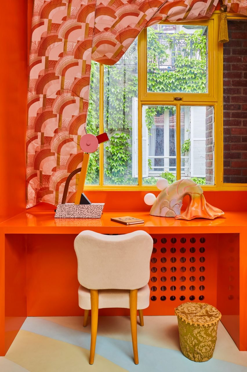
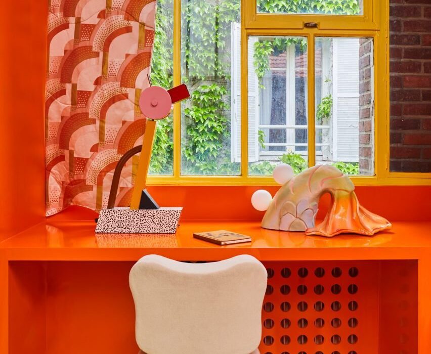
Orange desk in Univers Uchronia apartmentOrange desk in Univers Uchronia apartment
Julien Sebban designed Univers Uchronia as his home

Sebban designed the dwelling as his home, which he shares with his husband and Maison Royère artistic director Jonathan Wray.

The Uchronia founder created the apartment as an extension of his studio – “it’s truly a manifesto of our universe,” he told Dezeen.
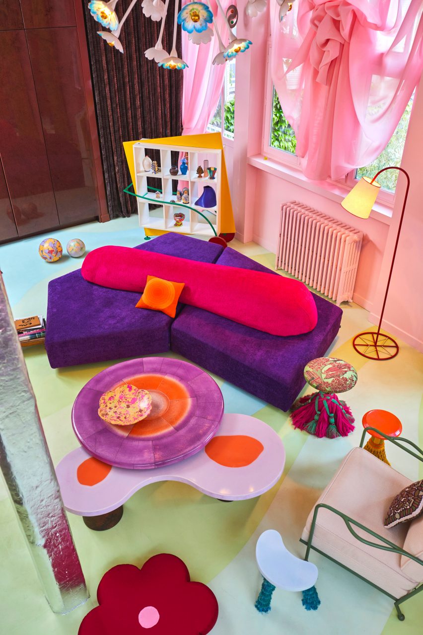
Colourful living room with pink curtainsColourful living room with pink curtains
Colourful interiors anchor the apartment

Sebban worked with local studio Atelier Roma to create all the walls and ceilings, which are either lacquered and glossy or made of matte pigmented concrete, respectively reflecting or absorbing light throughout the day.

Finished in hues ranging from cloud-like pale blue to lemony yellow, the walls and ceilings complement the poured-in-place resin floor that spans the apartment and features a bold motif that “waves and moves in relation to the architecture”.
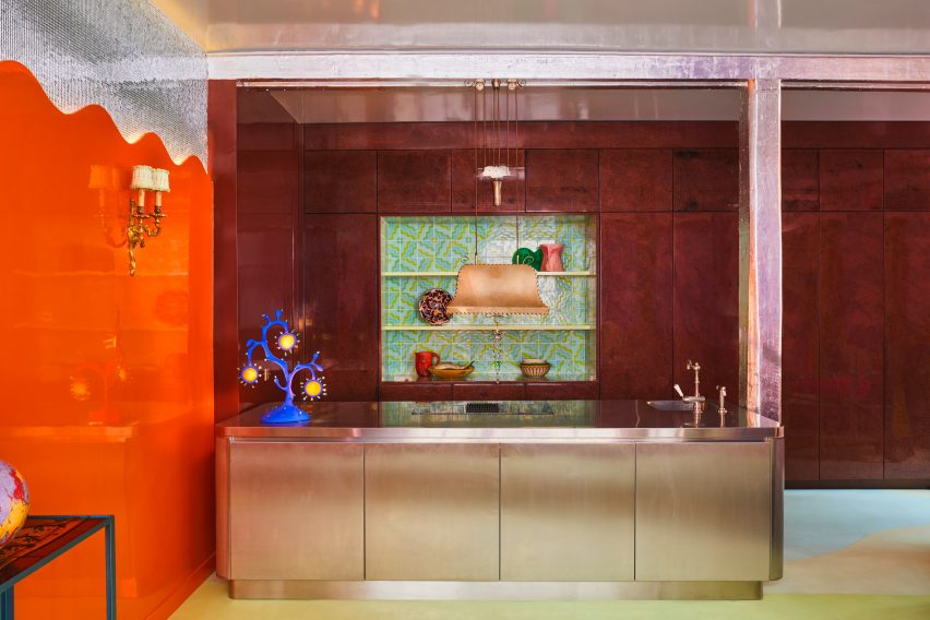
Open-plan kitchen in Univers UchroniaOpen-plan kitchen in Univers Uchronia
A metallic island features in the open-plan kitchen

The home is anchored by a predominantly pink living space, which includes Uchronia-designed pieces such as low-slung interlocking coffee tables made from walnut burl and orange resin.

Translucent and gathered pink curtains were paired with a geometric vintage bookshelf and a blocky but soft sofa finished in purple and orange.
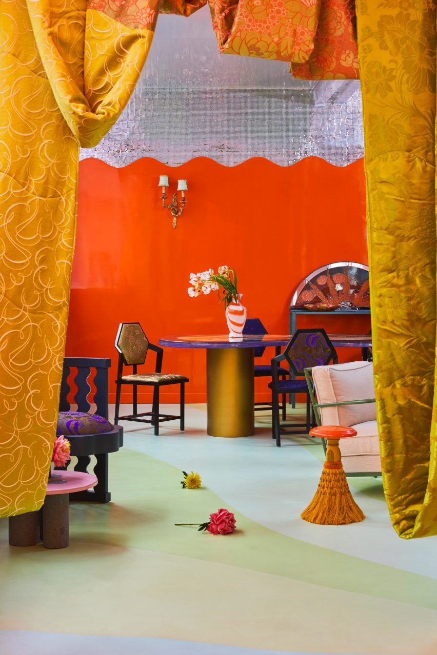
Onyx dining tableOnyx dining table
A bespoke onyx dining table was created for the home

“The apartment is very colourful with ’60s and ’70s inspirations and a mix of our contemporary pieces and vintage objects,” said Sebban.

In the open-plan kitchen and dining room, a veiny Van Gogh onyx table was positioned next to a metallic kitchen island, illuminated by a blobby seaweed-shaped table lamp.
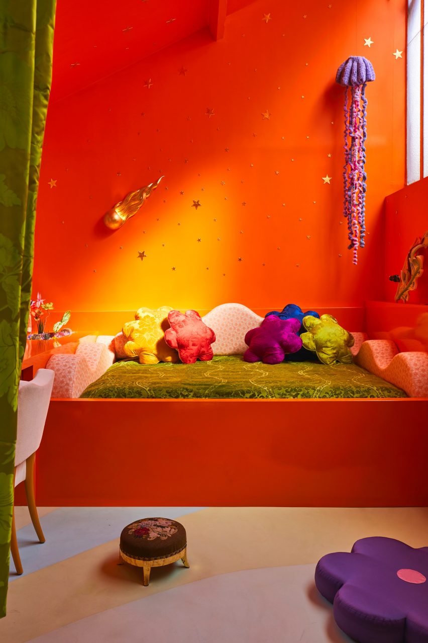
Home office with orange and yellow wallsHome office with orange and yellow walls
Ornamental jellyfish decorate the home office

A portion of the otherwise orange wall was clad with tiny, mirrored tiles. Reflected in the gleaming ceiling, the tiles have the same effect as a shimmering disco ball.

Opposite the dining area is Sebban and Wray’s home office, characterised by a bright orange, built-in day bed topped with silk flower-like cushions and a wave-shaped backrest.
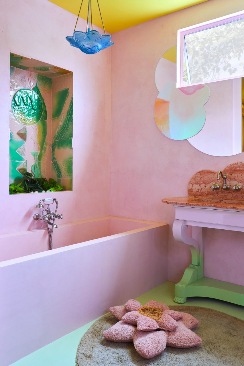
Bathroom with pink bathtub Bathroom with pink bathtub
The dwelling’s bathrooms follow a similar design

Above the bed, ornamental jellyfish were suspended like planets against a constellation of gold stars, which decorate the ombre orange and yellow wall that nods to the colour-drenched interior of the city’s Cafe Nuances – also designed by Uchronia.

The dwelling’s bathrooms follow a similar design. Accents include dusty pink alcoves and ceramic tiles depicting underwater scenes, as well as a lily pad-shaped rug and a mirror resembling a cluster of clouds.

“The apartment defines the codes we have tried to develop at Uchronia over the last four years,” concluded Sebban.

“It’s a play on colours, textures and materials, and a love letter to French craft.”
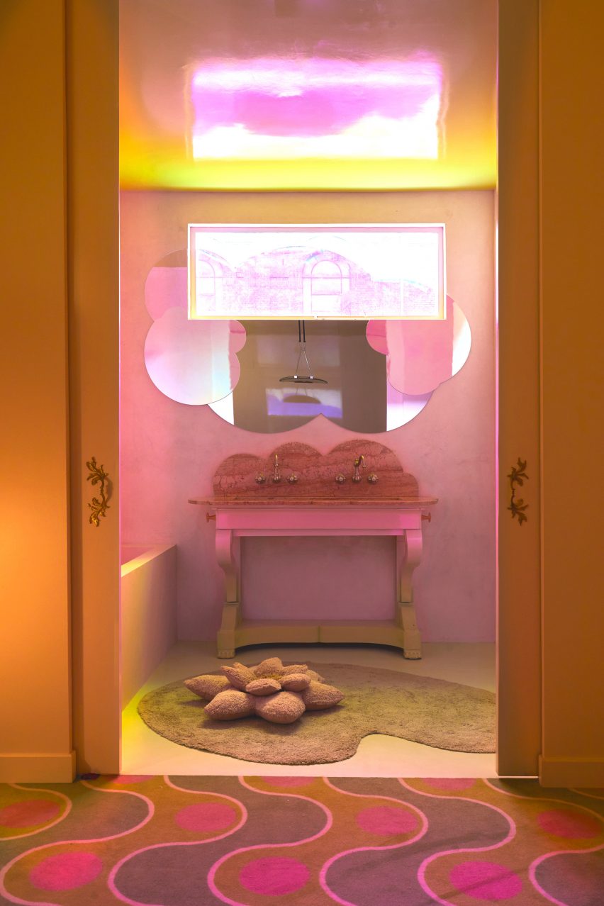
Pink-hued bathroom by UchroniaPink-hued bathroom by Uchronia
Univers Uchronia is “a love letter to French craft”

Uchronia was named emerging interior designer of the year at the Dezeen Awards 2023. The studio previously renovated a Haussmann-era apartment for a pair of jewellery designers with multifaceted furniture pieces created to mirror the appearance of precious stones.

Various architects have designed their own homes, such as John Pawson, who created this minimalist second home in the Cotswolds in the UK.

The photography is by Félix Dol Maillot

Reference

pastel colors clothe athletes’ village for paris olympic games 2024
CategoriesArchitecture

pastel colors clothe athletes’ village for paris olympic games 2024

Paris Olympic Games Athletes’ Village Reimagines Urban Space


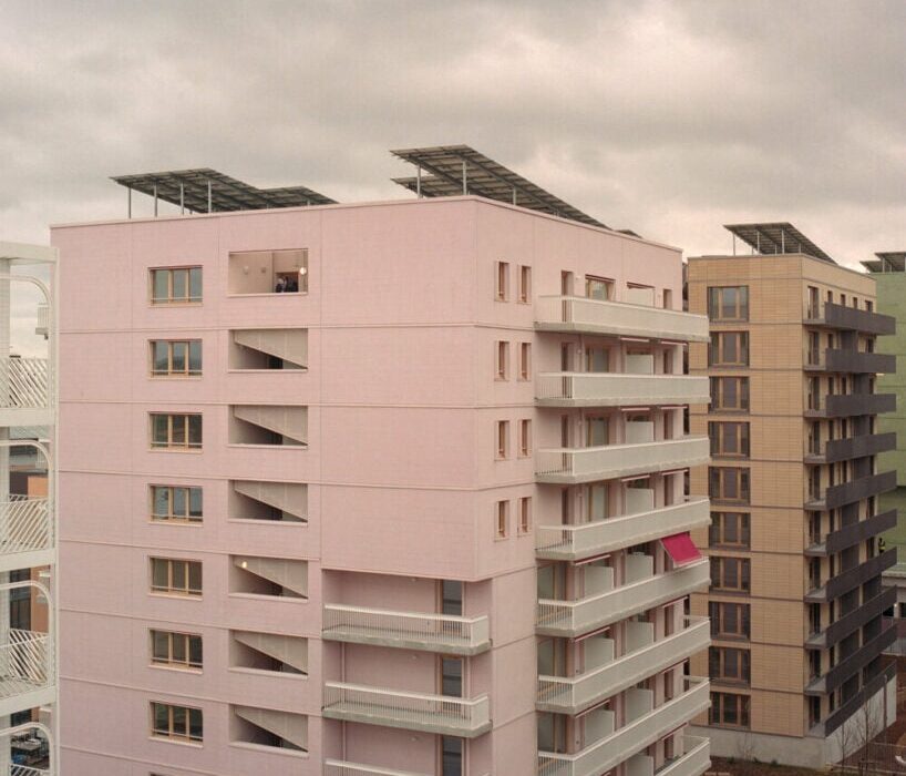
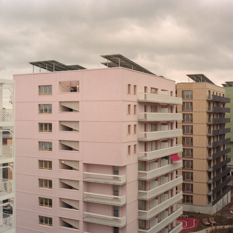
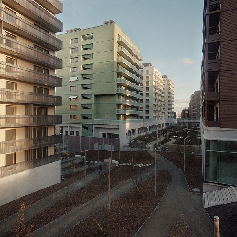
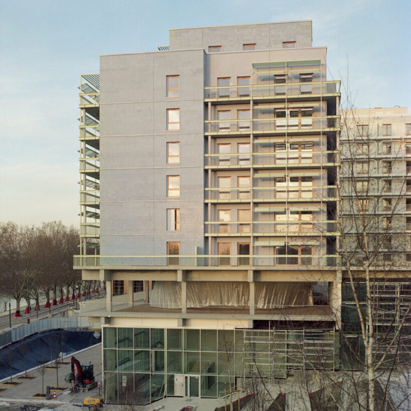
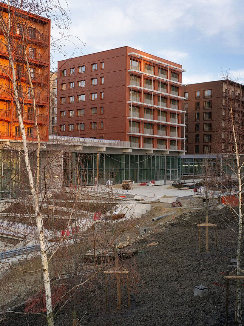
The Athletes’ Village for the Paris 2024 Olympic Games, constructed by uapS Agency and captured by Géraldine Millo, represents the transformation of an industrial site in northwestern Paris. This development reorients towards the Seine River and establishes new urban connections with neighboring areas. Unlike traditional host city approaches, the primary focus is on creating a new district to accommodate approximately 20,000 athletes from around the globe for a month.

pastel colors clothe athletes' village for paris olympic games 2024
all images by Géraldine Millo


‘Les Quinconces’ is built from wood and recycled materials


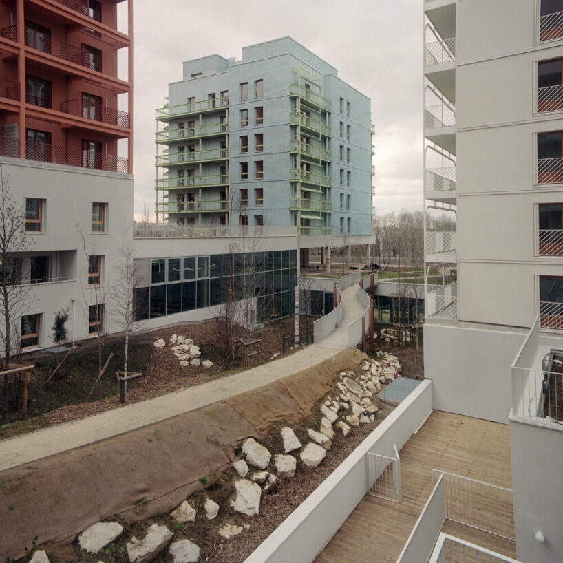
Lot D, known as ‘Les Quinconces’ for its urban layout, primarily features a variety of residential units, including family homes, duplexes, triplexes, penthouses, townhouses, and patios. It also offers a diverse range of youth and sports facilities. This programming by uapS Agency addresses diversity and integration issues within a socially disadvantaged area. ‘Les Quinconces’ serves as a model of social inclusion, emphasizing universal accessibility, low-carbon construction, and environmental sustainability. Its integration with a nearby forest facilitates gravity-based water management and biodiversity enhancement.
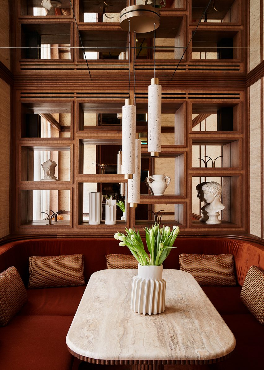
 

Constructed primarily from wood and recycled materials, the project aligns with the Paris 2025 agreements, prioritizing comfort and practicality to create a vibrant and livable community.


Photographer Géraldine Millo captures the project.

athletes village paris olympics games 24 11

pastel colors clothe athletes' village for paris olympic games 2024

athletes village paris olympics games 24 8

pastel colors clothe athletes' village for paris olympic games 2024

Reference

Paris duplex by Johanna Amatoury references Greek island architecture
CategoriesInterior Design

Paris duplex by Johanna Amatoury references Greek island architecture

Harnessing soft whites and gently curving plaster forms, interior designer Johanna Amatoury has brought a holiday-house feel to this apartment in the peaceful Paris suburb of Neuilly-sur-Seine.

The duplex belongs to a couple who work in real estate and their three young children – a globetrotting family with a particular love for the Greek islands.

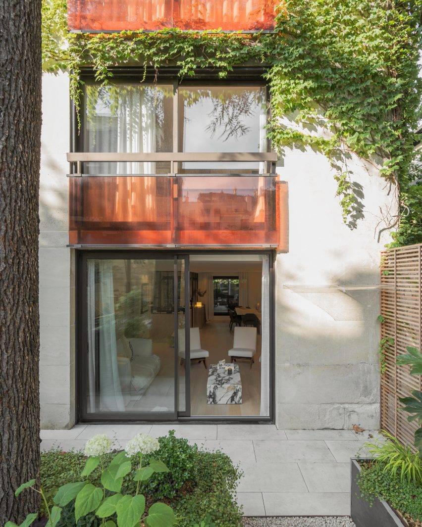
Exterior of Paris apartment by Johanna AmatouryExterior of Paris apartment by Johanna Amatoury
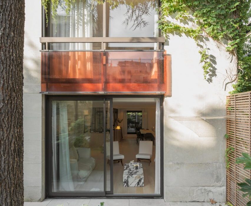
Interior designer Johanna Amatoury has renovated a Paris duplex

Amatoury designed their apartment as a homage to the region’s vernacular architecture.

“Because of their love for this part of the world, we arrived in this apartment and imagined a holiday house feeling, using warm and textural materials – very unlike typical Parisian apartments,” she told Dezeen.

“We worked with mineral materials, textures and raw colours in the apartment to provide depth and achieve the desired ambience.”

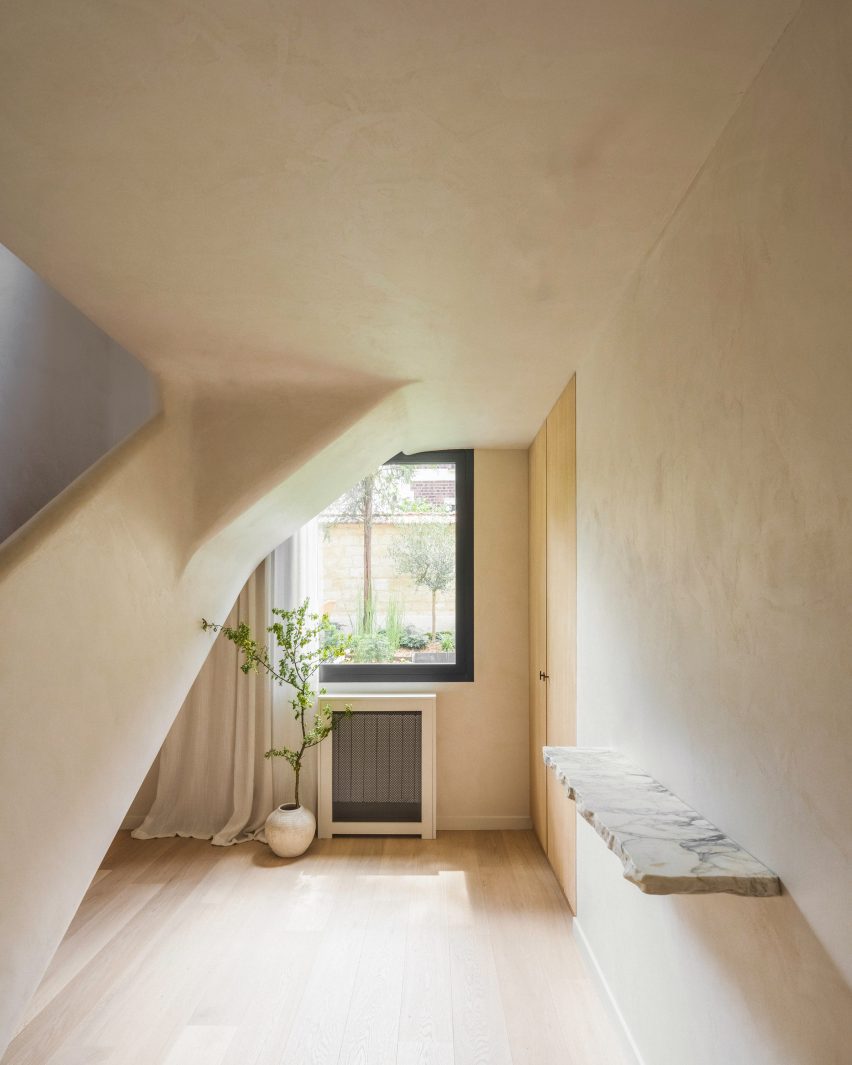
Hallway of Paris apartmentHallway of Paris apartment
Curving plaster-covered surfaces feature heavily in the entryway

The design of the home was also shaped by its layout, arranged over the ground and first floors of a large 1980s building that opens onto a small garden.

This encouraged Amatoury to model the apartment on a single-family house.

View into living room of flat by Johanna AmatouryView into living room of flat by Johanna Amatoury
The design draws on the vernacular architecture of the Greek islands

“We wanted to imagine it as a house, to create a more outside-in atmosphere, increasing all the size of the windows,” she said.

“The apartment is on the garden level, so my guideline was to open as much as possible to the outside and the planting there.”

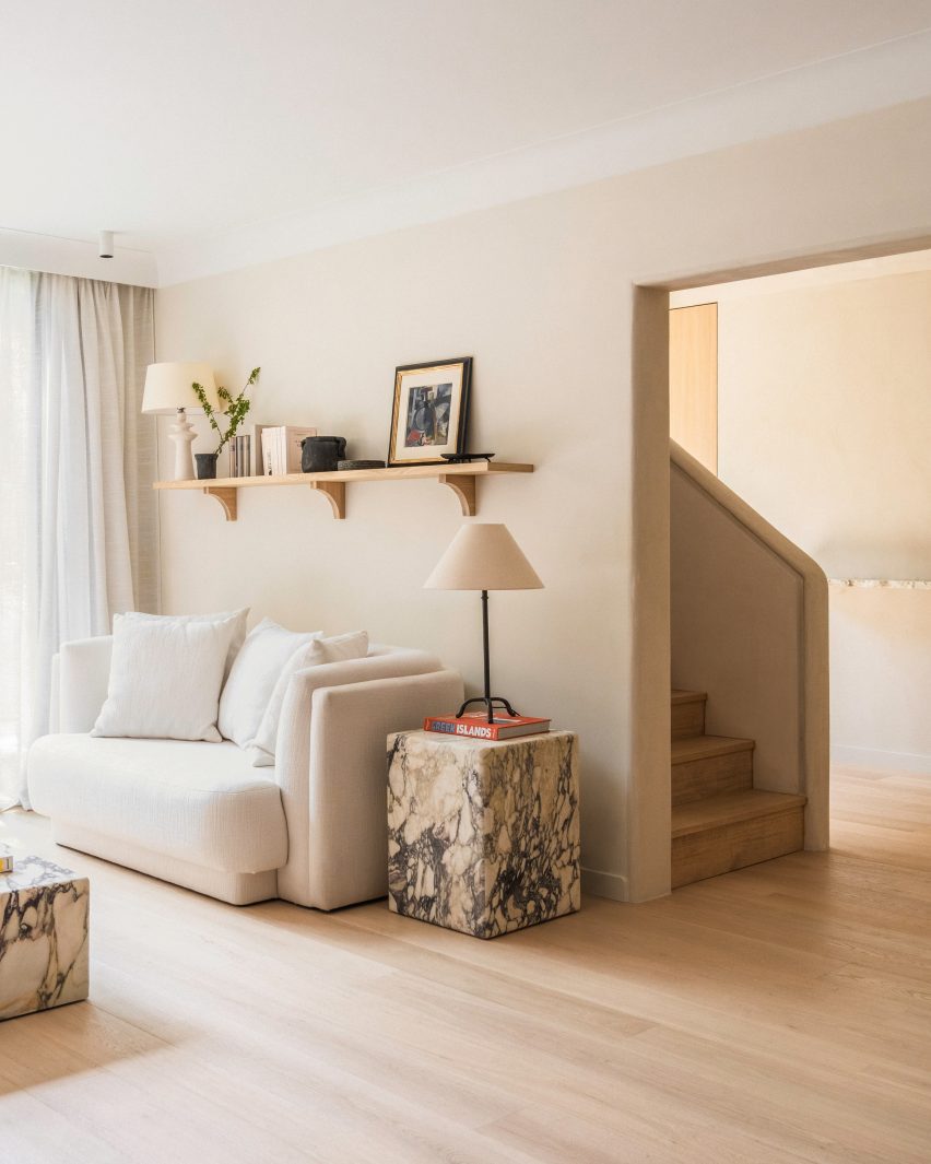
Living room of Paris apartmentLiving room of Paris apartment
Violetta marble tables anchor the living room

The apartment’s whole floorplan was reworked in order to create a living room, dining room and kitchen that all look onto the gardens outside.

The staircase was relocated to a more logical location close to the entrance, while upstairs the space was completely reconfigured to create four bedroom suites.

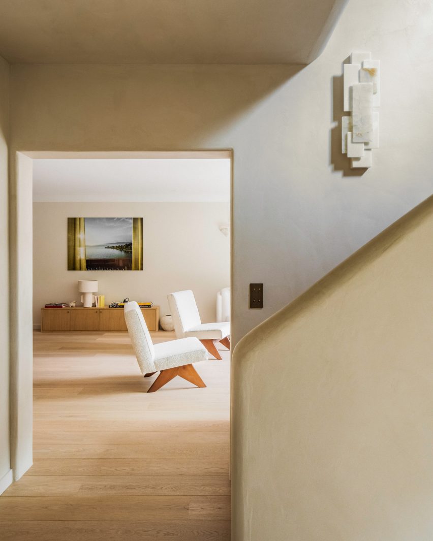
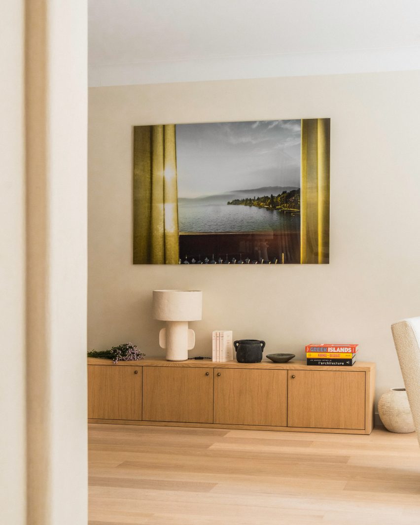
Artwork hanging over console table inside Paris apartment by Johanna AmatouryArtwork hanging over console table inside Paris apartment by Johanna Amatoury
Artworks reflect the Grecian theme of the interior

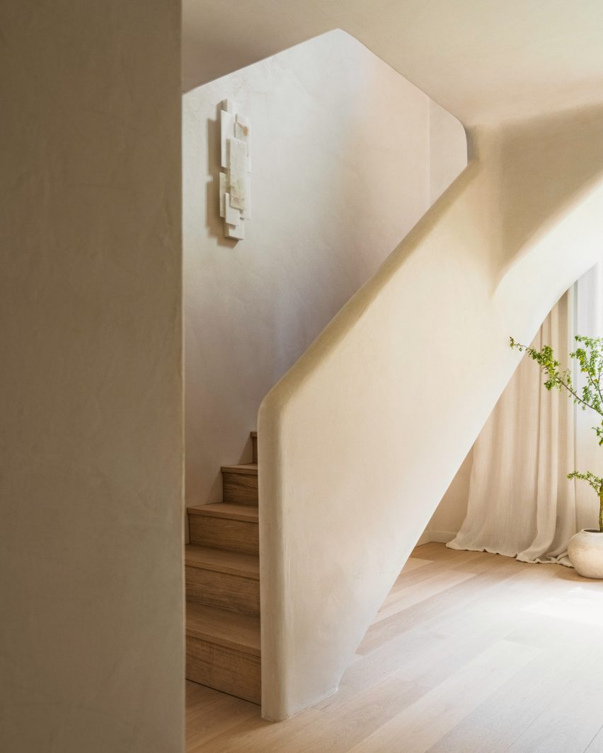
As a homage to Greek island architecture, Amatoury used Roman plaster to soften the forms within the apartment, particularly in the entrance hall.

“We used warm, textural materials including lots of softly curving and tactile plaster finishes that give the space a sculptural look,” she said.

“Roman plaster is a very ancient technique that has a mineral appearance with a smooth, soft and slightly glossy finish, which catches the eye and dresses the wall through classic mineral colours while also embracing brighter nuances.”

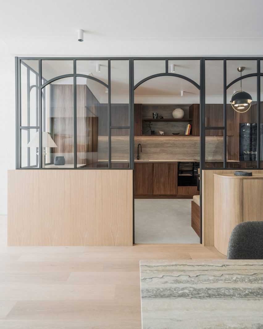
In the kitchen, smoked walnut timber cabinetry is paired with splashbacks and worktops made of Navona travertine.

Set in an otherwise open-plan space, the area is enclosed in glazed panels.

“The family entertains a lot and cooks a lot, both the parents and the children,” Amatoury said. “As a result, it was necessary to be able to close off the kitchen while maintaining this visual openness.”

Kitchen of Paris apartment with glass partitionsKitchen of Paris apartment with glass partitions
The kitchen is enclosed by glazed partitions

Much like a window, the glazed panels feature curved grilles and are set on an oak base that creates a visual link with the built-in oak banquette upholstered in white boucle wool.

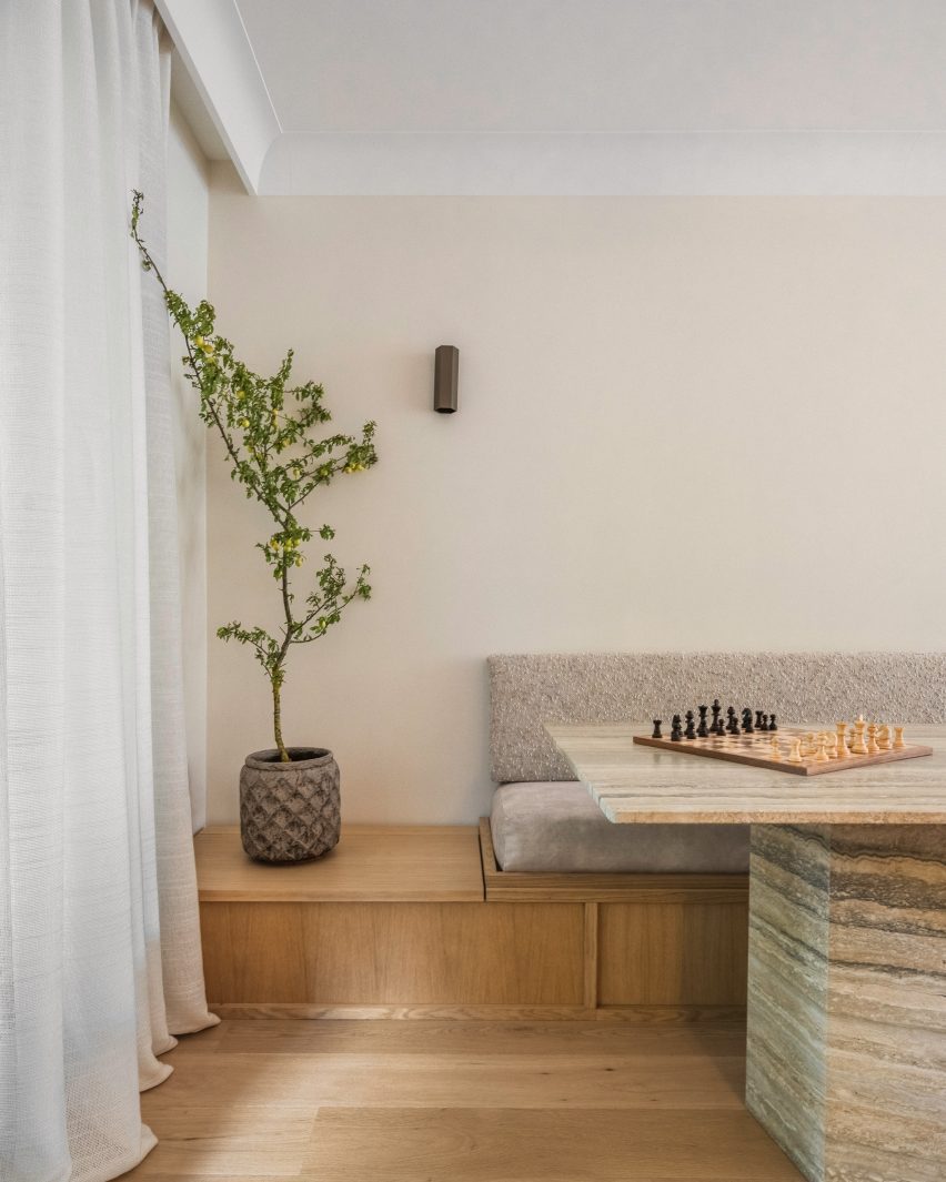
“We create a lot of benches because they’re so practical, incorporating storage chests, but most importantly for their cosy appeal,” Amatoury said. “Benches introduce a mix of fabrics and through these fabrics, the space becomes more welcoming.”

Dining area of Paris apartment by Johanna AmatouryDining area of Paris apartment by Johanna Amatoury
Amatoury fashioned an oak seating banquette for the dining area 

For Amatoury, the furniture edit was a balancing act between creating a “harmonious yet eclectic atmosphere” that blends sophistication and comfort.

Taking a central role is the curving sofa in the living room, which is upholstered in off-white linen and paired with monolithic Violetta marble tables.

Stairwell of Paris apartment Stairwell of Paris apartment
A staircase leads up to the second floor

“Its design not only provided a focal point but also added a touch of elegance and softness to the space,” she said.

“The curving shape offered a sense of flow and organic grace, enhancing the room’s visual appeal. The choice of off-white linen contributed to a serene ambience here, promoting a feeling of openness and lightness.”

Bedroom of apartment by Johanna AmatouryBedroom of apartment by Johanna Amatoury
The upper level houses four bedroom suites

Amatoury, who has worked on several residential and commercial interiors across Paris, says she was tasked with the project after the owners admired a home she had completed for friends of theirs.

“They liked our work and especially the warmth we bring to our projects, almost like a cocoon,” she said.

Other residential interiors in the French capital that have recently been featured on Dezeen include a loft apartment in a former textile workshop and a Haussmann-era flat that was restored to its “former glory”.

The photography is by Pierce Scourfield.


Reference

Brasserie des Pres draws on the vibrant history of Paris’s Latin Quarter
CategoriesInterior Design

Brasserie des Pres draws on the vibrant history of Paris’s Latin Quarter

The storied location of this brasserie in Paris inspired interior studio B3 Designers to fill the restaurant with tasselled chairs, disco balls and other flamboyant decor.

Brasserie des Pres is set in Paris’s Latin Quarter, which was a hub of creativity throughout the 19th and 20th centuries, its cafes filled with artists, publishers and prominent writers including Ernest Hemingway and Jean-Paul Sartre.

Interior of Brasserie des Pres restaurant in Paris by B3 DesignersInterior of Brasserie des Pres restaurant in Paris by B3 Designers
Brasserie des Pres’s ground-floor dining space features red-panelled walls with decorative tiling

London-based studio B3 Designers aimed to infuse this same buzzy ambience into the quarter’s latest eatery, undeterred by its awkwardly narrow interiors.

“Brasserie des Pres has a very unique floor print and we’ve used the existing architecture to create layers of dining experiences,” the studio said. “We’ve created a feeling of community and delight, a welcoming backdrop to the great food served here.”

Interior of Brasserie des Pres restaurant in Paris by B3 DesignersInterior of Brasserie des Pres restaurant in Paris by B3 Designers
Built-in shelving transforms walls on the first floor into a cabinet of curiosities

Lush with greenery, the exterior of the restaurant features a striped orange awning and classic Parisian terrace seating.

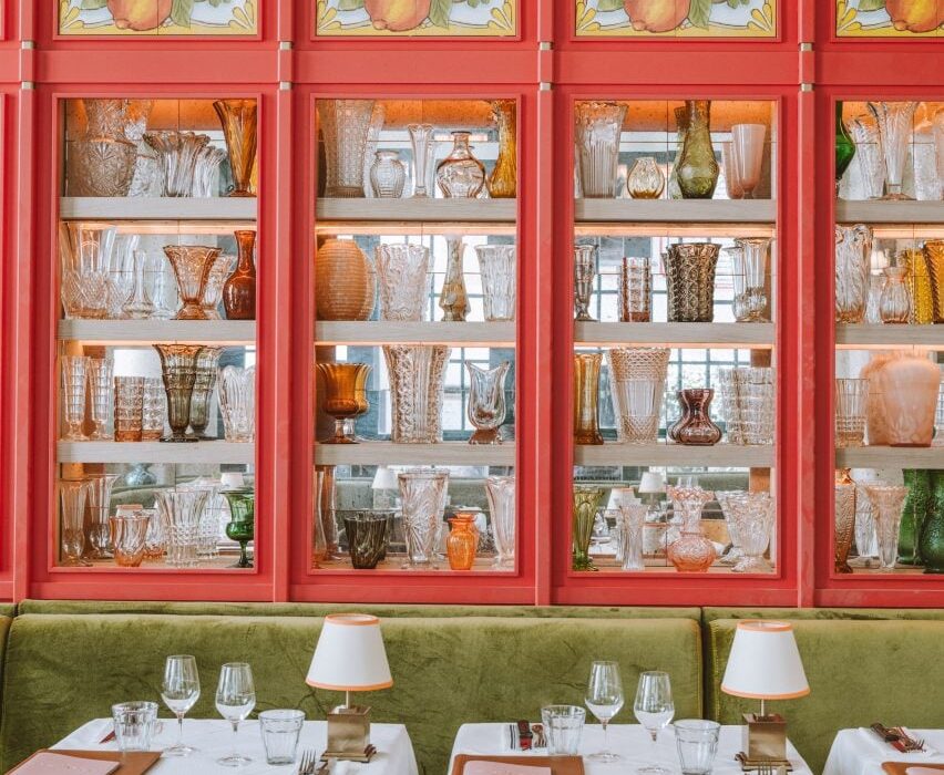
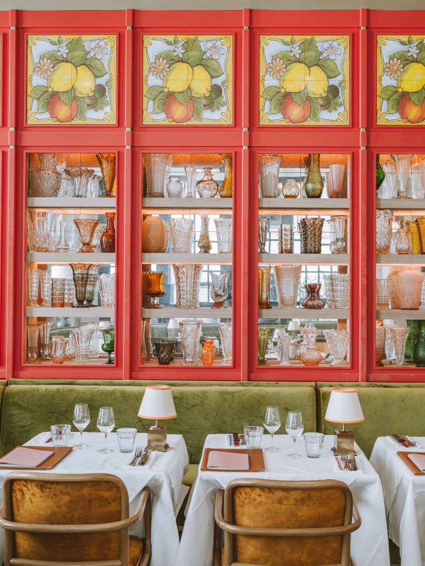
Once guests step inside, they find themselves in a large dining room with red-panelled walls, inset with mirrored shelves that display an assortment of shapely glass vessels.

Decorative tiles depicting limes, lemons and oranges are incorporated at the top of each panel.

Interior of Brasserie des Pres restaurant in Paris by B3 DesignersInterior of Brasserie des Pres restaurant in Paris by B3 Designers
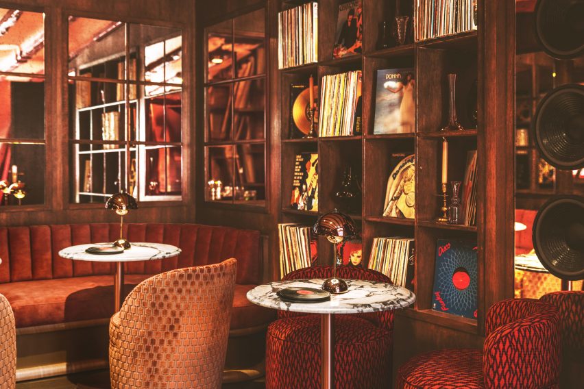
Guests can also relax in the top-floor lounge, which houses a rich selection of vinyl records

Tables throughout the room are dressed with white linen cloths and bijou brass lamps, nodding to the table set-up of the Latin Quarter’s traditional eateries.

Guests also have the option to sit at a high marble counter that directly overlooks Brasserie des Pres’s bustling kitchen or enjoy a drink at the bar, which is fronted by velvet-lined orange stools.

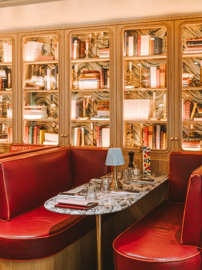
More dining space is provided on the first floor, where the shelves along the walls are filled with antique books and candelabras to mimic the worldly look of a cabinet of curiosities.

Finally, on the top floor of the restaurant is a lounge-style space where guests can relax while selecting tracks from the brasserie’s vinyl record library.

Interior of Brasserie des Pres restaurant in Paris by B3 DesignersInterior of Brasserie des Pres restaurant in Paris by B3 Designers
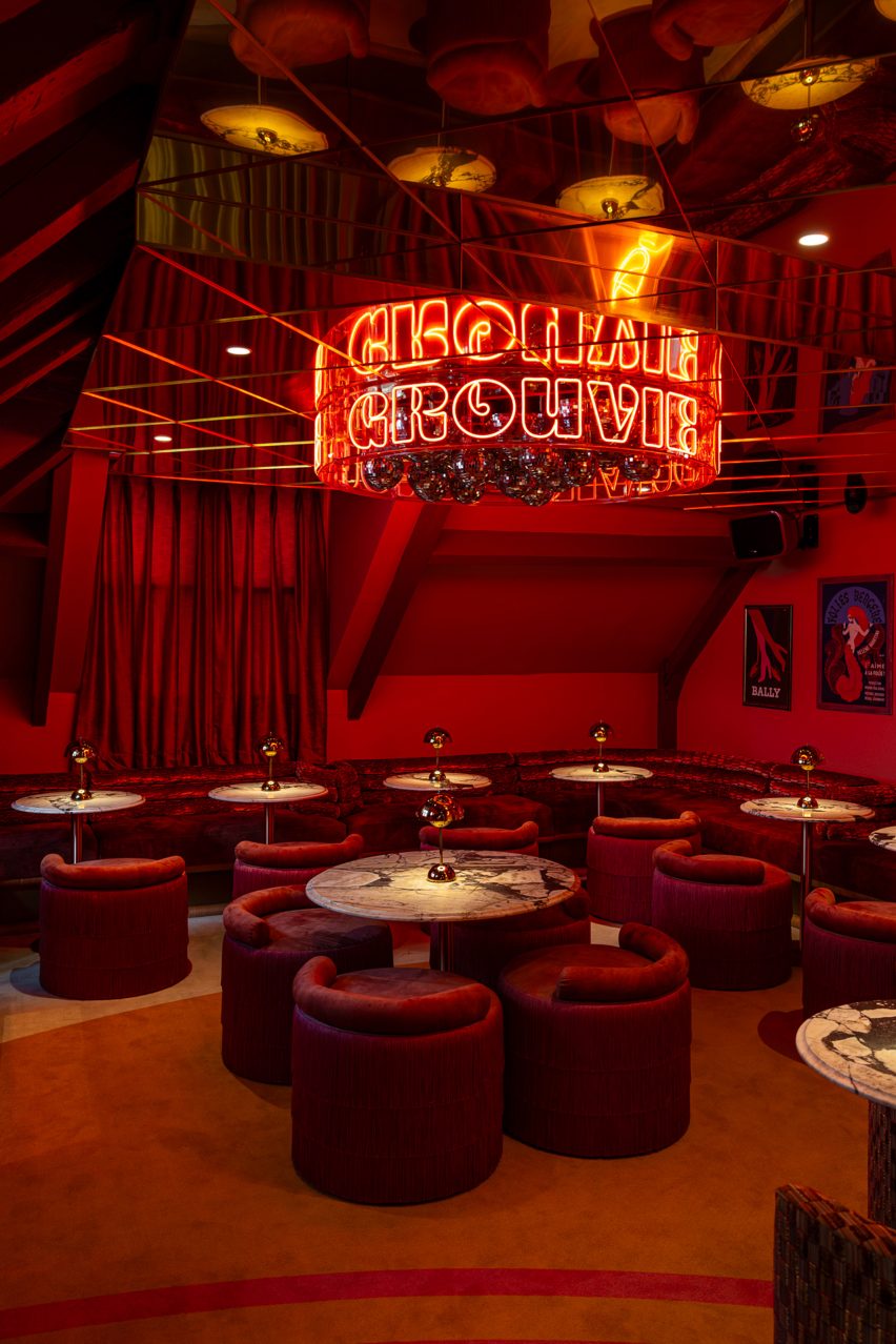
A crimson-red bar hides behind a curtained doorway

A curtained partition can be drawn back to reveal a secret bar, complete with a mirrored ceiling. From its centre hangs a cluster of disco balls, enclosed by a circular neon sign that spells the word groovy.

A plush, crimson banquet winds around the periphery of the space, accompanied by matching tassel-backed chairs and marble tables.

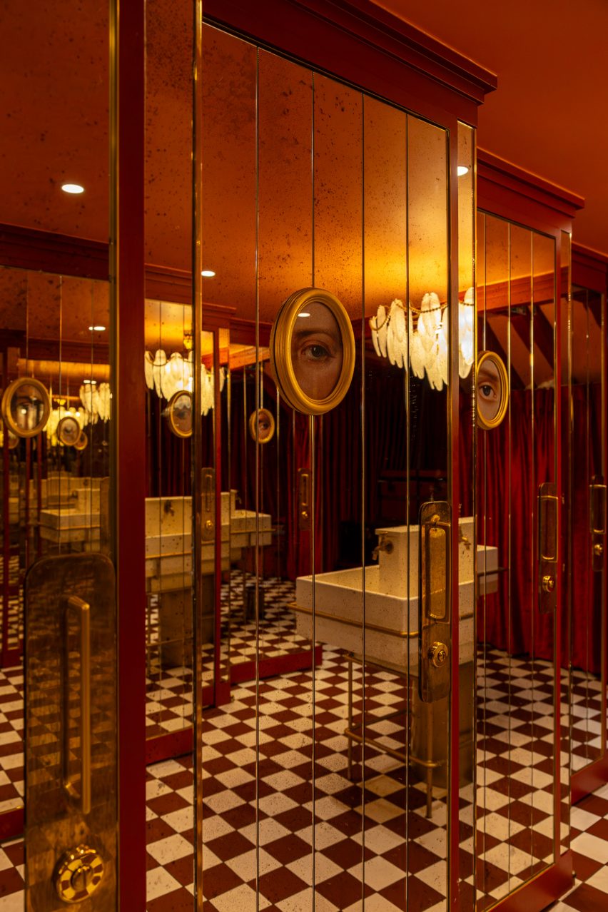
Even the toilets at this level are finished with eccentric details including a pearl-laden chandelier that droops above the washbasin  and surreal gold-framed paintings that depict the eyes of “unsung Parisian anti-heroes”, according to B3 Designers.

Interior of Brasserie des Pres restaurant in Paris by B3 DesignersInterior of Brasserie des Pres restaurant in Paris by B3 Designers
Surreal paintings and a pearl chandelier appear in the bathroom

Paris’s rich culinary scene is constantly expanding.

Other spots that have recently opened up around the city include Citrons et Huîtres, an oyster bar that’s designed to resemble a fishmonger, and Chinese restaurant Bao Express, which has a retro interior informed by Hong Kong diners of the 1970s.

The photography is by Vincent Remy and Joann Pai.

Reference

Hauvette & Madani restores Paris apartment to “former glory”
CategoriesInterior Design

Hauvette & Madani restores Paris apartment to “former glory”

Local design studio Hauvette & Madani drew on the Haussmannian history of this Paris apartment to create a gallery-like interior for its occupant’s vast art collection.

Located in the city’s historic Triangle d’Or, the dwelling previously featured minimalist marble surfaces and gilding leftover from a recent renovation.

Hauvette & Madani “re-appropriated” the apartment, originally designed as part of Georges-Eugène Haussmann’s famed reconstruction of the French capital during the mid-19th century, to reflect its architectural past.

Paris apartment by Hauvette & MadaniParis apartment by Hauvette & Madani
Hauvette & Madani added cornices and mouldings to the apartment to reflect the dwelling’s Haussmannian roots

“The challenge was to completely revamp the apartment, which had just been refurbished,” said studio co-founder Samantha Hauvette, who designed the dwelling with Lucas Madani.

“We carried out meticulous research to find the right motifs and decorations to restore the place to its former glory and Haussmannian charm,” she told Dezeen.

Artworks within the Hauvette & Madani-designed living roomArtworks within the Hauvette & Madani-designed living room
The living room features various artworks

The designers recreated delicate white cornices and mouldings – hallmarks of Haussmannian design – within the apartment, which had been previously stripped of these details.

This created a considered but neutral backdrop for the resident’s eclectic collection of artwork and a curated selection of furniture “mixing eras and styles,” according to Hauvette and Madani.

Turquoise fireplaceTurquoise fireplace
Sarah Crowner designed a bold fireplace for the dining space

Visitors enter at a small round vestibule clad in straw marquetry – a “common thread” that also features on a pair of curved sofas and a sleek coffee table as well as sliding doors, the main bedroom’s headboard and the dining table.

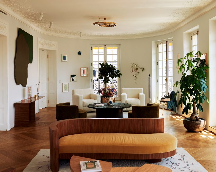
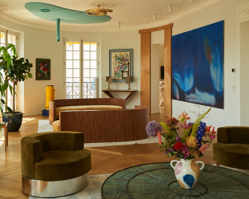
The light-filled living room is characterised by sculptural furniture and art pieces, including rounded vintage armchairs finished in a dark green hue and metallic base.

An amorphous ceiling work by Austrian artist Erwin Wurm was suspended above the sofas, while a deep blue painting by Swiss practitioner Miriam Cahn adds a bold hue to the room.

“It’s a real living space, where the homeowner shares a lot with her artist and designer friends,” said the designers. “All the pieces have a strong identity.”

Pink and green kitchen within Paris apartmentPink and green kitchen within Paris apartment
The kitchen balances traditional elements with more alternative details

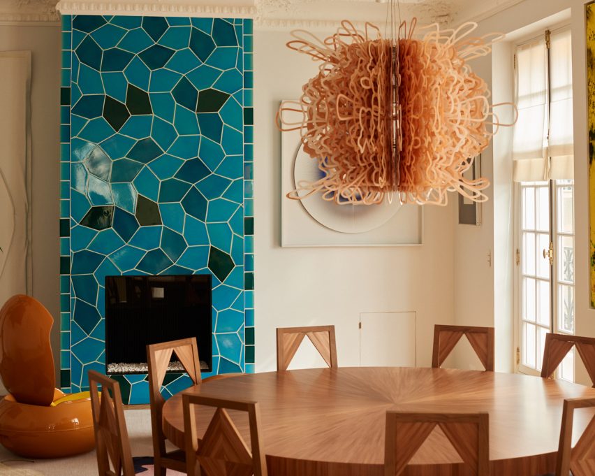
For the dining room, American artist Sarah Crowner created a striking turquoise fireplace, which was clad in a blocky mosaic of geometric tiles and positioned alongside a burnt orange vintage egg-shaped chair.

“We wanted to take the codes of classicism and break free from them,” explained Hauvette and Madani, who aimed to balance traditional interior details with more contemporary colourful touches.

Blocky wooden drinks barBlocky wooden drinks bar
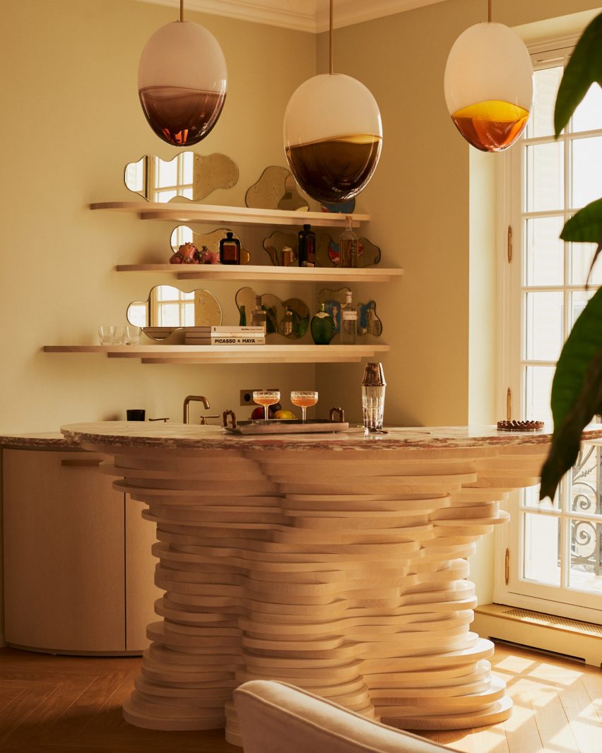
A blocky drinks bar was finished in the same design as the kitchen table

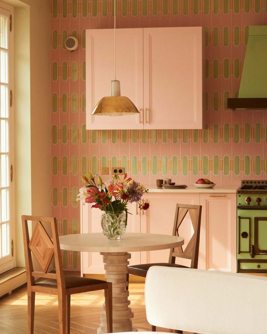
Continuing this theme, the designers sandwiched a bright green stove between more subtle, light pink cabinets in the kitchen, which includes a patterned feature wall.

Blocks of light-coloured timber were stacked by French furniture maker Hervé van der Straeten to create a singular lumpy leg for the kitchen table as well as the base of a drinks bar elsewhere in the apartment.

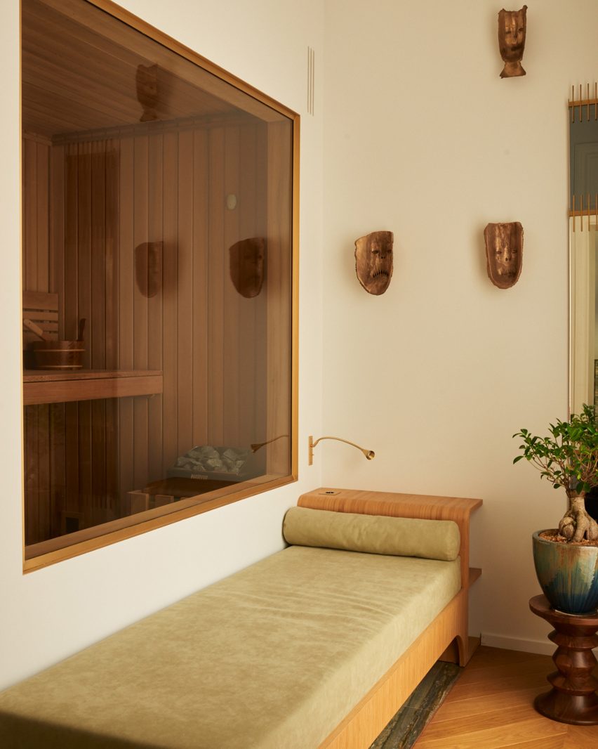
Hauvette and Madani also constructed an in-house sauna for the home, finished in dark wooden slats and tucked behind a bespoke green-hued daybed, made by the designers themselves.

“We have a strong belief that everything that you love independently will work perfectly once put together,” said Madani, who highlighted the power of trusting your instincts when curating eclectic interiors.

Home saunaHome sauna
Hauvette & Madani also added a home sauna

Summarising the overall look and feel of the apartment, the pair declared, “it’s Paris Haussmannian style, with a hint of craziness!”

Hauvette & Madani is not the first studio to renovate a traditional Parisian apartment with contemporary touches.

Local studio Uchronia recently filled a home for jewellery designers with multifaceted furniture pieces crafted to mirror the appearance of precious stones. The studio also previously added a wine-red kitchen to an otherwise neutral flat in the French capital.

The photography is by François Coquerel


Reference

Oka Fogo restaurants in Paris feature murals by Florence Bamberger
CategoriesInterior Design

Oka Fogo restaurants in Paris feature murals by Florence Bamberger

Architect Arnaud Behzadi and artist Florence Bamberger have combined French and Brazilian influences to create interiors for a pair of adjoining restaurants.

Located in Paris’ 17th arrondissement, Oka Fogo is the latest eatery from Raphael Rego, a Michelin-starred chef who is originally from Rio de Janeiro.

Behzadi designed interiors that aim to capture the spirit of Rego’s cuisine, while Bamberger painted wall and ceiling murals that bring an extra spark of energy.

Mural by Florence Bamberger on the wall of FogoMural by Florence Bamberger on the wall of Fogo
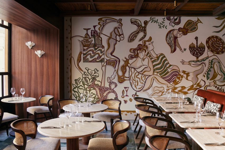
Bamberger reinterpreted Manet’s Le Déjeuner sur l’Herbe on the wall of Fogo

The two restaurants each have a distinct character.

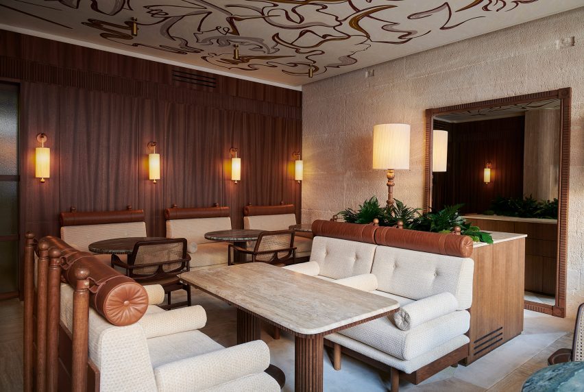
Oka, which means “house” in the language of Brazil’s indigenous Tupi people, is an intimate 16-seat dinner-service restaurant with the feel of a grand yet cosy lounge.

The neighbouring Fogo, which translates as “fire”, is a less formal space that offers a sense of dining al fresco. With an adjoining bar and grill, this 40-seat space is open for lunch and dinner.

Oka restaurant with travertine wallOka restaurant with travertine wall
Oka is a 16-seat restaurant with the feel of a grand but cosy lounge

“I approached the project as a journey through a house,” Behzadi told Dezeen.

“I see Oka as a prestigious living room and Fogo as an interior garden.”

Mural by Florence Bamberger on the ceiling of OkaMural by Florence Bamberger on the ceiling of Oka
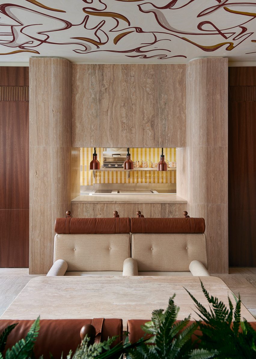
A ceiling mural incorporates references to Brazil’s flora and fauna

Bamberger’s expressive murals reinforce this approach.

In Fogo, she has painted a reinterpretation of the Édouard Manet artwork, Le Déjeuner sur l’Herbe. The work takes cues from the free-flowing lines of Brazilian artist José Francisco Borgès, resulting in a vibrant style.

The Oka mural features on the ceiling rather than a wall. This more abstract work is based on Brazil’s flora and fauna, along with objects that represent the nation’s culture.

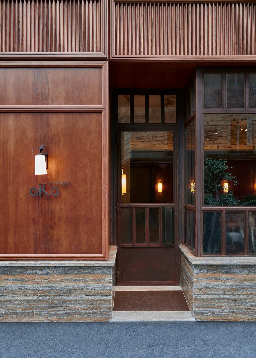
Oka Fogo restaurant facadeOka Fogo restaurant facade
The facade combines Jatoba wood with striated marble

Behzadi chose richly toned woods and highly textural marbles for the interior design palette, in a nod to materials favoured by Brazil’s prolific mid-century designers.

This partnering of stone and wood begins with the facade, where panels of Jatoba wood from the Amazon sit above a plinth of striated Iranian marble.

“I decided to interpret a classical style for the storefront,” said Behzadi.

“It’s a very Parisian approach, using an exotic material to start evoking the interior that you will discover inside.”

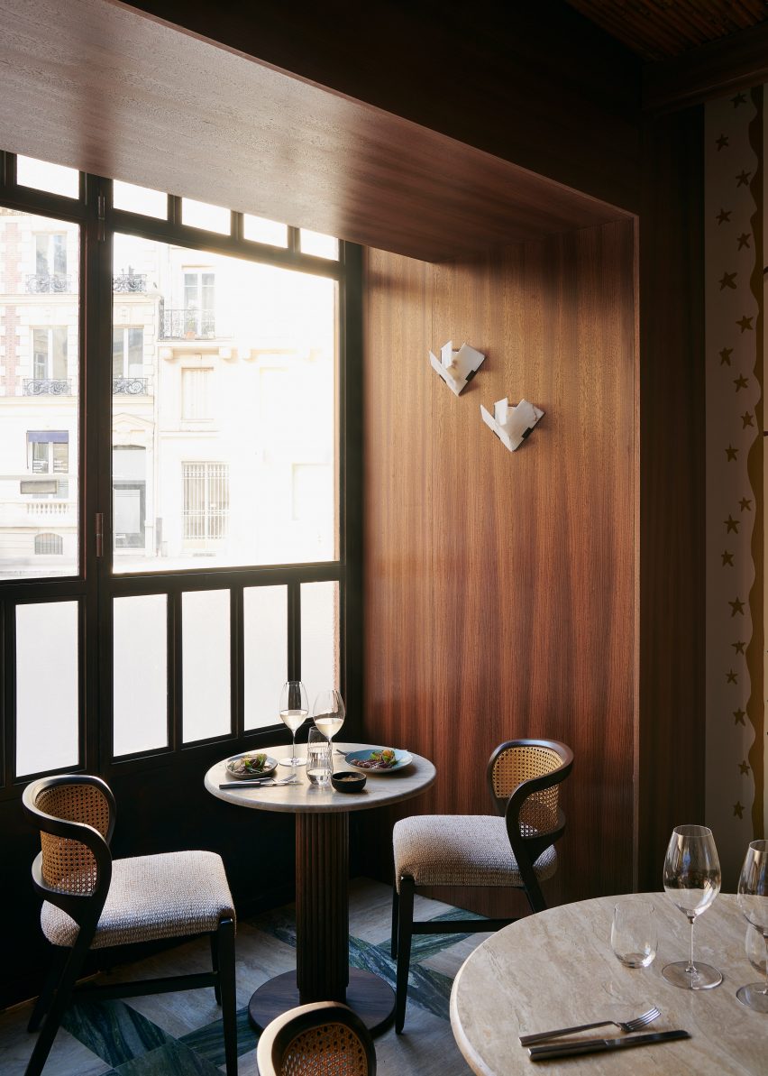
Tables and chairs in window of FogoTables and chairs in window of Fogo
Fogo’s floor is a grid of green marble and travertine tiles

Inside, decorative wooden furniture and joinery are accompanied by a mix of different stones, including white travertine and various green-toned marbles.

Other eye-catching details include sculptural wall lights by Behzadi’s former business partner, designer Cathy Crinon, and chairs by the late Brazilian designer Sergio Rodrigues.

“There is a clear Brazilian inspiration,” added Behzadi.

Oka Fogo alcove dining spaceOka Fogo alcove dining space
Additional spaces include a private alcove

The venue also includes an alcove dining space with room for six, featuring a mirrored ceiling and curved banquette in red velvet, and a wine and champagne tasting room with a vaulted ceiling.

Oka Fogo opened earlier this month. Other recent openings in Paris include Moët Hennessy’s Cravan cocktail bar and oyster bar Citrons et Huîtres.

The photography is by Claire Israel.

Reference

TVK designs limestone buildings for “first zero-carbon district” in Paris
CategoriesSustainable News

TVK designs limestone buildings for “first zero-carbon district” in Paris

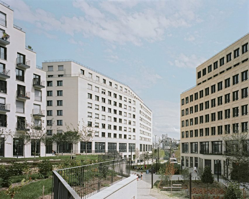
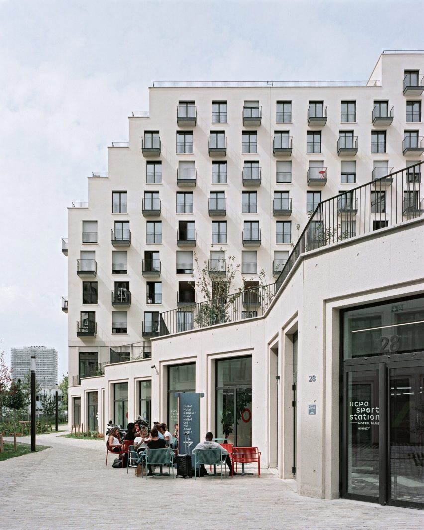
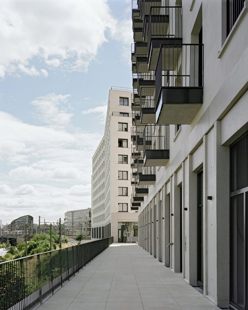
French architecture practice TVK has completed a neighbourhood in Paris made up of limestone buildings surrounding a garden and designed as a sustainable development that aims to increase biodiversity.

Located on a triangular site in Paris’s 19th arrondissement, the project is “the capital’s first zero-carbon district”, according to TVK.

Named Îlot Fertile, which translates to “fertile island” in French, it contains apartments, a youth hostel, student residences, a hotel, offices, restaurants, shops and sports facilities.

Paris zero-carbon neighbourhood by TVKParis zero-carbon neighbourhood by TVK
TVK claims Îlot Fertile is the first zero-carbon district in Paris

The four buildings that make up the neighbourhood range in height from seven to nine storeys tall, each with ground-floor levels made from low-carbon concrete and designed to achieve large, unobstructed interior spaces.

The upper levels were made from load-bearing limestone sourced mainly from the local Ile-de-France region, aiming to reduce the carbon cost of transportation.

TVK claims the 35,200-square-metre development is the largest load-bearing stone building site since Georges-Eugène Haussmann’s reconstruction of Paris in the mid-19th century.

Îlot Fertile zero carbon neighbourhood in Paris by TVKÎlot Fertile zero carbon neighbourhood in Paris by TVK
The buildings were made from load-bearing stone and concrete

“Each material is used in the right place and the right quantity,” TVK founders Pierre Alain Trévelo and Antoine Viger Kohler told Dezeen.

“We chose to use mainly limestone from the Paris region – it’s the same one used to build the Haussmann buildings.”

Public spaces, including restaurants and shops, are located on the ground floors of the buildings and open onto the central garden.

Hotel accommodations and apartments are on the upper levels, and a raised outdoor level provides additional garden spaces with an orchard, vegetable patches, insect hotels and nest boxes.

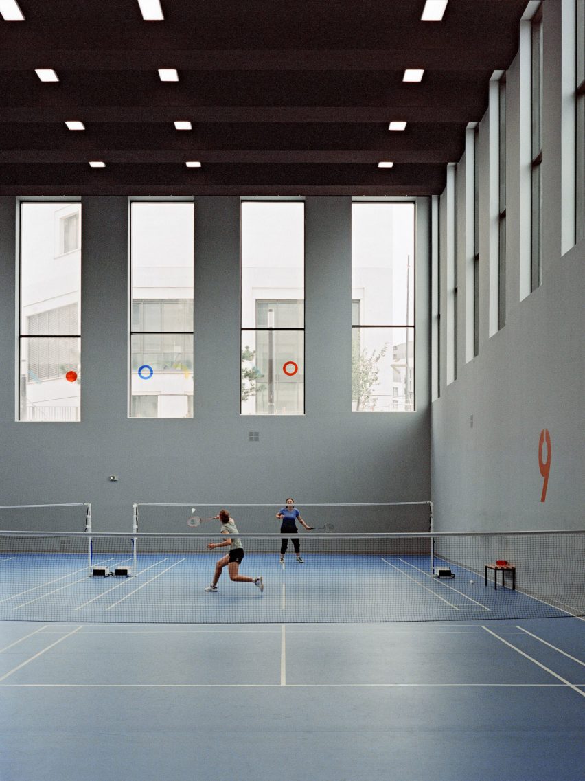
Office spaces are located in a building that sits parallel to a railway line and, aiming to work with the site’s existing topology and move as little earth as possible, TVK designed a sunken sports centre in a large hole on the site to create an interior with high ceilings.

“The biggest challenge of the project was to bring together more than a dozen programmes and turn them into a fully-fledged part of the city,” said Trévelo and Kohler.

“The shape of each building is linked to the very specific geometry of the site shaped by the railway infrastructure,” they continued. “This brings diversity to a building complex of this scale.”

Îlot Fertile zero carbon neighbourhoodÎlot Fertile zero carbon neighbourhood
It is located on a triangular site next to a railway

TVK designed Îlot Fertile to have a minimal carbon footprint in its construction and operation. It topped the buildings with photovoltaic panels and green roofs to produce energy while also aiming to increase biodiversity.

“Its proximity to public transport means that Îlot Fertile does not require any car parking, and we used a bioclimatic design to keep energy requirements to a minimum for heating, cooling and lighting,” said Trévelo and Kohler.

“For the small amount of energy that will be consumed, the project plans to compensate for it by producing green energy via bio-solar roofs.”

Tennis court in a sports centreTennis court in a sports centre
The development includes a sports centre built into an existing hole in the site’s topography

“Driven by the City of Paris’ ambition for ecological transition, zero-carbon is a long-term objective for the life of the entire operation,” added Trévelo and Kohler.

Elsewhere in Paris, Christ & Gantenbein completed a 124-metre-long steel-clad housing block, and RSHP unveiled its design for a “post-carbon” neighbourhood that will be located in the La Défense business district.

The photography is by Julien Hourcade.


Project credits:

Architect: TVK
Client: Linkcity
Landscape design: OLM
Building and civil engineering: Berim
Engineering: Carbone 4 and Amoes

Reference

Beata Heuman designs colour-drenched Hôtel de la Boétie in Paris
CategoriesInterior Design

Beata Heuman designs colour-drenched Hôtel de la Boétie in Paris

Saturated greens and blues contrast pale pink sheets and playful flower details at Hôtel de la Boétie in Paris, which Swedish designer Beata Heuman created to be “a bit like a stage set”.

Set in a 19th-century building, the 40-room hotel in Paris’ 8th arrondissement was designed with Heuman‘s signature colourful interior style.

Lounge at Hôtel de la Boétie
Beata Heuman’s Dodo Egg Light hangs in a lounge area at Hôtel de la Boétie

While it was a renovation of an existing hotel, the designer was able to make large changes to the interior as the building had been altered numerous times since it was completed.

“The building didn’t have any original features left and has been re-configured over the years,” Heuman told Dezeen. “We spun off the simplicity of the bones that were there, working with strong, simple ideas.”

Reception area at Hôtel de la Boétie
The hotel’s reception area has a warm red colour

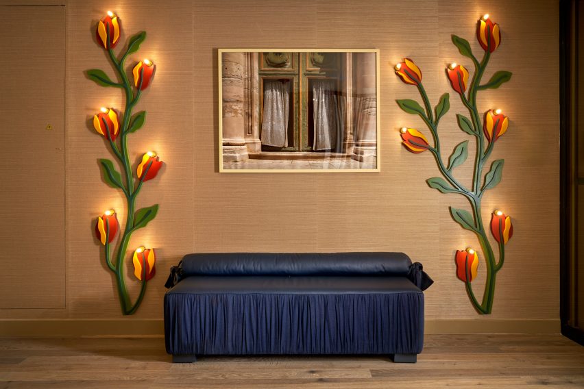
Guests are met by a reception room with a vibrant, bright-red nook for the front-of-house staff and two lamps designed like winding red-and-yellow flowers. A dark-blue leather seat complements the room.

Next to the reception area, Heuman created an all-silver lounge that was designed to have a theatrical feel and is brightened by an orange velvet sofa and a forest-green coffee table.

Silver lounge space at Hôtel de la Boétie
Guests can relax in a silver lounge area

The colour palette was very deliberately chosen by Heuman, who thought about the wider impact it would have on the space.

“It’s about contrast and balance,” the designer said. “When you work with rich colours my instinct is to off-set that using simpler materials around it to complement and enhance.”

Bedroom with patterned headboard
Woven headboards create striking centrepieces in the bedrooms

The bedrooms have a saturated colour scheme, with lower-level floors that feature dark blue walls, which change to shades of brown on the ascending floors.

The two top levels have pale, airy blue hues, with classic French cast-iron balconies providing views of central Paris from the top floor.

A grassy green carpet was used throughout the hotel to create a vibrant contrast to the blue and brown hues.

Bathroom at Parisian hotel
The bathrooms feature pale pastel colours

Some bedrooms have been decorated with oversized headboards that were woven as rugs and then upholstered, creating an unusual and eye-catching centrepiece.

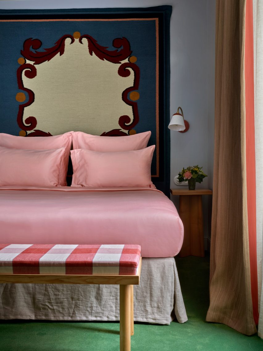
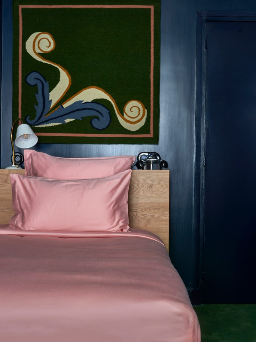
These were informed by the inlaid marble floor of the Medici Chapel in Florence and sit above the solid-ash beds, which have been made with pale-pink satin sheets that add to the vibrant feel of the room.

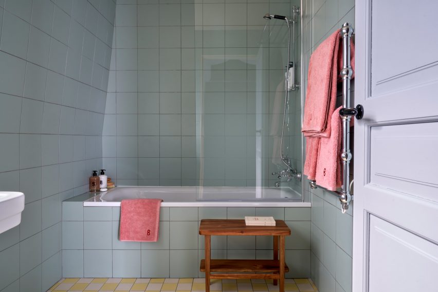
In the bathrooms, Heuman used pale blue and green pastel hues juxtaposed with pink towels to give the rooms a luxurious retro feel, while checkerboard-patterned tiles in yellow and green add a fun touch.

Pink satin sheets on bed in Paris hotel
bedrooms on the lower levels have dark-blue walls

The designer also used her own products to decorate the hotel, including her Dodo Egg Light – an egg-shaped light with green fittings designed to resemble planet leaves.

This decorates one of the ground floor lounge areas, which also features posters for art exhibitions by artists Pablo Picasso and Paul Klee.

The designer used mainly natural materials for the hotel, including wood and brass.

“The solid ash furniture used in all the rooms have a humble quality which anchors the more theatrical elements of the schemes such as the headboards, ensuring the expression stays true to the nature of the building,” she said.

Interior of Hôtel de la Boétie
Heuman aimed to use natural materials throughout the space

Heuman also created the branding for the hotel, which was made for French hotel group Touriste.

“A hotel is about having an experience for a day or two, which means that we have been able to explore a concept and a mood to a greater extent,” Heuman said.

“We can treat it a bit like a stage set, which is not the approach I would take when it comes to someone’s home.”

Reception at Parisian hotel
Flower lamps decorate the reception area

The project fulfilled a long-time dream for the designer, who had previously never designed a hotel and works more on private home interiors.

“I’ve been wanting to do a hotel for ages and it has been a fantastic experience,” Heuman said.  “I am drawn to the theatrical, although that is often not appropriate for a residential setting.”

“A hotel is an experience for a few nights, therefore you can exaggerate and do more of a ‘look’,” she added. “In a residential project the design is centred around the personal preferences of an individual client.”

Previous hotels by Touriste include Hotel Les Deux Gares in Paris, which has an interior that was created by British designer Luke Edward Hall. Also in Paris, local studio Uchronia created a colourful Haussmann-era apartment as a “chromatic jewellery box”.

The photography is by Simon Brown.

Reference

moreau kusunoki completes ‘le berlier,’ a timber tower in paris
CategoriesArchitecture

moreau kusunoki completes ‘le berlier,’ a timber tower in paris

la berlier: A Timber Tower Redefines Architecture of paris


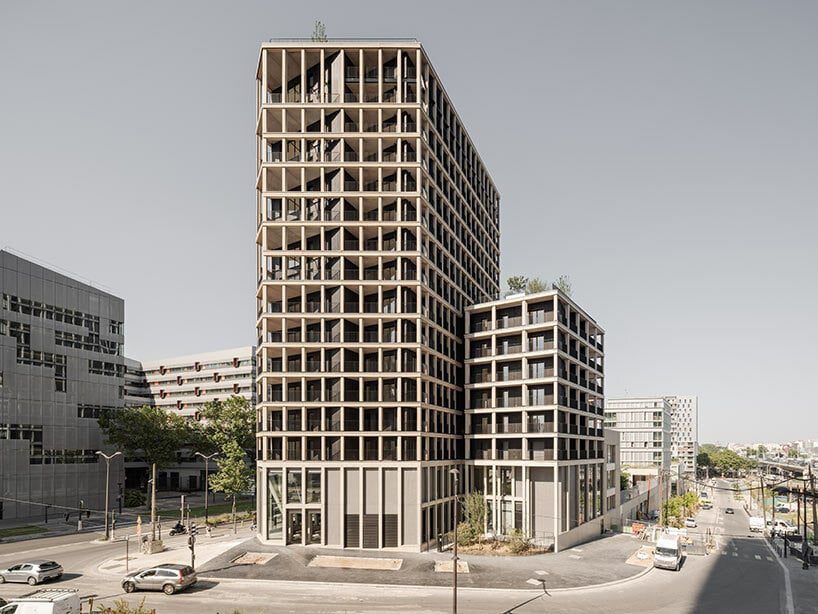
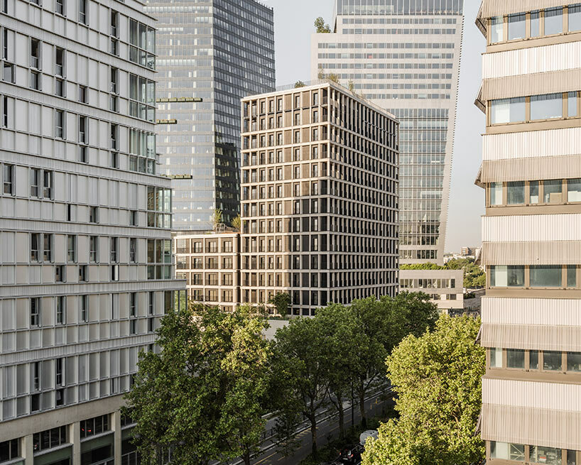
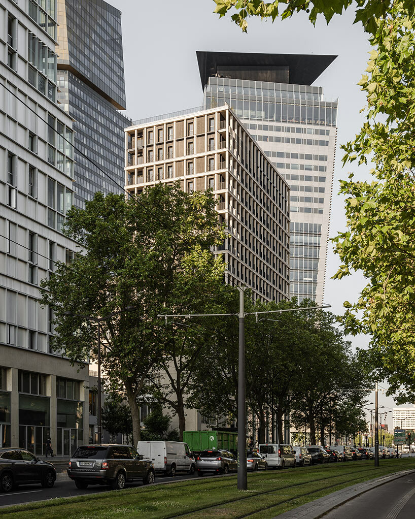
In the heart of Paris‘ thirteenth arrondissement, a new addition to the urban fabric has emerged with Le Berlier timber tower, designed by locally-based architecture studio Moreau Kusunoki. This forward-thinking tower rises fifty meters (165 feet) above the streets of the French capital city, and represents an harmonious blend of architectural innovation and a deep understanding of its site. Positioned at the intersection of various urban flows, networks, and scales, this residential project stands at the intersection between the monumental and the domestic.

moreau kusunoki berlier parisimages © Maris Mezulis | @mariocee


The ‘Inhabited Wall’ facade


The essence of Moreau Kusunoki’s design for the timber tower Le Berlier lies in its concept of the ‘inhabited wall.’ The building’s facade takes shape with a grid that introduces both a rhythmic texture and a functional filter. This grid, born from the design team‘s deep understanding of the site, plays a crucial role in preserving the tower’s sense of domestic tranquility amidst the densely-built urban environment. It’s a marriage of form and function, where the grid both complements the architectural aesthetics and shields the residents from the surrounding urban chaos.


The design of Le Berlier’s frame and its proportions exemplifies structural necessity and aesthetic intent. The tower’s verticality, an intentional choice made by the architects, results from the elongation of its proportions — the tower confidently stands its ground against the towering heights that encompass it, effectively becoming a part of the monumental Parisian landscape. This contrast between the tower’s massive, introverted inhabited wall and its transparent base is a feature that defines its architectural identity.

moreau kusunoki berlier paris
Le Berlier timber tower reaches new heights in Parisian architecture


moreau kusunoki emphasizes verticality


In contrast to the tower’s towering presence, the transparent base of Le Berlier opens itself up to the city. This public space serves as a welcoming gesture to the bustling urban environment that surrounds it. It aspires to seamlessly integrate with the cityscape, forging a strong connection between the tower and its vibrant surroundings. This dichotomy between introverted privacy and extroverted openness adds a layer of complexity to the narrative.


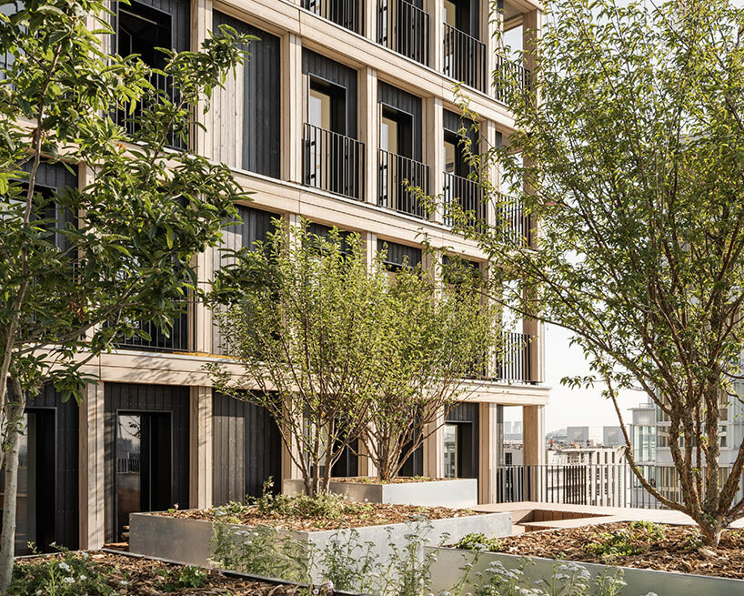
Moreau Kusunoki’s careful attention to detail extends to the choice of materials, with charred and pre-weathered wood being a prominent feature. This choice adds a layer of texture and depth to the tower’s aesthetic, evoking a sense of timelessness. This commitment to materiality is echoed in the thoughtful layout of the residential units. Each unit opens onto a private exterior space, effectively weaving a discreet and respectful connection between the interior and exterior. This decision fosters an harmonious relationship between nature and the city, private and public spaces, and ultimately, the growing neighborhood and its inhabitants.

moreau kusunoki berlier paris
a transparent base welcomes the city into the heart of the tower
moreau kusunoki completes 'le berlier,' a charred-timber tower in paris
the ‘inhabited wall’ is a grid facade that balances form and function


Reference

USM Haller creates “techno-chic” Coperni retail space in Paris
CategoriesInterior Design

USM Haller creates “techno-chic” Coperni retail space in Paris

Photo of the Coperni USM retail space

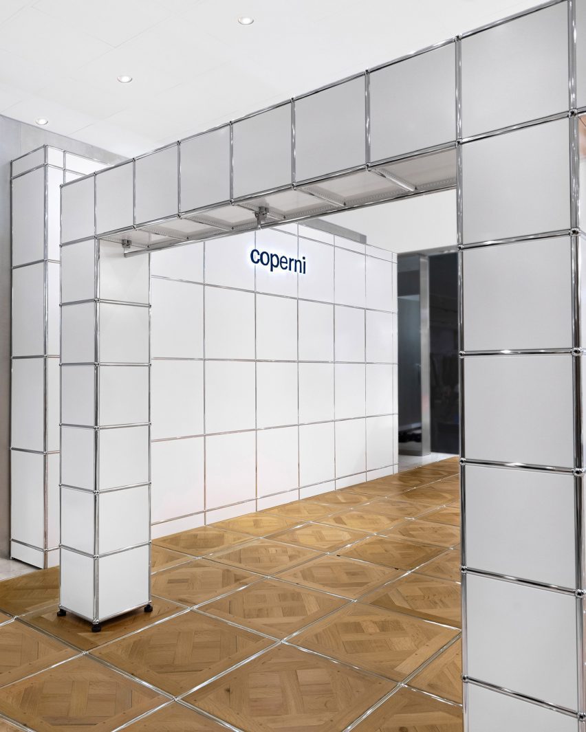
Parisian fashion brand Coperni has collaborated with Swiss furniture company USM Haller to create its first-ever boutique, a shop-in-shop at French department store Printemps Haussmann.

The shop-in-shop, installed at Printemps Haussmann in Paris, marks Coperni’s first-ever physical retail location and will be replicated at London’s Selfridges store and China’s Duty Free Mall in Hainan Island.

Photo of the Coperni retail space
Coperni collaborated with Swiss furniture brand USM

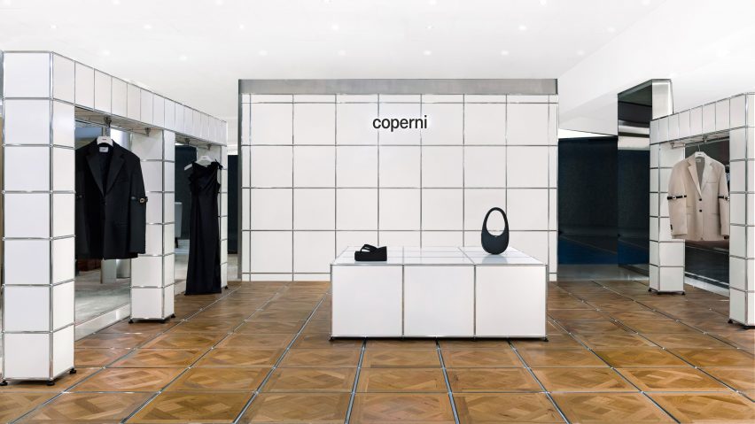
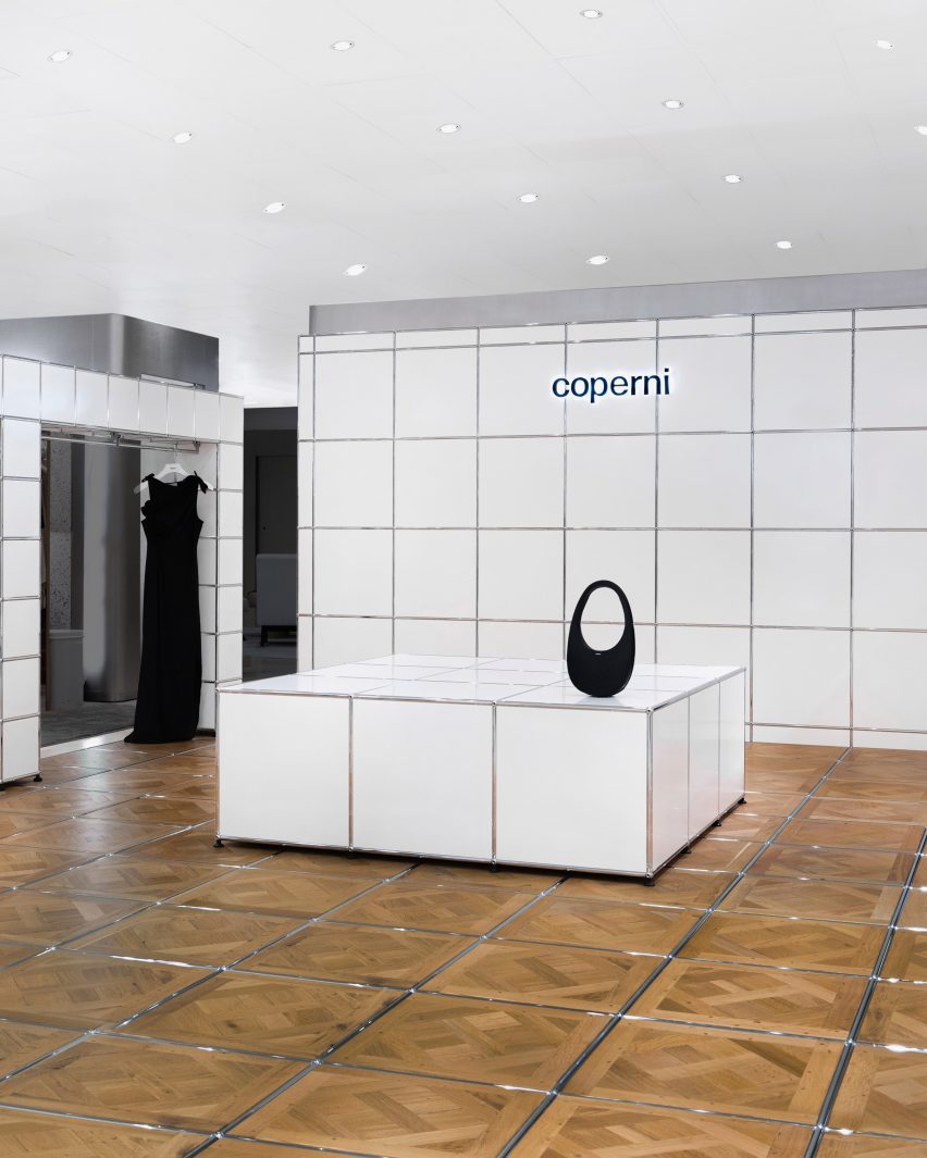
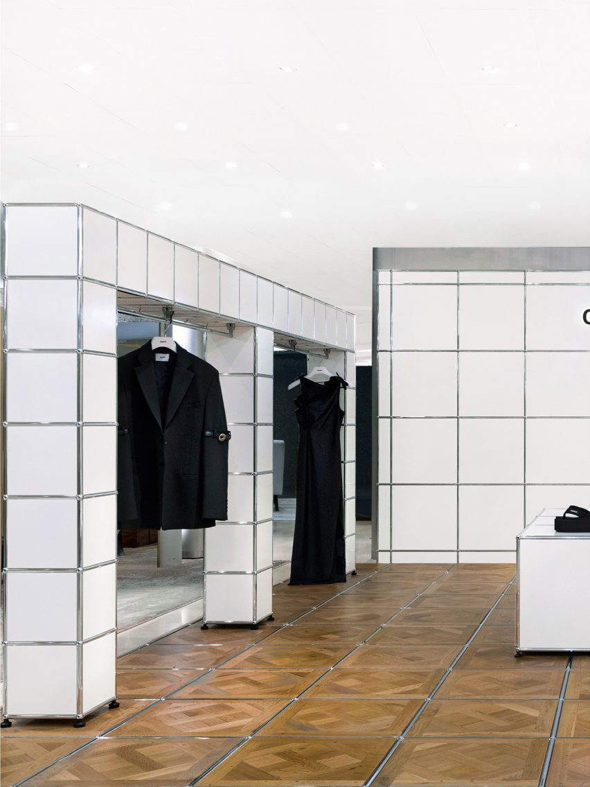
Described by Coperni‘s co-founder as “techno-chic”, the interior is defined by its cubic, space-age-style look that was achieved by reinterpreting USM Haller‘s cubic storage systems as tables, walls and display areas.

The floor of the retail space was covered in Versailles parquet flooring, with each of the wooden floor panels separated by USM Haller’s silver tubing. This typically lines the corners and edges of its storage systems and furniture.

Photo of items on display at the Coperni space
USM reinterpreted its iconic modular storage systems

The Versailles parquet flooring was chosen for its artisanal and timeless spirit that draws on Parisian craftsmanship, which Coperni said pays homage to its ethos as a brand.

The use of USM Haller’s silver tubing within the Versailles parquet flooring system marks the first time that USM has adapted and reinterpreted its modular systems into a wooden material.

USM Hallers modular systems also form arch-shaped display units along the perimeter of the shop-in-shop, which were fitted with rails allowing Coperni’s ready-to-wear collection to be displayed.

A display table constructed from larger cubic modules was placed at the centre of the space, while a wall behind was branded with the Coperni logo.

Photo of the retail space
It marks the first time USM used its silver tubing in a wooden system

In 2022, Coperni’s Spring Summer 2023 show during Paris Fashion Week went viral for live spraying a dress onto the body of supermodel Bella Hadid using Fabrican’s sprayable liquid fibre.

AMO recently created a terracruda-clad shop-in-shop for Parisian fashion brand Jacquemus in Selfridges, London, that was designed to have a “Provence atmosphere.”

The photography is courtesy of Coperni.


More images

Reference