Paris Olympic Games Athletes’ Village Reimagines Urban Space
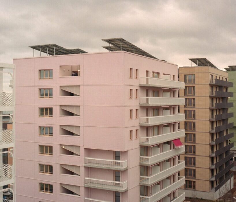
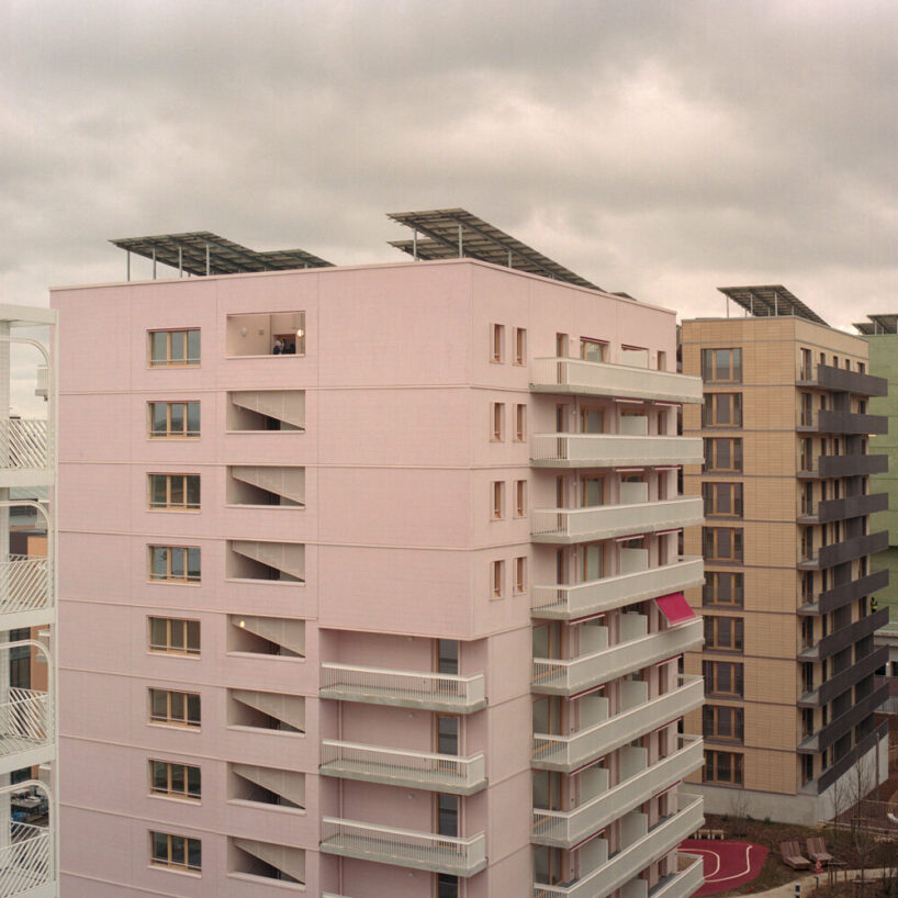
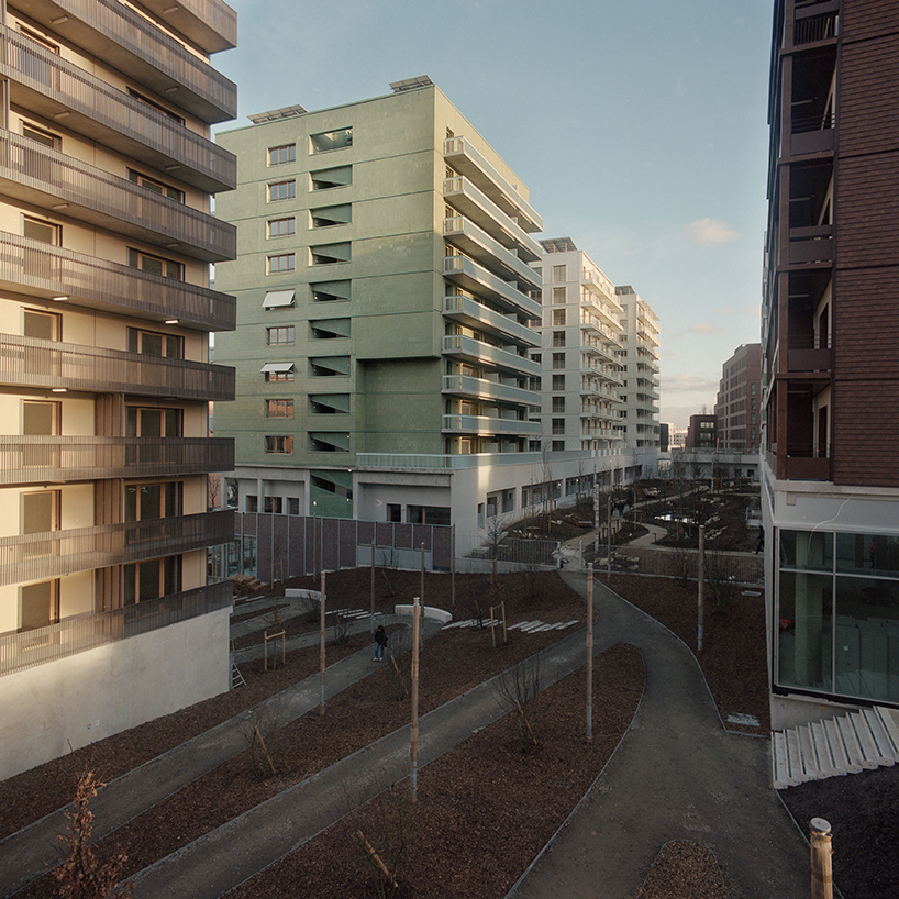
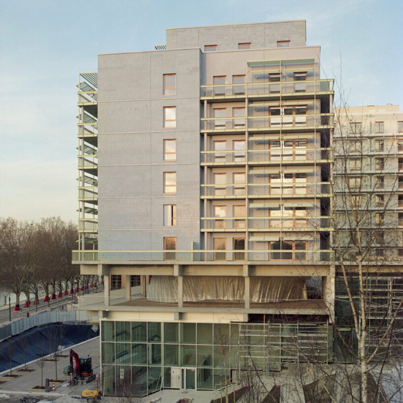
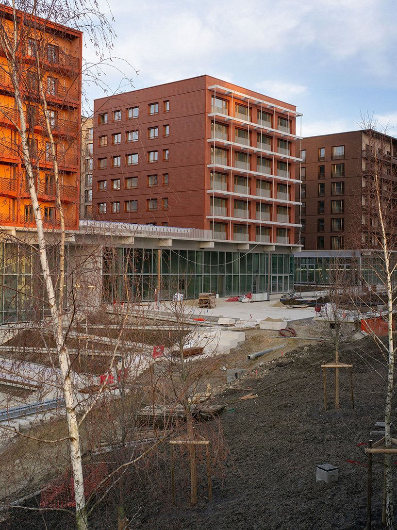
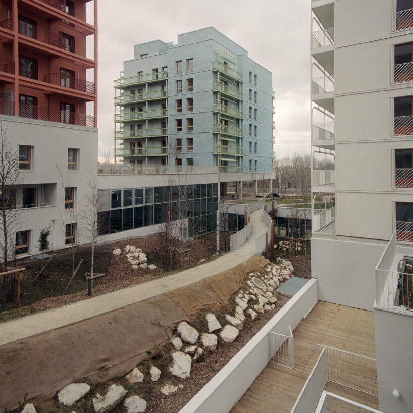
The Athletes’ Village for the Paris 2024 Olympic Games, constructed by uapS Agency and captured by Géraldine Millo, represents the transformation of an industrial site in northwestern Paris. This development reorients towards the Seine River and establishes new urban connections with neighboring areas. Unlike traditional host city approaches, the primary focus is on creating a new district to accommodate approximately 20,000 athletes from around the globe for a month.
‘Les Quinconces’ is built from wood and recycled materials
Lot D, known as ‘Les Quinconces’ for its urban layout, primarily features a variety of residential units, including family homes, duplexes, triplexes, penthouses, townhouses, and patios. It also offers a diverse range of youth and sports facilities. This programming by uapS Agency addresses diversity and integration issues within a socially disadvantaged area. ‘Les Quinconces’ serves as a model of social inclusion, emphasizing universal accessibility, low-carbon construction, and environmental sustainability. Its integration with a nearby forest facilitates gravity-based water management and biodiversity enhancement.
Constructed primarily from wood and recycled materials, the project aligns with the Paris 2025 agreements, prioritizing comfort and practicality to create a vibrant and livable community.
Photographer Géraldine Millo captures the project.
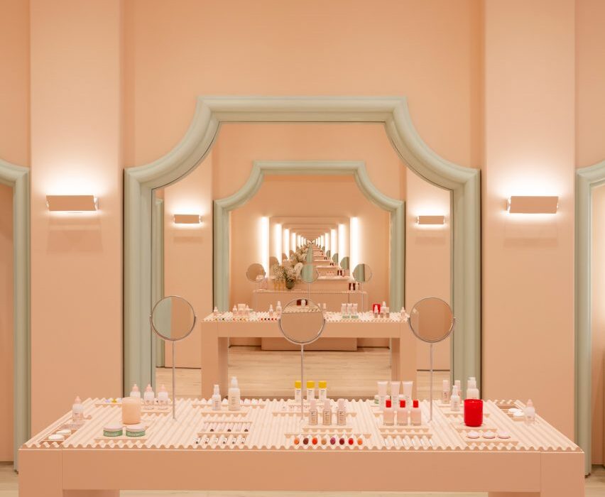
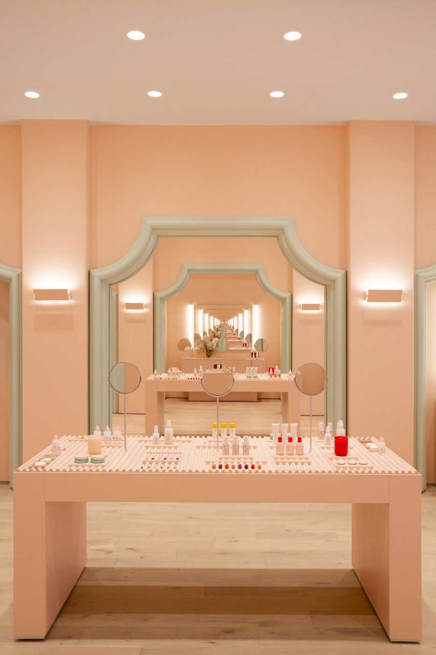
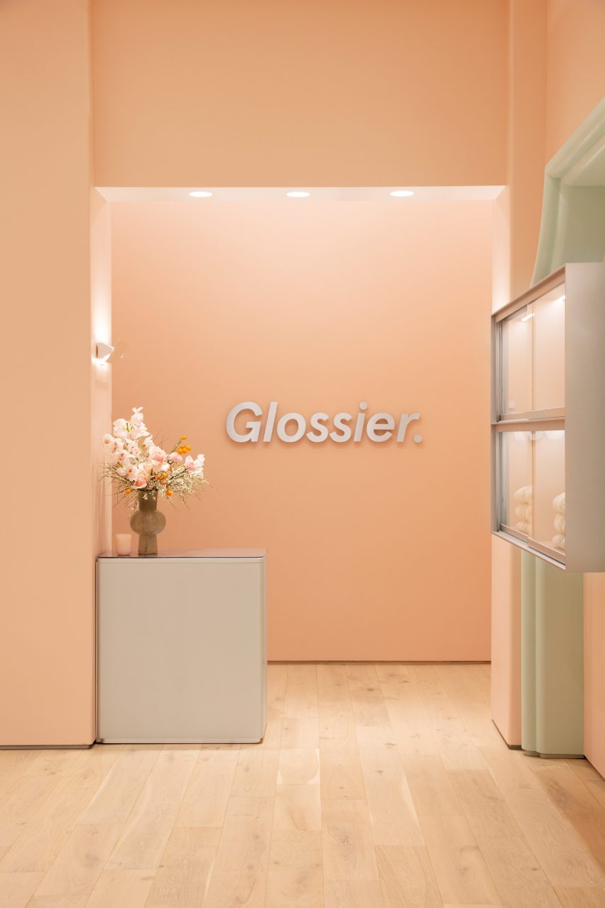
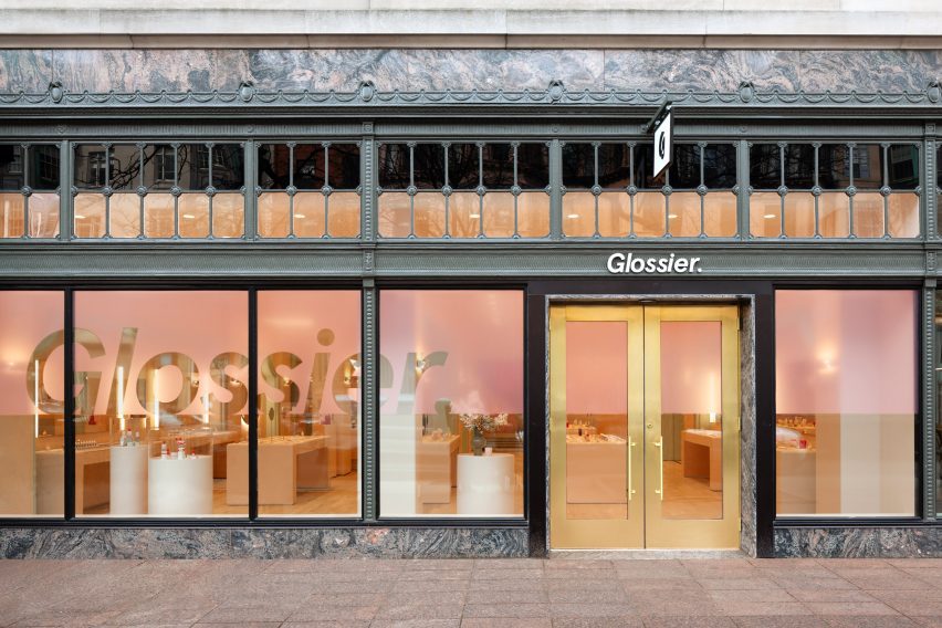
Decorative architectural mouldings are recreated in pastel green to frame openings at the Boston store for the cosmetics brand Glossier.
Designed by the company’s in-house team, the permanent Glossier Boston location on the city’s bustling Newbury Street follows a pop-up at the Seaport in 2019.
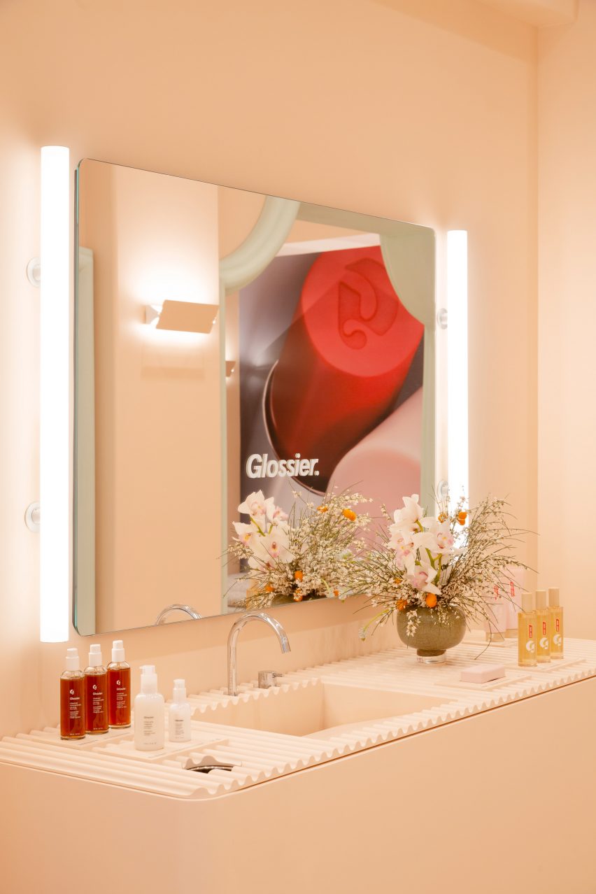
Mirrors positioned to face one another create infinite reflections at the Glossier Boston store
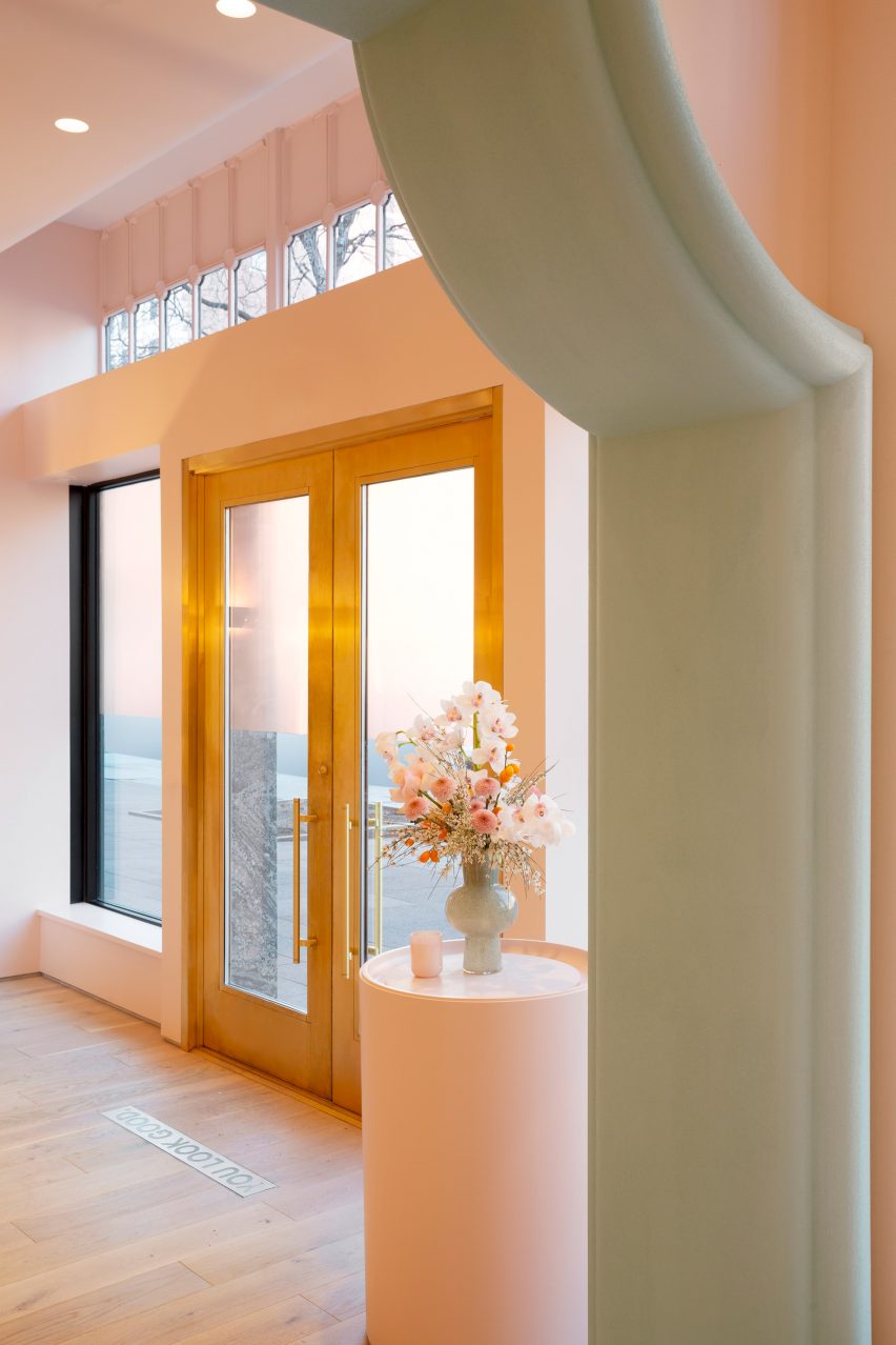
For the space, the designers took influences from historic local architecture and Boston’s status as a college student hub, with Harvard University and MIT located just over the Charles River in Cambridge.
“With our 10th Glossier location, we wanted to bring something special to the city that honors its metropolitan and scholastic personality,” said the team. “Our influences for Glossier Boston’s design include collegiate fashion and the decorative characteristics of Boston’s local architecture.”
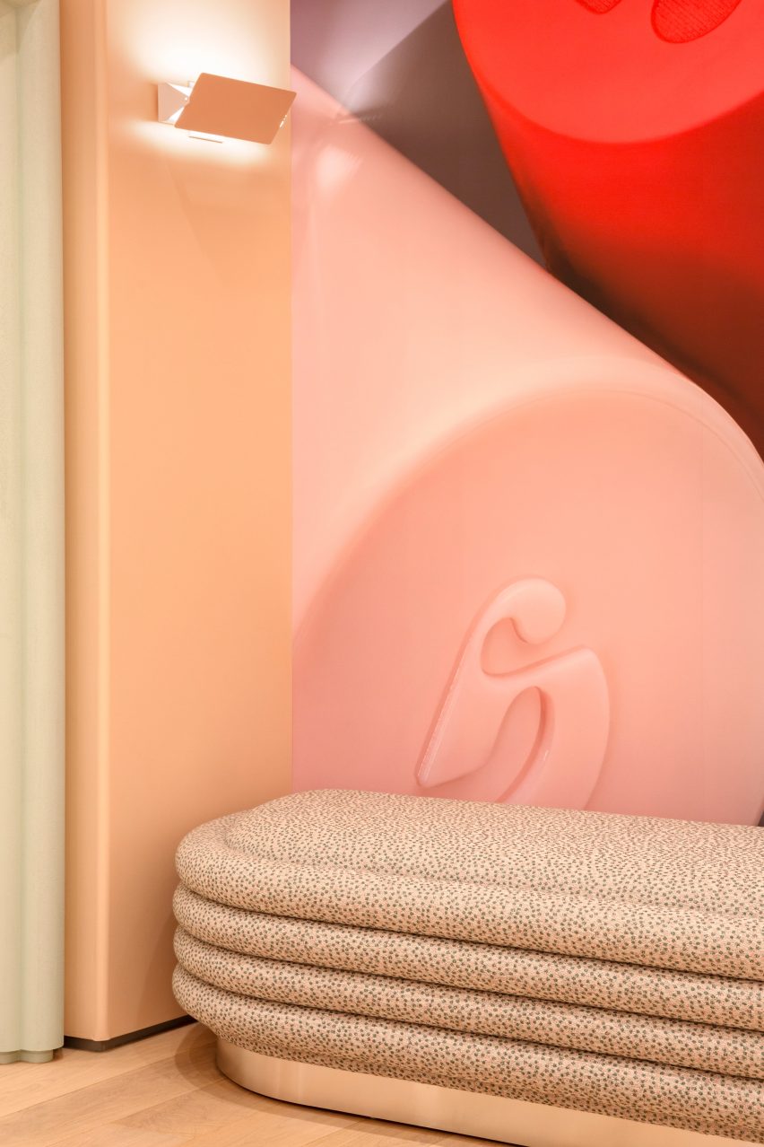
The brand’s signature pink hue covers the walls
They also cited the “blush pink stucco, verdant green stone and verdant plant life” of the nearby Isabella Stewart Gardner Museum, which is modelled on a Venetian palazzo, as a source of inspiration for the store interior.
Glossier’s signature Millennial pink shade covers the walls, while cased openings are framed with stylised versions of architectural mouldings found on neighbouring buildings.
Products are displayed on wavy trays
Mirrors are positioned to face one another in order to create infinite reflections of customers testing makeup and skincare products.
The merchandise is displayed on the wavy trays, cylindrical displays and rectangular tables found in many of Glossier’s stores.
The store is Glossier’s 10th permanent retail location
Pale wood floors contribute to the soft colour palette, while bright lighting is designed to be flattering.
On the exterior, the tall windows and brass doors are surrounded by marble panels and bronze detailing.
These details contrast the pale hues inside.
“There is also a large step-back from the curbside, filled with lush trees that invite visitors to connect and hang out,” the team said.
Stylised versions of historic architectural mouldings frame cased openings
When Glossier launched in 2014, it became known for its pop-up stores that opened across the US.
The temporary spot that the company installed in Seattle, which was filled with plant-covered mounds, was named small retail interior of the year at the 2020 Dezeen Awards.
The store’s marble and bronze exterior contrasts the interior colour scheme
The brand has since opened permanent locations in cities including Seattle, Los Angeles and London.
All of these share a similar aesthetic and colour scheme, with subtle differences that nod to the specific location and context.
For this lookbook, we’ve rounded up ten home interiors decorated in pastel tints that show how ice-cream colours can give spaces a fresh, calming look.
The selection from our archive, which includes bathrooms to bedrooms and kitchens, shows how pastels – made by adding white to pure colours to make them more luminous and less saturated – can create a spring-like feeling.
Never really out of fashion, pastels have strong psychological associations with new life with their pale, cheery tints representing a midway stage between the darkness of winter and the full-blown colour of summer.
This is the latest roundup in our Dezeen Lookbooks series providing visual inspiration for the home. Previous articles in the series feature rooftop gardens, bright kitchens, interiors with statement plants, terrazzo kitchens, and stylish home offices.
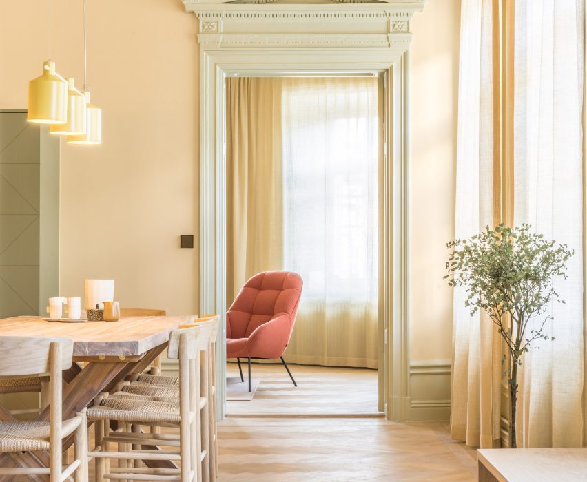
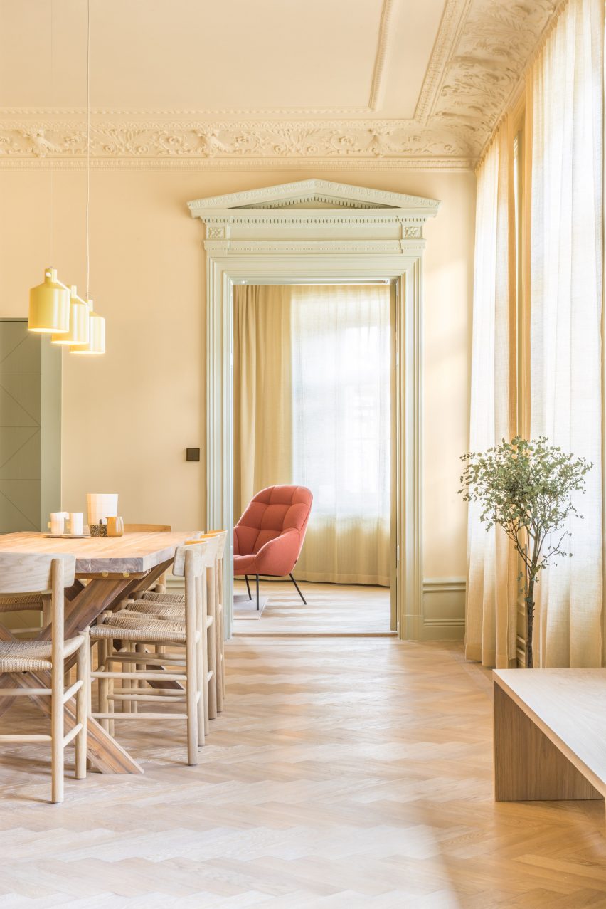
Hidden Tints, Sweden, by Note Design Studio
A warm, yellow tint covers the walls of this Stockholm apartment designed by Note Design Studio, which is filled with different pastel colours. A pale, spring-like green complements the yellow and is picked up in the plants dotted around the space.
Wooden furniture matches the gleaming wooden floors, while a pale orange Mango lounge chair by Note Design Studio for Wendelbo adds a touch of colour. The light above the table is SILO Trio by Note Design Studio for Zero.
Find out more about Hidden Tints ›
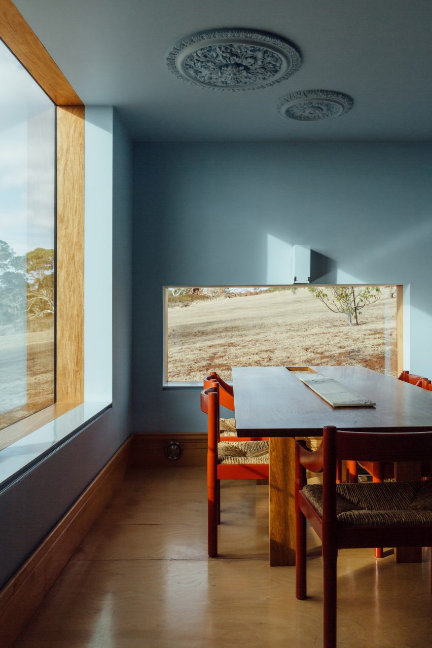
Longhouse, Australia, by Partners Hill
The dining room of this shed-style home in Australia has been decorated in a pale blue colour that contrasts with its wooden floor and wooden door frame, as well as the rolling plains of bushland outside the windows.
Tomato-red dining chairs give the room a contemporary, vibrant feel and stand out against the soothing blue walls.
Find out more about Longhouse ›
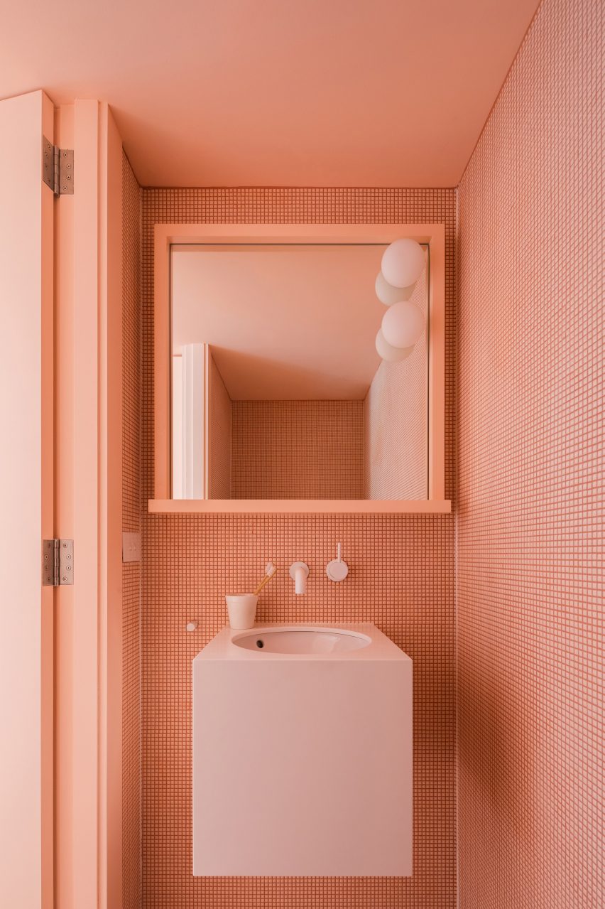
Suburban Canny, Australia, by Tribe Studio
Each bathroom in this Sydney home is tiled in a different colour – pink, teal and blue. The almost apricot-pink shade of the tiles is matched with a pale pink, wall-hung basin as well as the door and door frame.
The geometric shapes of the small tiles create a graphic pattern on the wall that adds interest to the monochrome interior.
Find out more about Suburban Canny ›
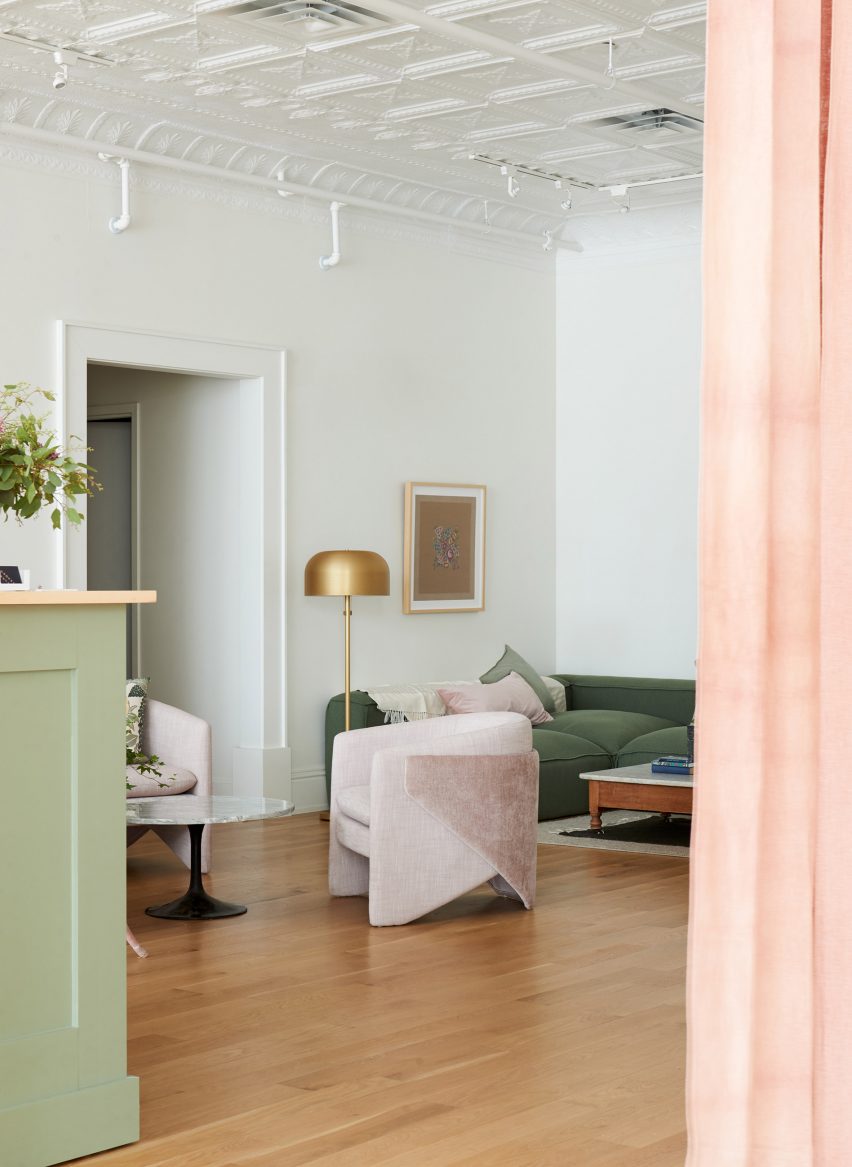
Co-working space, US, by Beauty Shoppe
While the walls have been kept a discrete grey colour, pastel colours were used for other parts of the interior in this Cleveland co-working space. A Tulip side table by Eero Saarinen for Knoll sits between two of West Elm’s Thea chairs in a very pale pink shade.
Green and pink is used throughout the space, on a reception desk in pistachio green and the apricot-coloured curtains, as well as a comfy green sofa accessorised with a pink pillow.
Find out more about the co-working space ›
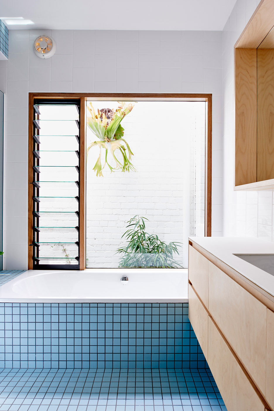
Melbourne extension, Australia, by Dan Gayfer Design
A banana-leaf ficus (ficus maclellandii) peaks in from the courtyard at this tile-clad blue bathroom in Melbourne. The tiles match the exterior of the house, which is also clad in pale blue tiles.
White-tiled walls and wooden drawers complete the clean, simple interior of the bathroom.
Find out more about the Melbourne extension ›
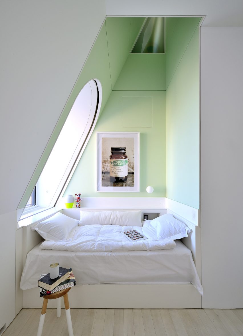
Skyhouse, US, by David Hotson and Ghislaine Viñas
This comfy sleeping nook in a Manhattan penthouse has been livened up with a very pale, almost pear-green colour that creates a peaceful feeling.
Light streaming in from a large window in the slanted wall adds to the fresh, crisp feel of the space which has been decorated with a small, practical stool as well as selected art pieces.
Find out more about Skyhouse ›
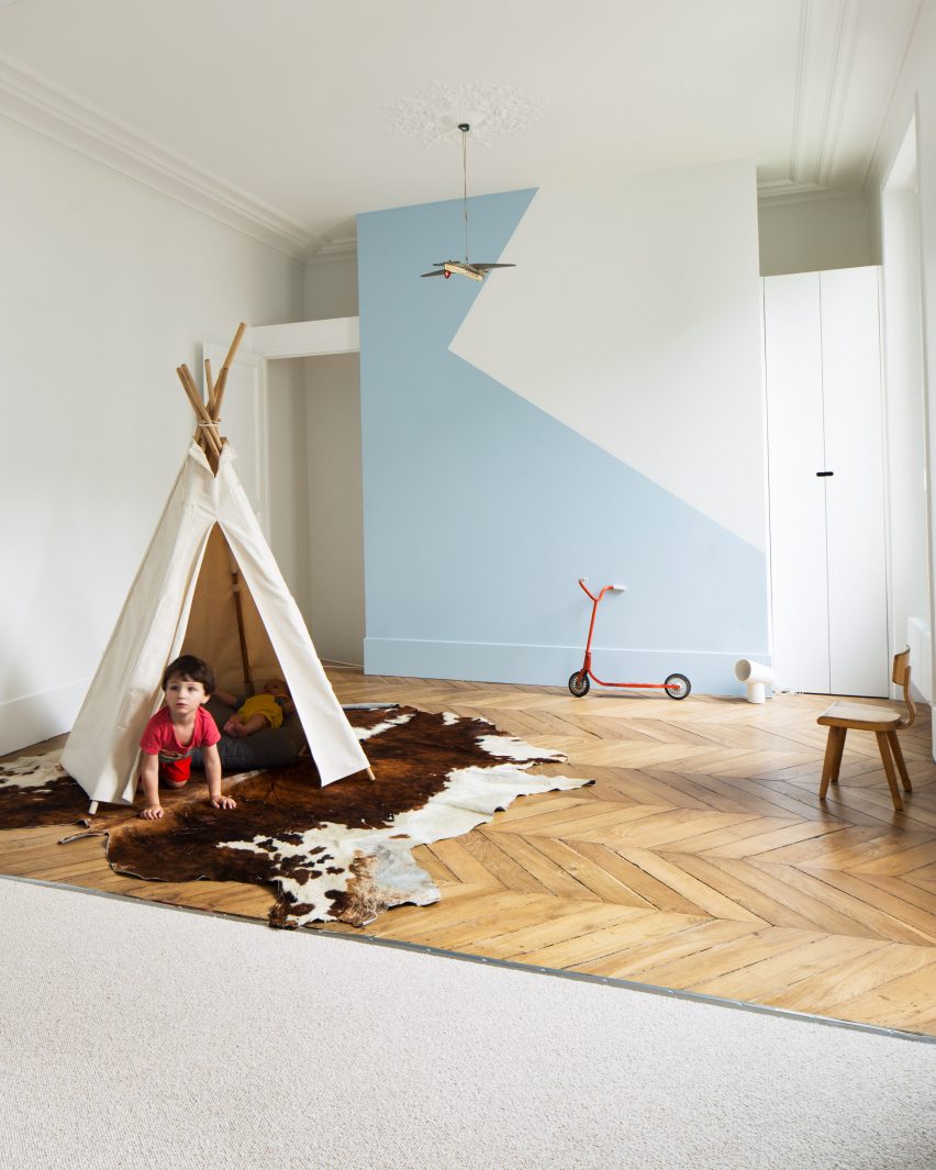
Paris apartment, France, by Les Ateliers Tristan & Sagitta
Colour was used generously throughout this Paris flat and used in a clever way to divide the children’s room for two brothers.
One side of the space has pale blue paintwork and beige carpet, while the other has white walls and wooden floorboards laid in a zigzagging pattern. The same pale blue was also used on the side with white walls to create a decorative geometric design on the wall.
Find out more about Paris apartment ›
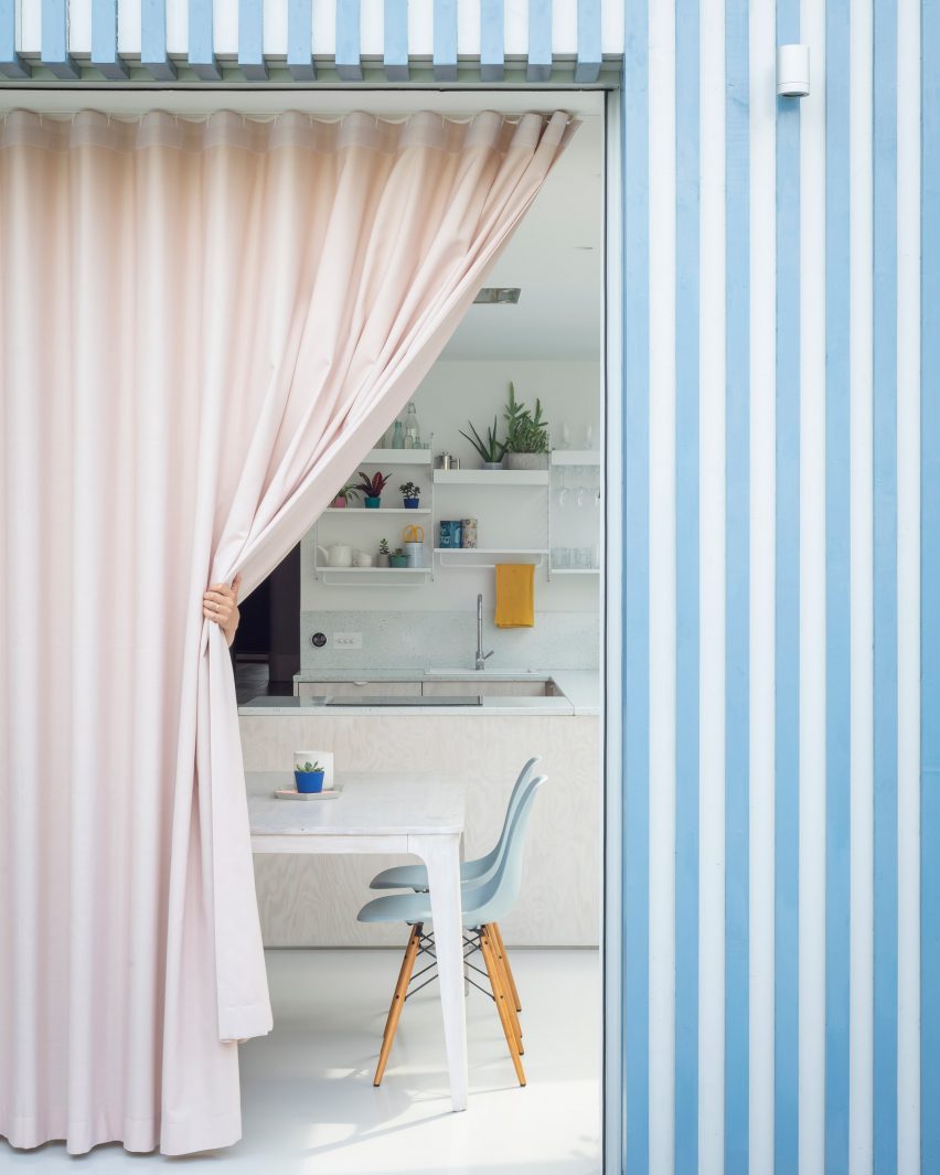
A Brockley Side, UK, by CAN
Architecture studio CAN added a blue and white striped extension to a Victorian terrace in London and used a pastel pink curtain to give added privacy to the kitchen and dining space inside.
Pale turquoise Eames DSW chairs are set around a white dining table, with the colour picked up by the speckled sink splashback and the blue accessories on the shelves above it.
Find out more about A Brockley Side ›
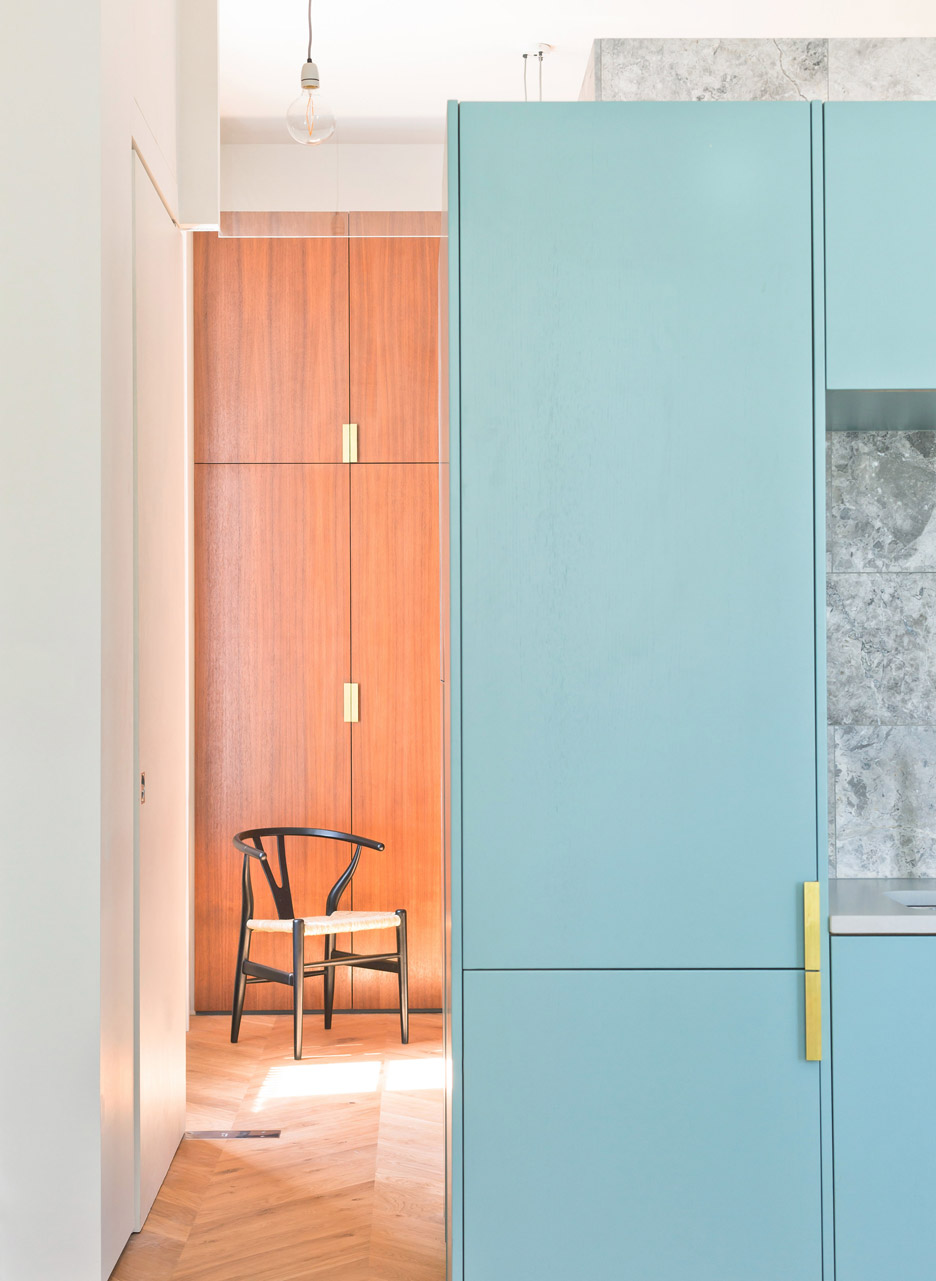
London flat, UK, by Nimtim
Hans J Wegner’s sculptural Wishbone chair for Carl Hansen & Søn functions almost as a piece of art in this bedroom in a London flat, which has wooden fitted wardrobes and a fold-down bed.
The kitchen and dining space next to it has colourful turquoise cabinetry and a grey marble wall, which adds a luxurious touch to the space.
Find out more about London flat ›
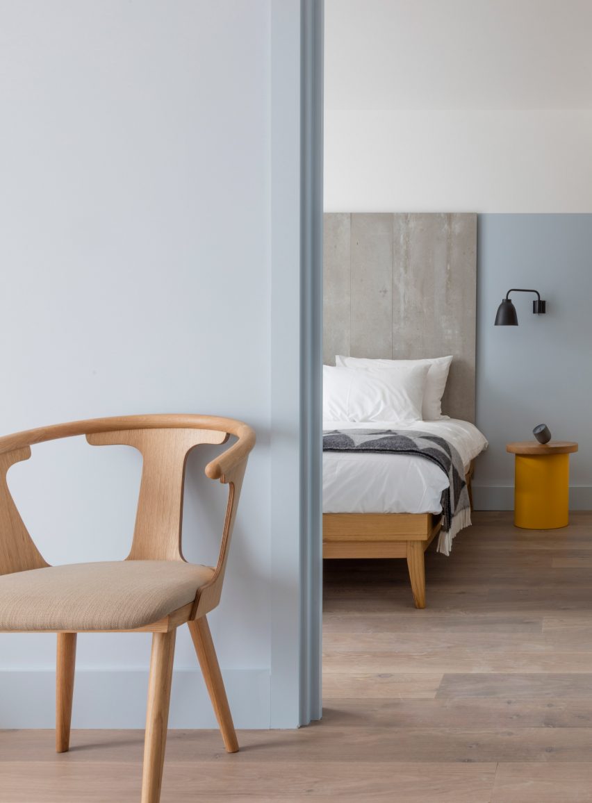
Leman Locke, UK, by Grzywinski + Pons
Pale blue was used in this bedroom of the Leman Locke hotel in London, which was designed to bridge the gap between a home and a hotel stay.
Sami Kallio’s In Between chair for &Tradition matches the elegant wooden bed, and the natural wood – which is also used on the bedside table – gives the sleek space a more organic feel.
Find out more about Leman Locke ›
This is the latest in our series of lookbooks providing curated visual inspiration from Dezeen’s image archive. For more inspiration see previous lookbooks showcasing peaceful bedrooms, calm living rooms and colourful kitchens
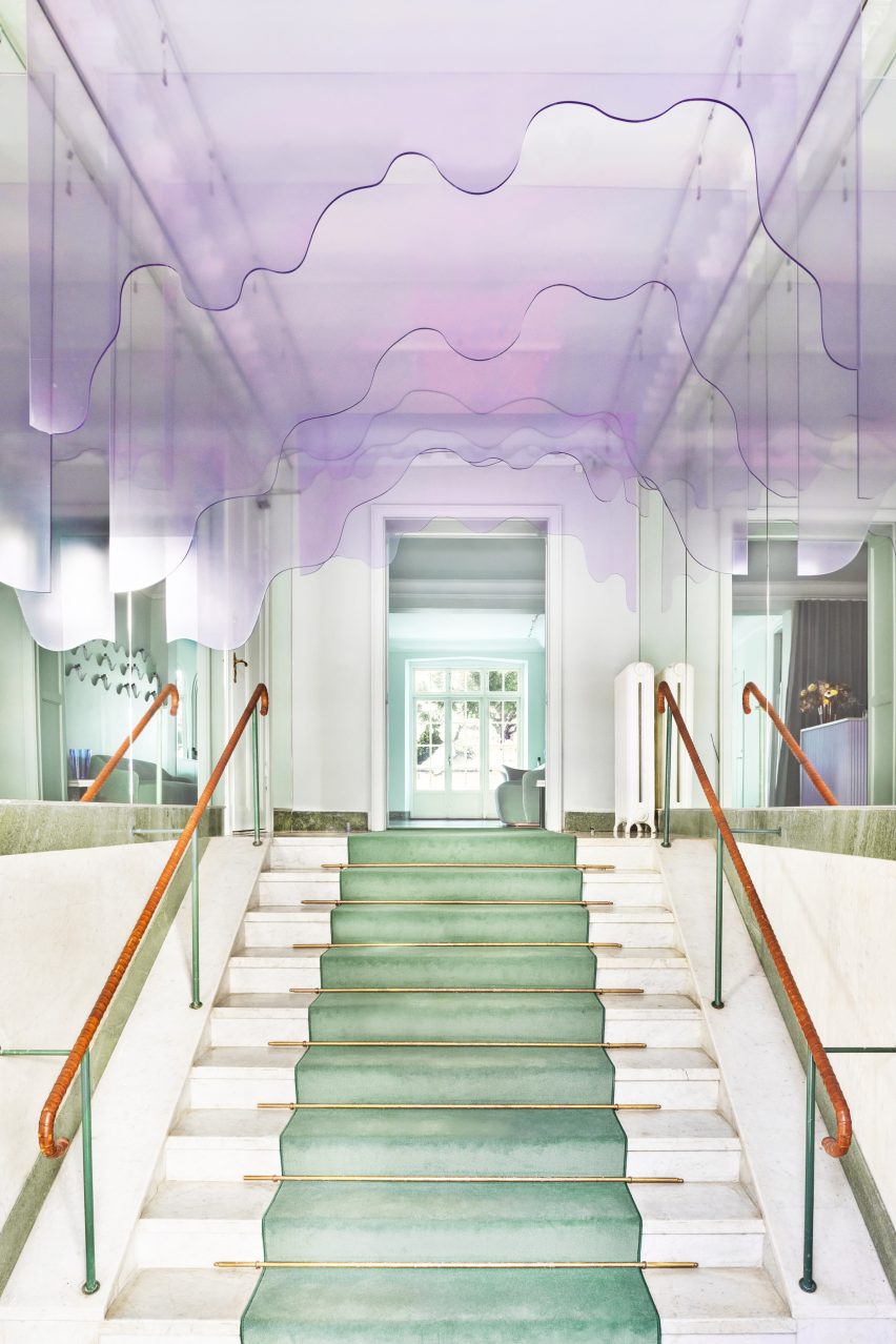
Swedish architecture studio ASKA has refurbished haircare brand Maria Nila’s headquarters and salon in Stockholm, creating an undulating ceiling installation that looks like dripping shampoo.
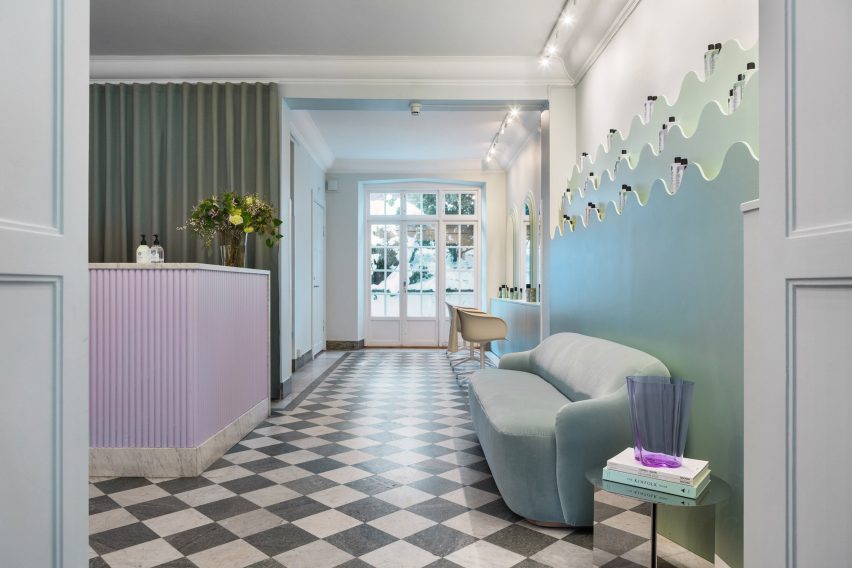
The Stockholm-based firm used a palette of soft pink, peach and turquoise colours that reference Maria Nila’s products to transform its headquarters in a four-storey townhouse.
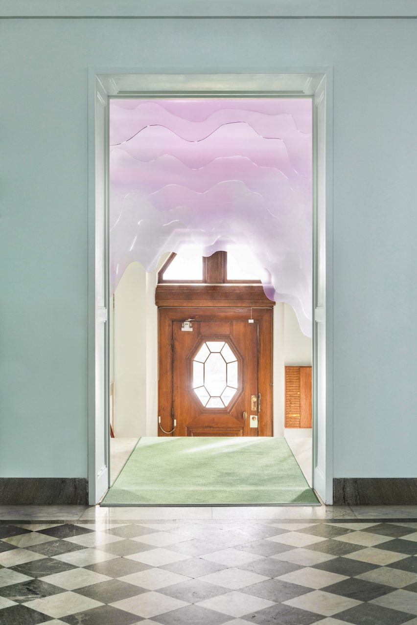
A plexiglass installation decorates the entrance
“The interior space before the renovation had a very neutral, impersonal feel to it and followed a white and grey colour scheme,” ASKA co-founder Madeleine Klingspor said.
“At ASKA, to the contrary, we always strive to create strong and flavoured environments by defining and highlighting the unique essences within each project.”
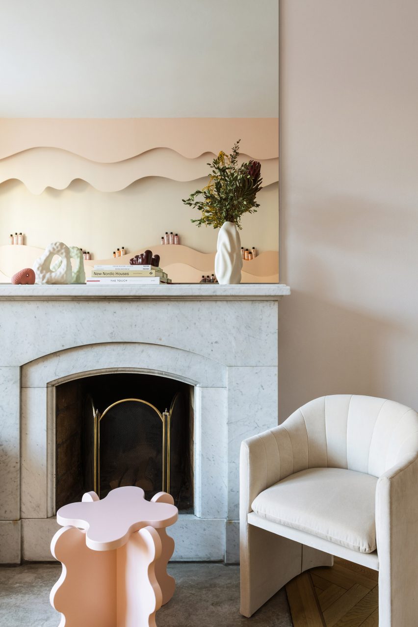
The chequered marble floor was preserved
The studio preserved some of the original details in the building, including a green chequered marble floor and a wooden staircase, while the rest of the space was fully refurbished.
“To add a layer of the uniqueness of Maria Nila as a brand most other parts of the interior was changed,” Klingspor said.
“Some thinner interior walls were torn down, most surfaces were repainted, new flooring was partly added as well as all bathrooms fully renovated.”
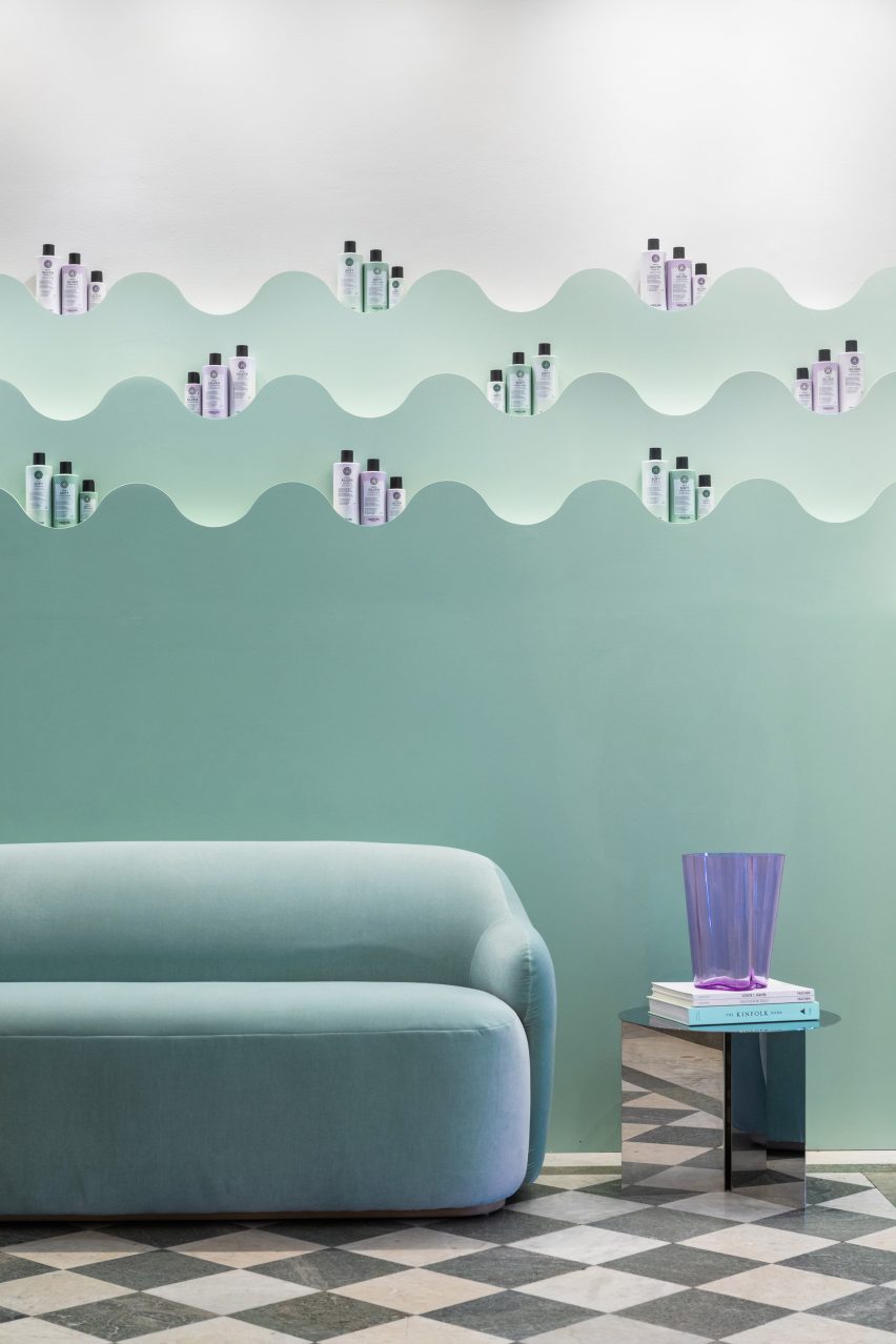
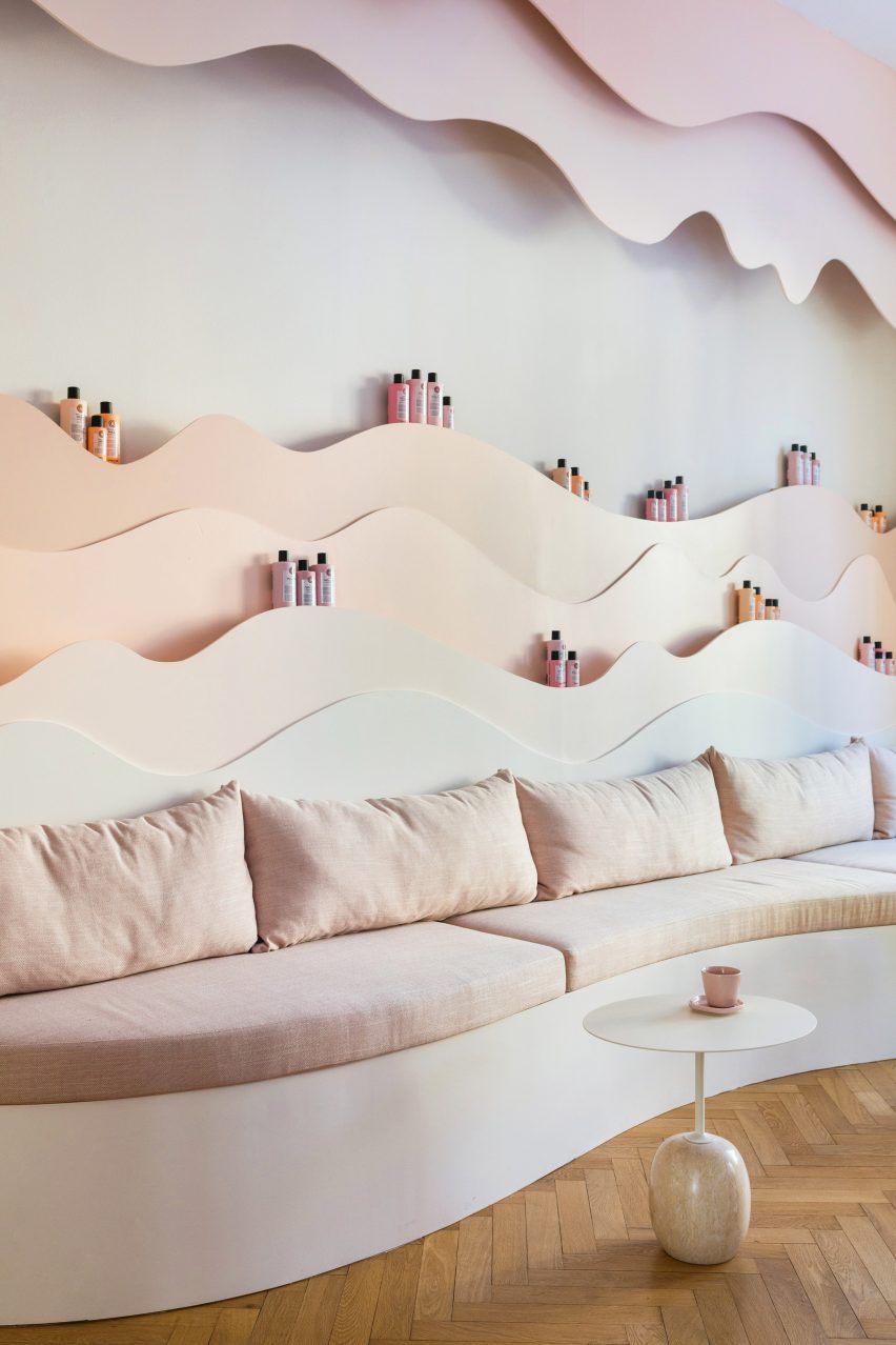
Pastel shelving with undulating shapes decorate the salon
The 650-square-metre building has 30 rooms, including five bathrooms, and houses both Maria Nila‘s public and private spaces.
Though each room has a unique look, all were designed to create a coherent relationship between the existing architecture and the new interior details.
The colour scheme was informed by the brand’s product packaging
“The program is distributed in a way where the entrance floor is the most public and then gradually the spaces become more private and workspace-oriented the higher up that you get,” ASKA co-founder Polina Sandström said.
“The reception, salon, beauty bar, conference and meeting areas make up the first floor while the second floor is well adjusted for larger gatherings and events including a kitchenette, a viewing room and a bigger break-out space,” she added.
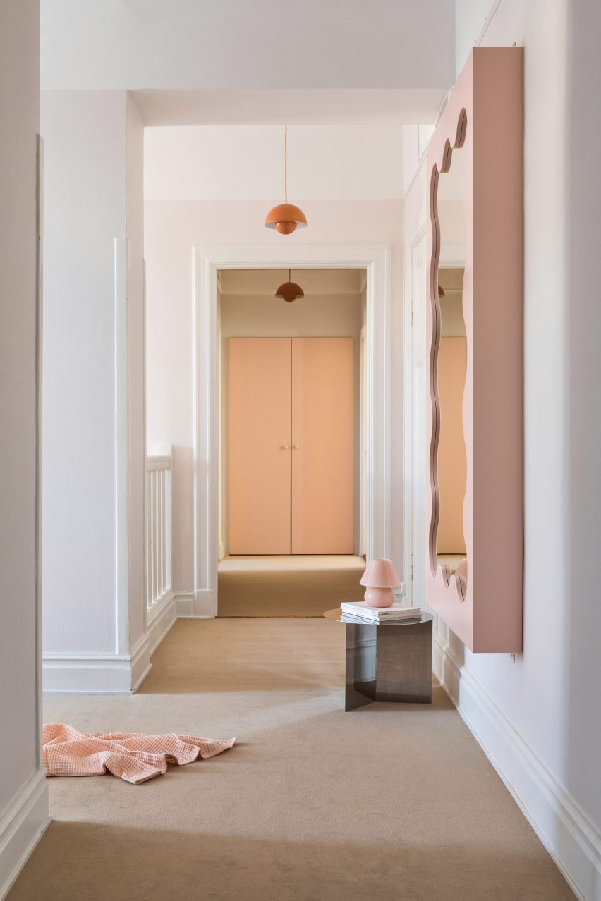
The four-storey townhouse has 30 rooms
At the entrance, ASKA installed a pale-pink art installation made from form-cut plexiglass designed to resemble shampoo dripping from the ceiling.
Much of the furniture was specially designed for the project, including product shelves, sofas and a beauty bar made from wood and MDF.
“Besides that, we chose to bring in products from companies that use sustainable materials, for example, a custom-made tabletop from Smile Plastic, a company that only uses waste materials in their products,” Klingspor said.
The new interior design was informed by the haircare brand’s own products, an influence that is most notable in the pastel colour palette.
Existing architecture was incorporated into the design
“The colour scheme chosen for the different spaces throughout the building refers to the different haircare lines of Maria Nila,” Sandström said.
“These pastel colours are one of the main identities of the brand and we decided early on that this was one of the unique essences that were important to bring to the surface through our design.”
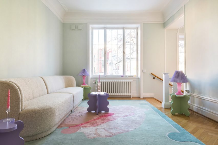
Playful tables by Gustaf Westman add a fun touch to the lounge space
ASKA also designed numerous undulating wall shelves to hold haircare products. Painted in matching gradient hues, these were informed by nature.
“The organic shapes are inspired by elements found in nature such as the forest, ocean, coral reefs and caves,” Sandström said.
An upstairs hallway has modern furniture in soft peach hues
“This soft and playful architectural language together with the pastel colours gives the interiors a unique visual identity,” she added.
Other playful hair salon interiors include Studio Roslyn’s design for a salon that is the “lovechild of art deco and Cyndi Lauper” and an avocado-green Beijing salon informed by space-age design.