metal mesh veils TAO’s transient in-between pavilion in shenzhen
CategoriesArchitecture

metal mesh veils TAO’s transient in-between pavilion in shenzhen

tao’s translucent structure echos the urban village’s vitality


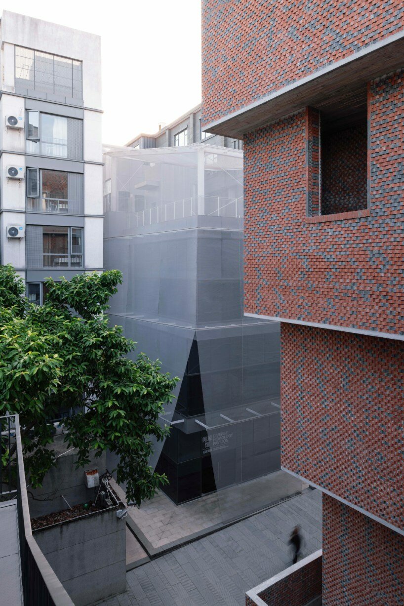
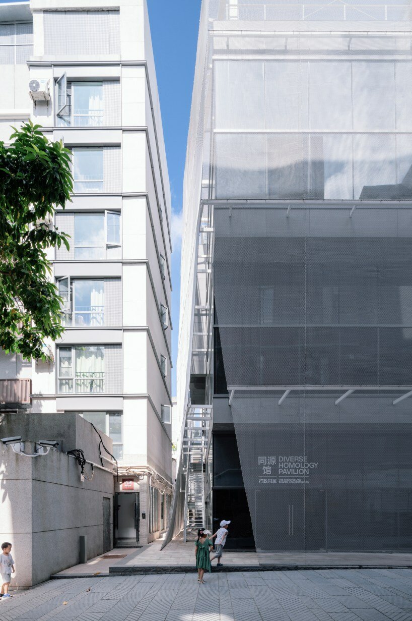
A delicately symbiotic gallery space, Trace Architecture Office’s (TAO) In-between Pavilion is an urban renewal project that tucks within a compressed urban node in Nantou Ancient Town, Shenzhen. Part of the Diverse Homology Museum complex, the space within delves into the interplay between political power and geography in the Pearl River Delta region. Along the streetfront, reflecting the active state of rapid evolution in the town, the pavilion embraces a transient approach and its architecture mirrors the urban village’s vitality, adapting to temporary and fragmented additions. A light and semi-translucent metal mesh facade, like a hazy veil, gracefully blurs the indoor-outdoor boundary, embodying ambiguity and order, openness and closure, solid and void. These evolving changes unfold throughout the day, echoing its dynamic context with a diverse and vibrant spatial experience inside and out.

metal mesh facade veils TAO's transient in-between pavilion in nantou ancient town
images by Chen Hao, TAL, Hua Li, and Mei Kejia


a transition from solid to void, openness and closure


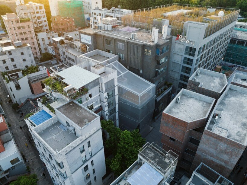
Once a densely packed and compressed area in the north side of the town, the site sitting between two residences underwent constant renewal over time, resulting in a distinctive aesthetic of chaos and vitality. The autonomous and spontaneous construction in the urban village has resulted in a confined spatial layout and visual occlusion within the architecture. Now, it encompasses three distinct property plots that transition from private residences to a public domain. This shift prompts a proactive design response to connect with surrounding public spaces.


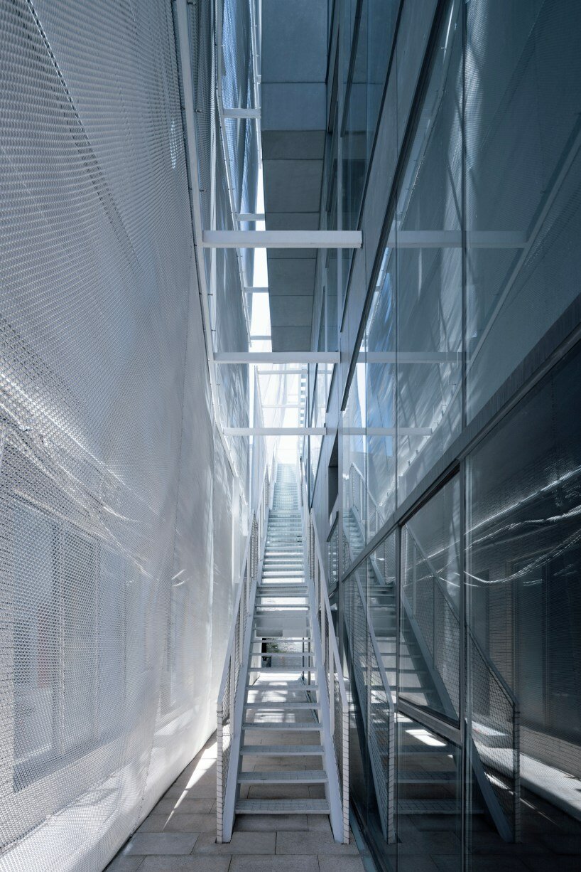
At street level, TAO’s architectural volume recedes from the delicate outer metal skin, creating a multifaceted space that blends the building with the street while reflecting the diversity of the urban village. A vertical street, formed between volumes and mesh skin, provides meandering access to galleries and a roof terrace, offering various perspectives of the town. When observed from the city, the moving figures strolling behind the hazy facade also inject the building with a dynamic nature.

metal mesh facade veils TAO's transient in-between pavilion in nantou ancient town


Due to spatial limitations, the architects’ design maximizes floor area utilization, projecting volumes further outwards as floors ascend, establishing a unique physical rhythm and urban gap space. Structurally, inclined columns support the volumes on the east side and west sides, with the west side’s overhanging framework exposed externally, while the middle columns remain concealed within the walls. Different forms of space thusly emerge and embody a sense of lightweight structural aesthetics.

metal mesh facade veils TAO's transient in-between pavilion in nantou ancient town

metal mesh facade veils TAO's transient in-between pavilion in nantou ancient town

Reference

AMDL Circle and Iart wrap Basel pavilion in energy-neutral media facade
CategoriesSustainable News

AMDL Circle and Iart wrap Basel pavilion in energy-neutral media facade

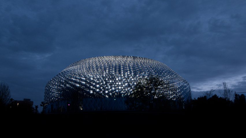
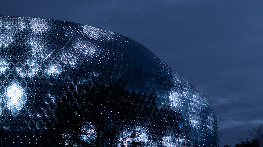
Italian studio AMDL Circle and interdisciplinary design studio Iart have created the Novartis Pavilion in Basel, Switzerland, which is wrapped in an energy-neutral media facade.

Located alongside the Rhine at the campus of the Novartis healthcare company, the pavilion, which was recently shortlisted in the Dezeen Awards, has a communicative skin made from photovoltaics and LEDs.

Novartis Pavilion - The Novartis
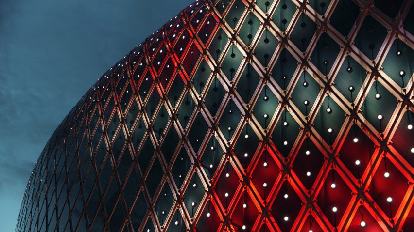
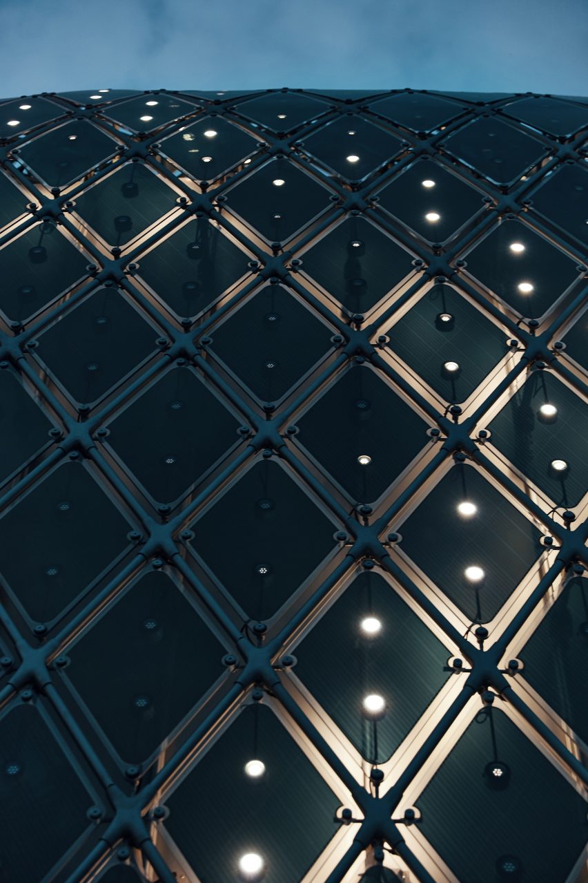
The media facade features a total of 10,000 solar modules with 30,000 embedded LEDs

Designed by AMDL Circle, which is led by Michele De Lucchi, the round pavilion was wrapped in a media facade created by Switzerland-based Iart. The media facade has a total of 10,000 solar modules with 30,000 embedded LEDs and consumes only as much power as it can produce.

“With this project we want to show that a media facade not only consumes electricity, but can also generate it itself,” Iart founder Valentin Spiess told Dezeen.

Organic solar modules were chosen over silicone-based counterparts for their lower grey energy footprint, aligning with Novartis’ sustainability principles.

“They require less grey energy in production and need little light to start generating electricity,” he continued. “They can be used in areas where light conditions are not ideal, such as a facade.

Novartis Pavilion - The Novartis
It was inspired by the shapes and colours of cells and molecules

According to Iart, the design was based on the idea of an organism with the buildings skin made up of individual cells.

The multi-layered membrane reflects the artistic works displayed on the facade, which “embody constant change and research,” Spiess said.

Novartis Pavilion - The Novartis
AMDL Circle worked closely with local architect and general planner Blaser Butscher Architecten AG

The works covering the pavilion were created by artists Daniel Canogar, Esther Hunziker and Semiconductor in collaboration with Novartis scientists.

Their collaboration with Novartis scientists was inspired by the shapes and colours of cells and molecules, as well as the themes of sustainability and the convergence of art and science.

“It communicates the themes of Novartis, through the digital artworks, into the urban space,” Spiess told Dezeen.

“The aim is for curiosity and fascination to arise in the viewer; for the medium, for the content and for the subject of life sciences.”

AMDL Circle worked closely with local architect Butscher Architecten AG for the planning, tender, technical design, construction and delivery of the pavilion.

“The floor plan of the Novartis Pavilion was inspired by the universal symbolism of the circle, considered a powerful field of psychophysical energy, a sort of sacred area where all physical and spiritual forces are concentrated,” added Michele De Lucchi.

Novartis Pavilion - The Novartis
Organic solar modules were used for their lower grey energy footprint

The interiors feature whitened, laminated wood and ceiling slats combined with a continuous light grey terrazzo floor. Providing a background for the dark green division curtains and details in natural oak wood, the internal material palette was chosen to create a “luminous and humanistic appeal”.

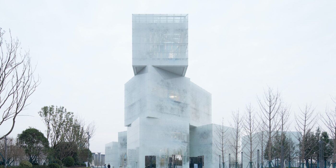
Other pavilions recently featured on Dezeen include an ice-block pavilion in China and the Parallel Histories in Chicago.

The photography is courtesy of Iart and Laurids Jensen.

Reference

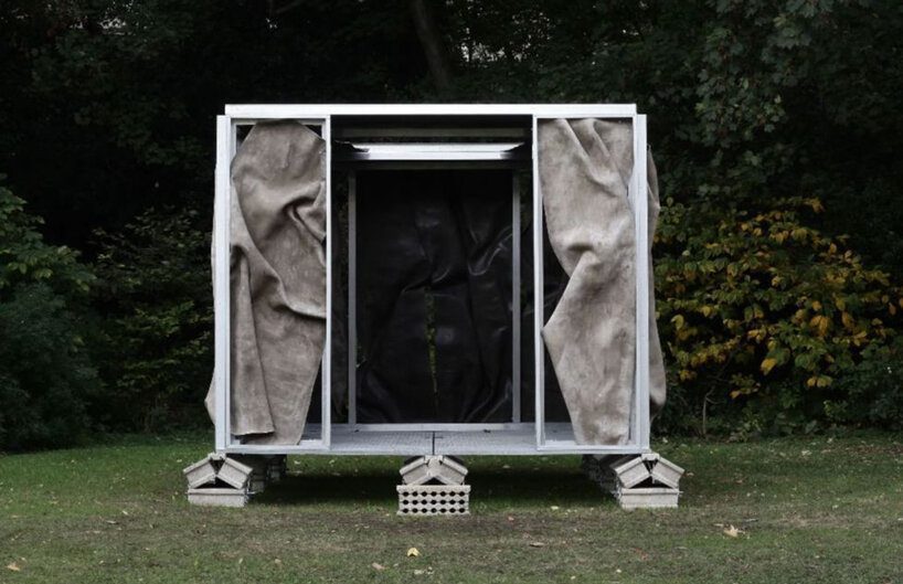
crumpled cement drapes over function-free pavilion X
CategoriesArchitecture

crumpled cement drapes over function-free pavilion X

Pavilion X’s dynamic dance with materiality


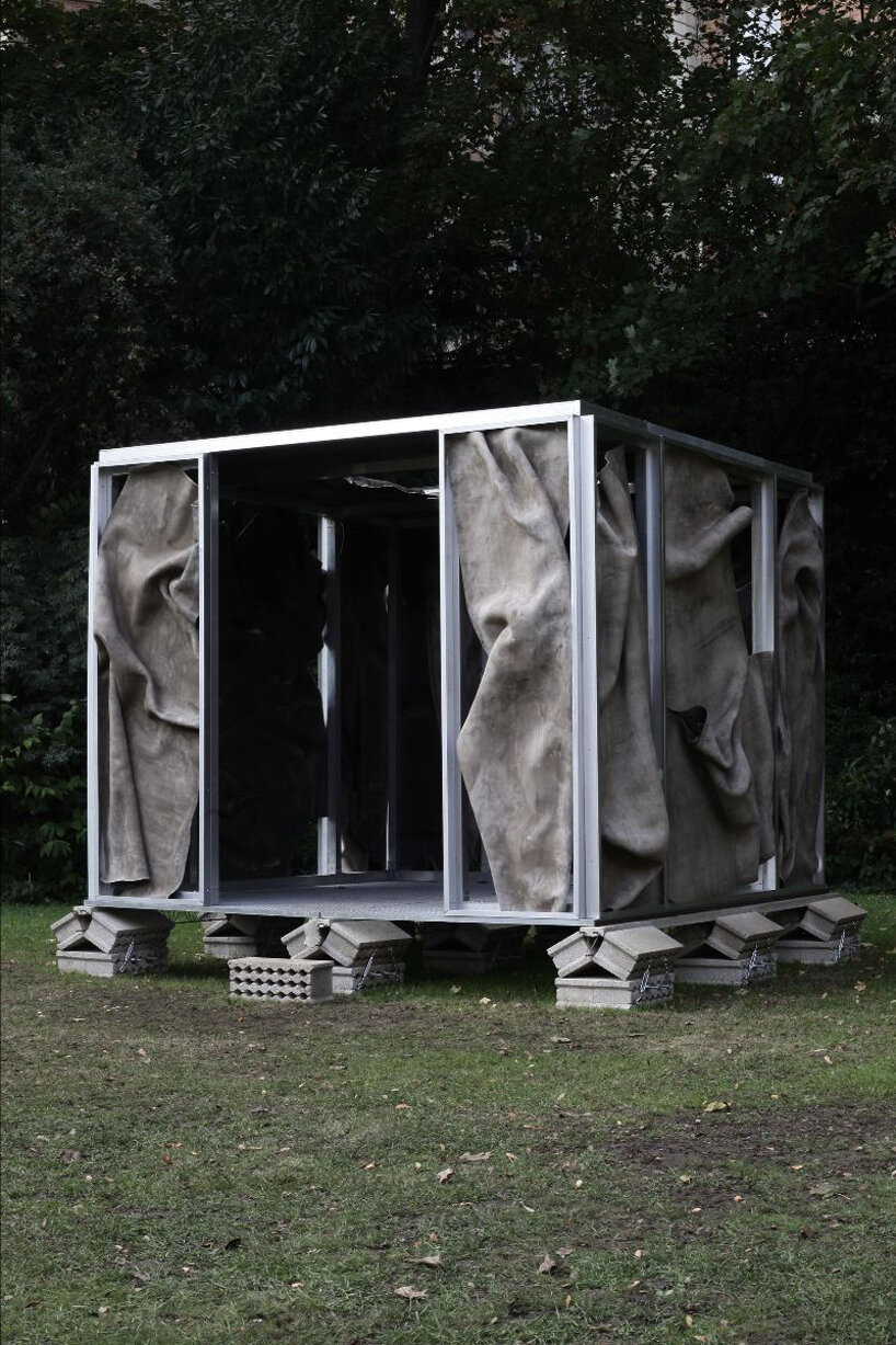
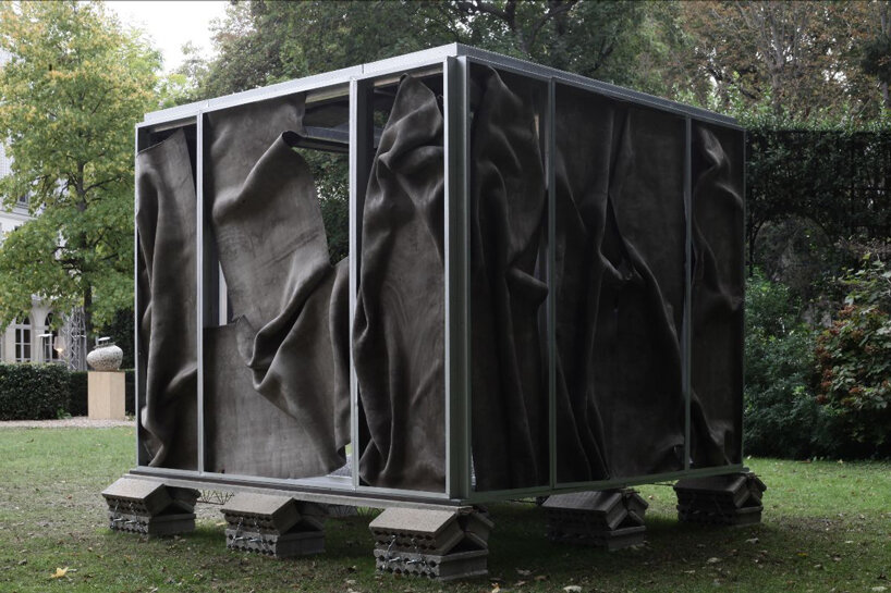
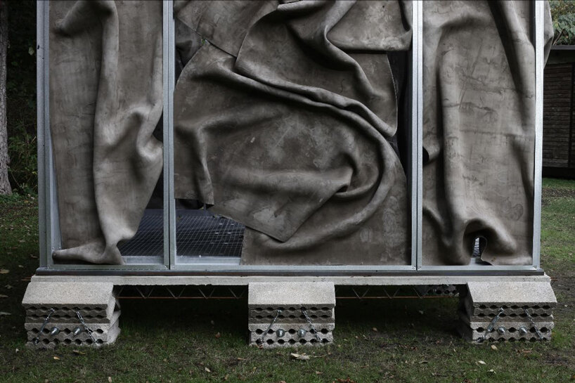
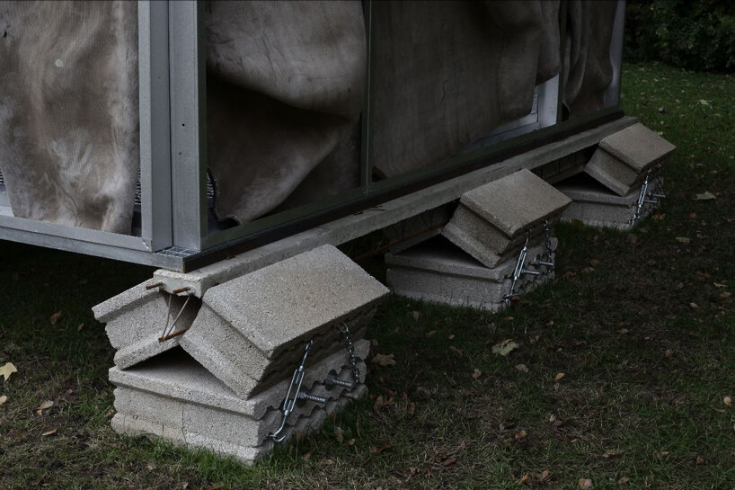
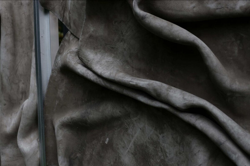
Pavilion X is a demountable structure that blurs the boundaries between sculpture and architecture. Conceptualized by Marc Leschelier, the framework of the pavilion is crafted from aluminum enveloped in a cement textile that undergoes a transformative process through the influence of water. The deliberate crumpling and stiffening of the material result in façade panels that are individually distinct, presenting a contrast between the organic, plastic qualities of a sculptural form and the rationality associated with an object. Presented by the Ketabi Bourdet gallery, the installation finds its temporary home in the gardens of the Hôtel de Maisons. Part of the Design at Large program during the inaugural edition of Design Miami/Paris from October 17th to the 22nd, 2023, Pavilion X defies conventional categorization by deliberately eschewing a defined function. Instead, it offers users an experiential space that prioritizes sensory engagement over practical utility.

crumpled cement drapes over function-free pavilion X
all images by Ketabi Bourdet


a demountable structure between sculpture and architecture


Marc Leschelier, the Paris-based sculptor and architect behind Pavilion X, is known for his exploration of pre-architecture —constructing structures devoid of conventional functions. These creations often find their place in disused spaces, sculpture parks, or locations exempt from urban regulations. Leschelier’s approach to architecture revolves around the visualization of its inner dimensions, particularly the union of opposing materials and the interplay between fluid and solid matter, brick and mortar. For Leschelier, the essence of architecture is tied to the conflicting union and complementarity of opposites. This philosophy manifests in Pavilion X, where the construction process becomes a visual representation of this duality. The work provocatively questions the traditional purpose of architecture, pushing the boundaries and prompting contemplation on what architecture could be when divorced from utilitarian considerations.

crumpled cement drapes over function-free pavilion X
the cement textile has been crumpled and stiffened by the action of water

crumpled cement drapes over function-free pavilion X
the function of the building is not defined, however the space focuses on the impression rather than the use   crumpled cement drapes over function-free pavilion XPavilion X invites reflection on the liberation of form and experience

crumpled cement drapes over function-free pavilion X
aluminum framework interacts with cement

crumpled cement drapes over function-free pavilion X
the intricate detail of the panels


project info:


name: Pavilion X

architect: Marc Leschelier | @marcleschelier

presented by: Ketabi Bourdet gallery | @ketabibourdet

location: in the gardens of the Hôtel de Maisons, France

christina petridou I designboom

nov 14, 2023


Reference

llLab weaves ‘bamboo cloud’ pavilion to float over lower manhattan
CategoriesArchitecture

llLab weaves ‘bamboo cloud’ pavilion to float over lower manhattan

design pavilion 2023: reviving traditional craft


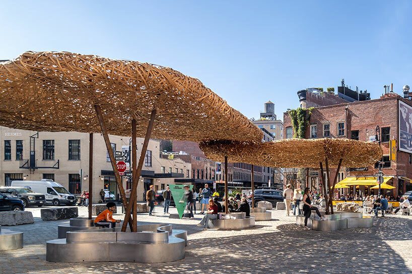
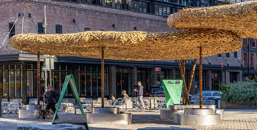
This year’s Design Pavilion for NYCxDESIGN included an experimental installation dubbed Bamboo Cloud, designed and crafted by Shanghai-based architecture studio llLab. The lightweight structure appeared to float over Gansevoort Plaza in New York‘s Meatpacking District from October 12th through 18th during Archtober 2023. Bamboo, a versatile and sustainable material, has been an integral part of architectural history for centuries. Primarily embraced in Asian and African regions, this resilient resource has been employed for a boundless number of architectural applications. From woven mats and panels to split strips for shingles and siding, to entire bamboo culms used for structural elements like columns, beams, and rafters. This rich tradition of bamboo architecture serves as the foundation for the Bamboo Cloud, which arrived this month in New York City. 

llLab weaves a 'bamboo cloud' design pavilion to float over lower manhattanimages © Xi Chen + Chris King


lllab weaves lightweight ‘clouds’ from bamboo


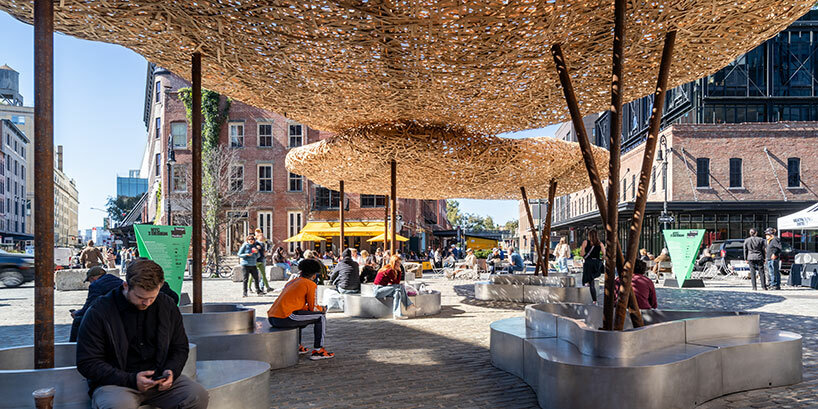
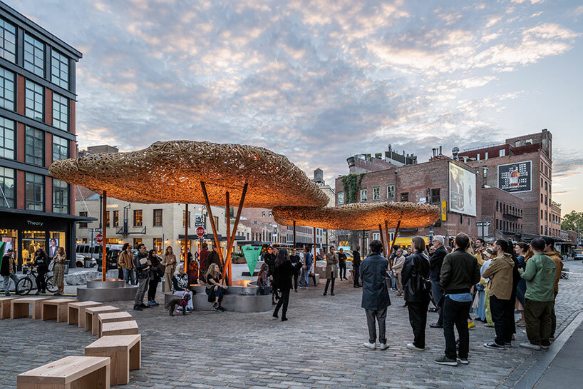
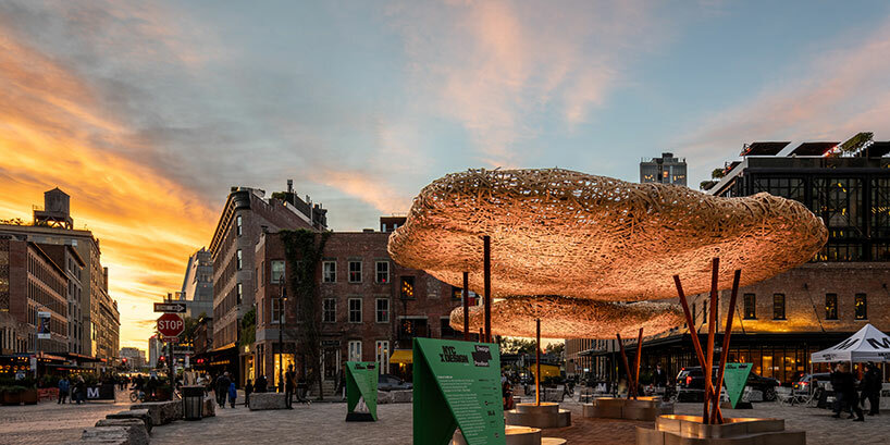
With Bamboo Cloud, the architects at llLab have taken the material to new heights, exploring an application that pushes the boundaries of what it can achieve. Bamboo’s strength and lightweight properties make it ideal for sustainable design innovations. The Design Pavilion for NYCxDesign exemplifies this potential in architecture. Composed of two amorphous ‘clouds’ constructed entirely from bamboo and supported by structural columns, the bamboo is intricately woven to form a porous surface that shelters a light and ethereal environment, ideal for relaxing and gathering in the city.

Bamboo Cloud is softly illuminated from within, as well as from below — thanks to a collaboration with architectural lighting design firm L’Observatoire International and  lighting suppliers Nanometer Lighting Color Kinetics. 

llLab weaves a 'bamboo cloud' design pavilion to float over lower manhattan
the Bamboo Cloud pavilion exemplifies the material’s versatility in New York City


from guilin to new york


The Shanghai-based team at llLab has been challenging the traditional applications of bamboo long before this Bamboo Cloud arrived in New York. The team had explored the material’s potential with a similar installation which, in 2020, occupied the dramatic, forested landscape of Guilin, China. see designboom’s coverage here!

Bamboo is still relatively ambiguously defined, though bamboo has been applied in various aspects in the field of architecture. In terms of structural calculation and material properties, it can still only be compared with wood in the role of ‘engineered bamboo,’ for imperfect construction implementation,’ said Hanxaio Liu, Founding Partner of llLab.However, the Bamboo Cloud intends to unify original bamboo and engineered bamboo in terms of materials and applications, as well as their properties and physical presentation.’

llLab weaves a 'bamboo cloud' design pavilion to float over lower manhattan
two bamboo ‘clouds’ shelter an open-air space for relaxing in the city


Hanxaio Liu continues: Bamboo Cloud focuses on the relationships between inherent material properties and their potential applications beyond convention. Bamboo has been mainly applied on the scale of handcraft, followed by the recent popularization of its utilization in sustainable buildings. However, the advantage of utilizing bamboo has not been thoroughly understood, so most applications have remained superficial.’

llLab weaves a 'bamboo cloud' design pavilion to float over lower manhattan
bamboo’s renewable nature makes it an environmentally responsible choice llLab weaves a 'bamboo cloud' design pavilion to float over lower manhattan
the Design Pavilion represents a vision for a fresh, sustainable future in architecture

Reference

netherlands plans luminous, rippling pavilion for expo 2025 osaka
CategoriesArchitecture

netherlands plans luminous, rippling pavilion for expo 2025 osaka

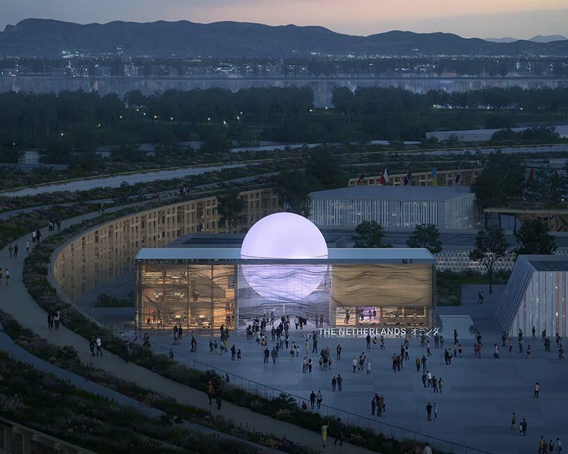
the netherlands pavilion: exploring the power of water


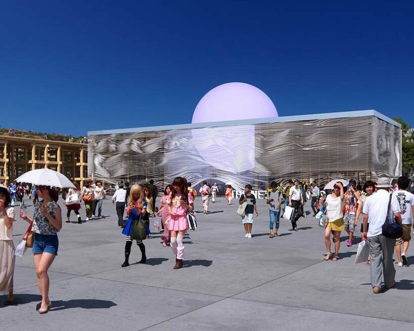
The Netherlands has recently announced its participation in Expo 2025 Osaka, set to take place from April 13th to October 13th, 2025 in Osaka, Japan. The pavilion will be characterized by its unique circular design and integration of clean, anthropogenic energy creation.  This innovative structure promises to showcase the Netherlands’ creative solutions to global energy challenges, particularly in the realm of sustainable power generation through water-based technologies — visitors to the Netherlands Pavilion will discover new technologies that can harness the power of water.


Making clean, renewable energy accessible to everyone is the key to a sustainable society and a sustainable economy,’ says Netherlands Minister for Foreign Trade and Development Cooperation Liesje Schreinemacher.The Russian war in Ukraine has put energy security higher on many countries’ agendas. I’m proud of the Dutch design, which showcases the innovative solutions that the Netherlands has to offer and introduces visitors to the possibilities of a zero-emission future driven by circularity.’

expo 2025 osaka netherlandsvisualizations © Plomp | @plo.mp


a luminous ‘rising sun’ symbolizes circular design


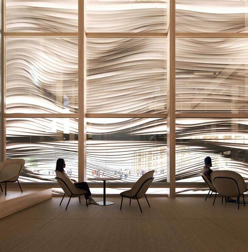
The Netherlands Pavilion at Expo 2025 Osaka will addresses one of humanity’s most critical challenges — the recognition that finite resources are not sustainable. Embracing this principle, a circular design will incorporate renewable materials and zero-emission energy sources as the foundation of the structure. Water, as an abundant and clean energy source, plays a prominent role, elegantly reflected in the facade and roof of the circular structure. An important element of the design is its ability to be dismantled and reassembled as needed.


The theme of the Netherlands Pavilion is ‘Common Ground: creating a new dawn together.’ This vision explores new technologies which harness the power of water to produce emission-free energy, providing access to clean power for all. The illuminated sphere, or abstracted ‘rising sun’ will shine brightly at the center of the architecture to symbolize infinite clean energy, sustainability, and circularity.

the netherlands plans luminous and rippling pavilion for expo 2025 osakathe architecture symbolizes a rising sun over rippling waters


dutch design to arrive in japan


To be built in time for Expo 2025 Osaka, the Netherlands Pavilion is the result of a collaboration between RAU Architects, engineering consultancy DGMR, experience design studio Tellart and Japanese construction company Asanuma.


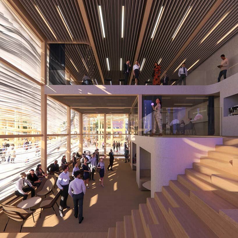
We are nearing the end of materials and fossil resources,’ says the team at RAU Architects.Our solution is the circular design, with circular materials and zero-emission energy sources. As the pavilion has water as its theme, this is reflected in the design of the facade, the roof and the fact that we consider water as emission-free energy. The entire pavilion is designed to be reassembled and is circular. All materials are registered in a material passport on the Madaster platform. Inside, guests take an interactive journey that builds to an immersive show that brings these transformative ideas to life.’

expo 2025 osaka netherlandsthe fluid facade shades the interiors and lends irregular shadows


expo 2025 osaka: the master plan by Sou Fujimoto


The overall master plan for Expo 2025 Osaka has been designed by Sou Fujimoto. In a recent interview with designboom (see here), the Japanese architect describes the project:The biggest project I am working on is the master design of the Expo Osaka 2025. For this, I proposed a huge ring-shaped roof that serves as a circulation map. The roof not only protects people from sunlight and rain but is also enormous, with a diameter of almost 700 meters. We are designing it using a wooden structure, which presents unique challenges due to the scale and materials involved. However, Japan has a wonderful tradition of historical wood construction, and I aim to draw inspiration from it and blend it with new technology in the construction process.

the netherlands plans luminous and rippling pavilion for expo 2025 osakathe pavilion will include interactive exhibits to explore the power of water


This work is not only a wonderful trial for working on such a large scale but also an exciting challenge in terms of innovative construction techniques,Sou Fujimoto tells designboom, describing his master plan for the Expo.On the rooftop, visitors can go up and experience a lifted surface that resembles a bank, allowing them to appreciate the sky above and feel completely immersed in the environment. As the location is in the middle of Osaka Bay, no tall structures are around, offering a clear view of the sky in a pure circle. And that must be a very impressive experience that people will look up at the same circle in the sky. And you can imagine we are really sharing this precious nature, and everybody is under it. It’s not just about technical construction but also about creating unforgettable experiences for everyone to cherish.


1/2

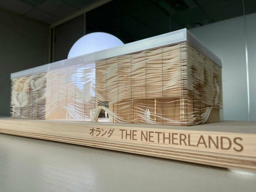
physical model

physical model

elevation

elevation

project info:


project title: Netherlands Pavilion@nlexpo2025

event: Expo 2025 Osaka@expo2025japan

architecture: RAU Architects@rau.architects

engineering: DGMR@dgmradviseurs

experience design: Tellart@tellart

construction: Asanuma

visualizations: © AND BV, © Plomp | @plo.mp


Reference

Monolithic New York museum pavilion features “perfect cube” gallery
CategoriesArchitecture

Monolithic New York museum pavilion features “perfect cube” gallery

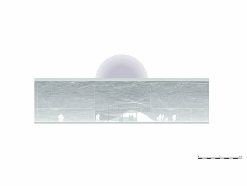
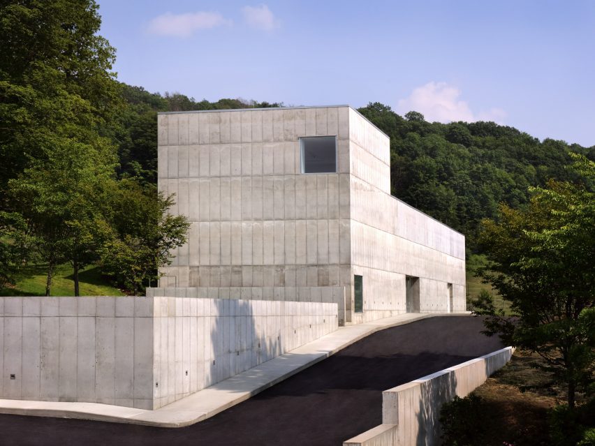
Spanish architects Alberto Campo Baeza and Miguel Quismondo have collaborated to create the Robert Olnick Pavilion for the Magazzino Italian Art museum in Cold Spring, New York.

The concrete-clad pavilion is the second structure on the campus of the museum, which is dedicated to promoting Italian art and design in the United States.

Quismondo, who designed the first building on the site, worked with Baeza to expand the gallery capabilities of the institution.

Concrete building with vertical protrusion and square windows
Alberto Campo Baeza and Miguel Quismondo designed the Robert Olnick Pavilion in New York

The pavilion is partially submerged into a sloping green hill, with entrances on either side of the building at the top and bottom of the grade.

It has a monolithic concrete facade with little detail, punctuated at points by simple square windows. At the top of the hill, the structure has a vertical element that gives the whole building an L shape.

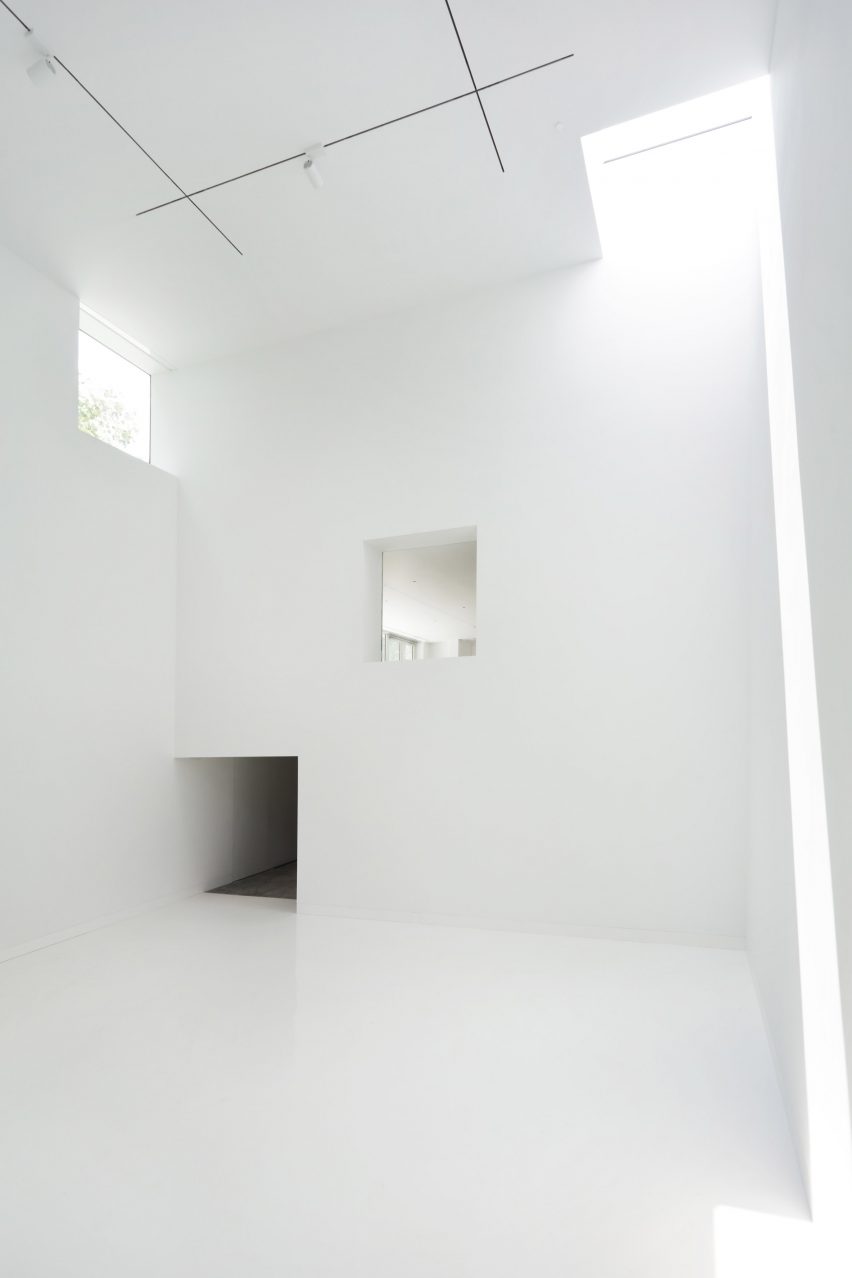
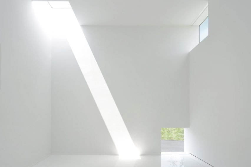
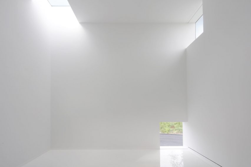
Within this space a double-height gallery was conceived of as an isotropic room that is a “perfect cube”, according to the architects. Windows were placed at each corner to create a sundial effect when light from outside enters.

White interior room with light streaming through square windows
The architects included a perfectly cubic room that functions like a sundial with strategically placed windows

“We built the Robert Olnick Pavilion like a poem: a white cube traversed by light,” said Baeza.

“The main space will embody the beauty of the artwork it exhibits, and with an isotropic design that carves an opening into every corner, each detail will be touched by magnificent sunlight.”

“Not unlike the excitement of birth, it is with great anticipation that we deliver this second building to the museum.”

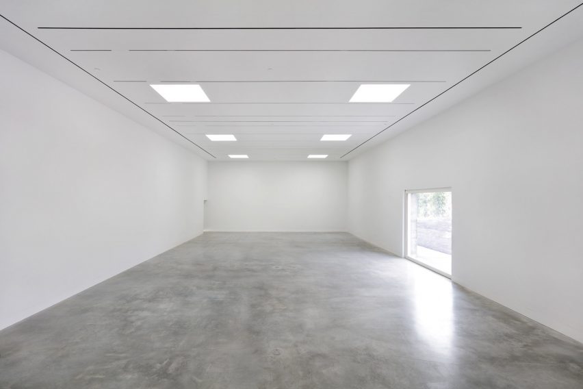
Polished concrete floors and white ceilings
The interior features polished concrete floors and white ceilings

The building has two floors and a mezzanine, with a long first floor that stretches the length of the structure and holds a variety of programming spaces, terminating at a glass end wall that overlooks a sunken courtyard.

The primary floor holds the two main galleries, one in the long end of the building and another housed in the double-space element created by the vertical element at the top of the grade.

“The pavilion has a humble layout that highlights industrial materials such as concrete to facilitate a conceptually strong and aesthetically neutral environment to compliment the postwar and contemporary Italian art and design it will exhibit,” said the museum.

White room with beams of sunlight
The galleries will hold art by Italian creatives

Between the two gallery spaces is a mezzanine level that is accessed from the door at the top of the slope. This space holds a cafe with a seating area that extends outdoors.

All the interiors are stark white, in line with the minimalism of the facade. Polished concrete flooring and seamless overhead lights were designed to add to the smoothness of the interior.

White light in white gallery space
The structure has two floors and a mezzanine

The museum plans to launch its first exhibitions in the fall, featuring the work of Italian designers and artists such as painter Mario Schifano and architect Carlo Scarpa.

Baeza and Quasimondo has been working with museum founders Nancy Olnick and Giorgio Spanu for more than twenty years, and designed the pair’s home, which was Baeza’s first US project, in 2003.

Other projects by Baeza include a sports complex in Madrid designed to be a “box of light” and a white-walled minimalist house in Monterrey, Mexico.

The photography is by Marco Anelli

Reference

saudi arabia pavilion at the 2023 venice architecture biennale
CategoriesArchitecture

saudi arabia pavilion at the 2023 venice architecture biennale

a walk through ‘IRTH إرث’  at the 2023 saudi arabia pavilion 


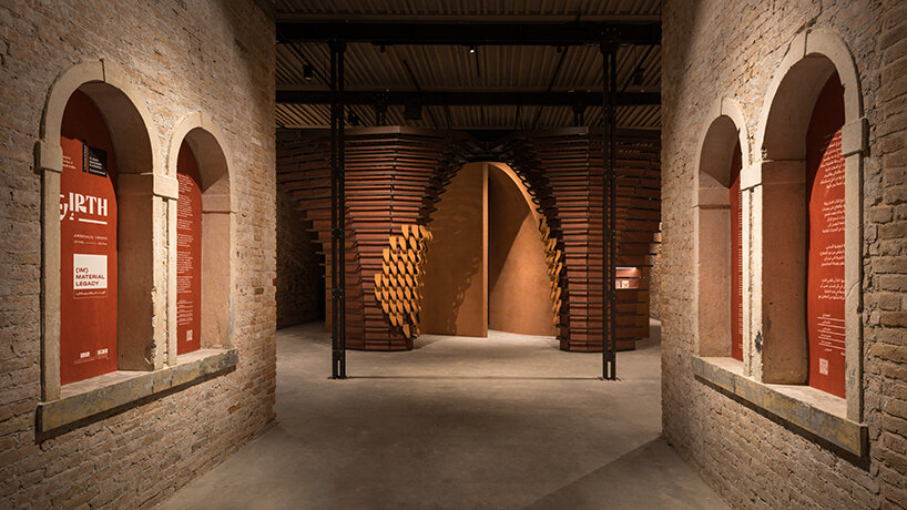
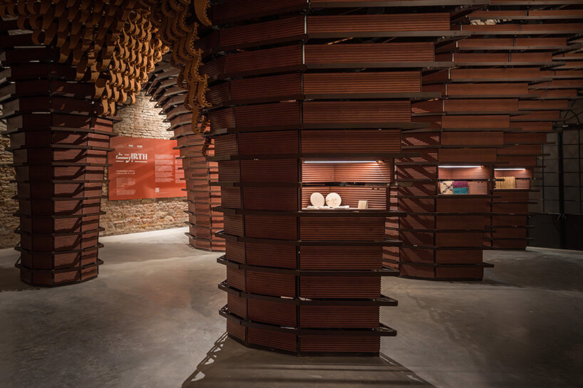
2023 Venice Architecture Biennale: For its third participation at the international fairthe National Pavilion of Saudi Arabia presents ‘IRTH إرث’ (meaning ‘legacy’ in Arabic), a spellbinding and multi-layered sensory exhibition under the curation of Basma and Noura Bouzo. Designed by architect AlBara Saimaldahar, the show examines the symbiotic relationship between material and immaterial properties and links past to future using one of the most historically significant and primary materials used in Saudi architecture: earth. 

dramatic wood and clay sculptures engulf the saudi pavilion at venice architecture biennale
all images © Venice Documentation Project, courtesy Ministry of Culture (unless stated otherwise)


exploring material vs. immaterial, and linking past to future 


Materials used to shape built environments can be thought of as quiet storytellers. Their unique properties, both tangible and intangible, tell us plenty about the inhabitants of a country or region. They are, in other words, embedded with narratives and hold valuable lessons that bridge traditional knowledge with new practices, creating a constantly evolving line of continuity. At this year’s Venice Biennale, ‘IRTH إرث’ physically explores this line linking past and future by celebrating Saudi Arabia’s most characteristic building material. Used as both a structural and cladding element, earth is spotlighted here through its textures and colors — spanning the entire spectrum of the country’s natural tones, from its desert dunes to the red sea coast.

dramatic wood and clay sculptures engulf the saudi pavilion at venice architecture biennale
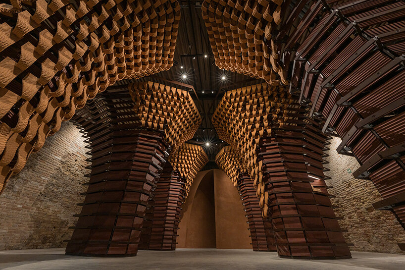
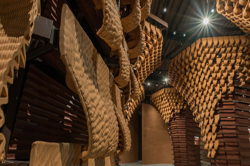
six arches clad internally with wood panels and externally with 3D-printed clay tiles


a multi-layered, sensorial journey into Saudi Architecture 


Illustrating this concept, the 2023 Saudi Arabia Pavilion design takes on a multi-layered approach, allowing visitors to experience the exhibition from different perspectives. The first layer is the structure itself, divided into several sections and reflecting on the method and use of vernacular components jointly with innovative technologies. The second layer, defined as the exhibition content, provides an overview of earth’s present and future in Saudi architecture.


The distinctive layout envisioned by AlBara Saimaldahar (see more here) combines nostalgia, legacy, and ongoing adaptation. It looks to the future through the lens of the past; it enhances the intrinsic essence of Saudi craftsmanship through elaborate artifacts, takes traditional patterns and motifs from Al-Balad, the Historical Jeddah, and transforms them into fluid forms. The evolution of the very concept of legacy is challenged in a crescendo that reaches its climax at the end. At the heart of the project is an experiential component: a simple, immersive room that stimulates the visitors’ senses, triggering individual reactions in an independent and uninfluenced manner.

dramatic wood and clay sculptures engulf the saudi pavilion at venice architecture biennale
celebrating the primary material in Saudi architecture: earth


The destination itself is not the end but rather a call for reflection and eventual examination of how one’s senses not only take but generates imprints within space and time. It is here that architecture brings to the surface the value of the unseen, allowing its occupants to build their own cognitive reconnaissance and placemaking,’ comments Saimaldhar.


The journey through the Pavilion’s three main structures begins by passing beneath six arches as authentic gateways. With their imposing eight-sided metal structures clad internally with wooden panels and externally with 3D-printed clay tiles – featuring an undulating pattern reminiscent of desert dunes – the portals convey both grandeur and lightness. On the one hand, they evoke monumental works of architecture carved in stone and in caves — mighty, seemingly indestructible, and enduring across time — and, on the other hand, the transience of materials, unstable like the sand of the Rub’ al-Khali desert or the Empty Quarter, as the outer covering gradually fades until it disappears.

dramatic wood and clay sculptures engulf the saudi pavilion at venice architecture biennale
the exhibition provides an overview of the material’s present and future


Meanwhile, an olfactory experimentation emerges in the middle of the Pavilion. A large and empty rectangular room is imbued with a fragrance created especially for the exhibition: notes of lavender, frankincense, and myrrh rise in the air, resonating with Arab culture in its most homely form. An immersive sensory hub, this dematerialized environment offers a glimpse of the future through the lens of tradition — an existential experience allowing visitors to experience something exceptional, sensing a ‘moment’ in time and triggering a memory of the Pavilion that will be different for each person.


The only material element inside the hall is a 3D-printed clay column illuminated by interior lights that project mystical patterns onto the Pavilion’s floor, walls, and ceiling. When the Biennale concludes, the sculpture will be transported to the bottom of the Red Sea, acting as an artificial stone to stimulate the growth of a marine ecosystem.


Underwater structures play a key role in the formation of habitats. Gradually, as more columns are printed, this ‘first stone’ will be joined by new elements: a gradual and continuous pattern of growth that will transform a single object artificially placed in a natural setting into an expanse of vertical lines, a labyrinth from which corals and other life forms will come forth. The contrast between the pure geometric form of the columns and the irregular expansion of life within them will visualize the relationship between nature and artifice: a human artifact is reclaimed and incorporated by nature in a dynamic balance that is both fragile and enduring,’ writes the curatorial team.

dramatic wood and clay sculptures engulf the saudi pavilion at venice architecture biennale
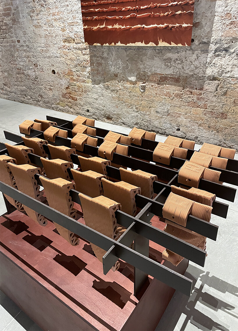
rows of clay tiles | image © designboom


The layout concludes by passing through two more portals: here, the visitor is invited to get involved in their transformation, adding new tiles (from the legacy of earth/clay tiles) to an octahedral structure through an interplay of progressive change, day after day.


According to Basma and Noura Bouzo, the experiments and explorations on display at the Saudi Arabia Pavilion combine the interdisciplinary perspectives of architects and designers, inviting the public to take part in a journey that will help define a legacy for future generations. ‘The pavilion brings to the forefront the notion of collaborative practice as a foundation of the laboratory of the future. It invites visitors to breach their role as spectators and actively engage in the process. The experience itself mirrors the future of architecture and materiality as a work in progress, determined not only by the practitioners but by its occupants.’


Reference

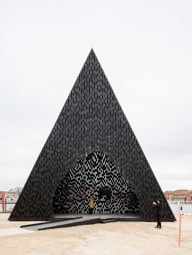
david adjaye’s triangular all-timber pavilion pierces the sky at venice architecture biennale
CategoriesArchitecture

david adjaye’s triangular all-timber pavilion pierces the sky at venice architecture biennale

David Adjaye presents ‘The Kwaeε’ at Venice Architecture Biennale


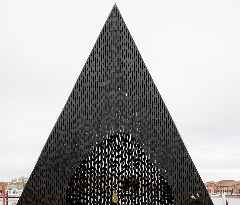
At the Venice Architecture Biennale 2023, acclaimed British architect David Adjaye has unveiled a striking triangular pavilion crafted exclusively from timber. Positioned just outside of the Arsenale Central Pavilion, the eye-catching structure is aptly titled ‘The Kwaeε,’ taking its name after the word ‘forest’ in Twi, a dialect of the Akan language spoken by millions of people in southern and central Ghana.

david adjaye's triangular all-timber pavilion pierces the sky at venice architecture biennale
David Adjaye’s triangular pavilion stands just outside the Arsenale | image by Andrea Avezzù, courtesy of La Biennale di Venezia (also head image)


all-wood pavilion evokes serene forest-like atmosphere


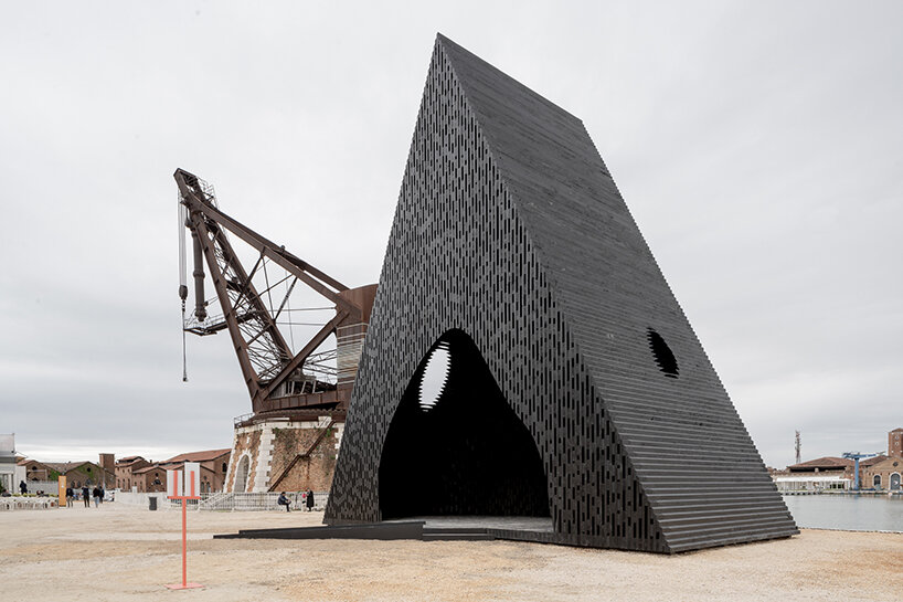
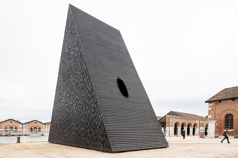
‘The Kwaeε’ installation by David Adjaye (find more here) embodies the essence of its namesake through its form and materiality. Crafted entirely from wood, this triangular prism structure incorporates two oculi, creating an interesting visual composition. By seamlessly merging elements of doorways, platforms, assemblies, and windows, the installation forms a harmonious and unified entity. The deliberate distortion of the shape, thoughtfully angled and integrated with its surroundings, generates passages and openings that facilitate a continuous flow of movement and interaction. Moreover, the structure’s vertical black timber slabs produce a captivating interplay of light and shadow, enveloping the space with a serene forest-like atmosphere.


Located right outside of the historic Arsenale grounds at the Venice Biennale (find more here), the pavilion stands out as a captivating addition, showcasing the rich diversity of African and African diaspora practitioners. Its external triangular prism structure contrasts with an internally sculpted ovoid chamber reminiscent of a cave. This design allows visitors to gaze at the sky through the oculi while enjoying glimpses of the surrounding canal through the intricately crafted timber interstices. Not only does the installation provide a tranquil space for reflection and respite, but it also serves as a versatile venue for multiple events and gatherings, accommodating diverse needs and purposes.

david adjaye's triangular all-timber pavilion pierces the sky at venice architecture biennale
the external triangular prism structure contrasts with an internally sculpted ovoid chamber | image by Andrea Avezzù, courtesy of La Biennale di Venezia

david adjaye's triangular all-timber pavilion pierces the sky at venice architecture biennale
crafted entirely from wood, the triangular prism structure incorporates two oculi | image by Andrea Avezzù, courtesy of La Biennale di Venezia


Reference

Finnish Pavilion “declares the death of the flushing toilet”
CategoriesSustainable News

Finnish Pavilion “declares the death of the flushing toilet”

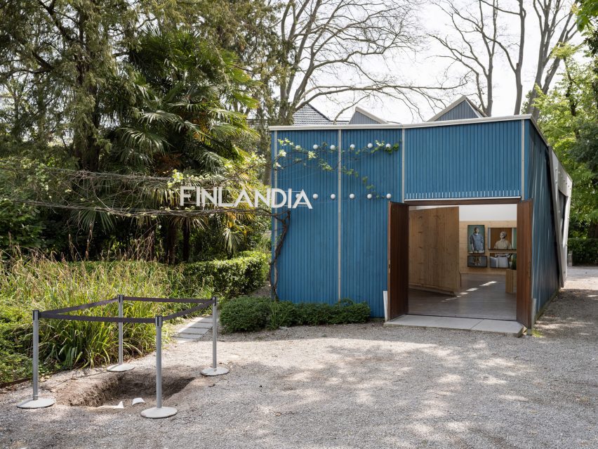
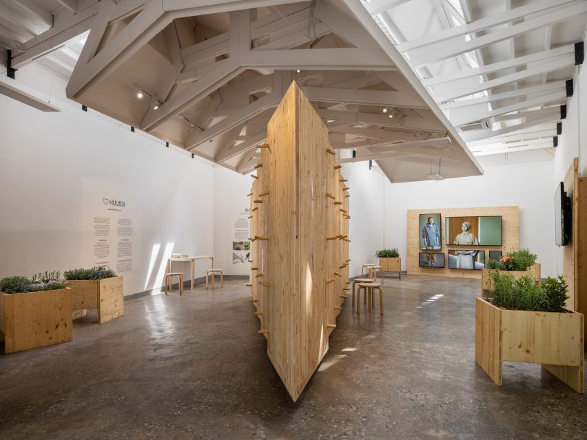
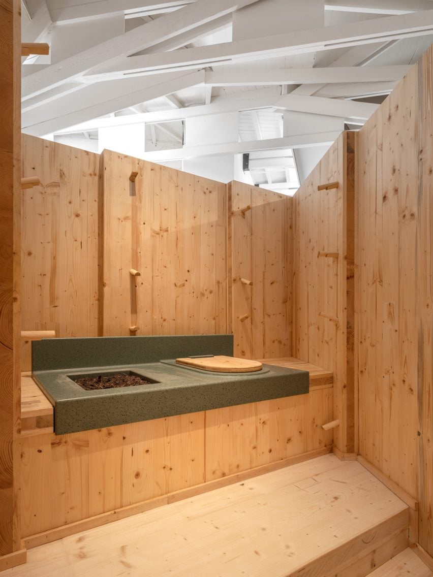
A Finnish huussi, or composting toilet, has been built in the centre of the country’s pavilion at this year’s Venice Architecture Biennale, which aims at critically exploring the world’s unsustainable approach to sanitation.

Declaring the “death of the flushing toilet as we know it” the pavilion, called Huussi – Imagining the Future History of Sanitation, was designed by The Dry Collective – a group of architects, designers and artists, and curated by Arja Renell.

Finnish Pavilion at the Venice Architecture Biennale 2023
The Finnish Pavilion is called Huussi – Imagining the Future History of Sanitation

The project is a response to the theme of the 2023 Venice Architecture Biennale, The Laboratory of the Future, curated by Lesley Lokko and asking participants to consider what it means for architects to be “agents of change”.

Finland’s display begins with a mock archaeological excavation of a typical flushing toilet – responsible for 30 per cent of domestic water use in developed economies – in the grounds of the Alvar Aalto-designed pavilion, symbolically consigning it to the distant past.

Internal shot of the Finnish Pavilion by The Dry Collective
It explores the world’s unsustainable approach to sanitation

“We cannot live on a planet where billions of people use rapidly diminishing fresh water resources to flush their waste,” said curator Arja Renell.

“The whole system needs to change,” she continued. “A shift will come as we begin to see our waste as a valuable resource, and transition to treating it as such.”

Composting toilet surrounded by CLT panels
The pavilion features a composting toilet

Inside the pavilion, a cross-laminated timber (CLT) structure contains a domestic-scale huussi, surrounded by wooden planters that have been fertilised using human urine-based fertiliser.

While the huussi toilet cannot be used by visitors during the biennale, it will afterwards be donated to VERAS, a local non-profit organisation that owns an agricultural part and allotments on the nearby Venetian island of Vignole.

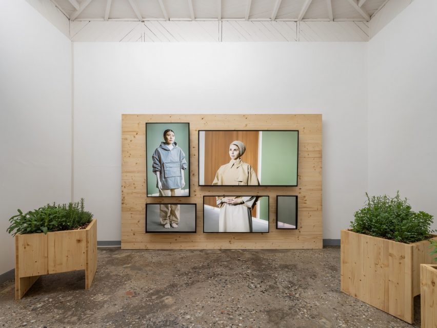
Accompanying the huussi is a fictional documentary film set in the year 2043 demonstrating the “absurdity” of our current attitude to sanitation and waste, along with other video works presenting information about alternative sanitation solutions.

“We want to share the domesticity and utility of the Finnish huussi to inspire a dialogue about the state of what is possible… what considerations become critical, and how will solutions vary in different parts of the world?” said Renell.

“Huussi inspires and invites all professionals to start looking for alternative solutions which would better serve the world we inhabit today,” she continued.

Screens showing a documentary film at the Finnish Pavilion
Accompanying the huussi is a fictional documentary film

The Finnish Pavilion is one of several that will be opened exclusively on Dezeen during the Venice Architecture Biennale 2023. Other pavilions that were seen first on Dezeen include the Danish pavilion, which focuses on rising Sea levels and the US pavilion that aims to question plastic dependency.

The photography is by Ugo Carmeni.

Dezeen is live reporting from the Venice Architecture Biennale, which takes place from 20 May to 26 November 2023. See Dezeen Events Guide for all the latest information you need to know to attend the event, as well as a list of other architecture and design events taking place around the world.

Reference

How Ice Cubes by Zone of Utopia + Mathieu Forest Architecte is Changing the Skyline of Northern China
CategoriesArchitecture

How Ice Cubes by Zone of Utopia + Mathieu Forest Architecte is Changing the Skyline of Northern China


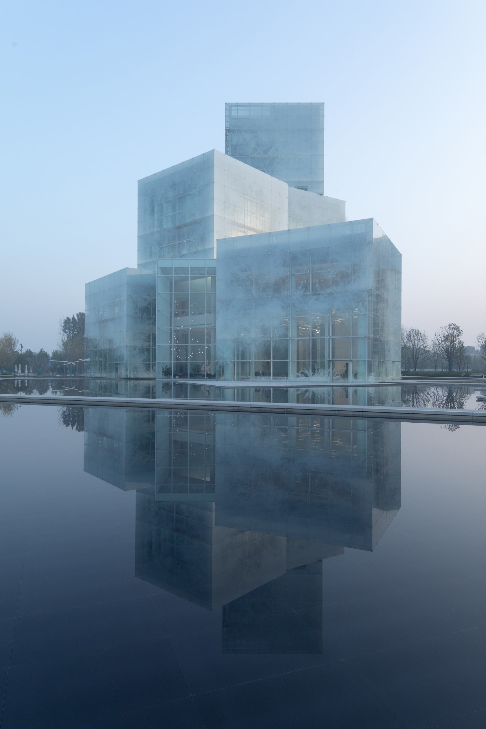
Ice cubes – The question we were asked was that of the spirit of a place. The client imagined a flat building, we proposed a tower: to conquer the sky, mark the territory and put the whole commercial district in tension with the future ski slope on the other side. In this commercial environment, our cultural center says “I am here!“. You can see it everywhere, day and night. The city is conceived from landmarks and vanishing points.

Architizer chatted with Mathieu Forest, Founder of Mathieu Forest Architecte, and Qiang Zou, Design Principal at Zone of Utopia, to learn more about this project.

Architizer: What inspired the initial concept for your design?

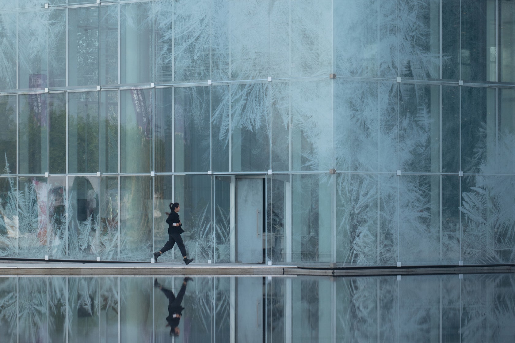
We are starting from a virgin site with only fields and sky as the landscape. We wanted a building that captures the “thickness of the air”, the only tangible context, which by its material and its form is anchored in the sky: the gray and misty skies, the sunbeams which pierce it, the snowy skies, the steely blue skies so characteristic of northern China, the skies overwhelming with light in summer, the golden evening horizons, the bluish mornings… our building continually changes its appearance with the rhythm of the seasons, the variations of the climate and hours, and like a mirror reveals the beauty of a changing sky and landscape. Its facades are a gigantic glass printed fresco according to a unique design, without any repetition. It is also an echo of the representations of landscapes in Chinese painting, whose mystery arises from the immensity and detail.

© Zone of Utopia + Mathieu Forest Architecte

© Zone of Utopia + Mathieu Forest Architecte

© Zone of Utopia + Mathieu Forest Architecte

© Zone of Utopia + Mathieu Forest Architecte

This project won in the 10th Annual A+Awards! What do you believe are the standout components that made your project win?

It is a poetic architecture, for which the technique, as advanced as it is, is at the service of emotion. We think that we must refuse generic, cloned, sanitized, standardized architectures, such as the current world produces too much. We must rediscover the sense of geography and context and never forget that the only goal to be achieved is that of the pleasure of living. As urban art, architecture must address everyone. We are looking for several degrees of mystery: we can see in this architecture the evocation of a mass of ice floating on a lake or that of a lantern and marvel at it, but going deeper, there is a more impressionist vision of capturing the effects of light, with a certain form of abstraction and constant renewal.

© Zone of Utopia + Mathieu Forest Architecte

© Zone of Utopia + Mathieu Forest Architecte

© Zone of Utopia + Mathieu Forest Architecte

© Zone of Utopia + Mathieu Forest Architecte

What was the greatest design challenge you faced during the project, and how did you navigate it?

The greatest challenge was the realization of the facade supposed to evoke a form of immateriality. Many prototypes had to be made to properly adjust the quality and color of the glass, the density and the color of the printed patterns. It was also necessary to work closely with the engineers to design the most absent structures possible. The nicest compliment we often get is that people think when they see the photos that they are perspectives when the building is well constructed!

© Zone of Utopia + Mathieu Forest Architecte

© Zone of Utopia + Mathieu Forest Architecte

© Zone of Utopia + Mathieu Forest Architecte

© Zone of Utopia + Mathieu Forest Architecte

How did the context of your project — environmental, social or cultural — influence your design?

We started from an almost virgin site, the most difficult situation for a contextual architect. There was only a master plan and a bird’s eye view of a future residential area organized along the lake, headed by a tourist area and shops and, as a highlight, a future artificial ski slope to attract future residents and tourists. This district of 10,000 housing units will accommodate approximately 30,000 inhabitants and will be part of the future new town of Pinyuan which will accommodate a total of 500,000 inhabitants.

We took advantage of the incredible dynamism of Chinese industry: in the glass sector in particular. Large samples manufactured in record time allowed us to develop the exact colors and ink densities desired, with exceptional thermal performance.

© Zone of Utopia + Mathieu Forest Architecte

© Zone of Utopia + Mathieu Forest Architecte

© Zone of Utopia + Mathieu Forest Architecte

© Zone of Utopia + Mathieu Forest Architecte

What drove the selection of materials used in the project?

It is a steel and glass building. Steel is adapted to an architecture of lightness and audacity, but also to allow prefabrication and great speed of implementation. We used glass for its advantages while avoiding its disadvantages, taking into account the continental climate, with cold and dry winters and hot and rainy summers. We have designed a waterproof double skin with controlled ventilation: in winter, the double skin is closed and the greenhouse effect makes it possible to avoid almost any heating. In summer, the air cooled by evaporation at the water surface is collected and circulates in the double skin to evacuate heat accumulations and cool the thermal facade and therefore reduce air conditioning needs.

© Zone of Utopia + Mathieu Forest Architecte

© Zone of Utopia + Mathieu Forest Architecte

© Zone of Utopia + Mathieu Forest Architecte

© Zone of Utopia + Mathieu Forest Architecte

What is your favorite detail in the project and why?

We want the structure to disappear so that only the effects remain. The details of the suspended facade were the most sensitive to develop, in the common parts as much as for the details of angles, overhangs and transition between volumes. We worked with our facade engineer on minimalist principles. Each glass of the double skin is only held by 4 pieces of steel of a few centimeters and a simple bead of transparent silicone ensures the seal.
© Zone of Utopia + Mathieu Forest Architecte

© Zone of Utopia + Mathieu Forest Architecte

© Zone of Utopia + Mathieu Forest Architecte

© Zone of Utopia + Mathieu Forest Architecte

How important was sustainability as a design criteria as you worked on this project? 

This question is of course a major one at the present time. This is why we have designed a double-skin façade which considerably reduces energy requirements. In winter, there is no need to heat the building. Dynamic thermal studies have shown that our design saves 50% energy compared to a traditional double-glazed facade. After a few years, the investment in the double glass skin is fully compensated and after 50 years, the gain is considerable.

© Zone of Utopia + Mathieu Forest Architecte

© Zone of Utopia + Mathieu Forest Architecte

© Zone of Utopia + Mathieu Forest Architecte

© Zone of Utopia + Mathieu Forest Architecte

In what ways did you collaborate with others, and were there any team members or skills that were essential in bringing this Award winning project to life?

We collaborated very efficiently, mainly through video conferences. The engineers for the structure and the facade were particularly called upon to be able to build the project and in general, all the actors worked very intensely with the will to be able to achieve this result.

© Zone of Utopia + Mathieu Forest Architecte

© Zone of Utopia + Mathieu Forest Architecte

Were any parts of the project dramatically altered from conception to construction, and if so, why?

Surprisingly, nothing has changed. The process was very fast and the building constructed is very faithful to the sketch.
© Zone of Utopia + Mathieu Forest Architecte

© Zone of Utopia + Mathieu Forest Architecte

How have your clients responded to the finished project?

The client is extremely satisfied with the project and its numerous publications. More generally, all the feedback tells us that the building is very well received by visitors and users.

© Zone of Utopia + Mathieu Forest Architecte

© Zone of Utopia + Mathieu Forest Architecte

What key lesson did you learn in the process of conceiving the project?

Having to go fast does not prevent designing with complexity and accuracy.

© Zone of Utopia + Mathieu Forest Architecte

© Zone of Utopia + Mathieu Forest Architecte

How do you believe this project represents you or your firm as a whole?

It is a contextual project, even if the urban context was almost non-existent. It exactly answers a question asked by a program and a site. In this, it represents our architectural philosophy well.

© Zone of Utopia + Mathieu Forest Architecte

© Zone of Utopia + Mathieu Forest Architecte

How has being the recipient of an A+Award evoked positive responses from others?

It is a great honor for us to receive such a distinction. Especially because we are a young architecture firm and that encourages us enormously to continue our work. This also contributes to our positive image for clients and our partners. It is very important for us.

© Zone of Utopia + Mathieu Forest Architecte

© Zone of Utopia + Mathieu Forest Architecte

How do you imagine this project influencing your work in the future?

We believe that projects always ask new questions for new answers. Each project teaches us, of course, but we will never do the same thing twice.

© Zone of Utopia + Mathieu Forest Architecte

© Zone of Utopia + Mathieu Forest Architecte

Is there anything else important you’d like to share about this project?

The project was designed and carried out during the COVID, in a very short time. There were 20 months between sketch and delivery. Challenge increased by the pandemic which banned travel and stopped the construction site for 4 months. We had to invent, like others, new methods. We worked and checked the site from photos and videos. We had daily video meetings. Paradoxically, the COVID has reinforced the good coordination between all.

For more on Ice cubes, please visit the in-depth project page on Architizer.

Ice cubes Gallery

Reference