Solar Pavilion is a canopy topped with 380 colourful solar panels
CategoriesSustainable News

Solar Pavilion is a canopy topped with 380 colourful solar panels

Multicoloured solar panels act like roof tiles on top of the Solar Pavilion, a gathering space at this year’s Dutch Design Week created by local firm V8 Architects and design practice Marjan van Aubel Studio.

The pavilion was designed to resemble a giant beach chair, in a nod to the fact that the pavilion offers visitors a place to rest after seeing the designs on display at the design festival last week.
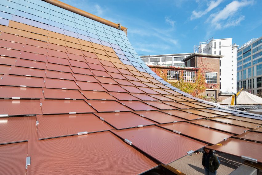
Red, orange and blue solar panels on a curved roof
The roof of the Solar Pavilion was formed from colourful photovoltaic panels

Masts, tension wires and reclaimed floor beams made from untreated steel supported the Solar Pavilion’s swooping roof.

Underneath, triangular timber sections were slotted into the corners of the steel beams to serve as seating, while a circular bench designed by Marjan van Aubel Studio occupied the centre of the space.
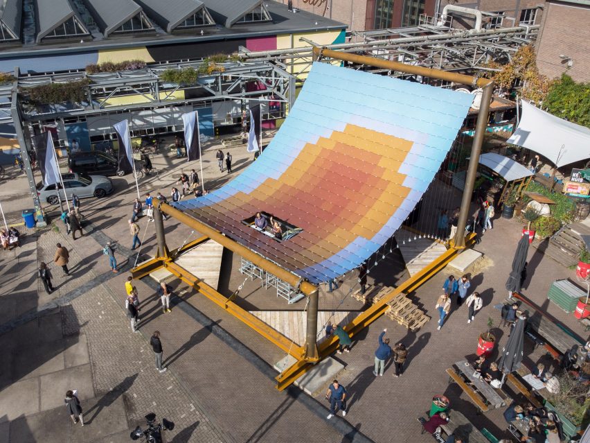
Solar Pavilion at Dutch Design Week by V8 Architects and Marjan van Aubel Studio
The pavilion was presented at Dutch Design Week

Two sets of stairs lead visitors to an opening in the curved roof, featuring 380 blue, orange and red photovoltaic panels that were mounted much like traditional roof tiles.

The panels produced approximately 7.5 kilowatts of energy at peak performance while on display at the design event, according to V8 Architects.

This energy was fed into an on-site battery and used at night to power lighting and electric heating panels mounted on the underside of the pavilion, mimicking the sensation of sitting in the sun during the day.

“Currently, energy is only harvested in a techno-functional way,” said V8 Architects co-founder Michiel Raaphorst. “We explore how to integrate the sun’s energy into our daily lives so that we can love and embrace it.”

The pavilion’s structure was intentionally left exposed so that visitors could visually understand how it works.
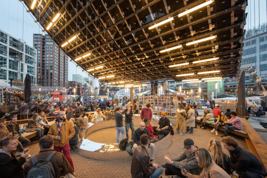
Public space under the roof of the Solar Pavilion
The energy harvested by the solar panels was used to light and heat the pavilion

This also made the structure reversible, so it could be easily disassembled and its parts reused after the event.

“It was planned that all materials would return to the companies that provided them,” V8 Architects told Dezeen.

“However, multiple parties have shown interest in the pavilion including a large festival. We are looking into different options at the moment.”
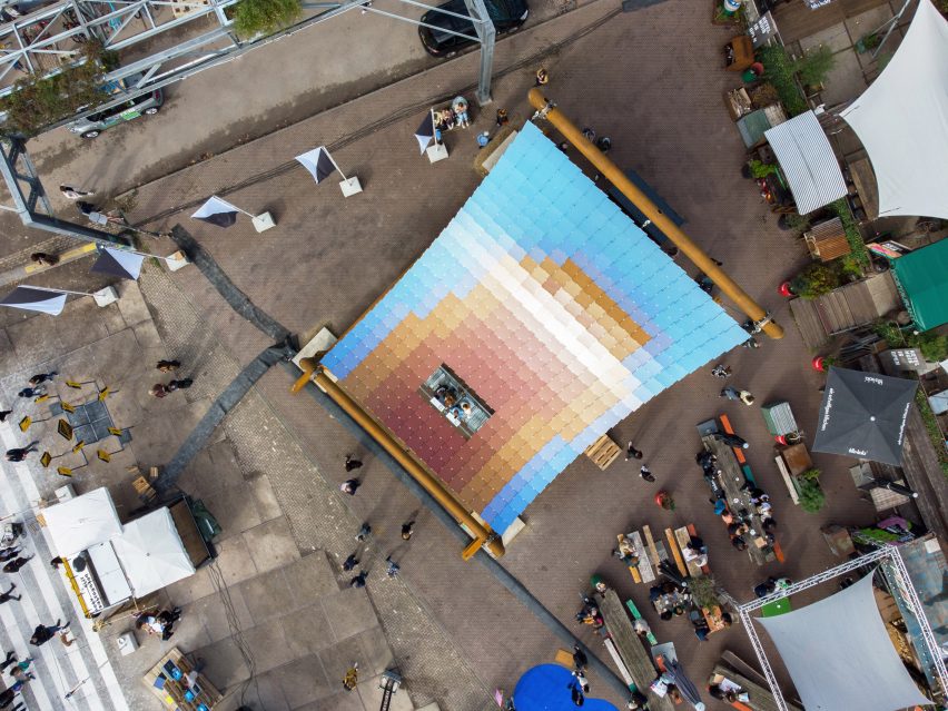
Solar Pavilion at Dutch Design Week by V8 Architects and Marjan van Aubel Studio
380 solar panels made up the pavilion’s canopy

The Solar Pavilion is also the final piece of the Solar Biennale – a month-long event organised by van Aubel and Dutch designer Pauline van Dongen to envision a future where everything is solar-powered.

“Solar energy needs a new, more personal perspective that is part of our culture,” explained Marjan van Aubel. “This pavilion demonstrates that solar energy can be experienced and used in a new way.”

“The pavilion is a sensory experience and, during Dutch Design Week, the place to poetically experience the harvesting of solar energy.”

Other designs that were on show at Dutch Design Week included a series of lampshades made from mushroom mycelium by Tallinn-based materials company Myceen and a rug that visualises the consequences of drought caused by climate change.

The photography is by Aiste Rakauskaite.

Solar Pavilion was on show from 21 to 30 October as part of Dutch Design Week 2022. See Dezeen Events Guide for an up-to-date list of architecture and design events taking place around the world.

Reference

Dezeen Awards 2022 sustainability public vote winners include a bio-based pavilion
CategoriesSustainable News

Dezeen Awards 2022 sustainability public vote winners include a bio-based pavilion

After more than 4,000 votes, Dezeen readers have chosen projects by DP6 Architectuurstudio, FADAA and Kenoteq as the winners of this year’s Dezeen Awards public vote in the sustainability categories.

DP6 Architectuurstudio won for its pavilion made from locally sourced wood and recycled-steel joints in the Netherlands, FADAA for its store coated in grey lime plaster in Jordan and Kenoteq for its brick made from construction waste.

Of the total 55,000 votes that were cast and verified across all categories, the sustainability categories received over 4,000 verified votes.

Dezeen Awards 2022 public vote winners in the architecture, interiors and design categories were published earlier this week, the media winners will be revealed later today and the studio winners will be unveiled tomorrow.

Dezeen Awards winners announced in November

The public vote is separate from the main Dezeen Awards 2022 judging process, in which entries are scored by our distinguished panel of judges. We’ll be revealing the Dezeen Awards 2022 winners ahead of the winners’ party at the end of November.

To stay up to date with the latest Dezeen Awards news, including this year’s winners, subscribe to our newsletter or follow us on Instagram and LinkedIn.

Read on to see who was voted most popular in the sustainability categories:

The Natural Pavilion by DP6 Architectuurstudio

Sustainable building

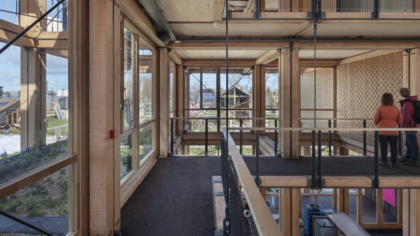
The Natural Pavilion serves as a model to tackle construction challenges faced in the Netherlands, including sustainable energy production, housing shortages, biodiversity recovery and climate change adaptation.

The structure by DP6 Architectuurstudio, which features cross-laminated timber floors and recycled glass windows, was voted sustainable building of the year in the public vote with 29 per cent of votes.

In close pursuit was Mustardseed by Localworks with 25 per cent, Floating Office by Powerhouse Company with 23 per cent, The Exploded View Beyond Building by Biobased Creations with 12 per cent and finally Learning and Sports Centre by General Architecture Collaborative with 11 per cent.

D/O Aqaba by FADAA
D/O Aqaba by FADAA

Sustainable interior

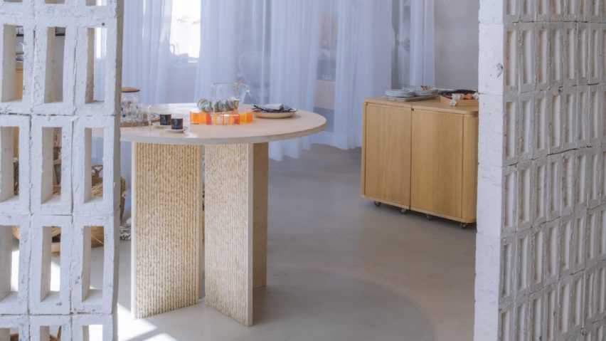
D/O Aqaba won sustainable interior of the year with 26 per cent of the votes. The store by FADAA uses stacked bio-bricks made from crushed shells as partitions to protect from the sun and segment the space.

Next up was Apricity by Object Space Place with 23 per cent, Semba Good Ethical Office by Semba Corporation with 20 per cent, The Circus Canteen by Multitude of Sins with 19 per cent and MONC by Nina+Co with 13 per cent.

K-briqTM by Kenoteq
K-Briq by Kenoteq

Sustainable design

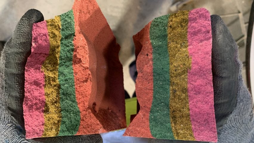
K-Briq was developed through academic circular economy research at Heriot Watt University in Scotland and won the sustainable design of the year category with 35 per cent of votes. Kenoteq’s design is made from construction waste and is coloured using recycled pigments.

The runners-up were Tidal Stool by Robotic Fabrication Lab HKU with 28 per cent, Remix by Open Funk with 18 per cent, Maggie’s Southampton by Local Works and Air-It-Yourself by Jihee Moon with seven per cent.


Reference

New Serpentine Pavilion “definitely” more sustainable than last year
CategoriesSustainable News

New Serpentine Pavilion “definitely” more sustainable than last year

The 2022 Serpentine Pavilion is more sustainable than last year’s “carbon-negative” design thanks to its reusable foundations and timber floor, say its engineers AECOM.

This year’s edition of the annual London commission is a timber drum designed by American artist Theaster Gates. Last year’s design, by Counterspace, controversially claimed to be “carbon-negative” despite featuring concrete foundations that were not reusable.

The 2022 edition is “definitely” more sustainable, according to AECOM director Jon Leach.

Serpentine Pavilion 2022
This year’s Serpentine Pavilion was designed by Theaster Gates

Reducing the amount of concrete used and making the entire structure demountable, including the foundation, has reduced the building’s overall carbon footprint, he explained.

“Measured like-for-like, this year’s pavilion has a lower carbon footprint than the 2021 pavilion, largely because of the very light-weight timber superstructure and very small, reusable low-cement foundations that are ballasted with site-won fill,” Leach told Dezeen.

Last year’s pavilion, which featured timber and other biomaterials, removed 31 tonnes of carbon from the atmosphere, according to a report seen by Dezeen.

Serpentine Pavilion by Counterspace
South African studio Counterspace designed last year’s Serpentine Pavilion

However, the report did not include the impact of moving the pavilion to a new location, which would require breaking up the 95-cubic-metre concrete base and casting a new one.

This year’s pavilion is secured with a series of concrete pads that will be removed from the site and reused when the structure is re-erected.

“The foundations are completely reusable,” said Leach. “They will be transported with the rest of the pavilion.”

“They are small concrete pads that were precast using low cement concrete, which takes a bit longer to cure – so they were pre-cast off-site,” he continued. “They can just be lifted out.”

Above ground the pavilion, which is the largest ever built on the site, was designed to be as lightweight as possible. This allowed AECOM to reduce the scale of the foundations by 75 per cent.

“The aim has been to improve year on year,” explained Leach. “So the key thing with this year’s was that it’s large, but it’s lightweight.

First Serpentine Pavilion without concrete floor

“So we focused on a timber, lightweight superstructure, and then really minimising the foundations as much as we can,” he continued. “So there’s still some concrete in the foundations, but it’s, it’s a quarter of what it was last year.”

To reduce the carbon impact, the pavilion does not have a concrete floor for the first time in the commission’s history. Instead, a raised timber floor was installed.

“All the previous pavilions have had concrete floors, mainly for durability,” said Leach. “This year we discussed with the gallery and decided we really need to take a step away from that as a principle.”

Interior of 2022 serpentine Pavilion
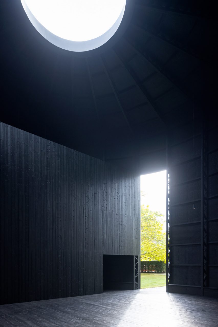
A raised timber floor was used to reduce the need for concrete

“We’ve done a lot of tests on making sure the timber should last for the summer with 300,000 visitors,” he added.

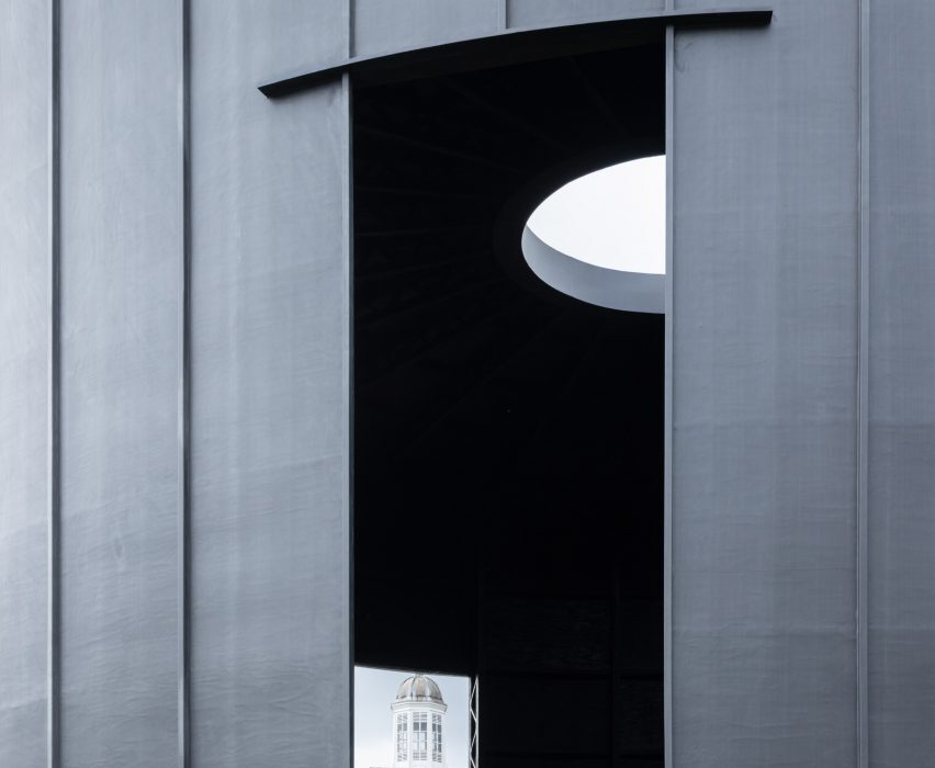
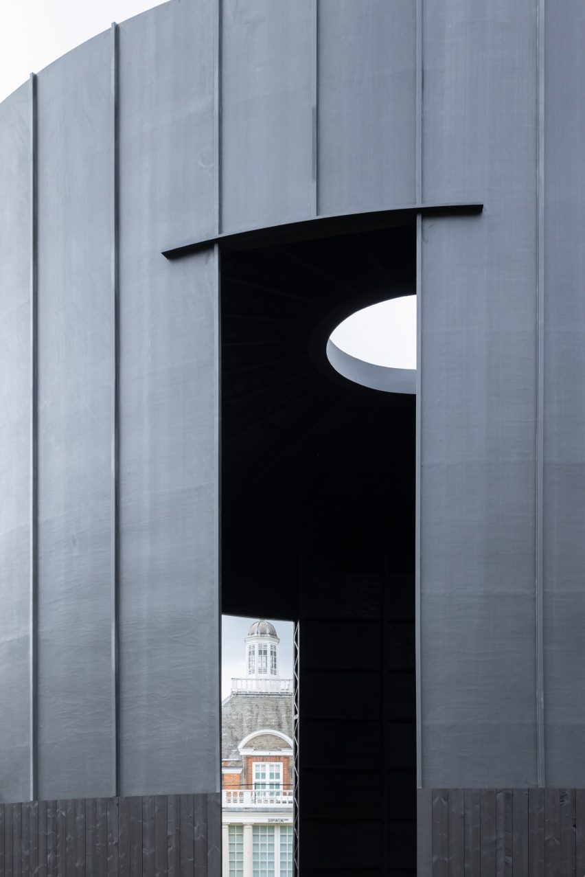
Designed by American artist Gates, the 2022 Serpentine Pavilion is named Black Chapel. It was designed to be a peaceful space “where one could rest from the pressures of the day and spend time in solitude”.

The cylindrical building was built largely from timber with MiTek posi-joists used as columns and nine-millimeter thick plywood used as the skin. The roof contains steel rings to support a central oculus.

Gates’ building is the 21st edition of the annual Serpentine Pavilion, commissioned by the Serpentine contemporary art gallery in London.

Previous architects have included last year’s Pritzker prize-winner Diébédo Francis Kéré, who designed a structure with a canopy that transformed into a waterfall during rain, BIG founder Bjarke Ingels, who worked with an “unzipped” wall of translucent blocks, and late British-Iranian architect Zaha Hadid whose marquee launched the commission in 2000.

The photography is by Iwan Baan.

Reference

NFT-funded pavilion by Iheartblob aims to promote decentralisation
CategoriesArchitecture

NFT-funded pavilion by Iheartblob aims to promote decentralisation

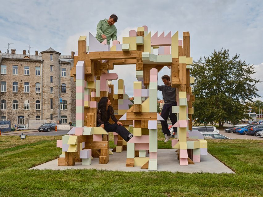
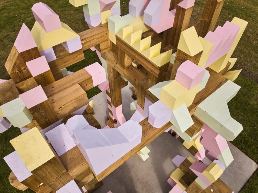
Architectural design studio Iheartblob has revealed the puzzle-like Fungible Non-Fungible Pavilion at the Tallinn Architecture Biennale in Estonia, which was partly designed by the public using NFTs.

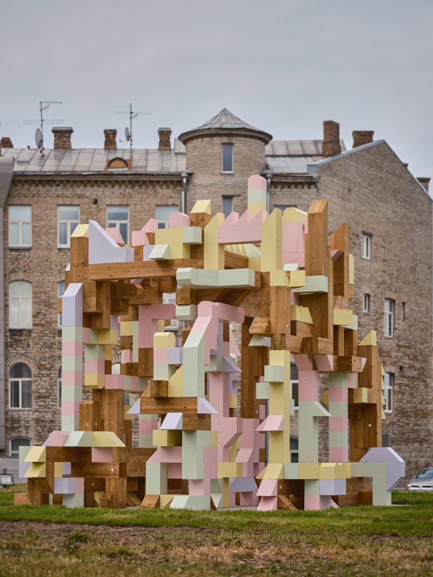
Located outside Tallinn’s Museum of Estonian Architecture, the experimental structure was built from physical versions of NFT objects designed by the community.

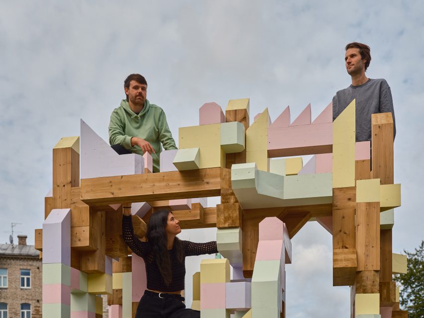
Iheartblob climbing the Fungible Non-Fungible Pavilion in Tallinn
Fungible Non-Fungible Pavilion is an installation at the Tallinn Architecture Biennale

Fungible Non-Fungible Pavilion was the winning entry of the Slowbuilding competition held for the main installation at Tallinn Architecture Biennale (TAB) 2022.

According to UK studio Iheartblob, it is the first pavilion designed by the community using NFTs.

Wooden structure outside Museum of Estonian Architecture
It was designed by Iheartblob with the community

“This is the first NFT pavilion in the world that is designed by the community together, it’s also co-owned by the community and co-funded by the community,” Iheartblob told Dezeen at the installation’s opening.

“The technology we’re using is very new and experimental, and we find it important to integrate it in architecture because architecture can benefit a lot from it.”

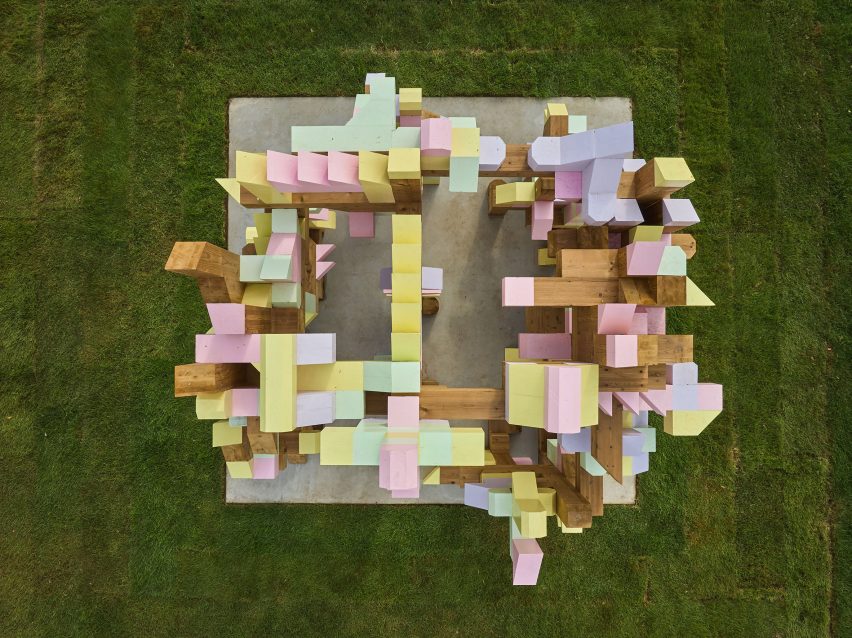
Aerial view of Fungible Non-Fungible Pavilion at Tallinn Architecture Biennale
Its puzzle-like form was built using NFT technology

NFTs, or non-fungible tokens, are certificates of authenticity and ownership that exist digitally and can be assigned to both physical and digital assets. Each one is individually recorded, or “minted”, on a blockchain similarly to a cryptocurrency transaction, allowing it to be purchased, sold and collected.

Iheartblob’s intention is for the pavilion to promote a slow and decentralised approach to architecture, in which the community replaces the architect as the “master builder”.

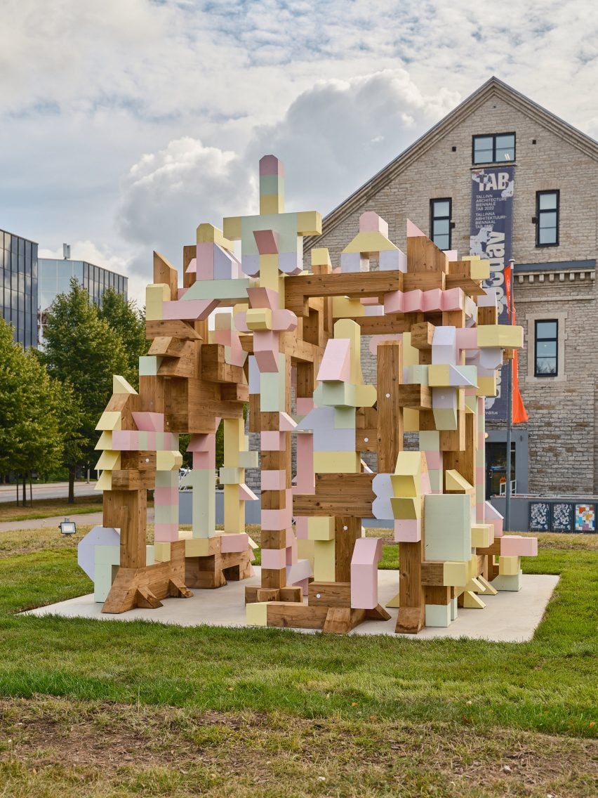
Photo of pixelated wooden pavilion
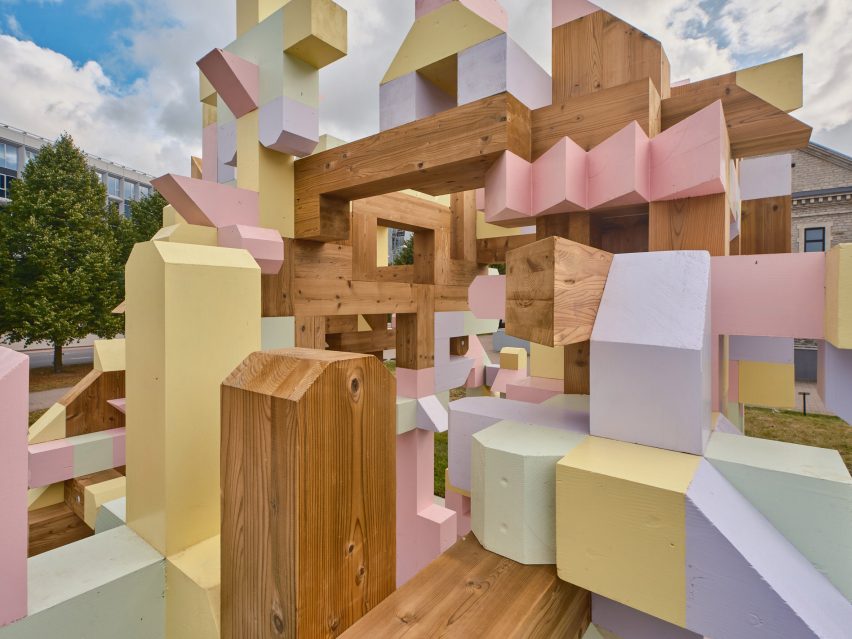
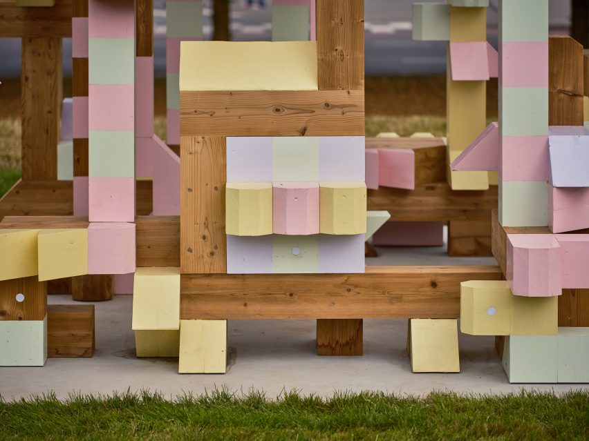
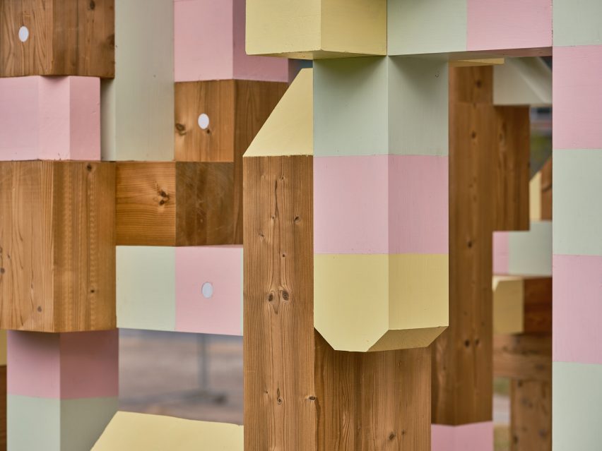
Its components are physical versions of NFT objects minted by the community

Its design responds to the theme of the sixth edition of the biennial TAB festival, for which Dezeen is media partner. Called “Edible; Or, the Architecture of Metabolism”, it was curated by architects Lydia Kallipoliti and Areti Markopoulou to explore food systems through the lens of architecture.

The pavilion is currently built from 78 unique puzzle-like pieces, although it is expected to expand.

Iheartblob climbing Tallinn Architecture Biennale pavilion
Iheartblob (above) created an NFT-generative tool for the project

To facilitate this, Iheartblob built an NFT-generative tool that anyone can use to design and mint objects. Every NFT minted by this tool funded a unique physical twin that is now used in the pavilion.

The end result is a fragmented structure that has a presence in both the metaverse and real space and is co-owned by and reflective of the community that designed it.

Detail photo of Fungible Non-Fungible Pavilion at TAB 2022
The blocks are made from wood

The tool is still open for use, meaning the pavilion will evolve and grow in size over the course of its installation until the opening of the next TAB in 2023.

“The idea here is that since we have decentralised the process of architecture, since anyone can design a block that becomes part of this piece, since anyone can add to the pavilion, this will change over the course of the biennale,” the studio explained.

“To date, I think we’ve had designers as young as five, create a piece we’ve had people here locally in Tallinn create many of these pieces. We’ve also had people from all over the world from Asia from America, designing different pieces that have come together.”

While Iheartblob handed over the reins to the public when it came to the pavilion’s design, it did provide a series of constraints to ensure the structure could be physically realised.

This included predefined forms for the interlocking components and predetermined timber materiality. There is also a maximum of 165 pieces, which will create a width, depth and height of roughly five metres.

Detail photo of Fungible Non-Fungible Pavilion at TAB 2022
The structure sits on the grass outside the Museum of Estonian Architecture in Tallinn

While promoting the idea of decentralisation in architecture, the studio hopes the Fungible Non-Fungible Pavilion will demonstrate the value of NFTs in the sector.

“We think blockchain and NFTs can feed into many aspects of the profession from having NFTs determine authenticity of architectural drawings to more experimental approaches which determine ownership and authorship, with royalties, of shared housing or even entire cities,” the studio explained.

Pavilion built from wooden blocks
The pavilion is expected to evolve over the course of its installation

The Fungible Non-Fungible Pavilion was selected to create the pavilion shortly after the original competition winners, Australian duo Simulaa and Natalie Alima, withdrew their proposal for an installation made of mushrooms.

Alongside the pavilion, this year’s TAB includes a curational exhibition at the Museum of Estonian Architecture and other fringe events. The event was previously expected to take place in 2021, but it was pushed back to 2022 due to the coronavirus pandemic. The seventh edition remains scheduled for 2023.

It is intended to promote decentralisation in architecture

At the previous TAB in 2019, the central installation took the form of a twisted pavilion designed by SoomeenHahm Design, Igor Pantic and Fologram. The structure explored augmented reality and old-fashioned woodworking such as steam-bent hardwood.

Tallinn Architecture Biennale takes place from 7 September to 20 November 2022 at various locations across Tallinn, Estonia. See Dezeen Events Guide for an up-to-date list of architecture and design events taking place around the world.

The photography is by Tõnu Tunnel.

Reference

Architecture Mood Board: Mies van der Rohe’s Barcelona Pavilion
CategoriesArchitecture

Architecture Mood Board: Mies van der Rohe’s Barcelona Pavilion

There are few buildings in the world with a more distinctive aesthetic than the Barcelona Pavilion, designed by Mies van der Rohe and Lilly Riech. Originally constructed as the German Pavilion for the Barcelona International Exhibition in 1929, and rebuilt in 1986, this iconic building bears all the characteristics of the Modernist principles that Mies is famed for. The pavilion’s emphatic horizontality, open-plan layout and minimalist detailing are renowned, but the project’s use of materials are arguably its most defining quality.

Sumptuous yet cool, rich yet understated, the pavilion’s material palette celebrates the art of contrast. Monumental slabs of marble work in harmony with slender glass partitions and reflecting pools to create a serene space, worlds away from the hustle and bustle of the nearby city.

Here, we take a closer look at some of those iconic materials, revealing the ingredients behind one of the purest manifestations of Modernist architecture. To the right of each image, you can find a selection of samples inspired by each material — visit Material Bank to start curating your own board.


Travertine (floor and exterior walls)

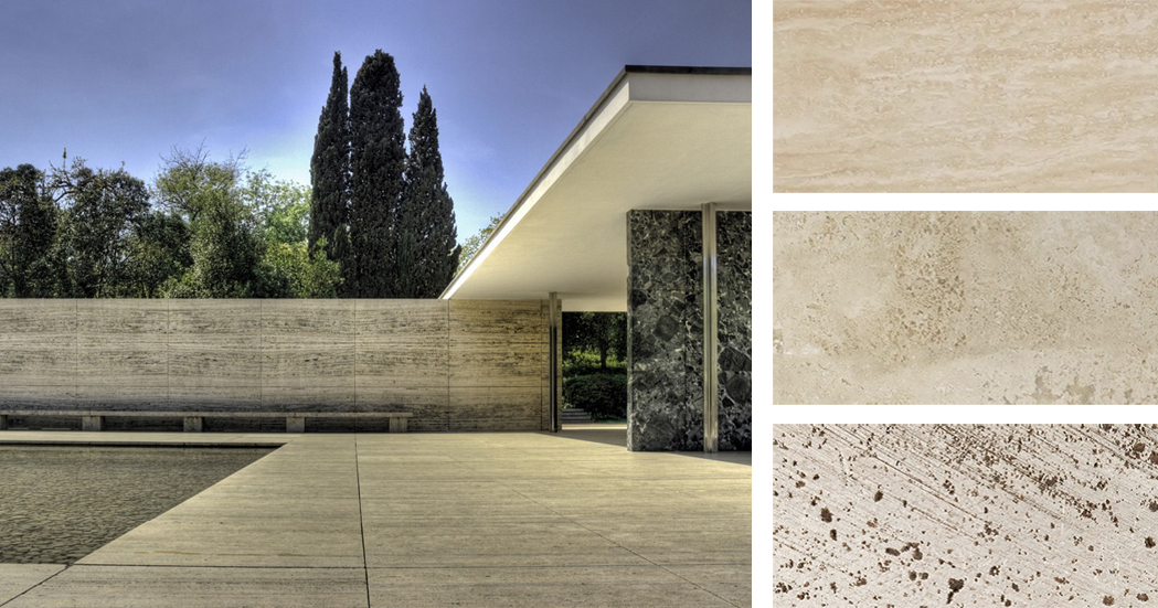
Left: The Barcelona Pavilion; image by Wojtek Gurak. Right: Materials inspired by the pavilion’s travertine surfaces; samples via Material Bank

The most prominent material used throughout the Pavilion is Roman travertine, a luxurious yet hard-wearing material that anchors the projects. Travertine forms the plinth upon which the building sits, as well as the surrounding walls, which enclose the reflecting pool and provide a sense of separation from the outside world. Its color, a soft, yellowish hue, acts as a perfect backdrop for the bold materials placed throughout the building.

Featured Material Samples


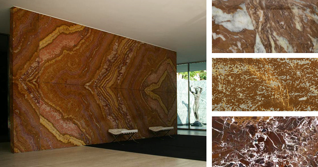
Golden Onyx (interior freestanding wall)

Left: Barcelona Pavilion interior; image by Martin D. Right: Materials inspired by the pavilion’s onyx wall; samples via Material Bank

At the heart of the building is a freestanding wall of golden onyx, sourced from the Atlas Mountains in Northern Africa. The uniquely patterned surface of this slab was revealed by a splitting process called broaching, enabling a symmetrical marbled pattern to be displayed across the wall’s entire expanse. In terms of color, amber hues transition into oranges and deep reds, providing a rich and complex finish that forms a focal point within the building’s interior. Interestingly, Carsten Krohn, author of Mies Van Der Rohe: The Built Work, states that “the honey-yellow onyx wall of the original is much redder in the modern reconstruction.”

Featured Material Samples


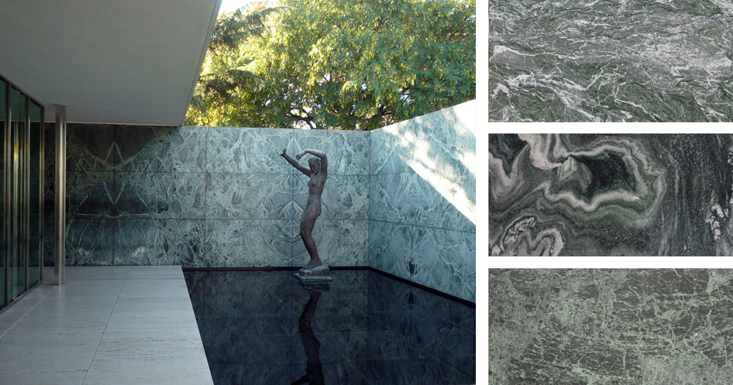
Green Marble (walls)

Left: Barcelona Pavilion exterior; image by Steven Zucker. Right: Materials inspired by the pavilion’s green marble walls; samples via Material Bank

Two types of marble with a green hue can be found in the Barcelona Pavilion: Polished green Tinian marble and “vert antique” marble, quarried in the French Alps. The hues of these walls range from deep green to gray-blue, contrasting with the lighter shades of travertine below and the pure white plane of the ceiling above.

Featured Material Samples


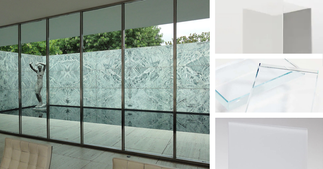
Glass (walls)

Left: Barcelona Pavilion glazing; image by Kent Wang. Right: Materials inspired by the pavilion’s glazing; samples via Material Bank

Mies employed a variety of glass materials throughout the pavilion, controlling the level of transparency, varying the sense of enclosure and framing specific views. According to Krohn, “an entire repertoire of materials have been employed: in addition to transparent glass, the building makes use of green and gray glass, frosted glass as well as black opaque glass for the table tops.” Together with the marble partitions, the glass panels of Mies’ pavilion challenge the conventional function of walls — rather than enclosing space, they act as devices to guide people through the building, channeling their path and blurring the boundaries between inside and out.

Featured Material Samples


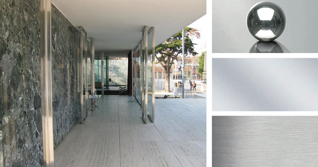
Stainless Steel (loading-bearing columns)

Left: Barcelona Pavilion interior; image by Rory Hyde. Right: Materials inspired by the stainless steel columns; samples via Material Bank

Key to Mies van der Rohe’s design was a set of eight polished steel columns that support the roof. As Krohn explains, “the columns form a structural unit that represents a separate architectonic element independent of the non-loadbearing partitioning walls.” Their cruciform shape provides the necessary structural rigidity, while their polished finish reflects light and flashes of color from the surrounding marble. It also echoes the reflective quality of the pools on the exterior or the building.

Featured Material Samples


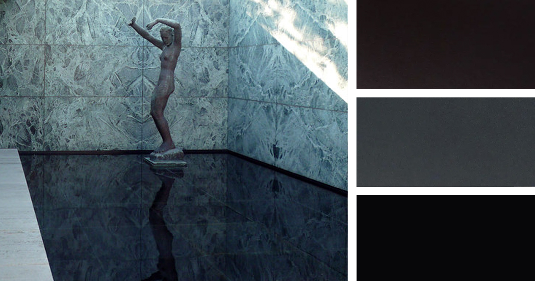
Black Glass (reflecting pool)

Left: Barcelona Pavilion exterior; image by Steven Zucker. Right: Materials inspired by the black glass of the reflecting pool; samples via Material Bank

Black glass was used to line the smaller of the two pools within the Barcelona pavilion, designed to heighten the reflective quality of the water and dramatize the solitary ornament within the building: a bronze reproduction of Georg Kolbe’s sculptural figure, entitled “Dawn”. Both the sculpture and the patterned marble walls behind it are perfectly reflected in the water, their curves contrasting with the perfectly straight lines that define the space.

Featured Material Samples


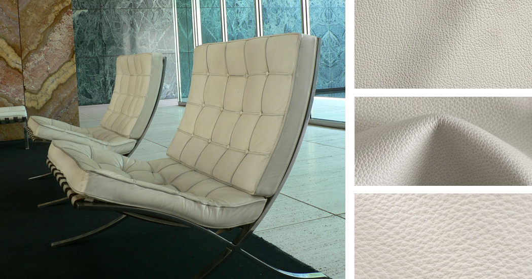
Ivory Leather (Barcelona Chairs)

Left: Interior featuring the Barcelona Chair; image by Yuichi. Right: Materials inspired by the Barcelona Chair; samples via Material Bank

Designed by Mies van der Rohe himself, the Barcelona Chair is an icon of modern design, to such an extent that faithful reproductions are still produced and sold today. The structure of the chair is polished stainless steel, echoing the cruciform columns of the pavilion. The back and cantilevered seat are upholstered with off-white kid leather, with welt and button details. MoMA sums it up best: “The Barcelona Chair achieves the serenity of line and the refinement of proportions and materials characteristic of Mies van der Rohe’s highly disciplined architecture.”

Featured Material Samples


Inspired by Mies? We invite you to create your own material mood boards using iconic architecture as your muse! Share your creations with editorial@architizer.com and we’ll publish a selection of the best on Architizer.

Top image: The Barcelona Pavilion via Wikimedia

Reference

Watch a live talk with Serpentine Pavilion architect Sumayya Vally
CategoriesLandscaping

Watch a live talk with Serpentine Pavilion architect Sumayya Vally

Watch a live talk with Serpentine Pavilion architect Sumayya Vally

Portrait of Sumayya Vally

Dezeen has teamed up with the Serpentine Gallery to live stream a conversation between Hans Ulrich Obrist and architect Sumayya Vally of Counterspace about this year’s Serpentine Pavilion. Watch the talk here from 1:00pm London time.

Broadcasting live from the 20th Serpentine Pavilion in London, Vally will discuss the process and concepts behind her design with Serpentine Galleries artistic director Obrist in the talk.

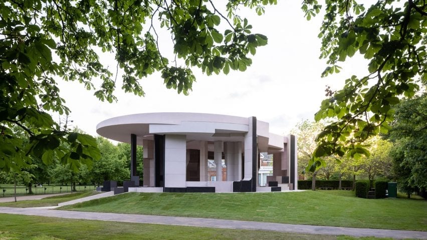
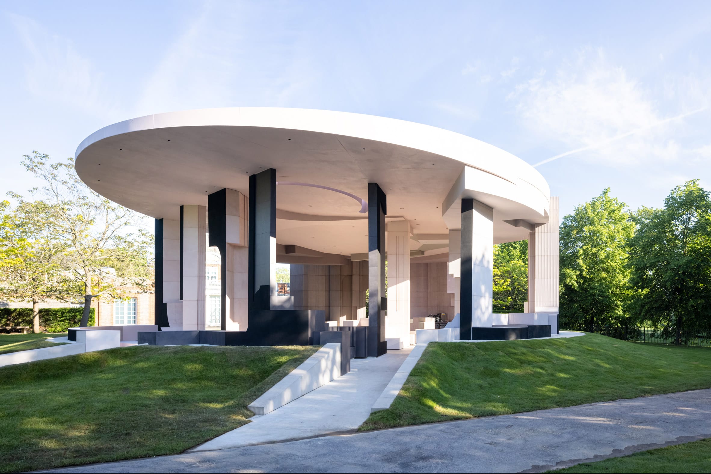
Counterspace Serpentine Pavilion
The 20th Serpentine Pavilion is designed by Sumayya Vally

Vally’s Serpentine Pavilion is a circular pink-and-grey structure made from reclaimed cork and steel.

The temporary structure, which is currently located on the lawn outside the Serpentine Gallery, is one of five pavilions dispersed throughout the capital that comprise this year’s design.

Portrait of Sumayya Vally
Sumayya Vally is the director of Counterspace

A further four smaller pieces can be found at sites significant to London’s migrant communities, including Deptford, Barking and Dagenham, Finsbury Park and Nottinghill.

Vally gave an exclusive video interview to Dezeen in which she described the pavilion as “like a puzzle of many different elements coming together.”

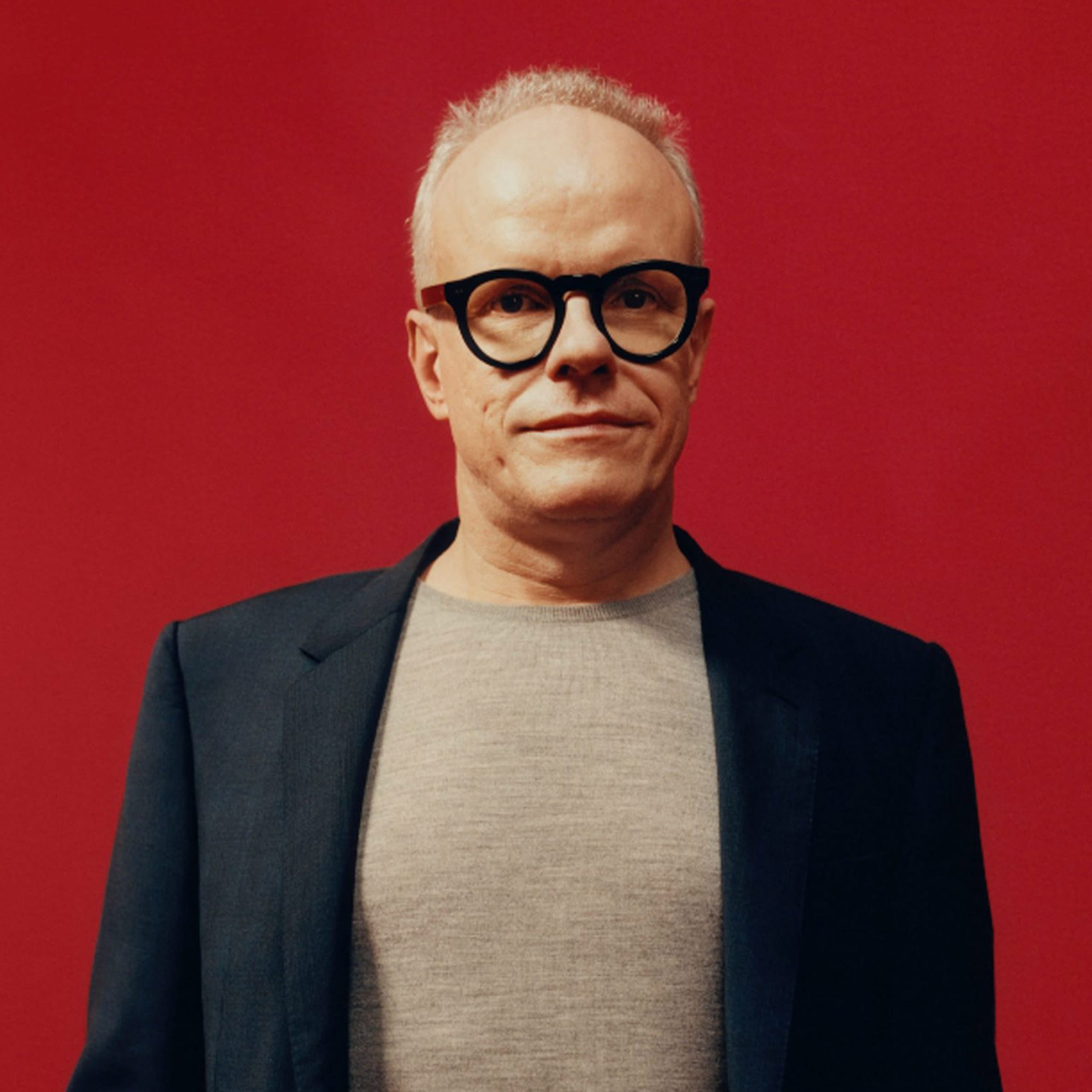
Hans Ulrich Obrist
Serpentine Galleries artistic director Hans Ulrich Obrist will moderate the talk

The Serpentine Pavilion is an annual commission established in 2000 by the London gallery. Each year, it is awarded to international architects who have not yet had the opportunity to build in the UK .

Vally is the youngest architect to receive the prestigious commission. The likes of Zaha Hadid, Toyo Ito and Oscar Niemeyer are among the architects to have designed previous pavilions.


The talk takes place at 1:00pm London time on 9 June 2021. The Serpentine Pavilion 2021 is open to the public in London from 11 June to 17 October 2021. See Dezeen Events Guide for an up-to-date list of architecture and design events taking place around the world.
The post Watch a live talk with Serpentine Pavilion architect Sumayya Vally appeared first on Dezeen.

The post Watch a live talk with Serpentine Pavilion architect Sumayya Vally appeared first on Source link