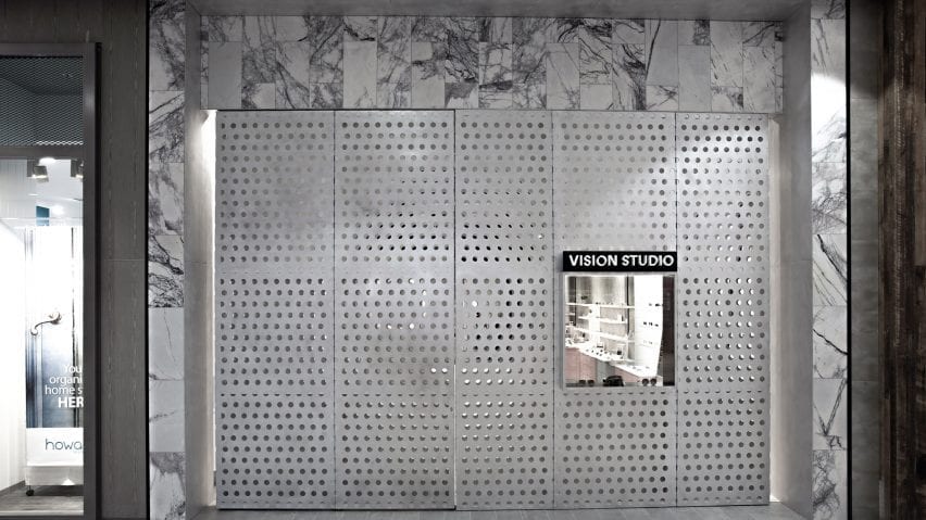
Architectural innovation and creativity go hand in hand. Designers are constantly seeking new ways to push boundaries, challenge norms, and create buildings that resonate with places and people. One material that is increasingly being harnessed to this end is perforated metal, with a multitude of high-tech systems now available to architects looking for customizable wall and façade solutions.
One such example is the ImageWall system by Zahner, a renowned engineering and fabrication company with a long-standing reputation for its work with architects. Developed specifically for perforated metal panels, it offers a range of diverse qualities for projects across typologies and climates.
 Zahner became known for advanced metal surfaces and systems with both functional and ornamental forms. With ImageWall, Zahner has created a system that offers design versatility to make immersive experiences. With its accessible design tools, affordability, and wide range of applications, the perforated metal panel system empowers designers and architects to bring their visions to life.
Whether used in commercial, hospitality, retail, or residential settings, this material provides a customizable canvas for integrating backlighting, materials, and graphics. In this guide, we’ll explore the creative potential of perforated metal panel systems like ImageWall, from the design process to technical detailing and application.
Conceptualization: Pushing the Boundaries of Design
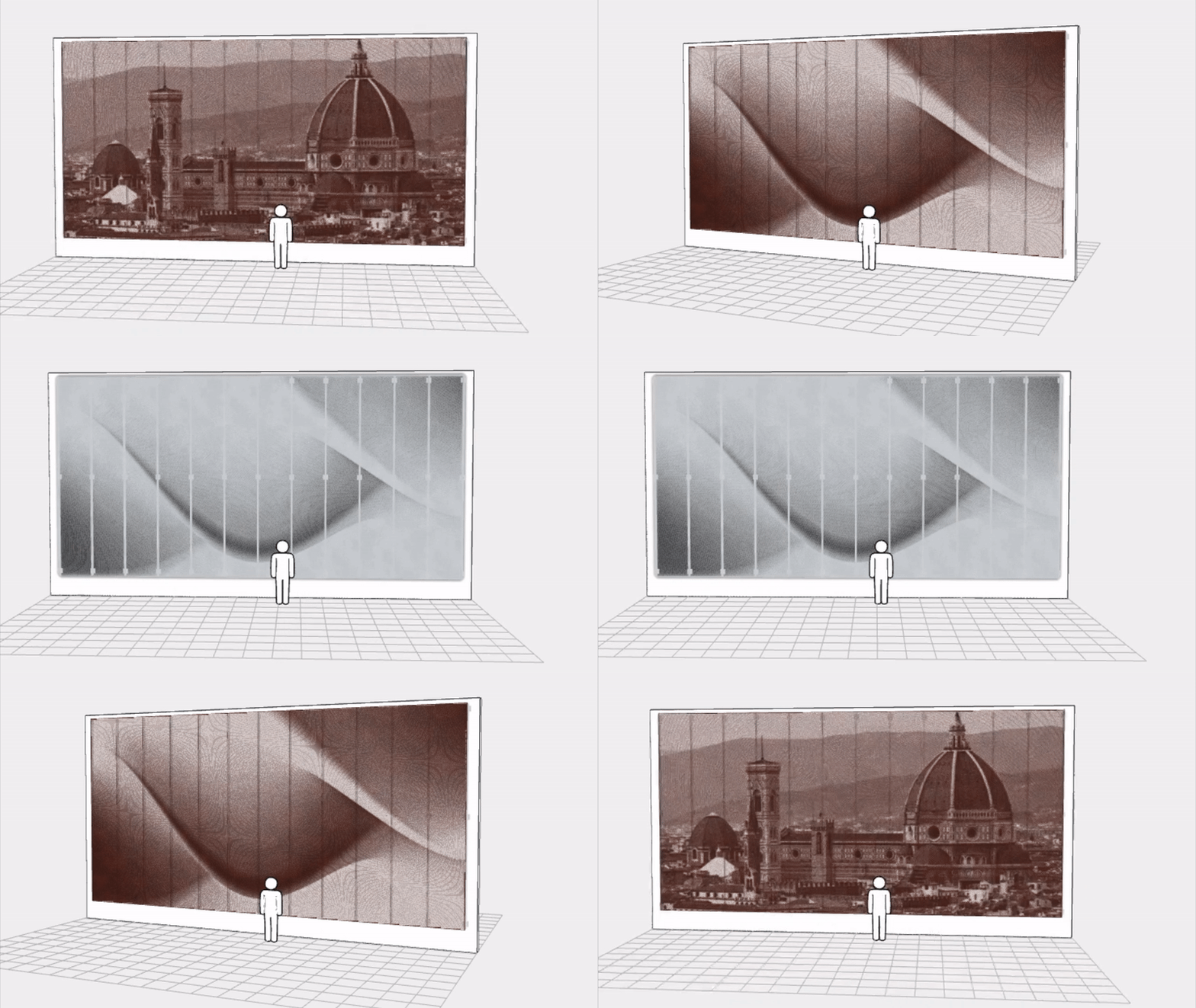
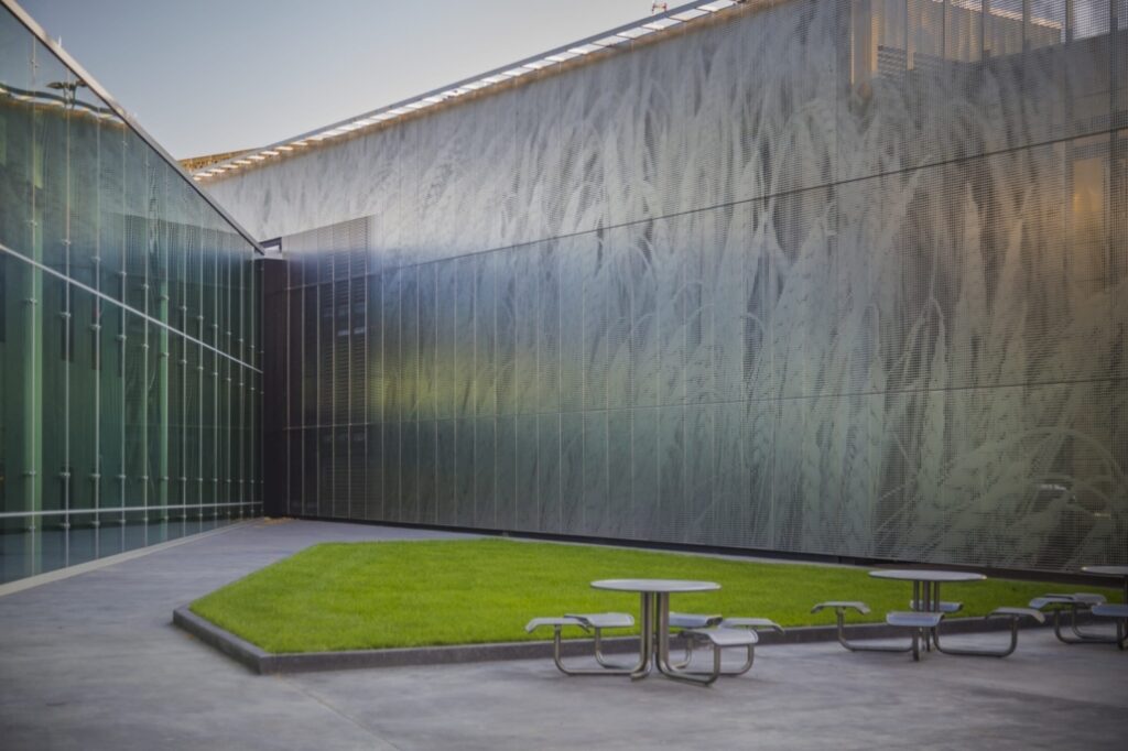 One of the most remarkable aspects of the ImageWall system is its accessibility to designers. Gone are the days of tedious back-and-forth communication. With this system, designers can now conceptualize and design directly within an intuitive online visualizer tool on the Zahner website.
This streamlines the design process and empowers architects to bring their visions to life more efficiently than ever before. The accessibility provided by the system fosters a greater sense of creative freedom, allowing designers to experiment, iterate, and explore a multitude of design options.
Design With ImageWall
Recently, Zahner Labs has further developed the system with ImageLines — an additional customization for generating perforated images. As the team explains, perforations are positioned by an array of customizable lines or curves, while perforation size is driven by a source image. Try it out; it’s easy to upload an image to the configurator and see how ImageLines takes perforated façades to the next level.
Technical Details: Streamlined Installation and Pre-Engineered Elements
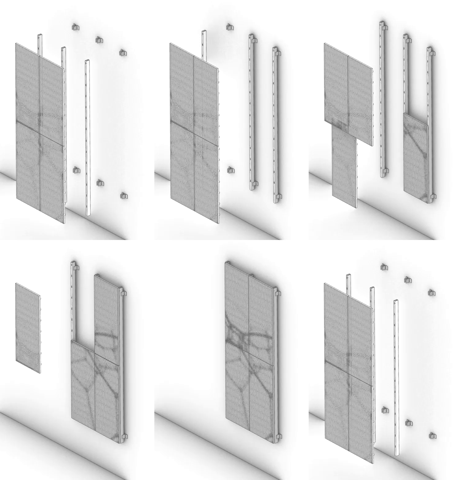 The ImageWall perforated metal panels not only look beautiful, but also allow for more streamlined detailing. Through the use of pre-engineered elements and easy-install systems, the cost and lead times are significantly reduced compared to traditional custom solutions. This makes affordability a key advantage offered by Zahner’s system.
Their product also allows clients with tighter budgets to benefit from the company’s reputation for quality craftsmanship and design expertise. In turn, the evolution from custom projects to a pre-engineered product demonstrates Zahner’s commitment to making cutting-edge design accessible to a wider audience.
Download ImageWall Details
 From sleek and modern metals like stainless steel and aluminum to warm and inviting materials like pre-weathered weathering steel and copper, ImageWall provides architects and designers with a wide selection of options to suit their desired aesthetic.
Additionally, the system can incorporate other materials such as glass, ceramics, or options like recycled materials, ensuring that each project can be uniquely tailored to meet the specific design requirements and desired visual impact. The versatility in material choices offered enables the creation of customized architectural elements that seamlessly integrate into a design.
Applications: Versatility Across Architectural Typologies
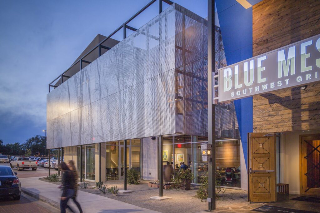
 At its heart, Zahner’s system has wide-ranging applications across architectural typologies. From commercial buildings to hospitality spaces, retail environments to multi-unit residential common areas, ImageWall seamlessly integrates with other building systems, structures, and assemblies.
This adaptability makes it a valuable tool for architects and designers working on a diverse range of projects. Whether it’s an eye-catching façade for a high-end hotel, an immersive retail environment, or a statement piece in a public space, the system offers endless possibilities for enhancing the appeal of a structure, entry or interior.
Creative Possibilities: Enhancing Design with Light, Materials, and Graphics
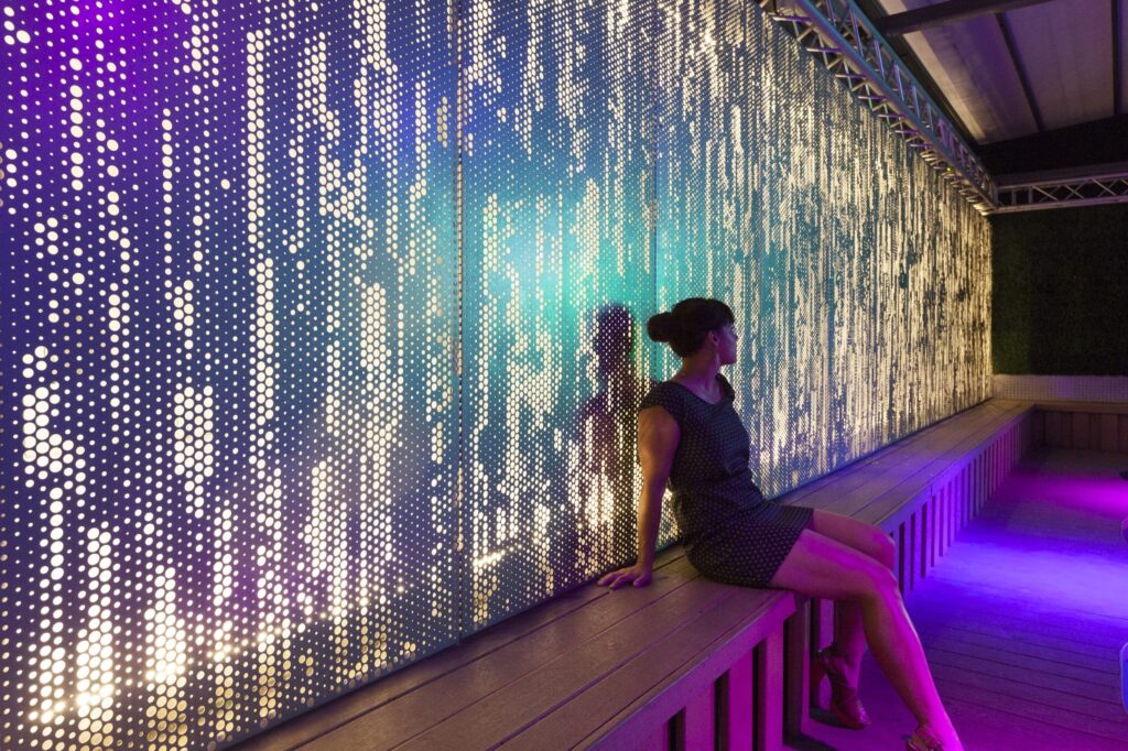
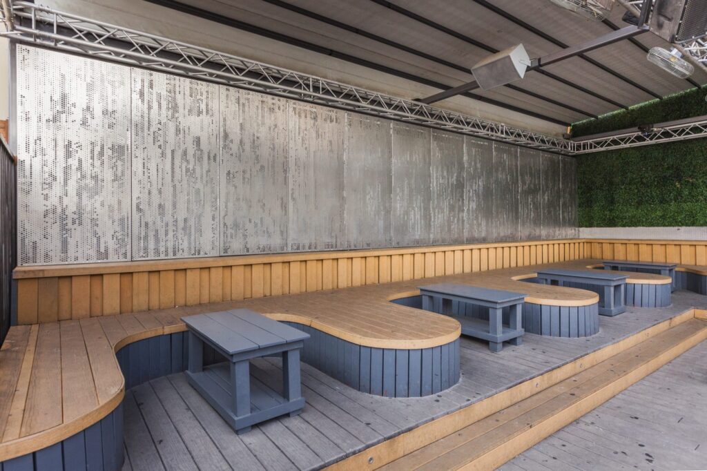 ImageWall offers a myriad of creative possibilities, including lighting options, material choices, and graphic integration. Backlighting adds a whole new dimension to architectural design, bringing depth, texture, and visual interest to spaces.
 With a vast array of materials to choose from, architects can find the perfect match for their desired aesthetic, whether it be sleek and modern or warm and organic. The graphic options also enable the integration of custom patterns, logos, or artwork, allowing architects to create truly unique and memorable spaces that leave a lasting impression.
Case Studies: Showcasing the Power of ImageWall
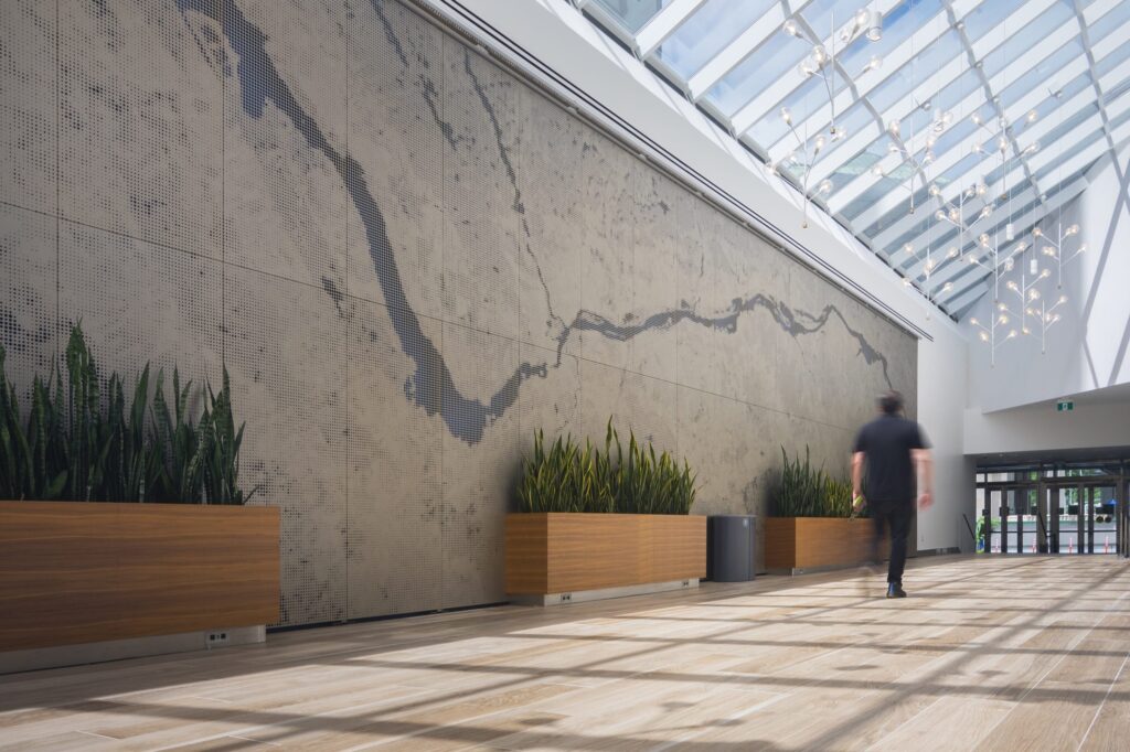 To appreciate the capabilities of perforated metal panels, there are many noteworthy case studies. For example, the ImageWall system was employed only a short walk from Canada’s Parliament buildings in Ottawa, Ontario, where the team of B+H Architects and Morguard collaborated with Zahner to enhance the experience of entering their office complex at 350 Sparks. The installation of custom perforated wall art showcases the journey along the Ottawa River adjacent to Parliament Hill. Zahner supplied 1,563 visible square feet of aluminum panels and associated sub-framing for the installation.
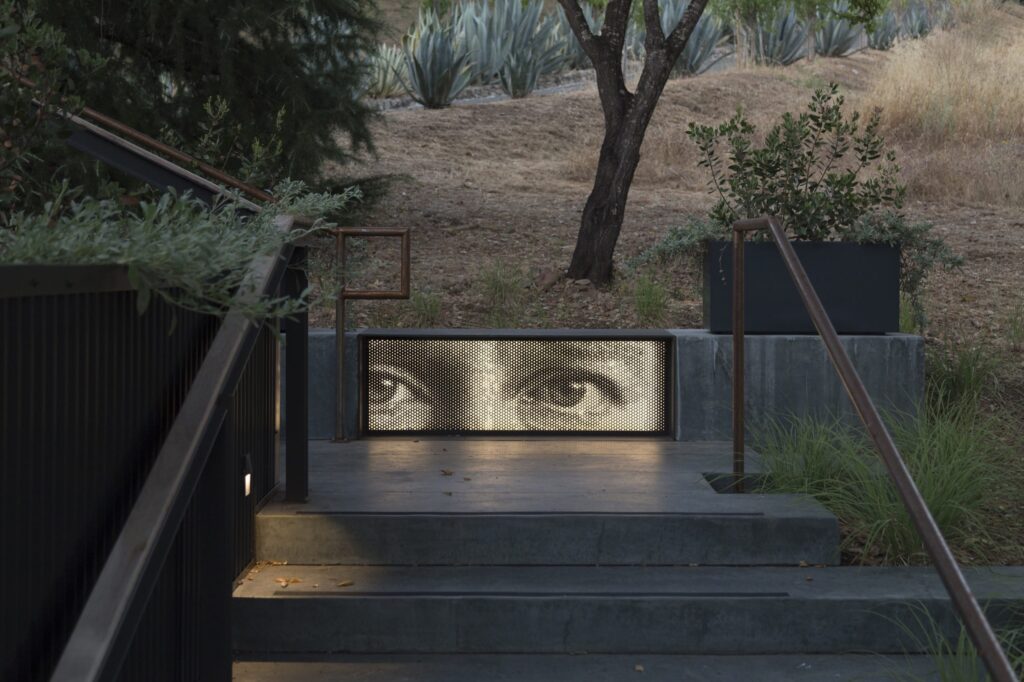
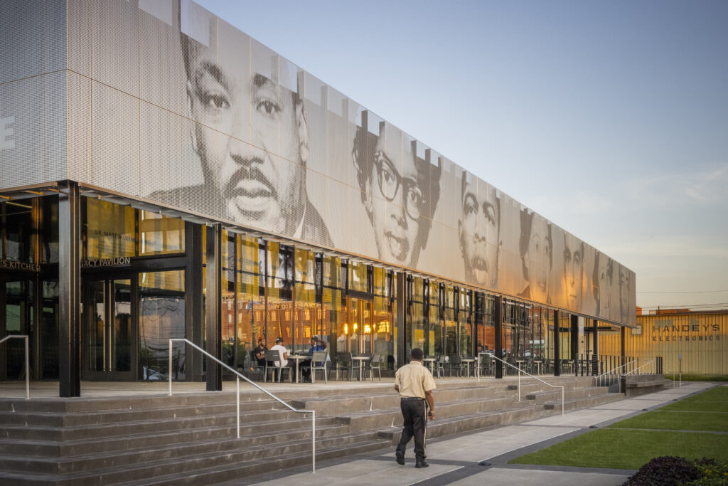 Zahner also collaborated on the Legacy Pavilion for The Equal Justice Initiative. The Pavilion, designed by Williams Blackstock Architects, is the EJI Museum campus’ new building. Zahner engineered and fabricated the custom Angel Hair stainless steel that clads the exterior of the building, which depicts the iconic images of several local civil rights activists that inspire hope for equal justice. In a similar way, two ImageWall murals clad the east and north sides of 1256 Penn Ave, featuring individual portrait panels of renowned local civil rights activists that helped shape the culture of Minneapolis.
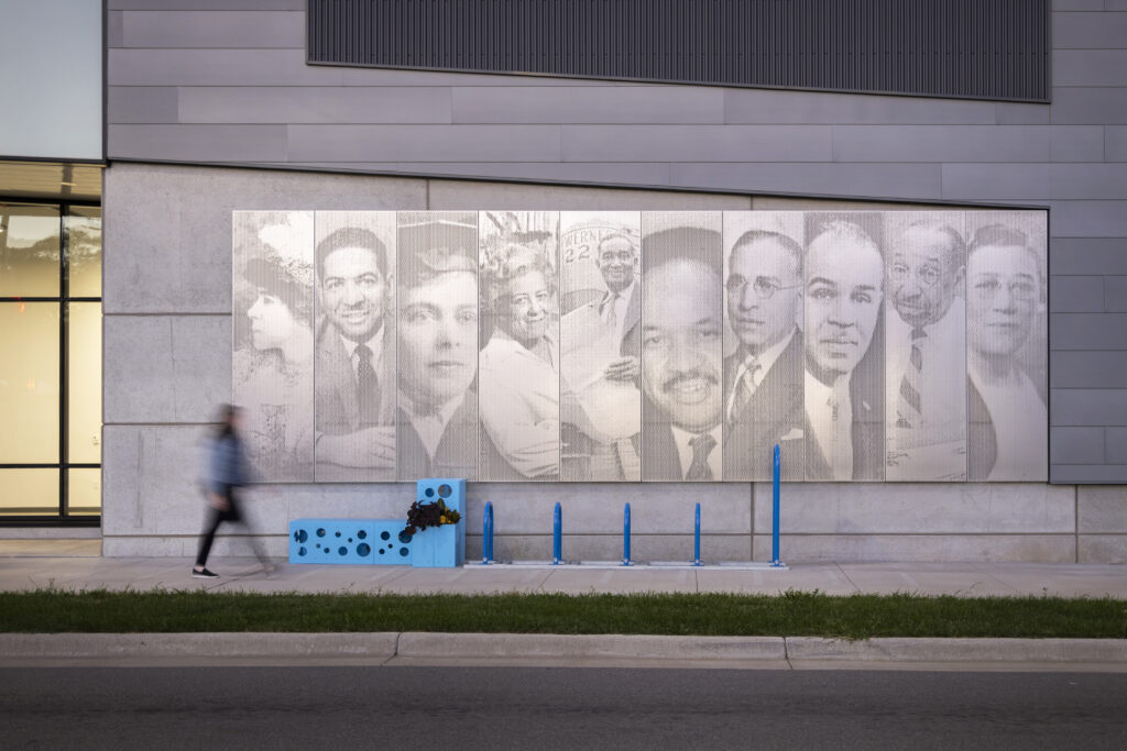 These case studies demonstrate how Zahner’s perforated metal panel system can be utilized by architects to enhance their designs. Its adaptability, material options, and creative possibilities have allowed architects to push boundaries and transform their visions into new landmarks.
Explore More Projects
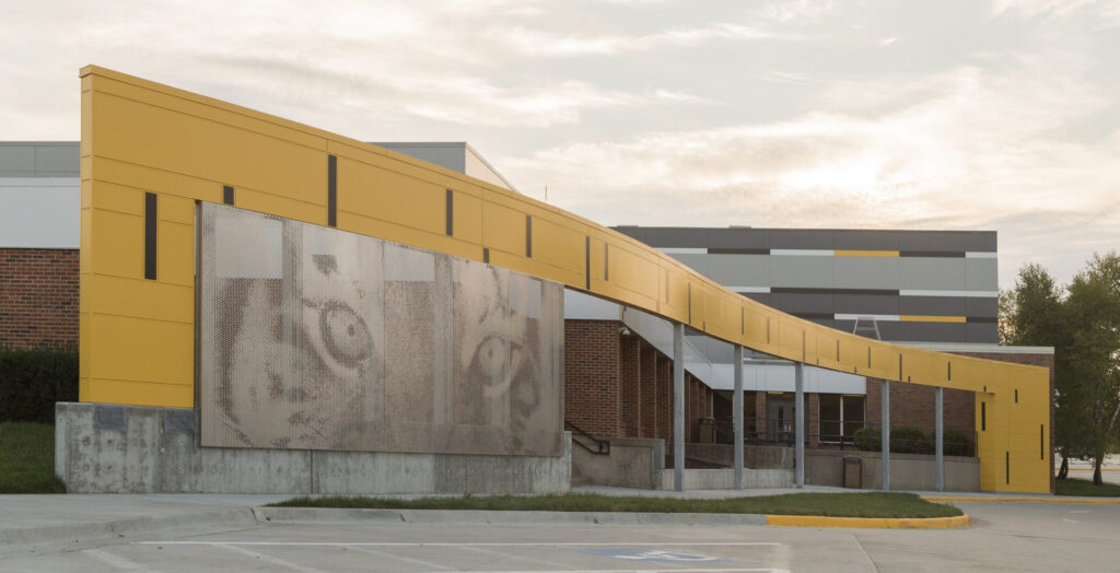 ImageWall represents the evolution of architectural solutions, bridging the gap between visionary concepts and practical implementation. Its accessibility to designers, affordability, wide range of applications, and design potential make it a versatile and valuable tool for architects and designers alike.
As Zahner continues to push boundaries and redefine what is possible in architectural design, the system stands as a testament to their ability to transform visionary concepts into innovative architecture products and systems.
Learn more about ImageWall here, start designing your own custom perforated panel here, and reach out to Zahner’s specialists about your next project here.





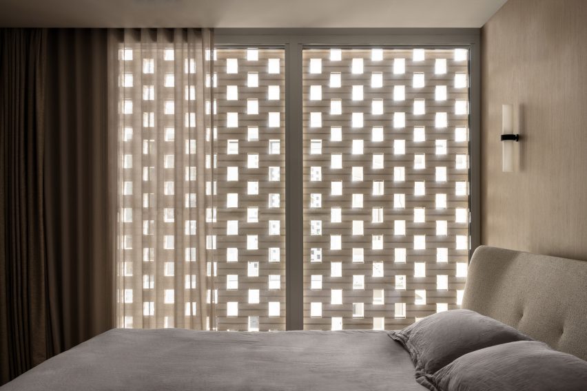
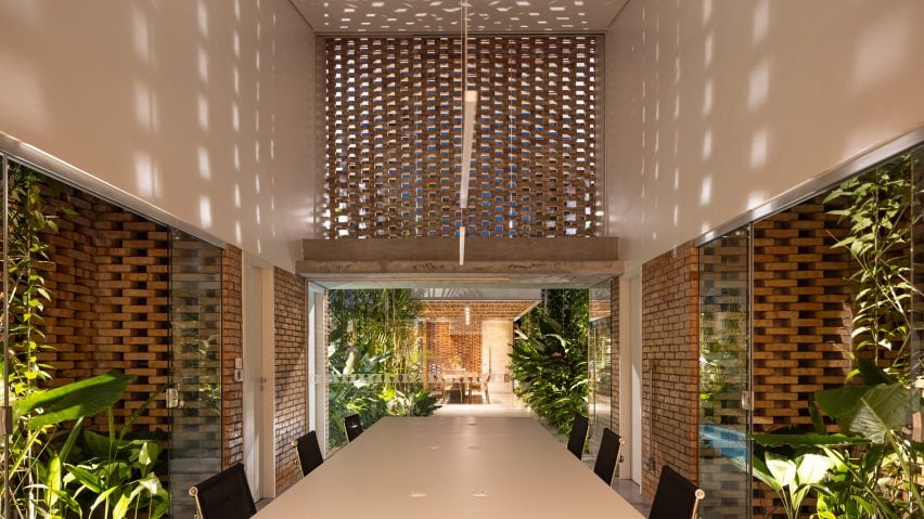
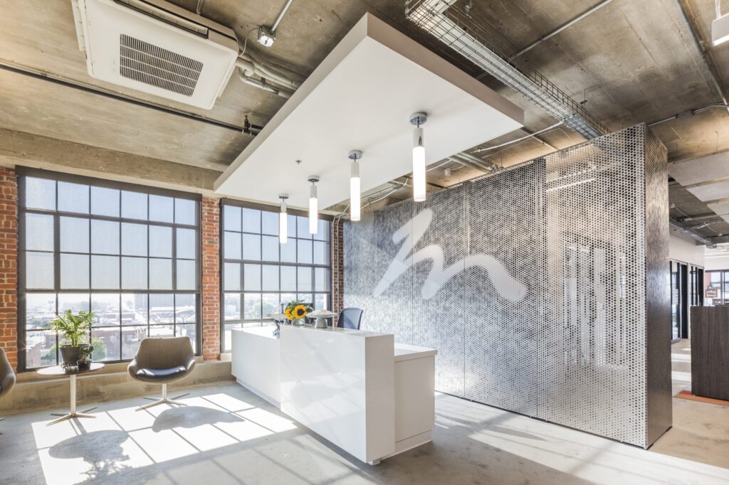
 Zahner became known for advanced metal surfaces and systems with both functional and ornamental forms. With ImageWall, Zahner has created a system that offers design versatility to make immersive experiences. With its accessible design tools, affordability, and wide range of applications, the perforated metal panel system empowers designers and architects to bring their visions to life.
 One of the most remarkable aspects of the ImageWall system is its accessibility to designers. Gone are the days of tedious back-and-forth communication. With this system, designers can now conceptualize and design directly within an
  The ImageWall perforated metal panels not only look beautiful, but also allow for more streamlined detailing. Through the use of pre-engineered elements and easy-install systems, the cost and lead times are significantly reduced compared to traditional custom solutions. This makes affordability a key advantage offered by Zahner’s system.
 From sleek and modern metals like stainless steel and aluminum to warm and inviting materials like pre-weathered weathering steel and copper, ImageWall provides architects and designers with a wide selection of options to suit their desired aesthetic.
 At its heart, Zahner’s system has wide-ranging applications across architectural typologies. From commercial buildings to hospitality spaces, retail environments to multi-unit residential common areas, ImageWall seamlessly integrates with other building systems, structures, and assemblies.
 ImageWall offers a myriad of creative possibilities, including lighting options, material choices, and graphic integration. Backlighting adds a whole new dimension to architectural design, bringing depth, texture, and visual interest to spaces.
 With a vast array of materials to choose from, architects can find the perfect match for their desired aesthetic, whether it be sleek and modern or warm and organic. The graphic options also enable the integration of custom patterns, logos, or artwork, allowing architects to create truly unique and memorable spaces that leave a lasting impression.
 To appreciate the capabilities of perforated metal panels, there are many noteworthy case studies. For example, the ImageWall system was employed only a short walk from Canada’s Parliament buildings in Ottawa, Ontario, where the team of B+H Architects and Morguard collaborated with Zahner to enhance the experience of entering their office complex at
  Zahner also collaborated on the Legacy Pavilion for
  These case studies demonstrate how Zahner’s perforated metal panel system can be utilized by architects to enhance their designs. Its adaptability, material options, and creative possibilities have allowed architects to push boundaries and transform their visions into new landmarks.
 ImageWall represents the evolution of architectural solutions, bridging the gap between visionary concepts and practical implementation. Its accessibility to designers, affordability, wide range of applications, and design potential make it a versatile and valuable tool for architects and designers alike.
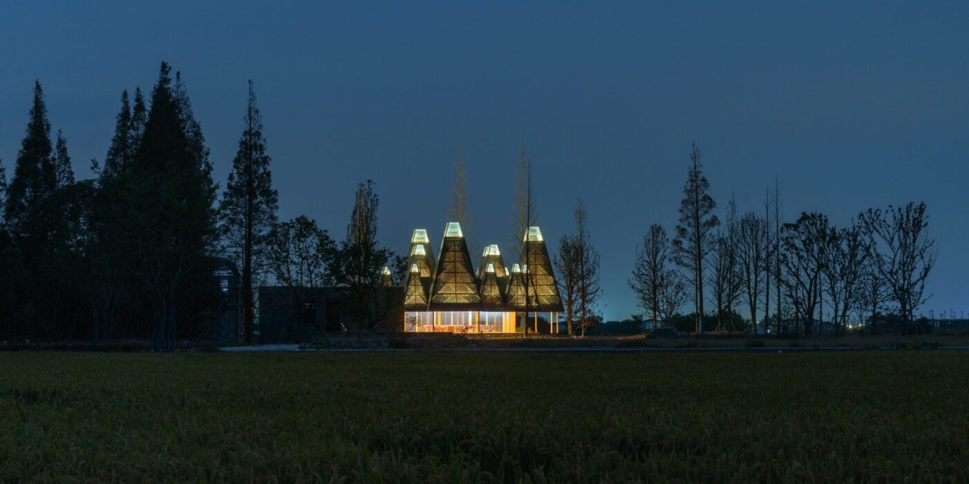
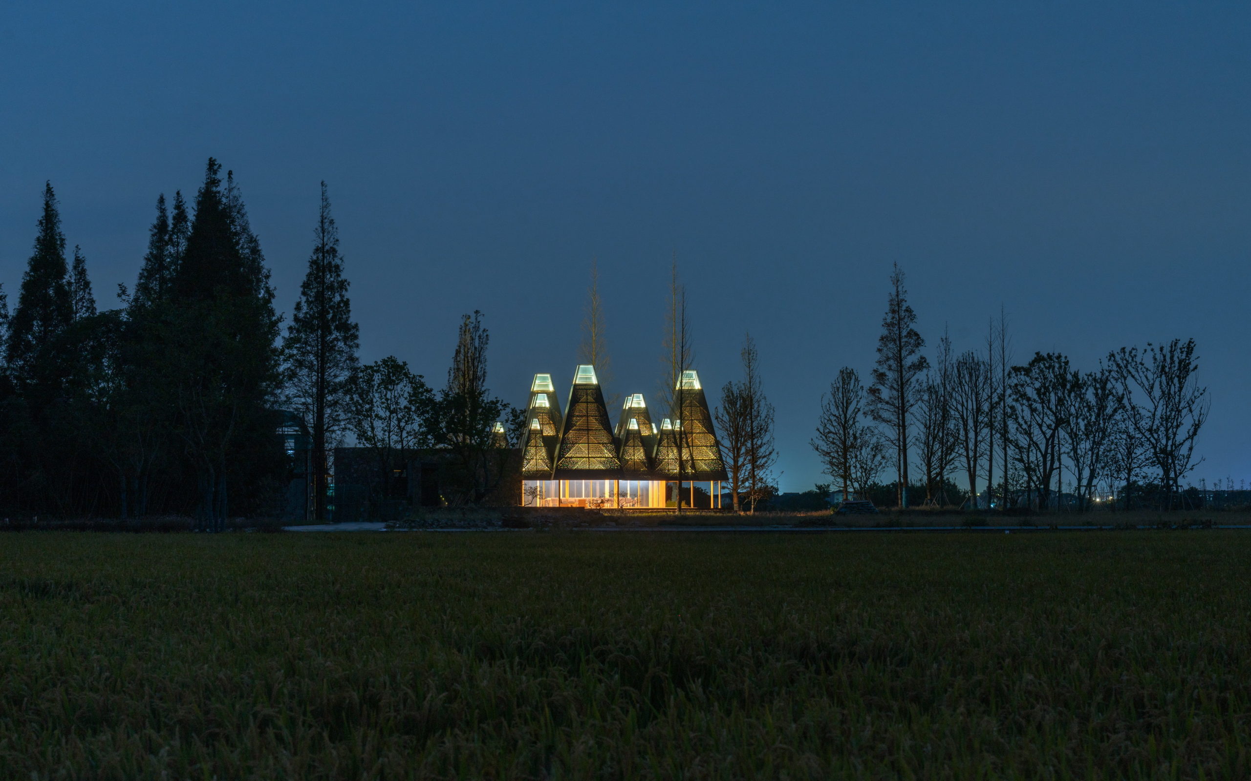
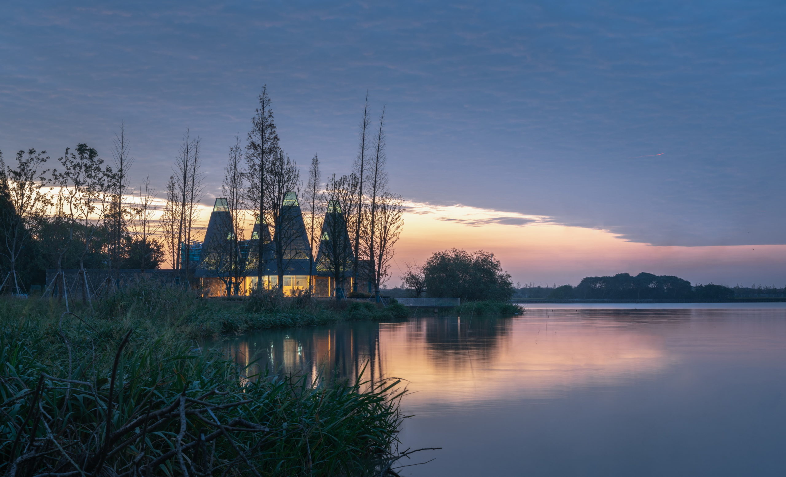
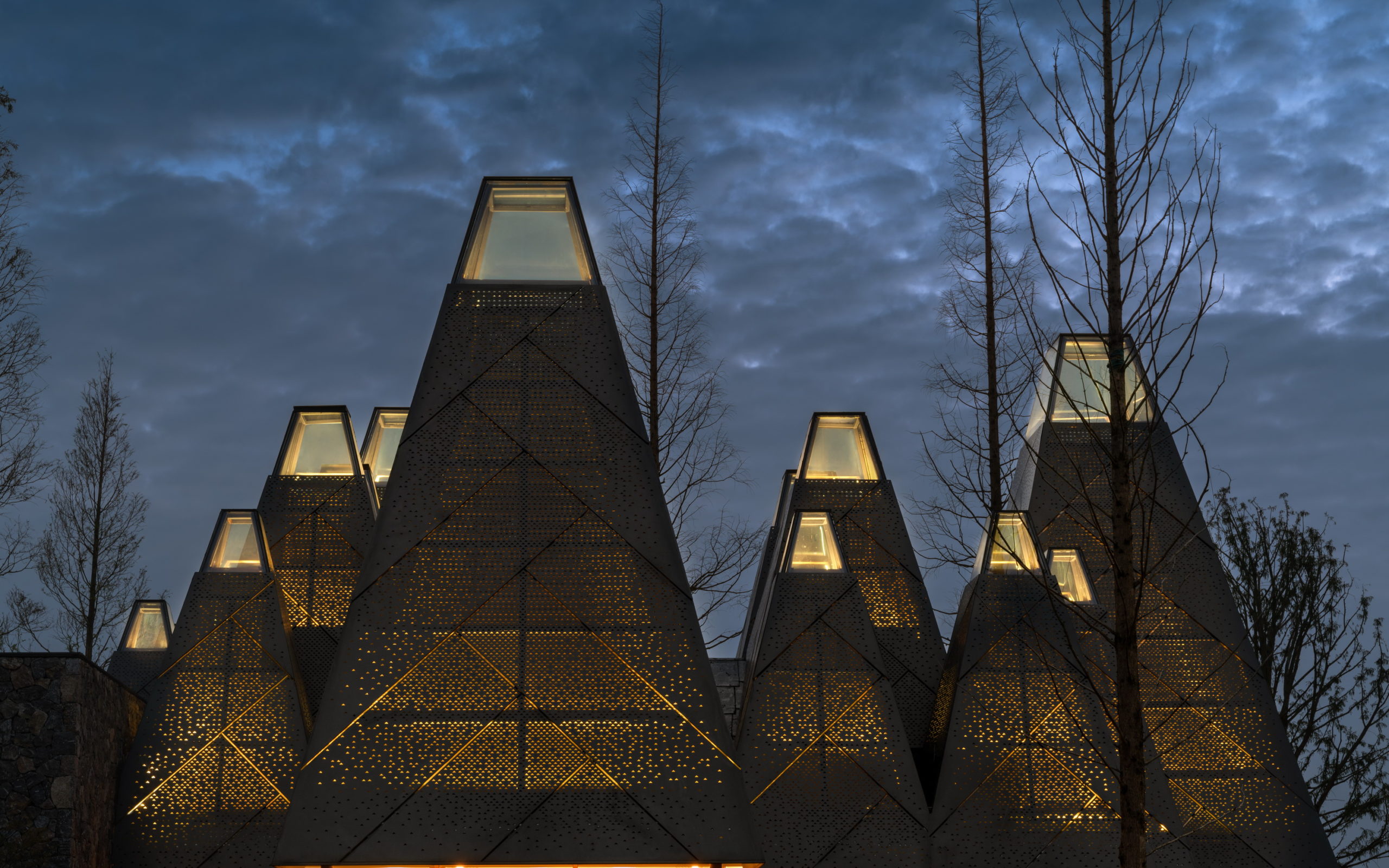
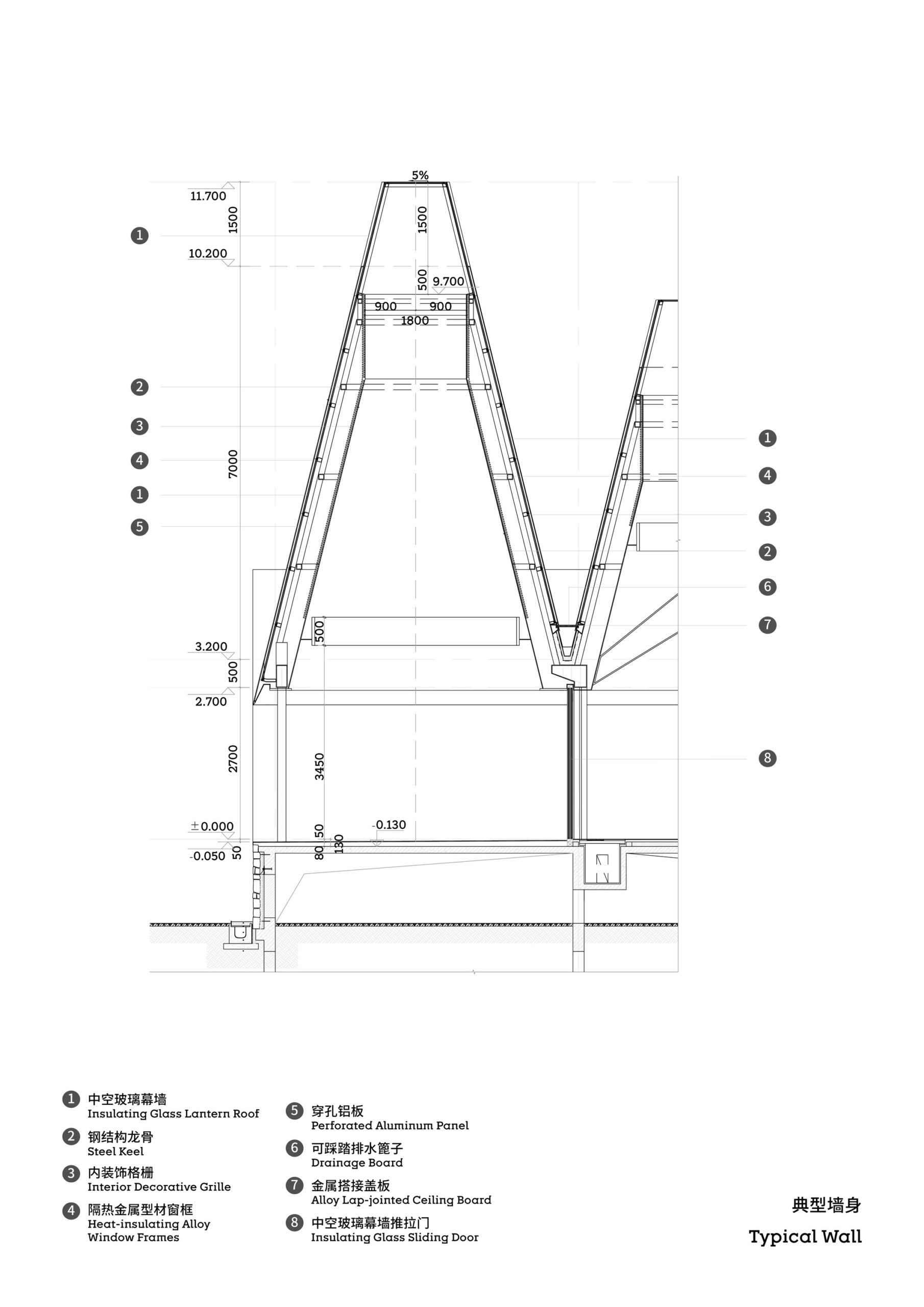
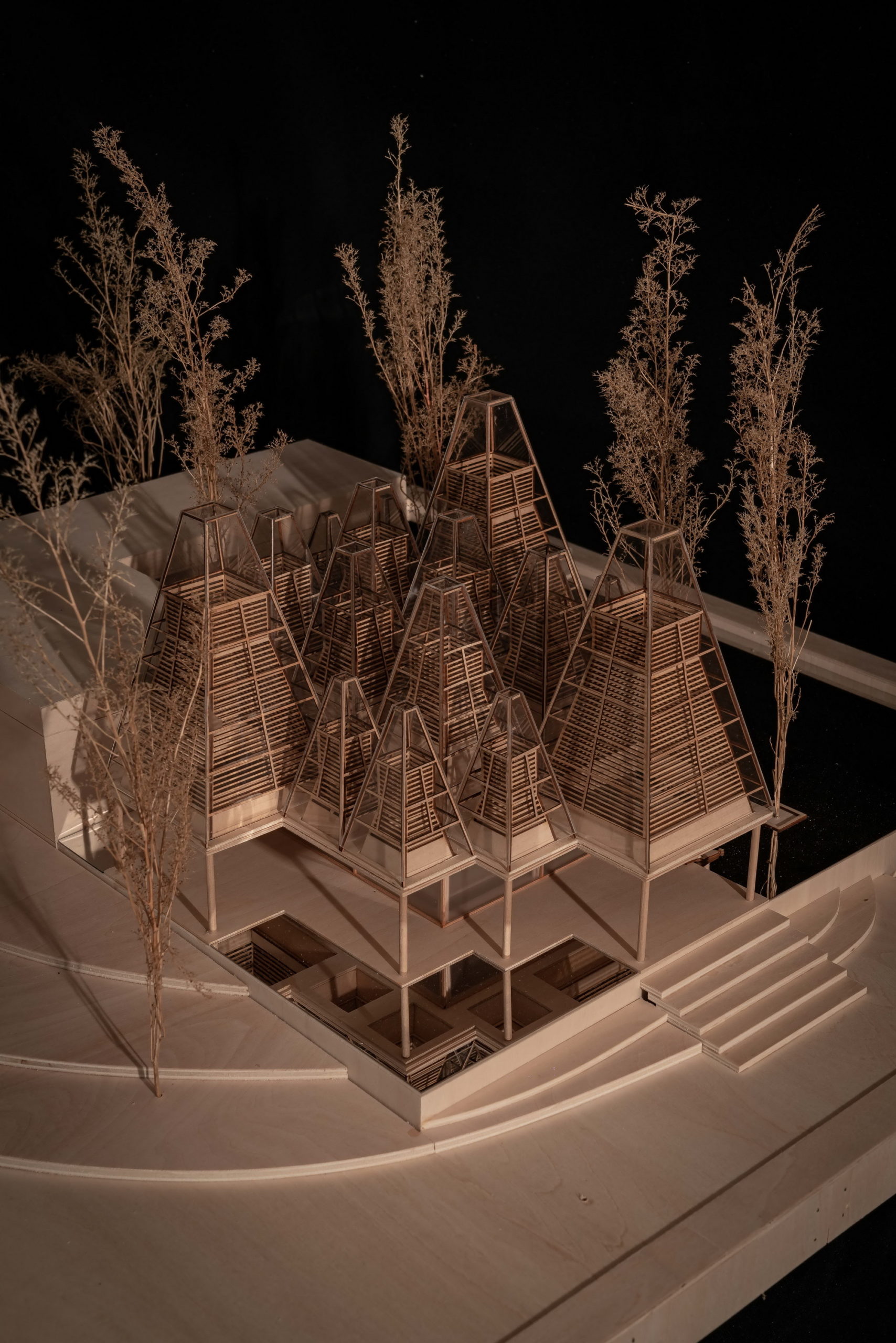
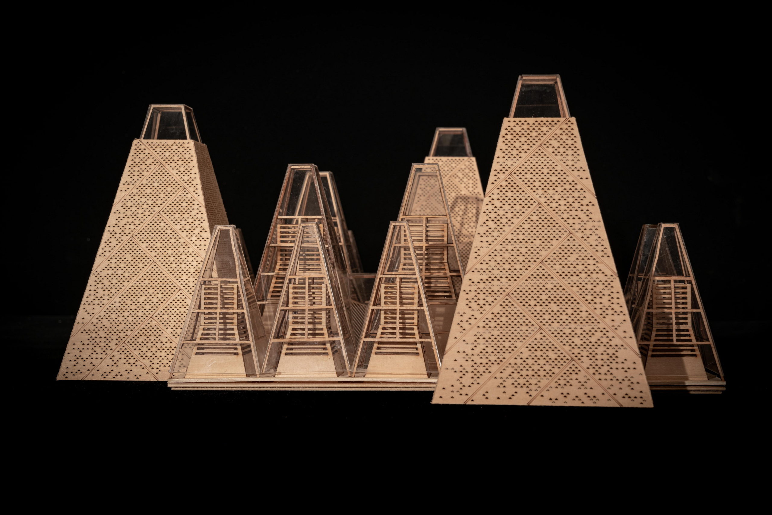 Despite the different heights on top, the lower end of the roof is evenly lowered by about nine feet to create a crisp frame of the view around. “Standing under the eaves and looking out, the vastness and tranquility of the plain wetlands seem to be included in the picture scroll,” GOA explained. The underside of the roof is also free of vents, which are in turn placed at the ground level along the glass windows, to create a disruption-free experience.
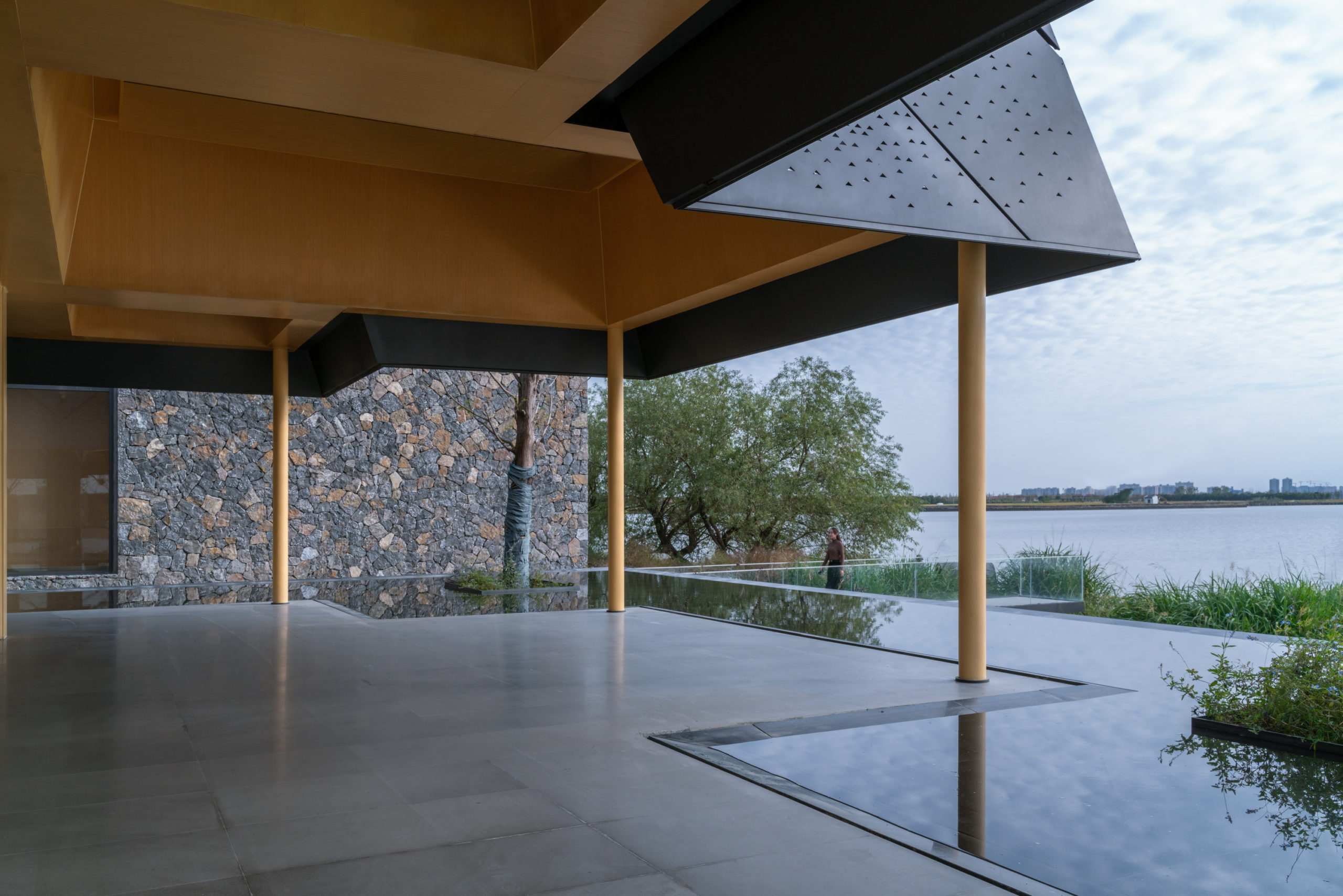
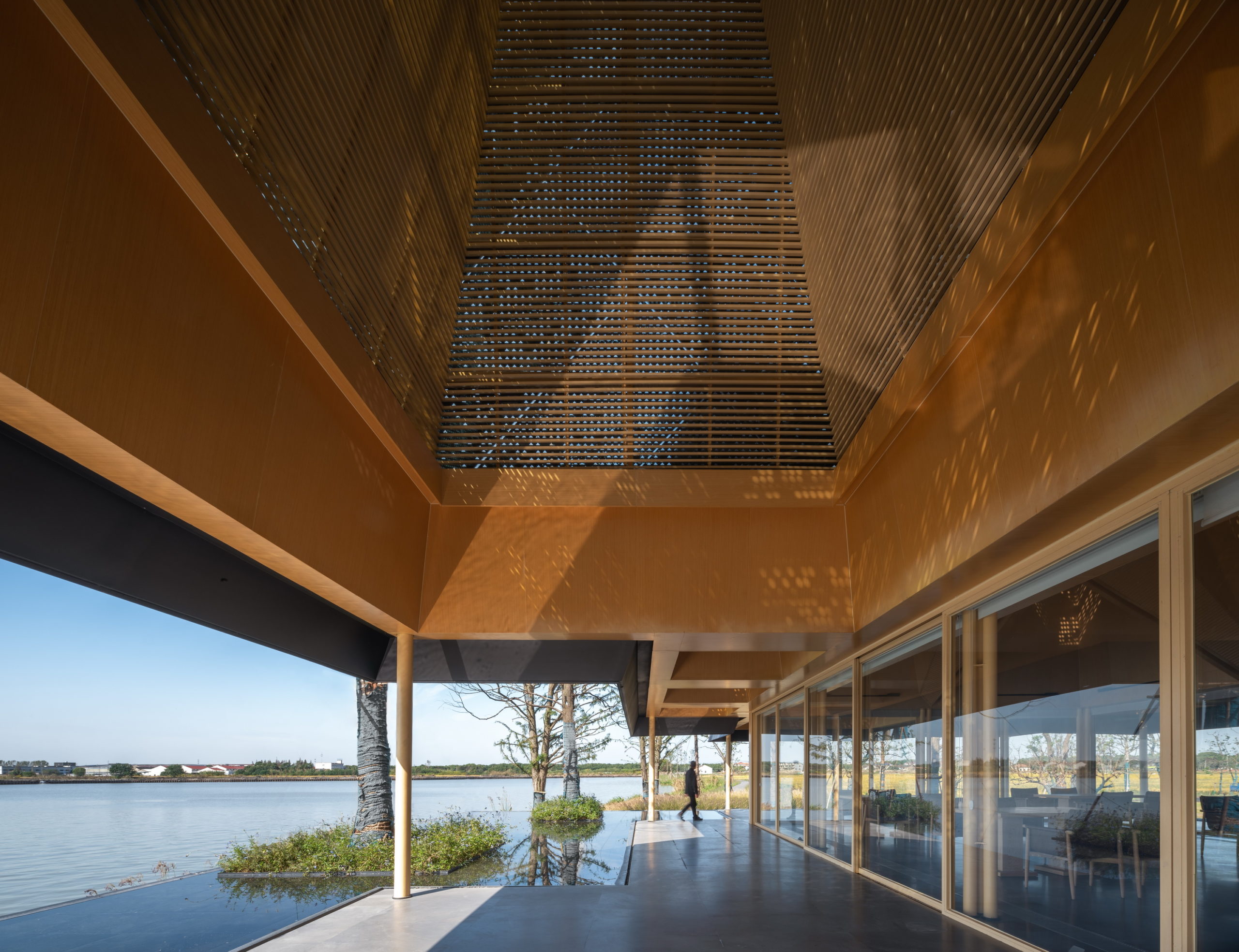
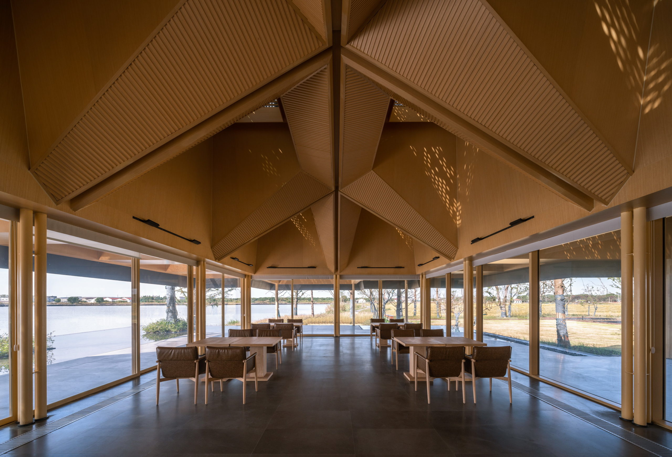 In addition to eliminating partition devices, the team has further blurred the boundaries between the structure and site around by using the same paving materials within the restaurant and the terrace that extends outwards. The terrace also includes a planned water body, closer to the natural water body, which creates a continuous line of vision when sitting inside.