Ten pink interiors that range from rose blush to bright coral
CategoriesInterior Design

Ten pink interiors that range from rose blush to bright coral

From homes with peach-coloured walls to rose-tinted shops and restaurants, we’ve rounded up 10 interiors projects to make you think pink in our latest Dezeen Lookbook.
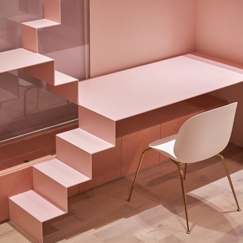


Cats' Pink House by KC Design Studio

Cats’ Pink House, Taiwan, KC Design Studio

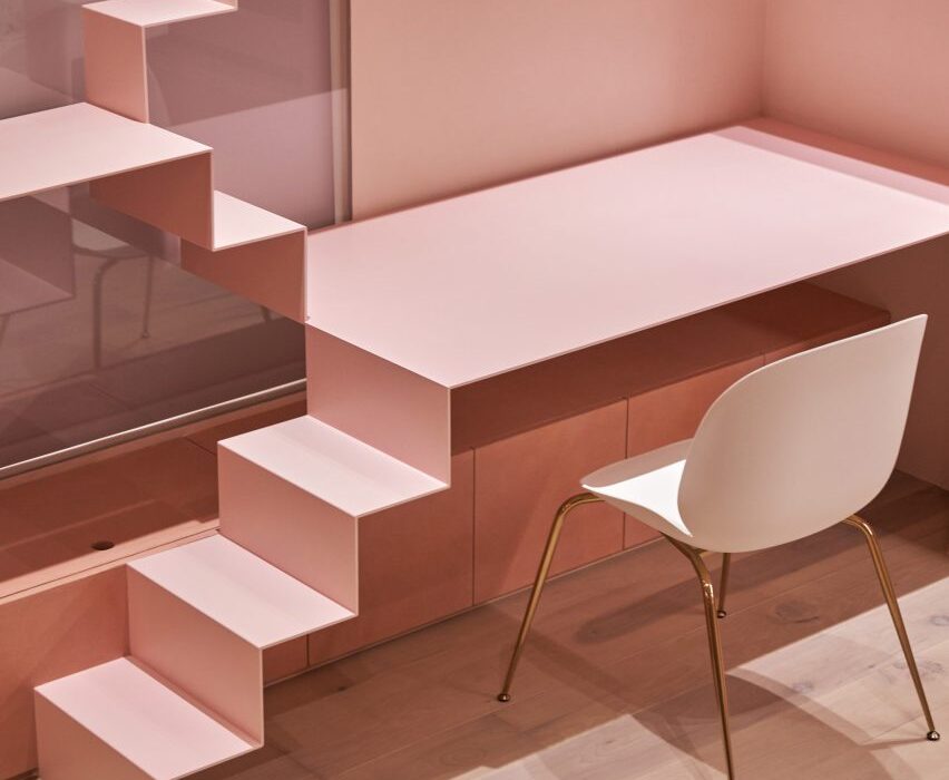
This holiday home in Taiwan is all pink – even the basketball court. KC Design Studio created the house by the sea for a client who owns several cats, so the interior includes pink cat ladders and a fluffy swing for the feline companions to recline on.

Find out more about Cats’ Pink House ›
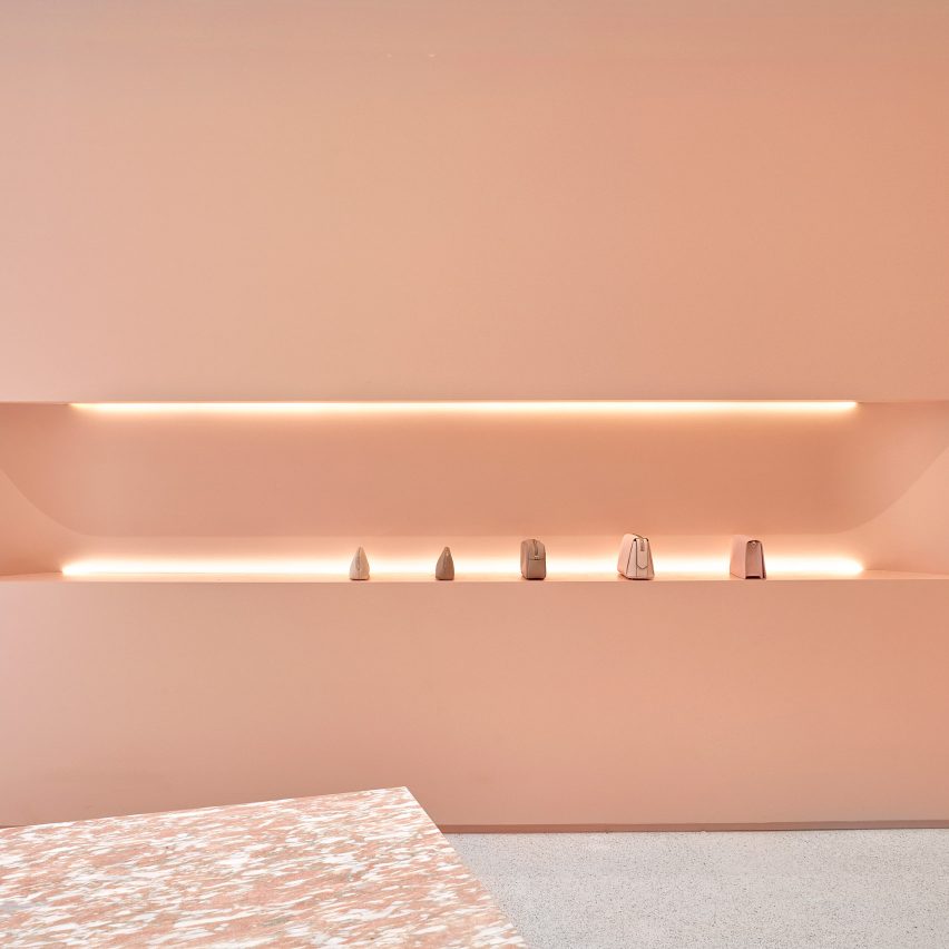

The Daily Edited flagship by Pattern Studio

The Daily Edited, Australia, Pattern Studio

Pattern Studio created a shop in Melbourne entirely in the signature colour of lifestyle brand The Daily Edited.

Blush-coloured walls are complemented by pale terrazzo floors and slabs of Norwegian rose marble.

Find out more about The Daily Edited ›
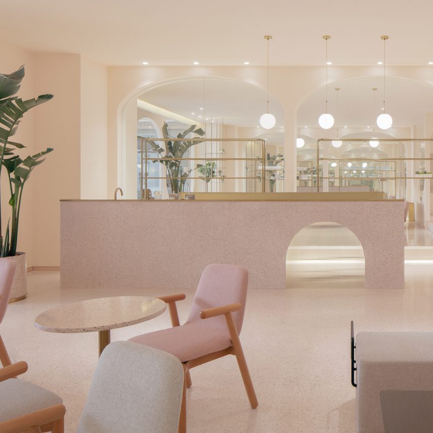

Ecnesse beauty salons by Penda-China

Ecnesse, China, by Penda China

Penda China used a rosy colour palette to create cosy cave-like interiors for high-end beauty salon Ecnesse in Beijing.

The rounded edges of the pink furniture echo the arched mirrors and doorways, which can be screened off using deep red velvet curtains.

Find out more about Ecnesse ›
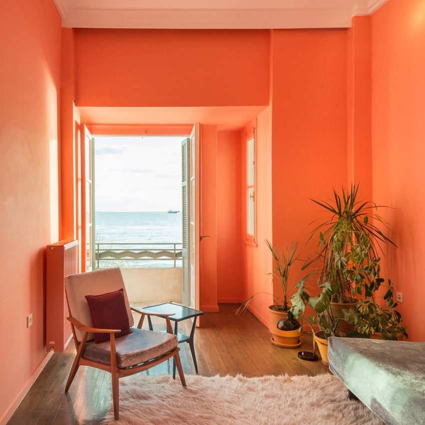

Waterfront Nikis Apartment, Greece, by Stamatios Giannikis

Colourful flamingo-coloured walls are a standout feature of this apartment in an art deco building in Thessaloniki.

Architect Stamatios Giannikis, who hosts dinners and exhibitions in this apartment he designed, chose the pink walls to enhance the views of the sea from beyond the balcony.

Find out more about Waterfront Nikis Apartment ›
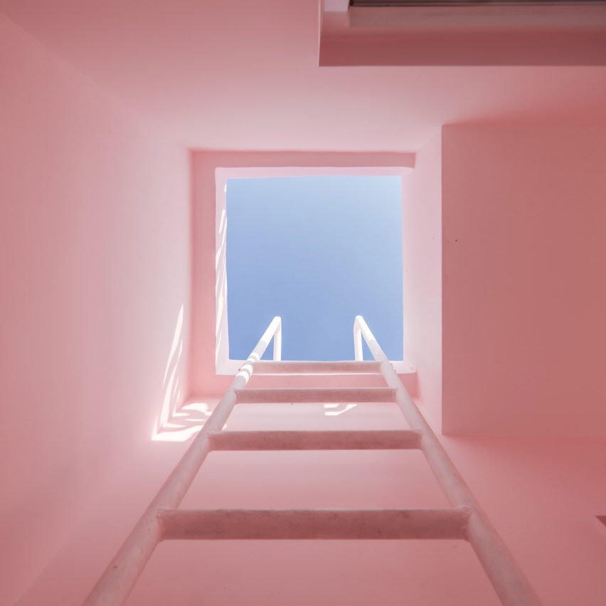

His and Her Houses by Wutopia Labs

His House and Her House, China, Wutopia Labs

Part house, part installation, His House and Her House is a pair of structures that Chinese studio Wutopia Labs used to explore ideas around gender.

The feminine side of the project is painted entirely in pastel pinks, featuring billowing pink curtains across the facade and a patio filled with pink rock salt instead of gravel.

Find out more about His House and Her House ›
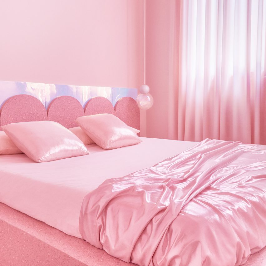

Bedrooms of Minimal Fantasy, a pink apartment in Madrid

Minimal Fantasy, Spain, Patricia Bustos Studio

This striking holiday rental apartment in Madrid is decorated in 12 different shades of pink. Patricia Bustos Studio wanted to create something on of a kind, using bubblegum hues, satin sheets and surfaces with iridescent sheen.

“Pink is already the colour of a whole generation,” said the studio. “The generation of the brave, those who are not afraid of change.”

Find out more about Minimal Fantasy ›
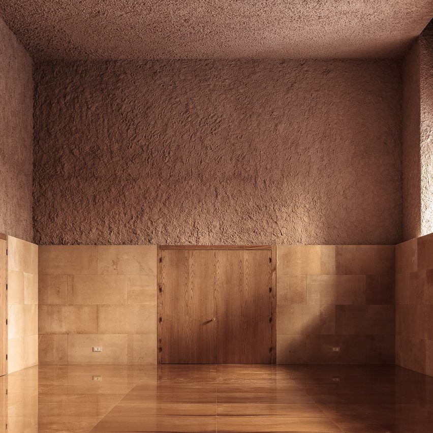

Specus Corallii, Italy, Antonino Cardillo

Specus Corallii, or The Coral Cave, is a music room in Sicily that’s decorated in homage to the shell imagery associated with the city of  Trapani.

The walls are covered in rough plasterwork that has been painted a muted pink to create a grotto-like interior, complemented by slabs of honey-coloured limestone.

Find out more about Specus Corallii ›
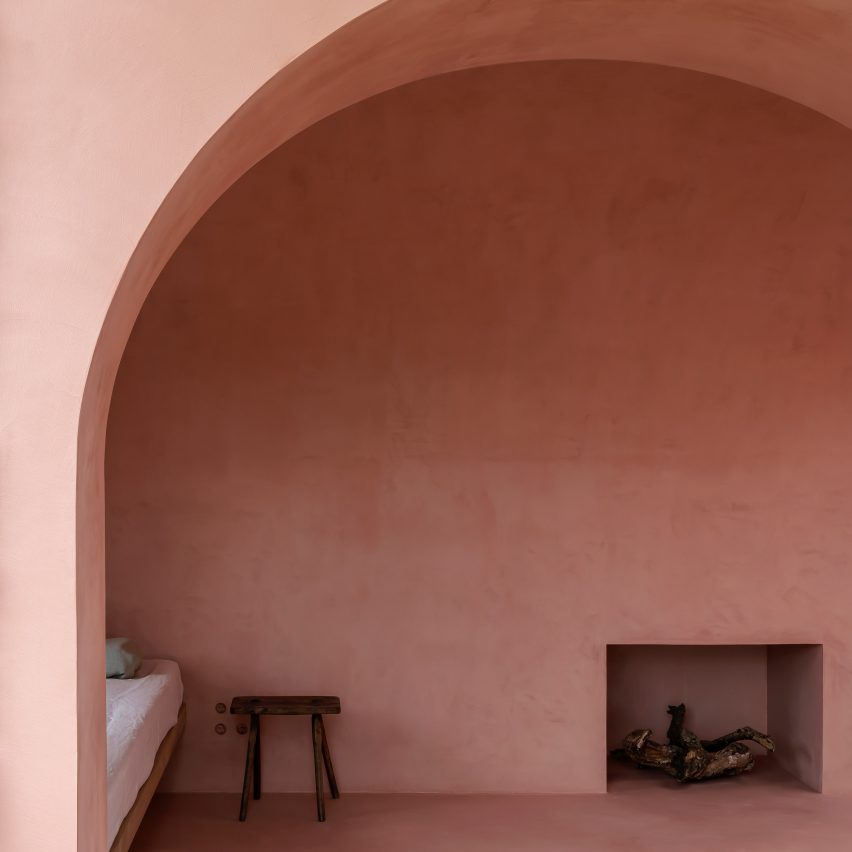

The Olive Houses in Mallorca designed by Mar Plus Ask

The Olive Houses, Spain, by Mar Plus Ask

The Olive Houses are a cluster of off-the-grid guesthouses in Mallorca designed as a retreat for artists and writers seeking a place to create free from interruptions.

Architecture studio Mar Plus Ask built the retreat around the boulders that litter the ancient olive grove, plastering the walls in a pale-pink stucco chosen to complement the delicate green leaves of the trees.

Find out more about The Olive Houses ›
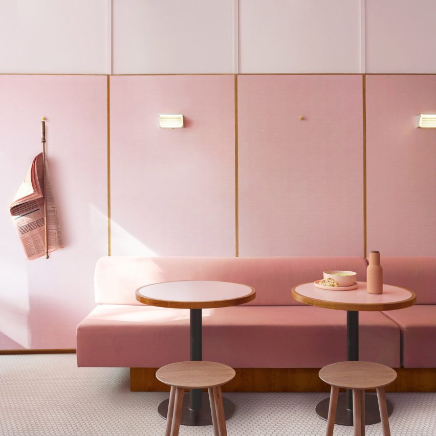

Humble Pizza designed by Child Studio

Humble Pizza, UK, Child Studio

Child Studio created interiors for this vegan pizza restaurant in London that pay tribute to 1950s greasy spoon cafes.

Candy pink walls and furnishings highlight the pink Formica tables and countertops, all the flatware is pink and pink newspapers are used as decoration as well as reading material.

Find out more about Humble Pizza ›
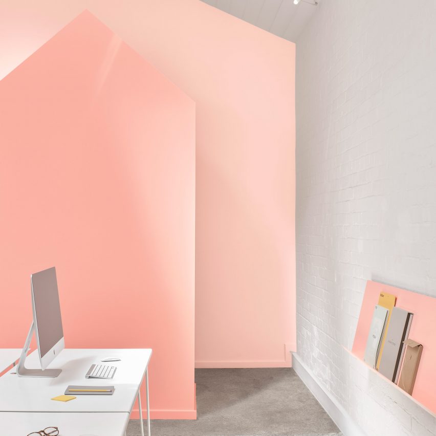

Angle + Earl St Studio by BoardGrove Architects

Angle + Eart St Studio, Australia, by BoardGrove Architects

Three different tones of peach were selected by BoardGrove Architects to decorate the interiors of this shared office space in Melbourne. The trio of colours subtly differentiates between the front of house, workspaces and back of house zones.

See more Angle + Eart St Studio ›

Reference

VATRAA adds pink plaster walls in south London council house renovation
CategoriesInterior Design

VATRAA adds pink plaster walls in south London council house renovation

Architecture studio VATRAA has won a Don’t Move, Improve! award with this London council house renovation featuring pink-toned plaster walls and an oversized window.


Called Council House Renovation, the project involved a full refurbishment and remodelling of the two-bedroom home in Bermondsey, south London.

VATRAA’s design was a joint winner in the 2021 Compact Design of the Year category for Don’t Move, Improve!

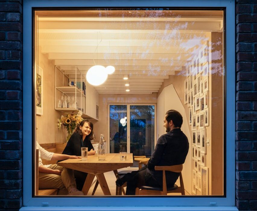
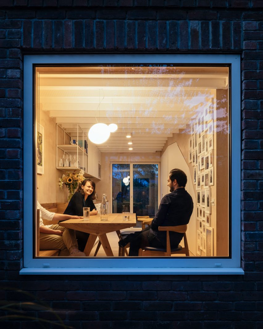
Large square window looking into house with people dining
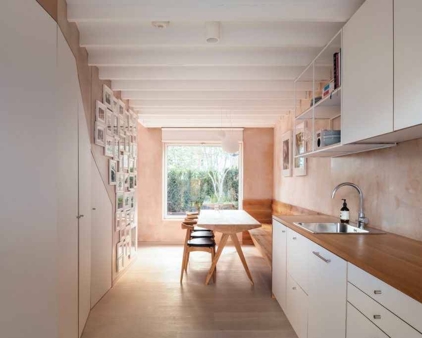
An oversized window creates transparency from front to back in the Council House Renovation

VATRAA‘s client wanted a warm, contemporary interior that gave her more space but without an extension that would disrupt the appearance of the council estate, which was built in the 1980s.

Instead, the architects aimed to create spaciousness within the small, 76-square-metre flat by making only minimal interventions.

Council House Renovation with pink plaster walls
The architects created a warm and contemporary look

Seeing the opportunities the small seven-by-seven-metre footprint presented for enhanced front-to-back transparency, the architects swapped out an ornamental bay window for a larger clean-lined square one.

It forms a new aesthetic feature and frames views of the evergreen front garden.

Living room with pink plaster walls
Ceiling joists are exposed in the living room

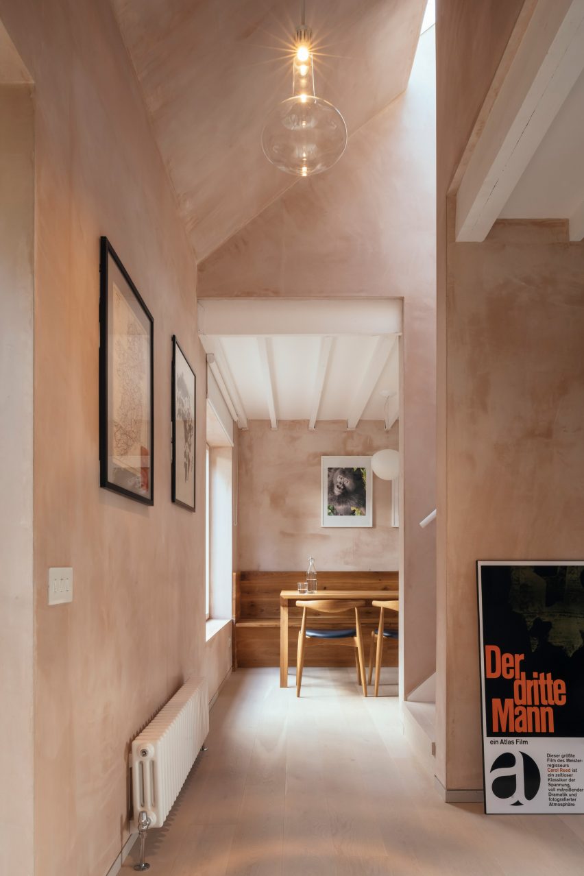
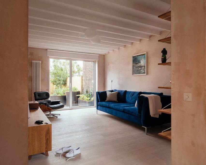
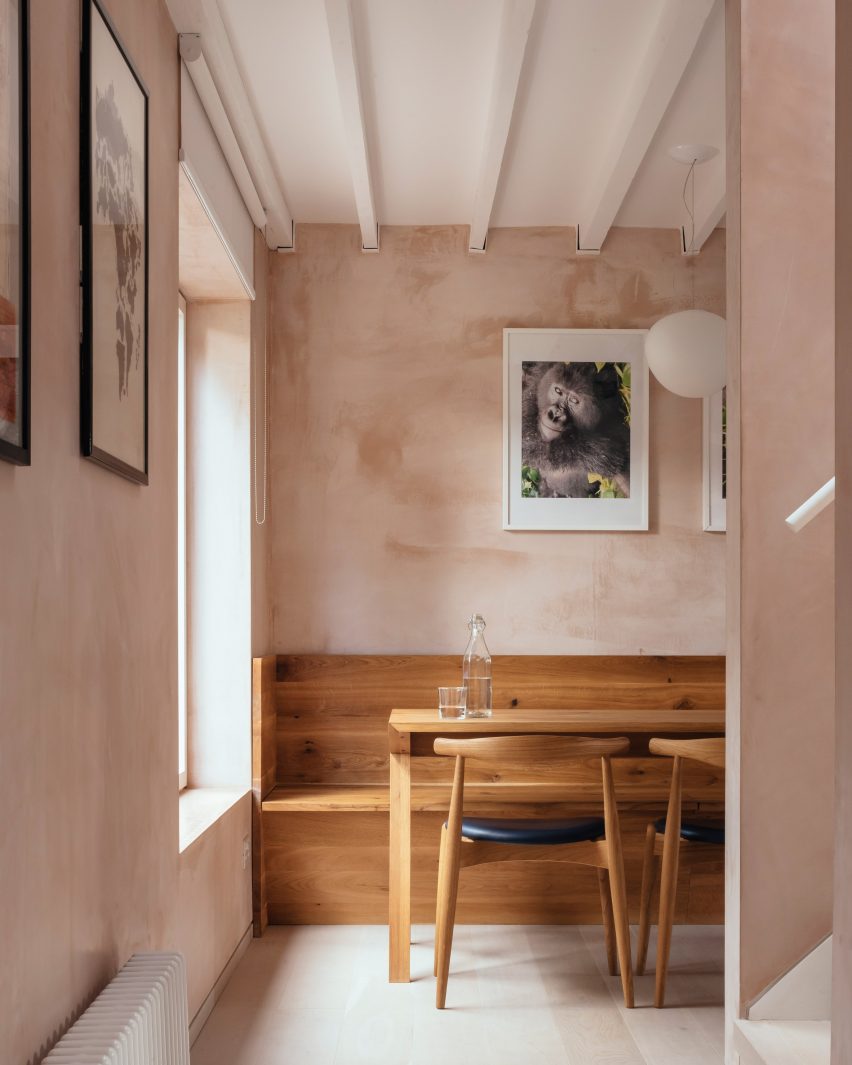
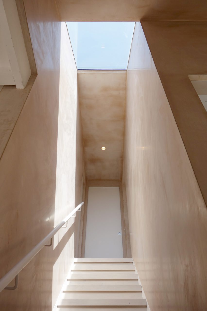
Another key feature is the textured, dusky pink-coloured walls.

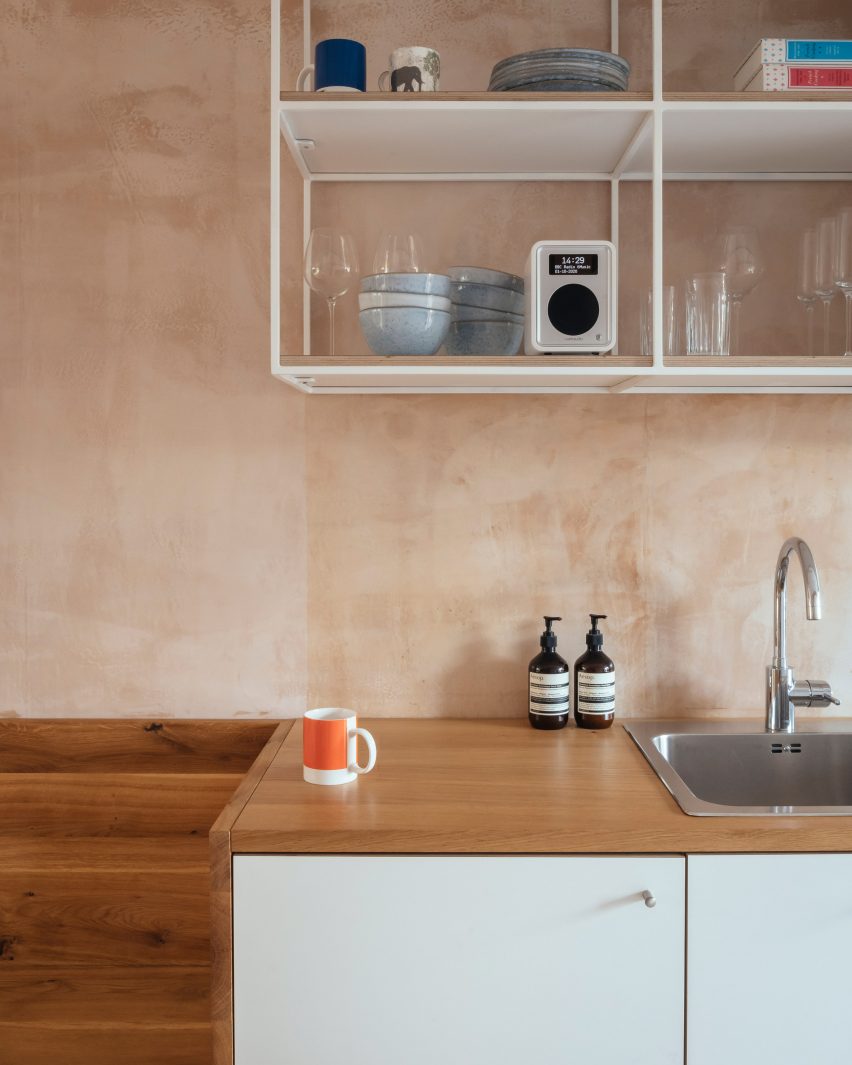
This effect is created with what VATRAA describes as a “banal” plaster, British Gypsum Multifinish, avoiding the cost and resources of wall paint altogether.

VATRAA applied the plaster carefully to achieve a textured and slightly reflective finish that responds well to daylight, creating different moods and effects at different times of the day.

Teamed with white ceilings and white-washed oak floors, it forms an aesthetic backdrop to the client’s collection of art and design objects.

Oak dining table with light coming through a large window
There are white-washed floors and white ceilings

For the floor plan, VATRAA were guided by the existing stairs and heating source, a pre-feed water tank that is part of a communal system.

To take advantage of its heat, they placed the laundry room around it so clothing would air-dry faster, and the bathroom directly above so the floor tiles would be warmed without additional heating.

White pantry and kitchen cabinets
An angled pantry optimises the space under the stairs

Each of the other spaces is given its own atmosphere according to function.

The architects made the entrance lobby grander by opening the ceiling to the pitched roof and incorporating the old external loggia into the interior.

Kitchen sink in Council House Renovation
The kitchen has bespoke furniture and cabinetry

In the living room, they exposed the previously concealed structural joists in the ceiling, making the 2.4-metre-high space feel loftier.

In the dining room, they created an angled pantry feature that makes the most of the awkward space underneath the stairs and added bespoke solid oak dining furniture.

Staircase with skylight
Different qualities of light create different moods in the house

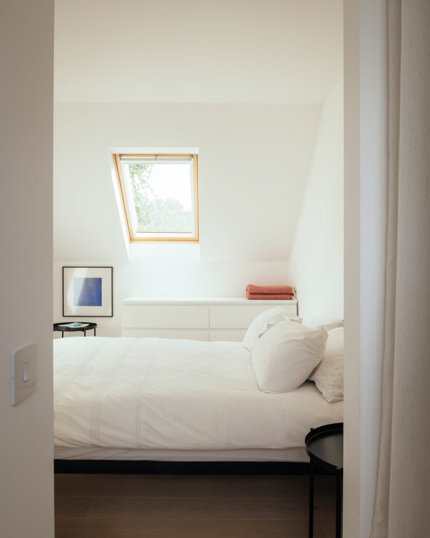
Upstairs, the two bedrooms are finished in calming all-white to create a contrast to the stimulating warmth of the downstairs living areas.

“The morning transition between the night and day zones becomes an event, giving the homeowner a sensation of energy, immediately as she steps into the stairwell and descends to the ground floor,” said VATRAA.

“With thoughtful decisions fully grounded in the context we operated in, we managed to turn a nondescript ex-council house into a home with a distinctive character, now proud to tell its story through space, light and materials.”

White bedroom with roof light
The upstairs bedrooms are a contrast in clean white

VATRAA was founded in 2018 by Anamaria Pircu and Bogdan Rusu, who are based across London and Bucharest. They completed the Council House Renovation in 2020.

It was named the Don’t Move, Improve! Compact Design of the Year alongside Two and a Half Story House by B-VDS Architecture, another project in a council estate.

Photography is by Jim Stephenson

Reference