A pared-back palette of raw materials creates a calm backdrop for PSLab’s lighting products inside the brand’s Berlin workshop and showroom space, designed in collaboration with Belgian firm B-bis architecten.
The newly opened studio occupies the ground floor and basement of a 1907 residential building in the city’s Charlottenburg district.
PSLab has opened a new workshop and showroom in Berlin
PSLab, which designs and manufactures light fixtures for architectural projects, set out to create a showroom where customers can experience lighting effects in a home-like environment.
“PSLab is not a digital platform where clients pick and buy products,” the company’s founder Dimitri Saddi told Dezeen. “Therefore the physical space as a ‘home’ is most important for one-on-one communication.”
“In Berlin, as with all our studios, we wanted to design a canvas to show the quality of our light and to show the process of our bespoke design approach by integrating a material library of endless opportunities and possibilities.”
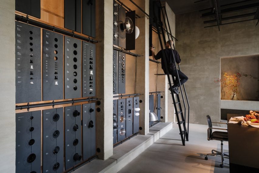
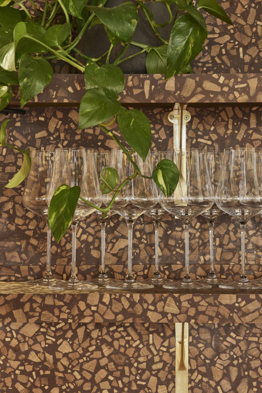
The space includes a materials library with a movable ladder
Working together with B-bis architecten, the design team looked to create a contemporary space that contrasts with Charlottenburg’s classical architecture whilst retaining references to common elements like colonnades, arches and symmetrical forms.
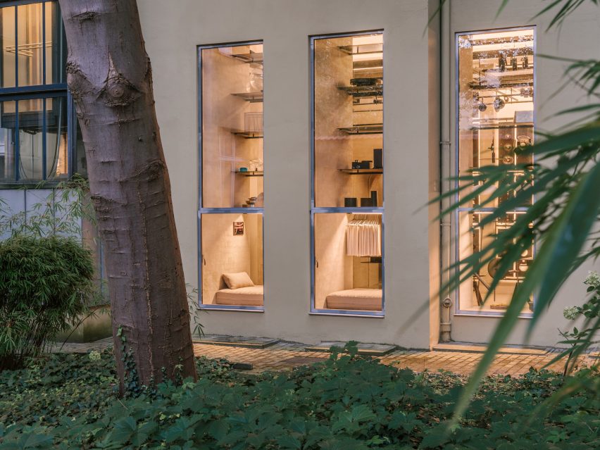
The entrance takes the form of a large zinc-and-glass sliding door that is set into the facade of the building on Niebuhrstrasse. Moving the door aside reveals a full-height opening that welcomes visitors into the studio.
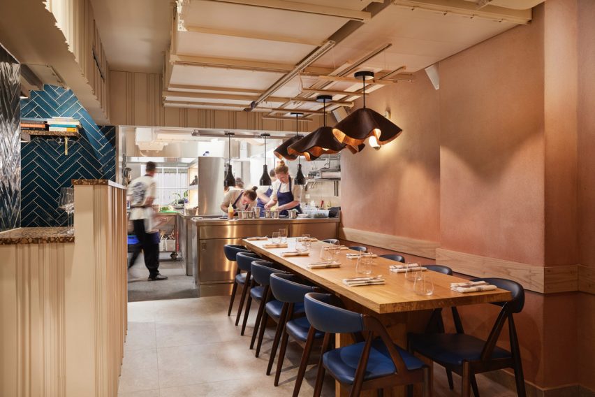
The interior was designed to present the brand’s lighting to its best advantage
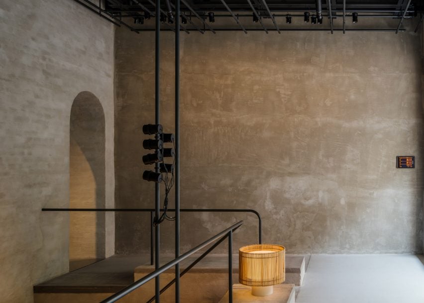
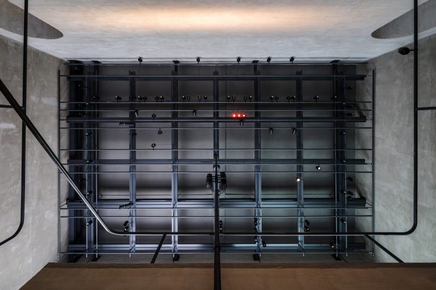
Inside, a double-height space with a six-metre-high ceiling allows lighting products to be hung in various heights and configurations.
Arched openings on either side of the staircase void lead through to a garden room that looks onto a leafy courtyard. Daylight streams into the space through large windows to create a tranquil atmosphere.
The workshop space includes a materials library where visitors can touch and explore the physical qualities of the brand’s lighting products. A movable ladder provides access to items on the library’s upper rows.
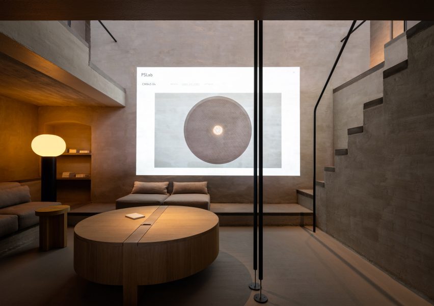
The cosy basement level is a place for informal conversations with clients. A projector in this parlour space also allows the team to display the company’s extensive digital library.
The basement serves as a cosy lounge
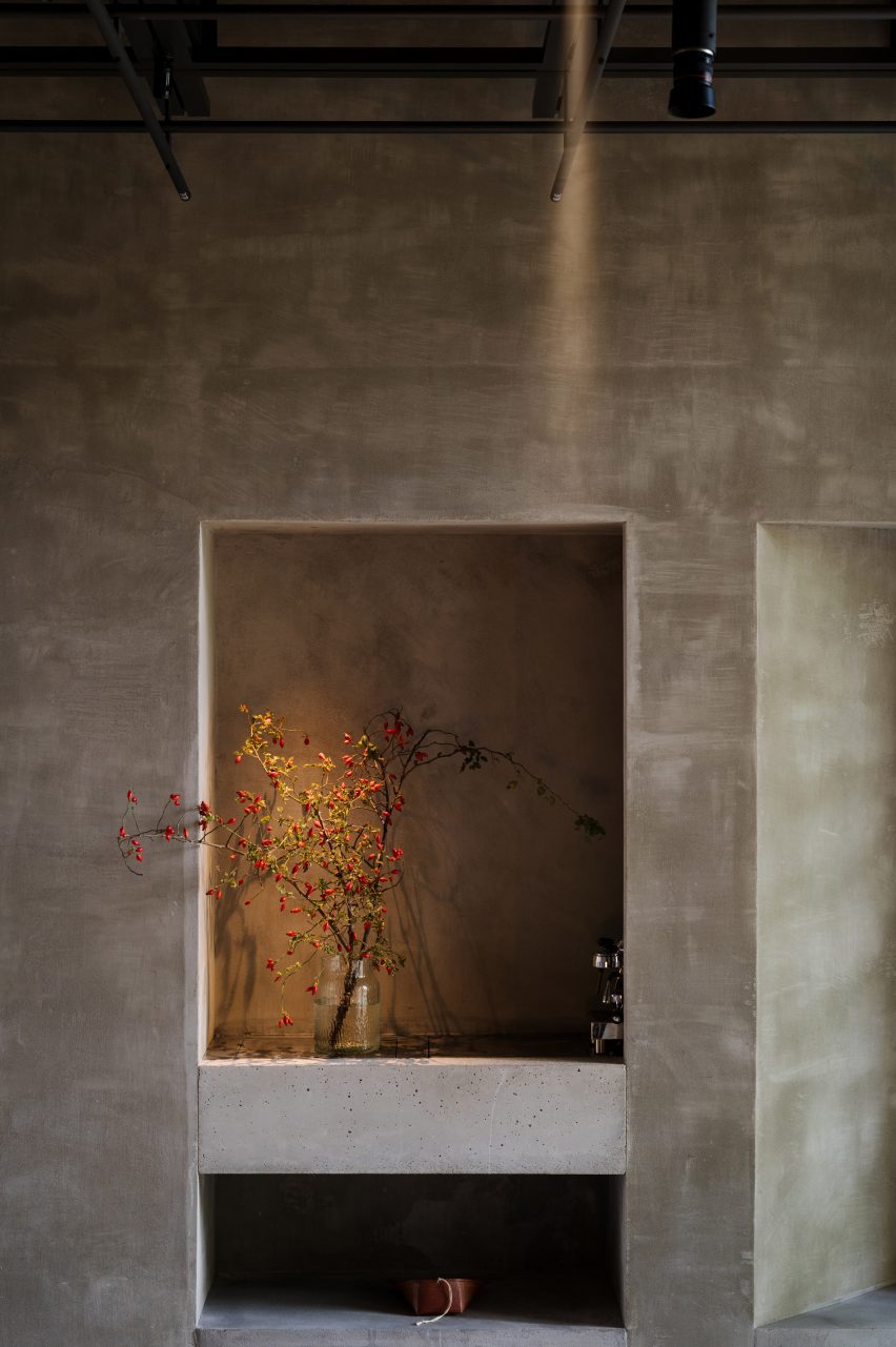
Throughout the studio, PSLab chose materials and finishes including lime wash, concrete, zinc and textiles that focus attention on how the space is lit rather than its architectural features to create a kind of “sacred place for light”.
“It is all about monochromatics and textures, which are specific to the location,” said Mario Weck, a partner at PSLab GmbH. “The atmosphere lets people focus on our approach.”
Gantries provide support for various light sources
On the ceiling of both the front room and garden room is a grey-steel gantry that helps unify the spaces whilst supporting various light sources as well as technical elements, much like on a theatre stage.
Furniture is mostly built in, with simple cushions providing casual seating while cylindrical wooden side tables and coffee tables offer somewhere to place a cup or catalogue.
The showroom is set in Berlin’s Charlottenburg
PSLab has studios in Antwerp, Bologna, London, Stuttgart and Beirut, where the firm originated. For its UK headquarters, the company commissioned JamesPlumb to convert a Victorian tannery into a space that evokes the “quiet brutalism” of the former industrial building.
Previously, the lighting brand has collaborated with Parisian studio Tolila+Gilliland on the design of an Aesop store in London featuring felt-covered walls and slim black pendant lights.
Architizer’s new image-heavy daily newsletter, The Plug, is easy on the eyes, giving readers a quick jolt of inspiration to supercharge their days. Plug in to the latest design discussions by subscribing.
Miralles Tagliabue EMBT is one of the most renowned Spanish architectural firms in the world. It was founded in 1994 in Barcelona by the late Enric Miralles and Benedetta Tagliabue. The studio’s primary philosophy is carefully responding to each project’s context and site conditions. It employs sensitive integration practices and creates a dialogue between design and its surroundings. Mainly undertaking public projects, the office emphasizes the urban, cultural and material values of its design, resulting in unorthodox, subtle organic forms that echo the context’s history, landscape and material presence.
By faithfully addressing their surrounding environment, Miralles Tagliabue EMBT create not just space but the architecture of place — that is, space filled with strong narratives and culturally relevant symbolic gestures. For instance, by simply observing the Scottish Parliament window openings or the stair balustrades of the Palafolls Public Library, one cannot help but acknowledge the originality in their inception and form. The studio treats each brief not as a tabula rasa project but as a field of relational conditions, ready to become gestures, walls and accents to create a one-of-a-kind architectural project.
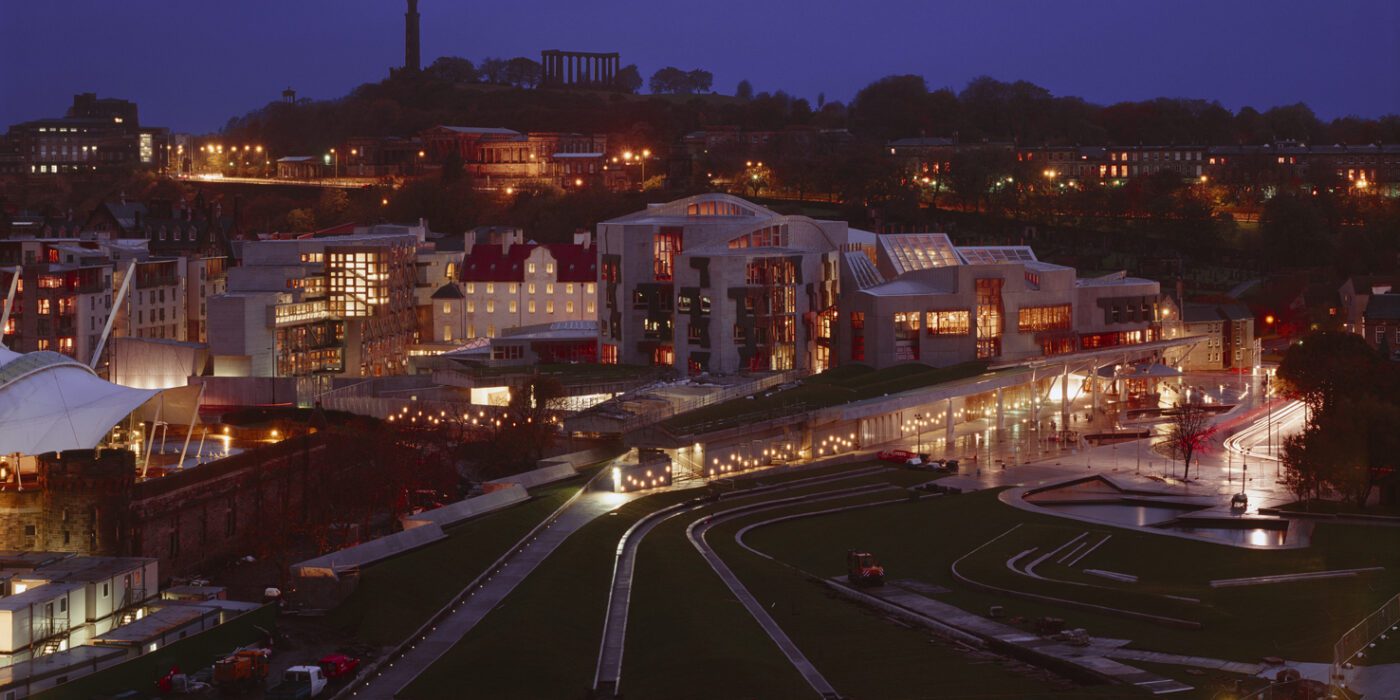
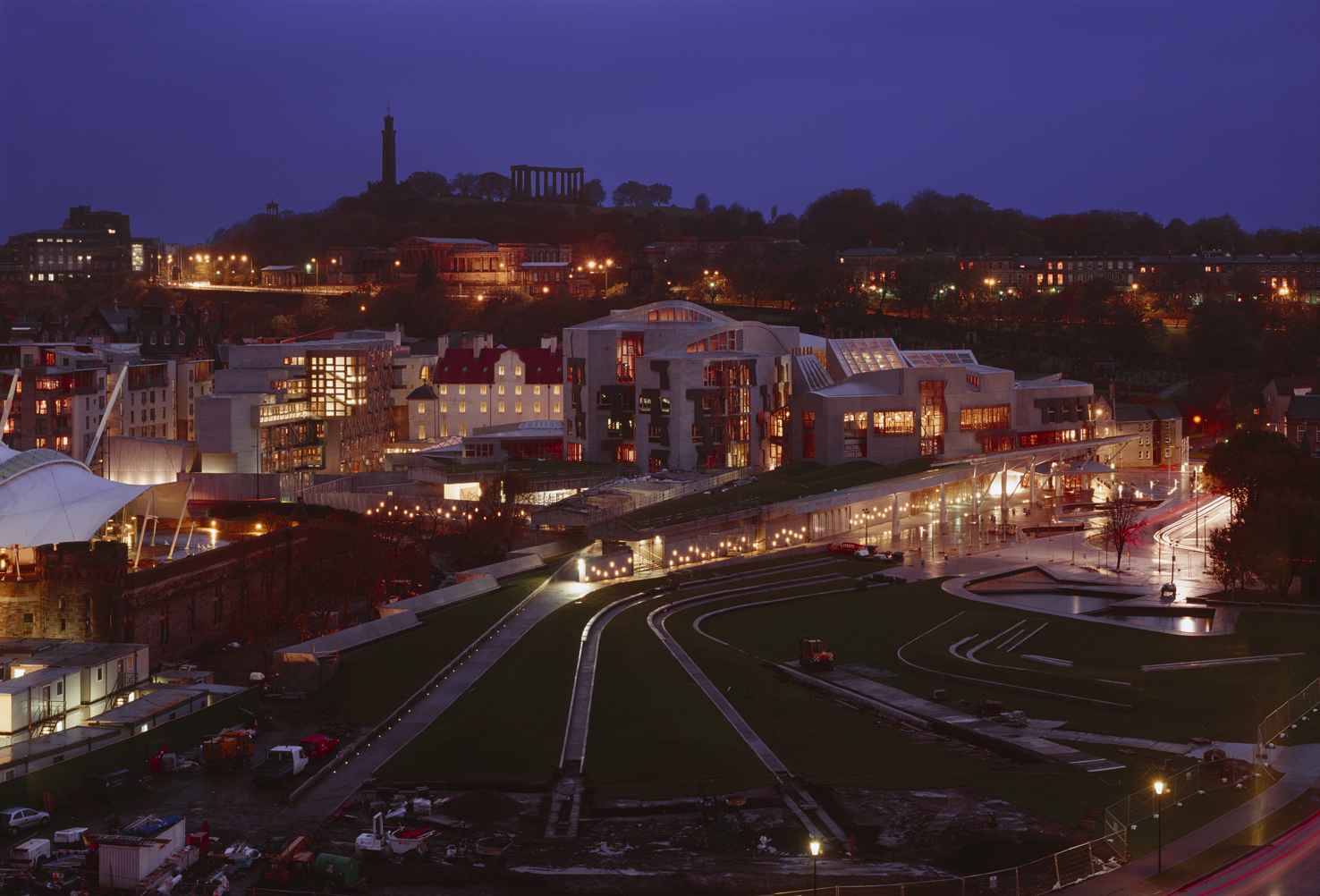
The Scottish Parliament
By Miralles Tagliabue EMBT, Edinburgh, United Kingdom
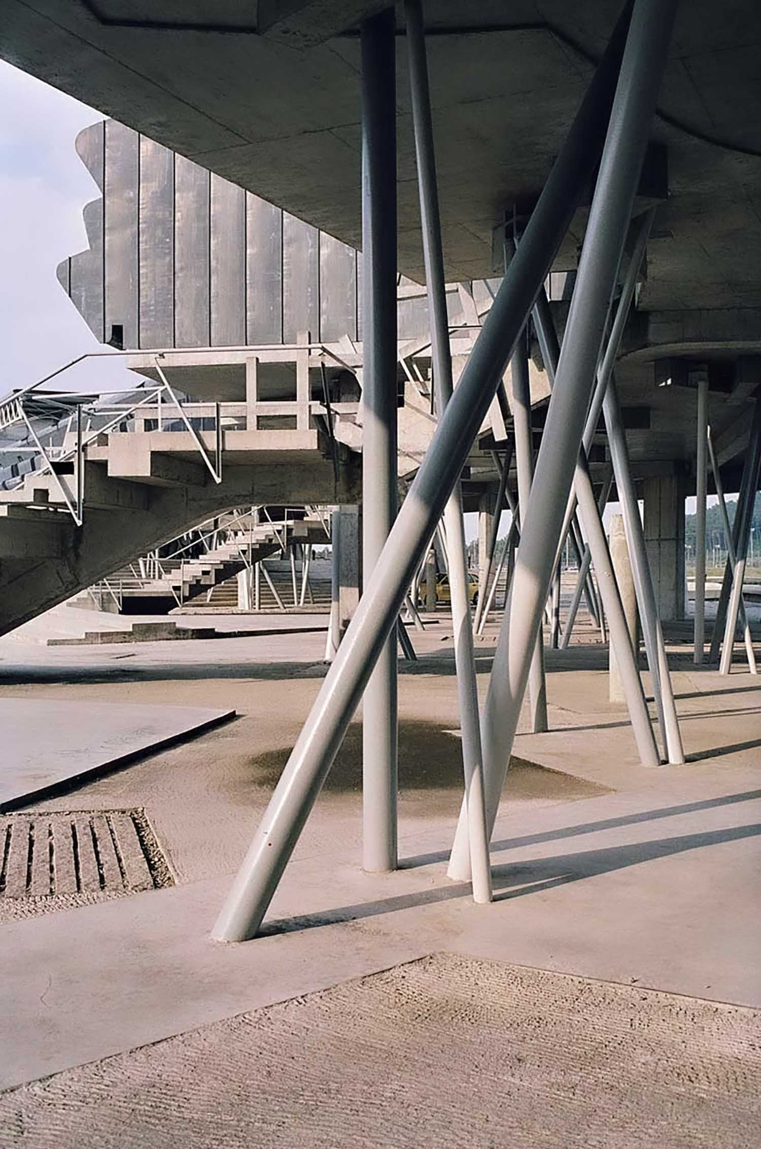
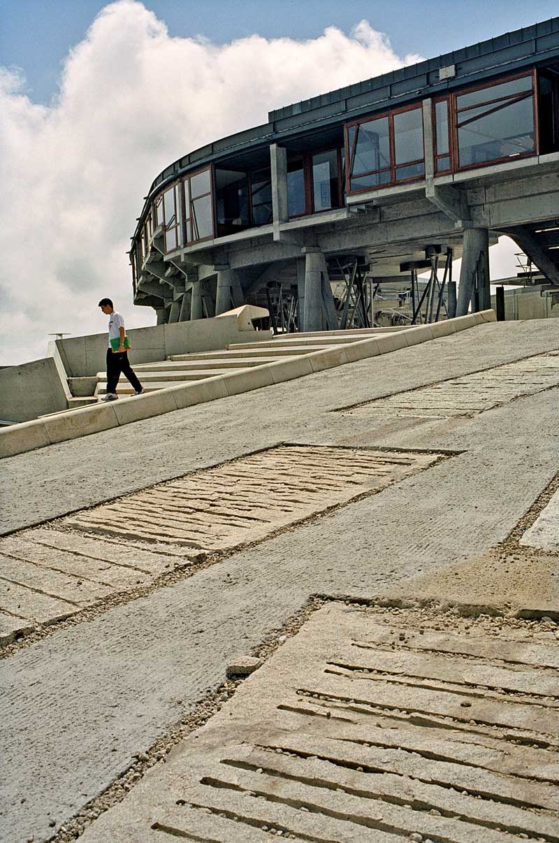
Located at the bottom of the Royal Mile, the Scottish Parliament acts as an extension of the Scottish hillside terrain. Its radical design sets it apart from the neighboring iconic, albeit classical, Palace of Holyrood. Greatly inspired by Scottish heritage elements such as the Scottish cross, Scottish paintings and the country’s natural landscape, the Parliament is comprised of a series of multifunctional, sensory spaces, each one custom-designed and exceptionally detailed. The building has seamlessly integrated within Scotland’s natural and cultural setting, while celebrating its quirky and influential design, becoming a true pioneer in the architectural field.
Palafolls Pubic Library
By Miralles Tagliabue EMBT, Palafolls, Spain
This next project is an interplay between the playfulness of the existing landscape and the functions hosted within the public library. Using the presence of agricultural land and Tordera river as gestures, the Palafolls Public Library is designed as a fluid, labyrinthine form. Its spaces are interchanging between gardens and walls, leading to interior spatial clusters, such as newspaper conferences, reading rooms and storage spaces. Finally, its low, curved walls allow for unobstructed views throughout the library visually tying all the spaces together.
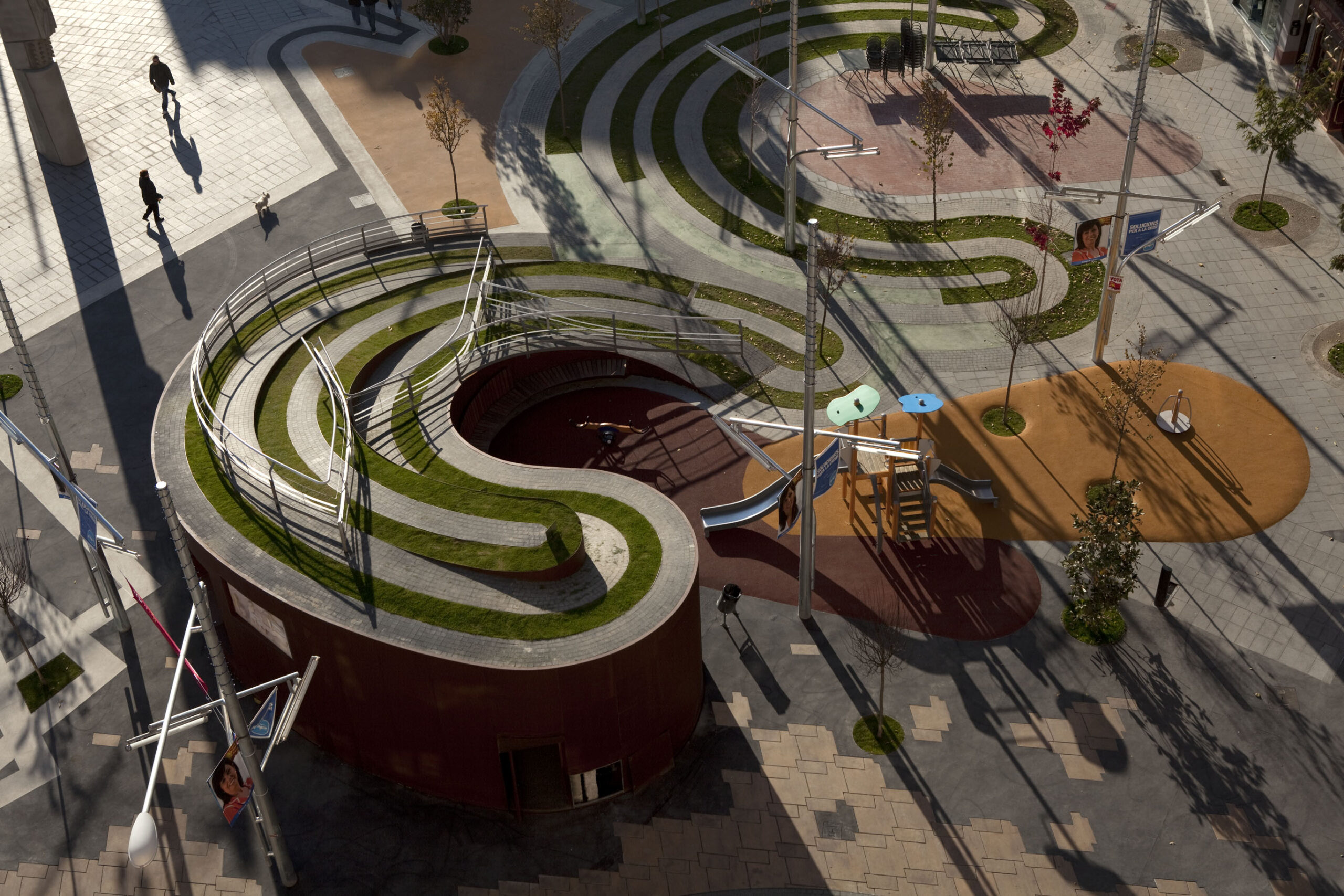
Plaza Ricard Viñes
By Miralles Tagliabue EMBT, Lleida, Spain
Plaza Ricard Viñes brings together the iconic landscape of La Seu Vella — Lleida’s most prominent cultural landmark — the Spanish musician Ricard Viñes and the symbolism of the labyrinth. With the intent to design an interactive Plaza, Miralles Tagliabue EMBT used the original etymology of the word ‘labyrinth’ to create irregular, “dancing” pathways, extending in multiple levels, made out of locally sourced stone. The location of the Plaza also serves as the official entrance into the city. Its labyrinthine form regulates the different functions spreading around it and creates spontaneous interactions within the public fabric of Lleida, becoming a true architecture of place.
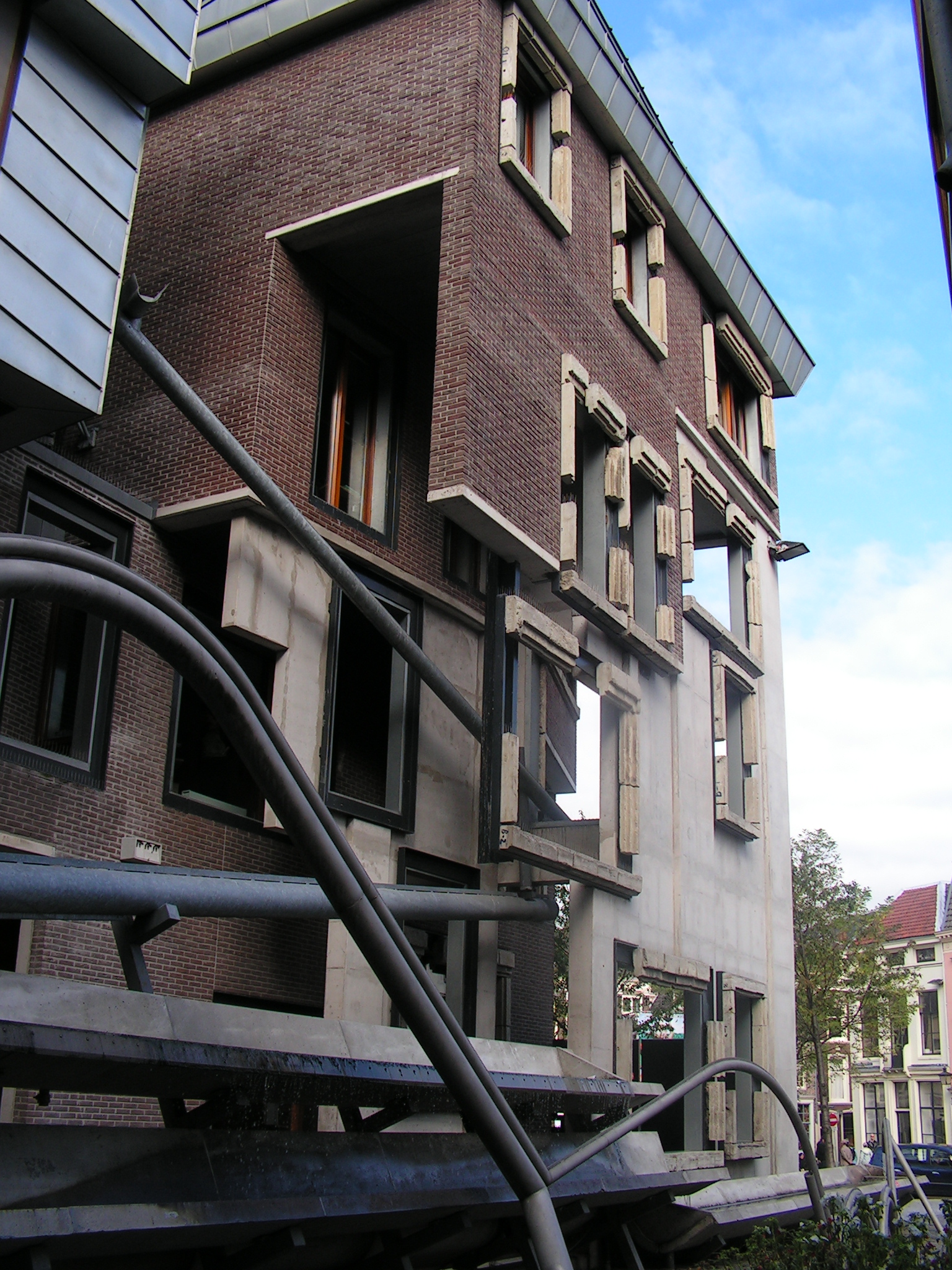
Utrecht Town Hall Rehabilitation
By Miralles Tagliabue EMBT, Utrecht, Netherlands
The original Utrecht Town Hall was a building with great historical value. Miralles Tagliabue EMBT used its neoclassical form as an inspiration for its extension, with spaces such as the ‘medieval room’ becoming rediscovered through its renovation. The new addition treated the municipality offices as an accumulation of different city structures, reflecting this in its inconsistent design forms and materials. In fact, to further integrate its diverse nature into the Dutch urban fabric, the building’s ground floor became a communal space fully accessible by the public.
Vigo University Campus
By Miralles Tagliabue EMBT, Vigo, Spain
The Vigo University Campus project operates in two different timescales: a short-term transformation of the university’s campus in order to establish a denser sense of community — an architecture of place — and a longer-term task to redefine the surrounding landscape. Miralles Tagliabue EMBT’s primary aim was to exaggerate the natural conditions that encompassed the campus by utilising the existing inland valleys and sloping topography. The newly constructed landscape serves as fresh ground for fostering university activities and communal gatherings.
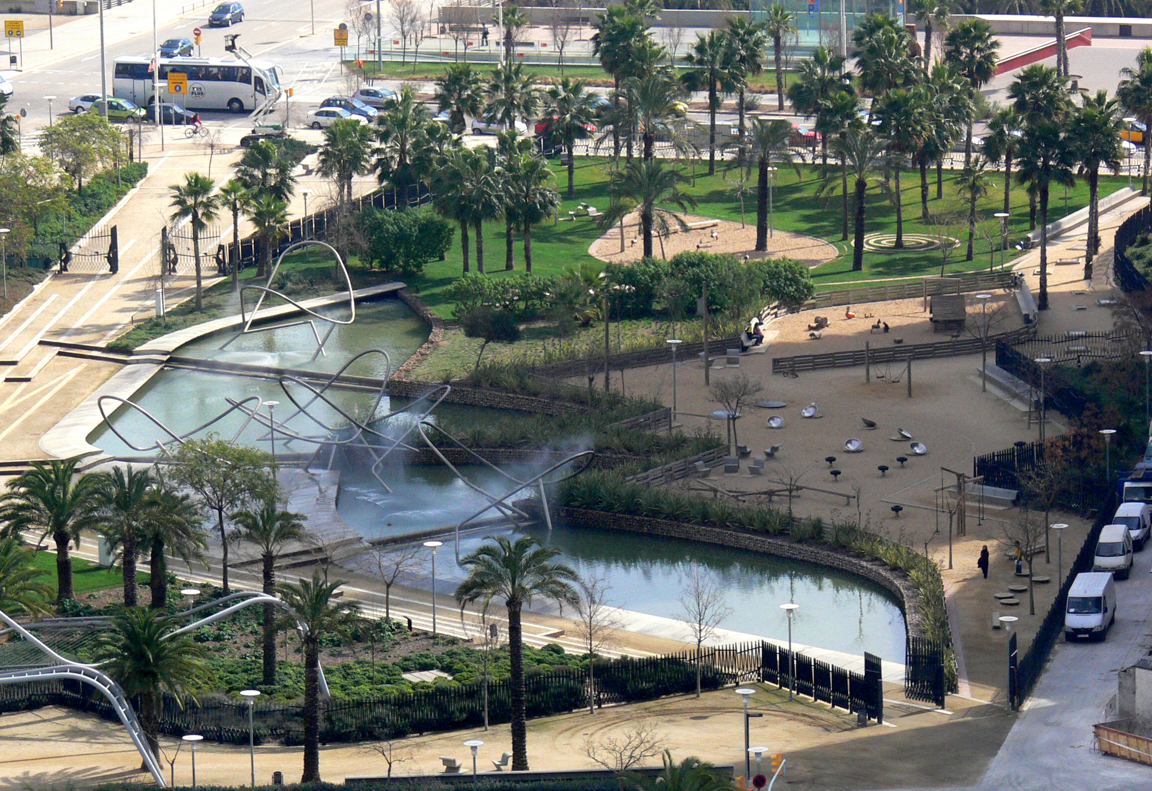
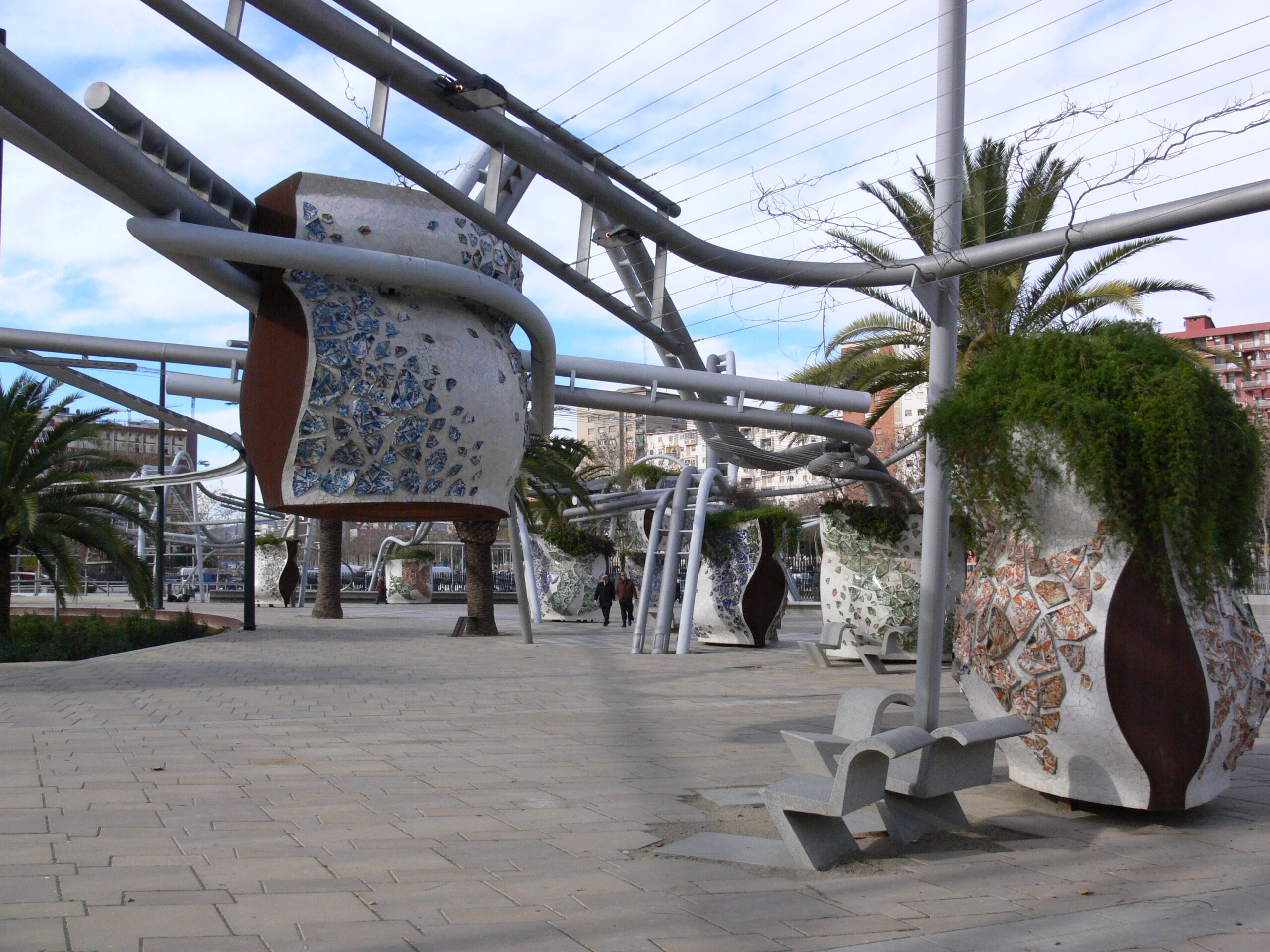
Diagonal Mar Park
By Miralles Tagliabue EMBT, Barcelona, Spain
This next project is all about making intentional urban connections. Located next to the Barcelona waterfront as well as adjacent to some of the most vibrant areas of the city, Diagonal Mar Park is designed to bring those places together. Its design forms a series of paths for walking, biking, skating as well as for enclosing artificial ponds. The curved structure expands and thickens, sometimes becoming a surface to walk on and others a carefully curated piece of metallic and ceramic structure.
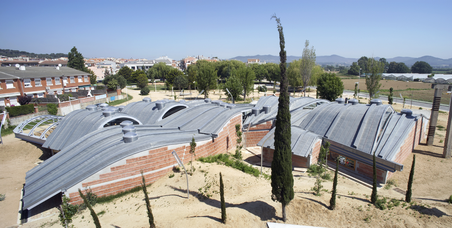
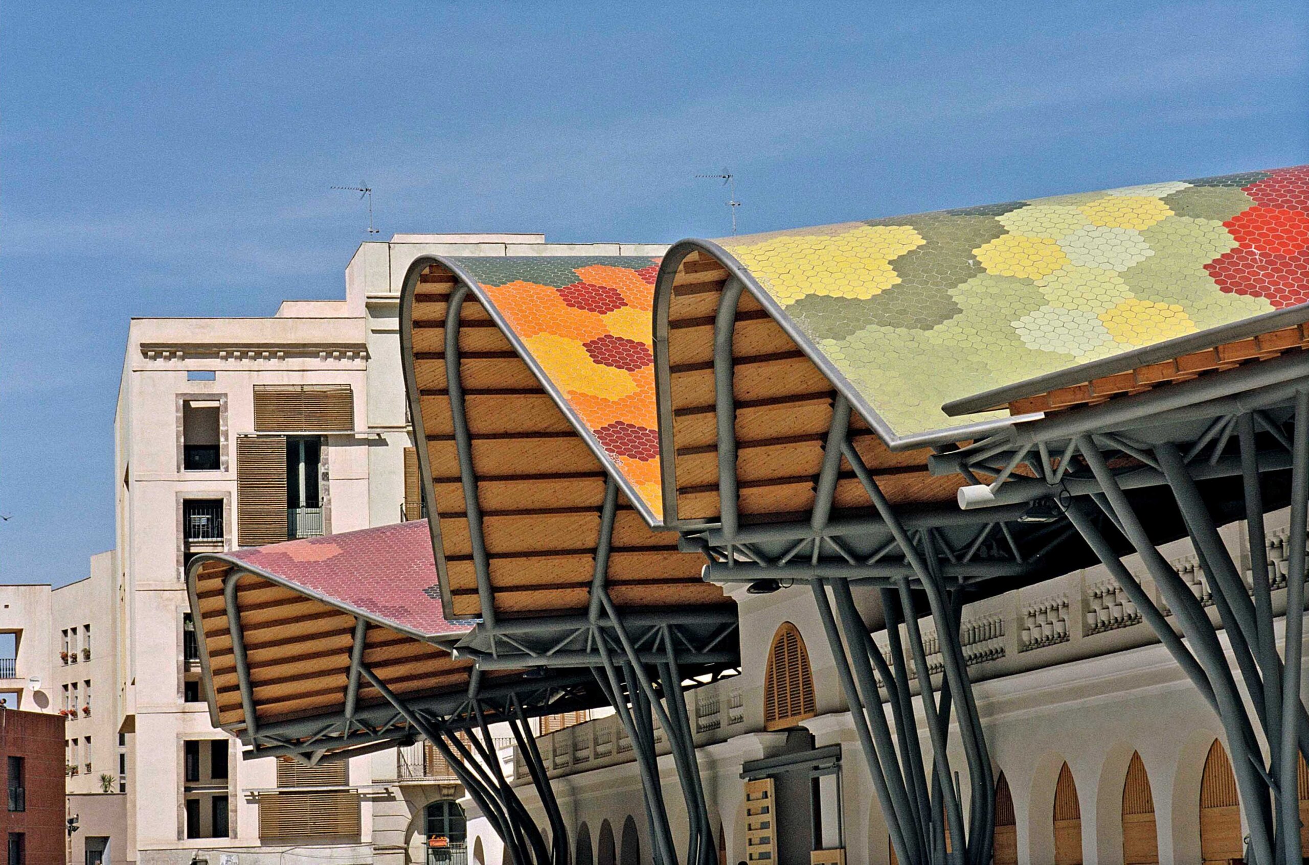
Santa Caterina Market
By Miralles Tagliabue EMBT, Barcelona, Spain
Located in Ciutat Vella, one of the oldest quarters of Barcelona, the historic Santa Caterina Market was restored by Miralles Tagliabue EMBT, who won the competition in 2005. Oddly, the market’s neighborhood appears almost as a standalone city by itself — a city within a city — and any effort for substantial intervention has been challenged by the complex, local planning regulations.
Eventually, Miralles Tagliabue EMBT restored Santa Caterina Market by designing a commercial food market, combined with a distinct residential zone and adjacent public spaces that integrated all the neighborhood activities. The market’s most prominent feature is a gleaming, colourful roof supported by old and new infrastructure and creating a hybrid design that reorganises the flows of public and private space. Santa Caterina Market operates as a true architecture of place in the heart of Barcelona.
Architizer’s new image-heavy daily newsletter, The Plug, is easy on the eyes, giving readers a quick jolt of inspiration to supercharge their days. Plug in to the latest design discussions by subscribing.
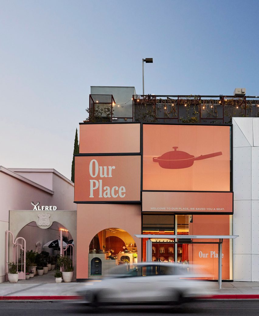
Brooklyn-based Ringo Studio designed a store for kitchenware brand Our Place that features colourful tile displays and expressive drapery that hangs from the ceiling.
The Our Place Melrose store is the brand’s second location in Los Angeles, following the inaugural shop in Venice, and is situated in West Hollywood’s busy shopping district.
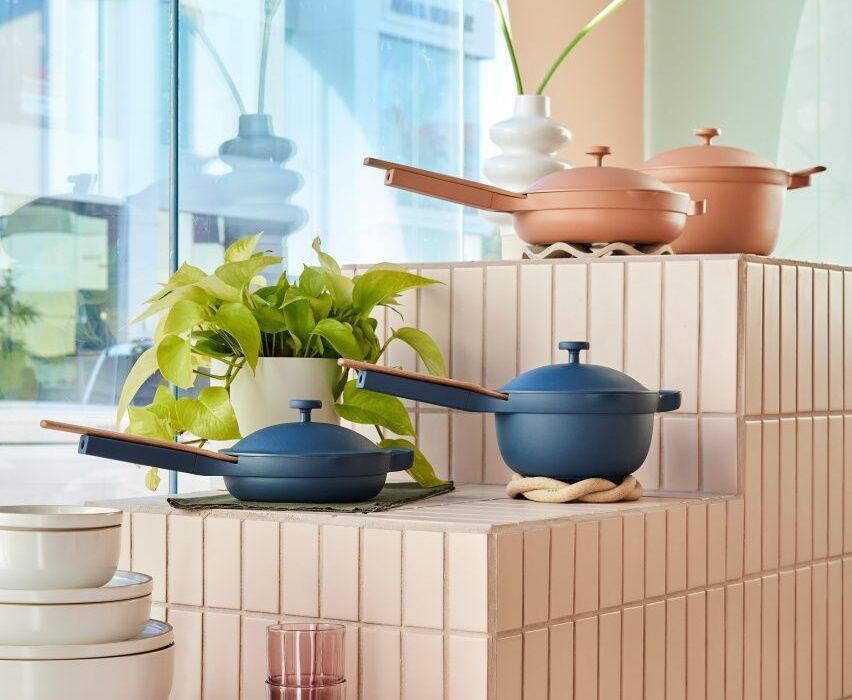
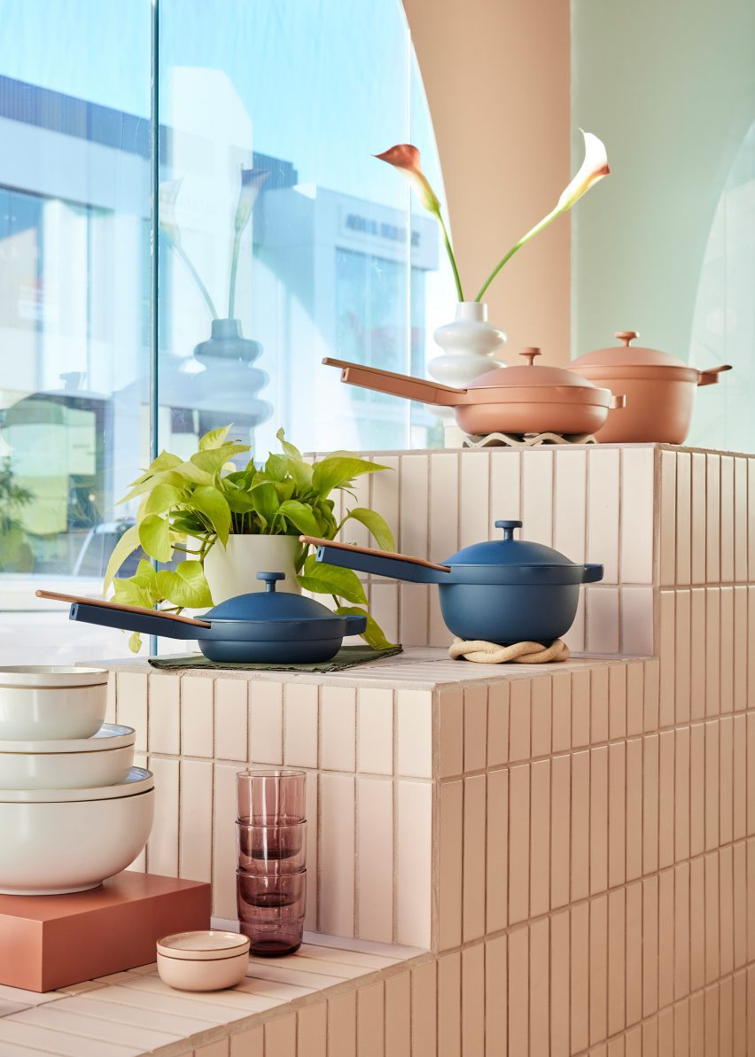
The Our Place store is designed to showcase the brand’s colourful cookware
The interiors by Ringo Studio are based on the identifiable colour palette of Our Place cookware sets, which are known for in a variety of pastel, neutral and jewel-toned hues.
“It retains the warmth and intricacy of Our Place’s first store in Venice, concepted by Mythology, while also taking Our Place’s design ethos into new and unique expressions,” said the team.
Many of the surfaces are covered in long rectangular tiles laid in a straight stack pattern
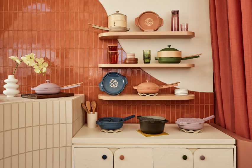
Elements derived from classical architecture were included, from fluted columns that support a wavy-topped table to arches that curve over shelving units and form punctured openings for showcasing small items.
Storage cabinets have rounded corners, as do the doors that front them, and many of the built-in elements also feature filleted edges.
At the back is a space coloured entirely terracotta, which features a table displaying the brand’s products
Long rectangular tiles laid in straight stack patterns cover several of the walls and display stands.
Each tiled block or surface is a different colour, with large panels including terracotta, lilac and cream, and smaller sections in pale blue and green.
An area towards the back is decorated entirely in terracotta, which covers the floor and walls, as well as matching strips of fabric hung in rows from the ceiling.
There’s also a side room where Our Place products are laid out on a dining table with mirrors on three sides, creating infinite reflections intended to “welcome everyone to have a seat at the table”.
A side room features mirrors on three sides to create infinite reflections of a dining table setup
Covered in mosaic tiles and with an undulating front, the table is accompanied by a pair of purple velvet chairs, and from the ceiling hangs purple drapery.
“Infused with the cozy feeling of home, the streamlined suite of products are artfully displayed throughout the store, making them feel like chic, sculptural objects,” said the Our Place team.
Our Place Melrose is located in West Hollywood’s busy shopping district and is the brand’s second location in LA
Ringo Studio was founded by architectural designer Madelynn Ringo, who has created retail experiences for companies such as Glossier, Studs and Funny Face Bakery.
Last year, the studio completed a store for fitness brand Bala in New York City, which includes scaled-up versions of its products.
A renovated dwelling in rural China and a converted stable in Ibiza feature in our latest lookbook, which collects 10 cottage interiors that promise rest and relaxation.
Cottages are small dwellings that are traditionally characterised by a sense of comfort and cosiness. However, interior designers are increasingly pushing the boundaries of how to dress the insides of these homes, as seen in these innovative examples.
As the weather cools down in the northern hemisphere, here are 10 calming interior spaces in cottages by architects and interior designers from across the globe.
This is the latest in our lookbooks series, which provides visual inspiration from Dezeen’s archive. For more inspiration see previous lookbooks featuring neutral living rooms, homes in converted warehouses and Bauhaus-informed interiors.
Photo is by courtesy of Sun Min and Christian Taeubert
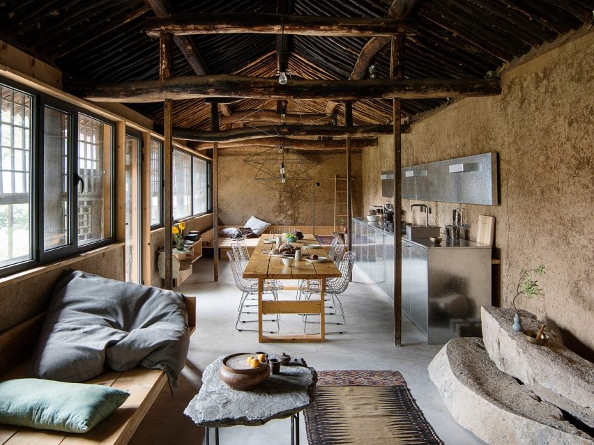
Hai Zhen cottage, China, by Sun Min and Christian Taeubert
Located in Hai Zhen, a village just outside of Beijing, this previously neglected cottage was renovated by fashion designer Sun Min and architect Christian Taeubert.
A large, open-plan lounge area displays a mixture of rustic features such as the original roof and timber beams, which are presented alongside more contemporary elements including stainless steel and spindly, wireframe lighting.
Find out more about this Hai Zhen cottage ›
Photo is by Timothy Kaye
Barwon Heads House, Australia, by Adam Kane Architects
Barwon Heads House is a renovated cottage by Melbourne-based studio Adam Kane Architects with a barn-style extension defined by an open-plan living area.
Shortlisted for the 2022 house interior of the year Dezeen Award, the cottage interior features a monochrome interior palette and statement geometric furniture, such as a pair of Kangaroo Lounge Chairs by designer Pierre Jeanneret.
Find out more about Barwon Heads House ›
Photo is by Jim Stephenson
English cottage, UK, by Invisible Studio
Architecture practice Invisible Studio added a double-pitched extension to this cottage that is located on the borders of Hampshire and Surrey in England.
Exposed concrete accents contrast with rectilinear sliding glass doors in the living space, which cantilevers over the sliding patio doors below with the support of a concrete chimney.
“All the materials are fair-faced so had to be perfectly made,” explained studio founder Piers Taylor. “Nothing is covered up and everything exposed.”
Find out more about this English cottage ›
Photo is by Youri Claesens
Casa Campo, Ibiza, by Standard Studio
Casa Campo is a cottage in Ibiza that Standard Studio converted from a 200-year-old stable to an off-grid showroom and home for the owners of an interior design shop.
Original beams crafted from Ibiza’s native Sabina pine trees are paired with contemporary low-slung furniture in the double-height living space that is illuminated by bright white walls.
Find out more about Casa Campo ›
Photo is by Jim Stephenson
Made of Sand, UK, by Studio Weave
Architecture office Studio Weave designed a wooden extension to a stone cottage in Devon’s Blackdown Hills in the English countryside, which was created as a creative workspace for its owners and visiting artists.
Called Made of Sand, the extension’s interior is defined by built-in timber window seats and wall storage that is framed by large glass windows.
“The contrast between materials, old and new, in and out, are foregrounded to create a distinct sense of rest and relaxation in the new spaces,” said studio director Je Ahn.
Find out more about Made of Sand ›
Photo is by Ronan Mézière
La Brèche, Canada, by Naturehumaine
Two volumes connected by a walkway make up La Brèche, a ski cottage in Quebec by Montreal studio Naturehumaine that features facades informed by the area’s vernacular architecture.
Floor-to-ceiling corner windows illuminate the living space, which is characterised by a polished concrete floor and minimal accents of colour and texture.
Find out more about La Brèche ›
Photo is by Joel Esposito
Muskoka Cottage, Canada, by Studio Paolo Ferrari
Named after its location in Canada’s Muskoka region, this cottage interior features exposed finishes informed by the surrounding natural forests and the area’s geological details.
These include sandy-hued, Douglas fir exposed ceilings and large slabs of granite that make up various statement islands throughout the home, as well as a large fireplace in the living space.
“The granite is coarse-grained and hard,” noted Studio Paolo Ferrari. “It references the minerality of the site and imbues the interiors with a sense of ruggedness.”
Find out more about Muskoka Cottage ›
Photo is by Paul Crosby Photography
The Marlboro Music Cottages, USA, by HGA Architects and Engineers
The Marlboro Music Cottages are a series of cabin-style dwellings by HGA Architects and Engineers (HGA) for musicians staying in New England over the summer during the Marlboro Music School and Festival, an annual event.
HGA took cues from the single-storey boxy dwellings with gabled roofs that populate Cape Cod for the cottages’ architecture. Cedar plank cladding and pitched roofs were used to embrace the homes’ natural setting.
Inside, the cottage interior features exposed timber ceilings, pine-sheathed walls and slate flooring, adding to this pared-back approach.
Find out more about The Marlboro Music Cottages ›
Photo is by Michael Moran
Hamptons cottage, USA, by Birdseye Design
A double-height living space offers views of the surrounding Hamptons at this cottage by architecture studio Birdseye Design, which is wrapped in thin wooden slats that nod to local traditional buildings.
Eclectic geometric furniture makes up dining and living areas that anchor the west side of the property and open out onto an outdoor dining space.
“Operable glass walls open to a large stone terrace off the living room and the kitchen opens to a wood-slatted, pergola-covered porch,” said Birdseye.
Find out more about this Hamptons cottage ›
Photo is by Trevor Mein
Captain Kelly’s Cottage, Tasmania, John Wardle Architects
Australian studio John Wardle Architects has repaired this weatherboard cottage in Tasmania, which originally belonged to its architect, harbourmaster Captain Kelly, in the 1840s.
Furniture created from materials left over at the end of the project’s renovation feature in its updated design, while a focus on wooden interiors maintains a sense of the dwelling’s history.
“Over 175 years there had been many unsympathetic alterations to the small cottage,” said the studio. “Part of our work involved the removal of these non-original works, to respectfully return the cottage to its original form.”
Find out more about Captain Kelly’s Cottage ›
This is the latest in our lookbooks series, which provides visual inspiration from Dezeen’s archive. For more inspiration see previous lookbooks featuring neutral living rooms, homes in converted warehouses and Bauhaus-informed interiors.
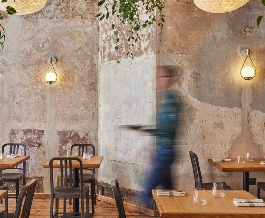
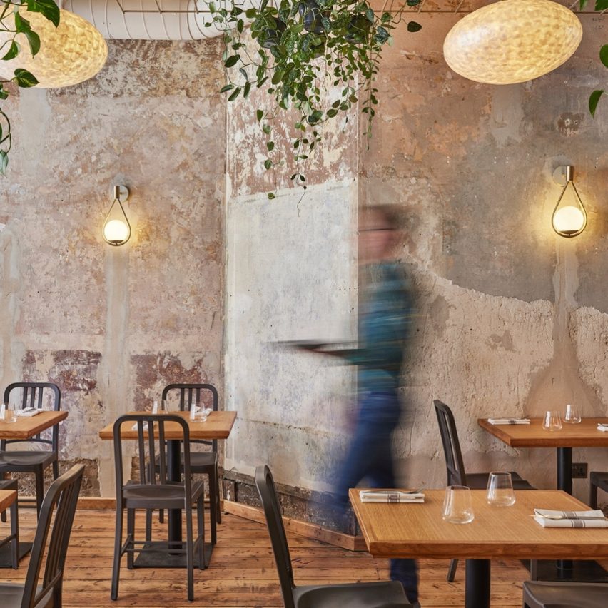
Interior design practice Object Space Place has revamped the Apricity restaurant interior in London with second-hand furniture and reclaimed materials.
The project has been shortlisted in the sustainable interior category of Dezeen Awards 2022, which will announce its winners next week.
The restaurant is furnished with second-hand tables and chairs
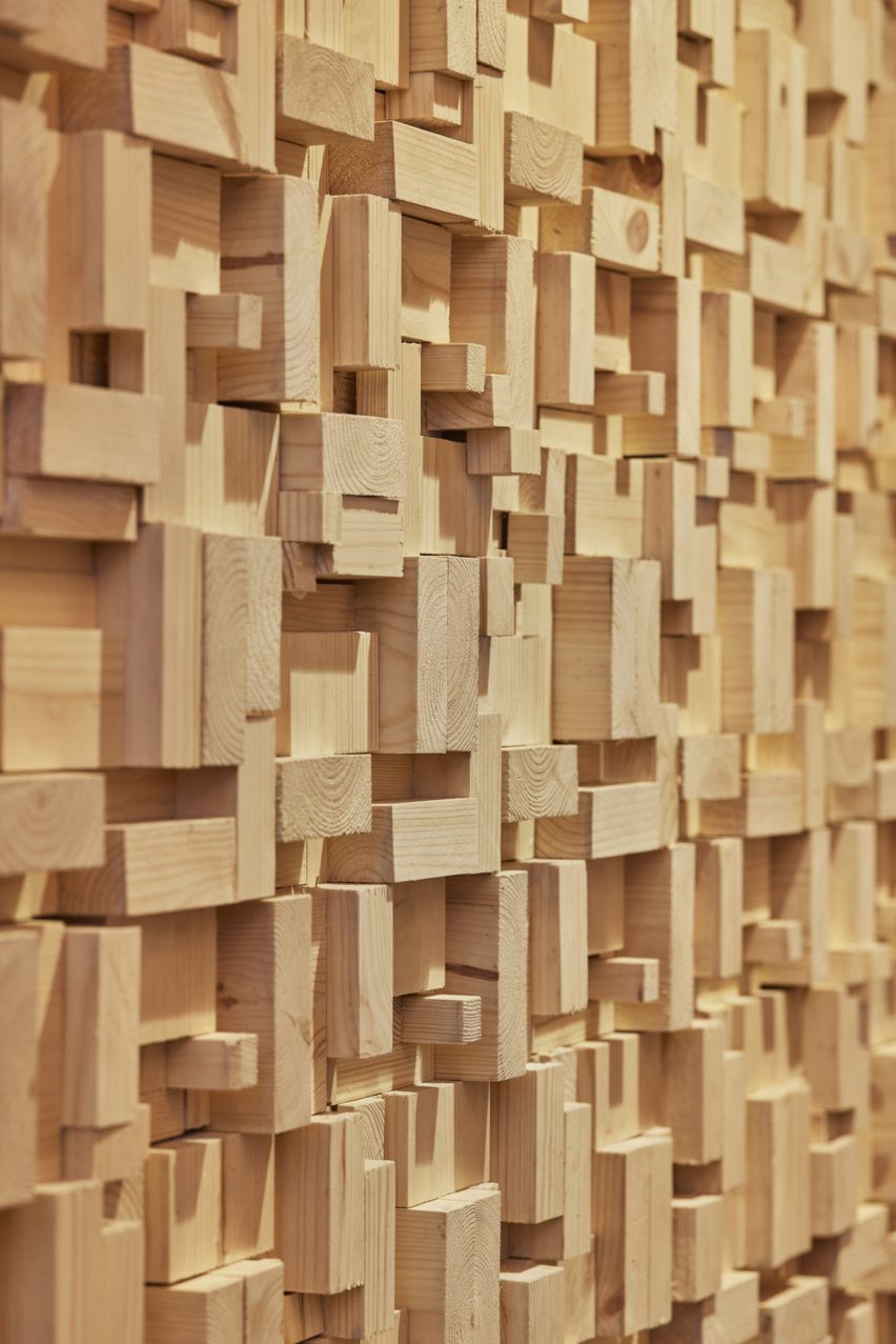
Part of the refurbishment involved removing a timber staircase to maximise usable floor space in the basement.
Object Space Place retained the staircase’s treads to reuse them for a new staircase and repurposed the rest of the usable material into decorative timber block wall cladding.
Material salvaged from a timber staircase was used as statement wall cladding
“We saw the old staircase as a materials bank full of wood that we could reuse, so we worked with the contractor to take the staircase apart carefully, grade the timber that was usable and create a repeating block pattern that could be made from these timber components,” Object Space Place told Dezeen.
“The timber wall finish has also been installed on a split batten system, so even if someone wants to change this in the future it can be done relatively easily.”
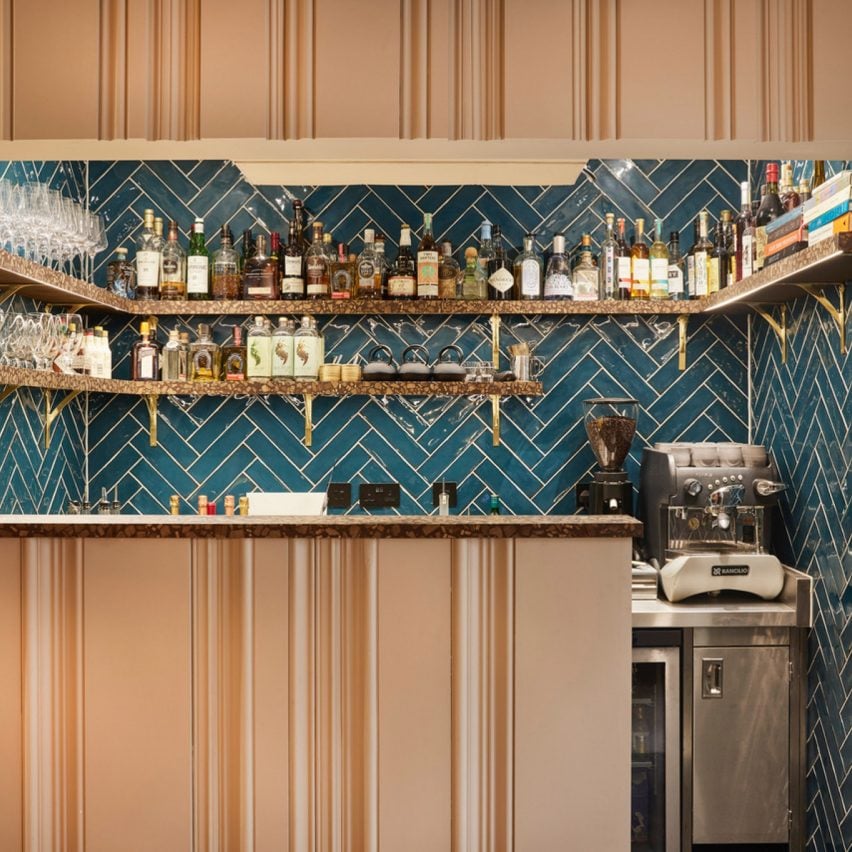
Skirting boards and architraves were reused to decorate the front of the bar
Architraves and skirting boards removed from the interior were reused to cover the front of the restaurant bar, creating a vertically grooved surface.
The practice overhauled the space to expose some of the original finishes, including brickwork, timber floorboards and aged walls.
“Customers really love the walls, which is interesting as these are simply what we found when we removed the blank white plasterboard wall linings on the ground floor,” said Object Space Place.
“This really epitomises what we discovered about working with waste and the circular economy – the extra effort you have to put in rewards you with a space rich in stories and these stories help add to a dining experience that exemplifies going the extra mile.”
The interior features pendant lights made from waste coffee grounds
Mechanical, electrical and plumbing (MEP) equipment was retained where possible and reclaimed furniture, sinks and mirrors were sourced to fit out the restaurant, including second-hand dining chairs that were reupholstered to suit the design scheme.
In instances where reclaimed items could not be acquired, new elements with sustainable qualities were used instead, including terrazzo-like surface material by Foresso made from recycled timber and lampshades made from oyster shells or waste coffee grounds.
Foresso timber terrazzo was used on the bar and waiter stations
Object Space Place designed the refurbishment according to its Restorative Design Framework initiative, which is based on circular economy principles.
“We developed a true benchmark in sustainable design and fit-out by applying the principles of a circular economy, particularly designing out waste and pollution and keeping natural resources in use,” the studio explained.
Plasterboards were removed to reveal aged walls
According to Object Space Place, the project achieved a reduced embodied carbon footprint of 45 per cent compared to refurbishments of similar-sized restaurants where new furniture and finishes were applied.
Other restaurants that feature reclaimed materials include an eatery in Madrid with interior features made from upcycled junk and a restaurant in Bangalore decorated with discarded bicycle bells and cassette tape boxes.
Bangladeshi architect Marina Tabassum, who was recently awarded the Soane Medal, explains why she only works in her home country in this exclusive interview.
Tabassum is known for designing buildings that use local materials and aim to improve the lives of low-income people in Bangladesh, where all her projects are based.
“The reason I’ve never really worked outside Bangladesh is the fact that wherever I work, I must understand that place, it is very important to me,” Tabassum told Dezeen in a video call from her studio in Dhaka.
“To go somewhere and build something without having the full knowledge of it makes me quite uncomfortable,” she added.
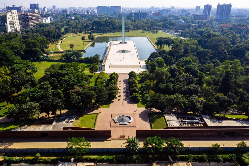
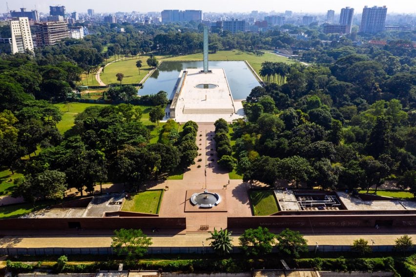
Marina Tabassum’s designed the underground Museum of Independence in Dhaka. Photo is by FM Faruque Abdullah Shawon
As Tabassum feels the need to have a connection to the spaces she designs, she doesn’t see any reason to create buildings outside of her home country.
“We have so much to do in Bangladesh, we have a lot of work that’s there,” she said. “I really do not feel the need to go anywhere else to look for work – we all have our own places to concentrate on.”
“In a lifetime there’s only so much you can do, so staying focused is probably more important,” she continued.
Among her designs in Bangladesh are the country’s Museum of Independence and the adjacent Independence Monument, as well as the Aga Khan Award-winning Bait Ur Rouf Mosque.
Architecture is a “social responsibility”
Tabassum grew up in Dhaka, Bangladesh, where she established her studio Marina Tabassum Architects (MTA), which she has led for the past 17 years.
Her childhood in the country has influenced her practice, with a number of her studio’s projects aiming to create better homes and lives for people in Bangladesh, which has a high income inequality.
“I come from a country where I’ve grown up seeing this disparity between the rich and poor, and every single day when I get out of my house, you see this disparity,” said Tabassum.
“I don’t know about architects in other countries and how they should be doing it, but in my case, I encourage the younger generation of architects to come and work for the people who have no knowledge about architecture,” she said.
“I think it’s a social responsibility for us, especially in Bangladesh, where we can make our knowledge and our skills available to people which can really help better people’s lives and living environment.”
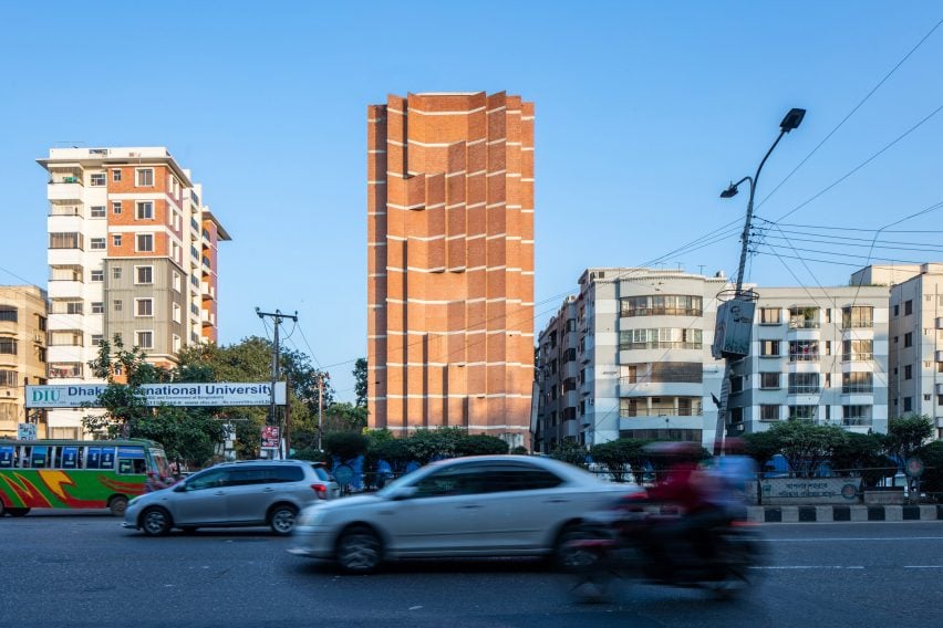
The Comfort Reverie building in Dhaka, where MTA is based. Photo is by FM Faruque Abdullah Shawon
With her architecture, Tabassum aims to create appropriate buildings with “a sense of place”, something she believes has been lost as architecture has become more homogenous over the past 30 years.
“Every place has a uniqueness that through an evolutionary process has come to a point where it’s the geography, the climate, the history, everything comes together and creates something which is very essential of a place,” Tabassum said.
“I think especially during the very high-flying capitalist time in the 1990s, and even in the 1980s, where we were just building profusely all over the world in this capitalist endeavour, we lost that idea of uniqueness,” she added.
“We are losing the value of the uniqueness of a place”
Tabassum studied at the Bangladesh University of Engineering and Technology, at a school set up by the Texas A&M University, and graduated in the mid-90s – a time when, according to her, architecture was becoming increasingly homogenous.
“When I graduated from architecture in Dhaka, I saw the same thing,” she said. “It’s just stacks of floors, built very quickly – you just put glass on [buildings], everything is about aluminium and glass and that’s it, the building is done. “
“It had no sense of the place and if you see the cities that were growing up during that time in China, or in the UAEs and the Arabian Peninsula, everything echoes that idea of globalisation, where everything is kind of standardised, fast-breed buildings,” she added.
“To me, that really felt like we are losing the value of the uniqueness of a place.”
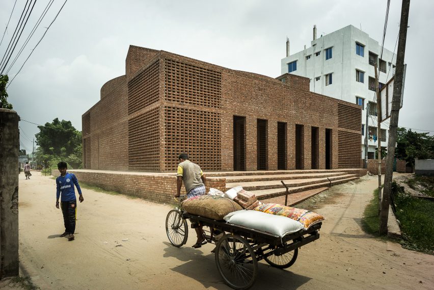
Tabassum’s Bait Ur Rouf Mosque is made from brick, a material traditionally used in Bangladesh. Photo is by Sandro Di Carlo Darsa
Instead, Tabassum aimed to find her own voice by designing using local materials. Many of her projects, including the Bait Ur Rouf Mosque, are constructed from brick – a common material in Bangladesh.
“I have tended to work with brick because it works with the climate, it ages very gracefully, in my opinion,” the architect said.
“Instead of let’s say concrete, which is not that great and especially in our weather – we have so much rain that within a few years the concrete ages quite poorly. But brick ages quite beautifully.”
“Glass is not able to take enormous heat”
As architecture has become more global, she believes that buildings have also become less adapted to local climates.
“We’ve always focused on the idea that the building must be climatically appropriate, so that it’s not dependent on any kind of artificial means, like air conditioning, only,” she said.
“Which you don’t see anymore when you have glass buildings because glass is not able to take enormous heat – it just turns into a greenhouse,” she added.
“That’s what’s wrong with the kind of architecture where you take something from a cold country and bring it to a warm country like ours.”
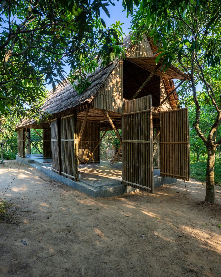
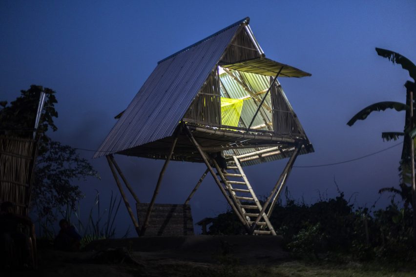
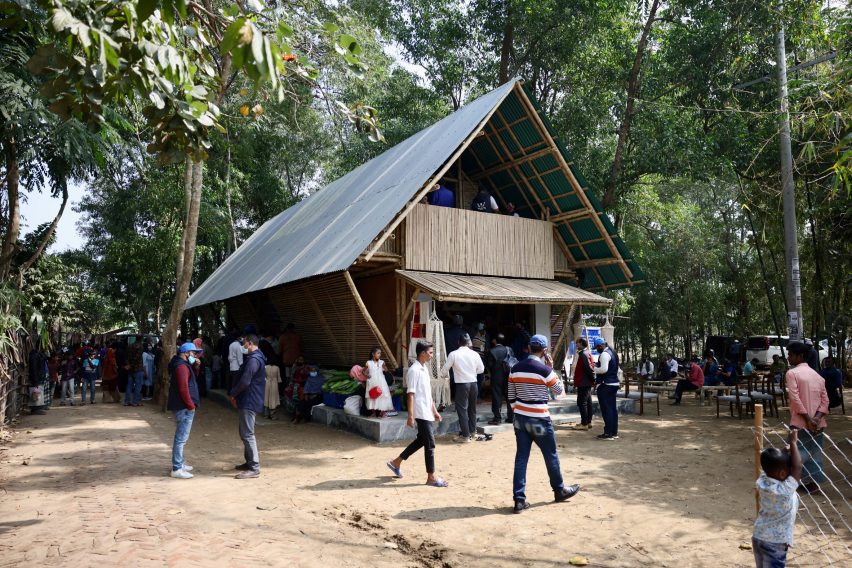
The Khudi Bari lets owners sleep on a higher level when needed. Photo is by FM Faruque Abdullah Shawon
Among the projects that Tabassum designed specifically for the Bangladeshi climate is Khudi Bari, modular houses that can be moved to help communities survive in Bangladesh’s “waterscape,” which is increasingly affected by flooding exacerbated by climate change.
“Khudi in Bengali means tiny and Bari is house, so these are really modular houses, especially for the landless,” Tabassum explained.
“Bangladesh is all about water – it’s a waterscape rather than landscape, there are so many different varieties of water bodies.”
There are essentially two types of people affected by the flooding in Bangladesh, according to the architect – people whose land is periodically flooded during the rainy season, and people who are continuously on the move because the land is constantly shifting.
The Khudi Bari houses were designed to be of use to both groups.
“Each one is quite different so we’re trying to give them different solutions to these kinds of houses,” Tabassum said.
“We deliver a modular structure which has two levels, so if you have flooding you can move yourself to the upper deck and save yourself and when the water recedes you can start living your life,” she added.
“When you have to move, this is a lightweight flatpack system that you can take down and it’s very low-cost, it’s about £300 all together.”
The modular Khudi Bari houses were designed to be disassembled and moved. Photo is by Asif Salman
The homes are built from bamboo and steel in order to make it as easy as possible for people to be able to source the materials and build the houses themselves.
Tabassum hopes to eventually be able to train steelworkers locally to make the steel joints needed for the building, which are currently supplied by the architects.
“We would like to make it in a way so that any steelworker in any location can make it,” Tabassum said.
“But the rest of the material people source on their own so they can decide how big their house will be and what accessories it will have – there’s a sense of ownership about it, which is important.”
Designing for refugee camps requires understanding “definition of beauty”
As well as designing homes for those who have become displaced by flooding – a problem that is likely to increase as the climate crisis continues – Tabassum is also creating architecture for people who have been displaced from their country of origin.
Her studio is working with the World Food Programme to build food distribution centres in Bangladesh’s Cox’s Bazar refugee camps, which house Rohingya refugees from Myanmar.
Designing for the camps, where nearly one million people live, comes with its own unique difficulties and limitations.
“A lot of things are not allowed,” Tabassum explained. “You are not allowed to use any permanent materials, everything has to be temporary.”
The Baharchora Aggregation Center is one of the buildings created for the World Food Programme. Photo is by Asif Salman
“You cannot build anything beautiful,” she added. “So being an architect, you deal with beauty and aesthetics in many ways – it’s what we have been taught.”
“And now to go against that and design something that is so-called not-beautiful is a challenge, you have to work around that, you need to understand the definition of beauty – what is beauty?”
To create beautiful and practical temporary buildings the studio worked with bamboo, rather than more permanent materials.
“You have a very limited palette of materials but you try to create something out of that,” Tabassum said.
As Tabassum continues working on both her studio’s regular projects – it is currently designing a hospital on the outskirts of Dhaka – and its designs for displaced people, she feels that people are at last taking action to help mitigate the climate crisis.
But above all, she believes there now needs to be a focus on collaboration.
“I think it’s important to understand that we’re living on one single planet, and the north and south are connected in every single way,” she said.
“And the majority of the population of the world lives in the Global South. And so it is an enormous responsibility of the north and the south, equally, to come towards a resolution where it is about mitigating our existential crisis.”
Spotted: With research showing that corporate social responsibility (CSR) initiatives are frequently withdrawn during times of economic uncertainty, the full picture of the fallout from the COVID-19 pandemic is still developing. Many environmental advocates hoped that the sudden drop in global emissions would become the new norm, but the opposite happened. The International Energy Agency (IEA) reports that global emissions rebounded to their highest level in history in 2021. Part of that was a rebound in airline travel and a steep increase in transport by car.
In light of the corporate struggle to do what is best for the planet, Spanish software company APlanet created a single, customisable dashboard for companies to track their environmental, social and governance (ESG) measures in one place. Whatever a business is doing to protect the global health of the planet, and wherever that occurs in the supply chain, the APlanet platform tracks it.
A company sets up the categories that it wants to track, which can include global standards as well as internal, local, or regional measures. APlanet helps identify data inputs and builds a bespoke dashboard. Companies can assign owners to different data sets and, when needed, easily create holistic performance reports for the entire organisation.
The detailed analysis provided by APlanet helps operational managers track efficiencies and a range of measures across multiple locations, including gender equality, emissions, energy usage, recycling, water usage and more.
CSR and ESG are important to consumers, with much brand loyalty pegged to a company’s ethos. As organisations seek ways to bake sustainability into their very foundations, innovators are rising to the challenge with technologies such as a platform that verifies and tracks impact projects and a social media app that raises funding for sustainable brands and causes.
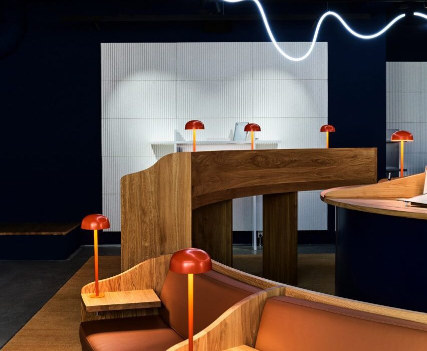
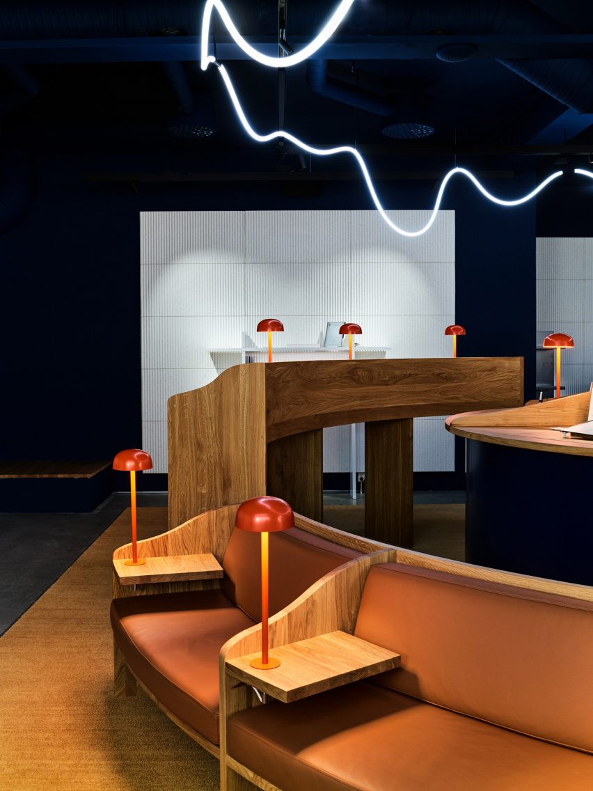
Architecture firm Snøhetta has created a library-informed respite from the digital world with A Better Place to Think, an Oslo pop-up shop for tablet brand reMarkable.
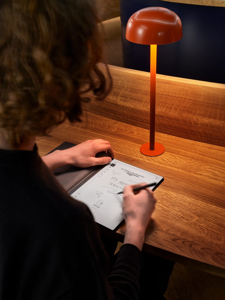
Located just off the city’s main shopping street, the temporary store was made to showcase the brand’s tablet, which has a paper-like surface.
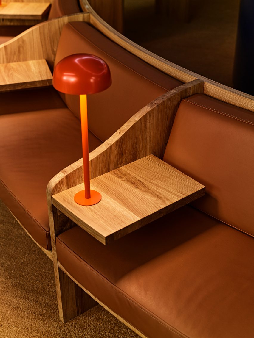
The reMarkable pop-up store is informed by libraries
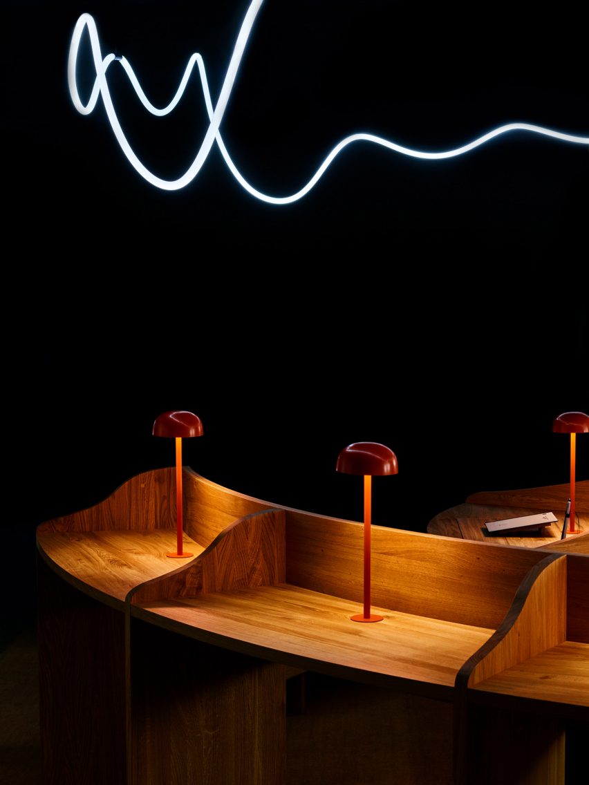
Snøhetta looked to libraries for the design, which features divided timber desks, leather banquets and small domed reading lamps.
The Norwegian studio wanted to encourage contemplation and concentration through the spatial qualities of the pop-up.
It features bespoke oak furniture in a quiet environment
“In today’s fast-paced and digitalised society, finding places for focused thinking can be a challenge,” Snøhetta founder Kjetil Trædal Thorsen told Dezeen.
“For the reMarkable pop-up store, we wanted to echo the serene environments of libraries – the clean and open spaces, somber aesthetics, tidy structures, and focused reading zones.”
The central light installation is inspired by a handwritten line
A Better Place to Think features two concentric rings of desks and seating, with the inner ring made up entirely of standing desks and the outer ring featuring blocks of seated desks, benches and sofas.
A handmade light installation overhead was inspired by the energy and movement of a line of handwriting.
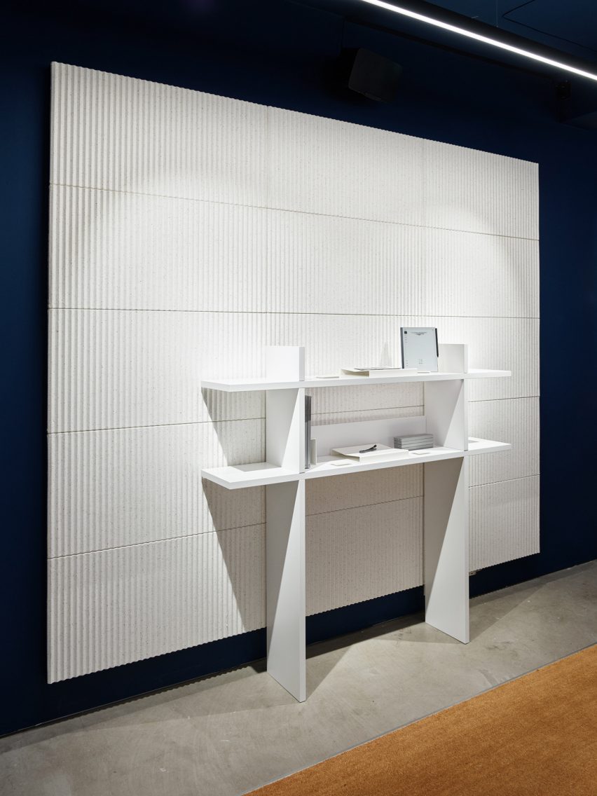
The walls and ceiling are painted in a “calm and sober” dark blue, with white acoustic panels and shelving covering most of the wall space.
The matt finishes across the walls, panels and on the bespoke oak furniture are meant to echo the material qualities of paper.
The store features matt finishes inspired by the feel of paper
The design of the pop-up aims to emphasise the enduring value of bricks-and-mortar shopping.
“Although consumers are becoming increasingly digital in their shopping habits, especially during the pandemic, we see the value of letting our customers experience that ‘wow’ moment of writing on one of our paper tablets for the very first time,” said reMarkable founder and CEO Magnus Wanberg.
White pulp acoustic panels line the walls
Founded in 1989, Snøhetta has offices around the world.
Its recently completed buildings include the shimmering Le Monde Group Headquarters in Paris and the El Paso Children’s Museum, which has a barrel-vaulted roof resembling a cloud.