PAU places glass structure in shell of Brooklyn’s Domino Sugar refinery
CategoriesArchitecture

PAU places glass structure in shell of Brooklyn’s Domino Sugar refinery

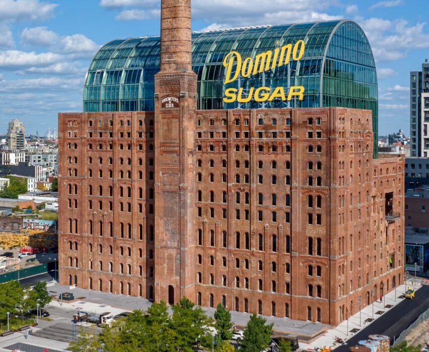
Local architecture studio Practice for Architecture and Urbanism has installed a glass office building with a vaulted roof inside the shell of the 19th-century Domino Sugar Refinery on the waterfront in Brooklyn.

Called the Refinery, the 12-storey building is the conversion of an industrial factory into a contemporary office, reflecting how the borough’s architectural needs have shifted.
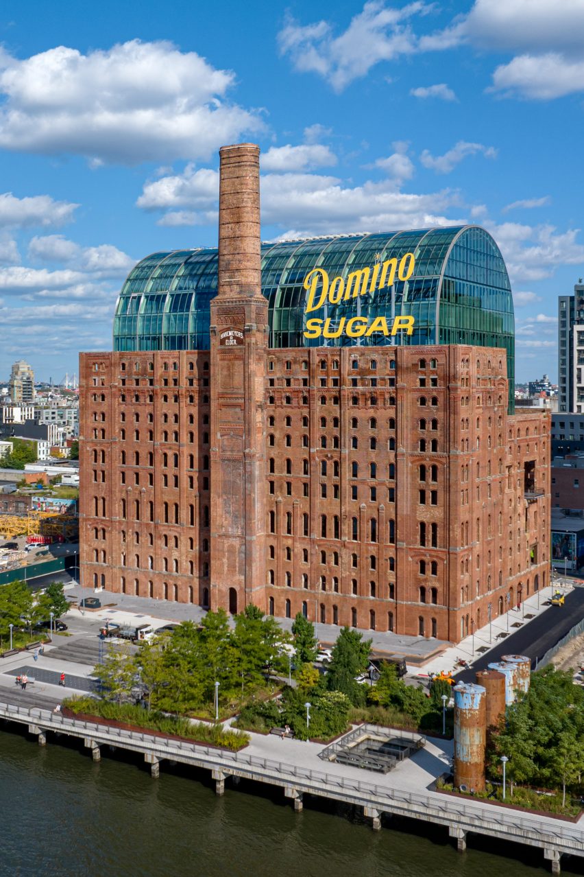
Building with historical brick facade wrapping new glass building
PAU has placed a glass office building with the shell of a historic sugar refinery

The structure is the centrepiece of the redevelopment of the Domino Sugar Refinery site, developed by Two Trees Management with a master plan by SHoP Architects and Field Operations.

For the Refinery, Practice for Architecture and Urbanism (PAU) wanted to create a functioning office space that kept the facade of the Romanesque Revival structure.
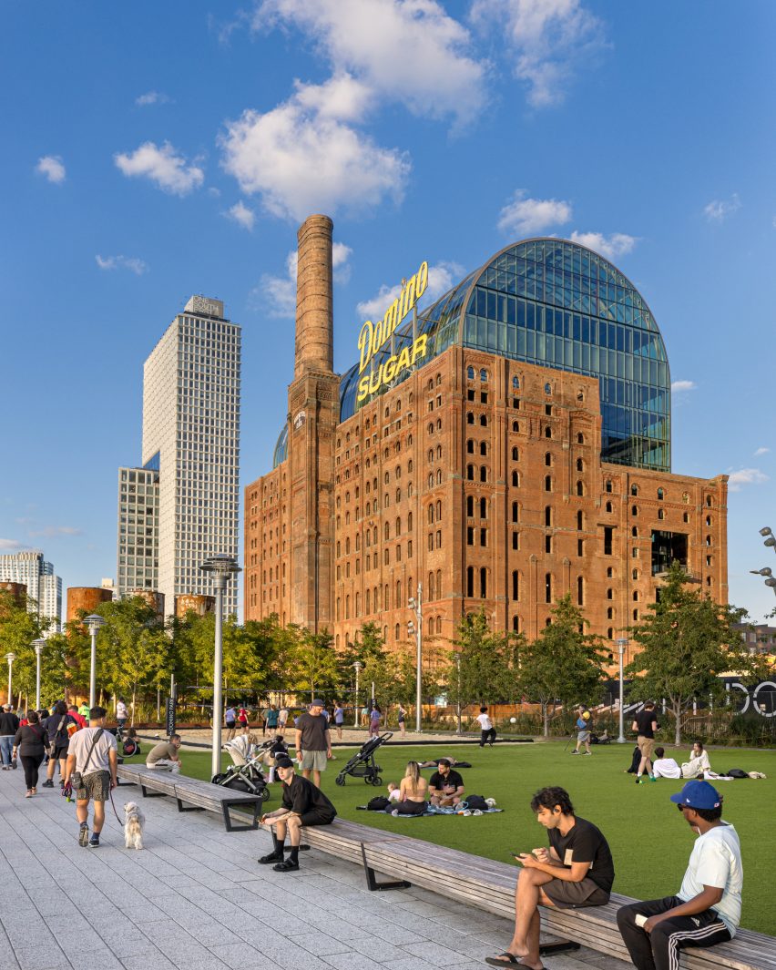
Park with restored Domino Refinery in background
The structure is part of the larger Domino Sugar redevelopment in Brooklyn

“We’re not shortchanging today for some nostalgia,” PAU principal Ruchika Modi told Dezeen.

“What was really important was this idea of palimpsest and embracing what was on the site without becoming slavish to history.”
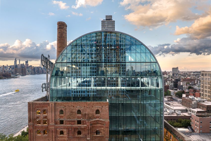
Vaulted glass ceiling on Domino Sugar Refinery
The office structure is topped with a large glass vault

Because of the floor configuration, the original building could not simply be adapted.

The floorplan was industrial with large cavernous spaces inside, so the studio opted for keeping the historic building’s facade intact while putting a whole new building inside of it.
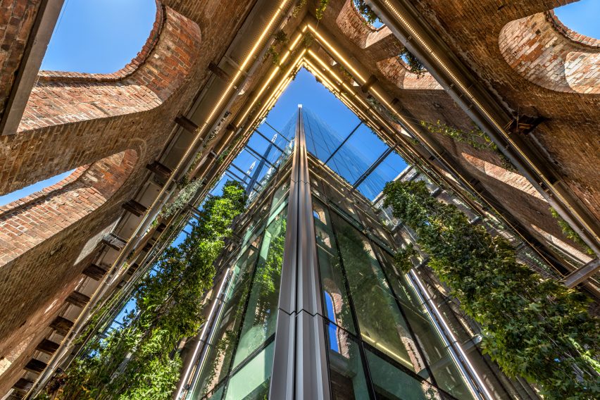
View from gap between the brick and glass walls
Beams attach the old facade to the new curtain walls

“It’s not a conventional adaptive reuse project in the sense of going into a warehouse building and adapting it,” Modi continued.

“There was no building to adapt. And if we were to just go in and fill in the missing floors, it would lead to a really weird, idiosyncratic, completely bizarre, you know, interior configuration.”
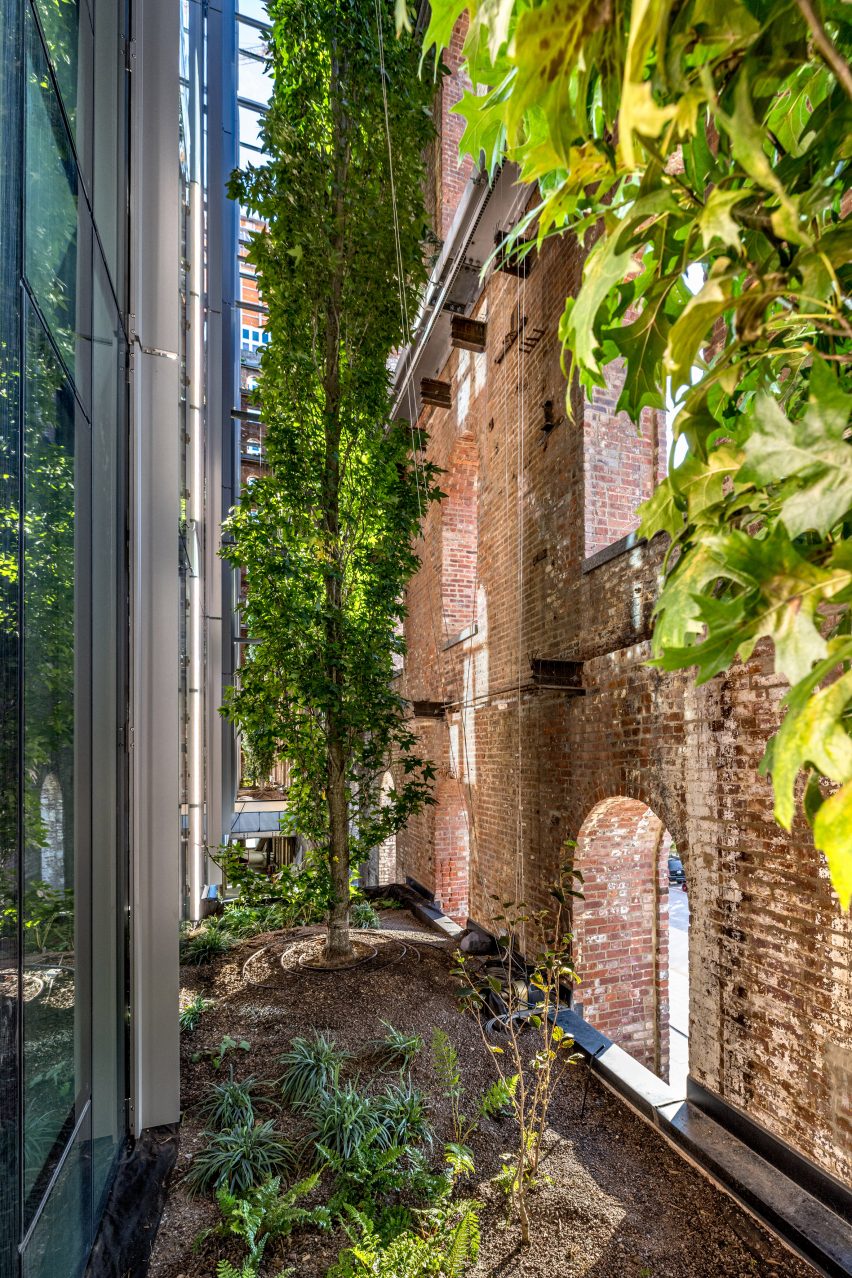
Trees in gap between brick and glass
Planters in the gap hold trees

Instead, the new glass building sits back from the preexisting masonry and is anchored to it with metal beams that connect to the new building’s curtain walls.

This gap allows for light to filter in through the windows and creates space for a “vertical garden” between the brick wall and the curtain walls.

Architectural details such as a large smokestack from the original structure were preserved on the facade.
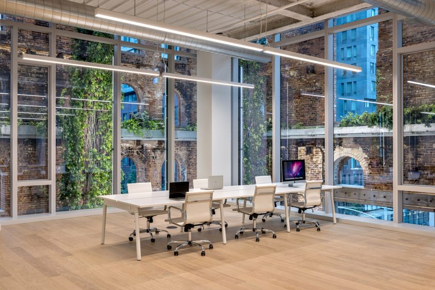
Office within Domino Sugar refinery building
The gap allows for the offices to have more natural light

The studio also used some of the original structural detailing to guide the new structure, such as a cantilevered glass overlook that juts out from the gap in the facade where an industrial chute once sat and has views of the Field Operations-designed parks on the site.

The new structure consists of 460,000 square feet (42,735 square metres) of offices with floor plans that differ depending on needs and a vast penthouse that sits directly underneath the glazed vaulted roof.

From the offices, inhabitants can catch views of the Manhattan skyline across the East River or of the urban environment of the Williamsburg neighbourhood in Brooklyn.

According to the studio, the building also runs on all-electric power.
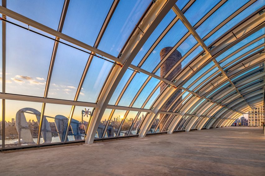
View from vaulted glass ceiling
The building sits on the East River across from Manhattan

On the ground floor is a triple-height atrium lobby with amenities spaces and retail. A replica LED sign displaying the Domino Sugar logo brand was hung from the river-facing facade.

The structure sits between two larger structures, a pair of linked skyscrapers by CookFox Architects and two in-progress skyscrapers clad in porcelain by Selldorf Architects.
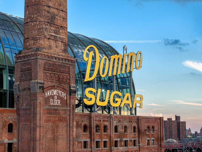
Domino Sugar sign
A replica sign was installed on the exterior

The Refinery had been in operation for 120 years when it closed in 2004. The site was bought by Two Trees Management in 2012.

A six-acre park by Field Operations holds the space between the developments and the East River and has become a popular park for the local public.

Since being commissioned for the Refinery, PAU has landed a commission, along with HOK, to redevelop the beleaguered Penn Station in Manhattan.

The photography is by Max Touhey.

Reference

Reims 502 places pool atop basalt-clad Mexican home
CategoriesArchitecture

Reims 502 places pool atop basalt-clad Mexican home

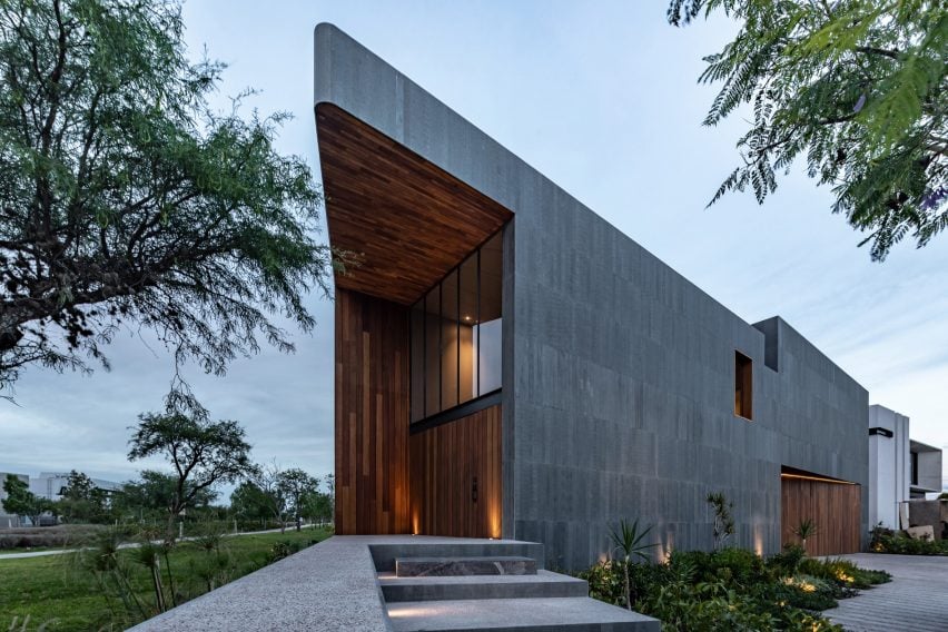
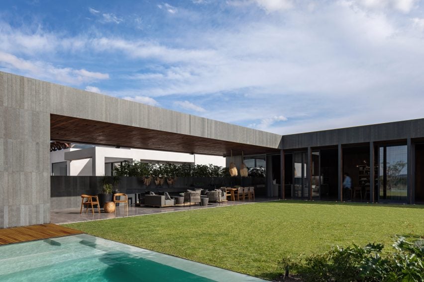
Local studio Reims 502 has unveiled an expansive residence in Querétaro, Mexico with warm walnut and dark basalt finishes and a rooftop pool and garden area.

Mexico-based designers Eduardo Reims and Andrea Maldonado, who work under the name Reims 502, completed the 1,000-square metre Casa Basaltica on a quarter-acre lot in 2023.

Angular basalt-clad house in Mexico
Warm walnut and dark basalt define the Mexican home

The house sits along a bike path that surrounds a lake. The challenge of the site was to create private interior space for the residents that did not sacrifice the view.

“The answer was simple,” the team told Dezeen, “Reverse the planting of the program compared to the neighboring houses.”

Walnut-clad rooms at house by Reims 502
Private, recreation and family spaces are located on the ground floor

All of the private, recreation and family spaces are located on the ground floor, creating a foundation that comprises the site’s entire buildable footprint.

Four suites are lined along one side of the property, creating a layered sawtooth transition with a screened porch that runs down the slanted edge of the trapezoidal house.

Casa Basaltica by Reims 502
Casa Basaltica sits on a quarter-acre lot

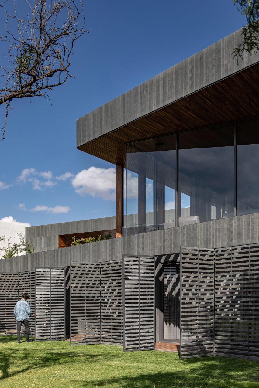
Movable shutters made out of thin basalt stone bars enclose the porch like blinds and serve as a thermal buffer that negates the need for air conditioning.

All of the public spaces – living room, dining room, kitchen and terrace – were placed on the top floor and arranged around a large garden and pool. The upper floor spaces are set back from the perimeter of the house on the park side to create another layer of privacy.

Rectilinear home and swimming pool by Reims 502
Reims 502 added a swimming pool to the garden

The service areas are located underground with a side courtyard for ventilation and natural lighting.

The home’s dark material palette is also a departure from the light-coloured schemas used for the neighbouring houses.

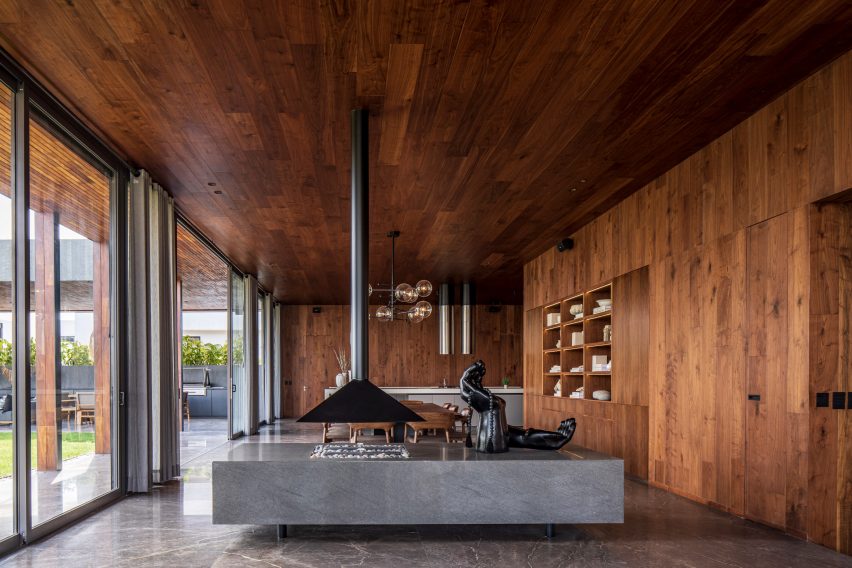
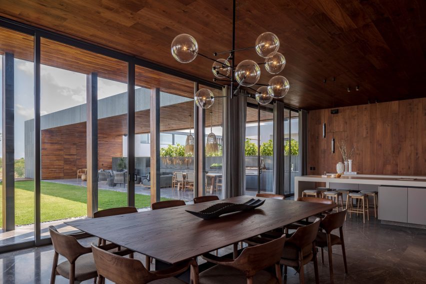
Dining table within home by Reims 502
Walnut also features on the interior

The exterior is clad in bands of durable, resilient basalt stone, arranged in thin vertical panels. The material changes where the facade steps back from the build line, trading stone for multi-toned walnut planks at the garage and the rounded corner entryway.

The walnut staves continue to the interior “creating an atmosphere of warmth and timelessness inside.”

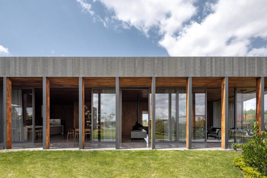
The top-floor public zones have a walnut-wrapped colonnade that creates a transition from the garden to the interior and shades the floor-to-ceiling glass, which maintains the views out to the park.

In addition to the cross ventilation that cools the top floor areas, solar panels for water heating and energy generation as well as a water recycling system were implemented to “contribute to its overall sustainable performance,” the studio explained.

Movable shutters made from basalt
Movable shutters made out of thin basalt stone bars enclose the porch

Rather than departing from Querétaro’s vernacular architecture like Reims 502 did, Gestalt Associates took cues from the area’s colonial roots with light, airy spaces in a brick and concrete home nearby.

Other projects that have basalt elements on the facade include a holiday home in Hawaii by Walker Warner Architects.

The photography is by Ariadna Polo.


Project credits:

Architecture: Reims 502
Team: Eduardo Reims, Andrea Maldonado
Contractor: Ramon Campillo
Structure: Sergio Ruiz
Decoration: Mavi González

Reference

Stephane Gaulin-Brown places curved roof on Quebec chalet
CategoriesArchitecture

Stephane Gaulin-Brown places curved roof on Quebec chalet

Montreal architect Stephane Gaulin-Brown has placed a single-slope roof with a curved soffit on top of a ski chalet to open it up to the forests of Mont Tremblant, Quebec.

Completed in 2023, the house – entitled Élément Tremblant – is a 1,400-square foot (130-square metre) retreat that recalls the glitz of the region’s classic ski culture with a contemporary twist.

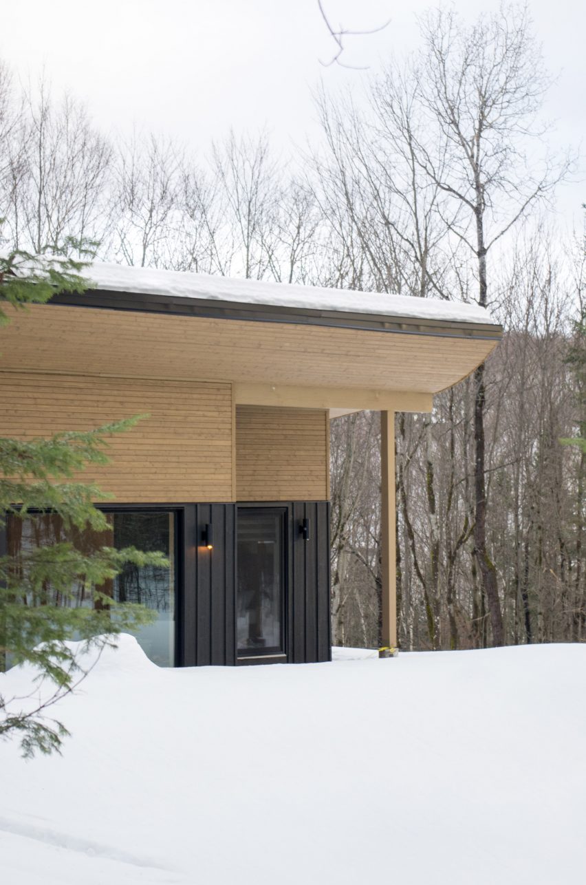
Wooden soffit and curved roof with snow drifts
Stephane Gaulin-Brown created a chalet in Quebec

“The suave adventurous spirit of the early pioneers like Stan Ferguson and Hans Falkner, as well as 1940’s après-ski paintings…served as inspiration for the design.” Stephane Gaulin-Brown said. “The design also grew out of the natural context: the ferns, the birch trees, the deer, and the large glacial boulders strewn across the forest floor.”

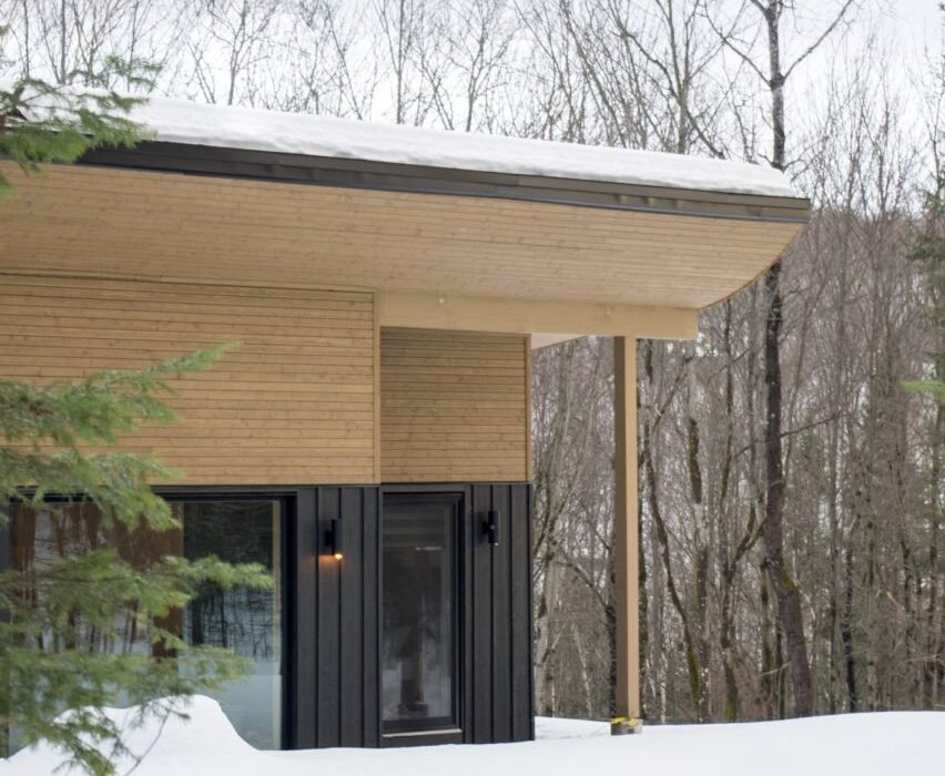
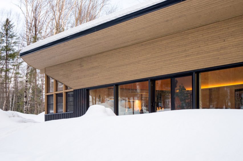
The primary feature is a long shed roof with an ochre-coloured wooden soffit that curves from the exterior wall up to the edge of the cantilever. The roof references a traditional Quebecois roof form with up-curved ends and gives a sense of lightness to the chalet “like it was rising up in the air”.

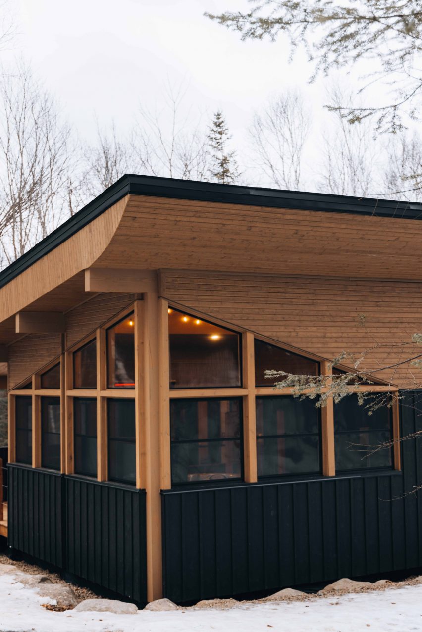
Wooden roof with windows to an interior sauna
Wooden beams wrap the exterior

The tongue-and-groove wood of the soffit turns down the wall to form the upper portion of the facade. Below it, black board and batten siding clads the exterior walls between large, black-framed windows.

The house is organized in a simple double-loaded bar. The entry, secondary bedrooms and bathrooms are aligned facing down the sloped site, while the primary bedroom and open-plan kitchen, dining room and living area form a band that looks up the slope to the forest vista dotted with glacial boulders.

Curved roof with snow drifts
The roof slopes up to let in light and views

On the southeast corner, the windows peak and wrap around a spa. Meanwhile, the northeast corner is subtracted with a small porch off the primary bedroom.

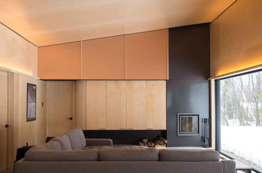
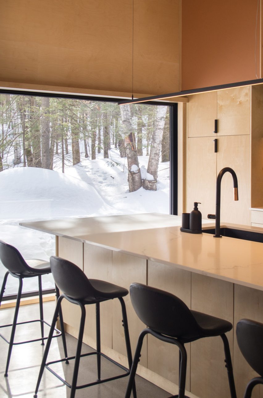
The interiors centre the open living space, which is wrapped in warm stain-resistant Russian plywood and copper-toned metal panels that bounce light from thin, suspended fixtures.

Wooden interior of a sloped living room with steel fireplace
The living areas include plywood and a powder-coated steel fireplace

The sloped roof forms a trapezoidal space that peaks at 12 feet, but the wall of windows is capped just above the average height of a person.

Poured concrete forms a solid base for the powder-coated steel fireplace – a high-efficiency model manufactured locally by Stûv – and flat storage cabinet that rounds the corner to the primary suite.

“Recessed uplit LED lighting along the length of the main living space adds drama, ultimately making the living room into a kind of film set ready for après-ski hangouts,” Gaulin-Brown said.

In the kitchen, thin black hardware and square tile accent the warm wood cabinetry and white countertops.

Glass windows with views of snow in the kitchen
Large glass windows frame the kitchen

“Historical images, sourced with permission from the National Library of Québec, are framed around the house to make the sense of history visceral,” Gaulin-Brown explained. “In the master bedroom, a historical photo of the original Mont Tremblant steam train is printed on a large scale across the whole wall.”

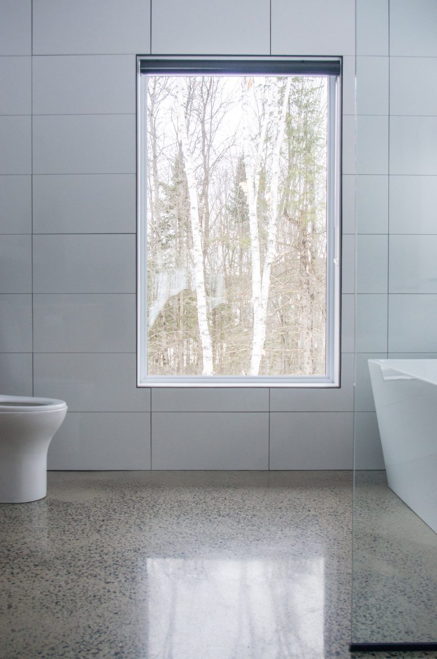
The exposed concrete floor conceals a radiant heating system that warms the house and serves as a heat sink in the winter.

Bathroom with white walls and concrete floors
The house has a radiant heating system in the flooring

In a similar black and warm wood palette, YH2’s Quebec ski chalet also draws in light with an upward-sloping roof, but the Laurentian mountain house employs a V-shaped profile, lifting the roof on both sides like wings.

The photography is by Stephane Gaulin-Brown and Valerie Lacroix.


Project credits:
Client: Alex Roy
Contractor: Daniel Brisson
Designer: Stephane Gaulin-Brown


Reference

Studio KO places female chefs “at the epicentre” of Sahbi Sahbi restaurant
CategoriesInterior Design

Studio KO places female chefs “at the epicentre” of Sahbi Sahbi restaurant

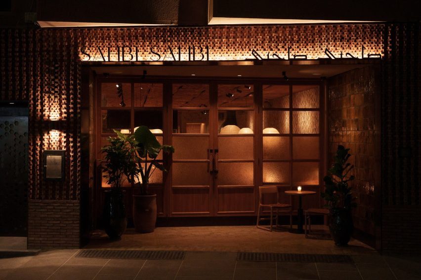
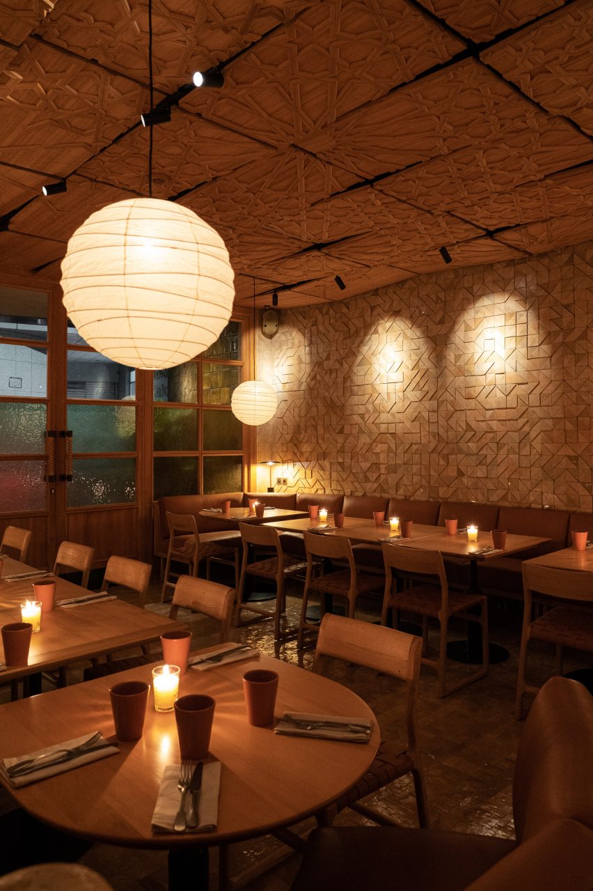
French architecture practice Studio KO has designed the restaurant interiors of Sahbi Sahbi using textures, tones and materials that celebrate Moroccan cuisine and female culinary practices.

Sahbi Sahbi, which translates to soulmates in Darija – a form of Arabic spoken in Morocco, is located in the Guéliz neighbourhood of Marrakech.

The exterior of Sahbi Sahbi restaurant
Top: An open kitchen is at the heart of Sahbi Sahbi. Above: the restaurant is in Marrakech

“Sahbi Sahbi is a reinvented tribute to Moroccan craftsmanship,” Studio KO told Dezeen.

“It is a symbiosis of modernity and tradition, of Japan wood tradition and details and Moroccan motifs and materials.”

Wooden tables inside Sahbi Sahbi
Studio KO wanted the restaurant to celebrate the female chefs who work there

The eatery serves a menu of traditional Morrocan dishes made using recipes created by Dadas – female cooks in Morocco who orally handed down their trade through generations.

Sahbi Sahibi’s focus on Dada cuisine influenced Studio KO to create an interior that places the female chefs at the centre of the space.

Sahbi Sahbi restaurant interiors by Studio KO
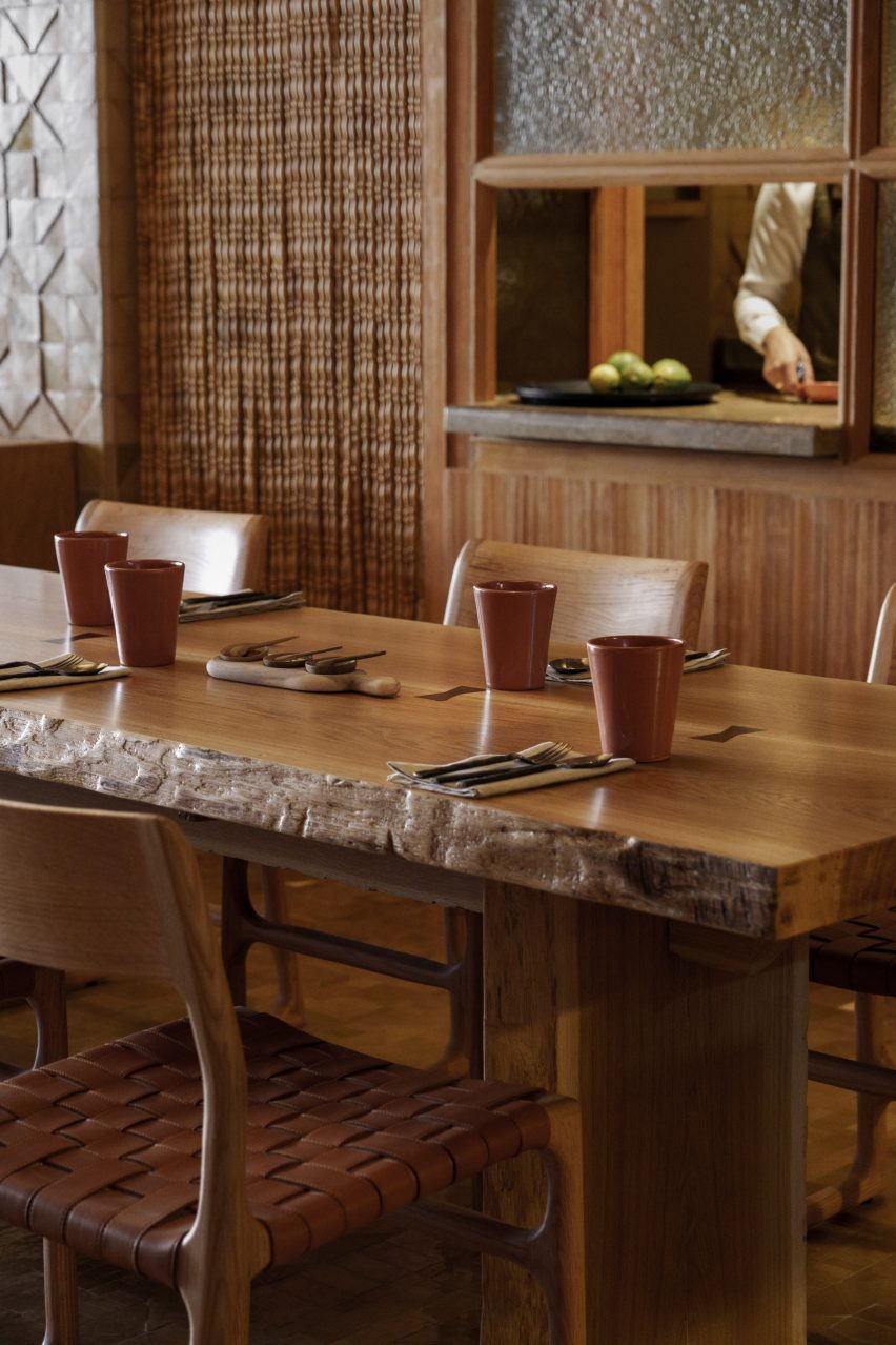
Warm wood was used for the ceiling, walls and table and chairs

“In Morocco, the kitchen is normally a secretive place, the hidden domain of the Dadas, women who hand down recipes from one generation to the next,” Studio KO said.

“It is with precisely this intention, to share and transmit knowledge – an intention evident even in the layout of the restaurant – that guests are welcomed at Sahbi Sahbi,” added the brand.

The interiors of a Moroccan restaurant
Rust-coloured paint and tableware is dotted throughout

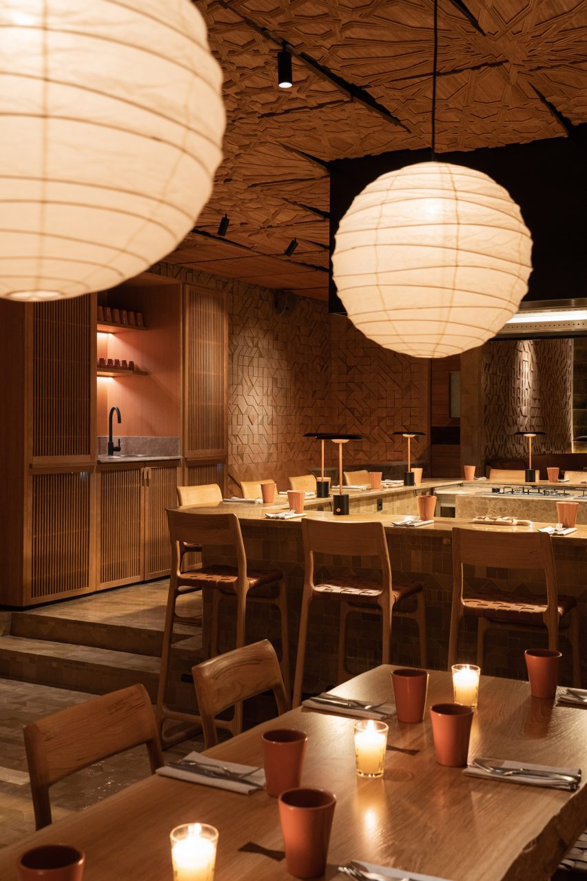
In the centre of the restaurant, the kitchen was intentionally left open so that diners can watch the chefs at work and get an insight into the culinary process.

Horseshoe-shaped tables and seating wrap around an open stove integrated into a kitchen island counter where chefs prepare meals.

“In conceiving this warm, convivial space, the designers inverted the archetype of Moroccan cuisine – its secretiveness – and instead placed the cooking at the epicentre of the restaurant’s activity,” said Studio KO.

Earthy colours and natural materials were used to complement the relaxed and friendly aesthetic of the restaurant.

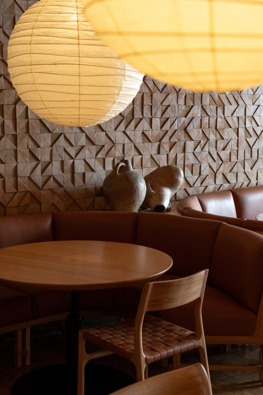
Wood was used to add warmth throughout. It covers the walls and ceiling and also forms the woven chairs and dining tables. These are illuminated with spherical pendant lights while brown leather upholsters the booth seating around the edge of the space.

A fireplace inside Sahbi Sahbi
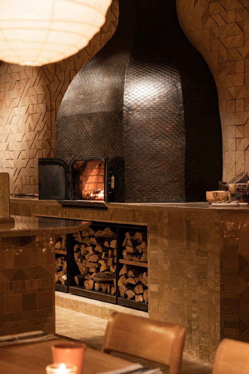
A traditional oven is located at the side of the space

In one corner, there is a large traditional oven where chefs can burn logs to bake bread or roast meat.

Finer details include rust-coloured ceramic urns, clay pots and pans and orange-brown paint in an alcove above a sink.

“The beauty is subtle: details, textures, the play of light and surfaces, natural tones and motifs that tell a story of traditional materials and knowledge, freely reinterpreted,” Studio KO explained.

The interiors of Sahbi Sahbi
the interiors were designed as a tribute to Moroccan craftsmanship

Studio KO has previously worked on projects in Marrakech. In 2017 the studio revealed the Musée Yves Saint Laurent, a 4,000-square-metre museum building showcasing the work of the late fashion designer Yves Saint Laurent.

Other notable buildings in the Moroccan capital city include Fobe House, a white house designed by Paris-based architecture studio Guilhem Eustache.

The photography is by Pascal Montary.

Reference