Seven playful living spaces where swings provide dynamic seating
CategoriesInterior Design

Seven playful living spaces where swings provide dynamic seating

This lookbook compiles seven living spaces where swings show they have a place beyond children’s playgrounds by providing a gleeful alternative to static seating.

Swings typically consist of a seat made from a flat piece of metal, plastic, wood or canvas, but can also be made from found materials such as tyres and sometimes feature a wraparound design for added safety.

This seat is then suspended by sturdy lengths of rope or chain from a frame, ceiling or tree.

Swings have been used for hundreds of years by cultures across the world for both leisure and ritual-related purposes, and are enjoyed by people of all ages, from children in play areas to older people who might have swinging benches in their gardens.

From basic playground swings transplanted into grown-up interiors to intricately crafted bench swing seats that look out over lush courtyards, read on to view a selection of interiors on Dezeen that feature suspended seating.

This is the latest in our lookbooks series, which provides visual inspiration from Dezeen’s archive. For more inspiration, see previous lookbooks featuring interiors animated by indoor slides, living spaces featuring metal furniture and spaces with oversized windows.
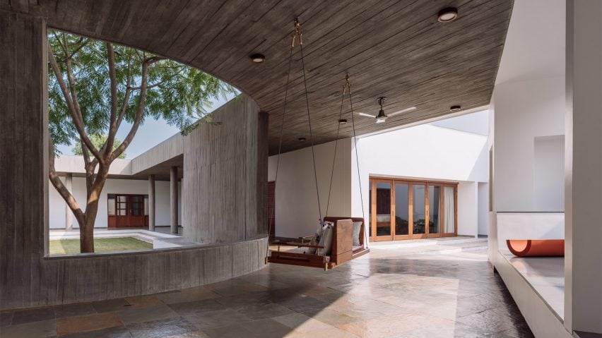

Covered walkway with swing seat looking out onto an open-air courtyard with treesCovered walkway with swing seat looking out onto an open-air courtyard with trees
Photo by Ishita Sitwala

Gujarat house, India, by Design ni Dukaan

A wooden swing seat covered in pillows is suspended from the concrete ceiling of this house in the Indian state of Gujarat.

The swing is situated in one of the house’s covered walkways and was positioned to allow the sitter to enjoy views of its open-air courtyard.

Find out more about Gujarat house ›
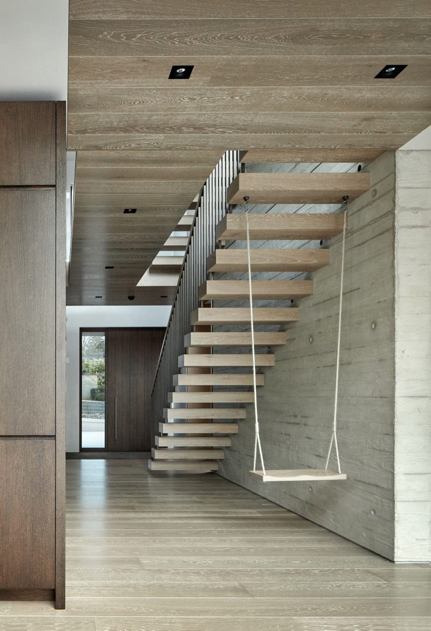

Kenwood Lee House by Cousins & Cousins (RIBA house of the year longslist)Kenwood Lee House by Cousins & Cousins (RIBA house of the year longslist)
Photo by Jack Hobhouse

Kenwood Lee House, UK, by Cousins & Cousins

A cantilevered floating stair anchors a swing inside the hallway of this house in north London by local studio Cousins & Cousins.

The wooden seat is suspended by softly frayed rope, creating a subtly rustic composition that compliments both the poured-concrete finish of the walls and the wood used on the ceiling, cabinets and front door.

Find out more about Kenwood Lee House ›
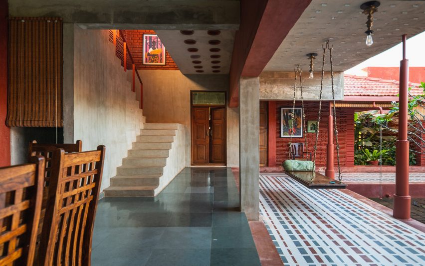

Covered living space beside courtyard with swing seatCovered living space beside courtyard with swing seat
Photo by Yash R Jain

Karai, India, by Rain Studio

Local office Rain Studio hung a polished wooden swing seat overlooking a verdant courtyard in this house near the city of Chennai in southern India.

The seat is suspended from all four corners by ornately cast metal hooks and links, some of which feature animals such as elephants.

Find out more about Karai ›
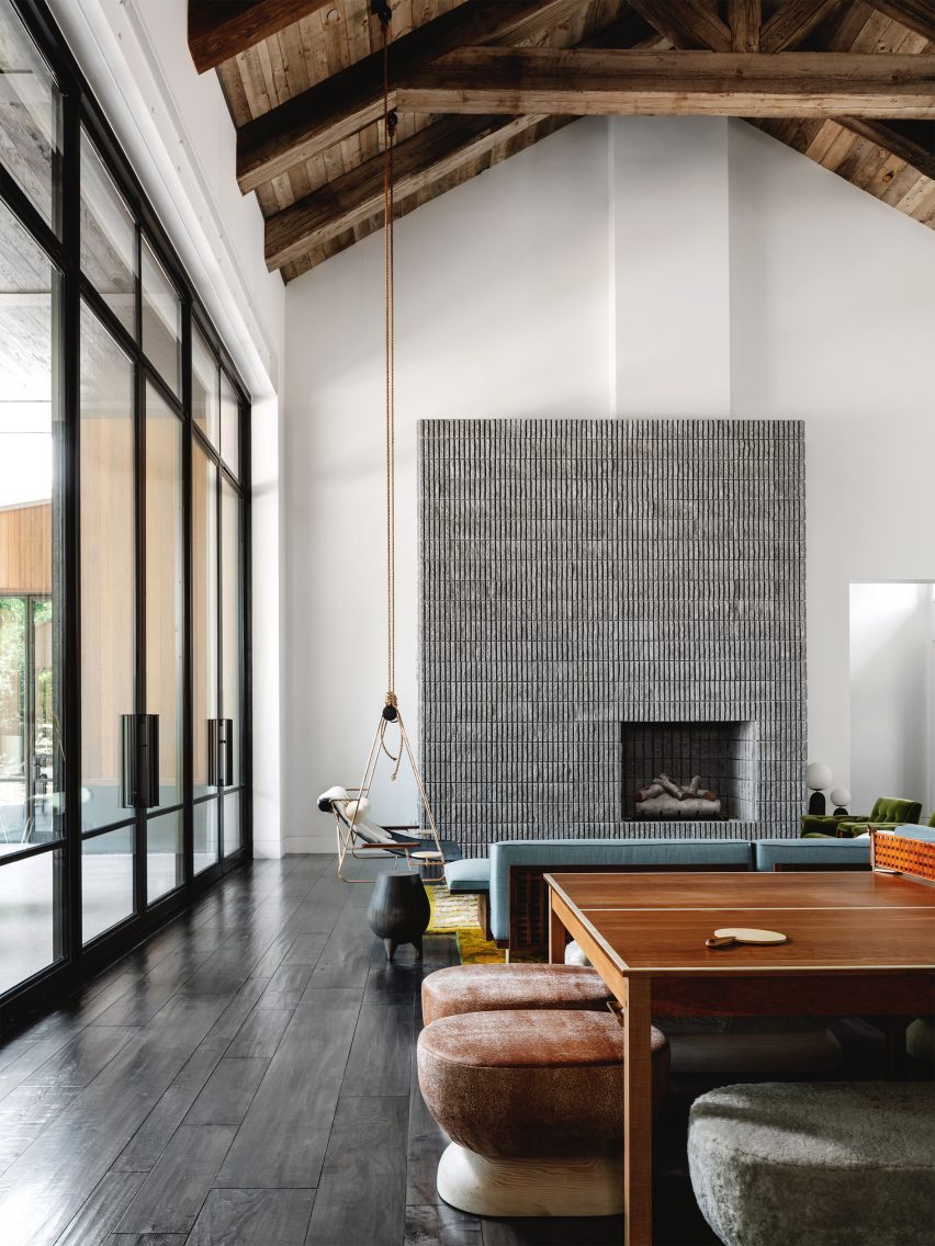

Living room with concrete fireplace and a swingLiving room with concrete fireplace and a swing
Photo by Chase Daniel

Austin House, USA, by Melanie Raines

Rustic Californian barns provided reference points for this house in Austin, Texas, which features a lofty double-height living space complete with multiple seating options.

A metal-framed lounge chair flanked by integrated side tables is suspended from the ceiling’s wooden rafters by two long lengths of rope, adding to the interior’s whimsical atmosphere.

Find out more about Austin house ›
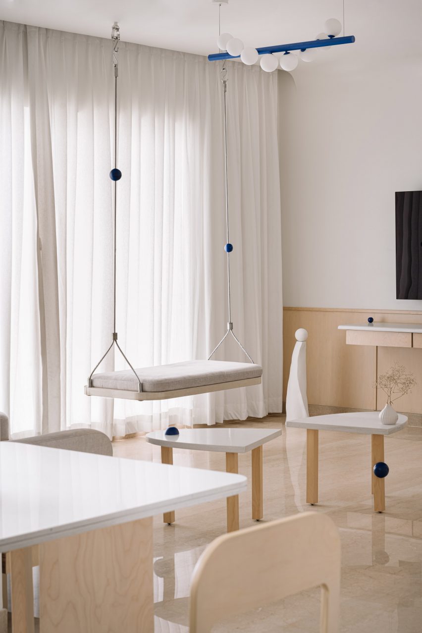

Living room interior of Out of the Blue apartment in IndiaLiving room interior of Out of the Blue apartment in India
Photo by The Fishy Project

Thane apartment, India, by The Act of Quad

Rigid metal uprights, each threaded with a cobalt-blue sphere, tie this swing seat in with the rest of the apartment’s blue-themed interior scheme, created by design studio Act of Quad.

The seat is softened by a slim cushioned pad and has been attached to the ceiling with metal hardware.

Find out more about Thane apartment ›
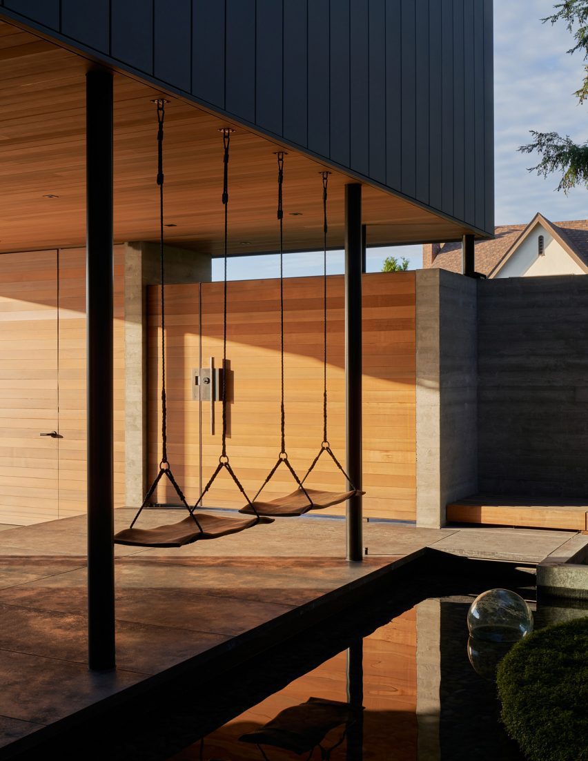

The Perch by Chadbourne + Doss ArchitectsThe Perch by Chadbourne + Doss Architects
Photo by Kevin Scott

The Perch, USA, by Chadbourne + Doss

A pair of swings are strung up on the boundary between a covered entryway and a courtyard pond in this house in Seattle.

The seats themselves were made from sheets of walnut timber and intended to provide the sitter with the experience of floating above the water.

Find out more about The Perch ›
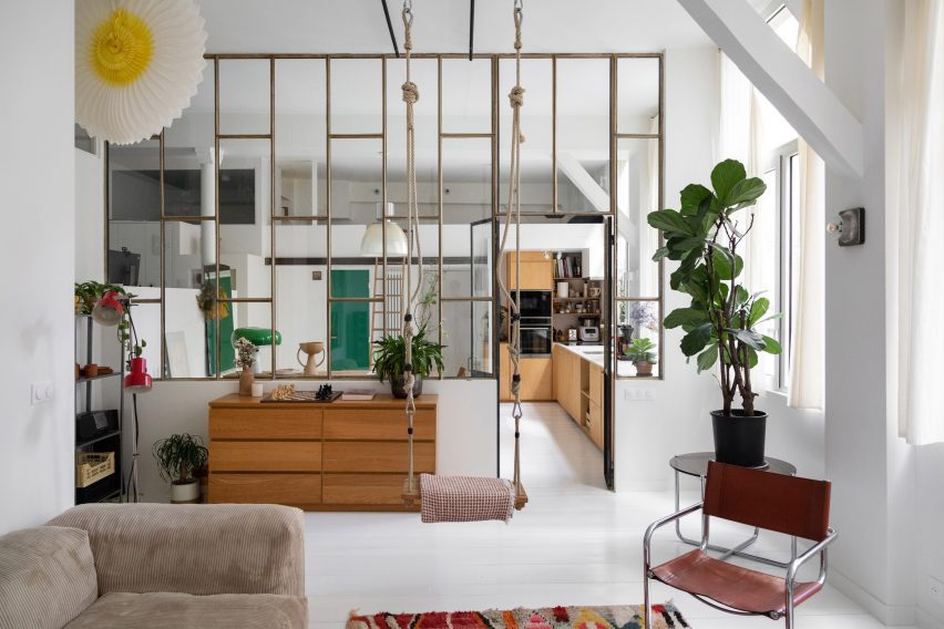

Living room in a high-ceilinged apartment with a swing hanging in itLiving room in a high-ceilinged apartment with a swing hanging in it
Photo by BCDF studio

Parisian loft, France, by Isabelle Heilmann

Hooks, carabiners and thick, knotted ropes affix this swing to the tall ceilings of this Parisian apartment’s living room.

The suspended seat slots in comfortably with the rest of the eclectically-chosen furniture, including a mid-century cantilevered chair and a slouchy, ribbed sofa.

Find out more about Parisian loft ›

This is the latest in our lookbooks series, which provides visual inspiration from Dezeen’s archive. For more inspiration, see previous lookbooks featuring interiors animated by indoor slides, living spaces featuring metal furniture and spaces with oversized windows.

Reference

Delve Architects designs “nurturing but playful” The Nest nursery
CategoriesInterior Design

Delve Architects designs “nurturing but playful” The Nest nursery

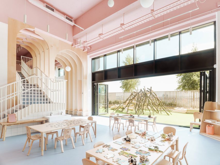
English practice Delve Architects has used joyful colours and natural, tactile materials to outfit a newly established kindergarten by the River Thames in east London that can be accessed via boat.

The Nest daycare centre is part of a wider housing development in the Royal Wharf area, occupying a commercial unit at the base of a 19-storey housing block.

Overview of the Nest nursery in east London by Delve Architects
The Nest nursery was designed by Delve Architects

As a result, the primary challenge was to bring the towering newbuild space down to child scale and make it feel more homely while forging a greater connection to the riverfront.

“We wanted to create a calm, nurturing but playful space that reflected the values of the nursery,” Delve Architects co-founder Alex Raher told Dezeen.

“Their ethos is for children to have a positive learning experience through a healthy relationship with the environment around them and a connection to the outdoors.”

Stairway and wooden arches inside east London nursery
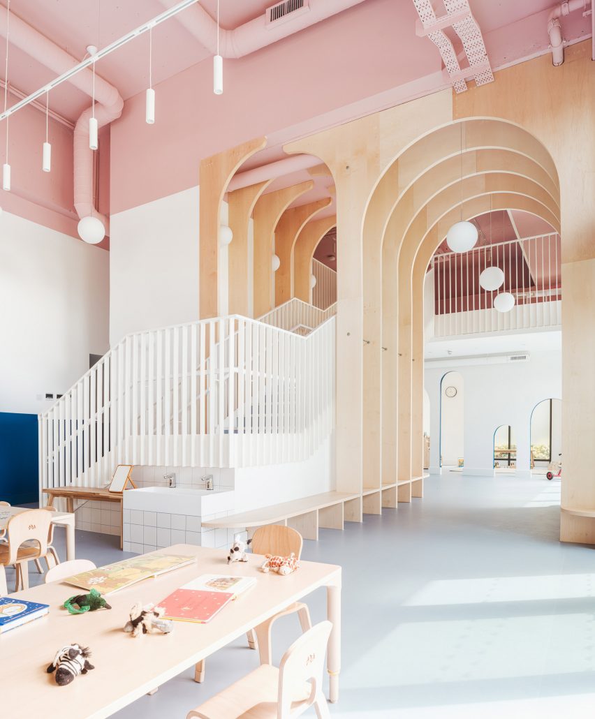
The studio used timber arches to define the space and envelop the new staircase

To boost the internal floor are, the studio installed a new mezzanine with a bespoke, powder-coated metal staircase that rises through a double-height space defined by a series of arched timber fins.

These maple-veneered arches – each around 4.5 metres tall – were conceived by Delve Architects to subdivide the space, creating zones without physical barriers.

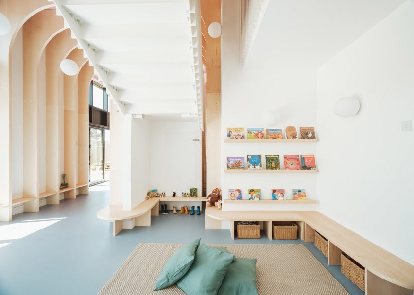
Area with low benches inside The Nest nursery
The timber fins taper off into low benches for the children

“We wanted to connect the spaces visually and physically between the mezzanine and lower level, and to soften the hardened edges of the space,” said Raher.

The arches are formed from a series of fins that merge into benches and individual seating as they approach the ground.

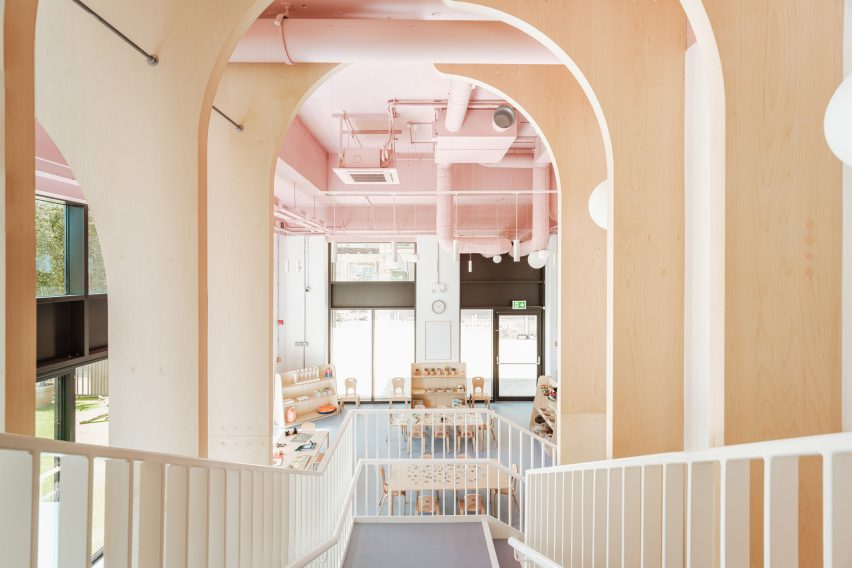
View from stairs of east London kindergarten by Delve Architects
The stairs lead up to a new mezzanine level

“The grand scale of the arches for a small child could feel overwhelming, so we brought this down into child-height seating, benches and joinery to play with the scale and make it more familiar to them,” said Raher.

“The material flows seamlessly between the two levels and creates a natural material palette that the children could recognise and read through different heights and spaces.”

The arches also span over the main staircase, where Raher says they suggest a canopy of trees.

“We wanted it to be a centrepiece that was exciting, functional and exploratory, almost like a meandering joinery up to a treehouse-style level on the mezzanine, through a network of arches and branches on the way,” the architect explained.

“One of the first concepts we explored was the treehouse idea, developing ideas around the nursery name The Nest and how we could bring a playful part of nature into the design.”

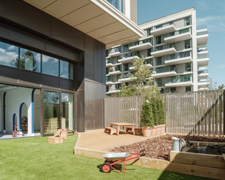
Given its inner-city location, the nursery is fortunate to have a large garden overlooking the riverfront, which is connected to the nursery via a double set of six bi-folding doors.

Pink-toned mezzanine of The Nest nursery
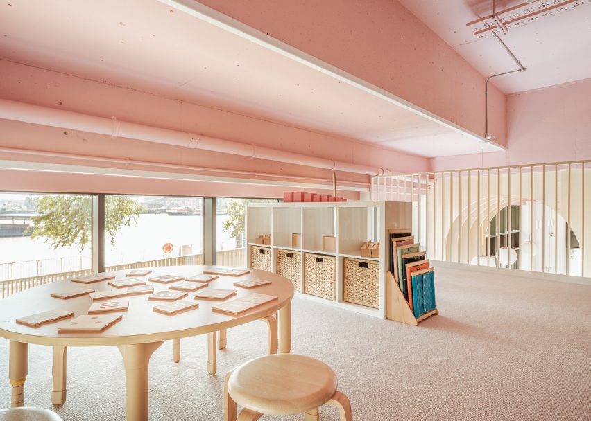
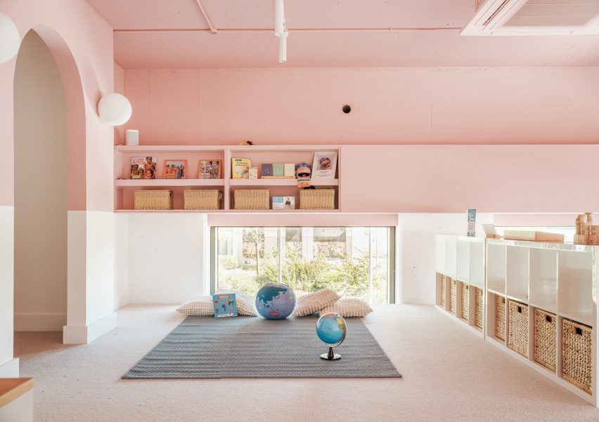
The upper level is finished almost entirely in baby pink

The external fencing was designed by Delve Architects “to merge with the rhythm of the existing tower’s balconies” and powder-coated in a matching colour.

“We wanted to celebrate the connection to the outside space, the riverfront location and the child-height views from the mezzanine to the water, as it was unique to the space and to the nursery setting,” said Raher.

“Children can arrive and parents can commute using the river boat directly outside the nursery. The new pier designed by Nex Architecture is a beautiful backdrop to the site.”

Pink-toned mezzanine of kindergarten in east London by Delve Architects
The mezzanine houses cosy play areas

To cope with the demands of a nursery setting, materials and finishes are resilient as well as being natural and tactile. Among them is recycled and recyclable Marmoleum flooring, maple-veneered joinery and low VOC paint.

A colour palette of soft muted shades helps to create a homely atmosphere inside The Nest.

“This palette works better than bolder primary colours, as these create too much visual noise for younger children,” Raher said.

Outdoor play area of The Nest nursery in east London
The Nest’s garden overlooks the riverfront

A panel of dark teal blue creates a datum line around the walls, designed to be “resilient to little fingers” while making the tall spaces feel more relatable to children.

“We always try to design from a child’s perspective, putting ourselves at that level, quite literally in some cases,” Raher said.

The soft blue of the flooring gels with the tones of the pale maple veneer and the matt pink that wraps around the ceiling and upper walls, covering almost the entire mezzanine.

Twig house in kindergarten play area
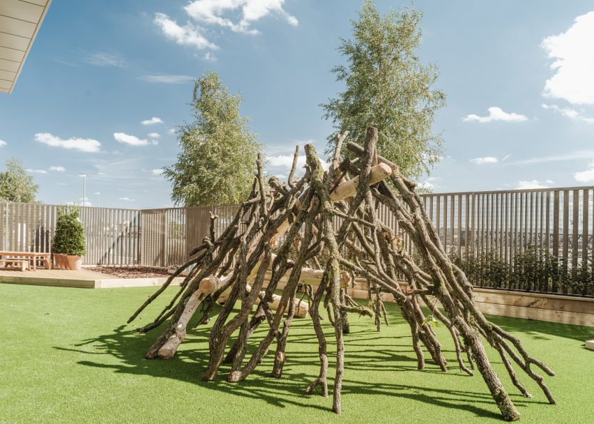
It can be accessed via river boat

“It both draws your eye upwards but also manages to change the scale of the space,” said Raher. “In some areas there is a five-metre ceiling height, so we wanted to break this up visually.”

“The services for heating, cooling and ventilation were also left exposed, giving a little insight for children to explore and imagine what they could be – a network of intriguing forms and geometry running through the nursery.”

Other kindergartens that hope to forge a greater connection to nature include this English nursery by Feilden Clegg Bradley, which makes use of natural materials to reflect the surrounding woodland, and a timber kindergarten extension in Austria by Bernardo Bader Architekten.

The photography is by Fred Howarth.

Reference

Eight interiors where Barbiecore pink adds a playful touch of colour
CategoriesInterior Design

Eight interiors where Barbiecore pink adds a playful touch of colour

As the upcoming Barbie film has created a shortage of pink colour and launched a real-life dollhouse in Malibu, we gathered eight pink interiors to exemplify the Barbiecore aesthetic for this lookbook.

The pink hues that are usually associated with Barbie, a children’s toy first launched by manufacturer Mattel in 1959, are influencing both clothes and interiors ahead of Great Gerwig’s live-action Barbie film.

The style, which has become known as Barbiecore, can add a joyful touch of colour to otherwise pared-back interiors, or be used as a hyper-bright nod to 1980s opulence.

Here, we have gathered eight interiors where pink was used to give interiors additional warmth and a touch of whimsy.

This is the latest in our lookbook series, which provides visual inspiration from Dezeen’s archive. For more inspiration see previous lookbooks featuring rustic interiors, Wes Anderson-style interiors and welcoming wood-panelled dining rooms.


Living room of Minimal Fantasy, a pink apartment in Madrid
Photo by JC de Marcos

Minimal Fantasy, Spain, by Patricia Bustos Studio

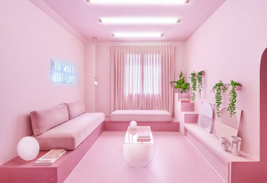
The Minimal Fantasy apartment is anything but minimalist – instead, Patricia Bustos Studio aimed to create an “aesthetic madness” for the interior of this Madrid rental in a 1950s residential building.

The holiday home features 12 different shades of pink, with the entire living room covered in a pastel bubblegum pink.

“Pink vindicates the fall of stereotypes – everything is possible, nothing is planned or established and that’s the beauty of it,” the studio told Dezeen.

Find out more about Minimal Fantasy ›


San Francisco Residence by Jamie Bush
Photo by Matthew Millman

San Francisco house, US, by Jamie Bush

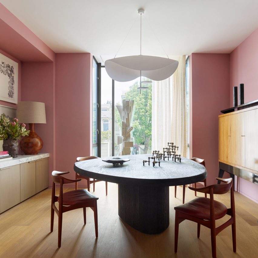
A more discrete take on adding pink to an interior can be found in this San Francisco house by architect Jamie Bush, who gave it an overhaul using an eclectic array of furniture.

Bush added pink walls to the dining room, where they contrast against dark-wood vintage furniture and white details including a lamp and sheer curtains to create a playful, yet elegant atmosphere.

Find out more about San Francisco House ›


Pink bedroom in Barbie's Malibu Dreamhouse
Photo by Hogwash Studios

Barbie’s Malibu Dreamhouse, US, by Ken

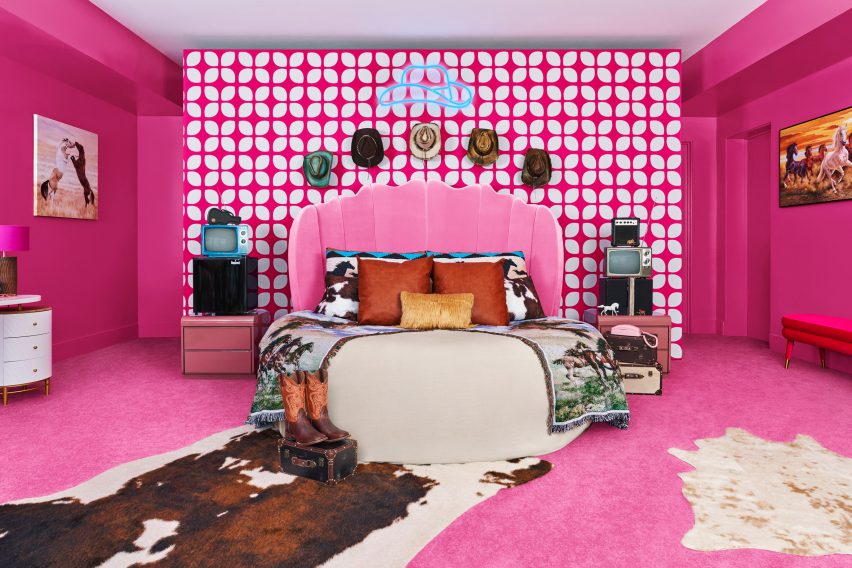
The most Barbiecore interior of them all can naturally be found in the Barbie Malibu Dreamhouse, which is being rented out by the doll’s boyfriend Ken on Airbnb.

Inside the California mansion, located beachside in Malibu, guests can enjoy pink rooms including the bright-fuchsia bedroom that has been decorated with cowboy hats, boots and cowhide rugs to add more “Kenergy”.

Find out more about Barbie’s Malibu Dreamhouse ›


Mixtape Apartment by Azab
Photo by Luis Díaz Díaz

Mixtape apartment, Spain, by Azab

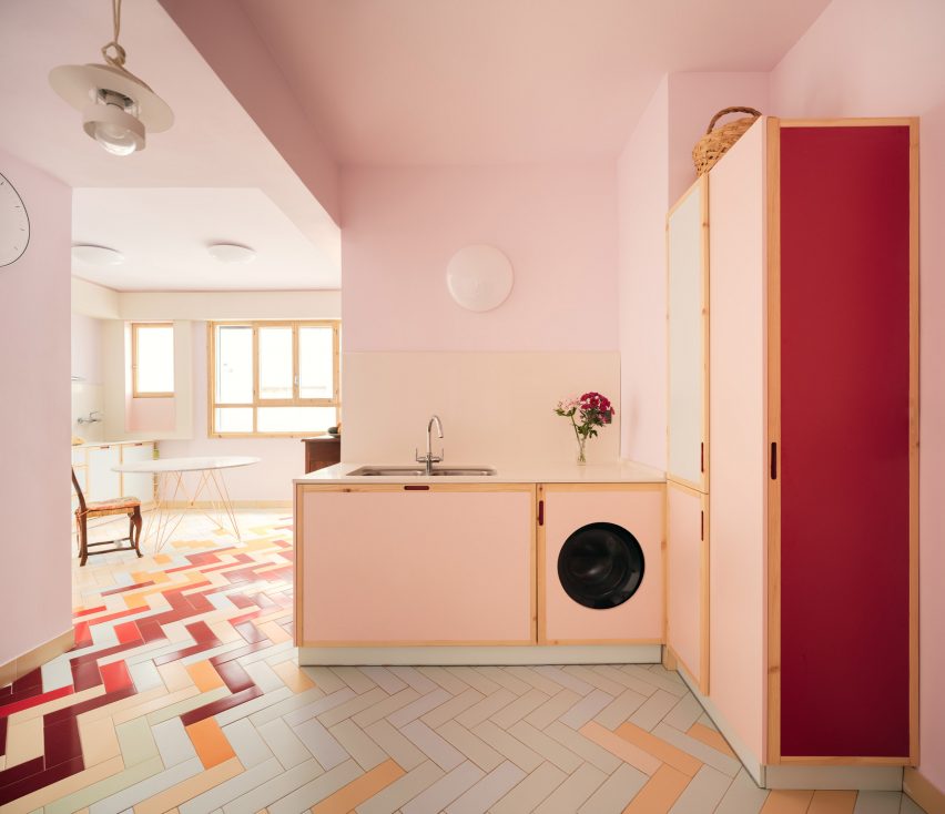
A dusky baby-pink kitchen decorates the Mixtape apartment in Bilbao, which was designed by architecture studio Azab.

The white and pink cupboards are boarded by light timber strips, and the appliances in the room have also been painted pink. A multicoloured floor with pale green and yellow as well as darker red herringbone tiles give the space a vibrant feel.

Find out more about Mixtape apartment ›


13 Square Metre House By Studiomama
Photo by Rei Moon of Moon Ray Studio

130-square-metre-house, UK, by Studiomama

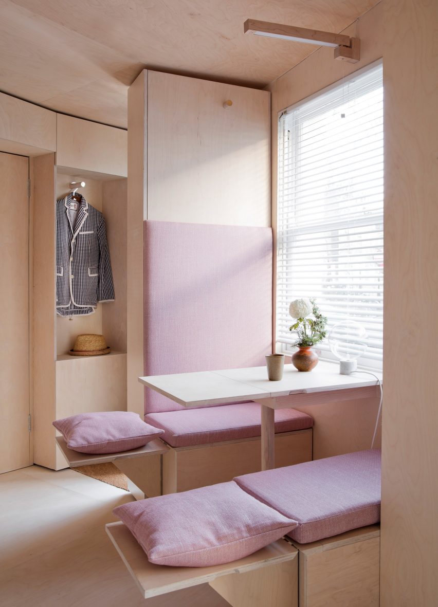
“London’s smallest house”, a conceptual design by Studiomama, features an abundance of pink details throughout, including in its plywood-clad kitchen.

Here, the clever fold-out seating has been decorated with blush-pink cushions and pillows, with a pink cushion also forming a cosy backrest.

Find out more about 130-square-metre house ›


Pink interior of Moco shop in Barcelona, designed by Isern Serra and Six N. Five
Photo by Salva Lopez

Moco Barcelona, Spain, by Isern Serra

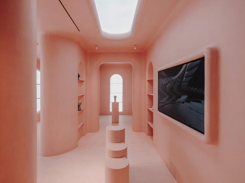
A computer-generated image was transformed into a real-life interior for the Moco Barcelona store, a rose-coloured shop inside the city’s Moco Museum.

Designer Isern Serra used pink micro-cement to achieve the same uniform, ultra-smooth surfaces as those of the computer-generated image, creating a dream-like interior filled with rounded corners and arches.

Find out more about Moco Barcelona ›


Interior of Pigment House by Unknown Works
Photo by Lorenzo Zandri

Pigment House, UK, by Unknown Works

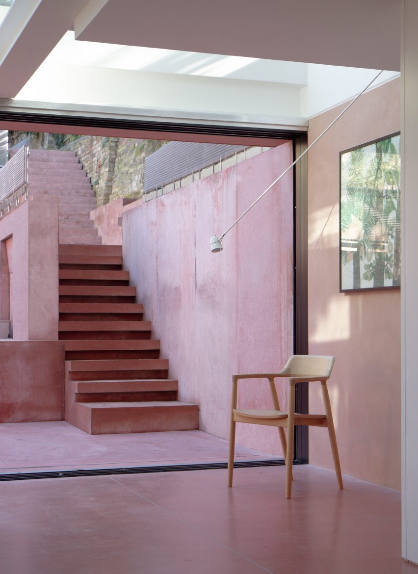
London studio Unknown Works went all in on the pink for Pigment House, a Hampstead home that was renovated to add a pink-toned patio area.

While not technically part of the interior, it adds a splash of colour to the ground floor area, and is used for indoor-outdoor living in the summer months. The choice of pink was a reference to the colourful buildings of Mexican architect Luiz Barragán.

Find out more about Pigment House ›


Cats' Pink House by KC Design Studio
Photo by Hey! Cheese

Cats’ Pink House, Taiwan, by KC Design Studio

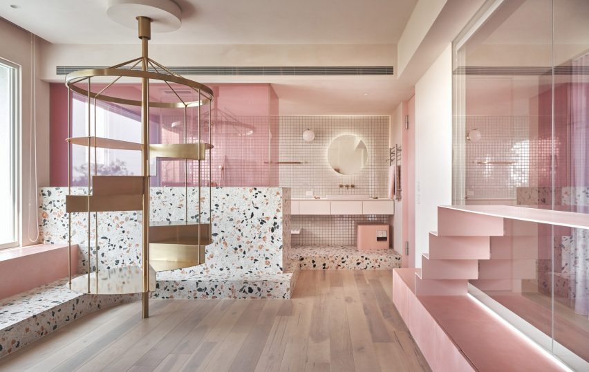
This holiday home in Taiwan got its name, Cats’ Pink House, as it includes cat ladders, a rotating carousel-shaped climbing frame and a fluffy pink cat swing.

KC Design Studio used a mineral-based paint to create the pink walls throughout the home, which also features a pink bathroom – with a pink cat litter box.

Find out more about Cats’ Pink House ›

This is the latest in our lookbook series, which provides visual inspiration from Dezeen’s archive. For more inspiration see previous lookbooks featuring rustic interiors, Wes Anderson-style interiors and welcoming wood-panelled dining rooms.

Reference

SLAS architekci’s public park is a collage of playful shapes
CategoriesArchitecture

SLAS architekci’s public park is a collage of playful shapes

activity zone brings regenerative play to post-military Chorzów


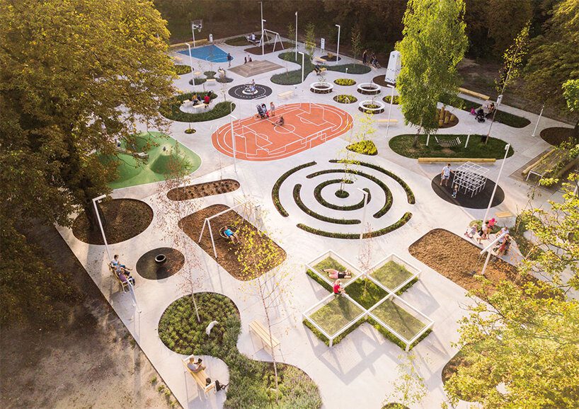
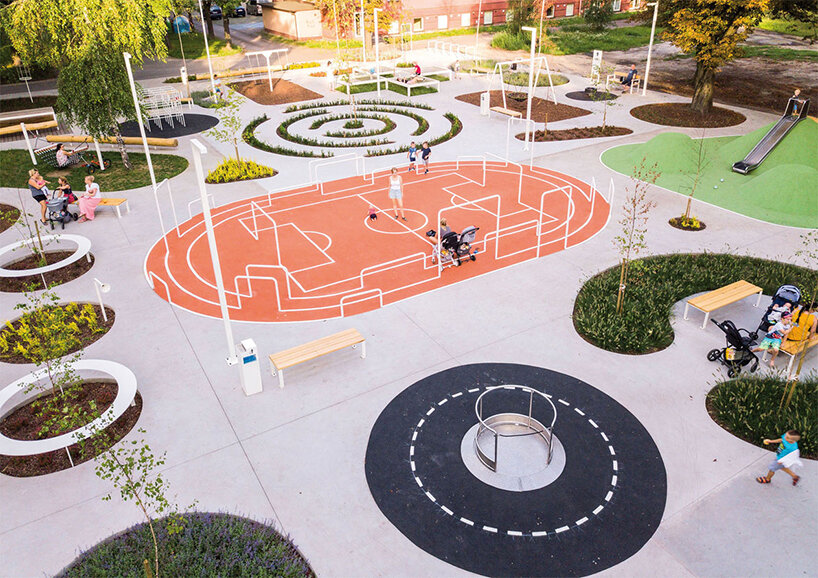
Located on the site of a demolished military building in Chorzów, Poland, Activity Zone takes shape as a multifunctional public park infused with whimsical designs, vegetation, and a vibrant color palette. Polish studio SLAS Architekci completed the playful space as the first phase of the regeneration and integration of the University of Silesia with Chorzów’s urban tissue. The studio’s project was nominated for the 2022 European Union Prize for Contemporary Architecture – Mies Van der Rohe Award (EUMiesAward).


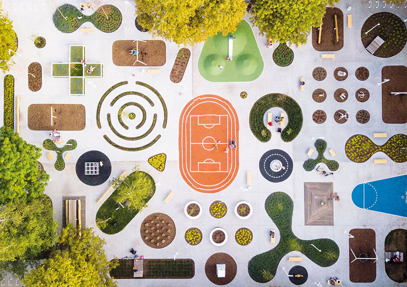
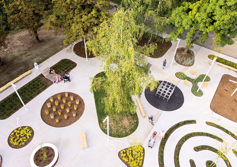
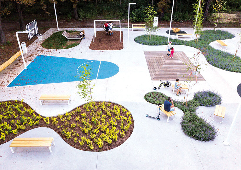
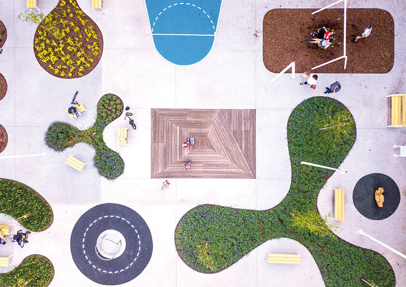
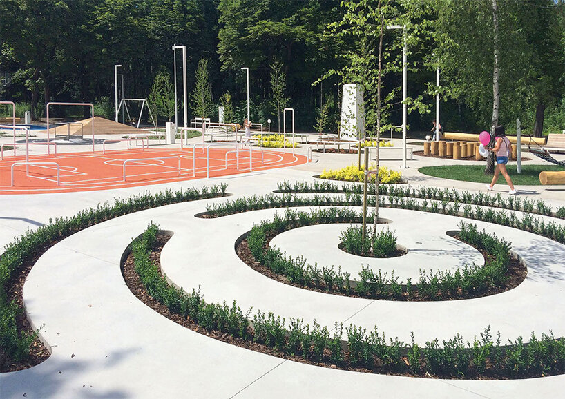
Activity Zone is designed as a concrete platform perforated throughout to create different flora-filled shapes to accompany the site’s existing trees, which were all preserved for this public park. Programs include a students leisure zone, children’s play devices, a fitness area, and individually designed street furniture. ‘The platform connects the diverse program, intensifies the use of the place and becomes itself an element of play,’ writes the Awards platform. 

SLAS architekci's public park in poland is a collage of playful, green-filled shapes
all images © Michał Kopaniszyn


slas architekci turns concrete into versatile public park


While initially catering to young students, the multifunctional public park is open to users of all age groups, inviting a proper integration of the University of Silesia‘s academic community with local inhabitants and the surrounding nature. Being part of a post-military, wooded, and neglected neighborhood area, Activity Zone brings back life to Chorzów by attracting frequent visits, gradually transforming an abandoned place into a safe park.


The concrete platform is an accessible feature for disabled people and opens up room for activities like biking, rollerblading, and skateboarding. In addition, the perforation allows SLAS architekci (see more here) to accommodate all these different programs while preserving each existing tree to provide shade and prevent overheating. Enhancing the sensory experience, the platform is enriched with a rich palette of colors, textures, and scents, creating a vivid garden amid the neglected area. All proposed materials ( concrete, steel, wood, tree bark, and sports rubber surface) are durable, easy to maintain, and affordable. You can see the complete list of 2022 nominees by visiting the EUMiesAward website

SLAS architekci's public park in poland is a collage of playful, green-filled shapes
a collage of playful shapes, textures, and colors

SLAS architekci's public park in poland is a collage of playful, green-filled shapes
turning a post-military, neglected area into an active, green space for all age groups

SLAS architekci's public park in poland is a collage of playful, green-filled shapes
Activity Zone park by SLAS architekci is part of a regeneration program for the University of Silesia

SLAS architekci's public park in poland is a collage of playful, green-filled shapes
carving shapes from the concrete platform and filling them with vegetation

SLAS architekci's public park in poland is a collage of playful, green-filled shapes
materials include concrete, steel, wood, tree bark and sports rubber surface

SLAS architekci's public park in poland is a collage of playful, green-filled shapes
SLAS architekci looks to gradually turn the difficult neighborhood into a safe public park

Reference

North Arrow Studio designs a playful, birdhouse-like ADU in Austin
CategoriesArchitecture

North Arrow Studio designs a playful, birdhouse-like ADU in Austin

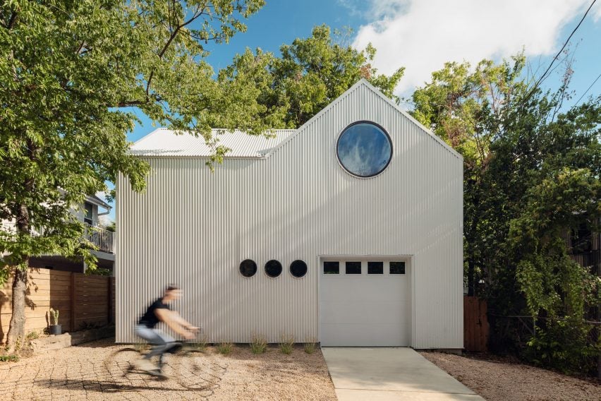
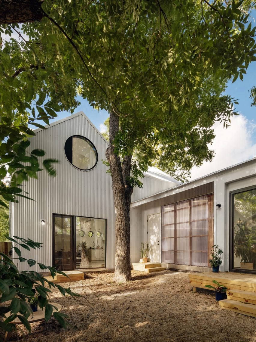
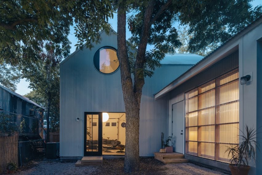
North Arrow Studio has completed a compact, corrugated metal accessory dwelling unit in East Austin’s Chestnut neighbourhood featuring a custom, circular pivot window that is reminiscent of the round opening in a birdhouse.

Aptly named the Birdhouse, the 900-square foot (84-square metre) ADU shares a narrow 5,900-square metre (550-square metre) lot with a 1939 single-storey house and three large protected pecan trees.

Corrugated metal accessory dwelling unit with a circular window
The Birdhouse is an accessory dwelling unit in East Austin

North Arrow Studio’s principal architect Francisco Arredondo described the two-bedroom, two-bath house as “simplicity carried to the extreme”.

“There’s simplicity in the footprint, the massing, and the material palette throughout,” Arredondo said. “But it’s also a smart little house that makes me smile.”

Corrugated metal structure by North Arrow Studio placed around trees
It is strategically placed around trees to create a courtyard

The home was strategically placed around the trees to create a courtyard between the main house and the ADU while providing privacy for the separate living quarters.

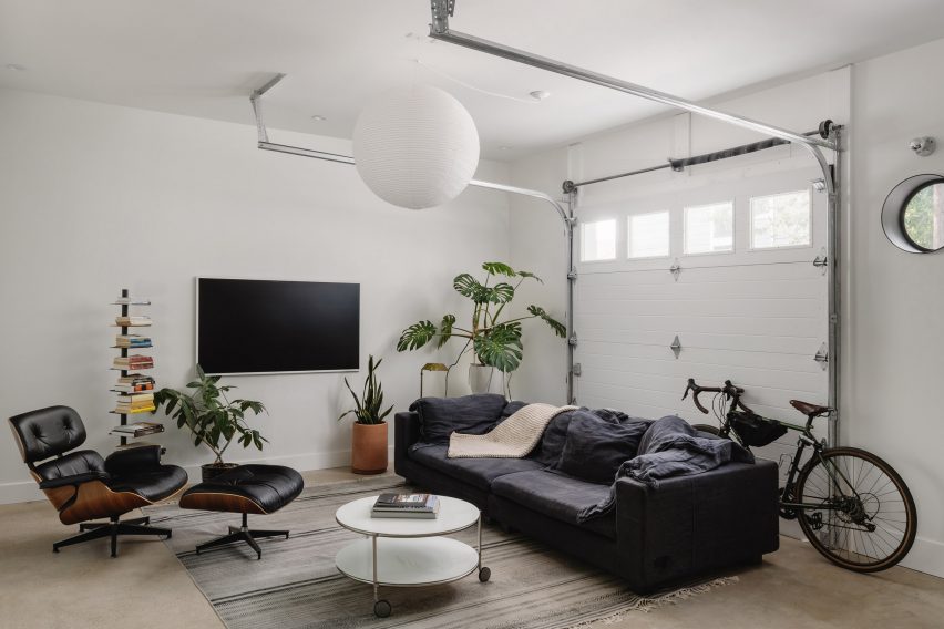
The L-shaped plan features a bedroom, bathroom, kitchen and living room featuring a roll-up garage door on the ground floor, all wrapped around an external pecan tree.

White walls of ADU with roll-up garage door
A roll-up garage door features in the living room

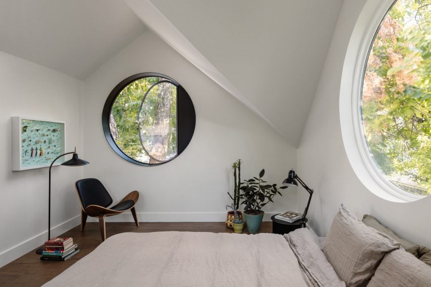
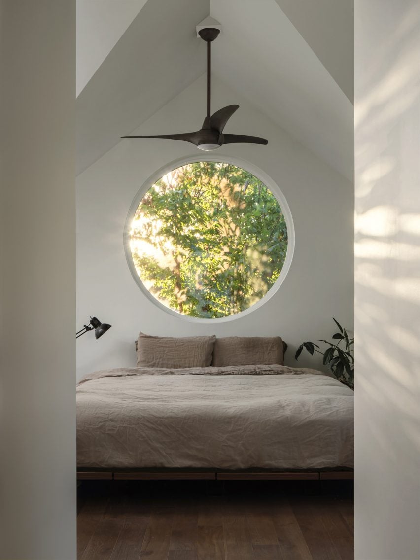
Upstairs, the main suite sits within the vaulted ceiling of the double-gabled form. Four five-foot (1.5-metre) diameter circle windows sit under each gable and use the surrounding tree canopy for privacy.

“They create a resemblance to a traditional birdhouse and bring a sense of whimsy to the design,” the studio said.

Circular pivot window in gabled roof
The main suite sits within the vaulted ceiling of the double-gabled form

One of the custom-fabricated steel windows serves as the required egress for the room.

“We began with a pivot design and worked our way towards a final swing design that opened up to the pecan tree’s canopy,” the team explained.

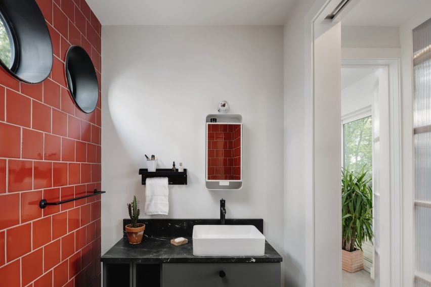
Bathroom with red tiles and small circular windows
The rounded-window motif carries throughout the house

The rounded-window motif carries throughout the house with miniature custom steel circle windows.
“Strategically selected walls are curved to soften edges and draw you into the spaces,” the studio said. “Interior finishes are simple and restrained apart from a few accent walls that give life to each room.”

Neutral colours in bedroom of ADU
Neutral colours decorate the living spaces

The monotone ADU is wrapped in light corrugated metal that “is a nod to the many metal sheds and accessory buildings already found throughout the neighborhood, but with a modern and playful twist”.

The soft, rounded edges and neutral colour complement the existing house and provide an accent along the alley, and the metal runs up the walls and becomes the roof material as well.

In the courtyard, a curved polycarbonate wall brings light into the hallway and creates a softly glowing, semi-transparent effect.

Corrugated metal was selected for its sustainability and resilience as the envelope is 100 per cent recyclable, repels sun and heat in Texas summers and is durable and low-maintenance, according to the studio.

Corrugated metal structure with circular openings and a gabled roof
Corrugated metal wraps the structure

“Working with a tight budget and constrained footprint can be very helpful in creating a story for the design,” the studio said. “The constraints begin to guide you and lend opportunities to be creative with traditional materials and spaces in ways that typically wouldn’t be considered.”

In 2014, North Arrow Studio created a stilted home in the Texas Hill Country that references Mies Van der Rohe’s glass Farnsworth House.

The photography is by Chase Daniel.


Project credits:

Builder, developer, owner: Brita Wallace, Digs ATX
Styling: Ben Newman Studios

Reference

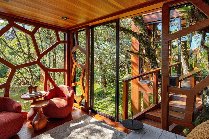
studio MEMM fronts tree house in brazil with playful solar shading
CategoriesArchitecture

studio MEMM fronts tree house in brazil with playful solar shading

‘tree house’ by studio MEMM, a multigenerational hub


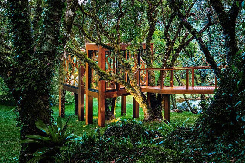
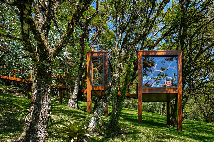
On a sloping land in Monte Verde, Brazil, Studio MEMM has completed a tree house as a multigenerational wooden hub connected by a walkway. Covering 18 sqm, the project ‘emerged as a playful idea. In a moment of family expansion, with new grandchildren and nephews, the client understood that the ludic universe of the tree house could add to the experience of staying in Monte Verde, Minas Gerais,’ explains the practice.


The design is located close to the main residence and features two volumes positioned among tree branches, emphasizing the sense of playfulness. The first and smaller module spanning 6 sqm serves as a reception area. In comparison, the second 12 sqm volume functions as the primary activity hub, initially displaced to accommodate a torsion of trunks that change position as they gain height. Two walkways support these structures: the first and smaller pathway connects both modules while the second, larger one gently regulates the terrain slope and links the tree house to the main property promenade.
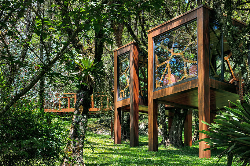
studio MEMM fronts two-volume tree house in brazil with solar shading inspired by leaves
all images © Nelson Kon


‘Before conceiving the project, it was necessary to choose the tree and understand its context. The client already had in mind options in an area near the lake on the site. Around it, programs such as a pool annex, a deck, a natural pool, and the new house would fence the surroundings of the body of water. The garden, densely populated by numerous tree species, brings privacy and ambiance to each program around the wetland area. In addition, a gentle, continuous slope extends across the land so that the lake’s surroundings are arranged in gentle plateaus,‘ shares the Studio MEMM team

studio MEMM fronts two-volume tree house in brazil with solar shading inspired by leaves


using glass, brise-soleils, and light for a deeper immersion 


All façades of the ‘Treee House’ are clad in glass panels, encouraging a strong visual connection to the outdoors. Bordering the panels are aluminum frames that attach the glass to the façades; thanks to their dark graphite finish, these frames stand out from the wooden structure and emphasize the limit between solid and void. They also contribute to the water drainage on rainy days, preventing puddles from accumulating in the lower parts of the frame and eventually deteriorating the wood. 

studio MEMM fronts two-volume tree house in brazil with solar shading inspired by leaves
a two-volume structure connected by a walkway


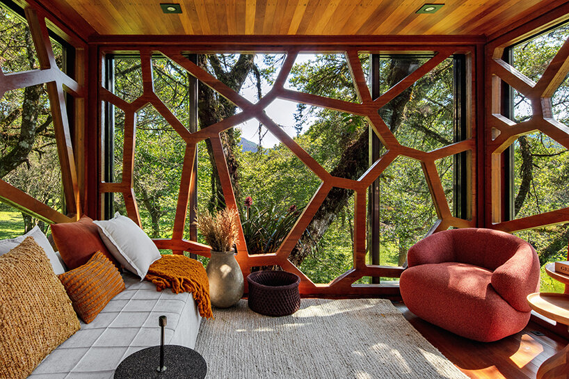
Inspired by the geometries of the surrounding sycamore leaf structures, Studio MEMM fronted the two-volume shed with a CNC-milled brise-soleil, industrially built with glued laminated timber.  Installed from the inside, this architectural element ‘embraces the guest and creates an impression of a dome that contains this entire universe in the interiors, instigating immersion and disconnection from the external world, transporting the user to a shelter that allows them to experience a feeling of unrecognizable enchantment,’ continues the team. 

studio MEMM fronts two-volume tree house in brazil with solar shading inspired by leaves
the brise-soleils evoke the geometry of sycamore leaves


Lastly, the lighting design by Futura Iluminação highlights both the unique aesthetic and sculptural branches engulfing the ‘Tree House’ without undermining the charm of night-time darkness. ‘The light spots placed on the ground level reveal the trunks and tree tops. The softly lit branches and leaves filter the dark sky above. Inside, light fixtures on the floor illuminate the brise soleil from bottom to top, bringing light, instead of shadow, to the lower part of the geometries. The solution emphasizes the view of the inside from the outside of the house and contributes to the discovery effect of the element in the heights,’ says Studio MEMM. 

studio MEMM fronts two-volume tree house in brazil with solar shading inspired by leaves


Reference

Urban flyover converted into playful community gathering space
CategoriesSustainable News

Urban flyover converted into playful community gathering space

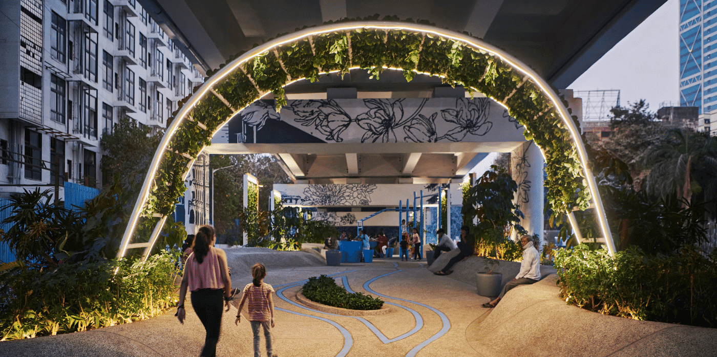
Spotted: Unlit, unused, dirty, and often unsafe locations are almost always easy to find in a city. Imagine, instead, how much beauty could be brought into the world if those underutilised spaces were multi-use community hubs. Mumbai architects StudioPOD, along with Dutch designers MVRDV, turned that idea into reality with the One Green Mile development directly below the Senapati Bapat Marg flyover in Mumbai.

The two studios were tasked with transforming 1,800 metres of the 11-kilometre-long space into a communal hub for recreation, meeting, reading, and performing. Now well lit, painted a bright white, and entwined with greenery, 3D shapes, and public art, the One Green Mile project provides a blueprint for making exceptional use of deserted urban areas.

Screens and archways of plants throughout the space help lower surrounding temperatures, reduce noise from traffic, and improve air quality for local residents. With bike paths, outdoor gyms, and places to gather and sit, the reinvigorated concrete barriers and roof have become a beautiful addition to the city, rather than an eyesore, bringing accessible fun into everyday urban living.

Developers are increasingly incorporating multi-use spaces into their plans, with Springwise spotting projects that range from entire neighbourhood updates to a garden footbridge that provides renewable energy and growing space for local restaurants.  

Written by: Keely Khoury

Email: office@mvrdv.com

Website: mvrdv.com

Reference