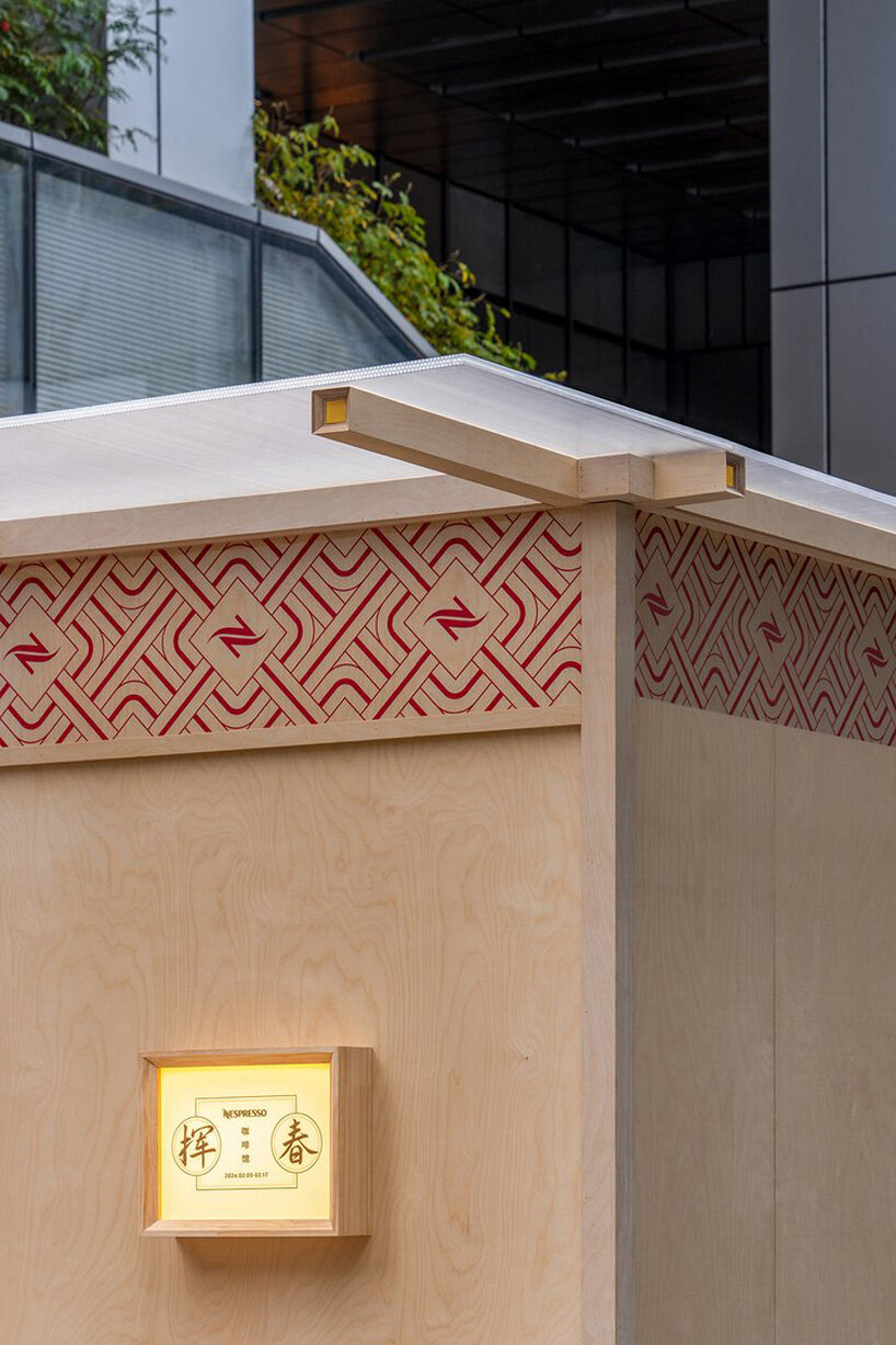
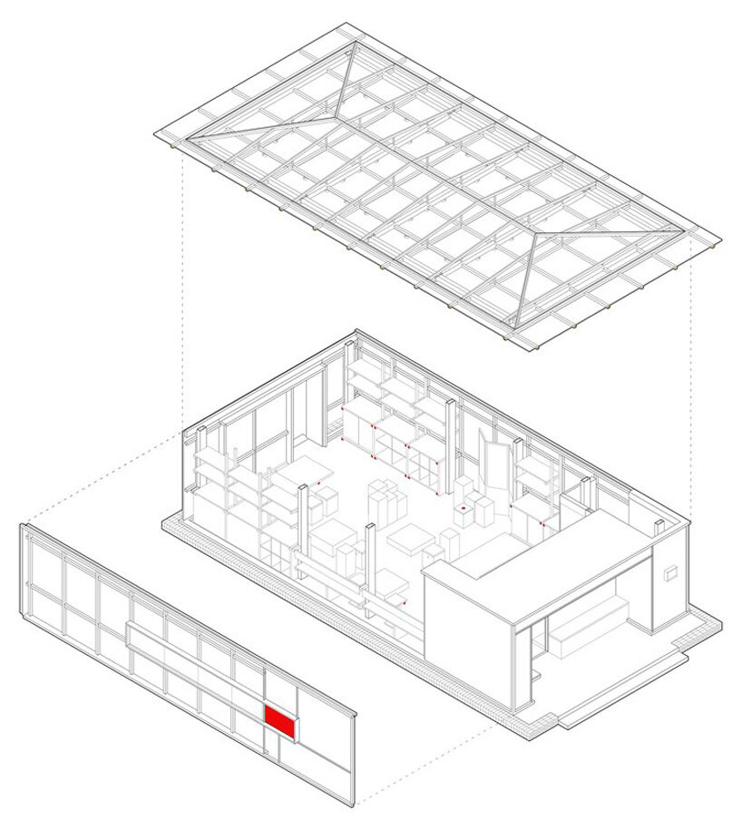
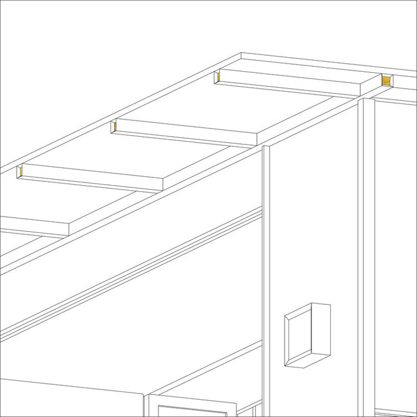
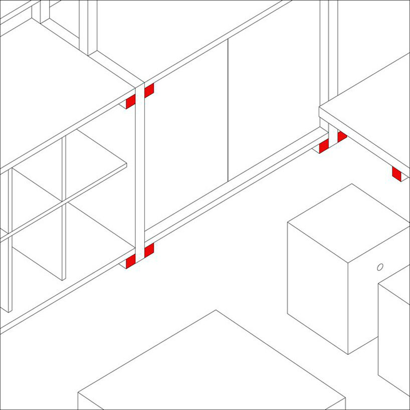
designboom has received this project from our DIY submissions feature, where we welcome our readers to submit their own work for publication. see more project submissions from our readers here.
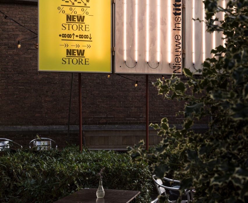
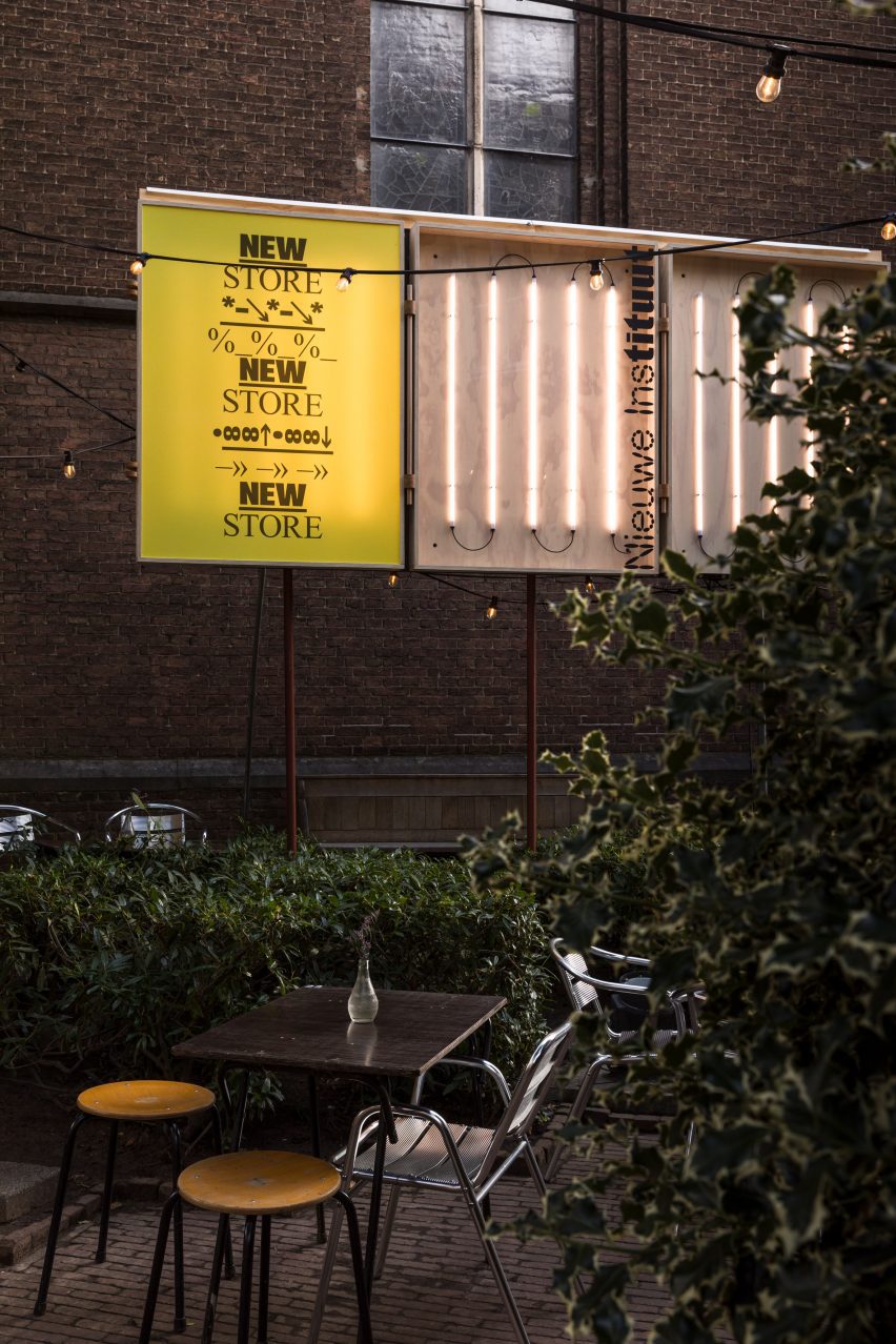
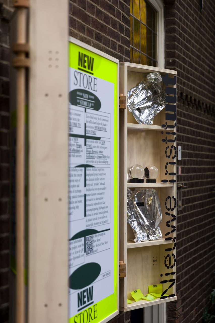
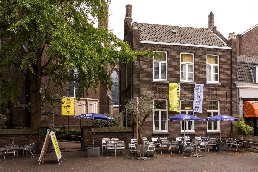
Cultural centre Het Nieuwe Instituut is rethinking the archetypal museum shop with a pop-up at Dutch Design Week, designed to encourage more ethical, resource-conscious consumption.
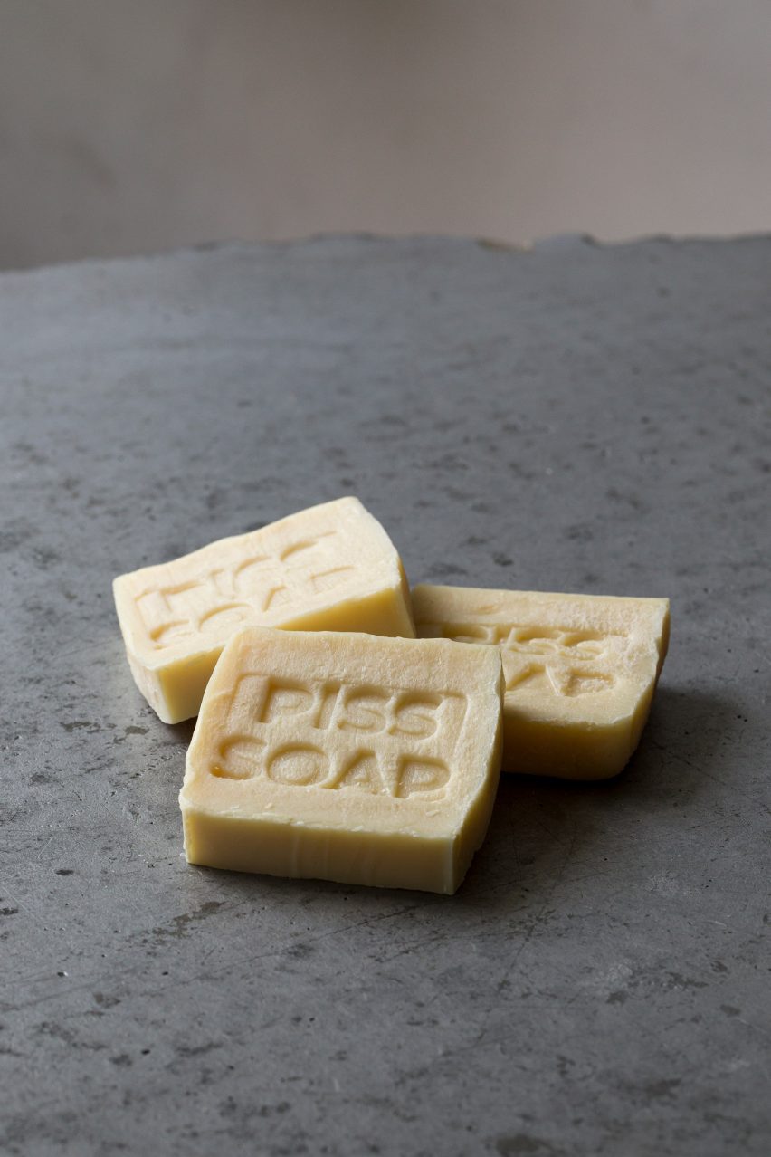
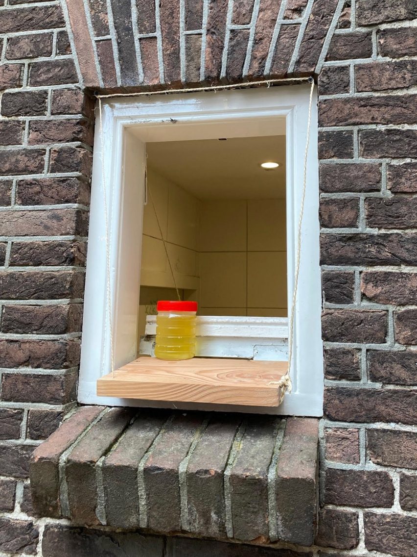
Instead of offering a straightforward exchange of wares for money, New Store 1.0 gives patrons the opportunity to trade their urine for a piece of Piss Soap and encourages them to place their phones on specially designed fixtures to provide lighting for the venue once the sun goes down.
Het Nieuwe Instituut has launched its debut pop-up shop at Dutch Design Week
Taking over Residency for the People – a hybrid restaurant and artist residency in Eindhoven – the pop-up also serves up two different versions of the same seabass dish, one made using wild locally caught fish and the other using fish that was industrially farmed and imported.
The pop-up is the first of two trial runs for the New Store, aimed at helping Rotterdam’s Nieuwe Instituut work out how to design its own museum shop to prioritise positive social and environmental impact over mere financial gain.
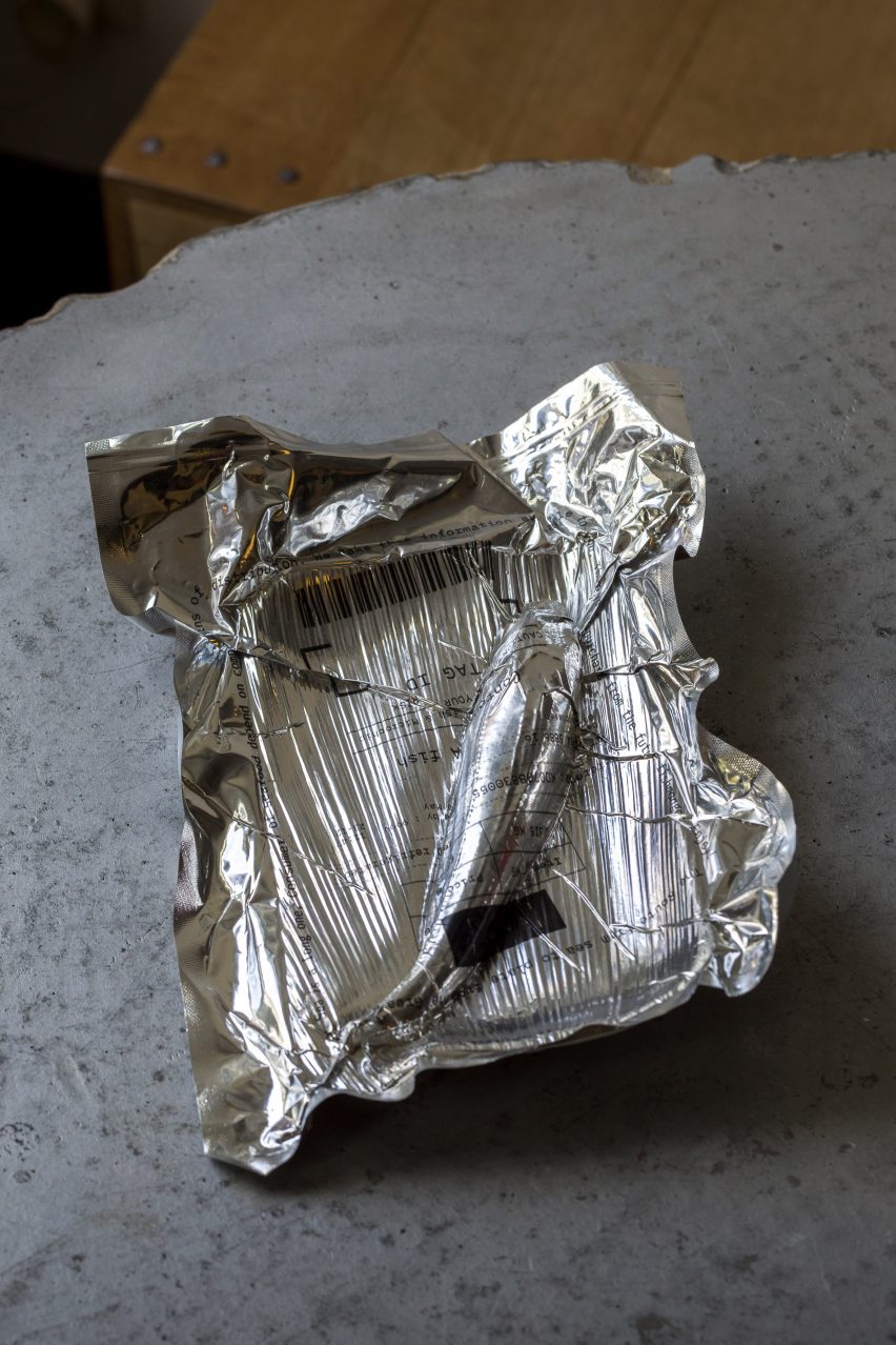
Arthur Guilleminot’s Piss Soap is among the projects on offer
In collaboration with the International Architecture Biennale Rotterdam (IABR) and research consultancy The Seeking State, the second trial will take place at next year’s Milan design week, with the aim to open the first dedicated shop in the museum’s Rotterdam location in 2025.
“It all started out with the idea that we don’t have a museum shop per se,” Nieuwe Instituut’s programme manager Nadia Troeman told Dezeen. “A museum shop, as we know, has books and trinkets and gadgets. And it’s not really doing well for the planet or the environment.”
“So we were like, how can we make the act of consuming better? How can we consume differently to help not just ourselves but the environment as well?”
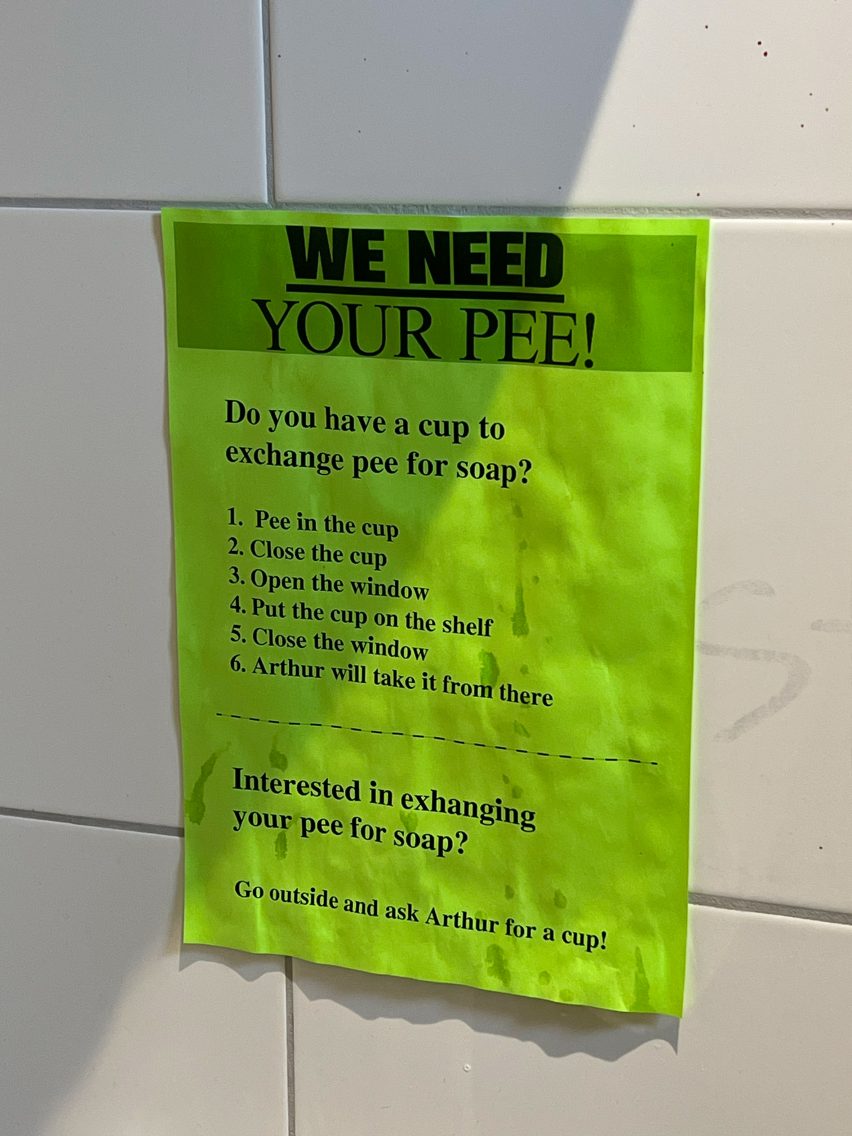
Visitors are invited to donate their urine via a poster in the toilet. Photo by Jennifer Hahn
The aim was to help the designers trial their ideas for how the exchange of goods could be less extractive and transactional in a real-world scenario.
This can then be placed on a shelf outside the bathroom. Photo by Tracy Metz
“The project is part of a broader institutional agenda of ours to become more of a testing ground,” explained the museum’s director Aric Chen. “It’s part of rethinking the role of cultural institutions as being places that can do more than host debates, discussions and presentations.”
“So our aim is to take some of these projects that try to think about how we can do less damage, take them out of the graduation shows, take them out of the museum galleries, take them out of the biennales and put them into the real world, with real consumers, audiences and real people to see what we can learn from it,” he continued.
Guilleminot used the opportunity to expand his ongoing Piss Soap project, with a poster in the venue’s toilet inviting visitors to donate their pee by relieving themselves into designated cups and discreetly placing them on a newly added shelf outside the bathroom window.
This can then be exchanged for a piece of soap, made using urine donated by previous participants and other waste materials from human activities such as used cooking oil.
The soap takes three months to cure and is entirely odourless, helping to break up dirt and grease thanks to the urine’s high ammonia content.
Those who are eating at the New Store can choose between two kinds of fish
The aim of the project is to find a new application for an underutilised waste material and engage people in a kind of circular urine economy.
“The idea was to revive the ancient tradition of using pee to make soap, which was done for many centuries, including in ancient Rome,” said Guilleminot.
“Could I make a modern product using this ingredient and, in the meantime, also change our feelings of disgust about our golden organic liquid?”
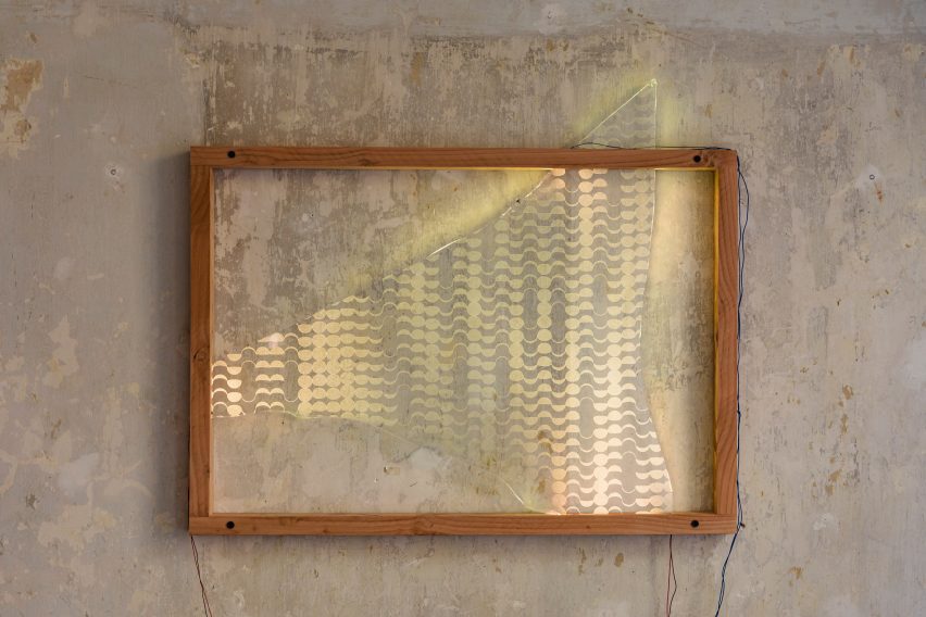
The shop’s interactive lighting fixtures were designed by Arnout Meijer
Those having dinner at the New Store can choose between two iterations of the same fish dish.
The first uses wild seabass that was caught locally by fishers Jan and Barbara Geertsema-Rodenburg in Lauwersoog while the other was farmed in Turkey and imported by seafood market G&B Yerseke.
Devised by Berwick, who is a design researcher and “occasional fisherwoman”, the project challenges diners to ask themselves whether they are willing to pay the higher price associated with locally caught fish in exchange for its environmental benefits.
“With the fish, they get a receipt of transparency,” Troeman added. “And one is obviously longer than the other.”
The shop is open until 29 October
Diners were also asked to provide their own illumination as the sun goes down, in a bid to make them aware of our overconsumption of energy and the adverse effects our light pollution has on the natural rhythms of other animals.
For this purpose, Meijer designed two wall-mounted fixtures inside the New Store that have no internal light source and are simply composed of discarded glass shards topped with wooden shelves made from old beams.
If they require more light, guests have to place their phone on this ledge with the flashlight on, funnelling light onto the glass shard through a narrow slit in the wood.
It takes over Eindhoven’s artists’ residency and restaurant Residency for the People
This reflects and refracts light around the space while revealing various crescent moon shapes engraved into the glass in a nod to the circadian rhythm.
“It’s really about our dependence on the constant supply of energy,” Troeman said. “Can we embrace the dark and hence be more environmentally friendly? It has benefits for everyone and everything.”
Exploring more circular forms of exchange was also on the agenda at last year’s Dutch Design Week, when designer Fides Lapidaire encouraged visitors to trade their own poo for “shit sandwiches” topped with vegetables that were fertilised with human waste.
The photography is by Jeph Francissen unless otherwise stated.
Dutch Design Week 2023 is taking over Eindhoven from 21 to 29 October. See Dezeen Events Guide for information about the many other exhibitions, installations and talks taking place throughout the week.
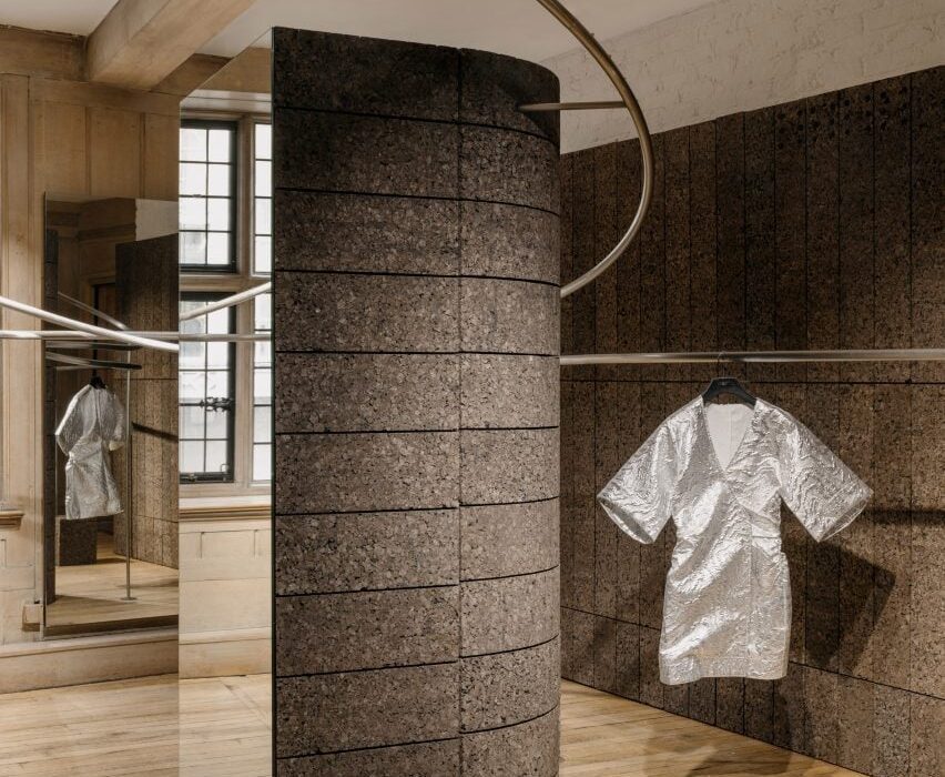
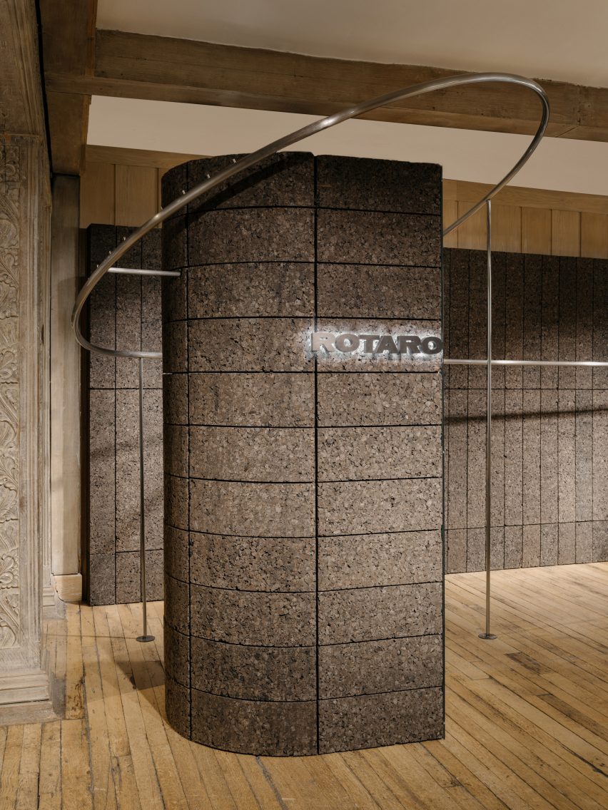
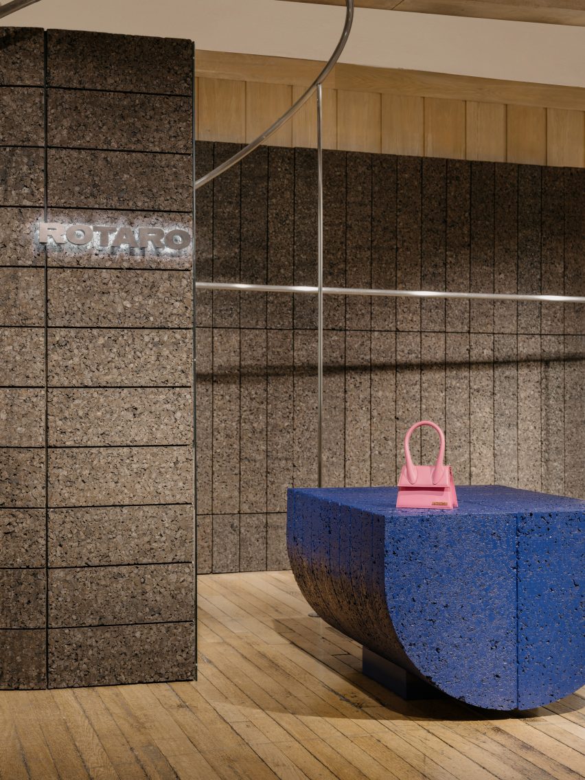
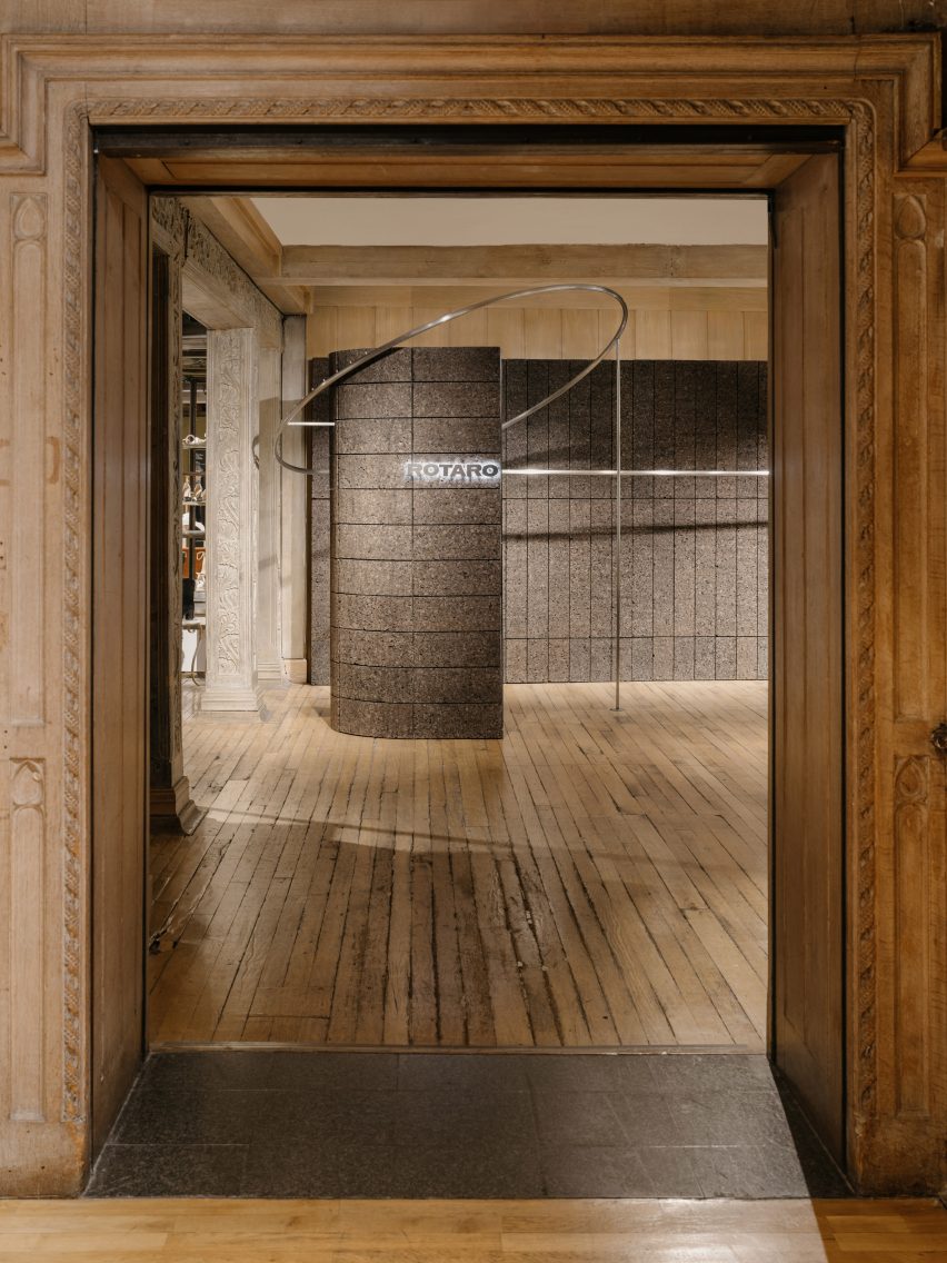
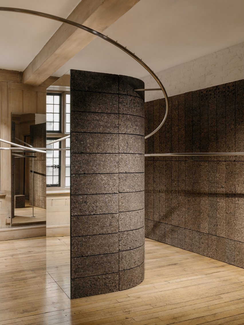
London-based studio EBBA Architects has channelled the environmental ethos of fashion rental platform Rotaro for its pop-up boutique at department store Liberty.
The project aimed to show that beautiful and interesting spaces can be created for temporary use, while still considering the environmental impacts of materials and construction.
“We are very aware of our environmental impact and we believe design should speak to this, while also trying to make a unique experience for the visitor,” EBBA founder Benjamin Allan told Dezeen.
EBBA designed a pop-up shop for fashion rental platform Rotaro
“Rotaro is all about fashion rental, as a response to waste in the industry,” he added. “Circularity is key to their ethos and we wanted to connect to this, both in the use of material and form.”
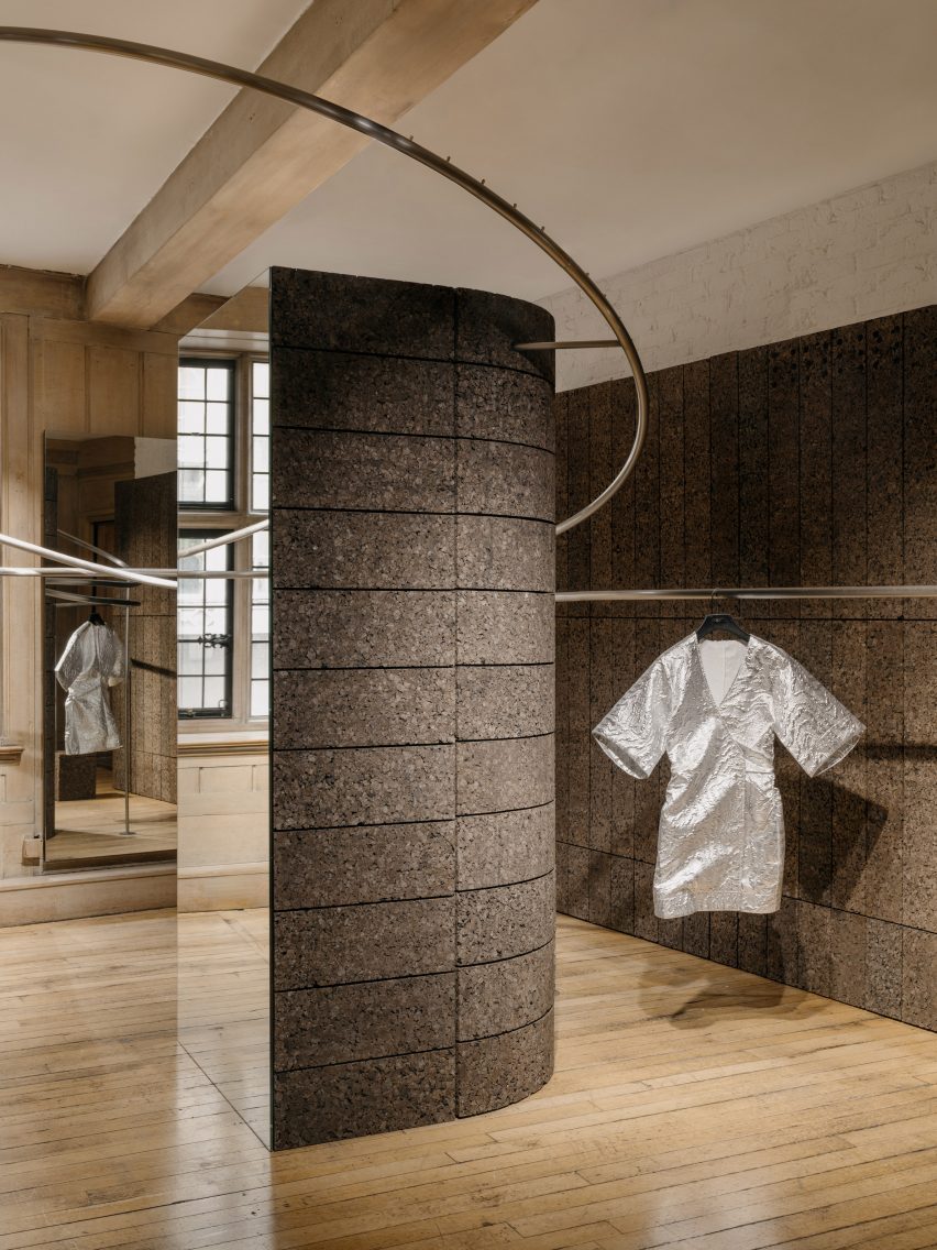
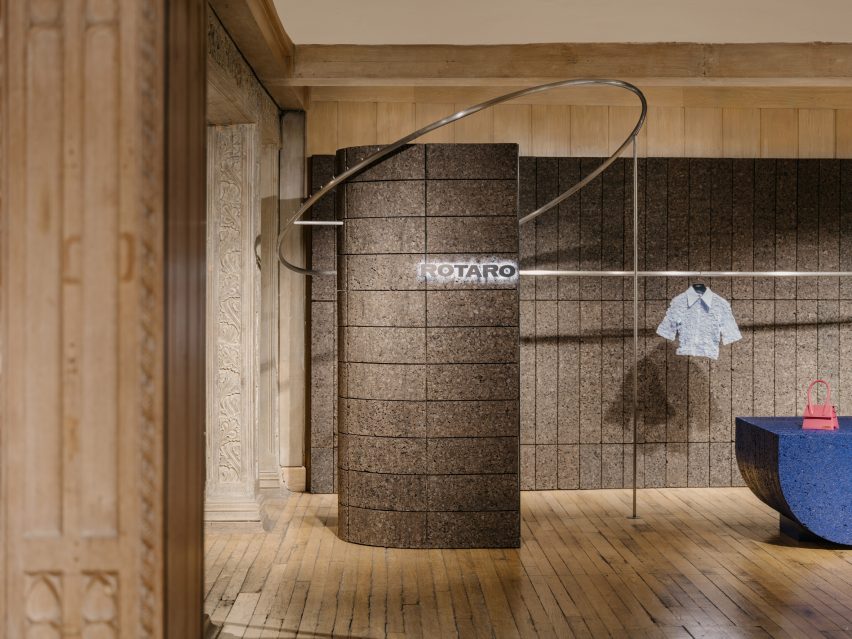
Bringing definition to Rotaro’s space within the wider store, EBBA has demarcated the area with a pair of substantial columns, each with an elongated, semi-circular cross-section.
“The position and shape of the columns create the sense of walking into an entirely new space within the historic context of Liberty,” said Allan.
The studio demarcated the area with a pair of substantial columns
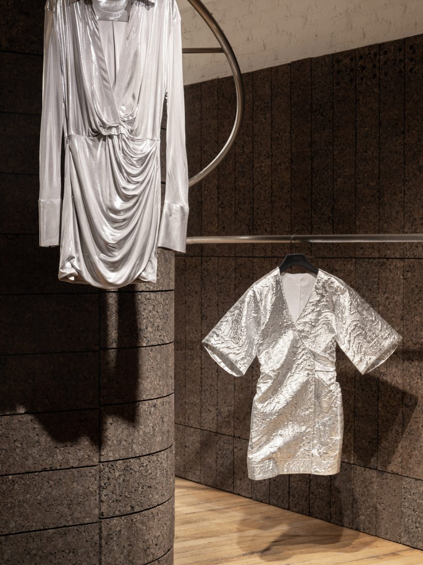
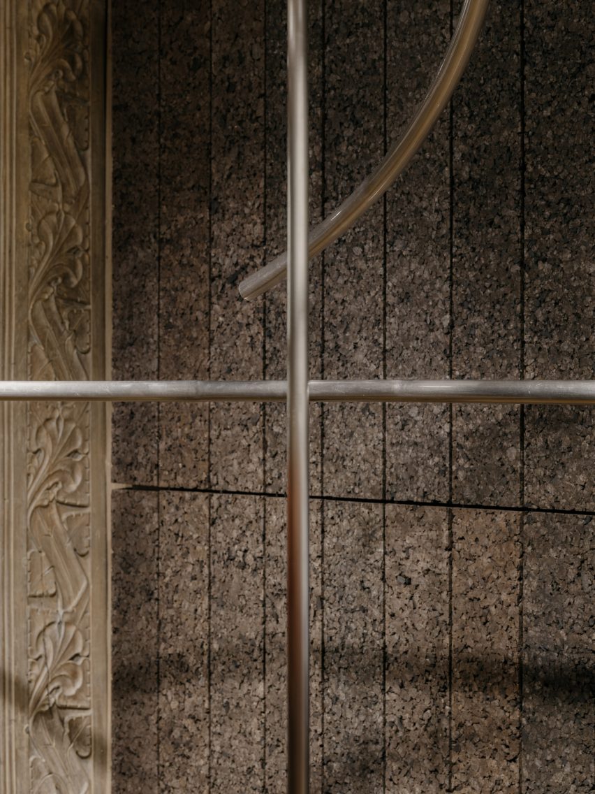
Entwining the two columns, a pair of metal rails have the dual function of creating a display area and introducing a sculptural element that further defines the space, with soaring, free-form curves.
“The two rails rotate and wrap around each of the columns, while also simultaneously responding to the opposite rail, a bit like a choreographed piece,” Allan said.
Cork is the project’s primary material
Continuing the theme of duality, just two key materials have been used in the space – cork and metal.
EBBA was influenced by the work of artists Donald Judd and Carl Andre and their elevation of humble materials through detailing and construction.
A pair of metal rails have a dual function
“We always look to push the potential of a project, to make the most impact through the simplest of means and also address the need to be economical,” Allan said.
“Essentially the design revolves around only two materials which, working together, give a sense of regularity in the layouts of the blocks, combined with the sculptural forms of the rails.”
Curated garments hang from the rails
Cork was used as the primary material, cladding the two columns and creating the backdrops that zone Rotaro’s area.
EBBA aimed to use a material that had an environmental quality, while using the standardisation of the blocks to set parameters for the design.
“We chose blocks of a specific dimension that could then be adapted to create both the walls and the columns themselves,” Allan said.
“The cork is a natural material that has an inherent warmth and depth, while also being incredibly versatile and easily recycled,” he added.
Texture characterises the pop-up shop
Brushed stainless steel was used for the metalwork, with each rail comprised of a single piece of metal that was bent and sculpted to wrap around the columns.
This rail’s curving form relates to the idea of circularity in Rotaro’s business model, while also bringing an adaptability to the space by allowing the garments to be shown in a variety of ways.
Brushed stainless steel was used for the metalwork
“The primary purpose is to display the continuously updated collection while also adding a sculptural aspect that helps to create a sense of space,” said Allan.
Within the ornately-detailed Liberty store, the project offers a bold, contemporary response to the interior, while finding common ground with the wider building.
The rail’s curving form relates to the idea of circularity
“The tones and textures in the warmth of the cork, tie in with the timber and natural colours of Liberty’s interior spaces,” Allan said. “Detailing and decoration in the original columns relate to nature and vegetation, which also tie into the use of cork and its qualities.”
Because the Liberty building has Grade II listed status, no fixings were allowed into the building fabric.
“The benefit of the lightweight cork material meant we could also adapt the Rotaro space with minimal impact on the wider building,” he added.
Cork was chosen for being lightweight
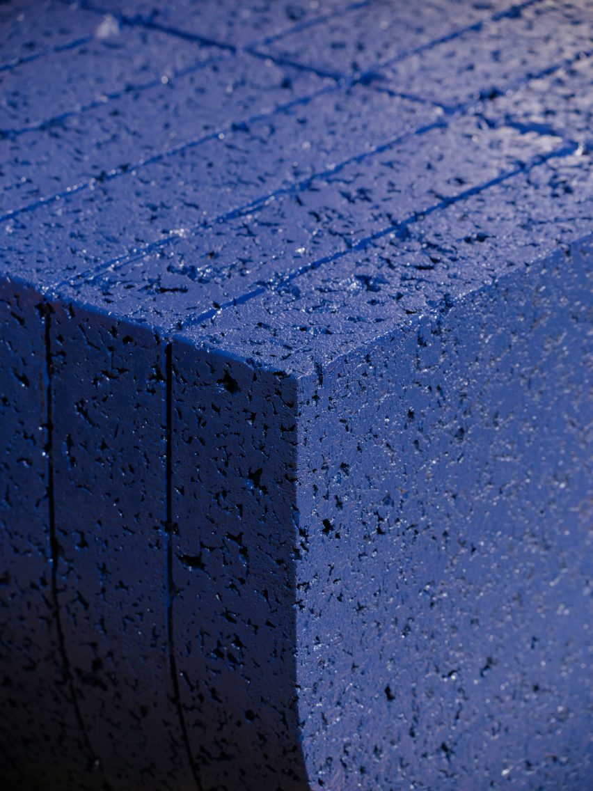
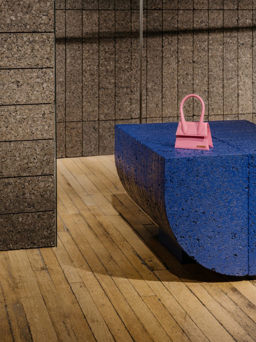
To create a plinth that provides a flat surface for displaying objects, EBBA used the same semi-circular form of the columns, but flipped onto its side.
This element has been given an ultramarine blue coating to add a sense of playfulness and catch the attention of visitors, using one of Rotaro’s key colours to connect with the brand’s identity.
A semi-circular plinth features an ultramarine blue coating
While the space has been designed as a pop-up, EBBA worked – through the quality of the materials and the construction of the walls and blocks – to give it a sense of permanence.
“All of our projects aim to achieve a quality of permanence through the use of natural materials and the detailing of the construction,” Allan said.
“We believe that this level of quality helps to create a design that feels purposeful, even for temporary uses.”
Other recent projects by EBBA Architects include a shop for Cubitts in an old pie-and-mash restaurant and a house extension with brutalist-style materials.
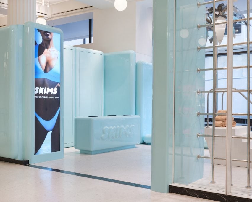
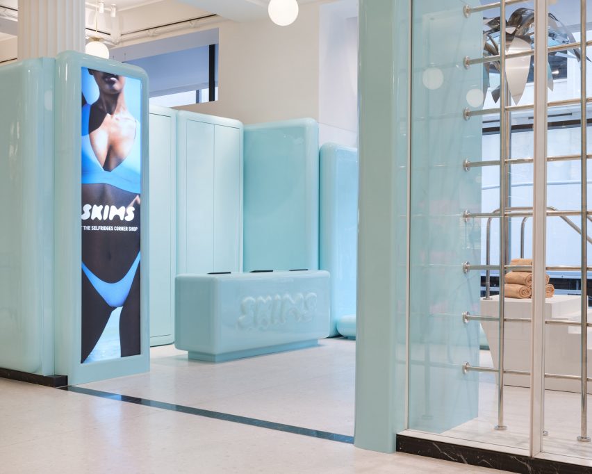
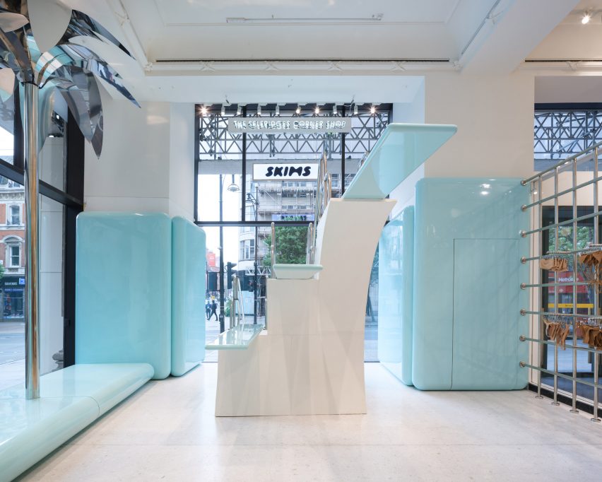
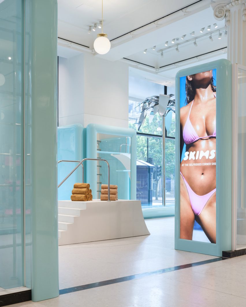
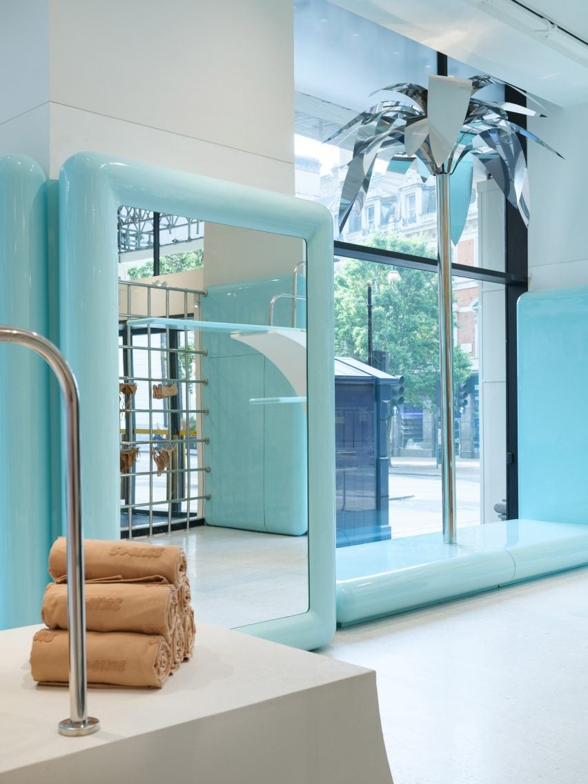
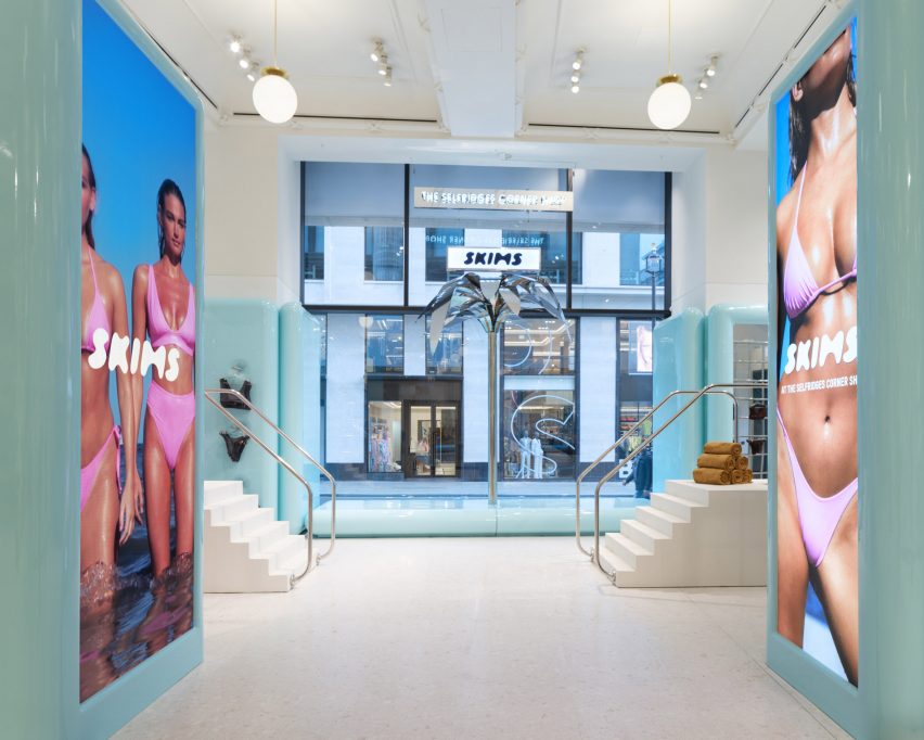
A three-tiered diving board stands next to a metallic palm tree inside this pop-up shop that designer Willo Perron has created for Kim Kardashian’s lingerie brand SKIMS in London.
The brand’s first physical retail space in the UK, at the Selfridges department store in London, follows the same formula as its debut shop in Paris. Here, surfaces were coated in panels of glossy plastic with gentle thermoformed curves to suggest the shape of the human body.
SKIMS has opened a swimwear pop-up in Selfridges
But for this temporary summertime pop-up, Perron abandoned the brand’s typical fleshy colour palette in favour of a pale blue hue reminiscent of a heavily chlorinated swimming pool.
The resulting plastic panels are so glossy they look almost wet as they form everything from mirror frames and bench seats to wall panels and the shop’s monolithic till counter, which is embossed with the SKIMS logo.
A three-tiered diving board sculpture forms the centrepiece of the store
A huge replica of a three-levelled diving board stands at the heart of the store, with a stepped base and springboards formed from lengths of the same baby-blue plastic.
Shiny chrome tubes act as handrails and are repeated throughout the store in the form of gridded partitions and clothing rails, curving around the columns of the Grade II-listed department store.
Rounding off the poolside atmosphere is a matching metal palm tree sculpture, integrated into the long bench set that runs along the shopfront.
To display stacks of rolled-up nude-coloured SKIMS towels, Perron also added two smaller freestanding platforms with the same steps and chrome handrails as the diving platform but minus the springboards.
Thermoformed plastic panels in glossy blue glad most of the interior
Taking over Selfridges’ ground-floor pop-up space The Corner Shop until 8 July 2023, the shop will offer the brand’s core collection of swimsuits and bikinis alongside limited editions and seasonal colourways.
Customers will also be able to buy ice cream to match their swimwear, stored in baby-blue freezers courtesy of London gelato company Chin Chin Labs.
A metallic palm tree decorates the store
“I’m thrilled to bring SKIMS Swim to London for the first-time ever and take over The Corner Shop at Selfridges with our most conceptual pop-up experience to date,” said SKIMS co-founder and creative director Kim Kardashian.
“We have followers all over the world,” she added. “As we enter the next phase of SKIMS retail, I look forward to connecting with these customers through innovative shopping experiences on a global scale.”
A metallic palm tree completes the poolside atmosphere
Returning for its second year, SKIMS’s swimwear offering is pitched towards providing various levels of coverage for different body types and modesty requirements.
This is an extension of the brand’s drive to create inclusive underwear and shapewear that works for people of different sizes and abilities, following the launch of its Adaptive Collection last year.
Over the next three years, the brand is planning to open a roster of freestanding stores across the UK and EU.
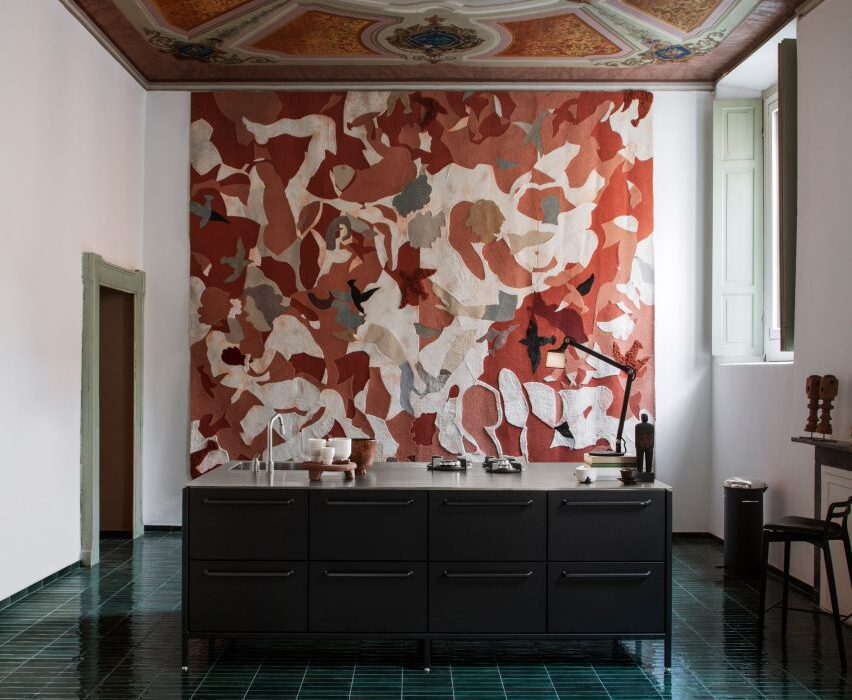
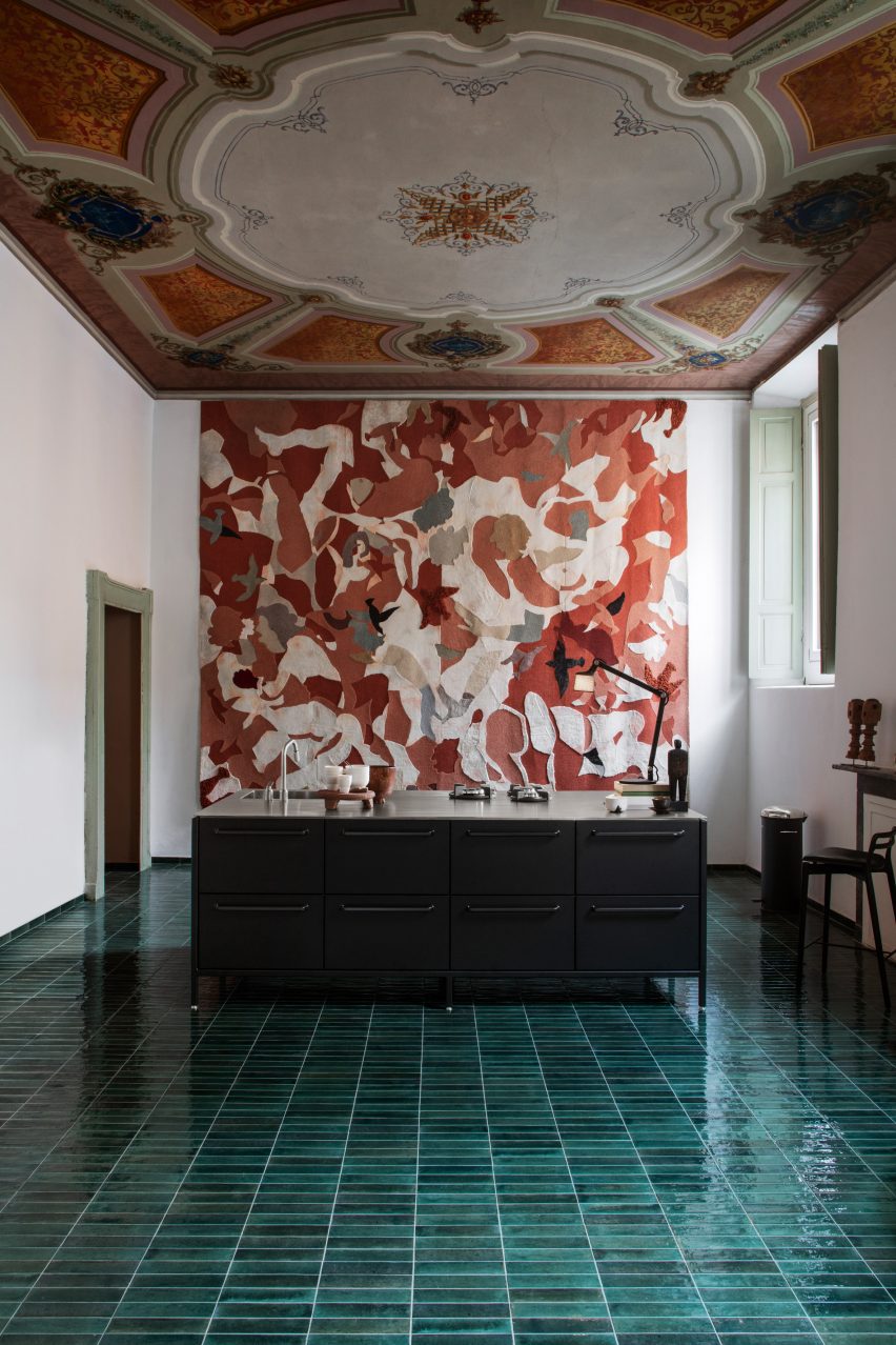
Interior designer Julie Cloos Mølsgaard has created a pop-up hotel filled with Italian frescos and modern Scandinavian furniture for Danish homeware brand Vipp within Palazzo Monti in Brescia, Italy.
The collaboration with Vipp saw the Palazzo Monti, which is an artist residency foundation hosted in a 13th-century palace, transformed into a hotel for guests to stay overnight.
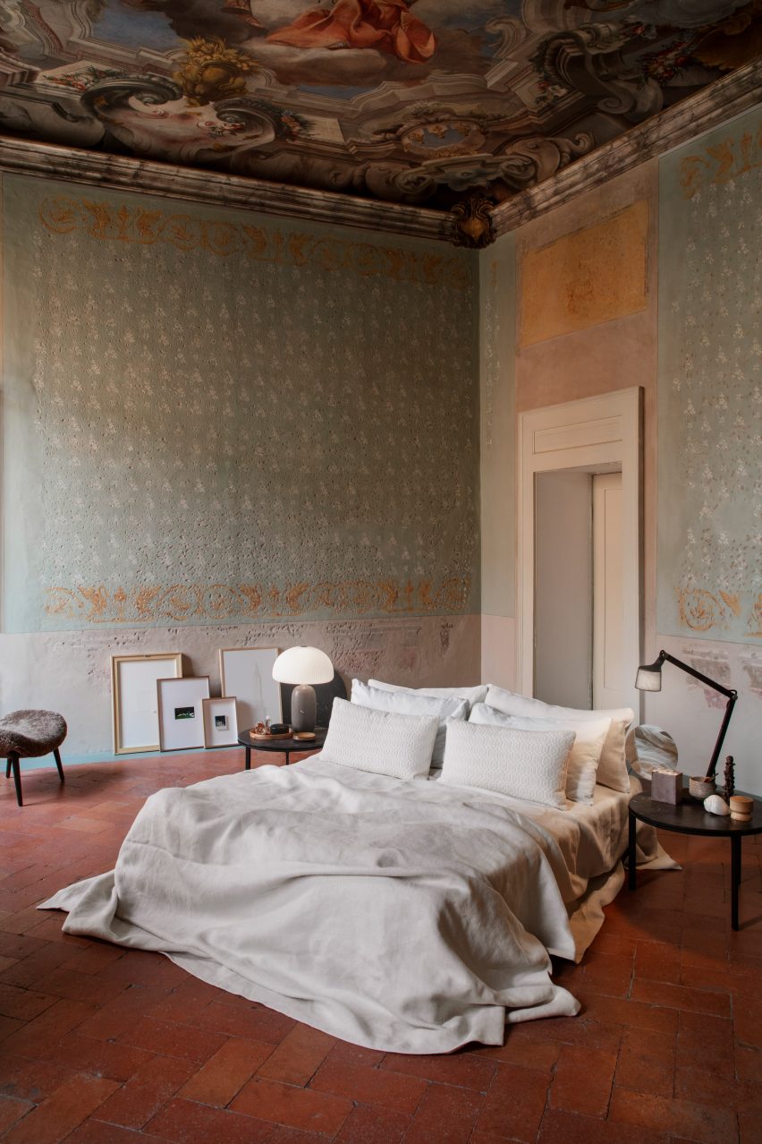
Palazzo Monti was converted into a pop-up hotel
The space was redesigned into a hotel suites focused on showcasing Vipp products.
Mølsgaard added minimalist furniture and lighting by Vipp to the interior spaces, aiming to complement the historic building, which features Baroque paintings from 1750 on its walls and ceilings.
The rooms were decorated with minimalist furniture
“Palazzo Monti showcases a broad array of art exhibitions,” said Palazzo Monti founder Edoardo Monti.
“For the first time, we will host a liveable installation curated by Vipp, where we invite guests to check into our residency,” he continued.
“Entering the opulent gates of the palazzo is like stepping into an old master’s painting.”
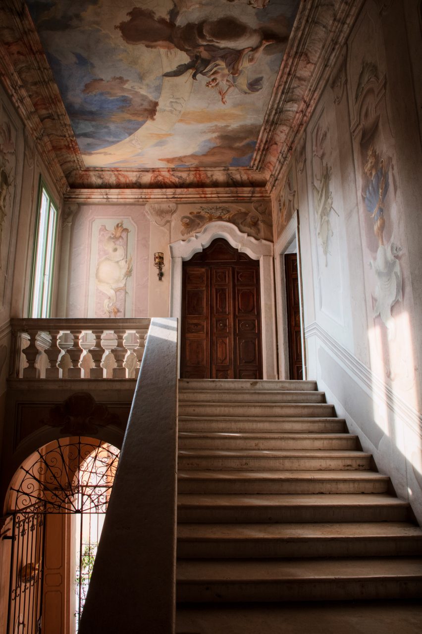
The staircase is surrounded by frescos on the walls and ceiling
“For the pop-up hotel at the palazzo, Mølsgaard had an ambition of building a bridge between the minimalist and the opulent,” said Vipp CEO Kasper Egelund.
“Vipp and Mølsgaard approached the interior design with a simple and minimalist mindset to respect and not compete with the surrounding richness.”
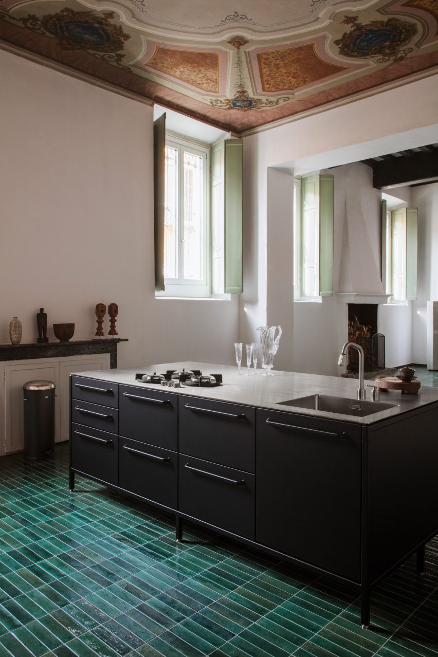
Green tiles cover the kitchen floor
On the ground floor is a combined kitchen and dining area. Mølsgaard added an industrial-looking matte black kitchen island in the middle of the space, which sits under an ornate ceiling and atop a green-tiled floor.
A grand staircase surrounded by pastel frescoes leads visitors to the pop-up hotel on the first floor.
A succession of rooms – a hallway, salon and bedroom – were transformed into a suite decorated with Vipp furniture and lighting.
The furniture in the bedroom was intended to be simple and minimalist. The mattress sits on the floor without a bedframe, making the painted three-metre-high ceiling the main focus of the room.
“The idea is that guests should visit and explore the space,” Mølsgaard told Dezeen. “When you wake up under the frescoes, it’s impossible not to think, what kind of life must have been lived in this house?”
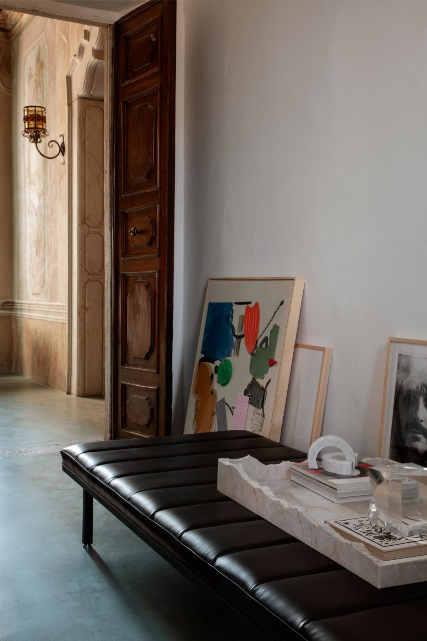
Artwork was placed on the floor
Throughout the palazzo, artwork and picture frames were placed on the floor propped up against the walls, rather than being hung.
“We initially hung a lot of art on the walls, but it was making too much noise, so instead I have sought the purity of the history of the place and wanted to let it speak through the bare walls,” said Mølsgaard.
Mølsgaard aimed to combine Scandinavian minimalism with Italian opulence
“The whole place is one big art piece,” she continued. “The staircase is a work of art, the doors are works of art, the shutters, the walls and the ceilings.”
“When you walk around the rooms, you simply experience so many things that you almost get overloaded, so there was something that had to be removed.”
Vipp launched a special edition chair for the pop-up
Artist workshops on the second floor of the building overlook Brescia, which is a UNESCO World Heritage Site.
To celebrate the pop-up hotel at Palazzo Monti, Vipp launched the Monti Edition chair, which sees the brand’s Swivel chair design upholstered in an Italian woven fabric created by textile company Torri Lana.
The pop-up hotel at Palazzo Monti opens on 18 April to coincide with Milan furniture fair Salone del Mobile and closes on 18 May 2023.
Vipp and Mølsgaard have previously collaborated on projects including a one-room hotel in a converted pencil factory and a pop-up supper club venue.
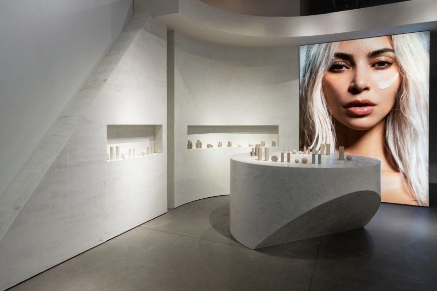
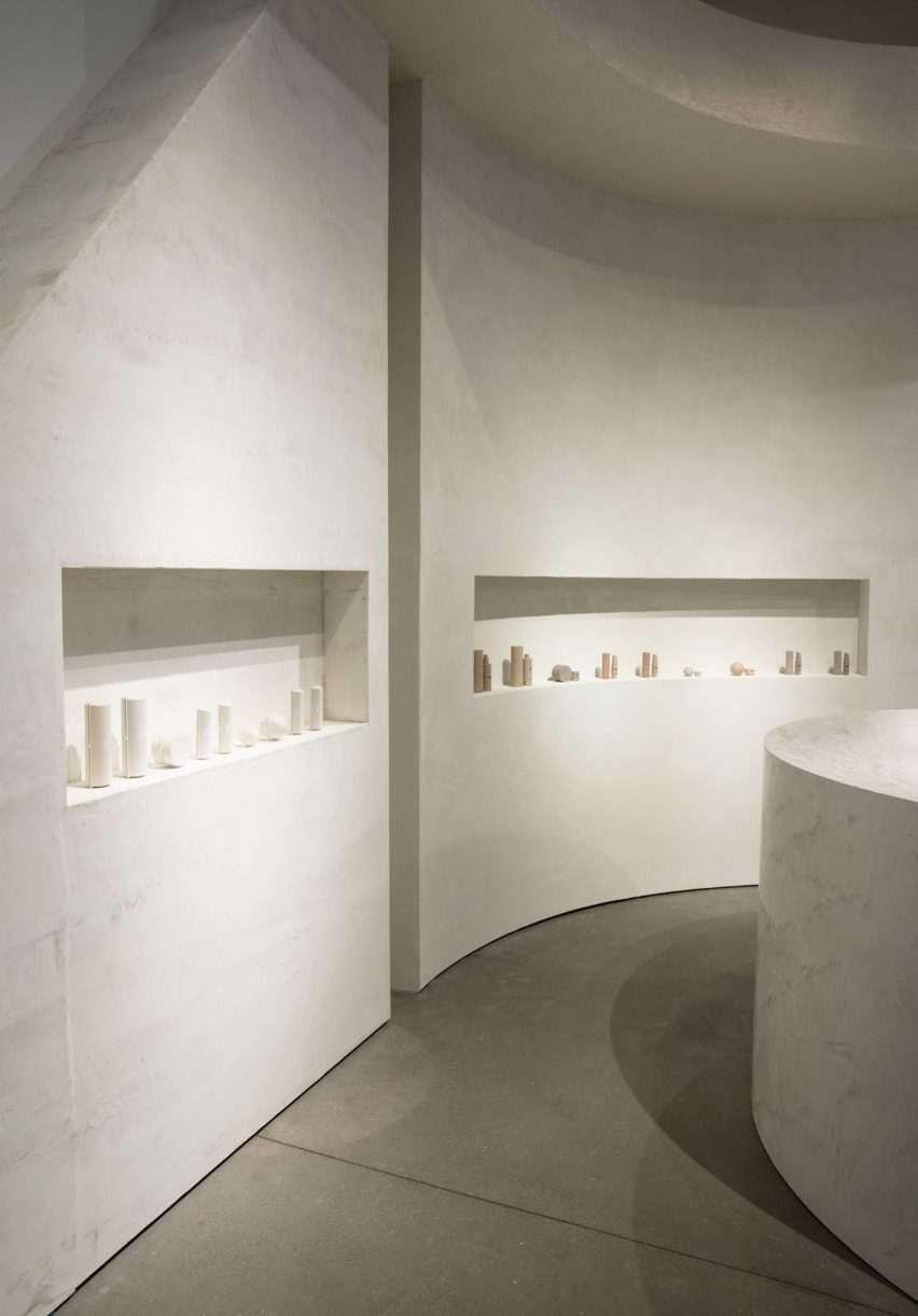
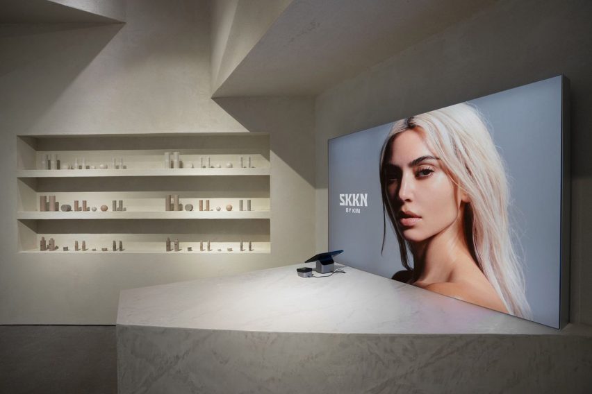
Design studio Perron-Roettinger has created a pop-up shop for Kim Kardashian’s skincare and homeware brand SKKN in Los Angeles that showcases its products in a physical space for the first time.
The minimalist pop-up store, which is located inside Los Angeles shopping mall Westfield Century City, was designed using a limited material palette in a nod to the brand’s pared-back design.
Perron-Roettinger has created a pop-up shop for Skkn
“The SKKN [store] is about raw materials – bold, big blocks of stacked raw material – which is inspired from an inactive quarry that I visited once,” Perron-Roettinger cofounder Willo Perron told Dezeen.
“All different plaster and cement finishes echo the emphasis on the raw natural materials.”
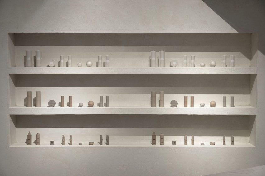
The walls and counters are made from concrete and plaster
In the 1,330-square-foot (123 square-metre) space, homeware and skincare products are presented within curved wall alcoves or on top of sculptural counters made from grey concrete and plaster. The room is framed by two large portrait photos of reality television star Kardashian.
“Just in time for the holiday season, the pop-up will offer customers a luxurious in-person shopping experience with the entire SKKN By Kim collection – from skincare to home decor,” said the brand.
Skincare items are displayed in alcoves
The use of raw materials references Perron’s partner Brian Roettinger’s packaging for SKKN products, as well as Kardashian’s recently launched concrete homeware collection called Home Accessories Collection.
All the materials come in varying shades of Kardashian’s signature beige and grey colour palette, which she has used in her home and her shapewear collections.
According to Perron, the brand’s packaging and the store interior are united in their reliance on simple shapes and raw materials.
“The throughline idea is materials untouched, most primary and elemental state,” he explained. “Simple geometry is important to add a recognizable component to both the space and the packaging.”
Perron–Roettinger was also responsible for SKKN’s creative direction, brand identity and art direction.
The store mirrors the brand’s minimalist packaging
The SKKN pop-up shop is open until the end of the year in Westfield Century City, Los Angeles.
The longtime collaboration between designer Willo Perron and Kim Kardashian has seen Perron design other pop-up stores for the American reality star’s brands.
For Kardashian’s shapewear company Skims, Perron created a beige coloured pop-up shop in Paris with chunky display units and partitions.
Los-Angeles based Perron-Roettinger has also completed other pop-up shops for brands including Stüssy.
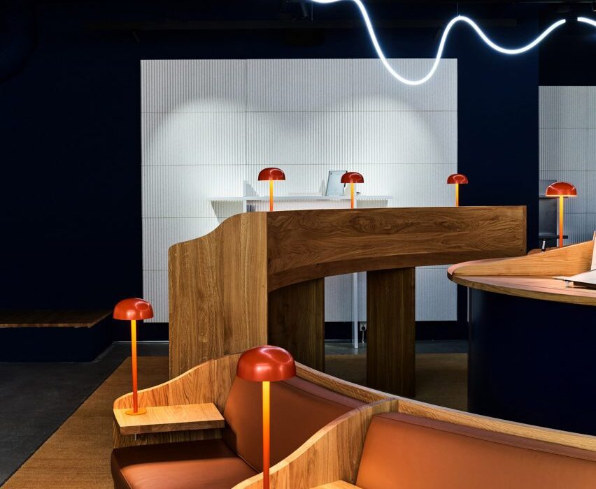
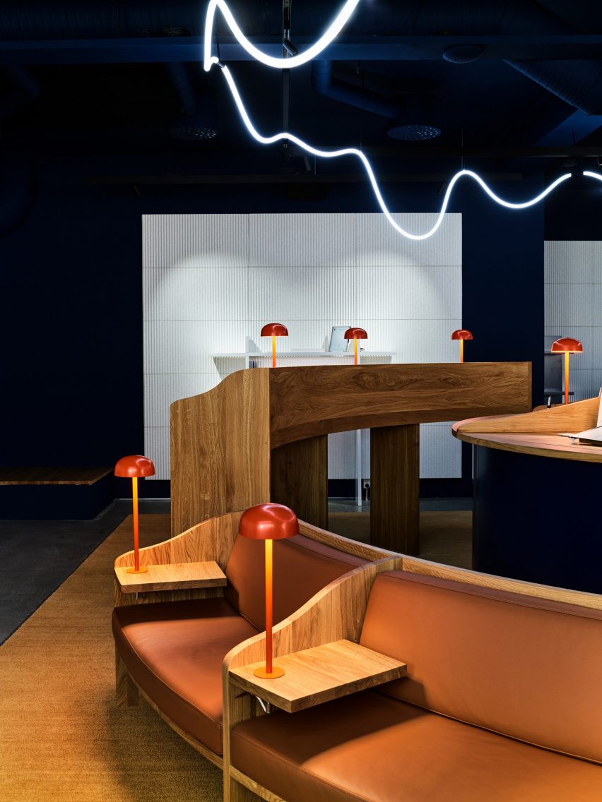
Architecture firm Snøhetta has created a library-informed respite from the digital world with A Better Place to Think, an Oslo pop-up shop for tablet brand reMarkable.
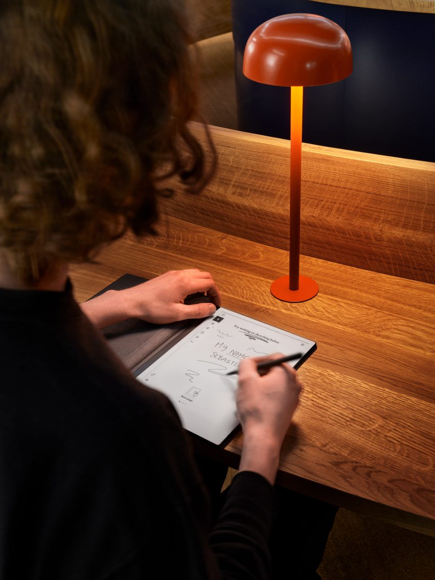
Located just off the city’s main shopping street, the temporary store was made to showcase the brand’s tablet, which has a paper-like surface.
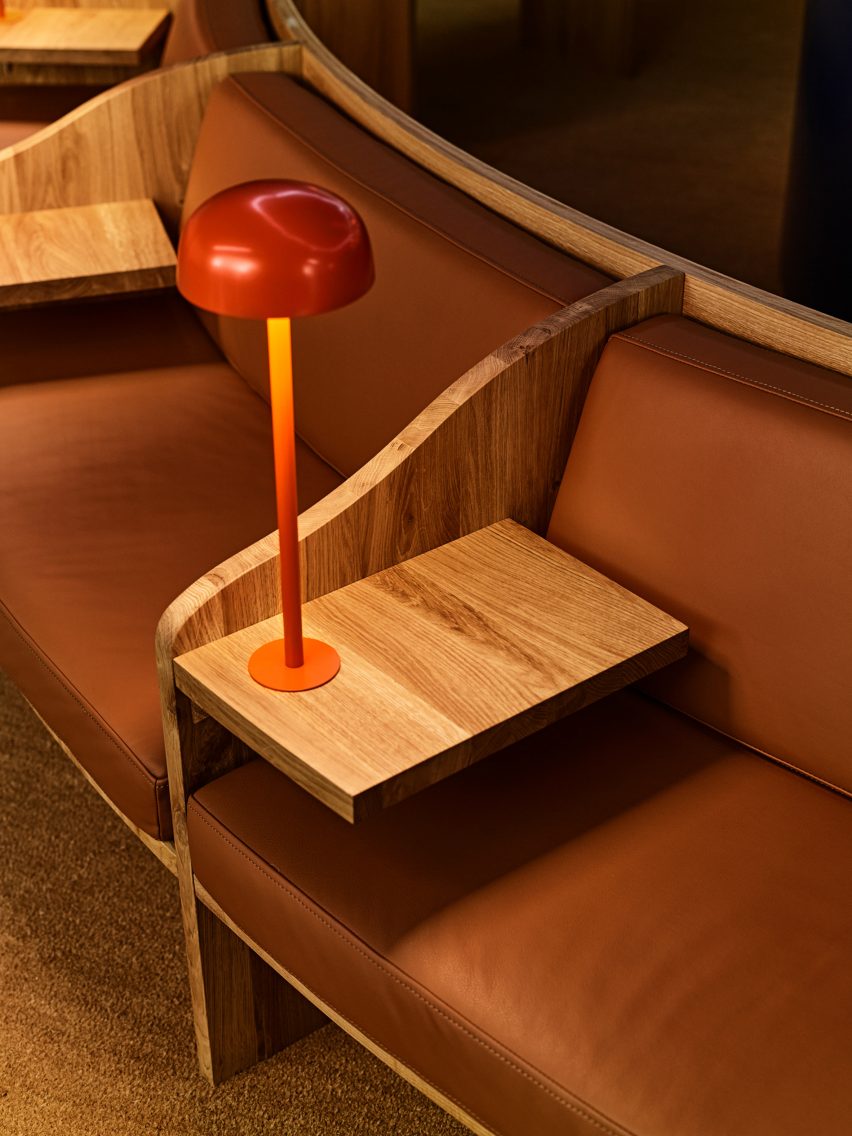
The reMarkable pop-up store is informed by libraries
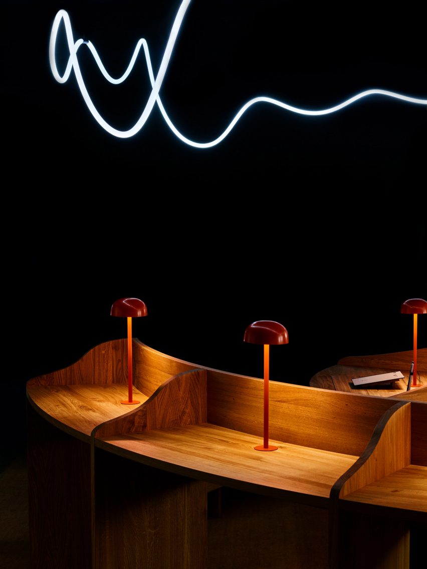
Snøhetta looked to libraries for the design, which features divided timber desks, leather banquets and small domed reading lamps.
The Norwegian studio wanted to encourage contemplation and concentration through the spatial qualities of the pop-up.
It features bespoke oak furniture in a quiet environment
“In today’s fast-paced and digitalised society, finding places for focused thinking can be a challenge,” Snøhetta founder Kjetil Trædal Thorsen told Dezeen.
“For the reMarkable pop-up store, we wanted to echo the serene environments of libraries – the clean and open spaces, somber aesthetics, tidy structures, and focused reading zones.”
The central light installation is inspired by a handwritten line
A Better Place to Think features two concentric rings of desks and seating, with the inner ring made up entirely of standing desks and the outer ring featuring blocks of seated desks, benches and sofas.
A handmade light installation overhead was inspired by the energy and movement of a line of handwriting.
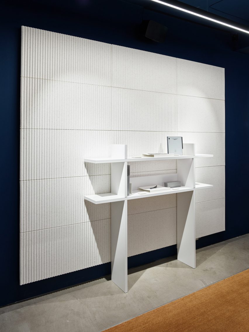
The walls and ceiling are painted in a “calm and sober” dark blue, with white acoustic panels and shelving covering most of the wall space.
The matt finishes across the walls, panels and on the bespoke oak furniture are meant to echo the material qualities of paper.
The store features matt finishes inspired by the feel of paper
The design of the pop-up aims to emphasise the enduring value of bricks-and-mortar shopping.
“Although consumers are becoming increasingly digital in their shopping habits, especially during the pandemic, we see the value of letting our customers experience that ‘wow’ moment of writing on one of our paper tablets for the very first time,” said reMarkable founder and CEO Magnus Wanberg.
White pulp acoustic panels line the walls
Founded in 1989, Snøhetta has offices around the world.
Its recently completed buildings include the shimmering Le Monde Group Headquarters in Paris and the El Paso Children’s Museum, which has a barrel-vaulted roof resembling a cloud.