Architizer is thrilled to present the 100 Finalists for the 4th Annual One Drawing Challenge, architecture’s biggest drawing competition! This year’s best drawings are full of fascinating details that paint a rich architectural portrait of life and our world in 2022. A vibrant celebration of architectural representation, the images depict a diverse range of narrative-driven environments, from fantastical metropolises to dystopian landscapes. Others form satirical commentaries on climate change, capitalist society and political turmoil, and everything in between.
The judging process is officially underway, with our stellar line up of expert jurors reviewing each drawing in minute detail. They will be judging the drawings based on the competition criteria to come up with their top drawings. The jurors’ rankings will be converted into scores, which will then give us our two Top Winners and 10 Runners-up. As a reminder, the two Top Winners, one student and one non-student student, will each receive:
- $3,000 cash prize
- Top billing in this year’s One Drawing Challenge Winners’ Announcement
- An exclusive interview with Architizer’s editorial team, published on architizer.com
- A seat on next season’s competition jury
Without further ado, explore the 100 Finalists of the 2022 competition below (published across 4 posts and in no particular order), accompanied by their stories, written by the entrants. Tell us which is your favorite on Instagram and Twitter with the hashtag #OneDrawingChallenge! Below, “Part 1” presents the first 25 architectural drawings — you can jump to parts 2, 3 and 4 using these buttons:
Part 2 Part 3 Part 4
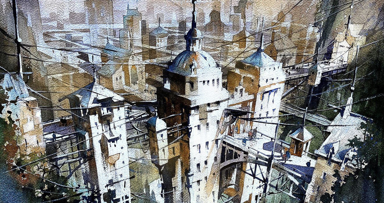
“Octavia – Suspended City” by Thomas Schaller
Schaller Architectural Fine Arts
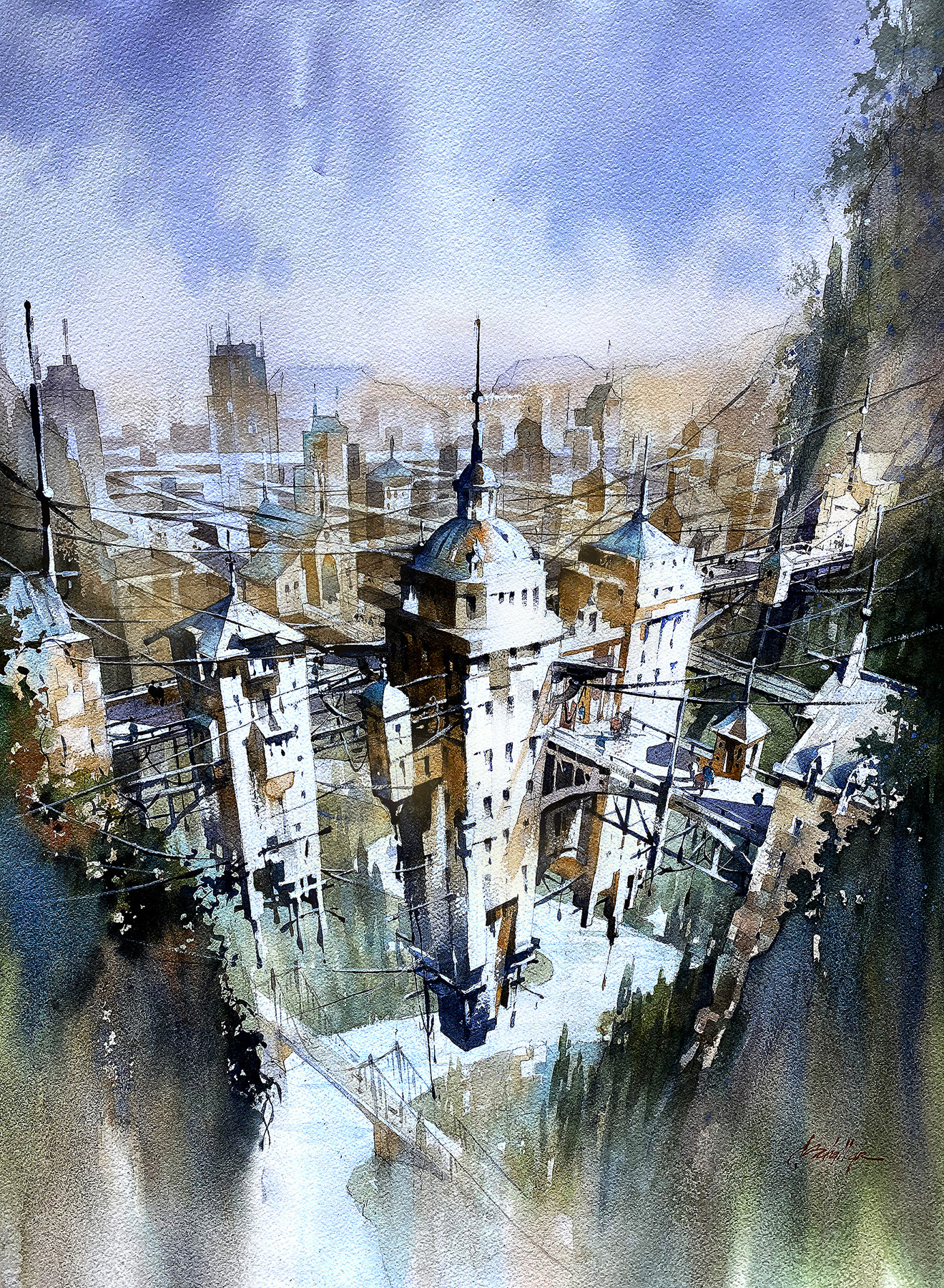 “Inspired by the iconic book Invisible Cities. by Italo Calvino, this drawing tells the story of Octavia, a city suspended above the Earth by a spider’s web of cables and wires. Interpretations are limitless, but in my interpretation, the inhabitants of Octavia depict the central truth about humanity – connections are profound – but tenuous; just as is our grasp on life itself. Isolation is not sustainable and connectivity – for all its impermanence – remains a more beautiful response.”
“DELIRIOUS COFFEE PALACE” by Pengcheng Yang and Zirui Wang
The Melbourne University
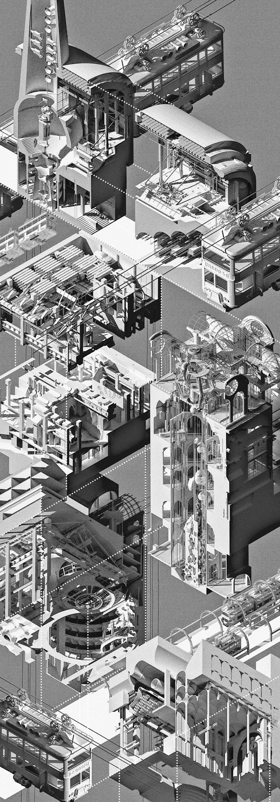 “Cafe Palace selected a series of plans of landmark buildings with different cultural backgrounds according to the composition of immigrants in the block, which served as the inspiration and design starting point of the overall underground space layout. Through the redefinition and blend of different architectural styles, an architectural atmosphere similar to the situationist concept was created.
At the same time, the coffee underground palace introduces phenomenological concepts and guides and creates underground circulation ideas from touch, hearing, smell and taste. This architecture can also be seen as an experiment in phenomenology. Elite food etiquette is often quite luxurious, and this program not only summarizes the traditional coffee washing process, but has deliberately designed these machines to be overly fussy in order to satirize the pursuit of the ultimate in coffee culture.”
“Fable or Failure” by Alexander Jeong and Brandon Hing
University of Southern California
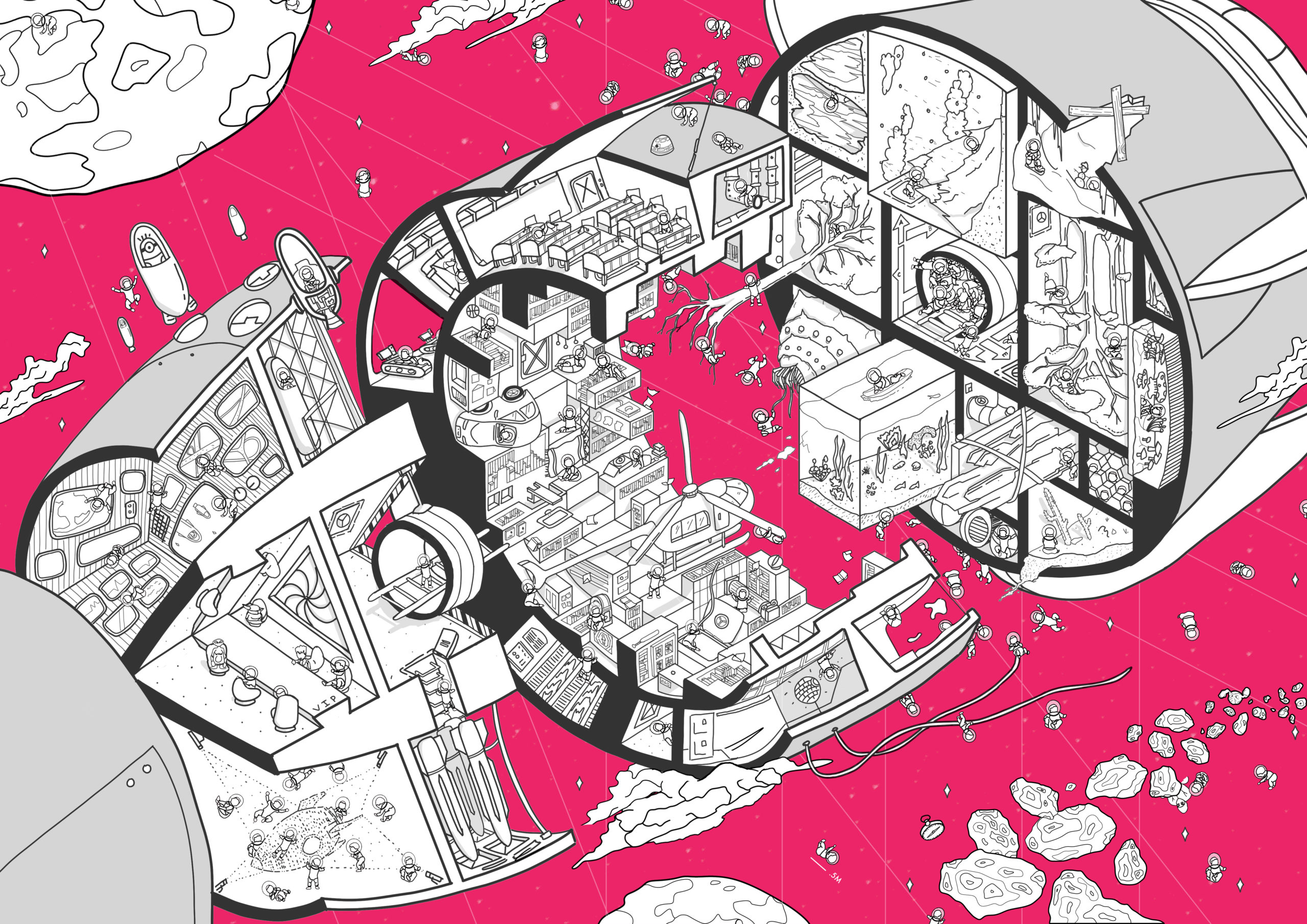 “The conversation around future space travel intensifies, illustrating an intrinsic tension between a childlike excitement towards space travel and a corrupt governmental elitist control. As the world we know deteriorates under our feet, we desire to preserve, to resist, to survive. Fable or Failure takes an architectural approach of dividing a traditional spacecraft into three sections.
The first captures the inherent hierarchy, placing governmental and elitist figures in the control room, dictating the direction of the spacecraft. The second creates a radial plethora of human cultural achievements, memories, and records of our collective development. The final depicts a need for biodiversity in extraterrestrial survival. Ironically, the spacecraft is divided hierarchically, giving the most value and meaning to those in the control room, the elite, highlighting the scale tipping, where our naive excitement for space travel is overrun by the forces of elitist and governmental monopolization.”
“Remembering Hanami” by Seah XinZe
WilkinsonEyre Architects

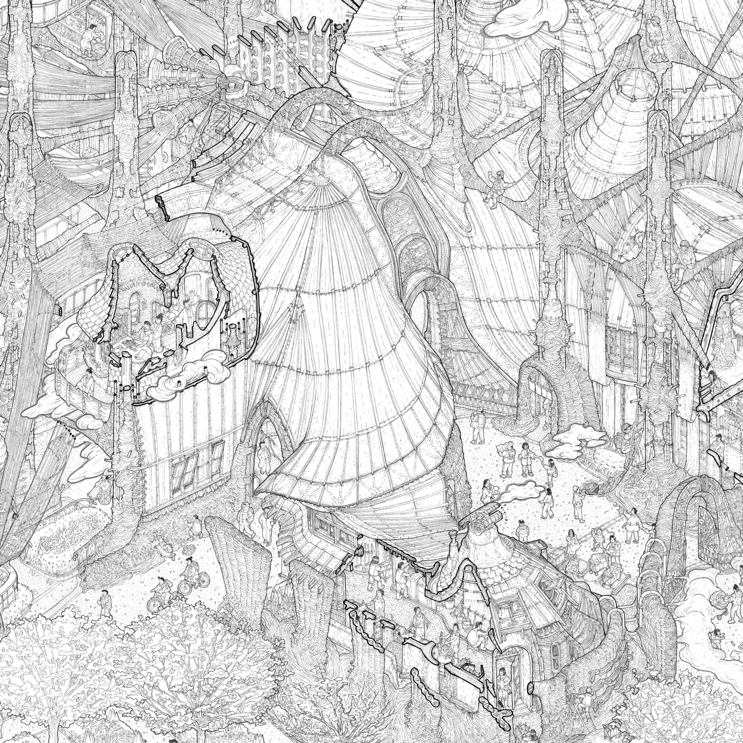
Detail
“Every spring, cherry trees in Japan bloom with a fleeting magnificence, captivating the nation for two weeks before wilting. During this time, parks are shrouded in pink and the ephemerality of cherry blossoms is appreciated as they are a reminder of the transitory yet overwhelming beauty of life.
Located in Yoyogi park, Tokyo, the project aims to immortalize the spirit of the cherry blossom. The building is a hand-woven landscape of experiences that engage the senses through the extraction of the different aspects of cherry blossom. The distillery boils flowers from the adjacent cherry grove, distributing scented steam through a network of pipes into the various spaces of the building. Visitors enjoy cherry blossom tea under a canopy crafted from sakiori weaving dyed pink from cherry trees and are invited to picnic by the scented water pools.”
“Ever Given Ever After: Suez Canal Obstruction Rethought” by Manuel Ragheb
ppp Architekten
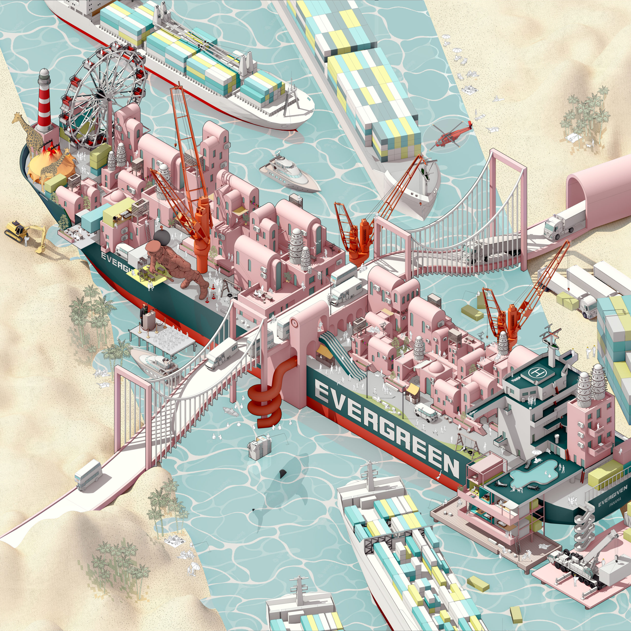 “In March 2021, an Evergreen container ship blocked the Suez Canal waterway for 6 days. In a scenario in which the ship had never managed to leave the canal, people in need of homes would have brought their lives aboard. While the Egyptian government has been dragging people out of their homes in Warraq and Sinai as development plans move forward, people are forced into poorly planned habitats that pay no real attention to people’s needs or their economic activities.
Not only are people entitled to the right to shelter, but also to one that guarantees a high life standard with consideration to the way people earn their livings. Urban development plans should target local inhabitants rather than investments that disregard the human factor. Only then, people can be part of a better urban future. The mural portrays people building their own homes on board the container ship.”
“The Red-Wall Maze” by Dong Fu
Zephyr(US) Architects P.C.
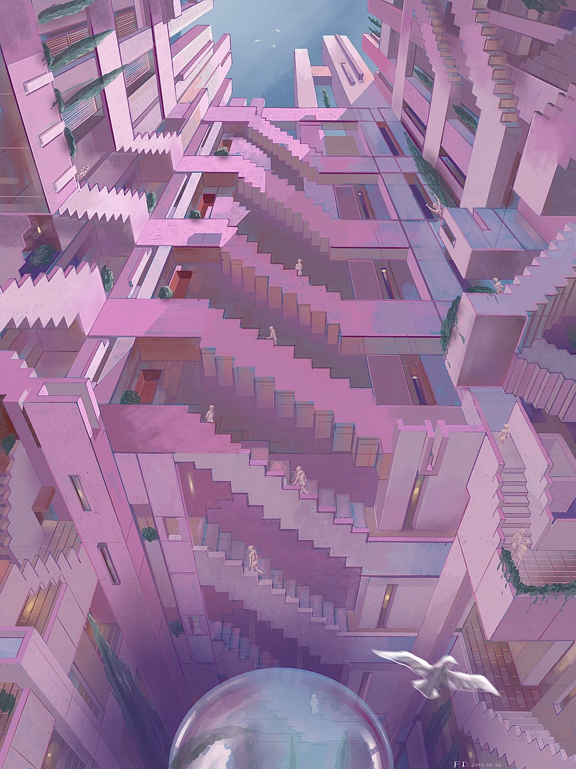 “Stair mazes will always be dynamic structures for the human spatial experience. Humans have the instinct to create infinite space through limited materials so that a certain relationship can be formed between limited life and the infinite universe. Stairs are important elements of a maze—connecting different heights and circulating up and down. The winding pink staircases, the main subject of this drawing, give the building a very large number of possible paths, forming a complex labyrinth.
At the same time, I utilized Escher’s impossible space in such a way that the upper part of the drawing is a space facing up, and the lower part faces down. In this way, at the shared edge of the two spaces, a person needs to make a 90-degree rotation of the body to complete the crossing between the two parts, similar to scenes of the movie “Inception.””
“Post Boulevard” by endri marku
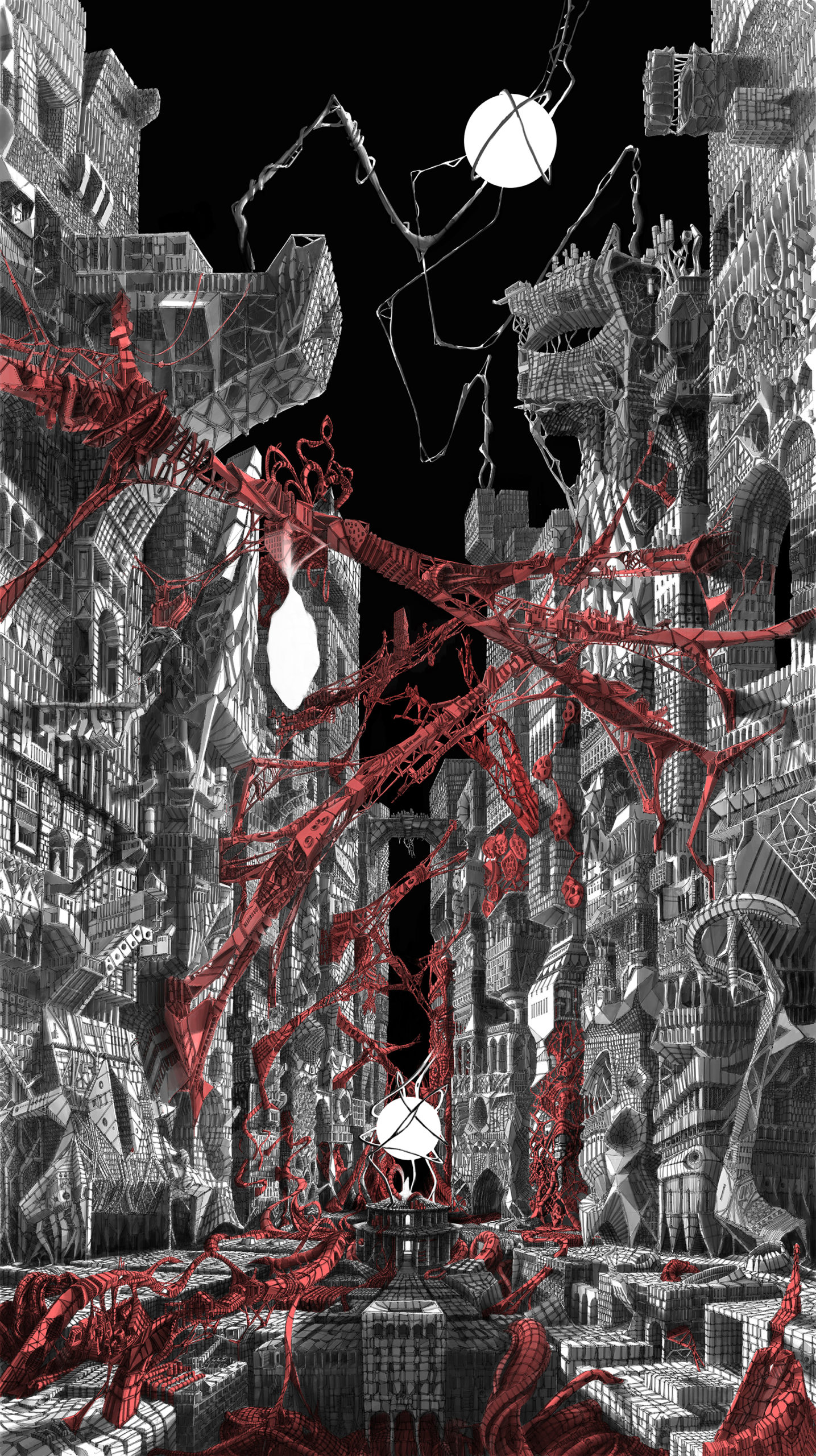
“A Sultan built a temple over the wilderness and a little picturesque settlement grew all around it.
Years later, a King ruled the place. He soon decided that the town needed a boulevard.
An Emperor dethroned the King. He thought the boulevard would be better surrounded by monumental buildings.
A Secretary General rised to power. He accepted the boulevard as it was and used it for his own celebrations.
A President came. He disliked all that space around the boulevard so he filled it with all sort of things.
Lastly a Post-Modern leader became the ruler of the city. He too liked that boulevard but with a city of its own making around. Architects from all over the world where invited to embellish it. Every corner of the bulevard, every space and especially the sky over it were filled with bright and colorful wonders – a place of terrifying beauty.”
“Chamber of Memories: Hidden Odyssey” by Ghassan Alserayhi
Taubman College of Architecture and Urban Planning, University of Michigan
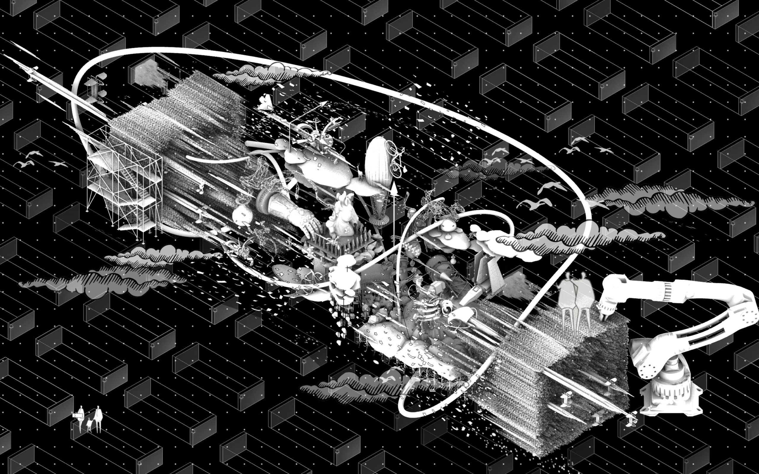 “Peter Eisenman commented on John Hejduk’s Berlin figures that they are not architecture “because you can’t get in them.” To which Hejduk replied, “YOU can’t get in them.” The work questions the degrees of accessibility in which users/participants can have agency/authorship to a piece of architecture. The notion of authorship can be understood as a form of intellectual property, where participants can only be allowed to travel with the designer through the meaning/essence of the work using their imaginations, only if the work was explained to them.
Analogously, this drawing reflects on the relationship between memories, architecture, and authorship, by capturing one moment extracted from the designer’s memory during the design process of this particular work, and then structuring different relations that intersect with time and space to reconstruct two possible realms of memories [exposed+hidden].”
“The Gardener’s Diary” by Glory Kuk
KPF
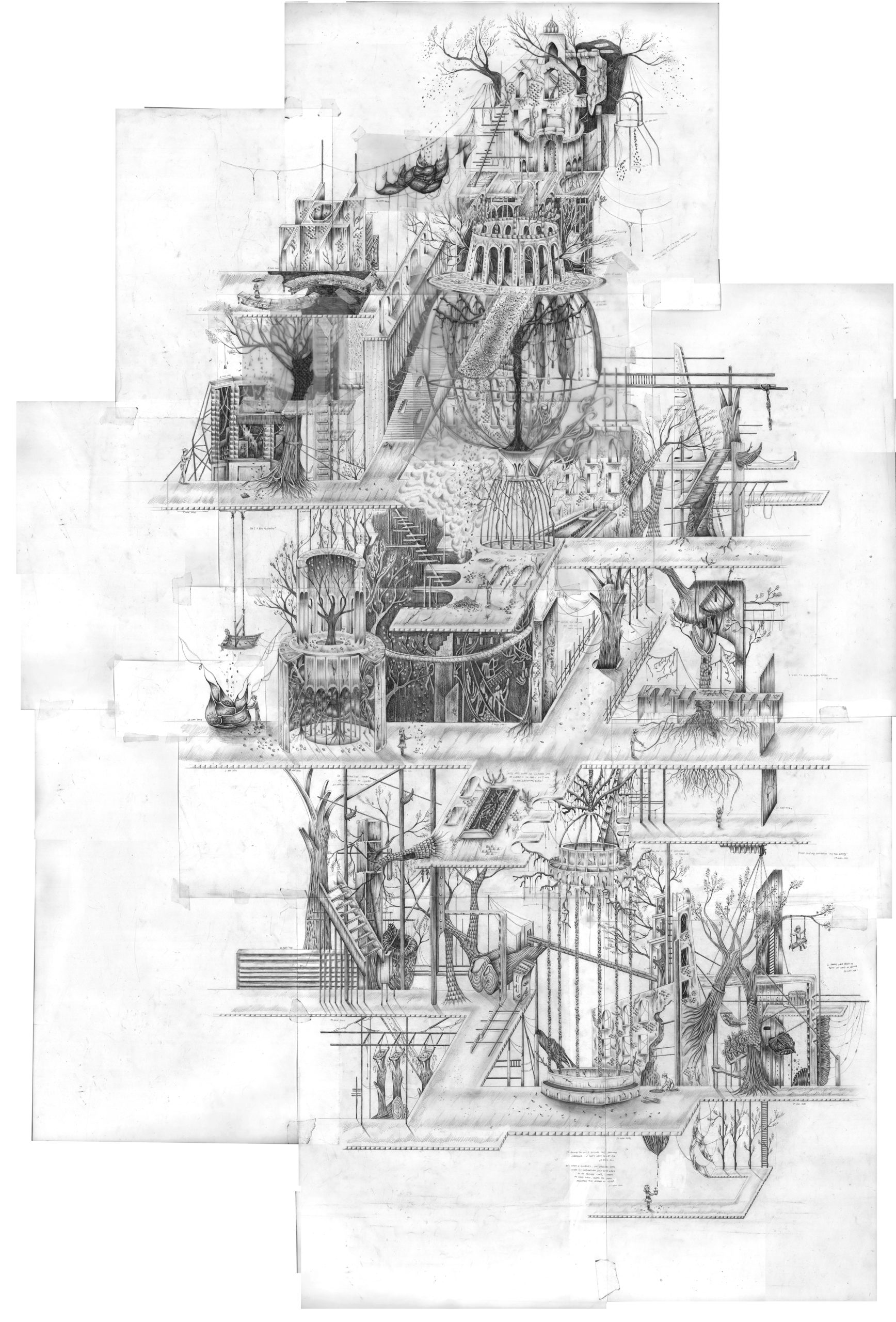 “Dear Diary,
I recently rummaged through my old diaries and found melancholic entries.
Located in Renwick Ruins of Welfare Island, an island that housed the undesirables of the city, much like our rejection of mental health problems.
The drawing diary is informed by small details in life and on site, which is spatially translated. It grows as more details are noticed, the drawing itself as a growing diary where it is reconditioned daily by me, tending, caring and maintaining the space. There is a visitor within me who might create chaos within the garden based on their emotions, the other side of my psyche. We shall leave traces for each other as we will never meet.
The drawing is where the garden is architecturised, and the architecture is gardenised.
It is a safe haven to defuse my worries, through this drawing I shall find my peace…
Yours Truly, The Gardener”
“The renovation of Chungking Mansions” by Chenkai Shao
Manchester School of Architecture
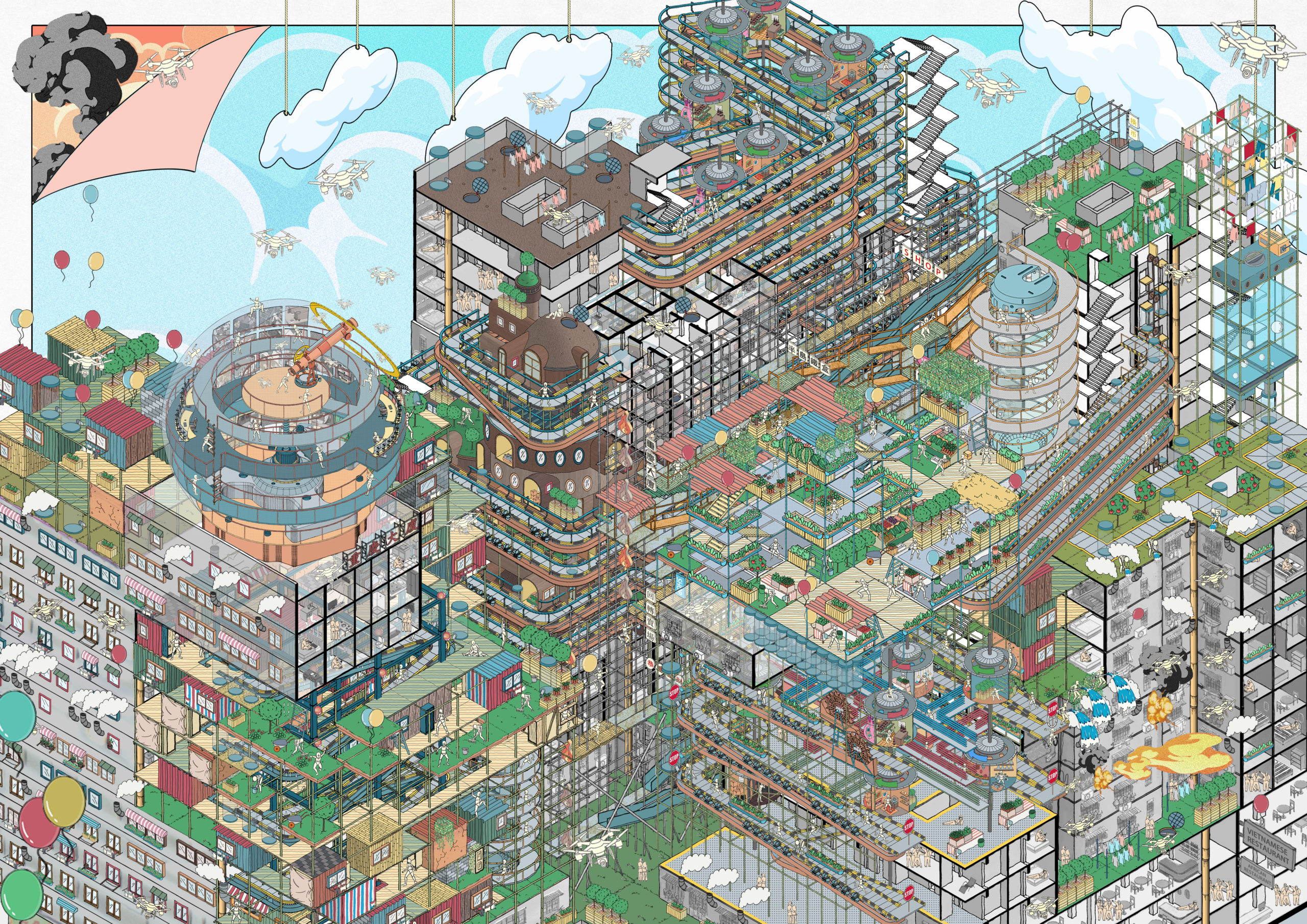 “Chungking Mansion is located in Hong Kong. It has brought together traders and asylum-seekers from South Asia and Africa, temporary workers from India and cash-strapped tourists from all over the world. It is a building that represents “low-end globalisation”.
Marginalization, cultural collisions, illegal activities, fire problems… These problems have complicated and frayed the small society of Chungking Mansions. At the same time, these problems are closely related to each other. Fire seems to be the embodiment of other problems, and is the only one that can cause substantial damage to the structure and space of Chungking Mansions.
Therefore, I conducted a study on this issue. On the premise of advocating the exploration of residents’ spontaneity and the use of low-technology construction, I rebuilt the building on the fire problem and tried to build a new life style for residents.”
“Dream of The Lost Era” by Mai Tung
HANOI ARCHITECTURAL UNIVERSITY
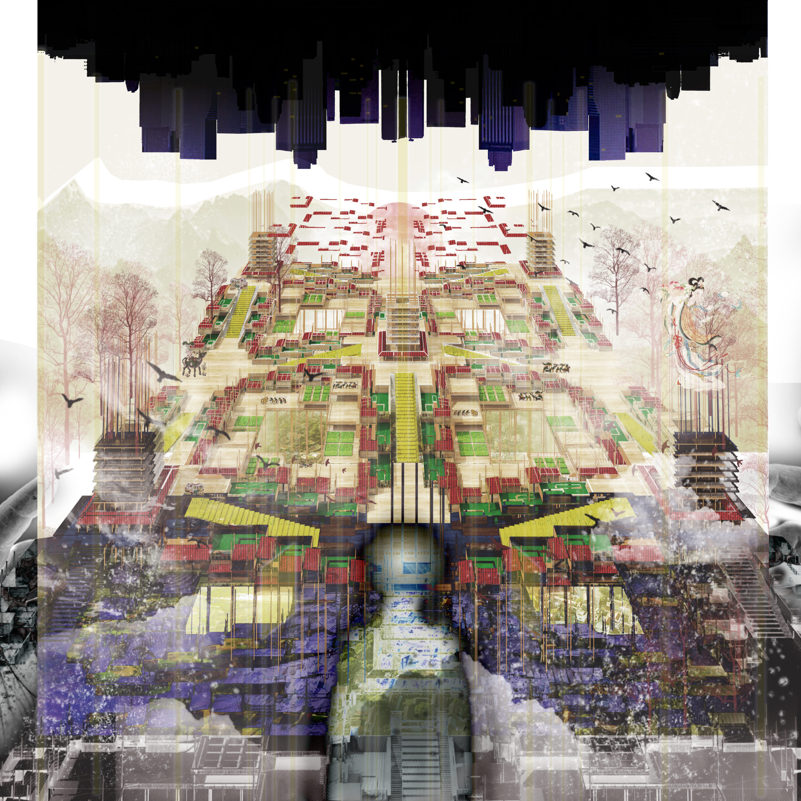 “The world was once filled with secluded and mysterious villages. The populations of these villages each lived and died in their own immaculate beliefs, traditions, and laws, their respective cultures untouched by the outside world for eons. With what land, sea and sky would offer, they would farm, herd, weave, build and worship, all in harmony with the cycles of nature.
Nowadays, the way of life of the ancients rings in the ears and minds of new generations suffocated by modernity like echoes. Voices from the distant past, urging them to embrace again traditions that preserved human groups for thousands of years. If not for modernity, nothing would have shaken the peace of these villages until the end of times.”
“A Garden of Rebirth” by Glory Kuk
KPF
Detail
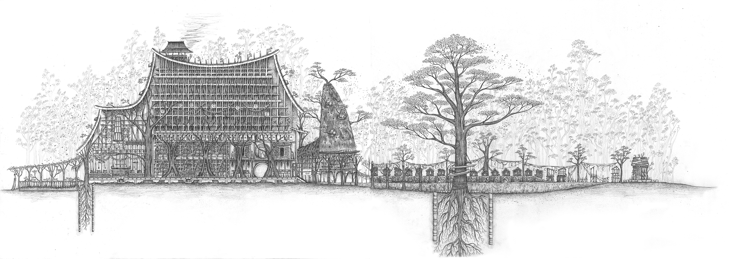
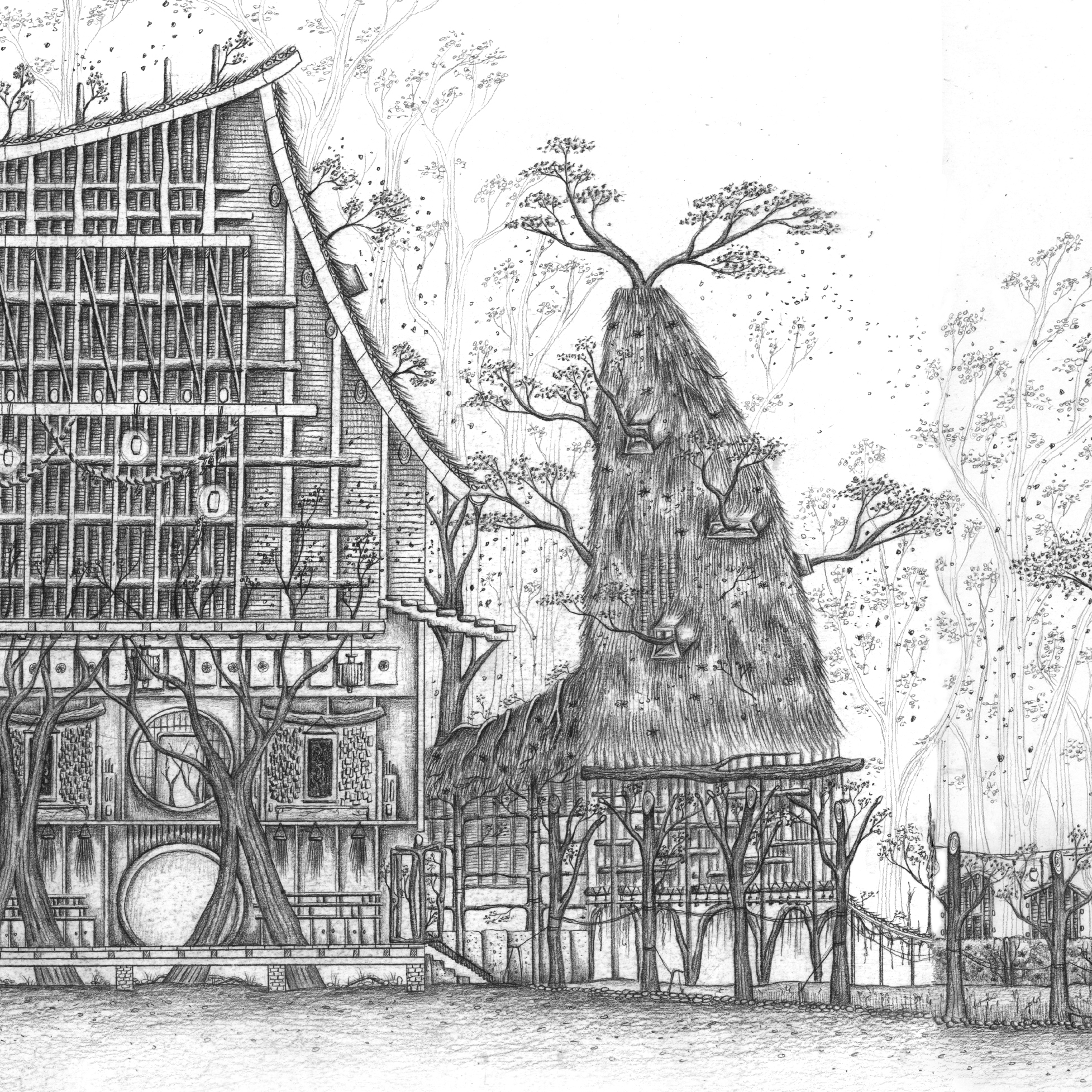
“Aokigahara, known for its unusual geography and abandoned objects, a Garden of Rebirth will be constructed in this forest of death, to transform the forest into a growing garden of the everyday. It is a building that never ends and grows, to be stood for all of eternity at least 10,000 years.
As a hybrid between a garden, monastery, hotel, the building records the passing of time. The garden acts as a refuge for visitors and lost souls that wander in the forest seeking for an end; a place for the dead and the living to exchange moments.
The building will be informed by the Pine trees in the forest, with the technical investigation into the study of shaping trees (pleaching), inspired by bonsai gardening, to construct desired elements and harvesting furniture as a self-sustained structure, to explore the notion of the evanescence of life and the essence of Zen.”
“Architecture of Insecurity” by Seungho Park, Architect
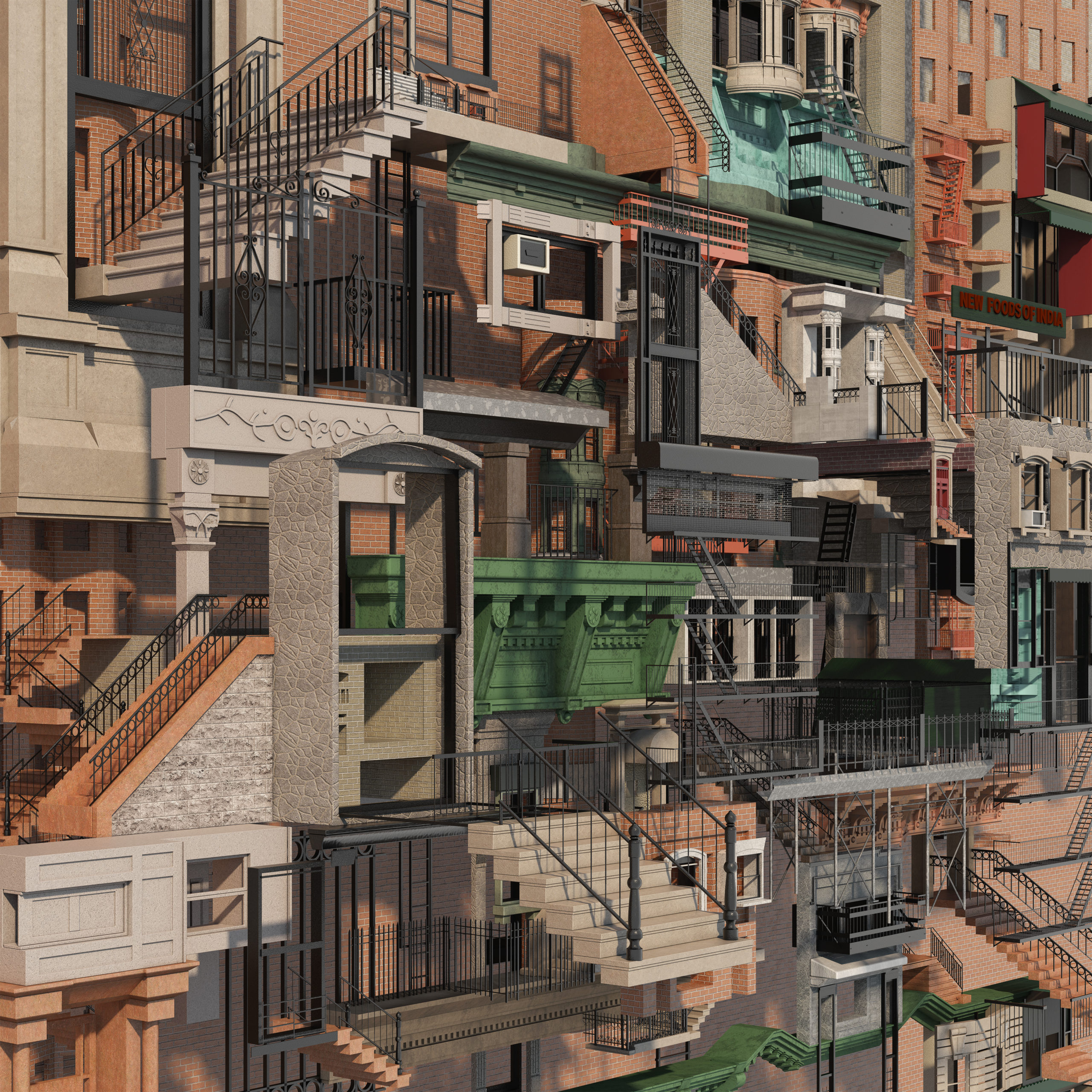 “During its rapid growth in the late 1800s, New York City formed most of its current modern city fabric. As a city of immigrants with its own cultural insecurity, New York borrowed the architectural style of its diverse ancestral European roots in an attempt to create a historic urban context. This European influence, combined with the advancing construction technology and socioeconomic factors of the time, forged a unique architectural environment. Architectural elements of different origin, whether ornamental or functional, were melded into New York’s building facades; architectural manifestation of “insecurity”.
The drawing mimics and exaggerates the architectural evolution of the city by displacing and fragmenting the buildings and architectural elements from their origin and context. Does the reassembly of the architectural fragments give us an extreme New York City? Through assemblage and abstraction, what can architects learn from it?”
“Art Expose” by Mannik Singh, Evelynne New and Xianke Qi
University of Melbourne
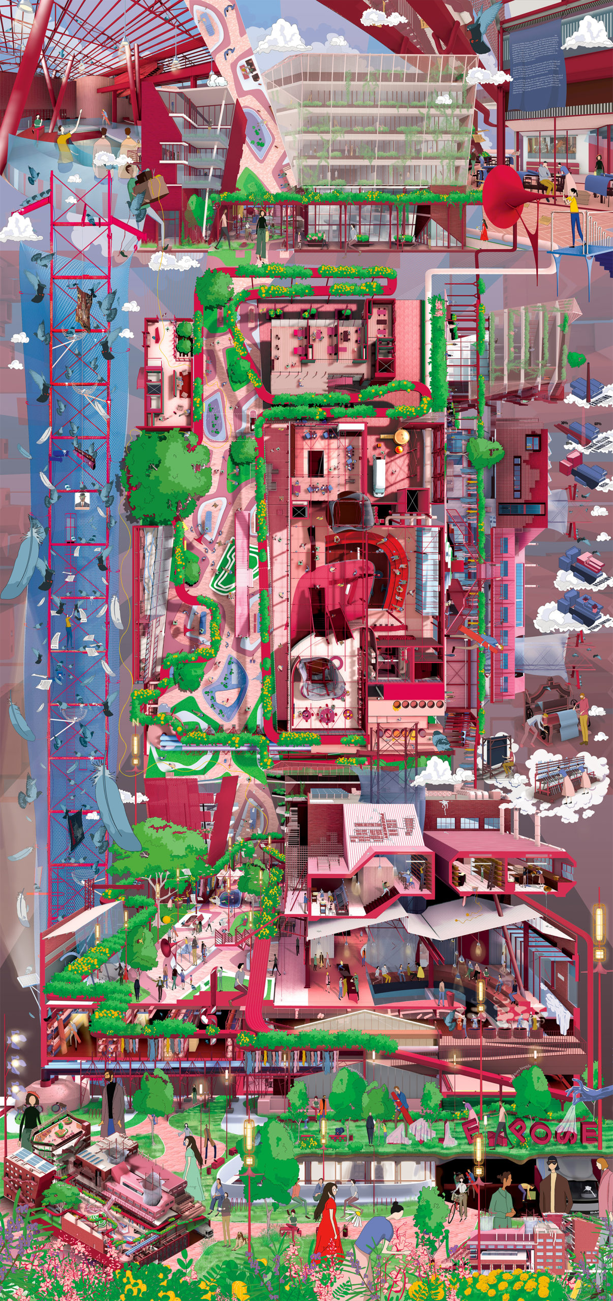 “Art Expose is a Public Fabric Art Forum aiming to raise awareness and mend inequities within Melbourne’s art scene alongside a fibre arts community. Putting the public in the central spine, the discursive architecture seeks to mediate between prosperous art dealers and struggling artists. The scheme arms the public with tools for measured amounts of active and passive surveillance of art production, storage and sales.
Art dealers have become synonymous with scandal and theft. While their secrets have been leaked to the press front pages, they remain the essential tin can telephone between artists and buyers, if we were to remove them, the connection will be lost.
The underbelly of the Art world continues to hum. Hundreds of feathered stewards hustle to feed the insatiable demand for smuggled art. The Machiavellian patrons get away with their white-collar crimes promising the cooing servants better living conditions for the pigeon race.”
“Pocket Size City: The Atlas” by Stefan Maier
University of Applied Arts Vienna
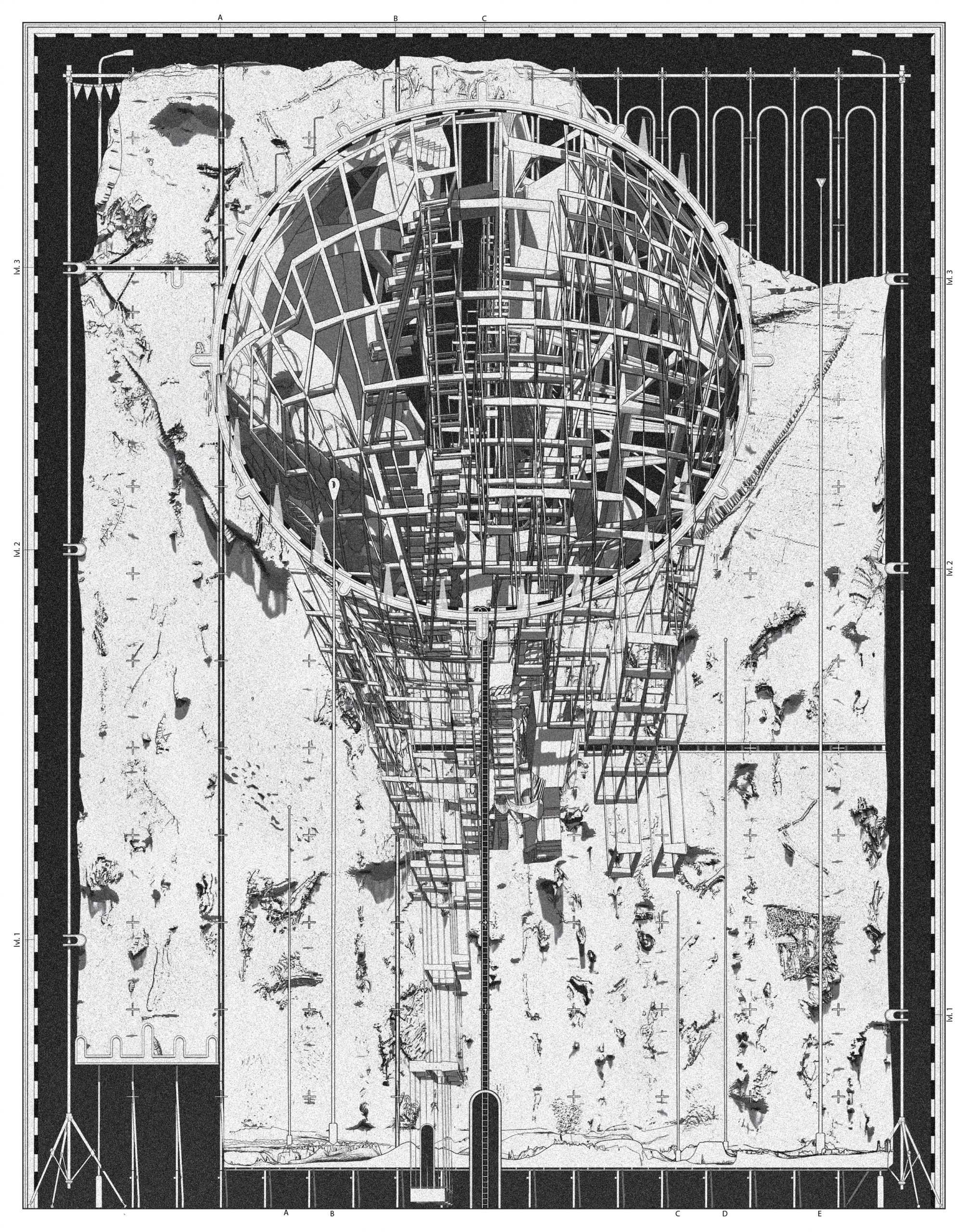 “The Atlas – a loose assemblage of maps. It constitutes a multitude of scales within itself. It links between the content and its representations, creates relationships, and references – a hyperlink into the digital space. The atlas holds the weight of the digital mesh.”
“The Post Apocalyptic Debrisity of Semporna” by kwok keng wong
School of Architecture & Built Environment, UCSI University, Malaysia
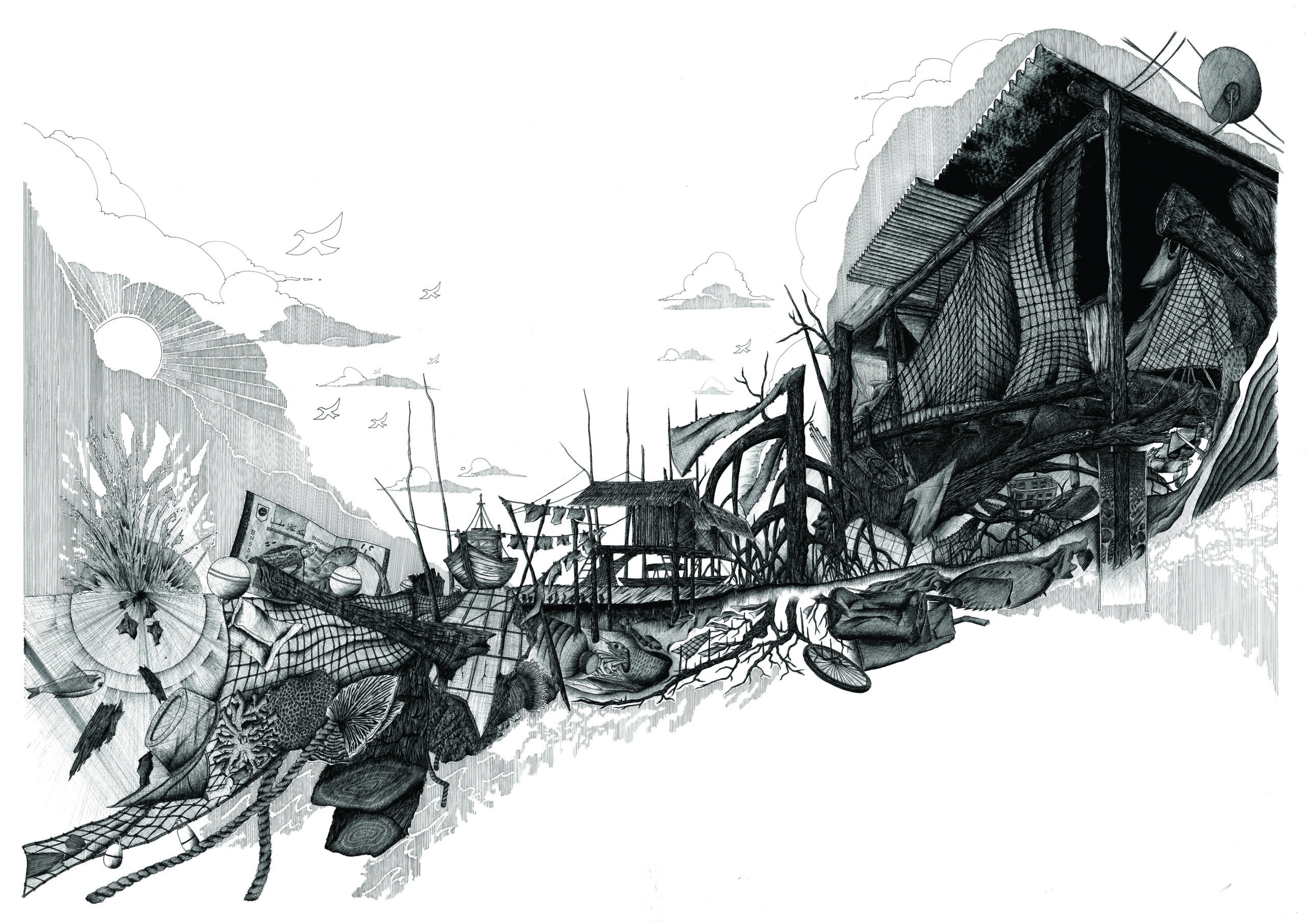 “The drawing is a capriccio depicting a post-apocalyptic Semporna as a ‘debrisity’ serving as a reminder that anthropogenic coastal and ocean debris is never another speculation but a reality. The notion of this drawing is to question the precarity whilst disseminating the importance of waste management and striving for the betterment of the settlement and marine life of Semporna. Cities across the globe are sharing the same fate in that unless we become more conscious about the impact of marine debris, they are destined to bear the brunt of human activities. Water is quintessential to support all forms of life yet paradoxically, human narcissism has laid and continues to lay waste to cities that are granted access to the paramount gift of nature, water, turning the ocean into a gigantic dumpster.
Medium : Mixed media on cartridge ( fineliner, ink, paint )
Size : 840 mm x 1188 mm (A0)”
“Synopolis” by Lohren Deeg
Ball State University
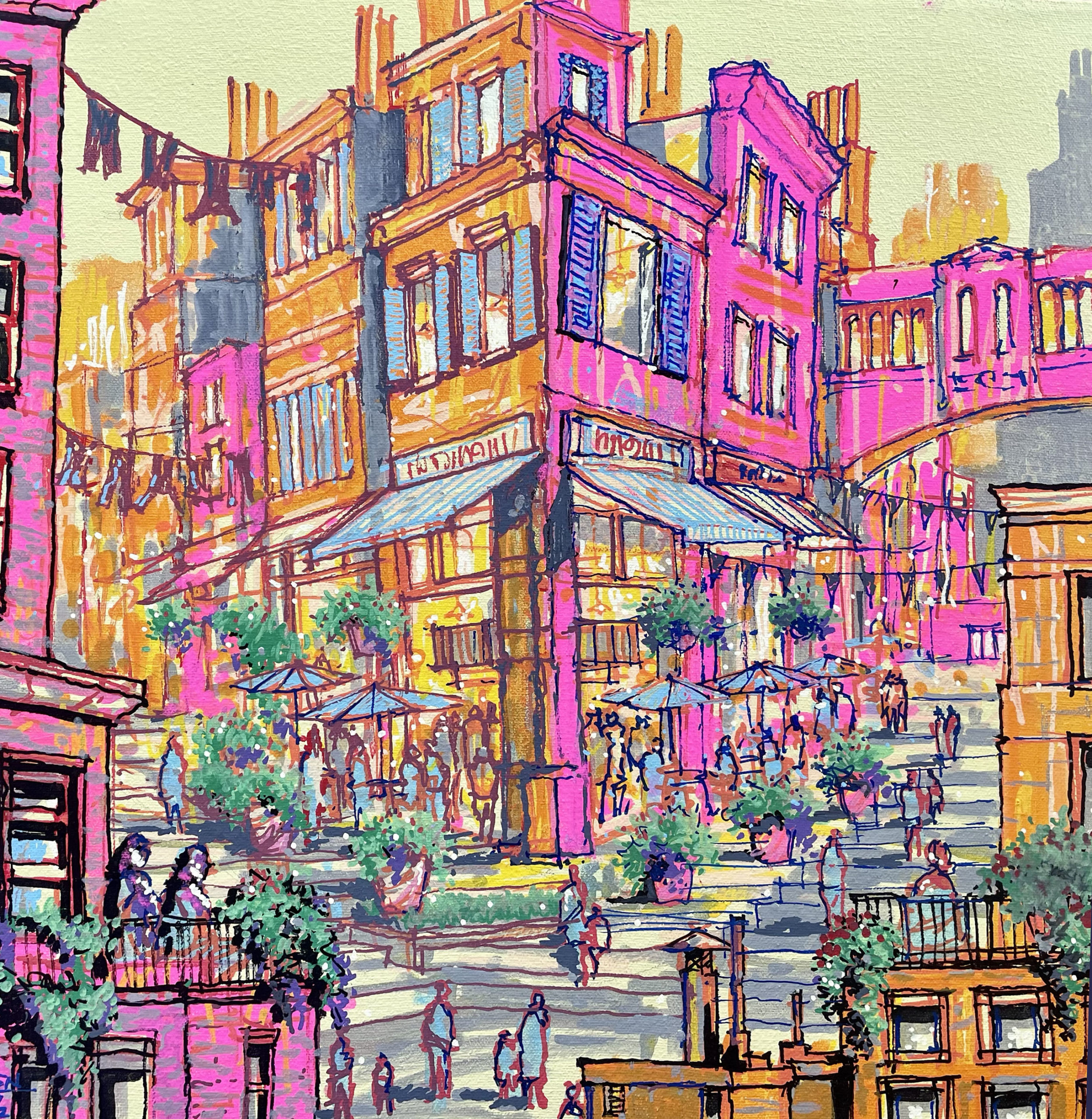 “Content with the limitations of their small apartments and quaint terraces, warmly greeting their neighbors, and strolling among the stepped streets, the citizens of Synopolis greet the sunset each evening with decanters of bubbly concoctions, slowness in their constitutionals, diving into delectable sweets, and chatting away the day’s trials and travails over stacks of plates of tapas.”
“More was more” by Gregory Klosowski
Pappageorge Haymes Partners
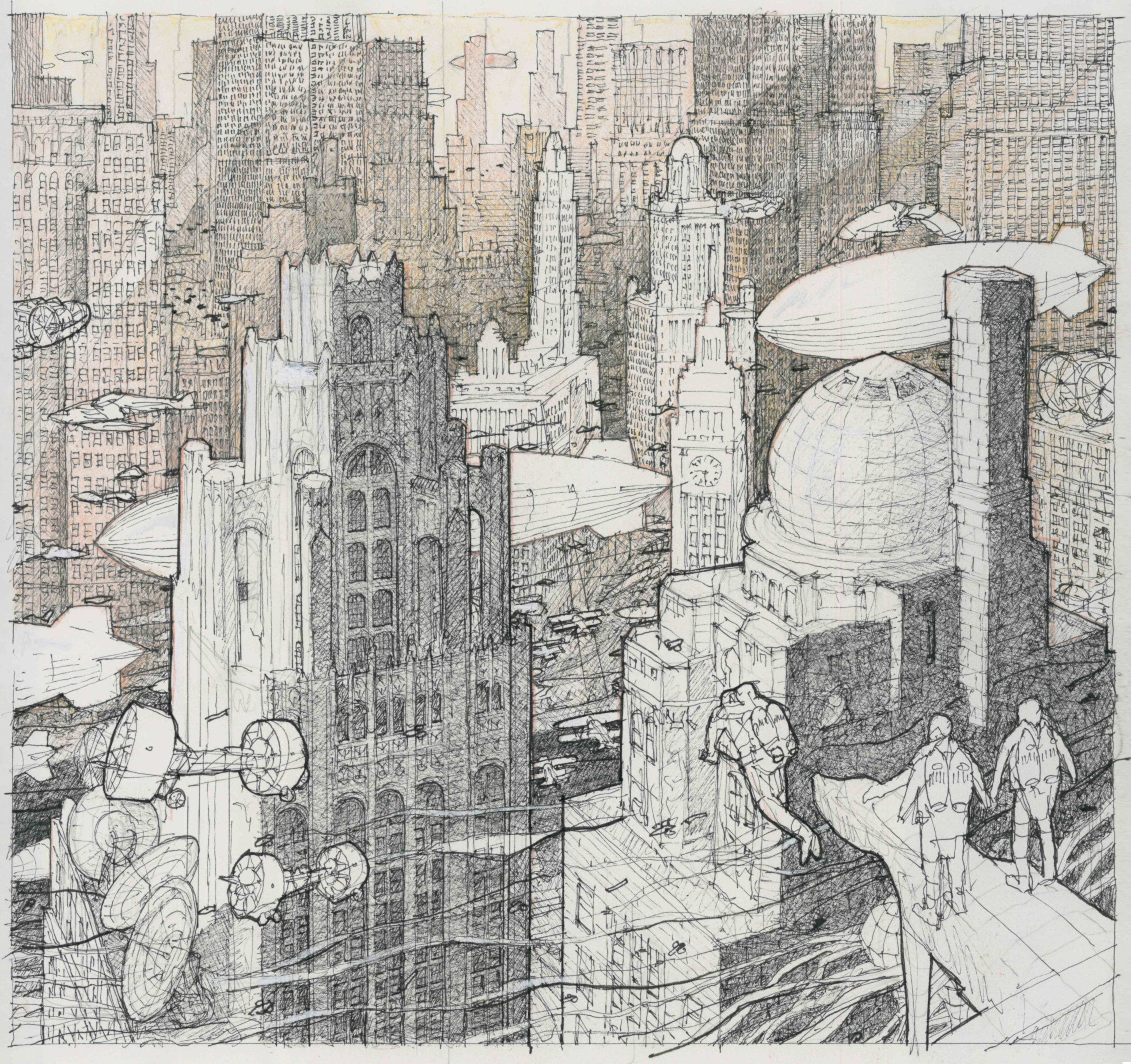 “This drawing imagines an alternate reality and economic reverie where the Great Depression never happened, a need for stripped to the basics skyscrapers averted, and the stylistic impressions of the era continued to roar for decades onward. This depicts a parallel Chicago, devoid of modernist glassy structures. A staggered stone skyline is a hazy backdrop to airships hovering at startlingly low altitudes.
Flight mechanisms with robotic precision, advanced echolocation, exact three dimensional positioning, and miniaturized drones allow for all manners of ability to defy gravity…affording anyone the ability to gracefully, and accurately, fly within the glowing limestone canyons. The drawing is rendered in ink pen and colored pencil with a warmth and technique characteristic of, and inspired by, period watercolor renderings.”
“The Keys” by mykhailo ponomarenko
EDSA, inc.
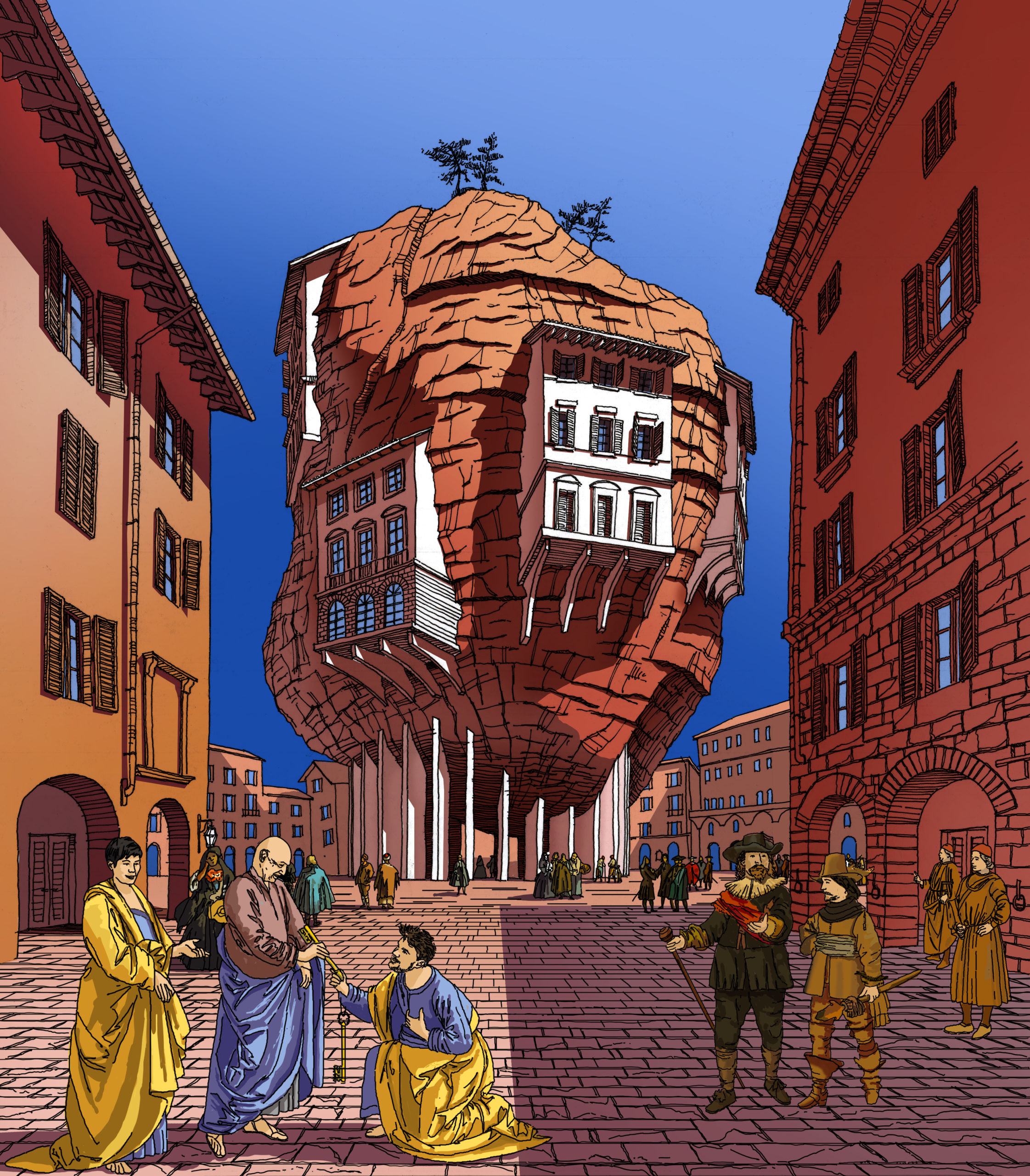 ““This day has come, my young apprentice!” – said Remio Kulhassio, founding partner of the renowned architecture studio in Fornio, Italy.
They met outside the studio in front of the piazza, designed by Kulhassio himself. It was around noon on April 12, 1796. Piazza represented a giant statement to human superiority over Nature. Remio was so proud of it.
The space was filled with people, minding their own business. Some wealthy dutch tourists were walking nearby and argued about whether they should go out at night or better to stay at their comfortable accommodations.
“Now you’re ready to keep the keys from the studio, while we will be out on a site visit. Keep the space spotless, Bjarki. Should I discover lapse of any variety during my absence, I promise swift and merciless justice will descend upon you”.”
“Ronin’s Lair” by Eduardo Perez
California State University Long Beach
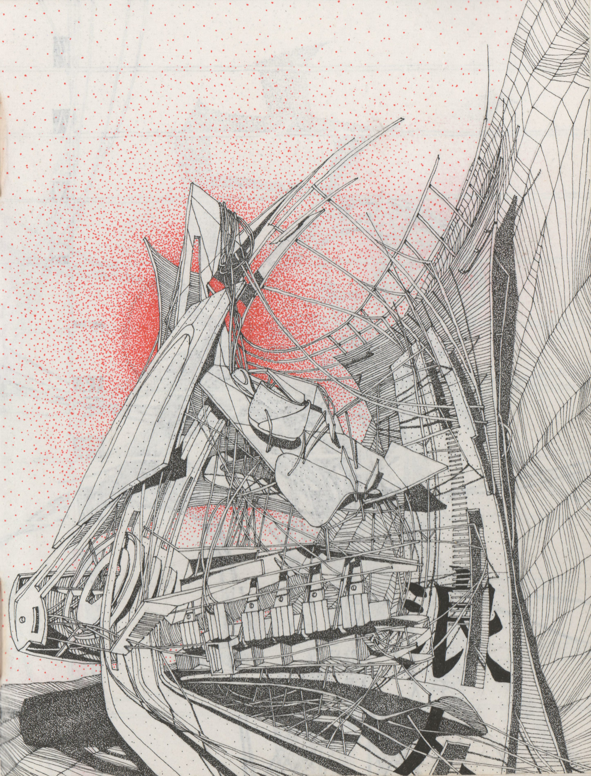 “‘Ronin’s Lair’… an environment that lies between two parallel universes. These series of spaces are a continually morphing and warping training grounds for the ‘wayward samurai’. They are part Japanese Edo Period and part digital future, they are neither today nor tomorrow… they are in a continually shifting threshold space; a warped interim and an evolutionary and non-chronological series of physicality’s and landscapes. My explorations also lie within 2 worlds of the analogue and the digital, my submission is one of the analogue (ink on parchment paper) and it is one of a series of many such explorations in digital, analogue, and hybrid mediums.”
“One Encounter, One Chance” by Ke Zhang
withoutarchitect
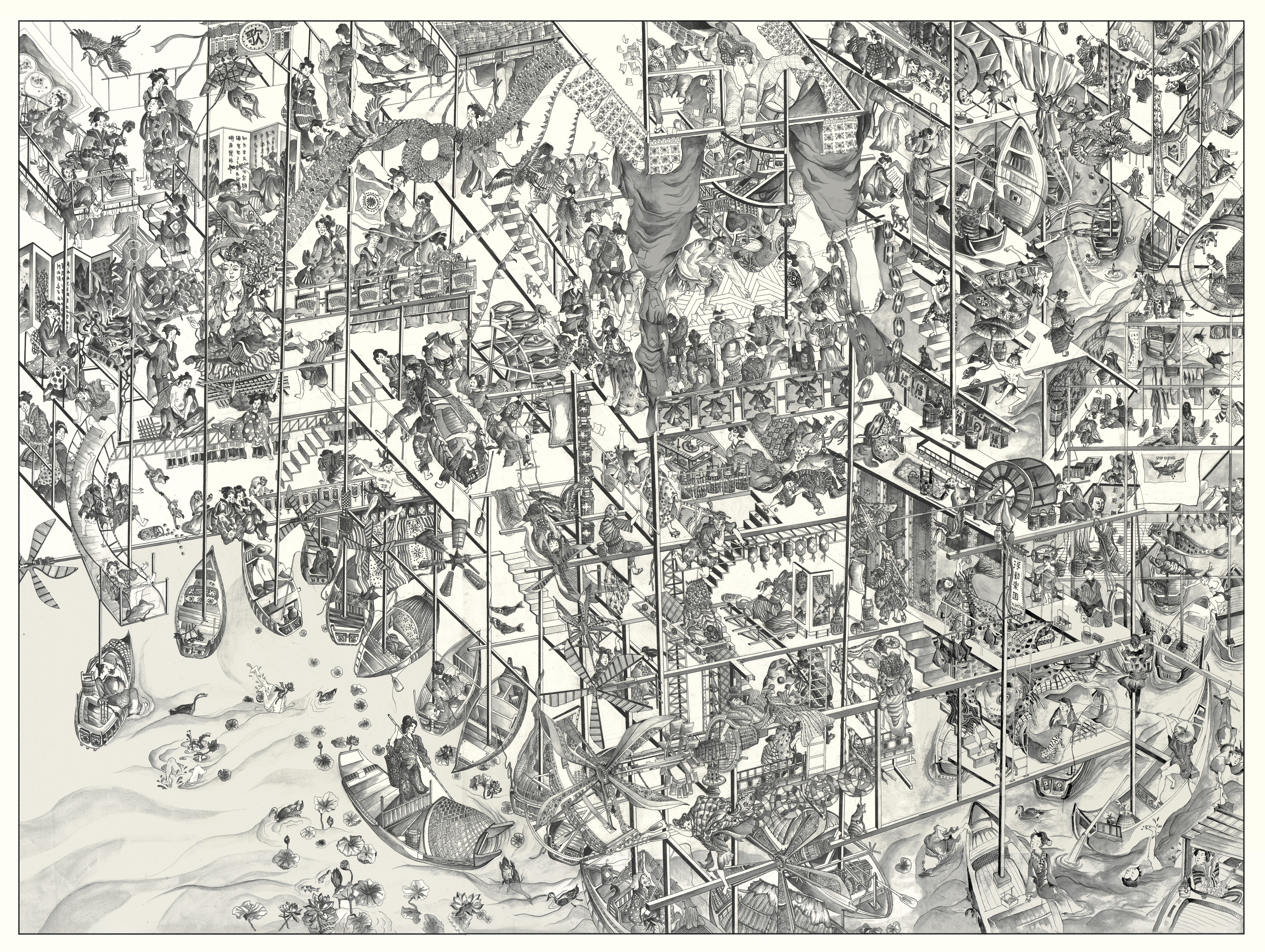 “If we strip away the technological advances of virtual reality and artificial intelligence, how do we ensure our ability to feel still exists in this digital age? Inspired by the Teatro Del Mondo “Floating Theater” (Aldo Rossi, 1979), this temporary structure floats in Tokyo Bay and is set to open every summer as a metaphor for the Japanese idiom: Ichi-go Ichi-e (one encounter, one chance), a celebration of the unrepeatable nature of every single moment.
Hundreds of fishing boats are tied together to create the strongest support for this flexible, adaptable, and stable structure. Upon entering this laboratory of raw emotions, conscious and subconscious, every encounter becomes a once-in-a-lifetime opportunity, each convergence of time, light, mood, thought, and movement is unique and unrepeatable. This project aims to bring forward a discourse on the potential of collective space that addresses the fundamental human need to simply feel, connect, and participate.”
“Threshold” by Kenan Pence and Deniz Calisir Pence
Kenan Pence / Design Office
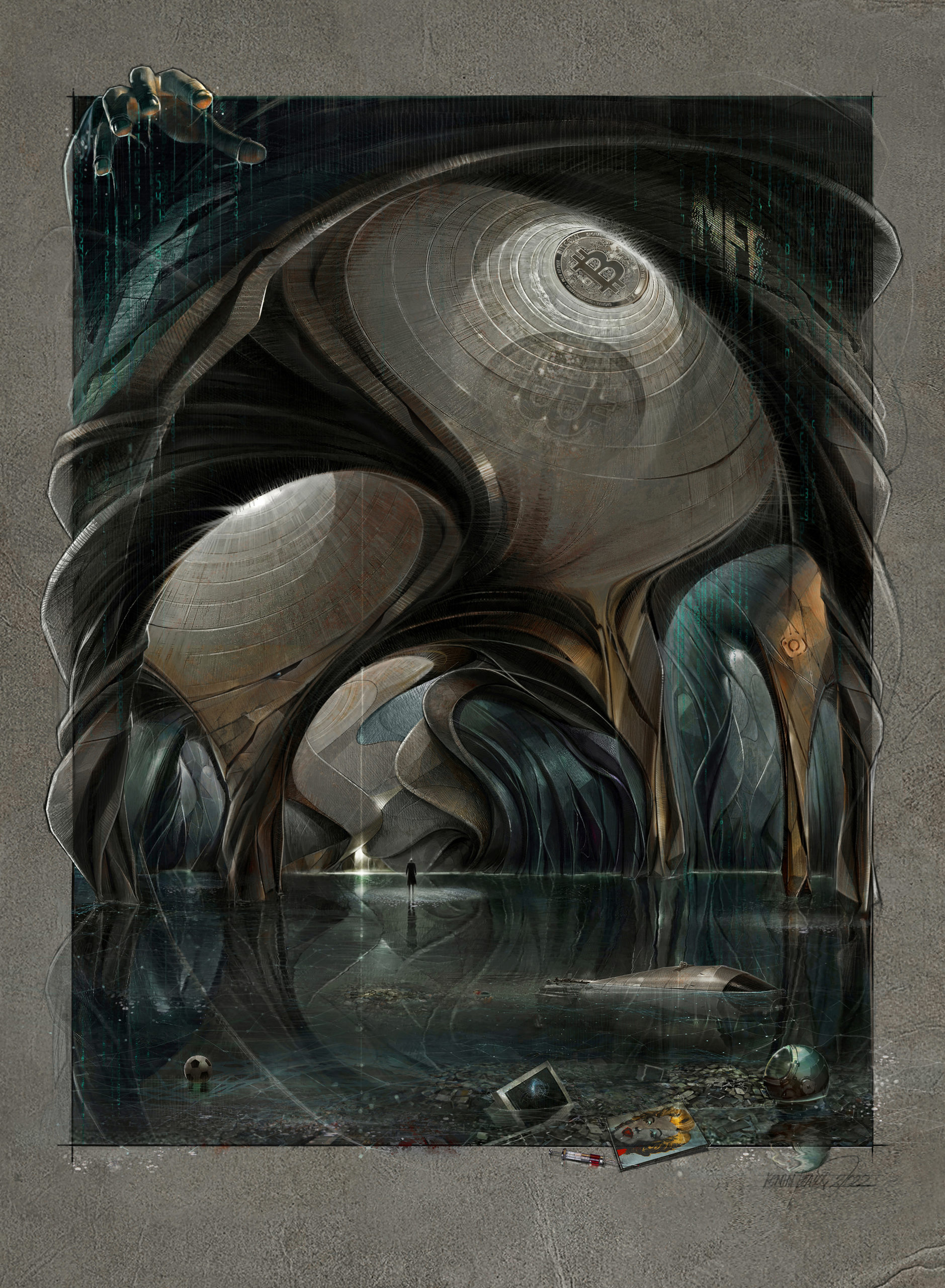 “Threshold: The focal point of the picture is a human standing on the water’s surface, facing the light (referring to the Truth) diffusing from a cracked wall in an uncanny cave. The philosophy of art and visual arts questioning the “reality” and “illusion” frequently refers to Platon’s “the allegory of Cave”. The picture uses a cave metaphor as well as a “the allegory of uterus” referring to the human’s first home which is conceptualized by the curvilinear forms.
In this context, space means “existence”. The picture merges both metaphors to create a conceptual architectural space representing a contemporary critical interpretation. The cave symbolized by the architectural space of the picture has metaphoric shadows that represent illusions built by power. The human at the threshold is left systematically created chaos behind in need of finding new hope.”
“(Your) My Bedroom” by Daniel Ho
University of Auckland
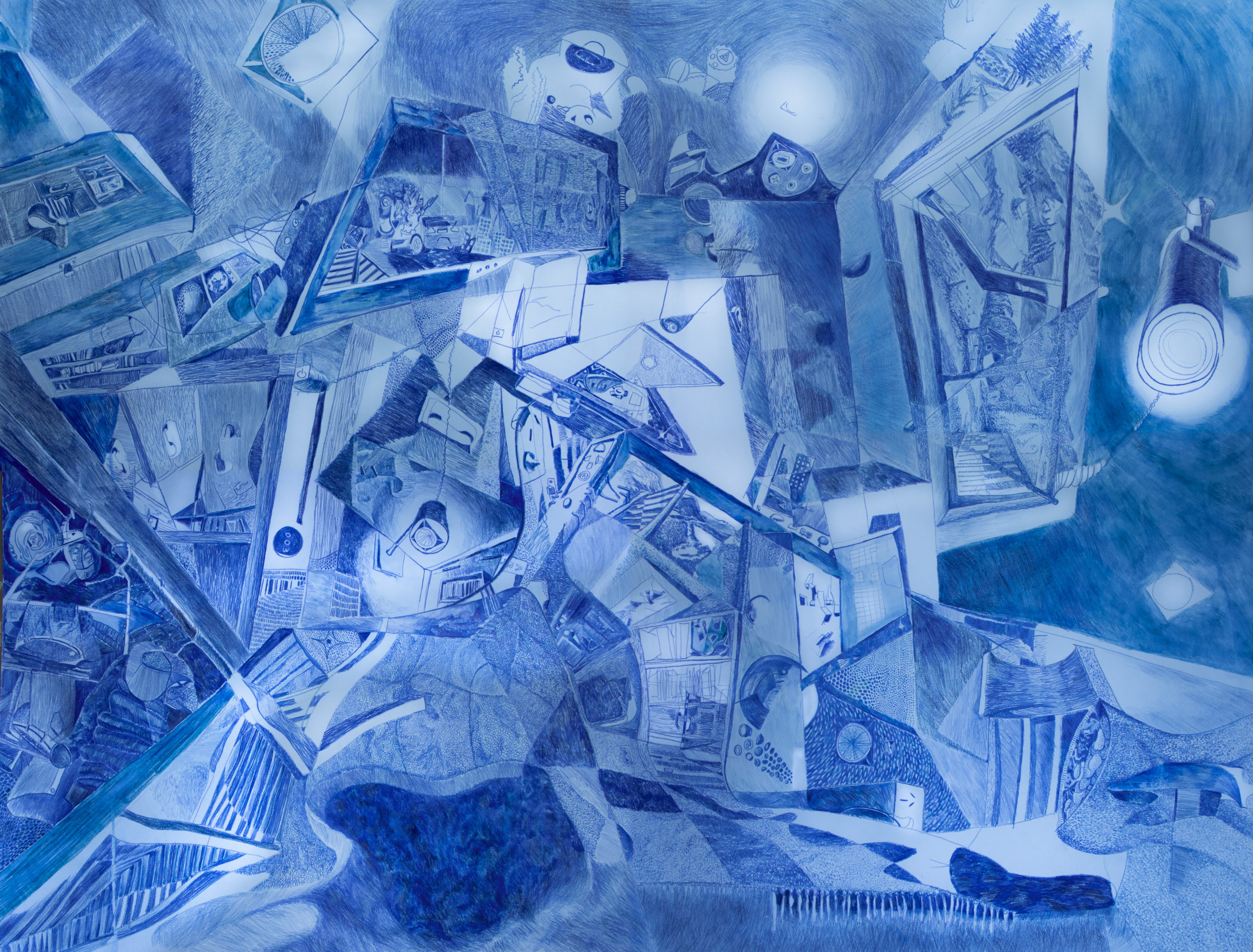 “Many see in architecture the plan, section, elevation, axonometric, and BIM model; mathematical conventions communicating the means of construction. However, drawing by measurement to prescribe beyond the floor, walls, and roof is a perverse overstep; measurements cannot make singular the continuous performance of everyday living.
‘(Your) My Bedroom’ departs from such Cartesian description. It draws a transient domestic, where violence and protection coalesce. A place to laugh, cry, hate, love, reflect, and regret; to feel ambition, faith, passion, cynicism, pleasure, and pain. To draw the bedroom should reflect these experiences with all the egotism of the eye, lest the drawing repels the character it endeavors to express.
Singular compositionally, yet multiplicative in evoking identities of the viewer’s own ‘Bedroom.’ Recalling these identities with blue pencil on 2000 x 1500mm paper means democratizing these everyday experiences. Identities range from bodily to microscopic scales; zoom up, explore, and analyze the character, ‘Bedroom.’”
“Futuristic Organic Architecture” by Muthanna Akram
WHY Architecture
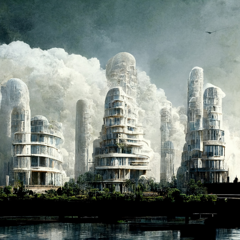 “The drawing depicts the possible future of architecture, where buildings are grown organically using programmable bionanobots and natural materials that automatically assemble and fuse chemically via biological mechanisms. buildings will be grown.”
“Resiting 1” by Roger Emmerson, Architectural Writer

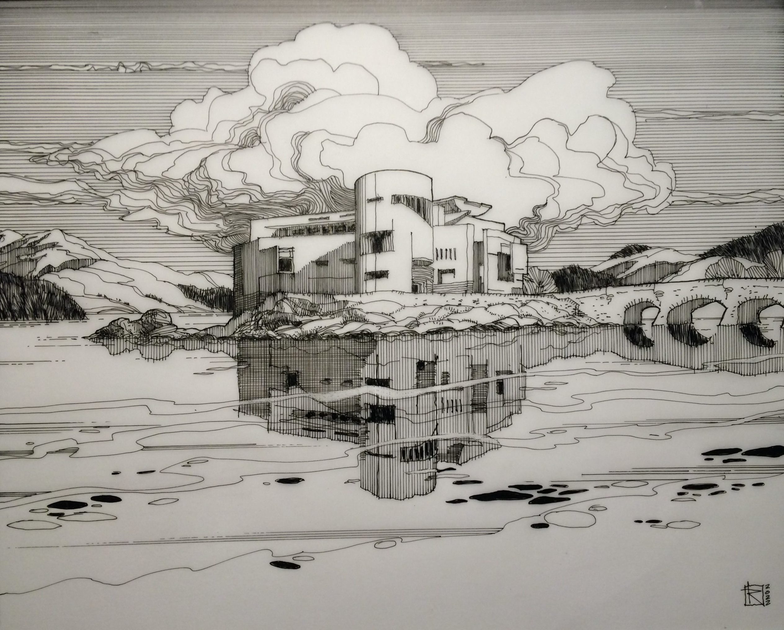
“Resiting 1, part of a series which marries significant Scottish buildings with significant Scottish landscape, relocates the Museum of Scotland, Edinburgh to the isle of Eilean Donan in the Scottish Highlands. The Museum of Scotland, 1999, by Benson + Forsyth seeks to encapsulate the history of Scottish architecture in one city centre building whereas Eilean Donan and its castle represent the archetypical view of both Scottish landscape and traditional 17th century architecture. The drawing process attempts to test the validity of the Museum’s original conception against the fact of the historic landscape and, through that process, to posit a continuity of intent and form peculiar to Scottish architecture.”
Next 25 Drawings →


 “Inspired by the iconic book Invisible Cities. by Italo Calvino, this drawing tells the story of Octavia, a city suspended above the Earth by a spider’s web of cables and wires. Interpretations are limitless, but in my interpretation, the inhabitants of Octavia depict the central truth about humanity – connections are profound – but tenuous; just as is our grasp on life itself. Isolation is not sustainable and connectivity – for all its impermanence – remains a more beautiful response.”
 “Cafe Palace selected a series of plans of landmark buildings with different cultural backgrounds according to the composition of immigrants in the block, which served as the inspiration and design starting point of the overall underground space layout. Through the redefinition and blend of different architectural styles, an architectural atmosphere similar to the situationist concept was created.
 “The conversation around future space travel intensifies, illustrating an intrinsic tension between a childlike excitement towards space travel and a corrupt governmental elitist control. As the world we know deteriorates under our feet, we desire to preserve, to resist, to survive. Fable or Failure takes an architectural approach of dividing a traditional spacecraft into three sections.

 “In March 2021, an Evergreen container ship blocked the Suez Canal waterway for 6 days. In a scenario in which the ship had never managed to leave the canal, people in need of homes would have brought their lives aboard. While the Egyptian government has been dragging people out of their homes in Warraq and Sinai as development plans move forward, people are forced into poorly planned habitats that pay no real attention to people’s needs or their economic activities.
 “Stair mazes will always be dynamic structures for the human spatial experience. Humans have the instinct to create infinite space through limited materials so that a certain relationship can be formed between limited life and the infinite universe. Stairs are important elements of a maze—connecting different heights and circulating up and down. The winding pink staircases, the main subject of this drawing, give the building a very large number of possible paths, forming a complex labyrinth.
 “Peter Eisenman commented on John Hejduk’s Berlin figures that they are not architecture “because you can’t get in them.” To which Hejduk replied, “YOU can’t get in them.” The work questions the degrees of accessibility in which users/participants can have agency/authorship to a piece of architecture. The notion of authorship can be understood as a form of intellectual property, where participants can only be allowed to travel with the designer through the meaning/essence of the work using their imaginations, only if the work was explained to them.
 “Dear Diary,
 “Chungking Mansion is located in Hong Kong. It has brought together traders and asylum-seekers from South Asia and Africa, temporary workers from India and cash-strapped tourists from all over the world. It is a building that represents “low-end globalisation”.
 “The world was once filled with secluded and mysterious villages. The populations of these villages each lived and died in their own immaculate beliefs, traditions, and laws, their respective cultures untouched by the outside world for eons. With what land, sea and sky would offer, they would farm, herd, weave, build and worship, all in harmony with the cycles of nature.

 “During its rapid growth in the late 1800s, New York City formed most of its current modern city fabric. As a city of immigrants with its own cultural insecurity, New York borrowed the architectural style of its diverse ancestral European roots in an attempt to create a historic urban context. This European influence, combined with the advancing construction technology and socioeconomic factors of the time, forged a unique architectural environment. Architectural elements of different origin, whether ornamental or functional, were melded into New York’s building facades; architectural manifestation of “insecurity”.
 “Art Expose is a Public Fabric Art Forum aiming to raise awareness and mend inequities within Melbourne’s art scene alongside a fibre arts community. Putting the public in the central spine, the discursive architecture seeks to mediate between prosperous art dealers and struggling artists. The scheme arms the public with tools for measured amounts of active and passive surveillance of art production, storage and sales.
 “The Atlas – a loose assemblage of maps. It constitutes a multitude of scales within itself. It links between the content and its representations, creates relationships, and references – a hyperlink into the digital space. The atlas holds the weight of the digital mesh.”
 “The drawing is a capriccio depicting a post-apocalyptic Semporna as a ‘debrisity’ serving as a reminder that anthropogenic coastal and ocean debris is never another speculation but a reality. The notion of this drawing is to question the precarity whilst disseminating the importance of waste management and striving for the betterment of the settlement and marine life of Semporna. Cities across the globe are sharing the same fate in that unless we become more conscious about the impact of marine debris, they are destined to bear the brunt of human activities. Water is quintessential to support all forms of life yet paradoxically, human narcissism has laid and continues to lay waste to cities that are granted access to the paramount gift of nature, water, turning the ocean into a gigantic dumpster.
 “Content with the limitations of their small apartments and quaint terraces, warmly greeting their neighbors, and strolling among the stepped streets, the citizens of Synopolis greet the sunset each evening with decanters of bubbly concoctions, slowness in their constitutionals, diving into delectable sweets, and chatting away the day’s trials and travails over stacks of plates of tapas.”
 “This drawing imagines an alternate reality and economic reverie where the Great Depression never happened, a need for stripped to the basics skyscrapers averted, and the stylistic impressions of the era continued to roar for decades onward. This depicts a parallel Chicago, devoid of modernist glassy structures. A staggered stone skyline is a hazy backdrop to airships hovering at startlingly low altitudes.
 ““This day has come, my young apprentice!” – said Remio Kulhassio, founding partner of the renowned architecture studio in Fornio, Italy.
 “‘Ronin’s Lair’… an environment that lies between two parallel universes. These series of spaces are a continually morphing and warping training grounds for the ‘wayward samurai’. They are part Japanese Edo Period and part digital future, they are neither today nor tomorrow… they are in a continually shifting threshold space; a warped interim and an evolutionary and non-chronological series of physicality’s and landscapes. My explorations also lie within 2 worlds of the analogue and the digital, my submission is one of the analogue (ink on parchment paper) and it is one of a series of many such explorations in digital, analogue, and hybrid mediums.”
 “If we strip away the technological advances of virtual reality and artificial intelligence, how do we ensure our ability to feel still exists in this digital age? Inspired by the Teatro Del Mondo “Floating Theater” (Aldo Rossi, 1979), this temporary structure floats in Tokyo Bay and is set to open every summer as a metaphor for the Japanese idiom: Ichi-go Ichi-e (one encounter, one chance), a celebration of the unrepeatable nature of every single moment.
 “Threshold: The focal point of the picture is a human standing on the water’s surface, facing the light (referring to the Truth) diffusing from a cracked wall in an uncanny cave. The philosophy of art and visual arts questioning the “reality” and “illusion” frequently refers to Platon’s “the allegory of Cave”. The picture uses a cave metaphor as well as a “the allegory of uterus” referring to the human’s first home which is conceptualized by the curvilinear forms.
 “Many see in architecture the plan, section, elevation, axonometric, and BIM model; mathematical conventions communicating the means of construction. However, drawing by measurement to prescribe beyond the floor, walls, and roof is a perverse overstep; measurements cannot make singular the continuous performance of everyday living.
 “The drawing depicts the possible future of architecture, where buildings are grown organically using programmable bionanobots and natural materials that automatically assemble and fuse chemically via biological mechanisms. buildings will be grown.”