This Danish Firm Took Rainwater-Damaged Walls and Made Interactive Green Spaces
CategoriesArchitecture

This Danish Firm Took Rainwater-Damaged Walls and Made Interactive Green Spaces

How can architecture be a force for good in our ever-changing world? During Future Fest, we’ll pose this question to some of the world’s best architects. Launching in September, our three-week-long virtual event will be 100% free to attend. Register here!

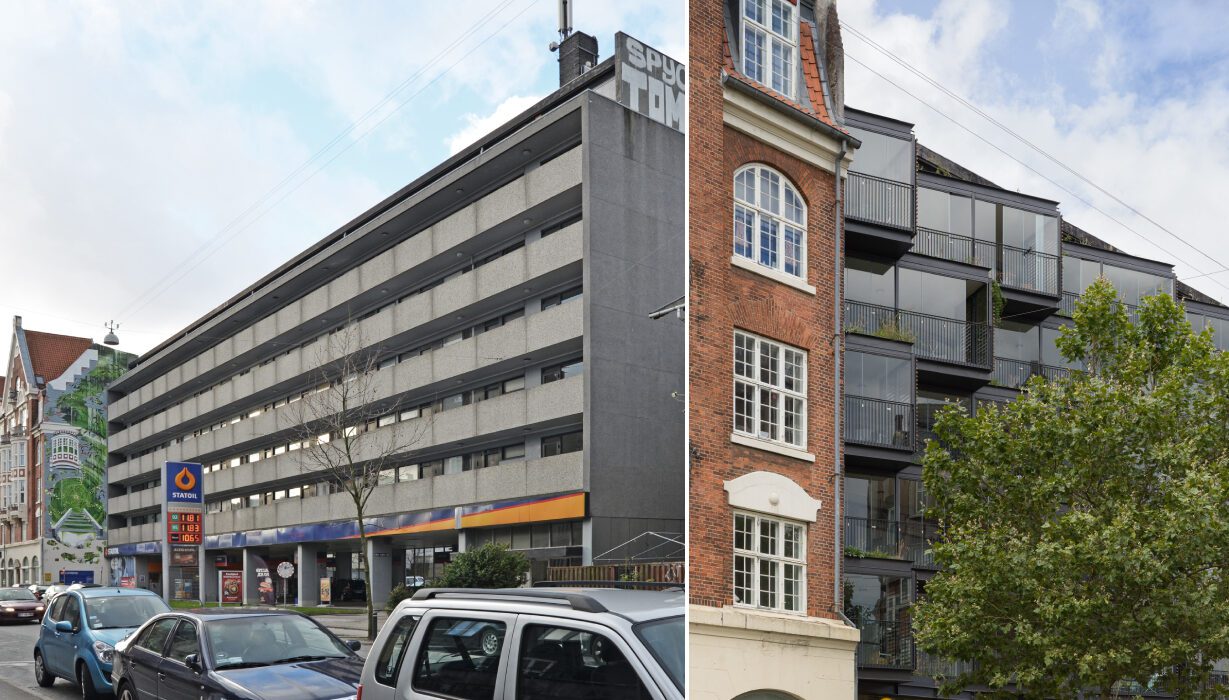
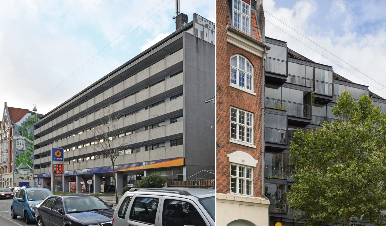
This is the story of an apartment building in Frederiksberg, Denmark, which was often called one of the ugliest buildings in the neighborhood over the past few decades. Its continuous concrete balconies and a stark grey façade might have been associated with efficient rental architecture when it was designed by Ole Hagen Arkitekter in the 1960s, but in the 2000s, it came across as cold and isolated. Over the years, residents became plagued with rainwater-damaged walls and constant nuisance from the heavy traffic on the street beyond.

Now, the old concrete edifice has been transformed into a spectacular award-winning building that has earned praises from both the locals and the government and stands as a source of inspiration for those with new visions to transform old buildings. In an interview with Renover Denmark, residents said that they now felt proud to call this building a home. So how did this dramatic transformation come to pass?

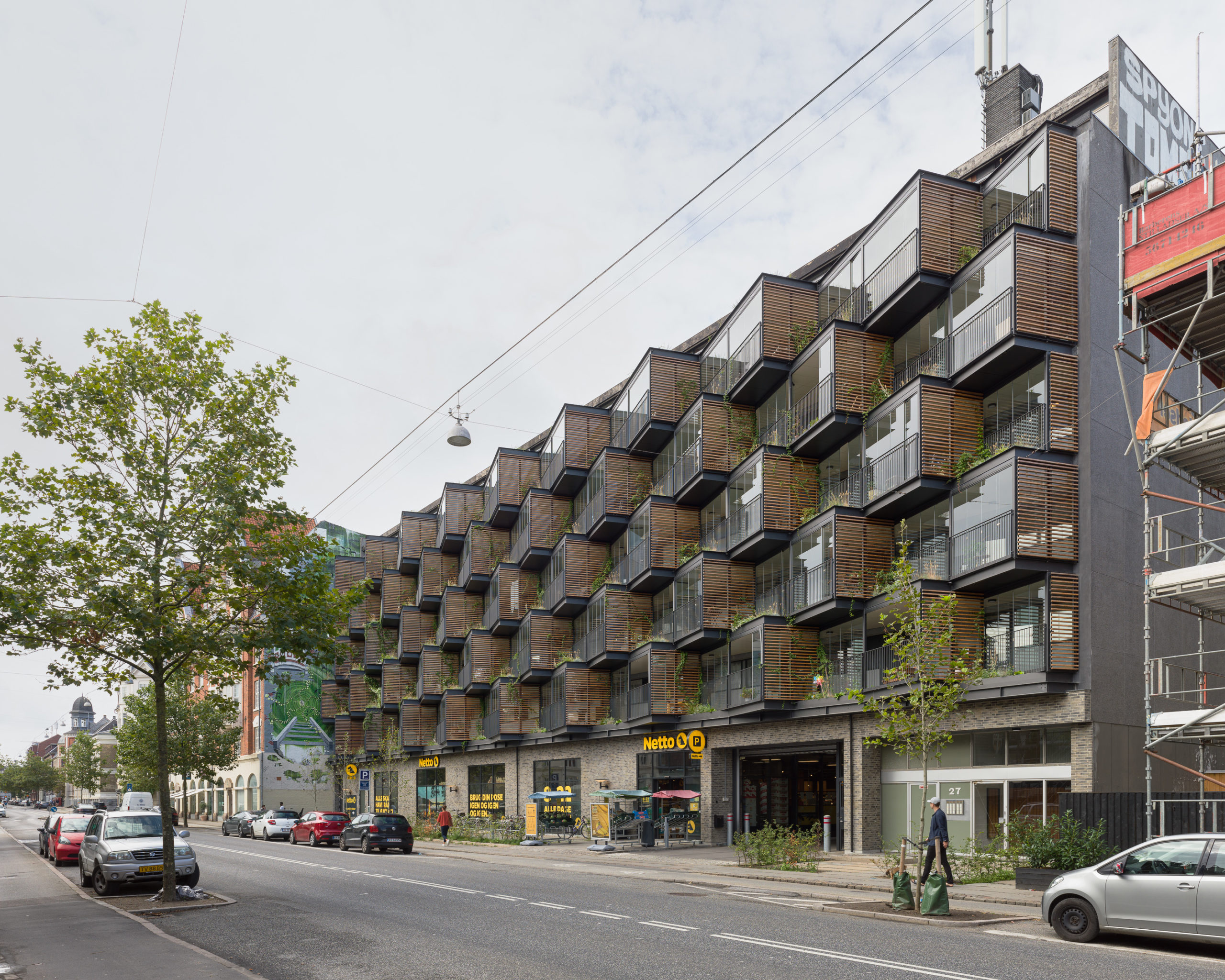
Instead of just addressing the water damage, Tegnestuen LOKAL came in with a vision to turn the existing façade of Ørsted Gardens into an interactive green space. “The main idea with the Ørsteds Haver project is to create a holistic environmental, social and architectural counterpoint to the pragmatic renovations that are carried out all over the country, and which often have a one-sided focus on energy,” they explain. This approach is one of the reasons that the building swept the Architecture +Renovation category in the 10th Annual A+Awards.

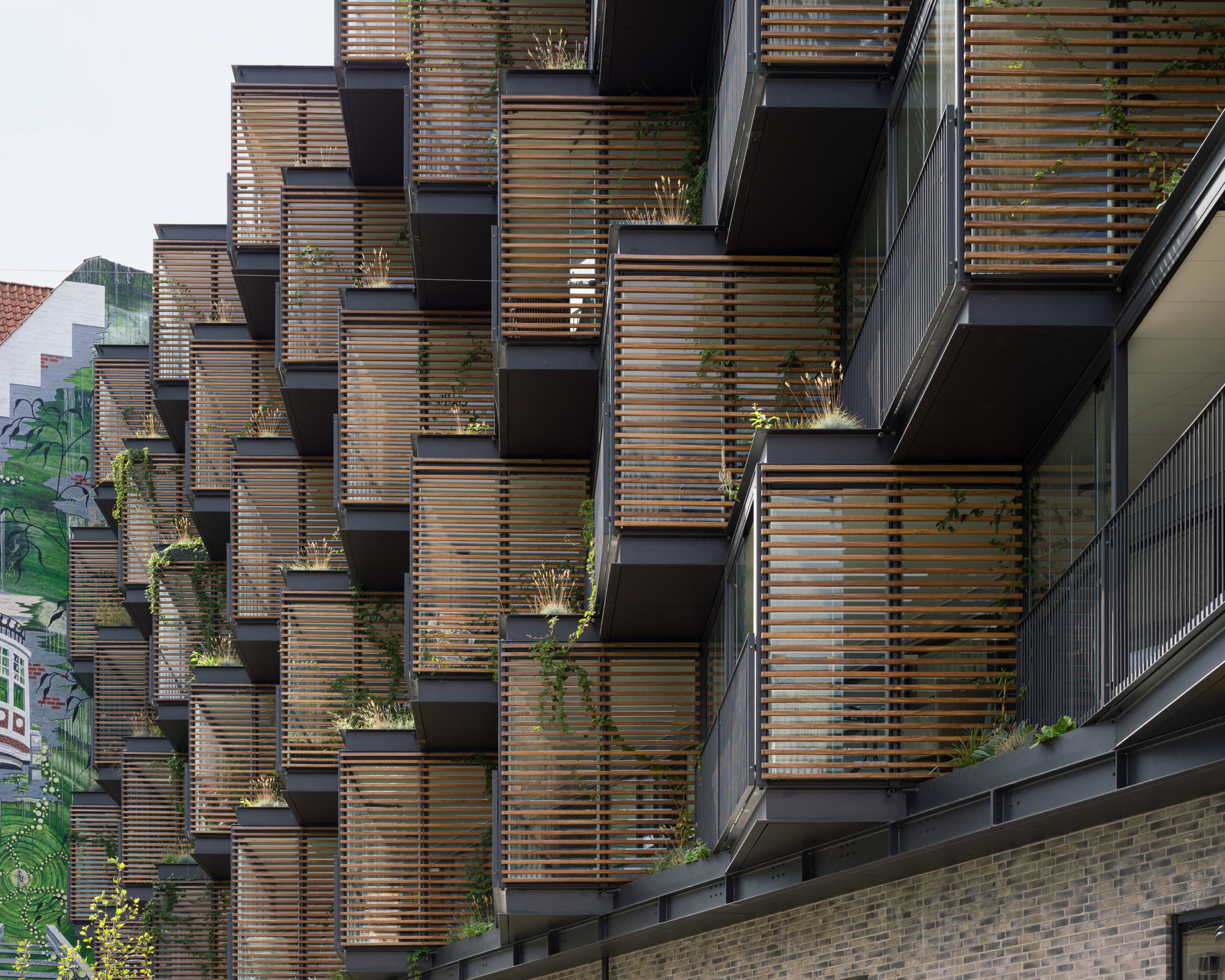
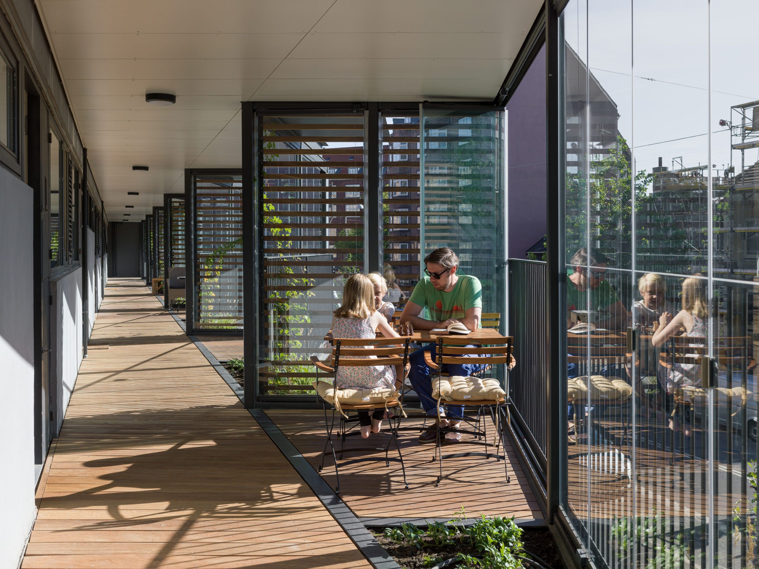
The idea was to create an environment that catalyzed random interactions, in turn generating new friendships between neighbors — which may sound idealistic, but has proven successful according to local residents. In addition to addressing the needs of future inhabitants, the design also takes into account the passersby and their experience of the building as they walk by it. The studio achieved this feat by creating triangular semi-private spaces to replace the older balconies. The system uses a mechanism similar to shelves where these boxes are fitted into the existing concrete structure. The bays on the bottom support the ones on the stop. Tension bands have been placed around to building to ensure that the additions don’t fall outwards.

These triangles are angled with glass on one side and a slatted screen on the other. The modules are staggered to break up a monotonous surface and also create space for planters within the gaps. Furthermore, the fifty small gardens also bleed into the interiors with small soil patches inside where residents have the option to plant their own saplings within these nooks. This helps them customize the space the way they would want it and introduces subtle differentiation between the modules. These bays also have openable glass panels to ensure that the space can be used through the different seasons. Another advantage is that this system acts as a buffer and dampens some of the noise from the busy street below.

The small gardens set between these balconies are made of welded steel boxes that come from the manufacturer and are placed directly into these gaps. They have an automatic irrigation system as well as spouts to ensure that the excess water from the garden falls directly into the garden below, indirectly enabling them to water themselves.

Introducing a social dimension to the building was more important to the studio than simply focusing on an energy-efficient model. “Energy renovations are effective from an economic and environmental point of view, but in their basic substance they do not take a critical view of the architecture being renovated,” they said. “Often, the architecture is simply repeated, without regard to the quality of the original project, and this unfortunately results in buildings with both poor social and environmental attributes being renovated solely with a better operating economy as the primary success criterion.”

Sustainability stands at the core of design decisions today. However, new additions might not solve the problems of current structures that consume too much power, have bad ventilation systems, don’t work with natural light and more. Additionally, the older buildings might not meet the changing needs of their residents. Think about the past two years; being locked at home during the pandemic has reminded people across the world of the importance of human contact, face-to-face conversations and the need to connect with nature for mental and physical wellbeing.

Finding innovative ways to radically transform current buildings is something many architects will have to look into in addition to planning new net zero energy homes and offices. In instances where building-level renovations might be impossible, there are still many opportunities to retrofit water collection, solar generation, green systems or spaces that boost connectivity into the outer envelope of the building that can dramatically change how the building functions and also contribute to the wellbeing of those using it. One single project might not change the world but it sure can make a difference one community at a time.

“If we want to achieve a sustainable future, we cannot rely on only building sustainable buildings going forward. We need to have a visionary method of transforming and adapting existing buildings to meet our changing needs,” said the firm.

How can architecture be a force for good in our ever-changing world? During Future Fest, we’ll pose this question to some of the world’s best architects. Launching in September, our three-week-long virtual event will be 100% free to attend. Register here!

Reference

As a First-Time Home Buyer, Should I Hire an Interior Designer?
CategoriesArchitecture

As a First-Time Home Buyer, Should I Hire an Interior Designer?

Anyone fitting out a new home has likely considered whether it’s better to hire a professional to design the interiors of their new space or to take that task on themselves. Hiring an interior designer brings unquestionable value to making a home uniquely functional and comfortable, but it does bring into question if it’s worth the cost. Luckily, the burgeoning world of online freelancing platforms offers a new method for homeowners to engage with freelance interior designers that makes even a modest investment worth the expense.

What Can an Interior Designer Do?

In general, an interior designer’s role in a home design project is to conceive of one or more possibilities for the layout, look, and feel of an interior space, then communicate their ideas with images such as 3D renderings, technical drawings, or material lists. Most importantly, they design spaces to satisfy both the functional requirements and aesthetic tastes of their clients. If done well, their experience and training leads to a more detailed, refined, and well-implemented design than a homeowner taking a do-it-yourself approach.

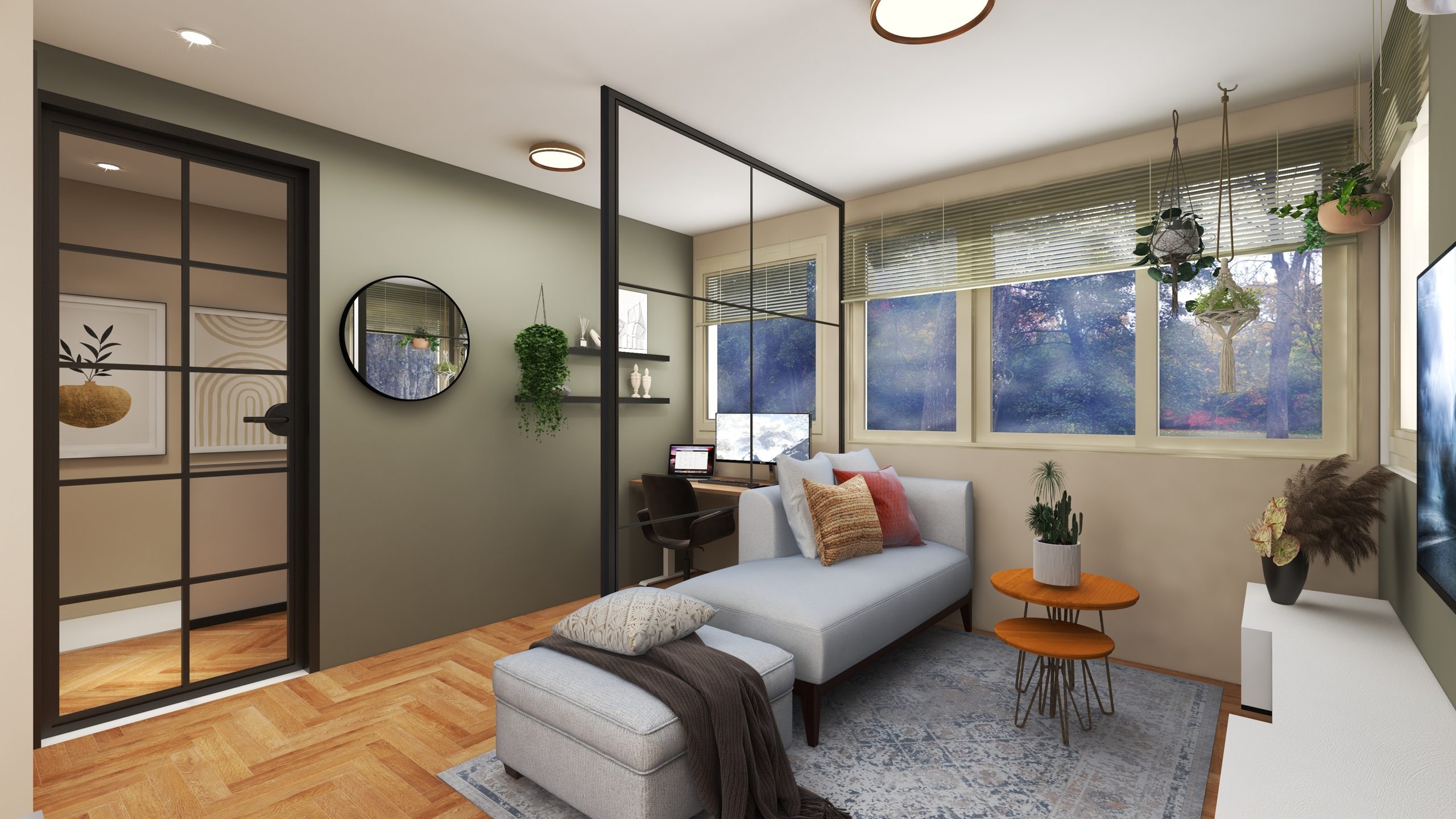
Interior rendering by Fiverr seller @dutchbydesign

Responsibility-wise, interior designers are often tasked with both selecting products and devising layouts for surface finish materials, lighting fixtures, furniture, cabinetry, and other furnishings. They can also oversee a contractor who’s building their designs, or advise a homeowner that’s installing them on their own. Their exact responsibilities vary by the needs of a project, but they can grow or be limited to include any aspect of how the interior of a home, or even just a single room, is designed.

Hiring an interior designer brings many practical benefits to a home design project. Their expertise allows them to spot problematic decisions before they’re implemented, saving time and money on mistakes. They’re also likely able to use their professional connections to get the best price on any fixtures, furniture, or furnishings needed for the project. Most importantly, their services free up a homeowner from taking the time to come up with a design, determine if it will actually work, and fret over numerous minor details in the process.

Why Hire a Freelance Interior Designer?

Many great, small-scale interior design firms and solo practitioners can provide services within many homeowner’s budgets. However, the best value is found by hiring a freelance interior designer through an online platform, such as Fiverr. The development of online freelancing platforms in recent years has allowed freelance interior designers to operate virtually while offering their services in discrete, pre-packaged bundles. This allows them to perform their services at much lower rates than conventional professional arrangements due to lower overhead costs and the elimination of a great deal of up-front negotiation.

As a First-Time Home Buyer, Should I Hire an Interior Designer?

Interior rendering by Fiverr seller @mmjhbaig

Anyone pursuing this approach to home design would definitely benefit from considering what deliverables they expect from a freelance interior designer before reaching out to one. An interior designer’s work products are often produced cumulatively as a project progresses, and what’s needed depends on the scope of the project and a homeowner’s budget. A typical workflow could incorporate any combination of items including an introductory consultation or conceptual direction-setter, such as a mood board, before moving on to detailed floor plans, elevations, or renderings.

If a homeowner is hiring a contractor to build their new space, they should ensure any plans an interior designer creates are detailed enough for their contractor to build from. In this case, it may be best to arrange a meeting between the designer and the contractor, or even a series of check-ins throughout the project’s construction. Many freelance interior designers offer this service virtually, although for relatively simple projects it may not be necessary, so it’s best to verify in advance what each party feels they need from the other to best complete their portion of the work.

How to Hire a Freelance Interior Designer

The easiest way to hire a freelance interior designer is through an online platform. With a dedicated Architecture & Interior Design store, Fiverr leads the way in this approach. A homeowner searching for an interior designer can filter their search on Fiverr by the type of deliverable, set of services, budget range, or seller characteristics they’re looking for, leading to a match far quicker than relying on recommendations from friends, family, or local industry groups.

Most talents on Fiverr break their work packages into three graduated levels of service, with price and other items like turnaround time, number of revisions, and final deliverables clearly identified. Specific details are agreed upon through direct communication before an assignment begins, and many freelance interior designers are open to discussing custom combinations of services, or even more complex work beyond their boilerplate packages.

Ready to find the perfect interior designer for your project? Head over to Fiverr’s Architecture & Interior Design store and check out the vast range of budget-friendly professional interior design services at your disposal.


Reference

Freelance Architect: What Is It? Why Should I Hire One?
CategoriesArchitecture

Freelance Architect: What Is It? Why Should I Hire One?

Most people undertaking home renovations, additions, or ground-up construction understand what an architect does, but many likely aren’t sure if they should hire one. Difficulty in determining the need for an architect, and a common perception that hiring one is an unaffordable luxury, contribute to this confusion. While hiring an entire architecture firm isn’t affordable for most individuals, purchasing a custom set of services from a freelance architect likely is, and doing so has recently become widely available due to the proliferation of online freelance marketplaces.

What Can an Architect Do?

Before deciding whether or not to hire an architect, anyone completing a building project should understand exactly what an architect can do for them. In general, an architect designs the layout of a space, the materials it’s made of, and how those materials are constructed in their finished state. A contractor can build a design from an architect’s plans, though they don’t necessarily need an architect’s plans to do so. Whether or not a project would benefit enough from an architect’s plans to justify the investment depends on the project.

A project rendering by Studio NA; image courtesy Studio NA

For an interior renovation that’s replacing existing fixtures, furnishings, or finishes with new ones in a similar configuration, an architect likely isn’t needed. In those cases, a competent contractor should suffice, though anyone taking this approach should clarify their expectations in advance with the contractor. For renovations that will change the location of walls, fixtures, or furnishings, an architect may not be necessary but the project would definitely benefit from their expertise, especially if the design is highly customized or complex.

If a project involves new, ground-up construction, including home additions, an architect is certainly worth the expense, and may even be required by local laws. Even if it isn’t, the complexity of new construction creates significant opportunity for an architect’s plans to maximize the quality of design and construction detailing on any budget. In all of these cases, utilizing an architect’s technical and design expertise will almost certainly save time, money, and effort in the long run.

Why Hire a Freelance Architect?

Until recently, hiring an architect was done by personal recommendations to local firms, an approach that lands outside most people’s budgets. However, since the advent of online freelance marketplaces such as Fiverr, the option to hire a single, freelance architect for a custom set of services has become widely available. Operating with little to no overhead, freelance architects are able to provide the exact level of design work a project needs on a task-by-task basis, making their services far more affordable than traditional professional arrangements.

The experience of working with a freelance architect varies significantly depending on what’s needed for a project. Traditionally, architects create a set of construction drawings that can be given to a contractor to build their design. For ground-up construction, a construction drawing set is definitely needed, and there are many freelance architects who can both design a new building and create the accompanying construction drawing set with enough detail for a contractor to build from. Someone undertaking interior renovations may only need some of the drawings found in a traditional set, so they could engage a freelance architect to prepare only those drawings they need.

In some cases, an illustrative rendering depicting the desired look and feel of a space may be enough to communicate to a contractor the information they need to build the design. Even just determining which types of drawings might be needed for a project can be worth a one-time consultation with a freelance architect, which is a service many provide. In all cases, if an architect must sign any drawing to meet a legal requirement, then a freelance architect should be sought who is properly licensed in the jurisdiction that is imposing that requirement.

How to Hire a Freelance Architect

The easiest way to hire a freelance architect is by using an online platform. With its dedicated Architecture & Interior Design store, Fiverr leads the way in sourcing freelance design services. Anyone searching for a freelance architect can filter their search on Fiverr by the type of deliverable or service they’re looking for, budget range, or seller characteristics, leading to a match far quicker than relying on personal recommendations or local industry groups.

Most talents on Fiverr break their work packages into three graduated levels of service, with price and other items like turnaround time, number of revisions, and final deliverables clearly identified. Specific details are agreed upon through direct communication before an assignment begins, though many freelance architects are likely open to discussing more complex, custom work, beyond their boilerplate services.

Ready to find the perfect design for your project? Head over to Fiverr’s Architecture & Interior Design store and check out the vast range of budget-friendly professional design services at your disposal.

Top image: A project rendering by Crystal Bright; image courtesy Crystal Bright

Reference

9 Tutorials To Improve Your Section Renderings
CategoriesArchitecture

9 Tutorials To Improve Your Section Renderings

The winners of Architizer’s 3rd Annual One Rendering Challenge have been revealed! Interested in next year’s program? Subscribe to our newsletter for updates.  

Sections are integral to understanding any architectural scheme. Whether 2D or 3D, they can give an insight into the varying heights within a model, site conditions, function, material use, light mapping and more. Students and professionals have been experimenting with a variety of styles and techniques to create conceptual and realistic sections to best showcase their proposals. Softwares like Illustrator and Photoshop have also made the task easier, especially when paired with 3D modeling applications and rendering assets.

People creating or inspecting design portfolios now expect drawings that are not only accurate but also have a strong visual appeal. Whether it is a blueprint effect, pop-art palette, x-ray layering or a watercolor effect, every technique contributes something different to the composition. Below is a list of videos that show some different types of sections and how to create them digitally.


Using Photoshop, the above video walks viewers through the different steps of converting a simple line drawing of a section into a rich visual that shows material, depth, light, green cover and more. In addition to the main drawing, there are several smaller steps that can not only apply to sections but can also help enrich other 2D drawings. The tutorial also takes care of less important details that might otherwise be overlooked such as staggering shadows on sloped surfaces and recesses.


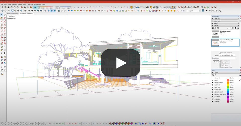
The creator has explained how to take a perspective section from SketchUp into a vector drawing on Illustrator to create a minimal black and white render. This is especially helpful to understand how angled sections can be created for structures with irregular forms. Naudet starts with detailed instructions on how to cut a section in a 3D model and add a reference height for human figures as well as faces for shadows on transparent surfaces. The tutorial then moves to Illustrator where we learn how to layer the base image and the shadows and then add humans, manipulate the site and play with line weights.


Street sections are helpful when it comes to showing road widths, tree heights and compound boundaries. The video above shows how to simply and effectively render a cross-section of a road for larger architecture projects, public space designs or urban planning. It starts with a line drawing and builds on it with silhouettes and vector additions of cars and trees along with labels and dimensions.


This video combines the regular view and the hidden line mode and normal mode views in SketchUp to create a conceptual render in Photoshop. There are also tips on how to vary opacity to enhance depth and manipulate line weights, add subtle textures, and correctly use colored lines instead of black for drawings. The technique is an effective way of moving away from traditional sections to more stylistic drawings without compromising on details or accuracy.


More focused on the Photoshop rendering than the original SketchUp model, this lengthy video is a must watch for all looking to create detailed and dramatic section renders. It starts with the basics of masking, introducing textures in perspective and adding noise, before moving into light modifications, building contrast and artistic flourishes. The voiceover is also extremely helpful in understanding the importance of each step and how the different tools and commands work.


This two-part series shows how to build out a landscape section entirely on photoshop. The first video focuses on a basic 2D section with a water body, vegetation and human activity. This is a method that focuses less on accurate site contours and more on the visual impact of the site. However, it is easy to start with a contour diagram from an AutoCAD drawing or SketchUp model and then follow along with the steps as described in the video. The second video shows how to convert the previously created 2D section into a perspective view, again entirely on Photoshop.


There is something very charming about hand-rendered drawings and sketches. However, creating multiple drawings by hand is not only more time-consuming but also can leave less room for modifications. The tutorial above shows a simple way of converting a line drawing imported from any 3D modeling software into a section that appears to be rendered by hand. It uses a variety of brush settings such as size, opacity, spacing and jitter to create realistic shading. While the brushes linked in the description are not available anymore, it might be possible to find similar ones on other websites online.


Paired with a great music selection, this video uses an angled section plane in an axonometric SketchUp view to create a colorful section. The initial part of the video focuses on cleaning up the imported drawing, adding fill to the cut portions and tweaking certain line weights. It shows how adding blocks of color can help differentiate programs and also assist in labeling. The drawing is finished off with painted shadows, tree silhouettes and tags for functions.


A less traditional way of depicting a 3D section is by using a puzzle piece form to cut a section line as opposed to a standard section plane. The video shows how to cut a puzzle piece out of a 3D model in ArchiCAD and clean the model for rendering in Illustrator. The second half focuses on using transparency, adding dotted lines for better understanding, introducing color and more.

The winners of Architizer’s 3rd Annual One Rendering Challenge have been revealed! Interested in next year’s program? Subscribe to our newsletter for updates.  

Reference

From the Top: 7 Way Statement Ceilings Can Add an Architectural Punch
CategoriesArchitecture

From the Top: 7 Way Statement Ceilings Can Add an Architectural Punch

The A+Product Awards is open for entries, with a Late Entry Deadline of July 22nd. Get started on your submission today! 

One thing that ties together the Sistine Chapel, The Peacock Room and The Romanian Athenaeum is their majestic ceilings. These buildings are proof that these surfaces can serve a purpose beyond just holding light fixtures. However, excessive embellishments and traditional techniques can look out of place in contemporary homes or restaurants. Below are just a few modern alternatives that ensure that the ceiling takes center stage.

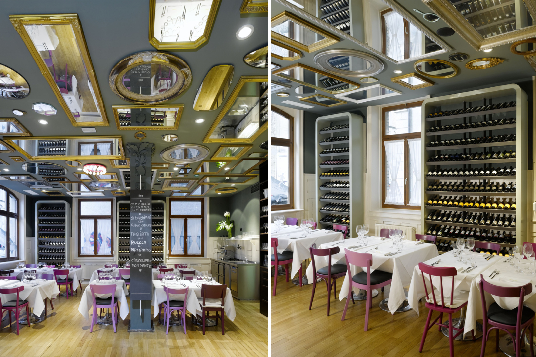
Bella Italia Weine by Ippolito Fleitz Group – Identity Architects, Stuttgart, Germany

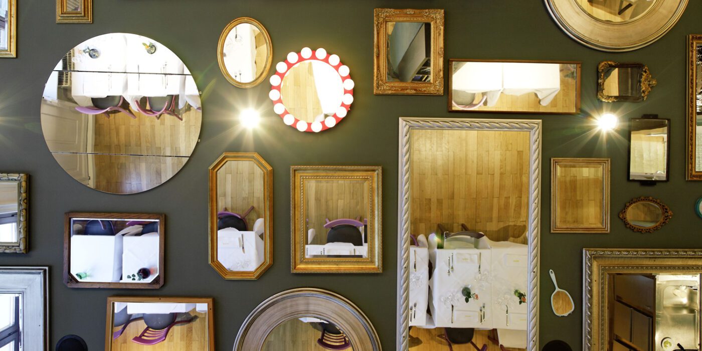
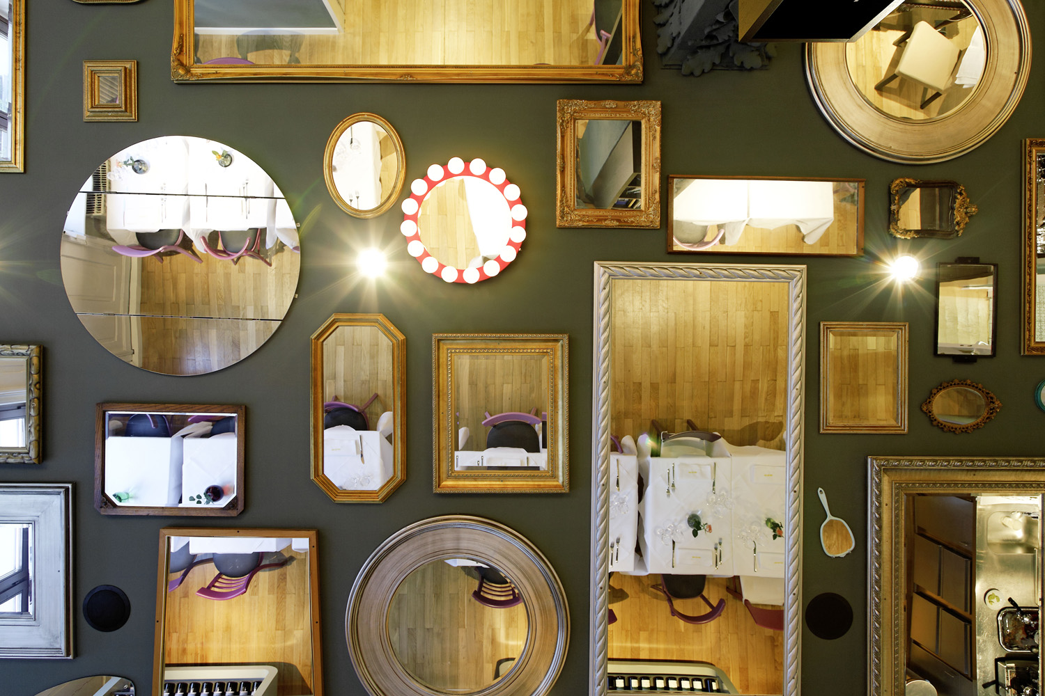
Gallery walls are a common occurrence in the Pinterest home décor search results. Another trend is creating a composition of mirrors featuring different design styles to create interest and play with the dimensions of the space. One interpretation of this trend is to adapt it to the horizontal plane or the celling of a room.

This approach is showcased in the Bella Italia Weine in Stuttgart. 90 different mirrors obtained from several rummage sales are mounted on the ceiling, ranging from large rectangular framed ones to decorative handheld mirrors. One of them even features hanging crystal lights to replicate a chandelier. They create broken reflections of the activity below and also imitate the comfort and intimacy offered by the home-style cuisine served here.

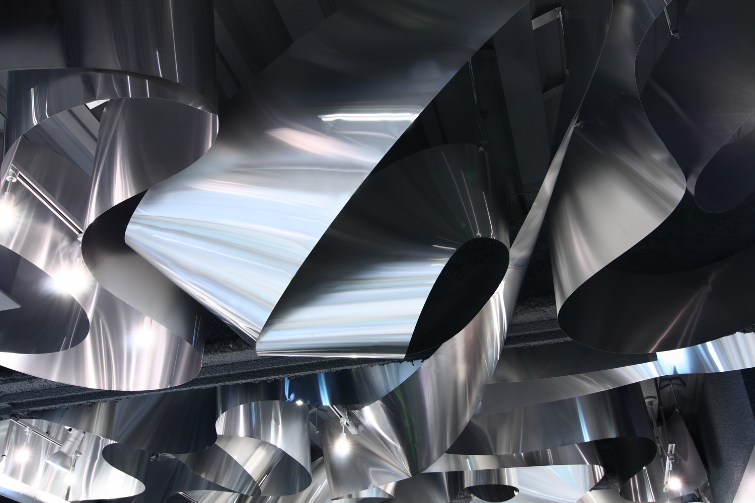
ARKHE Beauty Salon by Moriyuki Ochiai Architects, Chiba, Japan

While a sculpture can enhance the look of any space, turning an entire element of architecture into a sculpture can leave a significantly stronger impact. Using different materials, textures and forms in ceilings can create a captivating effect, reflect light in new ways and also help give dimension to an otherwise plain space. In ARKHE Beauty Salon, the firm uses strips of recycled aluminum curled and twisted over and over again on the entire surface to create almost a fluid composition. The firm wanted to replicate the movement of water and the lightness of the hair. The reflection of light on the metal’s surface also mimics the visual of light falling on the surface of the ocean.

Zafar Dental Office by ReNa Design, Tehran, Iran | Images by Reza Najafian

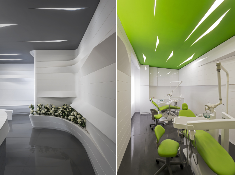
Zafar Dental Office is a great example of how even subtle introductions in a space can make a big difference. Here, they have used small cutouts in the ceiling to hold lights, much like simple cuts in a sheet of paper. These cuts have both sharp profiles as well as sinuous curves. The form is then continued n shelves and seating throughout the space to unify the design. This proves that even small changes in lighting design and geometry can create interest in spaces where it is difficult to add color or protrusions either due to the nature of the function or lack of height.

Over View by FreelandBuck, Pittsburgh, Pennsylvania

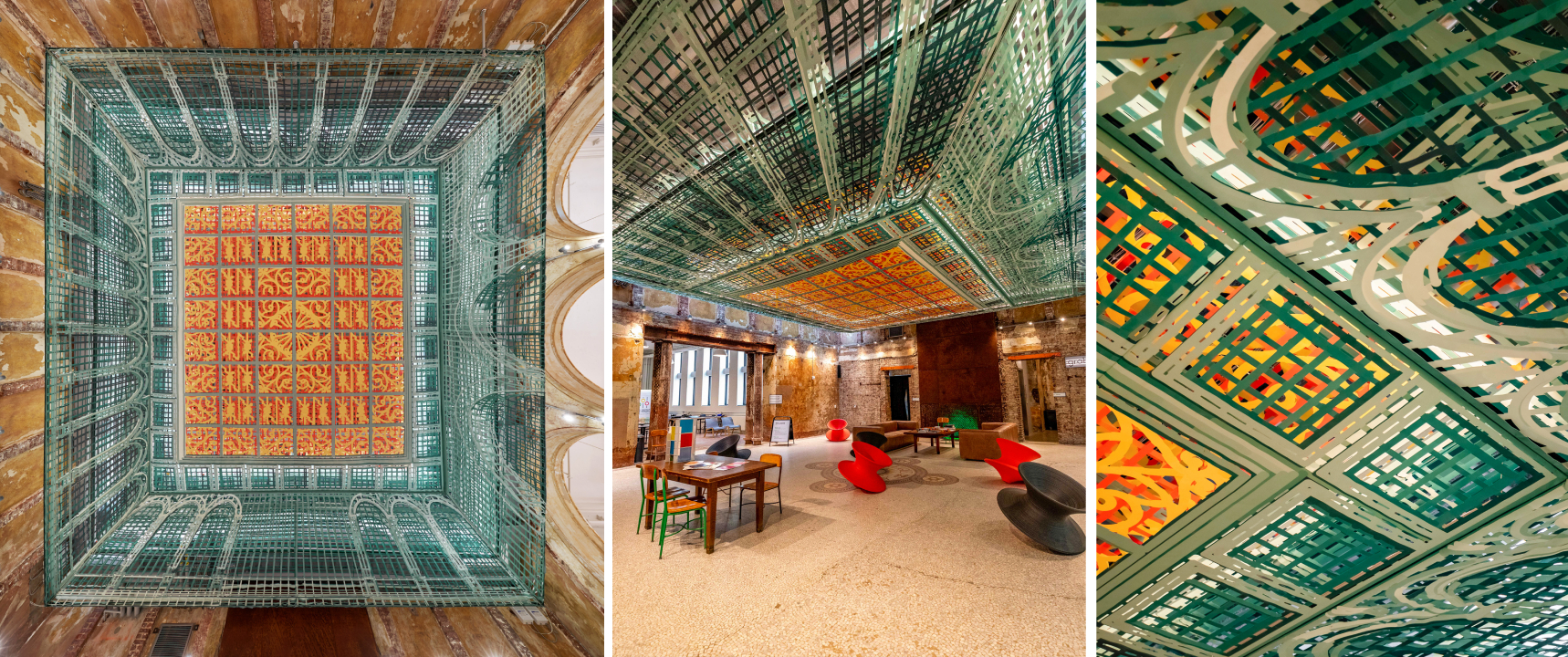
Art has been shown to be a successful way of decorating ceilings throughout history. It compels people to stop and look up, changing the way they use and perceive space. Taking this one step further, using optical illusions on the horizontal pain can not only trick people into believing there is a 3D form instead of a plane but also create movement. This helps create the perception of greater floor height as well.  Over View, an installation composed of printed textile pieces, transforms the lobby of the Carnegie Library into a Renaissance-era spectacle. When seen from the center of the room, it appears to have depth and go higher. When seen from other angles, it looks as if it is protruding toward the floor.

Tsujita by SWeet Co, LTD, Los Angeles, California

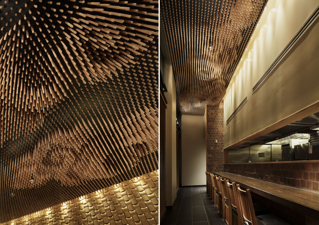
Being able to look at clouds when dining can make for a thoroughly enjoyable experience. But outdoor dining can also be challenging when grappling with uncertain weather. Interior decorators have often tried to bring the outdoors in by painting murals on walls and ceilings or bringing in greenery. This technique can be altered to better fit fine dining establishments by using a more abstract version of natural elements to add more whimsy. In Tsujita, 25,000 wooden sticks of different lengths are used to create the imagery of clouds. This image changes when seen from different angles due to the space between the sticks.

:PM Club by MODE, Sofia, Bulgaria

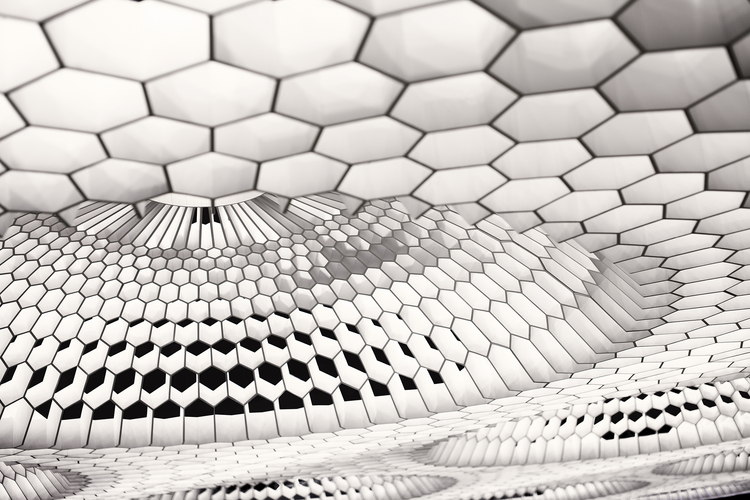
Vaults and domes have been significant structural elements in religious and cultural buildings throughout history. Now, we can see modern versions in interiors that are purely aesthetic. It can be done by padding beams to create vaulted tops or using wooden panels to add curves to flat surfaces. Another way to add dimension is by using hexagonal and pentagonal forms to create geometric domes as in :PM. The panels also diffuse the color-changing lights placed in this arrangement. This technique combines the charm of conventional domes with the grandeur of chandeliers.

Banq by Office dA, Boston, Massachusetts

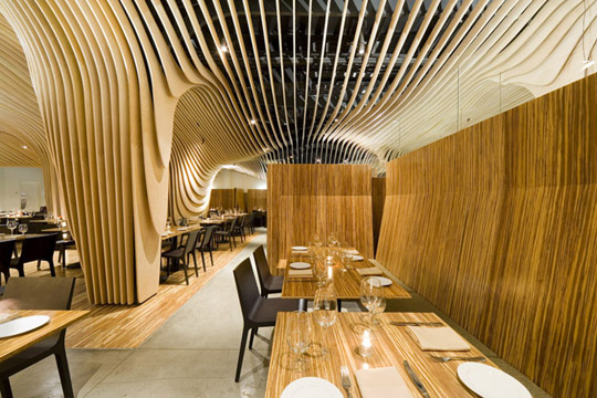
There has been an emergence of designs that allows floors, walls and ceilings to blend into one another. Pirogovka Appartment does so by allowing paint from the walls to crawl up the ceiling and floor and a bakery in Oporto continues vertical panels from the wall as swooping curves on the ceiling. Banq in Boston uses wooden slats to create a contouring canopy that continues upwards from the columns. This system also serves an additional function of concealing the old mechanical and structural systems from the previous design. The design also features a wine storage area in the center that becomes a part of this system.

The A+Product Awards is open for entries, with a Late Entry Deadline of July 22nd. Get started on your submission today! 

Reference

An App for Everyone: Spaces Is the Conceptual Design Tool Architects Always Needed
CategoriesArchitecture

An App for Everyone: Spaces Is the Conceptual Design Tool Architects Always Needed

The key to a successful architectural project is the development of a strong conceptual model. Conceptual design is the foundation of architecture and oftentimes, determines the future success of a project. Architects are forever in search of reliable and effective design tools that will aid in bringing their ideas to life. However, finding the right tool isn’t always easy. Many applications available today are complicated, costly and don’t always align with the designer’s working rhythm. For the average on-the-go architect, reliable and straightforward tools are key. Thankfully, Cerulean Labs has delivered just what every architect is after: the Spaces iPad app.

Cerulean Labs comprises a global team that is dedicated to improving the conceptual stage of architecture. Back in October of 2021, the company released Spaces: a parametric conceptual design tool made for the iPad. Today, the brand celebrates its continual effort in improving the conceptual design stage with a new and improved version of the app: Spaces version 2.

This updated application has recently hit the market and boasts a comprehensive list of tools fit for architects of all levels and experiences. Spaces version 2 comes complete with improved editing tools, increased 2D viewing options, new sun studies, new sketching capabilities and additional workflow integration options. This application is well and truly built for the masses.

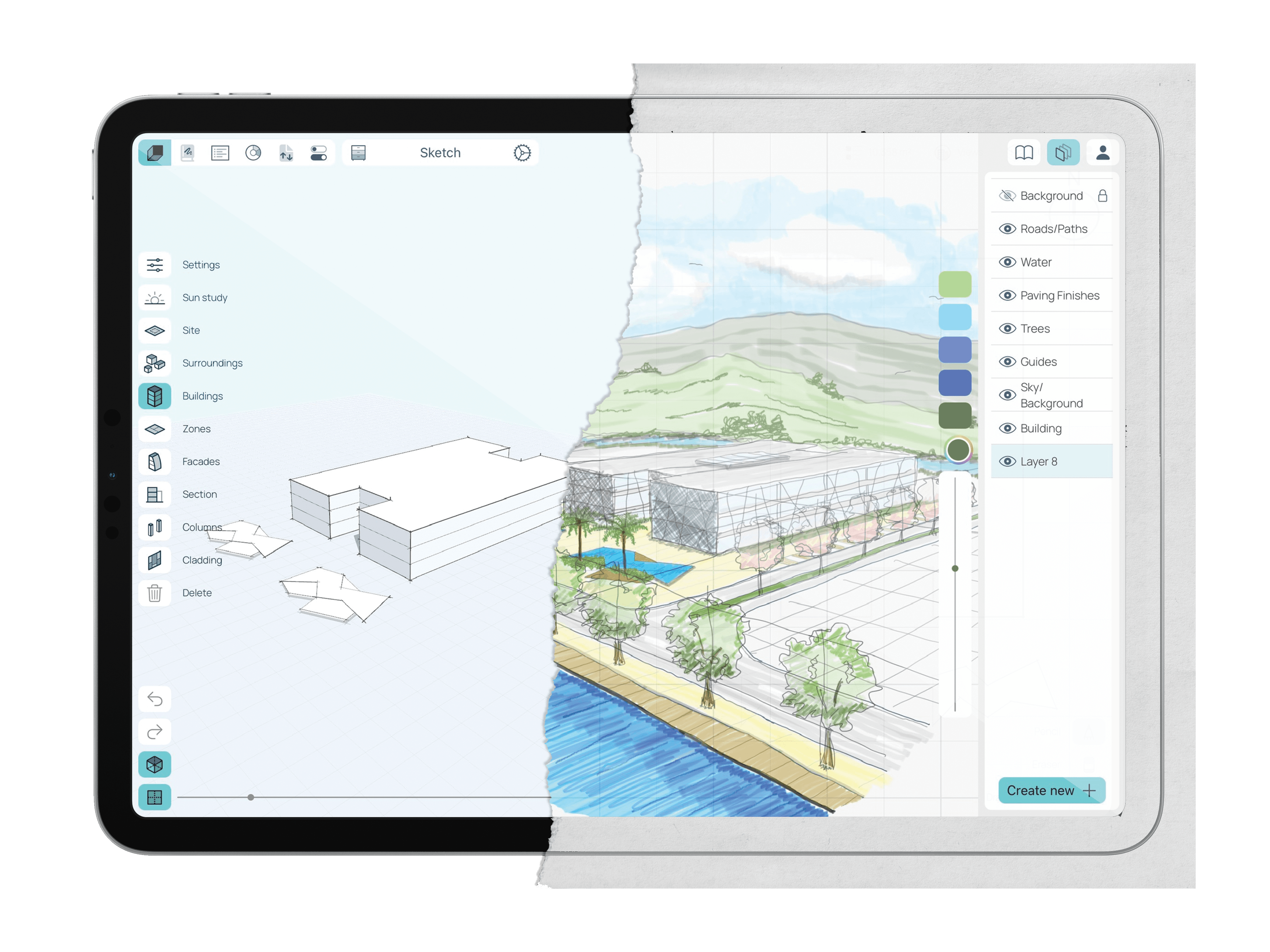
The Spaces version 2 app boasts an easy-to-use yet comprehensive set of design tools. The app merges old-school drawing techniques with modern-day computing technologies into a user-friendly interface. Its clean and clutter-free layout makes it especially useful for those designers who are constantly on the move.

The new digital sketchbook feature lets users swiftly document their ideas whenever — and wherever — they come to mind. The sketchbook encompasses new technologies, such as the Apple pencil, and allows designers to test their ideas out by sketching and note-taking. Moreover, users can send snapshots of their models directly to the sketchbook and trace them using the Apple pencil. This app celebrates architecture’s oldest and most useful tools – a simple pencil and paper.

The improved interface allows users to switch their screen between the Sketch and Modeling modes with ease.

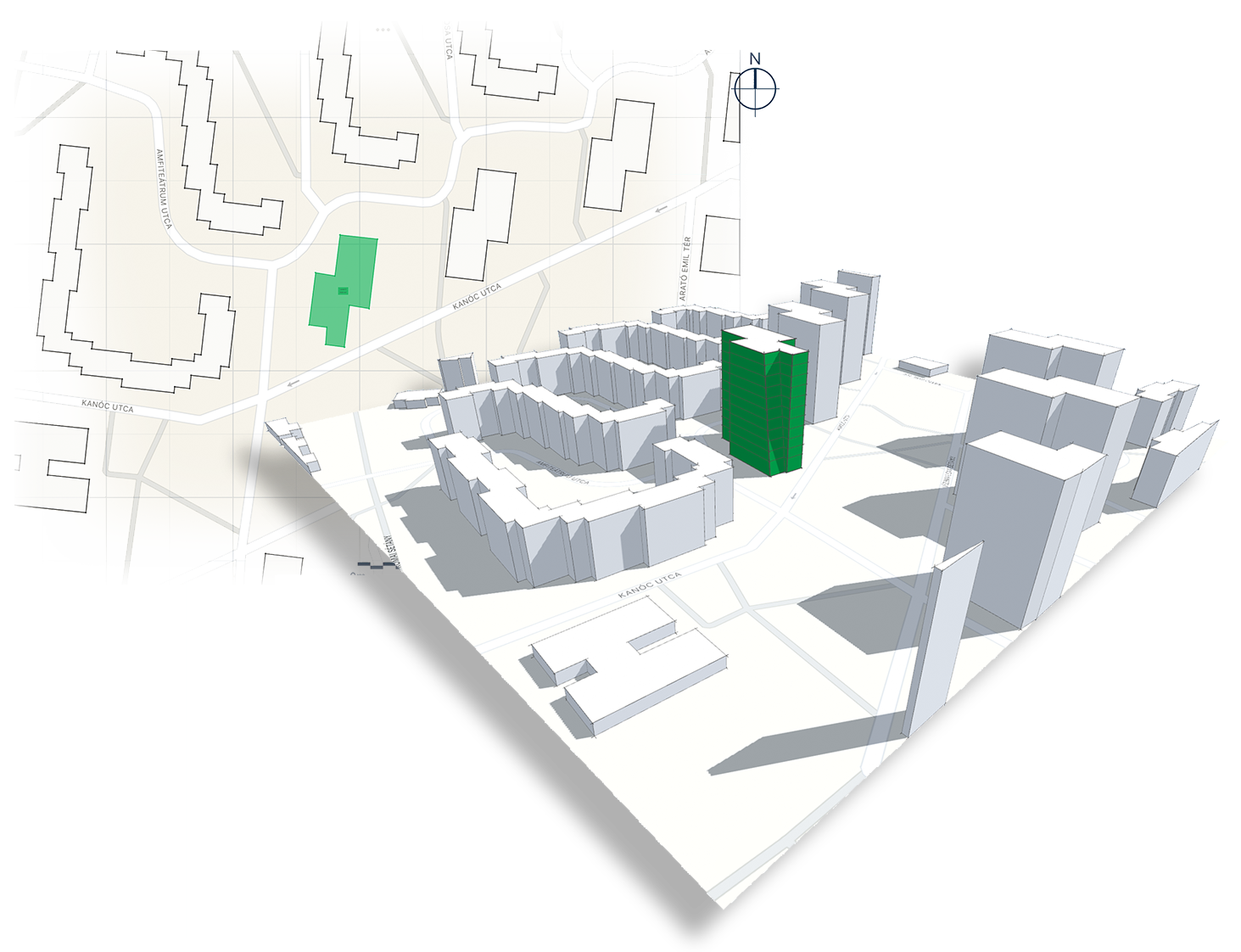
Another fresh addition to Spaces version 2 is the sun study feature. Recognizing how invaluable solar analysis is to the conceptual design process, Cerulean Labs has developed a tool that allows users to specify the exact location and time of day for their model, and instantly see how shadows cast by their project might impact neighboring buildings. Users can impose an animated sun study directly onto their models in real-time, helping them to better understand how their design responds to its surroundings.

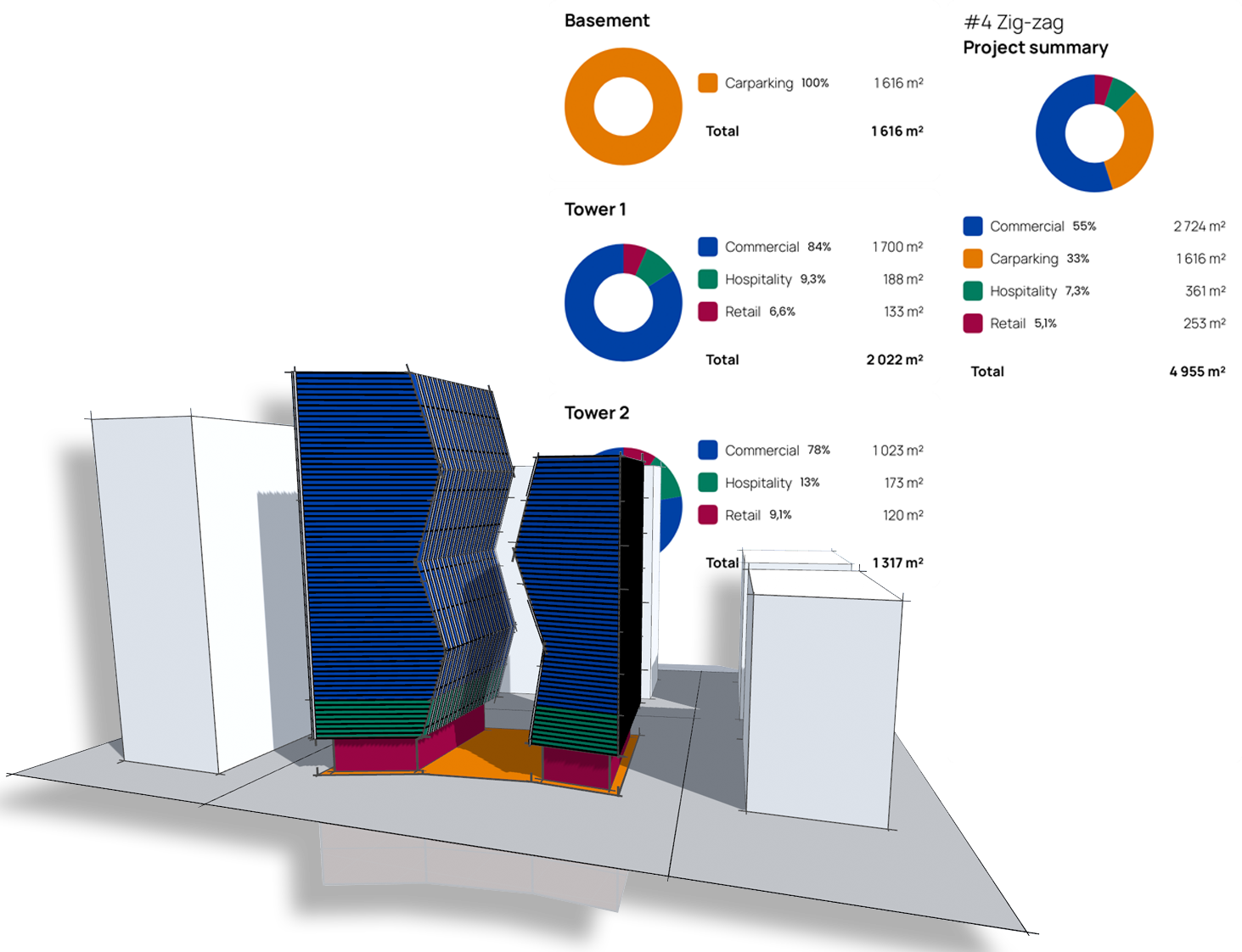
Additionally, Spaces version 2 has introduced IFC and OBJ exporting, which means that models can be exported and furthered in a secondary BIM tool. Moreover, the new space planning feature allows users to manage design briefs, create reports and develop project concepts directly on the app. The improved export options and new space planning features ensure that all models come out professional and presentable. In addition, users can import key site data to their design, thus producing a more precise and site-specific model.

Cerulean Labs is committed to growing and developing its Spaces app. iPads are continuing to dominate the AEC world and professional applications like Spaces version 2 offer increasingly powerful platforms to sketch, model and manage conceptual projects. The spaces app is available in both free and paid versions, with a new subscription recently becoming available: the Spaces Pro. Priced at $75 USD per month, the Spaces Pro subscription offers unlimited projects and comes with new and improved export features, reporting tools and modeling capabilities. The application can be downloaded via the Apple App Store and subscriptions can be managed directly through the Spaces website

Spaces by Cerulean Labs demonstrates the vast capabilities of iPad use in parametric conceptual design. The application offers great depth and flexibility, all the while remaining transportable and accessible. It celebrates traditional design tools while implementing the best modern-day technologies out there. The result is a brilliantly straightforward application suitable for all architects and designers.

Cerulean Labs is currently offering an extended free trial for the app, allowing users to try it out for 3 whole months — click here to find out more and download it (offer ends June 30th). To learn more about the Spaces application and all its offerings, check out the Spaces website.

Reference

FMG’s New Stoneware Surfaces Deliver Incredible Design Flexibility for Architects
CategoriesArchitecture

FMG’s New Stoneware Surfaces Deliver Incredible Design Flexibility for Architects

One of the most challenging aspects of design is bridging the gap between concept and reality. Architects and interior designers are first and foremost creatives; they are visionaries who at times struggle to find the perfect material that will bring their concept to life without some form of compromise. Whether it be a change in budget, an unforeseen roadblock or a disconnect between designer and developer, using materials that can easily adapt to a modified design ensures a successful outcome.

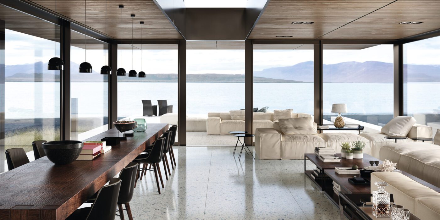
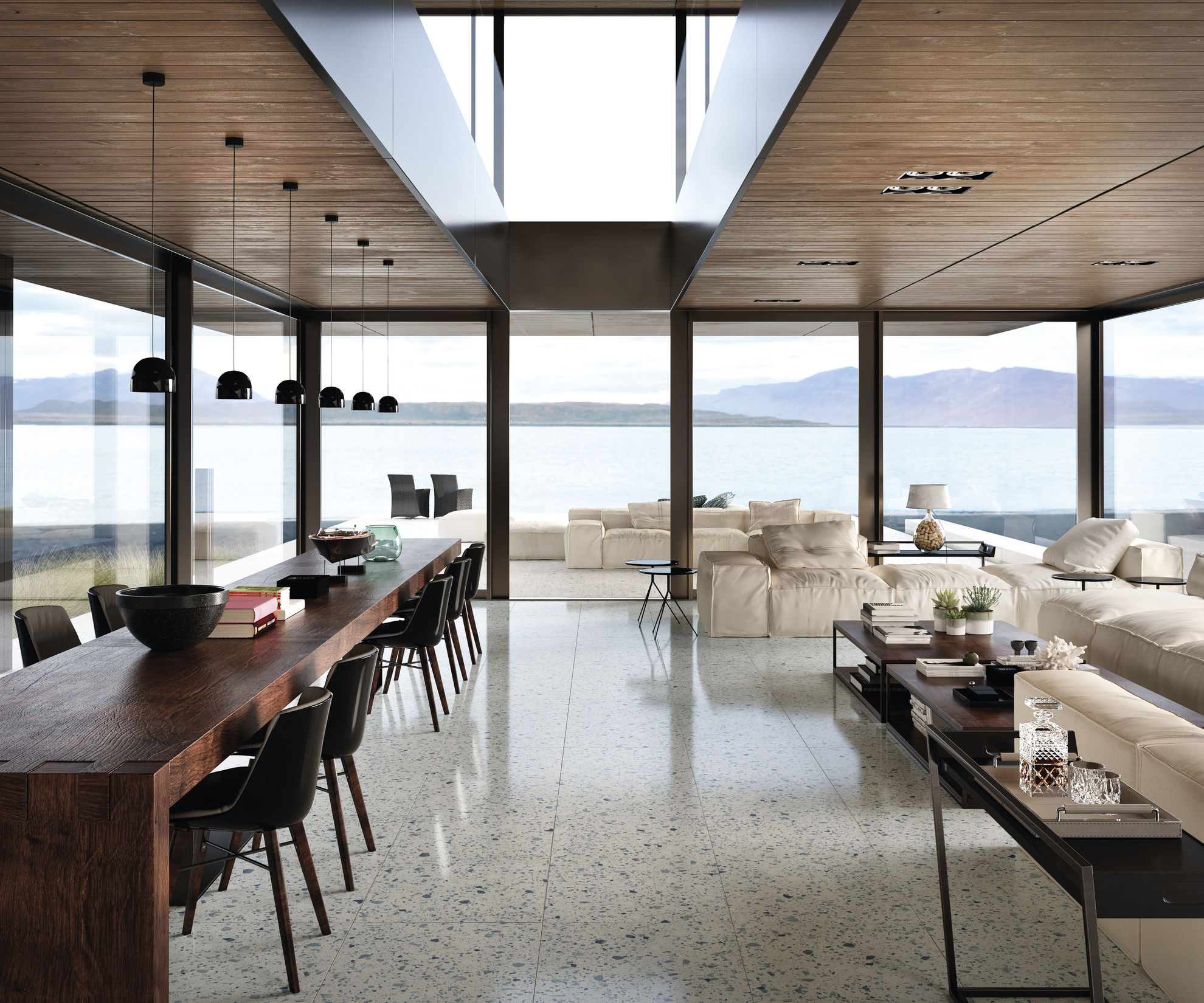
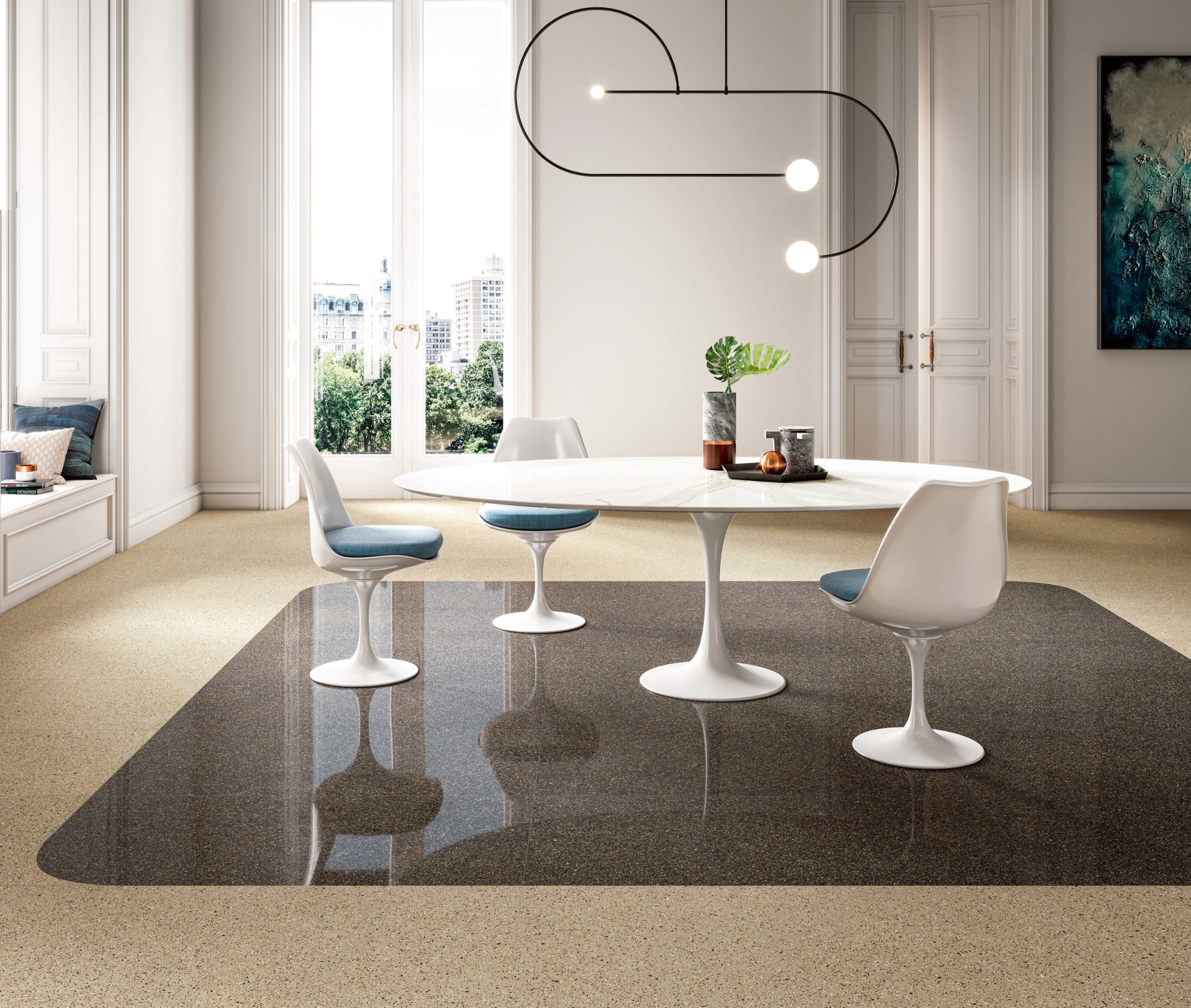
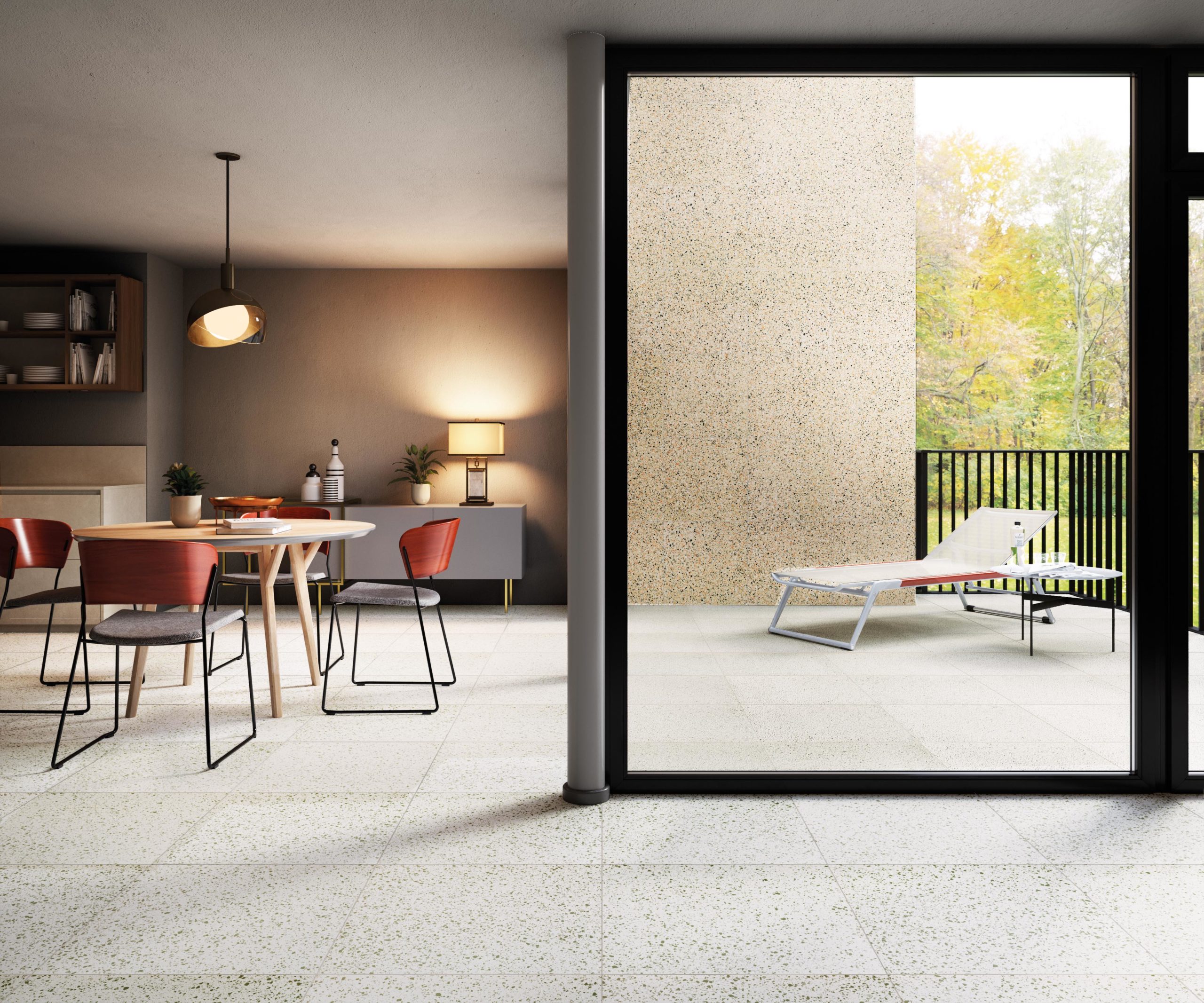
Fortunately, Italian stoneware Brand FMG Fabbrica Marmi e Graniti, part of Iris Ceramica Group, has developed a new product with creatives in mind. After extensive research and a thorough development process, FMG’s new full-body porcelain stoneware surfaces offer a comprehensive selection of durable, flexible and color-forward stone composites. Through a combination of raw materials, pigmented powders and random mix of hues, a robust line of handmade-like, unrepeated stone effect surfaces have recently hit the market. Among the most distinctive stone composites from the collection are the Palladio, the Venice Villa and the Rialto.

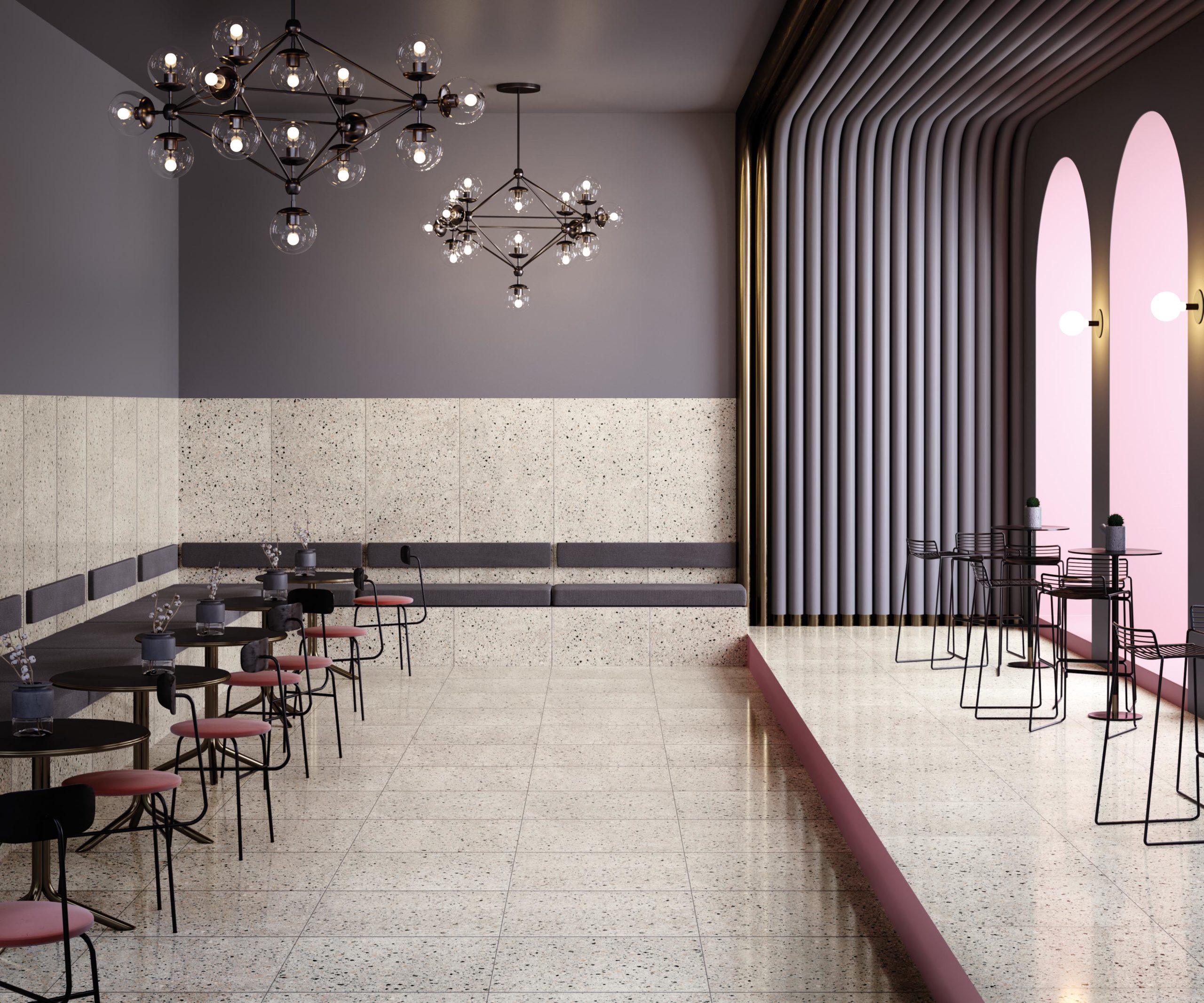
Project featuring FMG’s “Venice Villa” full-body porcelain stoneware

FMG boasts a unique production system that presses toxic-free powders with raw materials into an extremely durable material. The result is a compact stoneware that is non-absorbent, resistant to atmospheric agents and frost-free. Such a product can be easily implemented in both indoor and outdoor spaces as well as in private and commercial settings. Due to its extreme durability, it can withstand high-traffic environments without compromising aesthetics and functionality.

What further makes full-body porcelain stoneware stand out is its special processing abilities, enabling this stoneware to be manufactured for each designer’s bespoke needs. Whether the design requires rounded, beveled or central curved edges, the stoneware can be cut to deliver the required shape.

Project featuring FMG’s “Palladio” collection

FMG’s collection pays tribute to the Brand’s Italian origins through its experimentation and interpretation of the traditional and well-loved Venetian terrazzo flooring. Terrazzo has been around for centuries and has managed to remain a popular floor treatment to date. From its Venetian origins to its wide popularity in the Art Deco movement – it maintains its relevance in today’s dynamic design world.

A common complaint of terrazzo is its susceptibility to cracks if not properly maintained or if installed on a poor structural base. The full-body porcelain stoneware’s durable surface ensures a long-lasting, crack-free product that achieves the beloved terrazzo aesthetic. This built-to-last product can be implemented in a plethora of surface types – kitchen countertops, chairs, and shower trays – thus offering a product that is multifunctional and in many ways more versatile than traditional terrazzo.

Project featuring FMG’s “Rialto” full-body porcelain stoneware in zinc

Such versatility is not only seen in its physical makeup but in its pronounced and adaptable aesthetic. Through a thoughtful mix of marble fragments, grit sizes and stones, this line offers perfectly textured and decorative surfaces. Each style boasts a terrazzo-esque design, and whether the preference is a tighter pattern or a looser look, there are various options to choose from.

The line comes complete with 30 color offerings, ranging from ivory to graphite. The variation of finishes ensures the designer’s ideal aesthetic can be achieved, from Naturale, Levigata (smooth) and Strutturata (structured) to Sabbiata (sandblasted). The Palladio, Venice Villa and Rialto all come with a 10 mm (0.4 inch) thickness, with eight different sizes available. Among the Brand’s typical size offerings — 120×60, 60×60, 60×30 and 20×20 cm — three new formats join this collection: 150×75, 120×120 and 75×75 cm.

Project featuring FMG’s “Rialto” in pink

FMG’s full-body porcelain stoneware truly celebrates the spirit and colorful architectural history of Venice. Even its products’ names — Palladio, Venice Villa and Rialto — pay tribute to Venetian architecture. Rialto echoes the bustling Venetian commercial district and Venice Villa pays tribute to the region’s astounding mansions, while Palladio references the prominent Italian Renaissance architect, Andrea Palladio.

Very few products can offer such flexibility all the while ensuring a long-lasting, high-quality finish, with the need to compromise on aesthetics. As a modern-day interpretation of classic terrazzo flooring, combined with highly resilient material qualities, FMG’s latest stoneware collection is one that architects and designers can rely on to realize their creative vision.

To learn more about full-body porcelain stoneware and explore all of FMG’s offerings, check out their website.

Reference

Is Graphene the Next Revolutionary Building Material?
CategoriesArchitecture

Is Graphene the Next Revolutionary Building Material?

Browse the Architizer Jobs Board and apply for architecture and design positions at some of the world’s best firms. Click here to sign up for our Jobs Newsletter. 

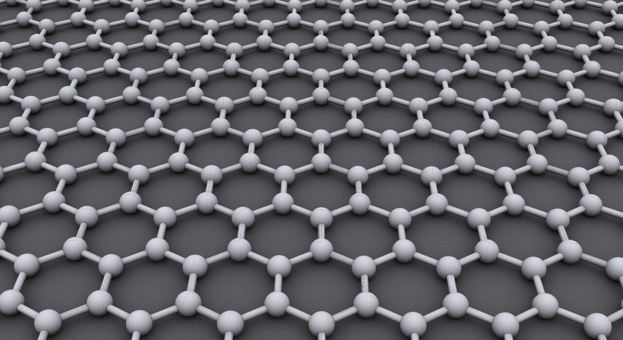
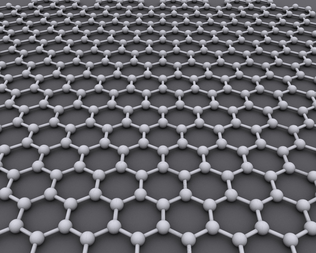
What is Graphene? Graphene is a single layer of carbon atoms arranged in a hexagonal lattice, making it the thinnest material known to man. Despite its thin composition, graphene is incredibly strong — two hundred times stronger and 6 times lighter than steel. First isolated by researchers Andre Geim and Konstantin Novoselov from the University of Manchester in 2004, the material received the 2010 Nobel Prize in Physics, garnering increased global attention and interest. Graphene is durable and malleable, and scientists see promising architectural potential in the new material.

Graphene is also highly conductive and equally holds unique light-absorbing qualities. When it comes to conducting electricity, graphene rivals copper; when it comes to conducting heat, it trumps all other known materials. Meanwhile, graphene is nearly transparent, making it a suitable material for products such as touch screen devices, as well as light and solar panels. When mixed with plastic, graphene becomes a strong conductor of electricity, making it a potentially useful product in the satellite, aviation and automotive industries.

Although it is still in the early stages of research and development, there are many companies and research initiatives already dedicated to understanding the potential uses of graphene. Due to its unique property makeup, graphene can be used and applied in a plethora of ways, making it a worthwhile and lucrative material to research, study and develop commercially. This certainly holds true in the architecture and construction industry. Will this material have a revolutionary role in the design world? 

Properties of Graphene:

  • Thermal and electrical conductivity
  • Flexible and malleable
  • Extremely durable
  • Ability to generate electricity through exposure to sunlight
  • Transparent and lightweight
  • Antibacterial & resistant to ionizing radiation

Graphene as a Concrete Additive

In 2018, researchers at the University of Exeter found that incorporating graphene into concrete can produce a durable and water-resistant concrete composite. Researchers at the university suggest this composite material is two times strong and four times more water-resistant than any existing concrete. Through a new nano-engineering technology, the researchers suspended thin graphene in water, which produced an extremely resistant and usable concrete composite. Seeing that concrete releases high levels of CO2 into the air, this new composite material perhaps promises a greener alternative to traditional concrete.

The research was carried out in accordance with the British and European standards for construction, which ensures a safe material for architects to build with. Moreover, graphene’s water-resistant properties could equally be beneficial for sites that are difficult to reach and properly maintain — making this concrete composite not only durable but practical. It is possible that graphene-reinforced composites could be the future.

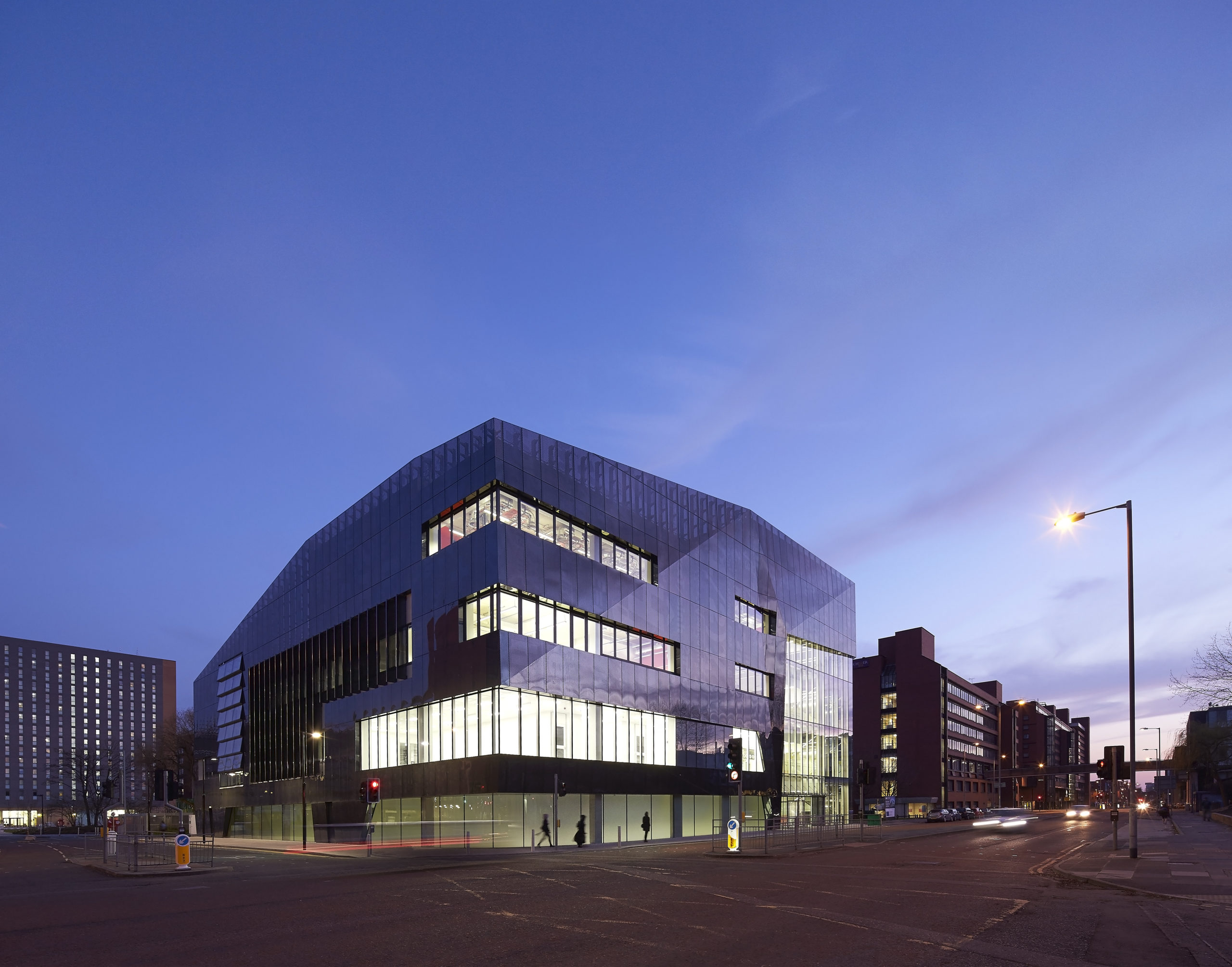
National Graphene Institute by Jestico + Whiles, Manchester United Kingdom. © Hufton+Crow Photography

Intelligent Cities

Some have suggested that graphene can easily up building’s intelligence. Architect Chenthur Raaghav Naagendran explains his research in a TEDx talk in Vienna, where he explores the possibilities of implementing graphene as a flexible skin for architecture. He proposes that graphene can be used to make architecture interactive, intelligent and adaptable. Chenthur’s research suggests that graphene could be used to replace traditional building materials and wires to create smart structures that respond to societal threats, such as global warming. Essentially, graphene can turn static structures into responsive agents.

Graphene in Paint

In 2017, paint manufacturer Graphenstone released a lime-based paint infused with graphene. Limewash paint has been around for centuries and has been revered for its breathable, bacteria-resistant, odor-absorbing and hypoallergenic properties. The company incorporated graphene into its renowned lime-based paint to create a thermal-regulating product. To resist heat from radiating through walls, the graphene present in the paint assists in capturing heat and thus improves a room’s insulation. Graphene’s thin makeup and durable properties mean less paint is required to achieve a corrosion-resistant and durable finish.

National Graphene Institute by Jestico + Whiles, Manchester United Kingdom. © Hufton+Crow Photography

Summary

Understandings of the role that graphene can play in the architecture and construction sphere are still in the early stages of research. However, there are promising concepts and graphene-present materials in development today. Equally, there are countless research initiatives and institutions dedicated to the commercialization of graphene. For example, the National Graphene Institute at the University of Manchester, designed by architecture firm Jestico + Whiles, is a world-leading research center dedicated to the research and development of graphene. Located at the very same institution where the material was first isolated, this institute demonstrates the UK’s dedication to remaining at the forefront of graphene commercialization.

Although there are still factors standing in the way of graphene commercialization — such as cost and maintaining quality during large-scale production — graphene could lead to more durable and thermally-regulated constructions in the future and is not to be overlooked.

Browse the Architizer Jobs Board and apply for architecture and design positions at some of the world’s best firms. Click here to sign up for our Jobs Newsletter.

Reference

Why Architects Should Never Stop Drawing By Hand
CategoriesArchitecture

Why Architects Should Never Stop Drawing By Hand

James Wines is a renowned American artist and architect associated with environmental design, and is founder and president of SITE, a New York City-based architecture and environmental arts organization chartered in 1970. He’s also on the jury for Architizer’s One Drawing Challenge, architecture’s biggest drawing competition, which offers $2,500 to its winners and publication opportunities for participants. In this essay, originally published in Blueprint Magazine with the title “From Hand to Mouse and Back Again”, Wines makes the argument for hand drawing as a means of architectural representation in the digital era.

It may seem strange to champion hand drawing, especially in view of the universal triumph of digital graphics, when every progressive architect in the world seems obsessed with elevating computerized delineation to new heights of illustrative supremacy. At the same time, as the software revolution has taken precedence, there appears to be a fresh incentive among many architecture students and emerging professionals – actually, a kind of quiet revolution – based on a new-found desire to hone their manual skills and learn to draw in the old way.

I have been a long-standing supporter of dual skills, encouraging young designers to maintain equal graphic abilities on paper surfaces and computer desktops. This advocacy is based on a deeply felt conviction that, by focusing exclusively on computer generated illustration alone, something conceptually profound is forfeited in the design process. When electronic response mechanisms replace the filtration of idea development through tactile means and guiding fingertips, the fertile territory of “subliminal accident” is lost. This refers to marginal calligraphy that dribbles off the edge of the paper, the inadvertent congestion of squiggly lines with no apparent meaning, the unwelcome blobs of ink that drop off a pen tip, or the inclusion of seemingly irrelevant visual references that have nothing to do with initial intentions.

On innumerable occasions over the years, I have been the creative beneficiary of my own graphic musings and the chaotic trail of ambiguities left behind by random charcoal smudges and watercolor washes. In other words, this pictorial detritus inscribed on paper, without any pre-determined architectonic mission, has often become the springboard for new ideas.
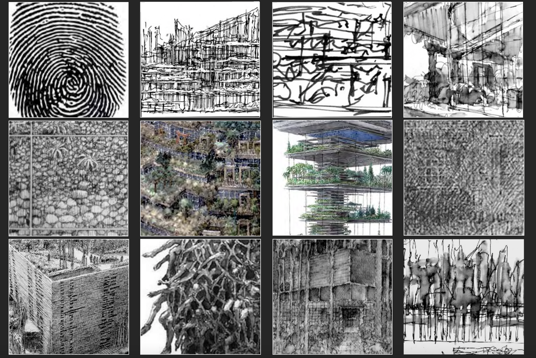
A selection of Wines’ sketches. Slide from James Wines’ “Mind to Hand” presentation, 2021; images courtesy James Wines

Frequently, when watching some seemingly pre-pubescent computer whiz use software to whip out multi-dimensional views of a complex structure in a matter of minutes, I feel as though I may be pushing a hopelessly old-fashioned aesthetic ritual, as a consequence of some deep-seated psychological resistance to the cybernetic world. I recall, two decades ago – when proficiency in computer rendering was being applauded as some kind of transcendental feat – how impressed I was with the photo-fidelity of digital drawing. Everything churned out in those days looked too good to be true . . . and it was. As my eyes became accustomed to sorting out slickness from substance, I gradually acquired a highly refined aptitude for detecting mediocrity (or outright crap) lurking under the pictorial gloss – to a point where I can now spot digital dazzle, camouflaging conceptual vacuity, at a distance of fifty feet from the monitor screen.

In addition to the inspirational merits of those idea generating graphic accidents credited earlier, one advantage the computer can never offer is the kind of calligraphic proficiency needed to draw really well. As I often try to explain to architectural students, this elevated status is a combination of aesthetic instinct and responsive rendition that goes considerably beyond the conventional ability to produce photo-like images with great fidelity . . . a commonplace talent in architecture, which is frequently mistaken for genuine drawing. Mechanical reportage also forms the basis of computer graphics and it is the primary reason that digital tools will always be best employed as an efficient means of confirmation (describing the big idea after it has been conceived), but never a deeply resonant art experience in itself.

When teaching drawing to young designers, their most noticeable deficit is a lack of understanding of the complex aesthetic challenges in accomplished draughtsmanship. These include knowledge of the origins of written language, the evolution of calligraphy, the nature of signification and the abstract dimension that unites positive and negative visual elements on a picture plane. In this context, I am speaking mainly of drawing in its subsidiary role as a recorder of thought process within the larger goal of building design. But, like the artist’s study for a painting or sculpture, the calligraphic nature of the conceptual sketch is always a decisive factor in its ultimate qualification as art.

Particularly among design students, the tradition of illustrative purpose often seems to hinder their grasp of what might be called the “deep structure” of drawing, with its multiple layers of art value and sources of content. For this reason, it can be a revelatory experience – especially in the computer age – to review the history of graphic invention and its relationship to the fusion of signs, symbols and aesthetic choices.
Slide from James Wines’ “Mind to Hand” presentation, 2021; images courtesy James Wines

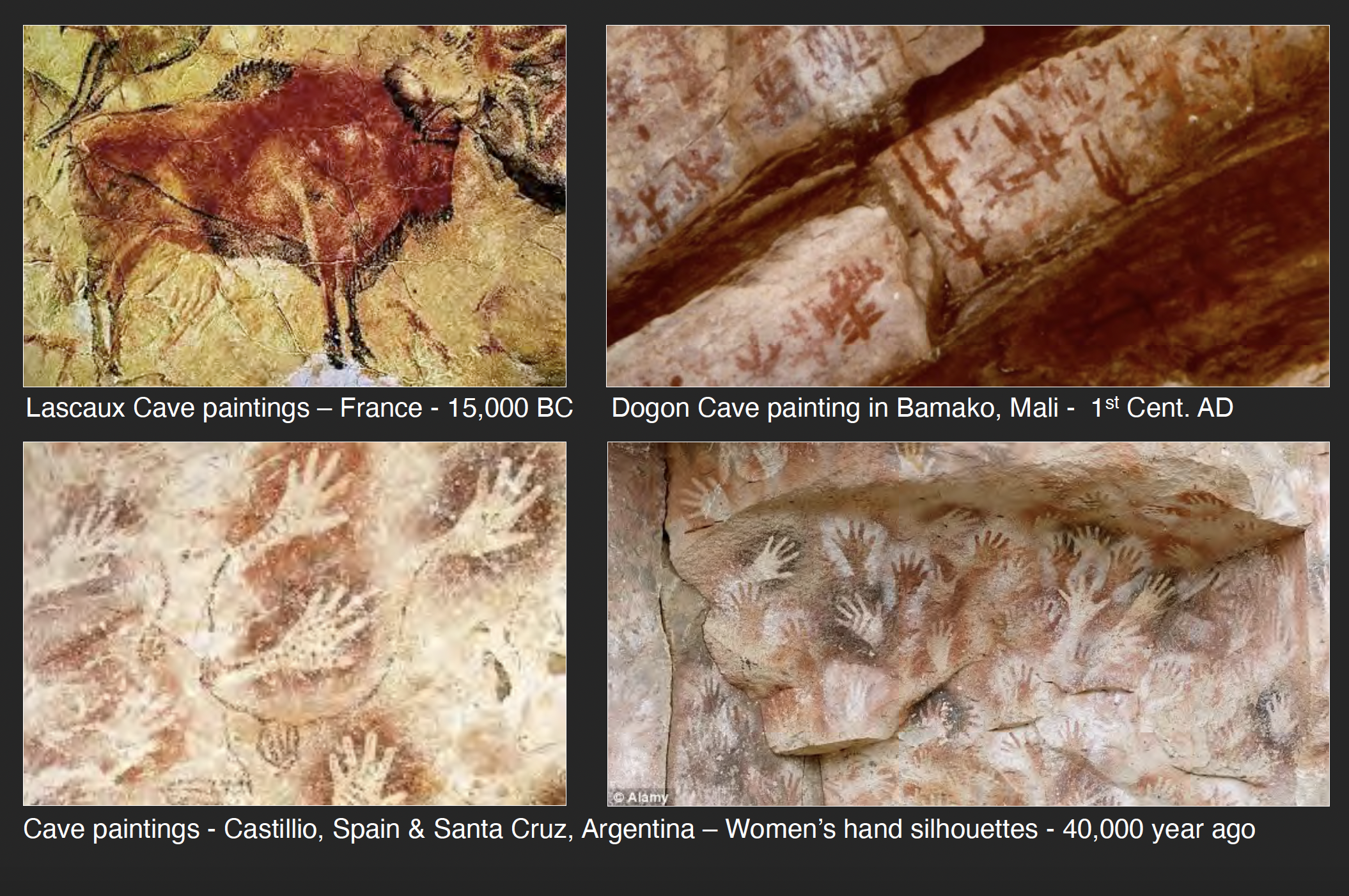
The discovery in of the Altamira and Lascaux cave paintings (in 1879 and 1940 respectively) confirmed the fact that Paleolithic cultures as far back as thirty thousand years ago had mastered the art of drawing and established the foundations for all subsequent graphic selection in the formation of written language. Contrary to the previous view that Cro-Magnon people were simply meandering hunter/gatherers, these communities obviously absolved a privileged minority of visually skilled individuals – perhaps as designated religious shamans – from their food-harvesting obligations. It is clear, given the consummate artistic quality of the cave murals, that this level of mastery was probably the result of centuries of stylistic refinement.

Without going into myriad speculations on the how and why of Lascaux and Altamira, it is sufficient to view the reality and conclude that nothing this aesthetically resolved could have occurred without a profound investment in both the urgency of communication and its translation into culturally endorsed nuances of line, tone and color. The illustrative factor was certainly part of the purpose of cave art; but those Magdalenian masters also knew that the profundity of visual language resided in its abstract elements – in essence, the connections linking symbolism and philosophy – apart from any reportage intentions.

It is reported that Picasso wept when he first viewed the Spanish cave paintings, exclaiming that, “After Altamira, all is decadence.” As one of history’s greatest draughtsman, he understood that prophetic Neolithic artists had anticipated not only the development of Egyptian hieroglyphics and Chinese calligraphy thousands of years later, but also the signifier/signified basis of linguistics and the role of mind and hand in the evolution of visual ideas. Historian Andrew Robinson refers to Magdalenian art as “proto-writing;” seemingly based on the assumption that Ice Age people did not yet have a legitimate alphabet. On the other hand, there are enough abstract symbols punctuating the cave murals to suggest that these Cro-Magnon painters had already laid major groundwork for the development of written language . . . as well as all subsequent calligraphic innovation in art and design.
Slide from James Wines’ “Mind to Hand” presentation, 2021; images courtesy James Wines

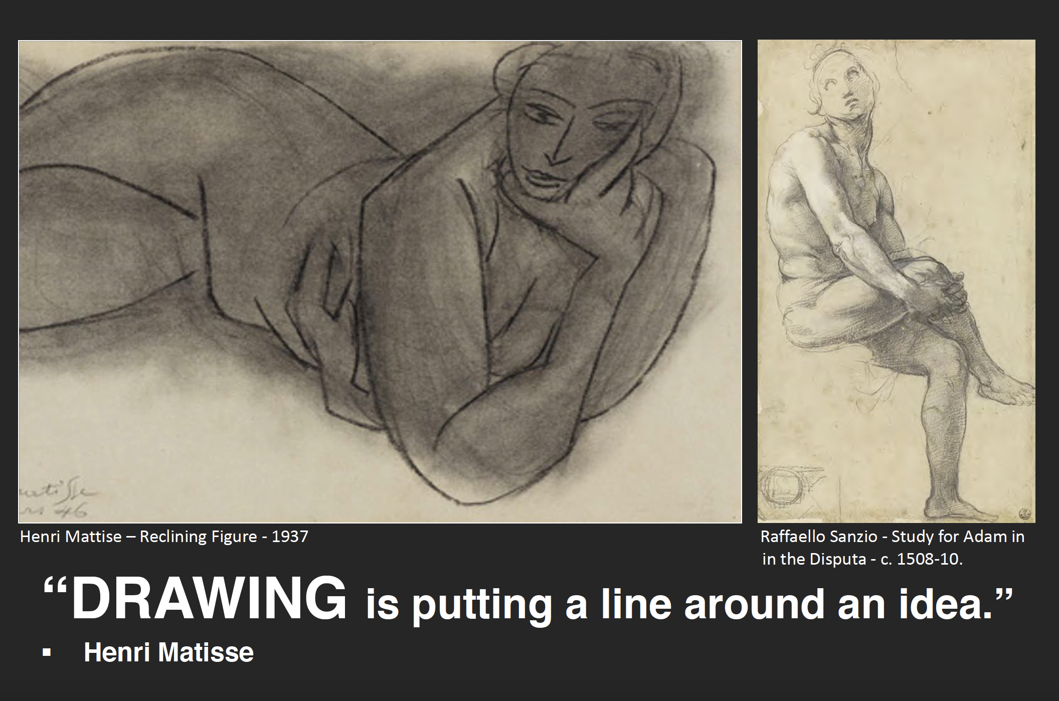
Supporting this argument, there is also the remarkable stylistic consistency linking the art of Lascaux and Altamira with innumerable other cave paintings in Chauvet and La Marche in France, as well as those found in Africa and Australia. For example, bison, deer and wild boar are represented with an extraordinary sensitivity of rendering techniques – particularly in terms of linear and tonal choices – which are parallel to those same skills found in the drawings of Da Vinci. Rembrandt, Van Gogh, Matisse and Giacometti and, in architecture, Alberti, Piranesi and Frank Lloyd Wright. In the context of prehistoric times, it was only a small aesthetic and linguistic leap to associate the gracefully tapered legs of a bison with all forms of stability and movement in nature. The next logical step was to abstract this fragment of anatomy into a pictographic symbol, refine it into a cuneiform inscription and, finally, amplify its meaning by phonetic markings and syllabary alphabets. With progressive logic, the extended legacy of this process eventually evolved into the serviceability of e-mail on one hand and the expressive pathos of Picasso’s drawings for Guernica on the other.

Observing the bridge from Magdalenian culture’s deep sense of symbolism and lyrical representation in the depiction of mammal prey to the advent of written language in Asia pretty much says it all concerning the value of graphic invention. By following a similar route four thousand years ago, China had already developed calligraphy to a degree where fragments of the first alphabet still remain a part of contemporary Chinese writing. This interface between language development and the aesthetics of drawing is at the core of graphic expression.

It is also a cyclical and continuously evolutionary form of communication, thriving on renewal and re-invention. As described by linguist Noam Chomsky; “Language is a process of free creation; its laws and principles are fixed, but the manner in which the principles of generation are used is free and infinitely varied. Even the interpretation and use of words involves a process of free creation.” To his “use of words” must be added the “use of line.”

Slide from James Wines’ “Mind to Hand” presentation, 2021; images courtesy James Wines

Chinese writing and drawing have remained synonymous skills in the hands of Asian calligraphers since the first pictographs emerged – which, in later dynasties, included “ideographs” to embody fully developed narratives. Like all languages, Chinese underwent a logical development from the faithful contour depiction of such images as “man, sun, ox, water, etc., toward a more complex system of signs needed for phonetic/semantic functions. But, the continuing beauty of Chinese characters is their metamorphic quality . . . moving gracefully back and forth between representational and conceptual realms of signification.” This “art of language” has kept Asian painters and poets continuously supplied with renewable source material and has perpetuated the performance role of master calligraphers. It is the kind of drawing that becomes a true fusion of theater, communication and graphic style. It is also extremely instructive to anyone seriously committed to understanding what the successful coordination of mind and hand can accomplish.

At the core of Chinese calligraphic aesthetic is the gestural rhythm of the pen or brush stroke and the manual control demonstrated by the flow of thick and thin lines. However, it is the raggedness of edges, the spontaneous splatters, the inadvertent drips and their collective interaction with negatives spaces – reinforcing that all-important element of “subliminal accident” mentioned before – which I personally consider essential ingredients in the multi-layered practice of drawing. For the master Chinese calligrapher, these indeterminate factors are usually captured in bold gestures; but the same spontaneity and fragmentation (and this includes architectural drawings) can be manifested in the smallest and most search-oriented lines on paper.
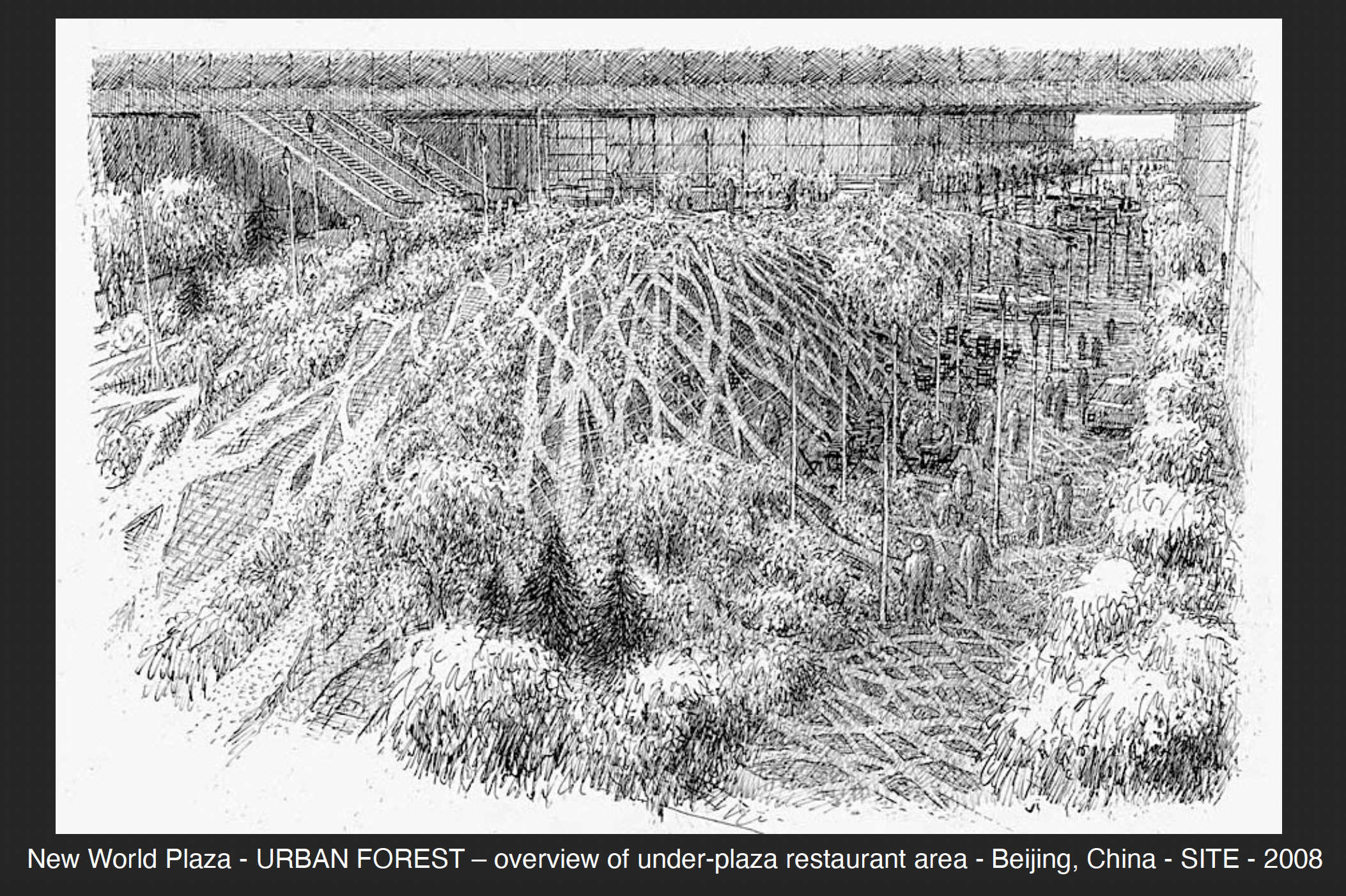
Slide from James Wines’ “Mind to Hand” presentation, 2021; images courtesy James Wines

I want to summarize a few of these observations on calligraphic values by discussing the contemporary efforts of SITE in this direction. From the beginning of the studio in 1970, our work has been a fusion of art, architecture and landscape. The philosophy of the firm is based on a view that communicative content in the building arts can be based on sources outside the traditions of formalist/functionalist design. These include the social, psychological and ecological implications of a post-industrial era.

SITE’s buildings and public spaces are frequently interpreted as “filtering zones” for receiving and communicating information about the environment, rather than designed as hermetic objects sitting in the environment. For example, in certain graphic works this proposes a narrative function of architecture. It suggests that a building’s wall surfaces, volumes, and adjoining spaces can be seen as absorptive, sponge-like conveyors of messages that go considerably beyond conventional sculptural relationships – suggesting a function of “architecture as the inversion of architecture.” It is a means of converting the familiar ingredients and processes of construction technology – plus the public’s subliminal acceptance of certain kinds of archetypal buildings – into a form of critique and/or commentary about architecture. By prioritizing these reflex identifications (rather than focusing on compositions of abstract shapes) my own sketches tend to view architecture as a “subject matter for art,” rather than the objective of a conventional design process.
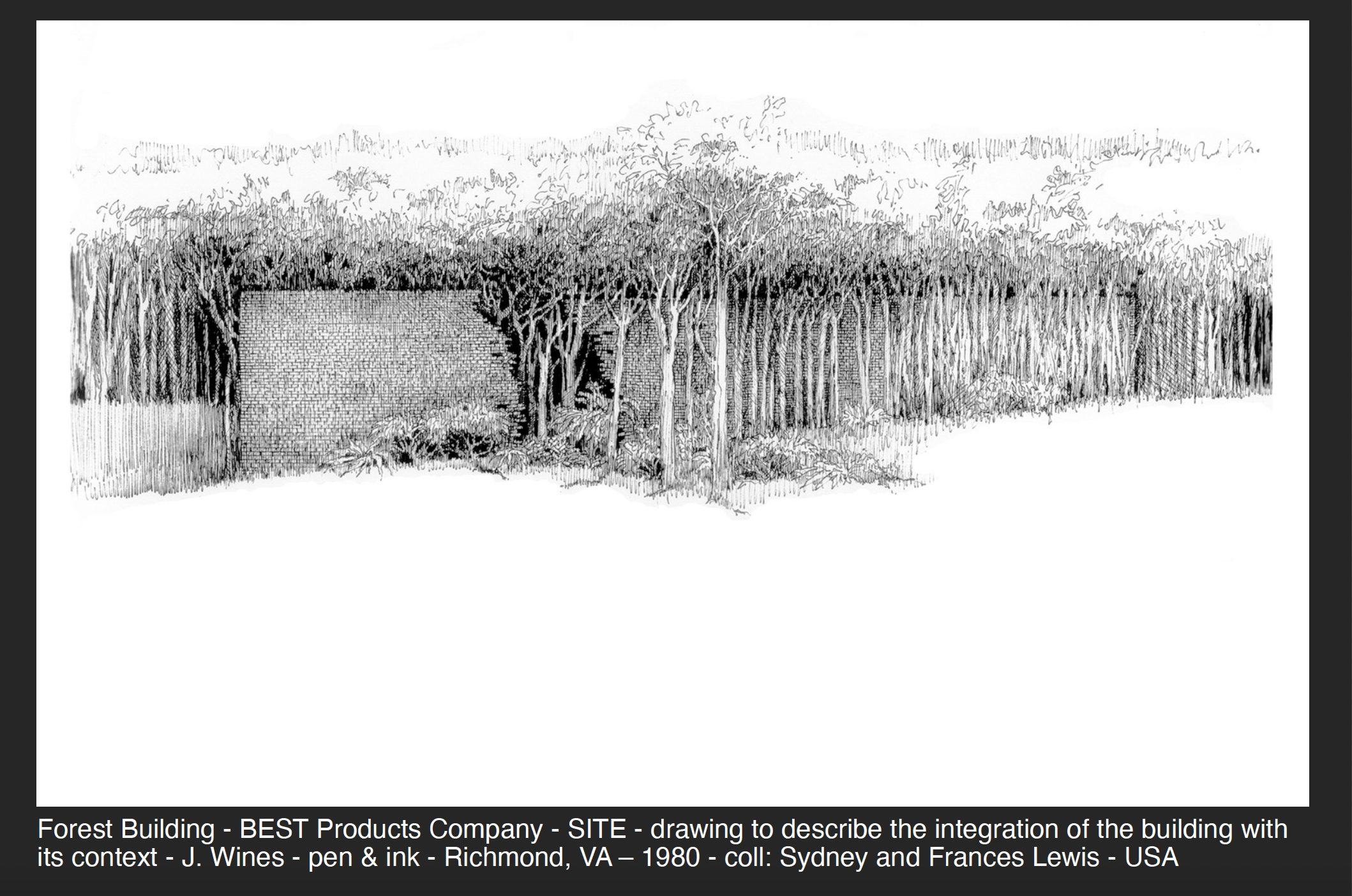
Slide from James Wines’ “Mind to Hand” presentation, 2021; images courtesy James Wines

A number of my recent drawings explore the integration of architecture and landscape. This approach is often responsive by a situation where the building is located in a natural site and the objective is to preserve as many trees as possible. As a result, architecture appears to be consumed by its own environment – or, seen more perversely, as a victim of “nature’s revenge.” In other examples, the renderings describe the need for more forested areas, water sources and urban agriculture in the cityscape. The primary purpose is to explore the integration of architecture with context to a degree where it becomes difficult to discern where a building ends and the environment begins. Also, in this way, vegetation can become as much a part of the aesthetic fabric of a structure as masonry, glass, and steel.

From the perspective of fusing computer graphics with hand drawings, SITE has developed an extremely fluid interface between multi-media and conceptual development. For example, our studio’s “Residence Antilia” for Mumbai, India offers a clear sequential demonstration of this creative process, realized through a combination of interactive hand + digital drawing techniques. It shows the basic stages of source referencing, search-for-idea sketches, design clarification and renderings for pure aesthetic experience. The proposal also demonstrates the calligraphic underpinnings as they appear in multiple formats, scales and comparative qualities of line, tone and color. This residential tower, designed in 2003 for industrialist Mukesh Ambani, is located on a very restrictive hilltop site, overlooking the entire city of Mumbai.
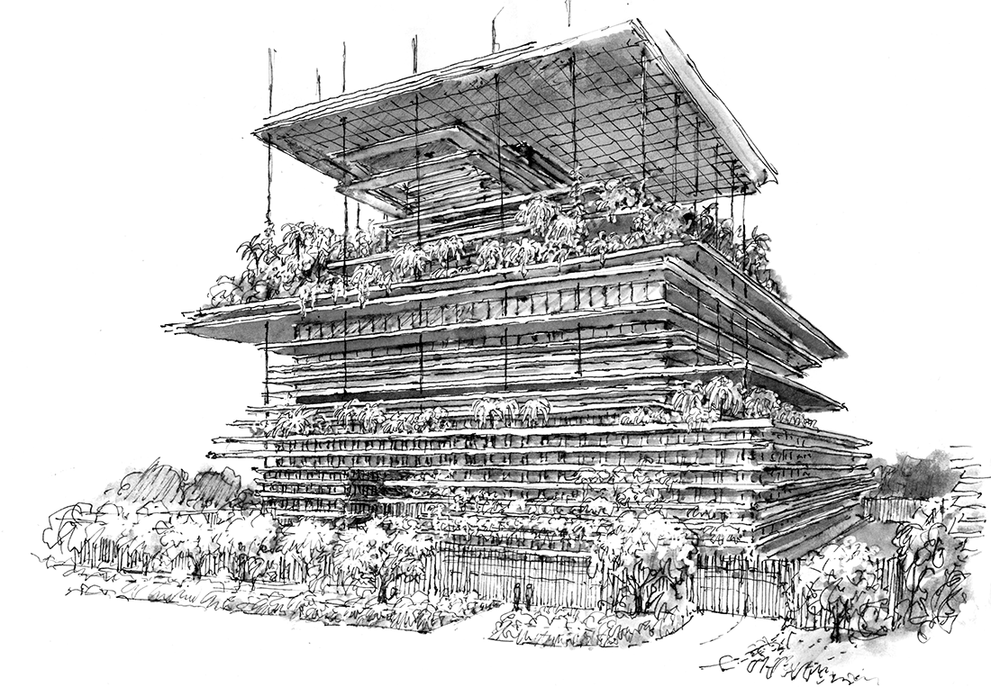
Antilia “Vertiscape” Tower proposal, Lower Levels, 2003, Image © SITE

The concept responds to the client’s desire to have a multi-tiered, heavily landscaped structure, similar to (his wife’s preference) the ancient Hanging Gardens of Babylon. For this reason, the entire building is conceived as a “Vertiscape” garden in the sky, freeing park spaces from their normal earthbound confinement. The concept responds to Vastu principles in Hinduism, wherein the spine is regarded as the main source of support, leading upward toward enlightenment. The seven levels of the residence are supported by a stratified structural spine, stabilized by the core and a series of steel cables that support five “floating” floor planes and a variety of interim garden terraces, verandas, trellises, viewing platforms, water features, and recreational facilities.

All horizontal projections emerge from the core structure, similar to the role played by vertebrae in the spine. In accordance with Chakra meanings in architecture, the zones of this building are linked to the themes of earth, water, fire, air, sound, light and information. The main residence, located on a crowning 4000 square meter platform, continues the visually unifying theme of stratification. All of the Vertiscape references, sources and interpretations are accounted for in my related series of drawings, which range from tentative pen lines, to amorphous washes, to hard-edged media combinations. And finally, most importantly for making conceptual choices, these depictions invariably explore what I refer to as the “ambient sensibility” of a place, the role of light and shadow and architecture’s capacity to transform context into content.
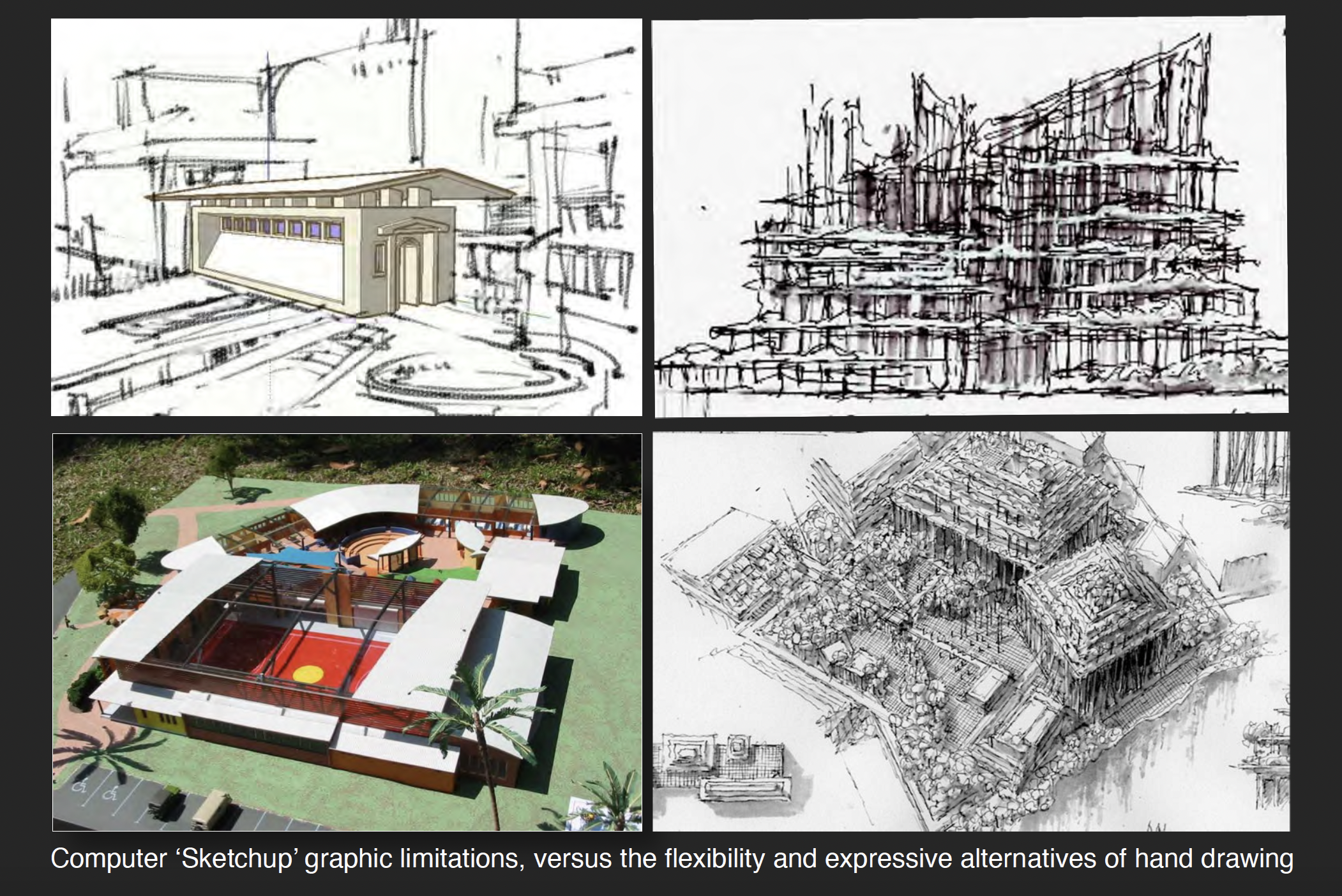
Slide from James Wines’ “Mind to Hand” presentation, 2021; images courtesy James Wines

My continuing advice to young architects seeking to draw for reasons of idea development (or pure pleasure) is to follow Picasso’s obsessive example; “I draw like other people bite their nails.” In his enthusiasm for the power of the hand, the great Spanish artist is also purported to have taken a dim view of the digital revolution by commenting; “Computers are useless. They can only give you answers.” While overstating the case – and probably reflective of a certain 1960’s naivety concerning the importance of an emergent computer age – Picasso correctly prophesized the current revival of interest in hand drawing and the widening acknowledgement that there are conceptual and aesthetic territories that the software of Form Z, AutoCAD and Sketchup can neither equate, nor replace.

When I watch masses of architectural students locked into computer monitors as prosthetic extensions of their bodies and churning out facile simulations of buildings, I recall Baudrillard’s eerie assessments of Post-modern culture. Particularly resonant are his views of media phenomena – as illusion replacing reality; where substitution ultimately becomes the reality. In his world of “simulacra” I personally find that signs scratched on paper with a pen or pencil do have a way of restoring the authenticity of representation, as well as the nature-centric validity and socially relevant value of symbolic content in the subject described.

As Baudrillard astutely observed, the illusions created by media tend to remove people from the organic and tactile world around them. Retaining this connection between mind and hand seems just as valid now as it was for the cave art masters who immortalized the hunt in Lascaux and Altamira. The quest for calligraphic quality is no less relevant as well. It is an objective perfectly described by by the writer/animator, Walter Stanchfield; “We all have at least 10,000 bad drawings inside of us. The sooner we get them out and onto paper, the sooner we’ll get to the good ones buried deep within.”

Sign up to be informed when the next One Drawing Challenge competition opens for submissions. Be sure to check out the rest of this year’s extraordinary Winners and Commended Entries.
Reference

7 Tips for Snapping a Killer Architectural Photograph
CategoriesArchitecture

7 Tips for Snapping a Killer Architectural Photograph

Send us a photo. Tell us a story. Win $2,500! Architizer’s 3rd Annual One Photo Challenge is underway with a Main Entry Deadline on June 24, 2022! Start your entry for architecture’s biggest photography competition here.

The art of architectural photography is a passion not just for architects, but everyone with a desire to capture the environment around them in all its glory. This desire extends far beyond simply archiving a building’s physical features: we yearn to capture the mood, atmosphere and emotion of places and the people that inhabit them. This is what Architizer’s One Photo Challenge — our global annual competition dedicated to architectural photography — is all about.

With 2 top prizes of $2,500 and global recognition for your work, this is a competition you will want to get involved with. Head this way to learn more and upload your submission:

Enter the One Photo Challenge

Architizer’s popular architectural ideas competition poses a simple question: Can you capture a single photograph that tells a powerful story about architecture? The best architectural photographs can tell you more about a building or cityscape than any essay or lecture, informing and inspiring in equal measure.

But what does it take to achieve such lofty goals with your phone, a compact or even an SLR? I am no technical expert when it comes to the genre, but I have taken a few snaps in my time: 10,000 photographs over 9 months of traveling in 2012 drew me so deeply into this niche, I suspect I’ll never view the built environment the same way ever again!

Here’s what I learnt over the course of that extraordinary year, primarily relating to composition and shot selection. Hopefully, one or two of these tips will aid you in your own quest for photographic immortality…

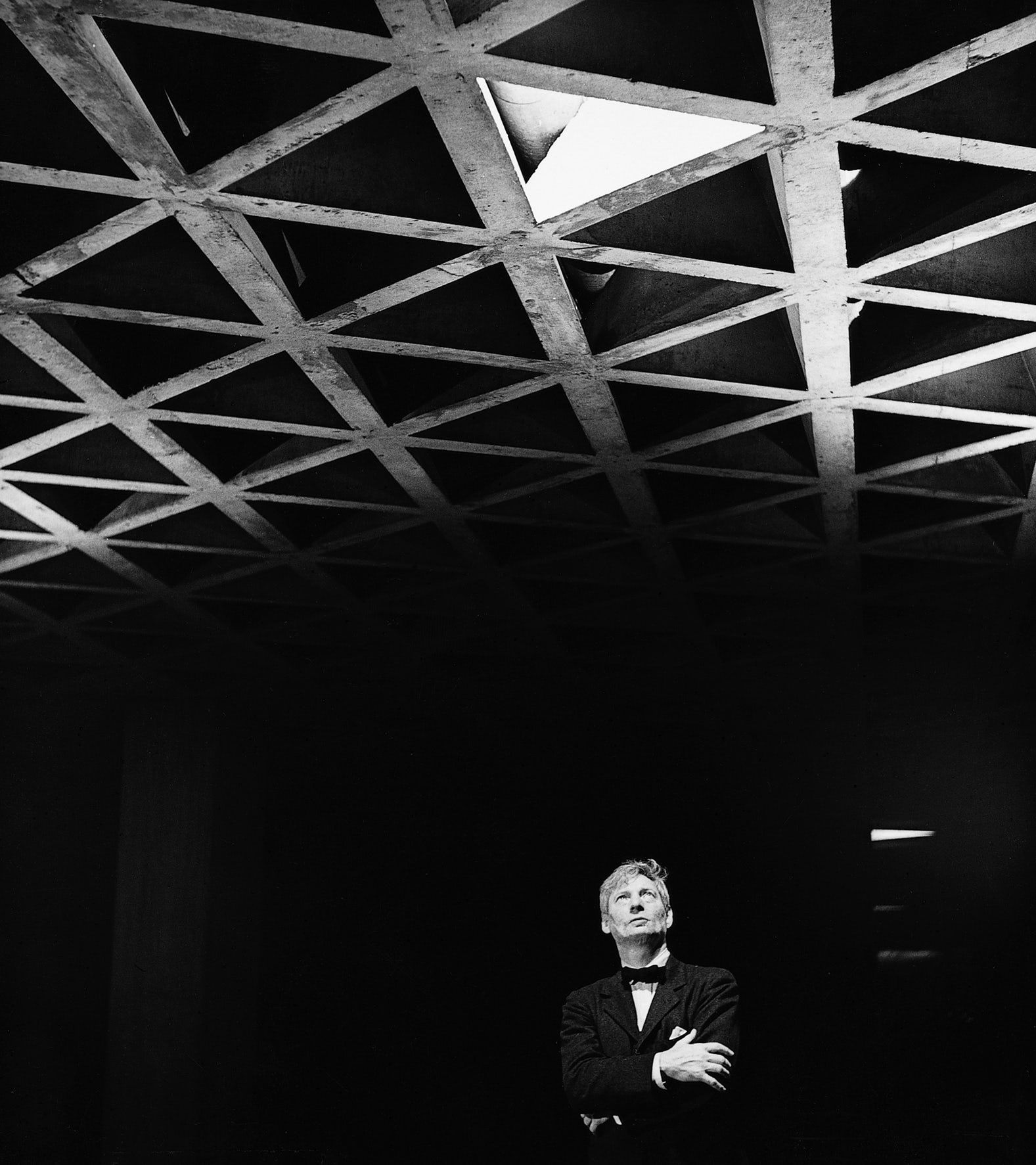
Louis Kahn Looking at His Tetrahedral Ceiling in the Yale University Art Gallery, 1953. © Lionel Freedman. Via Archdaily

1. Let There Be Light

Khan, Ando and Zumthor will tell you as much — light is the most crucial tool in an architect’s box, and the same can be said for photographers in the field. For exteriors, visit your subject in the early morning or late afternoon when the sun is low in the sky to capture images with a greater degree of contrast — assuming, of course, the weather is kind to you. I have been known to sit for an hour or more, waiting for the clouds to break so I can catch my favorite buildings at their glorious best. It pays to be patient!

Look for concentrated natural light sources within buildings too, for dramatic, high contrast shots full of atmosphere.

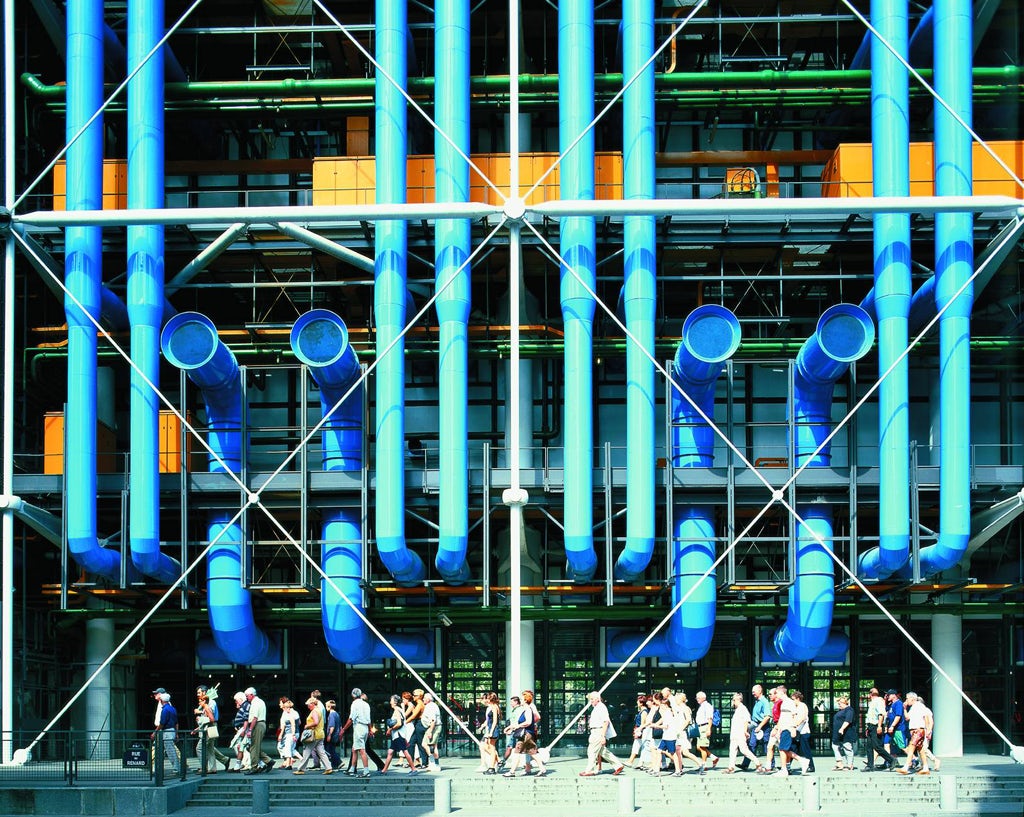
Centre Pompidou by Piano + Rogers.© Royal Academy of Arts. Via Metalocus

2. Color Me Stunning

Black turtleneck clichés abound, many architects would consider themselves somewhat allergic to color — there is nothing like a high-contrast monochromatic image to accentuate the striking forms and uncompromising lines of a modernist icon by Niemeyer or Corbusier.

However, it is possible — bear with me here — for a flash of color could provide a distinctive, eye-catching moment within your image, communicating architectural language by accentuating a window reveal, a soffit, or a key structural element. Try photographing the work of Richard Rogers, with his vibrant Pompidou ductwork, to kick-start your newfound love affair with color.

© Trey Ratcliff. Via PhotographyMad

3. The Rule Of Thirds

The Rule of Thirds is typically recognized as a safe bet when considering composition in photography: keep your primary subject or focal point off centre, a third of the way across the view, to creating additional tension, energy and interest within the image. For more distant shots, a composition should have balance and weight if the horizon sits a third of the way up the image.

Having said all this, if your subject lends itself to a centred composition, or a zoomed-in detail, go right ahead – rules are made to be broken!

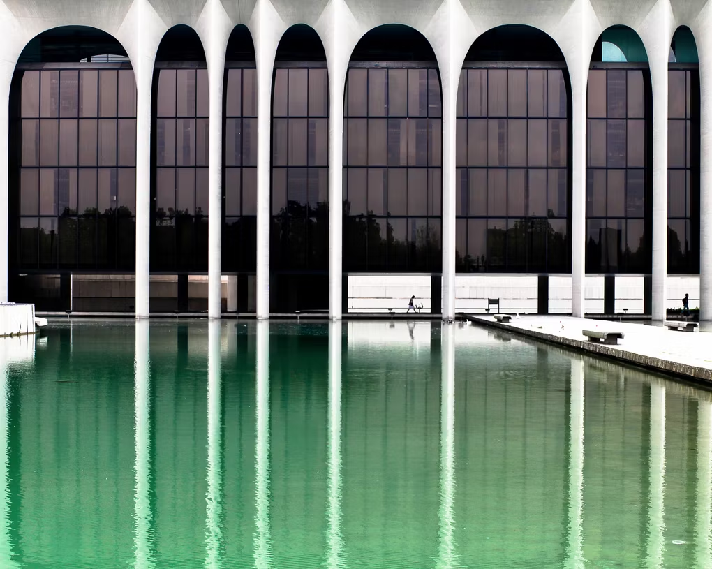
© Ezio Beschi. Via Flickr

4. Rhyme and Rhythm

A certain Johann Wolfgang once compared architecture to frozen music, and you can see his point: Some of the greatest works in our time have some wonderful rhythmic qualities. If you can find the right angle from which to take your photograph, these rhythms can be emphasized, revealing the logic behind the designer’s thinking and the structural qualities of the building in a single, stunning image.

Once you have those repeated elements within your viewfinder, align diagonal lines of perspective with the corners of the photograph to add depth and balance in equal measure.

Hong Kong High Rise. © Michael Wolf. Via Daily Mail

5. Clean vs. Chaotic

A classic architectural cliché is illustrated in that most infamous of Tumblrs, ‘Unhappy Hipsters’: Clean-cut minimalism, free from even the slightest speck of dust, a children’s toy, or — heaven forbid — a smiling face. However, consider shooting buildings in all their ugly glory: Anarchic apartment blocks, traffic-filled streetscapes and rusting industrial monoliths can tell a story that your slick, set-piece image may never manage.

The same can be said for weather: Capturing your favorite architectural icon on a crisp, clear day is just fine, but what about shooting it during the chaos of a thunderstorm, or even a blizzard? Brave the elements and find out, hardy souls.

‘Break Point’. © Darell Godliman. ViaBD Online

‘The Urban Lantern’. Via BD Online

6. The Human Touch

Speaking of smiling faces, who needs ’em? I have spent many a long day waiting with growing frustration as people walk in front of the church or museum elevation I’m trying to catch a perfect, person-free image of. We are all about the architecture, not the portraiture… right?

Ok, I must grudgingly admit that sometimes people can add an awful lot to your photograph. From a practical point of view, they provide comparable scale — tiny people in front of gargantuan skyscrapers really throw the urban environment into sharp perspective. On top of this, they can also provide that vital injection of cultural and social context — after all, without their inhabitants, buildings are merely objects upon the plains.

© Scott Fillmer

© Scott Fillmer

Via Craft Hubs

7. All the Gear, No Idea

If you search around the internet for architectural photography guides, you will be swamped with a plethora of recommendations regarding equipment and specifications: wide-angle lenses, tripods, tilt-shift lenses, polarising filters, bellows for detail shots, long exposures for night scenes, varied apertures… the list goes on.

If you are just starting out, reading about all of this can be bewildering – but ultimately, the best way to learn is to get out there and experiment. You will soon learn how the gear works and which settings will give you the result you are looking for.

Right, I’m off to the dark room, excuse me…


Submit your best architectural photo in the inaugural One Photo Challenge for shot at $2,500 and global recognition:

Enter the One Photo Challenge

Top Image: 56 Leonard Street by Herzog & de Meuron, photographed by One Photo Challenge juror Paul Clemence.

Reference