Architectural innovation and creativity go hand in hand. Designers are constantly seeking new ways to push boundaries, challenge norms, and create buildings that resonate with places and people. One material that is increasingly being harnessed to this end is perforated metal, with a multitude of high-tech systems now available to architects looking for customizable wall and façade solutions.
One such example is the ImageWall system by Zahner, a renowned engineering and fabrication company with a long-standing reputation for its work with architects. Developed specifically for perforated metal panels, it offers a range of diverse qualities for projects across typologies and climates.
 Zahner became known for advanced metal surfaces and systems with both functional and ornamental forms. With ImageWall, Zahner has created a system that offers design versatility to make immersive experiences. With its accessible design tools, affordability, and wide range of applications, the perforated metal panel system empowers designers and architects to bring their visions to life.
Whether used in commercial, hospitality, retail, or residential settings, this material provides a customizable canvas for integrating backlighting, materials, and graphics. In this guide, we’ll explore the creative potential of perforated metal panel systems like ImageWall, from the design process to technical detailing and application.
Conceptualization: Pushing the Boundaries of Design
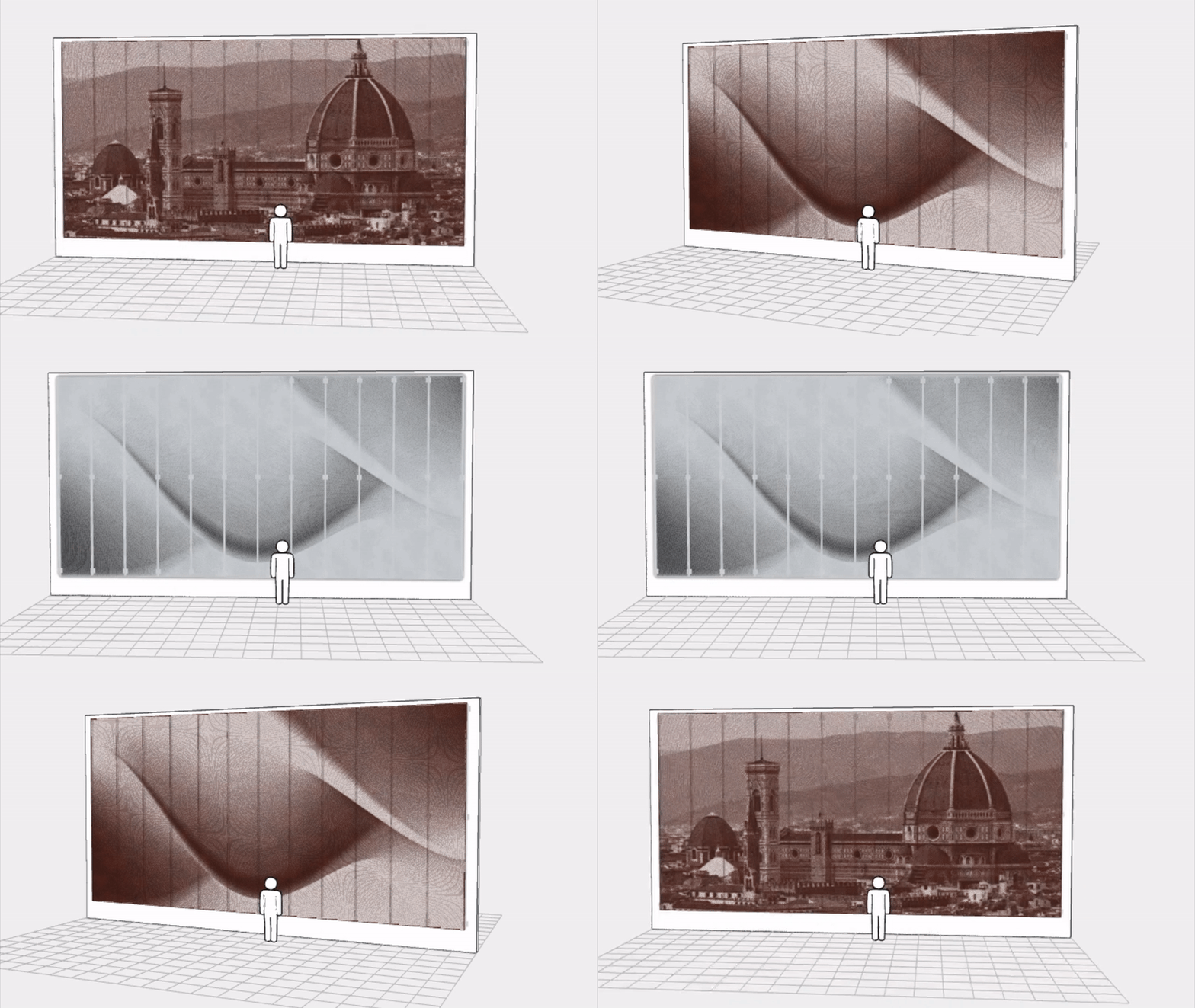
 One of the most remarkable aspects of the ImageWall system is its accessibility to designers. Gone are the days of tedious back-and-forth communication. With this system, designers can now conceptualize and design directly within an intuitive online visualizer tool on the Zahner website.
This streamlines the design process and empowers architects to bring their visions to life more efficiently than ever before. The accessibility provided by the system fosters a greater sense of creative freedom, allowing designers to experiment, iterate, and explore a multitude of design options.
Design With ImageWall
Recently, Zahner Labs has further developed the system with ImageLines — an additional customization for generating perforated images. As the team explains, perforations are positioned by an array of customizable lines or curves, while perforation size is driven by a source image. Try it out; it’s easy to upload an image to the configurator and see how ImageLines takes perforated façades to the next level.
Technical Details: Streamlined Installation and Pre-Engineered Elements
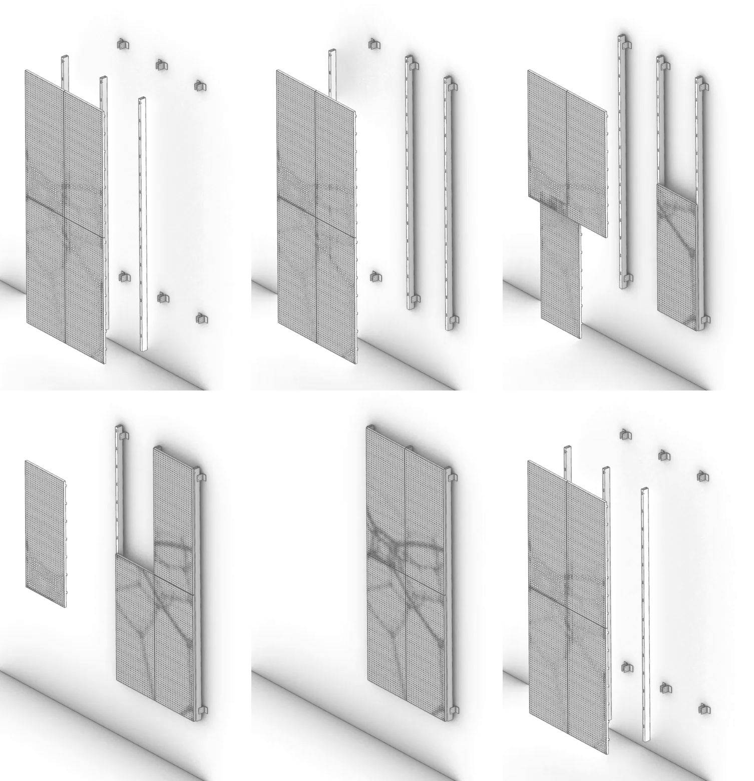 The ImageWall perforated metal panels not only look beautiful, but also allow for more streamlined detailing. Through the use of pre-engineered elements and easy-install systems, the cost and lead times are significantly reduced compared to traditional custom solutions. This makes affordability a key advantage offered by Zahner’s system.
Their product also allows clients with tighter budgets to benefit from the company’s reputation for quality craftsmanship and design expertise. In turn, the evolution from custom projects to a pre-engineered product demonstrates Zahner’s commitment to making cutting-edge design accessible to a wider audience.
Download ImageWall Details
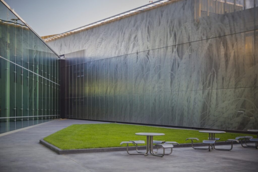
 From sleek and modern metals like stainless steel and aluminum to warm and inviting materials like pre-weathered weathering steel and copper, ImageWall provides architects and designers with a wide selection of options to suit their desired aesthetic.
Additionally, the system can incorporate other materials such as glass, ceramics, or options like recycled materials, ensuring that each project can be uniquely tailored to meet the specific design requirements and desired visual impact. The versatility in material choices offered enables the creation of customized architectural elements that seamlessly integrate into a design.
Applications: Versatility Across Architectural Typologies
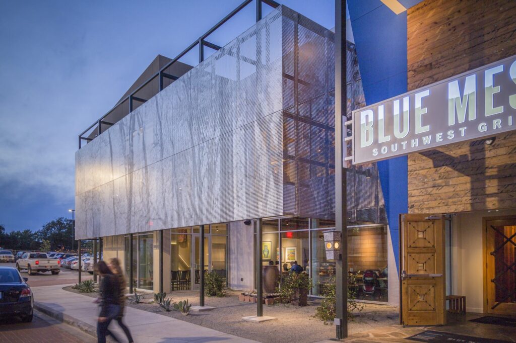
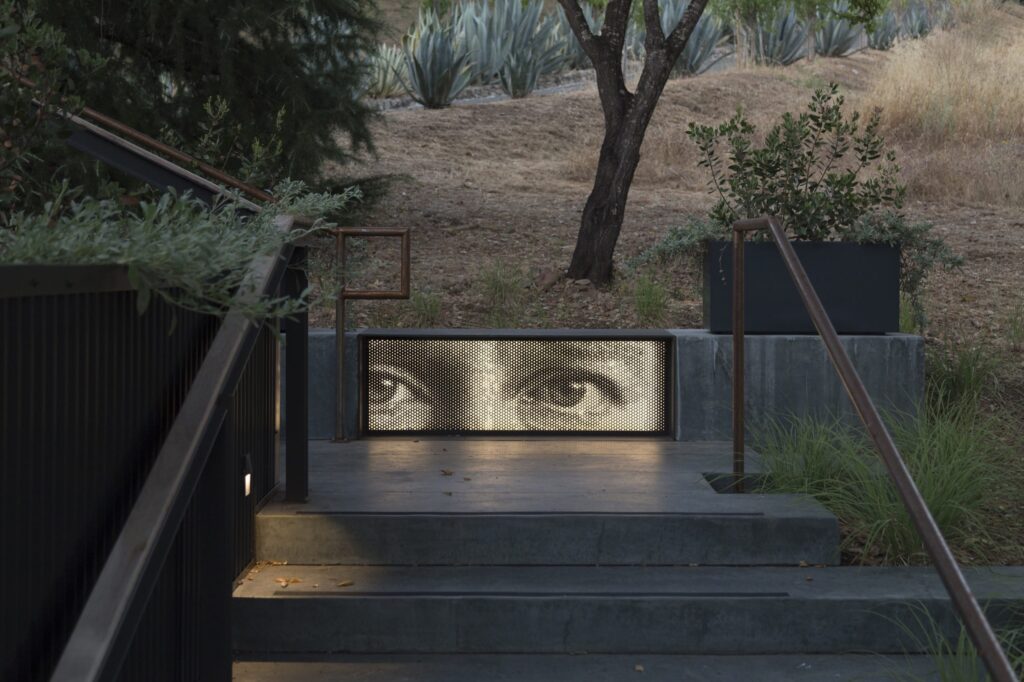 At its heart, Zahner’s system has wide-ranging applications across architectural typologies. From commercial buildings to hospitality spaces, retail environments to multi-unit residential common areas, ImageWall seamlessly integrates with other building systems, structures, and assemblies.
This adaptability makes it a valuable tool for architects and designers working on a diverse range of projects. Whether it’s an eye-catching façade for a high-end hotel, an immersive retail environment, or a statement piece in a public space, the system offers endless possibilities for enhancing the appeal of a structure, entry or interior.
Creative Possibilities: Enhancing Design with Light, Materials, and Graphics
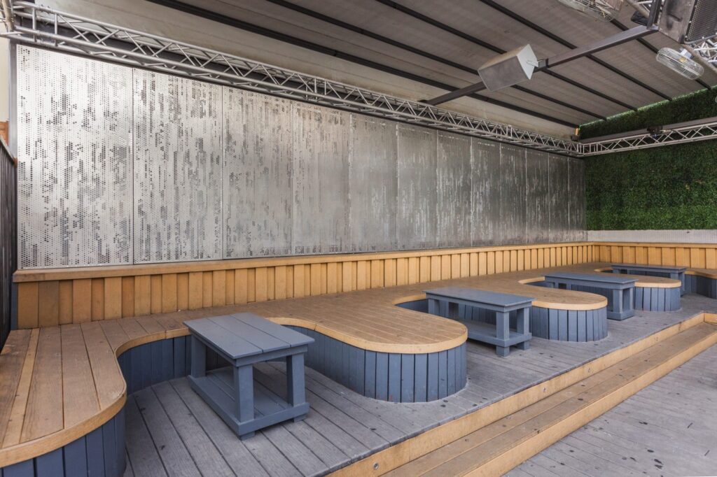 ImageWall offers a myriad of creative possibilities, including lighting options, material choices, and graphic integration. Backlighting adds a whole new dimension to architectural design, bringing depth, texture, and visual interest to spaces.
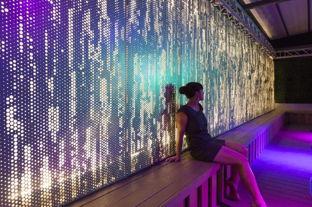 With a vast array of materials to choose from, architects can find the perfect match for their desired aesthetic, whether it be sleek and modern or warm and organic. The graphic options also enable the integration of custom patterns, logos, or artwork, allowing architects to create truly unique and memorable spaces that leave a lasting impression.
Case Studies: Showcasing the Power of ImageWall
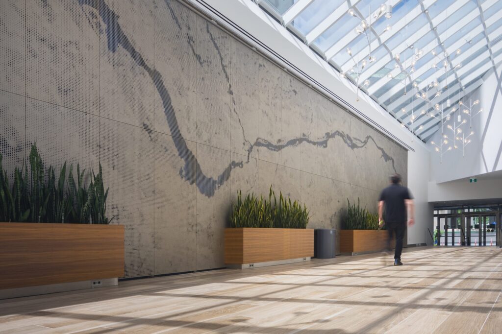 To appreciate the capabilities of perforated metal panels, there are many noteworthy case studies. For example, the ImageWall system was employed only a short walk from Canada’s Parliament buildings in Ottawa, Ontario, where the team of B+H Architects and Morguard collaborated with Zahner to enhance the experience of entering their office complex at 350 Sparks. The installation of custom perforated wall art showcases the journey along the Ottawa River adjacent to Parliament Hill. Zahner supplied 1,563 visible square feet of aluminum panels and associated sub-framing for the installation.
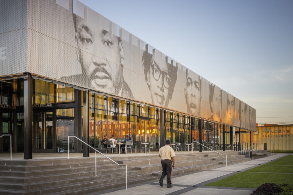 Zahner also collaborated on the Legacy Pavilion for The Equal Justice Initiative. The Pavilion, designed by Williams Blackstock Architects, is the EJI Museum campus’ new building. Zahner engineered and fabricated the custom Angel Hair stainless steel that clads the exterior of the building, which depicts the iconic images of several local civil rights activists that inspire hope for equal justice. In a similar way, two ImageWall murals clad the east and north sides of 1256 Penn Ave, featuring individual portrait panels of renowned local civil rights activists that helped shape the culture of Minneapolis.
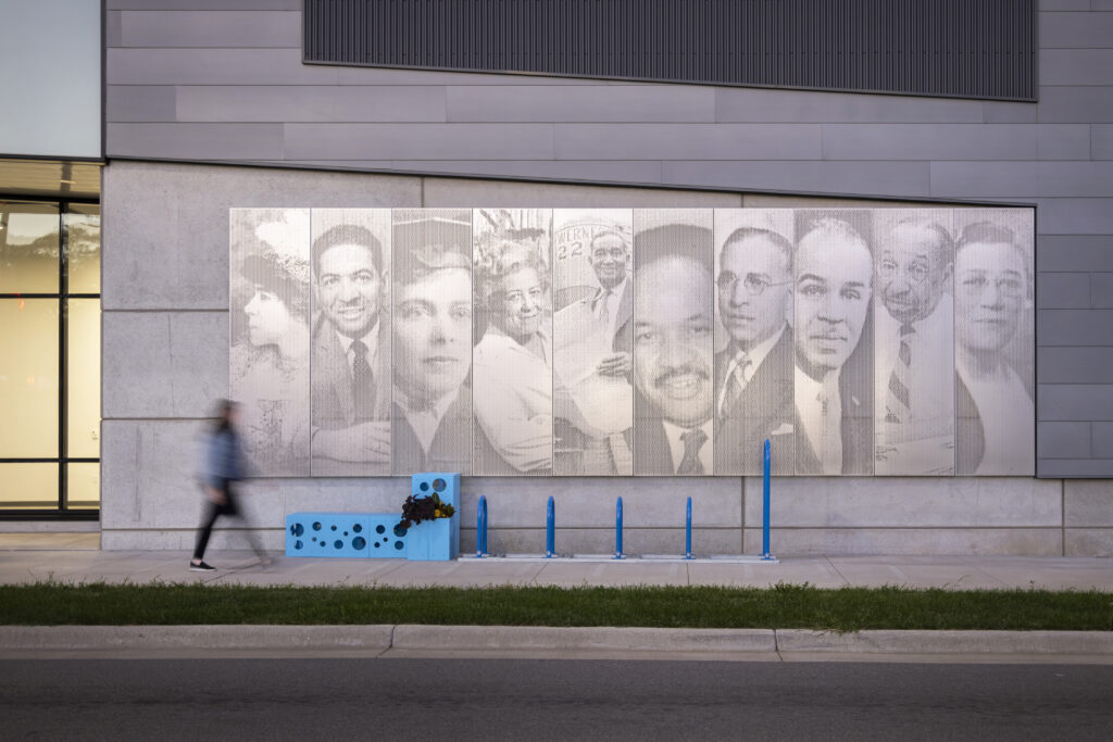 These case studies demonstrate how Zahner’s perforated metal panel system can be utilized by architects to enhance their designs. Its adaptability, material options, and creative possibilities have allowed architects to push boundaries and transform their visions into new landmarks.
Explore More Projects
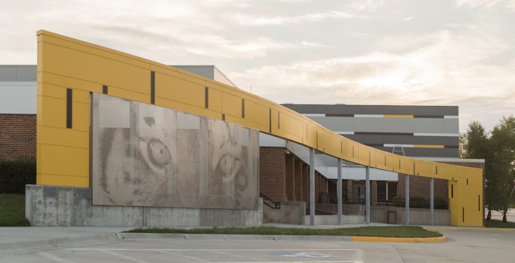 ImageWall represents the evolution of architectural solutions, bridging the gap between visionary concepts and practical implementation. Its accessibility to designers, affordability, wide range of applications, and design potential make it a versatile and valuable tool for architects and designers alike.
As Zahner continues to push boundaries and redefine what is possible in architectural design, the system stands as a testament to their ability to transform visionary concepts into innovative architecture products and systems.
Learn more about ImageWall here, start designing your own custom perforated panel here, and reach out to Zahner’s specialists about your next project here.
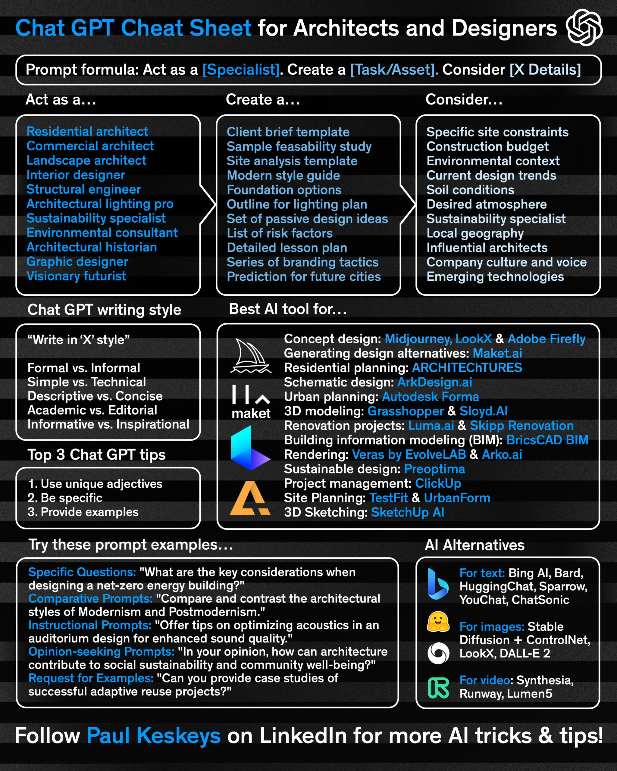 Here are three quick tips to make the most out of this sheet:

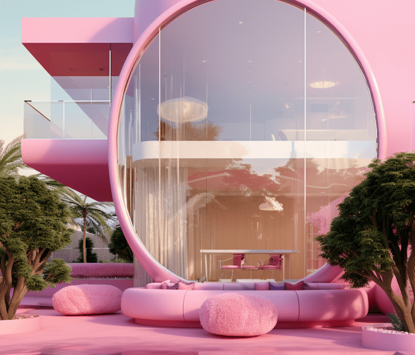
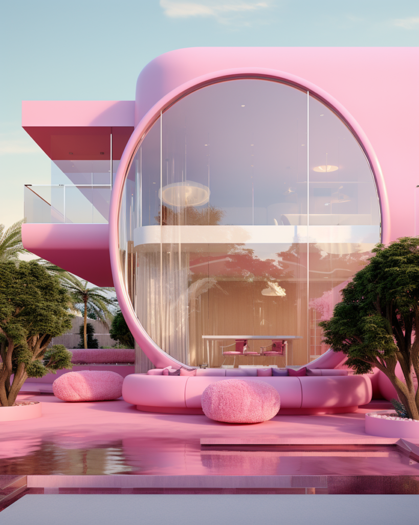
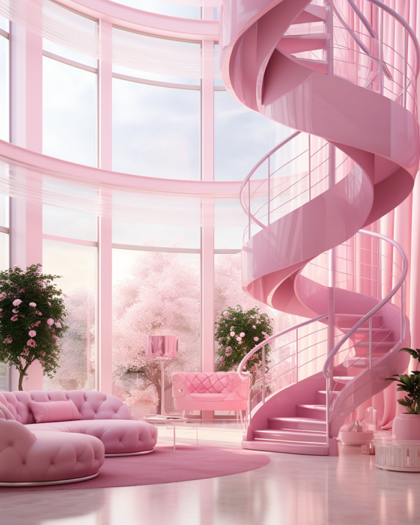
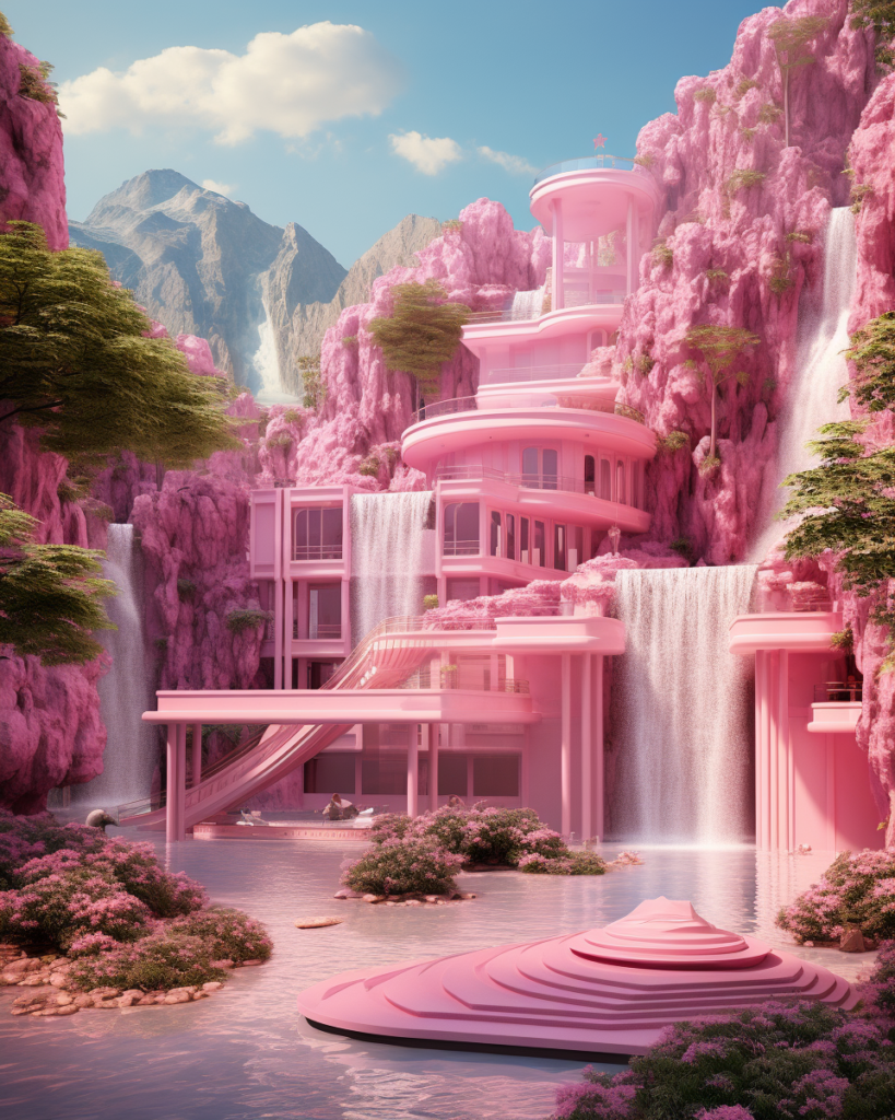
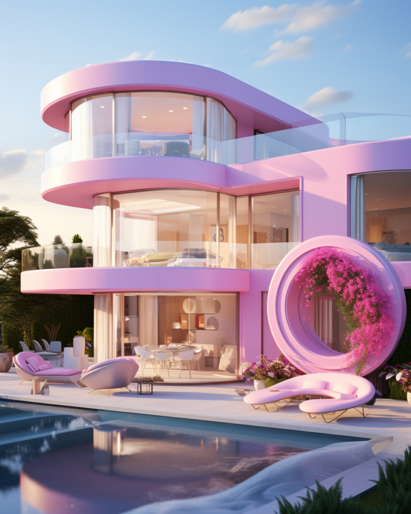
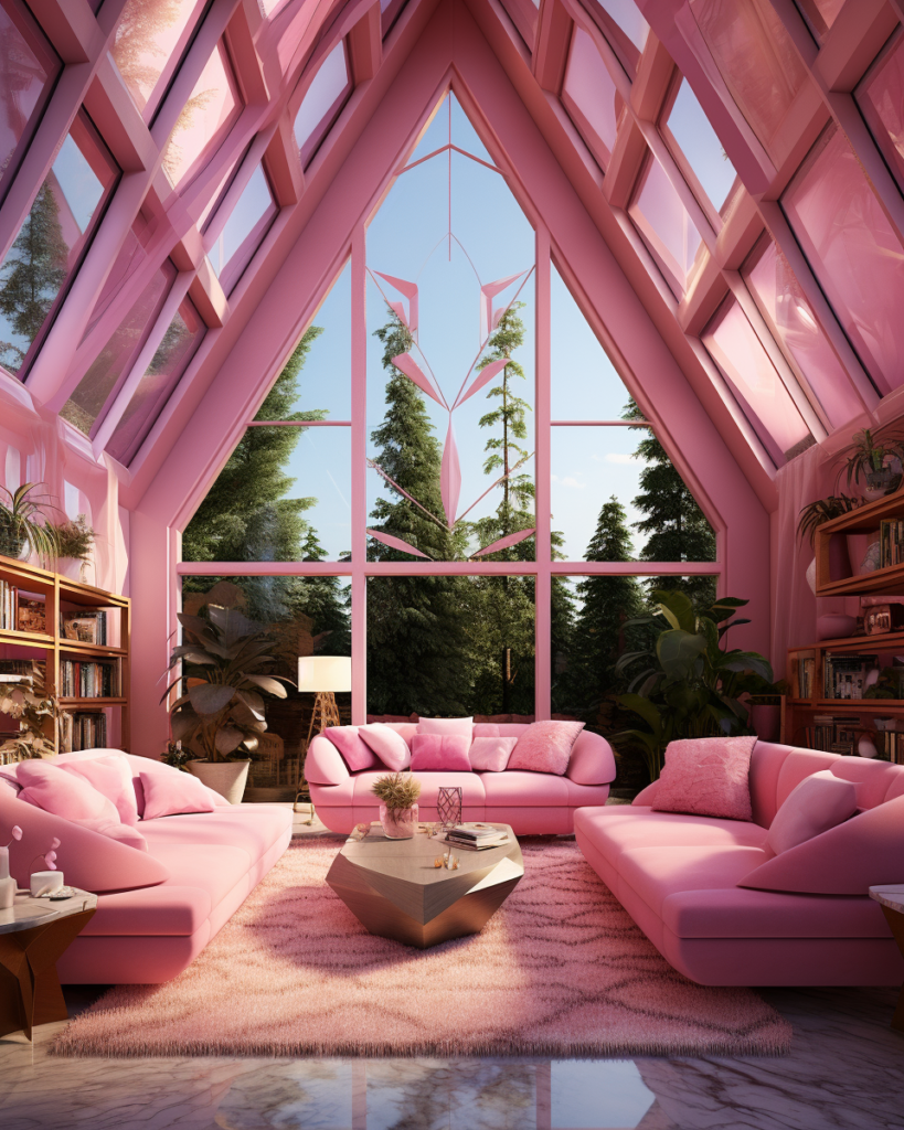
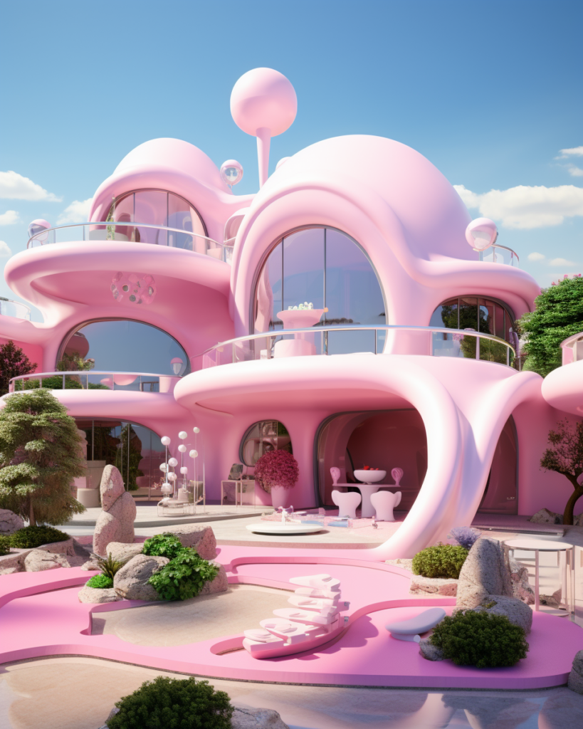
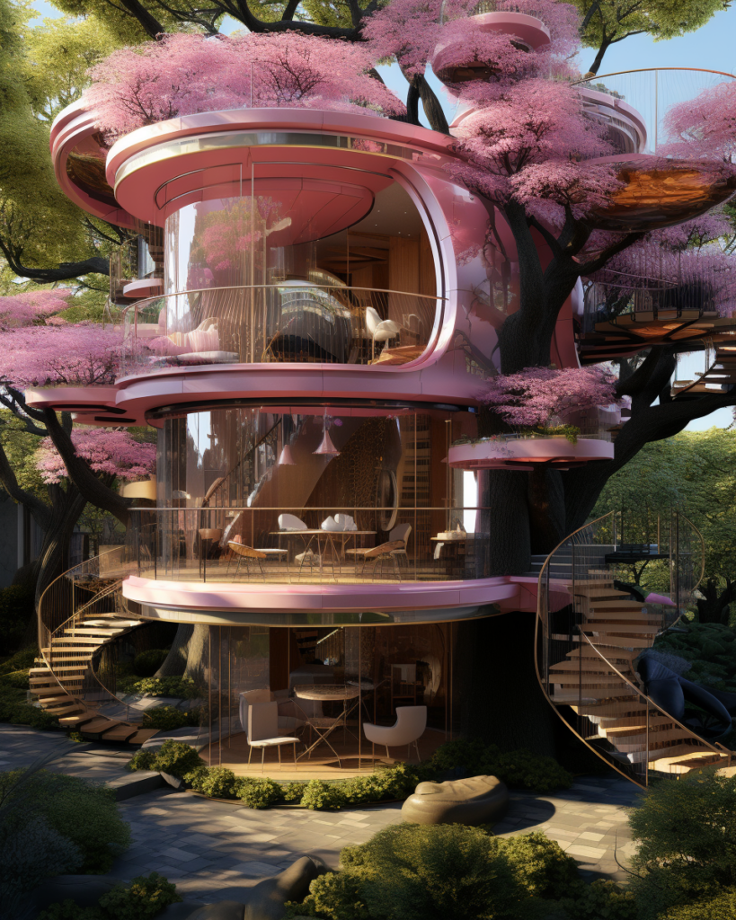
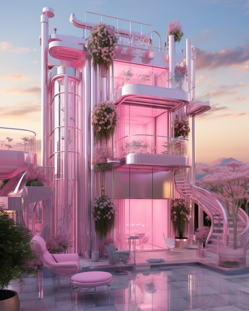
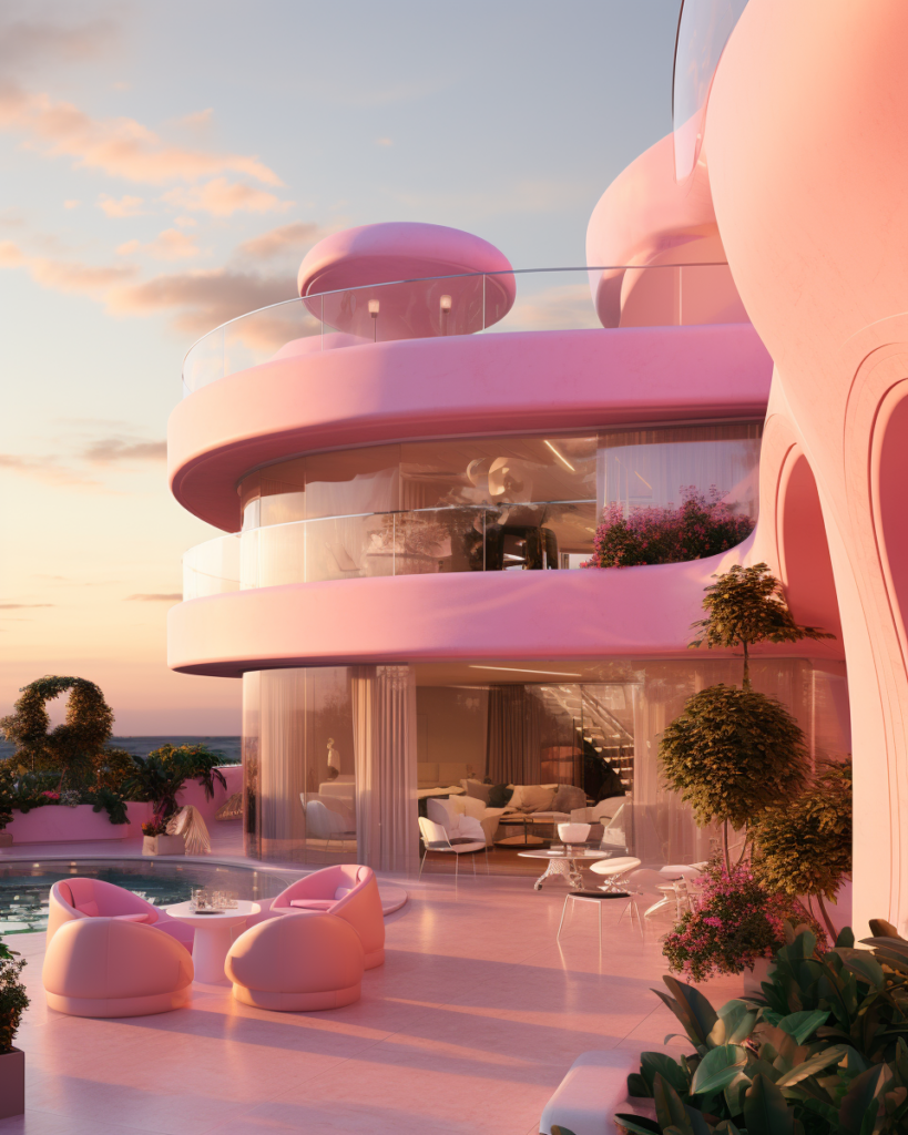
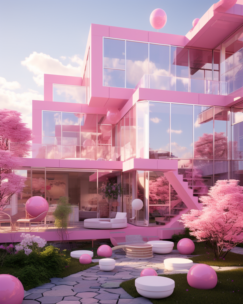
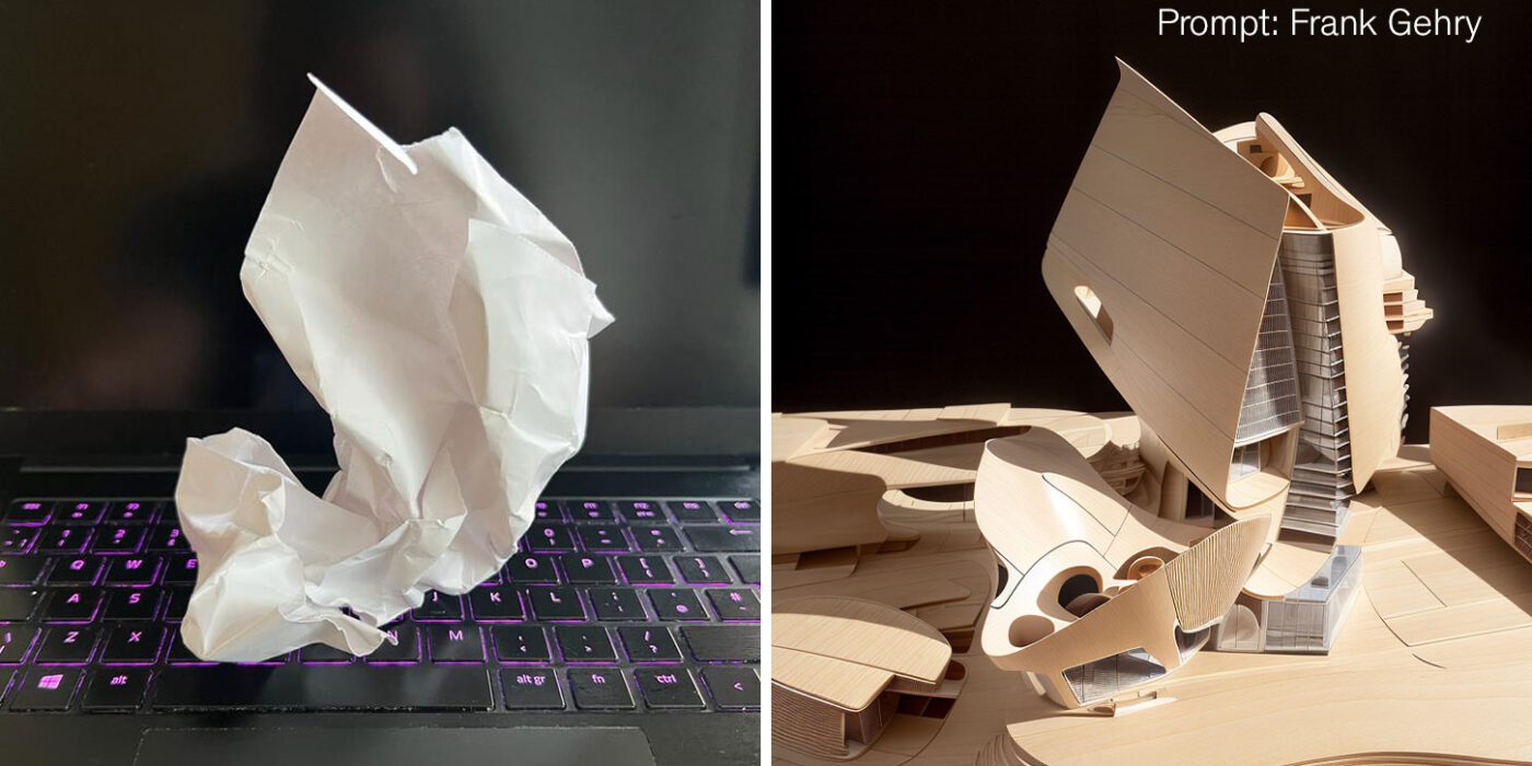
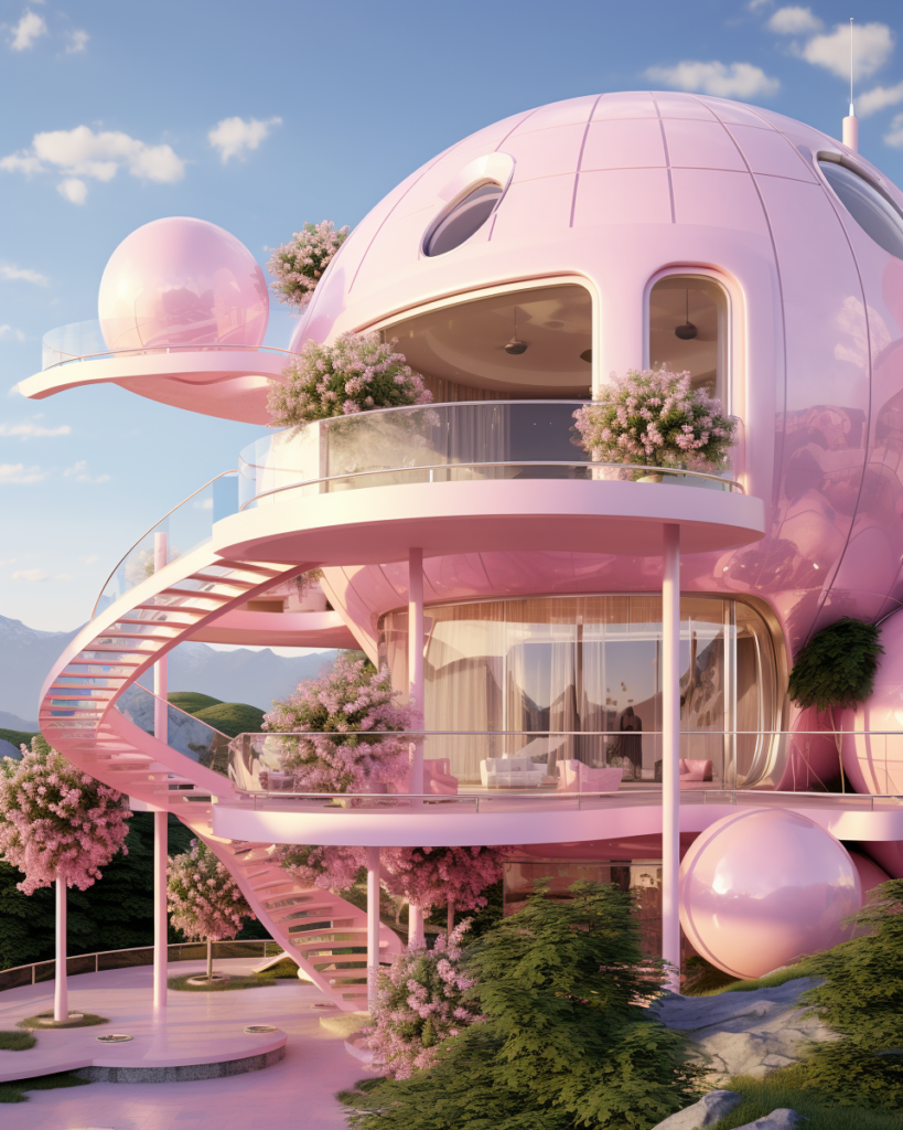 Barbie Dreamhouse Prompt Formula
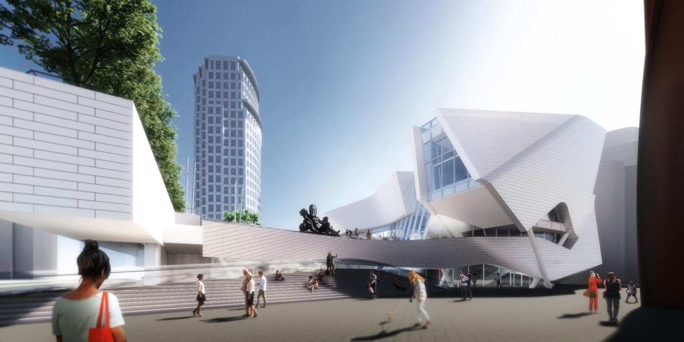
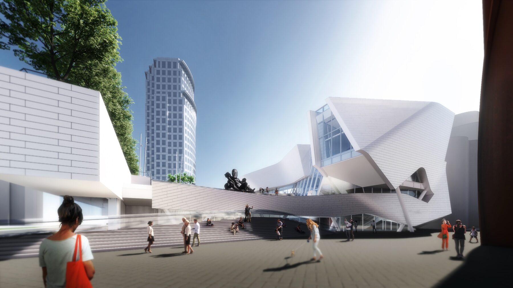
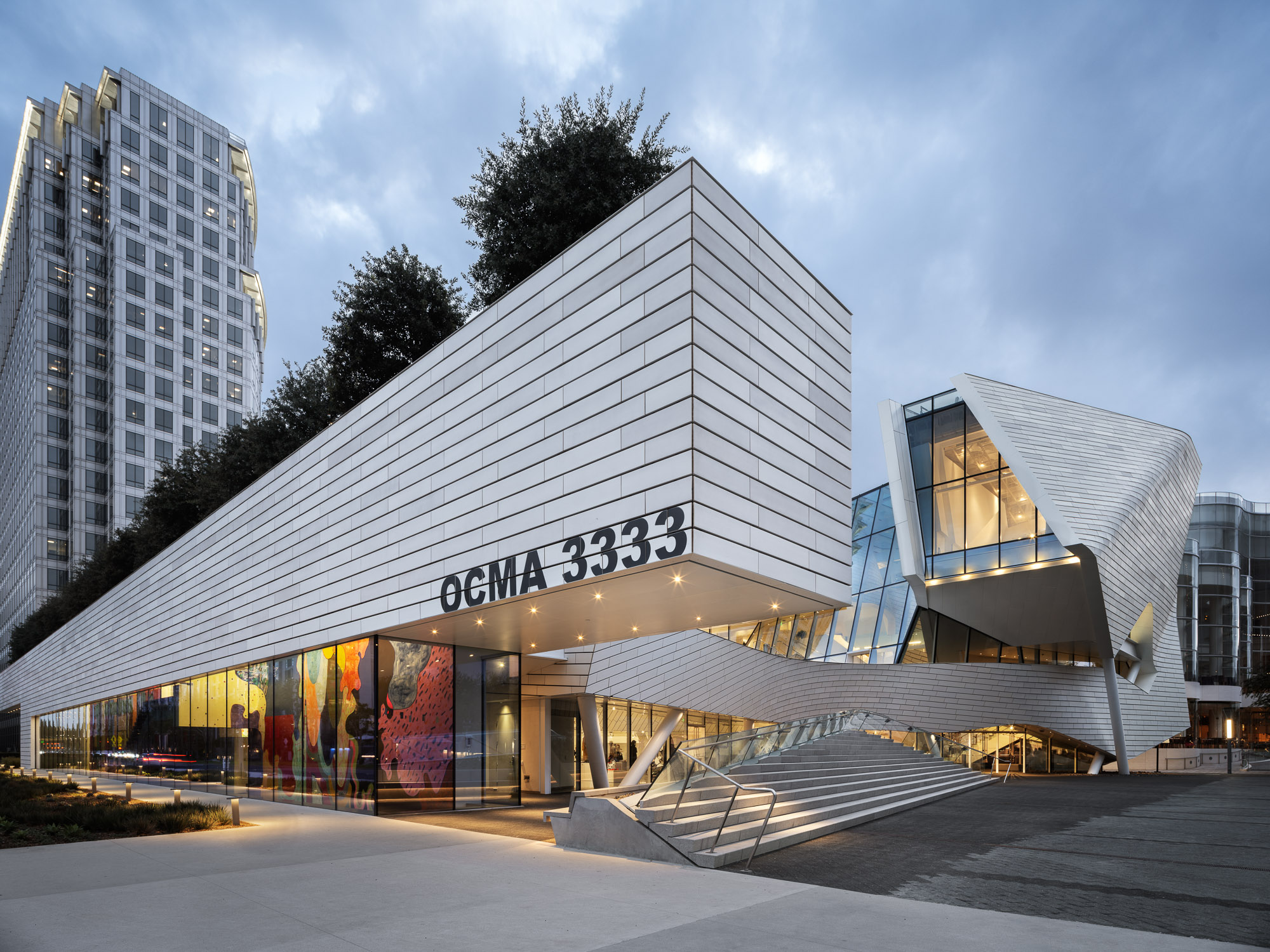 The design of the new Orange County Museum of Art addresses the need for museum space to be both flexible and functional as well as inviting and memorable. With flexible exhibition galleries, dedicated space for educational programming, and areas for public gathering, the new building was made to provide expanded access to the museum’s permanent collection and its world-class special exhibition program. The main floor is dedicated to reconfigurable open-span exhibition space, complemented by mezzanine, black-box, and jewel-box galleries that can accommodate temporary and permanent collection exhibitions spanning scales and mediums.
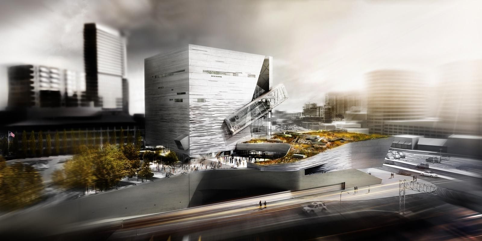
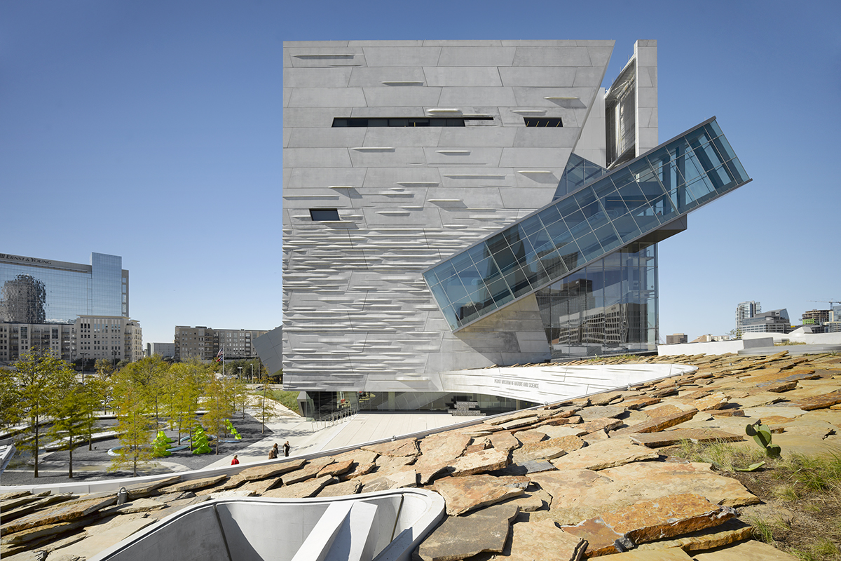 Giving shape to concrete, Morphosis Architects explored the material’s potential through the Perot Museum of Nature and Science in Dallas. Built to bring a simple cube and plinth into high relief, the Perot Museum showcases a precast-concrete panel façade. As a material investigation integrating structure and formwork, the elegant cladding solution was made possible through computer aided modeling and a collaboration with Gate Precast of Hillsboro, Texas.
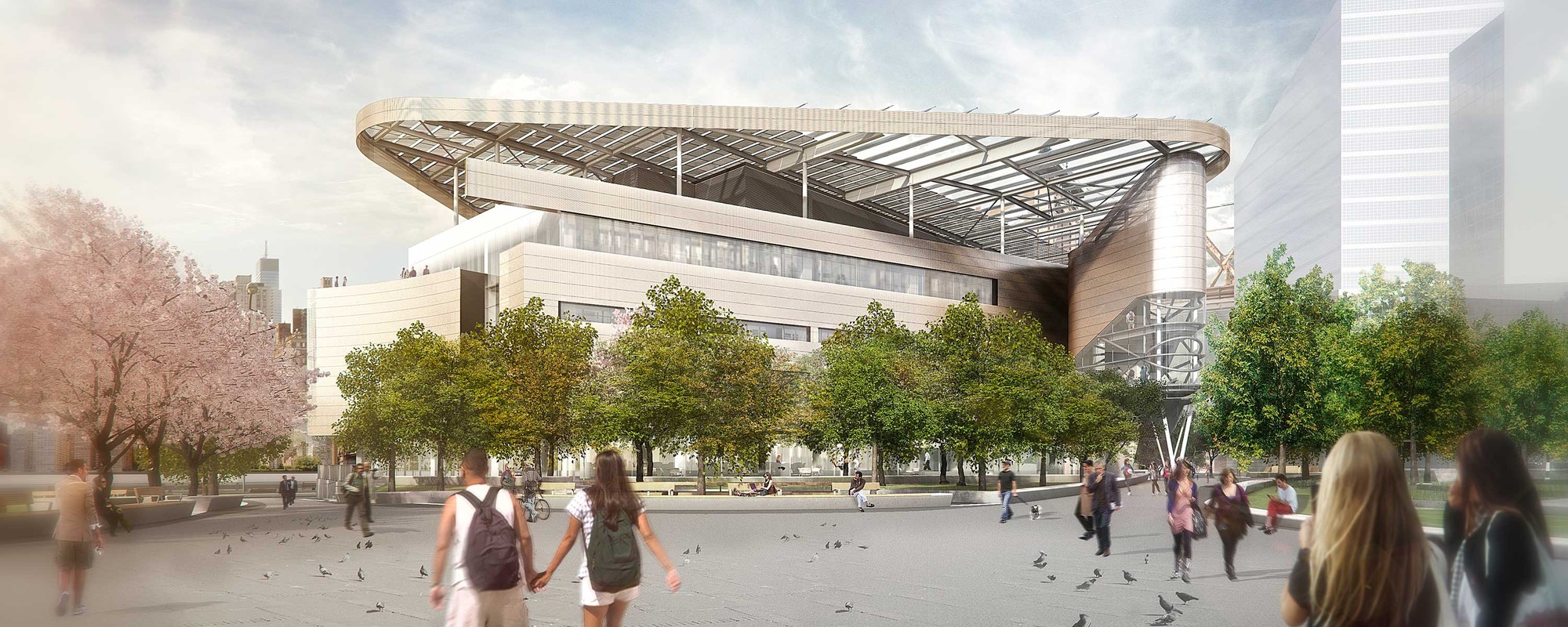
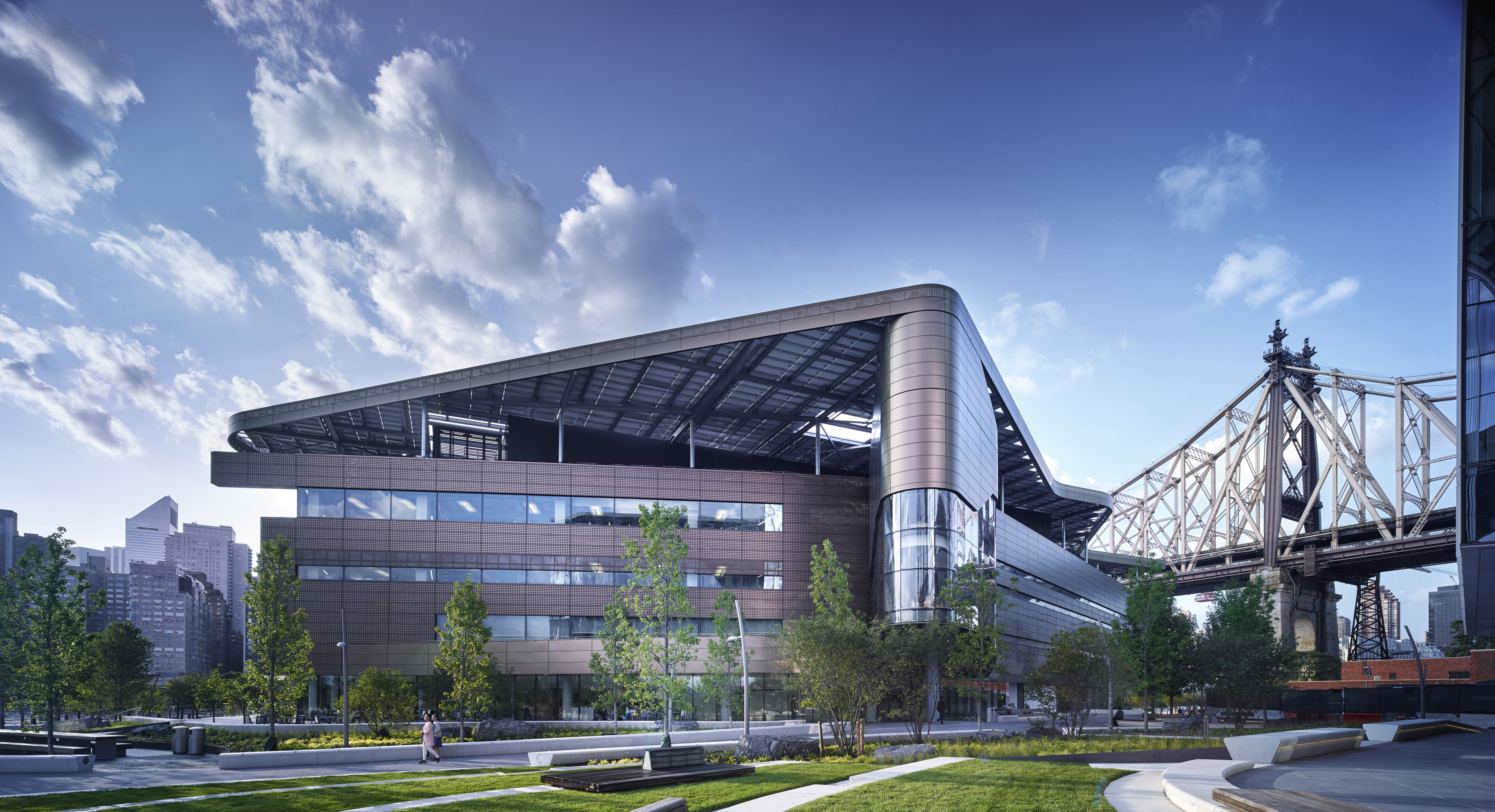 Designed to become a net-zero building, The Bloomberg Center forms the heart of the Cornell Tech campus on Roosevelt Island. The Bloomberg Center was made to reflect the school’s joint goals of creativity and excellence by providing academic spaces that foster collective enterprise and collaboration. The four-story, 160,000-square-foot (14,865-square-meter) academic building is named in honor of Emma and Georgina Bloomberg in recognition of a $100-million gift from Michael Bloomberg, who was responsible for bringing Cornell Tech to New York City while serving as the city’s 108th Mayor. The four-story building is set beneath a photovoltaic canopy with a low and narrow profile framing views across the island.
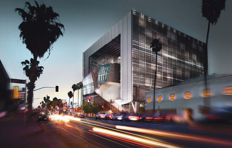
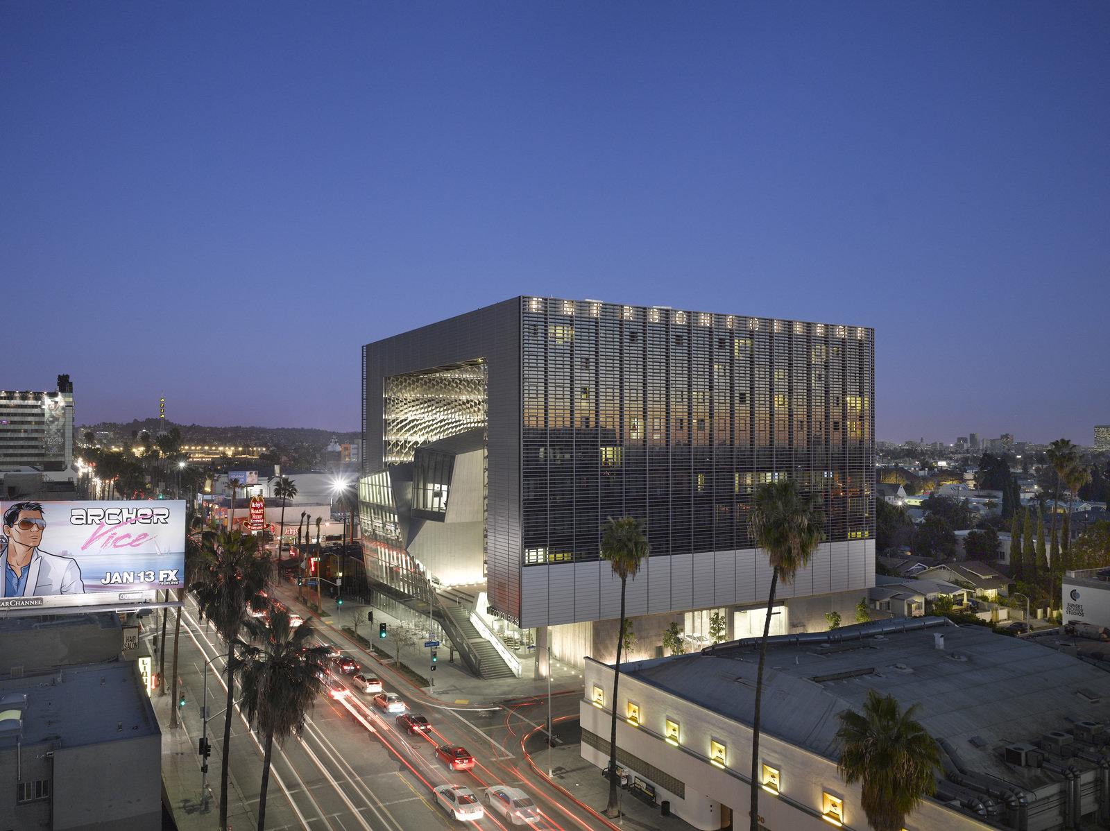 Emerson Los Angeles has emerged as a significant landmark in Los Angeles. As a backdrop for student filmmakers, the building weaves an urban fabric of outdoor and indoor spaces together with two slender residential towers bridged by a multi-use platform. With over 180 student rooms, four faculty apartments, film and video production labs, and classrooms, the project combines both a sculptural central mass and an undulating, textured metal scrim. At over 100,000 square feet (9,290 square meters) and ten stories high, the project spurred redevelopment as part of a larger transformation in Hollywood.
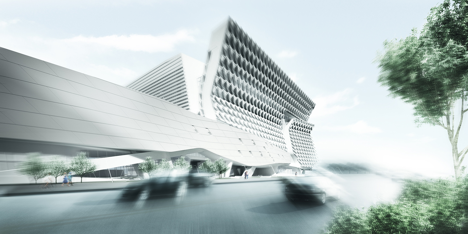
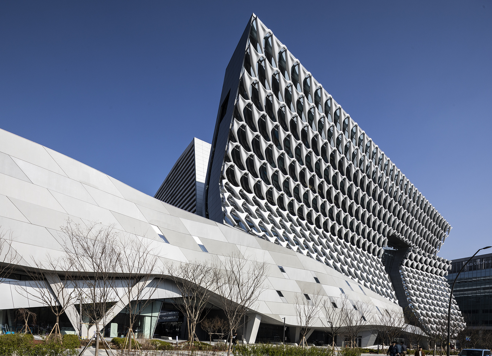 Sited in Seoul, Kolon’s new flagship research and development facility brings together researchers, leadership and designers in one location. The building combines flexible laboratory facilities with executive offices and active social spaces that encourage greater interaction and exchange across the company. The four-acre project site sits adjacent to Magok’s central park — a prominent location for what will be the district’s first major completed building. The building folds towards the park, providing passive shading to the lower floors.
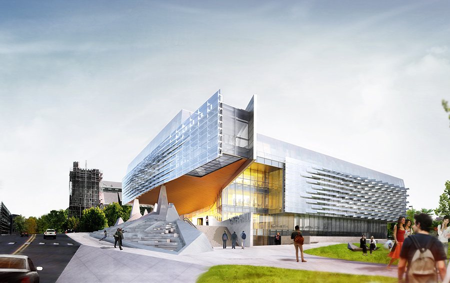
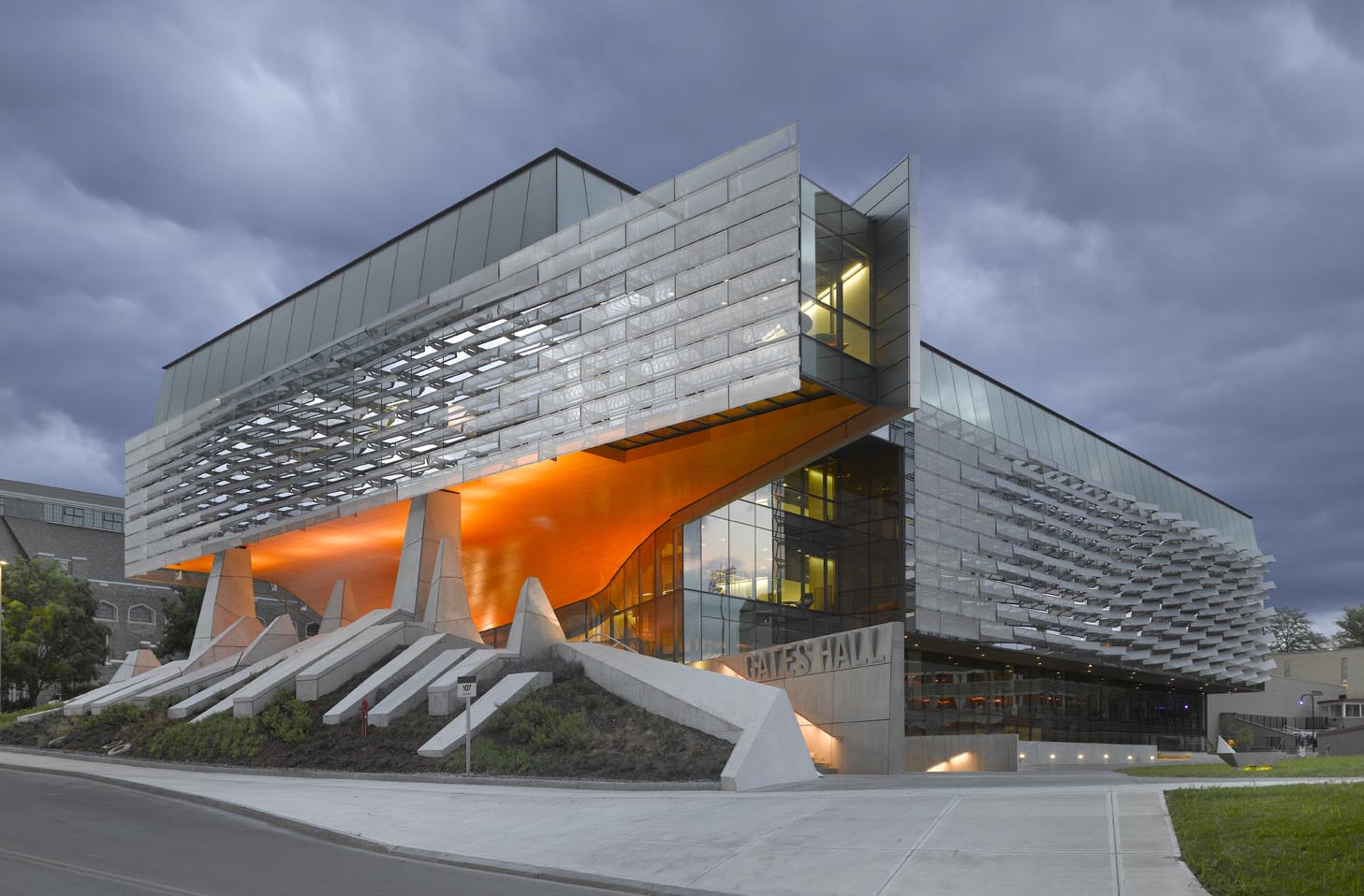 The Bill & Melinda Gates Hall brings together the faculty and students of Cornell University’s Computer Science and Information Science departments. Housed within a single structure, the project was designed to facilitate collaboration and spontaneous discourse between disciplines. Projecting westward from the building, a two-story cantilever creates a dramatic canopy over the elevated Entry Plaza to establish a new visual gateway to the campus. Advanced digital modeling tools are used to map a double skin of undulating, perforated stainless steel panels, which envelop the reflective glass curtain wall on the second and third levels.
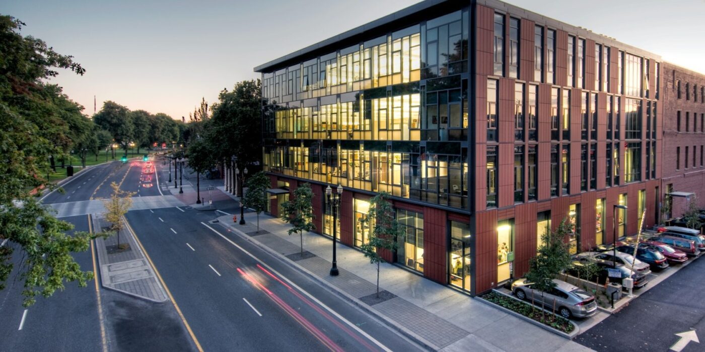
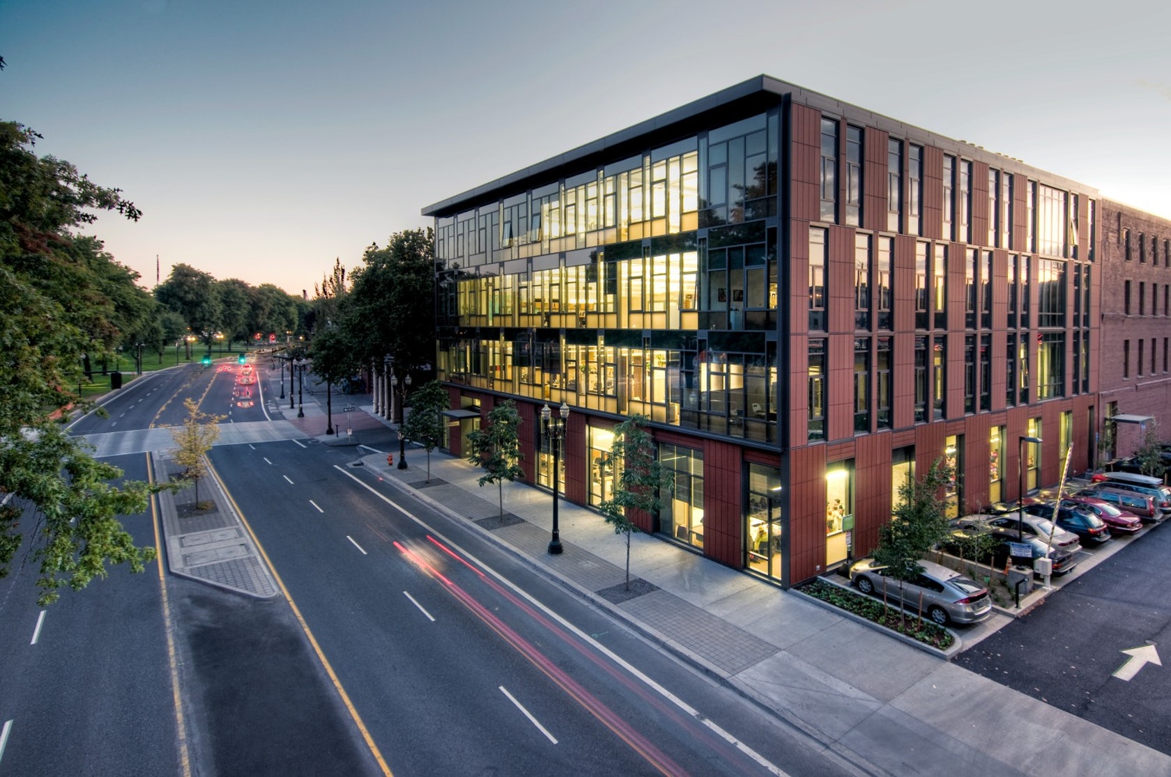
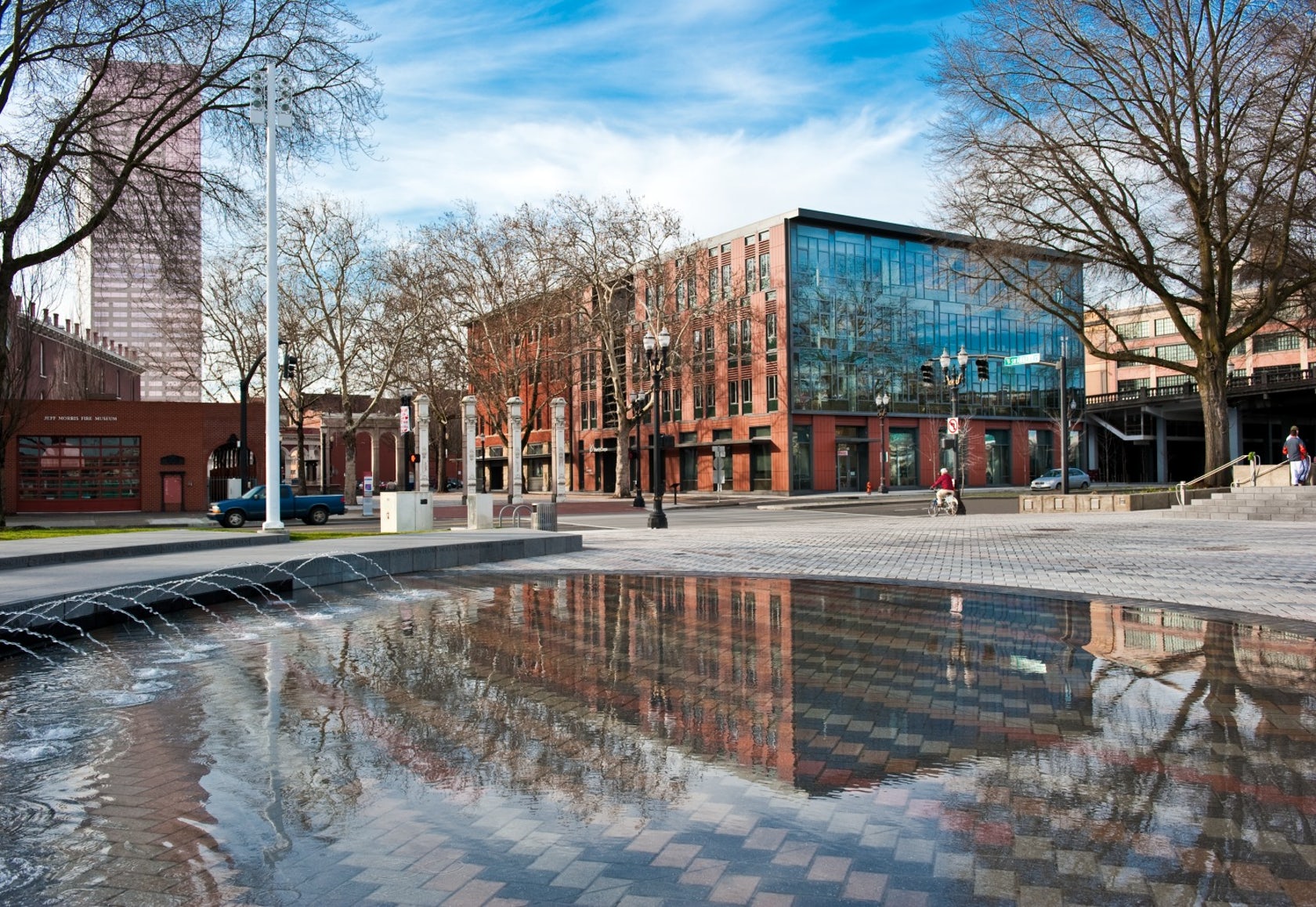 Designed to teach and encourage visitors to engage with contemporary issues, the Mercy Corps building was built to exemplify a sustainable, community-focused approach. Doubling the size of the historic Portland Packer-Scott Building, the landmark project combined a green roof, with resource-friendly landscaping and a glass and terracotta envelope.
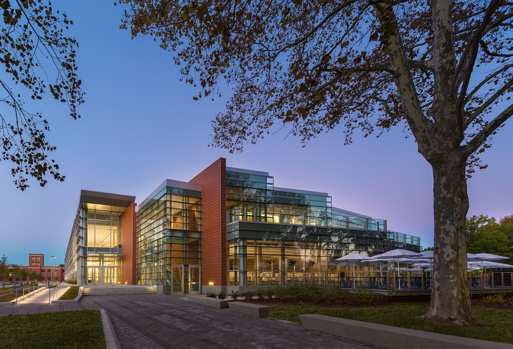
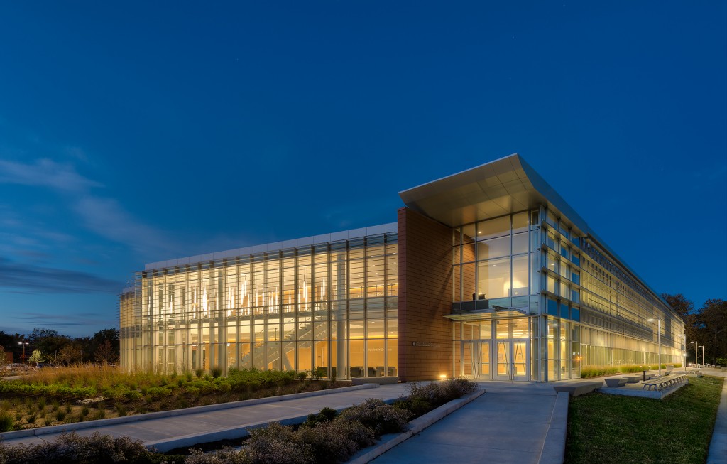
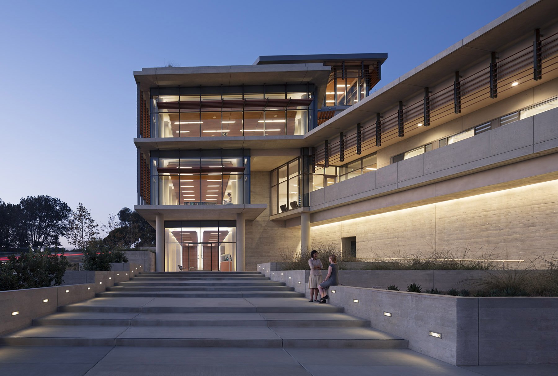
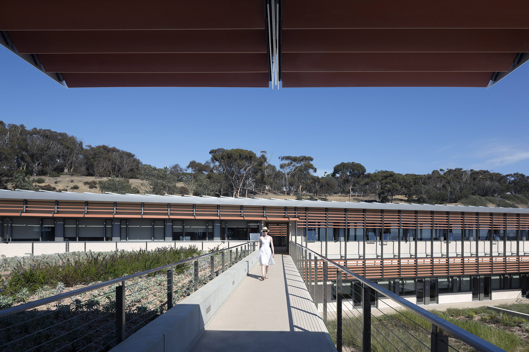 For the design of the National Oceanic and Atmospheric Administration (NOAA)’s Southwest Fisheries building, the team partnered with the University of California San Diego to design a facility that would pay homage to a world-class site and create a sustainable building for environmental stewards of the ocean.
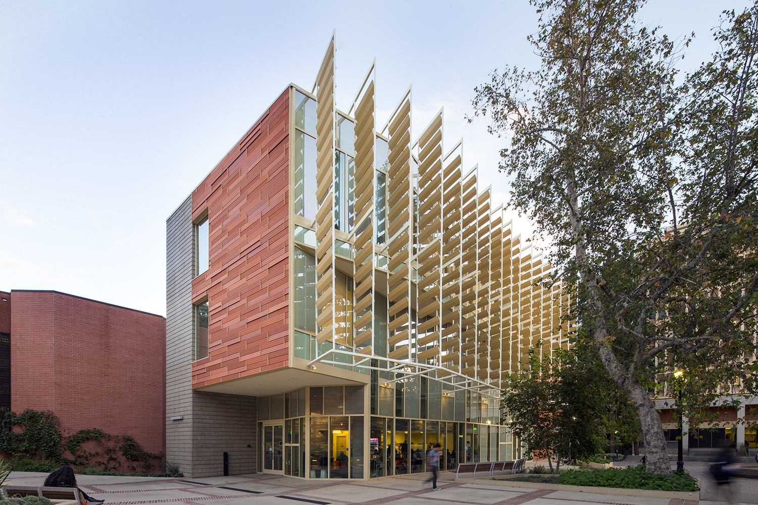
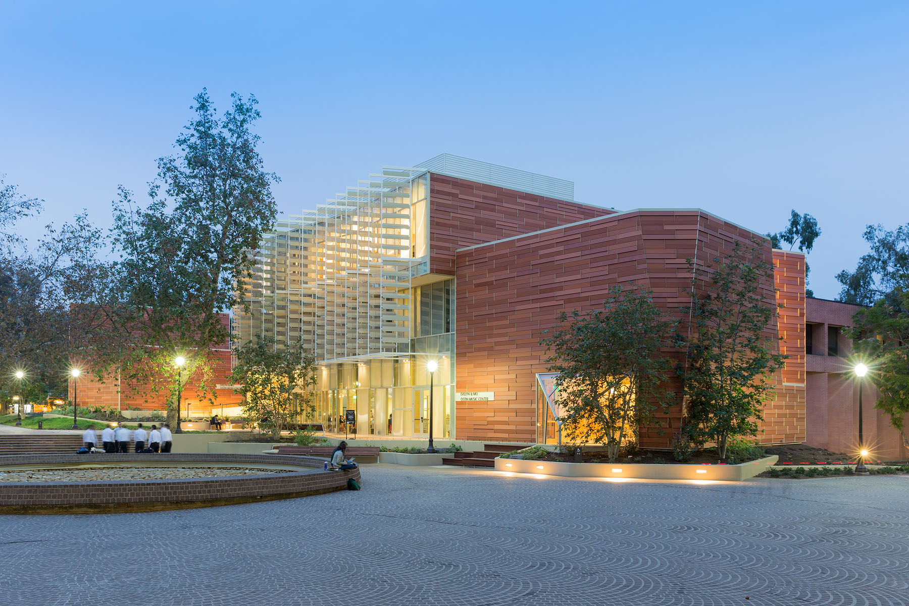 For this music center in Los Angeles ,the project includes a high-tech recording studio, spaces for rehearsal and teaching, a café and social space for students, and an Internet-based music production center. Music industry executive and philanthropist Morris “Mo” Ostin donated $10 million to UCLA for the music facility, now known as the Evelyn and Mo Ostin Music Center. Adjacent to the Schoenberg Music Building and the Inverted Fountain, the new structures provide faculty and students access to the latest advances in music technology, research and technology.
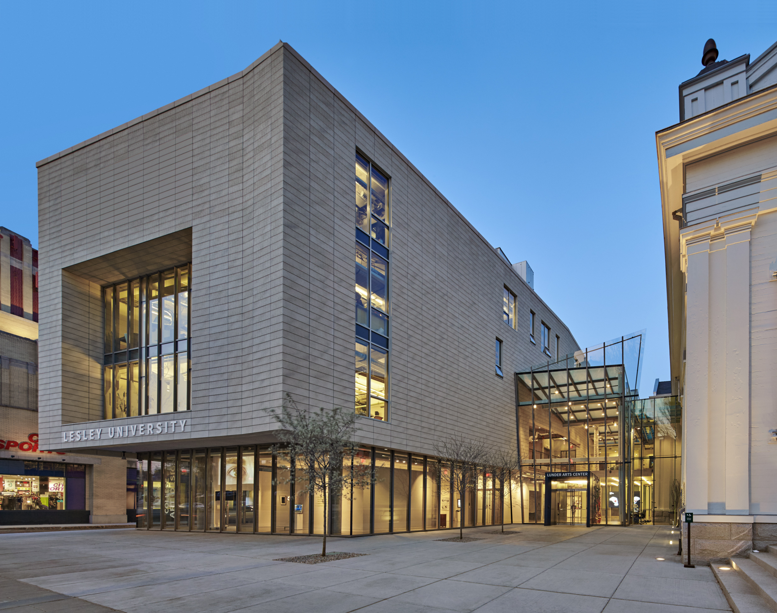
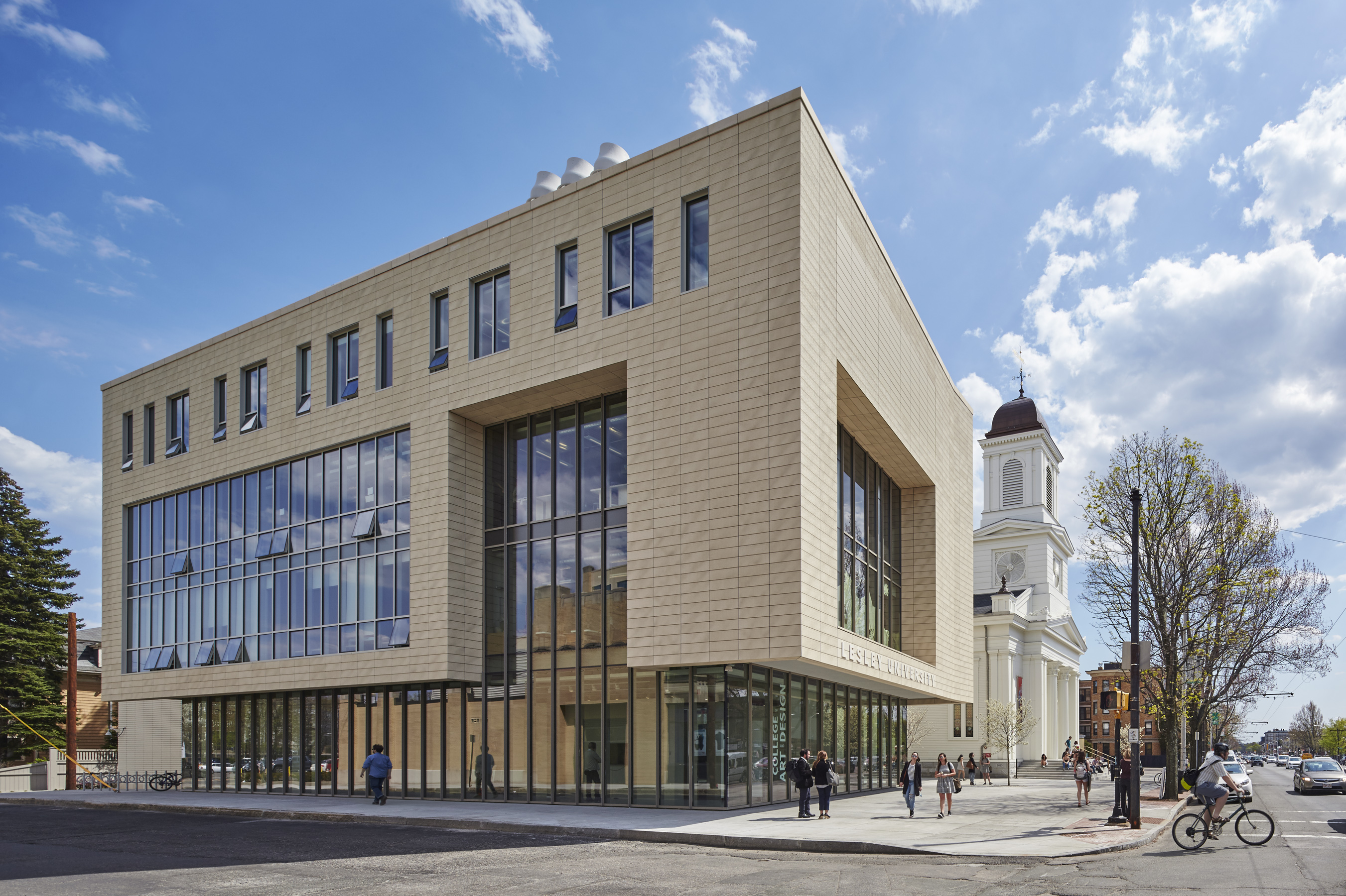 The Lunder Arts Center at Lesley was designed to be the new heart of the College of Art and Design. A center for art teaching and making, the campus is a crossroads for academic, artistic, and neighborhood communities. The terra-cotta and glass design foregrounds the site’s important historic church, initiating a dialog between 19th century religious and 21st century educational icons. An art gallery in the new glass building and a library in the historic church anchor the building at both ends; both are open to the public.
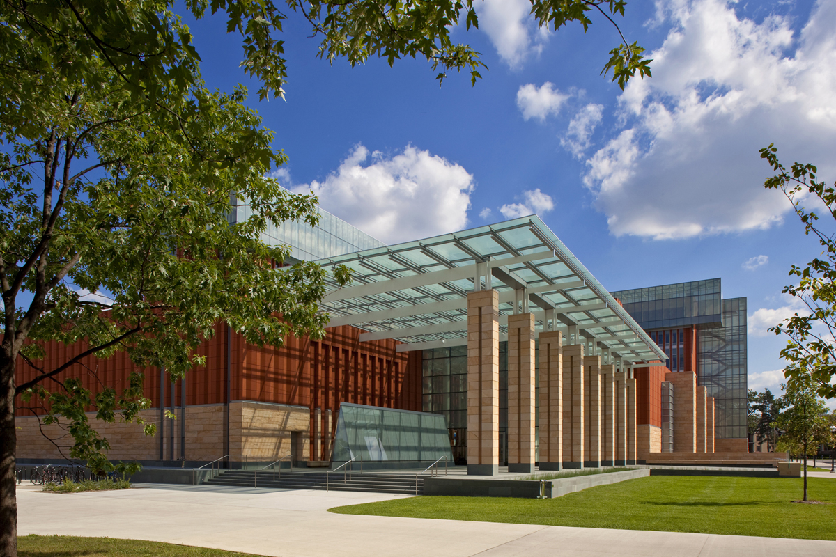
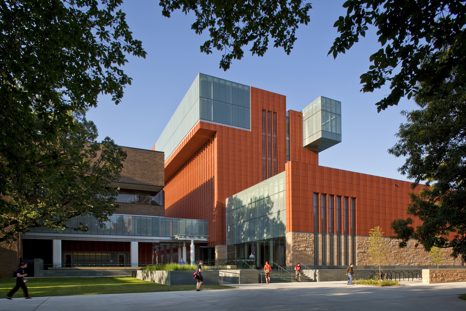 Key to the success of the design of the new Stephen M. Ross School building was relating the typical tiered classroom to group study spaces. To do so, the design team developed a model for early site planning studies to address the pedagogical needs of the school, which focused on assessing the capacity of existing buildings to accommodate new teaching spaces. Equally important was a sense of local identity, both for the building on the university campus and for distinct groups within the school.
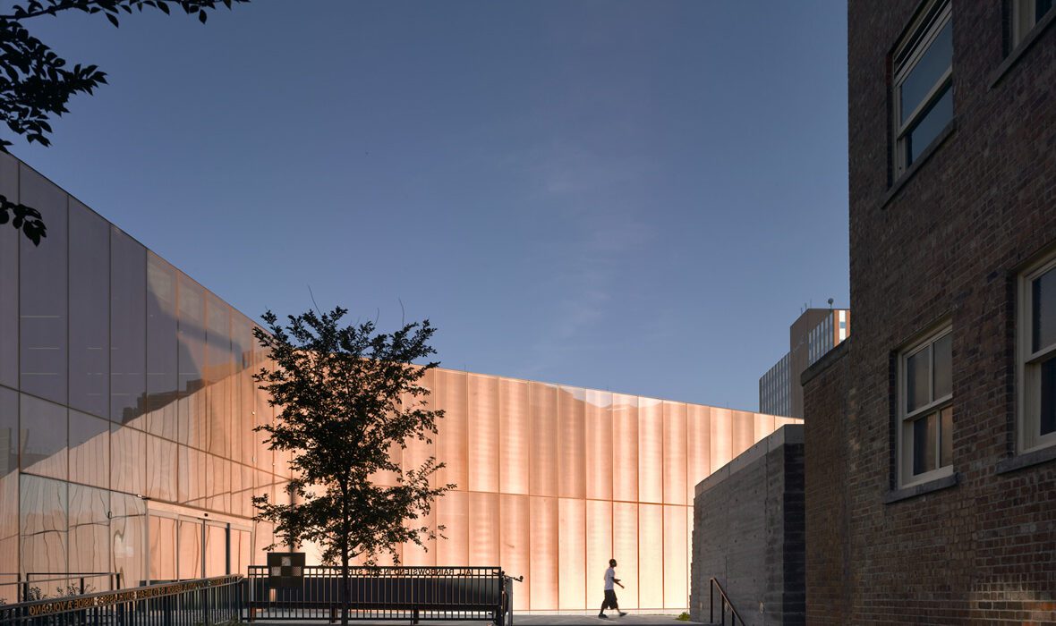

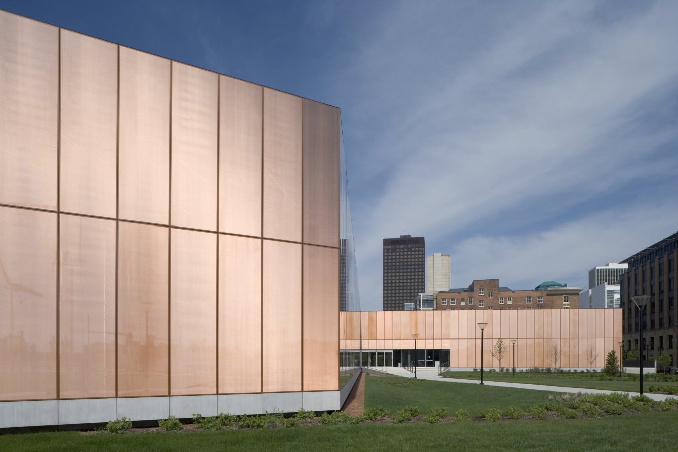 As the centerpiece of the Des Moines Western Gateway Park urban renewal project, this public library was sited between the center of the city and a newly designed public park. As well as library facilities, the building contains a flexible activity space, education facilities, children’s play areas, a conference wing and a cafeteria. In plan, it responds to the orthogonal nature of the city blocks to the east while stretching out into the park to the west. This plan is extruded vertically with a glass-metal skin, which gives the building its distinctive appearance.
 Harkening back to the beginning of insulated glazing itself, the Halley VI Antarctic Research Station was designed for polar research. As the world’s first re-locatable research facility, it was constructed by Galliford Try for the British Antarctic Survey (BAS). The project aimed to demonstrate ground-breaking architecture characterized by a compelling concept, but also a structure that’s executed with careful attention to detail and coordination.
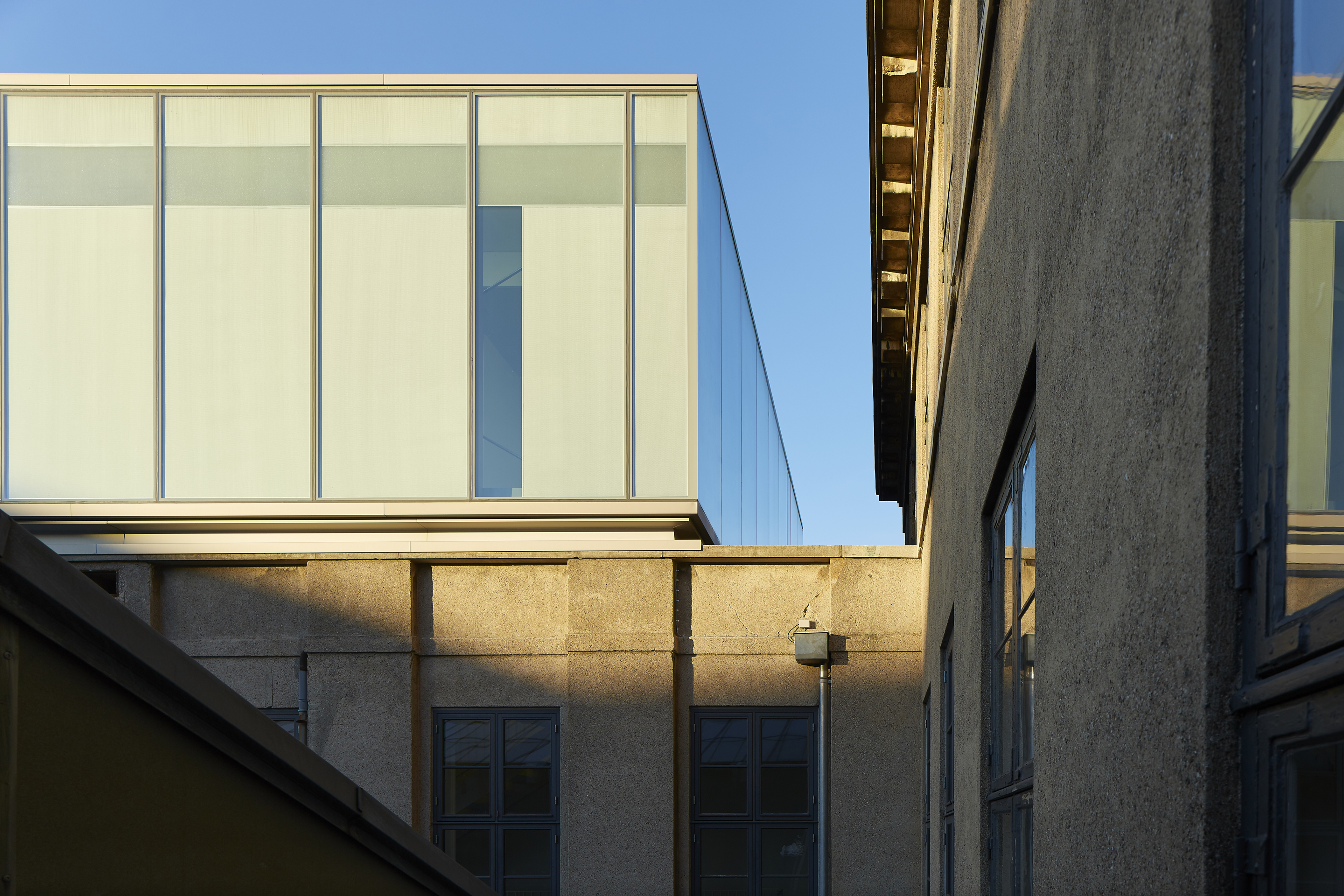
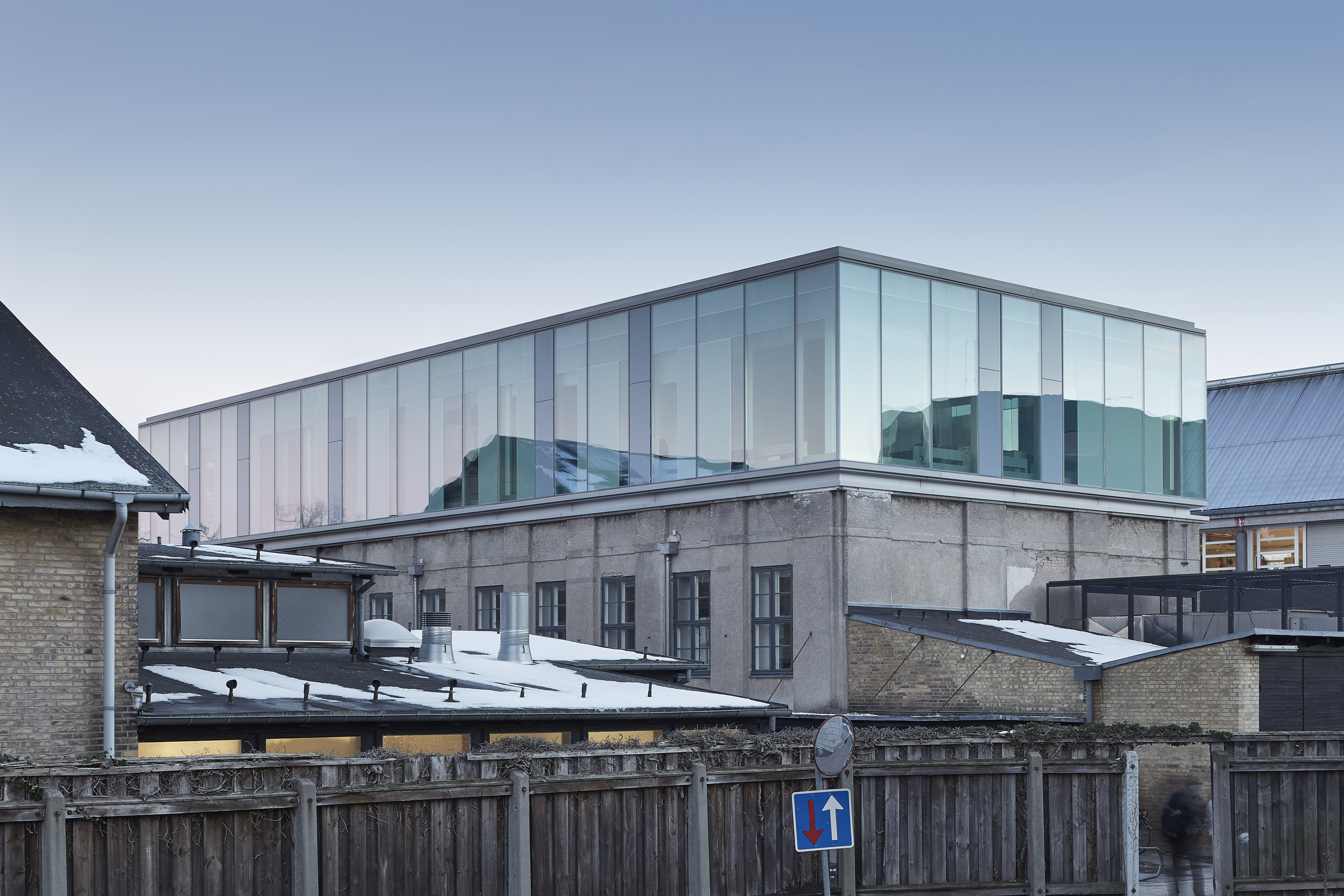 Extending an existing university gymnastic hall with a testing laboratory, the Damesal project was designed with a new building on top. The project offered an opportunity to explore an architectural concept where the geometry of the additional floor is designed with a simple box shape in glass. The architectural and functional variation happens as the glass façade responds to the program and functions within the building. The building’s envelope embodies design and performance as a collaboration between the architect and the supplier of the customized glass solution.
 The Greenpoint Emergency Medical Service (EMS) Station was designed as a two-story facility that supports FDNY ambulance crews and vehicles. The project was made with a strong, distinctive form occupying a prominent site in the rapidly developing neighborhood. The station’s requirements led to a four-part division of the facility. Because the space for housing vehicles called for a higher ceiling height than the rest of station, one side is taller than the other. This change organizes the building’s functions.
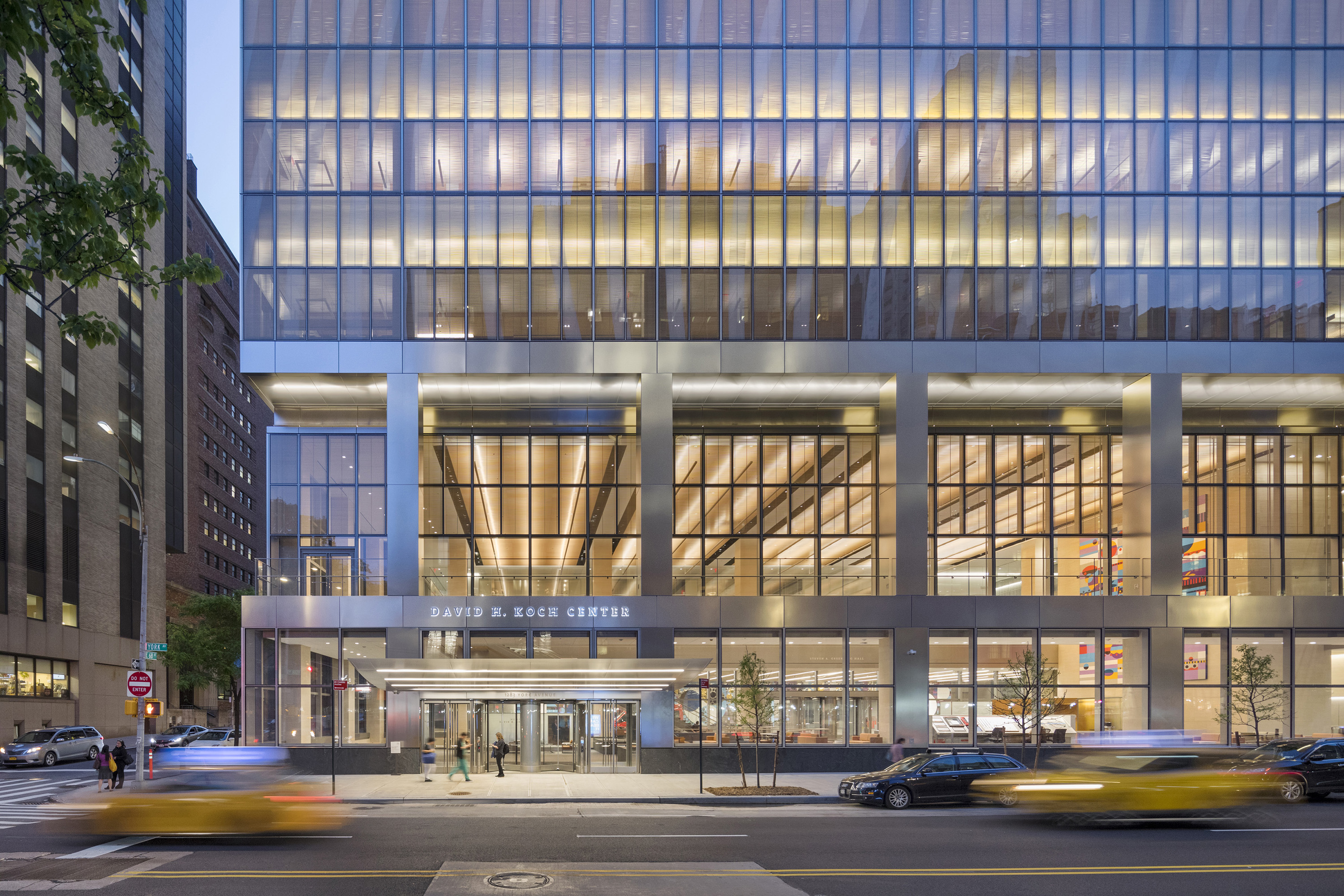
 The Koch Center was designed to provide advanced integrative healthcare and complex outpatient services. Patient-centered and family-centered care is at the forefront of the building’s medical program, announced by a triple-height lobby that offers respite from the surrounding streets. Infusion and radiation oncology areas, as well as diagnostic imaging, typically found in basement areas, are located on upper floors. This gives patients and staff the benefit of natural light.
 SHA designed the Cité de l’Océan et du Surf museum to raise awareness of oceanic issues and explore educational and scientific aspects of the surf and sea. Centered around leisure, science, and ecology, the project was made in collaboration with Solange Fabião. The design includes the museum, exhibition areas, and a plaza, within a larger master plan. The building form derives from the spatial concept “under the sky”/“under the sea”.
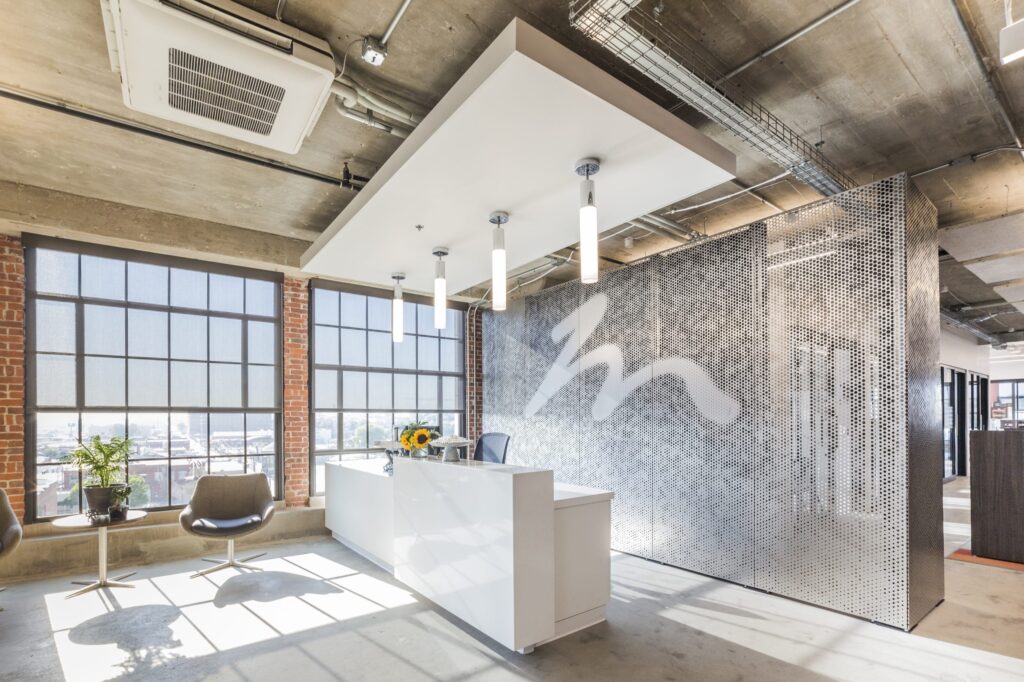
 Zahner became known for advanced metal surfaces and systems with both functional and ornamental forms. With ImageWall, Zahner has created a system that offers design versatility to make immersive experiences. With its accessible design tools, affordability, and wide range of applications, the perforated metal panel system empowers designers and architects to bring their visions to life.
 One of the most remarkable aspects of the ImageWall system is its accessibility to designers. Gone are the days of tedious back-and-forth communication. With this system, designers can now conceptualize and design directly within an
  The ImageWall perforated metal panels not only look beautiful, but also allow for more streamlined detailing. Through the use of pre-engineered elements and easy-install systems, the cost and lead times are significantly reduced compared to traditional custom solutions. This makes affordability a key advantage offered by Zahner’s system.
 From sleek and modern metals like stainless steel and aluminum to warm and inviting materials like pre-weathered weathering steel and copper, ImageWall provides architects and designers with a wide selection of options to suit their desired aesthetic.
 At its heart, Zahner’s system has wide-ranging applications across architectural typologies. From commercial buildings to hospitality spaces, retail environments to multi-unit residential common areas, ImageWall seamlessly integrates with other building systems, structures, and assemblies.
 ImageWall offers a myriad of creative possibilities, including lighting options, material choices, and graphic integration. Backlighting adds a whole new dimension to architectural design, bringing depth, texture, and visual interest to spaces.
 With a vast array of materials to choose from, architects can find the perfect match for their desired aesthetic, whether it be sleek and modern or warm and organic. The graphic options also enable the integration of custom patterns, logos, or artwork, allowing architects to create truly unique and memorable spaces that leave a lasting impression.
 To appreciate the capabilities of perforated metal panels, there are many noteworthy case studies. For example, the ImageWall system was employed only a short walk from Canada’s Parliament buildings in Ottawa, Ontario, where the team of B+H Architects and Morguard collaborated with Zahner to enhance the experience of entering their office complex at
  Zahner also collaborated on the Legacy Pavilion for
  These case studies demonstrate how Zahner’s perforated metal panel system can be utilized by architects to enhance their designs. Its adaptability, material options, and creative possibilities have allowed architects to push boundaries and transform their visions into new landmarks.
 ImageWall represents the evolution of architectural solutions, bridging the gap between visionary concepts and practical implementation. Its accessibility to designers, affordability, wide range of applications, and design potential make it a versatile and valuable tool for architects and designers alike.

 Waste is at the forefront of many global sustainable initiatives. Why? Because we all contribute to waste. It is part of our daily lives and, realistically, isn’t going anywhere. Currently, we are running out of space to house our waste. In the US alone, a whopping 292 million tons of trash was generated in a single year. To make room for all this waste, natural habitats have been destroyed, greenhouse gas emissions have risen, and taxes have gone up to offset the costs of running expensive landfills.
 For some real-world context, Jessica shared a bit on Inpro’s