IKEA reflects on “the past, the present and the future” of the home
CategoriesInterior Design

IKEA reflects on “the past, the present and the future” of the home

Swedish retailer IKEA marked its 80th anniversary at Milan design week with Assembling the Future Together, an immersive exhibition that charts the furniture company’s history and addresses its future.

Assembling the Future Together took place at Padiglione Visconti in Milan and explored the brand’s progression since the 1950s.

Colourful chairs within the IKEA installation at Milan design week
Assembling the Future Together is on display at Milan design week

“The whole exhibition is about the past, the present and the future,” said IKEA designer and chief creative officer Marcus Engman.

“So it’s a little bit like telling the story of IKEA furniture, things we have done and things that we will do even more,” he told Dezeen in Milan.
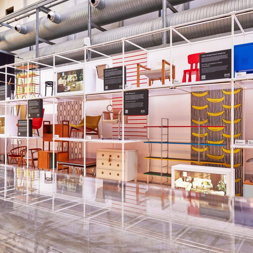
Chairs from the past at Assembling the Future Together by IKEA
Furniture from IKEA’s history is on display to reflect its past

To reflect this idea, the space was divided into three main sections. One area dedicated to the past features designs from IKEA’s 80-year history displayed on geometric white shelving.

Among the pieces was furniture from the 1970s with bright fabrics and bold shapes, which were influenced by the increasing emergence of youth culture during this decade, according to the brand.

Chunky children’s furniture from IKEA’s Mammut series was also included. The line was first designed in the 1990s and has remained popular ever since.
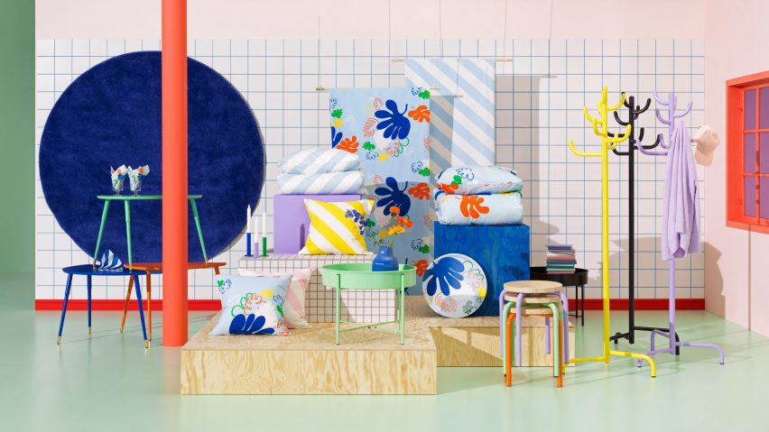
Nytillverkad collection by IKEA
IKEA is also debuting its new Nytillverkad collection

For the present portion of the exhibition, the brand launched the first products in its new Nytillverkad collection.

Characterised by “simple, functional and playful” elements, the furniture, bedding and accessories intend to pay homage to past iconic IKEA pieces in line with the current wide-spread revival of interest in vintage designs, according to the brand.
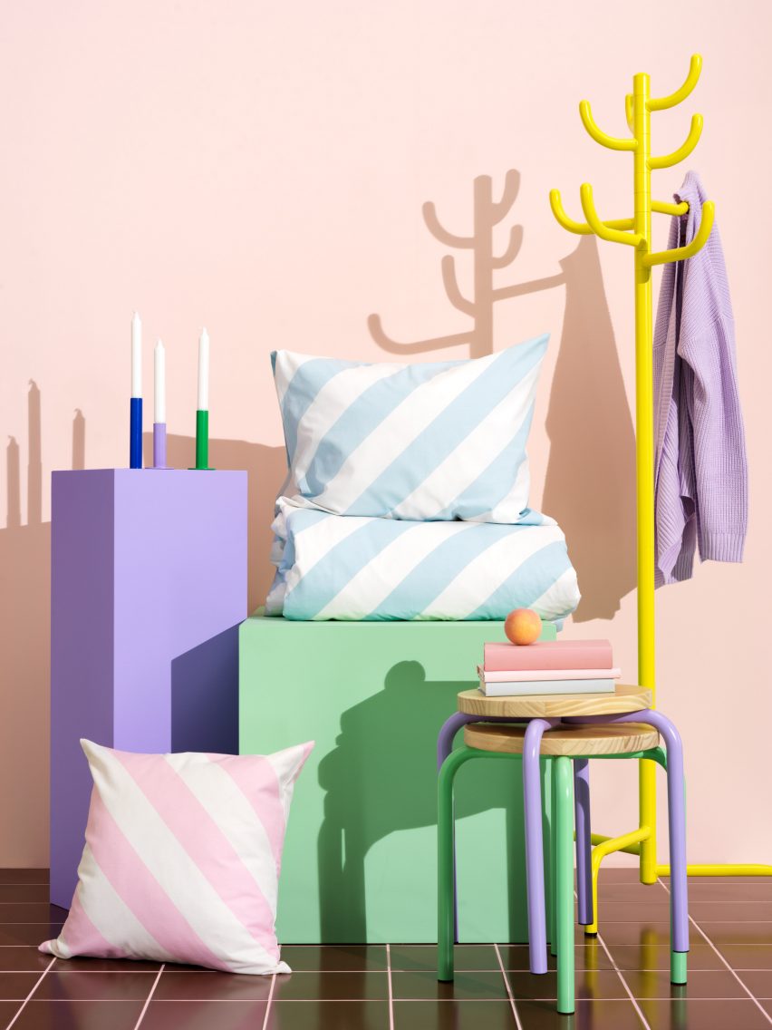
Colourful
The colourful collection takes cues from previous IKEA designs

While the collection nods to IKEA’s roots, the brand used contemporary materials to create the pieces.

“It’s putting old things into a new perspective,” explained Engman.
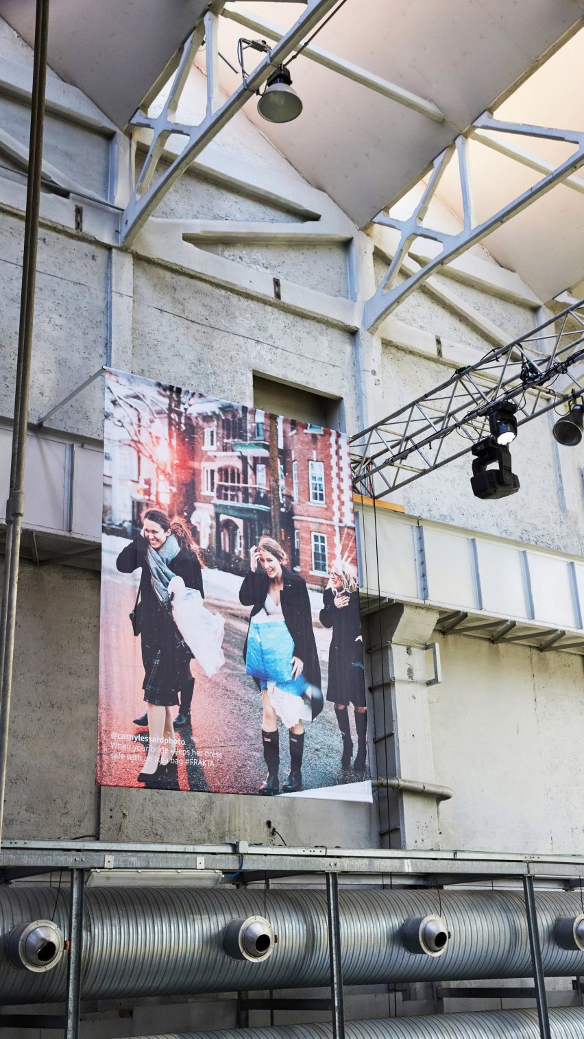
Wedding guests carrying IKEA's Frakta bag
Crowd-sourced images of people using the brand’s iconic Frakta bag are suspended in the space

Large-scale contemporary photographs, which showed members of the public sporting IKEA’s recognisable blue and yellow Frakta shopping bag in unexpected ways, were suspended from the ceiling throughout the venue

One image showed a bride protecting her dress inside one of the shoppers on her wedding day, while another has been adapted to transport a dog on the subway in New York.

“Even if we perceive our products as ‘ready design’, people see them a bit more like Lego pieces to play with,” acknowledged the designer. “People use the Frakta bag in so many ways we didn’t expect.”
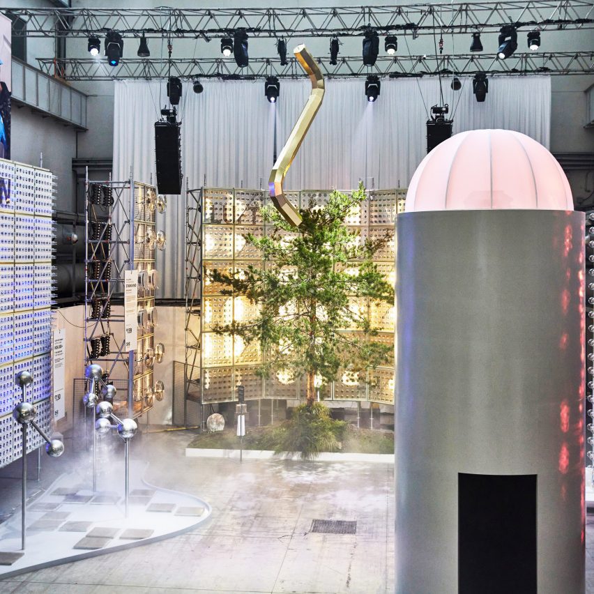
Installations referencing earth, wind, water and fire
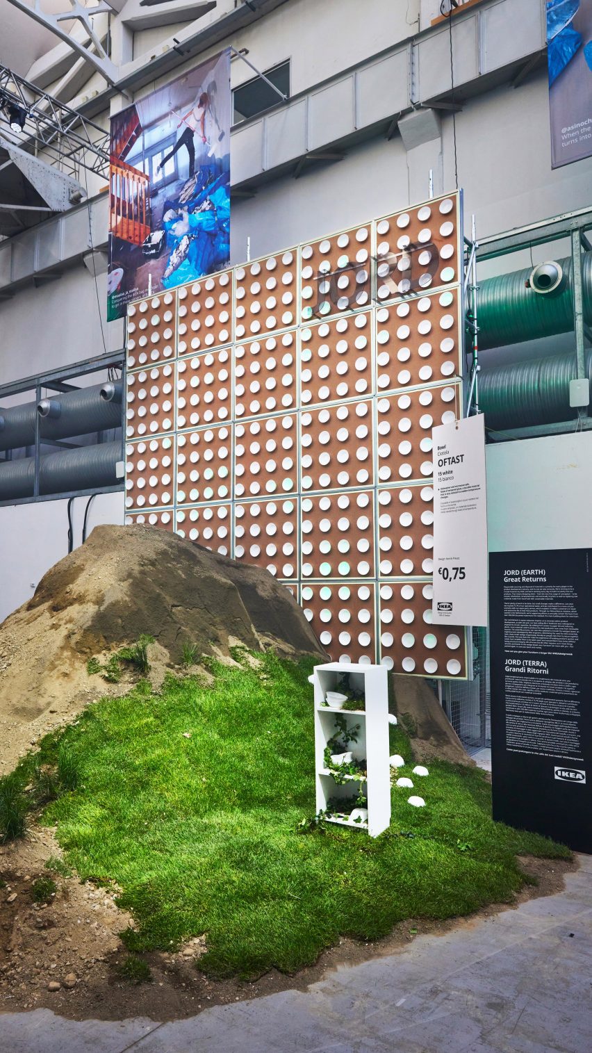
The ‘future’ section references the four elements with installations

The future area of the exhibition features four towering installations dedicated to the elements of fire, water, earth and wind, which include an illuminated tree and smoke dispensers.

“The future part is all about showing how we are using design and product development to nudge people’s behaviours into doing something that is good for people and the planet,” reflected Engman.

“It’s also where we try to challenge people to be part of this – not just wait for IKEA to do stuff, but actually ask, how can we do things together?”

“We have set out to be fully circular by 2030 so that affects everything that we do,” he continued.
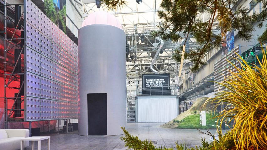
IKEA Assembling the Future Together installations
IKEA intends to urge people to think about the role they can play in shaping the future of design

Designed as an inclusive, “down-to-earth” space that is open to all, the exhibition drew together many other experiences, such as a cinema zone showing portraits taken by photographer and IKEA’s first artist-in-residence Annie Leibovitz that document the “real lives” of people in their homes.

The project is part of IKEA’s annual Life at Home Report, where members of the brand’s team visit people in their living spaces and document their findings.
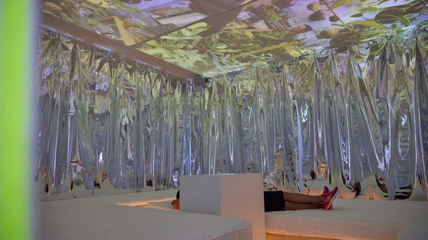
Person reclining within cinema space by IKEA at Milan design week
A cinema zone is showing portraits of people at home taken by Annie Leibovitz

Various talks and music events took place in the space throughout the week alongside a dedicated “record shop” and on-site IKEA cafe serving branded food and drinks.

The aim of incorporating music into the exhibition was to bring people together, according to Engman. Communicating the sacredness of the home is at the core of the IKEA exhibition, said the designer.

“This is something for us that we need to constantly work on – finding new ways of getting people to understand how important the home is,” he explained.

“I mean, the challenges during covid and now the cost of living crisis has been where we can help out even more.”

“Because people have had to spend more time at home – but how can we make the home also something that is really not just a functional thing, but an emotional thing?” he continued.

“So I think that’s our biggest thing, but making sure we do that in people- and planet-positive ways. Because that’s the only way forward.”
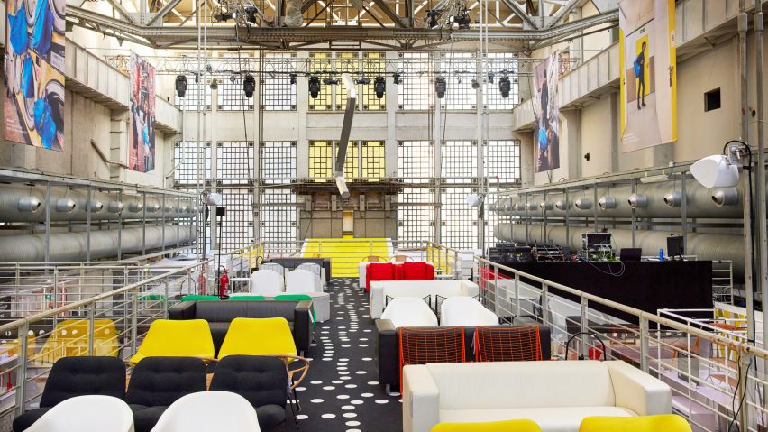
Immersive installation by IKEA
The exhibition was designed to be inclusive

Previously, IKEA donated its products and design services to create a series of United Nations-led refugee support centres in Eastern Europe to offer sanctuary to vulnerable groups displaced by Russia’s invasion of Ukraine. The brand’s research lab, Space10, developed a concept for connecting physical furniture to an ever-evolving NFT tree.

Assembling the Future Together is on show from 18 to 23 April 2023 at Padiglione Visconti, Via Tortona 58, Milan. See our Milan design week 2023 guide on Dezeen Events Guide for information about the many other exhibitions, installations and talks taking place throughout the week.

Reference

Chatsworth House exhibition is a “collision of past and present”
CategoriesInterior Design

Chatsworth House exhibition is a “collision of past and present”

An exhibition at Chatsworth House including designers including Michael Anastassiades, Faye Toogood and Formafantasma, features in this video produced by Dezeen for the stately home.

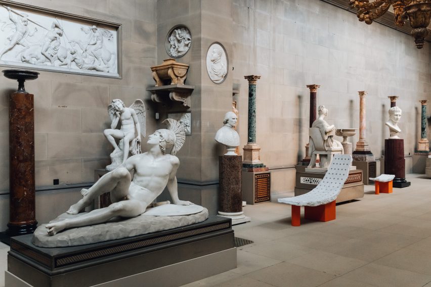
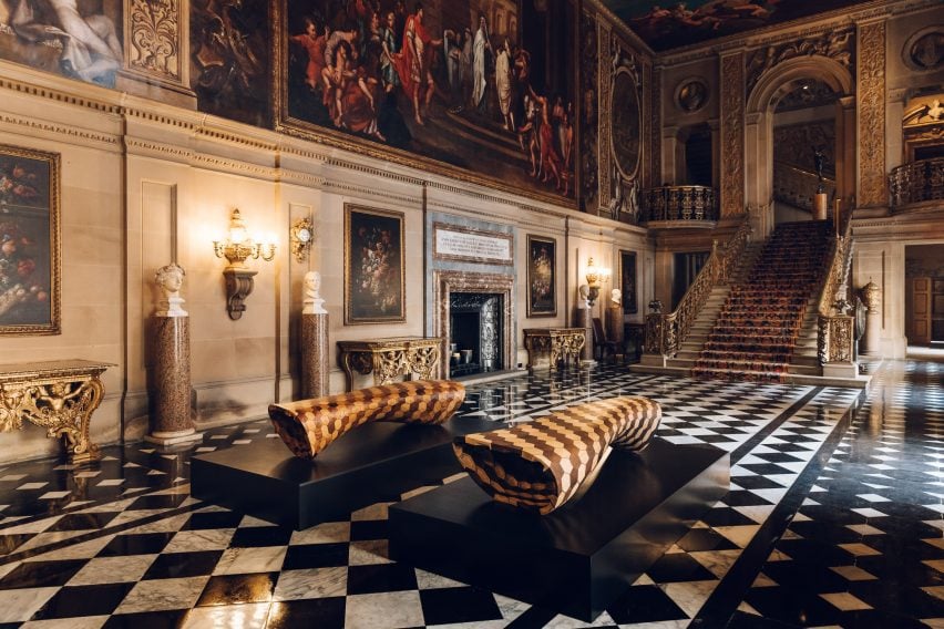
Called Mirror Mirror: Reflections on Design at Chatsworth, the exhibition brings together a collection of furniture and objects displayed throughout and responding to Chatsworth House and its gardens.

In total, 16 international designers and artists created pieces that respond to the interiors of the building.

Interior of Chatsworth House featuring staircase and benches
The exhibition introduces new art pieces and objects into the house and garden

Some responded by sourcing materials from the property itself, while others focussed on themes and ideas taken from decorations within the interiors.

“The designers of the exhibition have responded to Chatsworth in all sorts of fascinating ways,” said co-curator of the exhibition Glenn Adamson.

“Throughout you really see this kind of conversation between the present and the past.”

Jay Sae Jung Oh's throne-like seat wrapped in leather made from musical instruments
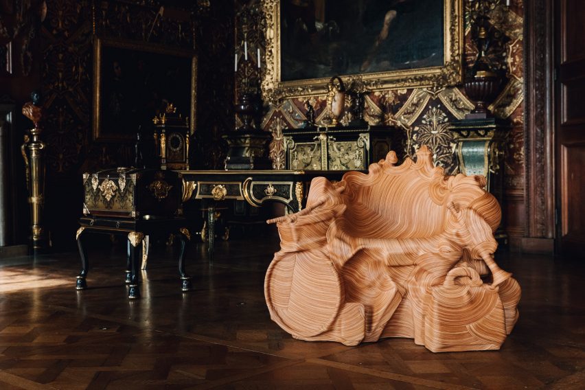
Jay Sae Jung Oh designed a throne using musical instruments

The exhibition continues Chatsworth House’s 500-year-long history of working with leading artists and designers and collecting an extensive collection of art and objects.

“An artist’s new work can create a new way of looking at these spaces,” said Chatsworth House Trust director Jane Marriott.

“It can capture their imaginations and hopefully inspire them to explore Chatsworth in a different light.”

Faye Toogood's monolithic stone furniture in the chapel space
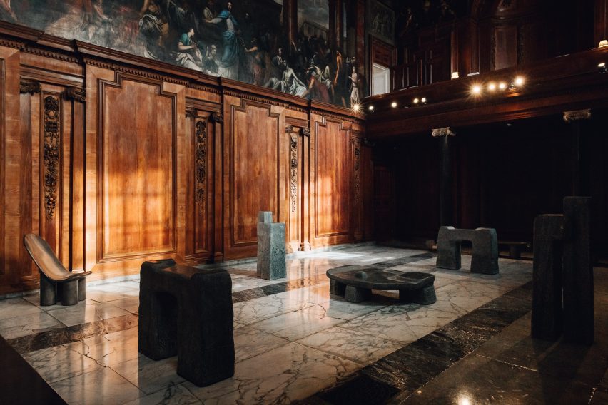
Toogood’s monolithic furniture creates a pensive space within the exhibition

British designer Toogood took over Chatsworth’s chapel and adjoining Oak Room. As a nod to the historical use of the space as a place of worship and gathering, she created an installation of monolithic furniture made from bronze and stone.

The sculptural forms were designed to evoke ecclesiastical structures and to reflect the local landscape.

“These objects give a sense of meditative calm, a sense of massiveness or monumentality that feels appropriate to the space,” Adamson said.

Joris Laarman's benches situated in the gardens of Chatsworth House
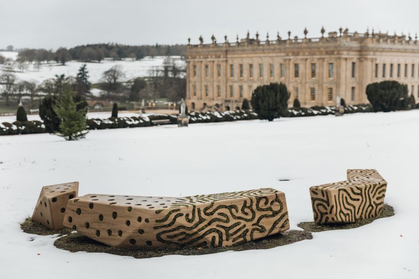
Dutch designer Joris Laarman designed a series of benches for the exhibition

Two stone benches by Dutch designer Joris Laarman made from locally sourced gritstone , which was the material used to build the house itself, were placed in Chatsworth House’s gardens.

The surfaces of the benches were carved with undulating patterns in which moss and lichen have been planted and will continue to grow over time.

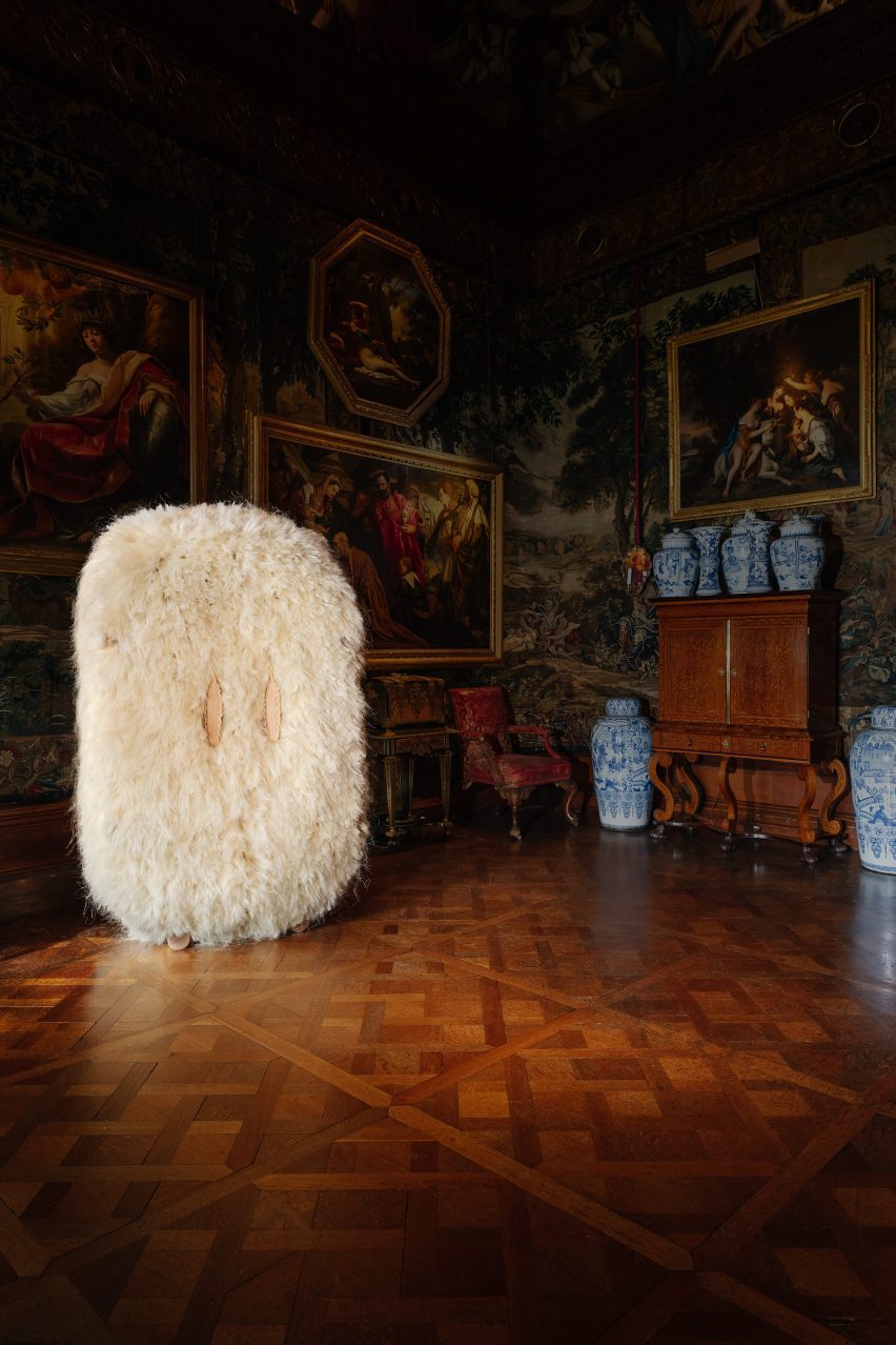
Other objects in the exhibition include a throne-like seat wrapped in leather made from musical instruments by Jay Sae Jung Oh, a fibrous cabinet designed by Fernando Laposse, and sinuous steam-wood sculptures by Irish furniture maker Joseph Walsh.

Agave cabinet by Fernando Laposse
Laposse’s fluffy cabinet is made from agave plant fibres

Another section of the exhibition, which occupy Chatsworth’s Sculpture Gallery built in the early 19th century, features pieces by British designer Samuel Ross.

Ross’s pieces were designed to echo the surrounding sculptures, mimicking their form to invite viewers to imagine the body that would recline on them. The designer has used a material palette of stone and marble to further reflect the sculptures within the gallery.

Samuel Ross's sculptural objects
Chatsworth’s collection contains art and design pieces spanning 4,000 years

“It’s a kind of collision of past and present, of the artisanal with the technological, the classical with the industrial,” Adamson said.

“It’s a great example of how the show in general tries to talk across generations, across centuries.”

Mirror Mirror: Reflections on Design at Chatsworth is on display at Chatsworth House in Derbyshire until 1 October 2023. See Dezeen Events Guide for an up-to-date list of architecture and design events taking place around the world.

Photography is courtesy of the Chatsworth House Trust.

Partnership content

This video was produced by Dezeen for Chatsworth House as part of a partnership. Find out more about Dezeen’s partnership content here.

Reference

This Epic Architectural Triptych Depicts the Complexities of Hiroshima’s Past, Present and Future
CategoriesArchitecture

This Epic Architectural Triptych Depicts the Complexities of Hiroshima’s Past, Present and Future

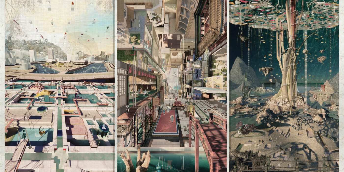
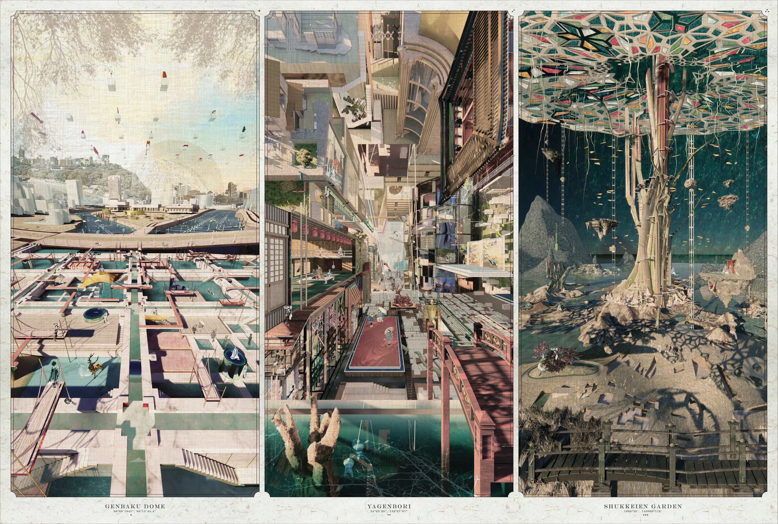
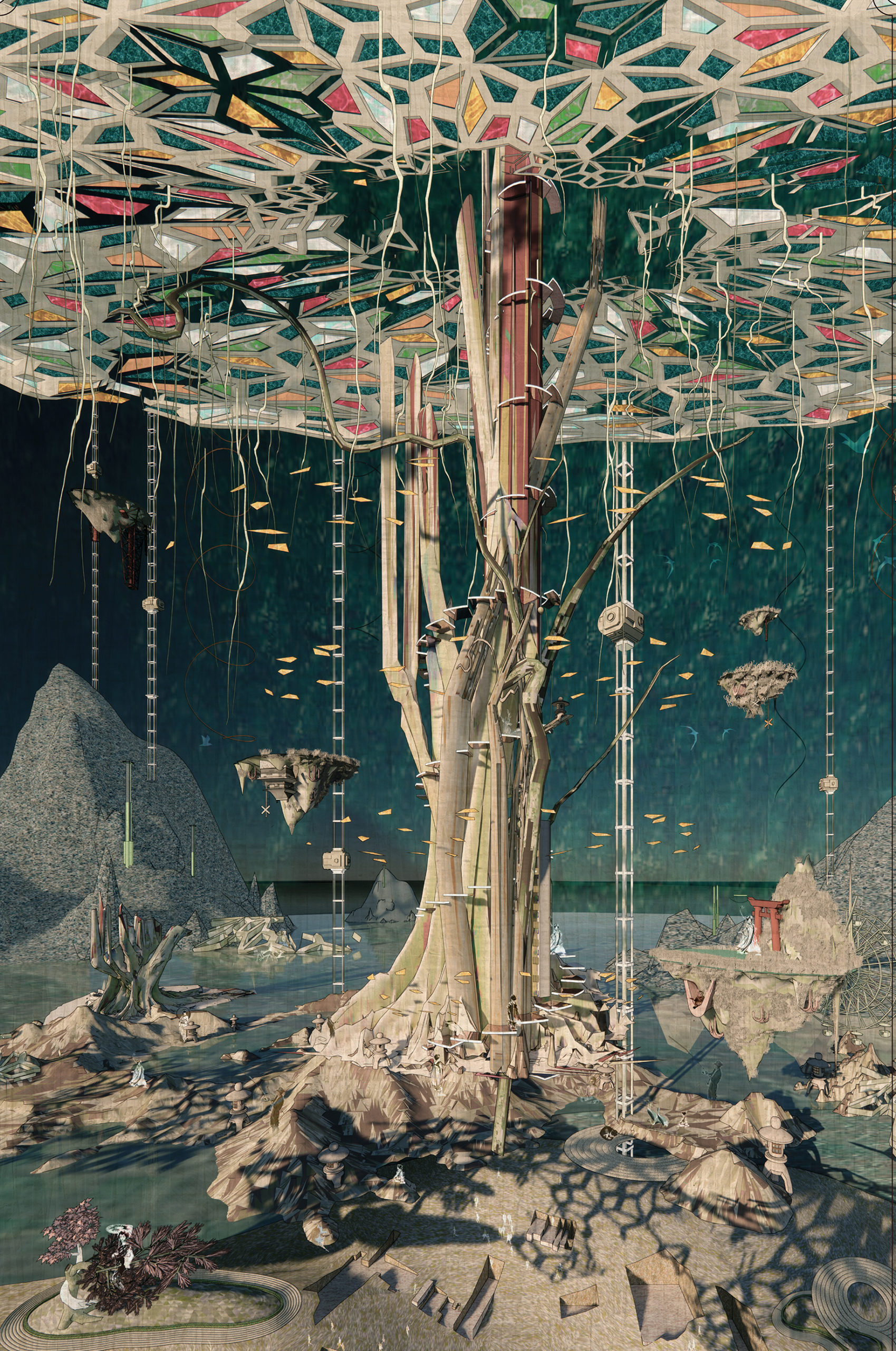
Upon first look over the minute details of One Drawing Challenge Student Winner Victoria Wong‘s award-winning triptych appears to revel in the medium itself. A drawing that harnesses the powers of digital processes, it certainly requires close looking to grasp the changing perspectives, intertwining scenes and layers of time that are compounded in each of the three scenes. One would be forgiven for assuming that the University of Michigan student set out to explore the aesthetic possibilities of digital sketching, 3D modeling and the various uses of other graphic software.

Yet, while Victoria demonstrates mastery of these techniques, they only tell one part of the story behind the drawing. At a fundamental level, before the composition and execution of these ideas, Victoria set out to explore the boundaries between designing, modeling and post-production. In this way, she approaches her subject matter, the site of Hiroshima, through a kaleidoscopic lens that incorporates Japanese aesthetic theory, contemporary music, and photographing imperfections in daily life. In this sense, the end goal was actually to overcome the hurdles of focusing on the technicalities of the design itself to instead foreground the emotive dimensions of a place, unlocking creative possibilities.

“Suggested by Lebbeus Woods, architecture is essentially an internalization of society yet an externalization of ourselves,” Victoria explained. “Through investigating the decay and death of artifacts and events, Into the Void illustrates the new collisions of regrowth and reshaping our relationship with different agencies.”

Architizer’s Architecture Editor invited Victoria to expand on conceptualization of her winning triptych. In the conversation that follows, the designer, who will be starting at Perkins&Will‘s Dallas studio this May, offers insights into her creative process and the underlying themes of her thesis project.

Hannah Feniak: Congratulations on your success with the One Drawing Challenge! What sparked your interest in entering the competition and what does this accolade mean to you?

Victoria Wong: Thank you, Hannah and your team, for hosting and curating! Also, congratulations to all the winners. I came across the One Drawing Challenge several years ago and appreciated Architizer showcasing a wide variety of entries so the public can appreciate those drawings. The simplicity of one image accompanied by storytelling has also been compelling. Regarding this accolade, it’s an honor to conclude my time as a student by sharing my thesis with the architecture community.

POSSIBILITIES.

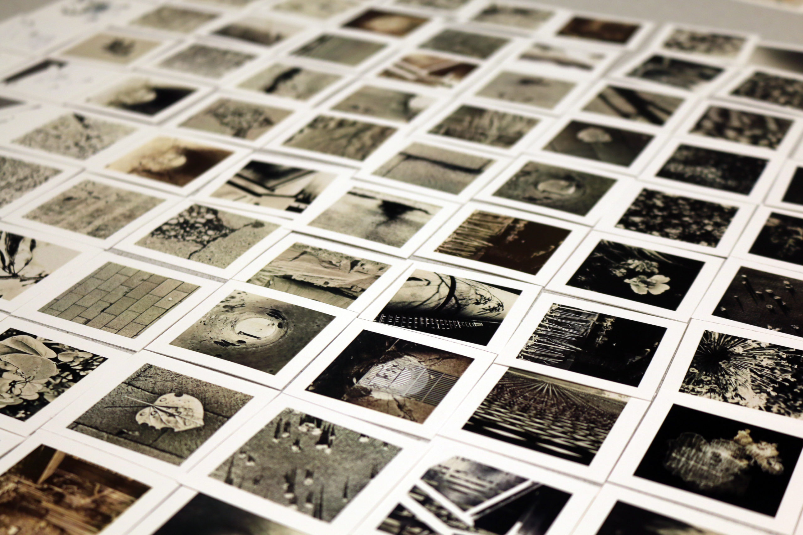
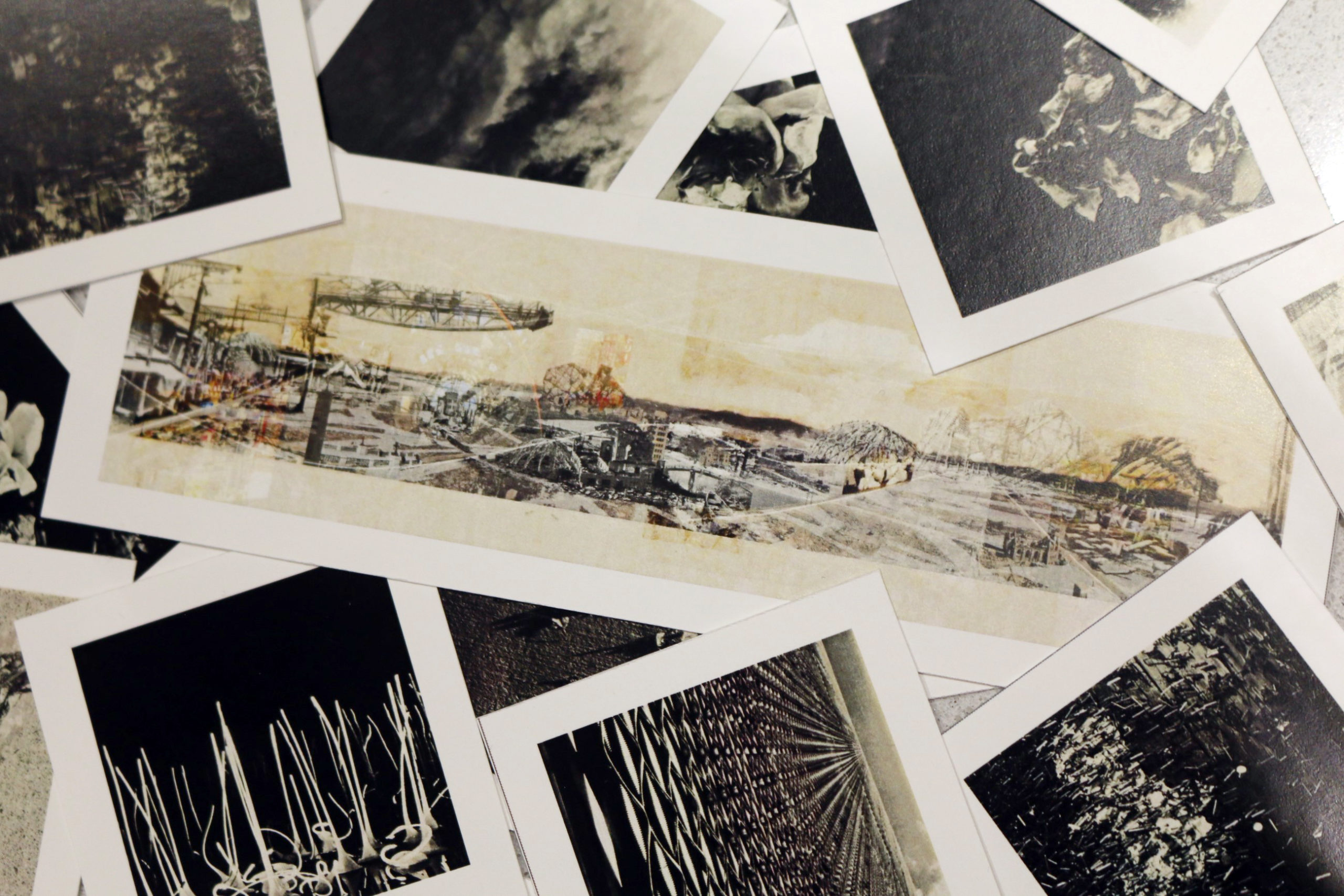
Photo Study: The starting point of Victoria’s winning entry was idea curation. To this end, she sought to understand her subject matter through taking photos and analyzing music. 

HF: What were the primary challenges of conceiving your work, from forming the idea to the physical process of creation? 

VW: The triptych serves as the final scenes of my thesis, “Into the Void: Fragment Time, Space, Memory, and Decay in Hiroshima.” It was about a six-month study of various Japanese aesthetic theories of imperfections, including life and death, decay and rebirth, shadow and lights, etc. Since the topic is very conceptual, I took a non-traditional route to build my understanding of the matter by photographing the imperfections in daily observance and analyzing contemporary music after the first round of research. 

The major challenge was translating multiple layers of Hiroshima’s research and new information into the final scenes while acknowledging the historical, cultural and natural aspects of the site. There is a delicate balance in respecting the gravity of the past while proposing a parallel timescape that accepts and appreciates imperfections and the scarring. Another challenge was to showcase the idea through an appropriate medium; in this case, the stages are oversaturated yet harmonizing to counter argue our understanding and concept of “void.” 

The final production was relatively short once I decided what to highlight and how to narrate my thesis. All elements in the triptych were modeled digitally, thus requiring very little post-production work. I specifically enjoyed the production process of this triptych; it was an experiment in challenging how much the post-production process can be minimized. The boundary between designing, modeling and post-production is blurred. The strategy of ‘manipulating’ the illustrations fulfilled my curiosity in examining if the creation of an image can be as interesting as the design and the story behind it. 
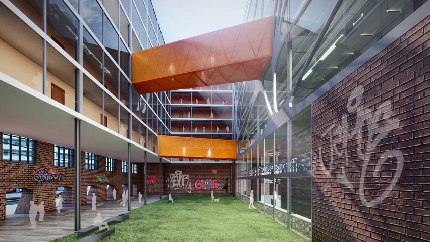
Photo Study: A zoomed-in showing one of the panoramic views that was described in the text that Victoria was working with.  

HF: Could you describe why you gravitated towards these specific illustration techniques? 

VW: I usually gravitate towards two types of illustrations: imaginative and informative. The creative illustration reveals how the space feels instead of the technicality of the design, i.e. the mood palette, while the informative illustration showcases relationships in all scales, from connectivities of agencies to architectural detailing to a building’s contextual relationship with its site or cityscape on a larger scale. This triptych lays between the two categories. It is a relatively new way of seeing illustrations for myself, but it seemed fitting for this theme. 

For example, the middle panel conveys the “void in culture” by depicting an afternoon at Yagenbori, previously known as one of the largest red-light districts in Japan. It is currently at its sunset stage and losing its identity as the cradle of Geisha. To capture its story and depict the diversity of the area, I chose to collapse multiple perspectives and timescapes into a one-point perspective allowing time and space to condense into one scene where layers of imagination coexist. The duo-perspective illustrates different timelines in the scene. When the panel is viewed ‘top-down,’ it tells the story of the current days; when it is viewed ‘forward,’ it illustrates the past events. Other floating devices and elements demonstrate futuristic connections bridging the two. The timeline, scale, and space are distorted in ways where elements from different eras are reorganized and coexist in the same world. 

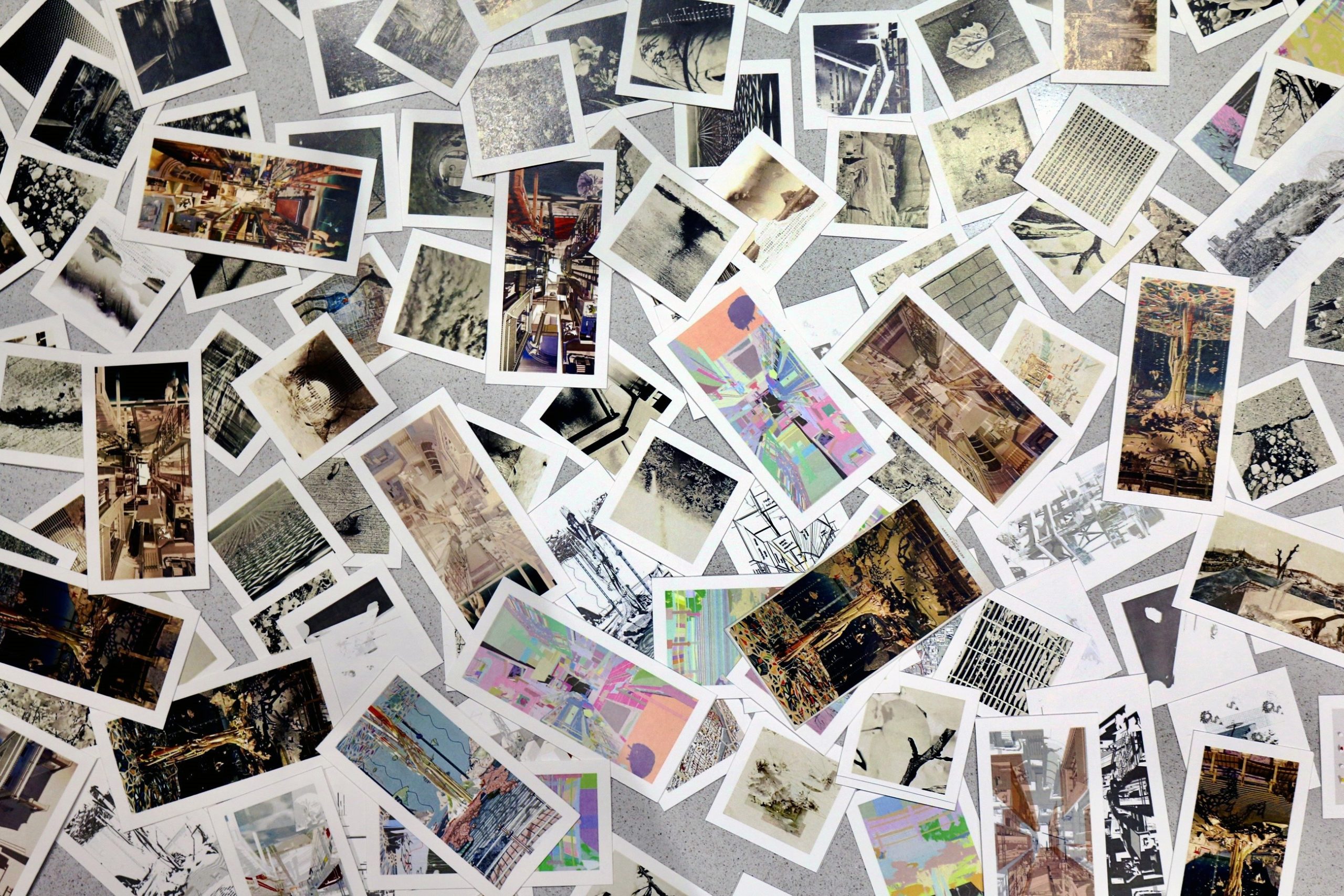
Mini Prints of Testing Images

HF: Your piece explores Japanese aesthetic theories through the city of Hiroshima’s past, presents and future. Do you have other drawings that are as conceptual as this? In terms of format, have you explored the narrative potential of the triptych format in the past?

VW: This is my first time creating a triptych, but I have always gravitated towards illustrations with a sense of humor and leaving room for imagination. The project started with a trio of panoramic collages using historic photos from WWII to re-visualize the same three Hiroshima sites shown in the triptych. They depict a parallel timeline in which human and non-human agencies got to reclaim the ruins and transform them into their habitat instead of reconstructing how the sites were before they were annihilated. In terms of format, I am currently researching a couple of other sites that follow the same trail of investigation and presentation format besides Hiroshima. They both have their challenges – historically, environmentally, culturally, and politically– and I’m excited to see where this way of investigation will affect our views towards scarring that are shared between generations and to inform architects of alternative possibilities.

HF: How did the process and workflow of creating your drawing compare to traditional architectural drafting?

VW: While technology certainly helps people visualize and communicate ideas, I’m attracted to the simplicity of pen and paper when thinking through ideas. During covid, when our mobility was primarily restricted, I started exploring digital sketching. The medium is different, but the general technique remains unchanged. While my ideas begin with analog and digital sketching, 3D modeling and other graphic software are productions and experimental tools that elevate my understanding of design. On the one hand, I enjoy how forgiving digital platforms are, yet making mistakes is the best part of experimenting. 

Detail of the final product: 1/3 of the triptych. 

HF: What one tip would you give other students looking to win next year’s One Drawing Challenge?

VW: Go wild and explore your imagination. There is no right or wrong answer to creating an excellent image as long as the message is conveyed. I’m excited to see how people depict their logic and systematically translate it into a visually pleasing drawing. Have fun, and enjoy the process! 

Thank you, Hannah and your team, for hosting and curating! Also, congratulations to all the winners. I came across the One Drawing Challenge several years ago and appreciated Architizer showcasing a wide variety of entries so the public can appreciate those drawings. The simplicity of one image accompanied by storytelling has also been compelling. Regarding this accolade, it’s an honor to conclude my time as a student by sharing my thesis with the architecture community.


Interested in seeing more work by Victoria Wong? Peruse her portfolio and connect:

> https://www.linkedin.com/in/vwongwt/ 
> https://www.instagram.com/vw.archive/ 

The winners of Architizer’s Fourth Annual One Drawing Challenge have been revealed! Interested in next year’s program? Subscribe to our newsletter for updates. 


Reference

Three Swiss design brands present sustainable products in San Francisco
CategoriesSustainable News

Three Swiss design brands present sustainable products in San Francisco

Promotion: a fashion label, packaging designer and coffee roastery are three brands from Switzerland taking part in the Swiss Design Accelerator Program in San Francisco, USA.

The three studios – YVY, Paula Cermeño León and Mikafi – represent innovative design practices emerging from Switzerland.

Recognised at the international event for their pioneering attitude to the design, the three brands aim to have sustainability and circular economic values at the forefront of their creative processes.

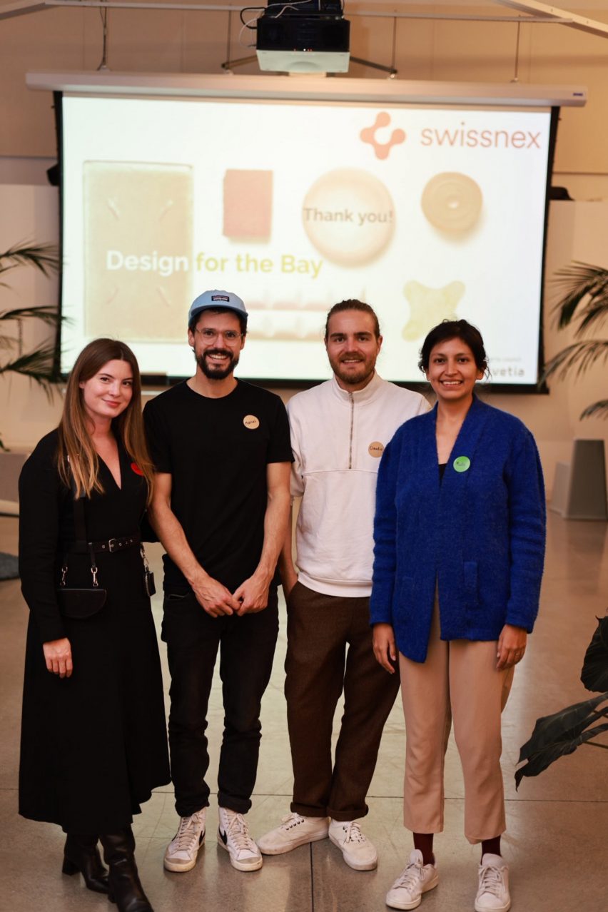
Designers people in front of projected image
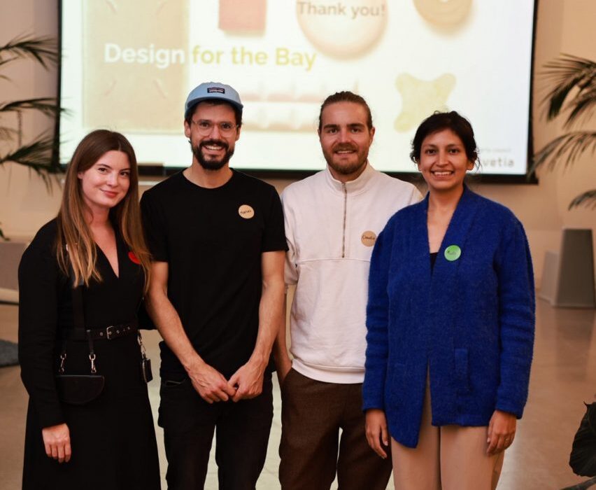
The designers exhibiting their brands in San Francisco (above) and work by Paula Cermeño León (top). Photo by Myleen Hollero for Swissnex in San Francisco

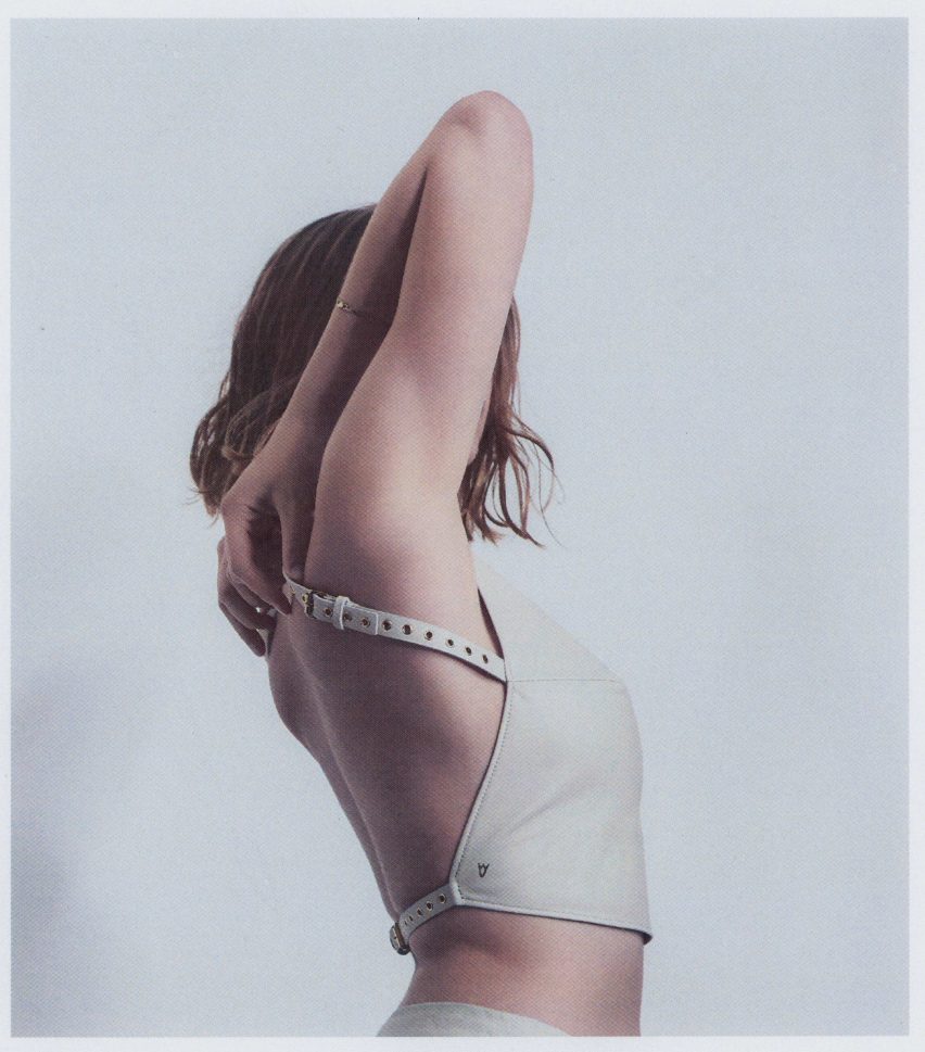
YVY is a fashion label founded by designer Yvonne Reichmuth in 2015, which designs and manufactures leather goods in Zurich.

The brand produces ready-to-wear accessories such as wallets, belts, jewellery and hats in addition to bespoke harnesses and clothing, which are predominantly made from leather.

A designer wearing suit and leather harness
YVY designs and manufactures leather goods

The brand has clothed notable celebrities such as Kristen Stewart, Billie Eilish, Madonna, Lady Gaga, Troye Sivan, Taylor Swift and Camila Cabello among others.

YVY does not release seasonal collections, instead it creates carry-over pieces that aim to reduce material waste and allow designs to be continuously refined.

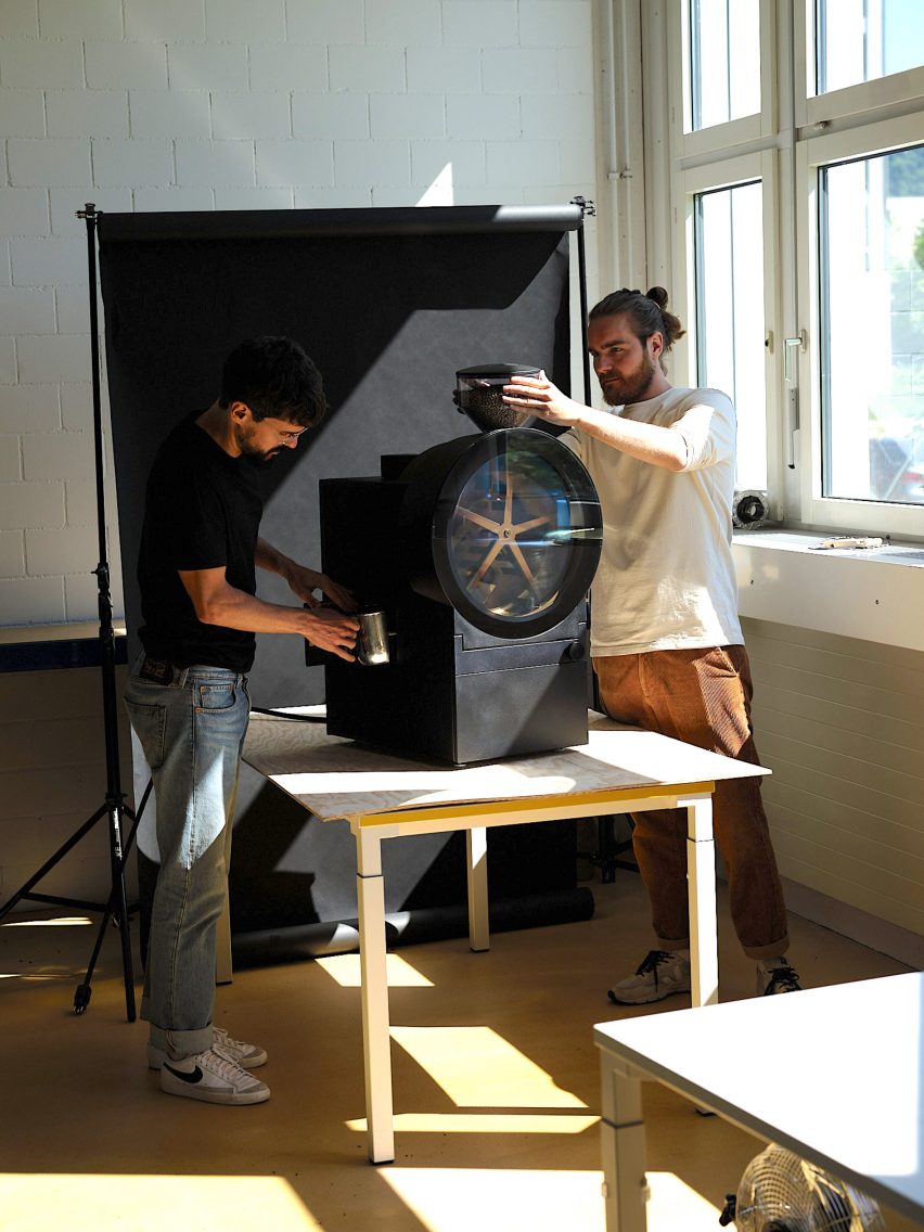
Two people with coffee machine
Mikafi designs pioneering the coffee roasting process

The leather is sourced from byproducts of the food industry, with the brand also offering non-animal alternatives on a case-by-case basis to cater to all client requirements.

The leather follows traditional processing techniques and uses vegetable tanning methods to make the material safe for both those handling it during the manufacturing process and for the planet.

Person wearing leather harness
The brand uses traditional leather treatment methods

Mikafi designs fully automated coffee roasting systems that are made up of both hardware and software that work in tandem to reduce the impact of coffee making on the environment.

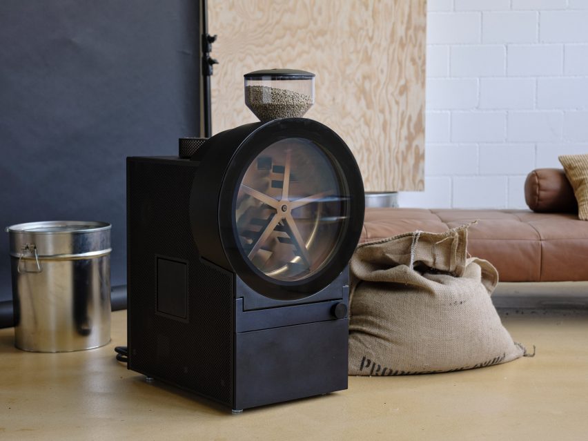
The brand’s tabletop mini roasting appliance called MCR 1 allows coffee beans to be roasted on demand, which reduces overproduction and waste, and being electrically powered makes the machine more environmentally viable than traditional gas-powered roasters.

Two people with coffee machine
Mikafi is pioneering the coffee roasting process

MCR 1 is still in its testing phase, and has been designed for use in commercial hospitality settings such as bakeries, cafes and restaurants.

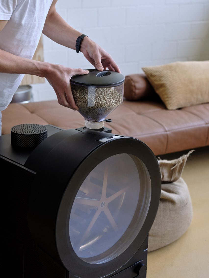
It is made up of a chamber containing coffee beans on the top, with a large circular window below that shows the roasting process happening inside.

Coffee machine with large circular window on worktop
MCR 1 is still in its testing phase, and has been designed for use in commercial hospitality settings such as bakeries, cafes and restaurants.

It is made up of a chamber containing coffee beans on the top, with a large circular window below that shows the roasting process happening inside.

Mikafi’s digital platform manages the process of the coffee beans from farm to cup, and aims to open up channels of communication between farmers, hospitality venues and consumers.

“The concept is thought to foster a fairer and more direct trade between the coffee farmer and the consumer, and most of all to strengthen the taste experience of the latter,” said Mikafi.

Coffee machine with large circular window on worktop
MCR 1 has a large window so users can observe the roasting process happening

Paula Cermeño León is a designer who specialises in creating sustainable packaging as well as personal care products informed by the importance of circularity and the benefits of working with plants.

She combines her design skills, which she developed during her studies at ECAL in Switzerland, with expertise from professionals who work closely with plants, including botanists, biologists, artists and engineers.

Photograph of product wrapped in dried leaves
Paula Cermeño León used natural waste material for packaging incense

Among León’s designs is a proposed alternative to conventional packaging for Peruvian brand Misha Rastrera, which makes Palo Santo incense.

As opposed to using conventional plastic film packaging, León chose to use surplus corn husks produced during farming to make packaging that is sustainable and compostable.

Photograph of neutral coloured skincare items on white background
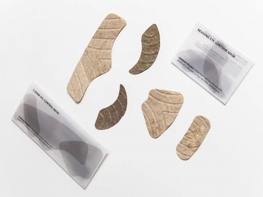
The face mask must be wetted before use

Other eco-based products by León include self-care items, such as the face mask set from her Herbier Project, which is made from plant fibres that can be distributed dry and rehydrated when ready to use.

Her Refined Remedies collection of medicinal products for minor wounds and menstrual pain are also infused with plant extracts and present a contemporary take on herbal remedies.

Hand smoothing patch onto arm on yellow background
Remedies are used for minor ailments

The Swiss Design Accelerator program is the result of collaboration between Swiss Art Council, Pro Helvetia, under the label Design Switzerland, and Swissnex in San Francisco, an initiative by Switzerland’s State Secretariat for Education, Research and Innovation, connecting “Switzerland, North America and the world in science, education, innovation and the arts”.

The program aims to build connections and international visibility for emerging Swiss designers and brands in the design industries.

The program ran from 7 November to 13 November 2022 and was held at Swissnex’s space at Pier 17 in San Francisco.

Partnership content

This article was written by Dezeen for Swissnex as part of a partnership. Find out more about Dezeen partnership content here.

Reference

Dezeen Lookbooks present interior design inspiration and trends
CategoriesInterior Design

Dezeen Lookbooks present interior design inspiration and trends

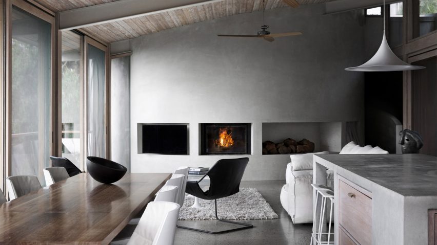
Living room with concrete wall

Dezeen has launched Dezeen Lookbooks, a new section featuring roundups of home interiors and decor trends to help designers and design lovers plan their projects.


Published each Saturday, the visually driven Dezeen Lookbooks present roundups of images of contemporary interiors selected from our vast archive of over 750,000 images.

Each roundup is curated by the Dezeen editorial team and addresses a different room and theme.

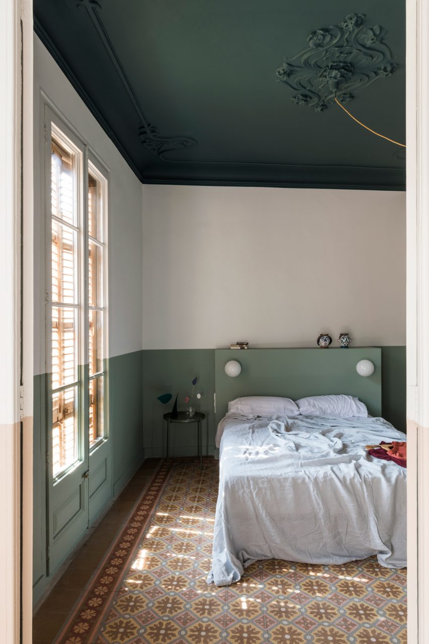
A peaceful bedroom
Top: an image from our cosy living rooms lookbook. Above: a project from the peaceful bedrooms lookbook

Lookbooks published so far feature living rooms, dining rooms, bedrooms, kitchens and bathrooms.

Dezeen Lookbooks is a response to the surge of interest in home design since the start of the coronavirus pandemic, which has seen people spending much more time at home.

As a result, web traffic to Dezeen posts about home interiors has soared.

Klinker apartment
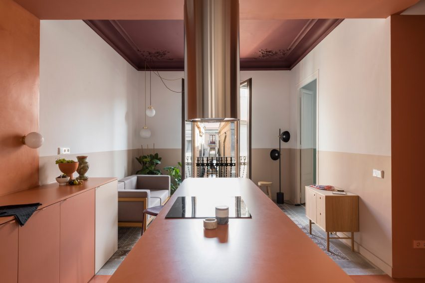
This Barcelona apartment features in our colourful kitchens lookbook

Popular Lookbook stories we’ve published over the last few months include our showcases of living rooms with calm interiors, bold bathroom designs and thirty kitchens designed by architects.

We’ll be adding more image-led roundups over the coming weeks and plan to expand the section to include other types of interiors plus trend reports in future.

Interior design fans can also check out our sections on residential interiors, apartments and houses.

Reference

Ten students from the School of Visual Arts present their final year projects
CategoriesInterior Design

Ten students from the School of Visual Arts present their final year projects

An LGBT+ community centre that caters to Seattle’s queer population and a peace centre in Homs, Syria, are included in Dezeen’s latest school show by students at the School of Visual Arts.


Also included is a fermentation centre that explores the world of microflora and its relationship to our wellbeing and a design for a new bookstore in China that marries biophilic principles with traditional Chinese architecture.


School: School of Visual Arts, BFA Interior Design: Built Environments
Courses: Senior thesis
Tutors:
Anthony Lee and Gita Nandan

School statement:

“The interior design senior thesis year at the School of Visual Arts Interior Design: Built Environments department is the culmination of a year-long self-directed exploration. Each student has driven and developed an adaptive-reuse project from site selection through concept development, interior design, programming and furnishings.

“Every project is unique and tackles real-world issues such as a residence for the Harbor School on Governors Island and a centre for philosophers in Homs Syria.”


School of Visual Arts school show

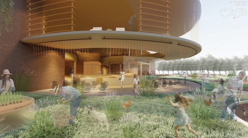
Oryzae Village by Chloe Hyun Jung Park

“Fermentation is an under-appreciated metabolic process that humans have embraced for thousands of years. It is responsible for a wide range of items we consume including beer, yoghurt, kimchi and penicillin. In this project, Oryzae Village is a fermentation centre that explores the world of microflora and its relationship to our health and wellbeing.

“It consists of farms, shops, residences and various engaging workshop areas. Fermentation experts and artisans lead the centre to create an environment for teaching, learning, sharing while creating products items using fermentation.

“Oryzae Village aims to revitalise the local communities by encouraging foraging, growing, investigating, and learning about microbial processes – helping people achieve healthier lives and wellbeing.”

Student: Chloe Hyun Jung Park
Course:
Senior thesis
Email:
chloehyun021@gmail.com


School for Visual Arts school show

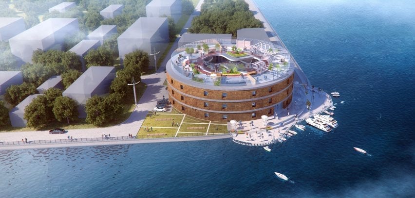
Harbor Residence by Iris Junhong Lin

“Being a high school student in New York’s award-winning Harbor School often means having to endure extremely long commutes from various corners of the five boroughs. Located on Governors Island, the school is accessible only by ferry. Harbor Residence is a student dormitory for these dedicated pre-college students committed to maritime studies, research and careers.

“In this project, Harbor Residence aims to be much more than just a place to live – it will be a continuation of the school’s maritime culture. Students will to able to live, socialise, learn, work at the residence – becoming a centre for the Harbor School Community.”

Student: Iris Junhong Lin
Course:
Senior thesis
Email:
jlin28@sva.edu


School for Visual Arts school show

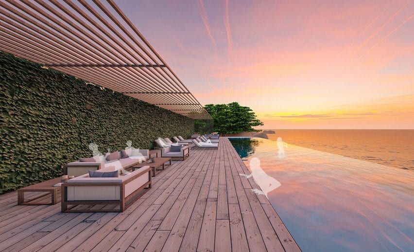
Cove by Stella Hanbyul Suk

“The pandemic has forced us to rethink travel. Urban dwellers with limited access to natural environments have been unable to travel long distances to connect with nature. Local travel may be the new normal in our post-pandemic tourism landscape.

“Cove is a wellness and activity centre that provides a tranquil and restful place in a natural setting within a relatively short distance from the major urban centres of South Korea. It is designed for people to unplug and reset their daily lives, improving both mental and physical wellness through high sensory involvement in a setting that connects back to nature.”

Student: Stella Hanbyul Suk
Course:
Senior thesis
Email:
st3lla.id@gmail.com


School of Visual Arts school show

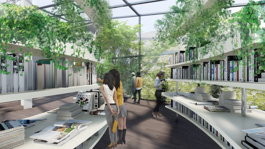
Alive Books by Difan Yang

“Alive Books is a new bookstore design in China. More than just a place to buy books, it is a gathering place where people can learn, communicate and exchange ideas.

“Marrying biophilic principles with traditional Chinese architecture, Alive Books aims to become the future of book retailers that will co-exist and survive the online bookselling landscape.”

Student: Difan Yang
Course:
Senior thesis
Email:
yang_difan@163.com


School for Visual Arts school show

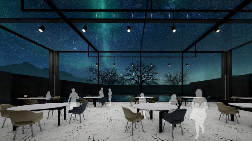
The Aurora by Ramey Yixuan Chen

“The Aurora is a hotel designed to maximize experiences of the Aurora Borealis, also known as the Northern Lights. Auroras result from disturbances in the magnetosphere caused by solar winds – resulting in otherworldly displays of atmospheric lights of varying colour and complexities.

“Located in Oblast, Russia, the Aurora Hotel is situated in the Arctic Circle with a relatively mild climate (due to the warm ocean currents crossing this seaside town).

“Because of its extreme northern location, visitors will be able to experience the ‘Polar Nights’ – when the night sky extends for periods longer than 24 hours – giving them unparalleled access to seeing the Aurora Borealis. The design of the hotel will focus on maximising the beauty of this atmospheric phenomenon while connecting visitors to nature.”

Student: Ramey Yixuan Chen
Course:
Senior thesis
Email:
ychencyx@gmail.com


School for Visual Arts school show

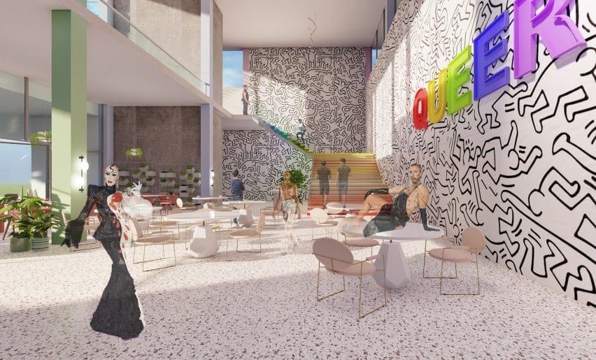
Queer Community Centre by Yearin ‘Rin’ Park

“Queer is the new LGBTQ+ centre in greater Seattle. Located adjacent to the University of Washington, Queer will cater to the vulnerable LGBTQ+ population and reflect core values of diversity, inclusivity and freedom of identity.

“Constantly under pressure and attack, the LGBTQ+ community needs a place to gather, grow, organise, support, heal, defend and celebrate queer experiences and identities. Now, more than ever, with trans people being ostracised, and the legality of gay marriage being questioned, Queer will be a welcoming and open centre for the entire Seattle community.”

Student: Yearin ‘Rin’ Park
Course:
Senior thesis
Email:
rinparkinterior@gmail.com


School of Visual Arts school show

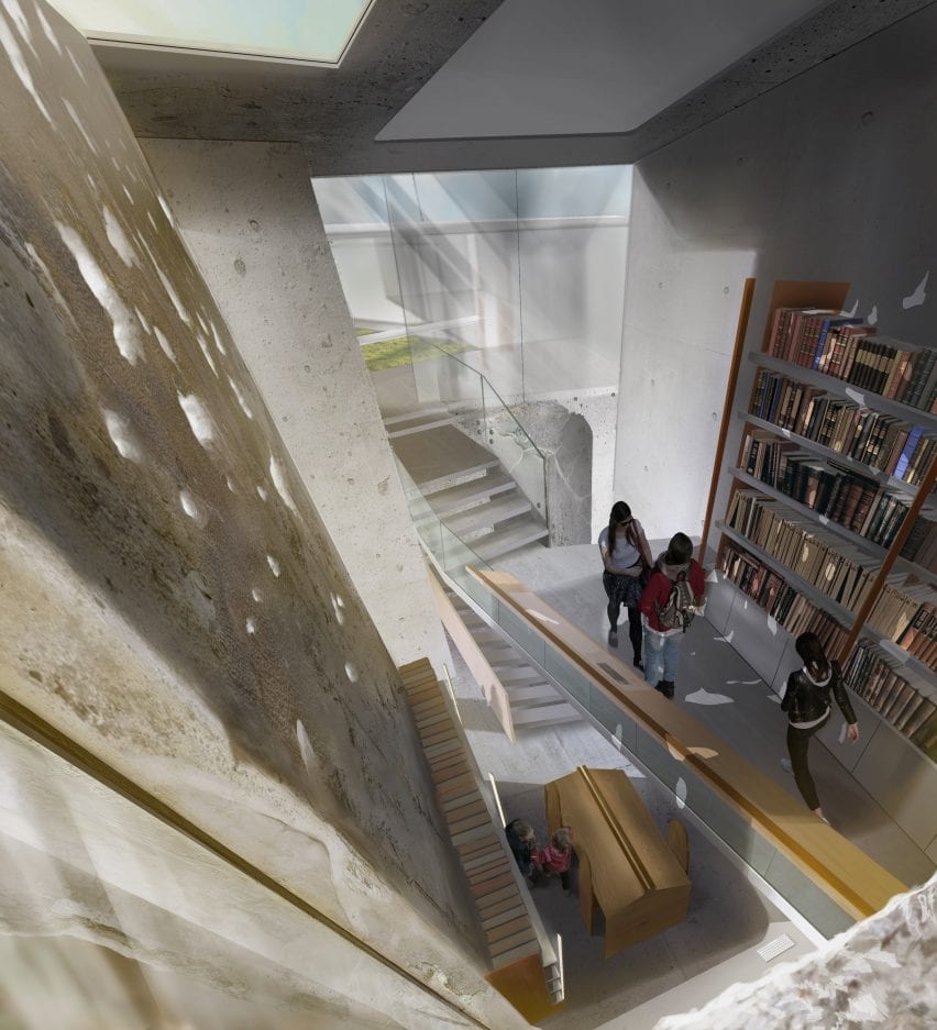
Bayt Al Kul Philosophy Centre by Fuad Khazam

“Bayt al-Kul (house of the all) is a philosophy and peace centre in Homs, Syria that aims to play a major role in healing a divided society by challenging beliefs through discussions and conceptual analysis. After a ten-year war that divided the Syrian people, Bayt al-Kul will give the people of Homs a chance to listen and share one another’s views through philosophical debate.

“For centuries, Homs was a cradle for philosophical education and the birthplace of many historical philosophers who contributed to the world today. By re-discovering the ‘world of ideas’ Bayt al-Kul aims to help rebuild the unity and cultural commonality among the Syrian people.”

Student: Fuad Khazam
Course:
Senior thesis
Email:
fkhazam@sva.edu


School of Visual Arts school show

Al-station by Eason Yixuan Du

“Al-station is a live and work community dedicated to art school students marrying art studios with living space. Students from the New York City (NYC) area art institutions will be able to use Al-station as a place to live, study, work, create, show, play and gather.

“The space will serve as a hub for creative university students – nurturing the next artists and designers who are so important to the continued growth and vitality of NYC.”

Student: Eason Yixuan Du
Course:
Senior thesis
Email:
easondu09@gmail.com


Social Commune by Yangkai Lin school show

Social Commune by Yangkai Lin

“Over the past 30 years, the China Government has instituted a programme of poverty alleviation that relocated millions of scattered families living in rural areas, moving them closer to cities to provide social services such as healthcare and education. This caused thousands of villages across China to become empty, creating a landscape of forgotten places. Many of these abandoned villages – dating back thousands of years – should be preserved, reimagined and reused.

“Social Commune is an experimental design project that focuses on adaptive reuse of these forgotten places: transforming originally residential buildings into a series of public buildings that celebrate the unique characteristics of the local village and community.

“Through a mixture of preservation and modern design, Social Commune will breathe new life into these underutilised structures and will become a model for rehabilitating rural areas throughout China.”

Student: Yangkai Lin
Course:
Senior thesis
Email:
ykstv21@gmail.com


School of Visual Arts school show

Noah by Ekko Tianjuan Zheng

“Covid-19 has changed the world. Wuhan China – with a population of over 10 million – is thought to be the epicentre of the virus. With its own virus spread quickly under control, Wuhan is in a position to become a centre for viral studies – to help prevent such an epidemic in the future.

“Noah is an institute of virology in Wuhan. Located in an abandoned factory, an extensive renovation will transform it into a high-tech, unique, state-of-the-art research facility. Incorporating biophilic elements and principles, Noah will be an environment where science and nature come together, creating a laboratory and science centre for the 21st century.”

Student: Ekko Tianjuan Zheng
Course: Senior thesis
Email:
zhengtianyuan99@gmail.com


Partnership content

This school show is a partnership between Dezeen and the School of Visual Arts. Find out more about Dezeen partnership content here.

Reference