Rafael Viñoly Architects unveils “last project” designed by Rafael Viñoly
CategoriesInterior Design

Rafael Viñoly Architects unveils “last project” designed by Rafael Viñoly

Architecture studio Rafael Viñoly Architects has unveiled designs for a terraced residential building in Uruguay, which is the last project designed by the studio’s founder.

Located outside of Montevideo on a beachfront site, the Médano El Pinar apartment complex will be comprised of approximately 120 luxury, multi-family residences of one to five bedrooms. It is the last project designed by architect Rafael Viñoly, who died last year.

Terraced apartments Terraced apartments
Rafael Viñoly Architects has unveiled designs for a terraced residential complex in Uruguay

“The last project designed by renowned architect Rafael Viñoly, Médano El Pinar is an innovative, ultra-sustainable, luxury, multi-family residential development,” said the studio.

“The building’s long, low-slung, and sinewy shape integrates it with the organic landscape of its pristine setting to minimize its visual impact on the neighbourhood and make it completely invisible from the public beach.”

A terraced hotelA terraced hotel
It is the last project designed by the late architect, according to the studio

Situated behind sand dunes, renderings show an undulating building with a terraced facade that mirrors the curves of its beachfront site.

Residences will be distributed along its 1,394-foot (425-metre) length and contain glazed facades that will open onto terraces.

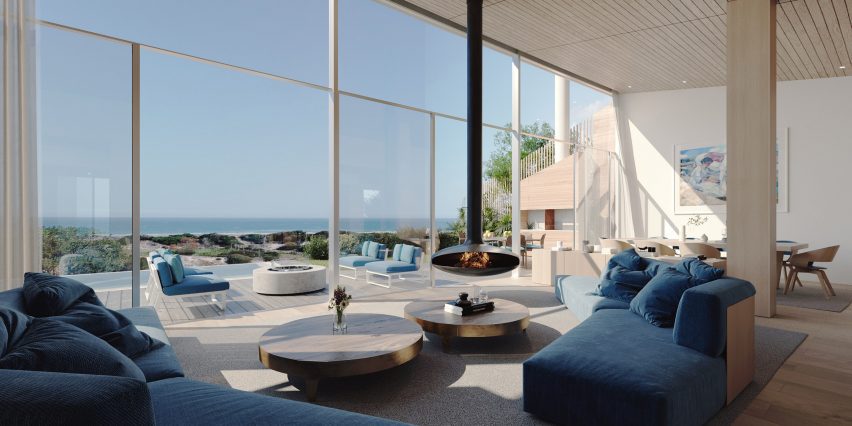
Living room with fireplaceLiving room with fireplace
The residences will contain glazed facades and private terraces

“Generously proportioned interiors open to large elevated private gardens with panoramic views, creating a sense of ‘conscious luxury’,” said the studio.

The building will be constructed from a locally sourced mass timber structure, according to the studio, with aims to be “the first nearly Zero-Energy Building”.

Other sustainable strategies integrated into its design will include the use of solar panels, rainwater capture, a green roof and cross ventilation.

Interior renderings show double-height living spaces with wood beams distributed throughout and capped by a wood-slated ceiling.

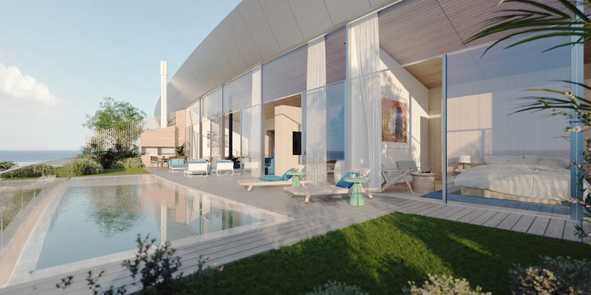
A building with glass facadeA building with glass facade
The building will be made of a mass timber structure

A wall of floor-to-ceiling windows and sliding glass doors open onto the accompanying terrace, which hosts a small pool or garden and additional seating areas.

A large pool sitting in front of the building is also pictured, with ground-level entrances to the building tucked along its length.

Uruguayan architect Viñoly, who died aged 78, designed numerous buildings around the world including 432 Park Avenue in New York and the Walkie Talkie in London.

Architects and critics including Norman Foster and Michael Kimmelman paid tribute to Viñoly after his passing, and his son Román Viñoly, discussed his legacy in an interview with Dezeen.

Other recent projects in Montevideo include a stacked housing block designed by MVRDV and a prefabricated multi-storey car park by MAPA.

The images are courtesy of Rafael Viñoly Architects.

Reference

ma yansong on MAD’s first transit-oriented project, a ‘train station in the forest’ in jiaxing
CategoriesArchitecture

ma yansong on MAD’s first transit-oriented project, a ‘train station in the forest’ in jiaxing

MAD architects unveils sunken train station in jiaxing, china


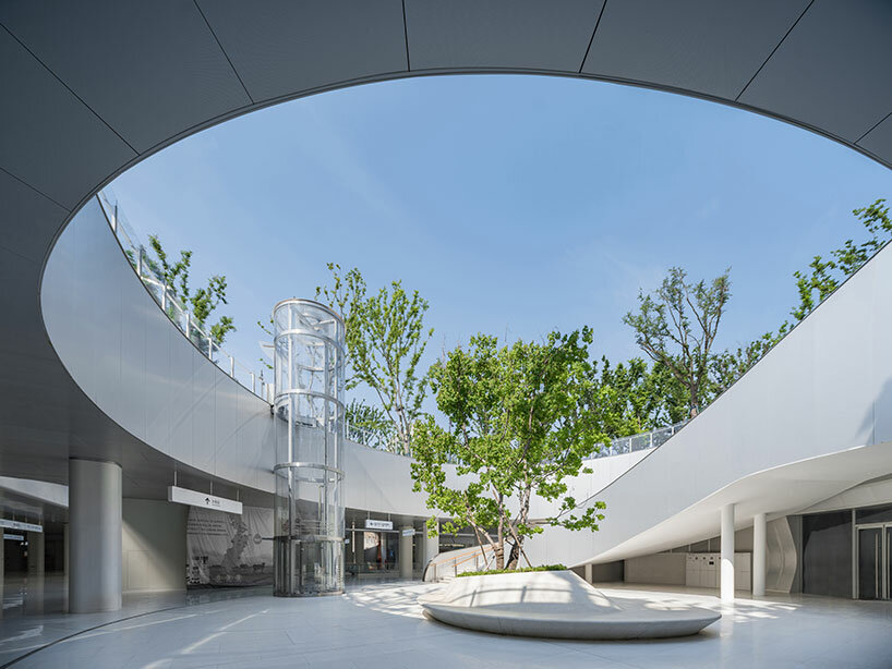
MAD Architects unveils Jiaxing Train Station (see designboom’s previous coverage here), the firm’s first transit-oriented infrastructure reconstruction and expansion project. Departing from the conventional pursuit of monumental transportation structures in China, the architects built an underground hub, replacing a dysfunctional train station that had stood at the site between 1995 and 2019. The submerged station, presented as a discreet structure, accentuates the historic station while integrating an extensive park featuring verdant spaces envisioned as an urban oasis in the densely populated area.


Lead architect Ma Yansong prioritized the project’s human-centric and efficient design ethos, contrasting with imposing and secluded Chinese transportation facilities typically bordered by expansive main roads, viaducts, and vacant squares. ‘They are like isolated islands where nobody likes to go unless they have to take the train,’ he tells designboom. ‘People should not feel lost in a vast space that makes them feel disoriented.’ MAD’s design revolutionizes the functions of transportation structures by largely relocating them underground, challenging traditional concepts and introducing the ‘train station in the forest’ concept. To delve deeper into this new typology, its design concept, and the challenges encountered during its realization, designboom spoke with Ma Yansong himself. Read the full interview below. 

ma yansong on MAD's first transit-oriented project, a 'train station in the forest' in jiaxing
the Jiaxing Train Station from above | photography by AC


interview with ma yansong


designboom (DB): What is the design philosophy behind the Jiaxing Train Station? 


Ma Yansong (MY): It’s not just a train station; it’s a part of an urban renewal. That area is a central part of the city, but nobody wants to visit it because the environment there is really bad. The only reason people go there is to take a train. However, I think the train station is not just for its function. It has to regenerate the whole area. It’s important to let this train station become an attractive, urban space that, no matter if they’re taking the train or not, people enjoy. Our design has a more environmental feel to it. We see more urban spaces in the project. There is the transportation function, but we also have a commercial function; we have offices, and parks. In addition, we kept the traditional building, the old train station from 100 years ago, and we made it into a small museum, so we added a cultural aspect to the transformation as well. Now, young people, old people, businessmen, travelers, families—they all have a purpose to go to the area. 


ma yansong on MAD's first transit-oriented project, a 'train station in the forest' in jiaxing


DB: How does the project separate itself from traditional designs of transportation structures?


MY: Through the years, China has developed a lot of train tracks for fast-speed trains all over the country. They have allowed people to travel around different cities, and of course, they have helped the economy. In a way, train stations have become symbolic in China. A lot of stations are very monumental; they are very large with huge plazas in front of them. In most cases, the train tracks are elevated. As a result, the stations feel disconnected from the rest of the city. They are like isolated islands where nobody likes to go unless they have to take the train. I understand those buildings have a symbolic purpose, but I think for both train stations and urban spaces, we need more humanity. We need something easier, with convenient access. People should not feel lost in a vast space that makes them feel disoriented. With these thoughts in mind, we decided to make a low-key architectural project. If you look at this building from a high level, it’s really low. We have used this low height to put the focus on the historical building, which is also a very small building. Most of the functions in our project are underground. From above, everyone sees only parks and greenery. 


ma yansong on MAD's first transit-oriented project, a 'train station in the forest' in jiaxing


DB: You mentioned that the design preserves the original 1907 station. Why was it important for you to look to the past? How did you balance historical preservation with contemporary functionality?


MY: The old building is part of the city’s history. History needs to be preserved, especially when we want to design a so-called futuristic building. I like to show all these different times and the historical layers, and I want to show them at the same time. Once you go visit this space, you will see these historical elements and some abstract new spaces. You will think, ‘This is futuristic. This is something I recognize from 100 years ago.’ Different narratives are unfolding. Urban space needs to have these layers so that people can fully understand what the project is about. Then, of course, history gives us a reason to design something new where past and present are still equal. When we put all these layers in an equal position, the citizens find more freedom because they don’t feel like they only belong to the past or the future. In any case, I didn’t want the futuristic character to dictate the whole atmosphere.

The old building was important, though not architecturally valuable. It is part of history, so that’s what makes it significant. It also gave us the excuse to create a new building that was very small compared to other train station constructions. I was able to build a low structure that respects the old building, which is already quite small. In a way, that is how I convinced the system, the government, to do something different and not build a huge train station like other transportation hubs in China. 


ma yansong on MAD's first transit-oriented project, a 'train station in the forest' in jiaxing


DB: Can you elaborate on the significance of placing the busy transport hub underground, and expanding the existing park? Did you face any challenges during the design and construction?


MY:
Most Asians are used to a very dense urban context when it comes to transportation hubs because a station has to serve its main function, which is, of course, the transportation of people. In this case, though, we have multiple functions, and most of them are now placed underground. We designed and introduced a new typology, essentially.  Since everything is underground, there has to be a new design that facilitates the use of the infrastructure. 

There was an existing park at the north of the site that was gated. We made it open and expanded it. We planted more trees, and we grew the green space to connect the train station with this old park, and then to a new park to the south. The two parks are now connected through the underground. Making this urban center blend into the green, was poetic, but it was also the main purpose of our project. We wanted to create something open.


ma yansong on MAD's first transit-oriented project, a 'train station in the forest' in jiaxing


MY (continued): One of the main challenges we faced was convincing others about the development. It’s more of an ideological challenge. We had to explain why this new train station looks like this. There were long discussions in the beginning. Also, we had to make sure that enough commercial spaces were accommodated in the project so that the whole thing could be supported. The second challenge was the fact that the train could not stop working during the whole construction. Every day, the train had to continue moving. That made the construction quite a challenge. Everything was completed very quickly and in parts. First, it was the north platform, then the north train station, then the north building. But it was also a challenge to do this amount of underground construction at such a quick pace. Again, through everything, the train had to keep on moving. 


ma yansong on MAD's first transit-oriented project, a 'train station in the forest' in jiaxing


ma yansong on MAD's first transit-oriented project, a 'train station in the forest' in jiaxing


ma yansong on MAD's first transit-oriented project, a 'train station in the forest' in jiaxing


Reference

Is This the Most Beautiful Architecture School Project Ever Designed?
CategoriesArchitecture

Is This the Most Beautiful Architecture School Project Ever Designed?

“Artisanal” is a word one hears a lot these days, especially in Brooklyn. Consumers are getting tired of the same old same old and long for one-of-a-kind products, preferably those made by hand. Artisans themselves are looking to escape a mainstream workforce where workers rarely get to take ownership over their own projects.

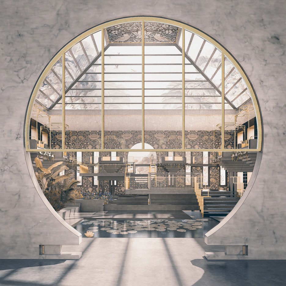
When she was an architecture student, Joanne Chen seized on this trend in an imaginative manner, designing a factory where master craftsmen could work alongside one another. Her drawings are the kind that would be perfect for Architizer’s inaugural Vision Awards, a competition that gives talented creators — including architectural photographers, filmmakers, visualizers, drawers, model-makers and more — a chance to showcase their work. With categories for students and professionals, the awards recognize emerging and established talent.

Pre-launch Registration is open today — sign up for the Vision Awards to be the first to receive updates and begin preparing your entries:

Register for the Vision Awards

In Chen’s vision, artisans would not only ply their trades but would also have access to recreational and educational facilities. It is a unique facility designed for those who wish to find enjoyment in their work.

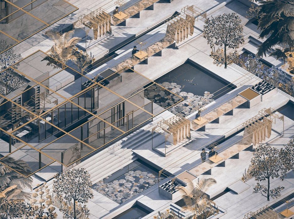
“The project raises a critique on the contemporary view of work as compensatory toil rather than fulfillment and pleasure,” said Chen. “The building adopts an interwoven spatial language, interspersing production spaces with gardens and waterscapes to create a multi-orientational experience while preserving the building’s sense of transparency.”

The proposal places the factory on the picturesque banks of the river Thames in London and includes workshops for stained-glass-makers, weavers, furniture designers and more. Courtyards featuring pensive lily ponds are laced throughout the scheme. Although this is a workplace, beauty is integrated into the functional spaces. Decorative doorways connect rooms with stunning glazed ceilings, and walls are lined with wallpaper featuring intricate vegetal motifs.

“The ornate design is a reaction against the minimalist Scandinavian design that is ubiquitous in today’s homes thanks to furniture manufacturers like Ikea,” explained Chen.

Readers might be surprised to learn that disenchantment with mass production is nothing new. In Victorian England, members of the Arts and Crafts movement called for an integration of the arts with everyday life.

They privileged the handmade over the factory-made and wrote treatises that romanticized the medieval guilds of centuries past, an age in which the products of daily life were built by master craftsmen who honed their skills over a lifetime.

One of the most interesting figures of the Arts and Crafts movement was the writer, textile designer and socialist thinker William Morris (1834–1896). In essays like “Art and Life,” Morris outlined his proposal to transform society in a way that would eliminate drudgery.

His dream was a world in which work was a sphere of life where people could feel independent, creative and fulfilled. “The true secret of happiness,” he once wrote, “lies in taking a genuine interest in all the details of daily life.”

Morris’s idealism was a major inspiration for Chen, whose factory is modeled on design principles set down in one of Morris’s texts. Like Morris, Chen wishes to reimagine the factory as a space for joy and exploration, rather than mere industrial efficiency. Many of the details of her proposal — including the striking wallpaper designs — are inspired by Morris’s own sketches and textile designs.

In terms of architectural inspirations, the project possesses a resemblance to Carlo Scarpa’s Brion Cemetery, a moving project defined by pristine concrete forms and reflecting pools.

Chen’s project was completed as part of her Masters program at the Bartlett School of Architecture in London. She worked in collaboration with the architect Niall McLaughlin as well as Michiko Sumi and Yeoryia Manolopoulou.

Architizer’s Vision Awards seeks to honor theoretical works that, like Chen’s imaginative drawing, might never result in a built project, but deserve recognition for the inspiration they spark. From fantastical renderings to intricate drawings, conceptual works tell powerful stories about architecture and form a creative catalyst for the profession:

Register For Updates

All images courtesy of Bartlett School of Architecture

Reference

Go Small, Live Well – Zero Energy Project
CategoriesSustainable News Zero Energy Homes

Go Small, Live Well – Zero Energy Project

Hopefully, this period of human existence will be known for the rapid and effective response to the existential crisis of climate change. Either that, or human culture will descend into a Mad Max scramble for survival. Either way, homes will be changing. Perhaps the most noticeable change will be the shrinking of living space. The median square footage of a new home sold in the US in 2020 was 2,333 square feet, and many “luxury” homes range from over-sized to gargantuan. Fortunately, there is a counter trend of modest-sized houses that are more affordable and fit better on small urban lots. And that counter trend has deep roots. In the late 1940s, the average new home was just 750 square feet. In the 1950s, it increased to 950 square feet, 1,100 square feet in the 1960s and 1,350 sf in the 1970s. In fact, most of us at an age to purchase a home were raised in houses that are much smaller than those we see on the market today. 


Small homes have smaller carbon footprints. They consume fewer building materials, need smaller equipment, cost less, and require less energy to operate. Even better, they require less time and effort for cleaning and maintenance. You may think that less living space means sacrifice, but a well-designed home can live big in fewer square feet. 


The right size home is the smallest that will work for your current needs. Many homebuyers fall into the trap of buying for “resale.” They buy rooms and features that they don’t really want or need, because they may believe the market demands these features. If it was ever true, it’s now a myth perpetuated by some real estate brokers. There’s a need to educate today’s homebuyers to see through the myth that “bigger is better.” In fact, as the housing market changes, it’s likely that large homes with empty bedrooms and high energy bills may not compete well in the market as smart buyers migrate to small, energy-efficient homes with lower operating costs. And today’s homebuyers will want to be in the vanguard of this trend, not the tail end. 


Everyone is different and has different needs, but here are some basic size considerations: 

  • Single person or couple: 600-1,000 sq. ft.
  • 3 to 4 person family: 1,200 – 1,600 sq. ft. 
  • Larger families 1,800 to 2,000 sq. ft. 


Good design can deliver comfort, utility, and a feeling of spaciousness in a smaller space. The deciding factor should be that homes fit the owner’s current needs and known needs for the future in the smallest possible footprint. 


Follow the principles of smart, small home design 


Keep it simple. Architectural complexity increases cost and complicates insulation and air sealing details. This doesn’t mean that we need to live in cubes. However, when you add corners beyond the usual four, make sure the benefit outweighs the costs. Think of the home’s footprint as two or more connected rectangles — small ones. 

Invite natural light. Careful selection, sizing, and location of windows can flood a small space with natural light, making it look larger without increasing energy use. Windows with higher sill heights limit total window area while preserving views, and light — providing ample space to place furniture against the wall below the windows. 

Share light between rooms. Indoor windows, glass block partition walls, full- or half-lite glazed doors, and transoms allow light from a brighter space into an adjacent area that has less natural light. Operable transoms also allow better air circulation in small homes that use ductless heating and cooling systems. 

Open floor plans. Most modern layouts connect cooking, eating, and living spaces in a more open pattern. This makes each individual space feel larger and allows for long interior views and good air circulation. 

High ceilings. Smaller rooms need not feel cramped. High ceilings (nine or ten feet) add an airy feeling and visual interest. Consider well insulated cathedral ceilings, which create more interior volume. Some of this volume can contain usable space, such as lofts, mechanical rooms, or heated storage. Even if it’s not directly functional, high ceilings bring visual appeal to smaller rooms. 

Reduce circulation paths. Shorten or eliminate hallways, unless they serve a dual purpose. Traffic patterns can flow around the perimeter of rooms with open floor plans adding to the perception of spaciousness.

Eliminate formal spaces. Formal living and dining rooms are seldom used. Most people gather in kitchens, family rooms, or outdoor spaces. Avoid showcase rooms that are rarely used.

Create soft separations. Distinguish between functional spaces without building walls. Divide large rooms with “soft” visual cues, such as differing floor finishes, wall colors, moveable partitions, hanging plants, or furniture arrangements that differentiate the spaces. Or you can tie spaces together visually using similar materials, such as flooring, wall coverings, and trim, giving the overall impression of greater space.

Multi-use spaces. Every space in the home should serve more than one function. A home office and guest bedroom is a common combination. A hall or stairway can be used as a library or gallery, a landing can be a reading nook, the mudroom or bathroom can be a laundry. Install built-ins for exercise equipment and media, rather than using separate rooms — or include an exercise nook in the garage.

Build in furniture. Cabinets, bookcases, benches, work desks, and eating nooks use less space when they become part of the structure. Recess bookcases or display cases into interior walls. 

Create privacy. Everyone needs a place to spend a bit of quality time alone. This can be difficult in a small house, so create a private space. It could be a cozy window seat, a secluded loft, or a comfy chair in a solitary corner. 

Laundry in a closet. The washer and dryer don’t need privacy. Instead of getting their own room, stack them in a closet or in other space, such as a mudroom, bathroom, or utility closet. Several utilitarian functions, such as laundry, water heating, and ventilation equipment can be located in a mudroom. Add shelves and cupboards for cleaning supplies and linens, and space for hanging clothes to dry. 

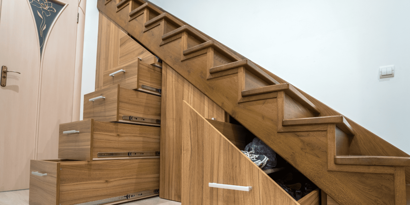
Contain the mess. Clutter makes spaces seem smaller. There are countless methods to stay organized. Give the kids their own built-in cubbies in the mudroom to store coats, hats, and other personal gear. Add shelves and cupboards above a mudroom laundry. Add closets under stairs.

Include unheated space. Storage, hobbies, and exercise can tolerate a wide range of temperatures. Expand unconditioned spaces, such as the garage, full basements, or sheds to accommodate these functions at much lower cost per square foot. 

Encourage outside living. Large patios and decks extend the living space during mild weather. 

Bring in the outdoors. Locate windows and glazed doors for optimal views of the outdoors to create a visual extension and bring the outside in. Patio, deck, or courtyard doors extend the living space past the outer walls during fair weather. 

Work-at-home space. Remote workers cherish a quiet place to concentrate. Combine a home office with a complimentary function. A bedroom can be used at night for sleeping and during the day for office work — and these functions can be kept distinct. A Murphy bed will hide away during the day, and desk and work tools can be concealed by a cabinet or a curtain when not in use. 

Provide ample storage. When people want a “bigger house” they may actually need more storage. In small homes, careful planning can provide densely packed, three-dimensional, tightly organized storage — so it does not add square feet. Instead of large walk-in closets and pantries, consider making them open spaces where you can easily access three walls of shelves. If you have a closet door, you can use the back side of the door for hooks, racks, or baskets. Make use of the stairwell walls for hooks or cupboards. Always use the space below a staircase, but be more sophisticated than a simple closet door leading into an oddly shaped room. The shorter regions near the base of the stairs could have large drawers that fully use the space below the bottom steps. 

Stop swinging. Sliding doors use less space than swinging doors. Consider using pocket doors that slide into a wall cavity, a rolling door that hangs on the wall surface, a simple curtain on a rod, or no door at all. Rolling doors don’t seal tightly, which could be a concern for privacy. On the other hand, there is ample airflow around the door for ventilation and space conditioning to penetrate. 

Plan for flexibility. The design should allow for changes in lifestyle. A young couple may have children. Grown children will leave the nest. A business could be born in the kitchen and grow in the guest bedroom. Plan for these changes. Pre-plan a future addition or consider ways new uses could be accommodated inside the existing footprint. The upstairs or basement could become an apartment for an aging relative. 


Stock Plans for Small Homes

We may think that building small homes is a new idea, but in the 1950s through the early 1970s the Canada Mortgage and Housing Corporation released a series of small house designs to encourage affordable housing. The concept behind these plans holds up well today, but it needs to be updated to zero energy and contemporary expectations, such as multiple bathrooms. 


Some modern designers are also embracing the idea. Here’s a contemporary take on small house plans that can be upgraded with energy-saving features. Zero Energy Plans offers plans for a range of small zero energy homes. Just click on “Plan Filters” and go to the zero energy home size choices to find a suitable match. 


If you can’t find the perfect house plan, consider a custom zero energy design that meets your size needs exactly. Seek out zero energy designers and builders who understand the trend towards smaller more energy-efficient homes. With good design and conscientious construction, you may find that a small, custom-built, zero energy house is not only within reach but lives very well! 

Reference

Elemental Green and the Zero Energy Project Join Forces to Accelerate Zero Carbon Homes.
CategoriesSustainable News Zero Energy Homes

Elemental Green and the Zero Energy Project Join Forces to Accelerate Zero Carbon Homes.

We have exciting news to share!

The Zero Energy Project has found a new home within Elemental Green, a leading green building media company dedicated to accelerating adoption of more sustainable residential building products and techniques.

By joining forces, the Zero Energy Project will reach a wider audience and have a greater opportunity to build consumer demand for zero energy and zero carbon homes, while encouraging building professionals to increase supply. Elemental Green and the Zero Energy Project, in partnership, aim to further our reach and impact – improving the discovery process for new products and professional services,  and increasing understanding of how we can build homes that are energy efficient, sustainable, and healthy.

Thank you for being part of the Zero Energy Project story and for continuing that journey jointly with Elemental Green as we all work toward creating a zero-carbon future.

Joe Emerson
Founder, The Zero Energy Project
Advisory Board, Elemental Green

Sheridan Foster
CEO, Elemental Green

Blog.

Reference

Highlighting Useful Technologies for Getting to Zero: The New Zero Energy Project Product Directory
CategoriesSustainable News Zero Energy Homes

Highlighting Useful Technologies for Getting to Zero: The New Zero Energy Project Product Directory

New technologies are making zero energy homes and buildings more affordable, healthier, and more comfortable than ever. The Zero Energy Project now helps you keep up with advanced building equipment and materials through our new Zero Energy Product Directory. Our focus is on energy-efficient, environmentally-friendly products that support and hasten the transition to zero energy homes and buildings.


Improved Efficiency

At ZEP, we are fond of saying that you can buy all the products you need to build a zero energy building “off the shelf”. While that’s certainly true, even mature technologies are improving their energy efficiency every year. For example, the success of heat pumps in heating and cooling homes is well established, and using heat pumps for water heating is gaining acceptance. Now heat pumps are being used for energy-efficient clothes drying as well. And mini-split heat pumps are now capable of heating a home even when outside temperatures drop below -13°F . As product offerings change and new products are introduced, one of the goals of the directory is to help you find the latest equipment and materials for your building project.


More Choices

While the key to affordability in zero energy buildings is, and always will be, good design, new technology offers designers many more choices. Technological advances are increasing efficiency and changing the balance between efficiency due to structural measures and efficiency as a result of high-performance equipment. For example, the rapidly falling price of solar electric panels is changing the relative cost-effectiveness of on-site generation versus that of structural improvements. Furthermore, solar roofing combines two functions that can be installed at the same time at lower cost than roofing and solar panels separately.


Lower Cost

It’s also true that it is sometimes cheaper to purchase an advanced product than to spend time and money on a labor-intensive, conventional approach. For instance, Aerobarrier is an aerosol sealant for buildings that can reliably reduce air leakage to a specified level in only a few hours. Air leakage is a complex problem with at least a dozen unique solutions. But this one technology promises to revolutionize the task of air sealing, especially for production builders.


New Capabilities

Finally, some new products offer capabilities that simply haven’t existed in the past. On-site battery storage is already a key component of major grid-integrated zero energy housing developments. This could become standard equipment in future zero energy homes and buildings. It’s a nascent technology that can benefit builders and buyers, while helping utilities even out the loads on the grid.


Greenhouse Gases

Reducing the energy needed to operate buildings has been the focus for years. Now that we are closer to realizing the goal of buildings that operate entirely on clean energy, it’s time to integrate the greenhouse gas impact of creating the products themselves. Sometimes called embodied energy, this is the greenhouse gas emissions resulting from extraction of raw materials, transportation, processing, manufacturing, installation, and disposal or recycling.

Products selected for the Zero Energy Project Product Directory exhibit low global warming potential compared to conventional materials or products. When available, the manufacturer has completed and made public a full life cycle assessment to show the range of benefits and impacts of its production, use, and disposal.


Indoor Air Quality and Environmental Safety

Since zero energy homes are so air-tight, it is important that the products used in them do not off-gas toxins, such as volatile organic compounds or formaldehyde, or contain chemicals contained in the Living Building Challenge Red List. These chemicals are a risk for homeowners, builders, fire safety personnel and for the environment.


New or Existing Buildings

New zero energy construction offers the easiest opportunity for installing these products.  On the other hand energy efficient equipment has an especially important role to play in renovating existing homes toward zero. In these homes where the structure is already established and access is limited, upgrading the energy efficiency of the shell is more difficult and expensive. So it becomes necessary to take advantage of the opportunity to replace failing equipment with new, high-efficiency products, either over time or as part of a major energy upgrade on the path to zero. The energy savings that result may be sufficient to avoid having to make major structural changes.


Suggest Products for the Directory

While the Zero Energy Project Product Directory is not intended to be an exhaustive list of everything needed for high energy performance, our hope is that the Directory will stimulate the supply chain of cost saving, energy efficient products in a way that will help drive the zero energy movement forward. Our goal is to help you identify useful products, both new and tried-and-true, that will make it easier to build a zero energy home. We invite your suggestions for products to add to the directory as well as your feedback on listed products, which you can provide in the comment section at the bottom of each page.

Please Note: While the Zero Energy Project is funded in part by sponsorships, sponsors will have no effect on our editorial content or mission, which is to help us all advance towards a zero net energy, zero net carbon, society. Contact us for more information about sponsorship.

Reference

A project cares for the pets of homeless people
CategoriesSustainable News

A project cares for the pets of homeless people

Spotted: As any pet owner knows, animals can quickly become members of the family. They provide us with companionship, love, and support. And for those who are homeless, pets are especially important, providing a range of health benefits in addition to physical protection. However, these animals are less likely to receive the care that they need to remain healthy.

The ElleVet Project is a US-wide mobile relief effort providing free care to pets in vulnerable communities. Multiple veterinarians travel around the country to treat pets of people who are homeless in order to improve the health and well-being of both the pets and their owners.

Out of a 38-foot RV, known as the ElleVan, the vets offer vaccinations as well as treatment. Vaccinations are crucial as they allow pets and owners to stay in animal-friendly homeless shelters where non-vaccinated animals are banned.

If the pet needs emergency care, the ElleVet Project contacts and pays local veterinary surgeons to perform the surgery and provide the necessary care. Within the first two months of launching, the project treated over 1,200 pets.

Among other pet-friendly innovations we have spotted in recent times include a digital diagnosis and treatment tool for pets that tackles vet shortages and dog leads made from old climbing rope.

Written By: Katrina Lane

Reference

How Mega Project Iconsiam Pushes the Boundaries of Material Science
CategoriesArchitecture

How Mega Project Iconsiam Pushes the Boundaries of Material Science

Mega projects inherently push limits. As the largest design efforts to shape the built environment in a given age, they naturally drive innovation simply due to the sheer scale of their undertaking. But while their development tends to bring about novel approaches to design and construction when considered in whole, the innovations they realize in the application of individual architectural materials is often overlooked.

Mega projects need mega materials, which is why cutting-edge technical porcelain stoneware from FMG Fabbrica Marmi e Graniti was a perfect fit for the larger-than-life Iconsiam development in Bangkok, Thailand. A massive, mixed-use complex featuring two residential skyscrapers, various cultural attractions and two malls, FMG’s high-performance MaxFine White Calacatta surfaces were used on the interior floors and exterior façade of Iconsiam’s malls.

The malls themselves, named Iconsiam and Iconluxe to differentiate each other’s brand offerings, are a maximalist fusion of all things Thai. Aspects of Thailand’s culture including art, food, and works from traditional and contemporary artisans are all synthesized under one roof in ways never before attempted. Designed to accommodate 150,000 daily visitors, Iconsiam and Iconluxe needed equally pioneering flooring and façade materials to perform well under extremely taxing conditions.

Designed to be utilized in large public spaces, Iconsiam’s floors are covered in FMG’s MaxFine White Calacatta surfaces, in both matte and glossy finishes depending on their location. MaxFine White Calacatta Active Surfaces® slabs, featuring antimicrobial and air purifying properties, wrap a majority of the building’s exterior. Together they employ the latest technological innovations to achieve superlative scales of application, long-term durability, ease of maintenance, and environmental health.

Size is the defining feature of most mega projects, and that is certainly true for Iconsiam, with 5.6 million square feet of retail between its two malls. As a result, FMG’s MaxFine White Calacatta surfaces cover over 118,000 square feet of floor space, while White Calacatta Active Surfaces® slabs clad more than 10,000 square feet of exterior façade.

At that scale, floor and wall panels need to cover a massive area without adding too much weight to the building’s structure or appearing unnatural. In this case, FMG’s MaxFine White Calacatta surfaces were picked for their lightness and dimensions, with thicknesses between just one quarter and one half of an inch, and slab dimensions of up to five feet by ten feet.

The natural wear and tear that such a large area of wall and floor surfaces are subject to is substantial, requiring them to both perform well and appear fresh after years of foot traffic and environmental exposure. FMG’s MaxFine White Calacatta slabs inherently resist wear over time by combining the good looks of stone with the durability of porcelain stoneware. As a result, they are fully waterproof, and resistant to chemicals, scratching, heat, fire, scaling, moisture, staining, and scuffing.

Maintenance and upkeep are likewise major concerns for a project with vast material quantities. FMG’s MaxFine White Calacatta slabs on the floors of Iconsiam are non-absorbent, allowing them to be cleaned with minimal effort before drying quickly. Outside, the mall’s wall surfaces feature FMG’s Active Surfaces®, with antibacterial and antiviral (including anti Covid-19), anti-pollution, anti-odour and self-cleaning properties. Thanks to their self-cleaning properties, when subject to light and humidity these surfaces are able to mitigate the buildup of dirt on the slabs and allow for the natural action of rain to accomplish a majority of their needed cleaning.

Available for almost any application, FMG’s Active Surfaces® slabs on Iconsiam’s façade greatly contribute to outdoor air quality. In fact, under the action of light and humidity, FMG’s Active Surfaces® are able to convert polluting molecules like nitrogen oxides and volatile organic compounds into harmless substances, improving the well-being of an entire neighborhood. Beneficial to both Iconsiam’s visitors and its neighbors.

Iconsiam’s Active Surfaces® also have an antibacterial and antiviral action. Using the photocatalytic properties of titanium dioxide combined with silver, when exposed to light these materials neutralize up to 99% of bacteria and viruses. A recent study by the University of Milan further confirmed that these surfaces eliminate up to 94% of SARS-CoV-2 (the virus responsible of Covid-19) after 4 hours of light exposure. Moreover, thanks to the presence of silver, these properties remain effective even in the dark.

To see how FMG’s MaxFine White Calacatta surfaces can bring innovative solutions to your project, check out their website.

All images courtesy Fabbrica Marmi e Graniti

Reference