“Proposals that are not adopted indicate a failure of design thinking”
In this week’s comments update, readers are debating an opinion piece by urbanist Vishaan Chakrabarti on the global housing problem and discussing other top stories.
Architect and urbanist Vishaan Chakrabarti has caused a stir by suggesting that high-density, low-rise urban housing is the key to accommodating another three billion people over the next 80 years without costing the Earth.
“The answer is hiding in plain sight,” said the architect. “A ‘Goldilocks’ type of high-density, low-rise urban housing that sits between the scale of sprawling single-family houses and large-scale towers, advocated by many architects and urbanists for decades.”
“This is the right idea for the inner suburbs”
Readers are torn. “I’m no architect, but this does make sense to me,” said Andre C.
“Providing it is done right. I live with solar, battery and a heat pump in a semi-detached London suburb and can attest to the semi-self sufficiency of the concept from spring to autumn.”
“This is the right idea for the inner suburbs,” added Chris D, “but probably too low for all the gap sites in city centres.”
James C agreed: “I think that the logic of this is pretty sound, but my biggest preoccupation with these arguments is urban densification and the steps needed to move more and more of (especially) the Western world to public transit systems.”
Dilgreen was unconvinced: “Sensible proposals that get made time and again but are not adopted indicate a failure of design thinking. Since the proposal makes lots of sense in its own terms, clearly the reason for non-adoption lies in another domain.”
Is high-density, low-rise urban housing key to solving the housing shortage? Join the discussion ›

Reader says Franky Gehry’s Guggenheium Museum Bilbao is “the most exhibitionistic building of our time”
Commenters disagree with architect Philip Johnson’s view that Frank Gehry’s Guggenheim Museum Bilbao is “the greatest building of our time”. The structure is featured in our deconstructivism series.
“It is unquestionably one of the most exhibitionistic buildings of our time,” said Tom Roberts. “Best? It might be truly significant if the structure was not an afterthought.”
Alfred Hitchcock continued: “It’s certainly a remarkable, striking and interesting building as well as being a great tourist draw. But in my experience, as a museum, it doesn’t work very well at all.”
“‘Greatest building of our time’, dunno, maybe it is, maybe it isn’t,” concluded Apsco Radiales. “But the picture of Gehry and Johnson visiting it is a gem. Gehry looks happy with his work, and Johnson wide-eyed in amazement. Both giants, and craftsmen of the highest order.”
Is the Guggenheium Museum Bilbao the greatest building? Join the discussion ›

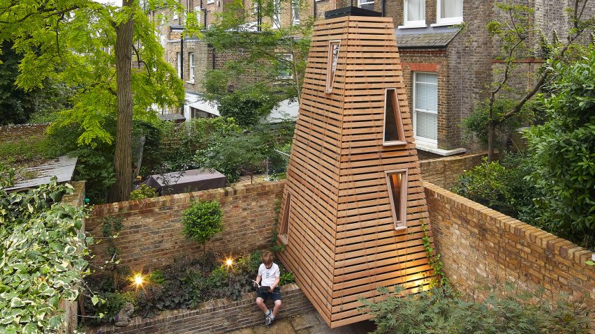
Commenter calls “treeless treehouse” an “absolutely joyous thing”
Readers are divided over a “treeless treehouse” named Penfold, which architecture studio De Matos Ryan created for a London garden. The pyramidal timber structure is accessible only by crawling beneath it.
“What an absolutely joyous thing,” said Think.
Flex agreed: “Oh, to be a child again! I could almost live in this playhouse!”
“Maybe speaking out of envy,” replied Jack Mclathass, “but if I was one of the neighbours I would be mad at this structure stealing precious minutes of sunlight and projecting extra shade in my garden.”
Does Penfold bring a smile to your face? Join the discussion ›

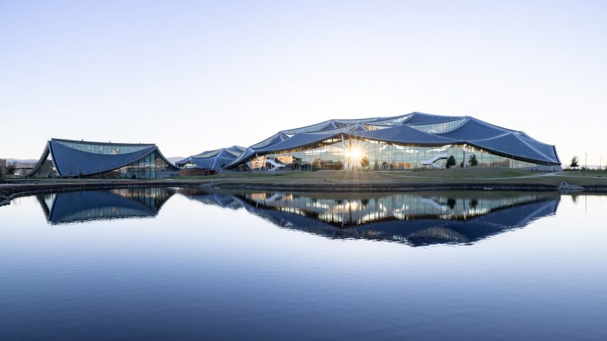
Reader thinks BIG and Heatherwick Studio-designed Google campus interiors “look like a generic trade fair”
Commenters are discussing Google’s new Bay View campus in Silicon Valley, California. It features sweeping, scale-like panels across its roof and was designed by BIG and Heatherwick Studio.
“This is my favorite building among the tech giants,” said Puzzello. “Not another boxy, suburban, curtainwall structure with their logo slapped on the parapet.”
“That interior does bring up an emotion,” continued Ima Nerdee, “a claustrophobic 1970s cubicle nightmare feeling. Did the budget run out?”
Tom agreed: “Somehow looks like a generic trade fair when the exhibitors are still setting up.”
What do you think of Bay View campus? Join the discussion ›
Comments update
Dezeen is the world’s most commented architecture and design magazine, receiving thousands of comments each month from readers. Keep up to date on the latest discussions on our comments page.

