Living space with a green marble feature wall
CategoriesInterior Design

Kingston Lafferty Design includes “sensual” red kitchen in home renovation

Living space with a green marble feature wall

Dublin studio Kingston Lafferty Design has transformed the architecture and interiors of this family home in Cork, Ireland, which features 1970s-style shapes and colours informed by the work of designer Verner Panton.

Positioned on Lovers Walk hill overlooking the city of Cork, the townhouse – called Lovers Walk – was renovated by Kingston Lafferty Design.

Living space with a green marble feature wallLiving space with a green marble feature wall
Kingston Lafferty Design completed the renovation in Cork

The studio originally planned to just update the interiors, but decided that a more extensive architectural transformation was needed after discovering structural instabilities in the home.

Kingston Lafferty Design removed all of the floors, which lacked foundations and insulation in their concrete slab, and completely reconfigured the two-storey property’s layout.

Oak-lined hallway with colourful accentsOak-lined hallway with colourful accents
Rooms on the ground floor were designed around an oak-lined hallway

“As the building was originally built in the 1970s, we wanted to return to its roots,” studio founder Róisín Lafferty told Dezeen.

“We thrived on inspiration from Verner Panton with his use of strong clashing colour, playful shapes and oversized elements,” she added.

Quartzite-clad kitchen by Kingston Lafferty DesignQuartzite-clad kitchen by Kingston Lafferty Design
One of these spaces is a “sensual” red kitchen

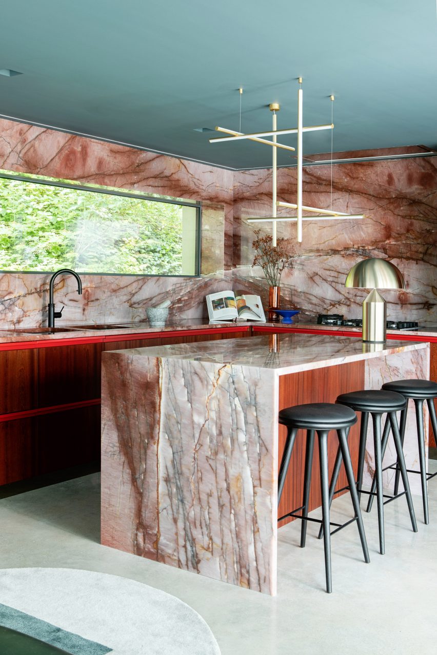
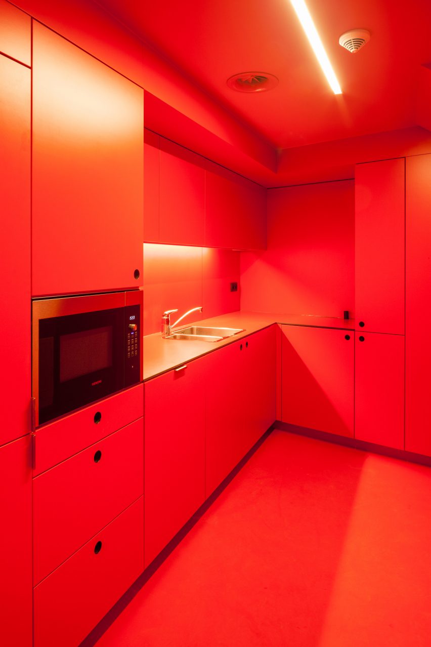
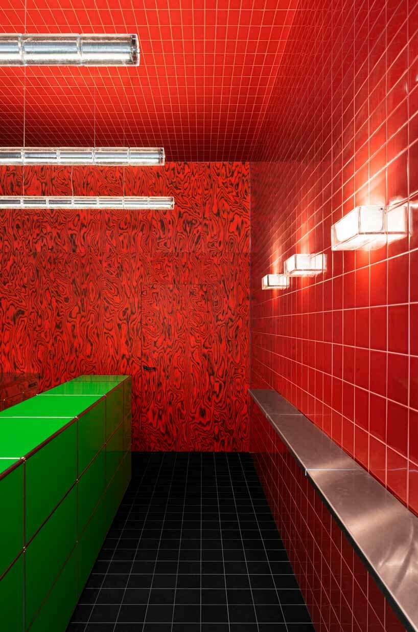
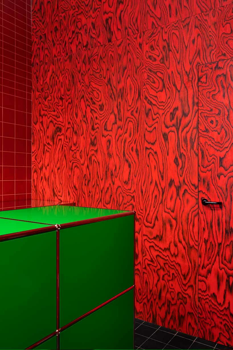
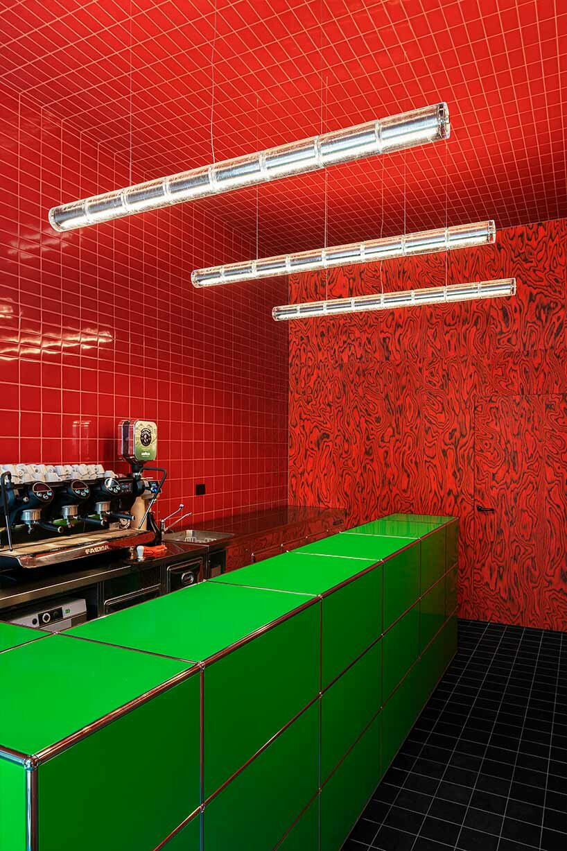
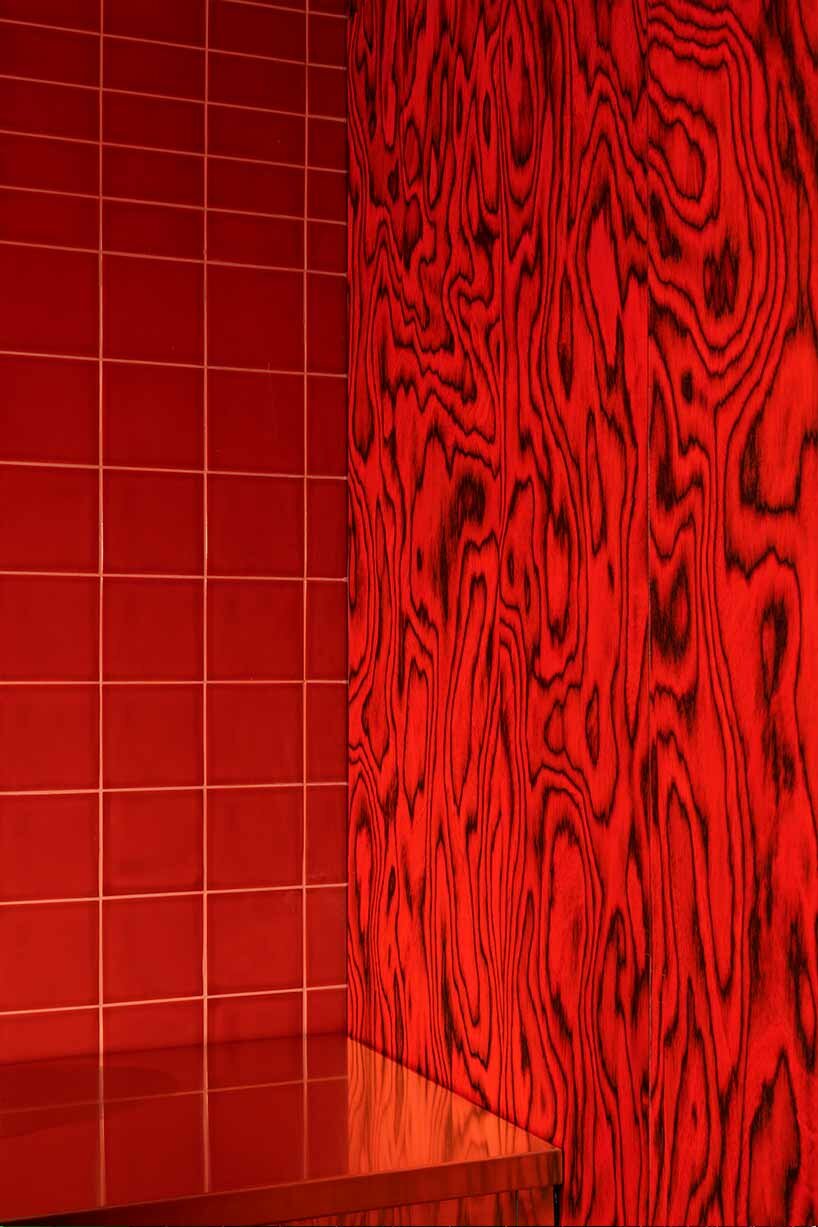
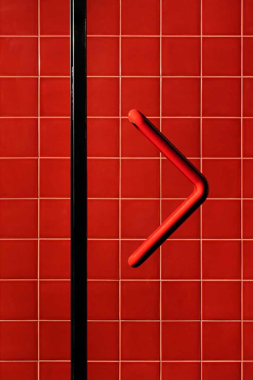
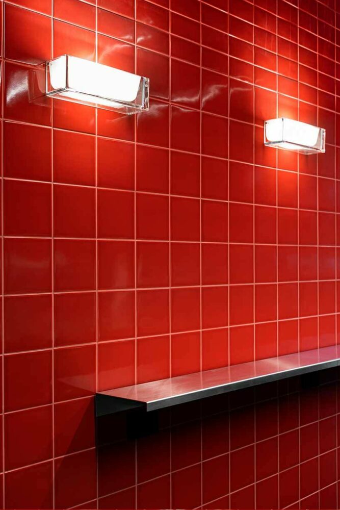
The ground floor was adapted to include an open-plan kitchen defined by a counter, island and splashback finished in veiny red quartzite.

Ruby-toned timber was used to create the geometric cabinets. When layered with the quartzite, “it sounds like a disaster, but it’s a delight,” said the designer.

Living space with floor-to-ceiling curtainsLiving space with floor-to-ceiling curtains
The living room follows a similar design to the kitchen

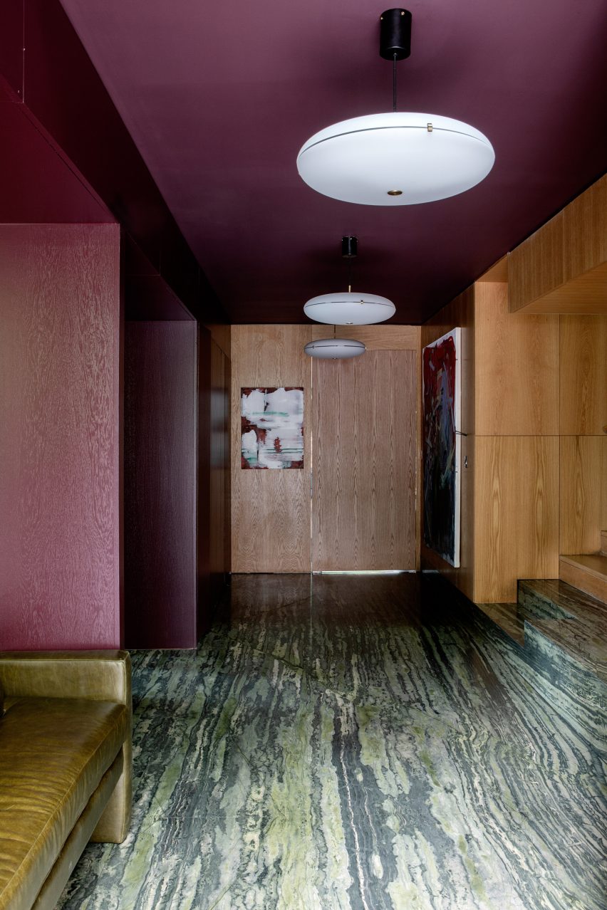
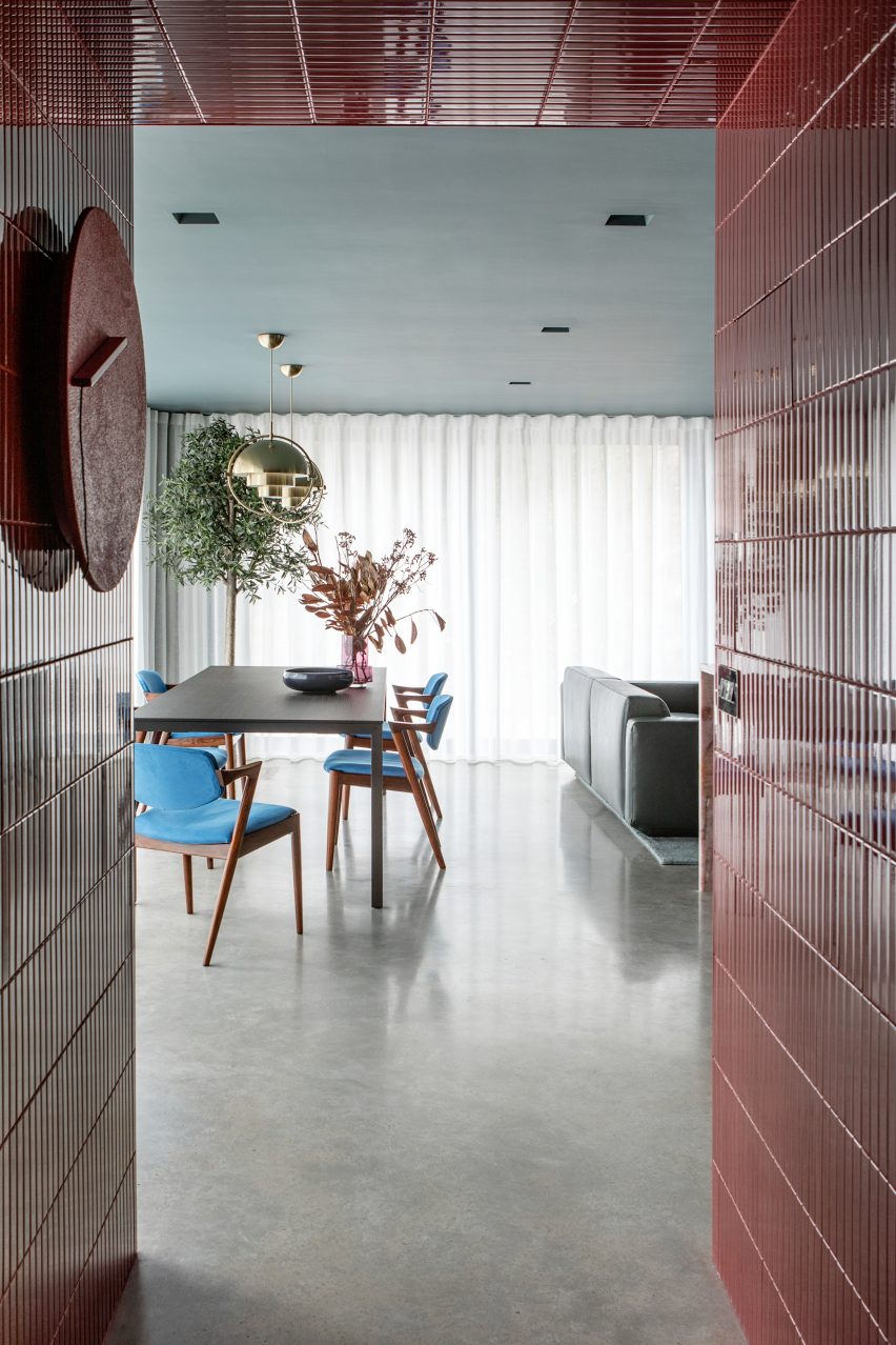
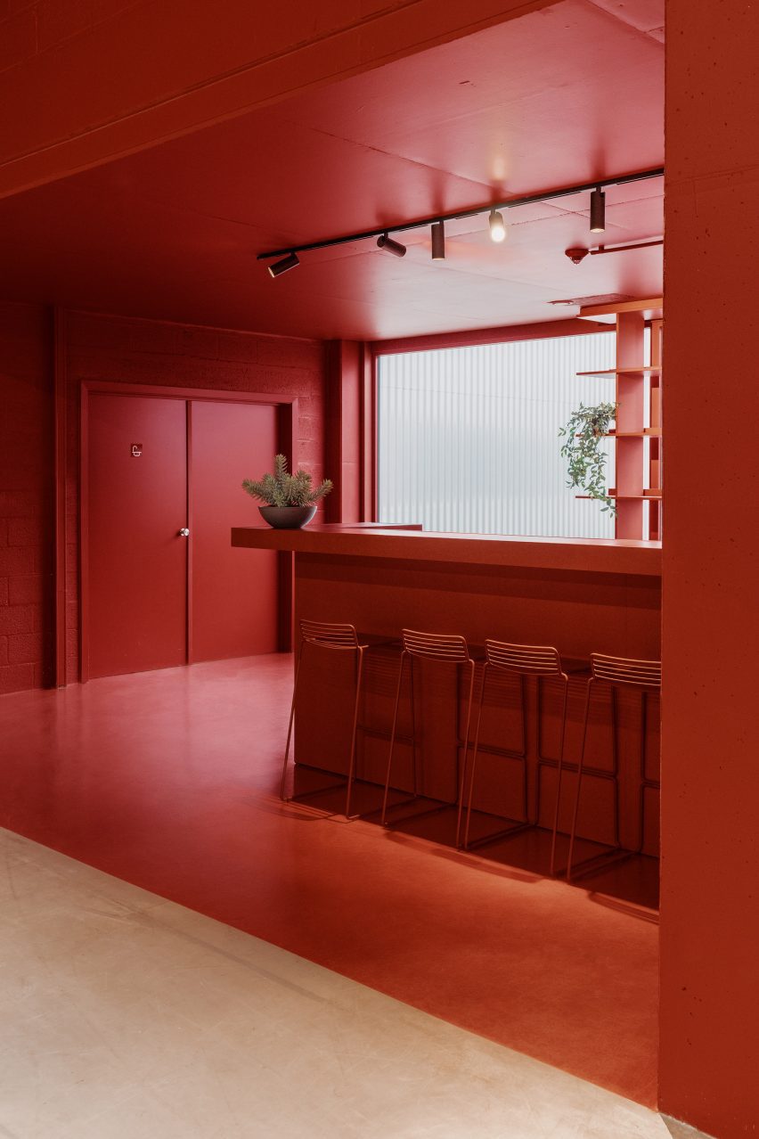
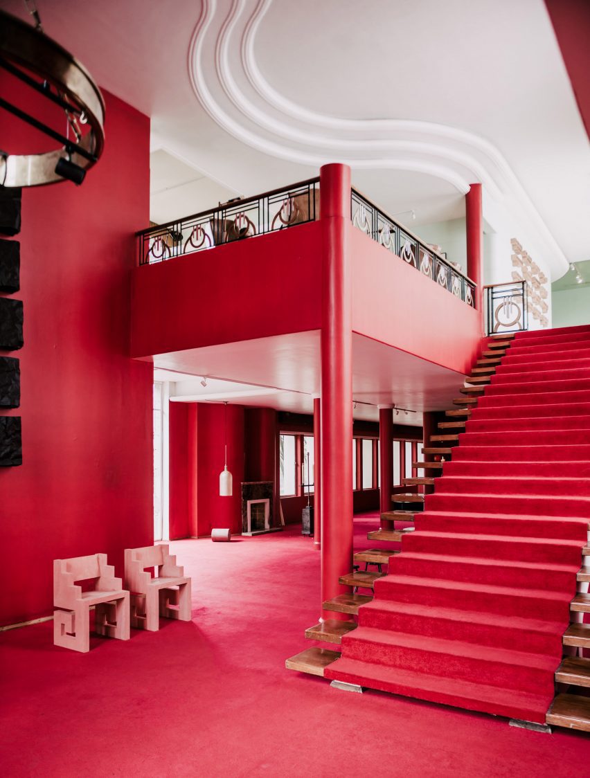
The space, described by the studio as a “sensual red-toned jewel kitchen”, is one of several rooms on the ground floor of Lovers Walk that were designed around the central, oak-lined hallway.

“We used the hallway as the core of the house, which grounded the space with pops of colour stemming from it. Each room leading from the core appears like a framed view or window of colour,” explained Lafferty.

Marble feature wall designed by Kingston Lafferty DesignMarble feature wall designed by Kingston Lafferty Design
It includes a green feature wall that takes cues from Mies van der Rohe’s iconic Barcelona Pavilion

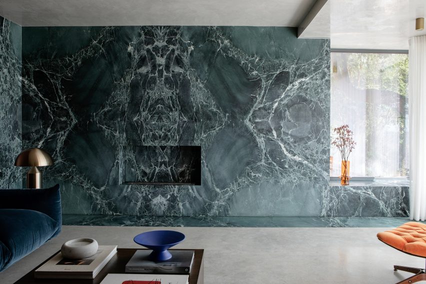
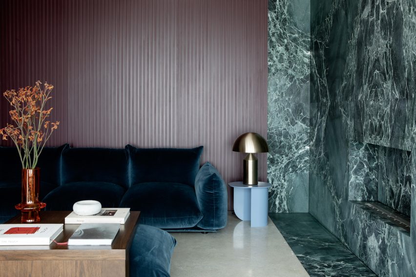
The living room includes blue velvet sofas and a green feature wall clad in swirly book-matched marble, which was fitted with an alcove reserved for a subtle fireplace.

When creating the polished stone wall, the studio took cues from the seminal Barcelona Pavilion, completed in 1929 by modernist architect Mies van der Rohe.

Green headboard in the main bedroomGreen headboard in the main bedroom
A floor-to-ceiling headboard takes centre stage in the main bedroom

“We used green as an overall thread throughout the house, inspired by the surrounding landscape,” added Lafferty.

“Although depending on the time of year, the colours tend to change and so we were able to add in other rich colours that anchor the green such as burgundies and bright oranges,” she added.

En-suite marble-clad bathroomEn-suite marble-clad bathroom
Stonework also defines the en-suite bathroom

“One would assume this mix of colours would clash, but we choose the tones and textures of each to ensure that all of them would blend harmoniously,” Lafferty said.

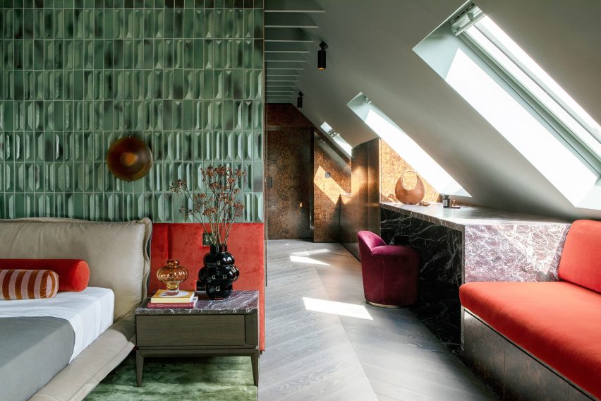
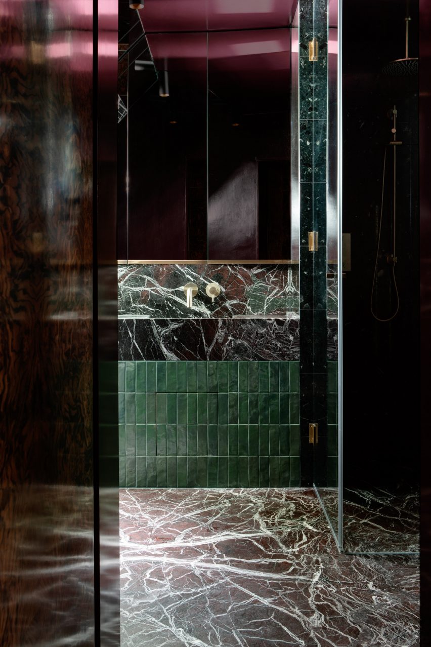
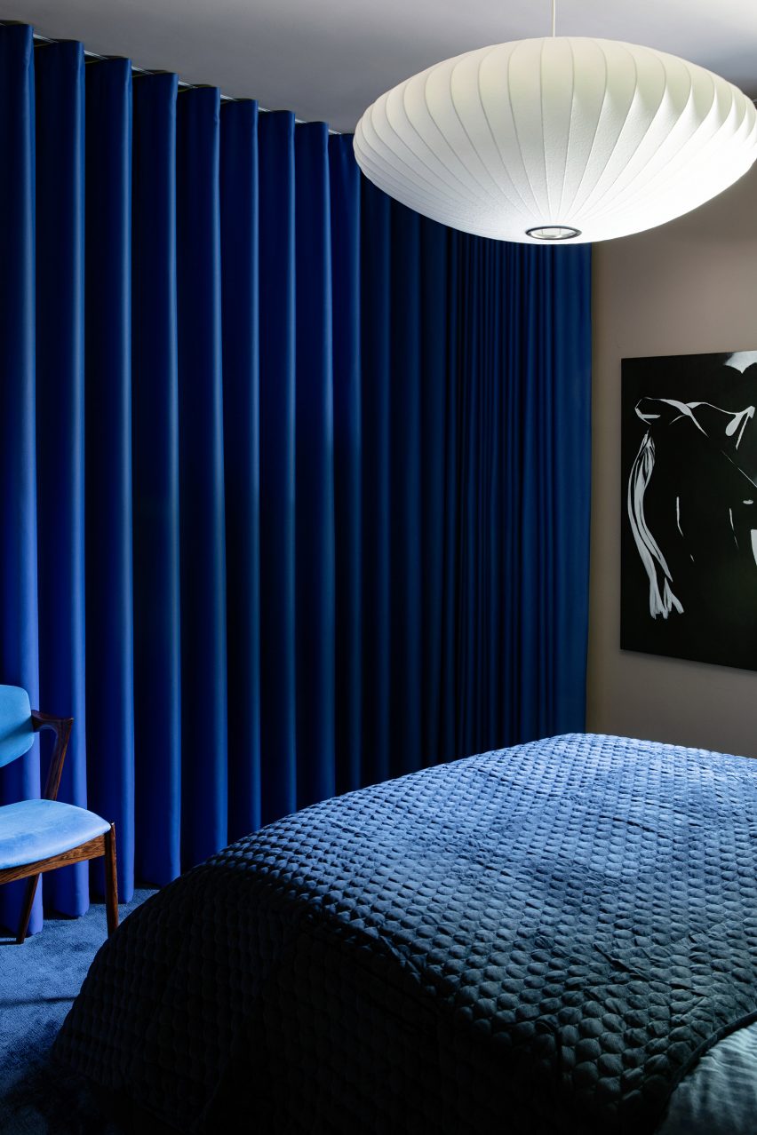
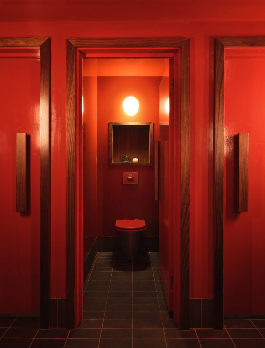
Upstairs, the main bedroom and en-suite bathroom were dressed in the same eclectic interiors as the communal spaces. A floor-to-ceiling headboard, finished in diamond-shaped green tiles originally designed by 20th-century architect Gio Ponti, frames the bed.

Playful bed design in Lovers Walk by Kingston Lafferty DesignsPlayful bed design in Lovers Walk by Kingston Lafferty Designs
A playful bed was added to the bedroom created for the occupants’ child

Balloon-like coloured glass vases were positioned on two bedside tables, which were topped with the same slabs of Rosso Levanto marble as the geometric vanity desk.

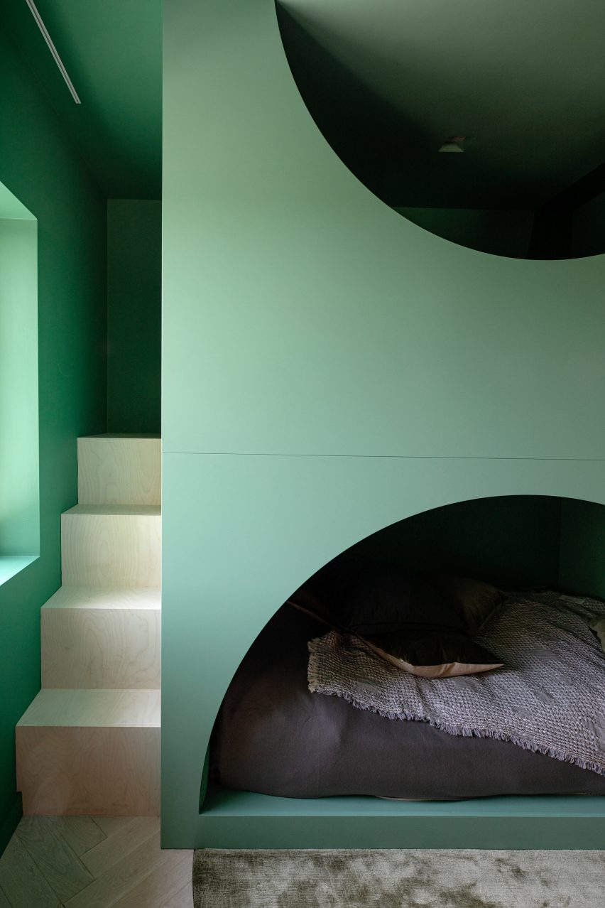
The bedroom designed for the occupants’ child features an alternative bed – a playful green structure with two stacked levels and half-moon openings that reveal a cosy sleeping area on the bottom level.

Other accents featured throughout the home include burl wood, terrazzo, plaster and brass. The repetition of 1970s-style thick pile carpets emphasises the dwelling’s textured material palette.

Lovers Walk is the studio’s “closest nod” to the work of Panton, explained Lafferty – “down to the selection of every tile, light fitting and exquisite piece of designer furniture”.

Deep blue-coloured guest bedroom by Kingston Lafferty DesignDeep blue-coloured guest bedroom by Kingston Lafferty Design
Deep blues characterise the guest bedroom

“Although there is such an array of materiality, it is balanced by repeated colour, shape and form,” she said.

“Every space in this house is an assault on the senses, in the best way possible.”

Lovers Walk by Kingston Lafferty DesignLovers Walk by Kingston Lafferty Design
Lovers Walk was informed by the work of Verner Panton

Founded in 2010, Kingston Lafferty Design has completed projects ranging from a Dublin restaurant with oversized lollipop-like lamps and a co-working office in Belfast that includes a yoga studio.

The photography is by Ruth Maria Murphy


Project credits:

Interior architecture and design: Kingston Lafferty Design
Woodwork: DFL
Stonework: Miller Brothers


Reference

Ductus design apartment complex in Switzerland
CategoriesInterior Design

Ductus coats blocky apartment complex with red plaster in Switzerland

Ductus design apartment complex in Switzerland

Architecture studio Ductus has designed an apartment complex coated with a monochrome red plaster facade into a sloping site in Schwarzenburg, Switzerland.

Located on the outskirts of the village of Schwarzenburg in eastern Switzerland, the complex was designed by Ductus to have the appearance of a series of intersecting blocks of various heights that protrude and recede throughout the design.

Ductus design apartment complex in SwitzerlandDuctus design apartment complex in Switzerland
The red plaster-covered block was has a blocky appearance

Accommodating 16 apartments, the complex comprises two buildings sat perpendicular to one another that are connected by a shared garden.

Balconies constructed from pressure-impregnated white fir and green columns contrast with the red plaster facade and overlook the garden and neighbouring buildings.

Apartment complex coated in red plaster by DuctusApartment complex coated in red plaster by Ductus
Adjoining balconies are constructed from pressure-impregnated white fir, which contrast with the red facade

Flat roofs lined with untreated copper top the apartment complex, which distinguishing it from the surrounding more traditional pitched-roof buildings.

On the exterior, untreated copper was also used for downpipes, while red-toned window frames and mechanical shutters match the plaster’s colour.

Within the apartments, textured white walls were set off by wooden flooring, while stylish bathrooms were characterised by red-toned fittings and decorative tiles to match the facade.

Bright living spaces are lit by floor-to-ceiling doors that also provide access to the adjacent balconies.

Apartment interior in Schwarzenburg, SwitzerlandApartment interior in Schwarzenburg, Switzerland
The complex contains 16 apartments split across two buildings

“All 17 apartments were designed as condominiums,” Ductus partner Marcel Hauert told Dezeen.

“The client’s desire was for all buyers to determine the interior finishes themselves. We provided a basic concept that could be adapted virtually without restrictions.”

Interior view of Swiss apartment complexInterior view of Swiss apartment complex
Red-toned fittings and tiles feature in the bathroom

Ductus is an architecture studio operating between Sweden and Switzerland.

Elsewhere in Switzerland, BE Architektur recently used intersecting sculptural blocks to form a barn-like house and Enrico Sassi has transformed a wood store into a micro home.

The photography is by Rasmus Norlander.

Reference

Image of Red Dunes Playtopia
CategoriesArchitecture

Red Dunes Playtopia features “cave-like” play spaces and undulating hills

Image of Red Dunes Playtopia

Sloping red dunes and cavernous spaces feature in this playground, which local studio XISUI Design has created in a residential area in Guangzhou, China.

Built above an underground parking unit, the play area takes cues from natural forms including mountains and caves and comprises a playful arrangement of hills and arches designed for climbing and discovery.

“The design revolves around utilising the undulating red dunes to provide an attractive terrain for children to come and engage in activities such as running, jumping, and playing,” studio design director Hu Yihao told Dezeen.

Image of Red Dunes Playtopia
Red Dunes Playtopia was designed by XISUI Design

The studio used a load-bearing concrete shell for the structure of the playground, arranging the openings so that the loads are transferred to the supporting columns of the building below.

“Through concealed structural supports beneath the main weight-bearing concrete shell, the upper weight is precisely transferred to the supporting columns of the underground garage,” said Hu.

“This reduces the amount of earthwork volume used, reducing the weight of the load, and ensuring safety and stability.”

Photo of Red Dunes Playtopia by XISUI Design
The playground consists of hill-like structures

A variety of areas were hidden beneath the concrete shell, where the undulating topography of the land underneath helps to form organic landscapes designed to evoke the atmosphere of a cave.

Accessed through curved openings between sloping bridges, the covered play space is punctuated by a central white column, where a ladder leads to a white playhouse that sits above the concrete shell and connects to a metal slide.

Photo of the Red Dunes Playtopia by XISUI Design
It has a concrete shell

“The use of undulating concrete shell structures creates cave-like spaces that blend harmoniously with the terrain, offering both climbing opportunities and fantastic sheltered areas,” said Hu.

“This design approach ensures seamless integration with the natural topography while minimising structural elements and maximising space utilisation.”

The landscape was coloured with a range of red and blue tones arranged in a blocky pattern of curving shapes that follows the topography of the playground.

“Our client expressed an interest in incorporating a celestial theme into the children’s play area, specifically referencing the concept of Mars,” said Hu.

“To balance the overall colour scheme and avoid excessive dominance of red tones, we also incorporated complementary blue hues to enhance contrast and visual interest.”

Photo of the playground
Climbing walls, slides and walkways cover the hills

Up the sides of the shell, ropes and climbing walls provide access to the top of the hill, with white railings placed along the edges of the arches to provide additional safety.

Play equipment, including tunnels, stepping stones, slides, and tactile climbing frames, has been arranged across the rest of the site into zones suited towards different age groups, ranging from toddlers to teenagers.

“We aimed to provide a balanced range of activities that cater to different stages of child development, including exercises that enhance upper and lower body strength, balance, social interaction, and parent-child bonding,” added Hu.

Photo of the playground
The playground has an undulating topography

Flattening out towards the edges of the site to simplify access, the topography was designed around these zones, with a smaller hill to one side of the site catering to toddlers and the larger shell on the other end providing more challenging terrain for older children.

While trees are dotted around the play area, the main green spaces were placed around the edges of the site where the ground dips to absorb draining rainfall.

Photo of Red Dunes Playtopia by XISUI Design
Trees surround the playground

“Meticulous calculations and simulations have ensured a comprehensive natural drainage system, effectively managing rainwater flow despite the undulating terrain,” said the studio.

“This innovative approach eliminates the need for surface drainage outlets, allowing rainwater to naturally disperse into green spaces and designated peak drainage outlets.”

Other playgrounds recently featured on Dezeen include a tree-inspired office playground in Tel Aviv and a series of giant rocks on wheels designed to encourage adventurous play.

The photography is by Hu Yihao.

Reference

Barn House by Jon Danielsen Aarhus 
CategoriesInterior Design

Ten cherry red interiors that make colour their focus

Barn House by Jon Danielsen Aarhus 

For our latest lookbook, we’ve picked eight interiors that are blanketed in shades of red that include an office in Belgium, a bar toilet in London and a mansion in Mexico.

The colour red is most commonly associated with activity, passion, sexuality, love and joy. In this lookbook Dezeen has highlighted ways in which interior designers and architects have used the colour in different interior settings.

Red terracotta tiles cover the interior of a home in Barcelona and red-tinted glass creates a glowy magma-like hue within the interior of a home located at the base of a volcano.

This is the latest in our lookbooks series, which provides visual inspiration from Dezeen’s archive. For more inspiration see previous lookbooks featuring terraces and balconies, marble-lined bathrooms and cave-like interiors.


Barn House by Jon Danielsen Aarhus 
Photo by Knut Bry

Barn House, Norway, by Jon Danielsen Aarhus 

Oslo based-architect Jon Danielsen Aarhus designed a gabled shed that sits on the grounds of a retired couple’s home in Lillehammer, Norway, which is used for painting, sculpting, craft and as additional living space.

The entrance hall of the gabled shed was covered entirely in red, including its window frames. The colour was chosen specifically to contrast against the structure’s raw timber exterior.

Find out more about Barn House ›


AEtelier office by Studio Anton Hendrik Denys
Photo by Hannelore Veelaert

AEtelier office, Belgium, by Studio Anton Hendrik Denys

In Belgium, Studio Anton Hendrik Denys and Steen Architecten transformed an industrial office building and added colourful graphics and bold hues to define areas across the interior.

The kitchen-cum-bar of the office was blanketed in an orangey-red hue, including its floor, walls, ceiling, fixtures and furnishings, which signifies and zones areas of the interior without the need for partition walls.

Find out more about AEtelier office ›


Social House by WAW Architects
Photo by Tim Van de Velde

Social House, Brussels, by WAW Architects

A vibrant red covers cabinet doors, drawers, floors, walls and the ceiling of a shared staff kitchen at a social services centre in Brussels, which was designed by WAW Architects.

The centre is located within a former orphanage and was converted into offices by the architecture studio. Bright hues were used throughout the interior to colour code the office space with red extending from a kitchen to an adjoining corridor.

Find out more about Social House ›


SOMA by Cake Architecture and Max Radford
Photo is by Felix Speller

SOMA, UK, by Cake Architecture and Max Radford

Located within a basement in London’s Soho, speakeasy-style bar SOMA was designed by Cake Architecture and Max Radford.

The restroom of the underground bar was painted bright red and paired with wooden fixtures and trimmings that were used to surround doorframes and recessed shelving in each of the cubicles.

Find out more about SOMA ›


House in Sant Antoni de Vilamajor by Arquitectura-G
Photo is by José Hevia

House in Sant Antoni de Vilamjor, Spain, by Arquitectura-G

Red was used as a running theme across this family home on the outskirts of Barcelona. It was designed by local studio Arquitectura-G and sits directly on top of a pre-existing garage.

Red features both inside and outdoors with many materials used across the exterior similarly used to decorate the interior, such as red bricks, red corrugated panelling and clay tiles.

Find out more about House in Sant Antoni de Vilamjor ›


Collective/Collectible by Masa
Photo is by Genevieve Lutkin

Collective/Collectible, Mexico, by Masa

Rich tones of red blanket the walls and floors of this abandoned mansion in the Lomas neighbourhood of Mexico City, which was used as the setting for an exhibition by gallerist Masa.

The 1970s home was decorated with furniture designed by 16 Mexico City-based designers and architects, including Esrawe, EWE Studio and Frida Escobedo. The interior features a grand staircase that was topped with a red runner.

Find out more about Collective/Collectible ›


Lookout House by Faulkner Architects
Photo is by Joe Fletcher

Lookout House, US, by Faulkner Architects

Although this room has no physical red elements Lookout House was fitted with red-tinted glass that provides the interior with a glowing red hue when light penetrates through the home.

The home is located in Truckee, California at the foot of Lookout Mountain volcano. It was designed by Faulkner Architects who wanted to mimic the colour of cooling magma within the home.

Find out more about Lookout House ›


Fox Head Inc office by Clive Wilkinson Architects

Fox Head Inc, US, by Clive Wilkinson Architects

A bright red interior was selected as a focal feature for the offices of a motocross apparel company in California. The headquarters was designed by Clive Wilkinson Architects which transformed a 7,600-square-metre warehouse into a flexible workplace.

A conference room at the headquarters was enclosed with red-tinted glass and fitted with a deep red carpet. A large white table and matching chairs, which have a bright red upholstered seat, were placed at the centre of the space.

Find out more about Fox Head Inc office ›

This is the latest in our lookbooks series, which provides visual inspiration from Dezeen’s archive. For more inspiration see previous lookbooks featuring terraces and balconies, marble-lined bathrooms and cave-like interiors.

Reference

glossy red tiles contrast with lime green counter within spazio maiocchi's new bar in milan
CategoriesArchitecture

glossy red tiles dynamically contrast with lime green counter within spazio maiocchi’s new bar

glossy red tiles contrast with lime green counter within spazio maiocchi's new bar in milan

Spazio Maiocchi’s bar extension in milan 


Spazio Maiocchi, a contemporary art space and cultural hub in the heart of Milan, has recently unveiled its new extension, a vibrant and modern bar. Its striking design, conceptualized by Capsule magazine and architect Paul Cournet, features a bold use of color and clear forms, creating a dynamic contrast between the intense shades of red and green. The eye-catching aesthetic is the result of collaborations with renowned designers, including Konstantin Grcic, and Ettore Sottsass among others. This new extension adds to the already rich cultural scene offered by Spazio Maiocchi, providing a stylish and welcoming environment where visitors can enjoy the Milanese energy.

glossy red tiles contrast with lime green counter within spazio maiocchi's new bar in milan
all images by Capsule


One year after the launch of Capsule magazine (see more here), Capsule Plaza was created as a hybrid between a fair and a collective exhibition. This initiative brought together designers and companies from various creative fields, injecting fresh energy into Milan Design Week. The inaugural edition of Capsule Plaza coincided with milan design week 2023, celebrating the city’s lively design scene. On this occasion, Capsule Plaza unveiled the new extension of Spazio Maiocchi — a striking former garage across the street, renovated by architect Paolo Caracini and Laboratorio Permanente, reaching a footprint of over 1600 sqm and reasserting its presence as a new cultural hub.

glossy red tiles contrast with lime green counter within spazio maiocchi's new bar in milan

wooden wall tiles by Ettore Sottsass incorporate natural warmth and texture into the space


a Symphony of Materials


The new bar is a natural extension of Spazio Maiocchi’s mission to bring together artists, creatives, and the community to foster cultural exchange. The space boasts a stunning design, featuring a striking combination of materials, such as Mutina DIN tiles in glossy red and matte black, created by Konstantin Grcic, and wooden wall tiles by the renowned designer Ettore Sottsass. The resulting aesthetic is bold and contemporary, while also incorporating natural warmth and texture into the space.


Adding to the design’s glossy are the horizontal suspended lamps by Ronan & Erwan Bouroullec and a USM bar counter in lime green. This diverse material choice imparts a sophisticated and timeless aesthetic to the overall composition, with the patterns and forms lending an illusion of space extension. Other details from aluminum shelves and wall sconces to a pedestal sink in rust-colored reinforced concrete contribute their own unique flair to the imposing design.

glossy red tiles contrast with lime green counter within spazio maiocchi's new bar in milan
the lime green USM bar counter creates a dynamic contrast against the red background.

glossy red tiles contrast with lime green counter within spazio maiocchi's new bar in milan
horizontal suspended lamps by Ronan & Erwan Bouroullec generate intricate reflections on the glossy walls

glossy red tiles contrast with lime green counter within spazio maiocchi's new bar in milan
a unique combination of materials, textures, and colors

glossy red tiles contrast with lime green counter within spazio maiocchi's new bar in milan glossy red tiles contrast with lime green counter within spazio maiocchi's new bar in milan


1/2

glossy red tiles contrast with lime green counter within spazio maiocchi’s new bar in milan


glossy red tiles contrast with lime green counter within spazio maiocchi’s new bar in milan


project info:


name: Spazio Maiocchi‘s new Bar | @spaziomaiocchi

designed by: Capsule and architect Paul Cournet

location: Milan

christina petridou I designboom

may 01, 2023


Reference

What's Yellow, Blue and Red All Over? Showcasing Sweden's Stunning Scarlet Architecture
CategoriesArchitecture

What’s Yellow, Blue and Red All Over? Showcasing Sweden’s Stunning Scarlet Architecture

What's Yellow, Blue and Red All Over? Showcasing Sweden's Stunning Scarlet Architecture

Architects: Want to have your project featured? Showcase your work through Architizer and sign up for our inspirational newsletter.   

The color red has been a part of residential architecture in Sweden since the 16th century when Falu red paint was first created from the residue found in copper mines in the country’s Falun region. Locals realized that this reddish sludge, when treated correctly, formed a paint that was very affordable, durable, weather-resistant and also helped mimic the appearance of brick houses that were owned by wealthier families.

Now, that particular shade of red is iconic and is knowingly used to help houses stand out in the verdant landscape. Today, the tradition continues evolving. Shades of Falu red now coats a variety of Swedish structures ranging from small homes and barns to large-scale university and apartment buildings. Here are a few buildings that illustrate the timelessness and exuberance of the color.

Images by Johan Fowelin

The Pavilion by Marge Arkitekter, Stockholm, Sweden

Unlike traditional pavilions, this Stockholm structure is stacked like a building. It is conceived to become the focal point of the redesign of the city block around it. The different levels help accommodate the slope of the site and provide access to visitors from both sides. The rouge tone helps it stand out among the beige and brown hues of the buildings around and also acts as a beacon for the citizens. The patterned exterior, created in collaboration with artist Gunilla Klingberg, is made of red-dyed concrete. The language is kept consistent by painting the awnings and window frames as well.

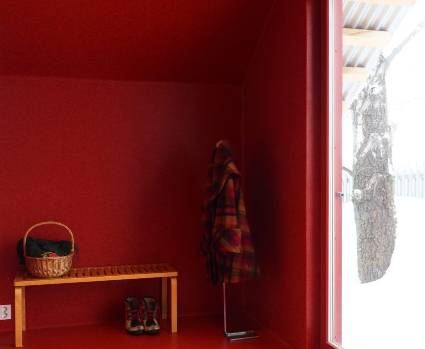
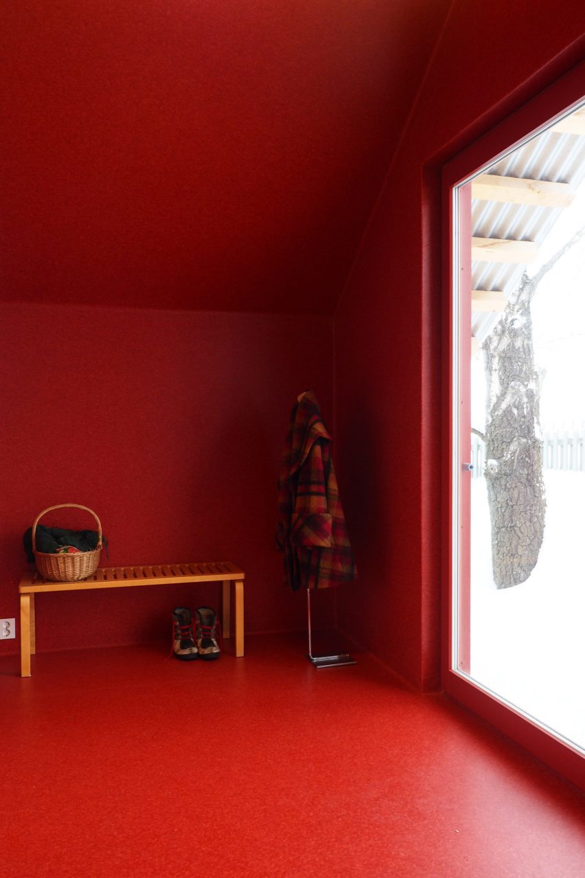
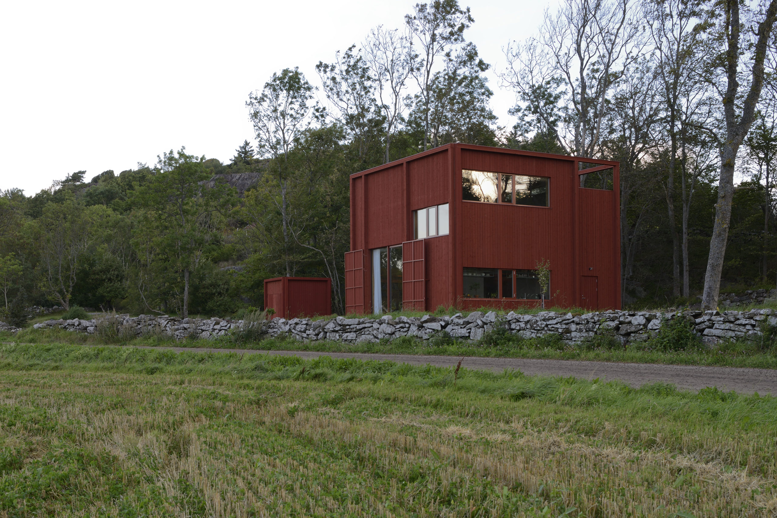
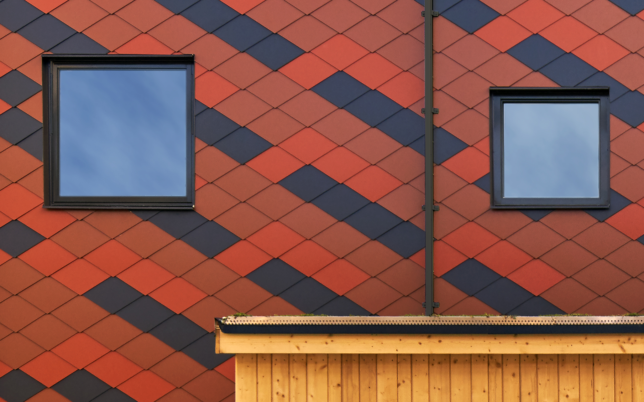
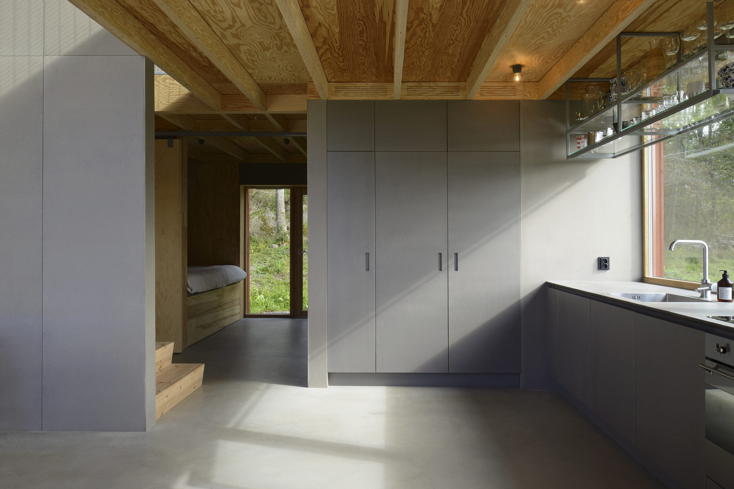
Späckhuggaren / House for a drummer by Bornstein Lyckefors Arkitekter, Kärna, Sweden

Coated in the traditional Falu red color, this house was designed for a single father of two. At one point, the site housed an old farm stall and a warehouse that was destroyed in a fire. The form of that warehouse is what inspired the design of this house. While the home appears heavy and solid from the outside, the interiors are open and airy. The spaces inside vary in height and there are mesh-covered gaps between levels to allow light to penetrate diagonally across floors.

Images by Ulf Celander

Uppgrenna Naturehouse by Tailor made arkitekter, Uppgränna, Sweden

This café and event space is a remodel of a red barn that was extant on the site. The red base, reminiscent of the previous structure, is given a modern facelift with the addition of a large greenhouse on top. The addition of panels to the base and doors not only helps maintain the barn aesthetic but also helps reduce heat radiation. On top, the greenhouse is equipped with a sewage and waste recycling system that also aids the growth of plants within. This eliminates the need to be connected to the municipal sewage system.

Images by Åke Eson Lindman

Passive Townhouses in Vallastaden by Kjellgren Kaminsky Architecture AB, Linköping, Sweden

The townhouse is broken up into four different apartments, with each one showcasing a slightly different personality. The continuous volume is broken up into four parts using separate roofs and façade patterns. These patterns are created using a mix of black, bright red and brick-toned tiles. The individuality of the apartments is also reflected in the kitchens and bathrooms inside. Additionally, this building features a courtyard, garden and storage space.

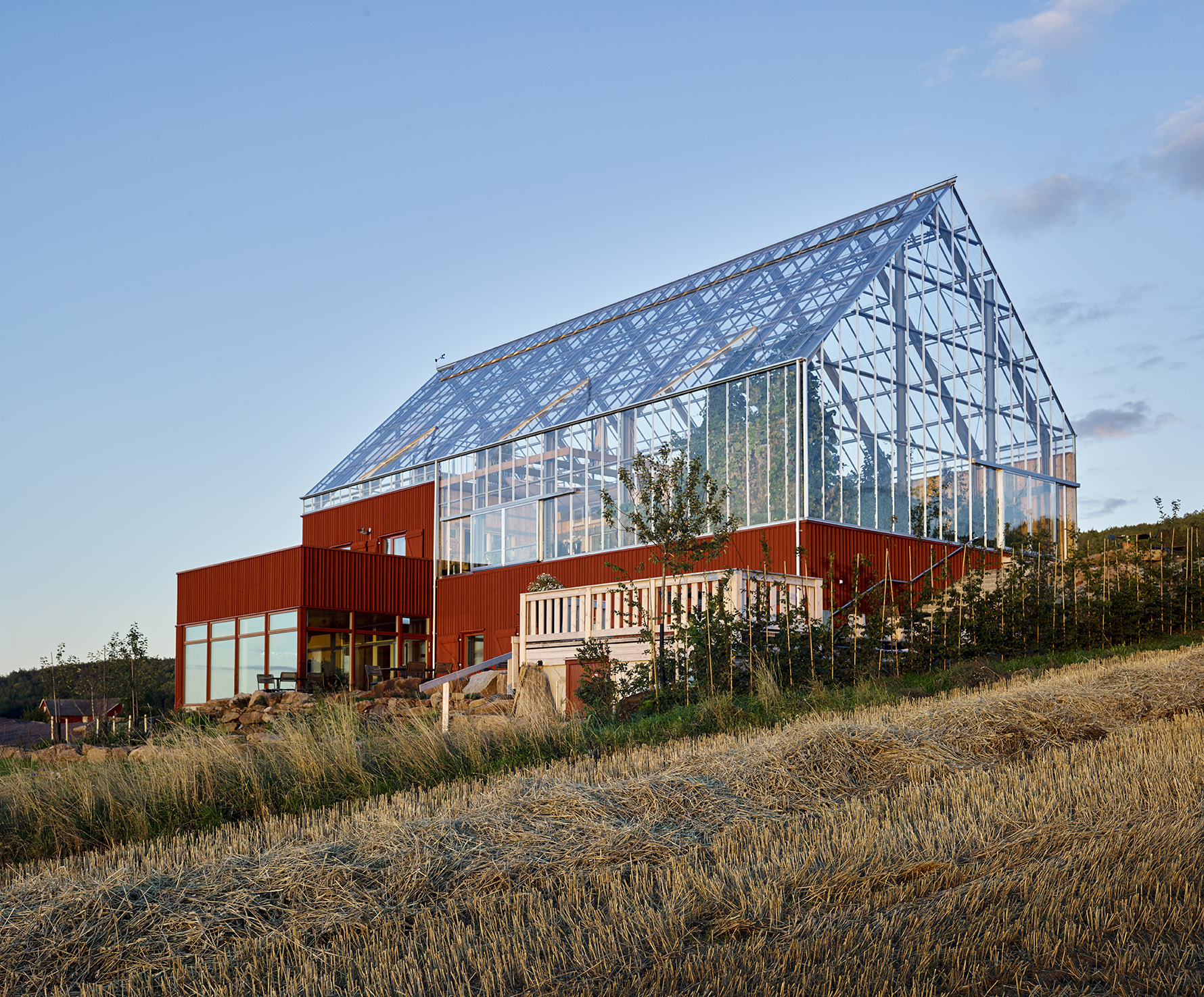
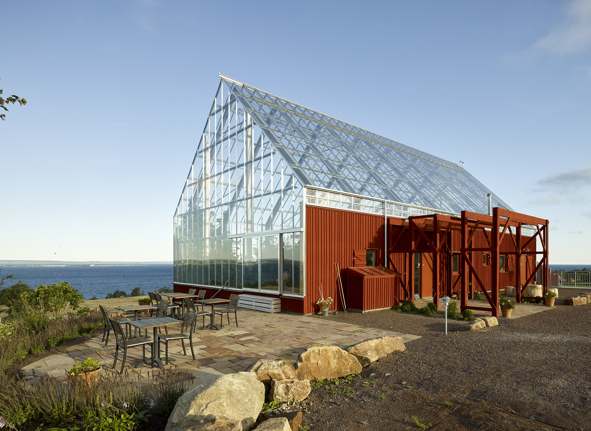
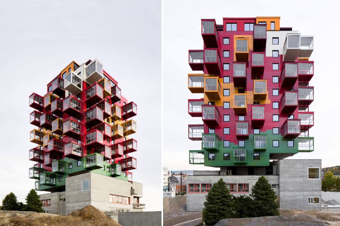
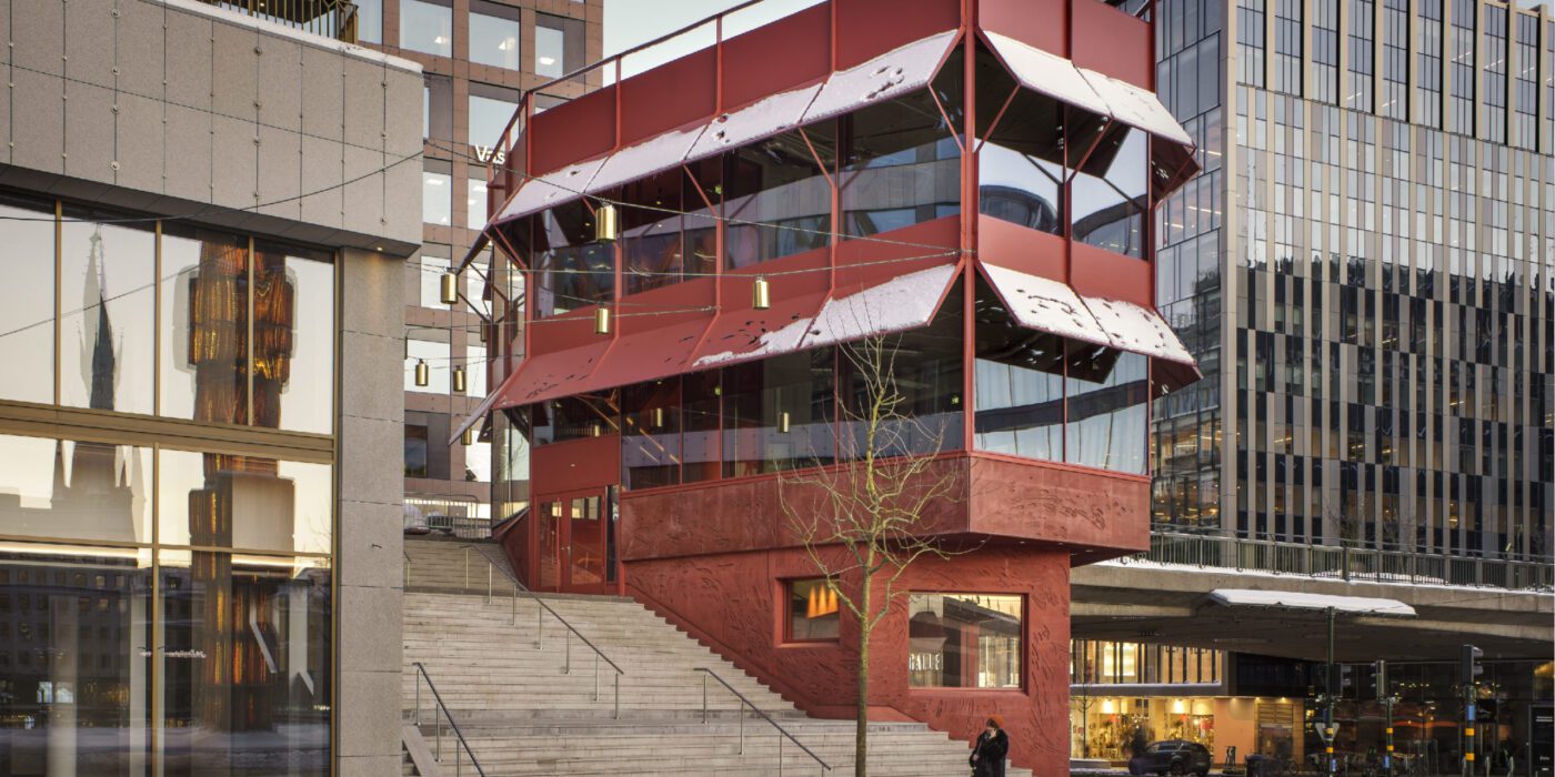
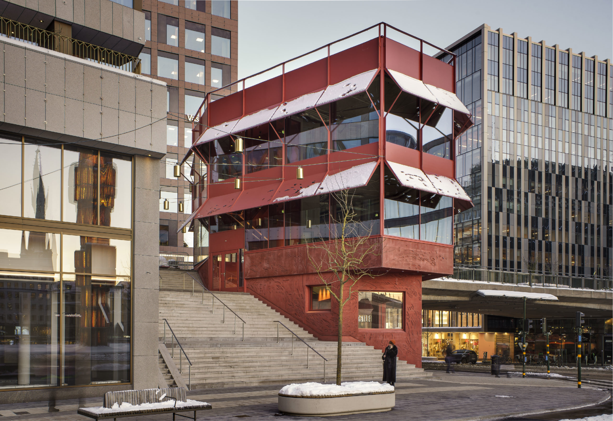
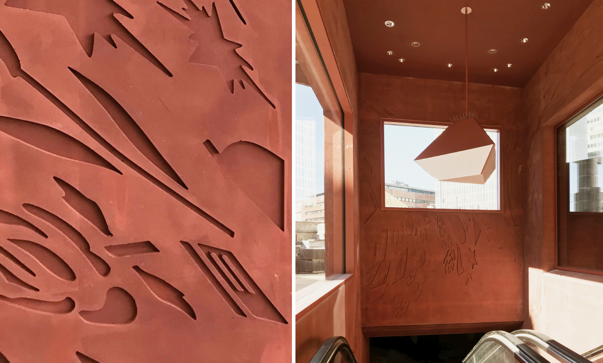
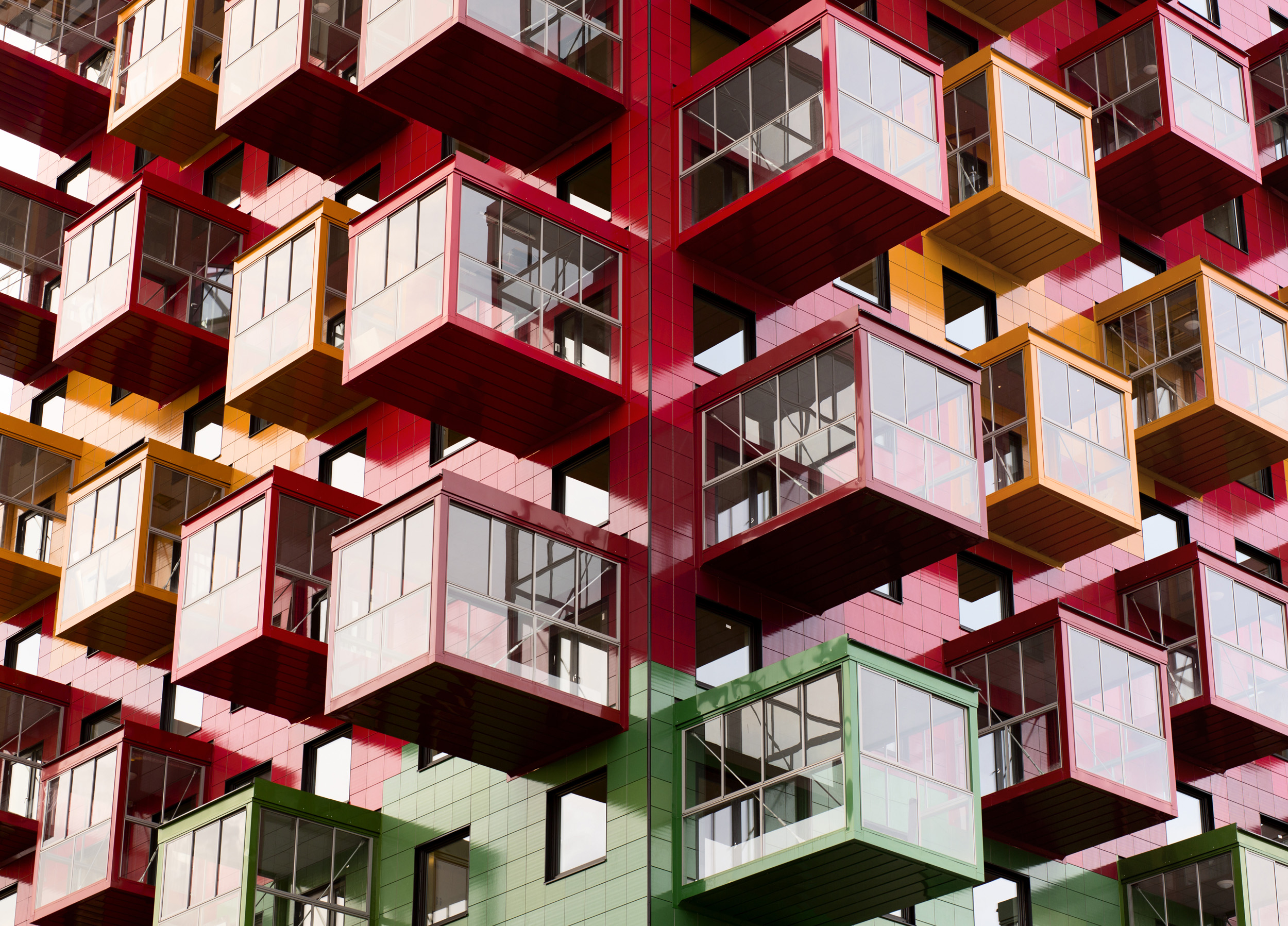
Tower on the Ting by Wingårdh Arkitektkontor AB, Örnsköldsvik, Sweden

Niklas Nyberg, a local builder, bought a courthouse that was built in 1967 after discovering it was rarely used and hoped to construct an apartment building on top of it. Taking inspiration from one of his favorite artists, Bengt Lindström, the architect set out to design a multidimensional apartment block. The square plan of the building is broken up into nine parts like a hashtag. Each level of the structure is made up of five apartments placed around a central block. The exterior is covered in glazed ceramic tiles in colors found in Lindström’s artwork.

Images by Tord-Rikard Soderstrom and Åke Eson Lindman

Kuggen by Wingårdh Arkitektkontor AB, Gothenburg, Sweden

The colorful glazed terracotta panels on this university building almost make it appear as if it is in motion. The red tones are a nod to the wharves and the harbors in the region and the other tones help add dimension and contrast. The structure is shaped like a tapered cylinder to shade the lower floors and increase floor space. The upper levels of the southern portion of the building project a bit further than the others to provide more shade throughout the day. Similarly, the triangular windows emerged from lighting considerations; they are designed to draw in sunlight from the ceiling and ensure that it reaches the building’s core. Meanwhile, motion-activated lights and ventilation systems help to conserve energy.

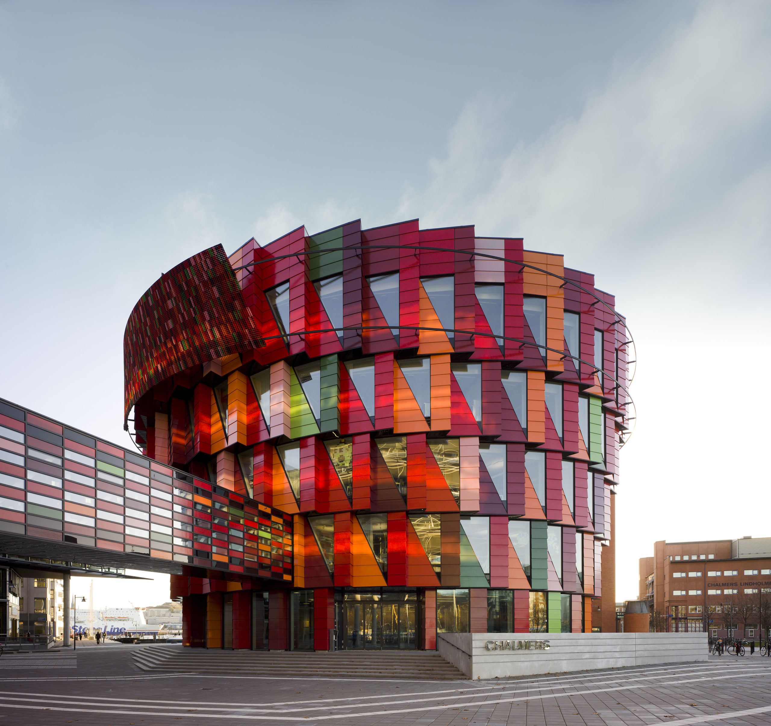
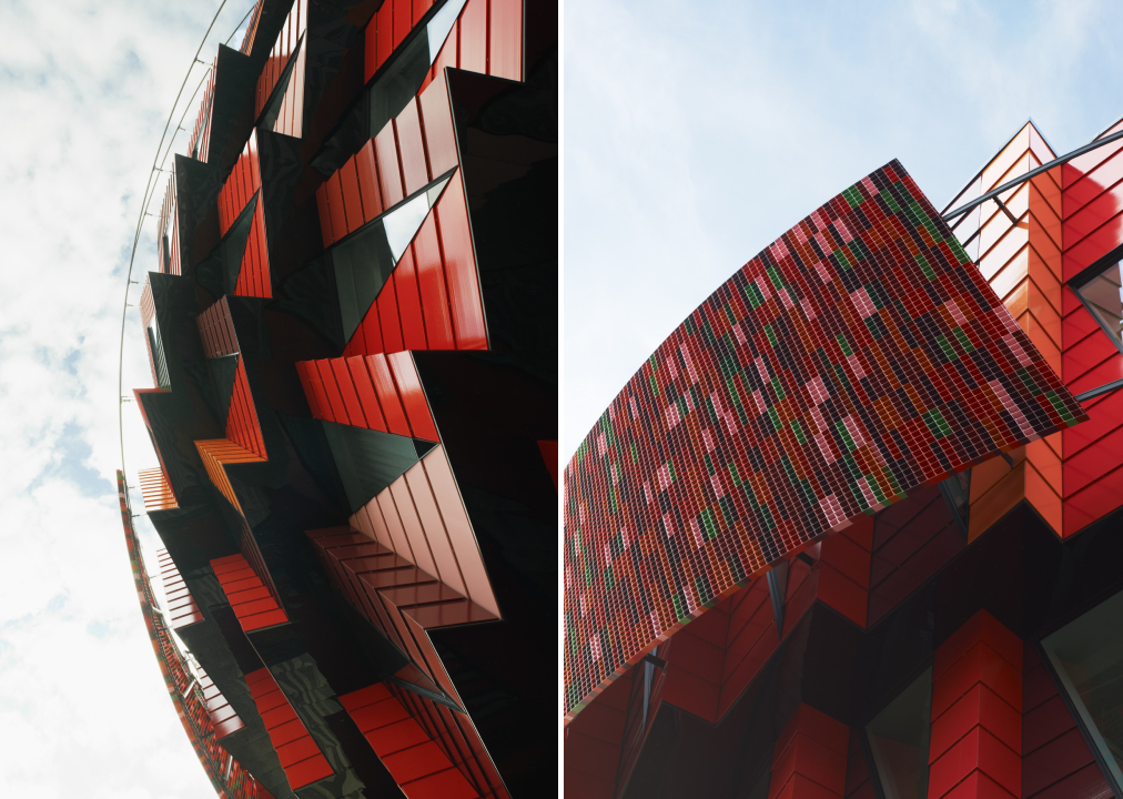
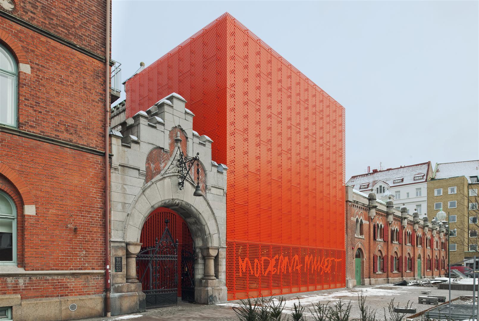
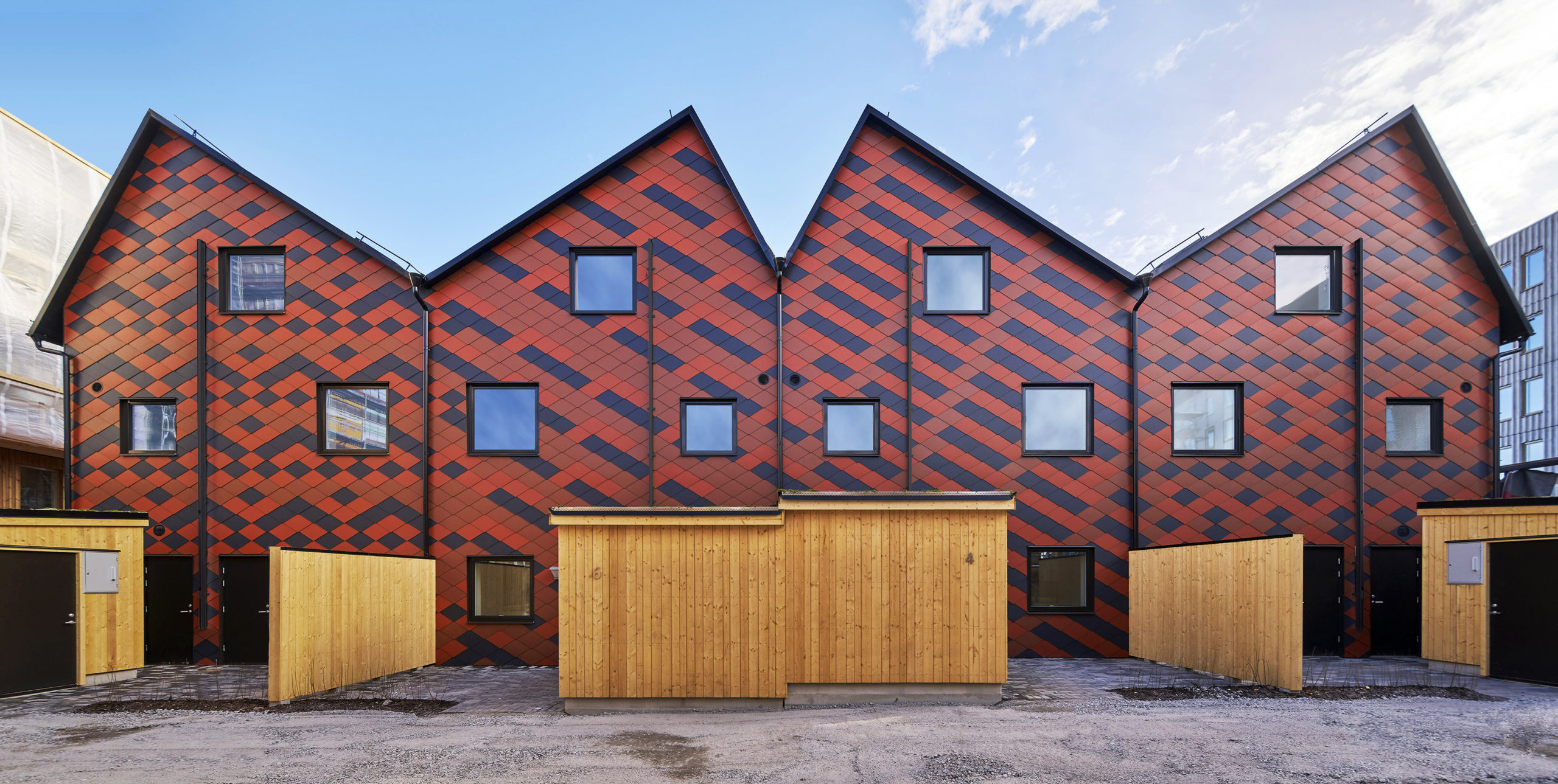
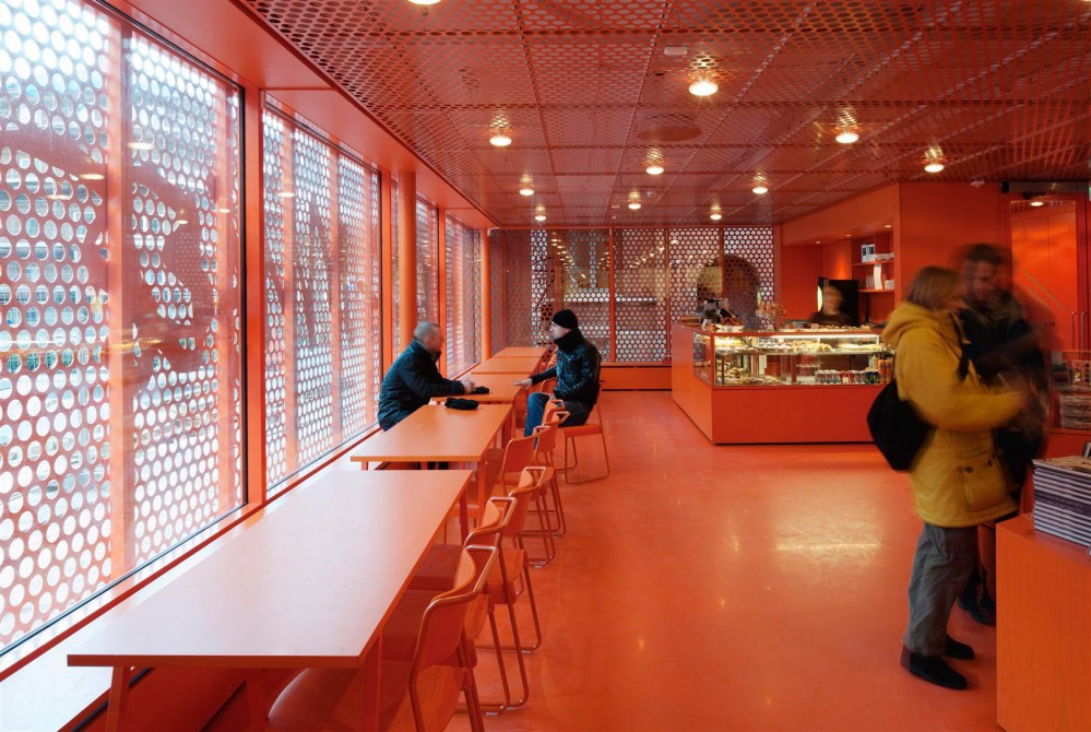
Moderna Museet Malmö by Tham & Videgård Arkitekter, Malmö, Sweden

The new branch of the Swedish Museum of Modern Art stands is a remodel of an old electricity station. The remodel is marked with the addition of a bright vermillion cubical extension with a perforated façade placed right next to a traditional entrance. The larger perforations on the lower level help the museum’s sign stand out as well. The floor is glazed to filter the sunlight coming in and the same vibrant hue is painted across every surface as well as the furniture inside the café. The other exhibition spaces are painted white or other neutral tones, intentionally creating a contrast.

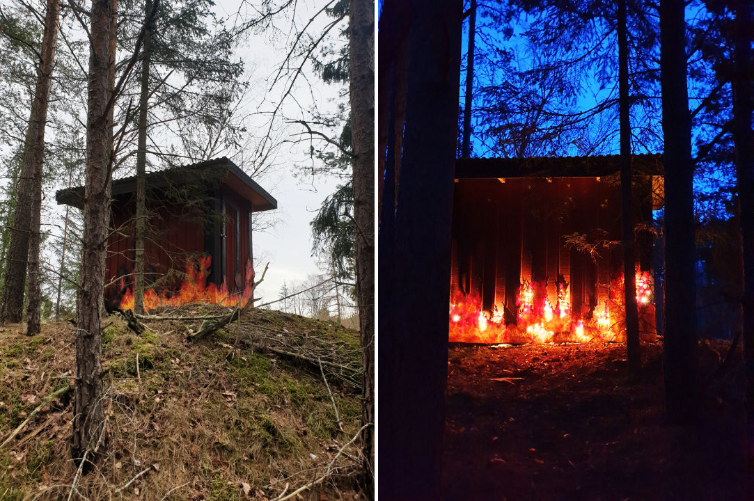
Fire House by Ulf Mejergren Architects (UMA), Stockholm, Sweden

After the previous outhouse burned down, the architect decided to rewrite the story of its demise in the replacement design. The client’s requirement for a red shed was taken up a notch by adding recycled beads, arranged to mimic a burning blaze, on the walls. This was paired with lights to bring this composition to life. In addition to being a point of conversation, the faux fire also helps keep the deer and rabbits away. The effect produced was so realistic that the owners had to inform their neighbors that it was art and not actual fire when they called the fire brigade.

Architects: Want to have your project featured? Showcase your work through Architizer and sign up for our inspirational newsletter.   

Reference

Iconic London’s Red Bus campaign promotes Lahore for foreign investment_Blog Artwork
CategoriesInternational News News

London red bus campaign promotes Lahore for foreign investment

Iconic London’s Red Bus campaign promotes Lahore for foreign investment_Blog Artwork

London red bus campaign promotes Lahore for foreign investment

LONDON – The city of Lahore has been projected globally in London as a private real estate company has launched its campaign in several parts of London to showcase the rich heritage of Lahore on 150 of London’s iconic red buses to promote ‘LAHORE – The Heart of Pakistan’.

On some of the busiest routes of London, 150 buses carrying the banners of LAHORE – The Heart of Pakistan’ will pass through London till the middle of November 2021.

Diyar Homes, the developers of the $30 Million luxury real estate development One Canal Road, Lahore, who recently announced their collaboration with leading Italian fashion house VERSACE Ceramics, are behind the launch of mega campaign on 150 of London’s iconic red buses to promote Lahore as the travel and investment destination.

The red London buses carrying ‘LAHORE – The Heart of Pakistan’ pass from outside UK Parliament, 10 Downing Street, Edgware Road, Oxford Circus, Trafalgar Square, Park Lane, Bond Street, South Kensington, East London, Embankment and Willesden Green.

Director of Diyar Homes UK Shaan Abbas speaking to the media at the launch of buses said that Lahore has undergone a $10 Billion urban transformation in recent years cementing its place as the cultural and economic heart of Pakistan.

“It’s the preferred investment destination of Pakistan and this is the message we wanted to give to the world from London, the global capital,” he said.

Shaan Abbas said that London’s iconic red double-decker buses are carrying brand Lahore on the roads of Central London, the hub of world tourists.

During four weeks, millions will see these buses depicting the diversity and beauty of Pakistan, he said.

He said the moving buses are creating an unparalleled lasting visual impact on millions of pedestrians and motorists alike, especially the tourists.

Shaan Abbas said the bus wrapping campaign aims to introduce foreign tourists to the beautiful land of Pakistan that still remains unexplored.

The post London red bus campaign promotes Lahore for foreign investment
appeared first on Daily Pakistan