Exterior of Paris apartment by Johanna Amatoury
CategoriesInterior Design

Paris duplex by Johanna Amatoury references Greek island architecture

Exterior of Paris apartment by Johanna Amatoury

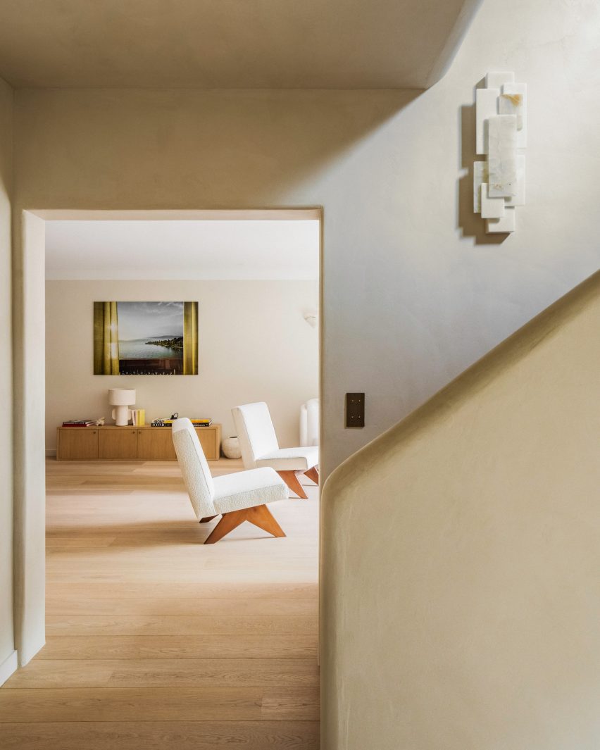
Harnessing soft whites and gently curving plaster forms, interior designer Johanna Amatoury has brought a holiday-house feel to this apartment in the peaceful Paris suburb of Neuilly-sur-Seine.

The duplex belongs to a couple who work in real estate and their three young children – a globetrotting family with a particular love for the Greek islands.

Exterior of Paris apartment by Johanna AmatouryExterior of Paris apartment by Johanna Amatoury
Interior designer Johanna Amatoury has renovated a Paris duplex

Amatoury designed their apartment as a homage to the region’s vernacular architecture.

“Because of their love for this part of the world, we arrived in this apartment and imagined a holiday house feeling, using warm and textural materials – very unlike typical Parisian apartments,” she told Dezeen.

“We worked with mineral materials, textures and raw colours in the apartment to provide depth and achieve the desired ambience.”

Hallway of Paris apartmentHallway of Paris apartment
Curving plaster-covered surfaces feature heavily in the entryway

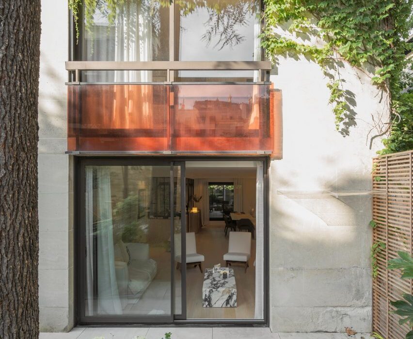
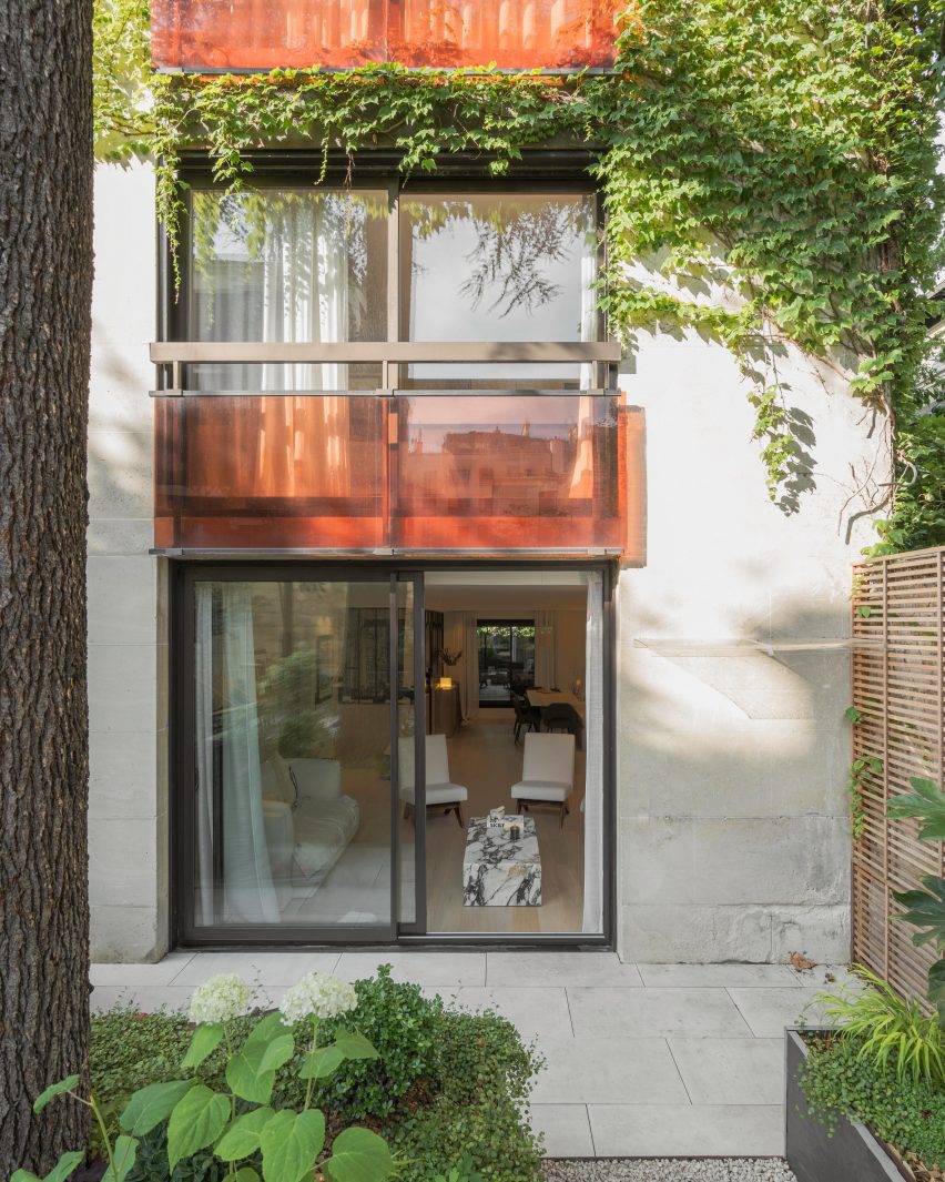
The design of the home was also shaped by its layout, arranged over the ground and first floors of a large 1980s building that opens onto a small garden.

This encouraged Amatoury to model the apartment on a single-family house.

View into living room of flat by Johanna AmatouryView into living room of flat by Johanna Amatoury
The design draws on the vernacular architecture of the Greek islands

“We wanted to imagine it as a house, to create a more outside-in atmosphere, increasing all the size of the windows,” she said.

“The apartment is on the garden level, so my guideline was to open as much as possible to the outside and the planting there.”

Living room of Paris apartmentLiving room of Paris apartment
Violetta marble tables anchor the living room

The apartment’s whole floorplan was reworked in order to create a living room, dining room and kitchen that all look onto the gardens outside.

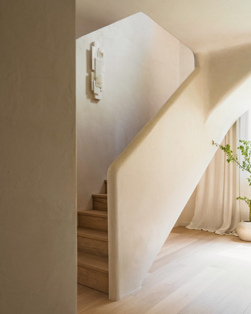
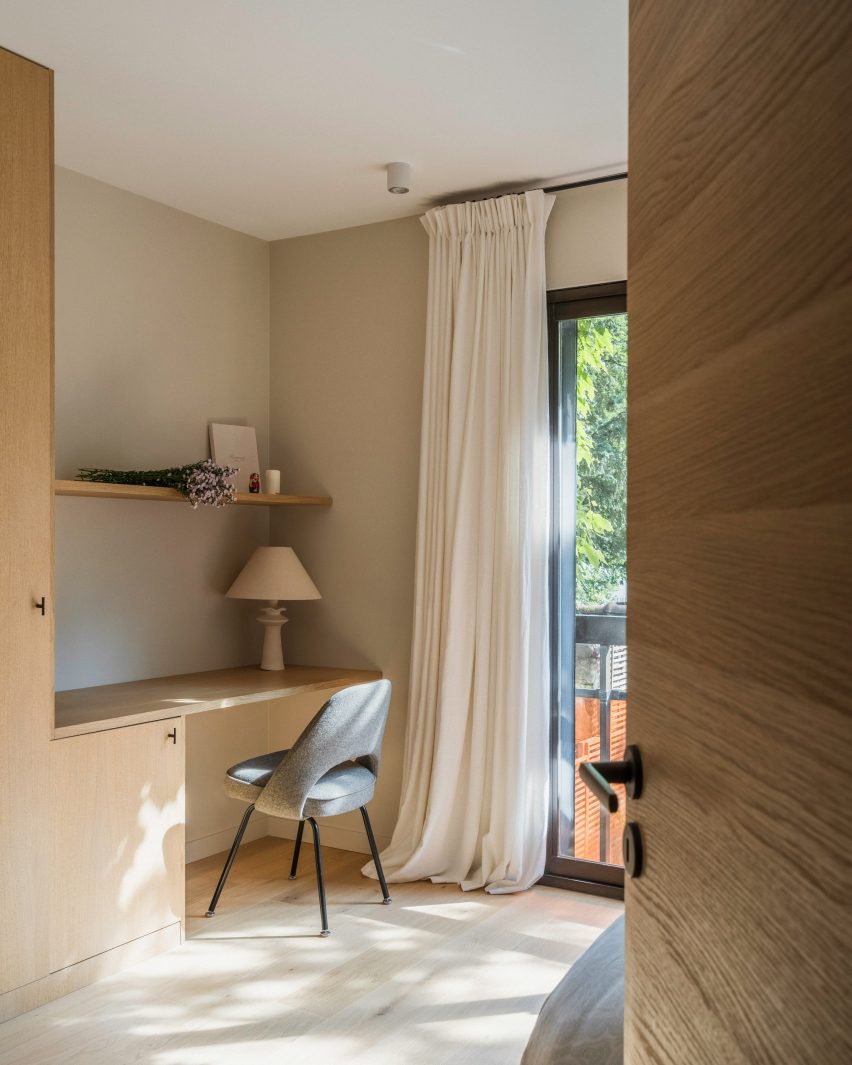
The staircase was relocated to a more logical location close to the entrance, while upstairs the space was completely reconfigured to create four bedroom suites.

Artwork hanging over console table inside Paris apartment by Johanna AmatouryArtwork hanging over console table inside Paris apartment by Johanna Amatoury
Artworks reflect the Grecian theme of the interior

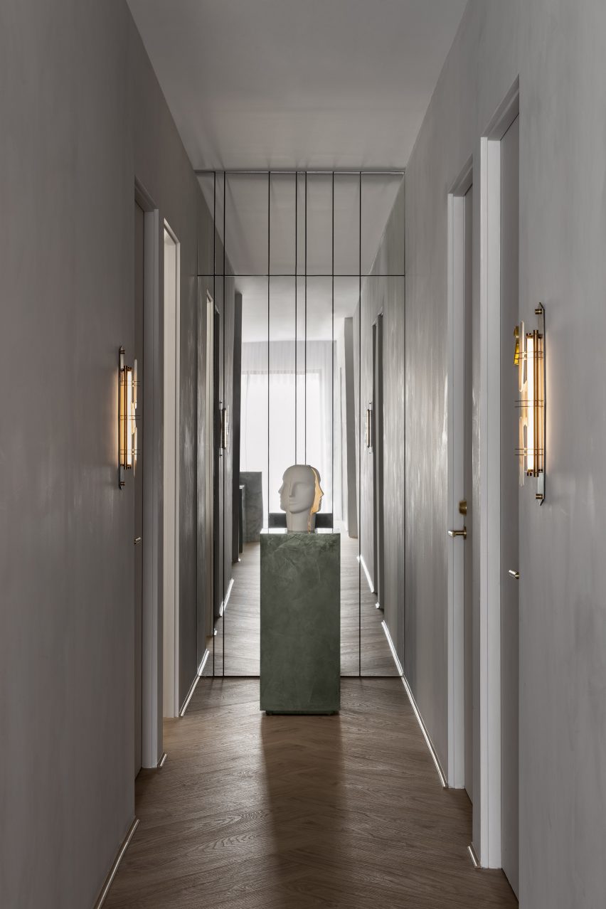
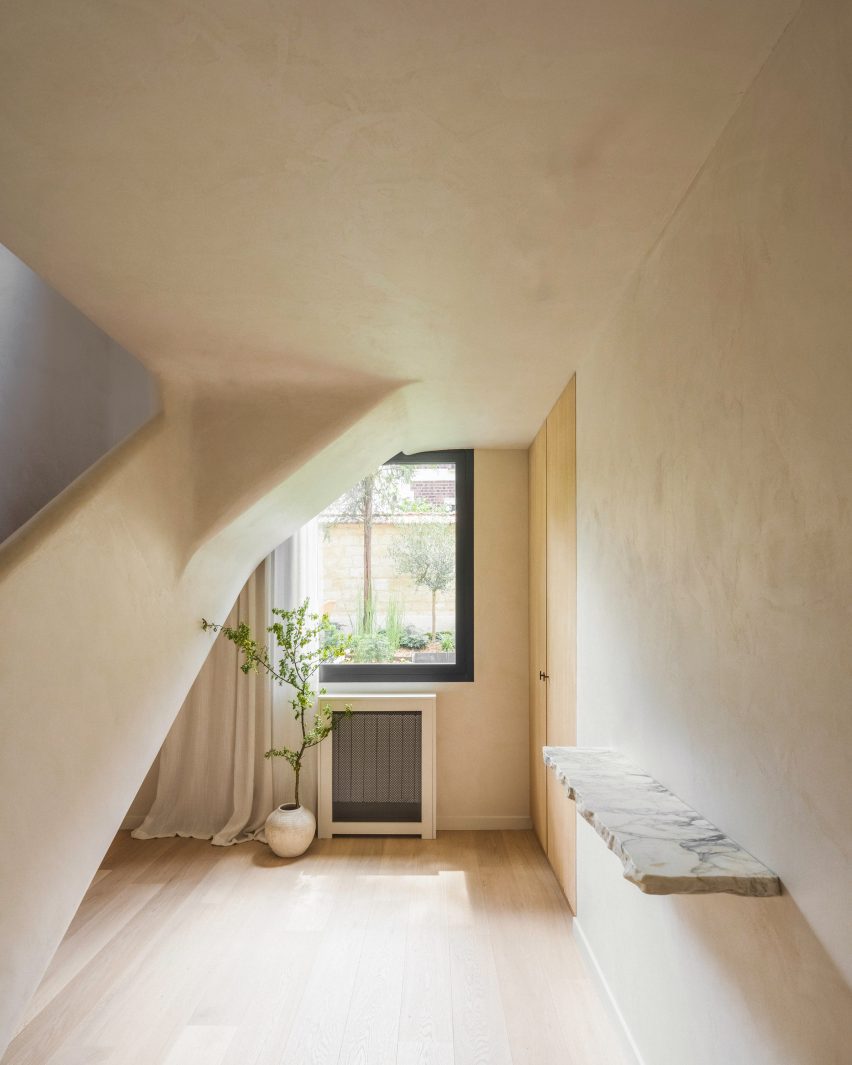
As a homage to Greek island architecture, Amatoury used Roman plaster to soften the forms within the apartment, particularly in the entrance hall.

“We used warm, textural materials including lots of softly curving and tactile plaster finishes that give the space a sculptural look,” she said.

“Roman plaster is a very ancient technique that has a mineral appearance with a smooth, soft and slightly glossy finish, which catches the eye and dresses the wall through classic mineral colours while also embracing brighter nuances.”

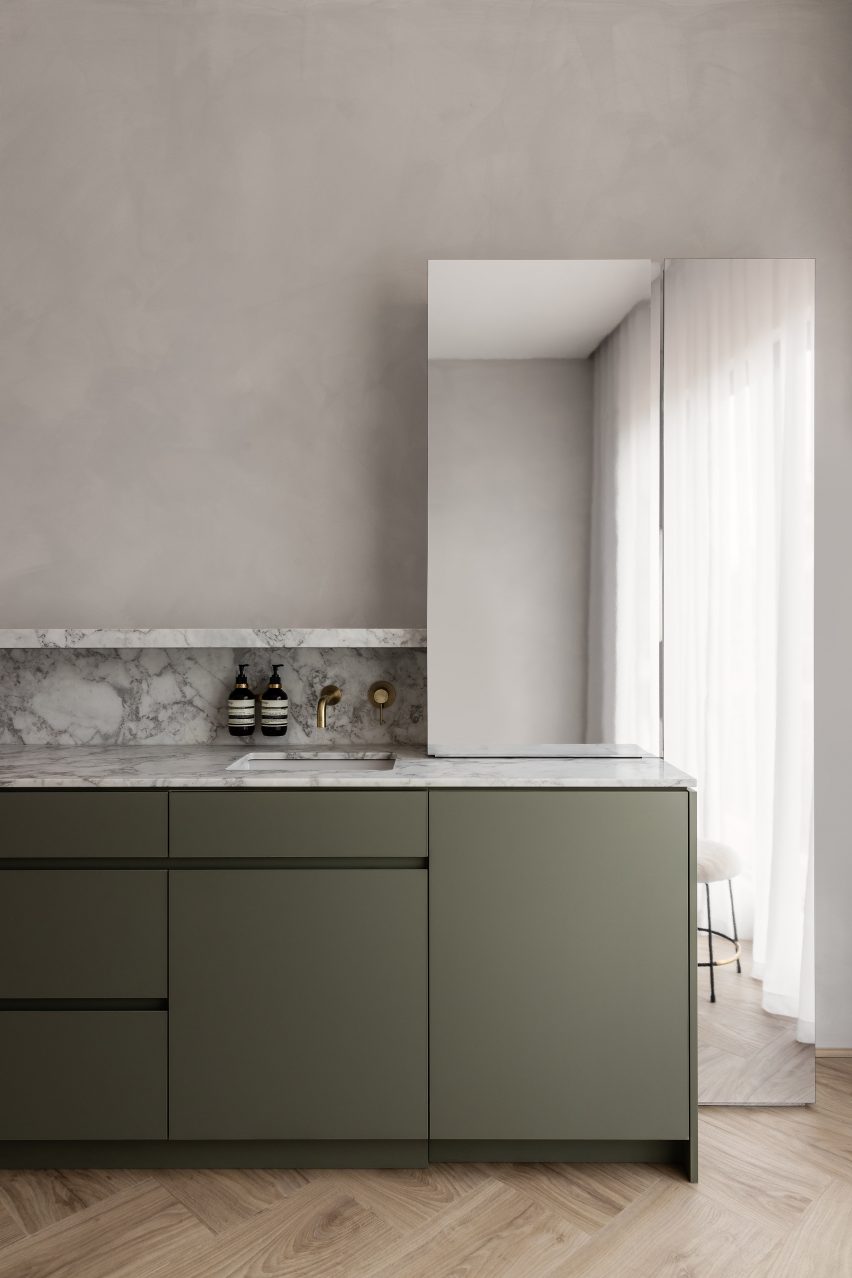
In the kitchen, smoked walnut timber cabinetry is paired with splashbacks and worktops made of Navona travertine.

Set in an otherwise open-plan space, the area is enclosed in glazed panels.

“The family entertains a lot and cooks a lot, both the parents and the children,” Amatoury said. “As a result, it was necessary to be able to close off the kitchen while maintaining this visual openness.”

Kitchen of Paris apartment with glass partitionsKitchen of Paris apartment with glass partitions
The kitchen is enclosed by glazed partitions

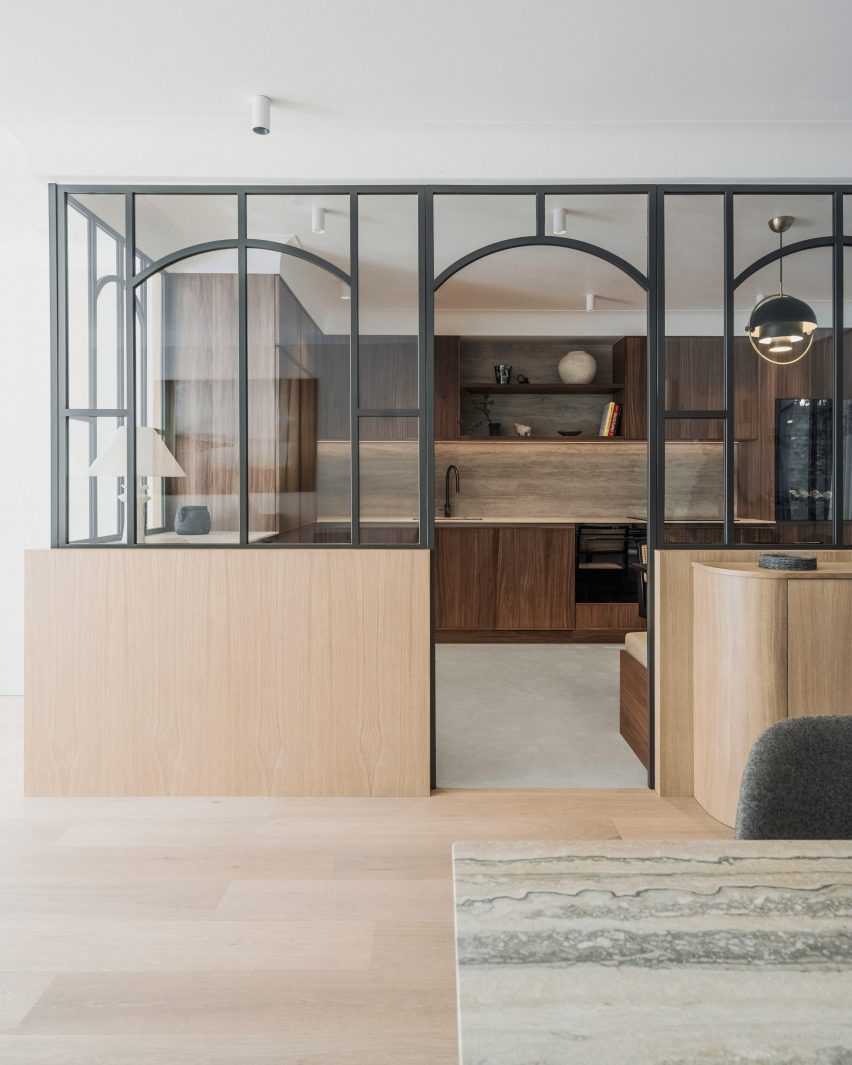
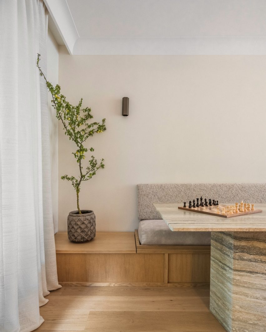
Much like a window, the glazed panels feature curved grilles and are set on an oak base that creates a visual link with the built-in oak banquette upholstered in white boucle wool.

“We create a lot of benches because they’re so practical, incorporating storage chests, but most importantly for their cosy appeal,” Amatoury said. “Benches introduce a mix of fabrics and through these fabrics, the space becomes more welcoming.”

Dining area of Paris apartment by Johanna AmatouryDining area of Paris apartment by Johanna Amatoury
Amatoury fashioned an oak seating banquette for the dining area 

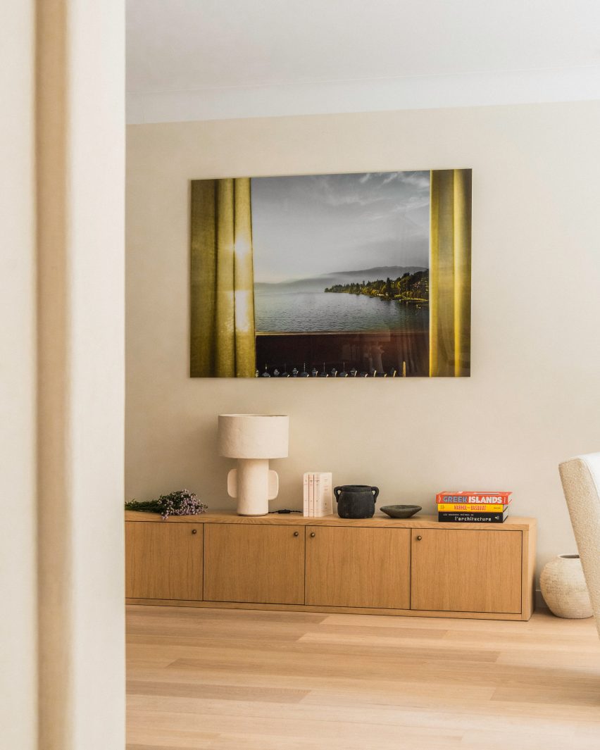
For Amatoury, the furniture edit was a balancing act between creating a “harmonious yet eclectic atmosphere” that blends sophistication and comfort.

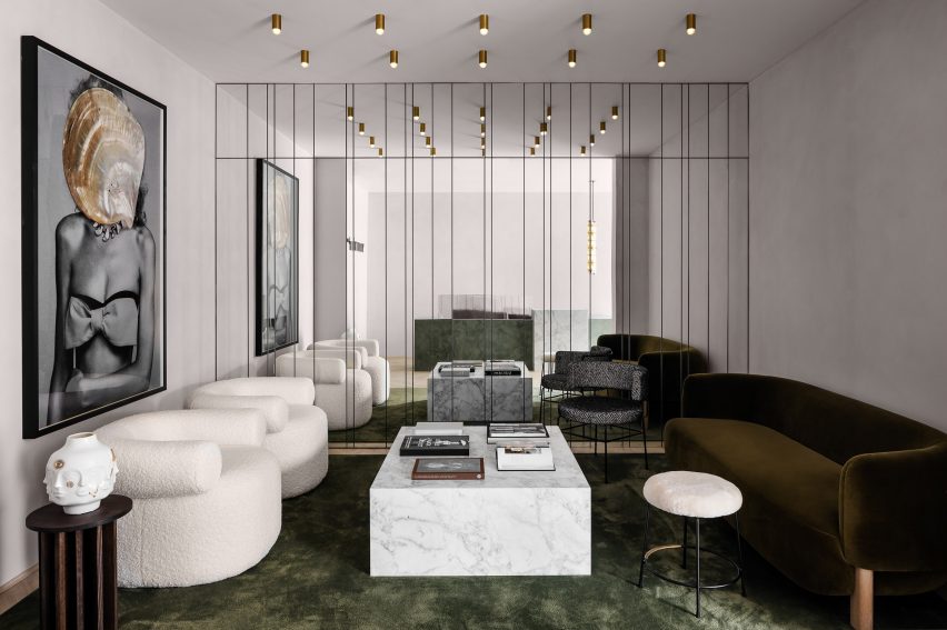
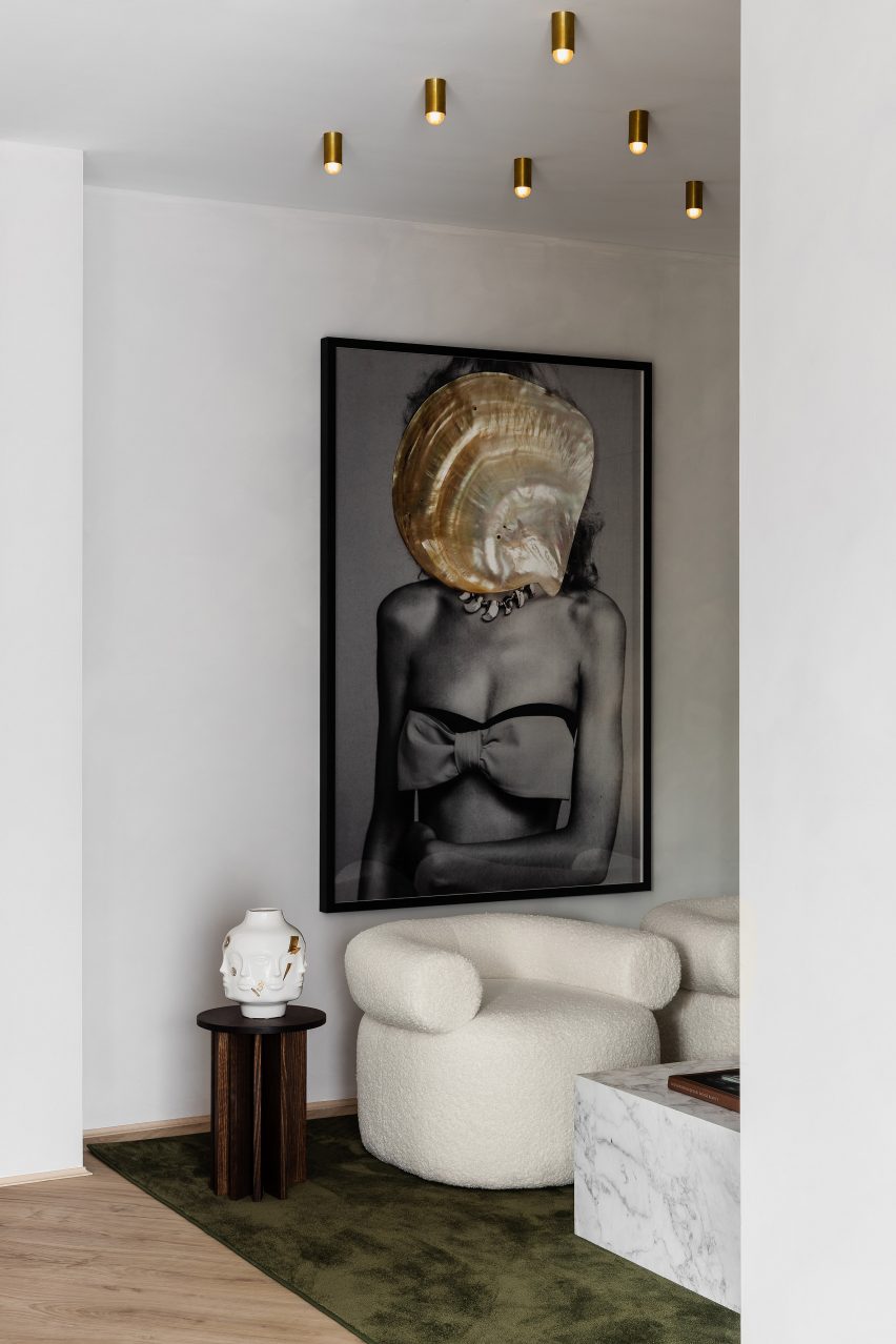
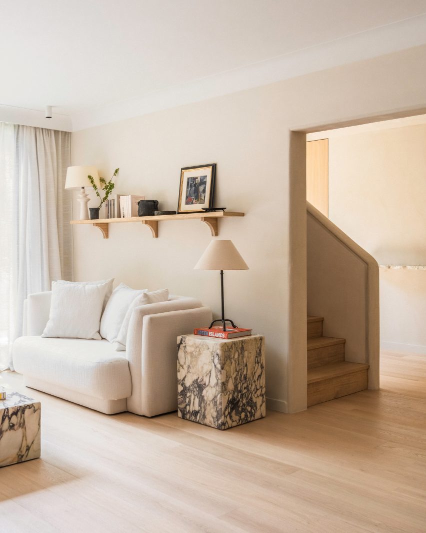
Taking a central role is the curving sofa in the living room, which is upholstered in off-white linen and paired with monolithic Violetta marble tables.

Stairwell of Paris apartment Stairwell of Paris apartment
A staircase leads up to the second floor

“Its design not only provided a focal point but also added a touch of elegance and softness to the space,” she said.

“The curving shape offered a sense of flow and organic grace, enhancing the room’s visual appeal. The choice of off-white linen contributed to a serene ambience here, promoting a feeling of openness and lightness.”

Bedroom of apartment by Johanna AmatouryBedroom of apartment by Johanna Amatoury
The upper level houses four bedroom suites

Amatoury, who has worked on several residential and commercial interiors across Paris, says she was tasked with the project after the owners admired a home she had completed for friends of theirs.

“They liked our work and especially the warmth we bring to our projects, almost like a cocoon,” she said.

Other residential interiors in the French capital that have recently been featured on Dezeen include a loft apartment in a former textile workshop and a Haussmann-era flat that was restored to its “former glory”.

The photography is by Pierce Scourfield.


Reference

Aerial view of Sabater House by Fran Silvestre Arquitectos
CategoriesArchitecture

​​Fran Silvestre Arquitectos references pathways for Sabater House in Spain

Aerial view of Sabater House by Fran Silvestre Arquitectos

Spanish studio Fran Silvestre Arquitectos has created a minimalist white house in Alicante, which winds through the landscape to enhance its relationship with the outdoors.

Named Sabater House, the Spanish dwelling unfolds through a series of intersecting, elongated forms that ascend upwards over its 780-square-metre site.

Its slim volumes adapt to the site’s natural topography, navigating existing large trees and framing a series of terraces and courtyards.

Aerial view of Sabater House by Fran Silvestre ArquitectosAerial view of Sabater House by Fran Silvestre Arquitectos
Fran Silvestre Arquitectos has created a minimalist white house in Alicante

According to Fran Silvestre Arquitectos, the sprawling design takes cues from local pathways that are carved into the terrain and lead to a hermitage.

“We were struck by how these winding paths adapt to the terrain, generating a very interesting architecture,” Fran Silvestre Arquitectos told Dezeen.

“This was the starting point to develop a home on a plot with similar characteristics in terms of width and slope of the land.”

Facade of Sabater House by Fran Silvestre ArquitectosFacade of Sabater House by Fran Silvestre Arquitectos
Sabater House winds through the landscape

Sabater House is designed for a client who wanted a home to accommodate his large family while ensuring “enough independence to guarantee the privacy of all family members”.

To accomplish this, each floor of the home features a distinct programme.

Aerial view of white home in AlicanteAerial view of white home in Alicante
Each floor of the home features a distinct programme

The highest level, described as the “nighttime area” of the home, features five bedrooms and bathrooms oriented to look out to the sea above the tree line.

Meanwhile, the middle floors contain an open-plan kitchen, dining and living area with floor-to-ceiling windows framing views out to the garden and outdoor swimming pool.

Exterior of white house in Spain by Fran Silvestre ArquitectosExterior of white house in Spain by Fran Silvestre Arquitectos
The house winds around existing trees

The living spaces are stretched across the long and narrow floor plan in a bid to avoid compacting them and open them up to the outdoors.

“The project is drawn with a very clear geometry of straight elements that are joined by a soft radius of curvature,” said the studio. “Each piece has a relationship with the environment.”

Accommodated on the lower level are the pool basin, a wine cellar, storage facilities and additional sleeping quarters.

With each floor stacked at an angle to create a zigzagging floor plan, a series of courtyards, terraces and bridges are created, further opening the relationship with the outdoors.

All-white interior of Spanish houseAll-white interior of Spanish house
The middle floor features open-plan living spaces

“Something unexpected about the house for us is the character of the interstitial spaces between the blocks and how they envelop you,” explained Fran Silvestre Arquitectos.

“The first acts as an access garden that directs you towards the entrance door, and the second as one of the main terraces. They are versatile spaces that allow you to make the most of the different orientations.”

Bedroom of Sabater House in AlicanteBedroom of Sabater House in Alicante
The top level contains the bedrooms

Fran Silvestre Arquitectos was founded in 2005 by architect Fran Silvestre. The studio is known for its minimalist style, which is applied throughout Sabater House.

Its previous projects that feature its signature pared-back style include an overhanging Hollywood Home and a residence with a T-shaped roof in Valencia.

The photography is by Fernando Guerra.

Reference

Interior of Totême store in London
CategoriesInterior Design

Halleroed references Swedish Grace for Toteme flagship store

Interior of Totême store in London

Stockholm studio Halleroed has designed fashion brand Toteme’s flagship store in London, which features a sculpture by artist Carl Milles and a steel sofa by designer Marc Newson.

Halleroed designed the store, located on Mount Street in the upmarket Mayfair area, together with Toteme founders Elin Kling and Karl Lindman. The duo wanted its third flagship to feature nods to the brand’s heritage.

“We like the idea of keeping certain elements that we find in our Swedish heritage,” Lindman told Dezeen at the store’s launch event.

“It can be by using certain vintage pieces, or like in [the brand’s Mercer Street store] in New York, we had a collaboration with Svenskt Tenn,” he added. “It’s about lifting this notion of Scandinavian design or Swedish design.”

Interior of Totême store in LondonInterior of Totême store in London
A metal sofa by Marc Newson is among the sculptural details in the store

Halleroed drew on the space itself when designing the interior, focussing on how the light falls.

“We were inspired by the space itself with beautiful original windows letting the daylight in,” Halleored co-founder Ruxandra Halleroed told Dezeen.

“The upper part of the windows was partly hidden, which was a shame, so we redesigned the ceiling with a half vault towards the front to show the full height of the windows.”

Totême London storeTotême London store
A piece by sculptor Carl Milles sits by the entrance

The design also references the work of Italian architect Carlo Scarpa as well as the Swedish Grace movement.

“We were also inspired by the Swedish Grace period – around 1920-30s – that has an elegant and pure design, something we think works well for Toteme as a brand,” Halleroed co-founder Christian Halleroed told Dezeen.

“Also the work of Carlo Scarpa we find interesting, more as a mindset on how to work with details and textures to create a subtle elegance and luxury.”

Cube inside fashion store in MayfairCube inside fashion store in Mayfair
A black mirrored cube features at the rear of the store

Kling and Lindman wanted to keep the feel of “very posh” Mount Street where the store is located, while also underlining the space’s minimalist feel.

To do so, a lot of effort was put into the colour palette and different textured materials used for the flagship store.

“We worked with an off-white palette in different tones and different textures,” Ruxandra Halleroed said.

“The textures are as important as colour and materials. For walls, we have a glossy, off-white stucco, ceiling in same colour but matte. The floor is in a beige, honed limestone with a so-called Opus pattern.”

Milles sculpture inside Totême storeMilles sculpture inside Totême store
Halleroed chose to redesign the store’s ceiling to reveal its windows

In the middle of the Toteme shop, Halleroed created a stone-clad cube that holds shelves, vitrines and niches filled with artworks.

“The volume in the middle is clad with the same limestone, but in three different textures: honed, bush hammered and spiked texture, combined with oxidised dark brass,” Christian Halleroed said.

The store also features a square black volume in the back made from high-gloss stucco and dark brass.

Beige and white interior of London fashion storeBeige and white interior of London fashion store
The minimalist interior has a beige, white and black colour palette

To contrast the minimalist interior, the store is decorated with multiple artworks, including a sculpture by Milles and Newson’s intricately woven steel Random Pak Twin sofa, which Lindman found online.

“He’s a slave to auction houses,” Kling told Dezeen.

“So he found it and sent it to me and I loved it, and we also have a Marc Newsom piece in every store,” she added. “So we thought, ‘this one’s for the Mount Street store’. At that time we only had the signed contract, nothing else.”

Sign outside Mount Street storeSign outside Mount Street store
The store is located on Mount Street in central London

The two founders and Halleroed decided on the gypsum Milles sculpture for the Toteme store together, with Halleroed designing a custom niche to place it in that is made from black high-gloss stucco to contrast the pale artwork.

Halleroed also added vintage Swedish Grace furniture to the store, including armchairs and a coffee table by furniture designer Otto Schulz, a daybed and a mirror in pewter made for the Stockholm Exhibition 1930.

The studio has designed a number of other store interiors, including a Paris boutique for French brand L/Uniform and an Acne Studios store in Chengdu that aimed to combine the futuristic and primitive.

Reference

Indoor playground in Tel Aviv designed by Sarit Shani Hay
CategoriesInterior Design

Sarit Shani Hay references the outdoors to design indoor playground

Indoor playground in Tel Aviv designed by Sarit Shani Hay

Tree-like columns and other nature-inspired details feature in this indoor playground, which design studio Sarit Shani Hay has created for the children of employees at an Israeli software company.

The playground is set on the 15th floor of a skyscraper, surrounded by floor-to-ceiling glass windows that provide uninterrupted views across the city of Tel Aviv.

Indoor playground in Tel Aviv designed by Sarit Shani Hay
Tree-like plywood columns can be seen throughout the playroom

Despite this urban setting, Sarit Shani Hay wanted the space to “emphasise closeness to nature” and subtly incorporate biophilic design principles.

The studio has therefore made reference to the outdoors throughout the scheme.

Indoor playground in Tel Aviv designed by Sarit Shani Hay
Plywood has been used to create other elements in the room, like the playhouses

Huge, round pieces of sea blue and forest-green carpet have been set into the floor. Circular panels in the same blue and green hues have also been put on the ceiling, bordered by LED tube lights.

Parts of the floor that are not covered with carpet have been overlaid with plywood or rubber to account for shock absorption.

Indoor playground in Tel Aviv designed by Sarit Shani Hay
The playhouses include features such as ramps and secret nooks

A series of tall plywood “trees” with spindly branches have been dotted across the room; a couple of them suspend a swinging hammock, while another supports a gridded toy shelf.

Plywood was also used to make house-shaped volumes for the children to play in.

Each of these volumes includes playful interactive features such as ramps, tunnels, rope ladders, sliding poles and secretive nooks.

The children also have the option of using a climbing wall at the rear of the room, which has different-coloured footholds.

Indoor playground in Tel Aviv designed by Sarit Shani Hay
Sea blue and forest-green carpet has been laid across the floor

The project also saw Sarit Shani Hay create a small kitchen where the children can wash their hands and have snacks prepared for them. This space was finished with sea-blue cabinetry and a gridded tile splashback.

The indoor playground also features a small cafe area, where employees can enjoy their lunch breaks whilst being close to their children.

Indoor playground in Tel Aviv designed by Sarit Shani Hay
A similar colour palette has been applied in the kitchen

Playgrounds are increasingly offering more than just swing sets and slides. Architecture studio KWY.studio created a play area for a park in Billund, Denmark that includes pink marble sculptures.

Artist Mike Hewson has also designed a public playground in Melbourne that features giant boulders on wheels, encouraging children to climb and explore intuitively.

The photography is by Roni Cnaani.


Project credits:

Design: Sarit Shani Hay
Lead designer: Adi Levy Harari

Reference

Moxy hotel lobby with motorcycle
CategoriesInterior Design

Yabu Pushelberg references multi-faceted LA culture in conjoined hotels

Moxy hotel lobby with motorcycle

Canadian design studio Yabu Pushelberg has created the Moxy and AC Hotel in Downtown Los Angeles to encapsulate a variety of references to the surrounding city.

The two hotels were placed side by side within a Gensler-designed building in central Los Angeles, with Yabu Pushelberg carrying out the design for both hotels.

The designers used a variety of LA-oriented references across both hotels, referencing local artist culture, streetlife, the desert, as well as the imagery of movies from Hollywood.

Moxy hotel lobby with motorcycle
The Moxy Hotel in Downtown Los Angeles was designed based on deserts and cinema

“Moving making and the California Dream are all mashed up together to create this atmosphere,” studio co-founder George Yabu told Dezeen.

We also captured the grittiness,” added co-founder Glenn Pushelberg. 

The hotels were designed to complement each other, providing various experiences for guests, who the team hopes can be staying in one while visiting the bars and restaurants of the others.

Moxy Hotel Los Angeles lobby
Yabu Pushelberg wanted to challenge guests with a sense of “grittiness”

According to the duo, the hotels are meant to be the day and nighttime versions of the same person or “like the same person in different movies”.

AC Hotel provides a more work-oriented vision and the Moxy representing a more dimly lit atmosphere.

Plush furniture in Moxy lounge
The Moxy includes lounge areas with plush furniture

Using desert themes and references to the 1969 film Easy Rider starring Peter Fonda, the Moxy has rammed earth walls, woven wall hangings and homages to motorcycle culture with a custom pouf designed with Harley Davidson in mind. It even has a motorcycle in the lobby lounge.

“If you look at the materialities and colors and textures, it is kind of off-off, which makes it on,” said Pushelberg. 

AC hotel with custom Yabu Pushelberg rug and wall hanging
AC Hotel is more restrained

Also in the Moxy’s lobby is a snakeskin-like carpet with a graphic of a snake.

The hotel includes studio spaces above the lobby with neon lights and plush furniture; minimal rooms with tile and stone walls; and a bar inspired by the “roadside gas station” with mottled stone countertops, metal mesh liquor cabinets and “cocoon-like” chairs.

Black table in Hotel AC Los Angeles
The AC Hotel is meant to evoke the artist’s loft

The AC Hotel is more restrained. The lobby is on the 34th floor and was designed to evoke the “artist’s loft” with views of the city below. Materials were inspired by Spanish architecture – such as textured plaster and stucco.

These details continue throughout the bars, guestrooms and library lounge, with the addition of wooden sculptures and dark black tile.

Yabu Pushelberg designed the carpets in the guest rooms to “reflect the geometric pattern and color story found throughout the hotel” and contrast the birch wood flooring.

According to the team, the hotels together are meant to bring together a variety of local influences to attract people to the downtown core.

“It’s a ​​perfect time for the hotels to be there because all these different types of people have never ever had a reason to go downtown,” said Pushelberg, who referenced the growing gallery scene in the area as an additional inspiration.

Hotel AC lobby overlooking Los Angeles
The AC’s lobby is on the 34th floor of the building

The design follows a slew of other hotels designed for LA’s downtown, including Hotel Per La designed by Jaqui Seerman, which occupies a 1920s bank building.

A division of Marriot, Moxy has dozens of hotels around the world, including a recent addition in New York’s Lower East Side designed by Michaelis Boyd and Rockwell Group.

Reference

Waiting area with mirror wall in Youth Lab 3.0 clinic interior design by Nickolas Gurtler
CategoriesInterior Design

Youth Lab clinic by Nickolas Gurtler references 1970s Italian glamour

Waiting area with mirror wall in Youth Lab 3.0 clinic interior design by Nickolas Gurtler

Australian designer Nickolas Gurtler has drawn from the nightclubs of 1970s Milan and Florence to create the interior for a cosmetic clinic in Perth, Australia.

It is the third interior that Gurtler has created for Youth Lab, a clinic that offers a range of non-surgical cosmetic treatments that include anti-ageing procedures, hair removal and skin rejuvenation.

Waiting area with mirror wall in Youth Lab 3.0 clinic interior design by Nickolas Gurtler
The waiting area features a mirror wall, gold lights and a green silk carpet

Located in Joondalup, Youth Lab 3.0 is the brand’s most experimental space so far.

While the two other locations – in Claremont and West Perth – occupy heritage buildings, this one is set inside a commercial block from the 1990s. This meant Gurtler could be more daring in his approach.

Youth Lab 3.0 clinic interior design by Nickolas Gurtler
A Dina Broadhurst artwork provides a focal point

While the design was partly informed by the brand’s minimalist identity, it also features playful details that include mirror walls and a grand geometric reception desk.

“There were some really outrageous and glamorous concepts that I really responded to and had filed away for the right project,” said Gurtler.

“When Youth Lab approached us again for their third clinic, I knew that this was the right time to bring them to life.”

Marble reception desk in Youth Lab 3.0 clinic interior design by Nickolas Gurtler
The reception desk is formed of Arabescato marble and Venetian plaster

The starting point was the palette of forms and materials that Gurtler has worked with previously for the brand, which includes decorative marble, plush velvet and metal cabinetry.

While the Claremont space that Gurtler designed for the brand has a New York loft vibe, here these elements are paired with shades of olive green and gold to create a more retro Italian feel.

“This language is a kind of style guide for us on each project,” said Gurtler.

“Common elements such as mixed metals, monolithic forms, plush textures and rich colour are used in each of the clinics, but we translate these elements completely differently each time.”

Youth Lab 3.0 clinic interior design by Nickolas Gurtler
The colour palette centres around olive green and gold

Arabescato marble is combined with Venetian plaster and polished aluminium to create the cuboidal forms of the reception desk, which sits beneath a custom glass and brass lighting pendant by designer Lost Profile Studio.

A large gridded mirror installation provides the backdrop to a waiting area furnished with a green silk carpet, a blocky marble coffee table and sculptural white armchairs.

Youth Lab 3.0 clinic interior design by Nickolas Gurtler
A sculpture by American potter Jonathan Adler sits in front of a second mirror wall

Rows of golden-hued ceiling lights are reflected in the mirrors, doubling their visual impact, and an artwork by Dina Broadhurst creates another focal point.

As customers are led through for treatment, they also encounter a second mirror wall, a ceramic by American potter Jonathan Adler, custom wall lights and brass door numbers.

Youth Lab 3.0 clinic interior design by Nickolas Gurtler
Custom lighting scones embellish the walls

Youth Lab 3.0 was longlisted for Dezeen Awards 2022 in the leisure and wellness interior category, along another of Gurtler’s designs, the Cole Hair Studio.

The designer hopes the space offers “an immersive and sensorial experience which is as much invigorating as it is calming”.

“The Youth Lab experience is a luxury and the interior reflects that,” he added.

The photography is by Timothy Kaye.

Reference

Exterior image of Groote Museum
CategoriesArchitecture

Merk X references nature for renovation and extension of Groote Museum

Exterior image of Groote Museum

Dutch studio Merk X has renovated the 19th-century Groote Museum at Amsterdam Zoo, combining the reinstatement of its original features with the addition of a new basement and contemporary accents informed by natural forms.

Designed in 1854 by Johannes van Maurik, the building historically acted as a member’s hall and museum for the zoological society Natura Artis Magistra or Artis, which closed in 1946 prior to the entire structure being closed in 2011.

The renovation by Merk X, which has been shortlisted in the civic and cultural interiors category of Dezeen Awards 2022, stripped away previous alterations before restoring and upgrading the building to house a new natural history museum.

Exterior image of Groote Museum
Merk X renovated Amsterdam’s Groote Museum

“The design process is characterised by two complementary approaches: to restore and to update,” said the practice.

“After a long period of neglect, this national monument has regained the transparency that formed architect Van Maurik’s two guiding principles: air and happiness,” it continued.

Across the original building’s two storeys, structural elements have been strengthened and original features, such as a striking double staircase in the rotunda, were altered to meet modern safety requirements with the addition of a higher balustrade.

Interior image of a ballroom with a green chandelier at the Groote Museum
It restored the building’s original features

Beneath, a basement was dug out by placing the original building on a steel table during construction, providing a new entrance route as well as much-needed additional space for back-of-house facilities, cloakrooms, lockers and bathrooms.

On the first floor, an elongated gallery space has been fitted with an additional staircase to improve circulation, designed to double as seating for public events, and a connecting bridge to link the east and west sides of the building.

The climate control and security of display areas have also been improved, with the glass vitrines that surround both levels of the gallery strengthened.

“Necessary interventions accommodating the expected influx of visitors have been fitted almost imperceptibly, including the structural strengthening of the exhibition halls and their galleries,” said the practice.

Interior image of a double staircase at Groote Museum
The studio inserted a new basement beneath the building

Alongside the restoration of historical details, Merk X drew on the nearby zoo’s nature to introduce a terrazzo floor, wall paintings, metal screens and lighting that reference trees and plants.

“A richly decorated terrazzo floor and a sculptural lamp inspired by organic forms such as chestnuts and acorns visually connect the entrance with the ground floor,” said the practice.

“Whether old or completely new, every facet of the Groote Museum has been given its place in this spectacular new composition,” it continued.

Image of a new staircase in a gallery space at the Groote Museum
It is a 19th-century building

Other projects featured on the civic and cultural interior shortlist of Dezeen Awards 2022 include the transformation of a former cow shed into a library space by Crawshaw Architects and the world’s first multi-storey skate park in Folkestone by Holloway Studio.

Photography is by Filip Dujardin.

Reference

reMarkable pop-up store interior by Snohetta
CategoriesInterior Design

Snøhetta references libraries for Oslo pop-up store A Better Place to Think

reMarkable pop-up store interior by Snohetta

Architecture firm Snøhetta has created a library-informed respite from the digital world with A Better Place to Think, an Oslo pop-up shop for tablet brand reMarkable.


Located just off the city’s main shopping street, the temporary store was made to showcase the brand’s tablet, which has a paper-like surface.

reMarkable pop-up store interior by Snohetta
The reMarkable pop-up store is informed by libraries

Snøhetta looked to libraries for the design, which features divided timber desks, leather banquets and small domed reading lamps.

The Norwegian studio wanted to encourage contemplation and concentration through the spatial qualities of the pop-up.

Library-like reading nook
It features bespoke oak furniture in a quiet environment

“In today’s fast-paced and digitalised society, finding places for focused thinking can be a challenge,” Snøhetta founder Kjetil Trædal Thorsen told Dezeen.

“For the reMarkable pop-up store, we wanted to echo the serene environments of libraries – the clean and open spaces, somber aesthetics, tidy structures, and focused reading zones.”

Standing desks separated by dividers
The central light installation is inspired by a handwritten line

A Better Place to Think features two concentric rings of desks and seating, with the inner ring made up entirely of standing desks and the outer ring featuring blocks of seated desks, benches and sofas.

A handmade light installation overhead was inspired by the energy and movement of a line of handwriting.

The walls and ceiling are painted in a “calm and sober” dark blue, with white acoustic panels and shelving covering most of the wall space.

The matt finishes across the walls, panels and on the bespoke oak furniture are meant to echo the material qualities of paper.

Person writing on reMarkable paper tablet at oak desk
The store features matt finishes inspired by the feel of paper

The design of the pop-up aims to emphasise the enduring value of bricks-and-mortar shopping.

“Although consumers are becoming increasingly digital in their shopping habits, especially during the pandemic, we see the value of letting our customers experience that ‘wow’ moment of writing on one of our paper tablets for the very first time,” said reMarkable founder and CEO Magnus Wanberg.

White acoustic panel with shelving
White pulp acoustic panels line the walls

Founded in 1989, Snøhetta has offices around the world.

Its recently completed buildings include the shimmering Le Monde Group Headquarters in Paris and the El Paso Children’s Museum, which has a barrel-vaulted roof resembling a cloud.

Photography is by Calle Huth.

Reference