Entrance area of The Wren with walnut wall panelling and hardwood floors
CategoriesInterior Design

Home Studios refreshes The Wren pub on NYC’s Bowery

Entrance area of The Wren with walnut wall panelling and hardwood floors

Brooklyn-based Home Studios has remodelled a bar and restaurant in New York’s East Village, using dark wood and velvet seating to retain a “worn-in and aged appearance”.

The Wren on the busy Bowery thoroughfare has become a neighbourhood staple since opening in 2012, but was ready for an interior revamp.

Entrance area of The Wren with walnut wall panelling and hardwood floorsEntrance area of The Wren with walnut wall panelling and hardwood floors
The Wren has been remodelled in a way that retains its rustic charm

Home Studios refreshed both levels of the upscale pub, including the upper-floor dining and drinking area, and private lounge downstairs.

“Despite the changes in the city and the evolution of the neighbourhood, The Wren has maintained its timeless appeal, offering visitors a glimpse into the past and an authentic pub experience,” said Home Studios, led by founder Oliver Halsegrave.

L-shaped bar with a marble counter and surrounded by wooden stoolsL-shaped bar with a marble counter and surrounded by wooden stools
The L-shaped bar has a marble counter and is surrounded by GAR Products stools

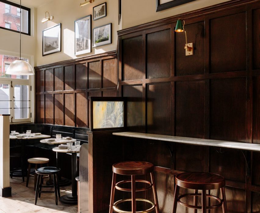
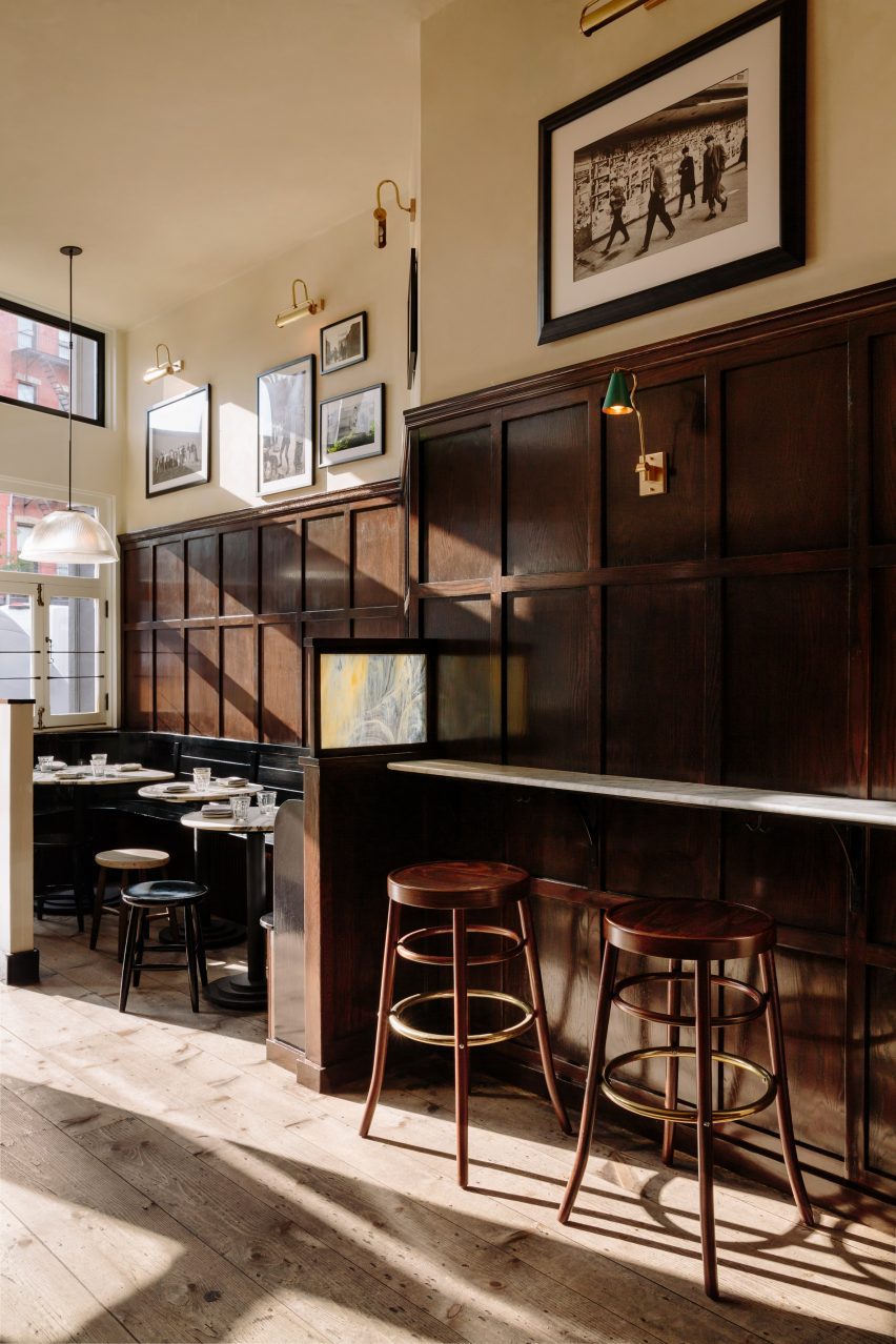
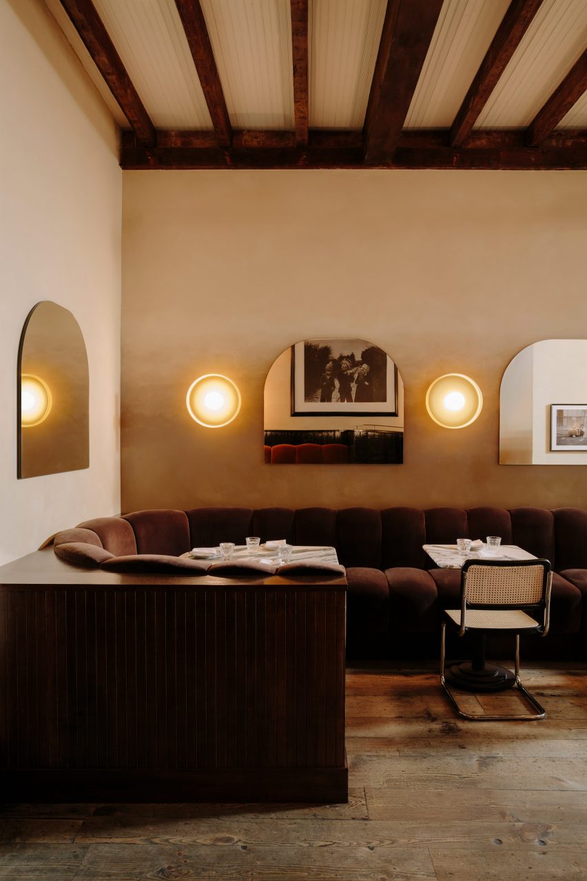
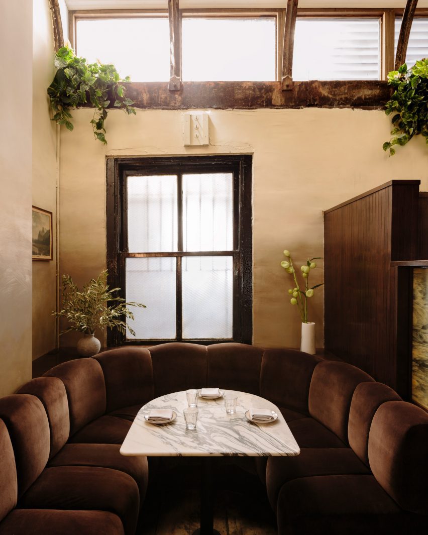
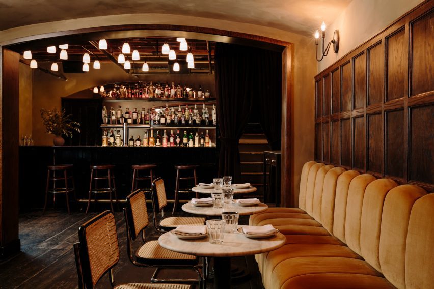
Across the main level, dark and moody materials have been used to retain the pub-like quality of the spaces, assisted by the exposed wooden ceiling beams and columns, and hardwood floors.

Either side of the entrance, black-painted, booth-style benches are installed against the walnut wall panelling, creating cosy nooks for pairs or small groups to occupy.

Chocolate-coloured velvet banquette featuring ribbed cushionsChocolate-coloured velvet banquette featuring ribbed cushions
Towards the back, a chocolate-coloured velvet banquette features ribbed cushions

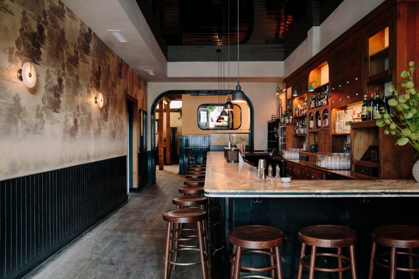
The bar area features an L-shaped marble counter surrounded by GAR Products stools, opposite black wainscoting that runs below vintage-looking wallpaper.

Towards the back, a long banquette is dressed in ribbed cushions that form the seating and backrests, all wrapped in brown velvet.

Row of custom mirrors alternated with disk-shaped sconces above tablesRow of custom mirrors alternated with disk-shaped sconces above tables
Custom mirrors alternate with disk-shaped sconces by In Common With

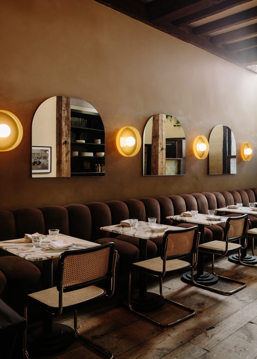
Custom arched shaped mirrors mounted on the walls alternate with disk-shaped sconces by In Common With, against a beige textured plaster backdrop.

A variety of other sconces throughout were sourced from lighting brands including O’Lampia, Shades of Light, Allied Maker and Rejuvenation.

U-shaped both below two windowsU-shaped both below two windows
Guests can choose from a variety of booths, two-tops or standing areas

“With a worn-in and aged appearance, the space now exudes a moody winter-like atmosphere,” said Home Studios.

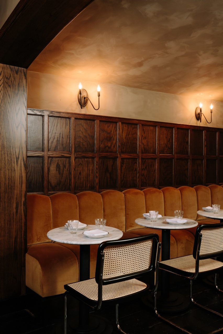
Downstairs, the mood is even more “sultry” and intimate, thanks to darker surfaces and a variety of dim, warm lighting sources.

The bar counter is made from Black Portoro marble and the wood floors are also stained black, while the banquette upholstery is a lighter tone than found on the upper level.

Between the two floors, guests can choose from a variety of seating or standing spots for enjoying their beers, cocktails and bar food.

Banquette below walnut panelling and candle sconcesBanquette below walnut panelling and candle sconces
In the private area downstairs, the mood is more sultry and the banquette upholstery is lighter in colour

“Home Studios has seamlessly blended nostalgic and rustic charm throughout The Wren’s interior, creating an inviting and distinctive ambiance that pays homage to the bar’s storied history,” said the team.

Home Studios is no stranger to refreshing beloved establishments, having completed interiors for The Bird in Montauk and The Pearl in Nantucket.

Downstairs area featuring dark-stained floors and a black marble bar counterDownstairs area featuring dark-stained floors and a black marble bar counter
The downstairs area features dark-stained floors and a black marble bar counter

The firm also recently turned a conference centre in Northern California back into a luxury hotel, as originally intended by the property’s founder: the inventor of the radio.

The photography is by Brian W Ferry.

Reference

Paul Smith LA store interior is stone-clad partitions and exposed rafters
CategoriesInterior Design

Standard Architecture refreshes interior of pink Paul Smith store in LA

Paul Smith LA store interior is stone-clad partitions and exposed rafters

British fashion label Paul Smith’s iconic pink store in Los Angeles has received an interior makeover from Standard Architecture.

Standard Architecture collaborated with the Paul Smith design team to reimagine the 4,740-square-foot (440 square metres) store on Melrose Avenue, West Hollywood.

Paul Smith LA store interior is stone-clad partitions and exposed raftersPaul Smith LA store interior is stone-clad partitions and exposed rafters
Standard Architecture and the Paul Smith team reorganised the LA store to better define the brand’s different collections

The studios also created a new VIP entrance patio for the building, which is notorious for its bright pink exterior that has become a pilgrimage spot for amateur photoshoots.

“The primary goal was to enhance the overall customer experience within the store, which was achieved by creating a more cohesive and immersive shopping environment across the different brand departments,” said Standard Architecture.

Seating area with clothing displays on either sideSeating area with clothing displays on either side
Stone-clad partitions help to define areas, but don’t reach the exposed timber ceiling

The entrance to the store – the only opening in the giant pink wall that faces the parking lot – leads shoppers through a glossy red metal vestibule into the main retail space.

Clearly defined yet interconnected areas for the menswear, womenswear and homeware collections help with navigation around the store.

Suits displayed in colour order on long brass railsSuits displayed in colour order on long brass rails
Long brass rails are used to present tailoring

Partitions clad in dappled beige stone frame these zones, but don’t reach the exposed timber ceiling, to retain the sense of openness.

In places, the stone walls are inlaid with mosaic-style artworks depicting abstract flora, which add splashes of colour to the warm-toned surfaces.

Paul Smith homeware collaborations displayed in a corner of the storePaul Smith homeware collaborations displayed in a corner of the store
Paul Smith’s collaborations with Gufram and Anglepoise are among the pieces on show

Black track lighting is suspended from the rafters, spotlighting the various clothing displays and lounge areas furnished with midcentury-style sofas and armchairs that are dotted around the store.

Long brass rails that appear to be suspended in midair are used to display suit jackets, which are carefully arranged by colour.

Shoes presented on stepped white ledges that resemble bleacher seatingShoes presented on stepped white ledges that resemble bleacher seating
Shoes are presented on stepped white ledges that resemble bleacher seating

In an area dedicated to accessories, the shoes and bags are lined up on stepped white ledges that resemble bleacher seating.

Walnut is used for accents including shelving, door frames, and podiums, as well as for a large open storage system with compartments for presenting individual products and a row of sculptures by Alexander Calder.

Founded by fashion designer Paul Smith in 1970, his eponymous brand is synonymous with the brightly coloured stripes applied to many of its apparel products and other collaborations.

Many of these appear throughout the store, including a colour-tinted Anglepoise desk lamp and a striped version of Gufram’s cactus-shaped coat stand.

Glossy red metal vestibule with store interior beyondGlossy red metal vestibule with store interior beyond
Entry to the store is via a vestibule wrapped in glossy red metal

“Overall, the design reflects a deep understanding of the brand’s identity, which places a strong emphasis on the use of colour and attention to detail,” Standard Architecture said.

Paul Smith retail spaces around the world are equally playful. On London’s Albemarle Street, its boutique has a patterned cast-iron facade by 6a Architects, while the shop in Seoul is encased in a curving concrete shell by System Lab.

Bright pink exterior of Paul Smith store on Melrose AvenueBright pink exterior of Paul Smith store on Melrose Avenue
The store on Melrose Avenue is an icon in Los Angeles thanks to its bright pink facades

Standard Architecture was founded by Silvia Kuhle and Jeffrey Allsbrook, who discussed their work with Dezeen during our Virtual Design Festival in 2020.

Past projects by the firm include a Hollywood Hills residence with a cantilevered swimming pool and a minimal showroom for fashion brand Helmut Lang – which was located just a few blocks from the Paul Smith store before it shuttered.

The photography is by Genevieve Garruppo.


Reference

Exterior of Casa Soleto
CategoriesInterior Design

Studio Andrew Trotter refreshes 17th-century Casa Soleto in Puglia

Exterior of Casa Soleto

Casa Soleto, a 17th-century house in Puglia, Italy, has been carefully renovated using lime plaster, terrazzo and furniture salvaged from a monastery.

The four-bedroom house, parts of which are over 400 years old, was given a refresh by its owners – architecture firm Studio Andrew Trotter and its studio manager Marcelo Martínez.

Exterior of Casa Soleto
Casa Soleto is located in southern Italy

While no structural changes were made, the designers redid some of the building’s roofs, which were falling apart, added two bathrooms and powder rooms, and swapped the living and dining spaces around.

“The street front had all the baroque details of a small palazzo and inside it was like time stood still,” Studio Andrew Trotter founder Andrew Trotter said of the house.

Dining room in Casa Soleto
Parts of the house are over 400 years old

None of its walls were straight and the layout was designed for the needs of past occupants, with a chapel located behind the kitchen so that the family did not need to leave the house to pray.

This place of worship was transformed into a media room and a powder room with an outdoor shower, creating a space that can be used as an extra guestroom if needed.

Old chapel in Puglia house
A former chapel was turned into a media room that can also serve as an extra guest room

Trotter and Martínez aimed for the renovation of Casa Soleto to resemble the original building as much as possible and the team preserved much of its original flooring.

“We tried to use natural materials as much as possible,” Martínez told Dezeen.

“We used lime plasters to give a natural and raw feeling to the walls, terrazzo floors – battuto alla veneziana – in the areas where new floors had to be made, wooden windows and doors seeking to imitate the original ones, cast iron hardware and linen sofas.”

Bedroom in Italian home by Studio Andrew Trotter and Marcelo Martínez
The 17th-century house was decorated with modern and antique furniture

The designers also chose a discrete colour palette for the lime plaster used on the walls of the house, which on the ground floor culminate in five-metre-high ceilings.

“We chose subtle earthy and greeny colours,” Martínez said. “Colours played a central role, as some make spaces feel light, others moody.”

Studio Andrew Trotter kept the house’s original kitchen and commissioned local woodworkers from the city of Lecce to recreate the home’s original wooden doors.

To add to the natural feel of the interior, the team used jute rugs to cover the stone floors and sourced linen upholstery and curtains from local artisans.

Living room in Casa Soleto
Lime plaster was used to give the walls a natural feel

Furniture and accessories by Danish brand Frama were juxtaposed with antique furniture pieces including an 18th-century dining table that was salvaged from an Abruzzo monastery.

The studio also sourced a late 18th- early 19th-century wardrobe from Lombardy for one of the bedrooms in Casa Soleto, which can only be accessed by going through the front patio and up an outside staircase.

Kitchen in Casa Soleto
The original kitchen was kept and refurbished

Studio Andrew Trotter, which has worked on a number of projects in Puglia, plans to use Casa Soleto as a rental property.

“We purchased and restored it mainly to rent it out, and also to invite creative minds that we appreciate, make gatherings and exhibitions,” Martínez said.

Exterior of Casa Soleto
An exterior staircase leads up to the bedrooms

Previous projects the studio has completed in the area include a 19th-century school that was turned into a family home and an earth-toned villa made from local sandstone.

The photography is by Salva López.


Project credits:

Interior design: Andrew Trotter and Marcelo Martínez
Plaster application: Tullio Cardinale and team
Woodwork: Alba Falegnameria

Reference

Photo of Cerveny Kostel
CategoriesArchitecture

Atelier-r refreshes neo-gothic church with angular black extension

Photo of Cerveny Kostel

Czech studio Atelier-r has refreshed the Red Church in Olomouc, the Czech Republic, adding an angular matte-black extension and public spaces informed by neo-gothic design.

The renovated church, along with the added black volume, holds an information centre and cafe as well as an events venue designed to host small concerts and exhibitions.

Photo of Cerveny Kostel
The church was extended by Atelier-r

Built in 1902, the original church was closed to the public and has been used as a private storage space for the library next to the site for the past sixty years.

Despite its poor condition, Atelier-r aimed to open up the listed building for public use, opting to partially reconstruct the church and add an extension that reflects the existing structure’s neo-gothic style.

Exterior photo of Cerveny Kostel
The extension is an angular structure

“The building itself was preserved as a whole but in a very poor condition,” studio founder Miroslav Pospíšil told Dezeen. “We had to do a complete makeover with maximum effort to retain the original elements.”

“We designed the renovation with deep respect to the neo-gothic atmosphere of the place,” he added. “First, it was necessary to strengthen the foundations, mend the damp and salty masonry, repair the stucco and plaster, and tidy up and fill the gaps in the facade cladding,

“The floors were a complete redo, including the layers all the way down to the terrain base.”

Photo of the library at Cerveny Kostel
The extension contains a library

Due to damaged trusses, the studio entirely reconstructed the roof of the church, cladding it in copper squares that resemble the concrete tiles of the original roof.

Modern decorative elements created by local sculptor Jan Dostal were added to the roof to replace the original damaged features.

Photo of the church
The extension connects directly to the 20th-century church

“The original roof was clad in asbestos cement tiles, but it is a very fragile material and most of them were damaged by falling ice from the church tower,” said Pospíšil.

“So we decided to use copper tiles of the same size as the original ones,” he continued. “Copper’s colour changes gradually to a dark grey colour, which will be very similar to asbestos cement tiles in a couple of years.”

Inside the church, exposed brick structural elements stand out against white walls, while a large ring-shaped lighting fixture is suspended over rows of chairs. A raised platform at the end of the building holds a sculptural arrangement of staggered bookshelves.

To hold additional spaces, including a reception and a cafe, Atelier-r added a new structure between the church and library, connecting it to both existing buildings with glazed walkways.

Photo of the interior
The shape of the extension was informed by the form of the church

Surrounded by a patio area with outdoor seating, the building features a roof and walls made from black aluminium and has an angular form informed by the geometry of the church.

“The crystal-like mass of the annex responds to the neo-Gothic form of the church; it derives from its geometric shape, volume, and layout, ” said Pospíšil. “The floor plan is a cut-out of the part of the church floor plan, only moved outside of the original platform.”

Interior image of the library
The interior has a pink concrete floor

Entering through a glass door set within walls of full-height glazing, guests are met by a double-height cafe and reception space finished with a pastel pink concrete floor.

To one side of the room, a tall accent wall featuring shelves filled with old books acts as the centrepiece of the space, while a glass lighting fixture by Lambert & Fils hangs over the dining tables.

Photo of a reception desk
A reception desk was constructed from pink concrete

“The elegant and minimalist glass elements float in the air, suspended on the nylon ropes high above the visitors’ heads,” said the studio. “If you look at them from specific angles, they reflect the houses in the street or the church.”

At the back of the space, a pink concrete reception desk reflects the angular form of the building and sits beneath a bespoke lighting feature that follows the shape of the desk.

Photo of Cerveny Kostel
The interior was designed in collaboration with Denisa Strmiskova Studio

Designed in collaboration with local interior design practice Denisa Strmiskova Studio, the interior spaces across the new and existing building feature chairs made from walnut wood, as well as coffee tables that draw upon the traditional design of the church.

A storage space branches from the main hall, featuring a wall of black lockers and a cloakroom set behind a blocky pink counter.

An additional accent wall of shelves is arranged around the large opening to the space, providing further storage for the old books from the library.

Photo of the church
The original rooms of the church were renovated

Other renovated churches recently featured on Dezeen include a cathedral in Manhattan that Ennead Architects has refreshed with a copper dome and a community hub added to a 19th-century church.

The photography is by BoysPlayNice.

Reference