Michael Hennessey Architecture clads renovated California house in cedar
CategoriesArchitecture

Michael Hennessey Architecture clads renovated California house in cedar

US studio Michael Hennessey Architecture has revitalised an ageing suburban house near San Francisco, adding black cladding and bright finishes to form a family home that bridges the past, present and future.

The residence is located in Mill Valley, a town just north of San Francisco that is known for its natural terrain and cultural offerings.
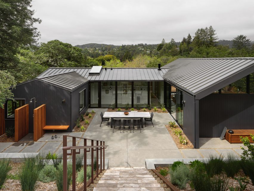
Black house by Michael Hennessey ArchitectureBlack house by Michael Hennessey Architecture
Michael Hennessey Architecture created Courtyard Hous

Designed for a couple with two young children, the budget-conscious project involved the renovation of a suburban-style house that was “in sore need of upgrades”.

The aim was to create a dwelling that supported the family’s current needs while being mindful of what might be needed in the future.
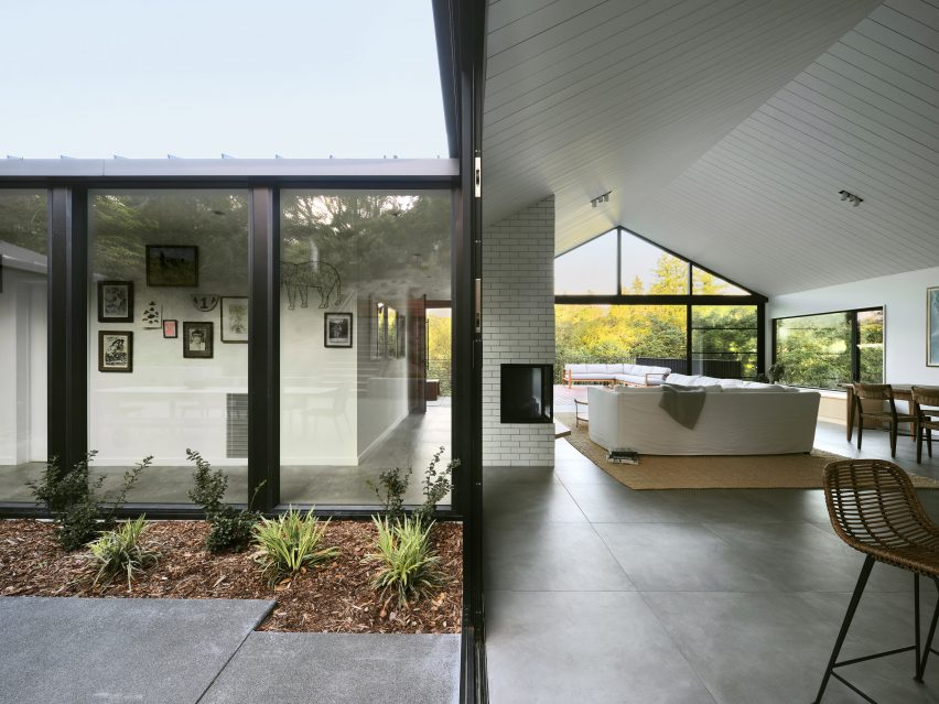
Courtyard House living spaceCourtyard House living space
The home is U-shaped in plan

“The home was thought not only as a shelter, but also as a bridge: from past to present, from one landscape condition to another, and from what a family wanted to what they could have,” said Michael Hennessey Architecture, which is based in San Francisco.

Built into a hillside, the home is U-shaped in plan, with gabled volumes organised around a central courtyard.
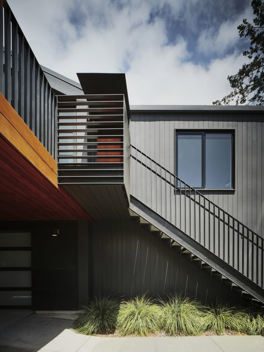
Vertical cedar sidingVertical cedar siding
Vertical cedar siding that adds a sense of gravitas

The team opted to preserve certain elements while adding contemporary interventions.

The building’s beige exterior was replaced with black, vertical cedar siding that adds a sense of gravitas, the studio said. The roof is covered in standing-seam metal.
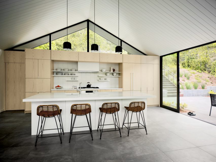
Open-plan kitchen Open-plan kitchen
Inside there is a clear division between public and private zones

Inside, the 1,870-square-foot (174-square-metre) house features a clear division between public and private zones.

On the main level, one side holds an open-concept kitchen, dining area, and living room, while the other encompasses three bedrooms. The ground level contains a family room and a garage.
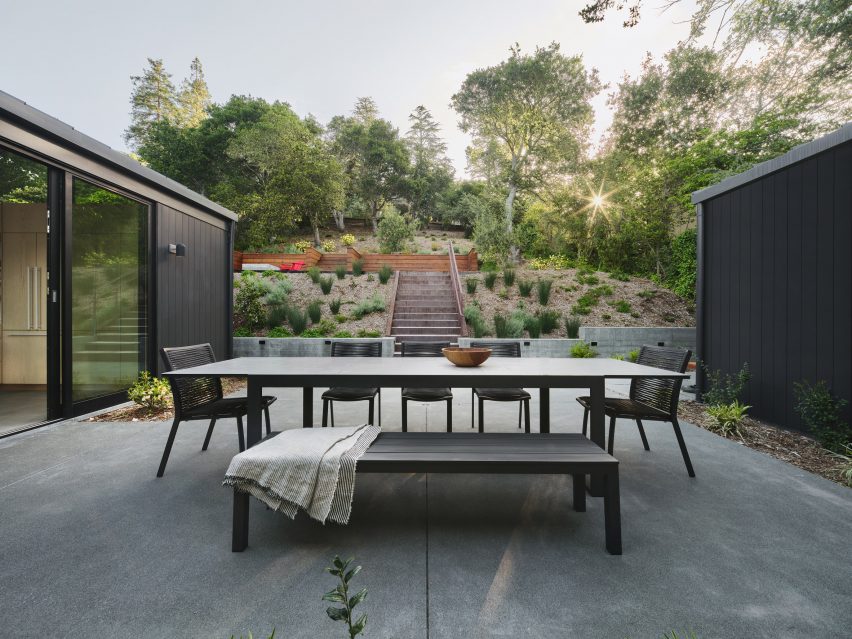
South-facing deckSouth-facing deck
A south-facing deck features outside

“Clearly delineated programmatic areas work in harmony with each other, the outside and the family’s needs,” the team said.

Interior finishes include ash cabinetry, large-format porcelain floor tiles, and ceramic tiles around the fireplace. Lofty ceilings and large stretches of glass provide an airy feel.

The outdoor spaces include a spacious, south-facing deck that receives bright sunlight. Softer light flows in through the courtyard on the north.

Proving a connection to the forested, hilly landscape was a guiding concern for the team.
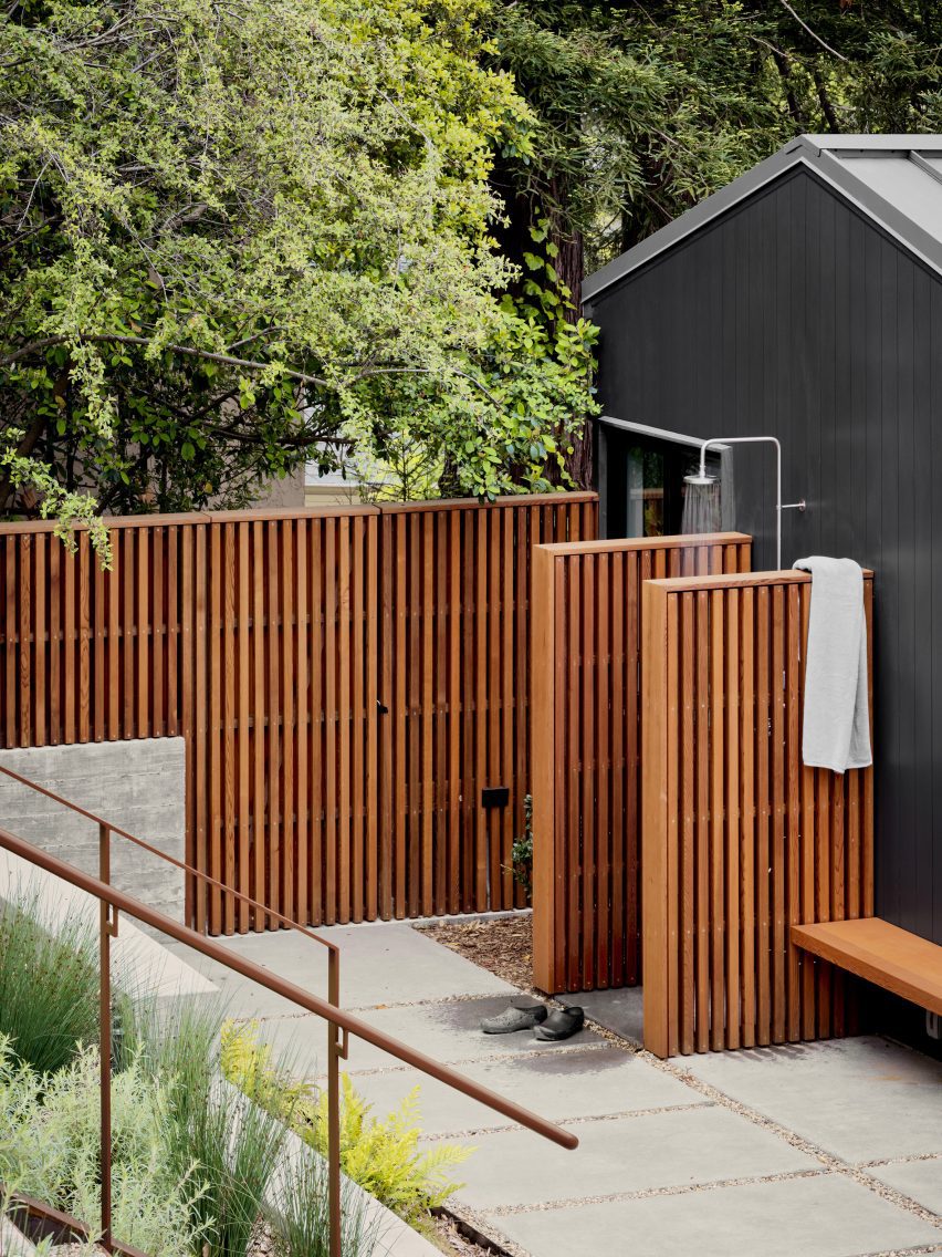
Outdoor showersOutdoor showers
Outdoor showers were also included in the design

“Every part of the house is oriented towards the landscape thanks to carefully framed views of the lush immediate vegetation, as well as the more distant valleys, resulting in a comprehensive, thoughtful and sensitive approach to creating an extraordinary daily life,” the team said.

Other projects by Michael Hennessey Architecture include a townhouse with modern bay windows that was designed to offer alternatives to “conventional building strategies” and the refurbishment of a 1960s house that was originally built by Joseph Eichler, known for his modernist housing subdivisions.

The photography is by Adam Rouse.


Project credits:

Architect: Michael Hennessey Architecture
Architecture team: Michael Hennessey, Claudia Merzario, Jason Laudat
Contractor: New Dimension Builders (Dirk Von Rueben)
Structural engineer: Berkeley Structural Design (Bill Lynch)
Landscape architect: George Loew
Title 24 consultant: EnergySoft, LLC (Hayley Monahan)
Sustainability consultant: Arcturus HD (Jeff Aalfs)

Reference

greater dog architects’ renovated 5 X 7 building in china
CategoriesArchitecture

greater dog architects’ renovated 5 X 7 building in china

the renovation of 5 x 7 building in Zhejiang, China


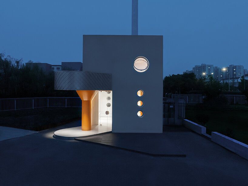
Greater Dog Architects was commissioned to renovate a small brick and concrete mixed-use structure in Zhejiang, China. Situated on the edge of a riverfront plot, the structure’s previous function was as a backup room for a substation, now transformed into The 5 X 7 building as a stopping point during touristic tours organized at the nearby é é é | BSH headquarters — a multi-use complex featuring a retail space, an office, an R&D, and production unit, several restaurants, and a factory that produces bedding made from high-quality goose down (the bird’s soft under plumage). In response, the architects employed an adaptive reuse strategy, effectively repurposing the existing space and floor height to create a suitable hub for the public to relax and enjoy tea.

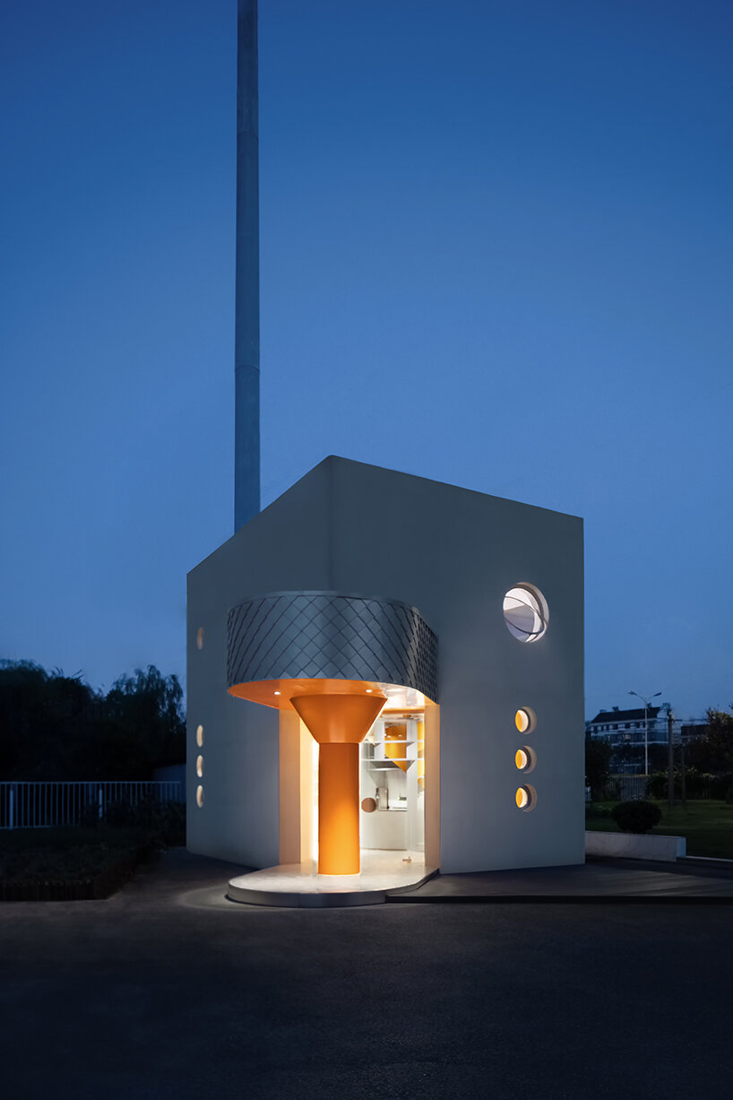
Under tight budget cost control, the aluminum-clad building 5 X 7 retains the old structural boundaries, while the extended canopy is used to break the conventional boxy shape, which also serves as the main entrance; this unique feature not only fulfills its function of providing shelter from the elements but also introduces subtle ‘reconstruction’ changes within the existing architectural framework. As a new structural element, it brings a sculptural language to the building, and the abstract goose-foot shape infuses it with vibrancy and humor.

greater dog architects' renovated 5 X 7 building in china boasts a goose foot-shaped canopy
all images © Metaviz Studio


greater dog architects pairs aluminum with vivid orange hue


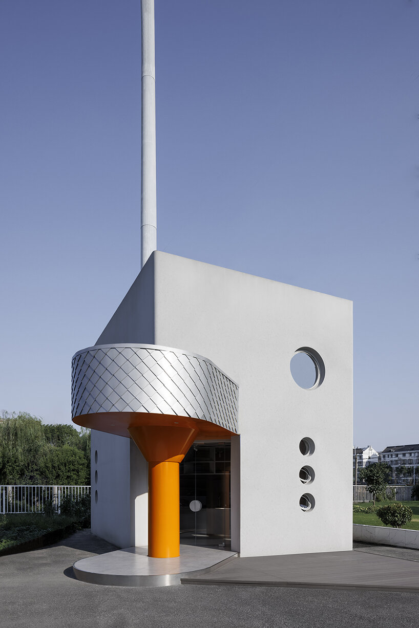
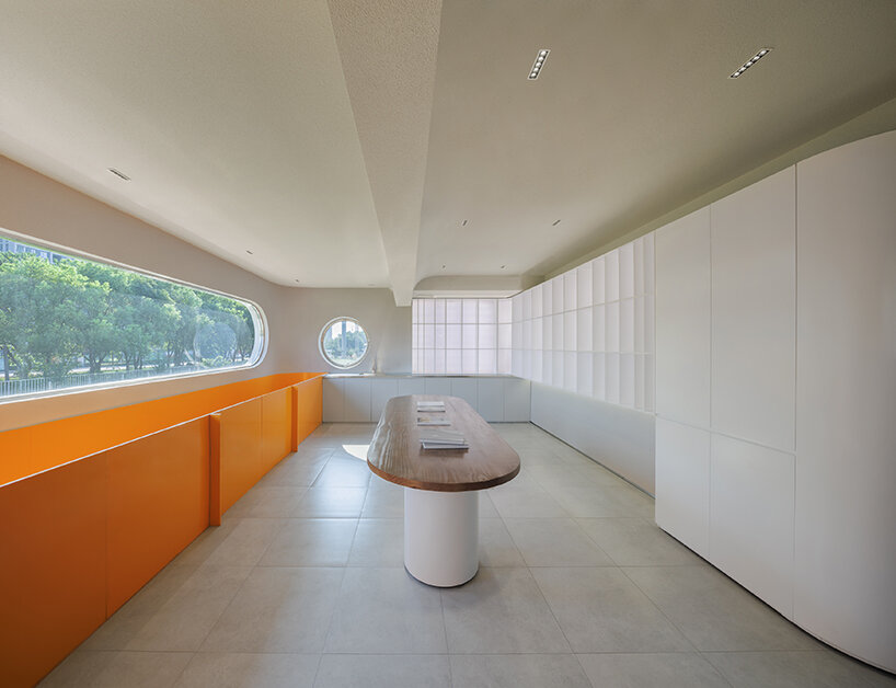
Furthermore, Greater Dog Architects (see more here) integrated the large windows on the original 5 x 7 building’s four facades into partially small circular windows. Throughout, the architects achieved optimal thermal insulation on the original exterior walls by adjusting the window-to-wall ratio, effectively combining the forms of southeast-facing windows and roof skylights to increase daylight pouring in.

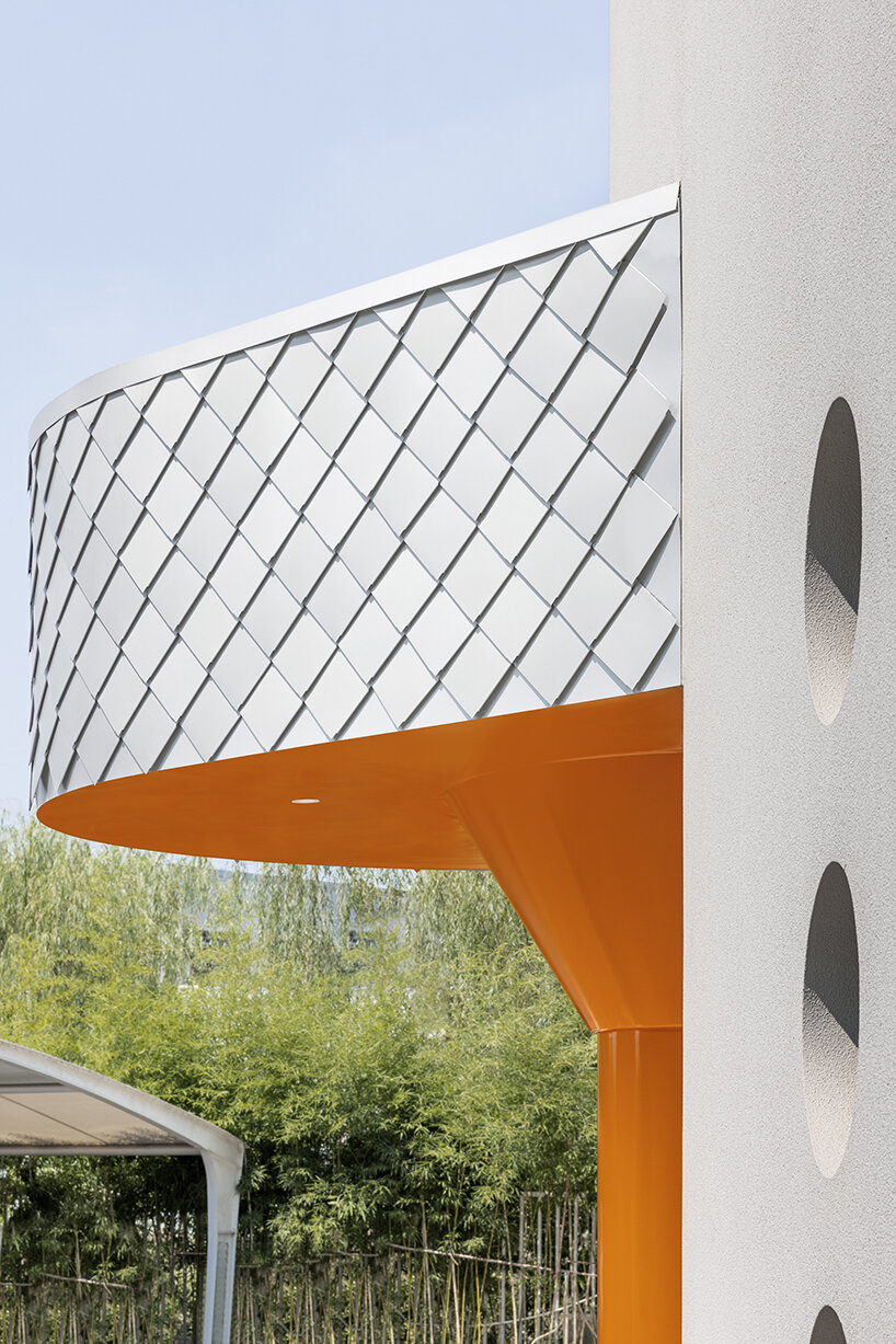
Facade-wise, the structure primarily features a neutral gray textured paint, while the special-shaped entrance canopy sports lightweight and corrosion-resistant natural aluminum cladding and orange-painted aluminum panels. The orange columns add a splash of color, rejuvenating the corner and making the building noticeable from a distance. Natural aluminum, as a 100% recyclable sustainable material, also boasts lightweight characteristics that ease installation and reduce the load on the original building structure, while its corrosion resistance ensures long-lasting durability. Simultaneously, the application of textured paint and aluminum materials accelerates construction, reducing the cost of renovating small-scale buildings.

greater dog architects' renovated 5 X 7 building in china boasts a goose foot-shaped canopy
abstract goose-foot shape infuses the building with vibrancy and humor


flexible and skylit interiors for tea and relaxation 


As for the interiors, Greater Dog Architects carefully reconfigured the 5 X 7 spaces, using the original building’s 6.8-meter ceiling height to divide it into two levels of use. On the one hand, a new orange-painted steel staircase added to the south side of the first-floor bar counter creates a vertical connection, linking the first-floor bar area with the second-floor tea lounge. On the other hand, the roof skylights above the staircase bring more natural light to the second floor and stairwell, creating unexpected spatial opportunities within the limited interior space. Additionally, large windows on the outward-facing facade offer views of the surrounding river and maximize transparency within the compact interiors.

The building serves as an external tea and relaxation space for the BSH goose-down tourist factory and extends its display functions to maximize the flexible layout and shared use of the functional area. The architects have utilized the vertical space of the wall to design display shelves of various scales, meeting the future needs for product display within the space. Similarly, the materials used in the building extend into the interior space, establishing a visual connection between inside and outside. Lastly, as night falls, the 5 X 7 structure becomes a shimmering elf in the corner.

greater dog architects' renovated 5 X 7 building in china boasts a goose foot-shaped canopy
the architects coated the structure primarily in a neutral gray textured paint

greater dog architects' renovated 5 X 7 building in china boasts a goose foot-shaped canopy
a touch of vivid orange makes 5 X 7 recognizable from a distance

greater dog architects' renovated 5 X 7 building in china boasts a goose foot-shaped canopy
sing the original building’s 6.8-meter ceiling height to divide it into two levels

Reference

Renovated Ibizan finca retains rustic charm as Aguamadera hotel
CategoriesInterior Design

Renovated Ibizan finca retains rustic charm as Aguamadera hotel

A 19th-century farmhouse hidden away in the mountains of Ibiza has been converted into a hotel, where guests stay inside earthy, minimalist suites with interiors conceived by creative director Carlota Sarda Caralps.

The remote Aguamadera resort opened earlier this year and was designed as “a secluded hideaway home” with a focus on nature, wellness and food.

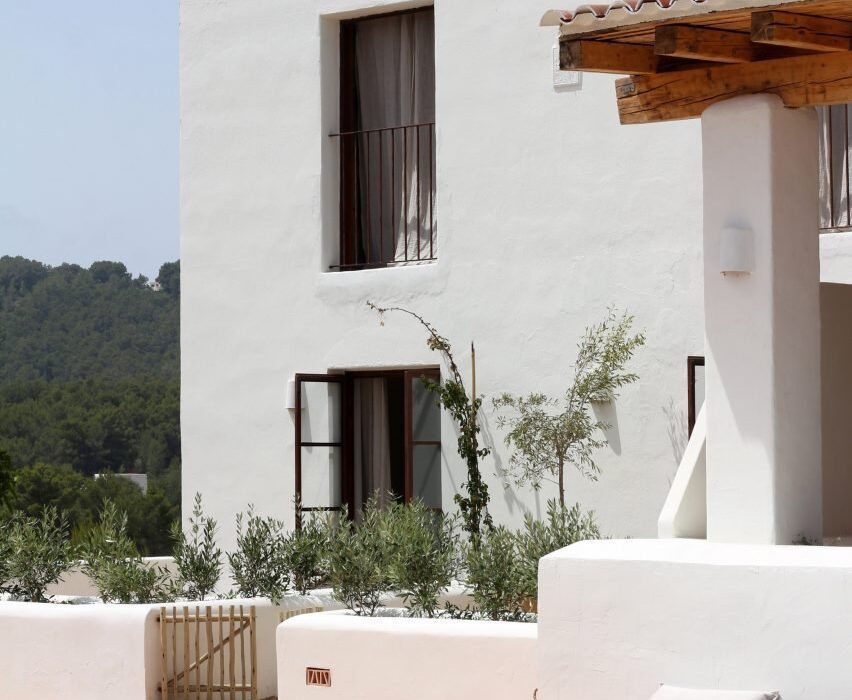
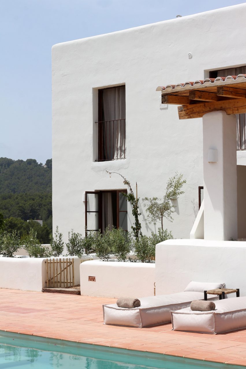
Two-storey whitewashed building with terracotta tiles terrace
A 19th-century farmhouse has been converted into a boutique hotel

The brainchild of Pacha Group co-founder Iria Urgell and hospitality entrepreneur Pablo Fernández-Valdés, the hotel was designed under the creative direction of Sarda Caralps.

Positioned atop a hill near the beach resort of Cala Llonga, the finca – or farmhouse – and its outbuildings constructed in 1888 were converted to accommodate seven guest rooms and four suites.

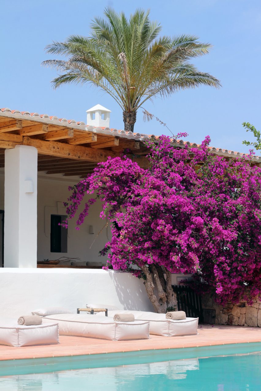
Renovated farmhouse with large bougainvillea tree in front, now the Aguamadera hotel in Ibiza
The pink flowers of a large bougainvillea tree contrast the whitewashed building

The renovated whitewashed structures sit among 27 acres of pine forests, olive groves and terraced agricultural land, from which much of the produce used in the hotel’s restaurant is sourced.

The name Aguamadera is derived from the Spanish words for water and wood, in a nod to the fact that the hotel hopes to promote healing through nature in its rural setting.

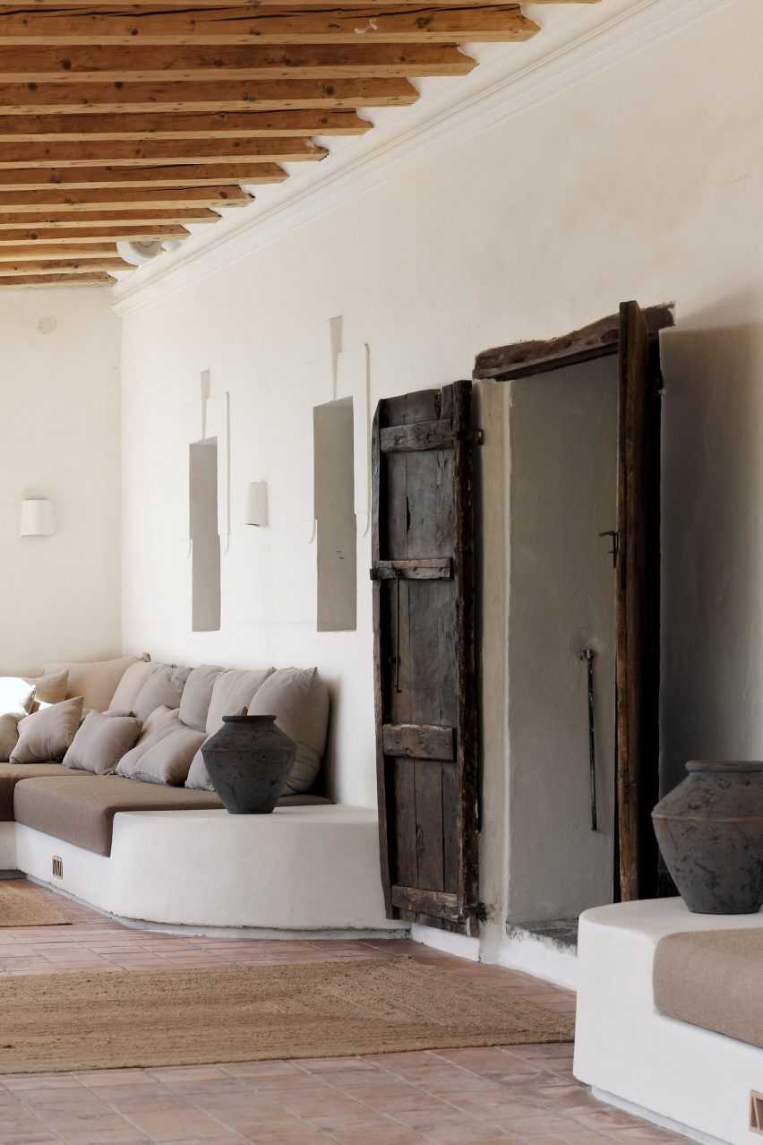
Covered porch with built-in seating and old wooden door
A covered porch features built-in seating for lounging

This translates into the design through the use of natural materials like clay plaster walls, wooden furniture, linen textiles and jute carpets.

Simplicity reigns throughout the resort. The textured plasterwork forms organically shaped surfaces and the cement floors complement the neutral palette.

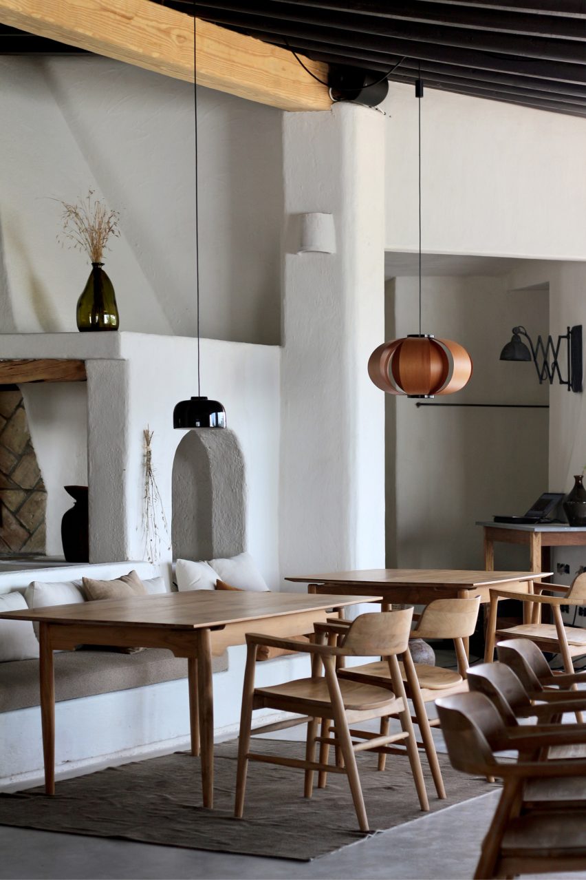
Dining area with wooden furniture and small pendant lights in Aguamadera hotel in Ibiza
Small pendant lights hang from the exposed ceiling beams in the casual dining area

The main building is minimally decorated with locally crafted furniture, objects and a rotating series of works by Ibizan artists.

“Our venue serves as a vessel between artists and guests,” said the operators.

“Aguamadera presents pieces of art for a limited time only where paintings, sculptures, environmental art and rare objects are integrated within the hotel experience.”

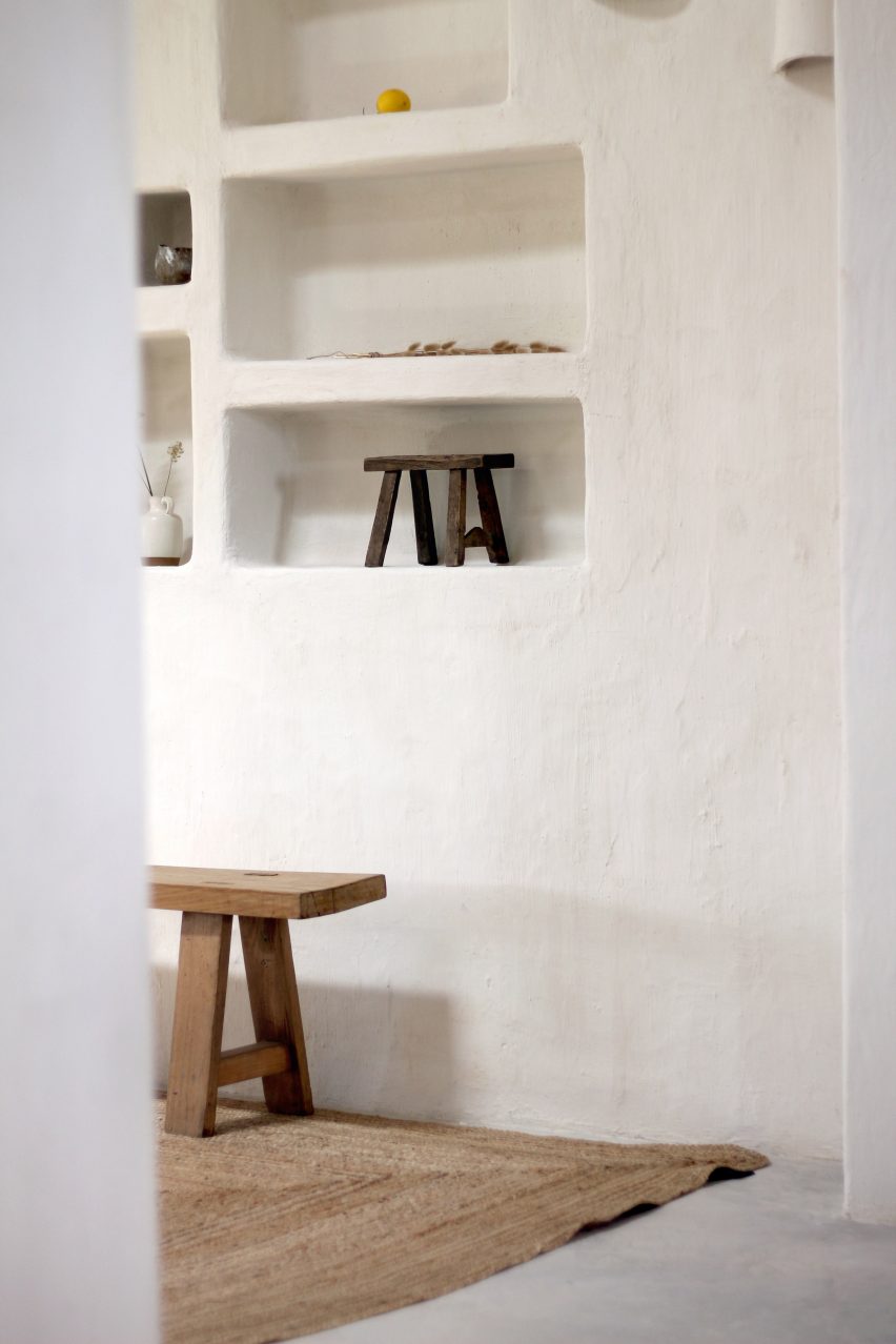
Built-in wall niches
Furniture, objects and works by local artists and artisans are displayed throughout

Towards the back is the restaurant, where the kitchen and its wood-fired oven are completely open to the casual dining area.

Small pendant lights suspended from the exposed wooden ceiling beams softly illuminate the tables, which are set with tableware by British artisan and artist Sarah Jerath.

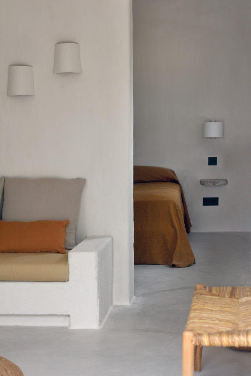
Guest room with plaster walls and earth-toned upholstery in Aguamadera hotel in Ibiza
The old farmhouse accommodates seven guest rooms

“Cosy, easy-going and fresh, the space allows you to explore the valley from within with sunset views,” the team said.

“In the essence of the winter season, a colossal fireplace evokes nostalgic charm.”

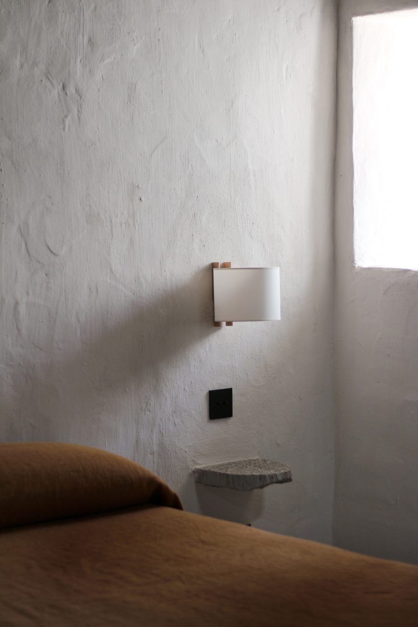
Close-up of rustic bedside table next to simple bed
The rooms have a monastic quality and are furnished with only the essentials

Spread over two floors, the guest rooms in the farmhouse have a monastic quality, with the earth-toned furnishings and decor elements reduced to only what’s necessary.

Larger multi-room suites are located in corrals – the outbuildings that formerly housed livestock – and have the same visual language as the other spaces.

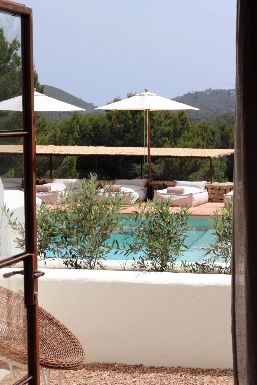
View through open doors of a swimming pool in Aguamadera hotel in Ibiza
Cushioned loungers surround the swimming pool, which overlooks the valley beyond

“Rustic wood finishes, built-in furniture, quality materials and soft textures are highlighted through sculptural silhouettes, the cornerstone of our design,” said the team.

Across the site, several terraces facing the surrounding valleys offer outdoor spaces for guests to eat, drink and relax.

A covered porch is lined with built-in seats for lounging and is further shaded by a bougainvillaea tree, whose pink flowers starkly contrast the building’s white walls.

The pool terrace below features chunky cushioned loungers placed on terracotta tiles and is wrapped by a low dry-stone wall.

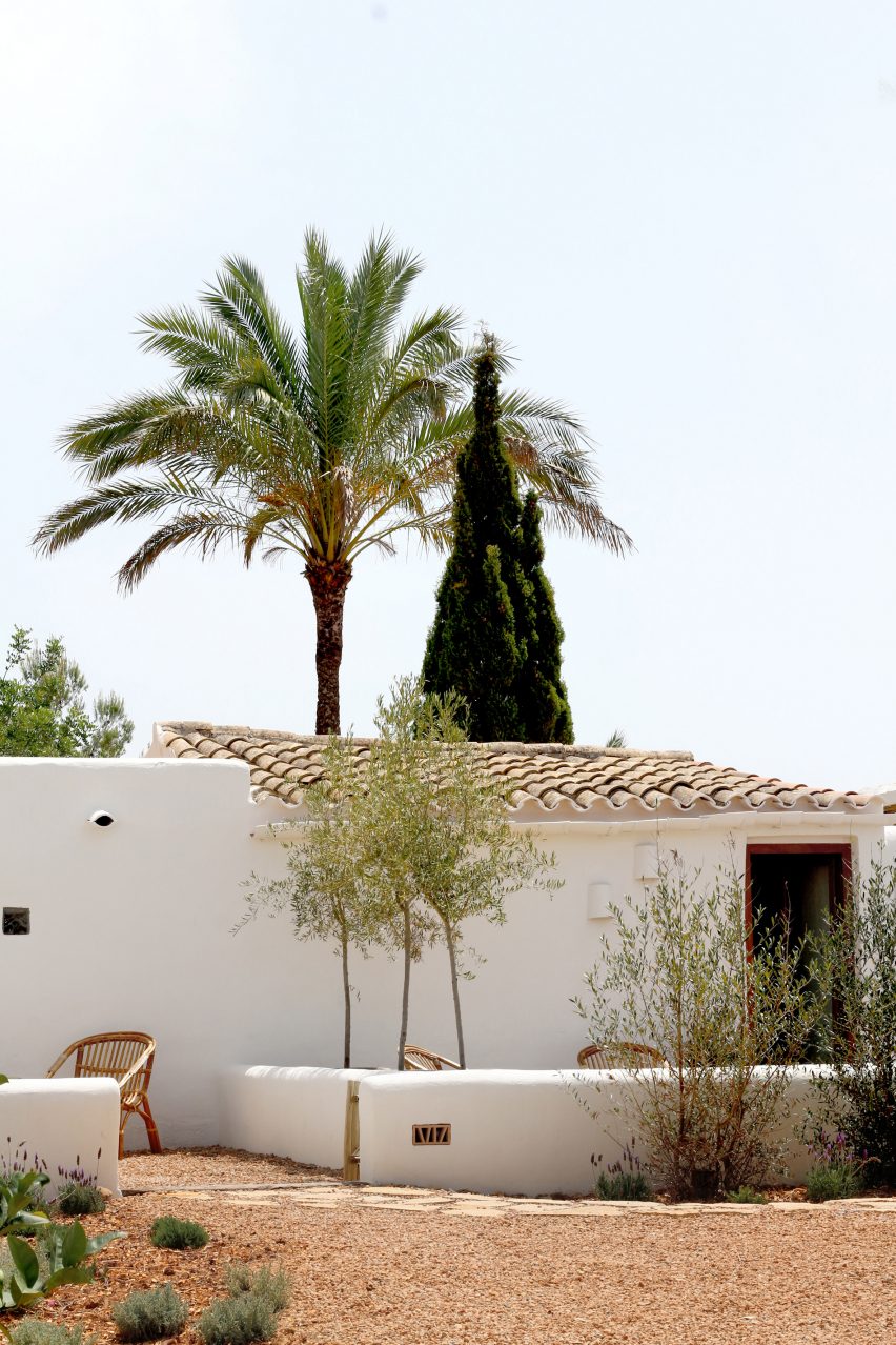
Whitewashed building with a tiled roof and palm tree behind
The hotel’s larger suites are housed in the outbuildings formerly used for livestock

Sunset is best enjoyed from cushions and mats placed under a huge tree on the opposite side of the building to the pool, where a large al fresco dining area is also located.

Details include hollow bricks with patterned faces embedded into the walls, which glow softly at night to help guests navigate around the site.

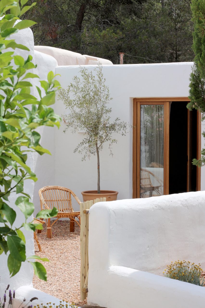
Outdoor courtyards with chairs and a potted tree in Aguamadera hotel in Ibiza
The suites have their own outdoor areas

Aguamadera hosts a variety of activities for guests and the local community, from exhibitions and workshops to wellness offerings such as sound meditations, rituals and ceremonies.

Ibiza is renowned the world over as a party destination but visitors are beginning to appreciate its natural beauty and rural charm, too.

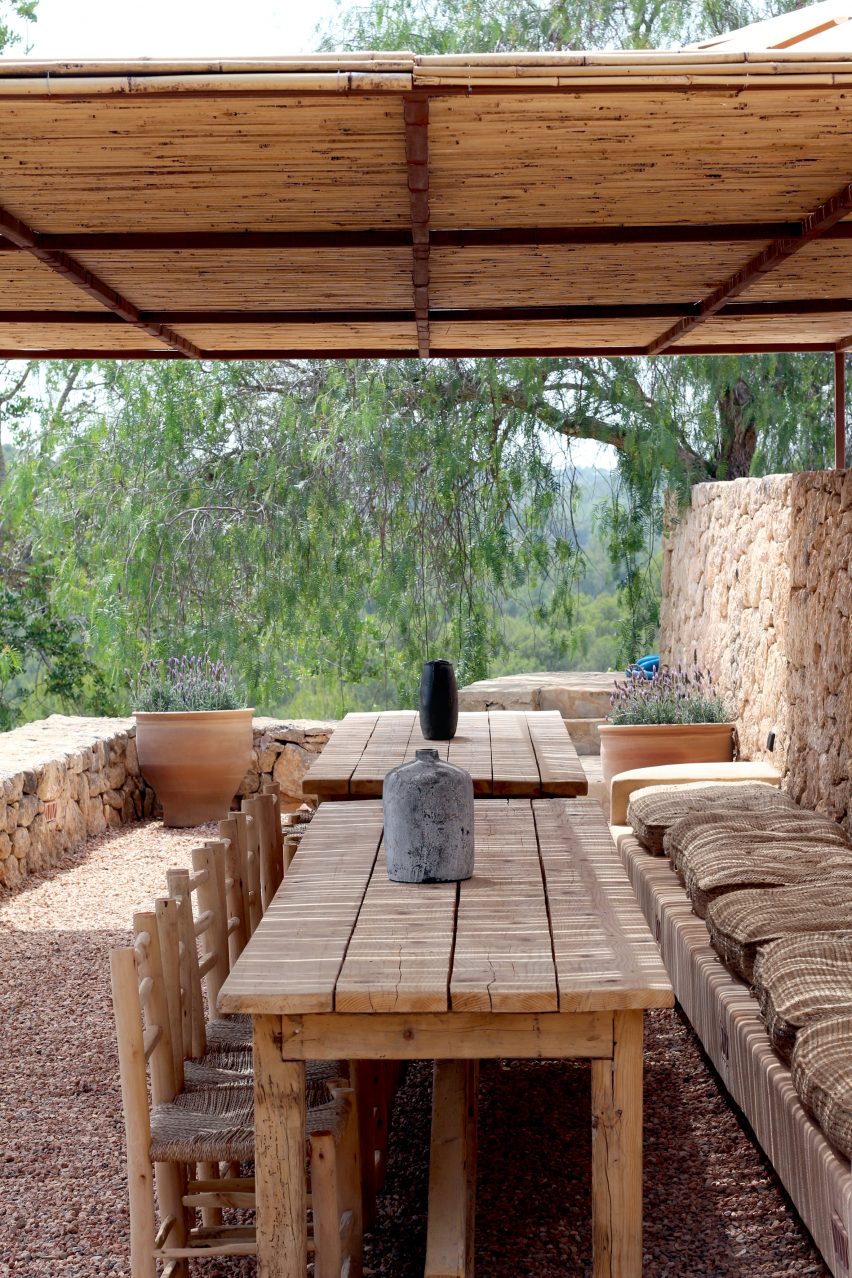
Covered outdoor terrace with wooden dining tables and chairs
Multiple terraces wrapped by dry-stone walls can be used by guests

Several of the island’s old farmhouses have been converted into hotels or private villas, including a 200-year-old stone building that was turned into the members-only retreat La Granja.

The historic port city of Eivissa has also seen a recent renaissance, with locations from international groups The Standard and Experimental both opening within the past couple of years.

The photography is by Lekuona Studio. The main image is by Mateo Sánchez Garcia De La Cruz.

Reference

Six renovated Parisian apartments in historical Haussmann-era buildings
CategoriesInterior Design

Six renovated Parisian apartments in historical Haussmann-era buildings

Period details are mixed with contemporary interventions inside these renovated apartments in Paris, built in the mid-19th century during Georges-Eugène Haussmann’s reconstruction of the French capital.

In his role as the prefect of the Seine département under Napoleon III, Baron Haussmann was responsible for creating the network of boulevards that still define the city’s urban landscape today.

The homogenous apartment buildings flanking these boulevards were designed to strict guidelines, all made from cream-coloured stone with a steep four-sided mansard roof and no more than six storeys.

Although Haussmann was less prescriptive about the building’s interiors, they generally feature high ceilings and parquet floors alongside elaborate mouldings and boiserie.

Read on for six examples of how architects and interior designers have brought these apartments into the 21st century, including a book lover’s loft and two flats combined to form a family home in the Marais.

This is the latest in our lookbooks series, which provides visual inspiration from Dezeen’s archive. For more inspiration see previous lookbooks featuring bedrooms with minimalist interiors, concrete kitchens and marble-lined bathrooms.


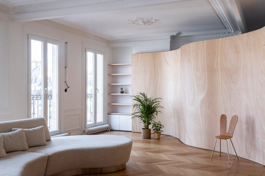
Wood Ribbon apartment by Toledano + Architects in Haussmann-era building
Photo by Salem Mostefaoui

Wood Ribbon apartment by Toledano + Architects

Original details such as parquet floors and ornate ceiling plasterwork were retained in the renovation of this apartment, which had been left largely untouched since the end of the 19th century.

But local studio Toledano + Architects tore down several partition walls to create a more open floorplan, traversed by a snaking plywood wall that roughly divides the apartment into three zones while providing tactical storage in the living room and kitchen.

“I really wanted to enhance this dichotomy between ancient and contemporary,” founder Gabrielle Toledano told Dezeen. “It’s very relevant in a city like Paris where both are in a constant dialogue.”

Find out more about Wood Ribbon apartment ›


Canal Saint-Martin apartment by Rodolphe Parente
Photo by Giulio Ghirardi

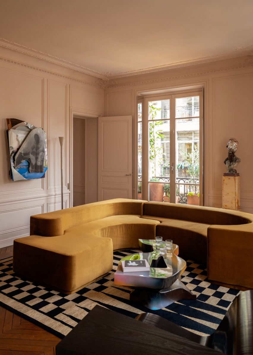
Apartment Canal Saint Martin by Rodolphe Parente

French interior designer Rodolphe Parente made only a few minor architectural interventions when overhauling this apartment in Canal Saint-Martin, exposing long sealed-off doorways and creating a hybrid dining room and kitchen.

Instead, he modernised the apartment by contrasting original details such as mouldings with unexpected contemporary details, colours and the “radical” art collection of the owner.

In the bedroom, a vivid purple rug clashes with caramel-coloured walls while in the living room, period wall panelling highlights the modernity of the sofa and the glossy coffee table.

Find out more about Apartment Canal Saint Martin ›


Apartment XIV by Studio Ravazi in Haussmann-era building
Photo by Olivier Martin Gambier

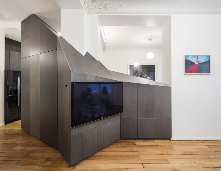
Apartment XIV by Studio Razavi

With several partition walls removed, French office Studio Razavi created a new layout for this apartment by slotting a multi-faceted furniture block made from wood-fibre panels into the remaining gaps.

Its staggered profile creates sightlines between the different areas of the house while framing some of the building’s original Hausmann-style ceiling mouldings.

Painted in a muted slate grey, the furniture block performs a different function in every room – acting as a storage cabinet in the kitchen, a TV mount in the living room and a desk in the study.

Find out more about Apartment XIV ›


Apartment Paris Marais living and dining room by Sophie Dries
Photo by Stephan Julliard

Marais apartment by Sophie Dries

Two flats become one 100-square-metre residence in this renovation project that French architect Sophie Dries completed in trendy Marais for a family of four.

Period details were painted in simple white, providing a contrast with new additions such as the Hans J Wegner chairs and the dyed linen curtains in the living room

“The Haussmannian style was refined and pared down, in order to introduce minimal lines better suited to a modern family,” Dries explained.

Find out more about Marais apartment ›


Enter the diamond by atelier 37.2 in Haussmann-era building

Enter the Diamond by Atelier 37.2

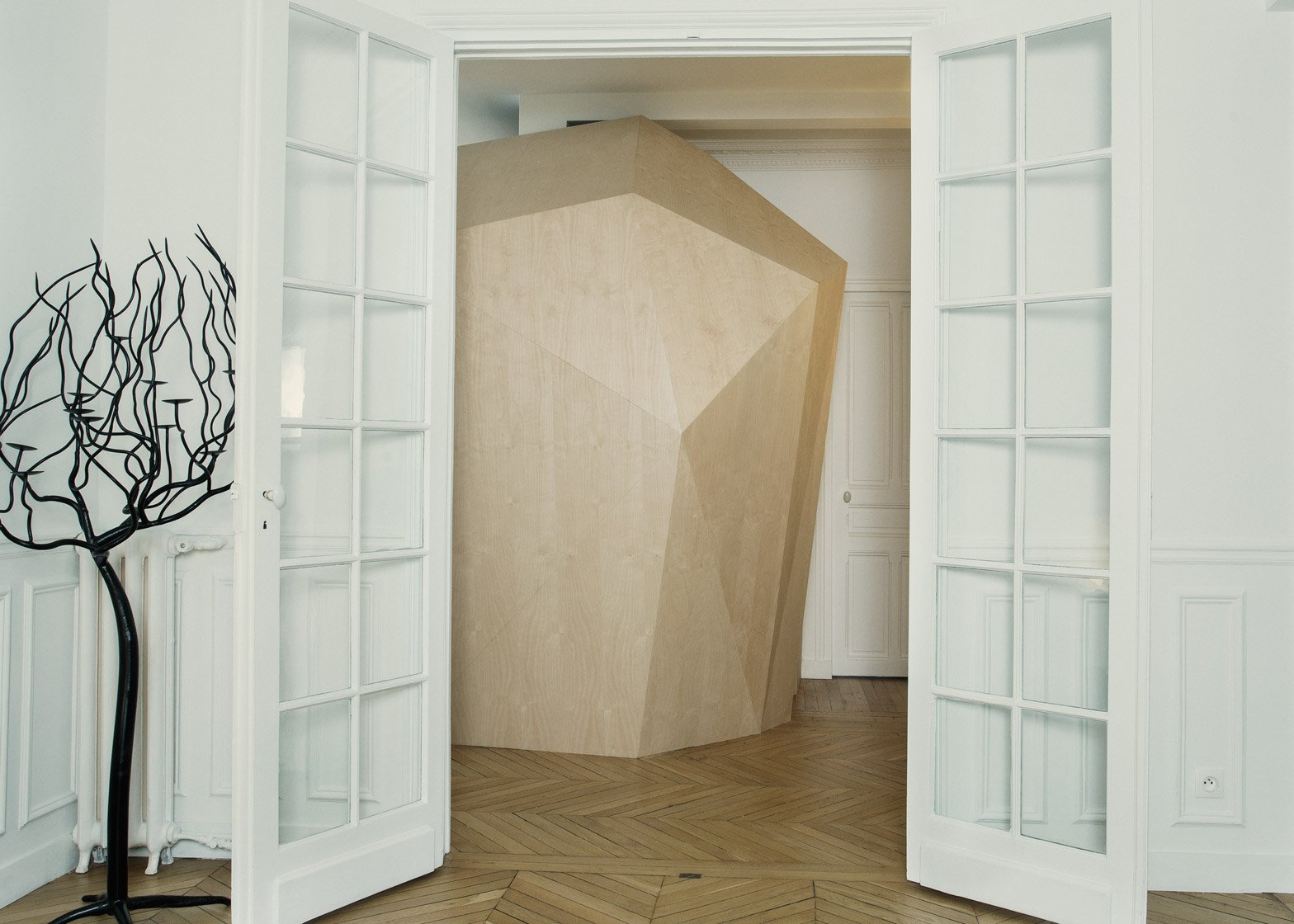
An additional bathroom is housed inside the three-metre-high birchwood volume at the centre of this residence in the French capital, designed by local studio Atelier 37.2.

The sharp lines of the diamond-shaped structure contrast with the apartment’s ornate ceiling mouldings and white-painted walls.

“This tension generates a fictional potential that plays with the imagination of the inhabitants,” said the studio.

Find out more about Enter the Diamond ›


Arsenal loft by h2o Architectes
Photo by Stéphane Chalmeau

Arsenal loft by h2o Architectes

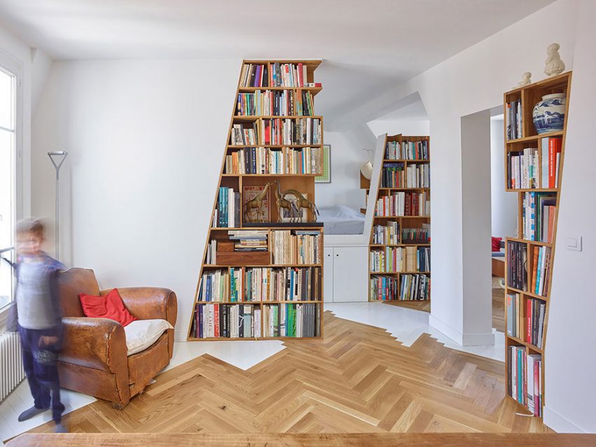
This three-room loft is set inside the mansard roof of a Haussmann-era building in the Arsenale district, which originally served as servant’s quarters for the apartments below.

Parisian firm h2o Architectes opened up its floor plan to make the most of the top-floor views while installing wooden bookshelves to define different areas and house the extensive library of the apartment’s book-loving owner.

Their timber construction creates a visual connection with the original parquet floors, while the white paint used to brighten walls and other structural elements continues onto some sections of the floor.

Find out more about Arsenal loft ›

This is the latest in our lookbooks series, which provides visual inspiration from Dezeen’s archive. For more inspiration see previous lookbooks featuring bedrooms with minimalist interiors, concrete kitchens and marble-lined bathrooms.

Reference

Stephanie Brown brings casual elegance to renovated Vancouver Home
CategoriesInterior Design

Stephanie Brown brings casual elegance to renovated Vancouver Home

Large family get-togethers are enjoyed in the open-concept living spaces at this house in Vancouver, which interior designer Stephanie Brown has overhauled with entertaining in mind.

The home is situated in a quiet, upscale neighborhood in the Canadian city. Built in 1991, it originally featured a postmodern aesthetic, while subsequent renovations favoured the craftsmen style.

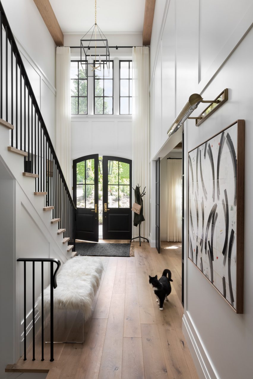
Foyer
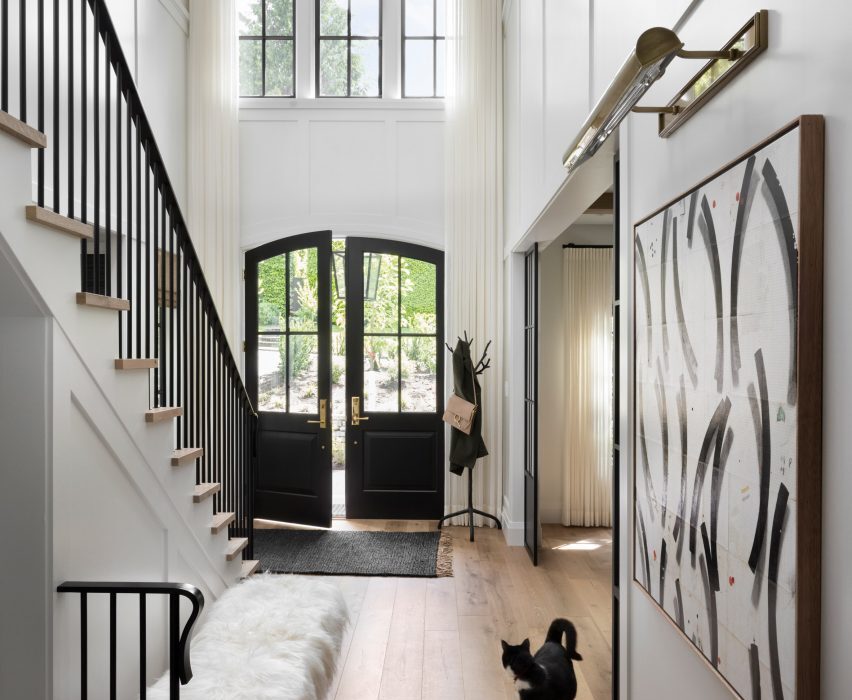
The layout of the home was reorganised to create a double-height foyer

Its latest iteration was devised by local studio Stephanie Brown, who was asked to design the interiors by homeowners Joanne and Alan.

The couple has a blended family with six grown-up children, and while only one still lives at home, the others return often for dinners together.

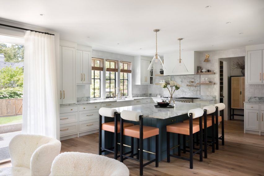
Kitchen
Small rooms were opened up to create larger spaces for entertaining

Alterations to the plan of the house were therefore required to allow it to comfortably accommodate so many people in the evenings, but still feel cosy during the day.

“Prior to the renovation, the layout featured very formal, separated rooms,” said Brown. “We re-worked the layout of the main floor to create a more open-concept space, which would provide better flow for modern family gatherings and fewer formalised spaces.”

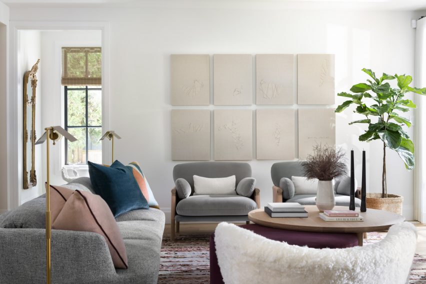
Living room
Jewel tones and feminine hues add variation to the predominantly white colour scheme

An enlarged family room is now adjacent to the kitchen, which includes a generous island with a teal-coloured base for preparing meals and eating breakfast.

The same teal shade, chosen for Joanne’s “love for moody jewel tones” continues in the pantry, while more feminine pinks and purples are introduced in other spaces through furniture fabrics.

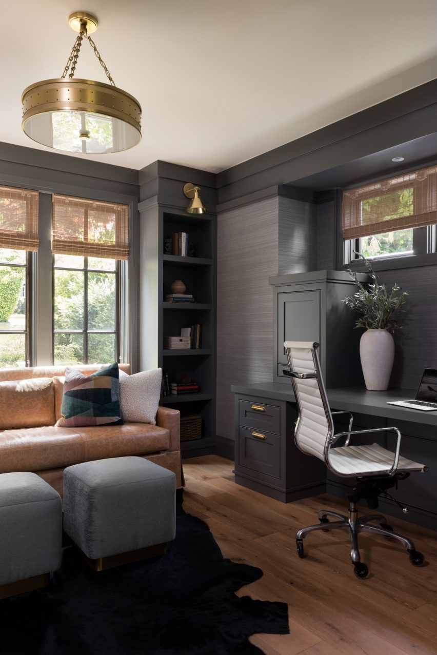
Den
Smaller rooms like this office space feature darker colours

In the dining room, a large black table is positioned beneath a grid of mid-toned oak beams and a Shape-Up chandelier by Ladies and Gentlemen Studio.

Oak is also applied as parquet flooring, adding visual interest and bringing warmth to the predominantly white palette throughout the home.

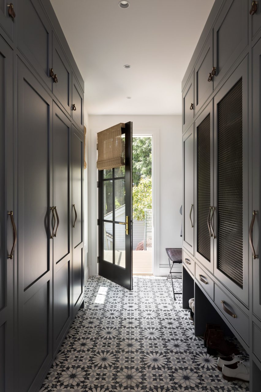
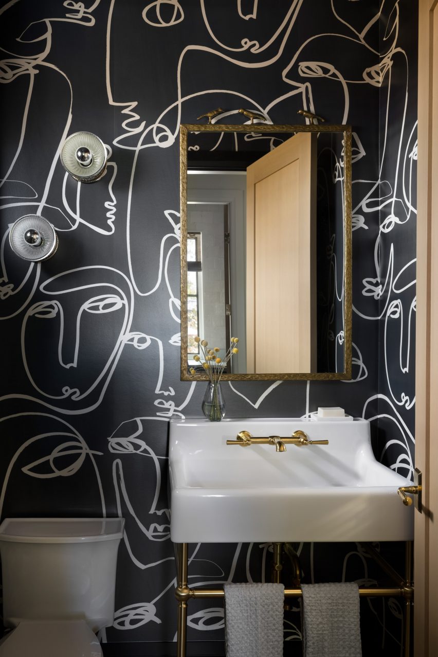
Darker colours are used in the smaller spaces, including a new mudroom with grey-and-white-patterned cement floor tiles, and a wallpapered powder room.

By also rearranging the first-floor layout, a bright two-storey entrance foyer was created, featuring black and unpolished brass details.

Mud room
A mud room with patterned ceramic tiles was created during the renovation

Artwork and decorative furniture pieces are dispersed throughout the home, intended to convey a relaxed atmosphere more akin to a city loft.

“We drew inspiration from New York and European apartments, which feature unique collections of art, furnishings and decor set against elegant details,” said Brown.

“We opted for a casual take on those interiors, but one where the play between classic and modern would still feel fresh and unique.”

Powder room
A powder room is lined with dark wallpaper

Vancouver is regularly ranked as one of the most liveable cities in the world and has a wealth of notable residential architecture and interiors.

Other projects recently completed there include RSAAW’s renovation of a mid-century residence to include a double-height library and a house by D’Arcy Jones Architects designed to mesh with its neighbours.

Reference