Atrium at the Here+Now office building by HawkinsBrown
CategoriesInterior Design

HawkinsBrown renovates offices to create a “connection to nature”

Atrium at the Here+Now office building by HawkinsBrown

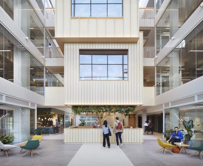
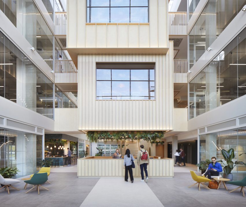
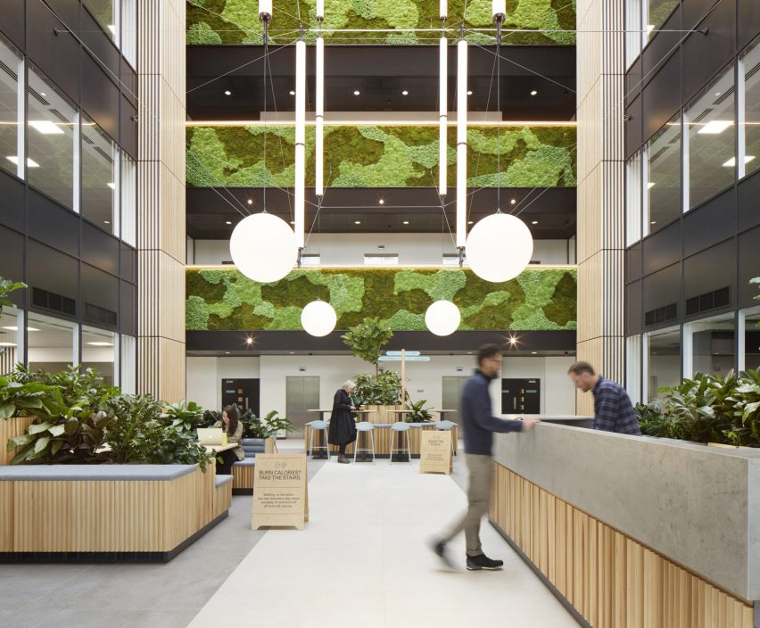
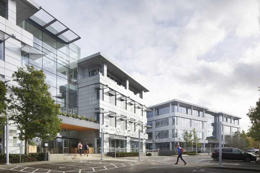
A stack of meeting rooms and a moss-covered wall overlook the atriums of Here + Now, a pair of office buildings in England refurbished by architecture studio Hawkins\Brown.

Informed by changing attitudes to workplace design following the Covid-19 pandemic, the two buildings have been renovated with a focus on wellbeing and a connection to nature.

They are located within a wider business park in Reading, formerly used by Microsoft.

Atrium at the Here+Now office building by Hawkins\Brown
Hawkins\Brown has renovated a pair of offices in Reading called Here + Now

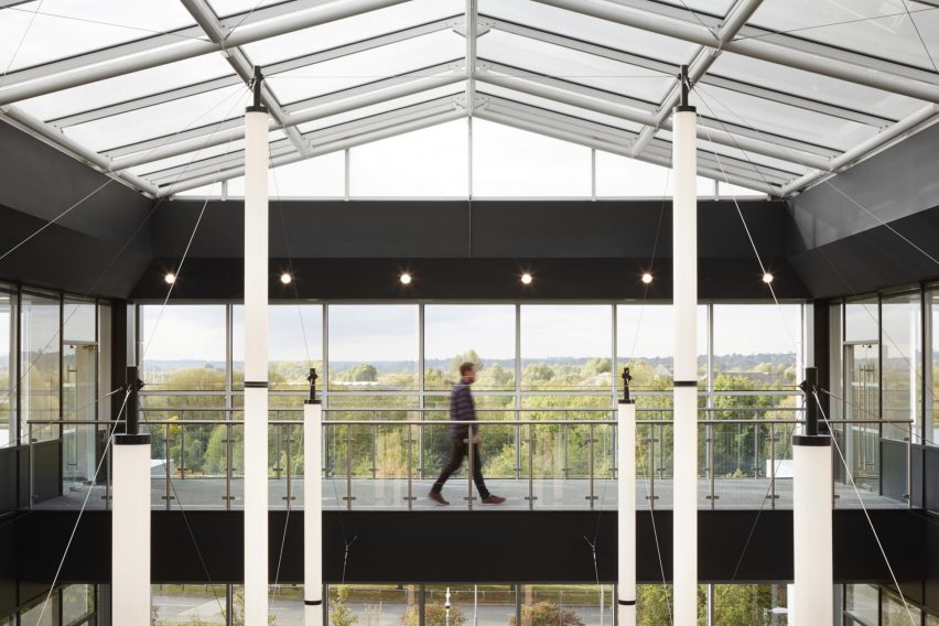
Connected by a bridge at their centre, the two buildings contain different facilities. One of them, named Here, offers space for more established companies, while the other, named Now, contains offices for smaller companies and start-ups.

“Here + Now is located on a business park, not in a city centre, which provides users with a much closer connection to nature and therefore better opportunity for activity and wellbeing,” Hawkins\Brown partner Massimo Tepedino told Dezeen.

“The idea is that companies can scale up or down and thereby stay on the campus for longer – this ultimately helps to create a sense of community,” he added.

Atrium at the Here+Now office building
A moss-covered wall overlooks an atrium in the Now building

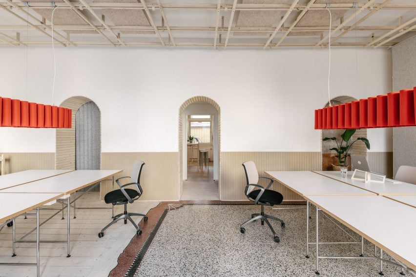
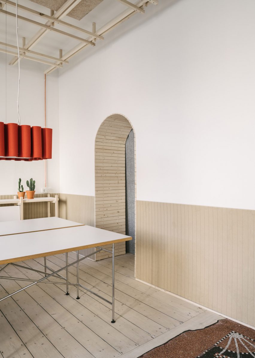
While the two buildings share a similar material and colour palette, the finishes of each were slightly different based on its tenants.

The approach to the Now building focuses on more cost-effective, flexible spaces, while the Here building is finished to a higher specification.

Here+Now office interior by Hawkins\Brown
Wood has been used to form seating areas and quiet nooks

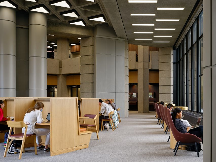
Each of the two buildings features a large arrival atrium designed to evoke a sense of “wonder”.

In the Here building, this space has a stack of meeting pods described by Hawkins\Brown as a “treehouse”, while dehydrated moss-covered balconies animate the atrium in Now.

Shared by both buildings are a range of on-site amenities, including a gym and treatment rooms, as well as a “lifestyle manager” who organises events and workshops.

“The benefit of having two buildings share amenities is that office spaces can accommodate a wide range of budgets, while everyone benefits from best-in-class amenities and the opportunity to socialise with established professionals and young entrepreneurs,” explained Tepedino.

Glass pitched roof at the Here+Now office building
The two buildings are connected by a bridge

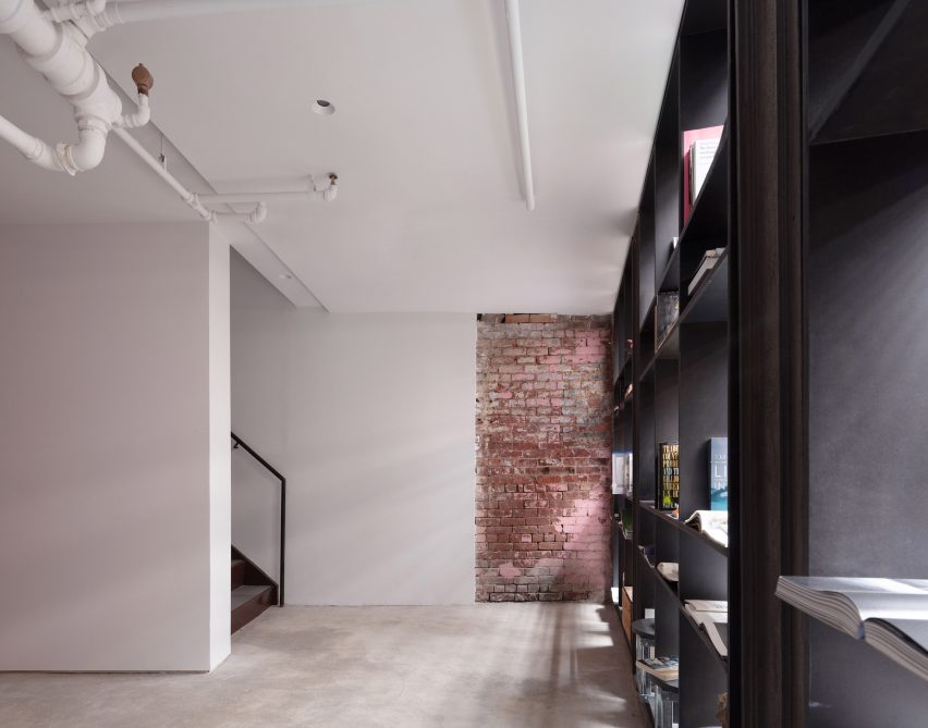
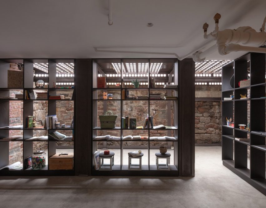
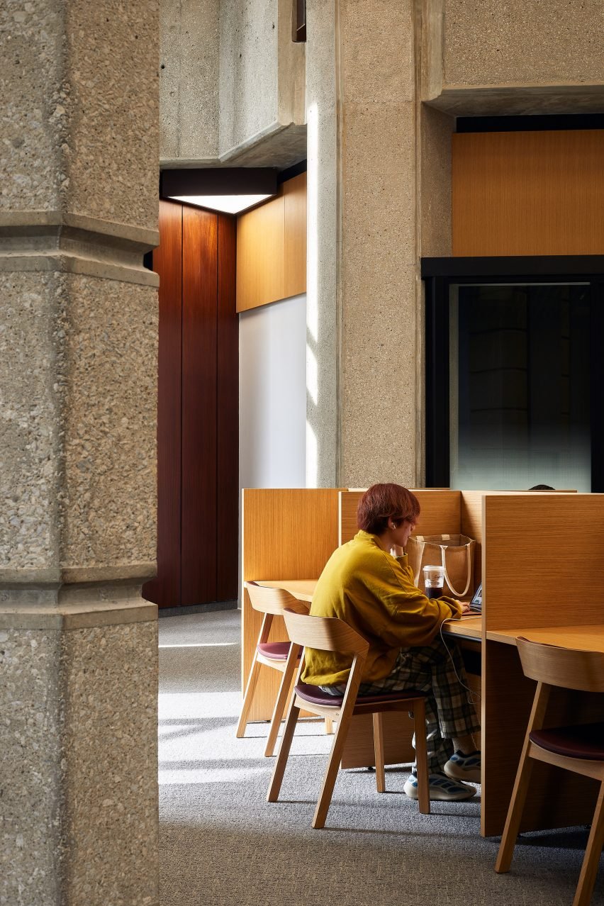
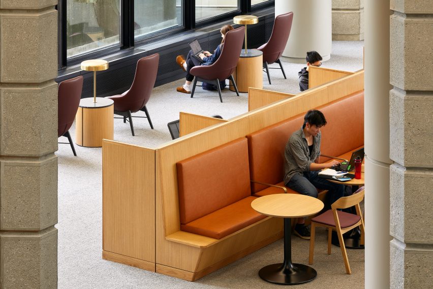
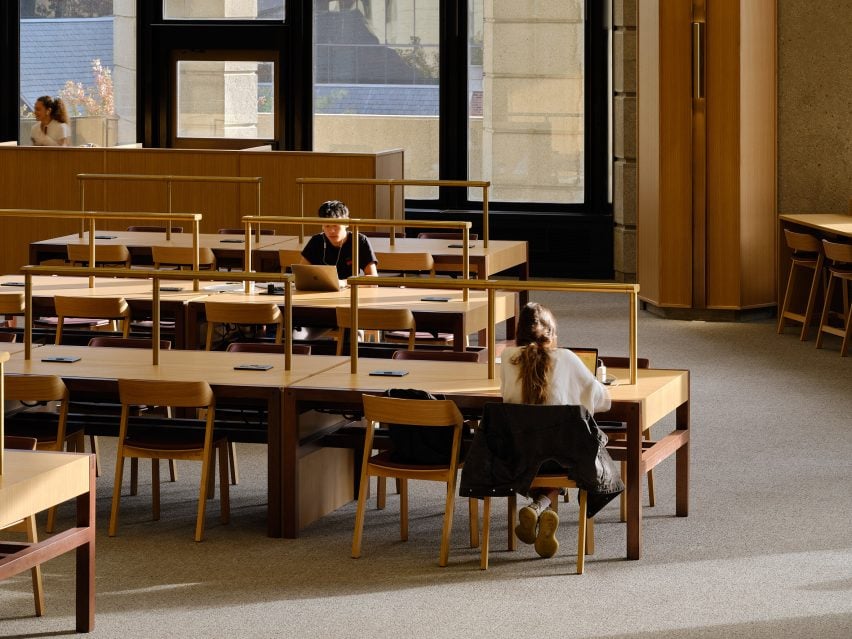
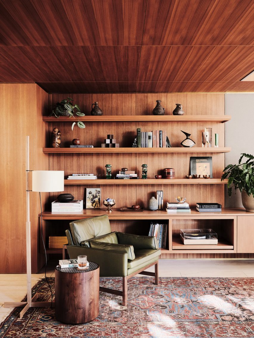
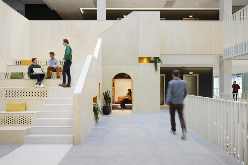
The glass and metal structures of the existing buildings have been treated internally with wooden panelling, which complements new wooden seating areas and nooks.

Particular attention was paid to the colour scheme, with a muted palette intended to evoke the nearby natural landscape and create a relaxing atmosphere.

Exterior of the Here+Now office building by Hawkins\Brown
The project is located on a business park

“We know that colours can facilitate, regulate, and even influence people’s behaviour – our colour palette takes its cues from the natural landscape and compliments the neutral tones of the existing buildings,” explained Hawkins\Brown.

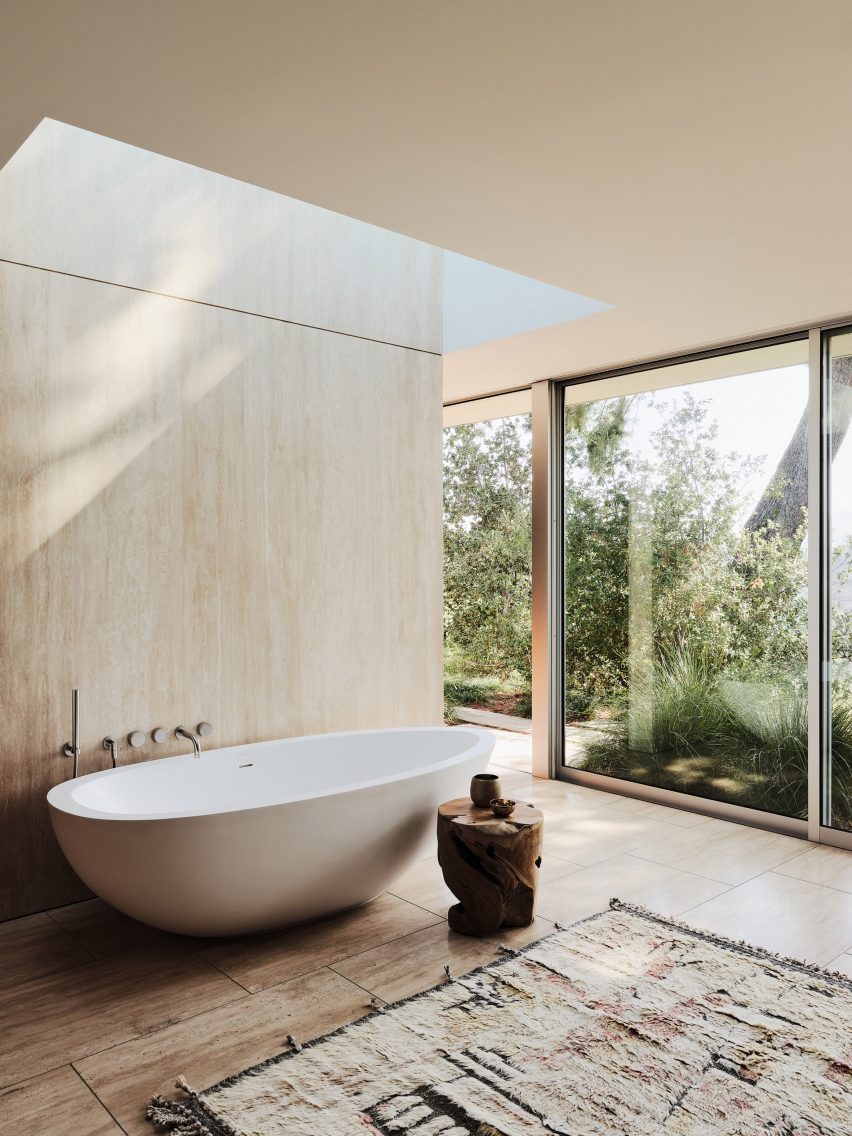
“The bathrooms take inspiration from spas and hotels, with green shades and bold graphics create a strong visual connection to nature and a calming environment.”

Here + Now has been shortlisted in the large workplace interior category of Dezeen Awards 2023.

Other projects recently completed by Hawkins\Brown include a student hub at Queen’s University Belfast with RPP Architects and the transformation of the historic Central Foundation Boys’ School in London.

The photography is by Jack Hobhouse.

Reference

Purple two-storey cuboid house with sun lounges and palm trees
CategoriesArchitecture

Workshop Architects renovates and expands purple Mérida home

Purple two-storey cuboid house with sun lounges and palm trees

Local architecture studio Workshop Architects has renovated a Spanish colonial house in Mérida, Mexico, and added two concrete buildings in its garden.

Named Casa Pulpo, the 235-square-metre residential project is characterised by lilac-hued exterior walls and traditional pasta floor mosaic tiling in the interiors.

Purple two-storey cuboid house with sun lounges and palm trees
Casa Pulpo has three purple-coloured buildings

“The traditional architecture of Mérida uses pasta tile for the floors, and usually, each room has a different pattern,” said Workshop Architects co-founder Francisco Bernés.

“That is why in this project, every room has a unique design on the floors and a similar tone colour for the base of the walls.”

Front exterior of the existing house at Casa Pulpo by Workshop Architects
The studio renovated the existing Spanish colonial house

The studio renovated the existing house, preserving the high ceilings and exposed white metal beams with wooden joists in the bedroom and living room at the front of the property.

An archway in the living room leads to the kitchen, which features a wood and white quartz island and a corner breakfast area to add a sense of cosiness.

A one-storey purple building with glass sliding doors revealing a dining room and swimming pool beyond
Glass sliding doors in the central building connect the living space and swimming pool

Each space in the house features a different colour applied to the pasta floor tiles and painted on the lower sections of the walls.

Workshop Architects united the rooms by using a neutral colour on the upper part of the walls and adding white border tiles on the perimeter of the floors.

Interior of a living room with mosaic floor tiles, exposed ceiling joists and a blue sofa
Traditional Mexican pasta tiles decorate the floors

Large sliding glass doors connect the kitchen and outdoor space, letting natural light and ventilation into the interior.

A breakfast nook was also added to generate a “warm and cosy feeling”.

The studio added two separate concrete buildings to the site, using door proportions and wall heights and thickness that reference the original house.

One of the buildings is a one-storey structure in the middle of the site, accommodating a bedroom and dining and TV room with glass sliding doors open out to a swimming pool.

“This area, being independent of the rest of the house, allows, through the use of two sliding glass doors, to have visuals that flow towards the gardens and towards the pool area, giving the sensation of spaciousness and freshness,” said Workshop Architects.

Exterior of a purple two-storey building with an arch entryway and swimming pool
Workshop Architects added an arched entryway to the building at the rear of the property

At the end of the garden is a two-storey structure containing a bedroom and ensuite on the ground floor, accessed by an arched entryway. An outdoor staircase leads to an additional bedroom and ensuite above.

“The third and last nucleus of the house has a more modern and purposeful volumetry with respect to the previous two, which are presented in a more conservative way,” said Workshop Architects.

Purple rectangular one-storey building with a swimming pool and palm trees
Chukum was used for the swimming pool walls

Adjacent to the two-storey structure is a small terrace with a bajareque wooden roof that filters natural light and “projects an extraordinary play of light and shadow on the walls and floors”.

The swimming pool walls were made from the material chukum, which is created by boiling chukum tree bark and mixing it with concrete.

Interior of a kitchen with mosaic floor tiles, a corner breakfast area and archway leading to a living room
Different colours were used on the lower parts of the walls in each room

“Casa Pulpo seeks to create perfect atmospheres for the full enjoyment of each of its spaces through the use of different materials and textures throughout the property,” said Workshop Architects.

In 2020, the studio transformed a colonial house in Mérida into an art centre and workshop for the city’s annual festival of lights.

The photography is by Tamara Uribe.

Reference

Exterior of cast-iron building housing Canal Projects
CategoriesInterior Design

Worrell Yeung renovates cast-iron New York building for Canal Projects

Exterior of cast-iron building housing Canal Projects

Architecture studio Worrell Yeung has renovated a historic cast-iron building in Soho for an arts organisation called Canal Projects, which hosts exhibitions “in an unmistakably New York City space”.

Sat between Soho and Tribeca, the five-storey landmark was built in 1900 as a manufacturing centre, featuring a decorative white facade, double-hung windows and an external fire escape all typical of the neighbourhood.

Exterior of cast-iron building housing Canal Projects
Worrell Yeung renovated the lower two floors of a landmarked building to create a home for Canal Projects

Its street and basement levels were renovated by Worrell Yeung to create a home for Canal Projects, a non-profit arts organisation that hosts exhibitions, talks, performances, readings and screenings for the community.

The studio was careful to retain as much of the building’s character as possible, highlighting the existing features like original masonry and steam radiators, and restoring them where necessary.

Patinated bronze panels line the entry threshold
Patinated bronze panels line the new entry threshold

Visitors arrive via a new entry threshold on Canal Street, where patinated bronze panels line the tall walls in a space intended to offer a moment of pause.

Up a short flight of steps is the main gallery space – a large, open and flexible room that can be programmed in accordance with the organisation’s needs.

The main gallery space is surrounded by windows and features historic details

“We designed the foundation to be a series of spaces that would compress and expand, collapse and unfold and move between dark and light,” said Worrell Yeung co-founder Jejon Yeung.

Surrounded by 14 large windows on two sides and boasting ceilings over 13 feet (four metres) tall, this room is light-filled and spacious.

A staircase leads down to more space at cellar level

New white oak floors complement the industrial details, including five cast iron columns and five wide flange steel columns that were exposed and restored.

“Similarly to providing artists with a distinctive platform, we wanted viewers to experience art in an unmistakably New York City space,” said Max Worrell, Worrell Yeung’s other co-founder.

Library space with pivoting shelves
A library area is formed by pivoting floor-to-ceiling shelves

“Passers-by will glimpse exhibitions from the street through the window walls along Canal and Wooster Streets, and visitors on the interior can see artwork with the city context visible in the background,” Worrell said.

Also on the ground-floor level are private offices for the curators and a bright orange public restroom.

The dark cellar space is used for film screenings

Next to a freestanding reception desk by artist Zachary Tuabe, a staircase leads down to the basement level, which has a much smaller occupiable footprint.

Darker and more enclosed, the cellar space features original brickwork, masonry and timber ceiling joists, and provides a very different exhibition space that is suitable for film screenings.

Orange kitchen
A bright orange kitchen is tucked into an alcove

Light from the steel sidewalk grates illuminates one end of the space, where a library area is created by floor-to-ceiling shelving that pivots as required.

A pantry area is hidden in an alcove behind a set of stable doors and is coloured entirely bright orange to match the upstairs restroom.

“We wanted artists to confront a venue that provides sufficient neutrality for their work, but that is also distinctly undivorceable from the Soho Cast Iron District,” said Yeung.

“This is a building typology unique to New York City, and a richly layered context within which to exhibit.”

Orange public bathroom
A public restroom on the upper level matches the kitchen

Canal Projects opened to the public in September 2022, with an exhibition titled Pray organised by artistic director and senior curator Summer Guthery.

The show featured works by Bangkok and New York-based artist Korakrit Arunanondchai, and American artist and filmmaker Alex Gvojic.

The Canal Projects building exterior at night
The building is located on the corner of Canal and Wooster Street, between Soho and Tribeca

Worrell Yeung was founded in 2015, and has worked on a variety of projects in and around New York.

The studio recently completed a timber-clad lake house with cantilevered roof planes in Connecticut, while past endeavours have included a Hamptons renovation, a Chelsea loft apartment, and the penthouse in the Dumbo Clocktower Building.

The photography is by Naho Kubota.


Project credits:

Architecture and interior design: Worrell Yeung
Worrell Yeung project team: Max Worrell, founder and principal; Jejon Yeung, founder and principal; Beatriz de Uña Bóveda, project manager; Yunchao Le, project designer
Structural engineer: Silman (Geoff Smith, Nick Lancellotti)
Lighting designer: Lighting Workshop (Doug Russell, Steven Espinoza)
MEP engineer: Jack Green Associates (Larry Green)
Expediter/code consultant: Anzalone Architecture (James Anzalone)
Contractor: Hugo Construction (Hugo Cheng, Kong Leong)

Reference

Brutalist concrete library interior
CategoriesInterior Design

Superkül renovates reading room at Toronto’s brutalist Robarts Library

Brutalist concrete library interior

Canadian studio Superkül has updated the reading room at the University of Toronto’s Robarts Library, a notable example of brutalist architecture.

The project involved renovating the cavernous concrete space on the building’s fourth floor, as part of the university’s larger initiative to revitalise the Robarts Library, which Superkül described as “one of North America’s most significant examples of brutalist architecture”.

Brutalist concrete library interior
The Brutalist concrete Robarts Library was built in 1973

Completed in 1973, the John P Robarts Research Library was designed by local architecture studio Mathers & Haldenby.

It is both the largest individual library at the University of Toronto and the largest academic library building in Canada.

New wooden seating elements
Superkül updated the spaces to better serve contemporary learning needs

As an important facility for students and faculty, the reading and study spaces required upgrades to meet contemporary learning styles and equipment, while remaining respectful to the heritage-listed architecture.

The project also needed to connect the original brutalist structure with the adjacent Robarts Common extension, completed by Diamond Schmitt Architects in September 2022.

Individual study stations
A variety of individual study stations were added to the double-height space

“We were tasked with an ambitious goal: to convert the space into a superior contemporary environment for quiet study, collaboration, and digital scholarship in a manner that complements the building’s exalted architectural language and supports accessibility, diversity, and wellness,” said Superkül.

Spread throughout the 20,300-square-foot (1,886-square-metre), double-height space are individual study areas, new digital stations, consultation rooms and two light therapy zones.

Concrete structure meets new insertions
Natural materials were chosen to bring warmth to the concrete building

Particular attention was paid to accessibility, through the addition of inclusive study spots that allow users to adjust desk heights, seating configurations and lighting for their needs.

“We also emphasised clear sightlines and intuitive wayfinding in a symmetrical layout to promote easy navigation,” said Superkül.

The studio worked with a team of acoustic specialists to create a sound-dampening system using perforated wood and metal panelling, designed to blend in with the interior architecture.

This scheme allows communal study groups to converse without disturbing other students.

Study areas
Particular attention was paid to accessibility, through the addition of inclusive study spots

For the new elements, a variety of natural materials were chosen to add warmth to the concrete building, including custom-designed bronze screens and details that play on existing motifs.

“To honour the distinctive geometry and materiality that make Robarts Library such a prodigious icon, we hewed closely to an overarching objective: create a robust and respectful design that honours the existing architecture and complements the library’s other spaces,” the studio said.

Communal work tables
An acoustic-dampening system was created to prevent communal study sessions distracting from quiet work

Also at the University of Toronto, studios Kohn Shnier and ERA Architects recently renovated the historic University College building to make it more accessible.

Superkül’s previous projects have included an all-white vacation home in the Ontario countryside.

The photography is by Doublespace.


Project credits:

Architect: Superkül
Structural engineer: Entuitive
Mechanical and electrical engineer: HH Angus
Acoustics: Aercoustics
Cost: Marshall & Murray
Code and safety: LRI

Reference

Swimming pool and sun deck of Clear Oak Residence by Woods + Dangaran
CategoriesInterior Design

Woods + Dangaran renovates mid-century modern Clear Oak Residence

Swimming pool and sun deck of Clear Oak Residence by Woods + Dangaran

Teak wood, travertine stone and expansive glazing all feature in Woods + Dangaran’s renovation of a mid-century modern house that once belonged to singer Bing Crosby’s manager.

Los Angeles-based Woods + Dangaran has both upgraded the architecture and designed the interiors for Clear Oak Residence, which is located on a hillside above LA’s San Fernando Valley.

Swimming pool and sun deck of Clear Oak Residence by Woods + Dangaran
Clear Oak Residence is located on a hillside above LA’s San Fernando Valley

The design aims to enhance the building’s relationship with its setting while also bringing an increased sense of warmth and comfort to the living spaces.

Doorways and windows were adjusted and enlarged to enable wraparound views of the landscape, while skylights were added to highlight key moments within the interior.

Cantilevered swimming pool at Clear Oak Residence by Woods + Dangaran
A new swimming pool cantilevers out towards the view

Travertine creates a continuous floor surface that extends out from the living spaces to a sunset terrace, while teak provides wall panelling and in-built joinery throughout.

“The architectural finish palette was intentionally limited to four materials: clear anodised aluminium, plaster, travertine, and teak for the wall panelling,” said Woods + Dangaran.

“This visual restraint manifests in a serene ambiance that permeates all aspects of the residence.”

Dining table in Clear Oak Residence by Woods + Dangaran
Travertine flooring extends both inside and out

Clear Oak Residence is shortlisted for Dezeen Awards 2022 in the house interior category, where it will compete with four other projects – including another one by Woods + Dangaran – for the title.

Woods + Dangaran designed this project for client Robert Galishoff, whose brief to the architects was to embrace the building’s mid-century heritage but ensure the result exudes a sense of “effortless luxury”.

Teak joinery in Clear Oak Residence by Woods + Dangaran
Teak provides wall panelling and custom joinery

Landscaping played a big role in the transformation. By relocating the swimming pool so that it cantilevers over the hill and adjusting the topography, more terrace and deck space could be created.

Sliding floor-to-ceiling glass doors allow the main bedroom, the living room and the dining area to open out to this terrace.

“Enlarged doorways and windows inside the house, including floor-to-ceiling glass doors, integrate the interior spaces with the landscape and foreground views by eliminating barriers,” said the architects.

“Glazed openings inserted along corridors create memorable spatial experiences from new axes and vantage points.”

Skylight above bath in Clear Oak Residence by Woods + Dangaran
Skylights create framed views of the sky

The interior furnishings include both new and retro pieces in natural materials and warm colours, which sit alongside Galishoff’s collection of objets d’art.

The living room features a copper silk shag rug from Mehraban, a Minotti sectional reupholstered in a retro-patterned textile and a pair of the Arthur Casas-designed Amorfa coffee tables.

“Inspired by mid-century pieces but adjusted for scale, function, and material, these pieces give the home a unique voice that mixes old and new, retro with contemporary vibes,” said Woods + Dangaran.

Bedroom facing pool in Clear Oak Residence by Woods + Dangaran
The design respect’s the building’s mid-century heritage

Led by architects Brett Woods and Joe Dangaran, Woods + Dangaran has developed a reputation for modernising mid-century homes but also designs new-builds with a similar character.

Other recent projects include an upgrade of a 1960s Craig Ellwood house and a brass-clad home in Palm Springs.

The photography is by Joe Fletcher.

Reference

Green marble pizza oven
CategoriesInterior Design

Ivy Studio renovates fire-damaged Piatti restaurant in Montreal

Green marble pizza oven

Dark green marble, glossy black tiles and sculptural lighting contrast the rough stone walls of this Montreal restaurant that has been resurrected by local Ivy Studio.

Located in Rosemère, on Montreal’s north bank, Piatti opened 15 years ago in an old stone building that was previously extended to accommodate a larger commercial space.

Green marble pizza oven
A pizza oven wrapped in green marble forms a focal point at Piatti

After a fire ripped through the Italian restaurant over a year ago, damaging the roof and the interior, the owners chose to renovate and update the space.

“From this tragedy rose the opportunity to give the space a much-needed facelift,” said the Ivy Studio team, who took on the project.

Two arches in pistachio-coloured wall
Entrance to the kitchen is through an arch set into a pistachio-coloured wall

“While the overall aesthetic is very contemporary, the decor was inspired by traditional Italian design and includes textures, materials and colours that project clients directly to the Mediterranean,” the studio added.

The two-storey building is entered on the lower level, where the preparation kitchen, a private event room and the washrooms are situated.

Sienna banquette below a mirrored wall
A sienna-toned banquette is installed beneath a mirrored wall

Upstairs are the dining areas, each with a distinct atmosphere. When entering past courses of glossy black tiles, customers are met by a “monumental” pizza oven wrapped in green Saint-Denis marble.

A black stained-wood and marble structure in front acts as a dining and service area, across from a hand-plastered pistachio wall with an arch that leads to the closed kitchen.

Bar area within old stone building
The bar area is located in the old stone building

Above a sienna-toned velvet banquette, a mirrored wall helps to make the dining space feel larger – reflecting its cream walls and sheer curtains.

Bistro chairs with green seats and caned backs are placed around tables.

Custom lighting and stools at the bar
Lighting and stools were custom designed for the bar

A circular wood-topped table sits on zig-zag black and white tiles below a central bespoke chandelier.

The bar occupies the old stone aspect of the building. Here, a U-shaped counter is clad with vertical oak boards and topped with a four-inch-thick travertine slab.

Custom stools made from velvet, steel and wood are lined up against the bar, colour-matching the banquette upholstery in the dining room.

Minimal, custom cream-painted lamps are spaced along the length of the counter, while a steel structure suspended above holds bottles behind fritted glass panels.

Dining table in the corner
A pendant light hangs above a table in the corner of the bar area

“The entire room has recessed lighting going around the ceiling to properly highlight the original stone walls in the evening,” said Ivy Studio.

Montreal is home to a wealth of Italian restaurants with notable interiors, several of which have opened over the last few years.

Fritted glass dividing wall
Ivy Studio based the contemporary decor on traditional Italian design

They include pizza spot Vesta and Tiramisu at the city’s Hilton hotel – both designed by Ménard Dworkind.

Among Ivy Studio’s other hospitality projects in the Quebec capital is Jack Rose, an eatery in a former auto body shop.

The photography is by Alex Lesage.


Project credits:

Team: Gabrielle Rousseau, David Kirouac, Guillaume B Riel, Philip Staszewski
Construction: Groupe Firco

Reference

Noe Valley home with exposed timber beams in ceiling and sculptural lamp
CategoriesInterior Design

Studio Terpeluk renovates Albert Lanier-designed Noe Valley home

Noe Valley home with exposed timber beams in ceiling and sculptural lamp

San Francisco-based Studio Terpeluk has renovated and expanded Redwood House in Noe Valley with redwood interiors and terraces.

The three-storey Redwood House was originally designed by American architect Albert Lanier – husband to sculptor Ruth Asawa – in a hilly  San Francisco neighbourhood characterised by Victorian and Edwardian houses.

Noe Valley home with exposed timber beams in ceiling and sculptural lamp
Studio Terpeluk renovated an interior in Noe Valley

Studio Terpeluk was selected to expand the 1976 house from 2,260 square feet (210 square metres) to 3,218 square feet (299 square metres) with a new guest room suite, home office, wet bar and media room.

The renovation “surgically modified the house in an architecturally non-aggressive manner,” the studio said.

Colourful panelling and cedar ceiling in Noe Valley home
Western red cedar was used for the walls and ceiling

Wrapped with irregular western red cedar planks, the narrow house cascades down the hillside with exterior courtyards that mitigate the grade change.

One enters the house through an intimate courtyard off the street into an open-plan upper level with a sloping ceiling and dark-knotted Douglas fir flooring made from local reclaimed pier pilings.

Many of the walls and ceilings were updated with vintage rough-sawn redwood veneered plywood maintained from the original build.

“Redwood surfaces and structural elements complete the warm interior landscape: from the sloping roof beams to partition walls and built-in shelves,” the studio said.

Cedar shelf library with abstract painting
The renovation expanded the home

To the left of the entrance is the kitchen with custom-gloss cabinets and a Carrara marble backsplash. It opens to a dining room that features a Saarinen table and Hans Wegner wishbone chairs.

To the right is the library where sunlight from the large window brightens the dark panelling and sculptural furniture.

Pink cabinets with marble backsplash
Bright panelling contrasts the rich wood tones

The living room is oriented around a pink sculpture by American artist Wanxin Zhang.

Padded seating wraps the corner under a large window looking out to the San Francisco skyline.

Brick fireplace with views of San Francisco and wrap-around seating
The living room has wrap-around seating and views of San Francisco

The house is centred around a staircase illuminated by a skylight.

“The sculptural blackened steel stair with vintage rough-sawn redwood plywood walls anchors the house, weaving together the three floors and their diverse spatial character,” the studio continued.

Wooden staircase with skylight and yellow storage unit
The home is oriented around a central staircase

The middle level features guest suites with direct access to the entry courtyard.

The primary suite is softened by light pink terrazzo tile and a micro mosaic of Indian red recycled plastic tiles.

Pink tile bathroom in mid-century renvoation
The home’s colour complements the art collection of the owners

“Color was a recurring theme in the exquisite and eclectic art collection of the owners,” studio founder Brett Terpeluk said.

“This went perfectly hand in hand with my interest in mid-century Italian design and its bold use of color.”

Wood-panelled terrace in Noe Valley home
A series of terraces connect the home with the sloping site

“We collaborated with our friend and designer Beatrice Santiccioli to enrich the project with a dedicated and bespoke color language,” he continued.

At the lowest level, a media room, home office and kitchenette open to an abundantly landscaped garden.

The outdoor areas were designed by Terpeluk’s wife and longtime consultant, Italian landscape designer Monica Viarengo.

The terraces shift from curated gardens to wild vegetation as one moves through the property, while the plantings reference California coastal landscapes with yellow roses, espaliered fruit trees and a variety of thymes.

Bedroom connecting to courtyard in Noe Valley home
A guest suite connects to the central courtyard

Studio Terpeluk was founded in 2008 by Brett Terpeluk, after he finished a tenure working with Italian architect Renzo Piano.

Other Noe Valley renovations include the Gable House by Edmonds + Lee, a renovated Victorian townhouse by Fougeron Architecture and an industrial home for a tech entrepreneur by Levy Art and Architecture and Síol Studios.

Photography is by Joe Fletcher.


Project credits

Project team: Brett Terpeluk, Huy Nguyen
Landscape design: Monica Viarengo
Color consultant: Beatrice Santiccioli
Contractor: Saturn Construction
Structural engineering: Strandberg Engineering
Furniture: Santiccioli Arredamenti
Orama sliding window systems: Cooritalia
Windows: Bonelli
Wood reclaimed wood flooring: Arborica
Metal fabrication: Upper Story Design
Drapery/upholstery: Malatesta & Co
Art: Catharine Clark Gallery

Reference

Urselmann Interior office
CategoriesSustainable News

Urselmann Interior renovates own office using recycled materials

Urselmann Interior office

Düsseldorf studio Urselmann Interior has renovated its own office interiors using biodegradable, recycled or upcycled materials, including glueless joinery and a cellulose-based wall cladding.

The interior design studio said that it renovated its self-described “circular” office in the German city to only feature materials that are either recycled, upcycled or biodegradable.

Urselmann Interior office
Urselmann Interior’s office is in Düsseldorf

These include existing wooden and terrazzo flooring that was salvaged during the renovation, as well as heaters obtained from resource-efficient building material platform Concular.

Spread over one main workspace, a kitchen and a meeting room, the single-level office features clay paint walls and is designed to be used as both a co-working space and a showroom.

Kitchen in office
The renovation includes a kitchen

“The office also serves us as a laboratory in that we can [use it to] test new qualities, materials and construction methods,” project manager Liz Theißen told Dezeen.

A solid wooden frame was used to create simple kitchen cabinets, which were constructed without glue so that the structure is fully demountable.

Urselmann Interior kitchen
Joinery was created without glue in much of the project

The frame was fitted with panels formed from recycled strips of fabric supplied by textile brand Kvadrat from its Really collection.

For its walls, the studio used Honext wall cladding – a cellulose-based material that is produced using paper sludge and cardboard waste.

Poplar wood from a tree felled in the nearby city of Krefeld was chosen for the ceiling, which was also assembled without glue.

Throughout the office, neutral and minimal colour and material palettes were applied to the interior design, which also includes clusters of carefully arranged potted plants and books.

Second-hand lighting encased in wiggly orange felt from Hey-Sign adds a splash of colour to the otherwise sandy-hued atmosphere.

Orange lighting in office
Wiggly orange lighting adds a splash of colour

Theißen explained that all of the components that Urselmann Interior used for the renovation have been listed in a published “material passport” that can be referred to for future projects.

“We want to develop a new design language for ourselves, in which we smartly combine high-quality materials such as solid wood with ecological building materials as well as reusable components [to achieve] a positive footprint in the construction industry,” she said.

“Our design principles follow the school of thought of ‘cradle to cradle’, which is the safe and potentially infinite circulation of materials and nutrients in cycles.”

“All constituents are chemically harmless and recyclable. We aim to eliminate the design flaw of waste in our processes,” concluded Theißen.

Honext panels
Honext panels line the clay paint walls

Urselmann Interior is a Düsseldorf-based interiors studio founded by Sven Urselmann.

Similar projects to the studio’s office renovation include a Madrid restaurant by Lucas Muñoz with furniture formed from site construction waste and a bar made out of recycled stereos, bottle crates and fridges by Michael Marriott.

The photography is by Magdalena Gruber


Project credits:

Design and build: Urselmann Interior
Founder and designer: Sven Urselmann
Designer: Petra Jablonická
Project manager: Liz Theißen

Reference

White Brooklyn apartment kitchen renovation with tiles
CategoriesInterior Design

Schissel Montgomery Architects renovates Brooklyn flat for art gallerist

White Brooklyn apartment kitchen renovation with tiles

New York City-based architecture office Schissel Montgomery has completed a minimalist renovation of a three-bedroom apartment in the Park Slope neighbourhood.

Named Wendy’s, the studio decluttered the 1,300-square-foot (120-square-metres) apartment’s living spaces to create “a quiet, generous background for art and life”.

Schissel Montgomery Architects also converted one of the bedrooms facing the street into a study.

White Brooklyn apartment kitchen renovation with tiles
The kitchen uses only lower cabinets to create a sense of openness

The renovation centres around a new kitchen, which is partially open to the living and dining space. Previously, these two areas were separate.“The intervention focuses on creating connections between the shared spaces of the apartment and selectively removing materials accreted over time,” said the studio.

Brooklyn apartment living room with minimalist furniture
A key move was to declutter the apartment’s living room

A new banquette along the wall integrates storage beneath the seat while consolidating the previously separate spaces.

At the end of a corridor, the studio repurposed an existing bedroom to create a study for the owner. Furniture selections here include a table by midcentury designer Eileen Gray and a Barcelona Daybed by Ludwig Mies van der Rohe.

Since the apartment is at street level, Schissel Montgomery designed sheer fabric curtains to cover the bottom portion of the windows.

This gives residents more privacy, while still admitting light into the space.

Office with Mies van der Rohe Barcelona daybed
The new study occupies a former bedroom at the far end of the apartment

The project has a restrained palette with light wooden floors, white painted walls and selectively curated furnishings and artwork.

“The intervention focuses on creating connections between the shared spaces of the apartment and selectively removing materials accreted over time,” Schissel Montgomery explained.

Brooklyn apartment foyer with built-in closets
The entrance includes a full-height mirror and built-in storage

Custom details include a handmade concrete enclosure to protect the building’s steam pipe.

It is made of stacked, textured cylinders that resemble a classical column’s fluting motif.

Brooklyn kitchen dining table with custom pipe cover
Custom details include a concrete sleeve to cover the building’s steam pipe

Another additional at the apartment’s entrance is a floor-to-ceiling mirror that was to expand the space and brings more light to a darker area of the apartment.

“The intervention uses painted surfaces, whitewashed floors and window sheers to maximise bounced light in the space,” explained Schissel Montgomery.

Renovated Brooklyn apartment with custom classical details
The pipe enclosure nods to similar classical columns visible from within the apartment

These pipes are left exposed in many New York City apartments and can become so hot that they are hazardous to residents, in addition to being unsightly.

Schissel Montgomery was established in 2019 and is led by two graduates of Columbia University’s architecture school, Michael Schissel and Talene Montgomery.

Other apartment renovations in the Brooklyn area include a townhouse by GRT Architects that is filled with eclectic art objects and a monochrome interior renovation by local firm Arnold Studio.

Photography is by Daniel Terna.


Project credits:

Architect: Schissel Montgomery Architects
Construction: WK Renovation

Reference