Exterior of Dutch home by Barde vanVoltt
CategoriesInterior Design

Barde vanVoltt gives historic Haarlem house a contemporary update

Exterior of Dutch home by Barde vanVoltt

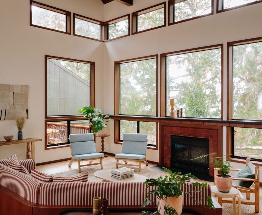
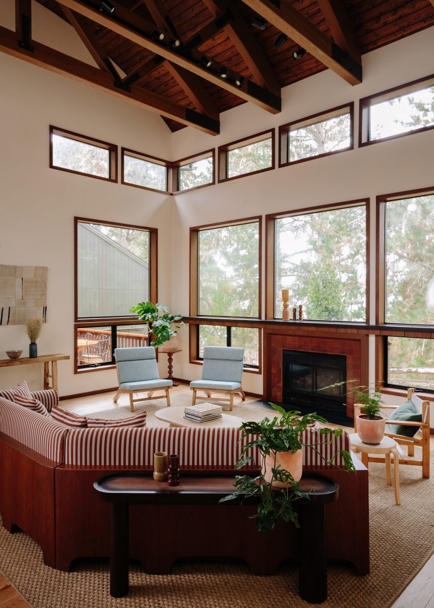
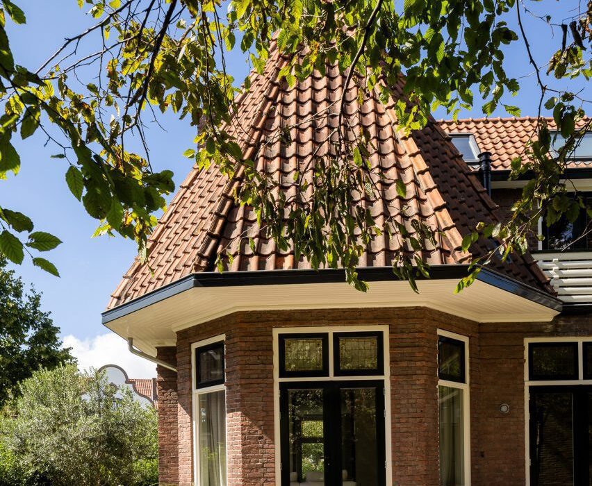
Interiors studio Barde vanVoltt has renovated this early 1900s house in the Dutch city of Haarlem to forge a strong connection between the building’s past and present, grounding the space with warm woods and tactile textures.

The owners – a young family of four – wanted a home that would stand the test of time while telling Dutch practice Barde vanVoltt to “surprise us”.

Exterior of Dutch home by Barde vanVolttExterior of Dutch home by Barde vanVoltt
Barde vanVoltt had overhauled an early 20th-century house in Haarlem

In answer, the studio worked to create an interior that fuses the past and the present.

“Stepping into this house is a journey through time, a reminder that architecture is a dialogue between generations,” the studio told Dezeen.

“Meticulously preserving its historical charm, the house’s design seamlessly integrates contemporary features, creating a harmonious blend that transcends eras.”

Extension of Haarlem House Extension of Haarlem House
The studio added an extension to the rear of the home

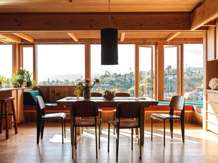
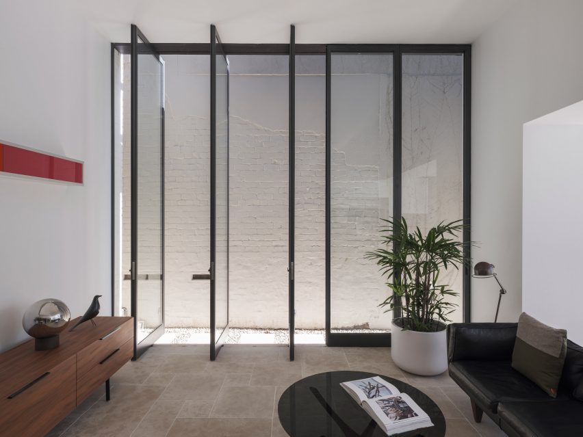
To address the narrow footprint of the house – a typically Dutch feature – internal walls were either removed, widened or replaced with glass panel doors.

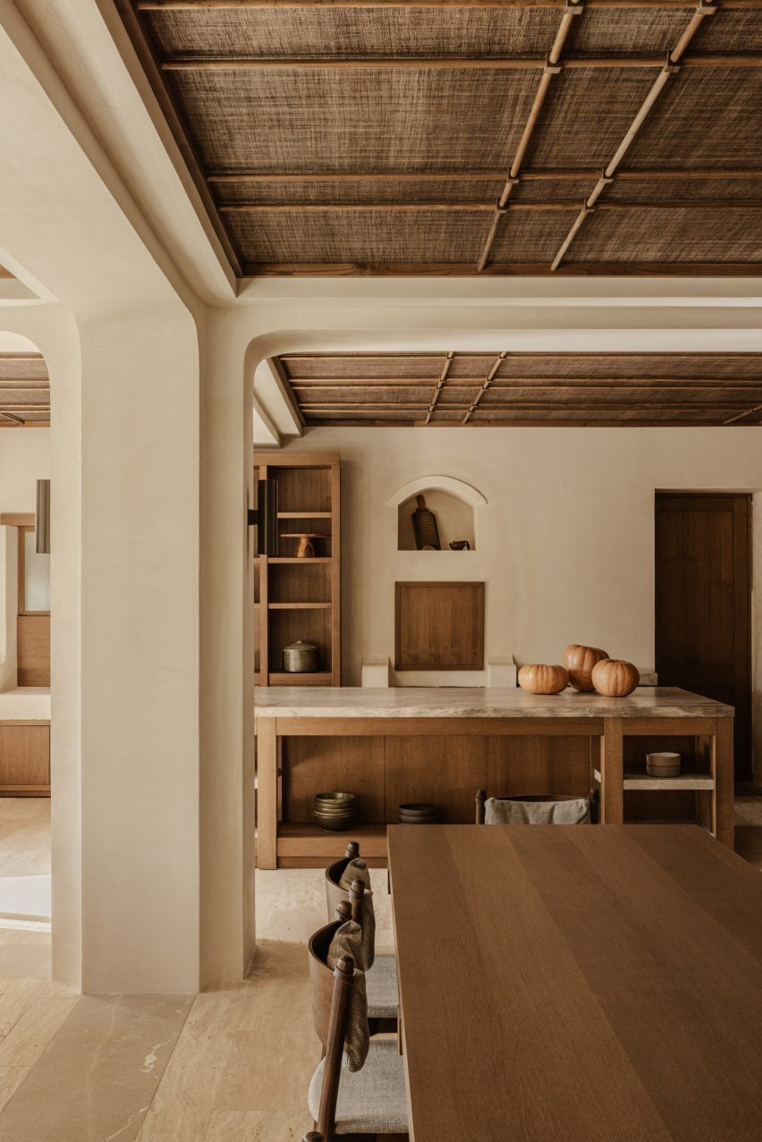
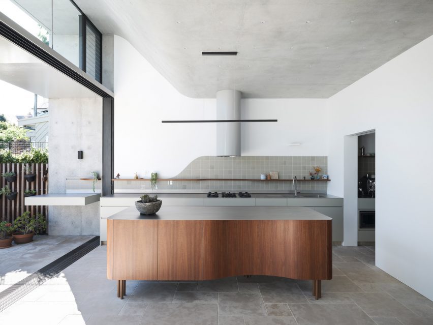
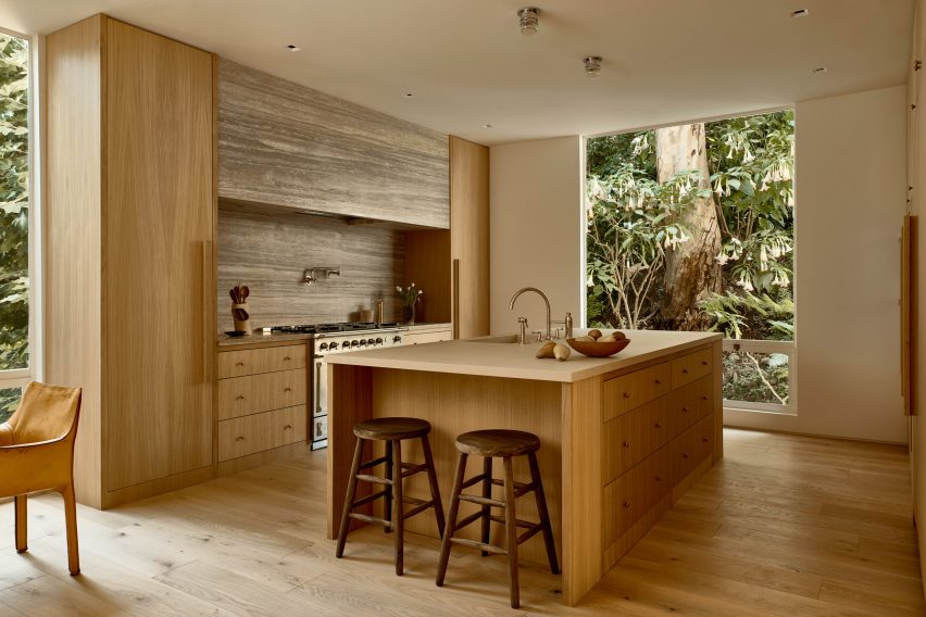
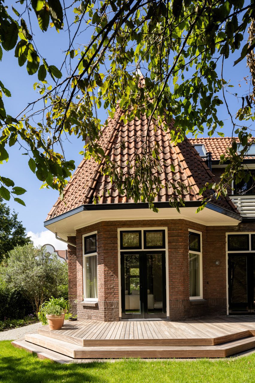
The back of the property was transformed with an extension and concertina glass doors to maximize the sense of light and space.

Kitchen of Dutch home by Barde vanVolttKitchen of Dutch home by Barde vanVoltt
The extension houses the kitchen and dining area

“With the extension on the ground floor, we wanted to create contrast with the original architecture,” said Barde vanVoltt. “The understated square modern architecture, due to its shape and angular position, blends perfectly with the past.”

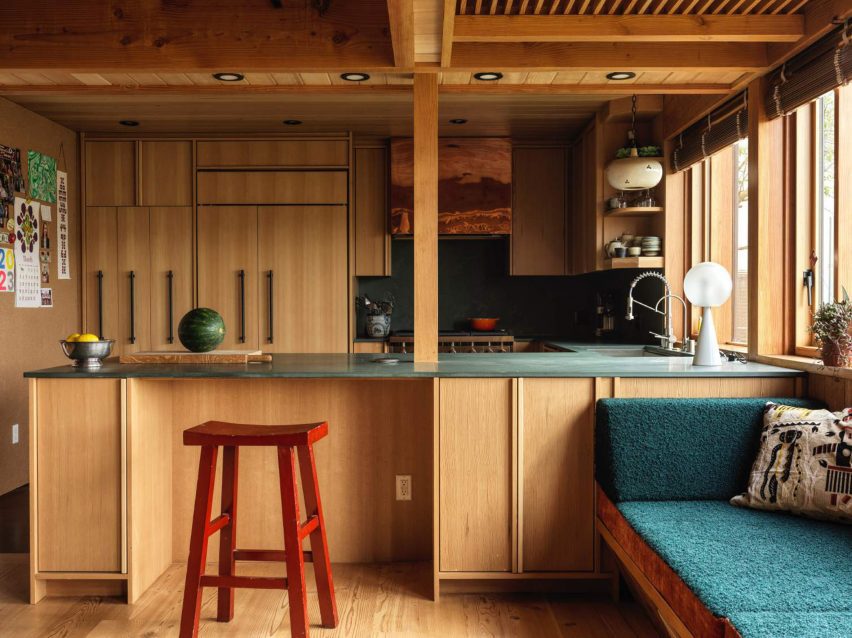
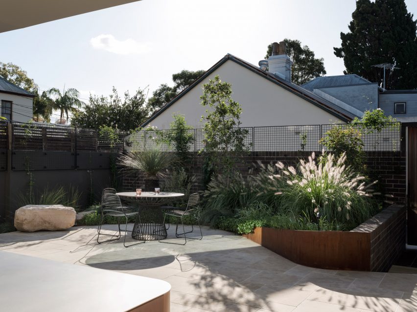
“With the historic facade at the front, we took advantage of the space at the rear, extending the kitchen and living areas into the garden.”

Living room of Haarlem HouseLiving room of Haarlem House
A vintage sandstone table centres the living room

The practice carefully aligned the new design elements with shapes drawn from the architectural features of the house, with the new full-height door openings echoing the proportions of the living room’s original windows.

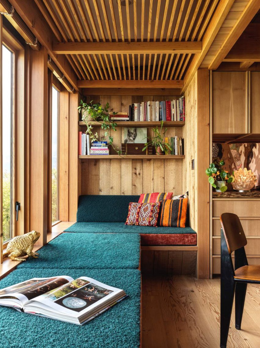
In the attic, a guest room doubles as a playroom. Barde vanVoltt infused this once-dark space with natural light via a skylight, “allowing guests to sleep under the stars”.

Hallway with stained glass windows inside Haarlem HouseHallway with stained glass windows inside Haarlem House
Barde vanVoltt retained Haarlem House’s original stained glass windows

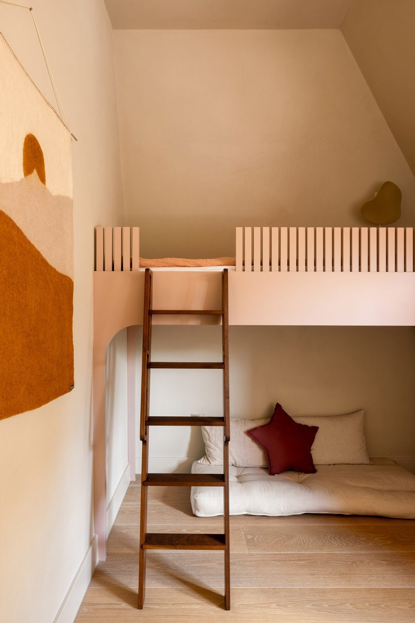
“Dutch houses are noted for their sloping attic roof lines,” the studio said. “For the children’s bedrooms, we followed this structural line and created custom bunk beds that combine sleep, storage, and space for play.”

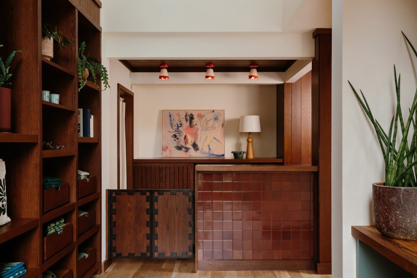
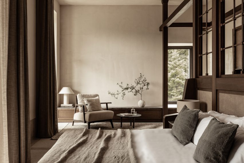
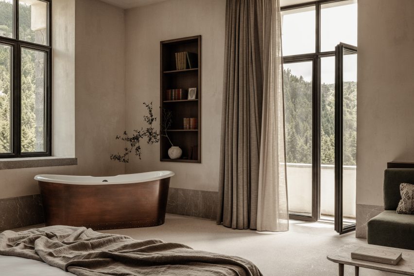
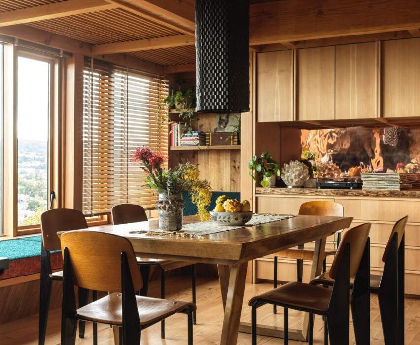
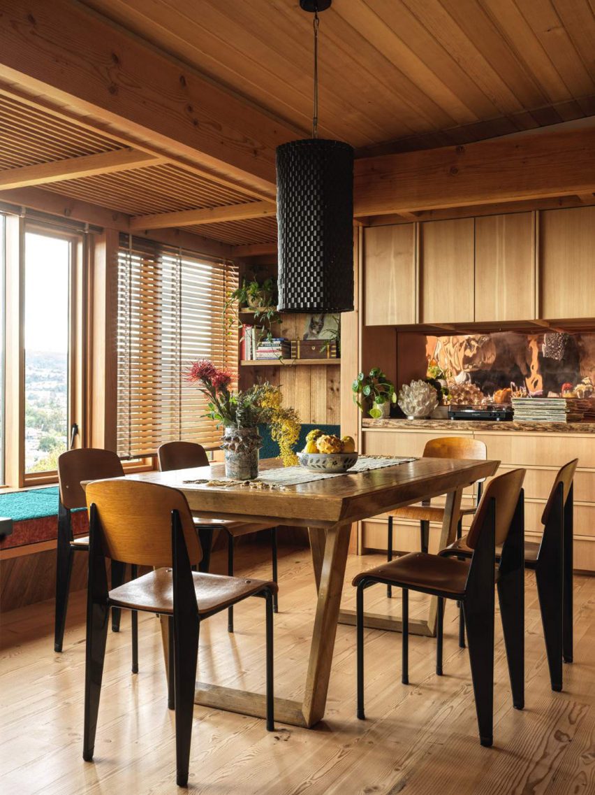
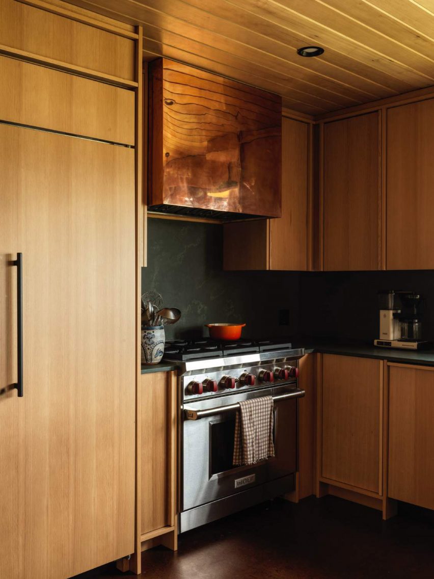
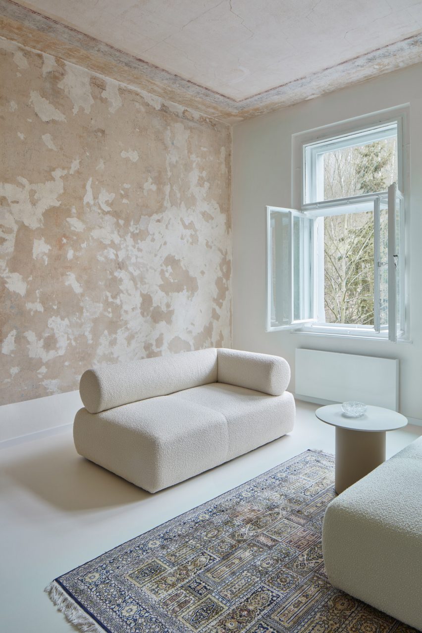
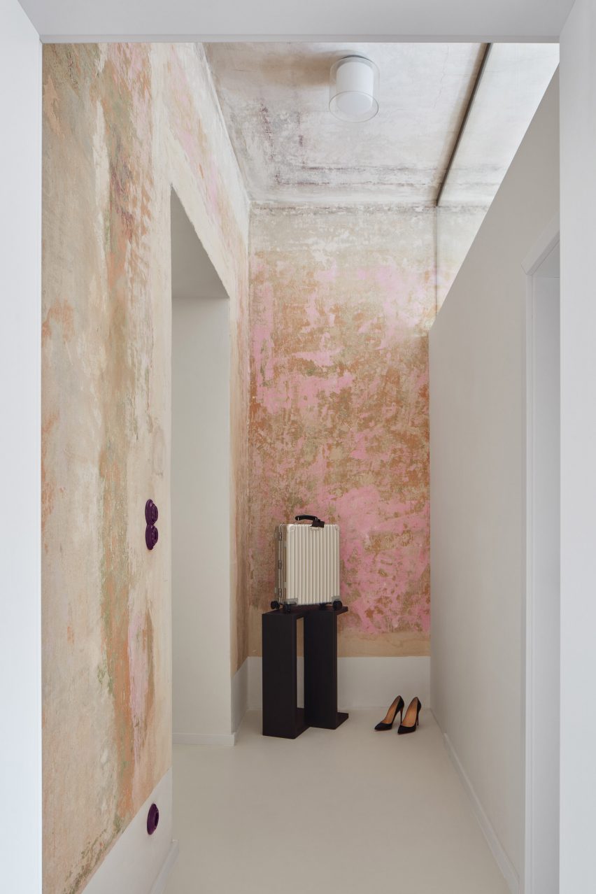
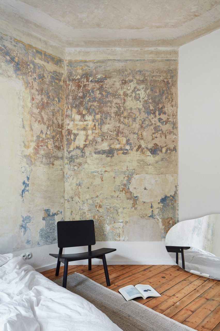
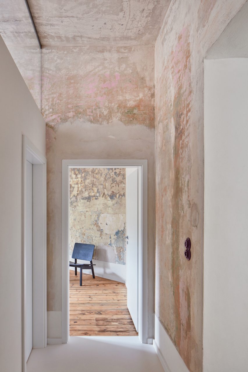
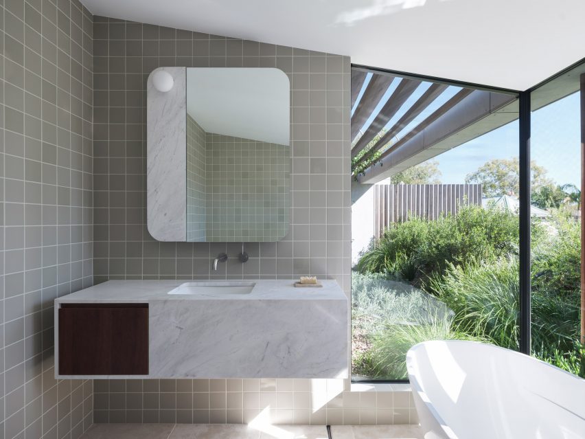
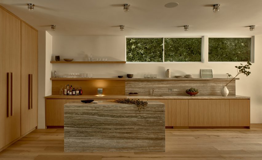
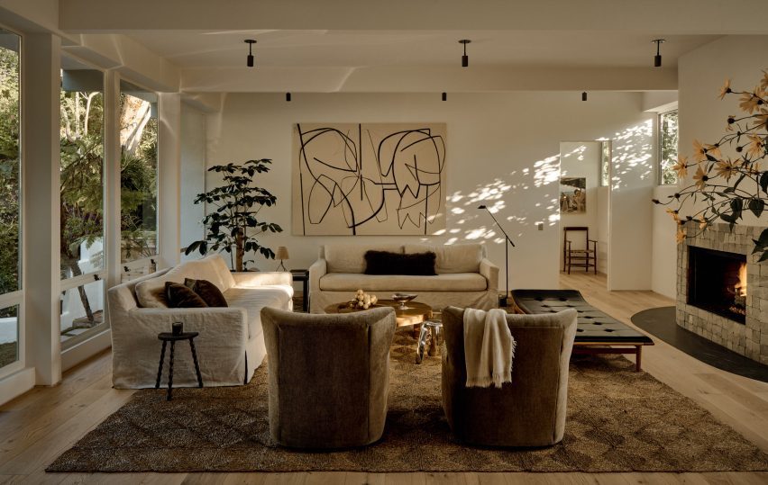
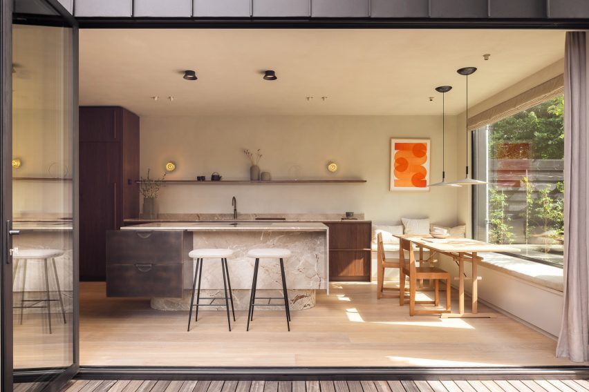
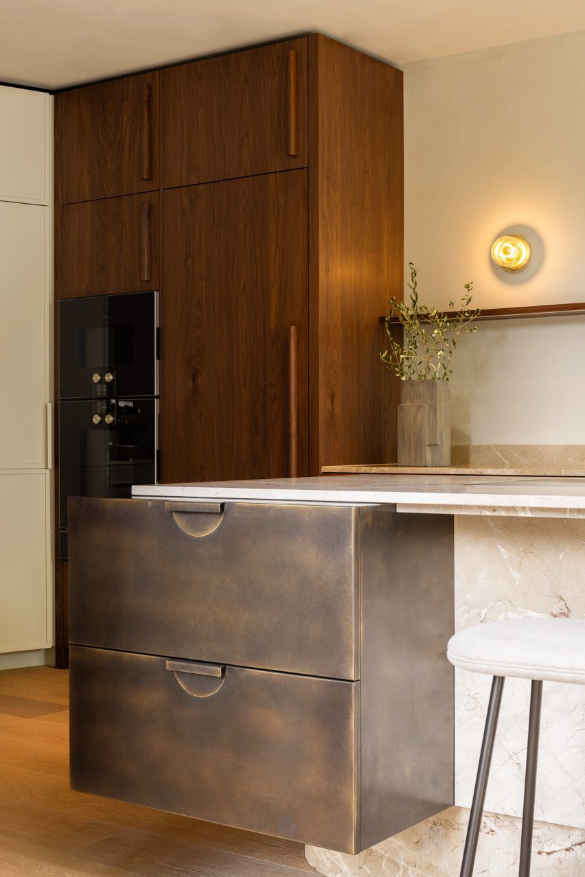
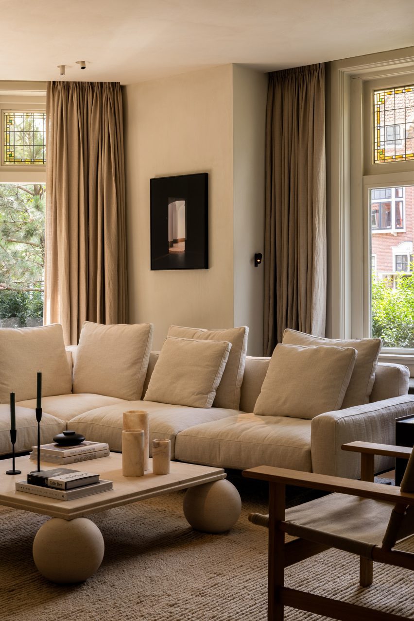
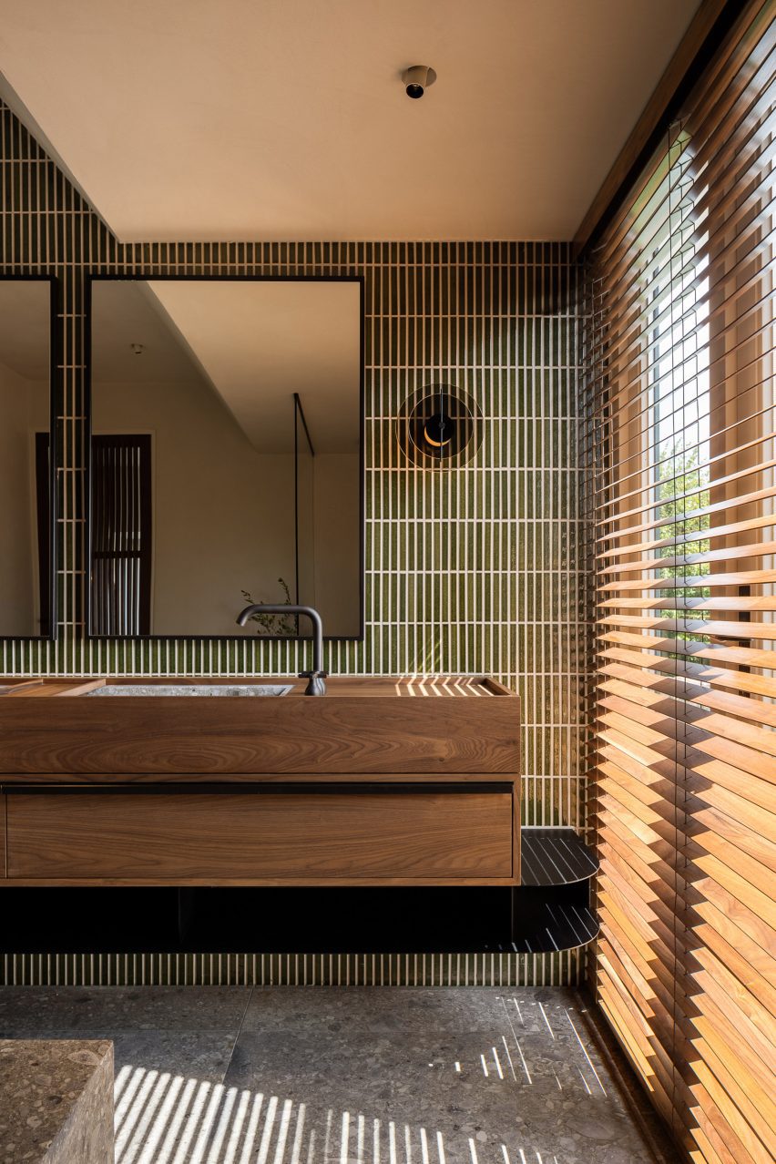
The material palette includes a range of mid- and dark-toned timbers that bring a sense of warmth and tactility to the home.

These are complemented by natural materials including stone and linen.

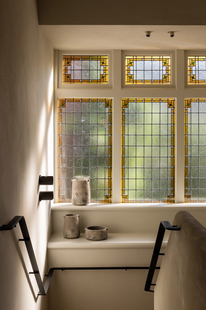
“Our colour scheme always consists of earthy colours like moss green, a faded terracotta, grey concrete and off-whites,” the studio said. “For this residence, we brought them in line with the original colours from the existing tiles and stained glass.”

Children's bedroom inside Dutch home by Barde vanVolttChildren's bedroom inside Dutch home by Barde vanVoltt
Custom bunk beds feature in the children’s bedrooms

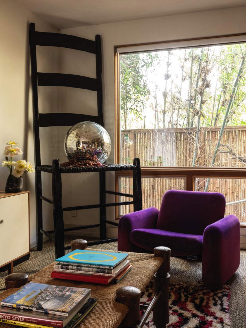
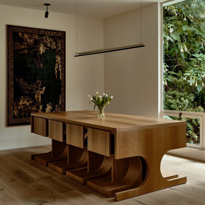
The furniture edit features Barde vanVoltt’s favoured mix of statement pieces alongside handmade and bespoke elements.

Selected pieces reflect the architectural style of the building such as the Lot table by Tecta in the study, as well as Gerrit Thomas Rietveld’s 1934 Zig Zag chair and his Steltman chair from 1963, which was the last chair ever created by the Dutch designer.

The playroom, dining area and bedroom all have specially-made seating upholstered in Kvadrat fabrics, while the bedrooms and study feature bespoke beds and closets.

Bathroom inside Dutch home by Barde vanVolttBathroom inside Dutch home by Barde vanVoltt
Wooden blinds mirror the linear pattern of the bathroom tiles

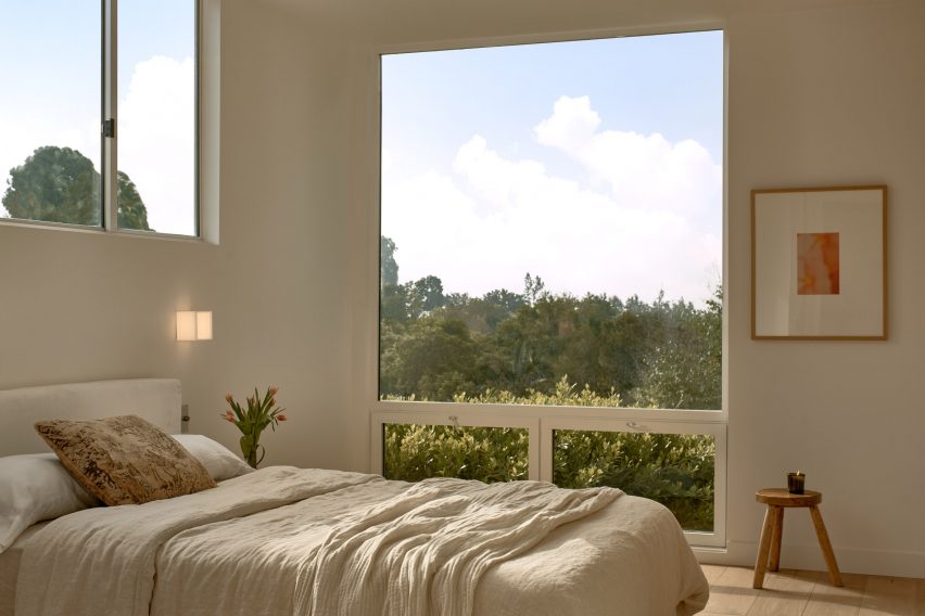
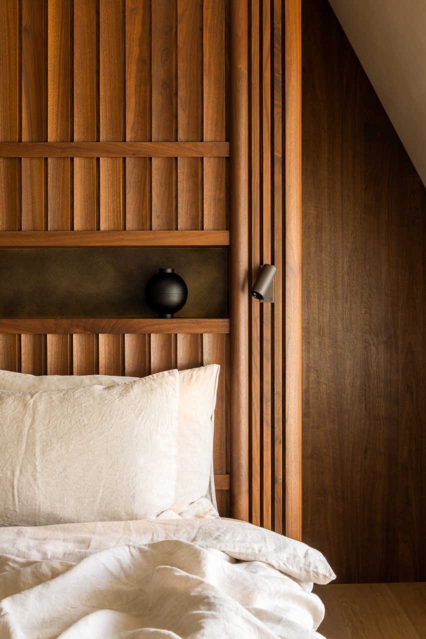
“We love creating interiors full of handmade, bespoke furniture pieces with refined details,” said Barde vanVoltt. “The headboard of the master bedroom is an art piece in itself. The walnut slats are slightly curved and give it a very sophisticated look.”

The square coffee table in the living room – made from a single piece of sandstone – is a vintage piece from Atelier Uma.

Bedroom inside Haarlem HouseBedroom inside Haarlem House
Barde vanVoltt created a custom headboard in the primary bedroom

For the lighting scheme, Barde vanVoltt set out to create the right balance between functional and decorative lighting, collaborating with lighting experts PSLab to create a “warm and cosy atmosphere.”

Other Dutch homes that have recently been featured on Dezeen include a house with a hexagonal footprint in Amsterdam and a Hobbit-style residence that is partially buried underground.

The photography is by Thomas de Bruyne.

Reference

Double-height lounge space with large windows and a red striped sofa
CategoriesInterior Design

Home Studios uses local materials to renovate Northern California hotel

Double-height lounge space with large windows and a red striped sofa

Brooklyn-based Home Studios has turned a conference centre in Northern California back into a luxury hotel, as originally intended by the property’s founder: the inventor of the radio.

The Lodge at Marconi sits on a 62-acre site next to Tomales Bay, within the picturesque Marconi State Historic Park – a 1.5-hour drive up Highway Route 1 from San Francisco.

Double-height lounge space with large windows and a red striped sofaDouble-height lounge space with large windows and a red striped sofa
Home Studios created a variety of lounge areas across Lodge at Marconi to provide an informal atmosphere

Designed for Nashville-based company Oliver Hospitality, the hotel occupies a historic property that was first built by Guglielmo Marconi, an Italian physicist who invented the radio in 1896.

“Home Studios found inspiration in the property’s storied history – particularly in the pioneering spirit of Guglielmo Marconi, who worked with a New York-based engineering company to build the property’s initial building, a luxury hotel, in 1914,” said the design team, led by Oliver Haslegrave.

Hotel reception counter clad in oxblood-coloured tilesHotel reception counter clad in oxblood-coloured tiles
The reception counter is clad in oxblood-coloured tiles from Heath Ceramics

It took 17 months to overhaul the complex of blackened-wood buildings, which are topped with mono-pitched roofs of different heights and opposing directions.

The architecture is similar to that of The Sea Ranch Lodge further up the coast, which reopened in 2022 after its own extensive renovation.

Dining room featuring brick flooring, blue-green tilework and eclectic contemporary furnitureDining room featuring brick flooring, blue-green tilework and eclectic contemporary furniture
The Redwood Dining Hall features brick flooring, blue-green tilework and eclectic contemporary furniture

Home Studios looked to the iconic site – famed for its modernist style and sensitive land planning – for cues when developing the Lodge at Marconi’s 45 guest rooms and suites, which occupy freestanding buildings across the wooded site.

“Borrowing design language from Sea Ranch’s ‘living lightly on the land’ credo, the rooms blend into the environment and boast a tranquil and peaceful atmosphere,” the team said.

A series of coloured wooden cubes mounted on a wall above banquette seating and dining tablesA series of coloured wooden cubes mounted on a wall above banquette seating and dining tables
Artworks in the restaurant, including a series of coloured wooden cubes, were created in collaboration with Lukas Geronimas Giniotis

The hotel complex is made up of eight indoor and outdoor spaces, laid out “like a summer camp” to accommodate different activities in each area.

In the reception block, guests arrive to a series of lounges and other communal spaces that create a more informal setting than a traditional hotel lobby.

Bright guest suite with a double bed, day bed and blue lounge chairBright guest suite with a double bed, day bed and blue lounge chair
The bedrooms are bright and airy, with materials and colours that subtly reflect the hotel’s natural surroundings

A check-in counter is fronted with oxblood-coloured tiles by Heath Ceramics, which was founded in nearby Sausalito.

More of the company’s tiles, this time in blue-green hues, line the lower walls of the restaurant known as the Redwood Dining Hall.

Shower with colourful patchwork of tiles from the 1960sShower with colourful patchwork of tiles from the 1960s
Three of the guest room bathrooms feature original tiles that date back to the 1960s

Red bricks are laid in a basketweave pattern across the floor, contrasting with the bright blue bases of the custom dining tables, while warm cedar panels and beams cover the ceiling.

A mural comprising four-panel linen screens and a series of wood cubes mounted on a wall was made in collaboration with California-based artist Lukas Geronimas Giniotis.

The guest rooms are bright and airy, with the colours of the natural surroundings subtly reflected in the furnishings.

Some have cosy loft spaces, while larger suites feature a dedicated workspace and sitting area.

Buildings clad in blackened wood and topped with monopitched roofsBuildings clad in blackened wood and topped with monopitched roofs
The accommodations are split across several buildings clad in blackened wood and topped with monopitched roofs

“Northern California’s rugged environment served as a design influence, and is reflected in the natural woods and earth-tone textiles that adorn each room and weave together a cohesive connection throughout the property,” Home Studios said.

“Three guest room bathrooms feature original tile dated to the 1960s when the hotel served as a rehabilitation facility known as Synanon.”

Wooden chairs surrounding a fire pit with blackened wood buildings in the backgroundWooden chairs surrounding a fire pit with blackened wood buildings in the background
The property includes multiple outdoor areas for gatherings and events

Across the property, the indoor spaces are afforded scenic views of the forest and the water through large windows.

A variety of gathering and event spaces are available to guests both inside and out, including wooden chairs positioned around fire pits among the landscape designed by Bay Area firm Dune Hai.

View through the trees to Tomales Bay at sunsetView through the trees to Tomales Bay at sunset
Lodge at Marconi sits atop a hill overlooking Tomales Bay in Northern California

This is Home Studios’ third hotel project, following the Mediterranean-influenced Alsace hotel in Los Angeles and the boutique Daunt’s Albatross motel in Montauk.

The firm’s other recent projects include a revamped bar and restaurant on Nantucket, an Italian eatery close to Harvard University and a townhouse renovation in Fort Greene, Brooklyn.

The photography is by Brian W Ferry.

Reference

Interior of brutalist Cantabrian Maritime Museum restaurant in Spain by Zooco Estudio
CategoriesInterior Design

Zooco Estudio unveils Cantabrian Maritime Museum restaurant

Interior of brutalist Cantabrian Maritime Museum restaurant in Spain by Zooco Estudio

Madrid-based Zooco Estudio has created a striking restaurant within the Cantabrian Maritime Museum in Santander, Spain, that celebrates the building’s brutalist architecture.

The restaurant is set within a dramatic vault of concrete paraboloids that were unearthed during the renovation, while a slatted timber ceiling pays homage to the area’s shipbuilding legacy.

Interior of brutalist Cantabrian Maritime Museum restaurant in Spain by Zooco EstudioInterior of brutalist Cantabrian Maritime Museum restaurant in Spain by Zooco Estudio
Zooco Estudio added a restaurant to the second floor of the Cantabrian Maritime Museum

Overlooking the tranquil waters of Santander Bay, the restaurant is located on the second floor of the landmark Cantabrian Maritime Museum, which was designed in the mid-1970s by architects Vicente Roig Forner and Ángel Hernández Morales.

The paraboloids were an original fixture of the structure and supported the roof of what was once the museum’s patio.

Interior of brutalist Cantabrian Maritime Museum restaurant in Spain by Zooco EstudioInterior of brutalist Cantabrian Maritime Museum restaurant in Spain by Zooco Estudio
Oak details were designed to contrast the restaurant’s concrete arches

The studio focused on restoring the historic fabric of the space and reviving the paraboloids, which had been concealed for around 20 years, as “a vestige of the past”.

“In 2003, the building was renovated and as part of this intervention, the paraboloids were covered with a new roof and the space between them and the perimeter of the building was closed with glass, generating a covered space where there was previously a terrace,” Zooco Estudio co-founder Javier Guzmán told Dezeen.

“We wanted the concrete paraboloids to be the absolute protagonists of the space and by removing the paint and the coating, the paraboloids are visible again and regain their full prominence.”

Interior of brutalist restaurant in Spain by Zooco EstudioInterior of brutalist restaurant in Spain by Zooco Estudio
The renovation exposed the raw concrete surface of the paraboloids

The previous renovation also altered the dimensions of the space and reconfigured the volume as a square.

To promote symmetry, four additional concrete triangles were added to balance out the original paraboloids in the brutalist restaurant.

Timber ceiling panels and concrete paraboloids inside a brutalist restaurantTimber ceiling panels and concrete paraboloids inside a brutalist restaurant
Slatted wooden ceiling panels bridge the gaps between the arches

Overhead, a false ceiling of slatted timber panels frames the concrete arches.

The studio designed theses triangular boards to reference the arrangement of timber across the hull of a boat, a nod to the museum and the area’s nautical past.

The panels also serve the purpose of concealing the restaurant’s mechanical systems.

“The wooden slats bring warmth and friendliness to the space while allowing us to solve all the technical needs for air conditioning, heating and lighting, leaving them hidden,” Guzmán said.

“In this way, we ensure that all these elements do not interfere with the dialogue of concrete and wood, which are presented as continuous and clean elements.”

Dining tables overlooking views of the Santander bayDining tables overlooking views of the Santander bay
Walls of floor-to-ceiling glazing offer views across the bay

The interior layout was largely dictated by the low arches of the elliptic paraboloids that dominate the brutalist restaurant.

“The geometry of the existing structure conditions the space, because its height in its lower part is impractical, so a large bench is arranged around the entire contour that allows us to take advantage of that space and organise the distribution of the rest of the floor plan,” added Guzmán.

Concrete paraboloid and dining tables inside brutalist restaurant in Spain by Zooco EstudioConcrete paraboloid and dining tables inside brutalist restaurant in Spain by Zooco Estudio
Grey porcelain floors mirror the concrete paraboloids

Like the ceiling panels, the interior finishes and furnishings allude to the maritime history that the building commemorates.

“The use of wood and steel for all the furniture is reminiscent of the materials used in shipbuilding – the furniture has slight curvatures that are reminiscent of the aerodynamic shapes of boats,” explained Guzmán.

“Likewise, the lamps are inspired by the masts for ship sails.”

Dining tables at Cantabrian Maritime Museum restaurantDining tables at Cantabrian Maritime Museum restaurant
Zooco Estudio also designed the restaurant’s curved timber furniture

Another key change was the replacement of the perimeter glass wall.

The inclined glazing was swapped for vertical glass, a decision that reclaimed external space for the patio, which stretches the length of the restaurant and overlooks the harbour below.

“When we are inside, the feeling is the same as when we are inside a boat, there is only water around, and that is why we used clean glass from floor to ceiling, generating a perimeter terrace as happens on boats,” said Guzmán.

Terrace at Cantabrian Maritime MuseumTerrace at Cantabrian Maritime Museum
The terrace features green curvilinear outdoor furniture

Other projects by Zooco Estudio include a renovated house in Madrid and a co-working space with a kids’ play area in California.

The photography is by David Zarzoso.


Project credits:

Architect: Zooco Estudio
Construction:
Rotedama Constructora SL
Lighting: Zooco Estudio
Furniture: Zooco Estudio

Reference

Stone facade of Manna hotel by K-Studio and Mongon
CategoriesInterior Design

Historic sanatorium in Greek mountain forest transformed into Manna hotel

Stone facade of Manna hotel by K-Studio and Mongon

Greek architecture offices K-Studio and Monogon have converted the abandoned Manna Sanatorium in Arcadia, southern Greece, into a luxury forest hotel.

Originally built in the 1920s to give tuberculosis patients access to the healing power of nature, the historic structure is now a five-star wellness retreat.

Manna offers 32 rooms fitted out with natural materials and neutral tones, plus gym and spa facilities and a restaurant focused on local produce.

Stone facade of Manna hotel by K-Studio and MongonStone facade of Manna hotel by K-Studio and Mongon
Manna hotel is housed in a former sanatorium for tuberculosis patients

The building sits within a fir forest on Mount Mainalo, the tallest peak in the mountainous region.

The design vision set out by Athens-based K-Studio was to amplify the sense of sanctuary offered by the remote location and enhance the feeling of connection to nature.

Manna owner Stratis Batayas, a Greek entrepreneur who had spent his childhood summers in the area, wanted to create a year-round destination that stayed true to the building’s history.

Manna hotel in Arcadia by K-Studio and MongonManna hotel in Arcadia by K-Studio and Mongon
The building is set in a fir forest in Arcadia, a mountainous region of Greece

“The client’s ambition was to reinterpret the concept of a sanctuary in the mountains with contemporary terms,” reads K-Studio’s design statement.

“The hotel would have to be a place for isolation, as well as community-making and participation in the primary activities of everyday living.”

Lounge at Manna hotelLounge at Manna hotel
Design details include columns with curved corner reveals and ornate gridded ceilings

The renovation was overseen in collaboration with Athens-based Monogon and involved significant building work, including the reconstruction of a derelict rear wing and the installation of a new roof.

When the sanatorium closed – made obsolete following the introduction of penicillin in 1938 – the building had been emptied to prevent looting. Stone window sills were stripped out and relocated, while the original roof was removed and repurposed on a hospital in nearby Tripoli.

Concrete was used to replace the old sills, while the new timber roof was installed over rendered brickwork.

Bar at Manna hotelBar at Manna hotel
The bar features neatly crafted joinery

A reconfigured layout provides a new entrance on the side of the building.

This leads through into a series of elegant reception and lounge spaces where details include columns with curved corner reveals, ornate gridded ceilings and a herringbone-patterned fireplace.

Manna’s bar can also be found here, featuring neatly crafted joinery. Elsewhere, the restaurant run by chef Athinagoras Kostakos has a more casual feel thanks to an open kitchen.

Art is present throughout, with works by Greek artist Nikos Kanoglou, painter Joanna Burtenshaw and ceramicist Diane Alexandre.

Attic bedroom at MannaAttic bedroom at Manna
Attic bedrooms feature dormer balconies

Bedrooms are located on the upper floors of the main building, including a new attic level, and on all levels of the rebuilt northern wing.

Attic rooms offer the most modern feel, extending out to balconies set within large gable-ended dormers.

Bedroom furnitureBedroom furniture
Interiors feature natural materials and neutral tones

The materials palette combines brushed timber with earth-toned textiles. Standout features include the elaborate privacy screens that form a backdrop to the beds.

Terrazzo flooring is inlaid with marble to define different zones, matching the stone used for wash basins. Room numbers are carved into the floor surfaces in front of each room entrance.

“Local craftsmen were involved in all construction phases, as they bear the knowhow of stoneworks, joinery and even the characteristic engraved grouting of the exterior stonewalls,” said K-Studio.

Bath in bedroom at MannaBath in bedroom at Manna
Terrazzo flooring is inlaid with marble to define zones

Manna opened its doors in the summer of 2023 and is represented by Design Hotels, a booking company that specialises in design-led retreats.

K-Studio co-founder Dimitris Karampataki presented the project at the 2023 edition of The Lobby, an annual hospitality conference in Copenhagen.

Manna restaurantManna restaurant
Manna’s restaurant features an open kitchen

He said the design for Manna “embraces the wear and tear, embraces the natural patina”.

“When we first arrived we saw something, which took about a century to make,” he said. “We didn’t want to clean it too much, to be selective of its heritage. It was more important for us to embrace the whole story.”

Balcony viewBalcony view
The design aims to reconnect people with nature

Other destination hotels to open recently include the Six Senses Rome, designed by Patricia Urquiola, and the Sanya Wellness Retreat in Hainan, China, designed by Neri&Hu.

The photography is by Ana Santl.


Project credits

Architectural concept: K-Studio
Technical design: Monogon, CS Architecture
On-site supervison: Monogon, K-Studio
FF&E: K-Studio, Monogon
Art curation: Joanna Burtenshaw
Branding design: MNP
Surveyor: Ioannis Charbilas
Structural engineer: Niki Psilla
Mechanical engineer: Gerasimos Vasilatos/Alexandra Zachopoulou & Partners
Lighting design: Eleftheria Deko and Associates Lighting Design
Sound consultant: Alpha Acoustiki
Kitchen consultant: Xenex
Landscape architects: H Pangalou & Associates
Main contractor: CT Construction


Reference

Wood-lined room with dining table and six chairs
CategoriesInterior Design

Lovers Unite revives interiors of mid-century Silver Lake home

Wood-lined room with dining table and six chairs

California design studio Lovers Unite has reinvigorated a 1950s home with sweeping views of the Los Angeles hills, turning an unused balcony into an extension of the indoor social space.

The wooden dwelling in LA’s Silver Lake neighbourhood belongs to production designer James Chinlund and artist Clare Crespo.

Wood-lined room with dining table and six chairsWood-lined room with dining table and six chairs
Lovers Unite renovated the home for a creative couple in Los Angeles

A “previously a boring, nondescript mid-century house”, according to Lovers Unite, the property required some imagination to bring its interiors up to par with its setting.

Therefore, the studio “introduced a few carefully plotted architectural interventions and material shifts to completely reimagine the interior of the home and take full advantage of its prime site”.

Dining room with large windows that have a view of hills in the distanceDining room with large windows that have a view of hills in the distance
The house has expansive views over the city’s hills

The most impactful of these interventions was to bring an underutilised balcony at the back of the house into the envelope, extending the open-plan living and dining area by several feet.

Beneath the large windows that were installed to fill the gap, Lovers Unite placed built-in seating with teal-upholstered cushions for relaxing and enjoying the panoramic vista.

View of wood-lined kitchen with a peninsula in the foregroundView of wood-lined kitchen with a peninsula in the foreground
Plenty of wood was used throughout the home, particularly in the kitchen

“With a large window wall and generous built-in banquette, the room finally celebrates the expansive views that had always been there,” the studio said.

In the kitchen, dark green soapstone used for counters and the backsplash contrasts with the honey-toned cabinetry, and a shiny copper range hood matches a panel installed at the back of a bar area on the opposite side of the room.

Honey-toned wood kitchen with soapstone surfaces and a copper range hoodHoney-toned wood kitchen with soapstone surfaces and a copper range hood
The honey-toned wood contrasts with soapstone surfaces and a copper range hood

Elsewhere, colourful furnishings, collectible design pieces and bold artworks stand out against the predominantly wood interiors.

A timber-lined lounge area features the classic modular Togo sofa system by Michael Ducaroy, which is wrapped in yellow corduroy fabric.

Meanwhile, in the den, a purple armchair is positioned beside a giant chair that Chinlund used as a prop for a shoot by Italian fashion outfit Roberto Cavalli.

Wood slats were employed to partially screen the staircase opening on the upper level, next to a central fireplace with a raised hearth.

Teal-upholstered window seat with a reading nook at the endTeal-upholstered window seat with a reading nook at the end
As part of the renovation, an unused balcony was incorporated into the social space and a long window seat was installed in its place

Other decor items like vintage rugs, embroidered cushions and plenty of art and design books add even more character to the spaces.

“Ultimately, the mood of the home reflects the spirit and talents of the estimable homeowner,” said Lovers Unite, noting that Chinlund has worked as a production designer for the Avengers movie franchise.

Den with a purple armchair and an oversized chair with a disco ball on its seatDen with a purple armchair and an oversized chair with a disco ball on its seat
Colourful furniture and set props are scattered through the different rooms

Silver Lake is home to a variety of architectural gems, many built on dramatically sloping sites, including residences designed by notable mid-century architects like Richard Neutra and Rudolph Schindler.

Led by Karen Spector and Alan Koch, Lovers Unite is based close to the neighbourhood, and has previously wrapped a bar and restaurant in Pasadena with expressive drapery.

The photography is by Chris Mottalini.

Reference

Living room with patchy brown and beige paintwork
CategoriesInterior Design

Plus One Architects uncovers paintwork of century-old Czech apartment

Living room with patchy brown and beige paintwork

Prague studio Plus One Architects has restored the “original splendour” of this 1902 apartment in Karlovy Vary, Czech Republic, by reinstating some of its original features.

Located in a turn-of-the-century apartment block, the two-bedroom flat was renovated by Plus One Architects, who exposed the original paintwork present on the walls and ceilings.

Living room with patchy brown and beige paintworkLiving room with patchy brown and beige paintwork
The Karlovy Vary Apartment features minimal furnishings

The studio also streamlined the circulation inside the apartment by removing doors to open up pathways, as well as undoing dated additions that had been installed over the top of the original walls and floors.

“We think the first renovation was probably done in the late 70s,” architect Kateřina Průchová told Dezeen. “It was full of wooden cladding on the walls, a lot of doors and carpet that covered the original floors.”

Corridor with flaky pink paintworkCorridor with flaky pink paintwork
Transom windows let light flood through the rooms

The revamped interior has a bright, airy atmosphere, as natural sunlight comes in through the large unobstructed windows and continues deeper into the rooms thanks to the addition of transom windows on some of the interior walls.

Remnants of colourful mottled paintwork appear on the walls and ceilings alongside brown and beige sections of plaster.

Chair in front of mottled painted wallChair in front of mottled painted wall
Mottled blue and yellow paintwork decorates the primary bedroom

Neutral-coloured paint and plasterwork feature in the kitchen and living room, where Plus One Architects retained the apartment’s original masonry heater clad in glossy brown tiles.

Painted details are also apparent on the ceiling, with concentric bands of red, blue and yellow delineating the perimeter of the room.

Doors were removed to improve the flow between spaces

Pink paint appears in the corridor and smaller bedroom while blue paintwork can be seen in the primary bedroom, complementing the restored wooden floorboards.

In the bathroom, white tiling lines the walls, interspersed with iridescent tiles and sections of exposed paintwork.

The rooms are sparingly furnished, allowing the paintwork to be the interior’s focal point.

Plus One Architects brought in furniture with minimalist forms by Czech design studio Janský & Dunděra alongside decorative pieces from local design brand Todus.

Photograph showing sink in bathroom with round mirror abovePhotograph showing sink in bathroom with round mirror above
The bathroom is fitted with white flooring, tiling and fixtures

“I hope we managed to return the apartment to the original splendour of the period, in which the house was built,” said Průchová.

“You can feel how the building looks from the outside – it is an old house in the historic part of a spa town.”

Round dining table and chairs in front of open window in narrow roomRound dining table and chairs in front of open window in narrow room
The kitchen and dining room overlook neighbouring rooftops

Kateřina Průchová and Petra Ciencialová founded Plus One Architects in 2019. The studio is based in Prague and works on projects across the Czech Republic.

Other apartment interiors that have recently been featured on Dezeen include a home in Milan centred around a monolithic green marble partition wall and a pastel-decorated apartment in Kraków.

The photography is by Radek Úlehla.


Reference

Apartment with green bedroom, blue kitchen and pink storage
CategoriesInterior Design

Ideas of Order selects bright colours for New York apartment renovation

Apartment with green bedroom, blue kitchen and pink storage

Bright hues define the different interventions that New York architecture studio Ideas of Order has made in this apartment at the northern tip of Manhattan.

The 1,000-square-foot primary residence in Hudson Heights was partially renovated for a couple, who had been living in the space for several years before deciding to invest in making it better suited to their needs, rather than buying another apartment.

Apartment with green bedroom, blue kitchen and pink storageApartment with green bedroom, blue kitchen and pink storage
One side of this Manhattan apartment was overhauled by Ideas of Order to make it function better for its owners

“Their sons had been sharing a room, but were beginning to need their own spaces,” Ideas of Order told Dezeen.

“They also wanted a space that could be designed for flexibility for when their children left for college.”

Bedroom with lime green built-ins housing a bed, a desk and storageBedroom with lime green built-ins housing a bed, a desk and storage
In the newly created bedroom, a lime green built-in houses a bed, a desk and storage

The kitchen also needed updating, to make it more suitable for entertaining, and more efficient storage space was required in the entryway.

So the architects reworked one side of the open living area, adding a bedroom on one side of the kitchen and refreshing the other areas.

Blue and purple kitchen cabinets behind a concrete counterBlue and purple kitchen cabinets behind a concrete counter
A new wall divides the bedroom from the kitchen

The husband is French, and the couple spent several years living together in France.

During this period, they both became enamoured by the midcentury architecture and design in the country and wanted to apply this style to their own home.

Raspberry and periwinkle cabinets surrounding a cooking area, which also features aluminium panelsRaspberry and periwinkle cabinets surrounding a cooking area, which also features aluminium panels
Raspberry and periwinkle cabinets surround the cooking area, which also features aluminium panels

“Inspired by their stories and the history of how colour was used by French midcentury designers like Charlotte Perriand, we suggested a series of polychrome millwork pieces inspired by Perriand’s design language, but updated for a contemporary home,” said Ideas of Order.

The different areas of the home were therefore given their own identities by applying bright hues.

Kitchen with cabinets on two sides and a porthole in the end wallKitchen with cabinets on two sides and a porthole in the end wall
A porthole looks through from the bedroom into the kitchen, which has rubber flooring

Lime green is used in the bedroom across a full wall of built-ins that incorporate a single bed, a workstation and plenty of storage.

Sliding doors with fritted glass panels pull across to enclose the slightly raised room, while a porthole window with double shutters looks through the new wall that separates the kitchen.

Pink and grey built-in storage in an entrywayPink and grey built-in storage in an entryway
Storage in the entryway was made more efficient by new pink and grey built-ins

This adjacent space is denoted by raspberry and periwinkle millwork, which surrounds a small preparation area with an aluminium backsplash and matching panels above.

The same metal also fronts the bar counter between an arched opening to the living area, which is topped with concrete.

Kitchen viewed through an arched openingKitchen viewed through an arched opening
Archways between spaces throughout the apartment have curved corners

Rubber flooring in the kitchen offers a practical alternative to the wood used through the rest of the apartment.

Finally, in the entryway – which is again raised slightly higher than the living area – an L-shaped cabinet system was constructed in a corner beside the door.

Pale pink is applied to the frames, while the doors and drawer fronts are finished in light grey and walnut is used for the trim. Choosing the right hues was a challenge that took many iterations to find the right balance, according to the architects.

“It was important that each pair of colours in the millwork work together, but that the colours also harmonise when viewed as a whole,” they said. “We wanted the colours to be bright, but not overpowering. And we wanted the colour pairings to feel timeless and not too trendy.”

Lime green bedroom to the left and blue kitchen to the rightLime green bedroom to the left and blue kitchen to the right
The architects went through many iterations to find the right balance of colours

Another challenge was the budget, which was modest by New York City standards and required some conscientious spending – particularly on small details that would make a big impact.

“We love the custom pulls for the millwork, the shutters for the circular window, and the rounded end to the partition between bedroom and kitchen, which reflects the rounded openings throughout the apartment,” the architects said.

Wide view of an apartment with wooden floors, white walls and colourful accentsWide view of an apartment with wooden floors, white walls and colourful accents
The couple had been living in the space for several years before deciding to invest in making it better suited to their needs

Ideas of Order was founded by Jacob Esocoff and Henry Ng, who are both Fosters + Partners and WORKac alumni.

Their renovation is one of the most colourful interiors we’ve featured in New York City of late, compared to a neutral show apartment inside the One Wall Street skyscraper and a loft in Dumbo with a subdued palette.

The photography is by Sean Davidson.

Reference

Entryway of Hidden Garden House by Sam Crawford Architects
CategoriesInterior Design

Sam Crawford Architects tops Sydney home renovation with “garden oasis”

Entryway of Hidden Garden House by Sam Crawford Architects

A private roof terrace enclosed by greenery features in Hidden Garden House, a Sydney home reconfigured by Australian studio Sam Crawford Architects.

Situated within a conservation zone, the home has been updated by Sam Crawford Architects to brighten its dark interior and transform it into an urban “sanctuary”.

Entryway of Hidden Garden House by Sam Crawford ArchitectsEntryway of Hidden Garden House by Sam Crawford Architects
An open-tread staircase has been added to the hallway

Alterations to the 198-square-metre home’s interior are first seen in its entrance, where a stair with open treads and a white-steel balustrade replaces a solid timber structure that previously restricted light from a skylight above.

Down from the entry hall is a spacious ground-floor kitchen and dining area, which is illuminated by 4.5-metre-high glass openings that lead out to a landscaped patio. The patio is paved with limestone tiles that extend out from the interior.

Renovated kitchen and dining area in Sydney home by Sam Crawford ArchitectsRenovated kitchen and dining area in Sydney home by Sam Crawford Architects
A curved concrete roof features in the kitchen

“By extending the ground floor finishes through the full-width doors into the rear yard, the garden and high-level green trellises at the rear of the site form the fourth wall to the rear wing,” studio director Sam Crawford told Dezeen.

“They create a sense of enclosure that draws the occupant’s eye up to the expanse of the sky rather than surrounding suburbia.”

Bathroom interior at Hidden Garden House in AustraliaBathroom interior at Hidden Garden House in Australia
Angled timber screens and greenery ensure privacy for the bathroom

A concrete ceiling in Hidden Garden House’s kitchen curves upwards to help draw in the winter sun and provide summer shading, while operable clerestory windows allow natural ventilation.

Above, this curved ceiling forms a sloped roof terrace filled with plants, which is situated off the main bedroom on the upper floor.

An ensuite bathroom, also lined with limestone floor tiles, has expansive openings offering a scenic yet private bathing experience enabled by angled timber screens and the terrace’s greenery.

“The rolling green roof serves as a visual barrier to the surrounding suburb, whilst allowing the occupants to occupy their private garden oasis,” added Crawford.

Living space interior of Hidden Garden House in SydneyLiving space interior of Hidden Garden House in Sydney
White walls and wooden furniture feature throughout the interior

Hidden Garden House’s consistent material palette of bright white walls and wooden furniture ties its living spaces together, while decorative square tiles line both the kitchen and bathrooms.

Curved details, such as the patio’s shape and the kitchen island and splashback, also feature throughout.

Terrace of Hidden Garden House in Sydney designed by Sam Crawford ArchitectsTerrace of Hidden Garden House in Sydney designed by Sam Crawford Architects
The home aims to be an urban “sanctuary”

Other alterations that were made to improve Hidden Garden House’s layout include the relocation of entrances to the ground floor laundry room and bathroom.

Elsewhere, Sam Crawford Architects has also created a restaurant topped with an oversized steel roof and a bridge modelled on the curving shape of eels.

The photography is by Tom Ferguson.


Project credits:

Architect: Sam Crawford Architects
Builder:
Toki
Structural engineer: Cantilever Engineers
Civil & hydraulic engineer: Partridge
Acoustic engineer: Acoustic Logic
Heritage consultant: Damian O’Toole Town Planning
Quantity Surveyor: QS Plus
Landscape design: Gabrielle Pelletier, SCA
Roof garden supplier: Fytogreen Australia

Reference

Kitchen with white oak island and cabinetry, and travertine backsplash
CategoriesInterior Design

Ome Dezin restores 1960s California residence by A Quincy Jones

Kitchen with white oak island and cabinetry, and travertine backsplash

US studio Ome Dezin has renovated a large mid-century home in Brentwood, California, using a tonal colour palette and maximising the lush hillside views.

The six-bedroom 12221 Benmore residence was designed and constructed in 1960 by notable local architects A Quincy Jones and Frederick Emmon.

Kitchen with white oak island and cabinetry, and travertine backsplashKitchen with white oak island and cabinetry, and travertine backsplash
Natural materials and neutral colours were chosen throughout the home to highlight the lush views

When Jesse Rudolph and Joelle Kutner of Ome Dezin came to the project, it had undergone a 1990s remodel that had stripped away its character and style.

The team made it their mission to revive the home’s original charm and connection to the outdoors, bringing in natural tones and materials.

White oak and travertine bar areaWhite oak and travertine bar area
White oak and travertine are recurring materials, as seen in the bar area

“We have always been fans of A Quincy Jones and familiar with his work, which is what prompted us to see the home initially,” the duo told Dezeen.

“This one did not disappoint — it had the typical Quincy atrium-like living space centered across from the exterior which includes a 40-foot (12-metre) waterfall.”

Living room with neutral decorLiving room with neutral decor
The main living spaces all flow together and have expansive views onto the garden

Many of the existing fixtures were retained, including the fixed windows and doors, wherever possible.

To keep the focus on the views from the large windows, the interior was designed with “a more muted, streamlined aesthetic”.

Wood dining table with chairs that tuck neatly underneathWood dining table with chairs that tuck neatly underneath
Custom pieces designed for the home include a dining table and chairs created in collaboration with Ben Willett

“We wanted to ensure the intention of Quincy was intact, so we aimed for a bit of brutalism and connection with nature,” said Rudolph and Kutner. “We opted for a limited material and color palette in favour of natural tones.”

The new white oak staircase designed for the three-storey atrium features rectangular forms and has an architectural presence, echoing the shape and style of the building.

Bedroom with a large window overlooking treetopsBedroom with a large window overlooking treetops
Large windows are found in almost every room, so the decor is kept minimal and sparse so as not to draw focus

It sits at the nexus of the living room, dining area, kitchen and bar, which all flow together and enjoy expansive views out the back of the house.

A den adjacent to these open spaces is furnished with a variety of midcentury pieces, in keeping with the building’s history.

Bathroom with stone floor, freestanding tub and corner showerBathroom with stone floor, freestanding tub and corner shower
Dramatically patterned Cipollino stone in the bathroom echoes the grey tones of the rocks outside

Two types of stone were used throughout the home: travertine, which appears in the kitchen, bar area and powder room, and richly patterned Cipollino in the primary bathroom chosen to pick out the colours of the mountains visible through the windows.

In the lower-floor bedrooms and around the fireplace, flagstones and cobblestones were laid to create a grounding quality and to connect the spaces to the rocky landscape outside and pavers around the swimming pool.

Custom pieces designed for the project include the dining table created with furniture designer Ben Willett, which allows all of the chairs to be tucked away neatly underneath.

Two 10-foot-high (three-metre) doors were custom-built for the living space and feature Jean Prouvé-influenced circular window cutouts that allow light to shine through.

Garden featuring a swimming pool and a 40-foot (12-metre) waterfallGarden featuring a swimming pool and a 40-foot (12-metre) waterfall
The garden features a swimming pool and a 40-foot (12-metre) waterfall

“We paid special attention to the lighting in the home, mostly sourcing vintage lights to add charm and character,” the design team said.

“With such a large home, and lots of windows and tall ceilings, warm mood lighting really made the spaces feel intimate and magical, particularly in the evenings.”

Three-storey modernist house seen at duskThree-storey modernist house seen at dusk
The home was designed and constructed in 1960 by A Quincy Jones and Frederick Emmon

Rudolph and Kutner founded Ome Dezin as a design and development studio focused on residential restoration in and around Los Angeles.

California has no shortage of mid-century properties in need of revamping. Other recently completed examples include Studio Schicketanz’s renovation of modernist architect Henry Hill’s former seaside home, and Woods + Dangaran’s overhaul of a residence that once belonged to singer Bing Crosby’s manager.

The photography is by Nils Timm.


Reference

Blue doorway in alleyway
CategoriesArchitecture

Bright colours fill converted brick structure in San Miguel de Allende

Blue doorway in alleyway

Architecture studios Oficina de Diseño Colaborativo and Atelier TBD have created a cultural space that preserves the “self-built essence” of San Miguel de Allende.

Created in collaboration with interior studio Maye Colab, Santa Tere Espacio is a cultural space and office that will primarily serve to foster reading in the surrounding neighbourhoods.

Blue doorway in alleywayBlue doorway in alleyway
OCD, Atelier TBD and Maye Colab have created a brightly coloured cultural space in Mexico

Santa Tere Espacio emerged from the idea of creating architecture through renovation, reuse, repair, and repurposing,” said the team. 

Based on the self-built essence of the neighbourhood, Office of Collaborative Design, TBD Atelier, and Maye Colab joined forces with a shared vision to propose a project that engages with the site’s legacy.”

A blue door open to red-tiled kitchenA blue door open to red-tiled kitchen
Located in San Miguel de Allende, the team sought to preserve the “self-built” nature of the city

According to the team, self-construction is a “common building practice in Latin America”, a technique they sought to preserve by repurposing both the existing architecture and materials from the site, which was a former six-room, single-story dwelling.

For Santa Tere Espacio, the team distributed several meeting rooms, a kitchenette, a bathroom and a central courtyard along the structure’s lateral plan with a second, detached bathroom tucked into a corner of the site. 

yellow chairs in front of a blue dooryellow chairs in front of a blue door
The site was a former single-story residence

A long alleyway, marked with a curving concrete path, runs along the length of the exterior and provides access to each space.

The intervention primarily involved demolitions to bring in light and allow ventilation of the spaces, and the incorporation of new elements such as doors, windows, and tile finishes that contrast with the pre-existing structure,” said the team.

Yellow walls facing a blue colored doorYellow walls facing a blue colored door
The team preserved much of the existing architecture and repurposed material found on-site

Openings were created in the form of doors, windows, and domes, and some walls were demolished to make way for the central courtyard.”

Colab worked with a palette of red, yellow and pink on the interior, based on hues found during construction.

primary colored officeprimary colored office
The interior palette was informed by colours found during the construction

“The idea of capturing the site’s essence is also reflected in the project’s colour palette, designed based on the colours found in the construction, with a contrasting colour being the blue of the ironwork.”

Bright blue windows and doors were distributed across the space and finished with geometric handles.

A red table and office chairA red table and office chair
Red was primarily used for furnishings

Interior furnishings were finished primarily in red, with the kitchenette covered in bright red tile and desks throughout the space trimmed in the same shade.

In a desk at the front of the building, the stalk of a plant grows through an opening carved in its surface, while a silver of a triangular skylight sits above.

Triangular skylightTriangular skylight
It features a central courtyard

The project’s landscape design incorporates both native plants and others commonly found around the neighbourhood’s rooftops, patios and facades.

A spindly palo verde plant was planted in the courtyard to provide shade, a species considered sacred to the Aztecs and associated with the feathered serpent god, according to the team. 

Santa Tere Espacio will act as a co-working and cultural space and will host OCD, Maye Colab and the bookstore Una Boutique de Libros.

Programming will focus on “reading, feminism, design and diversity”. 

Blue metal doorBlue metal door
Blue ironwork was used for windows and doors

Founded by Nadyeli Quiroz Radaelli, OCD and Maye Colab are design studios based in Mexico, while Atelier TBD, founded by Victor Wu, is an architecture office based between Brooklyn, Taipei and San Miguel.

Elsewhere in San Miguel de Allende, design studio Mestiz opened a studio to showcase its collaborations with local craftspeople.

The photography is by Leandro Bulzzano.


Project credits:

Architecture: Oficina de Diseño Colaborativo OCD, Atelier TBD
Interior design: Oficina de Diseño Colaborativo OCD, Atelier TBD, Maye Colab
Furniture and colorimetry: Maye Colab
Landscape architecture: Oficina de Diseño Colaborativo OCD, Atelier TBD
Principals: Maye Ruiz, Nadyeli Quiroz, Victor Wu
Design team: Alejandra Skinfield, Paola Bravo, Sara Lopez Farias
Structural consultant: Formula+, Yoyo Wu
Sources:
Steelwork: Crónica Estudio


Reference