Green classical screen separates bedroom spaces
CategoriesInterior Design

Martin Brudnizki designs Gilded Age-interiors for Fifth Avenue hotel

Green classical screen separates bedroom spaces

Martin Brudnizki Design Studio has designed the interiors for a 1907 Renaissance-style palazzo building in New York, which has been turned into a luxury boutique hotel by architecture studio Perkins Eastman.

The Fifth Avenue Hotel sits on the site of what was once one of the last mansions of The Gilded Age.

Throughout the late 19th century, the home of Charlotte Goodridge at 250 Fifth Avenue hosted receptions and musical evenings as part of New York’s social season.

Green classical screen separates bedroom spacesGreen classical screen separates bedroom spaces
Classical fixtures contrast a contemporary colour palette in the hotel’s rooms

Perkins Eastman added a 24-storey glass tower, designed with PBDW Architects, to the five-storey brick and limestone building.

This was originally designed by McKim, Mead & White as the Second National Bank in 1907, replacing Goodridge’s 19th century home.

Drawing on the history of the neighbourhood and heritage of the building, Martin Brudnizki Design Studio (MBDS) aimed to create an aesthetic for the new hotel that would embrace “Bohemian romanticism and the glamour of the gilded age,” while maintaining contemporary styling.

Green walls and ornate fittings and fixturesGreen walls and ornate fittings and fixtures
Martin Brudnizki has employed colour and texture to reflect global travels

“One of the biggest challenges was that we were working with both an existing and a new building at the same time, which each presented their own challenges architecturally,” studio founder Martin Brudnizki told Dezeen.

“We worked with the architects to marry the historic narrative with the contemporary tower addition, which reflects New York today, and the concept of the modern traveller,” he said.

Yellow curtains in The FifthYellow curtains in The Fifth
A corner bedroom features yellow curtains

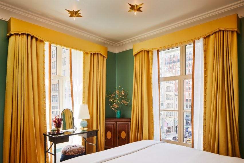
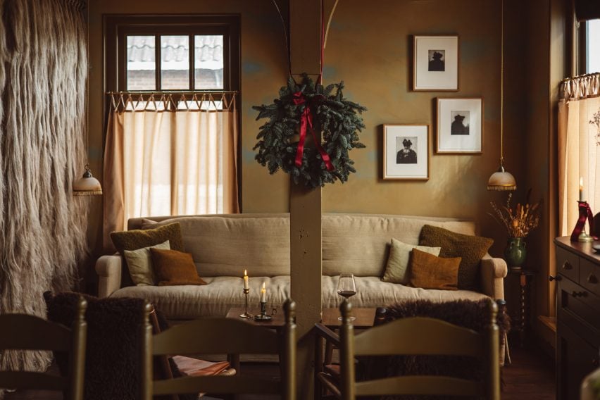
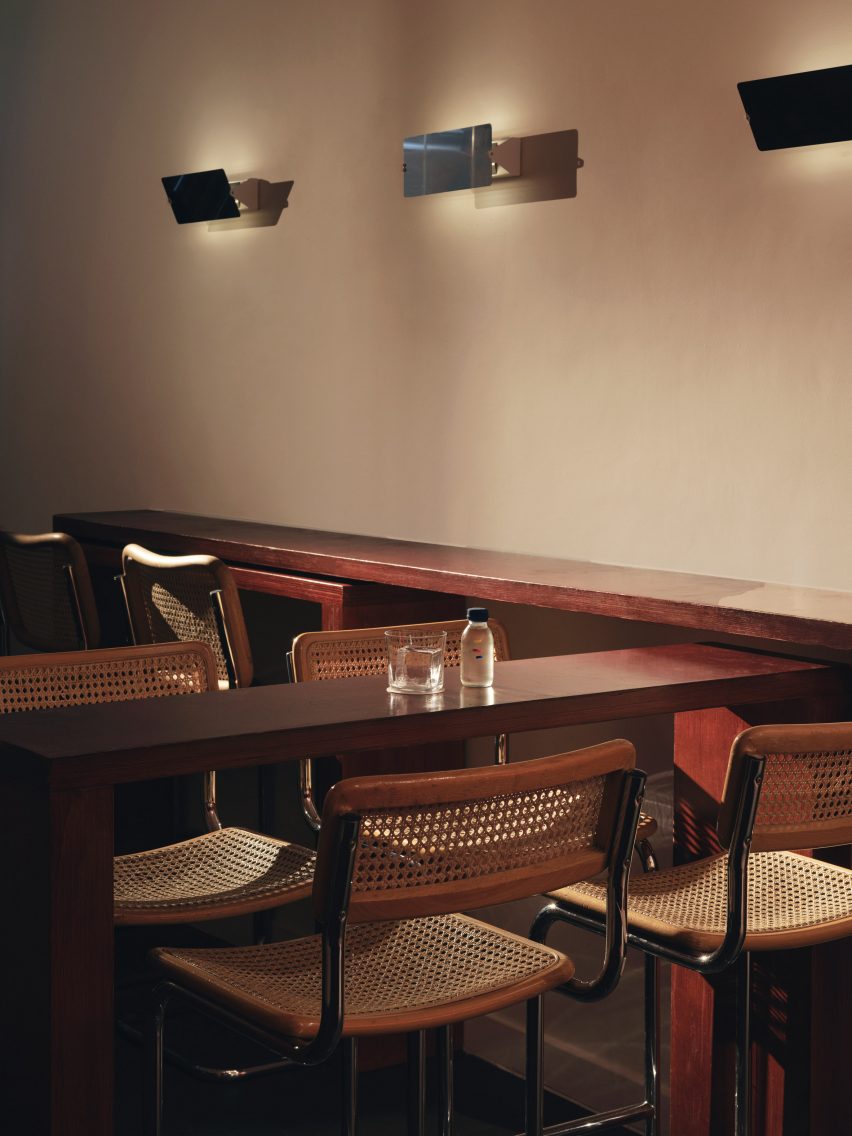
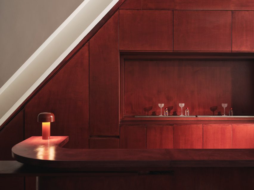
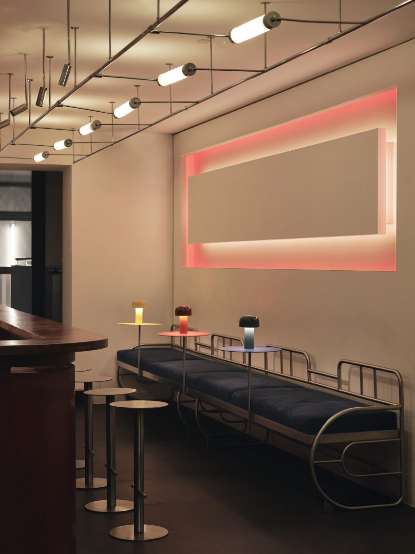
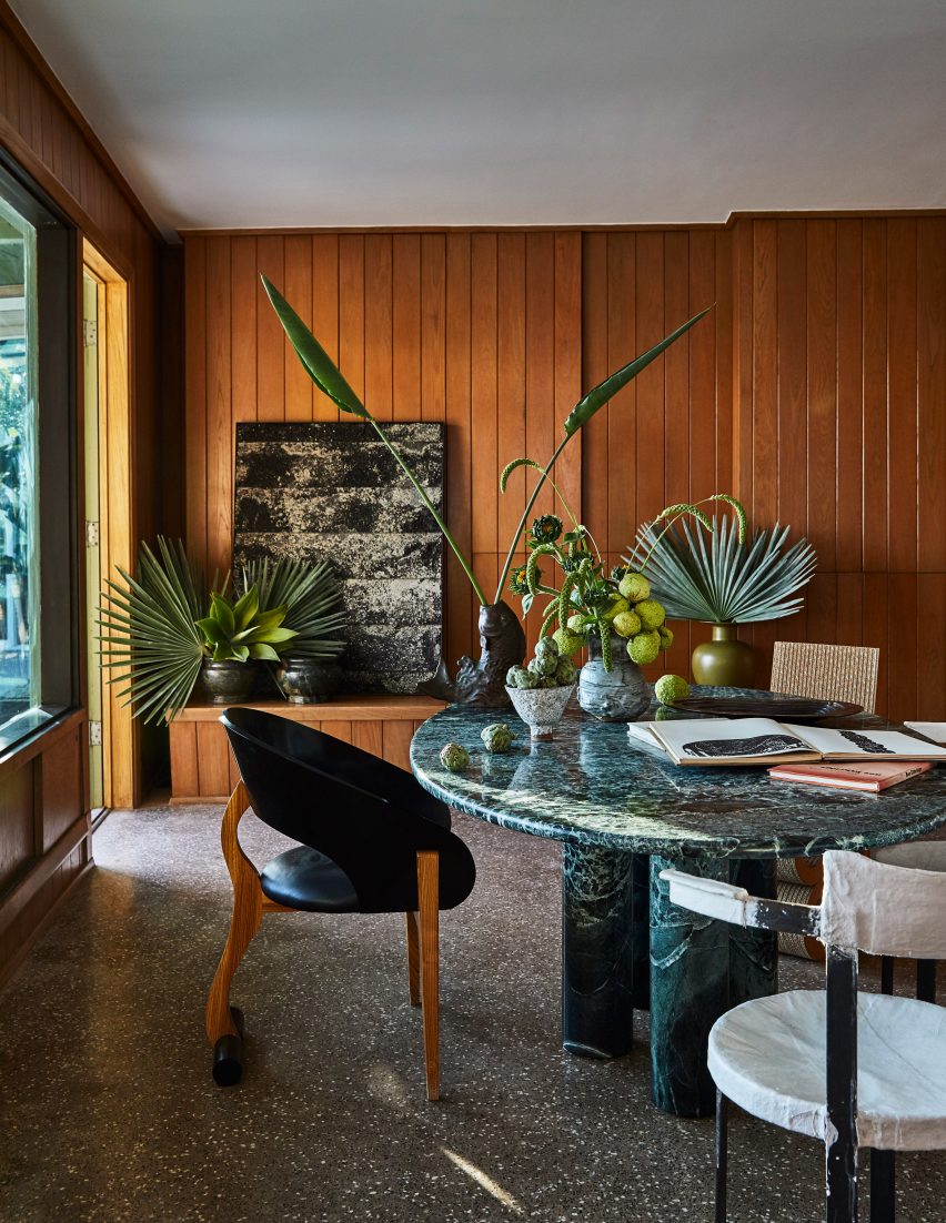
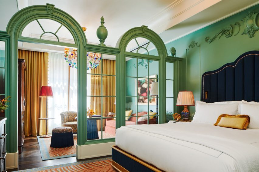
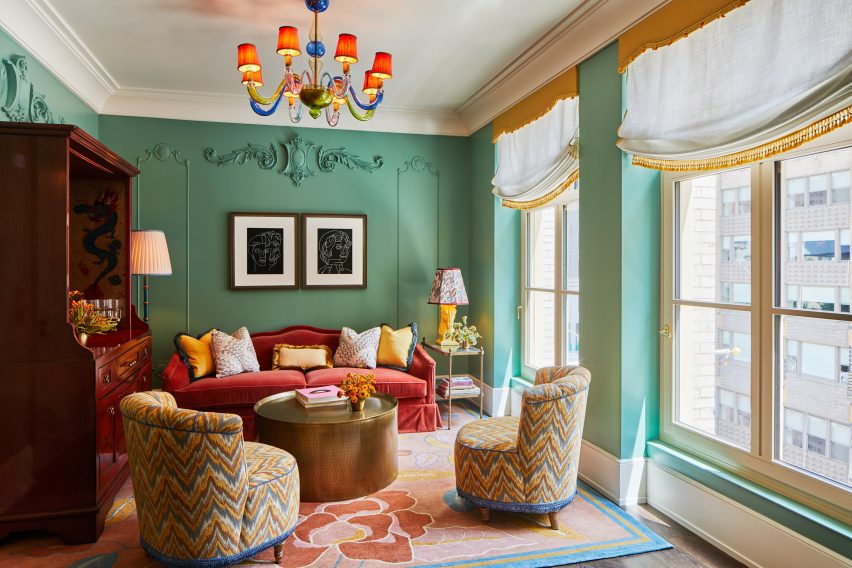
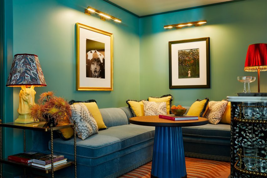
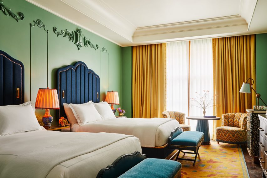
Rooms feature a rich colour palette of garden greens, buttercup yellow and peony pink with gold accents.

Bold patterns and textures jostle each other in a “harmonious and fun way, juxtaposing modernity with the classic finishings,” the designer said.

green walls and bespoke coffee tables at The Fifth Avenue hotelgreen walls and bespoke coffee tables at The Fifth Avenue hotel
The hotel’s walls host an extensive art collection

“The intersection of interiors with architecture is so important. The mansion is a much more classical response to the history and details of the building, whilst the tower enthuses a more modern touch,” Brudnizki explained.

“Both are unified by the choices of colours and certain furniture, fixtures and equipment that carry between the two sites.”

Bedrooms feature a global blend of references, including Pagoda-style table lamps, custom wardrobes informed by traditional Chinese cabinets, antique inlaid side tables, Murano glass chandeliers and star-like ceiling lights.

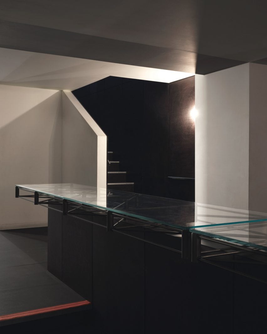
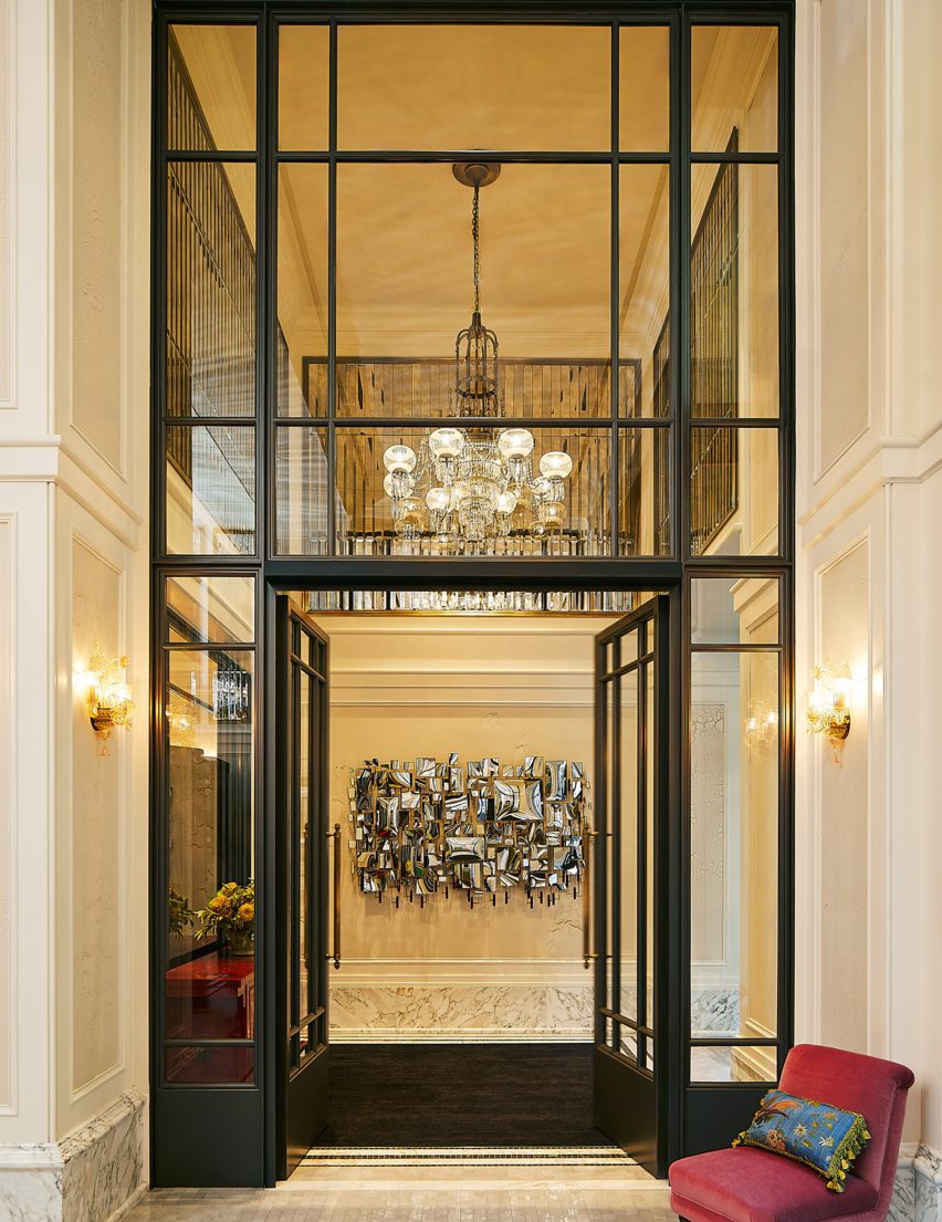
The double-height entrance lobby features walls panelled with faceted antique mirrors, marble floors and grand arched windows – which echo throughout the hotel bedrooms as room dividers between sleeping and sitting areas.

Rich colours evoke the gilded ageRich colours evoke the gilded age
Rooms have been designed to have a residential feel

“We loved the idea that all these great characters had once walked along the boulevard of Fifth Avenue and the fabulous parties hosted within the mansions of Fifth Avenue; the people and the conversations that took place,” said Brudnizki.

“We wanted to create a space that felt as though its interiors had been brought together over time, pulling items from our muse’s travels and adventures from across the globe.”

Double height lobby at The Fifth Avenue Hotel manhattanDouble height lobby at The Fifth Avenue Hotel manhattan
Antique glass panelling and modern mirrored artworks fill the double-height lobby

“It is a truly eclectic and layered project that is intended to feel as though it has been around since the days of The Gilded Age,” the designer concluded.

Other boutique hotels recently published on Dezeen include Christian Louboutin’s hotel Vermelho in Portugal and Trunk Hotel Yoyogi Park in Tokyo, by Keiji Ashizawa Design and Norm Architects.

Photography is by William Abranowicz.

Reference

Neuhäusl Hunal renovate apartment in Prague using curved glass partitions
CategoriesInterior Design

Neuhäusl Hunal divide open-plan apartment using curved glass walls

Neuhäusl Hunal renovate apartment in Prague using curved glass partitions

Czech architecture studio Neuhäusl Hunal has renovated a prefabricated apartment in Prague, turning it into an open-plan home and workspace for sculptor and glassworker Vladimír Bachorík.

Neuhäusl Hunal opted for curved translucent glass partitions in place of doors to divide the interior spaces and create a sense of openness and fluidity.

Neuhäusl Hunal renovate apartment in Prague using curved glass partitionsNeuhäusl Hunal renovate apartment in Prague using curved glass partitions
U-profiled glass partitions divide the interior spaces

In order to maximise floor space, the studio removed all non-load-bearing elements, leaving just a single load-bearing concrete wall that cuts through the living and workspaces.

Three U-profiled glass partitions were then used to enclose a cloakroom, storage space and kitchen, while the remaining floor space can be used flexibly.

Kitchen workspace in Prague apartment by Neuhäusl HunalKitchen workspace in Prague apartment by Neuhäusl Hunal
An existing load-bearing concrete wall separates the living and work spaces

A centralised, curved bathroom, raised by a small platform for waste management, is similarly enclosed by translucent glass panels and protrudes into the main space.

The bathroom interior was lined extensively with white ceramic tiles and features a walk-in shower.

Meanwhile, matching ceramic tiles were also used in the kitchen, which doubles as a work area for the artist.

Tiled bathroom designed by Neuhäusl Hunal in PragueTiled bathroom designed by Neuhäusl Hunal in Prague
White mosaic tiles line the kitchen and bathroom

“To design the maximally open and flowing space without doors, infrastructure, besides statics, was a key constraint, which defines the location of the single-almost-enclosed space: the bathroom,” studio architect and founder David Neuhäusl told Dezeen.

“Therefore we emphasized [the bathroom] as the most prominent element in the apartment to create a strong spatial experience,” Neuhäusl continued.

The interior material palette was defined by the stripped concrete wall as well as the translucent panels and ceramic tiles, set on a background of white plaster walls and grey-toned rubber flooring.

Metal furniture and shelving was used throughout the minimalist interior, with cubic plinths used to display Bachorík’s glasswork around the space.

Neuhäusl Hunal renovate apartment for sculptor in the Czech Republic Neuhäusl Hunal renovate apartment for sculptor in the Czech Republic
Existing windows draw daylight into the interior spaces

Daylight shines through the existing windows at either end of the apartment and penetrates the glass partitions to create a brightly lit interior, while carefully positioned strip lights and spotlights provide artificial lighting.

“These translucent glass blocks of high order ensure the penetration of light and create identity of the apartment,” Neuhäusl explained.

“Their materiality and character naturally refer to the client’s lifelong work. They can be naturally composed in curves to formulate the softly shaped partitions.”

Curved glass partitions divide bedroom interior of Sculptor's ApartmentCurved glass partitions divide bedroom interior of Sculptor's Apartment
Metal furniture is used throughout the space

Neuhäusl Hunal is an architecture studio founded by David Neuhäusl and Matěj Hunal in the Czech Republic.

Other projects recently completed in the Czech Republic include a winery topped with a sweeping concrete roof and an angular black extension to a neo-gothic church.

The photography is by Radek Úlehla.

Reference

Exterior of De Durgerdam hotel by Aedes
CategoriesInterior Design

De Durgerdam hotel takes over 17th-century sailor’s inn on a dyke

Exterior of De Durgerdam hotel by Aedes

Dutch hospitality company Aedes has pushed Amsterdam’s building restrictions to their limit to convert a heritage-listed tavern into an all-electric hotel.

De Durgerdam hotel occupies one in a row of almost identical gabled buildings perched on a seawall on lake IJmeer, which together make up the small village of Durgerdam near Amsterdam.

Constructed in 1664, the building originally served as an inn for sailors and fishermen, its white-painted clapboard facade acting as a beacon for boats that could pull right up to its deck in the Zuiderzee bay of the North Sea.

Exterior of De Durgerdam hotel by AedesExterior of De Durgerdam hotel by Aedes
De Durgerdam hotel is set on a seawall outside Amsterdam

Due to recurring flooding, the village was cut off from the sea with the construction of a dam in 1932, turning the bay into a freshwater lake while the inn became a ferry terminal and later a cafe and restaurant.

Following a five-year restoration led by Aedes, the building reopened this year as a boutique hotel with 14 rooms and interiors designed by material research studio Buro Belén.

De Durgerdam, the first hotel to be owned and operated by the Aedes, provided an opportunity to see how far heritage restrictions could be stretched to make the building as sustainable as possible.

Front door of hotel with white weatherboarded facadeFront door of hotel with white weatherboarded facade
The hotel occupies a former inn with a white-painted clapboard facade

“What we have done in terms of sustainability is fairly innovative for a historic building of this kind,” said founder Paul Geertman. “We have pushed the boundaries as far as we could to reduce its environmental impact.”

The 17th-century building now runs on renewable energy – provided by 32 rooftop solar panels and a green energy supplier – and its operations are entirely gas-free.

This was made possible via meticulous insulation and four separate heat pumps, which cover all of the building’s heating and cooling needs in lieu of a traditional boiler.

Lounge area inside De Durgerdam hotel with interiors by Buro BelénLounge area inside De Durgerdam hotel with interiors by Buro Belén
The ground-floor restaurant integrates a small lounge area

With limited space in the old inn, the heat pumps are dotted across the garden where they are hidden in tiny outbuildings complete with gables and clapboards, which Aedes constructed especially to work around local building codes.

“A heat pump in Amsterdam normally has to be inside of your building, otherwise you just don’t get the licence,” Aedes head of sustainability Esther Mouwen told Dezeen. “So we had to build a house around them.”

The windows posed a similar struggle, as the municipality rarely allows the distinctive hand-blown glazing of heritage buildings to be changed.

But Aedes was able to source an energy-efficient triple-glazed model with a pattern of tiny dots across its surface, which creates the optical illusion of looking at rippled glass.

Seating area of De Mark restaurantSeating area of De Mark restaurant
An Ingo Maurer chandelier hangs above a vintage sharing table in the restaurant

The renovation itself was a balancing act between changing as little as possible about the building while ensuring that it could survive for another 500 years.

Although from the outside, the three-storey building looks almost exactly like it did when it was first constructed, large parts of its structure had to be carefully dismantled and reconstructed.

“The building had deteriorated over time and the structural integrity had been compromised in some areas,” said Aedes marketing manager Monica Hanlo.

“The interiors had to be carefully renovated and restructured, with beams and stones disassembled, inspected and either reused or replaced.”

Bedroom of De Durgerdam hotel by Buro BelénBedroom of De Durgerdam hotel by Buro Belén
The bedrooms are finished in a moody colour palette

Where timber could no longer serve a structural function, it was converted into floorboards alongside reclaimed wood sourced from old church pews and demolished timber houses from Austria.

This wood was smoked for 18 hours to create a rich colour that permeates the timber rather than sitting on top like a stain, which would wear down over time and need re-upping.

“Normally, they do not smoke it that long,” explained Buro Belén co-founder Lenneke Langenhuijsen. “Now it will patina super beautifully because all throughout, it became this really dark wood.”

“It was important to us to make well-based decisions, maybe invest a bit more but it’s a long-lasting product that ages with the hotel and makes it even nicer over time.”

De Durgerdam marks the first time that Buro Belén has applied its material research approach to an entire hotel interior.

“We did a lot of research so that the hotel also feels very grounded in what it once was, in its place,” Langenhuijsen said. “And if you look at the Zuiderzee, it was a very important part of the Netherlands, all the villages around made their living from it.”

Layered throughout the hotel’s interior are references to this seafaring history, delivered via an eclectic mix of new, vintage and bespoke elements created by Buro Belén.

Fireplace in bedroom of hotel by AedesFireplace in bedroom of hotel by Aedes
A rusty red colour was used to highlight the building’s beams

In the ground-floor restaurant De Mark, framed photos provide a glimpse of the inn’s evolution over the years.

A shaggy curtain frames the lounge area near the entrance, made from traditional flax rope and raw flax fibres that were once used by local fishermen to make their nets.

Weather permitting, patrons can dine outside on the jetty atop lake IJmeer or sit at a long sharing table that forms the centrepiece of the restaurant.

Bathroom of De Durgerdam hotel by Buro BelénBathroom of De Durgerdam hotel by Buro Belén
The same colour dominates the guest bathrooms

Overhead, Buro Belén suspended Ingo Maurer’s chandelier Lacrime del Pescatore – or “fisherman’s tears” – made of sparkling crystals that droop from a nylon net.

Its name, according to Langenhuijsen, acts as a subtle reference to the plight of the local fishers, who lost their livelihoods as the village was cut off from the sea.

Upstairs, the inn accommodates three suites and one room, accessed via the building’s untouched original staircase, which still shows the deep grooves that were worn into the wood by thousands of shoes over the centuries.

Garden annex of hotel by AedesGarden annex of hotel by Aedes
Ten of the hotel’s 14 rooms are housed in a garden annexe added in 2006

De Durgerdam’s remaining 10 rooms are housed in a garden annexe that was added to the building in 2006. All share a moody colour palette that was drawn from the craft and building traditions of the Zuiderzee.

A rusty red colour – reminiscent of sails treated with tree-bark tannins to prevent rot – was used to highlight key architectural features like the building’s timber beams and the monochrome bathrooms.

Similarly, the inside of the bedrooms’ Shaker-style built-in wardrobes was painted in a sky blue colour that nods to a traditional paint made from buttermilk, chalk and a particular blue pigment, historically used by locals across cupboards and box beds to repel insects.

Small gabled outbuilding outside garden annex of De Durgerdam hotel by Aedes Small gabled outbuilding outside garden annex of De Durgerdam hotel by Aedes
The hotel’s heat pumps are hidden in tiny gabled outbuildings

Even though construction is complete, Aedes is still working on reducing the hotel’s operational footprint, with the aim of getting 80 per cent of the way towards being zero waste by the end of next year.

The company is also looking into a reliable way of offsetting the building’s whole-life carbon emissions via a reforestation scheme but has so far struggled to find a reliable company that can guarantee measurable, traceable carbon removals.

“We’re not fans of offsetting, because we think we have to make sure we don’t create emissions,” Mouwensaid. “But it’s not possible yet.”

Aedes has previously converted Amsterdam’s art deco Bungehuis building into a Soho House members’ club.

The photography is by Chantal Arnts and Studio Unfolded.

Reference

Tall tubular chairs at A Bar with Shapes for a Name by Cake Architecture
CategoriesInterior Design

Cake Architecture draws on Bauhaus principles for Hoxton bar

Tall tubular chairs at A Bar with Shapes for a Name by Cake Architecture

Cake Architecture has renovated A Bar with Shapes for a Name, an east London cocktail bar featuring “utilitarian” interiors.

A Bar with Shapes for a Name owes its title to the yellow triangle, red square and blue circle that are emblazoned on its facade in a nod to the primary colours and understated geometry commonly associated with the Bauhaus.

Tall tubular chairs at A Bar with Shapes for a Name by Cake ArchitectureTall tubular chairs at A Bar with Shapes for a Name by Cake Architecture
Tall tubular chairs feature on the ground floor

When creating the bar’s minimalist interiors, Dalston-based Cake Architecture took cues from the influential German art and design school that was established in 1919 and advocated for an emphasis on functionality, among other similar principles.

Located at 232 Kingsland Road in Hoxton, the cocktail bar was renovated by the studio to serve as a multipurpose venue.

Reddish plywood barReddish plywood bar
Cake Architecture created a smooth ground-floor bar from reddish plywood

Cake Architecture doubled the bar’s capacity by adding a basement, which acts as a “kitchen-bar” room, and refurbished the ground floor’s existing seating area as well as a classroom-style space that offers a location for rotating events or workshops.

“These spaces have specific functional requirements and we selected colours and materials to suit,” studio director Hugh Scott Moncrieff told Dezeen.

Rectilinear light installation within bar by Cake ArchitectureRectilinear light installation within bar by Cake Architecture
It was positioned opposite a rectilinear light installation

Upon entering the bar, visitors are greeted by the main seating area or “showroom”, which was designed to be warm and inviting.

Tall tubular chairs finished with neutral rattan were positioned around chunky geometric tables made from birch ply stained to a rich, reddish-brown hue.

Glass-topped central table in the basementGlass-topped central table in the basement
The renovation included the addition of a new basement

The team also used the same timber to create the space’s curving bar, which is illuminated by a squat, cordless table lamp by lighting brand Flos.

Opposite the bar, a glowing rectilinear light installation by photographer Steve Braiden was fitted to the wall underneath bench-style seating reminiscent of early Bauhaus furniture designs.

Close-up of the steel, glass-topped tableClose-up of the steel, glass-topped table
A steel, glass-topped table sets an industrial tone

“We looked in particular at projects by the Bauhaus founder Walter Gropius,” reflected Scott Moncrieff.

“Gropius is a master of this elegant zoning through the application of colour and form,” he added.

Steel-framed tables in the classroomSteel-framed tables in the classroom
The “classroom” includes steel-framed tables

Downstairs, the low-lit basement was created to house additional seating as well as “all of the crazy machinery they use to prepare the drinks,” the designer said.

The basement is characterised by a bespoke central table by Cake Architecture and furniture designer Eddie Olin.

Sculptural, colourful lampSculptural, colourful lamp
Red, yellow and blue accents define a sculptural lamp

Consisting of a steel frame that “floats” over a central leg, the table was topped with a glass surface and its base was clad in phenolic-coated plywood to match the floor and walls.

“This new basement is predominantly a production space – so the palette reflects this with hardwearing, utilitarian and industrial materials,” said Scott Moncrieff.

A thick, felt curtain in ultramarine adds a pop of colour to the otherwise pared-back space.

With its pale blue walls and Valchromat-topped, steel-framed tables, the ground-floor “classroom” pays homage to the Bauhaus as an educational institution.

Tall blackboard in the classroomTall blackboard in the classroom
A tall blackboard provides space to learn in the classroom

Brighter blue vinyl covers the floors while a sculptural lamp featuring red, yellow and blue circles echoes the bar’s logo.

A tall blackboard and overhead strip lighting add to the classroom feel of the space, which is used for various group events.

Illuminated bathroom sinkIlluminated bathroom sink
Thin vertical lights frame the bathroom sink

Cake Architecture worked closely with the bar’s founders Remy Savage and Paul Lougrat when creating the interiors, which were primarily informed by the duo’s way of working.

“The team has a conceptually driven ethos drawn from the theory and practice of Bauhaus embedded in everything they are doing. We found that incredibly exciting,” explained Scott Moncrieff.

Sconce lighting on the wallSconce lighting on the wall
A Bar with Shapes for a Name is located on London’s Kingsland Road

“The Bauhaus phrase ‘party, work, play’ was pertinent to some early ideas and this carried through all our design discussions,” noted the designer.

“The space enables these three things. Separately as individual functions and simultaneously as a representation of the overall atmosphere of a bar!”

Cake Architecture previously worked with interior designer Max Radford to create a curtain-wrapped speakeasy in London’s Soho. The studio also designed a workspace for London agency Ask Us For Ideas in the same part of the city.

The photography is by Felix Speller


Reference

Mid-century renovation of City Beach residence in Perth by Design Theory
CategoriesInterior Design

Eight mid-century home renovations that embrace contemporary details

Mid-century renovation of City Beach residence in Perth by Design Theory

From a modernist villa in Beverly Hills to a flat in one of Brasília’s iconic Superquadra apartment blocks, the mid-century renovations in this lookbook are a masterclass in updating a period home while retaining its distinctive character.

Originally constructed in the post-war period between 1945 and 1969, mid-century homes have proved enduringly popular due to their prescient emphasis on natural light, clean lines, open floor plans and humble materials such as wood, stone and concrete.

The renovations below see many of these original features retained and restored, supplemented with contemporary additions such as double-height ceilings and furniture by the likes of Tadao Ando and Mario Bellini.

This is the latest in our lookbooks series, which provides visual inspiration from Dezeen’s archive. For more inspiration see previous lookbooks featuring art deco homes, sunny yellow interiors and serene bedrooms with striking natural views.


Mid-century renovation of City Beach residence in Perth by Design Theory
Photo by Jack Lovel

City Beach Residence, Australia, by Design Theory

Australian studio Design Theory looked to preserve the “considerable mid-century charm” of this home on the coast of Perth during its renovation (top and above), remaining true to the rich palette of natural materials found in the original design.

Contemporary furniture and lighting with gently curving forms were chosen to soften the rigorous lines of the original architecture and prevent the interiors from feeling like a period pastiche.

Find out more about City Beach Residence ›


Brandaw Residence, US, by 180 Degrees Design + Build and CBTWO Architects
Photo by An Pham

Brandaw Residence, US, by 180 Degrees Design + Build and CBTWO Architects

A new double-height living room with a pitched roof and full-height glazing was added to modernise this 1960s home in Phoenix, creating sightlines up and out towards nearby Camelback Mountain.

Modernist touches remain on the interior in the form of plentiful wood panelling alongside finishes and furnishings in muted primary colours ranging from teal to mustard-yellow.

Find out more about Brandaw Residence ›


Mid-century renovation of Hampstead House by Coppin Dockray in London
Photo by James O Davies

Hampstead House, UK, by Coppin Dockray

This house in Hampstead was originally designed by British architect Trevor Dannatt in 1960 as London’s answer to the post-war Case Study Houses built by the likes of Richard Neutra and the Eameses in California.

When renovating and extending the property for a growing family, local studio Coppin Dockray contrasted vintage and contemporary furniture for a “domestic, lived-in” feel, with pieces ranging from a Togo chair to Mia Hamborg’s Shuffle table for &Tradition.

Find out more about Hampstead House ›


Beverly Hills villa, US, by Heusch
Photo by Gerhard Heusch

Beverly Hills villa, US, by Heusch

Historical images helped architecture firm Heusch to restore this Beverly Hills villa to its former glory and reverse some of its “unfortunate transformations” over the years.

Existing terrazzo floors on the ground floor were restored and complemented with fluted glass details and dark timber furnishings, both new and old, including Ando’s cantilevered Dream Chairs and a bookshelf by Italian architect Augusto Romano from the 1950s.

Find out more about Beverly Hills villa ›


Mid-century renovation of Palermo house, US, by OWIU
Photo by Justin Chung

Palermo house, US, by OWIU

California studio OWIU retained several original elements during the renovation of this 1955 home in LA’s San Rafael Hills, among them the glass-block walls and wooden ceiling beams, which were exposed from under false ceilings and sanded down to reveal their natural colour.

These were contrasted with more neutral contemporary elements such as pale oak flooring and walls coated in Venetian plaster, with assorted lights by Isamu Noguchi and George Nelson – one of the founding fathers of American modernism.

Find out more about Palermo house ›


308 Apartment by Debaixo do Bloco Arquitetura
Photo by Joana France

Brasília apartment, Brazil, by Debaixo do Bloco Arquitetura

This apartment is located inside Brasília’s historic Superquadra 308 Sul, the first “superblock” apartment complex constructed as part of architect Lucio Costa’s 1957 master plan for the new Brazilian capital.

Local studio Debaixo do Bloco Arquitetura cut open the building’s exposed concrete walls, opening up its layout to meet the needs of a modern family while preserving period details such as the building’s distinctive white breeze-block screens and its granilite flooring.

Find out more about Brasília apartment ›


Mid-century renovation of Malibu Surf Shack, US, by Kelly Wearstler
Photo by Ingalls Photography

Malibu Surf Shack, US, by Kelly Wearstler

When interior designer Kelly Wearstler turned this 1950s beachfront cottage in Malibu into a bohemian retreat for herself and her family, she retained the original wood-panelled walls and selected finishes that were “hand-crafted, rustic and raw” to match the existing material palette.

The interiors feature abundant planting, alongside an eclectic mix of period-agnostic furnishings including a 1980s green marble table by Bellini, paired with a plaster-covered Caféstuhl chair by contemporary Austrian designer Lukas Gschwandtner.

Find out more about Malibu Surf Shack ›


Golden House, US, by SHED Architecture and Design
Photo by Rafael Soldi

Golden House, US, by SHED

Seattle architecture firm SHED had to make several aggressive interventions when renovating this 1950s building in nearby Shoreline, which was originally constructed as a family home but had previously been divided up to serve as a retirement home.

Working around the existing post-and-beam structure, the studio updated the interior to maximise views of the Olympic Mountains and Puget Sound while enlarging the kitchen and reorganising it around a central island.

Find out more about Golden House ›

This is the latest in our lookbooks series, which provides visual inspiration from Dezeen’s archive. For more inspiration see previous lookbooks featuring art deco homes, sunny yellow interiors and serene bedrooms with striking natural views.

Reference

Yurikago House by Mas-aqui
CategoriesInterior Design

Ten Spanish apartment renovations characterised by eclectic tiles

Yurikago House by Mas-aqui

For our latest lookbook, we have collected 10 apartments in Spain that have been brought to life using decorative tiles, from preserved 20th-century features to speckled contemporary terrazzo grout.

Known for its abundance of colourful tiles, Spain has many period apartments with original details including ornate archways and eclectic tiling.

The following architecture and interior design studios have made the most of these traditions when renovating homes, which often involved refreshing the homes’ interiors while maintaining their history, or adding contemporary elements that nod to the past.

This is the latest in our lookbooks series, which provides visual inspiration from Dezeen’s archive. For more inspiration see previous lookbooks featuring statement carpets, pop-up shops and homes with sliding doors.


Yurikago House by Mas-aqui
Photo is by José Hevia

Yurikago House, Barcelona, by Mas-aqui

Architecture studio Mas-aqui opened up an apartment in Barcelona by creating multiple levels lined with slabs of exposed concrete, slatted wood and reddish ceramic tiles.

The dwelling was named  Yurikago House after the Japanese word for a cradle, which references the shape of the timber structure that supports part of a new mezzanine that was created in the renovation.

Find out more about Yurikago House ›


Conde Duque apartment by Sierra + De La Higuera
Photo is by German Sáiz

Madrid apartment by Sierra + De La Higuera

Set within a 1940s building, interior spaces in this Madrid apartment were delineated with vibrantly hued Moroccan zellige tiles, from bold yellow accents in the living room to an emerald green kitchen.

The tiles are defined by imperfect hand-moulded surfaces and feature throughout the home in the form of decorative skirting as well as flooring and cabinetry.

Find out more about this Madrid apartment ›


Casa Cas 8 by DG Arquitecto
Photo is by Mariela Apollonio

Valencia apartment by DG Arquitecto

During the minimalist renovation of a 1920s apartment in Valencia, local studio DG Arquitecto preserved the original mosaic elements – flooring that the firm called “typical” of the city.

The studio paired mid-century rattan dining chairs and delicate timber elements with the colourful tiles while original mouldings and decorative arched doorways were also maintained.

Find out more about this Valencia apartment ›


Tiled bathroom in curved bathroom within apartment in the Torres Blancas building
Photo is by José Hevia

1040 Unit, Madrid, by Studio Noju

Working within Madrid’s iconic brutalist Torres Blancas tower, emerging practice Studio Noju created an apartment that balances contemporary details with the building’s brutalist history.

Each of the dwelling’s three bathrooms were individually colour-coded with small geometric mosaics that nod to the green ceramic tiles that clad the apartment’s terraces.

“The [mosaic] material allowed us to solve all the elements of the bathroom such as shower areas, vanities, walls and floors, referencing a similar material strategy used in the original design,” studio co-founder Antonio Mora told Dezeen.

Find out more about 1040 Unit ›


Tiled floors and bookcases within Barcelona apartment by Narch
Image is courtesy of Narch

Barcelona apartment by Narch

Eclectically arranged decorative floors dating back to the early 20th century take centre stage in this Barcelona apartment that was renovated by Narch architecture office.

Known as encaustic tiling, which is common in the city, each tile is created by pouring pigmented ceramics into moulds and pressing them to create a pattern.

Elsewhere in the apartment, doors made from laminated glass screen off its bedrooms. This material was chosen for its neutrality in order to emphasise the space’s ornate flooring.

Find out more about this Barcelona apartment ›


Casa Olivar in Madrid by Matteo Ferrari and Carlota Gallo
Photo is by Asier Rua

Casa Olivar, Madrid, by Matteo Ferrari and Carlota Gallo

Casa Olivar is a two-storey apartment by designers Matteo Ferrari and Carlota Gallo, which is characterised by handmade terracotta floor tiles that complement the home’s muted colour palette.

Created as a “sensorial refuge”, the dwelling includes two large windows in the living room that flood the space with natural light. Earthy-toned, simple materials feature throughout, including textured plaster finishes.

Find out more about Casa Olivar ›


Tiled kitchen within Barcelona apartment by Parramon + Tahull
Photo is by Judith Casas Sayós

Barcelona apartment by Parramon + Tahull

Barcelona studio Parramon + Tahull added bespoke birch plywood joinery and continuous tiled flooring to an apartment in the city’s Gracia neighbourhood, in order to blend with the building’s original features.

Created by Spanish manufacturer Wow, the terracotta tiles feature a mismatched geometric design that covers the entire apartment, including the kitchen and the bathroom.

Find out more about this Barcelona apartment ›


Terrazzo grout made from crushed tiles
Photo is by José Hevia

Laia and Biel’s House, Barcelona, by TEd’A

Architecture office TEd’A used crushed tiles to create playful terrazzo grout in a renovated apartment that belongs to the owners of the Mallorcan tile brand Huguet.

The grout was made from the original terracotta tiles that lined the home before its revamp, which were crushed into tiny pieces to form a reddish-hued aggregate that was mixed with existing white tile grout.

“Our idea was to keep the best parts of the old flat we bought,” Biel told Dezeen, citing sustainability and honouring the apartment’s original design.

Find out more about Laia and Biel’s House ›


End the Roc by Nook Architects
Photo is by Yago Partal

End of the Roc, Barcelona, by Nook Architects

Nook Architects redesigned another apartment in Barcelona while maintaining its distinctive historical details, including a striking mural-style wall that is over 40 years old, timber beams and intricately patterned floor tiles.

“Our approach to End of the Roc revolved around the restoration and consolidation of the building’s original character,” said the architecture studio.

Find out more about End of the Roc ›


Casa Burés by Vilablanch
Photo is by Jordi Folch

Casa Burés, Barcelona, by Vilablanch and TDB Arquitectura

Interior design studio Vilablanch collaborated with TBD Arquitectura to refurbish all 26 apartments within Case Burés – a 20th-century building constructed by the late architect Francesc Berenguer i Mestres.

The team selected “silent” contemporary furnishings to complement Case Burés’ original decorative features, such as stainless steel geometric cabinetry that was chosen so as not to “compete with” or “imitate” the colourful tiled flooring.

Find out more about Casa Burés ›

This is the latest in our lookbooks series, which provides visual inspiration from Dezeen’s archive. For more inspiration see previous lookbooks featuring statement carpets, pop-up shops and homes with sliding doors. 

Reference

Built-in walnut wood wardrobe with decorative vase in The Life concept apartment
CategoriesInterior Design

I IN revamps Tokyo apartment to change Japanese view of renovations

Built-in walnut wood wardrobe with decorative vase in The Life concept apartment

Reeded glass partitions, stucco walls and red walnut joinery feature in this renovation of a compact apartment in Tokyo by local studio I IN.


Created for Smarg, the renovation arm of Japanese real estate firm Goodlife, The Life concept apartment was designed to reframe the way that Japanese homeowners perceive renovated apartments.

Built-in walnut wood wardrobe with decorative vase in The Life concept apartment
Red walnut joinery features throughout the apartment (top and above)

“There is a common image of renovated apartments in Japan, which is not always positive,” said I IN.

“The majority of people prefer new buildings and spaces because of their appearance and reinforced structures as we have earthquakes.”

Kitchen with walnut wood shelves in Tokyo flat interior by I IN
The kitchen cupboards are rendered in the same wood

To combat this preconception, I IN was commissioned to turn a 56-square-metre one-bed in a 1980s residential building into an understated luxury residence.

Set within Tokyo’s eastern Suitengūmae neighbourhood, the flat features an open-plan layout with the kitchen, living room and bedroom all located in one connected space.

Reeded glass partitions and wood cupboard in The Life concept apartment
Reeded glass partitions separate the bathroom from the living area

The kitchen sits at one end of the flat while the bedroom sits at the other, with the bed hidden from view behind a built-in walnut sideboard that the architects said serves as a “soft separation”. To separate these two domains, the living area was placed at the centre of the space.

I IN incorporated a palette of neutral colours and subtle textures throughout to create a light, restful and calming ambience.

Bathroom entrance with glass walls and decorative vases in The Life concept apartment
The screens allow light to filter into the windowless bathroom

Reeded glass partition walls allow light to penetrate into the windowless toilet and bathroom while red walnut joinery, polished chrome lighting fixtures and off-white stucco walls were chosen to evoke a sense of luxury.

“We wanted to show the wooden architectural essence from old Japan through the texture of the wood and the three-dimensional layers of light, which you see in sci-fi movies,” I IN told Dezeen.

“The soft ambience from the slit light and textured glass was also important.”

In the future, the studio says the plan is to roll the design out to other buildings in central Tokyo.

I IN, which was founded by interior designers Yohei Terui and Hiromu Yuyama in 2018, was previously shortlisted for small retail interior of the year at the 2020 Dezeen Awards.

Bedroom with built-in wooden wardrobe and reeded glass partitions in interior by I IN
The bedroom is hidden from view thanks to another glass partition

Other renovated Tokyo flats featured on Dezeen include an overhauled 1960s apartment by design studio Minorpoet, which has its kitchen hidden behind folding wooden doors, and a refurbished flat by architect Masatoshi Hira where a family of four shares one bedroom, living space and wardrobe.

Photography is by Tomooki Kengaku.

Reference