Tencent 5 residential complex by MVRDV
CategoriesArchitecture

MVRDV unveils residential development for Tencent smart city

Tencent 5 residential complex by MVRDV

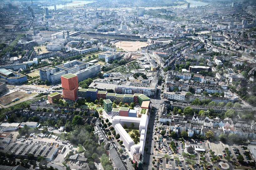
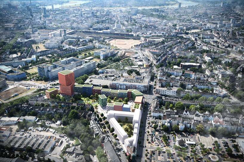
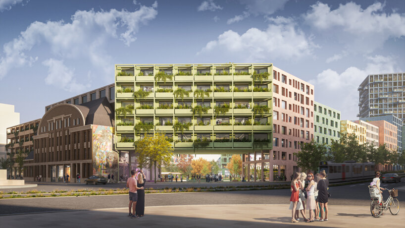
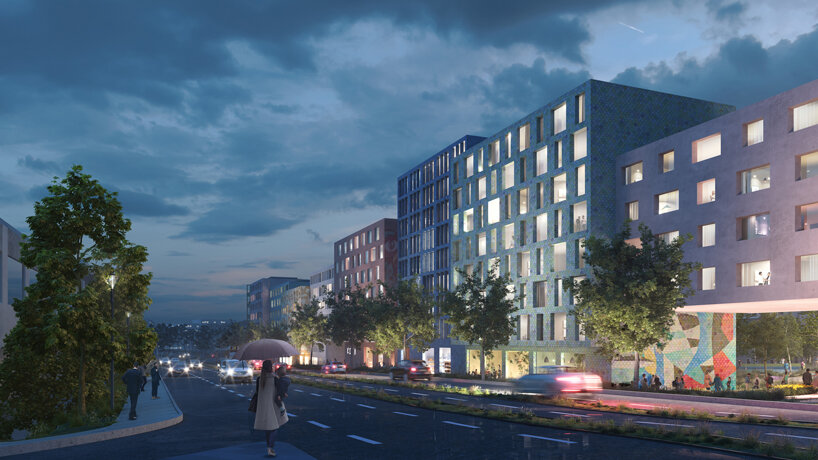
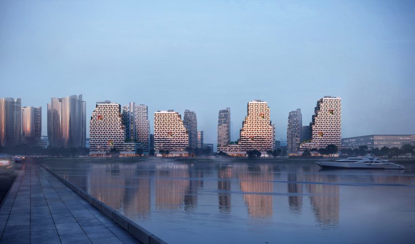
Dutch studio MVRDV has revealed a series of residential high-rises arranged around courtyards in Shenzhen’s Qianhai bay, which will form part of a smart city development by technology company Tencent.

Named Tencent 5, the residential complex will have four courtyards surrounded by 11 apartment buildings and an adjacent kindergarten, designed to be a neighbourhood that fosters community.

Tencent 5 residential complex by MVRDVTencent 5 residential complex by MVRDV
Tencent 5 will have 11 apartment buildings arranged around courtyards

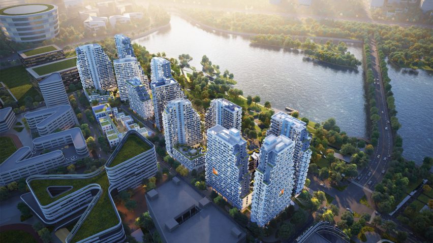
Located on a narrow peninsula, the bayside residences will be the centrepiece of a wider smart city campus developed by Tencent and masterplanned by US architecture studio NBBJ.

MVRDV designed Tencent 5 as a social and green development that provides housing to employees working in the city.

Residential high-rises by MVRDV in ShenzhenResidential high-rises by MVRDV in Shenzhen
Muli-level balconies will puncture the facades

“By contributing to Tencent’s smart city, we want to show that smart cities are also healthy cities, green cities, and social cities,” said MVRDV founding partner Winy Maas.

“The attention in smart cities always goes to the technology, and our design of the Tencent residential complex certainly includes that, but in our conception, the technology-related aspects are inseparable from the social spaces, the green courtyards, the terraces – the technological goes hand-in-hand with the human.”

MVRDV residential buildings in ShenzhenMVRDV residential buildings in Shenzhen
It will provide housing to employees working in the smart city campus

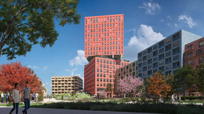
The terraced residential buildings, which range in height from 57 to one hundred metres, will have equally-sized apartments with views of the sea to the west and the bay towards the east.

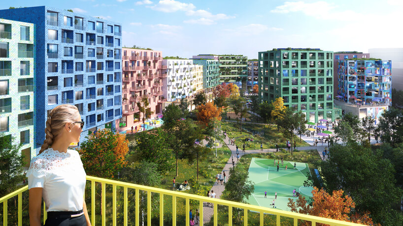
“Located at the northern end of the campus, MVRDV’s design emphasises equality between residents,” said MVRDV. “All units are identical in size and layout, with each providing a balcony or bay window to its occupant.”

“The buildings are terraced, supporting communal green spaces that can be accessed by all residents.”

The green courtyards and other public spaces in Tencent 5 were designed to be places where neighbours can connect with each other.

Pedestrian paths through the complex will provide added outdoor space populated with sports and leisure activities.

Tencent 5 residential development in ShenzhenTencent 5 residential development in Shenzhen
Green pathways will cut through the site

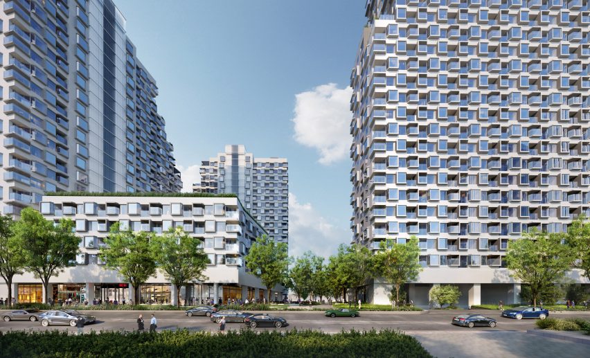
Additional shared amenity space will be located on the ground floors of the residential buildings, and multi-level balconies will puncture the facades.

“Large, multi-floor breakout spaces puncture the towers’ facades at a variety of levels, allowing residents to gather with others who live in the same part of the building and breaking the development into a number of smaller ‘neighbourhoods’,” said MVRDV.

Kindergarten in Shenzhen by MVRDVKindergarten in Shenzhen by MVRDV
A series of connected blocks will form the kindergarten

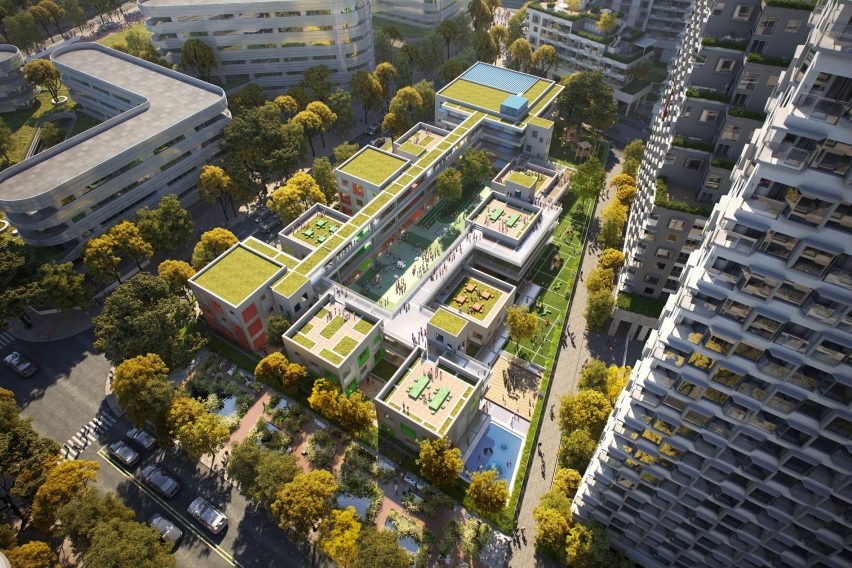
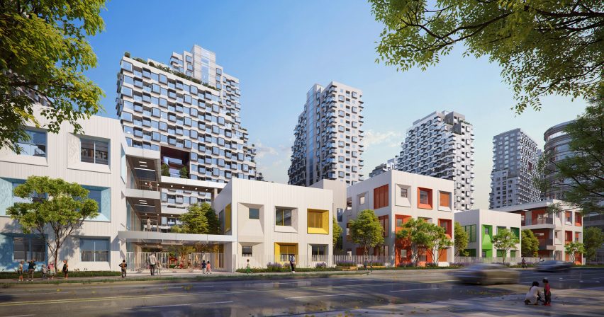
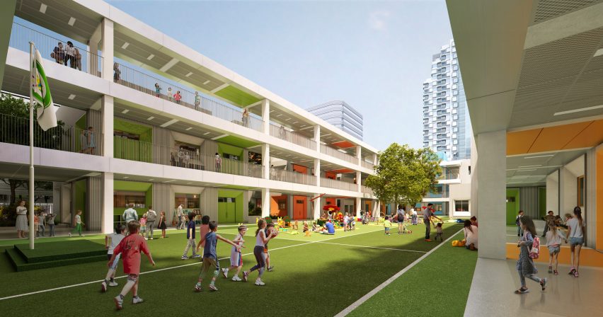
A kindergarten adjacent to the residential complex will also be arranged around its own courtyard. It will be made up of a series of blocky buildings with rooftop gardens, connected by corridors and walkways.

“The courtyard, along with the spaces between the blocks, provide safe and shaded playing spaces for the children, while the blocks themselves feature rooftop gardens,” said MVRDV.

Tencent 5 kindergarten by MVRDVTencent 5 kindergarten by MVRDV
The kindergarten will also have a courtyard

Construction on Tencent 5 is underway and it is due to be completed in 2024.

Other projects by MVRDV in China include the transformation of a skyscraper in Shenzhen into a women and children’s centre and its plans for a library in Wuhan with a sweeping form.

The images are by Atchain.


Project credits:

Architect: MVRDV
Co-architect: A&E design
Contractor: Shanghai Baoye Group Corp
Structural engineering and MEP: A&E design
Cost calculation: Arcadis
Environmental advisor: ATKINS
Visualisations: Atchain and Tiptop

Reference

Wood-lined room with dining table and six chairs
CategoriesInterior Design

Lovers Unite revives interiors of mid-century Silver Lake home

Wood-lined room with dining table and six chairs

California design studio Lovers Unite has reinvigorated a 1950s home with sweeping views of the Los Angeles hills, turning an unused balcony into an extension of the indoor social space.

The wooden dwelling in LA’s Silver Lake neighbourhood belongs to production designer James Chinlund and artist Clare Crespo.

Wood-lined room with dining table and six chairsWood-lined room with dining table and six chairs
Lovers Unite renovated the home for a creative couple in Los Angeles

A “previously a boring, nondescript mid-century house”, according to Lovers Unite, the property required some imagination to bring its interiors up to par with its setting.

Therefore, the studio “introduced a few carefully plotted architectural interventions and material shifts to completely reimagine the interior of the home and take full advantage of its prime site”.

Dining room with large windows that have a view of hills in the distanceDining room with large windows that have a view of hills in the distance
The house has expansive views over the city’s hills

The most impactful of these interventions was to bring an underutilised balcony at the back of the house into the envelope, extending the open-plan living and dining area by several feet.

Beneath the large windows that were installed to fill the gap, Lovers Unite placed built-in seating with teal-upholstered cushions for relaxing and enjoying the panoramic vista.

View of wood-lined kitchen with a peninsula in the foregroundView of wood-lined kitchen with a peninsula in the foreground
Plenty of wood was used throughout the home, particularly in the kitchen

“With a large window wall and generous built-in banquette, the room finally celebrates the expansive views that had always been there,” the studio said.

In the kitchen, dark green soapstone used for counters and the backsplash contrasts with the honey-toned cabinetry, and a shiny copper range hood matches a panel installed at the back of a bar area on the opposite side of the room.

Honey-toned wood kitchen with soapstone surfaces and a copper range hoodHoney-toned wood kitchen with soapstone surfaces and a copper range hood
The honey-toned wood contrasts with soapstone surfaces and a copper range hood

Elsewhere, colourful furnishings, collectible design pieces and bold artworks stand out against the predominantly wood interiors.

A timber-lined lounge area features the classic modular Togo sofa system by Michael Ducaroy, which is wrapped in yellow corduroy fabric.

Meanwhile, in the den, a purple armchair is positioned beside a giant chair that Chinlund used as a prop for a shoot by Italian fashion outfit Roberto Cavalli.

Wood slats were employed to partially screen the staircase opening on the upper level, next to a central fireplace with a raised hearth.

Teal-upholstered window seat with a reading nook at the endTeal-upholstered window seat with a reading nook at the end
As part of the renovation, an unused balcony was incorporated into the social space and a long window seat was installed in its place

Other decor items like vintage rugs, embroidered cushions and plenty of art and design books add even more character to the spaces.

“Ultimately, the mood of the home reflects the spirit and talents of the estimable homeowner,” said Lovers Unite, noting that Chinlund has worked as a production designer for the Avengers movie franchise.

Den with a purple armchair and an oversized chair with a disco ball on its seatDen with a purple armchair and an oversized chair with a disco ball on its seat
Colourful furniture and set props are scattered through the different rooms

Silver Lake is home to a variety of architectural gems, many built on dramatically sloping sites, including residences designed by notable mid-century architects like Richard Neutra and Rudolph Schindler.

Led by Karen Spector and Alan Koch, Lovers Unite is based close to the neighbourhood, and has previously wrapped a bar and restaurant in Pasadena with expressive drapery.

The photography is by Chris Mottalini.

Reference

White Aloop clinic reception
CategoriesInterior Design

Keiji Ashizawa adds “residential calm” to Aloop clinic in Ginza

White Aloop clinic reception

Japanese architect Keiji Ashizawa has created the interior for a skincare clinic in Tokyo, using textiles and custom-made furniture to make it feel more residential than medical.

The Aloop Clinic & Lab, which provides “skin cure and care”, is located in the city’s upscale Ginza area and run by Japanese beauty company POLA. Ashizawa wanted to give it an interior that would feel peaceful, while also representing the brand.

White Aloop clinic receptionWhite Aloop clinic reception
The Aloop clinic has a calm minimalist interior

“As a clinic that uses medical technology to deal with beauty, we thought that the space should have sincerity, calmness, and beauty in order to create a comfortable time for customers to feel at ease,” Ashizawa told Dezeen.

“In addition, considering that this is a completely new business for the POLA beauty brand, we felt that it was necessary to create a space that would enhance the brand.”

Wooden panelling inside Aloop clinicWooden panelling inside Aloop clinic
Wood was used throughout the space

To do so, Ashizawa looked at the design of the 210-square-metre clinic like he would if he were designing a residential space, giving it a calm, minimalist interior.

“Although it is a clinic, I considered the space to be similar to a hotel or a living space,” he said. “Therefore, I used materials that I use in designing living spaces and hotels.”

“The walls are plaster and the floor is a wool rug from Hotta Carpet,” he added. “The sofa and furniture at the characteristic entrance are made of Kvadrat wool textile to create a pleasant texture.”

Treatment room in Japanese skincare clinicTreatment room in Japanese skincare clinic
Treatment rooms were designed to have a residential feel

The architect used a clean, simple colour palette throughout the space, with white-painted walls contrasting against wooden panelling and wooden doors.

“Wood was used for doors, furniture and details because we wanted to create a residential calm rather than a clinic,” Ashizawa said. “We felt that a bright and healthy atmosphere was necessary.”

“The extensive use of wood was to create a residential atmosphere, and we wanted the space to be as far away from a typical clinic as possible,” he added.

Sofas by KarimokuSofas by Karimoku
Keiji Ashizawa created custom-made sofas with furniture brand Karimoku

His studio worked together with wooden furniture brand Karimoku to design the custom-made sofas for the space, which welcome customers as they enter the clinic.

“Of particular importance to this project were the custom sofas,” Ashizawa said.

“We asked Karimoku, with whom we communicate on a daily basis for furniture development and wood projects, to work with us on the development of the furniture.”

He compared his collaboration with the brand to that of mid-century modern Finnish architect Alvar Aalto and furniture brand Artek.

“For me, Karimoku has become an indispensable partner in thinking about space, just as Aalto is for Artek,” he explained.

Calm treatment room in TokyoCalm treatment room in Tokyo
Neutral colours contrast against pale wood

By creating the sofas with rounded edges, Ashizawa aimed for them to “gently envelop” customers after their treatments.

“The mere fact that something looks hard or painful makes the body tense, so we thought it would be desirable to eliminate such things,” he said.

“However, in order to maintain a comfortable sense of tension in the room, delicate details of metal and wood were used to achieve a balance.”

Sculptures in Aloop clinicSculptures in Aloop clinic
Small sculptures decorate the space

Small sculptures were dotted throughout the Aloop clinic, including in the treatment rooms.

Ashizawa has previously designed an interior with a similar colour palette for the Hiroo Residence in Tokyo, and also used plenty of wood for his and Norm Architects minimalist Trunk Hotel design.

The photography is by Tomooki Kengaku.

Reference

Living room with patchy brown and beige paintwork
CategoriesInterior Design

Plus One Architects uncovers paintwork of century-old Czech apartment

Living room with patchy brown and beige paintwork

Prague studio Plus One Architects has restored the “original splendour” of this 1902 apartment in Karlovy Vary, Czech Republic, by reinstating some of its original features.

Located in a turn-of-the-century apartment block, the two-bedroom flat was renovated by Plus One Architects, who exposed the original paintwork present on the walls and ceilings.

Living room with patchy brown and beige paintworkLiving room with patchy brown and beige paintwork
The Karlovy Vary Apartment features minimal furnishings

The studio also streamlined the circulation inside the apartment by removing doors to open up pathways, as well as undoing dated additions that had been installed over the top of the original walls and floors.

“We think the first renovation was probably done in the late 70s,” architect Kateřina Průchová told Dezeen. “It was full of wooden cladding on the walls, a lot of doors and carpet that covered the original floors.”

Corridor with flaky pink paintworkCorridor with flaky pink paintwork
Transom windows let light flood through the rooms

The revamped interior has a bright, airy atmosphere, as natural sunlight comes in through the large unobstructed windows and continues deeper into the rooms thanks to the addition of transom windows on some of the interior walls.

Remnants of colourful mottled paintwork appear on the walls and ceilings alongside brown and beige sections of plaster.

Chair in front of mottled painted wallChair in front of mottled painted wall
Mottled blue and yellow paintwork decorates the primary bedroom

Neutral-coloured paint and plasterwork feature in the kitchen and living room, where Plus One Architects retained the apartment’s original masonry heater clad in glossy brown tiles.

Painted details are also apparent on the ceiling, with concentric bands of red, blue and yellow delineating the perimeter of the room.

Doors were removed to improve the flow between spaces

Pink paint appears in the corridor and smaller bedroom while blue paintwork can be seen in the primary bedroom, complementing the restored wooden floorboards.

In the bathroom, white tiling lines the walls, interspersed with iridescent tiles and sections of exposed paintwork.

The rooms are sparingly furnished, allowing the paintwork to be the interior’s focal point.

Plus One Architects brought in furniture with minimalist forms by Czech design studio Janský & Dunděra alongside decorative pieces from local design brand Todus.

Photograph showing sink in bathroom with round mirror abovePhotograph showing sink in bathroom with round mirror above
The bathroom is fitted with white flooring, tiling and fixtures

“I hope we managed to return the apartment to the original splendour of the period, in which the house was built,” said Průchová.

“You can feel how the building looks from the outside – it is an old house in the historic part of a spa town.”

Round dining table and chairs in front of open window in narrow roomRound dining table and chairs in front of open window in narrow room
The kitchen and dining room overlook neighbouring rooftops

Kateřina Průchová and Petra Ciencialová founded Plus One Architects in 2019. The studio is based in Prague and works on projects across the Czech Republic.

Other apartment interiors that have recently been featured on Dezeen include a home in Milan centred around a monolithic green marble partition wall and a pastel-decorated apartment in Kraków.

The photography is by Radek Úlehla.


Reference

Apartment with green bedroom, blue kitchen and pink storage
CategoriesInterior Design

Ideas of Order selects bright colours for New York apartment renovation

Apartment with green bedroom, blue kitchen and pink storage

Bright hues define the different interventions that New York architecture studio Ideas of Order has made in this apartment at the northern tip of Manhattan.

The 1,000-square-foot primary residence in Hudson Heights was partially renovated for a couple, who had been living in the space for several years before deciding to invest in making it better suited to their needs, rather than buying another apartment.

Apartment with green bedroom, blue kitchen and pink storageApartment with green bedroom, blue kitchen and pink storage
One side of this Manhattan apartment was overhauled by Ideas of Order to make it function better for its owners

“Their sons had been sharing a room, but were beginning to need their own spaces,” Ideas of Order told Dezeen.

“They also wanted a space that could be designed for flexibility for when their children left for college.”

Bedroom with lime green built-ins housing a bed, a desk and storageBedroom with lime green built-ins housing a bed, a desk and storage
In the newly created bedroom, a lime green built-in houses a bed, a desk and storage

The kitchen also needed updating, to make it more suitable for entertaining, and more efficient storage space was required in the entryway.

So the architects reworked one side of the open living area, adding a bedroom on one side of the kitchen and refreshing the other areas.

Blue and purple kitchen cabinets behind a concrete counterBlue and purple kitchen cabinets behind a concrete counter
A new wall divides the bedroom from the kitchen

The husband is French, and the couple spent several years living together in France.

During this period, they both became enamoured by the midcentury architecture and design in the country and wanted to apply this style to their own home.

Raspberry and periwinkle cabinets surrounding a cooking area, which also features aluminium panelsRaspberry and periwinkle cabinets surrounding a cooking area, which also features aluminium panels
Raspberry and periwinkle cabinets surround the cooking area, which also features aluminium panels

“Inspired by their stories and the history of how colour was used by French midcentury designers like Charlotte Perriand, we suggested a series of polychrome millwork pieces inspired by Perriand’s design language, but updated for a contemporary home,” said Ideas of Order.

The different areas of the home were therefore given their own identities by applying bright hues.

Kitchen with cabinets on two sides and a porthole in the end wallKitchen with cabinets on two sides and a porthole in the end wall
A porthole looks through from the bedroom into the kitchen, which has rubber flooring

Lime green is used in the bedroom across a full wall of built-ins that incorporate a single bed, a workstation and plenty of storage.

Sliding doors with fritted glass panels pull across to enclose the slightly raised room, while a porthole window with double shutters looks through the new wall that separates the kitchen.

Pink and grey built-in storage in an entrywayPink and grey built-in storage in an entryway
Storage in the entryway was made more efficient by new pink and grey built-ins

This adjacent space is denoted by raspberry and periwinkle millwork, which surrounds a small preparation area with an aluminium backsplash and matching panels above.

The same metal also fronts the bar counter between an arched opening to the living area, which is topped with concrete.

Kitchen viewed through an arched openingKitchen viewed through an arched opening
Archways between spaces throughout the apartment have curved corners

Rubber flooring in the kitchen offers a practical alternative to the wood used through the rest of the apartment.

Finally, in the entryway – which is again raised slightly higher than the living area – an L-shaped cabinet system was constructed in a corner beside the door.

Pale pink is applied to the frames, while the doors and drawer fronts are finished in light grey and walnut is used for the trim. Choosing the right hues was a challenge that took many iterations to find the right balance, according to the architects.

“It was important that each pair of colours in the millwork work together, but that the colours also harmonise when viewed as a whole,” they said. “We wanted the colours to be bright, but not overpowering. And we wanted the colour pairings to feel timeless and not too trendy.”

Lime green bedroom to the left and blue kitchen to the rightLime green bedroom to the left and blue kitchen to the right
The architects went through many iterations to find the right balance of colours

Another challenge was the budget, which was modest by New York City standards and required some conscientious spending – particularly on small details that would make a big impact.

“We love the custom pulls for the millwork, the shutters for the circular window, and the rounded end to the partition between bedroom and kitchen, which reflects the rounded openings throughout the apartment,” the architects said.

Wide view of an apartment with wooden floors, white walls and colourful accentsWide view of an apartment with wooden floors, white walls and colourful accents
The couple had been living in the space for several years before deciding to invest in making it better suited to their needs

Ideas of Order was founded by Jacob Esocoff and Henry Ng, who are both Fosters + Partners and WORKac alumni.

Their renovation is one of the most colourful interiors we’ve featured in New York City of late, compared to a neutral show apartment inside the One Wall Street skyscraper and a loft in Dumbo with a subdued palette.

The photography is by Sean Davidson.

Reference

El Retiro residential extension
CategoriesArchitecture

Juan Alberto Andrade adds workspace to multifamily housing in Ecuador

El Retiro residential extension

Ecuadorian architect Juan Alberto Andrade has completed an extension to a multifamily housing complex with rammed earth walls in Guayaquil.

Known as El Retiro, the nine-square metre (97-square foot) addition doubles the common space of a 305-square metre (3,282-square foot) residential complex, protruding into the front setback along the street and blurring the line between the private housing and urban realm.

El Retiro residential extensionEl Retiro residential extension
El Retiro is a residential extension to an Ecuadorian home

Following Mexica architect Lucía Martín López’s idea of “the growing house,” Juan Alberto Andrade utilised a strategy for adapting housing López calls “crystallographic growth”: intervening within the limits of the property and following the area and height limits of the neighbourhood.

“Architecture is a response to the continuous need for the reinvention of a habitat,” the team told Dezeen. “Housing is an activity, a built process.”

Rammed earth residential extensionRammed earth residential extension
Rammed earth clads the external walls

Completed in 2022, the simple square addition is composed of a load-bearing, 30-centimetre-thick rammed earth wall – set on top of a limestone rock base – and bahareque masonry, which is a combination of a bamboo frame and clay plaster.

Despite being a different colour than the existing structure, the shape and materiality of the addition works to blend it with the house and the neighbourhood, as does the leafy landscaping along the street.

Communal workspaceCommunal workspace
Juan Alberto Andrade added a workspace to the house

A lightweight pine roof structure slopes from the existing exterior wall to the edge of the addition and is topped by a green metal roof.

Inside, the resin floor serves as a smooth contrast to the raw wooden ceiling and built-in millwork.

Resin flooringResin flooring
Resin floors serve as a smooth contrast to the raw wooden ceiling

A sliding iron door opens to the compact interior, which houses a social space, library, and storage along the street and steps up to a common workspace within the existing floor plan.

A freestanding metal core was inserted into the centre of the plan, joining the addition to the existing room with a kitchenette and bathroom.

Tree within the centre of the extension planTree within the centre of the extension plan
A planted atrium allows a tree to rise in the centre of the plan

A small planted atrium allows a 25-year-old tree to rise in the centre of the plan and light to filter into the building.

A square wooden window – protected by sliding metal shutters – looks across the street to a community park. The pivoting window frame can be opened and the deep structural wall becomes a secondary desk space.

“El Retiro is a project of extension and attachment from an independent body to a multifamily housing, that serves and transforms preexistence into a productive habitat,” the team said.

It was an opportunity to “build specific, viable and productive solutions that attend the progressive growth of housing, and to take advantage of the residual spaces generated by Ecuador’s policies”.

Window with sliding metal shuttersWindow with sliding metal shutters
A square wooden window is protected by sliding metal shutters

Maximizing small spaces is a pillar of Andrade’s practice. He previously designed a flexible installation for a micro apartment in Quito and converted a 1993 Chevy van into a plywood “house-on-wheels” with María José Váscones.

The photography is by JAG Studio.


Project credits:

Architect: Juan Alberto Andrade
Team: Cuqui Rodríguez, María José Váscones, Melissa Toasa, Victoria Peralta, Duda Rodriguez
Suppliers: Baldosas del Ecuador, Acesco, Megakywi

Reference

Kitchen with white oak island and cabinetry, and travertine backsplash
CategoriesInterior Design

Ome Dezin restores 1960s California residence by A Quincy Jones

Kitchen with white oak island and cabinetry, and travertine backsplash

US studio Ome Dezin has renovated a large mid-century home in Brentwood, California, using a tonal colour palette and maximising the lush hillside views.

The six-bedroom 12221 Benmore residence was designed and constructed in 1960 by notable local architects A Quincy Jones and Frederick Emmon.

Kitchen with white oak island and cabinetry, and travertine backsplashKitchen with white oak island and cabinetry, and travertine backsplash
Natural materials and neutral colours were chosen throughout the home to highlight the lush views

When Jesse Rudolph and Joelle Kutner of Ome Dezin came to the project, it had undergone a 1990s remodel that had stripped away its character and style.

The team made it their mission to revive the home’s original charm and connection to the outdoors, bringing in natural tones and materials.

White oak and travertine bar areaWhite oak and travertine bar area
White oak and travertine are recurring materials, as seen in the bar area

“We have always been fans of A Quincy Jones and familiar with his work, which is what prompted us to see the home initially,” the duo told Dezeen.

“This one did not disappoint — it had the typical Quincy atrium-like living space centered across from the exterior which includes a 40-foot (12-metre) waterfall.”

Living room with neutral decorLiving room with neutral decor
The main living spaces all flow together and have expansive views onto the garden

Many of the existing fixtures were retained, including the fixed windows and doors, wherever possible.

To keep the focus on the views from the large windows, the interior was designed with “a more muted, streamlined aesthetic”.

Wood dining table with chairs that tuck neatly underneathWood dining table with chairs that tuck neatly underneath
Custom pieces designed for the home include a dining table and chairs created in collaboration with Ben Willett

“We wanted to ensure the intention of Quincy was intact, so we aimed for a bit of brutalism and connection with nature,” said Rudolph and Kutner. “We opted for a limited material and color palette in favour of natural tones.”

The new white oak staircase designed for the three-storey atrium features rectangular forms and has an architectural presence, echoing the shape and style of the building.

Bedroom with a large window overlooking treetopsBedroom with a large window overlooking treetops
Large windows are found in almost every room, so the decor is kept minimal and sparse so as not to draw focus

It sits at the nexus of the living room, dining area, kitchen and bar, which all flow together and enjoy expansive views out the back of the house.

A den adjacent to these open spaces is furnished with a variety of midcentury pieces, in keeping with the building’s history.

Bathroom with stone floor, freestanding tub and corner showerBathroom with stone floor, freestanding tub and corner shower
Dramatically patterned Cipollino stone in the bathroom echoes the grey tones of the rocks outside

Two types of stone were used throughout the home: travertine, which appears in the kitchen, bar area and powder room, and richly patterned Cipollino in the primary bathroom chosen to pick out the colours of the mountains visible through the windows.

In the lower-floor bedrooms and around the fireplace, flagstones and cobblestones were laid to create a grounding quality and to connect the spaces to the rocky landscape outside and pavers around the swimming pool.

Custom pieces designed for the project include the dining table created with furniture designer Ben Willett, which allows all of the chairs to be tucked away neatly underneath.

Two 10-foot-high (three-metre) doors were custom-built for the living space and feature Jean Prouvé-influenced circular window cutouts that allow light to shine through.

Garden featuring a swimming pool and a 40-foot (12-metre) waterfallGarden featuring a swimming pool and a 40-foot (12-metre) waterfall
The garden features a swimming pool and a 40-foot (12-metre) waterfall

“We paid special attention to the lighting in the home, mostly sourcing vintage lights to add charm and character,” the design team said.

“With such a large home, and lots of windows and tall ceilings, warm mood lighting really made the spaces feel intimate and magical, particularly in the evenings.”

Three-storey modernist house seen at duskThree-storey modernist house seen at dusk
The home was designed and constructed in 1960 by A Quincy Jones and Frederick Emmon

Rudolph and Kutner founded Ome Dezin as a design and development studio focused on residential restoration in and around Los Angeles.

California has no shortage of mid-century properties in need of revamping. Other recently completed examples include Studio Schicketanz’s renovation of modernist architect Henry Hill’s former seaside home, and Woods + Dangaran’s overhaul of a residence that once belonged to singer Bing Crosby’s manager.

The photography is by Nils Timm.


Reference

MVRDV plans new green district in düsseldorf with colorful residential complex
CategoriesArchitecture

MVRDV plans new green district in düsseldorf with colorful residential complex

MVRDV plans new green district in düsseldorf with colorful residential complex

MVRDV and LOLA plan new green district in Düsseldorf


MVRDV has collaborated with landscape architects LOLA to conceptualize the Grüne Mitte project in Düsseldorf, prioritizing open communication, negotiation, and compromise in urban development. Initiated by Cube Real Estate, the project aims to introduce nearly 500 new apartments, with 50 percent allocated to social or affordable housing. Additionally, the development incorporates community spaces to enhance the overall well-being of the neighborhood. The proposed site in Flingern-Süd currently hosts an underutilized shopping center, supermarket, and car park complex built just 11 years ago. The neighboring Kiefernstraße, known for squatting since the 1980s and vibrant street art, adds a unique aspect to the community dynamics. To ensure community involvement and support, the team engaged in a participation process, collaborating to align development objectives with the diverse needs of the community. This approach has facilitated the integration of social and affordable housing and the creation of community spaces that contribute positively to the neighborhood.

MVRDV plans new green district in düsseldorf with colorful residential complex
Grüne Mitte in Düsseldorf, all images © MVRDV


A Sustainable and Community-Informed Design


MVRDV (see more here) and LOLA (see more here) conducted a series of workshops to involve residents in the development process. Interviews were held, and brainstorming sessions took place to gather ideas. Through this collaborative process, key requirements emerged, including the importance of retaining the supermarket as a social meeting spot, improving connectivity to neighboring city districts, and incorporating public spaces for an inclusive social environment. Designers presented three outline proposals for residents to discuss, with the Grüne Mitte design, featuring blocks around a central green space, being the most popular choice. The central park-like space within the block reduces paved or built surfaces from 98 percent to 62 percent, serving as a community hub accessible through various passages. This green area features amenities like kiosks, sports facilities, and playgrounds, contributing to increased biodiversity and a pleasant microclimate.

MVRDV plans new green district in düsseldorf with colorful residential complex
the green open space contributes to increasing the biodiversity in the neighborhood 


To economically support this large green space, a spatial compromise led to the inclusion of an office high-rise on the southwestern corner. Despite not aligning with the city’s high-rise plan, community support prompted special approval. The design team, considering community preferences, presented three proposals for the high-rise. The final 17-story design incorporates stacked blocks, with the lower one aligning with the Grüne Mitte, and the upper block twisted to complement the neighborhood’s features. Sustainability measures include green roofs, photovoltaic panels, cross-laminated timber floors, and an urban mining approach. The building’s façades celebrate diversity, with different treatments for each block, and some walls proposed for street art collaborations with Kiefernstraße residents.

MVRDV plans new green district in düsseldorf with colorful residential complex
the lower block of the 17-story building aligns with Grüne Mitte, while the upper block is twisted to complement the features of the neighborhood

MVRDV plans new green district in düsseldorf with colorful residential complex
different façade treatments for each block celebrate diversity and make the building more inviting

MVRDV plans new green district in düsseldorf with colorful residential complex
green roofs, photovoltaic panels, and cross-laminated timber floors contribute to the project’s sustainability


project info:


name: Grüne Mitte

architects: MVRDV | @mvrdv and LOLA@lolalandscapearchitects

location: Düsseldorf, Germany

christina petridou I designboom

jan 13, 2024


Reference

Haus L in Austria by Dunkelschwarz
CategoriesInterior Design

Ten homes with net floors for relaxation and play

Haus L in Austria by Dunkelschwarz

In this lookbook, we collect 10 residential interiors where net floors provide an unusual place to sit, recline or jump about.

Nets can be a fun way to link two storeys in the home. Featured below are examples from a New York apartment, a skinny house in Rotterdam and a small family residence in rural Vietnam, among others.

This is the latest in our lookbooks series, which provides visual inspiration from Dezeen’s archive. For more inspiration see previous lookbooks featuring homes with dividing lattice screens, split-level living areas and stylish children’s bedrooms.


Haus L in Austria by DunkelschwarzHaus L in Austria by Dunkelschwarz
Photo by Marcus Rohrbacher

Haus L, Austria, by Dunkelschwarz

Timber-lined living spaces create a soothing atmosphere inside this house in the Austrian Alps, designed by local architecture studio Dunkelschwarz.

To encourage relaxation, a void above the dining area was covered with netting that can be used for lounging, while an adjacent walkway leads directly to a large balcony.

Find out more about Haus L ›


Net floor in Pimeriza HouseNet floor in Pimeriza House
Photo by Marcos Zegers (also top)

Primeriza House, Chile, by Stanaćev Granados

Chilean architecture studio Stanaćev Granados put two large cargo nets at the centre of this seaside house in Chorrillos overlooking the Pacific.

As well as providing an easily visible children’s play space above the open-plan living area, the net allows for a subtle transition between the darker wood cladding of the ground floor and the white-painted timber of the upper level.

Find out more about Primeriza House ›


Net hammocks suspended above seating areasNet hammocks suspended above seating areas
Photo courtesy of No Architecture

Urban Tree House, USA, by No Architecture

To make the vast living space of this apartment in New York’s West Village feel less chasmic, No Architecture constructed two “treehouses” from a series of timber beams.

Black netting strung between the beams creates an elevated chill-out space, accessed by a spiral staircase whose balustrade is made of the same mesh material.

Find out more about Urban Tree House ›


Nets inside the HOUSE by H&P ArchitectsNets inside the HOUSE by H&P Architects
Photo by Le Minh Hoang

HOUSE, Vietnam, by H&P Architects

In this house in Vietnam designed by H&P Architects, a net floor contributes to the humble aesthetic created by its compact, open-plan layout and rough-and-ready materials like exposed brick and corrugated metal.

The net allows air to move freely through the home, helps to instil a sense of spaciousness and creates additional usable floor space.

Find out more about HOUSE ›


Atrium Townhome by Robitalle CurtisAtrium Townhome by Robitalle Curtis
Photo by Adrien Williams

Atrium Townhome, Canada, by Robitaille Curtis

Canadian studio Robitaille Curtis procured the expertise of famous circus company Cirque du Soleil to rig a trapeze-style net atop the high atrium inside this Montreal home.

The aim was to emphasise the drama of the space, with a tall bookcase accessed by a 5.5-metre ladder and vertical wooden slats also helping to direct the gaze upwards.

Find out more about Atrium Townhome ›


Net floor in Casa Bosque SerenoNet floor in Casa Bosque Sereno
Photo by FRAM Fotografía

Casa Bosque Sereno, Mexico, by Fábrica de Espacios

At Casa Bosque Sereno, residents can use the net floor as a place to watch movies thanks to a projector mounted opposite a white-painted brick wall.

The net also contributes to the pared-back, open-plan design chosen for the house by architecture office Fábrica de Espacios.

Find out more about Casa Bosque Sereno ›


SkinnyScar, Rotterdam, the Netherlands by Gwendolyn Huisman and Marijn BotermanSkinnyScar, Rotterdam, the Netherlands by Gwendolyn Huisman and Marijn Boterman
Photo courtesy of Gwendolyn Huisman and Marijn Boterman

SkinnyScar, Netherlands, by Gwendolyn Huisman and Marijn Boterman

Dutch architects Gwendolyn Huisman and Marijn Boterman wanted to avoid “harsh boundaries” between living spaces in this skinny house in Rotterdam that they designed for themselves to live in.

To that end, they strung a modestly sized net next to a large window overlooking the garden, to act as a kind of static hammock next to the first-floor living room and above the dining room.

Find out more about SkinnyScar ›


Net floor above living area in house designed by Ortraum ArchitectsNet floor above living area in house designed by Ortraum Architects
Photo by Marc Goodwin

MK5, Finland, by Ortraum Architects

This family house in a forest near Helsinki features a number of child-friendly elements including a climbing wall, gymnastic apparatus and, of course, a net floor.

Local studio Ortraum Architects placed the net in a cut-out next to the first-floor landing, allowing light to filter down into the basement stairwell.

Find out more about MK5 ›


King Bill house by Austin Maynard ArchitectsKing Bill house by Austin Maynard Architects
Photo by Derek Swalwell

King Bill, Australia, by Austin Maynard Architects

Austin Maynard Architects installed a netted platform with a view out of a large window and into the bathroom as part of its renovation of this formerly dilapidated stable in Melbourne.

The black mesh contrasts with the white corrugated metal of the window awning, the grey tiles of the bathroom and the orange carpet on the adjacent floor.

Find out more about King Bill ›


Saigon house by a21 StudioSaigon house by a21 Studio
Photo by Quang Tran

Saigon House, Vietnam, by a21studio

The large net in this Ho Chi Minh City house, designed by Vietnamese architecture office A21studio, is visible from almost everywhere in the four-storey building.

In addition to serving as a children’s play area, it helps create an impression of the ground floor as an outdoor courtyard – particularly as a tree bursts through the textile.

Find out more about Saigon House ›

This is the latest in our lookbooks series, which provides visual inspiration from Dezeen’s archive. For more inspiration see previous lookbooks featuring homes with dividing lattice screens, split-level living areas and stylish children’s bedrooms.

Reference

Paris zero-carbon neighbourhood by TVK
CategoriesSustainable News

TVK designs limestone buildings for “first zero-carbon district” in Paris

Paris zero-carbon neighbourhood by TVK

French architecture practice TVK has completed a neighbourhood in Paris made up of limestone buildings surrounding a garden and designed as a sustainable development that aims to increase biodiversity.

Located on a triangular site in Paris’s 19th arrondissement, the project is “the capital’s first zero-carbon district”, according to TVK.

Named Îlot Fertile, which translates to “fertile island” in French, it contains apartments, a youth hostel, student residences, a hotel, offices, restaurants, shops and sports facilities.

Paris zero-carbon neighbourhood by TVKParis zero-carbon neighbourhood by TVK
TVK claims Îlot Fertile is the first zero-carbon district in Paris

The four buildings that make up the neighbourhood range in height from seven to nine storeys tall, each with ground-floor levels made from low-carbon concrete and designed to achieve large, unobstructed interior spaces.

The upper levels were made from load-bearing limestone sourced mainly from the local Ile-de-France region, aiming to reduce the carbon cost of transportation.

TVK claims the 35,200-square-metre development is the largest load-bearing stone building site since Georges-Eugène Haussmann’s reconstruction of Paris in the mid-19th century.

Îlot Fertile zero carbon neighbourhood in Paris by TVKÎlot Fertile zero carbon neighbourhood in Paris by TVK
The buildings were made from load-bearing stone and concrete

“Each material is used in the right place and the right quantity,” TVK founders Pierre Alain Trévelo and Antoine Viger Kohler told Dezeen.

“We chose to use mainly limestone from the Paris region – it’s the same one used to build the Haussmann buildings.”

Public spaces, including restaurants and shops, are located on the ground floors of the buildings and open onto the central garden.

Hotel accommodations and apartments are on the upper levels, and a raised outdoor level provides additional garden spaces with an orchard, vegetable patches, insect hotels and nest boxes.

Office spaces are located in a building that sits parallel to a railway line and, aiming to work with the site’s existing topology and move as little earth as possible, TVK designed a sunken sports centre in a large hole on the site to create an interior with high ceilings.

“The biggest challenge of the project was to bring together more than a dozen programmes and turn them into a fully-fledged part of the city,” said Trévelo and Kohler.

“The shape of each building is linked to the very specific geometry of the site shaped by the railway infrastructure,” they continued. “This brings diversity to a building complex of this scale.”

Îlot Fertile zero carbon neighbourhoodÎlot Fertile zero carbon neighbourhood
It is located on a triangular site next to a railway

TVK designed Îlot Fertile to have a minimal carbon footprint in its construction and operation. It topped the buildings with photovoltaic panels and green roofs to produce energy while also aiming to increase biodiversity.

“Its proximity to public transport means that Îlot Fertile does not require any car parking, and we used a bioclimatic design to keep energy requirements to a minimum for heating, cooling and lighting,” said Trévelo and Kohler.

“For the small amount of energy that will be consumed, the project plans to compensate for it by producing green energy via bio-solar roofs.”

Tennis court in a sports centreTennis court in a sports centre
The development includes a sports centre built into an existing hole in the site’s topography

“Driven by the City of Paris’ ambition for ecological transition, zero-carbon is a long-term objective for the life of the entire operation,” added Trévelo and Kohler.

Elsewhere in Paris, Christ & Gantenbein completed a 124-metre-long steel-clad housing block, and RSHP unveiled its design for a “post-carbon” neighbourhood that will be located in the La Défense business district.

The photography is by Julien Hourcade.


Project credits:

Architect: TVK
Client: Linkcity
Landscape design: OLM
Building and civil engineering: Berim
Engineering: Carbone 4 and Amoes

Reference