“Yposkafo”: Have You Heard of Greece’s Underrated and Undercut Residential Typology?
CategoriesArchitecture

“Yposkafo”: Have You Heard of Greece’s Underrated and Undercut Residential Typology?

Architects: Want to have your project featured? Showcase your work through Architizer and sign up for our inspirational newsletter. 

For the past decade, Greek architects have had to tap into the tourist industry, Greece’s most prosperous sector, in order to deal with the country’s financial crisis. Suddenly, the bare landscapes in rural Greece went “under construction,” and a new typology of residential architecture emerged.

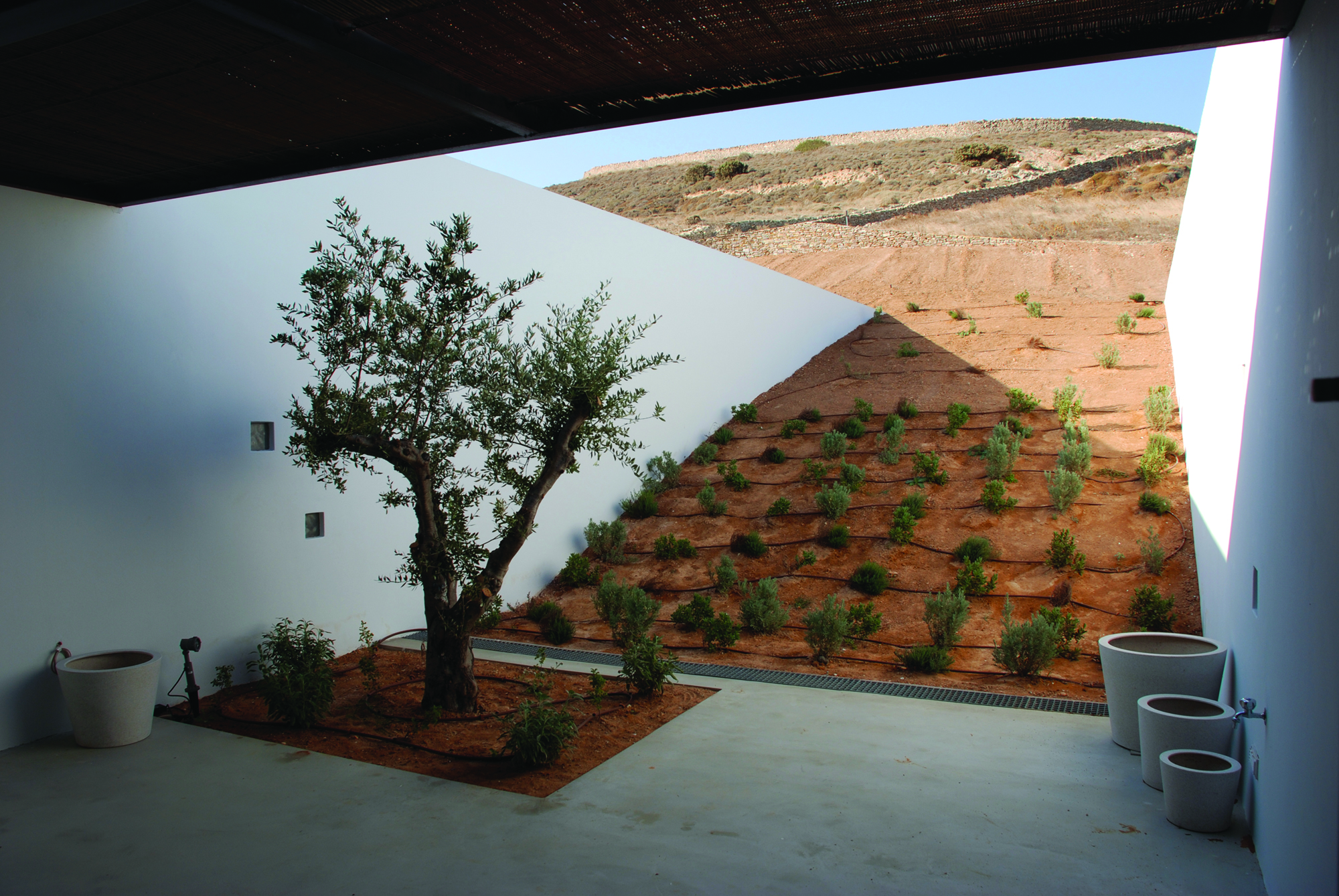
The term “yposkafo” stands for a building that exists partially into the ground and is also known as undercut architecture. These seven residential projects explore the different techniques, processes and morphologies of houses that blend in with a site’s topography. Spanning through multiple levels, these residences include both extraordinary underground spaces as well as limitless country and seaside views.


Xerolithi

By Sinas Architects, Serifos, Greece

Jury Winner 2021, A+Awards, Architecture + Stone
<alt=

Photos by Yiorgos Kordakis

<alt=

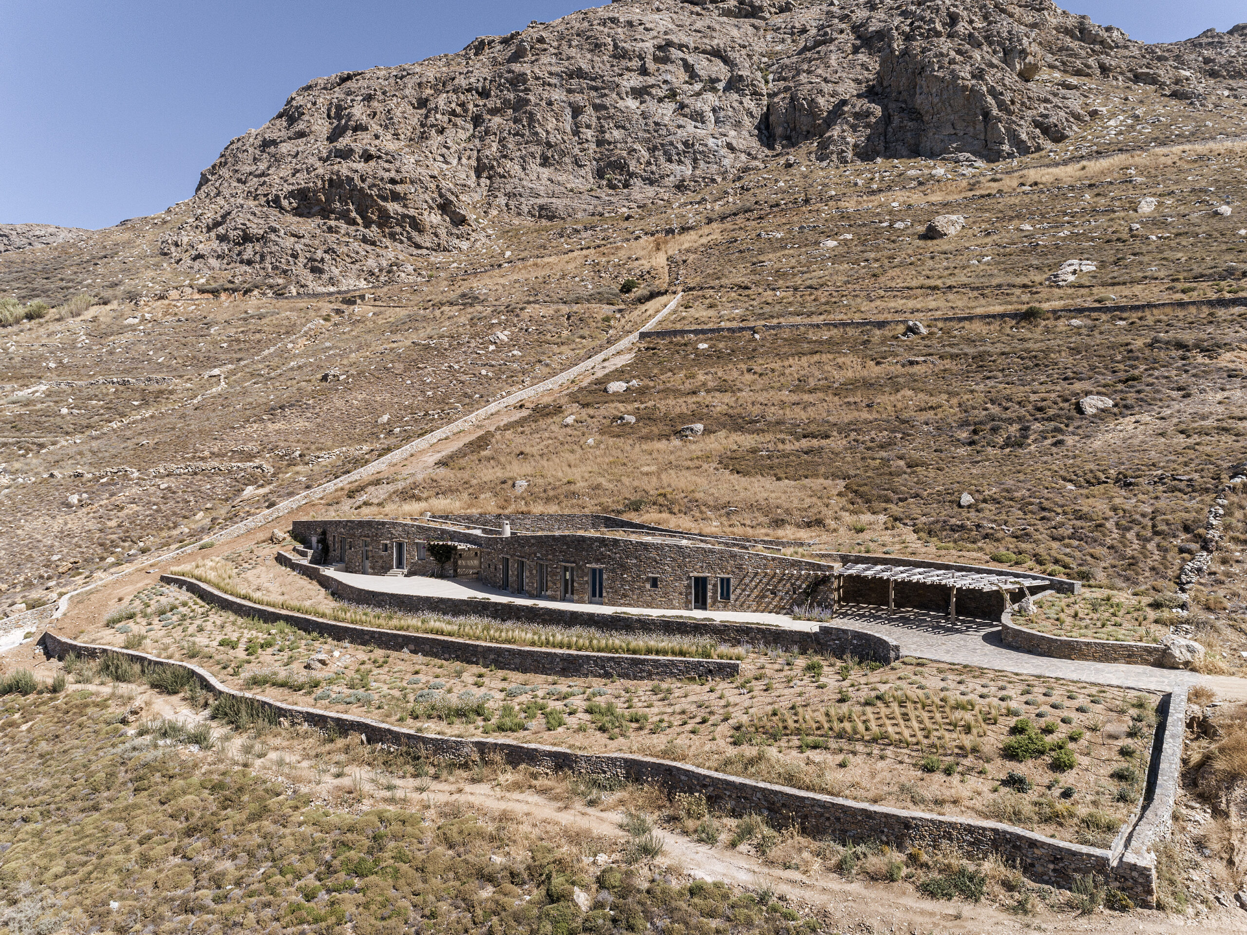
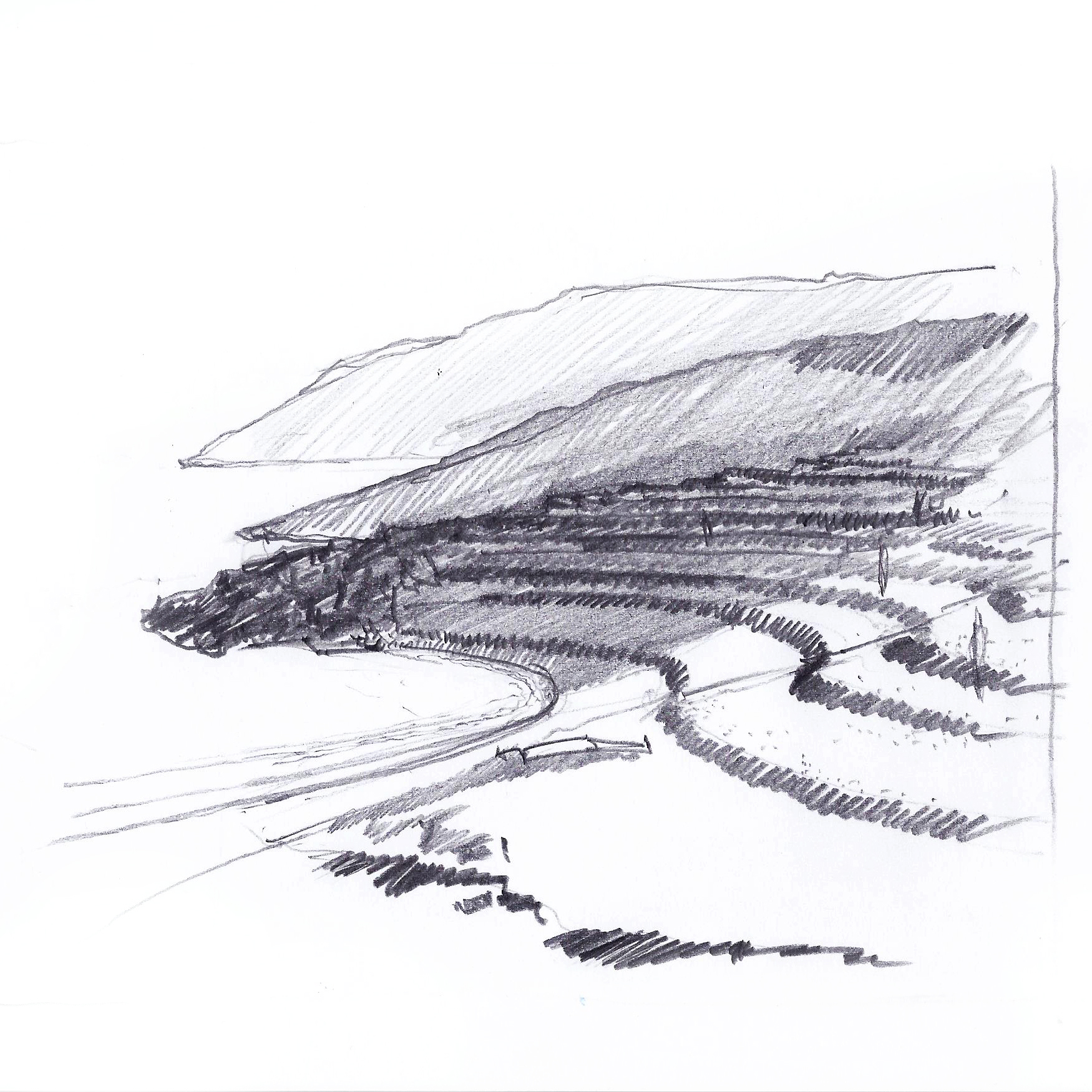
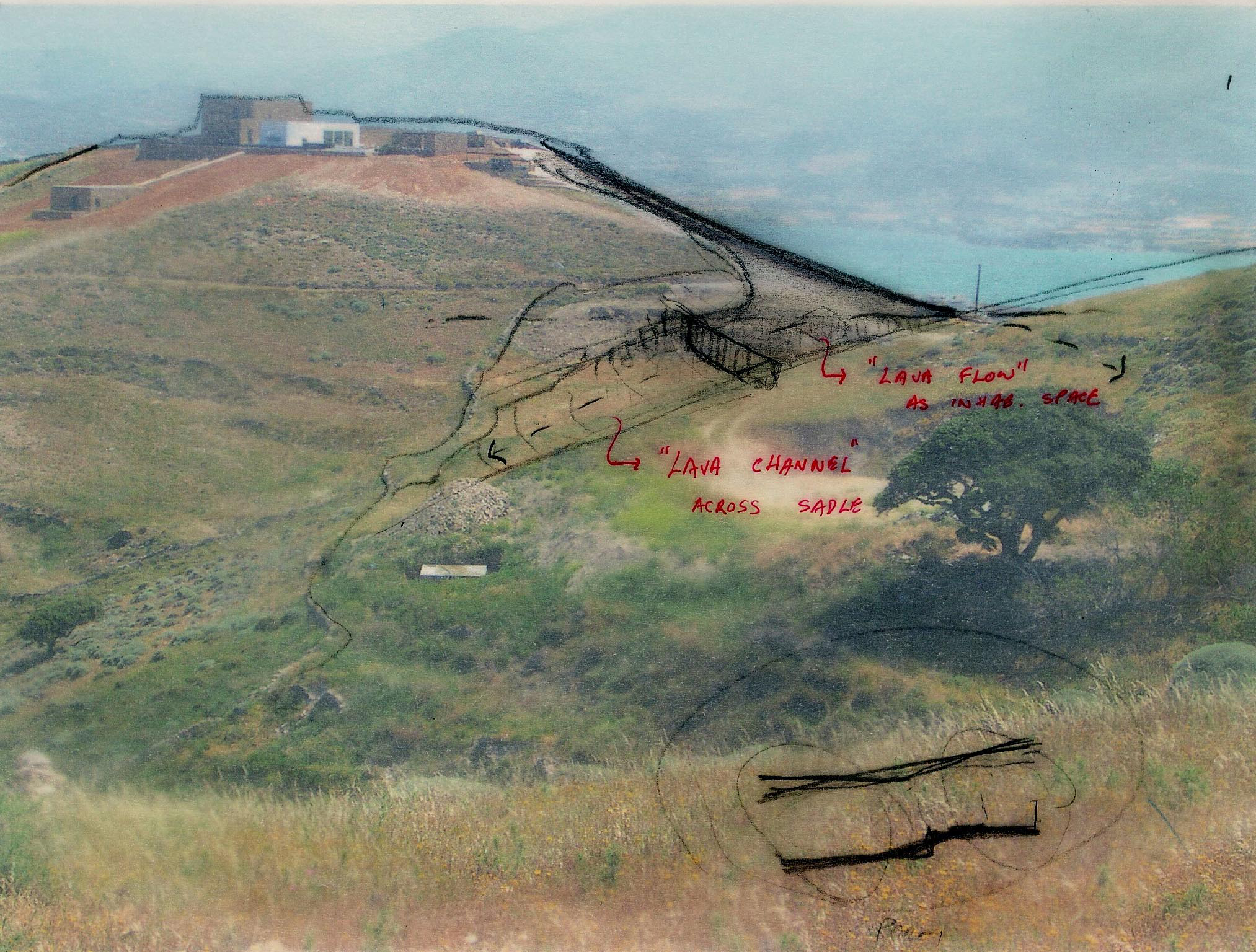
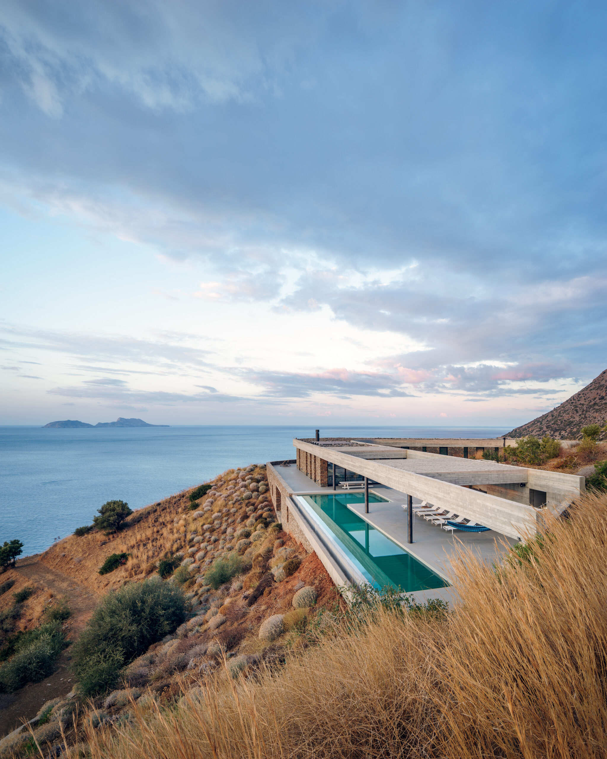
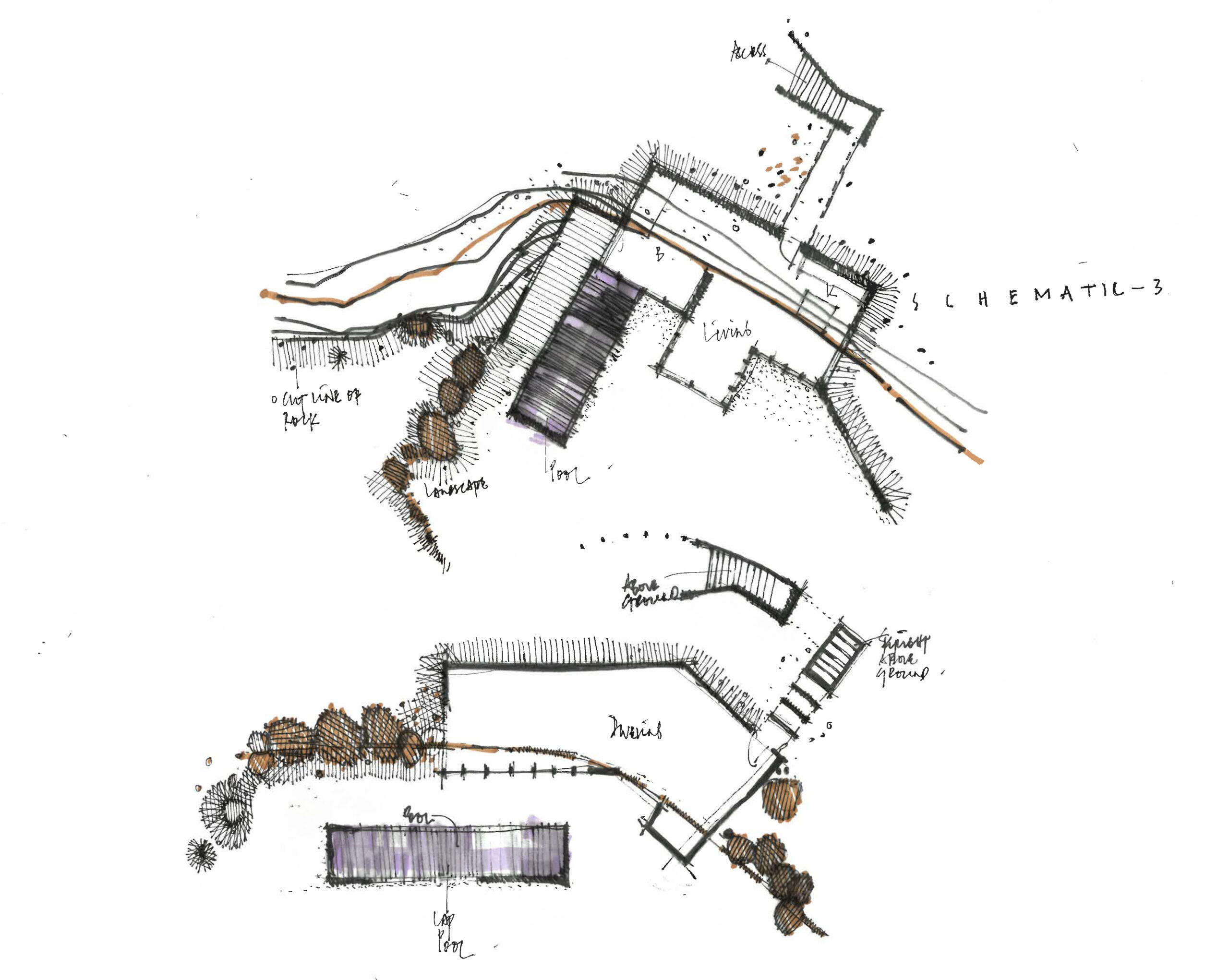
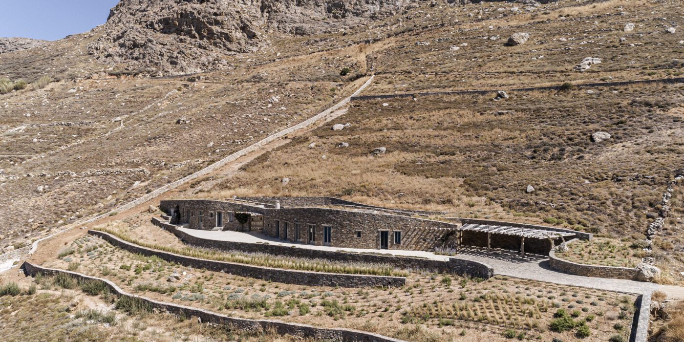
Topography and landscape are the two essential ingredients of Xerolithi. Breaking the preconceptions of a typical Cycladic house, Sinas Architects have exaggerated the island’s topographical contours, designing a house that seamlessly integrates with its surroundings. With walls built from the island’s stone and a roof that is covered with local plants and vegetation, the house is gradually emerging from the Mediterranean hill. Finally, a long, singular façade arranges the house’s functions in a linear order, successfully orienting it towards the sea.


Aloni

By Deca Architecture, Antiparos, Greece

<alt=
<alt=

Photos by Erieta Attali

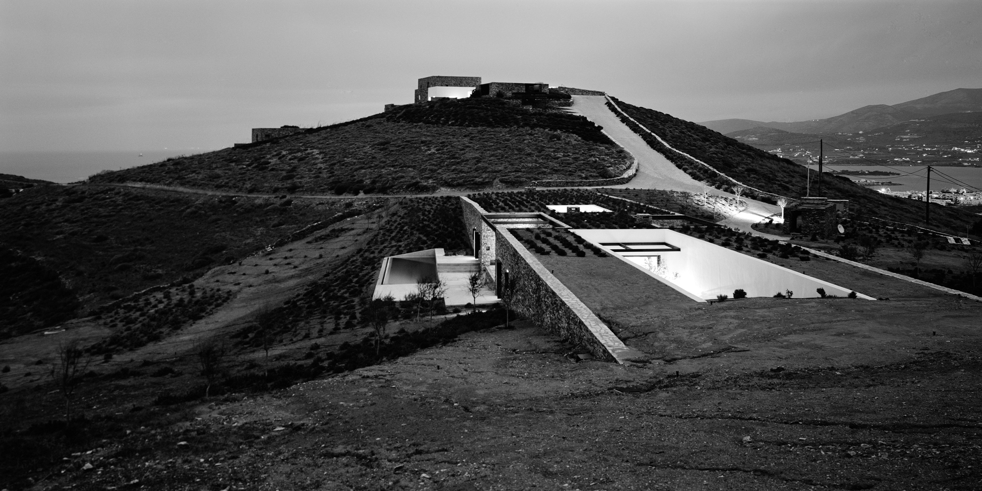
<alt=Aloni is also a house that trails the landscape. Still, in this case, the land is not raw or uninhabited, but rather a product of rural conversion practices. Following the agricultural motifs of the past, Deca Architecture employs a series of techniques such as carving, sinking and the use of existing retaining walls. They create a semi-artificial landscape that blurrs the edges between the natural and artificial ground morphology.


Ring House

By Deca Architecture, Crete, Greece

Jury Winner 2018, A+Awards, Private House (L 3000-5000 sq ft)
<alt=

<alt=

Photos by George Messaritakis

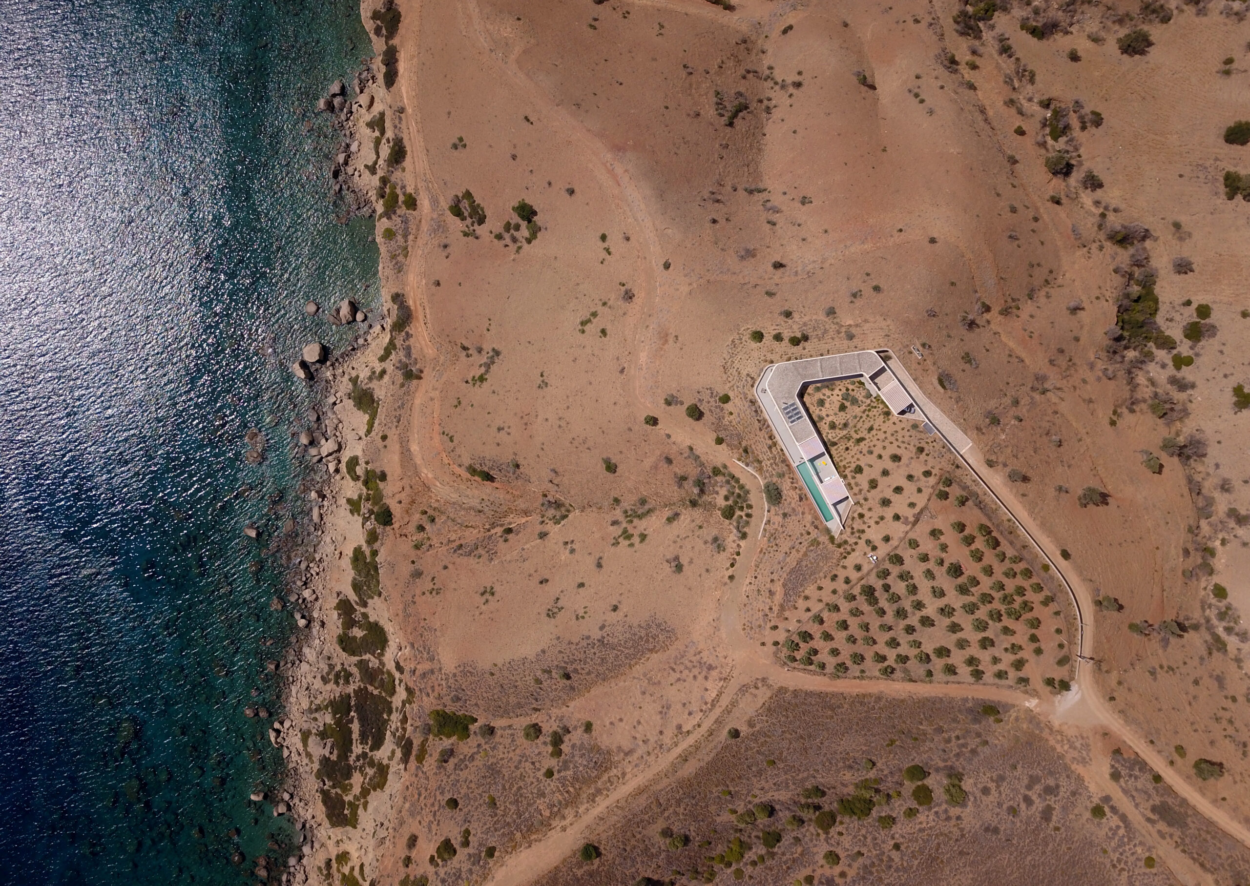
In addition to being a refined addition to Crete’s natural setting, the Ring House fulfills a wider agenda. After countless random interventions to the hill’s topography, Deca Architecture approached the house’s design as an opportunity to regenerate the surrounding landscape. Pursuing a reduce-waste approach, they used the excavated material to reconstruct the hill’s original morphology. At the same time, the Ring House itself acts as an exemplar for sustainable design. Its careful insertion into the landscape, results in the formation of a temperate microclimate fit for Crete’s desert-like environment.


Sheltered Villas

By A&M Architects, Karpathos, Greece
<alt= <alt=

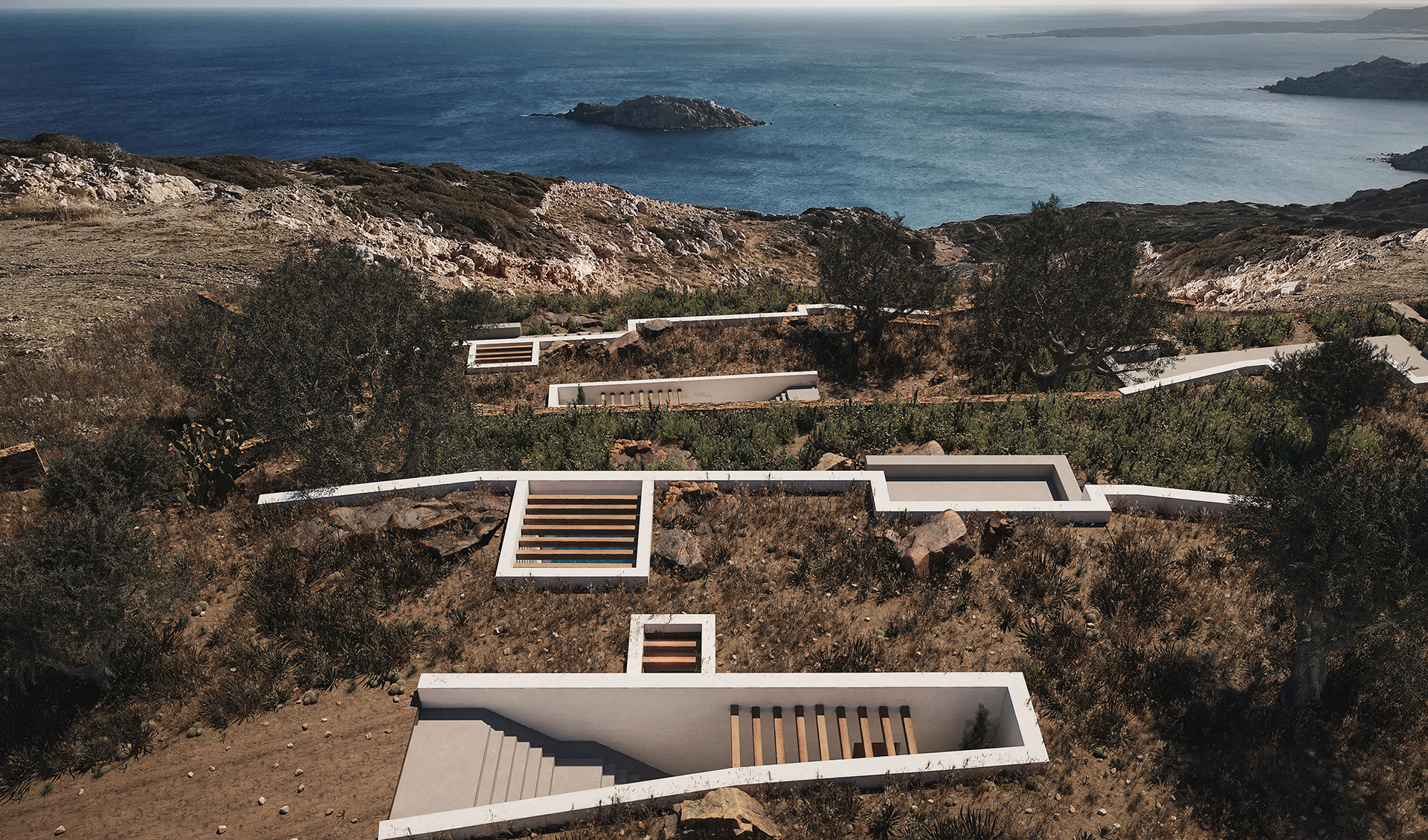
Sheltered but not concealed, A&M Architects designed three distinct villas in the island of Karpathos. However, instead of employing the classic “yposkafo” typology, they added a bit of a twist, treating the opposing facades of each house in the most contradictory way. On the one hand, a series of white retaining walls cut through the ground, clearly marking the back wall of each villa. On the front end of the house however, a single transparent façade creates a threshold between the inside spaces and the outside scenery.


KHI House & Art Space

By LASSA Architects, Methoni, Greece
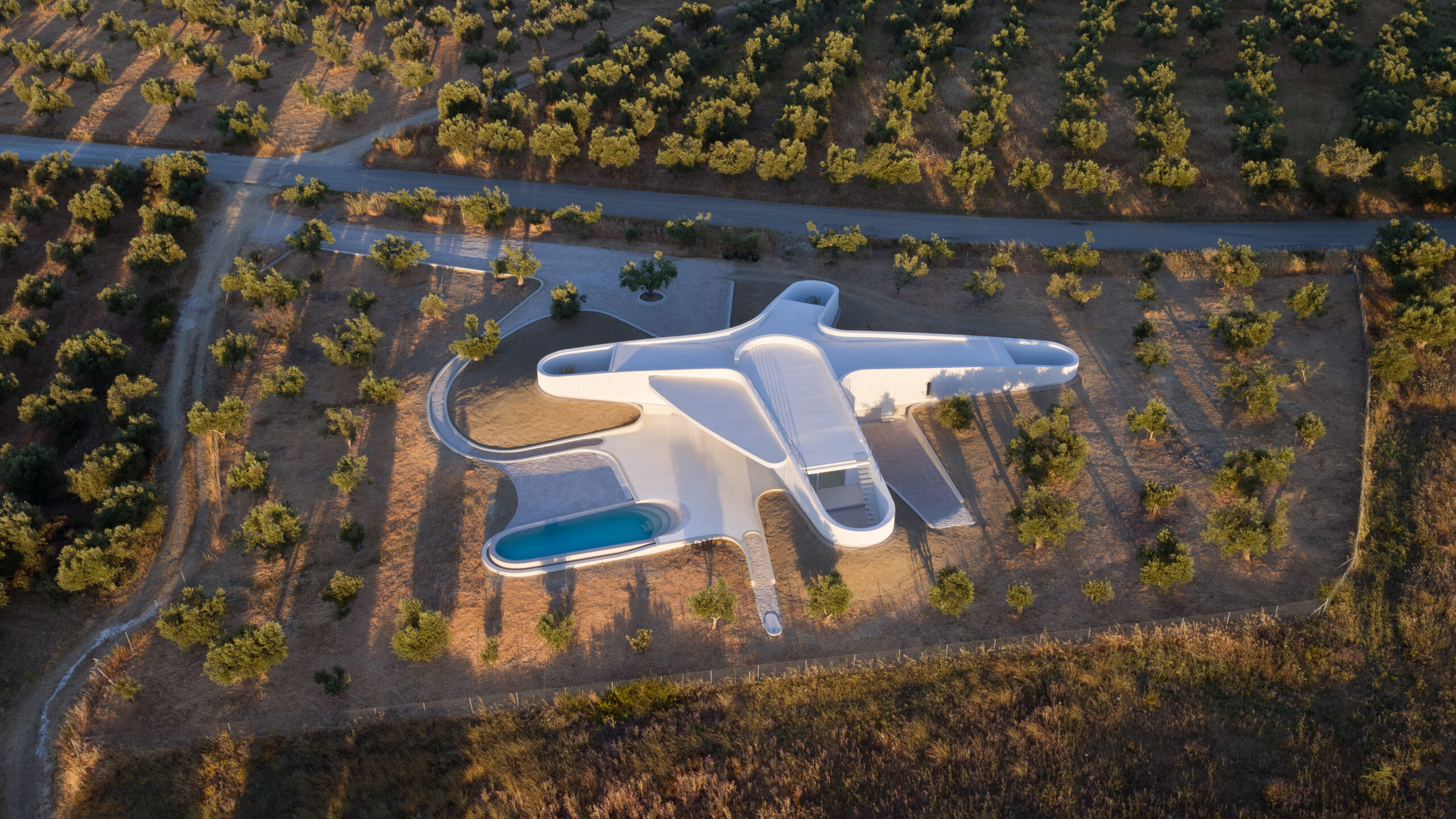
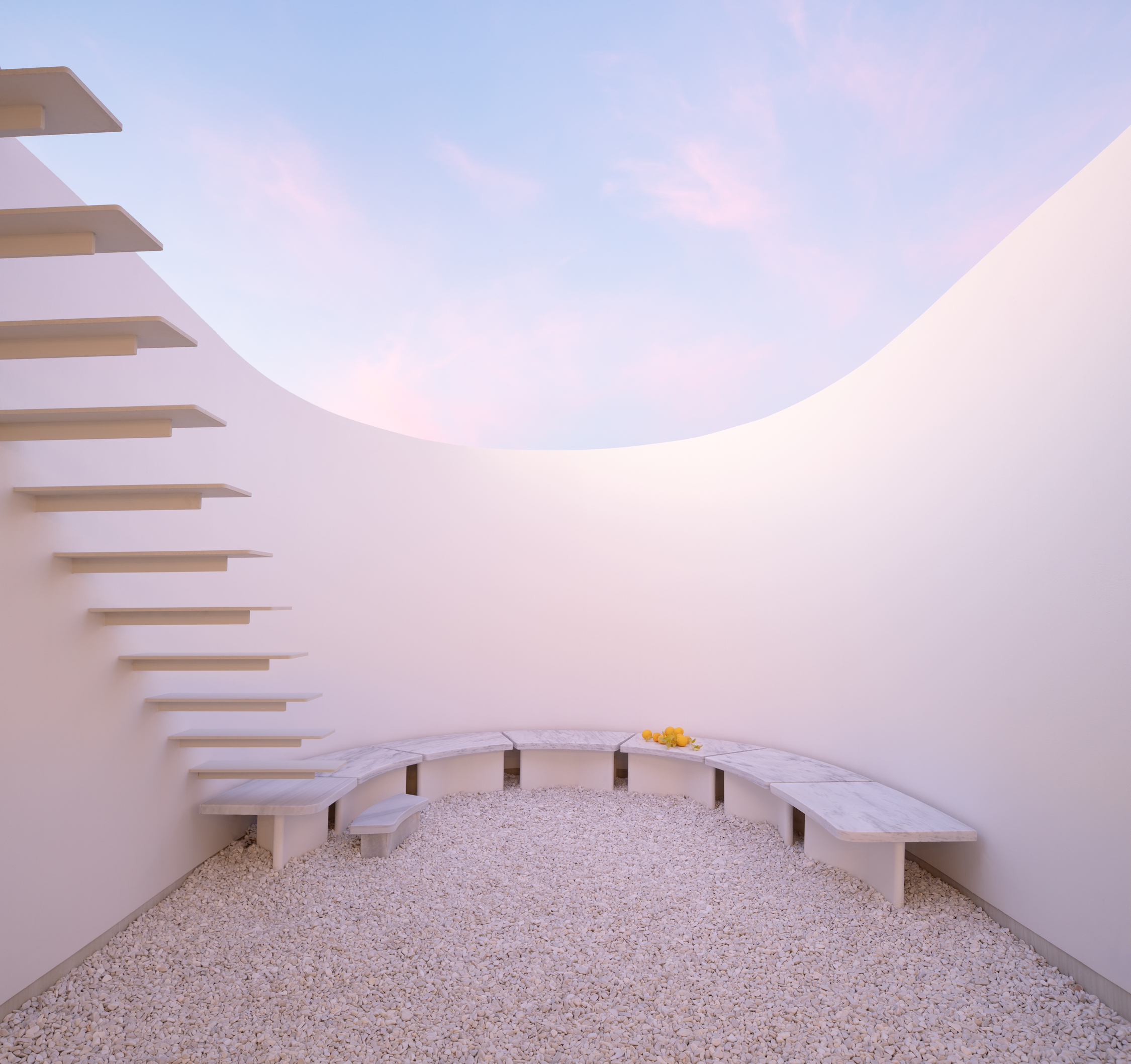
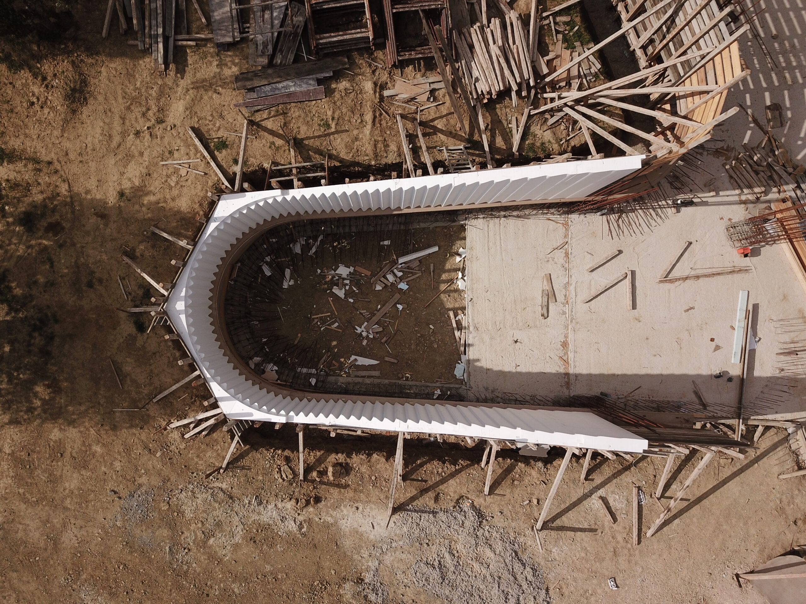
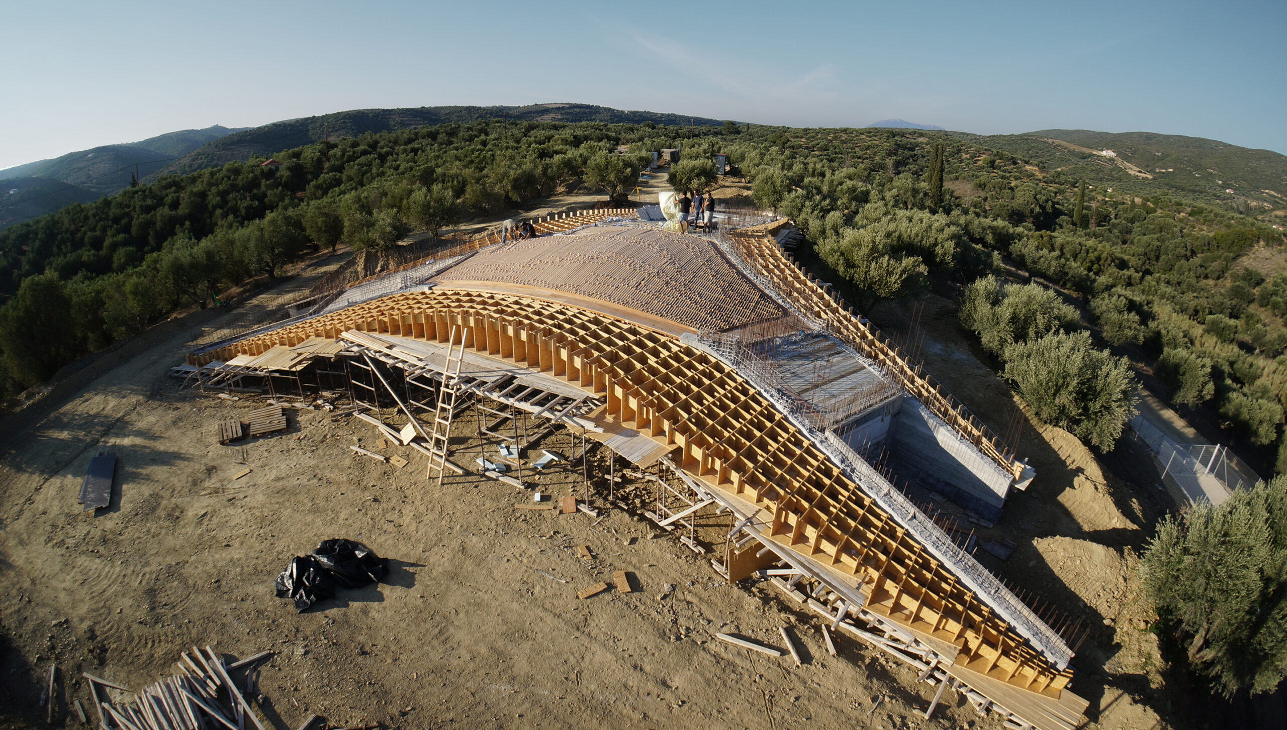
<alt= <alt= <alt=Located in a shallow Peloponnesian slope, KHI is a house full of contradictions. Playing with height as well as enclosure, LASSA Architects have merged courtyards, unrestricted roofs, underground gallery spaces, and sunbathed rooms all within a single rippling wall. The wall gradually sinks into the ground, continuously reframing the two functions of the house: the residence and the art space. It becomes an animating apparatus that shifts the landscape conditions around KHI House, gently integrating it with the immediate terrain.


House 6 °

By Mado Samiou Architecture, Lagonisi, Greece
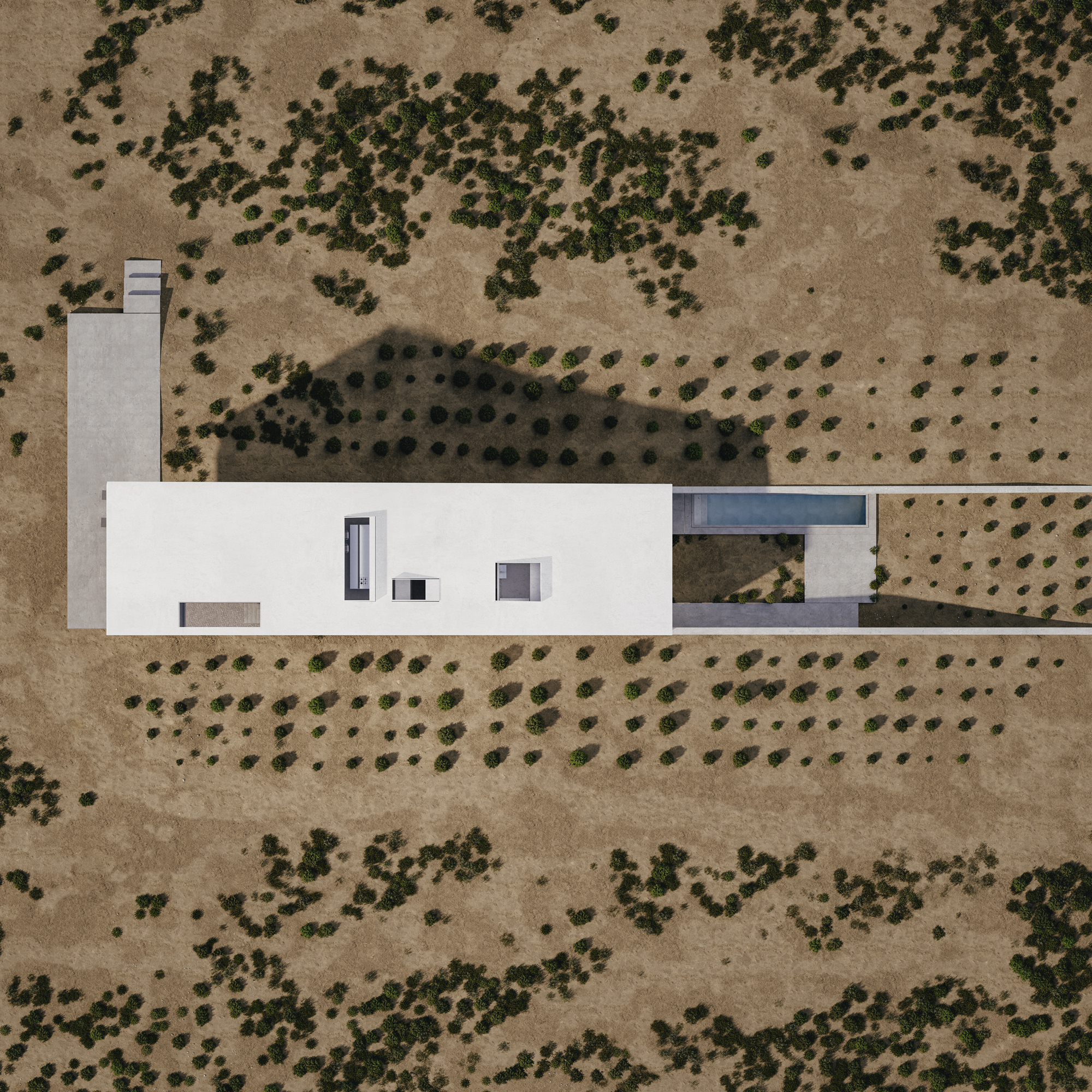
<alt= <alt=Built only a couple of miles away from Athens’s dense urban setting, House 6 ° celebrates the unspoiled nature of its setting. Emerging from the ground, the white solid structure compliments the incline of the adjacent hill. House 6 °separates its functional spaces into underground private areas, illuminated by a series of skylights, and common areas above the ground, strategically positioned towards the surrounding countryside views.


Villa Ypsilon

By LASSA Architects, Foinikounta, Greece
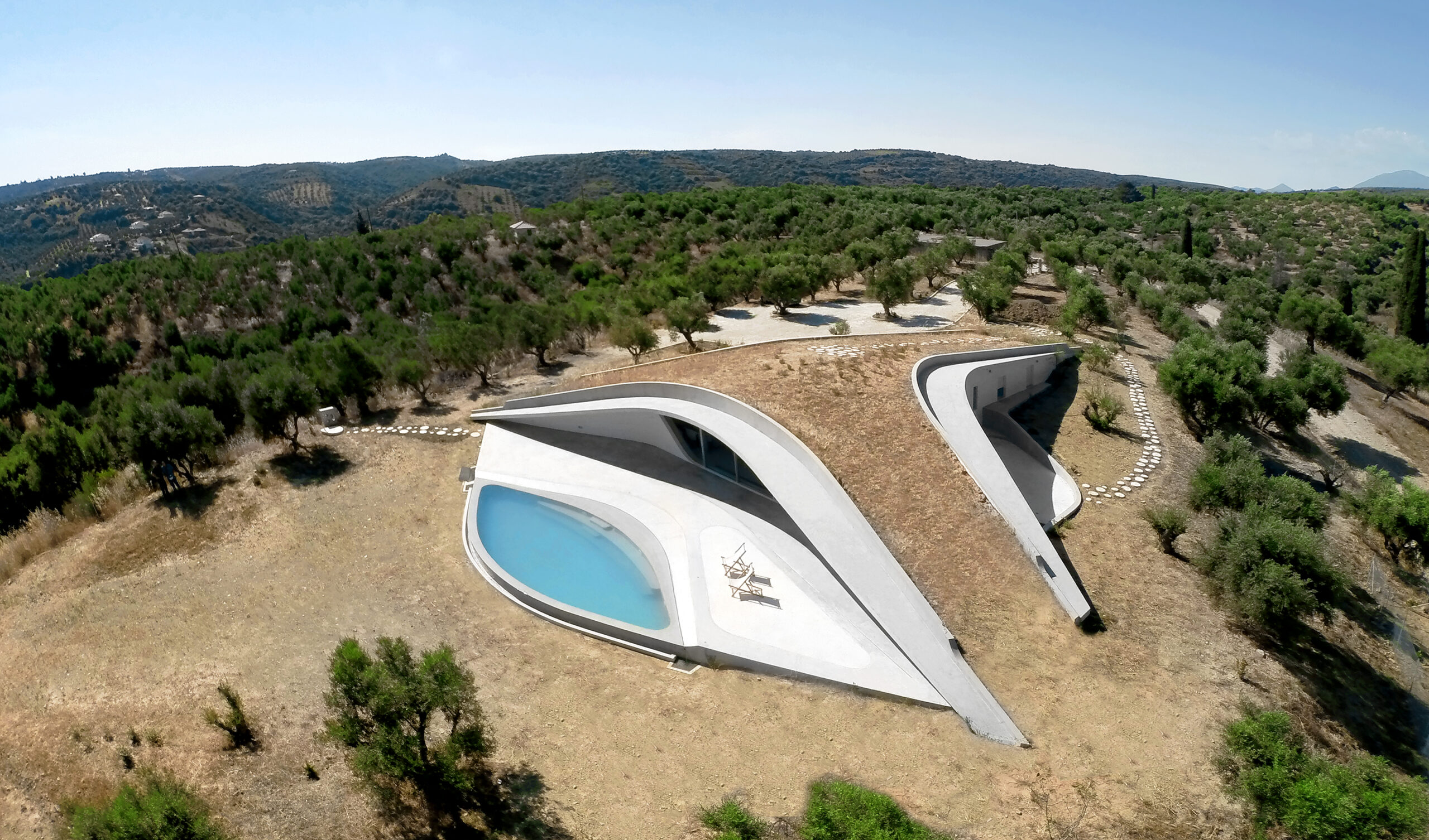
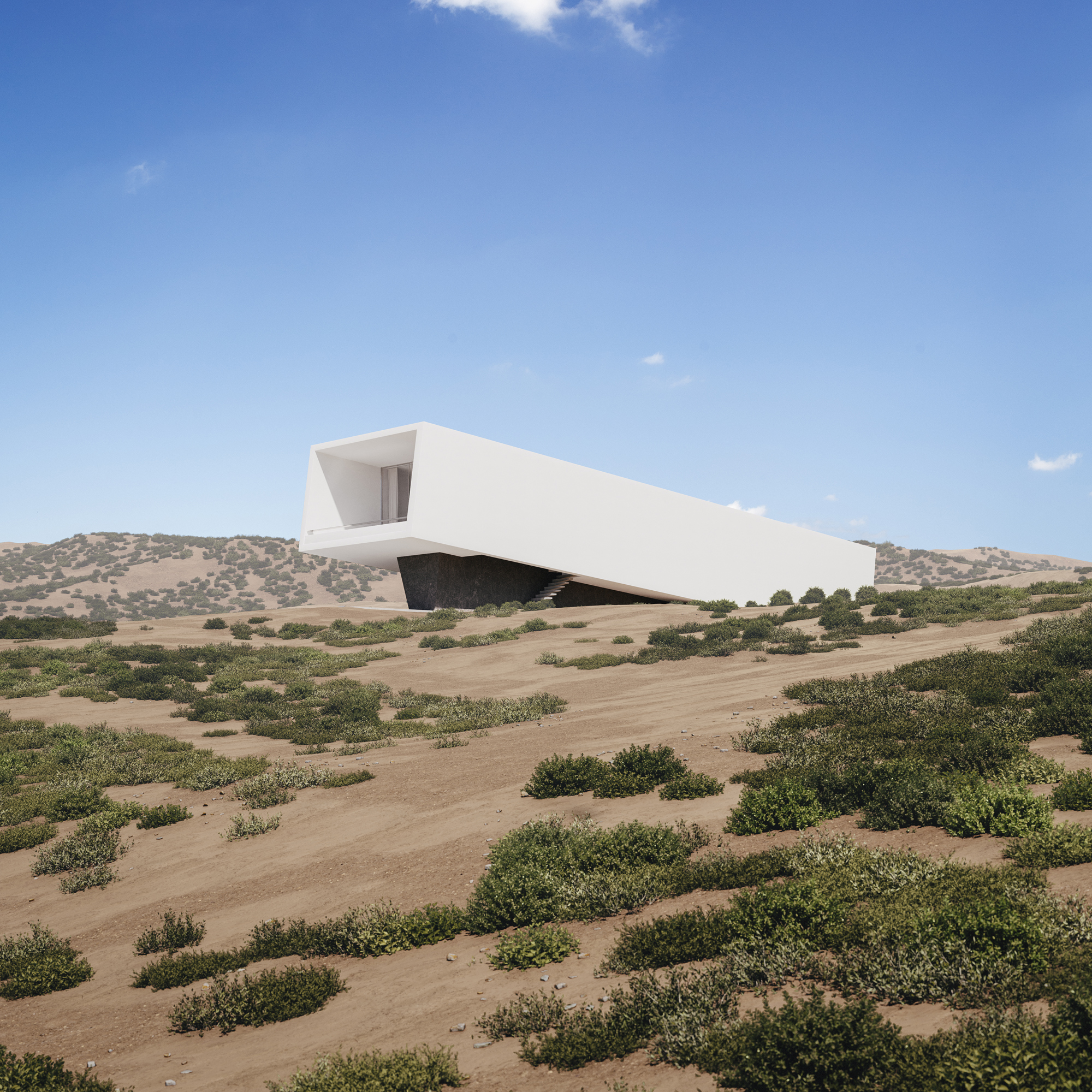
<alt= <alt=Villa Ypsilon is one of the most radical “yposkafo” residences, found inside a Peloponnesian olive grove. Instead of digging into the landscape, its design manipulates the ground’s surface, shifting it to a higher level. The roof of the villa becomes an integral part of the hill as well as a natural cooling mechanism for the entire space.

“Yposkafo” typology is predominantly established in rural areas in order to sustain Greece’s natural landscape. Greatly encouraged by Greek building regulations, it has become an intermediary solution for promoting international tourism without sacrificing its physical beauty.

Architects: Want to have your project featured? Showcase your work through Architizer and sign up for our inspirational newsletter. 

Reference

Let the Light In: Maximizing Natural Light in the Design of Oudong Residence
CategoriesArchitecture

Let the Light In: Maximizing Natural Light in the Design of Oudong Residence

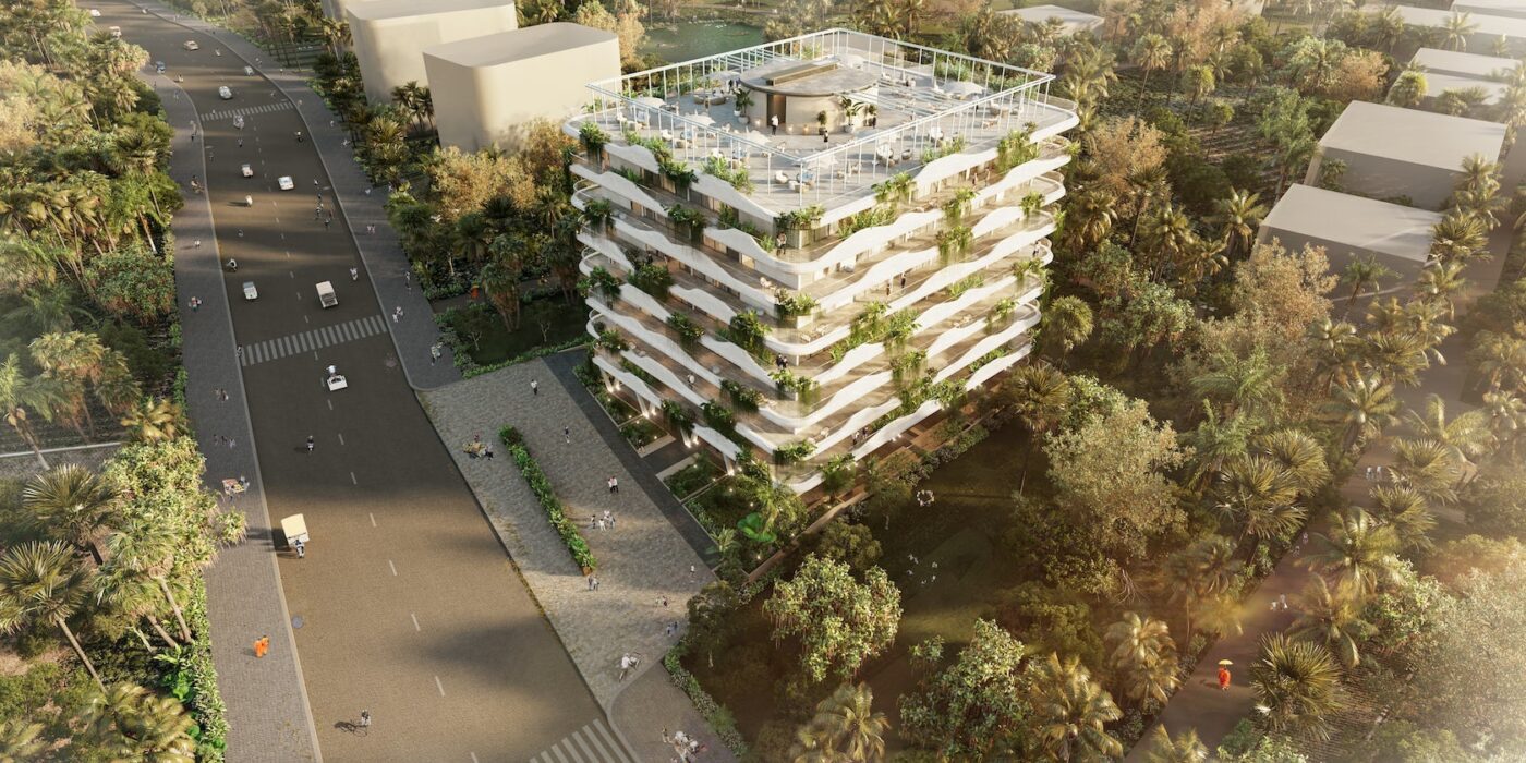
Oudong Residence – aims to combine functionality with artistic flair, creating living spaces that are both functional and visually appealing. Drawing inspiration from a unified composition of textures inspired by nature itself, and cultural influences, the creative vision for this particular residence emphasizes sustainability, innovative use of materials, and a seamless integration of indoor and outdoor spaces. The project brief outlines the key requirements and objectives for the residence, with a strong focus on maximizing natural light, ensuring energy efficiency, and fostering a sense of community among the occupants. Furthermore, the design aims to be adaptable to the evolving needs of the residents, reflecting a dynamic and modern approach to residential architecture.

Architizer chatted with Alessandro Mangano, Partner at Architectural Engineering Consultants, to learn more about this project.

Architizer: What inspired the initial concept for your design?

Alessandro Mangano: The initial concept for the residential design was inspired by the desire to create a harmonious balance between modern living and nature. Drawing upon elements from various architectural styles, the design seeks to establish a seamless connection with the surrounding environment, while ensuring functionality and comfort for its inhabitants. The use of sustainable materials and energy-efficient technologies further reflects our commitment to preserving the ecosystem and promoting a greener future. Ultimately, this architectural concept aims to provide a haven where residents can enjoy the best of both worlds – contemporary living in tune with nature’s grace.

© Architectural Engineering Consultants

© Architectural Engineering Consultants

This project won in the 10th Annual A+Awards! What do you believe are the standout components that made your project win?

One of the key factors that contributed to the success of our project was the exceptional collaboration and communication among team members. This enabled us to leverage individual expertise and skills to move the project forward effectively. Another standout component was our dedication to continuous improvement and adaptability. By constantly assessing our progress and adapting our strategy, we were able to overcome challenges and ensure the timely delivery of a high-quality project.

© Architectural Engineering Consultants

© Architectural Engineering Consultants

What was the greatest design challenge you faced during the project, and how did you navigate it?

The greatest design challenge we faced during the project was effectively balancing aesthetics with functionality. Understanding the importance of incorporating visually appealing elements while maintaining the project’s core purpose was crucial to its success. To navigate this challenge, we fostered open communication among team members to ensure we understood their expectations and goals. Additionally, we incorporated iterative design processes, allowing for continuous adjustments and improvements while keeping both aspects in harmony.

© Architectural Engineering Consultants

© Architectural Engineering Consultants

How did the context of your project — environmental, social or cultural — influence your design?

The Cambodian context of the project had a significant impact on the design process, particularly in regards to the environmental, and cultural factors. The diverse ecosystems near the outskirts of Phnon Penh city, required us to carefully consider the environmental impact of our design, ensuring that it would support sustainable development in the region. Moreover, we incorporated elements into our design, to feel a deeper connection to the space while also respecting the traditions of the community. Lastly, we accounted for the social dynamics within the Khmer societies, emphasizing elements that encourage communal interactions and emphasizing harmony with the natural environment.

© Architectural Engineering Consultants

© Architectural Engineering Consultants

© Architectural Engineering Consultants

© Architectural Engineering Consultants

© Architectural Engineering Consultants

© Architectural Engineering Consultants

© Architectural Engineering Consultants

© Architectural Engineering Consultants

For more on the Oudong Residence, please visit the in-depth project page on Architizer.

Oudong Residence Gallery

Reference

Blending In with Nature: The Inspiration Behind COMMOD-Haus GmbH’s Weekend Home
CategoriesArchitecture

Blending In with Nature: The Inspiration Behind COMMOD-Haus GmbH’s Weekend Home


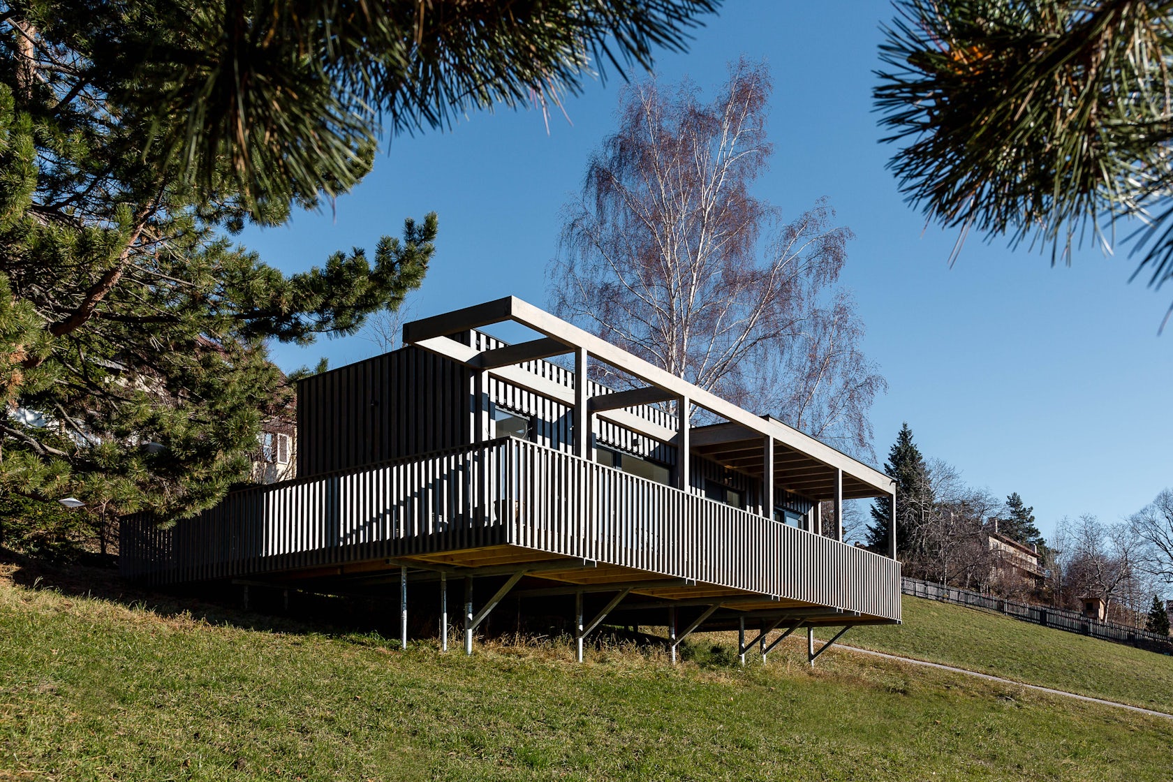
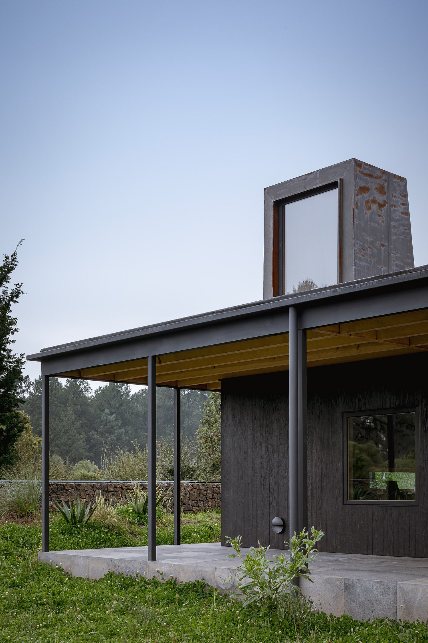
The Little Black One – The ambition of this project was to design a house that blended so perfectly into the breathtaking landscape as if it had always been there. It didn’t need to show off as the scenery speaks for itself but still it should live up to the ambition of providing its owners an elegant weekend spot. A house that is always in style – like a little black dress – that keeps on fascinating you over and over again.

Architizer chatted with Michaela Maresch, CEO & Founder at COMMOD-Haus GmbH, to learn more about this project.

Architizer: What inspired the initial concept for your design?

Michaela Maresch: COMMOD “The Little Black One” was definitely inspired by nature. The harsh, wide, mountain landscape at Semmering was inspiration and challenge at once.

© Commod-Haus GmbH

© Commod-Haus GmbH

This project won in the 10th Annual A+Awards! What do you believe are the standout components that made your project win?

The Little Black is an amazing example of how architecture can set the stage for the beauty of nature. I think that people currently desire to live closer to nature than ever before and this house reflects a simple yet stunning way to do so.

The minimalistic form of the house, the colour chosen for the spruce wood façade and the play of light and shadow that reveals different shades of black on the façade.

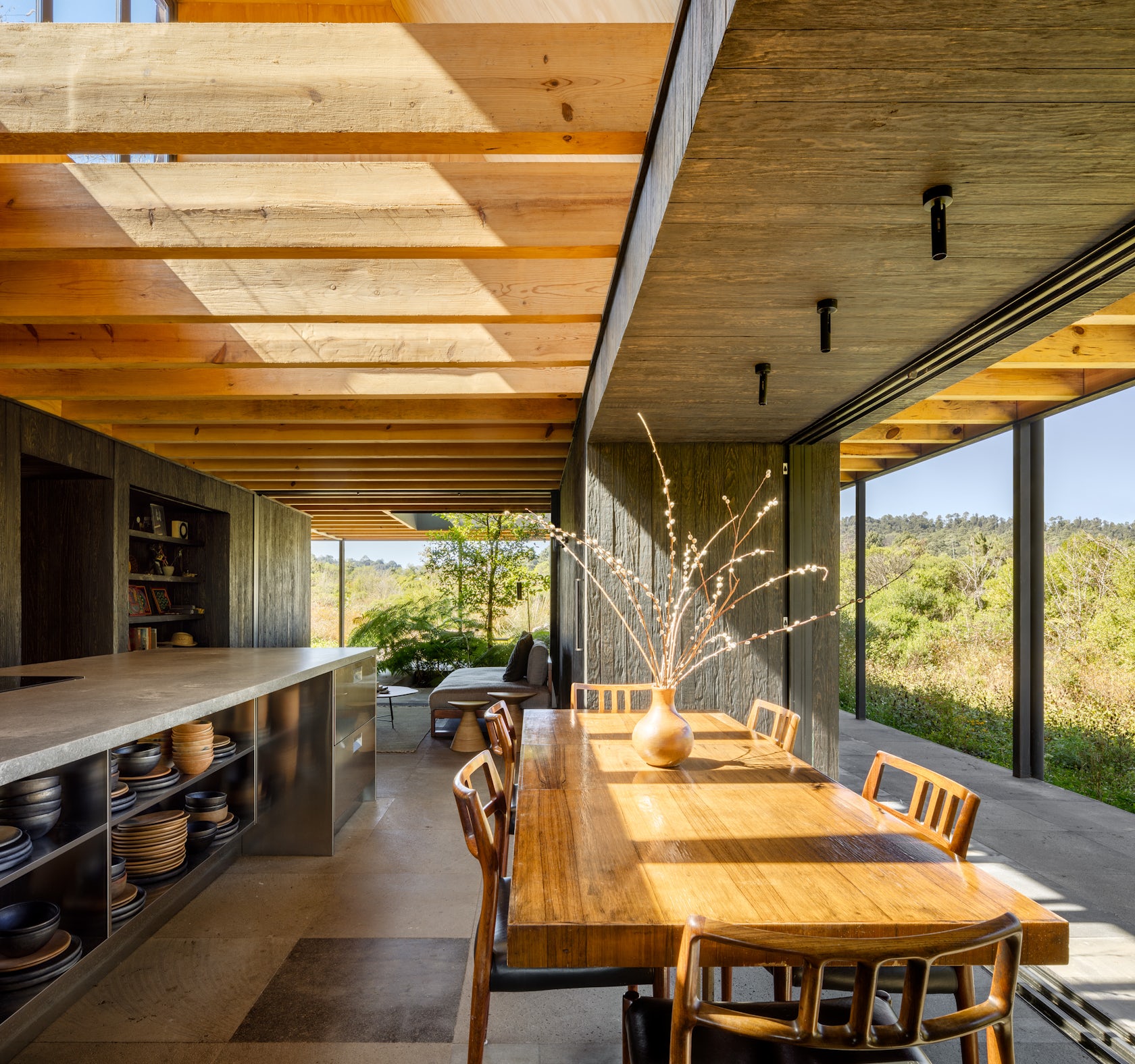
Well protected from the harsh climate outside by the beautiful wooden façade, the living area inside is flooded with light. The generous window fronts and open spaces create a sense of even being part of nature while still enjoying all amenities of a modern home.

© Commod-Haus GmbH

© Commod-Haus GmbH

What was the greatest design challenge you faced during the project, and how did you navigate it?

The main strength of this project was also its biggest challenge: a gentle, subtle embedding of the house into the existing terrain that yet creates a connection to the partents home next door and emphasises the view of the mountains.

© Commod-Haus GmbH

© Commod-Haus GmbH

How did the context of your project — environmental, social or cultural — influence your design?

The design of this project is only fully comprehensible if you take into account its entire context. The client-family living in the big city of Vienna wanted to spend their weekends away from it all in pure nature. It was our top priority to give them a space where they could fully breathe in the beauty of nature. However, considering the fact that they did not want to harm this nature in any way by building their weekend house, our construction method was simply ideal for them. The screw foundations can be removed without leaving any residue after their lifecycle is over. Soil sealing is absolutely not an issue here. So they can live in harmony in and with nature.

© Commod-Haus GmbH

© Commod-Haus GmbH

What is your favorite detail in the project and why?

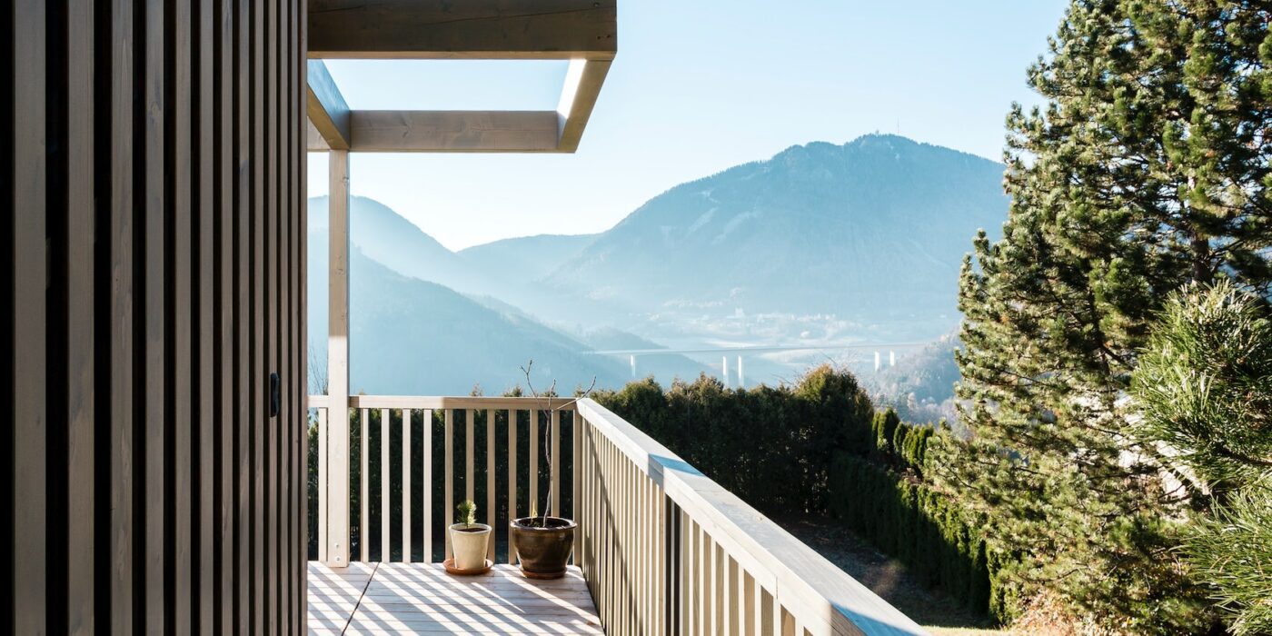
I can’t help but love the walkway that leads onto the terrace. It reveals this unique distant view of the rugged mountains, but at the same time exudes a calming effect on the visitor through the natural materials and the regularity of the slats.

© Commod-Haus GmbH

© Commod-Haus GmbH

How important was sustainability as a design criteria as you worked on this project? 

As already mentioned, it was extremely important to the owners not to interfere too much with nature. Using the system of point foundations, this was not a problem.

Basically, sustainability has been anchored in our DNA since the creation of our company, so for us it is almost not worth mentioning that our material consists of 99% renewable raw materials. We work hard to be and remain pioneers in this field.

© Commod-Haus GmbH

© Commod-Haus GmbH

How have your clients responded to the finished project?

This project illustrates all our strengths: Sustainability, adaptability, modern design, high quality standards and speed on site (this house took only one day to be delivered and assembled).

© Commod-Haus GmbH

© Commod-Haus GmbH

How has being the recipient of an A+Award evoked positive responses from others?

We are always very honoured when our houses receive awards. This not only makes us proud, but also the owners of the houses. But here it was something even more special. There are few awards that are as internationally respected as the Architizer A+Award. We feel grateful and happy to have become part of the Architizer Family and hope to impress with many more innovative projects in the future.

© Commod-Haus GmbH

© Commod-Haus GmbH

Team Members

Michaela Maresch, Gerald Brencic, Volker Ast, Ingmar Zwirn, Uwe Lackner, Gamze Olcay, Oumaima Laassibi, Lisa Gattebrauer, Rita Fruhmann, Jannis Fielers, Nadja Wieland

Products and Materials

Colour Synthesa „Greywood Forest 03“

For more on The Little Black One, please visit the in-depth project page on Architizer.

The Little Black One Gallery

Reference

mobile architectural office fuses parisian residential architecture
CategoriesArchitecture

mobile architectural office fuses parisian residential architecture

mobile architectural office unites parisian urban archetypes


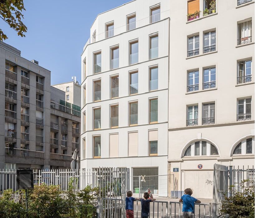
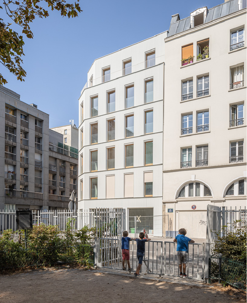
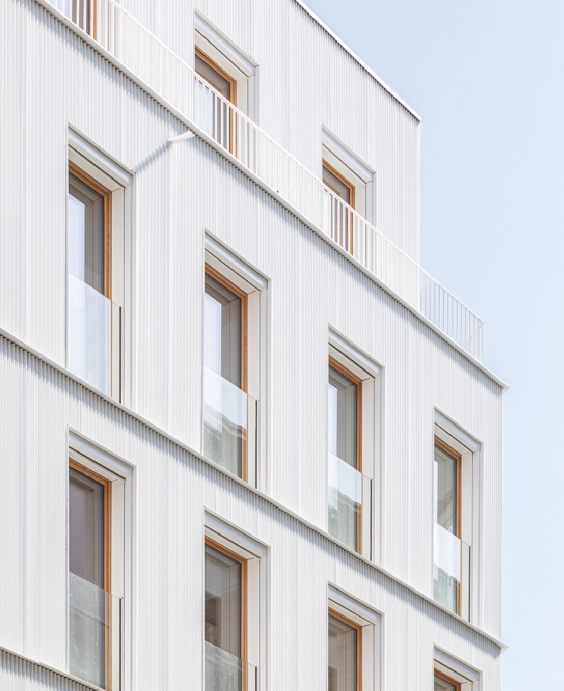
At the intersection of three Parisian urban situations in the heart of the French capital sits Mobile Architectural Office’s multifaceted new residential complex. Comprising six housing units and a commercial space, the project is concealed behind a white ribbed metal skin that unites the characteristic qualities of the city’s neighboring faubourien architecture with discreet modenature, the cohesive neatness of the brick facades, and the classical architectural language reinterpreted by postmodern structures from the 1980s.


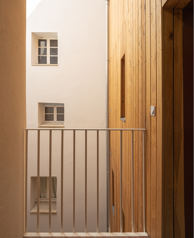
Across its five stories, the program configures six dwelling units, including two triplexes on the ground floor, above a commercial space. Each unit is arranged around a central courtyard, its inner facade clad in natural wood, and is served by a communal staircase and exterior landings for shared uses between neighbors.

wooden residential complex by mobile architectural office reinterprets characteristic parisian suburban architecture
all images © Cyrille Lallement


6 housing units concealed behind a ribbed metal skin


The site is located at the corner of rue Robert Blache and rue du Terrage. To echo its suburban fabric, the project reinterprets the fusion of faubourienne architecture, compact volumetry, facades ordered by regular vertical openings, discreet modenature, and simple expressions of construction. 


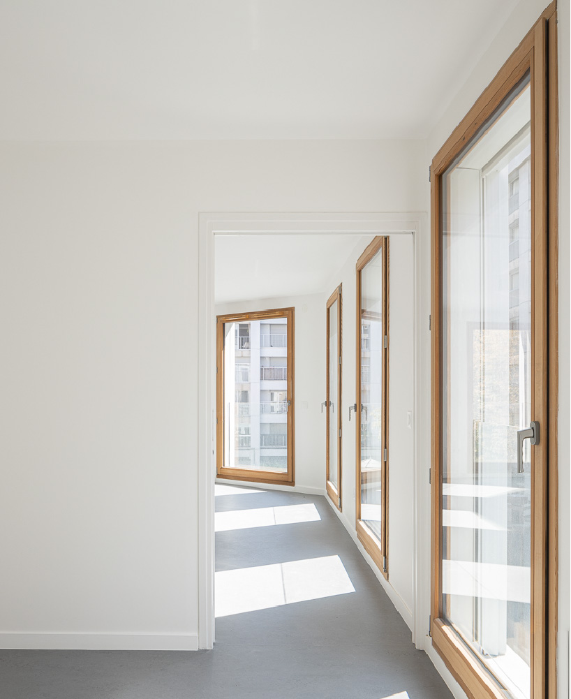
On the ground floor on rue Robert Blache, the team at Mobile Architectural Office has injected a strong sense of animation along the streetfront by integrating several retail spaces. Access to the residential flats is created via a bright walk-through hall overlooking the adjacent Rue du Terrage. On the upper floors, all dwellings are double or triple oriented and punctuated with uniform windows offering optimal natural light to inhabitants. Inside, some structural elements of the wooden joinery have been revealed in discreet, natural expressions. 

wooden residential complex by mobile architectural office reinterprets characteristic parisian suburban architecture


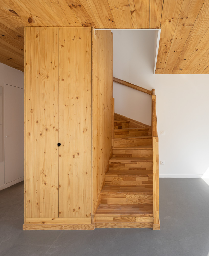
Mobile Architectural Office has developed a structural principle based on both vertical and horizontal prefabricated wood, with solid facades and floors from the Basque Country. This enables low carbon development and efficient construction, allowing the structure to be assembled within ten days. Further, in order to facilitate the large spans in the commercial premise and the relationship with the ground, the structure of the ground floor is made of concrete.


On the roof, a rainwater collection system captures precipitation and feeds the planter above the bicycle room and the green space on the ground floor. A recovery system in the tank supplies the taps in the common areas and all the sanitary facilities.

wooden residential complex by mobile architectural office reinterprets characteristic parisian suburban architecture

wooden residential complex by mobile architectural office reinterprets characteristic parisian suburban architecture

wooden residential complex by mobile architectural office reinterprets characteristic parisian suburban architecture

Reference

How Rain Harvest Home is Changing the Conversation Around Water Conservation in Mexico
CategoriesArchitecture

How Rain Harvest Home is Changing the Conversation Around Water Conservation in Mexico


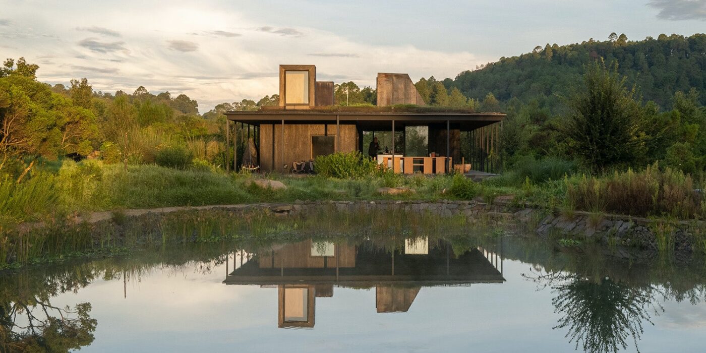
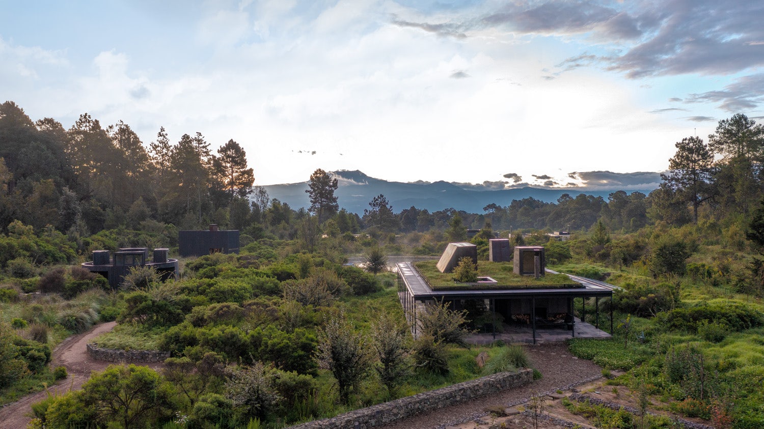
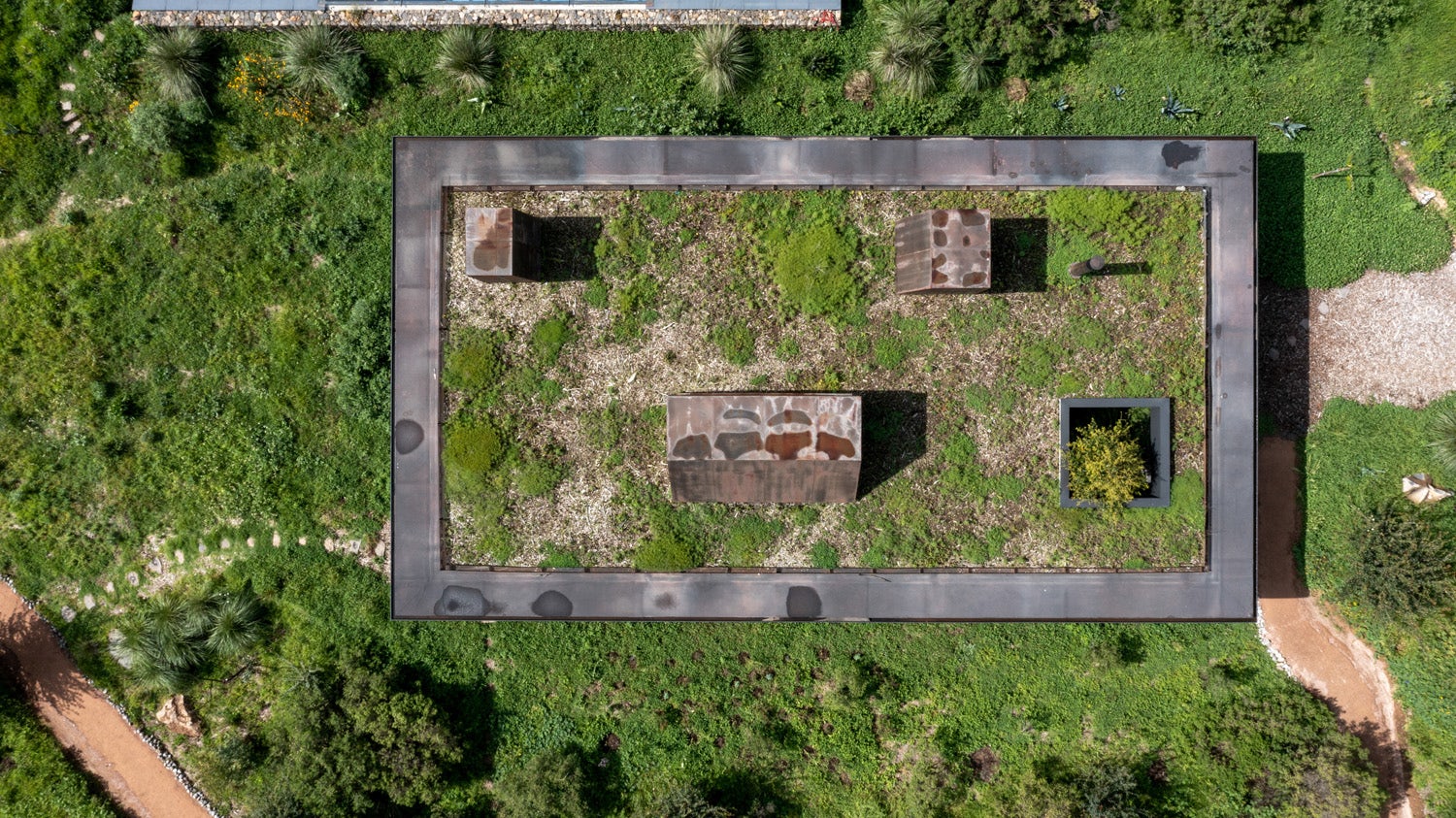
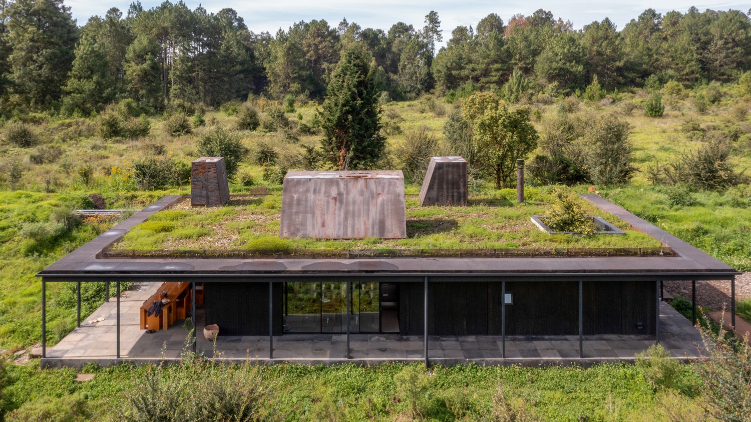
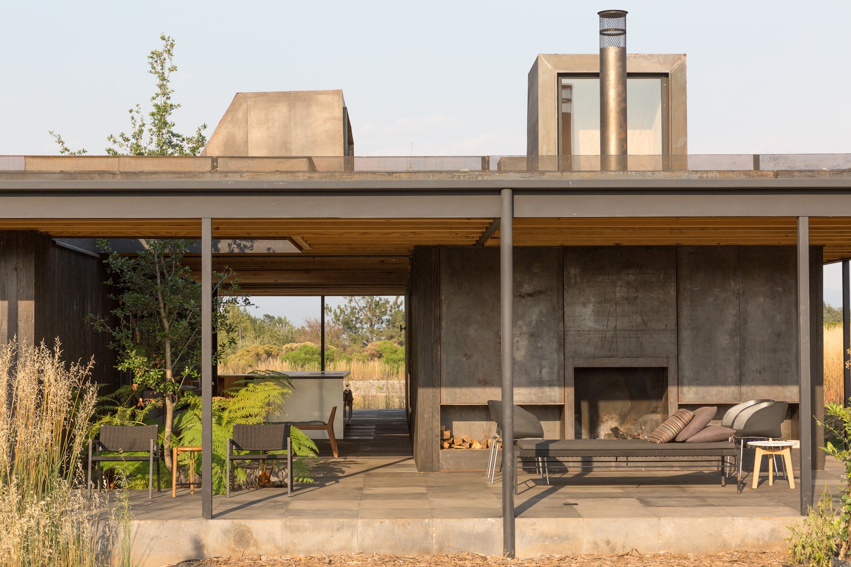
Rain Harvest Home – is located within Reserva el Peñón, a landscape-driven development which has achieved water self-sufficiency for a community of 80 families in 450 acres of a nature reserve, two hours from Mexico City. The Reserve framed our thinking around sustainability generally, and rainwater harvesting specifically. It pushed us to think at a larger level where the whole Reserve became the site, and the home was one piece of that. We also thought about how we could explore the larger issues of water conservation in Mexico, with this being an example of how to harvest rainwater on a small scale that could then apply to other projects. That became a driver in a powerful way. It was an idea that evolved over the course of the design process, and as the client became increasingly interested in cultivating a healthy, holistic lifestyle where they could live in harmony with the land.

Architizer chatted with Robert Hutchison from Robert Hutchison Architecture, and Javier Sanchez from JSa Arquitectura, to learn more about this project.

Architizer: What inspired the initial concept for your design?

Robert Hutchison & Javier Sanchez: The brief was simple: the clients wanted a small cabin to enjoy the mountainous site. Valle de Bravo has a dry season and a rainy season, and the sun plays a trick every day in both of those seasons. You can enjoy the sun, but you have to be careful with it. Here, you need to have spaces that are open and covered; enclosed and covered; and outside and uncovered. You need all three qualities, so we needed to make that happen within the three structures.

At the start, the project had a simple, classic program: 2 bedrooms, a bathroom, and a kitchen. When we were on site, we started developing the idea of splitting up the program into separate buildings. It started with wanting to separate the function of bathing, which led to the idea of the bathhouse. And then the separate studio emerged from that.

© JSa Arquitectura, Robert Hutchison Architecture

© JSa Arquitectura, Robert Hutchison Architecture

© JSa Arquitectura, Robert Hutchison Architecture

© JSa Arquitectura, Robert Hutchison Architecture

This project won in the 10th Annual A+Awards! What do you believe are the standout components that made your project win?

Rain Harvest Home offers a model for designing regeneratively with water. The home is 100% water autonomous and, in times of surplus, it is water positive and feeds excess water back into the community’s larger reservoir system. Not only does the design help restore the microclimate of the site, but it stands as a testament to the potential of rainwater harvesting for off-grid, self-contained water systems that eliminate reliance on municipal water sources. At the same time, the element of water contributes to the overall spatial and experiential quality of the project, reconnecting people with their environment by engaging the senses. More than any other element, conserving and improving the quality of water as a precious resource has the potential to dramatically improve the health and sustainability of built environments in Mexico, and beyond.
© JSa Arquitectura, Robert Hutchison Architecture

© JSa Arquitectura, Robert Hutchison Architecture

© JSa Arquitectura, Robert Hutchison Architecture

© JSa Arquitectura, Robert Hutchison Architecture

What was the greatest design challenge you faced during the project, and how did you navigate it?

Integrating the rainwater system was an initial design challenge, and continues to be an everyday challenge. Now, the rain harvesting system and on-site reservoir are a learning laboratory where the clients are continually learning about how the system performs. Understanding that the water and food systems on site are part of a living process that fluctuates depending on changing natural conditions, the client continues to experiment in ways to optimize the system through seasonal calibrations and refinements. Nothing is as objective as science would make it seem because things are always changing over time depending on how much it rains, and when. The house has to live with that, and it’s a constant learning experience for us as designers. It’s about integrating design into the cycle of water and of life.

© JSa Arquitectura, Robert Hutchison Architecture

© JSa Arquitectura, Robert Hutchison Architecture

© JSa Arquitectura, Robert Hutchison Architecture

© JSa Arquitectura, Robert Hutchison Architecture

How did the context of your project — environmental, social or cultural — influence your design?

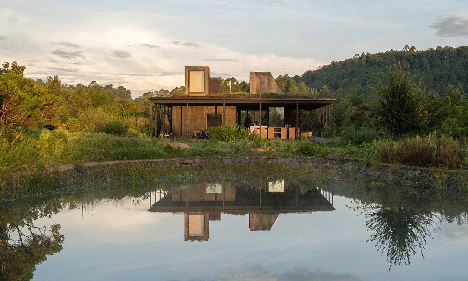
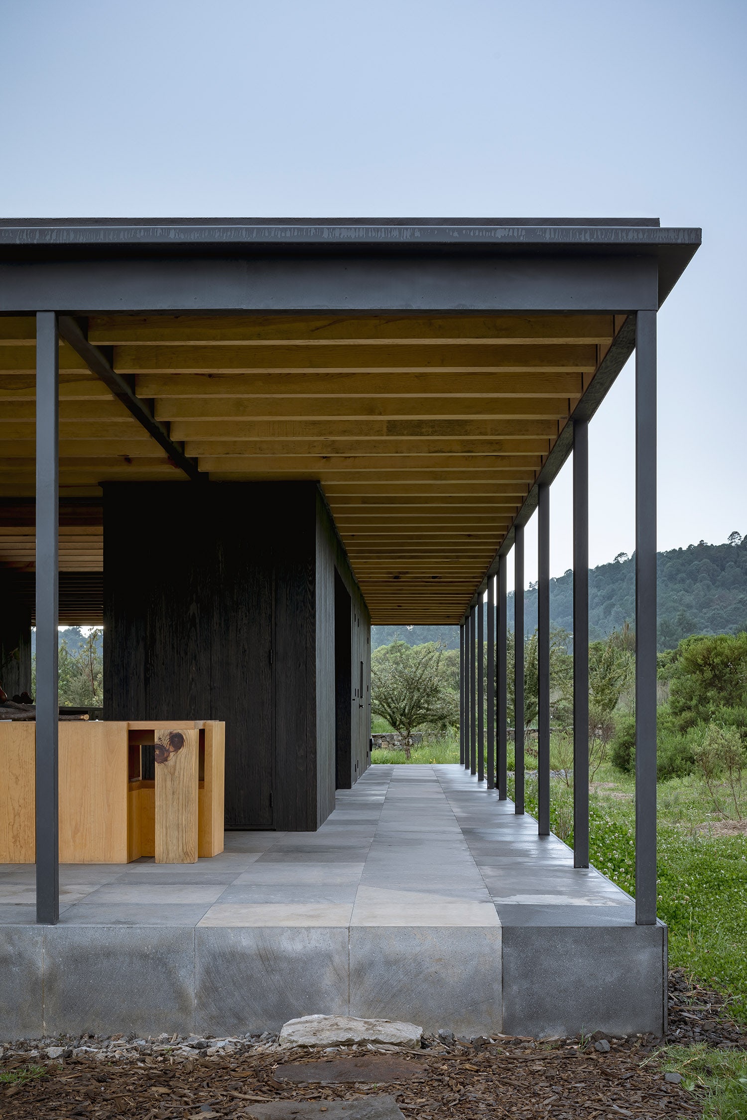
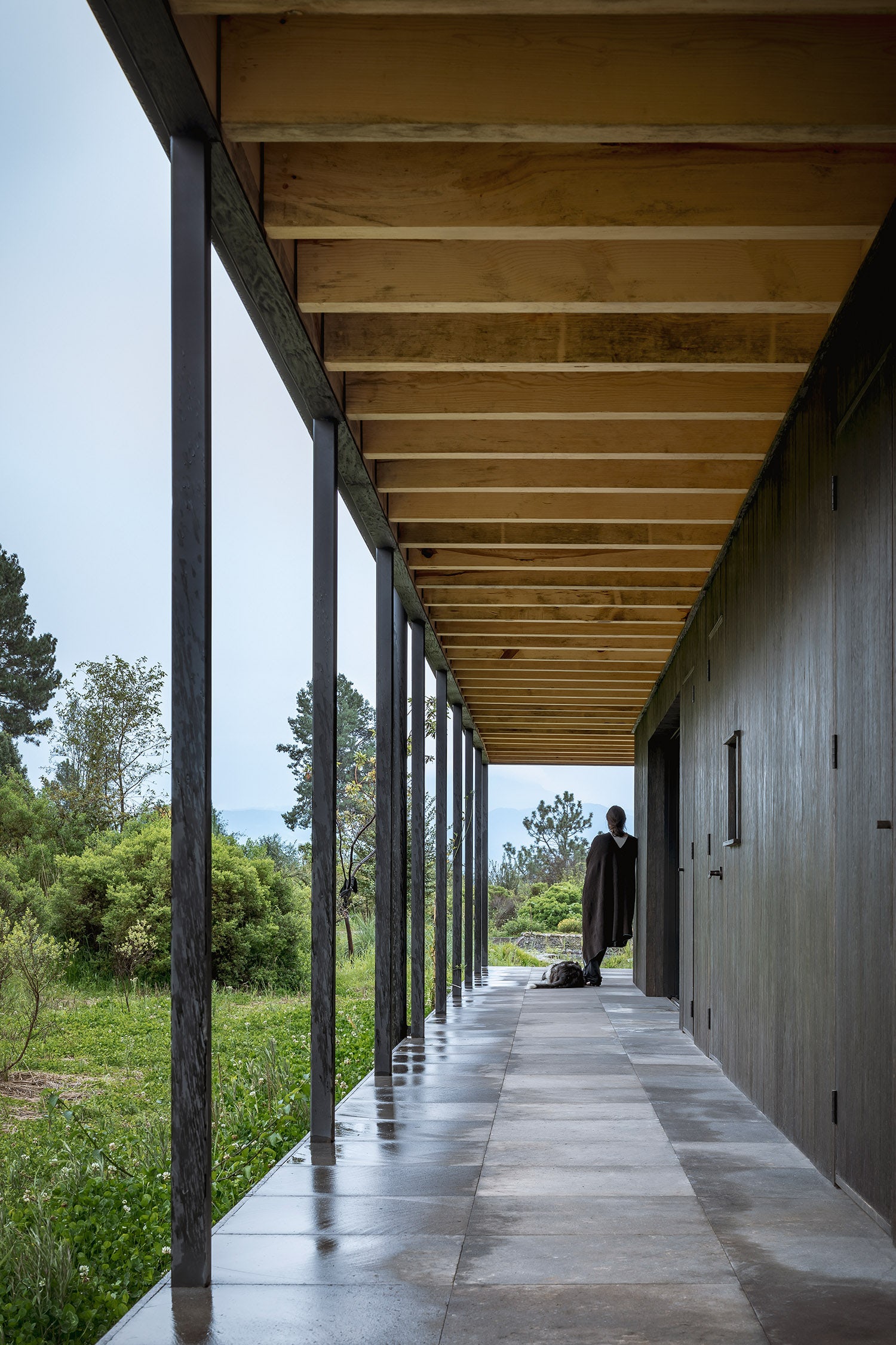
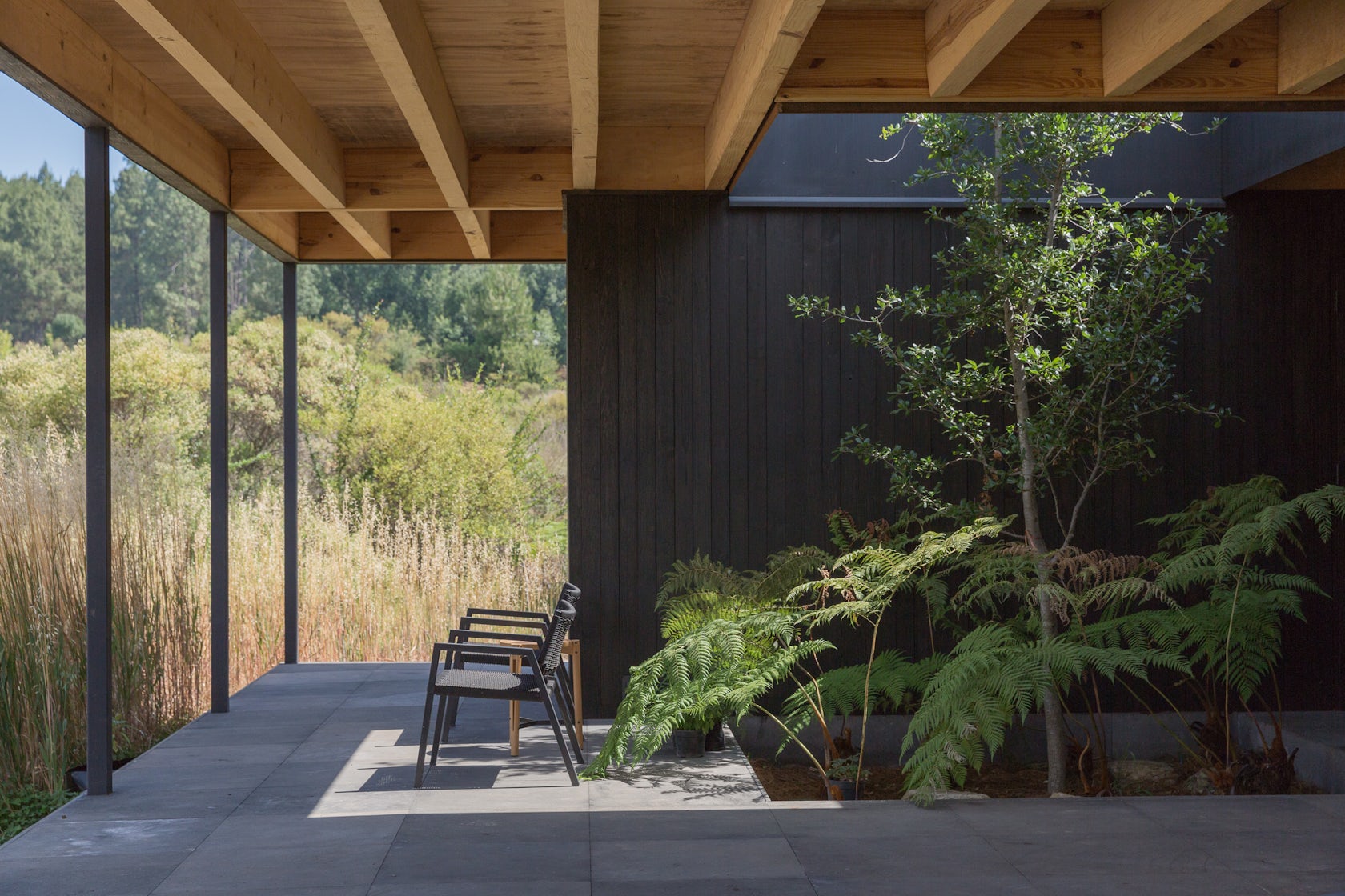
The site is relatively flat, but sits within a mountainous environment. All around are cliffs and steep slopes, but our site rests in a small plateau vegetated with continuous, single-story-high shrubs and brush. Because of these site conditions, we wanted to make the buildings disappear within the vegetation. This is why we designed a series of three low pavilions that nestle into the landscape and are dispersed across the site. We wanted a strong connection between each building and the landscape. Often as architects, we think about how spaces are created between buildings, but this was about letting the landscape be that interstitial space. The landscape becomes the connection between the buildings, just as it delineates the spaces between them. When you move through the site, there’s an experience of the buildings constantly disappearing and reappearing. It’s a process of discovery.

© JSa Arquitectura, Robert Hutchison Architecture

© JSa Arquitectura, Robert Hutchison Architecture

© JSa Arquitectura, Robert Hutchison Architecture

© JSa Arquitectura, Robert Hutchison Architecture

How important was sustainability as a design criteria as you worked on this project? 

Within La Reserva, each home is required to incorporate rain harvesting, with most of it coming from the individual home’s rainwater harvesting system and a small portion coming from the reserve’s reservoirs. We wanted to try and raise the bar and see if we could harvest 100% of our water from our individual site, rather than depend on external sources. This was important because there is a major water shortage in Mexico City, which is absurd because it rains a lot, but we don’t harvest that rainwater. Instead, we pump water in and out from the valley. As designers, we need to talk about those issues within our designs and experiment with new possibilities. Sometimes when you have a built example, it’s easier to understand new possibilities, particularly around rainwater harvesting.
© JSa Arquitectura, Robert Hutchison Architecture

© JSa Arquitectura, Robert Hutchison Architecture

© JSa Arquitectura, Robert Hutchison Architecture

© JSa Arquitectura, Robert Hutchison Architecture

© JSa Arquitectura, Robert Hutchison Architecture

© JSa Arquitectura, Robert Hutchison Architecture

© JSa Arquitectura, Robert Hutchison Architecture

© JSa Arquitectura, Robert Hutchison Architecture

Team Members

Sean Morgan, RHA; Bernice Solis, JSa

Consultants

TAF Alejandro Filloy, Bykonen Carter Quinn, Helene Carlo, MicMac Estructuras, Rhometal, Miguel Nieto, Teoatonalli

For more on Rain Harvest Home, please visit the in-depth project page on Architizer.
Rain Harvest Home Gallery

Reference

Revolutionizing Urban Living: MicroPolis Offers Affordable Housing Solutions in NYC’s Empty Spaces
CategoriesArchitecture

Revolutionizing Urban Living: MicroPolis Offers Affordable Housing Solutions in NYC’s Empty Spaces


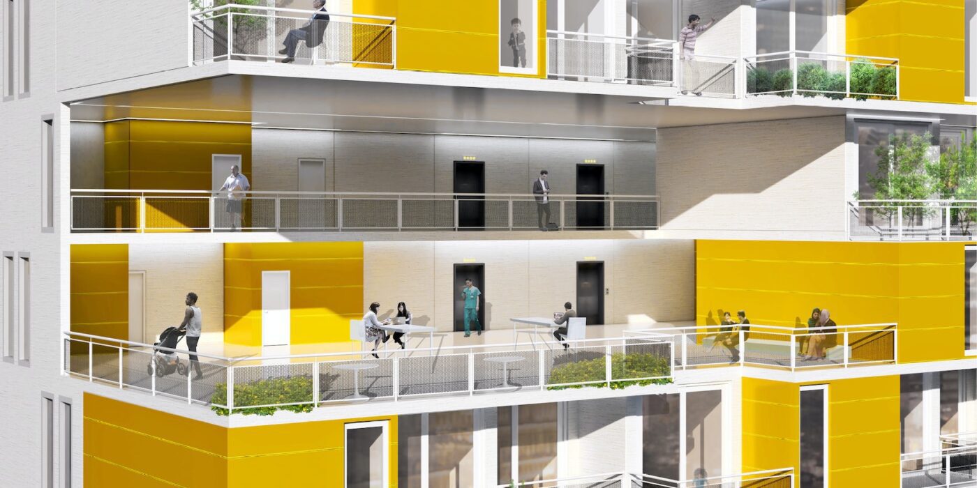
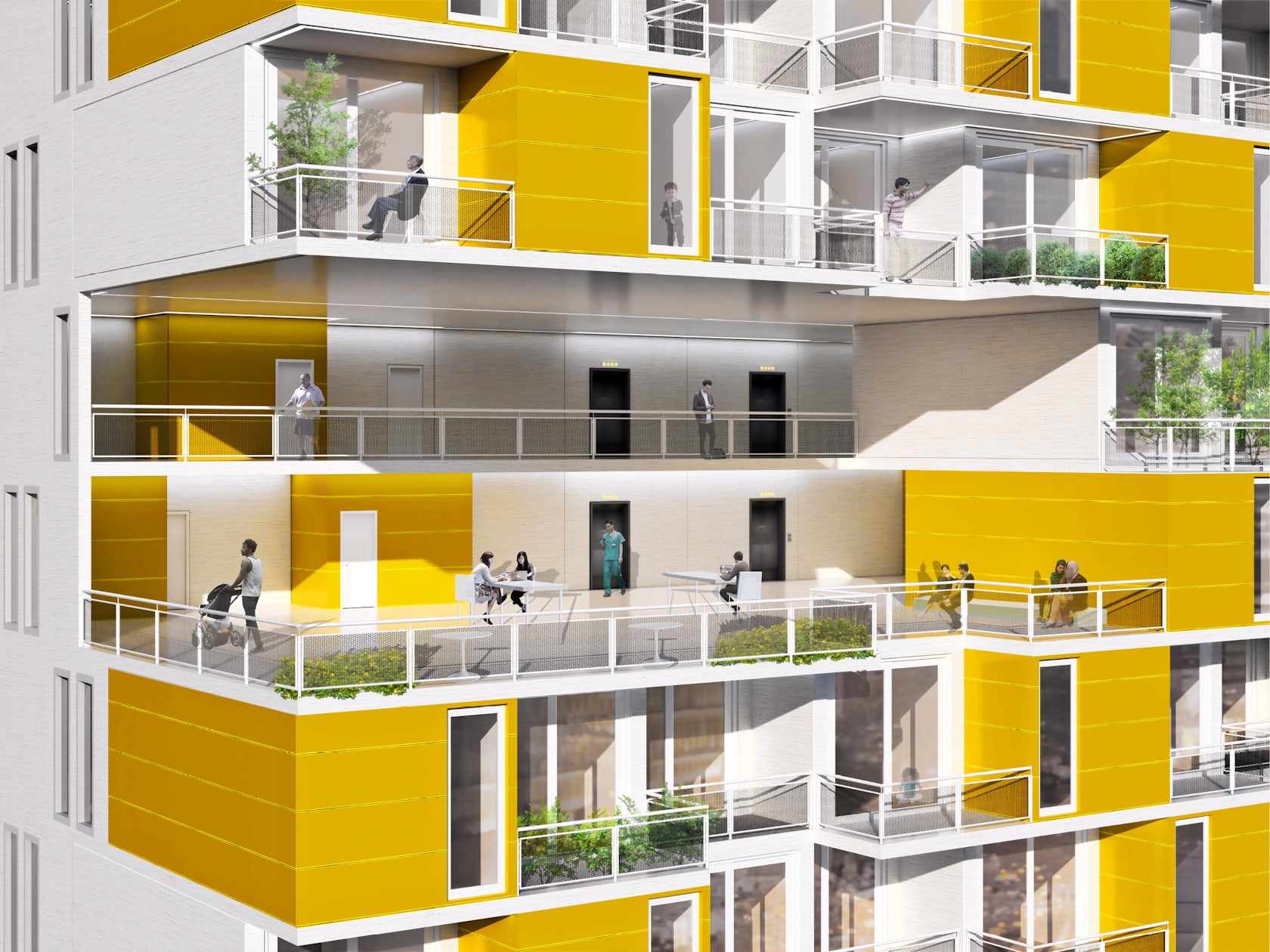
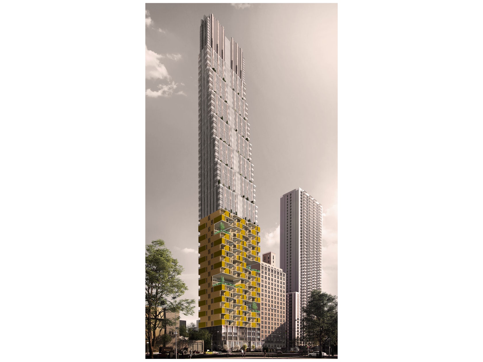
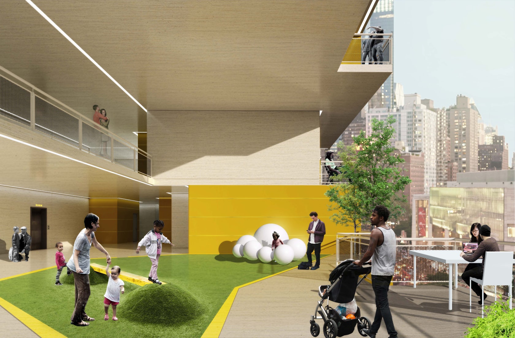
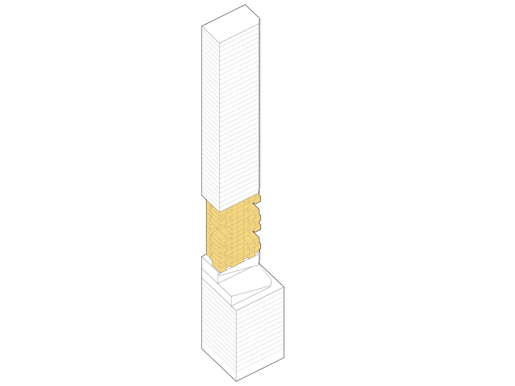
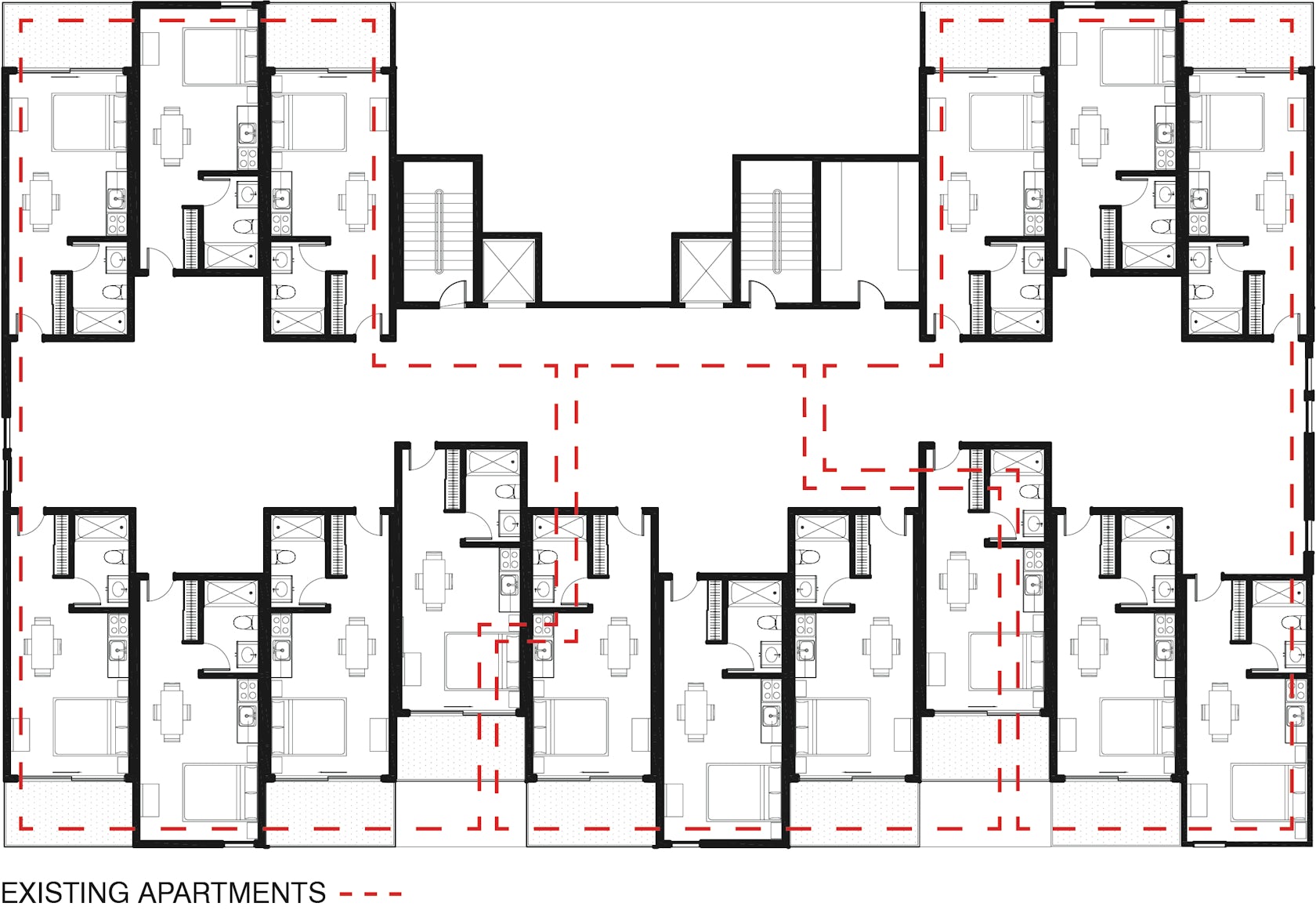
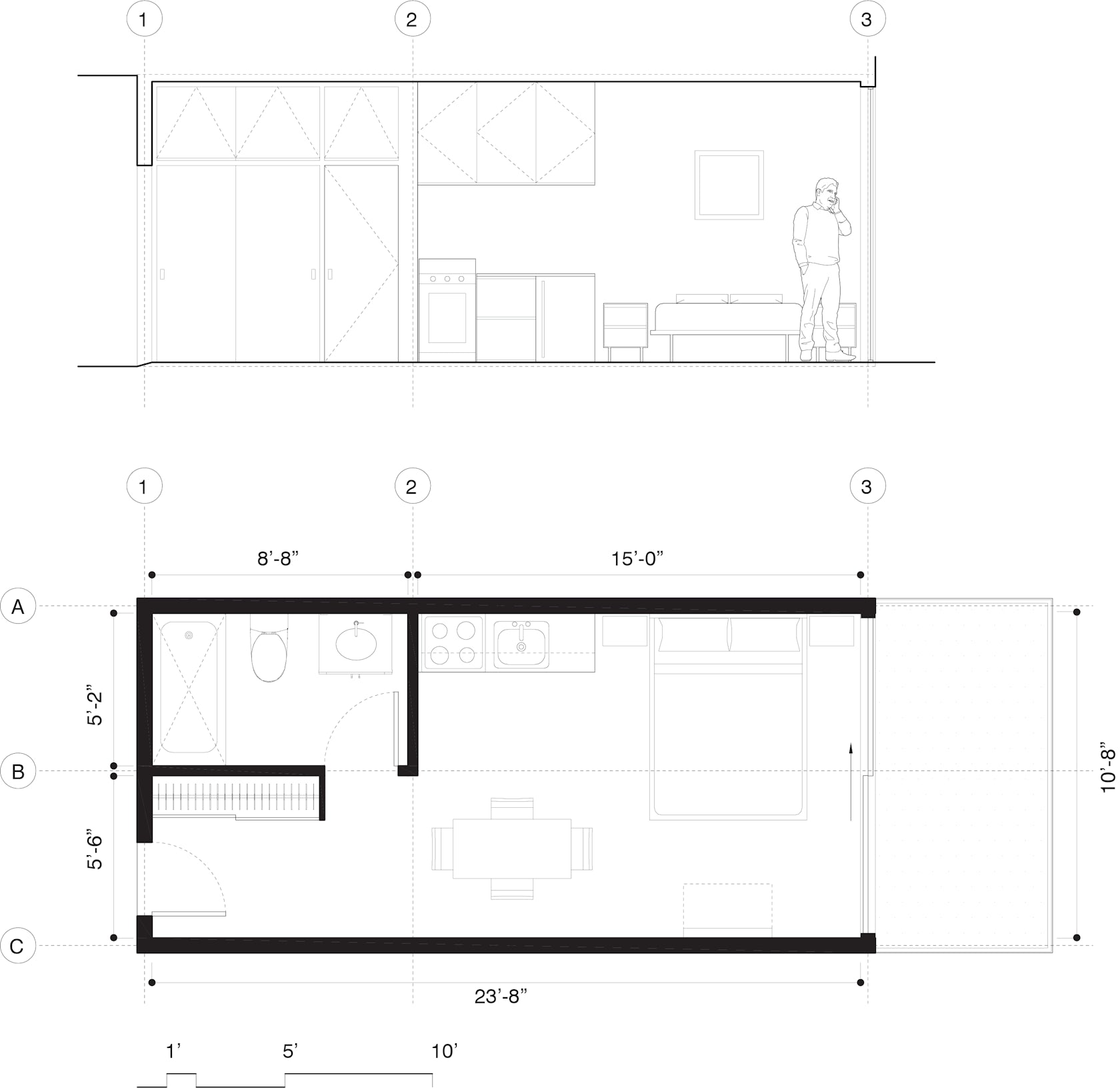
MicroPolis – is a proposal for a new housing typology of micro-homes in metropolitan centers such as New York City. It can be installed in already built, empty urban spaces. The staggering of the units creates a push-and-pull relation, generating balconies for most units. Large public outdoor terraces provide social and co-working spaces and safe places for children to play. Installing these complexes in wealthier neighborhoods and business districts improves living standards for communities of color, immigrant groups, and low- to middle-income families.
Architizer chatted with Esther Sperber, Principal at Studio ST Architects to learn more about this project.

Architizer: What inspired the initial concept for your design?

Esther Sperber: MicroPolis is a response to a February 2020 court case that revoked the building permit for the top 20 floors of a Manhattan luxury condominium because it used gerrymandering-style tax lot assembly tactics to justify the request for a very tall building. We suggested that we should not waste these already built floors but rather use them for affordable housing. The aim is to present creative, inclusive and positive design solutions to the urban affordable housing crisis, which has been exacerbated by the COVID-19 pandemic. The prevalence of unoccupied and unusable space presents an opportunity to rethink affordable housing throughout the city.

© Studio ST Architects

© Studio ST Architects

This project won in the 10th Annual A+Awards! What do you believe are the standout components that made your project win?

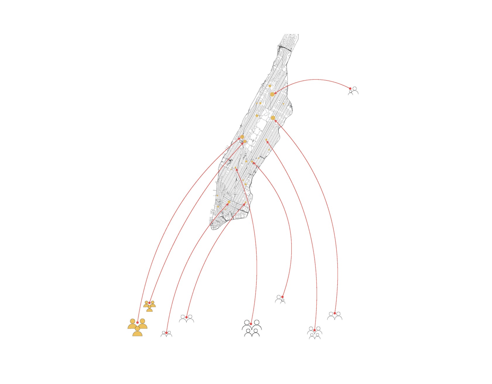
The project is contextual and addresses New York City’s critical issues such as the housing crisis, diversity and inclusion, and lowering the carbon footprint in the construction industry. MicroPolis could help alleviate the affordable housing shortage, which we have a moral obligation to address. The design creates innovative, sustainable and affordable micro-homes within vacant floors of luxury buildings in metropolitan city centers. Cities have always embraced people from all kinds of diverse backgrounds, but the pandemic revealed that the city is more divided than we would like to acknowledge. MicroPolis celebrates NYC’s diversity by increasing equity and valuing the range of people needed to make the city thrive. Adding affordable housing units throughout the city’s higher-end neighborhoods aims to make NYC more integrated, resilient and equitable.

© Studio ST Architects

© Studio ST Architects

What was the greatest design challenge you faced during the project, and how did you navigate it?

We realize there will likely be resistance to this proposal. Few privileged communities welcome low- and middle- income developments in their neighborhoods, let alone their own apartment buildings. But if we have learned anything during the COVID-19 pandemic, it is that our society is deeply intertwined. The communities that suffered most from the pandemic are those that we depend on most to keep our city running. The same resistance to this project is reason enough to take this typology seriously. It is time to stop averting our gaze from those who are less fortunate economically and invite them to be our neighbors.

© Studio ST Architects

© Studio ST Architects

How did the context of your project — environmental, social or cultural — influence your design?

NYC’s real estate exposes the city’s socio-economic inequities. Manhattan’s luxury residential market seems to be rebounding. However, at the same time, the Department of Housing & Preservation, which is responsible for maintaining affordable housing, experienced a 40% cut during the pandemic, resulting in the loss of 21,000 affordable housing units. Our unique modular system, which aims to create greater social equity, consists of prefabricated, energy-efficient and cost-effective micro-homes, which can be installed in already built empty urban spaces. The proposal demonstrates how to creatively house key workers and other tenants in need by maximizing space on mid-level floors of currently unoccupied luxury condos, which some developers have designated as mechanical voids in an attempt to increase the height of luxury buildings and gain maximum value for coveted upper floor apartments.

© Studio ST Architects

© Studio ST Architects

How important was sustainability as a design criteria as you worked on this project? 

The issue of sustainability was one of the main driving factors of MicroPolis’ design. Reusing built spaces has environmental advantages: it conserves materials and resources, lowers carbon footprint, and brings old, energy-inefficient buildings up to the current code. Carefully selected building materials and cladding ensure thermal insulation to lower energy use and costs for these micro-homes. MicroPolis is also uniquely designed to enable staggered balconies to provide some sun exposure and shade coverage during extreme weather conditions.

© Studio ST Architects

© Studio ST Architects

What key lesson did you learn in the process of conceiving the project?

The housing crisis in New York City, or any city for that matter, is a complex issue. With some of the world’s wealthiest residents, New York City is also home to thousands who do not have a clean, warm or dry place to sleep. The city is struggling to address its housing shortage for lower-income individuals and families, and to provide shelter to its 60,000-plus homeless. At the same time, New York City has a record number of empty, unsold, new luxury apartments. Unused space, particularly in tall luxury residential towers, can be reconfigured to accommodate more units dedicated to affordable housing within the existing floor area.

© Studio ST Architects

© Studio ST Architects

How do you believe this project represents you or your firm as a whole?

My firm, Studio ST Architects, strives to focus on sustainable, innovative and responsible design. Our firm combines unique expertise in architecture and psychology to design inspiring buildings and renovate spaces that transform human experiences, build deep and inclusive community connections, and create a sense of health and well-being. MicroPolis directly addresses these pillars of our practice.

© Studio ST Architects

© Studio ST Architects

How has being the recipient of an A+Award evoked positive responses from others?

It gave us an opportunity to think and explore issues around the multi-family residential typology, particularly within dense urban centers. This also helped us reach a larger audience to raise an issue we are passionate about, which led to more discussions with our clients and collaborators about responsible, compassionate design that addresses not only people’s basic need for housing, but also human connection.

© Studio ST Architects

© Studio ST Architects

How do you imagine this project influencing your work in the future?

Studio ST Architects has significant experience in apartment interior renovations and religious buildings, but we are excited to do more work in the multi-family residential sector. Our recently completed Jones Street multi-family apartment building holds a similar spirit of ambition to connect people and address the need for housing within Jersey City. Jones Street creates individual homes and a sense of community for the families and young professionals that live in this growing Jersey City community. It targets the swathe of families and young professionals looking for New York-style buildings just across the Hudson River. We hope to continue tackling the housing crisis by taking on more multi-family housing projects.

For more on MicroPolis, please visit the in-depth project page on Architizer.

MicroPolis Gallery

Reference

SoHo’s 49 Greene Street Embraces the Modern Concept of Loft Living
CategoriesArchitecture

SoHo’s 49 Greene Street Embraces the Modern Concept of Loft Living


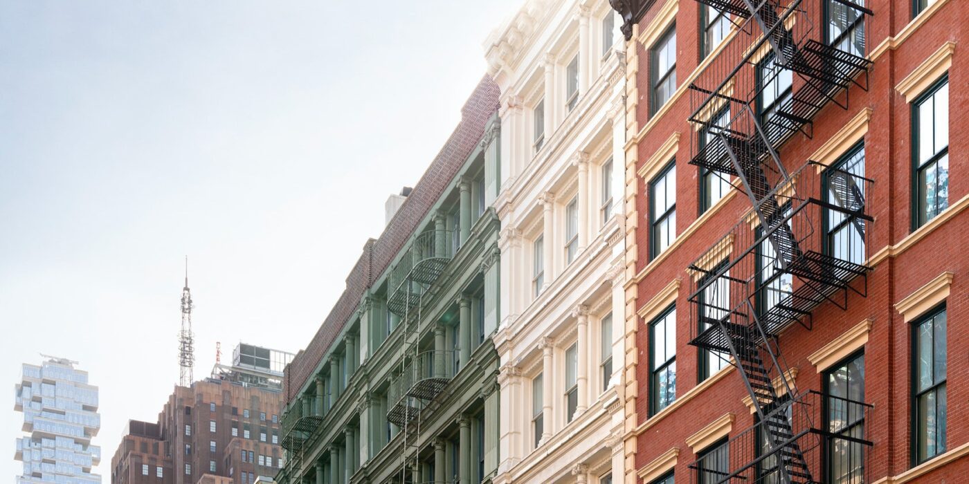
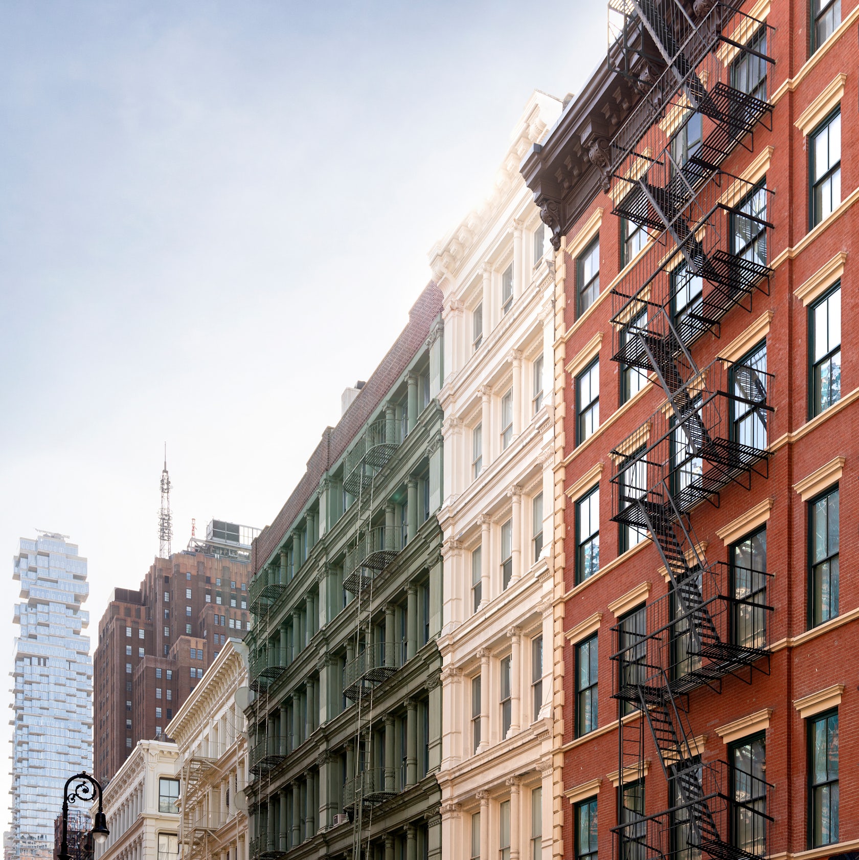
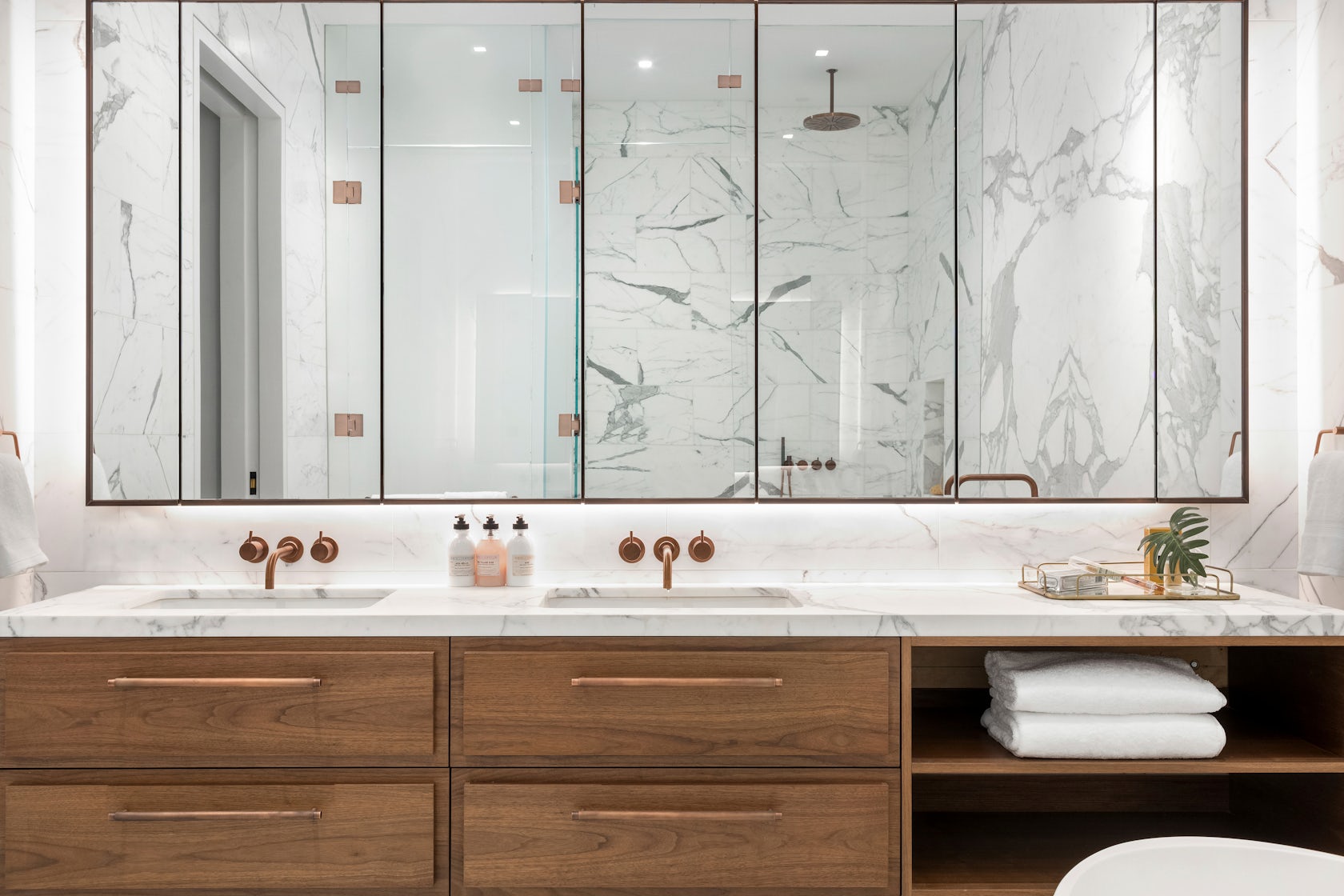
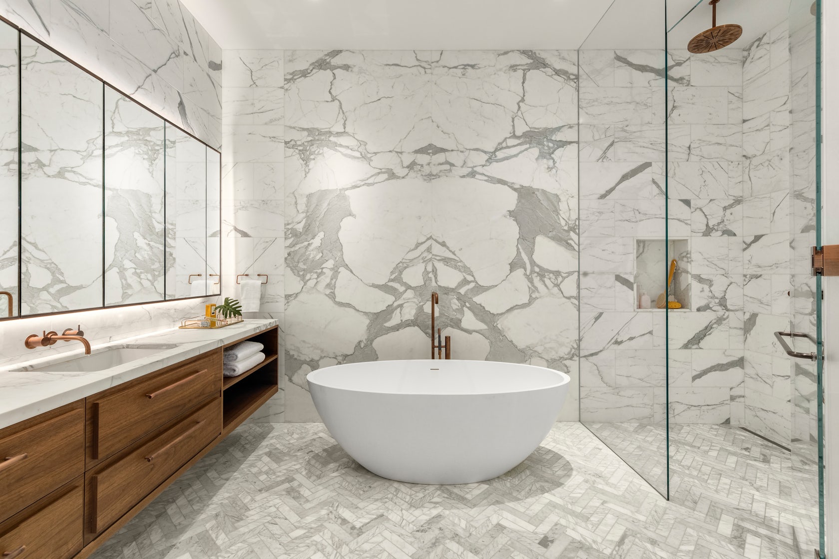
49 Greene Street – a 6-story building in NYC’s historic SoHo district, is an extant example of the mixed iron-and-masonry construction of the post-Civil War era. The client’s brief was to restore the building’s masonry façade and cast-iron storefront, and to convert the interiors into four high-end residential units. To do this, we drew inspiration from the makers and artist ls that once occupied this previously manufacturing building to create units that embrace modern concept of ‘loft living’, in which open, non-programmed flexible spaces meet highly crafted, millworked moments, adding warmth throughout with the use of woods, marbles, and ironwork.

Architizer chatted with Jordan Rogove, Co-Founder and Principal of DXA studio, to learn more about this project.

Architizer: What inspired the initial concept for your design?

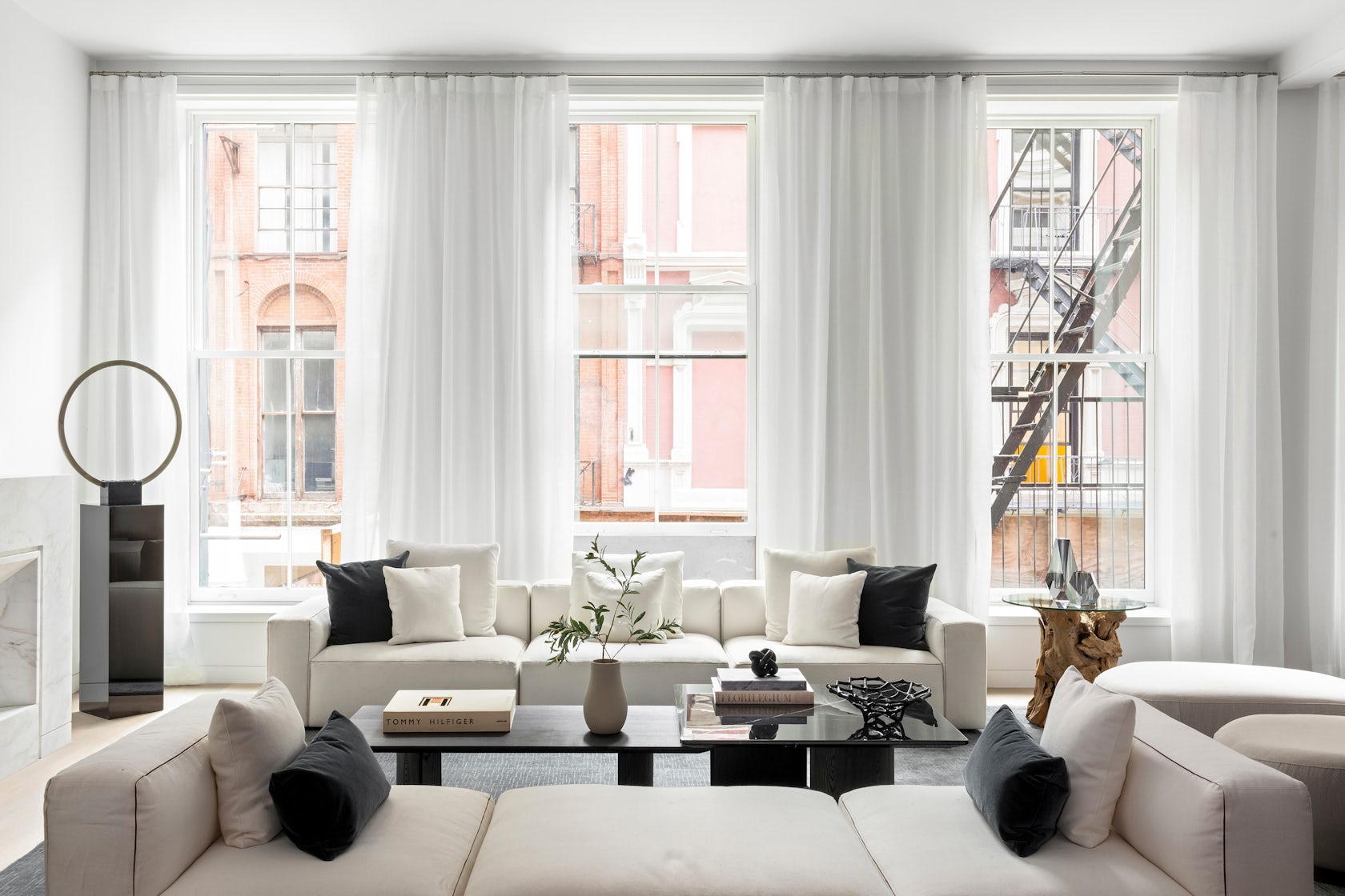
Jordan Rogove: We wanted to speak to the various movements that helped form SoHo’s unique character and charm. Much like the artists who were attracted to the neighborhood’s empty lofts in the 1960’s, we too were drawn to the building’s high ceilings, abundant light, and expansive floor plates. For this reason, we are committed to leaving the spaces as open, fluid, and customizable as possible.

However, we were acutely aware that we were designing a home, so introducing a residential scale was important to make the otherwise large space comfortable and inviting. To achieve this, we lowered the ceiling in select rooms and introduced a high level of craft and tactility – our way of communicating with the by-gone manufacturing era of SoHo.

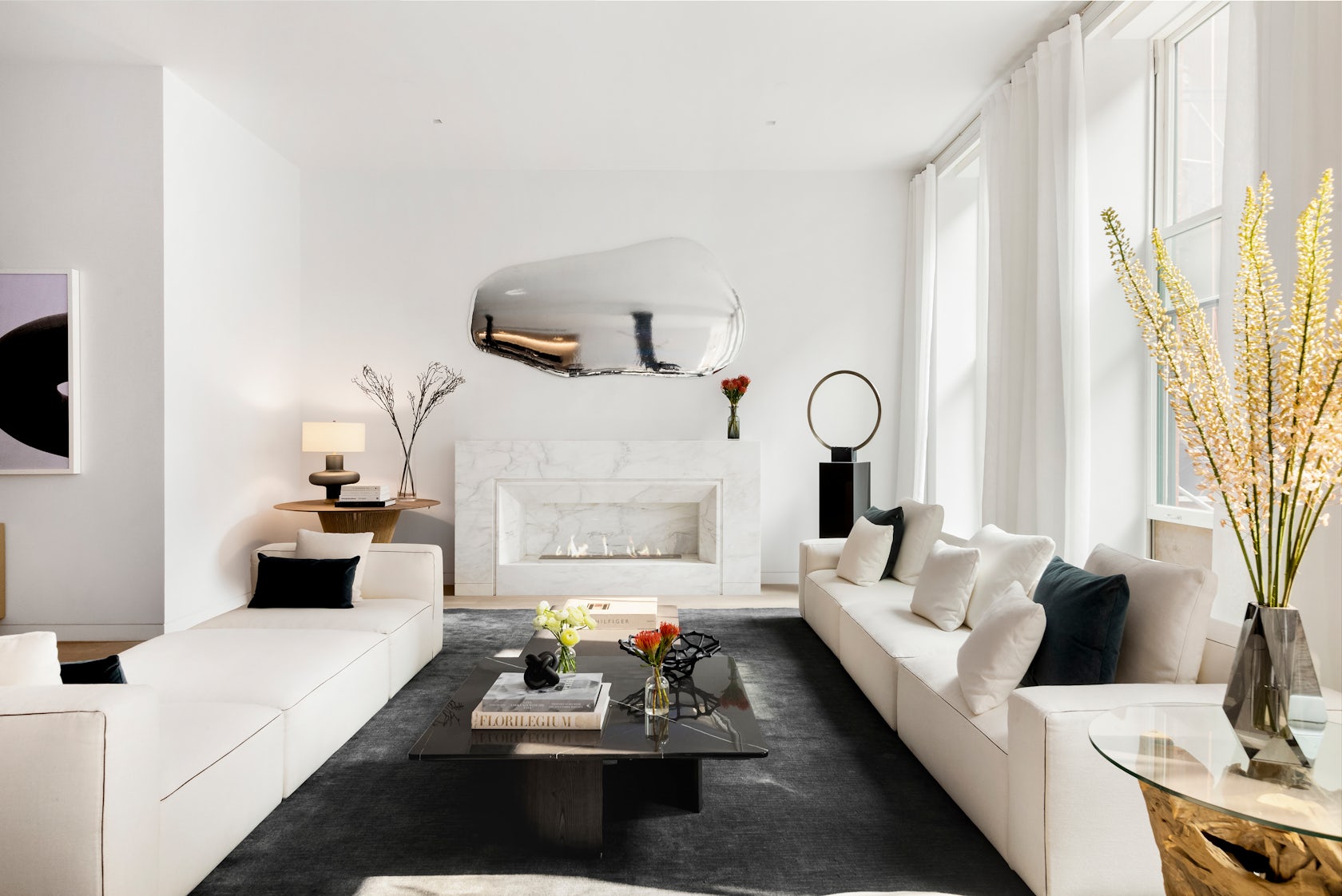
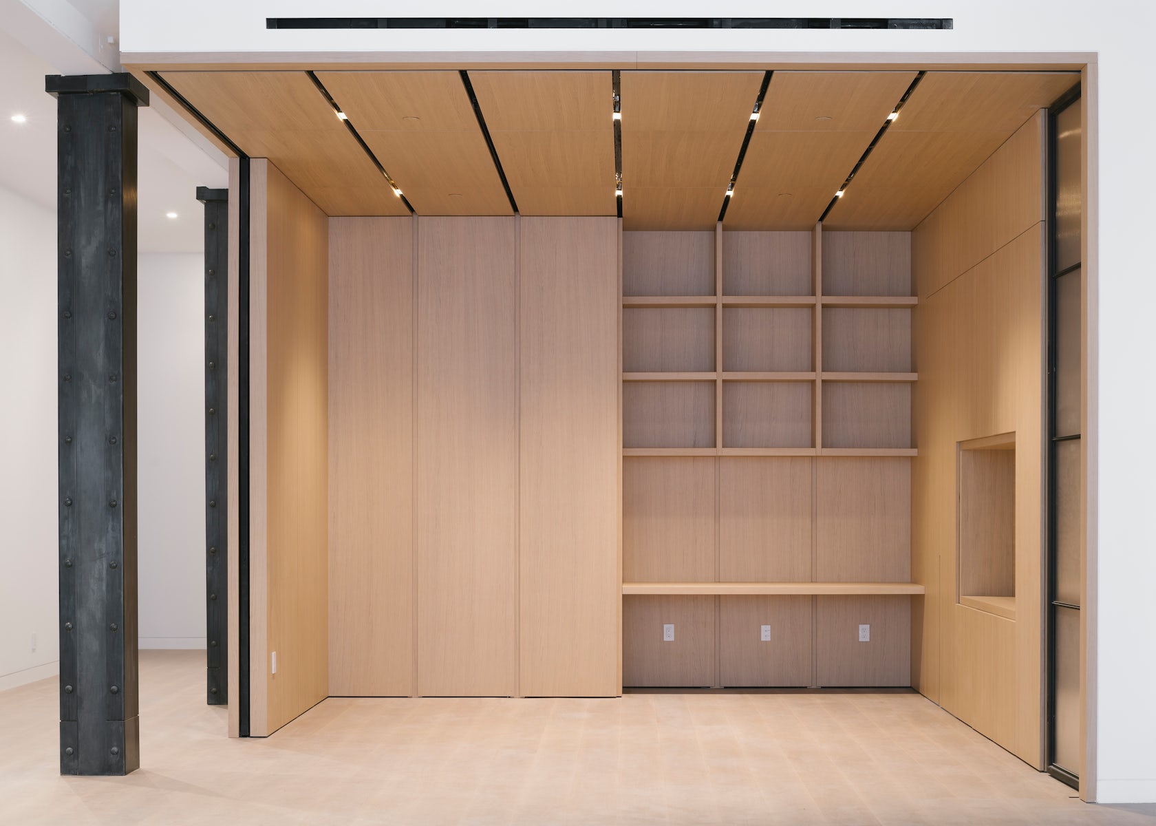
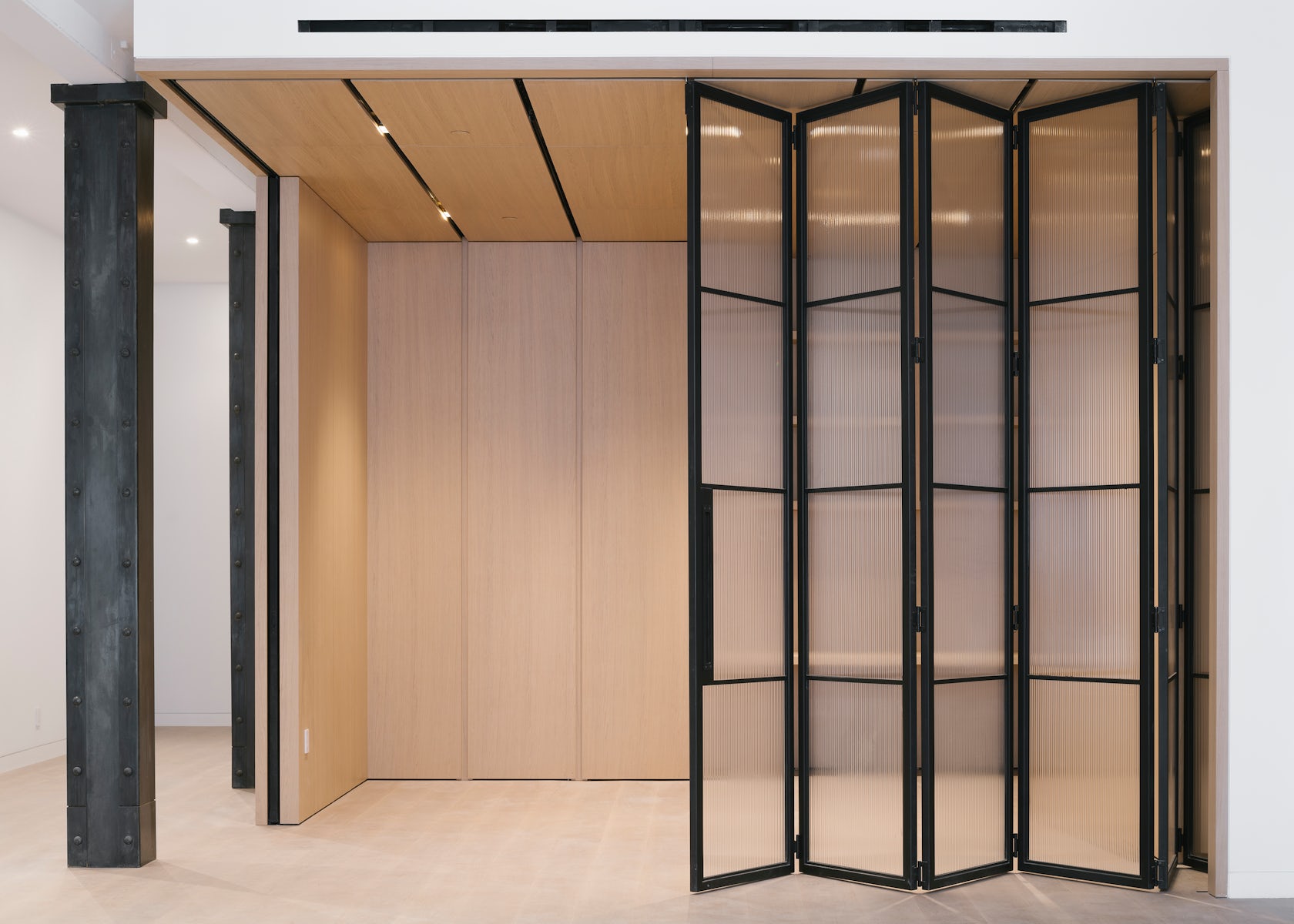
Throughout these rooms, we created a material theme of oak wood paneling, blackened steel, fluted glazing and various marbles. These materials are not only visually exquisite, but very in their tactile qualities, which we believe to be crucial adding warmth and comfort to a home.

© DXA studio

© DXA studio

© DXA studio

© DXA studio

© DXA studio

© DXA studio

This project won in the 10th Annual A+Awards! What do you believe are the standout components that made your project win?

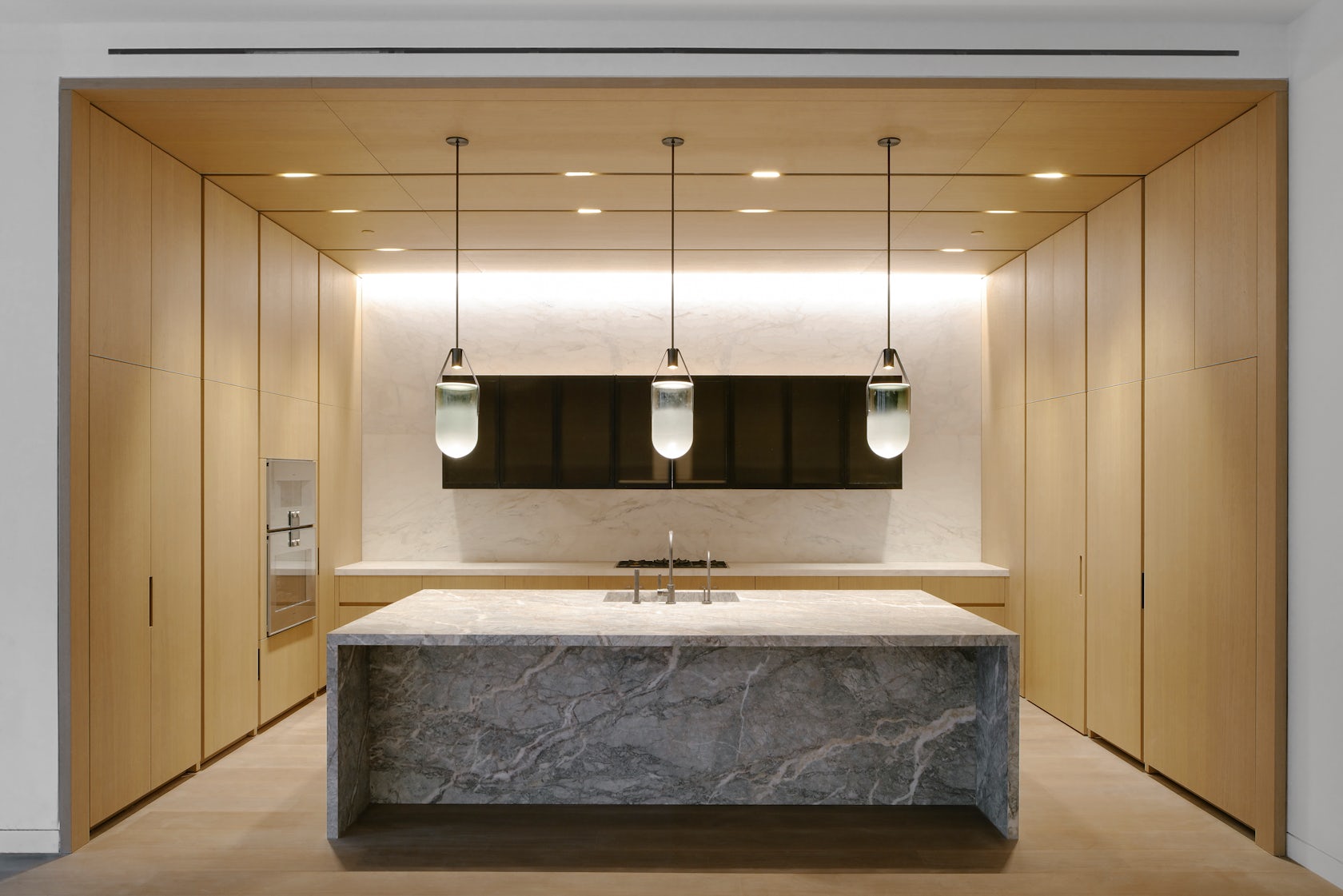
The kitchen and den–the hearth of the home–are the showpieces of each unit, as they are not only beautiful and practical, but speak to each other in their materiality and detailing.

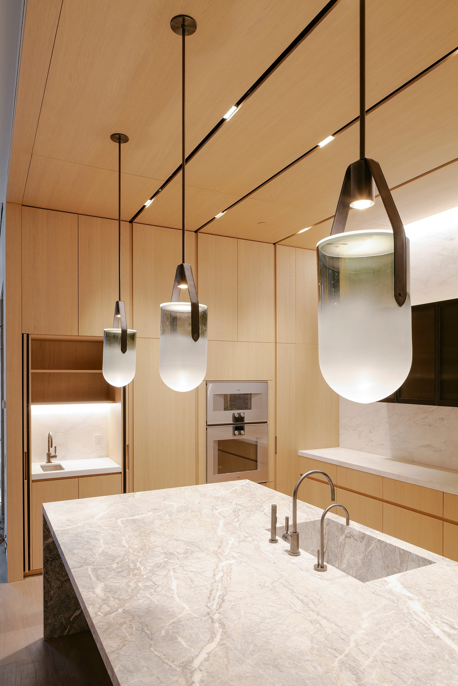
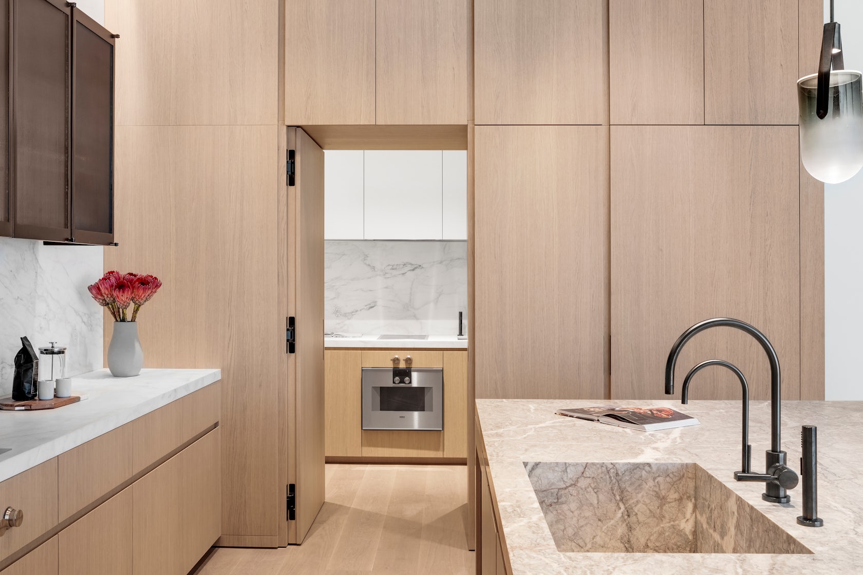
In the kitchen, the appliances, storage, and secondary scullery kitchen are all seamlessly hidden behind white oak paneling with beautifully crafted integrated pulls. This paneling wraps onto the ceiling to cleverly integrate recessed lighting and HVAC diffusers. The island is crafted out of a single slab of Fior di Pesco marble, known for its ability to add calm and serenity to a space, while the upper cabinetry is clad in blackened steel and fluted glass.

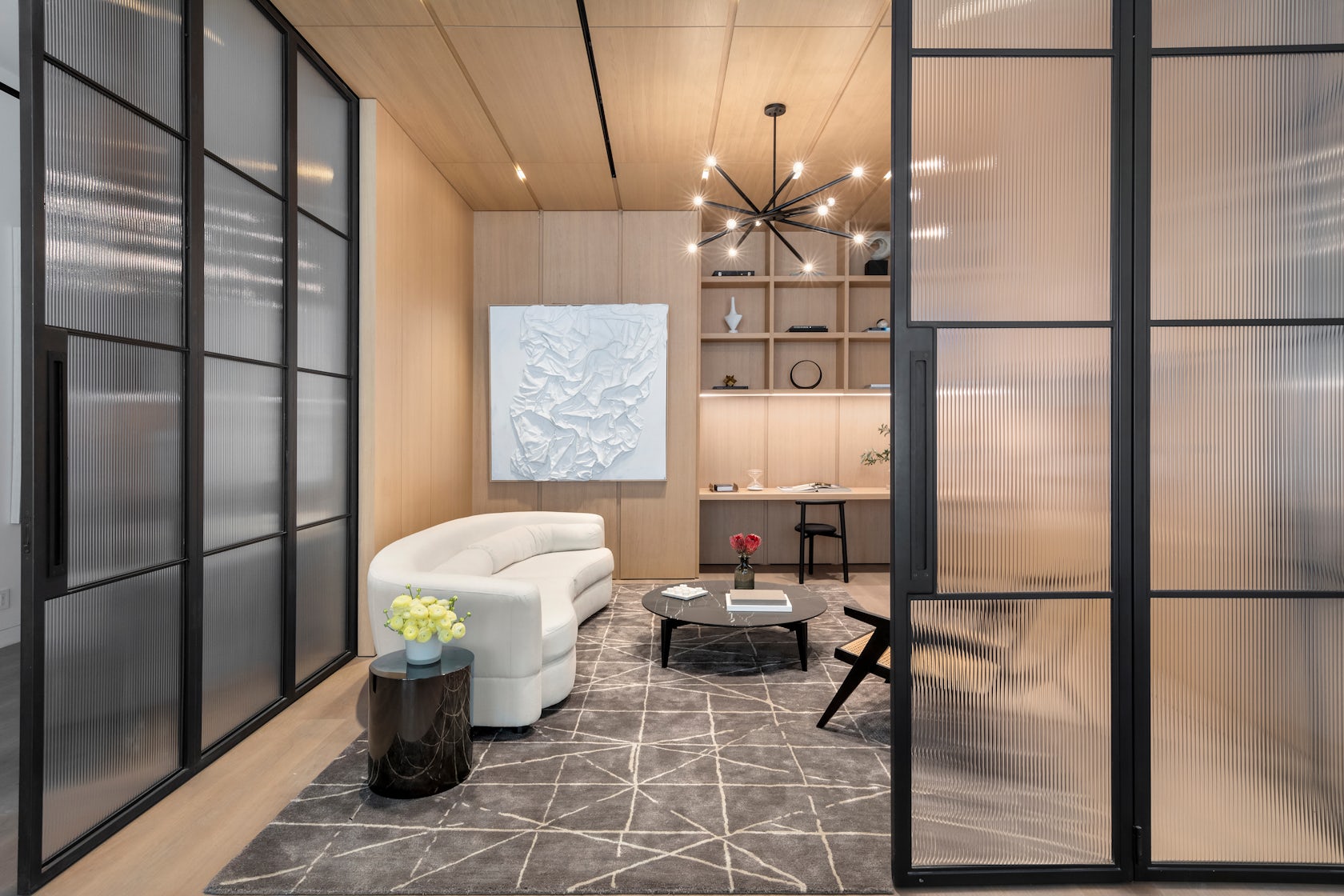
This millwork detailing continues into the den, where white oak paneling and a built-in desktop can be closed off from the main living spaces by large blackened steel and fluted glass doors. Alternatively, these doors can perfectly tuck away into the oak millwork to allow flexible space programming.

Many of these materials can be found throughout the unit, creating an overarching theme. For instance, the blackened steel of the den’s custom doors is mirrored in the steel frames of the bathroom vanities, the plumbing fixtures, and even the column cladding.

© DXA studio

© DXA studio

© DXA studio

© DXA studio

What was the greatest design challenge you faced during the project, and how did you navigate it? 

Renovating a manufacturing building from the 1800’s was an exciting challenge, both in terms of design and coordination. On the design side, we believe that as architects, it is our duty to celebrate the area’s rich history in an authentic yet contemporary manner. This is why we wanted to keep the open nature of these spaces as much as possible. It is also why we used wood and iron in a way that is reminiscent of previous eras, while using contemporary detailing to bring these materials to the present day.

On the coordination side, working with existing buildings in NYC is always a challenge. As precisely as we survey all historic projects, we often encounter surprises during construction that require us to tweak our design on the fly–and 49 Greene was no exception. Furthermore, we had to design an entirely new roof structure, as the existing roof was significantly sloped, which meant giving the 200-year old structure upgrades to account for modern building technologies.

© DXA studio

© DXA studio

© DXA studio

© DXA studio

What is your favorite detail in the project and why? 

Although it is one of the smallest rooms in each unit, we think the powder room really packs a punch. The vanity and sink are entirely made out of Fior di Bosco marble, which marries well with the ebony black wood veneer panels to create a dark yet calming atmosphere.

© DXA studio

© DXA studio

© DXA studio

© DXA studio

In what ways did you collaborate with others, and were there any team members or skills that were essential in bringing this Award winning project to life?

The nature of this project required us to closely collaborate with millworkers, iron workers, and various craftspeople to get the detailing down. We worked with Canova on all of the millwork, Manhattan Steel Door Co. on the large den doors, and with Sage Construction on the stonework and other general detailing. We had many pencil sessions and back-and-forth shop drawing reviews to better understand how to achieve the level of craftsmanship that we envisioned–and we really refined our knowledge of interior detailing along the way.

© DXA studio

© DXA studio

© DXA studio

© DXA studio

For more on 49 Greene Street, SoHo, please visit the in-depth project page on Architizer.

49 Greene Street, SoHo Gallery

Reference

Ten residential interiors that make the most of narrow spaces
CategoriesInterior Design

Ten residential interiors that make the most of narrow spaces

Including tight living areas, kitchens wedged into corridors and interiors in skinny Japanese houses, this lookbook features 10 homes that make clever use of narrow spaces.

Projects on constricted urban sites or working within historical buildings often must contend with long-and-narrow interior layouts.

Here are 10 examples of interiors where narrow spaces have been utilised to their full potential thanks to intelligent design.

This is the latest in our lookbooks series, which provides visual inspiration from Dezeen’s archive. For more inspiration see previous lookbooks featuring mezzanine bedrooms, creative built-in furniture and homes that make a highlight of their corridors.


1.8 Metre House in Japan
Photo by Sobajima, Toshihiro

1.8m Width House, Japan, by YUUA Architects & Associates

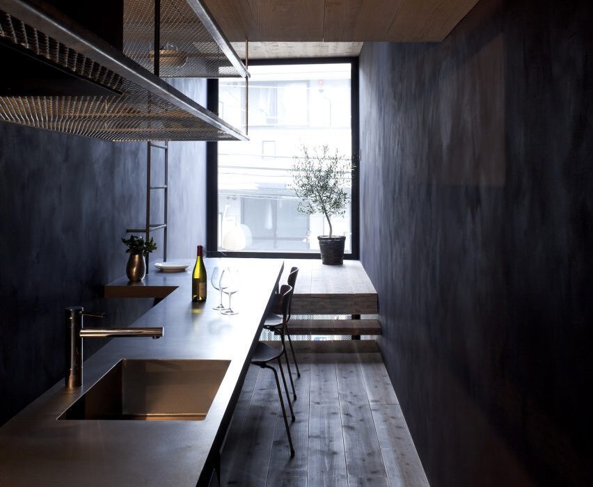
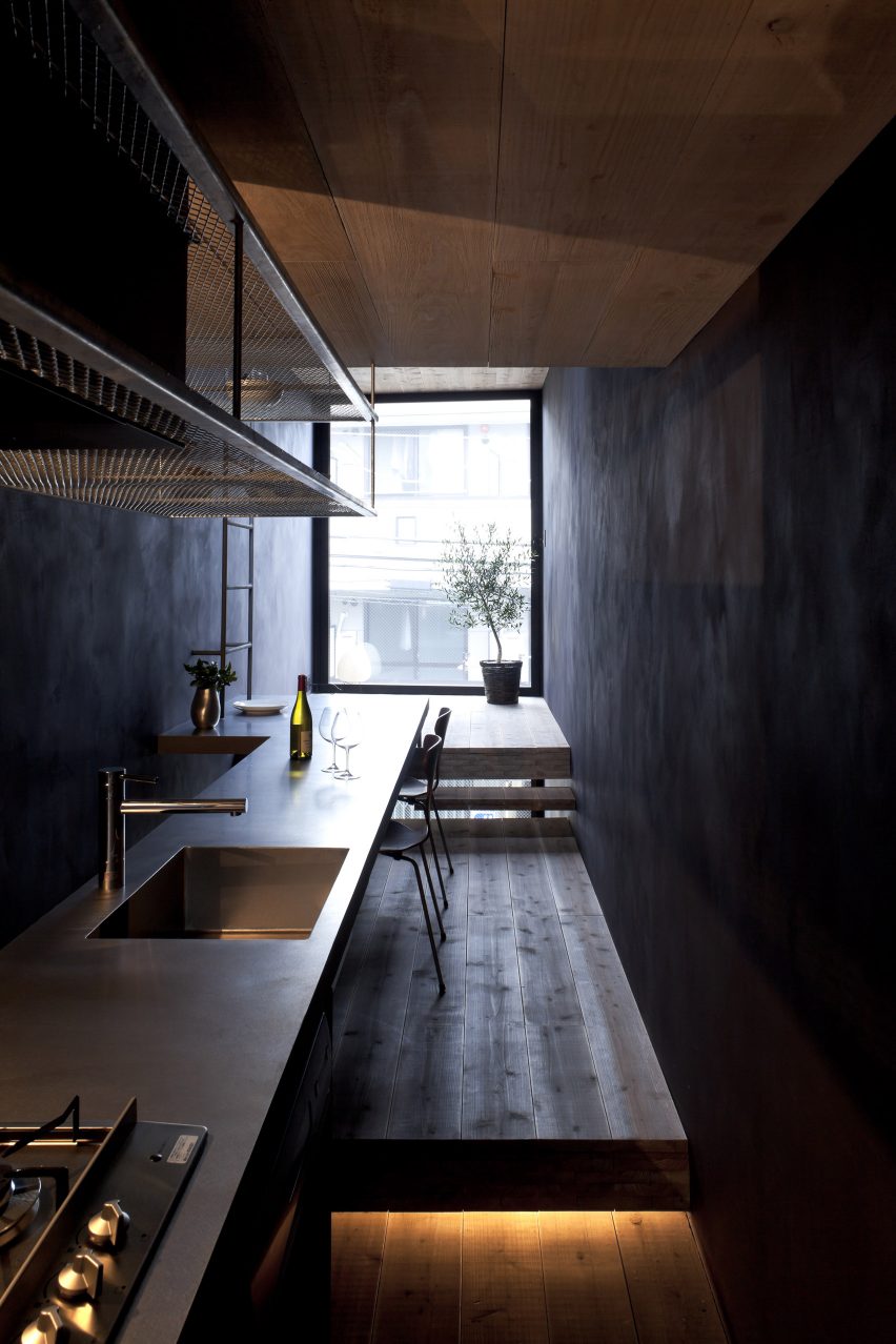
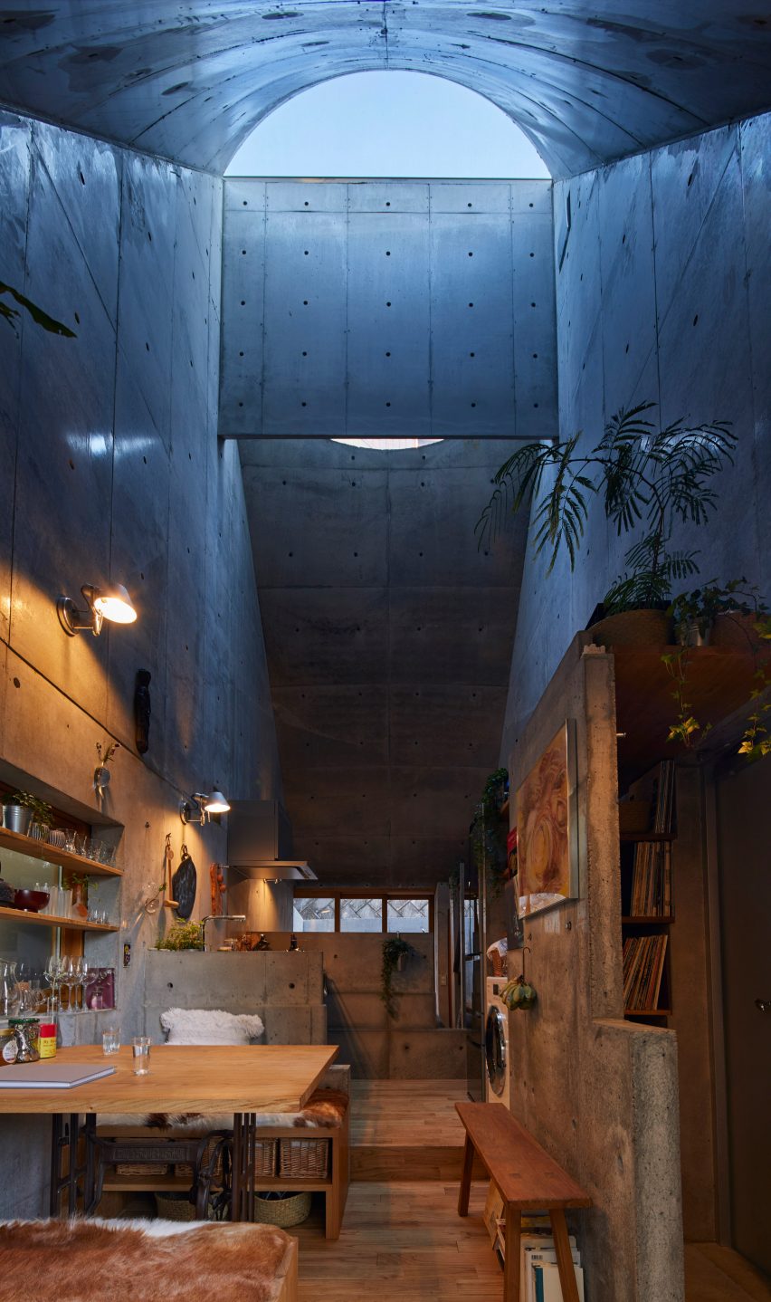
As its name suggests, the rooms in this house in central Tokyo are just 1.8 metres wide, so Japanese studio YUUA Architects & Associates had to plan the interior with meticulous care.

They used split-level floors to create natural partitions between different spaces, with a kitchen and dining area lined up along a single wall, while a dark colour scheme is intended to provide “a sense of depth”.

Find out more about 1.8m Width House ›


House in Valencia by DG Arquitecto Valencia
Photo by by Mariela Apollonio

Horta Nord townhouse, Spain, by DG Arquitecto Valencia

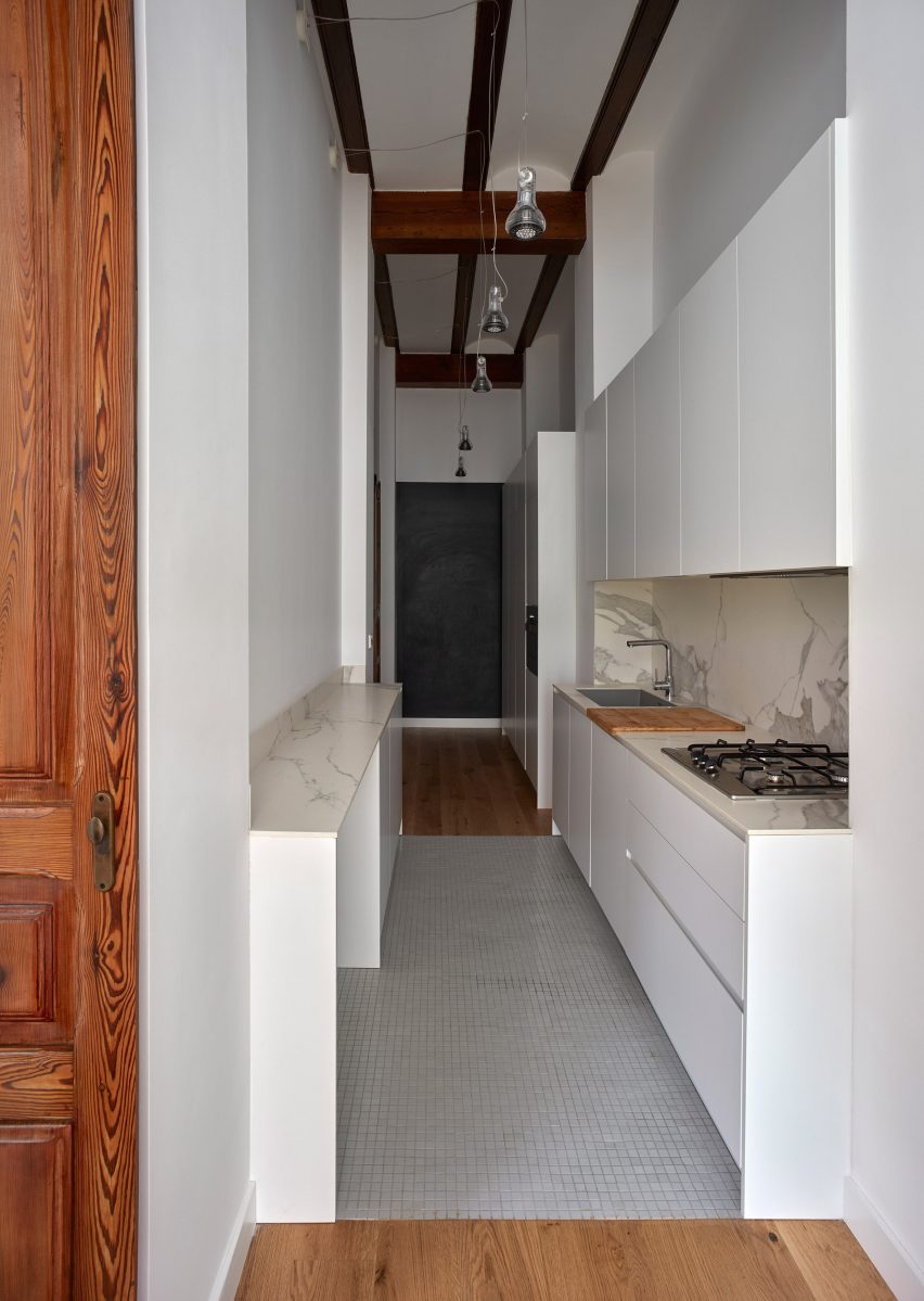
DG Arquitecto Valencia sneaked a kitchen into a passageway in this Valencian townhouse as part of a renovation project for a young family.

White floor tiles and downlighting hanging from the high ceiling help the space maintain a sense of generous scale despite the narrow proportions.

Find out more about this Horta Nord townhouse ›


196 Orchard model residence in Manhattan by Alex P. White
Photo by Colin Miller

196 Orchard apartment, USA, by Alex P White

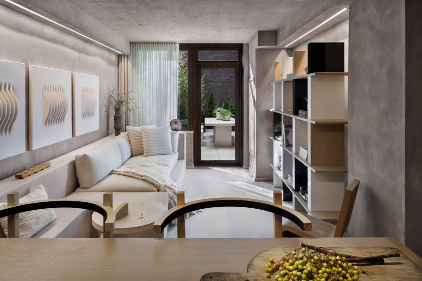
American designer Alex P White created a model unit for a high-end condominium building in Manhattan’s Lower East Side characterised by exposed calming concrete ceilings, grey plaster walls and neutral-toned decor.

In the narrow living room, a mix of shapes and textures combine with built-in furniture to provide added visual depth, from a series of ivory wall hangings by Los Angeles artist Mary Little to a large walnut shelving unit designed by White and a cardboard chair by Frank Gehry.

Find out more about this 196 Orchard apartment ›


Maisonette in Notting Hill by Francesco Pierazzi Architects
Photography is by Lorenzo Zandri

Notting Hill maisonette, UK, by Francesco Pierazzi Architects

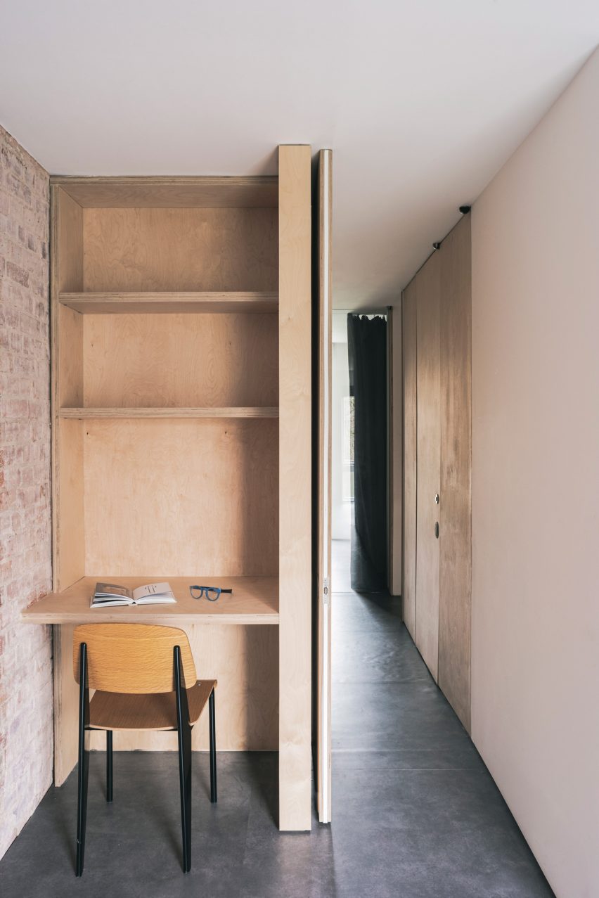
A petite plywood study space was nestled into a hallway in this London maisonette overhauled by Francesco Pierazzi Architects.

To emphasise the home’s sense of height, the studio placed floor-to-ceiling doorways in all of its narrower rooms and left the brick shell exposed, offset by dark flooring.

Find out more about this Notting Hill maisonette ›


Nuwa guesthouse by Z_Lab
Photo by Texture on Texture

Seochon micro guesthouse, South Korea, by Z_Lab

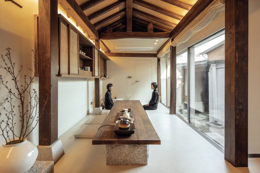
Z_Lab’s serene interiors for this tiny guesthouse tucked down an alleyway in northern Seoul occupy a former traditional Korean home, otherwise known as a hanok.

In the main space, long and rectilinear, different functions are lined up from a cosy reading area on a timber bench to a lengthy walnut table for enjoying tea that sits directly beside a sunken water bath.

Find out more about this Seochan micro guesthouse ›


West Chelsea Apartment by BoND
Photo by Eric Petschek

West Chelsea Apartment, USA, by BoND

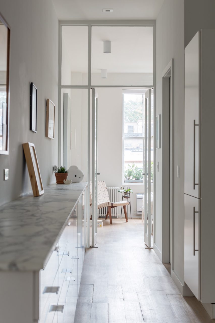
This long and narrow apartment in New York’s Chelsea neighbourhood was overhauled by architecture studio BoND, which replaced partition walls with glass doors to allow more light to reach the middle section while also “celebrating the apartment’s elongated proportions and maximising the illusion of depth”.

All utilities, including kitchen and bathroom fixtures, were moved to one wall to leave the other free for displaying art, while the direction of the floorboards and linear lighting fixtures help to emphasise the length of the interior.

Find out more about West Chelsea Apartment ›


Studio 6b bedroom
Photo by Itay Benit

Bauhaus Tel Aviv apartment, Israel, by Amir Navon and Maayan Zusman

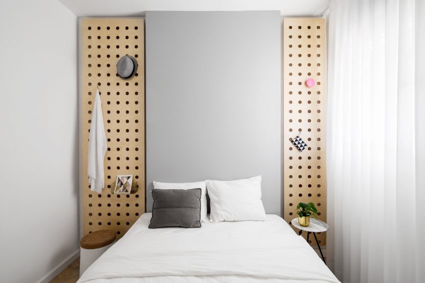
A “safe room” was turned into a snug spare bedroom as part of a refurbishment of this Tel Aviv apartment by architect Amir Navon and interior designer Maayan Zusman, who worked alongside graduates Dana Sagive and Naama Tison Vilotsky.

To compensate for a lack of width a light-toned oak herringbone floor was paired with pale colours, while two wooden plates with holes pierced in them to support brass hooks are a space-saving storage solution.

Find out more about this Bauhaus Tel Aviv apartment ›


Love2 House by Takeshi Hosaka in Tokyo Japan
Photo by by Koji Fujii Nacasa and Partners

Love2 House, Japan, by Takeshi Hosaka

This Tokyo micro home designed by architect Takeshi Hosaka for himself and his wife gathers household amenities into a linear floorplan spanning just 19 square metres.

Borrowing principles from the architecture of villas in ancient Roman villas, Hosaka divided up spaces for sleeping, bathing, eating and study using seven partitions that extend out from the concrete walls.

Find out more about Love2 House ›


Birch and Clay Refugio by Rise Design Studio
Photo by Ståle Eriksen

Birch and Clay Refugio, UK, by Rise Design Studio

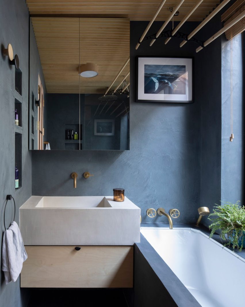
By cutting shelving into one wall, retaining a generous window sill and subtly overlapping the chunky sink and bathtub, Rise Design Studio was able to make the most of limited lateral space in this bathroom.

The room’s proportions were chosen to match an adjacent lightwell in the remodelled London flat, while the dark blue tadelakt walls and floor contrast with a birch plywood ceiling to convey an impression of solidity.

Find out more about Birch and Clay Refugio ›


Interiors of La Odette apartment by Crü

La Odette, Spain, by CRÜ

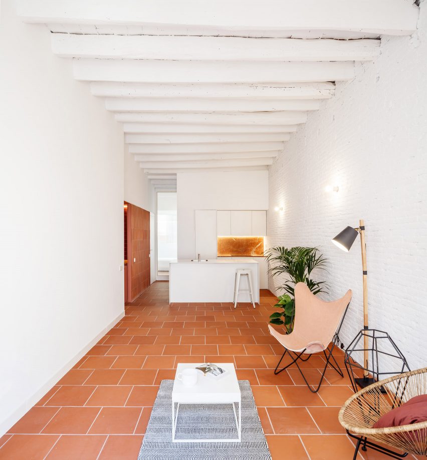
Architecture studio CRÜ was tasked with transforming this Barcelona apartment from a cramped three-bedroom home into a spacious two-bed while optimising the use of space.

In the kitchen-living area, it removed the partition walls to create an open-plan space, with large terracotta floor tiles and white-painted brick walls.

Find out more about La Odette ›

This is the latest in our lookbooks series, which provides visual inspiration from Dezeen’s archive. For more inspiration see previous lookbooks featuring mezzanine bedrooms, creative built-in furniture and homes that make a highlight of their corridors.

Reference

OMA’s first residential tower in miami ‘the perigon’ reveals its sunlit interiors
CategoriesArchitecture

OMA’s first residential tower in miami ‘the perigon’ reveals its sunlit interiors

interior designer tara bernerd works with oma


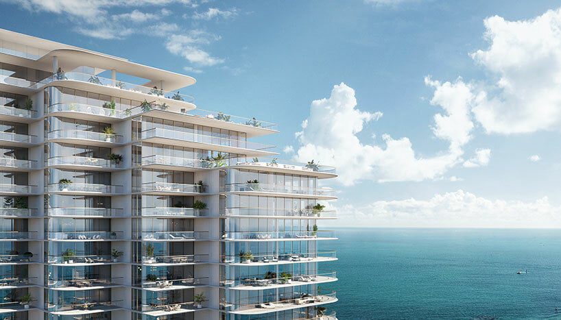
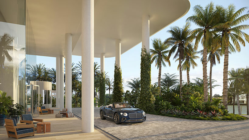
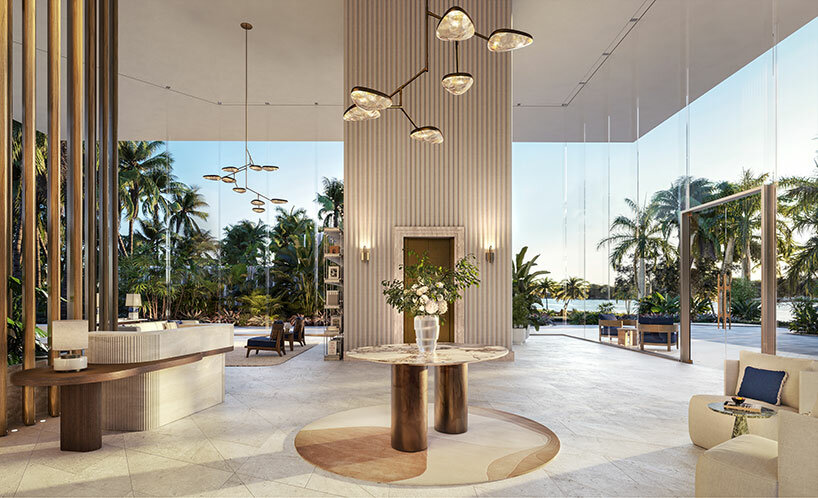
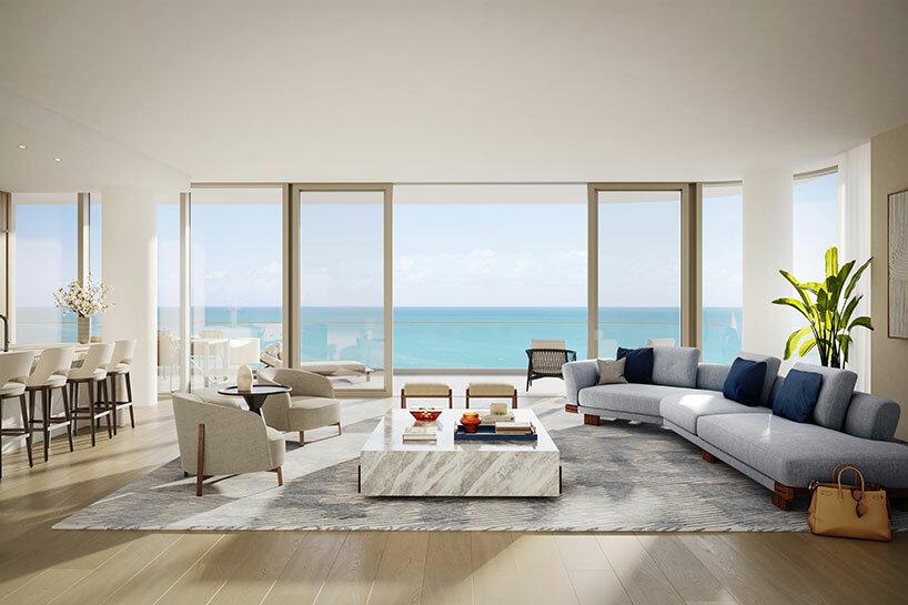
Sited proudly along the sparkling waterfront of Miami Beach, OMA‘s diamond-shaped residential high rise ‘The Perigon’ reveals a first look at its sunlit interiors. Fit for its exclusive, resort-minded location, the luxury tower will boast hotel-style amenities private to owners to blur the line between condominium and resort. Evoking the atmosphere of a five-star hotel, the interiors have been designed by Tara Bernerd, a renowned hospitality designer who has shaped iconic spaces from Belgravia to Vienna.


The architecture itself will take shape as an array of nesting towers, each rotated to enhance views for all residences toward the Atlantic Ocean. See designboom’s previous coverage here.

oma perigon miami
image, header image © Binyan Studios


the perigon: warm, welcoming, and sophisticated


Curating the amenities of The Perigon, interior designer Tara Bernerd looked to the masterful architecture by OMA. Arriving to the building, residents are welcomed by a grand and inviting lobby with honed white travertine flooring showing a diamond pattern, a nod to the project’s distinctive footprint, an Italian stone finish connecting with the natural textures which are recognized throughout Miami.


The design team sought an atmosphere which is warm, organic and bright, while at once evoking the sophistication of the European Riviera — a design choice which draws from the future residents’ many seaside travels.

oma perigon miamiimage © The Boundary


We envisaged the residents at The Perigon to be well travelled, design-savvy and highly cultured,’ said interior designer Tara Bernerd.We have created interiors that speak to the architecture of the building, with a conversation between interior and exterior design, that would appeal to this individual and their penchant for an international design sophistication. The amenity collection epitomizes this ethos, with finishes and furnishings chosen to evoke a refined relaxation, so that it truly is a destination in and of itself.’

oma perigon miami
image © The Boundary


inside the miami beach tower


The amenities which have been revealed as part of the first look at OMA’s The Perigon are located along two levels and include a highly anticipated spa. These spaces will be finished with a combination of materials and fabrics selected both for their authenticity to the area and their connection to sought-after natural environments.


A billiards room was designed by Tara Bernerd as a refreshing, mature approach to a game room. The warmly lit space is located just off the lobby and features a floor-to-ceiling glass interior wall to invite participation and spectatorship. The building’s signature diamond pattern is repeated here via its clever wood flooring. The sunrise lounge and hospitality kitchen stay consistent with the building’s soft and natural color palette, with light wood paneling and a dramatic stone bar for entertaining and private events.

oma perigon miami
image © The Boundary


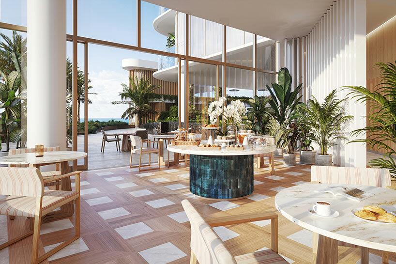
With views over Miami Beach, an awe-inspiring indoor-outdoor conservatory doubling as a breakfast lounge and terrace stands apart as one of the most hotel-like amenities at The Perigon by OMA. Residents will start their days in the serene, dedicated space, where a barista will be available upon request to serve hot or iced coffee to a resident’s liking. The staff at The Perigon will always ensure that every owner’s ideal daily morning routine, from reading the local paper to enjoying sunny-side-up eggs, will be realized.


The wine room and garden on the building’s south side is another unique space inspired by serenity, with views overlooking the property’s waterfall garden. The space will keep nearly 450 bottles of the most refined wine selections in stock and will offer storage services to residents with their own prized collections. A top sommelier will be on hand to host private tastings both at the bar and in the garden, while a celebrated chef will design a variety of pairing menus depending on the season.

oma perigon miami
image © The Boundary


When we first launched The Perigon, our buyers were struck by the tower’s remarkable design that is seemingly afloat above lush gardens,’ said Camilo Miguel, Jr., CEO of developer Mast Capital. ‘The architecture’s slender columns, soaring lines and wraparound terraces maximize the indoor- outdoor experience, and we had a clear vision to use this additional space to bring resort amenities and experiences into the condominium setting.


With reservations successfully converted to contracts, and incredible demand for the limited remaining inventory, we’re proud to reveal how The Perigon’s amenities are as impressive as the residences themselves, and a true extension of one’s home. The amenity collection will cultivate a community for private owners to enjoy this enriched everyday lifestyle together; with every need being met by a team of butlers and expert concierges ready to make any request a reality.’

Reference

Architectural Drawings: Residential Fireplaces in Plan
CategoriesArchitecture

Architectural Drawings: Residential Fireplaces in Plan

The Fourth Annual One Drawing Challenge is open for entries! Architecture’s most popular drawing competition is back and bigger than ever, including larger prizes. Get started on your submission.  

Architecture is designed to bring people together. In residential projects, warmth and comfort define life’s daily rhythms and how we gather. In turn, fireplaces have long been a central focus of architecture, drawing people close while setting the atmosphere. Frank Lloyd Wright famously expressed that “the hearth is the psychological center of the home.” Fireplaces are unique in that they are both functional and aesthetic, with very specific demands for detailing and safety. Whether gas or wood burning, historically, they have long been used to heat the home and provide light.

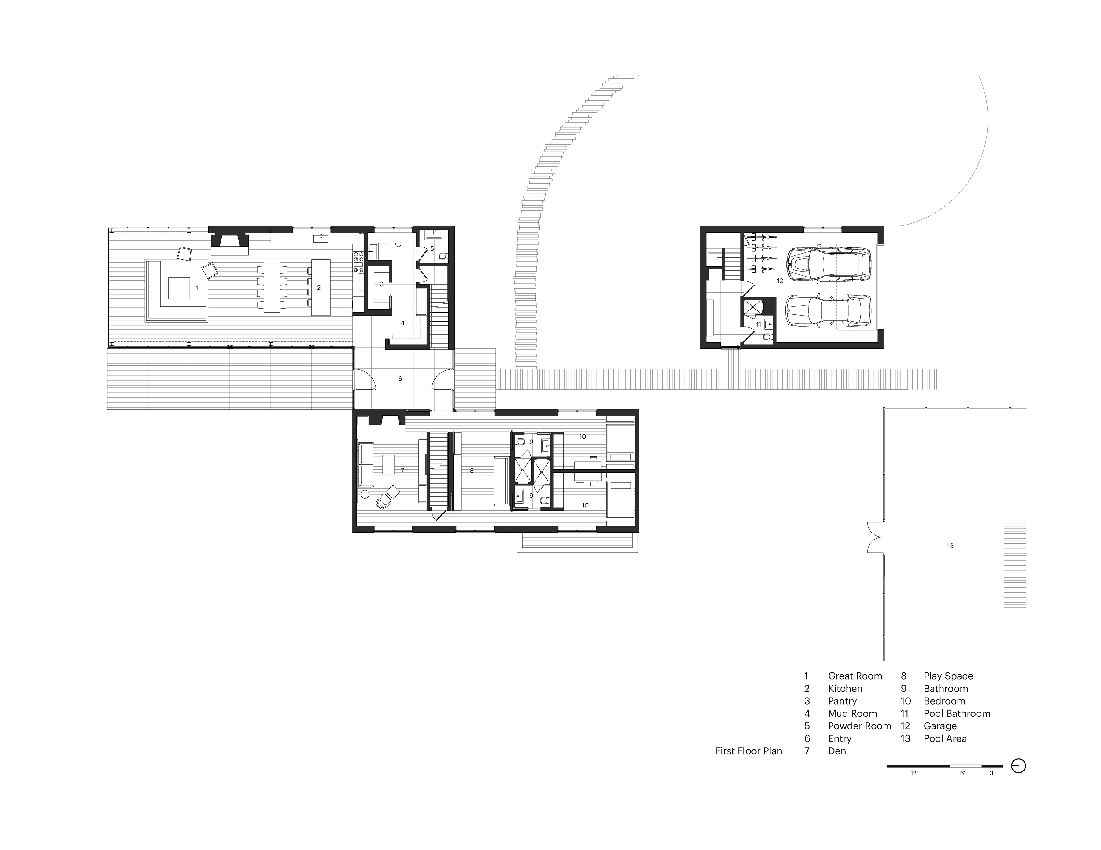
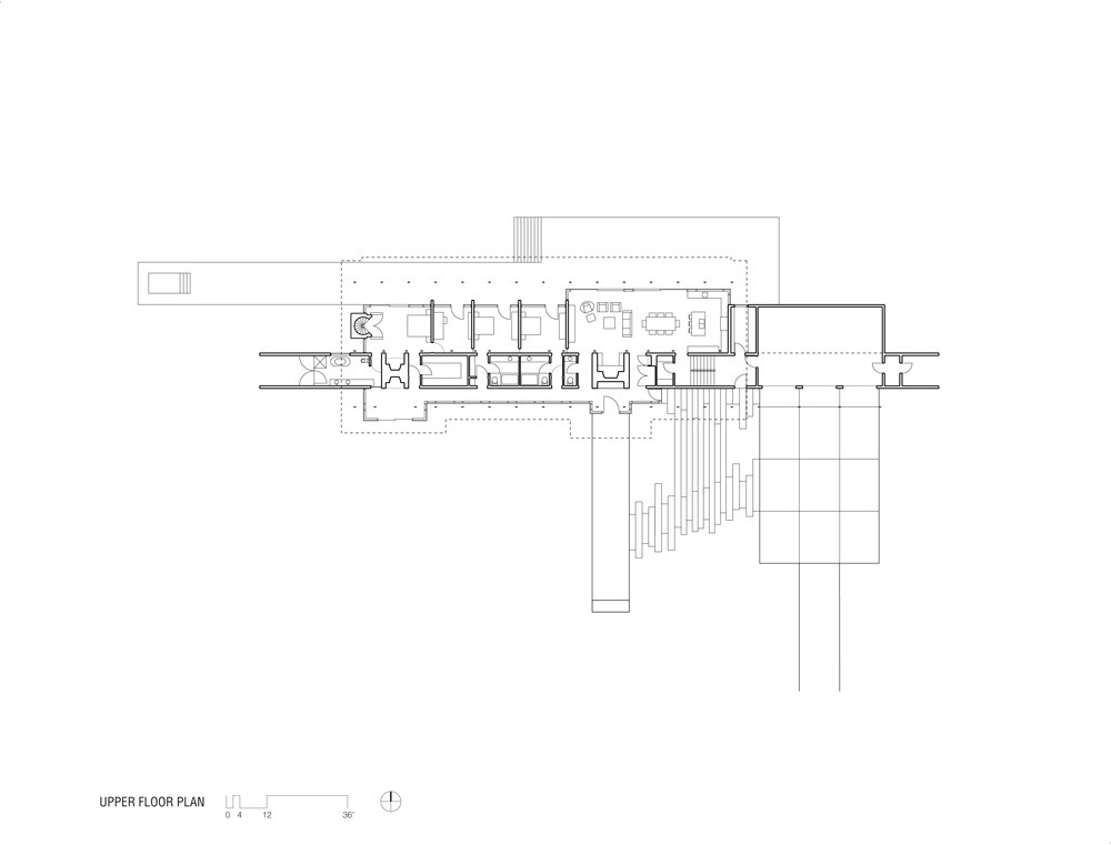
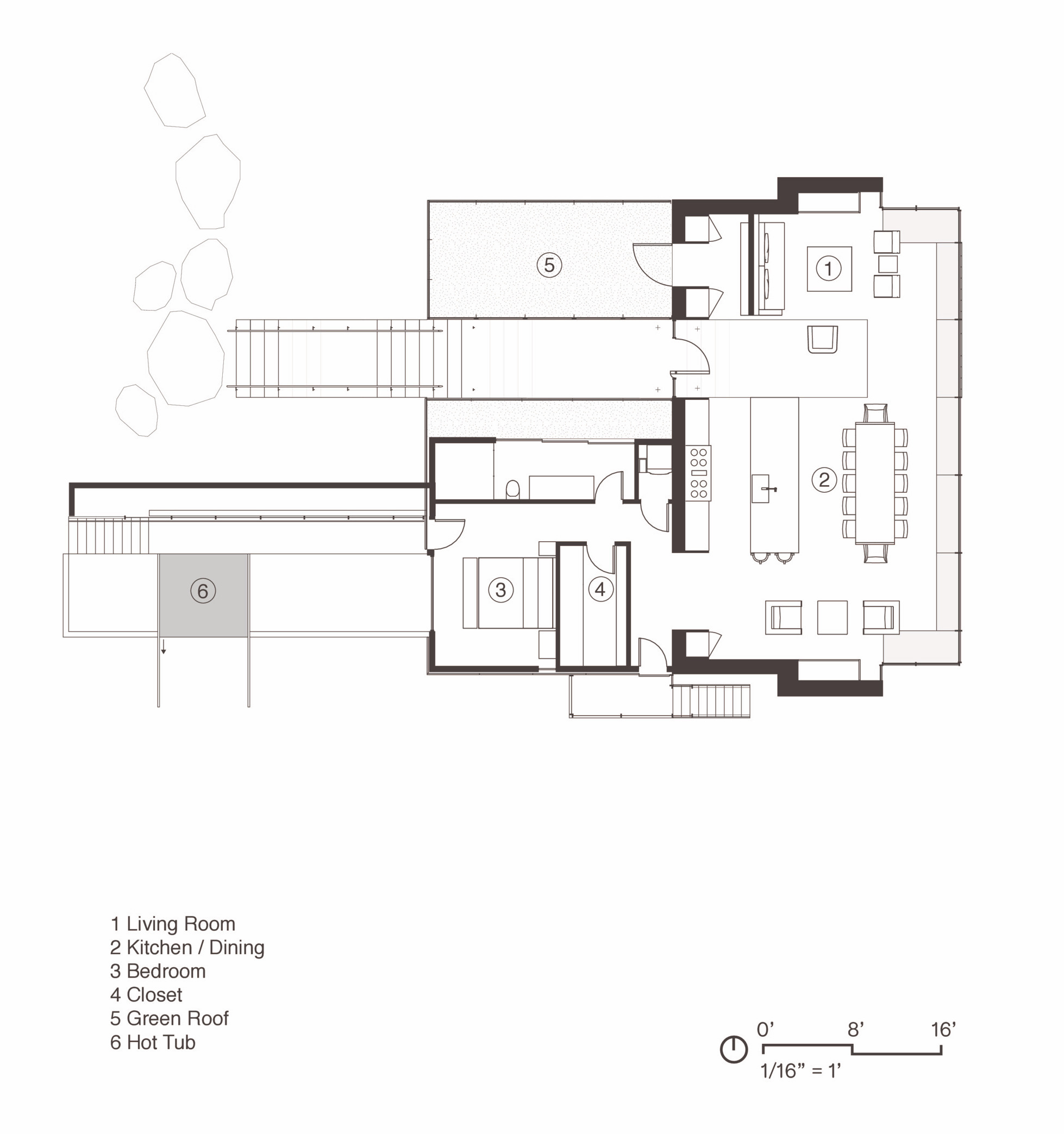
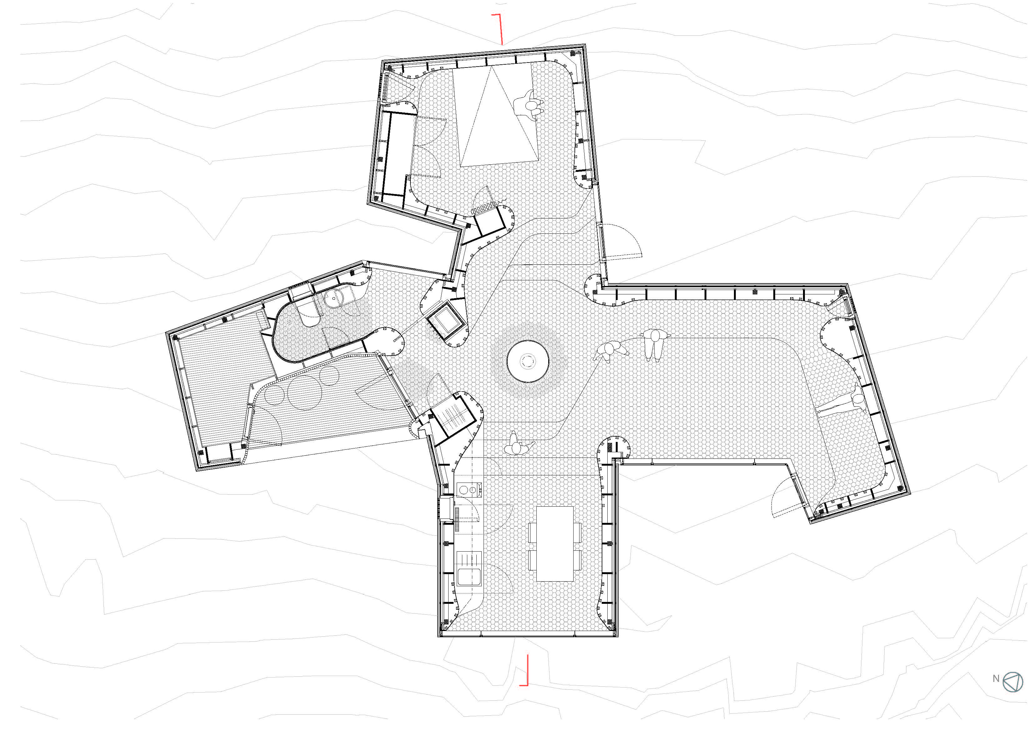
As a central defining element of residential projects, fireplaces take on a hierarchy in floor plan drawings. Often they anchor the interiors of a home while other decors, furniture or art are designed around them. Both indoors and outdoors alike, careful consideration is given to whether the fireplace needs to be functional or simply to provide a design aesthetic to a space. Today, manufacturers and architects are exploring new designs that provide exciting alternatives to traditional models. Drawing from the Architizer database, we’ve rounded up a collection of fireplaces and the corresponding floor plans to showcase how they are being designed around the world.


Grove House

By Roger Ferris + Partners, Bridgehampton, NY, United States

Jury Winner, 2018 A+Awards, Private House (XL>5000 sq ft)

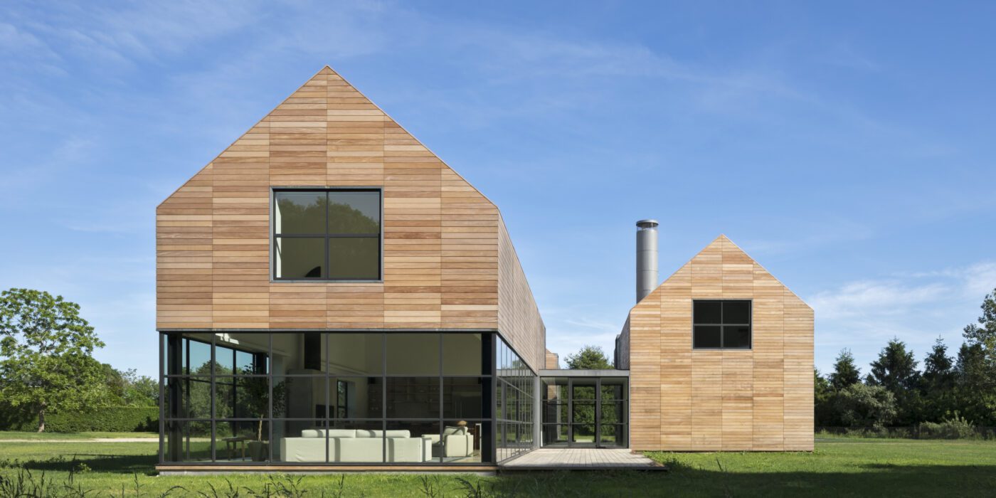
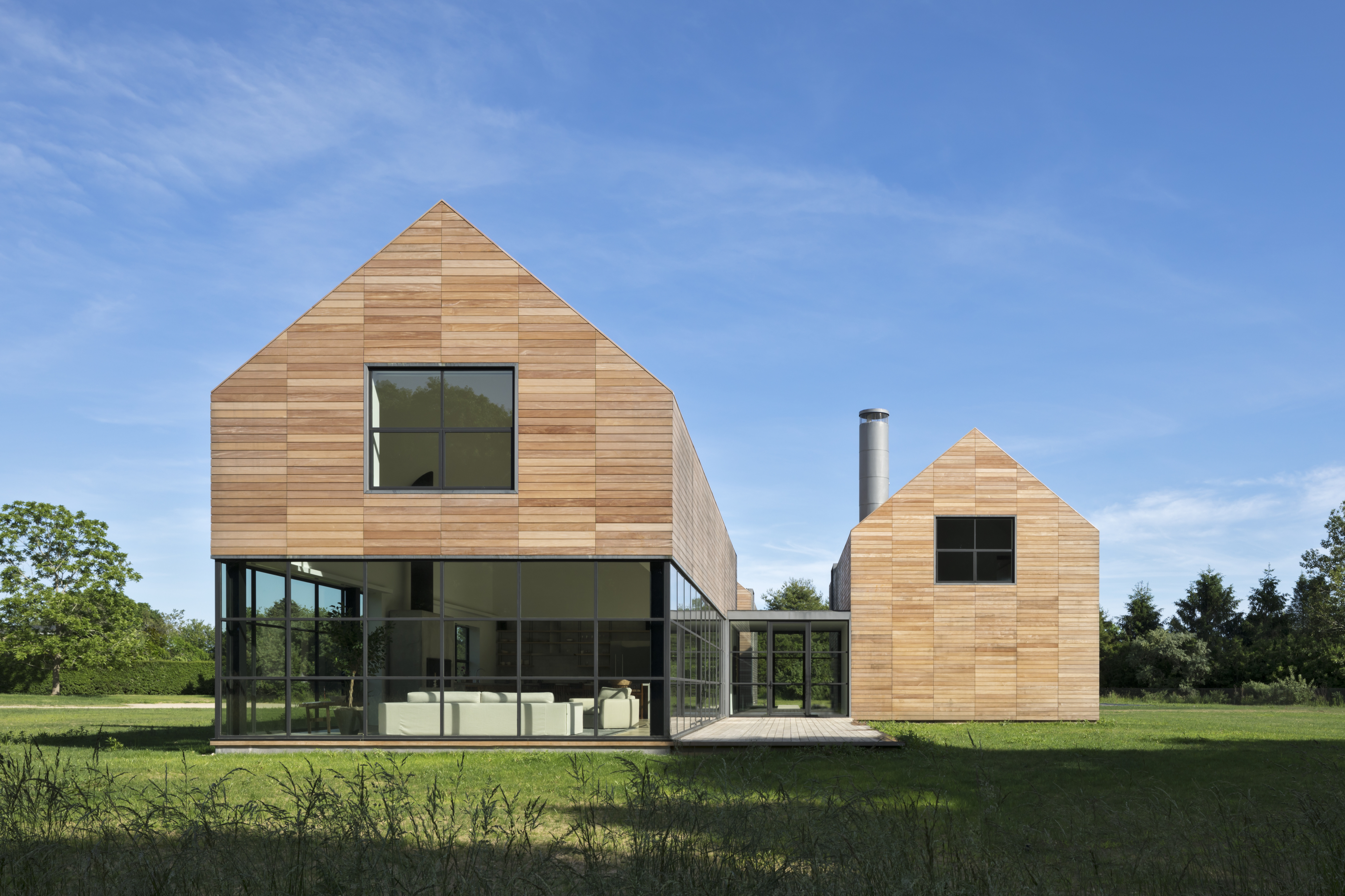
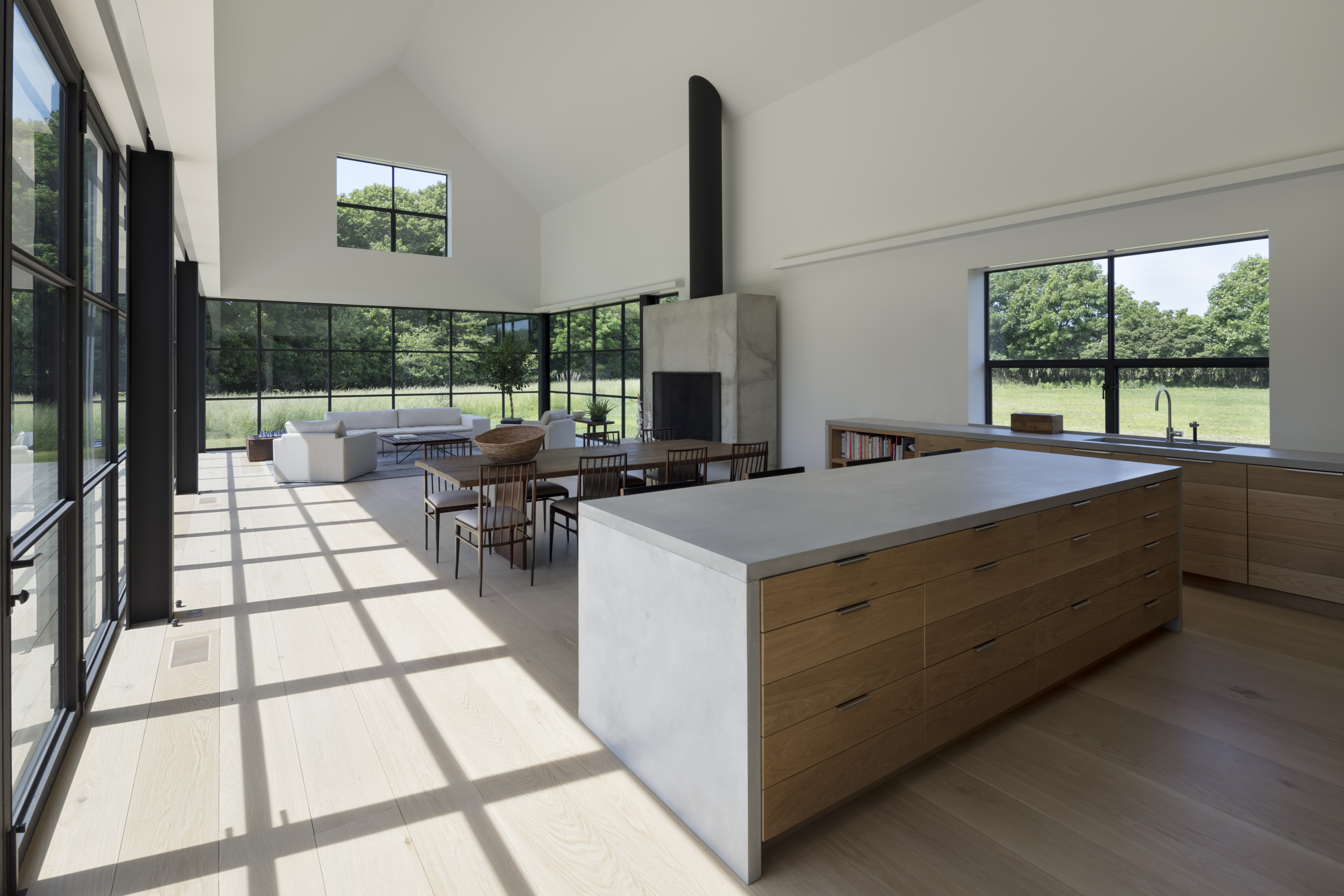
This private Hamptons residence was designed as an immersive retreat. Situated along a natural ravine and protected wetlands, the residence consists of three simple gable-shaped volumes, creating a dialogue between the natural grasslands and the built environment. A contemporary interpretation of a common New England building form, each volume is shrouded in horizontal wood slats which seamlessly wrap all wall and roof surfaces. A public great room is centrally located, acting as a social hub for family and guest interaction. Within the great room, special attention was taken to the design of the architectural concrete fireplace, countertops and black steel sash windows.
Ridge House

By Bohlin Cywinski Jackson, Bonnyville, Canada

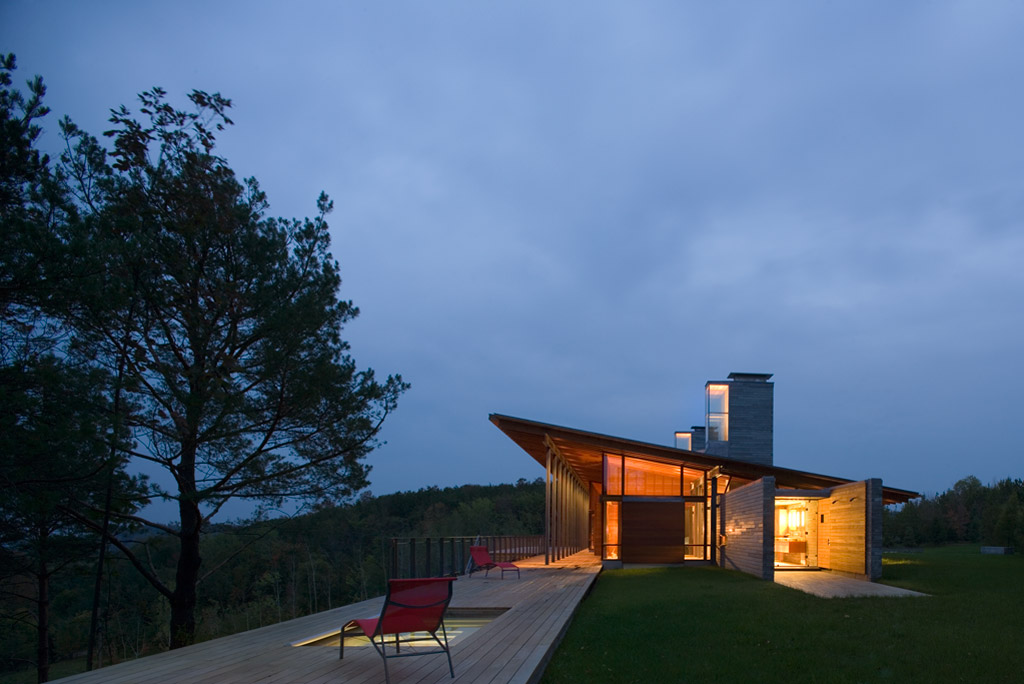
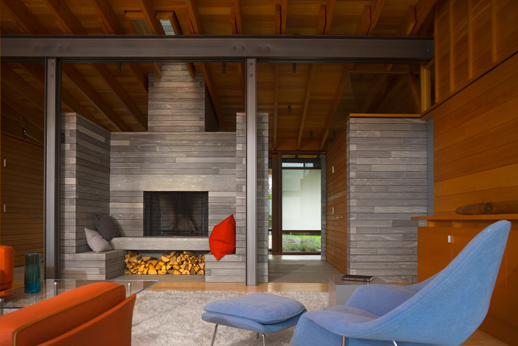
This retreat was conceived as a place for gathering family and friends as well as solitude. Located along the crest of a narrow ridge overlooking a broad valley, the drive that connects to the home turns to reveal a long, linear core of sawn stone that parallels the ridge, sliding under a single-slope roof through a steel-framed glass volume. The stone core, marked by two large fireplace masses, organizes the spaces, with primary circulation along its south face, while gaps in the stone provide access to each of the living spaces. In turn, clear and translucent glass along the south wall creates a play of light and shadow at the circulation spine.
Tofino Beach House

By Olson Kundig, Tofino, Canada

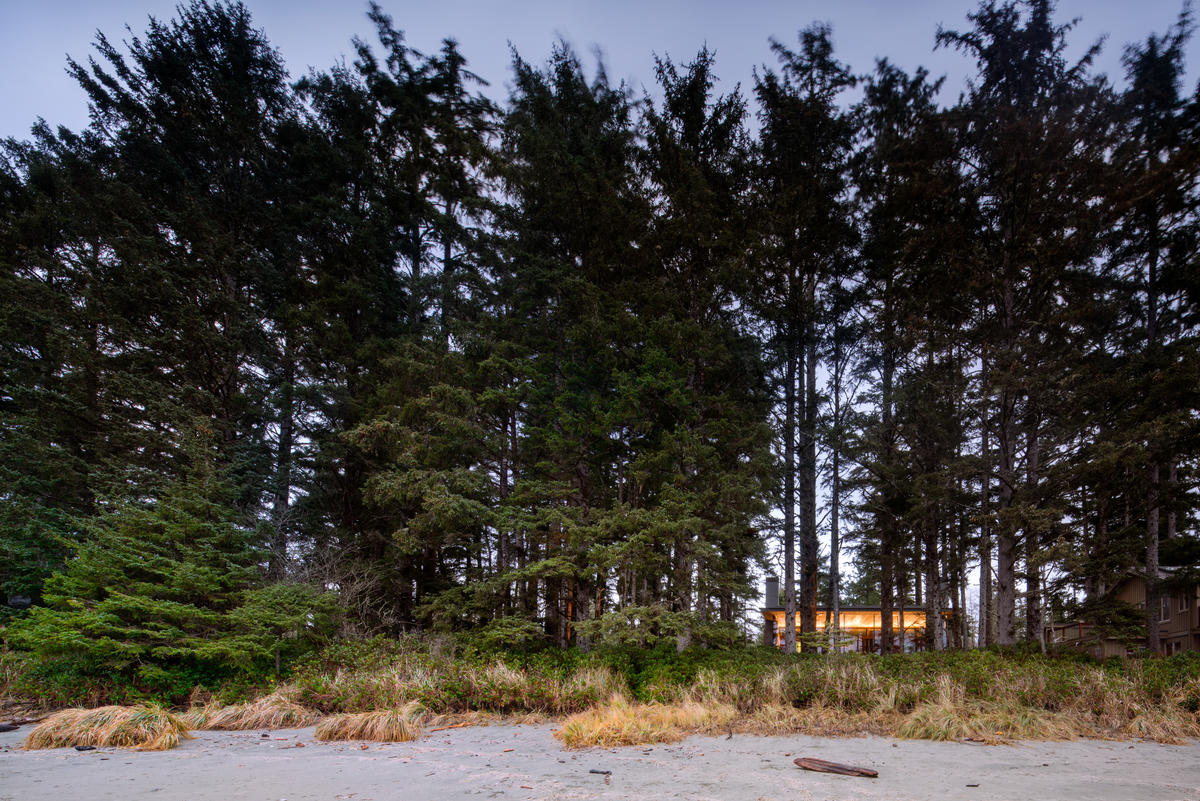
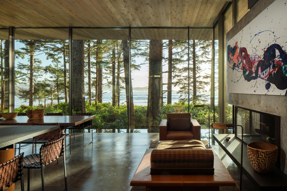
Designed as a beach house within the forest, this home creates a connection between the drama of the nearby ocean and the sense of sanctuary provided by the trees. Composed primarily of one large room, the house is light-filled on the south side facing the ocean, while remaining insular and protected on the other side. Glass walls open the living area to panoramic views of forest and ocean with two fireplaces on either end anchor that the space and provide a feeling of refuge. Artworks were incorporated into the design of the home, with the fireplace walls specially designed to fit paintings by Sam Francis and Diego Singh.
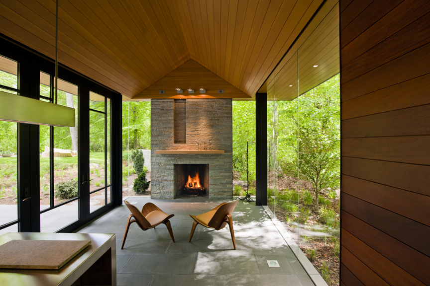
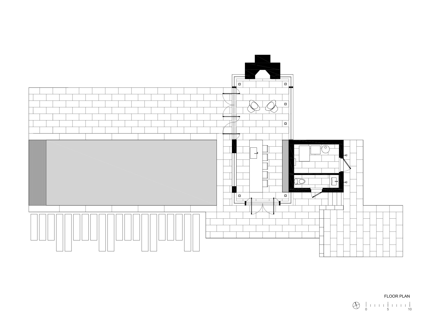
Nevis Pool and Garden Pavilion House

By Robert M. Gurney, Architect, Bethesda, MD, United States

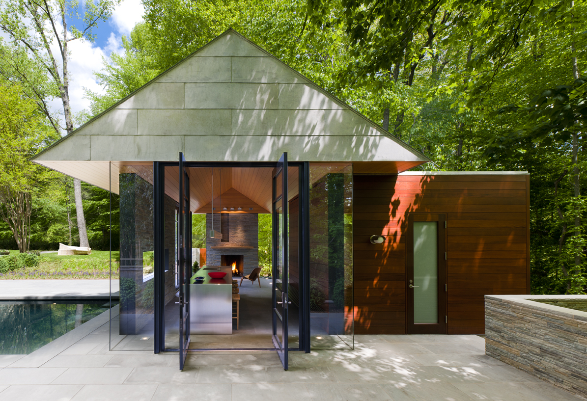
This suburban pavilion is located adjacent to woodlands. A contemporary house surrounded by mature trees and manicured gardens anchors the site. A new swimming pool, stone walls and terraces located behind the existing house organize the rear yard and establishes a dialogue between the existing house and a new pavilion. New paths, trees and structured plantings reinforce the geometry. The new pavilion, intended for year round use, is strategically located to provide a threshold between the structured landscape and adjacent woodland. The doors pivot to open the space much of the year while a large Rumford fireplace and heated floors provide a cozy counterpoint in winter months.
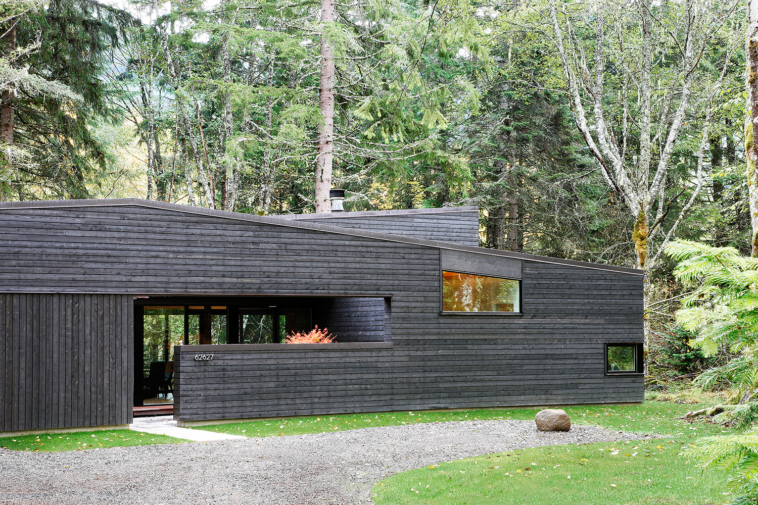
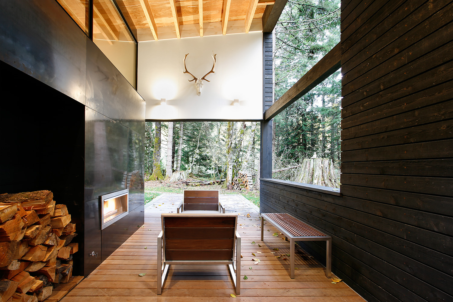
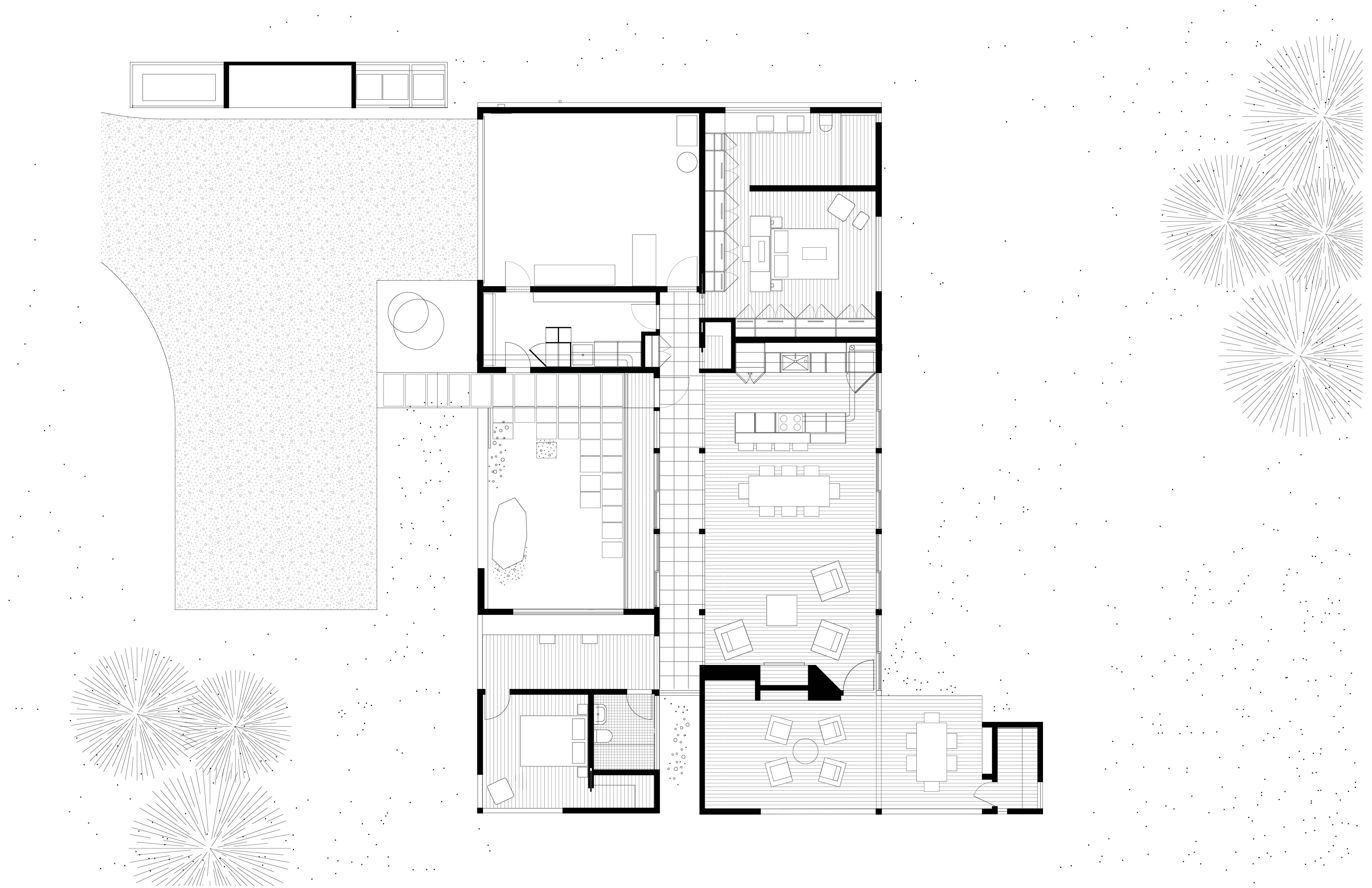
Courtyard House on a River

By Robert Hutchison Architecture, Greenwater, WA, United States

This small residence is sited on the banks of the White River five miles from Mt. Rainier. The project was designed to quietly blend into the surrounding forest. An entry courtyard serves as a transition space from outdoors to indoors and keeps the ubiquitous elk herds at bay. A steel-clad fireplace mass separates the living room from a covered outdoor patio. By working diligently with the client (who also served as General Contractor for the project), the building footprint was kept as compact as possible to minimize site disturbance. The residence was made to epitomize the small home living movement.
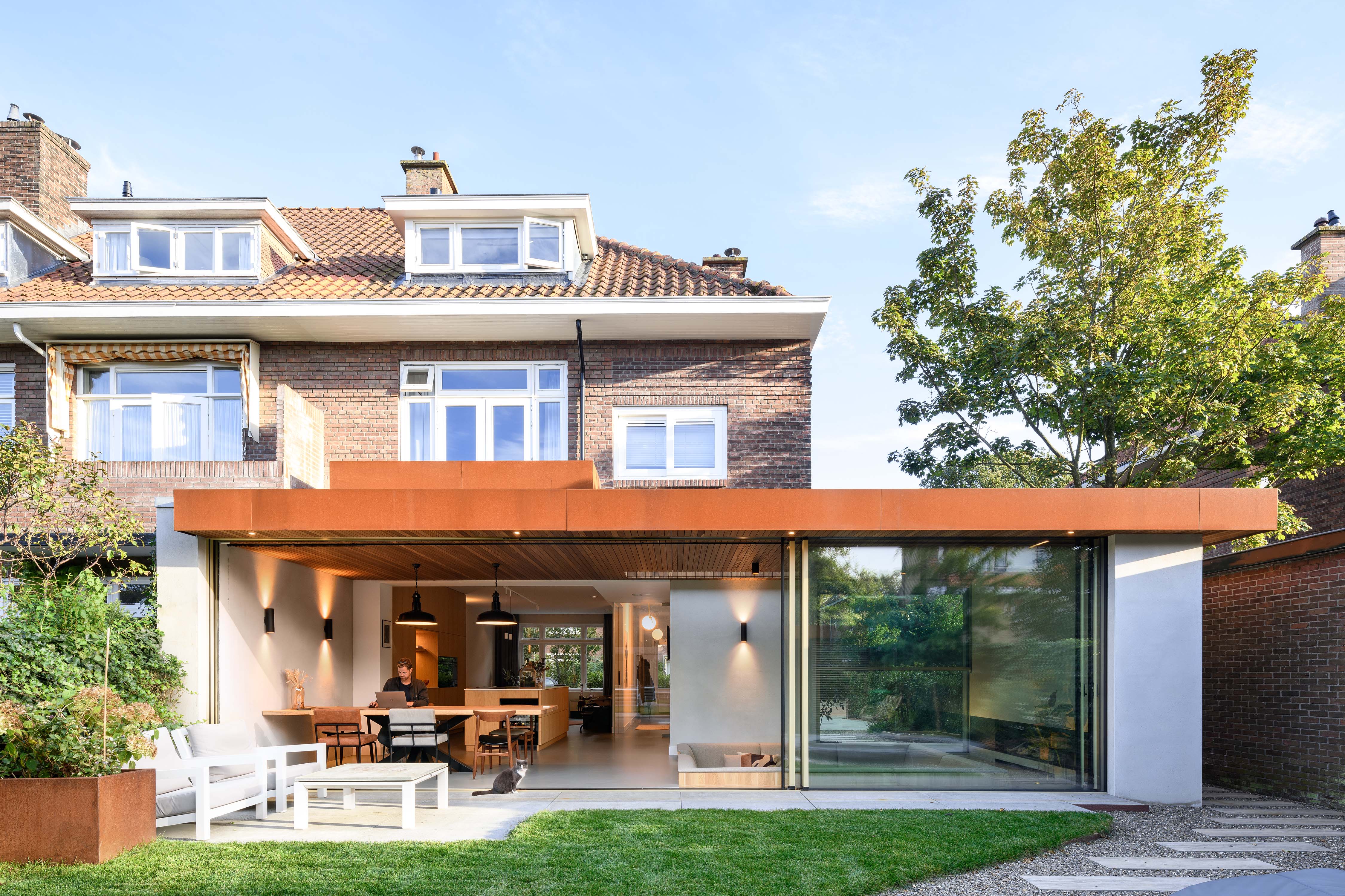
Pit House

By Bloot Architecture, The Hague, Netherlands

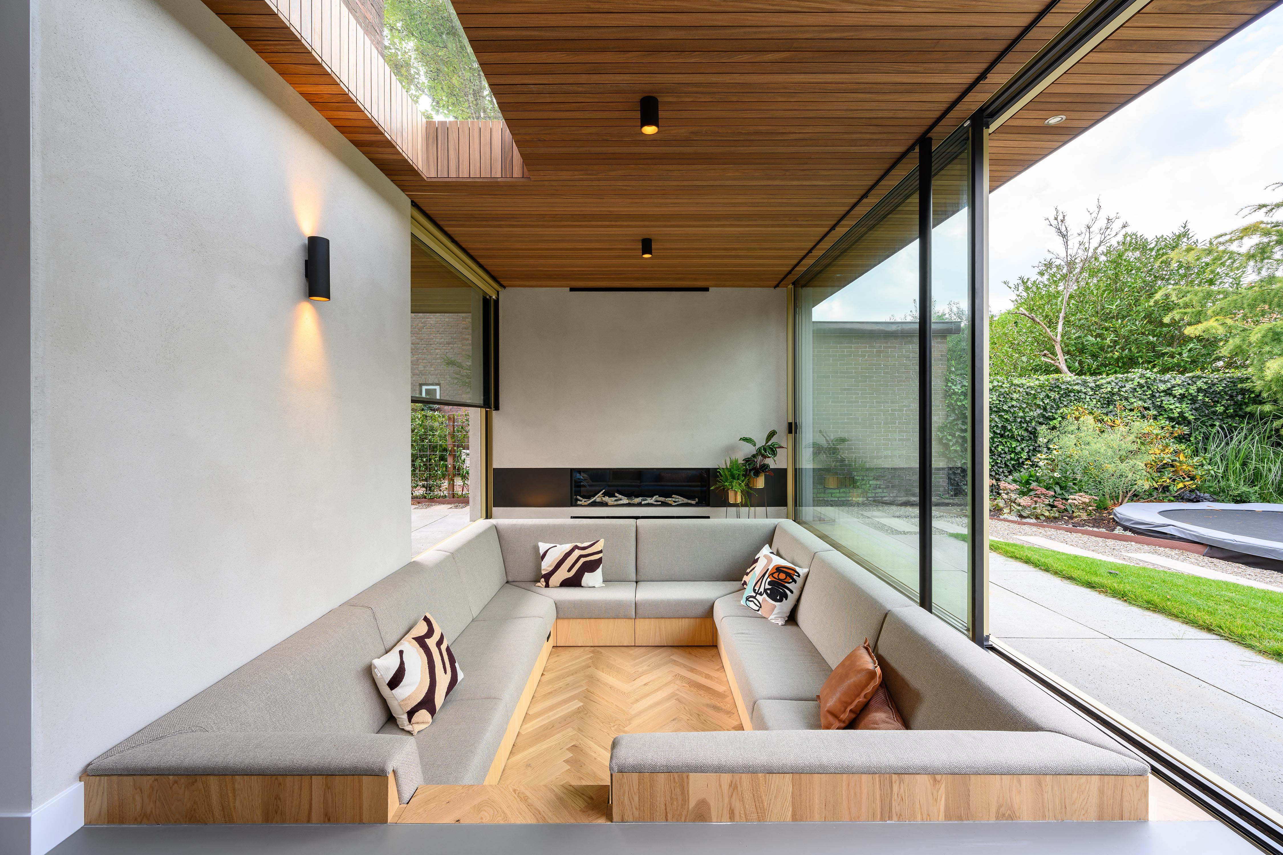
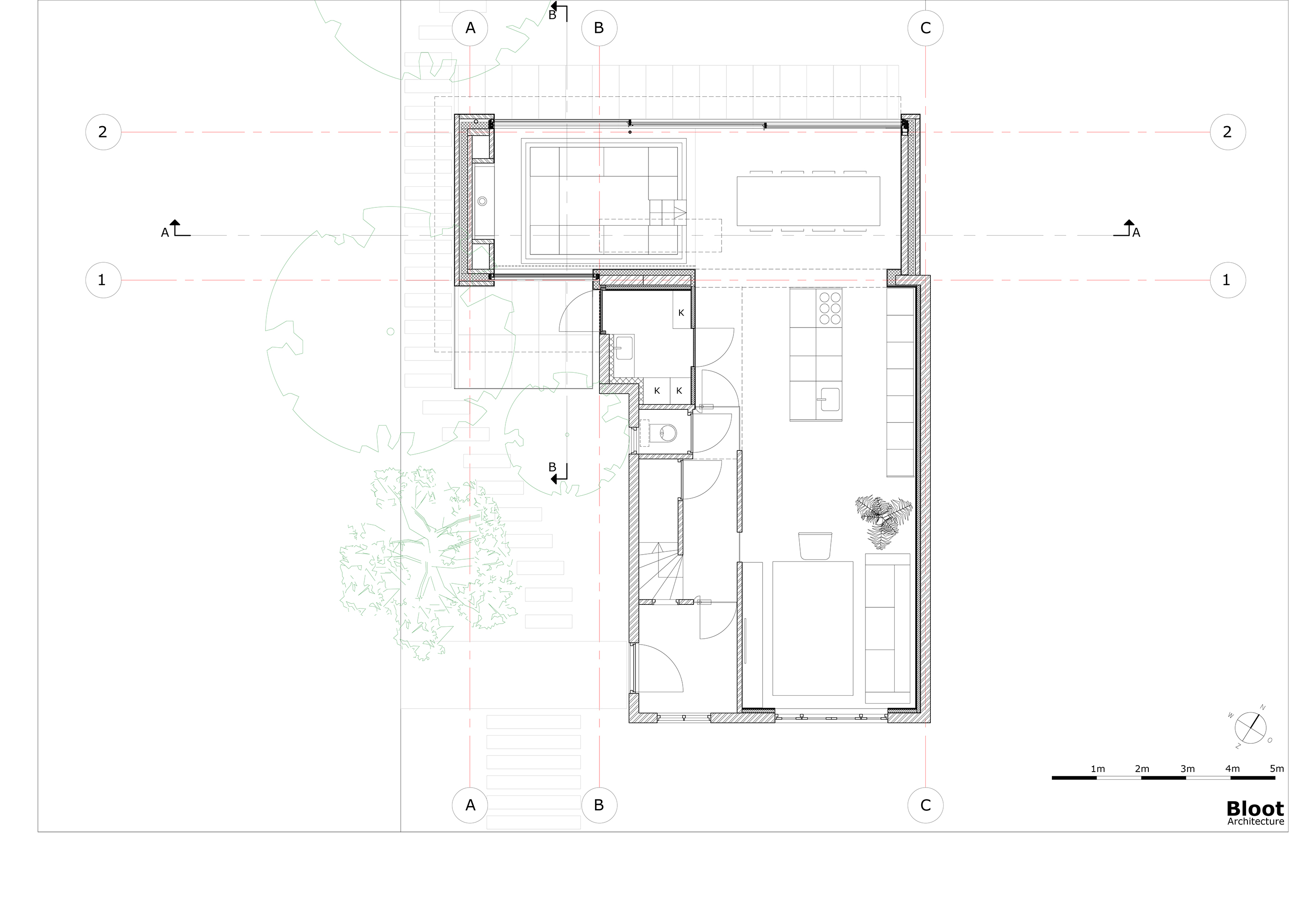
The heart of a dilapidated brick corner house from 1929 was completely renovated and extended, incorporating an inviting sitting pit. The clients asked for more space, an open kitchen and a more direct relationship to the garden. The sitting pit forms a playful space around the fireplace, where the owners are able to stay together with each other, friends and family. Seen at eye level from the seating pit, there is a vertically sliding window on the street side. By sliding this open as well as the large sliding doors at the rear, visitors find themselves outside in a sitting pit, at a fireplace and under a roof. The fireplace sits in a solid block that, together with a thick wall on the other side and a wall parallel to the seating pit, supports the roof.
Cabin at Norderhov

By AtelierOslo, Hønefoss, Norway

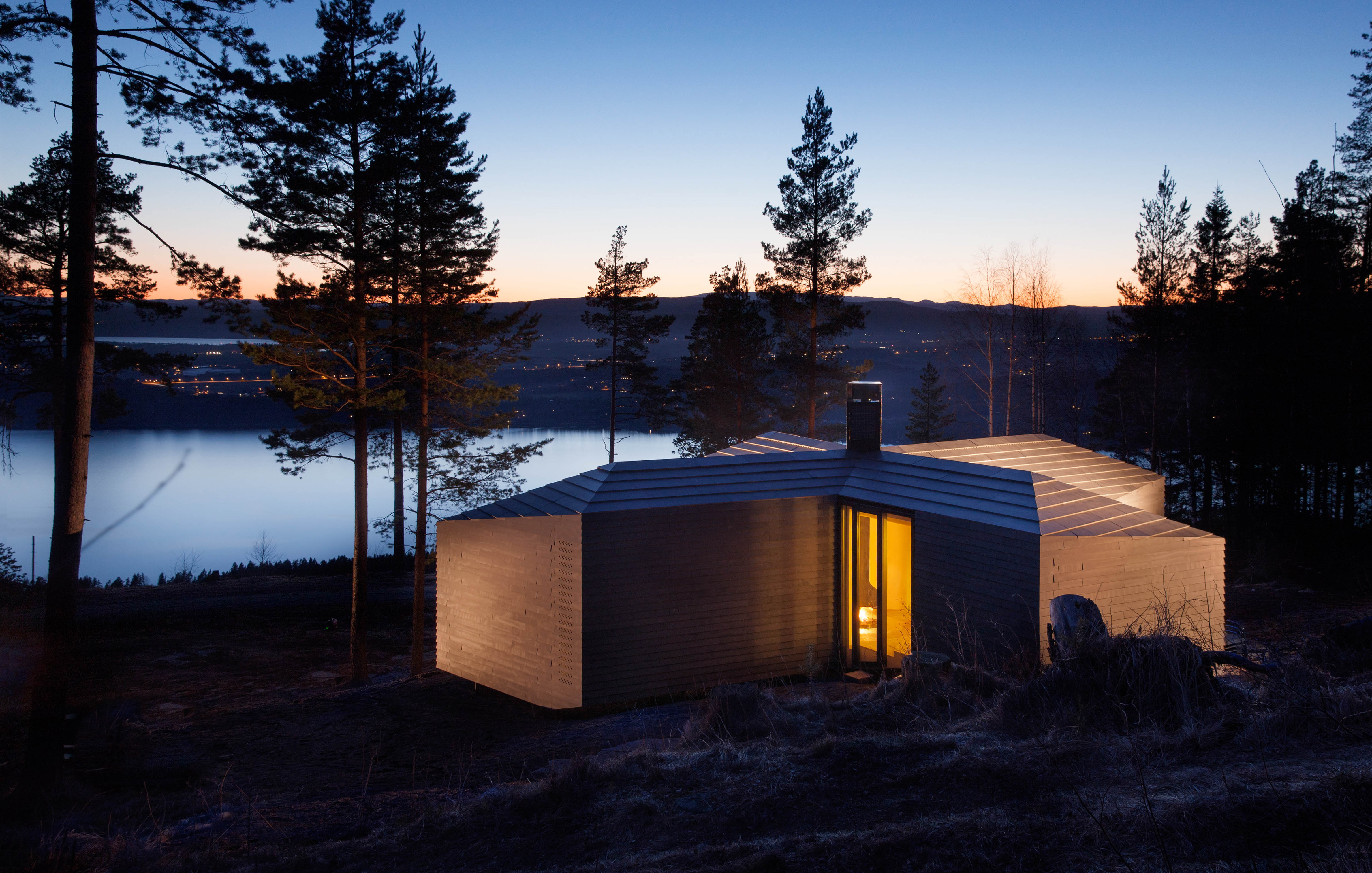
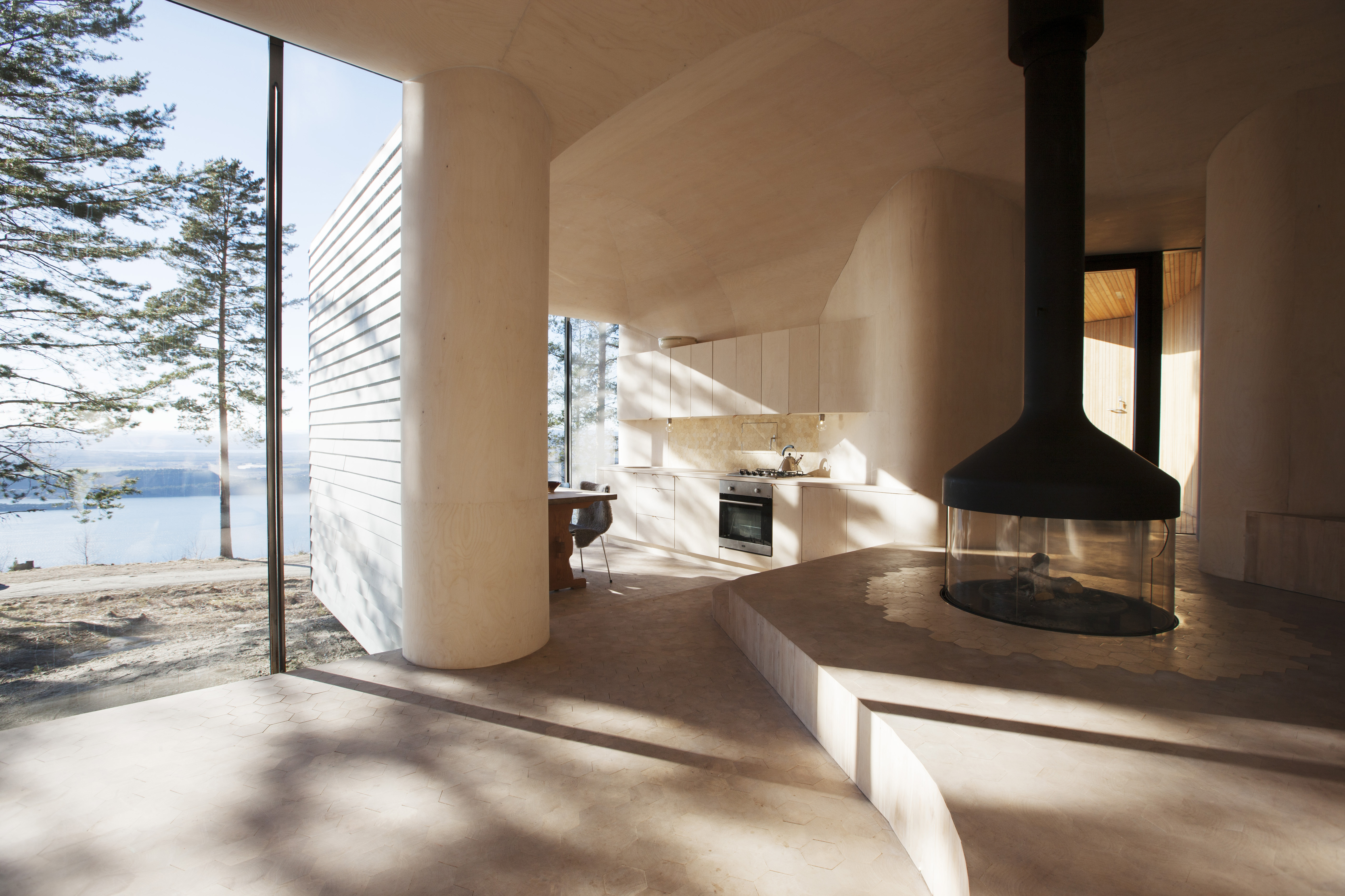
This residential cabin project is located in Krokskogen forests, outside the town of Hønefoss. The site is very exposed to the wind and the cabin is shaped to create several outdoors spaces that provide shelter from the wind and sun at different times of day. The interior is a continuous space finished in a thin layer of curved birch plywood. The fireplace is located at the center of the cabin. The fireplace mantel is hanging from the ceiling, while the fire is down at the floor of the access level. This provides the feeling of a campfire in the landscape that can be seen from different places.

The Fourth Annual One Drawing Challenge is open for entries! Architecture’s most popular drawing competition is back and bigger than ever, including larger prizes. Get started on your submission.  

Reference