geometric stone informs the interiors of retail store by tens atelier in china
CategoriesArchitecture

geometric stone informs the interiors of retail store by tens atelier in china

Tens Atelier designs VeVelte Yintai Center Store’s interior


VeVelte Yintai Center Store by Tens Atelier focuses on curating a collection of quality brands, including those from emerging Chinese fashion designers, with the aim of showcasing Chinese design globally. Tens Atelier took on the task of redesigning the VeVelte store in Hefei‘s Yintai Center, emphasizing its role not just as a brand showcase but also as a salon for VIP members, fostering interaction between the brand and consumers.


The site presented challenges, such as a large smoke pipe near the entrance and irregularly arranged structural columns. The design concept introduced the idea of a ‘boulder’ to guide customer flow and views, strategically minimizing the impact of columns. The ‘boulder’ form also serves to delineate distinct brand display and functional areas, optimizing the use of space.

abstract geometric stone informs the interiors of retail store by tens atelier in china
all images by MRC


Tens Atelier draws from abstract geometrical stone forms


The symbolic character of stone is incorporated into the space, not by directly introducing natural stone but by refining an abstract geometrical form inspired by the concept of a stone. Tens Atelier’s approach integrates the abstract concept of stone with the identity of VeVelte, conveying the symbolic meaning through the overall spatial experience.


Considering the seasonal theme changes for each brand, the designers opted for a uniform warm yellow overall color, while maintaining flexibility with white walls for display and posters, allowing for easy adaptation to evolving brand themes.
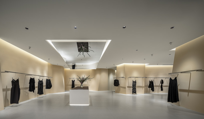
abstract geometric stone informs the interiors of retail store by tens atelier in china
VeVelte Yintai Center Store by Tens Atelier showcases quality brands, promoting Chinese design

abstract geometric stone informs the interiors of retail store by tens atelier in china
the redesign of VeVelte in Hefei’s Yintai Center creates a VIP salon to enhance brand-consumer interaction
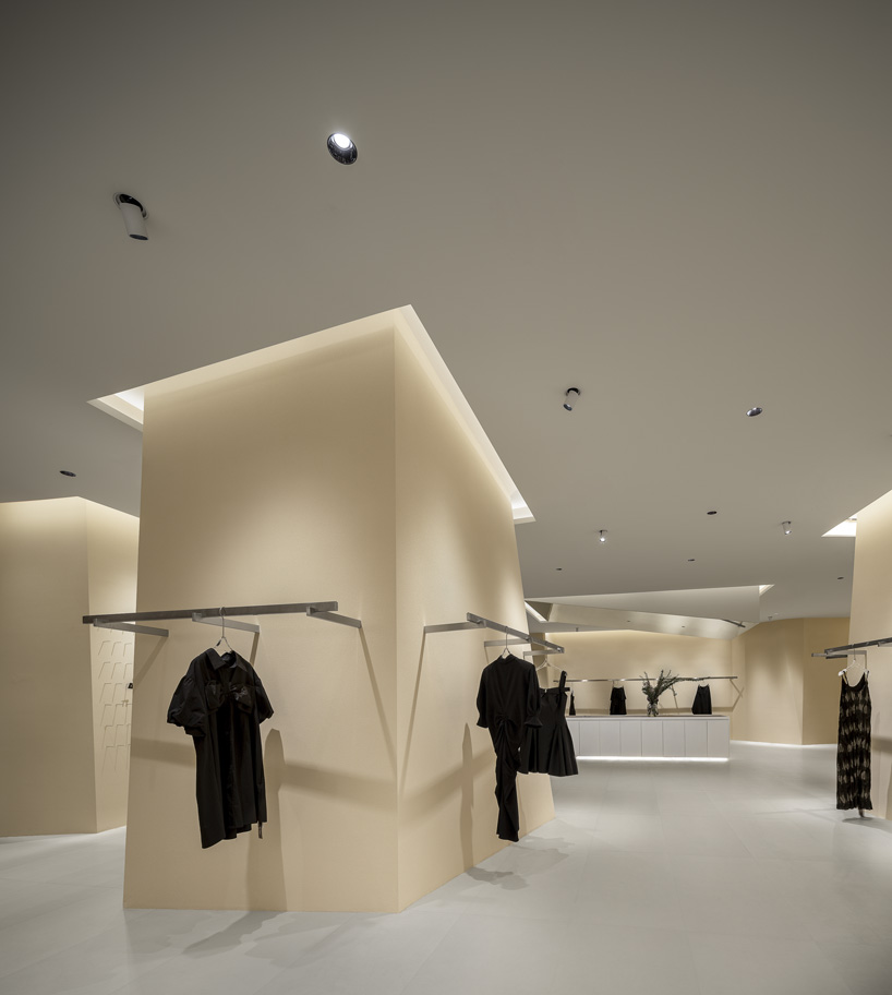
abstract geometric stone informs the interiors of retail store by tens atelier in china
site challenges prompted the design of a ‘boulder’ concept to guide customer flow and views

abstract geometric stone informs the interiors of retail store by tens atelier in china
the ‘boulder’ form minimizes the impact of columns and optimizes space by delineating distinct display areas

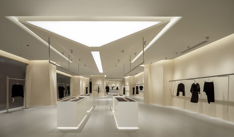
Reference

SML reinterprets ginseng cultivation structure as retail store, seoul
CategoriesArchitecture

SML reinterprets ginseng cultivation structure as retail store, seoul

an exhibition-like retail space for punggi


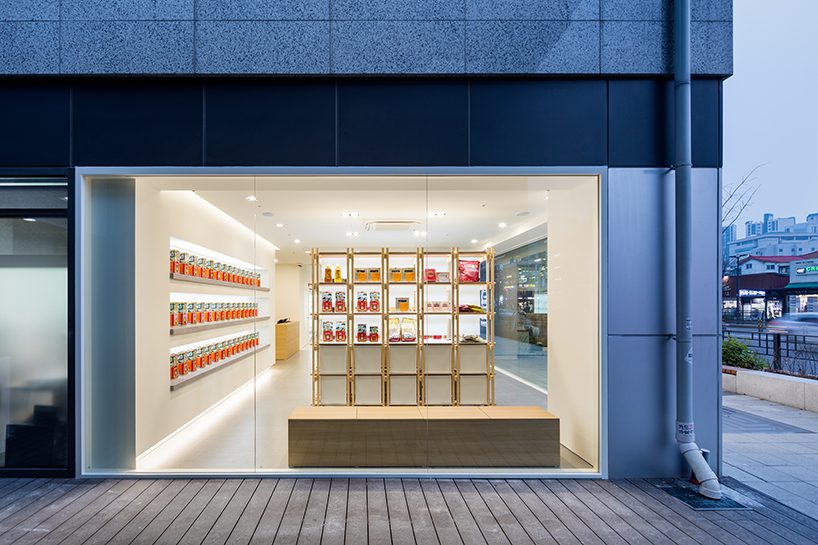
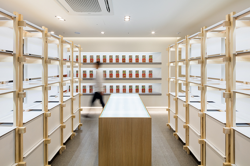
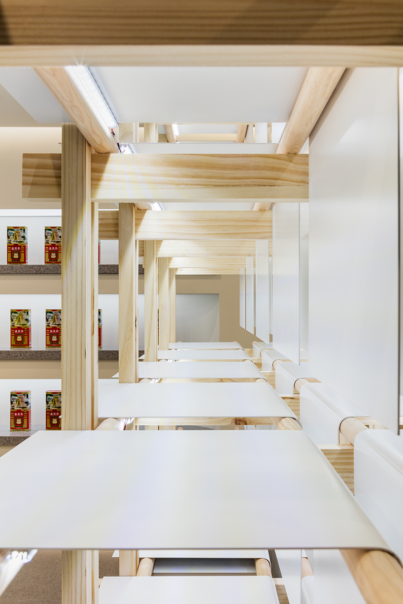
In Seoul, SML translates the traditional structure used to cultivate ginseng into a contemporary interior feature for the exhibition, promotion store, and sales center for Korean brand Punggi. The minimal, all-white space pays homage to the history of the plant, reimagining the traditional ‘Sampoeojang’ module with modern timber flair that weaves through the space to shape a retail area. With a modular form, products presented in a museum-like manner invite visitors to learn more about ginseng’s cultivation processes and the brand’s identity, as well as to purchase Punggi’s creations at the end of their journey

SML reinterprets ginseng cultivation structure as contemporary retail interior in seoul
all images by Kyungsub Shin


SML tells the story of ginseng amid the white walls


Embracing a passive branding strategy, SML’s design focuses on forming a spatial image that conveys the reputation of Punggi Korean Ginseng to a broader audience by spotlighting a differentiated, and yet-unknown image of the brand. The exhibition space, cloaked in pure white, serves as a canvas for the story of ginseng, with sophisticated wooden furniture embodying the brand’s inherent values. This design further seeks to subtly guide visitors through a journey that integrates brand exploration with the natural progression towards consumption.


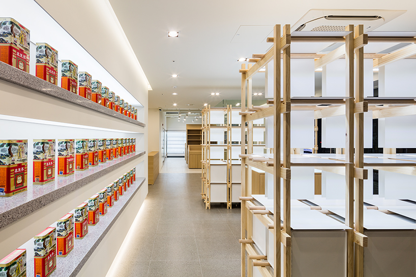
The promotion wall takes center stage, transforming the main products into objects of art through careful curation. In a thoughtful play of physical materials and display methods, the wooden furniture-type structure of the display stand introduces a compelling contrast, as well as exuding a sense of warmth into the space. Each display case, set against the whiteness of the room, showcases products along a circular wooden member that softly circulates the space.  

SML reinterprets ginseng cultivation structure as contemporary retail interior in seoul
Punggi Ginseng Cooperative Association store in Seoul


The Korean Peninsula, famed for being the world’s premier ginseng producer, owes its reputation to a blessed natural environment. The Punggi Korean Ginseng, which is recognized as the best quality among them, is a perennial plant with a slow growth rate and specific cultivation requirements, is grown in a sunshade system called Sampoeojang over three to six years. In this way, this structure is considered a ‘ground for cultivation’, the very ‘house of ginseng’, recalled in SML’s design concept.

SML reinterprets ginseng cultivation structure as contemporary retail interior in seoul
SML creates an exhibition, promotion store, and sales center for the Korean brand

SML reinterprets ginseng cultivation structure as contemporary retail interior in seoul
the promotion wall takes center stage, transforming the products into objects of art through careful curation

Reference

el departamento infuses mountainous hues into texturized optical boutique in madrid
CategoriesArchitecture

el departamento infuses mountainous hues into texturized optical boutique in madrid

El Departamento unveils new PJ Lobster boutique in Madrid


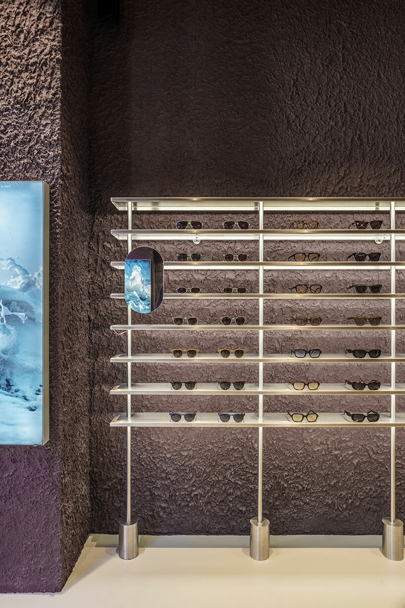
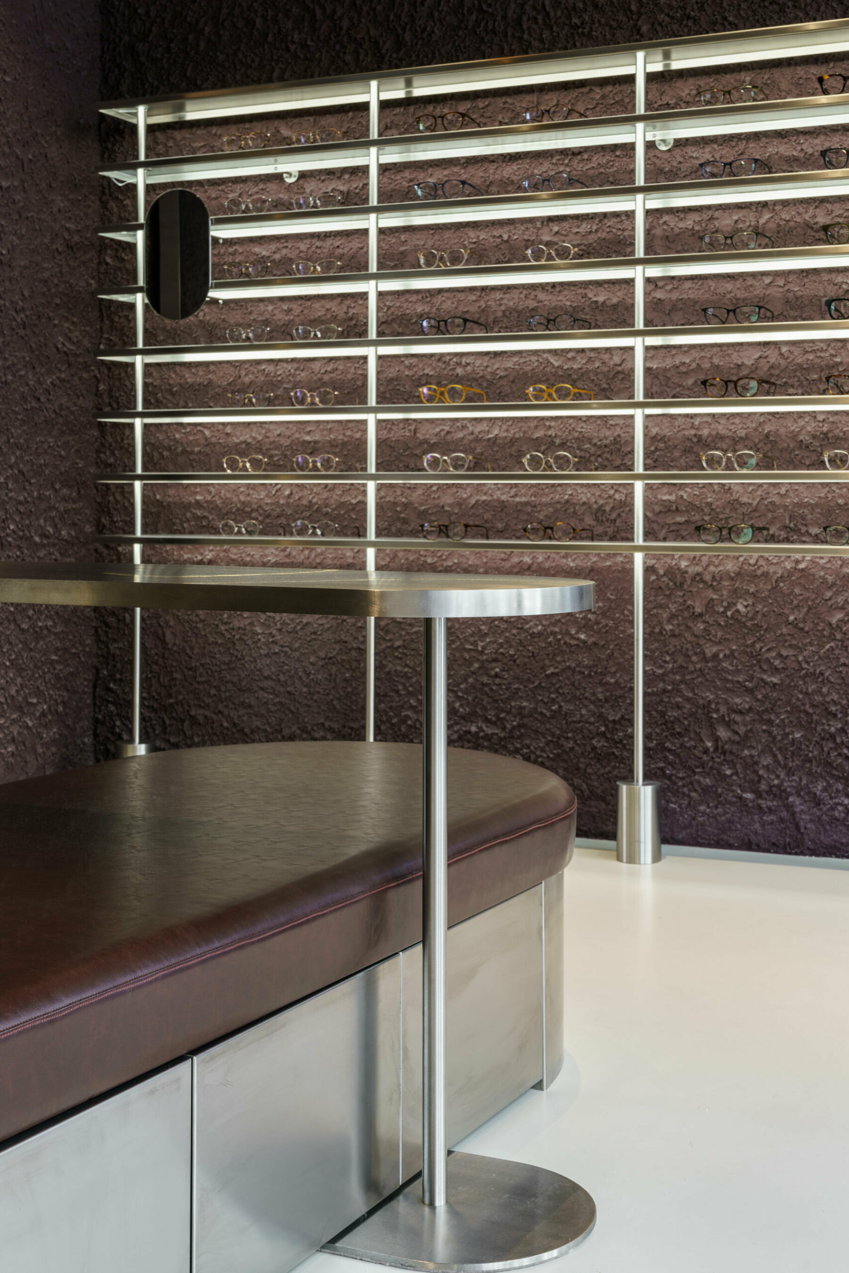
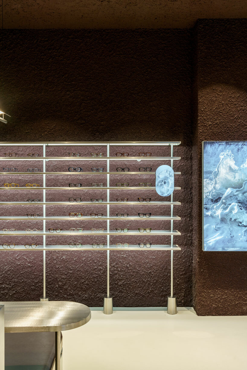
Valencia-based architecture practice El Departamento has crafted a contemporary optical boutique for the PJ Lobster brand in Madrid, Spain. Drawing from the character of the project location, which combines both sophistication and vibrancy, the retail interior incorporates texturized minimalism, rough materiality, organic forms, and stainless steel elements throughout its design. The color palette is inspired by the hues of the Madrid mountains, infusing a natural essence into the design which is otherwise described as ‘high-tech’.

el departamento infuses mountainous hues into texturized optical boutique in madrid
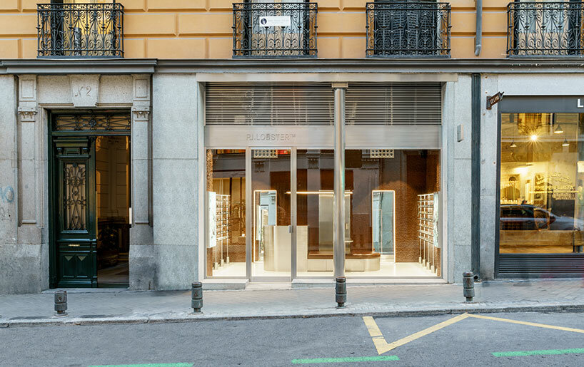
the exterior of the new PJ Lobster boutique in Madrid | all images courtesy of Miguel Fernández-Galiano


PJ Lobster’s Madrid store Unveils a Design Continuum


The new PJ Lobster boutique in Madrid continues the design exploration initiated in the previous project located in Barcelona (see designboom’s previous coverage here), focusing on color, organic forms, and different textures as common design elements.


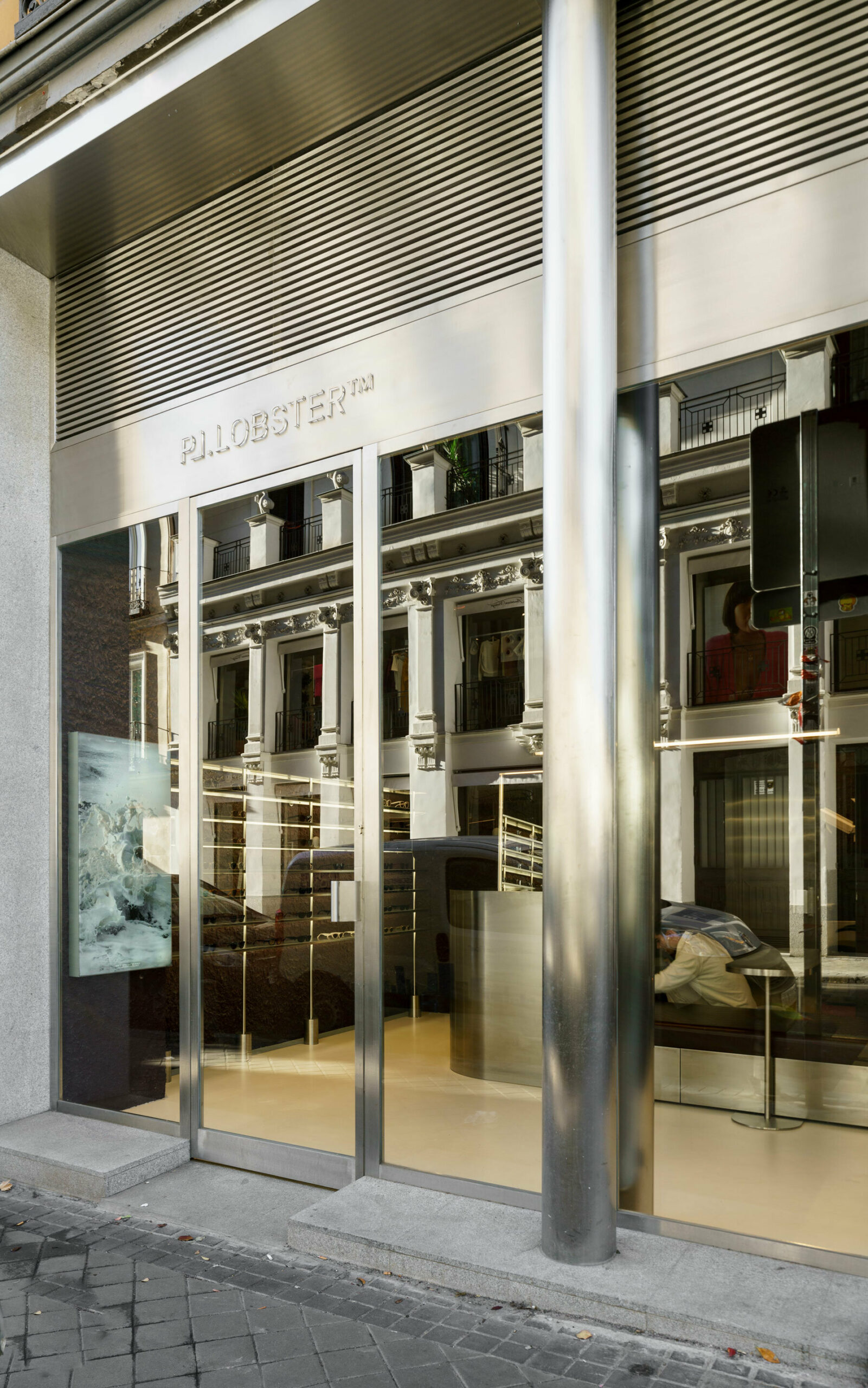
Spanning 42 m2, with an additional operational basement, the structure redefines traditional storefront concepts with an expansive, unobtrusive street-facing facade. The interior boasts ornamental structures, including wooden beams and cast-iron columns, maintaining an impressive free height of over 4 meters. El Departamento (find more here) preserved the original cast-iron pillars on the facade, encasing them in a sleek stainless-steel skin that transforms their appearance into two seamless cylinders. A striking glass facade, precisely centered between the two pillars, establishes a clear boundary, inviting patrons to experience the seamless transition between the external environment and the meticulously crafted interior space.


el departamento infuses mountainous hues into texturized optical boutique in madrid
the entrance of the store features reflective stainless steel elements


El Departamento’s Fusion of Textured Minimalism & Raw Precision


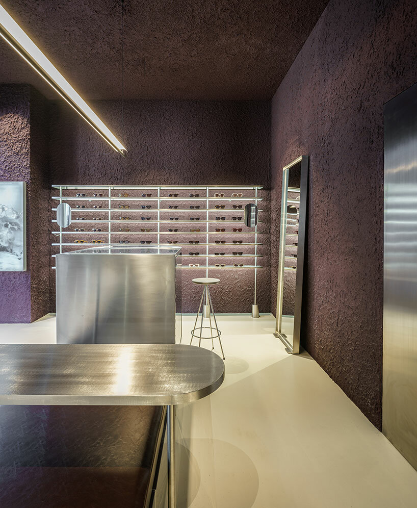
In their latest spatial exploration for this new optical boutique, El Departamento blends textured minimalism and raw precision. Meticulous attention to detail is evident as the color-blocked sales area dynamically contrasts with a neutral floor, yet harmonizes with stainless-steel furniture, accentuating the high-tech ambiance of the space.


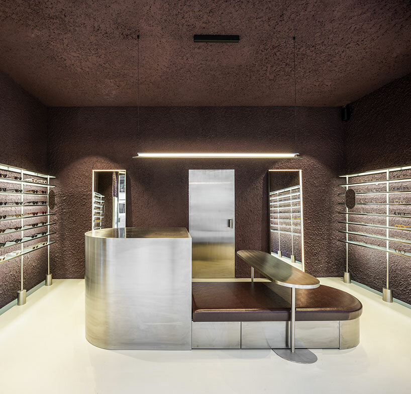
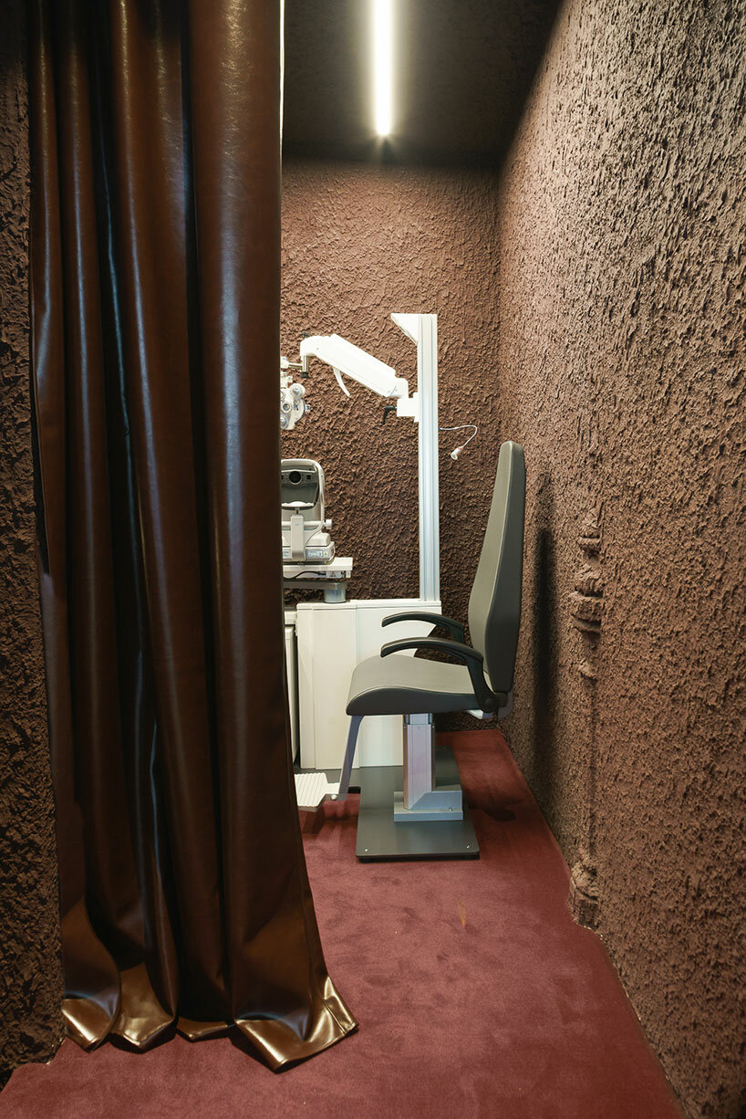
The design of the shop is characterized by rough materiality, as a prominent irregular plaster finish emerges. The color palette, dominated by dark garnet and aubergine hues, pays homage to the traditional color of Madrid’s exposed brick. This color, derived from the various clays of the central plateau, harks back to the architectural materials of Madrid’s late 19th-century aesthetics. ‘This tribute to reddish tones, transformed into garnet, evokes the hues that tint the fields of Madrid’s mountain range in autumnal twilights,’ the design team shares. 

el departamento infuses mountainous hues into texturized optical boutique in madrid
the retail interior incorporates rough materiality, organic forms, and stainless steel elements

el departamento infuses mountainous hues into texturized optical boutique in madrid
the color palette of the project is inspired by the hues of the Madrid mountains

el departamento infuses mountainous hues into texturized optical boutique in madrid
an irregular plaster finish emerges within the interior

el departamento infuses mountainous hues into texturized optical boutique in madrid
the interior boasts ornamental structures, including wooden beams and cast-iron columns

el departamento infuses mountainous hues into texturized optical boutique in madrid
the store is dominated by dark garnet and aubergine hues

el departamento infuses mountainous hues into texturized optical boutique in madrid
the boutique s characterized by a high-tech ambiance


project info: 

name: PJ Lobster Restyling
architects: El Departamento | @eldepartamento.estudio
design team: Alberto Eltini & Marina Martín

location: 2 Fernando VI Street, Madrid, Spain 
area: 42 sqm
photography: Miguel Fernández-Galiano

myrto katsikopoulou I designboom

dec 25, 2023


Reference