Kith Women Flagship in Soho combines walnut and pink marble
CategoriesInterior Design

Kith Women Flagship in Soho combines walnut and pink marble

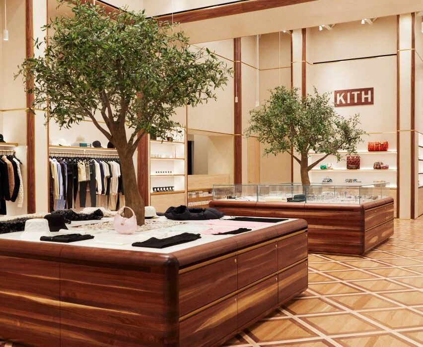
American fashion brand Kith has returned to the location of its first Manhattan flagship to open a women-dedicated store, in which olive trees grow up through display podiums.

The inaugural Kith Women Flagship in Soho opened last December at 644 Broadway, the same historic landmark building where the brand debuted its Manhattan retail offering in 2011.
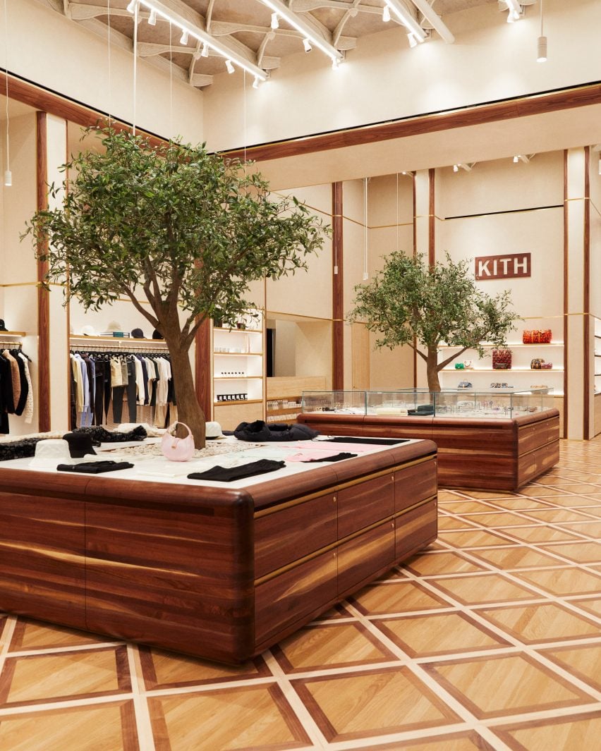
Custom-built walnut podiums with olive trees growing through the centreCustom-built walnut podiums with olive trees growing through the centre
Custom-built podiums run through the middle of the Kith Women flagship store in Soho

Previously the Manhattan Savings Institute Bank, the red sandstone and brick structure’s exterior features wrought iron gates at the entrance and set the tone for the materials palette inside.

Kith founder and creative director Ronnie Fieg designed the interiors to include signature elements of the brand’s retail concepts, but with adjustments to acknowledge its context.
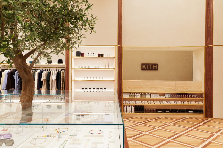
Kith Women store with apparel and accessories displayed in walnut and brass-trimmed nichesKith Women store with apparel and accessories displayed in walnut and brass-trimmed niches
The main room displays apparel and accessories in walnut and brass-trimmed niches

“The ambiance exudes modern elegance with its warm and calming aura, constructed with materials like Venetian plaster, travertine, and rosa aurora [marble],” said the Kith team.

The spacious main room benefits from tall ceilings and an open floor plan, and presents Kith Women in-house and multi-brand ready-to-wear apparel against Venetian plaster and Kith monogrammed suede wallpaper.
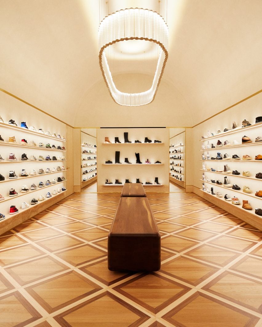
Footwear room with shoes presented on travertine shelvesFootwear room with shoes presented on travertine shelves
In a room dedicated to footwear, shoes are presented on travertine shelves

Clothing is displayed on rails installed in walnut and brass-trimmed niches around the perimeter, with accessories like hats and bags placed on shelves above.

A row of square walnut podiums runs through the middle of the room, each with an olive tree growing up through the centre of its pink marble surface.
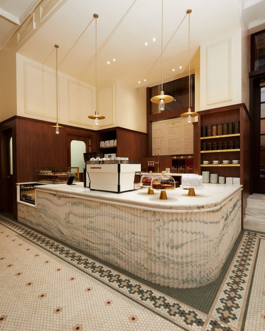
A cafe and flower shop featuring mosaic floors and a fluted marble service counterA cafe and flower shop featuring mosaic floors and a fluted marble service counter
A cafe and flower shop is run in partnership with PlantShed, and features mosaic floors and a fluted marble service counter

Custom-built by Brooklyn-based woodworker Mark Jupiter, these units contain drawers for product storage, and alternating ones are topped with glass vitrines for showcasing jewellery and other small accessories.

Oak flooring is laid in a grid pattern transversed by walnut strips, and the darker wood also lines the fitting rooms.

Footwear has a dedicated room, in which shoes are displayed on shelves with integrated lighting that run from one end to the other.

“Entering the footwear space, you will find a grand arched plaster ceiling, travertine shelves, and a custom chandelier from Italy by Viabizzuno,” the team said.
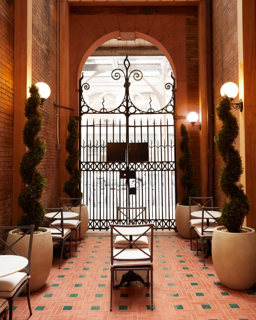
Cafe in a courtyard behind historic wrought iron gatesCafe in a courtyard behind historic wrought iron gates
The cafe leads out to a courtyard behind the historic building’s wrought iron gates

In the final room is a cafe run in partnership with New York-based flower and plant shop PlantShed, which serves light bites and drinks and offers custom floral arrangements.

The space features a mosaic tiled floor, walnut wall panelling, a service counter with a fluted pink marble front and floral displays on stepped stone plinths.

The cafe leads out to a courtyard area behind the building’s impressive iron gates, which furnished with cafe tables and chairs in between topiary plants shaped into spirals.
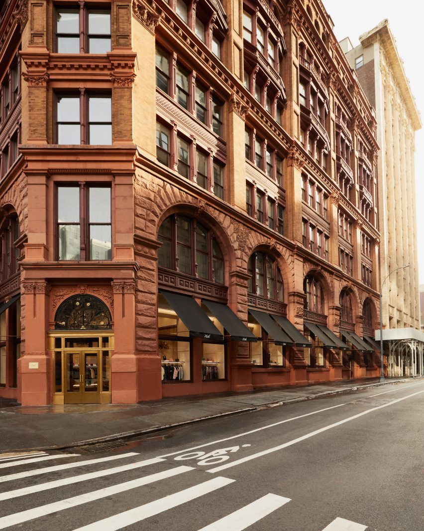
Exterior view of red sandstone building at 644 BroadwayExterior view of red sandstone building at 644 Broadway
Kith Women is located at 644 Broadway, the same building where the brand opened its original flagship retail space in 2011

Feig also designed Kith’s recently opened Williamsburg store, located in the 25 Kent Plaza office building where the brand also has its corporate offices.

The company had previously worked with design studio Snarkitecture on its retail spaces around the world, including outposts in Miami, Los Angeles and Paris.

The photography is courtesy of Kith.

Reference

Gharib Studio outfits Austin jewellery store with pink walls and arches
CategoriesInterior Design

Gharib Studio outfits Austin jewellery store with pink walls and arches

Los Angeles design studio Gharib Studio has contrasted concrete floors and exposed ceilings with soft-pink walls and clean lines for a jewellery store in Austin.
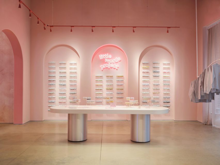
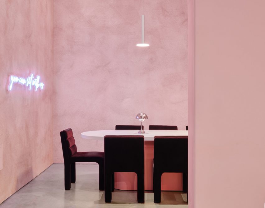
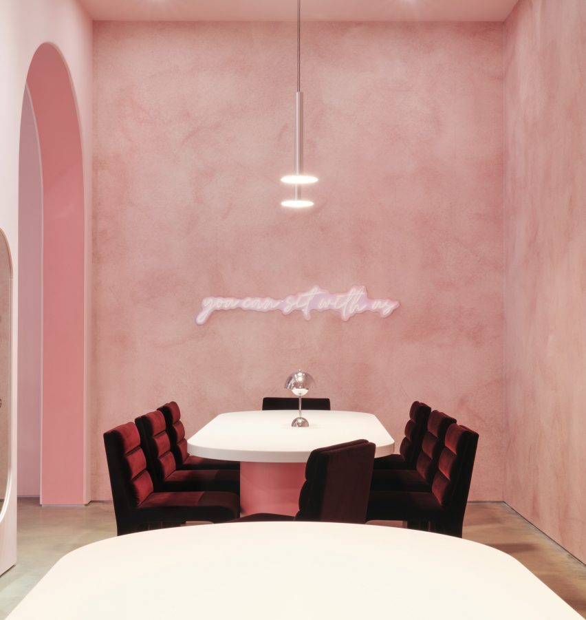
Created for the friendship jewellery brand Little Words Project (LWP), Gharib Studio used elements of the merchandise to inform the store’s pink material palette and incorporated arches throughout the space to contrast the industrial elements of the building, which were left exposed.

Table with silver baseTable with silver base
Gharib Studio has outfitted a jewellery store in Austin with dusty pink

According to Gharib Studio founder Nora Gharib, the team followed the common phrase “everything is bigger in Texas” when designing the concept store.

“I wanted to amplify the brand in a grand way by taking the LWP brand aesthetic and localizing it to Texas by pushing the standard design elements, such as the brand’s bracelet arches and beading table experience, then accentuating it,” said Gharib.

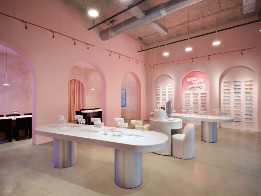
A retail store with silver with long white tablesA retail store with silver with long white tables
Arches and soft tones contrast with the space’s industrial elements

Visitors enter the store into a large, primary space, where built-in display cases were integrated into the walls.

On one side, the display resembles small bookcases and on the other, the bracelets are displayed throughout a series of arches.

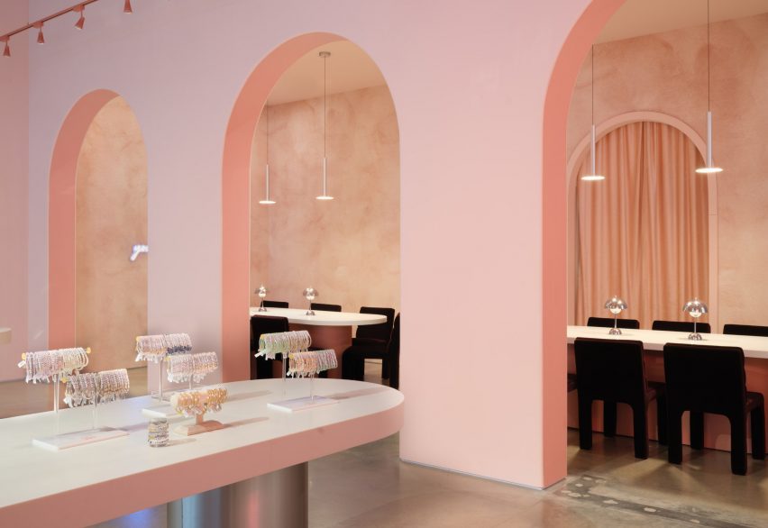
Archways with tables and chairsArchways with tables and chairs
Long tables lead to the seating area at the back of the space

At the centre of the primary space are two long tables with metallic-coated bases, also used for display. A circular display table in the middle was created to resemble a vanity, with merchandise incorporated throughout.

Gharib inserted three arches along the back of the space, in part to accentuate the height of the space, and to draw visitors to the space beyond them, which serves as a beading area.

Velvet chairs underneath aluminum light fixtureVelvet chairs underneath aluminum light fixture
Metallic details were informed by the charms found on the bracelets

This space was outfitted with CB2 Castell Chairs in burgundy, with similar tables as the main space, except with pink bases instead of silver.

A neon sign that reads, “You can sit with us” hangs above the tables.

Textured dusty-pink wallpaper by Belarte Studio was used to line the space, while the remaining interior was covered in a rose pink hue.

Metallic accents throughout the store, including aluminium light pendants, a metal trimmed mirror and the display table’s metallic bases, were informed by the metal charms found in LWP bracelets.

Space with velvet chairs and textured wallpaperSpace with velvet chairs and textured wallpaper
It is the brand’s first store in Austin

The space’s utility elements were left exposed on the ceiling, with red track lighting running the perimeter of the space.

Other retail projects recently completed in Austin include a mid-century post office turned grocery by Side Angle Side.

Gharib Studio is a Los Angeles-based studio founded by Nora Gharib in 2023, focused on retail and brand design.

The photography is by Casey Woods Photography 


Project credits:

Architectural designer: Gharib Studio

General contractor: Paco Santander Construction

Reference

Modernist architecture informs Bottega Veneta store in historic galleria
CategoriesInterior Design

Modernist architecture informs Bottega Veneta store in historic galleria

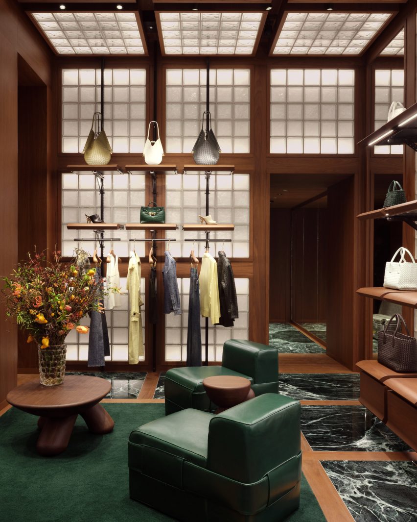
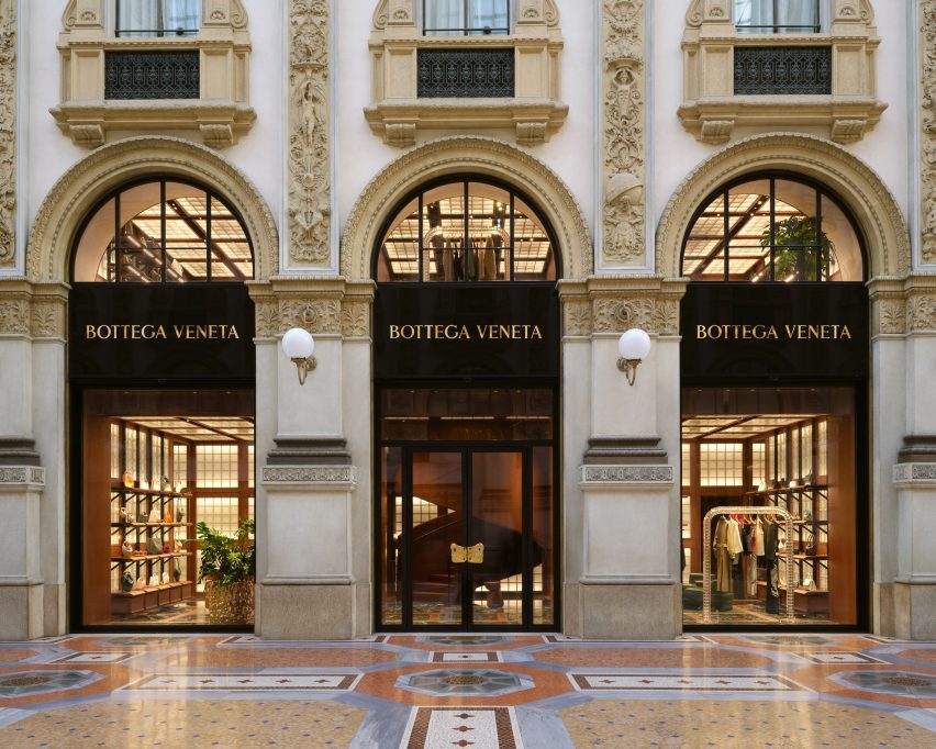
Fashion house Bottega Veneta has opened a boutique designed by its creative director Matthieu Blazy inside the Galleria Vittorio Emanuele II shopping arcade in Milan.

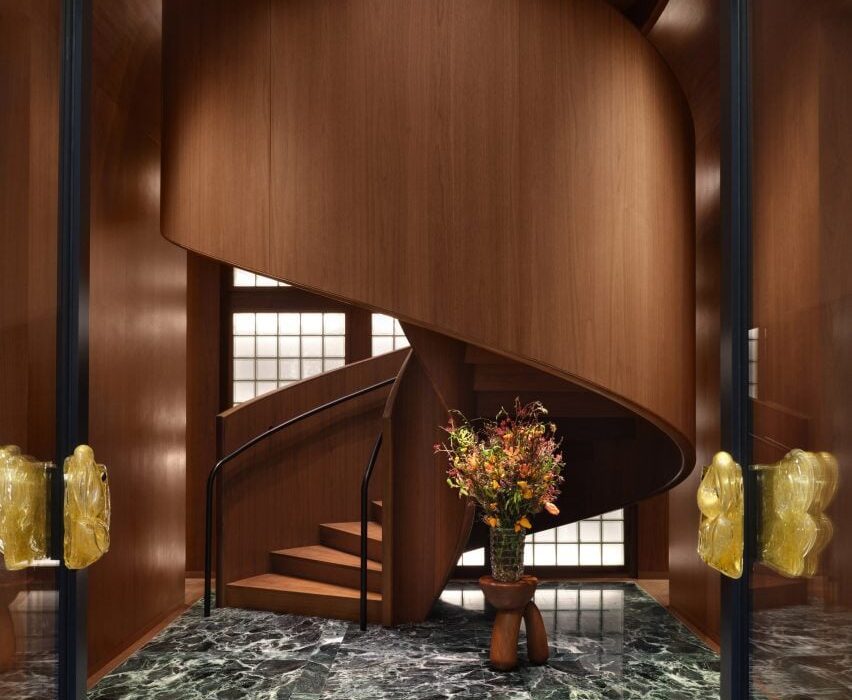
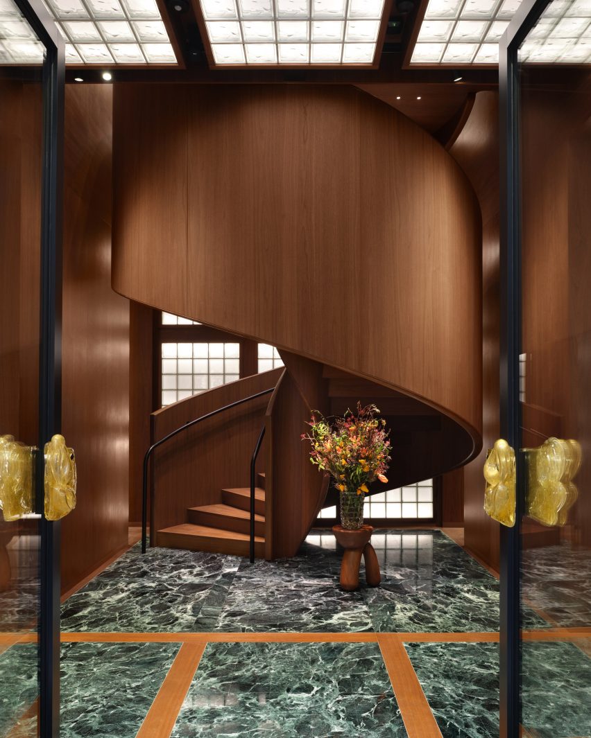
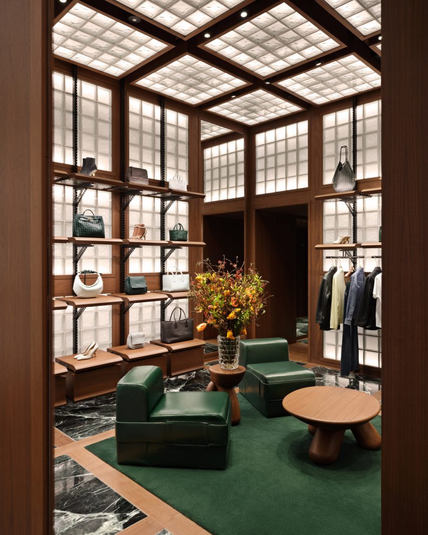
Bottega Veneta‘s two-storey store is distinguished by three primary materials: glass, Italian walnut and green Verde Saint Denis marble.

Walnut spiral staircase rising from green marble floorWalnut spiral staircase rising from green marble floor
A spiral staircase greets shoppers at the Bottega Veneta store in Milan

This trifecta is applied in strict grids to evoke Italian modernism and provide an organising principle in the various rooms.

“There are different experiences of space in the store,” said Blazy. “I wanted to express the idea of a domestic interior referring to Italian modernist architecture that contrasts with the aesthetic of a spaceship and to capture the intimacy and the imagination of getting dressed.”

Fashion store with glass-block walls and ceiling, and green marble flooringFashion store with glass-block walls and ceiling, and green marble flooring
Grids are used throughout the store to organise materials

From the galleria, shoppers are greeted by a dramatic spiral staircase made entirely from Italian walnut – a material used throughout the interior as panelling, modular shelving and furniture.

Green marble is laid in squares across the floors, separated by strips of walnut and occasionally swapped for larger patches of dark green wool carpet.

Room with squares of glass blocks across the walls and ceilingRoom with squares of glass blocks across the walls and ceiling
Glass blocks are integrated into the walls and ceilings

Square glass blocks are similarly arranged into grids across walls and ceilings, illuminated from behind to produce a soft warm glow throughout the store.

Green leather chairs and benches are accompanied by custom rounded wood tables and stools to form lounge areas.

“Throughout the space, soft textures are found in leather seating and wool carpets, while modular shelving units build a sense of discovery and play,” Bottega Veneta said.

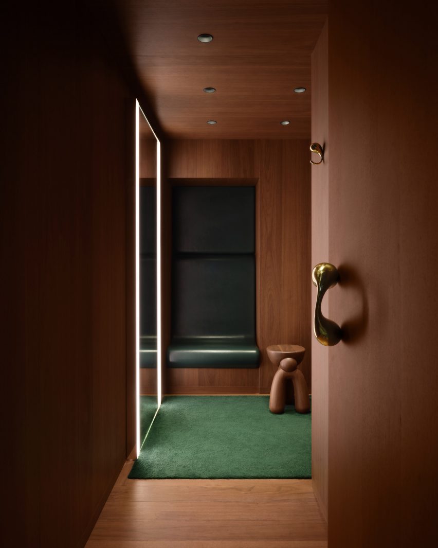
Fitting room lined in walnut with a green leather niche and wool carpetFitting room lined in walnut with a green leather niche and wool carpet
The fitting rooms feature leather niches that provide a place to sit

Fitting rooms are fully lined in walnut, except for leather-wrapped niches that provide a small seat, giant mirrors with built-in lighting and more green carpet.

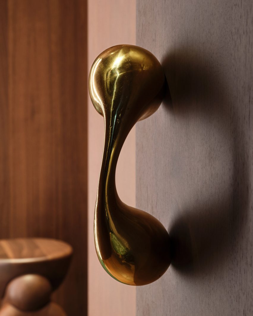
Sculptural polished metal elements form the door pulls and clothes hooks, their smooth surfaces contrasting with the more textured golden planters and entrance handles.

On the upper level, recesses formed by the Galleria’s arched windows provide nooks for seating and plants, as places to look out onto the highly decorative arcade.

Designed in 1861 by architect Giuseppe Mengoni, the neo-classical Galleria Vittorio Emanuele II is one of Milan’s most desirable shopping destinations.

Close-up of a polished metal sculptures that forms a door pullClose-up of a polished metal sculptures that forms a door pull
Polished metal sculptures form door pulls and clothing hooks in the fitting rooms

The four-storey, glass-vaulted double arcade is located in the city centre, close to other landmarks like the Duomo and the Teatro alla Scala.

The new Bottega store is the latest to open under Blazy since he took the reigns of the luxury brand in 2021, following locations on London’s Sloane Street and the Avenue Montaigne in Paris.

Exterior of the Bottega Veneta store in Milan's Galleria Vittorio Emanuele II Exterior of the Bottega Veneta store in Milan's Galleria Vittorio Emanuele II
The new store is located in the historic Galleria Vittorio Emanuele II shopping arcade

For the brand’s Spring Summer 2023 runway show, Bottega Veneta collaborated with Italian designer Gaetano Pesce, who envisioned a colourful resin-covered floor and 400 bespoke cotton-and-resin chairs for the set.

Pesce later went on to create a pair of handbags for the brand, which were designed to suggest different bucolic landscapes.

The photography is courtesy of Bottega Veneta.

Reference

Standard Architecture refreshes interior of pink Paul Smith store in LA
CategoriesInterior Design

Standard Architecture refreshes interior of pink Paul Smith store in LA

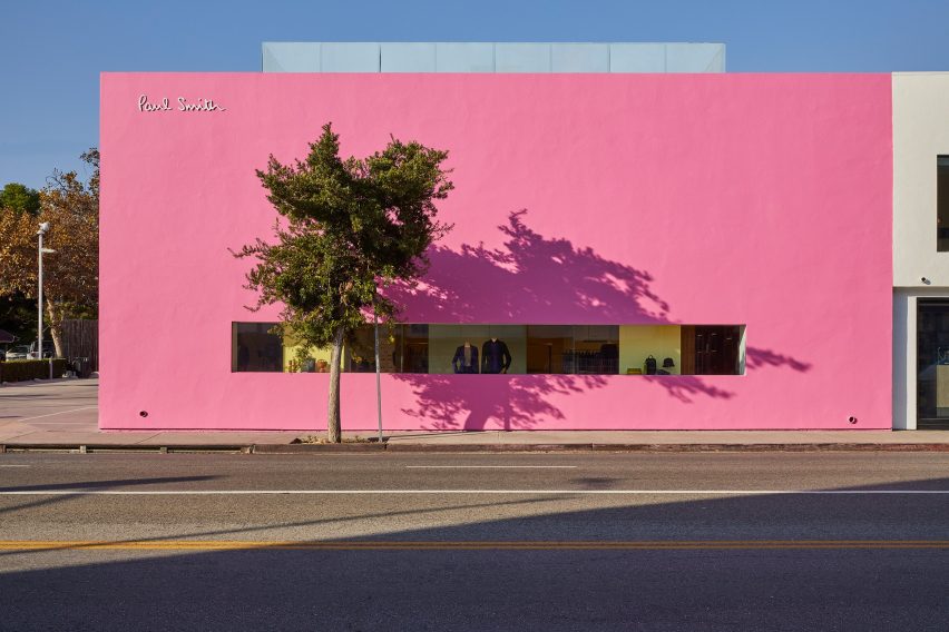
British fashion label Paul Smith’s iconic pink store in Los Angeles has received an interior makeover from Standard Architecture.

Standard Architecture collaborated with the Paul Smith design team to reimagine the 4,740-square-foot (440 square metres) store on Melrose Avenue, West Hollywood.

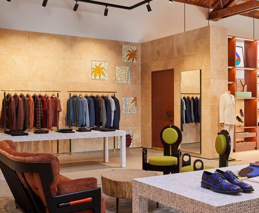
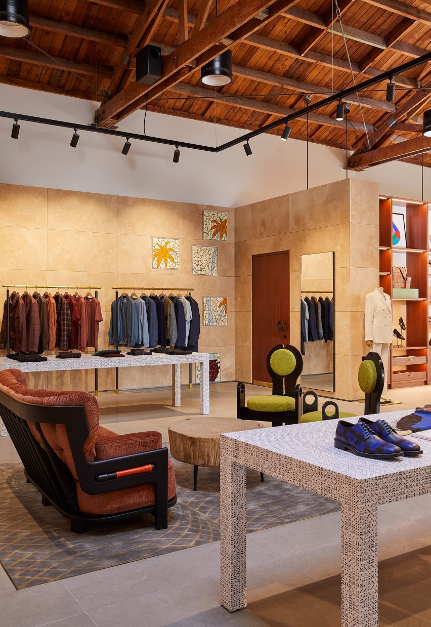
Paul Smith LA store interior is stone-clad partitions and exposed raftersPaul Smith LA store interior is stone-clad partitions and exposed rafters
Standard Architecture and the Paul Smith team reorganised the LA store to better define the brand’s different collections

The studios also created a new VIP entrance patio for the building, which is notorious for its bright pink exterior that has become a pilgrimage spot for amateur photoshoots.

“The primary goal was to enhance the overall customer experience within the store, which was achieved by creating a more cohesive and immersive shopping environment across the different brand departments,” said Standard Architecture.

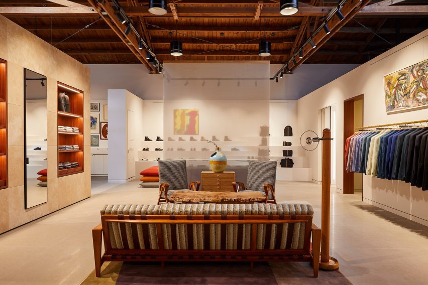
Seating area with clothing displays on either sideSeating area with clothing displays on either side
Stone-clad partitions help to define areas, but don’t reach the exposed timber ceiling

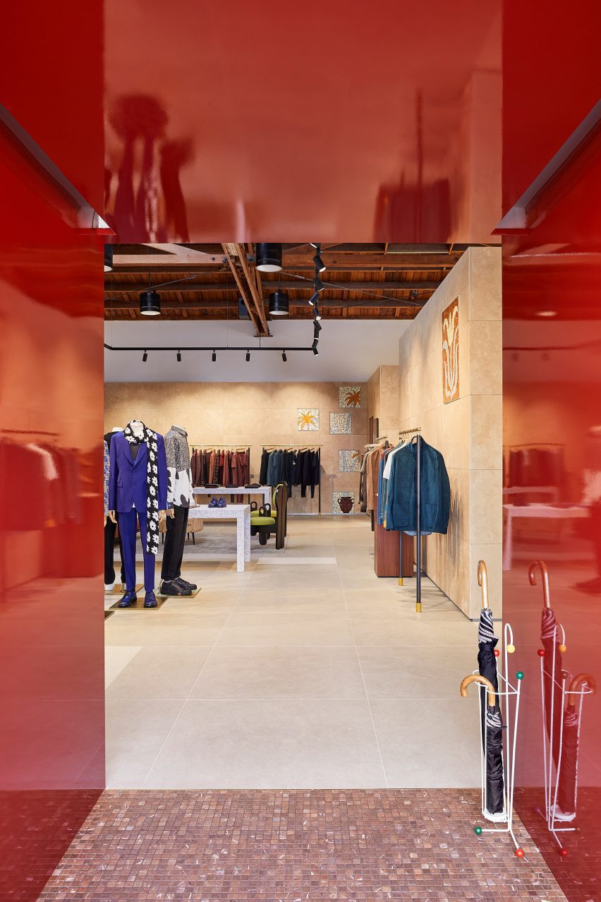
The entrance to the store – the only opening in the giant pink wall that faces the parking lot – leads shoppers through a glossy red metal vestibule into the main retail space.

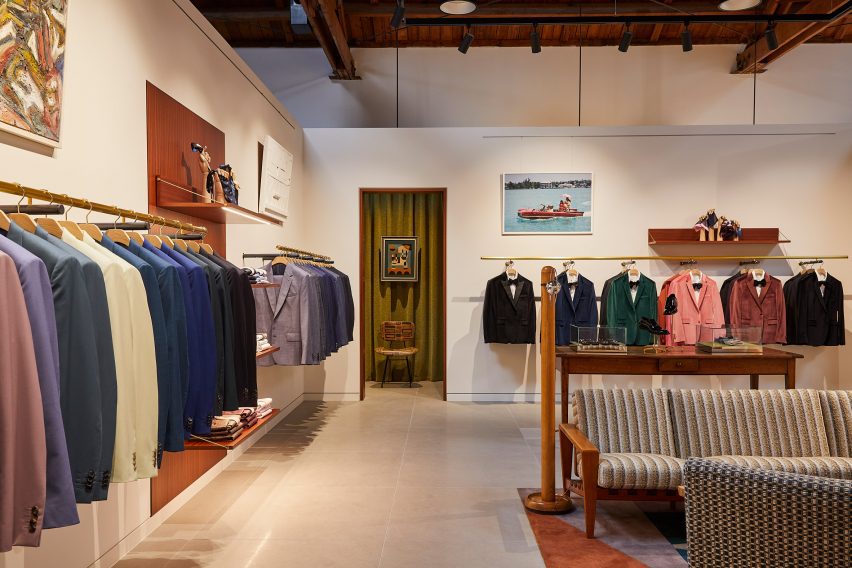
Clearly defined yet interconnected areas for the menswear, womenswear and homeware collections help with navigation around the store.

Suits displayed in colour order on long brass railsSuits displayed in colour order on long brass rails
Long brass rails are used to present tailoring

Partitions clad in dappled beige stone frame these zones, but don’t reach the exposed timber ceiling, to retain the sense of openness.

In places, the stone walls are inlaid with mosaic-style artworks depicting abstract flora, which add splashes of colour to the warm-toned surfaces.

Paul Smith homeware collaborations displayed in a corner of the storePaul Smith homeware collaborations displayed in a corner of the store
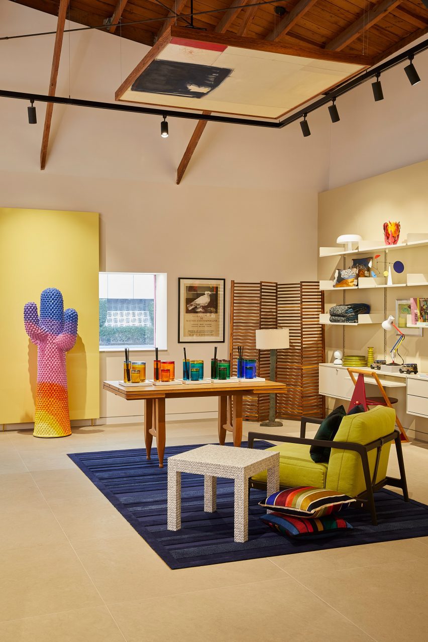
Paul Smith’s collaborations with Gufram and Anglepoise are among the pieces on show

Black track lighting is suspended from the rafters, spotlighting the various clothing displays and lounge areas furnished with midcentury-style sofas and armchairs that are dotted around the store.

Long brass rails that appear to be suspended in midair are used to display suit jackets, which are carefully arranged by colour.

Shoes presented on stepped white ledges that resemble bleacher seatingShoes presented on stepped white ledges that resemble bleacher seating
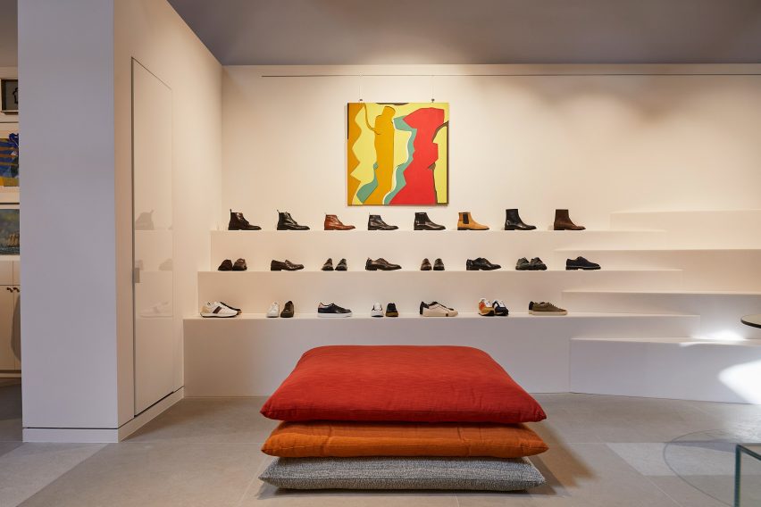
Shoes are presented on stepped white ledges that resemble bleacher seating

In an area dedicated to accessories, the shoes and bags are lined up on stepped white ledges that resemble bleacher seating.

Walnut is used for accents including shelving, door frames, and podiums, as well as for a large open storage system with compartments for presenting individual products and a row of sculptures by Alexander Calder.

Founded by fashion designer Paul Smith in 1970, his eponymous brand is synonymous with the brightly coloured stripes applied to many of its apparel products and other collaborations.

Many of these appear throughout the store, including a colour-tinted Anglepoise desk lamp and a striped version of Gufram’s cactus-shaped coat stand.

Glossy red metal vestibule with store interior beyondGlossy red metal vestibule with store interior beyond
Entry to the store is via a vestibule wrapped in glossy red metal

“Overall, the design reflects a deep understanding of the brand’s identity, which places a strong emphasis on the use of colour and attention to detail,” Standard Architecture said.

Paul Smith retail spaces around the world are equally playful. On London’s Albemarle Street, its boutique has a patterned cast-iron facade by 6a Architects, while the shop in Seoul is encased in a curving concrete shell by System Lab.

Bright pink exterior of Paul Smith store on Melrose AvenueBright pink exterior of Paul Smith store on Melrose Avenue
The store on Melrose Avenue is an icon in Los Angeles thanks to its bright pink facades

Standard Architecture was founded by Silvia Kuhle and Jeffrey Allsbrook, who discussed their work with Dezeen during our Virtual Design Festival in 2020.

Past projects by the firm include a Hollywood Hills residence with a cantilevered swimming pool and a minimal showroom for fashion brand Helmut Lang – which was located just a few blocks from the Paul Smith store before it shuttered.

The photography is by Genevieve Garruppo.


Reference

UNStudio unveils Huawei flagship store with “petal-like” facade
CategoriesInterior Design

UNStudio unveils Huawei flagship store with “petal-like” facade

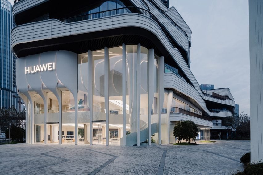
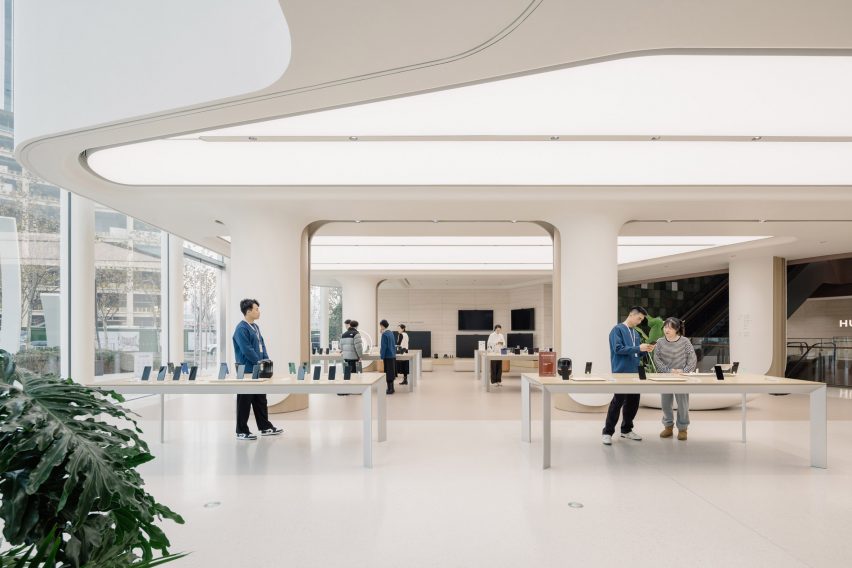
Dutch firm UNStudio has revealed a two-storey flagship store for Chinese technology company Huawei in Shanghai with a facade clad in ivory-coloured petal-like forms.

Drawing from Huawei’s global operating system, named Harmony, UNStudio‘s design aimed to generate biophilic associations between the brand and its technology by integrating organic geometric shapes throughout the scheme.

Facade of UNStudio Huawei flagship store in ShanghaiFacade of UNStudio Huawei flagship store in Shanghai
UNStudio has completed the Huawei flagship store in Shanghai with a petal-like facade

“Among the many interfaces found in retail nowadays, the flagship store we have created for Huawei in Shanghai is one that blends interactive experiences, technology and community creation,” UNStudio founder and principal Ben van Berkel said.

“The new store reimagines modern retail spaces as inviting environments that promote a sense of community and provide a contemporary venue for consumers and visitors to meet, share and innovate,” he continued.

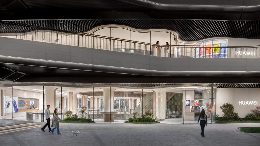
Southern facade of UNStudio Huawei flagship store in ShanghaiSouthern facade of UNStudio Huawei flagship store in Shanghai
The store’s southern facade integrates undulating floor-to-ceiling glazing. Image courtesy of Huawei

The store’s double-height frontage is defined by a series of overlapping elements that the studio described as “petal-like”, which fold together to form a raised band across the facade glazing.

Each ivory-coloured ‘petal’ weaves down to meet the ground as ‘stems’, configured to hide the structural mullions between glass panels and create the sense of a frameless facade.

Soft lighting was also integrated between the petal edges to illuminate the store’s exterior at night.

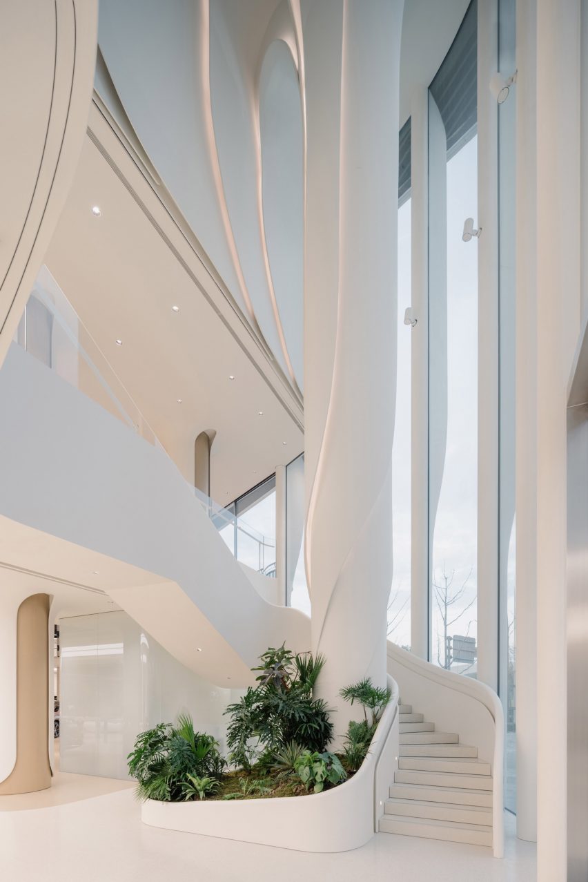
Internal tree column in UNStudio Huawei flagship store in ShanghaiInternal tree column in UNStudio Huawei flagship store in Shanghai
A spiralling column was positioned as a visual marker within the central atrium

Positioned directly behind the facade, a spiralling column named the Tree of Harmony continues the organic geometries internally.

The column was positioned to the side of the central atrium as a focal point for visitors and is wrapped by stairs that lead to the upper mezzanine floor.

To further the store’s biophilic character, the southern facade was finished with undulating glazing and seating that folds around the building’s curves.

Display zones in UNStudio Huawei flagship store in ShanghaiDisplay zones in UNStudio Huawei flagship store in Shanghai
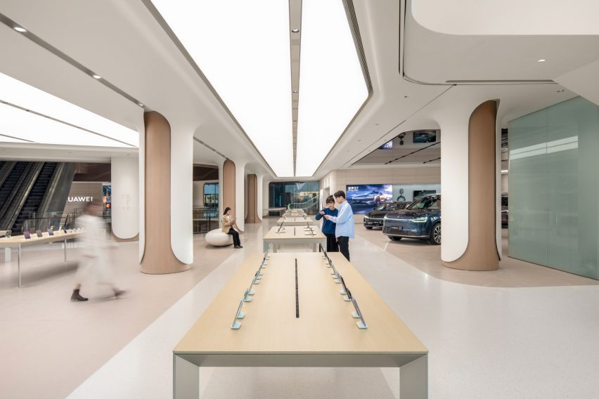
The studio used neutral and clean internal finishes to complement the ivory-coloured store frontage

Internal finishes were kept warm and neutral to match the facade’s clean tones and extensive white overhead lighting.

The studio used wood and glassfibre-reinforced cement for the store’s ceilings, floor and columns, while product tables and furniture were also made from wood and natural-toned materials to add to the organic feel of the space.

According to UNStudio, the store integrates high-performance materials and prefabricated, detachable finishes to increase the building’s longevity, while the quality of the air inside the store is monitored by climate control technology.

“Huawei TKL flagship store re-crafts Huawei’s innovative technology into a design aesthetic,” UNStudio partner Hannes Pfau said.

“It seamlessly creates a unified facade and interior narrative, while using high-performance, certified and recycled materials.”

Display zones in UNStudio Huawei flagship store in ShanghaiDisplay zones in UNStudio Huawei flagship store in Shanghai
A central product display avenue spans the length of the store

The store has a central product display avenue that spans the length of the ground floor, with two further experiential zones interspersed for increased user interaction.

A Signature Experience zone will host featured events and exhibits, while the Consumer Full Scenario Experience zone lets visitors use and test Huawei products.

Undulating glazed facade in UNStudio Huawei flagship store in ShanghaiUndulating glazed facade in UNStudio Huawei flagship store in Shanghai
Undulating floor-to-ceiling glazing was used for the store’s southern facade

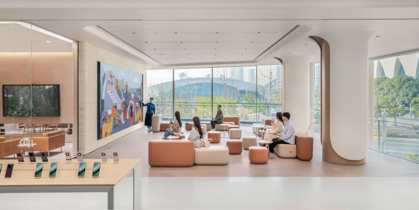
Both floors were designed with open and flexible spaces in which the store can host lectures, activities and classes.

To complete the store’s functional offerings, UNStudio also created a minimalist interior cafe to blend with the rest of the store for customers awaiting after-sale services.

Open gathering spaces in UNStudio Huawei flagship store in ShanghaiOpen gathering spaces in UNStudio Huawei flagship store in Shanghai
The store hosts flexible spaces to be used by the community

UNStudio was founded in Amsterdam in 1998 by Van Berkel and Caroline Bos.

The studio has also recently completed the Booking.com headquarters in Amsterdam and the YG Entertainment headquarters in Seoul featuring metallic surfaces and geometric forms.

The photography is by Wen Studio unless otherwise stated

Reference

Aro Archive store in Shoreditch features pastel-coloured rooms
CategoriesInterior Design

Aro Archive store in Shoreditch features pastel-coloured rooms

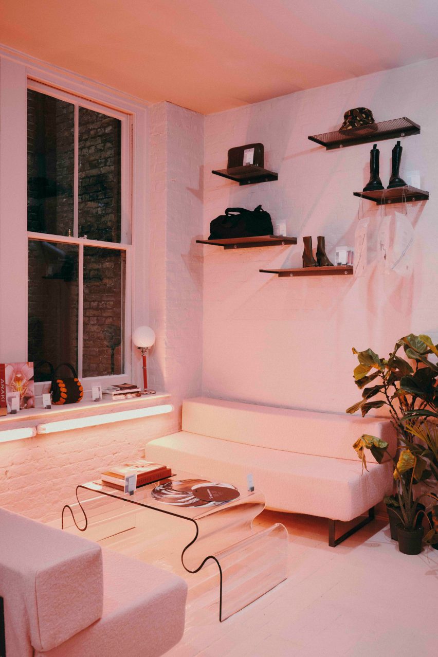
Fashion retailer Aro Archive’s pastel-hued east London store was designed by founder Ariana Waiata Sheehan to evoke “a sense of otherworldliness”.

The store, located in Shoreditch, replaces the brand’s previous, more industrial store on nearby Broadway Market and was intended to have a frivolous feel.

Pastel-coloured fashion storePastel-coloured fashion store
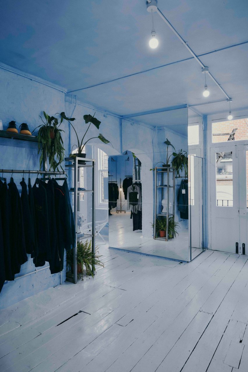
The Aro Archive store has pastel-coloured floors in pink and blue

The interior has “a sense of otherworldliness, escapism and fun,” Waiata Sheehan explains, comparing it to “a mixture between a mushroom trip and going to visit someone’s rich aunty who runs a gallery”.

“We’ve always had very neutral industrial spaces,” she told Dezeen. |But you can get an industrial Zara these days, so time to switch it up and go full personality, which has been scary but so worth it.”

Pink floor in Aro ArchivePink floor in Aro Archive
It is located inside an old Victorian warehouse

Located inside a five-storey former Victorian warehouse, Aro Archive, which sells pre-owned clothing by avant-garde designers, was organised so that each floor has a different colour.

Monochrome pastel pink, blue and white hues decorate the different levels, which also feature a wide range of reclaimed and recycled materials, furniture and artworks.

Blue floor in Aro ArchiveBlue floor in Aro Archive
Founder Ariana Waiata Sheehan created the interior design

“The pink floor is supposed to feel very warm, womb-like and enclosed,” Waiata Sheehan said. “The blue floor is more light and otherworldly. And the two white floors are very ethereal and calm.”

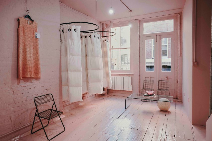
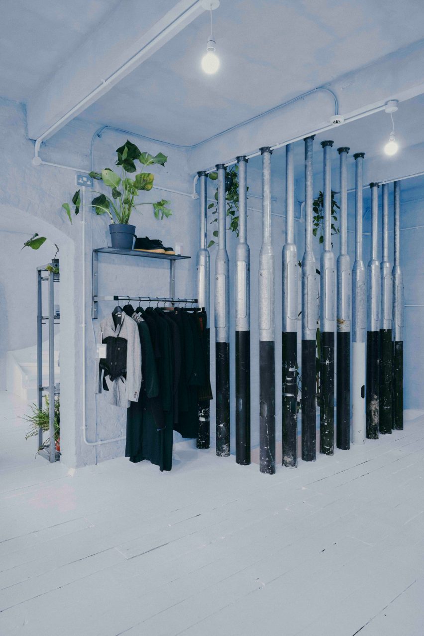
White duvet covers by fashion house Maison Martin Margiela were used to create curtains for the changing rooms, while interior pillars are made from reclaimed 1990s metal lamp posts that the designer sourced from a scrapyard in Preston.

Martin Margiela duvet-changing roomsMartin Margiela duvet-changing rooms
Duvet covers by Maison Martin Margiela frame the changing rooms

“The building and surrounding area feel very London, so we did want to bring in a sense of that for example with the lamp posts, metal works and details, bright neon lights and so forth,” Waiata Sheehan said.

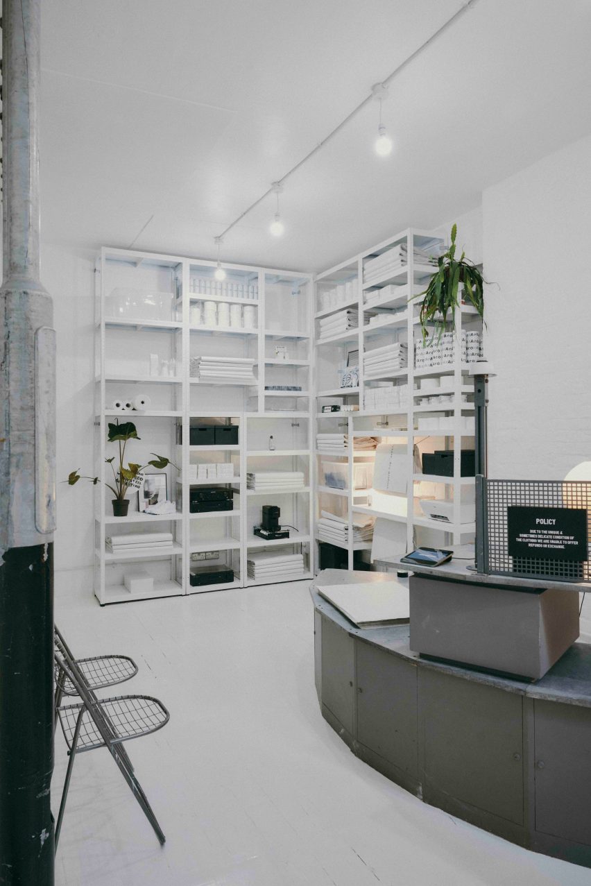
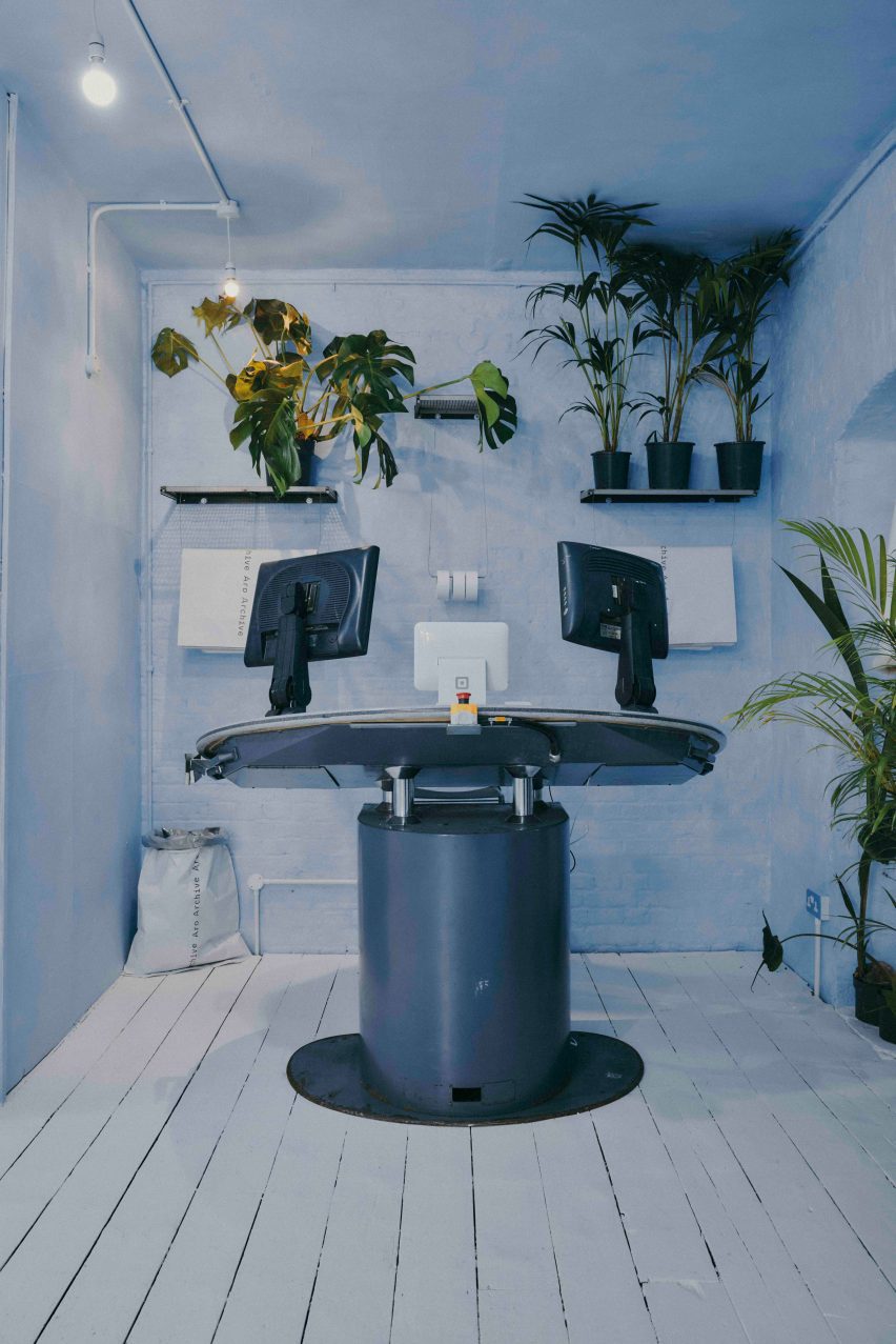
She sourced a number of unusual furnishings for the Aro Archive store, including an industrial control station from a paper-manufacturing plant that is now used as a till.

“The industrial paper control station I’ve been watching on eBay for nearly 4 years, waiting for a time I had the space to buy it,” Waiata Sheehan explained. “I wanted something different to the normal till, they’re all so boring and square.”

The store also has another large metal till and metal drawers that originally came from a 1980s Mary Quant store and were rescued from a squat in Hackney Wick.

Metal till from Mary QuantMetal till from Mary Quant
A large metal till was originally from a Mary Quant store

Waiata Sheehan also sourced several smaller pieces for the boutique, where customers can purchase everything down to the artwork, furniture and accessories.

“I do all the buying so everything is here because I love it in some way,” she explained. “But in terms of favourite pieces in store right now?”

“For fashion, it’s the Rick Owens orange shearling gimp mask gilet, for objects the Shirin Guild ceramic incense holders and for furniture the wobbly glass table with magazine racks.”

Industrial control stationIndustrial control station
Waiata Sheehan bought an old industrial control station from eBay

Waiata Sheehan hopes the Aro Archive boutique will feel like a home away from home and help to create a community feel in the area.

“I think Shoreditch is lacking a sense of community and I wanted to work that into the space,” she said. “The feeling of a chaotic family home and a feeling of togetherness.”

Pillars made from lampposts at Aro ArchivePillars made from lampposts at Aro Archive
Lampposts from a scrapyard form pillars inside the store

Other London stores with notable interior design recently covered on Dezeen include Swedish fashion brand Toteme’s newly-opened Mayfair store and a Coach pop-up store at Selfridges that had fixtures made from recyclable materials.

The photography is by John Munro.

Reference

SML reinterprets ginseng cultivation structure as retail store, seoul
CategoriesArchitecture

SML reinterprets ginseng cultivation structure as retail store, seoul

an exhibition-like retail space for punggi


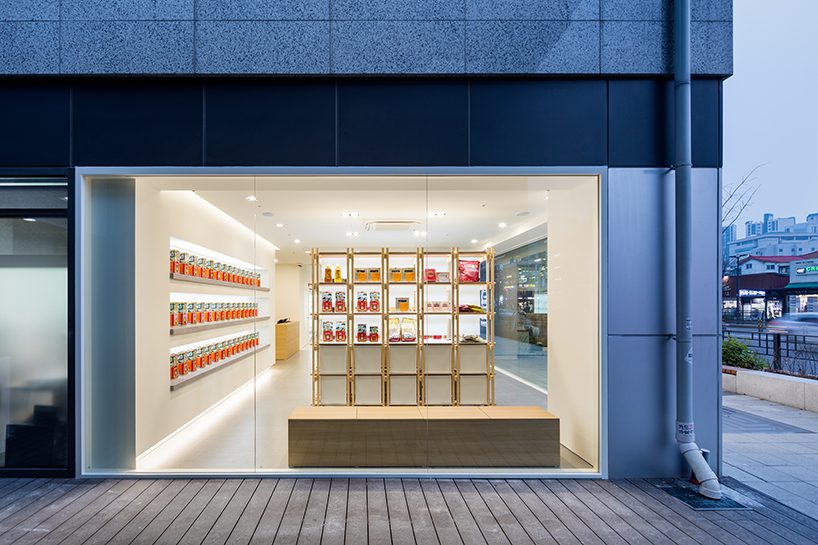
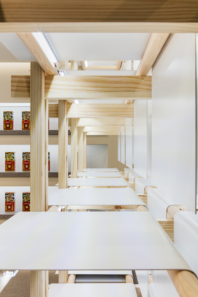
In Seoul, SML translates the traditional structure used to cultivate ginseng into a contemporary interior feature for the exhibition, promotion store, and sales center for Korean brand Punggi. The minimal, all-white space pays homage to the history of the plant, reimagining the traditional ‘Sampoeojang’ module with modern timber flair that weaves through the space to shape a retail area. With a modular form, products presented in a museum-like manner invite visitors to learn more about ginseng’s cultivation processes and the brand’s identity, as well as to purchase Punggi’s creations at the end of their journey

SML reinterprets ginseng cultivation structure as contemporary retail interior in seoul
all images by Kyungsub Shin


SML tells the story of ginseng amid the white walls


Embracing a passive branding strategy, SML’s design focuses on forming a spatial image that conveys the reputation of Punggi Korean Ginseng to a broader audience by spotlighting a differentiated, and yet-unknown image of the brand. The exhibition space, cloaked in pure white, serves as a canvas for the story of ginseng, with sophisticated wooden furniture embodying the brand’s inherent values. This design further seeks to subtly guide visitors through a journey that integrates brand exploration with the natural progression towards consumption.


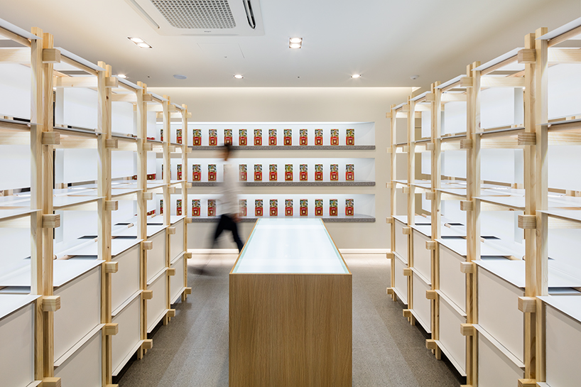
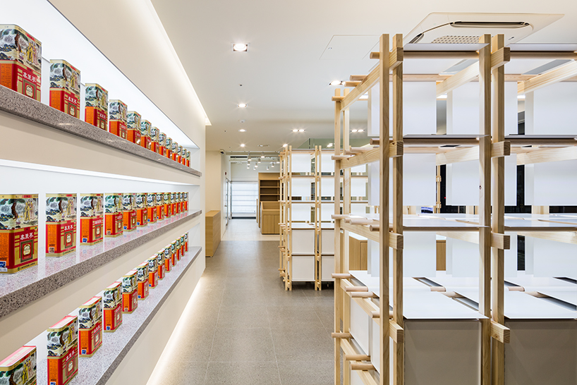
The promotion wall takes center stage, transforming the main products into objects of art through careful curation. In a thoughtful play of physical materials and display methods, the wooden furniture-type structure of the display stand introduces a compelling contrast, as well as exuding a sense of warmth into the space. Each display case, set against the whiteness of the room, showcases products along a circular wooden member that softly circulates the space.  

SML reinterprets ginseng cultivation structure as contemporary retail interior in seoul
Punggi Ginseng Cooperative Association store in Seoul


The Korean Peninsula, famed for being the world’s premier ginseng producer, owes its reputation to a blessed natural environment. The Punggi Korean Ginseng, which is recognized as the best quality among them, is a perennial plant with a slow growth rate and specific cultivation requirements, is grown in a sunshade system called Sampoeojang over three to six years. In this way, this structure is considered a ‘ground for cultivation’, the very ‘house of ginseng’, recalled in SML’s design concept.

SML reinterprets ginseng cultivation structure as contemporary retail interior in seoul
SML creates an exhibition, promotion store, and sales center for the Korean brand

SML reinterprets ginseng cultivation structure as contemporary retail interior in seoul
the promotion wall takes center stage, transforming the products into objects of art through careful curation

Reference

Side Angle Side transforms Austin post office into restaurant
CategoriesInterior Design

Side Angle Side transforms Austin post office into restaurant

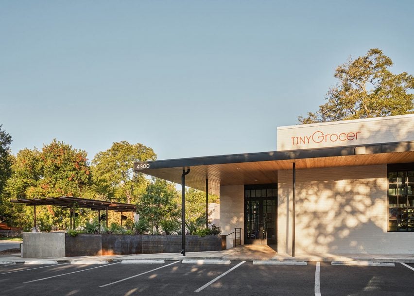
Texas architecture studio Side Angle Side has adapted a 1960s post office into a food market and restaurant in Austin.

Opened in October 2023 in the Hyde Park area, Tiny Grocer serves as a speciality market, bar and cafe while Bureau de Poste is a modern French bistro led by celebrity chef Jo Chan.

The exterior of a small, modern grocery storeThe exterior of a small, modern grocery store
Side Angle Side has transformed a 1960s post office into a food market and restaurant

Austin-based commercial and residential architecture firm Side Angle Side renovated the 3,500-square foot (325-square metre) 1967 US Post Office building and added a 1,500-square foot (140-square metre) outdoor dining patio.

“The Hyde Park U.S. Post Office was an important neighborhood hub in the 1960s – so we were especially careful to keep the integrity and spirit of the mid-century-utilitarian design,” Arthur Furman, founding partner of Side Angle Side, told Dezeen.

A grocery market with green shelvingA grocery market with green shelving
The team sought to preserve the building’s history as a community hub

“As the anchor tenant in the space, Tiny Grocer continues to be the centre of the community, a place to gather, shop, eat and drink.”

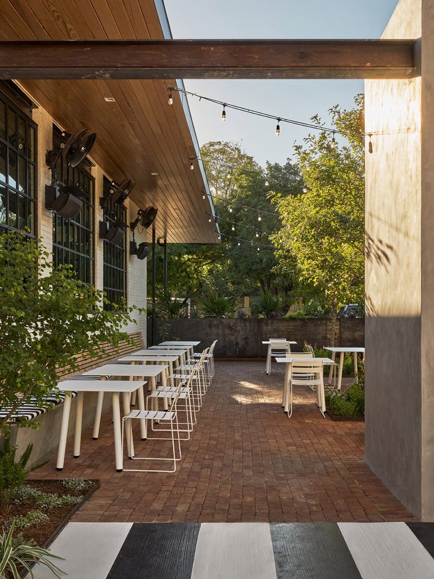
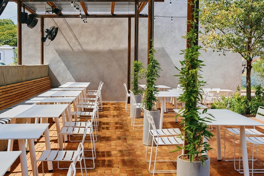
The shell of the white brick building was left intact, but the street-facing facade was previously used as a loading dock so the team transformed the back-of-house edge into a welcoming patio for the neighbourhood by removing the asphalt and adding two large live oak trees and a steel trellis and planters.

A bar in a grocery and marketA bar in a grocery and market
The exterior of the building was kept intact

A cast-in-place concrete banquette holds the edge of the patio that is paved with antique red brick.

The steel planter forms a boundary between the parking area and the dining space, while the other edge is held by a light grey-coloured stucco restroom building. White metal furniture from Isimar and Portofino was used to furnish the patio.

“The patio and wine garden is the real heart of the project,” the team said, mentioning that it wasn’t within the original scope of the project but added later when its larger value was realized. “This is where all the care and thought of the interior spills to the outside, creating a lively environment.”

Wooden tables in front of a black framed windowWooden tables in front of a black framed window
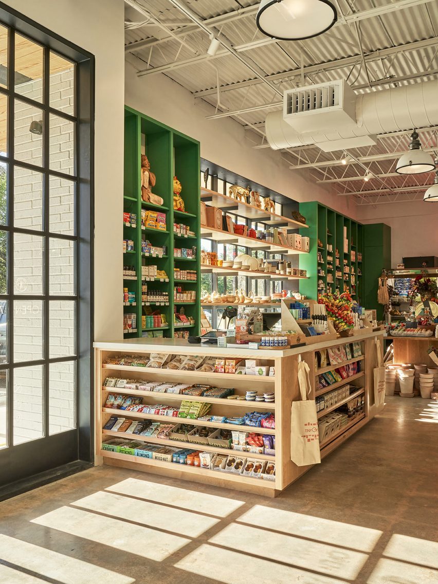
The renovated building has exposed concrete floors from the original building

On the interior, Side Angle Side complemented the original ceiling and open web joists with metal decking and industrial warehouse pendants by AQ Lighting. The polished concrete floors expose the weathered imperfections and show the history of the building.

Upon entering, shoppers take in the colourful selection of curated products displayed on white oak mercantile shelving. Green millwork hugs one wall and the space widens to an open interior plan.

A patio with white metal seating and plantsA patio with white metal seating and plants
A patio and wine garden is at the heart of the project

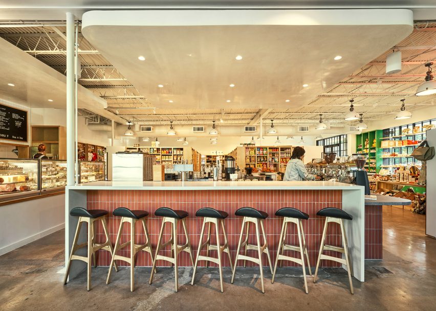
A central deli and coffee bar floats in the middle of the room and creates a transition from the market to the bistro. The bar is wrapped in Seneca terracotta tile and topped with grey and white quartz countertops. Wooden Soule barstools are tucked under the waterfall counter.

The back-of-house spaces hold a kitchen office, storage, and bar equipment.

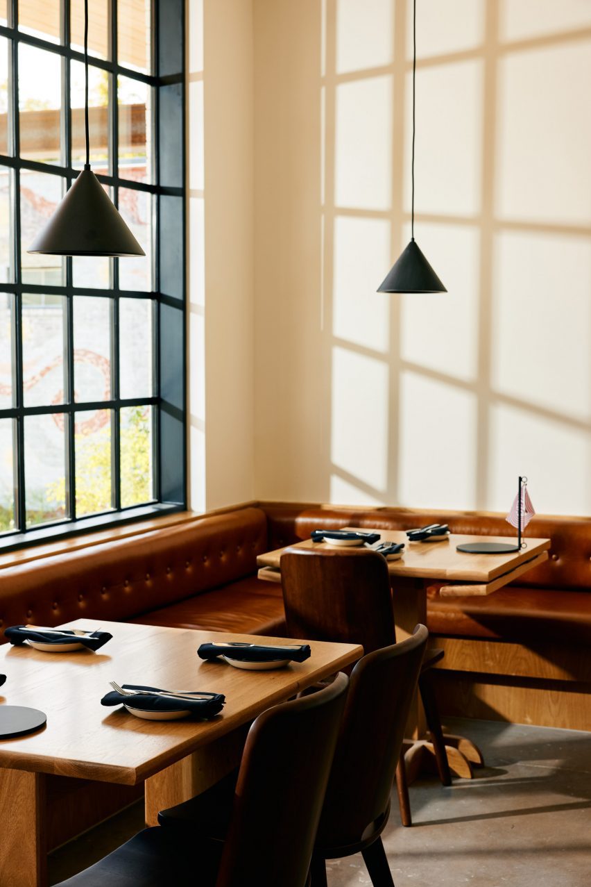
“Working closely with the owner, design finishes hint at the building’s midcentury past,” the team said, referencing the custom, built-in leather banquette by Undercover Austin Upholstery that lines the bistro’s back wall.

Above the banquette and Second Chance Custom wooden dining tables hang black cone light pendants by All Modern.

A patio with white metal seatingA patio with white metal seating
The patio features brick flooring and white metal furniture

“The single biggest sustainable feature of this project is one that is often overlooked,” the team said, noting the adaptation of the structure. “The ‘loose fit, long life’ style of these old buildings leads to more reuse and far less waste.”

Recent adaptive reuse projects in Austin include a 1900s house converted to a luxury office by Michael Hsu and commercial units converted to an architecture studio by Baldridge Architects.

The photography is by Likeness Studio and Mackenzie Smith Kelly.


Project credits:

Structural engineer: Creative Engineering
MEP engineer: ATS Engineers
Builder: Archive Properties
Commercial interior design: Side Angle Side
Architects: Side Angle Side
Building shell: Thought Barn Studio
Landscape design: Side Angle Side & Wild Heart Dirt
Owner: Steph Steele


Reference

Halleroed references Swedish Grace for Toteme flagship store
CategoriesInterior Design

Halleroed references Swedish Grace for Toteme flagship store

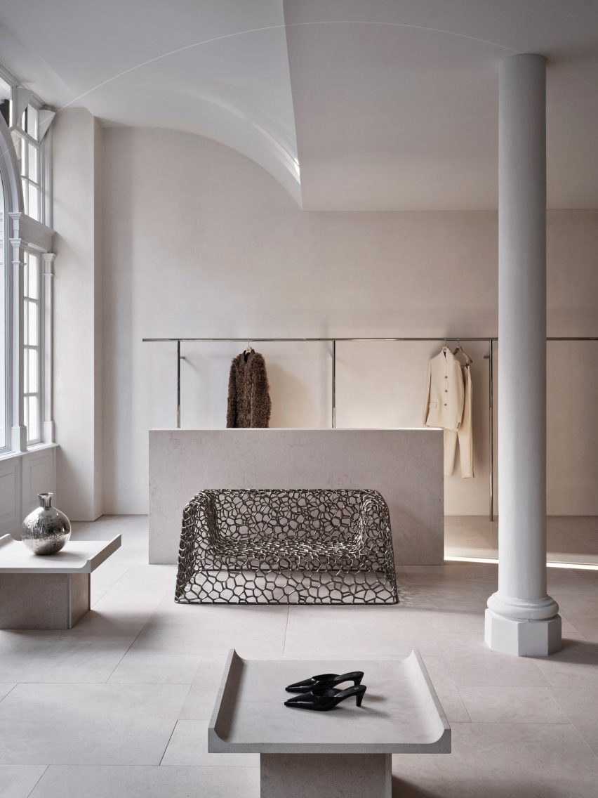
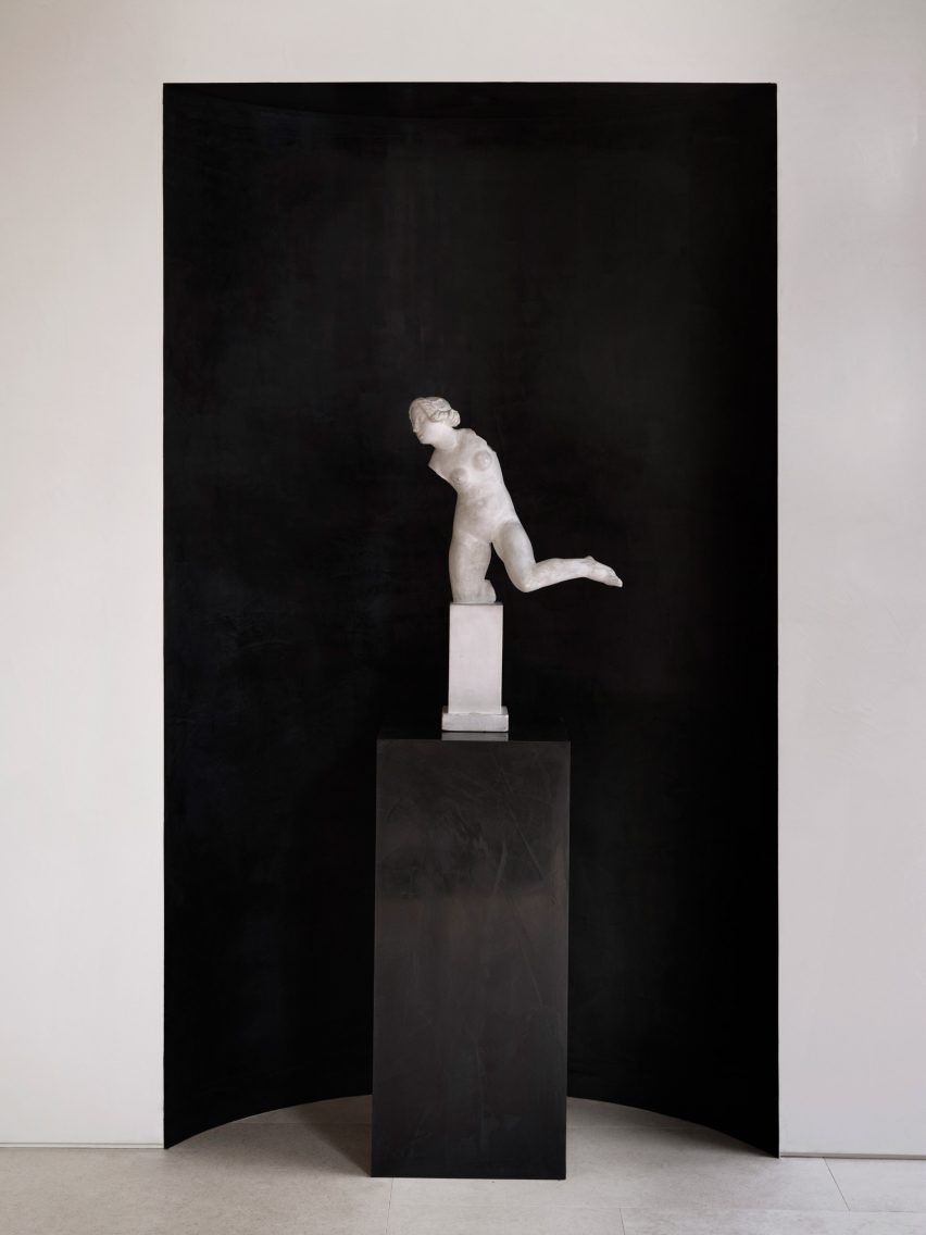
Stockholm studio Halleroed has designed fashion brand Toteme’s flagship store in London, which features a sculpture by artist Carl Milles and a steel sofa by designer Marc Newson.

Halleroed designed the store, located on Mount Street in the upmarket Mayfair area, together with Toteme founders Elin Kling and Karl Lindman. The duo wanted its third flagship to feature nods to the brand’s heritage.

“We like the idea of keeping certain elements that we find in our Swedish heritage,” Lindman told Dezeen at the store’s launch event.

“It can be by using certain vintage pieces, or like in [the brand’s Mercer Street store] in New York, we had a collaboration with Svenskt Tenn,” he added. “It’s about lifting this notion of Scandinavian design or Swedish design.”

Interior of Totême store in LondonInterior of Totême store in London
A metal sofa by Marc Newson is among the sculptural details in the store

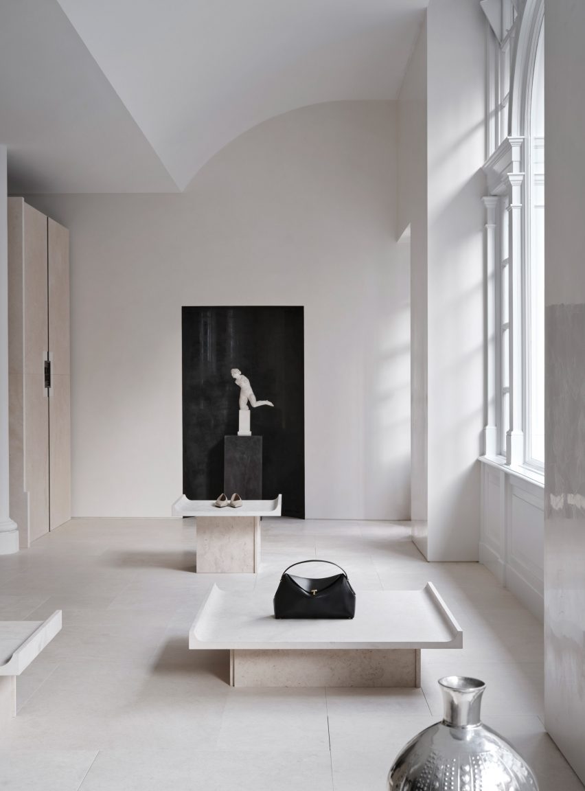
Halleroed drew on the space itself when designing the interior, focussing on how the light falls.

“We were inspired by the space itself with beautiful original windows letting the daylight in,” Halleored co-founder Ruxandra Halleroed told Dezeen.

“The upper part of the windows was partly hidden, which was a shame, so we redesigned the ceiling with a half vault towards the front to show the full height of the windows.”

Totême London storeTotême London store
A piece by sculptor Carl Milles sits by the entrance

The design also references the work of Italian architect Carlo Scarpa as well as the Swedish Grace movement.

“We were also inspired by the Swedish Grace period – around 1920-30s – that has an elegant and pure design, something we think works well for Toteme as a brand,” Halleroed co-founder Christian Halleroed told Dezeen.

“Also the work of Carlo Scarpa we find interesting, more as a mindset on how to work with details and textures to create a subtle elegance and luxury.”

Cube inside fashion store in MayfairCube inside fashion store in Mayfair
A black mirrored cube features at the rear of the store

Kling and Lindman wanted to keep the feel of “very posh” Mount Street where the store is located, while also underlining the space’s minimalist feel.

To do so, a lot of effort was put into the colour palette and different textured materials used for the flagship store.

“We worked with an off-white palette in different tones and different textures,” Ruxandra Halleroed said.

“The textures are as important as colour and materials. For walls, we have a glossy, off-white stucco, ceiling in same colour but matte. The floor is in a beige, honed limestone with a so-called Opus pattern.”

Milles sculpture inside Totême storeMilles sculpture inside Totême store
Halleroed chose to redesign the store’s ceiling to reveal its windows

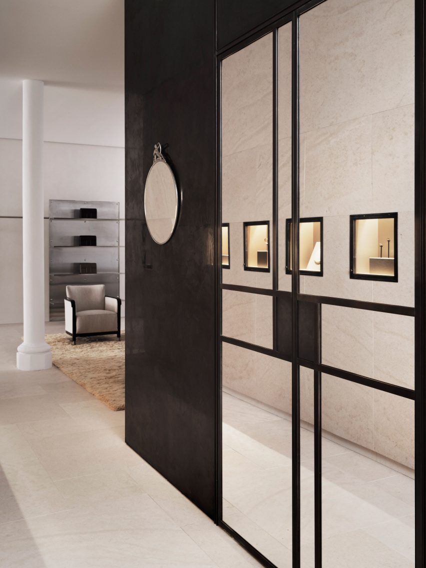
In the middle of the Toteme shop, Halleroed created a stone-clad cube that holds shelves, vitrines and niches filled with artworks.

“The volume in the middle is clad with the same limestone, but in three different textures: honed, bush hammered and spiked texture, combined with oxidised dark brass,” Christian Halleroed said.

The store also features a square black volume in the back made from high-gloss stucco and dark brass.

Beige and white interior of London fashion storeBeige and white interior of London fashion store
The minimalist interior has a beige, white and black colour palette

To contrast the minimalist interior, the store is decorated with multiple artworks, including a sculpture by Milles and Newson’s intricately woven steel Random Pak Twin sofa, which Lindman found online.

“He’s a slave to auction houses,” Kling told Dezeen.

“So he found it and sent it to me and I loved it, and we also have a Marc Newsom piece in every store,” she added. “So we thought, ‘this one’s for the Mount Street store’. At that time we only had the signed contract, nothing else.”

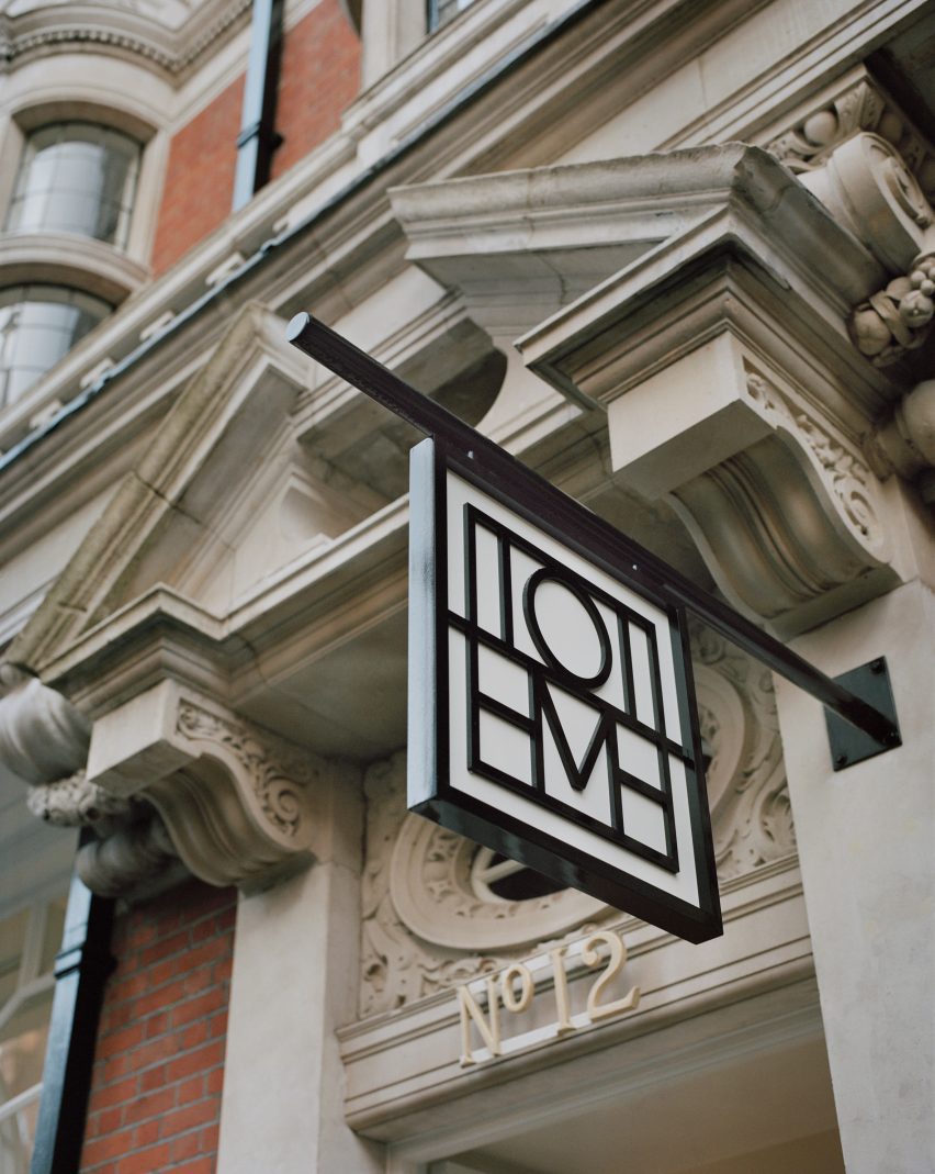
Sign outside Mount Street storeSign outside Mount Street store
The store is located on Mount Street in central London

The two founders and Halleroed decided on the gypsum Milles sculpture for the Toteme store together, with Halleroed designing a custom niche to place it in that is made from black high-gloss stucco to contrast the pale artwork.

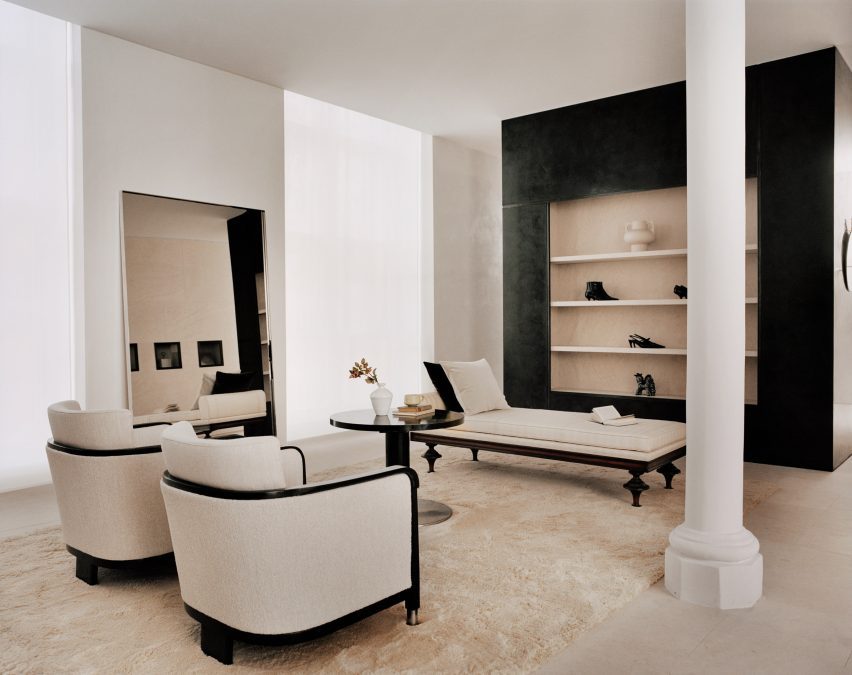
Halleroed also added vintage Swedish Grace furniture to the store, including armchairs and a coffee table by furniture designer Otto Schulz, a daybed and a mirror in pewter made for the Stockholm Exhibition 1930.

The studio has designed a number of other store interiors, including a Paris boutique for French brand L/Uniform and an Acne Studios store in Chengdu that aimed to combine the futuristic and primitive.

Reference

Yellow lighting illuminates Le Père store in New York by BoND
CategoriesInterior Design

Yellow lighting illuminates Le Père store in New York by BoND

New York architecture studio BoND has used tubular lighting to create a bright yellow glow inside this men’s apparel store on Manhattan’s Lower East Side.

The first flagship for cult fashion label Le Père occupies a 1,000-square-foot (93-square-metre) corner unit on Orchard Street.

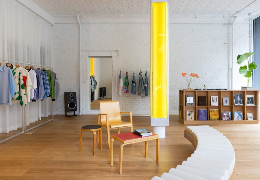
Store interior with white walls, wooden floors and a central yellow columnStore interior with white walls, wooden floors and a central yellow column
The flagship store for Le Père is largely painted white to allow the bright clothing to stand out

Utilising the store’s large exposure to the street, BoND opted to create an interior that would be just as impactful from the exterior as it is once inside.

“BoND designed the store to feel like a canvas, highlighting the design elements of the clothes while ensuring the space is a place that creators feel encouraged to spend time in,” the team said.

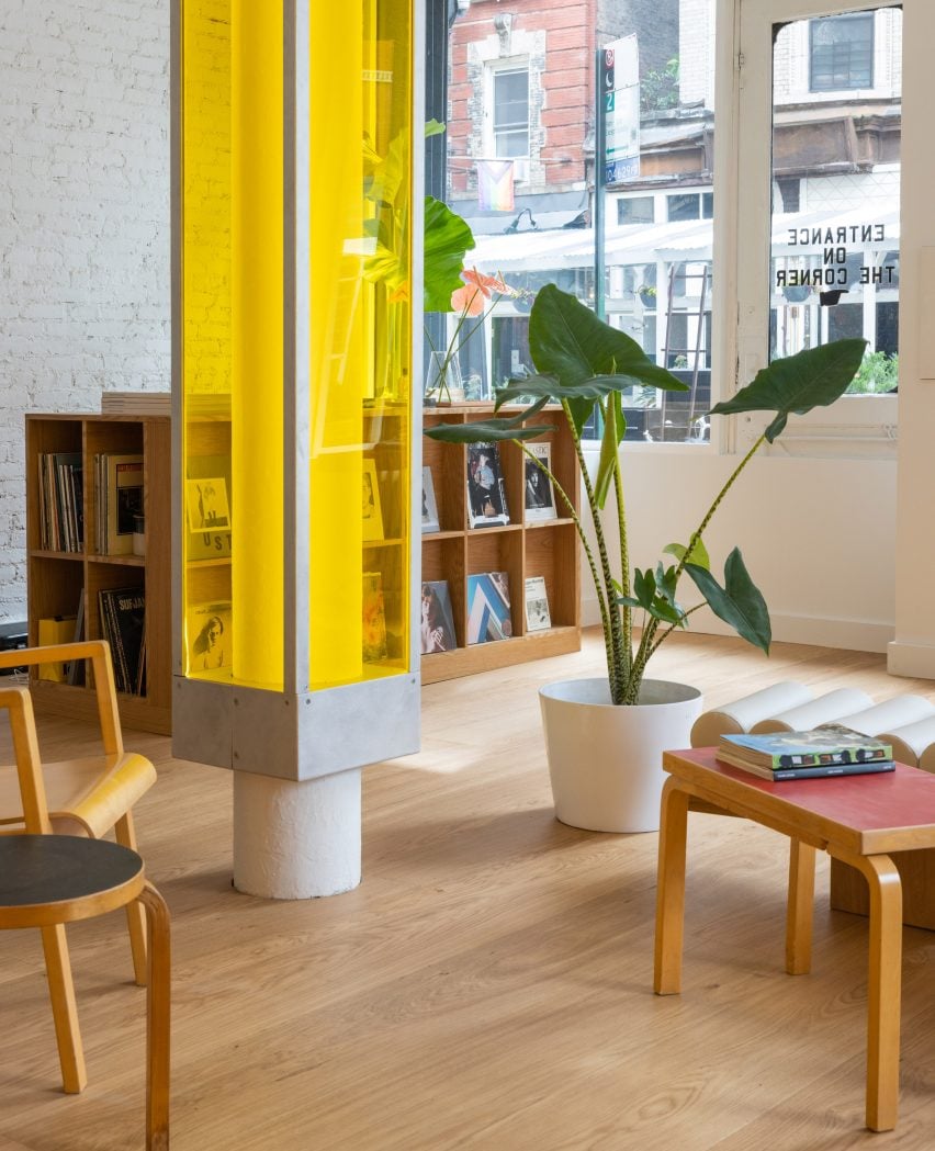
A central column encased in a translucent yellow boxA central column encased in a translucent yellow box
A central column is encased in a translucent yellow box

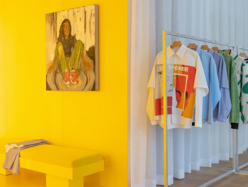
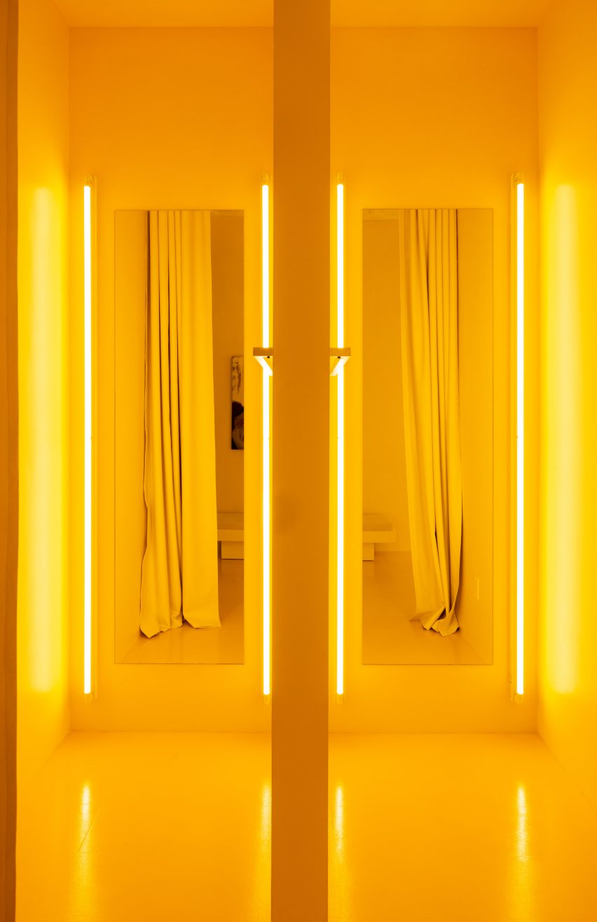
The firm’s approach was to leave the majority of the space white, allowing the boldly patterned clothing to stand out, then highlighting the fitting rooms using bright yellow lighting and surfaces.

A structural column in the centre of the store encased in a translucent box is also fitted with lights to give off a sunny glow.

Yellow fitting room with a rail of clothing to the rightYellow fitting room with a rail of clothing to the right
Yellow lighting installed in the fitting rooms emits an inviting glow

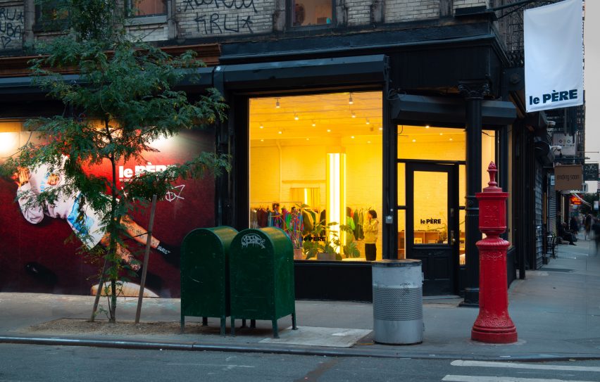
This yellow aura is immediately apparent from the street and is meant to entice passersby to step inside.

Neon lighting has seen a resurgence in retail and other commercial interiors of the past year, appearing everywhere from a Brooklyn cafe to a Calgary chicken shop.

Pair of yellow fitting rooms with tube lights either side of the mirrorsPair of yellow fitting rooms with tube lights either side of the mirrors
The tube lights were installed on either side of mirrors in the fitting rooms, which are also yellow

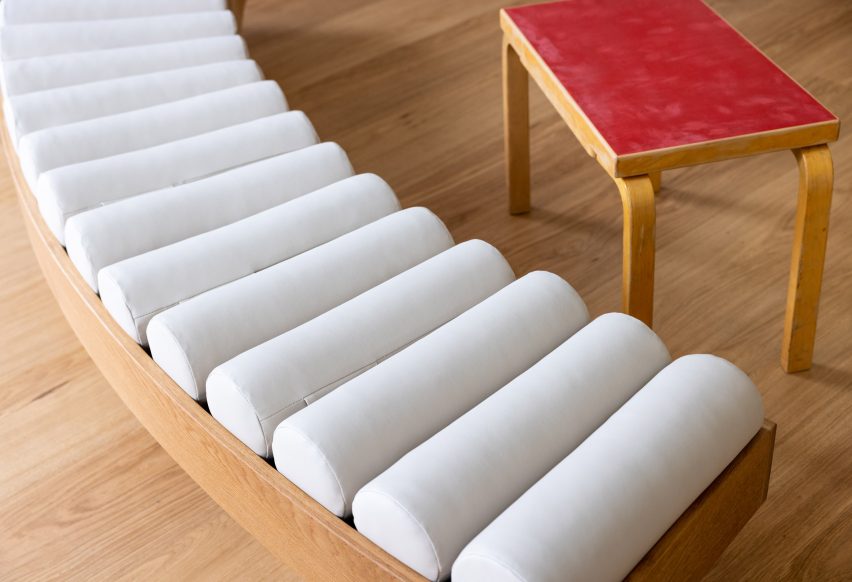
At Le Père, other elements like the tops of vintage Artek furniture are coloured red and black, to borrow from the street signs across the neighbourhood.

Floor-to-ceiling curtains along the back wall create a soft and neutral backdrop for the apparel, which is displayed on industrial metal racks.

Close-up on a curved bench with a row of cylindrical seat pillowsClose-up on a curved bench with a row of cylindrical seat pillows
Custom furniture pieces were designed by BoND and fabricated by Lesser Miracle

Wide-plank wood floors are laid across the main shop floor, which doubles as a space for gatherings, conversations, exhibitions and events.

Custom furniture pieces including a curved bench were designed by BoND and fabricated by Brooklyn design and art studio Lesser Miracle.

“The design scheme blurs the lines between a store, a home and an art studio – a space that is both aspirational and livable, combining contemporary and historic elements as a playful strategy,” said the studio.

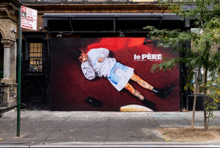
On the exterior, a generous portion of the facade is given over to a giant billboard that Le Père will use to present its seasonal visual campaigns and artwork by the brand’s collaborators.

Billboard across a storefrontBillboard across a storefront
A large portion of the facade is given over to a billboard to display the brand’s campaigns

The debut placement for Fall/Winter 2023 was titled And Sometimes Boys and influenced by the work of Korean visual artist Nam June Paik.

BoND was founded by Noam Dvir and Daniel Rauchwerger, who previously designed the global headquarters and showroom for the Brazilian brand PatBo in New York.

Le Père store exterior on Orchard StreetLe Père store exterior on Orchard Street
The glow from the yellow lighting is designed to entice in shoppers on the Lower East Side. Photo by BoND

The duo earlier overhauled an apartment in Chelsea for themselves, turning the dark, divided space into a light-filled home.

The photography is by Stefan Kohli, unless stated otherwise.


Reference