PlayLab Inc centres “space for conversation” in Los Angeles retail store
CategoriesInterior Design

PlayLab Inc centres “space for conversation” in Los Angeles retail store

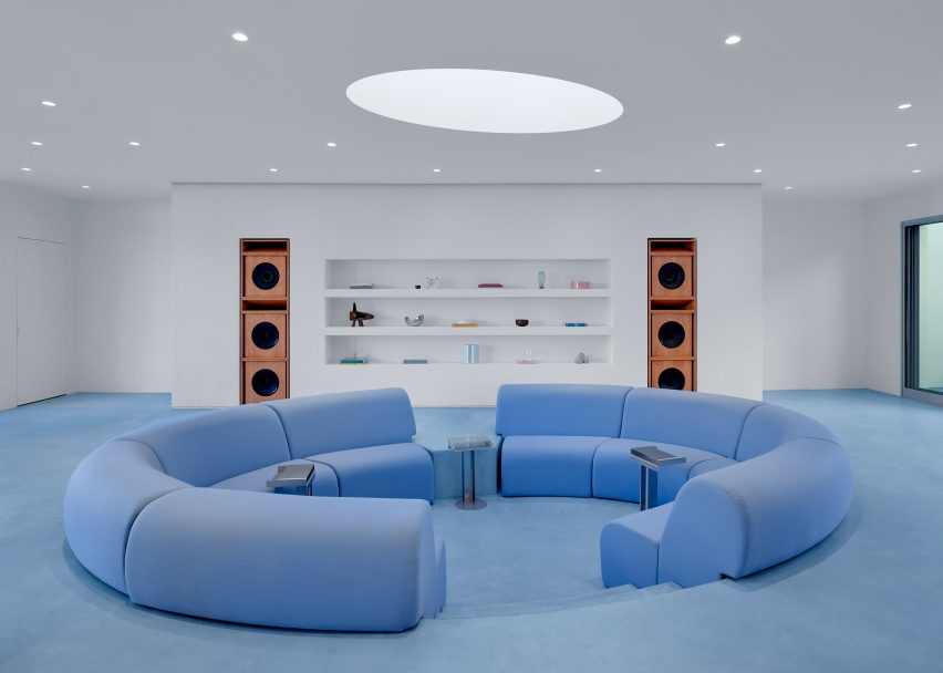
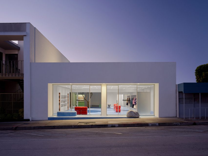
LA studio PlayLab Inc has created a flagship store that contains a sky blue conversation pit at its centre for local clothing brand MadHappy.

PlayLab Inc split the West Hollywood store into two distinct zones – one for retail space and the other for “intimate gathering spaces”, including a cafe and a courtyard.

a retail store in LA with large windowsa retail store in LA with large windows
PlayLab Inc has created a flagship store for LA clothing brand MadHappy

“Our collective goal with the design was to put space for conversation at the heart of the retail experience, creating a place that is equal parts for community dialogue and product,” PlayLab Inc co-founder Jeff Franklin told Dezeen.

“To do this we split the space down the middle, making one half a clear utility for shopping and the other a collection of intimate gathering spaces.”

a conversation pit made of light blue seatinga conversation pit made of light blue seating
The space was divided into separate zones for gathering and retail

Visitors enter the 2,800-square-foot (260-square-metre) store through a glass facade, which leads into a large open space with powder blue concrete flooring running throughout.

At the entrance, a blue bench emerges from a small exterior porch, while a boulder sits opposite.

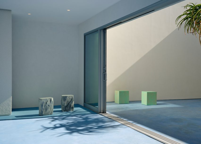
a courtyard with large sliding glass doors and various stoolsa courtyard with large sliding glass doors and various stools
A cafe and courtyard were placed at the back of the store

Towards one side, the store contains a 70’s style conversation pit underneath a large skylight. Plush, sky-blue couches line the seating area, with satin aluminium side tables by Berlin-based studio New Tendency placed alongside them.

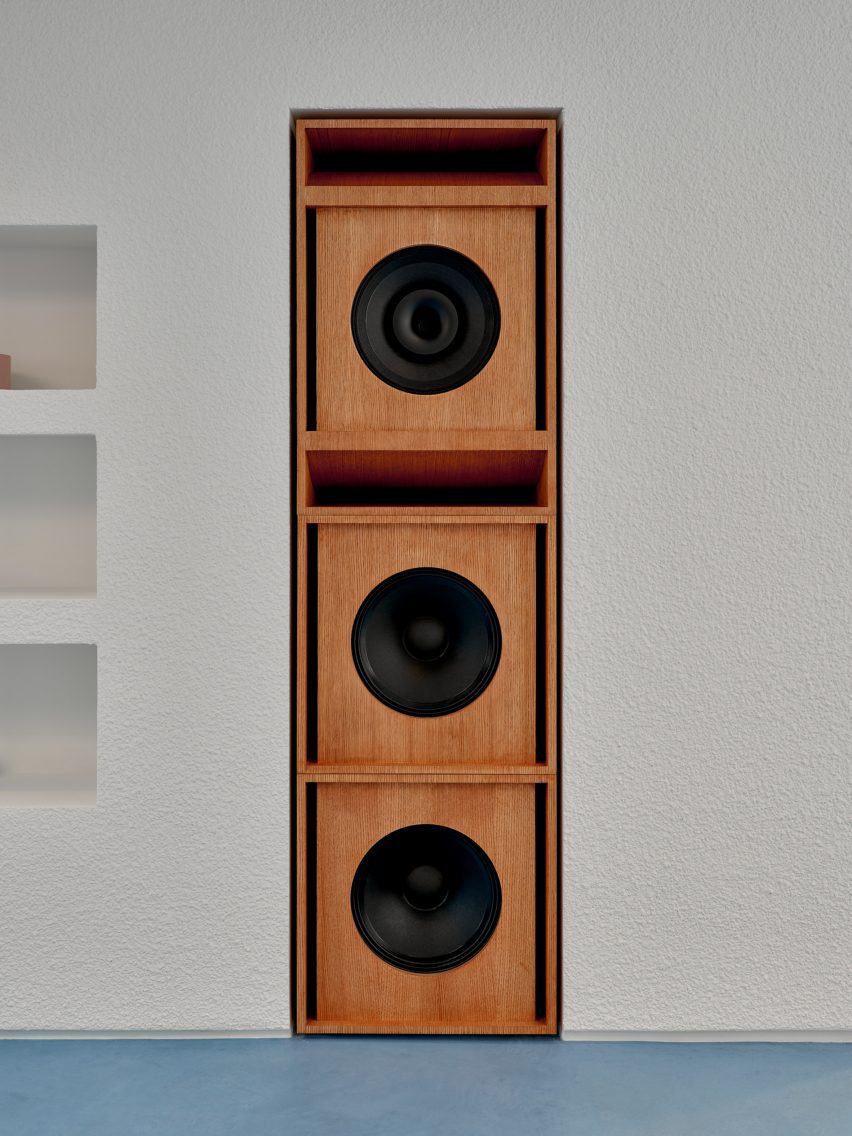
Along an adjacent limewashed wall, the studio installed built-in shelving flanked by large custom wooden speakers by New York music studio designer Danny Keith Taylor of House Under Magic.

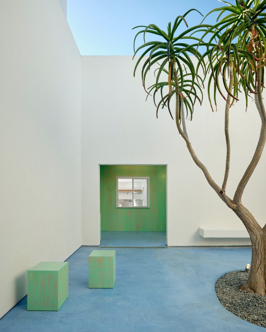
small light green stools and tree with blue floorsmall light green stools and tree with blue floor
The courtyard was populated with a single tree and green-stained plywood stools by Waka Waka

The social area leads into a small open-air courtyard populated by a single Tree Aloe installed by Cactus Store and green-stained plywood stools by LA studio Waka Waka.

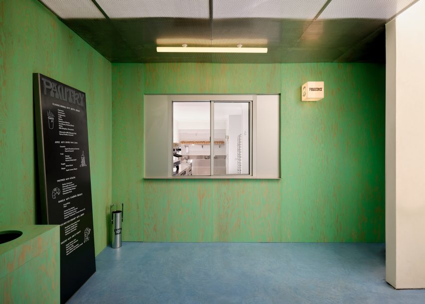
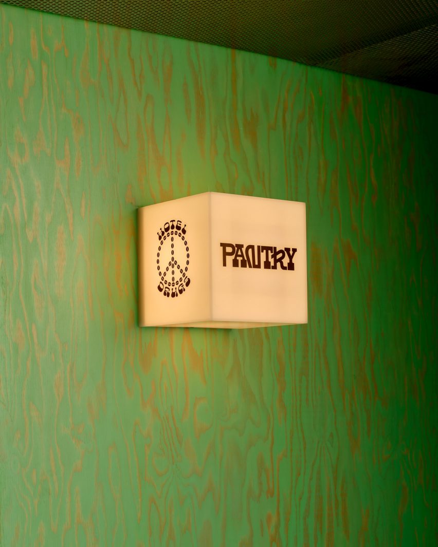
The same green plywood was used to line the takeout window of the store’s Pantry cafe, which sits in an enclosed corner and serves local and global cuisines from brands including Japanese-based café Hotel Drugs and LA bakery Courage Bagels.

a cafe space in a retail storea cafe space in a retail store
Custom signage was installed along the cafe’s takeout window

A custom lightbox and a large standing menu were installed next to the takeout window to display the cafe’s signage and goods.

In the remaining interior, PlayLab Inc created a large metallic “retail bar” that spans the shop’s length for “open views of the product”, according to Franklin. The studio also dispersed custom Lego-like benches around the space, which were covered in a candy apple red gloss.

an illuminated cube signan illuminated cube sign
The store will act as a retail space and venue

Faux-stone stools and a bench were installed throughout the space.

The store also contains a multimedia room, called the Local Optimist Space, a creative venue that will host audio and visual artwork.

“The design was inspired by the concept of conversation between things – a balance of scales, materials and textures,” said Franklin.

This is the first flagship store for the clothing brand MadHappy, which previously operated from a host of pop-up concepts and stores.

wooden speakerswooden speakers
Local designers worked on furniture and other pieces for the store

“From the beginning, physical retail has been essential to Madhappy and its success. We’ve always viewed our shops as spaces that go beyond something purely transactional – we want them to allow our community to engage with Madhappy beyond what’s possible digitally,” MadHappy co-founder Mason Spector said in a statement.

Other recent projects by PlayLab Inc also include a plexiglass skatepark for Vans and a lifesize toy racetrack set for a Louis Vuitton menswear show.

The photography is by Sean Davidson.


Reference

Space Projects creates Amsterdam store with thatched hut for Polspotten
CategoriesInterior Design

Space Projects creates Amsterdam store with thatched hut for Polspotten

A curvilinear thatched hut has been paired with terracotta-hued tiles at the Amsterdam store for homeware brand Polspotten, which was designed by local studio Space Projects.

The studio created the store to straddle a shop and an office for Polspotten, a furniture and home accessories brand headquartered in the Dutch capital.

Triangular archway in the Amsterdam Polspotten storeTriangular archway in the Amsterdam Polspotten store
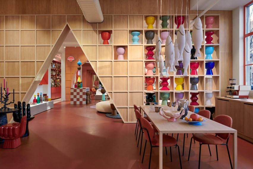
Visitors enter the Polspotten store via an oversized triangular entranceway

Characterised by bold angles and arches, the outlet features distinctive terracotta-coloured walls and flooring that nod to traditional pots, Space Projects founder Pepijn Smit told Dezeen.

“The terracotta-inspired colours and materials refer to the brand’s first product, ‘potten’ – or pots,” said Smit, alluding to the first Spanish pots imported by Erik Pol when he founded Polspotten in the Netherlands in 1986.

Plush cream sofa within Amsterdam homeware storePlush cream sofa within Amsterdam homeware store
The interconnected spaces are delineated by cutouts

Located in Amsterdam’s Jordaan neighbourhood, the store was arranged across a series of open-plan rooms, interconnected by individual geometric entryways.

Visitors enter at a triangular opening, which was cut away from gridded timber shelving lined with multicoloured pots that mimic totemic artefacts in a gallery.

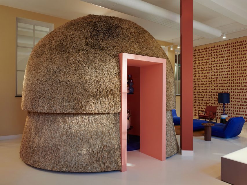
Curvilinear thatched hutCurvilinear thatched hut
A curvilinear thatched hut provides a meeting space

The next space features a similar layout, as well as a plump cream sofa with rounded modules and sculptural pots stacked in a striking tower formation.

Travelling further through the store, molten-style candle holders and Polspotten furniture pieces were positioned next to chunky illuminated plinths, which exhibit amorphously shaped vases finished in various coral-like hues.

Accessed through a rectilinear, terracotta-tiled opening, the final space features a bulbous indoor hut covered in thatch and fitted with a light pink opening.

The hut provides a meeting space for colleagues, according to the studio founder.

“The thatch, as a natural material, absorbs sound as well,” explained Smit.

Clusters of pots next to a circular tableClusters of pots next to a circular table
The store provides an art gallery-style space for homeware

Next to the hut, Space Projects created an acoustic wall illustrated with “hieroglyphics” of Polspotten products, which references the gallery-like theme that runs throughout the outlet.

“The store was inspired by Polspotten’s use of traditional techniques combined with a collage of their reinterpreted archetypes,” said Smit.

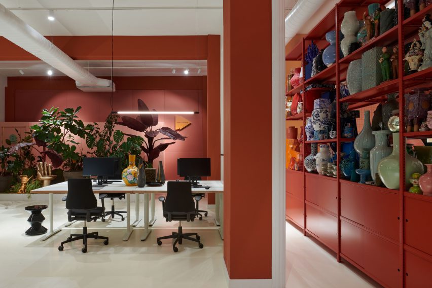
Office space at PolspottenOffice space at Polspotten
It is also used as an office space

Elsewhere in Amsterdam, Dutch practice Studio RAP used 3D printing and algorithmic design to create a “wave-like” facade for a boutique store while interior designer Linda Bergroth created the interiors for the city’s Cover Story paint shop to streamline the redecorating process for customers.

The photography is by Kasia Gatkowska.

Reference

External Reference creates 3D-printed organic displays for La Manso store
CategoriesInterior Design

External Reference creates 3D-printed organic displays for La Manso store

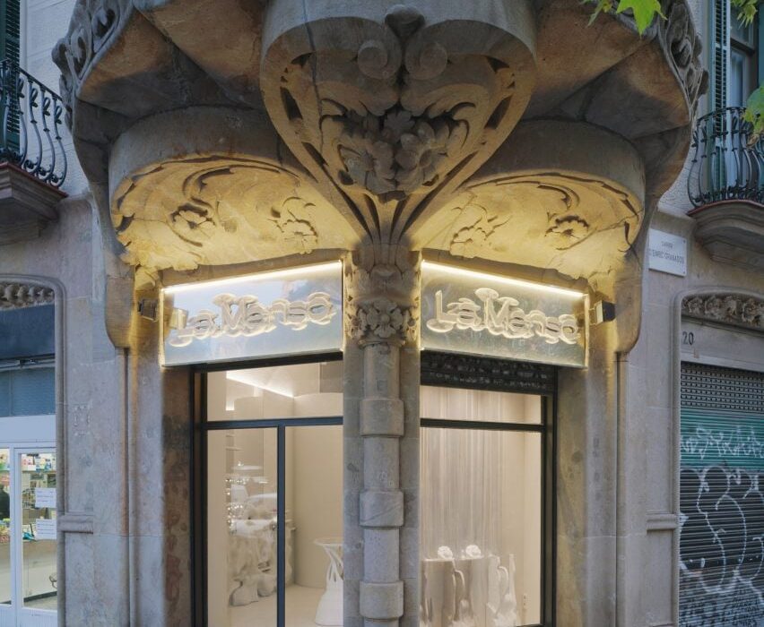
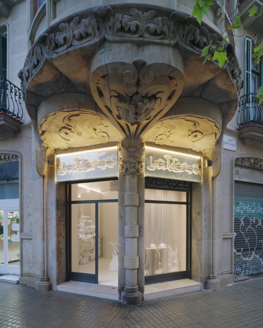
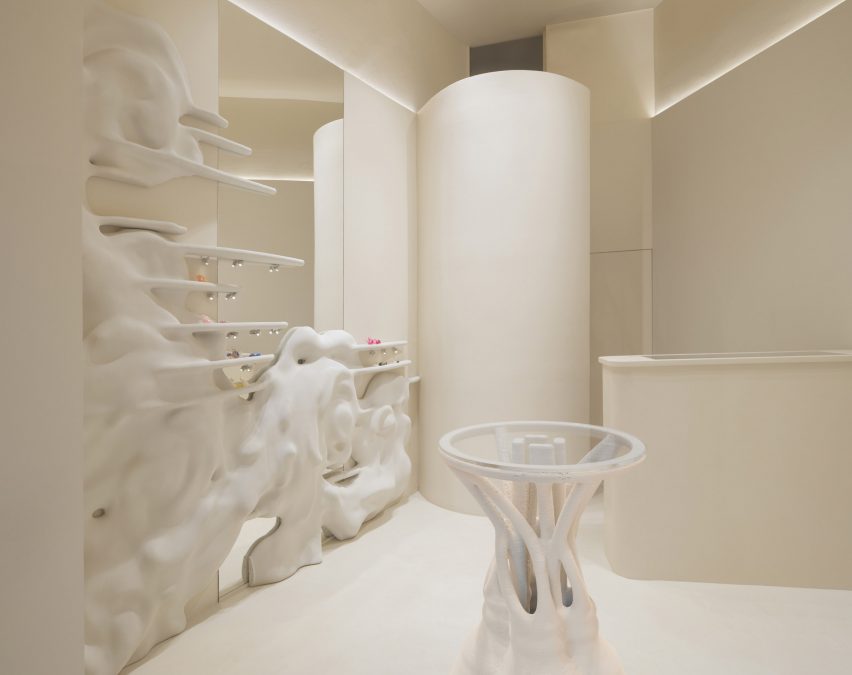
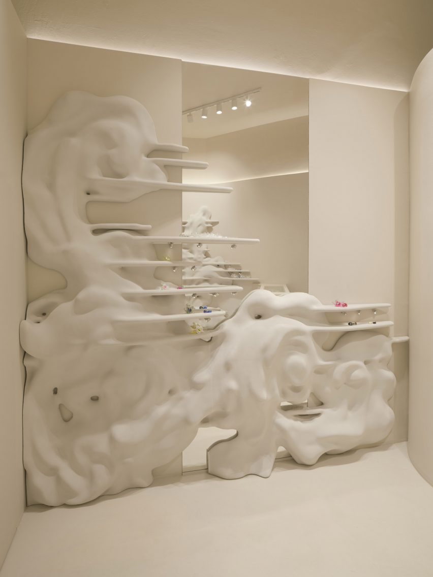
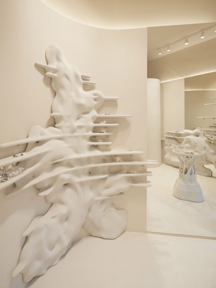
3D-printed shelving structures informed by Catalan-modernist buildings were used for shelving in this store designed by External Reference for a Spanish jewellery brand.

Experimental jewellery designer Adriana Manso asked Carmelo Zappulla’s studio External Reference to develop a suitably unusual interior concept for her first physical store in the city.

Exterior of La Manso store in BarcelonaExterior of La Manso store in Barcelona
The store is in the Eixample district

The project involved designing a window display and shelving for the 25-square-metre store, which is located in Barcelona’s Eixample district just a few metres from the house where Manso was born.

Manso is known for her playful pieces made from recycled plastic, which she wanted to display in a space that evokes the luxury feel of an haute-couture boutique.

Interior of La MansoInterior of La Manso
It features a 3D-printed interior informed by architecture

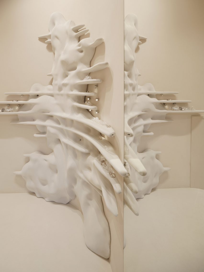
External Reference sought to combine the contemporary plasticity of La Manso’s jewellery with motifs influenced by Barcelona’s early 20th-century architecture, including the building in which the store is situated.

“Our design concept revolved around bringing the exterior facade inside, creating a melted and fluid background that would serve as an artistic canvas for showcasing the jewellery,” Zappulla told Dezeen.

“By blending the expressive elements of Catalan modernism with the organic forms inspired by La Manso design, our goal was to craft a visually captivating environment that elevates the overall shopping experience.”

Floral details in Barcelona storeFloral details in Barcelona store
External Reference created wavy shapes for the space

The designers selected fragments from the decorative facade and abstracted them using a process involving hand drawing and computational design techniques.

In particular, floral details from the elaborate canopy at the store’s entrance were reinterpreted as large rosettes incorporating futuristic glitches and bas-reliefs.

The organic shapes form shelving units that range in height from 90 centimetres to 1.7 metres. Jewellery and accessories are displayed on the shelves, as well as on a small table at the centre of the space.

The furniture is made from biodegradable cellulose and was produced with technical support from specialist 3D-printing workshop La Máquina.

Zappulla and his team refined the digital models to optimise them for printing. This involved splitting them into manageable parts that could be processed by the machine’s robotic arm.

Barcelona jewellery storeBarcelona jewellery store
The aim was to provide a neutral backdrop

All of the printed elements are finished in a muted off-white shade that matches the rest of the interior and provides a neutral backdrop for displaying the jewellery.

Large, mirrored surfaces help to make the interior feel more expansive, while spotlights provide targeted illumination for highlighting the collection.

In addition to the main furniture, the designers also developed a window display and 3D-printed signage that extend the store’s conceptual design out into the street.

Shelving at La MansoShelving at La Manso
The La Manso interior has a muted colour palette

Large-scale 3D-printing technology offers designers possibilities to create unique elements for branded interiors, which makes it increasingly popular for retail spaces.

Spanish design studio Nagami has created a store for sustainable clothing brand Ecoalf featuring transparent 3D-printed displays that recall melting glaciers, while Dutch architecture practice Studio RAP used the technology to produce a wave-like tiled facade for an Amsterdam boutique.

The photography is courtesy of External Reference.

Reference

Florencia Rissotti uses fabric as design element in Buenos Aires shop
CategoriesInterior Design

Florencia Rissotti uses fabric as design element in Buenos Aires shop

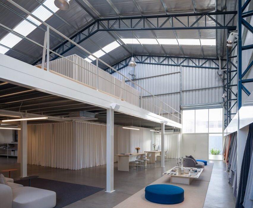
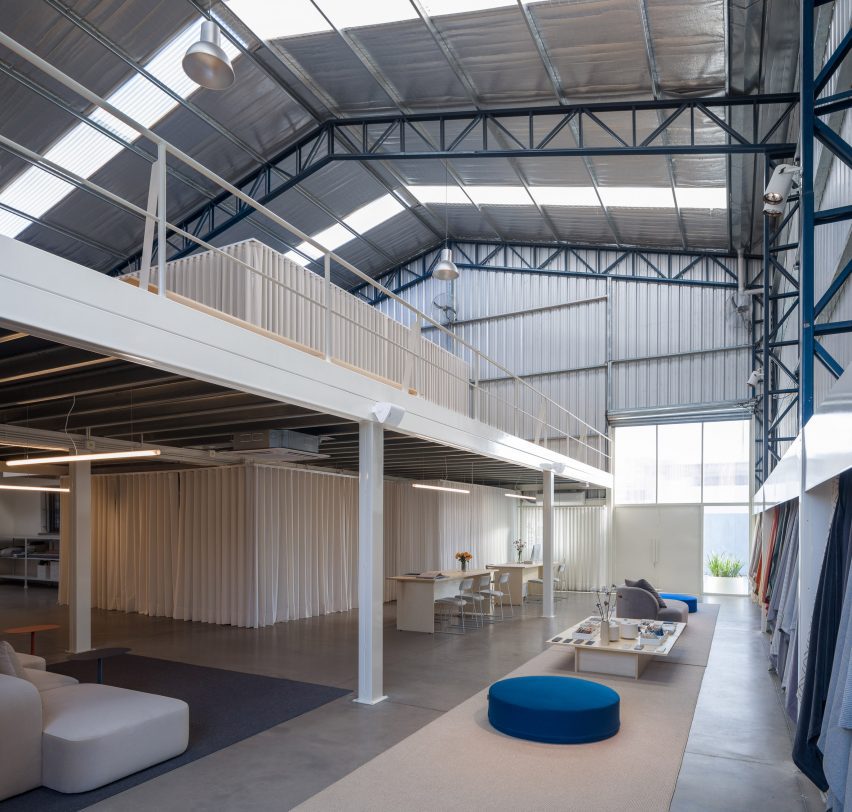
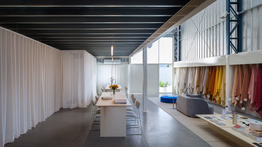
Local architect Florencia Rissotti has converted a warehouse into a textile shop in Buenos Aires, using fabric dividers to organise the space.

To house a retail location for fabric shop Tienda Mayor, Rissotti integrated textiles in several ways, lining the store with samples, draping colourful patches over a staircase and using curtains to conceal and create space.

warehouse storewarehouse store
Architect Florencia Rissotti has converted a warehouse into a fabric store in Buenos Aires

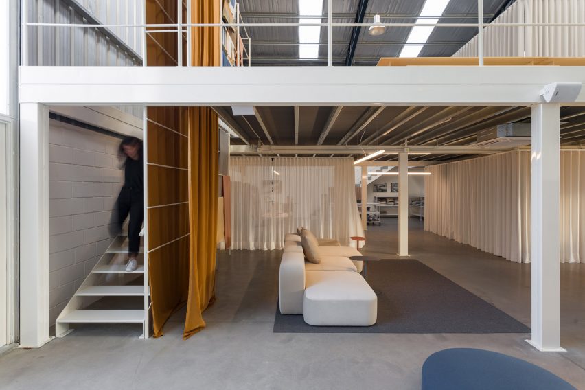
The interior is divided into two floors, with a mezzanine above used for storage and office space, and the store’s retail space and lounge areas below.

Cream-coloured curtains hang underneath the mezzanine and above to hide storage areas and create meeting spaces.

A fabric store in Argentina A fabric store in Argentina
A catalogue of fabric hanging from hooks lines the space

“The space was assembled using the raw material of the place: fabric,” said the studio. “A series of curtains divide, set up a meeting room, hide shelves with orders and cover the storage area.”

Along the length of a wall, large material samples are draped from hooks, which will “mutate” over time as the catalogue changes.

A person walking down stairs in a fabric shopA person walking down stairs in a fabric shop
The space was organized and divided using creme coloured curtains

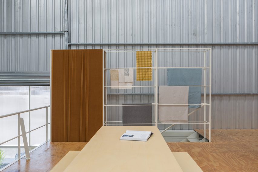
Similarly, fabric samples of various sizes were draped over the railings of a staircase that leads to the mezzanine, in part as a permanent installation and to display the shop’s selections.

“The ladder device was intended as an exhibition element, from which velvet falls and sews the two levels (the totem) together,” said the studio. “This ladder hanger is designed as an internal display window, where the selection/palette can be changed according to the season.”

Various creme tones dominate the space, with colour integrated from fabric samples and bright seating running in a straight line parallel to the fabric samples.

Alamo wood desks and large coffee tables were crafted for the space.

textiles draped over railingstextiles draped over railings
A staircase installation displays a rotating selection of textiles

Outside, a garden area contains a semi-circle metal bench and simple plantings.

Florencia Rissotti is a Buenos Aires-based architect who focuses on interiors and residential architecture.

Elsewhere in Buenos Aires, La Base Studio recently created a delicate wooden privacy screen for a 1970s home renovation and architects Julio Oropel and Jose Luis Zacarias Otiñano created a bio-art installation focused on fungi.

The photography is by Fernando Schapochnik.


Reference

Pierre Yovanovitch opens design gallery in New York City penthouse
CategoriesInterior Design

Pierre Yovanovitch opens design gallery in New York City penthouse

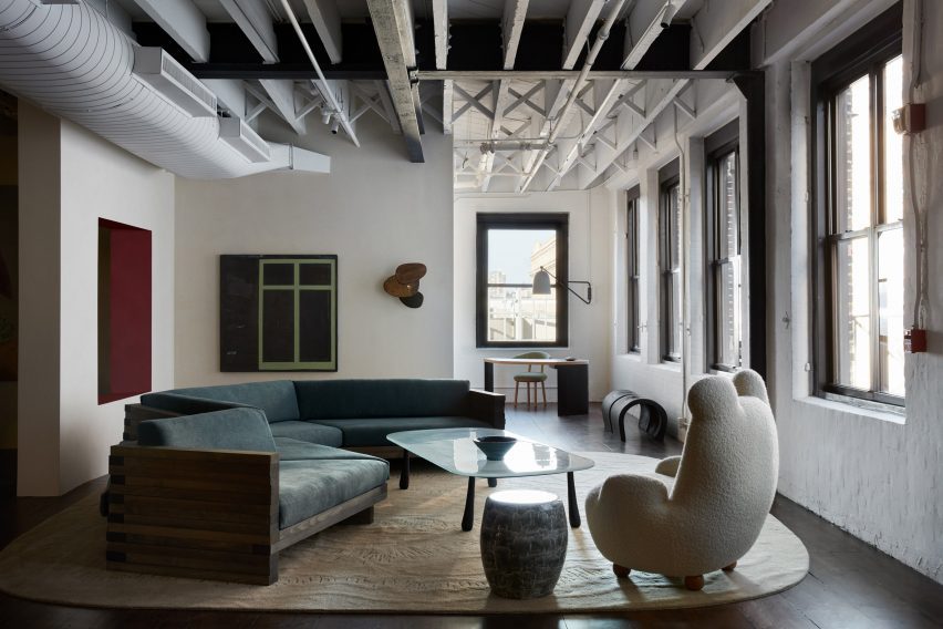
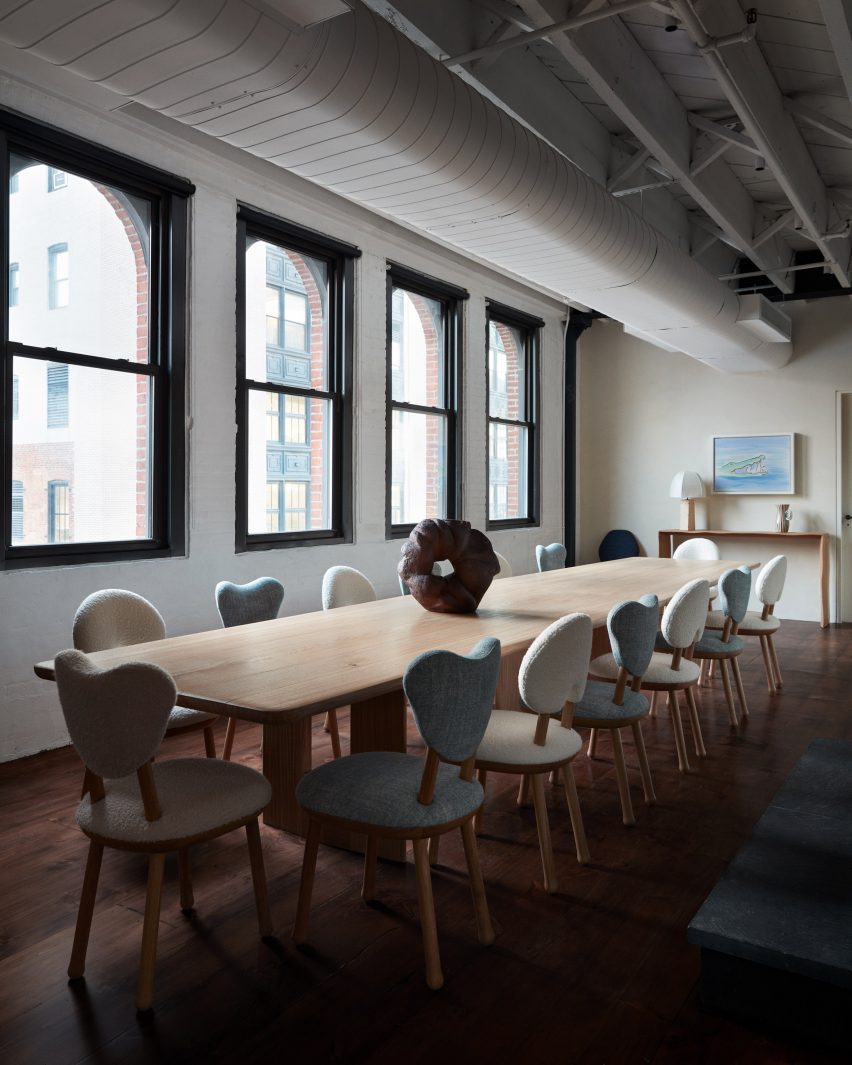
French designer Pierre Yovanovitch has opened his first US showroom and gallery in Manhattan’s Chelsea neighbourhood, displaying over 80 pieces from his own furniture brand.

Recognisable designs including the iconic Bear Chair fill the 10,000 square feet (930 square metres) of gallery and office space on the penthouse level of 555 West 25th Street.

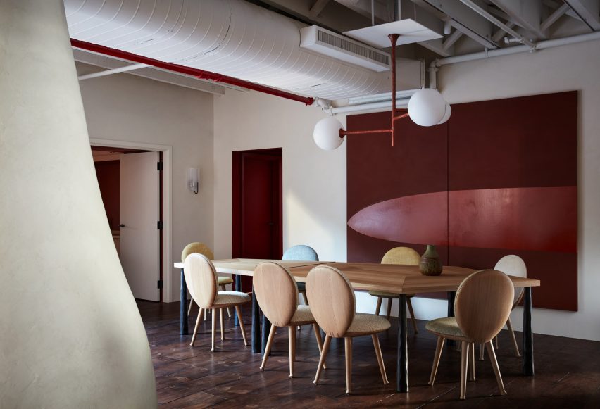
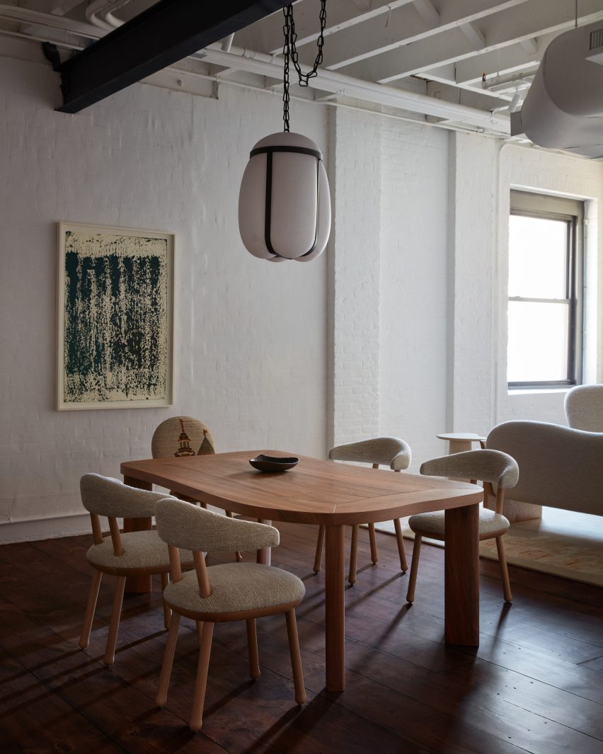
Dining table with eight round-backed chairs, and a light fixture aboveDining table with eight round-backed chairs, and a light fixture above
Pierre Yovanovitch chose a penthouse in a pre-war building for his New York gallery

This business expansion offers a permanent base for Yovanovitch and his team in New York, and allows customers and clients from his largest retail market to see the Pierre Yovanovitch Mobilier products first-hand.

“Having worked on residential projects in the US since the beginning of my practice in 2001 and with two successful furniture collection debuts (2017 and 2019) in New York, the opening of my first gallery space in America and new official New York headquarters, is a long-awaited realization for me,” said Yovanovitch.

Room with exposed ceiling beams, whitewashed brick and dark wood floorsRoom with exposed ceiling beams, whitewashed brick and dark wood floors
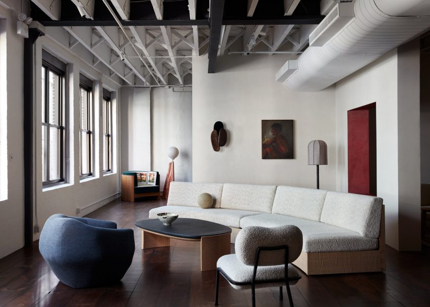
The exposed ceiling beams, whitewashed brick and dark wood floors are all typical of a New York loft

Inside the pre-war building, the gallery unfolds through a series of partial rooms that flow into one another without doorways or thresholds.

Throughout, exposed ceiling joists and ductwork are paired with dark wood flooring and whitewashed brick, typical of a New York loft space.

Furniture pieces styled like a living roomFurniture pieces styled like a living room
The gallery is laid out as a series of residential-style vignettes, which flow into one another

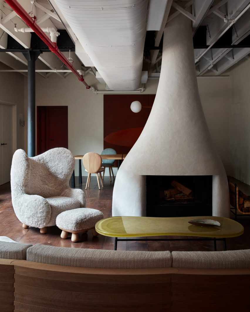
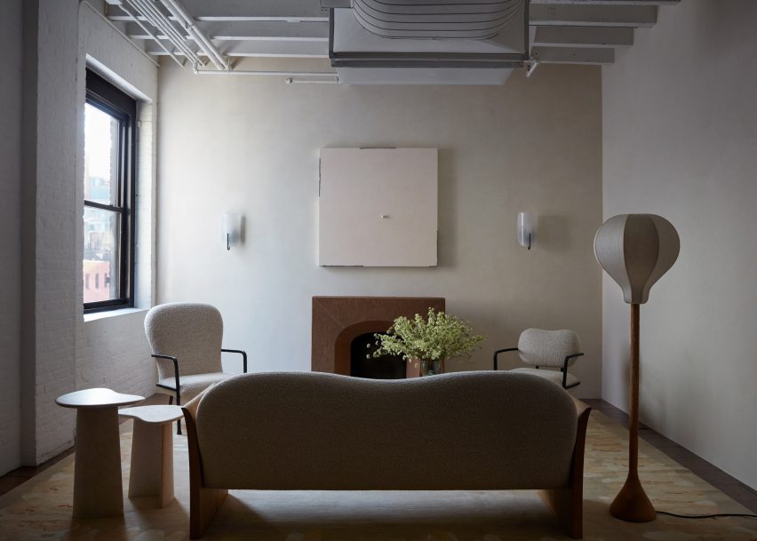
The largest display area centres around a sculptural fireplace, with a smooth plaster form that curves outward towards the base.

Furniture is oriented around the hearth, including a gently arced sofa and a chartreuse-toned resin coffee table, accompanied by the fluffy wing-backed Clifford armchair.

Wooden dining table with glass light aboveWooden dining table with glass light above
Yovanovitch curated a selection of artworks to accompany his furniture pieces

A variety of lounge and dining room vignettes showcase the products in suggested combinations with one another in residential-style layouts.

Other designs on show include the new Callis Table Lamp, the Roze Dining Table, the Arthur Sofa and the Artemis Rug.

Living room vignette facing a fireplaceLiving room vignette facing a fireplace
A variety of signature furniture and lighting designs are on display alongside new pieces

All are made in collaboration with specialist craftspeople and are “created with longevity and exceptional quality in mind” according to the brand.

“The brand pays homage to Yovanovitch’s Provencal roots, in particular the region’s natural light, rich and varied natural materials and colourways of the surrounding nature, as well as the historic commitment to craft associated with the region,” said a statement from the gallery.

The wide array of furniture and lighting pieces are presented alongside a selection of contemporary art curated by Yovanovitch – including works by Camille Henrot, Wolfgang Tillmans and Alicja Kwade – in an attempt to tie the gallery in with Chelsea’s status as an arts destination.

“It seems only fitting to open my first gallery location in the epicenter of New York’s art scene,” he said. “Not only is contemporary art central to my design practice, the neighborhood’s architectural history serves as reflection to my approach of revitalising historic spaces to fit a contemporary design aesthetic.”

Long dining table with blue and white upholstered chairsLong dining table with blue and white upholstered chairs
All of the Pierre Yovanovitch Mobilier products are “created with longevity and exceptional-quality in mind”

The New York gallery opening follows the debut of the brand’s new Paris showroom, which began welcoming visitors to a street-level space in the Marais neighbourhood from October 2023.

This move from the previous location in the 2nd arrondissement also strategically places Pierre Yovanovitch Mobilier amongst the city’s art galleries.

Sculptural fireplace accompanied by Pierre Yovanovitch's iconic Bear ChairSculptural fireplace accompanied by Pierre Yovanovitch's iconic Bear Chair
A sculptural fireplace anchors the largest area, accompanied by Yovanovitch’s Clifford chair

Yovanovitch founded his design practice in 2001 after working for fashion house Pierre Cardin. His interior design work has ranged from the salmon-pink and butter-yellow gift shop at Villa Noailles and ski hotel Le Coucou in France, to the high-end Hélène Darroze restaurant at The Connaught in London and ski hotel Le Coucou.

Earlier this year, the designer created a set with moving elements for Verdi’s Rigoletto at the Basel Opera.

The photography is by Stephen Kent Johnson.

Reference

USM Haller creates “techno-chic” Coperni retail space in Paris
CategoriesInterior Design

USM Haller creates “techno-chic” Coperni retail space in Paris

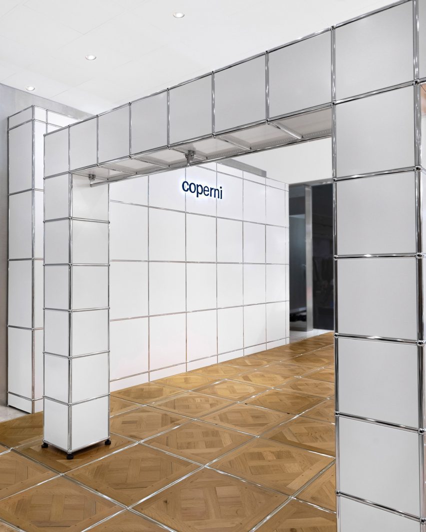
Photo of the Coperni USM retail space

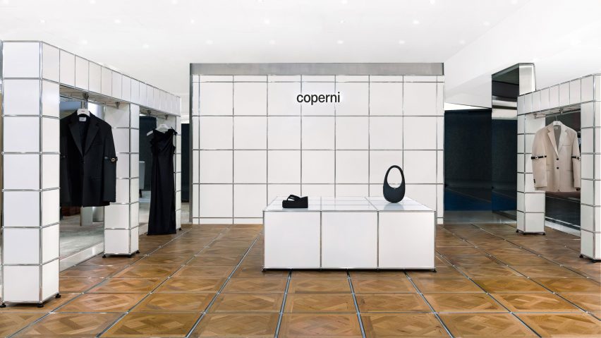
Parisian fashion brand Coperni has collaborated with Swiss furniture company USM Haller to create its first-ever boutique, a shop-in-shop at French department store Printemps Haussmann.

The shop-in-shop, installed at Printemps Haussmann in Paris, marks Coperni’s first-ever physical retail location and will be replicated at London’s Selfridges store and China’s Duty Free Mall in Hainan Island.

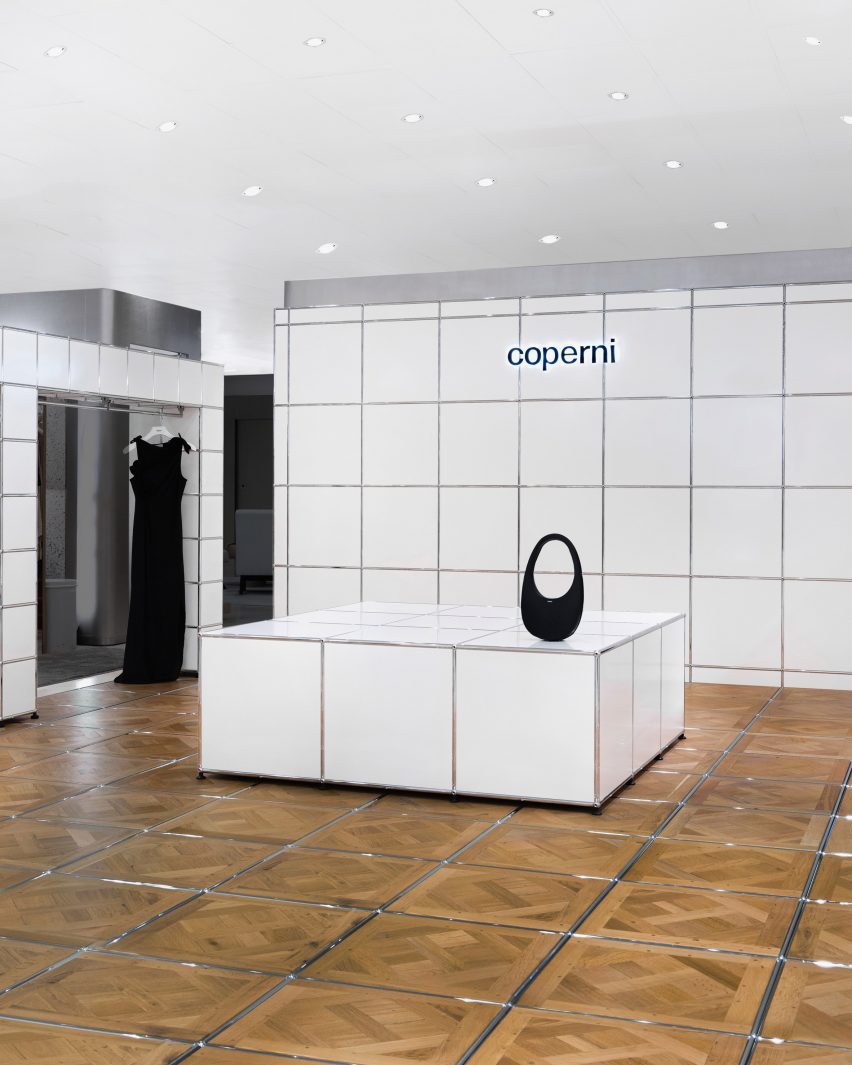
Photo of the Coperni retail space
Coperni collaborated with Swiss furniture brand USM

Described by Coperni‘s co-founder as “techno-chic”, the interior is defined by its cubic, space-age-style look that was achieved by reinterpreting USM Haller‘s cubic storage systems as tables, walls and display areas.

The floor of the retail space was covered in Versailles parquet flooring, with each of the wooden floor panels separated by USM Haller’s silver tubing. This typically lines the corners and edges of its storage systems and furniture.

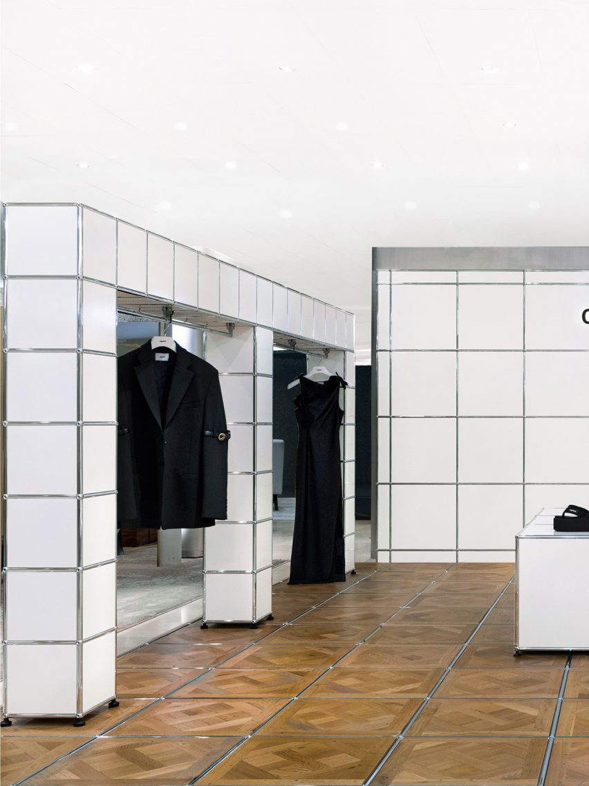
Photo of items on display at the Coperni space
USM reinterpreted its iconic modular storage systems

The Versailles parquet flooring was chosen for its artisanal and timeless spirit that draws on Parisian craftsmanship, which Coperni said pays homage to its ethos as a brand.

The use of USM Haller’s silver tubing within the Versailles parquet flooring system marks the first time that USM has adapted and reinterpreted its modular systems into a wooden material.

USM Hallers modular systems also form arch-shaped display units along the perimeter of the shop-in-shop, which were fitted with rails allowing Coperni’s ready-to-wear collection to be displayed.

A display table constructed from larger cubic modules was placed at the centre of the space, while a wall behind was branded with the Coperni logo.

Photo of the retail space
It marks the first time USM used its silver tubing in a wooden system

In 2022, Coperni’s Spring Summer 2023 show during Paris Fashion Week went viral for live spraying a dress onto the body of supermodel Bella Hadid using Fabrican’s sprayable liquid fibre.

AMO recently created a terracruda-clad shop-in-shop for Parisian fashion brand Jacquemus in Selfridges, London, that was designed to have a “Provence atmosphere.”

The photography is courtesy of Coperni.


More images

Reference

Retail Space of Zhima Health at the Universal Beijing Resort // Le Brand Strategy
CategoriesSustainable News

Retail Space of Zhima Health at the Universal Beijing Resort // Le Brand Strategy

Text description provided by the architects.

After a night-owl drink, you feel instantly refreshed, start walking in the air all the way up to the ceiling along the twists and turns of the spiral stairs and in front of your eyes is unfolding a world that sees no end…
While you chill out, you see four Chinese characters that read “Zhima Health” in front of a counter.

© Le Brand Strategy

© Le Brand Strategy

That’s when you let out a sigh of relief, realizing what happened was nothing but hallucination.

As a leader in the transformation and upgrade of time-honored brands, Zhima Health, a brand owned by the renowned TCM firm Tongrentang, draws the wisdom of the interior designer Wang Yong from Beijing Wuxiang Space Architecture Design Studio to put two stores-zero store in Daxing District and No.1 store in Shuangjing area-in place, highlighting a lifestyle trend that values both punk and health preservation among the young generation.

© Le Brand Strategy

© Le Brand Strategy

Along with the grand opening of the Universal Beijing Resort, a new retail store “Beijing Youli” under the support of Beijing State-owned Assets Supervision and Administration Commission also made its debut as the first suggested stop for the park visitors after they get off from the subway station. As a shop-in-shop, a disruptive new retail experience area for Zhima Health was designed by Wang Yong for an independent space of 30 square meters in the store.

© Le Brand Strategy

© Le Brand Strategy

1.Design Challenges of Re-upgradeTwo Tasks for the DesignerIn response to the call of “carrying on the essence while pursuing innovations” of time-honored brands proposed by Beijing State-owned Assets Supervision and Administration Commission, Beijing Youli emerged as a multi-brand store that gathers a portfolio of traditional brands that represent the humanitarian spirit of a city.

© Le Brand Strategy

© Le Brand Strategy

Its opening at Universal Beijing Resort has pooled nearly 30 local or national time-honored brands as well as other recognized ones, which, spurred by China Chic and together with other fashion brands, have formed a synergy as the new limelight at the new landmark.
With the experience of two existing stores, Zhima Health has taken consumption experience to the next level-on top of functionality and social networking, the space is expected to also offer an ever more critical emotional value for consumers, which is what Wang Yong must address as the first challenge.
The second challenge comes from the space itself-a 6.5m×4m box area of less than 30 square meters.

© Le Brand Strategy

© Le Brand Strategy

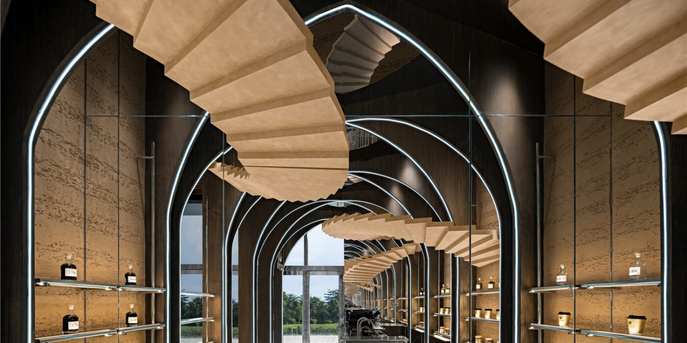
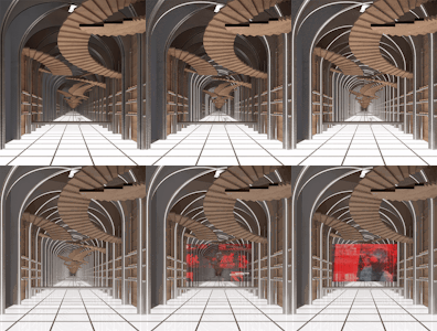
Given its relatively compact size compared to the other two stores, Wang Yong has to figure out how to minimize the “small” feeling of the confined space through the addition of a “fourth” dimension based on a 3D design concept.2.Design ConceptThe Uniqueness of the SpaceWhat Wang Yong had in mind was to target a certain customer group for Zhima Health with a brand new architectural style, which should conform with the culture of Universal Beijing Resort, cater to the diversified consumption preferences of the young generation, comply with the brand genes of Zhima Health and fit in the limited space.As a result, Wang Yong and his team decided to incorporate inspirations from Inception, multi-dimension, fashion and traditional brand genes into the design to deliver a space which is on the one hand fashionable and sci-fi and on the other light and friendly.As Zhima Health features the display and selling of light drinks in the quasi-concept store, Wang Yong, considering its finite space with a raised ceiling, worked out a light and 3D product arrangement plan and circulation design, resulting in a new retail space with a devotion to a sense of infiniteness and preservation of functionality.3.pace PresentationA 30㎡Metaverse Taking advantage of the high ceiling, Wang Yong deployed numerous towering wood arches, which were designed to intersect on the ceiling and then extend all the way down to the bottom of the rammed earth walls where product shelves were mounted.Four pairs of life-size wood spiral stairs echo each other overhead, threading through arches from a height and dominating the shop-in-shop.

© Le Brand Strategy

© Le Brand Strategy

The entire space, thanks to the arches and stair structures, resembles an unfolded accordion which is waking up the folded time and space.
On both horizontal and vertical dimensions, the use of mirrors enhances visual spaciousness. A whole glass on the ceiling and one side of the wall, together with the stretching structures that present a distortion in time and space, seems to have eliminated the boundary of the space and distorted time in a dazzling way.

© Le Brand Strategy

© Le Brand Strategy

With light projecting from underneath the ground and structured light belts on the arches, a metaverse of new retail space is throwing its arms wide open to all customers.4.New ValueBrand Genes That Combine Tradition and InnovationAs all century-old brands denote a particular trend or fashion in a certain era, the rise of China Chic is more of the rebirth of culture and value than cultural revival.

© Le Brand Strategy

© Le Brand Strategy

In particular, the irreplicable culture and spirit in the brand genes have enabled the reinvigoration of time-honored brands. From Goji Berry Coffee to Night Owl Drink, Zhima Health has achieved continued success, celebrating the everchanging time and the aspiring young generation and asserting its say as a new brand under a time-honored one in the modern era.

© Le Brand Strategy

© Le Brand Strategy

For any young person who is looking for a trendy and healthy night owl drink, Zhima Health is poised to provide a most authentic solution.
Building on Tongrentang’s brand recognition over the past few centuries, Zhima Health, through the concept zero store covering an area of nearly 20,000 square meters and the new retail social space of merely 30 square meters, is extending its antenna with innovation and courage ingrained in the brand to reach the future market.

© Le Brand Strategy

© Le Brand Strategy

To meet the demands of the new market and new consumption groups, it is brewing a new interpretation for the genes of its parent brand through space, for which Wang Yong has led the interior design–In hopes that the retail space at Universal Beijing Resort can strike a chord with the young customers, heralding a brighter future for Zhima Health albeit a small beginning through the combination of tradition and innovation.Project DetailsProject Location: Beijing, ChinaCustomer: Beijing Tongrentang Health Pharmaceutical CompanyTime of Design: September, 2021Interior Design: Beijing Wuxiang Space Architecture Design StudioWeb:www.wuux.netBuilding Type: CommercialLead Designer: Wang YongDesign Team: Wang Yong, Yu Yue, Jia Zhiyong, Zhu Chenxu, Tan Wei, Zhang Guiying, Beijing Wuxiang Space Architecture Design StudioPhotography: Zheng YanProject Planning: Le Brand Strategy AgencyCopywriting Agency: NARJEELING.

© Le Brand Strategy

© Le Brand Strategy

Retail Space of Zhima Health at the Universal Beijing Resort Gallery
Reference

Tiny Timber: 6 Small-Scale Retail Designs With Beautiful Wooden Interiors
CategoriesArchitecture

Tiny Timber: 6 Small-Scale Retail Designs With Beautiful Wooden Interiors

How can architecture be a force for good in our ever-changing world? During Future Fest, we’re pose this question to some of the world’s best architects. We’re hosting daily virtual talks from September 12th to 30th, which are 100% free to attend.  Check out the full schedule!

Shops can provide impressive shopping experiences even with limited floor areas. Instead of using shiny and luxurious materials that crowd the space, wood can easily bring intimacy and coziness to compact spaces. This collection includes six examples of retail designs that smartly employ wood in small store spaces. They demonstrate the possibility of timber-clad interiors, revealing how wood can evoke a range of atmospheres from quiet calmness to bright warmth to intimate mystery and more.

Mi Pan

By Concentrico, Mexico City, Mexico

Popular Choice Winner, 10th Annual A+Awards, Retail

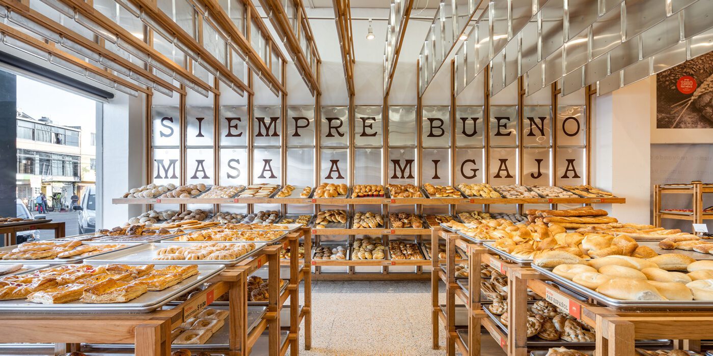
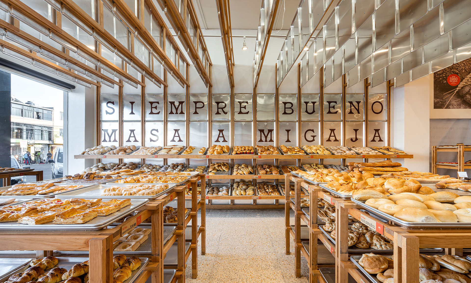
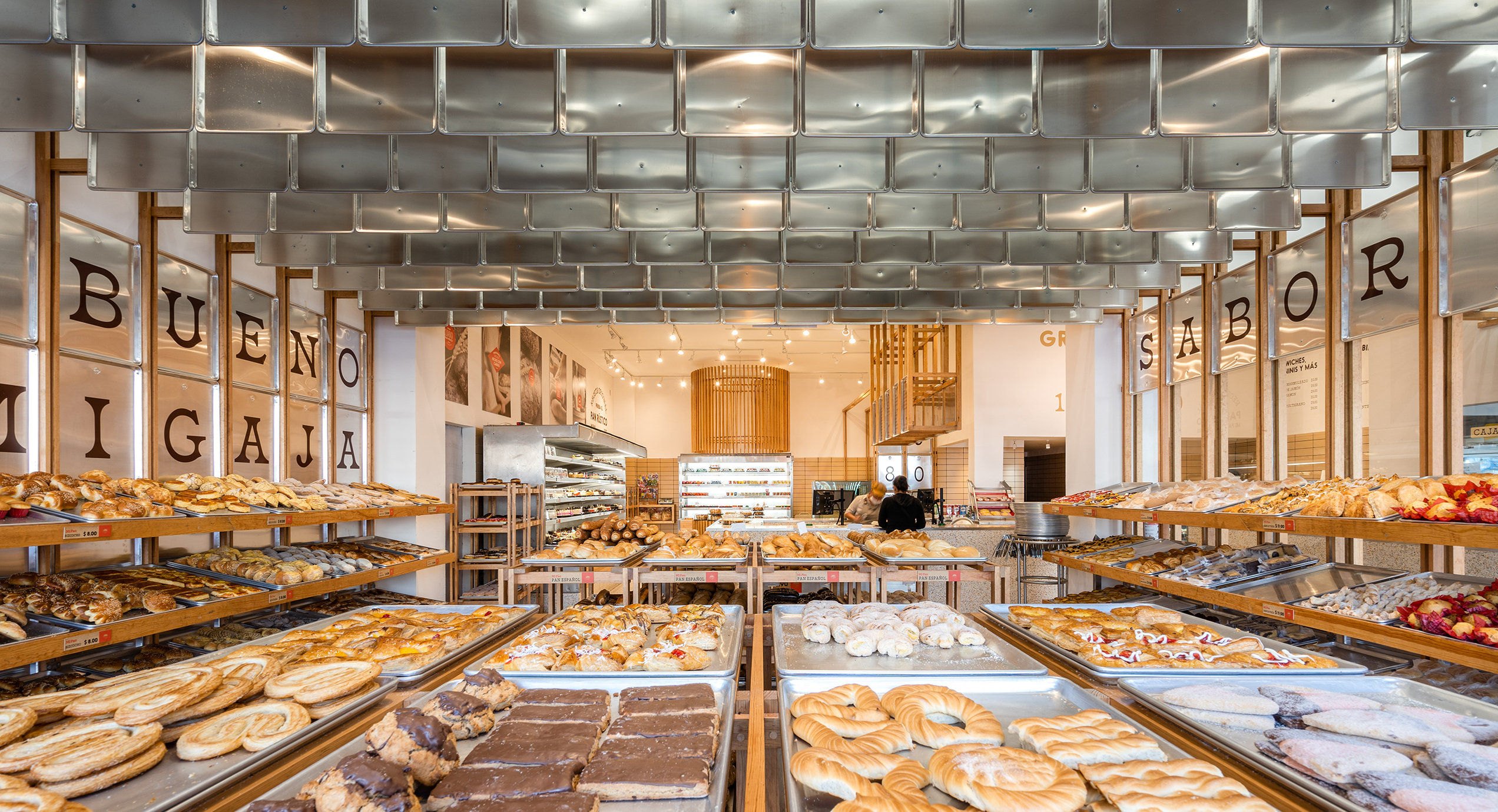
mi pan_interior_1mi pan_interior_2The bakery Mi Pan celebrates bakers’ hard work in making delicious bread. Metal trays reoccur on the shelves, wall cladding and ceiling decorations. These are the same type of tray used for bread production, reminding people of the heart of Mi Pan – the kitchen.
Instead of regular shelves, the design team uses trays and timber frames to hold freshly-baked bread. The trays emphasize the fact that the bread comes straight out of the kitchen as they are ready. Timber frames extend onto the walls and ceiling, breaking the boxy space into rhythmic fragments. The trays that hang from the ceiling hide cables from customers’ sight while making the bakery cozier by lowering the space.


Haregino Marusho

By Tsutsumi And Associates, Yokohama, Japan

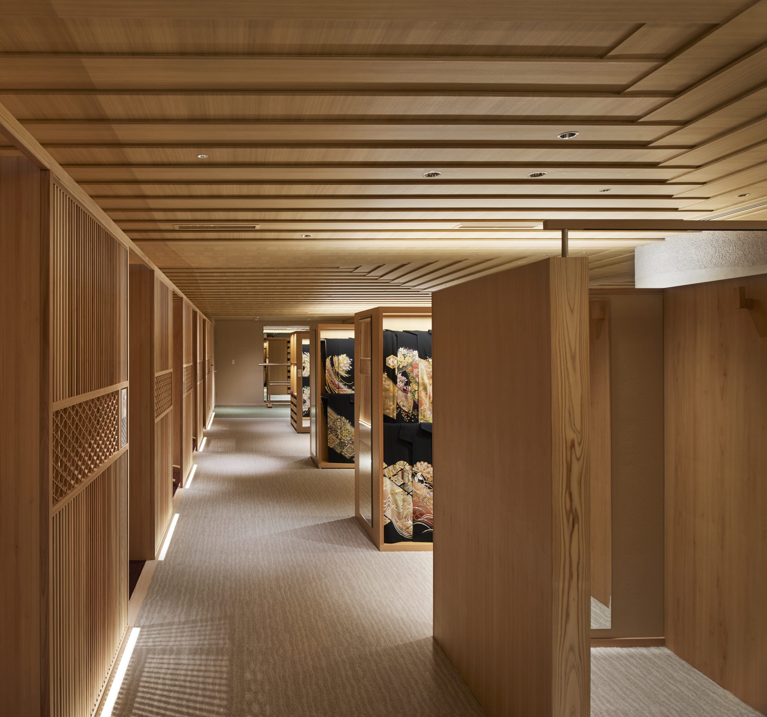
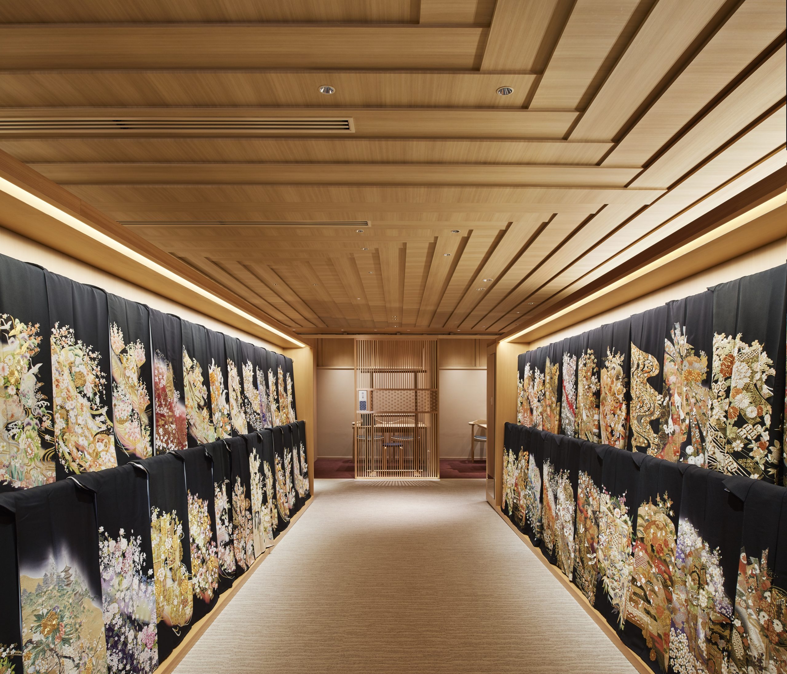
haregino marusho_interior_1haregino marusho_interior_3The design team refurbished the floor of the wedding Kimono in the traditional Japanese clothing shop Haregino Marusho and themed it with wood. Many spatial components, including display shelves, partitions and the ceiling, are in warm-color wood of similarly soft patterns. The space becomes an elegant wooden display box that does not take any spotlight from the kimono fabrics.
The ceiling panels are cut strategically to create a layering effect that resembles the Kasane (layering) of the Kimono. They also bring subtle changes in the ceiling height, making the monochromatic space more interesting to wander through.


Blackhills Cafe

By Mora + Suksumek, Lat Phrao, Bangkok, Thailand

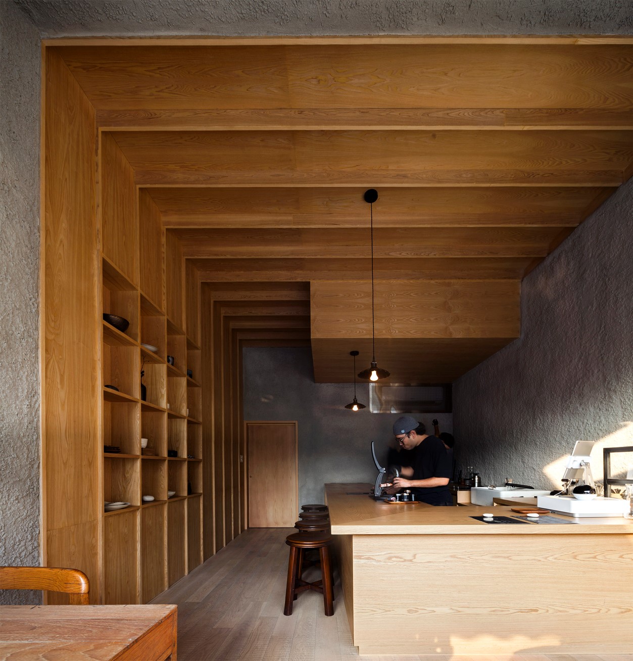
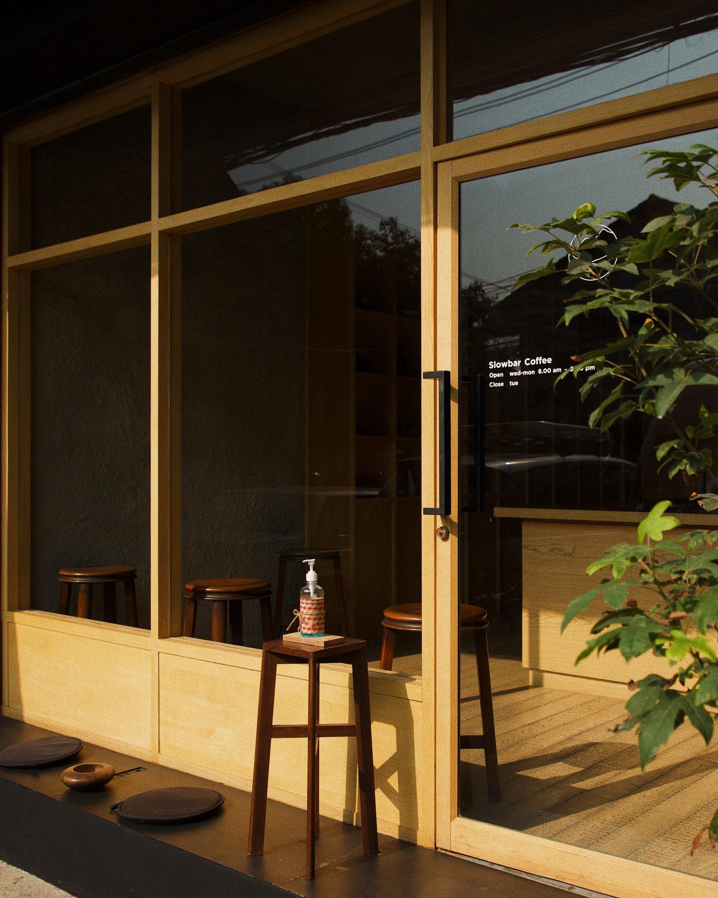
blackhills cafe_interior_1blackhills cafe_frontIn the coffee bar Blackhill, smooth wooden surfaces are put in conjunction with rough concrete surfaces. They together create a zen space for enjoying a moment away from the busy central Bangkok. In contrast to the colorful urban environment outside, the materials used in the coffee shop are limited to only wood and concrete. The simplicity of the design makes it almost a meditative space.
The coffee shop has a large, glazed front that welcomes late afternoon sunlight into the shop. Natural light gets through the open-plan interior. A few seats are available by the window and by the counter. Sunset, the visual and smelling experience of coffee-making are presented all at once.


Tsubomi House (Tokyo Bud House)

By FLAT HOUSE, Tokyo, Japan

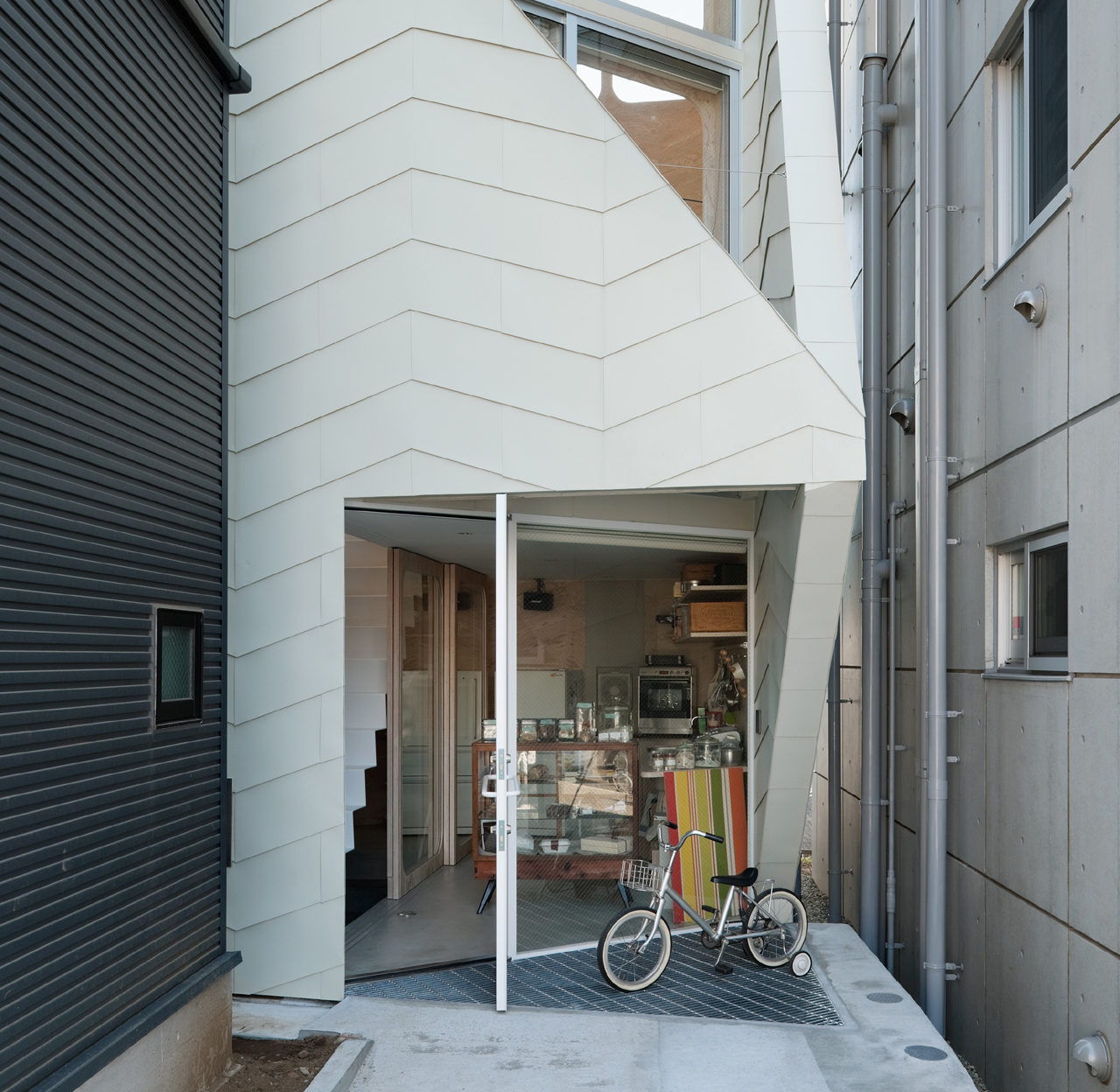
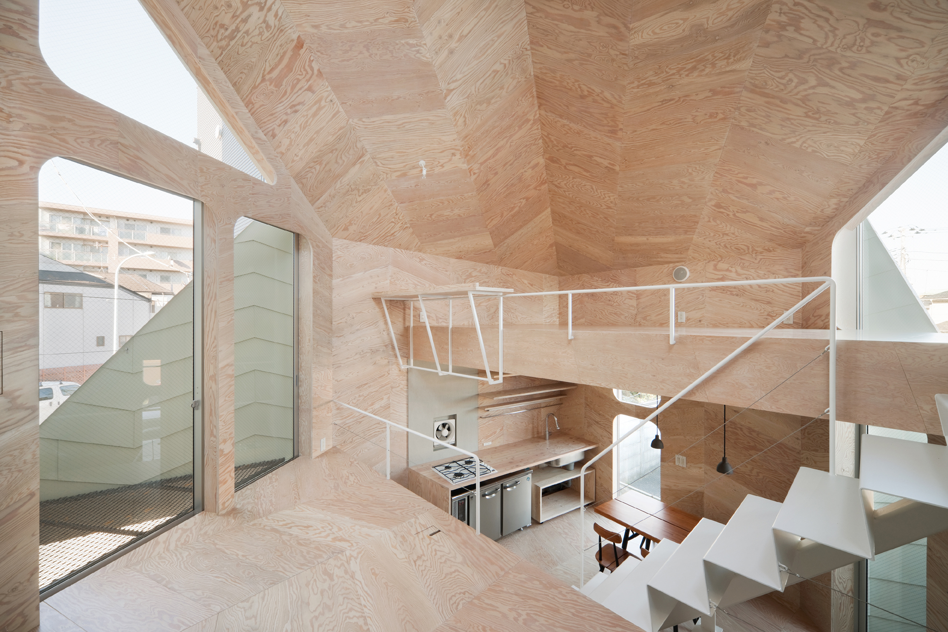
This small house has a footprint of only 280 square feet, yet it accommodates a biscuit shop and the shop owner’s family. Tsubomi House has seven different levels with no solid partitions between them. Each level is half a story higher/lower than the next one. Without walls separating each functional area, residents can move quickly from one space to another.
The interior finishing is largely in plywood which produces a gentle reflection of light. Natural light, therefore, comes in through openings on different levels and travels in the whole space. Paired with ivory steel, the light-color plywood makes the compact interior bright and continuous.


Sandra Weil Store

By Zeller & Moye, Mexico City, Mexico

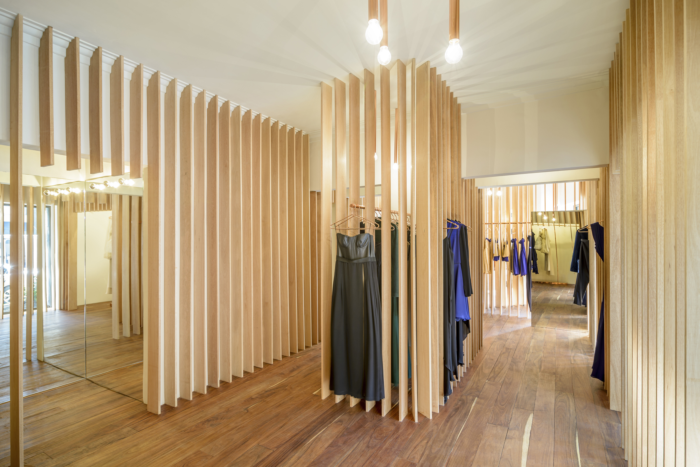
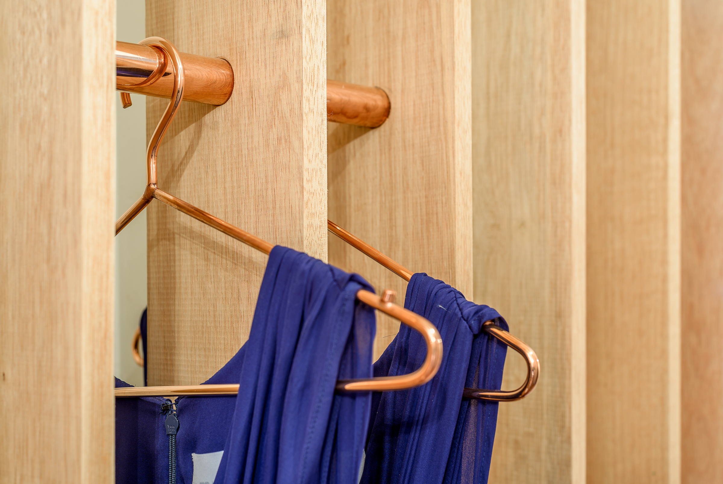
sandra weil_interiorsandra weil_detailInstead of presenting the garments all at once, Sandra Weil Store’s design gradually reveals the collections as customers walk around. Floor-to-ceiling slats made of local tropical wood stand in line with equal intervals between them. They form rhythmic partitions that are visually permeable only from certain angles. This allows a comfortable level of privacy in the shop without cutting the small store space into tiny fragments.
Garments hide between the slats, not showing themselves fully until the customer is in front of them. Meanwhile, the light and view change as well from one rack to another. The shopping experience in Sandra Weil is all about exploration.


RE x SUGAR

By CHINA ONDO Studio, Nanjing, China

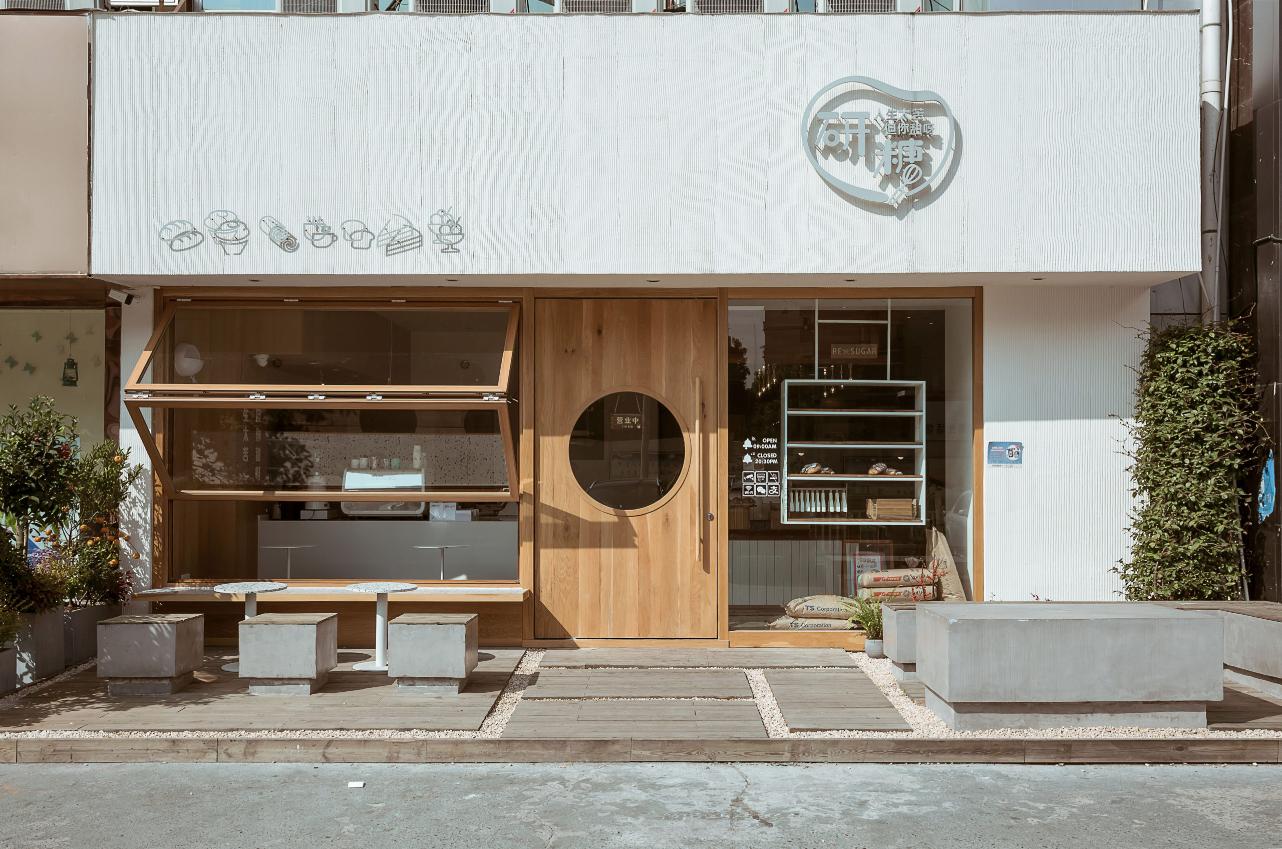
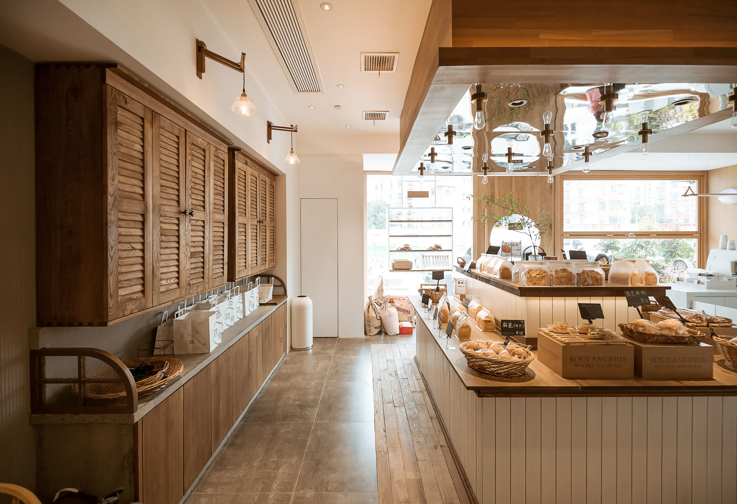
re sugar_frontre sugar_interiorThis community bakery uses large areas of warm-color timber to create a relaxing atmosphere. Like Blackhills Café, RE x SUGAR also has a transparent shop front that embraces the sunlight. A large folding window connects indoors and outdoors while the window sills become seats.
Woods of different textures create a harmonic yet interesting space. Some wooden surfaces are smooth, for example, the front door, walls, window frames and chairs. Cupboards, the display area of bread and the floor around it are covered in rather rough and pattern-intensive wood.

How can architecture be a force for good in our ever-changing world? During Future Fest, we’re pose this question to some of the world’s best architects. We’re hosting daily virtual talks from September 12th to 30th, which are 100% free to attend.  Check out the full schedule!

Reference

FADAA uses bio-concrete screens to shade D/O Aqaba retail space
CategoriesInterior Design

FADAA uses bio-concrete screens to shade D/O Aqaba retail space

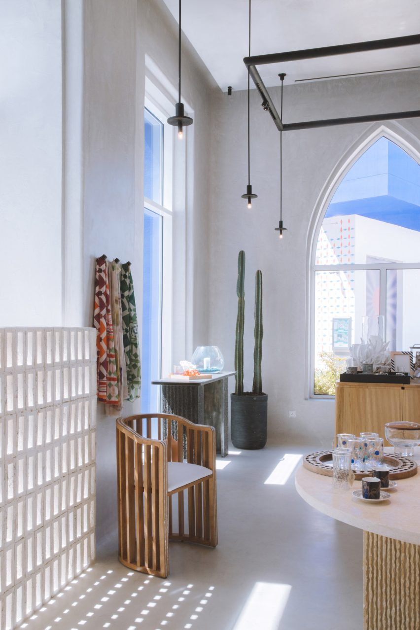
Crushed shells were used to form the bio-brick partitions at this store for a decor brand in Aqaba, Jordan, by architecture studio FADAA.

Designed by the Jordanian studio for Decoration One, the D/O Aqaba retail space is a flexible showcase for the local brand’s craft-focused homeware and ornaments.

Objects on display in the D/O Aqaba store
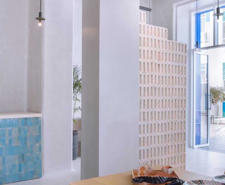
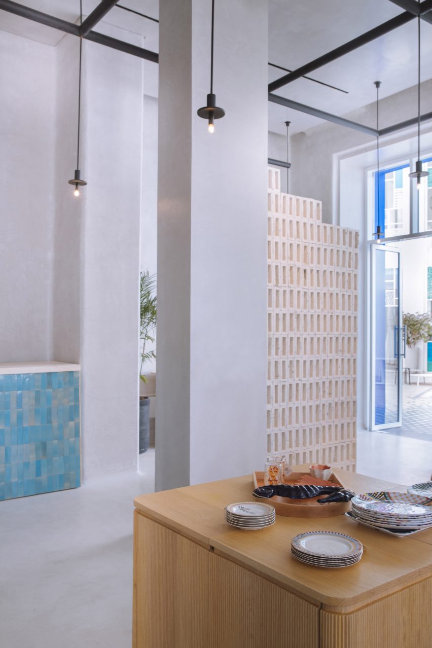
Bricks made from crushed shells act as sun shades and spatial dividers in the D/O Aqaba store

To protect the interior from the harsh south sun, the studio implemented partitions of stacked hollow rectangular bricks based on the traditional mashrabiya screens found in Islamic architecture.

These bricks are made from the shells of oysters, mussels and clams left over as waste from the coastal city’s seafood restaurants.

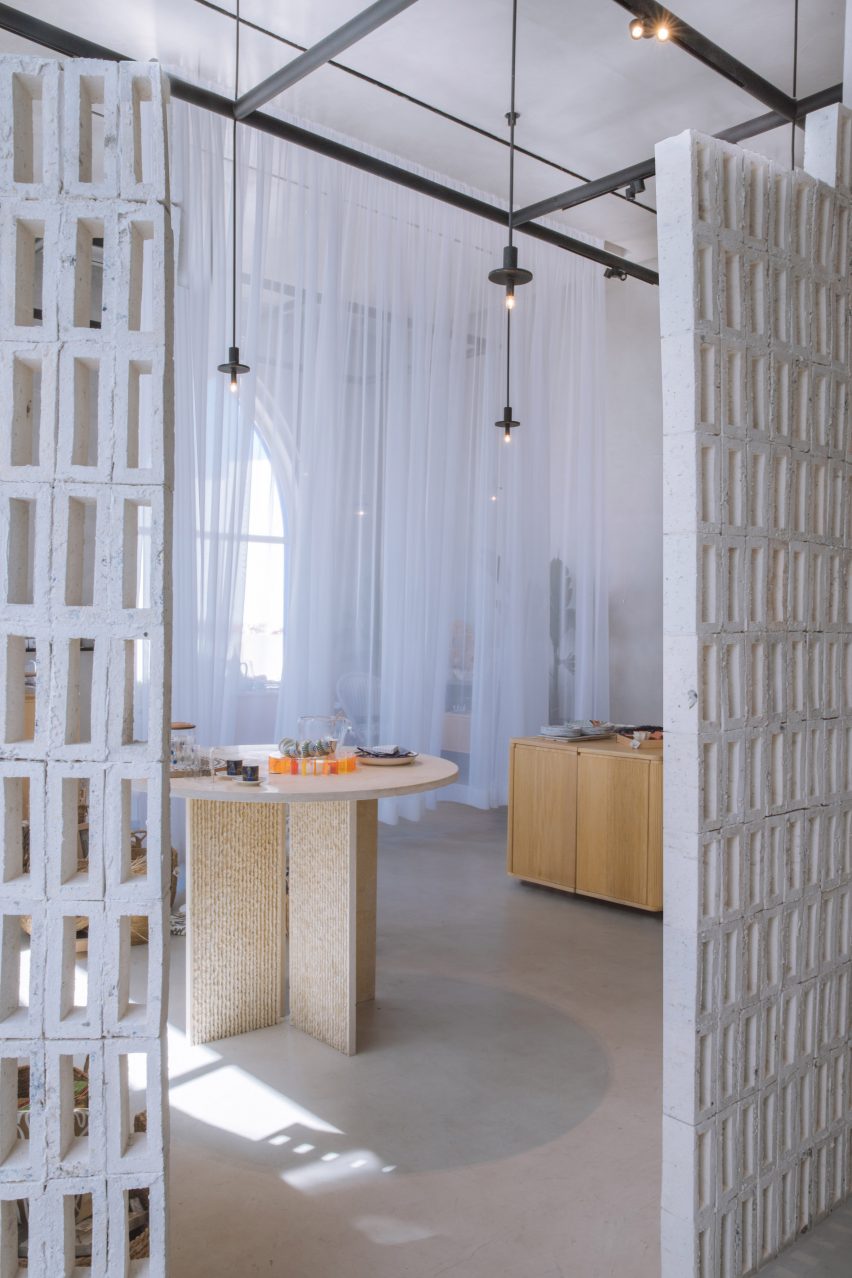
Bio-brick screens used as spatial dividers
The bio-bricks are stacked into gridded screens

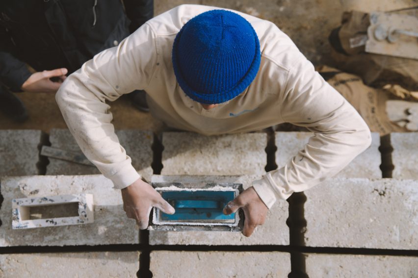
The shells were crushed and used as aggregate for a bio-based concrete that sequesters the carbon from the molluscs’ protective calcium carbonate coverings.

This material is pressed into a mould to form the brick shapes, dried to harden, and finally assembled into the gridded screens.

Store interior with furniture and displays

As well as shading the shop, the partitions help to divide the boutique and guide customers around the interior.

“Working alongside Decoration One’s craftspeople, a materiality-driven approach created the concept of a flexible retail store that embraces craft and low-carbon materials,” said the FADAA team, led by architects Bisher Tabbaa, Sarah Hejazin and Qussai Yousef.

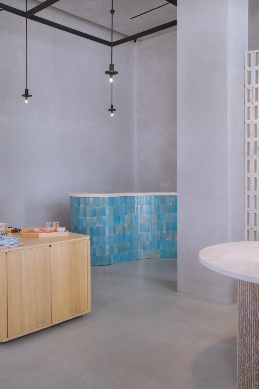
Sales counter clad in blue tiles
Colour is introduced through blue zellige ceramic tiles cladding the sales counter

Lime-plastered walls and native plant species also feature in the store to create a “healthy indoor environment”.

To accommodate Decoration One’s ever-changing collections, modular oak tables and sheer curtains can be moved and rearranged to organise the space as desired.

More tables, made from hand-chiselled local basalt and limestone, contrast the wood furniture and offer alternative ways to display the products.

A splash of colour is introduced by the zellige ceramic tiles that clad the curved sales counter.

Crushed shells form an aggregate for a bio concrete that is moulded into bricks
The bio-bricks are formed in moulds and feature hollow centres

“Embracing the craft nature of the project as well as economically supporting local industries, materials such as zellige and mother of pearl inlaying were used throughout the design,” FADAA said.

D/O Aqaba is shortlisted in the Sustainable Interior category for this year’s Dezeen Awards, along with projects including a restaurant in London and an office in Tokyo.

The bricks offer a sustainable alternative
The crushed shells form aggregate for the bricks and are visible across the surfaces

Bio-bricks are growing in popularity as a sustainable building material and a variety of compositions have been trialled over the past few years.

Bricks made from mushroom mycelium, sugar cane, charcoal and even human urine have all been put forward as environmentally friendly options.

The photography is by Bisher Tabbaa.

Reference

AI optimises supply chains and personalises retail offers
CategoriesSustainable News

AI optimises supply chains and personalises retail offers

Spotted: Recent years have witnessed two key retail trends: the move towards more personalised, curated customer offers, and pressure from stakeholders to tackle waste in the industry. UK-based Dressipi is working to tackle both issues with machine learning and artificial intelligence (AI). The company’s co-founders were inspired by their own first-hand experience struggling to find the products they wanted to buy.

Dressipi has developed a software platform that gives retailers the tools they need to personalise the shopping experience for individual customers. It does this by using a combination of human style expertise and AI to develop high quality product and brand data. Human stylists create a ‘taxonomy’ of fashion attributes that can be applied to each item. AI technologies, such as computer vision and natural language processing, are then used to apply these attributes at scale.

The same predictive models and algorithms that Dressipi uses to develop personalised insights can also be used to forecast buying and merchandising decisions. By better matching supply and demand, retailers can avoid waste in the supply chain, benefitting both their bottom line and the plant.

Dressipi’s technology has three key strengths. First, its algorithms have been developed over years in collaboration with human fashion experts. They are therefore specific to the needs of the fashion industry. Second, Dressipi owns extensive datasets of garment attributes and fashion-specific customer preferences, and the company’s ability to cleanse and parse all this data is the core of its offer. Finally, the company has a proven track record working with some of the industry’s leading names, delivering externally validated results.

Other AI-powered retail innovations spotted by Springwise
include personalised
wine recommendations, predictive
analysis to speed shipping, and computer
vision used for fashion cataloguing.

Written By: Matthew Hempstead

Website: dressipi.com

Contact: dressipi.com/company/contact/

Reference