Stop the Presses: Can Adapting an Abandoned Newspaper Facility Revitalize the Suburbs?
CategoriesArchitecture

Stop the Presses: Can Adapting an Abandoned Newspaper Facility Revitalize the Suburbs?

The latest edition of “Architizer: The World’s Best Architecture” — a stunning, hardbound book celebrating the most inspiring contemporary architecture from around the globe — is now available. Order your copy today.  

When you think of the American suburbs, what words come to mind? 

No matter how much affection you have for your hometown, one of those words is probably “bleak.” While many millennials, including this author, are still moving out to the suburbs to raise children — a pattern first established by their grandparents in the post-war era — few see these car-centric communities as ideal. The charmless strip malls, the big box stores, the neglected highway medians filled with litter from passing cars — how can one contemplate all this without crying out in despair?  

The question isn’t really if the suburbs are bad but why they are this way. Are the people who live in the suburbs really more boring than the people in cities? Or does the archetypal suburban ambiance of loneliness and fatigue stem instead from poor urban planning? 
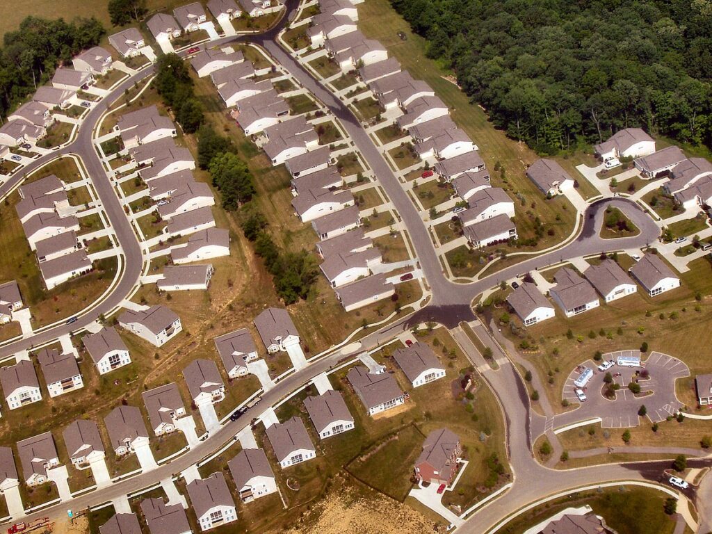
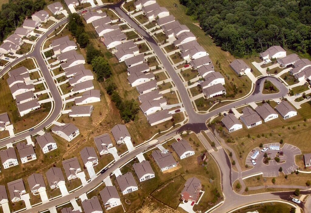
Tract housing in a suburb of Cincinatti, Ohio, 2005. Photo by Derek Jensen via Wikimedia Commons. 

My feeling is that it is the latter. Culture happens in places where people have the opportunity to move around, observe each other, and interact. The flâneur, that prototype of the modern artist or bohemian, emerged in mid 19th century Paris at the same time that the arcades were constructed, and this was no coincidence. As Baudelaire understood, the arcades provided the first modern artists with a stage on which to observe la comédie humaine firsthand. He argued that this new way of relating to society produced modern subjectivity as we know it. 

It stands to reason that the suburbs, by removing would-be flâneurs from their stage, sapped their creativity as well. A life that moves from home, to car, to cubicle, to drive-through and back provides few chances for people to observe and interact with one another. Over time, the suburbs have led to an epidemic of loneliness in America — a fact that has been recognized since at least 2000, when political scientist Robert D. Putnam published his best-selling book Bowling Alone.

This trend has only been exacerbated during and after the pandemic, as more Americans have begun not only to work from home, but to have their groceries, entertainment and other consumer goods delivered straight to their doorstep, obviating the need to go outside altogether. This has led to a shuttering of retail spaces in the suburbs, among other changes. Suddenly, people are nostalgic even for those commercialized, “fake” public spaces like the mall that were widely derided in the 90s. 
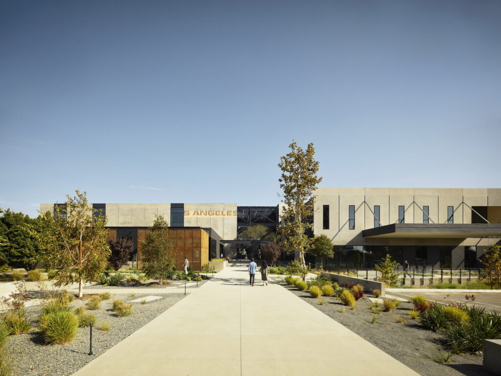
The Press won the 2023 A+ Jury Award for Commerical Renovations and Additions.

So how to fix it? What the suburbs need, most of all, are places where people can work, shop, wander and simply be. One project that tries to restore some of this urban energy to the suburbs is The Press, a former Los Angeles Times printing facility in Costa Mesa, California that was “reincarnated as a multidisciplinary workspace with a dining Canteen and a public Rail Trail on its 23.4-acre site” by Ehrlich Yanai Rhee Chaney Architects. Located in Orange County, California, Costa Mesa is a small city with a decidedly suburban feel, a place where people sit in traffic for twenty minutes to reach the In-N-Out Burger drive through. 

This project, which won the 2023 A+ Jury Award in the Commercial Renovations and Additions category, stands out for seeming like a truly inviting, interesting place to spend time. Not just an office building, and not just a place to shop or eat, The Press avoids the sense of falseness or contrivance that plagues most suburban workspaces and shopping centers. While this is of course a privately owned campus, it feels more public than, for instance, a mall. 
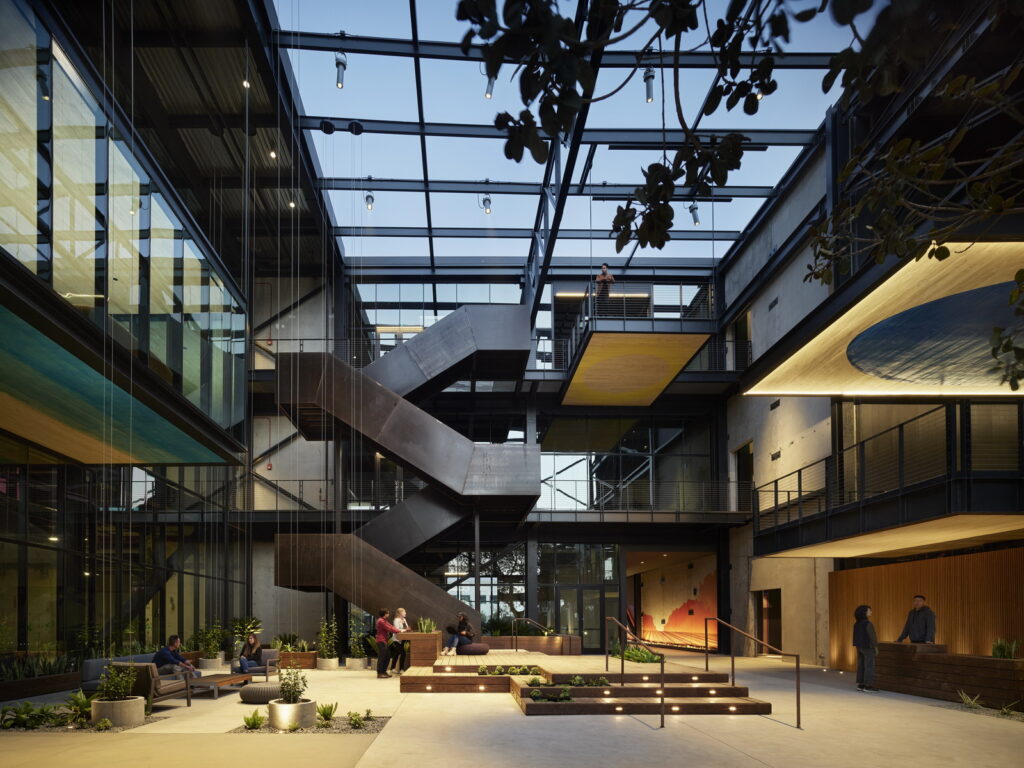
Industrial details elevate The Press above most commercial spaces one finds in the American suburbs.

Part of this is due to the sense of history that is preserved in the space. As the architects explain in their project notes, “precise cuts through precast concrete walls and roofing bring in fresh air, daylight and views. This subtraction exposes the beauty of the existing, reviving what has since been neglected and inviting the landscape to enter in through and around the campus.” Like a repurposed Bushwick warehouse, or even a Parisian arcade, The Press preserves a sense of place that pushes against the anonymity of “cookie cutter” suburbs. 

Some of the details in this project are just extraordinary. As the architects explain, “The design celebrates both material and organic markers of time. Paint chips, rail spurs and conveyor belts are left as is and an existing tree is placed to grow through the structure itself — hinting at history, site and context.” My favorite detail is probably the rail trail, a partly shaded walking path that follows the course of a former rail line. Like the now iconic New York High Line, the Rail Trail repurposes outdated infrastructure in a way that both feels perfectly natural and encourages health and interaction. 
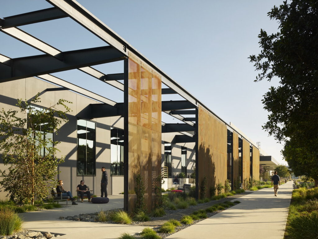
The Rail Trail gives Costa Mesa, California its own version of the High Line. A stunning feature of the project is that its campus extends over 23 acres.

Time will tell how The Press evolves with its environment. Currently, the complex has fifty-five tenants, including a number of incredible artisans and local restaurants. My hope is that, with this project, Ehrlich Yanai Rhee Chaney Architects have created a template for a new kind of suburban redevelopment, one that works with existing architecture to imprint the faceless suburbs with a vibrant sense of place. 

The latest edition of “Architizer: The World’s Best Architecture” — a stunning, hardbound book celebrating the most inspiring contemporary architecture from around the globe — is now available. Order your copy today.  

Reference

Harvesting the Skies: 6 Modern Architectural Designs that Revitalize Rainwater Management
CategoriesSustainable News

Harvesting the Skies: 6 Modern Architectural Designs that Revitalize Rainwater Management

Judging for the 11th A+Awards is now underway! While awaiting the Winners, prepare for the upcoming Architizer Vision Awards, honoring the best architectural photography, film, visualizations, drawings, models and the talented creators behind them. Learn more and register >

The history of rainwater harvesting stretches back millennia, with evidence of its practice in ancient civilizations such as Mesopotamia, Egypt and Rome. A testament to human ingenuity, these early societies recognized the importance of capturing and storing rainwater to ensure a stable water supply, especially in arid regions. As cities grew and centralized water systems developed, rainwater harvesting took a back seat, only to be revived in the face of modern challenges.

Today, as the world grapples with the impacts of climate change and increasing water scarcity, architects and engineers are revisiting the potential of rainwater harvesting in contemporary design. This sustainable water management solution serves to conserve resources and alleviate the burden on overtaxed municipal systems, reduce energy consumption and mitigate flood risks.

Advancements in technology and materials have paved the way for innovative rainwater harvesting systems, ranging from simple rooftop catchment setups to complex, large-scale integrated systems. Green rooftops, permeable pavements and landscape design elements such as bioswales and rain gardens are increasingly employed in urban environments to maximize rainwater capture and infiltration. While the rise of green building certifications like LEED and BREEAM, architects are incentivized to incorporate rainwater harvesting into their designs, further propelling its adoption.


The Independent

By Rhode Partners, Austin, TX, United States

The Independent by Rhode Partners, Austin, TX, United States Photograph by Nick Simonite

The Independent by Rhode Partners, Austin, TX, United States. Photograph by Patrick Wong

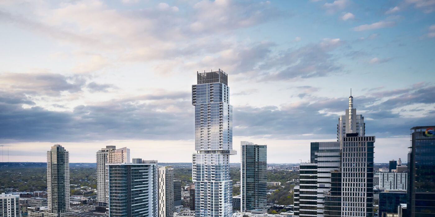
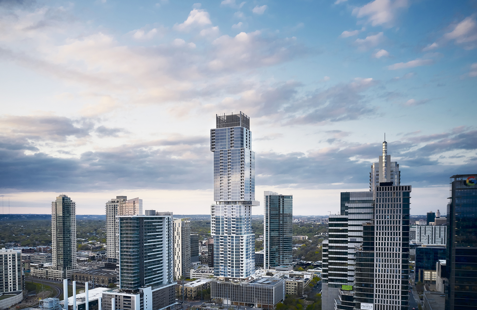
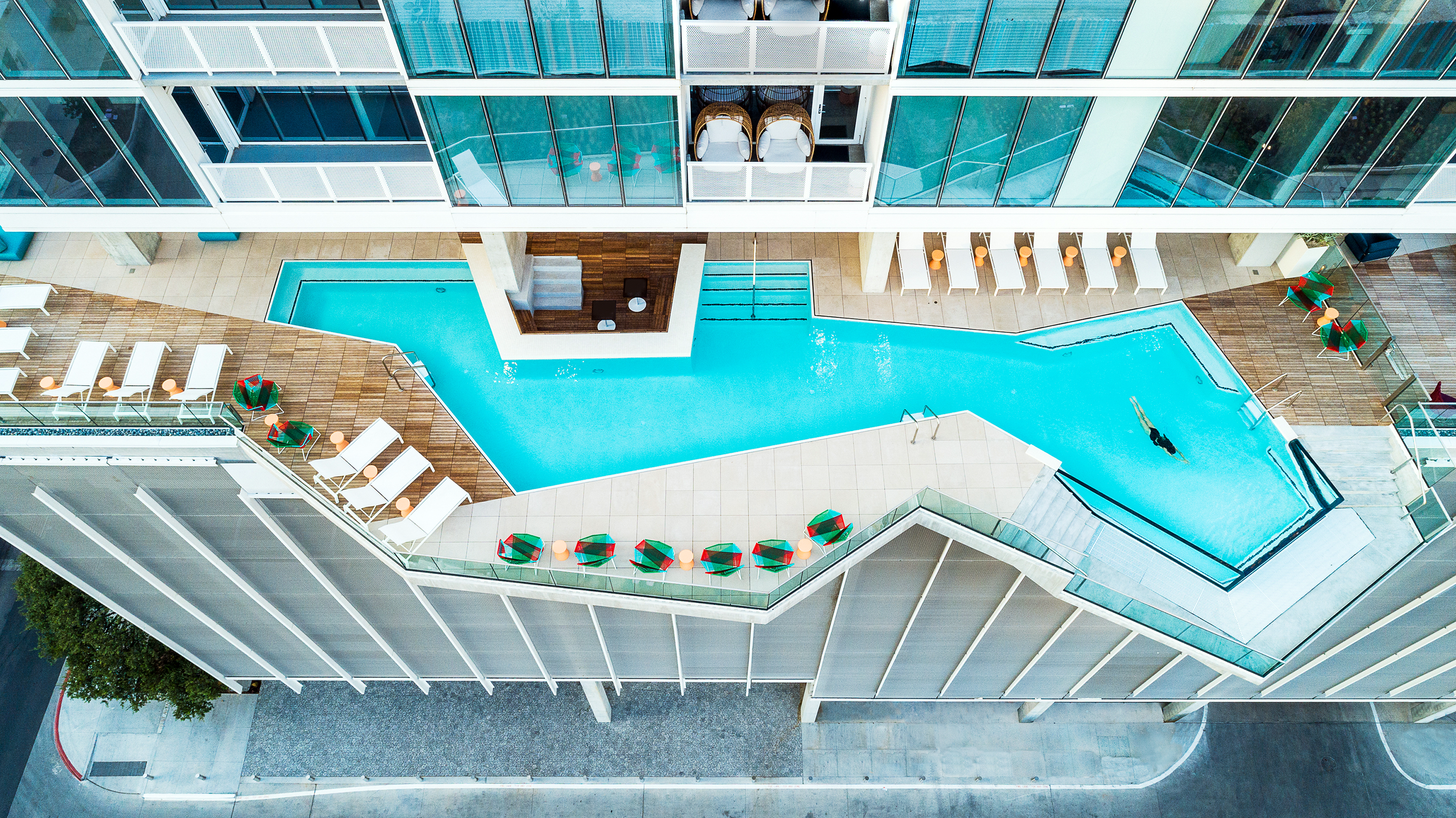
The Independent is an architectural marvel by Rhode Partners. The eco-conscious building reigns supreme in Austin’s Seaholm District as the city’s tallest LEED Gold Certified tower. This 688-foot skyscraper playfully teases gravity with its cantilevered blocks and a levitating infinity pool, while its floor-to-ceiling glass windows offer stunning city panoramas. A vertical neighborhood of 363 units, The Independent boasts 12 competitive, luxury condo amenity spaces across two floors spanning 20,000 square feet that cater to the high expectations of the tower’s residents.

At the same time, the architects endeavored to meet high levels of sustainability. Tucked within its stainless-steel mesh crown, a colossal liquid damper tank ensures stability against high-altitude winds while the pièce de résistance, a cutting-edge rainwater harvesting system and a 75-kilowatt solar power system, make this eco-friendly titan an iconic fixture in Austin’s skyline.


Fort 137

By Daniel Joseph Chenin, Ltd., Las Vegas, NV, United States

Popular Choice Winner, 10th Annual A+Awards, Residential > Residential Interiors (>3000 sq ft)

Fort 137 by Daniel Joseph Chenin, Ltd., Las Vegas, NV, United States. Photographs by Stetson Ybarra

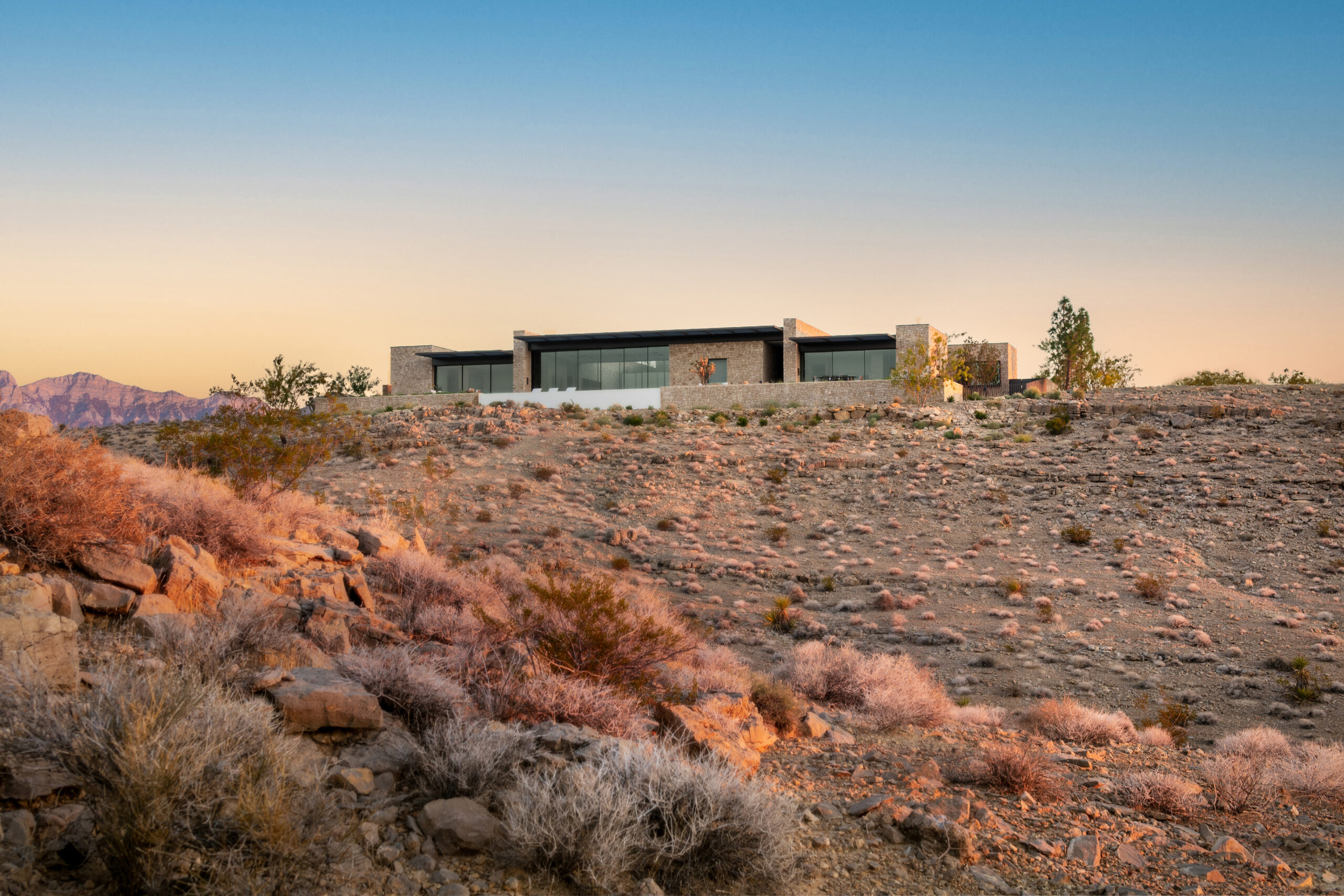
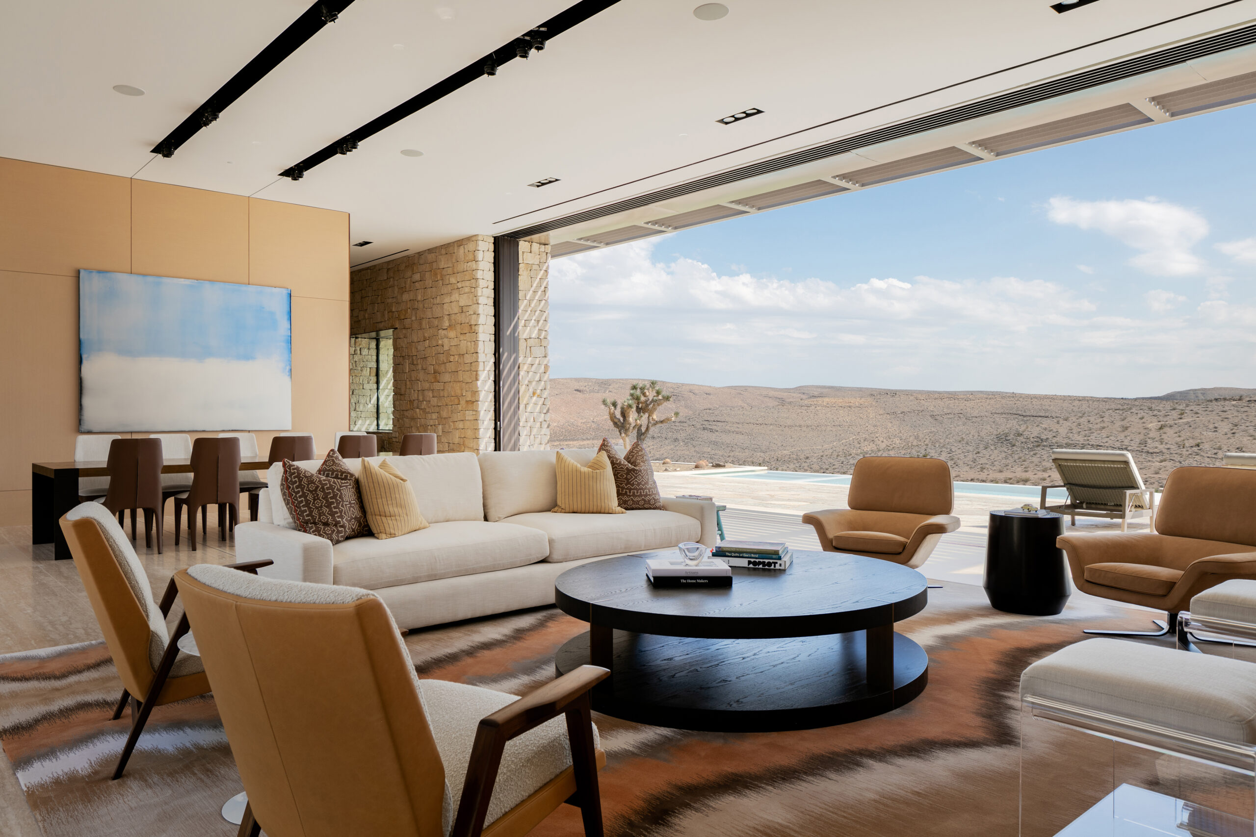
Nestled in the pristine Las Vegas Valley, this eco-conscious residence serves as a base camp for a family of nature-loving scientists. Drawing inspiration from historic fort structures, the house boasts a compact, clustered design, with each volume meticulously placed to optimize views and combat desert climate challenges.

Embracing the landscape, panoramic glass doors extend living spaces, enabling cross-ventilation and daylighting. Louvered roof overhangs provide summer shade and allow winter light penetration. A curated palette of native materials, such as weathered steel, hot rolled steel, reconstituted oak and limestone, ensures the residence ages gracefully alongside its environment.

Crucially, a state-of-the-art rainwater harvesting system elevates the home’s sustainability, conserving precious resources in the parched region. This architectural gem reduces its carbon footprint and exemplifies harmonious coexistence with nature by employing sustainable strategies like passive cooling, daylighting, thermal mass, and photovoltaic panels.


Rain Harvest Home

By Robert Hutchison Architecture, JSa Arquitectura, Temascaltepec de González, Mexico

Rain Harvest Home by Robert Hutchison Architecture, JSa Arquitectura, Temascaltepec de González, Mexico. Photo Credit Robert Hutchison

Rain Harvest Home by Robert Hutchison Architecture, JSa Arquitectura, Temascaltepec de González, Mexico. Photograph by Jaime Navarro

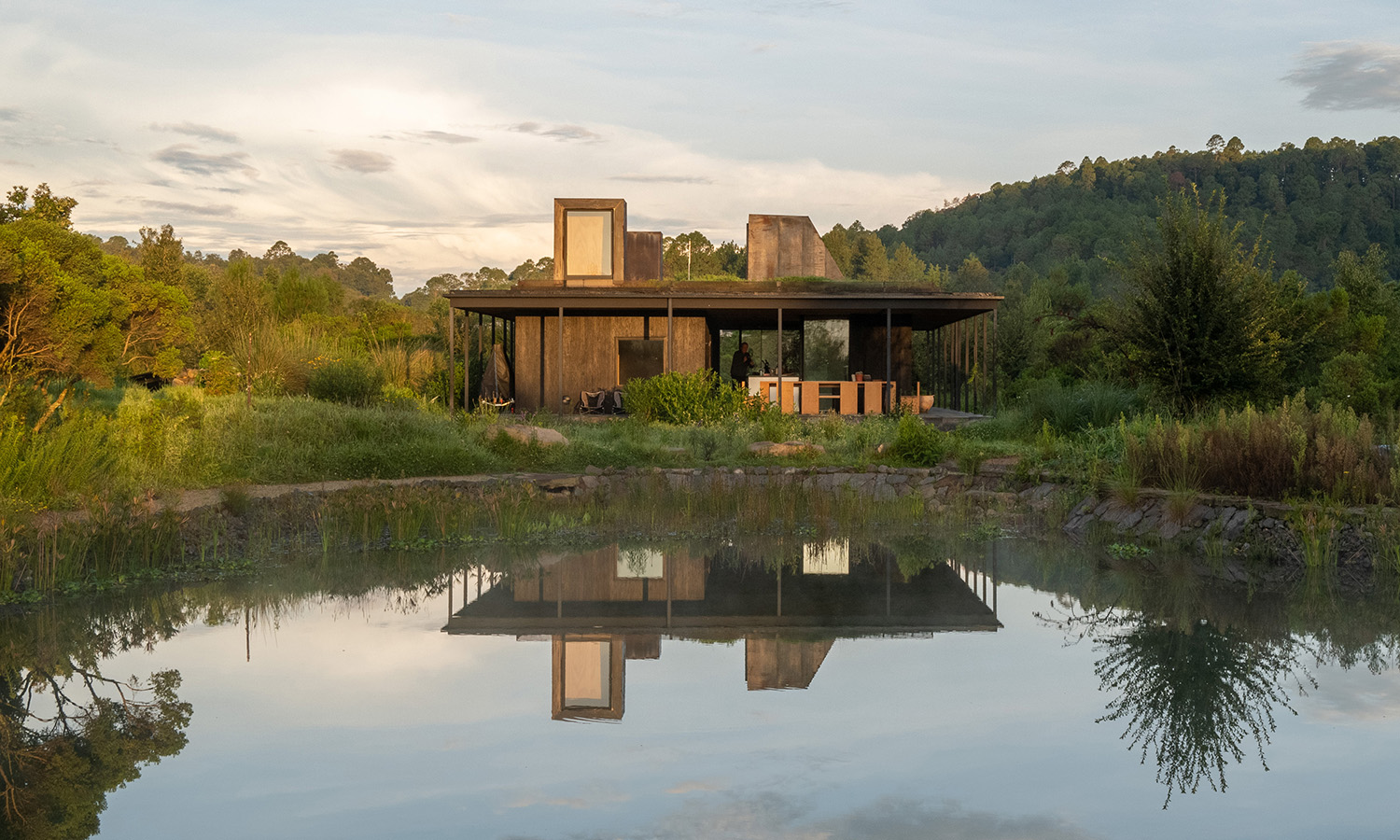
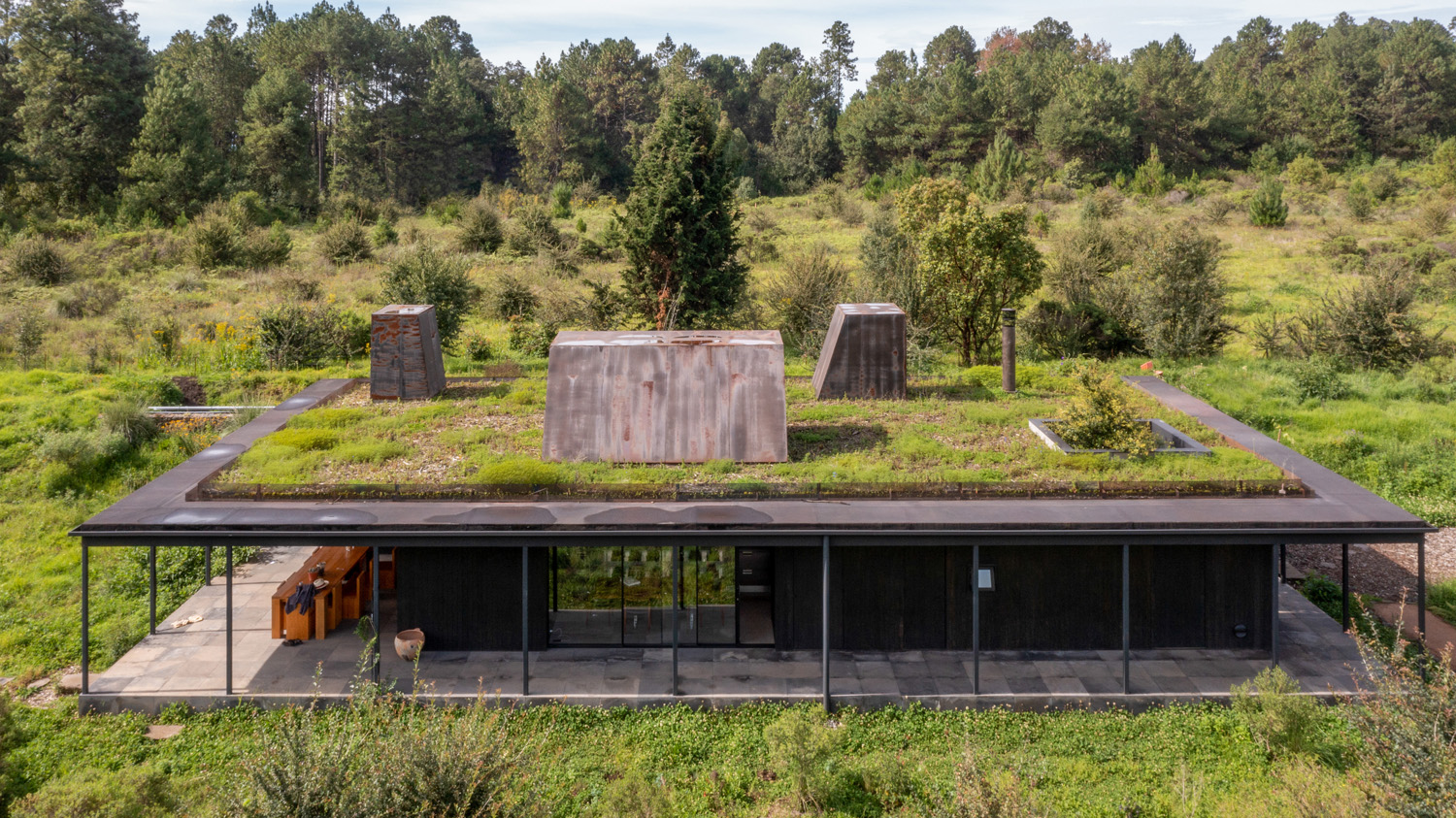
Rain Harvest Home, a collaborative creation by Robert Hutchison Architecture and JSa Arquitectura, is an experiential abode in the mountains west of Mexico City. Comprising three porous wooden structures, the residence embraces the landscape and embodies a regenerative design that addresses water scarcity in the region. Each building collects rainwater, supplying the home with 100% of its water needs year-round through an on-site reservoir and treatment system.

As part of the visionary 450-acre La Reserva el Peñón development, Rain Harvest Home exceeds the requirement to harvest rainwater for 60% of its water needs. Walking trails between the buildings double as bioswales, while the site also boasts a bio-agriculture garden, emphasizing the family’s commitment to living in harmony with nature.


House in the Countryside

By Herreros Arquitectos, Artà, Spain

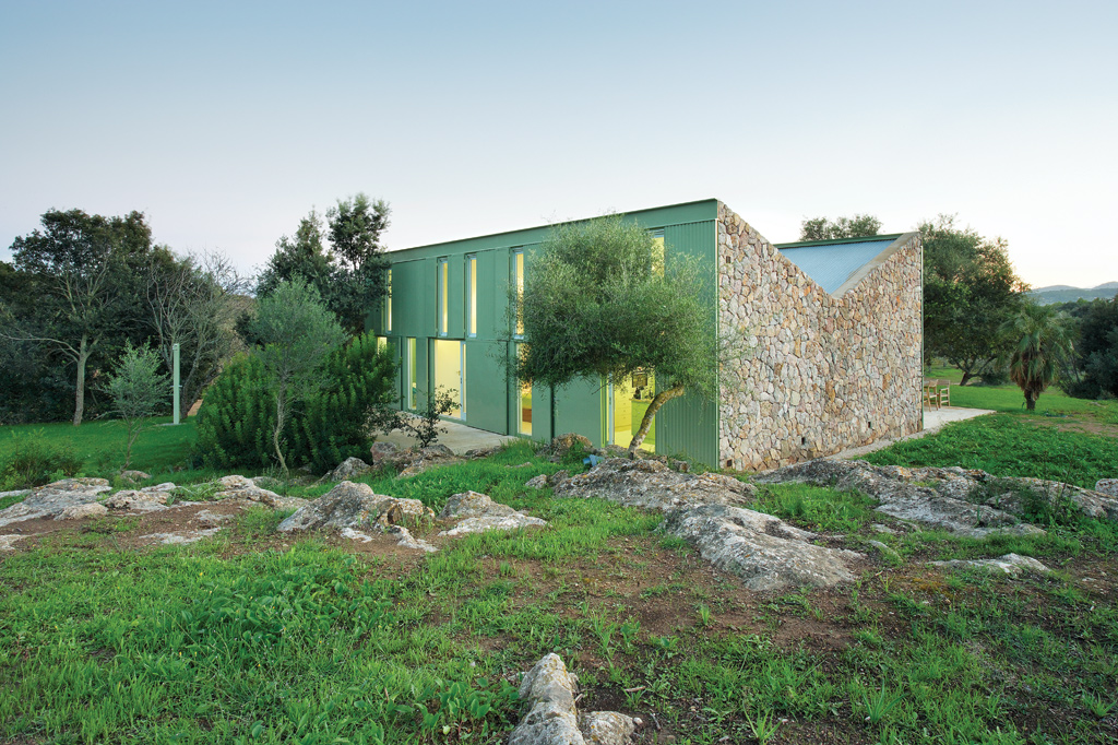
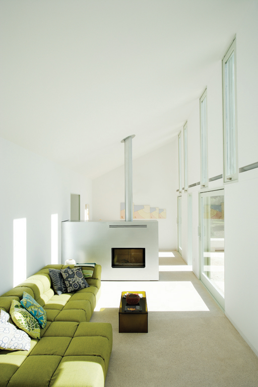
House in the Countryside by Herreros Arquitectos, Artà, Spain. Photographs by José Hevia

House in the Countryside, a project by Herreros Arquitectos in Artà, Spain, brilliantly transforms a former shepherd’s refuge into a charming occasional-use residence. The design replicates the original structure symmetrically, preserving its intelligent orientation, ventilation and water collection facilities. The dry-constructed outer wall fosters a dialogue with the local climate through independent systems of openings and shutters.

The interior retains the original compartments, each housing a single primary object defining its function. The inverted roof facilitates natural cross-ventilation that is adjustable to create an ideal climate. Notably, the rainwater harvesting system is preserved and optimized, with the dual-slope roof directing water to the original gutter and cistern, upholding the spirit of the initial construction.


U House, Ericeira

By Jorge Graca Costa, Ericeira, Portugal

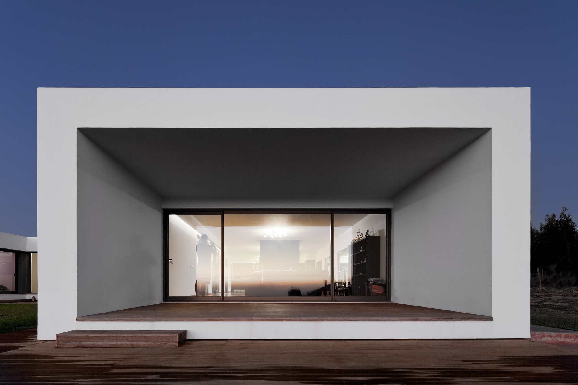
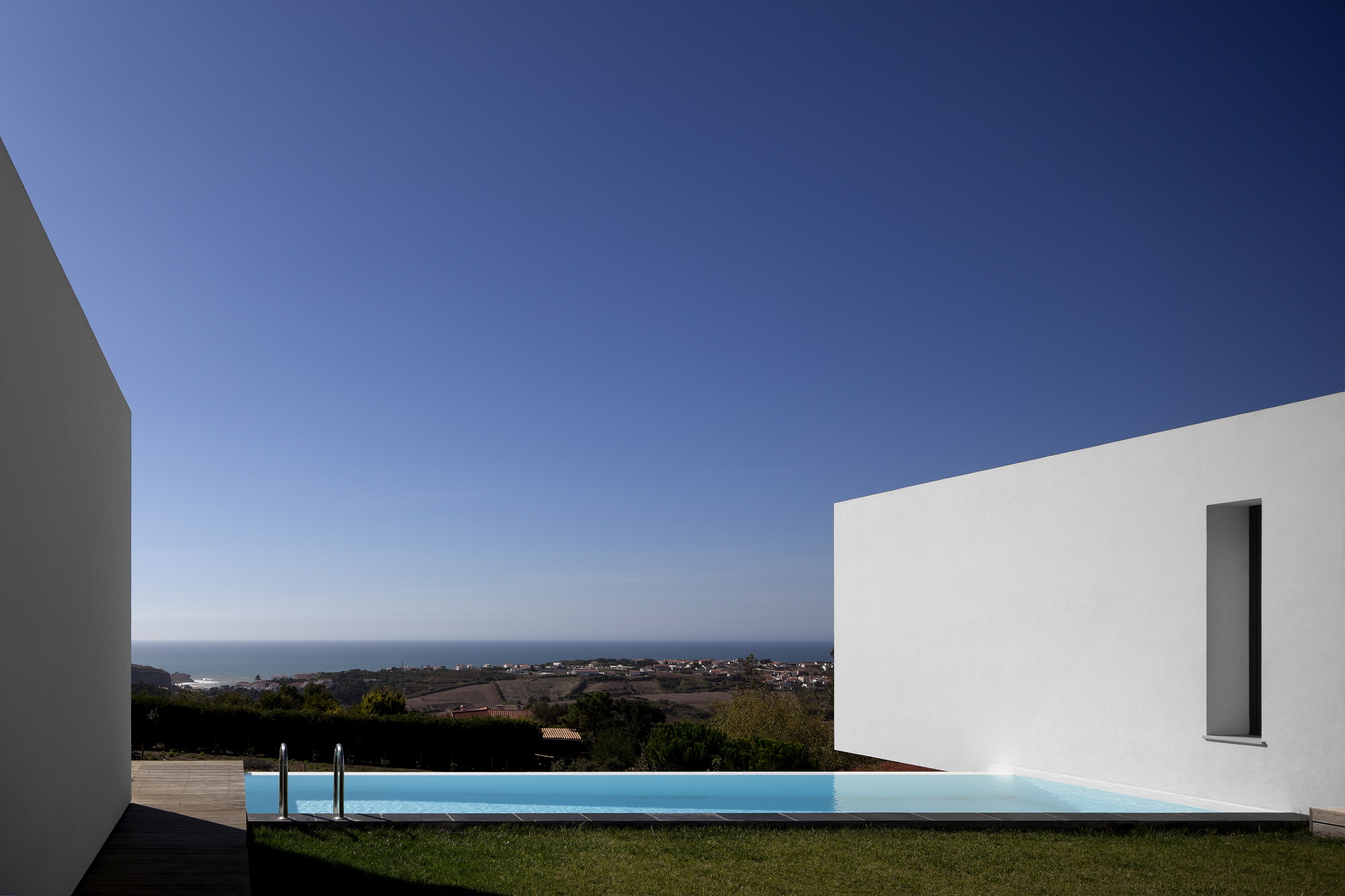
U House, Ericeira by Jorge Graca Costa, Ericeira, Portugal. Photographs by Fernando Guerra, FG + SG

U-House, perched atop a hill in Ericeira, Portugal, is a sustainable residence designed by architect Jorge Graca Costa for a professional surfer and his family. Inspired by traditional Mediterranean courtyard houses, the structure protects against the region’s windy climate while offering captivating views of San Lorenzo Bay.

A dense mesh of trees surrounds the 300-square-meter home, and its layout frames the bay view and moderates the courtyard’s climate. A grassy area, decked patio, and non-chlorinated pool heated by solar and biomass energy create a harmonious outdoor space.

Sustainability is integrated seamlessly into the design, combining eco-friendly features without sacrificing aesthetics or functionality. The house is constructed with cork insulation and benefits from passive design for natural heating and cooling. Solar panels are used for floor and water heating, with additional support from biomass heating. The microclimate environment created by the patio and chemical-free pool further contributes to the eco-friendly design.

Rainwater harvesting plays a crucial role in the home’s sustainability; a pre-existing well is used for collecting rainwater for irrigation purposes. With numerous green features, the U-House boasts an A+ energy rating from the National Energy Agency, showcasing the success of blending architecture with prescriptive performance design in a comfortable, livable space.


Tucson Mountain Retreat

By D U S T, Tucson, AZ, United States

Tucson Mountain Retreat by DUST, Tucson AZ, United States. Photographs by Jeff Goldberg

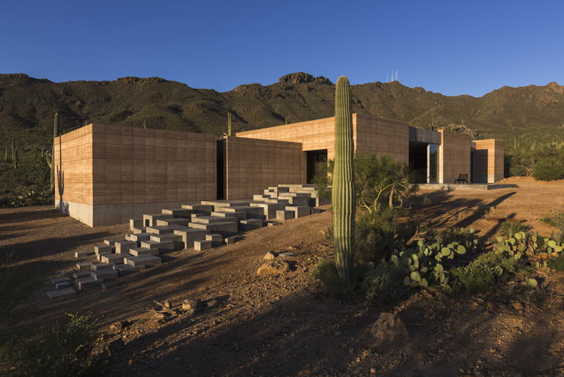
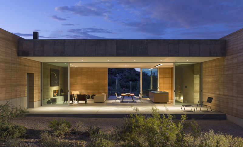
The Tucson Mountain Retreat in the Sonoran Desert is a thoughtfully designed home that minimizes environmental impact while maximizing connections to the mystical landscape. The house is constructed primarily of Rammed Earth, an eco-friendly material with excellent thermal mass properties. The design comprises three distinct zones for living, sleeping, and music recording/home entertainment, which can only be accessed by stepping outside and traversing the desert landscape. This separation ensures acoustic isolation and continuous interaction with the natural surroundings.

A 30,000-gallon rainwater harvesting system supplies water for all household uses, while solar heat gain is reduced by orienting the house along an east-west axis and minimizing openings on the east and west facades. South-facing patios and deep overhangs provide unobstructed views, passive heating, and cross-ventilation. When the floor-to-ceiling sliding glass doors are opened, the house and desert merge into one seamless, boundless space.

Judging for the 11th A+Awards is now underway! While awaiting the Winners, prepare for the upcoming Architizer Vision Awards, honoring the best architectural photography, film, visualizations, drawings, models and the talented creators behind them. Learn more and register >

Reference