Ringo Studio positions sex toys in athletic-themed room for Contact Sports
CategoriesInterior Design

Ringo Studio positions sex toys in athletic-themed room for Contact Sports

Brooklyn-based Ringo Studio has reimagined the experience of shopping for sex toys, creating a store in New York modelled on a collegiate locker room.

The Contact Sports shop on Mercer Street in Soho is designed to feel very different to the typical spaces in which products for sex are purchased.
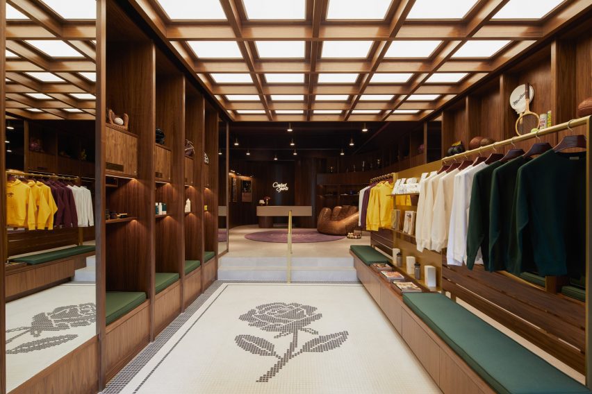
Store interior with walnut shelving and mosaic floor
The store interior features walnut panelling and mosaic flooring

“In a survey conducted before launch, the majority of people reported feeling uncomfortable walking into a sex store,” said the studio. “Uninviting exteriors felt intimidating, the aisles were hard to navigate, and the shelves stocked hundreds of products that were hard to decipher.”

Working with Ringo Studio founder Madelynn Ringo – who has designed retail spaces for Glossier, Bala and Our Place – the brand devised a shopping experience based around sport, and used cues from this world to inform the interiors.
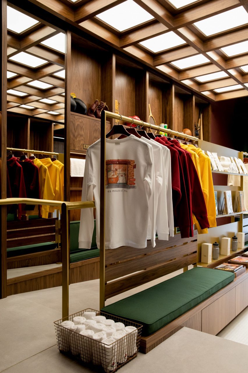
Merchandise displayed on brass rails and shelving
Merchandise is displayed on brass rails and shelving

The retail space includes an area at the front that sells long-stem roses in singles or bundles, including a 15-foot (4.5 metre) wall on which the fresh-cut red flowers are stored.

Beyond, dark walnut panelling, brass rails and shelves, and green cushions give the store a collegiate atmosphere, while mosaic floor tiles and baskets of towels evoke a locker room.
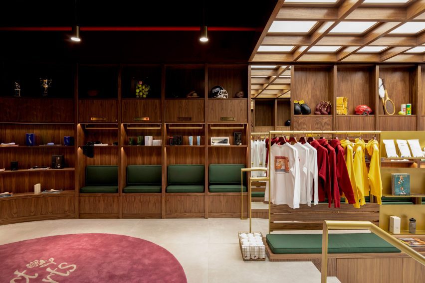
Walnut panelling forms cubby holes for displaying products
Walnut panelling forms locker-like cubby holes for displaying products

Vintage sporting ephemera like tennis rackets, boxing gloves and American football helmets are displayed on higher shelves.

Below, the selection of “entry-level gear and sensual gifts” from brands such as Kiki de Montparnasse, Lelo, Dame, Maude, Future Method and more are merchandised in locker-style cubbyholes.

“Contact Sports flips the traditional model on its head and takes a more curated approach, stocking only 70 products at launch,” the studio said.

“Their team spent more than a year vetting a category that includes tens of thousands to offer only the best of the best, with unexpected touches that enhance the full experience around the sport.”
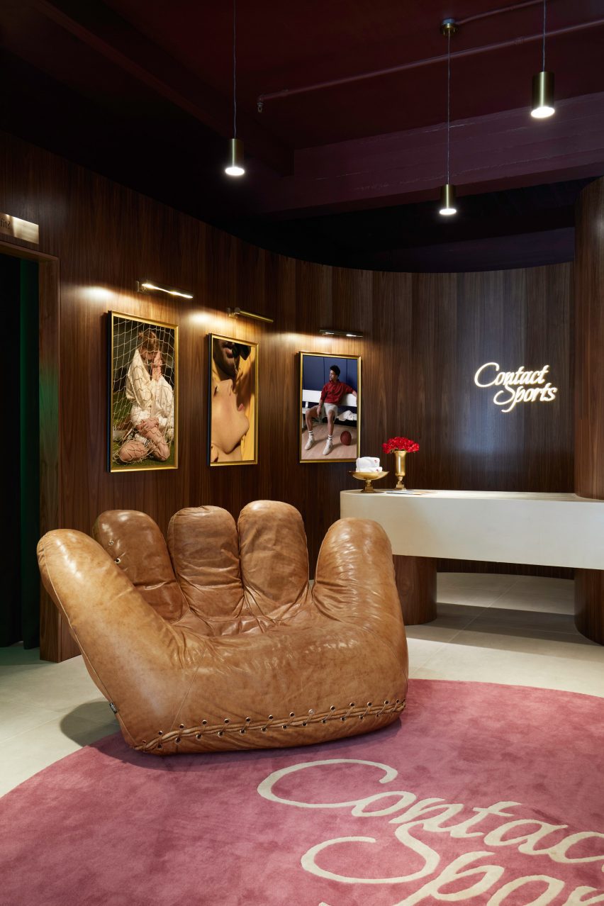
Jonathan de Pas baseball glove chair in front of counter
The store features a Joe Chair shaped like a baseball glove

The space is illuminated from above by a light box behind a wooden lattice, while softer lighting is installed in the cubbies.

An iconic chair shaped like a giant baseball mitt by designers Jonathan de Pas, Donato D’urbino and Paolo Lomazzi sits next to the white counter, above which the brand’s cursive logo glows in neon.
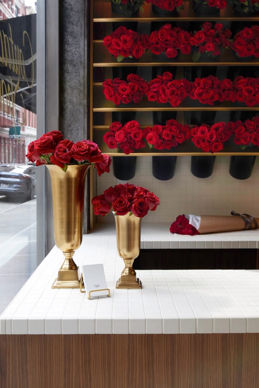
Long-stem red roses displayed in trophy-like vases
Long-stem red roses are sold at the front of the store

The sex toy industry has grown significantly in recent years, as taboos have broken and social acceptance has widened. See some of the most unusual sex toys featured on Dezeen.

However, “the retail experience itself had yet to evolve,” said the Contacts Sports team, which hopes the store will change how shopping for sex gear should look and feel.

The photography is by Anna Morgowicz.

Reference

Ringo Studio completes colourful store for Our Place in Los Angeles
CategoriesInterior Design

Ringo Studio completes colourful store for Our Place in Los Angeles

Brooklyn-based Ringo Studio designed a store for kitchenware brand Our Place that features colourful tile displays and expressive drapery that hangs from the ceiling.

The Our Place Melrose store is the brand’s second location in Los Angeles, following the inaugural shop in Venice, and is situated in West Hollywood’s busy shopping district.

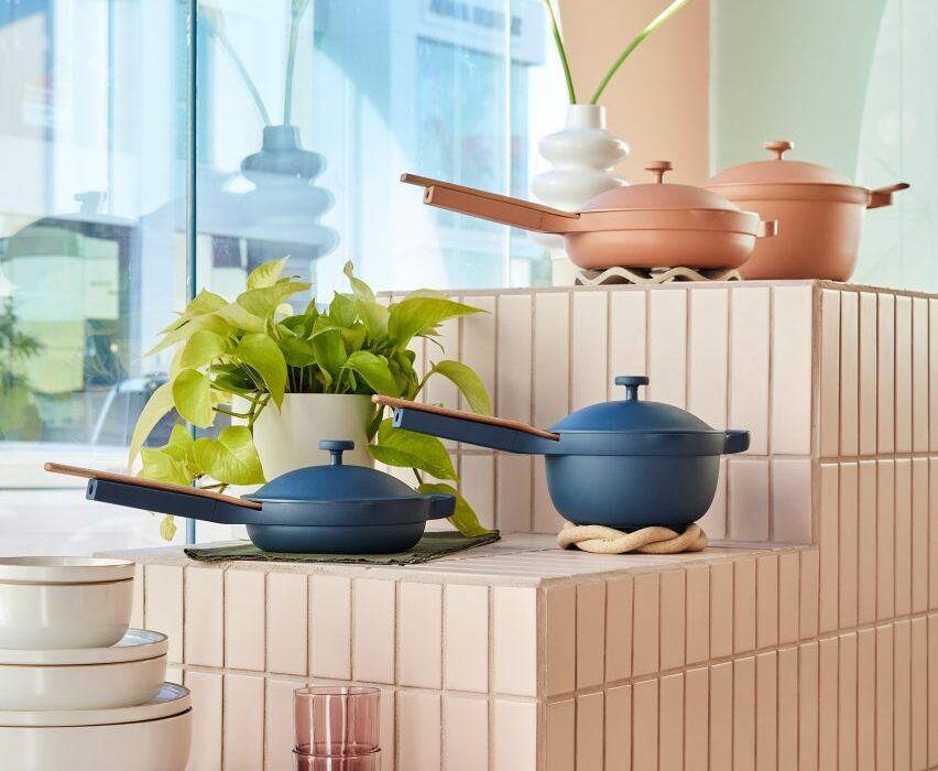
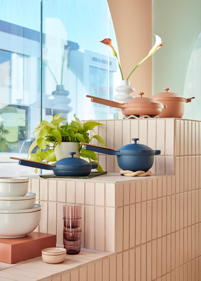
Our Place pots and pans displayed on a tiered stand covered in cream tiles
The Our Place store is designed to showcase the brand’s colourful cookware

The interiors by Ringo Studio are based on the identifiable colour palette of Our Place cookware sets, which are known for in a variety of pastel, neutral and jewel-toned hues.

“It retains the warmth and intricacy of Our Place’s first store in Venice, concepted by Mythology, while also taking Our Place’s design ethos into new and unique expressions,” said the team.

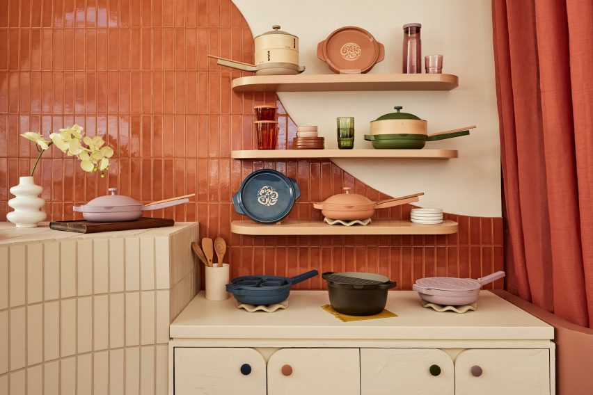
Cookware displayed on three shelves and cabinets below, against a tiled wall
Many of the surfaces are covered in long rectangular tiles laid in a straight stack pattern

Elements derived from classical architecture were included, from fluted columns that support a wavy-topped table to arches that curve over shelving units and form punctured openings for showcasing small items.

Storage cabinets have rounded corners, as do the doors that front them, and many of the built-in elements also feature filleted edges.

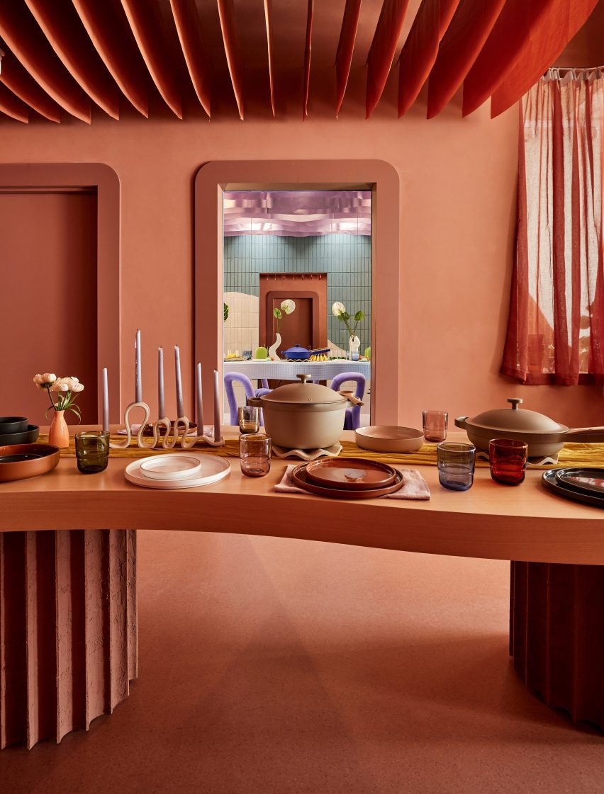
An entirely terracotta-coloured space with a dining table laid with Our Place products
At the back is a space coloured entirely terracotta, which features a table displaying the brand’s products

Long rectangular tiles laid in straight stack patterns cover several of the walls and display stands.

Each tiled block or surface is a different colour, with large panels including terracotta, lilac and cream, and smaller sections in pale blue and green.

An area towards the back is decorated entirely in terracotta, which covers the floor and walls, as well as matching strips of fabric hung in rows from the ceiling.

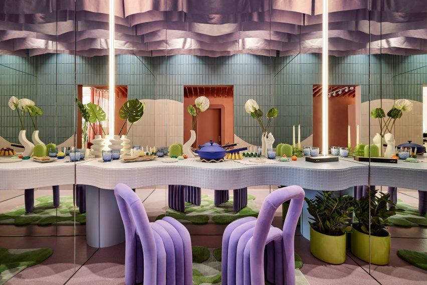
There’s also a side room where Our Place products are laid out on a dining table with mirrors on three sides, creating infinite reflections intended to “welcome everyone to have a seat at the table”.

A small room with a dining table and two purple chairs, with mirrors on three sides
A side room features mirrors on three sides to create infinite reflections of a dining table setup

Covered in mosaic tiles and with an undulating front, the table is accompanied by a pair of purple velvet chairs, and from the ceiling hangs purple drapery.

“Infused with the cozy feeling of home, the streamlined suite of products are artfully displayed throughout the store, making them feel like chic, sculptural objects,” said the Our Place team.

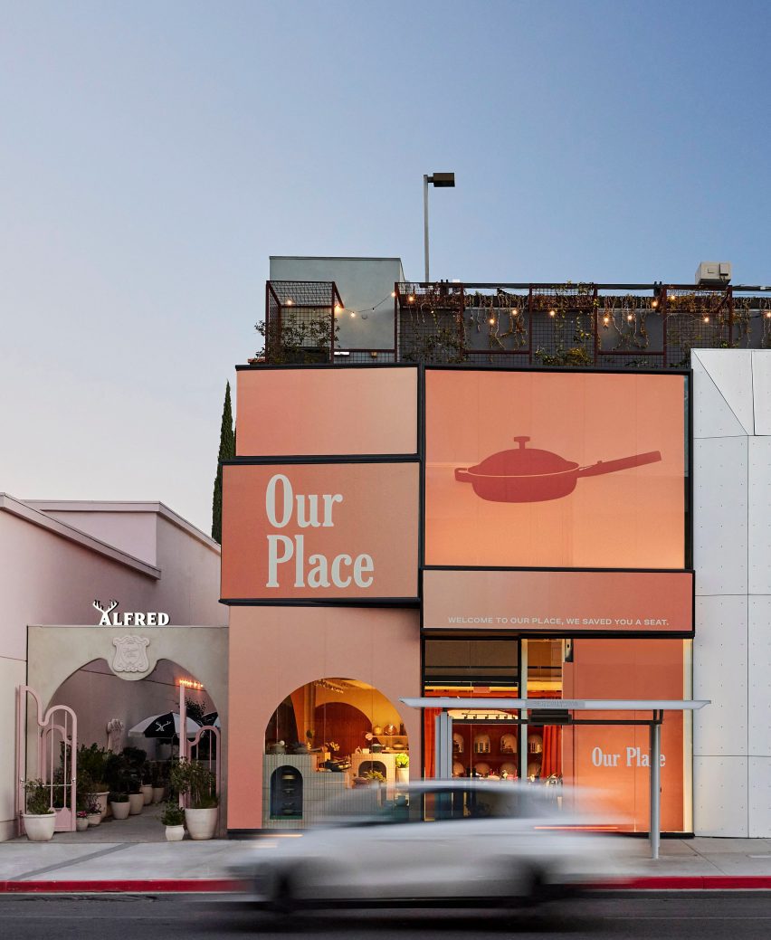
The exterior of the Our Place store on Melrose Avenue
Our Place Melrose is located in West Hollywood’s busy shopping district and is the brand’s second location in LA

Ringo Studio was founded by architectural designer Madelynn Ringo, who has created retail experiences for companies such as Glossier, Studs and Funny Face Bakery.

Last year, the studio completed a store for fitness brand Bala in New York City, which includes scaled-up versions of its products.

The photography is by Jenna Peffley.

Reference