Markus Benesch designs Alpine Rising home for tuntschi doll
CategoriesInterior Design

Markus Benesch designs Alpine Rising home for tuntschi doll

A vengeful doll from an Alpine folk tale was the imagined occupant of this colourful cabin-style home created by German designer Markus Benesch at Milan design week.

The maximalist Alpine Rising installation featured decorative Alpine-style furniture and multi-coloured wall coverings, all filled with references to life in the mountains.

Benesch developed the design after becoming fascinated by the fabled character of the “tuntschi” doll.
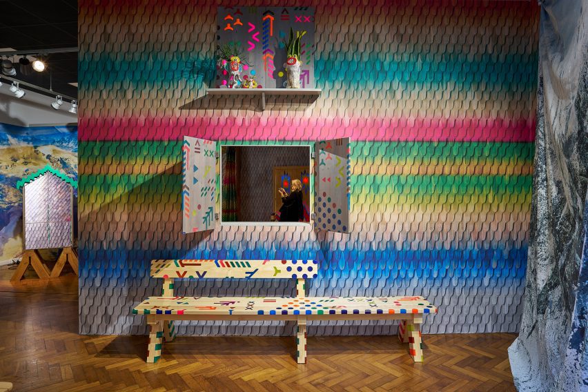
Bench in Alpine Rising exhibition by Markus Benesch
The exhibition featured Alpine-style furniture and multi-coloured wall coverings

According to the story, the tuntschi is fashioned out of wood, straw and cloth by herdsmen who spend the summer tending cattle on the mountain and crave female company.

The doll comes to life, yet the herdsmen continue to objectify her. So when the time comes for them to return home, she takes murderous revenge on one of them.

This got Benesch thinking about what happens after the story finishes.
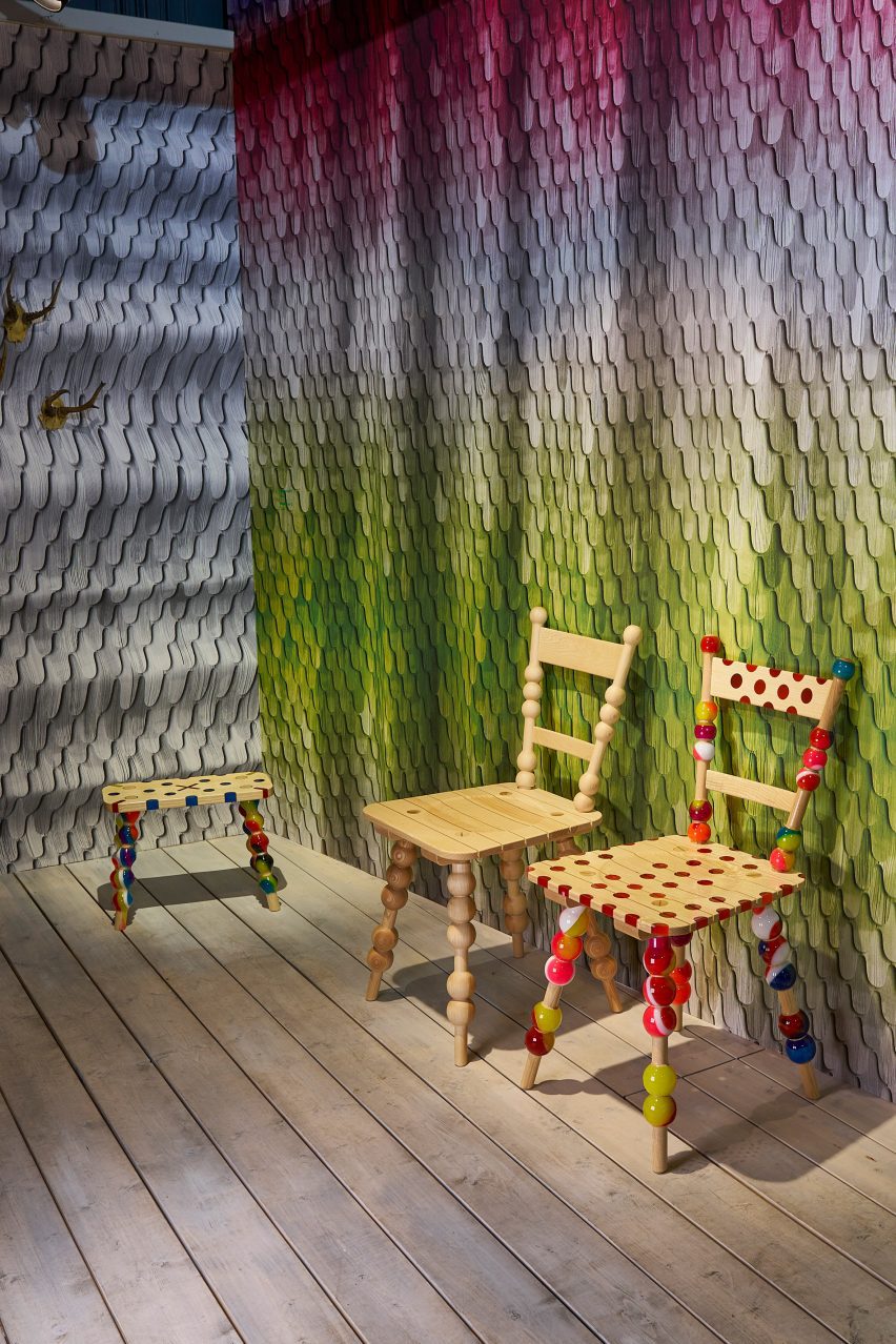
Chairs at Alpine Rising exhibition by Markus Benesch
Stui dining chairs and Hockerl stools both combine ash wood with colourful resin

“I wondered, what is this doll doing when she is alone in the wintertime?” he told Dezeen. “I thought, maybe she has the time of her life.”

One of the starting points for the design was to think about the types of pastimes that the doll might enjoy.
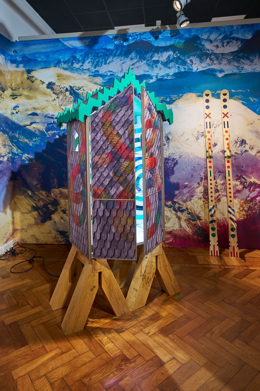
Cabinet in Alpine Rising exhibition by Markus Benesch
The Tuntschis Chapel cabinet is based on traditional Alpine architecture

One idea was that she might ski. This resulted in swirling motifs – reminiscent of snow tracks – that appeared throughout, plus a pair of bespoke skis.

Benesch also thought the doll might take up pottery, which led him to the work of Austrian ceramicist Florian Tanzer, founder of Vienna-based studio Luma Launisch.

Tanzer’s rough and enigmatic ceramics often depict unusual characters.

For Alpine Rising, he created vases and vessels that integrate the face of the tuntschi. Some pieces had more than one face, in reference to her two-faced nature.
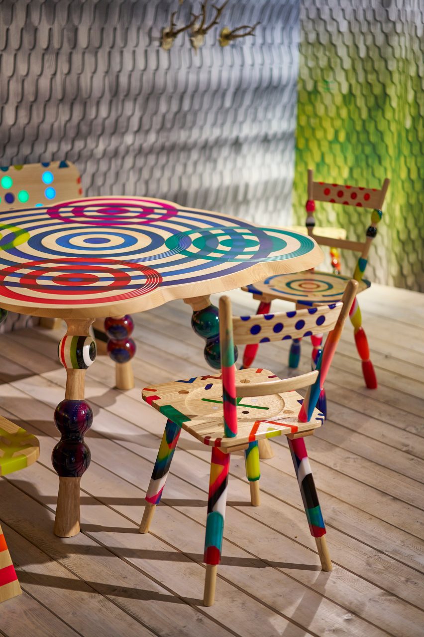
Dining table in Alpine Rising exhibition by Markus Benesch
The wallpaper combines images of wooden shingles with different colours and tones

Benesch and his small-production furniture, textile and wallpaper company Curious Boy created a completely custom interior for the tuntschi’s Alpine cabin.

Divided into rooms, it was filled with farmhouse-style furniture pieces that combined traditional Alpine woodcraft with colourful motifs typical of Benesch’s designs.

Benesch creates these patterns by inlaying wood with pigmented resin.
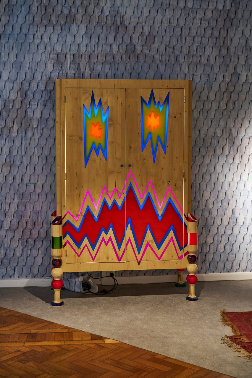
Wardrobe at Alpine Rising exhibition by Markus Benesch
The zigzag-patterned Hochzeitsschrank wardrobe was crafted from pine

In ash wood, designs on show included the cabin-style Tuntschis cabinet, the elaborate Himmibed and the playful Stui dining chairs.

Walnut was used for the amorphous Splügen lamp, while the zigzag-patterned Hochzeitsschrank wardrobe was crafted from pine.
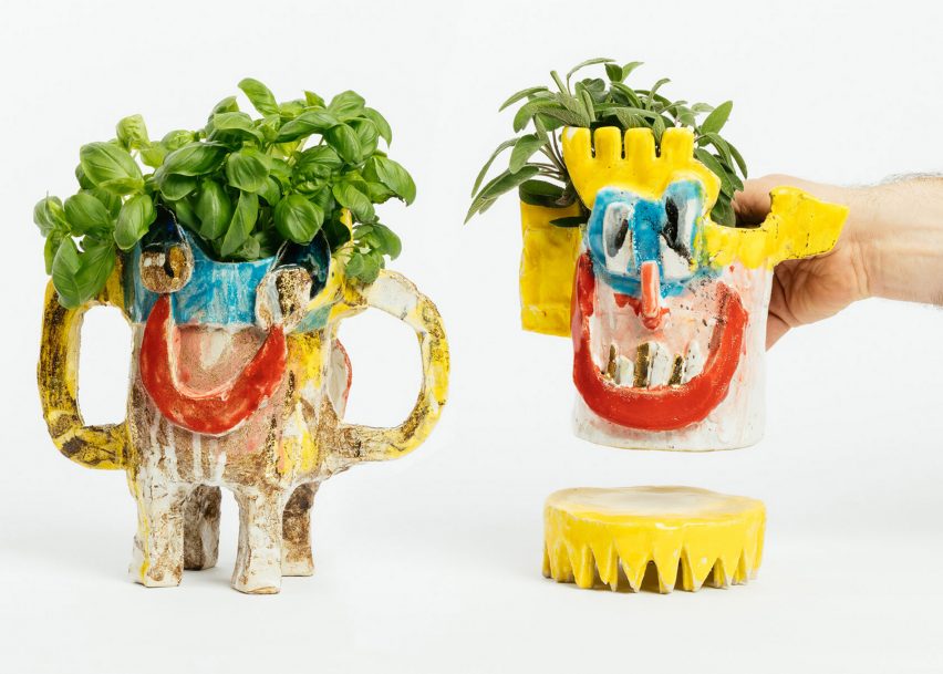
Ceramics by Florian Tanzer
Florian Tanzer created ceramics that refer to the two-faced nature of the doll

For the wallpaper and textiles, Benesch created repeating patterns using images of wooden shingles that typically clad Alpine chalets, then overlaid them with various colours and tones.

Underlying the entire design was an idea about getting away from today’s digital world and the harmful effects it can have on mental health, and instead celebrating “an analogue lifestyle”.
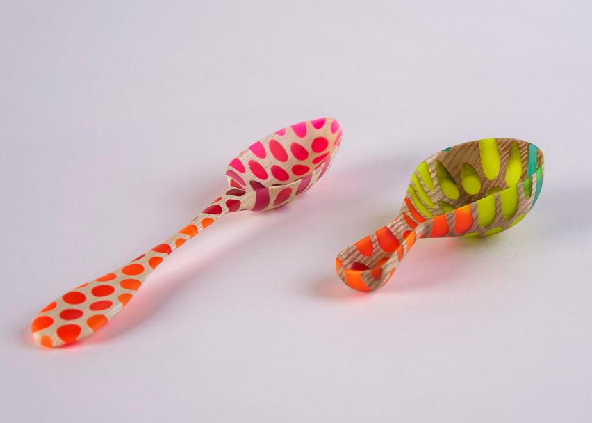
Alpine Rising spoons
Benesch also produced hand-carved ash and walnut spoons

This idea was emphasised by hand-carved ash and walnut spoons and a pack of custom-designed playing cards.

“We want to disconnect from the crazy of our today’s world and reconnect more with ourselves in nature,” added Benesch.

The exhibition formed part of the 5Vie district during Milan design week, where other exhibitions included Artemest’s L’Appartamento, a 1930s apartment redesigned by six different studios.

Following Milan design week, we collected ten standout installations and projects on show during the week.

Alpine Rising was on show from 15 to 21 April 2023 as part of Milan design week. See Dezeen Events Guide for more architecture and design events around the world.

Exhibition and furniture photography is courtesy of Markus Benesch Creates. Ceramic photography is by Gregor Hofbauer.

Reference

Round Up: Contextualizing the Rising Trend in Ring-Shaped Housing
CategoriesSustainable News

Round Up: Contextualizing the Rising Trend in Ring-Shaped Housing

Have your say in which architects will take home Architizer’s prestigious A+Awards: Public Voting opens this spring. Interested in next year’s program? Subscribe to our newsletter for updates.  

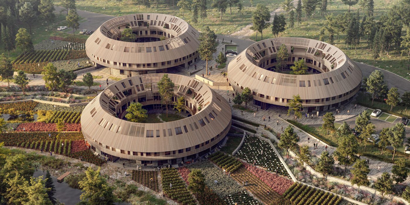
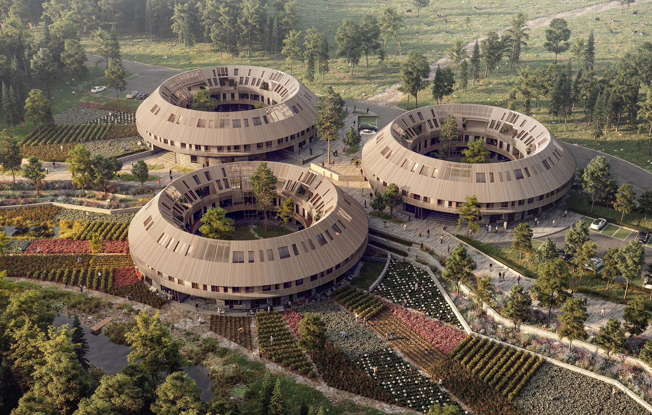
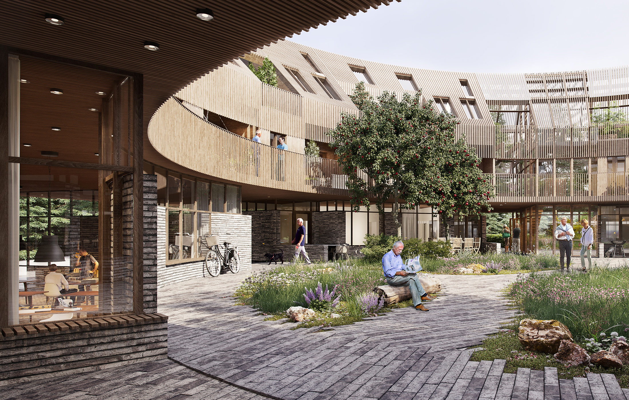
Recently, The Almanac by Sweco Architects Denmark made headlines for its conceptual community-centric approach to housing. Evoking themes associated with its namesake, the proposal features ring-shaped housing blocks with a large courtyard at its core. The lower floor of the building features cafes and other recreational spaces, tying it with the communal exterior spaces. The core also acts as the cultural center for each structure. The upper floor has a continuous balcony that connects to individual homes, all placed adjacent to each other along the ring form.

The Almanac by Sweco Architects Denmark

Like chawls found in Western India, the connected balcony on the exterior encourages neighbors to interaction. Additionally, the corridor on the inner side also forces people to walk by each other’s homes. Simply walking past the windows of other neighbors increases the chances of impromptu conversations and sharing of meals. Unlike apartments in big cities, it is almost impossible to not know who your neighbors are in this typology. Given the curved form, residents have the opportunity to interact with neighbors across the rings as well as those in the central garden.

The circular form has long been popular in architecture. Vernacular dwellings across the world were rounded, perhaps as an imitation of shapes and geometries found in the natural environment. But this form had several advantages as well. In comparison to a square or rectangular perimeter, a circular exterior has a lesser surface area, helping thermal conditions in cold climates. This shape also allowed for more connection points between the roof and the walls, making them stronger. These homes are also more resistant to strong winds, snow and earthquakes.

Image by ming yang via Pixabay

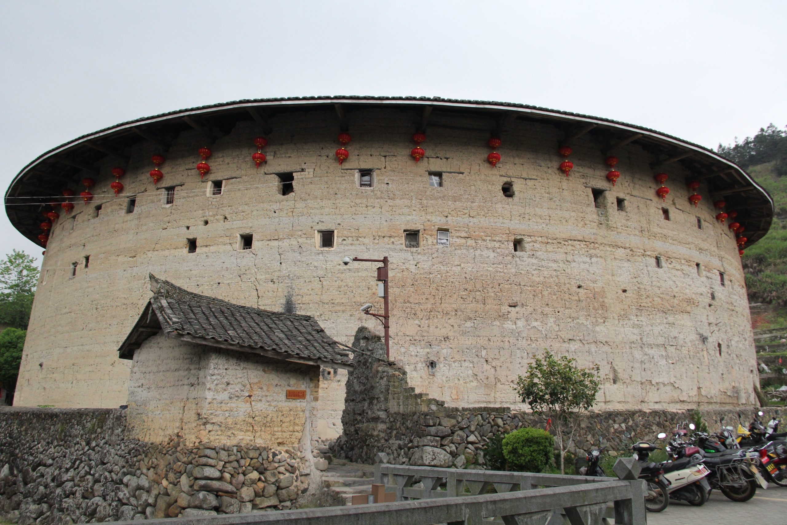
Over time the form of such buildings has evolved. Using a donut shape for multi-unit housing dates back to the 12th Century. The Tulou is a ring-shaped home made by the Hakka community in the Fujian province of China is one of the most well-known examples. There were some rectangular ones but the ring shape remained more popular. Given its robust walls and limited entrances, its structure was both built to protect its inhabitants and foster community living.

The building had small windows on the outside but was opened up inside. Each Tulou could have two to four floors. Made from thick load-bearing earthen walls, each building could easily house about 800 people along with other community spaces such as halls, wells and storerooms. Each Tulou was created for one Hakka clan and their extended family to live together. The uniform sizes of each home unit inside underscored the overarching design theme: unity.

Image by limo23 via Pixabay

In addition to protection and interaction, these structures were also very sustainable (primarily due to its durability). Today, these rammed earth structures are still standing. It should be noted that they have a minimal carbon footprint; in additional to sustainable material sourcing, the material structure itself also helps to regulate the temperature within. Furthermore, the unique donut shape allows ample light to enter the homes as well as in the common spaces, reducing the need for man-made light sources. There is also good circulation of the air through the entrances and the courtyard.

Apart from vernacular housing, the circular form with multiple units also found different uses through the 18th century. One such example is the Narrenturm in Vienna. The structure, built in 1784, was designed to accommodate psychiatric patients. This shape was thought to be helpful when trying to look at the occupants of the whole building from the center.

This idea was also the foundation for the conceptual Panopticon prisons, imagined by Jeremy Bentham. The building was to house prisoners in cells across the external ring and have a central watchtower for guards to observe prisoners from, much like an internal panorama. Fortunately, the use of the form has now reverted back to private homes, apartment complexes, museums and even commercial buildings.

62M by 5468796 Architecture, Winnipeg, Canada

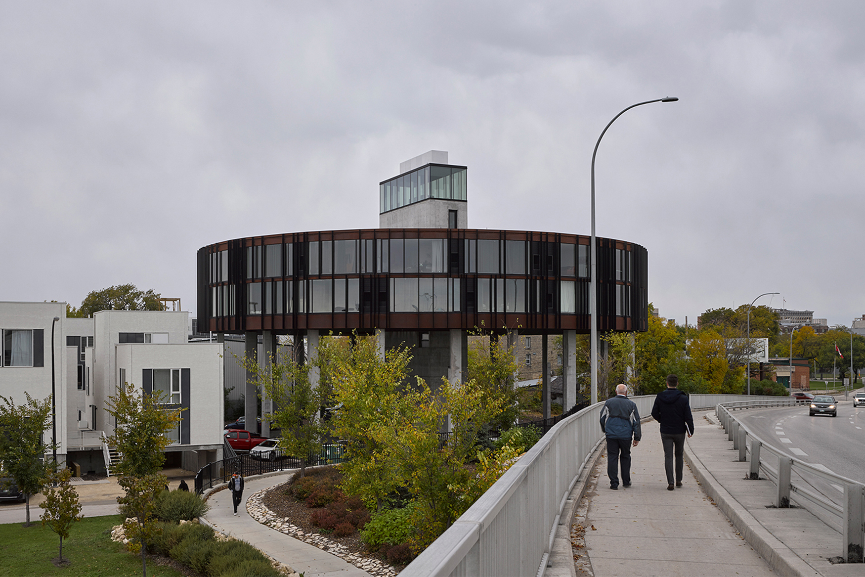
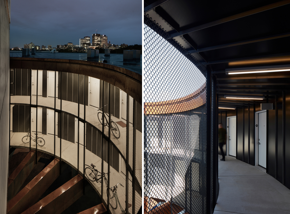
Today, we’re seeing a renewed interest in this unique building footprint, and the idea of building a round housing structure is now popping up in cities across the world. Take, for example, 62M, a housing dormitory in Winnipeg, which resembles a flying saucer. The disk-shaped structure stands on tall columns to provide better views from the 40 studios within and help with climatic conditions.

The entrance of the building as well as the circulation elements are located at the center. Additionally, the continuous corridor was devised to reduce the alienation caused by connectors with dead ends and present opportunities for the residents to meet their neighbors. The circular form also reduces the external surface area, thereby making heating spaces more efficient in cold winters.

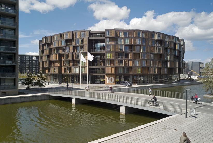
Tietgen Dormitory by Lundgaard & Tranberg Architects, København, Denmark

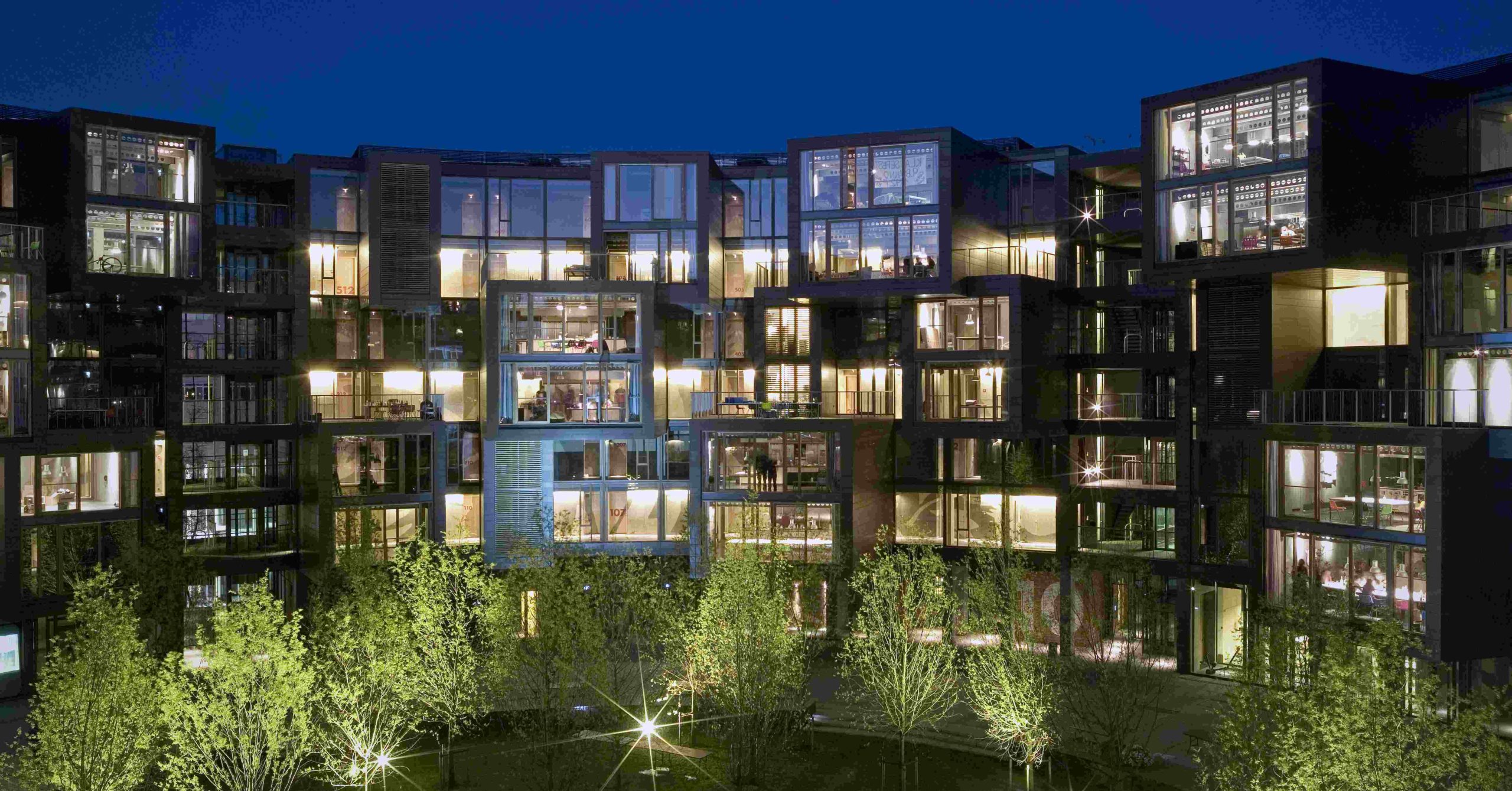
Similar themes are seen in the Tietgen Dormitory in Denmark. The structure comprises 360 residential units along the perimeter as well as some community spaces along the internal surface. Unlike previous structures in the article, homes in this dorm are staggered to create a sense of individuality. Several apartments are grouped together with a common community space that protrudes to help it stand out. While there is no common corridor inside, the circular form allows for increased visual connectivity.

The ring a ring a roses by GVultaggio

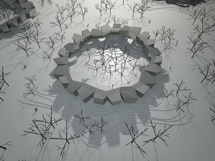
Lastly, a competition entry proposes a housing structure that increases interaction with the landscape as well as other residents. The different homes in the ring are placed at different heights and enclose the central space, creating a secured courtyard. The spaces on the lower level are classified as day-time functions whereas the upper level is for night-time or private functions.

All of these new structures draw on historic precedents but also bring new 21st century insights into the fold. While ringed housing complexes may never be a dominant residential floorplan in our cities, the host of design benefits suggest that this upward trend will bring more user-friendly, community-building housing stock to urban areas in the coming years.

Have your say in which architects will take home Architizer’s prestigious A+Awards: Public Voting opens this spring. Interested in next year’s program? Subscribe to our newsletter for updates.  

Reference