Lattice volume in Dende Duratex House by NJ Studio
CategoriesInterior Design

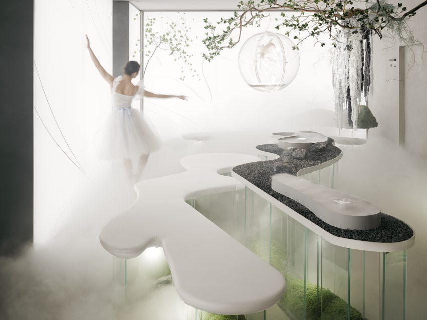
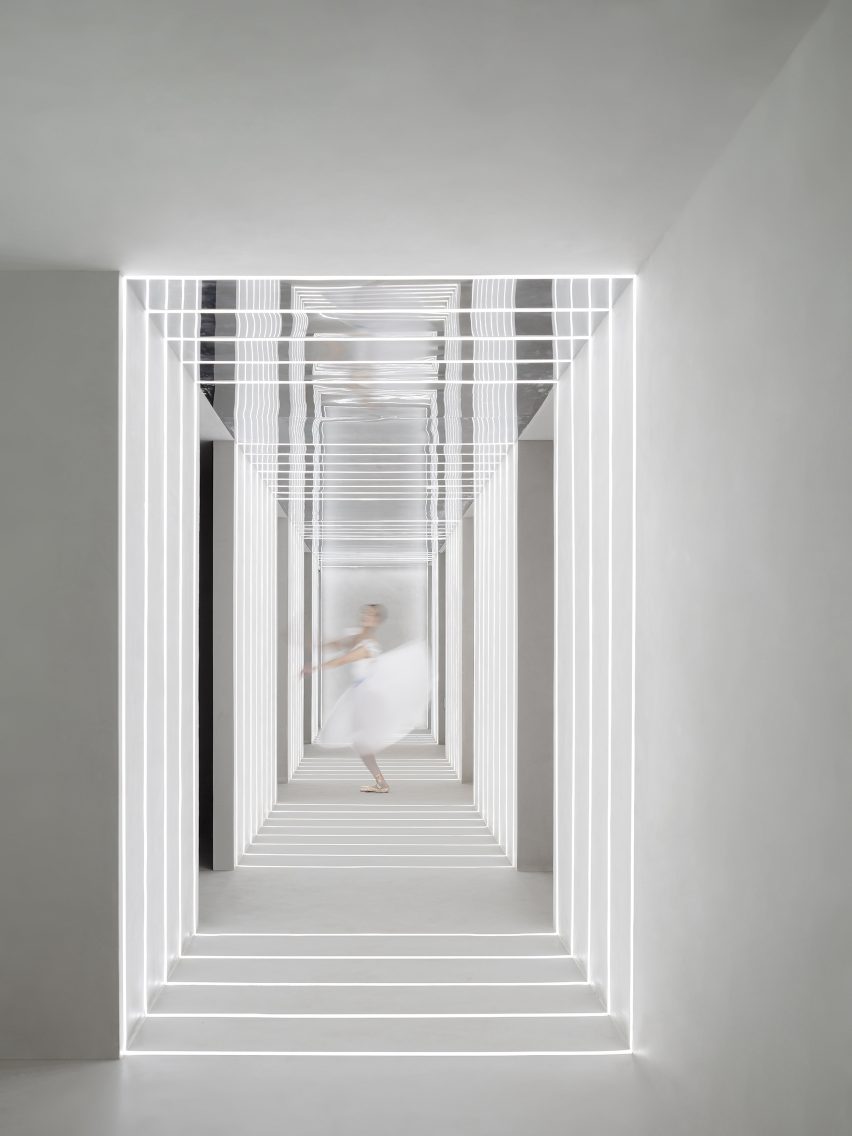
Eight interiors that use lattice screens as walls and room dividers

Lattice volume in Dende Duratex House by NJ Studio

For our latest lookbook, we have selected eight interiors that use lattice screens to conceal and divide spaces without blocking sightlines.

Lattice screens can come in a variety of materials and provide a versatile alternative to solid walls and room dividers, offering a way to create privacy between two spaces while still maintaining a connection between them.

From concealing bathrooms to establishing connections between interior and exterior spaces, this lookbook presents eight different ways in which lattice screens have been used in residential, hotel and restaurant interiors.

This is the latest in our lookbooks series, which provides visual inspiration from Dezeen’s archive. For more inspiration see previous lookbooks featuring period home renovations, open-plan interiors characterised by bold dining tables and interiors with reclaimed materials.


Lattice volume in Dende Duratex House by NJ Studio
Photo by Denilson Machado

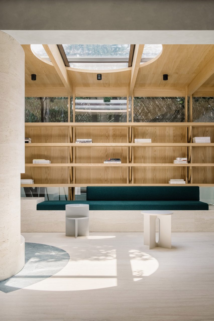
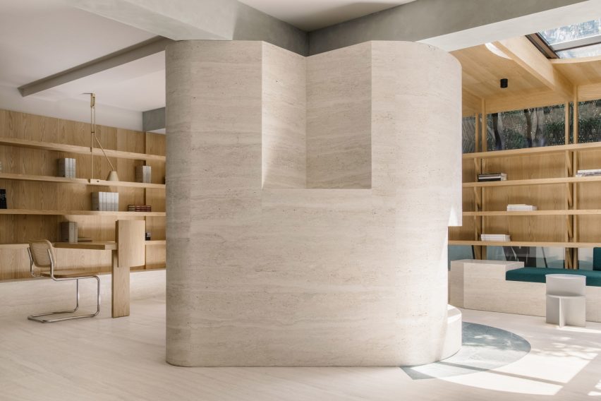
Dendê Duratex House, Brazil, by NJ+

Brazilian architecture studio NJ+ took cues from Bahia, the Brazilian state that studio founder Nildo José grew up in, to create the interior of Dendê Duratex House. Here, it integrated a white latticework structure that separates the living space from the bedroom.

The volume encompasses the one-bedroom apartment’s bathroom and kitchen amenities while introducing texture to the monochrome minimalist home.

Find out more about Dendê Duratex House ›


P Duplex interior with lattice guardrail by Pitsou Kedem
Photo by Amit Geron

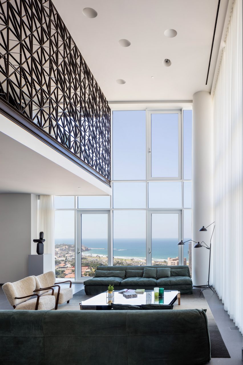
P Duplex apartment, Israel, by Pitsou Kedem Architects

The second floor of this apartment in Tel Aviv was transformed into a mezzanine that overlooks a double-height living and dining room by local practice Pitsou Kedem.

A black metal guardrail wraps the upper level, tracing the route from the staircase to the upper floor and offering security while allowing views of the floor below. The see-through lattice design features triangular shapes compiled into rectangular modules.

Find out more about P Duplex apartment ›


Sulwhasoo Flagship Store interior by Neri&Hu
Photo by Pedro Pegenaute

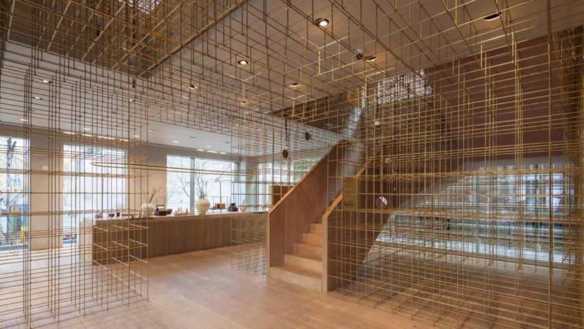
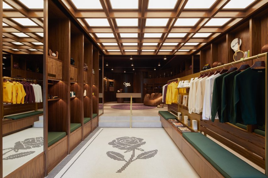
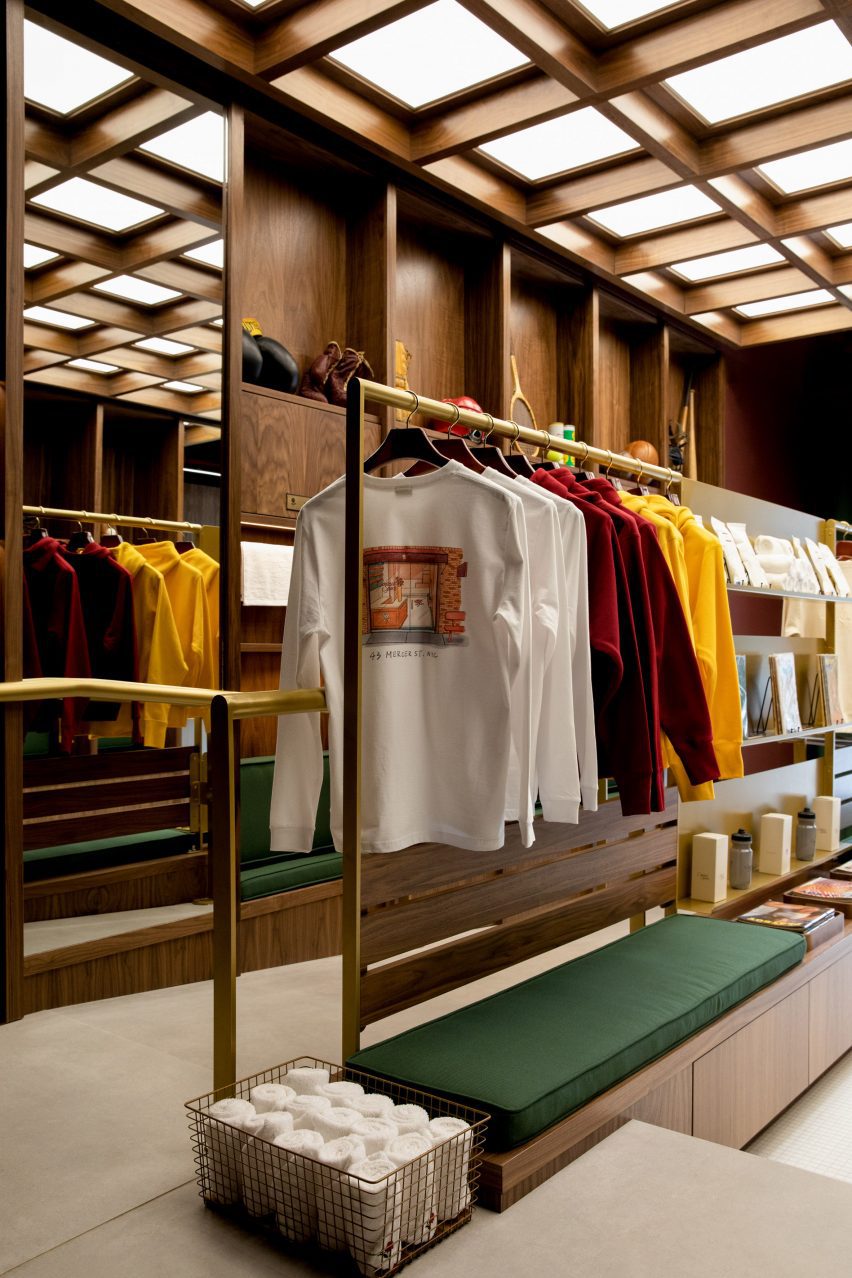
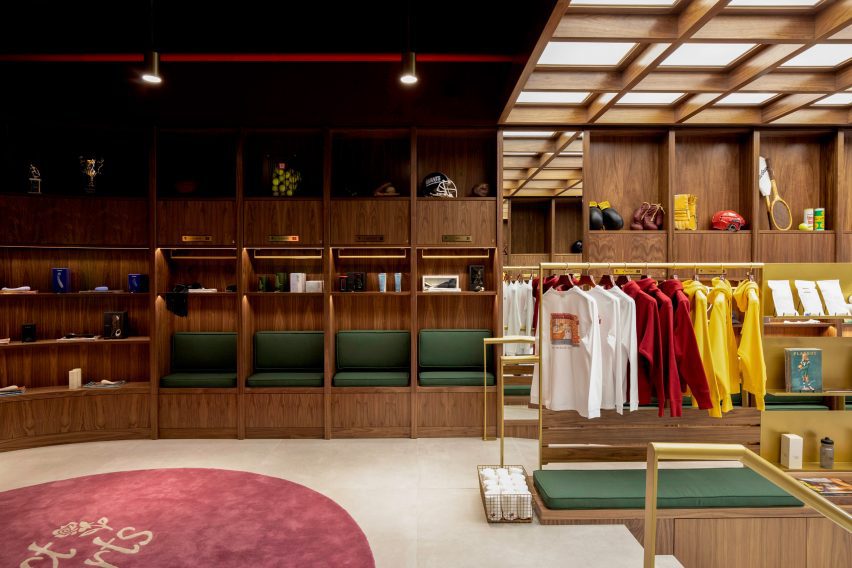
Sulwhasoo Flagship Store, South Korea, by Neri&Hu

This five-storey flagship store, designed for Korean skincare brand Sulwhasoo, is characterised by large expanses of brass rods that form a lattice network. Used throughout the store, the latticed walls form see-through room dividers as well as shelving.

The framework continues from the exterior into the interior of the store, guiding visitors through the five floors. Architecture studio Neri&Hu’s concept was informed by lanterns and their role in illuminating journeys in Asian culture.

Find out more about Sulwhasoo Flagship Store ›


Wooden lattice screen in a restaurant
Photo by Andrii Shurpenkov

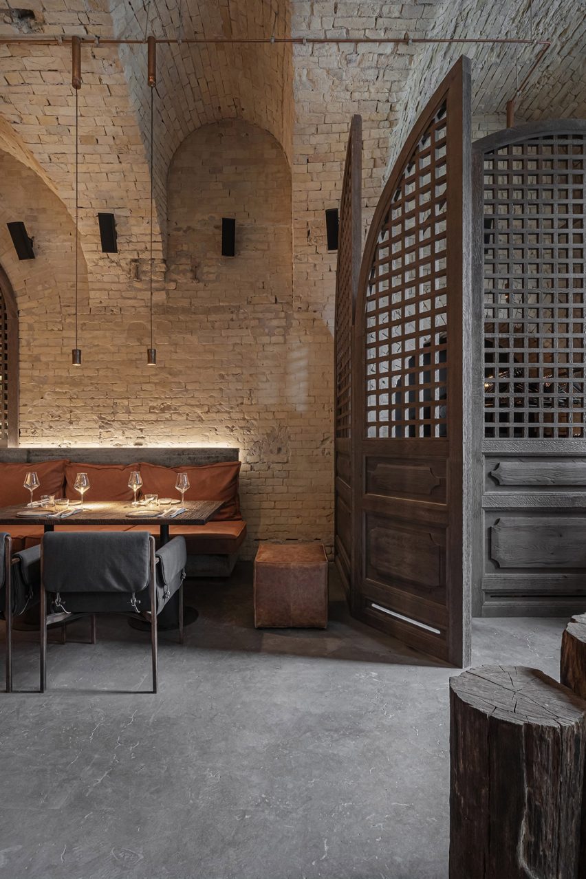
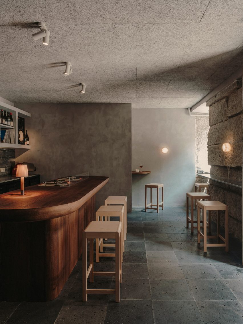
Virgin Izakaya Bar, Ukraine, by YODEZEEN

Timber screens and red metal webbed structures conceal and divide spaces within this Japanese restaurant in Kyiv, designed by Ukrainian architecture and design studio YODEZEEN.

The wooden lattice screens were introduced to soften the restaurant’s cold material palette, consisting of raw concrete and brick surfaces.

Find out more about Virgin Izakaya Bar ›


Casa Octavia boutique hotel by PPA ground floor
Photo by Luis Garvan, Luis Young and Maureen Evans

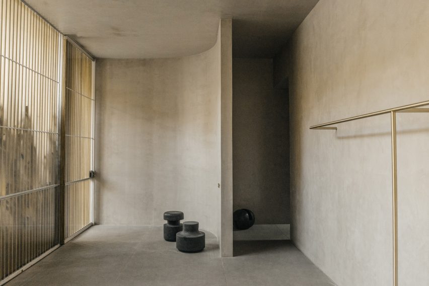
Casa Octavia, Mexico, by PPAA

Thin latticed timber screens shield this hotel’s interiors from harsh sunlight and cast intricate shadows throughout the day.

The screens aim to serve as a mediator between hotel guests and passerbys, fostering interaction between residents of the La Condesa neighbourhood in which its is located and the hotel itself, while maintaining a level of privacy.

Find out more about Casa Octavia ›


55 North bar with sliding lattice screens by Luchetti Krelle
Photo by Tom Ferguson

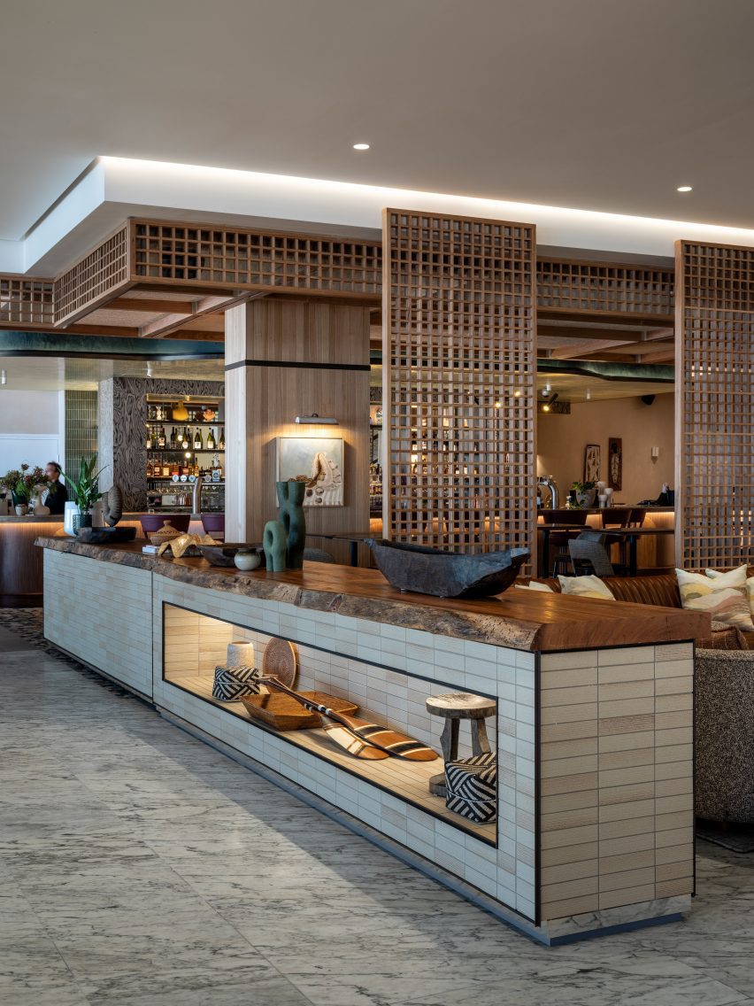
Manly Pacific, Australia, by Luchetti Krelle

Sliding lattice screens separate the reception from the bar in this hotel in Sydney, which was renovated by Australian studio Luchetti Krelle.

The partitions allow the two distinct spaces to blend together without losing their individual character, which is defined by contrasting material and colour palettes.

Find out more about Manly Pacific ›


Mimi Kakushi restaurant interior by Pirajean Lees
Photo by Maha Nasra Eddé

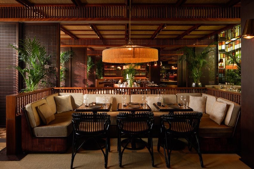
Mimi Kakushi, Dubai, by Pirajean Lees

London studio Pirajean Lees was informed by Japan’s jazz age, combining a variety of materials and textures such as beaded curtains, stained-glass windows and sliding gridded screens in this restaurant in Dubai.

The flexibility of the moveable lattice screens allows the restaurant to host events of varying crowd sizes, partitioning the open-plan layout into a variety of smaller spaces.

Find out more about Mimi Kakushi ›


Hiba restaurant in Tel Aviv features oak and granite interior
Photo by Amit Geron

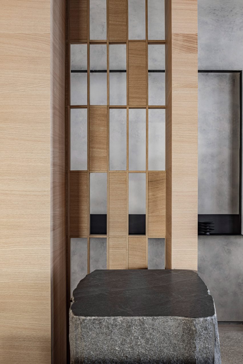
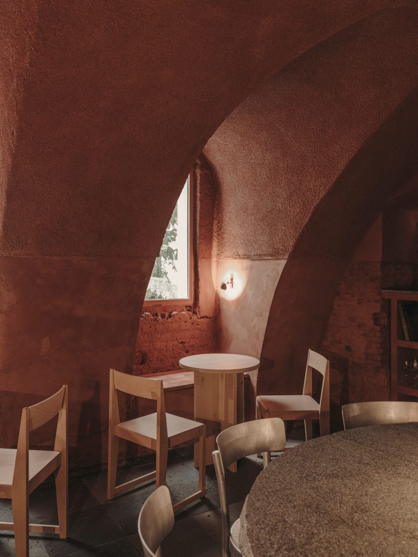
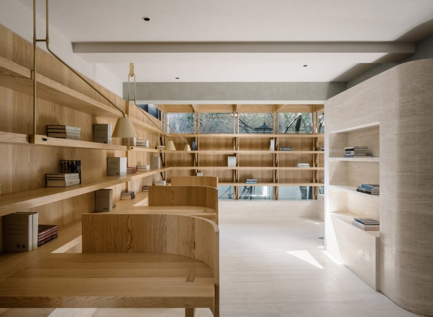
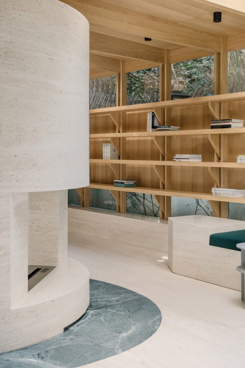
Hiba, Israel, by Pitsou Kedem Architects

A combination of solid and hollow oakwood components forms a gridded screen that allows visitors to glimpse between the dining area and the entrance of this restaurant in Tel Aviv.

Alongside oakwood, the restaurant’s interior features granite slabs and concrete. Designers Pitsou Kedem Architects aimed for the raw material palette to reflect the restaurant’s use of fresh ingredients.

Find out more about Hiba ›

This is the latest in our lookbooks series, which provides visual inspiration from Dezeen’s archive. For more inspiration see previous lookbooks featuring period home renovations, open-plan interiors characterised by bold dining tables and interiors with reclaimed materials.

Reference

Garden room for Horatio's Garden by Mcmullan Studio
CategoriesArchitecture

Mcmullan Studio designs garden room as “restorative haven”

Garden room for Horatio's Garden by Mcmullan Studio

Wooden shingles clad this pod-like garden room by London practice Mcmullan Studio, which has been created for spinal-injury charity Horatio’s Garden.

The small space was conceived by Mcmullan Studio as a “beautiful, immersive, restorative haven” for patients with spinal injuries at a hospital in Sheffield.

It has large openings and a central circular skylight to create a close connection to the outdoors, informed by the Japanese concept of forest bathing.

Garden room for Horatio's Garden by Mcmullan Studio
Mcmullan Studio has created a garden room for Horatio’s Garden

“Our design addresses the issue of monotony and lack of stimulation experienced by patients who are confined to staring at hospital ward ceilings, particularly those who cannot move or lift their heads due to spinal injuries,” director Andrew Mcmullan told Dezeen.

“We all know how good being in nature can make us feel,” he added. “We have known it for centuries. The sounds of the forest, the scent of the trees, the sunlight playing through the leaves, the fresh, clean air — these things give us a sense of comfort.”

The wooden pavilion was originally created for Horatio’s Garden‘s exhibit at the 2023 RHS Chelsea Flower Show in London, for which Mcmullan Studio worked with landscape designers Harris Bugg Studio.

Wooden shingles
It is clad in wooden shingles

The pavilion is now being transported to the Princess Spinal Injuries Centre in Sheffield as a permanent space for the charity, due to open in 2024.

The garden room’s skylight sits at the centre of a reciprocal roof – a twisting circle of interlocking beams that requires no central support, allowing the interior to be as open and unobstructed as possible.

“Apart from the technical aspects, the reciprocal frame also has intrinsic beauty. The nest-like character of this structure creates a visually intriguing and comforting atmosphere,” described Mcmullan.

“The structure frames a glazed rooflight that invites daylight into the space while providing ever-changing views of the overhanging tree canopies,” he added.

Reciprocal roof inside Horatio's Garden pod
It has a reciprocal roof

Wooden finishes have been used inside and out, with space for seating and a bed beneath the central skylight and a pattern of circular ceramics mounted on the walls.

Ease of transportation was central to the structure’s design, allowing it to be easily lifted as a single unit for its transportation from London to Sheffield.

Exterior of Garden room for Horatio's Garden by Mcmullan Studio at the 2023 RHS Chelsea Flower Show
It was on show at the 2023 RHS Chelsea Flower Show. Photo by Jim Stephenson

Once in place, it will be accompanied by two additional garden rooms and a larger communal garden building, all of which will also be designed by Mcmullan Studio.

Other garden rooms featured on Dezeen include an artichoke-shaped workspace by Studio Ben Allen and a writer’s shed by WT Architecture.

The photography is by Lucy Shergold unless stated otherwise.

Reference

Store interior with walnut shelving and mosaic floor
CategoriesInterior Design

Ringo Studio positions sex toys in athletic-themed room for Contact Sports

Store interior with walnut shelving and mosaic floor

Brooklyn-based Ringo Studio has reimagined the experience of shopping for sex toys, creating a store in New York modelled on a collegiate locker room.

The Contact Sports shop on Mercer Street in Soho is designed to feel very different to the typical spaces in which products for sex are purchased.

Store interior with walnut shelving and mosaic floor
The store interior features walnut panelling and mosaic flooring

“In a survey conducted before launch, the majority of people reported feeling uncomfortable walking into a sex store,” said the studio. “Uninviting exteriors felt intimidating, the aisles were hard to navigate, and the shelves stocked hundreds of products that were hard to decipher.”

Working with Ringo Studio founder Madelynn Ringo – who has designed retail spaces for Glossier, Bala and Our Place – the brand devised a shopping experience based around sport, and used cues from this world to inform the interiors.

Merchandise displayed on brass rails and shelving
Merchandise is displayed on brass rails and shelving

The retail space includes an area at the front that sells long-stem roses in singles or bundles, including a 15-foot (4.5 metre) wall on which the fresh-cut red flowers are stored.

Beyond, dark walnut panelling, brass rails and shelves, and green cushions give the store a collegiate atmosphere, while mosaic floor tiles and baskets of towels evoke a locker room.

Walnut panelling forms cubby holes for displaying products
Walnut panelling forms locker-like cubby holes for displaying products

Vintage sporting ephemera like tennis rackets, boxing gloves and American football helmets are displayed on higher shelves.

Below, the selection of “entry-level gear and sensual gifts” from brands such as Kiki de Montparnasse, Lelo, Dame, Maude, Future Method and more are merchandised in locker-style cubbyholes.

“Contact Sports flips the traditional model on its head and takes a more curated approach, stocking only 70 products at launch,” the studio said.

“Their team spent more than a year vetting a category that includes tens of thousands to offer only the best of the best, with unexpected touches that enhance the full experience around the sport.”

Jonathan de Pas baseball glove chair in front of counter
The store features a Joe Chair shaped like a baseball glove

The space is illuminated from above by a light box behind a wooden lattice, while softer lighting is installed in the cubbies.

An iconic chair shaped like a giant baseball mitt by designers Jonathan de Pas, Donato D’urbino and Paolo Lomazzi sits next to the white counter, above which the brand’s cursive logo glows in neon.

Long-stem red roses displayed in trophy-like vases
Long-stem red roses are sold at the front of the store

The sex toy industry has grown significantly in recent years, as taboos have broken and social acceptance has widened. See some of the most unusual sex toys featured on Dezeen.

However, “the retail experience itself had yet to evolve,” said the Contacts Sports team, which hopes the store will change how shopping for sex gear should look and feel.

The photography is by Anna Morgowicz.

Reference

Interior of Gota bar in Madrid designed by Plantea Estudio
CategoriesInterior Design

Plantea Estudio creates cosy cave-like room within bar Gota in Madrid

Interior of Gota bar in Madrid designed by Plantea Estudio

A red “cave” hides behind the main dining space of this wine and small plates bar in Madrid designed by interiors studio Plantea Estudio.

Located on the ground floor of a neoclassical building in Madrid’s buzzy Justicia neighbourhood, Plantea Estudio designed Gota to appear “dark, stony and secluded”.

Interior of Gota bar in Madrid designed by Plantea Estudio
Gota sits on the ground floor of a neoclassical building in the Justicia neighbourhood

Guests ring a bell to enter the 70-square-metre bar, and are then welcomed into a dining room enclosed by thickset granite ashlar walls. While some of the walls were left exposed, others have been smoothly plastered over and washed with grey lime paint.

The floor was overlaid with black volcanic stone tiles that the studio thought were suggestive of a “newly discovered terrain”.

Interior of Gota bar in Madrid designed by Plantea Estudio
A counter in the first dining space is inbuilt with a record player

A bench seat runs down the left-hand side of the bar, accompanied by lustrous aluminium tables and square birchwood stools from Danish design brand Frama.

Guests can alternatively perch on high stools at the peripheries of the room, where lies a slender stone ledge for drinks to be set down on.

Interior of Gota bar in Madrid designed by Plantea Estudio
Shelving displays wine bottles, vinyls, and other objects

More seating was created around a bespoke chestnut counter at the room’s centre; its surfacetop has an in-built turntable on which the Gota team plays a curated selection of music.

Behind the counter is a storage wall where wine bottles, vintage vinyl records and other music-related paraphernalia are displayed.

Gota bar in Madrid includes red cave-like room
A cave-like dining room hides at the bar’s rear

An open doorway takes guests down a short corridor to a secondary cave-like dining space, which boasts a dramatic vaulted ceiling and craggy brick walls. It has been almost entirely painted red.

“It’s relatively common to find this kind of vaulted brick space in the basements of old buildings in Madrid – this case was special because it’s on the ground floor with small openings to a garden,” the studio told Dezeen.

“It was perfect for a more quiet and private area of the bar,” it continued.

“The red colour is an abstract reference to the brick of which the cave is really made, and also a reference to wine.”

Gota bar in Madrid includes red cave-like room
The space is arranged around a huge granite table

At the room’s heart is a huge 10-centimetre-thick granite table that’s meant to look as if it has “been there forever”, surrounded by aluminium chairs also from Frama. Smaller birch tables and chairs custom-designed by the studio have been tucked into the rooms corners.

To enhance the cosy, intimate feel of the bar, lighting has been kept to a minimum – there are a handful of candles, reclaimed sconces and an alabaster lamp by Spanish brand Santa & Cole.

Gota bar in Madrid includes red cave-like room
Red paint covers the space’s vaulted ceiling and brick walls

Established in 2008, Plantea Estudio is responsible for a number of hospitality projects in Madrid.

Others include Hermosilla, a Mediterranean restaurant decked out in earthy tones, and Sala Equis, a multi-purpose entertainment space that occupies a former erotic cinema.

The photography is by Salva López.

Reference

Brutalist concrete library interior
CategoriesInterior Design

Superkül renovates reading room at Toronto’s brutalist Robarts Library

Brutalist concrete library interior

Canadian studio Superkül has updated the reading room at the University of Toronto’s Robarts Library, a notable example of brutalist architecture.

The project involved renovating the cavernous concrete space on the building’s fourth floor, as part of the university’s larger initiative to revitalise the Robarts Library, which Superkül described as “one of North America’s most significant examples of brutalist architecture”.

Brutalist concrete library interior
The Brutalist concrete Robarts Library was built in 1973

Completed in 1973, the John P Robarts Research Library was designed by local architecture studio Mathers & Haldenby.

It is both the largest individual library at the University of Toronto and the largest academic library building in Canada.

New wooden seating elements
Superkül updated the spaces to better serve contemporary learning needs

As an important facility for students and faculty, the reading and study spaces required upgrades to meet contemporary learning styles and equipment, while remaining respectful to the heritage-listed architecture.

The project also needed to connect the original brutalist structure with the adjacent Robarts Common extension, completed by Diamond Schmitt Architects in September 2022.

Individual study stations
A variety of individual study stations were added to the double-height space

“We were tasked with an ambitious goal: to convert the space into a superior contemporary environment for quiet study, collaboration, and digital scholarship in a manner that complements the building’s exalted architectural language and supports accessibility, diversity, and wellness,” said Superkül.

Spread throughout the 20,300-square-foot (1,886-square-metre), double-height space are individual study areas, new digital stations, consultation rooms and two light therapy zones.

Concrete structure meets new insertions
Natural materials were chosen to bring warmth to the concrete building

Particular attention was paid to accessibility, through the addition of inclusive study spots that allow users to adjust desk heights, seating configurations and lighting for their needs.

“We also emphasised clear sightlines and intuitive wayfinding in a symmetrical layout to promote easy navigation,” said Superkül.

The studio worked with a team of acoustic specialists to create a sound-dampening system using perforated wood and metal panelling, designed to blend in with the interior architecture.

This scheme allows communal study groups to converse without disturbing other students.

Study areas
Particular attention was paid to accessibility, through the addition of inclusive study spots

For the new elements, a variety of natural materials were chosen to add warmth to the concrete building, including custom-designed bronze screens and details that play on existing motifs.

“To honour the distinctive geometry and materiality that make Robarts Library such a prodigious icon, we hewed closely to an overarching objective: create a robust and respectful design that honours the existing architecture and complements the library’s other spaces,” the studio said.

Communal work tables
An acoustic-dampening system was created to prevent communal study sessions distracting from quiet work

Also at the University of Toronto, studios Kohn Shnier and ERA Architects recently renovated the historic University College building to make it more accessible.

Superkül’s previous projects have included an all-white vacation home in the Ontario countryside.

The photography is by Doublespace.


Project credits:

Architect: Superkül
Structural engineer: Entuitive
Mechanical and electrical engineer: HH Angus
Acoustics: Aercoustics
Cost: Marshall & Murray
Code and safety: LRI

Reference

Picture of a wall showcasing different material samples and a person touching one of the samples
CategoriesInterior Design

Office S&M unveils colourful office with plastic-bottle-wall meeting room

Picture of a wall showcasing different material samples and a person touching one of the samples

Architecture practice Office S&M has completed its own office inside a former paint-making workshop in Hackney, London.

With an entire wall of material samples and areas for modelling and sketching, Office S&M‘s workspace aims to act as a laboratory to support its ongoing exploration of materials “that are both practical and fun.”

Picture of a wall showcasing different material samples and a person touching one of the samples
Material samples are loosely placed to allow experimentation in the office

The studio, headed by architects Catrina Stewart and Hugh McEwen, frequently experiments with materials and colour.

For its own office, complementary shades such as electric blue, yellow, red and green, were combined.

Picture of an office's interior with electric blue walls, a red couch and a small pink mirror
The office combines bold colours

“For this workspace, we particularly used an electric blue and a bright yellow to contrast with each other and make the space larger,” McEwen told Dezeen.

“At the same time, because the workspace is south facing, we used the blue to cool the light and even out the warmth of the sun when looking at samples or drawings.”

Picture of a workspace with a communal desk in the centre, plants and green large windows in the background
The space has been broken into spaces for different uses

The office features a separate meeting room acoustically isolated with sheets of recycled plastic bottles.

The plastic-bottle wall also works as a point of light thanks to the bulbs it contains inside.

Picture of a yellow chair and a pink wavy side table in front of a recycled-plastic-bottle wall
According to the architects, the recycled-plastic-bottle “provides excellent acoustic insulation”

“For our own office, we decided to use another common waste material, plastic bottles, but reimagined, to build a soundproofed meeting room,” said Stewart.

“The recycled plastic insulation is easy to work with, and irritation free, compared to traditional insulation.”

Picture of a person drawing several illustrations of houses
The studio also includes ergonomic workstations

The space was divided into areas focused on collaboration, discussion and making to reflect Office S&M’s commitment to community-led design.

“We live in east London, and do much of our work in the areas near where we live and work,” said McEwen. “This gives us really local knowledge, so we can make sure projects have the most impact and can give back to the area.”

Picture of a three-storey building that previously was a paint-making business
The building is owned by Bootstrap, a charity that supports emerging businesses in Hackney

Additionally, Office S&M added plants, air purifiers and ergonomic workstations that intend to maintain the well-being of its occupants.

Other projects by the studio include a rental home for a young property developer that aims to offer a solution to London’s rental market, and the renovation of the Mo-tel House, a residence that features pale colours and bathroom counters made of discarded milk bottles and chopping boards.

The photography is by Ellen Christina Hancock.

Reference

Entrance exhibition space at Qian Hu Zhi Wu, Xiamen
CategoriesInterior Design

Cun Panda designs escape room with tree at its centre

Entrance exhibition space at Qian Hu Zhi Wu, Xiamen

Chinese studio Cun Panda has created a flexible space for immersive game company Qian Hu Zhi Wu in Xiamen, China, that features a silver-foil-clad tree, acrylic seats and mirror installations.

The local game company runs 14 escape rooms in China. Cun Panda’s design for its latest space measures 330 square metres and was designed with a focus on flexibility to enable a number of gaming narrations to take place.

“We aim to create a space that can tell stories,” the studio said. “The design injects extraordinary imagination and creativity into the space that integrates art and immersive experience.”

Entrance exhibition space at Qian Hu Zhi Wu, Xiamen
A series of rock-like formations surround the central tree installation

At the entrance of the space, a giant tree made of resin and covered in silver foil stretches through the ceiling to form the centre piece of the space. Added light installations were designed to look like satellites and planets circling the tree, giving the piece a futuristic feel.

The tree is surrounded by a series of rock-like formations, which were informed by Stonehenge.

“Stonehenge is taken as the prototype to open the interlaced space leading to the new world and build a dimension door of virtual and real,” explained the studio.

Resin tree covered in silver foil
Light installations have been added to the silver tree

The rock-like sculptures in the space have round holes to create clear sightlines inside the escape room, where the lit-up floor is the main light source and creates a variation of shadows.

Next to the entrance space, a narrow corridor connects the game room with a storage room, dressing room, and makeup areas. Stripes of lights and a mirrors installation on the wall and ceiling were designed to create an infinite sense of space.

Waiting area at Qian Hu Zhi Wu, Xiamen
Green moss and black sand add a sense of nature inside a white room

In another room, sand-dune shaped seats are supported by transparent acrylic to create a floating effect, revealing green moss and black sand in the otherwise completely white space.

Here, another tree breaks through the wall into the space and connects to the main tree installation. The white wall is lit up by LED lights and printed with shapes of sand dunes.

Corridor at Qian Hu Zhi Wu, Xiamen
Stripes of lights and mirrors create a visual illusion

Cun Panda was founded by Xuanna Cai and Jiacheng Lin in 2019 and has offices in Beijing, Shanghai, Kunming and Xiamen.

Other recent interiors from China include timber and travertine reading room by Atelier Tao+C and Fatface Coffee shop by Baicai, both shortlisted in this year’s Dezeen Awards.

The photography is by Xinghao Liu.

Reference

Reading room by Atelier Tao+C
CategoriesInterior Design

Atelier Tao+C creates serene timber and travertine reading room

Reading room by Atelier Tao+C

Two vacant ground-floor rooms and an adjoining greenhouse were knocked together and lined with bookshelves to form this private library, designed by Atelier Tao+C for a venture capital firm in Shanghai.

Set in a converted 1980s house, which is home to the offices of VC fund Whales Capital, the reading room can accommodate up to 12 people and is shared between the company’s employees and the owner’s friends.

Reading room by Atelier Tao+C
Atelier Tao+C has created a reading room for Whales Capital

All of the rooms are enclosed by immovable, load-bearing walls, which local practice Atelier Tao+C had to integrate into the design while creating the impression of being in one continuous 76-square-metre space.

To this effect, the original doors and windows were removed and three openings – measuring between two and three metres wide – were created to connect the rooms.

Private reading room
The space is lined with wooden bookshelves

The remaining wall sections are hidden from view by new architectural elements including a set of semi-circular wooden bookshelves, which run through the two ground-floor rooms to form a pair of small, quiet reading nooks.

The structural walls connecting these rooms to the old glasshouse were wrapped in creamy white travertine to create a kind of “sculptural volume”, Atelier Tao+C explained.

Reading room
Skylights funnel natural light into the interior

As a result, the studio says the walls and structural columns are “dissolved” into the space to create the feeling of a more open-plan interior.

In the old greenhouse, a timber structure was inserted into the building’s glass shell, with bookshelves integrated into its wooden beams and columns to create a seamless design.

This structure also forms a wooden ceiling inside the glasshouse, with strategically placed round and square skylights to temper the bright daylight from outside and create a more pleasant reading environment.

Spread across the interior are four different seating areas: a small study table for solo work, a shared meeting table, a reading booth for one person and a sofa seat where multiple people can talk and relax.

Travertine interiors
White travertine was used to obscure the building’s original brick walls

A Private Reading Room has been shortlisted in the small interiors category of the 2022 Dezeen Awards.

Atelier Tao+C, which is run by designers Chunyan Cai and Tao Liu, is also shortlisted for emerging interior design studio this year, alongside Sydney firm Alexander & Co, Barcelona-based Raúl Sánchez Architects and London practice House of Grey.

The photography is by Wen Studio.

Reference

CategoriesLandscaping

This Landscaped Outdoor Space Includes A Living Room With A Bookshelf For Plants

Architecture and interior design firm Onion has designed the second phase of the Sala Samui Chaweng Beach Resort in Koh Samui, Thailand.

As part of the design, they included an outdoor living room and sitting area that both include a bookshelf for plants.

An outdoor living room with a shelving unit designed to house plants.

At night, the plant bookshelves light up, while the living rooms are furnished with outdoor sofas, armchairs, planters, and oversized lamps, the living rooms create comfortable spaces for guests to relax in.

An outdoor living room with a shelving unit designed to house plants.

Another design detail of the outdoor living rooms are the pebbles that have been used in place of rugs.

An outdoor sitting room with pebbles and oversized lighting.

Let’s take a look around the rest of the hotel…

The Public Areas

The resort design has a bright white exterior, however, the lobby has been warmed up with the use of wood, and curved wood walls add a sculptural element. The hotel restaurant introduces blue accents and includes a variety of seating, as well as oversized black and white striped pendant lights.

A modern hotel lobby with sculptural wood walls, woven lighting, and round furniture.
A modern hotel lobby with wood walls, woven lighting, and round furniture.
A modern restaurant hotel with glass walls.
A modern hotel restaurant with blue, white, and wood color scheme.
A modern hotel restaurant with a blue and white theme, as well as black and white striped accents.
A modern hotel restaurant with window seat and banquette seating.

The Courtyards

The resort has a variety of courtyards and outdoor spaces including areas with chairs arranged in a circle and surrounded by trees, paths with nearby stairs that lead to the different levels of the resort, a swimming pool with sun chaises, and outdoor king-sized beds nestled between plants and shaded by large trees.

A modern hotel courtyard with outdoor chairs arranged in a circle.
A modern hotel with arches and white stairs with lighting.
A modern hotel with cut-out curved sections.
The architecture of a modern resort.
A resort swimming pool with oversized lights and a wood deck.
An outdoor king size bed for lounging in the sun.

The Spa

The spa area is defined by the use of the colors dark green and pink. The bathtub of the spa room is placed in the garden surrounded by the dark green walls, while the clear glass door brings nature into the treatment room.

Dark green walls and a built-in seat in a modern hotel spa.
Dark green and light pink walls in a hotel spa.
Light pink walls in a hotel spa.
Dark green walls with light pink stairs.
A spa with deep green walls.
A bathroom with deep green walls.

The Guest Rooms

The hotel’s rooms have contemporary interiors with wood accents and outdoor spaces with private swimming pools and lounges.

A hotel balcony with views of the pool below.
A hotel room with an open bathtub and shower.
A hotel bathroom with open bathtub and wood cabinetry.
A hotel room with a small swimming pool and covered seating area.
Photograpy by Wworkspace

Source link

CategoriesLandscaping

A Delightful Terraced Garden Sits In Front Of This Outdoor Dining Room

Andrew Mann Architecture has completed the remodel of a home in Sonoma, California, that includes a newly designed garden with tiered planters and a covered outdoor entertaining space.

A modern garden with an covered outdoor dining area and terraced built-in planters made from concrete.

The garden pavilion, which was designed by Andrew Mann Architecture, also included the hardscape and layout of the fences, as well as the surrounding planter beds.

A modern garden with an covered outdoor dining area and terraced built-in planters made from concrete.

The dining pavilion, which can be lit up at night, acts as an outdoor entertaining space that’s surrounded by peaceful gardens completed by Christa Moné.

A modern garden with an covered outdoor dining area and terraced built-in planters made from concrete.
A modern garden with terraced built-in planters made from concrete.

The raised planters, which have a simple concrete border are filled with flowering plants of different sizes.

A modern garden with terraced built-in planters.

The pavilion, which has a sloped roof, is built from dark stained wood and has a large open area dedicated to outdoor dining.

An outdoor pavilion includes dining area, a kitchen area with fridges, a pizza oven and firewood storage, as well as a separate space for storing garden items. This small room can be hidden from view by the large sliding barn doors.

The pavilion also includes a kitchen area with fridges, a pizza oven, and firewood storage, as well as a separate space for storing garden items. This small room can be hidden from view by the large sliding barn doors.

An outdoor pavilion includes dining area, a kitchen area with fridges, a pizza oven and firewood storage, as well as a separate space for storing garden items. This small room can be hidden from view by the large sliding barn doors.

Let’s take a look around the main house…

Architect Andrew Mann and interior designer Katie McCaffrey of Angus – McCaffrey Interior Design collaborated on the partial remodel of the house, which was originally built in 1974 by Roland Miller Associates.

A modern house with large windows.

Andrew focused on form making, while Katie defined a material palette different in feel and mood from their client’s city house. Exposed wood beams and a wood ceiling complement the wood floors and furniture found in the open plan living room and dining area.

A modern open plan living room and dining room with high ceilings and plenty of natural light.
A modern open plan dining room with high ceilings and plenty of natural light.

Behind the dining room is the kitchen, which includes minimalist white and gray cabinets, a breakfast bar, and an island with a waterfall countertop.

A modern kitchen which includes minimalist white and gray cabinets, a breakfast bar, and an island with a waterfall countertop.

Adjacent to the kitchen is a secondary smaller and more casual dining area.

A small casual dining area with a round table and leather chairs.

In the bedrooms, there are high ceilings and walls of wood-framed windows that fill the rooms with natural light.

A modern bedroom with high ceilings and a wall of wood-framed windows.
A modern bedroom with a simple design.

In the bathrooms, the color palettes have been kept neutral, with only the tile flooring providing a decorative accent.

A modern bathroom with a high ceiling and a wall of wood-framed windows.
A modern bathroom with a walk-in shower that includes a bench and built-in shower niche.
A modern bathroom with a floating vanity and patterned tile flooring.
Photography by David Wakely Photography | Architecture: Andrew Mann Architecture | Interior Design: Angus-McCaffrey Interior Design | Landscaping: Christa Moné

Source link