Multipurpose rooms optimise Ulli Heckmann’s Rotterdam apartment
CategoriesInterior Design

Multipurpose rooms optimise Ulli Heckmann’s Rotterdam apartment

A bedroom incorporating a bathtub and a window bench is one of several versatile spaces architect Ulli Heckmann created when renovating this compact apartment in Rotterdam, the Netherlands.

Heckmann and his partner, the designer Nienke Bongers, bought the apartment in the Delfshaven neighbourhood in 2020 with the aim of refurbishing it to suit their personal tastes.

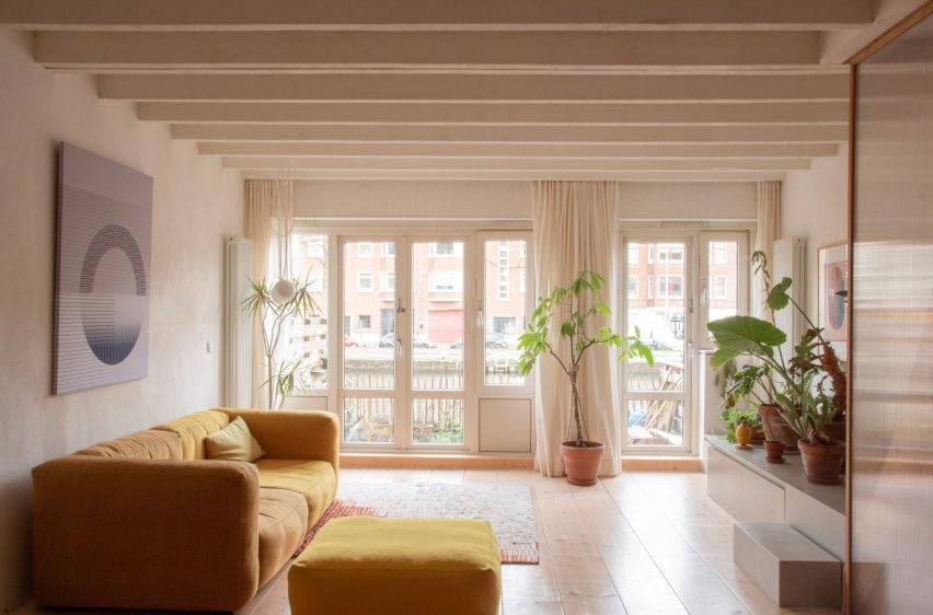
Living room and windows at Ulli Heckmann's compact apartment in RotterdamLiving room and windows at Ulli Heckmann's compact apartment in Rotterdam
Multipurpose rooms were used to optimise space at Ulli Heckmann’s Rotterdam apartment

The 100-square-metre property is spread across the ground floor and basement of a brick apartment building dating from 1935 that stretches along a dike on the river Schie.

Previous renovations in the 1980s had stripped away all of the interior’s original features, so the couple decided to completely gut the spaces and rebuild them using a modern and affordable material palette.
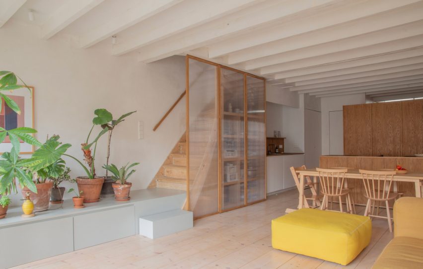
Kitchen and stairs at Ulli Heckmann's compact apartment in RotterdamKitchen and stairs at Ulli Heckmann's compact apartment in Rotterdam
The open-plan kitchen and living area receive daylight from the garden

The existing layout did not make the best use of the garden access, so Heckmann moved the bedrooms upstairs and created a large living space below with direct access to the outdoors.

“The original downstairs plan showed one room facing the garden and one towards the street, which was quite gloomy and dark,” the architect told Dezeen.

“Since the new downstairs is basically mono-orientated, an open layout with the kitchen cupboard as a room divider seemed the best solution in terms of space with an option for privacy.”
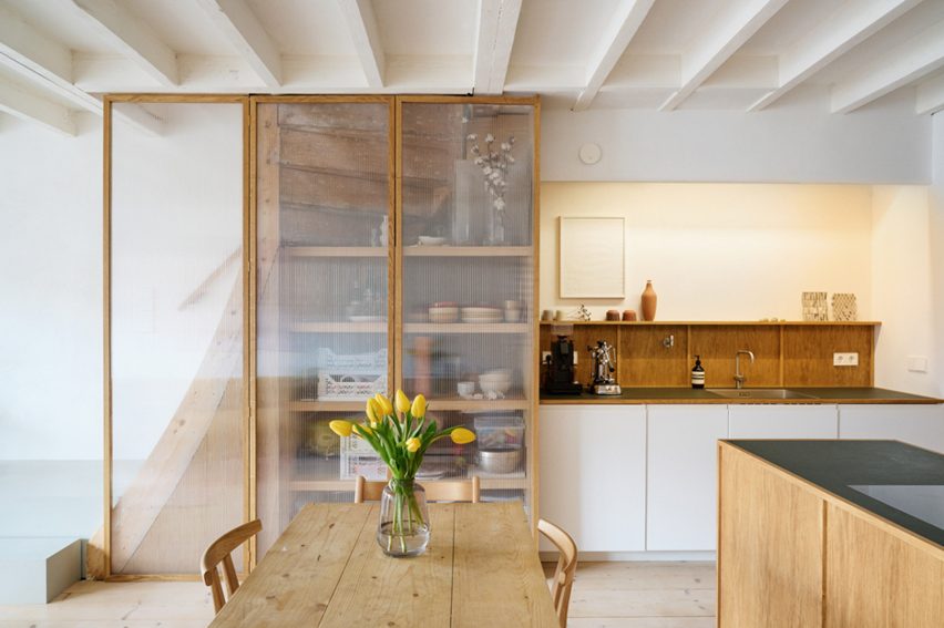
Kitchen and wooden fixtures at Ulli Heckmann's compact apartment in RotterdamKitchen and wooden fixtures at Ulli Heckmann's compact apartment in Rotterdam
Heckmann completely rebuilt the interior spaces using affordable materials. Photo is by Yuta Sawamura

The largely open-plan configuration creates a space for cooking, eating and socialising that receives plenty of daylight from the large windows at one end.

Freestanding cupboards screen a small private space that Heckmann explained can be used for “reading a book, inviting friends to stay over or simply drying the laundry without putting it in the middle of the living room.”
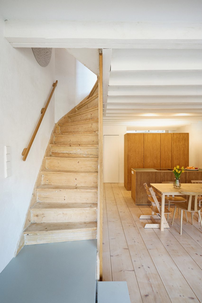
Wood staircase at Ulli Heckmann's compact apartment in RotterdamWood staircase at Ulli Heckmann's compact apartment in Rotterdam
The kitchen is divided by a wooden cupboard unit for privacy. Photo is by Yuta Sawamura

Throughout the property, built-in storage helps to optimise and organise space, allowing the interior to be used in different ways at different times. Examples include a hidden desk in the children’s bedroom and a window bench in the main bedroom.

“Most of the rooms are not limited to only one purpose throughout the day and night,” said Heckmann, “which helps tremendously for the use of the space – especially as a family.”

The layout of the upper floor is more compartmentalised than the basement level; however, a full-height mirrored door at the end of the hall can be left open to ensure the spaces feel connected.

The two bedrooms at either end of the plan are separated by a walk-in wardrobe and a shower room hidden behind cupboard-like doors.
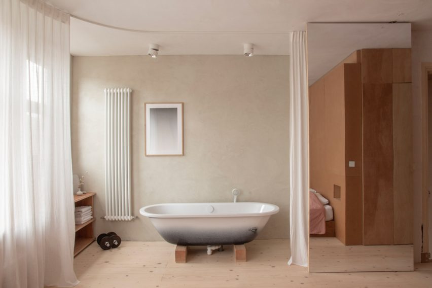
Bedroom bath at Ulli Heckmann's compact apartment in RotterdamBedroom bath at Ulli Heckmann's compact apartment in Rotterdam
The main bedroom integrates a bathtub that can be hidden behind a curtain

In addition to the bed and window bench, the main bedroom contains a bathtub set on wooden blocks that can be screened off using a curtain.

“The need to create multifunctional spaces is one of the reasons why we decided to have the bathtub in the bedroom,” Heckmann explained. “Also, we quite like that it becomes an object in our daily life instead of hiding it away.”
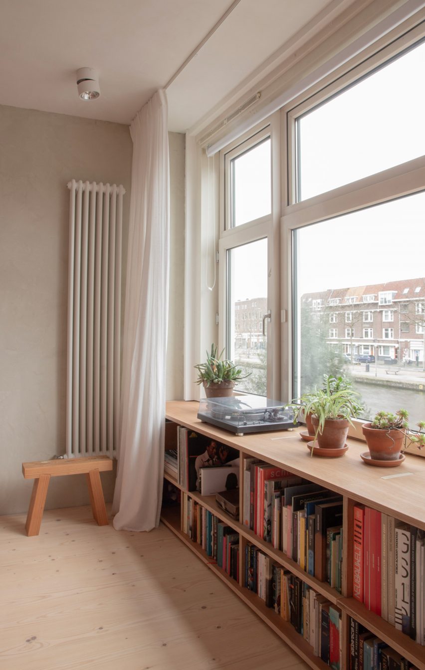
Bookshelf in Ulli Heckmann's compact apartment in RotterdamBookshelf in Ulli Heckmann's compact apartment in Rotterdam
Most of the furniture was built by Heckmann and Bongers with stained or dyed plywood and MDF

The couple had wanted to use natural materials where possible to completely revamp the interior, but the onset of the Covid-19 pandemic caused prices to soar and subsequent lockdowns made commissioning specialist trades much more difficult.

Heckmann and Bongers therefore designed and built most of the furniture themselves, using plywood or MDF that they stained or dyed to give the materials a more unique finish.

The bedroom shelf and the hall cupboards are made from eucalyptus plywood tinted with an earl-grey mixture, while the bedhead is MDF with a hardwax finish.
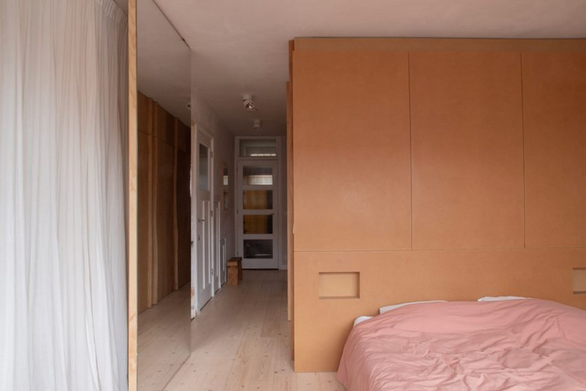
Bedroom unit in Ulli Heckmann's compact apartment in RotterdamBedroom unit in Ulli Heckmann's compact apartment in Rotterdam
The bedhead unit is made from MDF with a warm-toned hardwax finish

Lime plaster was used on the walls throughout the apartment. The downstairs spaces were left raw and natural, while the bedroom has green pigment added to give it a subtle hint of colour.

For the kitchen, Heckmann used MDF boards with oak veneer and a countertop with a dark Forbo linoleum surface. The cupboard under the stairs features an oak frame surrounding polycarbonate panels, while the staircase podium is made from painted MDF.
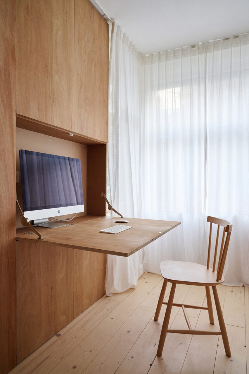
Computer nook at Ulli Heckmann's compact apartment in RotterdamComputer nook at Ulli Heckmann's compact apartment in Rotterdam
A hidden desk in the children’s bedroom helps to optimise space usage

Ulli Heckmann completed his Diploma studies at the Technical University of Darmstadt, Germany, in 2006 and worked for several years for agencies in Germany and France, including Maison Edouard François.

He founded his architecture and design studio in Paris in 2013 and now works on projects across Europe, ranging from object and interior design to private housing and architectural competitions.

Other recent Rotterdam projects featured on Dezeen include a floating cross-laminated timber office and a multi-faceted auditorium designed using computer modelling.

The photography is by Ulli Heckmann unless otherwise stated.

Reference

Aro Archive store in Shoreditch features pastel-coloured rooms
CategoriesInterior Design

Aro Archive store in Shoreditch features pastel-coloured rooms

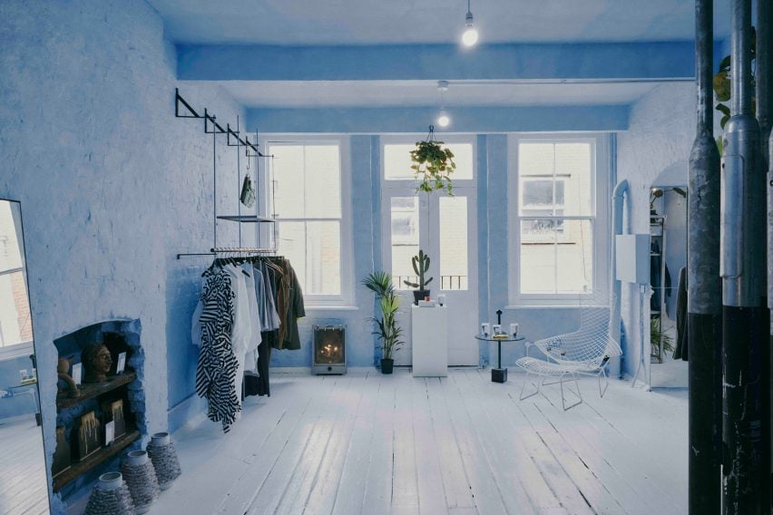
Fashion retailer Aro Archive’s pastel-hued east London store was designed by founder Ariana Waiata Sheehan to evoke “a sense of otherworldliness”.

The store, located in Shoreditch, replaces the brand’s previous, more industrial store on nearby Broadway Market and was intended to have a frivolous feel.

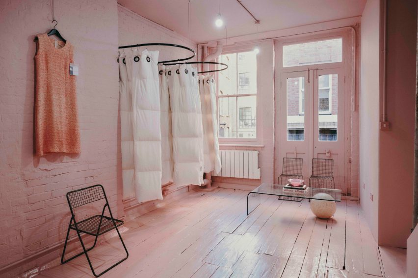
Pastel-coloured fashion storePastel-coloured fashion store
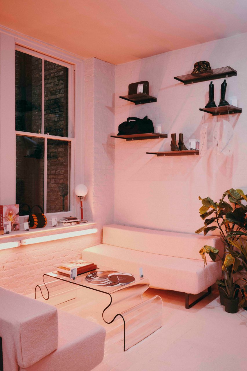
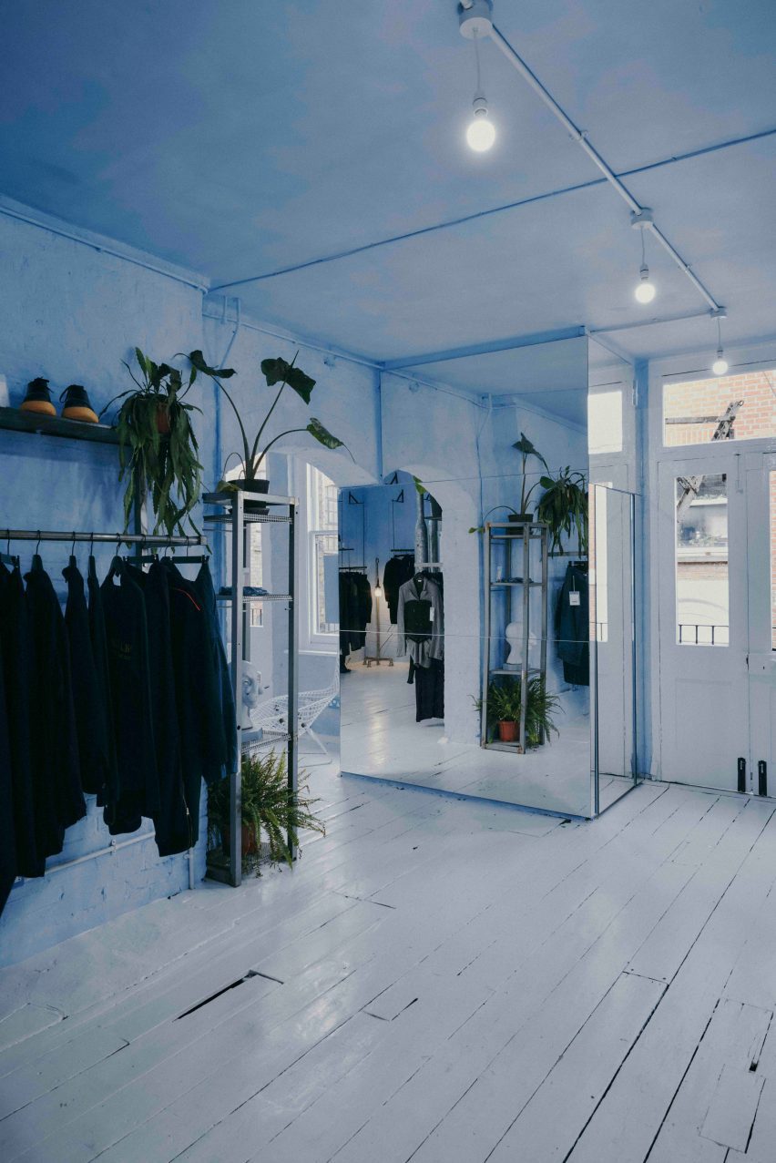
The Aro Archive store has pastel-coloured floors in pink and blue

The interior has “a sense of otherworldliness, escapism and fun,” Waiata Sheehan explains, comparing it to “a mixture between a mushroom trip and going to visit someone’s rich aunty who runs a gallery”.

“We’ve always had very neutral industrial spaces,” she told Dezeen. |But you can get an industrial Zara these days, so time to switch it up and go full personality, which has been scary but so worth it.”

Pink floor in Aro ArchivePink floor in Aro Archive
It is located inside an old Victorian warehouse

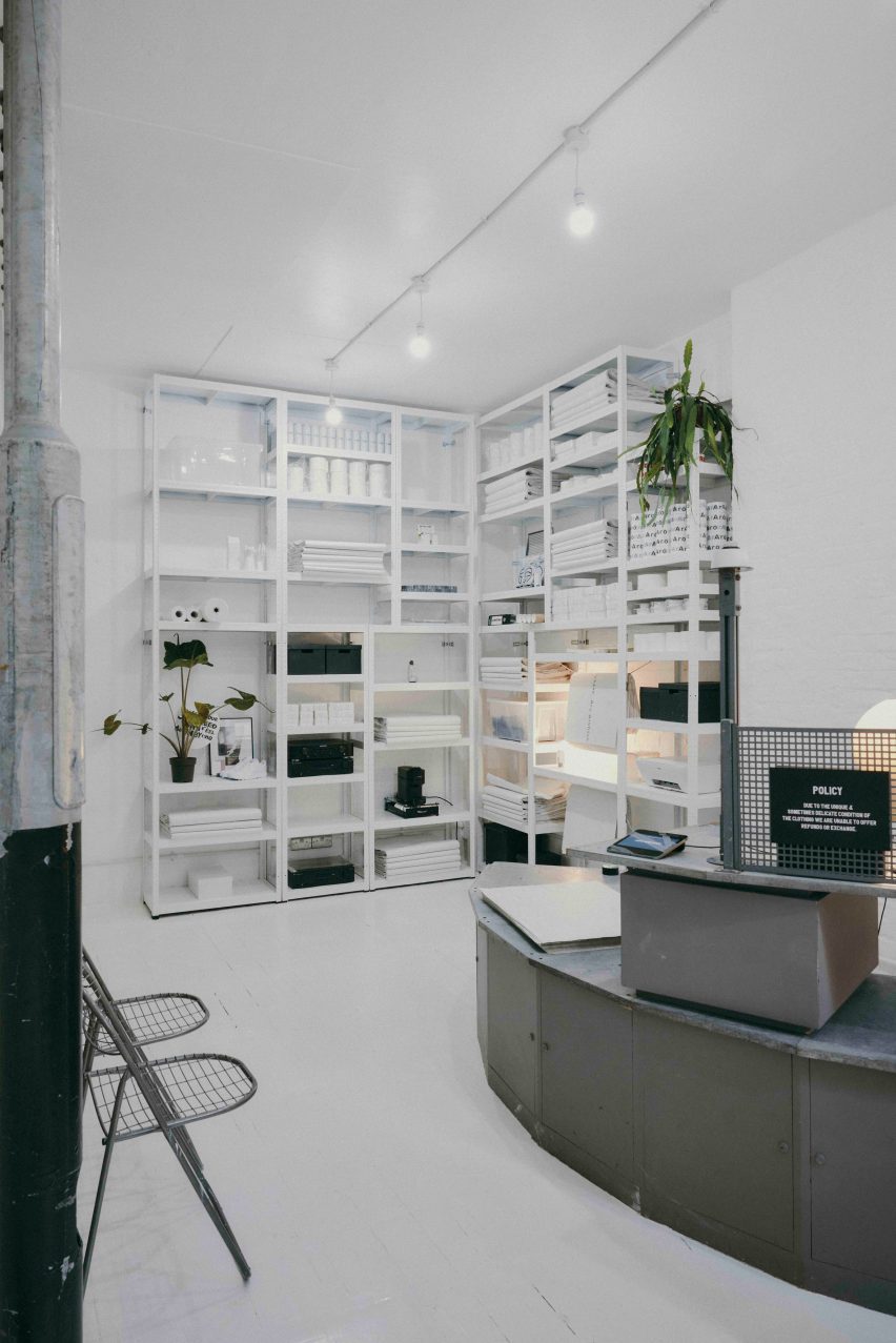
Located inside a five-storey former Victorian warehouse, Aro Archive, which sells pre-owned clothing by avant-garde designers, was organised so that each floor has a different colour.

Monochrome pastel pink, blue and white hues decorate the different levels, which also feature a wide range of reclaimed and recycled materials, furniture and artworks.

Blue floor in Aro ArchiveBlue floor in Aro Archive
Founder Ariana Waiata Sheehan created the interior design

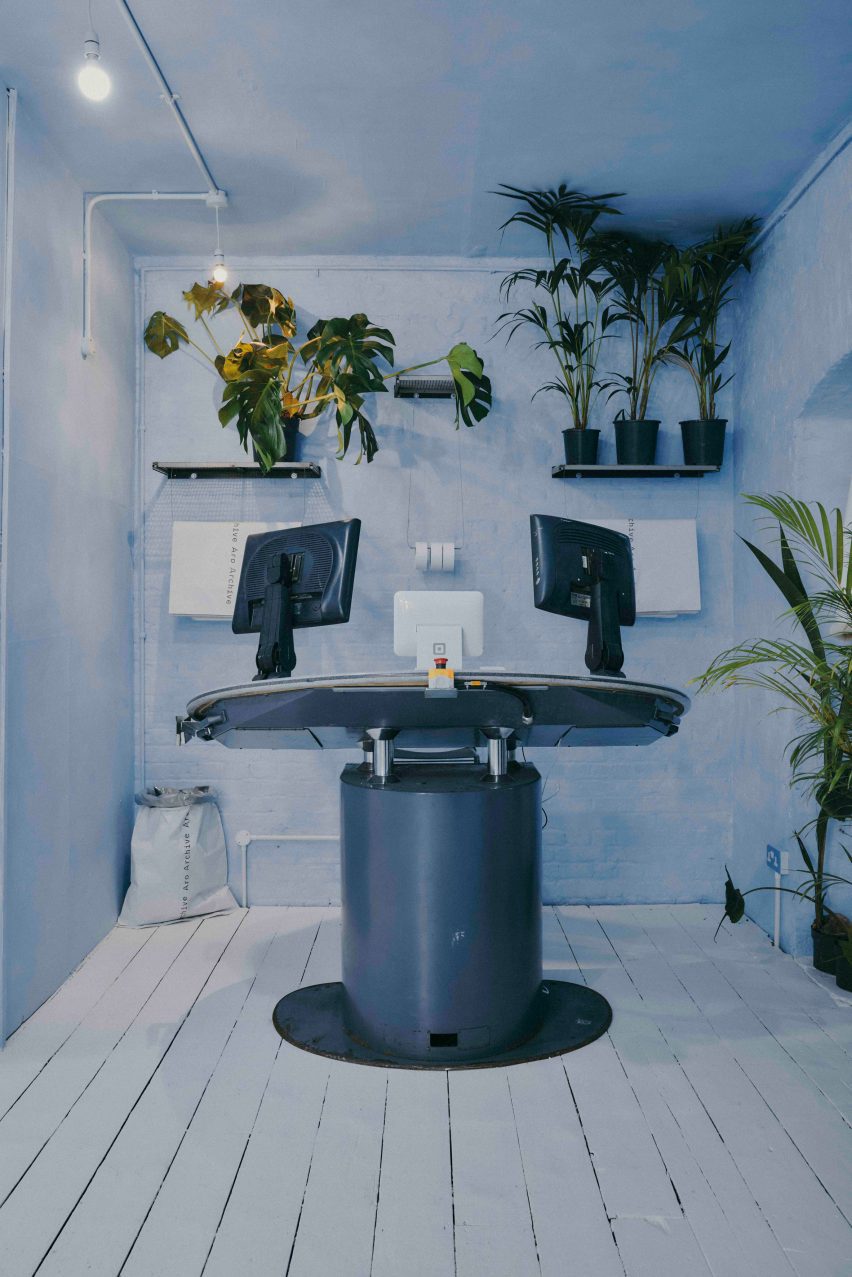
“The pink floor is supposed to feel very warm, womb-like and enclosed,” Waiata Sheehan said. “The blue floor is more light and otherworldly. And the two white floors are very ethereal and calm.”

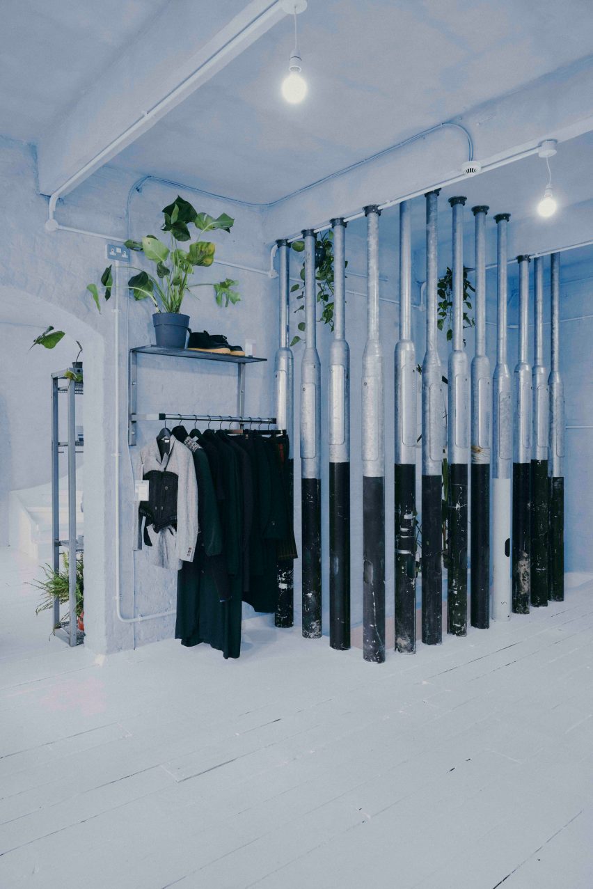
White duvet covers by fashion house Maison Martin Margiela were used to create curtains for the changing rooms, while interior pillars are made from reclaimed 1990s metal lamp posts that the designer sourced from a scrapyard in Preston.

Martin Margiela duvet-changing roomsMartin Margiela duvet-changing rooms
Duvet covers by Maison Martin Margiela frame the changing rooms

“The building and surrounding area feel very London, so we did want to bring in a sense of that for example with the lamp posts, metal works and details, bright neon lights and so forth,” Waiata Sheehan said.

She sourced a number of unusual furnishings for the Aro Archive store, including an industrial control station from a paper-manufacturing plant that is now used as a till.

“The industrial paper control station I’ve been watching on eBay for nearly 4 years, waiting for a time I had the space to buy it,” Waiata Sheehan explained. “I wanted something different to the normal till, they’re all so boring and square.”
The store also has another large metal till and metal drawers that originally came from a 1980s Mary Quant store and were rescued from a squat in Hackney Wick.

Metal till from Mary QuantMetal till from Mary Quant
A large metal till was originally from a Mary Quant store

Waiata Sheehan also sourced several smaller pieces for the boutique, where customers can purchase everything down to the artwork, furniture and accessories.

“I do all the buying so everything is here because I love it in some way,” she explained. “But in terms of favourite pieces in store right now?”
“For fashion, it’s the Rick Owens orange shearling gimp mask gilet, for objects the Shirin Guild ceramic incense holders and for furniture the wobbly glass table with magazine racks.”

Industrial control stationIndustrial control station
Waiata Sheehan bought an old industrial control station from eBay

Waiata Sheehan hopes the Aro Archive boutique will feel like a home away from home and help to create a community feel in the area.
“I think Shoreditch is lacking a sense of community and I wanted to work that into the space,” she said. “The feeling of a chaotic family home and a feeling of togetherness.”

Pillars made from lampposts at Aro ArchivePillars made from lampposts at Aro Archive
Lampposts from a scrapyard form pillars inside the store

Other London stores with notable interior design recently covered on Dezeen include Swedish fashion brand Toteme’s newly-opened Mayfair store and a Coach pop-up store at Selfridges that had fixtures made from recyclable materials.

The photography is by John Munro.

Reference

Seven cosy living rooms with industrial material palettes
CategoriesInterior Design

Seven cosy living rooms with industrial material palettes

Living rooms with tactile brick, concrete and wood surfaces feature in this lookbook, which shows that opting for industrial materials doesn’t have to sacrifice cosiness.

Typically informed by old and unrefined factories, lofts and warehouses, industrial-style interiors are a go-to for many contemporary designers.

Homes of this style are often characterised by a combination of man-made and natural materials, including brick, wood, concrete and metal, and the exposure of details that are usually concealed, such as ductwork.

While, for some, the image of industrial spaces can conjure up feelings of being cold and unwelcome, this list of living rooms proves that with the right finishes, the style can actually be warm and inviting.

This is the latest in our lookbooks series, which provides visual inspiration from Dezeen’s archive. For more inspiration see previous lookbooks featuring interiors with furry walls, sculptural wooden staircases and rustic Italian interiors.


St John Street, UK, by Emil Eve Architects
Photo by Mariell Lind Hansen

St John Street, UK, by Emil Eve Architects

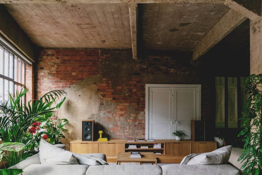
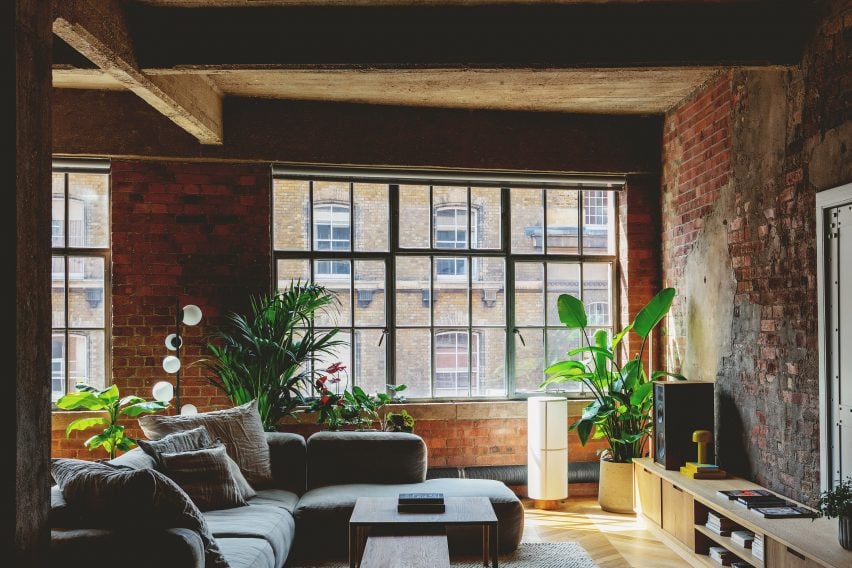
Emil Eve Architects retained the raw aesthetic of this former warehouse while transforming it into a warm and inviting home.

In the living room, old brick walls, metal window frames and a rough concrete ceiling form a tactile backdrop to contemporary wooden furnishings and an abundance of tall plants.

Find out more about St John Street ›


Living room of Michigan Loft by Vladimir Radutny
Photo by Mike Schwartz

Michigan Loft, USA, by Vladimir Radutny Architects

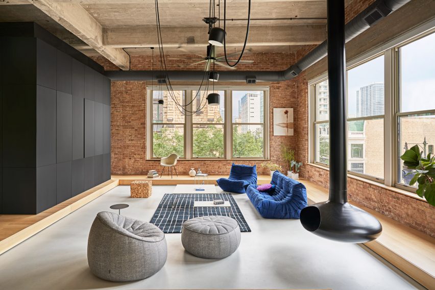
A suspended black-metal fireplace is the centrepiece of this lofty apartment, which is located in Chicago and dotted with floor furnishings including a Toga sofa.

The fireplace is complemented by exposed black ducting and hanging lights, which pop against the surrounding brick, warm wood and concrete elements.

Find out more about Michigan Loft ›


Gale Apartment living room with brown lounge chairs and concrete walls
Photo by Fran Parente

Gale Apartment, Brazil, by Memola Estudio

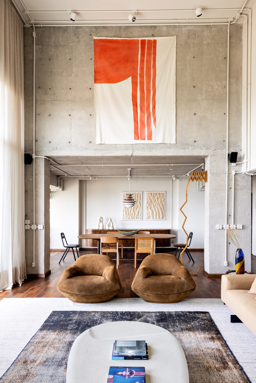
Exposed services, ducting and concrete help achieve an industrial look in this living room, which is located in a Brazilian apartment designed by Memola Estudio.

To add warmth to the space, these finishes are balanced with natural details including dark wooden floorboards and furniture, suede chairs and a textile wall tapestry.

Find out more about Gale Apartment ›


Photograph showing large sofa in living area looking into dining area
Photo by Andrey Bezuglov and Maryan Beresh

Relogged House, Ukraine, by Balbek Bureau

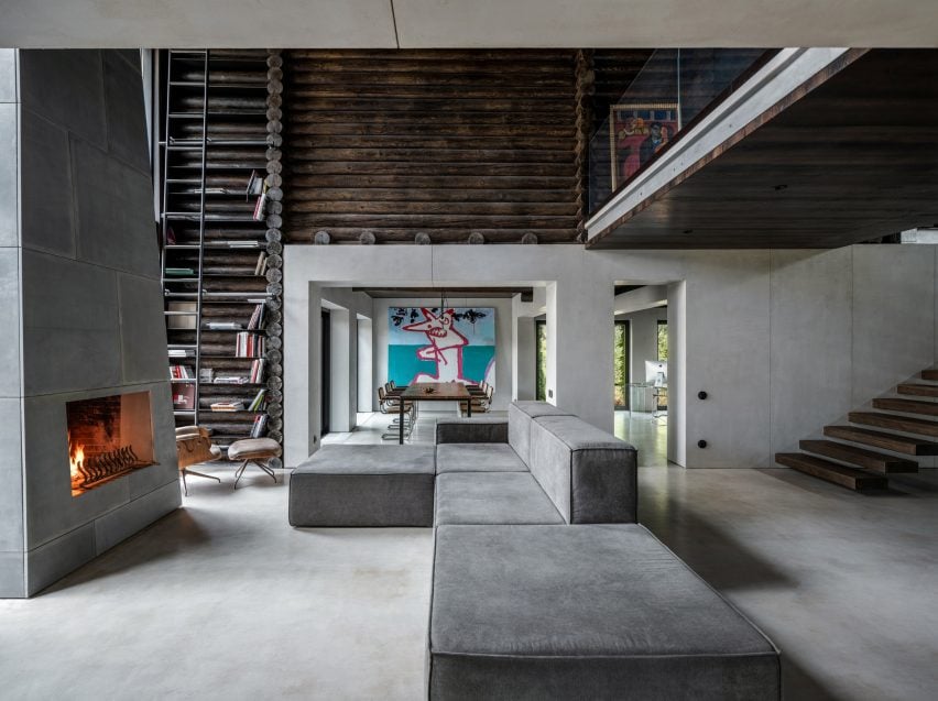
This living room belongs to a Ukrainian cabin, designed by Balbek Bureau with a utilitarian aesthetic that aims to challenge conventional cabin interiors.

Concrete is the predominant material, but stainless steel and wooden elements such as horizontally stacked logs also feature throughout. To add warmth, a giant fireplace takes centre stage and is positioned opposite a modular sofa on which visitors can cosy up.

Find out more about Relogged House ›


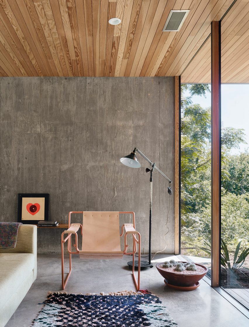
Living room of South 5th Residence by Alterstudio
Photo by Casey Dunn

South 5th Residence, USA, by Alterstudio Architecture

In this lounge, the stripped-back material palette helps to draw attention to the “dramatic vistas” over a valley in Austin, Texas.

Rough-textured concrete forms the walls of the space, while polished concrete lines the floor. Window frames made of wood and steel add to the room’s industrial look, and colour is introduced through furnishings including a tubular pink-metal armchair.

Find out more about South 5th Residence ›


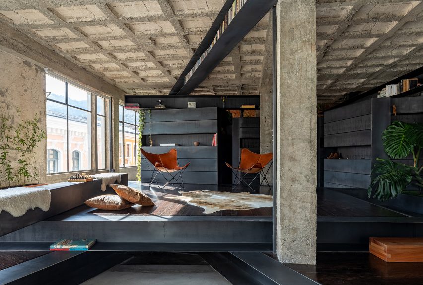
Living room of A Forest House by Aquiles Jarrín
Photo by JAG studio

A Forest House, Ecuador, by Aquiles Jarrín

Aquiles Jarrín married dark Chonta wood with black-steel beams and rough concrete for the design of this textural living room, found in A Forest House in Quito.

The wooden elements help break up the open-plan interior, carving out cosy nooks and storage spaces for the owner. The seating area is warmed by a cowhide rug and tan butterfly chairs.

Find out more about A Forest House ›


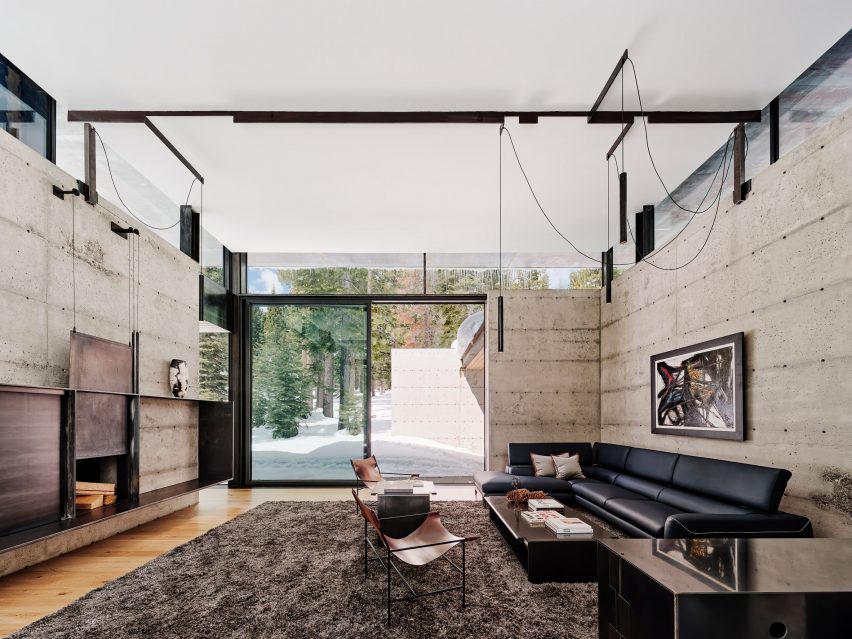
Kundig faulkner Analog House Truckee
Photo by Joe Fletcher

Analog House, USA, by Olson Kundig Architects

A tactile material palette of metal, concrete and glass tones was used for the living room of Analog House, a home in a Californian forest created by Olson Kundig Architects with the ​​founder of Faulkner Architects – the client for the project.

In the lounge, these materials are paired with light wooden floors and minimalist furnishings including hanging lights, a sleek black sofa and tubular chairs.

Find out more about Analog House ›

This is the latest in our lookbooks series, which provides visual inspiration from Dezeen’s archive. For more inspiration see previous lookbooks featuring interiors with furry walls, sculptural wooden staircases and rustic Italian interiors.

Reference

Ten dining rooms with built-in seating including benches and banquettes
CategoriesInterior Design

Ten dining rooms with built-in seating including benches and banquettes

Our latest lookbook explores homes where built-in benches or banquettes offer an inviting place to sit around the dining table, while also helping to save space.

Built-in seating is a popular solution in kitchens and dining rooms where the optimal position for a table is along a wall rather than in the centre of the space.

For homes where space is limited, a fixed bench can provide more seats than would otherwise be possible. It can also be a clever way of integrating extra storage, with concealed compartments under the seat.

The most straightforward approach is to build a fixed seat along one side of the table and then add dining chairs on the opposite side, although L-shaped or curved seating installations can also be possible, depending on the layout.

Whatever the design, the key to getting it right is ensuring that the table legs don’t clash with the base of the bench, so that it’s easy for people to get in and out.

Read on for 10 examples, ranging from a minimalist terrace in London to a warm and tactile family home in Melbourne.

This is the latest in our lookbook series, which provides visual inspiration from Dezeen’s archive. For more inspiration, other recent lookbooks feature colourful shower rooms and kitchens with tiled worktops.


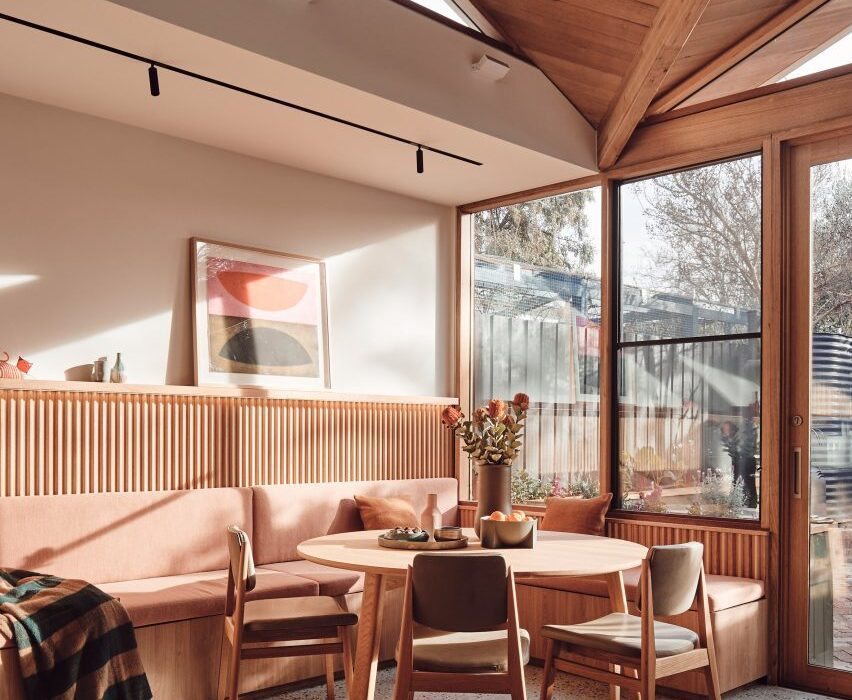
Built-in seating around the dining table in 10 Fold House, Australia, by Timmins + Whyte
Photo is by Peter Bennetts

10 Fold House, Australia, by Timmins + Whyte

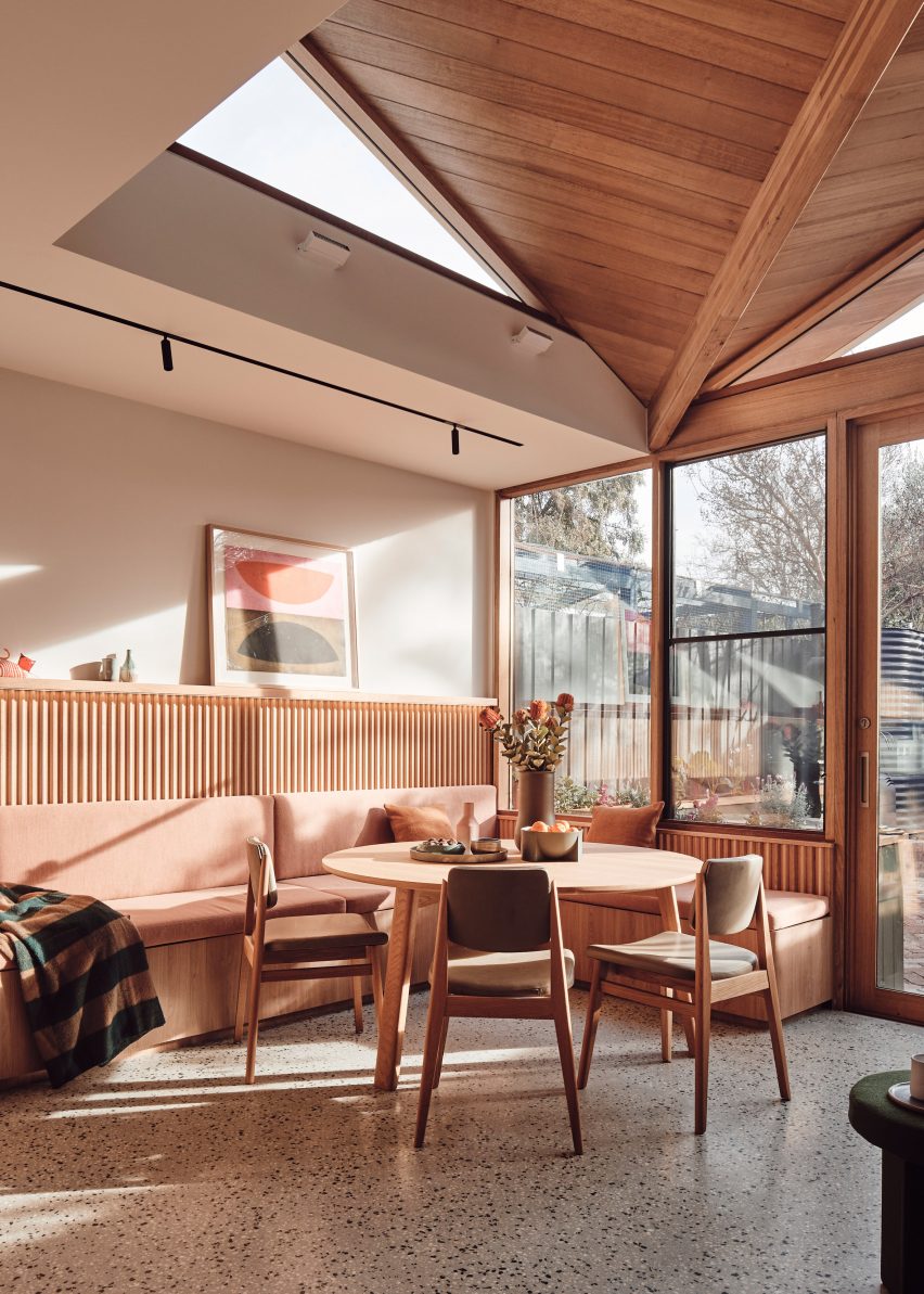
This extension to a family home in Melbourne, designed by architecture and design studio Timmins + Whyte, includes a casual dining space that slots into a corner between the kitchen counter and the end wall.

The L-shaped bench is topped with peach-toned cushions, which match the warm tone of the mid-century-style oak table. As well as providing comfort, they conceal storage areas underneath.

Find out more about 10 Fold House ›


Spruce House by Ao-ft
Photo is by Rory Gardiner

Spruce House, UK, by Ao-ft

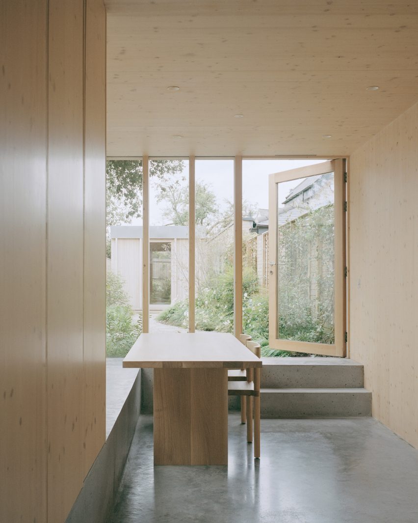
A bench seat forms an extension of the polished concrete floor in this cross-laminated timber-framed house in east London, designed by Ao-ft founders Liz Tatarintseva and Zach Fluker as their own home.

This is possible because the living space is slightly sunken. This means the concrete plinth, which actually sits at ground level, is the perfect height for sitting at the table.

Find out more about Spruce House ›


Project Karper by He!
Photo is by Tim Van de Velde

Karper, Belgium, by Hé!

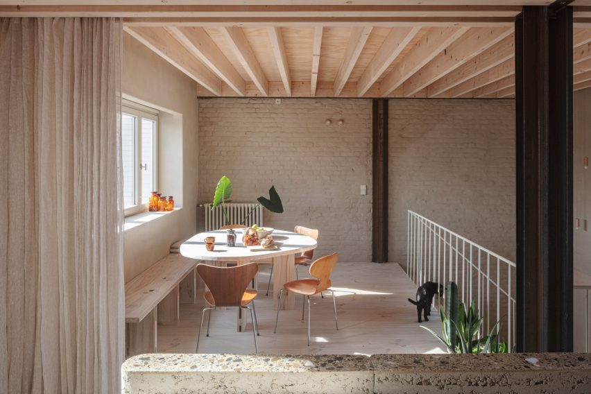
This converted warehouse in Brussels was designed to serve as either a family home or a co-living building, so it features a range of different live and work spaces. One of these is a casual dining space located next to the kitchen on the second floor.

A custom-made bench anchors this space to the side wall. A matching table has a squashed circle shape, creating the feel of a round table while also aligning with the seating fixture.

Find out more about Karper ›


Dining space in Frame House by Bureau de Change
Photo is by Gilbert McCarragher

Frame House, UK, by Bureau de Change

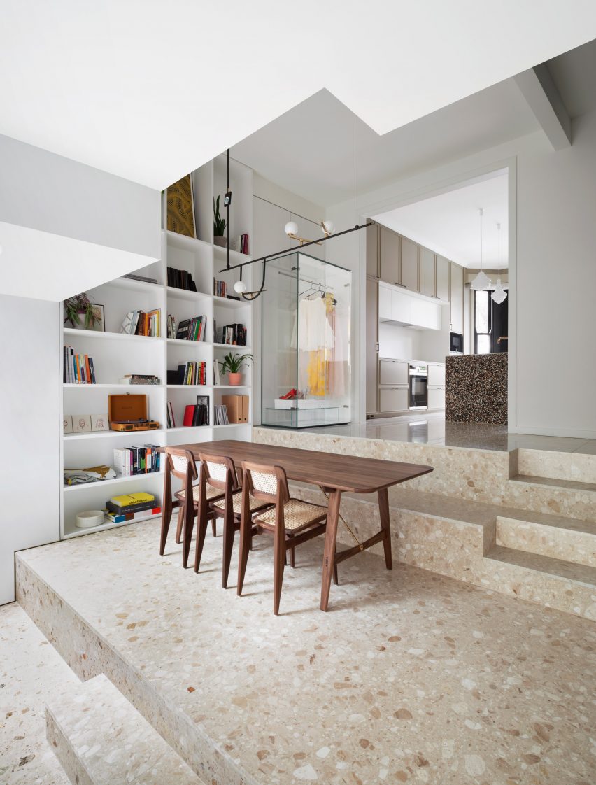
When remodelling this south London terrace, architecture studio Bureau de Change added a three-tiered extension at the property’s rear.

The stepped terrazzo floor was designed to incorporate casual seating areas, with one of them serving as a seating area for the adjacent dining table.

Find out more about Frame House ›


Interior of Steele's Road House by Neiheiser Argyros
Photo is by Lorenzo Zandri

Steele’s Road House, UK, by Neiheiser Argyros

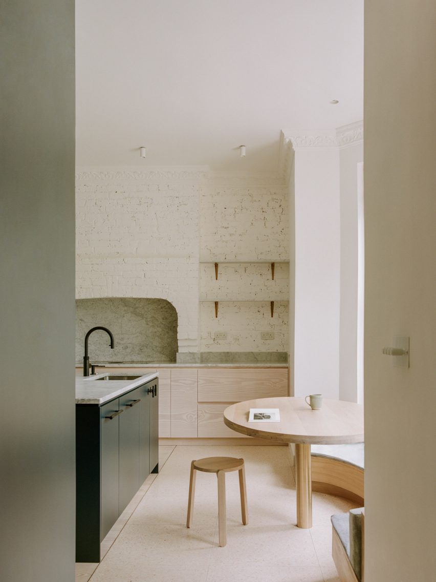
If a kitchen has a window bay, this can be a good place to create a seating area. This is what London studio Neiheiser Argyros did in its renovation of a Victorian terrace in the west of the city.

A curved banquette wraps the base of the window, framing a fixed cafe-style round table.

Find out more about Steele’s Road House ›


Dining room interior of Girona Street apartment in Barcelona, designed by Raúl Sanchez Architects
Photo is by José Hevia

Girona Street Apartment, Spain, by Raúl Sanchez Architects

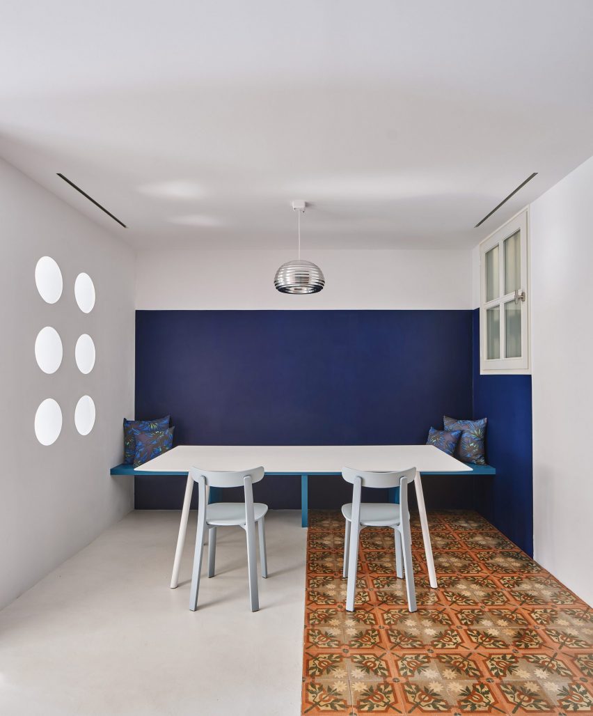
Barcelona studio Raúl Sanchez Architects employed colour-blocking to create the dining space for this renovated apartment in the city’s Dreta de l’Eixample neighbourhood.

A seating bench and the wall behind it are both painted deep blue, in contrast with the white tones elsewhere, which gives the dining space an increased emphasis.

Find out more about Girona Street Apartment ›


Kitchen with perforated breeze black walls and a timber ceiling
Photo is by Tom Ross

Sunday, Australia, by Architecture Architecture

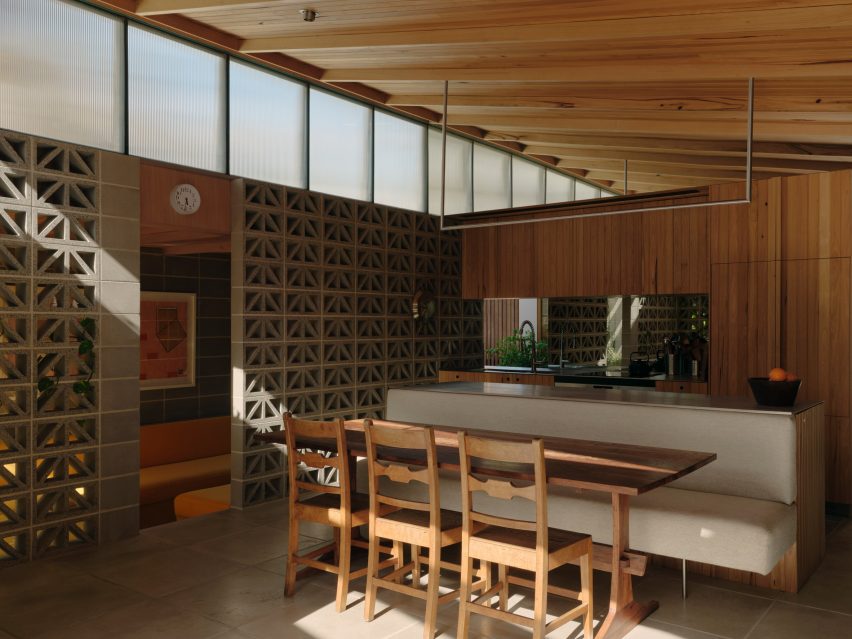
A kitchen island provides the backdrop to the dining table in this house in Melbourne designed by local studio Architecture Architecture.

Upholstered in a muted colour textile, the banquette has a cantilevered seat that slots neatly under a long, slender table, while traditional dining chairs are positioned on the opposite side.

Find out more about Sunday ›


Kitchen island with built-in bench seat at Scalloped Concrete House

Scalloped Concrete House, USA, by Laney LA

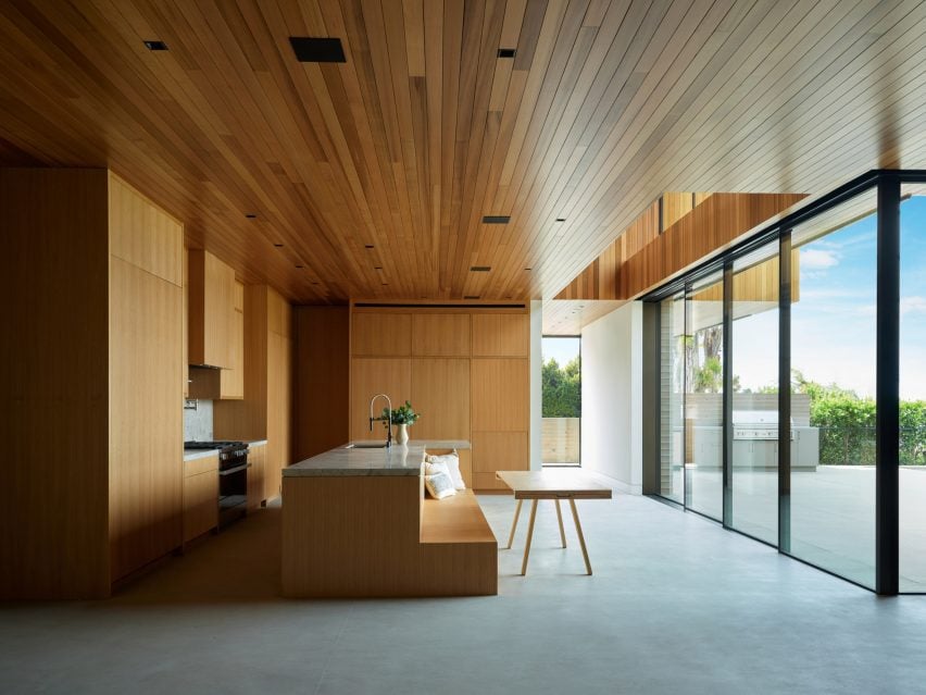
California-based studio Laney LA found another way to position a dining space beside a kitchen island for this home in Manhattan Beach, Los Angeles.

Instead of extending out, the bench seat is built into a recess within the wooden volume.

Find out more about Scalloped Concrete House ›


Dining table and bench seat in London terrace by O’Sullivan Skoufoglou Architects
Photo is by Ståle Eriksen

Kensington Place, UK, by O’Sullivan Skoufoglou Architects

In this extension of a mid-terrace property in London’s Kensington, a built-in bench allowed O’Sullivan Skoufoglou Architects to fit a dining table into a narrow space.

Built from plywood, the bench incorporates storage. It is slightly recessed at the base, while a backboard makes it feel more integrated with the wall behind.

Find out more about Kensington Place ›


Dining table with built-in banquette in Nido House by Angelucci Architects

Nido House, Australia, by Angelucci Architects

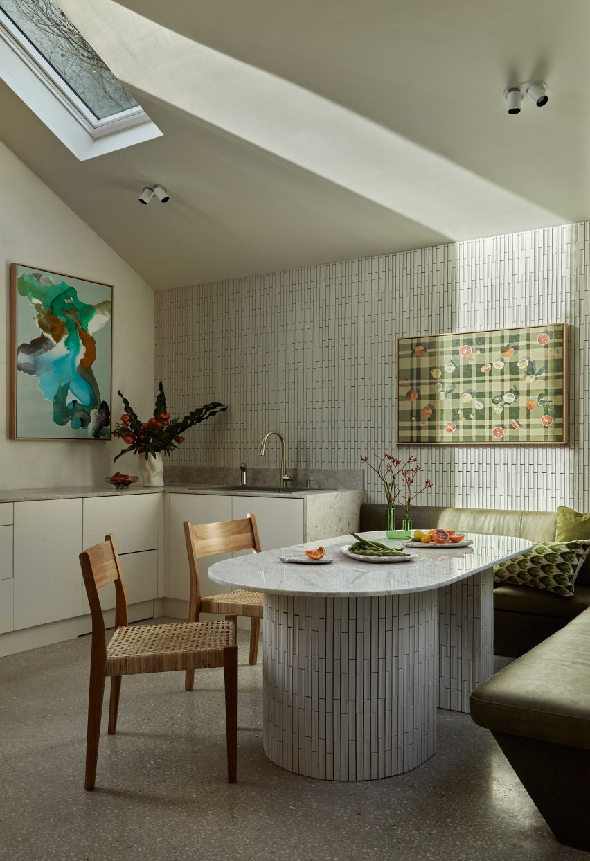
The ground floor spaces of this family home in Melbourne wrap around a glazed courtyard, so an L-shaped seat was the best solution for fitting in a dining table.

Designed by Angelucci Architects, the space incorporates a green leather banquette and a dining table featuring a marble surface and a base wrapped in ceramic tiles.

Find out more about Nido House ›

Reference

Eight living rooms featuring low-slung furniture and seating
CategoriesInterior Design

Eight living rooms featuring low-slung furniture and seating

Low-back sofas and armchairs play a key role in our latest lookbook, which explores how low-slung furniture can make living rooms feel more relaxed and less formal.

When lounge furniture sits low to the ground, it can make a big difference to the mood of the room.

Low-back seats are typically more generous in width, so the sitting position doesn’t have to be as upright. This means sofas can sometimes feel more like beds.

This type of furniture works well in open-plan interiors, as it can divide up the space without making different areas feel too separate. But it can also be used to soften rooms that are heavily decorative.

Read on for eight examples, including a London loft renovation and a California home.

This is the latest in our lookbook series, which provides visual inspiration from Dezeen’s archive. For more inspiration, other recent lookbooks feature colourful bedrooms and kitchens with tiled worktops.


Lounge windows in St John Street warehouse apartment by Emil Eve Architects
Photo is by Mariell Lind Hansen

St John Street, UK, by Emil Eve Architects

The aim behind this renovation of a former warehouse space in London’s Clerkenwell neighbourhood was to make it feel more comfortable without losing its industrial character.

A low-slung, L-shaped sofa helps to create that mood in the living space. Other furniture elements are also set low, allowing the exposed brickwork walls to be the key focal point.

Find out more about St John Street ›


Vasto gallery by Mesura apartment interior
Photo is by Salva López

Casa Vasto, Spain, by Mesura

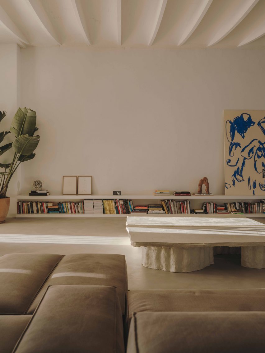
This converted factory apartment in Barcelona’s El Poblenou neighbourhood doubles as a gallery, so it plays host to an ever-changing roster of collectable art and design pieces.

Low-lying furnishings help to enhance the apartment’s high, vaulted ceilings, creating an optimal setting for display.

They include a modular sofa system that can be arranged in different ways and an equally low coffee table made out of construction waste.

Find out more about Casa Vasto ›


Minimalist living room inside House by the Sea by Of Architecture
Photo is by Lorenzo Zandri

House by the Sea, UK, by Of Architecture

The open-plan ground floor of this seaside house in Cornwall includes two lounge spaces. One is designed as a snug, with a high-back sofa and a hearth, while the other has a more casual feel.

The sofa in this second space is a modular L-shaped piece, upholstered in beige marl fabric.

Its low back helps the space feel connected with the adjacent kitchen and allows views across to the expansive sliding windows, which offer a view of Newquay’s picturesque Pentire Steps beach.

Find out more about House by the Sea ›


Sausalito Outlook by Feldman Architecture
Photo is by Joe Fletcher

Sausalito Outlook, USA, by Feldman Architecture

The living room of this renovated 1970s house on San Francisco Bay features an iconic low-slung seating design that was launched around the same time.

Designed by Michel Ducaroy in 1973 and produced by Ligne Roset, the Togo chairs and sofas look like slouchy, oversized cushions, but their foam filling is surprisingly supportive.

Here, they create two seating areas that can be used for reading, watching television or looking out at the sea view.

Find out more about Sausalito Outlook ›


Family lounge in Twentieth house by Woods and Dangaran
Photo is by Joe Fletcher

Twentieth, USA, by Woods + Dangaran

Generous, low furniture pieces are a recurring theme in this three-storey house in Santa Monica, which was designed to be practical for day-to-day life and able to host parties and gatherings.

The most striking example is a set of four club chairs with swivel bases, organised around a polished stone coffee table in one of two ground-floor living rooms.

Find out more about Twentieth ›


Exterior of NZ10 Apartment in Spain by Auba Studio
Photo is by José Hevia

NZ10 Apartment, Spain, by Auba Studio

Low-back furniture can work well in rooms that connect indoors with outdoors, where the atmosphere is typically less formal. This apartment in Palma de Mallorca is a prime example.

Located in a converted bakery, the home features full-height sliding doors that connect a rear lounge space with patio terrace. The room is furnished with a casual, low sofa that extends all the way along one side.

Find out more about NZ10 Apartment ›


Canal Saint-Martin apartment by Rodolphe Parente
Photo is by Giulio Ghirardi

Apartment Canal Saint-Martin, France, by Rodolphe Parente

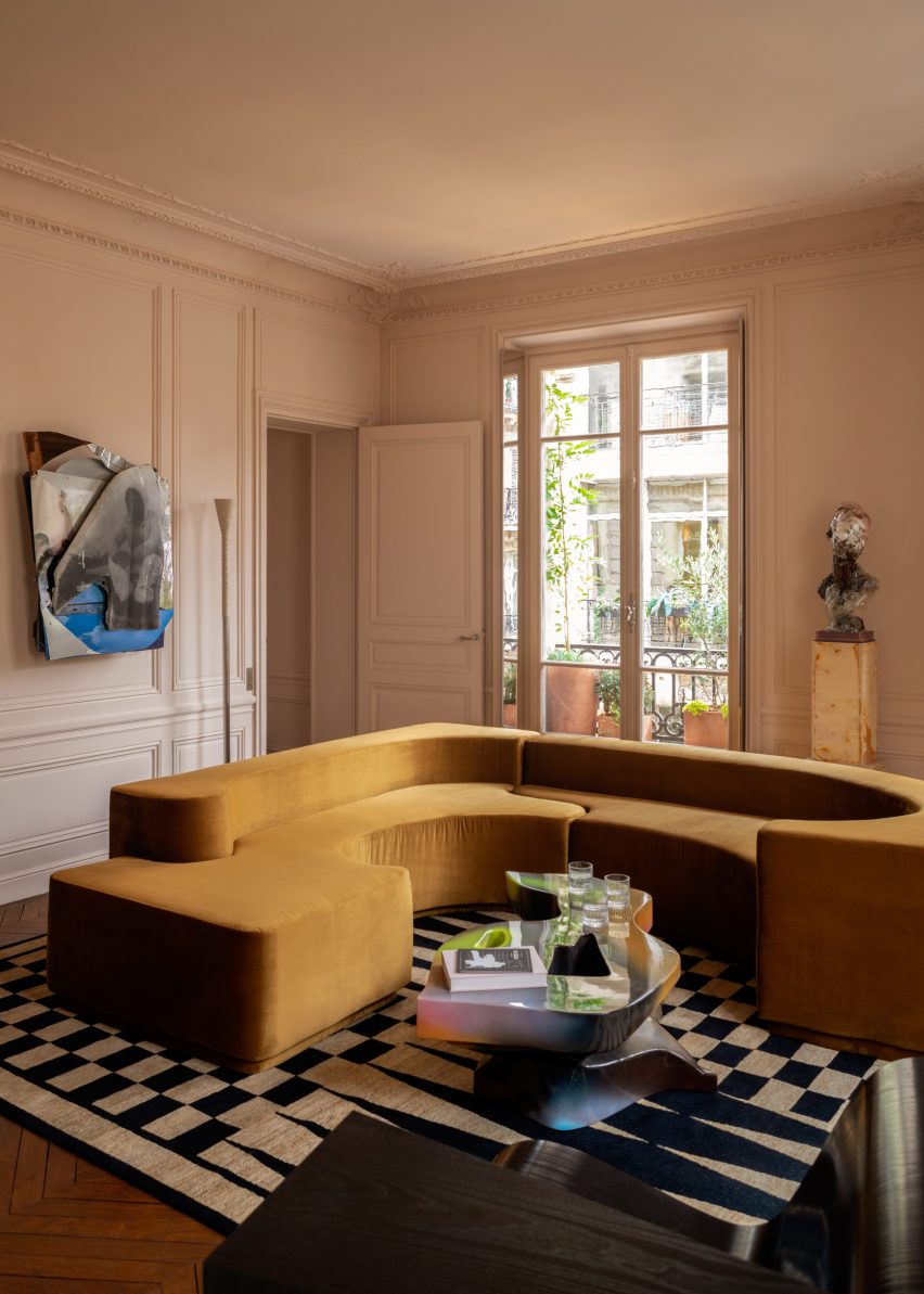
The living room of this renovated Haussmann-era apartment in Paris centres around a sculptural vintage sofa, upholstered in mustard-yellow velvet.

The piece has a formal, geometric shape that complements the building’s period details, while its low shape offers a contemporary feel that is echoed by other playful artworks and furnishings in the room.

Find out more about Apartment Canal Saint-Martin ›


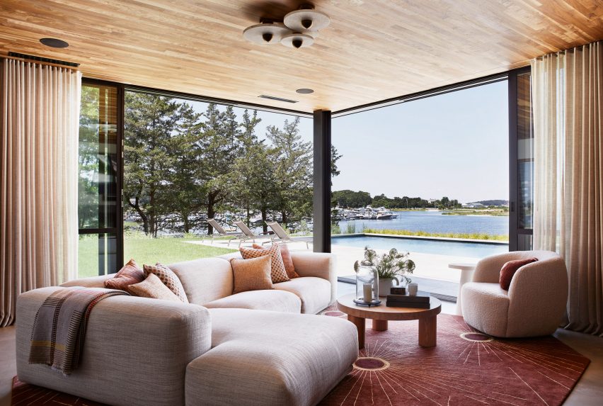
Low-slung sofa in Sag Harbor 2
Photo is by Read McKendree

Sag Harbor 2, USA, by KOS+A

Sunset views were a priority for the owners of this waterfront house in the Hamptons, the popular retreat destination for New Yorkers.

The waterfront facade is largely glazed to maximise views, so it made sense to choose unobtrusive furniture. For the family lounge, this meant a low-slung L-shaped sofa and a curved club chair.

Find out more about Sag Harbor 2 ›

This is the latest in our lookbook series, which provides visual inspiration from Dezeen’s archive. For more inspiration, other recent lookbooks feature colourful bedrooms and kitchens with tiled worktops.

Reference

Eight living rooms enhanced by decorative and striking art pieces
CategoriesInterior Design

Eight living rooms enhanced by decorative and striking art pieces

For our latest lookbook, we have gathered eight examples of serene living rooms where well-curated artworks add a touch of creativity.

Paintings, sculptures and other art pieces can add a more personal feel to interiors, as seen in these eight art-filled living rooms.

While some have gone all in on the art, others chose just one or two signature pieces to create a creative atmosphere.

Either way, smartly placed artworks can enhance an interior and give homes a more personal feel.

This is the latest in our lookbooks series, which provides visual inspiration from Dezeen’s archive. For more inspiration see previous lookbooks featuring living rooms with cowhide rugs, monochrome interiors and basement apartments.


Amagansett house by Athena Calderone
Photo by Nicole Franzen

Amagansett house, US, by Athena Calderone

Plaster walls, marble details and linen fabric were used to decorate this renovated mid-century home in Long Island, New York.

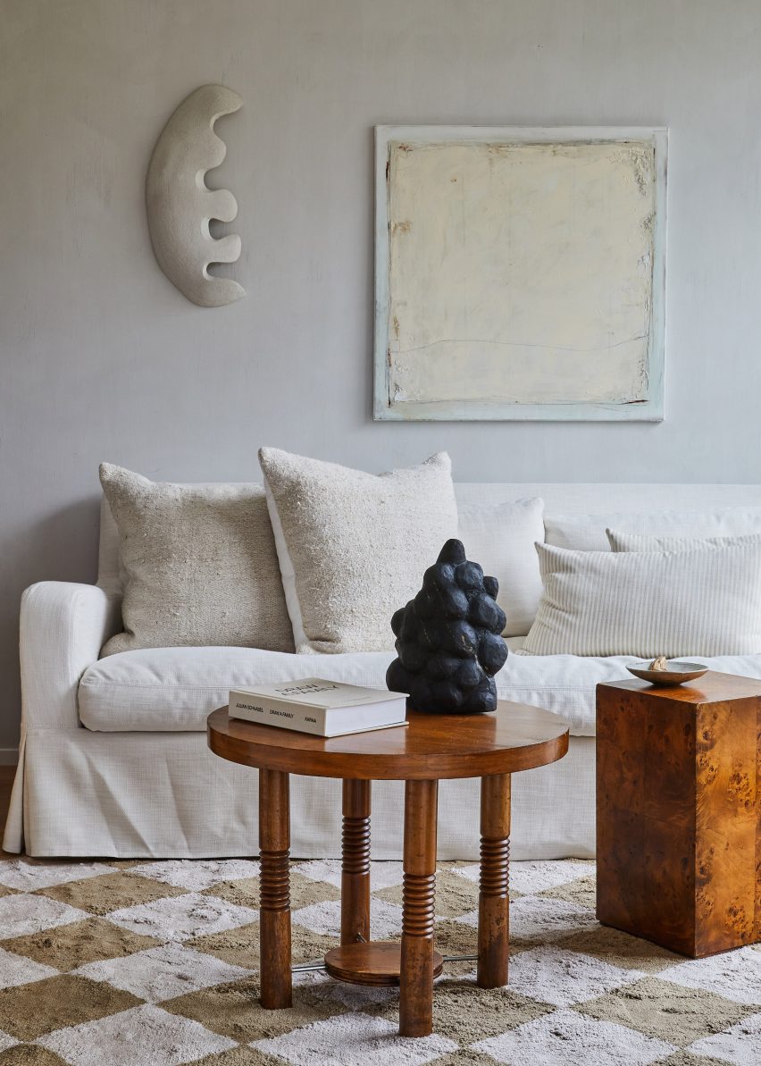
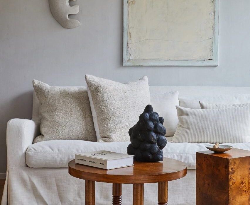
Owner and designer Athena Calderone also added plenty of sculptures and paintings to the interior, including in the living room where white artworks with playful textures and shapes add interest to the pale walls.

Find out more about the Amangansett house ›


Living room with mosaic and gallery walls
Photo by Fran Parente

Gale Apartment, Brazil, by Memola Estudio

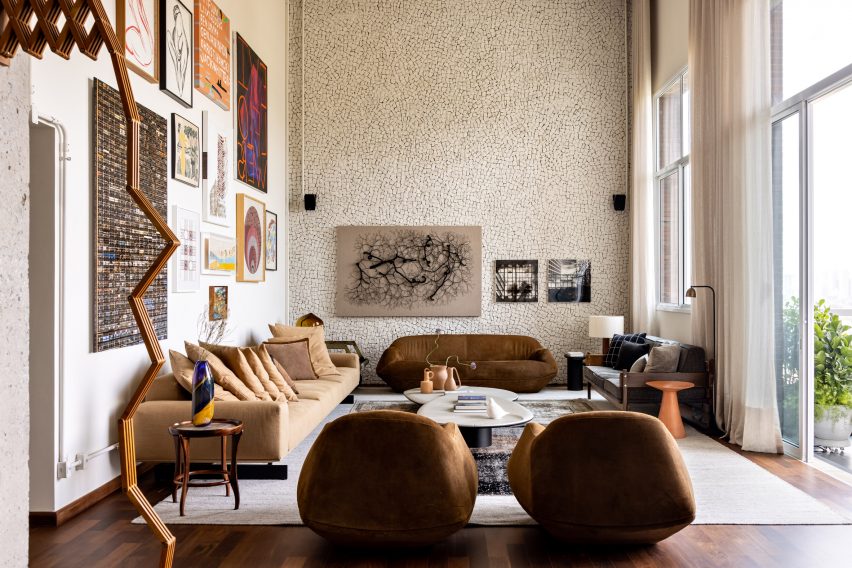
Brazilian studio Memola Estudio aimed to balance natural and industrial materials in this apartment in São Paulo, which has a double-height living room.

The owners took advantage of the height to create a gallery wall on one side of the living room. Artworks also decorate an adjacent mosaic wall, giving the whole room a gallery-like feel.

Find out more about Gale Apartment ›


Vasto gallery by Mesura apartment interior
Photo by Salva López

Casa Vasto, Spain, by Mesura

Designed to be both an apartment and an art gallery, this home in a former factory in Barcelona features an exquisitely curated living and exhibition space.

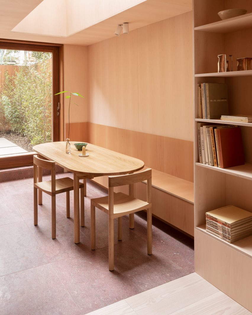
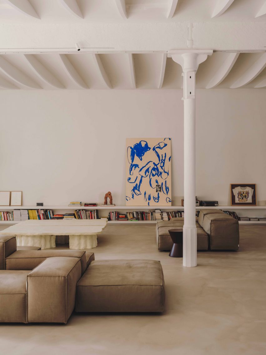
A large abstract blue-and-beige painting sits on top of a low bookshelf, which also displays a sculpture and multiple smaller paintings.

Find out more about Casa Vasto ›


Living room in Kew Residence by John Wardle Architects in Melbourne, Australia
Photo by Trevor Mein and Sharyn Cairns

Kew Residence, Australia, by John Wardle Architects

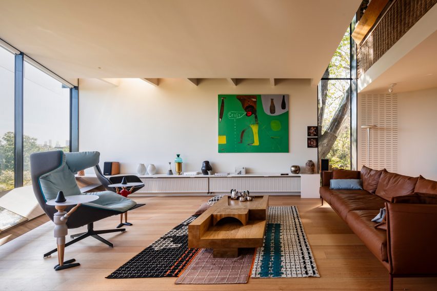
A large contemporary painting in a bright green hue decorates the living room of this house in Melbourne, the home of architect John Wardle.

Other artful details include playful side tables held up by mannequins, a sculptural wooden coffee table and numerous small vases and sculptures.

Find out more about Kew Residence ›


Living room in Riverside Tower flat
Photo by Olmo Peeters

Riverside Tower, Belgium, by Studio Okami Architecten

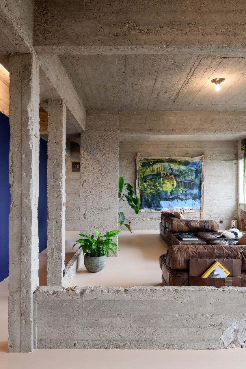
Located inside the brutalist Riverside Tower in Antwerp, this pared-back apartment has made a feature out of its original concrete structure.

In the living room, the material is juxtaposed with a dark blue wall and a large painting in green and blue hues. Cosy leather sofas and green plants add a homely feel.

Find out more about Riverside Tower ›


Photograph showing large sofa in living area looking into dining area
Photo by Andrey Bezuglov and Maryan Beresh

Log cabin, Ukraine, by Balbek Bureau

This house in Ukraine, a modern interpretation of a log cabin, features a number of striking and strategically placed artworks in the open-plan living room and dining room.

Above the dining table hangs a large painting in a neo-expressionist style, integrating turquoise, white and pink to create an eye-catching focal point among the room’s more neutral colours.

Find out more about the log cabin ›


Malibu Surf Shack by Kelly Wearstler
Photo by by Ingalls Photography and Mark Durling Photography

Malibu Surf Shack, USA, by Kelly Wearstler 

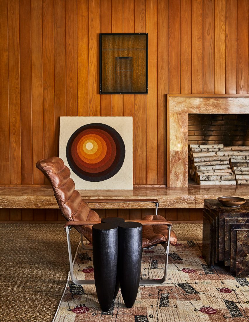
Designer Kelly Wearstler created Malibu Surf Shack, a renovated 1950s beachfront cottage, as a bohemian retreat for herself and her family.

Its wood-clad living room has been enhanced by artworks in tonal colours that match the warm panelling, as well as tactile timber sculptures and geometric stone tables.

Find out more about Malibu Surf Shack ›


Canal Saint-Martin apartment by Rodolphe Parente
Photo by Giulio Ghirardi

Paris apartment, France, by Rodolphe Parente

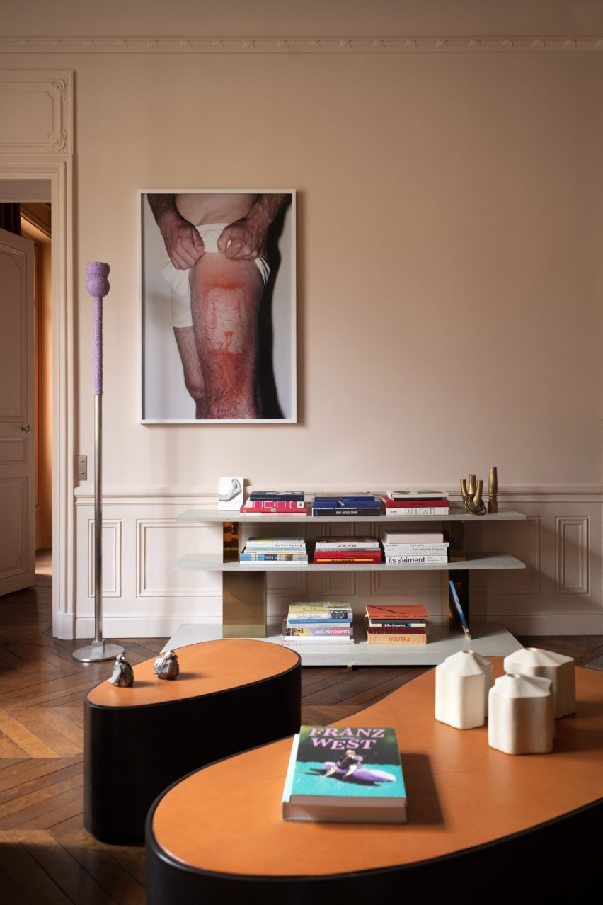
This apartment in a Haussmann-era building in Paris was given a makeover by interior designer Rodolphe Parente.

Parente played with contrasting materials and colour palettes in the apartment, which was designed around the owner’s “radical” art collection. In the living room, a framed photo print hangs on an otherwise empty wall overlooking two sculptural coffee tables.

Find out more about the Paris apartment ›

This is the latest in our lookbooks series, which provides visual inspiration from Dezeen’s archive. For more inspiration see previous lookbooks featuring living rooms with cowhide rugs, monochrome interiors and basement apartments.

Reference

Ten living rooms decorated with textural cowhide rugs
CategoriesInterior Design

Ten living rooms decorated with textural cowhide rugs

From a ranch in Colorado to a treehouse in Australia, the living spaces in this lookbook are united by the grounding presence of cowhide rugs.

Animal skins have been used in dwellings for warmth and decoration for thousands of years. More recently, cowhide rugs – which were popularised in America – have become a common sight in interiors around the world, thanks to their recognisable pattern, outline and durability.

Each hide has unique colourations and patterning, with variations in texture depending on the breed of the animal. One side features the hair, while the reverse is plain leather – the result of the tanning process.

Cowhides imbue a cosy cabin-like feel, and can both blend into rustic homes and add timeless contrast in more minimalist interior schemes.

This is the latest in our lookbooks series, which provides visual inspiration from Dezeen’s archive. For more inspiration see previous lookbooks featuring underground bedrooms, kitchens that combine stone with wood and interiors with bright yellow accents.


Bully Hill House by Studio MM
Photo by Brad Feinknopf

Bully Hill House, USA, by Studio MM

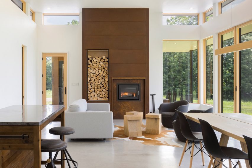
A tan and white cowskin rug adds warmth to this lofty living space in a rural house in upstate New York.

The skewbald floor covering lends a rustic edge to the living space, and is bolstered by the saloon-style bar stools and a fire surround clad in Corten steel with a niche for storing chopped firewood.

Find out more about Bully Hill House ›


Seating area with cow hide rug and book shelves
Photo by Fernando Marroquín, Jaime Navarro and Beto Lanz

Mexican house, Mexico, by Amezcua

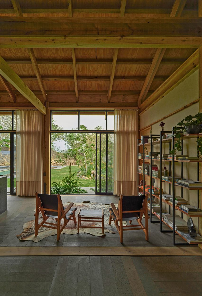
A dappled cowskin rug adorns the volcanic stone floor of the living room in this modular holiday house in Mexico.

The brown and white rug zones the seating area, which comprises two chairs and a side table made from wood and leather and is flanked by a simple bookshelf in matching hues.

Find out more about the Mexican house ›


Open-plan living and dining room in a timber farmhouse with open walls
Photo by Christopher Stark

Sonoma farm house, USA, by Tyreus Design Studio

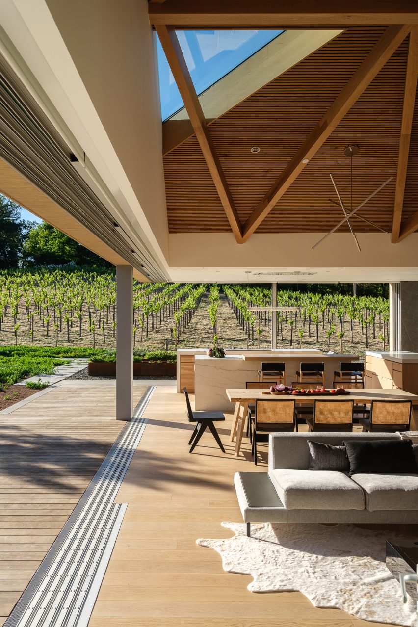
Nature is ever-present in this house in California, thanks to its expansive sliding doors as well as the earthy elements of the interior scheme, including a pale cowskin rug.

The lightly dappled coat appears to glow in the sunlight and echoes the striated white marble kitchen counter on the other side of the interior.

Find out more about Sonoma farm house ›


Seating area in front of large window overlooking trees
Photo by Matthew Millman

Paintbrush Residence, USA, by CLB Architects

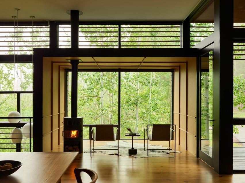
A vast picture window and a cylindrical log burner flank the cowhide floor covering in this contemplative seating area in a house in Wyoming.

The curving outline of the grey and white hide provides a textural contrast to the regular linear shapes in the timber wall and ceiling cladding that encloses the area.

Find out more about Paintbrush Residence ›


Photograph showing loft room with skylight and chair
Photo by BoysPlayNice

Czech house, Czech Republic, by Atelier SAD and Iveta Zachariášová

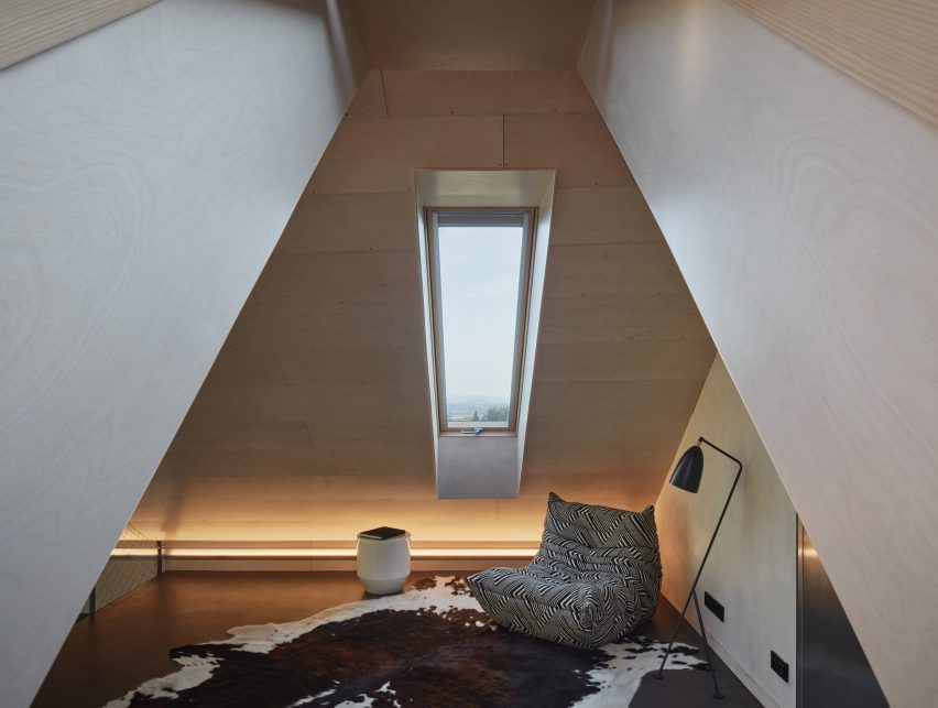
This gabled living space in the ceiling of a house in the Czech Republic is dominated by a large brindle cowhide.

The rug’s naturally irregular patterning is offset by the geometric floor lamp and a ribbed seat covered in black-and-white zigzag upholstery.

Find out more about the Czech house ›


Interior of Pepper Tree Passive House by Alexander Symes
Photo by Barton Taylor

Pepper Tree Passive House, Australia, by Alexander Symes

A cream cowhide with a pronounced brown stripe running down its centre straddles two types of flooring in this unique house in New South Wales, Australia.

Built around a 60-year-old pepper tree, the interior has a fundamentally neutral colour palette punctuated by plants.

Find out more about Pepper Tree Passive House ›


Living room and kitchen with brown cow hide rug
Photo by Cristóbal Palma

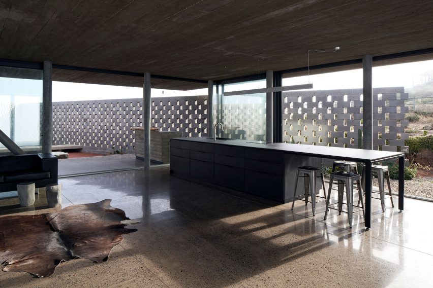
LBS house, Chile, by Umberto Bonomo and Felipe Alarcón

Overlooking a V-shaped wall made from cinder blocks, the industrial-style living space in this Chilean house is softened by the presence of a glossy brown cowhide.

The use of concrete and metal throughout the interior is offset by the rug’s organic feel.

Find out more about LBS house ›


Reforma Alas by OMCM Arquitectos
Photo by Leo Mendez

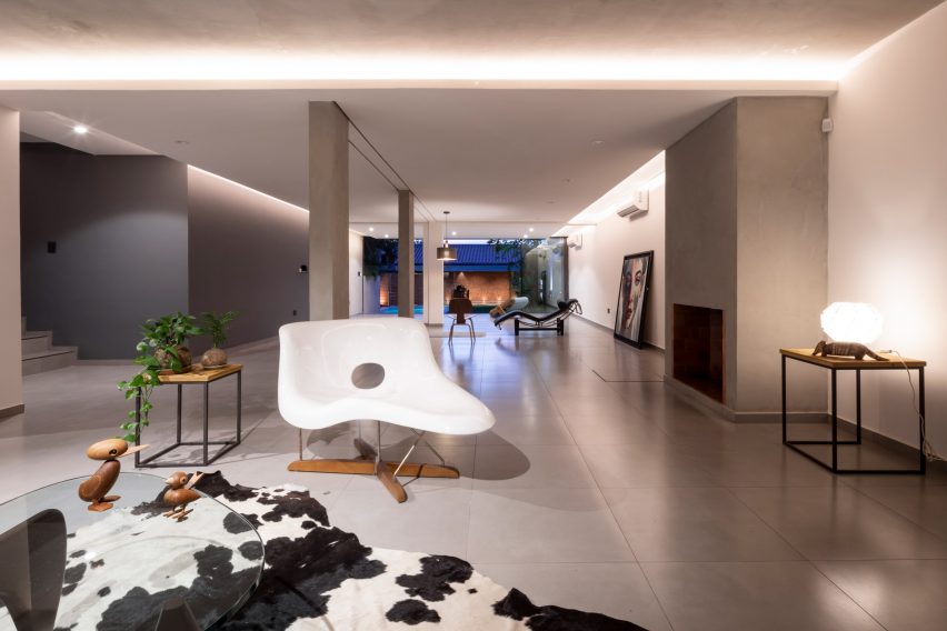
Reforma Alas, Paraguay, by OMCM Arquitectos

A classic black-and-white spotted cowhide lines the floor in the airy open-plan living room of this house in Paraguay.

The rug provides a focal point in the otherwise minimally decorated space, which is defined by the use of grey and white hues on the walls and floors.

Find out more about Reforma Alas ›


Rockham House is a house in Devon that was designed by Studio Fuse
Photo courtesy of Studio Fuse

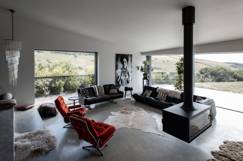
Rockham House, UK, by Studio Fuse

The laid-back living room in this house in Devon centres around a pale cowskin that sprawls across the concrete floor.

The room’s broad picture windows frame views of the countryside, with the hide retaining the space’s cosiness with help from a suspended fireplace.

Find out more about Rockham House ›


Goatbarn Lane by Renee Del Gaudio
Photo by David Lauer

Goatbarn Lane, USA, by  Renée del Gaudio Architecture

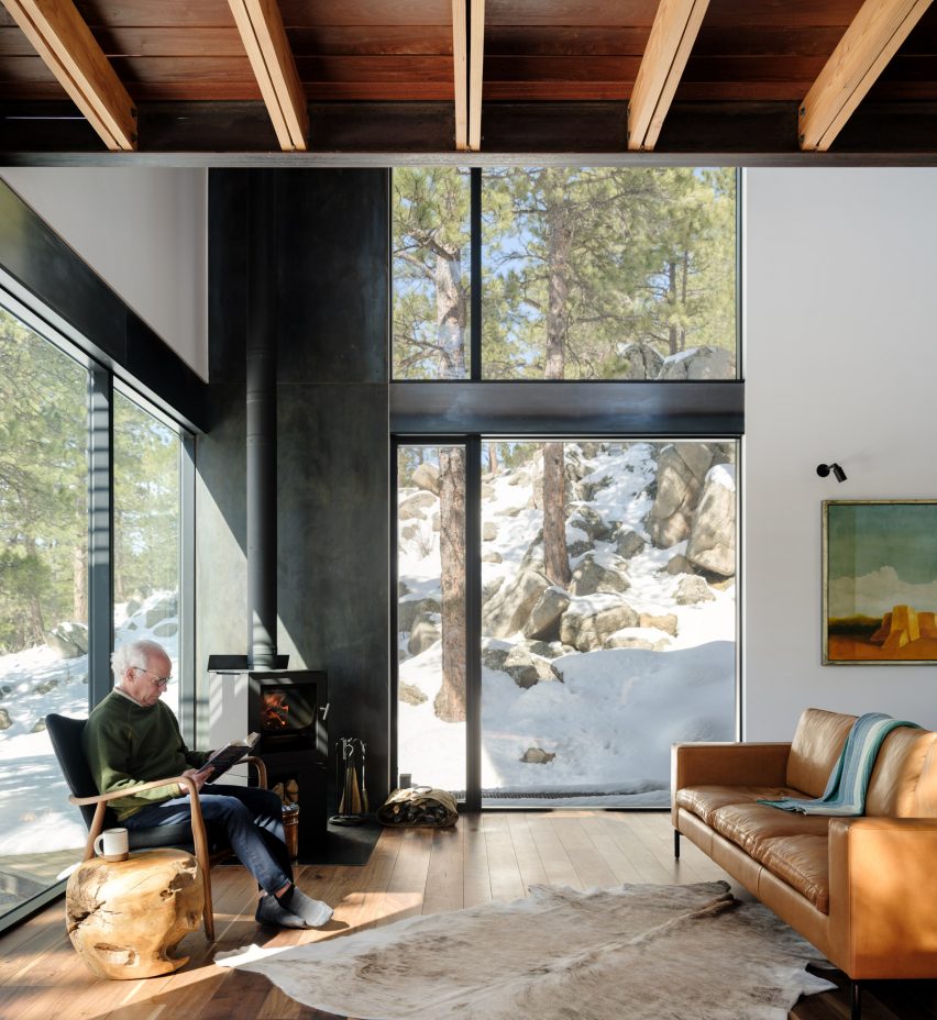
An orange leather sofa, a side table made from gnarled wood and a light-coloured brindle cowskin rug huddle around a fireplace in the corner of the living room in this house in the Rocky Mountains.

Despite the rugged setting, warmth and comfort are instilled in the interior through the use of soft furnishings and warm-toned wooden floors.

Find out more about Goatbarn Lane ›

This is the latest in our lookbooks series, which provides visual inspiration from Dezeen’s archive. For more inspiration see previous lookbooks featuring underground bedrooms, kitchens that combine stone with wood and interiors with bright yellow accents.

Reference

Hotel Genevieve in Louisville features colour-coordinated guest rooms
CategoriesInterior Design

Hotel Genevieve in Louisville features colour-coordinated guest rooms

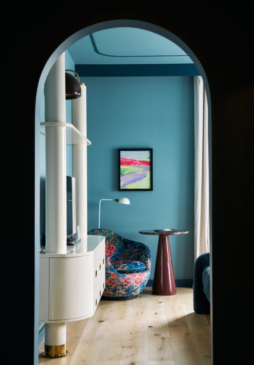
Room types are organized by bold colours at this hotel in Louisville, Kentucky, which was designed by US hospitality group Bunkhouse and Philadelphia-based design studio Rohe Creative.

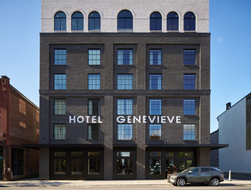
Located in Louisville’s East Market district, also known as NuLu (New Louisville), Hotel Genevieve occupies a new six-storey, black-brick building that’s within walking distance of some of the city’s biggest tourist attractions.

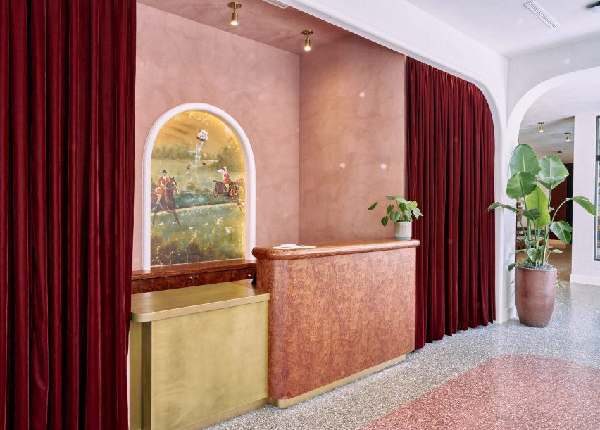
Lobby with pink terrazzo floor and matching plaster walls
In the hotel’s lobby, pink terrazzo flooring matches the plasterwork behind the reception desk

The hotel takes its name from a regional type of limestone, Saint Genevieve, which is a key ingredient in local bourbon production and also prevalent in Texas, where operator Bunkhouse is based.

The company collaborated with Rohe Creative on the interiors, which are intended to reference Louisville’s history.

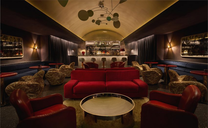
Dark bar lounge with a vaulted golden ceiling
Communal spaces for guests include a speakeasy-style bar with a golden vaulted ceiling

In the lobby, pink tones of terrazzo flooring are echoed in the plasterwork behind the reception desk, surrounding an equestrian-themed mural.

Artworks are displayed on white walls and in front of red velvet curtains to form a gallery around the lobby seating areas and corridors.

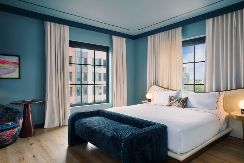
Blue guest bedroom with large bed
The rooms are coloured by type and the smaller spaces feature a blue palette

The adjacent all-day restaurant, Rosettes, serves food made with local ingredients and is influenced by al fresco Parisian cafes and chef Ashleigh Shanti’s Southern background. This bright, brasserie-like space combines green-tiled floors with colourful dining chairs and retro light fixtures.

“Richly decorated, each design accent tells a story, from bold usages of colour to a playful mix of vintage and modern furniture, and a vivacious art program featuring local talent,” said the hotel team.

View through an arched opening into a blue bedroom
The chosen colour in each room extends across the wall and ceiling, as well as into the bathrooms

A mini market on the ground floor, which is “part convenience store, part pop art installation”, sells locally sourced provisions, handmade artisanal goods, and coffee and snacks to go.

There’s also a dark and moody speakeasy-style bar with lounge seats and a golden vaulted ceiling.

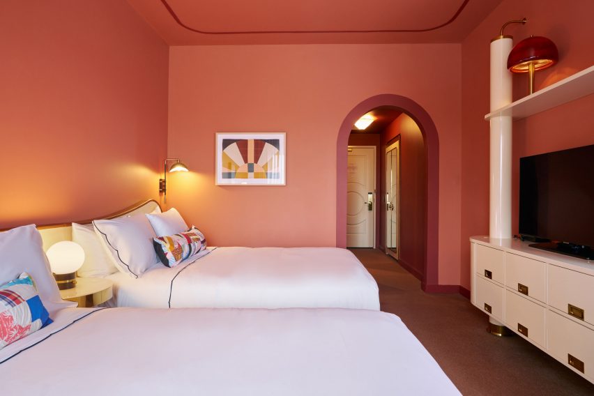
Terracotta-coloured hotel room with two queen beds
Double Queen rooms are decorated in a terracotta hue

“Luxurious and feminine architectural details bring life to the space and reference the city’s namesake, King Louis XVI, heavily featuring Louisville’s vibrant local flora and fauna, with goldenrod [plants] shining throughout the suites and ground-floor restaurant,” said the hotel team.

The hotel’s 122 guest rooms are each painted a distinct colour that correlates with their size or type. These hues cover the walls and ceilings, and also extend into the bathrooms via floor and shower tiles.

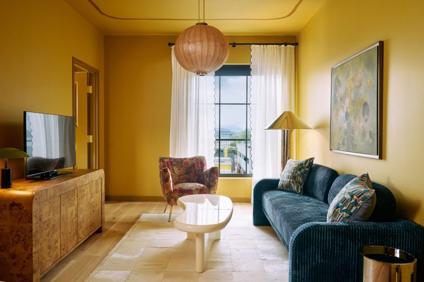
Yellow-coloured living room within a hotel room
Four Suite Genevieve rooms have a separate living room and are coloured yellow

Smaller rooms, including the King Louie and Petite King categories, feature a blue palette, while the slightly larger Double Queens are decorated in a terracotta hue.

Four Grand King rooms accommodate a seating area and are also painted blue, while an additional four Suite Genevieve rooms have a separate living room and are coloured yellow.

All of the rooms boast custom features and fittings by ROHE, as well as paintings and prints by Kentucky-born artist John Paul Kesling.

The rooftop venue, Bar Genevieve, serves cocktails and French-Mediterranean food from an indoor space that opens to the outdoors.

Spacious bar area with teal accents
Bar Genevieve on the top floor features teal accents and can be hired for private events

The bar area is accented with deep teal colours across the counter, stool seats, arched window frames and floor-to-ceiling velvet curtains that can be used to divide up the room.

Hotel Genevieve has also partnered with local organisations Black Soil Kentucky, Louisville Orchestra, and the Olmsted Parks Conservancy for programming across its varied communal spaces.

Exterior view of black-brick building
The hotel occupies a new black-brick building in Louisville’s East Market district

Kentucky draws visitors for its bourbon production and horse racing heritage, and demand for high-end accommodation in the state appears to be on the rise: a new five-star hotel called The Manchester also recently opened in Lexington.

Bunkhouse operates multiple properties across North America, including the Austin Motel and nearby Hotel Magdalena, Phoenix Hotel in San Francisco and Hotel San Cristóbal in Los Cabos, Mexico.

The photography is by Nick Simonite.

Reference

Eight sunny yellow interiors from kitchens to living rooms
CategoriesInterior Design

Eight sunny yellow interiors from kitchens to living rooms

One-palette rooms and statement staircases are featured in our latest lookbook, which explores the best yellow interiors from the Dezeen archives.

From soft, buttery hues to vivid primary colours and deeper mustards, these residential and commercial spaces have challenged the use of traditional shades to create unique, eye-catching yellow interiors.

The use of yellow has been incorporated into bedrooms, living rooms, kitchens and facades, whether it is contrasting with brighter colours, blending with other honey tones or standing out against neutral materials.

This is the latest in our lookbooks series, which provides visual inspiration from Dezeen’s archive. For more inspiration see previous lookbooks featuring interiors with lime plaster walls, Barbiecore pink aspects and retro nods to Wes Anderson.


Beresford Road by Russian for Fish
Photography is by Peter Landers

Beresford Road property, London, by Russian for Fish

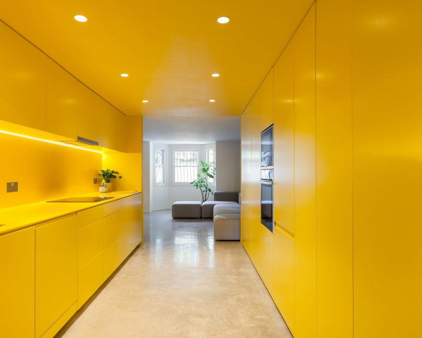
This London-based apartment features a statement yellow kitchen that was used to brighten the basement and complement the other colours in the space. Russian for Fish used the same vivid shade throughout the entirety of the kitchen, which also continues to the staircase.

Plant pots are added to the area to create dimension, with the green tones adding more colour to the otherwise yellow and neutral home.

“Yellow is a great colour – it brings out the ochre tones of the natural concrete floor, compliments the off-white walls, and creates warmth throughout the flat, even on the dullest of days,” says architect and founder at Russian for Fish, Pereen d’Avoine.

Find out more about Beresford Road property ›


Seven Lives by Anna and Eugeni Bach
Photography is by Eugeni Bach

Seven Lives, Spain, by Anna and Eugeni Bach

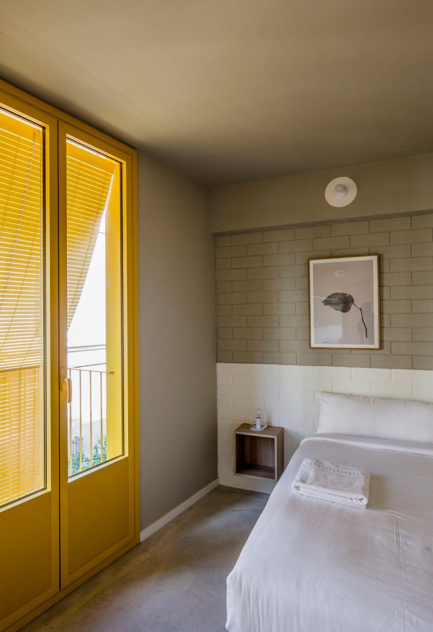
Spanish architecture studio Anna and Eugeni Bach built this apartment block in Barcelona, adding primary yellow features to the facade that add a vibrant touch to the interiors.

The building has yellow window frames and grills, balconies and blinds that are all visible from the apartments, as well as yellow internal doors to the balconies. These statement attributes contrast with the grey stucco and internal walls.

The shade – which was selected as it was approved by the area’s regulators – is also used in the communal staircase.

Find out more about Seven Lives ›


Bright yellow modular kitchen in compact apartment
Photography is by René de Wit and Pim Top

Residential complex, The Netherlands, by Shift Architecture Urbanism

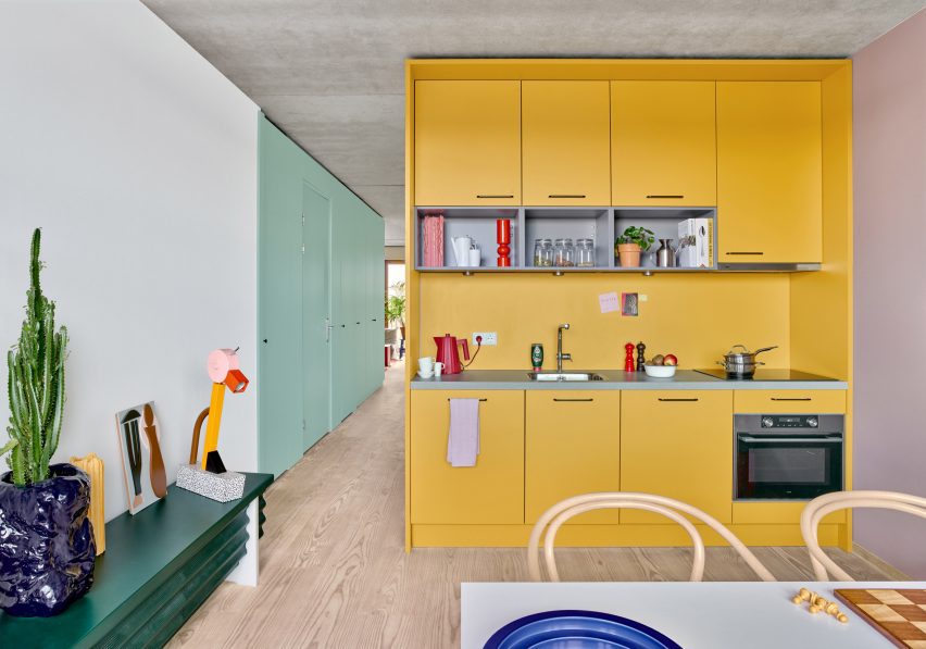
A variety of bright colours were used to decorate this residential complex designed by Shift Architecture Urbanism in Amsterdam. The 235 apartments feature shades of yellow, green, blue, red in the furniture, fixtures and appliances to create a playful atmosphere.

The homes feature laminate floors, white walls and concrete ceilings that create a neutral base for the additional colours used for the modular units, cupboard-style bedrooms and ceramic tiled walls.

Find out more about the residential complex ›


Photo of a room with a yellow ceiling
Photography is by Jesper Westblom

Apartment, Sweden, by Westblom Krasse Arkitektkontor

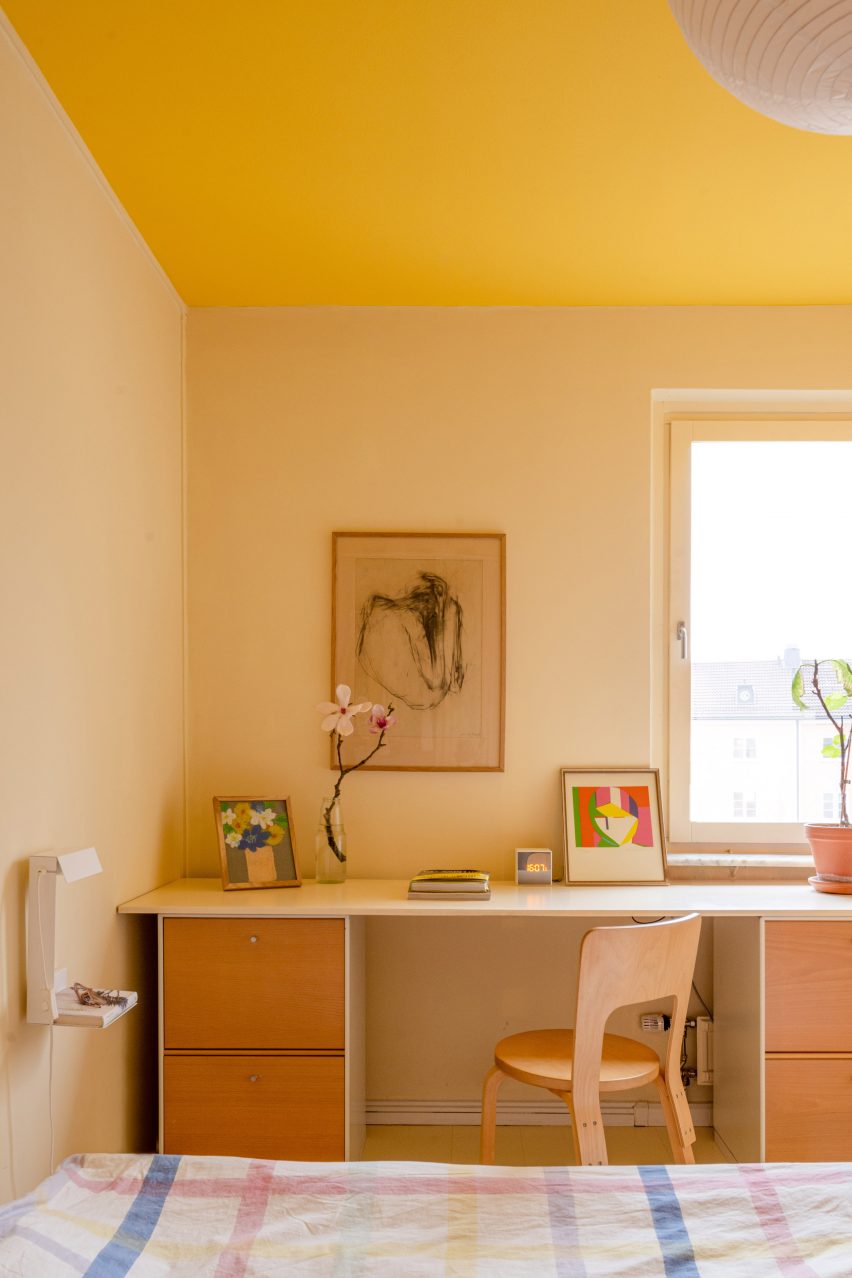
This apartment in Stockholm uses plenty of primary colours, with reds, blues and yellows used on the walls and on the furniture.

A butter shade decorates the walls of the main and children’s bedrooms, and is complimented by a sunshine hue on the ceiling. Soft yellow shades are also used to contrast maroon tiles and doors throughout the home.

Yellow accents can also be found on its accessories, such as lamps, crockery and artwork.

Find out more about the Stockholm apartment ›


Interiors of Casa Collumpio by MACH
Photography is by Del Rio Bani

Casa Collumpio, Spain, by MACH

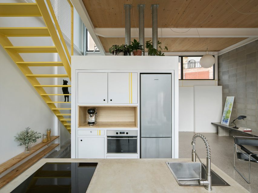
MACH designed this industrial-style house in Barcelona with lemon-yellow steelwork used on the interior and exterior.

Used as a focal point among grey concrete and wooden cladding, a bright yellow staircase with a protective mesh panel connects the upper floors of the building. To complement the feature, yellow stripes are added to the white kitchen cupboards.

The colour continues on the steelwork around the door, forming a decorative statement around the windows at the front and back of the home.

Find out more about Casa Collumpio ›


Duplex in Sant Gervasi by Arquitectura-G
Photography is by José Hevia

Apartment, Spain, by Arquitectura-G

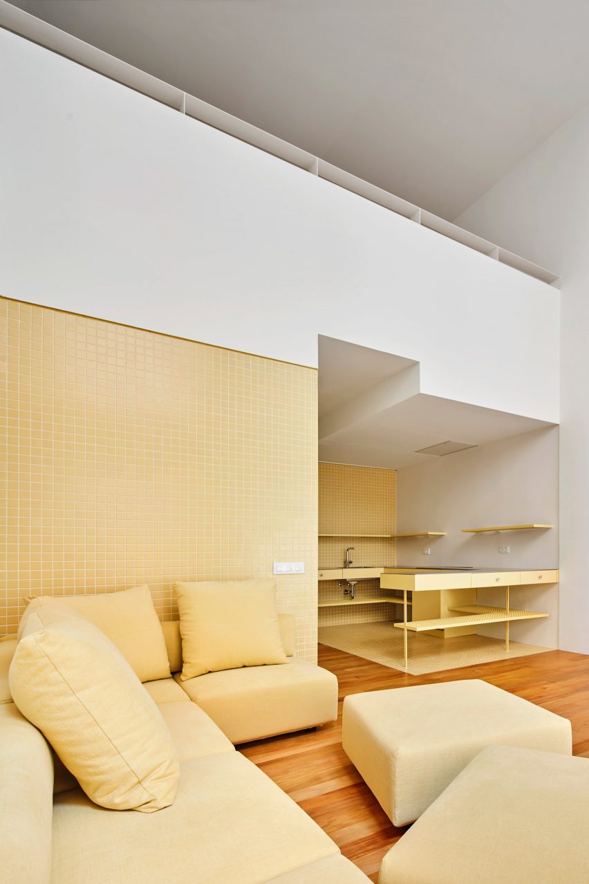
Arquitectura-G designed the interiors of this apartment in Barcelona with pastel yellow tones to create a lighter, more open space. The walls and floor of the space are covered in glazed square tiles, with the metal kitchen units matching in a similar tone.

Yellow furniture, such as a sofa and cupboards, complement the apartment’s colour palette.

“We prefer to use the same colour in the whole project, in order to give a strong visual impact and make it an essential part of the house’s identity,” sids Arquitectura-G.

Find out more about the Spanish apartment ›


Photo of a cafe in Stockholm
Photography is by Mikael Lundblad

Cafe Banacado, Sweden, by ASKA

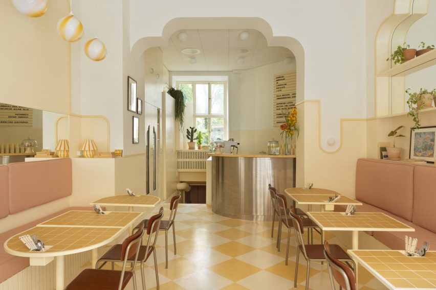
ASKA has created a picturesque cafe in Stockholm informed by film director Wes Anderson’s aesthetics, using shades of mustard, cream, pink and brown to adorn the space.

The yellow checkerboard floor was influenced by traditional Cuban styles of interiors and mirrored by similar tones in the tiled table tops.

“In order to create an environment that feels harmonious we work with subtle layering and tone in tone methods,” said ASKA co-founder Madeleine Klingspor. “The same yellow is used on the walls, lamps, tables and floor but in different scales and intensity,”

Find out more about Cafe Banacado ›


Pink, grey and chrome Kitchen in JJ16 apartment by Lucas y Hernández-Gil
The photography is by Jose Hevia

JJ16, Spain, by Lucas y Hernández-Gil

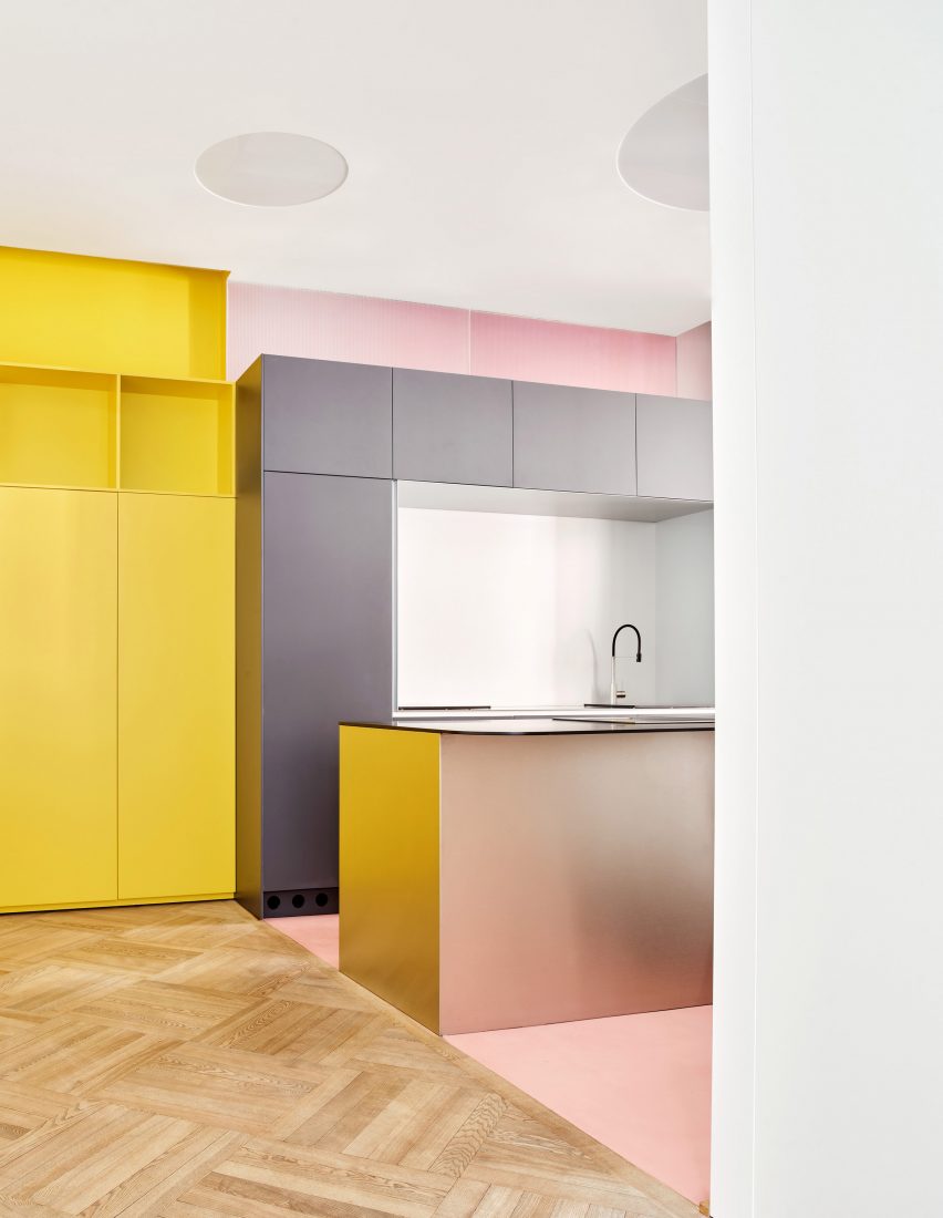
Citrus yellow offsets petal pink in this Madrid apartment by Lucas y Hernández-Gil, with a yellow built-in bookshelf lining the length of the corridor.

The hallway leads to the kitchen, which features a contrasting soft pink floor and walls and matte grey units.

The rest of the space has been decorated with similarly vivid colours and prints, including neon orange storage hidden by white doors, blue checkerboard flooring and an aubergine wardrobe.

Find out more about JJ16 ›

This is the latest in our lookbooks series, which provides visual inspiration from Dezeen’s archive. For more inspiration see previous lookbooks featuring interiors with lime plaster walls, Barbiecore pink aspects and retro nods to Wes Anderson.

Reference

Eight welcoming wood-panelled dining rooms with an organic feel
CategoriesInterior Design

Eight welcoming wood-panelled dining rooms with an organic feel

For our latest lookbook, we’ve selected eight dining rooms from the Dezeen archive where wooden panelling was used to create cosy, earthy environments with an organic feel.

From South America to Europe, these wood-panelled dining rooms serve as focal points in the interiors and create social spaces for residents and guests.

Whether they’re made from timber, pine or plywood, the wooden finishes on these statement walls and ceilings have been used to create welcoming environments with peaceful atmospheres.

This is the latest in our lookbooks series, which provides visual inspiration from Dezeen’s archive. For more inspiration see previous lookbooks featuring homes with focal point wardrobes, statement headboards and homes with pergolas.


Dining room
Photography is by Fran Parente and image production is by Victor Correa

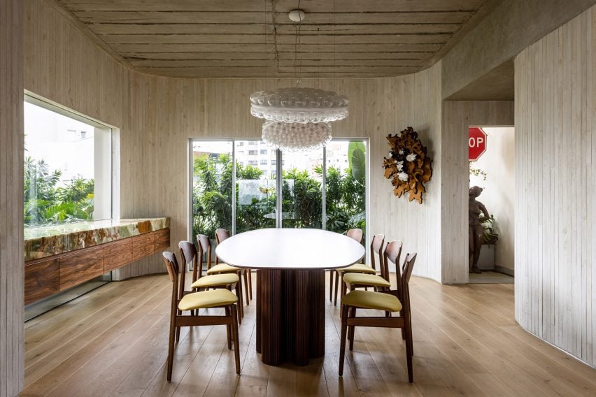
ER Apartment, Brazil, Pascali Semerdjian Arquitetos

This apartment in São Paulo has an exposed concrete ceiling and uses natural materials, such as walnut, bronze, onyx and stone in its furnishings and finishes.

Pascali Semerdjian Arquitetos used vertical timber cladding, local art and furniture by Brazilian architects and designers Oscar Niemeyer and Claudia Moreira Salles in the dining room to make the space “deeply Brazilian and vividly cosmopolitan”.

Find out more about ER Apartment ›


Photo of a dining room and stairs
Photography is by Eric Petschek

Carroll Gardens Townhouse, US, Starling Architecture and Emily Lindberg Design

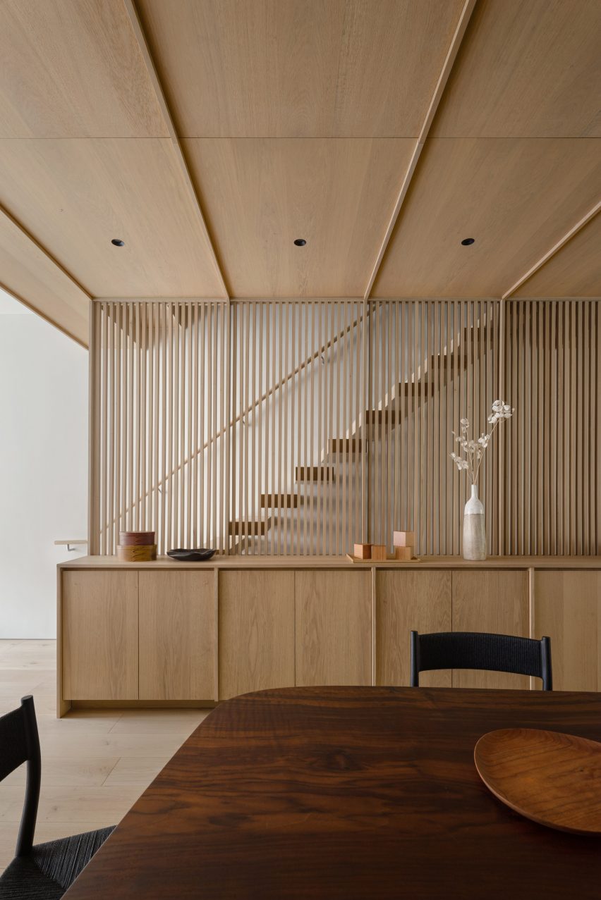
Starling Architecture and Emily Lindberg Design combined two units in a Brooklyn townhouse to create this family home. The townhouse features Belgian white oak on the flooring and along the corridor, stairs, mudroom, kitchen and dining area.

The New York-based studios used neutral tones to decorate the five-story house. In the dining room, wooden cabinets and decorative lamellas match the floor and ceiling.

Find out more about Carroll Gardens Townhouse ›


River Thames engraving in Dragon Flat by Tsuruta Architects
Photography is by Tim Croker

Dragon Flat, UK, Tsuruta Architects

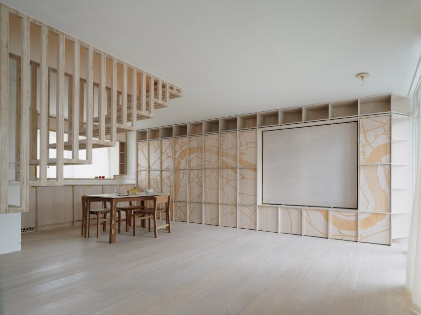
Artificial intelligence (AI) was used to design the patterns engraved on plywood panels that decorate the dining room of the Dragon Flat in London’s Notting Hill. Tsuruta Architects used a CNC router – a computer-controlled cutting machine – to engrave a pattern of the River Thames on the wall.

The architecture studio also updated the two-level maisonette to include a walk-in wardrobe and tatami room, which features an engraved design on its panelled walls.

Find out more about Dragon Flat ›


Wood-panelled dining hall
Photography is by David Grandorge

Homerton College, UK, Feilden Fowles

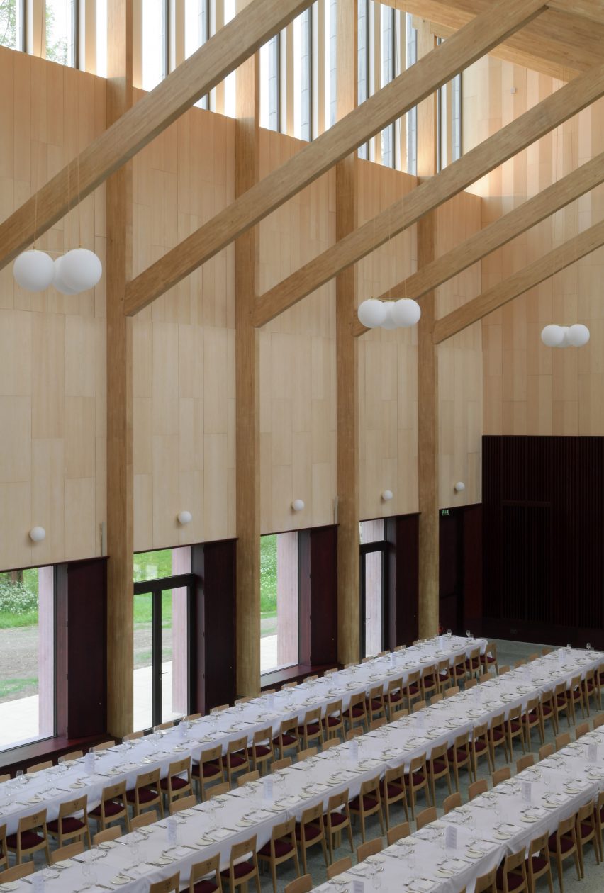
Homerton College at the University of Cambridge includes a dining hall by London architecture studio Feilden Fowles made from concrete, timber and 3,200 faience tiles.

The building, which was constructed with chestnut-laminated timber frames and clerestory windows, features a larger eating space, a smaller eating room, the kitchen and staff amenities.

It was designed to celebrate handcrafting techniques and contemporary construction and engineering.

Find out more about Homerton College ›


House in El Peumo, Chile by Cristian Izquierdo Hehmann
Photography is by Roland Halbe

House in El Peumo, Chile, Cristián Izquierdo Lehmann

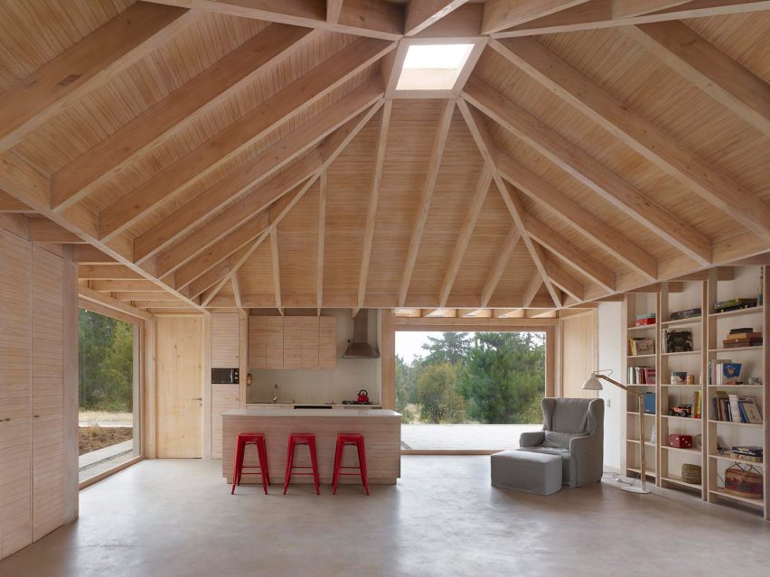
This house, designed by Cristián Izquierdo Lehmann, centres around an open-plan kitchen and dining room with a vaulted ceiling that is used for cooking, dining and socialising.

A minimalist decor compliments the dramatic ceiling, with red stools used for dining and a bookcase lining the wall.

Located in El Peumo, Chile, the house was clad with laminated pine and features concrete floors and large windows for the owners to enjoy the green exterior.

Find out more about House in El Peumo ›


Another Seedbed Brooklyn

Another Seedbed, US, Future Projects

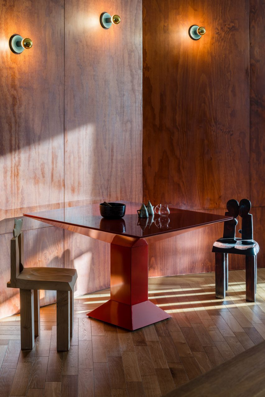
The Another Seedbed loft in Williamsburg, Brooklyn, serves as both a home and performance space for its owner. To function as both, the space is predominately open, with hidden rooms located around the apartment.

Warm pine walls mark the dining space, which features a complementary red angular table and wooden sculptural chairs.

Other walls in the loft are covered in hand-troweled earthen clay plaster, blue penny-round tiles and floor-to-ceiling shelving.

Find out more about Another Seedbed ›


Stone Creek Camp by Anderson-Wise Architects
Photography is by Art Gray

Stone Creek Camp, US, Andersson-Wise Architects

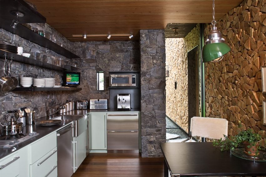
US-based Andersson-Wise Architects designed the Stone Creek Camp in Big Fork, Montana, as a family retreat of cabins and cottages.

While it is wood-clad, the kitchen and dining area does not feature traditional panelled walls. Instead, one wall is made from wooden logs that have been assembled to create an unusual wall with a highly textured surface.

The ceiling was clad in wooden panels that match the floorboards in the home.

Find out more about Stone Creek Camp ›


Cabin Geilo, Norway by Lund Hagem
Photography is by Marc Goodwin

Geilo Valley Cabin, Norway, Lund Hagem

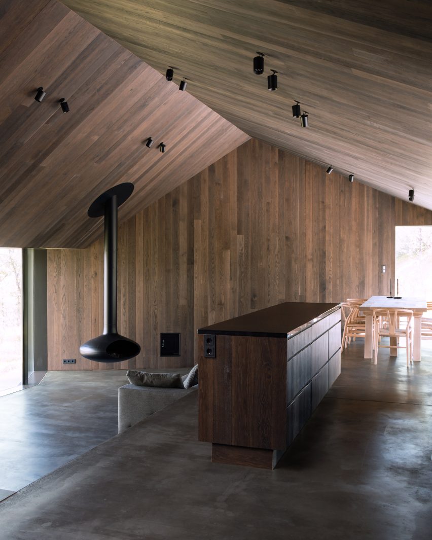
Panelled with blackened timber, this Norwegian ski cabin shelters residents from harsh weather conditions and offers panoramic views of the Geilo Valley. The cabin’s exterior concrete walls have also been tinted black to reflect the interior panels.

The walls and ceiling of the dining room use the same timber cladding, matching the kitchen island to create a cosy, coherent atmosphere.

“The dark tone allows the nature outside to come closer and creates a darkness that contrasts with the white winter landscape,” said the project’s architects Lund Hagem.

Find out more about Geilo Valley Cabin ›

This is the latest in our lookbooks series, which provides visual inspiration from Dezeen’s archive. For more inspiration see previous lookbooks featuring homes with focal point wardrobes, statement headboards and homes with pergolas.

Reference