Homes where flooring enhances connection between indoors and outdoors
CategoriesInterior Design

Homes where flooring enhances connection between indoors and outdoors

Our latest lookbook explores homes where flooring details and materials help to create the impression that a living space extends out beyond a house’s exterior walls.

A range of different techniques can be used to create the sense of a continuous floor surface.

The most obvious is to use the same flooring material, or one that looks very similar, for both interior and exterior spaces.

However, this isn’t always necessary. By combining level thresholds with floor-to-ceiling glazing, it’s also possible to create that sense of continuation by simply maintaining a consistent surface.

Here, we look at 10 examples that use one or more of these methods to create different effects, ranging from a forest home in Mexico’s Valle de Bravo to a waterside villa in Denmark.

Many of these examples use continuous floor surfaces to connect a living room with a garden or patio, but some explore other rooms where the effect can be applied.

This is the latest in our lookbooks series, which provides visual inspiration from Dezeen’s archive. For more inspiration, see previous lookbooks featuring chocolate-brown interiors and minimalist bathrooms.
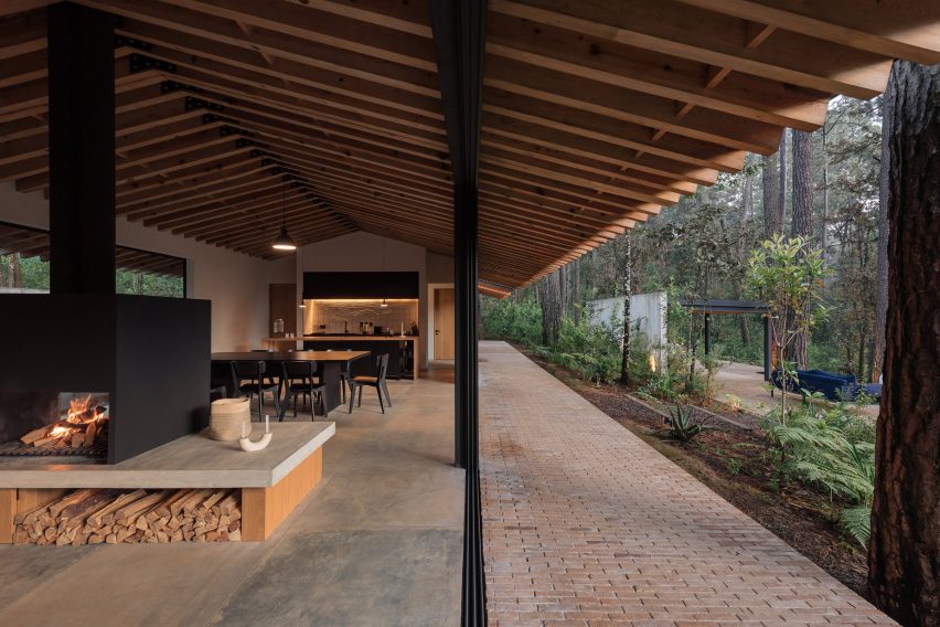

Casa Mola, Mexico, by Estudio AtemporalCasa Mola, Mexico, by Estudio Atemporal
Photography is by LGM Studio

Casa Mola, Mexico, by Estudio Atemporal

Mexico City-based Estudio Atemporal designed this house in a densely forested area of Valle de Bravo with the aim of allowing residents to live “more organically”.

The large-format flooring tiles inside the house give way to brickwork paving outside, but sliding glass doors with level thresholds create a clean junction that allows the two spaces to feel connected.

Find out more about Casa Mola ›
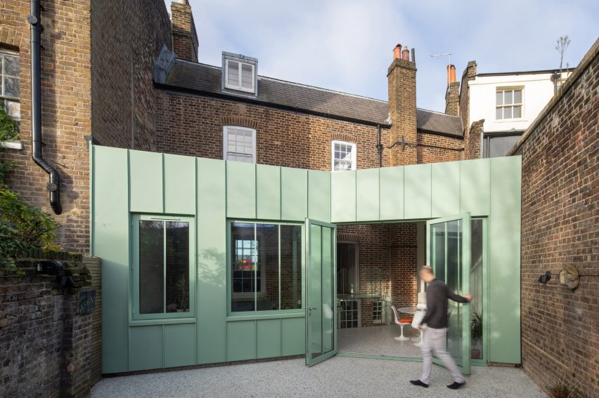

The Saddlery, UK, by Studio OctopiThe Saddlery, UK, by Studio Octopi
Photo is by Agnese Sanvito

The Saddlery, UK, by Studio Octopi

Terrazzo flooring features both inside and outside this extension to a Georgian house in southeast London, designed by architecture office Studio Octopi.

Sourced from British manufacturer Diespeker, this material is speckled with colours that complement the mint-green tone of the building’s metal walls.

Find out more about The Saddlery ›

Proctor & Shaw design London home extension with continuous flooringProctor & Shaw design London home extension with continuous flooring
Photo is by Nick Deardon

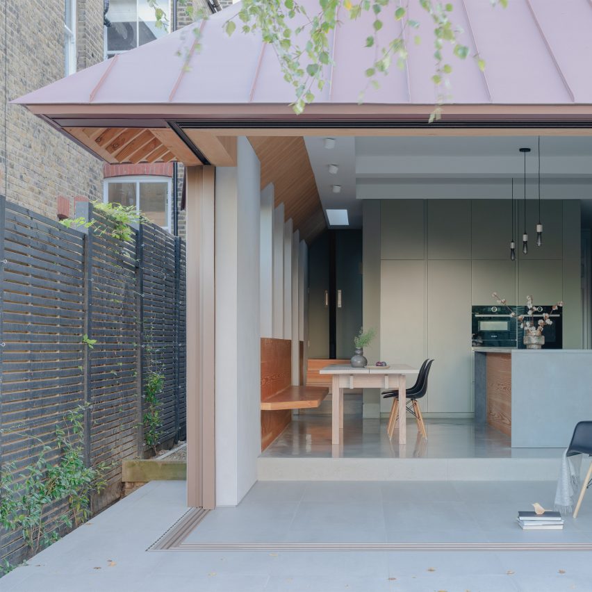
Dulwich House, UK, by Proctor & Shaw

Kitchen and terrace become a single space divided only by levels in this extension to a home in Dulwich, London, designed by architecture studio Proctor & Shaw.

Glass doors slide open on two sides – with one disappearing into a wall – to completely open up the building’s corner. The sliding mechanism is set into a continuous porcelain tile floor surface, resulting in a flush threshold.

Find out more about Dulwich House ›

Exterior patio with stone paving at Maison Hercourt by Studio Guma in NormandyExterior patio with stone paving at Maison Hercourt by Studio Guma in Normandy
Photo is by Maxime Delvaux

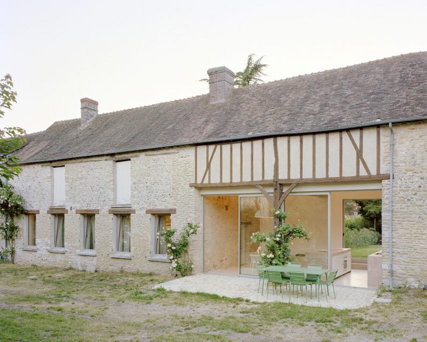
Maison Hercourt, France, Studio Guma

Minimal glazing plays a key role in connecting the kitchen of this renovated stone farmhouse in Normandy with an adjoining patio.

Designed by Paris-based Studio Guma, the renovation involved installing the kitchen in a space that previously functioned as a cart shed. Although the floor surface changes from concrete to stone from inside to outside, the slender-framed glass doors help the two surfaces to be read as one.

Find out more about Maison Hercourt ›

Brick flooring in Fjord Boat HouseBrick flooring in Fjord Boat House
Photo is by Jonas Bjerre-Poulsen

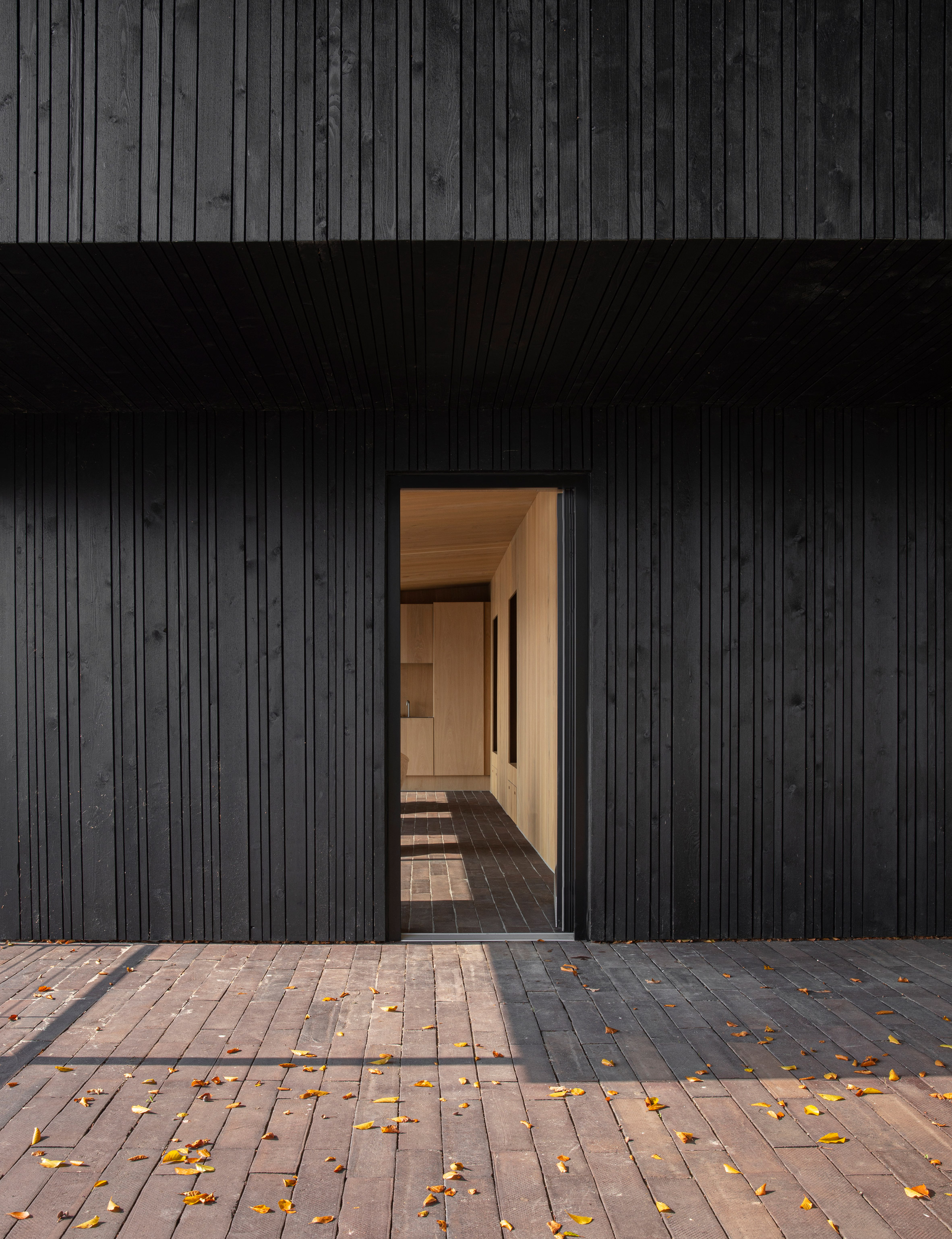
Fjord Boat House, Denmark, by Norm Architects

Copenhagen-based Norm Architects chose handmade ceramic bricks for the flooring of this vacation house, built on the edge of a fjord just outside the city.

They form stairs that lead down from the main house to a terrace, then continue inside to give the interior living spaces a casual, rustic feel. At the main entrance, the linearity of the brickwork pattern acts to draw the eye.

Find out more about Fjord Boat House ›

Square saltillo tile flooringSquare saltillo tile flooring

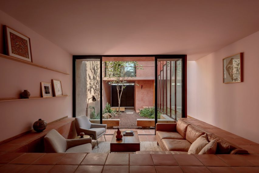
Ederlezi, Mexico, Práctica Arquitectura

Using the same flooring surface for both indoors and outdoors can become costly, but this low-cost infill house in Monterrey offers a clever solution.

Designed by locally based Práctica Arquitectura, the house features a stepped living space with an adjoining courtyard.

Most of the courtyard is landscaped, but the edges are lined with the same square saltillo tiles that provide interior flooring. This helps to extend the living space outdoors without requiring quite as many tiles.

Find out more about Ederlezi ›
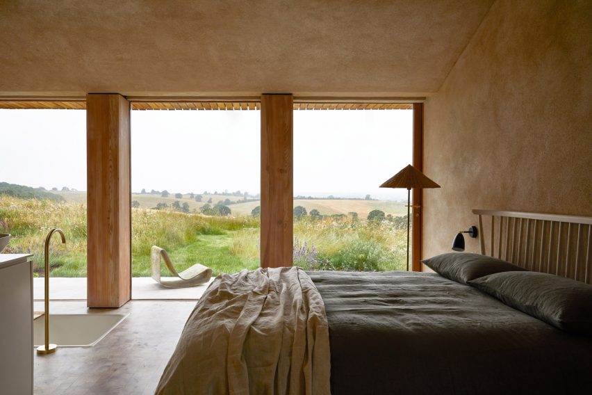

The Maker's Barn by Hutch Design with timber end-grain flooringThe Maker's Barn by Hutch Design with timber end-grain flooring
Photo is by Helen Cathcart

The Maker’s Barn, UK, by Hutch Design

Full-height glazing features in many of the rooms of this rural holiday rental on the outskirts of London, a former pig shed renovated by Hutch Design. This results in a strong connection with the surrounding patio.

The effect is particularly effective in the primary bedroom, which features a bath set into the floor. Here, it’s possible to observe the clean line running between the end-grain timber flooring inside and the paving tiles outside.

Find out more about The Maker’s Barn ›
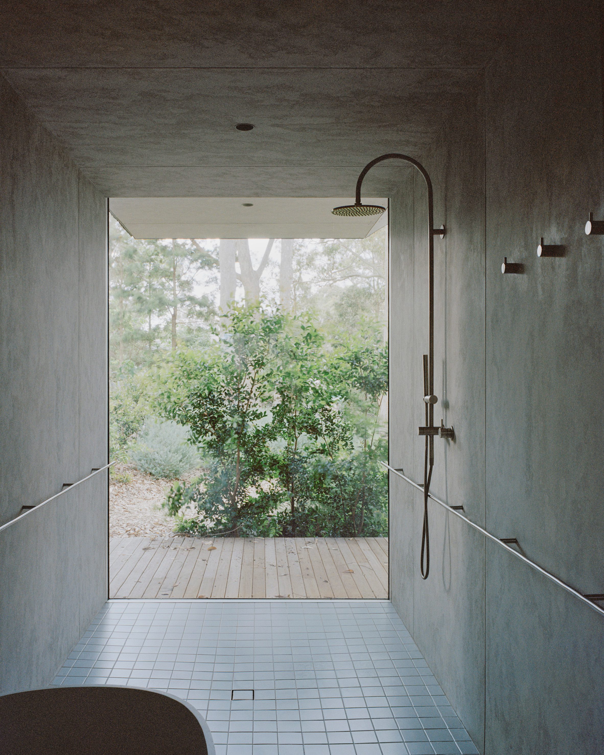

Tiled flooring in bathroom of Mossy Point House by Edition OfficeTiled flooring in bathroom of Mossy Point House by Edition Office
Photo is by Rory Gardiner

Mossy Point, Australia, by Edition Office

Melbourne-based Edition Office selected very different surfaces for the shower room of this house in Mossy Point, New South Wales, but they appear to merge thanks to the use of frameless glazing.

A similar effect can be found throughout the house, but the contrast between the wooden decking and the blue tiles of this room is the most striking.

Find out more about Mossy Point ›
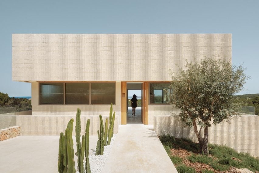

Shift House, Spain, by Nomo Studio

Roughly polished white concrete flooring unites both the interior and exterior of this house on the island of Menorca, designed by Barcelona-based Nomo Studio.

This creates a feeling of continuity from the building’s entrance, located on the uppermost storey, all the way across to a balcony terrace on the opposite side of the main living room.

Find out more about Shift House ›
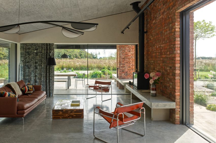

House by Richard ParrHouse by Richard Parr
Photo is by Brotherton Lock

A Modern Oasis, UK, by Richard Parr Associates

The level thresholds of this house in Oxfordshire, England, create a visual connection between the polished concrete flooring inside and the paving tiles outside.

Architecture office Richard Parr Associates carefully matched the colours of these two surfaces so that they appear to be made of the same material.

Find out more about A Modern Oasis ›

This is the latest in our lookbooks series, which provides visual inspiration from Dezeen’s archive. For more inspiration, see previous lookbooks featuring chocolate-brown interiors and minimalist bathrooms.

Reference

Eight home interiors where full-length curtains add a touch of drama
CategoriesInterior Design

Eight home interiors where full-length curtains add a touch of drama

From a glitzy Parisian apartment to a converted garage in Buffalo, New York, our latest lookbook collects eight residential interiors where floor-to-ceiling curtains inject a theatrical feel.

Curtains aren’t just for covering windows. A set of statement drapes can be an easy way to significantly change the mood of a room, particularly in apartment renovations.

The selection below features curtains in stage-like living rooms, rough-edged bedrooms and cosy working nooks.

This is the latest in our lookbooks series, which provides visual inspiration from Dezeen’s archive. For more inspiration, see previous lookbooks featuring interiors with statement carpets, furry walls and colourful bedrooms.

Ready-made Home by AzabReady-made Home by Azab
Photo is by Luis Díaz Díaz

Ready-made Home, Spain, by Azab

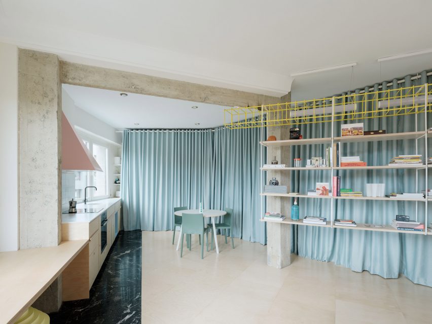
Duck-egg blue curtains help to create a flexible open-plan layout at this apartment in Bilbao that was overhauled by architecture studio Azab, running the length of the living-dining-kitchen area to conceal storage space and a bathroom.

“The curtains have theatrical and playful connotations and invites the inhabitant to perform with it, to change the space and to play with the mysteries, contradictions and paradoxes that privacy offers us beyond morality,” said the studio.

Find out more about Ready-made Home ›


Ruckers Hill House by Studio BrightRuckers Hill House by Studio Bright
Photo by Rory Gardiner

Ruckers Hill House, Australia, by Studio Bright

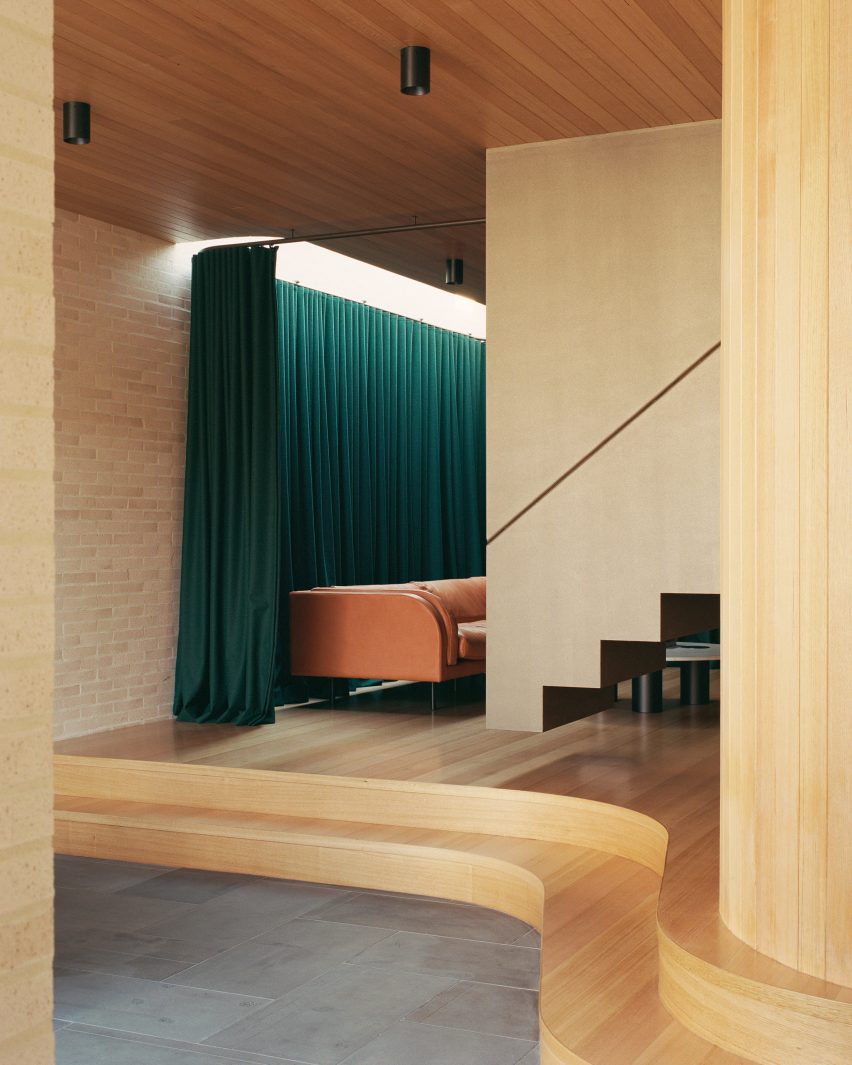
In this extension to an Edwardian family home in Melbourne, architecture practice Studio Bright raised the sitting room on a curved plinth, giving it a stage-like quality.

Enhancing the effect is a heavy green curtain hung from the ceiling, which can be drawn across to turn the space into an impromptu theatre for the children to play in.

Find out more about Ruckers Hill House ›


Uchronia renovated a Haussmann-era apartment in ParisUchronia renovated a Haussmann-era apartment in Paris
Photo by Félix Dol Maillot

Avenue Montaigne apartment, France, by Uchronia

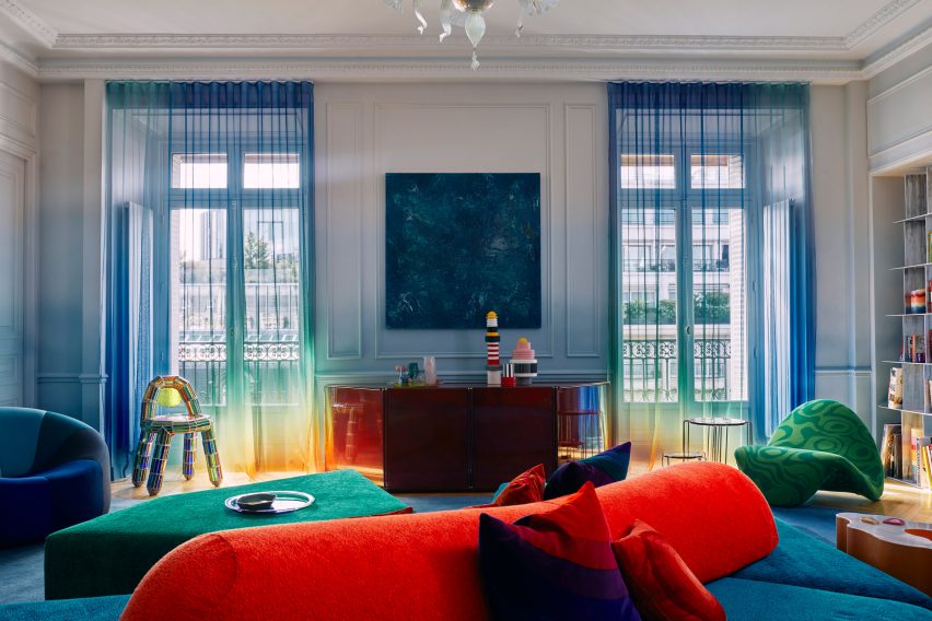
Sheer, rainbow-effect curtains cover the balconies of this opulent Haussman-era Parisian apartment, renovated by local studio Uchronia.

Even the walls echo the curtains’ gradations of colour, while the brightly toned furnishings are designed to resemble pieces of jewellery.

Find out more about this apartment ›


Roksanda Ilincic penthouse apartment in London's King's CrossRoksanda Ilincic penthouse apartment in London's King's Cross
Photo by Michael Sinclair

Gas-holder apartment, UK, by Roksanda Ilincic

Fashion designer Roksanda Ilincic brought her proclivity for bold colours and shapes to this London penthouse inside a former Victorian gas holder.

Pale pink Kvadrat curtains over the full-height windows cast a rose-tinted hue over the rooms, where the colour palette is kept mostly neutral apart from some pops of bright yellow.

Find out more about this apartment ›


Big Space, Little Space by Davidson RafailidisBig Space, Little Space by Davidson Rafailidis
Photo by Florian Holzherr

Big Space, Little Space, USA, by Davidson Rafailidis

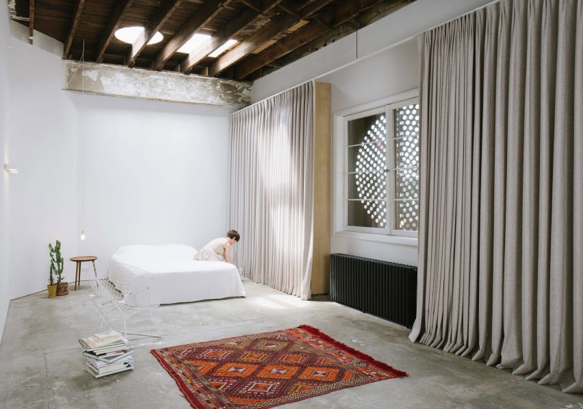
Peeling paintwork, uneven concrete floors and distressed wooden beams lend a distinctly rough-and-ready feel to this home-slash-workspace in Buffalo created out of a garage conversion by design studio Davidson Rafailidis.

For the most part, the space is minimally furnished, apart from a set of high and wide drapes that introduce a luxurious twist.

Find out more about Big Space, Little Space ›


Silver curtains in hallway at Landscape House in JapanSilver curtains in hallway at Landscape House in Japan
Photo by Norihito Yamauchi

Landscape House, Japan, by FORM/Kouichi Kimura Architects

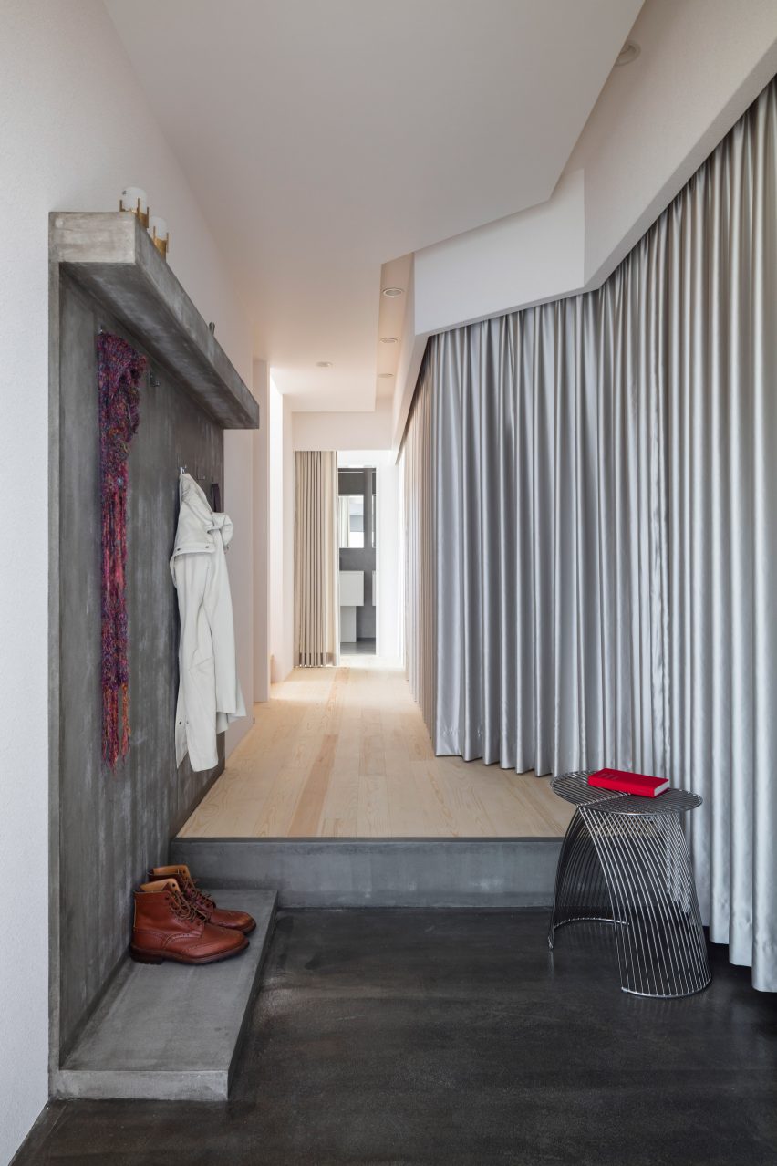
Upon entering Landscape House in central Japan, designed by Japanese studio FORM/Kouichi Kimura Architects, one is greeted by a lengthy corridor lined entirely on one side by a full-length silver curtain.

The fabric echoes a raw concrete feature wall on the opposite side of the corridor, as well as referencing the extensive use of metal throughout the building.

Find out more about Landscape House ›


Kitchen in Pops apartment by Furora StudioKitchen in Pops apartment by Furora Studio
Photo by ONI Studio

Pops, Poland, by Furora Studio

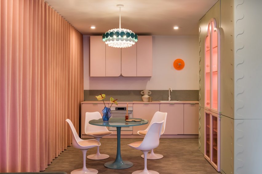
Furora Studio wanted the design of this holiday apartment in Kraków to be slightly more outrageous than the standard residential interior.

A velvety, salmon-pink curtain dresses an entire wall in the open-plan kitchen and living room, adding to a plethora of sugary colours and rounded edges.

Find out more about Pops ›


Maison-Boutique Coloniale by Michael Godmer and Mathieu TurgeonMaison-Boutique Coloniale by Michael Godmer and Mathieu Turgeon
Photo by Maxime Brouillett

Maison-Boutique Coloniale, Canada, by Michael Godmer and Mathieu Turgeon

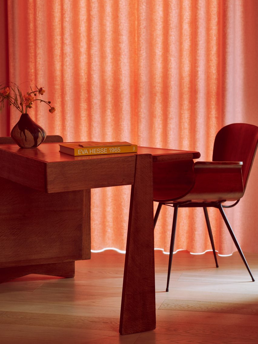
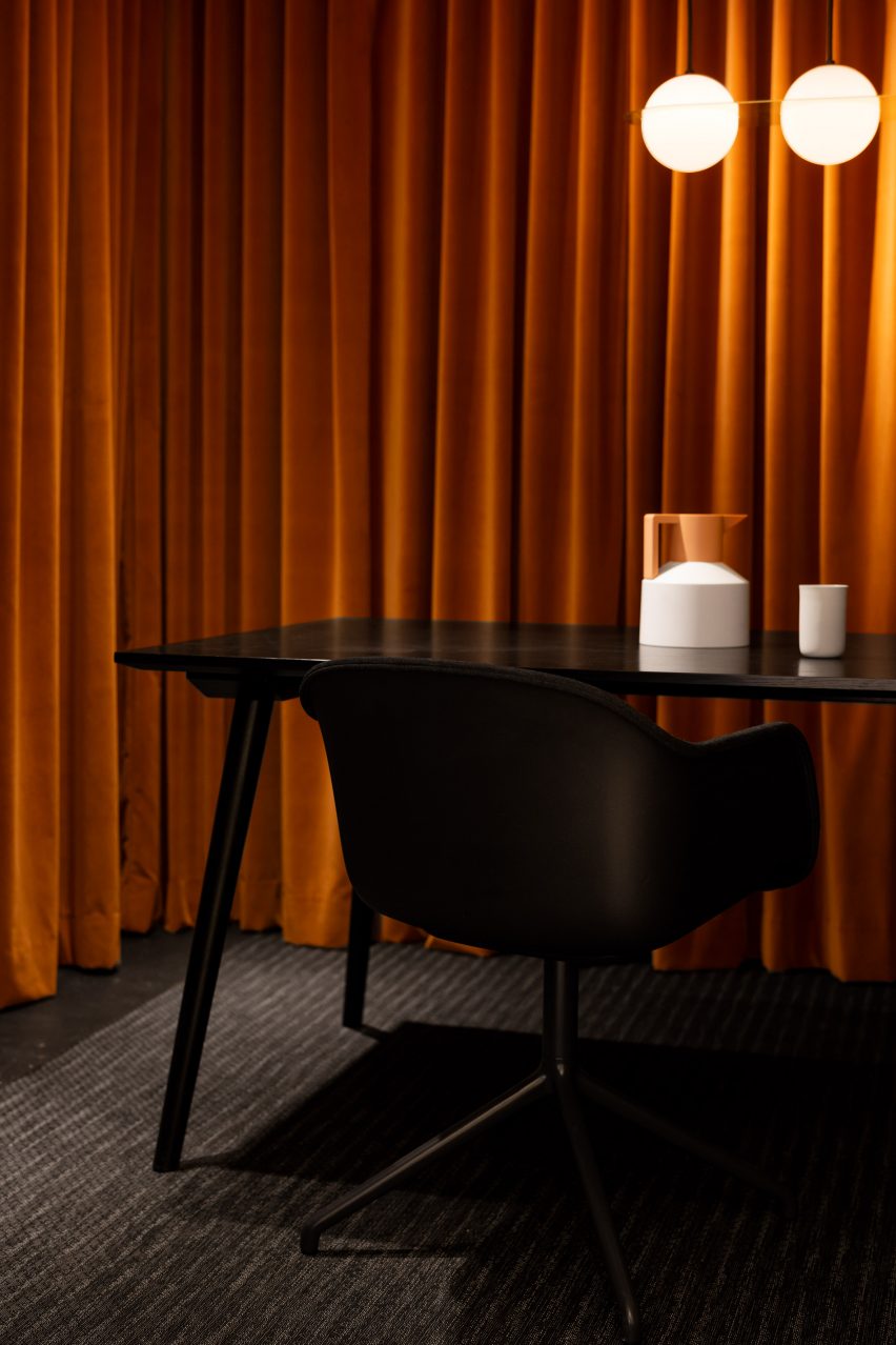
Most of the spaces inside Maison-Boutique Coloniale in Montreal – renovated by designers Michael Godmer and Mathieu Turgeon as their own residence and studio – are pared-back and neutral.

But in an office space on the basement level, plush orange curtains line the walls, combined with dim pendant lighting and a black table arrangement by Muuto and &tradition for an intimate effect.

Find out more about Maison-Boutique Coloniale ›

This is the latest in our lookbooks series, which provides visual inspiration from Dezeen’s archive. For more inspiration, see previous lookbooks featuring interiors with statement carpets, furry walls and colourful bedrooms.
Reference

Seven playful living spaces where swings provide dynamic seating
CategoriesInterior Design

Seven playful living spaces where swings provide dynamic seating

This lookbook compiles seven living spaces where swings show they have a place beyond children’s playgrounds by providing a gleeful alternative to static seating.

Swings typically consist of a seat made from a flat piece of metal, plastic, wood or canvas, but can also be made from found materials such as tyres and sometimes feature a wraparound design for added safety.

This seat is then suspended by sturdy lengths of rope or chain from a frame, ceiling or tree.

Swings have been used for hundreds of years by cultures across the world for both leisure and ritual-related purposes, and are enjoyed by people of all ages, from children in play areas to older people who might have swinging benches in their gardens.

From basic playground swings transplanted into grown-up interiors to intricately crafted bench swing seats that look out over lush courtyards, read on to view a selection of interiors on Dezeen that feature suspended seating.

This is the latest in our lookbooks series, which provides visual inspiration from Dezeen’s archive. For more inspiration, see previous lookbooks featuring interiors animated by indoor slides, living spaces featuring metal furniture and spaces with oversized windows.


Covered walkway with swing seat looking out onto an open-air courtyard with treesCovered walkway with swing seat looking out onto an open-air courtyard with trees
Photo by Ishita Sitwala

Gujarat house, India, by Design ni Dukaan

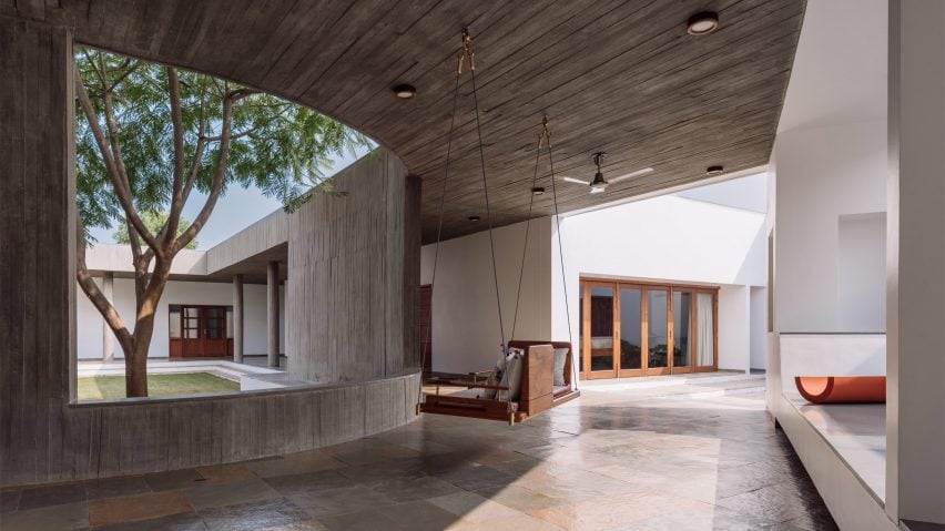
A wooden swing seat covered in pillows is suspended from the concrete ceiling of this house in the Indian state of Gujarat.

The swing is situated in one of the house’s covered walkways and was positioned to allow the sitter to enjoy views of its open-air courtyard.

Find out more about Gujarat house ›


Kenwood Lee House by Cousins & Cousins (RIBA house of the year longslist)Kenwood Lee House by Cousins & Cousins (RIBA house of the year longslist)
Photo by Jack Hobhouse

Kenwood Lee House, UK, by Cousins & Cousins

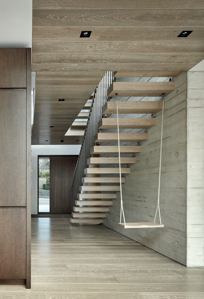
A cantilevered floating stair anchors a swing inside the hallway of this house in north London by local studio Cousins & Cousins.

The wooden seat is suspended by softly frayed rope, creating a subtly rustic composition that compliments both the poured-concrete finish of the walls and the wood used on the ceiling, cabinets and front door.

Find out more about Kenwood Lee House ›


Covered living space beside courtyard with swing seatCovered living space beside courtyard with swing seat
Photo by Yash R Jain

Karai, India, by Rain Studio

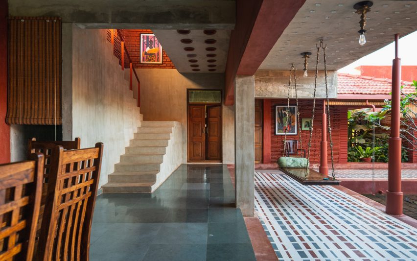
Local office Rain Studio hung a polished wooden swing seat overlooking a verdant courtyard in this house near the city of Chennai in southern India.

The seat is suspended from all four corners by ornately cast metal hooks and links, some of which feature animals such as elephants.

Find out more about Karai ›


Living room with concrete fireplace and a swingLiving room with concrete fireplace and a swing
Photo by Chase Daniel

Austin House, USA, by Melanie Raines

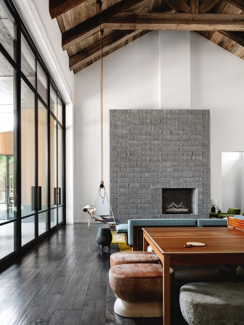
Rustic Californian barns provided reference points for this house in Austin, Texas, which features a lofty double-height living space complete with multiple seating options.

A metal-framed lounge chair flanked by integrated side tables is suspended from the ceiling’s wooden rafters by two long lengths of rope, adding to the interior’s whimsical atmosphere.

Find out more about Austin house ›


Living room interior of Out of the Blue apartment in IndiaLiving room interior of Out of the Blue apartment in India
Photo by The Fishy Project

Thane apartment, India, by The Act of Quad

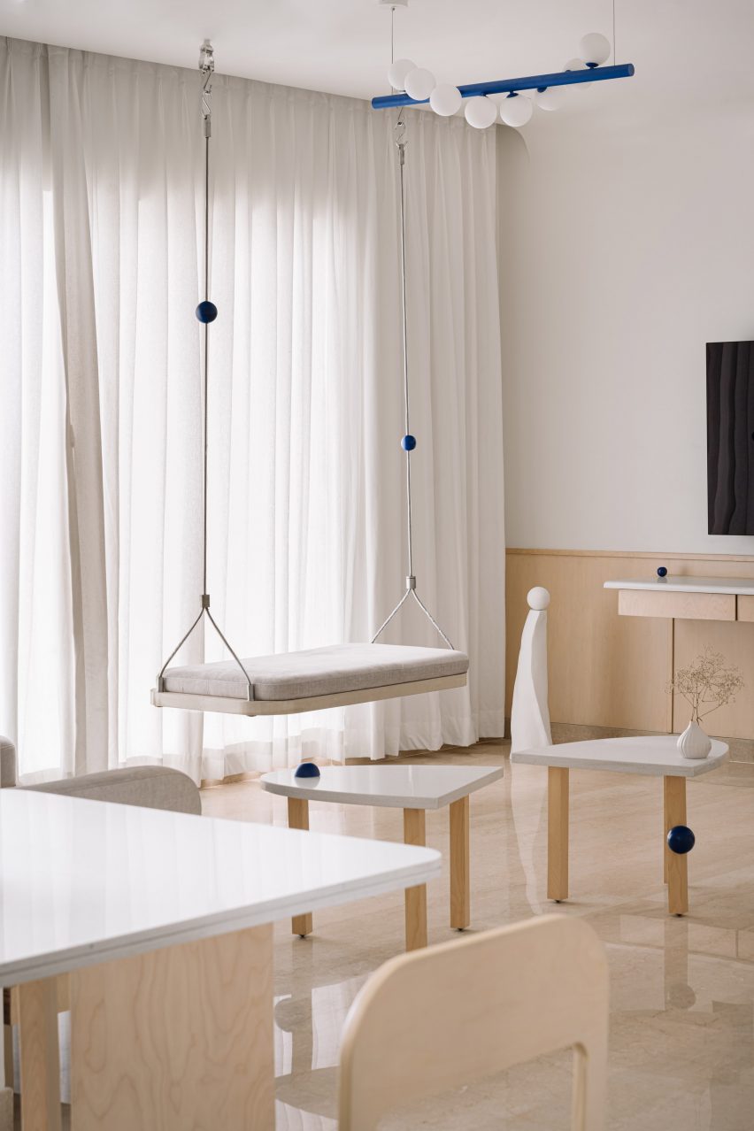
Rigid metal uprights, each threaded with a cobalt-blue sphere, tie this swing seat in with the rest of the apartment’s blue-themed interior scheme, created by design studio Act of Quad.

The seat is softened by a slim cushioned pad and has been attached to the ceiling with metal hardware.

Find out more about Thane apartment ›


The Perch by Chadbourne + Doss ArchitectsThe Perch by Chadbourne + Doss Architects
Photo by Kevin Scott

The Perch, USA, by Chadbourne + Doss

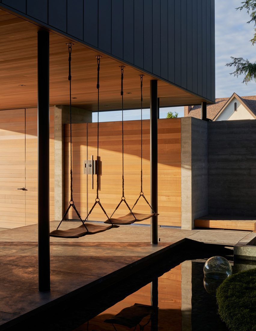
A pair of swings are strung up on the boundary between a covered entryway and a courtyard pond in this house in Seattle.

The seats themselves were made from sheets of walnut timber and intended to provide the sitter with the experience of floating above the water.

Find out more about The Perch ›


Living room in a high-ceilinged apartment with a swing hanging in itLiving room in a high-ceilinged apartment with a swing hanging in it
Photo by BCDF studio

Parisian loft, France, by Isabelle Heilmann

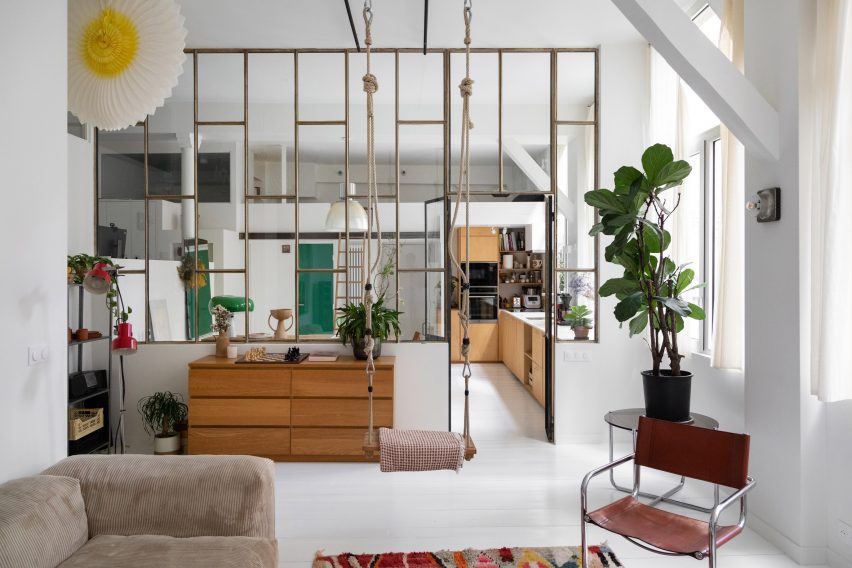
Hooks, carabiners and thick, knotted ropes affix this swing to the tall ceilings of this Parisian apartment’s living room.

The suspended seat slots in comfortably with the rest of the eclectically-chosen furniture, including a mid-century cantilevered chair and a slouchy, ribbed sofa.

Find out more about Parisian loft ›

This is the latest in our lookbooks series, which provides visual inspiration from Dezeen’s archive. For more inspiration, see previous lookbooks featuring interiors animated by indoor slides, living spaces featuring metal furniture and spaces with oversized windows.

Reference

Ten highlights from Design Doha exhibition Arab Design Now
CategoriesInterior Design

Ten highlights from Design Doha exhibition Arab Design Now

A disaster-proof chandelier from Lebanon and a towering sand dune-style stone installation feature in Arab Design Now, the main exhibition at the inaugural Design Doha biennial.

Arab Design Now was curated by Rana Beiruti to capture the spirit of contemporary design across the Middle East and North Africa (MENA), the curator told Dezeen ahead of the opening of the first Design Doha.

Set within the Qatari capital’s M7 building, the design biennial draws together a range of collectible design and installations.

Selected works from 74 participants paid homage to the MENA region’s “extremely harsh and unique geography” and investigated the “use of materials as a guiding principle,” explained Beiruti.

Here are 10 of Dezeen’s highlights from Arab Design Now, which is on display in Doha until early August.


Sites – New Sites by Studio Anne Holtrop at Arab Design NowSites – New Sites by Studio Anne Holtrop at Arab Design Now

Sites – New Sites by Studio Anne Holtrop

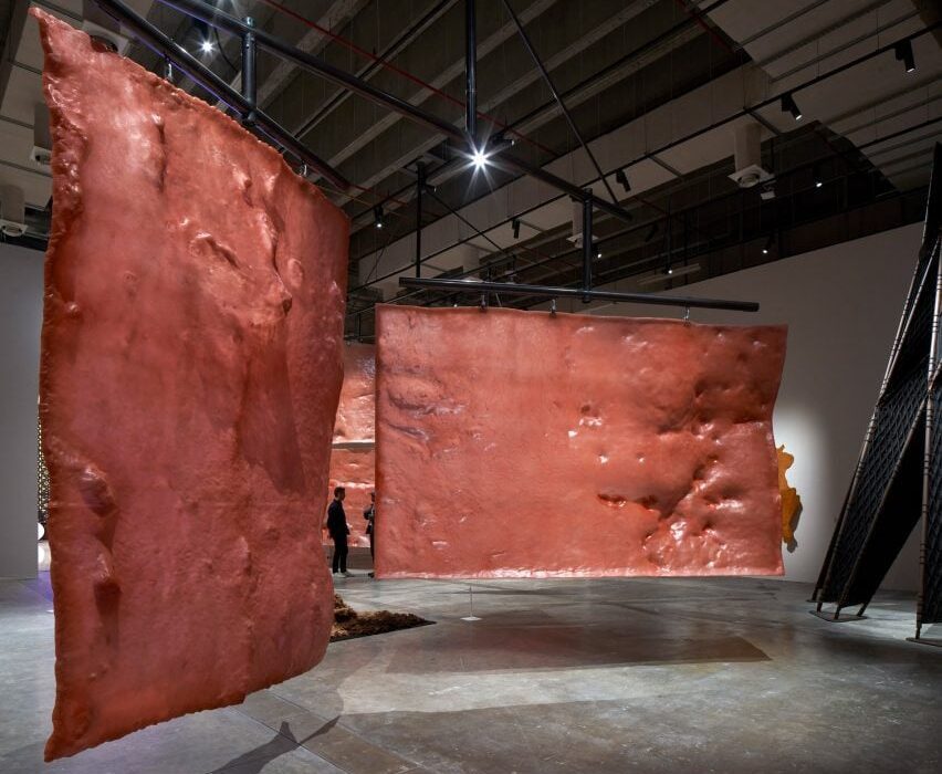
Bahrain- and Amsterdam-based architect Anne Holtrop has designed a cluster of large-scale mobiles made from vast slabs of lumpy resin.

Holtrop took casts of a series of manmade and natural sites that he found across Qatar to create the textured pieces, which hang from bearing mechanisms and can be manually rotated by visitors to produce continuously moving formations.


Constellations 2.0: Object. Light. Consciousness by Abeer SeikalyConstellations 2.0: Object. Light. Consciousness by Abeer Seikaly

Constellations 2.0: Object. Light. Consciousness by Abeer Seikaly

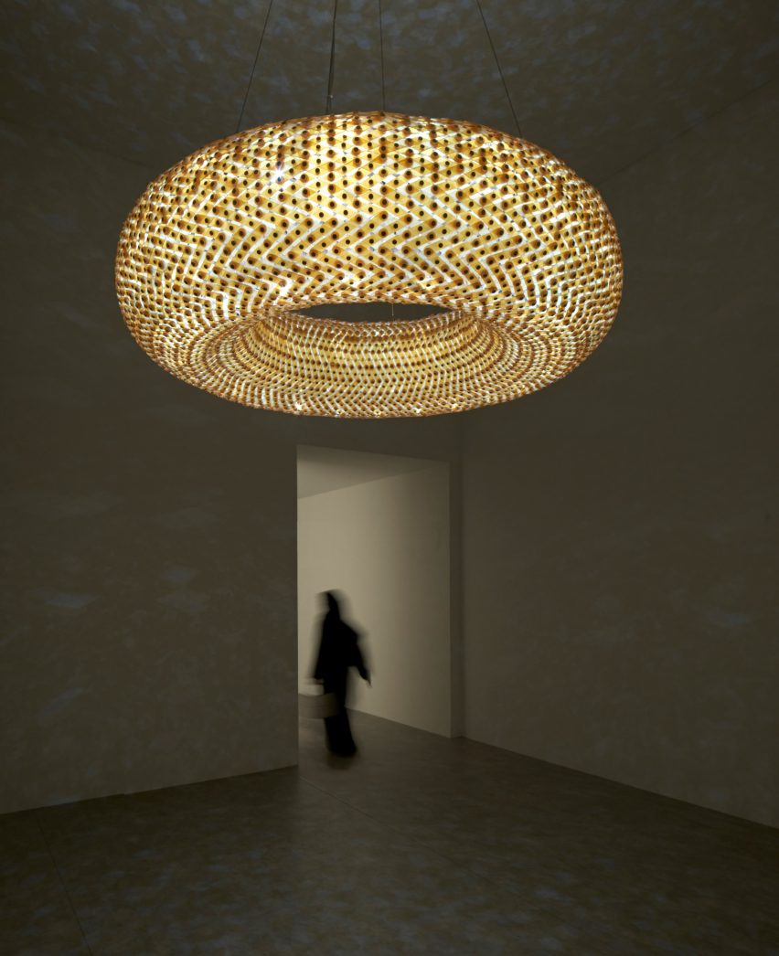
Over 5,000 pieces of Murano glass were woven together by Jordanian-Palestinian designer Abeer Seikaly to create this chandelier, which combines Bedouin weaving practices from Jordan with traditional Venetian glassmaking techniques.

Brass and stainless steel were also integrated into the lighting, made flexible by the glass mesh.

Once illuminated, the sculptural piece creates dramatic light patterns that nod to a starry night sky seen from the Badia desert, according to Seikaly.


House Between a Jujube Tree and a Palm Tree by Civil Architecture at Arab Design NowHouse Between a Jujube Tree and a Palm Tree by Civil Architecture at Arab Design Now

House Between a Jujube Tree and a Palm Tree by Civil Architecture

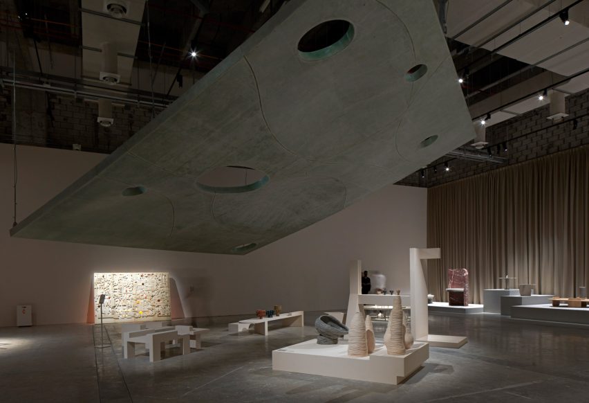
Kuwait and Bahrain-based office Civil Architecture has designed a looming fibreglass roof proposal for a majlis – the traditional term for an Arabic gathering space.

“It’s a 1:1 model of a roof of an actual house that we designed in Bahrain,” studio co-founder Hamed Bukhamseen told Deezen.

Supported by steel and suspended from tension cables, the majlis features openings designed to accommodate tall trees and was created to explore the “symbiotic but blurred” relationship between indoor and outdoor settings.


Nubia, Hathor and Gros Guillaume Stool by Omar ChakilNubia, Hathor and Gros Guillaume Stool by Omar Chakil
Photo courtesy of Design Doha

Nubia, Hathor and Gros Guillaume Stool by Omar Chakil

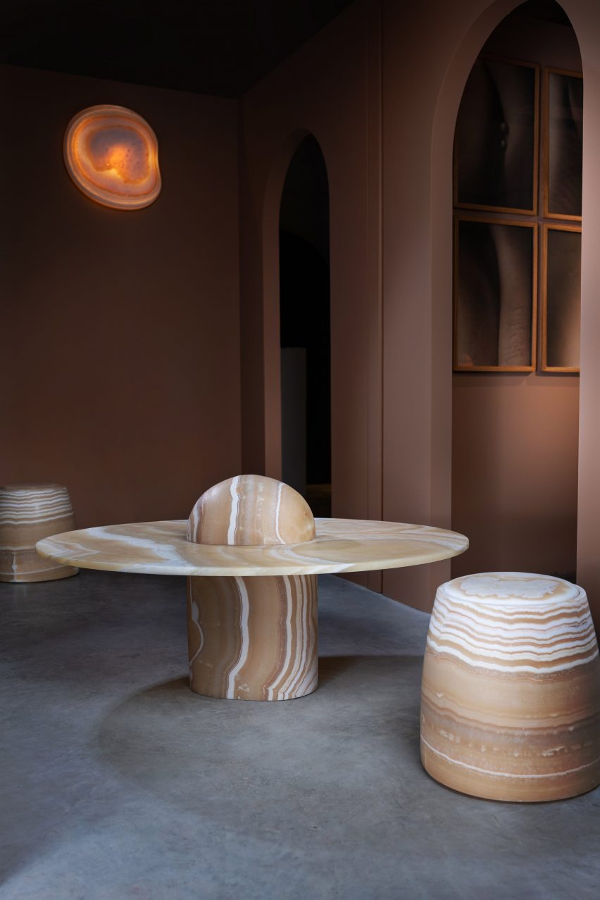
French-Egyptian-Lebanese designer Omar Chakil was informed by his father’s homeland of Egypt when he chose alabaster onyx to create this monolithic shelving, a bulbous coffee table and a stool that glides across the floor on wheels.

Taking cues from ancient practices, Chakil carved the rounded furniture from raw blocks of the material, which was sanded down over time using water rather than covered in varnish – something that the designer said had became common in Egypt, especially when making “cheap” souvenirs.

“The whole idea of the collection was to use Egyptian alabaster, which was a healing stone,” Chakil told Dezeen.

“The pharaohs used [the material], then it transformed it over time. It lost its soul. So I tried to put it in the contemporary context by using the shapes that healing emotions would take – so they are round and soft, even though they are very heavy,” he added.

“I see that people are afraid to, but I want them to touch the furniture.”


Tiamat by AAU AnastasTiamat by AAU Anastas

Tiamat by AAU Anastas

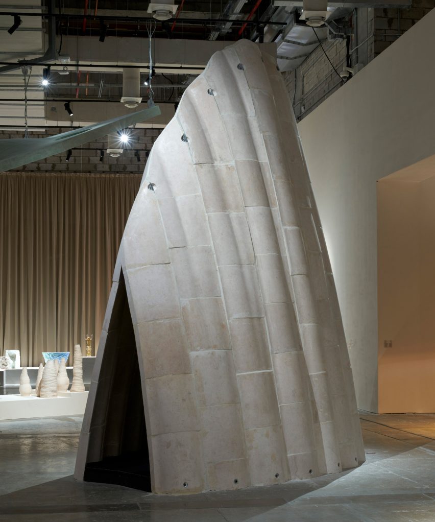
Palestinian architecture office AAU Anastas is presenting Tiamat, a dune-shaped installation that forms part of the studio’s ongoing project, Stone Matters, which explores the potential of combining historical stone building techniques with modern technologies to encourage the use of structural stone.

Positioned for visitors to walk through, the installation is a towering structure made of stone sourced from Bethlehem and informed by the Gothic-style architecture found across Palestine, Syria and Lebanon.

According to AAU Anastas, the light, sound reverberations and climate control within Tiamat’s internal space is unique to stone construction.


Clay in Context by Sama El Saket at Arab Design NowClay in Context by Sama El Saket at Arab Design Now

Clay in Context by Sama El Saket

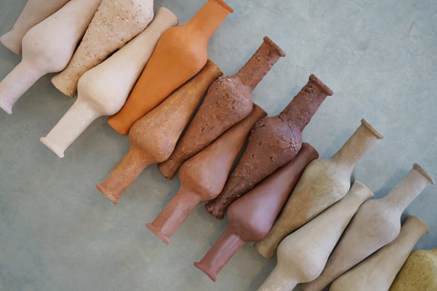
Jordan-born architect and ceramicist Sama El Saket took cues from her native landscape when creating this “taxonomy of Jordanian clays”.

The result is a set of spindle bottle-style vessels, each made of a different natural clay found across Jordan. This gives the pieces their distinctive colours, textures and character.

“These are all natural clays with no pigments added,” El Saket told Dezeen. “The colours are attributed to the different minerals that are found within the region. Some are sandier, some are rockier.”

The designer noted that while Jordan features an abundance of clay deposits and a rich history of ceramic production, today most Jordanian clay is imported.


Light Impact by Fabraca StudiosLight Impact by Fabraca Studios
Photo by Sabine Saadeh

Light Impact by Fabraca Studios

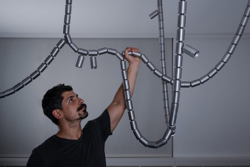
Lebanese industrial design brand Fabraca Studios has created Light Impact, a solid aluminium lighting fixture that was designed as an alternative chandelier, resembling durable ropes.

The piece was made to replace a glass chandelier that shattered in the aftermath of the 2020 Beiruit explosion, which destroyed a large part of Lebanon’s capital city.

Light Impact is defined by “flexible characteristics designed to withstand another disaster,” studio founder Samer Saadeh told Dezeen. He added that the piece, which includes internal brass components, was designed as an ode to Beirut’s adaptability and resilience.


Eleven by Sahel AlhiyariEleven by Sahel Alhiyari

Eleven by Sahel Alhiyari

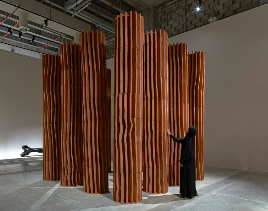
Eleven is a cluster of tall fluted terracotta columns by Jordanian architect Sahel Alhiyari that were made through moulding and forming rather than traditional cutting and carving.

The architect handcrafted the segments, which are vertically stacked, using a similar technique to pottery-making,

“As you twist and turn the material, it creates all of this stuff,” Alhiyari told Dezeen. The designer explained that the columns were deliberately created to celebrate imperfections, despite referencing classical architecture.


Sediments by Talin HazbarSediments by Talin Hazbar

Sediments by Talin Hazbar

UAE-based Syrian designer Talin Hazbar is featuring her Sediments project, which previously gained recognition at Dubai Design Week.

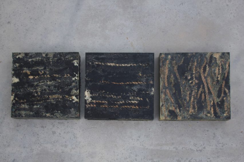
The work consists of blocky seating made from fishing ropes and fishing cage ropes extracted from the Persian Gulf with the assistance of the Dubai Voluntary Diving Team.

Also made up of recycled rubber grains, the heavily textured seating was created to serve as a reminder of how we might attempt to clean up damaged coastlines, according to Hazbar.


Whispers from the Deep by T SakhiWhispers from the Deep by T Sakhi

Whispers from the Deep by T Sakhi

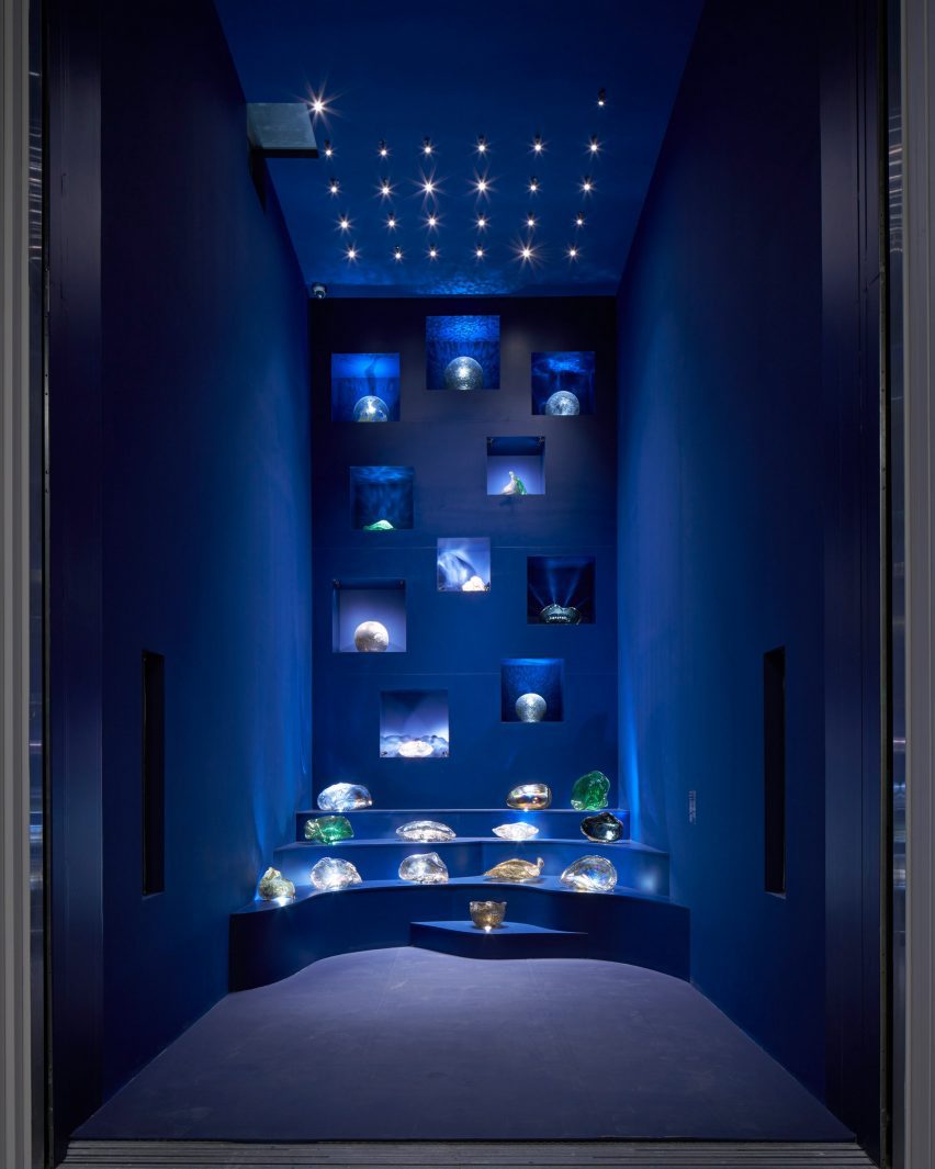
Lebanese-Polish sisters Tessa and Tara El Sakhi of the studio T Sakhi combined discarded metal salvaged from factories in Veneto, Italy, with Murano glass to create amorphous glassware that takes cues from underwater sea creatures.

These pieces were arranged atop dramatic shelving inside the elevator connecting the first and second floors of the Arab Design Now exhibition.

The result is a playful installation that draws together the Venetian lagoon and Lebanese glassblowing traditions.

The photography is by Edmund Sumner unless stated otherwise.

Arab Design Now takes place at Design Doha from 24 February to 5 August 2024 at M7 in Doha, Qatar. See Dezeen Events Guide for an up-to-date list of architecture and design events taking place around the world.


Reference

Eight interiors celebrating the curated clutter of “bookshelf wealth”
CategoriesInterior Design

Eight interiors celebrating the curated clutter of “bookshelf wealth”

Dubbed the first major design trend of 2024, our latest lookbook collects cosy, lived-in interiors that embody the “bookshelf wealth” aesthetic movement taking over social media.

While using books for interior decoration is not a new idea, it has been brought back into focus by a now-viral TikTok video posted in December by San Diego-based interior designer Kailee Blalock.

In the video, Blalock explains that “bookshelf wealth” is not just about creating perfect book displays, but instead about capturing the warmth and homeliness of book collections to curate “a whole home vibe”.

“Bookshelf wealth”, which the Financial Times called this year’s “first major design trend”, suggests pairing bookshelves with mismatched interior patterns, cosy seating areas and layered, loosely organised art pieces to create a tastefully eclectic space for reading.

Despite their contemporary qualities, the projects in this list capture the intimate atmosphere of “bookshelf wealth”, from colourful bookshelves that span an entire room to subtle reading nooks for deeply personal collections.

This is the latest in our lookbooks series, which provides visual inspiration from Dezeen’s archive. For more inspiration, see previous lookbooks featuring spaces punctuated by structural columns, rooms embracing the “unexpected red theory” and playful homes integrating indoor slides.


Living room with full storage wallLiving room with full storage wall
Photo by Nicole Franzen

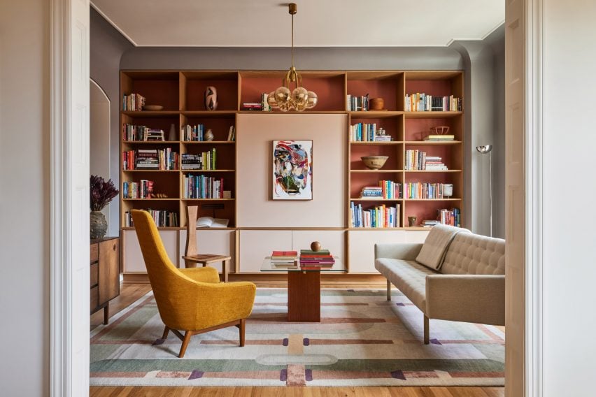
East Village Apartment, USA, by GRT Architects

A wooden bookcase with sienna-coloured backing panels complements this warm New York apartment renovation by GRT Architects.

The bookcase spans the length of the living room behind patterned, textural furniture pieces and is lined with multicoloured books stacked in different directions against small sculptural objects.

Aiming to preserve the home’s “turn-of-the-century disposition”, GRT Architects concealed a TV behind a light pink panel at the centre of bookcase.

Find out more about East Village Apartment ›


Mayfair home by Child StudioMayfair home by Child Studio
Photo by Felix Speller

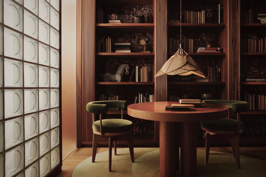
Mayfair home, UK, by Child Studio

London-based Child Studio designed this entertainer’s home in Mayfair with mid-century modern furniture and deep-toned material finishes, aiming to enhance the art deco atmosphere by carving bookshelves into dark mahogany walls.

“We worked closely with the client to create a space that reflected his personality and interests, encompassing art, design, literature and travel,” Child Studio founders Che Huang and Alexy Kos told Dezeen.

“This approach made us think of Saint Laurent’s salon – an eclectic interior where design objects and art pieces from different eras and parts of the world are assembled together, forming a highly personal environment.”

Find out more about the Mayfair home ›


Kelly Wearstler's interiors for Santa Monica Proper HotelKelly Wearstler's interiors for Santa Monica Proper Hotel
Photo by The Ingalls and Matthieu Salvaing

Santa Monica Proper Hotel, USA, by Kelly Wearstler

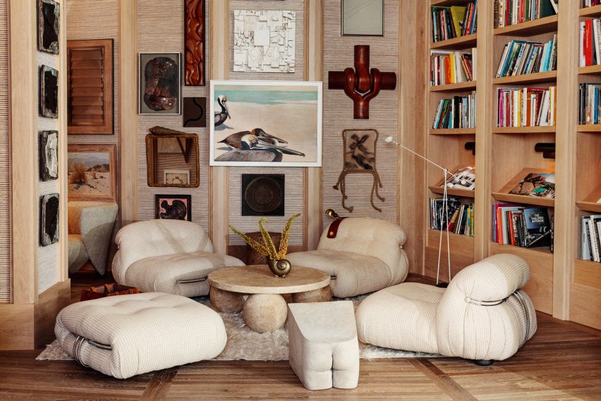
The Santa Monica Proper Hotel by American designer Kelly Wearstler includes reading niches with artwork and furniture by local artists and artisans.

A brimming bookcase flanks low-lying lounges and walls covered by misaligned artwork, with Wearstler explaining that the idea was to connect the original building’s Spanish colonial revival style with the new contemporary building.

“Everything’s connected to somebody that is local in the city,” Wearstler explained. “We’re so lucky to be in Los Angeles, the talent pool here is extraordinary.”

Find out more about Santa Monica Proper Hotel ›


Photo by Victor Stonem

AdH House, Mexico, by Francesc Rifé Studio

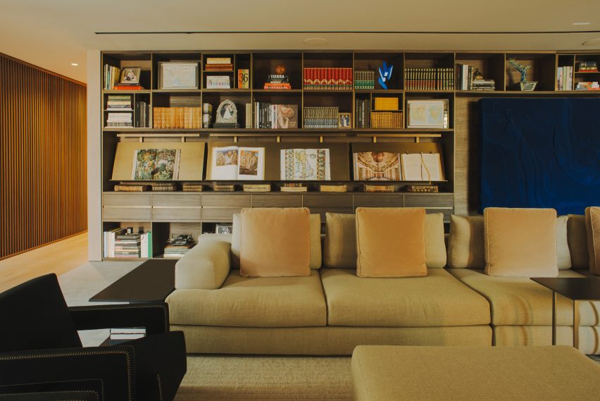
Spanish practice Francesc Rifé Studio conceived this moody house in Mexico City with a eucalyptus floor-to-ceiling bookcase to display antique atlases.

The bespoke unit was finished with brass bookstands and embedded LED lighting to complement the tactile and neutral interior palette, capturing the luxurious undertones of “bookshelf wealth”.

Find out more about AdH House ›


Reading nook with white walls and black shelvingReading nook with white walls and black shelving
Photo by Rafael Soldi

Whidbey Dogtrot, USA, by SHED

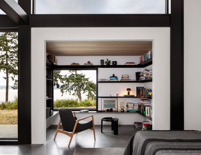
A dedicated reading nook punctures this bedroom suite for a compact home in the Pacific Northwest by US studio SHED.

Wrapping the bright white walls, stacked books and mismatched objects line dark metal shelf extrusions that are interrupted by a square window looking out to the surrounding landscape.

Find out more about Whidbey Dogtrot ›


Study bookshelves in Kew Residence by John Wardle Architects in Melbourne, AustraliaStudy bookshelves in Kew Residence by John Wardle Architects in Melbourne, Australia
Photo by Trevor Mein and Sharyn Cairns

Kew Residence, Australia, by John Wardle Architects

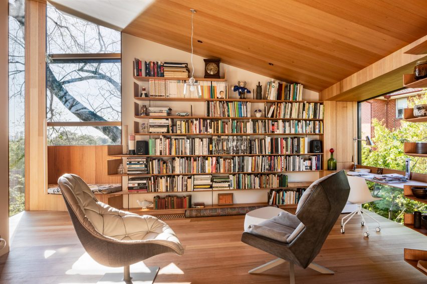
Remodelled by John Wardle Architects for the founder’s own Melbourne home, Kew Residence leans into the informal and cocooning atmosphere of “bookshelf wealth” in its wood-clad first-floor study.

Built-in shelves made from Victorian Ash are the focal point of the room and have been densely filled with a collection of ceramic art and books. Next to the shelves, an inset window seat and a slim suspended desk were added, creating a practical and uniform interior.

Find out more about Kew Residence ›


Photo by Chris Mottalini

Silver Lake home, USA, by Lovers Unite

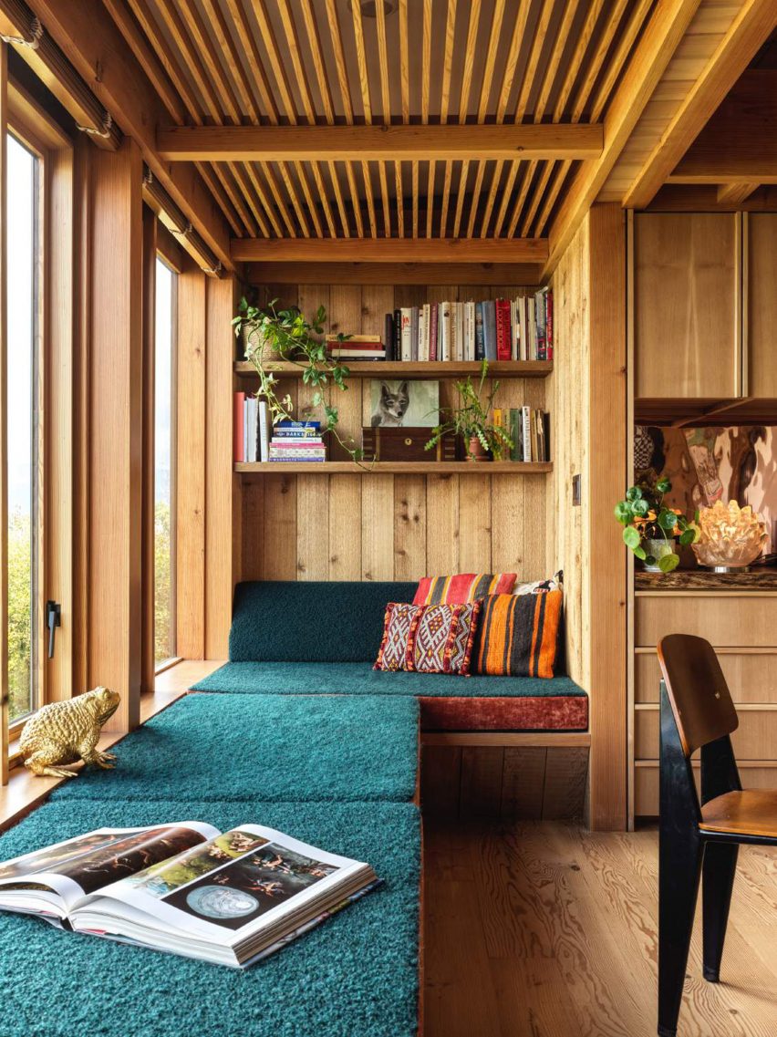
As part of renovation works for a 1950s Los Angeles home, California studio Lovers Unite converted an unused balcony into a long, teal-upholstered window seat below a floating bookshelf.

Paired with contrasting embroidered cushions and vintage decor pieces, the book display adds colour, depth and a feeling of occupation to enliven the timber-clad interiors.

Find out more about Silver Lake home ›


St Vincents Place by BE ArchitectureSt Vincents Place by BE Architecture
Photo by Derek Swalwell

St Vincents Place, Australia, by BE Architecture

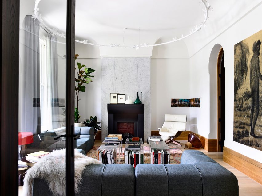
Australian studio BE Architecture renovated this Victorian home to highlight the client’s vast art collection, while also rejecting “stark minimalism” and embracing the interior’s existing heritage features.

Large-format books form a centrepiece in the home’s lounge area under transparent coffee table cubes, adding to the home’s eclectic, richly textured and academic character.

Find out more about St Vincents Place ›

This is the latest in our lookbooks series, which provides visual inspiration from Dezeen’s archive. For more inspiration see previous lookbooks featuring homes with indoor slides, colourful home renovations and built around ruins. 


Reference

Ten inspiring living spaces punctuated by structural columns
CategoriesInterior Design

Ten inspiring living spaces punctuated by structural columns

From monolithic concrete pillars to ornately decorated columns, this lookbook collates ten living room interiors that embrace existing structural columns.

It is not always cost-effective or practical for designers and architects to remove preexisting columns from interiors, especially if they are load-bearing and thus vital to the structural integrity of the building.

In the past, the structural components of buildings were often concealed within walls; however, this changed with the increase in popularity of open-plan spaces over the course of the 20th century.

Columns are sometimes placed at irregular intervals, especially in older buildings, and consequently the interior design scheme must be adapted to fit around them.

Pillars can provide a strong focal point that can be enhanced by both the choice of interior finishes and the placement of furniture around them.

Depending on their materiality and style, they can also serve as an immovable reminder of the building’s design style and the historical period in which it was built.

This is the latest in our lookbooks series, which provides visual inspiration from Dezeen’s archive. For more inspiration see previous lookbooks featuring interiors animated by textural burl wood, multicoloured interior design schemes and contemporary interiors that make a feature of historic ruins.


Grey chairs in living room with white column in cornerGrey chairs in living room with white column in corner
Photo by Pier Carthew

Kerr, Australia, by SSdH

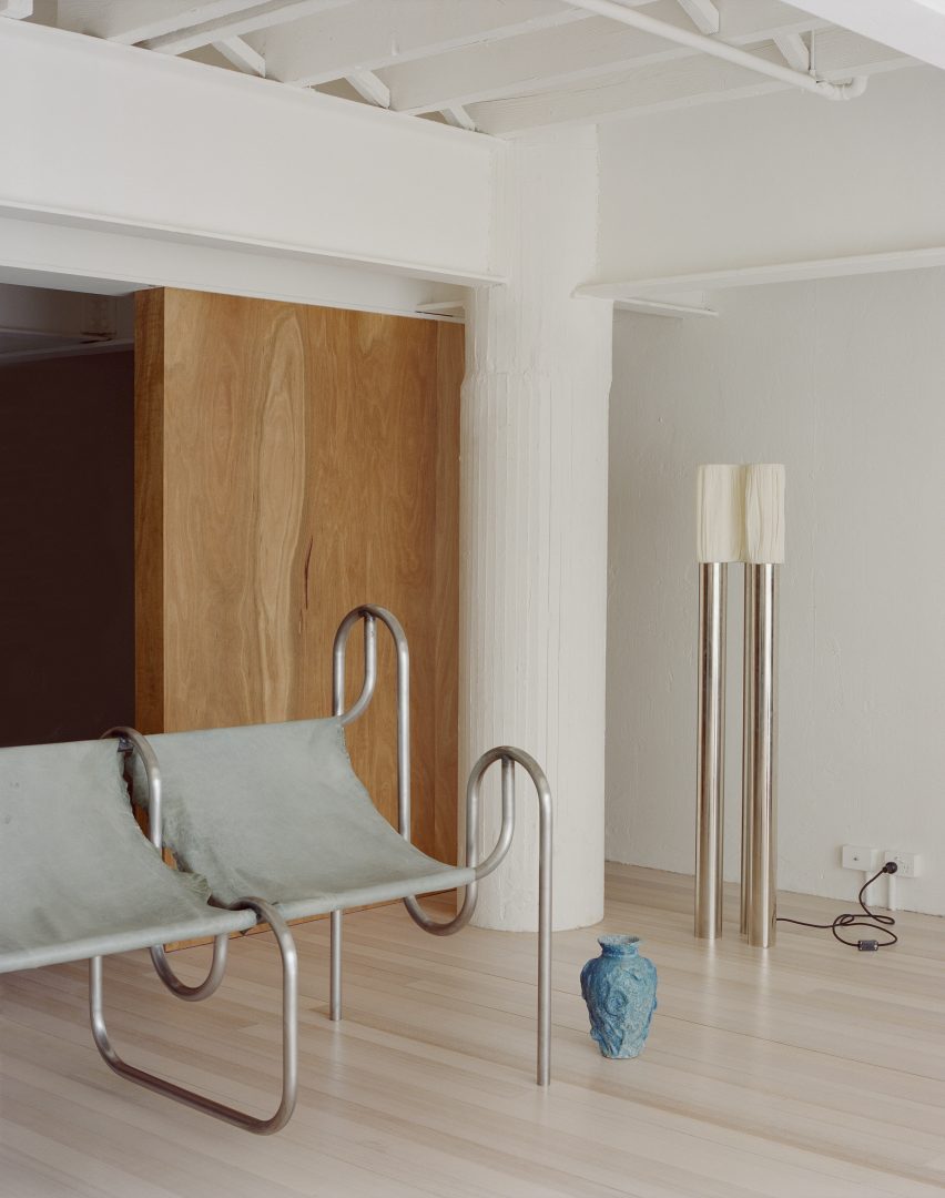
The industrial past of this mezzanine apartment in Melbourne is apparent thanks to the I-beams that crisscross the space and the pair of thick plastered columns in two corners of its living room.

The functional aesthetic of the pillars is complimented by the presence of streamlined metal furnishings and offset by floor-to-ceiling wooden panelling.

Find out more about Kerr ›


Kitchen with chrome counter in JJ16 apartment by Lucas y Hernández-GilKitchen with chrome counter in JJ16 apartment by Lucas y Hernández-Gil
Photo by Jose Hevia

JJ16, Spain, by Lucas y Hernández-Gil

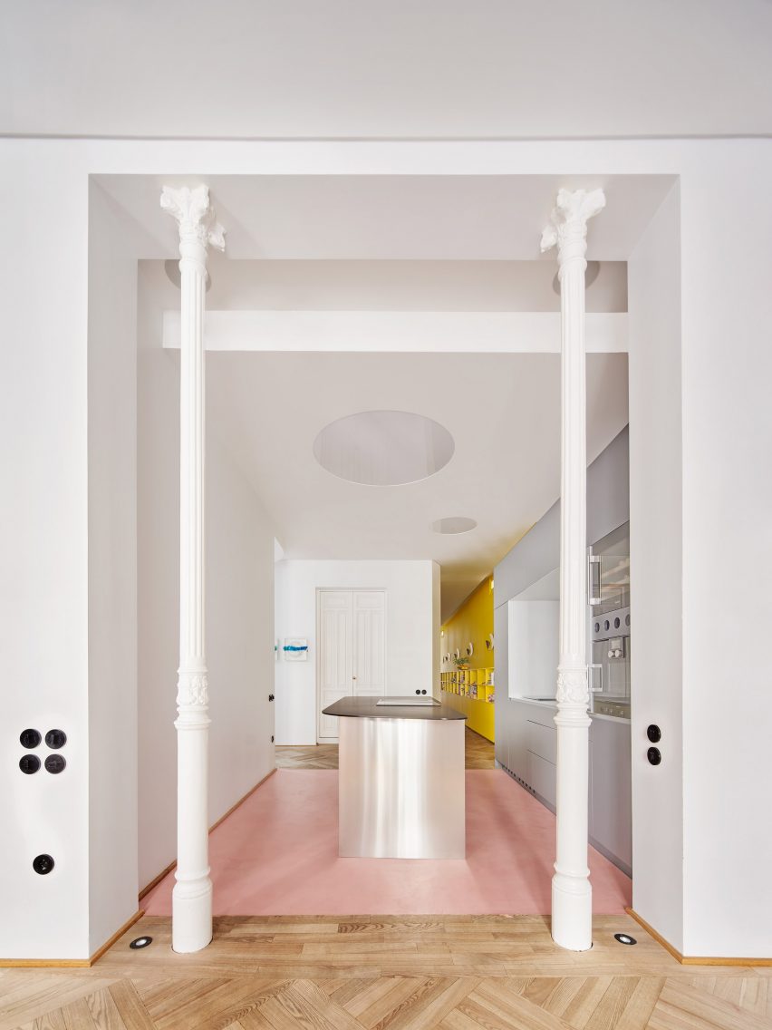
Situated in the Salamanca district of Madrid, local studio Lucas y Hernández-Gil created a playful interior for a high-ceilinged 19th-century apartment that combines pops of colour with original features.

A pair of elegant columns made from cast iron frame the entrance to the walk-through kitchen, contrasting the contemporary units with their fluted shafts and ornamented capitals.

Find out more about JJ16 ›


Living room with concrete column in itLiving room with concrete column in it
Photo by Fran Parente

Curitiba apartment, Brazil, by Leandro Garcia and Amanda Dalla-Bona

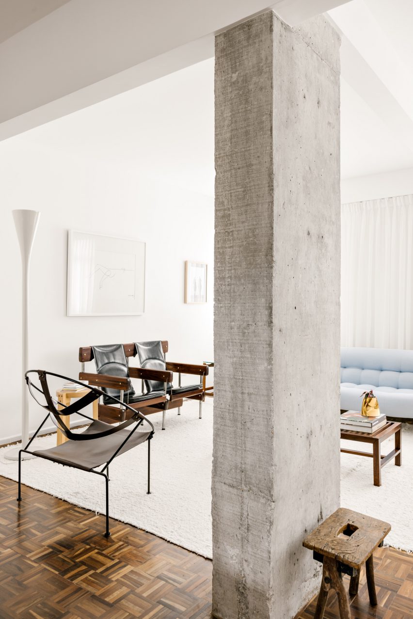
Eclectic furniture and glossy herringbone flooring contrast the weathered concrete pillar that sits on the boundary between the living and dining spaces of this apartment in the Brazilian city of Curitiba.

It has a rectangular footprint and a characterfully rough surface, which are both echoed in a gnarled wooden stool sitting at its base.

Find out more about Curitiba apartment›


Living room with mirrored wall and detailed columnsLiving room with mirrored wall and detailed columns
Photo by Sarah Elliott

Tribeca Loft, USA, by Andrea Leung

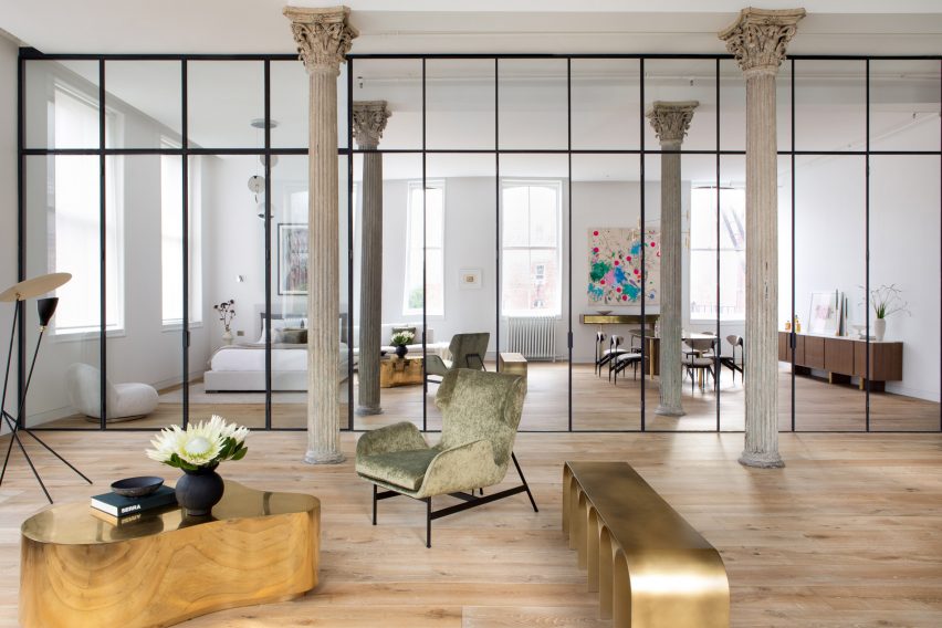
Public and private zones have been delineated by a partially mirrored wall tucked behind a sequence of three original, intricately formed columns in this loft apartment in New York’s Tribeca area.

The Corinthian-style iron pillars are characterised by gracefully fluted shafts topped by opulent capitals that feature acanthus leaves. The style was popular in ancient Greek and Roman architecture.

Find out more about Tribeca Loft ›


Living room with smooth white column in cornerLiving room with smooth white column in corner
Photo by Felix Speller and Child Studio

Mews house, UK, by Child Studio

A quartet of smooth, statuesque pillars blend in seamlessly against a backdrop of art deco and mid-century modern furnishings in the living area of this mews house in London’s Mayfair area.

The thick, pale pillars bring a dramatic air to the space, which was designed for lounging as well as hosting, entertaining and dining.

Find out more about the mews house ›


Living space with curved sofa and tiled columnsLiving space with curved sofa and tiled columns
Photo by Seth Caplan

Dumbo Loft, USA, by Crystal Sinclair Designs

Walls made from floor-to-ceiling glass panels and an opulent crystal chandelier create a sense of luxury in this Brooklyn apartment.

The living room is grounded by a double-height structural pillar, which has a bottom half clad in pale pink vertical, subway-style tiles.

Find out more about Dumbo Loft ›


Living space with kitchen in corner and stone pillar in centreLiving space with kitchen in corner and stone pillar in centre
Photo by José Hevia

Can Santacilia, Spain, by OHLAB

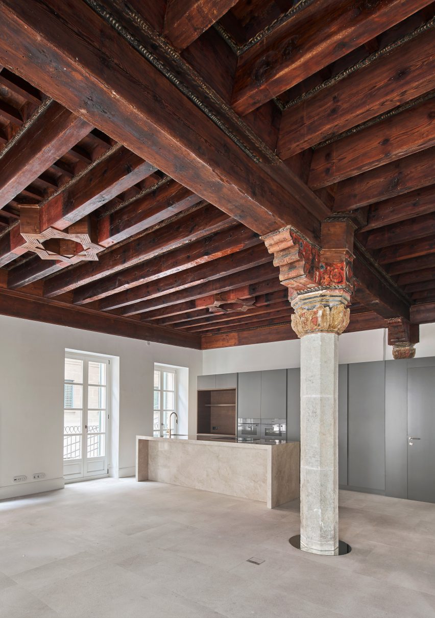
A pillar with a faceted stone shaft and an ornately carved and painted wooden capital is the focal point of this living area inside an apartment in Palma de Mallorca by local studio OHLAB.

The stately pillar and dramatic coffered ceiling are contrasted by the sleek modern kitchen, but united by the use of stone in both the column and kitchen island.

Find out more about Can Santacilia ›


Living area in a wooden houseLiving area in a wooden house
Photo by Nao Takahashi

Casa Nano, Japan, by Bosco Sodi

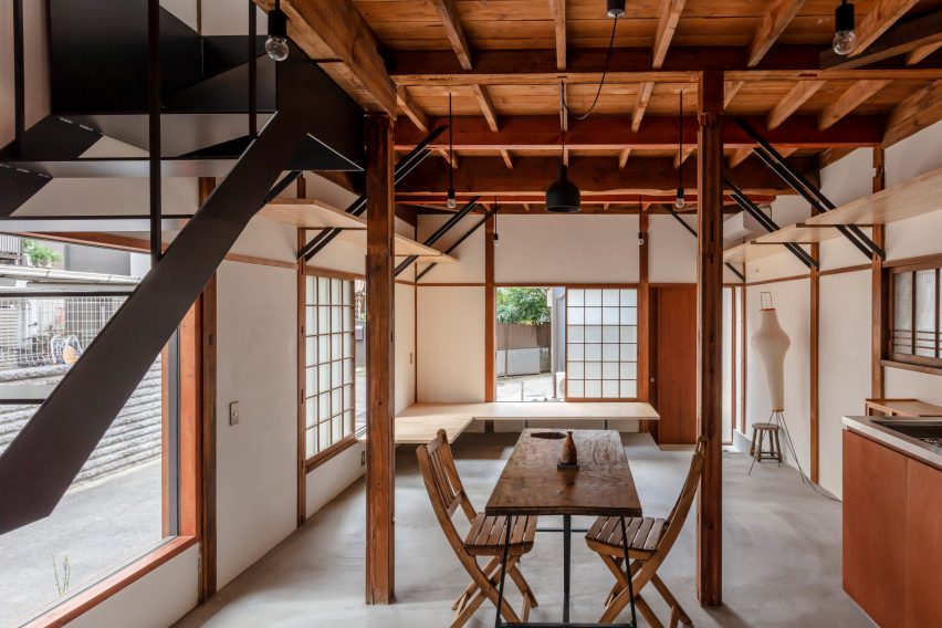
This modest home in Tokyo features slender struts made from wood that form part of the building’s exposed structure.

Wooden seating, tables, cabinets and shelving create a harmonious interior scheme, which is dominated by both the skeletal wooden frame of the building and an open-tread staircase.

Find out more about Casa Nano ›


Vasto gallery by Mesura apartment interiorVasto gallery by Mesura apartment interior
Photo by Salva López

Casa Vasto, Spain, by Mesura

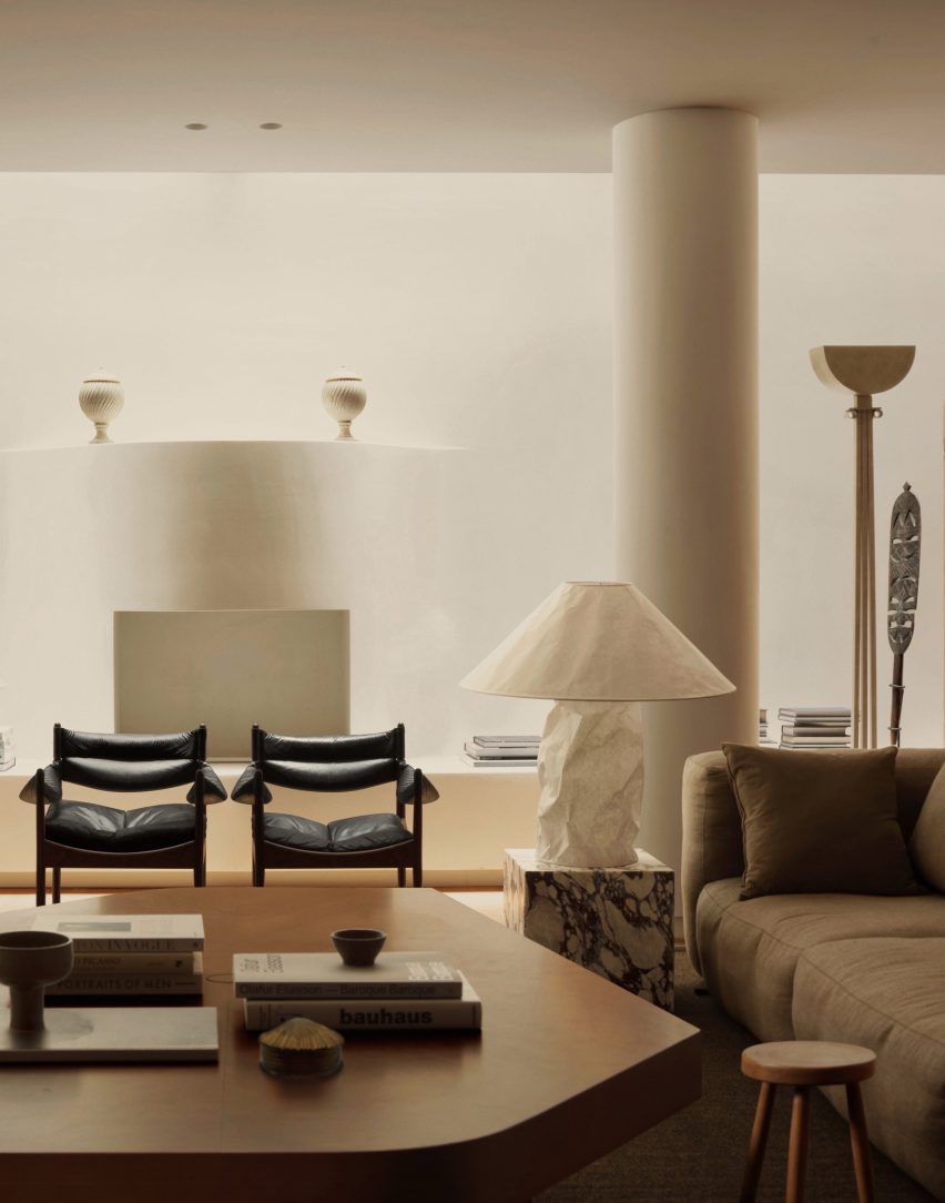
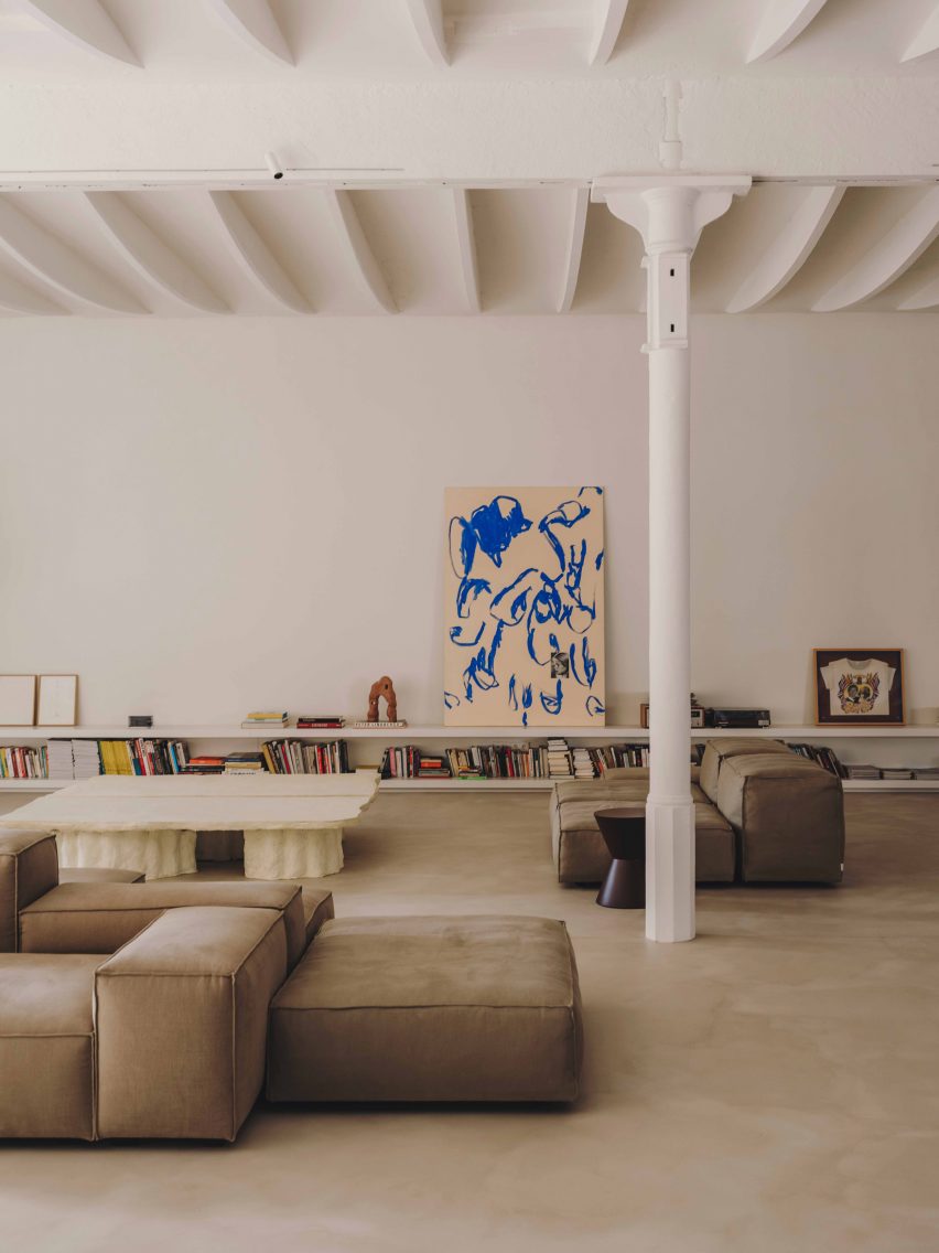
This apartment in Barcelona (above and main image) is studded with white-rendered columns dating from the 18th century, which anchor the unique vaulted ceiling to the expansive floor.

Low-slung furnishings provide a horizontal emphasis in the interior while the columns create a rhythm of upright pillars, which nod to the building’s industrial heritage.

Find out more about Casa Vasto ›


Brutalist Chelsea townhouse by PricegoreBrutalist Chelsea townhouse by Pricegore
Photo by Johan Dehlin

Brutalist Chelsea townhouse, UK, by Pricegore

London-based architecture studio Pricegore refurbished the interior of this brutalist townhouse to celebrate its concrete materiality.

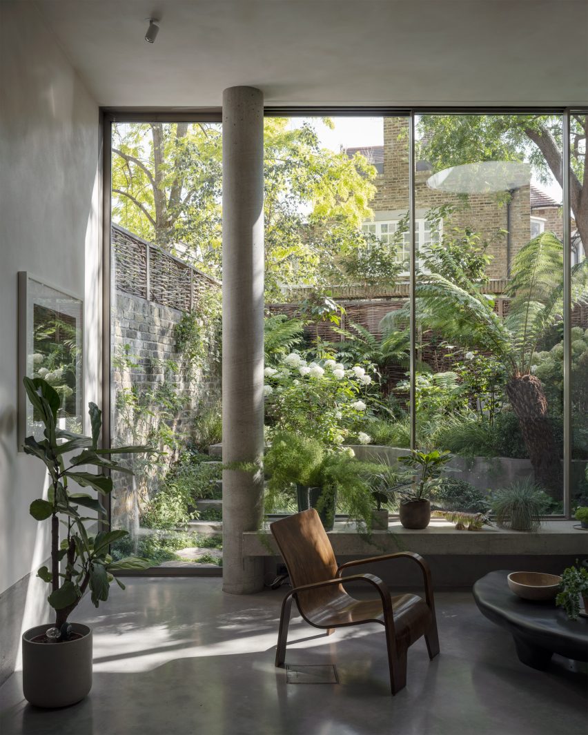
In the lofty, double-height living space, a cylindrical pillar stretches from floor to ceiling in front of the backdrop provided by the house’s verdant garden.

Find out more about Brutalist Chelsea townhouse ›

This is the latest in our lookbooks series, which provides visual inspiration from Dezeen’s archive. For more inspiration see previous lookbooks featuring interiors with textural burl wood, colourful interior design schemes and contemporary interiors that make a feature of existing historic ruins.

Reference

Eight interiors where burl wood provides natural texture
CategoriesInterior Design

Eight interiors where burl wood provides natural texture

This week’s lookbook rounds up eight interiors with furnishings and surfaces finished in burl-wood veneer, allowing its swirly, psychedelic graining to serve a decorative function.

Burl wood is a rare and expensive wood, often only available in thin sheets of veneer. That’s because it is derived from the knobbly outgrowths of tree trunks and branches – also known as burls.

Like the botanical equivalent of a callous, these outgrowths form in response to different stress factors and grow unpredictably, creating complex unexpected grain patterns behind their gnarled bark.

Burl wood has been experiencing a renaissance over the last few years, with interior designers including Kelly Wearstler using it to evoke the bohemian flair of its 1970s heyday.

Mixed and matched with other patterns, the material is now used to communicate a kind of organic understated luxury, much like natural stone.

From a Michelin-starred restaurant to a home that was designed to resemble a boutique hotel, read on for eight examples of how burl wood can provide textural richness to a modern interior.

This is the latest in our lookbook series, which provides visual inspiration from Dezeen’s archive. For more inspiration see previous lookbooks featuring rooms with net floors, interiors with furry walls and homes with mid-century modern furniture.


Botaniczna Apartment, Poland, by Agnieszka Owsiany StudioBotaniczna Apartment, Poland, by Agnieszka Owsiany Studio
Photo by Pion Studio

Botaniczna Apartment, Poland, by Agnieszka Owsiany Studio

This tranquil apartment in Poznań was designed by local firm Agnieszka Owsiany Studio to give the owners a reprise from their high-pressure medical jobs.

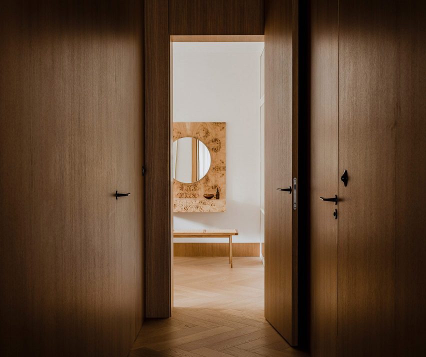
The interior combines a calming mix of pale marble and various kinds of wood, including oak cabinetry, chevron parquet flooring and a console and vanity, both finished in speckled burl.

“My clients asked for a high quality, almost hotel-like space, as they were in need of everyday comfort,” founder Agnieszka Owsiany told Dezeen.

Find out more about Botaniczna Apartment ›


Ulla Johnson flagship, USA, by Kelly WearstlerUlla Johnson flagship, USA, by Kelly Wearstler
Photo by Adrian Gaut

Ulla Johnson flagship, USA, by Kelly Wearstler

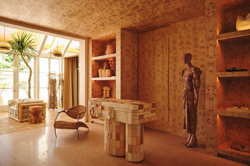
Burlwood brings “a touch of 1970s California nostalgia” to the Ulla Johnson flagship store in Los Angeles, courtesy of local designer Kelly Wearstler.

The unusual veneer was used liberally to cover walls, ceilings and shelves, as well as forming a statement display cabinet where the material’s natural wavy surface texture provides an added element of tactility (top image).

Find out more about the Ulla Johnson flagship ›


Koda hair salon by Arent & PykeKoda hair salon by Arent & Pyke
Photo by Prue Ruscoe

Koda hair salon, Australia, by Arent & Pyke

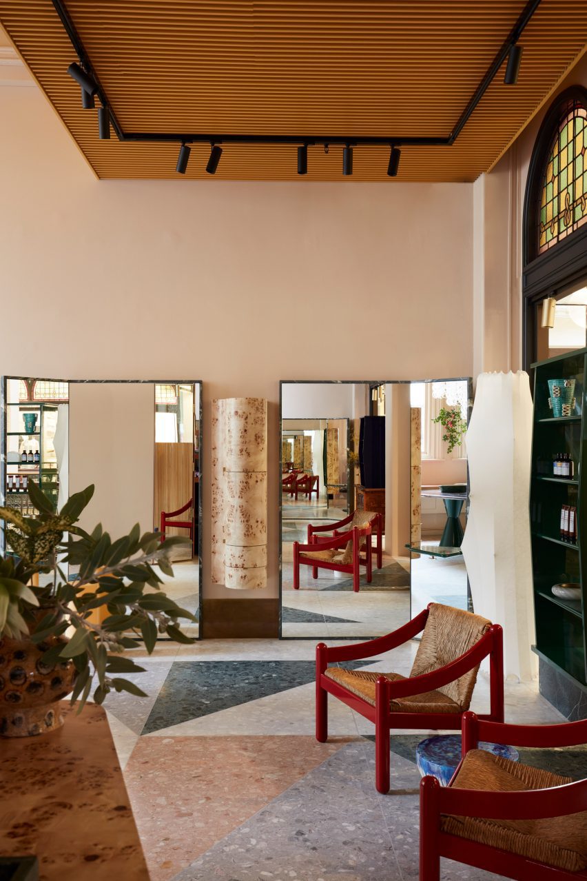
This hair salon in Sydney’s Queen Victoria Building was designed by Australian studio Arent & Pyke to be “best appreciated from seated height”.

Drawing attention away from the building’s extra-tall ceilings, freestanding quartzite-rimmed mirrors are placed at angles in front of the styling chairs, framing a vintage hanging cabinet made from pale burl.

Find out more about the Koda hair salon ›


Opasły Tom restaurant by Buck StudioOpasły Tom restaurant by Buck Studio
Photo by Pion Studio

Opasly Tom restaurant, Poland, by Buck Studio

Buck Studio employed a limited palette of colours and materials to create visual continuity throughout Warsaw restaurant Opasly Tom, which occupies a split-level building that was broken up into a series of rooms of different sizes.

Coral-orange chair cushions mirror the hardware of the totem-like pendant lights, and several burl-clad cabinets are dotted throughout the eatery. These match the kaleidoscopically patterned panelling in the hallway and the private dining rooms.
“This contemporary, minimalistic design approach produces the impression of coherence while creating a powerful aesthetic impact,” explained the Polish studio, which is headed up by Dominika Buck and Pawel Buck.

Find out more about the Opasly Tom restaurant ›


Warsaw apartment by MistoviaWarsaw apartment by Mistovia
Photo by Oni Studio

Warsaw apartment, Poland, by Mistovia

Elsewhere in Warsaw, Polish studio Mistovia designed an apartment for an art director and her pet dachshund to resemble an “elaborate puzzle” of contrasting patterns.

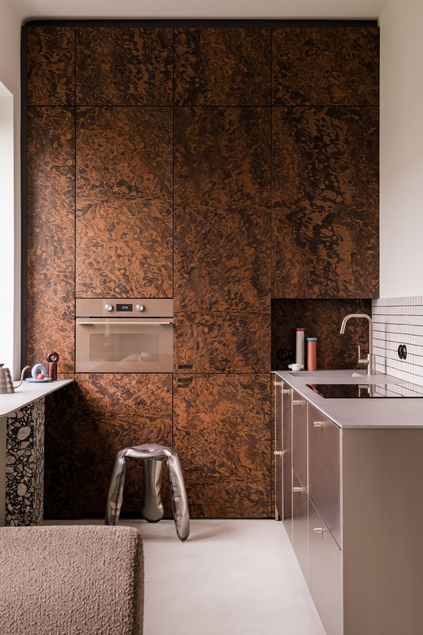
Walnut-burl cabinets dominate the kitchen, with their trippy swirling pattern offset against monochrome tiles, brushed-metal drawers and a terrazzo-legged breakfast bar.

Find out more about the Warsaw apartment ›


Imperfecto, USA, by OOAK ArchitectsImperfecto, USA, by OOAK Architects
Photo by Jennifer Chase and Yorgos Efthymiadis

Imperfecto, USA, by OOAK Architects

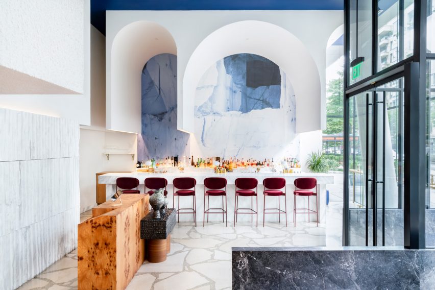
Upon entering Michelin-starred restaurant Imperfecto in Washington DC, diners are greeted by a custom-made maître-d stand clad in panels of burl-wood veneer, creating a mirrored tortoiseshell pattern across its surface.

The interior, designed by Greek-Swedish studio OOAK Architects, sees neutral tones paired with splashes of blue and white that nod to the restaurant’s Mediterranean menu.

“OOAK Architects has used varied, high-quality finishes and authentic materials including Greek and Italian marbles, as well as brass and wood from different parts of the world, creating contrasting textures across the space,” the team said.

Find out more about Imperfecto ›


Interior of Black Diamond house by YSGInterior of Black Diamond house by YSG
Photo by Anson Smart

Black Diamond house, Australia, by YSG

Australian interiors studio YSG introduced a sumptuous mix of materials to this house in Sydney’s Mosman suburb to evoke the feeling of staying in a luxury hotel.

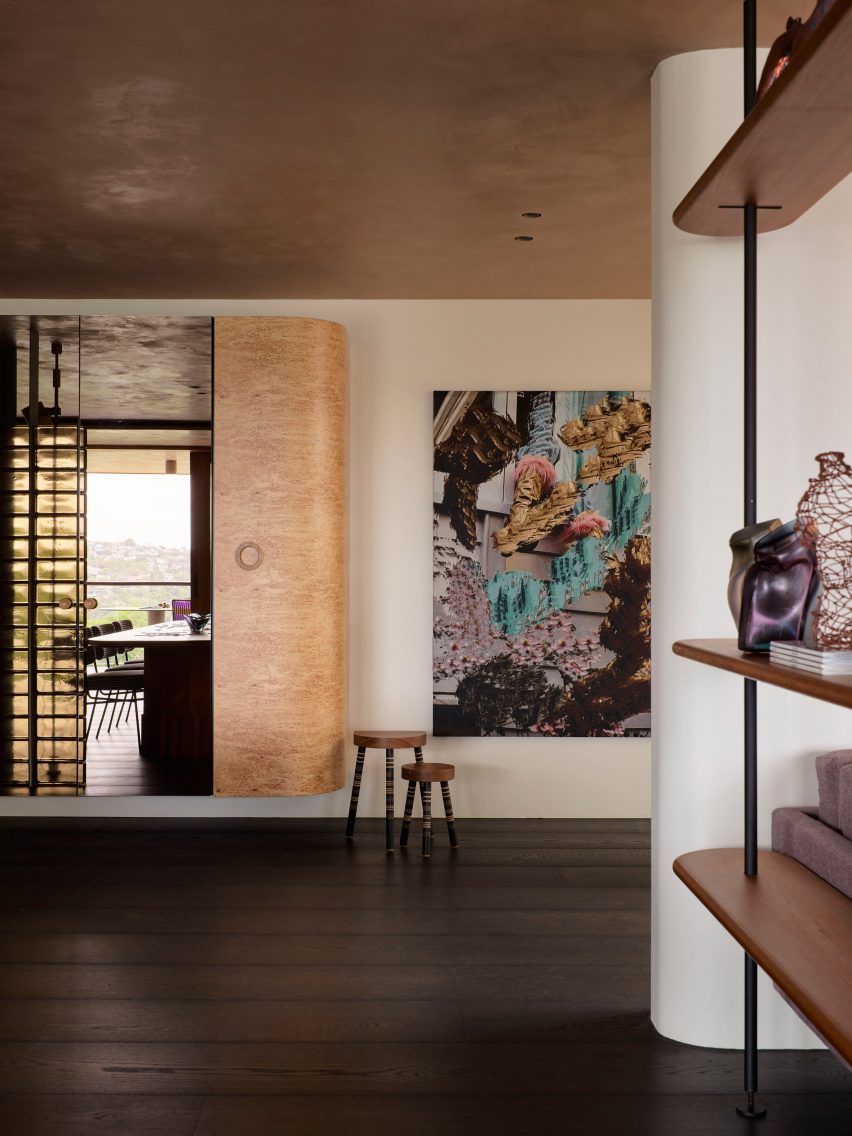
This approach is evidenced by a number of custom furniture pieces dotted throughout the home, including a Tiberio marble vanity in the downstairs powder room and a poplar-burl cabinet with a bronzed mirror that looms over the nearby living room.

Find out more about Black Diamond house ›


Studio Frantzén, UK, by Joyn StudioStudio Frantzén, UK, by Joyn Studio
Photo by Åsa Liffner

Studio Frantzén, UK, by Joyn Studio

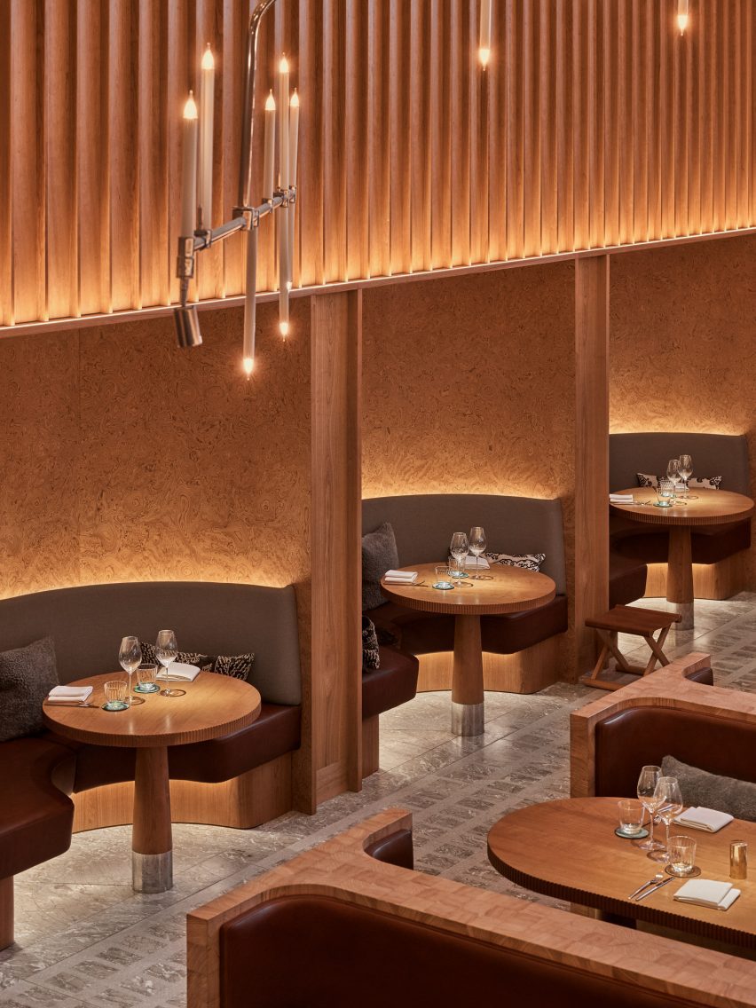
Restaurant Studio Frantzén in London’s Harrods department store serves a fusion of Nordic and Asian food that is also reflected in its Japandi interiors – taking cues from both Scandinavian and Japanese design.

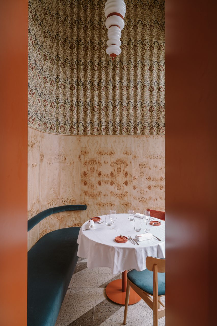
Interiors practice Joyn Studio leaned heavily on both cultures’ penchant for wood, combining seating banquettes made from blocks of end-grain pine wood with gridded timber ceilings and seating booths framed by burl-wood wall panelling.

Find out more about Studio Frantzén ›

This is the latest in our lookbook series, which provides visual inspiration from Dezeen’s archive. For more inspiration see previous lookbooks featuring rooms with net floors, interiors with furry walls and homes with mid-century modern furniture.

Reference

Eight homes where mid-century modern furniture adds a stylish touch
CategoriesInterior Design

Eight homes where mid-century modern furniture adds a stylish touch

Pieces by designers Charles and Ray Eames and Isamu Noguchi are on show in this lookbook, which features homes with eye-catching mid-century modern furniture.

Mid-century furniture, which often has simple lines and a sculptural feel, adds a modernist touch to these homes, which range from period properties to newly built and renovated houses.

Among the interiors showcased in this lookbook are iconic architect Le Corbusier’s own home and a residence in London’s upmarket Mayfair area that has been filled with mid-century modern and art deco details.

This is the latest in our lookbooks series, which provides visual inspiration from Dezeen’s archive. For more inspiration see previous lookbooks featuring perforated brick-walls, budget home interiors and immersive saunas in peaceful settings.


Mid-century modern home Mid-century modern home
Photo by Mariell Lind Hansen

Zero House, UK, by Ben Garrett and Rae Morris

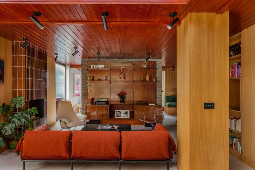
Owners Ben Garrett and Rae Morris updated Zero House, which was informed by Californian Case Study Houses, themselves in a way that would honour its mid-century roots.

The living room features a striking floor-to-ceiling fireplace clad in tiles, as well as a number of furniture pieces in warm colours. Among them is a classic Eames office chair in a dark-brown leather colour that matches the wooden panelling that decorates the room.

Find out more about Zero House ›


Hudson Woods house by Magdalena KeckHudson Woods house by Magdalena Keck
Photo by Jeff Cate

Hudson Woods home, US, by Magdalena Keck

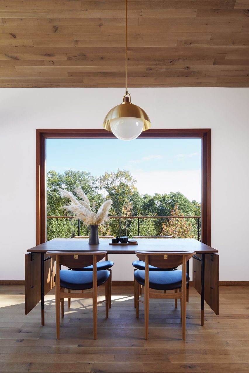
Located in upstate New York, this holiday home has an interior that fuses Danish and Japanese design. A dinner table and chairs by designer Finn Juhl are among the Danish pieces used in the house, where they look both functional and elegant.

A simple lamp with a gold-coloured shade above the table adds a decorative touch and matches the brass fastenings at the backs of the chairs.

Find out more about the Hudson Woods home ›


Interior of Madrid apartmentInterior of Madrid apartment
Photo by Polina Parcevskya and Julie Smorodkina

Radikal Klassisk, Spain, by Puntofilipino 

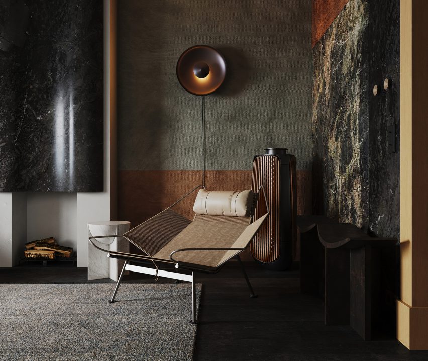
The interior of this Spanish apartment in a former bank building has a moody, interesting colour palette and features richly textured materials including terrazzo, clay-rendered walls and marble tiles.

In contrast, the furniture is streamlined and unfussy, including a sculptural lounge chair by Danish designer Hans J Wegner in the living room.

Find out more about the Radikal Klassisk ›


City Beach residence in Perth by Design TheoryCity Beach residence in Perth by Design Theory
Photo by Jack Lovel

City Beach House, Australia, by Design Theory

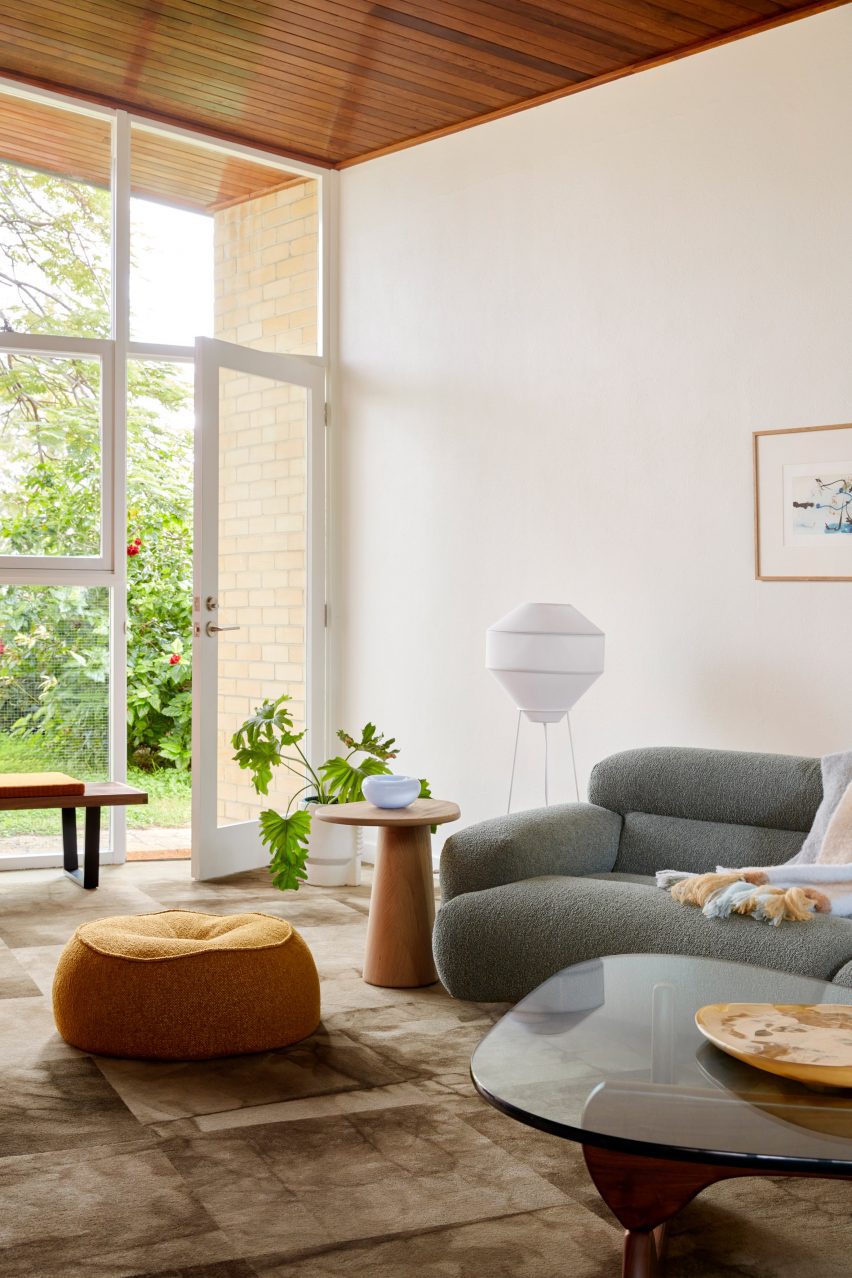
American artist and designer Noguchi’s iconic coffee table, made from a heavy glass tabletop that rests on two undulating wooden legs, has pride of place in the living room of City Beach House.

The interior, created by Australian studio Design Theory, responds to the design and natural material palette of the house itself, which is from the 1960s.

Find out more about City Beach House ›


White home in Sweden by Asa Hjort ArchitectsWhite home in Sweden by Asa Hjort Architects
Photo by Jim Stephenson

Hallen, Sweden, by Åsa Hjort Architects

This newly built home in the southern Swedish region of Österlen has a blocky geometric design and large windows that provide views out across the Baltic Sea.

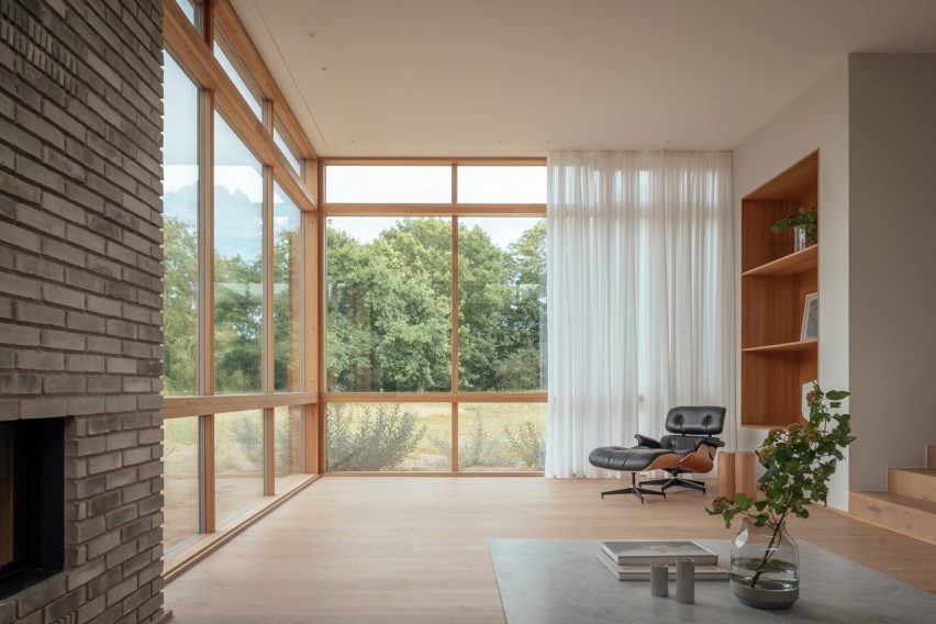
An Eames lounge chair adds a comfortable resting space in one of the rooms, where its dark hues contrast against sheer white curtains and pale wood flooring.

Find out more about Hallen ›


Moore HouseMoore House
Photo is by Joe Fletcher

Moore House, US, by Woods + Dangaran

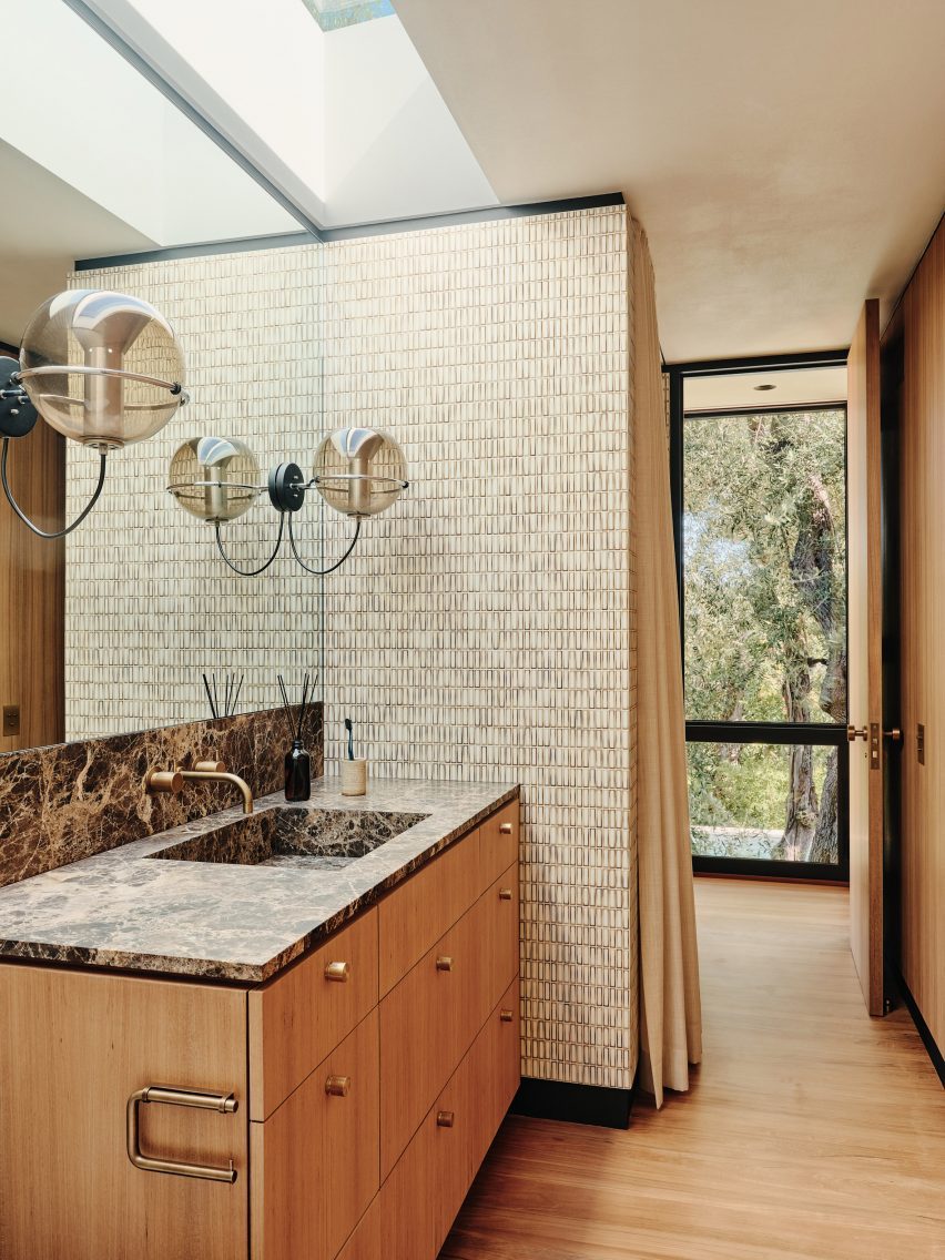
A pair of vintage globe-shaped pendants by Dutch designer Frank Ligtelijn light up the bathroom in this 1960s California home designed by architect Craig Ellwood.

The bathroom also features a dark Emperador marble countertop and a wall clad in Japanese porcelain tiles.

Find out more about Moore House ›


Mid-century modern interior by Child StudioMid-century modern interior by Child Studio
Photo by Felix Speller and Child Studio

Mayfair residence, UK, by Child Studio

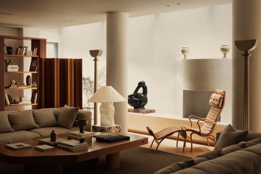
The “Pernilla” lounge chair by Swedish designer Bruno Mathsson is among the many mid-century modern furniture pieces on show in this London apartment.

Local practice Child Studio told Dezeen that the spacious lounge that houses the chair was informed by the grand salon in fashion designer Yves Saint Laurent’s Paris home.

Find out more about the Mayfair residence ›


Le Corbusier's studio apartmentLe Corbusier's studio apartment

Studio apartment, France, by Le Corbusier

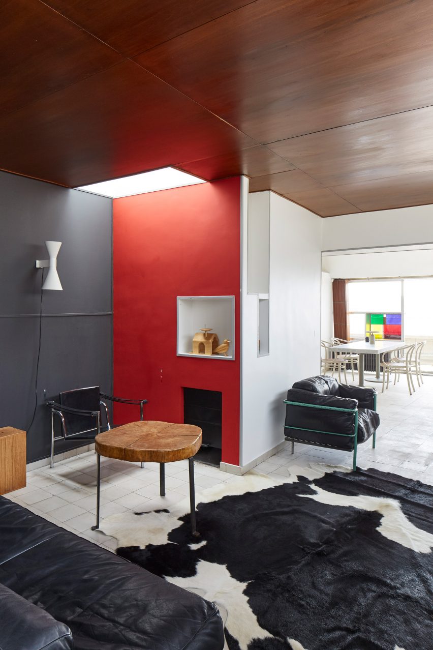
Le Corbusier’s apartment in his Immeuble Molitor apartment building in Paris, where he lived for more than three decades, reopened to the public in 2018.

Visitors to the modernist flat can admire mid-century modern furniture pieces including a black leather edition of the designer’s signature LC2 lounge chair, which sits next to a cowhide rug at the entrance of the apartment.

Find out more about Le Corbusier’s apartment ›

This is the latest in our lookbooks series, which provides visual inspiration from Dezeen’s archive. For more inspiration see previous lookbooks featuring perforated brick-walls, budget home interiors and immersive saunas in peaceful settings.

Reference

Ten homes with net floors for relaxation and play
CategoriesInterior Design

Ten homes with net floors for relaxation and play

In this lookbook, we collect 10 residential interiors where net floors provide an unusual place to sit, recline or jump about.

Nets can be a fun way to link two storeys in the home. Featured below are examples from a New York apartment, a skinny house in Rotterdam and a small family residence in rural Vietnam, among others.

This is the latest in our lookbooks series, which provides visual inspiration from Dezeen’s archive. For more inspiration see previous lookbooks featuring homes with dividing lattice screens, split-level living areas and stylish children’s bedrooms.

Haus L in Austria by DunkelschwarzHaus L in Austria by Dunkelschwarz
Photo by Marcus Rohrbacher

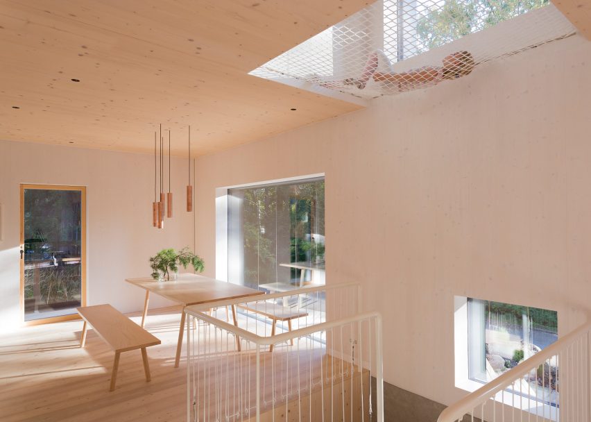
Haus L, Austria, by Dunkelschwarz

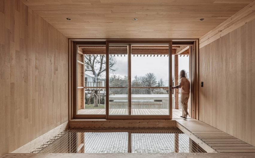
Timber-lined living spaces create a soothing atmosphere inside this house in the Austrian Alps, designed by local architecture studio Dunkelschwarz.

To encourage relaxation, a void above the dining area was covered with netting that can be used for lounging, while an adjacent walkway leads directly to a large balcony.

Find out more about Haus L ›


Net floor in Pimeriza HouseNet floor in Pimeriza House
Photo by Marcos Zegers (also top)

Primeriza House, Chile, by Stanaćev Granados

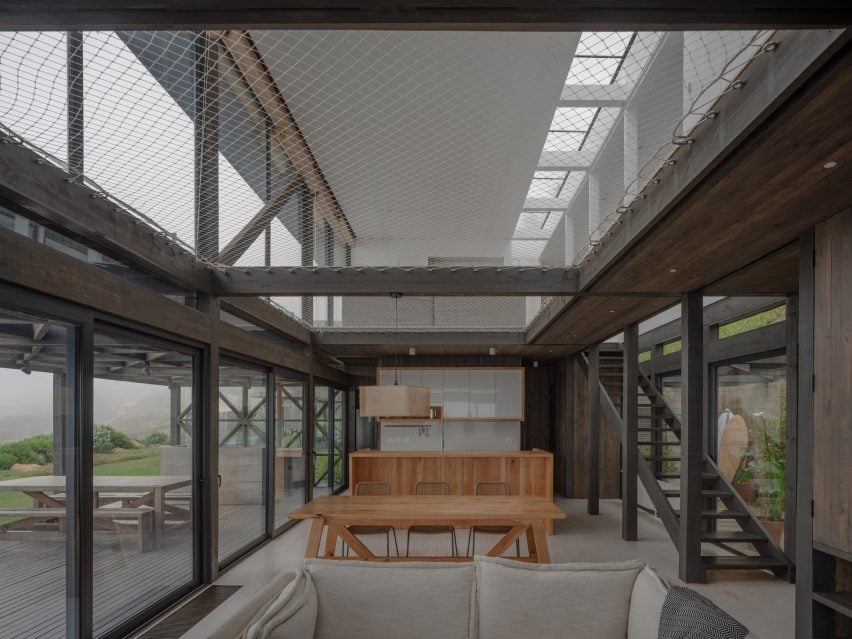
Chilean architecture studio Stanaćev Granados put two large cargo nets at the centre of this seaside house in Chorrillos overlooking the Pacific.

As well as providing an easily visible children’s play space above the open-plan living area, the net allows for a subtle transition between the darker wood cladding of the ground floor and the white-painted timber of the upper level.

Find out more about Primeriza House ›


Net hammocks suspended above seating areasNet hammocks suspended above seating areas
Photo courtesy of No Architecture

Urban Tree House, USA, by No Architecture

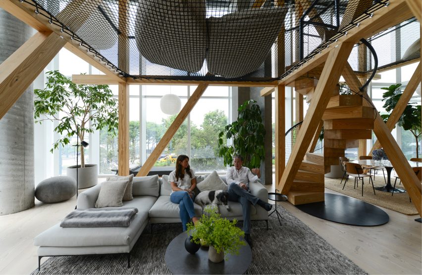
To make the vast living space of this apartment in New York’s West Village feel less chasmic, No Architecture constructed two “treehouses” from a series of timber beams.
Black netting strung between the beams creates an elevated chill-out space, accessed by a spiral staircase whose balustrade is made of the same mesh material.
Find out more about Urban Tree House ›


Nets inside the HOUSE by H&P ArchitectsNets inside the HOUSE by H&P Architects
Photo by Le Minh Hoang

HOUSE, Vietnam, by H&P Architects

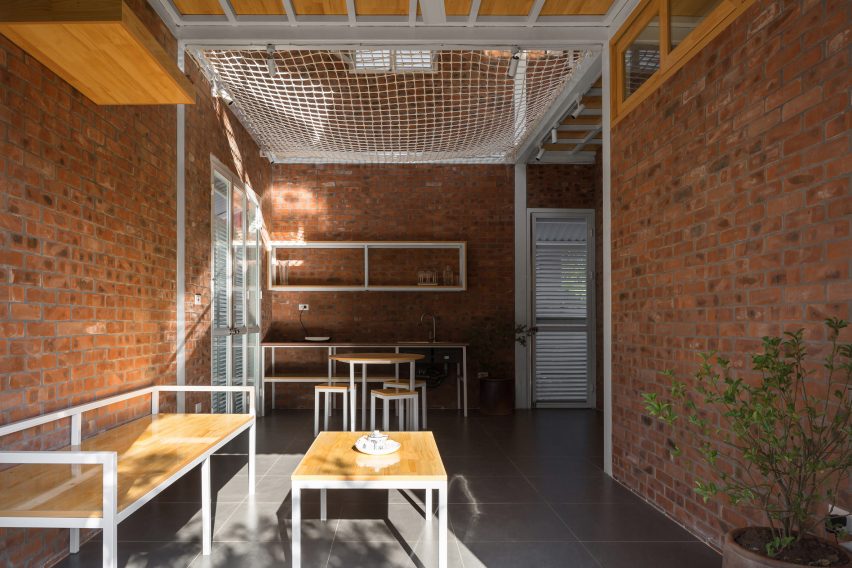
In this house in Vietnam designed by H&P Architects, a net floor contributes to the humble aesthetic created by its compact, open-plan layout and rough-and-ready materials like exposed brick and corrugated metal.

The net allows air to move freely through the home, helps to instil a sense of spaciousness and creates additional usable floor space.

Find out more about HOUSE ›


Atrium Townhome by Robitalle CurtisAtrium Townhome by Robitalle Curtis
Photo by Adrien Williams

Atrium Townhome, Canada, by Robitaille Curtis

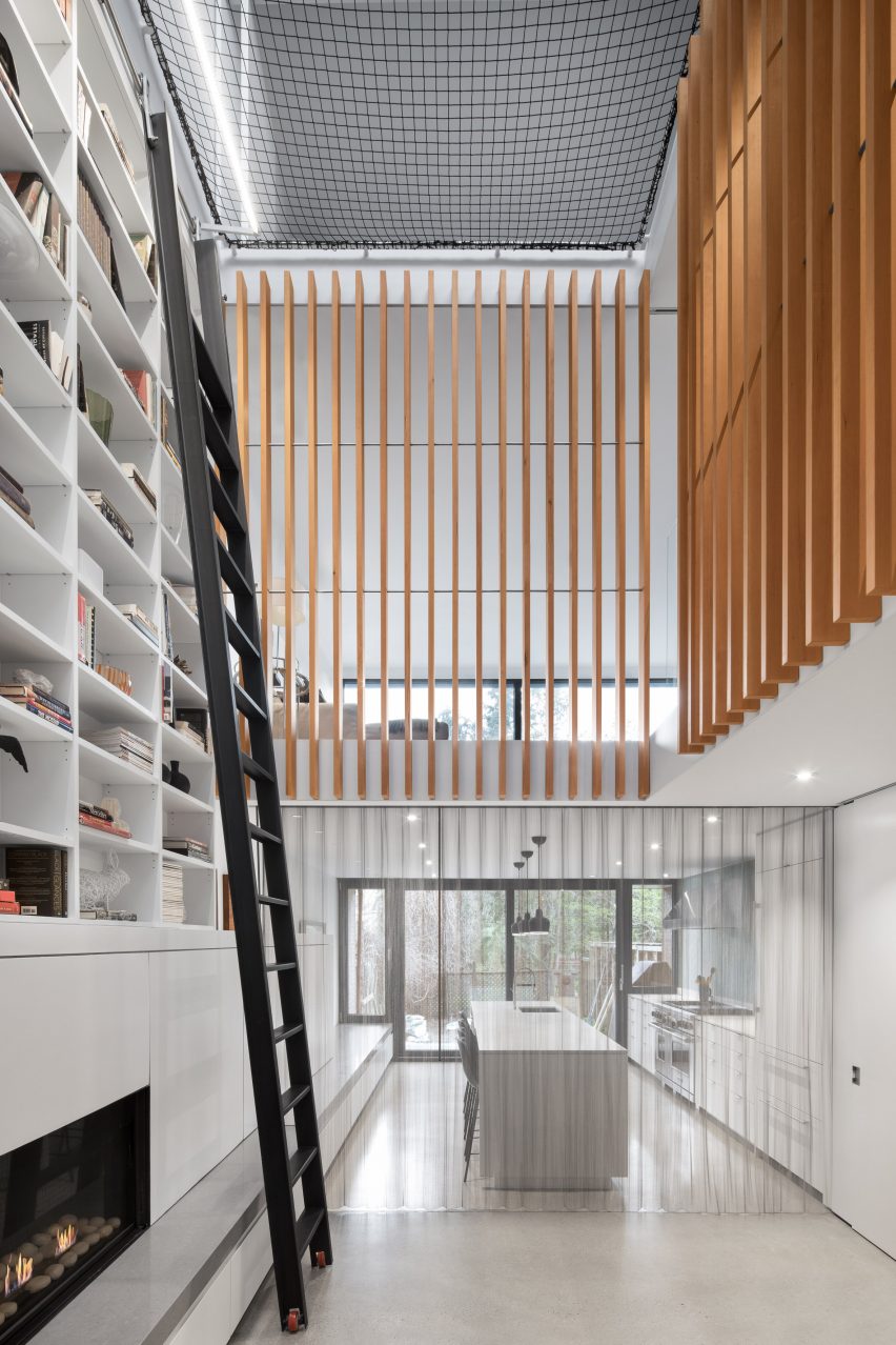
Canadian studio Robitaille Curtis procured the expertise of famous circus company Cirque du Soleil to rig a trapeze-style net atop the high atrium inside this Montreal home.

The aim was to emphasise the drama of the space, with a tall bookcase accessed by a 5.5-metre ladder and vertical wooden slats also helping to direct the gaze upwards.

Find out more about Atrium Townhome ›


Net floor in Casa Bosque SerenoNet floor in Casa Bosque Sereno
Photo by FRAM Fotografía

Casa Bosque Sereno, Mexico, by Fábrica de Espacios

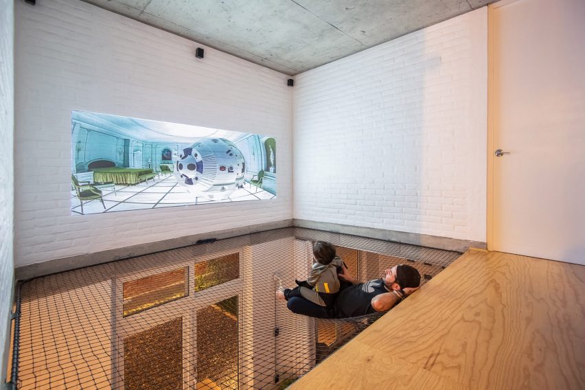
At Casa Bosque Sereno, residents can use the net floor as a place to watch movies thanks to a projector mounted opposite a white-painted brick wall.

The net also contributes to the pared-back, open-plan design chosen for the house by architecture office Fábrica de Espacios.

Find out more about Casa Bosque Sereno ›


SkinnyScar, Rotterdam, the Netherlands by Gwendolyn Huisman and Marijn BotermanSkinnyScar, Rotterdam, the Netherlands by Gwendolyn Huisman and Marijn Boterman
Photo courtesy of Gwendolyn Huisman and Marijn Boterman

SkinnyScar, Netherlands, by Gwendolyn Huisman and Marijn Boterman

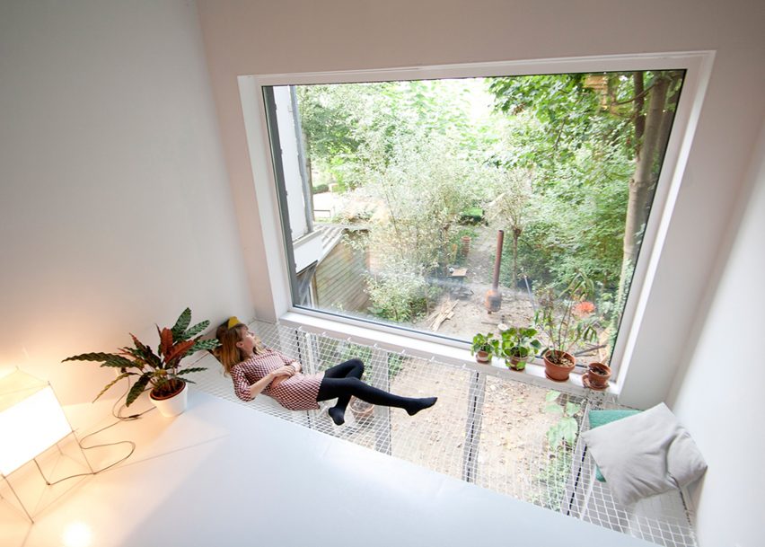
Dutch architects Gwendolyn Huisman and Marijn Boterman wanted to avoid “harsh boundaries” between living spaces in this skinny house in Rotterdam that they designed for themselves to live in.

To that end, they strung a modestly sized net next to a large window overlooking the garden, to act as a kind of static hammock next to the first-floor living room and above the dining room.

Find out more about SkinnyScar ›


Net floor above living area in house designed by Ortraum ArchitectsNet floor above living area in house designed by Ortraum Architects
Photo by Marc Goodwin

MK5, Finland, by Ortraum Architects

This family house in a forest near Helsinki features a number of child-friendly elements including a climbing wall, gymnastic apparatus and, of course, a net floor.

Local studio Ortraum Architects placed the net in a cut-out next to the first-floor landing, allowing light to filter down into the basement stairwell.

Find out more about MK5 ›


King Bill house by Austin Maynard ArchitectsKing Bill house by Austin Maynard Architects
Photo by Derek Swalwell

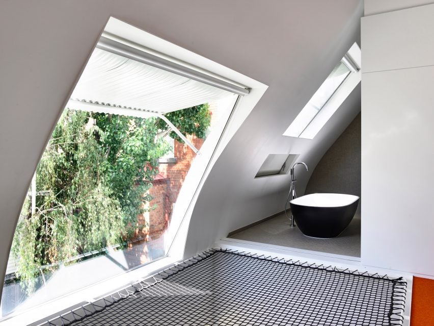
King Bill, Australia, by Austin Maynard Architects

Austin Maynard Architects installed a netted platform with a view out of a large window and into the bathroom as part of its renovation of this formerly dilapidated stable in Melbourne.

The black mesh contrasts with the white corrugated metal of the window awning, the grey tiles of the bathroom and the orange carpet on the adjacent floor.

Find out more about King Bill ›


Saigon house by a21 StudioSaigon house by a21 Studio
Photo by Quang Tran

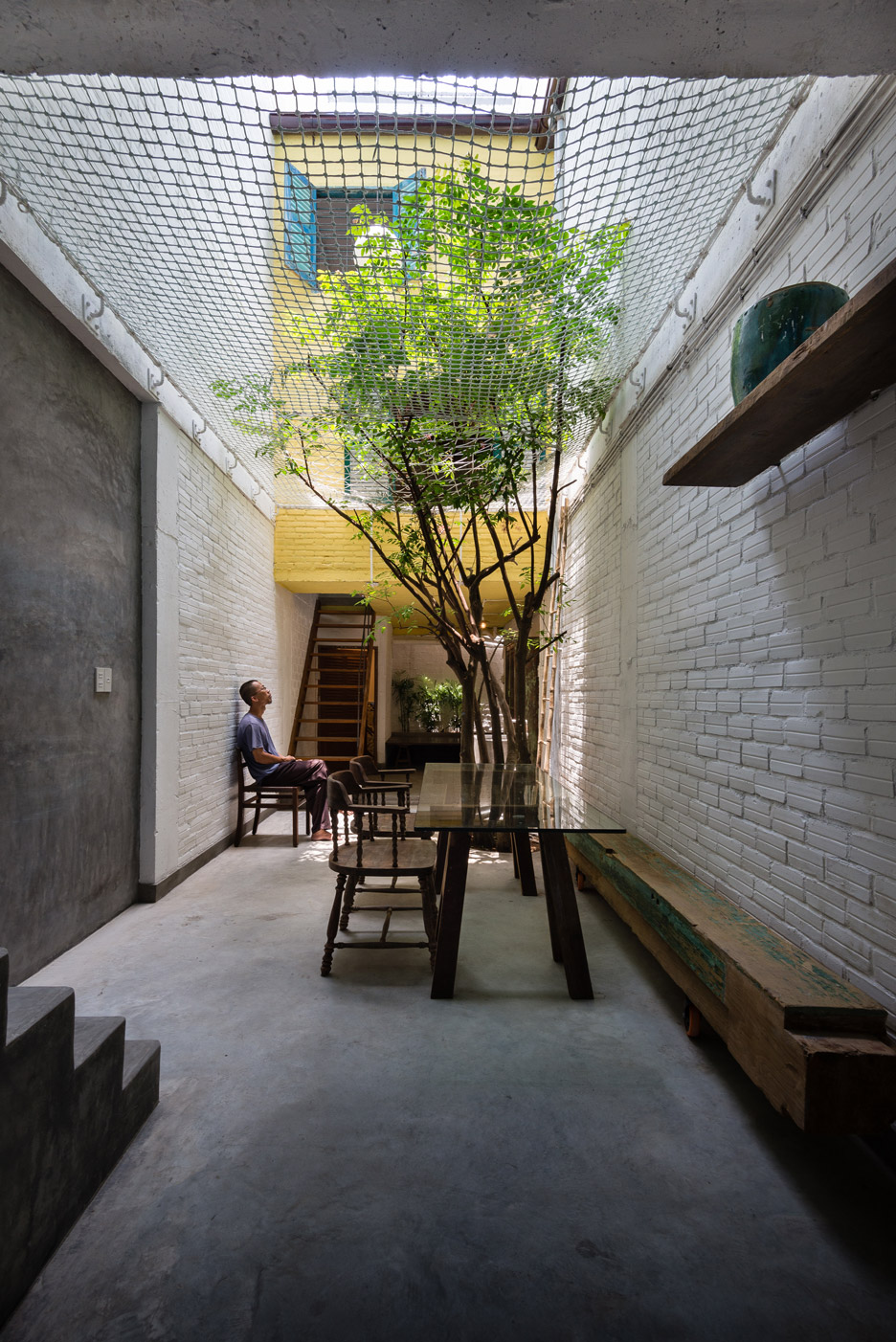
Saigon House, Vietnam, by a21studio

The large net in this Ho Chi Minh City house, designed by Vietnamese architecture office A21studio, is visible from almost everywhere in the four-storey building.

In addition to serving as a children’s play area, it helps create an impression of the ground floor as an outdoor courtyard – particularly as a tree bursts through the textile.

Find out more about Saigon House ›

This is the latest in our lookbooks series, which provides visual inspiration from Dezeen’s archive. For more inspiration see previous lookbooks featuring homes with dividing lattice screens, split-level living areas and stylish children’s bedrooms.

Reference

Dezeen’s top 10 hotels of 2023
CategoriesInterior Design

Dezeen’s top 10 hotels of 2023

Already thinking about your next getaway post-Christmas? Here is Dezeen’s pick of 2023’s top 10 hotels, put together as part of our review of the year.

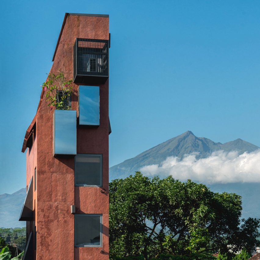
Our selection of the most popular and noteworthy hotels featured on Dezeen this year includes what is possibly the world’s skinniest in Indonesia, the grand conversion of a 1940s bank building in Rome and a place in Tbilisi that aims to make guests feel like they’re inside a movie.

Read on for the full list:


Exterior of PituRooms in Indonesia by Sahabat SelojeneExterior of PituRooms in Indonesia by Sahabat Selojene
Photo by David Permadi

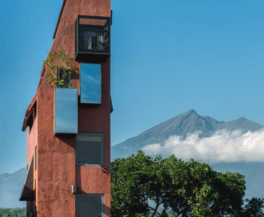
PituRooms, Indonesia, by Sahabat Selojene

This seven-room hotel in Central Java is just 2.8 metres wide. Each compact room contains a double bed and bathroom pod with a toilet and shower.

“Aside from the technical difficulties, the biggest challenge was the typical mindset surrounding the hospitality industry that is used to superlative words: biggest, tallest, most luxurious,” Sahabat Selojene studio founder Ary Indra told Dezeen. “Here we are skinniest.”

PituRooms was not the only skinny hotel to capture readers attention in 2023, with 324Praxis’ Sep’on Heartfulness Centre in Vietnam similarly slender.

Find out more about PituRooms ›


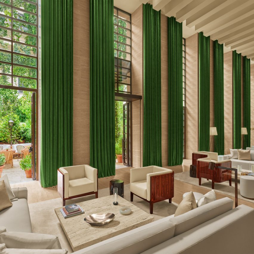
The Rome Edition hotelThe Rome Edition hotel
Photo by Nikolas Koenig

The Rome Edition, Italy, by The Edition

Dramatic seven-metre-high ceilings, full-height windows with green curtains and travertine surfaces grace the lobby of The Rome Edition.

Created by Amercian entrepreneur Ian Schrager’s hotel group The Edition, the 91-room hotel opened this year in a 1940s bank building. Other highlights include the intimate Jade Bar, which is fully lined in deep green antique marble and furnished with emerald-coloured velvet seating.

Find out more about The Rome Edition ›


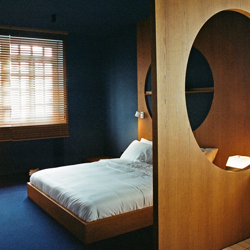
The interior of a bedroom in Blueberry NightsThe interior of a bedroom in Blueberry Nights
Photo courtesy of Blueberry Nights

Blueberry Nights, Georgia, by Sandro Takaishvili

Georgian architect Sandro Takaishvili wanted Tbilisi’s Blueberry Nights to make guests feel “like they’re inside a movie, where everything feels slightly familiar but otherworldly at the same time”.

With a theatrical colour scheme and cinematic moody lighting, its design evokes the visual style of directors such as Stanley Kubrick and David Lynch, while film projectors feature in all 16 rooms.

Find out more about Blueberry Nights ›


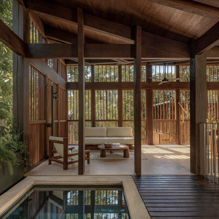
Boca de Agua de Taller Frida EscobedoBoca de Agua de Taller Frida Escobedo
Photo by César Béjar

Boca de Agua, Mexico, by Frida Escobedo

Wooden guest quarters perched on stilts characterise Boca de Agua, a resort in the Yucatán Peninsula designed by Mexican architect Frida Escobedo

The villas – including one with a private pool and terrace – were raised up to reduce the environmental impact of the ground plane and to raise guests into the leafy jungle landscape.

Find out more about Boca de Agua ›


 Borgo Santandrea hotel Borgo Santandrea hotel
Photo by Adrian Gaut

Borgo Santandrea, Italy, by Bonaventura Gambardella and Nikita Bettoni

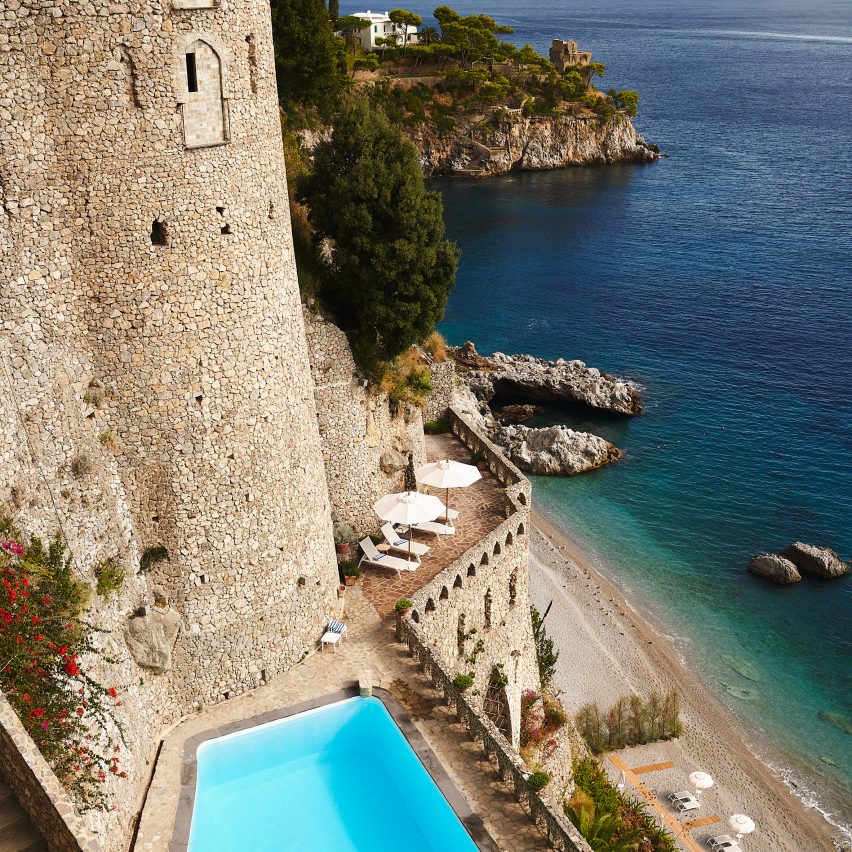
Overlooking the historic fishing village of Conca dei Marini on the Amalfi Coast, the 1960s Borgo Santandrea hotel was restored by architect Bonaventura Gambardella and interior designer Nikita Bettoni.

The hotel incorporates the atmospheric medieval stone fortifications carved into the cliff below, with some of the guest rooms built into the old ramparts.

Find out more about Borgo Santandrea ›


Maison Brummell Marrakech by Bergendy CookeMaison Brummell Marrakech by Bergendy Cooke
Photo by Emily Andrews

Maison Brummell Majorelle, Morocco, by Bergendy Cooke and Amine Abouraoui

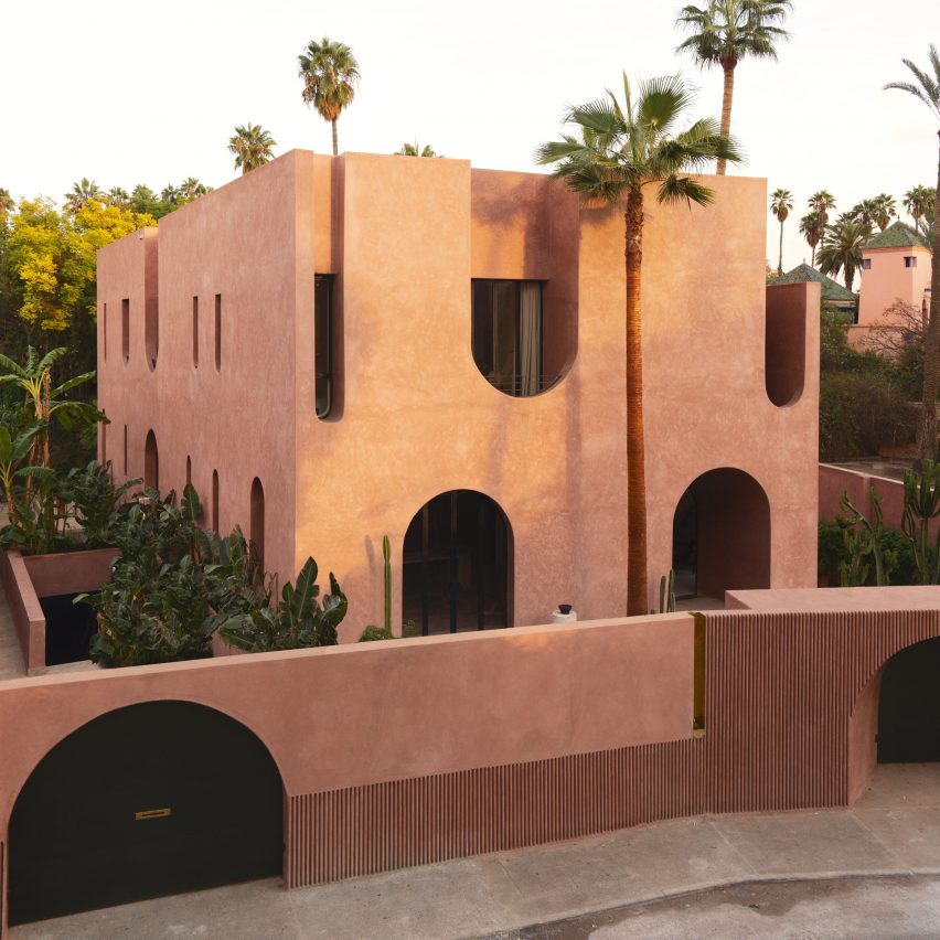
Located next to the famous Majorelle Gardens in Marrakech, this boutique hotel was designed by New Zealand studio Bergendy Cooke in collaboration with Moroccan architect Amine Abouraoui.

With its sculptural, monolithic aesthetic and recurring arched openings inside and out, it was intended as a playful contemporary twist on the site’s history and the city’s traditional architecture.

Find out more about Maison Brummell Majorelle ›


The Lodge hotel in Mallorca by Único Hotels and interior designer Pilar García-NietoThe Lodge hotel in Mallorca by Único Hotels and interior designer Pilar García-Nieto
Photo by Montse Garriga

The Lodge, Spain, by Pilar García-Nieto

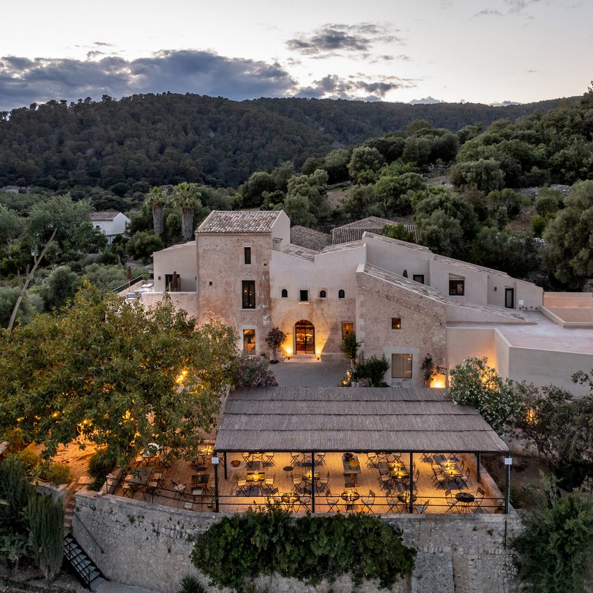
From Único Hotels, The Lodge occupies a 500-year-old farmhouse in Mallorca on a 157-hectare estate filled with almond and olive trees, lavender fields and hiking trails.

Interior designer Pilar García-Nieto kept the interiors mostly clean and minimal but left traces of the building’s agricultural past visible – most spectacularly an old stone mill for pressing olive oil, which stands in what is now the hotel reception area.

Find out more about The Lodge ›


"Garden hotel" in singapore
Photo by Darren Soh

Pan Pacific Orchard, Singapore, by WOHA

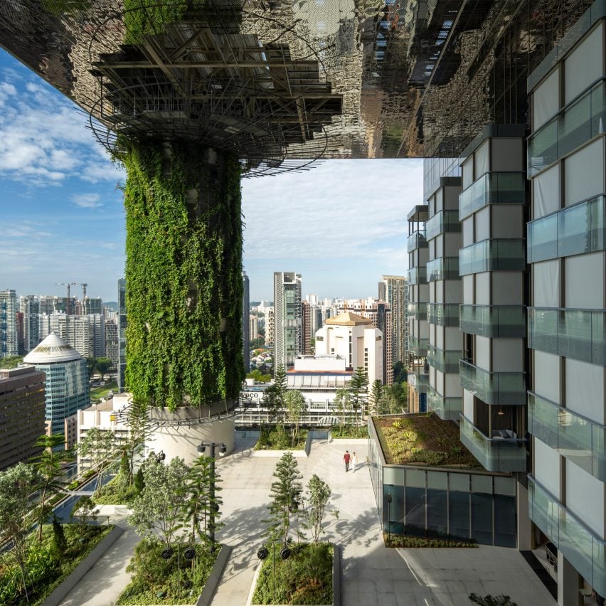
Large, elevated garden terraces are cut into the form of this tall hotel building in Singapore designed by architecture studio WOHA, including one 18 floors up.

The studio wanted the hotel to have verdant views on all storeys despite its urban location, while the terraces also provide passive cooling in the humid climate.

Find out more about Pan Pacific Orchard ›


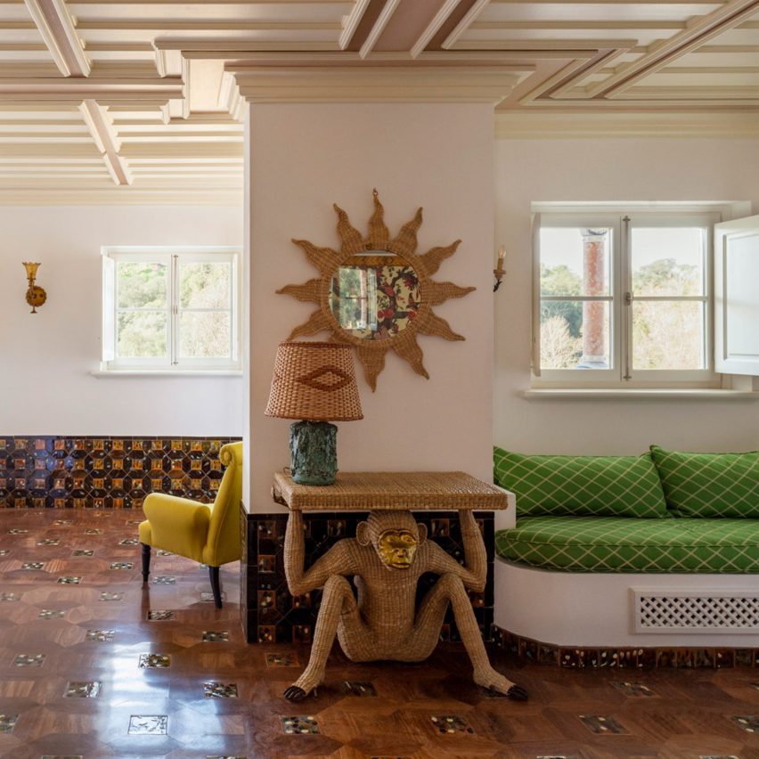
monkey table at vermelho hotelmonkey table at vermelho hotel
Photo by Ambroise Tézenas

Vermelho, Portugal, by Christian Louboutin and Madalena Caiado

Fashion designer Christian Louboutin teamed up with architect Madalena Caiado to create this 13-room hotel in the Portuguese village of Melides.

Its traditionalist architecture meets maximalist interiors, with the rooms containing furniture from Louboutin’s personal collection as well as objects produced by local craftsmen. Louboutin talked to Dezeen about design process behind the hotel in an exclusive interview.

Find out more about Vermelho ›


Château Royal hotel in Berlin by Irina Kromayer, Etienne Descloux and Katariina MinitsChâteau Royal hotel in Berlin by Irina Kromayer, Etienne Descloux and Katariina Minits
Photo by Felix Brueggemann

Château Royal, Germany, by Irina Kromayer and others

Berlin’s renovated Château Royal references the German capital’s heyday at the turn of the 20th century through abundant oak panelling, art nouveau tiles, sisal carpets and hardware in brass and nickel.

The 93-room hotel comprises two buildings dating from 1850 and 1910, in addition to a newer building and roof extension designed by David Chipperfield Architects.

Find out more about Château Royal ›


Dezeen review of 2023Dezeen review of 2023

2023 review

This article is part of Dezeen’s roundup of the biggest and best news and projects in architecture, design, interior design and technology from 2023.


Reference