Dezeen’s top 10 most innovative materials of 2023
CategoriesSustainable News

Dezeen’s top 10 most innovative materials of 2023

As part of our review of 2023, Dezeen’s design and environment editor Jennifer Hahn has rounded up 10 of this year’s most significant material innovations, including bricks made from toxic soil and a 3D printer for wool.

Over the last 12 months, designers found new uses for bacteria, using the microorganisms to colour textiles, grow a leather alternative and turn plastic waste into vanilla ice cream.

In architecture, researchers continued to reinvent concrete, with some using algae instead of cement as a binder while others rediscovered the secret to “self-healing” Roman concrete.

Energy efficiency was an ongoing concern in light of the recent energy crisis, with projects such as water-filled windows and colour-changing cladding aiming to passively heat and cool buildings without relying on fossil fuels.

Read on for Dezeen’s top 10 material innovations of 2023:
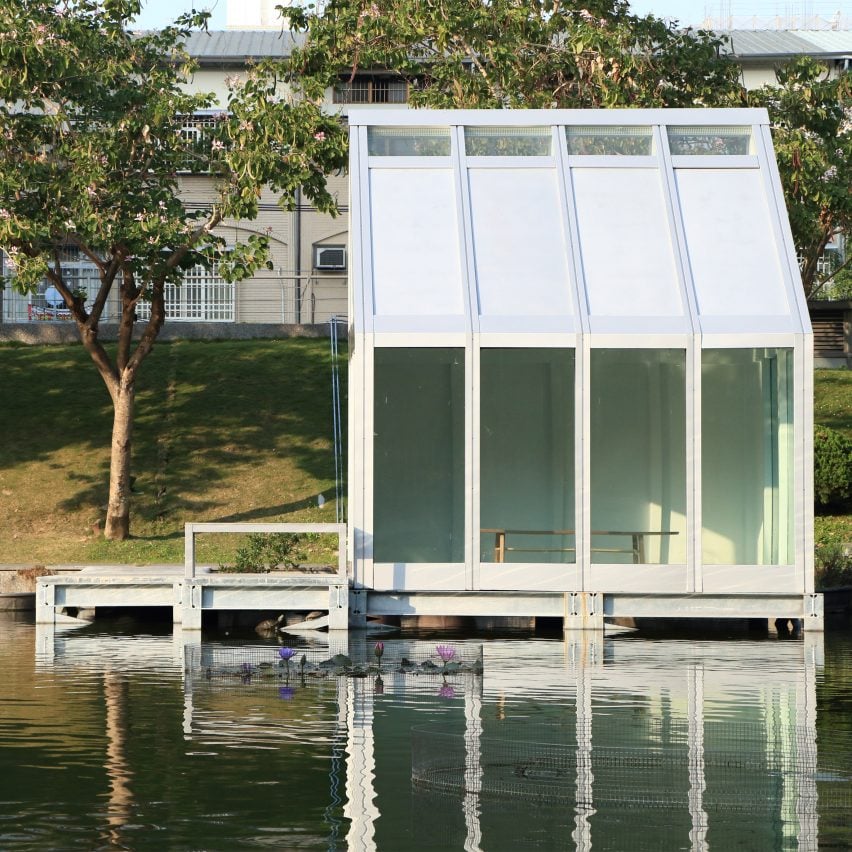

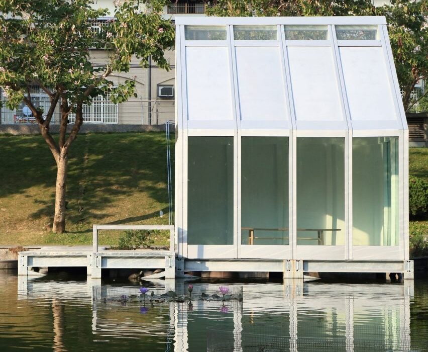
Water House by Water-Filled GlassWater House by Water-Filled Glass
Photo courtesy of Water-Filled Glass

Water-Filled Glass by Matyas Gutai, Daniel Schinagl and Abolfazl Ganji Kheybari

One of Dezeen’s best-read stories of the year looked at how researchers from Loughborough University combined two ubiquitous materials – water and glass – in a new and innovative way.

As the name suggests, their Water-Filled Glass windows consist of a thin layer of water wedged between two panes of glass, which can reduce a building’s energy bills by around 25 per cent compared with standard glazing.

That’s because the water absorbs warmth from sunlight and heat loss from the interior that can then be diverted to help heat the building, while also limiting solar heat gain in the warmer months.

Find out more about Water-Filled Glass ›
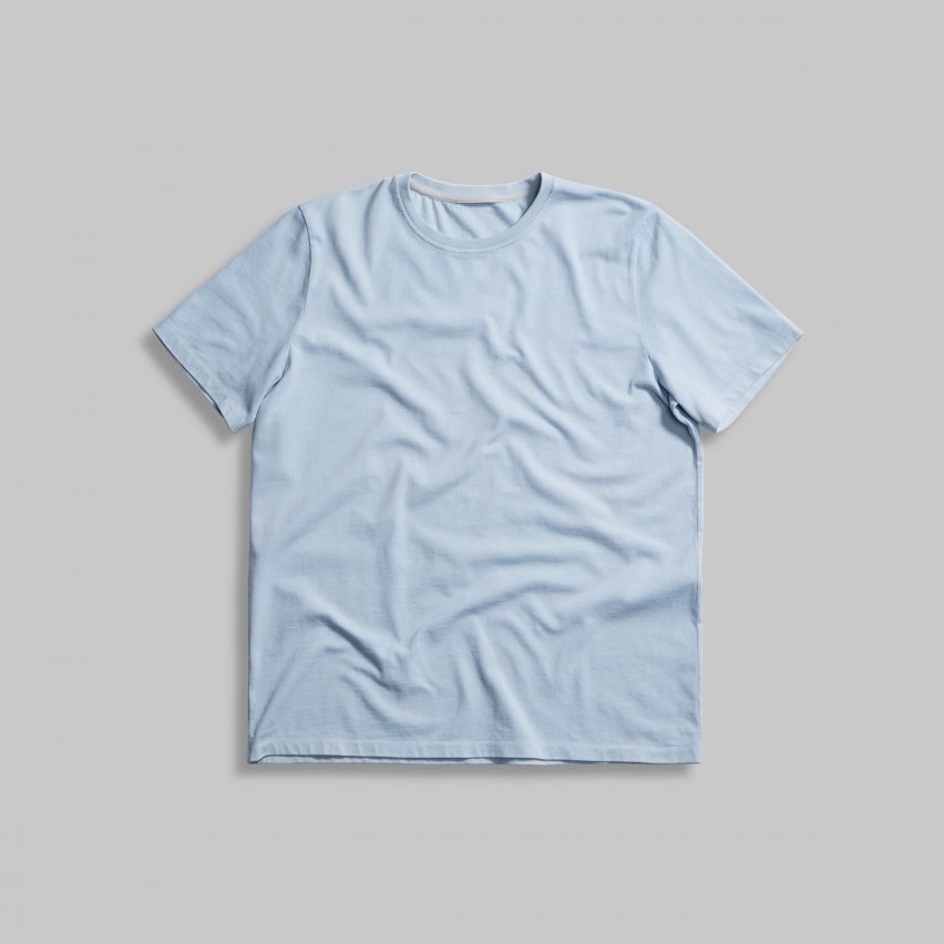

DNA T-shirt by Vollebak coloured using Colorifix bacterial dyeDNA T-shirt by Vollebak coloured using Colorifix bacterial dye
Photo by Sun Lee

Colorifix by Orr Yarkoni and Jim Ajioka

Synthetic biologists Orr Yarkoni and Jim Ajioka have developed a way of colouring textiles using bacteria in place of toxic chemical dyes which is already being used by mega-retailer H&M and experimental clothing brand Vollebak (pictured above).

Their Colorifix technology uses bacteria that is genetically engineered to produce different colour-making enzymes, creating a dyestuff that is compatible with the textile industry’s standard dye machines.

Crowned material innovation of the year at the 2023 Dezeen Awards, the technology offers a scalable alternative to chemical dyes while using 77 per cent less water and producing 31 per cent fewer carbon dioxide emissions, the company claims.

Find out more about Colorifix ›
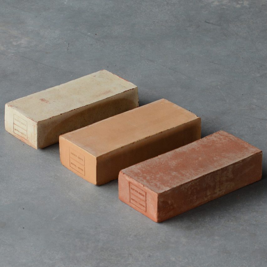

Packing Up PFAS by Emy BensdorpPacking Up PFAS by Emy Bensdorp
Photo by Sem Langendijk

Claybens by Emy Bensdorp

At Dutch Design Week, designer Emy Bensdorp presented a series of bricks made using clay contaminated with PFAS – toxic “forever chemicals” used for water- and fire-proofing, that can leak into our soils and waterways.

In the Netherlands, where PFAS can be traced in up to 90 per cent of soils, developers and landowners must now legally take responsibility for this contaminated soil, which ends up being hidden away and left to gather dust in depots with little prospect for the chemicals’ removal.

Bensdorp discovered that firing the clay into bricks at high temperatures can eliminate these highly durable chemicals while turning the soil from a burden into a useful building material via an existing industrial process.

Find out more about Claybens ›


Guilty Flavours ice-cream by Eleonora OrtolaniGuilty Flavours ice-cream by Eleonora Ortolani
Photo by Mael Henaff

Guilty Flavours by Eleonora Ortolani and Joanna Sadler

Central Saint Martins graduate Eleonora Ortolani created a bowl of vanilla ice cream that she believes might the world’s first food made from plastic waste.

The ice cream was made by taking a small amount of PET plastic waste and breaking it down using genetically engineered bacteria to create synthetic vanillin – the flavour molecule in vanilla.

Originally developed by researchers from the University of Edinburgh, the process produces a flavouring that is chemically identical to vanillin derived from crude oil, which is commonly sold in stores. The only difference is that it uses a recycled instead of a virgin fossil feedstock.

Find out more about Guilty Flavours ›
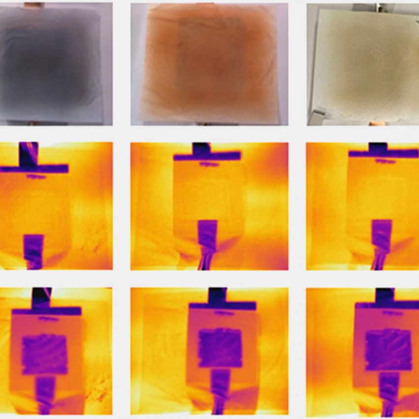

Electrochromic cladding by the University of ChicagoElectrochromic cladding by the University of Chicago
Images courtesy of Hsu Group

Electrochromic cladding by the Hsu Group

Researchers from the University of Chicago have developed a “chameleon-like” facade material that can change its infrared colour – the colour it appears under thermal imaging – based on the outside temperature to keep buildings cool in summer and warm in winter.

The composite material appears yellow under thermal imaging on a hot day because it emits heat and purple on cold days when it retains heat. This colour change is triggered by a small electrical impulse, which either deposits copper onto a thin film or strips it away.

“We’ve essentially figured out a low-energy way to treat a building like a person,” said materials engineer Po-Chun Hsu. “You add a layer when you’re cold and take off a layer when you’re hot.”

Find out more about this electrochromic cladding ›
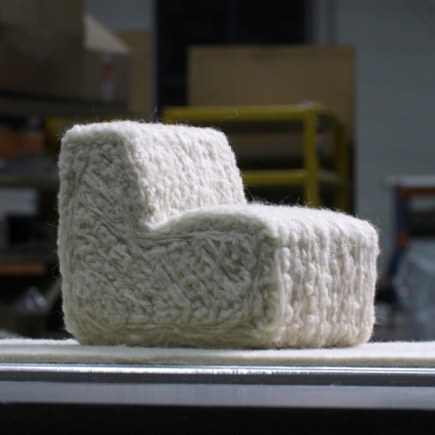

Model of 3D printed wool chair by Christien MeindertsmaModel of 3D printed wool chair by Christien Meindertsma
Photo courtesy of TFT

Flocks Wobot by Christien Meindertsma

Dutch designer Christien Meindertsma has opened up new uses for the wool of European sheep, which is too coarse to form textiles and thus often discarded, by developing a custom robot arm that acts much like a 3D printer.

The Flocks Wobot connects layers of the material through felting to create three-dimensional shapes without the need for any kind of additional binder.

So far, Meindertsma has used the robot to produce a sofa – currently on display at the V&A – but in the future, she claims it could equally be used to create everything from insulation to acoustic products.

Find out more about Flocks Wobot ›
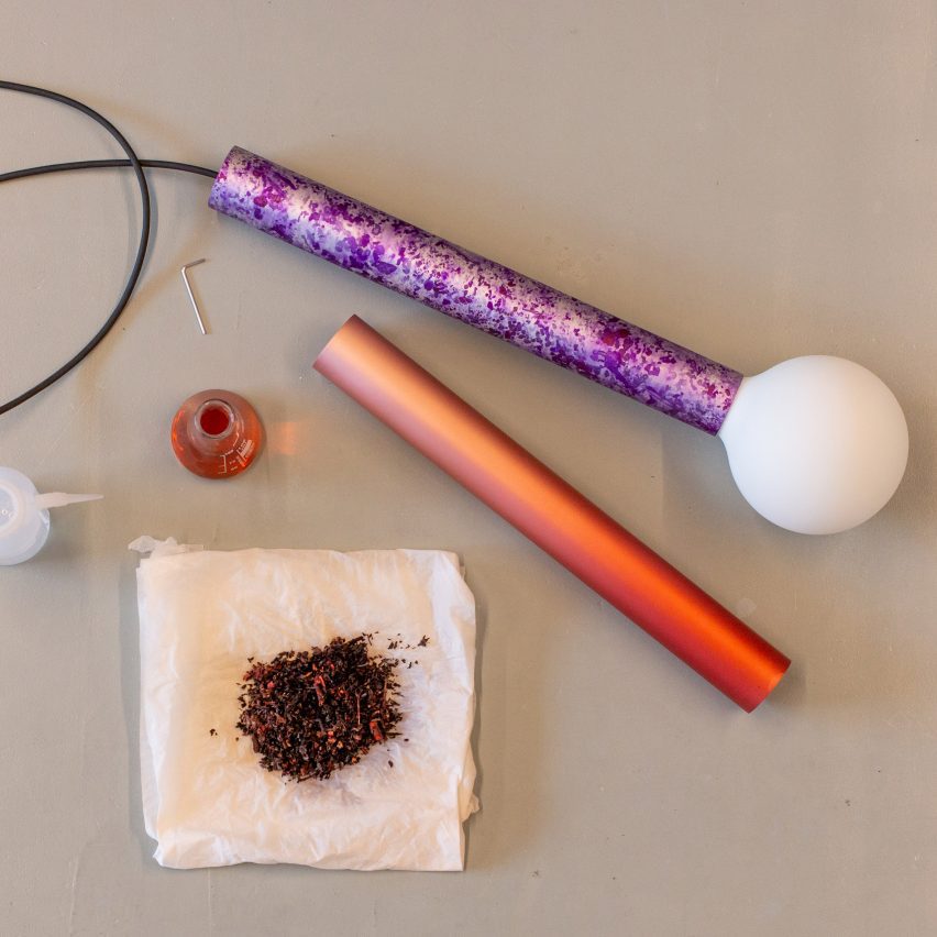

Local Colours by Loop LoopLocal Colours by Loop Loop
Photo courtesy of Loop Loop

Local Colours by Loop Loop

Dutch design studio Loop Loop has developed the “world’s first plant-based aluminium dying process”, using bio-based pigments instead of ones derived from petroleum.

The Local Colours project adapts the traditional process of anodising, which involves using an electric current to oxidise the metal, creating a porous surface that is able to absorb colour before being dipped into a water-based pigment solution.

So far, the studio has created four different solutions – a deep pink made using madder root, a bright gold produced with red onion and a warm purple and mustard yellow derived from different flowers.

Find out more about Local Colours ›
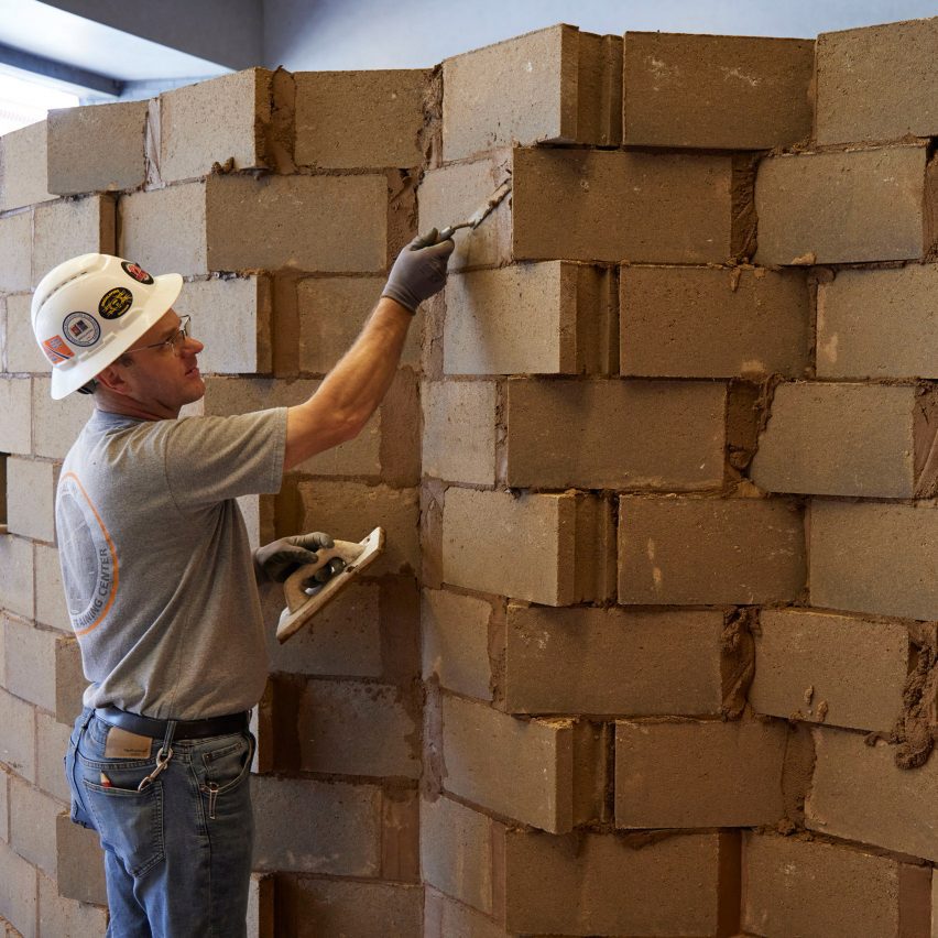

SOM installation for the 2023 Chicago BiennialSOM installation for the 2023 Chicago Biennial
Photo by Dave Burk

Bio-Blocks by Prometheus Materials and SOM

Colorado start-up Prometheus Materials has developed a “zero-carbon alternative” to concrete masonry blocks that is bound together using micro-algae instead of polluting Portland cement, which accounts for around eight per cent of global emissions.

The company is working with architecture studio SOM to explore applications for the material, with a dedicated installation at this year’s Chicago Architecture Biennial taking the form of a giant spiral.

“This project demonstrates how product development, design, and construction can come together to address the climate crisis in a meaningful way,” said Prometheus Materials president Loren Burnett.

Find out more about Bio-Blocks ›
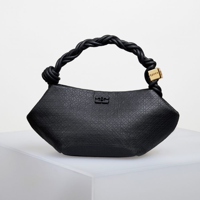

Bou Bag made from bacterial nanocellulose by Ganni and Modern Synthesis from LDFBou Bag made from bacterial nanocellulose by Ganni and Modern Synthesis from LDF
Photo courtesy of Modern Synthesis

Modern Synthesis by Jen Keane and Ben Reeve

Modern Synthesis has developed a plastic-free leather alternative that drapes much like cowhide but could generate up to 65 times less greenhouse-gas emissions than real leather, the British start-up estimates.

The material is made by bacteria that is grown on a framework of threads and fed with waste sugar from other industries, which is converted into a strong, lightweight material called nanocellulose.

Danish fashion brand Ganni has already used the material to create a version of its Bou Bag (pictured above) that was revealed at the London Design Festival and could be commercially available as soon as 2025.

Find out more about Modern Synthesis ›


MIT Harvard study finds secret to durability of ancient Roman concreteMIT Harvard study finds secret to durability of ancient Roman concrete
Image via Pexels

Roman concrete by MIT and Harvard 

This year, researchers from MIT and Harvard made headlines when they discovered the secret ingredient found in “self-healing” Roman concrete, which they are now aiming to bring to market.

The ancient recipe that has allowed structures such as the Pantheon (pictured above) to remain standing for millennia integrates quicklime instead of the slacked lime found in modern concrete, the scientists have posited.

As rainwater runs through the cracks that form in concrete over time and touches the quicklime clasts in the concrete, this creates a calcium-saturated solution that recrystallises to “heal” the fissures.

Find out more about Roman concrete ›


Dezeen review of 2023Dezeen review of 2023

2023 review

This article is part of Dezeen’s roundup of the biggest and best news and projects in architecture, design, interior design and technology from 2023.

Reference

Dezeen’s top 10 restaurant and bar interiors of 2023
CategoriesInterior Design

Dezeen’s top 10 restaurant and bar interiors of 2023

For the latest roundup in Dezeen’s 2023 review we’ve selected 10 of this year’s most popular and evocative restaurant and bar interiors, ranging from a space-themed sushi bar in Milan to a beach-style eatery in London.

Also among this year’s eclectic roundup of restaurant and bar interiors is a renovated 16th-century brewery in Poland lined with a bold interior of red brick and ceramic tiles, as well as a bar and restaurant informed by Japanese psychedelia and cabins in Canada.

Read on for Dezeen’s top 10 restaurant and bar interiors of 2023:


Interior of Ikoyi restaurant by David ThulstrupInterior of Ikoyi restaurant by David Thulstrup
Photo by Irina Boersma

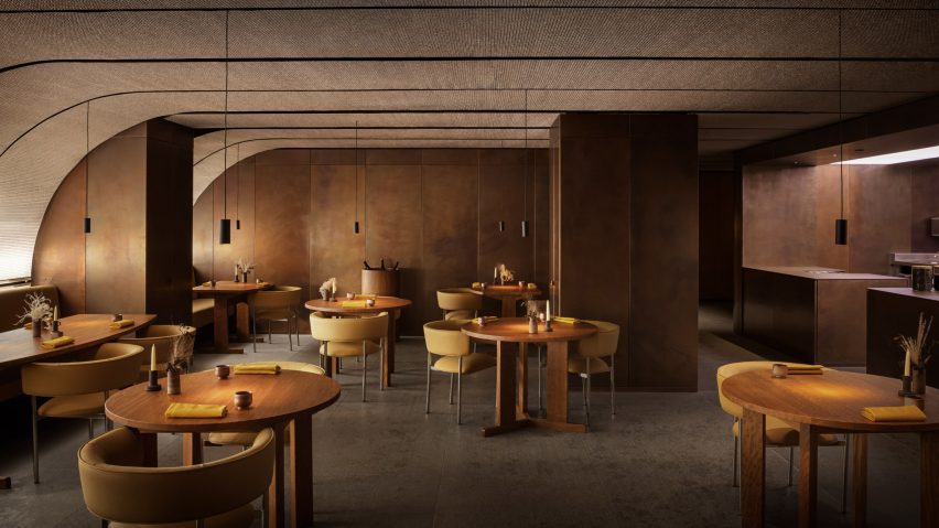
Ikoyi restaurant, UK, by David Thulstrup 

Copenhagen-based designer David Thulstrup designed a copper and oak interior for the Ikoyi restaurant, situated within London’s 180 The Strand building.

Drawing on spice-making processes from sub-Saharan west Africa, the interior features ceilings clad with metal-mesh panels and walls lined with oxidised copper sheets.

Find out more about Ikoyi restaurant ›


Sando burger restaurant in Geneva by Sapid StudioSando burger restaurant in Geneva by Sapid Studio
Photo by Alicia Dubuis

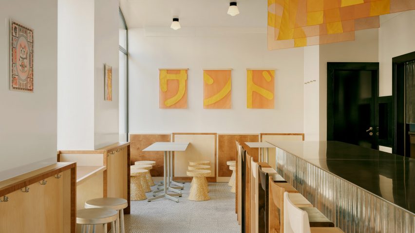
Sando, Switzerland, by Sapid Studio

Sapid Studio used Japanese patchwork techniques to inform the renovation of a burger restaurant in Geneva.

Named after the Japanese word for sandwich, Sando features a largely retained interior decorated with a corrugated stainless steel bar, patched up tiled flooring, and translucent tapestries.

Find out more about Sando ›


The Taproom bar at Tenczynek Brewery by Projekt PragaThe Taproom bar at Tenczynek Brewery by Projekt Praga
Photo by ONI Studio

Tenczynek Brewery, Poland, by Projekt Praga

Red brick, ceramic tiles and oak furniture define the Tenczynek Brewery interior, designed by Polish design studio Projekt Praga.

Located outside of Krakow, the centuries-old brewery was converted into a bold-coloured restaurant and bar, with a self-service beer fountain occupying the centre of the historic brick-vaulted space.

Find out more about Tenczynek Brewery ›


Photo of Prada Caffè at HarrodsPhoto of Prada Caffè at Harrods
Photo courtesy of Prada

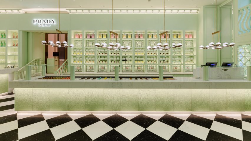
Prada Caffè, UK, by Prada

Located in London’s luxury department store Harrods, fashion house Prada opened a cafe informed by one of Milan’s oldest patisseries.

Contrasting with Harrods’ baroque facade, Prada Caffè’s mint green latticed storefront references the brand’s signature green hue, which extends to the interior walls, ceilings and furniture.

Find out more about Prada Caffè ›


Bar area of Milk Beach Soho restaurant by A-nrdBar area of Milk Beach Soho restaurant by A-nrd
Photo by Charlie McKay

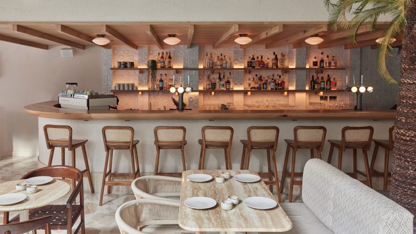
Milk Beach Soho, UK, by A-nrd

London-based design studio A-nrd brought a “beachfront feel” reminiscent of an Australian beach club to this restaurant interior in Soho, London.

Milk Beach Soho’s minimal interior has a neutral material palette featuring a polished terrazzo floor and art deco-style furniture and lighting.

Find out more about Milk Beach Soho ›


ICHI Station restaurant in Milan by MasquespacioICHI Station restaurant in Milan by Masquespacio
Photo by Luis Beltran

Ichi Station, Italy, by Masquespacio

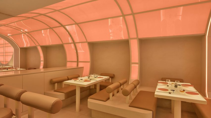
Ichi Station, by Valencian design studio Masquespacio, is a dine-in restaurant in Milan that draws on sci-fi and space tourism.

Designed to resemble a futuristic spaceship, the cylindrical restaurant interior has a material palette of glass and micro-cement along with rounded, custom-made furniture.

Find out more about Ichi Station ›


Drift Santa Barbara by Anacapa ArchitectureDrift Santa Barbara by Anacapa Architecture
Photo by Erin Feinblatt

Drift Santa Barbara, US, by Anacapa Architecture

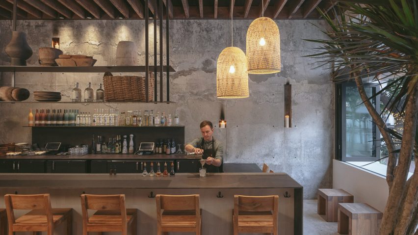
US studio Anacapa Architecture transformed a formerly closed early-1900s building into a hotel – hosting a ground-floor bar and cafe for both hotel guests and local visitors.

Located in central California, the rustic interior accentuates the building’s historical character and is complemented by concrete and wooden furniture.

Find out more about Drift ›


Wooden seating area below hand-painted mural by Álvaro SizaWooden seating area below hand-painted mural by Álvaro Siza
Photo by Luís Moreira / Matilde Cunha

Cozinha das Flores, Portugal, by Space Copenhagen

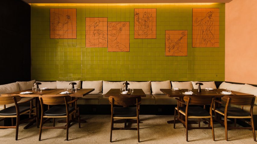
Located in a 16th-century building in Porto, Cozinha das Flores’ interior is decorated by a ceramic mural created by Portuguese architect Álvaro Siza.

Designed by Space Copenhagen, the rustic interior is lined with green and burnt orange tiles, along with oak furniture and brass accents.

Find out more about Cozinha das Flores ›


Corner cafe and bar at Tate Modern by Holland HarveyCorner cafe and bar at Tate Modern by Holland Harvey
Photo by Jack Hobhouse

Corner, UK, by Holland Harvey

London-based architecture studio Holland Harvey revamped Tate Modern’s ground-floor cafe to be less “Herzog & de Meuron-y”.

Doubling as the gallery’s first late-night spot, the interior is organised around a grey stone bar, while salvaged chairs and bespoke tables are used throughout the space.

Find out more about Corner ›


Cabin-like Japanese restaurant in BanffCabin-like Japanese restaurant in Banff
Photo by Chris Amat

Hello Sunshine, Canada, by Frank Architecture 

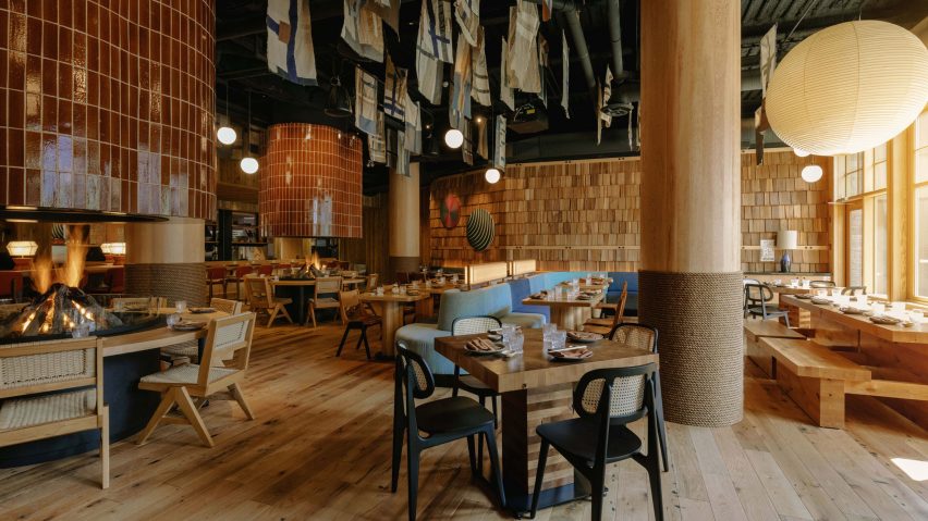
Situated within the mountains of Alberta, Hello Sunshine is a bar and restaurant informed by Japanese psychedelia and cabins in collaboration with Little Giant.

Designed by Canadian studio Frank Architecture, the wooden interior features two raised fire pits accompanied by large flues clad with glazed ceramic tiles, along with paper lanterns and textile artworks.

Find out more about Hello Sunshine ›


Dezeen review of 2023Dezeen review of 2023

2023 review

This article is part of Dezeen’s roundup of the biggest and best news and projects in architecture, design, interior design and technology from 2023.

Reference

Dezeen’s top 10 staircases of 2023
CategoriesInterior Design

Dezeen’s top 10 staircases of 2023

Continuing our 2023 review, we have selected 10 striking staircases published on Dezeen this year, from prefabricated plywood steps at a Cornish home to a colourful set for an opera in a Swiss theatre.

Architects and designers have continued to find clever solutions to travelling on foot from one storey to another in 2023 by creating staircases that are both beautiful and functional.

Ranging from the spectacular to the space-saving, here are Dezeen’s top 10 staircases of 2023:


Ribbon HouseRibbon House
Photo by Purnesh Dev Nikhanj

Ribbon House, India, by Studio Ardete

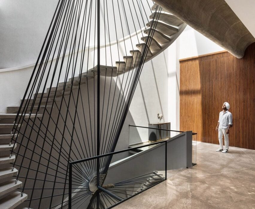
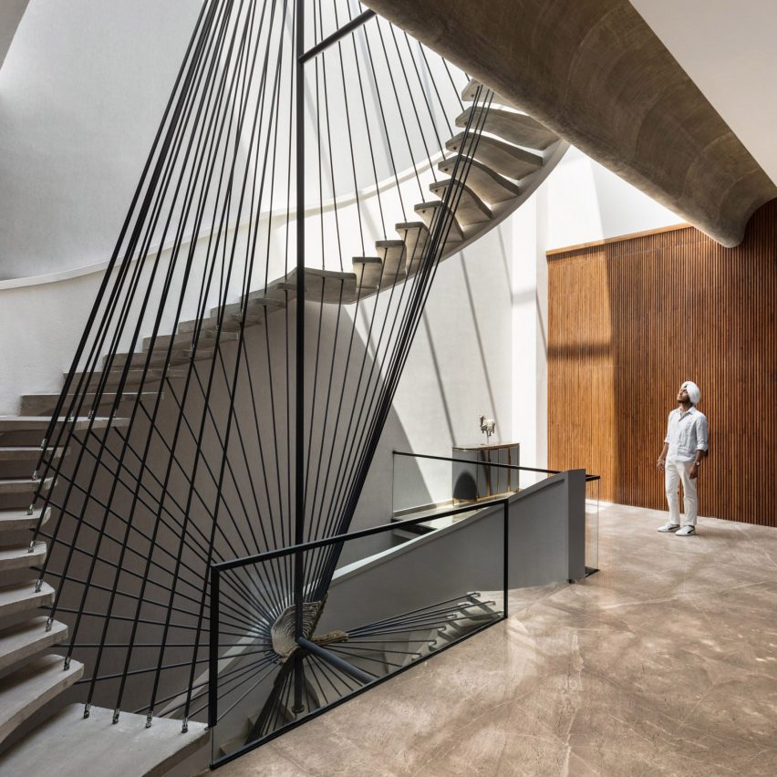
An angular balustrade with tilting black rails twists around sweeping concrete steps to form the staircase at Ribbon House, a home in Punjab with an equally sculptural exterior.

Architecture office Studio Ardete placed open living spaces next to the staircase on each floor to create lobby-like communal areas on the house’s different levels.

Find out more about Ribbon House ›


House by the Sea in CornwallHouse by the Sea in Cornwall
Photo by Lorenzo Zandri

House by the Sea, UK, by Of Architecture

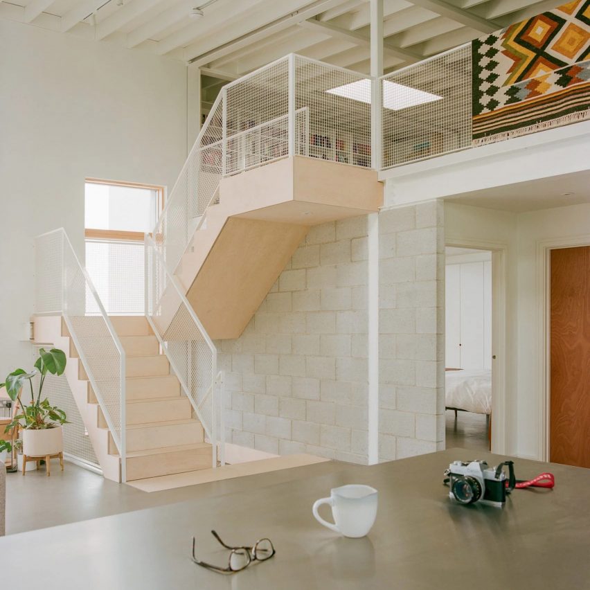
House by the Sea is the home of a surfer-and-artist couple in Newquay, Cornwall, that was designed to be “simple, robust and utilitarian”.

For the interior, London studio Of Architecture inserted prefabricated plywood steps leading to a cosy mezzanine level tucked beneath the dwelling’s sloping roof.

Find out more about House by the Sea ›


HAUS 1 by MVRDVHAUS 1 by MVRDV
Photo by Schnepp Renou

Haus 1, Germany, by MVRDV and Hirschmüller Schindele Architekten

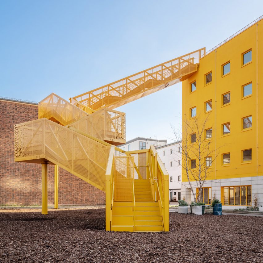
A bright yellow, zigzagging staircase juts out from the facade of the Haus 1 building in Berlin, creating the appearance of a striking crane and providing a beacon for approaching visitors.

Dutch studio MVRDV worked with local studio Hirschmüller Schindele Architekten to design Haus 1, which forms part of the city’s Atelier Gardens redevelopment.

Find out more about Haus 1 ›


Staircase at Luna HouseStaircase at Luna House
Photo by Pezo von Ellrichshausen

Luna House, Chile, by Mauricio Pezo and Sofia von Ellrichshausen

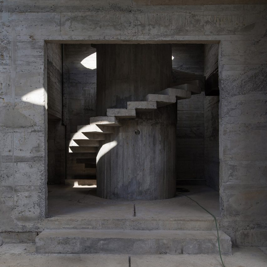
Brutalist-style spiral staircases connect the storeys of Luna House, an expansive geometric complex in Chile comprised of 12 individual buildings.

Chilean studio Pezo von Ellrichshausen designed the stairs and the majority of the structure in reinforced concrete, which is highly textured thanks to imprints left behind by wooden formwork.

Find out more about Luna House ›


Pierre Yovanovitch staircase set design Basel operaPierre Yovanovitch staircase set design Basel opera
Photo by Paolo Abate.

Rigoletto set design, Switzerland, by Pierre Yovanovitch

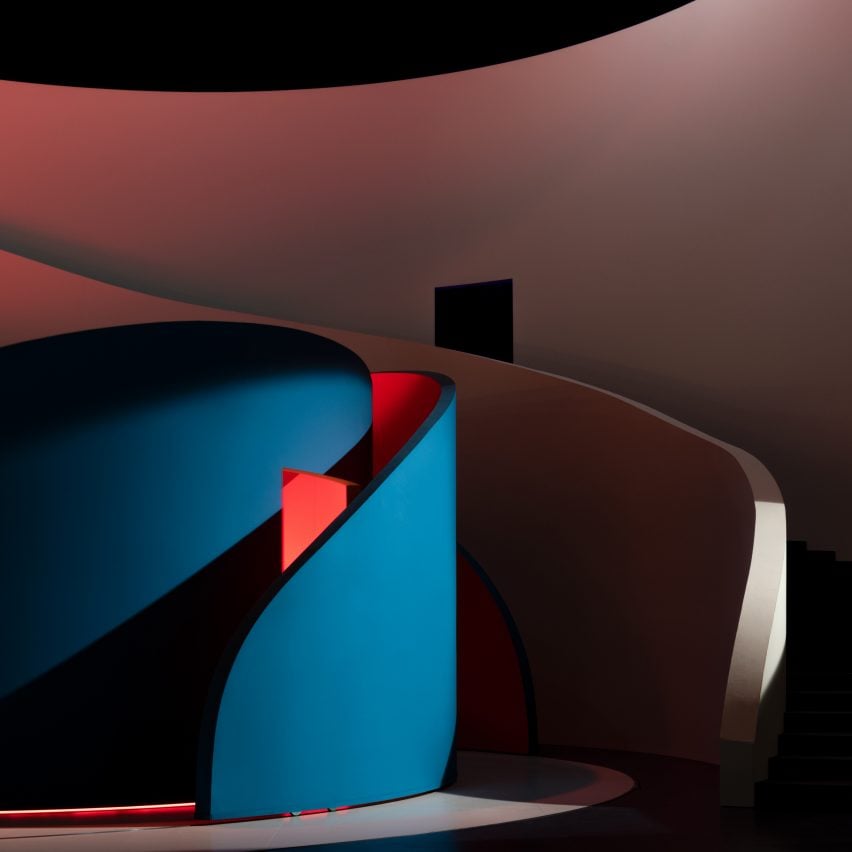
French interior designer Pierre Yovanovitch embedded moving, curved walls within an undulating staircase that stretched the full width of the stage for a production of Giuseppe Verdi’s opera Rigoletto at Theatre Basel.

Bathed in coloured light, the flexible walls created a neutral set for the performers to balance the play’s complex plot, according to the designer.

Find out more about this staircase ›


Staircase inside Hairpin House by Figure and Studio J JihStaircase inside Hairpin House by Figure and Studio J Jih
Photo by James Leng (also top)

Hairpin House, USA, by Studio J Jih and Figure

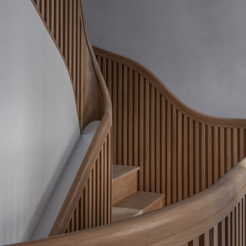
This Boston house was renovated to revolve around a sculptural “hairpin” staircase informed by the twists and turns of mountain roads.

Designed by American firms Studio J Jih and Figure, the white oak stairs were created to increase the home’s useable floor area by 20 per cent.

Find out more about Hairpin House ›


Trapezoidal concrete and glass houseTrapezoidal concrete and glass house
Photo by Alex Shoots Buildings

House in Pernek, Slovakia, by Ksa Studený

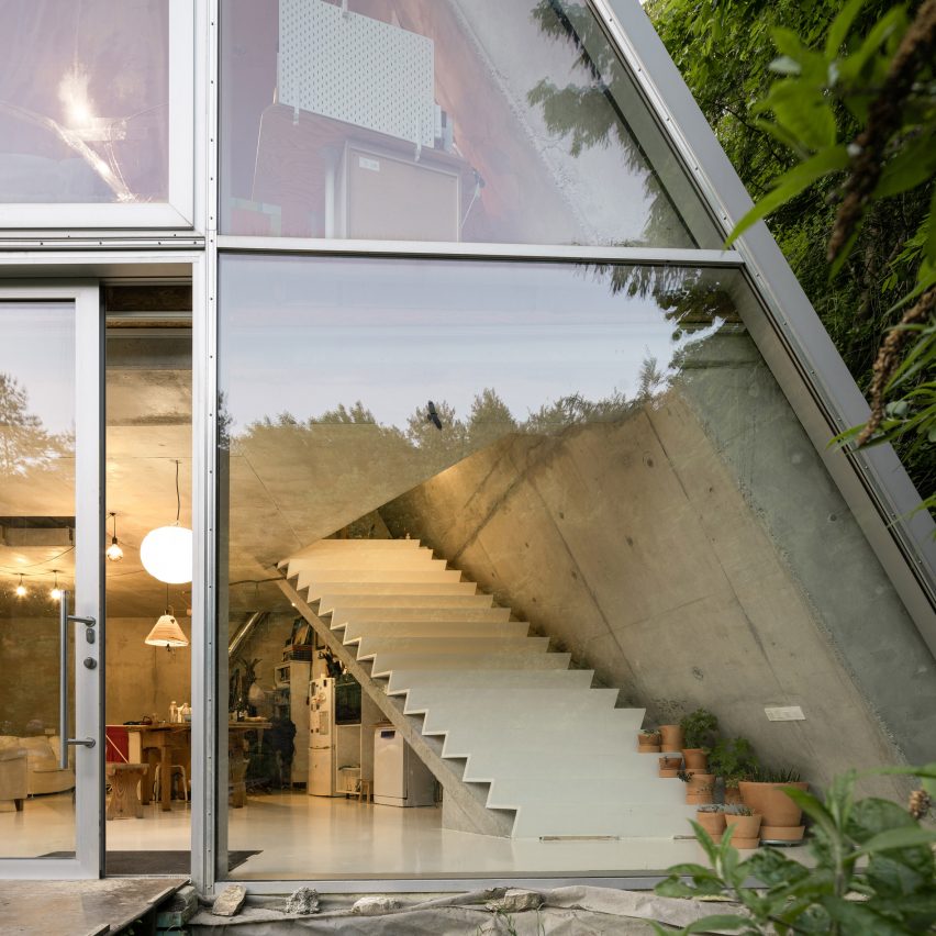
This home in the village of Pernek, Slovakia, was designed in the shape of an isosceles trapezoid, mirroring its longitudinal profile.

Architecture studio Ksa Studený positioned a chunky white staircase over a slanted slab of concrete to divide the interior space.

Find out more about this house ›


The Arbor House in ScotlandThe Arbor House in Scotland
Photo by Jim Stephenson

The Arbor House, Scotland, by Brown & Brown

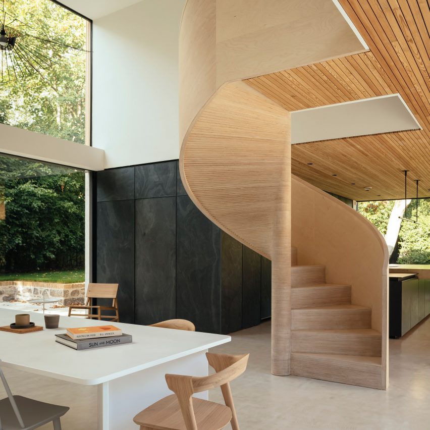
A spiral staircase made from birch plywood winds into the dining area at The Arbor House by Brown & Brown, located in a conservation area in Aberdeen.

The studio assembled the stairs over three weeks, with timber treads individually cut and hand-layered to form a smooth curve.

Find out more about The Arbor House ›


Apartment by FADD StudioApartment by FADD Studio
Photo by Gokul Rao Kadam

SNN Clermont residential tower, India, by FADD Studio

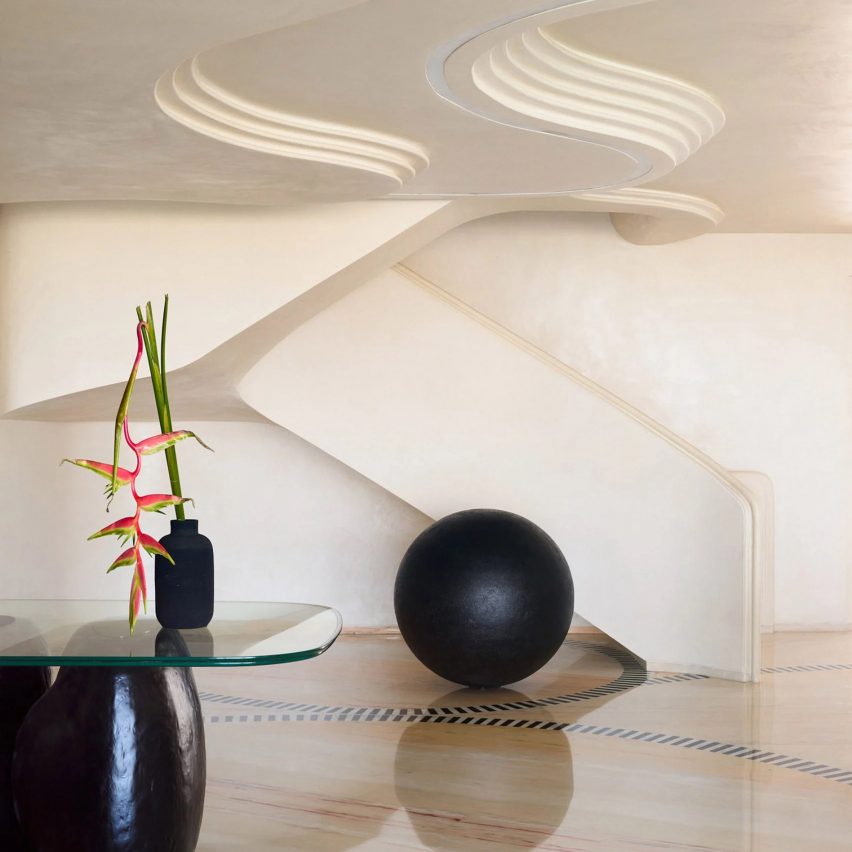
Indian practice FADD Studio renovated two apartments within the SNN Clermont residential tower in Bangalore to create a fused multi-generational home.

The studio took cues from the curves of caterpillars when creating a swooping staircase, which connects the two flats and features deep red marble risers.

Find out more about these apartments ›


 Keiji Ashizawa-designed Conran Shop Keiji Ashizawa-designed Conran Shop
Photo courtesy of The Conran Shop

The Conran Shop, Japan, by Keiji Ashizawa 

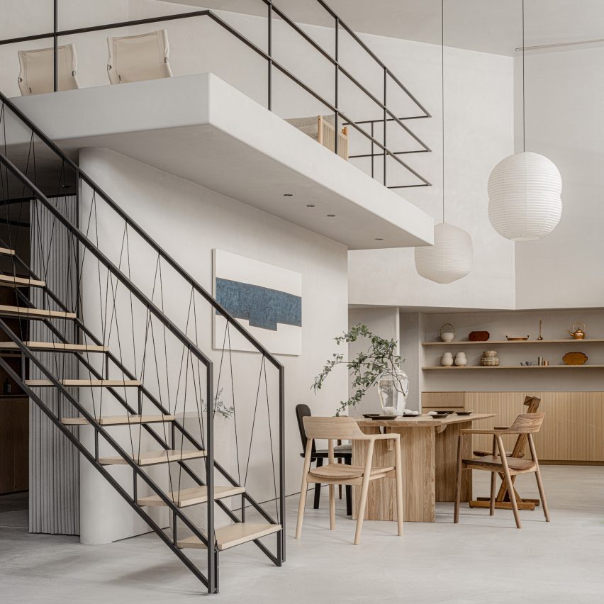
Japanese designer Keiji Ashizawa created interiors for The Conran Shop in Tokyo to reflect the inside of someone’s home.

The store’s mezzanine floor is accessible by a minimalist geometric staircase featuring a handrail made from black paper cords.

Find out more about The Conran Shop ›

Reference