Fireplace at Il Gattopardo by Dion & Arles
CategoriesInterior Design

Dion & Arles creates “salon in which you can dine” for Il Gattopardo

Fireplace at Il Gattopardo by Dion & Arles

French design and interiors studio Dion & Arles drew on the work of 20th-century Italian designers Carlo Mollino and Gio Ponti for the interior of Mayfair restaurant Il Gattopardo in London.

“We envisioned Il Gattopardo to be a salon in which you can dine – not just a restaurant,” the designers told Dezeen.

The studio looked to Mollino’s apartment in Turin for its balance between modernity and heritage.

Fireplace at Il Gattopardo by Dion & Arles
The inner dining room has curved crushed-velvet seating and a large fireplace

“Modernity, heritage and sophistication are the three elements we think together define the Italian sensibility, which we tried to translate into the interiors,” Dion & Arles said.

Il Gattopardo – which is Italian for leopard – is located in Mayfair in central London and aims to “celebrate the golden era of mid-century Italian design in an intimate setting” across five dining spaces, the studio said.

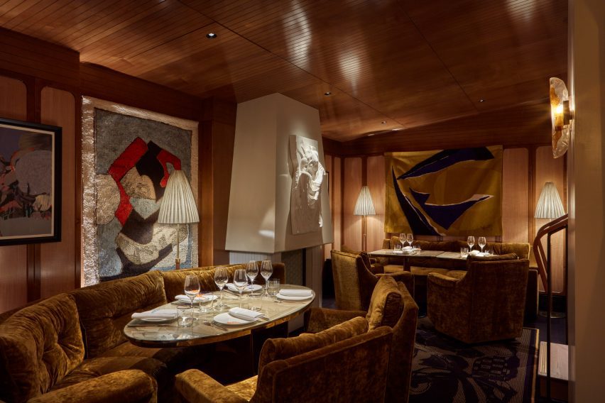
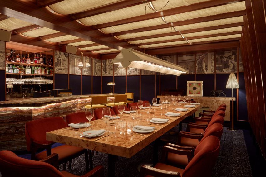
The main dining room and crudo bar lead through to an inner dining area and second bar, which in turn reveals the intimate “salon”, or living room, which seats 10 people in soft-upholstered armchairs.

Banquette seating looks out onto the courtyard lattice
Banquette seating is complemented by groupings of tables and chairs

There is a separate private dining room on the lower ground level.

The salon room is characterised by crushed-velvet curved seating and a substantial fireplace featuring a bas-relief on its canopy.

Tables are topped with sepia drawings after artist Piero Fornasetti, which complement the muted amber seating.

Blue panthers on the walls that lead to the dining room
Blue panthers feature on the walls in the entrance space

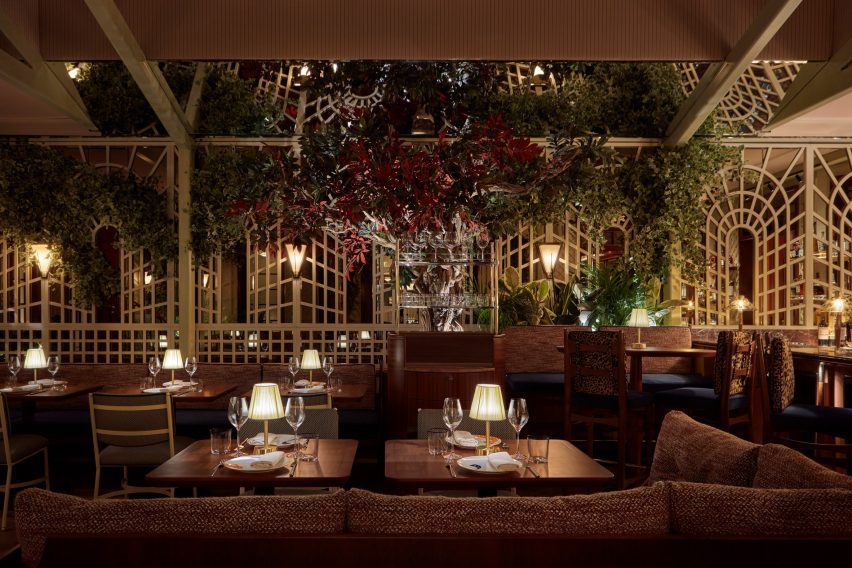
In the main dining room, banquette seating has been kept to a minimum, with tables and chairs otherwise arranged in close groupings.

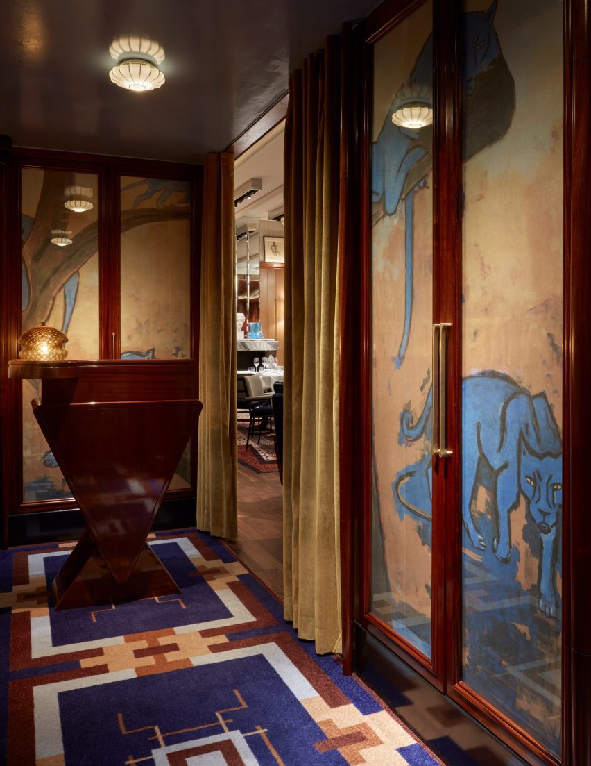
A signature leopard print motif appears on rugs, cushions and artworks in various tones ranging from amber to blue.

“Each project should belong to its specific location,” the studio said.

“We do not believe in cloning, as it gives the feeling of being everywhere, anywhere. We are trying to make people feel they are in a unique space that cannot be found anywhere else; ‘somewhere’ that belongs to ‘someone.”

Italian stone tops the crudo bar in the corner of the dining room
An Italian stone crudo bar sits in the corner of the dining room

The spaces are decorated with an eclectic mix of free-form sculptures, objets, lamps, picture frames and carpets in vibrant colours.

These “speak to the influence of the master of Italian flair, the interior designer and architect Gio Ponti,” the studio said.

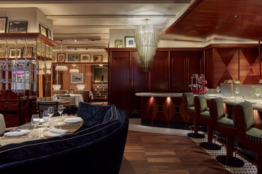
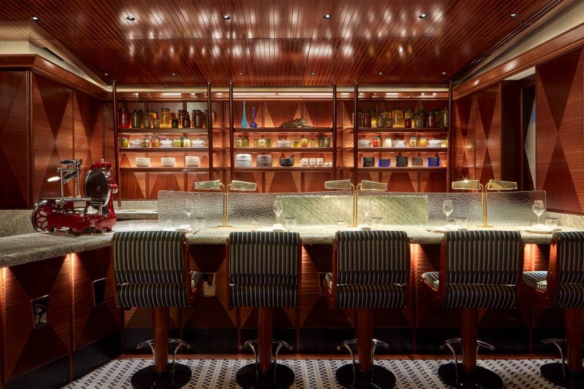
A striped fabric informed by the linings of Italian tailoring covers the ceiling. Panelled walls are intended to mimic the dashboard of a vintage Fiat coupé and, in the corner, Italian stone tops the crudo bar.

Informed by the eclectic, mix’n’match style of Mollino’s apartment, the private dining room – which features a leopard-print carpet from French interior designer Madeleine Castaing – was designed to feel like a secret refuge.

“We see patterns as a variation of colour which add density to the palette,” the designers said. “We generally prefer to work with a small-scale pattern, which is less intrusive.”

Dining room at Il Gattopardo Mayfair
The private dining room has soft lighting diffused through fabric

Classical sepia frescoes run around the wall of the private dining room above rich navy blue, textured fabric panels.

Soft lighting is diffused through fabric resting between the ceiling beams, which was designed to mimic a sunset. An illuminated onyx bar adds to the warm lighting scheme.

The bar
The crudo bar has a polished wood-panelled ceiling

Designing the interiors of Il Gattopardo was “a dream commission” the studio said, as it gave it the opportunity to work in a style the designers love.

“We are always referring to earlier periods when every house and family inherited antique furniture and juxtaposed it with futuristic pieces,” the studio said.

Reference points for the space also included project by interior designer David Hicks and movies by director Stanley Kubrick.

“We don’t have rules and we like to take inspiration from great painters, as in most recent compositions by Peter Doig, or the way [Pedro] Almodóvar approaches colour in his films,” the studio added.

“Everything can go together; bad or good taste is merely a place of refuge for under-confidence. Walking along the borders of taste is more exciting to us.”

Other restaurant interiors recently featured on Dezeen include GRT Architects’ “vacation Italian” restaurant in New York and Lorenzo Botero and Martín Mendoza’s conversion of a Bogotá residence into a brick-lined restaurant.

The photography is by James McDonald.

Reference

Pastel plastic installation
CategoriesInterior Design

ASKA uses organic shapes and pastel colours for Maria Nila hair salon

Pastel plastic installation

Swedish architecture studio ASKA has refurbished haircare brand Maria Nila’s headquarters and salon in Stockholm, creating an undulating ceiling installation that looks like dripping shampoo.


The Stockholm-based firm used a palette of soft pink, peach and turquoise colours that reference Maria Nila’s products to transform its headquarters in a four-storey townhouse.

Pastel plastic installation
A plexiglass installation decorates the entrance

“The interior space before the renovation had a very neutral, impersonal feel to it and followed a white and grey colour scheme,” ASKA co-founder Madeleine Klingspor said.

“At ASKA, to the contrary, we always strive to create strong and flavoured environments by defining and highlighting the unique essences within each project.”

Green-checked marble floor
The chequered marble floor was preserved

The studio preserved some of the original details in the building, including a green chequered marble floor and a wooden staircase, while the rest of the space was fully refurbished.

“To add a layer of the uniqueness of Maria Nila as a brand most other parts of the interior was changed,” Klingspor said.

“Some thinner interior walls were torn down, most surfaces were repainted, new flooring was partly added as well as all bathrooms fully renovated.”

Maria Nila salon in Stockholm
Pastel shelving with undulating shapes decorate the salon

The 650-square-metre building has 30 rooms, including five bathrooms, and houses both Maria Nila‘s public and private spaces.

Though each room has a unique look, all were designed to create a coherent relationship between the existing architecture and the new interior details.

Specially designed shelves for beauty products
The colour scheme was informed by the brand’s product packaging

“The program is distributed in a way where the entrance floor is the most public and then gradually the spaces become more private and workspace-oriented the higher up that you get,” ASKA co-founder Polina Sandström said.

“The reception, salon, beauty bar, conference and meeting areas make up the first floor while the second floor is well adjusted for larger gatherings and events including a kitchenette, a viewing room and a bigger break-out space,” she added.

Art installation made from plexiglass
The four-storey townhouse has 30 rooms

At the entrance, ASKA installed a pale-pink art installation made from form-cut plexiglass designed to resemble shampoo dripping from the ceiling.

Much of the furniture was specially designed for the project, including product shelves, sofas and a beauty bar made from wood and MDF.

“Besides that, we chose to bring in products from companies that use sustainable materials, for example, a custom-made tabletop from Smile Plastic, a company that only uses waste materials in their products,” Klingspor said.

The new interior design was informed by the haircare brand’s own products, an influence that is most notable in the pastel colour palette.

Pastel colour palette
Existing architecture was incorporated into the design

“The colour scheme chosen for the different spaces throughout the building refers to the different haircare lines of Maria Nila,” Sandström said.

“These pastel colours are one of the main identities of the brand and we decided early on that this was one of the unique essences that were important to bring to the surface through our design.”

Lounge room in Maria Nila headquarters
Playful tables by Gustaf Westman add a fun touch to the lounge space

ASKA also designed numerous undulating wall shelves to hold haircare products. Painted in matching gradient hues, these were informed by nature.

“The organic shapes are inspired by elements found in nature such as the forest, ocean, coral reefs and caves,” Sandström said.

Pink mirror in hallway
An upstairs hallway has modern furniture in soft peach hues

“This soft and playful architectural language together with the pastel colours gives the interiors a unique visual identity,” she added.

Other playful hair salon interiors include Studio Roslyn’s design for a salon that is the “lovechild of art deco and Cyndi Lauper” and an avocado-green Beijing salon informed by space-age design.

Photography is by Mikael Lundblad.

Reference