This week photos revealed The Line megacity progressing in Saudi Arabia
CategoriesArchitecture

This week photos revealed The Line megacity progressing in Saudi Arabia

Aerial view of Neom construction

This week on Dezeen, aerial images showed construction progressing on projects involved in the Saudi mega-development Neom, including The Line megacity, Oxagon port and Sindalah island resort.

In a bid to prove the controversial project was moving forward, The Line’s chief operating officer Giles Pendleton shared the images in a LinkedIn post titled “Neom is real”.
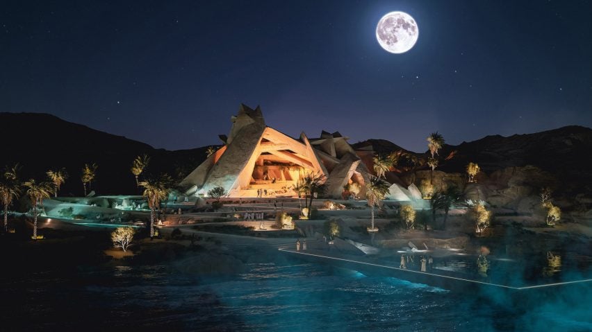
Xaynor members' club on the Gulf of Aqaba at Neom by Sordo Madaleno Arquitectos.Xaynor members' club on the Gulf of Aqaba at Neom by Sordo Madaleno Arquitectos.
Sordo Madaleno Arquitectos revealed designs for Neom’s Xaynor members’ club

The aerial shots revealed excavations for The Line, which will comprise two 170-kilometre-long skyscrapers set 200 metres apart, as well as preparation works on the Oxagon development and hotels being constructed at Sindalah.

In other Neom news, the development also revealed the designs for its beach-side members’ club Xaynor, courtesy of Mexican studio Sordo Madaleno Arquitectos.
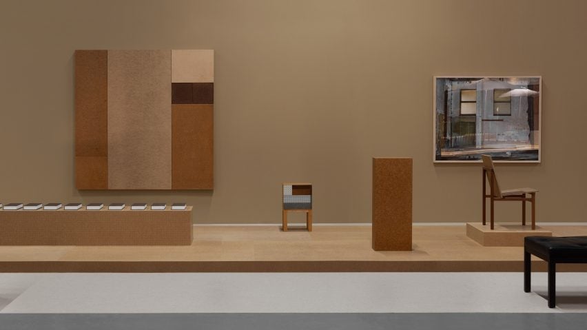
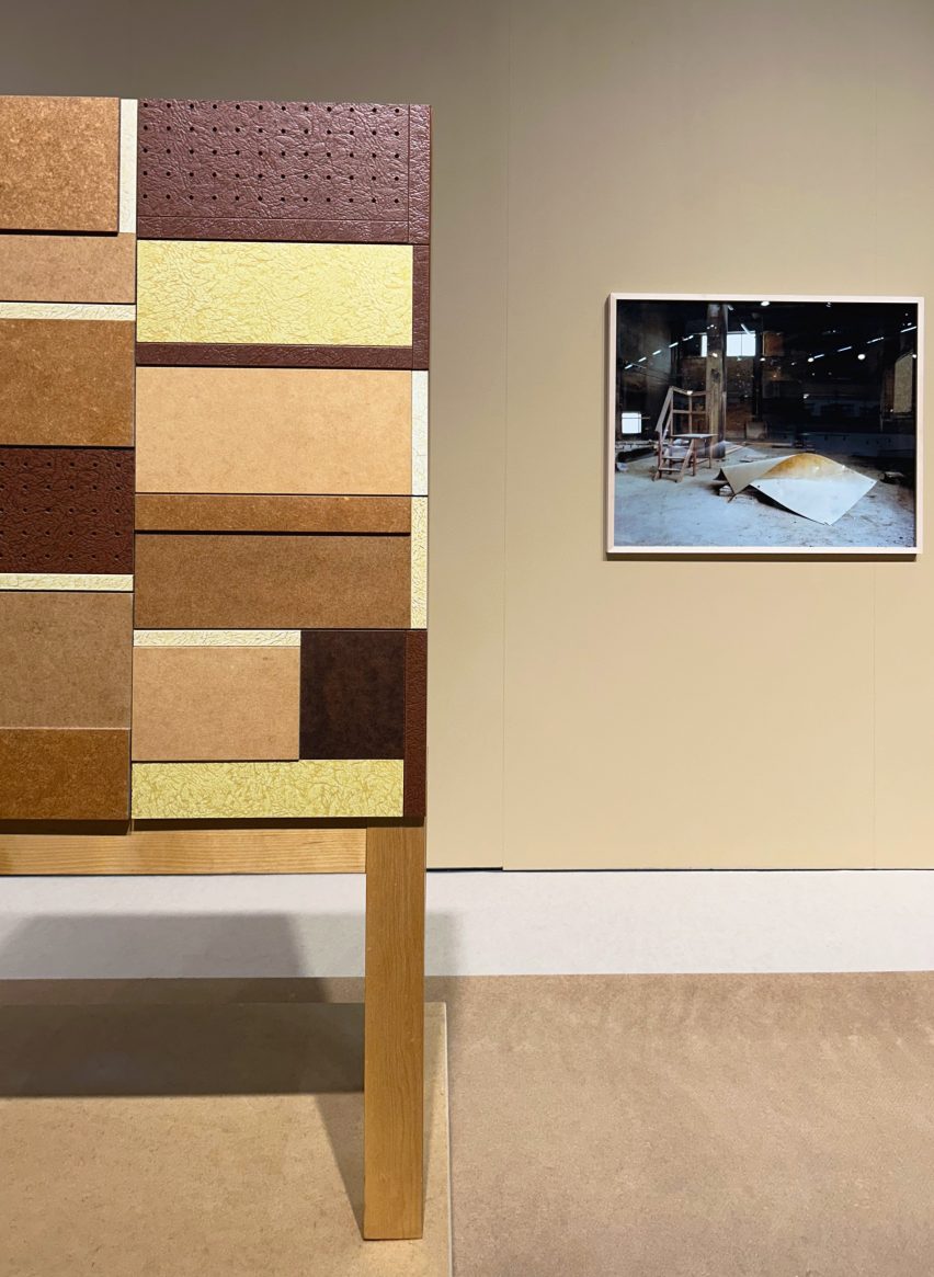
The Museum of Masonite by Folkform at Stockholm Furniture FairThe Museum of Masonite by Folkform at Stockholm Furniture Fair
Folkform exhibited Masonite furniture at this year’s Stockholm Design Week

We reported live from Sweden this week to share exclusive previews of products, installations and events taking place at Stockholm Design Week.

The first day of our Dezeen Live blog from the event included new lighting and furniture collections from Färg & Blanche, day two saw a spotting of actor Will Ferrell and our day three coverage included an installation of Masonite hardboard furniture by design studio Folkform.

Medals for Paris 2024 Olympic and Paralympic Games by ChaumetMedals for Paris 2024 Olympic and Paralympic Games by Chaumet
The Paris 2024 Olympic and Paralympic medals were unveiled this week

Also this week, French jeweller Chaumet unveiled the Paris 2024 Olympic and Paralympic medals, which feature rear faces embedded with a piece of the Eiffel Tower.

The fragments were removed from the iconic monument during various renovation works during the 20th century and preserved. For the medals, the hexagonal pieces have been stamped with the emblem of the Paris 2024 games.
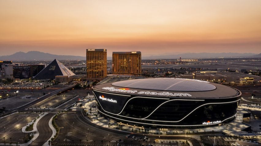
Allegiant stadiumAllegiant stadium
The Las Vegas Raiders’ Allegiant Stadium will host this year’s NFL Super Bowl

In other sporting news, the NFL Super Bowl will take place this weekend at the 62,000-seat Las Vegas Raiders’ Allegiant Stadium in Nevada, which opened in 2020.

Designed by Manica Architecture, the stadium’s cylindrical shape and black metal exterior were informed by the sleekness and power of sports cars.

Polestar 4 car from abovePolestar 4 car from above
Polestar 4 is the first mass-market car to have no rear window

After launching in China last year, the five-door electric SUV coupé Polestar 4 has now gone on sale in Europe and Australia, making it the world’s first mass-market car without a rear window.

Created by Swedish automaker Polestar, the car has a roof-mounted rear camera that gives a more reliable picture than rear-view mirrors in standard coupés.

The top of Legends TowerThe top of Legends Tower
Ryan Scavnicky believes making the Oklahoma City skyscraper the tallest in the US sends the wrong message

Following the news that Californian architecture studio AO and developer Matteson Capital plan to build the US’s tallest building in Oklahoma City, architecture critic Ryan Scavnicky argued that the project sends the wrong message.

“Legends Tower is a very 20th-century way to say that you are squarely entering the 21st century of cultural and economic change,” he wrote in an opinion piece for Dezeen.
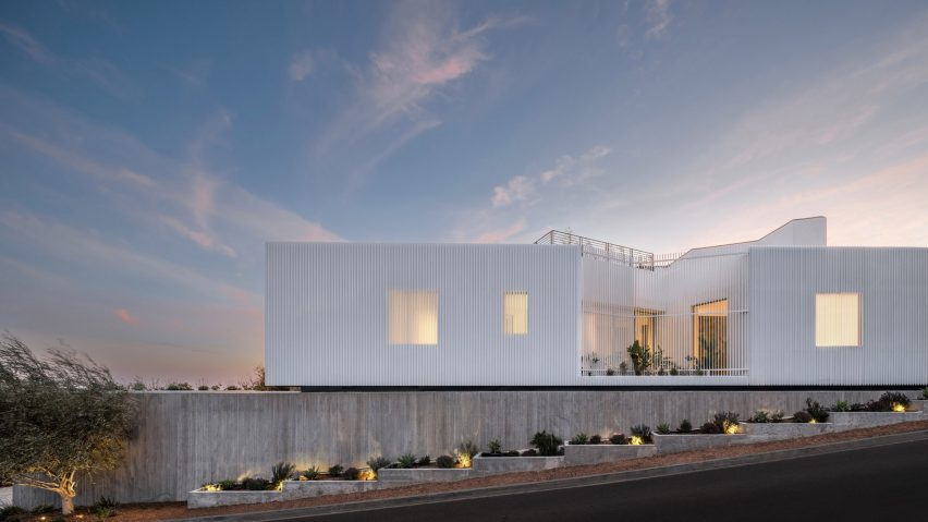
Stradella Ridge by SAOTAStradella Ridge by SAOTA
An angular home in Los Angeles was among the most-read stories this week

Popular projects this week included a Los Angeles house clad in white aluminium screens, a home in Japan with a blackened wood and corten steel exterior and a minimalist Tokyo apartment with interiors lined in local wood.

Our latest lookbooks featured brightly coloured home renovations and playful houses with indoor slides.

This week on Dezeen

This week on Dezeen is our regular roundup of the week’s top news stories. Subscribe to our newsletters to be sure you don’t miss anything.

Reference

Folkform installs The Museum of Masonite at Stockholm Furniture Fair
CategoriesInterior Design

Folkform installs The Museum of Masonite at Stockholm Furniture Fair

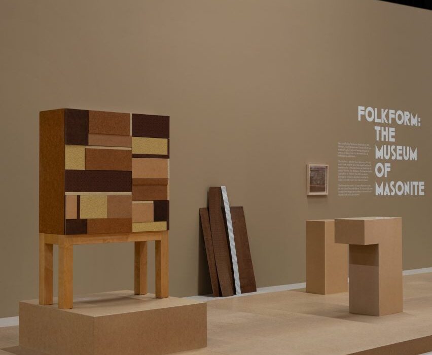
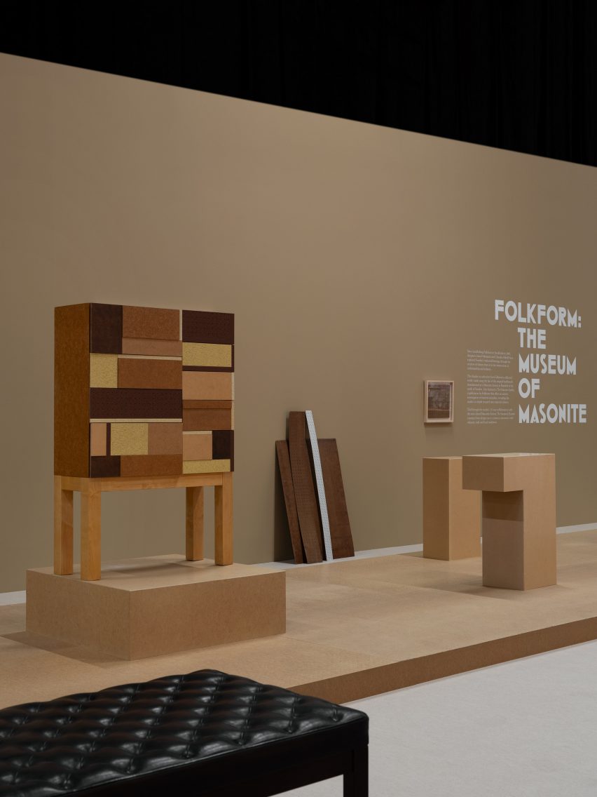
Swedish design duo Folkform has presented a series of furniture pieces made using Masonite hardboard sourced from a factory that closed down over a decade ago.

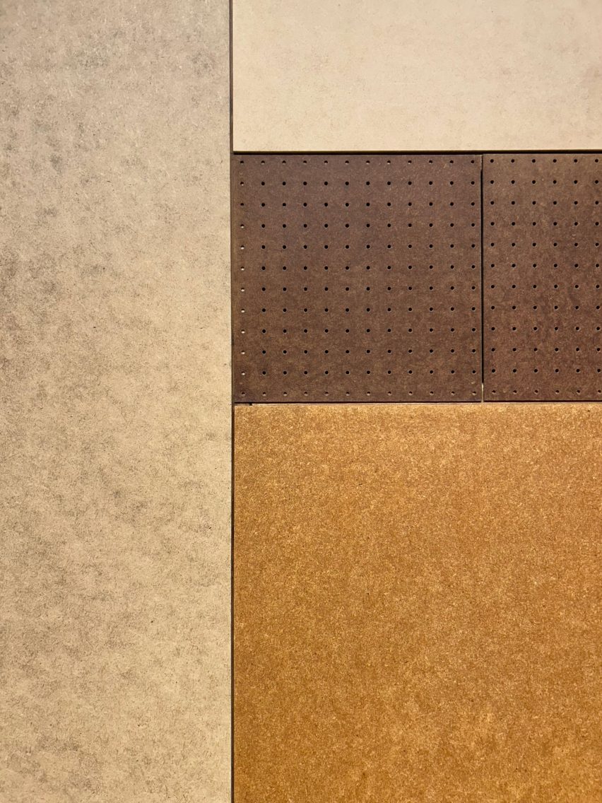
On show at Stockholm Furniture Fair, The Museum of Masonite centres around a patented type of engineered wood board that is made by steam-cooking and pressure-moulding wood fibres.

Folkform founders Anna Holmquist and Chandra Ahlsell first started experimenting with this material 15 years ago, in collaboration with Sweden’s last remaining Masonite producer in Rundvik.

The Museum of Masonite by Folkform at Stockholm Furniture FairThe Museum of Masonite by Folkform at Stockholm Furniture Fair
The Museum of Masonite features furniture made from a patented type of wood board

When the factory closed in 2011, the pair took all the remaining stock.

“I felt a responsibility to tell the story of what happened to this material,” explained Holmquist, who has since completed a PHD exploring the cultural significance of Masonite.

“It created the Swedish welfare state in the 1930s, 40s and 50s,” she told Dezeen.

“It was made from leftover wood from the Swedish sawmills so it became bigger here than anywhere else. Everyone was using it, for everything from boats and caravans to houses.”

The Museum of Masonite by Folkform at Stockholm Furniture FairThe Museum of Masonite by Folkform at Stockholm Furniture Fair
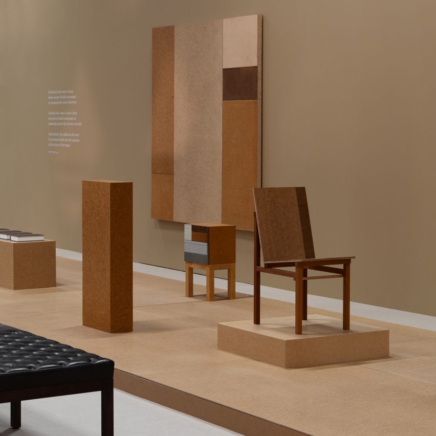
Works on show include the Masonite Chair, a collaboration with Åke Axelsson

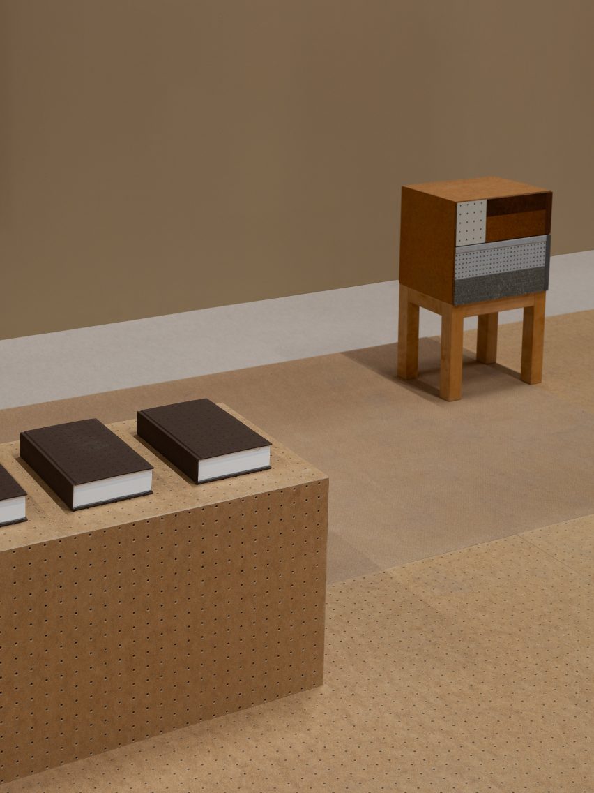
The Museum of Masonite follows the release of the Production Novellas, a book published by Folkform detailing the results of Holmquist’s PHD research.

Folkform is showcasing this book alongside some of their favourite Masonite designs created over the years.

Works on display include the Masonite Chair, a 2021 collaboration with Åke Axelsson based on an experimental design the Swedish interior architect produced in 1978.

Older pieces include a chest of drawers and a bedside cabinet, both created in 2012, which feature different material samples arranged in geometric collages.

“We combined materials with different ages, with this idea that the furniture becomes an archive,” said Holmquist.

The Museum of Masonite by Folkform at Stockholm Furniture FairThe Museum of Masonite by Folkform at Stockholm Furniture Fair
The exhibition follows the release of the book Production Novellas

The most recent designs in the show explore a more minimalist approach, suggesting how the material can create the suggestion of solid blocks.

“I feel like the compositions will be never-ending because we still have more of this board,” added Holmquist.

The works are presented alongside photographs, illustrations and artefacts that tell the story of the factory.

The Museum of Masonite by Folkform at Stockholm Furniture FairThe Museum of Masonite by Folkform at Stockholm Furniture Fair
The exhibition includes photos from the factory. Image by Amy Frearson

Later in the year, the exhibition will move to the Laurel Museum of Art in Mississippi, the city where Masonite was patented in 1924 by William H Mason.

Masonite is distinct from other engineered wood fibre boards, such as MDF, because it is made without glue. Holmquist believes the material could have a future in manufacturing.
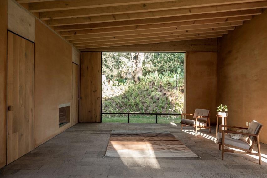
The Museum of Masonite by Folkform at Stockholm Furniture FairThe Museum of Masonite by Folkform at Stockholm Furniture Fair
Masonite is made from pressure-moulded wood fibres. Image by Amy Frearson

“It’s a beautiful material and it’s very sustainable,” she concluded.

“We are already seeing a shift in food, where people increasingly care where the things they eat come from, so maybe it will also happen for furniture and objects.”

At Stockholm Furniture Fair this year, visitors could also enjoy the Wekino With exhibition by South Korean furniture designers and British designer Faye Toogood’s collaboration with Finnish company Vaarnii.

The photography is by Erik Lefvander unless otherwise stated.

The Museum of Masonite is on show at Stockholm Furniture Fair, which is open to the public from 7 to 11 February 2024. See Dezeen Events Guide for more Stockholm Dezeen Week exhibitions in our dedicated event guide.

Reference

The Rebello Hotel occupies former factory along Porto’s riverside
CategoriesInterior Design

The Rebello Hotel occupies former factory along Porto’s riverside

This hotel by architecture studio Metro Urbe occupies a series of former industrial buildings on the banks of the River Douro in Porto, Portugal, and features interiors by Quiet Studios.

The Rebello Hotel is spread across several 19th-century buildings, which have been overhauled and adapted with new additions by Metro Urbe, in Vila Nova de Gaia – across the river from the city proper.

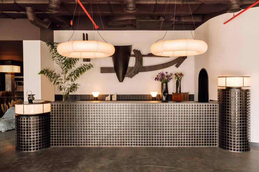
Reception desk with metal lattice front and hoop-shaped lights aboveReception desk with metal lattice front and hoop-shaped lights above
At The Rebello Hotel, nods to the site’s industrial past and Porto’s nautical history can be found in artworks and decor choices

Operated by Bomporto Hotels, which has two properties in Lisbon, the new addition to its portfolio was designed with a local approach and to take full advantage of its prime riverside location.

The Rebello is named after Porto’s famous rabelos – wooden boats that used to transport barrels of port wine down the river – and located beside the city’s only remaining boatyard.

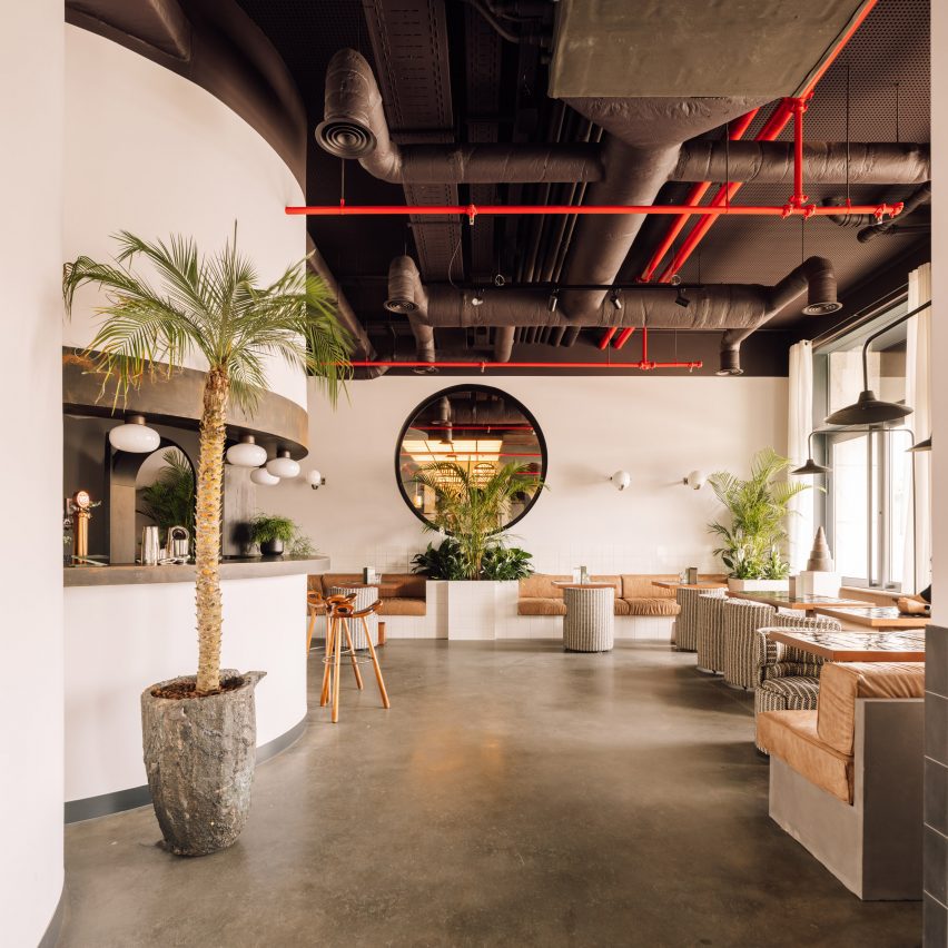
Bar and cafe area with polished concrete floors and exposed ceiling ductworkBar and cafe area with polished concrete floors and exposed ceiling ductwork
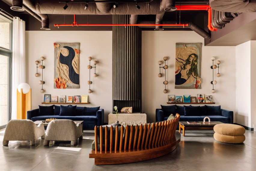
The lobby bar and cafe was designed for digital nomads to work and relax

The collection of buildings was once a kitchen utensil factory and had been unoccupied for some time before work began to reconfigure the site.

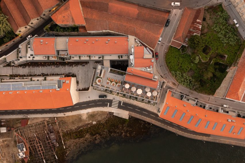
The team restored two long buildings that face onto the river, preserving their historic stone facades, and constructed two new volumes in the centre of the site that incorporate smaller original structures and resolve the sloping topography.

A variety of soft seating options in an industrial-style spaceA variety of soft seating options in an industrial-style space
A variety of soft seating options enliven the industrial-style interiors of the hotel’s communal spaces

Presented with a blank canvas, Spanish interior designer Daniela Franceschini – founder of Lisbon-based Quiet Studios – worked with local artists and creatives to transform the industrial spaces into warm and comfortable guest facilities.

Using vintage and contemporary objects, she based the interiors around four key elements: water, wine, wood and industry.

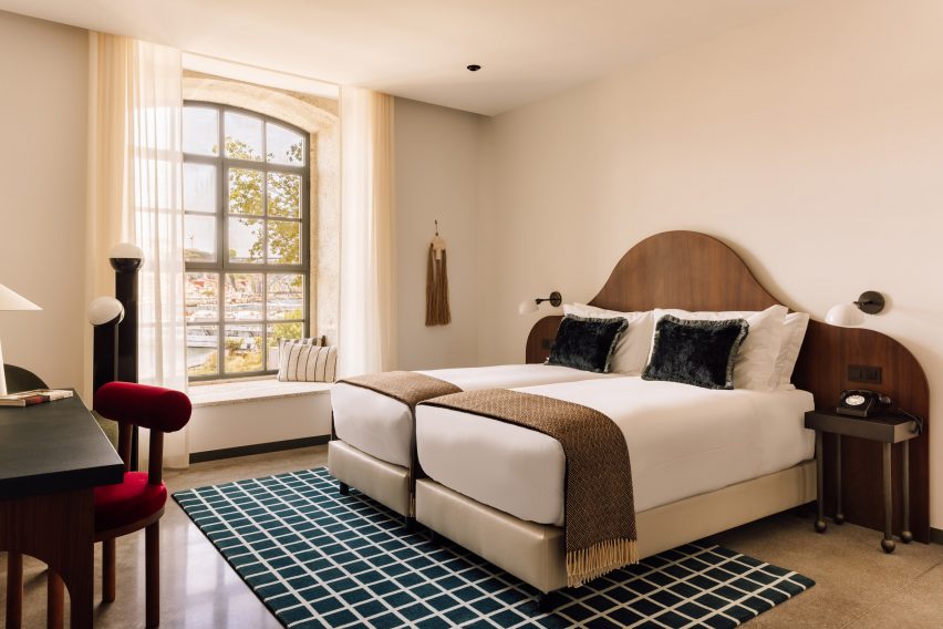
Bright bedroom with neutral decor and wavy walnut headboardBright bedroom with neutral decor and wavy walnut headboard
Bedrooms are bright and neutral, with splashes of colour introduced through contemporary furniture

“There’s a nautical feel to the colours, materials and textures,” said Franceschini. “That also comes through in the lighting, which is suggestive of floating and sailboats, and in the lamps with chains, the wooden shelves by Tomaz Viana, the ceramic nets by Fig Studio and the undulating mirrors that evoke the movement of the sea.”

Above the retro-style reception counter, fronted by a metal lattice, is an artwork crafted using reclaimed materials from the rabelos, which was designed by Studio Ther in collaboration with a local artisan.

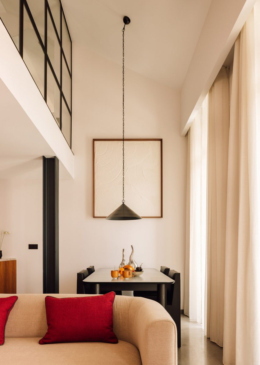
Double-height living and dining room with a long pendant lamp suspended over the tableDouble-height living and dining room with a long pendant lamp suspended over the table
Guest room types vary from studios to three-bedroom penthouse apartments

The lobby lounge and bar was designed for digital nomads to work or relax on a variety of comfortable soft seats, within a bright space that features polished concrete floors and exposed ceiling ductwork.

As a nod to the site’s history, the ground-floor Pot&Pan restaurant serves family-style dishes in large pots and pans within a space decorated with dark-toned walls and plants to create a casual atmosphere.

There’s also a cafe and store selling local produce and crafts, and meeting rooms that can be hired separately or combined for private events.

The Rebello Hotel’s 103 guest rooms and apartments are split into 11 different types, ranging from studios to three-bedroom penthouses that span 37 to 195 square metres.

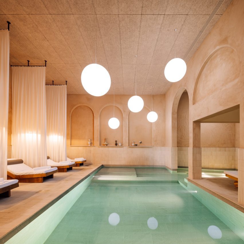
Spa with textured plaster walls, and globe-shaped lights over a large poolSpa with textured plaster walls, and globe-shaped lights over a large pool
The hotel’s spa is modelled on ancient Roman baths

The interiors of its light-filled suites have been decorated with walnut, steel, concrete and tiles, along with contemporary furniture that introduces splashes of bright colour to the otherwise neutral palette.

The bedrooms also include “tailor-made pieces influenced by nautical and industrial design, such as the sinks inspired by old water tanks and the organically styled bed headboards that resemble the rippling waters of the Douro”, according to the design team.

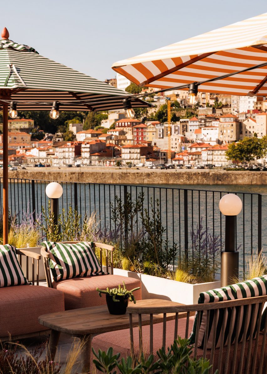
Lounge chairs under umbrellas overlooking the Douro RiverLounge chairs under umbrellas overlooking the Douro River
The fourth-floor rooftop bar offers views across the Douro River to the Porto skyline

The Rebello Hotel guests can enjoy a spa, modelled on ancient Roman baths and encompassing a heated pool, sauna, fitness centre and treatment rooms.

Finally, the Rooftop Bello bar on the fourth floor offers a spot for al fresco cocktails overlooking the river, with a view of the city’s terracotta-tiled skyline beyond.

Aerial view of The Rebello Hotel showing the layout of its terracotta-roofed buildingsAerial view of The Rebello Hotel showing the layout of its terracotta-roofed buildings
The riverside site, a former kitchen utensil factory, was converted and extended by architects Metro Urbe

Other interior design projects in Porto include a rustic restaurant interior designed by Space Copenhagen, which features a ceramic mural by Álvaro Siza, and a sushi bar by Paulo Merlini where 8,000 wooden chopsticks hang above diners.

The photography is by Francisco Nogueira.

Reference

Modernist architecture informs Bottega Veneta store in historic galleria
CategoriesInterior Design

Modernist architecture informs Bottega Veneta store in historic galleria

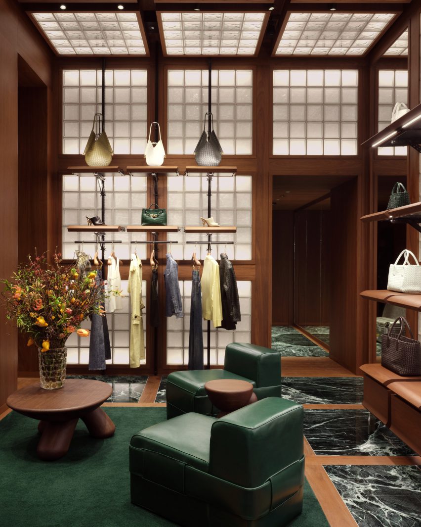
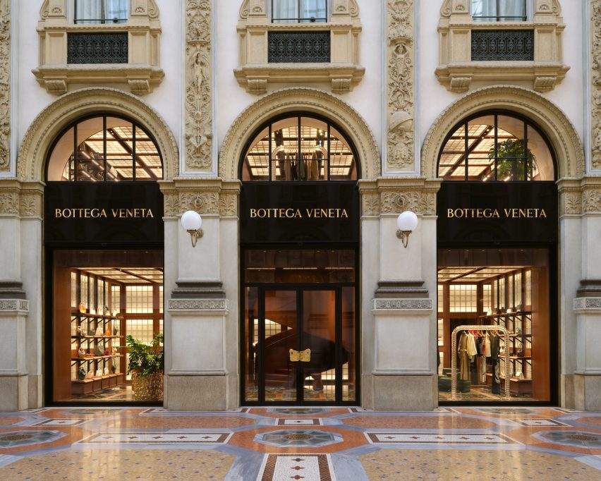
Fashion house Bottega Veneta has opened a boutique designed by its creative director Matthieu Blazy inside the Galleria Vittorio Emanuele II shopping arcade in Milan.

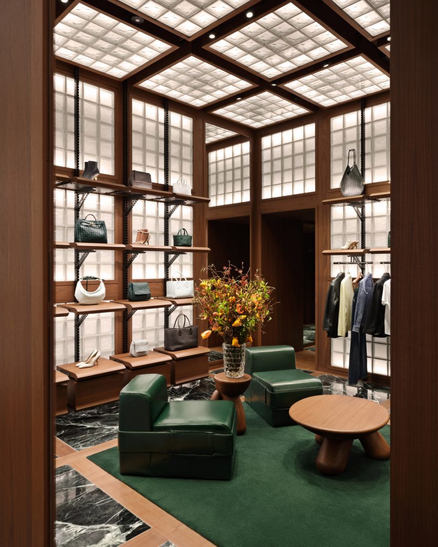
Bottega Veneta‘s two-storey store is distinguished by three primary materials: glass, Italian walnut and green Verde Saint Denis marble.

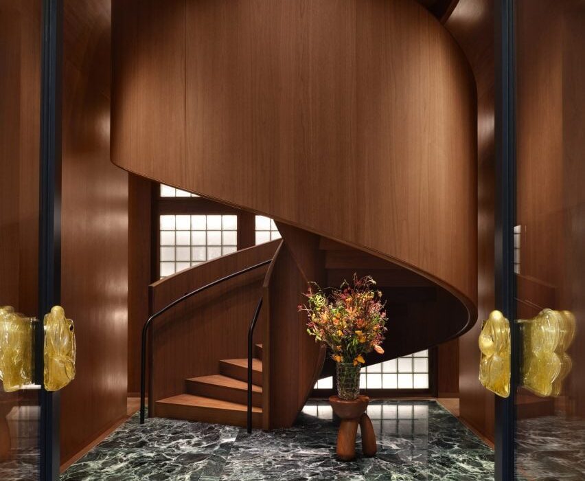
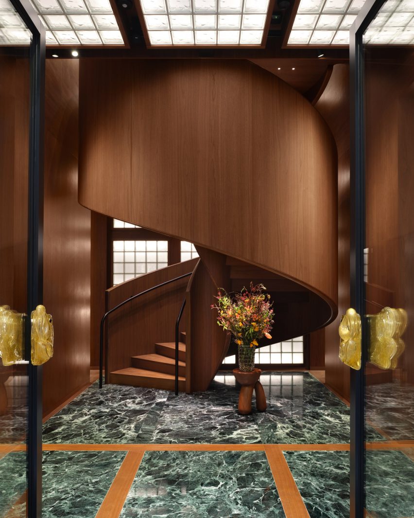
Walnut spiral staircase rising from green marble floorWalnut spiral staircase rising from green marble floor
A spiral staircase greets shoppers at the Bottega Veneta store in Milan

This trifecta is applied in strict grids to evoke Italian modernism and provide an organising principle in the various rooms.

“There are different experiences of space in the store,” said Blazy. “I wanted to express the idea of a domestic interior referring to Italian modernist architecture that contrasts with the aesthetic of a spaceship and to capture the intimacy and the imagination of getting dressed.”

Fashion store with glass-block walls and ceiling, and green marble flooringFashion store with glass-block walls and ceiling, and green marble flooring
Grids are used throughout the store to organise materials

From the galleria, shoppers are greeted by a dramatic spiral staircase made entirely from Italian walnut – a material used throughout the interior as panelling, modular shelving and furniture.

Green marble is laid in squares across the floors, separated by strips of walnut and occasionally swapped for larger patches of dark green wool carpet.

Room with squares of glass blocks across the walls and ceilingRoom with squares of glass blocks across the walls and ceiling
Glass blocks are integrated into the walls and ceilings

Square glass blocks are similarly arranged into grids across walls and ceilings, illuminated from behind to produce a soft warm glow throughout the store.

Green leather chairs and benches are accompanied by custom rounded wood tables and stools to form lounge areas.

“Throughout the space, soft textures are found in leather seating and wool carpets, while modular shelving units build a sense of discovery and play,” Bottega Veneta said.

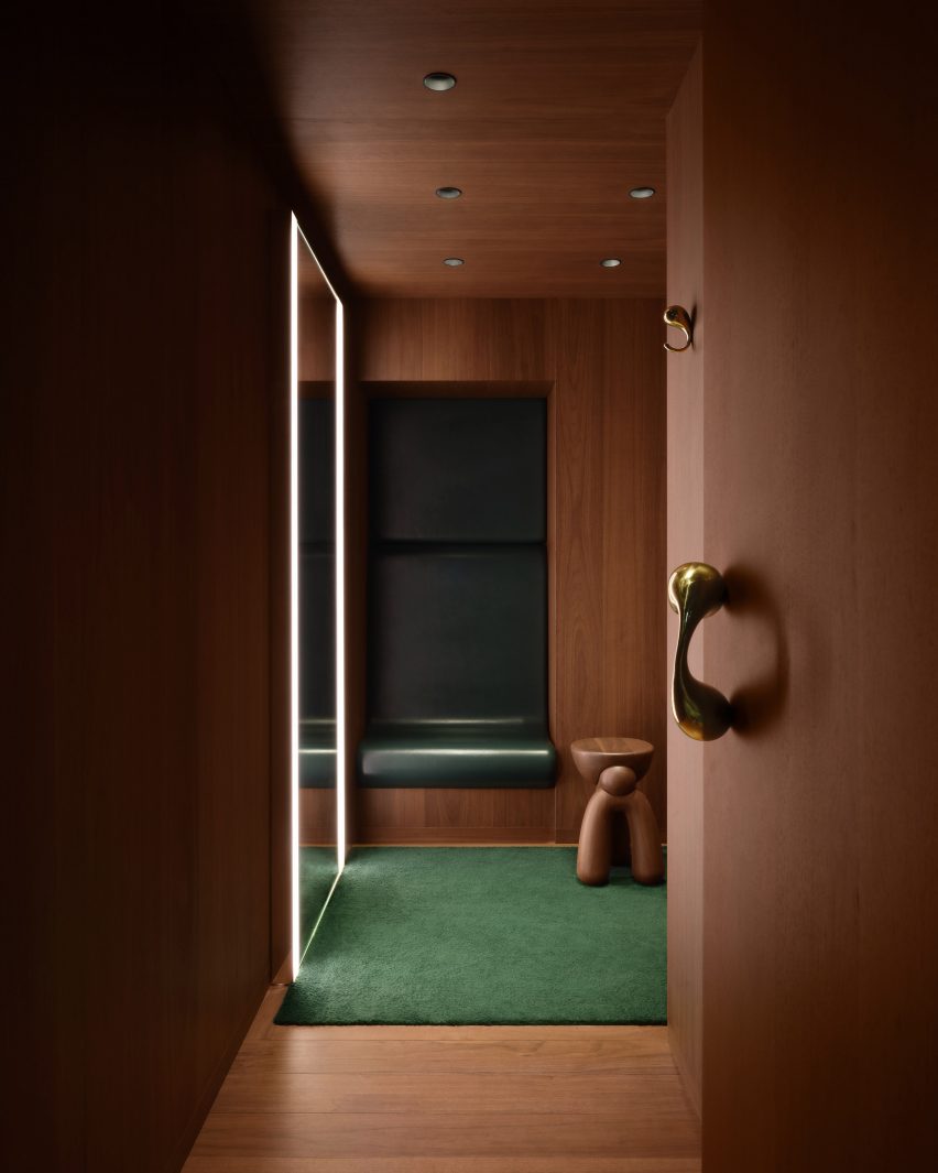
Fitting room lined in walnut with a green leather niche and wool carpetFitting room lined in walnut with a green leather niche and wool carpet
The fitting rooms feature leather niches that provide a place to sit

Fitting rooms are fully lined in walnut, except for leather-wrapped niches that provide a small seat, giant mirrors with built-in lighting and more green carpet.

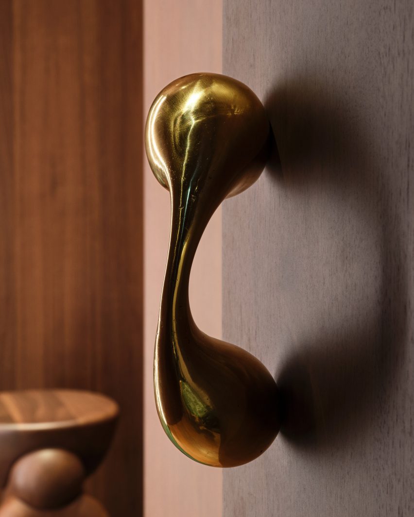
Sculptural polished metal elements form the door pulls and clothes hooks, their smooth surfaces contrasting with the more textured golden planters and entrance handles.

On the upper level, recesses formed by the Galleria’s arched windows provide nooks for seating and plants, as places to look out onto the highly decorative arcade.

Designed in 1861 by architect Giuseppe Mengoni, the neo-classical Galleria Vittorio Emanuele II is one of Milan’s most desirable shopping destinations.

Close-up of a polished metal sculptures that forms a door pullClose-up of a polished metal sculptures that forms a door pull
Polished metal sculptures form door pulls and clothing hooks in the fitting rooms

The four-storey, glass-vaulted double arcade is located in the city centre, close to other landmarks like the Duomo and the Teatro alla Scala.

The new Bottega store is the latest to open under Blazy since he took the reigns of the luxury brand in 2021, following locations on London’s Sloane Street and the Avenue Montaigne in Paris.

Exterior of the Bottega Veneta store in Milan's Galleria Vittorio Emanuele II Exterior of the Bottega Veneta store in Milan's Galleria Vittorio Emanuele II
The new store is located in the historic Galleria Vittorio Emanuele II shopping arcade

For the brand’s Spring Summer 2023 runway show, Bottega Veneta collaborated with Italian designer Gaetano Pesce, who envisioned a colourful resin-covered floor and 400 bespoke cotton-and-resin chairs for the set.

Pesce later went on to create a pair of handbags for the brand, which were designed to suggest different bucolic landscapes.

The photography is courtesy of Bottega Veneta.

Reference

Karimoku Case lines minimalist Tokyo apartment with local wood
CategoriesInterior Design

Karimoku Case lines minimalist Tokyo apartment with local wood

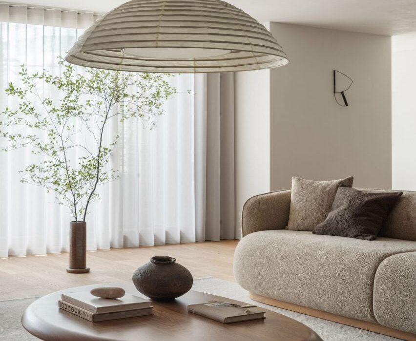
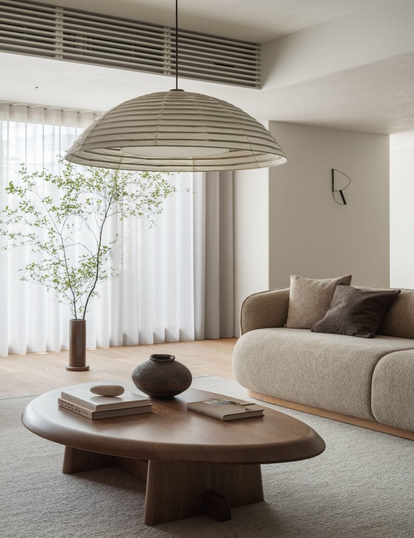
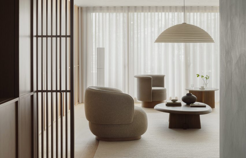
Japanese brand Karimoku Case has redesigned an apartment on a hilltop in Tokyo, using wood and a neutral colour palette to create a “calm and serene atmosphere”.

Named Azabu Hills Residence, the project was designed by Karimoku Case – a studio developed by Karimoku Furniture in collaboration with design studios Keiji Ashizawa and Norm Architects.

The studio used the project as an opportunity to optimise the use of local zelkova wood which is increasingly underutilised.

Living space interior of Azabu Hills Residence in JapanLiving space interior of Azabu Hills Residence in Japan
The apartment features furniture made from zelkova wood

“We sympathized with the story of how zelkova used to be a common material in Japan, but is now being chipped and discarded, and wished to explore the possibilities of zelkova through this project,” lead designer Keiji Ashizawa told Dezeen.

“When I first saw the sample of it, I felt that its gentle reddish hue, along with its story, was a good match for the project,” he continued.

“We decided to create the interior using zelkova that would come in harmony with the gentle light from the north side.”

View into living space of Tokyo residence by Karimoku CaseView into living space of Tokyo residence by Karimoku Case
A neutral material palette creates a “calm and serene atmosphere”

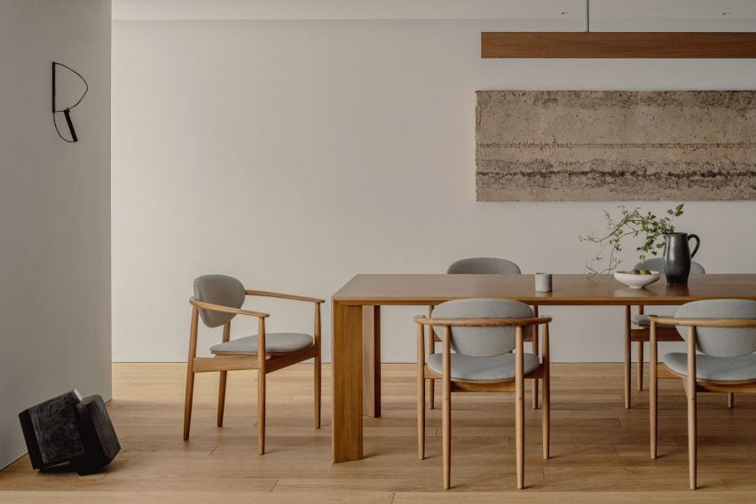
The 226-metre-square apartment was centred around a spacious, open-plan living area and dining room illuminated by floor-to-ceiling windows.

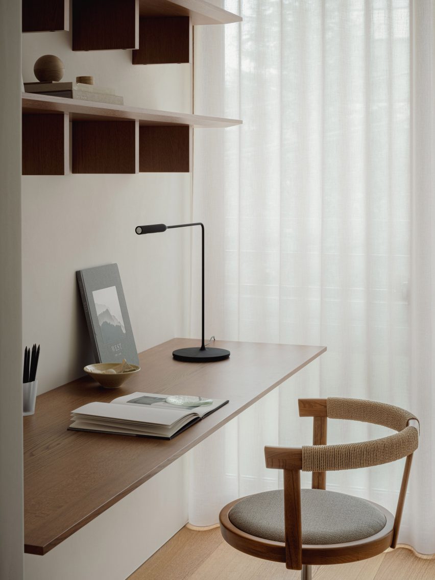
A small workspace nestled behind a wall in the living space makes use of the spacious interior, and is furnished with a desk, chair and shelving made from zelkova wood.

Desk space within Azabu Hills Residence in TokyoDesk space within Azabu Hills Residence in Tokyo
White plaster walls and wooden floors define the living spaces

The minimalist interior is defined by textured white walls and wood used for flooring, window frames and fittings, which are tied together by cream furnishings, paper lighting fixtures and decorative artwork.

In the living space, lattice wooden screens were used to separate programmes as well as provide cross ventilation through the space to create airy interiors.

“With the residence being located in the middle of a large city like Tokyo, it was important to have a home-like atmosphere that makes you feel at ease,” Ashizawa said.

“We were conscious of the calmness and tranquility needed to achieve this, and designed the interior with well-curated furniture, lighting, and art to create an environment for this purpose.”

Minimalist dining space in Azabu Hills Residence in TokyoMinimalist dining space in Azabu Hills Residence in Tokyo
Wooden, lattice screens allow ventilation through the home

A counter made from zelkova wood divides the living space and adjacent kitchen, while also serving as an additional seating and dining space.

Within the kitchen, cabinets built from gridded wooden frames were finished with concrete countertops, complemented by tiled terrazzo flooring that also features in the home’s entryway.

Bedroom interior of Tokyo apartment by Karimoku CaseBedroom interior of Tokyo apartment by Karimoku Case
Furnishings, paper lighting fixtures and pieces of artwork tie the interior together

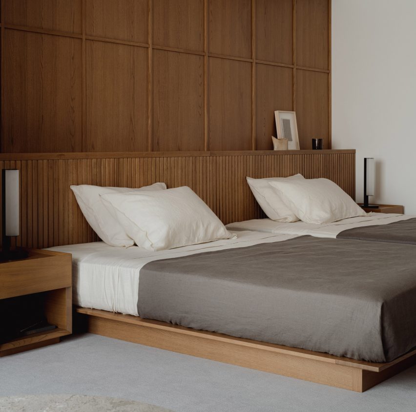
Gridded wooden frames are repeated for both storage in the living area and a wall in the main bedroom where the home transitions into a cosy-feel with carpet flooring.

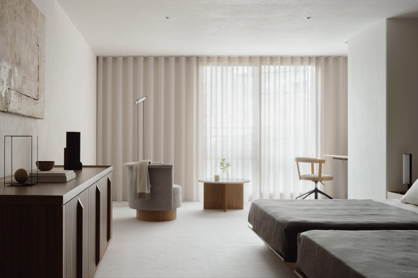
A circular chair and marbled table sit in front of the bedroom’s floor-to-ceiling windows, with a study desk nestled into the corner.

Bedroom interior of minimalist apartment Tokyo by Karimoku CaseBedroom interior of minimalist apartment Tokyo by Karimoku Case
Gridded wooden frames feature in the kitchen, living space and bedroom

Other recently completed projects with minimalist interiors include a dental clinic in Montreal designed to feel like “someone’s home” and a London pub converted into a pared-back jewellery showroom.

The photography is by Tomooki Kengaku


Project credits:

Architect: Keiji Ashizawa Design
Project architect: Keiji Ashizawa / Ryota Maruyama
Client: reBITA / NTT Urban Development Coperation Tokyo
Construction: Tamarix
Furniture collaboration: Norm Architects
Furniture:
Karimoku Case
Lighting: Kojima Shoten / Saito Shomei
Lighting plan: AURORA / Yoshiki Ichikawa
Interior styling: Yumi Nakata

Reference

Taller Héctor Barroso envisions Mexican houses as “silent architecture”
CategoriesArchitecture

Taller Héctor Barroso envisions Mexican houses as “silent architecture”

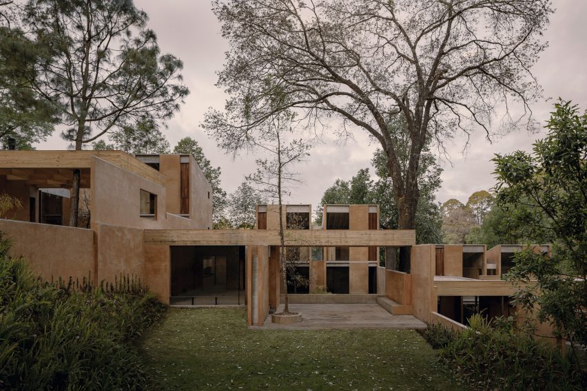
Mexican studio Taller Héctor Barroso has used concrete, wood and brick to create a series of holiday homes that merge with the wooded landscape and “allow nature to act in the intimacy of the home”.

The small residential complex – called Los Helechos, or The Ferns – is located in Valle de Bravo, a scenic area that is a couple hours by car from Mexico City.

Los Helechos by Taller Hector BarrosoLos Helechos by Taller Hector Barroso
Taller Hector Barroso has created a series of holiday homes in Mexico. Top photo by Jaime Navarro

The 1,150-square-metre complex consists of four identical houses that sit side by side on a sloped property within Rancho Avándaro, a golf and recreational community.

The architecture studio designed the homes to integrate with the tree-studded landscape and to enable nature to flow indoors.

A courtyard with multiple plainsA courtyard with multiple plains
The four residences sit side by side on a slope

“Los Helechos is a group of houses designed to allow nature to act in the intimacy of the home, creating a silent architecture to accompany the beauty of their gardens,” said Taller Hector Barroso, a studio based in Mexico City.

“The four houses stealthily adapt to the steep slope of the terrain, respecting the existing topography and vegetation to minimize their impact on the site,” the studio added.

An armchair placed next to fireplaceAn armchair placed next to fireplace
Each house faces a central courtyard. Photo by Jaime Navarro

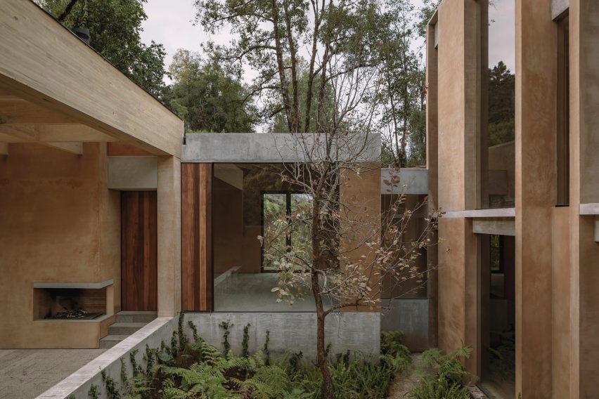
Each house has two levels and a basement. The homes are C-shaped in plan and feature rectilinear volumes arranged around a central courtyard filled with native plants.

“The houses look inward through a central courtyard that becomes a space of transition and contemplation – an area between public and private, allowing the entire house to maintain a direct relationship with nature,” the team said.

To construct the buildings, the team used concrete, pine and red brick plastered with soil-based stucco. Windows are framed with ipe wood, and a pergola is made of laminated pine.

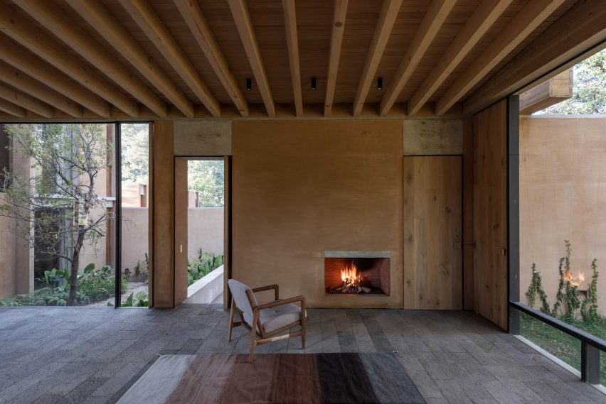
Interior finishes include oak doors and stucco-covered walls, along with floors covered in cantera – a type of stone that came from a local quarry.

Room with exposed wooden beamsRoom with exposed wooden beams
The studio used concrete, pine and red brick plastered with stucco for finishes. Photo by Jaime Navarro

The ground level encompasses two bedrooms and a mix of indoor and outdoors spaces for cooking, dining and lounging. The upper level contains two bedrooms, and the basement holds storage space and a garage.
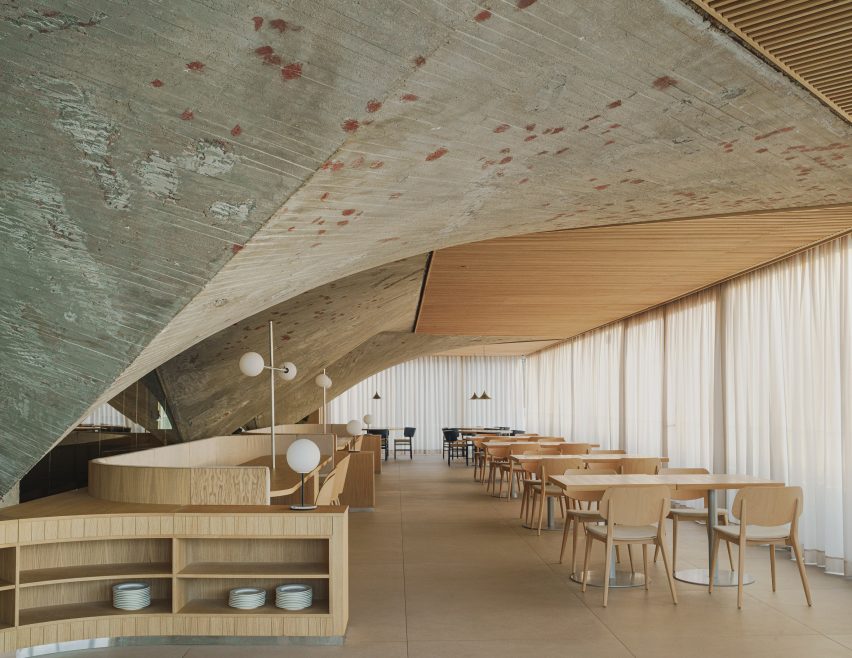
Founded in 2011, Taller Hector Barroso has completed a range of projects around its home state of Mexico, such as a caramel-coloured apartment complex in Mexico City and a stark tennis venue in Los Cabos made of rammed earth.

The photography is by César Béjar unless otherwise stated


Project credits:

Architect: Héctor Barroso
Team: Alan Rojas, Alice Moreno, Paloma Sánchez, Salvador Saracho

Reference

Zooco Estudio unveils Cantabrian Maritime Museum restaurant
CategoriesInterior Design

Zooco Estudio unveils Cantabrian Maritime Museum restaurant

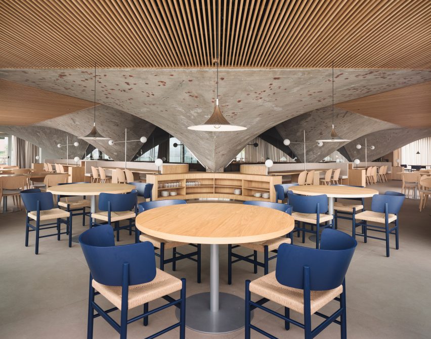
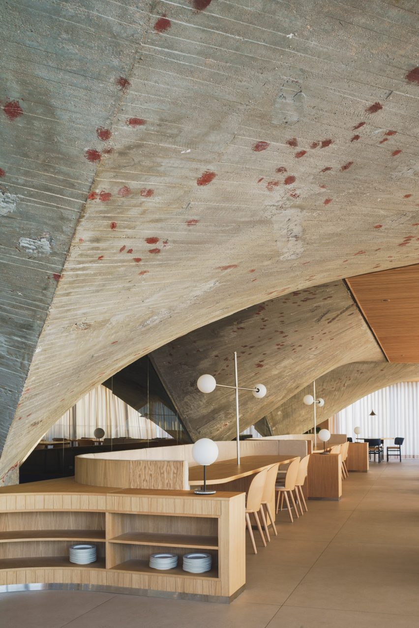
Madrid-based Zooco Estudio has created a striking restaurant within the Cantabrian Maritime Museum in Santander, Spain, that celebrates the building’s brutalist architecture.

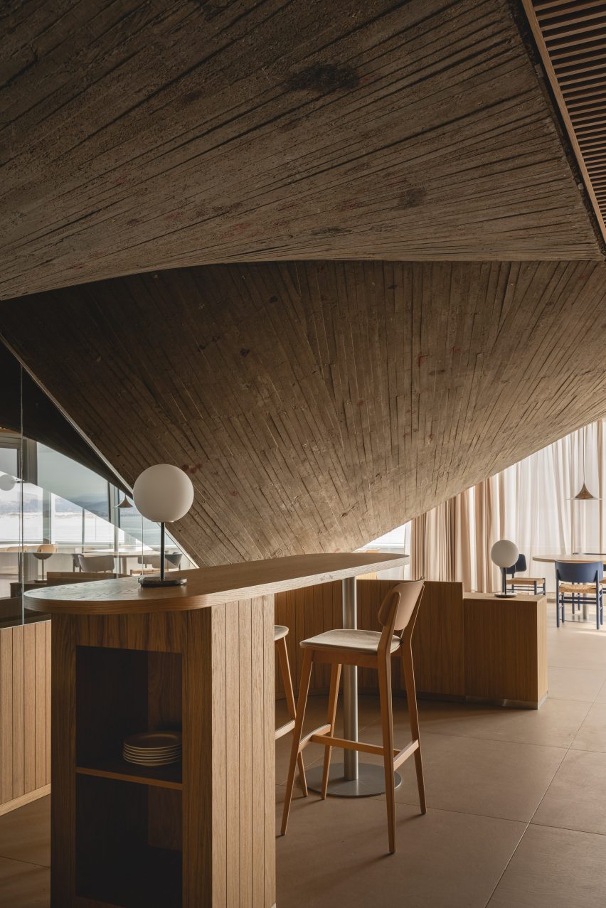
The restaurant is set within a dramatic vault of concrete paraboloids that were unearthed during the renovation, while a slatted timber ceiling pays homage to the area’s shipbuilding legacy.

Interior of brutalist Cantabrian Maritime Museum restaurant in Spain by Zooco EstudioInterior of brutalist Cantabrian Maritime Museum restaurant in Spain by Zooco Estudio
Zooco Estudio added a restaurant to the second floor of the Cantabrian Maritime Museum

Overlooking the tranquil waters of Santander Bay, the restaurant is located on the second floor of the landmark Cantabrian Maritime Museum, which was designed in the mid-1970s by architects Vicente Roig Forner and Ángel Hernández Morales.

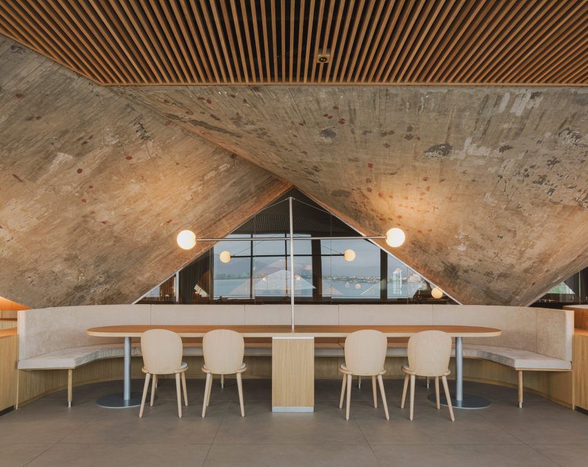
The paraboloids were an original fixture of the structure and supported the roof of what was once the museum’s patio.

Interior of brutalist Cantabrian Maritime Museum restaurant in Spain by Zooco EstudioInterior of brutalist Cantabrian Maritime Museum restaurant in Spain by Zooco Estudio
Oak details were designed to contrast the restaurant’s concrete arches

The studio focused on restoring the historic fabric of the space and reviving the paraboloids, which had been concealed for around 20 years, as “a vestige of the past”.

“In 2003, the building was renovated and as part of this intervention, the paraboloids were covered with a new roof and the space between them and the perimeter of the building was closed with glass, generating a covered space where there was previously a terrace,” Zooco Estudio co-founder Javier Guzmán told Dezeen.

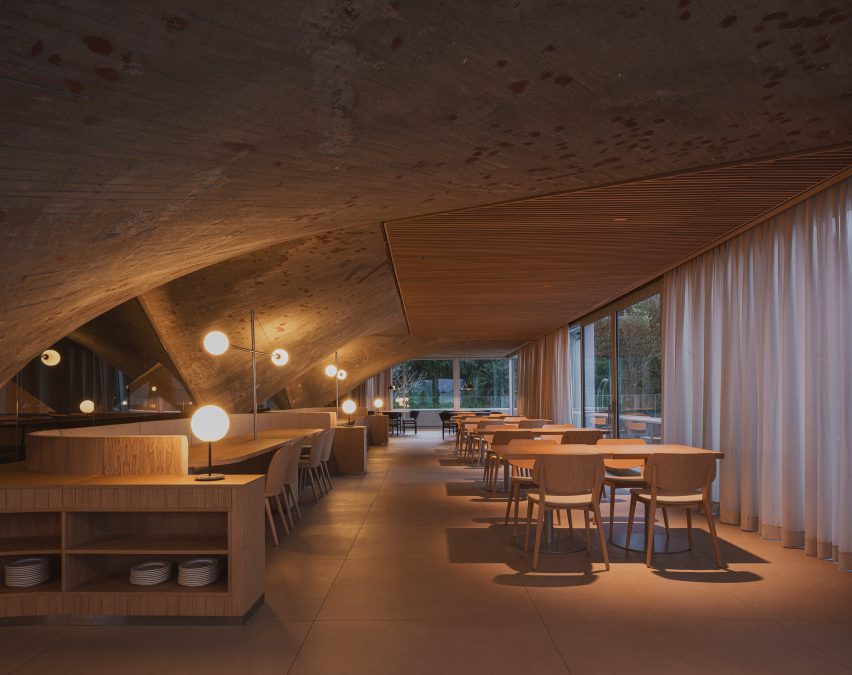
“We wanted the concrete paraboloids to be the absolute protagonists of the space and by removing the paint and the coating, the paraboloids are visible again and regain their full prominence.”

Interior of brutalist restaurant in Spain by Zooco EstudioInterior of brutalist restaurant in Spain by Zooco Estudio
The renovation exposed the raw concrete surface of the paraboloids

The previous renovation also altered the dimensions of the space and reconfigured the volume as a square.

To promote symmetry, four additional concrete triangles were added to balance out the original paraboloids in the brutalist restaurant.

Timber ceiling panels and concrete paraboloids inside a brutalist restaurantTimber ceiling panels and concrete paraboloids inside a brutalist restaurant
Slatted wooden ceiling panels bridge the gaps between the arches

Overhead, a false ceiling of slatted timber panels frames the concrete arches.

The studio designed theses triangular boards to reference the arrangement of timber across the hull of a boat, a nod to the museum and the area’s nautical past.

The panels also serve the purpose of concealing the restaurant’s mechanical systems.

“The wooden slats bring warmth and friendliness to the space while allowing us to solve all the technical needs for air conditioning, heating and lighting, leaving them hidden,” Guzmán said.

“In this way, we ensure that all these elements do not interfere with the dialogue of concrete and wood, which are presented as continuous and clean elements.”

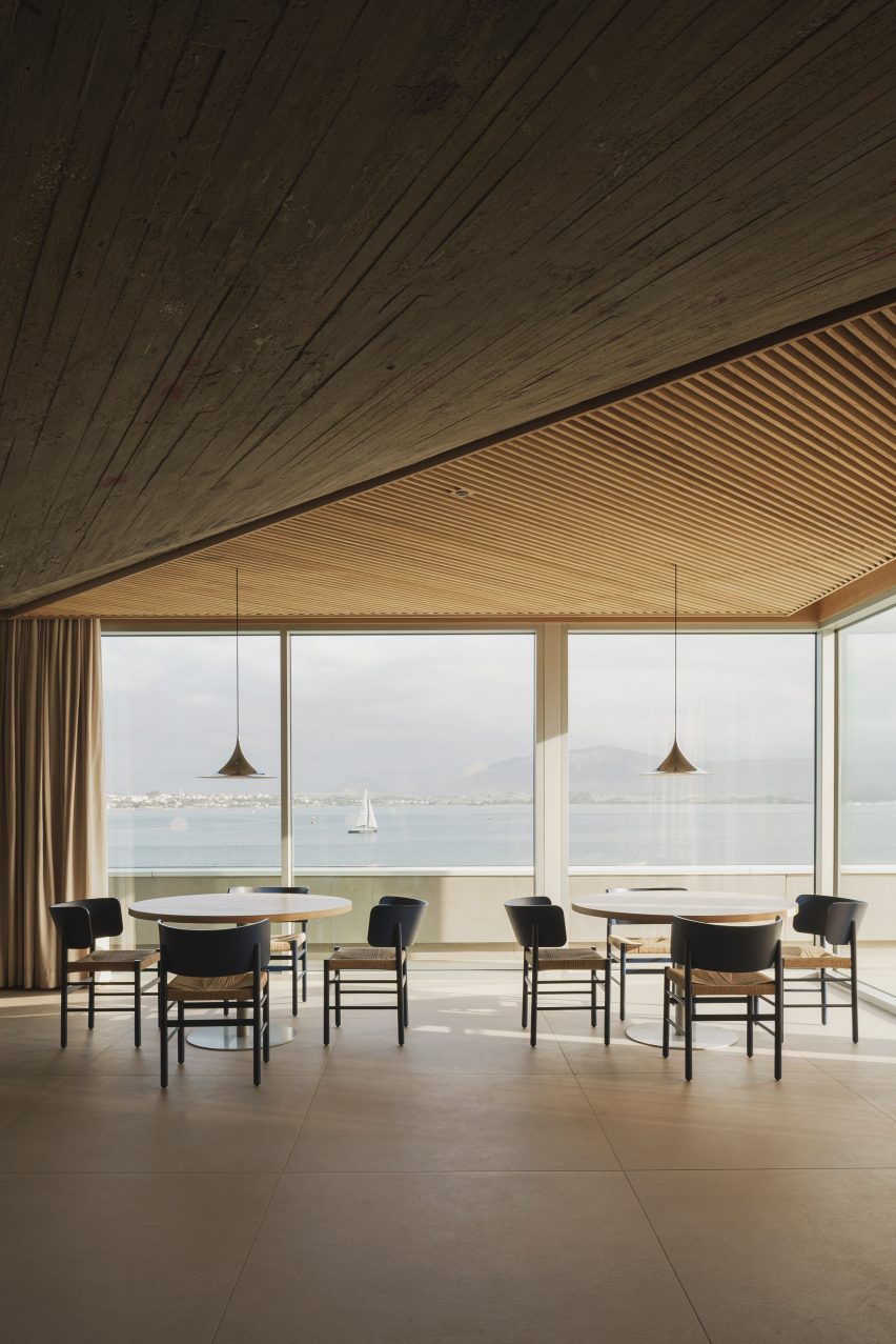
Dining tables overlooking views of the Santander bayDining tables overlooking views of the Santander bay
Walls of floor-to-ceiling glazing offer views across the bay

The interior layout was largely dictated by the low arches of the elliptic paraboloids that dominate the brutalist restaurant.

“The geometry of the existing structure conditions the space, because its height in its lower part is impractical, so a large bench is arranged around the entire contour that allows us to take advantage of that space and organise the distribution of the rest of the floor plan,” added Guzmán.

Concrete paraboloid and dining tables inside brutalist restaurant in Spain by Zooco EstudioConcrete paraboloid and dining tables inside brutalist restaurant in Spain by Zooco Estudio
Grey porcelain floors mirror the concrete paraboloids

Like the ceiling panels, the interior finishes and furnishings allude to the maritime history that the building commemorates.

“The use of wood and steel for all the furniture is reminiscent of the materials used in shipbuilding – the furniture has slight curvatures that are reminiscent of the aerodynamic shapes of boats,” explained Guzmán.

“Likewise, the lamps are inspired by the masts for ship sails.”

Dining tables at Cantabrian Maritime Museum restaurantDining tables at Cantabrian Maritime Museum restaurant
Zooco Estudio also designed the restaurant’s curved timber furniture

Another key change was the replacement of the perimeter glass wall.

The inclined glazing was swapped for vertical glass, a decision that reclaimed external space for the patio, which stretches the length of the restaurant and overlooks the harbour below.

“When we are inside, the feeling is the same as when we are inside a boat, there is only water around, and that is why we used clean glass from floor to ceiling, generating a perimeter terrace as happens on boats,” said Guzmán.

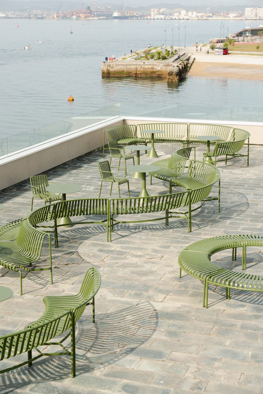
Terrace at Cantabrian Maritime MuseumTerrace at Cantabrian Maritime Museum
The terrace features green curvilinear outdoor furniture

Other projects by Zooco Estudio include a renovated house in Madrid and a co-working space with a kids’ play area in California.

The photography is by David Zarzoso.


Project credits:

Architect: Zooco Estudio
Construction:
Rotedama Constructora SL
Lighting: Zooco Estudio
Furniture: Zooco Estudio

Reference

ALA draws on West Village history for Talea taproom interiors
CategoriesInterior Design

ALA draws on West Village history for Talea taproom interiors

New York studio Alda Ly Architecture has designed a taproom for female- and veteran-owned brewery Talea in the city’s West Village neighbourhood, which includes a place for groups to “scheme”.

Talea West Village is the beer company’s third outpost and its first Manhattan location, following two established in Brooklyn.

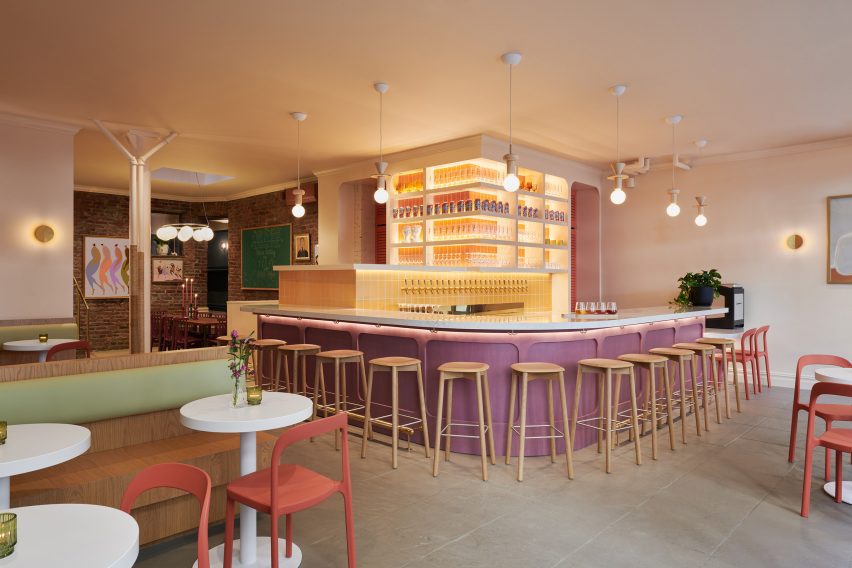
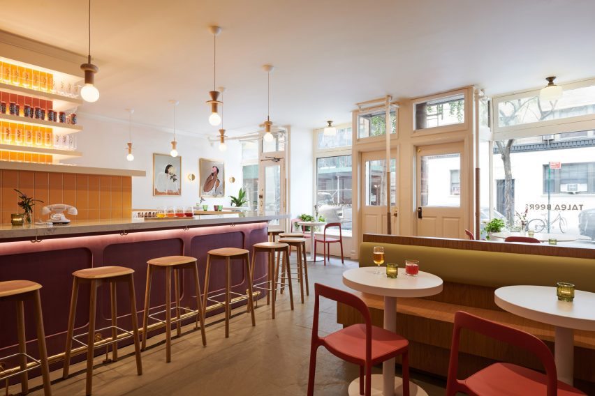
Bar area with stools surrounding a purple-fronted counterBar area with stools surrounding a purple-fronted counter
The main dining and drinking area at the Talea West Village taproom is anchored by a colourful bar

The space is located in a 1920s building on Christopher Street, an iconic thoroughfare that’s home to several landmarks, businesses and historic spaces associated with the LGBTQ+ rights movement.

“This new taproom on Christopher Street reclaims the masculine identity of a West Village saloon to celebrate voices of women and LGBTQ+ communities in the Village, all while serving Talea’s popular sour brews in an elevated, vibrant space,” said Alda Ly Architecture (ALA).

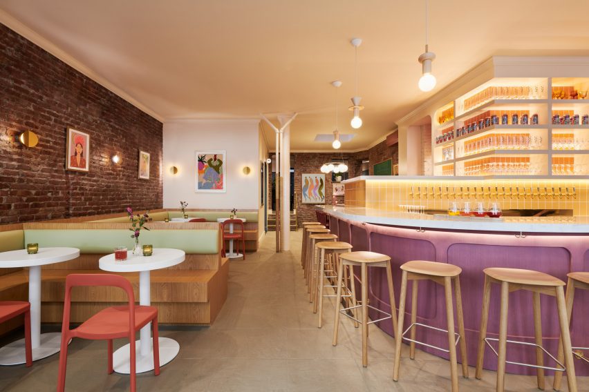
Bar with built-in seating on the left and counter on the rightBar with built-in seating on the left and counter on the right
Bright hues chosen by ALA for the space include yellow for tiles, green seat backs and red dining chairs

Flooded with natural light thanks to large windows along the street facade, the main space is anchored by a purple-fronted bar with a curved white quartz countertop in one corner.

Behind, numerous beer taps are mounted onto a yellow-tiled partition, while glassware and cans are displayed on shelves above.

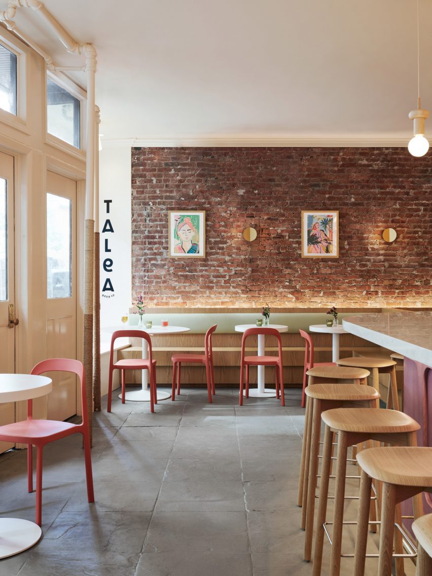
View towards an exposed brick wall with seating in frontView towards an exposed brick wall with seating in front
Exposed brick and stone floors allude to a saloon-style aesthetic

The bar is lit by Junit oak pendants from Schneid Studio and brass Dottie sconces by Visual Comfort are mounted around the perimeter.

“We opened up the space to provide as much open area for the front dining room, and brought the bar front and centre to highlight the taps with their extensive selection of beers,” said ALA founder Alda Ly.

Dining area and bar counter with street windows behindDining area and bar counter with street windows behind
The taproom was designed to celebrate its location in the West Village, which has played an important role in LGBTQ+ history

“We wanted the bar to be a welcoming beacon for all people in the neighborhood,” she added.

The other side features built-in, stained-oak seating and small circular tables against an exposed brick wall.

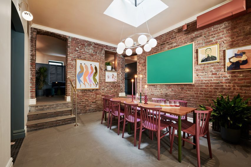
Brick-wrapped room with a skylight over a large tableBrick-wrapped room with a skylight over a large table
Behind the bar is The Revolution Room, intended for larger groups to gather

Pale green backrests and muted red Scroll dining chairs from Industry West continue the interior’s bright colour palette, which is also echoed in the works by local artists displayed on the walls.

“It was important to us to capture the spirit of Talea in a space that felt elevated but also very warm and welcoming,” said ALA project director Marissa Feddema.

Past the bar is a more intimate space called The Revolution Room, designed for groups of eight to 10 people to “scheme, hang and gather” according to the team.

A large table sits below a Nuura Miira 8 Oval chandelier that’s suspended from a skylight, and more brickwork is exposed to add to the saloon-like vibe.

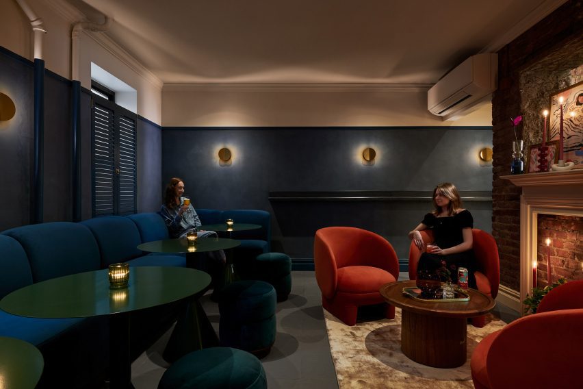
Dimly lit room with dark walls and colourful furnitureDimly lit room with dark walls and colourful furniture
At the back is the Snug, a cosy space furnished with jewel-tone pieces

Further back still, patrons will find the Snug – a much darker and cosier room decorated with jewel-toned furniture, navy limewash painted walls and a vintage fireplace mantle.

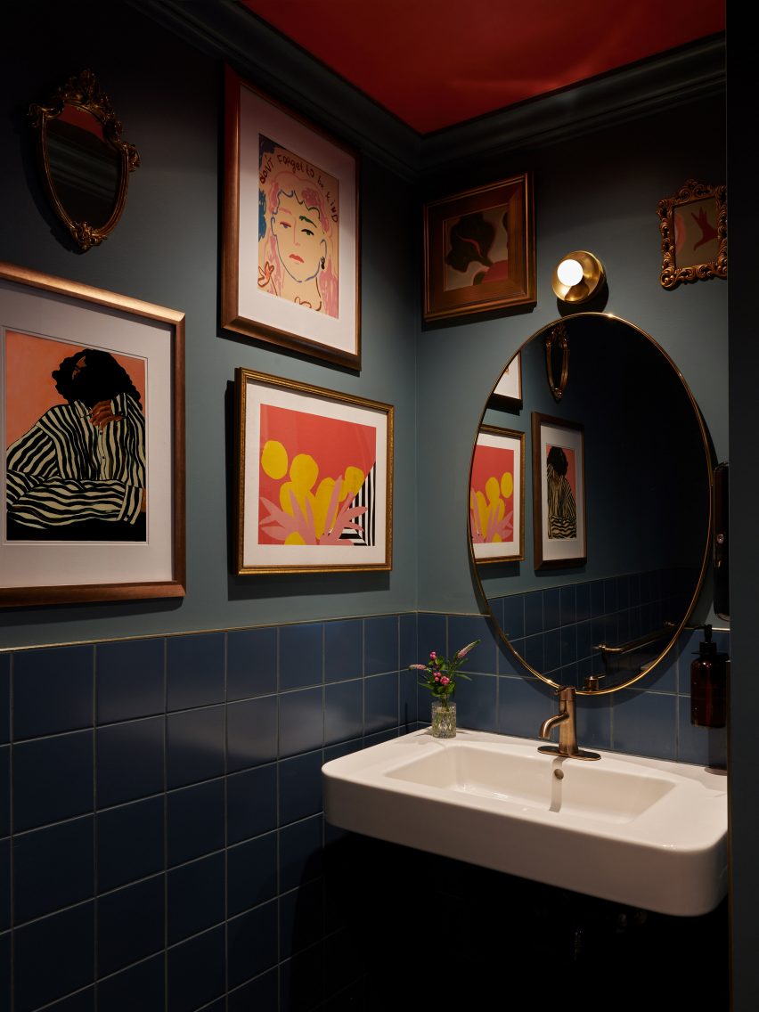
The moody bathrooms are adorned with images of prominent local residents and gender activists through the years, further emphasising the neighbourhood’s importance to the LGBTQ+ community.

Bathroom with dark blue tiles, paintings on the walls and an oval mirror above a sinkBathroom with dark blue tiles, paintings on the walls and an oval mirror above a sink
Images of prominent local residents and gender activists are displayed in the moody bathrooms

The West Village is packed with bars and restaurants, from upscale dining spots like Cecchi’s to casual cocktail places like Donna.

Close by, in the Union Square area, ALA has previously designed the interior for a doctor’s office and clinic with earthy and homey details.

The photography is by Brooke Holm.


Project credits:

Architect and interior designer: ALA (Alda Ly, Marissa Feddema, Sheridan Treadwell, Marlee Anderson)
MEP engineer: Tan Engineering
General contractor: Aerial Design & Build

Reference

Standard Architecture refreshes interior of pink Paul Smith store in LA
CategoriesInterior Design

Standard Architecture refreshes interior of pink Paul Smith store in LA

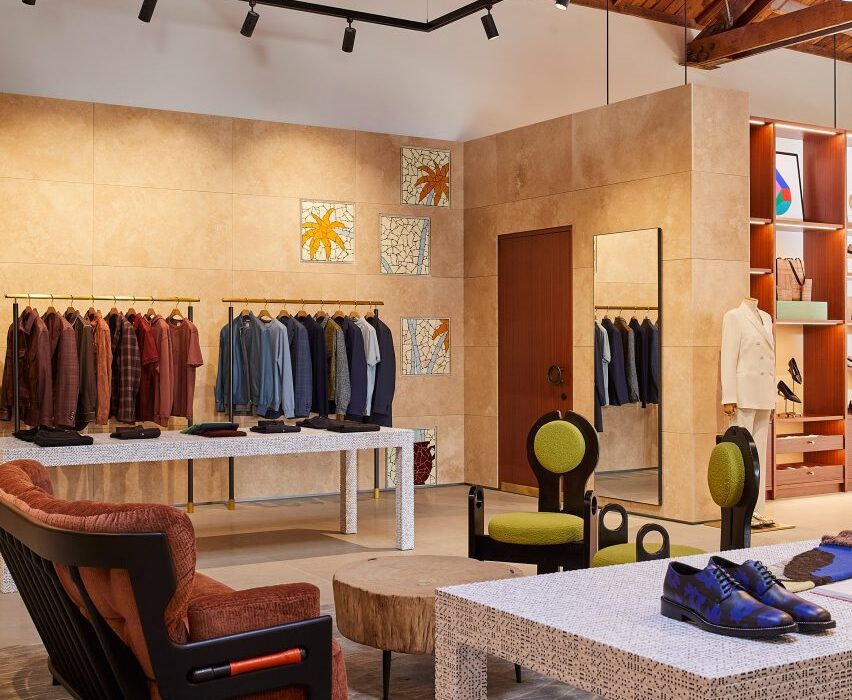
British fashion label Paul Smith’s iconic pink store in Los Angeles has received an interior makeover from Standard Architecture.

Standard Architecture collaborated with the Paul Smith design team to reimagine the 4,740-square-foot (440 square metres) store on Melrose Avenue, West Hollywood.

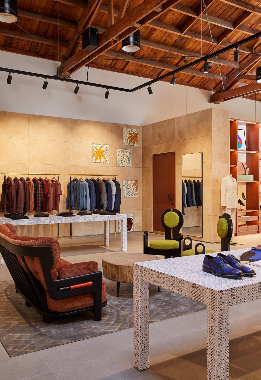
Paul Smith LA store interior is stone-clad partitions and exposed raftersPaul Smith LA store interior is stone-clad partitions and exposed rafters
Standard Architecture and the Paul Smith team reorganised the LA store to better define the brand’s different collections

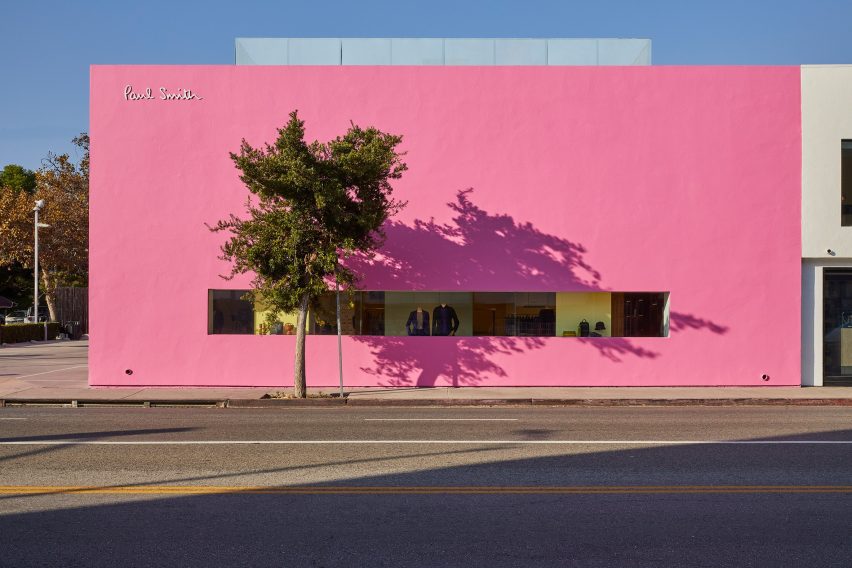
The studios also created a new VIP entrance patio for the building, which is notorious for its bright pink exterior that has become a pilgrimage spot for amateur photoshoots.

“The primary goal was to enhance the overall customer experience within the store, which was achieved by creating a more cohesive and immersive shopping environment across the different brand departments,” said Standard Architecture.

Seating area with clothing displays on either sideSeating area with clothing displays on either side
Stone-clad partitions help to define areas, but don’t reach the exposed timber ceiling

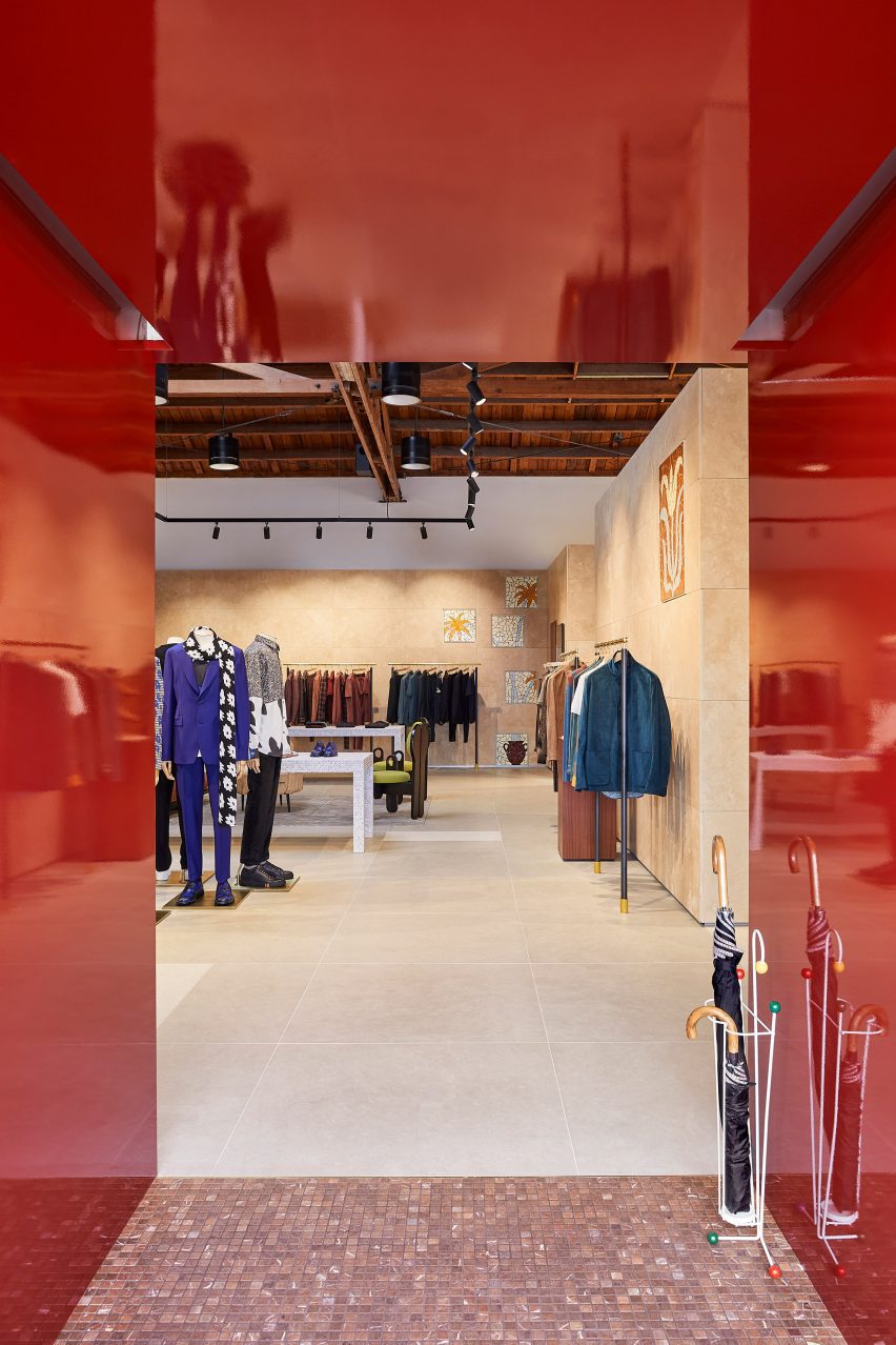
The entrance to the store – the only opening in the giant pink wall that faces the parking lot – leads shoppers through a glossy red metal vestibule into the main retail space.

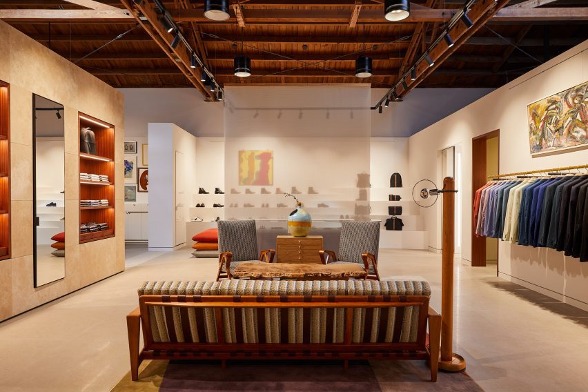
Clearly defined yet interconnected areas for the menswear, womenswear and homeware collections help with navigation around the store.

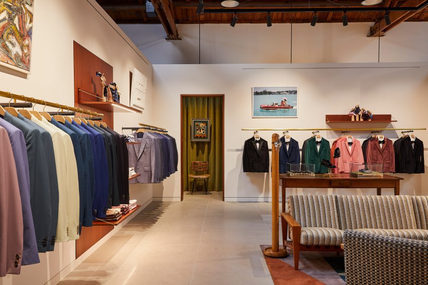
Suits displayed in colour order on long brass railsSuits displayed in colour order on long brass rails
Long brass rails are used to present tailoring

Partitions clad in dappled beige stone frame these zones, but don’t reach the exposed timber ceiling, to retain the sense of openness.

In places, the stone walls are inlaid with mosaic-style artworks depicting abstract flora, which add splashes of colour to the warm-toned surfaces.

Paul Smith homeware collaborations displayed in a corner of the storePaul Smith homeware collaborations displayed in a corner of the store
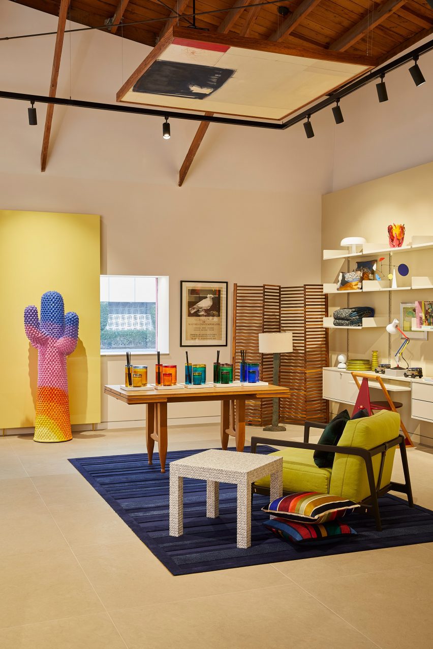
Paul Smith’s collaborations with Gufram and Anglepoise are among the pieces on show

Black track lighting is suspended from the rafters, spotlighting the various clothing displays and lounge areas furnished with midcentury-style sofas and armchairs that are dotted around the store.

Long brass rails that appear to be suspended in midair are used to display suit jackets, which are carefully arranged by colour.

Shoes presented on stepped white ledges that resemble bleacher seatingShoes presented on stepped white ledges that resemble bleacher seating
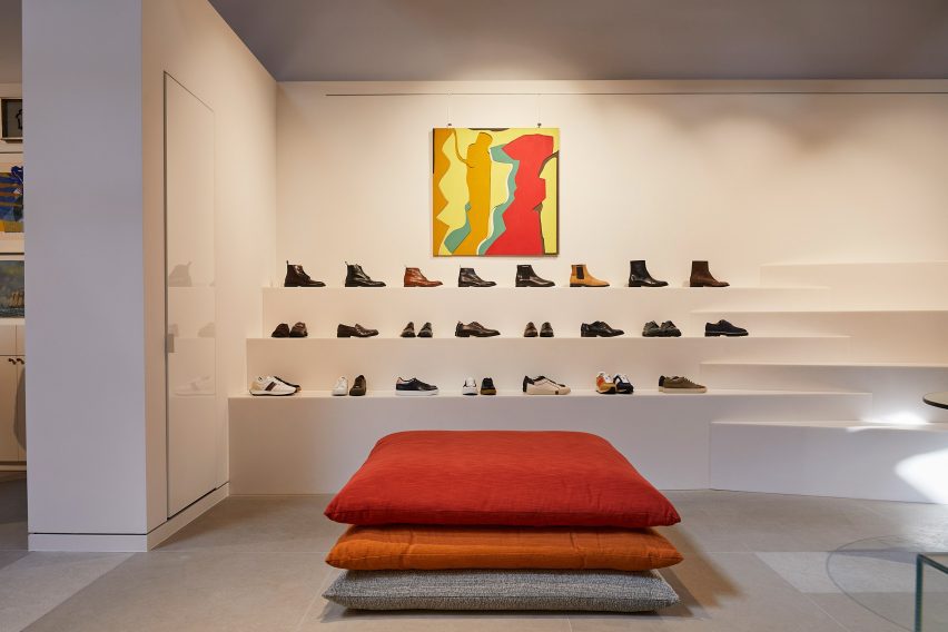
Shoes are presented on stepped white ledges that resemble bleacher seating

In an area dedicated to accessories, the shoes and bags are lined up on stepped white ledges that resemble bleacher seating.

Walnut is used for accents including shelving, door frames, and podiums, as well as for a large open storage system with compartments for presenting individual products and a row of sculptures by Alexander Calder.

Founded by fashion designer Paul Smith in 1970, his eponymous brand is synonymous with the brightly coloured stripes applied to many of its apparel products and other collaborations.

Many of these appear throughout the store, including a colour-tinted Anglepoise desk lamp and a striped version of Gufram’s cactus-shaped coat stand.

Glossy red metal vestibule with store interior beyondGlossy red metal vestibule with store interior beyond
Entry to the store is via a vestibule wrapped in glossy red metal

“Overall, the design reflects a deep understanding of the brand’s identity, which places a strong emphasis on the use of colour and attention to detail,” Standard Architecture said.

Paul Smith retail spaces around the world are equally playful. On London’s Albemarle Street, its boutique has a patterned cast-iron facade by 6a Architects, while the shop in Seoul is encased in a curving concrete shell by System Lab.

Bright pink exterior of Paul Smith store on Melrose AvenueBright pink exterior of Paul Smith store on Melrose Avenue
The store on Melrose Avenue is an icon in Los Angeles thanks to its bright pink facades

Standard Architecture was founded by Silvia Kuhle and Jeffrey Allsbrook, who discussed their work with Dezeen during our Virtual Design Festival in 2020.

Past projects by the firm include a Hollywood Hills residence with a cantilevered swimming pool and a minimal showroom for fashion brand Helmut Lang – which was located just a few blocks from the Paul Smith store before it shuttered.

The photography is by Genevieve Garruppo.


Reference

UNStudio unveils Huawei flagship store with “petal-like” facade
CategoriesInterior Design

UNStudio unveils Huawei flagship store with “petal-like” facade

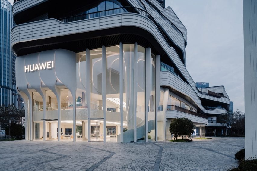
Dutch firm UNStudio has revealed a two-storey flagship store for Chinese technology company Huawei in Shanghai with a facade clad in ivory-coloured petal-like forms.

Drawing from Huawei’s global operating system, named Harmony, UNStudio‘s design aimed to generate biophilic associations between the brand and its technology by integrating organic geometric shapes throughout the scheme.

Facade of UNStudio Huawei flagship store in ShanghaiFacade of UNStudio Huawei flagship store in Shanghai
UNStudio has completed the Huawei flagship store in Shanghai with a petal-like facade

“Among the many interfaces found in retail nowadays, the flagship store we have created for Huawei in Shanghai is one that blends interactive experiences, technology and community creation,” UNStudio founder and principal Ben van Berkel said.

“The new store reimagines modern retail spaces as inviting environments that promote a sense of community and provide a contemporary venue for consumers and visitors to meet, share and innovate,” he continued.

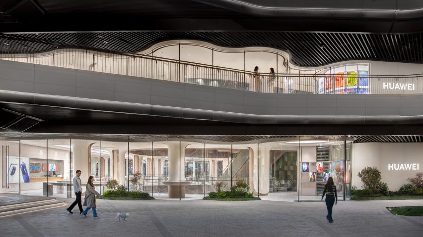
Southern facade of UNStudio Huawei flagship store in ShanghaiSouthern facade of UNStudio Huawei flagship store in Shanghai
The store’s southern facade integrates undulating floor-to-ceiling glazing. Image courtesy of Huawei

The store’s double-height frontage is defined by a series of overlapping elements that the studio described as “petal-like”, which fold together to form a raised band across the facade glazing.

Each ivory-coloured ‘petal’ weaves down to meet the ground as ‘stems’, configured to hide the structural mullions between glass panels and create the sense of a frameless facade.

Soft lighting was also integrated between the petal edges to illuminate the store’s exterior at night.

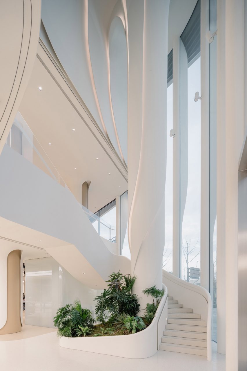
Internal tree column in UNStudio Huawei flagship store in ShanghaiInternal tree column in UNStudio Huawei flagship store in Shanghai
A spiralling column was positioned as a visual marker within the central atrium

Positioned directly behind the facade, a spiralling column named the Tree of Harmony continues the organic geometries internally.

The column was positioned to the side of the central atrium as a focal point for visitors and is wrapped by stairs that lead to the upper mezzanine floor.

To further the store’s biophilic character, the southern facade was finished with undulating glazing and seating that folds around the building’s curves.

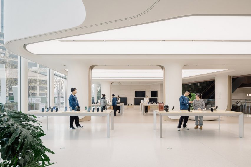
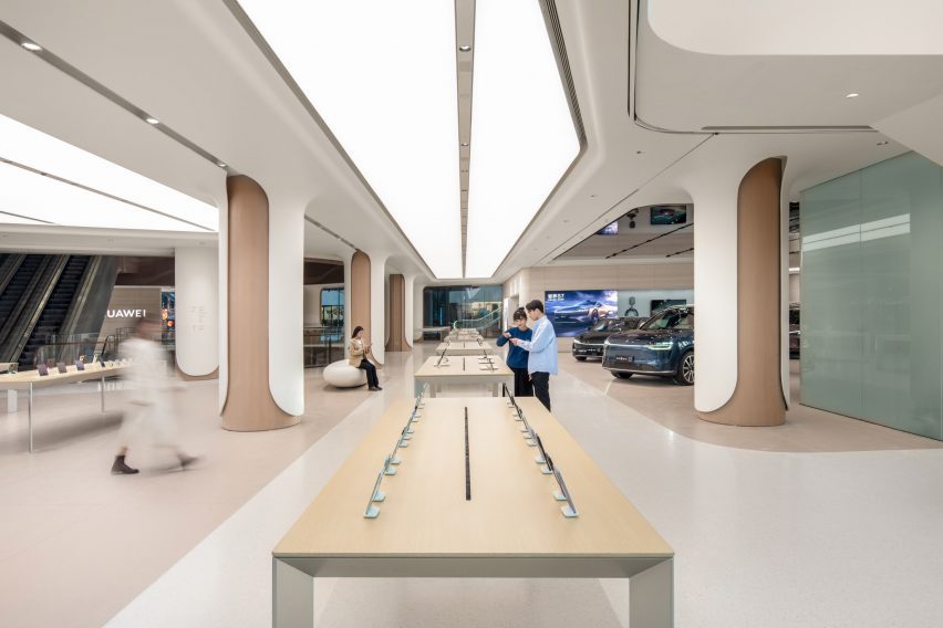
Display zones in UNStudio Huawei flagship store in ShanghaiDisplay zones in UNStudio Huawei flagship store in Shanghai
The studio used neutral and clean internal finishes to complement the ivory-coloured store frontage

Internal finishes were kept warm and neutral to match the facade’s clean tones and extensive white overhead lighting.

The studio used wood and glassfibre-reinforced cement for the store’s ceilings, floor and columns, while product tables and furniture were also made from wood and natural-toned materials to add to the organic feel of the space.

According to UNStudio, the store integrates high-performance materials and prefabricated, detachable finishes to increase the building’s longevity, while the quality of the air inside the store is monitored by climate control technology.

“Huawei TKL flagship store re-crafts Huawei’s innovative technology into a design aesthetic,” UNStudio partner Hannes Pfau said.

“It seamlessly creates a unified facade and interior narrative, while using high-performance, certified and recycled materials.”

Display zones in UNStudio Huawei flagship store in ShanghaiDisplay zones in UNStudio Huawei flagship store in Shanghai
A central product display avenue spans the length of the store

The store has a central product display avenue that spans the length of the ground floor, with two further experiential zones interspersed for increased user interaction.

A Signature Experience zone will host featured events and exhibits, while the Consumer Full Scenario Experience zone lets visitors use and test Huawei products.

Undulating glazed facade in UNStudio Huawei flagship store in ShanghaiUndulating glazed facade in UNStudio Huawei flagship store in Shanghai
Undulating floor-to-ceiling glazing was used for the store’s southern facade

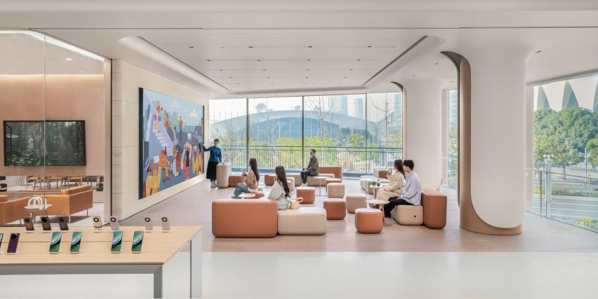
Both floors were designed with open and flexible spaces in which the store can host lectures, activities and classes.

To complete the store’s functional offerings, UNStudio also created a minimalist interior cafe to blend with the rest of the store for customers awaiting after-sale services.

Open gathering spaces in UNStudio Huawei flagship store in ShanghaiOpen gathering spaces in UNStudio Huawei flagship store in Shanghai
The store hosts flexible spaces to be used by the community

UNStudio was founded in Amsterdam in 1998 by Van Berkel and Caroline Bos.

The studio has also recently completed the Booking.com headquarters in Amsterdam and the YG Entertainment headquarters in Seoul featuring metallic surfaces and geometric forms.

The photography is by Wen Studio unless otherwise stated

Reference