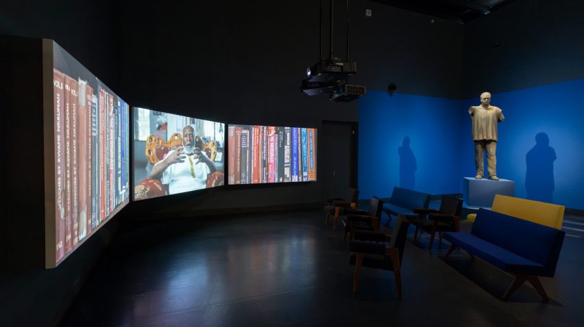
Schemata Architects embraces rough material finishes for gallery in Seoul
CategoriesArchitecture

Schemata Architects embraces rough material finishes for gallery in Seoul

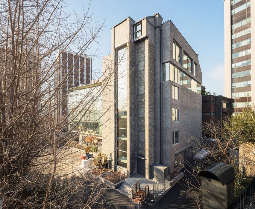
The rough finishes of an existing concrete and brick structure are contrasted by white exhibition spaces at Arario Gallery in Seoul, completed by Japanese studio Schemata Architects.

The gallery is located at the rear of the Space Group Building, a modernist icon in South Korea that houses the Arario Museum.

Designed by architect Kim Swoo-geun, the grey-brick, heritage-listed building was completed in the 1970s and converted into the museum in 2014.
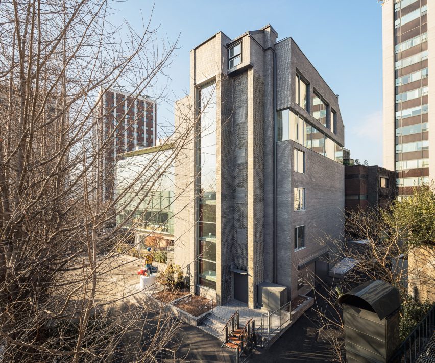
Exterior of the Arario Gallery in Seoul by Schemata ArchitectsExterior of the Arario Gallery in Seoul by Schemata Architects
Arario Gallery sits alongside the grey-brick Space Group Building

Alongside this building is a glazed extension from the 1990s by architect Jang Se-yang, a student of Swoo-geun, as well as a traditional South Korean home, or hanok, which was relocated to the site when it reopened in 2014.

Amid this architectural backdrop is a brick and concrete structure added to the site in the 1980s, which Schemata Architects was tasked with converting into the Arario Gallery.

“It was a great challenge for me, a Japanese architect, to work on the third building – excluding the hanok – especially after seeing the perfect contrast between the two buildings already created by the master and the disciple,” said Schemata Architects Principal Jo Nagasaka.
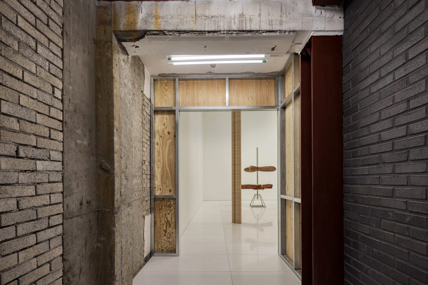
Interior of the Arario Gallery in Seoul by Schemata ArchitectsInterior of the Arario Gallery in Seoul by Schemata Architects
The gallery spaces are contained in white rooms

Looking to create a space that “looks unchanged on the outside”, the studio retained the building’s structural frame and dark brickwork, originally chosen to complement the Space Group Building.

“In this context, we thought that inserting another unique feature into the landscape would not be appropriate,” explained Nagasaka.
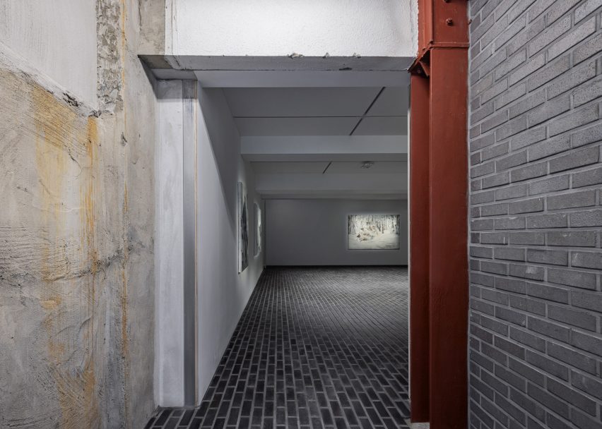
White gallery interior with grey brick floorsWhite gallery interior with grey brick floors
Brickwork extends across the floor of the basement

Organised across four floors and a basement level, the white-walled gallery spaces sit alongside the existing staircase, lift, service and storage areas, where the structure’s rough material finishes have been left exposed.

In these more industrial-feeling spaces, walls have been made using plywood on metal frames. Teamed with metal doors and white metal balustrades, they deliberately stand out against the “skeleton” of the existing building.

In the basement, the dark grey brickwork of the adjacent museum is mirrored in a brick floor that extends throughout the space.

On the third floor, sections of the exterior wall were removed to create a full-height glass wall in the VIP area. This looks out towards the nearby Changdeokgung Palace and a surrounding park, also visible through windows in the stairwell.
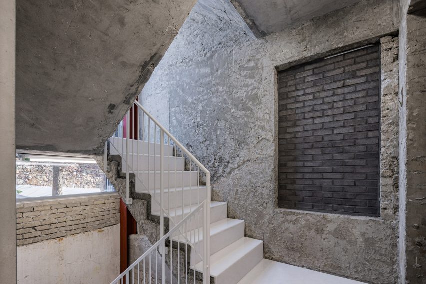
Concrete stairwell with white stairsConcrete stairwell with white stairs
White metal accents highlight new additions to the Arario Gallery

“In this way, we established repetitive patterns where visitors would emerge from the white cube into a skeleton space and see the palace beyond as they ascend to the upper floors,” said Nagasaka.
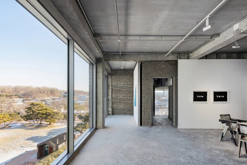
Lounge area in Seoul by Schemata ArchitectsLounge area in Seoul by Schemata Architects
Large windows in the Arario Gallery overlook Changdeokgung Palace

Schemata Architects is a Tokyo-based studio, Founded in 1998 by Nagasaka after he graduated from Tokyo University of the Arts.

Its previous projects include a public bathhouse in Tokyo finished with turquoise tiles and a hillside guesthouse and bar for a home on the coast of an island in the Seto Inland Sea.

The photography is by Yongjoon Choi.


Reference

Bruno Mars and Yabu Pushelberg design cocktail lounge in Las Vegas
CategoriesInterior Design

Bruno Mars and Yabu Pushelberg design cocktail lounge in Las Vegas

Musician Bruno Mars and design studio Yabu Pushelberg have teamed up to create the interiors of a cocktail lounge and live music venue at the Bellagio casino in Las Vegas.

Named The Pinky Ring, the 5,000-square-foot (465-square-metre) lounge is accessible directly from the casino floor, but designed as an entirely separate experience away from the bright lights, bustle and noise.

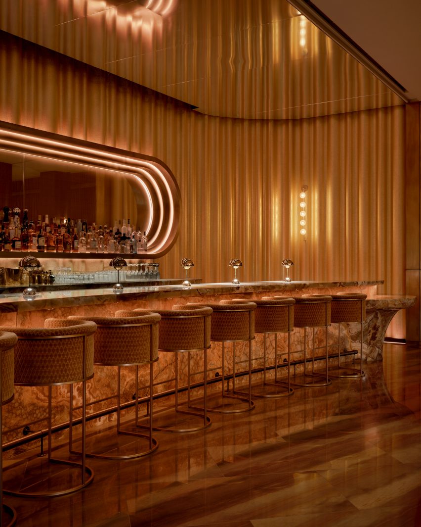
Bar at The Pinky Ring surrounded by golden drapesBar at The Pinky Ring surrounded by golden drapes
The stone bar at The Pinky Ring is surrounded by golden drapes that are reflected in the mirrored ceiling

Grammy Award-winning artist Mars collaborated with Canadian studio Yabu Pushelberg to craft an elevated and luxurious space within the Bellagio Resort and Casino.

The bar serves a curated collection of cocktails and hosts live entertainment by top musicians and DJs – though no phones are allowed inside.

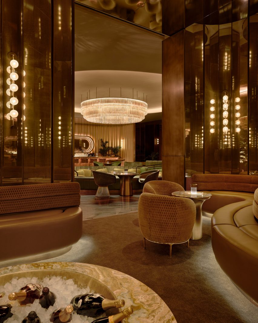
View from VIP area at The Pinky RingView from VIP area at The Pinky Ring
A huge crystal chandelier hangs in the centre of the lounge and is visible from all corners

The entry sequence begins with a dimly lit mirrored passageway, where Mars’ collection of Grammy trophies is displayed.

“Inspired by contemporary museum design, the corridor was designed as a soothing and discreet exhibition space where guests can cleanse their visual palette from the outside world and begin to submerge into The Pinky Ring,” said the design team.

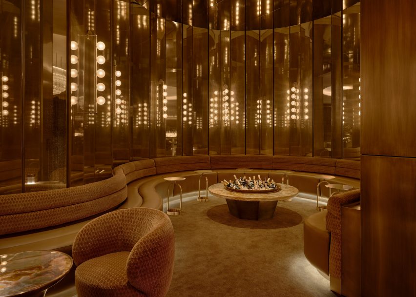
VIP area lined with faceted mirrored panelsVIP area lined with faceted mirrored panels
A VIP area is lined with faceted mirrored panels that create infinite reflections

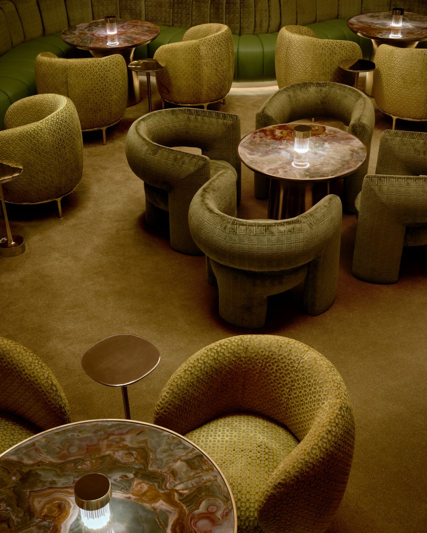
Guests arrive at the main bar and lounge in front of a sunken conversation pit, wrapped with a wavy banquette and furnished with soft armchairs gathered around a series of small tables.

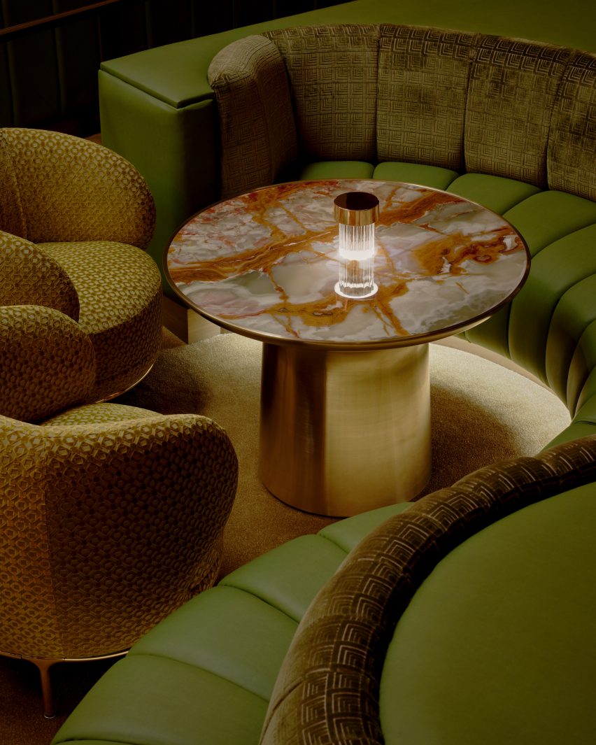
The carpet, the leather and the velvet chair upholstery are shades of green – colours also found in the richly veined stone tabletops.

Seating area in a niche featuring dark wood-veneer panelsSeating area in a niche featuring dark wood-veneer panels
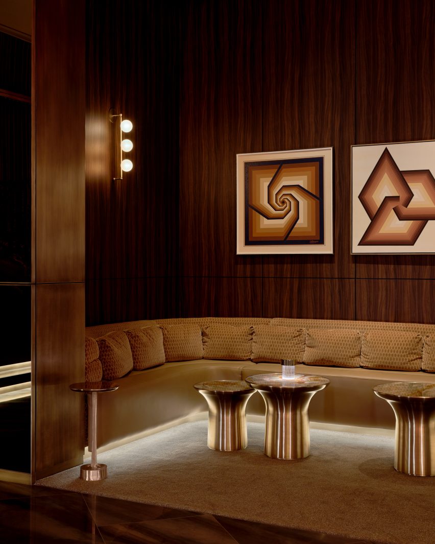
Other niches with additional seating feature dark wood-veneer panels

A giant halo-like chandelier with tiers of glowing crystal hangs from the ceiling above, providing a central focal point that can be seen from every corner.

At the rear of the space is a gently curved, dramatically patterned stone bar, topped with a row of metallic Flowerpot lamps by Verner Panton.

Conversation pit with carpet, chairs and banquettes in various shades of greenConversation pit with carpet, chairs and banquettes in various shades of green
In the central conversation pit, various shades of green were chosen for the carpet, chairs and banquettes

The back bar is housed within an elongated pill-shaped, mirrored recess, which displays a wide range of liquor bottles and is ringed with stepped cove lights.

Golden drapes run floor to ceiling across the back wall and are reflected in more mirrors on the ceiling.

Seats and banquette surrounding a table with a richly veined stone topSeats and banquette surrounding a table with a richly veined stone top
The green hues of the seating are echoed in the richly veined stone tabletops

Off the main lounge are various niches and VIP areas that offer additional seating, some lined with dark wood-veneer panels.

“See or be seen, each area is composed of its own suave and purpose that echoes into the next,” said the team.

One organically shaped space is lined with faceted, smokey mirrored panels that create infinite reflections, and features a banquette that wraps around a large table fitted with a giant ice bucket for chilling drinks.

An important factor in the design was the lighting, which comprises under-seat and ceiling coves, along with wall lights with five globe-shaped diffusers attached to vertical brass rods.

Patterned crushed velvet and leather banquettePatterned crushed velvet and leather banquette
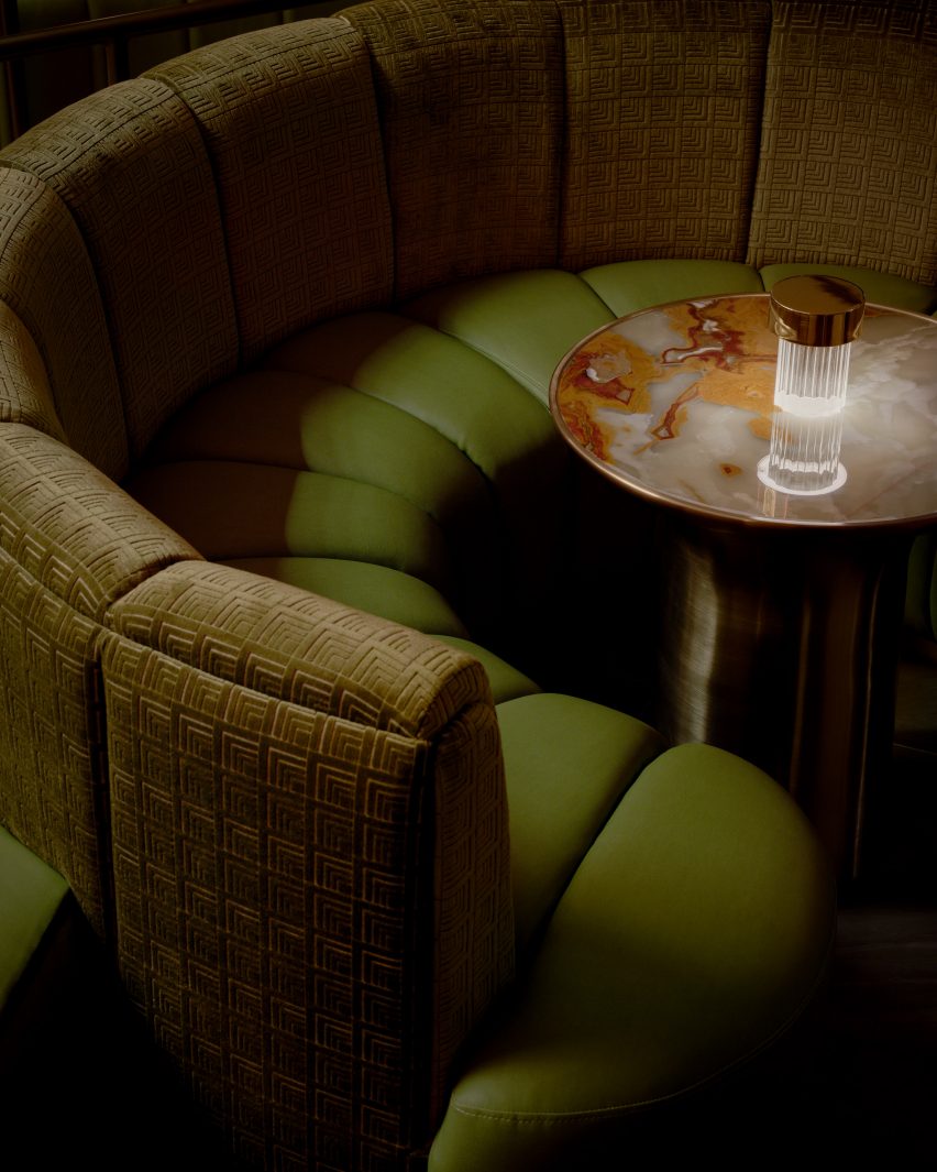
Patterned crushed velvet covers the curved banquette back, while the seat is wrapped in leather

“In the pursuit of perpetual allure, where lighting not only transforms spaces, but perceptions, The Pinky Ring unveils a strategic lighting innovation, schemed to make people look and feel their best,” the team said.

“Through a strategic interplay of low-level, contrast, and accent lighting, The Pinky Ring lighting design unveils the unseen.”

Mars joins a long line of famous musicians to open entertainment venues. Among others is singer Justin Timberlake, who put his name behind an AvroKO-designed Nashville dining and drinking destination in 2021.

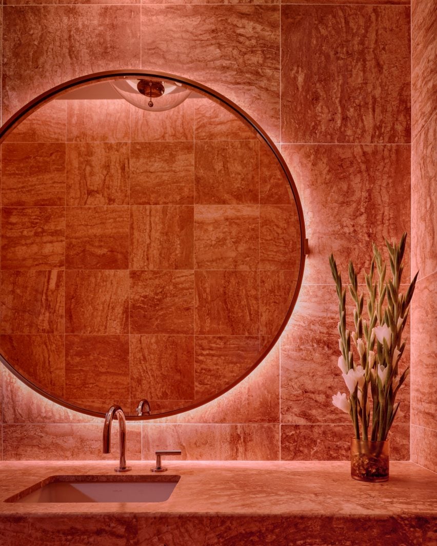
Bathroom with a large circular mirror and walls lined in pink-red stone tilesBathroom with a large circular mirror and walls lined in pink-red stone tiles
Pink-red stone tiles across the bathroom walls nod to the lounge’s name

Yabu Pushelberg was founded by George Yabu and Glenn Pushelberg in 1980, and the studio has designed some of the most recognisable hospitality interiors over the past four decades.

Shortlisted for Dezeen Awards 2021 design studio of the year and judges for the program in 2023, Yabu Pushelberg’s recent projects include the Moxy and AC Hotel in Downtown Los Angeles – of several they’ve completed for the Moxy brand – and The Londoner hotel on Leicester Square in the UK capital.

The photography is by Sean Davidson.

Reference

FranklinTill lists nine principles for a shift to regenerative materials
CategoriesSustainable News

FranklinTill lists nine principles for a shift to regenerative materials

Design research agency FranklinTill has compiled a list of principles to help designers, makers and brands avoid greenwashing when sourcing textiles.

By making it easier to identify textiles that have a greater positive impact on people and planet, FranklinTill hopes to enable a shift towards regenerative materials.

“We can only move towards a regenerative approach to textiles by understanding the full lifecycle of our materials,” said co-founder FranklinTill Caroline Till.

“As designers, makers, brands and manufacturers, we need to think of materials not as static and linear, but as dynamic, evolving systems, to holistically consider the full impact to the wider ecosystem they are a part of.”

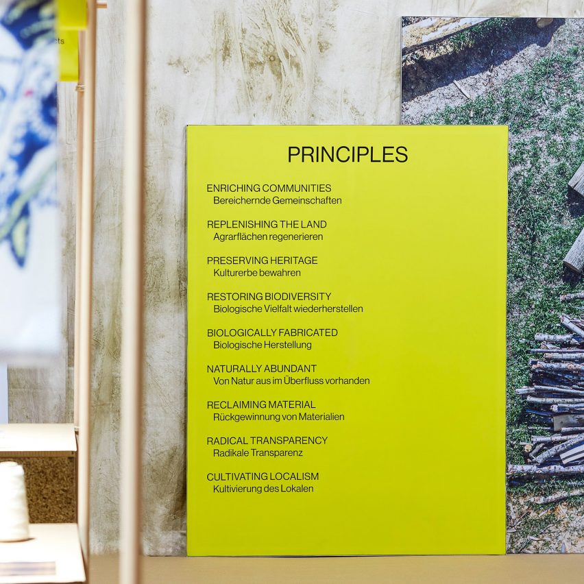
Regenerative exhibition by FranklinTillRegenerative exhibition by FranklinTill
FranklinTill has curated an exhibition setting out its nine principles

The defining characteristic of regenerative materials, according to Till, is that they restore and nourish the ecosystems they are part of.

“Sustainability, by its very definition, is all about maintaining the status quo, while regeneration seeks to actively heal and put back better,” she said.

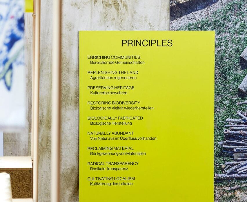
FranklinTill first unveiled its nine principles of regenerative design in an exhibition at the Heimtextil trade fair in Frankfurt in January, with a second show planned for the Techtextil fair in April.

In an online exclusive, we are also unveiling them here. Read on to see all nine, with captions written by FranklinTill and examples of material innovation in practice:


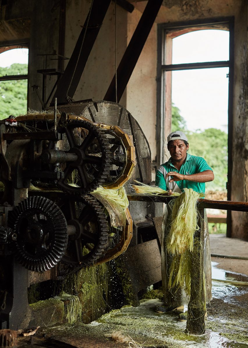
Agave textile production in MexicoAgave textile production in Mexico
Designer Fernando Laposse works with local communities in Mexico to process sisal, a fibrous material made from agave leaves, which he turns into hairy furniture

Enriching Communities

“To go beyond sustainability and become regenerative, we must focus on both the social and the environmental impact of production.”

“This means spotlighting how materials are made and by whom, looking to improve livelihoods with better pay, working conditions and future prospects.”


Bulrush plants used for BioPuff materialBulrush plants used for BioPuff material
British manufacturer Ponda produces BioPuff, an insulating fibre filler material, using bulrush plants grown on natural wetlands

Replenishing the Land

“Focused on high yields with an over-reliance on pesticides and water, modern industrial farming damages land.”

“Regenerative farming works holistically to reverse this, rebuilding organic soil matter and sequestering carbon in soil, wetlands and trees, retaining water and reducing the use of artificial pesticides and fertilisers.”


Yak khullu wool is made by nomad families on the Tibetan PlateauYak khullu wool is made by nomad families on the Tibetan Plateau
Lifestyle brand Norlha creates apparel and homewares from yak khullu wool, which is handcrafted by nomad families on the Tibetan Plateau

Preserving Heritage

“Many indigenous practices are regenerative by nature, working with the land and local communities.”

“By acknowledging and celebrating the value of cultural heritage and craftsmanship and learning from its ecological wisdom, we can protect valuable skills and knowledge from being lost to technology and globalisation.”


Textiles made from sunflowersTextiles made from sunflowers
British textile brand Climafibre produces fabrics from sunflowers, a species that can be grown with minimal intervention, fertilisers or watering

Restoring Biodiversity

“Regenerative practices must take a multispecies approach to encouraging biodiversity.”

“Acknowledging the threat of extinction, addressing the causes of loss, and reviving habitats for diverse plants and wildlife aids ecological restoration.”


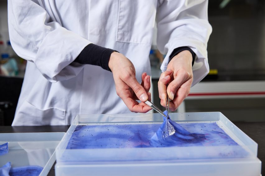
Charlotte Werth has developed a printing process that uses bacteria to create pigmentsCharlotte Werth has developed a printing process that uses bacteria to create pigments
Designer Charlotte Werth has developed a fabric printing process that uses bacteria to create pigments

Biological Fabrication

“The convergence of science and design offers huge potential for new materials, from living microbial systems to synthesising nature’s regenerative powers.”

“Growing and extracting next-generation materials using innovative, highly productive processes can create plentiful resources from minimal input.”


Keel Labs produces a textile industry yarn from kelpKeel Labs produces a textile industry yarn from kelp
US-based Keel Labs produces Kelsun, a seaweed-based yarn, using an abundant polymer found in kelp

Naturally Abundant

“Highly productive, resilient raw materials that grow with little human intervention offer naturally high yields, strengthen soils and capture carbon.”

“These abundant, versatile crops could help move the focus away from traditional natural material fibres that require high levels of water, pesticides or fertilisers.”


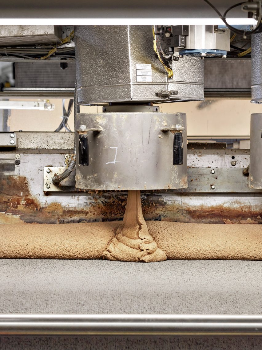
Desso carpet tiles by Tarkett use post-consumer wasteDesso carpet tiles by Tarkett use post-consumer waste
Circularity is built into all of the design and manufacturing processes for Tarkett’s Desso carpet tiles

Reclaiming Material

“Extracting raw materials, making products, then discarding them and their byproducts is contributing to the global waste problem.”

“By putting useful waste streams back into production, we can better utilise existing resources and avoid waste altogether.”


Haelixa creates a distinct DNA code for each supplier, brand, collection or materialHaelixa creates a distinct DNA code for each supplier, brand, collection or material
Haelixa is bringing transparency to material supply chains by applying distinct DNA codes to raw materials, using a customised spraying system

Radical Transparency

“By using science and technology to create tools and processes that capture and record data along supply chains, we can understand the social and environmental impact of the materials we consume.”

“Encrypting materials helps brands track their footprints and life cycles, and communicate this information to customers in a meaningful, trustworthy and accessible way.”


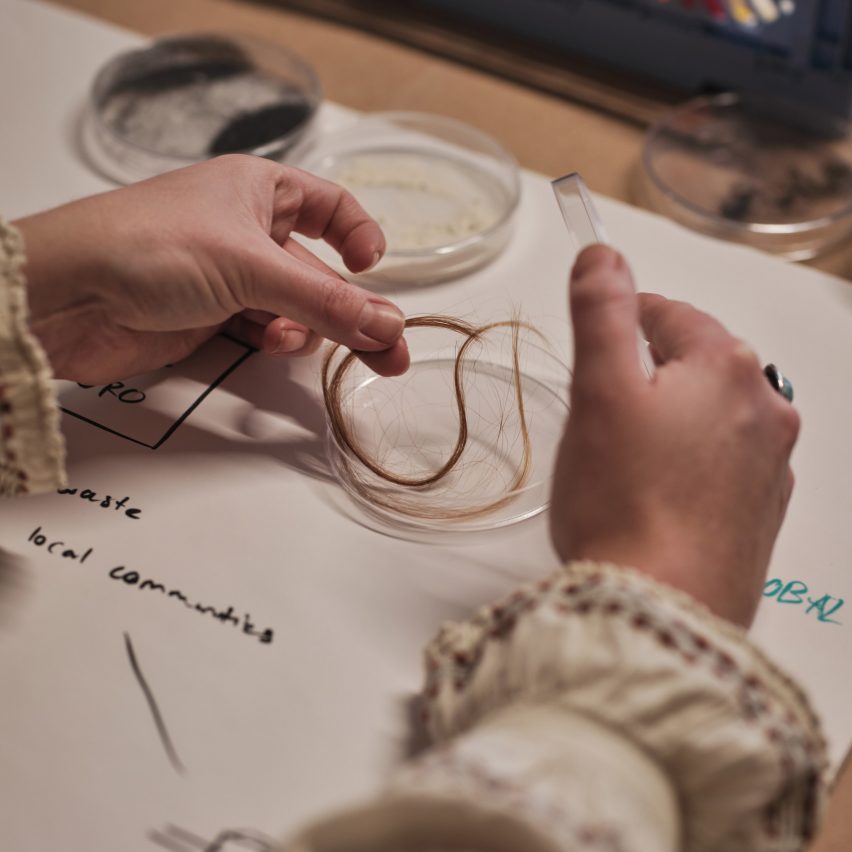
Sanne Visser works with human hairSanne Visser works with human hair
Dutch designer Sanne Visser uses traditional rope-making techniques to turn human hair into handspun yarns

Cultivating Localism

“By supporting the local sourcing, production and consumption of materials, we can avoid globalised transportation and reduce carbon footprints.”

“Focusing on availability, seasonality and resourcefulness means embracing non-standardisation, often improving local environments as well as extracting from them.”

Reference

Cúpla decorates Rixo Marylebone store with hand-painted murals
CategoriesInterior Design

Cúpla decorates Rixo Marylebone store with hand-painted murals

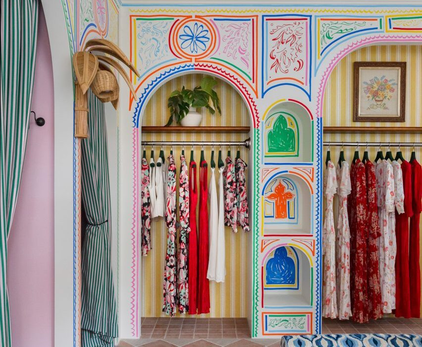
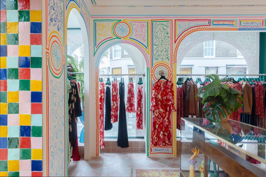
Interior design studio Cúpla has completed a boutique for fashion brand Rixo in central London that features hand-painted illustrations and colourful zellige tiles.

The clothing store on Marylebone High Street was revamped by Cúpla, whose creative director Gemma McCloskey is the twin sister of Rixo co-founder Orlagh McCloskey.

The interior designer had previously designed the brand’s flagship store on the King’s Road and wanted the refurbished Marylebone location to have a similar feel.

Colourful illustrations in Rixo MaryleboneColourful illustrations in Rixo Marylebone
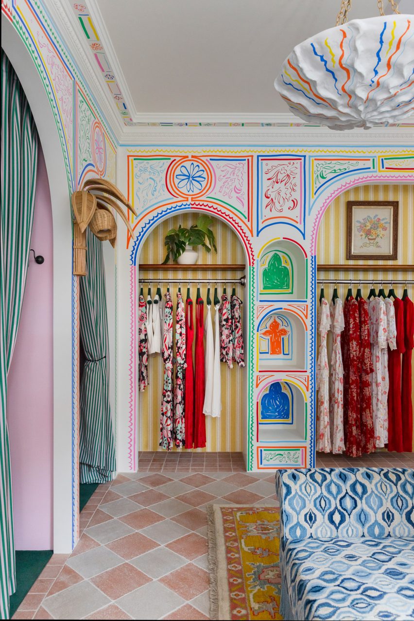
Rixo’s Marylebone store is covered in hand-painted murals

“We wanted the store to embody everything we had previously created for Rixo’s flagship store but within its own right,” Gemma McCloskey told Dezeen.

“A sense of escapism paired with a welcoming warmth within a boutique setting were the key emotions we wanted the customer to feel.”

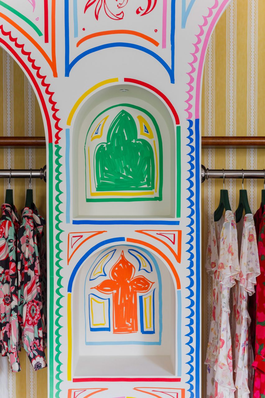
As the brand sells hand-painted prints, the designer wanted the store’s interior to feature illustrations to reflect the style of the clothes.

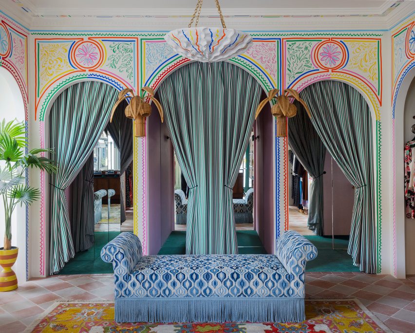
Blue patterned sofa and archways in London fashion storeBlue patterned sofa and archways in London fashion store
It features modified vintage furniture

“Understanding Rixo’s roots and the fact their USP is hand-painted prints, it felt tangible to represent the brand’s values and beginnings with the illustrations,” Gemma McCloskey said.

“Given the space is quite small, we treated it almost like a living room space within a home and felt we could make it all-encompassing and personal.”

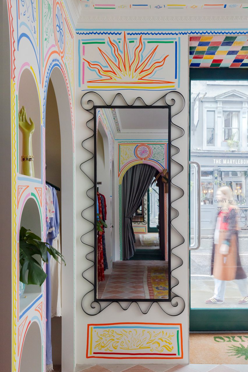
Mirror in London clothing storeMirror in London clothing store
Artist Sam Wood created colourful illustrations for the store

Artist Sam Wood hand-painted murals and illustrations throughout the store, which has a bright and playful colour palette and also features traditional glazed Moroccan zellige tiles.

“We wanted the colour palette to feel really fresh and bright,” the designer explained.

“Although there is an abundance of colours used, every line of the mural or the ‘random’ coloured zellige tile layout was methodically composed to ensure a right balance between the colours was struck.”

The studio added decorative arches and classical mouldings to the store in a nod to the architecture and heritage of its Marylebone neighbourhood.

The store also features bespoke fitting room curtains with pickle-green and flora-pink stripes by fabric brand Colours of Arley.

Zellige tiles in Rixo MaryleboneZellige tiles in Rixo Marylebone
Moroccan zellige tiles add to the playful interior

Cúpla used vintage furniture pieces throughout the store, which sells Rixo’s full collection including ready-to-wear and bridalwear.

“We actually modified existing pieces of vintage furniture, which had been previously sourced by [Rixo founders] Orlagh and Henrietta years ago in the early days of Rixo,” Gemma McCloskey said.

“They were the perfect fit for the space but didn’t have the functionality we required, so we decided to alter these instead or replace them.”

Illustrations at Marylebone storeIllustrations at Marylebone store
The store is located on Marylebone High Street

“It was much more sustainable and because the pieces were from the early years of Rixo, they had sentimental value so we didn’t want to replace them,” she added.

Other recent London stores featured on Dezeen include a Camper store with a giant foot sculpture and a stationery store with a demountable interior.

The photography is courtesy of Rixo.


Reference

Lissoni Architecture creates New York showroom with “melting pot attitude”
CategoriesInterior Design

Lissoni Architecture creates New York showroom with “melting pot attitude”

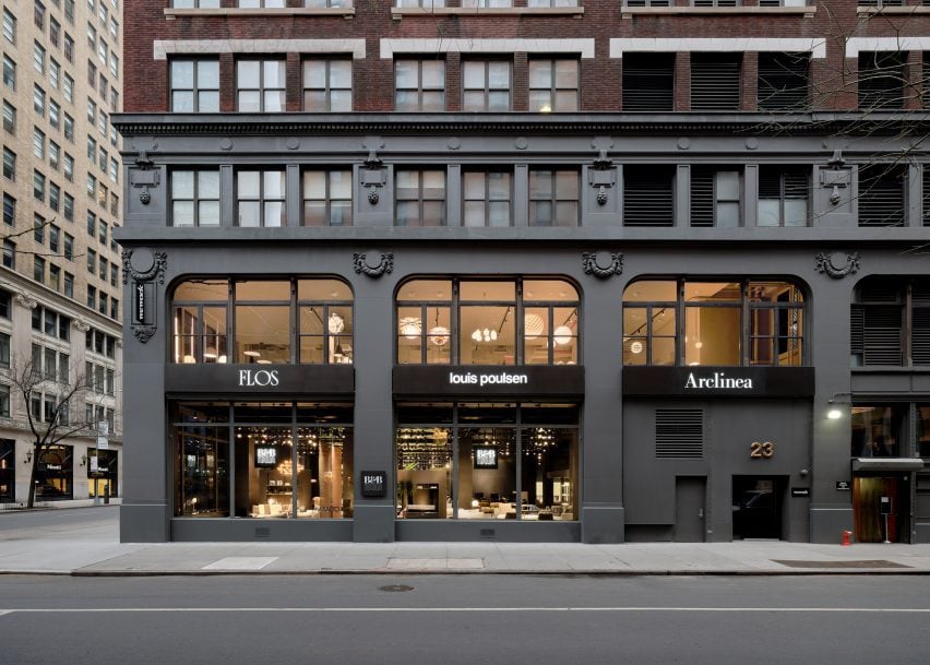
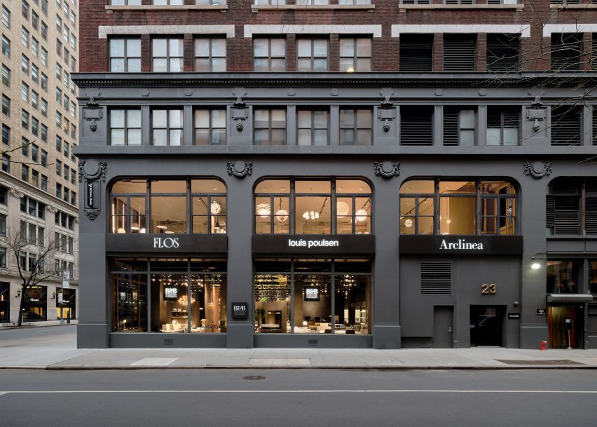
Local studio Lissoni Architecture has expanded the Design Holding flagship in New York City, creating an entirely new floor outfitted with light displays and curving metallic installations.

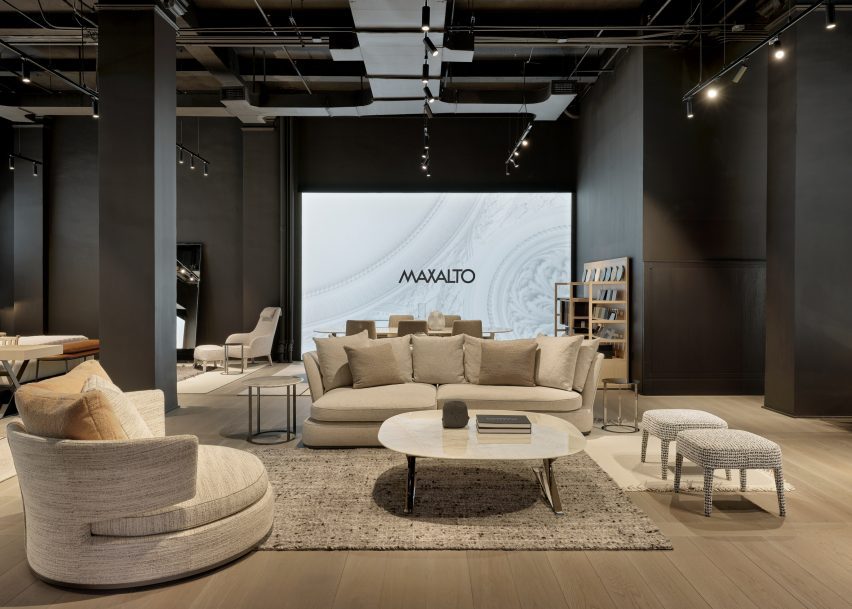
Lissoni Architecture, the US branch of Italian studio Lissoni & Partners, created an entirely new second floor and redesigned a portion of the first floor for the Design Holding showroom, which displays furniture and lighting brands including B&B Italia, Flos, Louis Poulsen, Maxalto, Arclinea and Azucena.

New York building facadeNew York building facade
Lissoni Architecture has created an expansion for the Design Holding showroom in New York

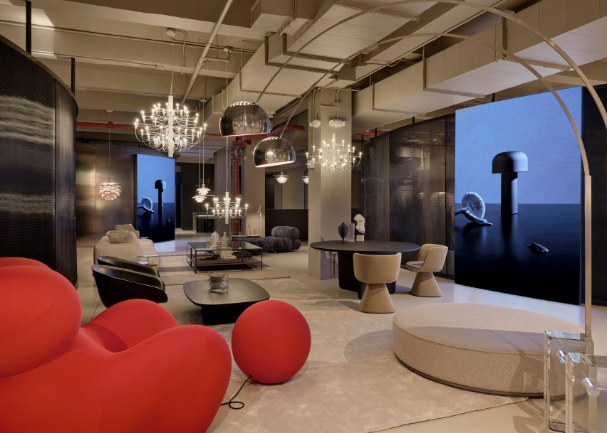
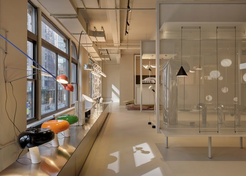
Lighting and design elements from the brands were distributed across the second-floor space, spread out amongst vertical stone-clad panels, transparent, metal showcases, and curving chrome benches and walls.

Each area of the floor was dedicated to a specific brand and the interior architecture was tailored to each brand’s identity, according to the studio.

Red chair in showroomRed chair in showroom
The project encompasses a new second floor and an expansion and redesign of the first

“We wanted to share the melting pot attitude of New York City where everyone and everything can blend together holistically so we went to the essence of the iconic brands,” said Lissoni Architecture founder Piero Lissoni.
“[We highlighted] their DNA and proposed a common ground that could host and enhance the design codes of each identity.”

A wall of lights and windowsA wall of lights and windows
The studio created dedicated areas for brands including Flos and B&B Italia

For lighting brand Flos, the studio created a series of display cases backed by a transparent mesh. A magnetized, geometric Bilboquet light by designer Philippe Malouin is on display, as well as the Almendra chandelier affixed with almond-shaped flakes by Patricia Urquiola.
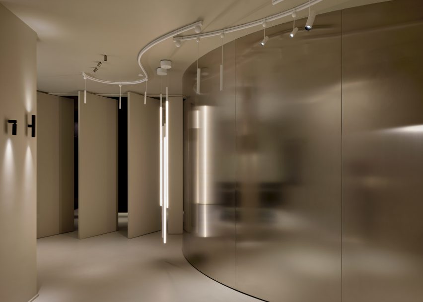
A testing room for clients was also created for the brand, which consists of a curved, metal wall that meets a series of angled panels that act as an entrance for the room.

Tables in a showroomTables in a showroom
The various displays were informed by the “melting pot” attitude of New York City

Another corner of the floor was dedicated to the display of the Skynest chandelier by Marcel Wanders, which resembles an inverted basket interlaced with cords of light.

Displays for Flos and Louis Poulsen consist of inserted panels and curving planting beds that are populated with a number of lighting fixtures from both brands.

A room with a curving metal wallA room with a curving metal wall
Metallic panels, warm wood, and dark cladding were used throughout the second-floor space

Dark, metal cladding used in the Flos displays contrasts the off-white and beiges used throughout the Louis Poulsen space, but both flank a B&B Italia lounge that sits at the centre of the floor, which features a bright-red chair from the Up series by Gaetano Pesce.

A B&B Italia wardrobe was also created for the showroom, which sits next to an Arclinea kitchen display.

A black ash finish was used to clad a large cabinet unit, which sits behind a Thea island topped with a quartz waterfall countertop.

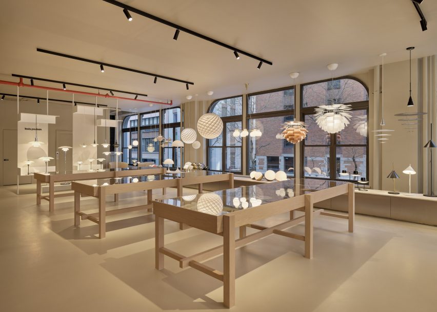
Lighting by Louis Poulsen, including the Patera Oval pendant by designer Øivind Slaatt, was tucked into the furthest corner of the space, with pieces distributed amongst wooden tables and a low-lying display unit.

A show room with white furnitureA show room with white furniture
A separate entrance leads to a Maxalto space on the first floor

On the first floor, a new space dedicated to Maxalto is accessible through a separate entrance, with pieces such as the brand’s Arbiter sofa system positioned against walls clad in black.

Design Holding, a global retailer founded in 2018, recently added furniture brands Menu, By Lassen and Brdr Petersen to its portfolio after an agreement with Denmark-based company Designers Company.

Piero Lissoni announced the founding of the US branch of his studio last year, saying that the US has become more “open-minded” in terms of architecture.

The photography is courtesy Design Holding.

Reference

Ten Mexican holiday homes characterised by earthy hues
CategoriesInterior Design

Ten Mexican holiday homes characterised by earthy hues

From a brutalist dwelling nestled in a pine forest to a beachy weekend retreat with a rooftop swimming pool, our latest lookbook features 10 holiday homes across Mexico.

While known for their often vibrant colours, Mexican interiors also include many examples of more muted designs. These earthy hues are often created through the use of natural and local materials, such as wood and stone.

Holiday homes are located all over the country, which has a varied landscape and is famous for its escapist destinations. Here are 10 Mexican holiday homes that combine pared-back colour palettes with getaway-style luxury.

This is the latest in our lookbooks series, which provides visual inspiration from Dezeen’s archive. For more inspiration, see previous lookbooks featuring metal furniture, breakfast nooks and living spaces with swings.


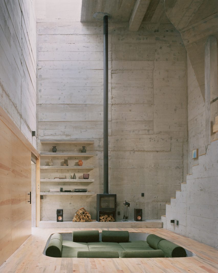
Built-in couch in concrete homeBuilt-in couch in concrete home
Top and above: photos by Rory Gardiner

Casa Alférez, Alférez, by Ludwig Godefroy

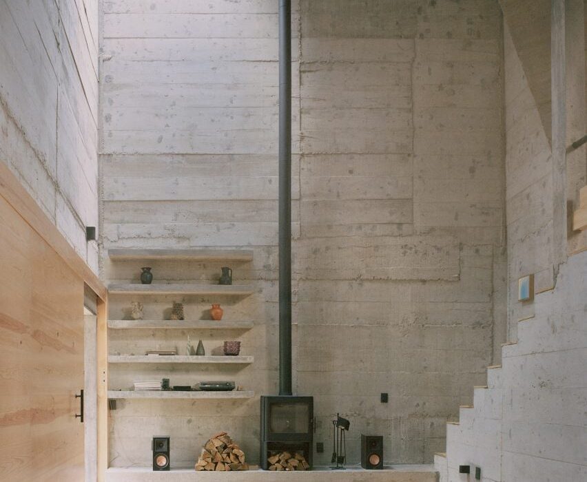
This holiday home is a brutalist dwelling clad in board-formed concrete and located in a pine forest in the country’s Alférez region.

French architect Ludwig Godefroy, who is Mexico City-based, added a conversation pit to the cathedral-like living area, which features a spindly double-height fireplace.

Find out more about Casa Alférez ›


Gardenia HouseGardenia House
Photo by LGM Studio

Holiday home, San Simón El Alto, by Estudio Atemporal

Local architecture office Estudio Atemporal designed a weekend retreat in San Simón El Alto village with an oversized gabled roof.

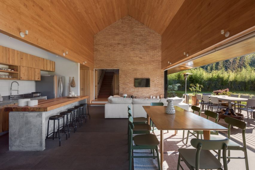
Inside, the studio created a statement brick wall in the angular, open-plan living space defined by timber and concrete accents. Generous glass doors lead to a covered outdoor patio.

Find out more about this holiday home ›


Villa CavaVilla Cava
Photo by César Béjar

Villa Cava, Tulum, by Espacio 18 Arquitectura

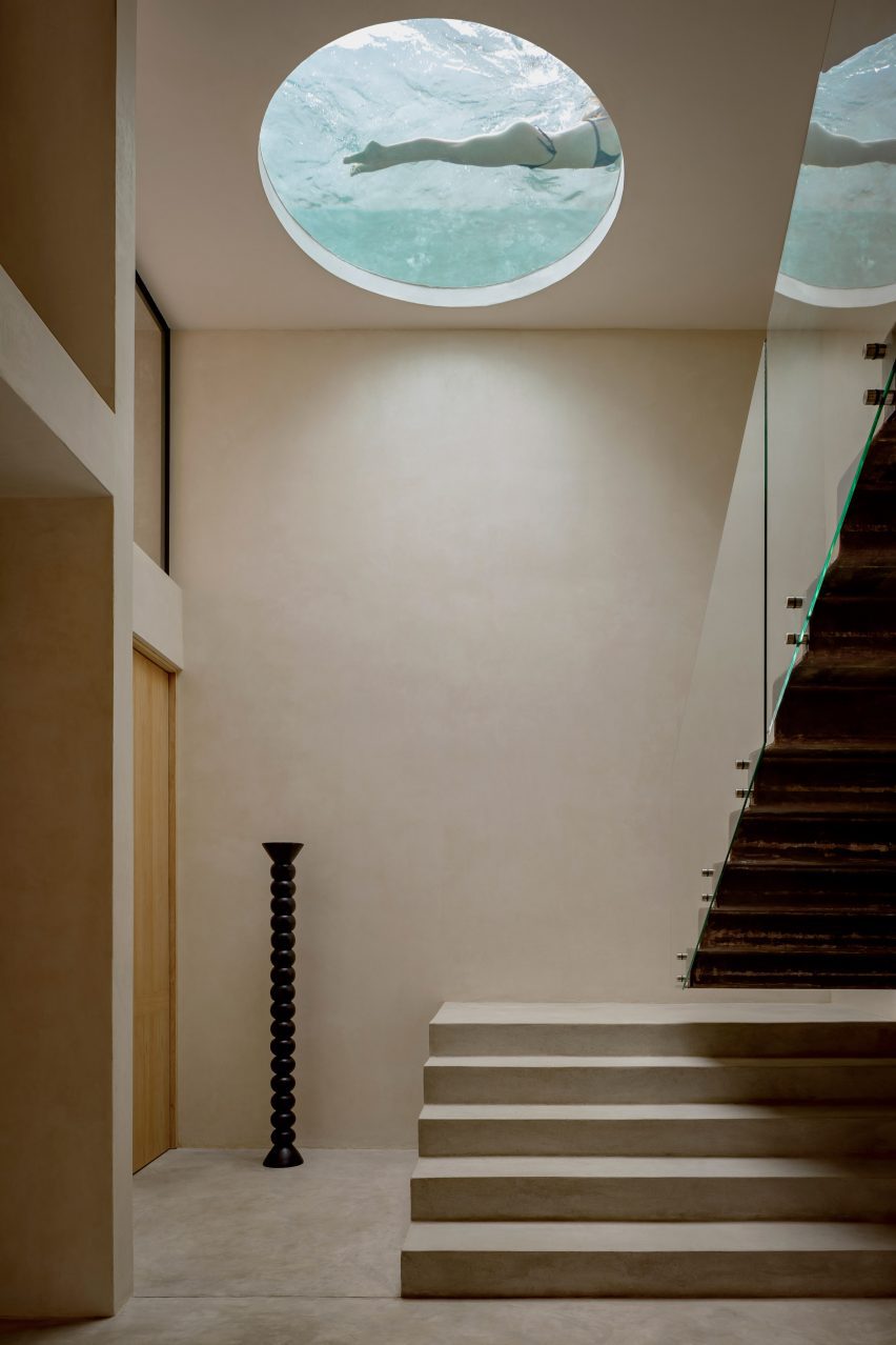
Neutral tones and textures define this house in Tulum that was informed by cenotes – ancient sunken water-filled limestone pits and caves found across Mexico’s Yucatán Peninsula.

Espacio 18 Arquitectura carved a circular window into one of the home’s ceilings, which reveals a rooftop swimming pool. Blue-coloured light filters through the opening, emphasising the cavernous atmosphere.

Find out more about Villa Cava ›


Interior design by Gala Sánchez-ReneroInterior design by Gala Sánchez-Renero
Photo by Diego Padilla Magallanes

La Extraviada, Mazunte, by Em-Estudio

Architecture firm Em-Estudio stepped a pair of concrete residential volumes down a rocky hillside overlooking the coastal town of Mazunte, Oaxaca.

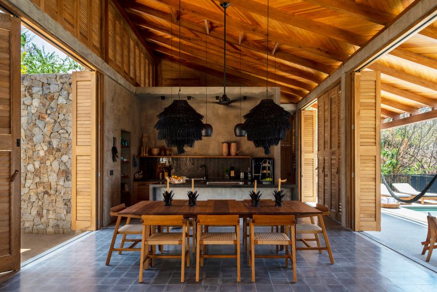
Called La Extraviada, the holiday home includes an eclectic kitchen and dining space flanked by floor-to-ceiling timber shutters that open onto a terrace with a swimming pool.

Regional materials, including guapinol wood and local stone obtained from nearby quarries, feature throughout the earthy-hued project.

Find out more about La Extraviada ›


Lounge with red sofa, Casa Tres Árboles in Valle de Bravo by DireccionLounge with red sofa, Casa Tres Árboles in Valle de Bravo by Direccion
Photo by Fabian Martinez

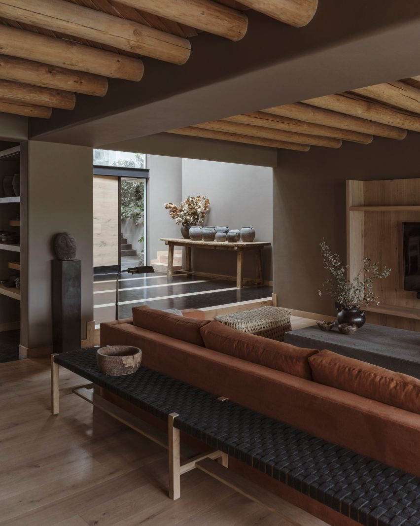
Casa Tres Árboles, Valle de Bravo, by Direccion

Architecture studio Direccion took cues from “monastic” sanctuaries when renovating this weekend retreat in Valle de Bravo.

The open-plan living space includes exposed warm-toned wooden ceiling beams, which contrast against dark-painted walls. A soft-red sofa adds a rare pop of colour to the otherwise muted interiors.

Find out more about Casa Tres Árboles ›


Los Terrenos by Tatiana BilbaoLos Terrenos by Tatiana Bilbao
Photo by Rory Gardiner

Los Terrenos, Monterrey, by Tatiana Bilbao

Mexican architect Tatiana Bilbao added a multifunctional ceramic screen to the interior of Los Terrenos – a holiday home in Monterrey with mirrored glass facades that reflect the surrounding wooded site.

“[The screen] works as solid and permeable floor, a screen partition, a structural wall, and as a semi-open wall that allows ventilation and sunlight to bathe the interior spaces,” explained Bilbao’s eponymous studio.

Find out more about Los Terrenos ›


Tonalli House staircaseTonalli House staircase
Photo by Ansatz

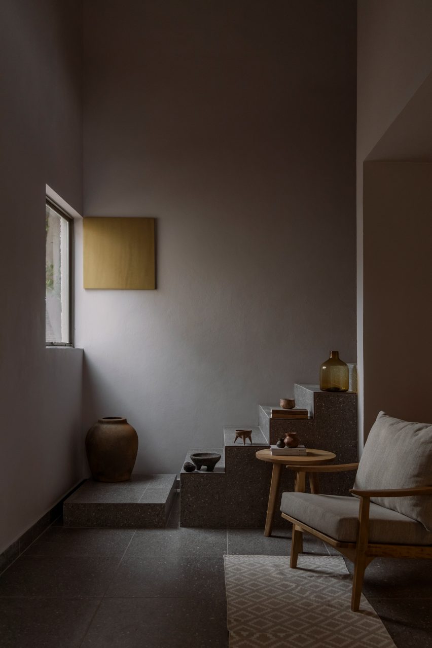
Tonalli House, Jalisco, by Moises Sánchez 

This stucco-clad holiday home was punctuated with strategic openings and takes cues from architecture commonly found in Mexican villages, according to its designer Moises Sánchez.

Sánchez created an understated interior palette referencing the nearby architecture surrounding Lake Chapa, where the home is located. For example, the blocky terrazzo staircase doubles as a stepped plinth for sandy-coloured ornaments.

Find out more about Tonalli House ›


CO-LAB Design Office made the house out of concreteCO-LAB Design Office made the house out of concrete
Photo by César Béjar

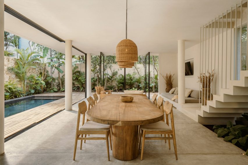
Casa Areca, Tulum, by CO-LAB Design Office

Local studio CO-LAB Design Office created Casa Areca to merge with its lush Tulum setting.

The open-plan ground floor includes pivot doors and retractable glass walls, which enable the social area to flow into the jungle-like garden. Creamy walls and polished concrete floors were paired with local tzalam wood, jute accents and ceramic vases filled with hand-selected wild grasses.

Find out more about Casa Areca ›


Living space of El AguacateLiving space of El Aguacate
Photo by Dove Dope

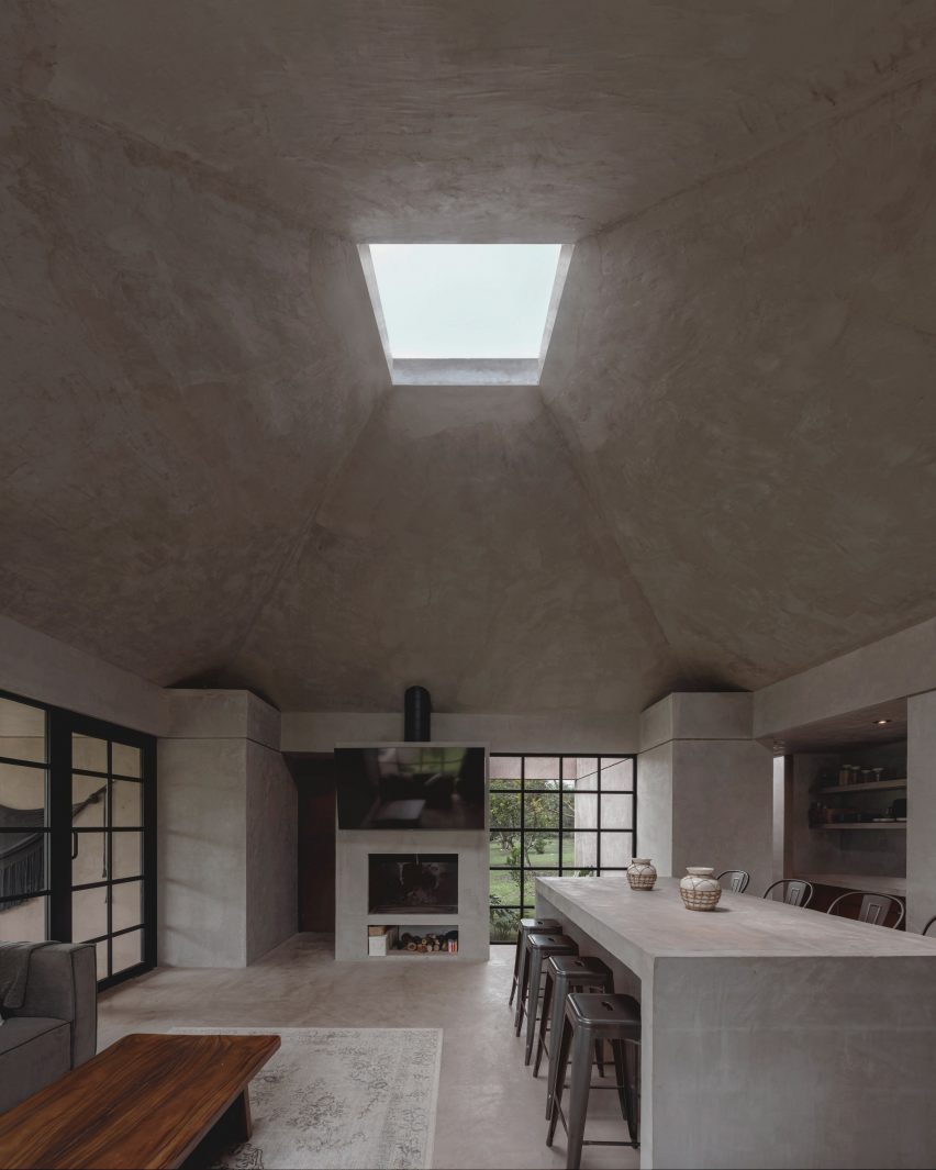
El Aguacate, El Barrial, by Práctica Arquitectura

El Aguacate – or “The Avocado” – is a holiday home in El Barrial village made almost entirely out of concrete.

Práctica Arquitectura topped the main living area with a tall pyramidal roof featuring a boxy skylight. The studio added a built-in fireplace and alter-like dining table to the space – also made from smooth concrete.

Find out more about El Aguacate ›


A large table in the shady dining areaA large table in the shady dining area
Photo by Rafael Gamo

Casa Cova, Puerto Escondidio, by Anonimous

When designing Casa Cova in Puerto Escondido, Mexican studio Anonimous took cues from pre-colonial architecture.

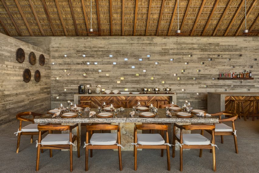
Inside, the central living space is kept cool by a traditional thatched roof made of dried palm leaves, called a “palapa.” Tiny square openings were also cut into some of the walls, creating “a dynamic light pattern from dusk till dawn”.

Find out more about Casa Cova ›

This is the latest in our lookbooks series, which provides visual inspiration from Dezeen’s archive. For more inspiration, see previous lookbooks featuring metal furniture, breakfast nooks and living spaces with swings.

Reference

Yussef Agbo-Ola creates jute temple for Sharjah Architecture Triennial
CategoriesArchitecture

Yussef Agbo-Ola creates jute temple for Sharjah Architecture Triennial

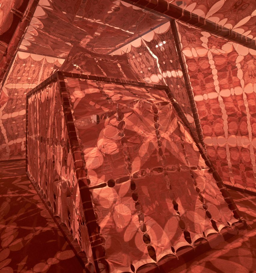
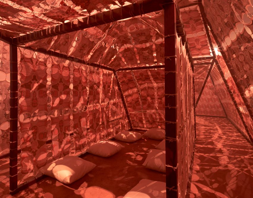
Architect Yussef Agbo-Ola has created a tent-like temple informed by Sharjah’s topography and biodiversity as part of the Sharjah Architecture Triennial.

Occupying a classroom within the former school that is now the triennial’s headquarters, the temple was designed by Agbo-Ola of London environmental design practice Olaniyi Studio as a place for incense burning and reflection.

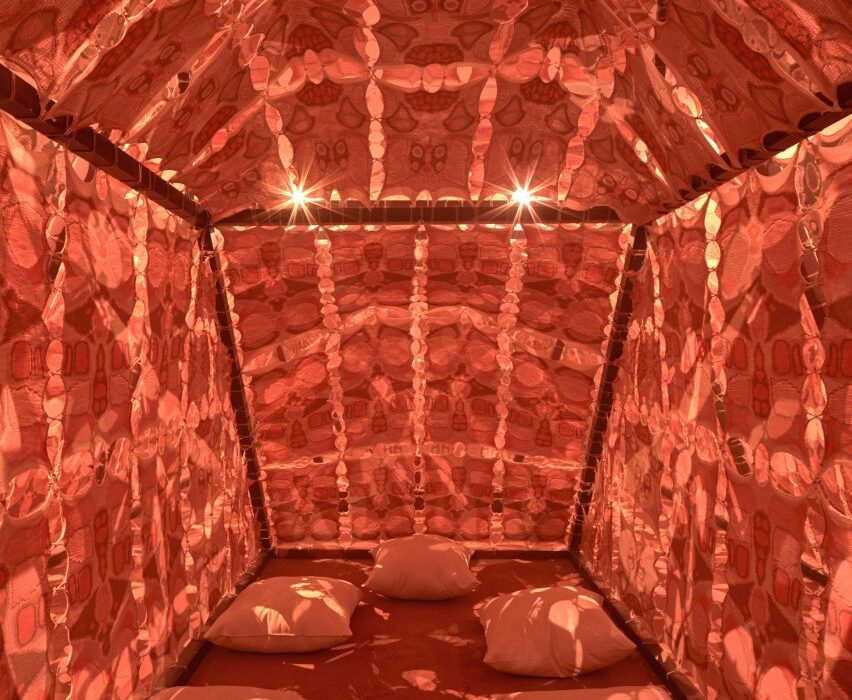
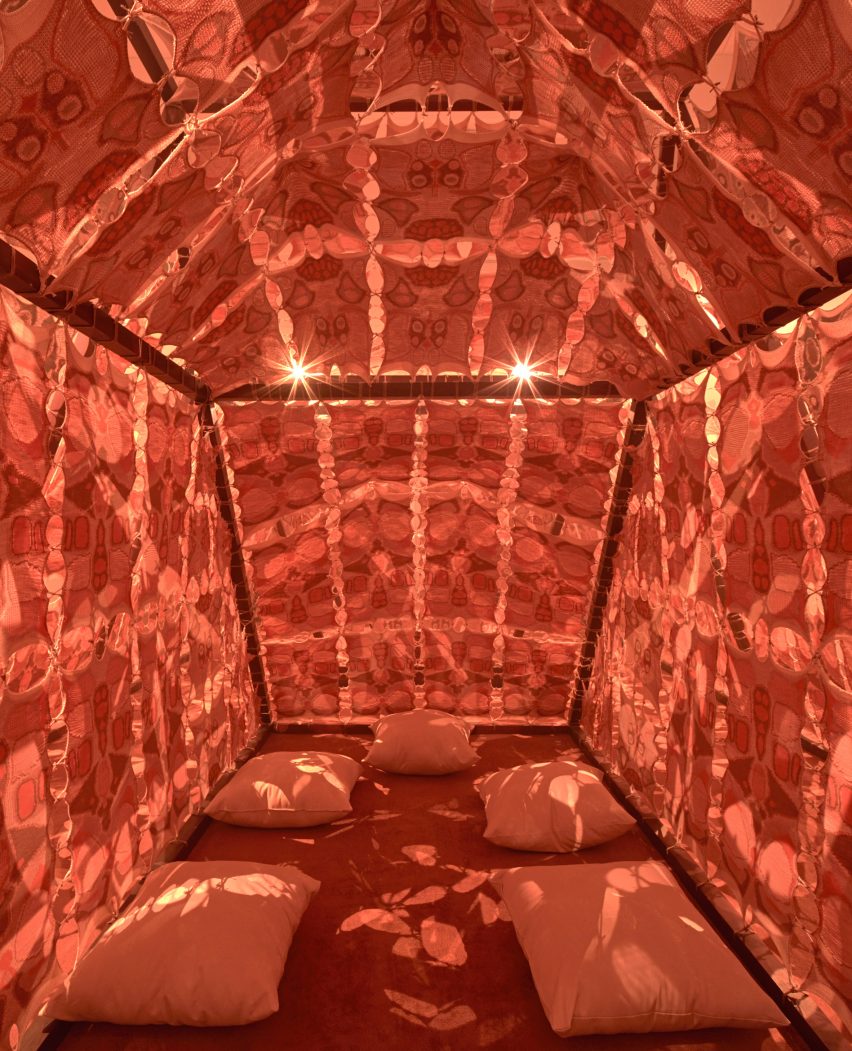
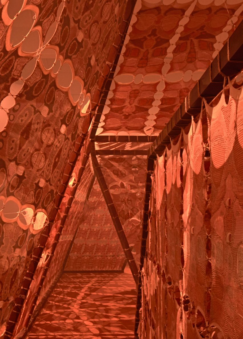
Named Jabal: 9 Ash Cleansing Temple, the structure was made from jute, hemp and cotton yarns knitted into a fabric to encourage reflection on how climate change is impacting Sharjah’s biodiversity.

Temple by Yussef Agbo-OlaTemple by Yussef Agbo-Ola
Yussef Agbo-Ola created a temple for the Sharjah Architecture Triennial

“Jabal: 9 Ash Cleansing Temple is a living architectural entity for honouring non-human life and endangered species in the womb of a scared mountain,” Agbo-Ola told Dezeen.

“It honours ephemeral rituals across architecture, performance and art within Bedouin, Yoruba and Cherokee communities that respect the natural world and practice environmental consecration,” he continued.

“This sacred structure is an apparatus for collective aroma rituals of bakhoor or incense burning and invites visitors to partake in breathing ceremonies within the inner altars of the structure.”

Jabal: 9 Ash Cleansing TempleJabal: 9 Ash Cleansing Temple
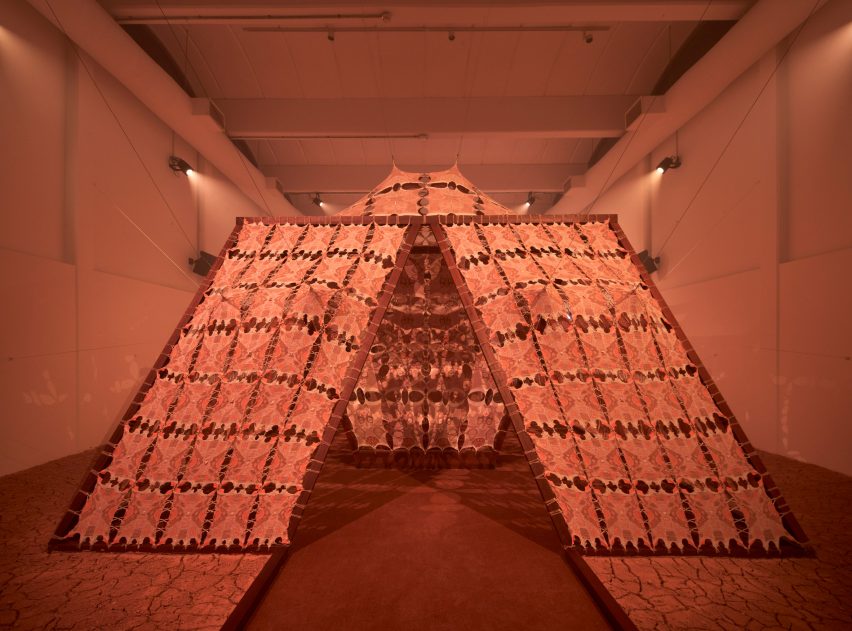
The installation is called Jabal: 9 Ash Cleansing Temple

The tent-like structure, which is surrounded by dried mud, has a form and colour intended to evoke the Jebel Jais Mountain in Sharjah’s neighbouring emirate of Ras Al Khaimah.

“It is my core belief that mountains are the mothers that hold an environment’s wisdom and DNA within them,” said Agbo-Ola.

“They can speak to us and are seen as elements in a landscape that humble us in relation to their scale and presence. The truth is, they are also extruded from the land by the unseen tensions and movements of the tectonic layers under the surface.”

“The colours of the knit skins are inspired by the colour pallet of the mountains and rock formations in the landscape as well as light patterns that depict fractal fossilised micro-crustaceans,” he continued.

“When these organisms, which are symbolically represented in the knits, are linked together in the temple, they create a new visual ecosystem as a symbolic form of their dependence on each other for ecological balance.”

Jute, hemp and cotton fabricJute, hemp and cotton fabric
The temple is made from jute, hemp and cotton

According to Agbo-Ola, the structure was also designed to celebrate fertility and the natural process of transformation.

“I believe it is the things that we cannot hold on to, that we cannot possess or claim, that become meaningful and hold an essence of amazement or reverence within us,” he explained.

“Jabala: 9 Ash Cleansing Temple is designed in a similar way in the sense that each fabric skin in the design should be seen from the perspective of the single thread that holds it together,” he continued. “The decay that occurs when one microscopic organism eats the temple’s fibres or lays eggs on it is just as important as the overall form and shape of the temple from the macro scale.”

Temple in SharjahTemple in Sharjah
It was designed as a space for incense burning and reflection

Overall, Agbo-Ola hopes that the temple will act as a space for contemplation.

“As visitors walk through the temple they are invited to experience the perspectives and beauty of non-human entities while slowing down to reverence the presence of the sacred mountains,” he said.

“This element of contemplation is induced by the burning of bakhoor and incense in the temple as a collective ritual.”

Sharjah Architecture Triennial installationSharjah Architecture Triennial installation
The tent-like structure is surrounded by dried mud

“There is also a sound work that is connected to the piece, which acts as the voice of the temple,” he continued. “The sonic work draws from research into ritual, shamanism and the practices of healers, that can bring new and deeper connections to our ecological environments.”

“The experimental composition of orchestral and spatial gradients aims to mimic the multi-layered atmospheric acoustic conversations between botanical, geological and unseen environmental elements.”

The second edition of the Sharjah Architecture Triennial was curated by Nigerian architect Tosin Oshinowo, who explained the triennial’s theme of scarcity in a recent interview with Dezeen.

Elsewhere, we rounded up 12 intriguing pavilions and installations from the event.

The photography is by Edmund Sumner.

Sharjah Architecture Triennial 2023 takes place from 11 November 2023 to 10 March 2024 at various locations across Sharjah. See Dezeen Events Guide for an up-to-date list of architecture and design events taking place around the world.

Reference

Eight home interiors where full-length curtains add a touch of drama
CategoriesInterior Design

Eight home interiors where full-length curtains add a touch of drama

From a glitzy Parisian apartment to a converted garage in Buffalo, New York, our latest lookbook collects eight residential interiors where floor-to-ceiling curtains inject a theatrical feel.

Curtains aren’t just for covering windows. A set of statement drapes can be an easy way to significantly change the mood of a room, particularly in apartment renovations.

The selection below features curtains in stage-like living rooms, rough-edged bedrooms and cosy working nooks.

This is the latest in our lookbooks series, which provides visual inspiration from Dezeen’s archive. For more inspiration, see previous lookbooks featuring interiors with statement carpets, furry walls and colourful bedrooms.


Ready-made Home by AzabReady-made Home by Azab
Photo is by Luis Díaz Díaz

Ready-made Home, Spain, by Azab

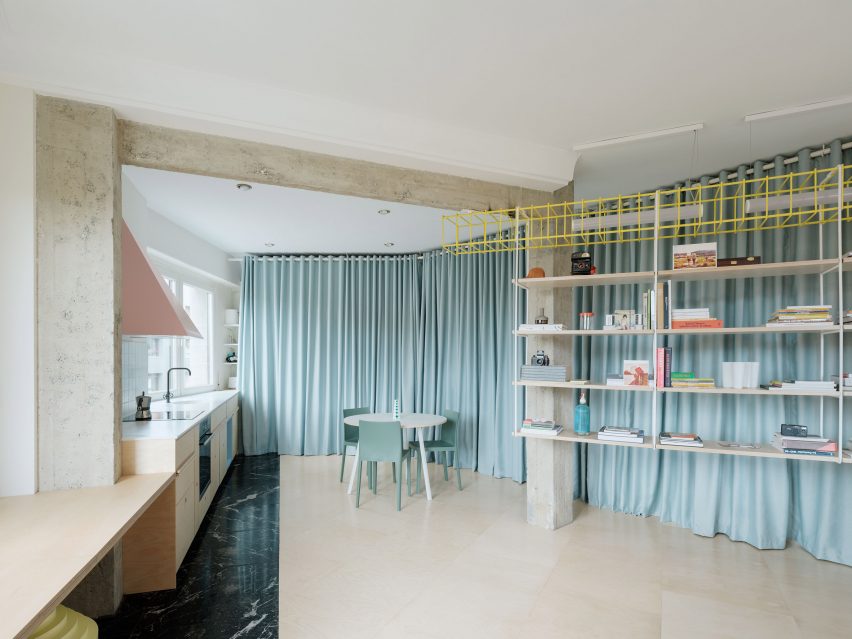
Duck-egg blue curtains help to create a flexible open-plan layout at this apartment in Bilbao that was overhauled by architecture studio Azab, running the length of the living-dining-kitchen area to conceal storage space and a bathroom.

“The curtains have theatrical and playful connotations and invites the inhabitant to perform with it, to change the space and to play with the mysteries, contradictions and paradoxes that privacy offers us beyond morality,” said the studio.

Find out more about Ready-made Home ›


Ruckers Hill House by Studio BrightRuckers Hill House by Studio Bright
Photo by Rory Gardiner

Ruckers Hill House, Australia, by Studio Bright

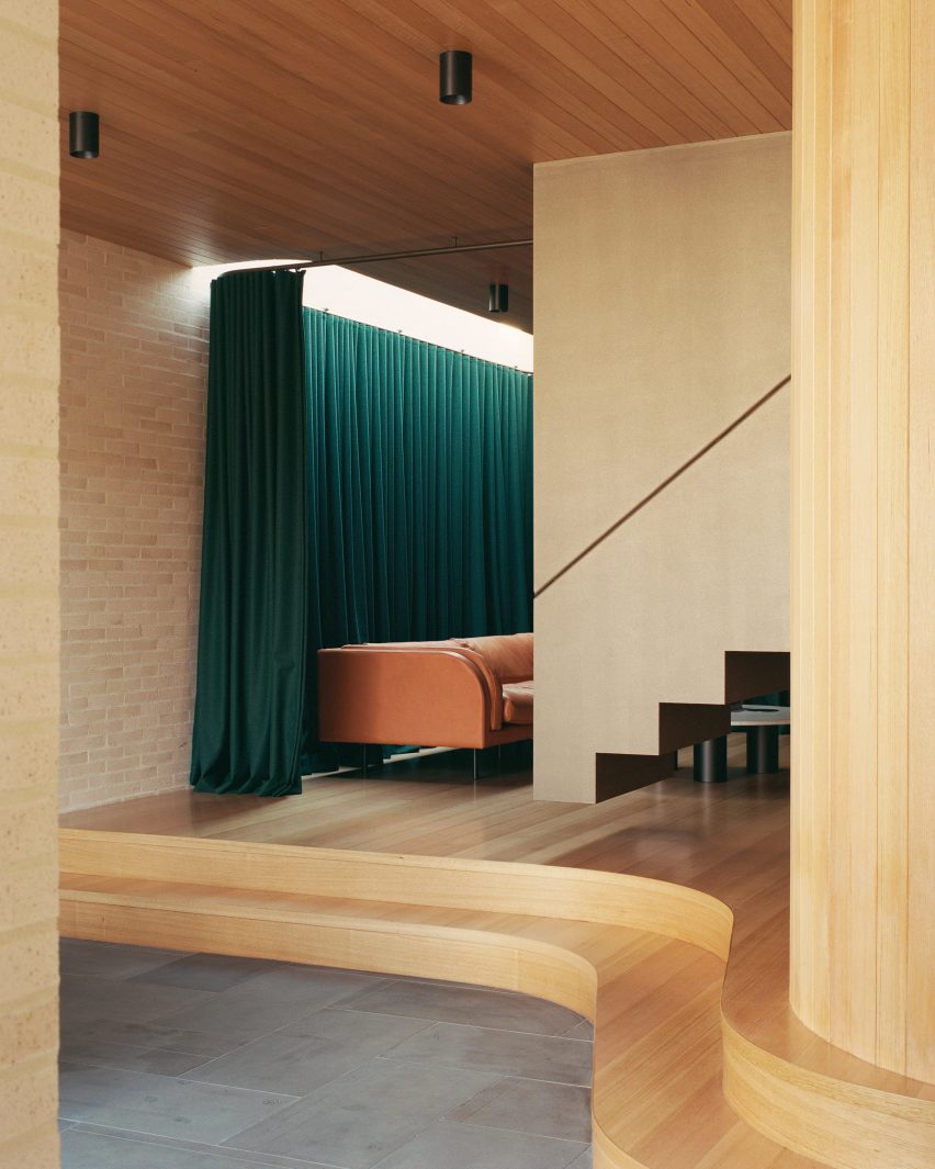
In this extension to an Edwardian family home in Melbourne, architecture practice Studio Bright raised the sitting room on a curved plinth, giving it a stage-like quality.

Enhancing the effect is a heavy green curtain hung from the ceiling, which can be drawn across to turn the space into an impromptu theatre for the children to play in.

Find out more about Ruckers Hill House ›


Uchronia renovated a Haussmann-era apartment in ParisUchronia renovated a Haussmann-era apartment in Paris
Photo by Félix Dol Maillot

Avenue Montaigne apartment, France, by Uchronia

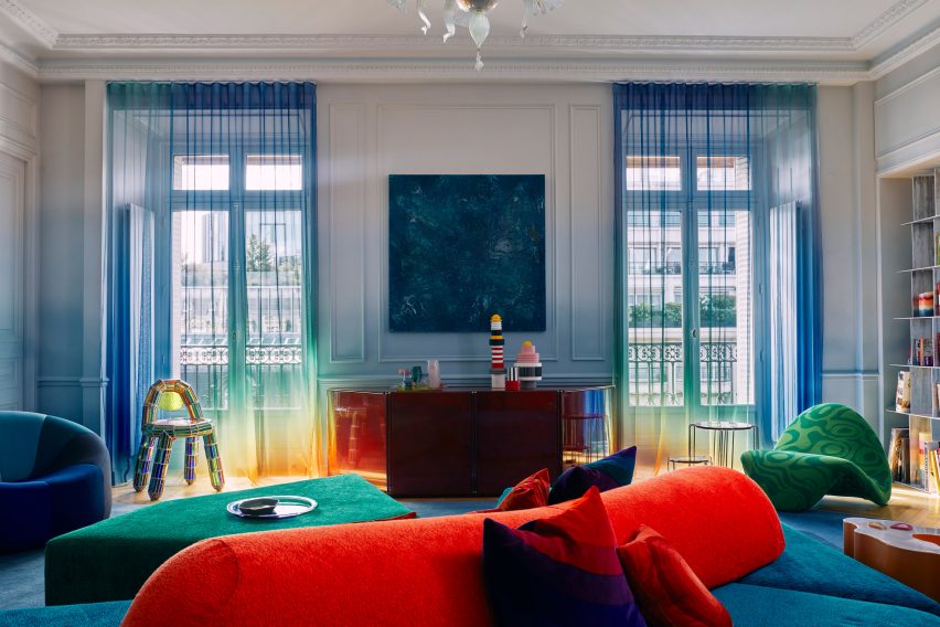
Sheer, rainbow-effect curtains cover the balconies of this opulent Haussman-era Parisian apartment, renovated by local studio Uchronia.

Even the walls echo the curtains’ gradations of colour, while the brightly toned furnishings are designed to resemble pieces of jewellery.

Find out more about this apartment ›


Roksanda Ilincic penthouse apartment in London's King's CrossRoksanda Ilincic penthouse apartment in London's King's Cross
Photo by Michael Sinclair

Gas-holder apartment, UK, by Roksanda Ilincic

Fashion designer Roksanda Ilincic brought her proclivity for bold colours and shapes to this London penthouse inside a former Victorian gas holder.

Pale pink Kvadrat curtains over the full-height windows cast a rose-tinted hue over the rooms, where the colour palette is kept mostly neutral apart from some pops of bright yellow.

Find out more about this apartment ›


Big Space, Little Space by Davidson RafailidisBig Space, Little Space by Davidson Rafailidis
Photo by Florian Holzherr

Big Space, Little Space, USA, by Davidson Rafailidis

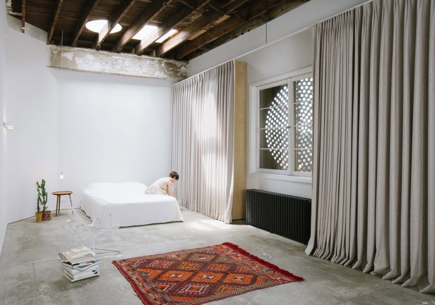
Peeling paintwork, uneven concrete floors and distressed wooden beams lend a distinctly rough-and-ready feel to this home-slash-workspace in Buffalo created out of a garage conversion by design studio Davidson Rafailidis.

For the most part, the space is minimally furnished, apart from a set of high and wide drapes that introduce a luxurious twist.

Find out more about Big Space, Little Space ›


Silver curtains in hallway at Landscape House in JapanSilver curtains in hallway at Landscape House in Japan
Photo by Norihito Yamauchi

Landscape House, Japan, by FORM/Kouichi Kimura Architects

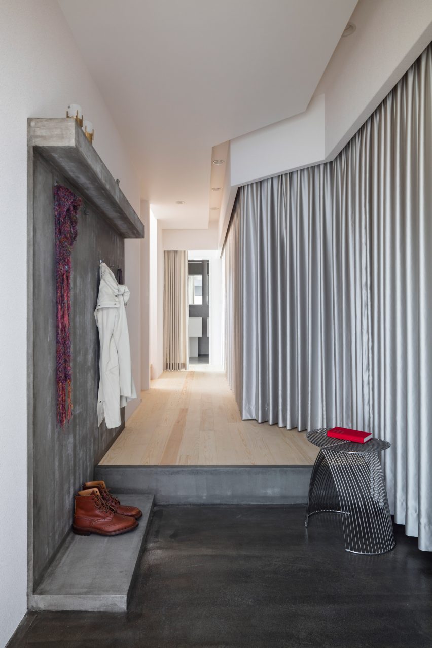
Upon entering Landscape House in central Japan, designed by Japanese studio FORM/Kouichi Kimura Architects, one is greeted by a lengthy corridor lined entirely on one side by a full-length silver curtain.

The fabric echoes a raw concrete feature wall on the opposite side of the corridor, as well as referencing the extensive use of metal throughout the building.

Find out more about Landscape House ›


Kitchen in Pops apartment by Furora StudioKitchen in Pops apartment by Furora Studio
Photo by ONI Studio

Pops, Poland, by Furora Studio

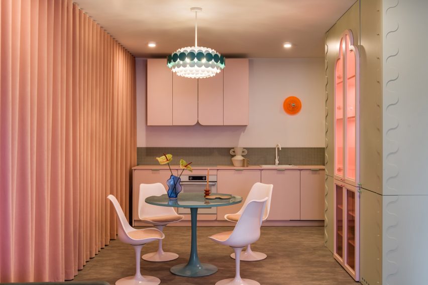
Furora Studio wanted the design of this holiday apartment in Kraków to be slightly more outrageous than the standard residential interior.

A velvety, salmon-pink curtain dresses an entire wall in the open-plan kitchen and living room, adding to a plethora of sugary colours and rounded edges.

Find out more about Pops ›


Maison-Boutique Coloniale by Michael Godmer and Mathieu TurgeonMaison-Boutique Coloniale by Michael Godmer and Mathieu Turgeon
Photo by Maxime Brouillett

Maison-Boutique Coloniale, Canada, by Michael Godmer and Mathieu Turgeon

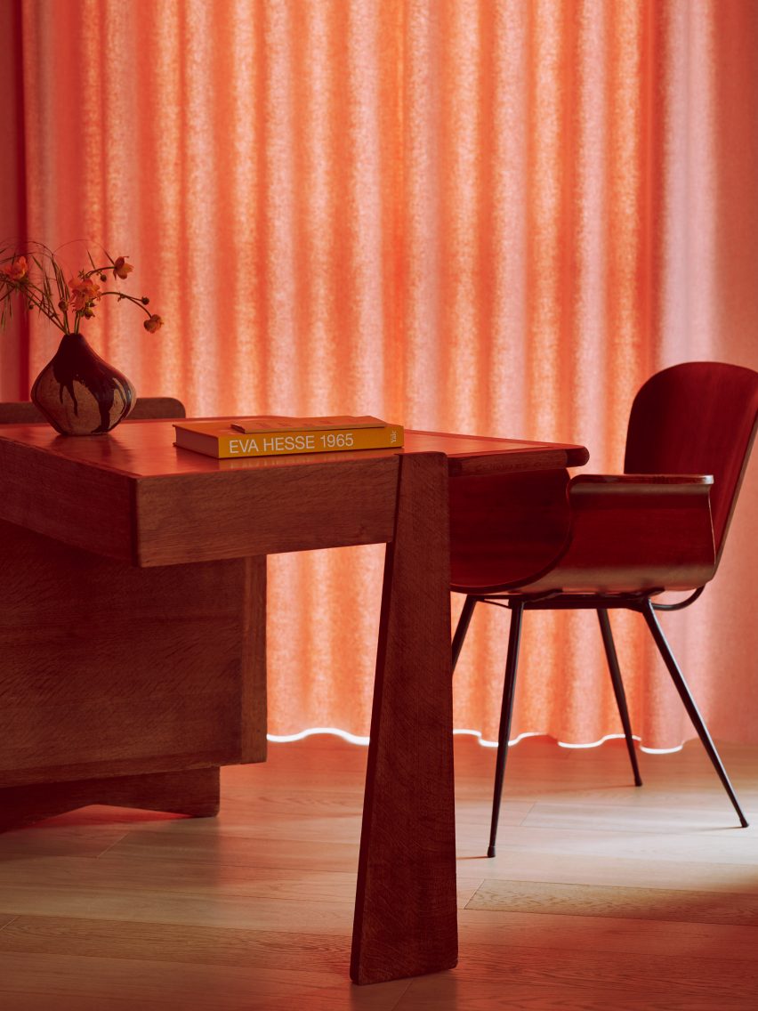
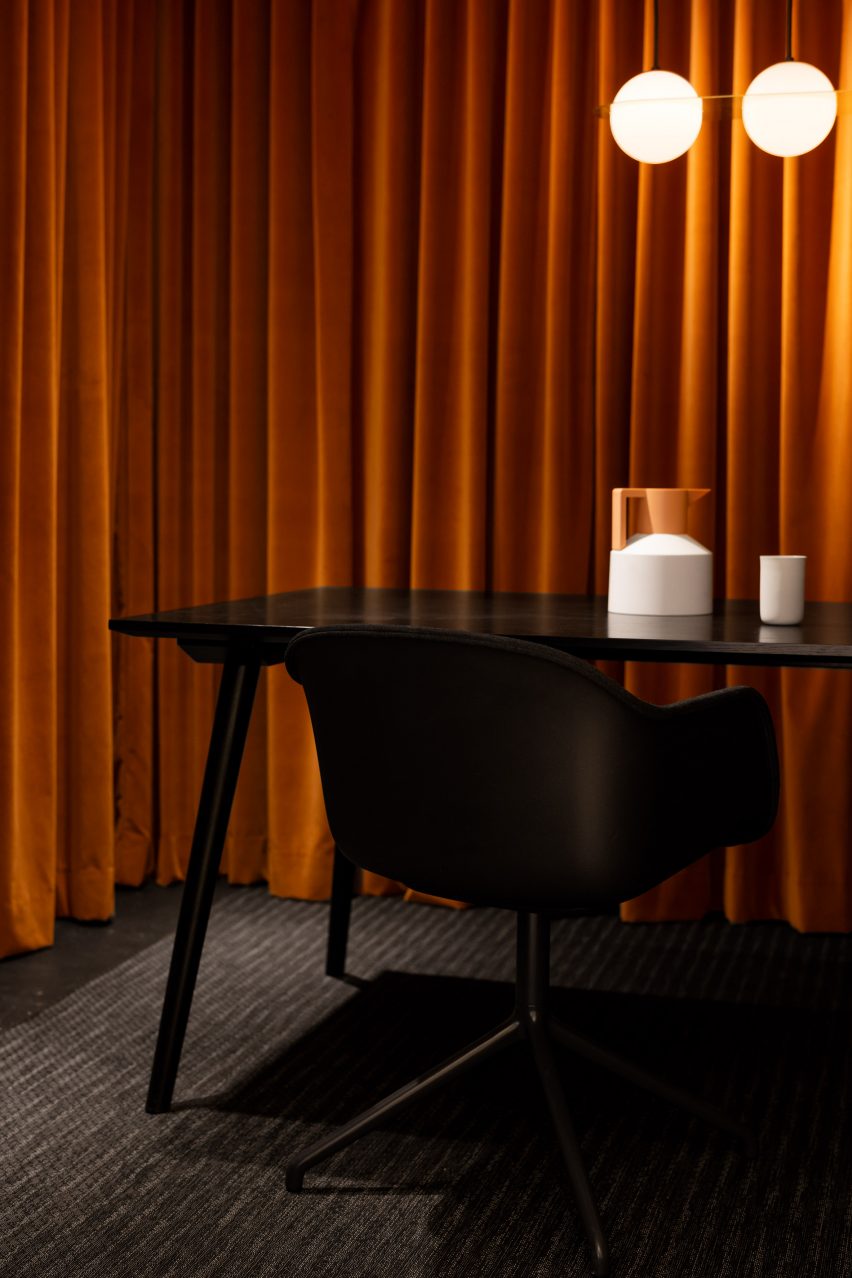
Most of the spaces inside Maison-Boutique Coloniale in Montreal – renovated by designers Michael Godmer and Mathieu Turgeon as their own residence and studio – are pared-back and neutral.

But in an office space on the basement level, plush orange curtains line the walls, combined with dim pendant lighting and a black table arrangement by Muuto and &tradition for an intimate effect.

Find out more about Maison-Boutique Coloniale ›

This is the latest in our lookbooks series, which provides visual inspiration from Dezeen’s archive. For more inspiration, see previous lookbooks featuring interiors with statement carpets, furry walls and colourful bedrooms.

Reference

North Carolina practice Sundholm Studio revamps Durham restaurant
CategoriesInterior Design

North Carolina practice Sundholm Studio revamps Durham restaurant

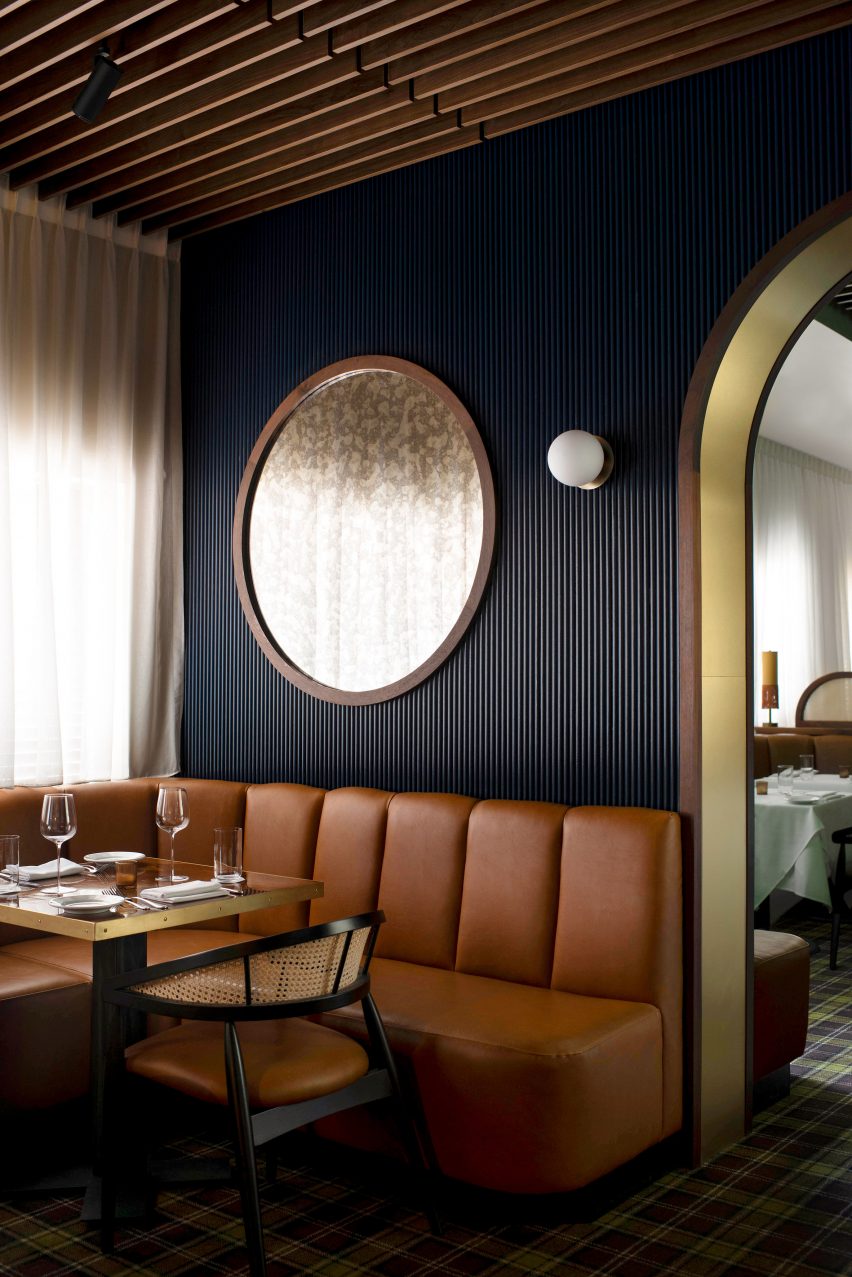
Interiors practice Sundholm Studio has refreshed the 30-year-old Nanas restaurant in Durham, North Carolina, with strong colours, bespoke timber joinery and metalwork.

Previously named Nana’s, the restaurant was renamed Nanas, in tribute to “not one nana, but rather the entire genre,” Sundholm Studio creative director Shaun Sundholm told Dezeen.

The space – intended to capture the hospitable “spirit of grandmothers” – comprises a bar, salon, dining room and an outdoor patio.

Restaurant and bar in Durham, North CarolinaRestaurant and bar in Durham, North Carolina
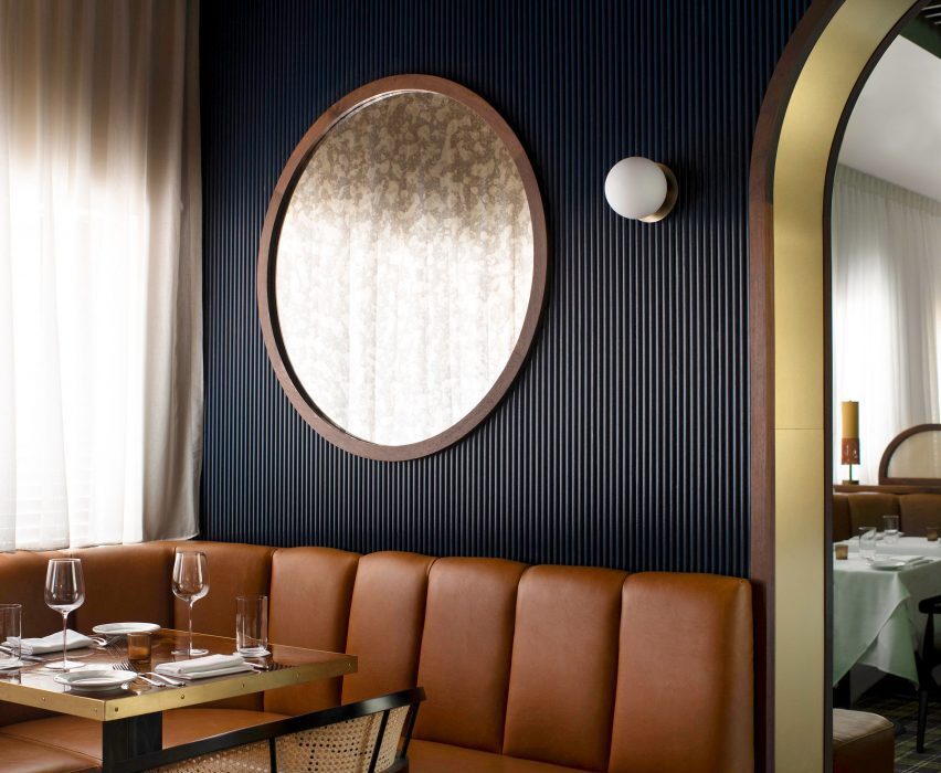
Navy fluted walls form the backdrop to the salon

Sundholm’s aim was to update the space with “modern details that bring the outside in”.

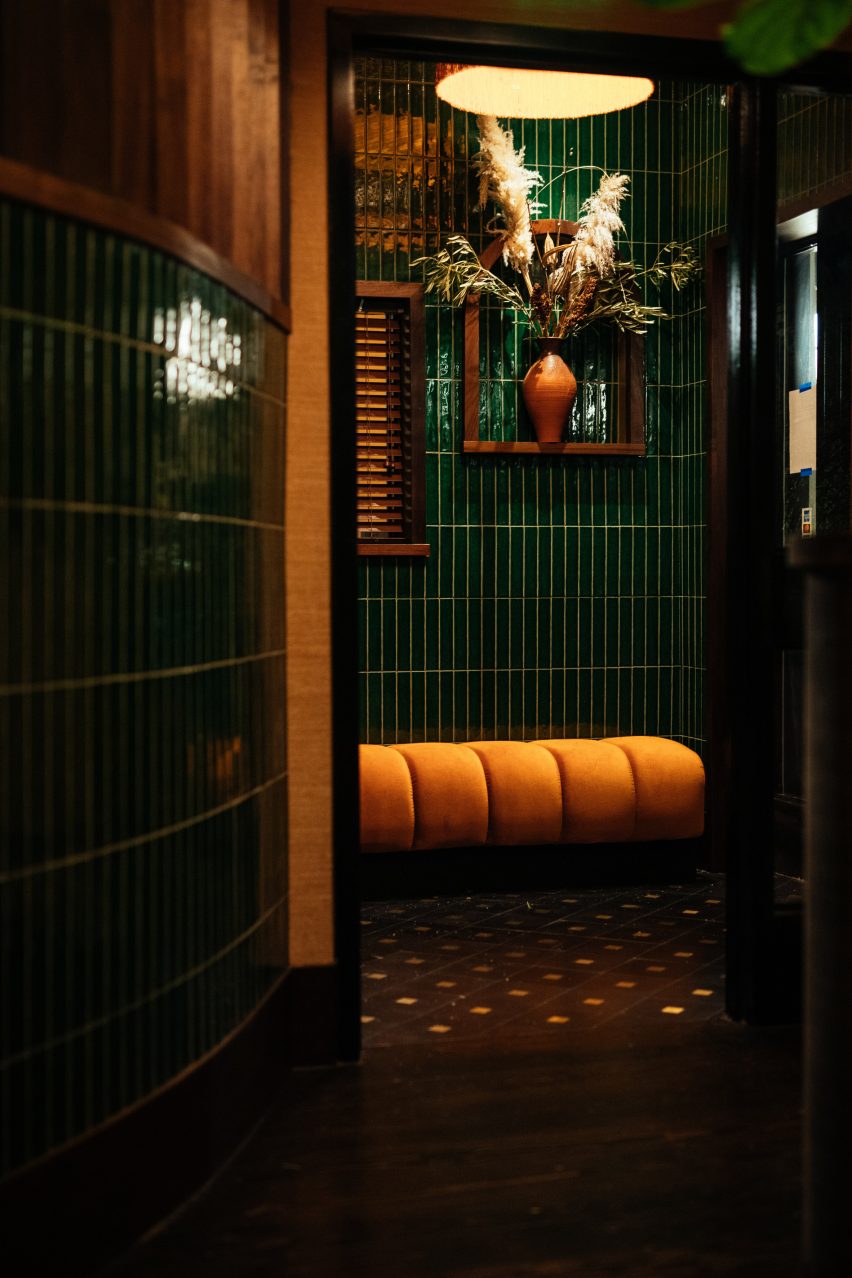
The existing curved walls in the entryway were retained and reworked with wooden slats, which light passes through to evoke “a walk through the woods”.

Wooden window blinds and sheer drapes in the dining room help with acoustic absorption and adjusting the natural light levels.

Restaurant and bar interiors in Durham, North CarolinaRestaurant and bar interiors in Durham, North Carolina
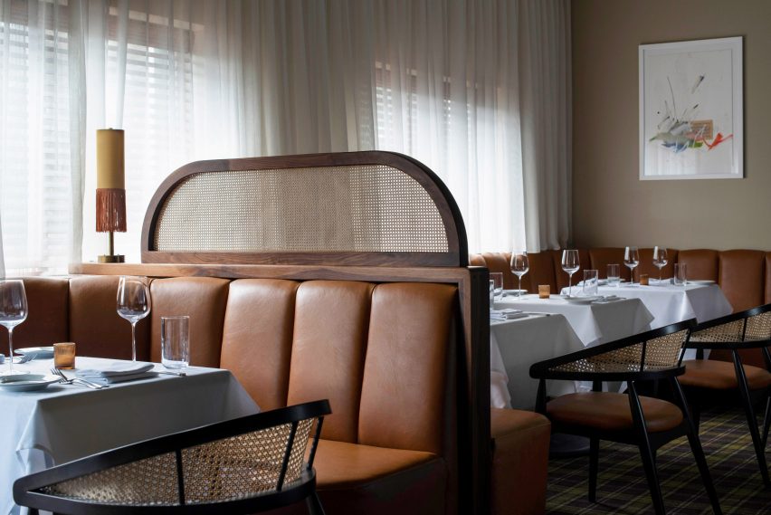
The seating is a mixture of banquette booths and chairs

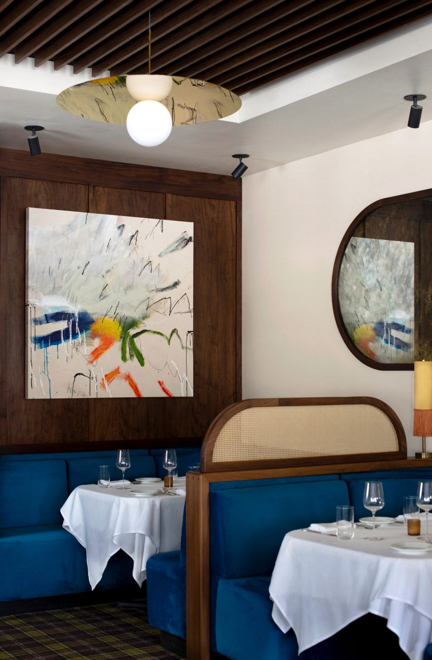
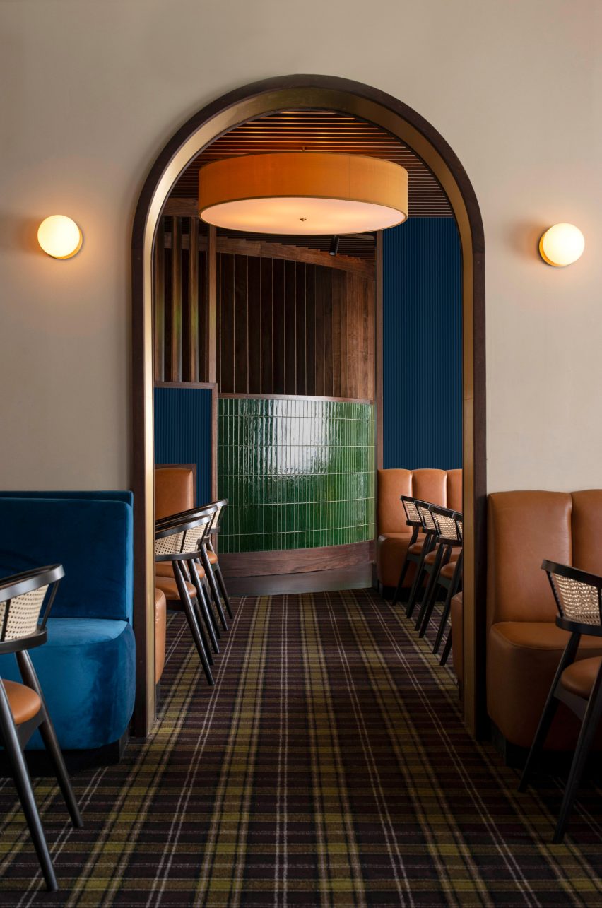
The dimly lit entrance was contrasted with the bar, dining area and salon, where jewel-toned colours like emerald green, sapphire blue, and rich amber orange have been used.

“I aimed to pay homage to aspects of the previous design where possible, accentuating some of the interesting bits of the existing physical space, such as the curved wall at the entrance and the hints of orange throughout – recalling the bright, blaze orange walls of the past,” Sundholm explained.

In line with the jewel-toned colour palette, Sundholm selected a variety of textures to use across the restaurant, including glossy green handmade Italian tiles and brass finishes.

Blue velvet upholstery covers the banquettes in the bar, while “vintage luggage” orange leather covers the banquettes in the salon and dining area.

Nanas, Durham, North Carolina, USA, by Sundholm StudioNanas, Durham, North Carolina, USA, by Sundholm Studio
The dark entrance leads into a curved passage, through to the dining room

Brass archways designed by local metal art studio Andrew Preiss Designs feature across the restaurant, including as a portal between the salon and dining area. This arch motif is echoed in the bathroom mirrors.

Earth-toned grasscloth wallpaper and a plaid-patterned carpet contrast the solid colours and textures.

“For this restaurant, our initial mood boards culled from a diverse range – from The Golden Girls and vintage Ralph Lauren textiles to 1970s Cadillacs and abstract impressionist art inspired by the Smoky Mountains,” Sundholm said.

Nanas bar and restaurant in Durham, North Carolina, USANanas bar and restaurant in Durham, North Carolina, USA
Bold colour is used for the restaurant seating

The studio’s goal was to “distill these inspirations into their core elements” and use them to inform the interiors in a “non-gimmicky” way.

A collection of mixed-media artworks by local artist Jason Craighead featured across the restaurant add to this aesthetic.

Tartan carpet introduces a pattered counterpoint to the block colours

Other recently renovated restaurants featured on Dezeen include Aino and Alvar Aalto’s Savoy restaurant in Helsinki restored after 80 years and The Bird in Montauk designed by Home Studios.

The photography is by Lissa Gotwals and D L Anderson.

Reference

Tropical Modernism exhibition explores “the politics behind the concrete”
CategoriesInterior Design

Tropical Modernism exhibition explores “the politics behind the concrete”

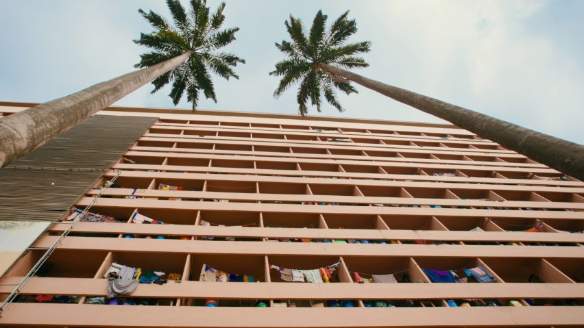
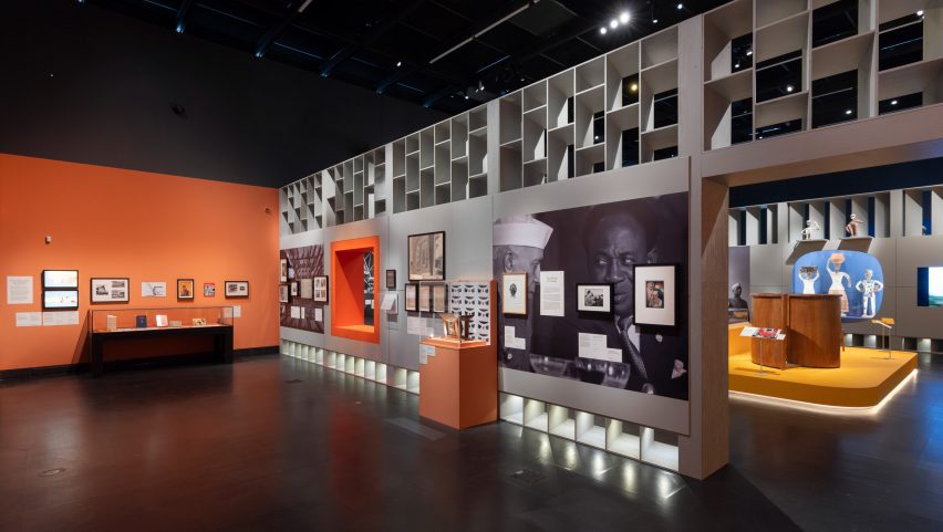
London’s Victoria and Albert Museum has launched its Tropical Modernism exhibition, which highlights the architectural movement’s evolution from colonial import to a “tool of nation building”.

According to the Victoria & Albert Museum (V&A), the exhibition aims to examine the complex context, power dynamics and post-colonial legacy of tropical modernism – an architectural style that developed in South Asia and West Africa in the late 1940s – while also centralising and celebrating its hidden figures.

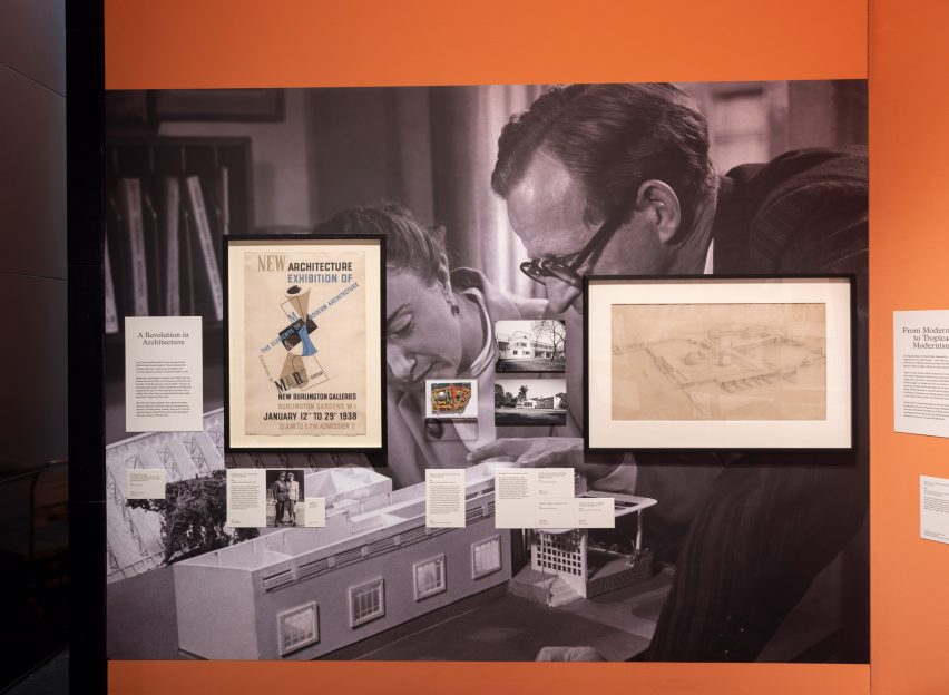
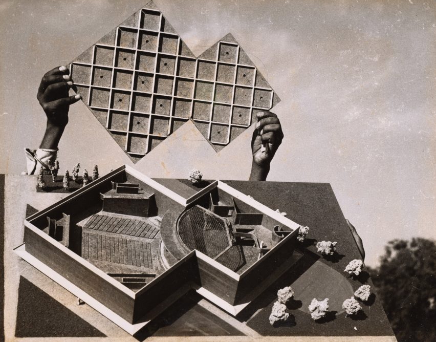
Archival Image in Tropical Modernism exhibition at the V&A LondonArchival Image in Tropical Modernism exhibition at the V&A London
London’s V&A museum has opened a major exhibition exploring tropical modernism

“Tropical modernism is experiencing something of a modish revival as an exotic and escapist style popular in verdant luxury hotels, bars and concrete jungle houses,” the exhibition’s lead curator Christopher Turner told Dezeen.

“But it has a problematic history and, through an examination of the context of British imperialism and the de-colonial struggle, the exhibition seeks to look at the history of tropical modernism before and after Independence, and show something of the politics behind the concrete,” he continued.

Installation shot of Tropical Modernism exhibition at the V&A LondonInstallation shot of Tropical Modernism exhibition at the V&A London
The exhibition traces the evolution of tropical modernism within a South Asian and West African context

The exhibition follows the V&A’s Tropical Modernism exhibition at the 2023 Venice Biennale, which revealed the team’s precursory research on tropical modernism in a West African setting.

For the in-house iteration of the exhibition, additional architectural models, drawings and archival imagery have been introduced to interrogate tropical modernism in India alongside the African perspective.

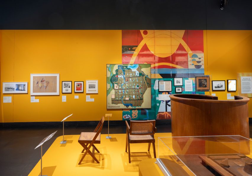
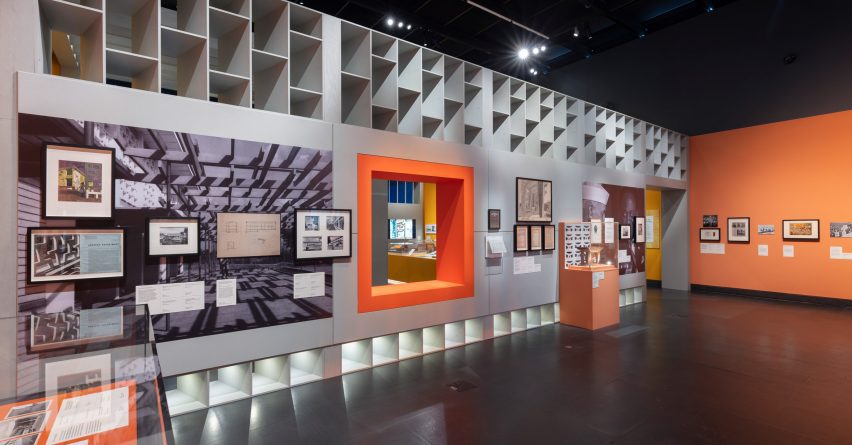
Exhibition materials line a series of rooms within the V&A’s Porter Gallery, divided by brightly coloured partitions and louvred walls referencing tropical modernist motifs.

Installation shot of Tropical Modernism exhibition at the V&A LondonInstallation shot of Tropical Modernism exhibition at the V&A London
Archival imagery, architectural drawings and physical models line the gallery rooms

The exhibition begins by tracing tropical modernism back to its early development by British architects Jane Drew and Maxwell Fry. Stationed together in Ghana from 1944, Drew and Fry adapted international modernism to the African climate, proposing functional over ornamental design.

Drew and Fry would also become part of the Department of Tropical Studies at the Architectural Association (AA), which exported British architects to the colonies from 1954 in a bid to neutralise calls for independence.

Installation shot of Tropical Modernism exhibition at the V&A LondonInstallation shot of Tropical Modernism exhibition at the V&A London
The exhibition aims to centralise local professionals who have gone widely unrecognised for their contributions to the movement

The exhibition continues by spotlighting local Ghanaian figures who worked with Fry and Drew, noting the power shifts that were taking place behind the scenes to reappropriate the architectural style for an emerging era of colonial freedom.

Influential political leaders Jawaharlal Nehru in India and Kwame Nkrumah in Ghana are the exhibition’s key personas, framing the evolution of tropical modernism from conception to regionalisation.

Installation shot of Tropical Modernism exhibition at the V&A LondonInstallation shot of Tropical Modernism exhibition at the V&A London
Gallery rooms are divided by brightly coloured partitions informed by tropical modernist motifs

“The heroes of our exhibition are Nehru and Nkrumah, the first prime ministers of India and Ghana,” Turner explained. “Tropical modernism, a colonial invention, survived the transition to Independence and was appropriated and adapted by Nehru and Nkrumah as a tool of nation building.”

“Nkrumah, who sometimes sketched designs for the buildings he wanted on napkins, created the first architecture school in sub-Saharan Africa to train a new generation of African architects, and this institution has partnered with us on a five-year research project into tropical modernism.”

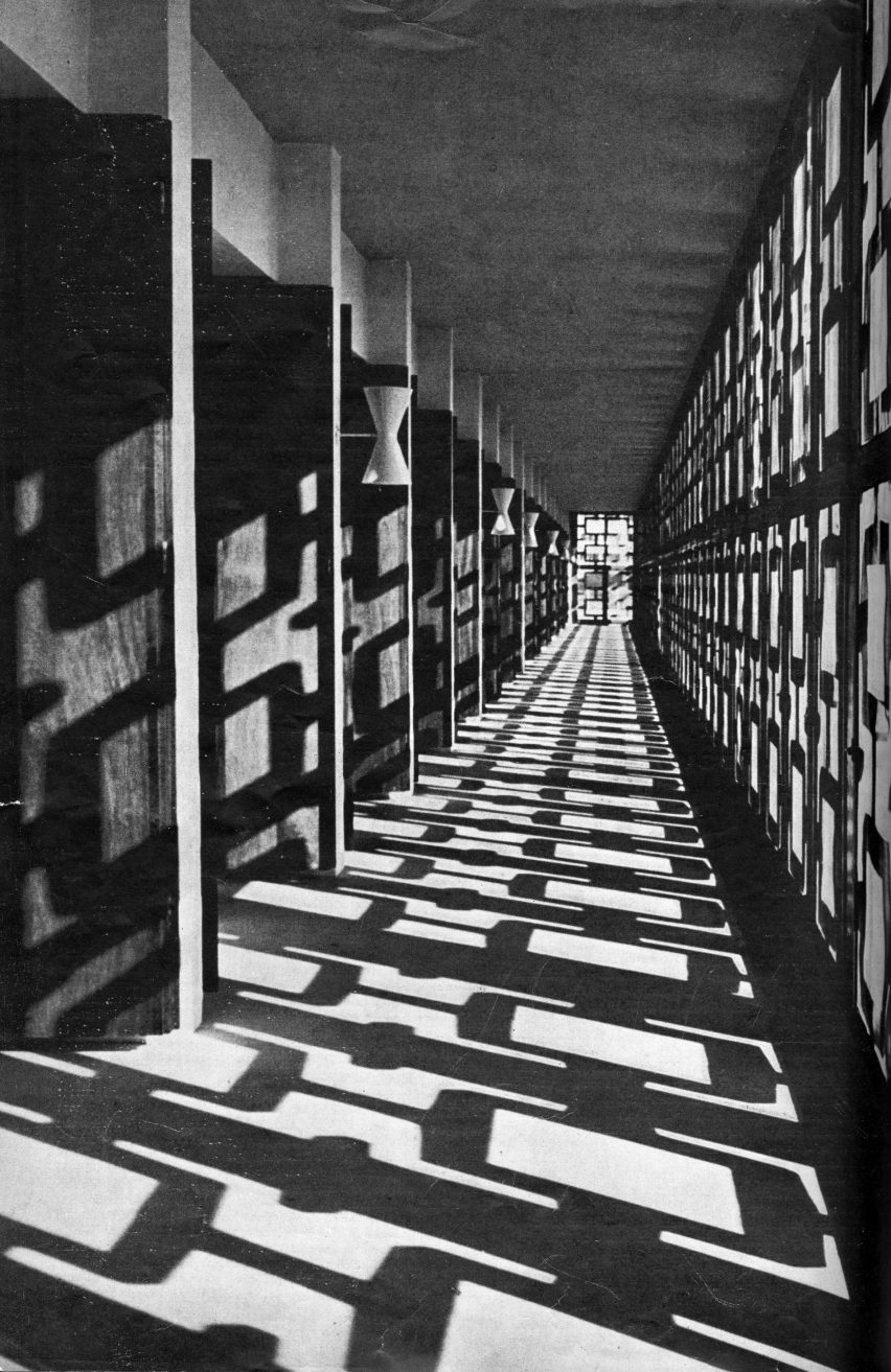
Archival image of University College Ibadan used in Tropical Modernism exhibition at the V&A LondonArchival image of University College Ibadan used in Tropical Modernism exhibition at the V&A London
According to the V&A’s research, tropical modernism shifted from its western Bauhaus roots towards a localised vernacular styles

Through a host of physical models and artefacts, the city of Chandigarh becomes the exhibition’s narrative focal point for tropical modernism in India.

Under prime minister Jawaharlal Nehru, Chandigarh was the first large-scale modernist project, recruiting Drew and Fry along with French architect Le Corbusier to plan the ideal utopian urban centre.

As with Nkrumah – who saw how the Africanisation of architecture could become a symbol of progress and change – the exhibition also aims to highlight Nehru’s ambitions for a localised modernism drawing from the Indian vernacular, rather than the Western Bauhaus style.

The display culminates in a video featuring 16 key tropical modernist structures, interspersed with interviews and footage explaining the social and political context behind each building’s realisation.

“We made a three-screen 28-minute film, shot in Ghana and featuring panoramic portraits of over a dozen buildings, cut with archive footage from the time and interviews with architects like John Owusu Addo and Henry Wellington, and Nkrumah’s daughter, the politician Samia Nkrumah,” said Turner.

Archival image of Maxwell Fry and John Noah used in Tropical Modernism exhibition at the V&A LondonArchival image of Maxwell Fry and John Noah used in Tropical Modernism exhibition at the V&A London
The exhibition aims to address gaps in the museum’s African and South Asian studies

According to Turner, the exhibition begins to address gaps in the V&A’s collections and archives pertaining to architecture and design in the global south.

“Archives are themselves instruments of power, and West African and Indian architects are not as prominent in established archives, which many institutions have now realised and are working to address,” Turner explained.

“Tropical modernism was very much a co-creation with local architects who we have sought to name – all of whom should be much better known, but are excluded from established canons.”

Installation shot of Tropical Modernism exhibition at the V&A LondonInstallation shot of Tropical Modernism exhibition at the V&A London
The display will inhabit the V&A’s Porter Gallery until 22 September 2024

Bringing tropical modernism back into contemporary discourse was also important to the V&A as a timely investigation of low-tech and passive design strategies.

“Tropical modernism was a climate responsive architecture – it sought to work with rather than against climate,” Turner said.

“As we face an era of climate change, it is important that tropical modernism’s scientifically informed principles of passive cooling are reexamined and reinvented for our age,” he added.

“I hope that people will be interested to learn more about these moments of post-colonial excitement and opportunity, and the struggle by which these hard-earned freedoms were won.”

Image of video used in the Tropical Modernism exhibition at the V&A LondonImage of video used in the Tropical Modernism exhibition at the V&A London
A 28-minute video captures footage of remaining tropical modernist structures at the end of the exhibition

The V&A museum in South Kensington houses permanent national collections alongside a series of temporary activations and exhibitions.

As part of London Design Festival 2023, the museum hosted a furniture display crafted from an Alfa Romeo car by Andu Masebo and earlier in the year, architect Shahed Saleem created a pavilion in the shape of a mosque at the V&A as part of 2023’s Ramadan Festival.

The photography is courtesy of the Victoria & Albert Museum.

Tropical Modernism: Architecture and Independence will run from 2 March to 22 September 2024 at the V&A Museum in London. For more events, exhibitions and talks in architecture and design visit the Dezeen Events Guide.

Reference