Isern Serra completes “serene” office for eyewear brand Gigi Studios
CategoriesInterior Design

Isern Serra completes “serene” office for eyewear brand Gigi Studios

Sculptural custom-made furniture adds artistic flourishes to this otherwise minimal showroom and head office, designed by Spanish interiors studio Isern Serra for eyewear brand Gigi Studios.

Isern Serra was tasked with creating a holistic scheme for the 900-square-metre headquarters, occupying one floor of a building in the town of Sant Cugat del Vallès just north of Barcelona.
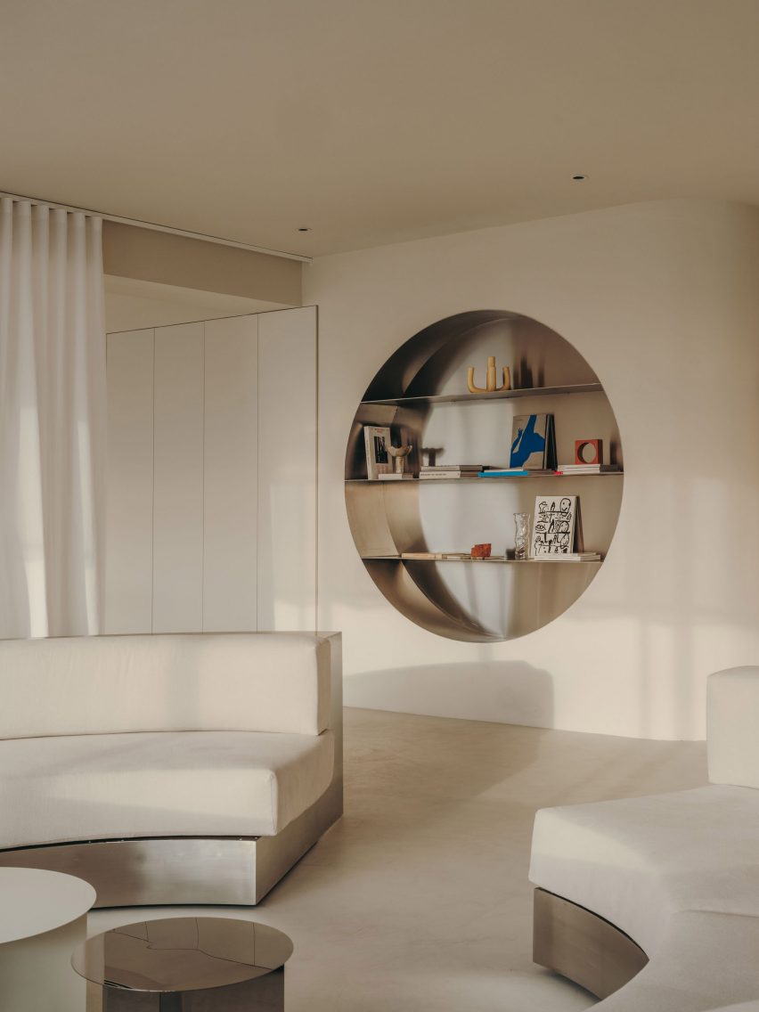
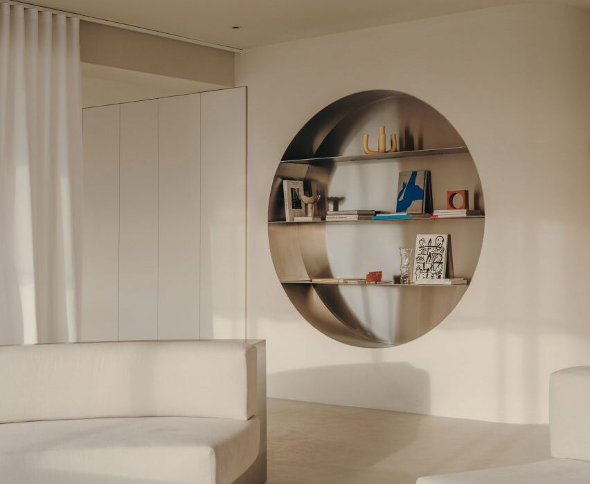
Wall niche with stainless steel shelving in Gigi Studios office Wall niche with stainless steel shelving in Gigi Studios office
Isern Serra has filled the Gigi Studios headquarters with custom furniture

The brief called for a design that creates a sense of spaciousness and comfort while reflecting founder Patricia Remo’s vision of Gigi Studios as a brand.

“It is also serene, warm and elegant and conceptually close to the idea of a studio and away from the concept of a traditional office, without losing the practicality and functionality,” Isern Serra explained.
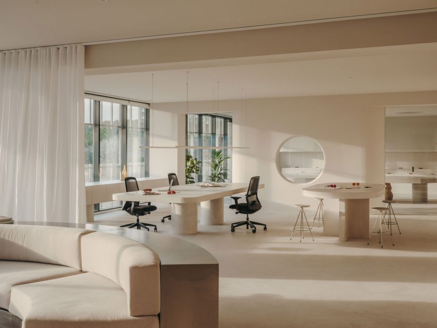
Workspaces in office in Spain by Isern SerraWorkspaces in office in Spain by Isern Serra
Rows of desks were replaced with more intimate work areas

The building’s rectangular floor plan features a central service core housing the lifts and toilets, with the workspaces, meeting rooms, kitchen and showroom occupying the surrounding O-shaped open space.

Serra and his team positioned the kitchen and showroom at one end of the plan and placed the meeting rooms and client areas at the other, leaving the longer sides open to optimise circulation.
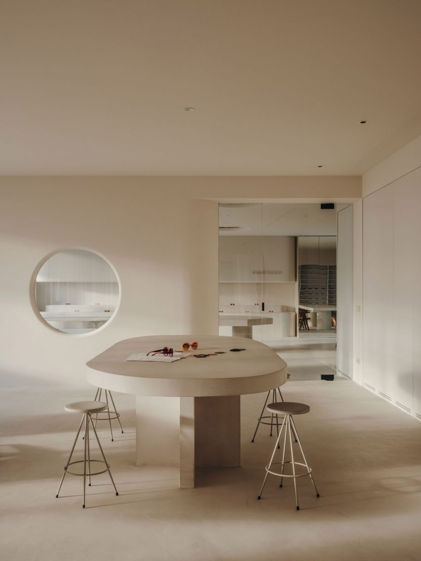
Table with stools in Gigi Studios office Table with stools in Gigi Studios office
Concrete bases for the work tables were cast in situ

Various bespoke furniture pieces, conceived by Isern Serra as “small works of art”, bring a distinct personality to the different formal and informal spaces.

These interventions were designed to embody Gigi Studios’ design ethos while standing out against the warm and minimal backdrop.

“The project aims to experiment with the limits of the workspace and seek a new concept that goes hand in hand with the idea of domus and museum,” Isern Serra explained.
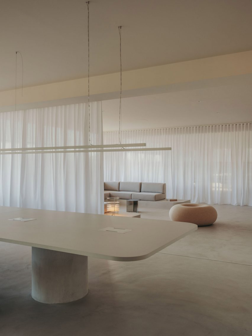
Table and lounge area inside office in Spain by Isern SerraTable and lounge area inside office in Spain by Isern Serra
Curtains can be used to cordon off the lounge area

A large circular sofa framed in stainless steel provides a bold statement in one of the reception areas.

The sculptural piece fulfils a dual function as a seating area and a space for working, with tables and book storage integrated into the backrest around the perimeter.

Similarly, the building’s central core is wrapped in a layer of built-in storage units including circular stainless-steel niches that incorporate shelves for displaying books and materials.

Rather than a typical office layout with rows of workstations, the large open spaces are separated into more intimate zones with a more domestic scale.
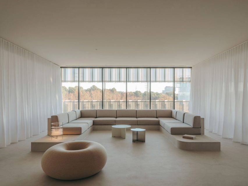
Lounge area inside Gigi Studios office Lounge area inside Gigi Studios office
A Boa Pouf by Sabine Marcelis provides informal seating

Next to the lobby is a design area featuring tables made from concrete that was cast in situ. Task seating surrounds the work table and a taller table is accompanied by stools, while lenses for the different glasses are stored in a custom-made unit.

The second workspace features a large C-shaped sofa with a concrete base that was also cast in situ. Custom-made tables and one of Sabine Marcelis’s Boa Poufs complete this lounge-style space, which can be visually separated from the rest of the office using curtains on either side.
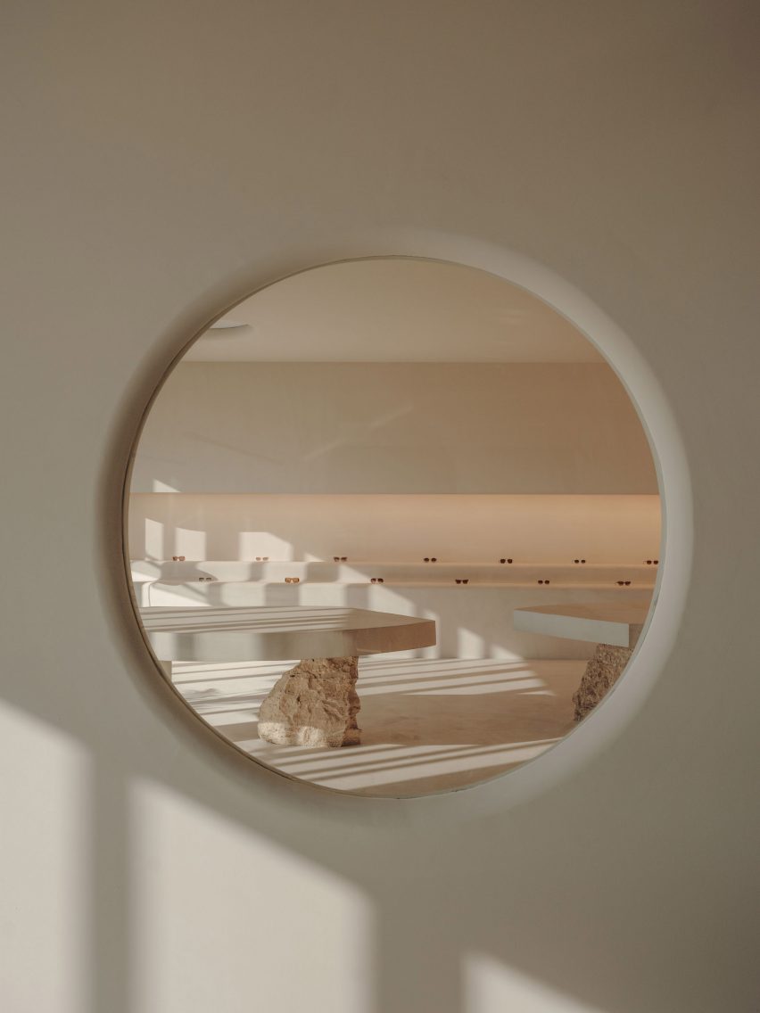
Look at eyewear showroom through circular windowLook at eyewear showroom through circular window
The showroom is visible from the office through a circular window

A circular window with rounded edges provides a glimpse of the showroom, which is dominated by two sculptural tables with concrete tops supported by rough chunks of travertine stone.

A built-in tiered display is used to highlight different Gigi Studios’ eyewear. The rest of the collection is housed in a backlit cabinet, while a mirror-fronted unit conceals a large screen used for presentations.

The kitchen is located next to the showroom so that the two spaces can easily be used together for events. Here, a homely, Mediterranean feel is created via a five-metre-long sharing table, custom-made alongside the accompanying stools.
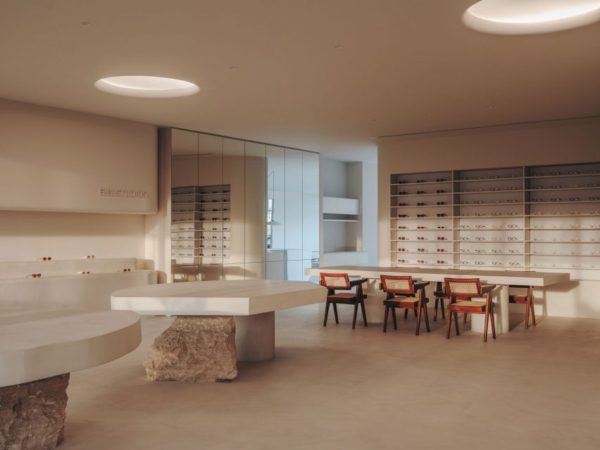
Showroom inside Gigi Studios headquartersShowroom inside Gigi Studios headquarters
Display tables in the showroom are held up by rough chunks of travertine

The sizeable kitchen island is finished in micro-cement and features a curved base that enhances its sculptural presence.

A curved corridor incorporating a sofa niche on one wall provides access to offices and a meeting room positioned to have the best views of the surrounding countryside.

Internal columns are used to support one end of concrete tables built in each of the workspaces, furnished with classic designs including Marcel Breuer’s Wassily and Cesca chairs.
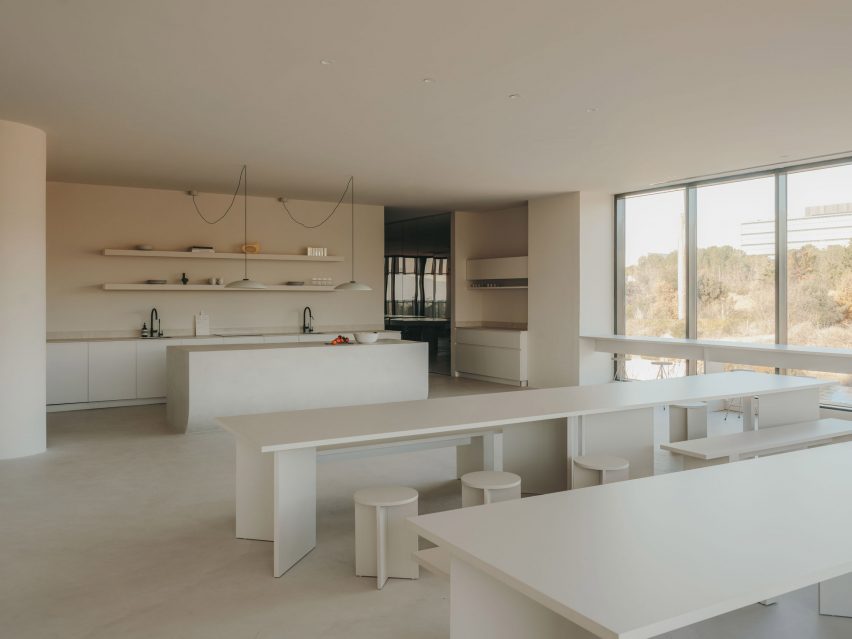
Office inside eyewear brand headquarters in Spain by Isern SerraOffice inside eyewear brand headquarters in Spain by Isern Serra
Large sharing tables allow for communal eating in the kitchen

Interior designer Isern Serra founded his self-titled studio in Barcelona in 2008 and works across architecture, interiors and industrial design.

Previous projects including a rose-coloured shop for Barcelona’s Moco Museum that was based on a computer-generated image and a minimalist office for digital artist Andrés Reisinger, which was named small workplace interior of the year at the 2023 Dezeen Awards.

The photography is by Salva López with art direction by Aasheen Mittal.

Reference

Snøhetta designs compostable hemp light Superdupertube
CategoriesSustainable News

Snøhetta designs compostable hemp light Superdupertube

Norwegian studio Snøhetta has teamed up with lighting brand Ateljé Lyktan to create Superdupertube, an office lamp made from extruded hemp and sugarcane bioplastic.

The design is a contemporary update of Ateljé Lyktan‘s Supertube – an office light from the 1970s made from extruded aluminium.

Hemp lamp by Snøhetta and Ateljé LyktanHemp lamp by Snøhetta and Ateljé Lyktan
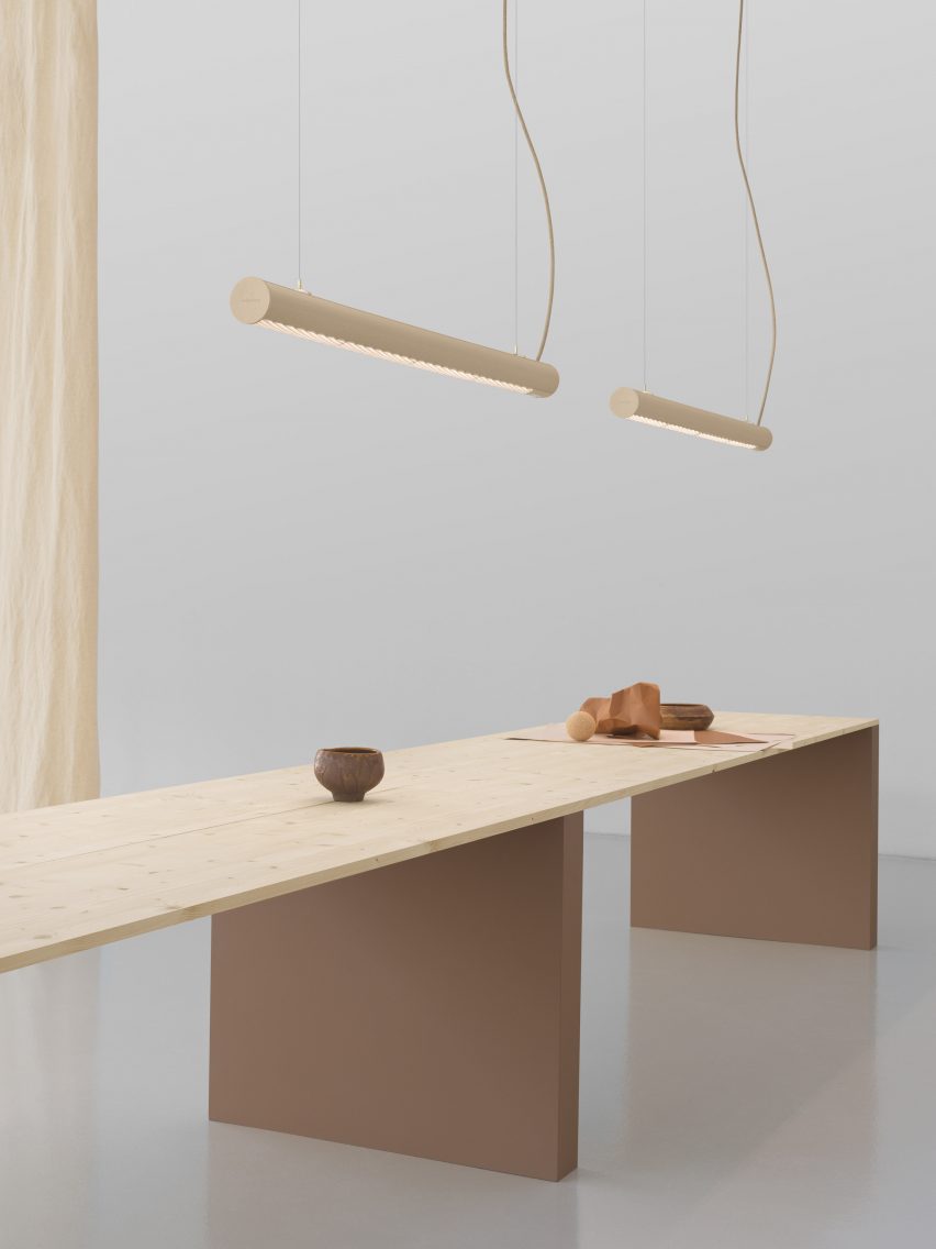
The Superdupertube is a modern take on the Supertube lamp

“[The Supertube] had finished production in 2010 or something like that, so it was iconic but sort of forgotten,” Snøhetta partner Jenny B Osuldsen told Dezeen. “And it’s a tube. It’s not rocket science but it is what you need for a smart lamp in an office.”

“We really loved it and think it has a lot of possibilities, so we wanted to upgrade it to a new level,” she added.

Tubular hemp lamp Tubular hemp lamp
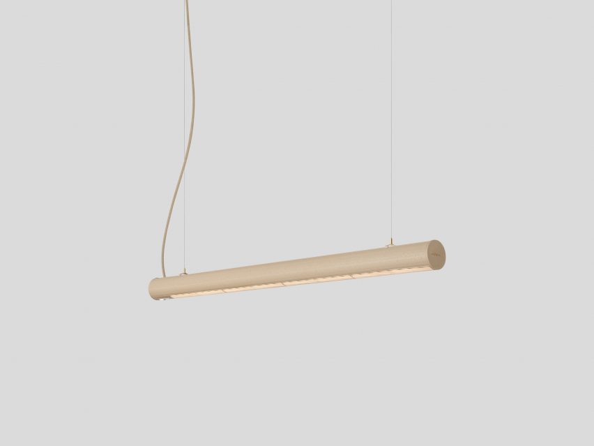
It is made from hemp and can be industrially composted. Photo by Ateljé Lyktan

The extrusion technique for the original lamp was developed in the 1960s, and Snøhetta and Ateljé Lyktan decided to create a lamp that would nod to the original design.

However, the aim was to lower the carbon footprint of the lamp by choosing the most sustainable material possible.

View of compostable lamp made from hempView of compostable lamp made from hemp
Snøhetta and Ateljé Lyktan chose to use hemp as the material is renewable and durable

The studios played around with multiple different materials before settling on the hemp bioplastic, which was used to form Snøhetta’s first office lighting design.

Snøhetta and Ateljé Lyktan first worked together on The 7th Room, a charred-timber cabin suspended among the treetops in northern Sweden, for which they also collaborated on the lighting design.

Detailed view of Superdupertube lampDetailed view of Superdupertube lamp
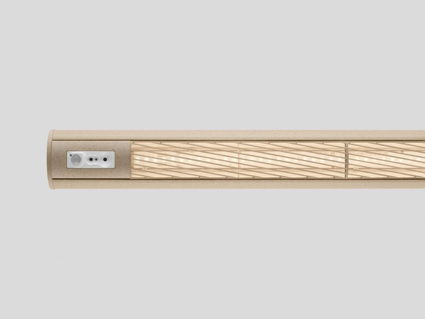
The lighting features twisted louvres. Photo by Ateljé Lyktan

“When we were doing The 7th Room project up in northern Sweden, everything was in pine and there were lots of pine cones,” Osuldsen said.

“We wanted to find a product or material that isn’t used for anything else, so we started testing the use of pine cones by grinding them, but it didn’t work.”

“The fibres in the cones are too short,” said Ateljé Lyktan product director Malin Gadd. “We also tried using coffee grounds but they are even shorter, so we realised quite quickly that we needed fibres that are long and strong.”

“That’s where the hemp fibres come into the picture,” she added.

Snøhetta and Ateljé Lyktan sourced the hemp used for the lights from the Netherlands, as the quality of the hemp from Swedish farmers “wasn’t quite there yet”, according to Gadd.

The Superdupertube light shown in an interiorThe Superdupertube light shown in an interior
Its shape is both extruded and injection-moulded

The hemp is mixed with a polylactic acid (PLA) bioplastic derived from sugarcane, alongside wood cellulose and different minerals to create a fossil- and gas-free composite.

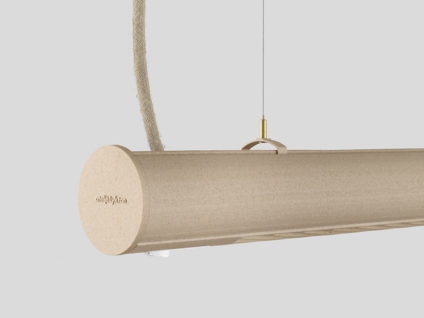
The material is then extruded to create the main body of the lamp, which also comprises injection-moulded louvres and side covers. To add to the organic feel of the light, its electric cables are covered with linen fabric.

“Hemp is an old cultural plant and it’s very easy to renew [by growing more],” Osuldsen said. “And it’s very durable.”

Fastening on hemp lamp by Ateljé LyktanFastening on hemp lamp by Ateljé Lyktan
Linen fabric covers the electric cable. Photo by Ateljé Lyktan

The Superdupertube can be composted in an industrial composter or recycled and ground down into pellets to create more lamps.

However, this currently requires owners to send the lamps back to the producer, as the material cannot be processed in regular recycling centres.

Using the hemp bioplastic reduces the lamp’s carbon footprint by over 50 per cent compared to traditional aluminium variants, according to Snøhetta and Ateljé Lyktan.

Colour of SuperdupertubeColour of Superdupertube
The Superdupertube comes in a natural colour. Photo by Ateljé Lyktan

The dimmable Superdupertube features twisted louvres – an architectural detail that helps the light feel softer by angling the glare away.

“That’s why it’s a perfect workspace luminaire, it’s adapted to be better for the person sitting working and it’s also totally unique – it doesn’t exist on the market,” Gadd said.

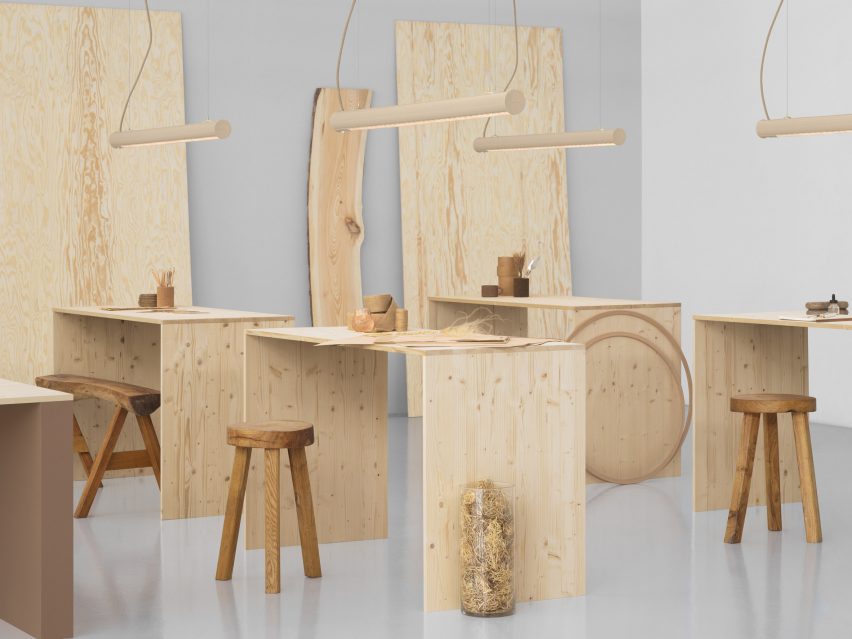
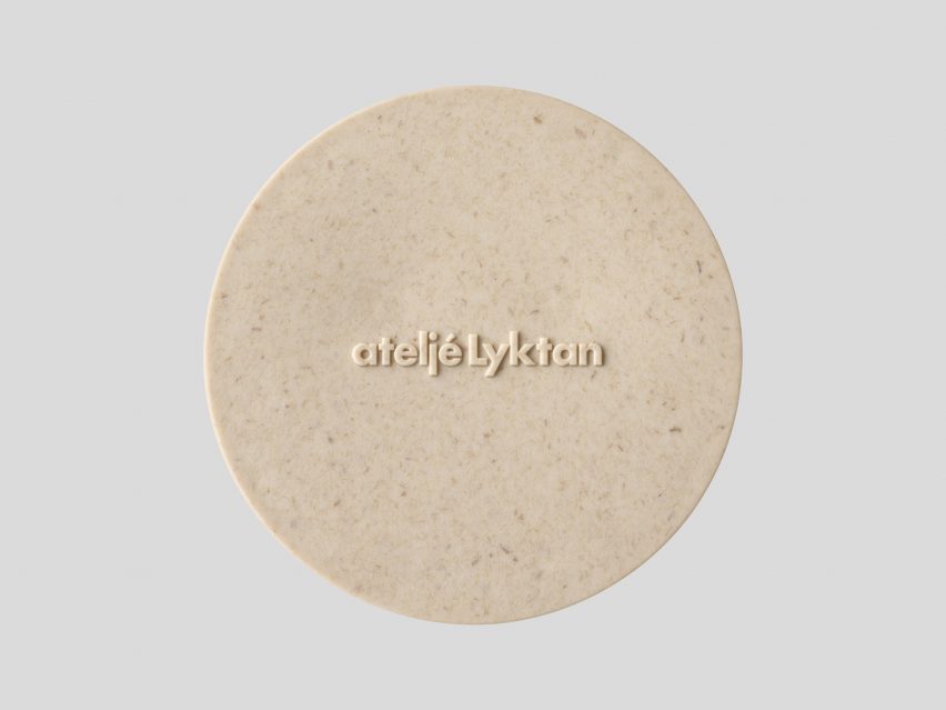
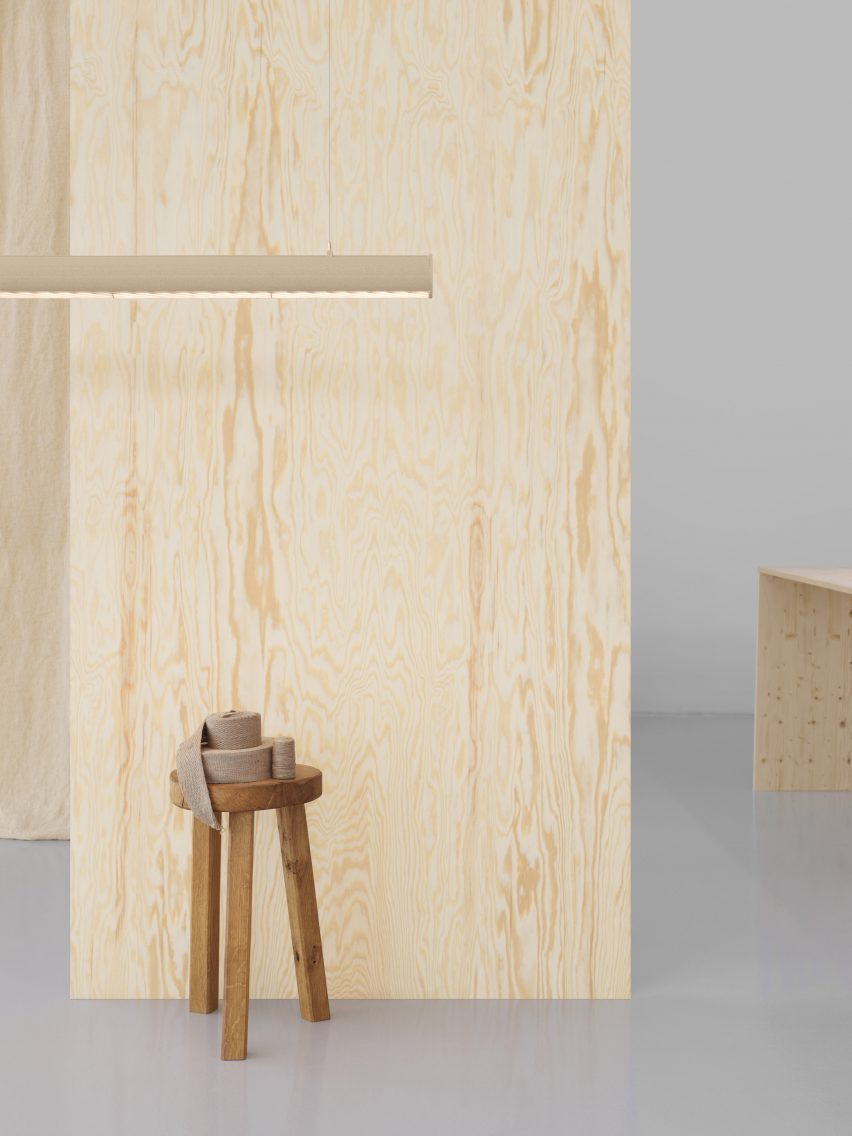
The Superdupertube, which comes in four different lengths, has an organic beige colour with a natural pattern from the hemp and other ingredients.

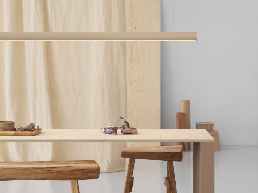
Wooden wall behind Superdupertube lampWooden wall behind Superdupertube lamp
It is the first time Snøhetta has designed an office lamp

“We didn’t really know how it would look,” Osuldsen said. “The material is the colour of the hemp. And, of course, there’s probably something from the sugarcane because it’s heated up. It’s burnt sugar in a way.”

“So we get this specific colour and that also means that all of them will be a little bit different,” she added. “It’s all about the crops; if it’s a wet year or a dry year, the humidity in the material will be a little bit different. That’s why it’s sort of alive.”

Other recent Snøhetta projects include a glass-lined library in China designed to look like a forest and a hexagonal paving system for urban landscapes.

The photography is by Jonas Lindstrom unless otherwise stated.

Reference

Get listed in Dezeen’s digital guide to 3 Days of Design 2024
CategoriesArchitecture

Get listed in Dezeen’s digital guide to 3 Days of Design 2024

If you’re hosting an exhibition or event during 3 Days of Design, you can feature in Dezeen Events Guide’s digital guide to the Danish festival.
Taking place in Copenhagen from 12 to 14 June 2024, the festival includes a programme of exhibitions, product launches, open showrooms, talks and other events.

This year, the 11th iteration of the festival focuses on the theme Dare to Dream and presents furniture, accessories, textiles, surfaces, workplace design, outdoor products and material innovations.

Dezeen’s digital guide will spotlight the key events and brands taking place across the festival’s 13 design districts.

Get listed in Dezeen’s digital guide to 3 Days of Design

Get in touch with the Dezeen Events Guide team at [email protected] to book your listing or to discuss a wider partnership with Dezeen.

There are three types of listings:

Standard listings cost £100 and include the event name, date and location details plus a website link. These listings will also feature up to 50 words of text about the event.

Enhanced listings cost £175 and include all of the above plus an image at the top of the listing’s page and an image in the listing preview on the Dezeen Events Guide homepage. These listings will also feature up to 100 words of text about the event.

Featured listings cost £350 and include all elements of an enhanced listing plus a post on Dezeen’s Threads channel, inclusion in the featured events carousel on the right hand of the homepage for up to two weeks and 150 words of text about the event. This text can include commercial information such as ticket prices and offers and can feature additional links to website pages such as ticket sales, newsletter signups etc.

For more information about partnering with us to help amplify your event, contact the team at [email protected].

About Dezeen Events Guide

Dezeen Events Guide is our guide to the best architecture and design events taking place across the world each year.

The guide is updated weekly and includes virtual events, conferences, trade fairs, major exhibitions and design weeks.

For more details on inclusion in Dezeen Events Guide, including in our guide to 3 Days of Design, email [email protected].

The illustration is by Justyna Green.

Reference

Rafael Viñoly Architects unveils “last project” designed by Rafael Viñoly
CategoriesInterior Design

Rafael Viñoly Architects unveils “last project” designed by Rafael Viñoly

Architecture studio Rafael Viñoly Architects has unveiled designs for a terraced residential building in Uruguay, which is the last project designed by the studio’s founder.

Located outside of Montevideo on a beachfront site, the Médano El Pinar apartment complex will be comprised of approximately 120 luxury, multi-family residences of one to five bedrooms. It is the last project designed by architect Rafael Viñoly, who died last year.

Terraced apartments Terraced apartments
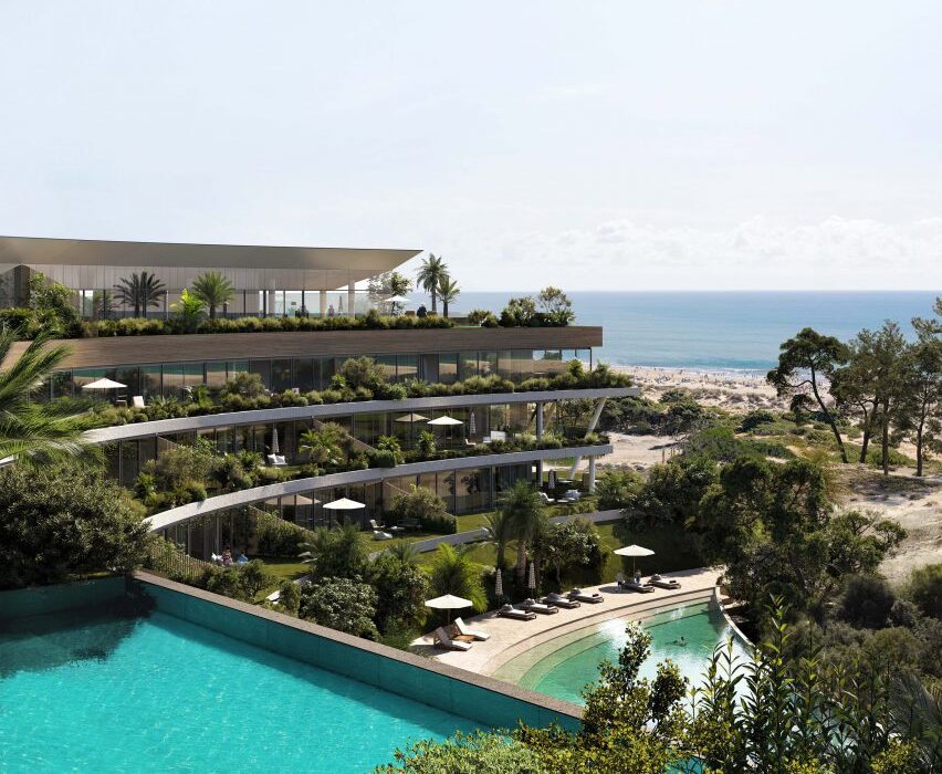
Rafael Viñoly Architects has unveiled designs for a terraced residential complex in Uruguay

“The last project designed by renowned architect Rafael Viñoly, Médano El Pinar is an innovative, ultra-sustainable, luxury, multi-family residential development,” said the studio.

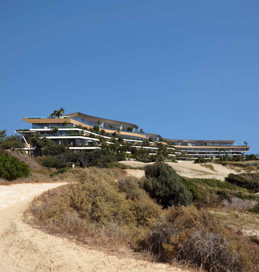
“The building’s long, low-slung, and sinewy shape integrates it with the organic landscape of its pristine setting to minimize its visual impact on the neighbourhood and make it completely invisible from the public beach.”

A terraced hotelA terraced hotel
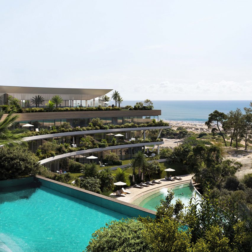
It is the last project designed by the late architect, according to the studio

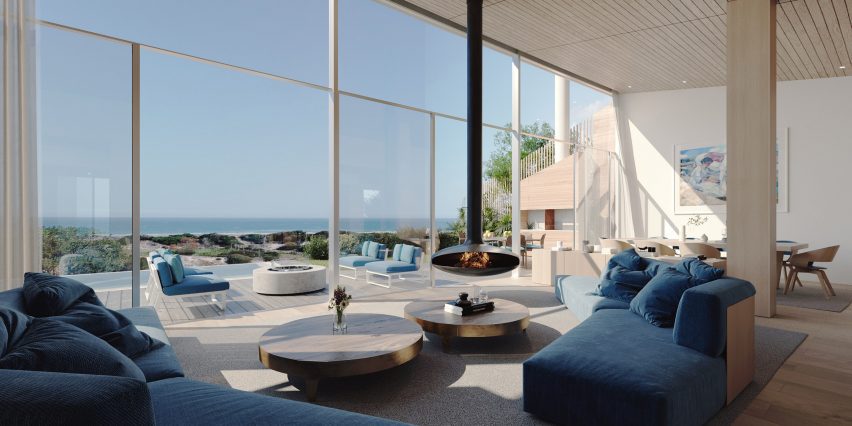
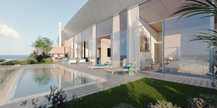
Situated behind sand dunes, renderings show an undulating building with a terraced facade that mirrors the curves of its beachfront site.

Residences will be distributed along its 1,394-foot (425-metre) length and contain glazed facades that will open onto terraces.

Living room with fireplaceLiving room with fireplace
The residences will contain glazed facades and private terraces

“Generously proportioned interiors open to large elevated private gardens with panoramic views, creating a sense of ‘conscious luxury’,” said the studio.

The building will be constructed from a locally sourced mass timber structure, according to the studio, with aims to be “the first nearly Zero-Energy Building”.

Other sustainable strategies integrated into its design will include the use of solar panels, rainwater capture, a green roof and cross ventilation.

Interior renderings show double-height living spaces with wood beams distributed throughout and capped by a wood-slated ceiling.

A building with glass facadeA building with glass facade
The building will be made of a mass timber structure

A wall of floor-to-ceiling windows and sliding glass doors open onto the accompanying terrace, which hosts a small pool or garden and additional seating areas.

A large pool sitting in front of the building is also pictured, with ground-level entrances to the building tucked along its length.

Uruguayan architect Viñoly, who died aged 78, designed numerous buildings around the world including 432 Park Avenue in New York and the Walkie Talkie in London.

Architects and critics including Norman Foster and Michael Kimmelman paid tribute to Viñoly after his passing, and his son Román Viñoly, discussed his legacy in an interview with Dezeen.

Other recent projects in Montevideo include a stacked housing block designed by MVRDV and a prefabricated multi-storey car park by MAPA.

The images are courtesy of Rafael Viñoly Architects.

Reference

Seven playful living spaces where swings provide dynamic seating
CategoriesInterior Design

Seven playful living spaces where swings provide dynamic seating

This lookbook compiles seven living spaces where swings show they have a place beyond children’s playgrounds by providing a gleeful alternative to static seating.

Swings typically consist of a seat made from a flat piece of metal, plastic, wood or canvas, but can also be made from found materials such as tyres and sometimes feature a wraparound design for added safety.

This seat is then suspended by sturdy lengths of rope or chain from a frame, ceiling or tree.

Swings have been used for hundreds of years by cultures across the world for both leisure and ritual-related purposes, and are enjoyed by people of all ages, from children in play areas to older people who might have swinging benches in their gardens.

From basic playground swings transplanted into grown-up interiors to intricately crafted bench swing seats that look out over lush courtyards, read on to view a selection of interiors on Dezeen that feature suspended seating.

This is the latest in our lookbooks series, which provides visual inspiration from Dezeen’s archive. For more inspiration, see previous lookbooks featuring interiors animated by indoor slides, living spaces featuring metal furniture and spaces with oversized windows.


Covered walkway with swing seat looking out onto an open-air courtyard with treesCovered walkway with swing seat looking out onto an open-air courtyard with trees
Photo by Ishita Sitwala

Gujarat house, India, by Design ni Dukaan

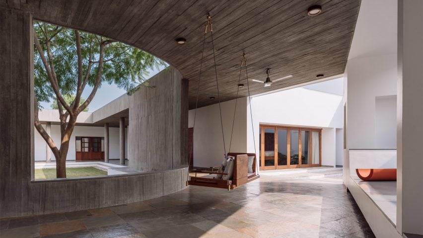
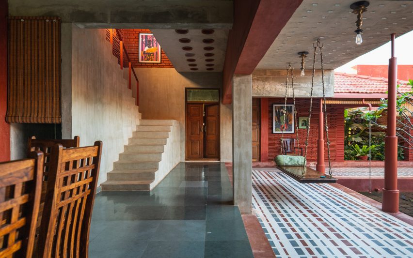
A wooden swing seat covered in pillows is suspended from the concrete ceiling of this house in the Indian state of Gujarat.

The swing is situated in one of the house’s covered walkways and was positioned to allow the sitter to enjoy views of its open-air courtyard.

Find out more about Gujarat house ›


Kenwood Lee House by Cousins & Cousins (RIBA house of the year longslist)Kenwood Lee House by Cousins & Cousins (RIBA house of the year longslist)
Photo by Jack Hobhouse

Kenwood Lee House, UK, by Cousins & Cousins

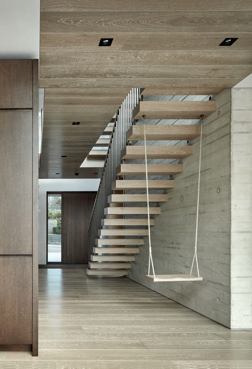
A cantilevered floating stair anchors a swing inside the hallway of this house in north London by local studio Cousins & Cousins.

The wooden seat is suspended by softly frayed rope, creating a subtly rustic composition that compliments both the poured-concrete finish of the walls and the wood used on the ceiling, cabinets and front door.

Find out more about Kenwood Lee House ›


Covered living space beside courtyard with swing seatCovered living space beside courtyard with swing seat
Photo by Yash R Jain

Karai, India, by Rain Studio

Local office Rain Studio hung a polished wooden swing seat overlooking a verdant courtyard in this house near the city of Chennai in southern India.

The seat is suspended from all four corners by ornately cast metal hooks and links, some of which feature animals such as elephants.

Find out more about Karai ›


Living room with concrete fireplace and a swingLiving room with concrete fireplace and a swing
Photo by Chase Daniel

Austin House, USA, by Melanie Raines

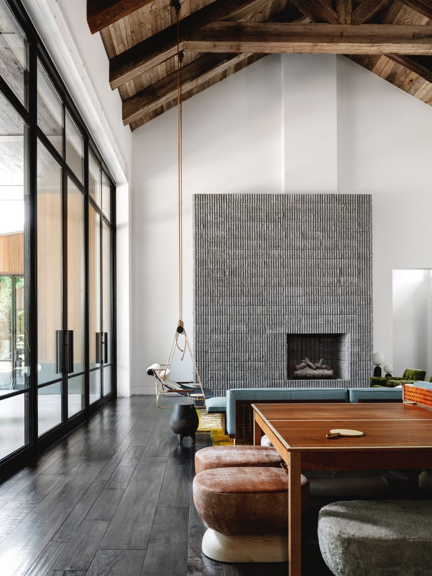
Rustic Californian barns provided reference points for this house in Austin, Texas, which features a lofty double-height living space complete with multiple seating options.

A metal-framed lounge chair flanked by integrated side tables is suspended from the ceiling’s wooden rafters by two long lengths of rope, adding to the interior’s whimsical atmosphere.

Find out more about Austin house ›


Living room interior of Out of the Blue apartment in IndiaLiving room interior of Out of the Blue apartment in India
Photo by The Fishy Project

Thane apartment, India, by The Act of Quad

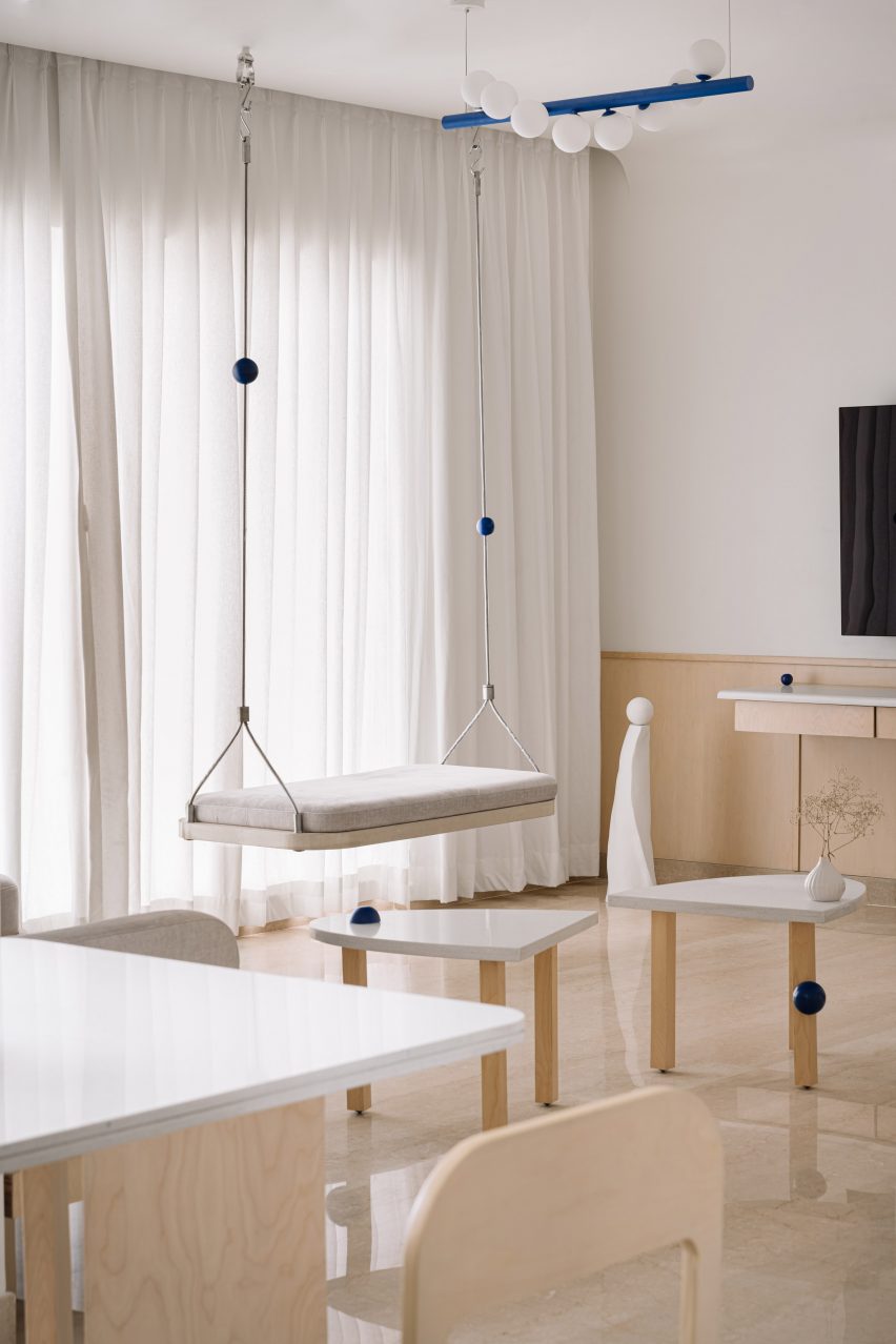
Rigid metal uprights, each threaded with a cobalt-blue sphere, tie this swing seat in with the rest of the apartment’s blue-themed interior scheme, created by design studio Act of Quad.

The seat is softened by a slim cushioned pad and has been attached to the ceiling with metal hardware.

Find out more about Thane apartment ›


The Perch by Chadbourne + Doss ArchitectsThe Perch by Chadbourne + Doss Architects
Photo by Kevin Scott

The Perch, USA, by Chadbourne + Doss

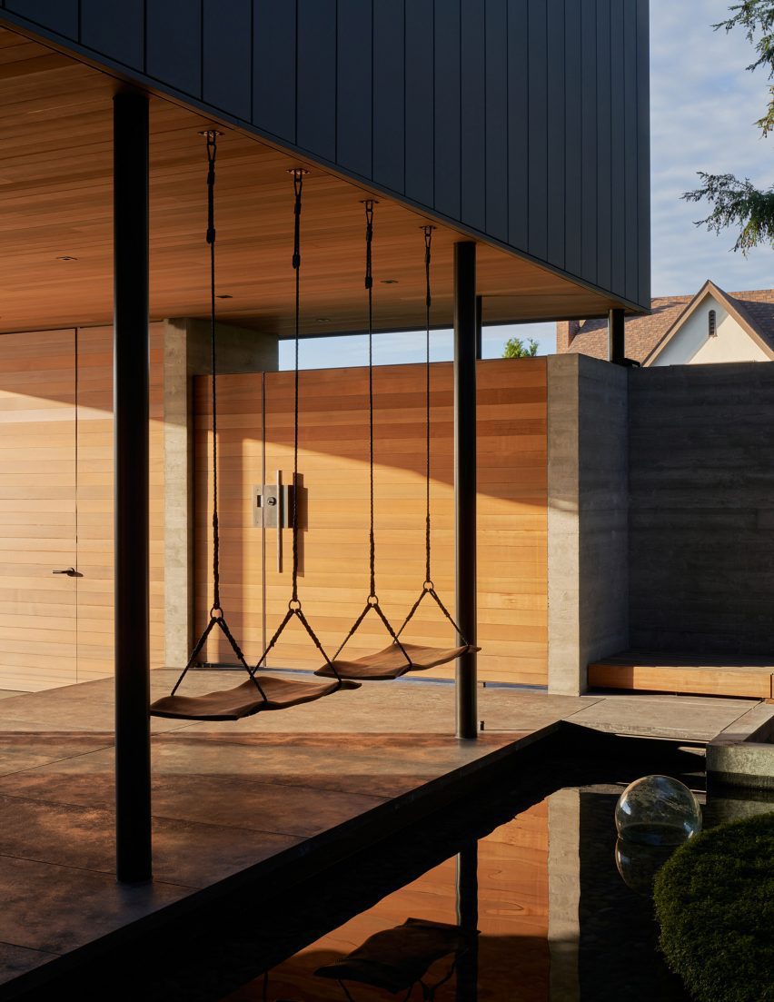
A pair of swings are strung up on the boundary between a covered entryway and a courtyard pond in this house in Seattle.

The seats themselves were made from sheets of walnut timber and intended to provide the sitter with the experience of floating above the water.

Find out more about The Perch ›


Living room in a high-ceilinged apartment with a swing hanging in itLiving room in a high-ceilinged apartment with a swing hanging in it
Photo by BCDF studio

Parisian loft, France, by Isabelle Heilmann

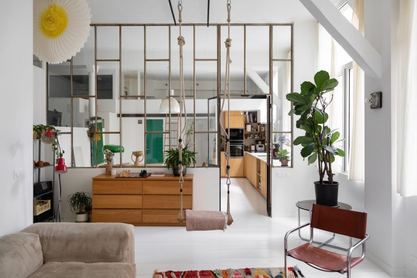
Hooks, carabiners and thick, knotted ropes affix this swing to the tall ceilings of this Parisian apartment’s living room.

The suspended seat slots in comfortably with the rest of the eclectically-chosen furniture, including a mid-century cantilevered chair and a slouchy, ribbed sofa.

Find out more about Parisian loft ›

This is the latest in our lookbooks series, which provides visual inspiration from Dezeen’s archive. For more inspiration, see previous lookbooks featuring interiors animated by indoor slides, living spaces featuring metal furniture and spaces with oversized windows.

Reference

22RE invokes “stillness” inside green Miami golfing boutique
CategoriesInterior Design

22RE invokes “stillness” inside green Miami golfing boutique

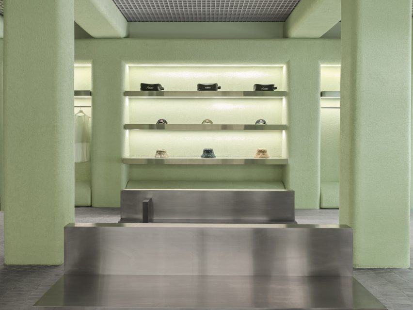
Los Angeles studio 22RE has used pale-green stucco informed by Miami’s colours and golf courses for the interiors of a golf clothing boutique in the city.

A few blocks from the ocean, the Malbon store in Coconut Grove serves a large customer base for the brand in South Florida – a popular golfing destination thanks to year-round warm weather.

Store interior with green stucco columns and radial grey floor tilesStore interior with green stucco columns and radial grey floor tiles
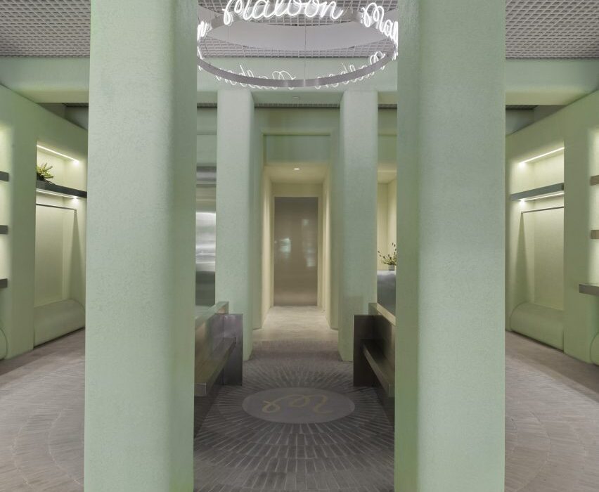
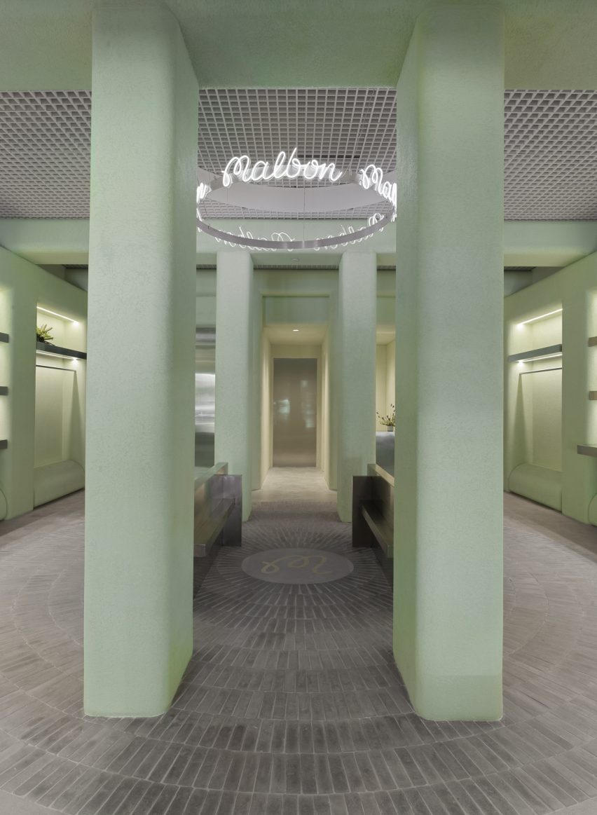
The Malbon Miami store revolves around a central area, from which handmade tiles emanate in a radial pattern across the floor

The verdant neighbourhood and Miami’s distinct architecture provided 22RE with a starting point to build upon, aiming to create a tranquil space amongst such vibrancy.

“We intended to create an oasis within the city, one that invoked stillness – a feeling that Malbon customers are accustomed to while they’re out on the green,” 22RE founding principal Dean Levin told Dezeen.

Golf clothing boutique with green stucco wallsGolf clothing boutique with green stucco walls
Pale green stucco covers the walls, columns and ceiling beams

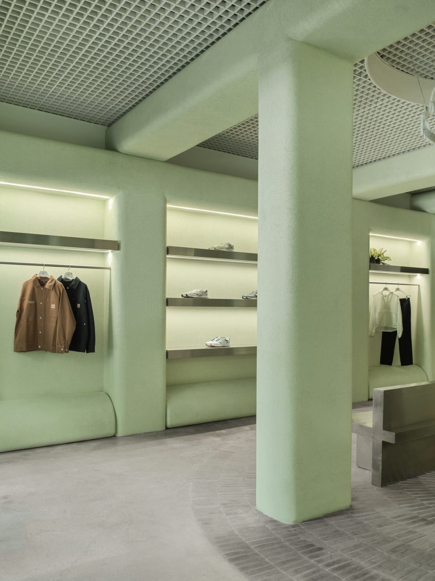
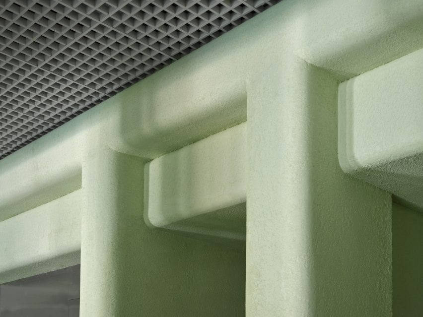
The store’s most striking feature is the pale green stucco that covers the majority of vertical surfaces and ceiling beams that form square archways overhead.

“The shade of green used throughout the space was inspired by the studio’s first visit to the location, and inspired by the vibrant hues associated with Miami as a city,” said Levin.

Accessories displayed on stainless steel shelves, surrounded by green stuccoAccessories displayed on stainless steel shelves, surrounded by green stucco
Merchandise is kept to the perimeter of the store, displayed on stainless steel rails and shelves

The placid hue is contrasted with stainless steel elements including the sales counter and a doorway to the stock room.

From the centre of the space, mid-grey handmade Mexican tiles are laid across the floor in a radial pattern, emanating from a circular plaque that displays the brand’s monogram.

Filleted stucco surfaces contrast an aluminium open-cell grid ceilingFilleted stucco surfaces contrast an aluminium open-cell grid ceiling
Filleted stucco surfaces contrast the aluminium open-cell grid ceiling

A ring-shaped installation above, suspended from an aluminium open-cell grid ceiling, also bears the Malbon logo scribed repeatedly in white neon.

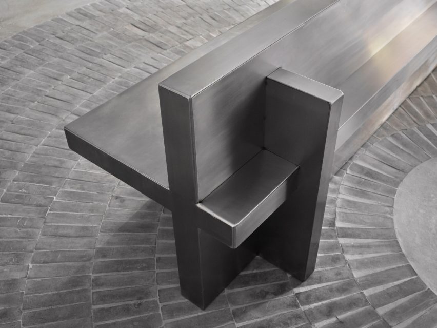
Four columns and a pair of stainless steel benches define this central area, which is intentionally devoid of merchandise to create a moment for pause and conversation between customers.

Clothing and accessories are kept to the perimeter, displayed in illuminated niches on stainless steel rails or shelves.

“In retail stores, there is a predominantly unchanging relationship between salesperson and customer,” Levin said. “We wanted to consider and account for the things we could – foot traffic, merchandising and general flow.”

Detail of a stainless steel bench made from perpendicular planesDetail of a stainless steel bench made from perpendicular planes
A pair of stainless steel benches offer a place for pause and conversation in the middle of the boutique

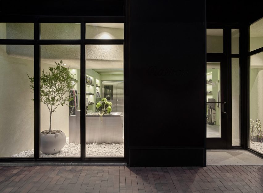
Behind the street-facing windows, white stones cover the floors and plants so that the store “feels like a natural extension of the vegetation and foliage” in the surrounding area, said Levin.

“Through juxtaposing a variety of different materials both organic and industrial, the Malbon Miami storefront is an accurate reflection of the values we celebrate and preserve as an architecture and design firm,” he added.

Storefront with greenery behind large windowsStorefront with greenery behind large windows
The storefront contains greenery to create a natural extension of the verdant surroundings of Coconut Grove

Miami has grown significantly as a retail destination over the past decade, with a large concentration of new luxury stores in the city’s Design District.

Brands including Louis Vuitton, Off-White and Christian Louboutin all have distinctly designed outposts in the neighbourhood.

The photography is by Erik Stackpole.


Reference

Home Studios refreshes The Wren pub on NYC’s Bowery
CategoriesInterior Design

Home Studios refreshes The Wren pub on NYC’s Bowery

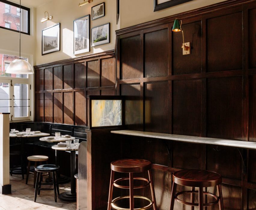
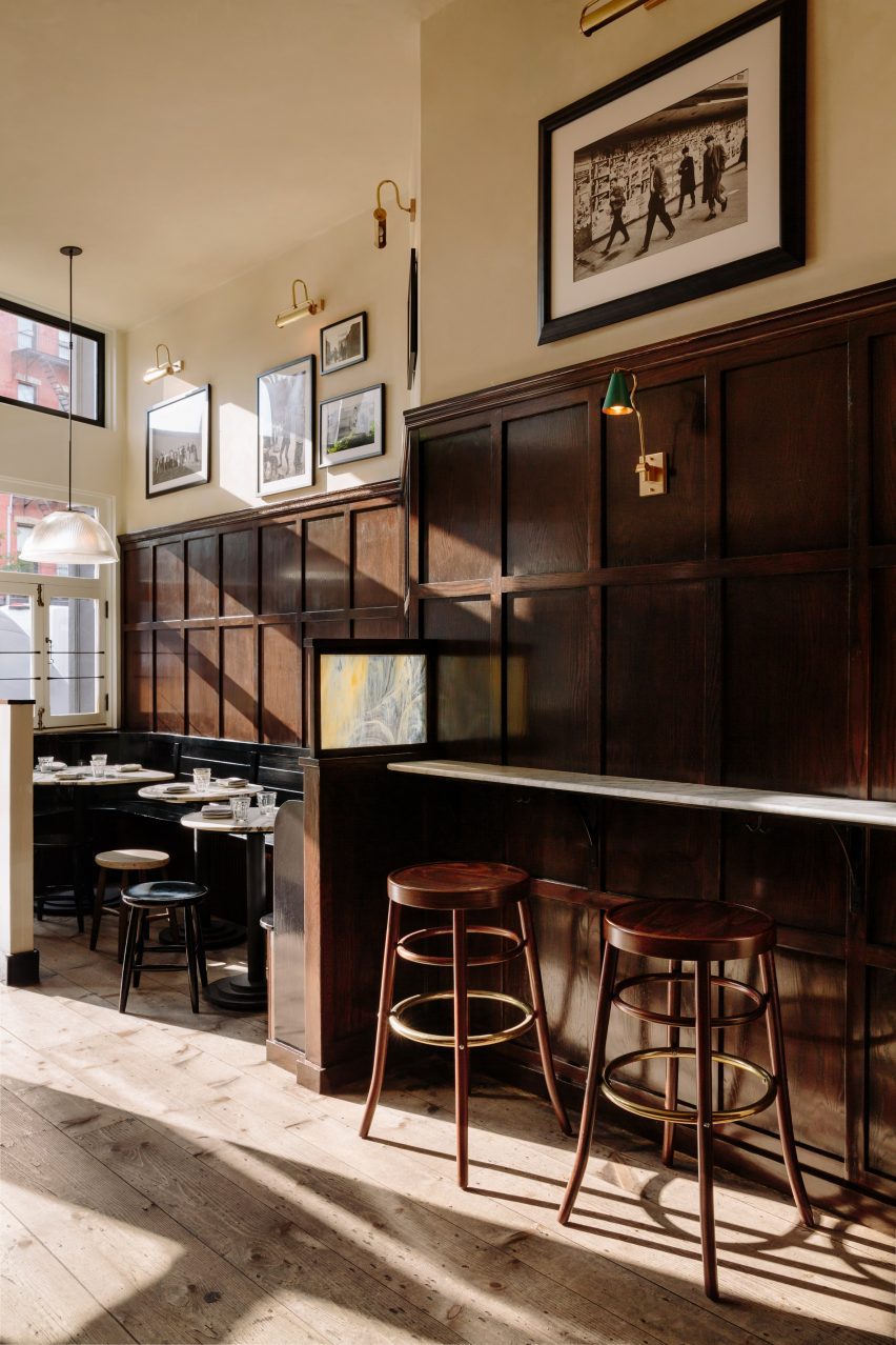
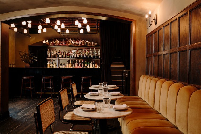
Brooklyn-based Home Studios has remodelled a bar and restaurant in New York’s East Village, using dark wood and velvet seating to retain a “worn-in and aged appearance”.

The Wren on the busy Bowery thoroughfare has become a neighbourhood staple since opening in 2012, but was ready for an interior revamp.

Entrance area of The Wren with walnut wall panelling and hardwood floorsEntrance area of The Wren with walnut wall panelling and hardwood floors
The Wren has been remodelled in a way that retains its rustic charm

Home Studios refreshed both levels of the upscale pub, including the upper-floor dining and drinking area, and private lounge downstairs.

“Despite the changes in the city and the evolution of the neighbourhood, The Wren has maintained its timeless appeal, offering visitors a glimpse into the past and an authentic pub experience,” said Home Studios, led by founder Oliver Halsegrave.

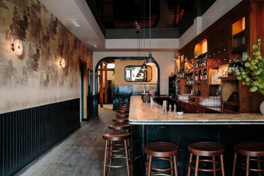
L-shaped bar with a marble counter and surrounded by wooden stoolsL-shaped bar with a marble counter and surrounded by wooden stools
The L-shaped bar has a marble counter and is surrounded by GAR Products stools

Across the main level, dark and moody materials have been used to retain the pub-like quality of the spaces, assisted by the exposed wooden ceiling beams and columns, and hardwood floors.

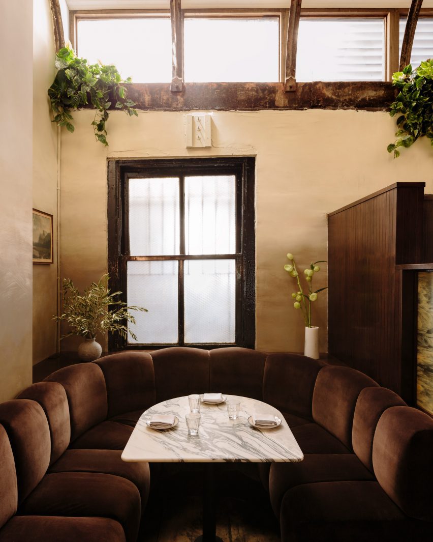
Either side of the entrance, black-painted, booth-style benches are installed against the walnut wall panelling, creating cosy nooks for pairs or small groups to occupy.

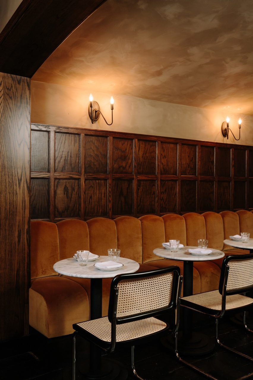
Chocolate-coloured velvet banquette featuring ribbed cushionsChocolate-coloured velvet banquette featuring ribbed cushions
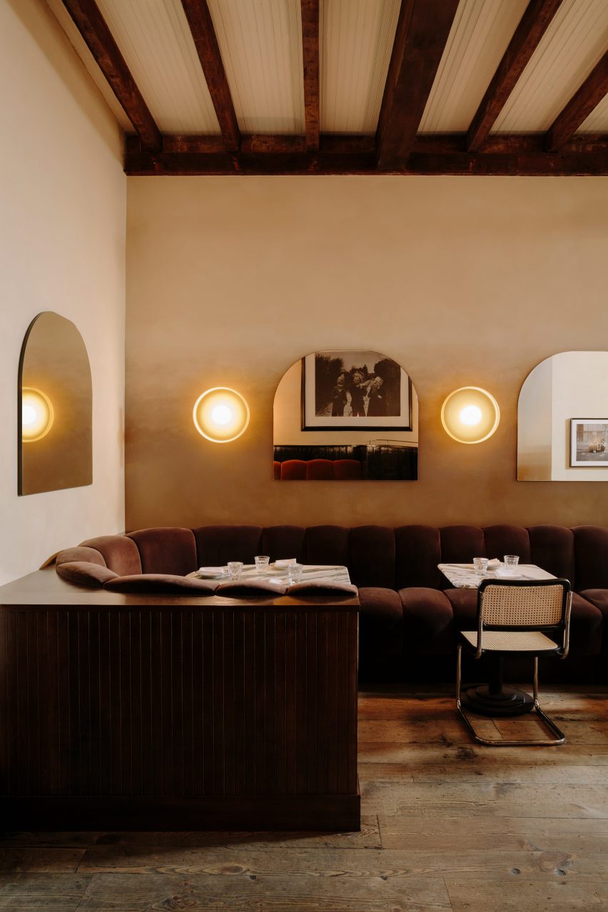
Towards the back, a chocolate-coloured velvet banquette features ribbed cushions

The bar area features an L-shaped marble counter surrounded by GAR Products stools, opposite black wainscoting that runs below vintage-looking wallpaper.

Towards the back, a long banquette is dressed in ribbed cushions that form the seating and backrests, all wrapped in brown velvet.

Row of custom mirrors alternated with disk-shaped sconces above tablesRow of custom mirrors alternated with disk-shaped sconces above tables
Custom mirrors alternate with disk-shaped sconces by In Common With

Custom arched shaped mirrors mounted on the walls alternate with disk-shaped sconces by In Common With, against a beige textured plaster backdrop.

A variety of other sconces throughout were sourced from lighting brands including O’Lampia, Shades of Light, Allied Maker and Rejuvenation.

U-shaped both below two windowsU-shaped both below two windows
Guests can choose from a variety of booths, two-tops or standing areas

“With a worn-in and aged appearance, the space now exudes a moody winter-like atmosphere,” said Home Studios.

Downstairs, the mood is even more “sultry” and intimate, thanks to darker surfaces and a variety of dim, warm lighting sources.

The bar counter is made from Black Portoro marble and the wood floors are also stained black, while the banquette upholstery is a lighter tone than found on the upper level.
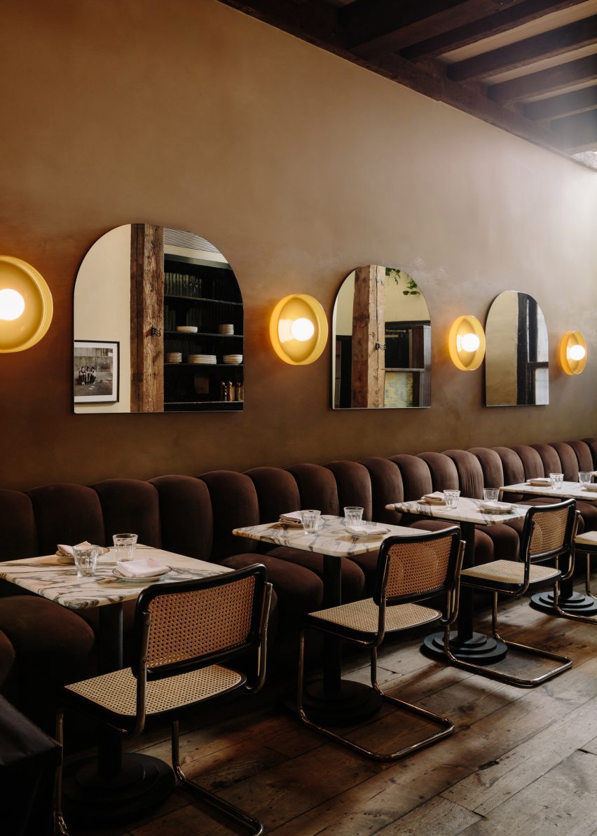
Between the two floors, guests can choose from a variety of seating or standing spots for enjoying their beers, cocktails and bar food.
Banquette below walnut panelling and candle sconcesBanquette below walnut panelling and candle sconces
In the private area downstairs, the mood is more sultry and the banquette upholstery is lighter in colour

“Home Studios has seamlessly blended nostalgic and rustic charm throughout The Wren’s interior, creating an inviting and distinctive ambiance that pays homage to the bar’s storied history,” said the team.

Home Studios is no stranger to refreshing beloved establishments, having completed interiors for The Bird in Montauk and The Pearl in Nantucket.

Downstairs area featuring dark-stained floors and a black marble bar counterDownstairs area featuring dark-stained floors and a black marble bar counter
The downstairs area features dark-stained floors and a black marble bar counter

The firm also recently turned a conference centre in Northern California back into a luxury hotel, as originally intended by the property’s founder: the inventor of the radio.

The photography is by Brian W Ferry.

Reference

Studio Bark designs water-powered Breach House in UK countryside
CategoriesSustainable News

Studio Bark designs water-powered Breach House in UK countryside

London-based practice Studio Bark has unveiled plans for Breach House, a water-powered family home located in Leicestershire, UK.

Designed to enable the owners to “live off the land”, the proposal by Studio Bark will be powered by photovoltaic (PV) panels and micro-hydro energy, creating a home capable of running off-grid.

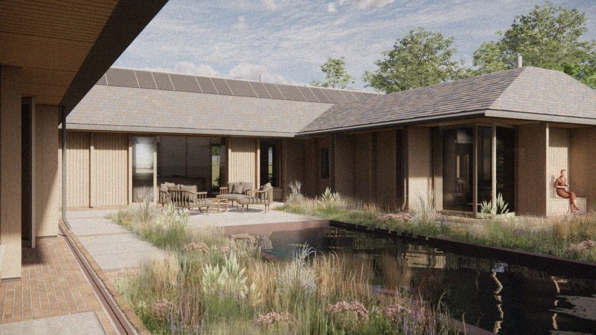
Render of water-powered home by Studio BarkRender of water-powered home by Studio Bark
Breach House will be powered by photovoltaic (PV) panels and micro-hydro energy

The 430-metre-square proposal will comprise the new home, along with the restoration of an existing agricultural barn and extensive landscaping.

Making use of the site’s location among a network of small brooks, streams and ponds, run-off water from the surrounding fields will be used to provide a portion of the home’s energy needs. It will also be harvested on-site and filtered for use within the house.

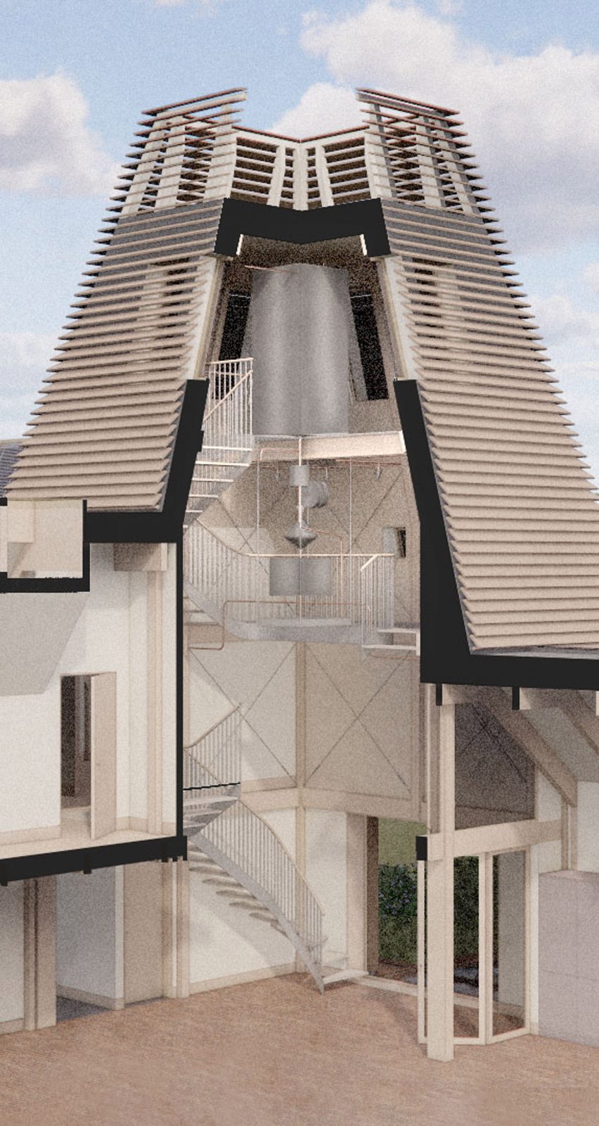
View of 'water tower' within Breach House by Studio BarkView of 'water tower' within Breach House by Studio Bark
The ‘water tower’ connects the home’s two wings

“The concept is a rural home which establishes a reciprocity between ecology and human needs through water,” studio director Tom Bennett told Dezeen.

“The massing echoes the typology of a traditional farmstead, blending contextual influences to create a contemporary building which resonates subtly with its setting.”

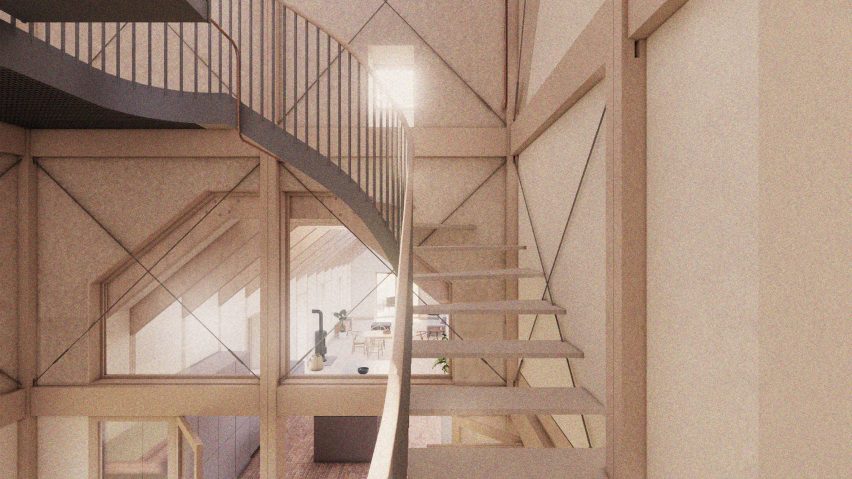
Interior render of Breach House in Leicestershire Interior render of Breach House in Leicestershire
The design references the typology of traditional farm buildings

Drawing on the local typologies, the home will be arranged in clusters complemented by courtyards and sheltered outdoor spaces formed by deep overhanging eaves.

A ‘water tower’, which will sit centrally on the site, will house ventilation and circulation functions as well as water filtration.

It will also hold a staircase and corridor to connect the home’s two wings and was designed to be a visual reference to the use of water throughout the scheme.

Low carbon and natural materials suggested for the proposal include reclaimed brick, UK-sourced timber and reclaimed tiles, which were chosen in response to the character and heritage of the surrounding landscape.

Renders of the proposal reveal a largely timber structure, with exposed beams interspersed with skylights featuring on the home’s interior.

On the exterior, trapezoidal-shaped roofs will be clad with decorative tiles and provide shelter for a balcony adjacent to the bedroom on the upper floor.

Render of living interior at water-powered home by Studio BarkRender of living interior at water-powered home by Studio Bark
Exposed timber beams and skylights will feature on the home’s interior

According to the studio, the residual carbon impact of the building is expected to be countered by landscaping proposals – including the planting of around 200 trees – that will accelerate carbon drawdown on the site.

Calculations undertaken by the studio suggest that these landscaping proposals will sequester roughly three times the amount of carbon that will be released over the building’s lifetime.

Render of living space within Breach House in LeicestershireRender of living space within Breach House in Leicestershire
Run-off water will be harvested and filtered for use within the home

“Proposed works include a new woodland area, wet meadow, enriched wildflower meadow, reinstated historical copse, successional tree planting, new ponds and reinstated field boundaries,” Bennett said.

“These measures will sequester carbon, greatly enhance the ecological value of the currently agricultural site, in addition to assisting with natural flood management in the locality.”

Proposed bedroom interior within Breach House by Studio BarkProposed bedroom interior within Breach House by Studio Bark
Breach House is expected to result in a 65 per cent biodiversity net gain

The proposal is anticipated to result in a 65 per cent biodiversity net gain, with additional habitat measures incorporated into the home set to include a bat attic.

Other architectural projects with a heavy focus on sustainability include the UK’s “most sustainable” and largest neighbourhood made from timber and a neighbourhood in Paris made up of limestone buildings.

The renders are courtesy of Studio Bark.


Project credits:

Architect: Studio Bark
Planning consultant/agent: Studio Bark
Client: Private Domestic
Structural engineer: Structure Workshop
Landscape architect: Studio 31
Energy consultant: Max Fordham
Hydrologist: Amber Planning
Ecologist: Elton Ecology
Arboriculturalist: RJ Tree Services
Highways: Create Consulting Engineers

Reference

This week Riken Yamamoto won the Pritzker Architecture Prize
CategoriesArchitecture

This week Riken Yamamoto won the Pritzker Architecture Prize

Riken Yamamoto

This week on Dezeen, Japanese architect Riken Yamamoto was awarded the Pritzker Architecture Prize for his buildings that aim to foster community.

Yamamoto, who became the 53rd architect to be awarded the Pritzker Architecture Prize, was recognised for his work created over a five-decade career.

Riken Yamamoto key projectsRiken Yamamoto key projects
We rounded up Riken Yamamoto’s key projects

To celebrate Yamamoto’s win, we looked back at 15 of his most interesting projects that often use glass, terraces and balconies to encourage transparency and foster community.

Also in response to this year’s winner, Dezeen editor Tom Ravenscroft wrote an opinion piece drawing attention to the fact that Japanese men have won the prize more times than women.

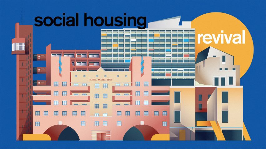
Social Housing Revival artwork by Jack BedfordSocial Housing Revival artwork by Jack Bedford
This week we launched Social Housing Revival

This week, we also kicked off our latest series – the Social Housing Revival, which will explore the current discussions on social housing and celebrate the best contemporary examples.

To kick off the series, Peter Apps called for a return to mass public house-building. “We need a major shift in the way we look at public housing”, he wrote in an opinion piece.

Dezeen's International Women's Day power list 2024Dezeen's International Women's Day power list 2024
Dezeen compiled a list of the 50 most influential women in architecture and design

To celebrate International Women’s Day we compiled a list of the 50 most influential women in architecture and design.

In a follow-up to an article written seven years ago, where she declared “I am not a female architect. I am an architect”, Dorte Mandrup wrote an opinion piece discussing the need for gender-based lists.

“The persistent need for distinction is a symptom of inequality and prejudice,” she wrote. “It should be common practice to include women in the general architectural discourse.”

Notre-Dame's spire was revealedNotre-Dame's spire was revealed
Notre-Dame’s spire was revealed

In Paris, the reconstructed spire at Notre-Dame cathedral was revealed as scaffolding was removed from the building.

The 96-metre-high spire was designed to be identical to the 1859 version designed by architect Eugène Viollet-le-Duc.

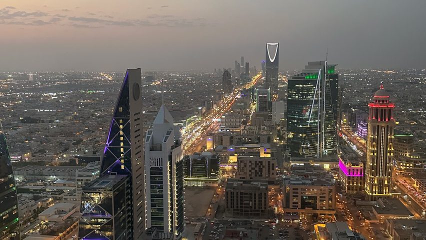
Riyadh skylineRiyadh skyline
Foster + Partners is reportedly designing a two-kilometre-high skyscraper

In other architecture news, it was reported that Foster + Partners is designing a skyscraper in Saudi Arabia that, if built, would be the tallest in the world.

According to a report in UK architecture magazine Architects’ Journal, the skyscraper planned for a site north of Riyadh will be two kilometres tall.

Pinwheel shelter in the Italian Alps by EXPinwheel shelter in the Italian Alps by EX
A tent-like refuge was one of this week’s most popular stories

Popular projects this week included a tent-like refuge with panoramic views of the Italian Alps, a rural retreat built in a concrete pig shed and Gensler’s own office in LA.

Our latest lookbooks featured inviting breakfast nooks for easy-going mornings and homes kept cool and bright by central courtyards.

This week on Dezeen

This week on Dezeen is our regular roundup of the week’s top news stories. Subscribe to our newsletters to be sure you don’t miss anything.

Reference

Erik Bratsberg fills Persona restaurant with tactile materials
CategoriesInterior Design

Erik Bratsberg fills Persona restaurant with tactile materials

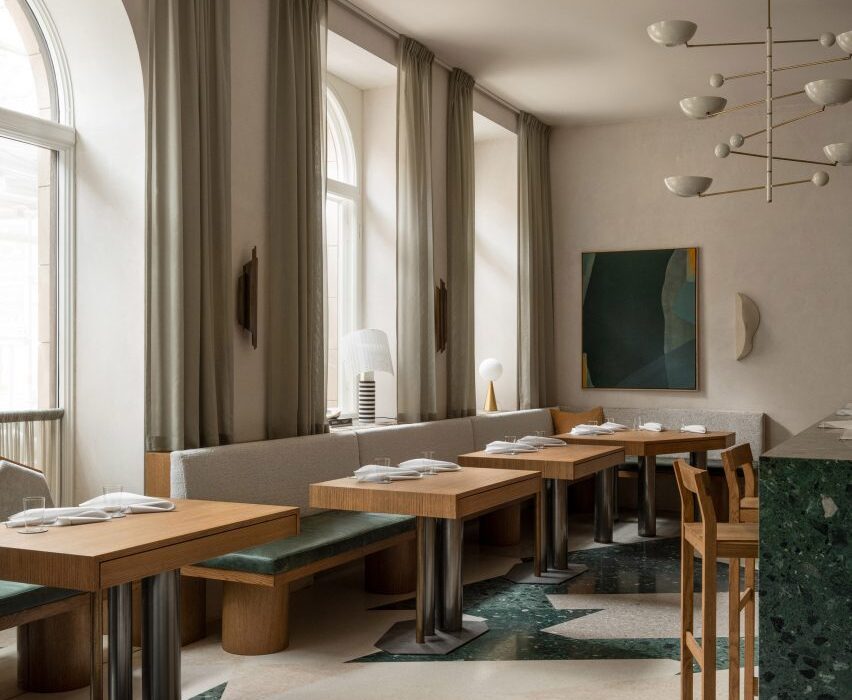
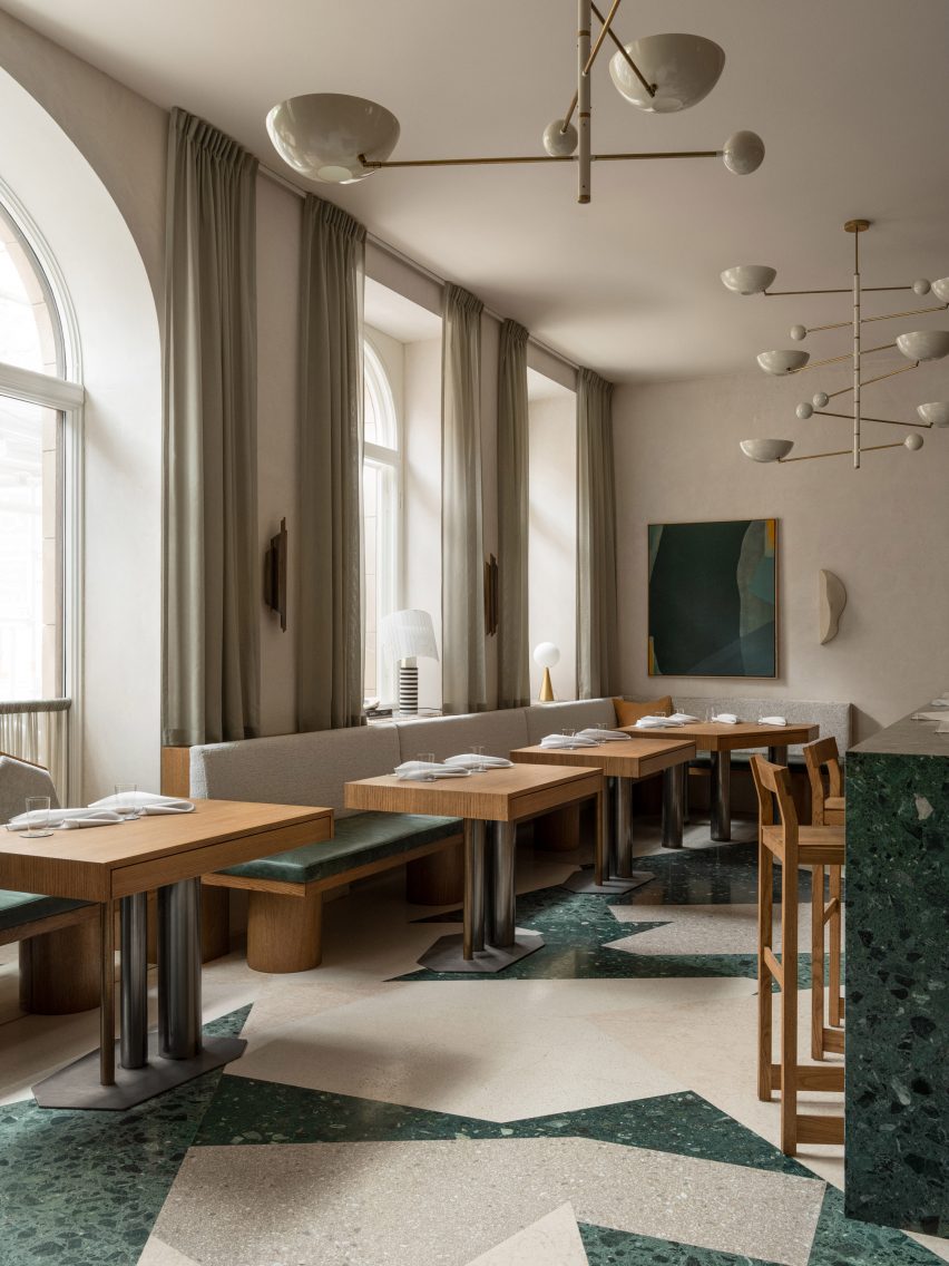
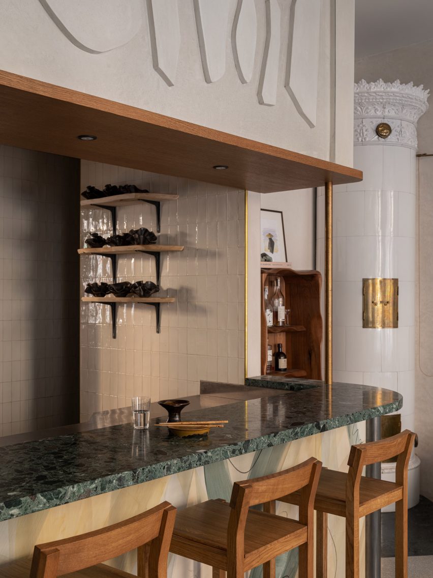
Interior designer Erik Bratsberg has created unique artwork for the interior of the Persona restaurant in Stockholm, which also features asymmetrical terrazzo and patinated brass details.

Bratsberg, who worked in finance before moving into interior design, wanted the fine dining restaurant in Stockholm’s upmarket Östermalm neighbourhood to have a warm and welcoming feel.

Terrazzo floor at PersonaTerrazzo floor at Persona
Persona is located in Stockholm’s Östermalm area

“The inspiration is drawn from a mix of personal experiences, subconscious imprints from admired styles, particularly mid-century Italian design, and a desire to integrate a homely warmth into a hospitality environment,” he told Dezeen.

“The design philosophy centres around creating a timeless, inviting space that enhances the dining experience while maintaining a sense of personal touch and intimacy.”

Bar in Stockholm restaurantBar in Stockholm restaurant
Green tones feature throughout the interior

Green hues are used throughout Persona‘s 120-square-metre interior, complementing its cream-coloured walls and numerous wooden furniture pieces and panelling.

“Green is my go-to when I want to arouse a sense of calmness and comfort,” Bratsberg explained.

Soft white chairs in front of curtained windowSoft white chairs in front of curtained window
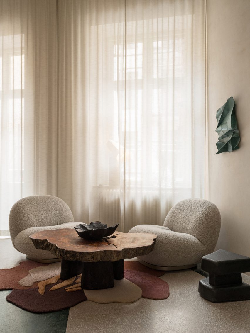
Designer Erik Bratsberg used furniture pieces with rounded and organic shapes

“It’s a tertiary colour, a mix of a cold and a warm colour, which allows it to go well with both warmer and colder hues and materials – a yin and yang of colours somehow,” he added.

“Green also brings the mind to nature and I guess my love for green relates to the joy of seeing the leaves back on the trees after a long Swedish winter.”

Wood-panelled wall in Östermalm restaurantWood-panelled wall in Östermalm restaurant
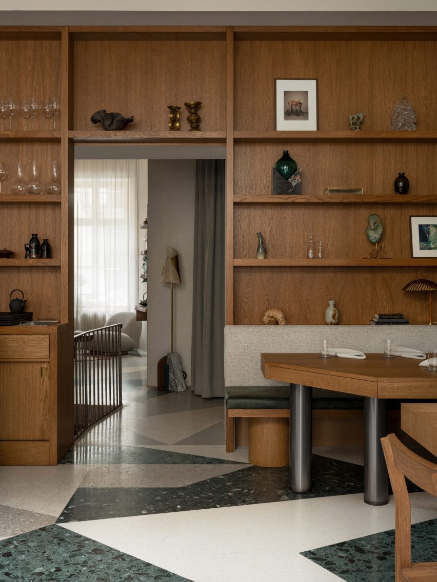
“Honey-tinted” oak shelving is filled with crockery and art

The restaurant, which feels more like a living room than an eatery in parts, also features plenty of natural materials such as stone and wood, which are interspersed with terrazzo and brass to create tactile interest.

This material mix was chosen to evoke a sense of “casual elegance”, Bratsberg said.

“For the floor I played around with the possibilities of terrazzo, using shades of green and warm greys and whites forming an asymmetrical pattern,” the designer explained.

Bratsberg clad the walls of the Persona restaurant in an off-white plaster with a mottled surface, designed to contrast the “silky honey-tinted oak” used for the wall shelving and tables.

“Patinated brass together with details in yellow ochre acts as an accent,” Bratsberg added. “Sheer curtains, patinated leather and textured textiles round it all off.”

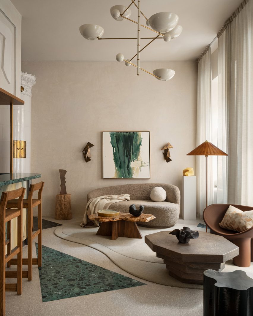
Living-room like corner in Persona eateryLiving-room like corner in Persona eatery
Bratsberg created his own artworks for the restaurant

Custom-made abstract artworks also decorate the interior. Bratsberg made these himself from watercolour paintings that he had made, which were then screen-printed onto acoustic panels.

“In my multidisciplinary practice I strive to interrelate my art, design and interior work – why not make a lamp into sculpture, or a bar front as a painting, or a plain wall a relief?” Bratsberg said.

Jagged shapes decorate Stockholm restaurantJagged shapes decorate Stockholm restaurant
Cut-out geometric details add extra interest to the bar

Also notable in the interior is the variation of shapes, with the angular tables and counters contrasting against round and jagged lamps, cut-out geometric details and smaller tables made from organically shaped burl wood and stone.

“Perfectly straight lines and symmetry bring order and calmness for the eye, but never have I been particularly intrigued by squares and straight lines,” Bratsberg said.

“On the other hand, too much asymmetrical geometries and organic shapes can bring the feeling of disorder. But balancing the two – as with many opposites or contrasts – can create an interesting harmony,” he added.

Bathroom of Persona restaurantBathroom of Persona restaurant
The bathroom features undulating mirrors and a mix of different shapes

In the bathroom, undulating mirrors match a wavy sink and are juxtaposed against square wall niches and angled, jagged cut-out wall decorations.

“Forms, lines, colours and materiality speak to us in mysterious ways, but an interior without any sculptural form and asymmetries is like a language without exclamation marks, gestures or emotional expression to me,” Bratsberg concluded.

Other Stockholm restaurants with interesting interiors featured on Dezeen include an “unexpected” restaurant in a historic food hall and a decadent Italian restaurant located in a former cinema.

The photography is by Erik Lefvander.


Reference