ORA creates modern home in 500-year-old Czech Renaissance building
CategoriesInterior Design

ORA creates modern home in 500-year-old Czech Renaissance building

Czech architecture studio ORA has renovated a Renaissance-era house in the town of Český Krumlov, preserving original features like its carved wooden beams while adding free-standing contemporary furniture.

Local entrepreneurs Petra Hanáková and Radek Techlovský purchased the dilapidated house in the town centre in 2016 and asked ORA to oversee a modernisation process that retains the interior’s historical character.
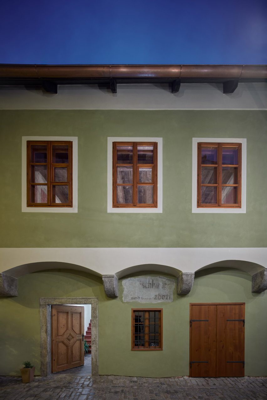
Exterior of Masná 130 house in Český Krumlov, Czech Republic by ORAExterior of Masná 130 house in Český Krumlov, Czech Republic by ORA
Masná 130 is a renovated home by ORA in Český Krumlov

The 500-year-old building, now called Masná 130, had been neglected for decades and was not even connected to the town’s sewage system. It also had flood-damaged foundations and a roof in need of major repairs.

Despite its issues, the owners saw potential in the property and spent two years transforming its ground floor into a cafe that has become a gathering place for the local community.
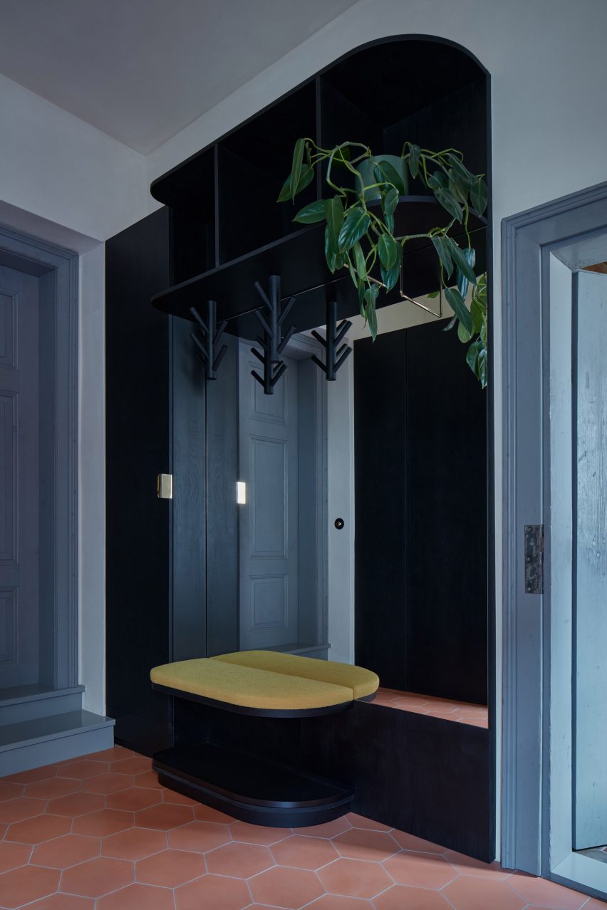
Entrance of Masná 130 houseEntrance of Masná 130 house
The architects added bespoke furniture made from dark-stained birch plywood

The latest phase of the project involved renovating the first-floor living spaces. The original intention was to redevelop them as rental flats, but Hanáková and Techlovský eventually decided to create a single apartment that they could occupy themselves.

ORA’s design for the apartment reveals aspects of the building’s past while introducing modern features that reflect the owners’ love for contemporary design and minimalist style.
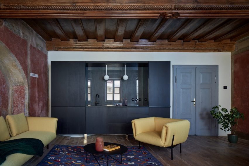
Living room of house in Český Krumlov, Czech Republic by ORALiving room of house in Český Krumlov, Czech Republic by ORA
The building’s original carved wooden ceiling beams are left exposed

“We did not want to create a historical ‘museum’ interior, nor a design showroom,” said Hanáková and Techlovský. “We wanted to organically connect the historical and contemporary layers.”

The architects began by removing an existing partition wall in the main living space and reinstating the original open layout. This created a large salon that reveals the full splendour of the Renaissance-era wooden ceiling.
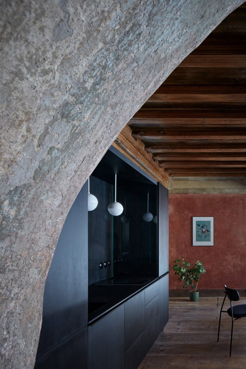
Kitchen of Masná 130 houseKitchen of Masná 130 house
The kitchen was designed as a standalone unit that is raised above the floor

The restoration process also uncovered original stone walls that were painted a deep crimson colour. Together with the wooden rafters, this informed a material palette that complements these dark, saturated tones and creates a cosy atmosphere.

The apartment’s bedroom features a small remnant of the original ceiling fresco. The rest of the room is painted a cream colour to lend the space a calm and relaxing feel.

In the bathroom, ORA chose to combine cool colours with white tiles and large mirrors to brighten the space. Playful details such as the irregularly shaped bathtub, curved sinks and tiles with rounded edges help to soften the overall aesthetic.

Throughout the apartment, the architects added bespoke freestanding furniture that performs the necessary functions without disturbing or concealing the existing heritage features.
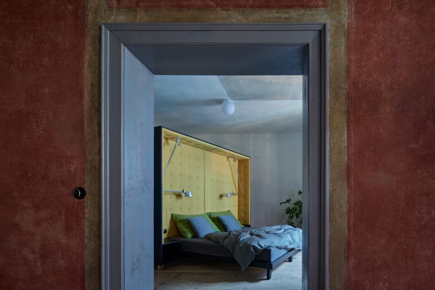
View to bedroom of house in Český Krumlov, Czech Republic by ORAView to bedroom of house in Český Krumlov, Czech Republic by ORA
The bed is dominated by an oversized headboard

“The interior design is approached as a collage of motifs,” said ORA. “The furniture is inserted into the historical space in the form of separate objects that create distance from the historical elements.”

The kitchen, for example, was designed as a standalone unit that is raised above the floor and stops well short of the ceiling. Its sink, hob and countertop occupy a central void, with all other functions concealed within the cabinetry.
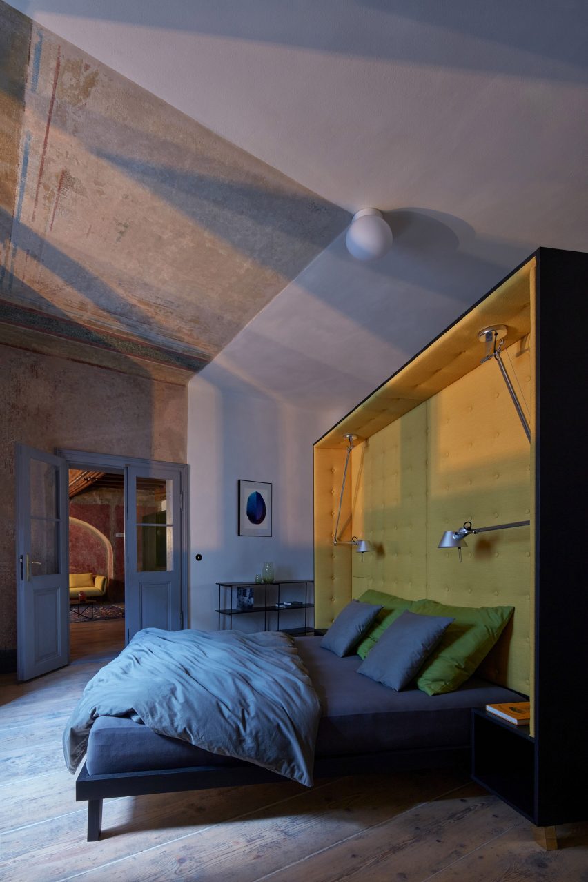
Bedroom of Masná 130 houseBedroom of Masná 130 house
It takes pride of place in the centre of the bedroom

The bed features an oversized headboard that connects with a wardrobe on its reverse side. It is placed in the centre of the bedroom and is angled to provide the best view of the window and the original painted ceiling.

Custom-made furniture is built from dark-stained birch plywood with contrasting brass legs that help to enhance the sense of separation from the existing spaces.

Lighting is either freestanding or integrated into furniture such as the kitchen unit and bed. An overhead light above the dining table is mounted on a bracket so it does not touch the historical ceiling.
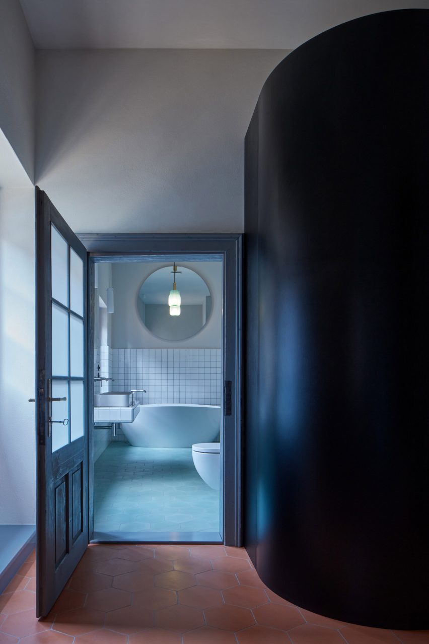
Bathroom of house in Český Krumlov, Czech Republic by ORABathroom of house in Český Krumlov, Czech Republic by ORA
ORA combined cool colours with white tiles in the bathroom

ORA, which stands for Original Regional Architecture, was founded in 2014 by Jan Veisser, Jan Hora and Barbora Hora. The studio is based in the small town of Znojmo, with previous projects including the conversion of a 16th-century home in Mikulov to create a modern guesthouse.

Other recent attempts at revamping the historical residences of the Czech Republic include a 1920s villa in Prague that was renovated by No Architects and a 100-year-old apartment in Karlovy Vary, where Plus One Architects uncovered the building’s original paintwork.

The photography is by BoysPlayNice.

Reference

Ten highlights from Design Doha exhibition Arab Design Now
CategoriesInterior Design

Ten highlights from Design Doha exhibition Arab Design Now

A disaster-proof chandelier from Lebanon and a towering sand dune-style stone installation feature in Arab Design Now, the main exhibition at the inaugural Design Doha biennial.

Arab Design Now was curated by Rana Beiruti to capture the spirit of contemporary design across the Middle East and North Africa (MENA), the curator told Dezeen ahead of the opening of the first Design Doha.

Set within the Qatari capital’s M7 building, the design biennial draws together a range of collectible design and installations.

Selected works from 74 participants paid homage to the MENA region’s “extremely harsh and unique geography” and investigated the “use of materials as a guiding principle,” explained Beiruti.

Here are 10 of Dezeen’s highlights from Arab Design Now, which is on display in Doha until early August.


Sites – New Sites by Studio Anne Holtrop at Arab Design NowSites – New Sites by Studio Anne Holtrop at Arab Design Now

Sites – New Sites by Studio Anne Holtrop

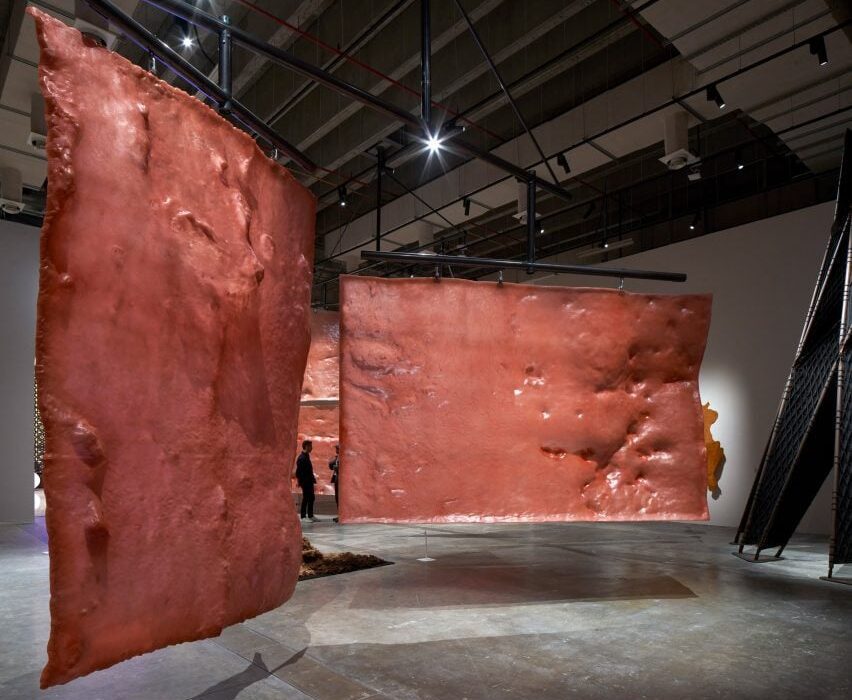
Bahrain- and Amsterdam-based architect Anne Holtrop has designed a cluster of large-scale mobiles made from vast slabs of lumpy resin.

Holtrop took casts of a series of manmade and natural sites that he found across Qatar to create the textured pieces, which hang from bearing mechanisms and can be manually rotated by visitors to produce continuously moving formations.


Constellations 2.0: Object. Light. Consciousness by Abeer SeikalyConstellations 2.0: Object. Light. Consciousness by Abeer Seikaly

Constellations 2.0: Object. Light. Consciousness by Abeer Seikaly

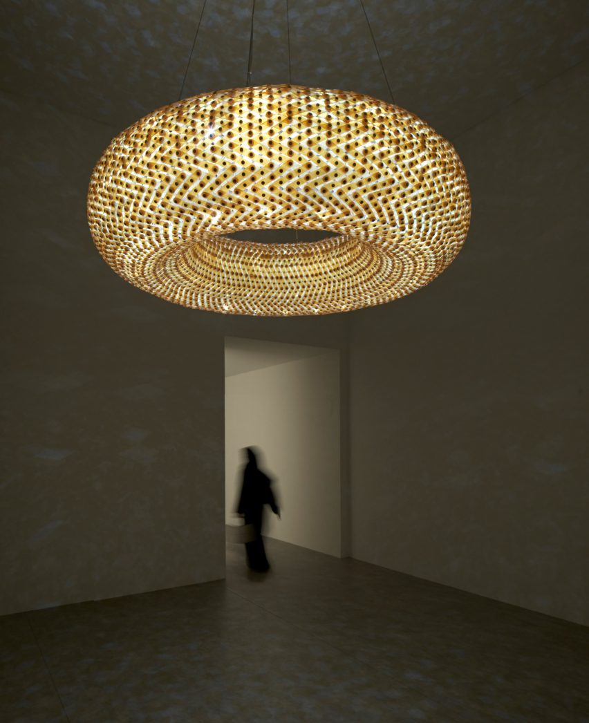
Over 5,000 pieces of Murano glass were woven together by Jordanian-Palestinian designer Abeer Seikaly to create this chandelier, which combines Bedouin weaving practices from Jordan with traditional Venetian glassmaking techniques.

Brass and stainless steel were also integrated into the lighting, made flexible by the glass mesh.

Once illuminated, the sculptural piece creates dramatic light patterns that nod to a starry night sky seen from the Badia desert, according to Seikaly.


House Between a Jujube Tree and a Palm Tree by Civil Architecture at Arab Design NowHouse Between a Jujube Tree and a Palm Tree by Civil Architecture at Arab Design Now

House Between a Jujube Tree and a Palm Tree by Civil Architecture

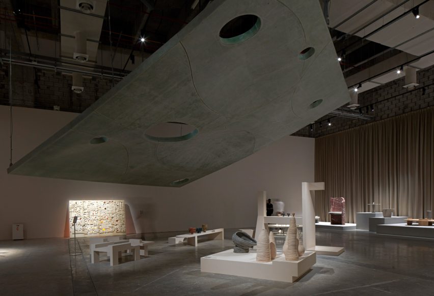
Kuwait and Bahrain-based office Civil Architecture has designed a looming fibreglass roof proposal for a majlis – the traditional term for an Arabic gathering space.

“It’s a 1:1 model of a roof of an actual house that we designed in Bahrain,” studio co-founder Hamed Bukhamseen told Deezen.

Supported by steel and suspended from tension cables, the majlis features openings designed to accommodate tall trees and was created to explore the “symbiotic but blurred” relationship between indoor and outdoor settings.


Nubia, Hathor and Gros Guillaume Stool by Omar ChakilNubia, Hathor and Gros Guillaume Stool by Omar Chakil
Photo courtesy of Design Doha

Nubia, Hathor and Gros Guillaume Stool by Omar Chakil

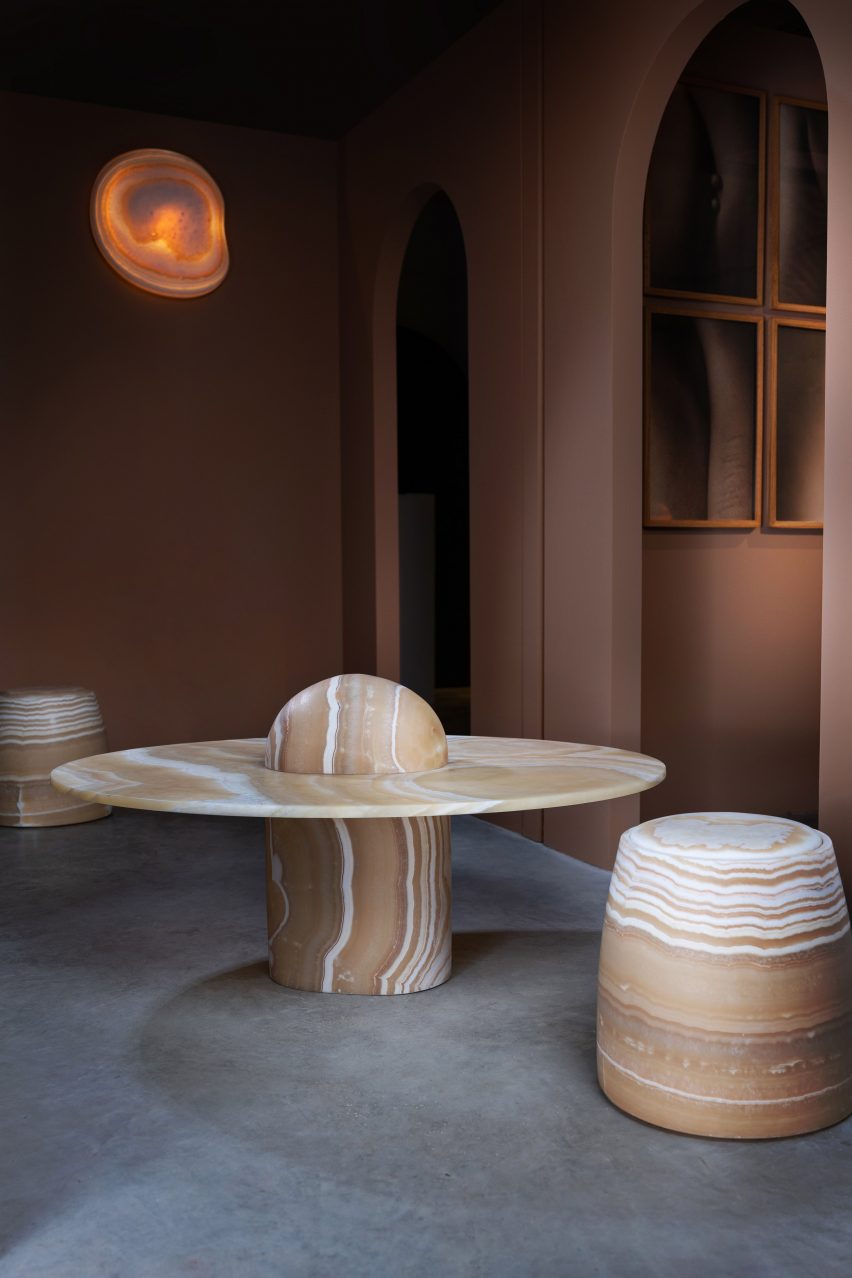
French-Egyptian-Lebanese designer Omar Chakil was informed by his father’s homeland of Egypt when he chose alabaster onyx to create this monolithic shelving, a bulbous coffee table and a stool that glides across the floor on wheels.

Taking cues from ancient practices, Chakil carved the rounded furniture from raw blocks of the material, which was sanded down over time using water rather than covered in varnish – something that the designer said had became common in Egypt, especially when making “cheap” souvenirs.

“The whole idea of the collection was to use Egyptian alabaster, which was a healing stone,” Chakil told Dezeen.

“The pharaohs used [the material], then it transformed it over time. It lost its soul. So I tried to put it in the contemporary context by using the shapes that healing emotions would take – so they are round and soft, even though they are very heavy,” he added.

“I see that people are afraid to, but I want them to touch the furniture.”


Tiamat by AAU AnastasTiamat by AAU Anastas

Tiamat by AAU Anastas

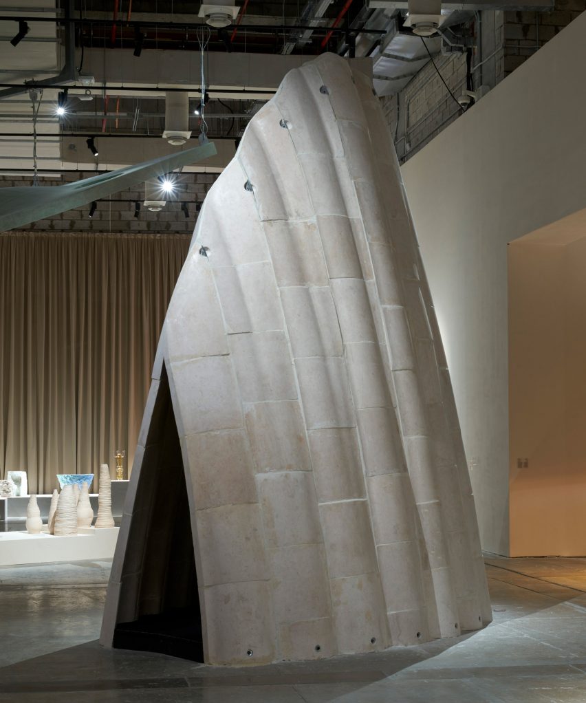
Palestinian architecture office AAU Anastas is presenting Tiamat, a dune-shaped installation that forms part of the studio’s ongoing project, Stone Matters, which explores the potential of combining historical stone building techniques with modern technologies to encourage the use of structural stone.

Positioned for visitors to walk through, the installation is a towering structure made of stone sourced from Bethlehem and informed by the Gothic-style architecture found across Palestine, Syria and Lebanon.

According to AAU Anastas, the light, sound reverberations and climate control within Tiamat’s internal space is unique to stone construction.


Clay in Context by Sama El Saket at Arab Design NowClay in Context by Sama El Saket at Arab Design Now

Clay in Context by Sama El Saket

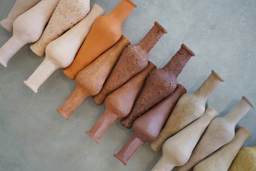
Jordan-born architect and ceramicist Sama El Saket took cues from her native landscape when creating this “taxonomy of Jordanian clays”.

The result is a set of spindle bottle-style vessels, each made of a different natural clay found across Jordan. This gives the pieces their distinctive colours, textures and character.

“These are all natural clays with no pigments added,” El Saket told Dezeen. “The colours are attributed to the different minerals that are found within the region. Some are sandier, some are rockier.”

The designer noted that while Jordan features an abundance of clay deposits and a rich history of ceramic production, today most Jordanian clay is imported.


Light Impact by Fabraca StudiosLight Impact by Fabraca Studios
Photo by Sabine Saadeh

Light Impact by Fabraca Studios

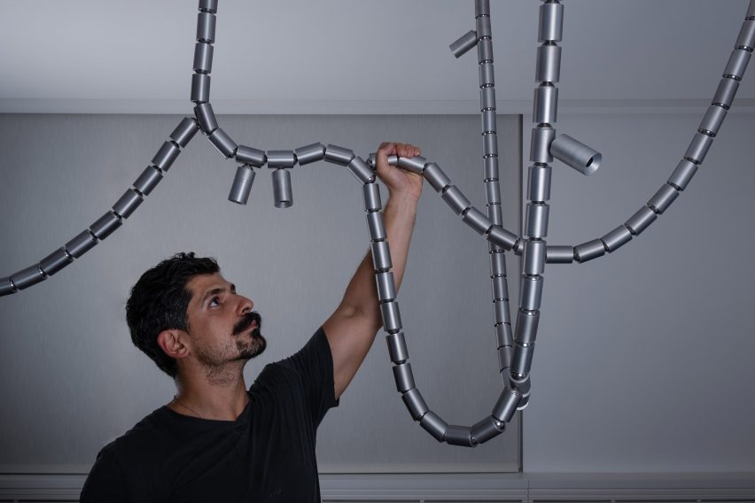
Lebanese industrial design brand Fabraca Studios has created Light Impact, a solid aluminium lighting fixture that was designed as an alternative chandelier, resembling durable ropes.

The piece was made to replace a glass chandelier that shattered in the aftermath of the 2020 Beiruit explosion, which destroyed a large part of Lebanon’s capital city.

Light Impact is defined by “flexible characteristics designed to withstand another disaster,” studio founder Samer Saadeh told Dezeen. He added that the piece, which includes internal brass components, was designed as an ode to Beirut’s adaptability and resilience.


Eleven by Sahel AlhiyariEleven by Sahel Alhiyari

Eleven by Sahel Alhiyari

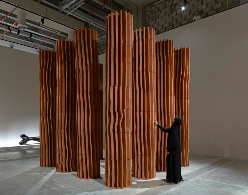
Eleven is a cluster of tall fluted terracotta columns by Jordanian architect Sahel Alhiyari that were made through moulding and forming rather than traditional cutting and carving.

The architect handcrafted the segments, which are vertically stacked, using a similar technique to pottery-making,

“As you twist and turn the material, it creates all of this stuff,” Alhiyari told Dezeen. The designer explained that the columns were deliberately created to celebrate imperfections, despite referencing classical architecture.


Sediments by Talin HazbarSediments by Talin Hazbar

Sediments by Talin Hazbar

UAE-based Syrian designer Talin Hazbar is featuring her Sediments project, which previously gained recognition at Dubai Design Week.

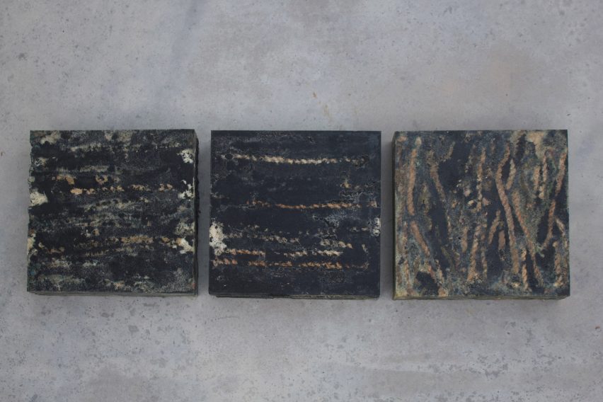
The work consists of blocky seating made from fishing ropes and fishing cage ropes extracted from the Persian Gulf with the assistance of the Dubai Voluntary Diving Team.

Also made up of recycled rubber grains, the heavily textured seating was created to serve as a reminder of how we might attempt to clean up damaged coastlines, according to Hazbar.


Whispers from the Deep by T SakhiWhispers from the Deep by T Sakhi

Whispers from the Deep by T Sakhi

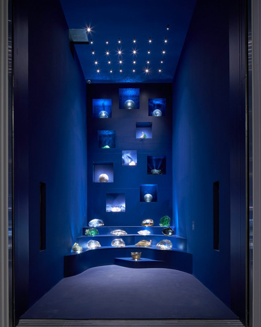
Lebanese-Polish sisters Tessa and Tara El Sakhi of the studio T Sakhi combined discarded metal salvaged from factories in Veneto, Italy, with Murano glass to create amorphous glassware that takes cues from underwater sea creatures.

These pieces were arranged atop dramatic shelving inside the elevator connecting the first and second floors of the Arab Design Now exhibition.

The result is a playful installation that draws together the Venetian lagoon and Lebanese glassblowing traditions.

The photography is by Edmund Sumner unless stated otherwise.

Arab Design Now takes place at Design Doha from 24 February to 5 August 2024 at M7 in Doha, Qatar. See Dezeen Events Guide for an up-to-date list of architecture and design events taking place around the world.


Reference

Get listed in Dezeen’s digital guide for NYCxDesign 2024
CategoriesInterior Design

Get listed in Dezeen’s digital guide for NYCxDesign 2024

If you’re hosting an event during NYCxDesign, you can get listed in Dezeen Events Guide’s digital guide to the festival, which highlights the key events taking place across New York City’s five boroughs.

NYCxDesign runs from 16 to 23 May 2024 and features hundreds of events including installations, exhibitions, fairs, tours, open studios and product launches.

One of the largest events taking place during the eight-day programme is the International Contemporary Furniture Fair (ICFF) and WantedDesign Manhattan, located at the Javits Center from 19 to 21 May 2024. Each year the fair sees 10,000 visitors from the architecture, design and retail fields.

With 2024 marking the festival’s 12th anniversary, NYCxDesign aims for its events to target themes of sustainability, inclusivity and diversity while exploring a range of design mediums.

Get listed in Dezeen’s digital NYCxDesign guide

Get in touch with the Dezeen Events Guide team at [email protected] to book your listing or to discuss a wider partnership with Dezeen.

There are three types of listing available:

Standard listings cost £125 ($160) and include the event name, date and location details plus a website link. These listings will feature up to 50 words of text about the event.

Enhanced listings cost £175 ($225) and include all of the above plus an image at the top of the listing’s page and a preview image on the Dezeen Events Guide homepage. These listings will also feature up to 100 words of text about the event.

Featured listings cost £350 ($450) and include the elements of an enhanced listing plus a post on Dezeen’s Threads channel, inclusion in the featured events carousel on the right hand of the homepage for up to two weeks and 150 words of text about the event. This text can include commercial information such as ticket prices and offers and can feature additional links to website pages such as ticket sales and newsletter signups.

For more details about partnering with us to help amplify your event, contact the team at [email protected].

About Dezeen Events Guide

Dezeen Events Guide is our guide to the best architecture and design events taking place across the world each year.

The guide is updated weekly and includes events, conferences, trade fairs, major exhibitions and design weeks.

The illustration is by Justyna Green.

Reference

AHMM to transform office into co-living space next to Barbican estate
CategoriesInterior Design

AHMM to transform office into co-living space next to Barbican estate

Developer HUB and investor Bridges Fund Management have revealed plans to convert a 1950s office building in London into Cornerstone, a co-living residential scheme designed by Allford Hall Monaghan Morris.

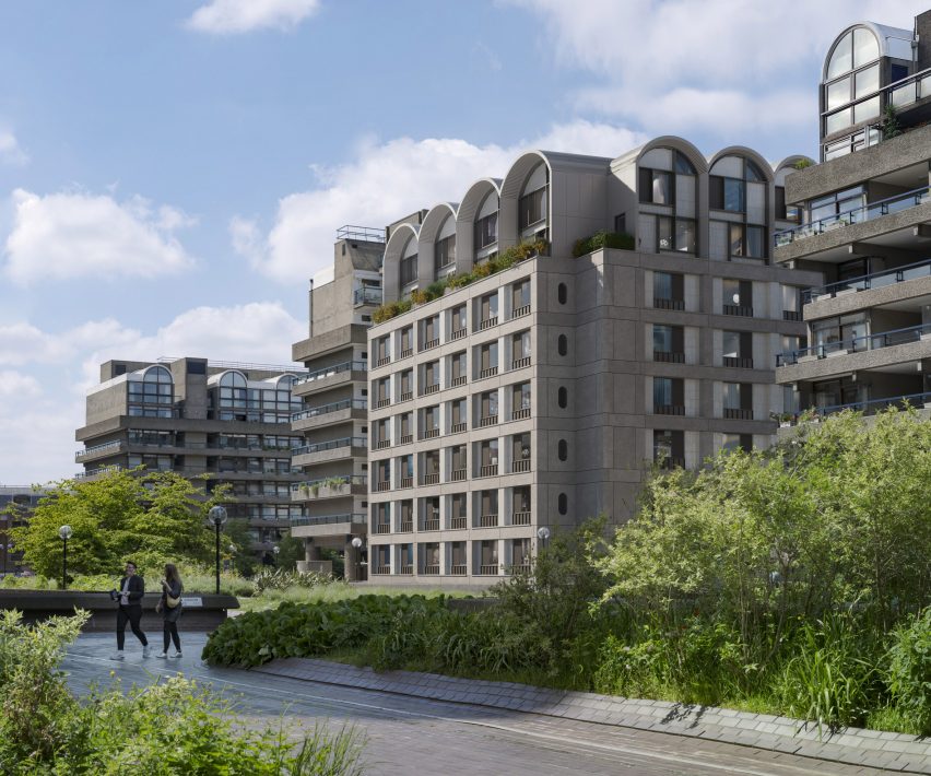
Located on the edge of the Barbican estate, the Cornerstone project will draw from the iconic Barbican architecture to transform 45 Beech Street into 174 co-living residences along with street-level commercial spaces and amenities.

“Building on the success of our previous London projects with HUB, we are joining forces again to transform an underloved office building in the heart of the city,” Allford Hall Monaghan Morris (AHMM) director Hazel Joseph said.

Elevation view of Cornerstone by AHMM in LondonElevation view of Cornerstone by AHMM in London
AHMM has revealed plans for a co-living retrofit next to London’s Barbican estate

AHMM’s proposal aims to re-use as much of the building’s existing structure and facade as possible, taking a “retrofit-first approach” to minimise the need for new building works.

The studio will also primarily work within the geometric parameters defined by the original envelope, while updating the rectilinear language to create uniform apertures for each co-living apartment.

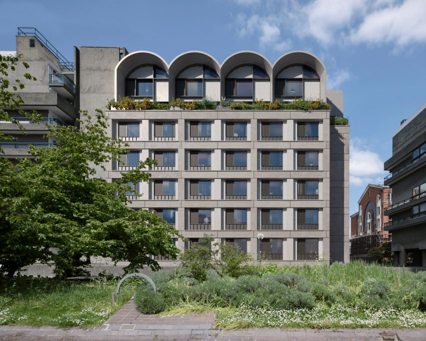
Referencing the Barbican estate, a series of arched, double-height extrusions will be introduced across the crown of the building to house additional co-living apartments.

Barbican context and facade of Cornerstone by AHMM in LondonBarbican context and facade of Cornerstone by AHMM in London
The design will adapt the existing building’s form and insert a series of arched spaces at the top

“The architectural approach has been carefully considered, responding sensitively to the much-loved Barbican context, completing the northern frontage of the estate,” Joseph said.

The arches will be partially set back from the building’s facade and lined with an asymmetric patchwork of glazed and tile panels underneath the curved overhangs.

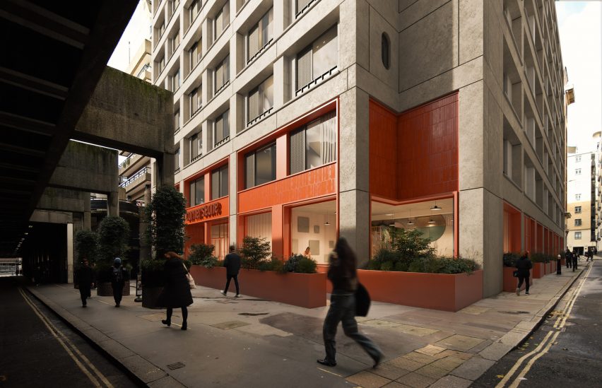
At street level, warm red panel accents will contrast against the building’s neutral concrete finishes to highlight commercial and collective functions.

The scheme will integrate a public cafe, a co-working space and community-focused amenities at its lower levels to improve the public realm for those who live and work in the area.

“The existing structure of 45 Beech Street will be re-used and extended, creating a new residential community with shared amenities and breathing new life into the local streetscape,” Joseph explained.

street level activation of Cornerstone by AHMM in Londonstreet level activation of Cornerstone by AHMM in London
At street level, new commercial and public amenities will seek to activate the ground plane

According to HUB and Bridges Fund Management, AHMM’s proposal was developed in collaboration with the community – including Barbican residents – who were consulted through a series of workshops and events.

A website was also established to solicit viewpoints about the redevelopment, reiterating the design vision to establish a “vibrant community” that will adapt the original building and holistically contribute to the neighbourhood.

AHMM was established in 1989 by Simon Allford, Jonathan Hall, Paul Monaghan and Peter Morris in London. The studio has previously converted a 1930s block into New Scotland Yard’s headquarters in London and completed a mixed-use building in Southwark with interlocking flats.

Also adjacent to the Barbican estate, Diller Scofidio & Renfro’s proposal for a pyramidal music centre was recently scrapped when the City of London Corporation revealed its plans for a “major renewal” of the Barbican.

The images are courtesy of HUB and Bridges Fund Management.

Reference

Medprostor encloses 12th-century church with folding roof in Slovenia
CategoriesArchitecture

Medprostor encloses 12th-century church with folding roof in Slovenia

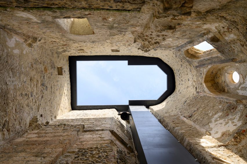
Local studio Medprostor has covered and partially repaired a 900-year-old Romanesque church in Slovenia, placing an operable roof on top of the open structure to create a space “between a ruin and a reconstruction”.

Medprostor crafted a series of modest interventions alongside the folding roof that aim to protect the significant monastic building, located inside the fortified grounds of the historic Žiče Charterhouse.

The repairs and alterations were also intended to improve its functionality for tourism and events.

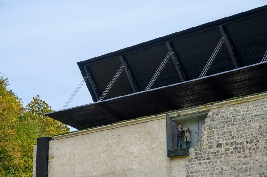
Roof and lookout at Žiče Charterhouse church by Medprostor in SloveniaRoof and lookout at Žiče Charterhouse church by Medprostor in Slovenia
Medprostor has topped a 12th-century church with a folding roof in Slovenia

According to the studio, the project was conceived to protect the church’s immaterial qualities as an ancient and sacred place, in addition to preserving its physical remains.

“The construction and restoration interventions were carried out in such a way that they enable a chronological reading of the 900-year-old sacral space,” Medprostor cofounder Jerneja Fischer Knap told Dezeen.

“[The design] fully conforms to the requirements of heritage protection for reversibility, with less invasive and less intense interventions,” he continued.

Blackened wood and steel roof over church in Žiče Charterhouse by Medprostor in SloveniaBlackened wood and steel roof over church in Žiče Charterhouse by Medprostor in Slovenia
The half-gable roof structure spans the length of the church and can be opened to the sky

“The largest intervention was the covering of the existing building with a semi-movable, folding roof,” Knap said.

“When lowered, it enables the smooth running of events in the church regardless of the season and weather, while when raised, it preserves one of the most important intangible moments of the ruin: contact with the open sky.”

Lightweight black steel, blackened wood and dark slate tiles make up the half-gable roof system, distinguishing the gesture from the church’s original masonry architecture.

Medprostor also chose restrained and rectilinear geometries for its interventions, seeking to establish a low-tech aesthetic language that could sit harmoniously against the heritage structures.

“The roof, together with its details and proportions is related to the key architectural elements of the whole church,” Knap explained. “And yet, it can also act as an illusion – a spectre in harmony with the open, ephemeral character of the ruin… [a] space between a ruin and a reconstruction.”

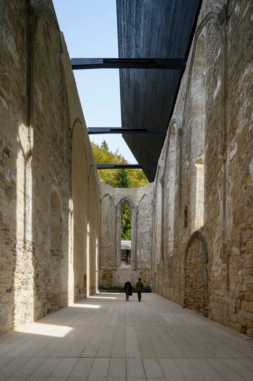
Open roof and ruins of the church at Žiče Charterhouse by Medprostor in SloveniaOpen roof and ruins of the church at Žiče Charterhouse by Medprostor in Slovenia
A dark, uniform material palette defines the interventions across the church

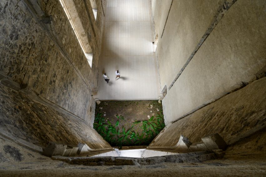
The studio reconstructed a demolished portion of the church’s walls and flooring, while spiral staircases were placed into existing vertical shafts to reconnect visitors to an upper-level viewing platform.

“Two staircases are connected to a new lookout point with a narrow, slightly sloping corridor leading up to it, framed by the outer faces of the [reconstructed] north wall,” Knap explained.

“The lookout point offers an essential view from above of the northern part of the monastery complex and its ruined character.”

Repaired wall and raised flooring in church at the Žiče Charterhouse by Medprostor in SloveniaRepaired wall and raised flooring in church at the Žiče Charterhouse by Medprostor in Slovenia
The studio made limited repairs to the ruins, including reconstructing its partially collapsed northern wall

Slovenian architecture studio Medprostor was established by Knap, Rok Žnidaršič and Samo Mlakar in 2011, with projects spanning across the public and private sectors.

Medprostor’s interventions at Žiče Charterhouse were shortlisted for the 2024 European Mies van der Rohe Award, which has previously been won by Grafton Architects for its colonnaded teaching building for Kingston University in London.

The seven finalists for the 2024 Mies van der Rohe Award were recently revealed to include The Reggio School by Andrés Jaque, a copper-clad convent in France and a library by SUMA Arquitectura in Spain.

The photography is by Miran Kambič.

Reference

Ivy Studio installs colourful marbles in Montreal’s Hayat restaurant
CategoriesInterior Design

Ivy Studio installs colourful marbles in Montreal’s Hayat restaurant

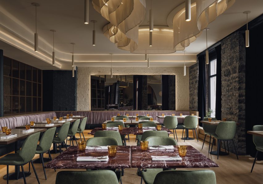
Montreal-based Ivy Studio has chosen a variety of dramatic marble to outfit a Middle Eastern restaurant, which features a colour palette influenced by “the earthy tones of the Syrian deserts”.

In Montreal’s Old Port neighbourhood, the 1,500-square-foot (140-square metre) Hayat restaurant is designed to reflect the cuisine served by chef Joseph Awad.

Entrance to Hayat restaurant with marble host stand in foregroundEntrance to Hayat restaurant with marble host stand in foreground
The marble host stand at Hayat sets the tone for the restaurant’s Middle Eastern-influenced colour palette

“This Middle Eastern restaurant’s colour palette was inspired by the earthy tones of the Syrian deserts and their surrounding greenery,” said Ivy Studio.

Upon entering is a screen of black hammered-glass panels, which also conceals the kitchen in the far corner.

Dining room with marble topped tables, green chairs and cream wallsDining room with marble topped tables, green chairs and cream walls
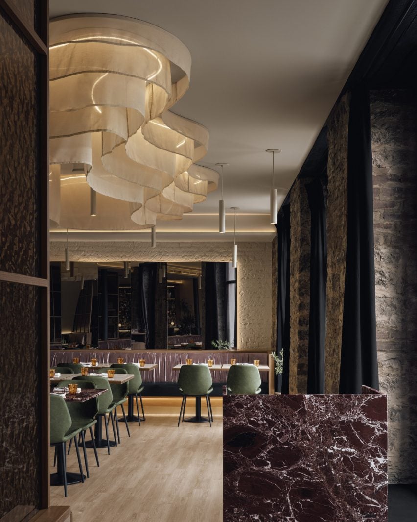
In the main dining space, banquette seating runs along two walls below a fabric ceiling installation

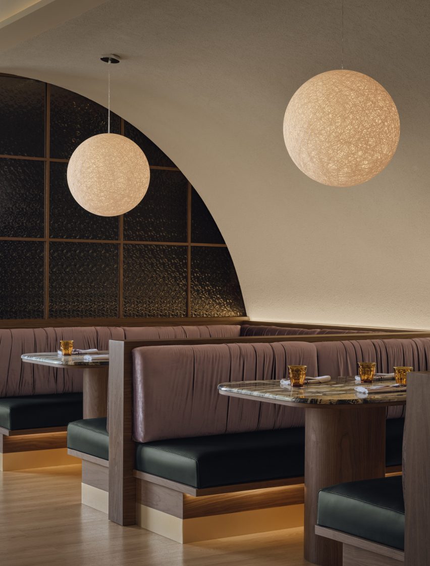
In the main dining room, built-in benches form an L along two walls, while a pair of U-shaped booths sit against another that arches over them.

The seat backs are upholstered in mauve velvet and the cushions are wrapped in contrasting deep green leather.

Private booths positioned below an arched ceiling and behind a partition of black hammered glassPrivate booths positioned below an arched ceiling and behind a partition of black hammered glass
Private booths are positioned below an arched ceiling and behind a partition of black hammered glass

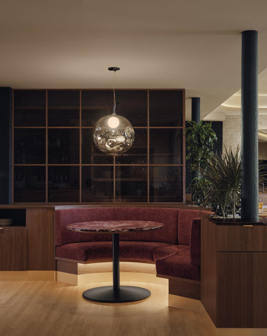
Closer to the kitchen is another small, semi-circular booth built into the walnut millwork.

Here the cushioned seats are covered in ruby-toned velvet, and a metallic light fixture is suspended above.

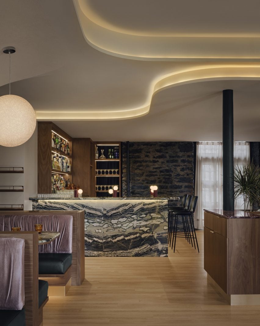
The bar counter made from teal, pistachio and cream-coloured marbleThe bar counter made from teal, pistachio and cream-coloured marble
The bar is made from a dramatic marble variety with streaks of teal, pistachio and cream colours

Ivy Studio selected a wide variety of striking, richly veined marbles, “each contributing their own touch of colour into the space” according to the team.

The bar is made from a dramatic stone with teal, cream and pistachio striations, while the host stand and dining table tops in the main area are purple and white.

A red-hued semicircular booth tucked into walnut millworkA red-hued semicircular booth tucked into walnut millwork
A red-hued semicircular booth is tucked into the walnut millwork close to the kitchen

The building’s exposed brickwork is painted cream to match the other walls, while the original historic stone between the large windows is left exposed.

“The ancient stone walls at the front and rear facades were left intact to showcase the building’s history,” Ivy Studio said.

Curved layers across the ceiling, which hide indirect lighting, are designed to evoke the smooth landscapes of the Middle East.

A fabric installation suspended above the dining tables curves around more strips of lighting, diffusing the light to create a warm glow.

Bar made from a dramatic marble variety with streaks of teal, pistachio and cream coloursBar made from a dramatic marble variety with streaks of teal, pistachio and cream colours
The bar is made from a dramatic marble variety with streaks of teal, pistachio and cream colours

Walnut, stone and cream walls are also found in the bathrooms, which echo the colour and material scheme throughout the restaurant.

“The overall intention of the palette was to bring together the worlds of Middle Eastern nature and Old Montreal construction,” the studio said.

Hayat restaurant by Ivy StudioHayat restaurant by Ivy Studio
The same material palette continues in the moody bathrooms

Ivy Studio has completed several interiors across Montreal that include colourful marble.

These include the Italian restaurant Piatti where the dark green stone contrasts the building’s rough walls and co-working office Spatial where purple surfaces pop against mint green millwork.

The photography is by Alex Lesage.


Project credits:

Architecture and design: Ivy Studio
Construction: Groupe Manovra

Reference

Post Company imbues Mollie Aspen hotel interiors with earthy hues
CategoriesInterior Design

Post Company imbues Mollie Aspen hotel interiors with earthy hues

New York studio Post Company has designed warm, wood-filled interiors for a boutique hotel in Aspen, Colorado, which offers a pared-back take on the Arts and Crafts style.

Mollie Aspen occupies a new timber-clad building designed by CCY Architects and developed and operated by HayMax in the mountain city’s downtown area.

Lobby lounge at Mollie Aspen with earth-toned furniture and a gridded wood ceilingLobby lounge at Mollie Aspen with earth-toned furniture and a gridded wood ceiling
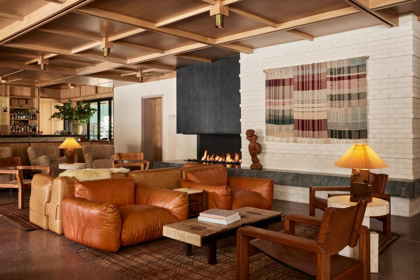
With an open fireplace as a backdrop, the lobby lounge at Mollie Aspen features earth-toned furniture and a gridded wood ceiling

Post Company was tasked with creating the interiors for the 68-room hotel, combining contemporary Scandinavian and Japanese design elements for a serene take on Rocky Mountain luxury.

“Mollie is designed for those with a natural curiosity and appreciation for connection and offers visitors a unique, welcoming respite in the bustling mountain town,” said the hotel’s team.

All-day cafe in the Mollie Aspen lobby All-day cafe in the Mollie Aspen lobby
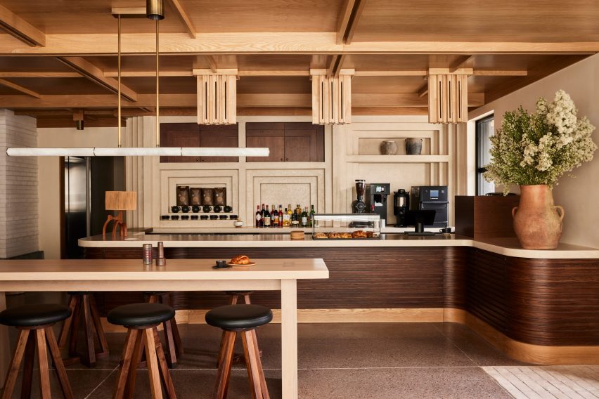
An all-day cafe in the lobby serves pastries and beverages from a walnut-wrapped counter

An abundance of wood can be found throughout the different spaces, with numerous varieties creating a layered effect of different colours and grain patterns.

The timber is crafted into elements like gridded wall and ceiling panels with built-in lighting, which evoke an Arts and Crafts aesthetic, as well as fluted counterfronts and a range of furniture pieces.

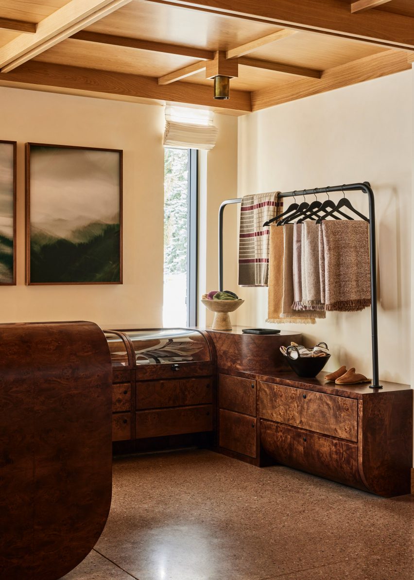
Burl wood counters and displays in a retail spaceBurl wood counters and displays in a retail space
Burl wood counters and displays present goods in the hotel’s retail space

The majority of the materials used in Mollie’s construction were sourced from the Western United States to reduce waste, according to the team.

Meanwhile, other accents like earthen ceramics, hand-dyed textiles and sand-casted brass add to the cosy atmosphere.

Guest room with neutral decorGuest room with neutral decor
Guest rooms offer an even more pared-back take on the neutral decor palette

“These materials are incorporated throughout the hotel to mimic the area’s rough-hewn mountains while large windows frame views of the surrounding landscape and bring an abundance of light into the hotel,” said the team.

The lobby lounge is designed as a cosy gathering space for guests and the public, with a large open fireplace providing a backdrop.

Beige plaster walls and textured carpet in a guest roomBeige plaster walls and textured carpet in a guest room
Beige plaster walls and textured carpets complement the wood ceilings in the guest rooms

Chunky leather, velvet and boucle sofas and armchairs in a range of earthy hues form comfy conversation nooks.

At one end of the room, the black-topped bar spans the full width and is illuminated by a row of globe-shaped pendant lights suspended from thin brass bars.

Guest suite with black leather furniture and snowy mountain viewsGuest suite with black leather furniture and snowy mountain views
Black leather furniture in the larger suites offers a contrast to the other furniture pieces and snowy mountain views

A repeated geometric pattern across the pale counter front is also found on door panels leading to other hotel areas.

An all-day cafe at the opposite end of the lobby serves pastries and an assortment of beverages from a walnut-wrapped counter, and the restaurant

Bathroom with dark green tiles and freestanding white bathtubBathroom with dark green tiles and freestanding white bathtub
Dark green tiles in the bathrooms match the spruce trees outside

In the adjacent retail space, burl wood counters and displays with curved edges, some of which are topped with glass vitrines.

On the third floor is a roof terrace with a bar and a spa pool set to open in Spring 2024, while a fitness facility and flexible meeting space are located at ground level.

The guest rooms continue the soft, neutral palette in a more pared-back style.

Beige plaster walls, textured carpets and green-grey curtains complement the wood ceilings and built-in furniture, while black leather chairs add contrast.

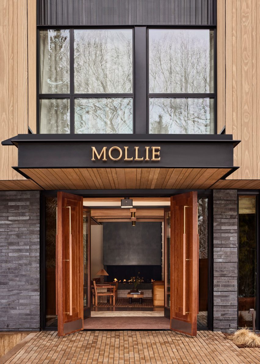
Mollie Apsen entrance with logo on the entrance canopyMollie Apsen entrance with logo on the entrance canopy
Mollie Aspen is located within a newly constructed building by CCY Architects

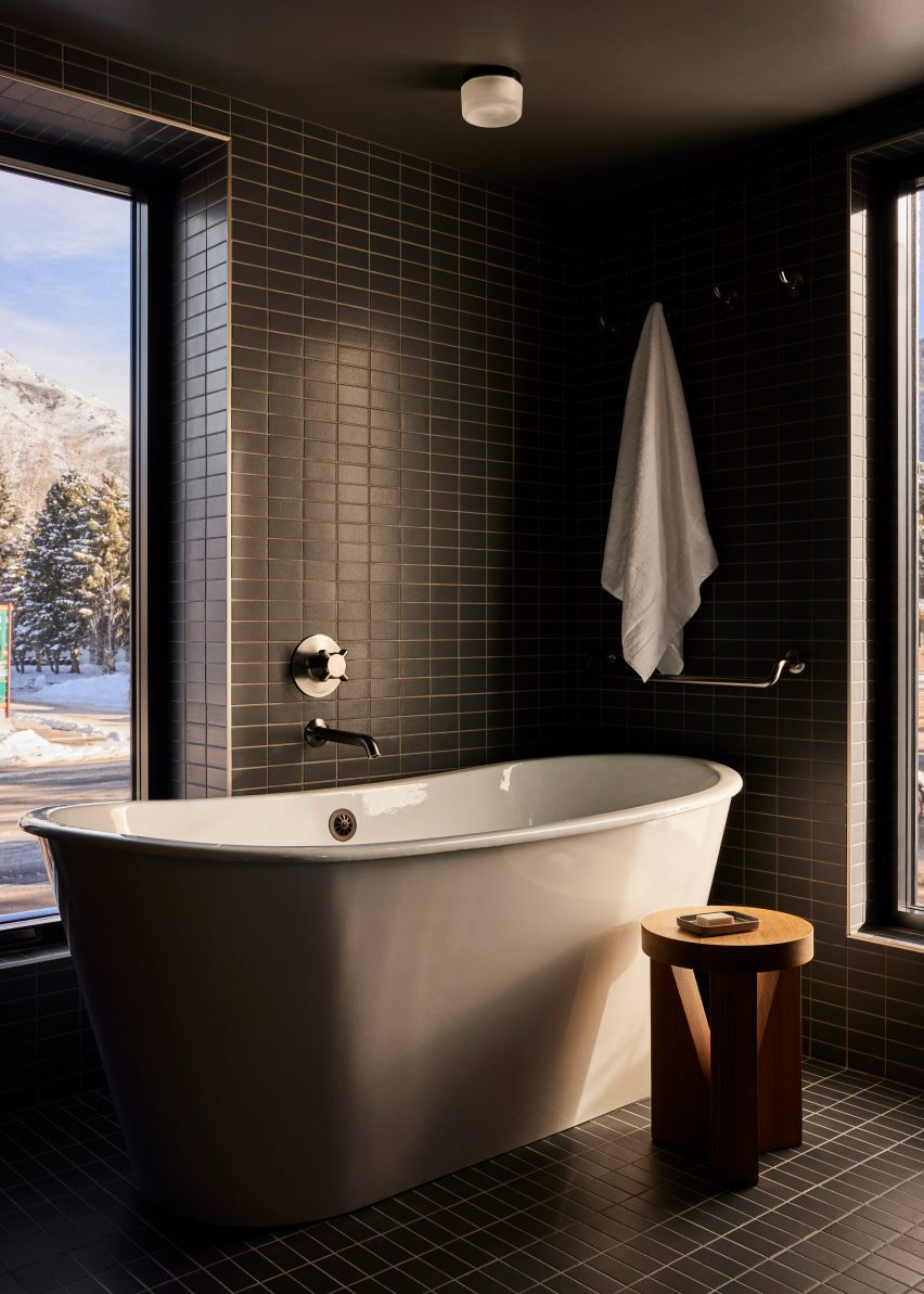
Dark green stacked tiles that line the bathrooms match the spruce trees outside and freestanding tubs beside the windows allow guests to enjoy the view while soaking.

“Guests are left with a sense of Aspen’s cultural and recreational history, providing a lens to appreciate its contemporary personality and influence,” the team said.

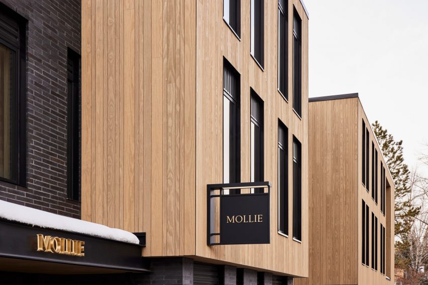
Mollie Aspen's wood-clad exteriorMollie Aspen's wood-clad exterior
The building was constructed largely from materials sourced from the Western US

Aspen is a renowned destination for winter sports and affluent vacationers, and CCY Architects has designed several private residences in and around the town – among them an extension to a Victorian house, a residence nestled in a grassy valley and a retreat that overlooks the dramatic mountainous scenery.

Formerly known as Studio Tack, Post Company’s previous hotel projects include the Anvil Hotel in Wyoming, The Sandman in California, and Scribner’s Catskill Lodge in New York.

The photography is by Nicole Franzen.

Reference

UK’s “most sustainable” neighbourhood receives planning approval
CategoriesSustainable News

UK’s “most sustainable” neighbourhood receives planning approval

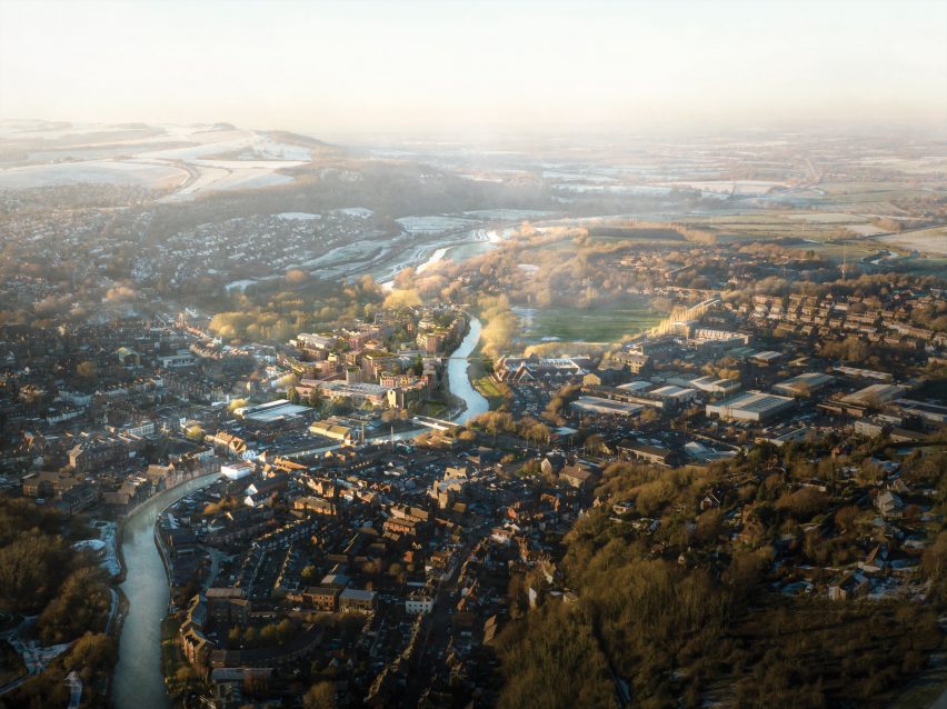
Development company Human Nature has received planning approval to transform a former industrial site in Lewes into a sustainable 685-home neighbourhood that will be the UK’s largest made from timber.

The Phoenix, which was granted planning permission last week, will be built from engineered timber and be the most sustainable neighbourhood in the UK, according to Human Nature.

The Phoenix sustainable neighbourhood by Human NatureThe Phoenix sustainable neighbourhood by Human Nature
The buildings in the Phoenix development will have engineered timber structures

“One year after proposals were announced for the transformation of a 7.9-hectare brownfield site into the UK’s most sustainable neighbourhood, the Phoenix development has today been granted planning permission, taking the visionary project a step closer to reality,” said Human Nature.

“When complete, it will be the UK’s largest timber-structure neighbourhood and a blueprint for sustainable placemaking and social impact that can be deployed at scale.”

Sustainable neighbourhood in Lewes by Human NatureSustainable neighbourhood in Lewes by Human Nature
It will be located on a former industrial site

Located in the South Downs National Park, the Phoenix will contain energy-efficient homes, public space and healthcare, retail, hospitality and industrial space, all constructed from engineered timber including cross-laminated timber.

It will be the largest structural timber neighbourhood in the UK by number of units, Human Nature’s head of sustainable construction Andy Tugby told Dezeen.

The buildings will range from two to five storeys tall and be clad in prefabricated panels made from locally sourced timber and biomaterials such as hemp.

Sustainable development in Lewes by Human NatureSustainable development in Lewes by Human Nature
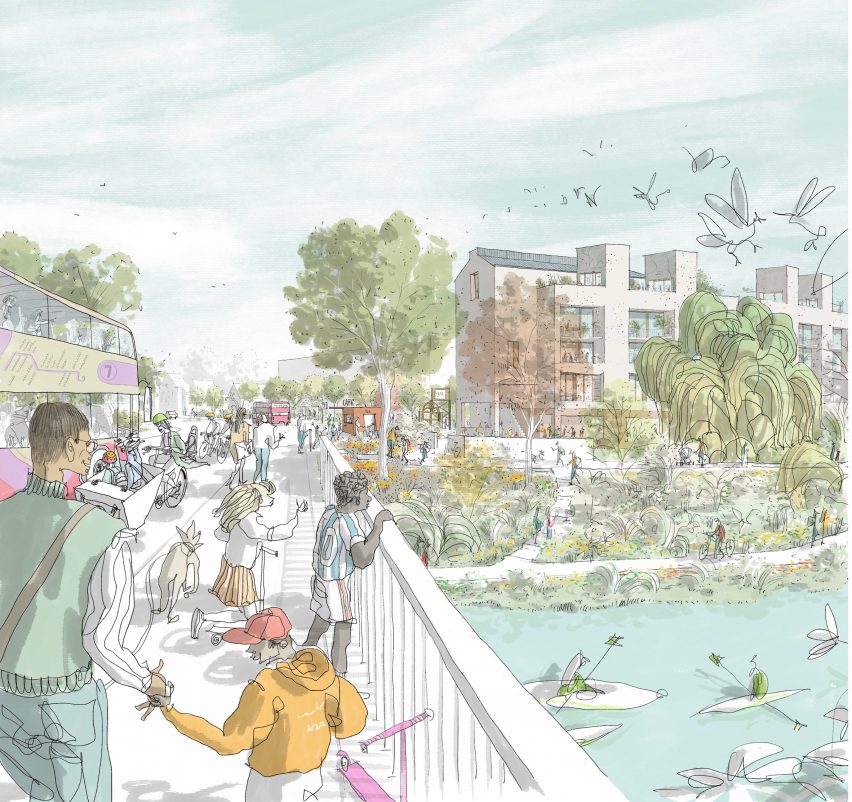
A riverside walk will feature in the neighbourhood. Image by Carlos Penálver

Industrial structures on the site will be repurposed to house most of the community spaces, including a canteen, event hall, taproom, fitness centre, workspace and studios.

The Phoenix’ homes will be designed to be energy efficient and powered by renewable energy sourced from on-site photovoltaic panels and an off-site renewable energy facility.

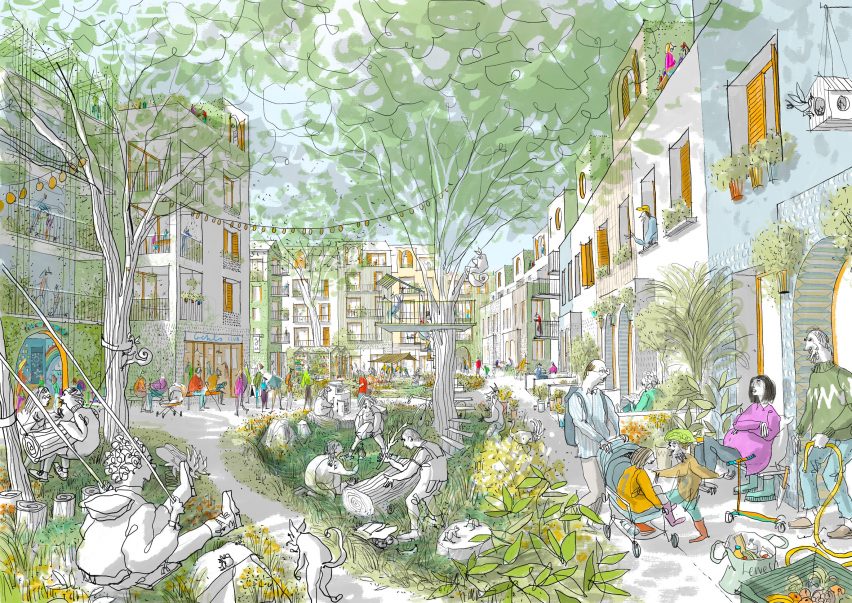
Aiming to create a place for all generations and for people with mixed incomes, 30 per cent of the 685 residences will be affordable homes – 154 of which will be built to the government’s Local Housing Allowance rates and the remainder built as part of the First Homes scheme.

The Phoenix will be designed as a walkable neighbourhood that prioritises people over cars, with a mobility hub providing electric car shares, car hire, electric bike services and shuttle buses to help encourage a shift away from private vehicle use.

Public squares, gardens, community buildings and a riverside pathway that stretches the length of the site will provide space designed for interaction between residents.

Timber structure neighbourhood by Human NatureTimber structure neighbourhood by Human Nature
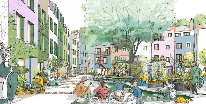
The development will contain energy-efficient homes

The Phoenix masterplan was designed by Human Nature’s in-house design team with UK architecture studio Periscope and Kathryn Firth, director of masterplanning and urban design at Arup.

Developed designs for the scheme will be made in collaboration with UK architecture studios Archio, Ash Sakula, Mae Architects, Mole Architects and Periscope and engineering firms Expedition Engineering and Whitby Wood.

Drawing of a park surrounded by buildingsDrawing of a park surrounded by buildings
The Phoenix aims to provide sustainable housing to people with a range of income brackets. Image by Carlos Penálver

Human Nature is a development company based in Lewes that was founded by former Greenpeace directors Michael Manolson and Jonathan Smales.

Other timber developments published on Dezeen include a zero-carbon housing scheme in Wales by Loyn & Co and Henning Larsen’s plans for Copenhagen’s first all-timber neighbourhood.

The images are by Ash Sakula, courtesy of Human Nature, unless stated.

Reference

Totem-pole colonnade encloses Kaimakk restaurant at Istanbul Airport
CategoriesInterior Design

Totem-pole colonnade encloses Kaimakk restaurant at Istanbul Airport

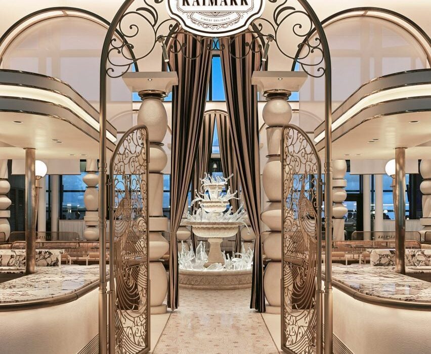
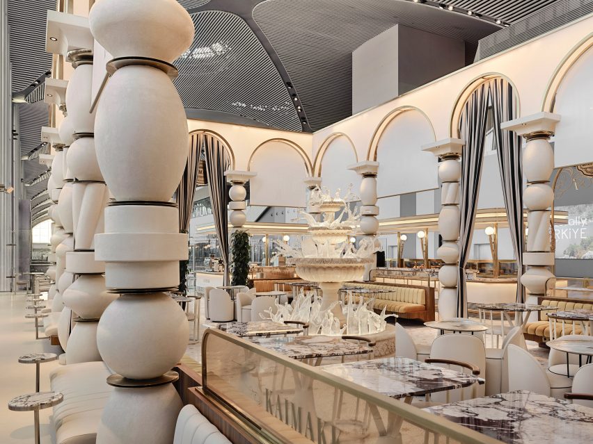
A stone and glass fountain, totem pole-like columns and gilded arches characterise the Kaimakk bar and dining space by local studio Sanayi313 inside Istanbul Airport.

The 600-square-metre space was created by Sanayi313 as a place of refuge from the bustle of the airport.

“The challenge of this project was to create a place where people would feel secluded and relaxed in the hectic environment of one of Europe’s busiest airport terminals,” Sanayi313 founder Enis Karavil told Dezeen.

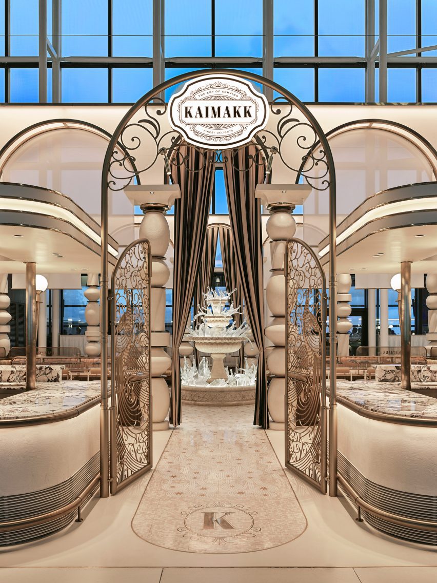
Arched metal gates leading to fountain Kaimakk Istanbul Airport designed by Sanayi313Arched metal gates leading to fountain Kaimakk Istanbul Airport designed by Sanayi313
Kaimakk is an Istanbul Airport restaurant designed by Sanayi313

Two large, L-shaped serving counters with canopies above enclose the seating space inside. Between the counters, an archway with intricate metalwork gates leads to a “frozen” fountain at the centre of the project.

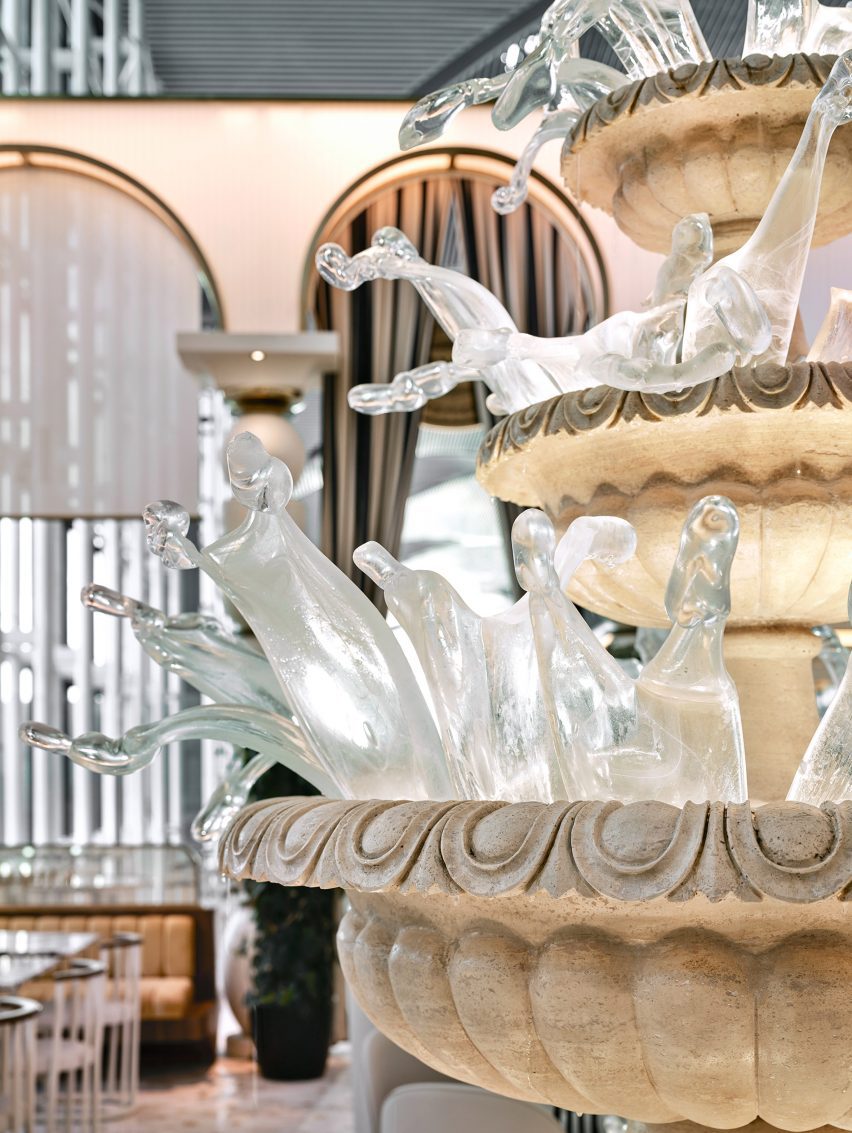
The fountain was made from traditional travertine stone with individually made, mouth-blown glass pieces.

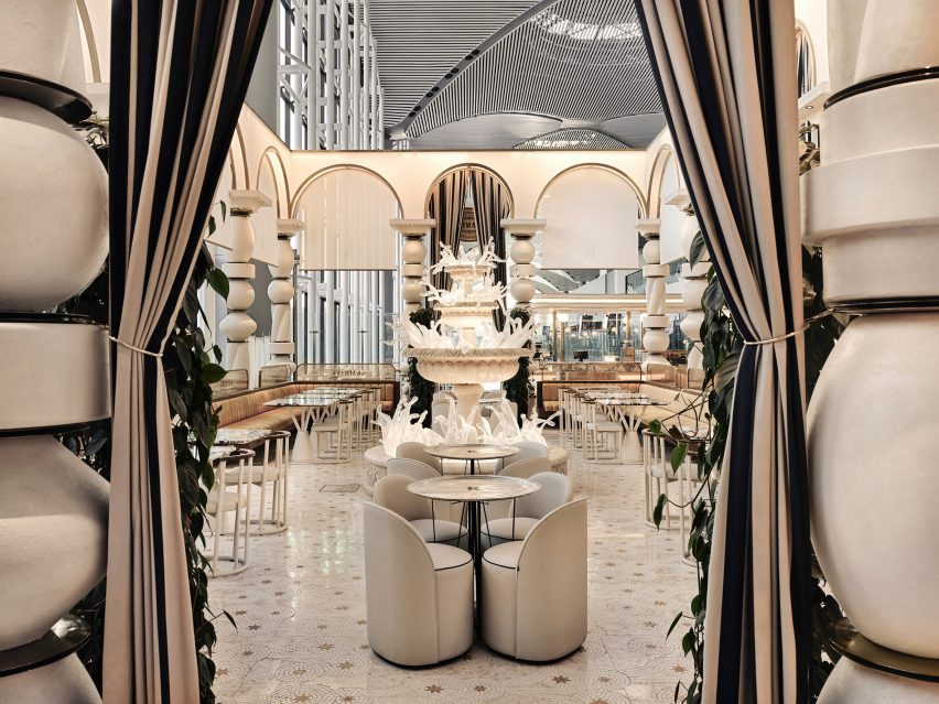
Kaimakk bar and dining area by Sanyayi313Kaimakk bar and dining area by Sanyayi313
A fountain made of stone and glass sits at the centre of the space

Completed in two stages, the fountain was first carved and assembled before contemporary Turkish glass artist Derya Geylani crafted the glass pieces to create the “frozen” expression.

According to Kaimakk’s Lian Beraha, the fountain “took shape from the idea of life, joy, abundance and the eruption of cream”.

Mouth-blown glass pieces in fountain by Derya GeylaniMouth-blown glass pieces in fountain by Derya Geylani
Mouth-blown glass pieces were made by Turkish glass artist Derya Geylani

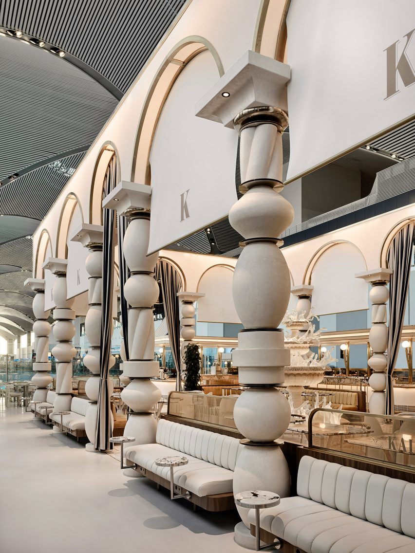
Surrounding the fountain, a series of tall archways are supported on sculptural, totem-pole-like  columns that form a colonnade enclosing the restaurant.

“The studio stacked a variety of recurring forms into totem-like pillars with gold discs between them and placed arched blocks on top, as if playing with Lego,” Karavil explained.

“Each arched unit is equipped with built-in blinds made of translucent material to diffuse the light transmitted into the space at different times during the day,” he continued.

“Coated in micro-topping, the four-metre-high structure pays homage to the architecture and stoneworks in the Turkish city of Mardin.”

Tall totem pole-like columns throughout Kaimakk by Sanayi313Tall totem pole-like columns throughout Kaimakk by Sanayi313
Large sculptural columns and arches are a recurring motif throughout the project

This idea of drawing upon heritage was central to the concept behind the project, which, according to Beraha, “draws inspiration from the traditional Mesopotamian culture” of places in southeastern Turkey like Mardin, Diyarbakır and Gaziantep.

“One of the key features of the project is the handcrafted mosaic floors incorporating an intricate geometrical pattern with stars,” Karavil described.

“It draws inspiration from the One Thousand and One Nights – a collection of Middle Eastern folktales also known as Arabian Nights.”

Columns and benches in dining area by Sanyayi313Columns and benches in dining area by Sanyayi313
Sanayi313 used a colour palette of beige, cream and gold

Built-in booth seating is positioned alongside barstools and a mixture of both round and rectangular marble-topped tables, with views out over the airport runway.

Other projects in Istanbul include Renzo Piano’s Istanbul Modern museum wrapped in a facade of “evocative fish scales” and an Apple Store by Foster + Partners that is characterised by two travertine walls.

The photography is by İbrahim Özbunar.

Reference

Scientists develop hybrid “beef rice” as future meat alternative
CategoriesSustainable News

Scientists develop hybrid “beef rice” as future meat alternative

Scientists from South Korea’s Yonsei University have invented what they believe to be a sustainable, high-protein food in the form of “beef rice”, made by growing cow cells in grains of rice.
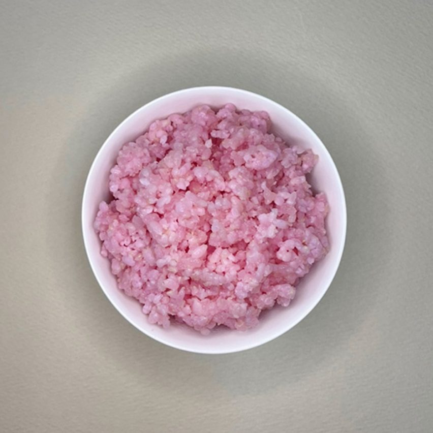
Tinged a pale pink from the cell culturing process, the hybrid food contains more protein and fat than standard rice while having a low carbon footprint, leading its creators to see it as a potential future meat alternative.

The beef rice was made by inserting muscle and fat stem cells from cows into grains of rice and leaving them to grow in a Petri dish.

Photo of a bowl of pink-coloured rice viewed from abovePhoto of a bowl of pink-coloured rice viewed from above
The hybrid “beef rice” is made by growing cow muscle and fat cells within rice grains

Because the rice grains are porous and have a rich internal structure, the cells can grow there in a similar way to how they would within an animal. A coating of gelatine – in this case, fish-derived – further helps the cells to attach to the rice.
Although beef rice might sound like a form of genetically modified food, there is no altering of DNA in the plants or animals. Instead, this process constitutes a type of cell-cultured or lab-grown meat but with the beef grown inside rice.
In a paper published in the journal Matter, the Yonsei University researchers explain that their process is similar to that used to make a product already sold in Singapore – a cultured meat grown in soy-based textured vegetable protein (TVP).
Soy and nuts are the first foods that have been used for animal cell culturing, they say, but their usefulness is limited because they are common allergens and do not have as much cell-holding potential as rice.

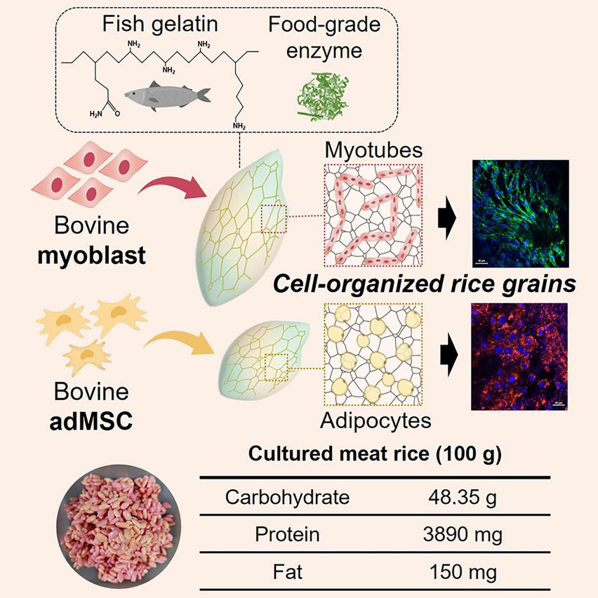
Complex graphic depicting bovine and fat cells inserted into rice grains and the nutritional content table for 100 grams of cultured meat riceComplex graphic depicting bovine and fat cells inserted into rice grains and the nutritional content table for 100 grams of cultured meat rice
It contains more fat and protein than standard rice

The nutritional gains for their beef rice are also currently small, but the researchers from Yonsei University’s Department of Chemical and Biomolecular Engineering say that with further optimisation, more cells and therefore more protein could be packed in.

The hybrid rice contains 3890 milligrams of protein and 150 milligrams of fat per 100 grams – just 310 milligrams more protein and 10 milligrams more fat than standard rice.

“Although hybrid rice grains still have a lower protein content than beef, advances in technology that can improve the cell capacity of rice grains will undoubtedly improve the nutritional content of hybrid rice,” the researchers said in their paper.

The scientists also believe the product could be inexpensively commercialised and tout the short time frame required to boost nutrition through culturing.

Whereas beef production usually takes one to three years and rice 95 to 250 days, they say their cell culturing process took less than 10 days.

“Imagine obtaining all the nutrients we need from cell-cultured protein rice,” said researcher Sohyeon Park. “I see a world of possibilities for this grain-based hybrid food. It could one day serve as food relief for famine, military ration or even space food.”

If commercialised, the hybrid grain is expected to have a low carbon footprint, similar to growing standard rice, because there would be no need to farm lots of animals. While the stem cells used for the process are extracted from live animals, they can proliferate indefinitely and don’t require animal slaughter.

An obstacle for some may be the taste; the cell culturing process slightly changes the texture and smell of the rice, making it more firm and brittle and introducing odour compounds related to beef, almonds, cream, butter and coconut oil.

Image of hybrid "beef rice" being grown in a petri dishImage of hybrid
The meat alternative was grown in a Petri dish

However, lead researcher Jinkee Hong told the Guardian that the foodstuff tastes “pleasant and novel”.

The team is now planning to continue their research and work to boost the nutritional value of the hybrid rice by stimulating more cell growth.

Lab-grown and cultivated meats have been a subject of great interest and investment since 2013 when the world’s first lab-grown burger was eaten live at a press conference.

However, scaling up production, clearing regulatory hurdles and creating an appealing taste and texture have proven a challenge, and there are few examples on sale anywhere in the world.

In the meantime, speculative designers have explored the issue. Leyu Li recently created three conceptual products that, similar to beef rice, combine lab-grown meat with vegetables, calling them Broccopork, Mushchicken and Peaf.

All images courtesy of Yonsei University.

Reference