Bruno Mars and Yabu Pushelberg design cocktail lounge in Las Vegas
CategoriesInterior Design

Bruno Mars and Yabu Pushelberg design cocktail lounge in Las Vegas

Musician Bruno Mars and design studio Yabu Pushelberg have teamed up to create the interiors of a cocktail lounge and live music venue at the Bellagio casino in Las Vegas.

Named The Pinky Ring, the 5,000-square-foot (465-square-metre) lounge is accessible directly from the casino floor, but designed as an entirely separate experience away from the bright lights, bustle and noise.
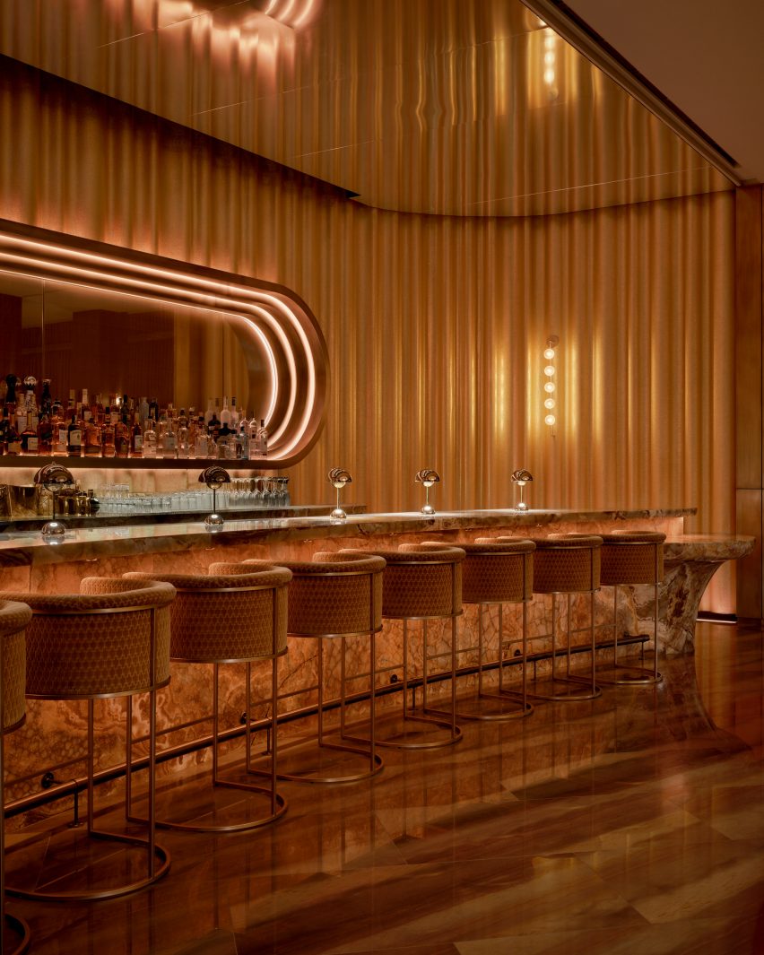
Bar at The Pinky Ring surrounded by golden drapesBar at The Pinky Ring surrounded by golden drapes
The stone bar at The Pinky Ring is surrounded by golden drapes that are reflected in the mirrored ceiling

Grammy Award-winning artist Mars collaborated with Canadian studio Yabu Pushelberg to craft an elevated and luxurious space within the Bellagio Resort and Casino.

The bar serves a curated collection of cocktails and hosts live entertainment by top musicians and DJs – though no phones are allowed inside.
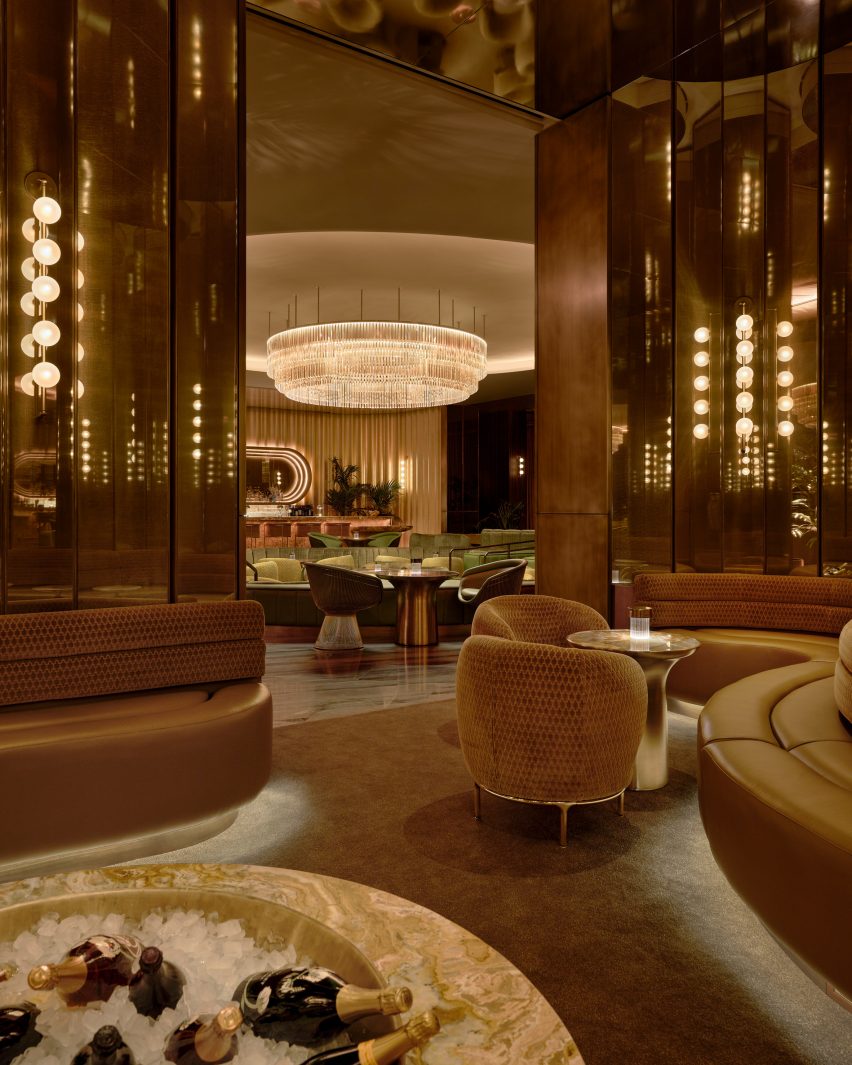
View from VIP area at The Pinky RingView from VIP area at The Pinky Ring
A huge crystal chandelier hangs in the centre of the lounge and is visible from all corners

The entry sequence begins with a dimly lit mirrored passageway, where Mars’ collection of Grammy trophies is displayed.

“Inspired by contemporary museum design, the corridor was designed as a soothing and discreet exhibition space where guests can cleanse their visual palette from the outside world and begin to submerge into The Pinky Ring,” said the design team.
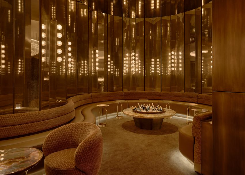
VIP area lined with faceted mirrored panelsVIP area lined with faceted mirrored panels
A VIP area is lined with faceted mirrored panels that create infinite reflections

Guests arrive at the main bar and lounge in front of a sunken conversation pit, wrapped with a wavy banquette and furnished with soft armchairs gathered around a series of small tables.

The carpet, the leather and the velvet chair upholstery are shades of green – colours also found in the richly veined stone tabletops.
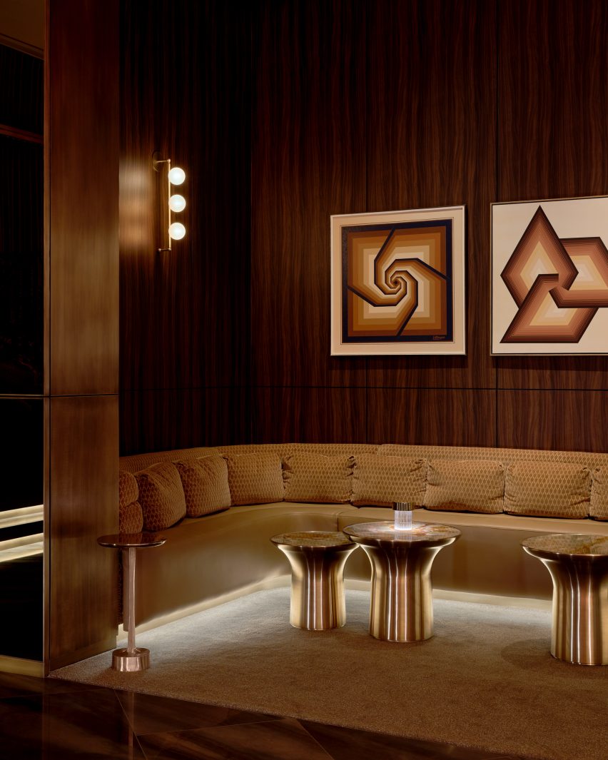
Seating area in a niche featuring dark wood-veneer panelsSeating area in a niche featuring dark wood-veneer panels
Other niches with additional seating feature dark wood-veneer panels

A giant halo-like chandelier with tiers of glowing crystal hangs from the ceiling above, providing a central focal point that can be seen from every corner.

At the rear of the space is a gently curved, dramatically patterned stone bar, topped with a row of metallic Flowerpot lamps by Verner Panton.
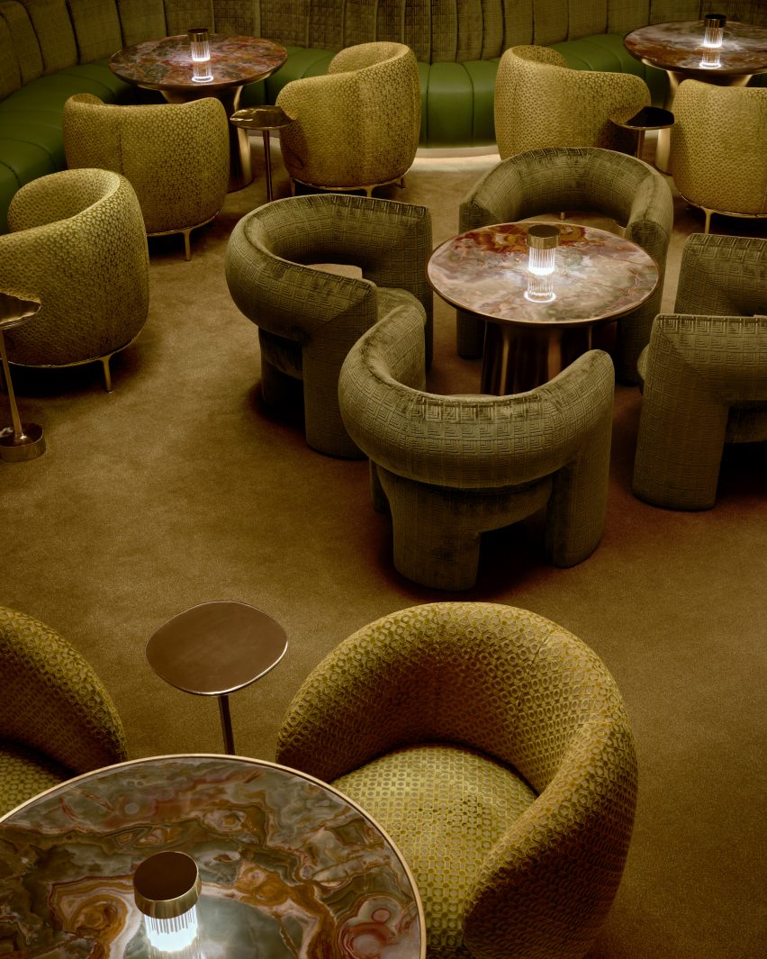
Conversation pit with carpet, chairs and banquettes in various shades of greenConversation pit with carpet, chairs and banquettes in various shades of green
In the central conversation pit, various shades of green were chosen for the carpet, chairs and banquettes

The back bar is housed within an elongated pill-shaped, mirrored recess, which displays a wide range of liquor bottles and is ringed with stepped cove lights.

Golden drapes run floor to ceiling across the back wall and are reflected in more mirrors on the ceiling.
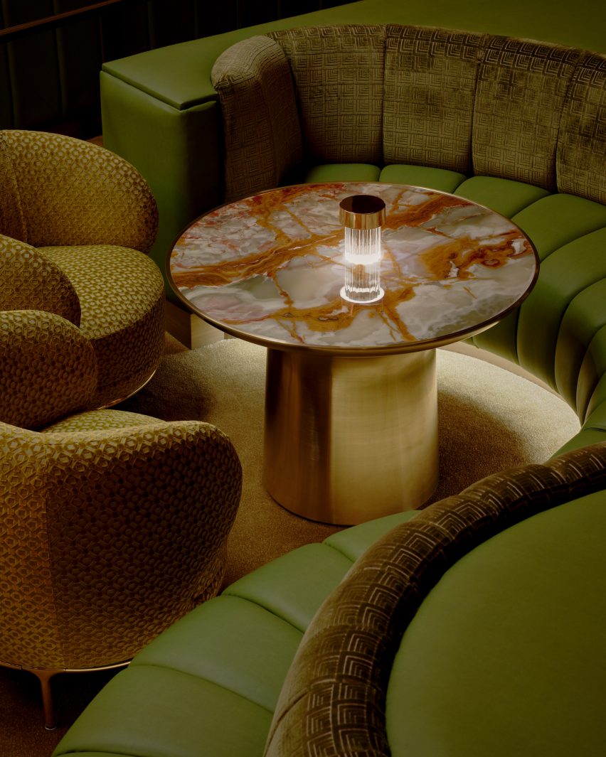
Seats and banquette surrounding a table with a richly veined stone topSeats and banquette surrounding a table with a richly veined stone top
The green hues of the seating are echoed in the richly veined stone tabletops

Off the main lounge are various niches and VIP areas that offer additional seating, some lined with dark wood-veneer panels.

“See or be seen, each area is composed of its own suave and purpose that echoes into the next,” said the team.

One organically shaped space is lined with faceted, smokey mirrored panels that create infinite reflections, and features a banquette that wraps around a large table fitted with a giant ice bucket for chilling drinks.

An important factor in the design was the lighting, which comprises under-seat and ceiling coves, along with wall lights with five globe-shaped diffusers attached to vertical brass rods.
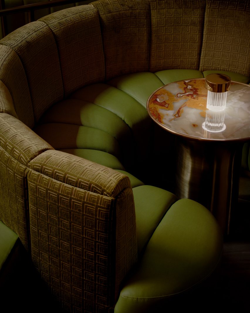
Patterned crushed velvet and leather banquettePatterned crushed velvet and leather banquette
Patterned crushed velvet covers the curved banquette back, while the seat is wrapped in leather

“In the pursuit of perpetual allure, where lighting not only transforms spaces, but perceptions, The Pinky Ring unveils a strategic lighting innovation, schemed to make people look and feel their best,” the team said.

“Through a strategic interplay of low-level, contrast, and accent lighting, The Pinky Ring lighting design unveils the unseen.”

Mars joins a long line of famous musicians to open entertainment venues. Among others is singer Justin Timberlake, who put his name behind an AvroKO-designed Nashville dining and drinking destination in 2021.
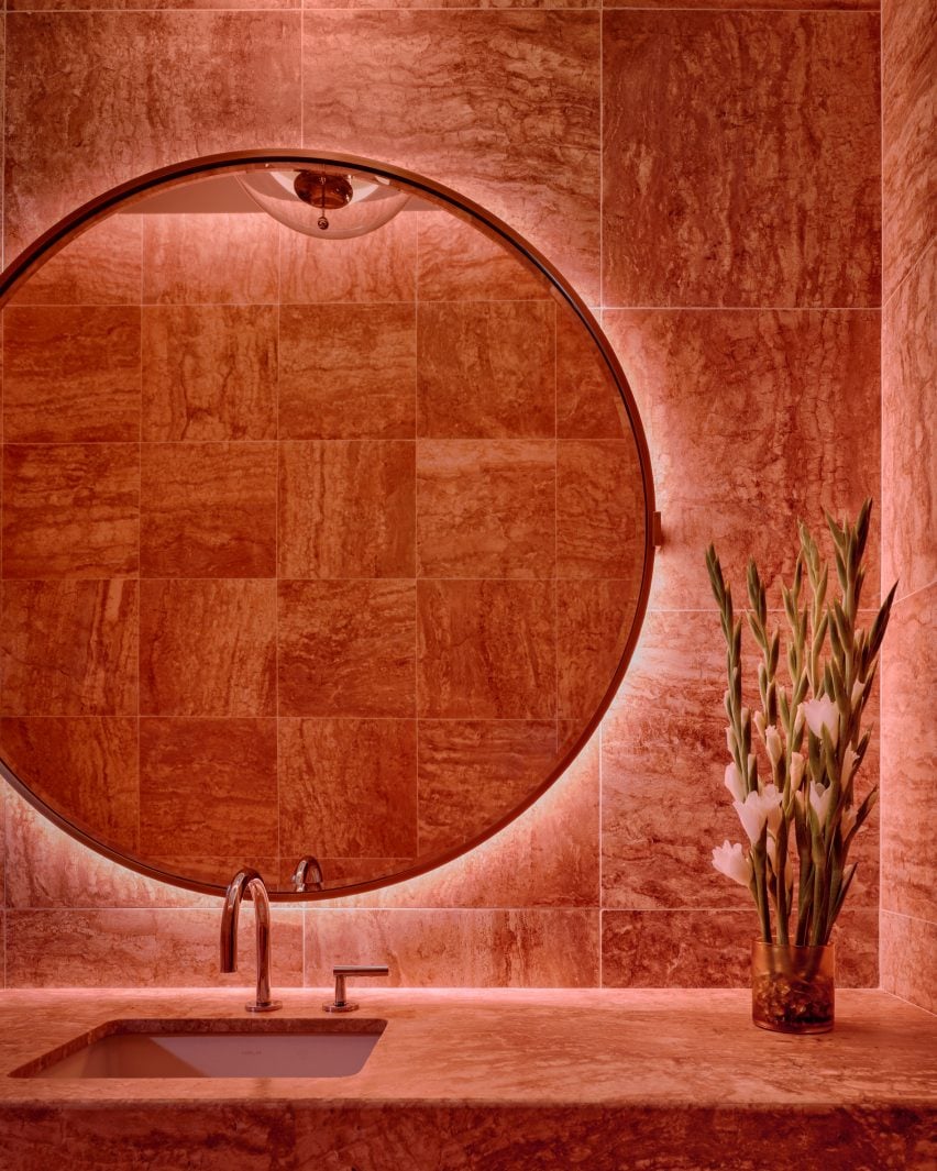
Bathroom with a large circular mirror and walls lined in pink-red stone tilesBathroom with a large circular mirror and walls lined in pink-red stone tiles
Pink-red stone tiles across the bathroom walls nod to the lounge’s name

Yabu Pushelberg was founded by George Yabu and Glenn Pushelberg in 1980, and the studio has designed some of the most recognisable hospitality interiors over the past four decades.

Shortlisted for Dezeen Awards 2021 design studio of the year and judges for the program in 2023, Yabu Pushelberg’s recent projects include the Moxy and AC Hotel in Downtown Los Angeles – of several they’ve completed for the Moxy brand – and The Londoner hotel on Leicester Square in the UK capital.

The photography is by Sean Davidson.

Reference

Cúpla decorates Rixo Marylebone store with hand-painted murals
CategoriesInterior Design

Cúpla decorates Rixo Marylebone store with hand-painted murals

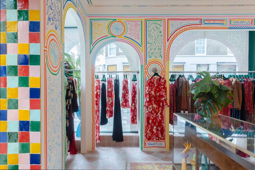
Interior design studio Cúpla has completed a boutique for fashion brand Rixo in central London that features hand-painted illustrations and colourful zellige tiles.

The clothing store on Marylebone High Street was revamped by Cúpla, whose creative director Gemma McCloskey is the twin sister of Rixo co-founder Orlagh McCloskey.

The interior designer had previously designed the brand’s flagship store on the King’s Road and wanted the refurbished Marylebone location to have a similar feel.

Colourful illustrations in Rixo MaryleboneColourful illustrations in Rixo Marylebone
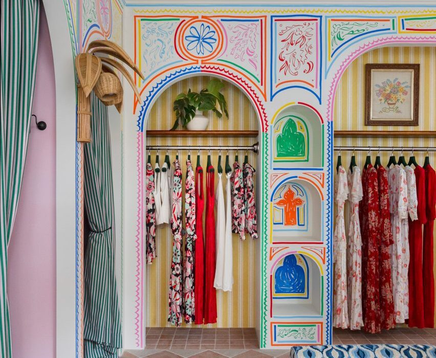
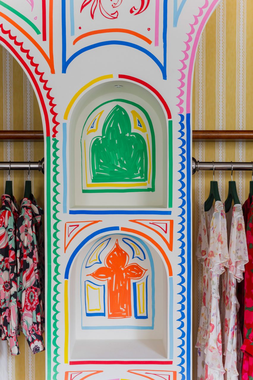
Rixo’s Marylebone store is covered in hand-painted murals

“We wanted the store to embody everything we had previously created for Rixo’s flagship store but within its own right,” Gemma McCloskey told Dezeen.

“A sense of escapism paired with a welcoming warmth within a boutique setting were the key emotions we wanted the customer to feel.”

As the brand sells hand-painted prints, the designer wanted the store’s interior to feature illustrations to reflect the style of the clothes.

Blue patterned sofa and archways in London fashion storeBlue patterned sofa and archways in London fashion store
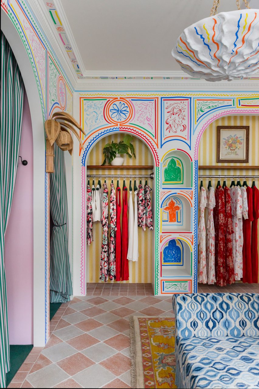
It features modified vintage furniture

“Understanding Rixo’s roots and the fact their USP is hand-painted prints, it felt tangible to represent the brand’s values and beginnings with the illustrations,” Gemma McCloskey said.

“Given the space is quite small, we treated it almost like a living room space within a home and felt we could make it all-encompassing and personal.”

Mirror in London clothing storeMirror in London clothing store
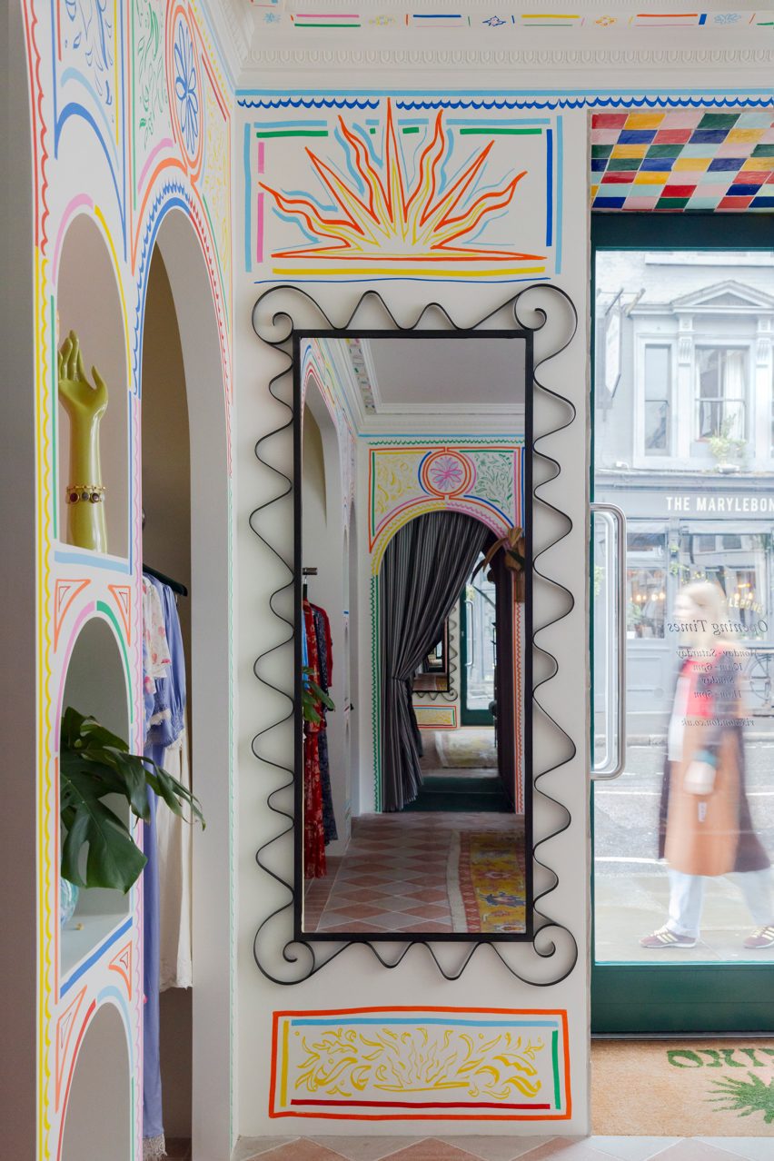
Artist Sam Wood created colourful illustrations for the store

Artist Sam Wood hand-painted murals and illustrations throughout the store, which has a bright and playful colour palette and also features traditional glazed Moroccan zellige tiles.

“We wanted the colour palette to feel really fresh and bright,” the designer explained.

“Although there is an abundance of colours used, every line of the mural or the ‘random’ coloured zellige tile layout was methodically composed to ensure a right balance between the colours was struck.”

The studio added decorative arches and classical mouldings to the store in a nod to the architecture and heritage of its Marylebone neighbourhood.

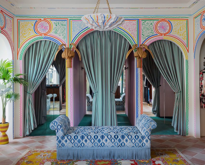
The store also features bespoke fitting room curtains with pickle-green and flora-pink stripes by fabric brand Colours of Arley.

Zellige tiles in Rixo MaryleboneZellige tiles in Rixo Marylebone
Moroccan zellige tiles add to the playful interior

Cúpla used vintage furniture pieces throughout the store, which sells Rixo’s full collection including ready-to-wear and bridalwear.

“We actually modified existing pieces of vintage furniture, which had been previously sourced by [Rixo founders] Orlagh and Henrietta years ago in the early days of Rixo,” Gemma McCloskey said.

“They were the perfect fit for the space but didn’t have the functionality we required, so we decided to alter these instead or replace them.”

Illustrations at Marylebone storeIllustrations at Marylebone store
The store is located on Marylebone High Street

“It was much more sustainable and because the pieces were from the early years of Rixo, they had sentimental value so we didn’t want to replace them,” she added.

Other recent London stores featured on Dezeen include a Camper store with a giant foot sculpture and a stationery store with a demountable interior.

The photography is courtesy of Rixo.


Reference

Lissoni Architecture creates New York showroom with “melting pot attitude”
CategoriesInterior Design

Lissoni Architecture creates New York showroom with “melting pot attitude”

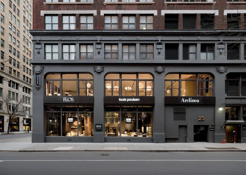
Local studio Lissoni Architecture has expanded the Design Holding flagship in New York City, creating an entirely new floor outfitted with light displays and curving metallic installations.

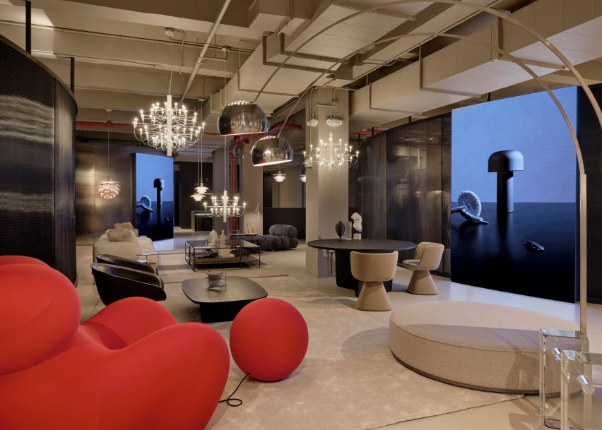
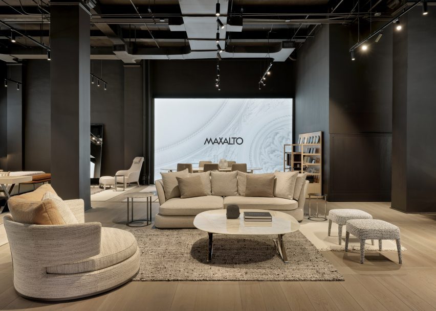
Lissoni Architecture, the US branch of Italian studio Lissoni & Partners, created an entirely new second floor and redesigned a portion of the first floor for the Design Holding showroom, which displays furniture and lighting brands including B&B Italia, Flos, Louis Poulsen, Maxalto, Arclinea and Azucena.

New York building facadeNew York building facade
Lissoni Architecture has created an expansion for the Design Holding showroom in New York

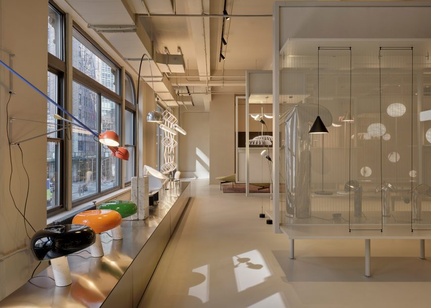
Lighting and design elements from the brands were distributed across the second-floor space, spread out amongst vertical stone-clad panels, transparent, metal showcases, and curving chrome benches and walls.

Each area of the floor was dedicated to a specific brand and the interior architecture was tailored to each brand’s identity, according to the studio.

Red chair in showroomRed chair in showroom
The project encompasses a new second floor and an expansion and redesign of the first

“We wanted to share the melting pot attitude of New York City where everyone and everything can blend together holistically so we went to the essence of the iconic brands,” said Lissoni Architecture founder Piero Lissoni.

“[We highlighted] their DNA and proposed a common ground that could host and enhance the design codes of each identity.”

A wall of lights and windowsA wall of lights and windows
The studio created dedicated areas for brands including Flos and B&B Italia

For lighting brand Flos, the studio created a series of display cases backed by a transparent mesh. A magnetized, geometric Bilboquet light by designer Philippe Malouin is on display, as well as the Almendra chandelier affixed with almond-shaped flakes by Patricia Urquiola.

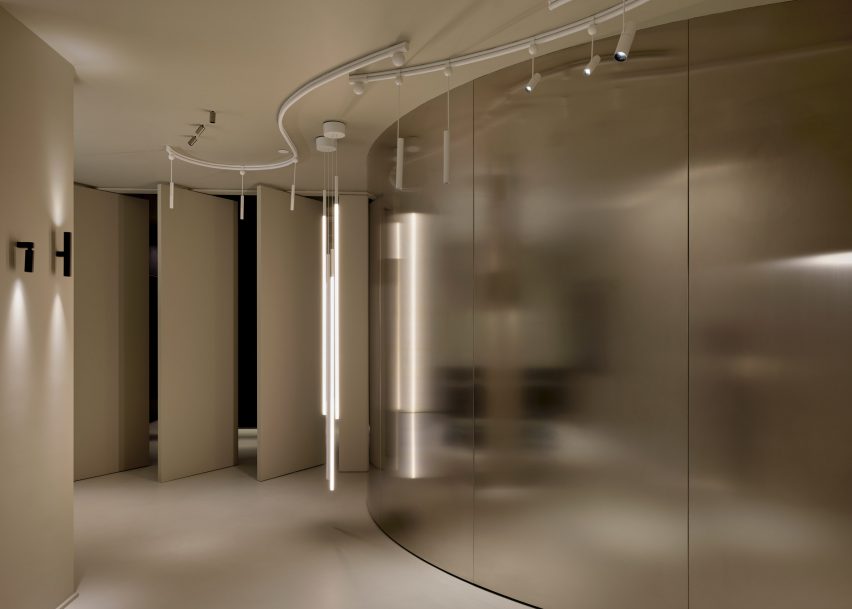
A testing room for clients was also created for the brand, which consists of a curved, metal wall that meets a series of angled panels that act as an entrance for the room.

Tables in a showroomTables in a showroom
The various displays were informed by the “melting pot” attitude of New York City

Another corner of the floor was dedicated to the display of the Skynest chandelier by Marcel Wanders, which resembles an inverted basket interlaced with cords of light.

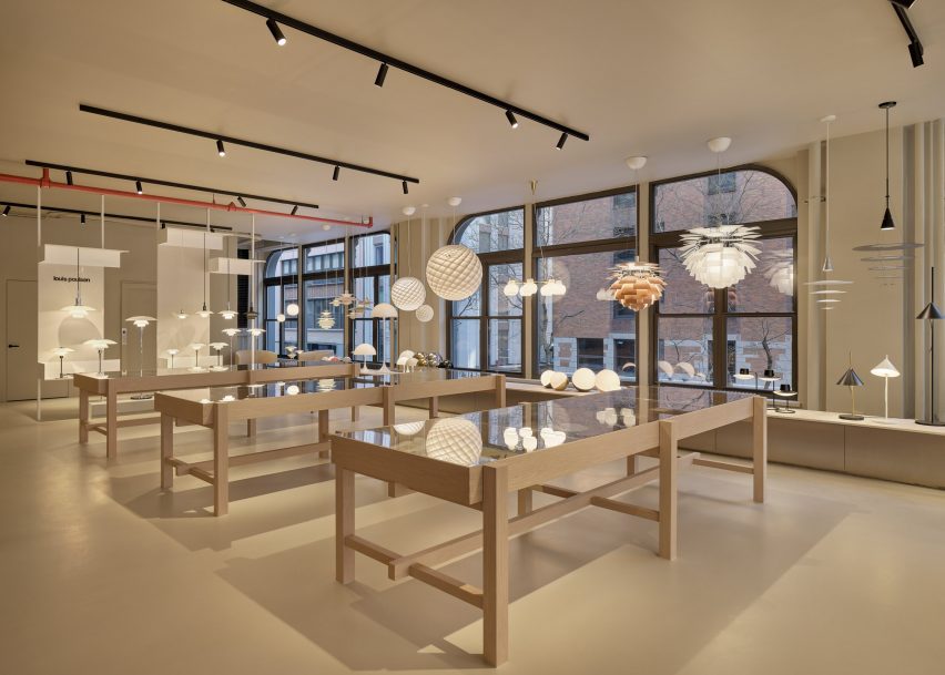
Displays for Flos and Louis Poulsen consist of inserted panels and curving planting beds that are populated with a number of lighting fixtures from both brands.

A room with a curving metal wallA room with a curving metal wall
Metallic panels, warm wood, and dark cladding were used throughout the second-floor space

Dark, metal cladding used in the Flos displays contrasts the off-white and beiges used throughout the Louis Poulsen space, but both flank a B&B Italia lounge that sits at the centre of the floor, which features a bright-red chair from the Up series by Gaetano Pesce.

A B&B Italia wardrobe was also created for the showroom, which sits next to an Arclinea kitchen display.

A black ash finish was used to clad a large cabinet unit, which sits behind a Thea island topped with a quartz waterfall countertop.

Lighting by Louis Poulsen, including the Patera Oval pendant by designer Øivind Slaatt, was tucked into the furthest corner of the space, with pieces distributed amongst wooden tables and a low-lying display unit.

A show room with white furnitureA show room with white furniture
A separate entrance leads to a Maxalto space on the first floor

On the first floor, a new space dedicated to Maxalto is accessible through a separate entrance, with pieces such as the brand’s Arbiter sofa system positioned against walls clad in black.

Design Holding, a global retailer founded in 2018, recently added furniture brands Menu, By Lassen and Brdr Petersen to its portfolio after an agreement with Denmark-based company Designers Company.

Piero Lissoni announced the founding of the US branch of his studio last year, saying that the US has become more “open-minded” in terms of architecture.

The photography is courtesy Design Holding.

Reference

Ten Mexican holiday homes characterised by earthy hues
CategoriesInterior Design

Ten Mexican holiday homes characterised by earthy hues

From a brutalist dwelling nestled in a pine forest to a beachy weekend retreat with a rooftop swimming pool, our latest lookbook features 10 holiday homes across Mexico.

While known for their often vibrant colours, Mexican interiors also include many examples of more muted designs. These earthy hues are often created through the use of natural and local materials, such as wood and stone.

Holiday homes are located all over the country, which has a varied landscape and is famous for its escapist destinations. Here are 10 Mexican holiday homes that combine pared-back colour palettes with getaway-style luxury.

This is the latest in our lookbooks series, which provides visual inspiration from Dezeen’s archive. For more inspiration, see previous lookbooks featuring metal furniture, breakfast nooks and living spaces with swings.


Built-in couch in concrete homeBuilt-in couch in concrete home
Top and above: photos by Rory Gardiner

Casa Alférez, Alférez, by Ludwig Godefroy

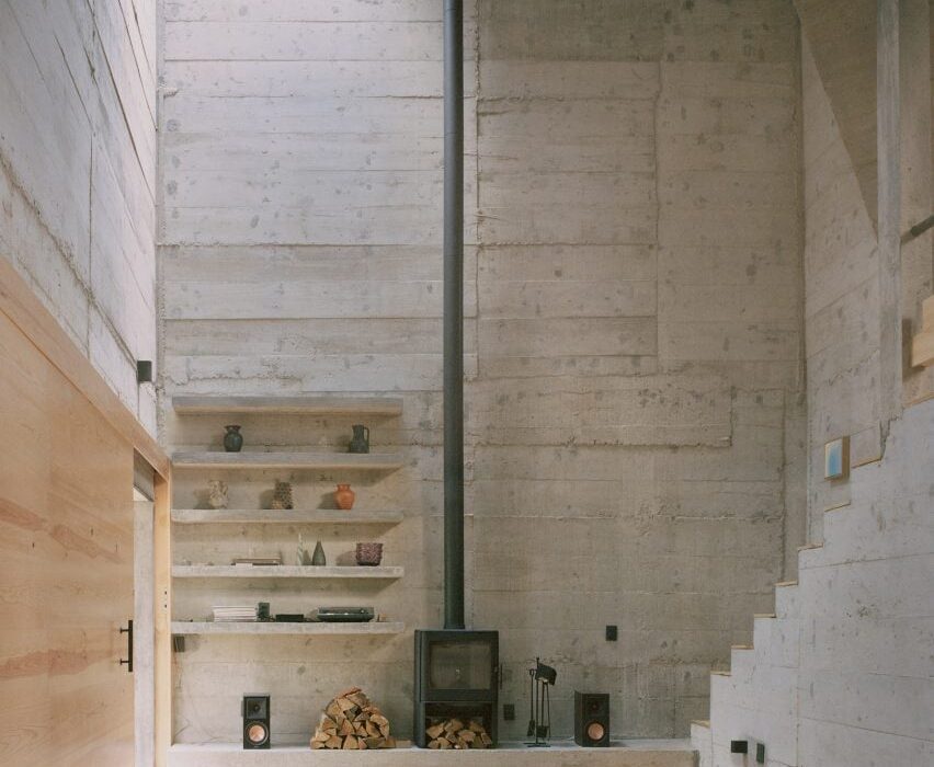
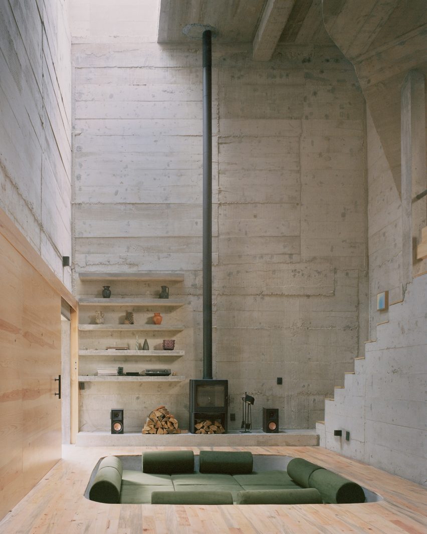
This holiday home is a brutalist dwelling clad in board-formed concrete and located in a pine forest in the country’s Alférez region.

French architect Ludwig Godefroy, who is Mexico City-based, added a conversation pit to the cathedral-like living area, which features a spindly double-height fireplace.

Find out more about Casa Alférez ›


Gardenia HouseGardenia House
Photo by LGM Studio

Holiday home, San Simón El Alto, by Estudio Atemporal

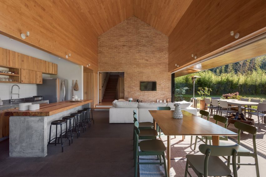
Local architecture office Estudio Atemporal designed a weekend retreat in San Simón El Alto village with an oversized gabled roof.

Inside, the studio created a statement brick wall in the angular, open-plan living space defined by timber and concrete accents. Generous glass doors lead to a covered outdoor patio.

Find out more about this holiday home ›


Villa CavaVilla Cava
Photo by César Béjar

Villa Cava, Tulum, by Espacio 18 Arquitectura

Neutral tones and textures define this house in Tulum that was informed by cenotes – ancient sunken water-filled limestone pits and caves found across Mexico’s Yucatán Peninsula.

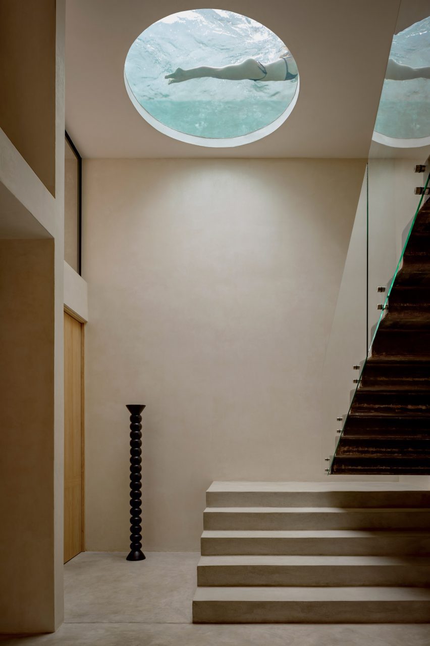
Espacio 18 Arquitectura carved a circular window into one of the home’s ceilings, which reveals a rooftop swimming pool. Blue-coloured light filters through the opening, emphasising the cavernous atmosphere.

Find out more about Villa Cava ›


Interior design by Gala Sánchez-ReneroInterior design by Gala Sánchez-Renero
Photo by Diego Padilla Magallanes

La Extraviada, Mazunte, by Em-Estudio

Architecture firm Em-Estudio stepped a pair of concrete residential volumes down a rocky hillside overlooking the coastal town of Mazunte, Oaxaca.

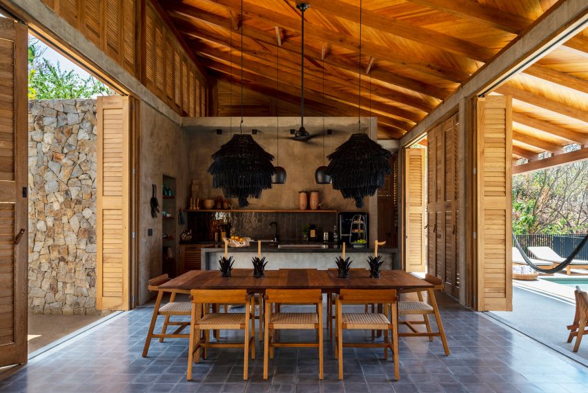
Called La Extraviada, the holiday home includes an eclectic kitchen and dining space flanked by floor-to-ceiling timber shutters that open onto a terrace with a swimming pool.

Regional materials, including guapinol wood and local stone obtained from nearby quarries, feature throughout the earthy-hued project.

Find out more about La Extraviada ›


Lounge with red sofa, Casa Tres Árboles in Valle de Bravo by DireccionLounge with red sofa, Casa Tres Árboles in Valle de Bravo by Direccion
Photo by Fabian Martinez

Casa Tres Árboles, Valle de Bravo, by Direccion

Architecture studio Direccion took cues from “monastic” sanctuaries when renovating this weekend retreat in Valle de Bravo.

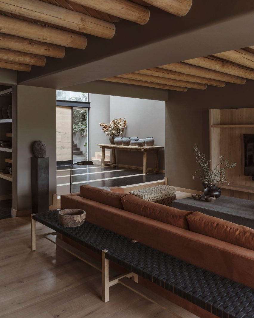
The open-plan living space includes exposed warm-toned wooden ceiling beams, which contrast against dark-painted walls. A soft-red sofa adds a rare pop of colour to the otherwise muted interiors.

Find out more about Casa Tres Árboles ›


Los Terrenos by Tatiana BilbaoLos Terrenos by Tatiana Bilbao
Photo by Rory Gardiner

Los Terrenos, Monterrey, by Tatiana Bilbao

Mexican architect Tatiana Bilbao added a multifunctional ceramic screen to the interior of Los Terrenos – a holiday home in Monterrey with mirrored glass facades that reflect the surrounding wooded site.

“[The screen] works as solid and permeable floor, a screen partition, a structural wall, and as a semi-open wall that allows ventilation and sunlight to bathe the interior spaces,” explained Bilbao’s eponymous studio.

Find out more about Los Terrenos ›


Tonalli House staircaseTonalli House staircase
Photo by Ansatz

Tonalli House, Jalisco, by Moises Sánchez 

This stucco-clad holiday home was punctuated with strategic openings and takes cues from architecture commonly found in Mexican villages, according to its designer Moises Sánchez.

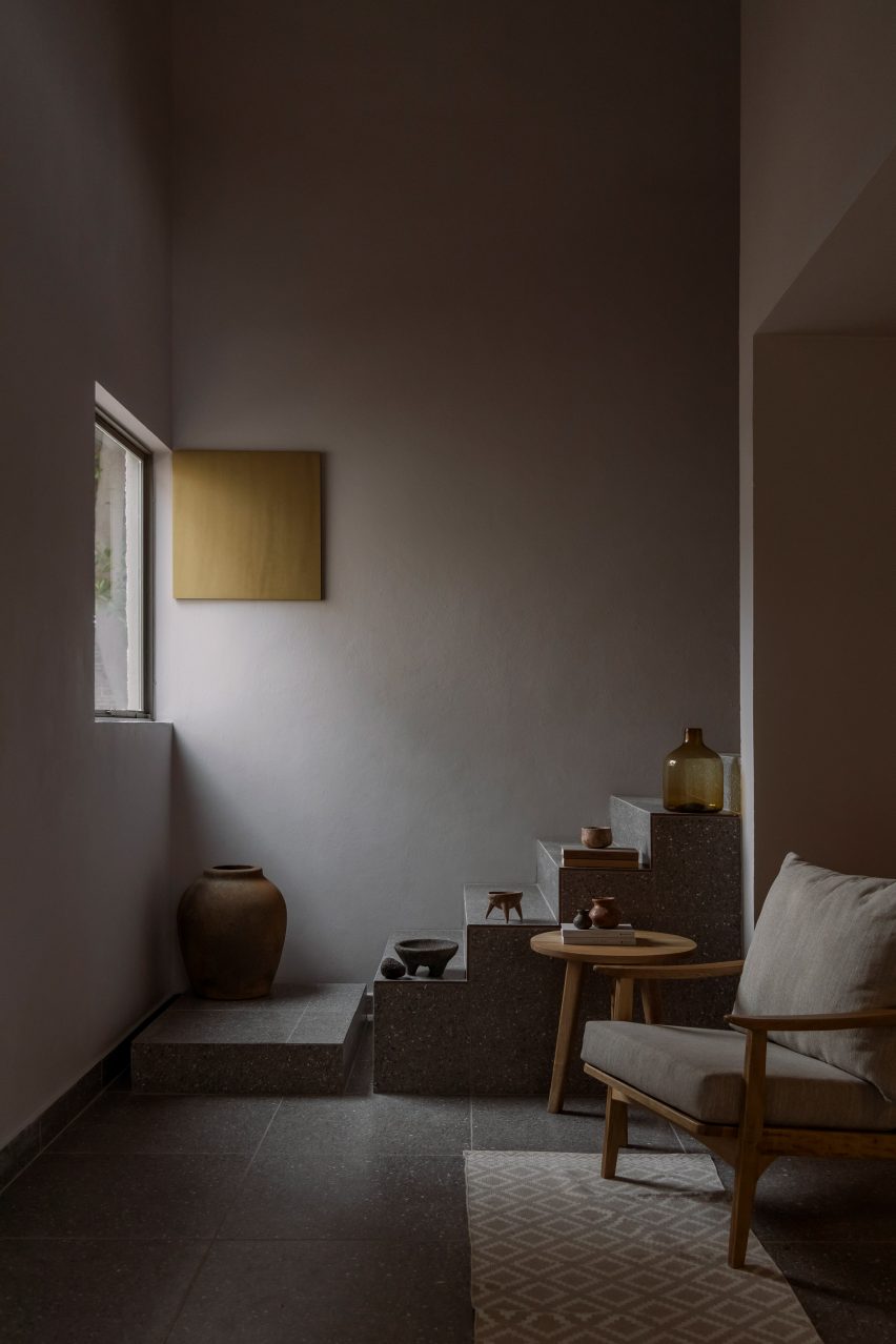
Sánchez created an understated interior palette referencing the nearby architecture surrounding Lake Chapa, where the home is located. For example, the blocky terrazzo staircase doubles as a stepped plinth for sandy-coloured ornaments.

Find out more about Tonalli House ›


CO-LAB Design Office made the house out of concreteCO-LAB Design Office made the house out of concrete
Photo by César Béjar

Casa Areca, Tulum, by CO-LAB Design Office

Local studio CO-LAB Design Office created Casa Areca to merge with its lush Tulum setting.

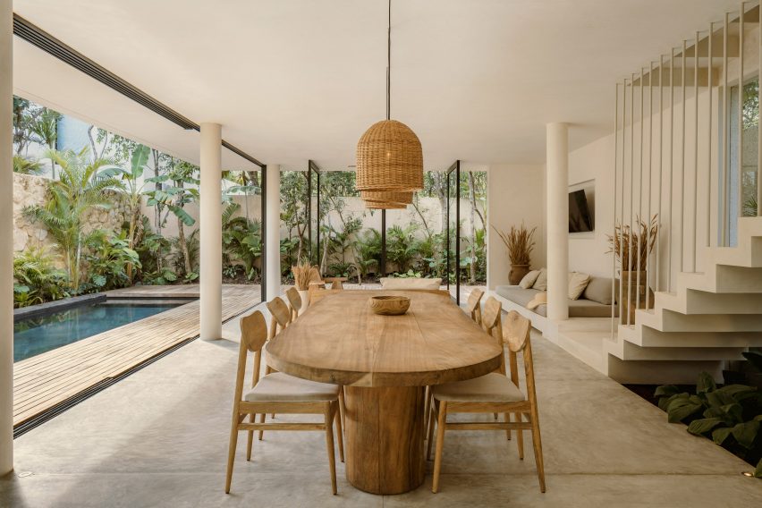
The open-plan ground floor includes pivot doors and retractable glass walls, which enable the social area to flow into the jungle-like garden. Creamy walls and polished concrete floors were paired with local tzalam wood, jute accents and ceramic vases filled with hand-selected wild grasses.

Find out more about Casa Areca ›


Living space of El AguacateLiving space of El Aguacate
Photo by Dove Dope

El Aguacate, El Barrial, by Práctica Arquitectura

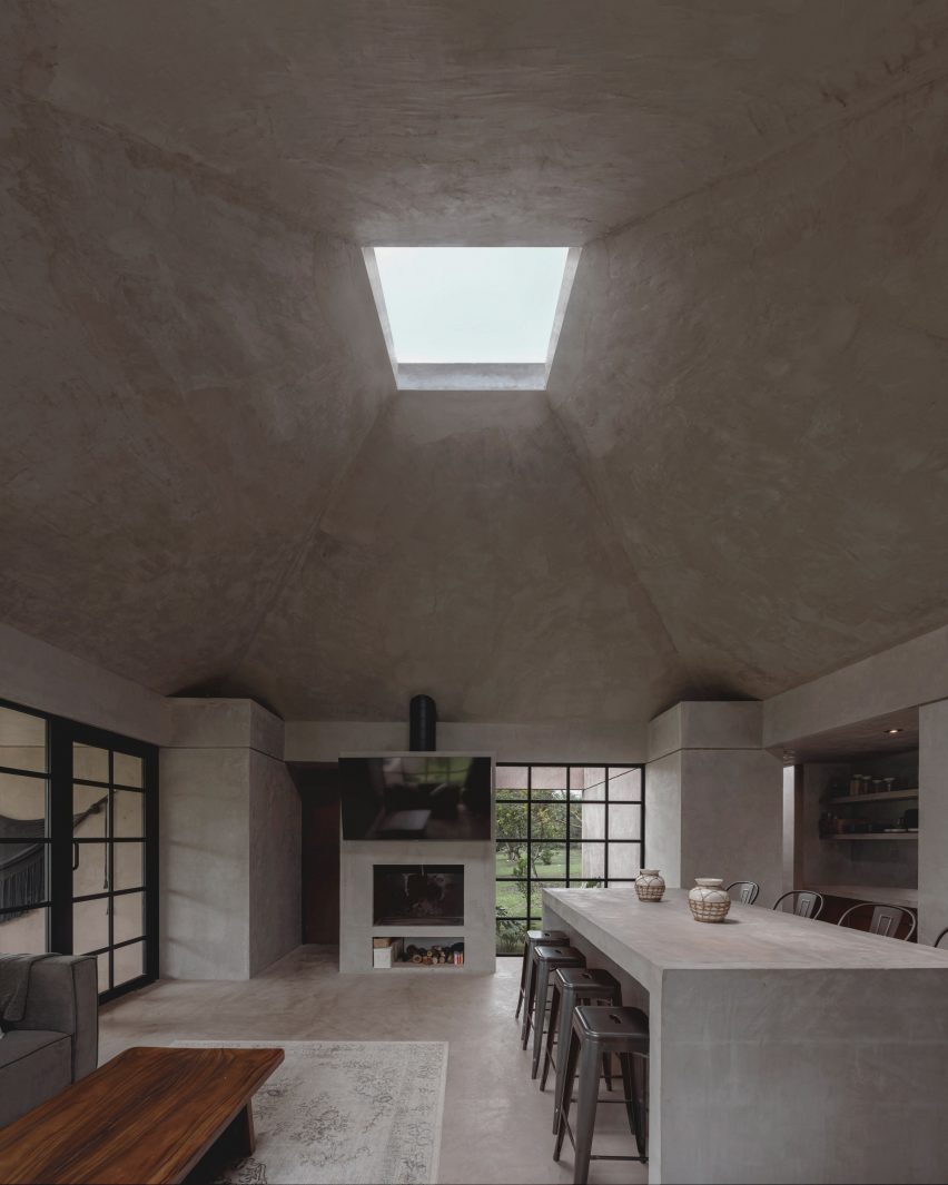
El Aguacate – or “The Avocado” – is a holiday home in El Barrial village made almost entirely out of concrete.

Práctica Arquitectura topped the main living area with a tall pyramidal roof featuring a boxy skylight. The studio added a built-in fireplace and alter-like dining table to the space – also made from smooth concrete.

Find out more about El Aguacate ›


A large table in the shady dining areaA large table in the shady dining area
Photo by Rafael Gamo

Casa Cova, Puerto Escondidio, by Anonimous

When designing Casa Cova in Puerto Escondido, Mexican studio Anonimous took cues from pre-colonial architecture.

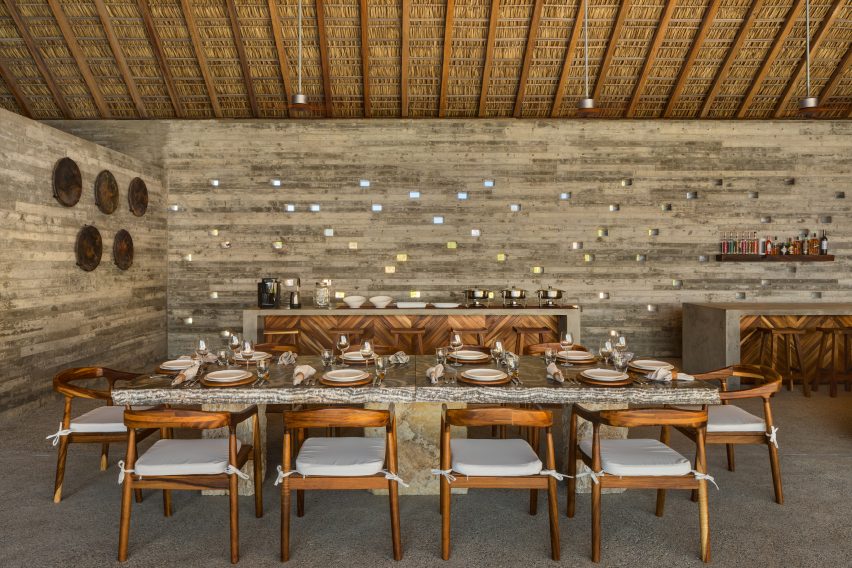
Inside, the central living space is kept cool by a traditional thatched roof made of dried palm leaves, called a “palapa.” Tiny square openings were also cut into some of the walls, creating “a dynamic light pattern from dusk till dawn”.

Find out more about Casa Cova ›

This is the latest in our lookbooks series, which provides visual inspiration from Dezeen’s archive. For more inspiration, see previous lookbooks featuring metal furniture, breakfast nooks and living spaces with swings.

Reference

Eight home interiors where full-length curtains add a touch of drama
CategoriesInterior Design

Eight home interiors where full-length curtains add a touch of drama

From a glitzy Parisian apartment to a converted garage in Buffalo, New York, our latest lookbook collects eight residential interiors where floor-to-ceiling curtains inject a theatrical feel.

Curtains aren’t just for covering windows. A set of statement drapes can be an easy way to significantly change the mood of a room, particularly in apartment renovations.

The selection below features curtains in stage-like living rooms, rough-edged bedrooms and cosy working nooks.

This is the latest in our lookbooks series, which provides visual inspiration from Dezeen’s archive. For more inspiration, see previous lookbooks featuring interiors with statement carpets, furry walls and colourful bedrooms.


Ready-made Home by AzabReady-made Home by Azab
Photo is by Luis Díaz Díaz

Ready-made Home, Spain, by Azab

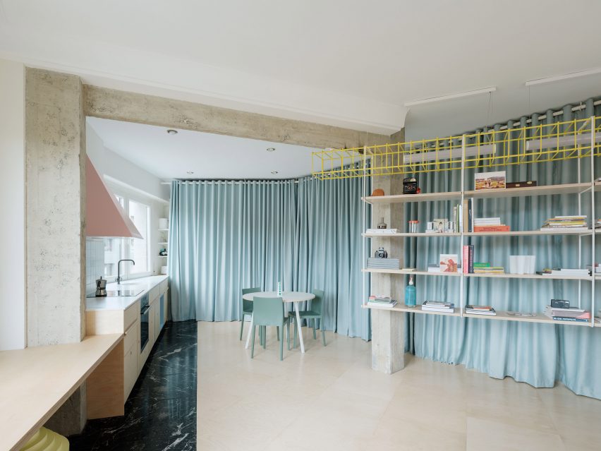
Duck-egg blue curtains help to create a flexible open-plan layout at this apartment in Bilbao that was overhauled by architecture studio Azab, running the length of the living-dining-kitchen area to conceal storage space and a bathroom.

“The curtains have theatrical and playful connotations and invites the inhabitant to perform with it, to change the space and to play with the mysteries, contradictions and paradoxes that privacy offers us beyond morality,” said the studio.

Find out more about Ready-made Home ›


Ruckers Hill House by Studio BrightRuckers Hill House by Studio Bright
Photo by Rory Gardiner

Ruckers Hill House, Australia, by Studio Bright

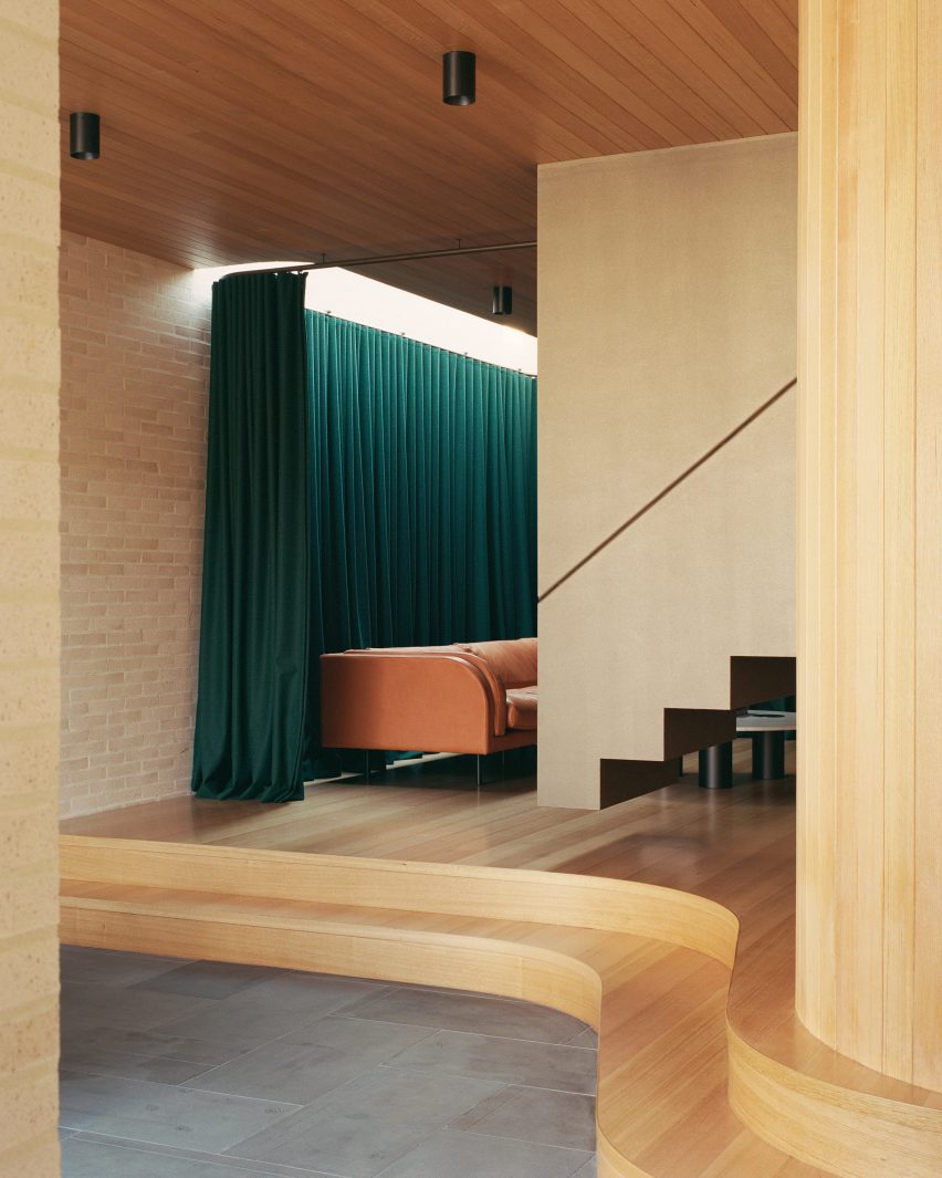
In this extension to an Edwardian family home in Melbourne, architecture practice Studio Bright raised the sitting room on a curved plinth, giving it a stage-like quality.

Enhancing the effect is a heavy green curtain hung from the ceiling, which can be drawn across to turn the space into an impromptu theatre for the children to play in.

Find out more about Ruckers Hill House ›


Uchronia renovated a Haussmann-era apartment in ParisUchronia renovated a Haussmann-era apartment in Paris
Photo by Félix Dol Maillot

Avenue Montaigne apartment, France, by Uchronia

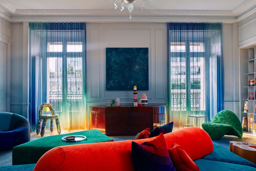
Sheer, rainbow-effect curtains cover the balconies of this opulent Haussman-era Parisian apartment, renovated by local studio Uchronia.

Even the walls echo the curtains’ gradations of colour, while the brightly toned furnishings are designed to resemble pieces of jewellery.

Find out more about this apartment ›


Roksanda Ilincic penthouse apartment in London's King's CrossRoksanda Ilincic penthouse apartment in London's King's Cross
Photo by Michael Sinclair

Gas-holder apartment, UK, by Roksanda Ilincic

Fashion designer Roksanda Ilincic brought her proclivity for bold colours and shapes to this London penthouse inside a former Victorian gas holder.

Pale pink Kvadrat curtains over the full-height windows cast a rose-tinted hue over the rooms, where the colour palette is kept mostly neutral apart from some pops of bright yellow.

Find out more about this apartment ›


Big Space, Little Space by Davidson RafailidisBig Space, Little Space by Davidson Rafailidis
Photo by Florian Holzherr

Big Space, Little Space, USA, by Davidson Rafailidis

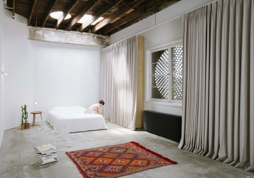
Peeling paintwork, uneven concrete floors and distressed wooden beams lend a distinctly rough-and-ready feel to this home-slash-workspace in Buffalo created out of a garage conversion by design studio Davidson Rafailidis.

For the most part, the space is minimally furnished, apart from a set of high and wide drapes that introduce a luxurious twist.

Find out more about Big Space, Little Space ›


Silver curtains in hallway at Landscape House in JapanSilver curtains in hallway at Landscape House in Japan
Photo by Norihito Yamauchi

Landscape House, Japan, by FORM/Kouichi Kimura Architects

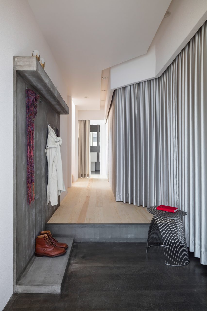
Upon entering Landscape House in central Japan, designed by Japanese studio FORM/Kouichi Kimura Architects, one is greeted by a lengthy corridor lined entirely on one side by a full-length silver curtain.

The fabric echoes a raw concrete feature wall on the opposite side of the corridor, as well as referencing the extensive use of metal throughout the building.

Find out more about Landscape House ›


Kitchen in Pops apartment by Furora StudioKitchen in Pops apartment by Furora Studio
Photo by ONI Studio

Pops, Poland, by Furora Studio

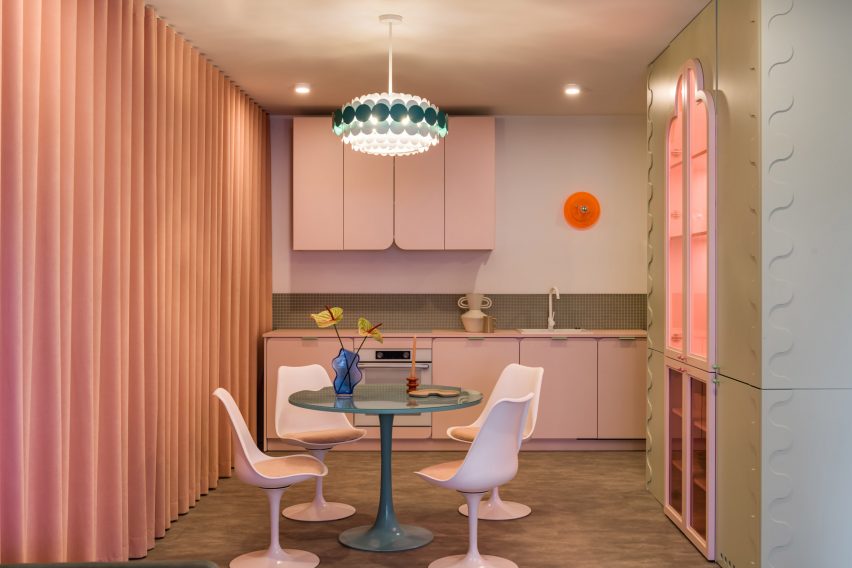
Furora Studio wanted the design of this holiday apartment in Kraków to be slightly more outrageous than the standard residential interior.

A velvety, salmon-pink curtain dresses an entire wall in the open-plan kitchen and living room, adding to a plethora of sugary colours and rounded edges.

Find out more about Pops ›


Maison-Boutique Coloniale by Michael Godmer and Mathieu TurgeonMaison-Boutique Coloniale by Michael Godmer and Mathieu Turgeon
Photo by Maxime Brouillett

Maison-Boutique Coloniale, Canada, by Michael Godmer and Mathieu Turgeon

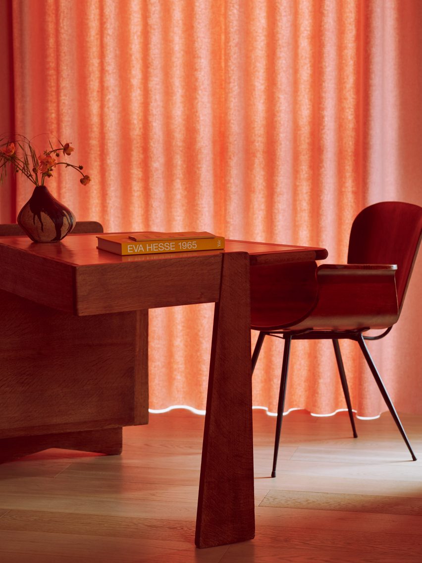
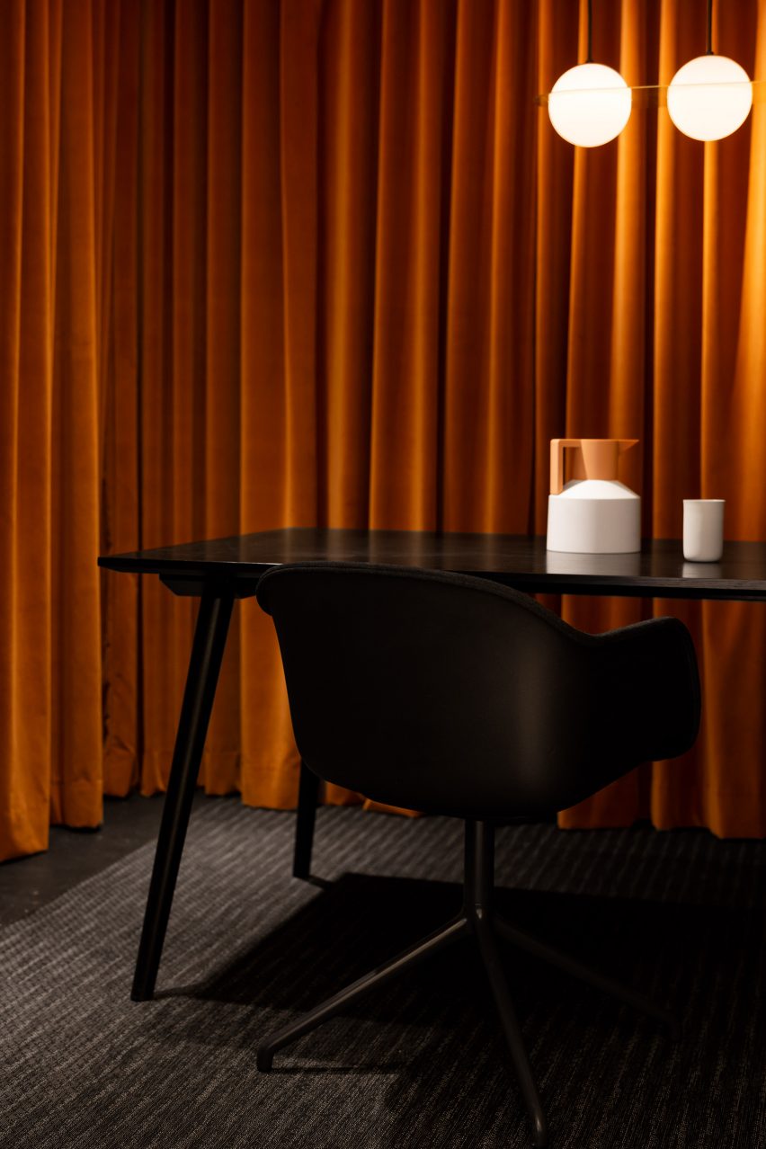
Most of the spaces inside Maison-Boutique Coloniale in Montreal – renovated by designers Michael Godmer and Mathieu Turgeon as their own residence and studio – are pared-back and neutral.

But in an office space on the basement level, plush orange curtains line the walls, combined with dim pendant lighting and a black table arrangement by Muuto and &tradition for an intimate effect.

Find out more about Maison-Boutique Coloniale ›

This is the latest in our lookbooks series, which provides visual inspiration from Dezeen’s archive. For more inspiration, see previous lookbooks featuring interiors with statement carpets, furry walls and colourful bedrooms.

Reference

North Carolina practice Sundholm Studio revamps Durham restaurant
CategoriesInterior Design

North Carolina practice Sundholm Studio revamps Durham restaurant

Interiors practice Sundholm Studio has refreshed the 30-year-old Nanas restaurant in Durham, North Carolina, with strong colours, bespoke timber joinery and metalwork.

Previously named Nana’s, the restaurant was renamed Nanas, in tribute to “not one nana, but rather the entire genre,” Sundholm Studio creative director Shaun Sundholm told Dezeen.

The space – intended to capture the hospitable “spirit of grandmothers” – comprises a bar, salon, dining room and an outdoor patio.

Restaurant and bar in Durham, North CarolinaRestaurant and bar in Durham, North Carolina
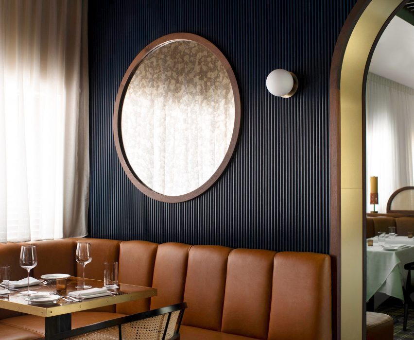
Navy fluted walls form the backdrop to the salon

Sundholm’s aim was to update the space with “modern details that bring the outside in”.

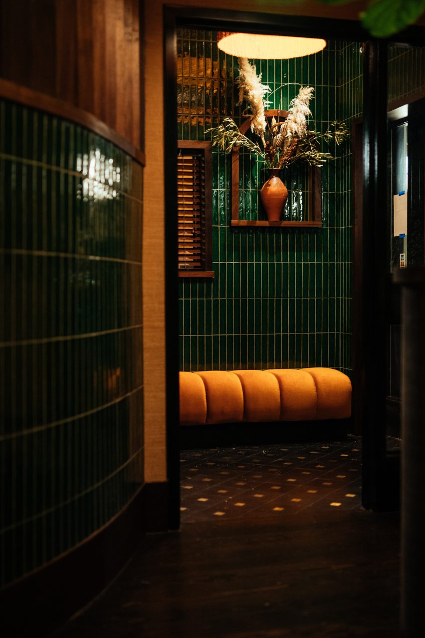
The existing curved walls in the entryway were retained and reworked with wooden slats, which light passes through to evoke “a walk through the woods”.

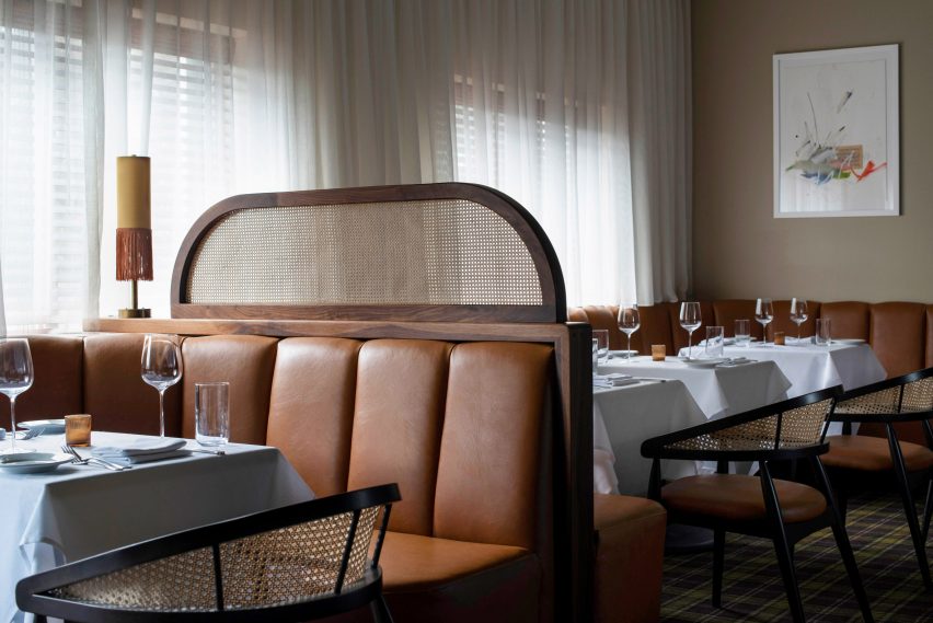
Wooden window blinds and sheer drapes in the dining room help with acoustic absorption and adjusting the natural light levels.

Restaurant and bar interiors in Durham, North CarolinaRestaurant and bar interiors in Durham, North Carolina
The seating is a mixture of banquette booths and chairs

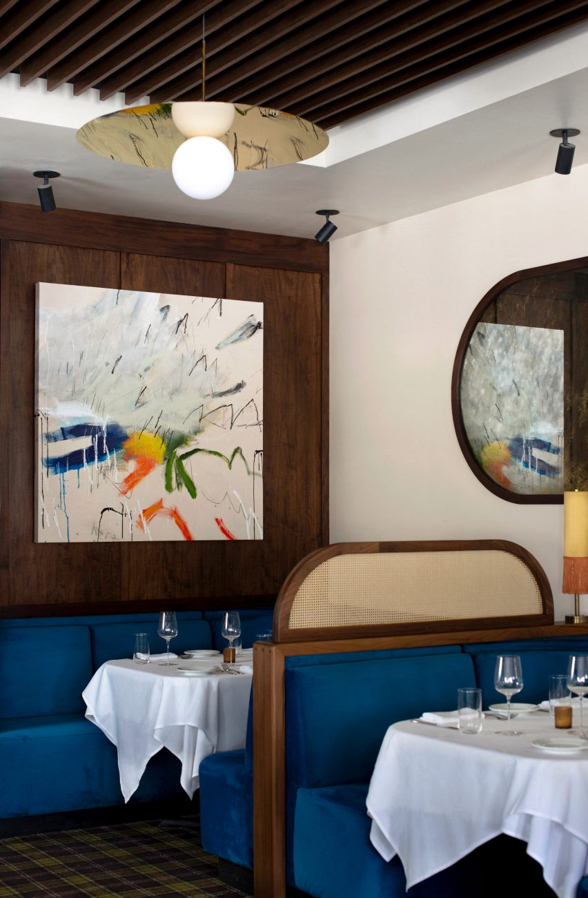
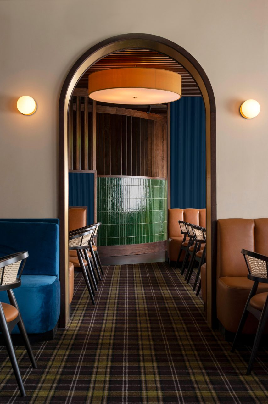
The dimly lit entrance was contrasted with the bar, dining area and salon, where jewel-toned colours like emerald green, sapphire blue, and rich amber orange have been used.

“I aimed to pay homage to aspects of the previous design where possible, accentuating some of the interesting bits of the existing physical space, such as the curved wall at the entrance and the hints of orange throughout – recalling the bright, blaze orange walls of the past,” Sundholm explained.

In line with the jewel-toned colour palette, Sundholm selected a variety of textures to use across the restaurant, including glossy green handmade Italian tiles and brass finishes.

Blue velvet upholstery covers the banquettes in the bar, while “vintage luggage” orange leather covers the banquettes in the salon and dining area.

Nanas, Durham, North Carolina, USA, by Sundholm StudioNanas, Durham, North Carolina, USA, by Sundholm Studio
The dark entrance leads into a curved passage, through to the dining room

Brass archways designed by local metal art studio Andrew Preiss Designs feature across the restaurant, including as a portal between the salon and dining area. This arch motif is echoed in the bathroom mirrors.

Earth-toned grasscloth wallpaper and a plaid-patterned carpet contrast the solid colours and textures.

“For this restaurant, our initial mood boards culled from a diverse range – from The Golden Girls and vintage Ralph Lauren textiles to 1970s Cadillacs and abstract impressionist art inspired by the Smoky Mountains,” Sundholm said.

Nanas bar and restaurant in Durham, North Carolina, USANanas bar and restaurant in Durham, North Carolina, USA
Bold colour is used for the restaurant seating

The studio’s goal was to “distill these inspirations into their core elements” and use them to inform the interiors in a “non-gimmicky” way.

A collection of mixed-media artworks by local artist Jason Craighead featured across the restaurant add to this aesthetic.

Tartan carpet introduces a pattered counterpoint to the block colours

Other recently renovated restaurants featured on Dezeen include Aino and Alvar Aalto’s Savoy restaurant in Helsinki restored after 80 years and The Bird in Montauk designed by Home Studios.

The photography is by Lissa Gotwals and D L Anderson.
Reference

Isern Serra completes “serene” office for eyewear brand Gigi Studios
CategoriesInterior Design

Isern Serra completes “serene” office for eyewear brand Gigi Studios

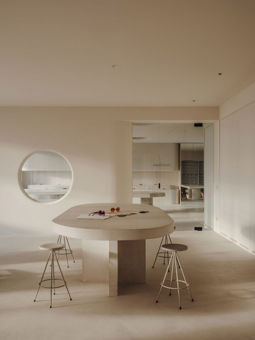
Sculptural custom-made furniture adds artistic flourishes to this otherwise minimal showroom and head office, designed by Spanish interiors studio Isern Serra for eyewear brand Gigi Studios.

Isern Serra was tasked with creating a holistic scheme for the 900-square-metre headquarters, occupying one floor of a building in the town of Sant Cugat del Vallès just north of Barcelona.

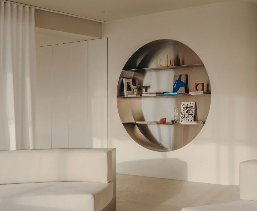
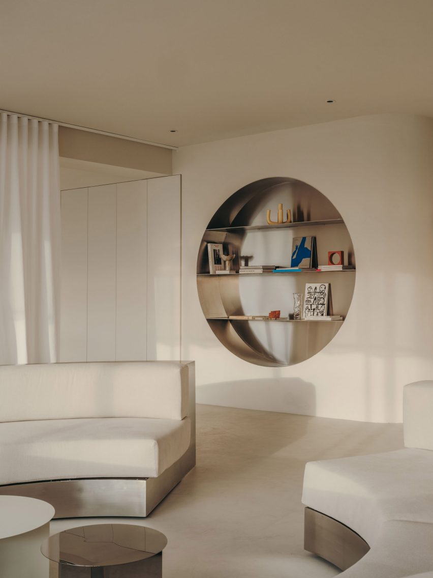
Wall niche with stainless steel shelving in Gigi Studios office Wall niche with stainless steel shelving in Gigi Studios office
Isern Serra has filled the Gigi Studios headquarters with custom furniture

The brief called for a design that creates a sense of spaciousness and comfort while reflecting founder Patricia Remo’s vision of Gigi Studios as a brand.

“It is also serene, warm and elegant and conceptually close to the idea of a studio and away from the concept of a traditional office, without losing the practicality and functionality,” Isern Serra explained.

Workspaces in office in Spain by Isern SerraWorkspaces in office in Spain by Isern Serra
Rows of desks were replaced with more intimate work areas

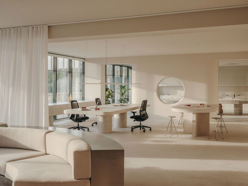
The building’s rectangular floor plan features a central service core housing the lifts and toilets, with the workspaces, meeting rooms, kitchen and showroom occupying the surrounding O-shaped open space.

Serra and his team positioned the kitchen and showroom at one end of the plan and placed the meeting rooms and client areas at the other, leaving the longer sides open to optimise circulation.
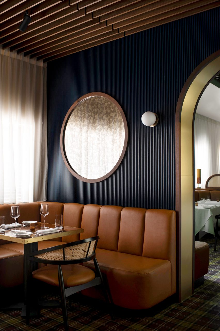
Table with stools in Gigi Studios office Table with stools in Gigi Studios office
Concrete bases for the work tables were cast in situ

Various bespoke furniture pieces, conceived by Isern Serra as “small works of art”, bring a distinct personality to the different formal and informal spaces.

These interventions were designed to embody Gigi Studios’ design ethos while standing out against the warm and minimal backdrop.

“The project aims to experiment with the limits of the workspace and seek a new concept that goes hand in hand with the idea of domus and museum,” Isern Serra explained.

Table and lounge area inside office in Spain by Isern SerraTable and lounge area inside office in Spain by Isern Serra
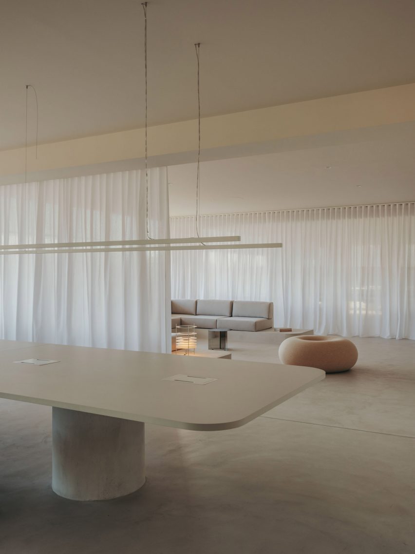
Curtains can be used to cordon off the lounge area

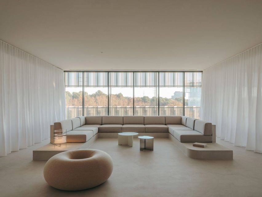
A large circular sofa framed in stainless steel provides a bold statement in one of the reception areas.

The sculptural piece fulfils a dual function as a seating area and a space for working, with tables and book storage integrated into the backrest around the perimeter.

Similarly, the building’s central core is wrapped in a layer of built-in storage units including circular stainless-steel niches that incorporate shelves for displaying books and materials.

Rather than a typical office layout with rows of workstations, the large open spaces are separated into more intimate zones with a more domestic scale.

Lounge area inside Gigi Studios office Lounge area inside Gigi Studios office
A Boa Pouf by Sabine Marcelis provides informal seating

Next to the lobby is a design area featuring tables made from concrete that was cast in situ. Task seating surrounds the work table and a taller table is accompanied by stools, while lenses for the different glasses are stored in a custom-made unit.

The second workspace features a large C-shaped sofa with a concrete base that was also cast in situ. Custom-made tables and one of Sabine Marcelis’s Boa Poufs complete this lounge-style space, which can be visually separated from the rest of the office using curtains on either side.

Look at eyewear showroom through circular windowLook at eyewear showroom through circular window
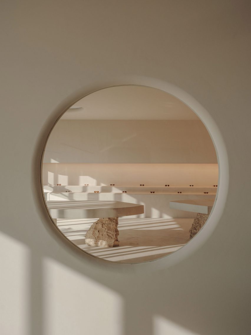
The showroom is visible from the office through a circular window

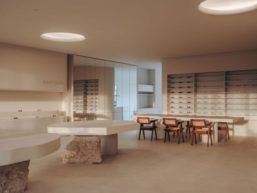
A circular window with rounded edges provides a glimpse of the showroom, which is dominated by two sculptural tables with concrete tops supported by rough chunks of travertine stone.

A built-in tiered display is used to highlight different Gigi Studios’ eyewear. The rest of the collection is housed in a backlit cabinet, while a mirror-fronted unit conceals a large screen used for presentations.

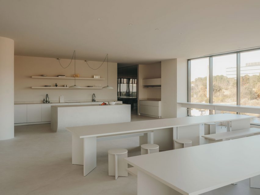
The kitchen is located next to the showroom so that the two spaces can easily be used together for events. Here, a homely, Mediterranean feel is created via a five-metre-long sharing table, custom-made alongside the accompanying stools.

Showroom inside Gigi Studios headquartersShowroom inside Gigi Studios headquarters
Display tables in the showroom are held up by rough chunks of travertine

The sizeable kitchen island is finished in micro-cement and features a curved base that enhances its sculptural presence.

A curved corridor incorporating a sofa niche on one wall provides access to offices and a meeting room positioned to have the best views of the surrounding countryside.

Internal columns are used to support one end of concrete tables built in each of the workspaces, furnished with classic designs including Marcel Breuer’s Wassily and Cesca chairs.

Office inside eyewear brand headquarters in Spain by Isern SerraOffice inside eyewear brand headquarters in Spain by Isern Serra
Large sharing tables allow for communal eating in the kitchen

Interior designer Isern Serra founded his self-titled studio in Barcelona in 2008 and works across architecture, interiors and industrial design.
Previous projects including a rose-coloured shop for Barcelona’s Moco Museum that was based on a computer-generated image and a minimalist office for digital artist Andrés Reisinger, which was named small workplace interior of the year at the 2023 Dezeen Awards.
The photography is by Salva López with art direction by Aasheen Mittal.

Reference

Seven playful living spaces where swings provide dynamic seating
CategoriesInterior Design

Seven playful living spaces where swings provide dynamic seating

This lookbook compiles seven living spaces where swings show they have a place beyond children’s playgrounds by providing a gleeful alternative to static seating.

Swings typically consist of a seat made from a flat piece of metal, plastic, wood or canvas, but can also be made from found materials such as tyres and sometimes feature a wraparound design for added safety.

This seat is then suspended by sturdy lengths of rope or chain from a frame, ceiling or tree.

Swings have been used for hundreds of years by cultures across the world for both leisure and ritual-related purposes, and are enjoyed by people of all ages, from children in play areas to older people who might have swinging benches in their gardens.

From basic playground swings transplanted into grown-up interiors to intricately crafted bench swing seats that look out over lush courtyards, read on to view a selection of interiors on Dezeen that feature suspended seating.

This is the latest in our lookbooks series, which provides visual inspiration from Dezeen’s archive. For more inspiration, see previous lookbooks featuring interiors animated by indoor slides, living spaces featuring metal furniture and spaces with oversized windows.


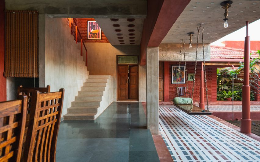
Covered walkway with swing seat looking out onto an open-air courtyard with treesCovered walkway with swing seat looking out onto an open-air courtyard with trees
Photo by Ishita Sitwala

Gujarat house, India, by Design ni Dukaan

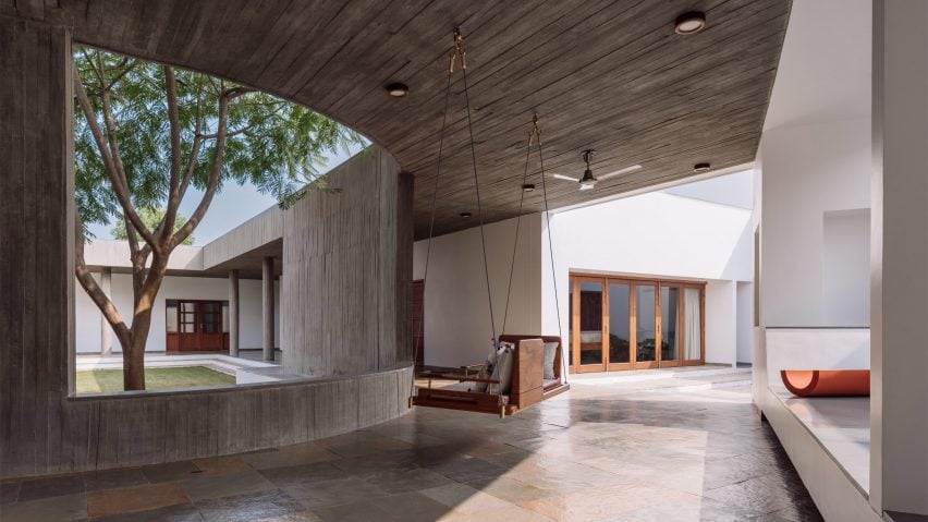
A wooden swing seat covered in pillows is suspended from the concrete ceiling of this house in the Indian state of Gujarat.

The swing is situated in one of the house’s covered walkways and was positioned to allow the sitter to enjoy views of its open-air courtyard.

Find out more about Gujarat house ›


Kenwood Lee House by Cousins & Cousins (RIBA house of the year longslist)Kenwood Lee House by Cousins & Cousins (RIBA house of the year longslist)
Photo by Jack Hobhouse

Kenwood Lee House, UK, by Cousins & Cousins

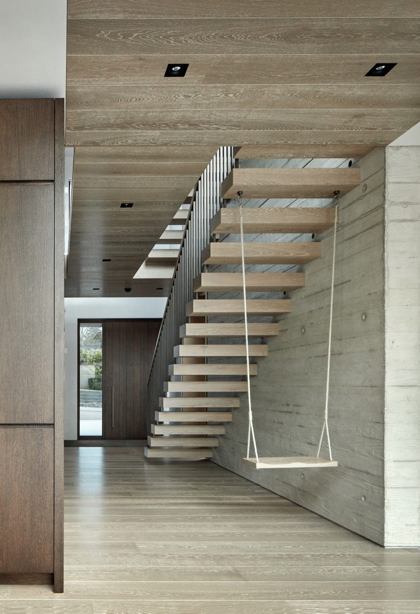
A cantilevered floating stair anchors a swing inside the hallway of this house in north London by local studio Cousins & Cousins.

The wooden seat is suspended by softly frayed rope, creating a subtly rustic composition that compliments both the poured-concrete finish of the walls and the wood used on the ceiling, cabinets and front door.

Find out more about Kenwood Lee House ›


Covered living space beside courtyard with swing seatCovered living space beside courtyard with swing seat
Photo by Yash R Jain

Karai, India, by Rain Studio

Local office Rain Studio hung a polished wooden swing seat overlooking a verdant courtyard in this house near the city of Chennai in southern India.

The seat is suspended from all four corners by ornately cast metal hooks and links, some of which feature animals such as elephants.

Find out more about Karai ›


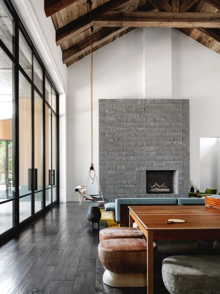
Living room with concrete fireplace and a swingLiving room with concrete fireplace and a swing
Photo by Chase Daniel

Austin House, USA, by Melanie Raines

Rustic Californian barns provided reference points for this house in Austin, Texas, which features a lofty double-height living space complete with multiple seating options.

A metal-framed lounge chair flanked by integrated side tables is suspended from the ceiling’s wooden rafters by two long lengths of rope, adding to the interior’s whimsical atmosphere.

Find out more about Austin house ›


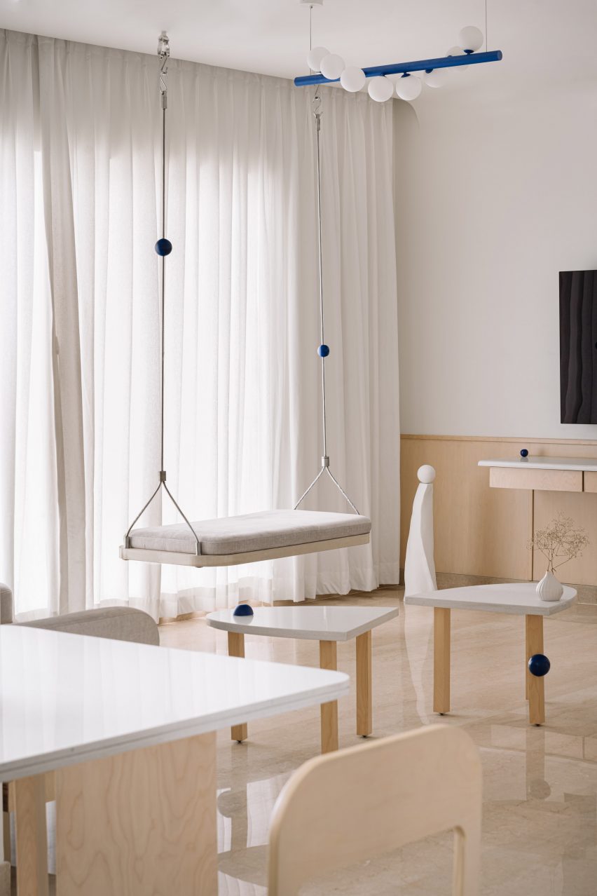
Living room interior of Out of the Blue apartment in IndiaLiving room interior of Out of the Blue apartment in India
Photo by The Fishy Project

Thane apartment, India, by The Act of Quad

Rigid metal uprights, each threaded with a cobalt-blue sphere, tie this swing seat in with the rest of the apartment’s blue-themed interior scheme, created by design studio Act of Quad.

The seat is softened by a slim cushioned pad and has been attached to the ceiling with metal hardware.

Find out more about Thane apartment ›


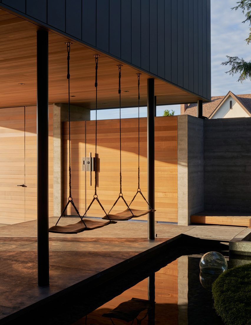
The Perch by Chadbourne + Doss ArchitectsThe Perch by Chadbourne + Doss Architects
Photo by Kevin Scott

The Perch, USA, by Chadbourne + Doss

A pair of swings are strung up on the boundary between a covered entryway and a courtyard pond in this house in Seattle.

The seats themselves were made from sheets of walnut timber and intended to provide the sitter with the experience of floating above the water.

Find out more about The Perch ›


Living room in a high-ceilinged apartment with a swing hanging in itLiving room in a high-ceilinged apartment with a swing hanging in it
Photo by BCDF studio

Parisian loft, France, by Isabelle Heilmann

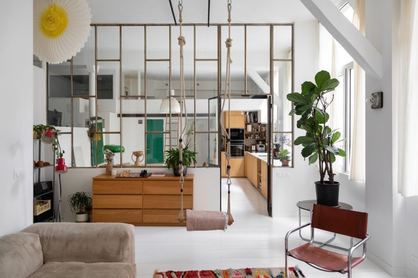
Hooks, carabiners and thick, knotted ropes affix this swing to the tall ceilings of this Parisian apartment’s living room.

The suspended seat slots in comfortably with the rest of the eclectically-chosen furniture, including a mid-century cantilevered chair and a slouchy, ribbed sofa.

Find out more about Parisian loft ›

This is the latest in our lookbooks series, which provides visual inspiration from Dezeen’s archive. For more inspiration, see previous lookbooks featuring interiors animated by indoor slides, living spaces featuring metal furniture and spaces with oversized windows.

Reference

22RE invokes “stillness” inside green Miami golfing boutique
CategoriesInterior Design

22RE invokes “stillness” inside green Miami golfing boutique

Los Angeles studio 22RE has used pale-green stucco informed by Miami’s colours and golf courses for the interiors of a golf clothing boutique in the city.

A few blocks from the ocean, the Malbon store in Coconut Grove serves a large customer base for the brand in South Florida – a popular golfing destination thanks to year-round warm weather.

Store interior with green stucco columns and radial grey floor tilesStore interior with green stucco columns and radial grey floor tiles
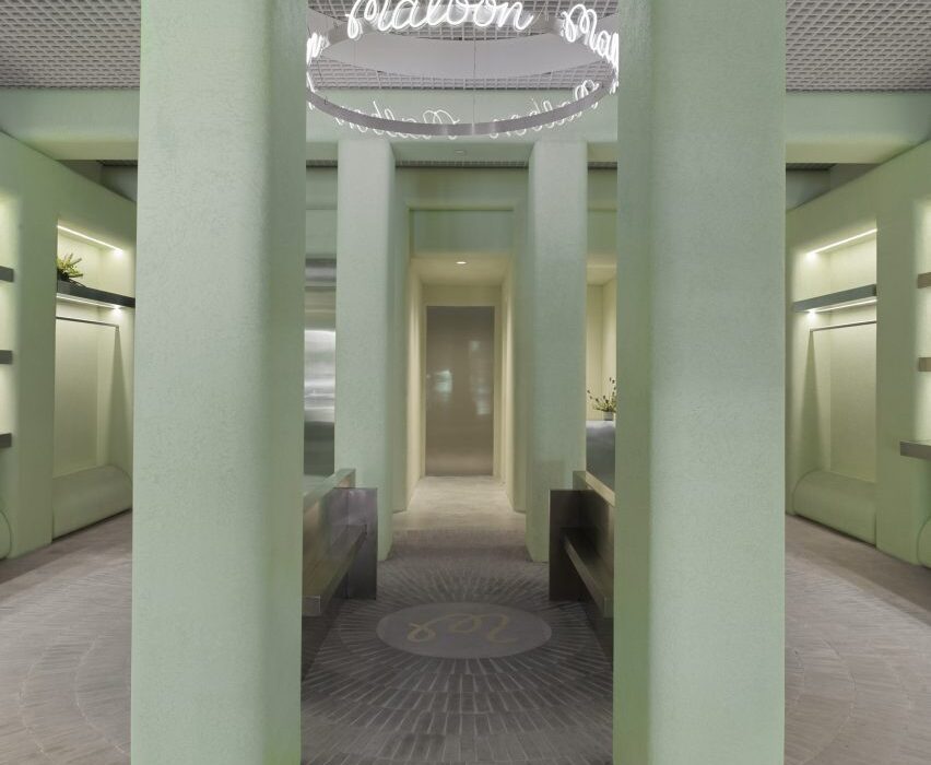
The Malbon Miami store revolves around a central area, from which handmade tiles emanate in a radial pattern across the floor

The verdant neighbourhood and Miami’s distinct architecture provided 22RE with a starting point to build upon, aiming to create a tranquil space amongst such vibrancy.

“We intended to create an oasis within the city, one that invoked stillness – a feeling that Malbon customers are accustomed to while they’re out on the green,” 22RE founding principal Dean Levin told Dezeen.

Golf clothing boutique with green stucco wallsGolf clothing boutique with green stucco walls
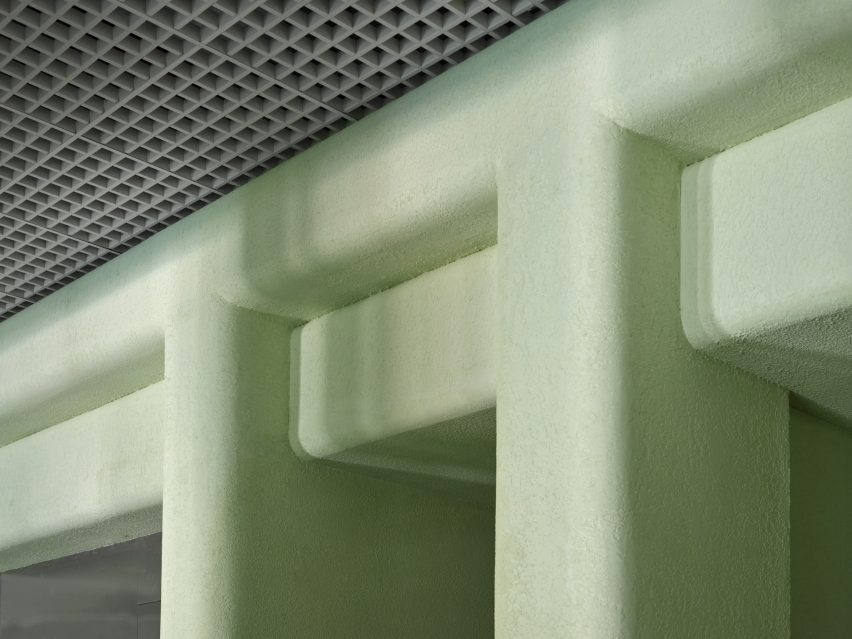
Pale green stucco covers the walls, columns and ceiling beams

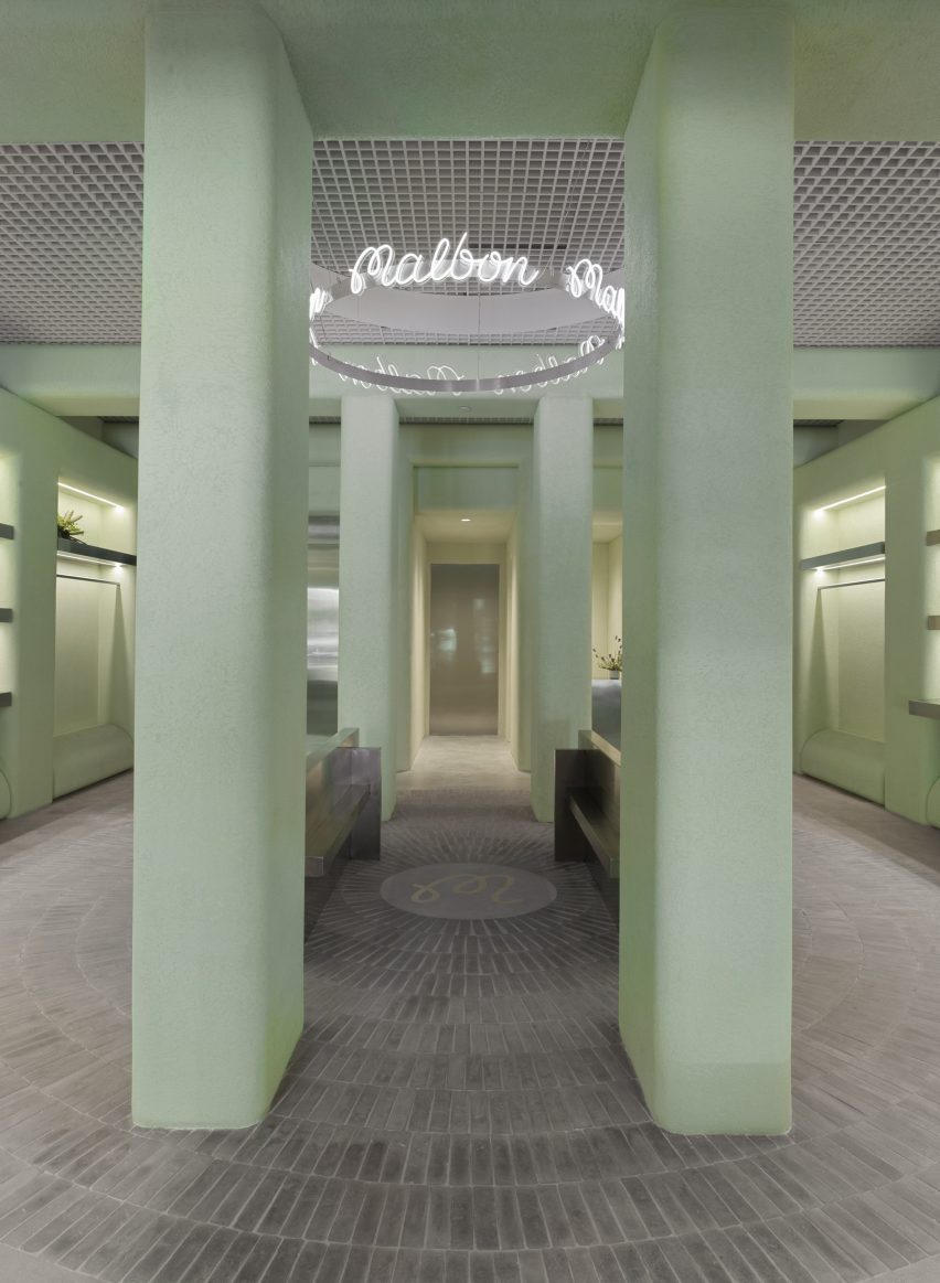
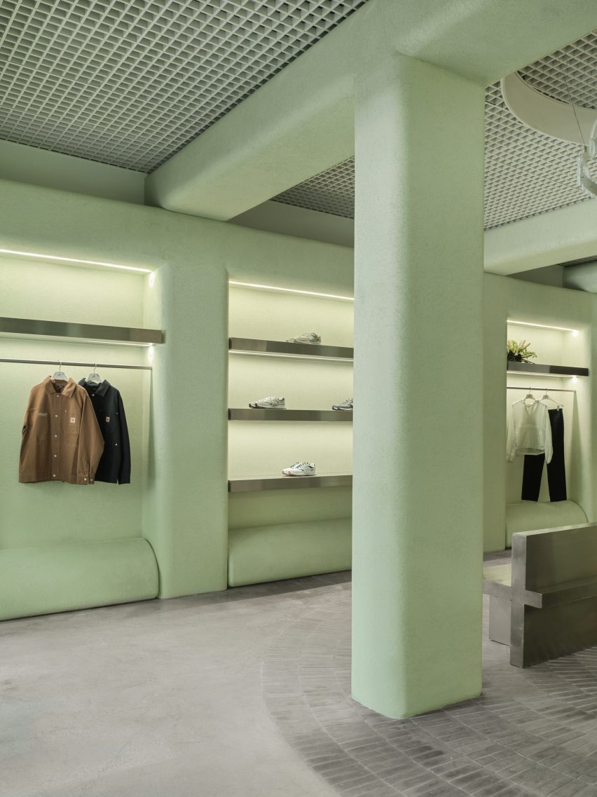
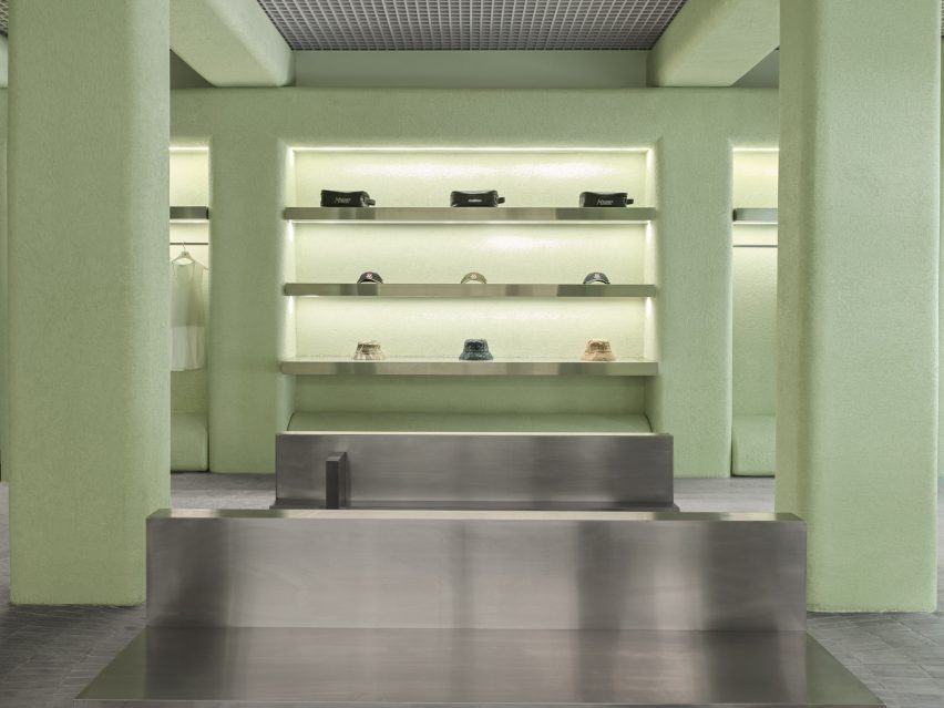
The store’s most striking feature is the pale green stucco that covers the majority of vertical surfaces and ceiling beams that form square archways overhead.

“The shade of green used throughout the space was inspired by the studio’s first visit to the location, and inspired by the vibrant hues associated with Miami as a city,” said Levin.

Accessories displayed on stainless steel shelves, surrounded by green stuccoAccessories displayed on stainless steel shelves, surrounded by green stucco
Merchandise is kept to the perimeter of the store, displayed on stainless steel rails and shelves

The placid hue is contrasted with stainless steel elements including the sales counter and a doorway to the stock room.

From the centre of the space, mid-grey handmade Mexican tiles are laid across the floor in a radial pattern, emanating from a circular plaque that displays the brand’s monogram.

Filleted stucco surfaces contrast an aluminium open-cell grid ceilingFilleted stucco surfaces contrast an aluminium open-cell grid ceiling
Filleted stucco surfaces contrast the aluminium open-cell grid ceiling

A ring-shaped installation above, suspended from an aluminium open-cell grid ceiling, also bears the Malbon logo scribed repeatedly in white neon.

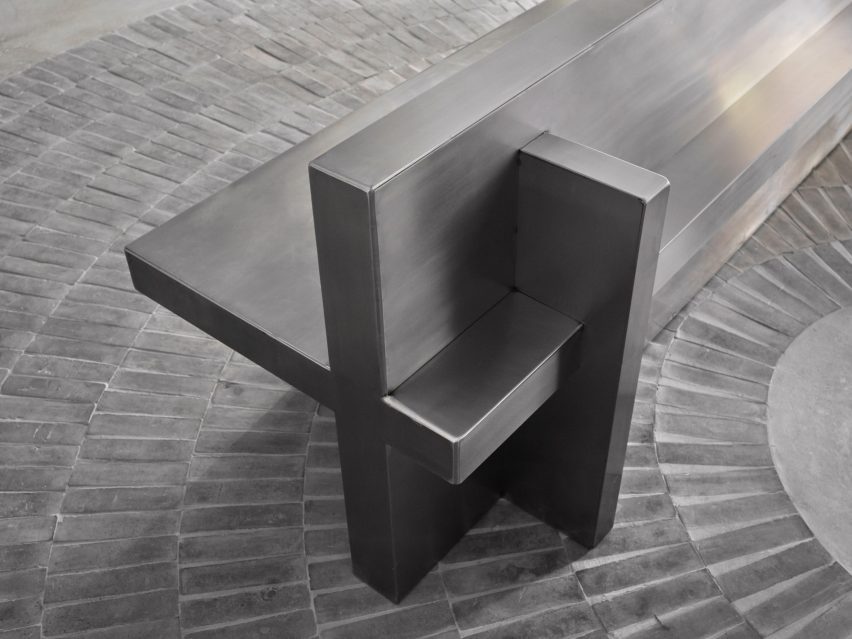
Four columns and a pair of stainless steel benches define this central area, which is intentionally devoid of merchandise to create a moment for pause and conversation between customers.

Clothing and accessories are kept to the perimeter, displayed in illuminated niches on stainless steel rails or shelves.

“In retail stores, there is a predominantly unchanging relationship between salesperson and customer,” Levin said. “We wanted to consider and account for the things we could – foot traffic, merchandising and general flow.”

Detail of a stainless steel bench made from perpendicular planesDetail of a stainless steel bench made from perpendicular planes
A pair of stainless steel benches offer a place for pause and conversation in the middle of the boutique

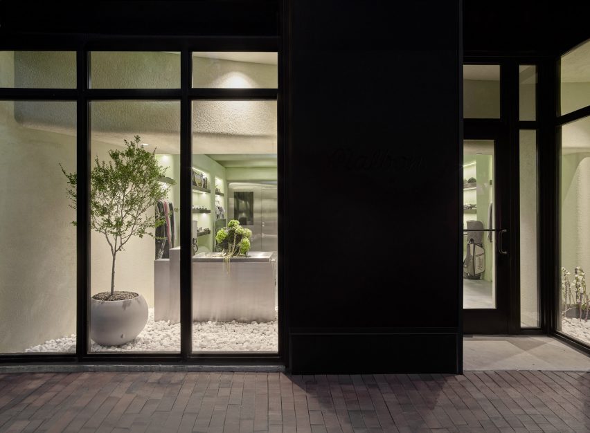
Behind the street-facing windows, white stones cover the floors and plants so that the store “feels like a natural extension of the vegetation and foliage” in the surrounding area, said Levin.

“Through juxtaposing a variety of different materials both organic and industrial, the Malbon Miami storefront is an accurate reflection of the values we celebrate and preserve as an architecture and design firm,” he added.

Storefront with greenery behind large windowsStorefront with greenery behind large windows
The storefront contains greenery to create a natural extension of the verdant surroundings of Coconut Grove

Miami has grown significantly as a retail destination over the past decade, with a large concentration of new luxury stores in the city’s Design District.

Brands including Louis Vuitton, Off-White and Christian Louboutin all have distinctly designed outposts in the neighbourhood.

The photography is by Erik Stackpole.


Reference

Home Studios refreshes The Wren pub on NYC’s Bowery
CategoriesInterior Design

Home Studios refreshes The Wren pub on NYC’s Bowery

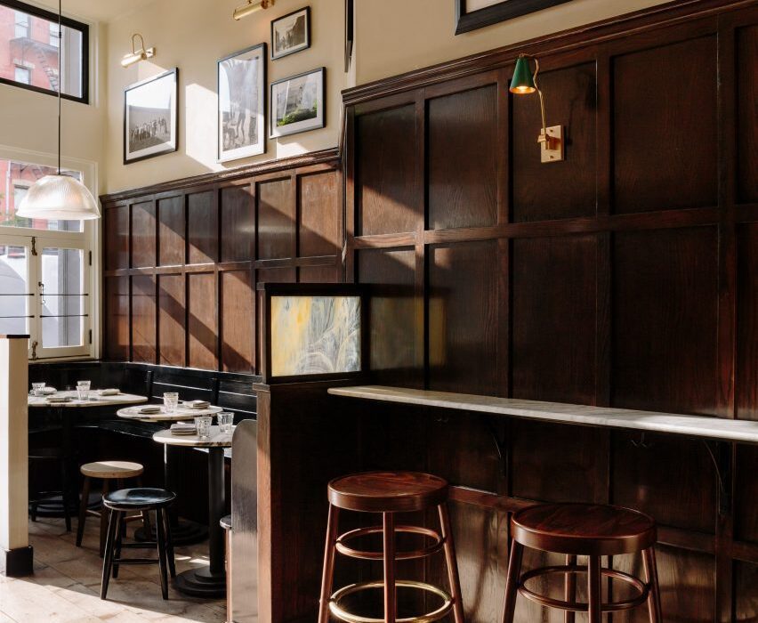
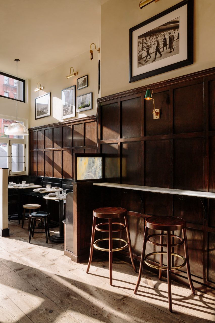
Brooklyn-based Home Studios has remodelled a bar and restaurant in New York’s East Village, using dark wood and velvet seating to retain a “worn-in and aged appearance”.

The Wren on the busy Bowery thoroughfare has become a neighbourhood staple since opening in 2012, but was ready for an interior revamp.

Entrance area of The Wren with walnut wall panelling and hardwood floorsEntrance area of The Wren with walnut wall panelling and hardwood floors
The Wren has been remodelled in a way that retains its rustic charm

Home Studios refreshed both levels of the upscale pub, including the upper-floor dining and drinking area, and private lounge downstairs.

“Despite the changes in the city and the evolution of the neighbourhood, The Wren has maintained its timeless appeal, offering visitors a glimpse into the past and an authentic pub experience,” said Home Studios, led by founder Oliver Halsegrave.

L-shaped bar with a marble counter and surrounded by wooden stoolsL-shaped bar with a marble counter and surrounded by wooden stools
The L-shaped bar has a marble counter and is surrounded by GAR Products stools

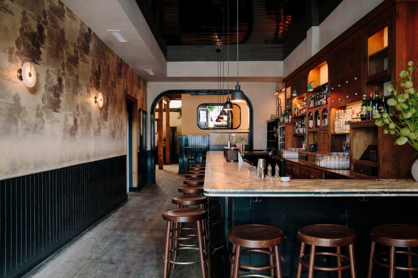
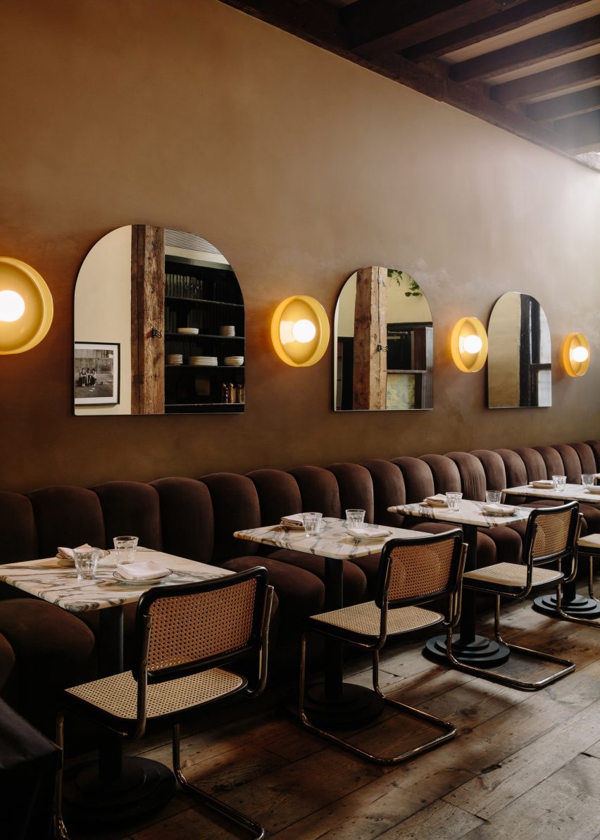
Across the main level, dark and moody materials have been used to retain the pub-like quality of the spaces, assisted by the exposed wooden ceiling beams and columns, and hardwood floors.

Either side of the entrance, black-painted, booth-style benches are installed against the walnut wall panelling, creating cosy nooks for pairs or small groups to occupy.

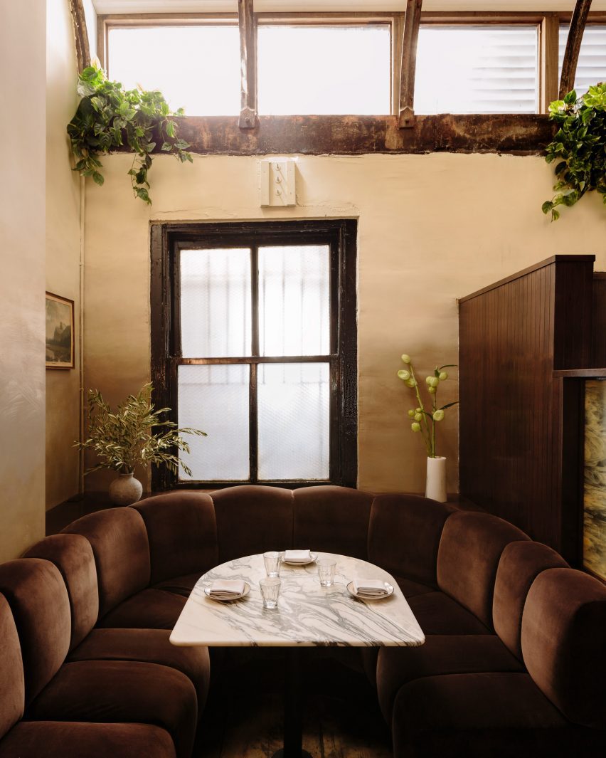
Chocolate-coloured velvet banquette featuring ribbed cushionsChocolate-coloured velvet banquette featuring ribbed cushions
Towards the back, a chocolate-coloured velvet banquette features ribbed cushions

The bar area features an L-shaped marble counter surrounded by GAR Products stools, opposite black wainscoting that runs below vintage-looking wallpaper.

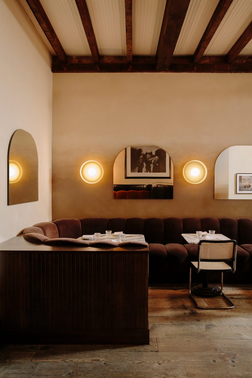
Towards the back, a long banquette is dressed in ribbed cushions that form the seating and backrests, all wrapped in brown velvet.

Row of custom mirrors alternated with disk-shaped sconces above tablesRow of custom mirrors alternated with disk-shaped sconces above tables
Custom mirrors alternate with disk-shaped sconces by In Common With

Custom arched shaped mirrors mounted on the walls alternate with disk-shaped sconces by In Common With, against a beige textured plaster backdrop.

A variety of other sconces throughout were sourced from lighting brands including O’Lampia, Shades of Light, Allied Maker and Rejuvenation.

U-shaped both below two windowsU-shaped both below two windows
Guests can choose from a variety of booths, two-tops or standing areas

“With a worn-in and aged appearance, the space now exudes a moody winter-like atmosphere,” said Home Studios.

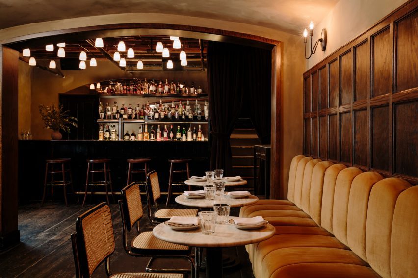
Downstairs, the mood is even more “sultry” and intimate, thanks to darker surfaces and a variety of dim, warm lighting sources.

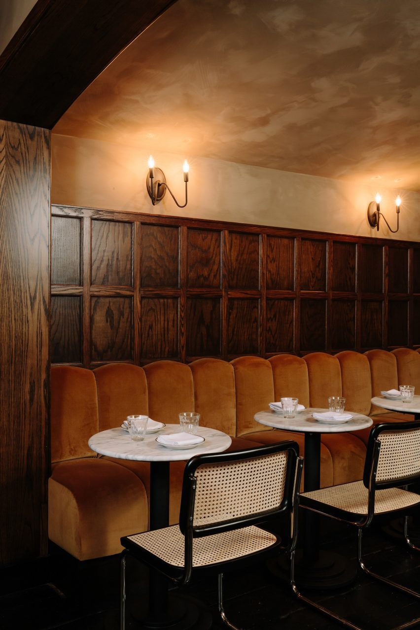
The bar counter is made from Black Portoro marble and the wood floors are also stained black, while the banquette upholstery is a lighter tone than found on the upper level.

Between the two floors, guests can choose from a variety of seating or standing spots for enjoying their beers, cocktails and bar food.

Banquette below walnut panelling and candle sconcesBanquette below walnut panelling and candle sconces
In the private area downstairs, the mood is more sultry and the banquette upholstery is lighter in colour

“Home Studios has seamlessly blended nostalgic and rustic charm throughout The Wren’s interior, creating an inviting and distinctive ambiance that pays homage to the bar’s storied history,” said the team.

Home Studios is no stranger to refreshing beloved establishments, having completed interiors for The Bird in Montauk and The Pearl in Nantucket.

Downstairs area featuring dark-stained floors and a black marble bar counterDownstairs area featuring dark-stained floors and a black marble bar counter
The downstairs area features dark-stained floors and a black marble bar counter

The firm also recently turned a conference centre in Northern California back into a luxury hotel, as originally intended by the property’s founder: the inventor of the radio.

The photography is by Brian W Ferry.

Reference