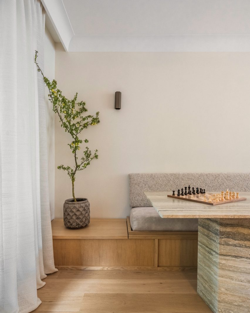
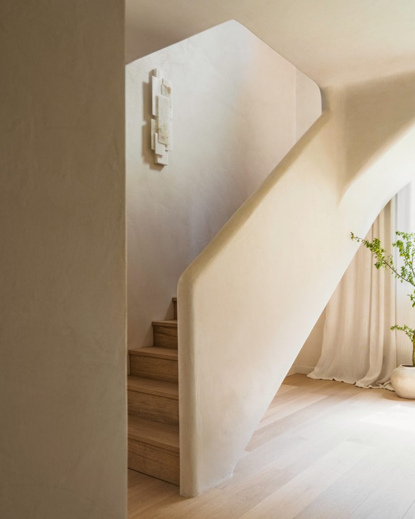
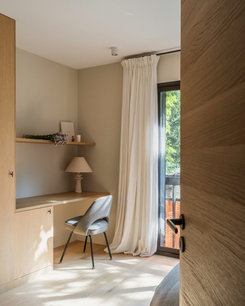
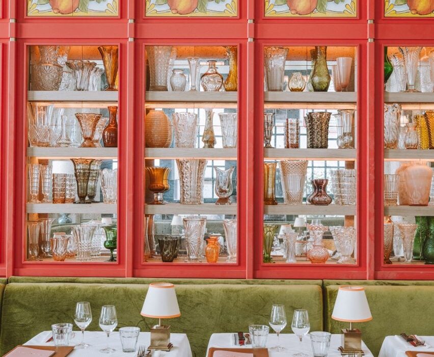
Post Company imbues Mollie Aspen hotel interiors with earthy hues
CategoriesInterior Design

Post Company imbues Mollie Aspen hotel interiors with earthy hues

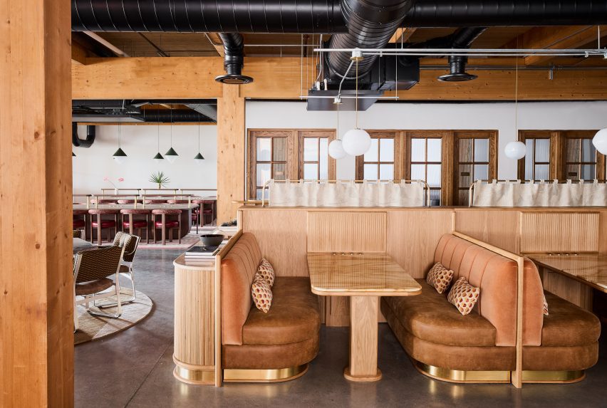
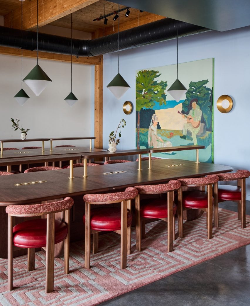
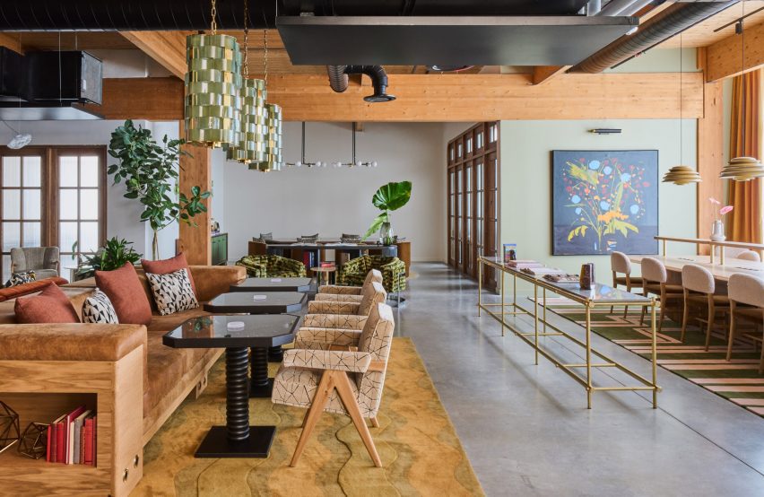
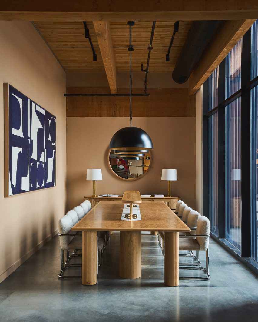
New York studio Post Company has designed warm, wood-filled interiors for a boutique hotel in Aspen, Colorado, which offers a pared-back take on the Arts and Crafts style.

Mollie Aspen occupies a new timber-clad building designed by CCY Architects and developed and operated by HayMax in the mountain city’s downtown area.
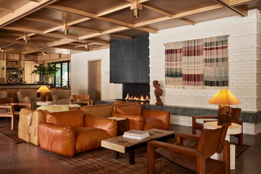
Lobby lounge at Mollie Aspen with earth-toned furniture and a gridded wood ceilingLobby lounge at Mollie Aspen with earth-toned furniture and a gridded wood ceiling
With an open fireplace as a backdrop, the lobby lounge at Mollie Aspen features earth-toned furniture and a gridded wood ceiling

Post Company was tasked with creating the interiors for the 68-room hotel, combining contemporary Scandinavian and Japanese design elements for a serene take on Rocky Mountain luxury.

“Mollie is designed for those with a natural curiosity and appreciation for connection and offers visitors a unique, welcoming respite in the bustling mountain town,” said the hotel’s team.
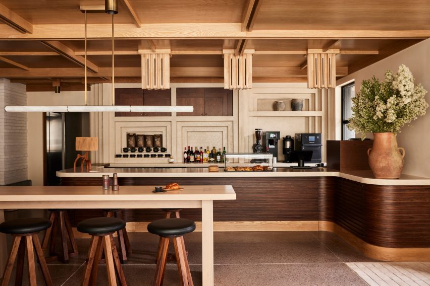
All-day cafe in the Mollie Aspen lobby All-day cafe in the Mollie Aspen lobby
An all-day cafe in the lobby serves pastries and beverages from a walnut-wrapped counter

An abundance of wood can be found throughout the different spaces, with numerous varieties creating a layered effect of different colours and grain patterns.

The timber is crafted into elements like gridded wall and ceiling panels with built-in lighting, which evoke an Arts and Crafts aesthetic, as well as fluted counterfronts and a range of furniture pieces.
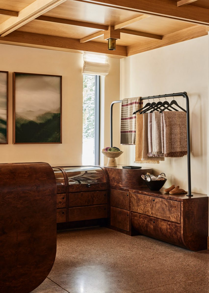
Burl wood counters and displays in a retail spaceBurl wood counters and displays in a retail space
Burl wood counters and displays present goods in the hotel’s retail space

The majority of the materials used in Mollie’s construction were sourced from the Western United States to reduce waste, according to the team.

Meanwhile, other accents like earthen ceramics, hand-dyed textiles and sand-casted brass add to the cosy atmosphere.
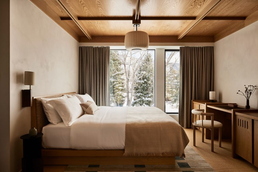
Guest room with neutral decorGuest room with neutral decor
Guest rooms offer an even more pared-back take on the neutral decor palette

“These materials are incorporated throughout the hotel to mimic the area’s rough-hewn mountains while large windows frame views of the surrounding landscape and bring an abundance of light into the hotel,” said the team.

The lobby lounge is designed as a cosy gathering space for guests and the public, with a large open fireplace providing a backdrop.
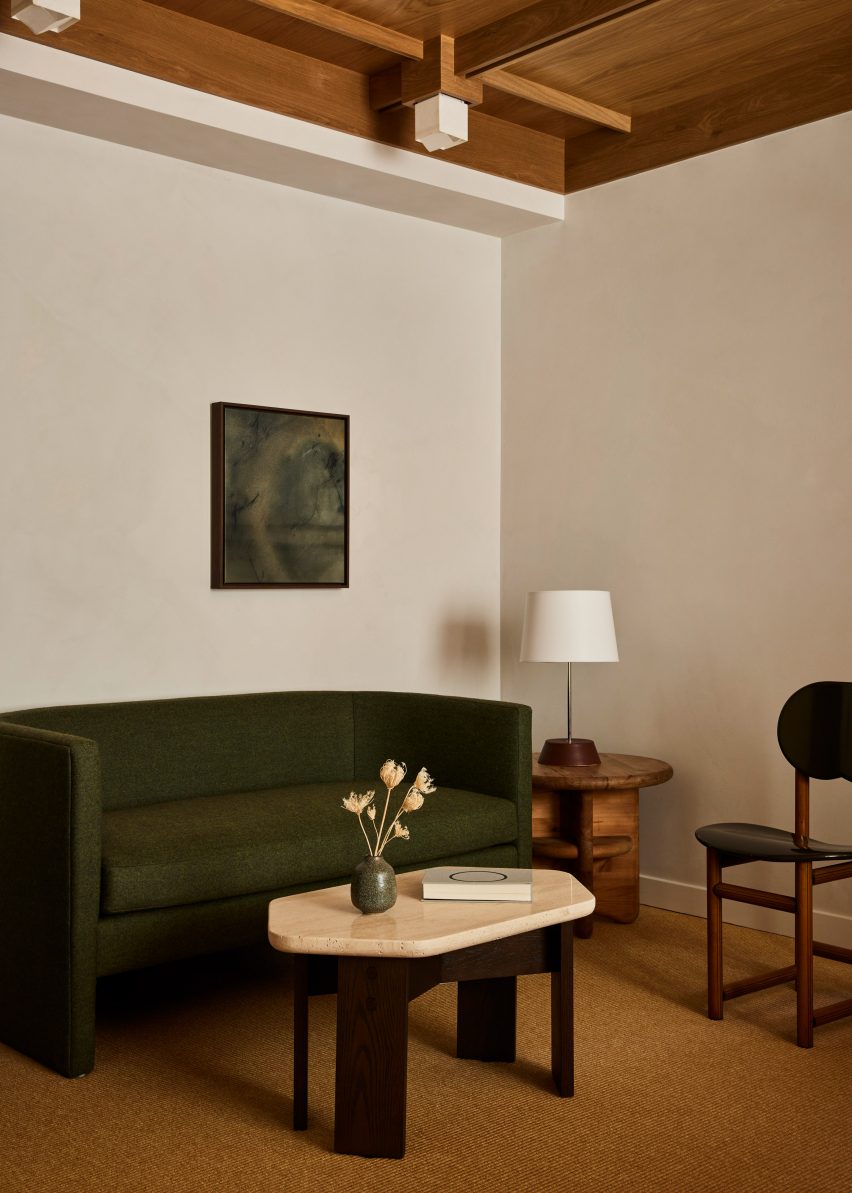
Beige plaster walls and textured carpet in a guest roomBeige plaster walls and textured carpet in a guest room
Beige plaster walls and textured carpets complement the wood ceilings in the guest rooms

Chunky leather, velvet and boucle sofas and armchairs in a range of earthy hues form comfy conversation nooks.

At one end of the room, the black-topped bar spans the full width and is illuminated by a row of globe-shaped pendant lights suspended from thin brass bars.
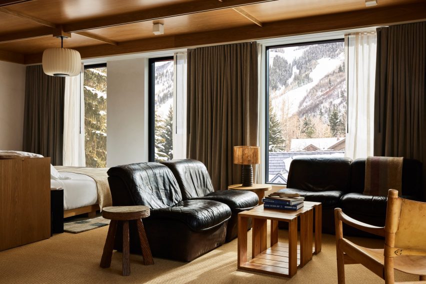
Guest suite with black leather furniture and snowy mountain viewsGuest suite with black leather furniture and snowy mountain views
Black leather furniture in the larger suites offers a contrast to the other furniture pieces and snowy mountain views

A repeated geometric pattern across the pale counter front is also found on door panels leading to other hotel areas.

An all-day cafe at the opposite end of the lobby serves pastries and an assortment of beverages from a walnut-wrapped counter, and the restaurant
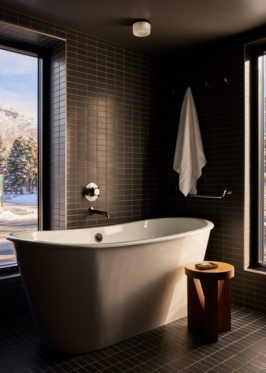
Bathroom with dark green tiles and freestanding white bathtubBathroom with dark green tiles and freestanding white bathtub
Dark green tiles in the bathrooms match the spruce trees outside

In the adjacent retail space, burl wood counters and displays with curved edges, some of which are topped with glass vitrines.

On the third floor is a roof terrace with a bar and a spa pool set to open in Spring 2024, while a fitness facility and flexible meeting space are located at ground level.

The guest rooms continue the soft, neutral palette in a more pared-back style.

Beige plaster walls, textured carpets and green-grey curtains complement the wood ceilings and built-in furniture, while black leather chairs add contrast.
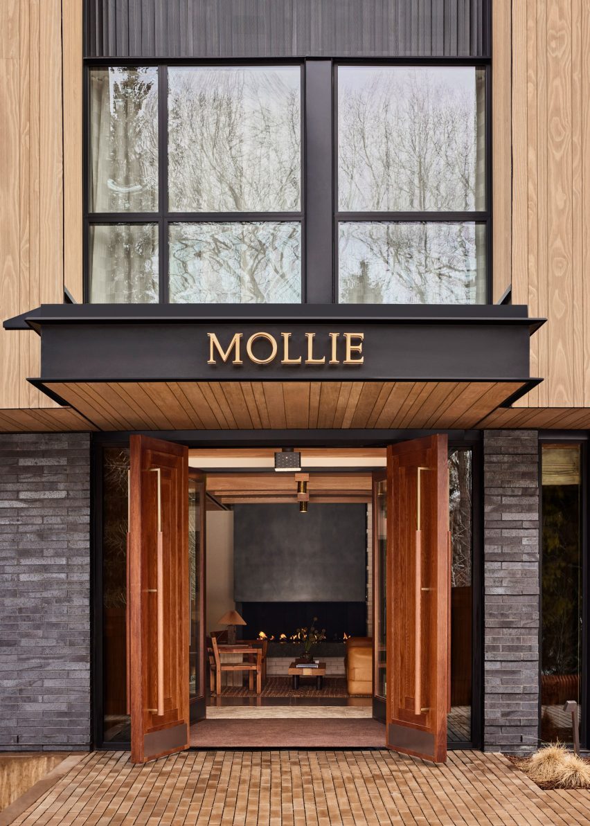
Mollie Apsen entrance with logo on the entrance canopyMollie Apsen entrance with logo on the entrance canopy
Mollie Aspen is located within a newly constructed building by CCY Architects

Dark green stacked tiles that line the bathrooms match the spruce trees outside and freestanding tubs beside the windows allow guests to enjoy the view while soaking.

“Guests are left with a sense of Aspen’s cultural and recreational history, providing a lens to appreciate its contemporary personality and influence,” the team said.
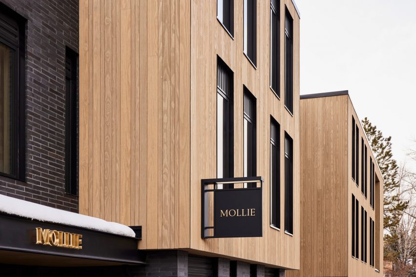
Mollie Aspen's wood-clad exteriorMollie Aspen's wood-clad exterior
The building was constructed largely from materials sourced from the Western US

Aspen is a renowned destination for winter sports and affluent vacationers, and CCY Architects has designed several private residences in and around the town – among them an extension to a Victorian house, a residence nestled in a grassy valley and a retreat that overlooks the dramatic mountainous scenery.

Formerly known as Studio Tack, Post Company’s previous hotel projects include the Anvil Hotel in Wyoming, The Sandman in California, and Scribner’s Catskill Lodge in New York.

The photography is by Nicole Franzen.

Reference

Totem-pole colonnade encloses Kaimakk restaurant at Istanbul Airport
CategoriesInterior Design

Totem-pole colonnade encloses Kaimakk restaurant at Istanbul Airport

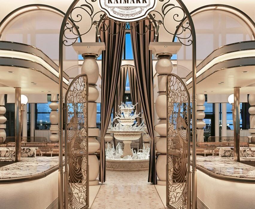
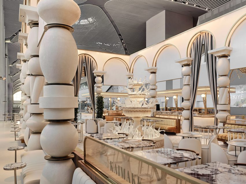
A stone and glass fountain, totem pole-like columns and gilded arches characterise the Kaimakk bar and dining space by local studio Sanayi313 inside Istanbul Airport.

The 600-square-metre space was created by Sanayi313 as a place of refuge from the bustle of the airport.

“The challenge of this project was to create a place where people would feel secluded and relaxed in the hectic environment of one of Europe’s busiest airport terminals,” Sanayi313 founder Enis Karavil told Dezeen.
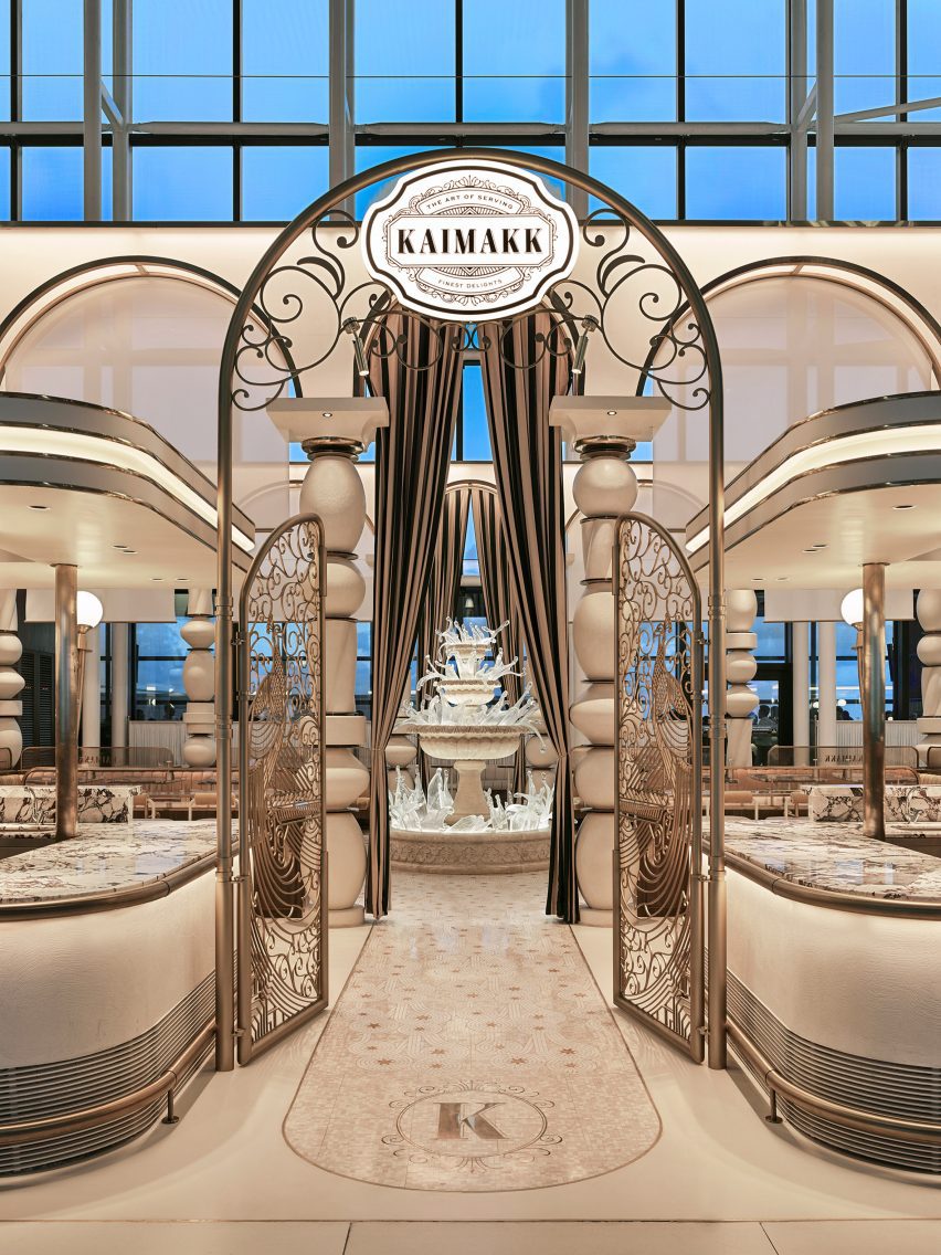
Arched metal gates leading to fountain Kaimakk Istanbul Airport designed by Sanayi313Arched metal gates leading to fountain Kaimakk Istanbul Airport designed by Sanayi313
Kaimakk is an Istanbul Airport restaurant designed by Sanayi313

Two large, L-shaped serving counters with canopies above enclose the seating space inside. Between the counters, an archway with intricate metalwork gates leads to a “frozen” fountain at the centre of the project.

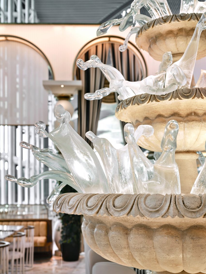
The fountain was made from traditional travertine stone with individually made, mouth-blown glass pieces.

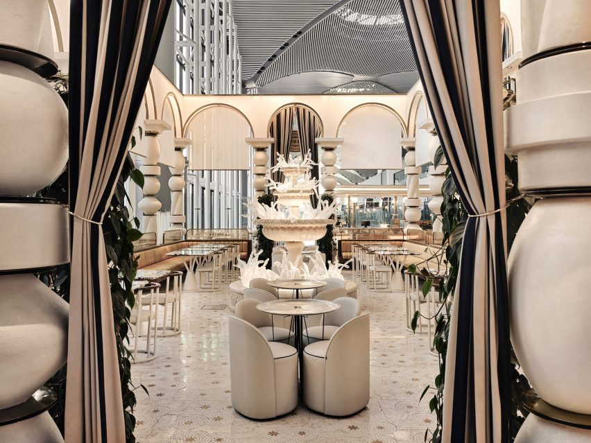
Kaimakk bar and dining area by Sanyayi313Kaimakk bar and dining area by Sanyayi313
A fountain made of stone and glass sits at the centre of the space

Completed in two stages, the fountain was first carved and assembled before contemporary Turkish glass artist Derya Geylani crafted the glass pieces to create the “frozen” expression.
According to Kaimakk’s Lian Beraha, the fountain “took shape from the idea of life, joy, abundance and the eruption of cream”.
Mouth-blown glass pieces in fountain by Derya GeylaniMouth-blown glass pieces in fountain by Derya Geylani
Mouth-blown glass pieces were made by Turkish glass artist Derya Geylani

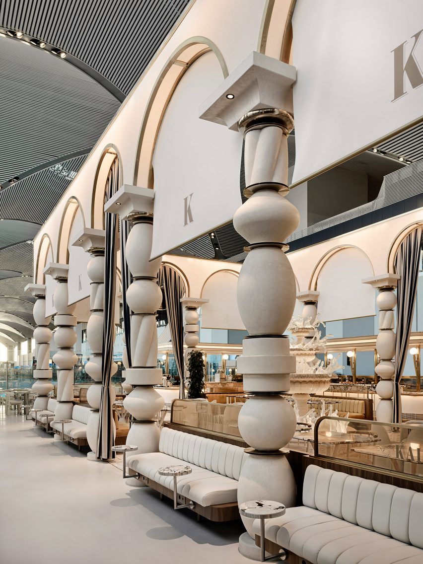
Surrounding the fountain, a series of tall archways are supported on sculptural, totem-pole-like  columns that form a colonnade enclosing the restaurant.

“The studio stacked a variety of recurring forms into totem-like pillars with gold discs between them and placed arched blocks on top, as if playing with Lego,” Karavil explained.

“Each arched unit is equipped with built-in blinds made of translucent material to diffuse the light transmitted into the space at different times during the day,” he continued.

“Coated in micro-topping, the four-metre-high structure pays homage to the architecture and stoneworks in the Turkish city of Mardin.”

Tall totem pole-like columns throughout Kaimakk by Sanayi313Tall totem pole-like columns throughout Kaimakk by Sanayi313
Large sculptural columns and arches are a recurring motif throughout the project

This idea of drawing upon heritage was central to the concept behind the project, which, according to Beraha, “draws inspiration from the traditional Mesopotamian culture” of places in southeastern Turkey like Mardin, Diyarbakır and Gaziantep.

“One of the key features of the project is the handcrafted mosaic floors incorporating an intricate geometrical pattern with stars,” Karavil described.

“It draws inspiration from the One Thousand and One Nights – a collection of Middle Eastern folktales also known as Arabian Nights.”

Columns and benches in dining area by Sanyayi313Columns and benches in dining area by Sanyayi313
Sanayi313 used a colour palette of beige, cream and gold

Built-in booth seating is positioned alongside barstools and a mixture of both round and rectangular marble-topped tables, with views out over the airport runway.

Other projects in Istanbul include Renzo Piano’s Istanbul Modern museum wrapped in a facade of “evocative fish scales” and an Apple Store by Foster + Partners that is characterised by two travertine walls.

The photography is by İbrahim Özbunar.

Reference

Archiloop converts Italian monastery into hotel Vocabolo Moscatelli
CategoriesInterior Design

Archiloop converts Italian monastery into hotel Vocabolo Moscatelli

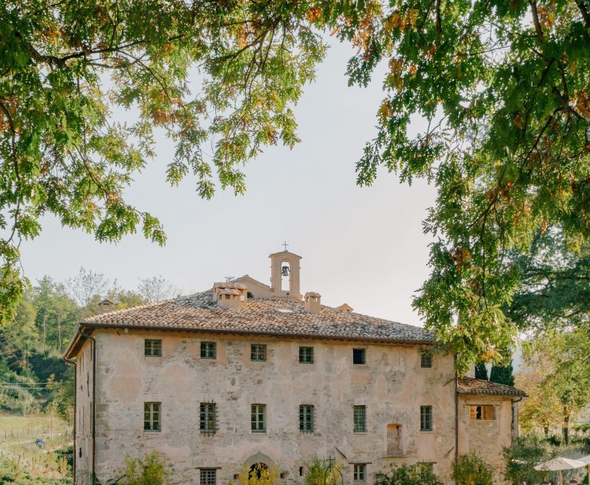
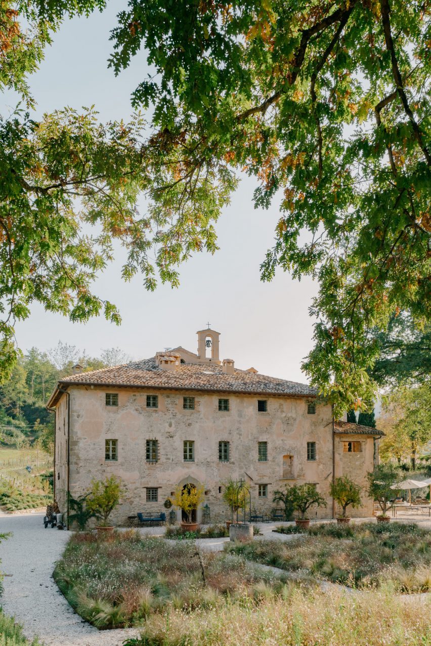
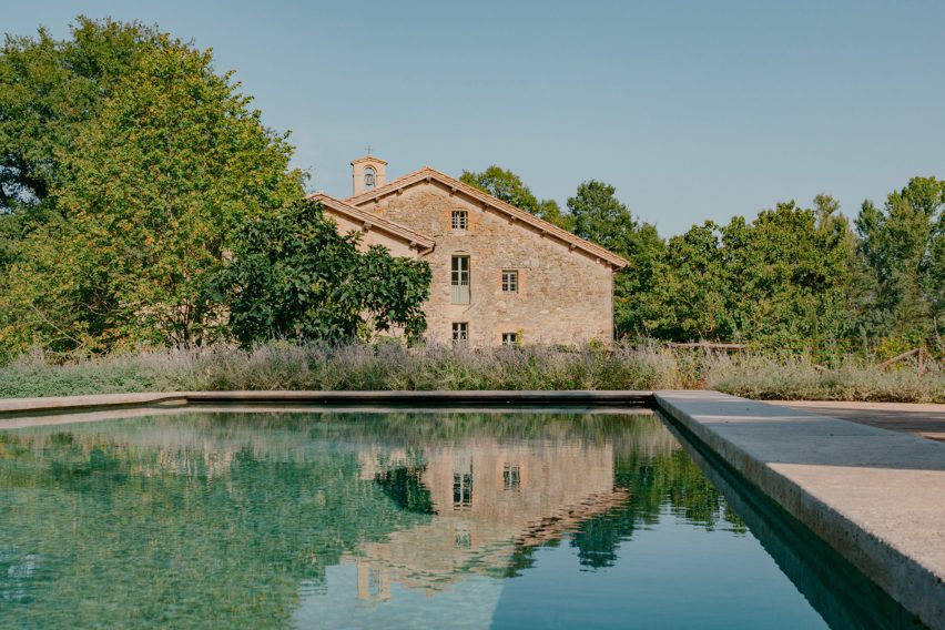
A 12th-century monastery in Italy’s Umbria region has become a boutique hotel in the hands of Florence studio Archiloop, which aimed to retain the site’s “rustic simplicity” during its renovation.

Vocabolo Moscatelli sits in the countryside near the hamlet of Calzolaro, close to the Tuscan border, on a remote estate surrounded by woodland.

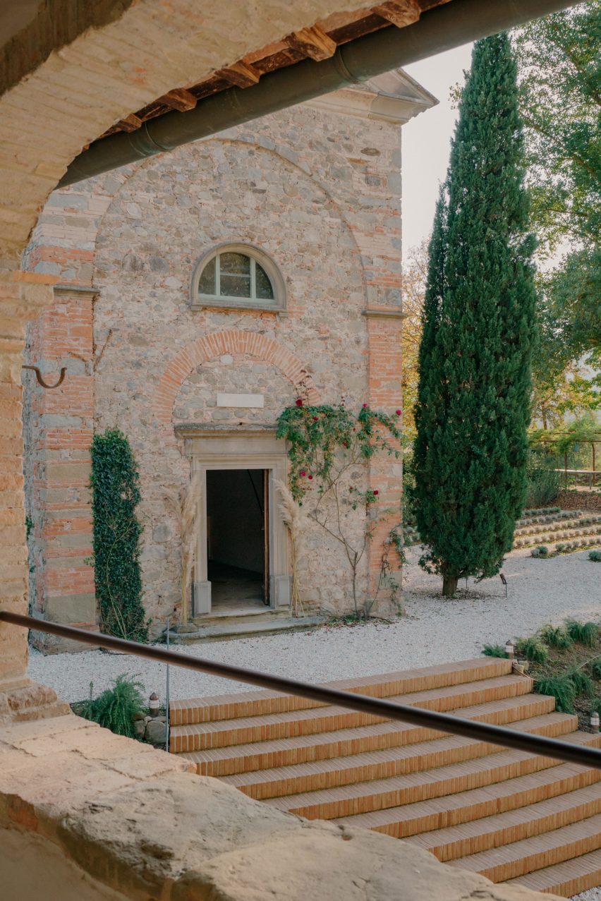
Exterior of converted monastery building with a bell tower, surrounded by landscapingExterior of converted monastery building with a bell tower, surrounded by landscaping
Vocabolo Moscatelli occupies a converted monastery in Umbria

The property was discovered by chef concierge Frederik Kubierschky and his partner Catharina Lütjens, who set about restoring the various 800-year-old stone buildings with the help of architect Jacopo Venerosi Pesciolini of Archiloop.

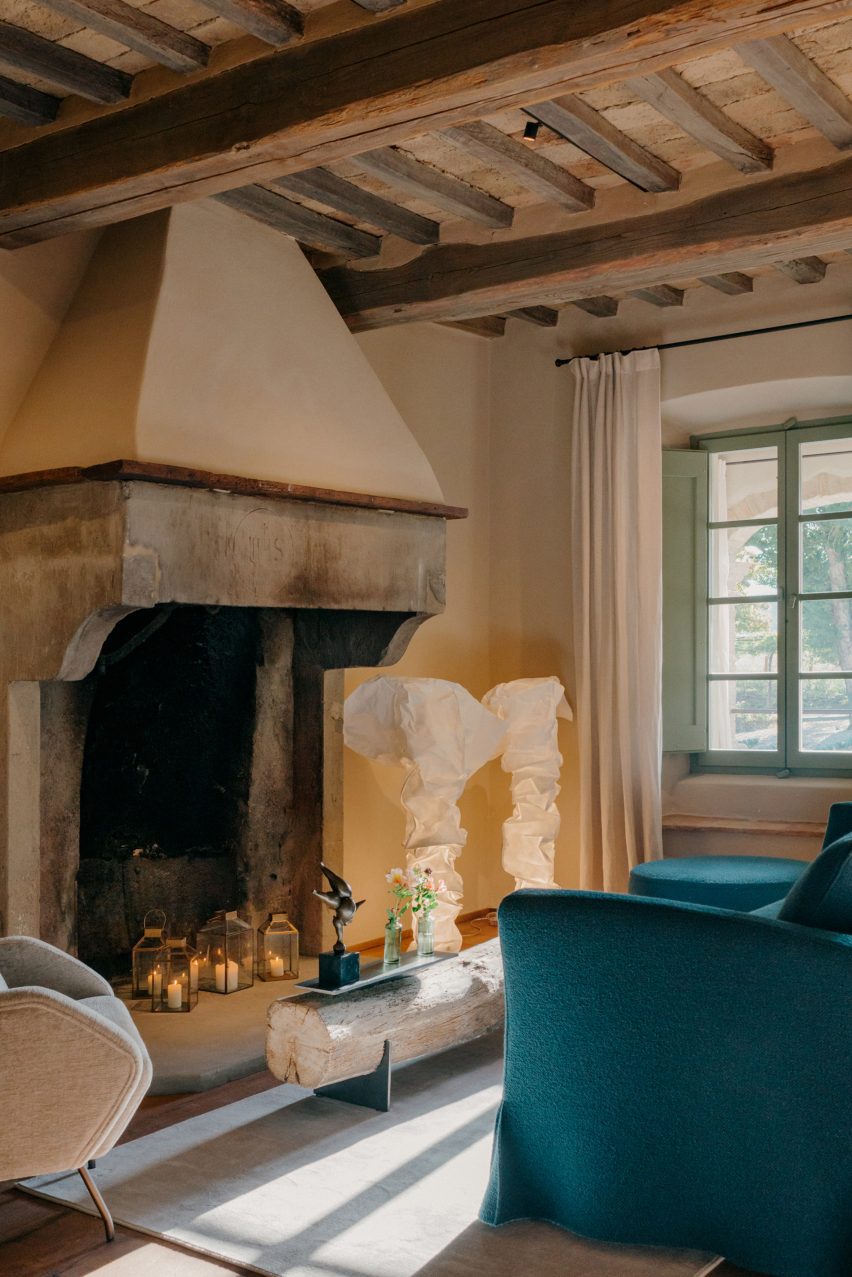
Aiming to retain the historic charm and as much of the original features as possible, the team kept the original wooden floors, exposed terracotta brickwork and ceiling beams, alongside brass, iron and stone details.

Stairs leading up to Vocabolo Moscatelli hotel in converted monasteryStairs leading up to Vocabolo Moscatelli hotel in converted monastery
The original brick and stone buildings were restored by Archiloop

They worked with local craftspeople on the restoration of these elements and incorporated new pieces by artists and designers from across the region, too.

“Vocabolo Moscatelli brings together the stone mason, blacksmith and woodworker with the artisan makers: ceramicists, tile makers and painters, creating a boutique style canvas that plays homage to the past while bringing in the design references of the now,” said the hotel team.

Seating area with fireplace inside Hotel Vocabolo Moscatelli in Umbria by ArchiloopSeating area with fireplace inside Hotel Vocabolo Moscatelli in Umbria by Archiloop
Timber ceiling beams are left exposed throughout the hotel

New additions to the site include a travertine swimming pool, coloured to match the surrounding woodland and Mediterranean landscaping by Fabiano Crociani.

“Threaded smoothly together, the effect is a template of rustic simplicity with heart,” the team said.

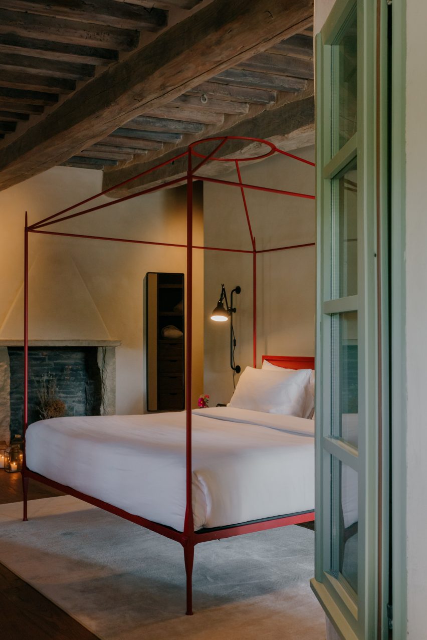
Bedroom with a red-framed, four-posted bedBedroom with a red-framed, four-posted bed
Each of the property’s 12 guest suites is unique and includes a custom bed frame

Vocabolo Moscatelli offers 12 spacious guest suites: eight in the main building and four more dotted around the landscaped grounds, all with a “monastic chic” style.

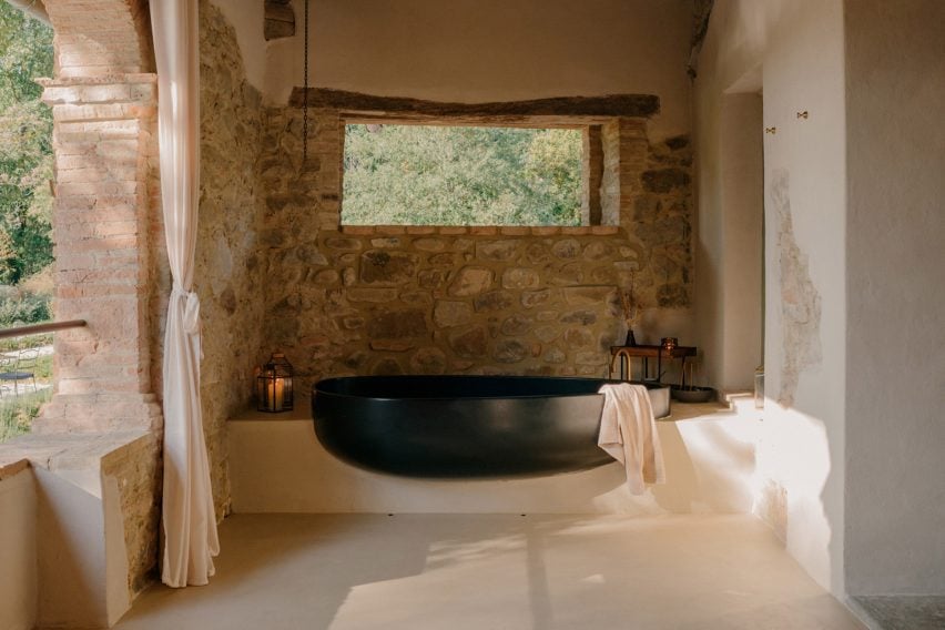
Each includes a unique colour palette and collection of design pieces, like a sculptural black two-person bathtub on one of the terraces and the various handmade beds.

The Bridal Suite includes a round canopy bed and a private garden, while the Spa Suite has its own sauna and jacuzzi.

Bathtub on a terraceBathtub on a terrace
Some of the suites have sculptural al fresco bathtubs

Furniture and products were sourced from Italian brands, such as outdoor furniture by Paola Lenti and lighting from Davide Groppi and Flos.

Handmade glazed tiles by local Umbrian company Cotto Etrusco adorn the bathrooms, contrasting the rough stonework of the building’s thick walls.

Vocabolo Moscatelli is part of hotel group The Aficionados, which brings together 90 design-led properties across Europe.

Swimming pool of Vocabolo Moscatelli by ArchiloopSwimming pool of Vocabolo Moscatelli by Archiloop
New additions to the estate include a travertine swimming pool

Many historic buildings across Umbria have been converted into guest accommodations, from remote holiday homes like the Torre di Moravola watchtower to sprawling rural estates like Castello di Reschio.

Several monasteries in Italy have also found new life as hotels, including the Monastero Arx Vivendi near Lake Garda.

The photography is by Fabio Semeraro.

Reference

Paris duplex by Johanna Amatoury references Greek island architecture
CategoriesInterior Design

Paris duplex by Johanna Amatoury references Greek island architecture

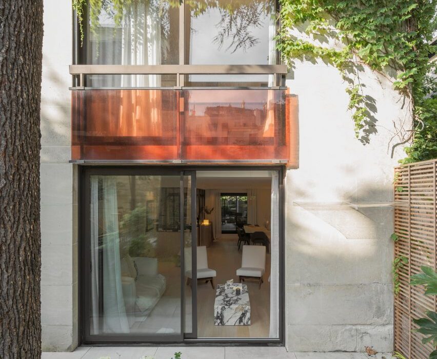
Harnessing soft whites and gently curving plaster forms, interior designer Johanna Amatoury has brought a holiday-house feel to this apartment in the peaceful Paris suburb of Neuilly-sur-Seine.

The duplex belongs to a couple who work in real estate and their three young children – a globetrotting family with a particular love for the Greek islands.

Exterior of Paris apartment by Johanna AmatouryExterior of Paris apartment by Johanna Amatoury
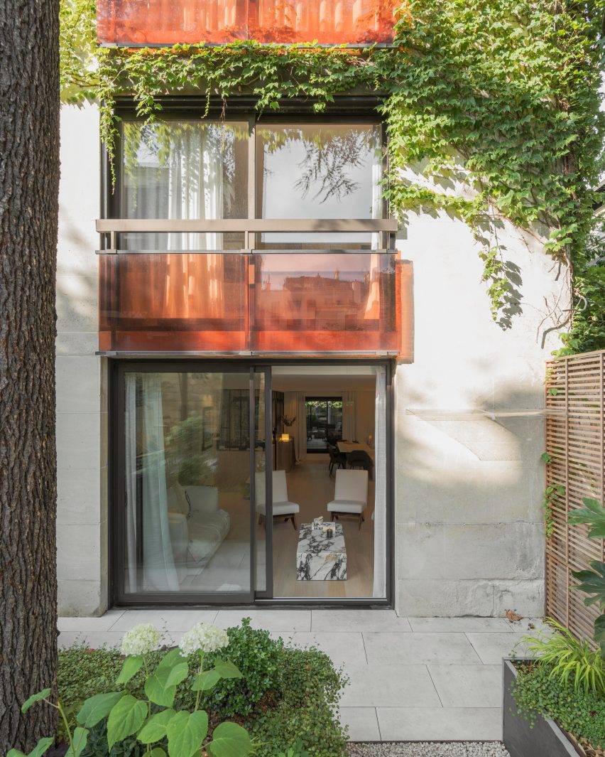
Interior designer Johanna Amatoury has renovated a Paris duplex

Amatoury designed their apartment as a homage to the region’s vernacular architecture.

“Because of their love for this part of the world, we arrived in this apartment and imagined a holiday house feeling, using warm and textural materials – very unlike typical Parisian apartments,” she told Dezeen.

“We worked with mineral materials, textures and raw colours in the apartment to provide depth and achieve the desired ambience.”

Hallway of Paris apartmentHallway of Paris apartment
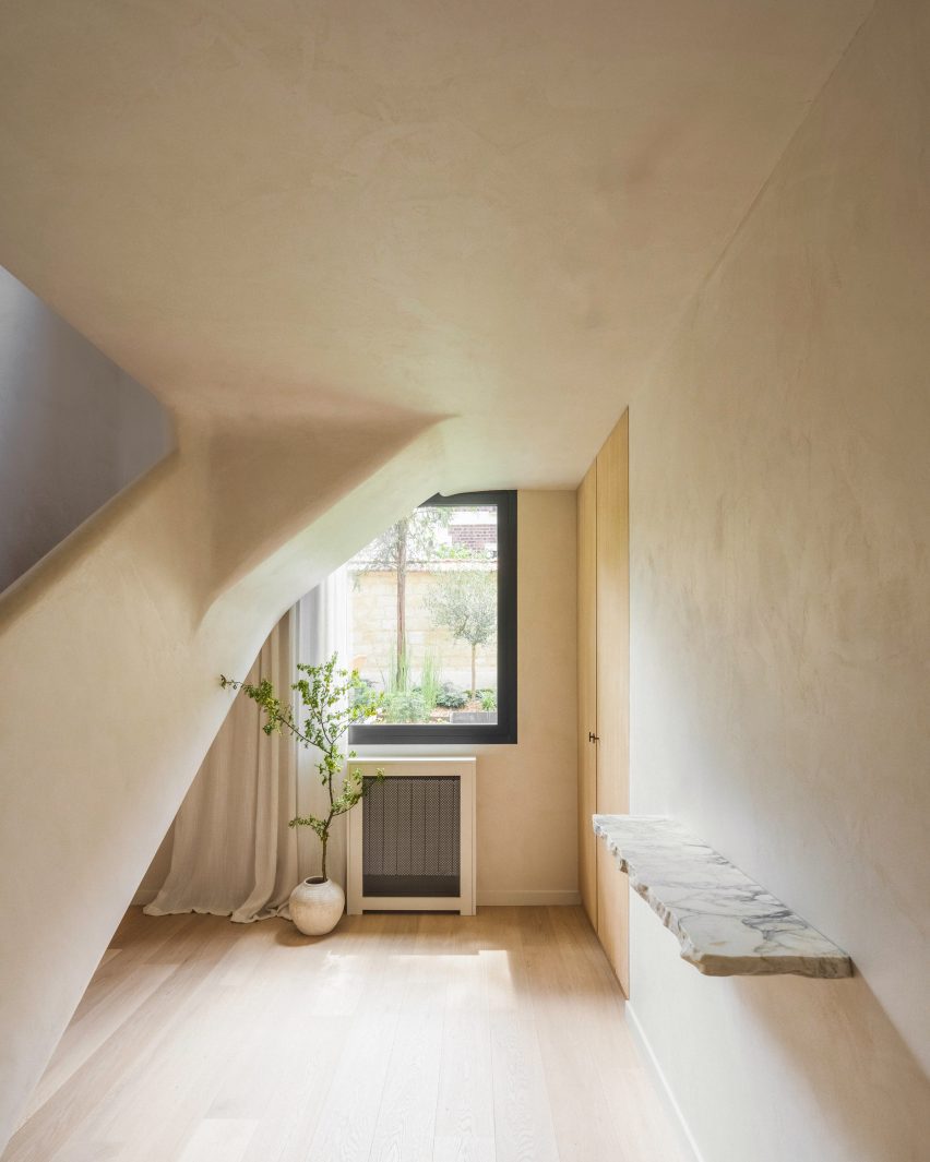
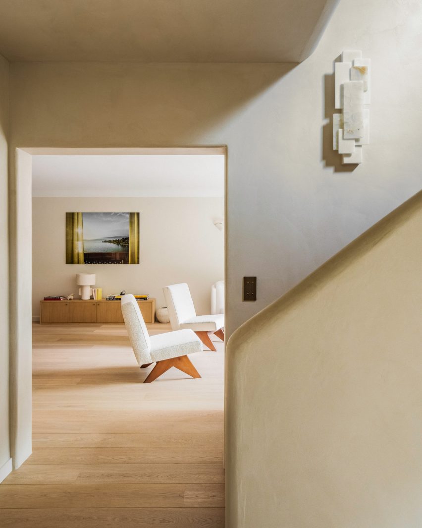
Curving plaster-covered surfaces feature heavily in the entryway

The design of the home was also shaped by its layout, arranged over the ground and first floors of a large 1980s building that opens onto a small garden.

This encouraged Amatoury to model the apartment on a single-family house.

View into living room of flat by Johanna AmatouryView into living room of flat by Johanna Amatoury
The design draws on the vernacular architecture of the Greek islands

“We wanted to imagine it as a house, to create a more outside-in atmosphere, increasing all the size of the windows,” she said.

“The apartment is on the garden level, so my guideline was to open as much as possible to the outside and the planting there.”

Living room of Paris apartmentLiving room of Paris apartment
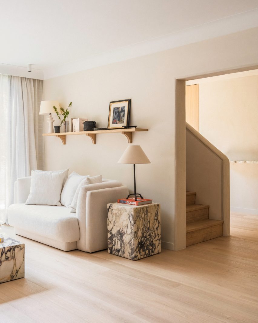
Violetta marble tables anchor the living room

The apartment’s whole floorplan was reworked in order to create a living room, dining room and kitchen that all look onto the gardens outside.

The staircase was relocated to a more logical location close to the entrance, while upstairs the space was completely reconfigured to create four bedroom suites.

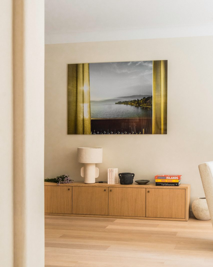
Artwork hanging over console table inside Paris apartment by Johanna AmatouryArtwork hanging over console table inside Paris apartment by Johanna Amatoury
Artworks reflect the Grecian theme of the interior

As a homage to Greek island architecture, Amatoury used Roman plaster to soften the forms within the apartment, particularly in the entrance hall.

“We used warm, textural materials including lots of softly curving and tactile plaster finishes that give the space a sculptural look,” she said.

“Roman plaster is a very ancient technique that has a mineral appearance with a smooth, soft and slightly glossy finish, which catches the eye and dresses the wall through classic mineral colours while also embracing brighter nuances.”

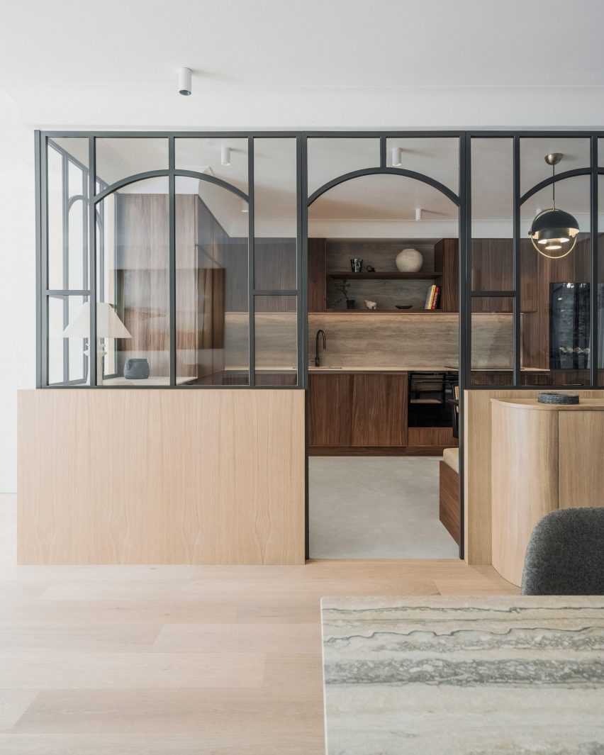
In the kitchen, smoked walnut timber cabinetry is paired with splashbacks and worktops made of Navona travertine.

Set in an otherwise open-plan space, the area is enclosed in glazed panels.

“The family entertains a lot and cooks a lot, both the parents and the children,” Amatoury said. “As a result, it was necessary to be able to close off the kitchen while maintaining this visual openness.”

Kitchen of Paris apartment with glass partitionsKitchen of Paris apartment with glass partitions
The kitchen is enclosed by glazed partitions

Much like a window, the glazed panels feature curved grilles and are set on an oak base that creates a visual link with the built-in oak banquette upholstered in white boucle wool.

“We create a lot of benches because they’re so practical, incorporating storage chests, but most importantly for their cosy appeal,” Amatoury said. “Benches introduce a mix of fabrics and through these fabrics, the space becomes more welcoming.”

Dining area of Paris apartment by Johanna AmatouryDining area of Paris apartment by Johanna Amatoury
Amatoury fashioned an oak seating banquette for the dining area 

For Amatoury, the furniture edit was a balancing act between creating a “harmonious yet eclectic atmosphere” that blends sophistication and comfort.

Taking a central role is the curving sofa in the living room, which is upholstered in off-white linen and paired with monolithic Violetta marble tables.

Stairwell of Paris apartment Stairwell of Paris apartment
A staircase leads up to the second floor

“Its design not only provided a focal point but also added a touch of elegance and softness to the space,” she said.

“The curving shape offered a sense of flow and organic grace, enhancing the room’s visual appeal. The choice of off-white linen contributed to a serene ambience here, promoting a feeling of openness and lightness.”

Bedroom of apartment by Johanna AmatouryBedroom of apartment by Johanna Amatoury
The upper level houses four bedroom suites

Amatoury, who has worked on several residential and commercial interiors across Paris, says she was tasked with the project after the owners admired a home she had completed for friends of theirs.

“They liked our work and especially the warmth we bring to our projects, almost like a cocoon,” she said.

Other residential interiors in the French capital that have recently been featured on Dezeen include a loft apartment in a former textile workshop and a Haussmann-era flat that was restored to its “former glory”.

The photography is by Pierce Scourfield.


Reference

Brasserie des Pres draws on the vibrant history of Paris’s Latin Quarter
CategoriesInterior Design

Brasserie des Pres draws on the vibrant history of Paris’s Latin Quarter

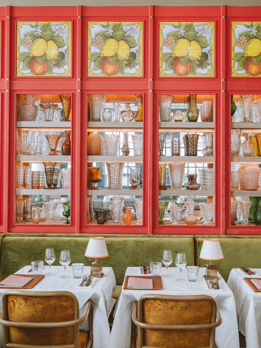
The storied location of this brasserie in Paris inspired interior studio B3 Designers to fill the restaurant with tasselled chairs, disco balls and other flamboyant decor.

Brasserie des Pres is set in Paris’s Latin Quarter, which was a hub of creativity throughout the 19th and 20th centuries, its cafes filled with artists, publishers and prominent writers including Ernest Hemingway and Jean-Paul Sartre.

Interior of Brasserie des Pres restaurant in Paris by B3 DesignersInterior of Brasserie des Pres restaurant in Paris by B3 Designers
Brasserie des Pres’s ground-floor dining space features red-panelled walls with decorative tiling

London-based studio B3 Designers aimed to infuse this same buzzy ambience into the quarter’s latest eatery, undeterred by its awkwardly narrow interiors.

“Brasserie des Pres has a very unique floor print and we’ve used the existing architecture to create layers of dining experiences,” the studio said. “We’ve created a feeling of community and delight, a welcoming backdrop to the great food served here.”

Interior of Brasserie des Pres restaurant in Paris by B3 DesignersInterior of Brasserie des Pres restaurant in Paris by B3 Designers
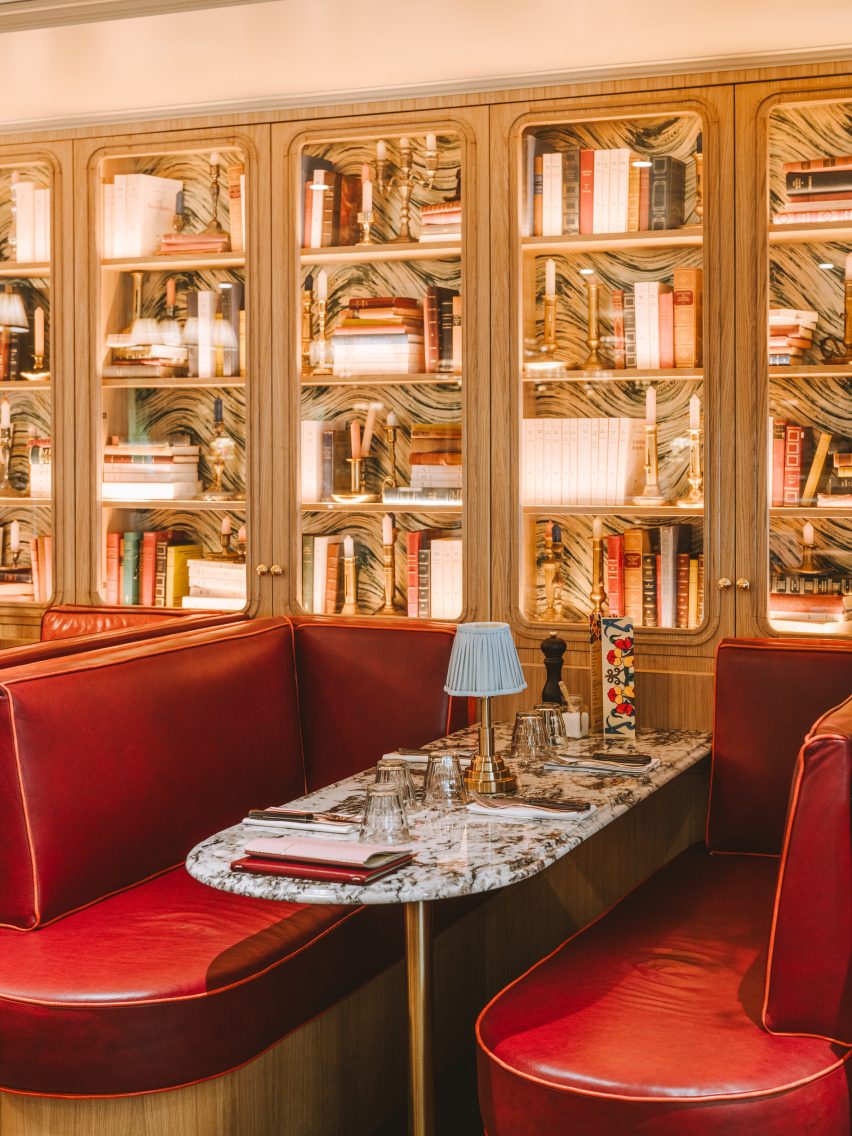
Built-in shelving transforms walls on the first floor into a cabinet of curiosities

Lush with greenery, the exterior of the restaurant features a striped orange awning and classic Parisian terrace seating.

Once guests step inside, they find themselves in a large dining room with red-panelled walls, inset with mirrored shelves that display an assortment of shapely glass vessels.

Decorative tiles depicting limes, lemons and oranges are incorporated at the top of each panel.

Interior of Brasserie des Pres restaurant in Paris by B3 DesignersInterior of Brasserie des Pres restaurant in Paris by B3 Designers
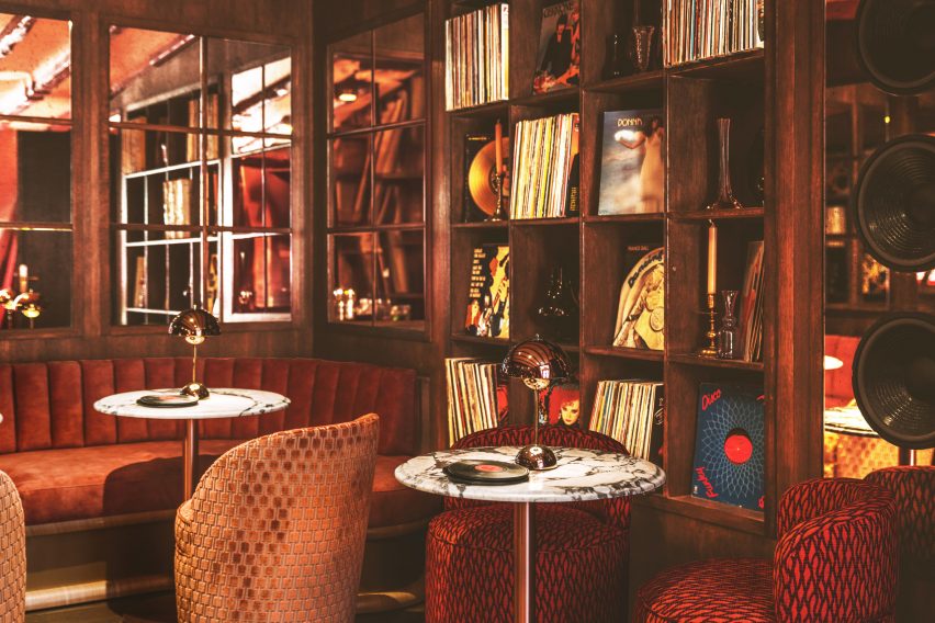
Guests can also relax in the top-floor lounge, which houses a rich selection of vinyl records

Tables throughout the room are dressed with white linen cloths and bijou brass lamps, nodding to the table set-up of the Latin Quarter’s traditional eateries.

Guests also have the option to sit at a high marble counter that directly overlooks Brasserie des Pres’s bustling kitchen or enjoy a drink at the bar, which is fronted by velvet-lined orange stools.

More dining space is provided on the first floor, where the shelves along the walls are filled with antique books and candelabras to mimic the worldly look of a cabinet of curiosities.

Finally, on the top floor of the restaurant is a lounge-style space where guests can relax while selecting tracks from the brasserie’s vinyl record library.

Interior of Brasserie des Pres restaurant in Paris by B3 DesignersInterior of Brasserie des Pres restaurant in Paris by B3 Designers
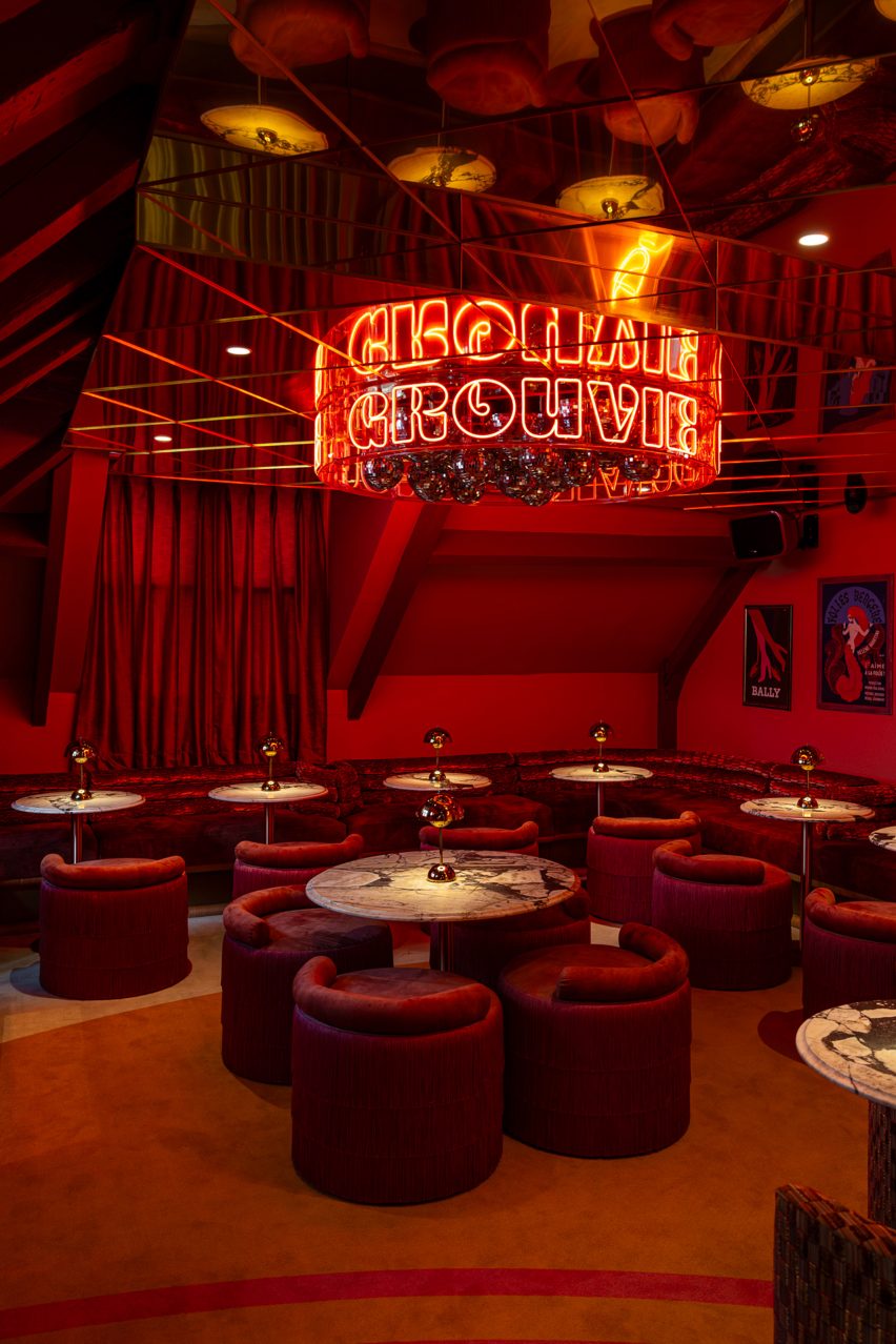
A crimson-red bar hides behind a curtained doorway

A curtained partition can be drawn back to reveal a secret bar, complete with a mirrored ceiling. From its centre hangs a cluster of disco balls, enclosed by a circular neon sign that spells the word groovy.

A plush, crimson banquet winds around the periphery of the space, accompanied by matching tassel-backed chairs and marble tables.

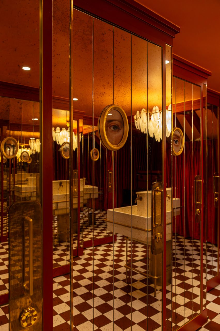
Even the toilets at this level are finished with eccentric details including a pearl-laden chandelier that droops above the washbasin  and surreal gold-framed paintings that depict the eyes of “unsung Parisian anti-heroes”, according to B3 Designers.

Interior of Brasserie des Pres restaurant in Paris by B3 DesignersInterior of Brasserie des Pres restaurant in Paris by B3 Designers
Surreal paintings and a pearl chandelier appear in the bathroom

Paris’s rich culinary scene is constantly expanding.

Other spots that have recently opened up around the city include Citrons et Huîtres, an oyster bar that’s designed to resemble a fishmonger, and Chinese restaurant Bao Express, which has a retro interior informed by Hong Kong diners of the 1970s.

The photography is by Vincent Remy and Joann Pai.

Reference

Eight interiors celebrating the curated clutter of “bookshelf wealth”
CategoriesInterior Design

Eight interiors celebrating the curated clutter of “bookshelf wealth”

Dubbed the first major design trend of 2024, our latest lookbook collects cosy, lived-in interiors that embody the “bookshelf wealth” aesthetic movement taking over social media.

While using books for interior decoration is not a new idea, it has been brought back into focus by a now-viral TikTok video posted in December by San Diego-based interior designer Kailee Blalock.

In the video, Blalock explains that “bookshelf wealth” is not just about creating perfect book displays, but instead about capturing the warmth and homeliness of book collections to curate “a whole home vibe”.

“Bookshelf wealth”, which the Financial Times called this year’s “first major design trend”, suggests pairing bookshelves with mismatched interior patterns, cosy seating areas and layered, loosely organised art pieces to create a tastefully eclectic space for reading.

Despite their contemporary qualities, the projects in this list capture the intimate atmosphere of “bookshelf wealth”, from colourful bookshelves that span an entire room to subtle reading nooks for deeply personal collections.

This is the latest in our lookbooks series, which provides visual inspiration from Dezeen’s archive. For more inspiration, see previous lookbooks featuring spaces punctuated by structural columns, rooms embracing the “unexpected red theory” and playful homes integrating indoor slides.


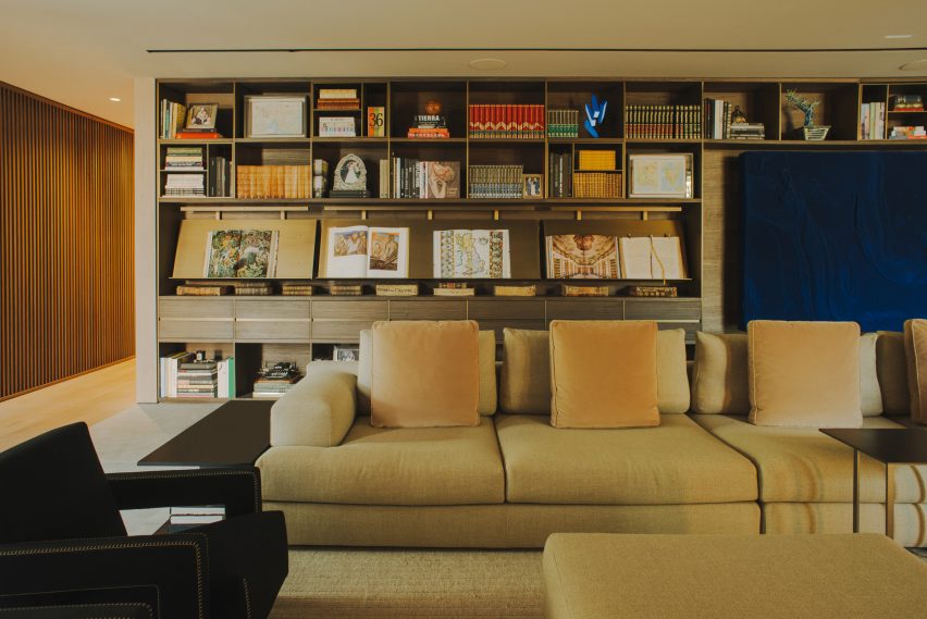
Living room with full storage wallLiving room with full storage wall
Photo by Nicole Franzen

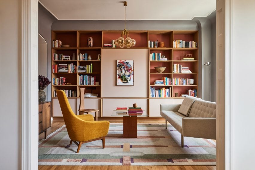
East Village Apartment, USA, by GRT Architects

A wooden bookcase with sienna-coloured backing panels complements this warm New York apartment renovation by GRT Architects.

The bookcase spans the length of the living room behind patterned, textural furniture pieces and is lined with multicoloured books stacked in different directions against small sculptural objects.

Aiming to preserve the home’s “turn-of-the-century disposition”, GRT Architects concealed a TV behind a light pink panel at the centre of bookcase.

Find out more about East Village Apartment ›


Mayfair home by Child StudioMayfair home by Child Studio
Photo by Felix Speller

Mayfair home, UK, by Child Studio

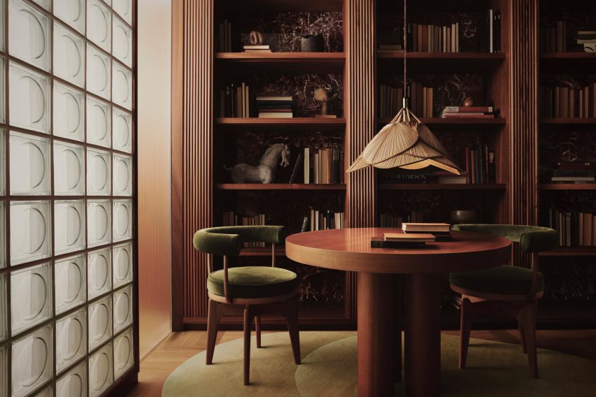
London-based Child Studio designed this entertainer’s home in Mayfair with mid-century modern furniture and deep-toned material finishes, aiming to enhance the art deco atmosphere by carving bookshelves into dark mahogany walls.

“We worked closely with the client to create a space that reflected his personality and interests, encompassing art, design, literature and travel,” Child Studio founders Che Huang and Alexy Kos told Dezeen.

“This approach made us think of Saint Laurent’s salon – an eclectic interior where design objects and art pieces from different eras and parts of the world are assembled together, forming a highly personal environment.”

Find out more about the Mayfair home ›


Kelly Wearstler's interiors for Santa Monica Proper HotelKelly Wearstler's interiors for Santa Monica Proper Hotel
Photo by The Ingalls and Matthieu Salvaing

Santa Monica Proper Hotel, USA, by Kelly Wearstler

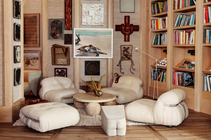
The Santa Monica Proper Hotel by American designer Kelly Wearstler includes reading niches with artwork and furniture by local artists and artisans.

A brimming bookcase flanks low-lying lounges and walls covered by misaligned artwork, with Wearstler explaining that the idea was to connect the original building’s Spanish colonial revival style with the new contemporary building.

“Everything’s connected to somebody that is local in the city,” Wearstler explained. “We’re so lucky to be in Los Angeles, the talent pool here is extraordinary.”

Find out more about Santa Monica Proper Hotel ›


Photo by Victor Stonem

AdH House, Mexico, by Francesc Rifé Studio

Spanish practice Francesc Rifé Studio conceived this moody house in Mexico City with a eucalyptus floor-to-ceiling bookcase to display antique atlases.

The bespoke unit was finished with brass bookstands and embedded LED lighting to complement the tactile and neutral interior palette, capturing the luxurious undertones of “bookshelf wealth”.

Find out more about AdH House ›


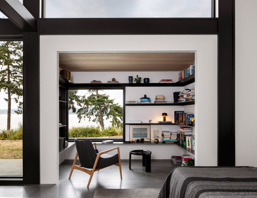
Reading nook with white walls and black shelvingReading nook with white walls and black shelving
Photo by Rafael Soldi

Whidbey Dogtrot, USA, by SHED

A dedicated reading nook punctures this bedroom suite for a compact home in the Pacific Northwest by US studio SHED.

Wrapping the bright white walls, stacked books and mismatched objects line dark metal shelf extrusions that are interrupted by a square window looking out to the surrounding landscape.

Find out more about Whidbey Dogtrot ›


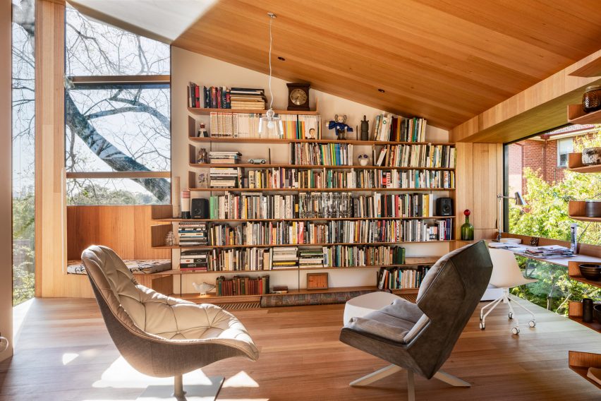
Study bookshelves in Kew Residence by John Wardle Architects in Melbourne, AustraliaStudy bookshelves in Kew Residence by John Wardle Architects in Melbourne, Australia
Photo by Trevor Mein and Sharyn Cairns

Kew Residence, Australia, by John Wardle Architects

Remodelled by John Wardle Architects for the founder’s own Melbourne home, Kew Residence leans into the informal and cocooning atmosphere of “bookshelf wealth” in its wood-clad first-floor study.

Built-in shelves made from Victorian Ash are the focal point of the room and have been densely filled with a collection of ceramic art and books. Next to the shelves, an inset window seat and a slim suspended desk were added, creating a practical and uniform interior.

Find out more about Kew Residence ›


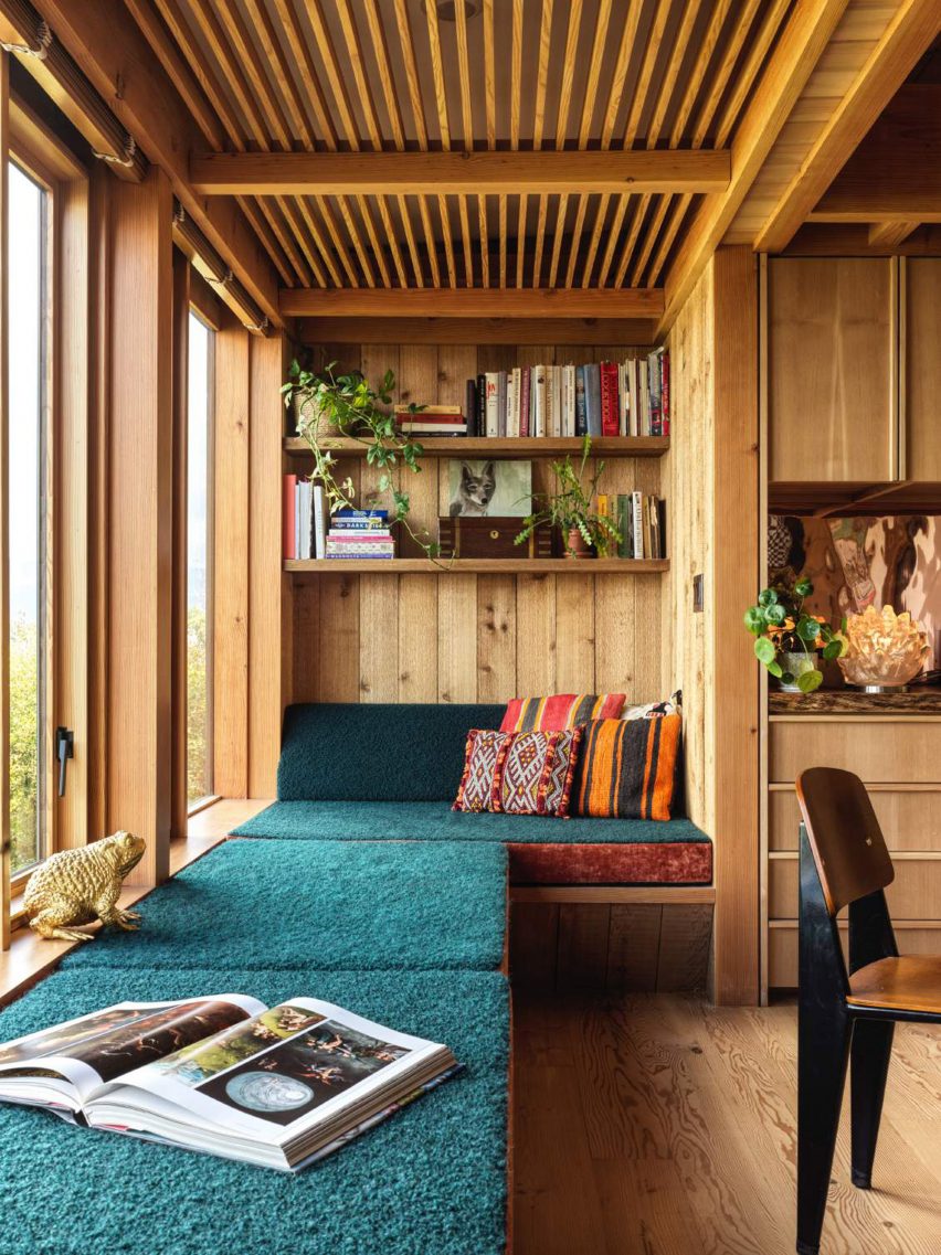
Photo by Chris Mottalini

Silver Lake home, USA, by Lovers Unite

As part of renovation works for a 1950s Los Angeles home, California studio Lovers Unite converted an unused balcony into a long, teal-upholstered window seat below a floating bookshelf.

Paired with contrasting embroidered cushions and vintage decor pieces, the book display adds colour, depth and a feeling of occupation to enliven the timber-clad interiors.

Find out more about Silver Lake home ›


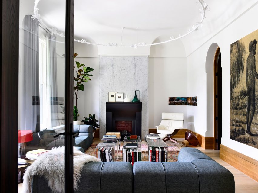
St Vincents Place by BE ArchitectureSt Vincents Place by BE Architecture
Photo by Derek Swalwell

St Vincents Place, Australia, by BE Architecture

Australian studio BE Architecture renovated this Victorian home to highlight the client’s vast art collection, while also rejecting “stark minimalism” and embracing the interior’s existing heritage features.

Large-format books form a centrepiece in the home’s lounge area under transparent coffee table cubes, adding to the home’s eclectic, richly textured and academic character.

Find out more about St Vincents Place ›

This is the latest in our lookbooks series, which provides visual inspiration from Dezeen’s archive. For more inspiration see previous lookbooks featuring homes with indoor slides, colourful home renovations and built around ruins. 


Reference

Co-working members’ club The Malin opens wood-filled Nashville location
CategoriesInterior Design

Co-working members’ club The Malin opens wood-filled Nashville location

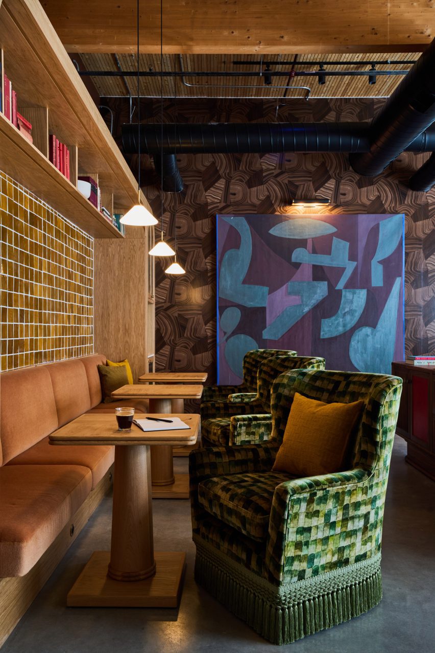
The Malin has designed its work-oriented member’s club in Nashville, its first outside of New York City, with an earthy colour palette and a mix of vintage and contemporary furniture to give it a hotel-like feel.

Located in the Wedgewood Houston neighbourhood, The Malin is one of a number of creative businesses within the Nashville Warehouse Co, which claims to be the city’s “first large-scale mass-timber building”.

Lounge-like space inside mass-timber building in NashvilleLounge-like space inside mass-timber building in Nashville
The mass-timber structure of the Nashville Warehouse Co building is visible throughout The Malin’s interiors

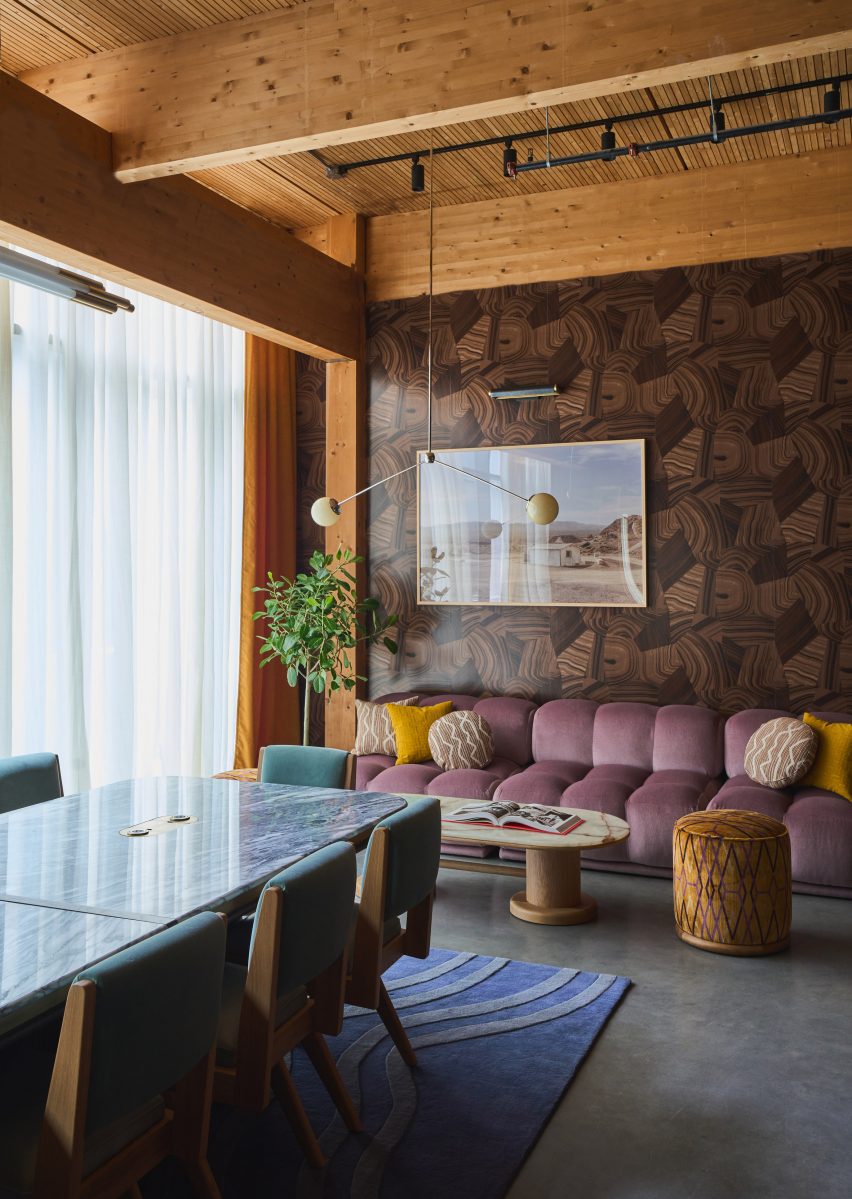
The building’s timber structure is highly visible throughout the interiors, and the pine ceilings and deep beams add to the warm, earthy palette of the various work areas.

Designed by The Malin‘s in-house team, the club encompasses 16,000 square feet of space that encompasses 48 dedicated desks, seven private offices, five meeting rooms and two libraries.

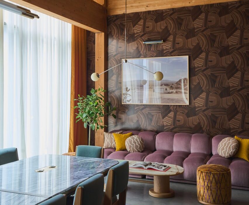
Oak banquettes with velvet upholstery within industrial-style spaceOak banquettes with velvet upholstery within industrial-style space
Wood varieties including light oak and dark walnut are used throughout the member’s club

All of these rooms feature rich colours and an eclectic mix of vintage and contemporary furniture, intended to feel more like a hotel than a co-working space.

“We’re in the hospitality business, so we carefully tailor each location of The Malin to fit the needs of the neighbourhood and professional community,” said The Malin founder and CEO Ciaran McGuigan. “Not only are we providing the highest level of hospitality, but we’re doing it in a refined and beautiful space that contributes to a productive workflow.”

Rows of walnut worktables with red upholstered seatingRows of walnut worktables with red upholstered seating
The club offers both dedicated workspaces and casual areas for members to meet and relax

The design team decorated The Malin Wedgewood Houston with deep-toned Benjamin Moore paints, Schumacher wallpapers and glazed zellige tiles, while bespoke millwork is executed in dark walnut and white oak.

A variety of formal and casual seating areas are available for members to utilise as desired, either for individual or group work, or entertaining guests.

Open-plan space with sofas, armchairs and communal tablesOpen-plan space with sofas, armchairs and communal tables
Sofas, communal tables and banquettes are all available for use as desired

Large communal tables accompanied by cushioned tubular metal chairs, sofas and armchairs with brightly coloured velvet upholstery, and cafe tables beside leather banquettes are among the options available.

Surfaces of limestone, travertine and multiple varieties of marble – including Giallo Siena, Irish Green, Onice Brecia and Aresbecator Oribico – complement the wood tones and colourful furniture.

Meeting room with tan walls, large wooden table and tubular metal chairsMeeting room with tan walls, large wooden table and tubular metal chairs
Private meeting rooms are similarly designed to look more like a hotel than an office

Members also have access to an acre of outdoor community park space for hosting events, and receive discounts and perks at several neighbourhood hotspots.

“The Malin is committed to providing an environment equipped with personalised services and high-touch amenities,” said the team. “In catering to a tight knit community with a finite number of members, The Malin is able to provide tailored lifestyle management services while offering both the comforts of a home and the resources of an office.”

The Malin’s first location in Manhattan’s Soho, which opened in 2022, was longlisted in the small workspace interiors category of Dezeen Awards 2022.

The company has since added spots in Williamsburg and the West Village to its portfolio, making The Malin Wedgewood Houston its fourth.

Interior of The Malin in NashvilleInterior of The Malin in Nashville
The colour scheme throughout the club is warm and earthy, aided by richly toned upholstery and deep paint hues

Long-known for its thriving music scene, Nashville is now quickly growing as a destination for other creative industries.

Recent openings in the city include an outpost of members’ club Soho House – just down the street from The Malin – and a multi-venue dining and drinking destination designed by AvroKO and owned by Sam Fox and Justin Timberlake.

The photography is by Sean Robertson.

Reference

Kith Women Flagship in Soho combines walnut and pink marble
CategoriesInterior Design

Kith Women Flagship in Soho combines walnut and pink marble

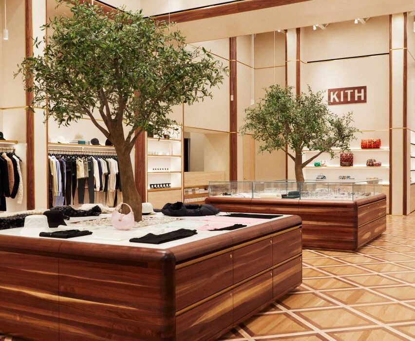
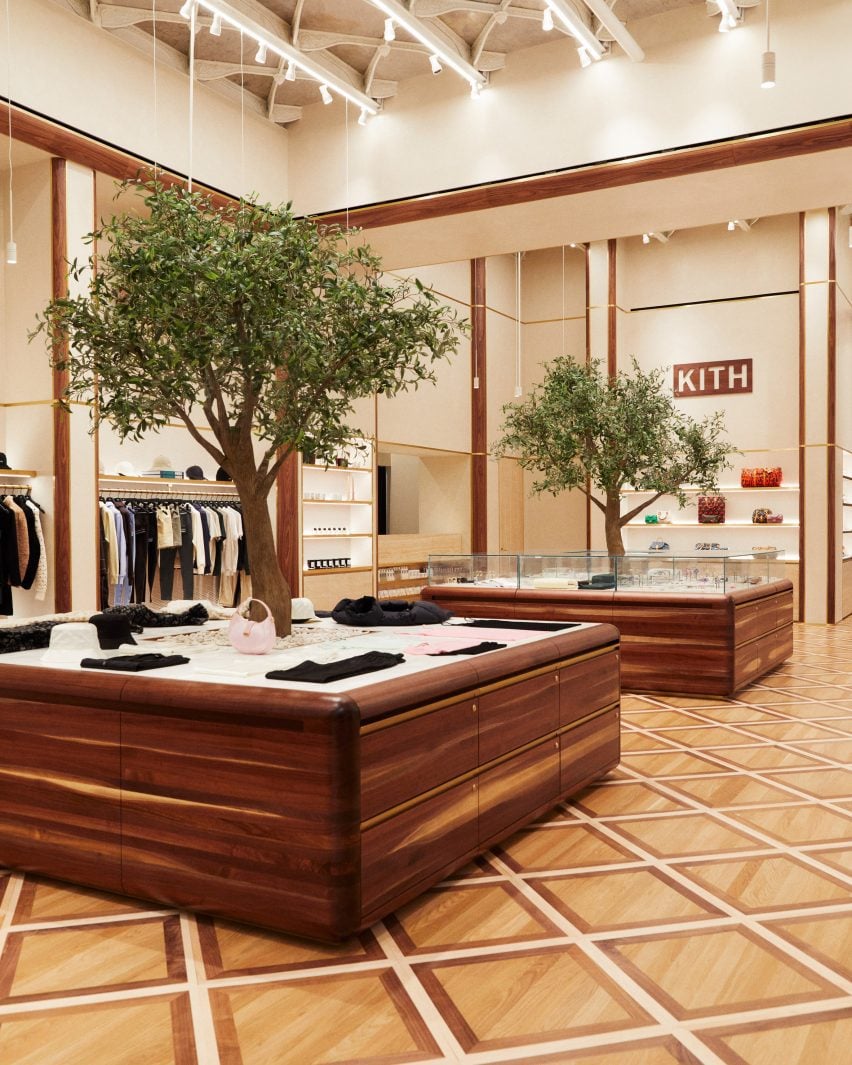
American fashion brand Kith has returned to the location of its first Manhattan flagship to open a women-dedicated store, in which olive trees grow up through display podiums.

The inaugural Kith Women Flagship in Soho opened last December at 644 Broadway, the same historic landmark building where the brand debuted its Manhattan retail offering in 2011.

Custom-built walnut podiums with olive trees growing through the centreCustom-built walnut podiums with olive trees growing through the centre
Custom-built podiums run through the middle of the Kith Women flagship store in Soho

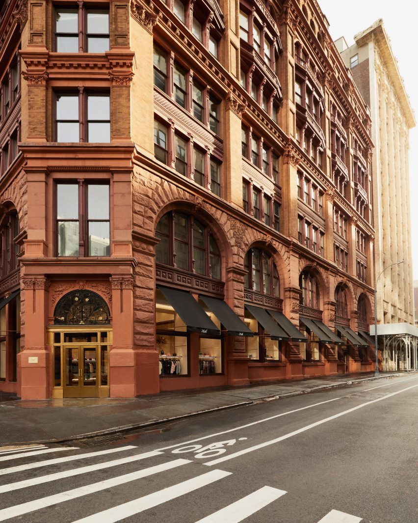
Previously the Manhattan Savings Institute Bank, the red sandstone and brick structure’s exterior features wrought iron gates at the entrance and set the tone for the materials palette inside.

Kith founder and creative director Ronnie Fieg designed the interiors to include signature elements of the brand’s retail concepts, but with adjustments to acknowledge its context.

Kith Women store with apparel and accessories displayed in walnut and brass-trimmed nichesKith Women store with apparel and accessories displayed in walnut and brass-trimmed niches
The main room displays apparel and accessories in walnut and brass-trimmed niches

“The ambiance exudes modern elegance with its warm and calming aura, constructed with materials like Venetian plaster, travertine, and rosa aurora [marble],” said the Kith team.

The spacious main room benefits from tall ceilings and an open floor plan, and presents Kith Women in-house and multi-brand ready-to-wear apparel against Venetian plaster and Kith monogrammed suede wallpaper.

Footwear room with shoes presented on travertine shelvesFootwear room with shoes presented on travertine shelves
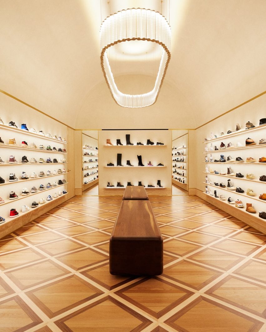
In a room dedicated to footwear, shoes are presented on travertine shelves

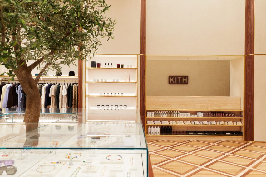
Clothing is displayed on rails installed in walnut and brass-trimmed niches around the perimeter, with accessories like hats and bags placed on shelves above.

A row of square walnut podiums runs through the middle of the room, each with an olive tree growing up through the centre of its pink marble surface.

A cafe and flower shop featuring mosaic floors and a fluted marble service counterA cafe and flower shop featuring mosaic floors and a fluted marble service counter
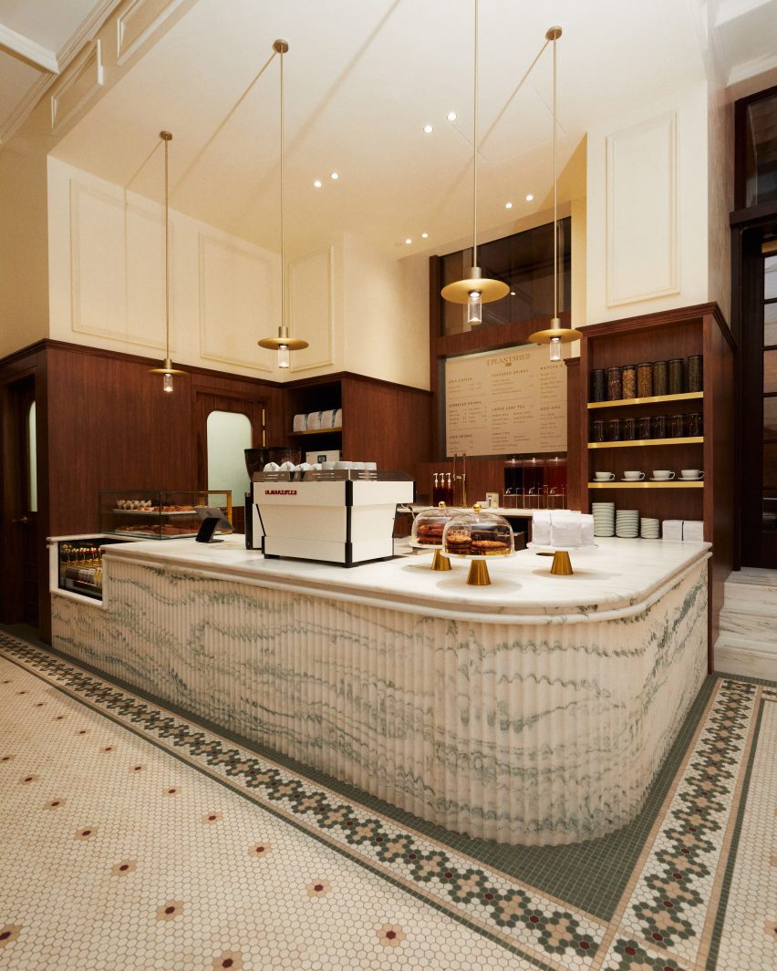
A cafe and flower shop is run in partnership with PlantShed, and features mosaic floors and a fluted marble service counter

Custom-built by Brooklyn-based woodworker Mark Jupiter, these units contain drawers for product storage, and alternating ones are topped with glass vitrines for showcasing jewellery and other small accessories.

Oak flooring is laid in a grid pattern transversed by walnut strips, and the darker wood also lines the fitting rooms.

Footwear has a dedicated room, in which shoes are displayed on shelves with integrated lighting that run from one end to the other.

“Entering the footwear space, you will find a grand arched plaster ceiling, travertine shelves, and a custom chandelier from Italy by Viabizzuno,” the team said.

Cafe in a courtyard behind historic wrought iron gatesCafe in a courtyard behind historic wrought iron gates
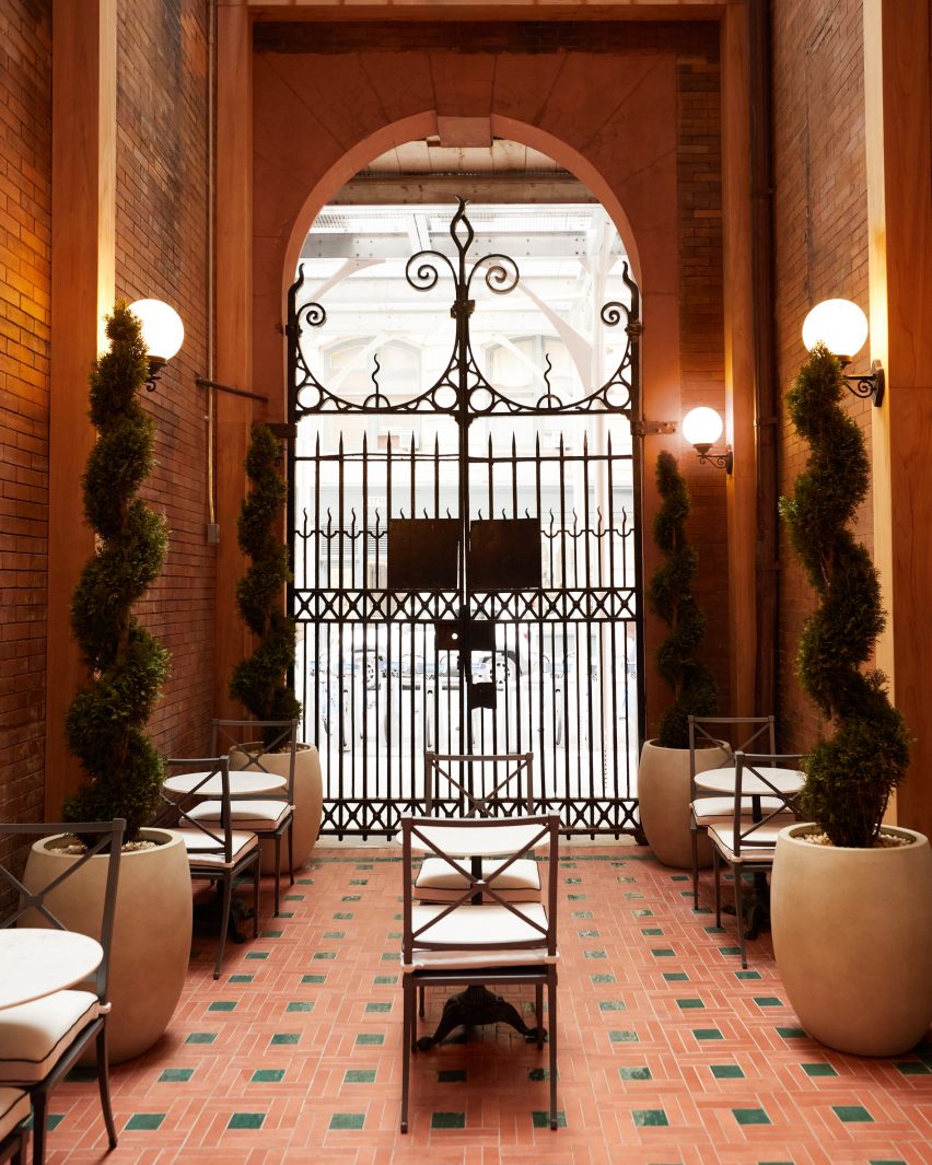
The cafe leads out to a courtyard behind the historic building’s wrought iron gates

In the final room is a cafe run in partnership with New York-based flower and plant shop PlantShed, which serves light bites and drinks and offers custom floral arrangements.

The space features a mosaic tiled floor, walnut wall panelling, a service counter with a fluted pink marble front and floral displays on stepped stone plinths.

The cafe leads out to a courtyard area behind the building’s impressive iron gates, which furnished with cafe tables and chairs in between topiary plants shaped into spirals.

Exterior view of red sandstone building at 644 BroadwayExterior view of red sandstone building at 644 Broadway
Kith Women is located at 644 Broadway, the same building where the brand opened its original flagship retail space in 2011

Feig also designed Kith’s recently opened Williamsburg store, located in the 25 Kent Plaza office building where the brand also has its corporate offices.

The company had previously worked with design studio Snarkitecture on its retail spaces around the world, including outposts in Miami, Los Angeles and Paris.

The photography is courtesy of Kith.

Reference

Hauvette & Madani restores Paris apartment to “former glory”
CategoriesInterior Design

Hauvette & Madani restores Paris apartment to “former glory”

Local design studio Hauvette & Madani drew on the Haussmannian history of this Paris apartment to create a gallery-like interior for its occupant’s vast art collection.

Located in the city’s historic Triangle d’Or, the dwelling previously featured minimalist marble surfaces and gilding leftover from a recent renovation.

Hauvette & Madani “re-appropriated” the apartment, originally designed as part of Georges-Eugène Haussmann’s famed reconstruction of the French capital during the mid-19th century, to reflect its architectural past.

Paris apartment by Hauvette & MadaniParis apartment by Hauvette & Madani
Hauvette & Madani added cornices and mouldings to the apartment to reflect the dwelling’s Haussmannian roots

“The challenge was to completely revamp the apartment, which had just been refurbished,” said studio co-founder Samantha Hauvette, who designed the dwelling with Lucas Madani.

“We carried out meticulous research to find the right motifs and decorations to restore the place to its former glory and Haussmannian charm,” she told Dezeen.

Artworks within the Hauvette & Madani-designed living roomArtworks within the Hauvette & Madani-designed living room
The living room features various artworks

The designers recreated delicate white cornices and mouldings – hallmarks of Haussmannian design – within the apartment, which had been previously stripped of these details.

This created a considered but neutral backdrop for the resident’s eclectic collection of artwork and a curated selection of furniture “mixing eras and styles,” according to Hauvette and Madani.

Turquoise fireplaceTurquoise fireplace
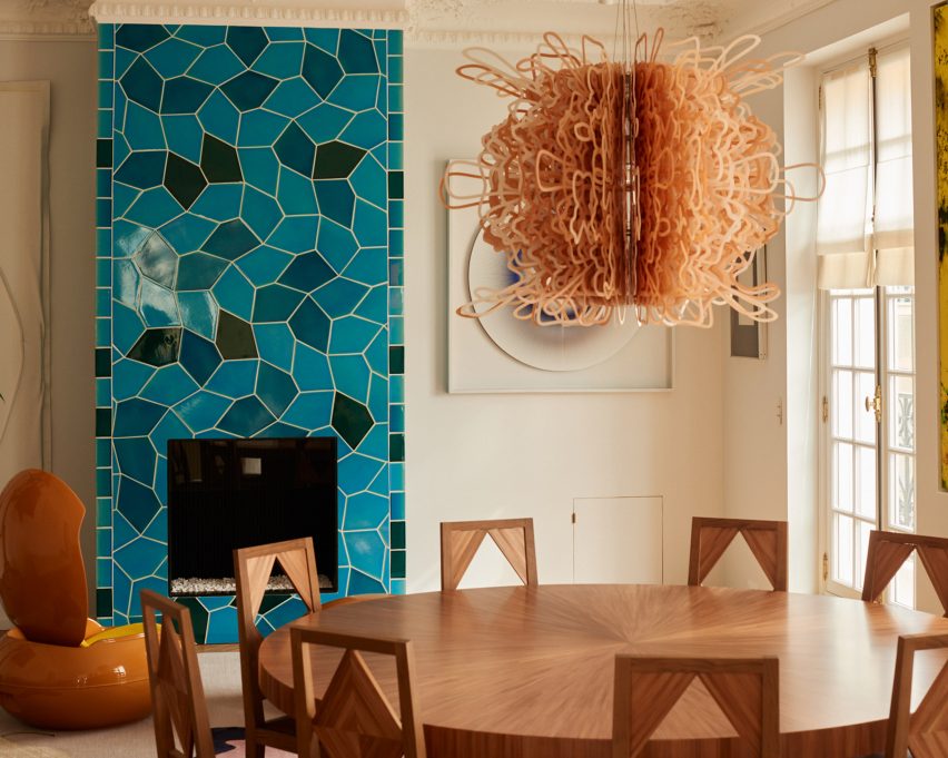
Sarah Crowner designed a bold fireplace for the dining space

Visitors enter at a small round vestibule clad in straw marquetry – a “common thread” that also features on a pair of curved sofas and a sleek coffee table as well as sliding doors, the main bedroom’s headboard and the dining table.

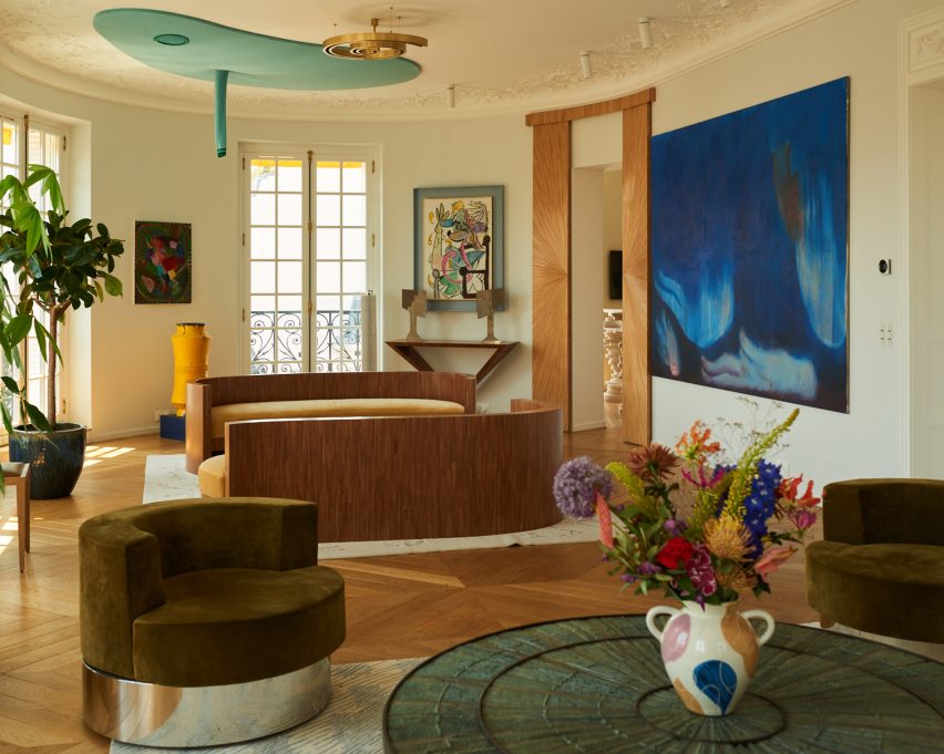
The light-filled living room is characterised by sculptural furniture and art pieces, including rounded vintage armchairs finished in a dark green hue and metallic base.

An amorphous ceiling work by Austrian artist Erwin Wurm was suspended above the sofas, while a deep blue painting by Swiss practitioner Miriam Cahn adds a bold hue to the room.

“It’s a real living space, where the homeowner shares a lot with her artist and designer friends,” said the designers. “All the pieces have a strong identity.”

Pink and green kitchen within Paris apartmentPink and green kitchen within Paris apartment
The kitchen balances traditional elements with more alternative details

For the dining room, American artist Sarah Crowner created a striking turquoise fireplace, which was clad in a blocky mosaic of geometric tiles and positioned alongside a burnt orange vintage egg-shaped chair.

“We wanted to take the codes of classicism and break free from them,” explained Hauvette and Madani, who aimed to balance traditional interior details with more contemporary colourful touches.

Blocky wooden drinks barBlocky wooden drinks bar
A blocky drinks bar was finished in the same design as the kitchen table

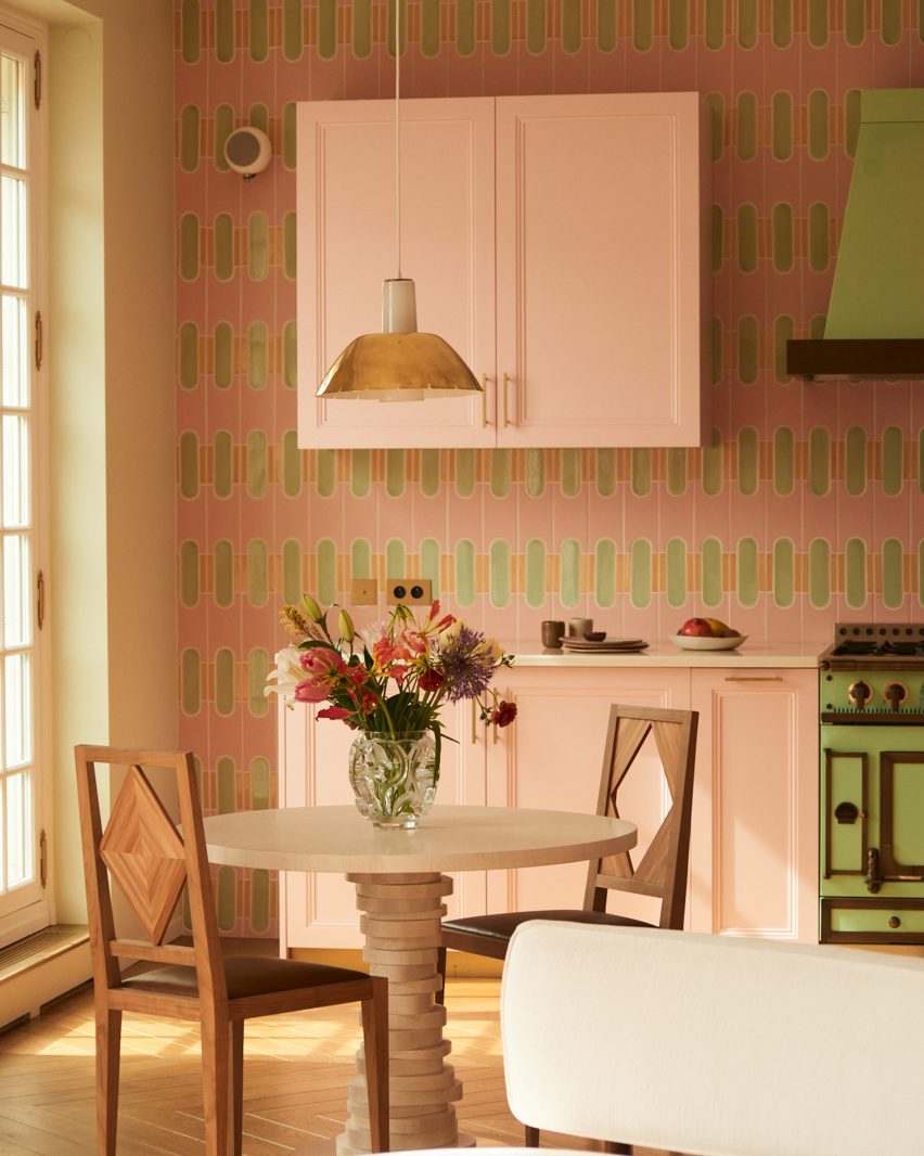
Continuing this theme, the designers sandwiched a bright green stove between more subtle, light pink cabinets in the kitchen, which includes a patterned feature wall.

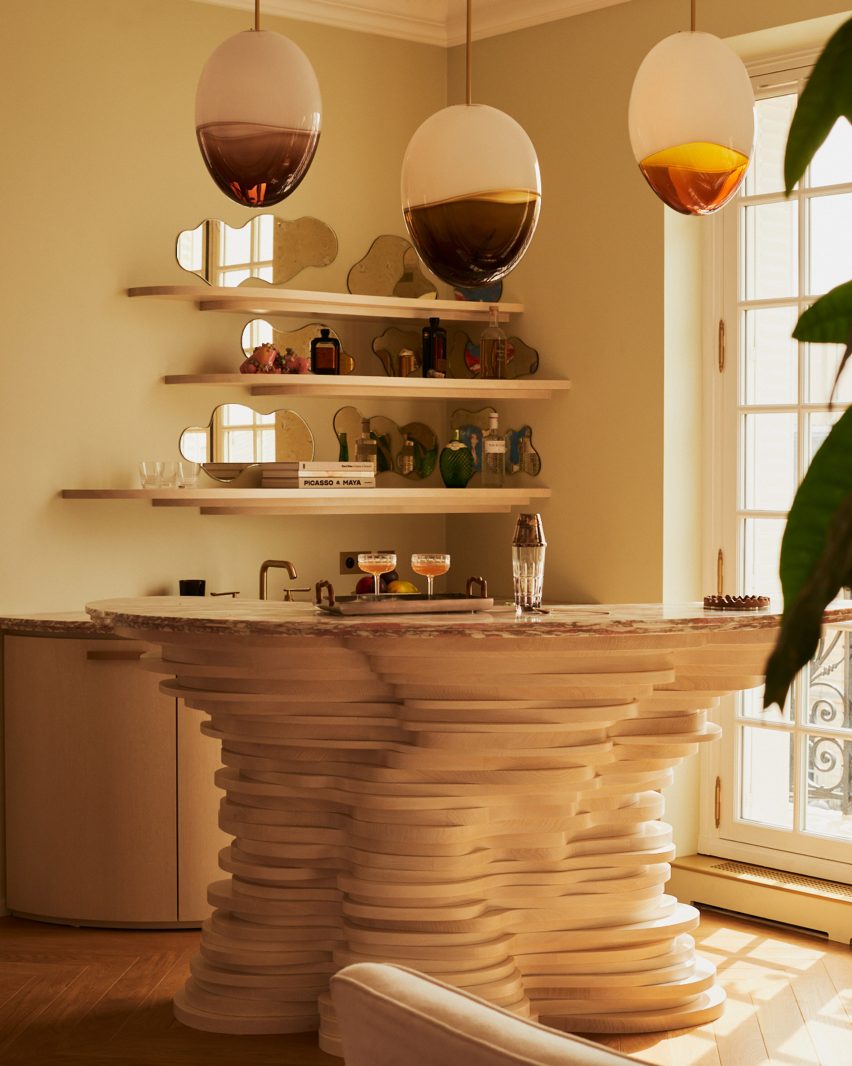
Blocks of light-coloured timber were stacked by French furniture maker Hervé van der Straeten to create a singular lumpy leg for the kitchen table as well as the base of a drinks bar elsewhere in the apartment.

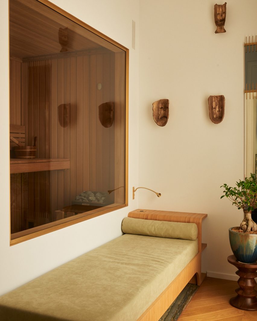
Hauvette and Madani also constructed an in-house sauna for the home, finished in dark wooden slats and tucked behind a bespoke green-hued daybed, made by the designers themselves.

“We have a strong belief that everything that you love independently will work perfectly once put together,” said Madani, who highlighted the power of trusting your instincts when curating eclectic interiors.

Home saunaHome sauna
Hauvette & Madani also added a home sauna

Summarising the overall look and feel of the apartment, the pair declared, “it’s Paris Haussmannian style, with a hint of craziness!”

Hauvette & Madani is not the first studio to renovate a traditional Parisian apartment with contemporary touches.

Local studio Uchronia recently filled a home for jewellery designers with multifaceted furniture pieces crafted to mirror the appearance of precious stones. The studio also previously added a wine-red kitchen to an otherwise neutral flat in the French capital.

The photography is by François Coquerel


Reference

Gharib Studio outfits Austin jewellery store with pink walls and arches
CategoriesInterior Design

Gharib Studio outfits Austin jewellery store with pink walls and arches

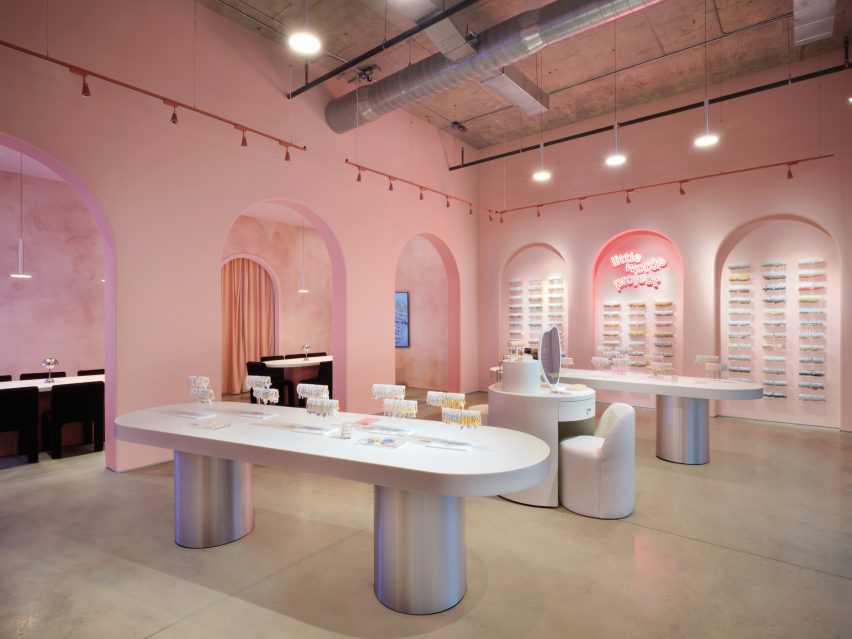
Los Angeles design studio Gharib Studio has contrasted concrete floors and exposed ceilings with soft-pink walls and clean lines for a jewellery store in Austin.

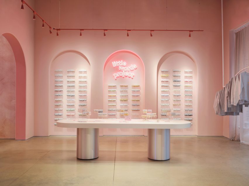
Created for the friendship jewellery brand Little Words Project (LWP), Gharib Studio used elements of the merchandise to inform the store’s pink material palette and incorporated arches throughout the space to contrast the industrial elements of the building, which were left exposed.

Table with silver baseTable with silver base
Gharib Studio has outfitted a jewellery store in Austin with dusty pink

According to Gharib Studio founder Nora Gharib, the team followed the common phrase “everything is bigger in Texas” when designing the concept store.

“I wanted to amplify the brand in a grand way by taking the LWP brand aesthetic and localizing it to Texas by pushing the standard design elements, such as the brand’s bracelet arches and beading table experience, then accentuating it,” said Gharib.

A retail store with silver with long white tablesA retail store with silver with long white tables
Arches and soft tones contrast with the space’s industrial elements

Visitors enter the store into a large, primary space, where built-in display cases were integrated into the walls.

On one side, the display resembles small bookcases and on the other, the bracelets are displayed throughout a series of arches.

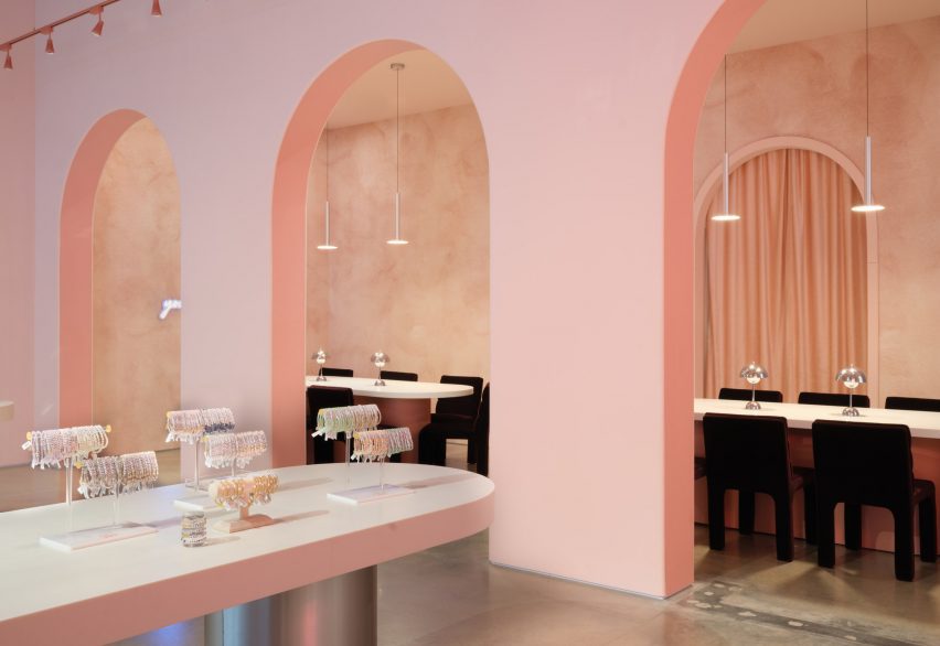
Archways with tables and chairsArchways with tables and chairs
Long tables lead to the seating area at the back of the space

At the centre of the primary space are two long tables with metallic-coated bases, also used for display. A circular display table in the middle was created to resemble a vanity, with merchandise incorporated throughout.

Gharib inserted three arches along the back of the space, in part to accentuate the height of the space, and to draw visitors to the space beyond them, which serves as a beading area.

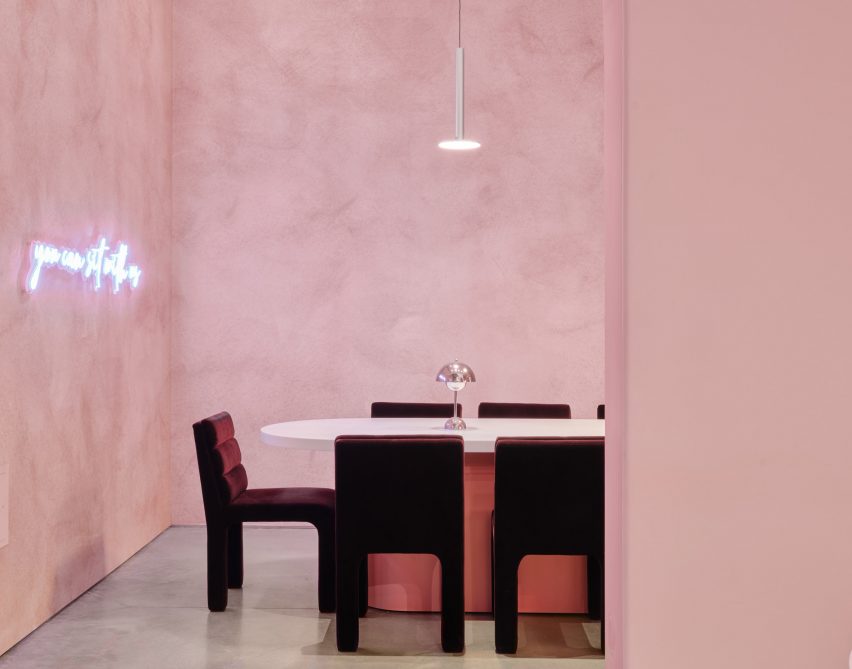
Velvet chairs underneath aluminum light fixtureVelvet chairs underneath aluminum light fixture
Metallic details were informed by the charms found on the bracelets

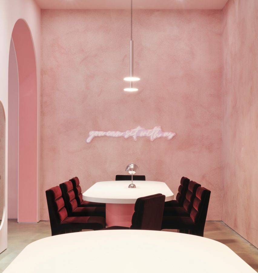
This space was outfitted with CB2 Castell Chairs in burgundy, with similar tables as the main space, except with pink bases instead of silver.

A neon sign that reads, “You can sit with us” hangs above the tables.

Textured dusty-pink wallpaper by Belarte Studio was used to line the space, while the remaining interior was covered in a rose pink hue.

Metallic accents throughout the store, including aluminium light pendants, a metal trimmed mirror and the display table’s metallic bases, were informed by the metal charms found in LWP bracelets.

Space with velvet chairs and textured wallpaperSpace with velvet chairs and textured wallpaper
It is the brand’s first store in Austin

The space’s utility elements were left exposed on the ceiling, with red track lighting running the perimeter of the space.

Other retail projects recently completed in Austin include a mid-century post office turned grocery by Side Angle Side.

Gharib Studio is a Los Angeles-based studio founded by Nora Gharib in 2023, focused on retail and brand design.

The photography is by Casey Woods Photography 


Project credits:

Architectural designer: Gharib Studio

General contractor: Paco Santander Construction

Reference