Eight interiors where chequerboard flooring adds a sense of nostalgia
CategoriesInterior Design

Eight interiors where chequerboard flooring adds a sense of nostalgia

A cannabis dispensary, a hotel gym and an office in a converted 1930s military warehouse feature in this lookbook, proving that chequered floors aren’t just for kitchens.

Alternating squares of colour, a style hearkening back to the nostalgia of 1950s American diners and Victorian entryways, can provide a graphic backdrop to any room.

The examples below were realised using a range of materials, from tiles and stone slabs to wood parquet and paint, providing a clever way of bringing colour, pattern and texture into interiors.

This is the latest in our lookbooks series, which provides visual inspiration from Dezeen’s archive. For more inspiration see previous lookbooks featuring autumnal bedrooms, loft conversions and kitchen islands with sleek waterfall edges.

Chequered yellow floor with chequerboard flooring
Photo by Mikael Lundblad

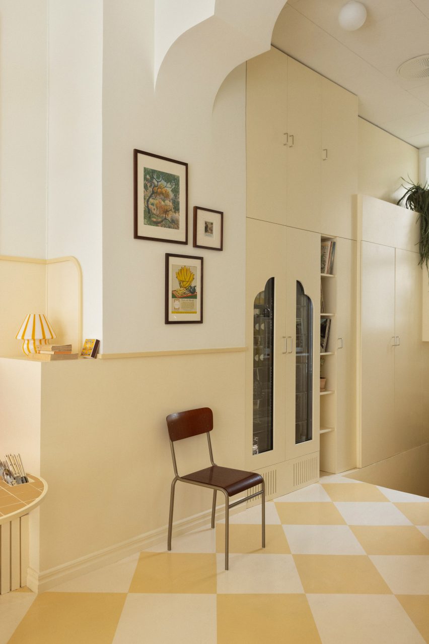
Cafe Banacado, Sweden, by ASKA

The sun-drenched bars of Cuba and the symmetry of Wes Anderson films informed the design of this all-day breakfast cafe in Stockholm.

This is reflected in its butter-yellow colour palette and the tonal squares painted onto the concrete floor, complemented by vintage touches including a vinyl player and a wall of Polaroid pictures.

Find out more about Cafe Banacado ›

Il Capri Hotel, Italy, by Graziella Buontempo and Arnaud Lacombe
Photo by Marine Billet

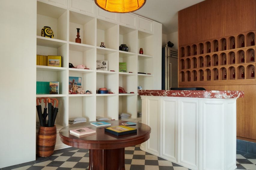
Il Capri Hotel, Italy, by Graziella Buontempo and Arnaud Lacombe

When renovating this hotel in a 19th-century Venetian-style palazzo, husband-and-wife duo Graziella Buontempo and Arnaud Lacombe aimed to balance the building’s old-school grandeur with a more pared-back contemporary elegance.

A classic black-and-white checked floor runs through all of the hotel’s communal spaces and was paired with a mix of new and antique furniture pieces to create a homely, lived-in feel.

Find out more about Il Capri Hotel ›

Bonne Vie patisserie with chequerboard flooring
Photo by Brian W Ferry

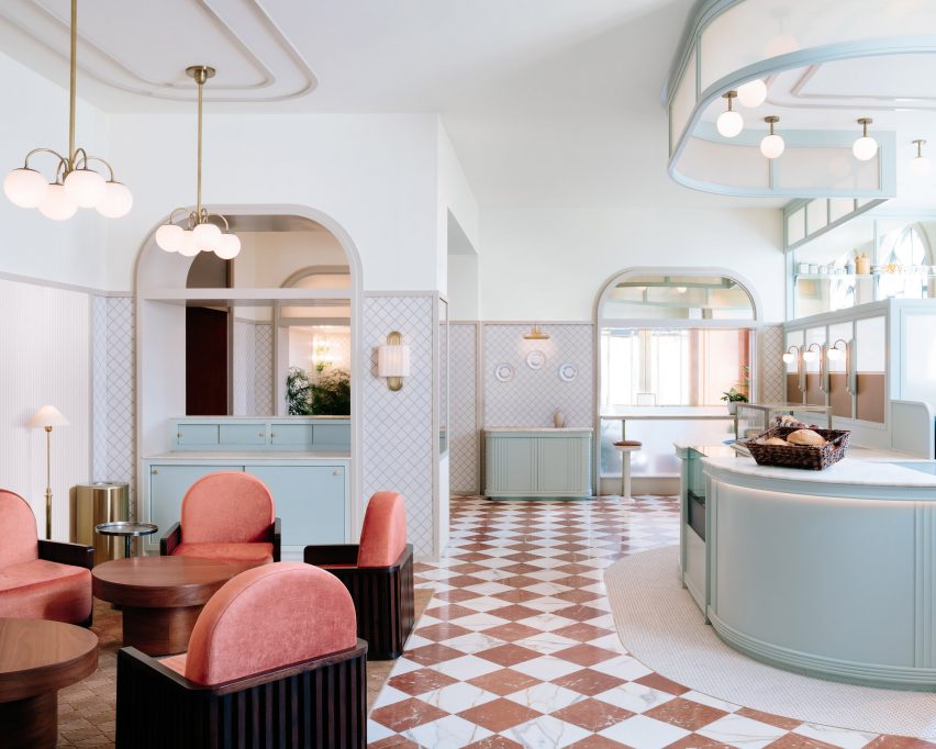
Bonne Vie patisserie, USA, by Home Studios

Alternating slabs of red and white marble pave the Bonne Vie patisseries at The Grand America Hotel, which was designed to bring European cafe culture to Salt Lake City.

Matching crushed velvet chairs create a small seating area and are offset against duck-egg blue millwork and art deco-style opal globe lights mounted on brass fixtures.

Find out more about Laurel Brasserie and Bar ›
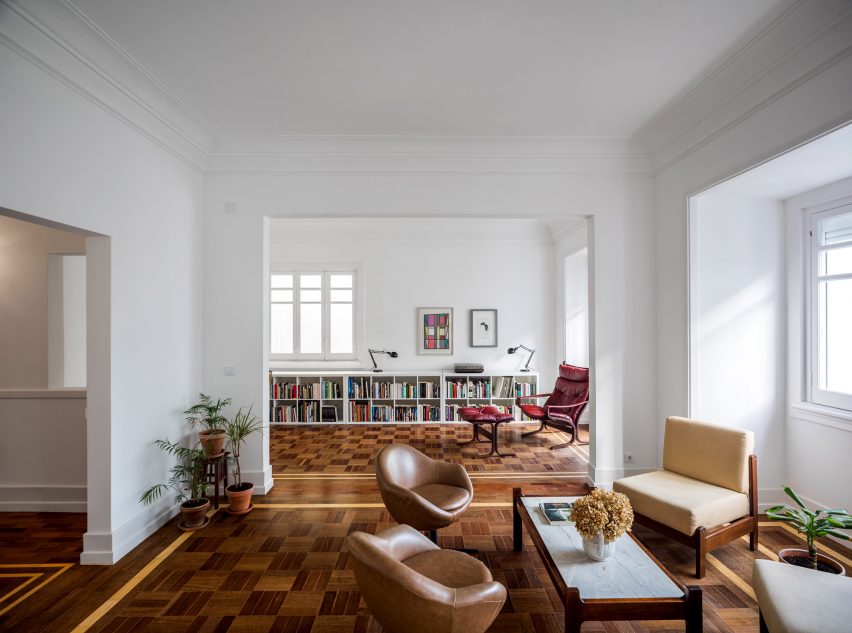

022 Rodrigo da Fonseca by Aboim Inglez Arquitectos residential interiors
Photo by Ricardo Gonçalves

Rua Rodrigo da Fonseca apartment, Portugal, by Aboim Inglez Arquitectos

Portuguese studio Aboim Inglez Arquitectos stripped back the interior of this 1930s apartment in Lisbon to reveal its original parquet floors during a renovation.

Fulfilling much the same function as area rugs, the carefully restored patterns feature timber in different shades, laid into a subtle chequerboard pattern bordered by strips of light wood.

“We believe it was used to stress the independence of the rooms and circulation areas and at the same time acting as the element that unifies the whole house,” architects Maria Ana and Ricardo Aboim Inglez told Dezeen.

Find out more about Rua Rodrigo da Fonseca apartment ›
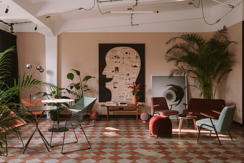

Clay Warsaw offices designed by Mateusz Baumiller with chequerboard flooring
Photo by Ernest Wińczyk

Clay.Warsaw office, Poland, by Mateusz Baumiller

Tiled chequerboard floors are original to this former 1930s military warehouse in Warsaw, which now houses the joint offices of production companies Menu, Analog/Digital and Photoby.

To soften the building’s industrial shell, architect Mateusz Baumiller furnished the office much like a residential interior, bringing in modern Polish art and a mix of contemporary and vintage design pieces from local brands and artisans.

Find out more about the Clay.Warsaw office ›
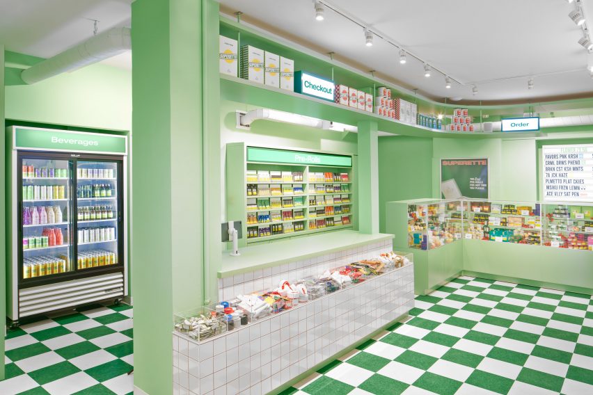

A greent store with cannabis products
Photo by Alex Lysakowski

The Annex, Canada, by Superette

This cannabis dispensary in Toronto was modelled on an Italian delicatessen, complete with a deli counter that contains an array of pre-rolled joints and different strains and strengths of marijuana.

The kitschy nostalgic atmosphere was rounded off with green-and-white chequered flooring, while contrasting splashes of tomato red was used across stools and pendant lights.

Find out more about The Annex ›
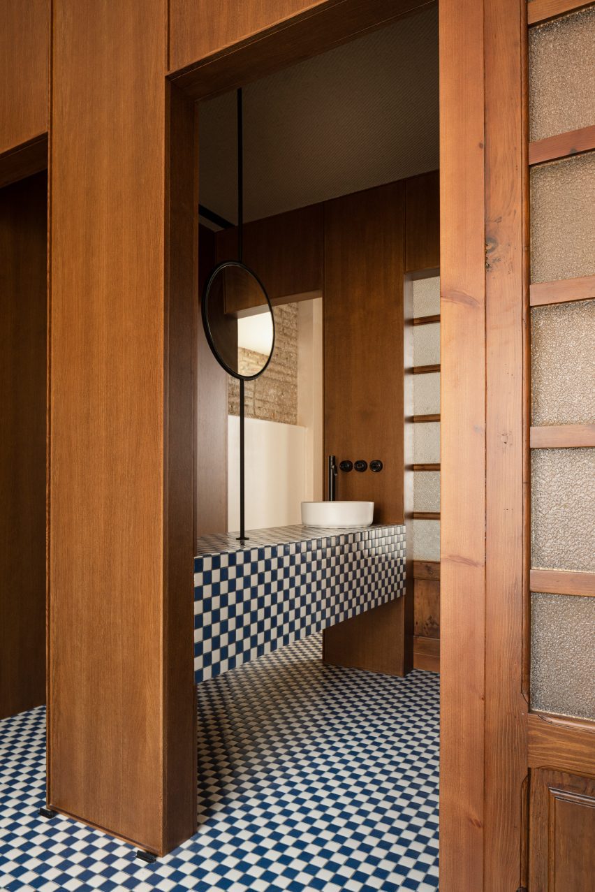

Casa Cabanyal in Valencia by Viruta Lab with chequerboard flooring
Photo by David Zarzoso

Casa Cabanyal, Spain, by Viruta Lab

A mosaic of small navy blue and white tiles brings a subtle nautical feel to this home in Valencia’s traditional fishing neighbourhood El Cabanyal.

Featured throughout all the rooms, from the bathroom to the sleeping quarters, they nod to the traditional azulejo tiled facades found across the city, which has been a prolific exporter of ceramics since the 15th century.

Find out more about Casa Cabanyal ›
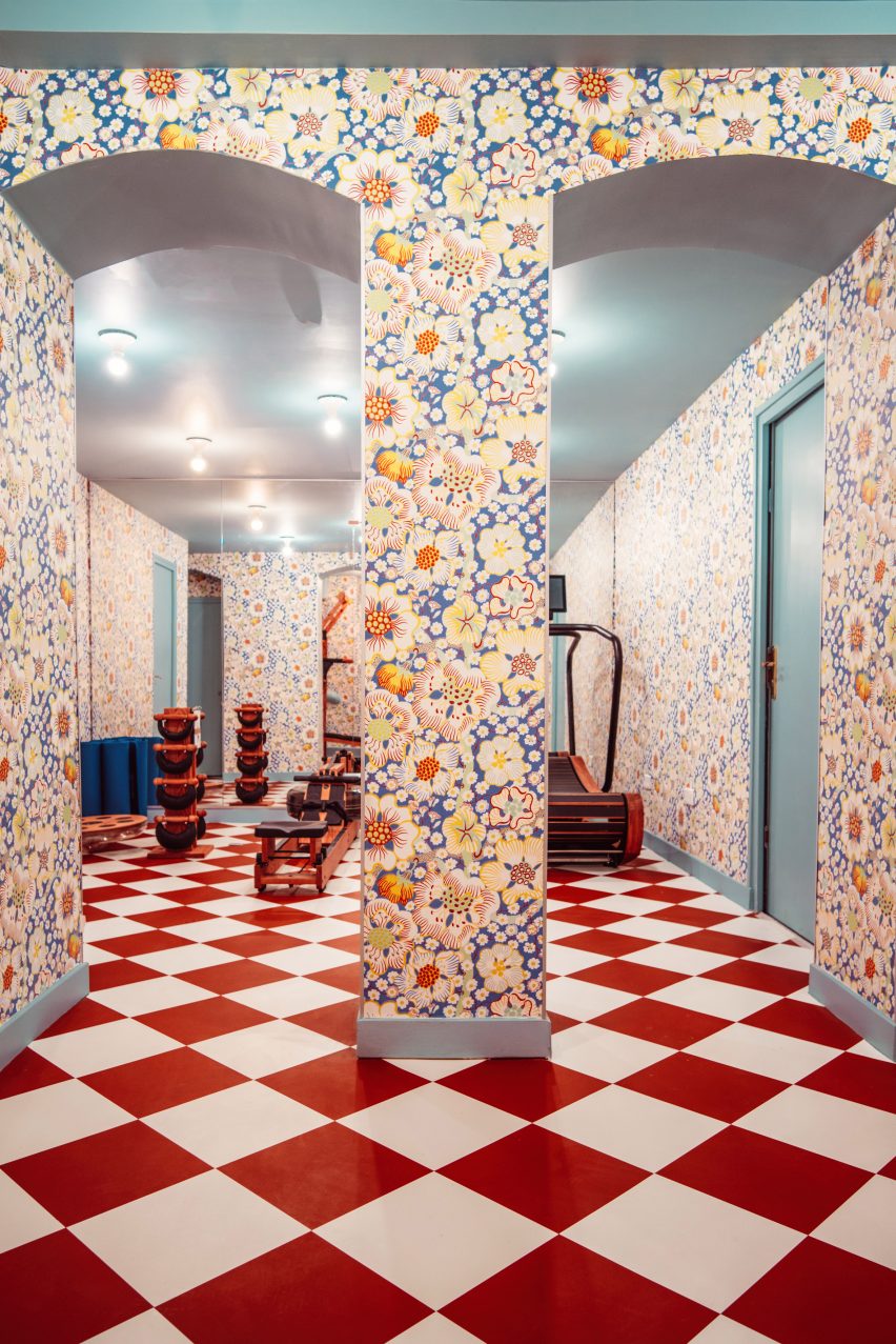

Gym inside Hotel Les Deux Gares in Paris
Photo by Benoit Linero

Hotel Les Deux Gares, France, by Luke Edward Hall

Colours and patterns clash merrily inside this renovated hotel, designed by British designer Luke Edward Hall to have an “anti-modern” feel that hearkens back to the Paris of the past.

Even its gym has been reimagined with wooden equipment, graphic red-and-white flooring and mismatched floral wallpaper designed by Austrian architect Josef Frank.

“I really wanted this space to feel above all joyful and welcoming and alive, classic but a little bonkers at the same time,” Hall told Dezeen.

Find out more about Hotel Les Deux Gares ›

This is the latest in our lookbooks series, which provides visual inspiration from Dezeen’s archive. For more inspiration see previous lookbooks featuring autumnal bedrooms, loft conversions and kitchen islands with sleek waterfall edges.

Reference

Headquarters of crypto company Copper “provide a sense of assurance”
CategoriesInterior Design

Headquarters of crypto company Copper “provide a sense of assurance”

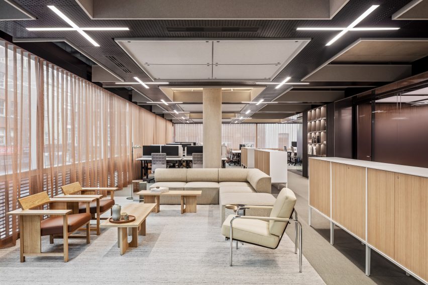
Universal Design Studio put a modern spin on the design conventions of bank buildings when creating the headquarters for cryptocurrency firm Copper inside a Richard Rogers-designed office in London.

Copper – a fintech company that helps financial institutions to securely store and trade cryptocurrencies – wanted to break away from London’s financial districts and instead set up its office inside Soho’s Broadwick House.

Open workspace in Copper headquarters
Copper’s headquarters are located in the Richard Rogers-designed Broadwick House

The building was originally completed by the Richard Rogers Partnership in 2000 and was renovated last year before Copper brought in Universal Design Studio to devise the interiors.

The local practice introduced familiar materials such as marble and walnut into Copper’s HQ to “provide a sense of assurance”.

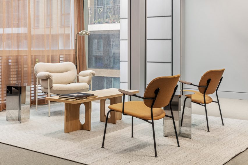
Seating area in fintech office by Universal Design Studio
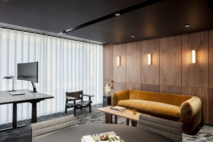
Copper-toned curtains provide a sense of privacy

These are contrasted with more contemporary elements including stainless steel, kinetic screens and dynamic light boxes that help to create “an uncanny and cinematic environment”.

“The design approach draws in part upon historic icons of banking architecture through a contemporary lens, to create a familiar space that feels safe, whilst also pushing the boundaries on expectations,” the practice said.

“Being able to contain that within an architectural landmark is very special.”

Overview of Copper headquarters in London
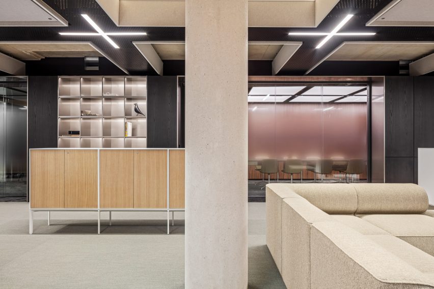
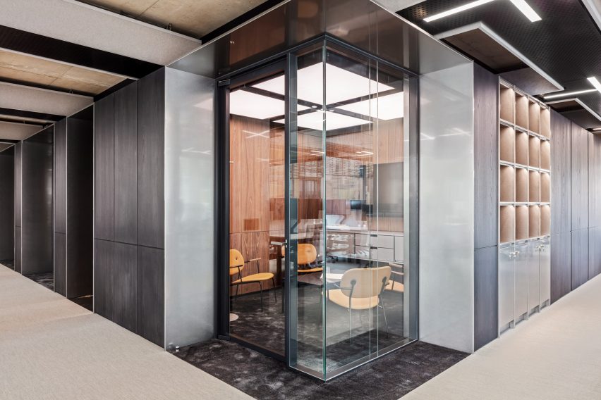
Private meeting rooms are set back from the facade at the core of the building

The lobby features Jesmonite wall panels, referencing the marble-wrapped entrances found in more traditional banks.

By contrast, a gold desk, alcove and gridded lightbox ceiling give a cinematic feel to the lobby and “allude to some of the more unexpected design elements further up the building”, according to Universal Design Studio.

“This idea of bringing together two distinctive finishes that are different recurs throughout the building, to echo the safe and trusted nature of finance with a new digital future,” the practice said.

Overview of London office by Universal Design Studio
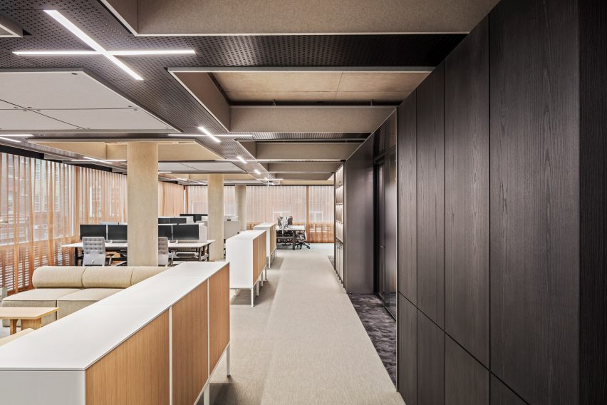
The building’s new “Copper Core” is clad in dark timber

Rogers’s original architectural concept for the building focussed on transparency, with glazed facades providing high levels of light penetration.

Universal Design Studio sought to work with this vision, creating light-infused workspaces with a focus on natural materials.

Meeting room inside core of Copper headquarters
Lightbox ceilings provide dramatic illumination

“The main workspaces for the Copper team are light, with a connection to the street level around the perimeter, playing to the strengths of the original facade design,” the studio said.

“But given the nature of what Copper do, an element of privacy was also essential.”

To achieve this, the studio designed a more opaque “Copper Core” that runs through the entire building, punctuating each floor and containing private spaces such as meeting rooms and quiet rooms.

Set away from the exterior facade, the meeting rooms in the core of the building are inevitably less light-filled than the main work areas.

Wood-panelled meeting room
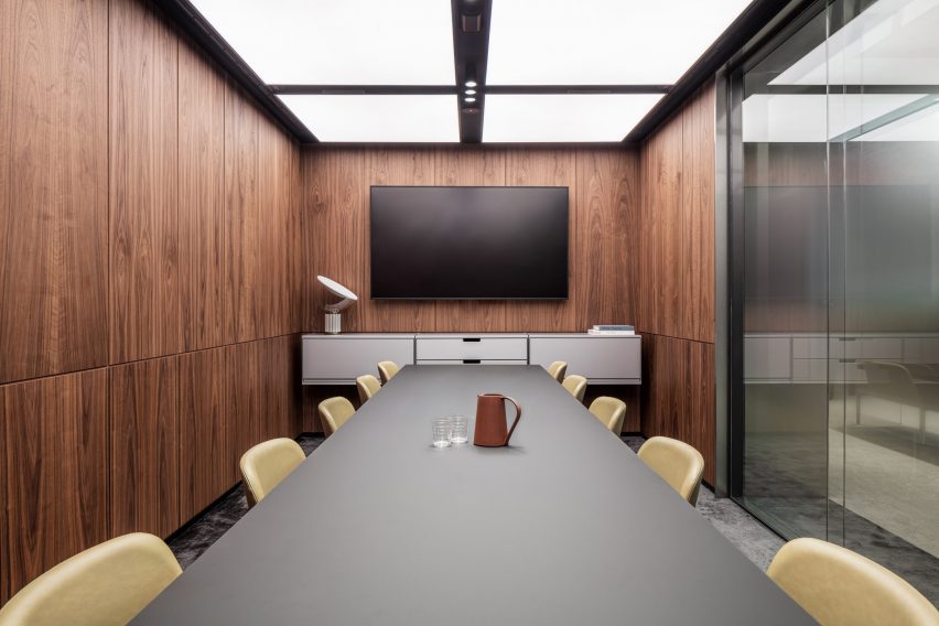
Meeting rooms are panelled with walnut wood

To create spaces that still felt inviting, Universal chose to panel the walls with walnut, harnessing the tactility of this natural material to add a feeling of safety and familiarity.

Stainless steel thresholds were added to create a sense of arrival, as team members move away from general working areas into the Copper Core.

Wood-panelled meeting room
The interiors were designed to inspire a sense of trust and security

In another nod to the concept of privacy, Universal designed a copper-toned curtain that is found on each floor level, running the full perimeter of the facade.

“Operated digitally, each floor’s curtain closes in unison,” the studio said. “The curtain was also conceived as a type of visual security, locking down the building at night.”

Top floor of Copper headquarters in London
The top floors were designed for hosting clients

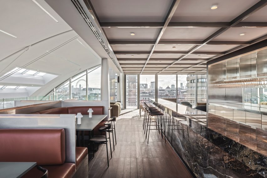
Visiting clients are received on the sixth and seventh floors of the building where the meeting rooms take on a hospitality focus, with bar and banquette-style seating capitalising on Broadwick House’s views across the city.

“These areas are styled on a members’ club to serve the Copper team and its clients,” Universal Design Studio said.

“The sixth floor has a focus on gathering both physically and digitally. Cinematic experiences are again utilised in this space with dramatic sliding digital screens for large events and presentations.”

Seating banquettes inside London office by Universal Design Studio
Guests can take in the views from banquette-style seating booths

Other unconventional interiors belonging to financial institutions include Hana Bank in Seoul with its “floating” meeting room and Citibank Singapore, which was designed to resemble a giant conservatory.

The photography is by Ed Reeve.

Reference