Fluff Stuff is a plant-based textile filling that isn’t just “serving hippies”
CategoriesSustainable News

Fluff Stuff is a plant-based textile filling that isn’t just “serving hippies”

Fluff Stuff is a textile filling created from plants cultivated on rewetted peatlands in Finland, which has been designed by students at Aalto University and was on display as part of Helsinki Design Week.

Co-founded by engineer Lukas Schuck and designer Tea Auramo, who are currently studying master’s degrees at Helsinki’s Aalto University, Fluff Stuff is a range of prototype soft homeware and clothing.

Fluff Stuff
Fluff Stuff includes clothing stuffed with plant filling

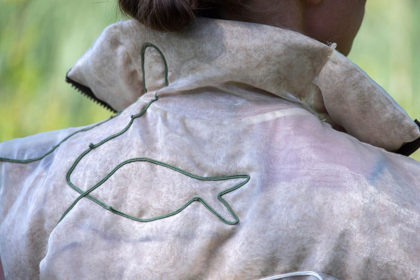
These products include various colourful cushions and duvets as well as jackets, bags and a hooded hat that are stuffed with cellulose fibres.

The pieces are filled with typha latifolia, a type of plant commonly known as broadleaf cattail, which is defined by its long cigar-shaped seed heads and is typically found in Finnish peatlands – a type of wetland.
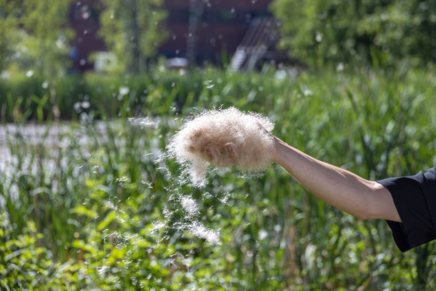
Cattail plants
The products include cattail plants extracted from rewetted wetlands

Each product is stuffed with plant fibres instead of traditional, carbon-intensive down filling. According to the Fluff Stuff team, cattail absorbs 66 per cent less water than down and dries twice as fast.

“Typha fibres are naturally coated by a wax layer, making them highly hydrophobic,” they explained.

Currently, the plants are harvested from rewetted peatlands in Finland using the team’s first prototype device – a handheld machine that abstracts the cattails through suction.
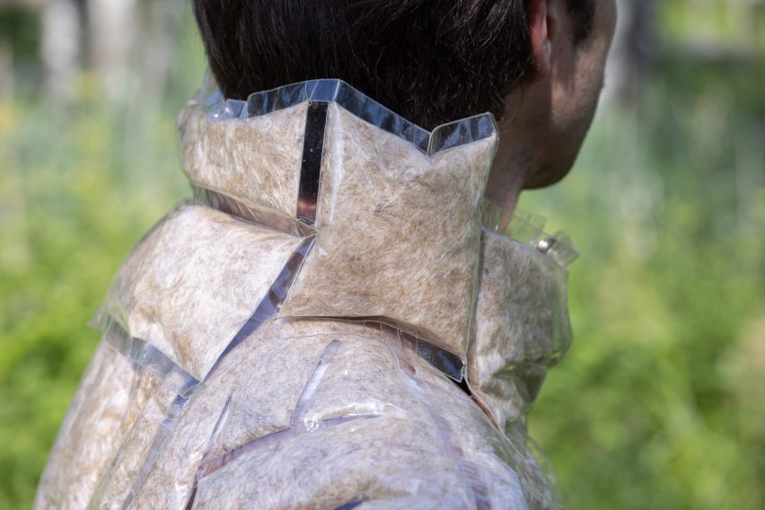
Fluff Stuff
Fluff Stuff is currently a range of prototype products

“Drained peatlands account for 50 to 60 per cent of agricultural emissions in Finland,” said the Fluff Stuff team, explaining that the project aims to restore rewetted peatlands while also providing a more sustainable solution to creating textile filling.

“Fluff Stuff rethinks Finnish peatland management and the Finnish textile industry by connecting bio-based material innovation with regenerative agricultural practices,” the designers added.

Designer Auramo explained that the team is currently using textiles it has sourced for the project, but in the future, it plans to make its own textiles in which to use the filling, as Fluff Stuff has plans to become a commercial range.

“We chose colours [for the textiles] that would fit with our own dyed colours, so you can see beige and blues and red tones so that they will fit later when we do more prototypes,” the designer told Dezeen.

She also explained that they chose green as a colour for some of the products, due to its “fit in more modern homes”.

“We also chose a more modern colour – lime green,” said Auramo. “We definitely aren’t just serving hippies. We want to speak to different customer groups.”
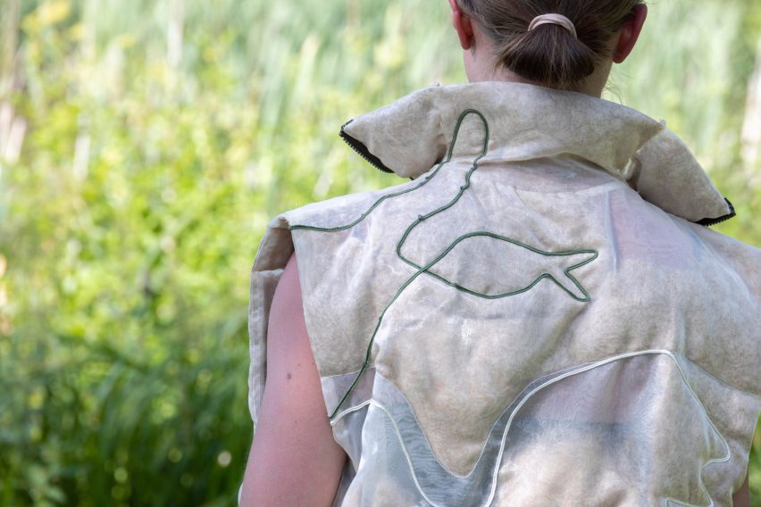
Plant-filled clothing
The project intends to find a sustainable solution to down

Other recent similar student projects include fabrics created from plants grown in seawater and dissolvable ramen packaging that turns into edible sauce.

The photography is by Aalto University, Mikko Raskinen and Anna Berg.

Helsinki Design Week took place from 1 to 11 September 2022 in Helsinki, Finland. See Dezeen Events Guide for an up-to-date list of architecture and design events taking place around the world.


Reference

7 Restaurants Serving Up an Industrial Aesthetic
CategoriesArchitecture

7 Restaurants Serving Up an Industrial Aesthetic

Architects: Want to have your project featured? Showcase your work through Architizer and sign up for our inspirational newsletter.    

Unfinished concrete surfaces, metal pipes, visible ducts, high ceilings and exposed structural systems are common sights in old factories and warehouses. However, in recent years, we have seen an increasing demand for this aesthetic in both residential and commercial spaces. Those remodeling old warehouses or pre-war buildings into homes have been choosing to preserve elements of their older structures. Some offices are incorporating similar design elements to make their spaces more trendy, and less clinical or formal.

The industry that has seen a massive adoption of this trend is the hospitality sector, especially in the past two decades. Restaurants and bars across the world are taking cues from old factories and playing with unfinished surfaces, metallic accents, industrial lights and heavy-duty hardware to create an atmosphere that is both nostalgic and modern. Designers have found several ways to soften these harsh materials and craft spaces that are welcoming. Below are just a few examples.

Images by Mikael Axelsson

USINE by Studio Richard Lindvall, Stockholm, Sweden

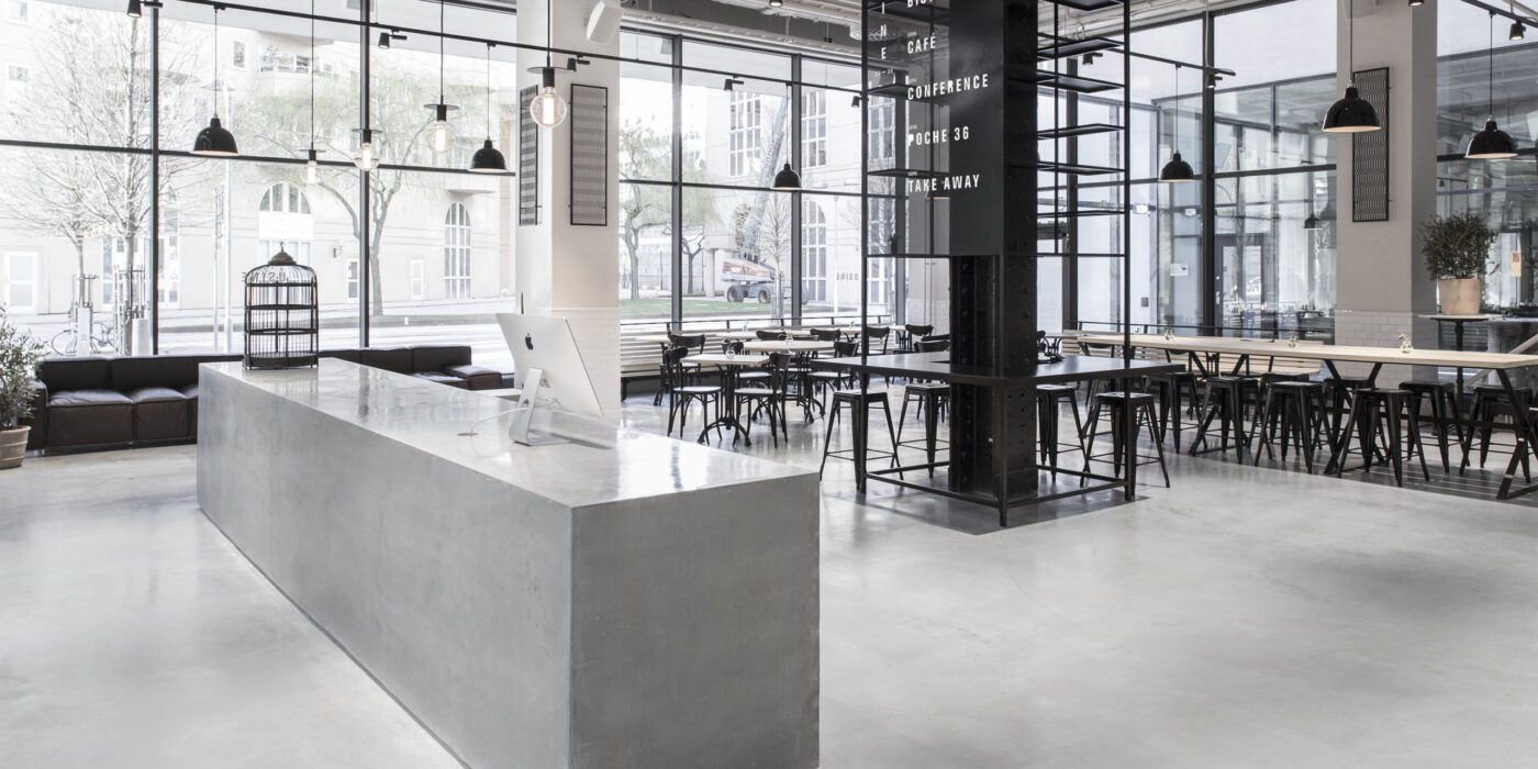
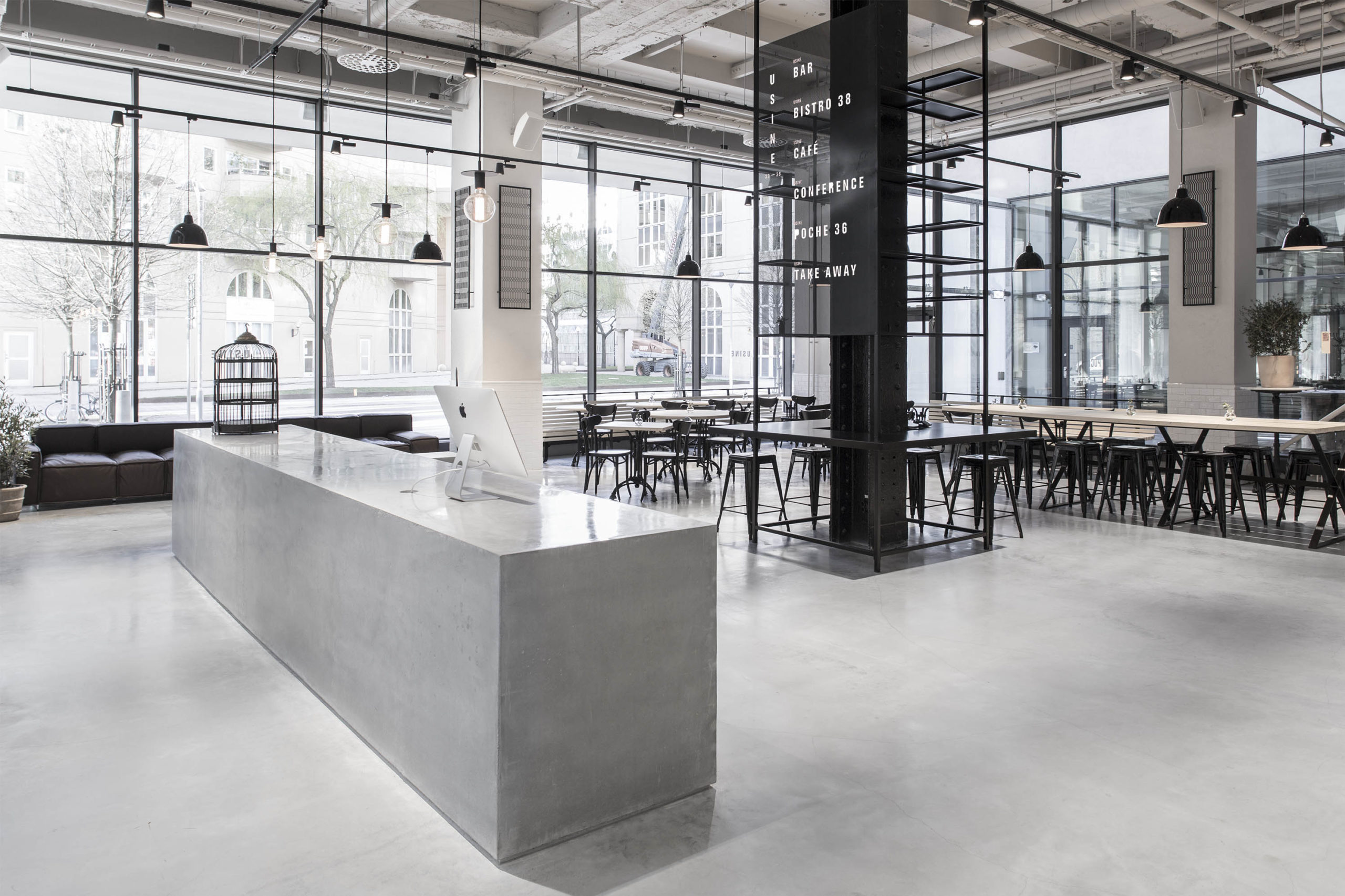
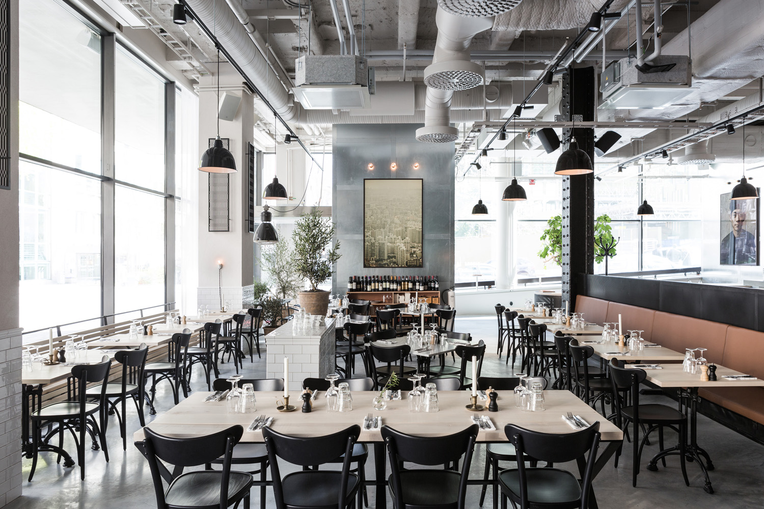
It is hard to tell that this restaurant and meeting area was once a sausage factory. The remodeled space combines Scandinavian minimalism with a more industrial aesthetic, while also referencing hotels in Shanghai, New York and Amsterdam. Materials like concrete, galvanized steel and black cast iron are softened with cognac leather and maple wood. All the ventilation systems are left exposed and painted in white. Light fixtures with bold black details are juxtaposed against this lighter canvas to strengthen the aesthetic.

Spokane Steam Plant by HDG Architecture, Spokane, Washington
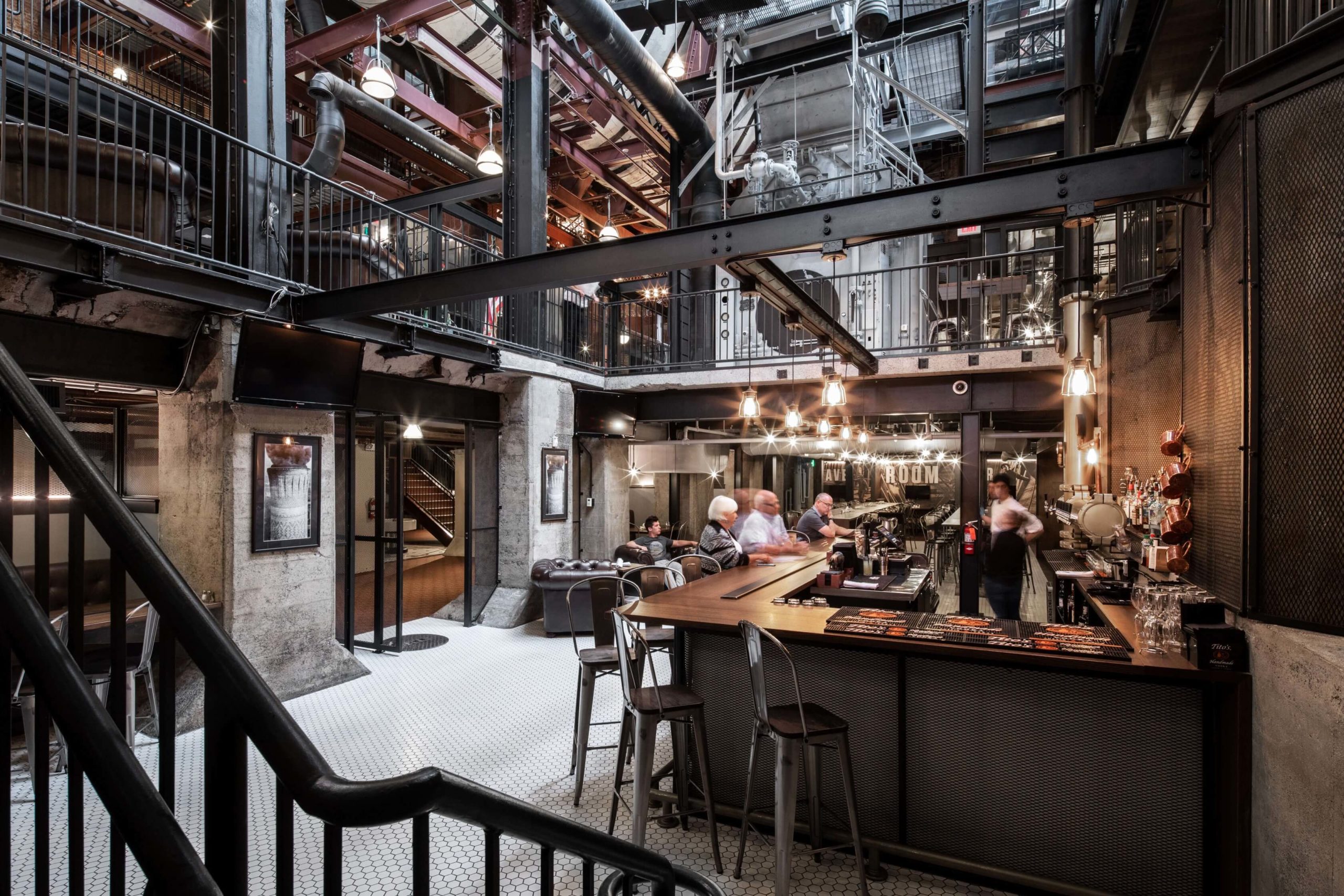
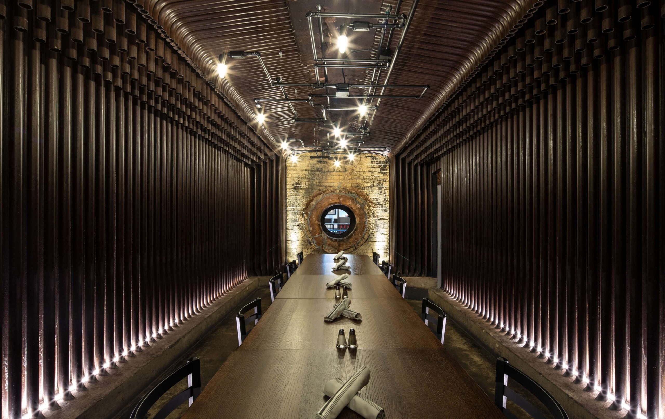
This restaurant design is conscious of the century-long history of the steam plant in Spokane. The metal columns and beams are not only left exposed but also painted in black to have them blend ini. These structural details are joined by black-tinted furniture, mesh-covered concrete walls, metal-backed chairs and dramatic pendant lights. Furthermore, the studio also used copper-toned pipes to create a drink dispenser at the bar.

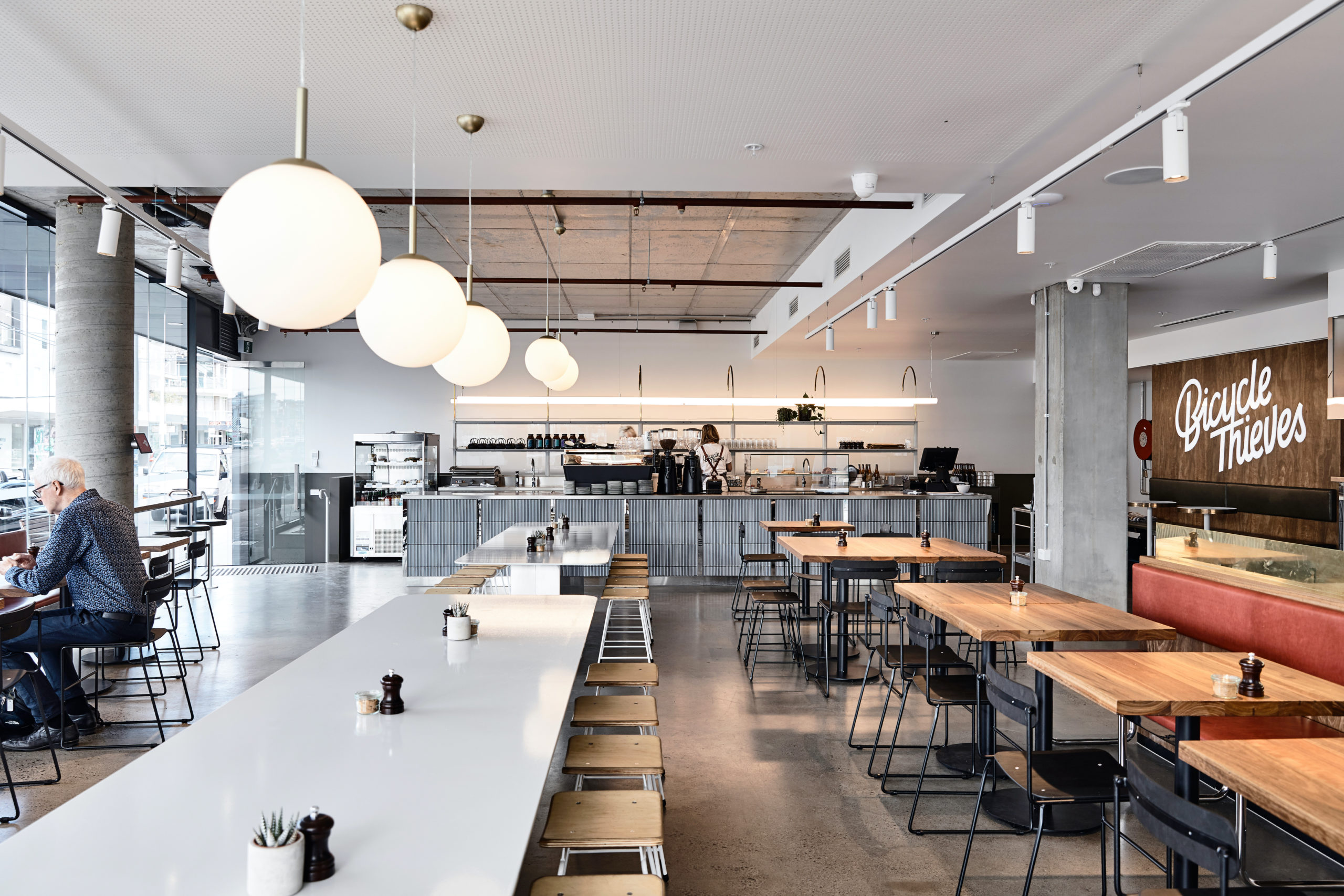
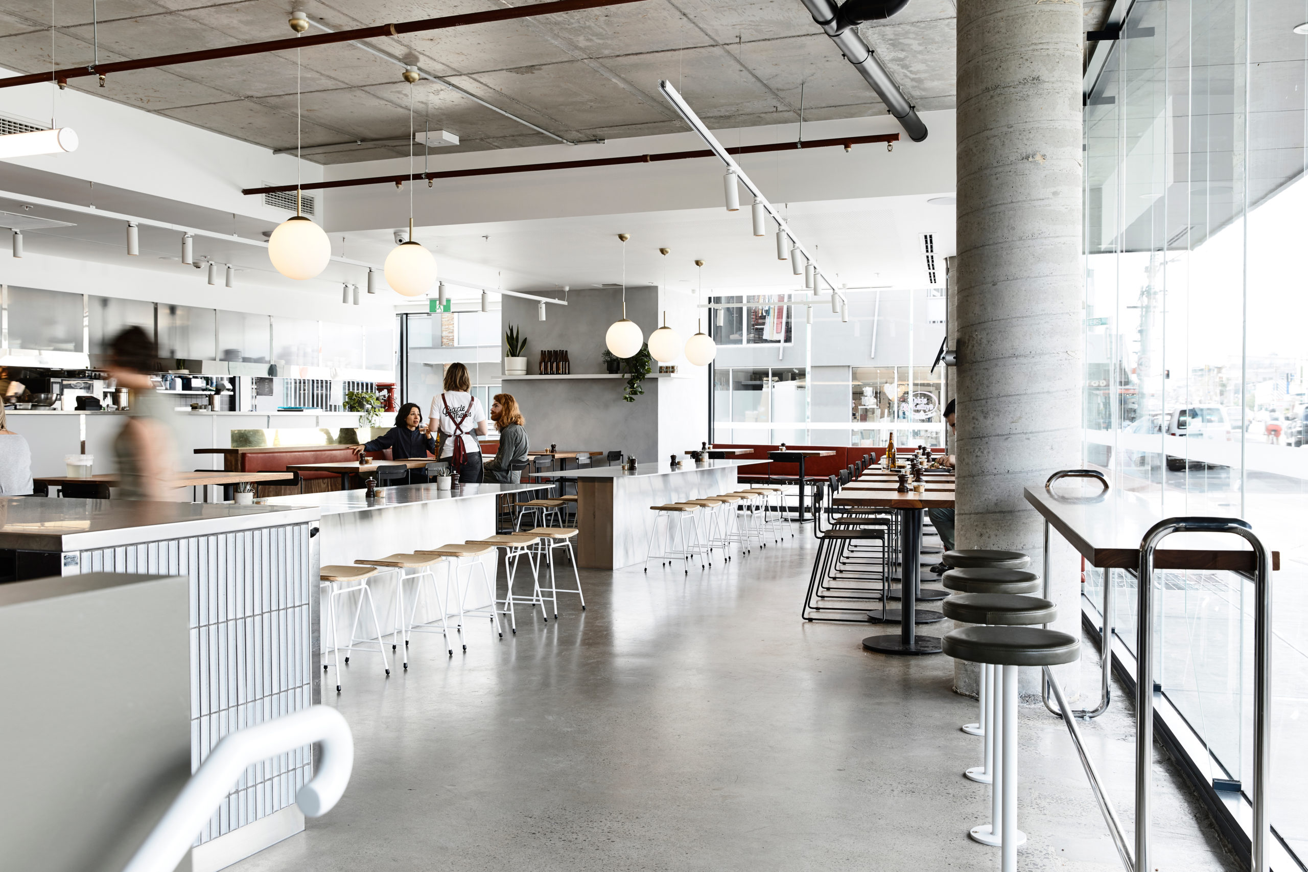
Bicycle Thieves by Pierce Widera, Northcote, Australia
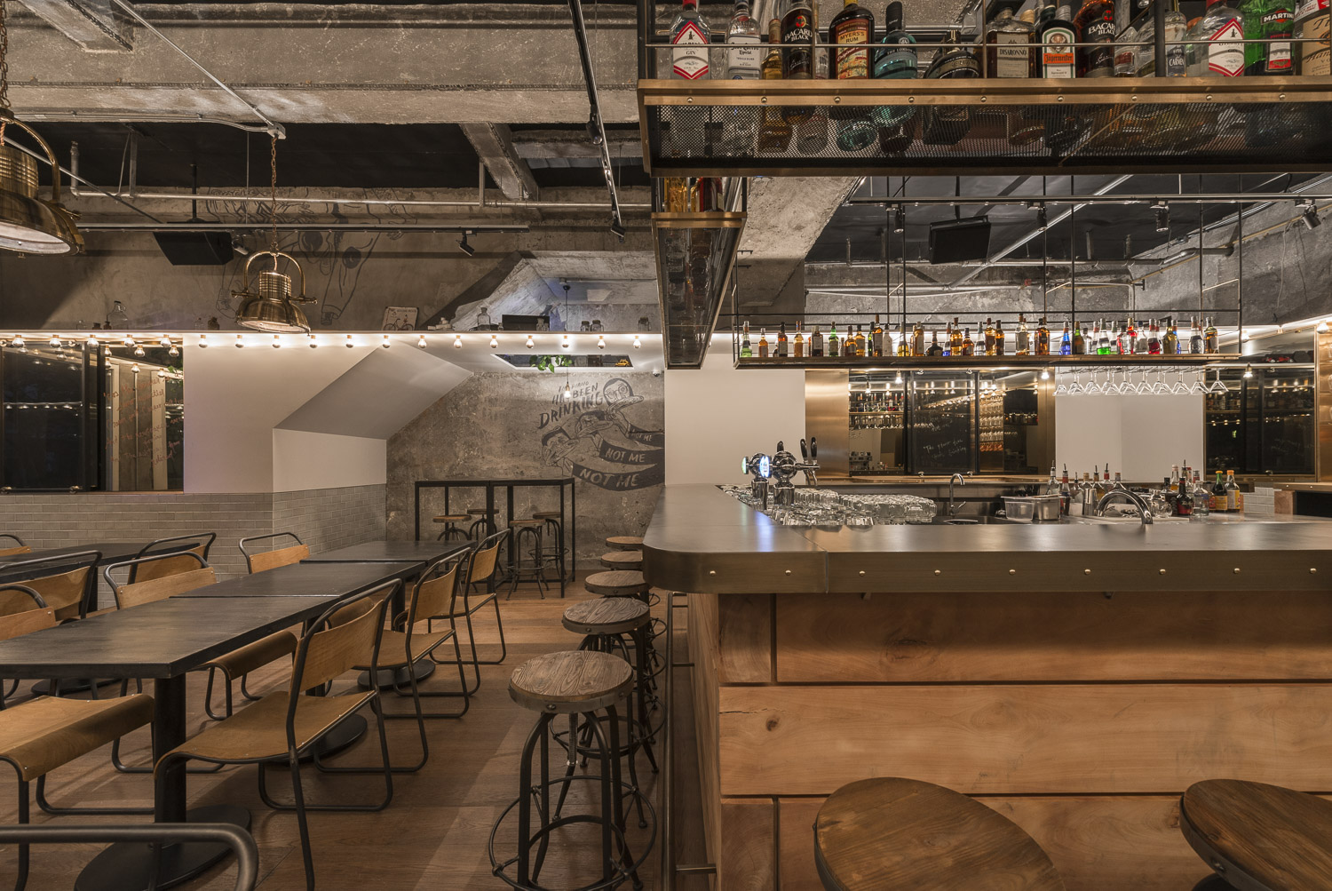
Named after the best-known film of Italian neorealism, this eatery is a lighter and fresher take on the traditional industrial style.  It references the late 1940s (when the film was released) with the use of mid-century modern materials and details. Suspended lighting acts as dividers, breaking up the open plan into smaller seating areas. Linear pendant lights are used above the bar, Globe lights over the communal tables and track lights around the periphery where the smaller tables are placed. Exposed concrete and cement finishes cove the walls, columns, floors as well as the ceiling.

Images by Dirk Weiblen

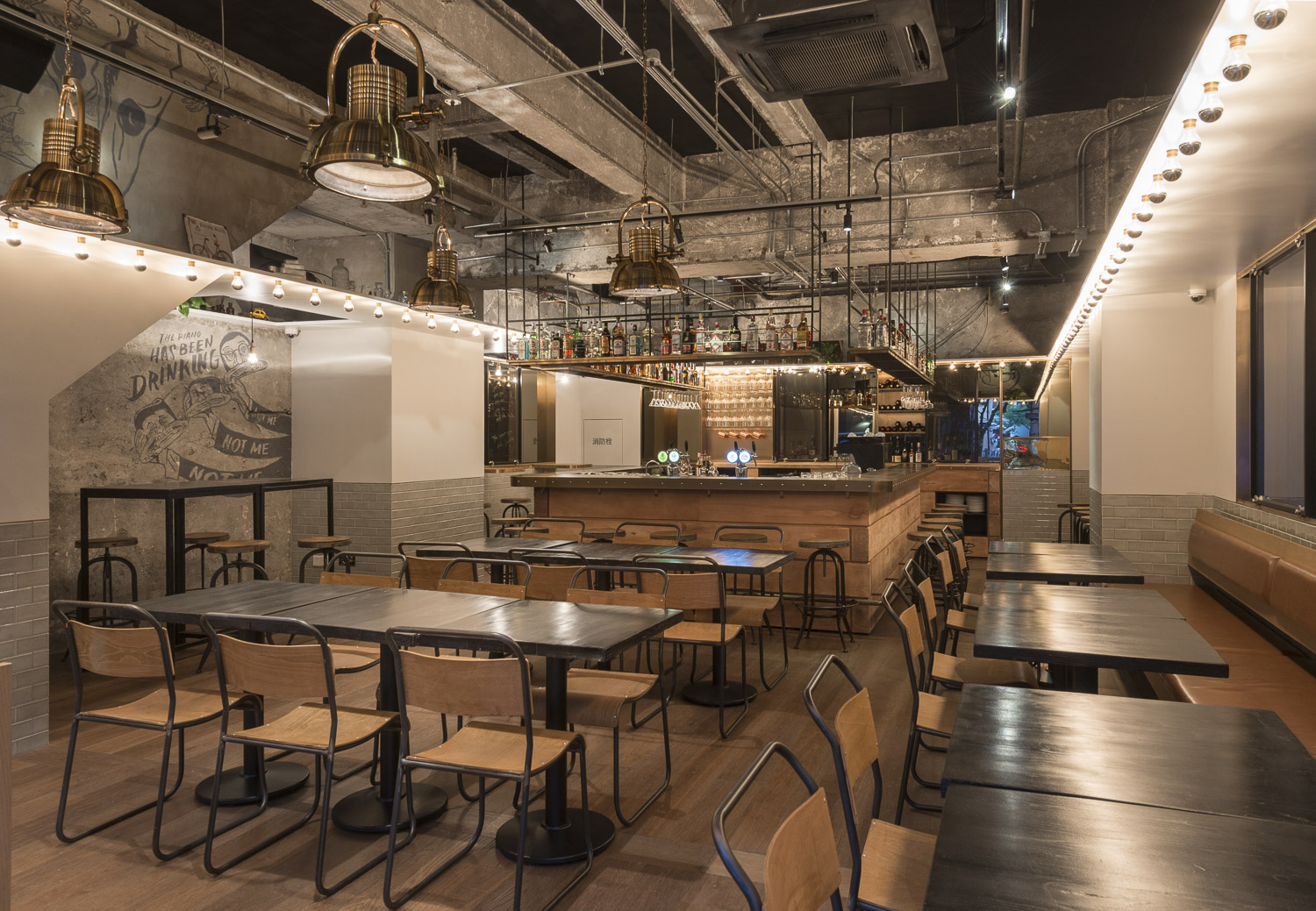
Tribeca by Linehouse, Shanghai, China

The New York-style gastropub evokes images of drinks with friends, city streets and late-night food cravings. The ceiling drops down in different parts to separate spaces. White false ceilings form the periphery whereas a suspended shelf canopy hangs over the bar. Mirror bulbs frame the entire space to infuse old-world glamour.

Restaurant & Bar Nazdrowje by Studio Richard Lindvall, Stockholm, Sweden
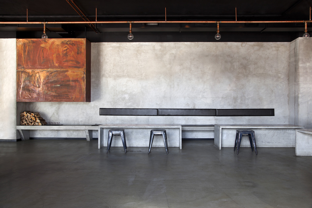
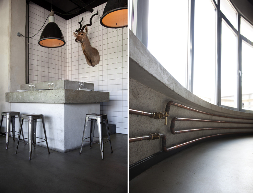
Minimal, raw and timeless: these words encapsulate the essence of Nazdrowje. The restaurant was initially a parking lot and the studio decided to use the natural atmosphere of the space as inspiration for the final design. Concrete is the predominant material in the space. The light grey concrete seats were cast and mounted directly into the walls, tying them with the concrete floors. The space also includes a large copper fireplace and visible copper pipes throughout.

Images by Andres Martellini

Victoria Brown Bar & Restaurant by Hitzig Militello arquitectos, Buenos Aires, Argentina

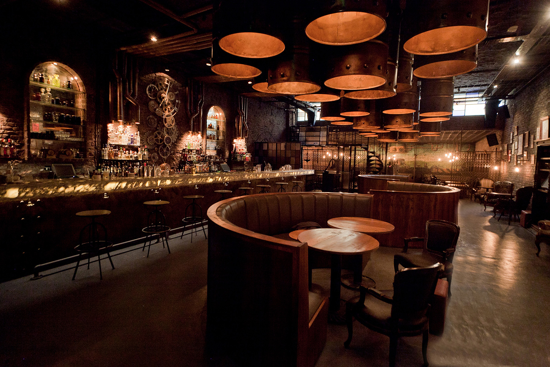
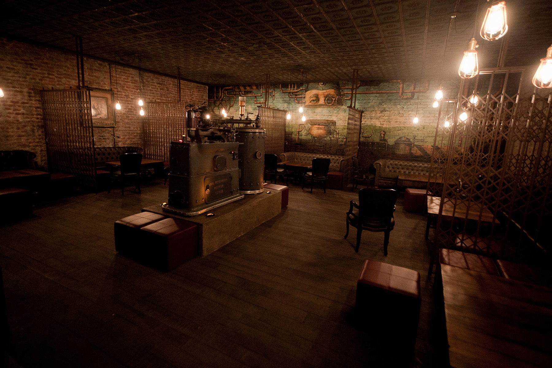
The bar has the mysteriousness of a speakeasy and the flash and flair of a private social club from the 19th century. Staying true to the theme, it also features a secret entrance through a coffee shop in the front. The space evokes nostalgia with a combination of elements like aging barrels, uneven brick walls, rich leather, vintage seating and suspended light bulbs. In one room, scissor screens break up the larger area into intimate pockets for small groups.

Industrial Brewery Pub in Saigon by T3 Architects, Ho Chi Minh City, Vietnam

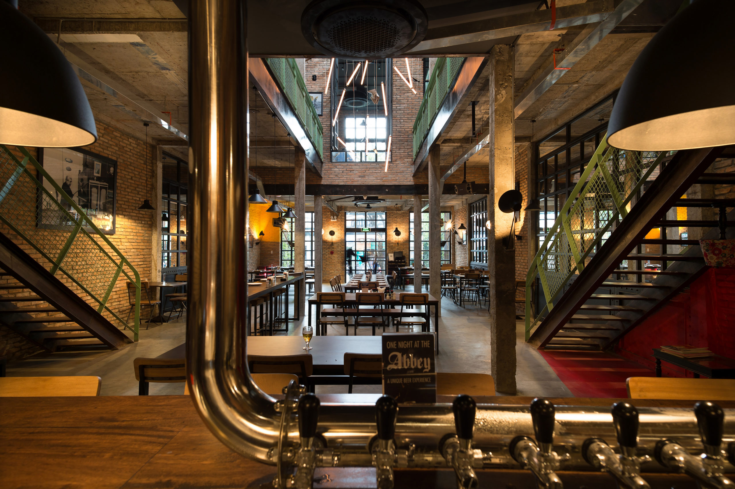
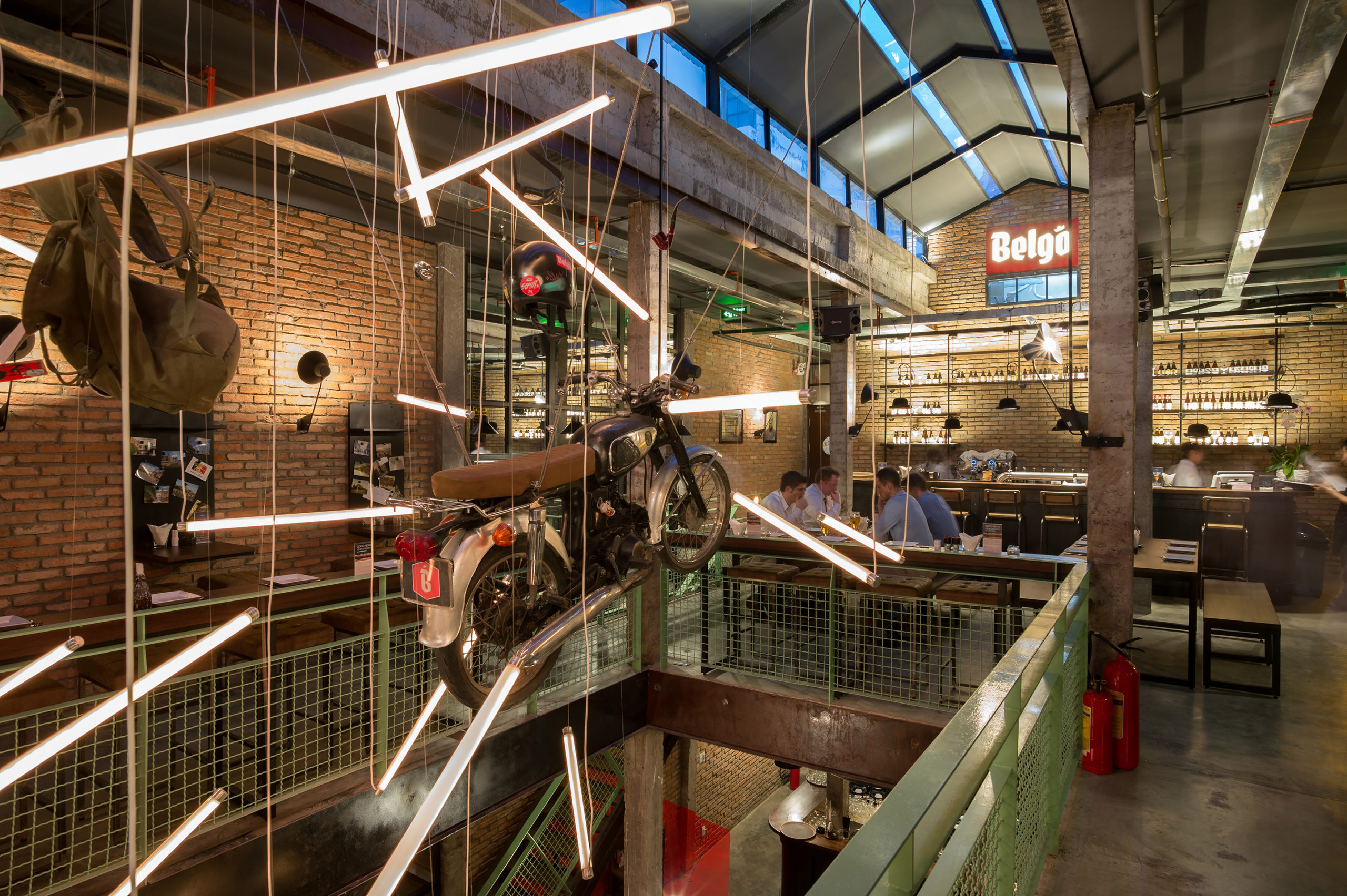
The studio wanted to adopt the industrial aesthetic from 20th century Europe given that the brewery serves Belgian beers and food. Traditional European elements have been given a tropical twist by using local ventilation mechanisms and ceiling fans. The design also uses second-hand bricks sourced locally to reduce the carbon footprint. Pops of green, black and white posters and photographs, hanging backpacks and a suspended motorcycle also bring in the humorous side of the Belgian culture.

Architects: Want to have your project featured? Showcase your work through Architizer and sign up for our inspirational newsletter.    

Reference