6a Architects brings Soho sex shop windows to JW Anderson Milan store
British fashion brand JW Anderson has opened a flagship store in Milan that was designed by British studio 6a Architects and draws on the local atmosphere as well as Soho sex shops.
The 53 square-metre-store is located on the Via Sant’Andrea luxury shopping street in Milan’s Quadrilatero shopping district. It is set across a single floor and comprises two rooms.
While the boutique primarily draws reference from its “bourgeoise” Milanese surroundings, the retail space also pulls from designer Jonathan Anderson’s first JW Anderson store in Soho and from the 2017 exhibition Disobedient Bodies, which was curated by him.
It was designed by 6a Architects, who Anderson began working with in 2017 after selecting the studio to design the set for Disobedient Bodies at The Hepworth Wakefield.
“I thought [6a Architects] really grasped how to take my visual language and turn it into something which was able to be educational,” Anderson told Dezeen.
“They’re very good at hybrid, old or new. They’re very good at this combination, they’re great architects.”
“The store actually is a combination of Disobedient Bodies and a store. It’s a little bit more elevated,” he said. “The front of the building feels Soho, and as you go in, it feels more kind of domestic Milanese.”
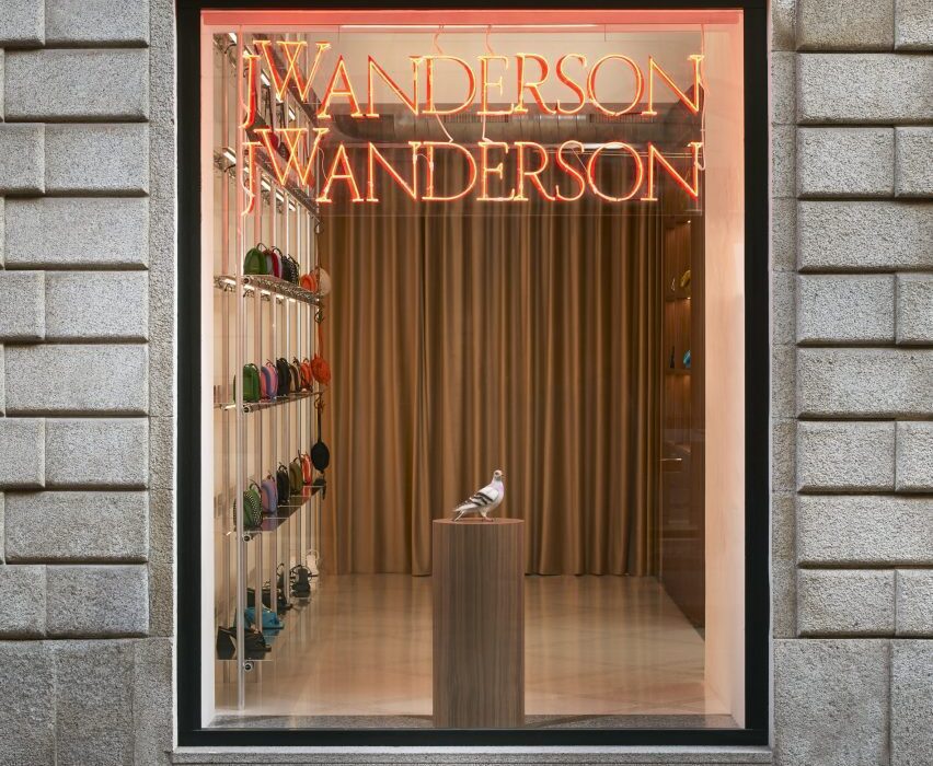
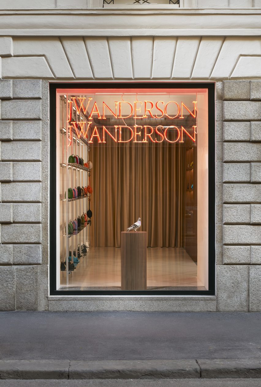
In a nod to the store frontages of the sex shops found in London’s Soho area, the windows of the Milanese store were decorated with neon lighting and rainbow-slatted curtains.
Anderson and 6a Architects used the design as a juxtaposition against the more typical Milanese interior.
“For me, there is something very sexual about neon lighting,” said Anderson. “I think we associate it with grand gestures and I felt like a window is kind of like a television set. There’s something with neon that it does, it kind of tricks you.”
“There are little alleyways and they have all these amazing sex stores on and these curtains,” Anderson continued.
“I liked the idea that we have this in Milan and then suddenly you enter into a kind of Milanese setting, something which is very bourgeoise.”
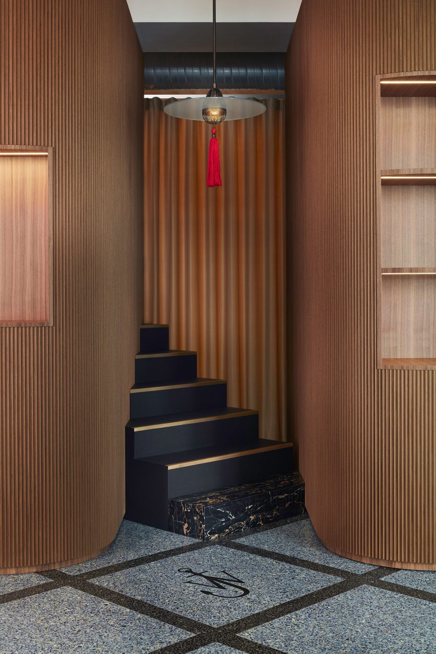
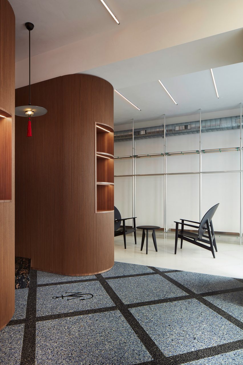
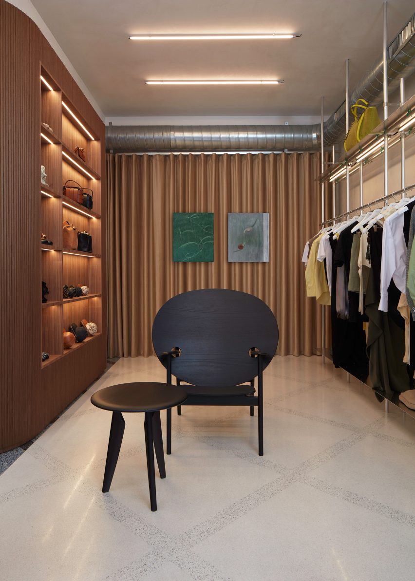
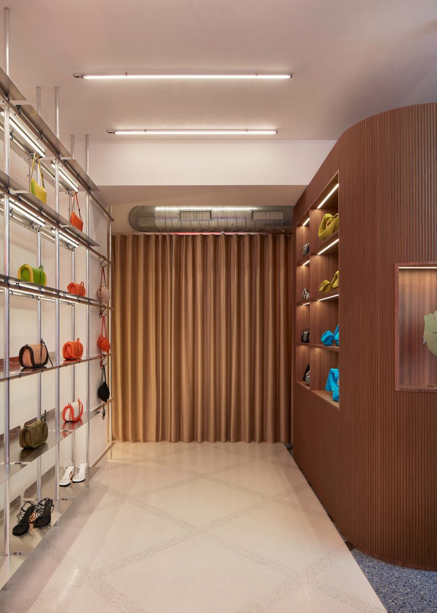
Inside, gridded handmade terrazzo covers the floor and visually divides areas of the interior through bespoke contrasting tones of grey and sand.
Brassy, metallic curtains ripple along the rear walls of the store, in a similar way to 6a Architects’ use of curtains in the exhibition design for Disobedient Bodies.
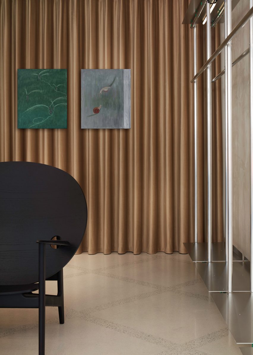
Aluminium scaffolding, which was also carried over from Anderson’s Soho store, was translated into display shelving and brought an “angst” to the interior that contrasts against traditional Italian furnishings, such as fluted walnut panelling that envelops two curved walls.
“There is something slightly more underground in terms of the construction of a JW Anderson store, whereas, I think Loewe [for which Anderson is creative director] is about a heightened perfection,” said Anderson. “With JW Anderson, there’s always a bit of slight angst to it.”
“It’s softer inside, and then you have this harshness with the windows where there’s neons and sex curtains and it’s kind of like a theatre. It has moveable parts and in a weird way the store becomes a giant window.”
Furniture and artworks personally selected by Anderson fill the interior.
Designer Mac Collins’ black Iklwa chair was paired with matching side tables, while a Cardinal Hat pendant light by Lutyens Furniture is suspended from the ceiling of the main space.
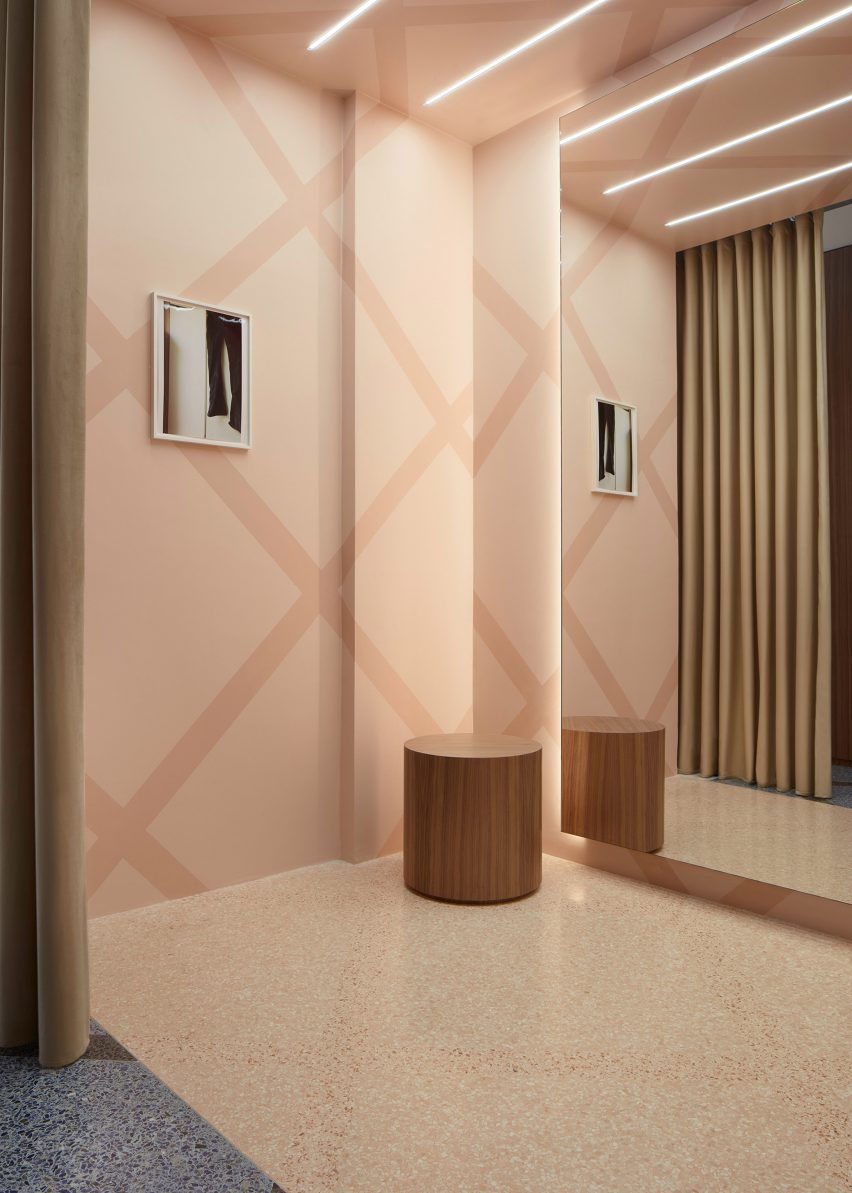
Oil paintings by Chinese artist Hongyan appear to float on the ripples of the brass-coloured curtains, and images by photographer Wolfgang Tillmans sit on the walls of the store’s fitting room.
“I don’t believe that stores should be completely cookie-cutter,” said Anderson. “I feel like the key is to make sure that each store has a different universe because there’s no point in having something which is just a duplication, duplication, duplication.”
Jonathan Anderson founded his eponymous label JW Anderson in 2008 and was appointed creative director of Spanish luxury house Loewe in 2014, which recently announced the winner of its sixth annual craft prize.
During London Fashion Week, JW Anderson presented a “parallel world of people trapped in their computers” for its Spring Summer 2023 collection.
The photography is by DePasquale+Maffini, courtesy of JW Anderson.

