Finnish Design Shop creates forest-set logistics centre
CategoriesSustainable News

Finnish Design Shop creates forest-set logistics centre

Avanto Architects and Joanna Laajisto have designed a logistics centre for retailer Finnish Design Shop that features warm timber, a foraged-food restaurant for staff and visitors, and views of the surrounding forest.

Located on the outskirts of Turku, west of Helsinki, the logistics centre is the hub for storage, management and dispatch of products from the Finnish Design Shop, which says it is the world’s largest online store for Nordic design.

The company needed a new logistics centre after a period of high growth, but founder and CEO Teemu Kiiski also aimed for it to be a meaningful place for employees and visitors.

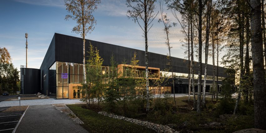
Photo of the exterior of the Finnish Design Shop logistics centre in Turku by Avanto Architects
The Finnish Design Shop logistics centre is located in the Pomponrahka nature reserve in Turku. Photo is by Kuvio

Employees of the logistics centre can enjoy plenty of light and forest views as well as warm timber environments and a restaurant run by Sami Tallberg, an award-winning chef who specialises in foraging.

The Finnish Design Shop had first explored whether it could convert an existing building in the Turku area, but, finding nothing suitable, chose to build on a site in the Pomponrahka nature reserve, where the surrounding forest would provide a calming work environment and reflect the appreciation for wood in Nordic design.

To undertake construction there responsibly, the Finnish Design Shop says the builders saved as many trees as possible and landscaped the area with natural forest undergrowth and stones excavated from the site.
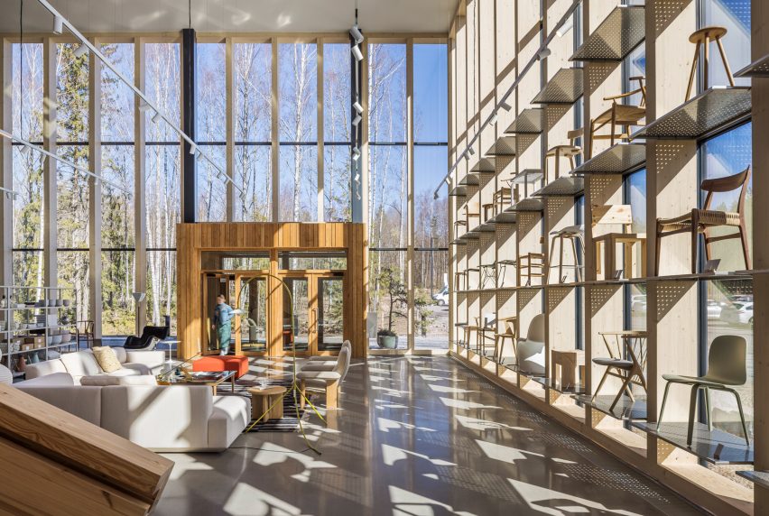
Photo of the entrance interior to the Finnish Design Shop hub with light pouring through glass curtain walls and chairs displayed in shelves that reach high up the glazing
The entrance features glass curtain walls that connect the interior and exterior. Photo by Kuvio

Avanto Architects designed the 12,000-square-metre building to blend into the forest as much as possible — a challenge given its massing, a product of the warehouse layout.

The layout was created beforehand by specialist consultants to maximise the efficiency of operations, which are carried out by robots in an automated system.
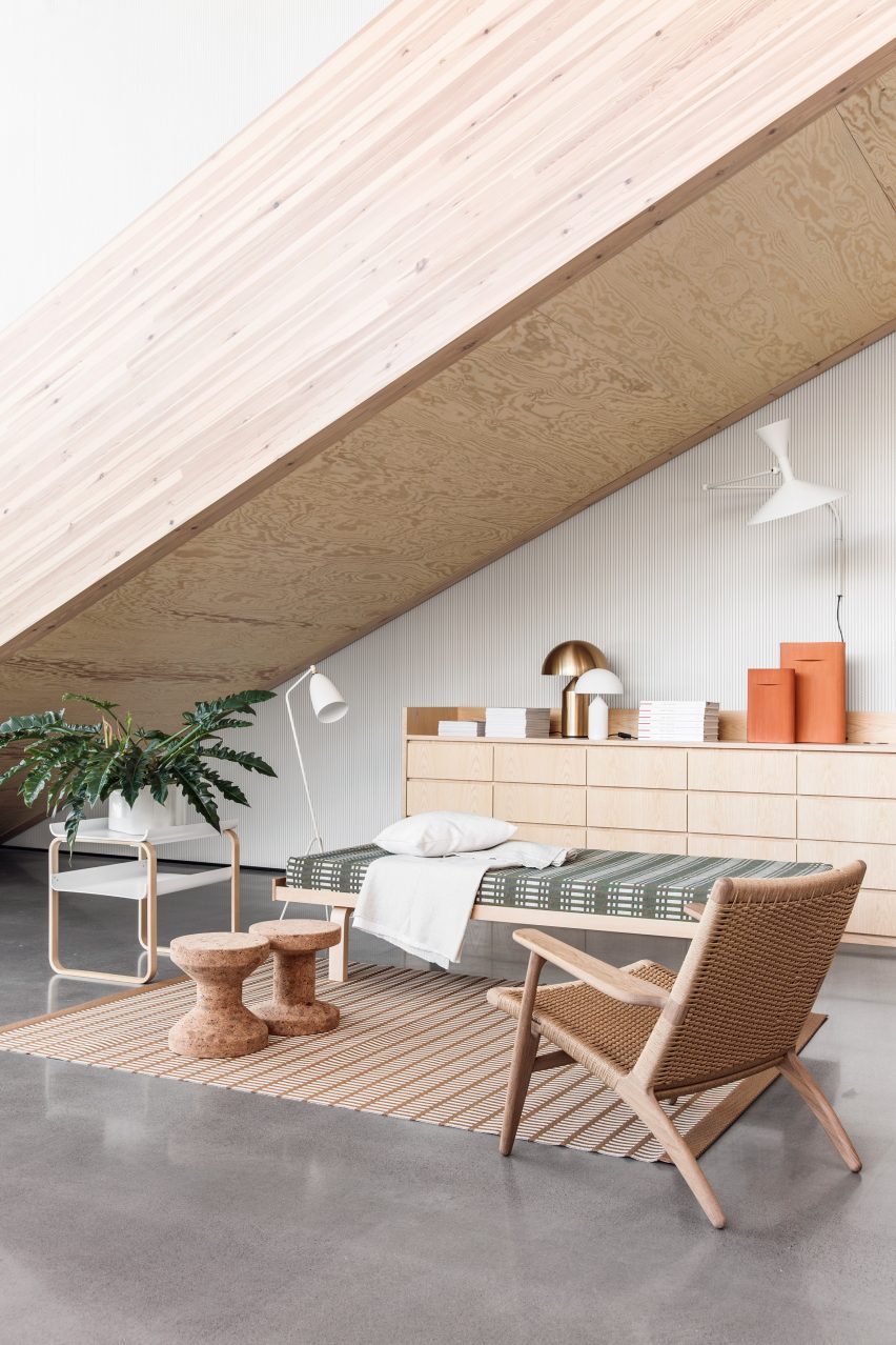
Photo of a showroom featuring furniture by Nordic designers in pale woods and natural colours
The centre includes a showroom. Photo by Mikko Ryhänen

The architects opted for a dark facade with a vertical relief pattern that becomes visible on approach and echoes the tree trunks in the surrounding woodlands.

“The pattern forms a more human scale to the large facade surfaces,” Avanto Architects co-founder Anu Puustinen told Dezeen. “We also used warm wooden accents in the main entrance vestibule, balcony and windows.”
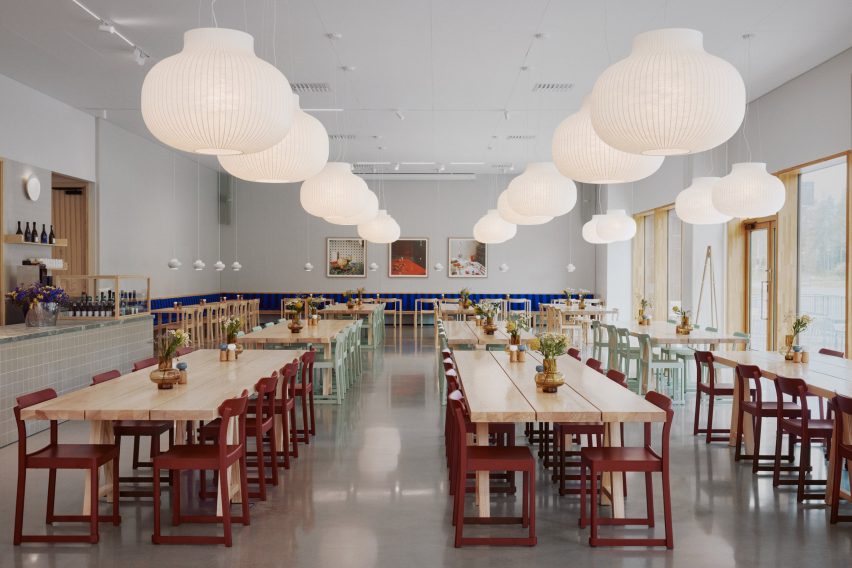
Photo of the wild food restaurant at the Finnish Design Shop hub in Turku
There is also a restaurant that specialises in foraged food. Photo by Mikko Ryhänen

The architects gave the office spaces large windows so the employees could enjoy frequent views of the forest and lots of light, and included a balcony for access to the outdoors on the first floor.

The entrance to the centre is through the showroom, which features glass curtain walls that showcase the use of the building and a long, straight staircase made from two massive glulam beams.
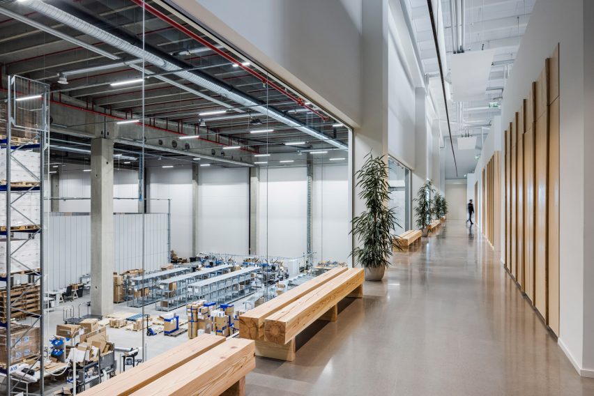
Photo showing views of a warehouse floor through large windows in an office corridor
The first-floor offices have a view of the warehouse floor. Photo by Kuvio

The interior was designed by Laajisto and her studio, who aimed to make the space feel well-proportioned and comfortable despite its size and to create a good acoustic environment by liberally applying sound-absorbing materials.

She kept the colour and material palette neutral and natural, with lots of solid pine and ash wood to continue the forest connection, but used furniture from the Finnish Design Shop in bright colours to punctuate the space.

“The aim was that every aspect in the interior should be done well and beautifully,” Laajisto told Dezeen. “Attention to detail was embraced in things that typically are overlooked, such as doors, plumbing fixtures and electrical hardware selections and applications, acoustic ceiling panels and ceramic tiles.”

The project is the first logistics building in Finland to be certified BREEAM Excellent, the second highest level.
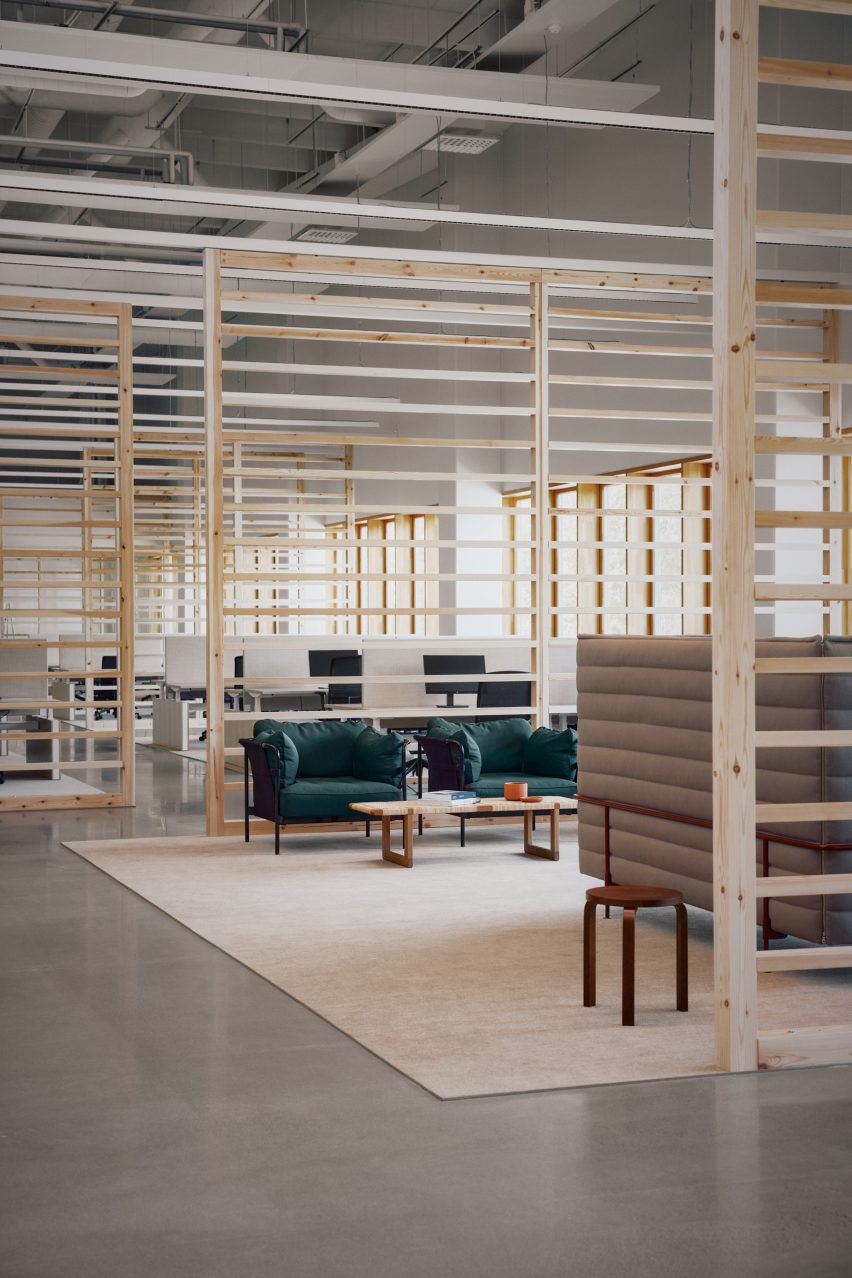
Photo of an open office area with slatted pale wood room dividers and soft furnishings in neutral colours and turquoise
Special attention has been paid to creating a good acoustic environment with sound-dampening materials. Photo by Mikko Ryhänen

Kiiski, who positions the company as the opposite of multinational e-commerce players such as Amazon, aimed for the new centre to be the most socially and environmentally sustainable online store.

“The values that life in the Nordic countries is based on include transparency, equality and respect for nature,” said Kiiski. “It would have been impossible to create this company and our new logistics centre without unwavering respect for these values.”
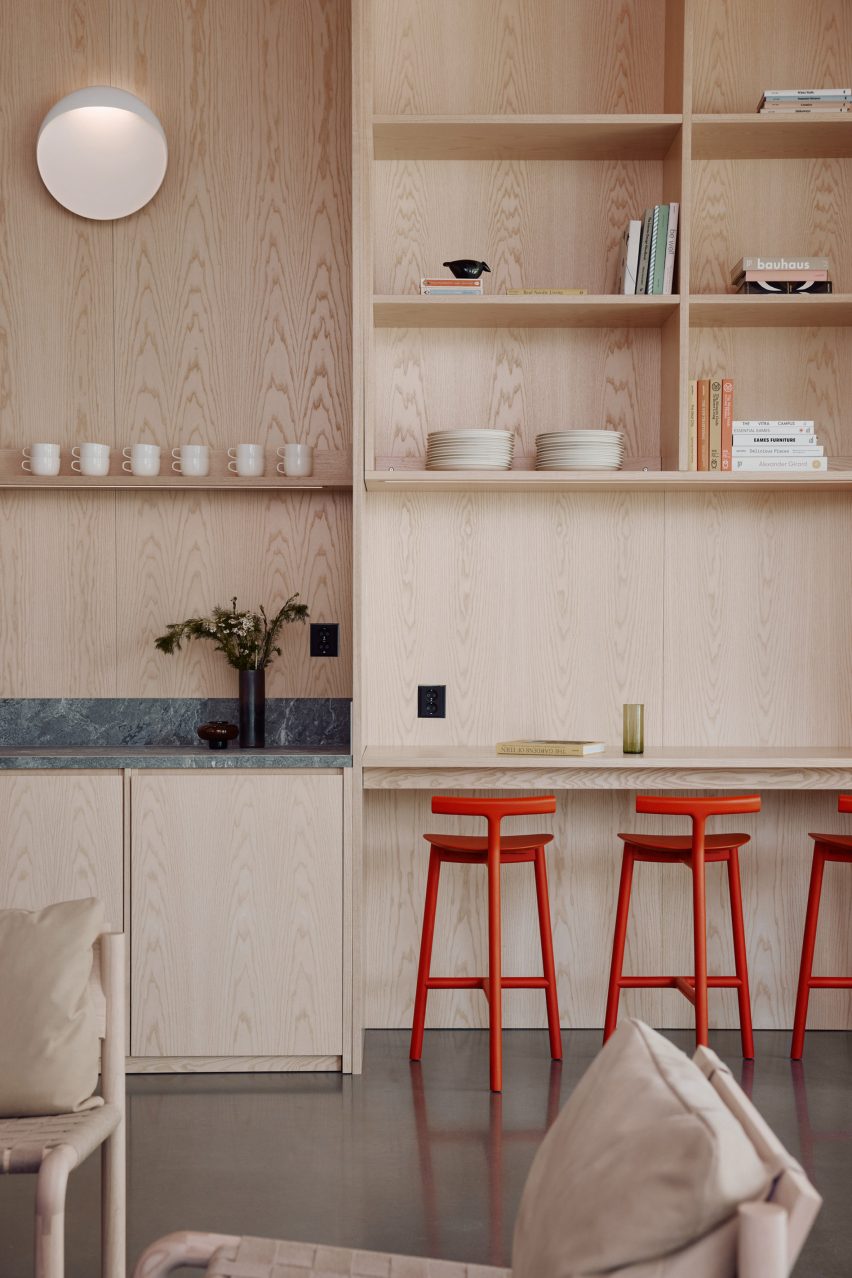
Wood-panelled kitchen corner
Wood is featured throughout the interior

He believes that global online shopping can be socially and environmentally sustainable when issues in supply chains, logistics and operations are addressed.

“Many studies show that online shopping can have a lower carbon footprint as compared to in-store shopping,” said Kiiski. “This is due to the more efficient logistics in e-commerce and the fact that in-store shopping usually involves private transport.”

“We want to push the whole industry towards a more sustainable future,” he continued.
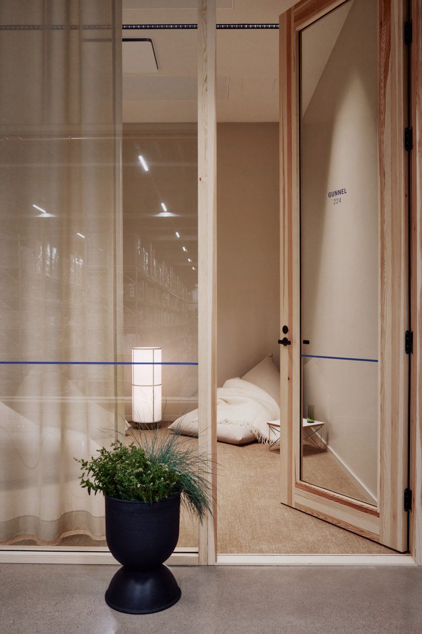
Photo of a timber-framed glass office door with warm light and a beige beanbag with throw rug in one corner
The hub is meant to offer employees a healthy and humane working environment. Photo by Mikko Ryhänen

Past work by Avanto Architects includes the Löyly waterfront sauna in Helsinki, which has a multifaceted exterior that visitors can climb, and the Villa Lumi, a house with a sculptural white staircase.

Laajisto’s previous projects include office interiors for service design company Fjord and the Airisto furniture collection for Made by Choice, which was inspired by Scandinavian holiday culture.

Reference

Keiji Ashizawa creates Blue Bottle Coffee shop in Kobe department store
CategoriesInterior Design

Keiji Ashizawa creates Blue Bottle Coffee shop in Kobe department store

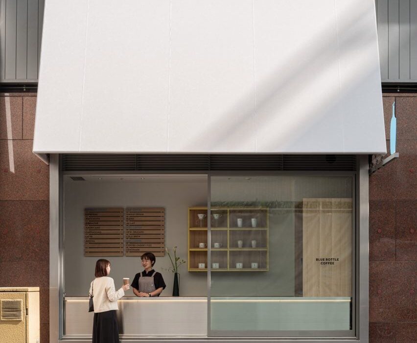
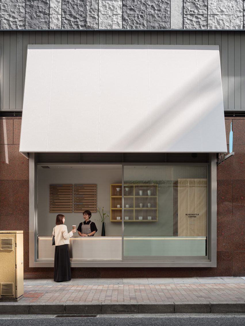
Japanese studio Keiji Ashizawa Design has created the interior of the Blue Bottle Coffee shop in Kobe’s Hankyu department store, taking advantage of its display windows to connect the cafe with the street outside.

The 173-square-metre cafe, which shares the department store’s ground floor with a number of apparel brands, has five large display windows.

To open the coffee shop up towards the street, designer Keiji Ashizawa turned one of the windows into a take-out counter.

Window counter of Blue Bottle Coffee shop in Kobe
One display window was turned into a take-out counter

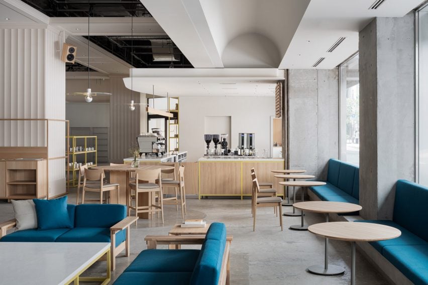
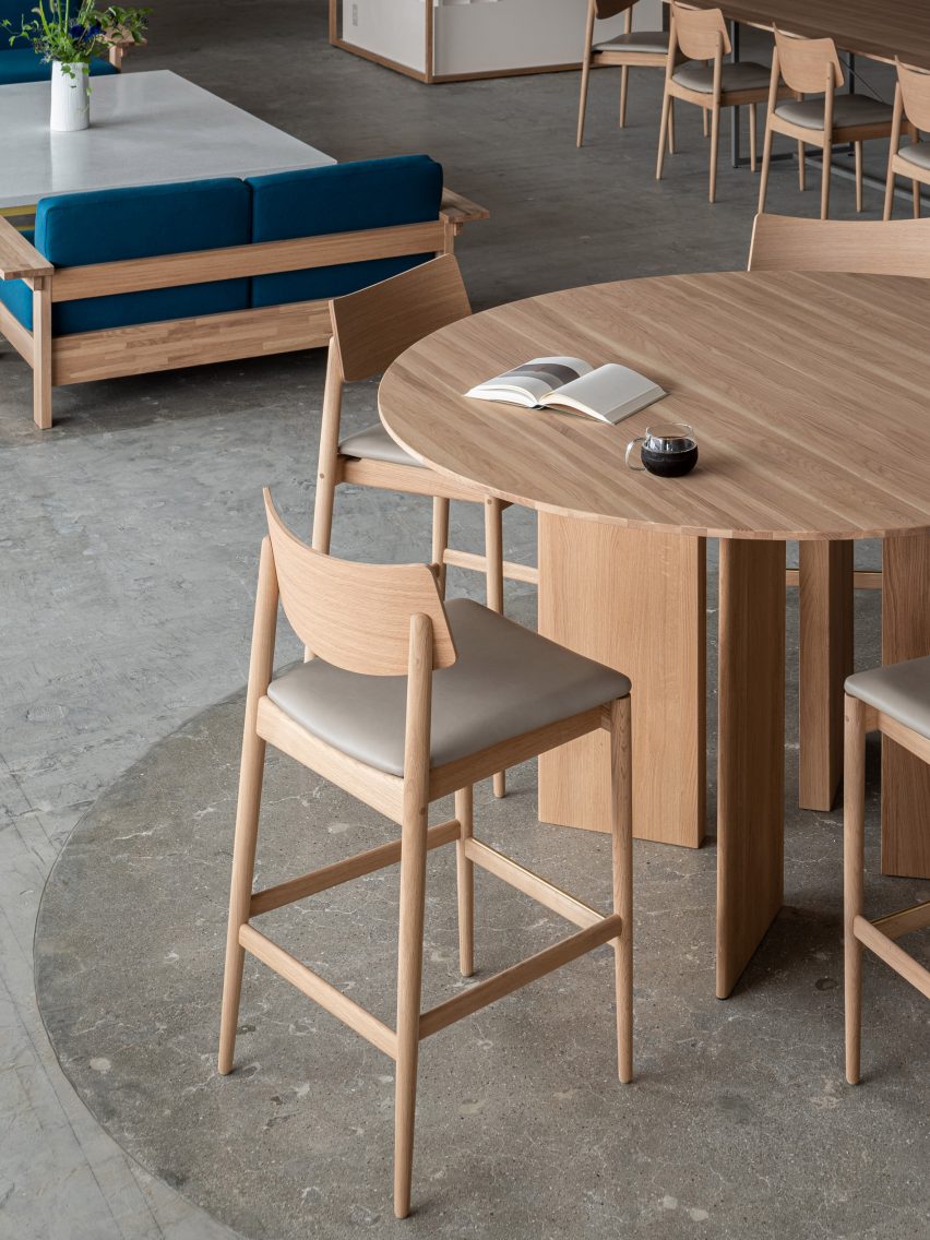
The remaining window niches were filled with blue built-in seating, creating a splash of colour among the wooden furniture.

Inside the cafe, square-shaped and rectangular furniture nods to the graphic look of the facade and is contrasted by round tables and large circular ceiling lights.

“The furniture is mainly made of domestic wood in collaboration with the Japanese furniture manufacturer Karimoku, who specializes in working with oak wood,” Ashizawa told Dezeen.

Interior of Hankyu Blue Bottle Coffee shop
Wooden furniture and terrazzo tabletops were used for the interior

The studio also mixed in terrazzo amongst the wooden furniture to give the cafe a welcoming feel.

“By placing a large terrazzo tabletop with fine textures created by mixing grounded glass into the material, it adds to the soft and welcoming atmosphere that identifies Blue Bottle Coffee and their hospitality,” Ashizawa said.

“It is also used for the low coffee table surrounded by the sofas, creating a sense of harmony and elegance throughout the space of the cafe,” he added.

While the studio was unable to change the material of the existing rough concrete floor, the department store allowed it to create a discrete demarcation by polishing the floor underneath the central tables.

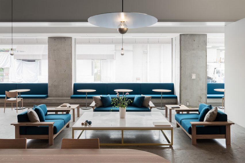
Terrazzo table inside Blue Bottle Coffee shop
Circular pendant lights were made from raw aluminium

Large disc-shaped pendant lights add a sense of drama to the coffee shop’s pared-back design.

“With the idea of creating a high ceiling within the space, the pendant lights were made from raw aluminum to complement the industrial structures,” Ashizawa said.

“Six pendant lights are placed in the central space at equal distances in three zones, creating a sense of rhythm and spatial balance.”

Polished concrete floor in Blue Bottle Coffee shop
The concrete floor was polished in part of the cafe

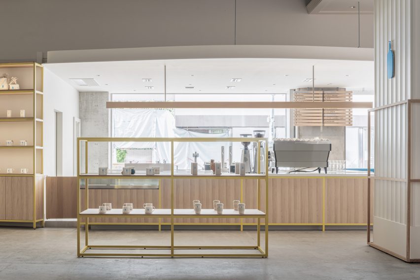
The wooden furniture inside the Blue Bottle Coffe Hankyu cafe has mainly been kept in its natural colour, but Ashizawa added bright colour to some of the wood.

“In the space with concrete structures, the yellow color was added to balance the combination of wood and concrete, and the blue color was placed as a contrast,” he said.

“We also designed the space to fit in with the apparel brands that share the ground floor.”

Colourful shelving in Kobe cafe
Shelves were painted a bright yellow

Ashizawa has previously created a number of cafes for the Blue Bottle Coffee company, including a Shanghai store decorated with traditional Chinese roof tiles and a Tokyo outpost with a volcanic-ash counter.

The photography is by Tomooki Kengaku.


Project credits:

Architect: Keiji Ashizawa Design
Project architect: Keiji Ashizawa, Tomohiko Fujishita, Masaru Kiotya
Construction: Tank
Design supervision: Miyachi Office/Kunihiko Miyachi
Lighting design: Aurora/Yoshiki Ichikawa
Furniture: Karimoku Case Study/Ichinomaki Laboratory by Karimoku
Metal works: Super Robot

Reference

yuji tanabe completes capsule toy shop in japan with mirror optical illusion
CategoriesArchitecture

yuji tanabe completes capsule toy shop in japan with mirror optical illusion

‘ONARI capsule’ toy shop BY Yuji tanabe ARCHITECTS


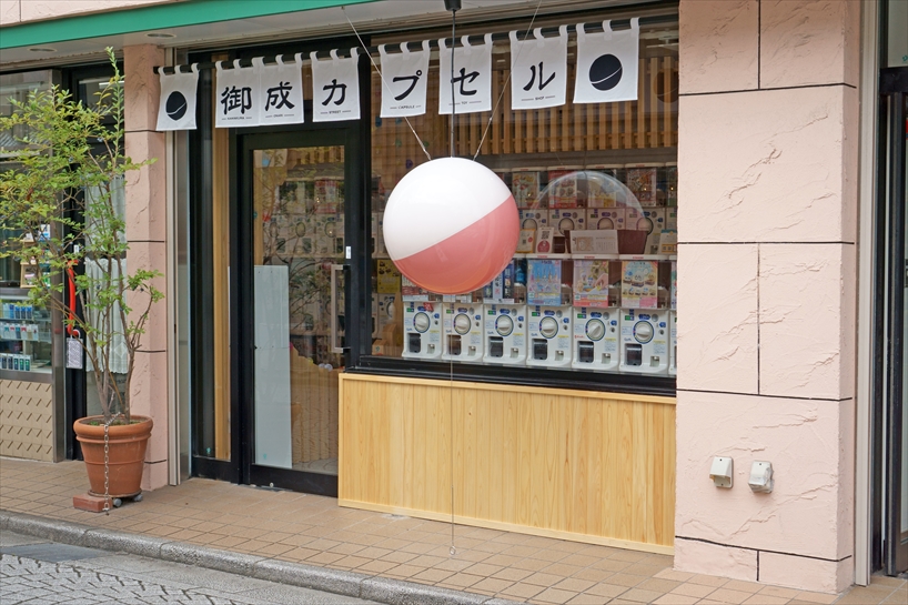
Located on the Onari shopping street in Kamakura, Japan, the ‘Onari Capsule’ by Yuji Tanabe Architects was once an optics shop but has now transformed into a fun capsule toy store. With 65 capsule toy machines and two mirrors facing each other inside the compact space, the Japanese architect aimed to make the interior look as wide as possible from the outside. It was important to create a visual presence that stands out in the shopping district while maintaining a Japanese traditional feel in the city of Kamakura using lanterns, oren curtains, cypress lattices, En-Mado, and faintly reflective silver-leaf paper on the ceiling. The architects also introduce the idea of collecting used capsules by creatively designing an interactive lattice wall to place used capsules between the intervals. 


onari capsule capsule toy shop in japan 1
street view of the Onari toy store

all images courtesy of  Yuji Tanabe Architects


glass windows and a low wainscot reveal the capsules


Yuji Tanabe Architects creatively aimed to renovate and revive the previously known optics store. The Onari shopping street, leading to the West exit of the city’s station, is more frequented by locals, which is where the toy shop is located. Nevertheless in recent years Onari has also been used as a sightseeing route to the sea and the Great Buddha of Hase, thus adding historical value to the shopping district and preserving culture and tradition within the Onari Capsule shop. Originally this compact store had about six tatami mats with a width of 3.4m (11.2 ft)  and a depth of 2.8m (9.2 ft). On the exterior facing the street, there was a frame door and a glass window that leaves a low wall wainscot–an area of wooden paneling on the lower part of the walls of a room– that effectively exposed the interior of the store to the passers-by on the street.onari capsule capsule toy shop in japan 7


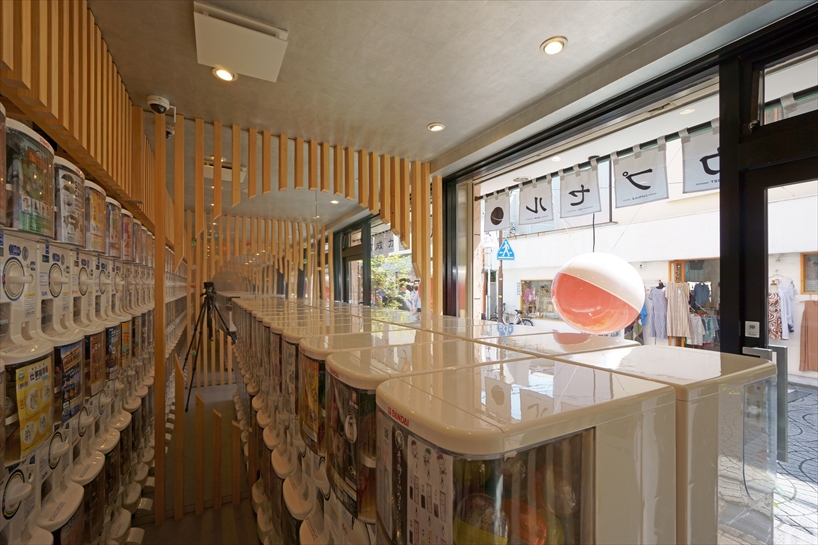
65 capsule machines are mirrored to illude an infinite space 


From the shop’s entrance, 65 capsule toy machines look multiplied infinitely by a 3.4m (11.2 ft)  high mirror on the right side. In addition, the 45mm square Japanese cypress lattices on the mirrored surface are arranged at intervals of 4 types (45mm, 55mm, 65mm, 75mm). The interval spaces account for the standard capsule sizes since the lattices function as a system that collects empty capsules. The capsule is inserted between two lattices after taking out the contents inside– a fun way to recycle the capsules. 


The cypress lattice was cut out with En-Mado (circles) of different sizes on both sides. By making the En-Mado on the entrance side smaller than the one on the opposite side, the reflection on the mirror makes it appear smaller. In other words, the perspective is emphasized, and therefore  it feels farther than the actual distance. Kamakura was a capital city in 800 years ago and it has a long history, which is why the Onari Capsule is a place that holds historical value and proposes a new way of sustaining the culture around capsule toy shops while providing a fun approach to recycling the capsules. 


onari capsule capsule toy shop in japan 6
mirror wall on one side of the store creating the illusion of infinite capsules

Reference

Singapore Plaza Shops for Sale
CategoriesShops for Sale Singapore Plaza Zarkon Group

Singapore Plaza Shops for Sale

Singapore Plaza Mobile Shops for Sale on the 5th Floor. Own Your Commercial Shops Today!
• Shop Size: 10 x 10 SQFT (Rs. 55 Lakh)
• Shop Size: 10 x 20 SQFT (Rs. 65 Lakh)
• Direct Owner: Yes
• Lift: Available
• Stock: Limited Available
• Price: Negotiable for Serious Buyers
• Location: Near Saddar Metro Station, Bank Rd, Saddar, Rawalpindi

⚠️For Details & Visit
?Muhammad Faheem
?Call/WhatsApp: +92 30 8846 9934