Gary Card redesigns LN-CC store with orange tunnel and LED-lit club
CategoriesInterior Design

Gary Card redesigns LN-CC store with orange tunnel and LED-lit club

Designer Gary Card has given London’s LN-CC boutique a redesign that includes a sci-fi-looking wooden tunnel and a room “shaped like the inside of a foot”.

Card, who designed the original interior of the east London store in 2011, said the challenge for him was using the knowledge he has accumulated since then to create something new.
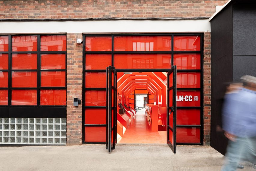
LN-CC store in east LondonLN-CC store in east London
The LN-CC store in east London has a red facade

“The question for myself this time was – can I use everything I’ve learned over the last decade to reimagine one of my most recognized projects,” he told Dezeen.

“Each room has a very different concept,” he added. “It’s become part of the tradition now to change the temperature and colour palette with each room and encourage a journey of identity and discovery.”
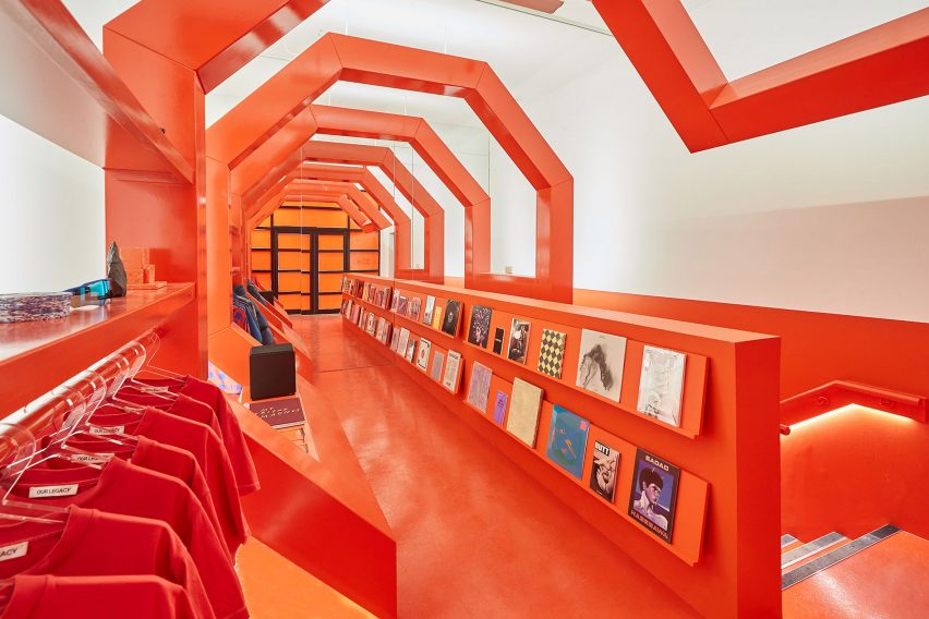
Wooden orange tunnel inside London fashion storeWooden orange tunnel inside London fashion store
An octagonal wooden tunnel welcomes visitors

The store is the only physical shop for LN-CC, which is mainly an online business, and is spread across the ground and lower-ground floor of a former tie factory.

Visitors enter via an orange wooden tunnel with an octagonal shape reminiscent of the architecture in director Stanley Kubrick’s film 2001: A Space Odyssey.
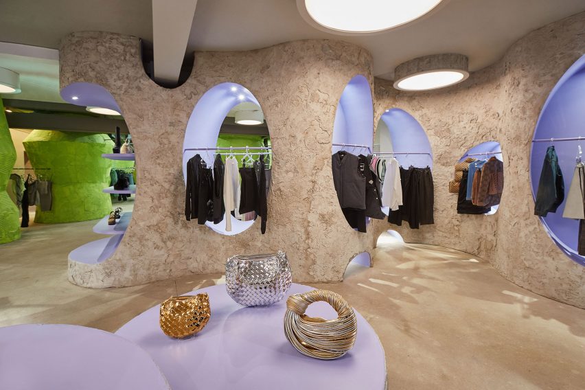
Calisto room inside LN-CCCalisto room inside LN-CC
Each room in the store has different colours and materials

It is the third tunnel that Card has designed for the store, following its original orange tunnel and a later white version.

“The tunnel is LN-CC’s icon,” Card explained. “It’s been with us for over a decade now, so it had to be a significant feature.”

“We decided early on to bring it to street level and make the entrance something that had never been seen before as part of the store space,” he added.

“It’s a brand-new design and construction. We’ve brought back the orange from the first tunnel; the white is a nod to the second version from 2014.”
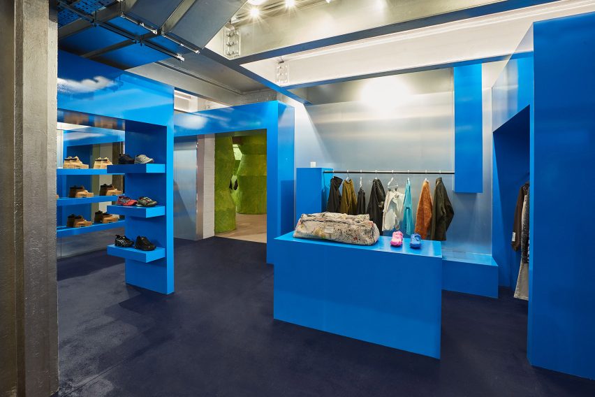
Blue room by Gary Card at LN-CCBlue room by Gary Card at LN-CC
A cobalt-blue room sits on the lower-ground floor

Each of the six rooms in the store has a different feel and different colours, which Card chose together with LN-CC’s buying and creative director Reece Crisp.

“The colours we settled on really amplify what we’re showcasing, the brand’s unique edit,” the designer said.
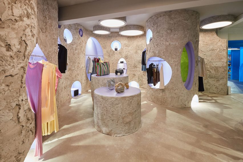
Cave-like Callisto room at LN-CCCave-like Callisto room at LN-CC
The store is LN-CC’s only physical space

Among them is the Callisto room, which has a cave-like feel and a design that was influenced by the building’s existing structures.

“In the Callisto room, there was a circular part of a helter-skelter that used to be in the building – this used to be a tie factory and it was in the corner,” Crisp told Dezeen. “When we stripped the space back, we saw this sort of circle and that fed into how we wanted that space to be.”

In the Atrium, Card used tile adhesive to create the structures and patterns on the room’s wide lime-green pillars, which provide shelving for the store’s accessories.
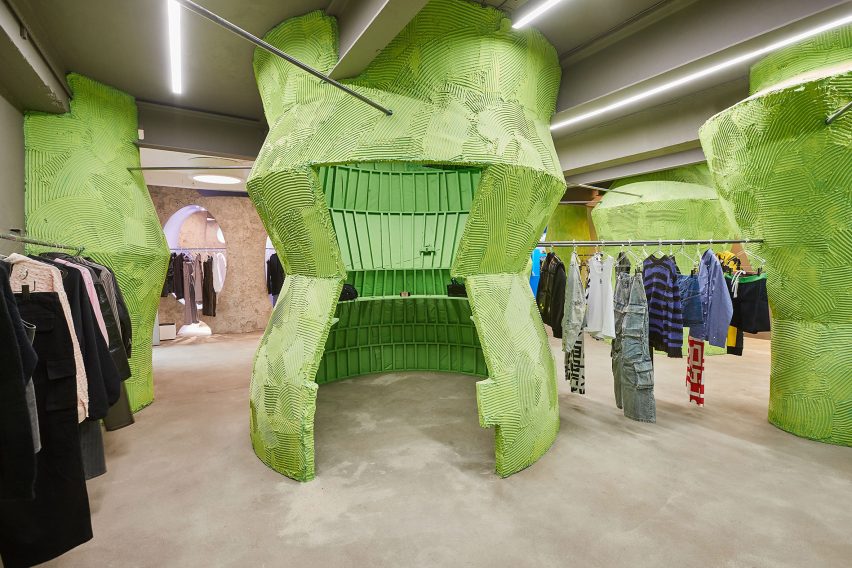
Green pillars inside LN-CC Atrium Green pillars inside LN-CC Atrium
The Atrium room has green pillars decorated with tile adhesive

For LN-CC’s shoe room, known as the Midtarsal, Card drew on the anatomy of the human body to create an undulating, flesh-coloured interior.

“The shoe space, the Midtarsal room, that’s engineering to an incredible degree,” Crisp said. “We love the shape – like the inside of the foot – and how that warps the room.”

Throughout LN-CC, Card used a variety of different materials to bring the rooms to life.

“The space is a juxtaposition of lots of different materials,” he said. “So MDF, perspex, wood and concrete – I sought to take small cues from the original while innovating with a refreshed lens exploring the interplay between texture, colour and materials within the newly imagined rooms.”
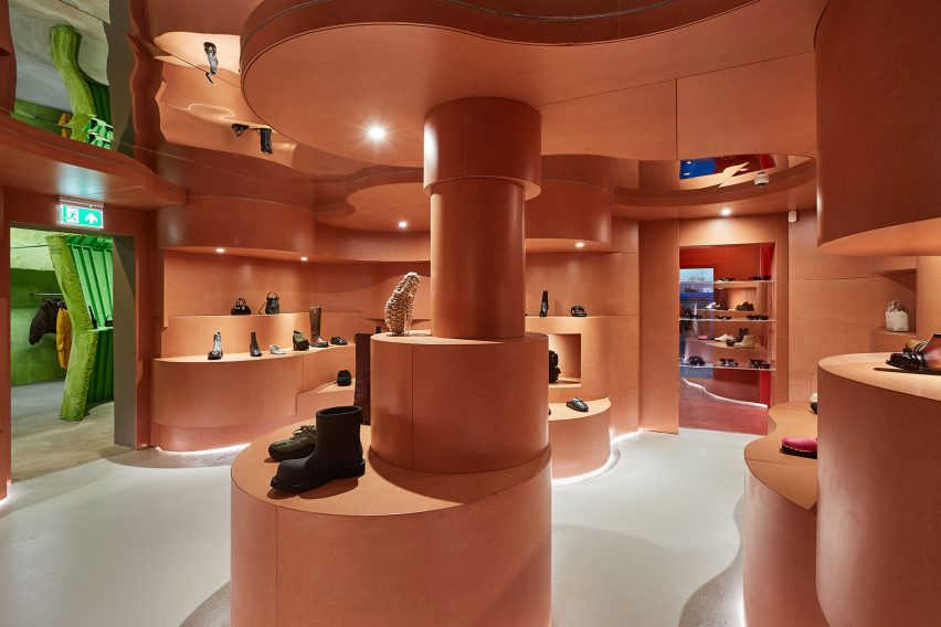
Midtarsal room at London fashion storeMidtarsal room at London fashion store
The Midtarsal room has undulating shapes in a beige colour

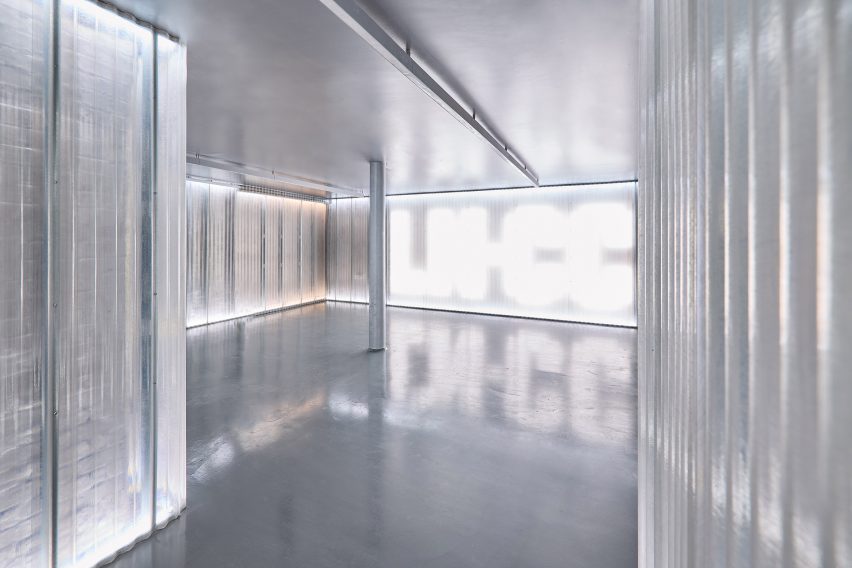
The last room of the store is a club space, which features LED walls that can be used to turn the room into different colours or display messages.

“The club has always been a huge part of LN-CC’s identity, ” Card said. “It was never about selling clothes – the brand was an online business after all – it was about delivering experiences. So we wanted to do something really special with the new club.”
Club space at LN-CCClub space at LN-CC
The LN-CC club space is lit by an LED wall

“It was a bit dark and gritty before, which was cool, but we knew we needed to raise the stakes for the latest store design without it losing its edge,” Card added.

“My right-hand man, Richard Wilkins, was the tech wizard for the space who created the lighting and amazing LED wall. The lighting totally transforms the space.”

Other recent London store interiors include a boutique sprayed with recycled newspaper pulp and a colourful Marylebone store with handpainted murals.

Reference

Al-Jawad Pike creates marble store for APL in NYC
CategoriesInterior Design

Al-Jawad Pike creates marble store for APL in NYC

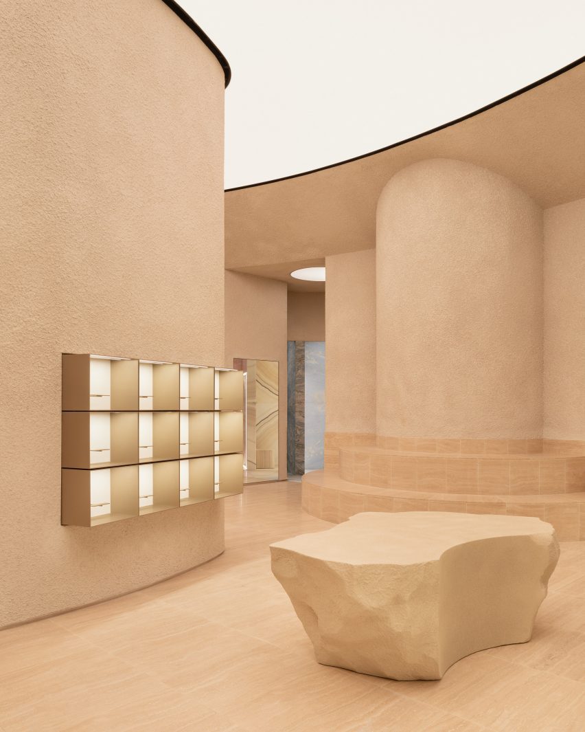
British architecture studio Al-Jawad Pike has used colourful marble for the interiors of trainer brand Athletic Propulsion Labs’ second flagship store in Soho, New York City.

The interior of the 3,900-square-foot space (1,188 square metre) was laid out in a curving amphitheatre design, which the studio designed to be “simple yet severe” while creating a “completely immersive experience,” Al-Jawad Pike studio co-founder Jessam Al-Jawad told Dezeen.

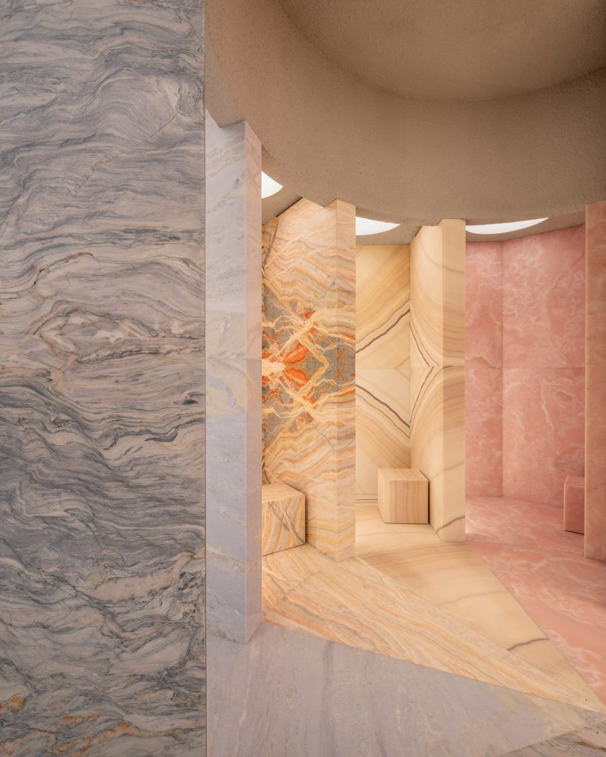
The centrepiece of the Athletic Propulsion Labs (APL) store is five “vanity rooms” in a radial design, each clad in different-coloured onyx or marble stone with matching stone stools and back-lit mirrors.

The rainbow-colour array of stone, chosen by the client from different quarries, was “intended to represent the five boroughs of New York,” Al-Jawad said.

backlit colourful marble "vanity rooms"backlit colourful marble
Five vanity rooms are each clad in distinctive coloured onyx or marble

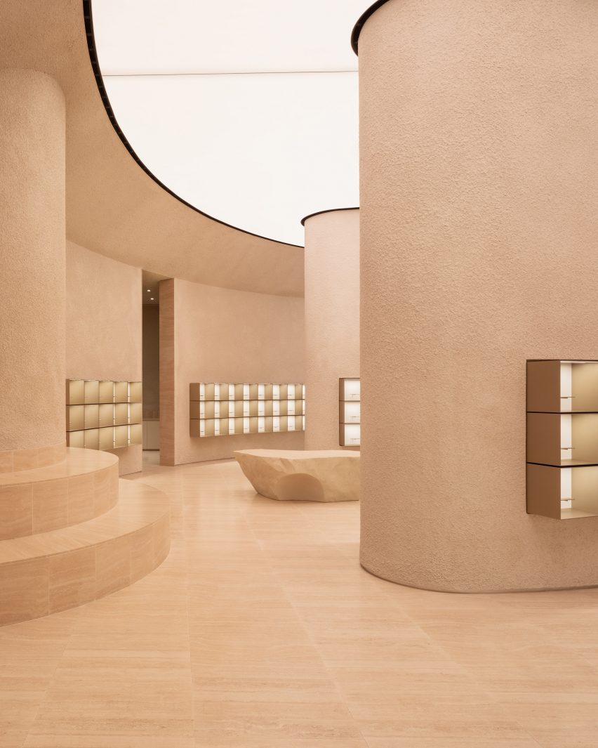
A teardrop-shaped column is located in the centre of the store, while boulder-like plinths positioned around the space are used for product displays.

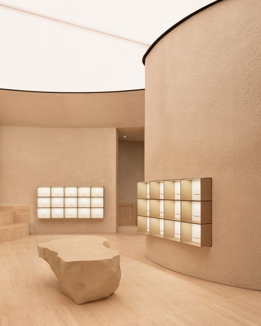
The textured display plinths were developed with a bespoke fabricator based in New York, who CNC-carved the forms.

The studio incorporated various other materials into the scheme such as textured sprayed plaster on the walls, Romano travertine for the floor, and champagne-coloured anodised aluminium for the display boxes.

Athletic Propulsion Lab flag ship store by Al Jawad PikeAthletic Propulsion Lab flag ship store by Al Jawad Pike
Al Jawad Pike completed the interiors for Athletic Propulsion Lab’s flagship store in New York

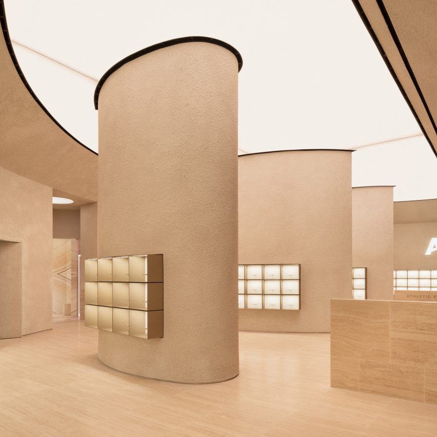
The aim of the store layout was to allow customers to see all the products from all parts of the store.

“We approached this by creating an architectural form that displays the product in a pan-optical array to provide visibility in completeness from almost any part of the store; whilst maintaining a seamless link between staff back-of-house functions at the basement level with the main retail space,” the studio explained.

Athletic Propulsion Lab flag ship store by Al Jawad PikeAthletic Propulsion Lab flag ship store by Al Jawad Pike
The space features a layout designed in a curvilinear amphitheatre style

The shoes are displayed in simple box frames, which are raised and lit up like artwork in a gallery. Ensuring that the trainers on display were the focal point was a main objective for the architects.

“The goal was to make sure the products were the main attraction in the store, while also making everything work smoothly for both customers and staff,” Al-Jawad Pike said.

Athletic Propulsion Lab flag ship store by Al Jawad PikeAthletic Propulsion Lab flag ship store by Al Jawad Pike
The studio devised a store layout enabling customers to view all products from any part of the store

The store’s semi-circular layout has street-facing windows that let in the light, and the studio also added adjustable warm lighting from the back-lit, semi-circular ceiling to provide additional illumination.

“We wanted to create a wash of light from above to bath the space in a warm and comfortable ambience,” said Al-Jawad.

“At its top, the perimeter wall banks into a semi-circular, back-lit stretch ceiling with adjustable warmth to dramatically alter the atmosphere in the space.”

Athletic Propulsion Lab flag ship store by Al Jawad PikeAthletic Propulsion Lab flag ship store by Al Jawad Pike
Sculpted boulders are dotted around the store space

Al-Jawad Pike was founded in 2014 by Al-Jawad and Dean Pike and aims to create spaces that “engender a sense of well-being and intrigue, as well as fun”.

Other retail interiors recently featured on Dezeen include Bottega Veneta’s Avenue Montaigne flagship store in Paris and Cúpla’s design for a boutique in central London.

The photography is by Ståle Eriksen.

Reference

Cúpla decorates Rixo Marylebone store with hand-painted murals
CategoriesInterior Design

Cúpla decorates Rixo Marylebone store with hand-painted murals

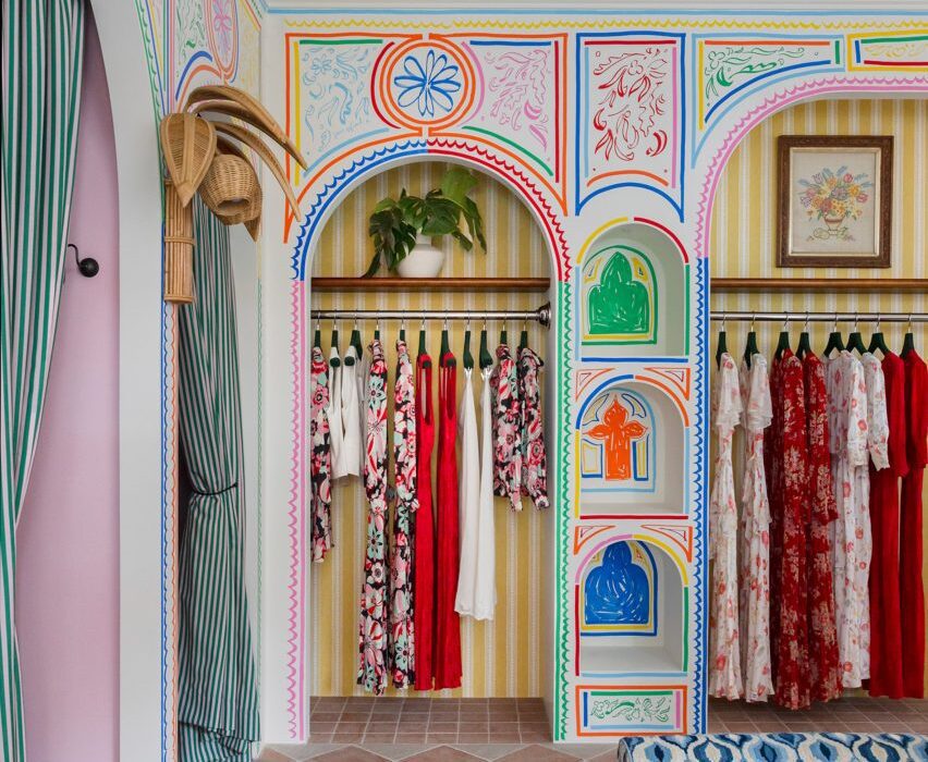
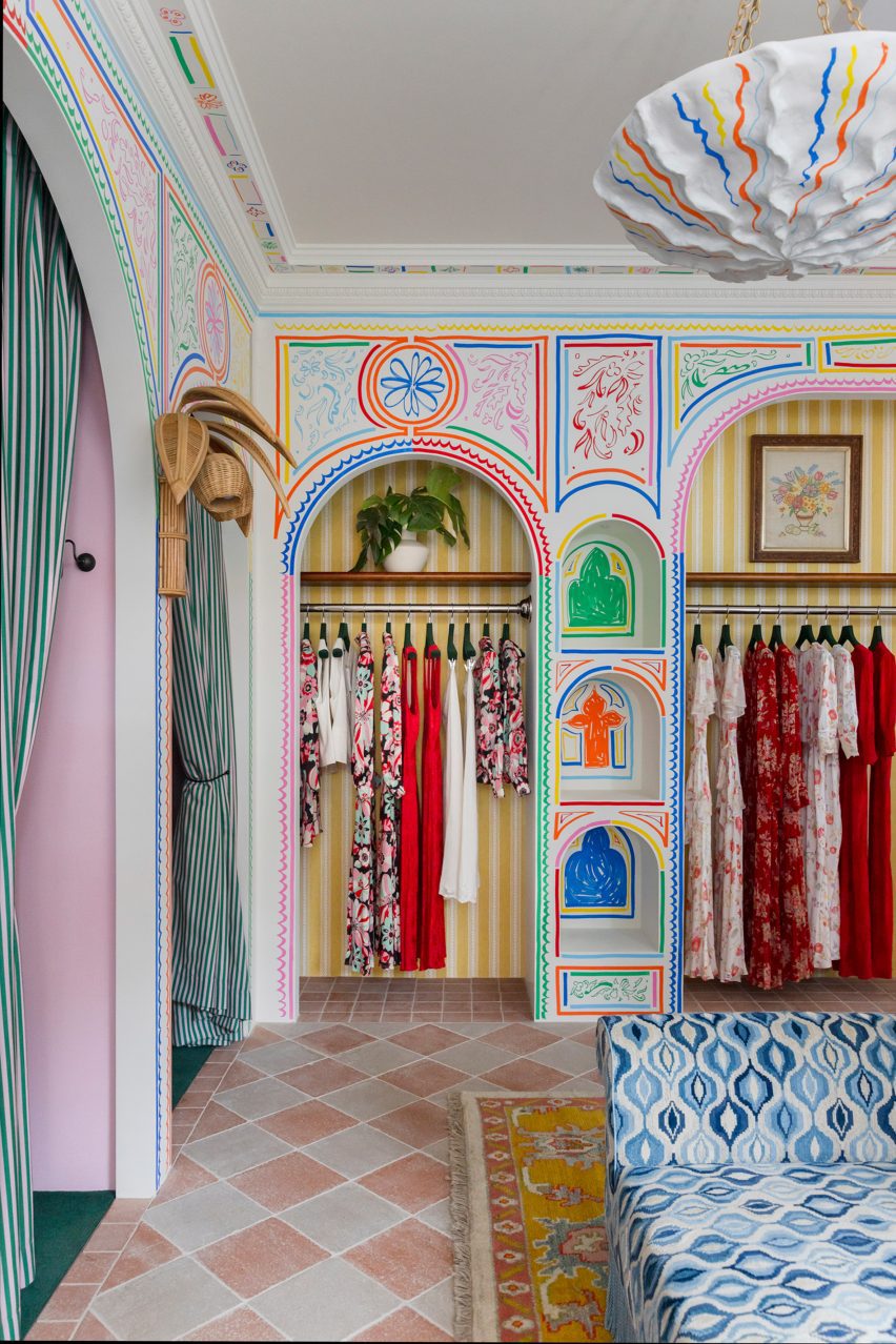
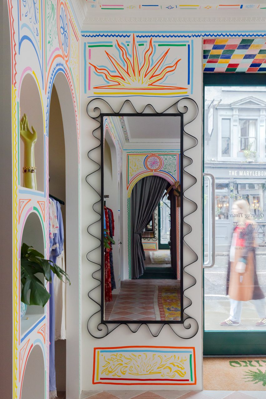
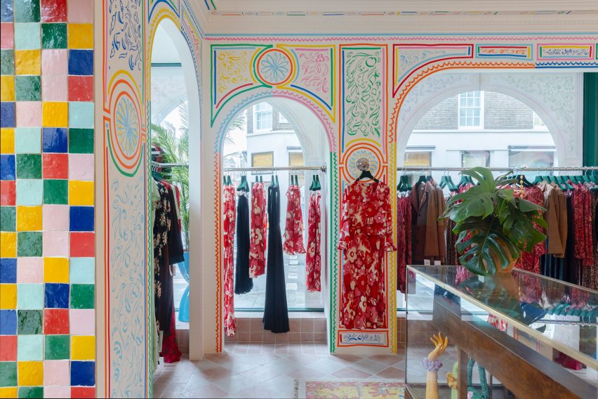
Interior design studio Cúpla has completed a boutique for fashion brand Rixo in central London that features hand-painted illustrations and colourful zellige tiles.

The clothing store on Marylebone High Street was revamped by Cúpla, whose creative director Gemma McCloskey is the twin sister of Rixo co-founder Orlagh McCloskey.

The interior designer had previously designed the brand’s flagship store on the King’s Road and wanted the refurbished Marylebone location to have a similar feel.

Colourful illustrations in Rixo MaryleboneColourful illustrations in Rixo Marylebone
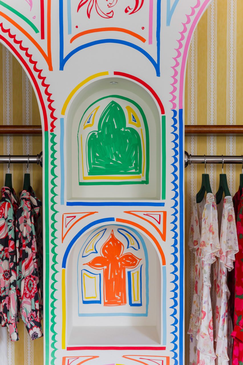
Rixo’s Marylebone store is covered in hand-painted murals

“We wanted the store to embody everything we had previously created for Rixo’s flagship store but within its own right,” Gemma McCloskey told Dezeen.

“A sense of escapism paired with a welcoming warmth within a boutique setting were the key emotions we wanted the customer to feel.”

As the brand sells hand-painted prints, the designer wanted the store’s interior to feature illustrations to reflect the style of the clothes.

Blue patterned sofa and archways in London fashion storeBlue patterned sofa and archways in London fashion store
It features modified vintage furniture

“Understanding Rixo’s roots and the fact their USP is hand-painted prints, it felt tangible to represent the brand’s values and beginnings with the illustrations,” Gemma McCloskey said.

“Given the space is quite small, we treated it almost like a living room space within a home and felt we could make it all-encompassing and personal.”

Mirror in London clothing storeMirror in London clothing store
Artist Sam Wood created colourful illustrations for the store

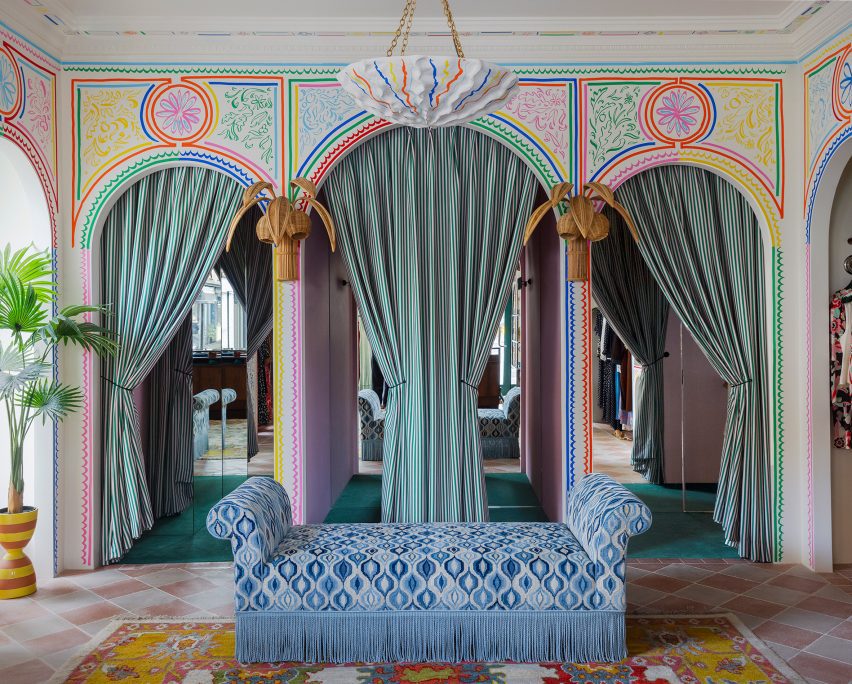
Artist Sam Wood hand-painted murals and illustrations throughout the store, which has a bright and playful colour palette and also features traditional glazed Moroccan zellige tiles.

“We wanted the colour palette to feel really fresh and bright,” the designer explained.

“Although there is an abundance of colours used, every line of the mural or the ‘random’ coloured zellige tile layout was methodically composed to ensure a right balance between the colours was struck.”

The studio added decorative arches and classical mouldings to the store in a nod to the architecture and heritage of its Marylebone neighbourhood.

The store also features bespoke fitting room curtains with pickle-green and flora-pink stripes by fabric brand Colours of Arley.

Zellige tiles in Rixo MaryleboneZellige tiles in Rixo Marylebone
Moroccan zellige tiles add to the playful interior

Cúpla used vintage furniture pieces throughout the store, which sells Rixo’s full collection including ready-to-wear and bridalwear.

“We actually modified existing pieces of vintage furniture, which had been previously sourced by [Rixo founders] Orlagh and Henrietta years ago in the early days of Rixo,” Gemma McCloskey said.

“They were the perfect fit for the space but didn’t have the functionality we required, so we decided to alter these instead or replace them.”

Illustrations at Marylebone storeIllustrations at Marylebone store
The store is located on Marylebone High Street

“It was much more sustainable and because the pieces were from the early years of Rixo, they had sentimental value so we didn’t want to replace them,” she added.

Other recent London stores featured on Dezeen include a Camper store with a giant foot sculpture and a stationery store with a demountable interior.

The photography is courtesy of Rixo.


Reference

Kith Women Flagship in Soho combines walnut and pink marble
CategoriesInterior Design

Kith Women Flagship in Soho combines walnut and pink marble

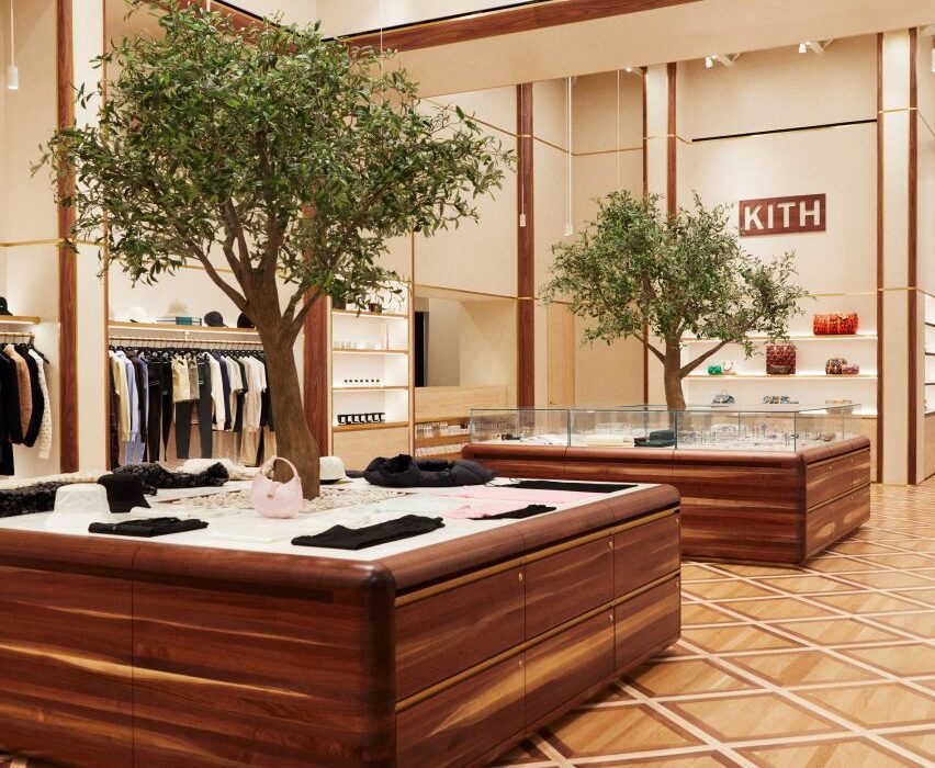
American fashion brand Kith has returned to the location of its first Manhattan flagship to open a women-dedicated store, in which olive trees grow up through display podiums.

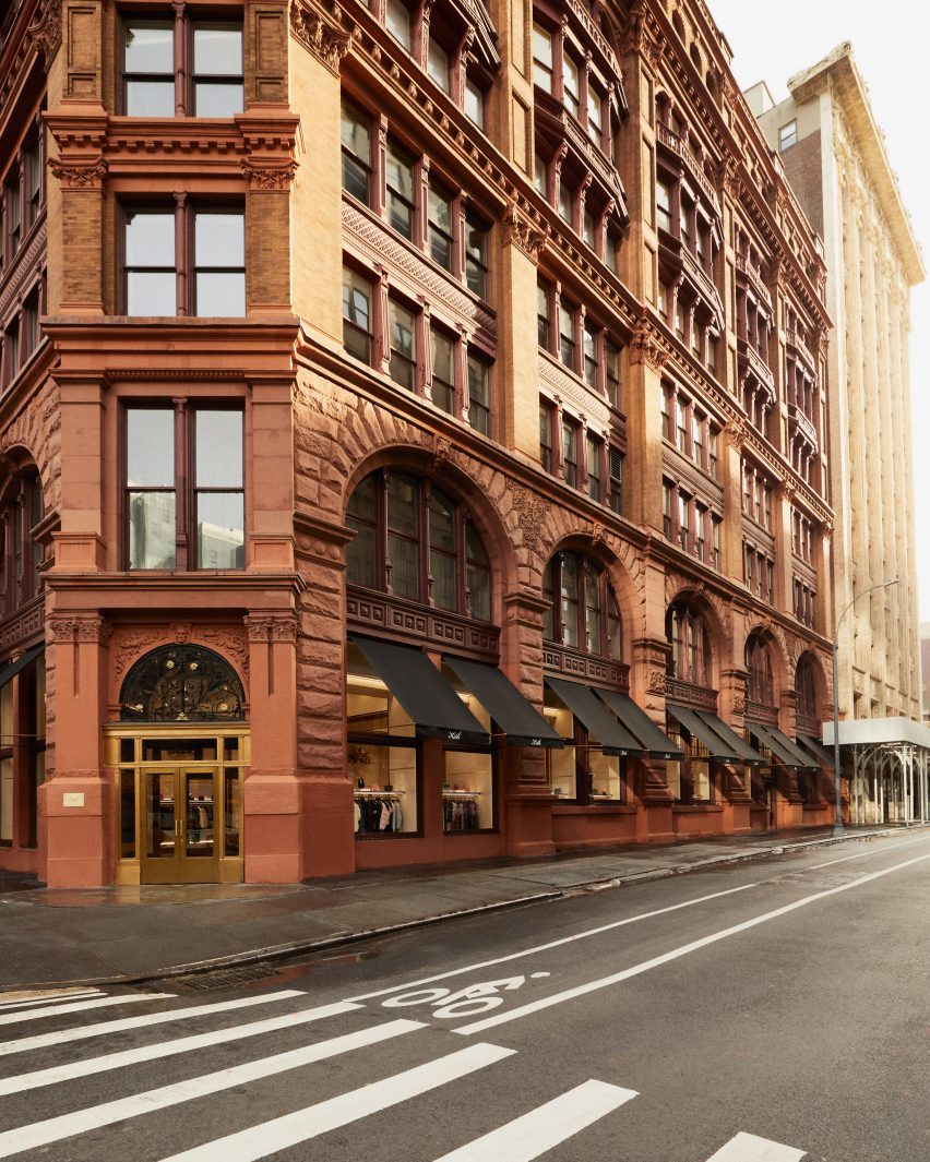
The inaugural Kith Women Flagship in Soho opened last December at 644 Broadway, the same historic landmark building where the brand debuted its Manhattan retail offering in 2011.

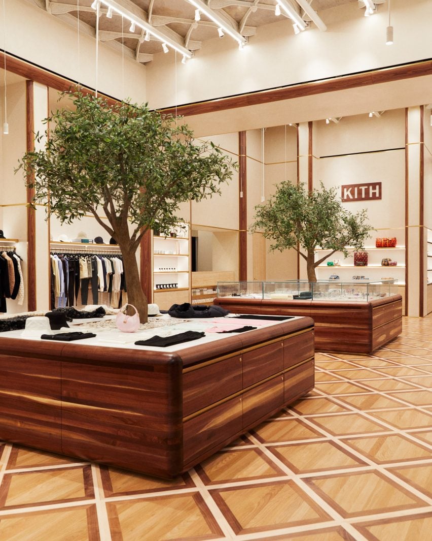
Custom-built walnut podiums with olive trees growing through the centreCustom-built walnut podiums with olive trees growing through the centre
Custom-built podiums run through the middle of the Kith Women flagship store in Soho

Previously the Manhattan Savings Institute Bank, the red sandstone and brick structure’s exterior features wrought iron gates at the entrance and set the tone for the materials palette inside.

Kith founder and creative director Ronnie Fieg designed the interiors to include signature elements of the brand’s retail concepts, but with adjustments to acknowledge its context.

Kith Women store with apparel and accessories displayed in walnut and brass-trimmed nichesKith Women store with apparel and accessories displayed in walnut and brass-trimmed niches
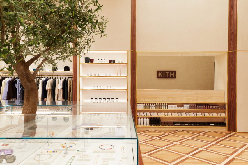
The main room displays apparel and accessories in walnut and brass-trimmed niches

“The ambiance exudes modern elegance with its warm and calming aura, constructed with materials like Venetian plaster, travertine, and rosa aurora [marble],” said the Kith team.

The spacious main room benefits from tall ceilings and an open floor plan, and presents Kith Women in-house and multi-brand ready-to-wear apparel against Venetian plaster and Kith monogrammed suede wallpaper.

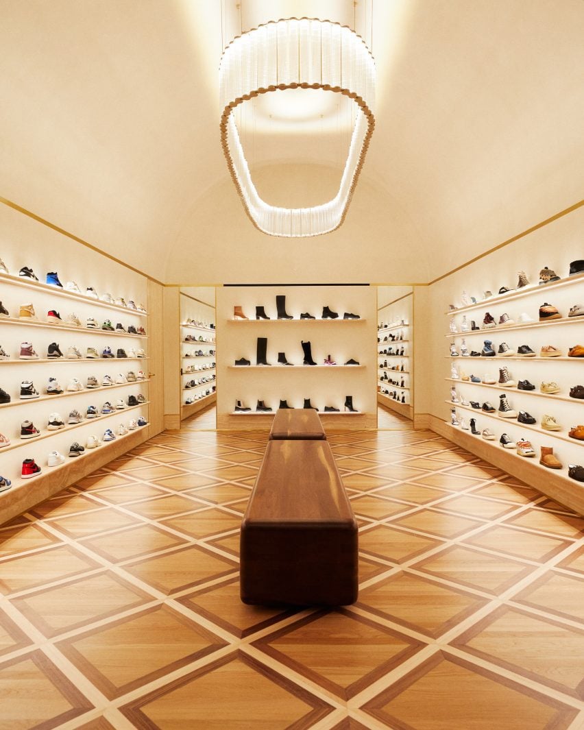
Footwear room with shoes presented on travertine shelvesFootwear room with shoes presented on travertine shelves
In a room dedicated to footwear, shoes are presented on travertine shelves

Clothing is displayed on rails installed in walnut and brass-trimmed niches around the perimeter, with accessories like hats and bags placed on shelves above.

A row of square walnut podiums runs through the middle of the room, each with an olive tree growing up through the centre of its pink marble surface.

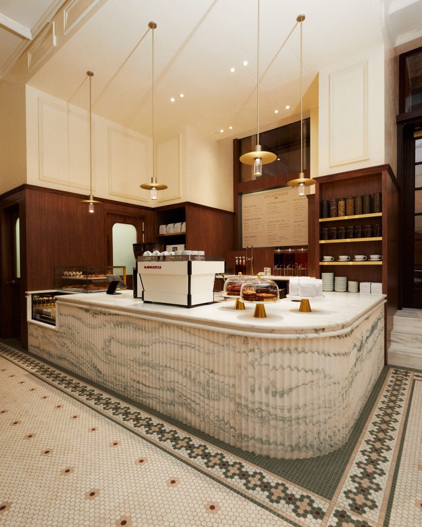
A cafe and flower shop featuring mosaic floors and a fluted marble service counterA cafe and flower shop featuring mosaic floors and a fluted marble service counter
A cafe and flower shop is run in partnership with PlantShed, and features mosaic floors and a fluted marble service counter

Custom-built by Brooklyn-based woodworker Mark Jupiter, these units contain drawers for product storage, and alternating ones are topped with glass vitrines for showcasing jewellery and other small accessories.

Oak flooring is laid in a grid pattern transversed by walnut strips, and the darker wood also lines the fitting rooms.

Footwear has a dedicated room, in which shoes are displayed on shelves with integrated lighting that run from one end to the other.

“Entering the footwear space, you will find a grand arched plaster ceiling, travertine shelves, and a custom chandelier from Italy by Viabizzuno,” the team said.

Cafe in a courtyard behind historic wrought iron gatesCafe in a courtyard behind historic wrought iron gates
The cafe leads out to a courtyard behind the historic building’s wrought iron gates

In the final room is a cafe run in partnership with New York-based flower and plant shop PlantShed, which serves light bites and drinks and offers custom floral arrangements.

The space features a mosaic tiled floor, walnut wall panelling, a service counter with a fluted pink marble front and floral displays on stepped stone plinths.

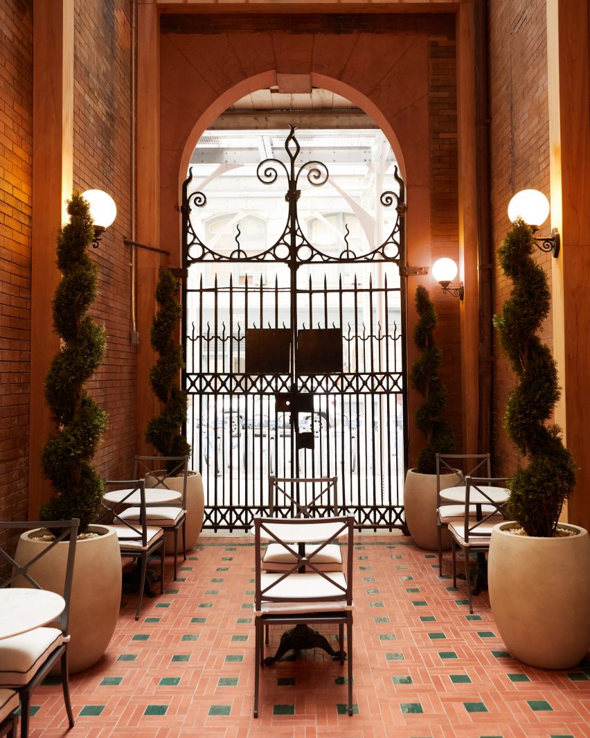
The cafe leads out to a courtyard area behind the building’s impressive iron gates, which furnished with cafe tables and chairs in between topiary plants shaped into spirals.
Exterior view of red sandstone building at 644 BroadwayExterior view of red sandstone building at 644 Broadway
Kith Women is located at 644 Broadway, the same building where the brand opened its original flagship retail space in 2011

Feig also designed Kith’s recently opened Williamsburg store, located in the 25 Kent Plaza office building where the brand also has its corporate offices.

The company had previously worked with design studio Snarkitecture on its retail spaces around the world, including outposts in Miami, Los Angeles and Paris.

The photography is courtesy of Kith.

Reference

Modernist architecture informs Bottega Veneta store in historic galleria
CategoriesInterior Design

Modernist architecture informs Bottega Veneta store in historic galleria

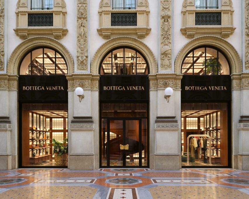
Fashion house Bottega Veneta has opened a boutique designed by its creative director Matthieu Blazy inside the Galleria Vittorio Emanuele II shopping arcade in Milan.

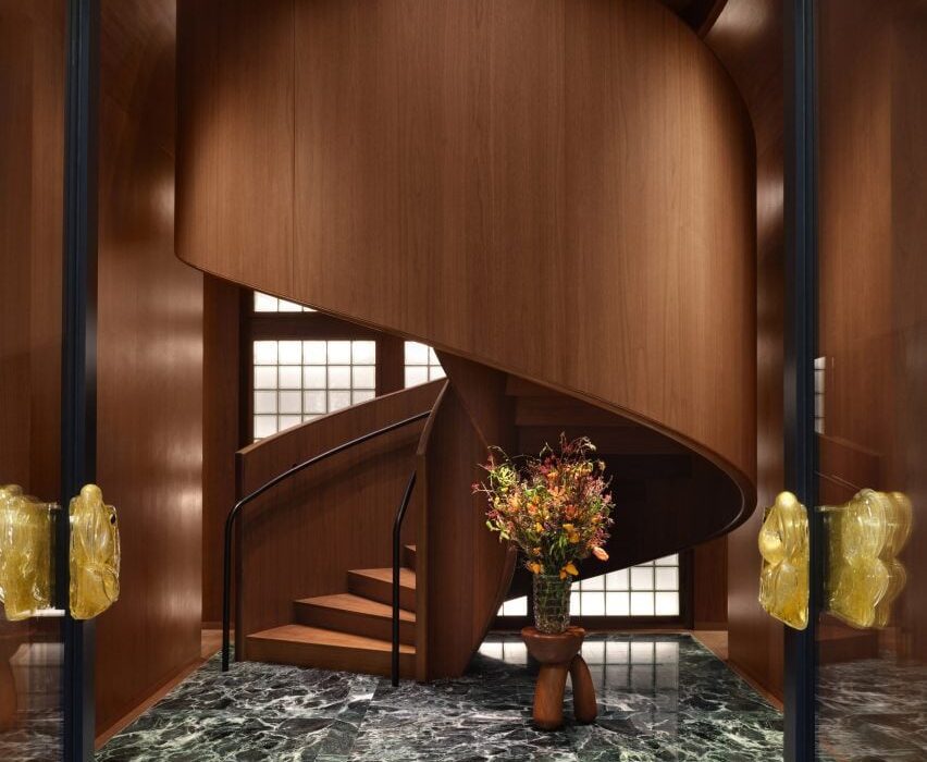
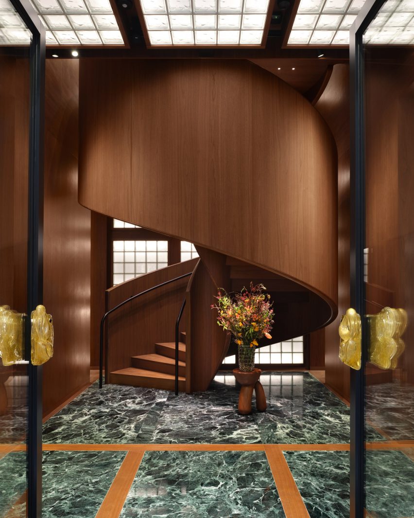
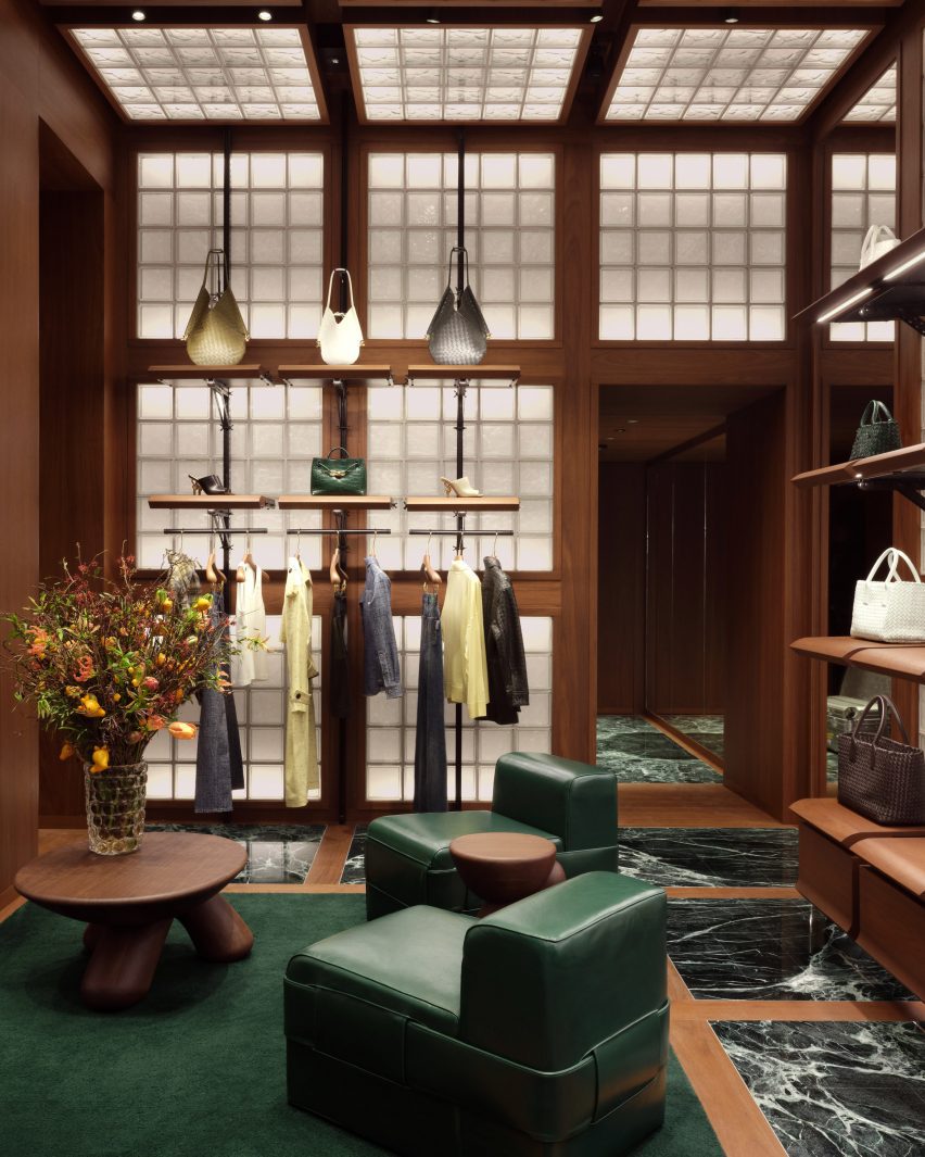
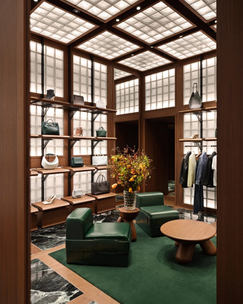
Bottega Veneta‘s two-storey store is distinguished by three primary materials: glass, Italian walnut and green Verde Saint Denis marble.

Walnut spiral staircase rising from green marble floorWalnut spiral staircase rising from green marble floor
A spiral staircase greets shoppers at the Bottega Veneta store in Milan

This trifecta is applied in strict grids to evoke Italian modernism and provide an organising principle in the various rooms.

“There are different experiences of space in the store,” said Blazy. “I wanted to express the idea of a domestic interior referring to Italian modernist architecture that contrasts with the aesthetic of a spaceship and to capture the intimacy and the imagination of getting dressed.”

Fashion store with glass-block walls and ceiling, and green marble flooringFashion store with glass-block walls and ceiling, and green marble flooring
Grids are used throughout the store to organise materials

From the galleria, shoppers are greeted by a dramatic spiral staircase made entirely from Italian walnut – a material used throughout the interior as panelling, modular shelving and furniture.

Green marble is laid in squares across the floors, separated by strips of walnut and occasionally swapped for larger patches of dark green wool carpet.

Room with squares of glass blocks across the walls and ceilingRoom with squares of glass blocks across the walls and ceiling
Glass blocks are integrated into the walls and ceilings

Square glass blocks are similarly arranged into grids across walls and ceilings, illuminated from behind to produce a soft warm glow throughout the store.

Green leather chairs and benches are accompanied by custom rounded wood tables and stools to form lounge areas.

“Throughout the space, soft textures are found in leather seating and wool carpets, while modular shelving units build a sense of discovery and play,” Bottega Veneta said.

Fitting room lined in walnut with a green leather niche and wool carpetFitting room lined in walnut with a green leather niche and wool carpet
The fitting rooms feature leather niches that provide a place to sit

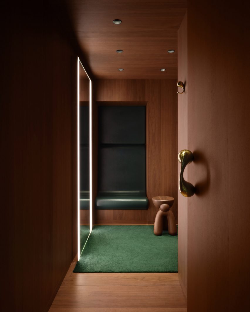
Fitting rooms are fully lined in walnut, except for leather-wrapped niches that provide a small seat, giant mirrors with built-in lighting and more green carpet.

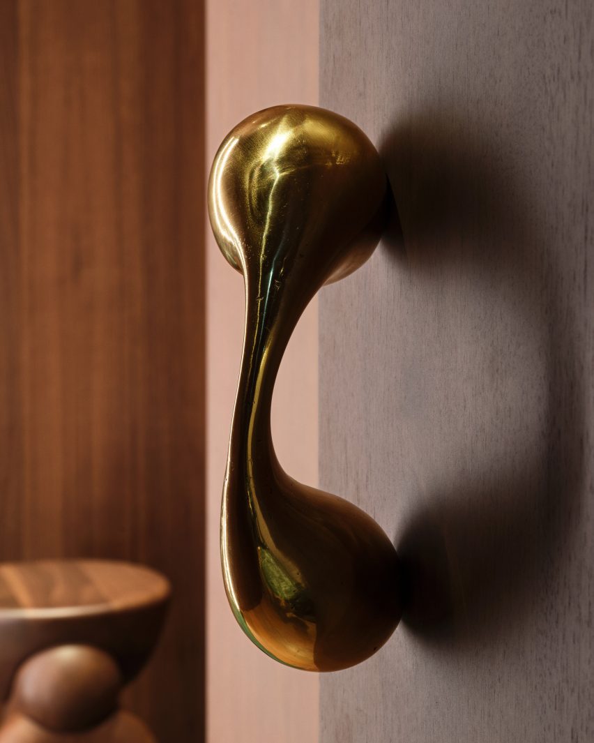
Sculptural polished metal elements form the door pulls and clothes hooks, their smooth surfaces contrasting with the more textured golden planters and entrance handles.

On the upper level, recesses formed by the Galleria’s arched windows provide nooks for seating and plants, as places to look out onto the highly decorative arcade.

Designed in 1861 by architect Giuseppe Mengoni, the neo-classical Galleria Vittorio Emanuele II is one of Milan’s most desirable shopping destinations.

Close-up of a polished metal sculptures that forms a door pullClose-up of a polished metal sculptures that forms a door pull
Polished metal sculptures form door pulls and clothing hooks in the fitting rooms

The four-storey, glass-vaulted double arcade is located in the city centre, close to other landmarks like the Duomo and the Teatro alla Scala.

The new Bottega store is the latest to open under Blazy since he took the reigns of the luxury brand in 2021, following locations on London’s Sloane Street and the Avenue Montaigne in Paris.

Exterior of the Bottega Veneta store in Milan's Galleria Vittorio Emanuele II Exterior of the Bottega Veneta store in Milan's Galleria Vittorio Emanuele II
The new store is located in the historic Galleria Vittorio Emanuele II shopping arcade

For the brand’s Spring Summer 2023 runway show, Bottega Veneta collaborated with Italian designer Gaetano Pesce, who envisioned a colourful resin-covered floor and 400 bespoke cotton-and-resin chairs for the set.

Pesce later went on to create a pair of handbags for the brand, which were designed to suggest different bucolic landscapes.

The photography is courtesy of Bottega Veneta.

Reference

Standard Architecture refreshes interior of pink Paul Smith store in LA
CategoriesInterior Design

Standard Architecture refreshes interior of pink Paul Smith store in LA

British fashion label Paul Smith’s iconic pink store in Los Angeles has received an interior makeover from Standard Architecture.

Standard Architecture collaborated with the Paul Smith design team to reimagine the 4,740-square-foot (440 square metres) store on Melrose Avenue, West Hollywood.

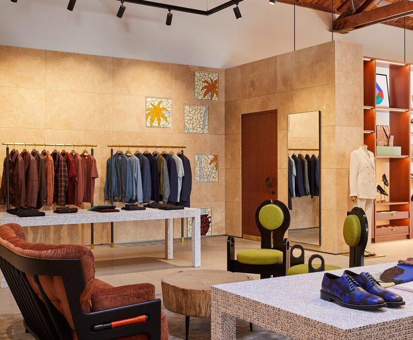
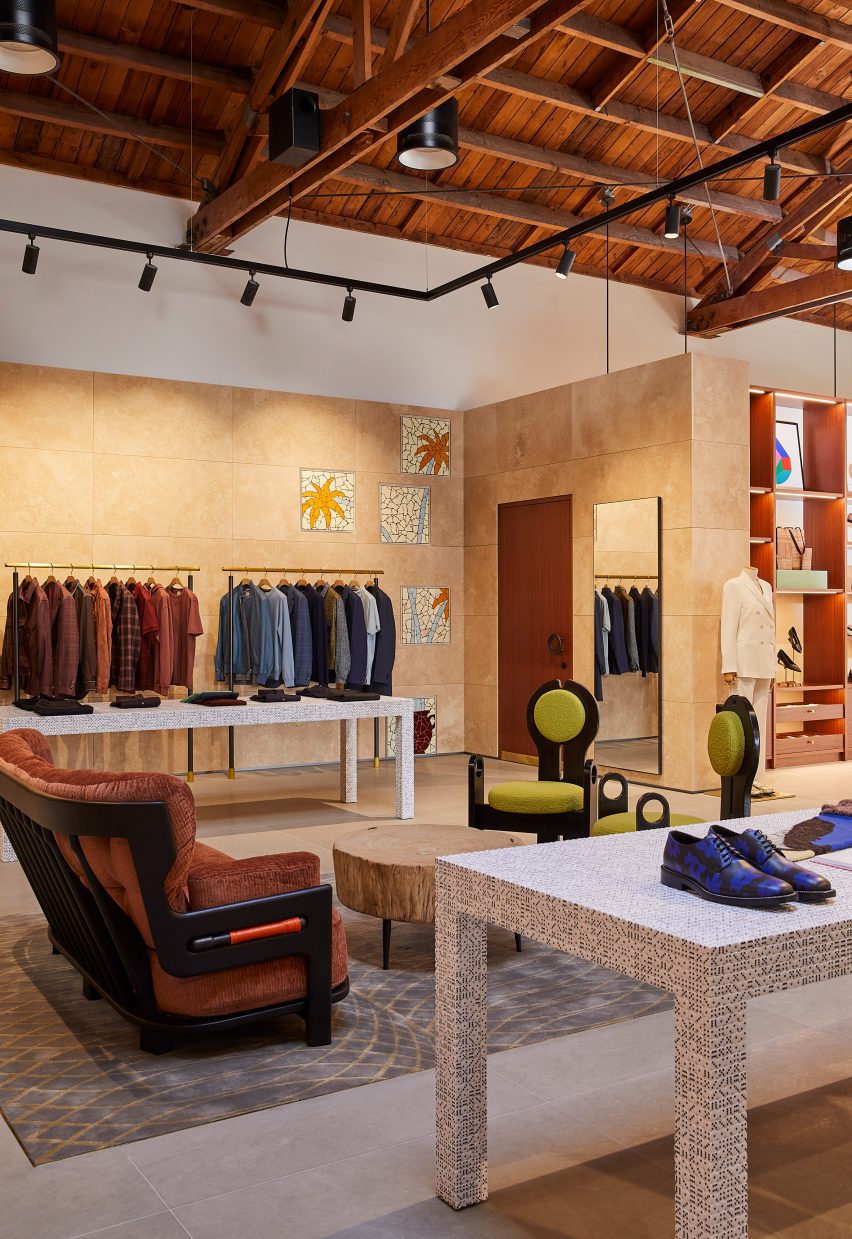
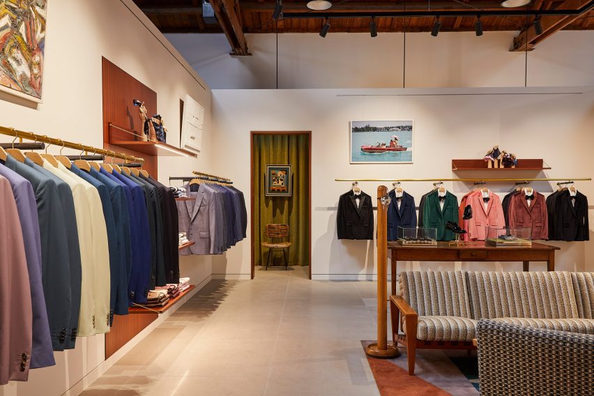
Paul Smith LA store interior is stone-clad partitions and exposed raftersPaul Smith LA store interior is stone-clad partitions and exposed rafters
Standard Architecture and the Paul Smith team reorganised the LA store to better define the brand’s different collections

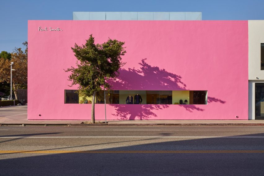
The studios also created a new VIP entrance patio for the building, which is notorious for its bright pink exterior that has become a pilgrimage spot for amateur photoshoots.

“The primary goal was to enhance the overall customer experience within the store, which was achieved by creating a more cohesive and immersive shopping environment across the different brand departments,” said Standard Architecture.

Seating area with clothing displays on either sideSeating area with clothing displays on either side
Stone-clad partitions help to define areas, but don’t reach the exposed timber ceiling

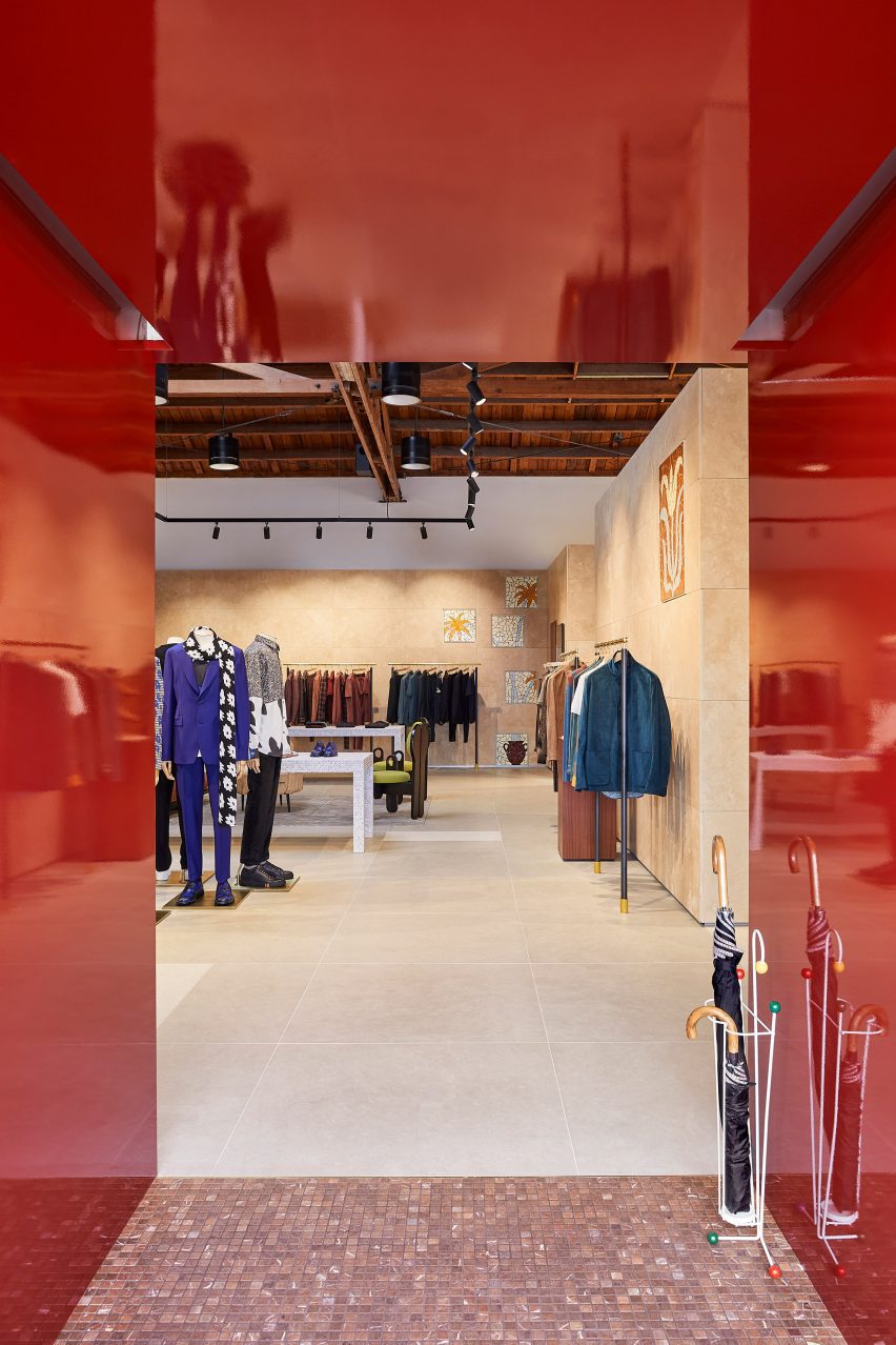
The entrance to the store – the only opening in the giant pink wall that faces the parking lot – leads shoppers through a glossy red metal vestibule into the main retail space.

Clearly defined yet interconnected areas for the menswear, womenswear and homeware collections help with navigation around the store.

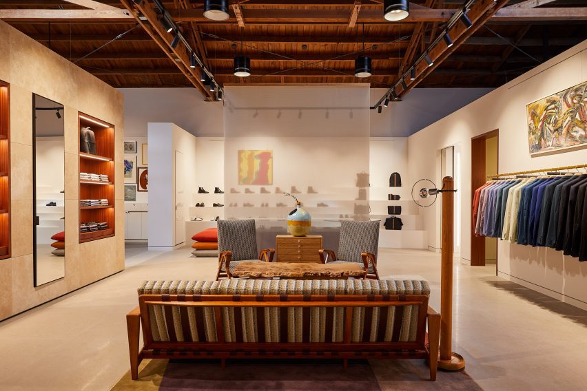
Suits displayed in colour order on long brass railsSuits displayed in colour order on long brass rails
Long brass rails are used to present tailoring

Partitions clad in dappled beige stone frame these zones, but don’t reach the exposed timber ceiling, to retain the sense of openness.

In places, the stone walls are inlaid with mosaic-style artworks depicting abstract flora, which add splashes of colour to the warm-toned surfaces.

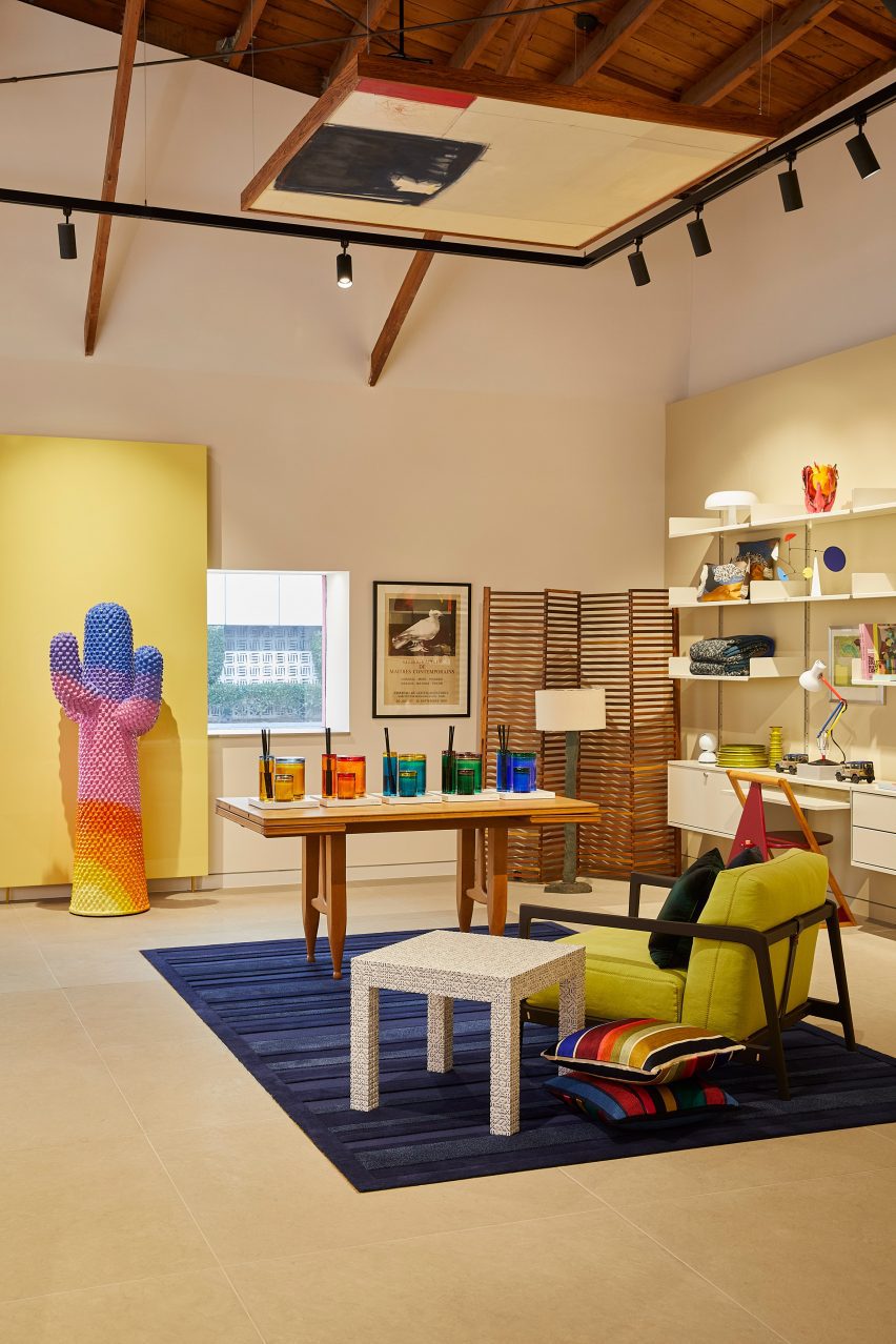
Paul Smith homeware collaborations displayed in a corner of the storePaul Smith homeware collaborations displayed in a corner of the store
Paul Smith’s collaborations with Gufram and Anglepoise are among the pieces on show

Black track lighting is suspended from the rafters, spotlighting the various clothing displays and lounge areas furnished with midcentury-style sofas and armchairs that are dotted around the store.

Long brass rails that appear to be suspended in midair are used to display suit jackets, which are carefully arranged by colour.

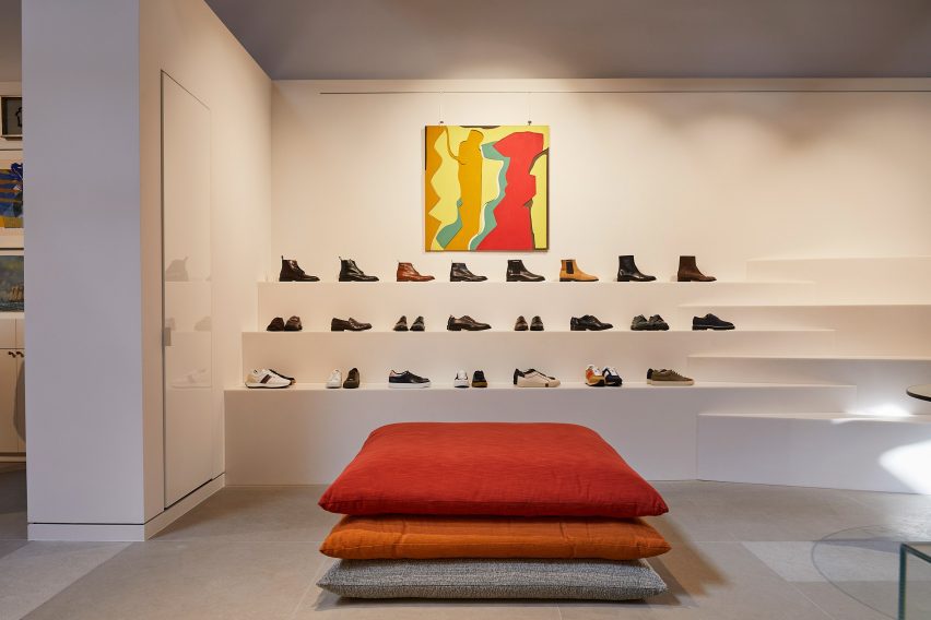
Shoes presented on stepped white ledges that resemble bleacher seatingShoes presented on stepped white ledges that resemble bleacher seating
Shoes are presented on stepped white ledges that resemble bleacher seating

In an area dedicated to accessories, the shoes and bags are lined up on stepped white ledges that resemble bleacher seating.

Walnut is used for accents including shelving, door frames, and podiums, as well as for a large open storage system with compartments for presenting individual products and a row of sculptures by Alexander Calder.

Founded by fashion designer Paul Smith in 1970, his eponymous brand is synonymous with the brightly coloured stripes applied to many of its apparel products and other collaborations.

Many of these appear throughout the store, including a colour-tinted Anglepoise desk lamp and a striped version of Gufram’s cactus-shaped coat stand.

Glossy red metal vestibule with store interior beyondGlossy red metal vestibule with store interior beyond
Entry to the store is via a vestibule wrapped in glossy red metal

“Overall, the design reflects a deep understanding of the brand’s identity, which places a strong emphasis on the use of colour and attention to detail,” Standard Architecture said.

Paul Smith retail spaces around the world are equally playful. On London’s Albemarle Street, its boutique has a patterned cast-iron facade by 6a Architects, while the shop in Seoul is encased in a curving concrete shell by System Lab.

Bright pink exterior of Paul Smith store on Melrose AvenueBright pink exterior of Paul Smith store on Melrose Avenue
The store on Melrose Avenue is an icon in Los Angeles thanks to its bright pink facades

Standard Architecture was founded by Silvia Kuhle and Jeffrey Allsbrook, who discussed their work with Dezeen during our Virtual Design Festival in 2020.

Past projects by the firm include a Hollywood Hills residence with a cantilevered swimming pool and a minimal showroom for fashion brand Helmut Lang – which was located just a few blocks from the Paul Smith store before it shuttered.

The photography is by Genevieve Garruppo.


Reference

Aro Archive store in Shoreditch features pastel-coloured rooms
CategoriesInterior Design

Aro Archive store in Shoreditch features pastel-coloured rooms

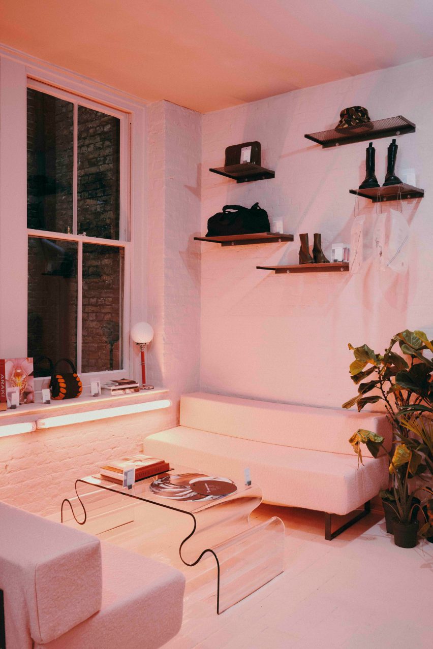
Fashion retailer Aro Archive’s pastel-hued east London store was designed by founder Ariana Waiata Sheehan to evoke “a sense of otherworldliness”.

The store, located in Shoreditch, replaces the brand’s previous, more industrial store on nearby Broadway Market and was intended to have a frivolous feel.

Pastel-coloured fashion storePastel-coloured fashion store
The Aro Archive store has pastel-coloured floors in pink and blue

The interior has “a sense of otherworldliness, escapism and fun,” Waiata Sheehan explains, comparing it to “a mixture between a mushroom trip and going to visit someone’s rich aunty who runs a gallery”.

“We’ve always had very neutral industrial spaces,” she told Dezeen. |But you can get an industrial Zara these days, so time to switch it up and go full personality, which has been scary but so worth it.”

Pink floor in Aro ArchivePink floor in Aro Archive
It is located inside an old Victorian warehouse

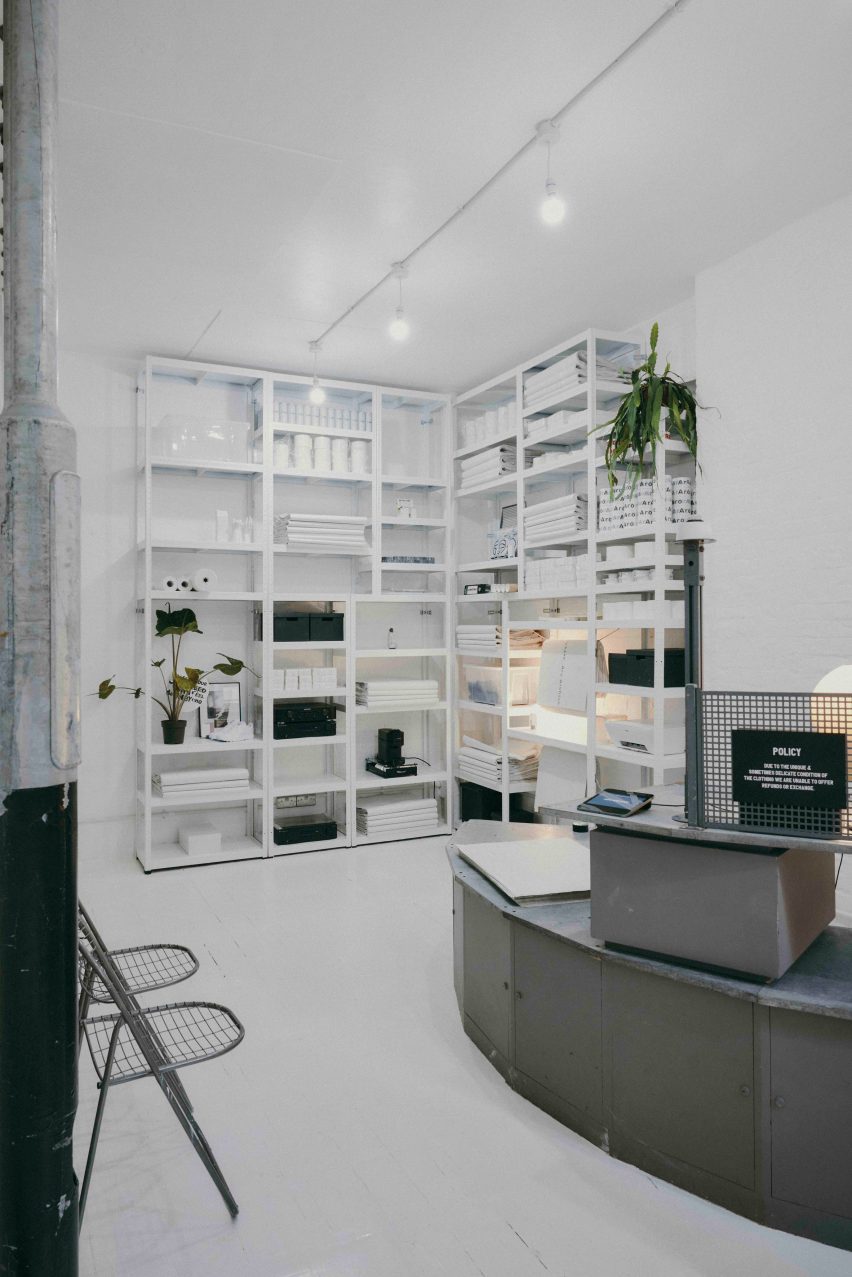
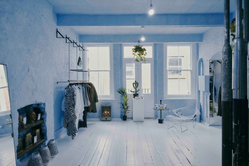
Located inside a five-storey former Victorian warehouse, Aro Archive, which sells pre-owned clothing by avant-garde designers, was organised so that each floor has a different colour.

Monochrome pastel pink, blue and white hues decorate the different levels, which also feature a wide range of reclaimed and recycled materials, furniture and artworks.

Blue floor in Aro ArchiveBlue floor in Aro Archive
Founder Ariana Waiata Sheehan created the interior design

“The pink floor is supposed to feel very warm, womb-like and enclosed,” Waiata Sheehan said. “The blue floor is more light and otherworldly. And the two white floors are very ethereal and calm.”

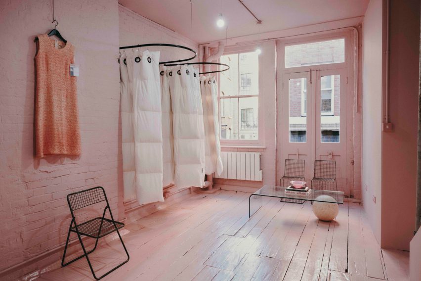
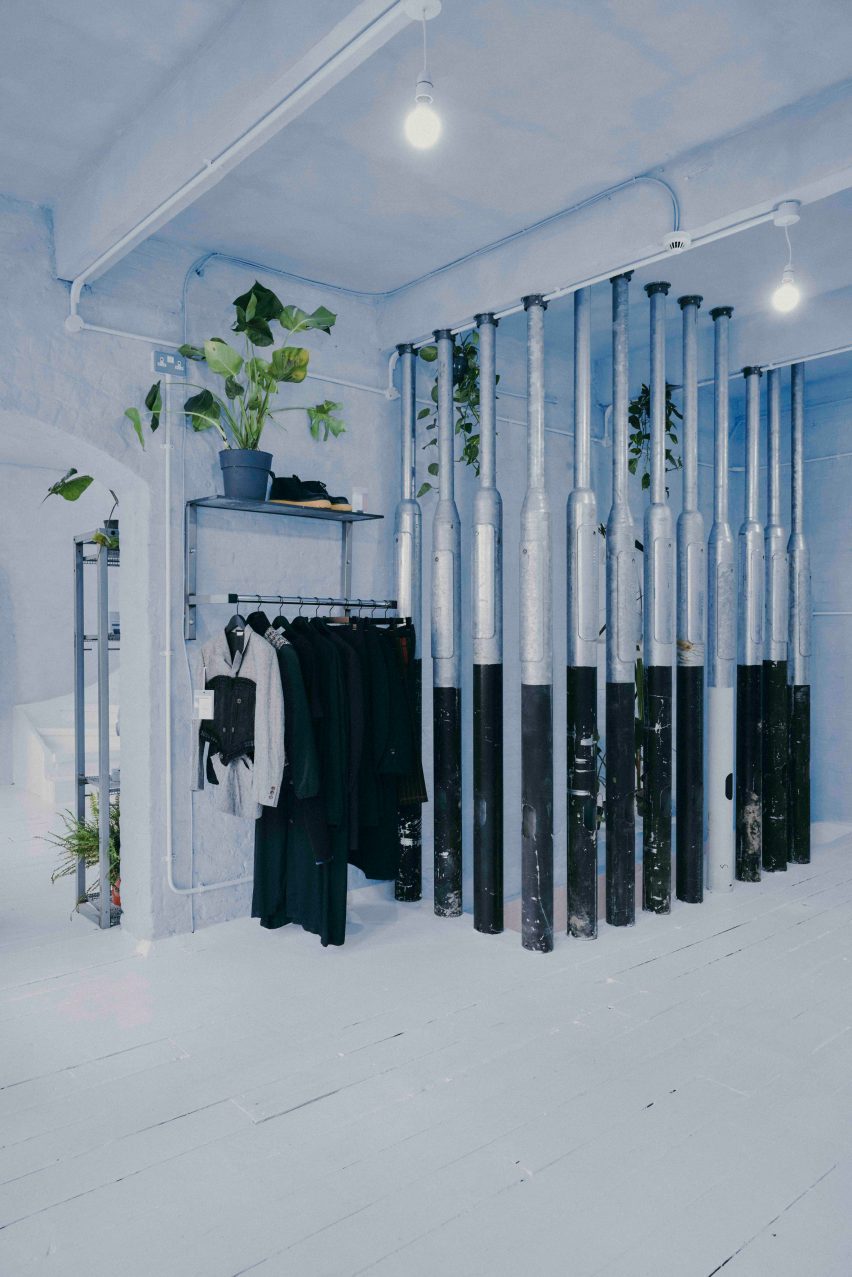
White duvet covers by fashion house Maison Martin Margiela were used to create curtains for the changing rooms, while interior pillars are made from reclaimed 1990s metal lamp posts that the designer sourced from a scrapyard in Preston.

Martin Margiela duvet-changing roomsMartin Margiela duvet-changing rooms
Duvet covers by Maison Martin Margiela frame the changing rooms

“The building and surrounding area feel very London, so we did want to bring in a sense of that for example with the lamp posts, metal works and details, bright neon lights and so forth,” Waiata Sheehan said.

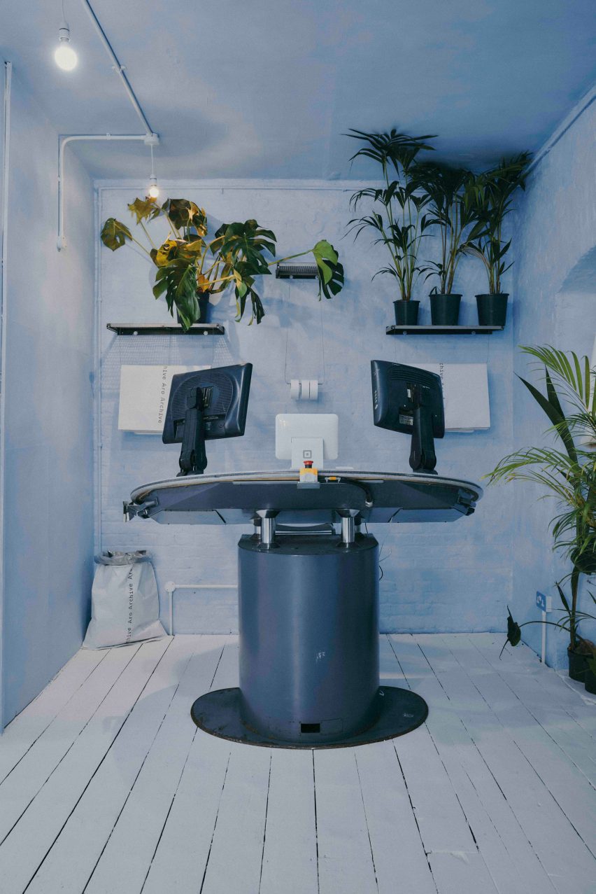
She sourced a number of unusual furnishings for the Aro Archive store, including an industrial control station from a paper-manufacturing plant that is now used as a till.

“The industrial paper control station I’ve been watching on eBay for nearly 4 years, waiting for a time I had the space to buy it,” Waiata Sheehan explained. “I wanted something different to the normal till, they’re all so boring and square.”

The store also has another large metal till and metal drawers that originally came from a 1980s Mary Quant store and were rescued from a squat in Hackney Wick.

Metal till from Mary QuantMetal till from Mary Quant
A large metal till was originally from a Mary Quant store

Waiata Sheehan also sourced several smaller pieces for the boutique, where customers can purchase everything down to the artwork, furniture and accessories.

“I do all the buying so everything is here because I love it in some way,” she explained. “But in terms of favourite pieces in store right now?”

“For fashion, it’s the Rick Owens orange shearling gimp mask gilet, for objects the Shirin Guild ceramic incense holders and for furniture the wobbly glass table with magazine racks.”

Industrial control stationIndustrial control station
Waiata Sheehan bought an old industrial control station from eBay

Waiata Sheehan hopes the Aro Archive boutique will feel like a home away from home and help to create a community feel in the area.

“I think Shoreditch is lacking a sense of community and I wanted to work that into the space,” she said. “The feeling of a chaotic family home and a feeling of togetherness.”

Pillars made from lampposts at Aro ArchivePillars made from lampposts at Aro Archive
Lampposts from a scrapyard form pillars inside the store

Other London stores with notable interior design recently covered on Dezeen include Swedish fashion brand Toteme’s newly-opened Mayfair store and a Coach pop-up store at Selfridges that had fixtures made from recyclable materials.
The photography is by John Munro.

Reference

Yellow lighting illuminates Le Père store in New York by BoND
CategoriesInterior Design

Yellow lighting illuminates Le Père store in New York by BoND

New York architecture studio BoND has used tubular lighting to create a bright yellow glow inside this men’s apparel store on Manhattan’s Lower East Side.

The first flagship for cult fashion label Le Père occupies a 1,000-square-foot (93-square-metre) corner unit on Orchard Street.

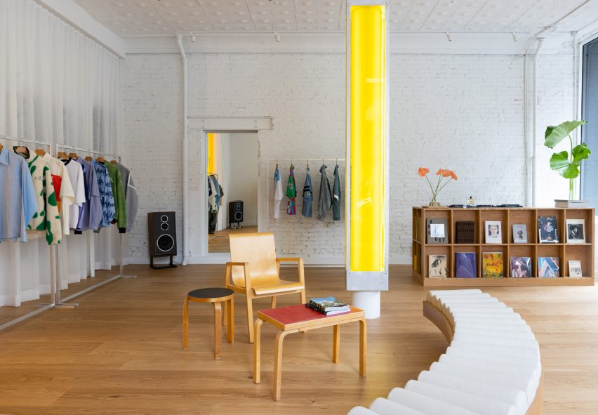
Store interior with white walls, wooden floors and a central yellow columnStore interior with white walls, wooden floors and a central yellow column
The flagship store for Le Père is largely painted white to allow the bright clothing to stand out

Utilising the store’s large exposure to the street, BoND opted to create an interior that would be just as impactful from the exterior as it is once inside.

“BoND designed the store to feel like a canvas, highlighting the design elements of the clothes while ensuring the space is a place that creators feel encouraged to spend time in,” the team said.

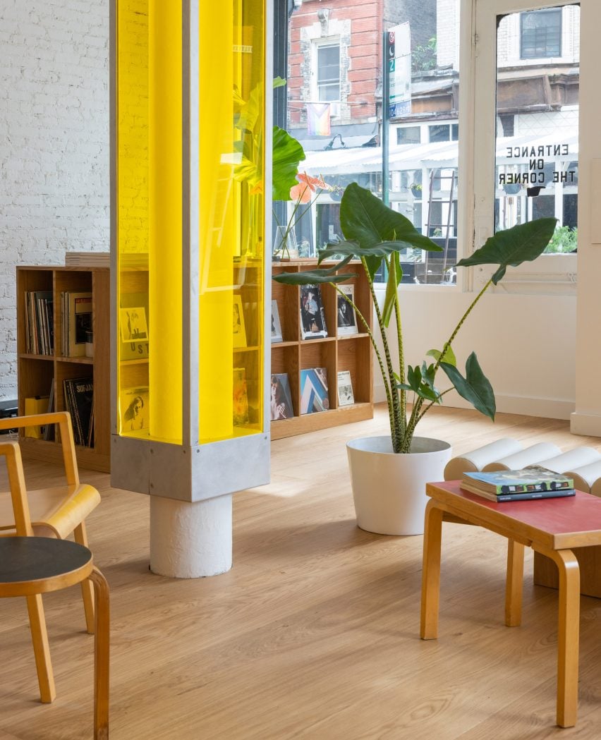
A central column encased in a translucent yellow boxA central column encased in a translucent yellow box
A central column is encased in a translucent yellow box

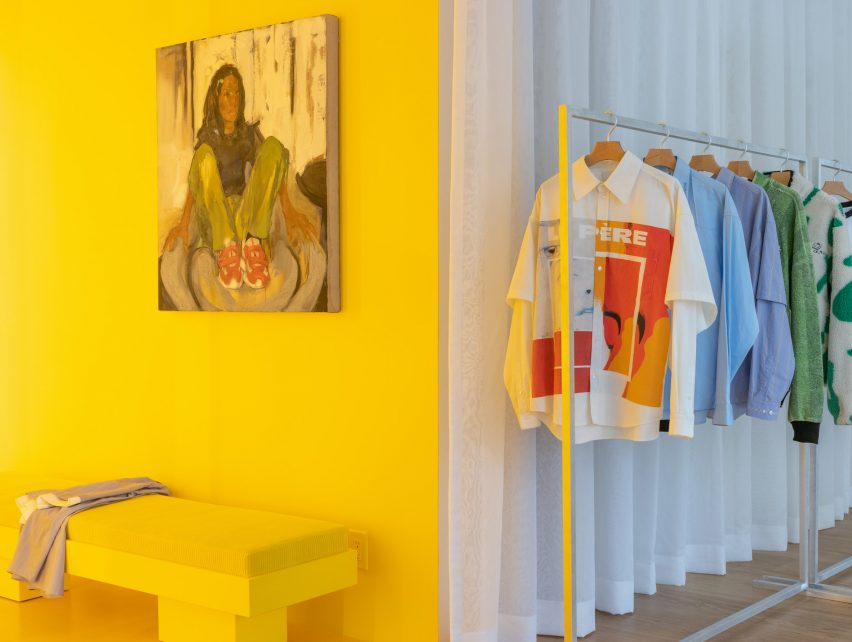
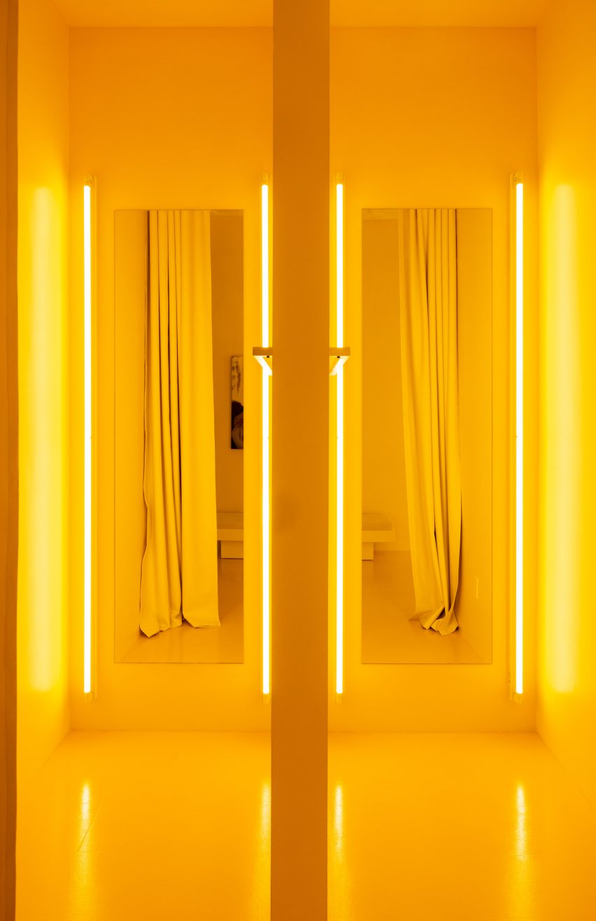
The firm’s approach was to leave the majority of the space white, allowing the boldly patterned clothing to stand out, then highlighting the fitting rooms using bright yellow lighting and surfaces.
A structural column in the centre of the store encased in a translucent box is also fitted with lights to give off a sunny glow.
Yellow fitting room with a rail of clothing to the rightYellow fitting room with a rail of clothing to the right
Yellow lighting installed in the fitting rooms emits an inviting glow

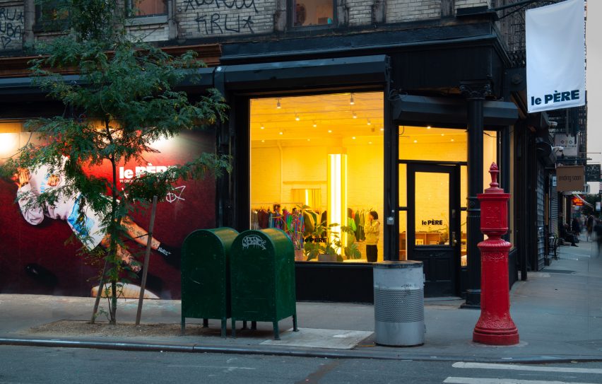
This yellow aura is immediately apparent from the street and is meant to entice passersby to step inside.

Neon lighting has seen a resurgence in retail and other commercial interiors of the past year, appearing everywhere from a Brooklyn cafe to a Calgary chicken shop.

Pair of yellow fitting rooms with tube lights either side of the mirrorsPair of yellow fitting rooms with tube lights either side of the mirrors
The tube lights were installed on either side of mirrors in the fitting rooms, which are also yellow

At Le Père, other elements like the tops of vintage Artek furniture are coloured red and black, to borrow from the street signs across the neighbourhood.

Floor-to-ceiling curtains along the back wall create a soft and neutral backdrop for the apparel, which is displayed on industrial metal racks.

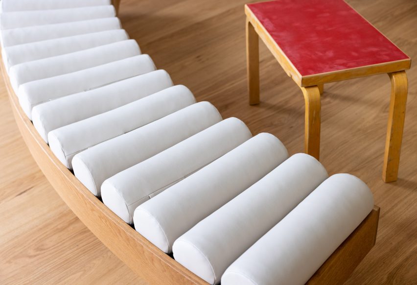
Close-up on a curved bench with a row of cylindrical seat pillowsClose-up on a curved bench with a row of cylindrical seat pillows
Custom furniture pieces were designed by BoND and fabricated by Lesser Miracle

Wide-plank wood floors are laid across the main shop floor, which doubles as a space for gatherings, conversations, exhibitions and events.

Custom furniture pieces including a curved bench were designed by BoND and fabricated by Brooklyn design and art studio Lesser Miracle.

“The design scheme blurs the lines between a store, a home and an art studio – a space that is both aspirational and livable, combining contemporary and historic elements as a playful strategy,” said the studio.

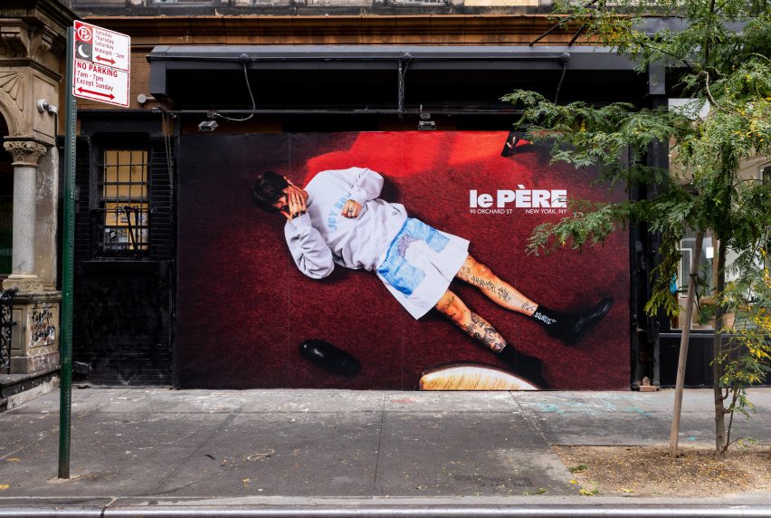
On the exterior, a generous portion of the facade is given over to a giant billboard that Le Père will use to present its seasonal visual campaigns and artwork by the brand’s collaborators.

Billboard across a storefrontBillboard across a storefront
A large portion of the facade is given over to a billboard to display the brand’s campaigns

The debut placement for Fall/Winter 2023 was titled And Sometimes Boys and influenced by the work of Korean visual artist Nam June Paik.

BoND was founded by Noam Dvir and Daniel Rauchwerger, who previously designed the global headquarters and showroom for the Brazilian brand PatBo in New York.

Le Père store exterior on Orchard StreetLe Père store exterior on Orchard Street
The glow from the yellow lighting is designed to entice in shoppers on the Lower East Side. Photo by BoND

The duo earlier overhauled an apartment in Chelsea for themselves, turning the dark, divided space into a light-filled home.

The photography is by Stefan Kohli, unless stated otherwise.


Reference

Space Projects creates Amsterdam store with thatched hut for Polspotten
CategoriesInterior Design

Space Projects creates Amsterdam store with thatched hut for Polspotten

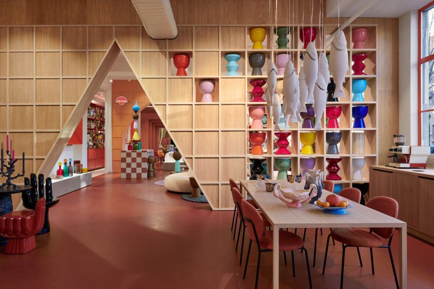
A curvilinear thatched hut has been paired with terracotta-hued tiles at the Amsterdam store for homeware brand Polspotten, which was designed by local studio Space Projects.

The studio created the store to straddle a shop and an office for Polspotten, a furniture and home accessories brand headquartered in the Dutch capital.

Triangular archway in the Amsterdam Polspotten storeTriangular archway in the Amsterdam Polspotten store
Visitors enter the Polspotten store via an oversized triangular entranceway

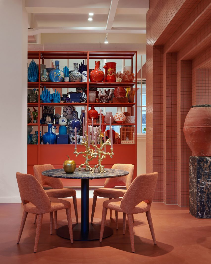
Characterised by bold angles and arches, the outlet features distinctive terracotta-coloured walls and flooring that nod to traditional pots, Space Projects founder Pepijn Smit told Dezeen.

“The terracotta-inspired colours and materials refer to the brand’s first product, ‘potten’ – or pots,” said Smit, alluding to the first Spanish pots imported by Erik Pol when he founded Polspotten in the Netherlands in 1986.

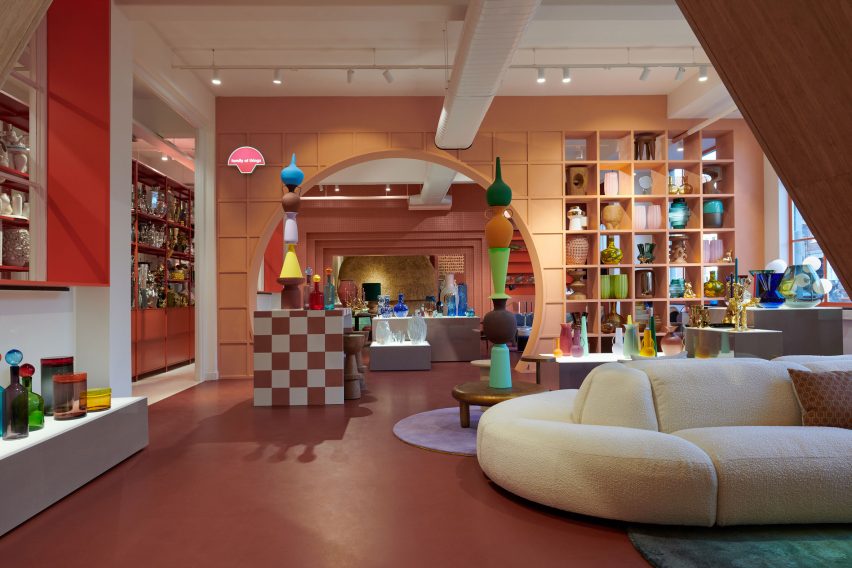
Plush cream sofa within Amsterdam homeware storePlush cream sofa within Amsterdam homeware store
The interconnected spaces are delineated by cutouts

Located in Amsterdam’s Jordaan neighbourhood, the store was arranged across a series of open-plan rooms, interconnected by individual geometric entryways.

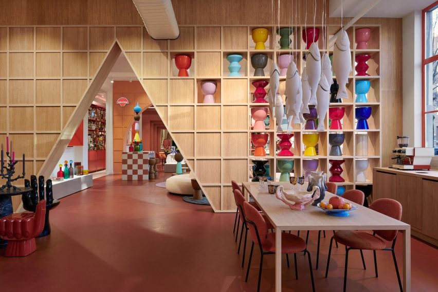
Visitors enter at a triangular opening, which was cut away from gridded timber shelving lined with multicoloured pots that mimic totemic artefacts in a gallery.

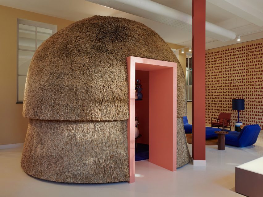
Curvilinear thatched hutCurvilinear thatched hut
A curvilinear thatched hut provides a meeting space

The next space features a similar layout, as well as a plump cream sofa with rounded modules and sculptural pots stacked in a striking tower formation.

Travelling further through the store, molten-style candle holders and Polspotten furniture pieces were positioned next to chunky illuminated plinths, which exhibit amorphously shaped vases finished in various coral-like hues.

Accessed through a rectilinear, terracotta-tiled opening, the final space features a bulbous indoor hut covered in thatch and fitted with a light pink opening.

The hut provides a meeting space for colleagues, according to the studio founder.

“The thatch, as a natural material, absorbs sound as well,” explained Smit.

Clusters of pots next to a circular tableClusters of pots next to a circular table
The store provides an art gallery-style space for homeware

Next to the hut, Space Projects created an acoustic wall illustrated with “hieroglyphics” of Polspotten products, which references the gallery-like theme that runs throughout the outlet.

“The store was inspired by Polspotten’s use of traditional techniques combined with a collage of their reinterpreted archetypes,” said Smit.

Office space at PolspottenOffice space at Polspotten
It is also used as an office space

Elsewhere in Amsterdam, Dutch practice Studio RAP used 3D printing and algorithmic design to create a “wave-like” facade for a boutique store while interior designer Linda Bergroth created the interiors for the city’s Cover Story paint shop to streamline the redecorating process for customers.

The photography is by Kasia Gatkowska.

Reference