Putting On a Show: 7 Remarkable Venues With Real Wow-Factor
Architizer’s 11th Annual A+Awards is open for entries! With a Final Entry Deadline of January 27th, 2023, the clock is ticking — get started on your submission today.
Venues are the vessels of performance, and architecture is perhaps the most overlooked player on the stage. The geometries of events structures must perfect a complex dance that juggles elements such as acoustics, scale, sightlines, illumination and atmosphere. All the world may be a stage, to quote Shakespeare’s enduring words, but it’s the task of the architect to shape the stage into its own palpable world.
Performance spaces, whether theatrical, cultural or athletic, have a storied history that reaches back millennia. Yet, these typologies continue to be revised and rewritten in exciting new ways, as these outstanding winning projects from the 10th Annual A+Awards show. From concert halls and theaters to stadiums, discover seven of the most innovative contemporary venues deserving of a standing ovation.
Zhengzhou Grand Theater
By The Architectural Design and Research Institute of HIT, Zhengzhou, China
Popular Choice Winner, 10th Annual A+Awards, Hall / Theater
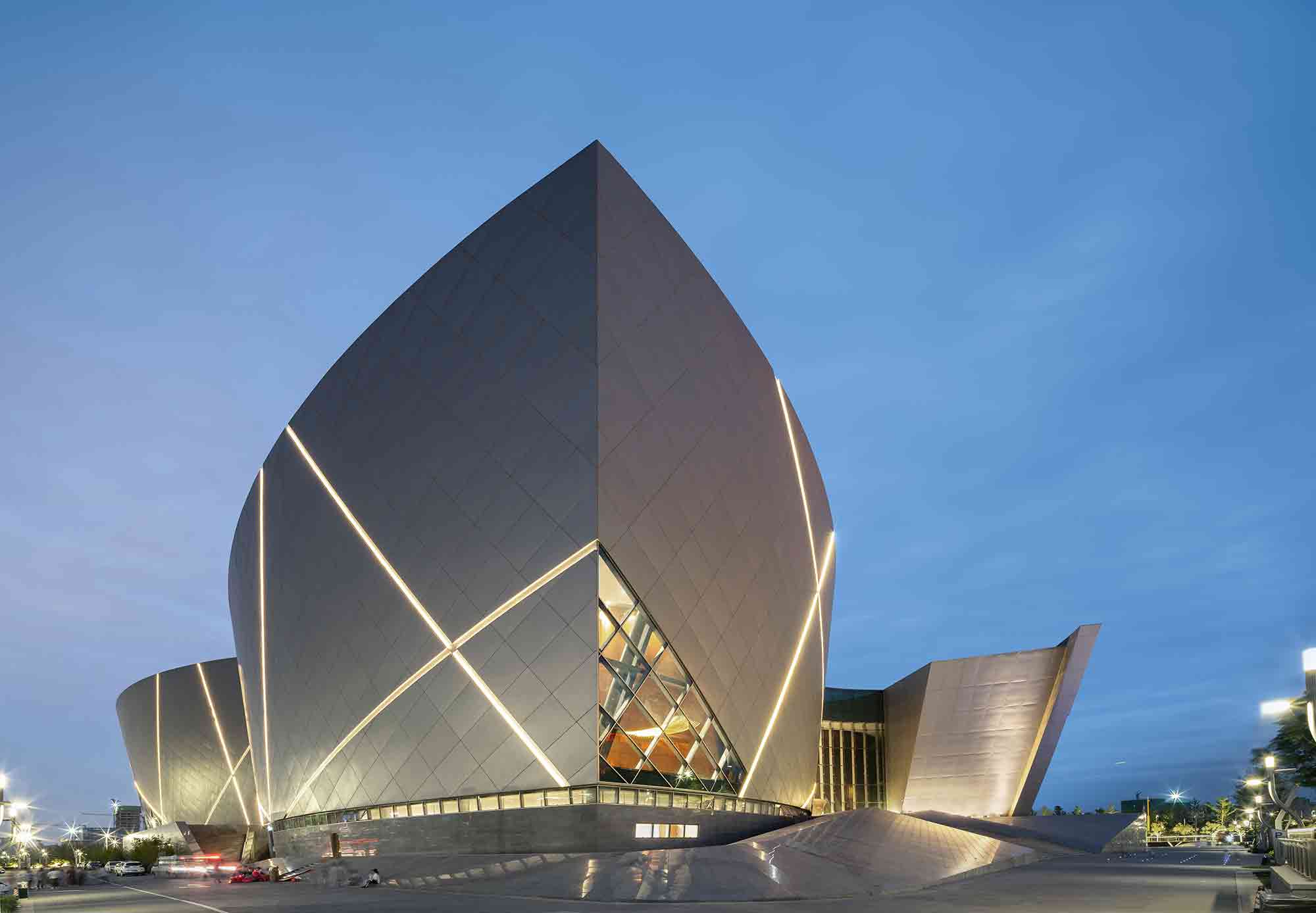
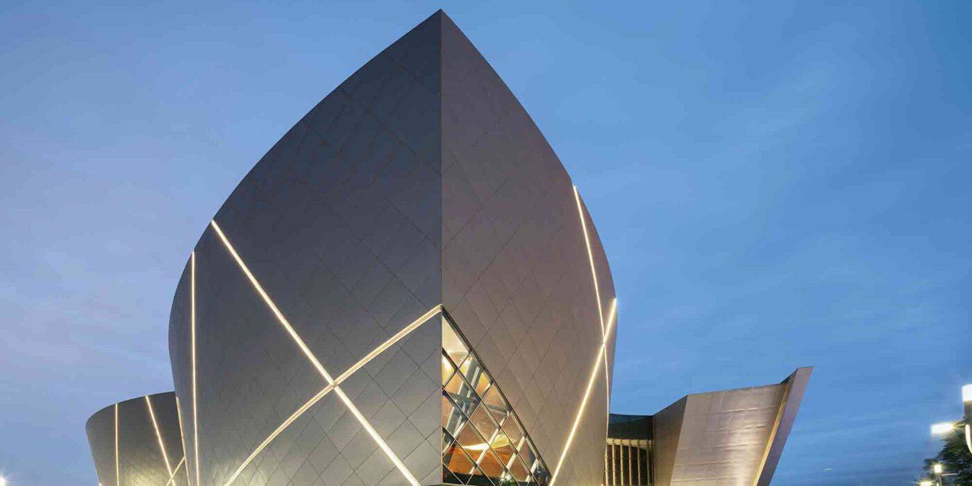
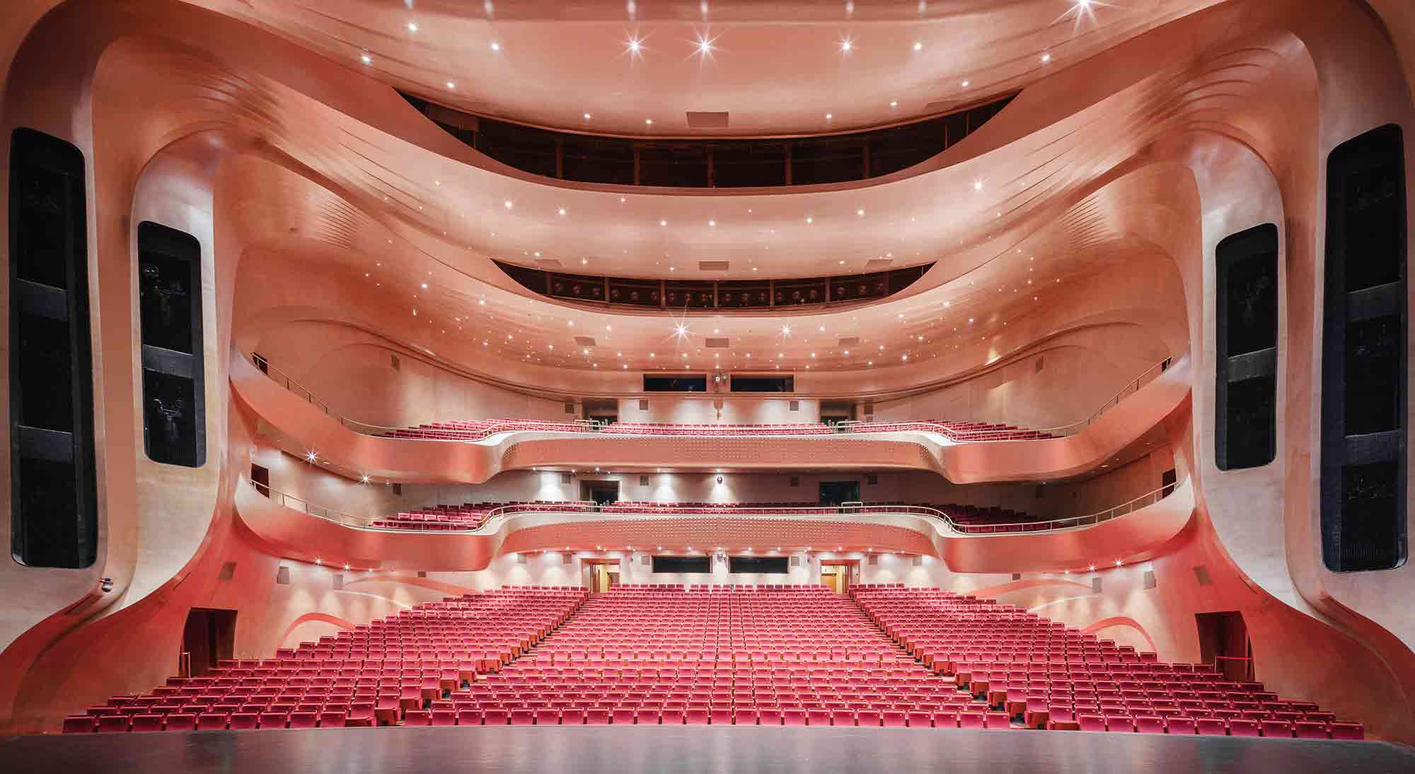 Envisaged as a boat traversing China’s Yellow River, this remarkable performing arts venue resembles a vast ship anchored amid the urban sprawl of Zhengzhou. A series of dramatic metal sails define the exterior; however, the structure’s imposing scale is softened by its receptiveness to the surrounding landscape. Angular glass openings create a rapport between the building and the street outside. After nightfall, the sails illuminate and the interior glows, beckoning passers-by into its theatrical world.
Inside, the complex is home to four large theaters with unique architectural identities. The spaces have been carefully designed to accommodate their differing acoustic needs while ensuring there’s no noise interference between the venues. Undulating balconies, curving forms and dynamic solid surface patterns shape an immersive visual and audio experience.
Andermatt Concert Hall
By Studio Seilern Architects, Andermatt, Switzerland
Jury Winner, 10th Annual A+Awards, Hall / Theater
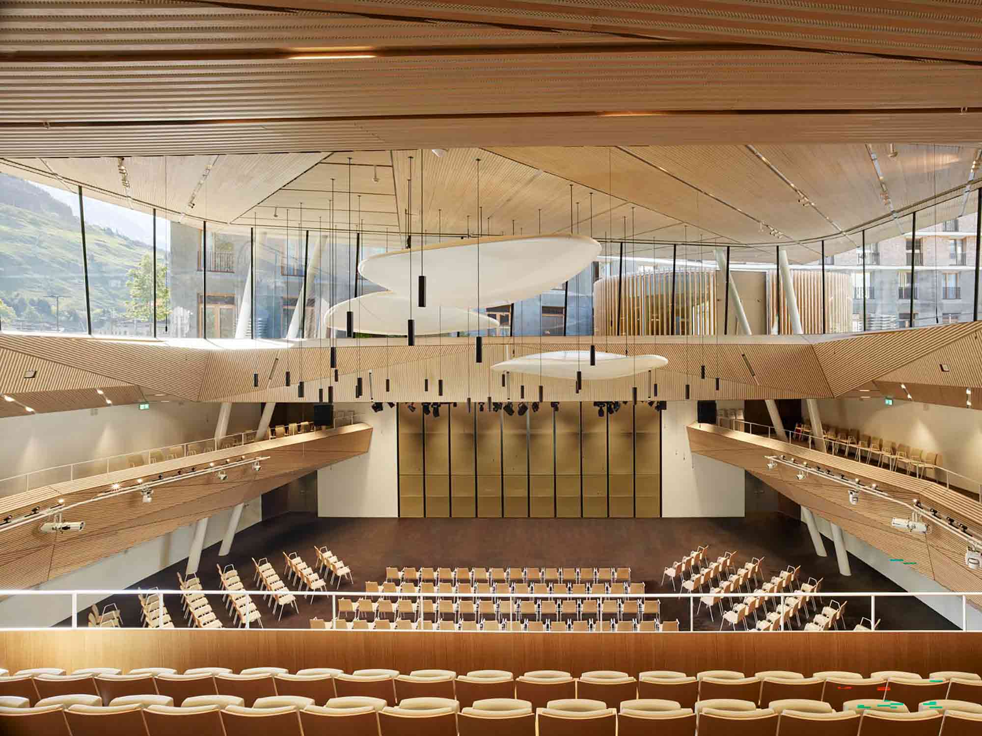
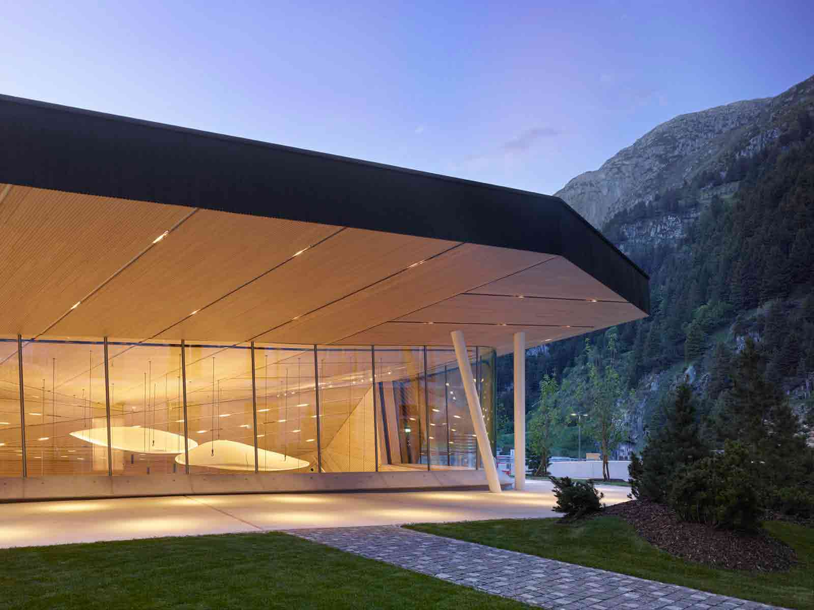 Originally an underground convention hall, this concrete structure has been transformed into a contemporary concert hall in the picturesque Swiss Alps. The ceiling of the subterranean space was raised to amplify the venue’s acoustics and increase its capacity. From the origami-inspired timber cladding to the inclined balconies and suspended sound reflectors, the interior topography has been carefully orchestrated to create an enveloping space where sound rises and falls around the audience like a wave.
The redesign rejects the conventional notion of the concert hall as an insular, enclosed space. The glazed upper volume protrudes up into the rural landscape, allowing light to pour down into the venue and creating a mercurial backdrop for concerts that shifts with the seasons. Externally, the structure takes on the appearance of an art installation at first glance, the acoustic reflectors floating ethereally amid the mountain peaks. The result is an intriguing invitation to find out more…
Hayward Field
By SRG Partnership, INC, Eugene, Oregon
Popular Choice Winner, 10th Annual A+Awards, Stadium & Arena

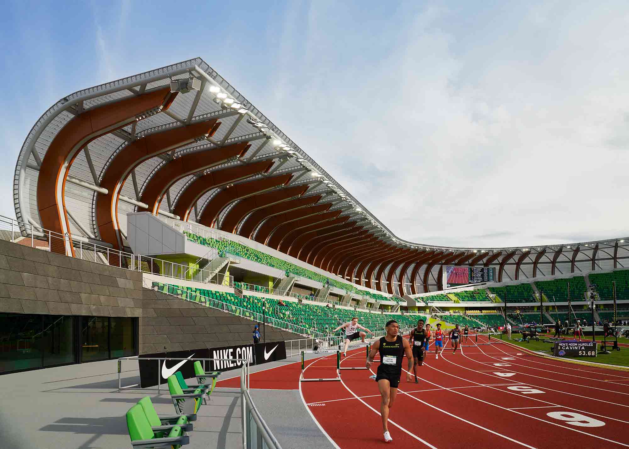 The site of sporting venues since 1919, this state-of-the-art track and field stadium has a hallowed history. The newest iteration of this legacy was inspired by the energy of competing athletes. The asymmetric oval frame of the stadium dips and rises in height as though it’s in motion — a considered decision that increases the density of seats near the finishing line. Meanwhile, a canopy of wooden ribs covered in a translucent skin allows daylight to permeate the stands, shielding the heart of the stadium, the spectators, from the elements.
The athletes’ experiences are prioritized in the architectural fabric of the structure too. As well as a vast complex dedicated to training and recovery below the stands, every element of the stadium has been designed as a vehicle for practice, from the winding stairs at the entrance to the public concourses and ramps clad in track surfacing.
Montforthaus
By HASCHER JEHLE Architektur, Feldkirch, Austria
Jury Winner, 10th Annual A+Awards, Cultural & Expo Centers
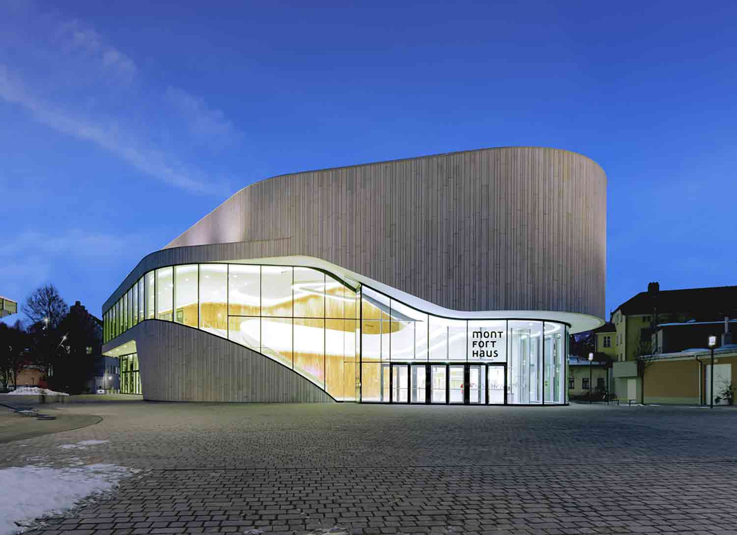
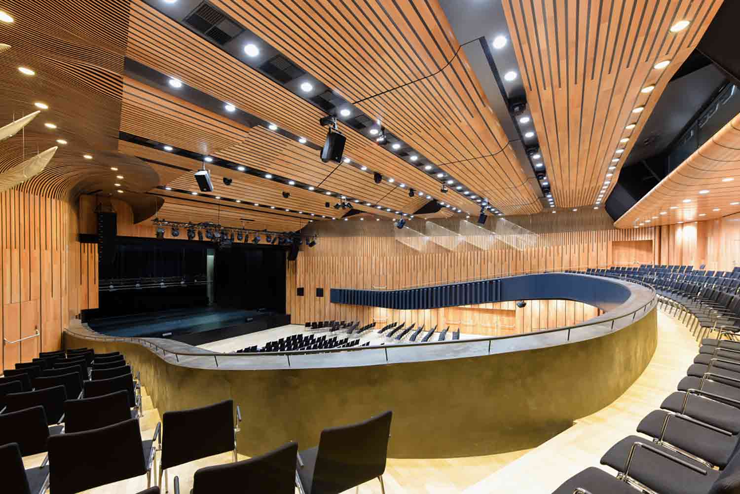 This experimental venue is situated in a medieval town in western Austria. It was designed as a fluid space, capable of hosting everything from conventions and balls, to theater, pop concerts and classical performances. While its architectural form is strikingly contemporary, the structure doesn’t stand in conflict with its historic surroundings. Instead, traditional regional materials have been reimagined in a modern lexicon, creating a continuity between old and new.
The complex comprises an array of multipurpose events spaces, each shapeshifting in their scale and functionality. The large concert hall features over 300 square meters of adjustable surfaces, including six movable acoustic sails across the ceiling for a customizable aural experience. Height limitations posed an initial challenge to the design, which meant rethinking the theatrical rigging system. Instead, the classic fly tower was reimagined as interchangeable segments, an especially innovative configuration.
Quzhou Stadium
By MAD Architects, Quzhou, China
Jury Winner, 10th Annual A+Awards, Stadium & Arena
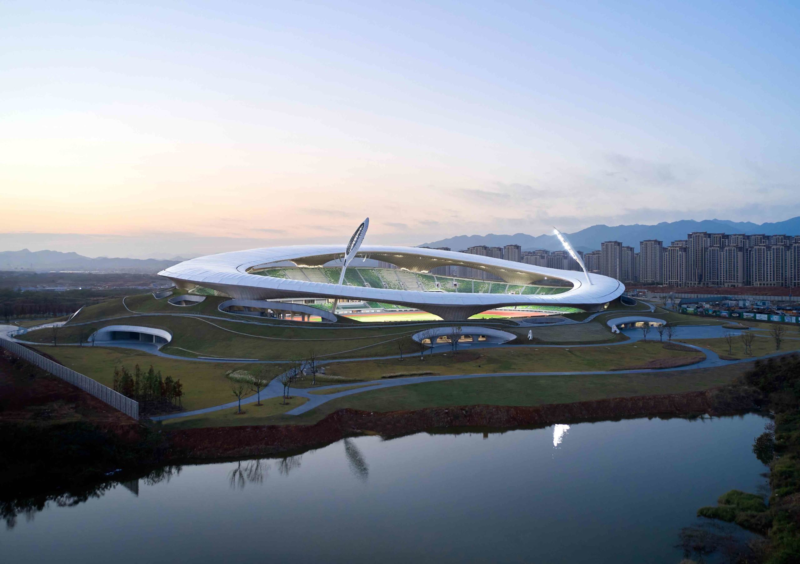
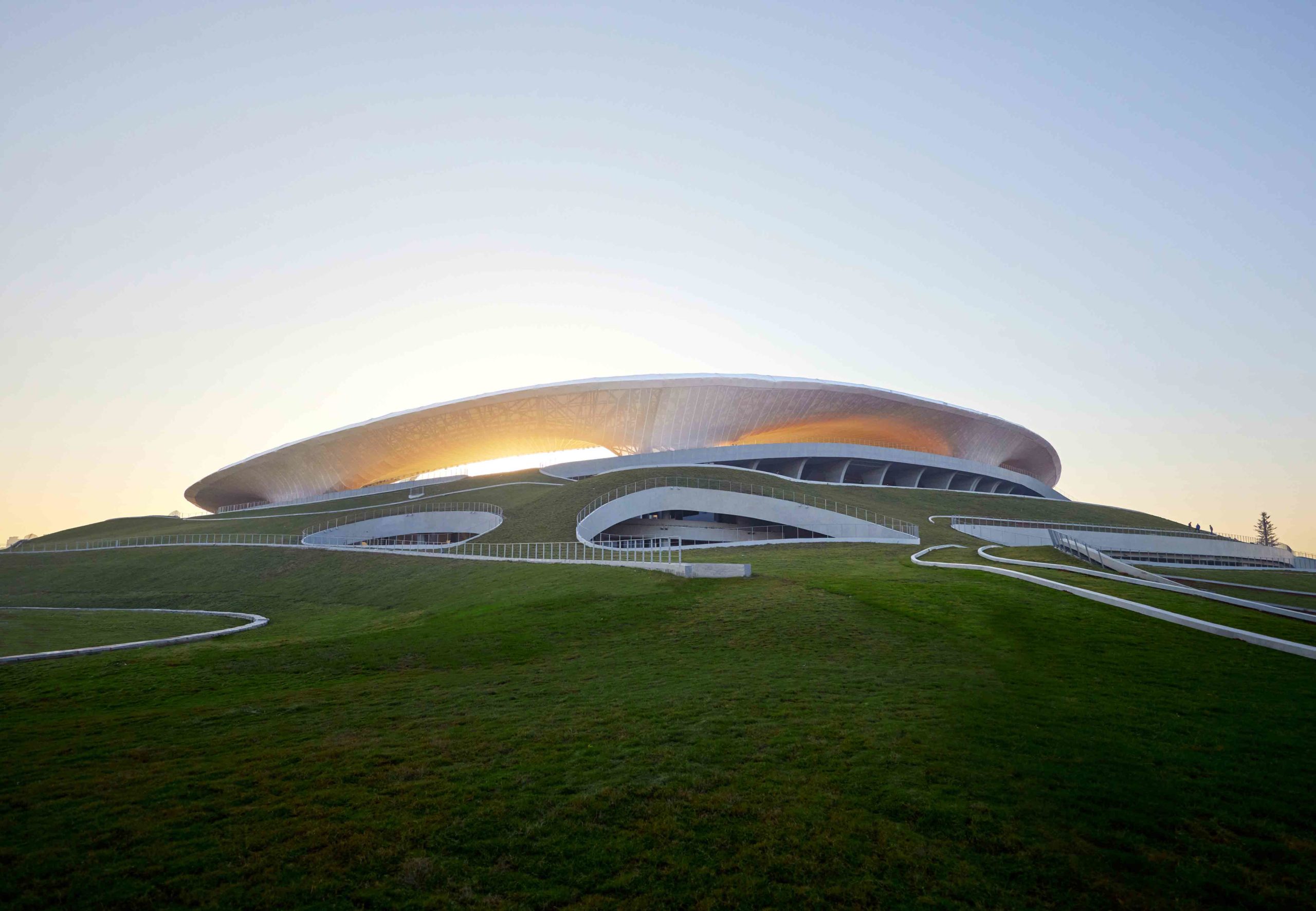 Embedded within an urban park, this extraordinary sports complex in Quzhou was devised to blur into the rolling topography. Six hills, a lake and sunken gardens sit in harmony with the structure, which is nestled within a crater-like recess in the ground. The entrances to the stadium appear as apertures in the earth, oversized burrows of sorts. From a distance, the only tell-tale sign of the arena’s presence is the translucent halo of the roof, which seemingly floats above the landscape like a cloud.
Encircled by woodland, the park sits at a distance from the city, the organic terrain a counterpoint to the developed skyline. The project offers a rebuttal to the typology of the stadium as a display of power — one that often appears to dominate the landscape. Instead, the sporting spirit is sensitively imbued into a communal outdoor space, placing the training of elite athletes alongside the quotidian physical activities of city dwellers.
Intuit Dome
By Cloud Architects, Inglewood, California
Jury Winner, 10th Annual A+Awards, Unbuilt Sport & Recreation

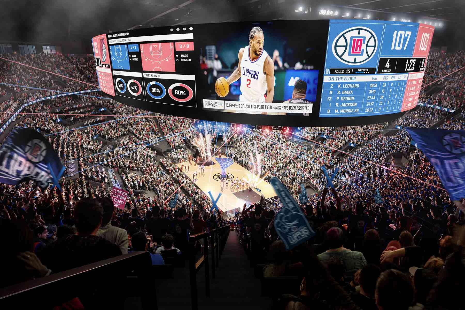 Combining sports with sustainability, the ground-breaking basketball stadium of the LA Clippers is striving to become the world’s first carbon-neutral arena. Harnessing Southern California’s sunny climate, the stadium, which is currently under construction, will be enveloped by a gridshell crowned with a solar array. The building will run entirely off electricity derived from the sun, while its solar battery storage system will have enough capacity to power a basketball game or concert. Coupled with natural ventilation and initiatives to eradicate landfill waste and improve local air quality, the arena will have an overwhelmingly positive impact on the region.
Embracing environmental responsibility hasn’t compromised the experience of fans either. The pioneering design will feature a bowl-style seating arrangement that ensures each seat has an unimpeded sightline, as well as integrated at-seat refreshment services. Meanwhile, the architects conceived the arena’s interior to optimize the Clippers’ home-court advantage — 51 rows of seats will flank one of the baskets, dubbed the ‘Wall of Sound’.
Winter Park Library & Events Center
By Adjaye Associates, Winter Park, Florida
Jury Winner, 10th Annual A+Awards, Libraries
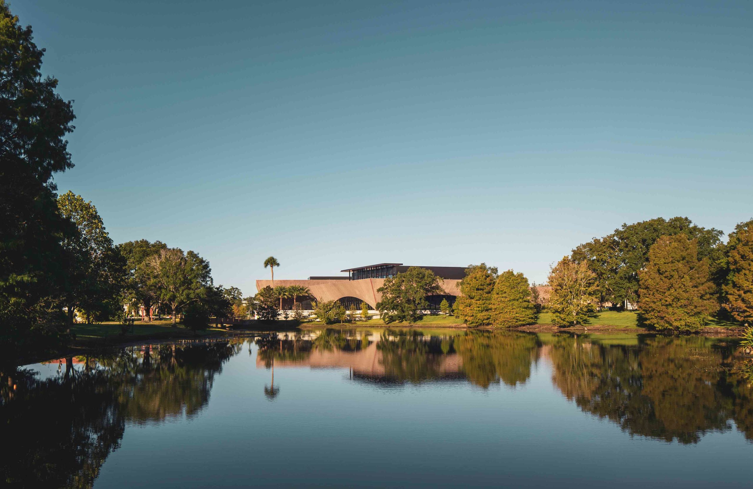
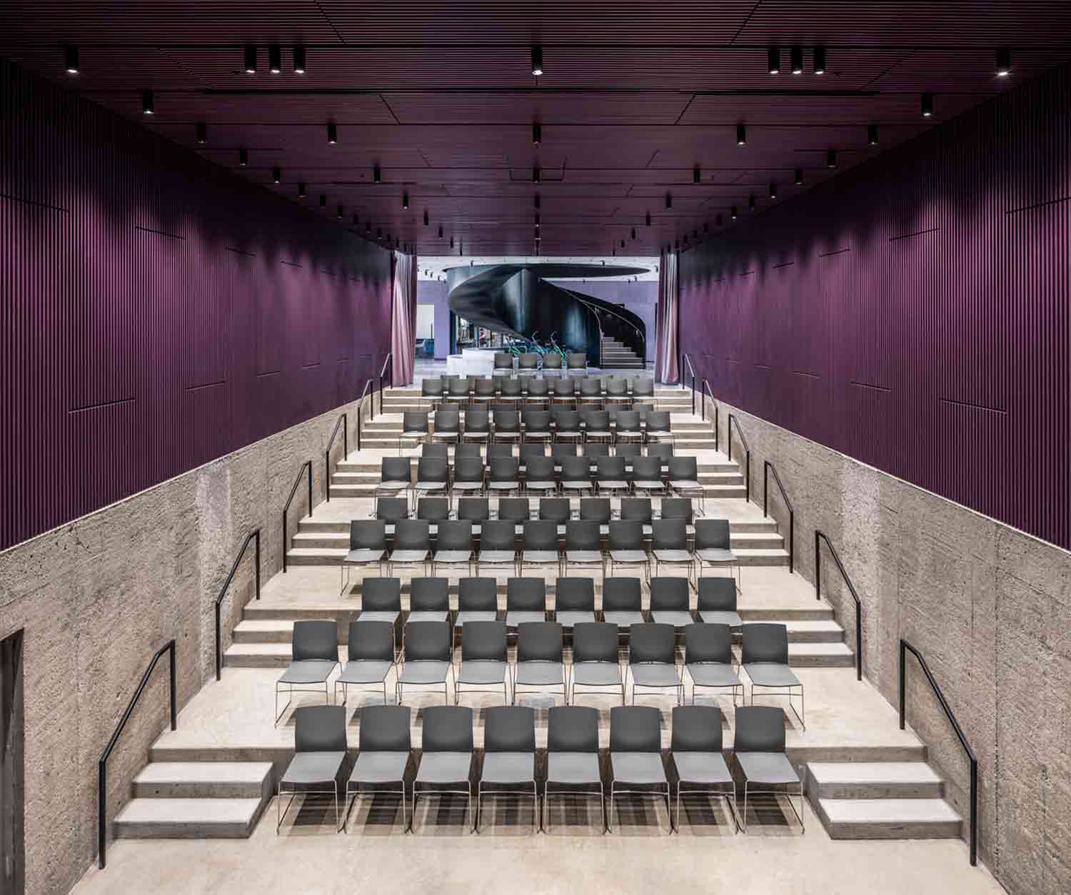 This community development in Florida was designed as a cultural micro-village amongst the tropical terrain. Encompassing the northwest corner of Martin Luther King, Jr. Park, the complex comprises three pavilions that house a two-story library, an events center and a welcome portico, as well as a number of outdoor socializing areas. The scheme’s radical design articulates its core principles of empowerment, education and unity with the natural world.
Just as the indoor buildings flow out seamlessly to the exterior meeting spaces, the divisions between the designated interior zones are porous. The library and events center feature flexible floor plans that promote the cross-pollination of ideas. Rather than a traditional, closed design, the tiered auditorium is open at the back to the rest of the events complex, encouraging engagement and participation. Here, the venue is not a singular confined space but a permeable zone of collaboration.
Architizer’s 11th Annual A+Awards is open for entries! With a Final Entry Deadline of January 27th, 2023, the clock is ticking — get started on your submission today.


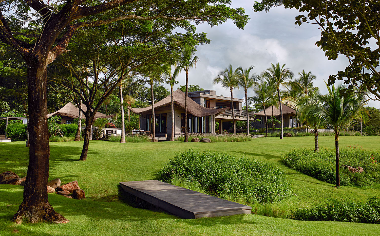 The project was approached with a deep sensitivity to local context. “The intent was to first restore, then relate to and engage with the site,” stated the architects. “The design needed to emerge from the restored forest to find wide open plains through, in, and around the main house. The concept of the main house at Casa Loro was to create a modern tree house made with contextual materials that enclose indoor and outdoor spaces equally.”
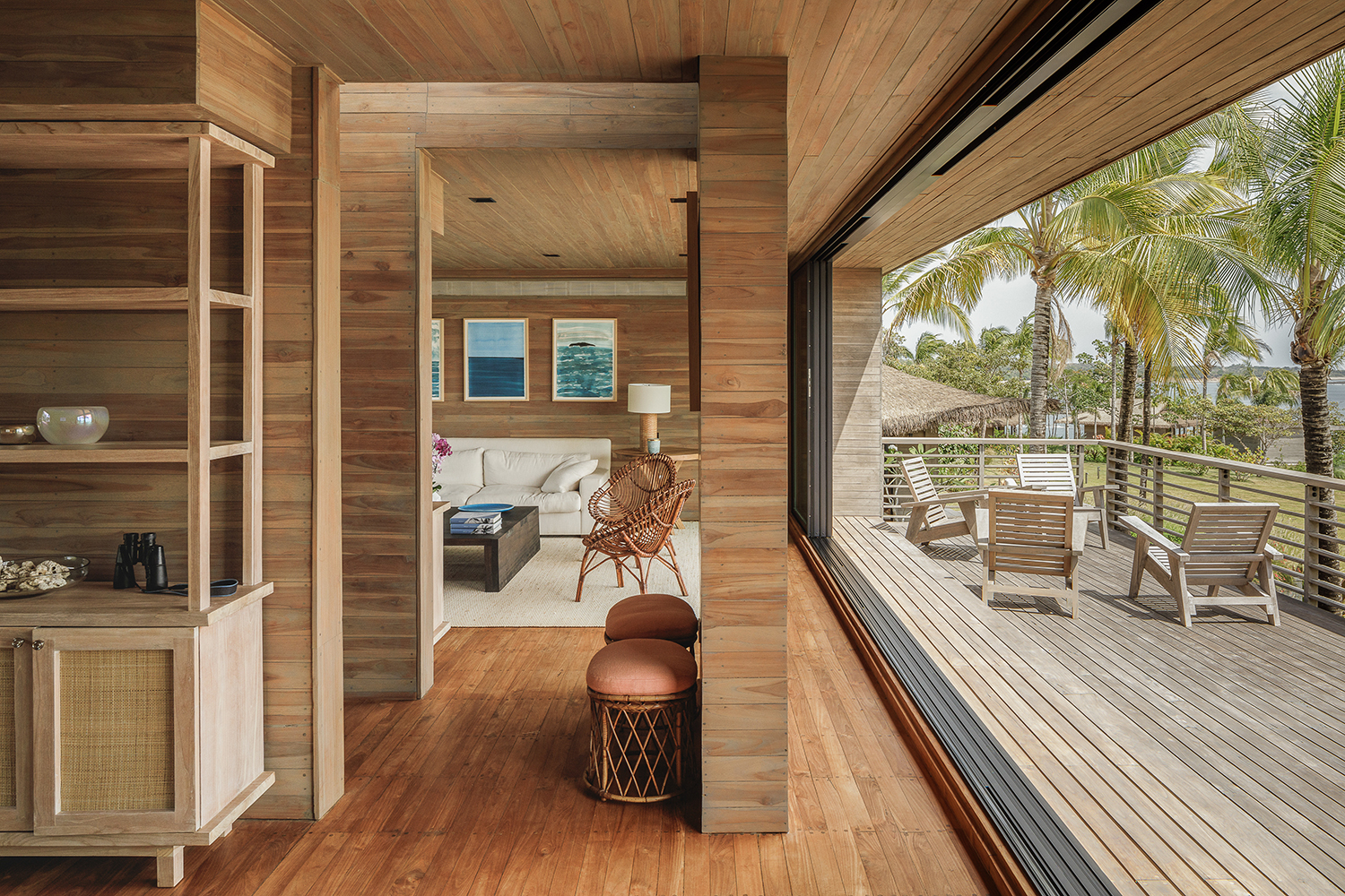 IM-KM paid special attention to material selection and spatial layout, seeking to create a home in which each space is uniquely designed to enhance the client’s sensory experience: “As we designed each of these spaces, we wanted them to have unique qualities of sound, materials, and light, that become integrated components that enhance the user’s experience and create specific memories of the place.
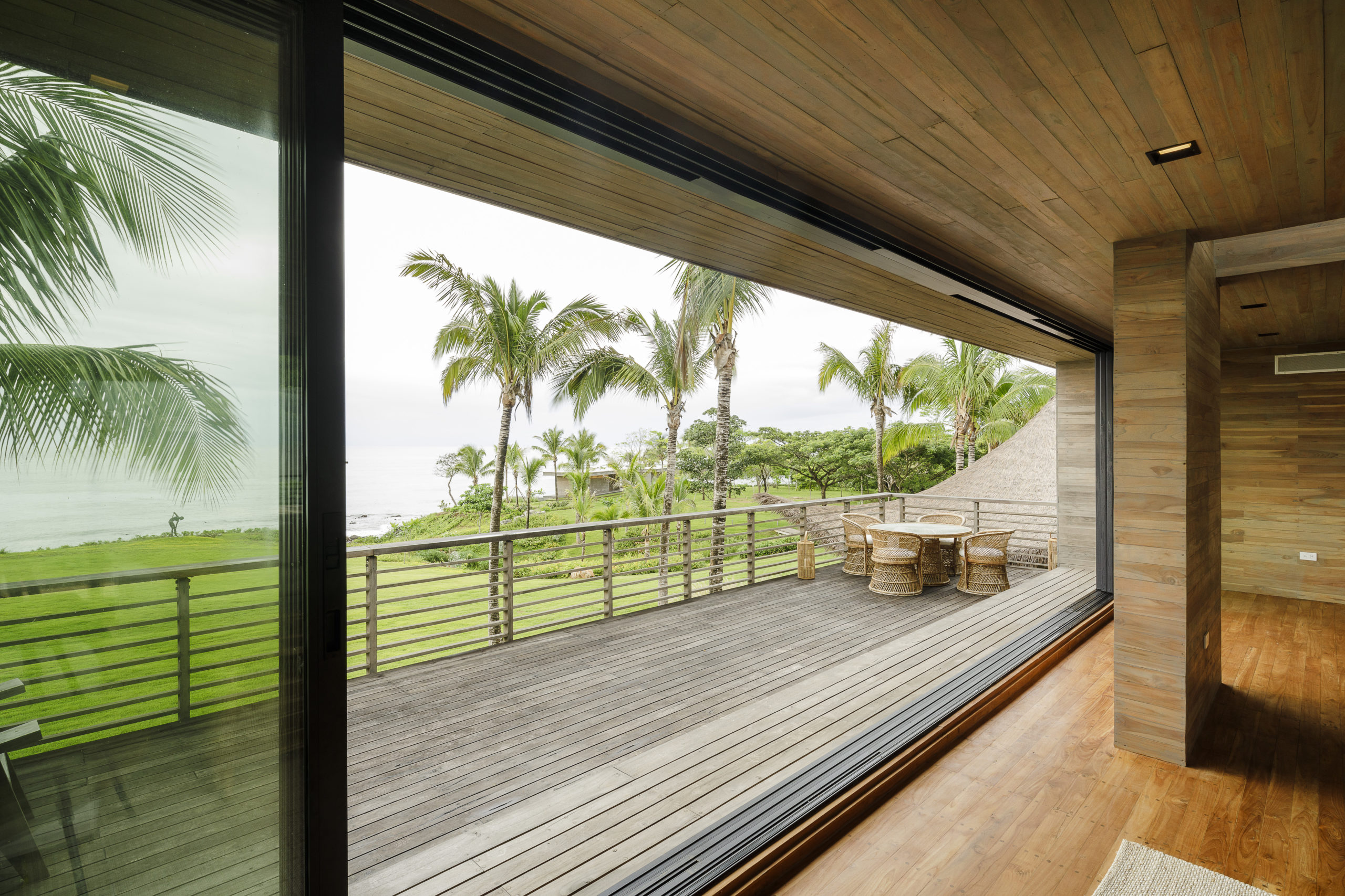 “This was achieved by hierarchically separating the spaces by a series of steps and platforms that are surrounded by gardens that attract biodiversity. As you circulate, each space becomes gradually more intimate until you reach the bedrooms and their private gardens. The ocean and fountain provide different acoustics depending on which space or garden you are in, and the shade from the various trees and palms create shadows that move around with the ocean breeze.”
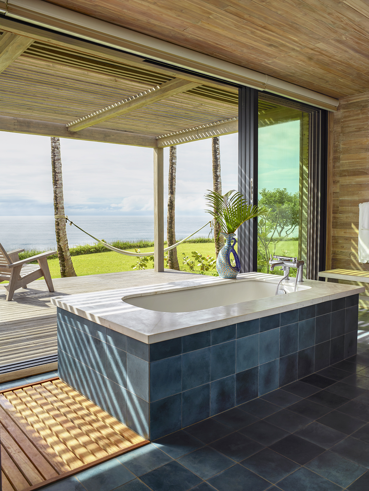 The architects sought to create a hierarchical sequence of spaces that would offer inhabitants a sense of escape as they transition between each living space. IM-KM explained: “The pavilions of the main house are all balanced around the central pavilion which contains the vestibule and indoor and outdoor living rooms. From this central space, you transition from the modern world to somewhere else, where you can forget your day, and just be on holiday.”
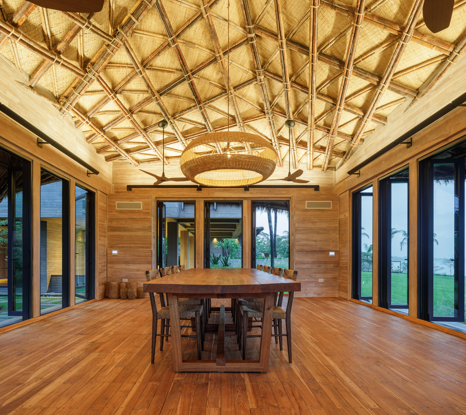 Utilizing LaCantina’s sliding door systems, the façades of each pavilion are fully operable. When opened, the perimeter of the interior spaces become permeable and create a single larger room including the adjacent garden spaces and the ocean at the horizon. “When passing through the modern pavilion — from the vestibule into the outdoor living room — you are compressed and released into the vastness of the outdoor living room which looks out to the sea and the surrounding playful roof forms. It is meant to be an exciting, all-encompassing transition,” said the architects.
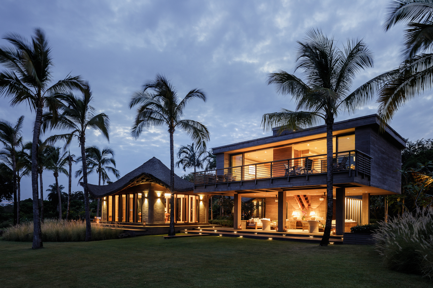 Casa Loro powerfully demonstrates how smart material and product selection can enable a seamless transition between interior spaces and the surrounding landscape. IM-KM’s adept use of LaCantina Doors systems helped create a serene home that is intimately connected to the unique natural environment of Panama, while producing an open-plan layout that is flooded with natural light. The house is proof that, when the right building products are employed and the details are well considered, a “Best in Show” outcome is possible.