Vitra extends European presence with showroom openings
CategoriesInterior Design

Vitra extends European presence with showroom openings

Promotion: Swiss furniture brand Vitra is expanding its European presence through a programme of showroom openings in renovated, distinctive historic buildings.

The brand, which is known for high-end office and home furniture by leading designers, has embarked on a programme of showroom expansion and renovation to add to its global presence.

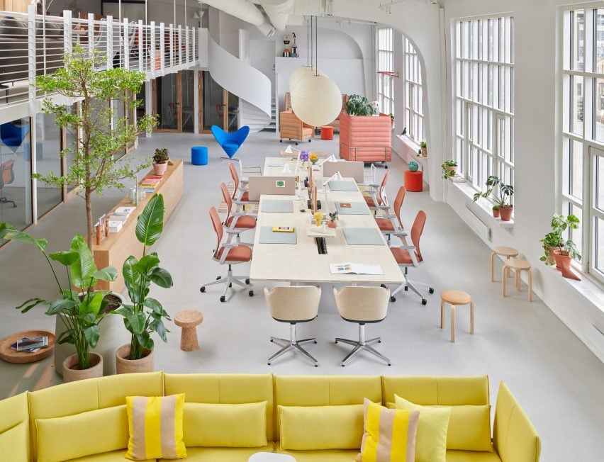
“All Vitra showrooms reflect an agile and flexible platform to showcase our office and home concepts, including both Vitra and Artek,” said the brand.

“We are keen to present the collaboration and synergies with our partners in spaces designed for communal work, activities and events.”

It has recently opened or renovated showrooms in Amsterdam, London, Madrid, Oslo and Stockholm.
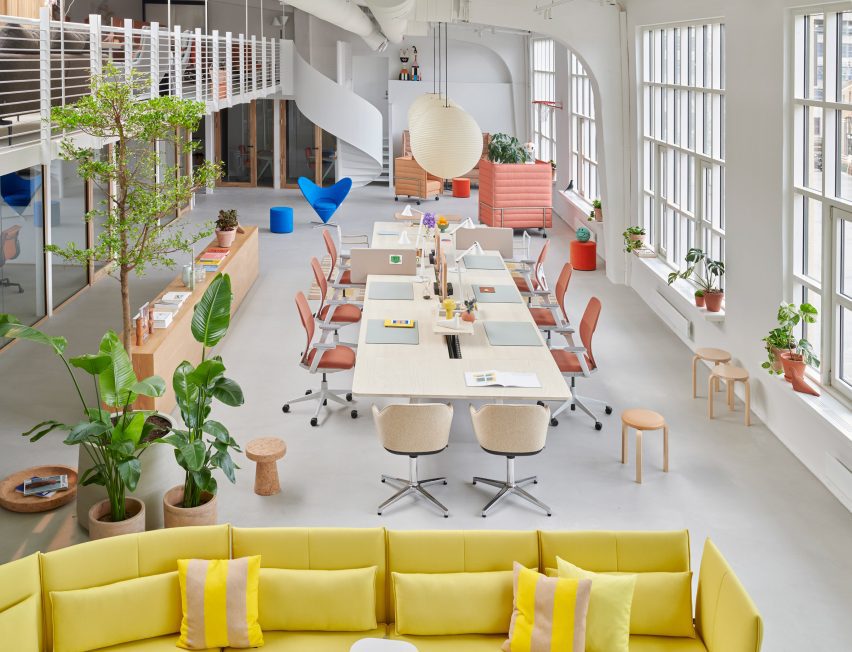
Oslo Vitra showroomOslo Vitra showroom
Vitra recently opened a showroom in Oslo

Vitra’s latest showroom opened last month in Oslo. Set within a 1930s metal factory in the resurgent Skøyen district, the understated interior was designed to contrast the industrial structure and set the base for the brand’s curated furniture collections.

The space contains offices for Vitra local staff and also functions as a place for the brand to host architects and designers.
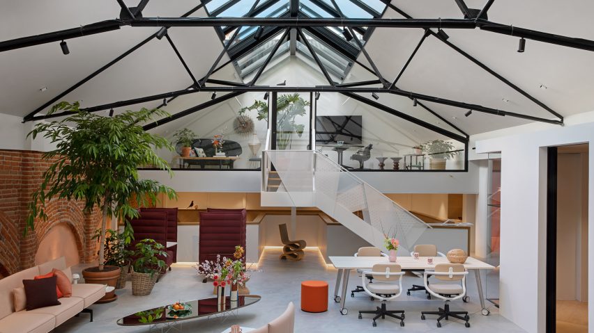
Vitra Madrid showroomVitra Madrid showroom
It also opened a showroom in renovated building in Madrid

Earlier this year in Madrid’s bustling Salamanca district, Vitra opened a showroom within a 1920s art nouveau building originally designed by Spanish architect Antonio Palacios as a power supply facility for the city’s metro system.

The space was renovated by Spanish studio Carlos Manzano Arquitectos to create a bright and open space that showcases many of the building’s original features.

Topped by a distinctive steel and glass roof, the space combines office space for Vitra’s Madrid staff along with a showroom space, Vitra Colour & Material Library and a Task Chair Lab.

“One of our main goals was to peel off added elements to reveal the beauty of the spacious interior,” said Till Weber, creative director interiors and scenography.

“We also tried to maintain as much as possible of the original structure. For example, we tore out an entire kitchen installed by the former tenant to reveal wonderfully preserved brick walls.”
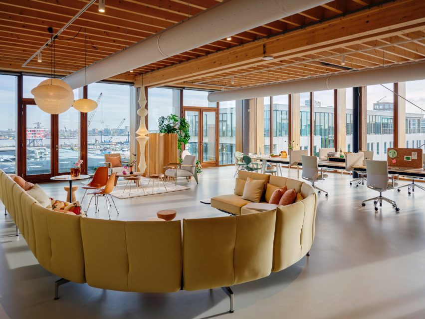
Vitra Amsterdam showroomVitra Amsterdam showroom
Its Amsterdam showroom overlooks the city’s port

In Amsterdam, Vitra recently opened another showroom on the dockside in the city’s Houthavens district within an old industrial munitions complex.

Vitra’s Amsterdam home was designed by London-based interiors studio SevilPeach, which was shortlisted for interior designer of the year at Dezeen Awards 2019.

Described as “breathtaking” by Vitra chairman Rolf Fehlbaum, the pared-back space features several showrooms, a shop, offices, canteen, a workshop and warehouse spaces.
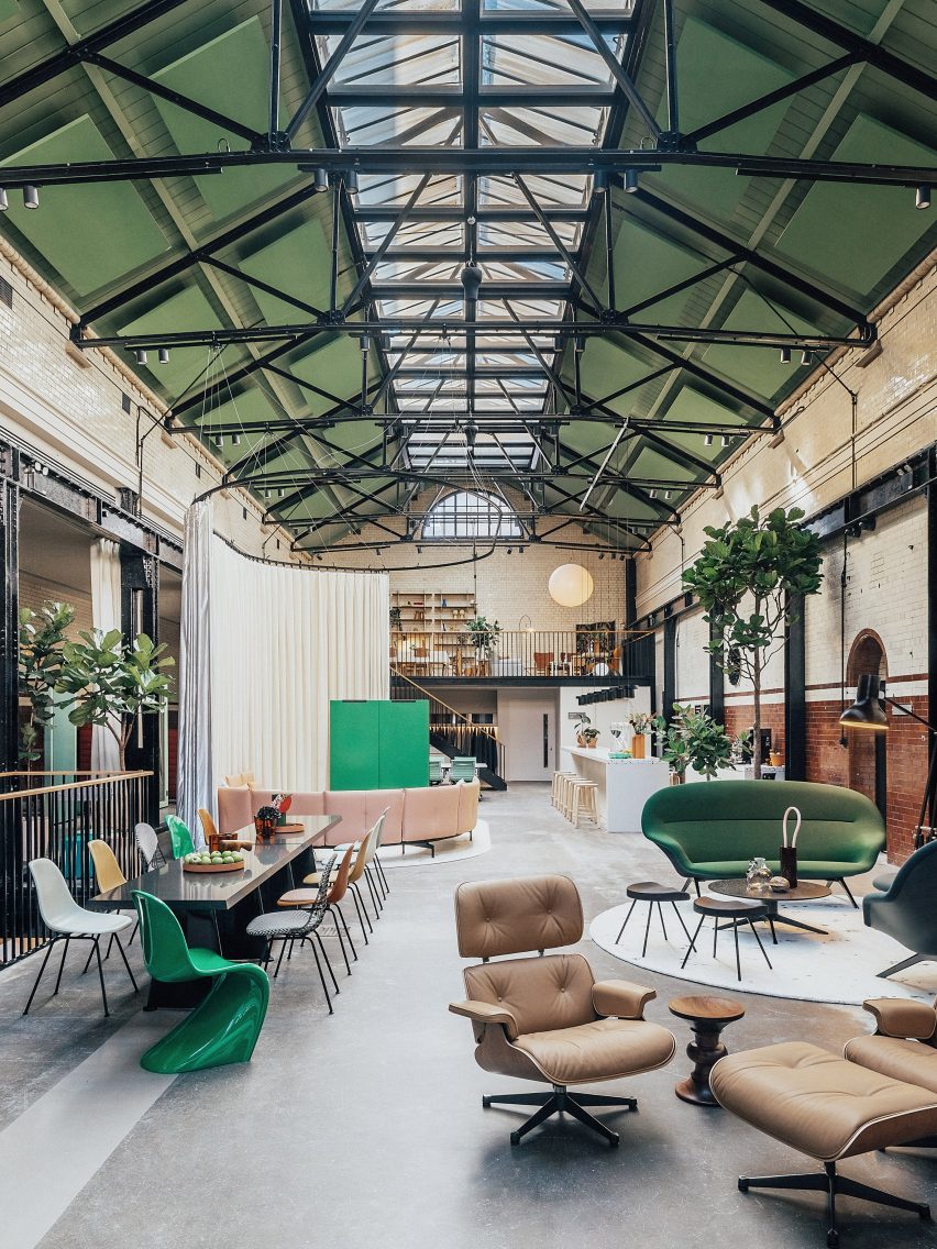
Vitra showroom in ShoreditchVitra showroom in Shoreditch
Vitra’s London showroom opened in the Tramshed in Shoreditch

In London, Vitra recently opened a showroom in another heritage building – the Grade II-listed Tramshed in Shoreditch.

Originally built as a power station for the East London Tramway in 1905, the building was renovated to draw attention to its original features including the central roof light.

Along with the showroom openings, Vitra also recently renovated its Stockholm showroom. The brand also has European showrooms in Brussels, Copenhagen, Frankfurt, Prague and Paris as well as outside Europe in Los Angeles, New York and Tokyo.
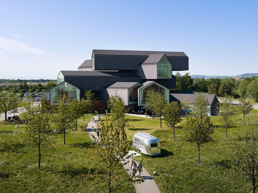
Herzog & de Meuron-designed VitraHaus flagship storeHerzog & de Meuron-designed VitraHaus flagship store
The Herzog & de Meuron-designed VitraHaus is its flagship store

The target audience for Vitra’s showrooms are B2B professionals, dealers, artists and designers. For its private clients, Vitra caters via its authorised dealer network and its own online shops.

Additionally, there is the Vitra Campus in Weil Am Rhein in Germany, which contains the Herzog & de Meuron-designed VitraHaus flagship store.

“The VitraHaus is a unique building that we have been working on for more than a decade,” said Nora Fehlbaum, CEO of Vitra.

“During this time, we have learned more about the building and about interiors in general: what does the building want? What suits it? What are the recipes for a good room? What is missing from our collection to make an interior even more meaningful or appealing? The interior we have now created reflects our answers to these questions and it is an ongoing project.”

Vitra creative director interiors and scenography Till Weber said: “In addition to the Vitra Campus, the Vitra brand should also be tangible and visible at a local level.”

“Depending on the location and surroundings there is a tailored concept, different colour scheme, a different product selection – but the Vitra DNA can always be experienced.”

Find out more about Vitra’s showrooms on its website.

Partnership content

This article was written by Dezeen for Vitra as part of a partnership. Find out more about Dezeen partnership content here.

Reference

Apparatus updates Los Angeles showroom to include a “modernist grotto”
CategoriesInterior Design

Apparatus updates Los Angeles showroom to include a “modernist grotto”

New York-based studio Apparatus has redesigned its Hollywood showroom with multiple material schemas and a range of its lighting and furniture products to evoke a feeling of “discovery” for visitors.

The 5,000-square-foot (464 square metres) Hollywood showroom first opened in 2018 in a former warehouse. Apparatus redesigned the interiors – which previously consisted of bold geometric and neoclassical elements – opting for an experience featuring a progression of materials that create distinct experiences for each room.

Heavily textured walls with hanging pendantsHeavily textured walls with hanging pendants
Apparatus has redesigned the interiors of its LA showroom

Its three adjoining rooms were transformed with distinct finishes and reconfigured displays.

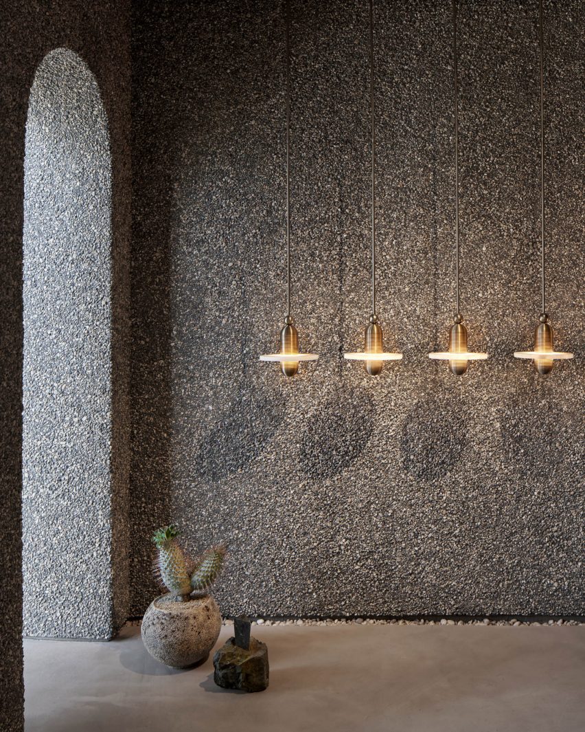
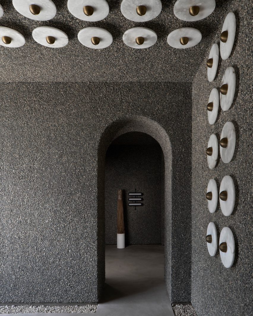
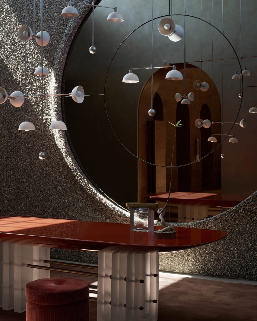
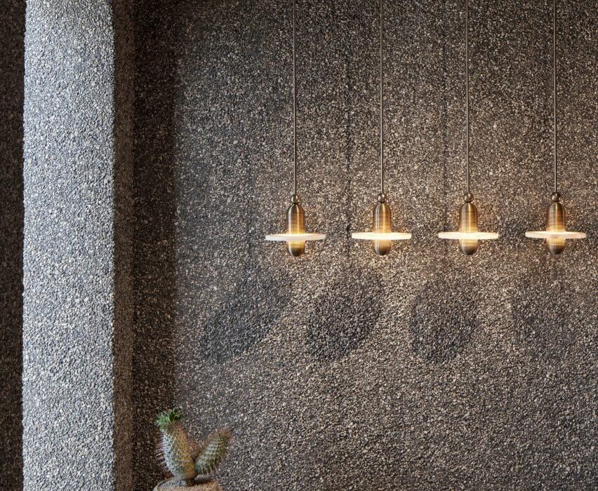
The first room’s walls and adjoining archways were covered in a coarse rock aggregate. Beds of similar stones fill small recessed gaps between the floor and the walls and a large circular mirror sits behind an installation of the Trapeze light configured as a mobile.

Heavily textured walls of Apparatus LA showroomHeavily textured walls of Apparatus LA showroom
The entry program features wall with a rough texture

“Upon entering, you find yourself in our version of a modernist grotto,” said Apparatus.

“Here lights are relatively low, allowing you to experience our collections with slightly subterranean undertones.”

Apparatus trapeze chandelier Apparatus trapeze chandelier
The “grotto”-like room features an installation of the Trapeze chandelier

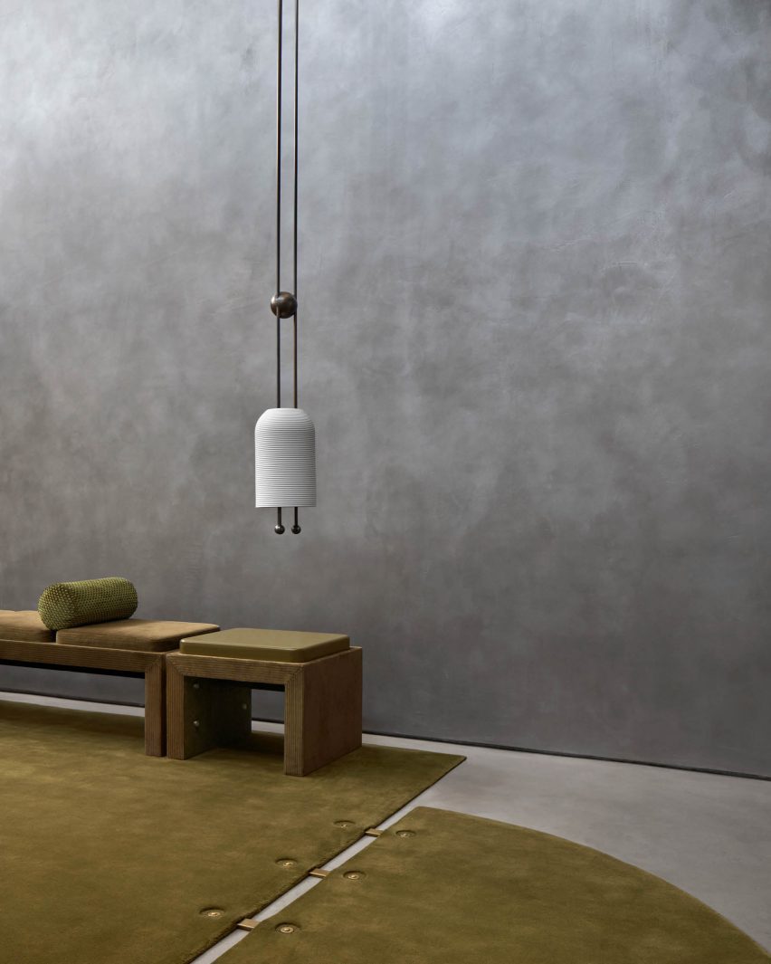
The pre-existing archways were left intact and lead into the next space, which was finished in a silver-toned plaster custom produced by New York outift Kamp Studios. This surface treatment has a reflective quality meant to contrast the first space.

It has an installation featuring multiple of Appratatus’ iconic Cloud chandeliers that give the space an airiness when contrasted with the earthy textures of the first.

Apparatus LA showroomApparatus LA showroom
The second room has a smooth, silvery finish on the walls

“Silvered walls reflect without revealing, giving the impression of being inside a Renaissance coffer,” said the studio. “After the grounding of the first space, this functions as a release.”

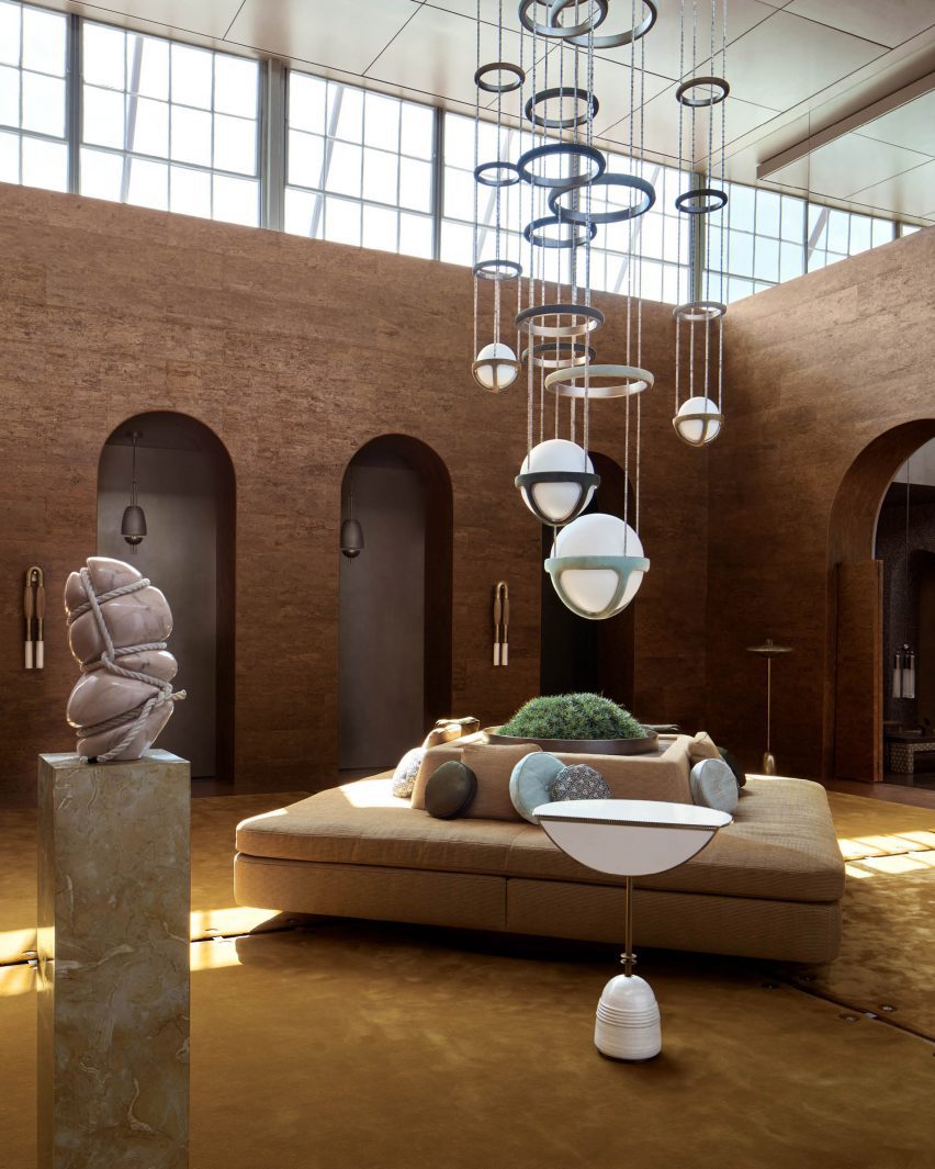
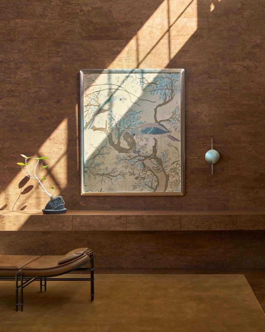
A third room is lined with cork wall panels with intricate grain patterning and includes an unattributed bird-themed tapestry.

Natural light comes in from overhead windows casting shadows on the double-height room, and includes several products arranged sparsely across the room.

“It’s about feeling discovery and moving through layers,” said Apparatus founder Gabriel Hendifar.

Throughout, light fixtures are hung low to emphasize a dream-like characteristic of the reimagined space.

As in Apparatus’s other showrooms in New York and London, the gallery’s interior design resembles the composition of famous paintings and historical architectural styles. Italian artist Giorgio De Chirico’s Surrealist works were referenced for this room.

Apparatus showroomApparatus showroom
The third space features cork-lined walls and a double-height ceiling

According to the company, the space was also redesigned based on a creative narrative of a hypothetical person: a woman living in New York City during the 1960s.

The hypothetical person in this case experiences the cultural tensions of the time, between old world conventions and big changes in society, such as the moon landing, embodying the “tension between modernity and the arcane”.

“What would happen if this woman moved to Los Angeles a decade later to find herself? Our Los Angeles gallery is the answer,” said the studio.

Apparatus LA Apparatus LA
The rooms were ordered to evoke a sense of discovery

Apparatus has displayed its full suite of products in this immersive setting. Collections on view include the Cloud pendant lamp and the Episode Settee sofa.

Other recent showroom designs include the London Camper store by James Shaw and Malbon Golf Coconut Grove store by 22RE.

The photography is by Matthew Placek.

Reference

Lissoni Architecture creates New York showroom with “melting pot attitude”
CategoriesInterior Design

Lissoni Architecture creates New York showroom with “melting pot attitude”

Local studio Lissoni Architecture has expanded the Design Holding flagship in New York City, creating an entirely new floor outfitted with light displays and curving metallic installations.

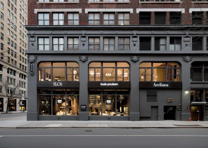
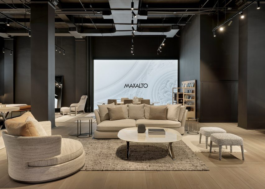
Lissoni Architecture, the US branch of Italian studio Lissoni & Partners, created an entirely new second floor and redesigned a portion of the first floor for the Design Holding showroom, which displays furniture and lighting brands including B&B Italia, Flos, Louis Poulsen, Maxalto, Arclinea and Azucena.

New York building facadeNew York building facade
Lissoni Architecture has created an expansion for the Design Holding showroom in New York

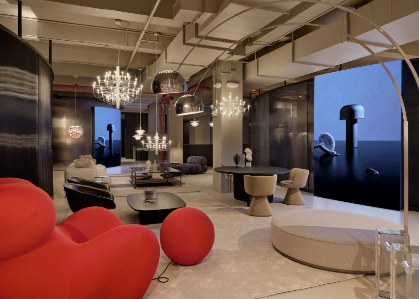
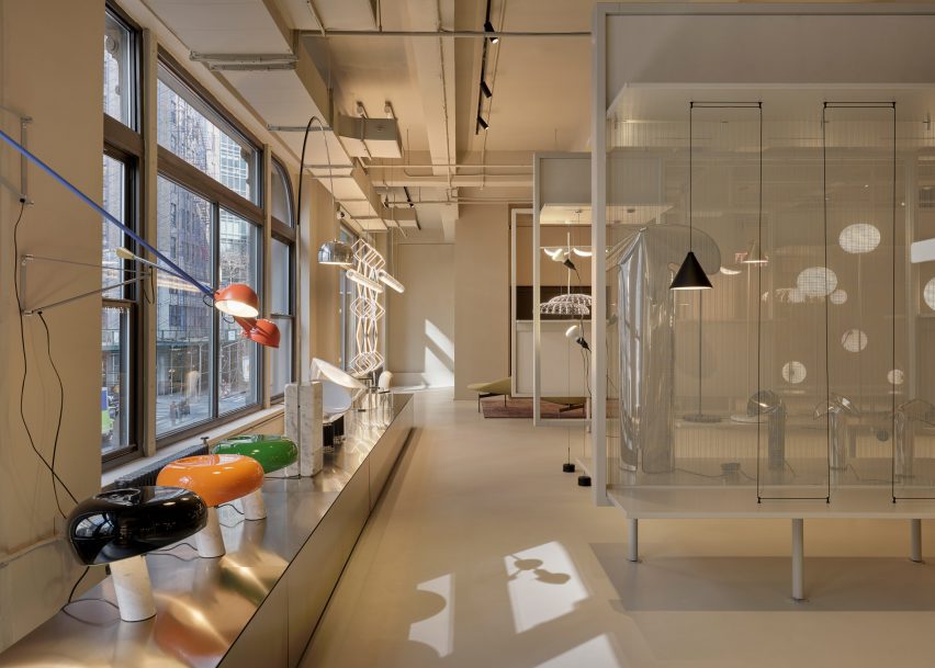
Lighting and design elements from the brands were distributed across the second-floor space, spread out amongst vertical stone-clad panels, transparent, metal showcases, and curving chrome benches and walls.

Each area of the floor was dedicated to a specific brand and the interior architecture was tailored to each brand’s identity, according to the studio.

Red chair in showroomRed chair in showroom
The project encompasses a new second floor and an expansion and redesign of the first

“We wanted to share the melting pot attitude of New York City where everyone and everything can blend together holistically so we went to the essence of the iconic brands,” said Lissoni Architecture founder Piero Lissoni.

“[We highlighted] their DNA and proposed a common ground that could host and enhance the design codes of each identity.”

A wall of lights and windowsA wall of lights and windows
The studio created dedicated areas for brands including Flos and B&B Italia

For lighting brand Flos, the studio created a series of display cases backed by a transparent mesh. A magnetized, geometric Bilboquet light by designer Philippe Malouin is on display, as well as the Almendra chandelier affixed with almond-shaped flakes by Patricia Urquiola.

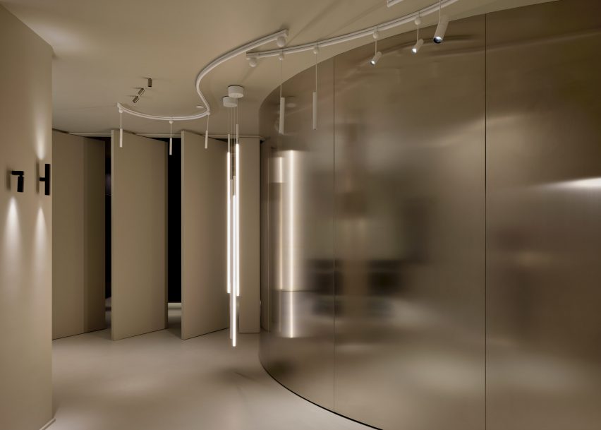
A testing room for clients was also created for the brand, which consists of a curved, metal wall that meets a series of angled panels that act as an entrance for the room.

Tables in a showroomTables in a showroom
The various displays were informed by the “melting pot” attitude of New York City

Another corner of the floor was dedicated to the display of the Skynest chandelier by Marcel Wanders, which resembles an inverted basket interlaced with cords of light.

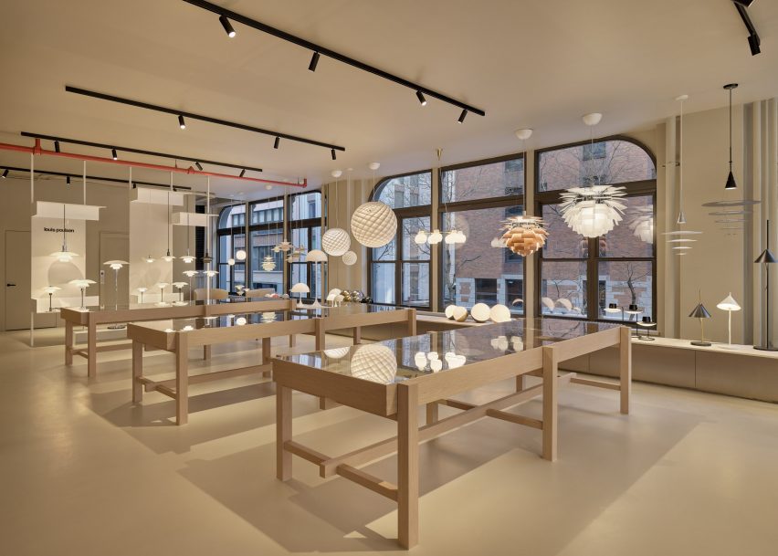
Displays for Flos and Louis Poulsen consist of inserted panels and curving planting beds that are populated with a number of lighting fixtures from both brands.

A room with a curving metal wallA room with a curving metal wall
Metallic panels, warm wood, and dark cladding were used throughout the second-floor space

Dark, metal cladding used in the Flos displays contrasts the off-white and beiges used throughout the Louis Poulsen space, but both flank a B&B Italia lounge that sits at the centre of the floor, which features a bright-red chair from the Up series by Gaetano Pesce.

A B&B Italia wardrobe was also created for the showroom, which sits next to an Arclinea kitchen display.

A black ash finish was used to clad a large cabinet unit, which sits behind a Thea island topped with a quartz waterfall countertop.

Lighting by Louis Poulsen, including the Patera Oval pendant by designer Øivind Slaatt, was tucked into the furthest corner of the space, with pieces distributed amongst wooden tables and a low-lying display unit.

A show room with white furnitureA show room with white furniture
A separate entrance leads to a Maxalto space on the first floor

On the first floor, a new space dedicated to Maxalto is accessible through a separate entrance, with pieces such as the brand’s Arbiter sofa system positioned against walls clad in black.

Design Holding, a global retailer founded in 2018, recently added furniture brands Menu, By Lassen and Brdr Petersen to its portfolio after an agreement with Denmark-based company Designers Company.

Piero Lissoni announced the founding of the US branch of his studio last year, saying that the US has become more “open-minded” in terms of architecture.

The photography is courtesy Design Holding.

Reference

PSLab’s monochromatic Berlin showroom is a “sacred place for light”
CategoriesInterior Design

PSLab’s monochromatic Berlin showroom is a “sacred place for light”

A pared-back palette of raw materials creates a calm backdrop for PSLab’s lighting products inside the brand’s Berlin workshop and showroom space, designed in collaboration with Belgian firm B-bis architecten.

The newly opened studio occupies the ground floor and basement of a 1907 residential building in the city’s Charlottenburg district.

Entrance of PSLab's Berlin studioEntrance of PSLab's Berlin studio
PSLab has opened a new workshop and showroom in Berlin

PSLab, which designs and manufactures light fixtures for architectural projects, set out to create a showroom where customers can experience lighting effects in a home-like environment.

“PSLab is not a digital platform where clients pick and buy products,” the company’s founder Dimitri Saddi told Dezeen. “Therefore the physical space as a ‘home’ is most important for one-on-one communication.”

“In Berlin, as with all our studios, we wanted to design a canvas to show the quality of our light and to show the process of our bespoke design approach by integrating a material library of endless opportunities and possibilities.”

Library of materials inside lighting showroom by B-bis architectenLibrary of materials inside lighting showroom by B-bis architecten
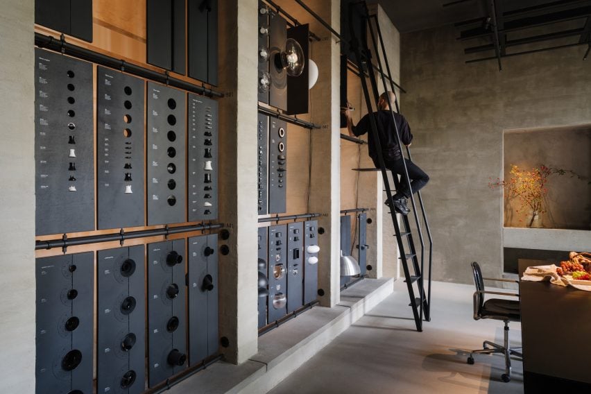
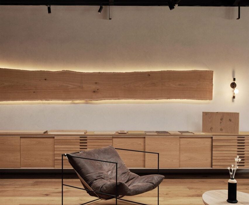
The space includes a materials library with a movable ladder

Working together with B-bis architecten, the design team looked to create a contemporary space that contrasts with Charlottenburg’s classical architecture whilst retaining references to common elements like colonnades, arches and symmetrical forms.

The entrance takes the form of a large zinc-and-glass sliding door that is set into the facade of the building on Niebuhrstrasse. Moving the door aside reveals a full-height opening that welcomes visitors into the studio.

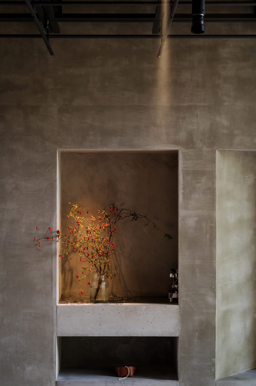
Vase illuminated inside PSLab's Berlin studioVase illuminated inside PSLab's Berlin studio
The interior was designed to present the brand’s lighting to its best advantage

Inside, a double-height space with a six-metre-high ceiling allows lighting products to be hung in various heights and configurations.

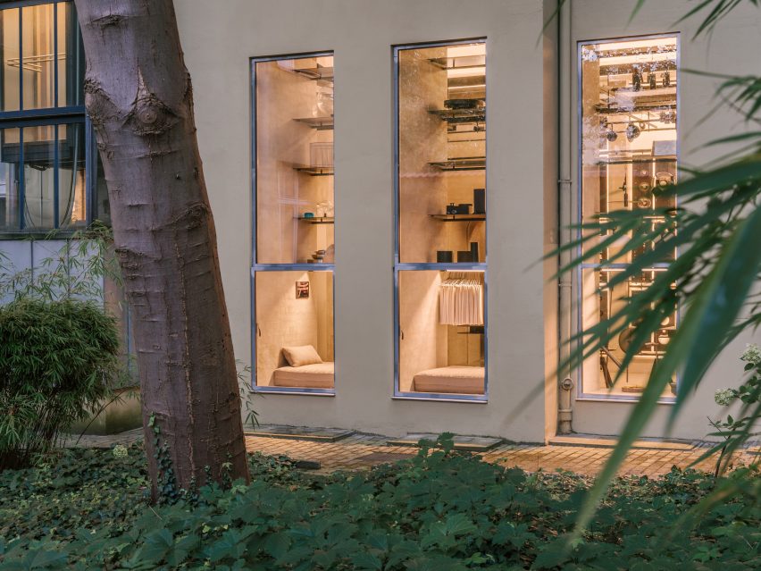
Arched openings on either side of the staircase void lead through to a garden room that looks onto a leafy courtyard. Daylight streams into the space through large windows to create a tranquil atmosphere.

The workshop space includes a materials library where visitors can touch and explore the physical qualities of the brand’s lighting products. A movable ladder provides access to items on the library’s upper rows.

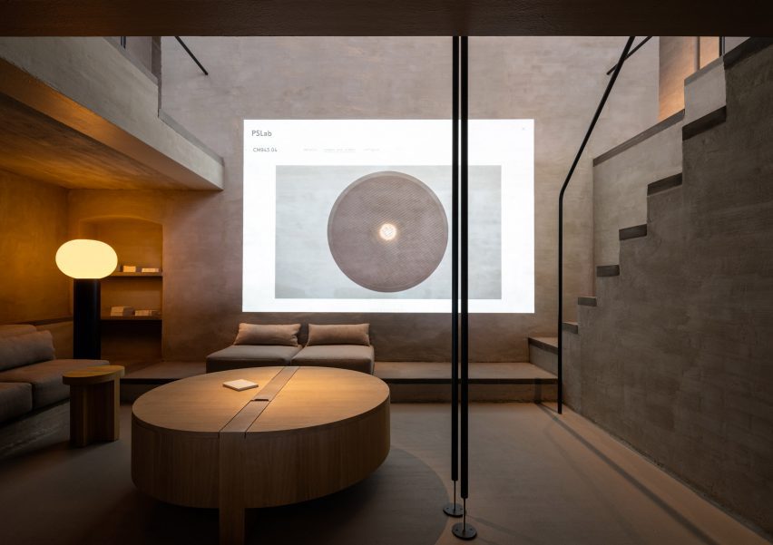
The cosy basement level is a place for informal conversations with clients. A projector in this parlour space also allows the team to display the company’s extensive digital library.

Lounge inside lighting showroom by B-bis architectenLounge inside lighting showroom by B-bis architecten
The basement serves as a cosy lounge

Throughout the studio, PSLab chose materials and finishes including lime wash, concrete, zinc and textiles that focus attention on how the space is lit rather than its architectural features to create a kind of “sacred place for light”.

“It is all about monochromatics and textures, which are specific to the location,” said Mario Weck, a partner at PSLab GmbH. “The atmosphere lets people focus on our approach.”

Llighting rig inside PSLab's Berlin studioLlighting rig inside PSLab's Berlin studio
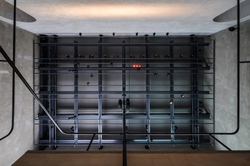
Gantries provide support for various light sources

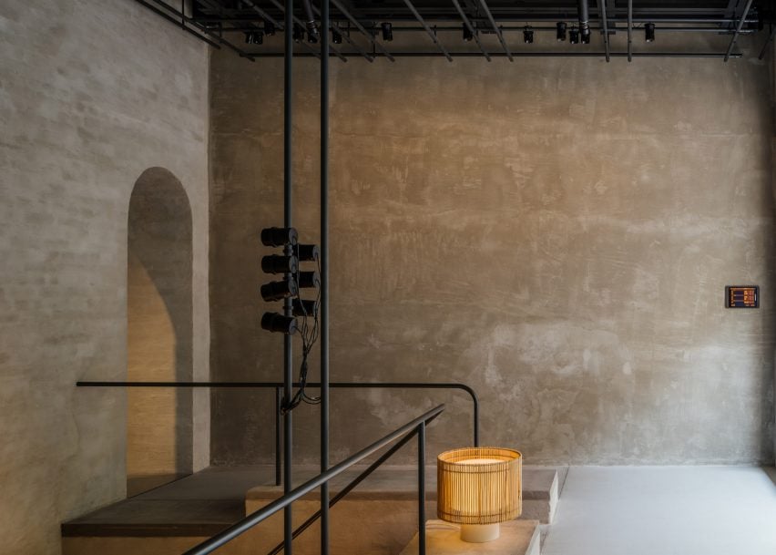
On the ceiling of both the front room and garden room is a grey-steel gantry that helps unify the spaces whilst supporting various light sources as well as technical elements, much like on a theatre stage.

Furniture is mostly built in, with simple cushions providing casual seating while cylindrical wooden side tables and coffee tables offer somewhere to place a cup or catalogue.

Exterior of PSLab's Berlin studioExterior of PSLab's Berlin studio
The showroom is set in Berlin’s Charlottenburg

PSLab has studios in Antwerp, Bologna, London, Stuttgart and Beirut, where the firm originated. For its UK headquarters, the company commissioned JamesPlumb to convert a Victorian tannery into a space that evokes the “quiet brutalism” of the former industrial building.

Previously, the lighting brand has collaborated with Parisian studio Tolila+Gilliland on the design of an Aesop store in London featuring felt-covered walls and slim black pendant lights.

The photography is by Nate Cook.

Reference

Madera displays custom wood products in Los Angeles showroom
CategoriesInterior Design

Madera displays custom wood products in Los Angeles showroom

Design and fabrication firm Madera has unveiled its latest showroom in Los Angeles, which was designed to showcase wood flooring and millwork products and has been captured in this exclusive video produced by Dezeen.

The West Coast hub, which is Madera‘s second showroom, is located in the Arts District of Los Angeles while its flagship showroom is in New York City.

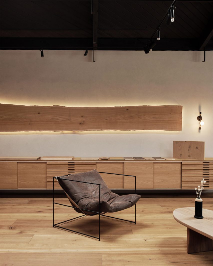
The showroom features a selection of wood products ranging from the brand’s signature wide-plank Thrasher flooring to custom cabinetry and benches.

The space, which was converted from a former metal foundry into a showroom, aims to encourage clients to embrace wood and view it as an essential and natural element in design.

Madera bespoke cabinetry
Madera’s made-to-order Thrasher cabinetry is displayed in a living room space

The entryway features bespoke Douglas fir tables and benches, while the living room space has made-to-order Thrasher cabinetry showcasing the various finishes the brand offers.

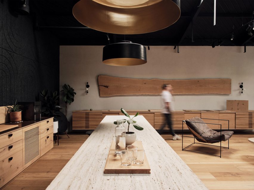
The kitchen displays a large custom island combining Madera’s Dogwood Ash and Travertine finishes, while a nearby conference room houses the brand’s Abechi Façade cladding in black.

Madera showroom in Los Angeles California
The showroom kitchen features a custom island that combines Madera’s Dogwood Ash and Travertine finishes

Madera’s mission is to bring the natural beauty of wood into the spaces their clients inhabit to “redefine its place in the modern home”, according to the brand.

Its Los Angeles wood shop, where custom stair parts and millwork elements are produced, is located only a short distance from its showroom.

outside of Madera showroom in Los Angeles
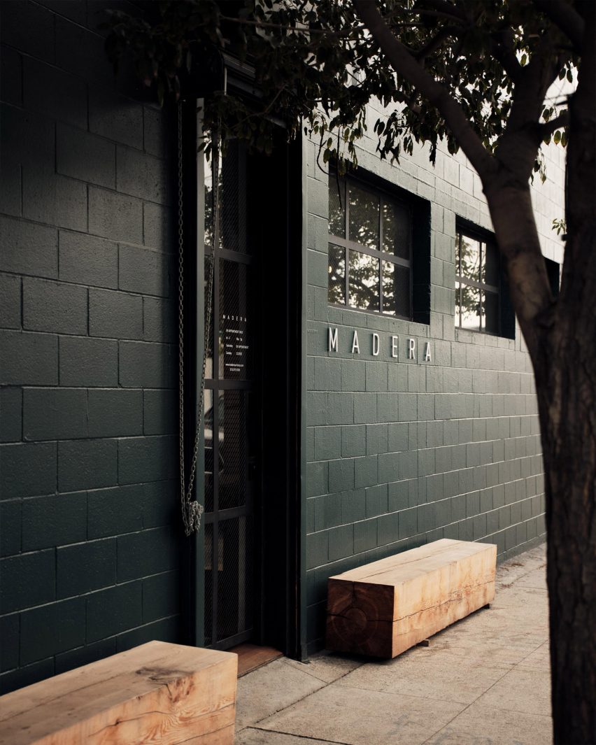
Madera’s showroom is located in the Arts District of Los Angeles

The brand recently launched its Seamless Wood Design system, which aims to ensure wooden products in an interior all complement each other.

The system was created to offer designers and homeowners a customisable option that enables them to retain the character of wood throughout an interior.

Partnership content

This video was produced by Dezeen for Madera as part of a partnership. Find out more about Dezeen partnership content here.


Reference

Johnston Marklee converts historic Los Angeles car showroom into gallery
CategoriesArchitecture

Johnston Marklee converts historic Los Angeles car showroom into gallery

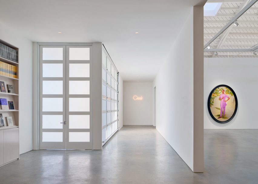
A vaulted ceiling punctured with skylights features in a 1940s auto dealership that architectural studio Johnston Marklee has converted into a bright home for the Roberts Projects art gallery.

Roberts Projects chose the local studio to transform the brick and cinder-block building into its new home as it moved from Culver City to the mid-Wilshire district, which has seen an influx of art galleries in recent years.

Converted car showroom
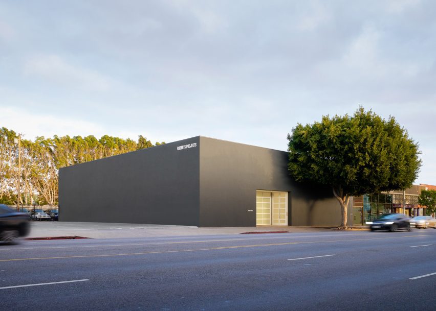
Johnston Marklee has converted a Los Angeles car showroom into an art gallery

The architects conceived a total overhaul of the 10,000-square-foot (929-square-metre) former auto dealership, which was built in 1948 and features an arched, 30-foot-high (nine-metre) ceiling.

For many years, the building housed a Chrysler-Plymouth dealership known as the “Auto Dealer to the Stars”, as it drew celebrity clients such as actors Fred Astaire, Lucille Ball and Bob Hope.

Gallery renovation by Johnston Marklee
Roberts Projects acquired a historic building in the area

“We searched for a space for over four years and felt this building was ideal due to the raw talent of the structure, incredible ceiling height and great location,” said Roberts Projects co-owner Julie Roberts.

The exterior of the building – which once featured large stretches of glass for the display of cars – was replaced with solid walls in grey stucco, which suits the “gallery’s minimalist aesthetic”, the gallery said.

Solid grey stucco walls
The exterior was replaced with solid walls in grey stucco

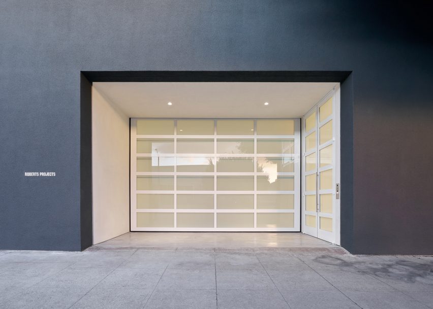
Marking the entrance are a glazed garage door and an existing ficus tree.

“The elemental facade and building mass will integrate the new gallery into the cultural landscape of the arts and architecture across the city,” Johnston Marklee founding partner Sharon Johnston said.

Johnston Marklee conceived a total overhaul of the car showroom

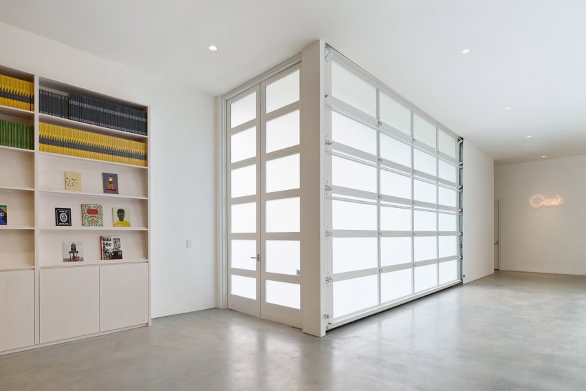
Inside, the building houses four exhibition spaces, offices, study areas and a reception with a bookshop.

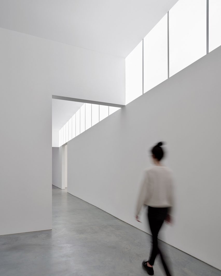
Throughout the building, “cavities of light” reveal architectural elements and enhance the viewing experience, the architects said.

Glazed garage door by Johnston Marklee
A glazed garage door marks the entrance

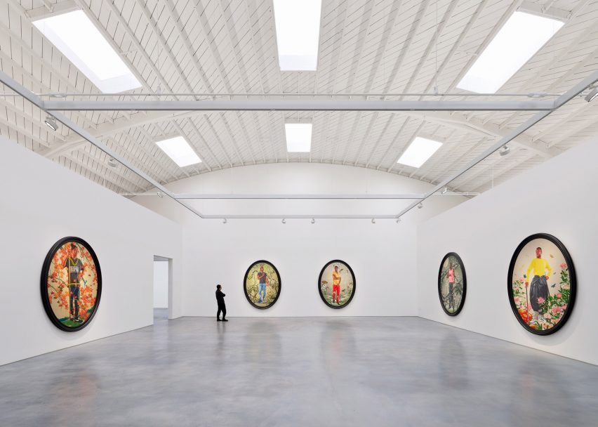
The main exhibition space sits under the vaulted ceiling, which was given a fresh layer of paint.

Here, skylights usher in daylight. In other areas, illumination is provided by “clearstories” made of panels uplit by LEDs.

Concrete flooring and bright white walls lend to the gallery’s austere character. Furnishings include pieces by Alvar Aalto, Gijs Bakker and Jean Prouvé. Shelving is made of birch plywood.

Illuminated shop area of Roberts Projects gallery
Illumination is provided by “clearstories” made of panels

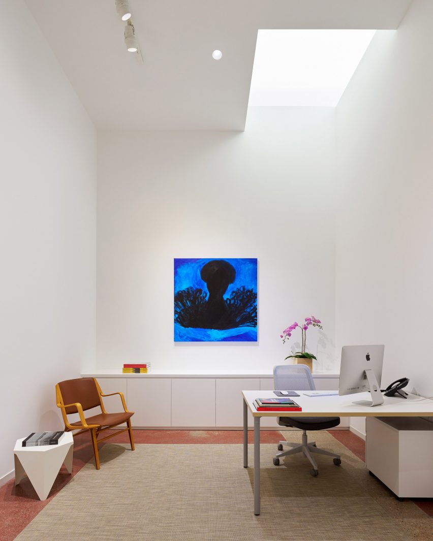
In the office area, the flooring consists of red-tinted concrete with exposed aggregate, which is original to the space. The concrete was polished and given a terrazzo-like appearance.

The gallery’s new home was inaugurated with an exhibition of colourful portraits by renowned US painter Kehinde Wiley, whom Roberts Projects has represented for over two decades.

“This new space is the next chapter in our long history of being at the forefront of the Los Angeles art scene,” said gallery co-owner Bennett Roberts, who said that LA is in the midst of a “creative renaissance”.

“With access to outstanding exhibitions year-round, dedicated collectors, and creative energy from those who call this city home, Los Angeles is poised to be one of the most important creative hubs for years to come,” he added.

Red-tinted concrete flooring in the office area
In the office area, the flooring consists of red-tinted concrete with exposed aggregate

The opening of Roberts Projects’s new home follows a period of continual growth for the city’s arts scene.

Galleries such as Hauser & Wirth and The Future Perfect have recently opened venues in Los Angeles, and an annual edition of the Frieze Art Fair was introduced here in 2019.

Other art-related buildings in Los Angeles include a new home for auction house Phillips that was designed by local studio Formation Association, and the recent completion of a 20-year renovation and expansion of the Hammer Museum that was overseen by Michael Maltzan Architecture.
The photography is by Eric Staudenmaier.


Project credits:

Architecture: Johnston Marklee
Lighting design: Buro Happold
Furnishings consultant: Ellen Brill

Reference

Hollie Bowden converts London pub into Completedworks showroom
CategoriesInterior Design

Hollie Bowden converts London pub into Completedworks showroom

Lime-washed walls meet aluminium display fixtures in this minimalist studio and showroom that designer Hollie Bowden has devised for London brand Completedworks.

Set over two floors of a former pub in Marylebone, it provides space for Completedworks to design and display its jewellery and ceramics, as well as to host an array of craft-focused classes.

Completedworks studio designed by Hollie Bowden features minimalist interior
Hollie Bowden has designed a studio and showroom for Completedworks

The brand was established in 2013 and up until now, has largely been sold via high-end department stores such as Dover Street Market and Liberty. But founder Anna Jewsbury felt it was time for Completedworks to have its own brick-and-mortar space.
“We increasingly had clients asking to come and see our pieces in person but felt that we didn’t have a space that felt considered and reflected our vision,” she said. “We wanted people to be able to enter our world and get to know us, and for us to get to know them.”
Completedworks studio designed by Hollie Bowden features minimalist interior
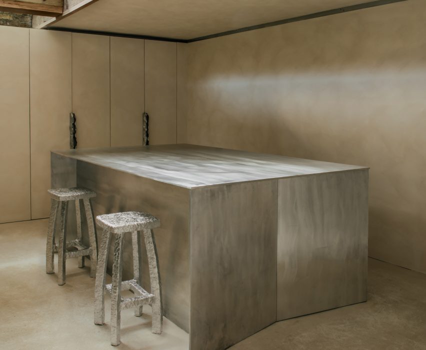
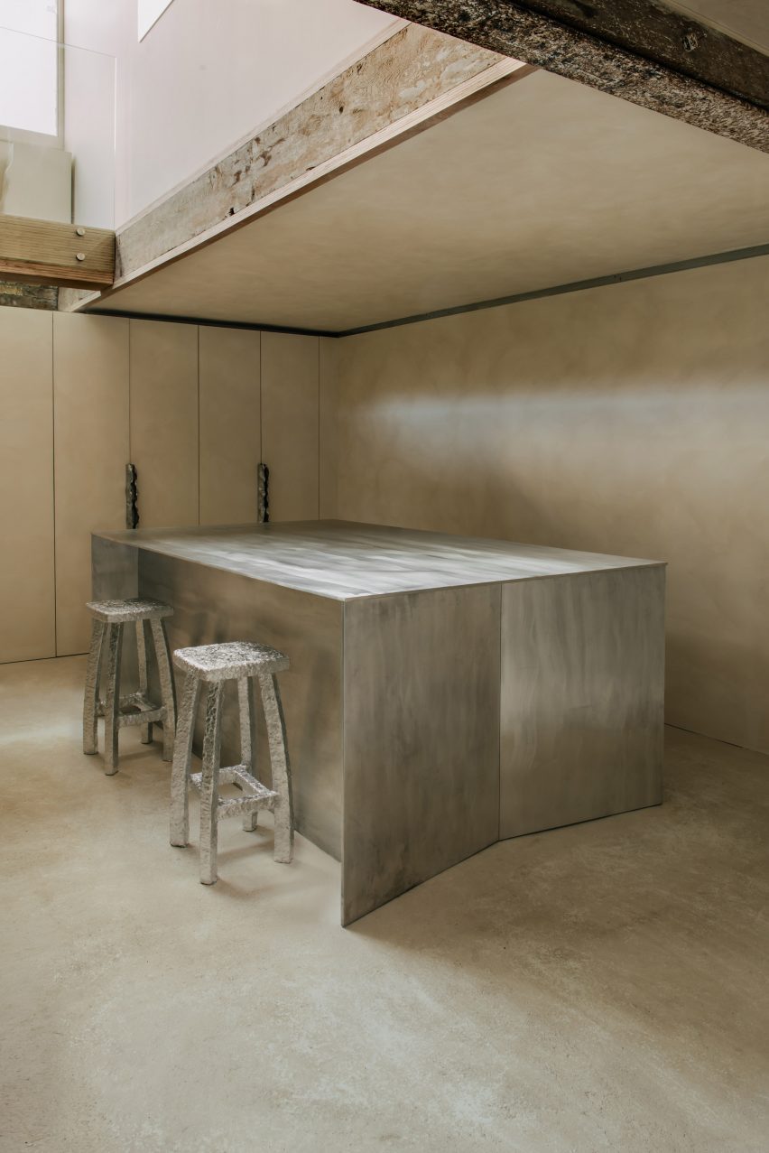
Display shelving was crafted from lustrous aluminium

For the design of the showroom, Jewsbury worked with London-based designer Hollie Bowden, who naturally looked to the brand’s jewellery for inspiration.

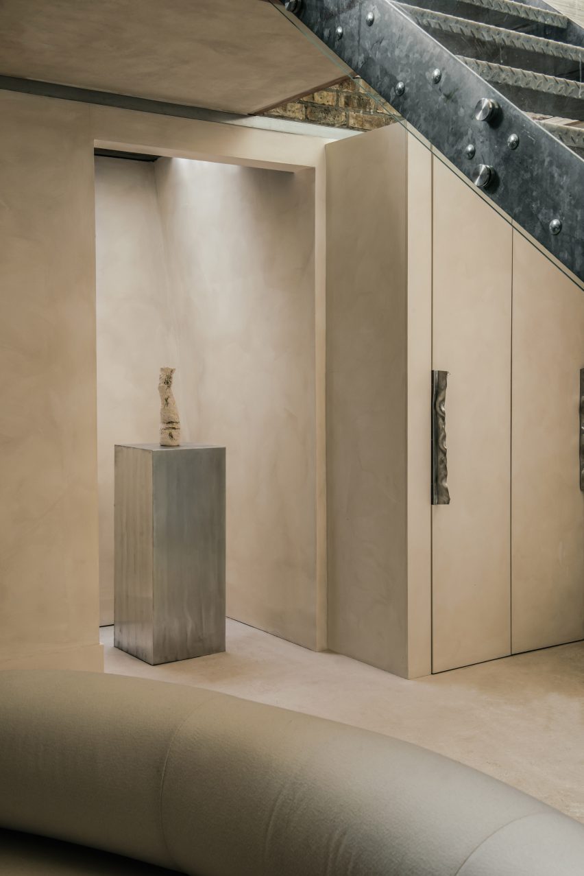
This can be seen for example in the hammered-metal door handles that appear throughout the studio and directly reference the creased design of the gold Cohesion earrings.

Completedworks studio designed by Hollie Bowden features minimalist interior
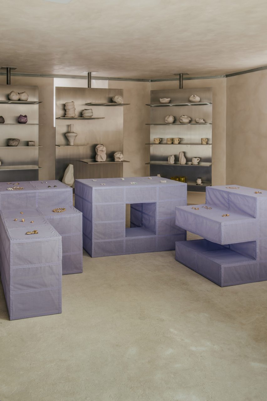
A modular display system in the showroom is clad in lilac linen

“[Completedworks] is known for the beauty of the textural surfaces and flowing almost baroque forms,” Bowden explained. “We developed a display language that played off that, with minimal details and strict lines.”

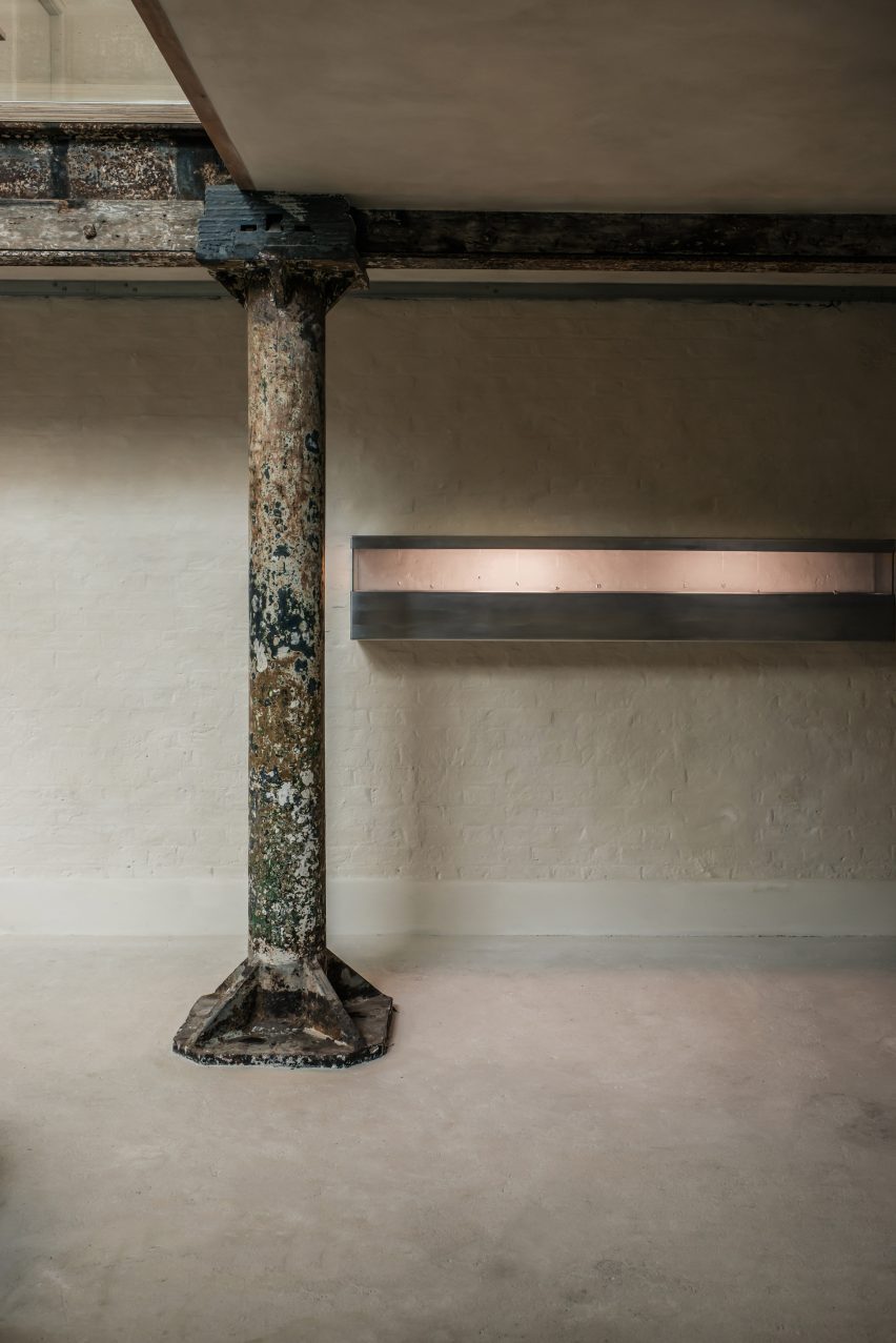
Almost every surface throughout the studio is washed in beige-toned lime paint, with only a few slivers of the original brick walls and a worn metal column left exposed near the central staircase.

Bowden used brushed aluminium to create a range of display fixtures, including chunky plinths and super-slender shelving units supported by floor-to-ceiling poles.

The space also houses a couple of angular aluminium counters for packing orders that include discrete storage for boxes and subtle openings, through which tissue paper or bubble wrap can be pulled.

Completedworks studio designed by Hollie Bowden features minimalist interior
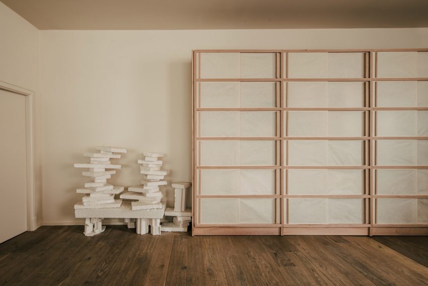
Shoji-style storage cabinets can be seen in the office

A slightly more playful selection of colours and materials was used for the studio’s custom furnishings.

In the main showroom, there’s a modular display island sheathed in lilac linen. Meanwhile in the office, designer Byron Pritchard – who is also Bowden’s partner – created a gridded wooden cabinet inlaid with translucent sheets of paper, intended to resemble a traditional Japanese shoji screen.

Completedworks studio designed by Hollie Bowden features minimalist interior
Hammered-metal door handles in the studio resemble Completedworks’ earrings

This isn’t Bowden’s first project in London’s affluent Marylebone neighbourhood.

Previously, the designer created an office for real estate company Schönhaus, decking the space out with dark-stained oak and aged leather to emulate the feel of a gentleman’s club.

The photography is by Genevieve Lutkin.

Reference

Coil + Drift opens lighting studio and showroom in the Catskills
CategoriesInterior Design

Coil + Drift opens lighting studio and showroom in the Catskills

Lighting studio Coil + Drift has opened an office, showroom and production facility in the Catskill Mountains of Upstate New York that places modern elements in a barn-like building.

Coil + Drift founder John Sorensen-Jolink, who relocated to the area in 2021, has created a new home for his brand in a barn-like structure surrounded by nature.

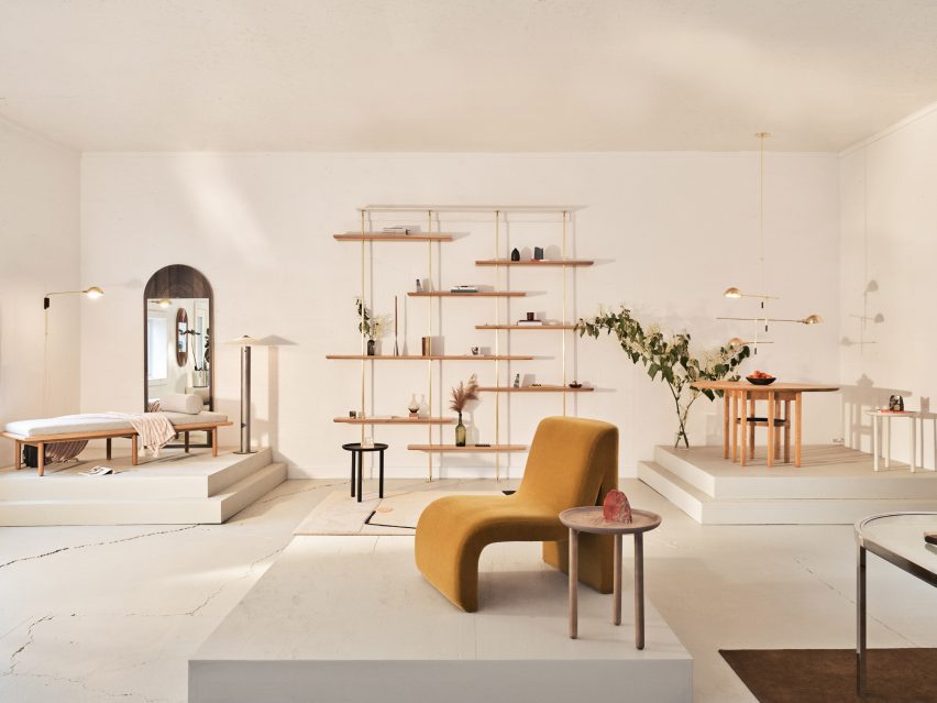
Furniture arranged on raised platforms across the showroom
Coil + Drift’s new space in the Catskills showcases the brand’s products

“By relocating their queer-owned design business to the countryside, Coil + Drift is sparking a visceral conversation between people in a thriving rural creative community about how what we make defines who we are,” said the studio.

The building encompasses 3,000 square feet (280 square metres) and boasts tall ceilings, which are painted white along with its plywood-panelled walls.

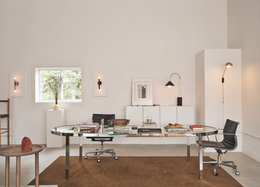
Glass-topped metal desk positioned on a brown rug
The showroom includes an office space, defined by a chocolate-brown rug

The space is divided between a combined office and showroom, and a production facility where an in-house team now creates all of the company’s lighting designs.

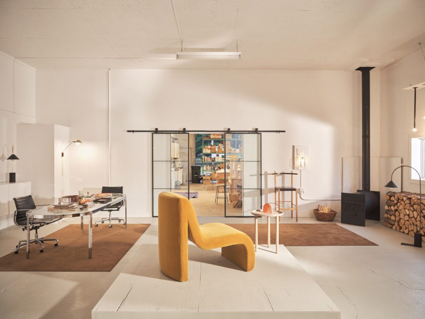
In one corner of the showroom sits a black wood-burning stove, with a flue that extends through the roof, next to a pile of chopped logs used to fuel it.

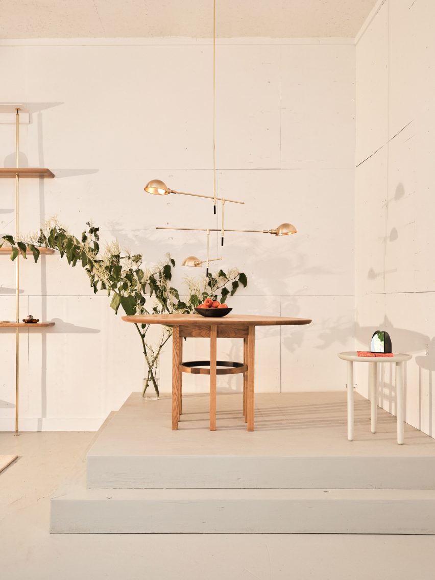
Wood table on a plinth with brass light above
Furniture is displayed on stepped plinths, accompanied by lighting above

Chocolate-brown area rugs contrast the pale concrete floors, defining the entrance, the office space and a spot by the fire in lieu of walls or partitions.

Plinths are used to raise furniture designs, arranged in styled vignettes along with lighting, plants and small accessories.

More objects are displayed on wooden shelves of varying lengths, held up at different heights on thin golden rods.

Industrial-looking metal and glass doors mounted on rolling tracks separate the showroom from the workshop, which is located in an adjoining room.

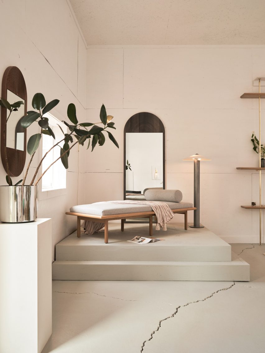
Daybed presented on a raised plinth
The showroom features a white ceiling and walls, and a pale concrete floor

On show are several new additions to popular Coil + Drift collections, such as a floor version of the Yama table lamp and a “mobile-like” chandelier that joins the Atlas series.

Also to coincide with its move and expansion, the company has launched a trade-focused online platform for its products.

Wide shot of the showroom with yellow chair in the foreground
The building also houses a production facility behind industrial-style doors

Coil + Drift’s previous projects have included styling a townhouse in Brooklyn’s Prospect Heights neighbourhood for Hatchet Design.

Sorensen-Jolink, a former dancer, is one of many creatives that moved from New York City to nearby rural areas, either during or following the Covid-19 pandemic.

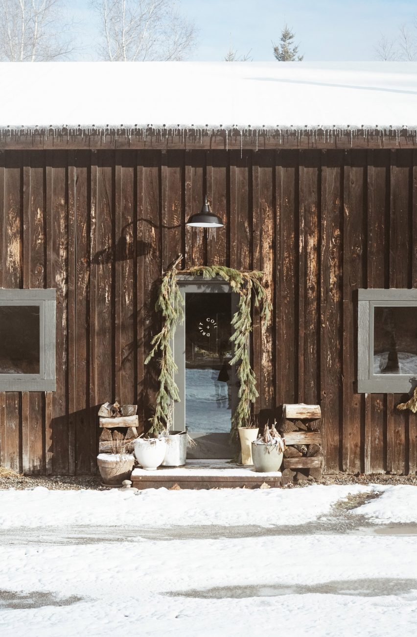
Exterior view of the Coil + Drift showroom facing the door
Coil + Drift founder John Sorensen-Jolink relocated to the Catskills in 2021 before opening the new studio

Upstate New York, and particularly the Hudson Valley and Catskills area, was already growing in popularity as a destination for artists and designers before the lockdowns, thanks to its reputation for vintage furniture shopping and art institutions.

Then low property prices and high demand for space and fresh air sparked an exodus to the region, when many bought second homes or relocated permanently.

The photography is by Zach Hyman.

Reference

The Relic Shelter | Fuzhou Teahouse // Neri & Hu
CategoriesSustainable News

The Relic Shelter | Fuzhou Teahouse // Neri & Hu

Text description provided by the architects.

The project draws inspiration from imagery uniquely associated with Fuzhou: the Jinshan Temple. This is a rare example of a temple structure built in the middle of a river in China. John Thomson was one of the first photographers ever to travel to the country and provided Western audiences with some of the first glimpses into the Far East.

© Neri & Hu

© Neri & Hu

In the album Foochow and the River Min, which documented his legendary journey up the Min River, Thomson captured the ancient structure in its original state resting serenely above a floating rock in 1871. This would become a lasting image unmistakably identified with the city of Fuzhou.
Conceived as an urban artefact and drawing from the historical roots of the city of Fuzhou, the Relic Shelter internalizes a piece of distinct heritage at a time when rapid new development has eroded traditional culture and identity.

© Neri & Hu

© Neri & Hu

The client’s brief posed the unique challenge of creating an enclosure for a Chinese artefact – the wooden structure of a high-ranking Qing dynasty official’s residence, replete with ornamental carvings and intricate joinery. Relocated from Anhui to its new home in Fuzhou, the Hui-style structure is enshrined as the inhabitable centrepiece of a new teahouse.
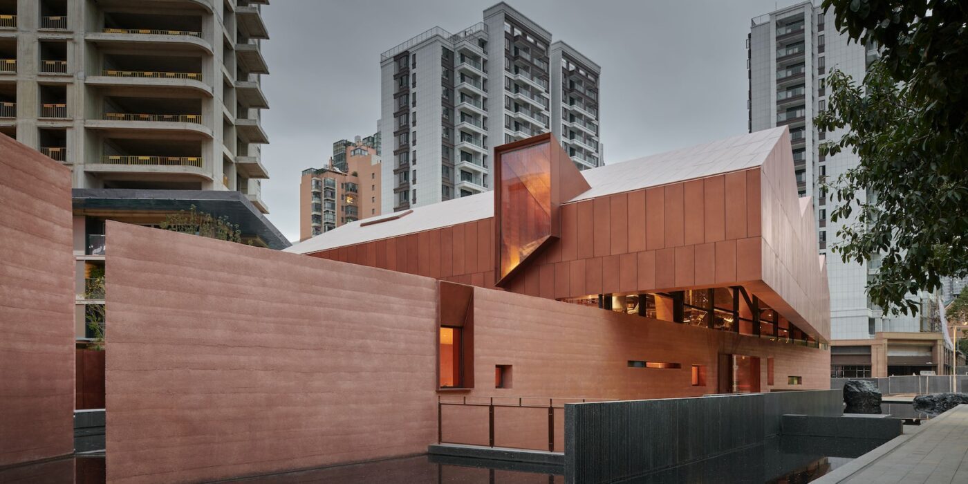
Envisioned as a house atop a rock, the teahouse is elevated above a rammed concrete base, while its sweeping copper roof echoes the roofline of the enclosed architectural relic.

© Neri & Hu

© Neri & Hu

Its core material, rammed concrete, is a modern homage to the traditional earthen dwellings of the region, emphasizing a raw monumentality. Visitors are presented with two images of the building upon approach: the upright silhouette of the form, and its mirrored reflection duplicated in the surrounding pool of water.
A series of contrasts plays out among elements that are bright and dark, light and heavy, coarse and refined, as visitors enter the grand hall where the structure of the ancient residence is situated.

© Neri & Hu

© Neri & Hu

Sky wells penetrate the roof, bringing natural light into the depths of the enclosure and illuminating the priceless artefact on display. Only upon reaching the mezzanine does the structural configuration of the building begin to reveal itself. The hovering metal roof is lifted 50 cm off the solid base by copper-clad trusses to introduce a sliver of continuous illumination around its periphery.

© Neri & Hu

© Neri & Hu

Wrapping itself around the historical wooden structure, the mezzanine space allows visitors to appreciate intricate carpentry details at eye level.
The basement level includes a secondary arrival lobby housing a rotunda, a sunken courtyard and tasting rooms. At the top of the rotunda, a carved oculus capped by glass is submerged beneath the pool in the courtyard above.

© Neri & Hu

© Neri & Hu

It filters the sun through a thin film of water, creating a mesmerizing play of reflections..

© Neri & Hu

© Neri & Hu

The Relic Shelter | Fuzhou Teahouse Gallery

Reference