Fettle channels Soho’s “grittier” years at 1 Warwick members’ club
CategoriesInterior Design

Fettle channels Soho’s “grittier” years at 1 Warwick members’ club

Interiors studio Fettle drew on the neo-baroque architecture of this Edwardian building in London’s Soho when converting it into a members’ club, as well as nodding to the area’s colourful history of the 1950s and 60s.

Owned by Maslow’s, the group behind Fitzrovia club Mortimer House, 1 Warwick features mid-century furniture and lighting along with bespoke designs that reimagine the furniture of the period.

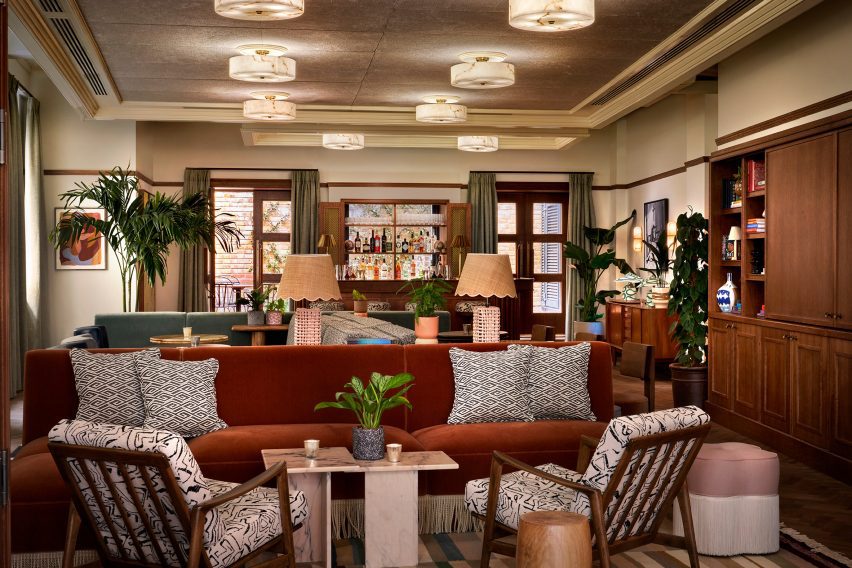
Lounge of 1 Warwick members’ club
Fettle has designed the 1 Warwick members’ club in London

The mix includes jaunty elements such as splayed-leg easy chairs and scallop-edged rattan lighting.

“During this period of history, Soho was much grittier than we find it today, so we wanted to underplay the more elevated finishes that you would typically find in a members’ club,” Fettle‘s director Andy Goodwin told Dezeen.

“We have referenced the less polished nature of Soho in this period with raw plaster wall finishes and exposed brick.”
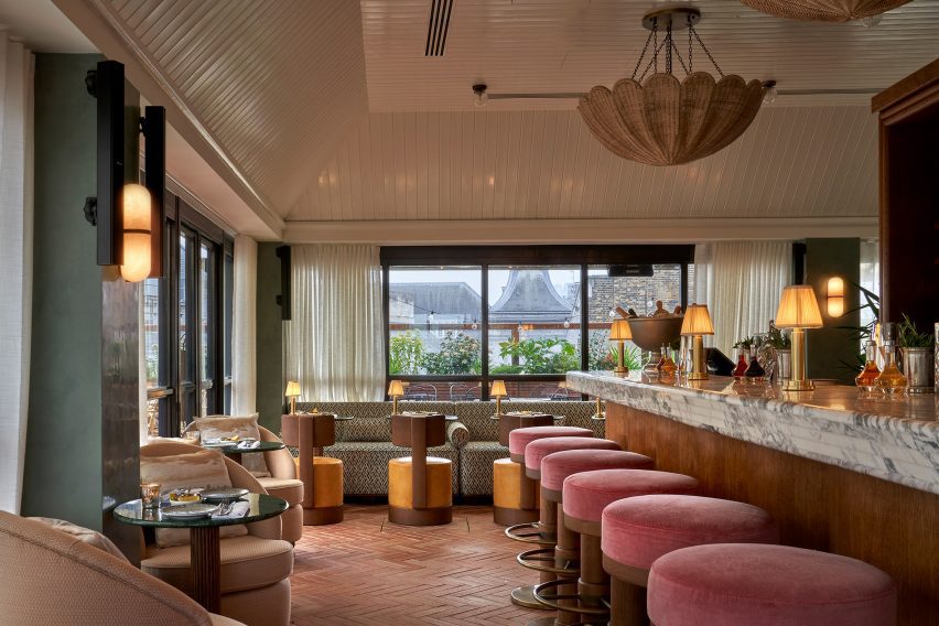
Yasmin restaurant by Fettle
The club has a rooftop restaurant called Yasmin

Fettle juxtaposes these references with some influences from the neo-baroque mansion itself, reworking its sense of assured comfort in a contemporary way with richly toned wood panelling and elaborate chandeliers.

“We wanted to ensure that we referenced this period within the final design,” Goodwin said. “We simplified a traditional Edwardian baroque skirting and architrave style within the bespoke joinery that was designed for the ground and first floors.”

“Typically, buildings of a similar age had common features, including bold geometric floor patterns within the entrances. And as such we reimagined a pattern from the period in the lobby of 1 Warwick.”
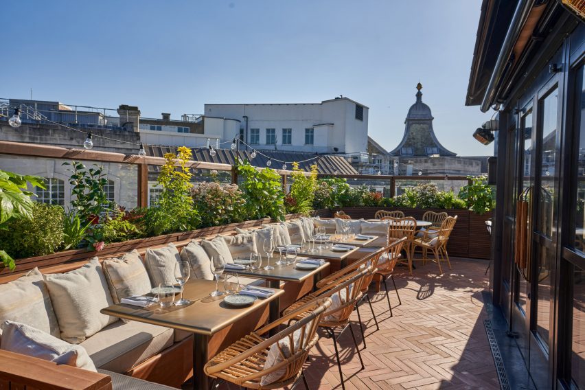
Balcony of Yasmin restaurant at 1 Warwick members’ club
Its wraparound roof terrace offers views across Soho

While drawing on the history of the building and the area, Fettle worked hard to ensure that the club feels fresh, welcoming and contemporary.

“We have mixed furniture, lighting and accessories from a variety of different eras and curated a space that feels relaxed and residential in its aesthetic,” he continued.

“When designing furniture specifically for the project, we referenced more traditional designs, however. We looked at the details through a modern lens to make the space feel familiar yet contemporary.”

Set over six floors, the crowning glory of 1 Warwick is the rooftop bar and restaurant Yasmin with its wraparound roof terrace and views across Soho.

Here, pink mohair-upholstered bar stools nestle against a wood-clad marble-topped bar while the menu is Middle Eastern, inspired by executive chef Tom Cenci’s time in Istanbul.

Two lounge spaces – the Living Room and adjoining Den – are at the heart of the club, where Fettle used an earthy-toned palette, along with exposed brick walls and geometric patterned rugs to bring a sense of warmth to the interior.
Shared workspace in 1 Warwick members’ club
The club has several co-working areas

“We wanted to let the existing architectural features be visible within the final design to create a more neutral backdrop, onto which we layered playful choices across the furniture and fittings,” said Goodwin.

“We used deep, saturated, colourful fabrics for the upholstered pieces and we have looked to mix mohairs and velvets with more vibrant leathers and patterned fabrics to give an eclectic feel to the space,” said Goodwin.

In the daytime, 1 Warwick offers spaces to suit different kinds of working styles, from private studies and rentable desks to the Pied-à-Terre – an open-plan workspace featuring long, library-style tables and comfortable lounge seating.
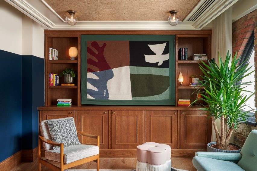
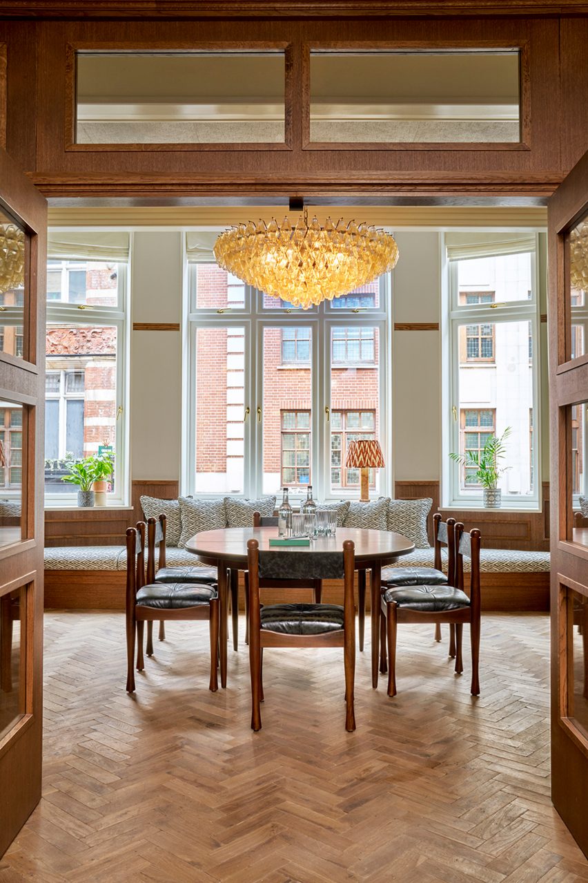
Office space by Fettle
Members can also work in private meeting rooms

At ground level, there’s the neighbourhood bistro and bar Nessa, open to all and offering a playful take on British classics while the more intimate, horseshoe-shaped bar serves up its own menu of small plates.

With a colour palette of warm, autumnal tones and a material mix of exposed brick, wood panelling and marble-topped tables, the atmosphere here is welcoming and down-to-earth.
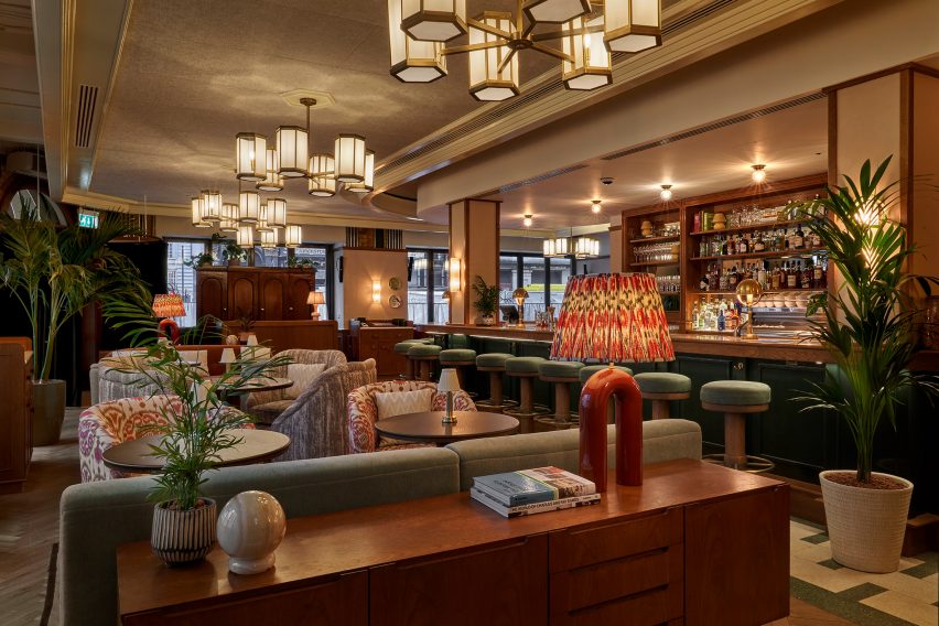
Nessa restaurant at 1 Warwick members’ club
The Nessa restaurant is set on the ground floor and open to the public

Founded in 2013, Fettle has a long history in hospitality design with previous projects including the Schwan Locke Hotel in Munich, which was conceived as an homage to early German modernism.

Elsewhere in London, the studio was also responsible for designing The Gessner apartment block to resemble a hotel, complete with a cafe and co-working area.

The photography is by Simon Brown.

Reference

SoHo’s 49 Greene Street Embraces the Modern Concept of Loft Living
CategoriesArchitecture

SoHo’s 49 Greene Street Embraces the Modern Concept of Loft Living


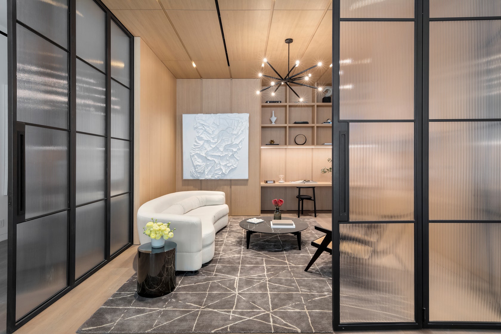
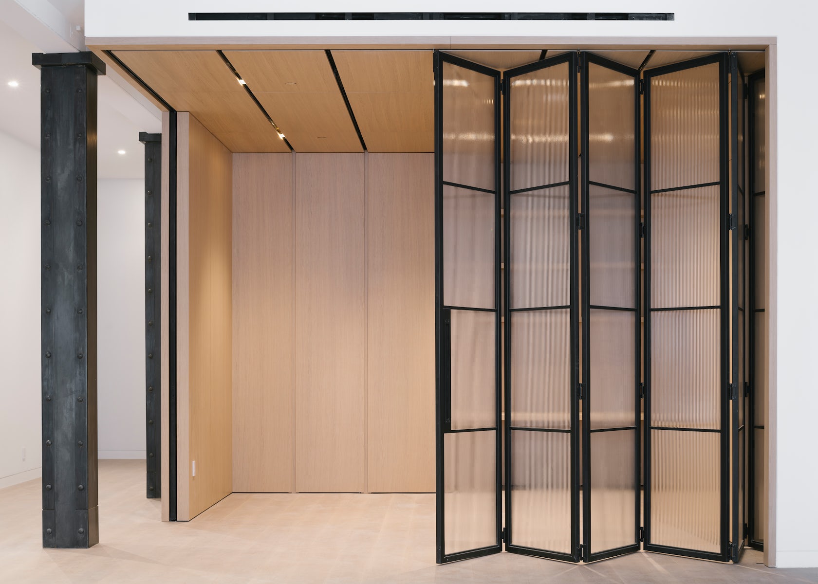
49 Greene Street – a 6-story building in NYC’s historic SoHo district, is an extant example of the mixed iron-and-masonry construction of the post-Civil War era. The client’s brief was to restore the building’s masonry façade and cast-iron storefront, and to convert the interiors into four high-end residential units. To do this, we drew inspiration from the makers and artist ls that once occupied this previously manufacturing building to create units that embrace modern concept of ‘loft living’, in which open, non-programmed flexible spaces meet highly crafted, millworked moments, adding warmth throughout with the use of woods, marbles, and ironwork.

Architizer chatted with Jordan Rogove, Co-Founder and Principal of DXA studio, to learn more about this project.

Architizer: What inspired the initial concept for your design?

Jordan Rogove: We wanted to speak to the various movements that helped form SoHo’s unique character and charm. Much like the artists who were attracted to the neighborhood’s empty lofts in the 1960’s, we too were drawn to the building’s high ceilings, abundant light, and expansive floor plates. For this reason, we are committed to leaving the spaces as open, fluid, and customizable as possible.

However, we were acutely aware that we were designing a home, so introducing a residential scale was important to make the otherwise large space comfortable and inviting. To achieve this, we lowered the ceiling in select rooms and introduced a high level of craft and tactility – our way of communicating with the by-gone manufacturing era of SoHo.

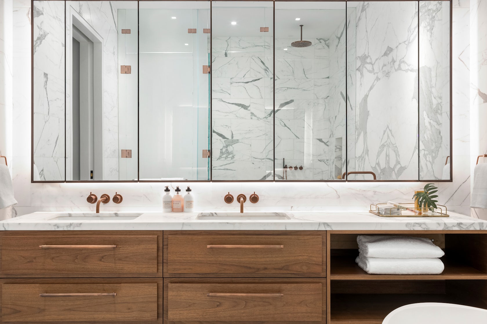
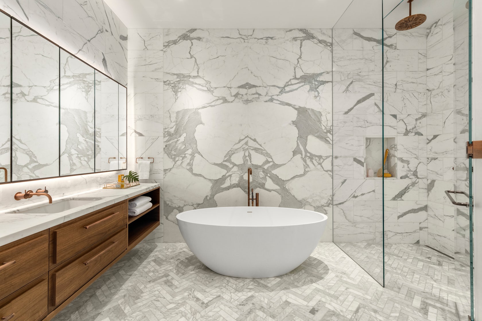
Throughout these rooms, we created a material theme of oak wood paneling, blackened steel, fluted glazing and various marbles. These materials are not only visually exquisite, but very in their tactile qualities, which we believe to be crucial adding warmth and comfort to a home.

© DXA studio

© DXA studio

© DXA studio

© DXA studio

© DXA studio

© DXA studio

This project won in the 10th Annual A+Awards! What do you believe are the standout components that made your project win?

The kitchen and den–the hearth of the home–are the showpieces of each unit, as they are not only beautiful and practical, but speak to each other in their materiality and detailing.

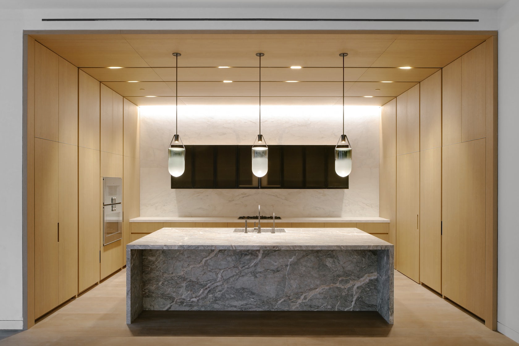
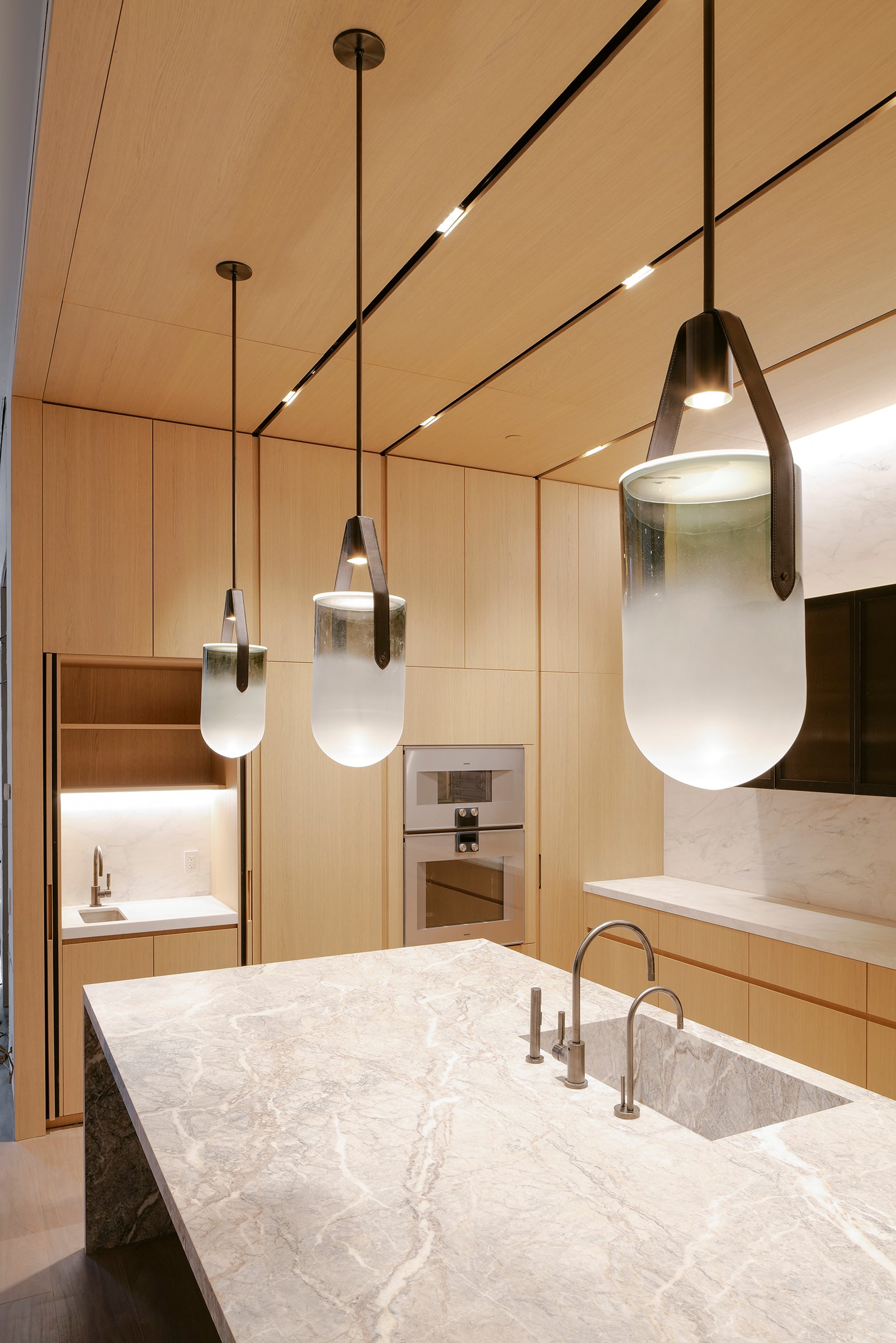
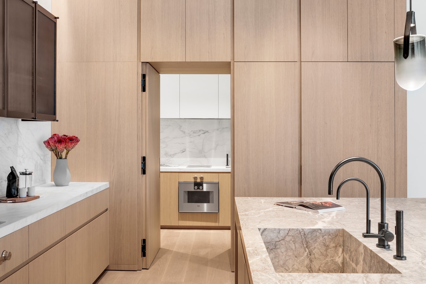
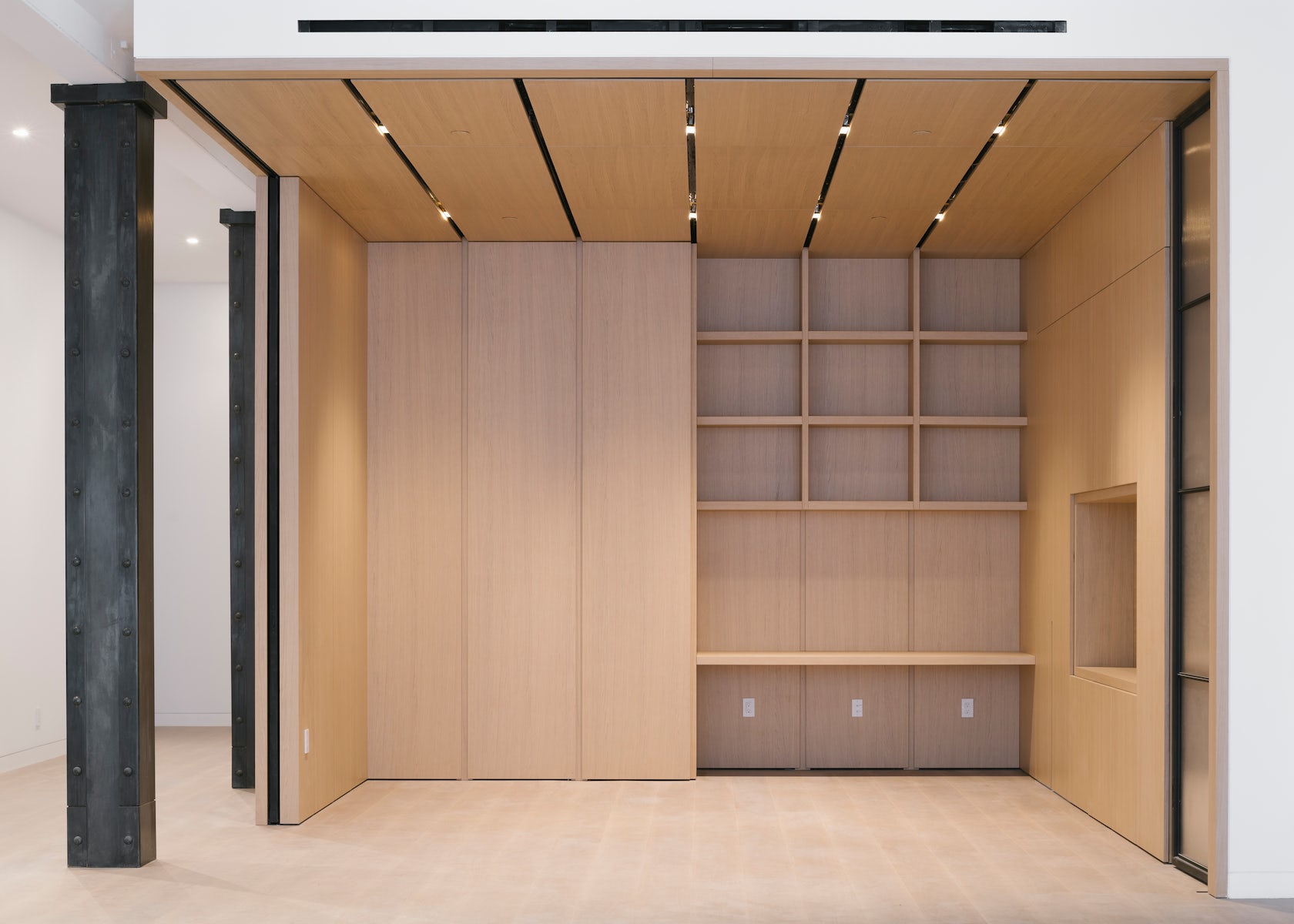
In the kitchen, the appliances, storage, and secondary scullery kitchen are all seamlessly hidden behind white oak paneling with beautifully crafted integrated pulls. This paneling wraps onto the ceiling to cleverly integrate recessed lighting and HVAC diffusers. The island is crafted out of a single slab of Fior di Pesco marble, known for its ability to add calm and serenity to a space, while the upper cabinetry is clad in blackened steel and fluted glass.

This millwork detailing continues into the den, where white oak paneling and a built-in desktop can be closed off from the main living spaces by large blackened steel and fluted glass doors. Alternatively, these doors can perfectly tuck away into the oak millwork to allow flexible space programming.

Many of these materials can be found throughout the unit, creating an overarching theme. For instance, the blackened steel of the den’s custom doors is mirrored in the steel frames of the bathroom vanities, the plumbing fixtures, and even the column cladding.

© DXA studio

© DXA studio

© DXA studio

© DXA studio

What was the greatest design challenge you faced during the project, and how did you navigate it? 

Renovating a manufacturing building from the 1800’s was an exciting challenge, both in terms of design and coordination. On the design side, we believe that as architects, it is our duty to celebrate the area’s rich history in an authentic yet contemporary manner. This is why we wanted to keep the open nature of these spaces as much as possible. It is also why we used wood and iron in a way that is reminiscent of previous eras, while using contemporary detailing to bring these materials to the present day.

On the coordination side, working with existing buildings in NYC is always a challenge. As precisely as we survey all historic projects, we often encounter surprises during construction that require us to tweak our design on the fly–and 49 Greene was no exception. Furthermore, we had to design an entirely new roof structure, as the existing roof was significantly sloped, which meant giving the 200-year old structure upgrades to account for modern building technologies.

© DXA studio

© DXA studio

© DXA studio

© DXA studio

What is your favorite detail in the project and why? 

Although it is one of the smallest rooms in each unit, we think the powder room really packs a punch. The vanity and sink are entirely made out of Fior di Bosco marble, which marries well with the ebony black wood veneer panels to create a dark yet calming atmosphere.

© DXA studio

© DXA studio

© DXA studio

© DXA studio

In what ways did you collaborate with others, and were there any team members or skills that were essential in bringing this Award winning project to life?

The nature of this project required us to closely collaborate with millworkers, iron workers, and various craftspeople to get the detailing down. We worked with Canova on all of the millwork, Manhattan Steel Door Co. on the large den doors, and with Sage Construction on the stonework and other general detailing. We had many pencil sessions and back-and-forth shop drawing reviews to better understand how to achieve the level of craftsmanship that we envisioned–and we really refined our knowledge of interior detailing along the way.

© DXA studio

© DXA studio

© DXA studio

© DXA studio

For more on 49 Greene Street, SoHo, please visit the in-depth project page on Architizer.

49 Greene Street, SoHo Gallery

Reference

Child Studio channels Soho’s peep show booths for Cubitts eyewear store
CategoriesInterior Design

Child Studio channels Soho’s peep show booths for Cubitts eyewear store

Featuring linoleum floors, Formica-clad walls and a deep red basement, Soho’s peep show booths served as inspiration for the atmospheric interior of this London eyewear store by Child Studio for spectacle-maker Cubitts.


Perched on the corner of Marshall Street in London’s Soho neighbourhood, the store occupies one of the early 19th-century buildings that form the area’s narrow streets.

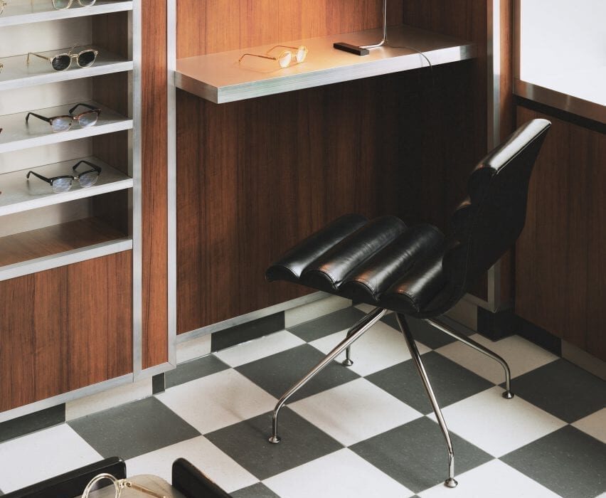
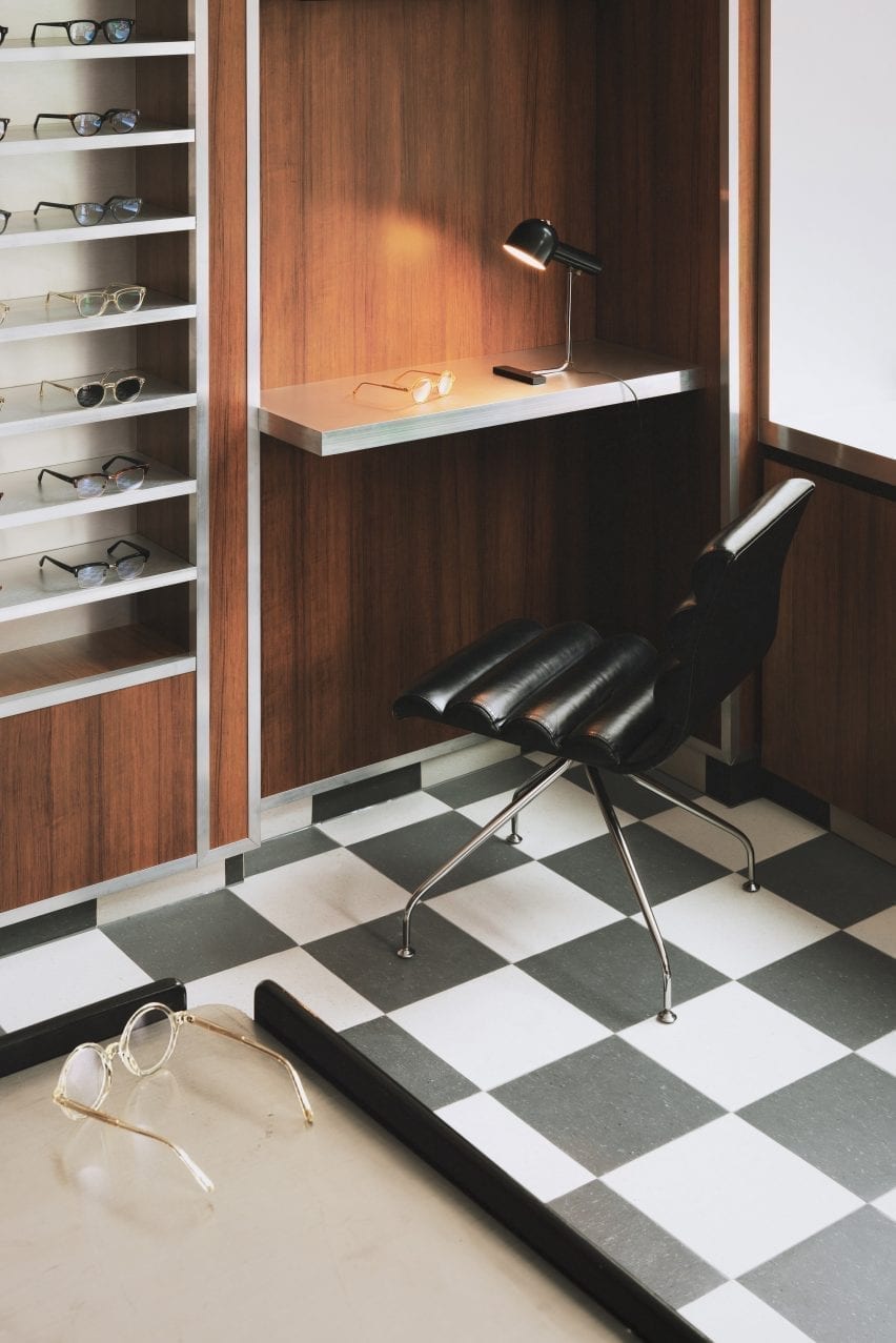
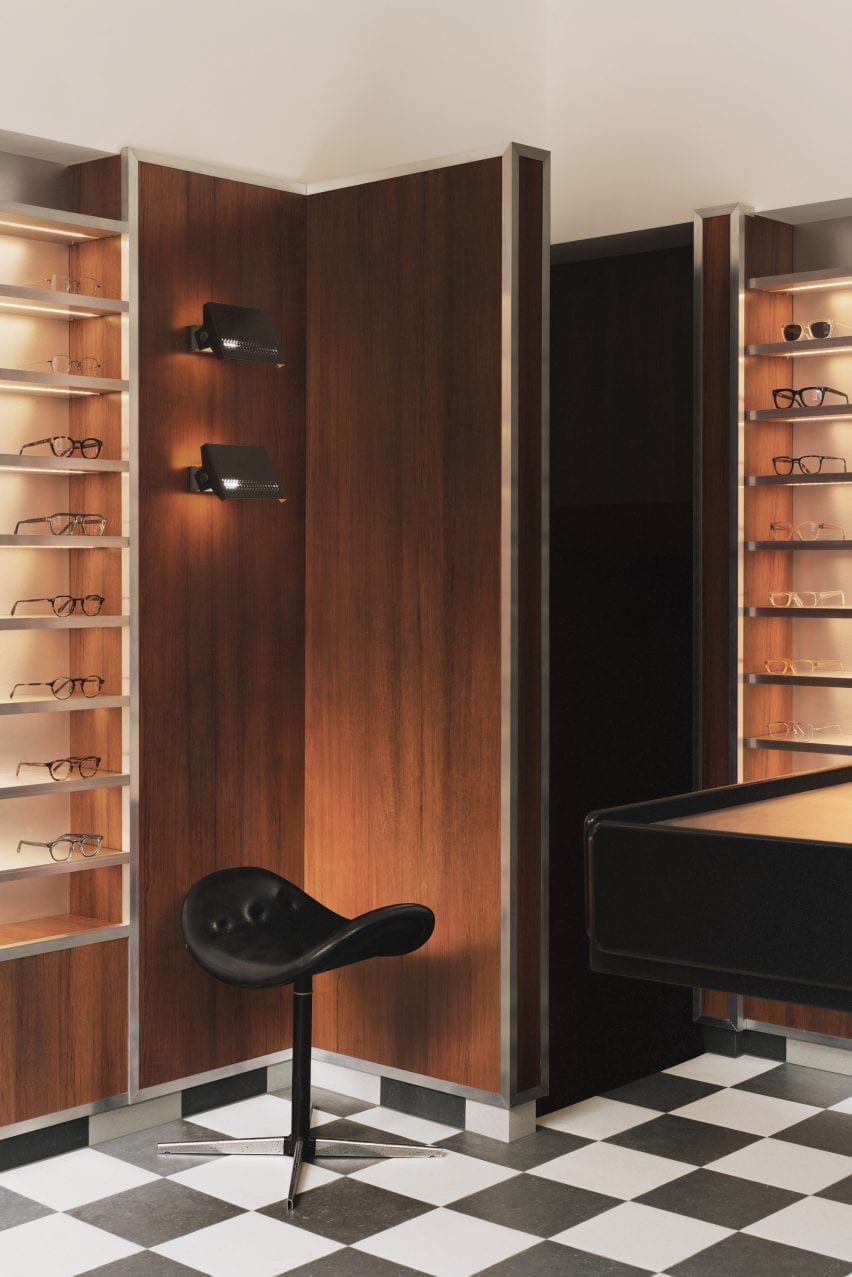
Checked linoleum floor and wood-panelled walls in Cubitts eyewear store
Black and white checkered linoleum flooring features throughout the store

The store is spread out over a small ground floor and basement space lined by a narrow staircase.

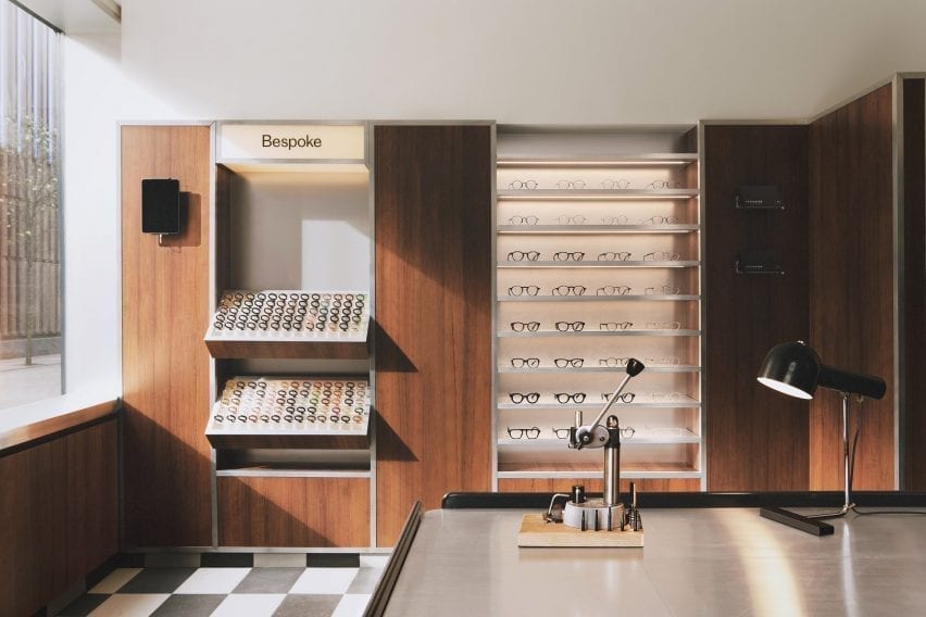
In terms of practical requirements, the store needed to incorporate a display of the 100 different coloured acetate chips that customers can choose from to create bespoke frames.

London-based Child Studio designed a space for Cubitts that aims to reflect the history of the local area and create a customer journey that would encourage people to explore the basement space.

Wood-panelled walls and acrylic display stands in eyewear store by Child Studio
A wall-mounted display case holds 100 different coloured acetate chips

Cubitts wants each of its shops to have a unique design reflecting the history of the local neighbourhood,” Child Studio co-founder Alexy Kos told Dezeen.

“The brand has a strong connection to London, where its glasses are made, and to Modernism as the guiding principle to its design aesthetic.”

Checkered floor, black stool and wood-panelled walls in Cubitts London shop

To design the interior, the studio drew upon Soho’s colourful history as a destination for massage parlours, adult cinemas and sex shops in the postwar era.

“Gambling, drinking, religious and political dissent, clubbing and prostitution were all, at varying times, peculiar Soho specialities,” said the studio.

“We have focussed our research on Soho’s heyday in the postwar era, looking at the interiors of the neighbourhood’s iconic venues, such as the Formica-clad Bar Italia and the legendary jazz venue 100 Club, with its all-red interiors.”

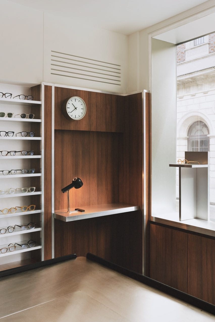
Desk nook with clock and glasses display in eyewear store by Child Studio
Formica laminate partitions with aluminium trims divide up the space

Referencing the peep show booths of Soho, the store incorporates low partitions clad in a wood-effect Formica laminate and trimmed with aluminium to form a maze-like environment.

Display areas with illuminated acrylic shelving that showcase the spectacles and the colourful acetate chips are recessed into the walls. Lightbox signage integrated into the metal-trim cladding and black and white checkered linoleum flooring add to the store’s nostalgic ambience.

An antique Caori cocktail table designed by Vico Magistretti in 1961 serves as a focal point on the ground floor.

Featuring a brushed aluminium tabletop and several concealed compartments for records and magazines, the piece was specially sourced by Child Studio and adapted to include a raised podium so that it is better serves the retail environment.

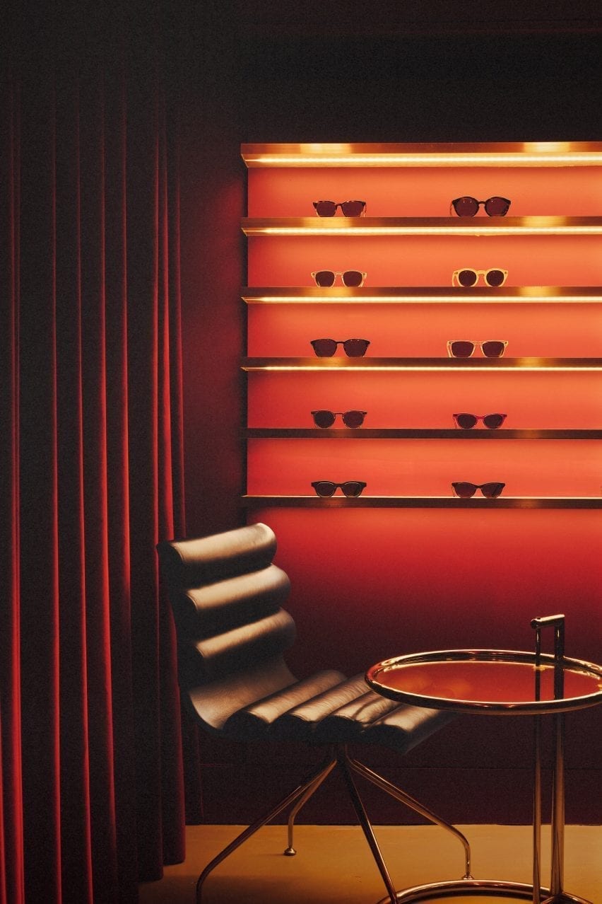
Leather chair with red glasses display in Cubitts store
The basement is saturated with a deep red colour

“Every project tells a unique story and we always look for rare and unusual furniture pieces to add depth and authenticity to the narrative,” said the design team.

“The desk lamp is another mid-century find, created by the Czech designer Josef Hurka for the manufacturer Napako in the 1960s.”

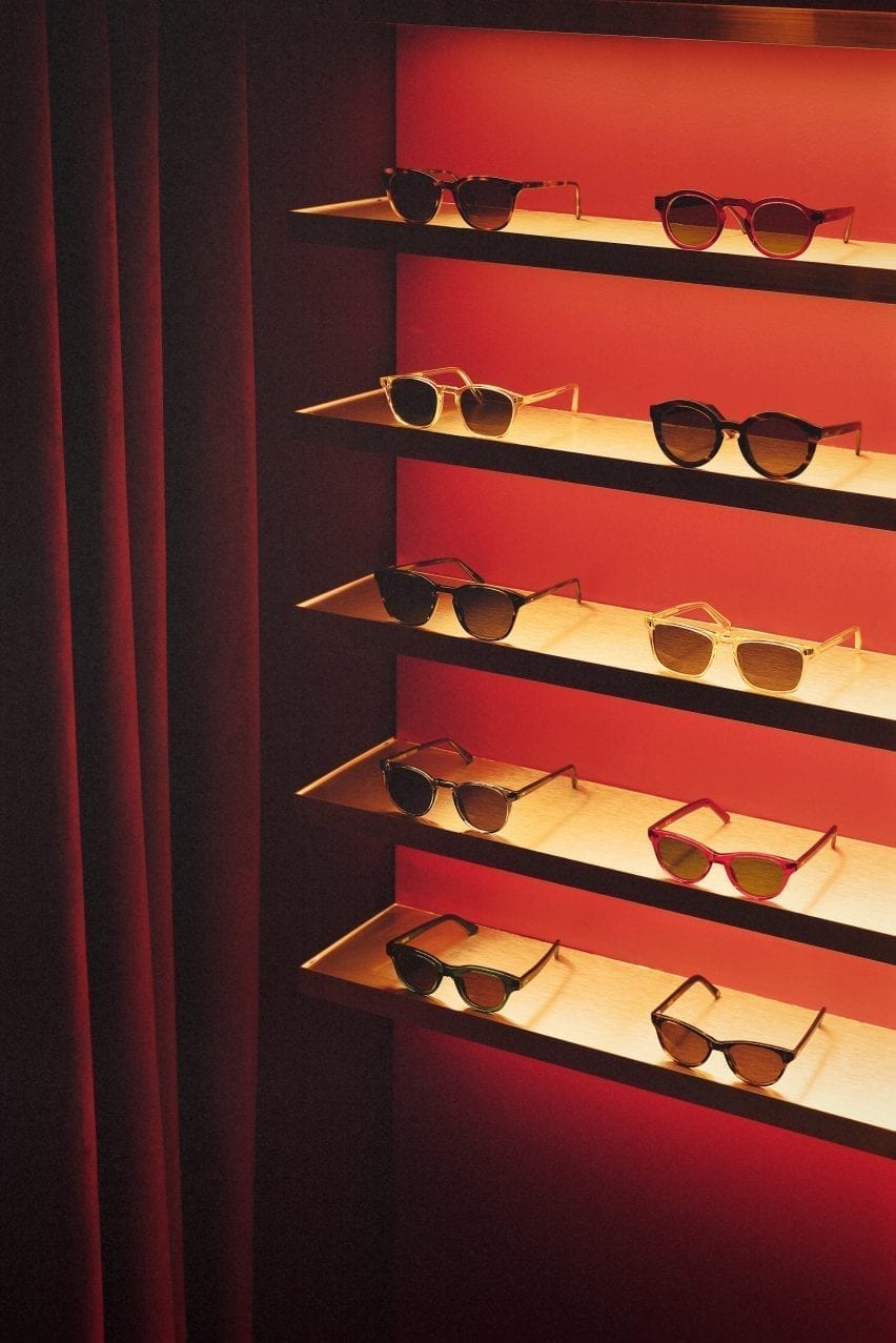
Acryclic glasses display with red velvet curtain in eyewear store by Child Studio
Limited-edition sunglasses are displayed on shelves clad in aluminium-effect Formica

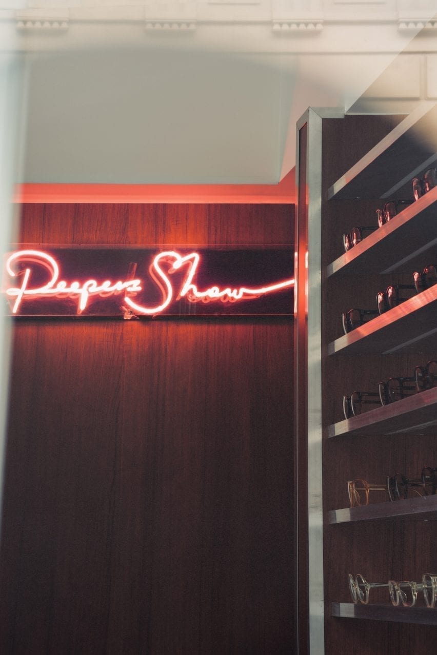
A narrow staircase leads to the basement, which is saturated in a deep red colour. Customers are guided to an eye examination room concealed behind a velvet curtain by neon signs.

Cubitt’s moody basement lounge area is lit by the Conelight floor lamp by the British designer Ronald Homes and furnished with chrome and leather chairs designed by Giovanna Modonutti.

A collection of limited-edition sunglasses is displayed on illuminated shelves clad in aluminium-effect Formica that create a theatrical effect in the dark red surrounds.

Neon peep show sign in Cubitts Soho store
A neon peep show sign hangs at the entrance to the eye examination room

Previously, the studio run by Kos and Che Huang has channelled the look of a 1950s cafe inside a vegan pizza restaurant in west London and transformed a former London post office into a sushi restaurant with a 1960s interior.

“We like to use the word ‘cinematic’ to describe the spaces designed by Child Studio,” Kos told Dezeen. “With every project, we aim to capture a particular mood and atmosphere, rather than trying to recreate an interior from a specific era.”

Photography is by Felix Speller and Child Studio.

Reference